| | |
38 Lineart Studio (or: Grayscale, or: Fontsources)
[Muhammad Ridha Agusni]

|
 Architect and designer in Banda Aceh, Indonesia, b. 1980, who set up Grayscale, then 38 Lineart, and finally Fontsources.
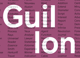
 In 2018, he released the hexagonally-patterned color font Space, the nervous monoline display typeface Barcelona, the monoline script Brandy, the tattoo and metal band blackletter font Amstha, Twinkle (hexagonal texture), Premium Quality, Hightide (signage script), Ashley Pages, Bold Grunge (a wood style Western font), Rabbit House, Strongbold (brush style), Onthel (a rhythmic signage script), Cafeine, Seulanga (calligraphic), Sweet Bubble, Downhill, Architecture (technical writing font), Wisethink (rough brush), Emerald, Ghotic, Oakland (signage script), Parthenon (signage script), Strawberry Night (script), the formal calligraphic font Beauty Athena, the inline font Epicentrum, and the signature font Attitude in 2018. Typefaces from 2019: Ghoust (a marker font done at Cititype), Diamant Handwriting (a signature font), Utrecht (with Siti Saribanon Nurjannah), Exhibitionist (a fine rhythmic script), Holimount, Prague Metronome (a thin signature script), Allegroost (a brush typeface), Anisha (script), Kyoto Northern, ChiQuel (a Victorian display typeface that can be layered), Hillstone (a dry brush script), Malique, Ginchiest (a retro signage script), Kid Knowledge, Haghia, Khatija Calligraphy, Bernound, Graffity, Brandy Script (monoline), Downhill, Concept (sketched, blueprint font), Konya (signature script), Blacksmith, Curve Calibration (condensed sans). Typefaces from 2020: The Pallace (a great natural inky signature script by Muhammad Ridha Agusni and Siti Saribanon Nurjannah), Chipen (inline, all caps), Jakarta (a flowing inky script by Muhammad Ridha Agusni and Siti Saribanon Nurjannah), Rhode White (a great signature script by Muhammad Ridha Agusni and Siti Saribanon Nurjannah), Bailamore (a creamy signage script), Vogie (a sporty / techno sans family of 72 fonts, plus a variable font), Rollingtime (a brush script jointly designed by Muhammad Ridha Agusni and Siti Saribanon Nurjannah), Piedmont (a heavy connected handwriting script advertized as a masculine signature font), Whiplash (an all caps dry brush font), Aceh (a 36-style geometric sans), Youthink, Sacred Letter (a vintage weathered script), Serif Sketch (by Muhammad Ridha Agusni and Siti Saribanon Nurjannah), Corinthiago, Smart Chameleon (a handcrafted typewriter font by Muhammad Ridha Agusni and Siti Saribanon Nurjannah), Hiroshima Gyoshi (a brush font inspired by Japanese calligraphy), Roughmarker (dry marker font), Brotherhood, Blugie (a fat finger font), Rome Ionic (an all caps roman typeface), Black Orchestra (a great horror or black metal font), Black Orchestra (a horror font). Typefaces from 2021: Magreb (an 8-style renaissance serif typeface), Toxide (calligraphic; Celtic; uncial), Redtone (a 14-style geometric sans), Moula (an 18-style geometric sans for Latin, Greek and Cyrillic), Zouk (blackletter), Zagreb (an inky signature script by Muhammad Ridha Agusni and Siti Saribanon Nurjannah), Alsace (Victorian), Backbone (a black metal blackletter typeface), Roundkey (a 24-style condensed, but not round, sans), Wordwalker (a marker pen font by Muhammad Ridha Agusni and Siti Saribanon Nurjannah for Cititype), Sweet Bubble (a bubblicious font), Souljah (an elegant inky calligraphic script). Creative Fabrica link. Another Fontbundles link. [Google]
[MyFonts]
[More] ⦿
|
4th February
[Sergiy Tkachenko]

|
 Sergiy Tkachenko (b. 1979, Khrystynivka, Cherkasy region, Ukraine) lives in Kremenchuk, Ukraine, and has been a prolific type designer since 2008. Sergiy graduated from Kremenchuk State Polytechnic University in computer systems and networks in 2007. Various other URLs: Microsoft link, Identifont, 4th February, Behance, Klingspor link, Revision Ru, Russian creators, CPLUV Fontspace, Twitter. Kernest link. Sergey Tkachenko's typefaces:
 - 2008: the techno typefaces Bladi One 4F, Bladi One Slab 4F, Bladi Two 4F, Abia Wide 4F Thin.
- 2009: Wrongo 4F, Zantiqa (an über-serif), Serifiqo (a (free) thin didone fashion mag display face), Codename Coder 4F (monospace programming font), Droporado 4F (using circles only), Tovstun (futuristic, ultra-fat and rounded), Perfocard 4F, Modularico (five modular typefaces based on a logo from Master Kremenchug a company for which Sergiy worked for 4 years), Boldesqo Serif 4F (a splendid informal fat didone, now with Greek support), Tkachenko Sketch, Unicase Slab (a techno slab), Laftatic, Logofontik 4F (techno), PC.DE Stencil (+Italic; custom stencil font), Stenciliqo 4F, Tiap Liap 4F (handwriting), Nut Kit 4F, Rezzzistor 4F, the inline modular face Grand Hotel, and Bijou 4F.
- 2010: Roboo 4F (a bubblegum typeface family), PädIn (a custom typeface for Pädagogische Initiative e.V.: rounded fat informal face), Fat Quad (in the fatty trend), Veselka (a free multiline face), Smeshariki Black (+ Gleams: a bubble gum font made for an animation company), Republica 4F (a fat family), Rodeqa Slab 4F, ComFi (semi-octagonal), Grotesqa 4F, Nowy Geroy 4F, Fabryka 4F (a monospaced typewriter family), Placarto4F-Italic (an ultra fat art deco), Lavina 4F (a hairline sans with lachrymal terminals).
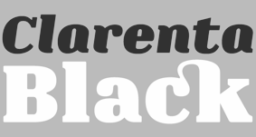
- 2011: Squartica (octagonal), Decomart (free), Model 4F Unicase (a unicase fat didone released in 2013 only), Fontatigo 4F, Kylie 4F (bilined and geometric), Waldemar 4F (a large didone style fat typeface family), Dinesqo (2011, a monoline sans of utter simplicity), Qargotesk (+Cyrillic) [images: i, ii, iii, iv], Neultica 4F (black unicase family), Squartiqa 4F (2011, constructivist), Clarenta 4F Black (after Clarendon---a great family), Designosaur (free sans), Perfopunto (based on perforated circles and squares), OlaScript 4F, Bayadera 4F (a tamed upright monoline script), Febrotesk4FUnicase (squarish unicase family).
- 2012: Targo 4F (rounded typeface with stencil and non-stencil styles), Myra (free font), Myra 4F Caps (free), Cedra (wide monolined sans face), Fontatica 4F (rounded techno grotesk), Akzentica 4F, Ukraintica 4F Wide (a monoline wide-bowled sans family), Laventa 4F, Sports World (free athletic lettering font), Web Serveroff (free computer geek font), Octin Spraypaint Cyrillic (a rough stencil done exclusively for Ninja Theory).
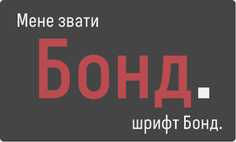 2013: Condesqa (modular sans), Esqadero (an uncomplicated monoline sans), Vanyla 4F Unicase (monoline), Esqadero FF CY (a free wide sans, Cyrillic), Bond (a confident no-frills sans), Attentica (free sans font for Latin and Cyrillic), Cedra 4F Wide Thin. 2013: Condesqa (modular sans), Esqadero (an uncomplicated monoline sans), Vanyla 4F Unicase (monoline), Esqadero FF CY (a free wide sans, Cyrillic), Bond (a confident no-frills sans), Attentica (free sans font for Latin and Cyrillic), Cedra 4F Wide Thin. - Cyrillizations: several typefaces such as Lavoisier (by Alec Julien), Budmo Jiggler (Ray Larabie) and JoAnne Display (Sandy Cerovich), Gnuolane (of a Ray Larabie font), Paranoid Cyrillic (based on Kevin Lo's Paranoid), Movavi Grotesque Black (+Cyrillic; image; numerals), Azoft Sans (made for Azoft, and free here and here).
- Custom fonts: Blue Pill, Sansus Webissimo (since 2011 free at Open Font Library), Minaeff ECT (2011, a free legible family for Latin and Cyrillic, custom-made for and downloadable from WebhostingRating.com), Webhostinggeeks.Com (2011), Web Serveroff, OnlinePharmacyCheck.Com (2011), 1800Flowers.com (2011), DesignStudio.com (2011, free), ArchyStudio.Com (2011, free download, Movavi Grotesque (2011, free), Azoft Sans, PÄd In, Smeshariki, Fat Cow (2010: free condensed sans), ComFi (2010, free), PC.de (2009: free techno family, including a stencil face), League Gothic (2009-2011, The League of Movable Type) Cyrillic, Paranoid Cyrillic, 28 Days Later Cyrillic, Acid Label Cyrillic, Dead Secretary Cyrillic, Rezland Cyrillic, Sweet Leaf Cyrillic, Droid Cyrillic, Jo Anne Display Cyrillic, Gnuolane Free Cyrillic, Bosox Cyrillic, Budmo Jiggler Cyrillic.
- Typefaces from 2014: Laqonic 4F (unicase sans), Cubynets 4F, Blogger Sans (free rounded organic sans), Boncegro (free Western typeface, briefly called Vaquero before a name change), Motor 4F (based on Russian car license plates), Monitorica (a futuristic typeface made for ipHostMonitor.com, free at OFL), Areqo (condensed titling sans), Architect's Daughter Cyrillic (architectural lettering), GetVoIP Grotesque (a free typeface commissioned by GetVoIP), Meeneralca (unicase sans inspired by the logo of the mineral water Borjomi from Georgia), Glasoor (free oil spill or jelly bean font), Robotesqa.
- Typefaces from 2015: Croogla (a circle-based informal sans), Blackentina 4F (free ultra-black squarish typeface), Dart 4F (neo-grotesque), Kent 4F (a layered family for letterpress emulation).
- Typefaces from 2016: Brent 4F (original design going back to 2013), a custom typeface for the labels used in the Ukrainian Armed Forces, Economica Cyrillic Pro (with Vicente Lamonaca).
- Typefaces from 2018: Indi Kazka 4F (Indic simulation).
Abstract Fonts link. Dafont link. Creative Market link. Behance link. Hellofont link. Open Font Library link. View Sergiy Tkachenko's fonts. [Google]
[MyFonts]
[More] ⦿
|
A3
[Bram Vermeyen]
|
Bram Vermeyen's blog and electrtonic mag about design and typography. [Google]
[More] ⦿
|
Aah Yes

|
 Southampton, UK-based foundry, est. 2006. Font families include Regalese (2008, 8 weights with stylish rounded serifs), Arrow Heaven (2007, 6 styles of fonts with 62 arrows in 40 orientations each), Lydiard (2007, sans cum comic book), Demigrunge (2007), Nidex (2007, caps-only grunge), Rocksolid (2007), Perio (2007, a grungy didone), Havenbrook (2007, a 22-style family), Sudoku Blank (2007), Pikelet (2007, grunge headline face), Sanzettica (2007, a 40-style geometric sans family, but the x-weight is unacceptably large), Hunniwell (2007, felt tip style), Meriden (2007, display sans family), Saint Val (2007), Funkywarp (2006), Cheedo (2006, bi-lined), Old Forge (2006, roman style), Blank Manuscript (2006, music font), Disgrunged ABCD (2006), Disgrunged 1234 (2006), Beeble (2006), Choob Stripes (2006), Diffie (2006), Pixettish (2006), Caldicote (2006, a 13-style serif family), Starbell (2006), Tuzonie (2006, grunge), Cabragio (2006, free-flowing informal), Deltarbo (2006, sans), Write (2006, an almost architectural script), Dascari (2006, an informal headline sans), Smeethe (2006, comic strip face), Crockstomp (2006, grunge), Dorkihand (2006), Meltifex (2006, melting letters), Rappica (grunge), Blue Sugar (2007, grunge), Front Desk (2007), Powdermonkey (2007), Sideshadow (2007), Spiky (2007), Zebra Spots (2007), Amescote (2007, a 6-weight sans), Mivron (2007, outline sans), Puggu (2007, comic strip font), Luzaine (2007), Overlapper (2007), Satron (2007), Stubble (2008, grunge), Newsanse (2008, a 15-style large x-height disaster), Rysse (2008, an 11-style grunge family), Chelp (2008, grunge), Snather (2008: thin, rounded squarish), Keybies (2008, piano key font), Quickle (2008), Pevensey (2008: 21 styles, each with 1200 glyphs, transitional style), Spiraltwists (2008), Music Sheets (2009), Snazzy (2009), Shelflife (2012, a macho sans), Langton (2012, a workhorse sans family), Indipia (2012, a corroded family), Bradwell (2012, condensed sans), Dunsley (2013, a hand-drawn sans), Darnalls (2013, antiqued book face), Stamppad (like a rough rubber stamp pad), Heavenly Bodies, Stripated (2016), Slonk (2016: an ornamental font with a pearl in each outline), Guitar Chords (2016).
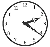
 Typefaces from 2017: Time Exactly (just type in the four numbers of any time from 0000 to 2359 and it will give you that clock face, in one of 60 styles of your choice), Rebista, Magg (a corroded condensed sans typeface family), Sanstone. Typefaces from 2018: Hypersans (12 weights), Martian Tiles, Dominoes (a domino tile font). Typefaces from 2020: Yafferbuddle (a cartoon font). View the Aah Yes typeface library. [Google]
[MyFonts]
[More] ⦿
|
Active Images (or: Comic Book Fonts, or: Comicraft)
[Dave Lanphear]
|
Rita Simpson and Richard Starkings' company which specialized in comic book fonts. The newest Tekton-lookalike font, Hellshock, was designed by Dave Lanphear. Some typefaces: Achtung Baby (1997), Adamantium, Chills, DivineRight, DoubleBack, DutchCourage Elsewhere, IncyWincySpider, RunningWithScissors, Spills StandBy4Action, Stormtrooper, TheStorySoFar, Thrills, ToBeContinued, Alchemite, Astro City, Bithead, Bronto Burger, CarryonScreaming, ClobberInTime, Comicrazy, Flameon, Frostbite, GrimlyFiendish, JimLee, JoeMad, Meltdown, MonsterMash, PhasesOnStun, PulpFictioon, ResistanceIs, SezWho/SezYou, SpookyTooth, Splashdown, TimSale, Wildwords (129 USD!), YuleTideLog, Zoinks. Most fonts by John Roshell. [Google]
[More] ⦿
|
Adalbero Neto
[Adalberto Barbosa]
|
 Brazilian designer (b. 1997) based in Bairro Manoel Satiro. As an architecture student at Universidade de Fortaleza, he created the blueprint / architectural drawing font Adalbs (2021). [Google]
[More] ⦿
|
Adalberto Barbosa
[Adalbero Neto]
|
[More] ⦿
|
Adam Ryszewski
[Vertigo]

|
[MyFonts]
[More] ⦿
|
Adriana Esteve Hernandez
[Adriprints]

|
 [MyFonts]
[More] ⦿
|
Adriprints
[Adriana Esteve Hernandez]

|
 Adriana Hernandez (b. Miami, FL) established Adriprints in 2008. She is located in Munich, Germany.
 Her fonts include Kicks (2012, a fun hand-printed typeface for children's books), Stitching Kit (2010, dings), Fiddleshticks (2009, linocut), Sorbet and Sorbet Wide (2009, like architectural letters), Fancypants (2010, curly lettering), Stitchin Crochet (2009, dingbats), Trellis (2009, hand-printed), and Draft Punk (2009, comic book style). Font Squirrel link. Klingspor link. [Google]
[MyFonts]
[More] ⦿
|
Akash Peeroo
|
Freelance graphic designer and photographer in Quatre Bornes, Mauritius, who created an art deco architectural font, Archi, in 2013 as a school project. In 2014, he designed a hairline sans and an experimental geometric typeface. [Google]
[More] ⦿
|
Alberto Cerezo Narvaez
|
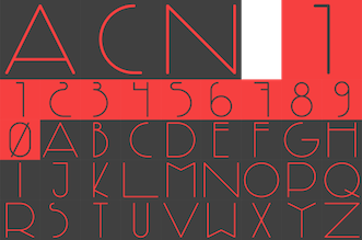 Architect, designer and photographer in San Fernando, Spain. In 2013, he designed the pair of avant garde typefaces ACN 2 and ACN 1.
 Behance link. [Google]
[More] ⦿
|
Alejandra Riera Mora
|
Graduate of the Miami Ad School in Madrid who lives in Murcia, near where many spaghetti westerns were filmed. No surprise then that she created the Western look typeface Bandido and the counterless display typeface Cactus in 2012. Architecture font is a wide techno face. For something completely different, she turned to alchemism with the nutty Nick Minaj font (2012). Behance link. Another Behance link. [Google]
[More] ⦿
|
Alejandro Paul
[Sudtipos]

|
 [MyFonts]
[More] ⦿
|
Alexander McCracken
[Neutura]

|
[MyFonts]
[More] ⦿
|
Alicia Ingruber
|
Behance link. Dutch photographer and graphic designer who made Absolute (2011, architectural drawing sans). [Google]
[More] ⦿
|
Alissa Barendse
|
At San Francisco State University, Alissa Barendse designed the 3d outline typeface Surface (2016). [Google]
[More] ⦿
|
Allison B. Williams
[Alphabet Zoo]

|
[MyFonts]
[More] ⦿
|
Allison Lea Armstrong
|
During her studies at the University of Central Arkansas in Conway, AR, Allison Lea Armstrong designed Architecture Anatomy Font (2016, decorative caps) and the related artchitect (2016). [Google]
[More] ⦿
|
Alois Ludwig
|
Brno-born architect (1872) who worked in München and Vienna and died in 1969. Some of his lettering. [Google]
[More] ⦿
|
Alpaprana Studio
|
Indonesia-based designer of display, scrapbook and handcrafted typefaces. In 2021, he published these fonts: Aesthetic, Angelic Smiles, Another (architectural lettering), Asgerion (stencil), Baby Mermaid, Baby Sparkle, Barley, Bathiora, Beacon (futuristic), Beauty Hearts, Best Valentine, Bigdino Park, Blackout (futuristic), Boost Display, Claresta, Clatterson, Committing, Creamy Buttermilk, Darling, Devany, Felicity, Gelato, Getting Better, Gia Cristine, Giordan (calligraphic), Golang, Grandia, Halmera, Haster, Hazelnuts, Hello Snowy, Hello Viktoria, Hunting, Katracy, Kingham, Kingston Signature, Komon, Latterday, Life Hacks, Love&Thunder, Magderyna, Magretta, Memphis, Merkisa, Midnight Shadows, Mighty Kingdom, Modena, Momy & Marsa, Northing, Perky Dream, Pumpkin Party, Radiants, Ralynda, Rastella, Ratcliffer, Replay Time, Spider Homes, Sweet Puppy, Thom Rodger, Wakanda, Western. [Google]
[More] ⦿
|
Alphabet Zoo
[Allison B. Williams]

|
Allison B. Williams (Alphabet Zoo) is Hilton Head Island, SC-based type and graphic designer. In 2010, she made the alphading font Christmas Spirit (+Christmas Spirit 2), and the architectural writing font Handwriting Absolute. In 2011, this was followed by Quick Notation (hand-printed). Klingspor link. [Google]
[MyFonts]
[More] ⦿
|
Alvaro Diaz
|
Furniture and industrial designer in Madrid, whose rationality shines through in his architectural ADH typeface (2012). [Google]
[More] ⦿
|
Alvin Lustig

|
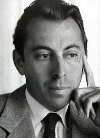 Modern American design pioneer (b. 1915, Denver, CO, d. 1955), known for his books, graphic design, interior and architectural design, and typefaces. Lustig studied design at Los Angeles City College, Art Center, and independently with American architect Frank Lloyd Wright at his Taliesin studio and French painter Jean Charlot. He began his career designing book jackets in 1937 in Los Angeles. In 1944 he became Director of Visual Research for Look Magazine. He also designed for Fortune, and Girl Scouts of the United States. The Rochester Institute of Technology maintains an Alvin Lustig Collection. Wikipedia link.
 Digital typefaces based on Lustig's work: - Greta Bassanese's Alvin Lustig Typeface (2014).
- Lustig Elements (2016, P22). Craig Welsh (Lancaster, PA) and AIGA Medalist Elaine Lustig Cohen (NY), Alvin's widow, extended Alvin Lustig's 1939 geometric typeface Euclid, and named it Lustig Elements. It was cut in wood by Hamilton Wood Type & Printing Museum in 2015, and produced as a digital typeface in 2016 by P22.
[Google]
[MyFonts]
[More] ⦿
|
Amar Arif
[KaryAmo Studio]

|
[MyFonts]
[More] ⦿
|
Amélie Dugon
|
Amélie Dugon graduated with a Bachelor en arts plastiques visuels et de l'espace from ESA Saint-Luc in Tournai, Belgium, class of 2016. Strasbourg, France-based designer of a typeface that was inspired by Frank Gehry's architectural style. Just called Gehry (2015), it has the wavy look of early art nouveau types. [Google]
[More] ⦿
|
Ameer Hamza Qureshi
|
UX/UI designer in Lahore, Pakistan. In 2015, Ameer Hamza Qureshi and Faiza Shahid co-designed the free architectural hand font Who Cares. Behance link. [Google]
[More] ⦿
|
American Technical Society
|
 The American Technical Society published Cyclopedia of Architecture, Carpentry and Building in 1908 in Chicago. This text contains a chapter dedicated to architectural lettering. [Google]
[More] ⦿
|
Amy Novak
|
Industrial designer. Amy's typeface Aalto (2012) is inspired by the well-known Finnish architect and designer Alvar Aalto. She also made the custom font Articule (2012) for a gallery in Montreal. [Google]
[More] ⦿
|
Anastasia Kulazhenko
|
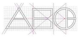 Vilnius-based designer of Aliboni (2012), a corporate typeface made for the identity of Italian architecture/construction company Aliboni Costruzioni. [Google]
[More] ⦿
|
Andrea Zanchetta
[Civico13]
|
[More] ⦿
|
André Caciatore
|
Sorocaba, Brazil-based designer of the display typeface Cow Head (2017), which was deceloped together with Felipe Bueno and Rafael Tadeu, this typeface was inspired by the architecture of Rem Koolhaas. [Google]
[More] ⦿
|
André Design (or: AAID)
[Andrew Farrell]

|
AAID stands for Andre & Associates Interpretation & Design. Type foundry in Victoria, BC. André Drafting (2012) is based on the hand-drafting lettering of senior designer Andrew Farrell. It can be used in CAD drawings, concept sketches and more. [Google]
[MyFonts]
[More] ⦿
|
Andressa Anantharaju
|
Designer in San Francisco. In 2014, she created Ksztalt (2014). This contemporary sans typeface was inspired by the architecture of the Jewish Museum of San Francisco, and the shapes of modern Hebrew letters. She is motivated by this quote by Antoine de Saimt-Exupery: A designer knows he has arrived at perfection not when there is no longer anything to add, but when there is no longer anything to take away. Behance link. [Google]
[More] ⦿
|
Andrew Farrell
[André Design (or: AAID)]

|
[MyFonts]
[More] ⦿
|
Andrew Footit
[Arkitype (was: Virtue Creative)]

|
 [MyFonts]
[More] ⦿
|
Andrew Walsh
[TypeTrough]
|
[More] ⦿
|
Andrii Mahda
[Legend Art]
|
[More] ⦿
|
Andy Cruz
[House Industries]

|
 [MyFonts]
[More] ⦿
|
Andy Hayes
[Hucklebuck Design Studio]
|
[More] ⦿
|
Angel Sánchez
|
Ángel Sánchez is a Spanish designer. In 2011, he created Museum (a roman caps face), Curriculum (a monoline typewriter face) and Stadium (a geometric circle-based display typeface for architectural signs). Stadium and Museum are free. [Google]
[More] ⦿
|
Angela Detanico
[Angela Detanico and Rafael Lain]
|
[More] ⦿
|
Angela Detanico and Rafael Lain
[Angela Detanico]
|
Brazilian designers of an architectural dingbat font inspired by Oscar Niemeyer buildings, called Utopia (2006). [Google]
[More] ⦿
|
Anna Paula Silva Gouveia
|
Anna Paula Silva Gouveia is a researcher and professor at the State University of Campinas Art Institute (IA-UNICAMP). With Priscilla Farias, she spoke at ATypI 2010 in Dublin about replications of architectonic epigraphs. [Google]
[More] ⦿
|
Anna Seslavinskaya
[Popkern]

|
 [MyFonts]
[More] ⦿
|
Annemarieke Kloosterhof
|
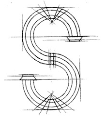 Annemarieke Kloosterhof was born and grew up in The Netherlands. In 2012 she started her graphic design studies at Central Saint Martin's University of the Arts in London. During her studies, she created Alphabet for Architects (2014). Behance link. Cargo Collective link. [Google]
[More] ⦿
|
Anouk Pennel
[Studio Feed (or: Feedtype)]
|
 [More] ⦿
|
Anthony Schmiedeler
|
During his graphic design studies at the University of Kansas, Anthony Schmiedeler created Mr. Wright (2012), a font with architectural elements drawn from Frank Lloyd Wright's work. Behance link. Cargo collectivbe link. [Google]
[More] ⦿
|
Antje Driemeyer
[Driemeyer Design]

|
[MyFonts]
[More] ⦿
|
Anton Scholtz
[Scholtz Fonts]

|
 [MyFonts]
[More] ⦿
|
Antonin Skoda
|
Slovak designer from the early part of the 20th century. One of his posters entitled Deleni Plochy (1927) shows rectangular bi-colored partitions of space. [Google]
[More] ⦿
|
Antonio Basoli
|
Basoli (1774-1848) was born in Bologna, where he studied at the Accademia di Belle Arti, thereafter gradually making a name for himself as a specialist decorator and scene-painter. Basoli did a great deal of scene-painting and production design for the Teatro Comunale in Bologna. Beginning in 1803, he taught at the Accademia in Bologna where he had studied, and was appointed Professor of Ornament there. He published an ornamental architectural alphabet in Bologna in 1839 called Alfabeto Pittorico, ossia raccolta di pensieri pittorici composti di oggetti comincianti dalle singole lettere alfabetiche (Pictorial Alphabet, or, a collection of pictorial thoughts composed of objects beginning with the individual letters of the alphabet). Each letter in this fantastic lithographic alphabet features a surreal architectural form. [Google]
[More] ⦿
|
Antonio Lechuga
[Antonio Mejia Lechuga]

|
 Mexico City-based designer, b. Huauchinango. He studied graphic design at Universidad del Valle de Mexico in Queretaro City, and received a diploma in corporate identity from LISAVA in Barcelona in 2005. He opened his own graphic design studio in Mexico City in 2016.
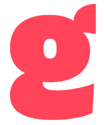
 With the Latinotype team, he designed the high-contrast fashion mag headline typeface family Gabriela Stencil (2016), which was inspired by 19th century didones. Gabriela Stencil won an award at Tipos Latinos 2018. In 2018, Antonio Mejia Lechuja designed the handwriting typeface Handasa (programming by Ivan Moreno, Veracruz, Mexico). Handasa imitates the handwriting of architect Pedro Pablo Velasco Ochoa in his thesis Handasa: La epica en la arquitectura. In 2019, he added Gabriela (Latinotype) and Trust Sans (Latinotype Mexico: for corporate branding). Typefaces from 2021: Planetazul (a corporate font for Planeta Azul), Bruna (a 16-style sans family named after Dutch children's book illustrator Dick Bruna (1927-2017)). In 2021, he designed Gatopardo Display for the Mexican magazine Gatopardo, as well as Mestiza (a 12-style serif with sharp terminals). Typefaces from 2022: Mestiza Sans (a 12-style flared lapidary sans). [Google]
[MyFonts]
[More] ⦿
|
Antonio Mejia Lechuga
[Antonio Lechuga]

|
 [MyFonts]
[More] ⦿
|
Antony Bauer
|
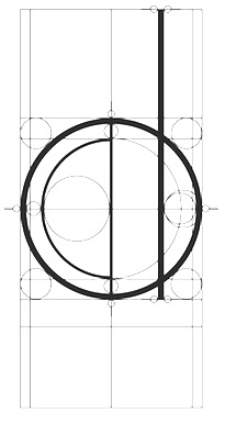 Auckland, New Zealand-based designer of the compass-and-ruler typeface Parti (2014). This great typeface was developed during his studies at AUT. It was influenced by architectuiral lettering. [Google]
[More] ⦿
|
Aparelho Studio
|
Rio de Janeiro-based creator of Eiffel Alphabet (2014), a typeface that simulates metal structures of the Eiffel tower. [Google]
[More] ⦿
|
Apple GX fonts
|
This discussion walks us through the original Apple GX fonts, such as Tekton GX, Skia (Matthew Carter), Buffalo Gal (Thomas Rickner), Jam (Erik van Blokland), Chunk (Matthew Butterick) and Zycon (Font Bureau). [Google]
[More] ⦿
|
ArchBlocks (was: Font Forest, Epiphany Design Studio)
|
ArchBlocks (earlier: FontForest or Epiphany Design Studio, Santa Monica, CA) markets Architect Pack for 59USD since ca. 2002: 6 TTF or type 1 fonts: MrHand, Glasgow (which looks like the lettering of Frank Lloyd Wright), Sketcher, HeavyHand, Scribble, Stamped. [Google]
[More] ⦿
|
Archibald
|
An architectural writing font with art nouveau features, by Brendel (1994). [Google]
[More] ⦿
|
Archiness
[Wico Valk]

|
 Archiness is a foundry, est. in 2009 in Delft, The Netherlands, by Wico Valk (b. 1962, Waddinxveen), a practicing architect since 1989. He designed these typefaces: ArchiType Rounded (2011, square gothic), Archi Logo (2009), ArchiType (2009, 12 styles). [Google]
[MyFonts]
[More] ⦿
|
Arkitype (was: Virtue Creative)
[Andrew Footit]

|
 Andrew Footit (b. 1984) runs his own type foundry in Johannesburg, South Africa. He is also known as Arkitype. Until 2014, his type studio was called Virtue Creative and before that, Virtue84. In 2017, he set up Arkitype. His typefaces:
 - The very simple monoline rounded geometric typeface Modulus (2011). Updated to Modulus Pro in 2019.
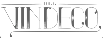
- The stunning art deco typeface Vindeco (2011).
- Gigafont (2011): a free bubblegum font.
- FunFair (2012): hand-printed.
- Virtus Sans (2012): a clean 4-style sans family.
- the Western family Westro (2012, +Inline).
- The free rounded sans drafting font Struct (2013).
- The four-style vintage poster typeface The Woods (2013).
- The spurred letterpress typeface family Roper (2014). Roper evolved into the octagonal typeface family Hudson NY (2015) and Hudson NY Pro (2020). Hudson NY Regular, Serif and Slab are athletic lettering / octagonal typeface families.
- Bosk Hand.
- Roves (2016). A camping style set of fonts, including several stencil typefaces.
- Anchor Script (2016). Inspired by classic cursive connected handwriting.
- Navigator (2016). Inspired by the early explorers.
- Bowline Script (2016). A vintage monoline cursive script typeface.
- Saveur Sans (2017) and Saveur Sans Round (2017). A lovely sans typeface family that is inspired by art deco and French cafes.
- Comply Slab (2017). All caps and octagonal, with possible applications in athletic lettering.
- 3 Stripe Type (2017) and Adidas Nemeziz (2017). Prismatic typefaces.
- Technol (2018).
- Statewide (2018). An all caps squarish techno display sans family.
- ESPN Next (2018). An octagonal inline custom typeface. ESPN Heroes (2019) is a six-lined prismatic typeface.
- Poster Compressed (2019). A piano key typeface.
- Neumatic Compressed (2019), Neumatic Gothic Round (2020) and Neumatic Gothic (2019).
- Protrakt Variable (2019). Nine variable width all caps fonts, of different thicknesses.
- Coastal (2020). A twelve-style all caps sans.
- Compose. An 18-style minimalist sans with elliptical curves and quite open counters.
- Storica (2021). A 9-style all caps vintage serif.
Behance link. Creative Market link. Home page. View Andrew Footit's typefaces. Home page. [Google]
[MyFonts]
[More] ⦿
|
Arne Jacobsen
|
Arne Emil Jacobsen (b. 1902, d. 1971) was a Danish architect and designer. He is best known for his contribution to architectural functionalism and his simple but effective chair designs. In 1941-1942, Arne Jacobsen and Erik Moeller designed an architectural drawing-style alphabet for the Aarhus town hall. That alphabet was digitally revived---commissioned by the Board of Arne Jacobsen, Arne Jacobsen's Grandson Tobias Jacobsen and Danish branding agency AM---by the A2 foundry as Arne Jacobsen, ca. 2018. [Google]
[More] ⦿
|
Arthur Beresford Pite
|
Architect, born in 1861 in London, died in 1934 in Beckenham, Kent. He created this architectural alphabet. [Google]
[More] ⦿
|
Artista Mûvek
|
Hungarian foundry, which made the organic sans family Terra, the architectural lettering font Sample, and the very geometric sans Simple. [Google]
[More] ⦿
|
Astigmatic One Eye
[Brian J. Bonislawsky]

|
 Astigmatic One Eye (AOE) has lots of nice original fonts by Brian J. Bonislawsky (b. 1973, Pittsburgh, PA). Many are free, others are not. AOE joined Font Brothers Inc in 2006. Brian Bonislawsky currently lives in Las Vegas, NV.
 Fontsquirrel link. Dafont link. Fontspace link. A partial list of the AOE fonts made in 2011: Engagement (2011, a free brush script at Google Web Fonts), Fascinate (2011, an art deco typeface at Google Web Fonts; +Inline), Original Surfer (2011, a free Google Web Font inspired by a vintage advertisement for the "California Cliffs Caravan Park"), Smokum (2011, a Western / Italian face), Yellowtail (2011, signage face), Redressed (2011), Special Elite (2010, a free old typewriter face), Aclonica (2011). Typefaces from 2008 or before: Horseplay AOE (2008, Western style), Cake and Sodomy AOE (2008), Good Eatin AOE (2008), Paradiso AOE (2008, inspired by logotype of the Paris Resort and Casino in Las Vegas), Montelago AOE (2007, a script inspired by the logotype of the Mirage Resort and Casino in Las Vegas), Jack Chain AOE (2007), Henhouse (2007), Schnitzle (2007), Luxurian AOE (2007, inspired by the logo of the Luxor Hotel&Casino in Las Vegas), Digital Disco AOE (2007), Mighty Tuxedo AOE (2007), Makeshift AOE (2007), Clarity AOE (2007, slab serif headline; + grungy version), Red Pigtails AOE (2007), Run Tron 1983 (2002), Eyeliner AOE (2006, Tekton-like), Mother Hen (2007), Gloversville (2007, comic book style), Mighty Tuxedo AOE (2007, condensed sans), Quick Handle AOE (2007), Surfing Bird (2007), Hydrogen (2004), Hardliner (2004, fifties diner style), Big Ruckus (2004), SS Antique No. 5 (2004), Europa Twin (2003), EuroMachina (2003, techno), Lord Rat (2003: papercut sans), Love Anxiety (2003), BuzzSaw (2003), Skullbearer (2003, skull dingbats), Beatnick Blue (2002), Geisha Boy (2002), Mardi Party (2002), Midcrime (2002), Ocovilla (2002), Ruthless (2002), Saltie Doggie (2002), Whiskers (2002), Royal Gothic, Family, Eggit, Jericho, Wild Monkeys (2002), 5FingeredGothSW, AlienArgonautAOE, AlphaMackAOE, AmphibiPrint, AngiomaAOE, AntiChristSuperstar, AntiChristSuperstarSW, AstigmaSolid, BigLimboAOE, BigLimbodOutAOE, BoneRollAOE, BoneRollAOEBold, BoundAOE, BrailleAOE, BulletBallsAOE, ButterflyChromosome, ButterflyChromosomeAOE, ButtonButton, ButtonButtonAOE, CType, CTypeAOE, CelticLionAOE-Bold, CelticLionAOE-BoldItalic, CelticLionAOE-Italic, CelticLionAOE, CharailleAOE, ChickenScratch, ChickenScratchAOE, ClunkerAOE, ClunkerAOE-Bold, CropBats, CropBatsAOE, CropBatsIIAOE, DarkNightAOE, DeadGrit, DeliveryMatrixAOE, DetourAOE, DigitalDiscoAOE, DigitalDiscoAOEOblique, DingleBerries, DoggyPrintAOE, DraxLumaAOE, DungeonKeeperII, DungeonKeeperIIBold, DungeonKeeperIIItalic, EggItAOE, EggitAOE-Italic, EggitOutlineAOE, ElectricHermes, ElectricHermesAOE, ElectricHermesAOECharge, FearAOE, FilthAOE, FishyPrintAOEOne, FishyPrintOneAOE, FishyPrintTwoAOE, FutharkAOE, FutharkAOEInline, FutharkAOEInline, GateKeeperAOE, Ghoulish Fright AOE (2006), GlagoliticAOE (1999, grungy glagolitic), GorgonCocoonAOE, Gotik, GreyAlienSW, HAL9000AOE, HAL9000AOEBold, HAL9000AOEBoldItalic, HAL9000AOEItalic, HandageAOE, HandageAOEBold, HauntAOE, HybridLCDAOE, IDSupernovaSW, IslanderAOE, JokerWildAOE, KillMeCraig, KillMeCraigAOE, Kinderfeld, KittyPrint, KittyPrintAOE, Kornucopia, KornucopiaAOE, LinusFace, LinusFaceAOE, LinusPlayAOE, LinusPlaySW, Lochen, LovesickAOE, Manson, MasterPlan, Mervale Script Pro (2012: a brushy script based on the 1940's Fawcett Publications Mary Marvel comic), Microbe, MooCowSW, MotherlodeLoadedAOE-Italic, MotherlodeLoadedAOE, MotherlodeStrippedAOE-Italic, MotherlodeStrippedAOE, MysterioSWTrial, NightmareAOE, OrnaMental, Pantera, PapaManoAOE, PenicillinAOE (described as a bacterial stencil typeface), PixelGantryAOE, PixelGantryAOEBold, PixelGantryAOEBoldItalic, PixelGantryAOEHeavy, PixelGantryAOEHeavyItalic, PixelGantryAOEItalic, PixelGantryHiliteAOE, PixelGantryHiliteAOEItalic, PoppyAOE, PoseidonAOE, Prick, QuiltedAOE, QuiltedAOEBlack, QuiltedTrial, RippleCrumb, RippleCrumbUltraCon, ROCKY, ROCKYAOE, RustedMachineSW, SSExpAntiqueAOE, Schizm, Schrill, SchrillAOE, SchrillAOEOblique, Scrawn, ScrawnAOE, ScrawnCyrAOE, ScrawnKOI8AOE, ScrewedAOE, ScrewedAOEOblique, ScrewedSW, SeaweedFireAOE, SenthAOE, ShampooSW, ShottyTransferTrial, SkinnerAOE, SlurCrumb, SpatCrumb, SpikeCrumbGeiger, SpikeCrumbSwizzle, SpikeCrumbSwollen, SteelcapRubbingTrial, StruckSW, StrutterAOE, SunspotsAOE, SurferComicTrial, TRANSHUMANALPHABET10, TRANSHUMANKATAKANA20, TannarinAOE, TannarinAOEOblique, TibetanBeefgardenAOE, TibetanBeefgardenAOE, TouristTrapAOE, TransponderAOE, TransponderGridAOE, UglyStickAOE, VanguardIIIAOE-Bold, VanguardIIIAOE-BoldOblique, VanguardIIIAOE-Oblique, VanguardIIIAOE, Ventilate, VentilateAOE, Y2KPopMuzikAOE, Y2KPopMuzikOutlineAOE, YoungItchAOE, ZeichensSW, ZenoPotionAOE, Zombie, BeatnikBlueAOE, BeatnikBlueFillAOE, GeishaBoyAOE, MardiPartyAOE, MindCrimeAOE, OcovillaAOE, PolynesianTouristAOE, RuthlessAOE, SaltyDoggieAOE, SpruceAOE, WhiskersAOE-Oblique, WhiskersAOE, WhiskersAltCapsAOE-Oblique, WhiskersAltCapsAOE (2002), Habitual, Automatic (techno), Bitrux, Filth (an eerie brush script), Cake&Sodomy, Gulag, Bad Comp, Detour, Alien Argonaut, Dark Night, GateKeeper (Halloween font), Gargamel Smurf, Invocation, Neuntotter, Geisha Boy, Saratoga Slim, Gobe, Stingwire, Lavatype, Tapehead, Islander, Clunker, Digelectric, Gargamel, Krulo-Tag, Krelesanta, SurferComic, Bound, Culture Vulture, Intruder, Cavalier, Anoxia, Synchrounous (IBM logo style lettering), Luna, Data Error, Lunokhod, Jericho. There are many techno and gothic fonts. Kill Me Craig is the first 26 death scene dingbat font (scenes by Craig Dowsett). KittyPrint takes the LinusFace font concept to more realistic cat head dingbats. Krelesanta (not free) is a funky font inspired by the band Kreamy Electric Santa. The free ButtonButton is useful for making buttons. Lovesick AOE is a scrawly, lovelorn typeface, i's dotted with hearts. Strutter AOE is based on the KISS logo. Senth AOR is a runic font. Charaille is one of the many dot matrix fonts. Cavalero is inspired by the logotype of the Chevy Cavalier. At Bitstream in 2001, AOE published Cavalero, Stingwire and Tannarin. And in 2002, he published the comic book font Big Limbo, Euro Machina BT and Islander there. Bio at Bitstream. In 2005, Bonislawsky and Sandler realeased 500 fonts, via Bitstream and MyFonts, under the label Breaking The Norm. In 2006, Astigmatic published their typewriter collection, which includes Military Document, Bank Statement, State Evidence Small Caps, State Evidence, Urgent telegram, Library Report, Overdrawn Account, Customs Paperwork, Incoming Fax and Office Memorandum. From the bio and various pieces of information, one is led to believe that Brian was born in Poland, and now lives in Miami, but that may be wrong. In 2010, he placed a free font at the Google Directory, Syncopate. Along the same lines, we find the derived square serif typeface Stint Ultra Condensed (2011, Google Web Fonts) and Stint Ultra Expanded (2012). In 2011, several other typefaces followed there, like Ultra (fat didone), Maiden Orange, Special Elite (2010, a free old typewriter face), Just Another Hand, Crushed, Luckiest Guy (comic book face), Aclonica, Redressed, Montezuma (a curly connected upright script), Devonshire (brush script), Fondamento (calligraphic lettering), Yellowatil (connected retro script), Righteous (free at Google Web Fonts: inspired by the all capitals letterforms from the deco posters of Hungarian artist Robert Berény for Modiano), Ribeye and Ribeye Marrow> (cartoon and/or tattoo style lettering---free at Google Web Fonts), Spicy Rice (2011, free festive display typeface at Google Web Fonts). Contributions in 2012: Marcellus (2012, Trajan, flared roman, at Google Fonts and CTAN), Eagle Lake (a free calligraphic font at Google Web Fonts), Uncial Antiqua, Jim Nightshade (2012, free at Google web fonts), Dynalight (2012, a retro script inspired by a vintage luggage tag for the Southern Pacific 4449 Daylight steam locomotive), Yesteryear (a retro script loosely based on the title screen from the 1942 film The Palm Beach Story), Parisienne (Google Web Fonts: casual connected script based on a 1960s ad for bras), Shojumaru (Google Web Fonts: an oriental simulation typeface inspired by a poster for the Marlon Brando movie Sayonara), Berkshire Swash (Google Web Fonts), Audiowide (Google Web Fonts), Romanesco (Google Web Fonts: a narrow calligraphic style), Galindo (Google Web Fonts), Oregano (Google Web Fonts: based on cartoon style lettering of calligrapher and logo designer Rand Holub. This style of hand lettering adorned many retro brochures and advertisements of the late 40's through the 1960's), Peralta (Google Web Fonts: an Egyptian comic book face), Eagle Lake (Google Web Fonts: calligraphic), McLaren (Google Web Fonts: comic book style alphabet), Freckle Face, Hanalei Fill, Hanalei [Polynesian bamboo or tiki lettering], Purple Purse, Margarine, Risque, Clicker Script [image], Stalemate [a gracious script, by Jim Lyles for AOE], Mouse Memoirs, Quintessential [Google Web Fonts: chancery hand], Bigelow Rules, Englebert [Google Web Fonts: from the title screen of the 1930's film titled Der blue Engel, starring Marlene Dietrich], Sacramento [Google Web Fonts: connected script]. Typefaces from 2013: Freckle Face (grunge), Grand Hotel, Purple Purse (Purple Purse draws its inspiration from a vintage Ivory Soap ad from the 1950's. Somewhat of a cross between Bodoni and Pixie, this font finds that it never truly takes itself seriously). Stiggy & Sands is the American type foundry of Brian Bonislawsky and Jim Lyles, est. 2013. Their first commercial typefaces, all jointly designed, are Luckiest Guy Pro (a fat comic book font based on vintage 1950s ads) and Marcellus Pro (a flared roman inscriptional typeface with both upper and lower case, originally published in 2012 by Astigmatic). Typefaces from 2014: Franken Jr AOE Pro (inspired by the title screen from the 1966 Hanna Barbera cartoon Frankenstein Jr), Good Eatin Pro AOE (inspired by the title screen from the 1942 Warner Bros. cartoon Dog Tired), Ghostkid AOE Pro (comic letter style). Typefaces from 2015: Shanks Antique 5 AOE (after the newspaper typeface Memorial (1865, Stevens, Shanks & Sons)), Reliquaire AOE (a somber blackletter typeface inspired by Memorial (1881, Boston Type Foundry)). Typefaces from 2016: Mailuna Pro AOE (a gothic sans), Kentish AOE Pro (art deco). Reardon AOE (a digitization of a film typeface called Joyce Black by LetterGraphics), Berkmire AOE (1970s style robot-inspired techno font), Blackheath Pro AOE (this typeface started as a digitization of a film typeface called Roberts Square by LetterGraphics), Delaware Pro AOE (art deco), Rutland AOE (a futuristic font that is a digitization of a film typeface called Maccaro by LetterGraphics). In 2016, Brian J. Bonislawasky and Jim Lyles published the rugged octagonal mega typeface family Tradesman at Grype. In 2017, they added the art deco typeface Cowling Sans AOE (which is based on alphabet from "Lettering for Commercial Purposes" by Wm. Hugh Gordon). In 2018, they published the letterpress emulation typeface Prison Pro, Pink Sangria (50s style movie font), Manic Tambourine, Motenacity (a Martian cartoon font), the old typewriter font Office Memorandum Pro, and the Flintstone font Strongman. Typefaces from 2021: Klutz AOE Pro (a condensed all caps beatnik font), Data Error AOE Pro (based on early dot matrix printers), Customs Paperwork AOE Pro (based on the NuMode Type No. 61 vintage typewriter), Rinzler AOE Pro (a great stencil font that revives LetterGraphics' Caren), Restraining Order AOE Pro (an old typewriter font), Brazarri AOE Pro (an Aztec emulation font based on MacKeller, Smiths and Jordan's Bizarre from 1884). View Astigmatic's typeface library. View the typefaces made by Brian Bonislawsky. Fontsquirrel link. Dafont link. Fontspace link. Creative Market link. [Google]
[MyFonts]
[More] ⦿
|
Atipo
|
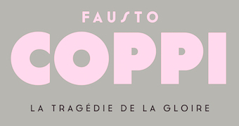 Design studio in Gijon, Spain, set up by Asturian designers Raul Garcia del Pomar and Ismael Gonzalez. One of them studied graphic design in Salamanca. Atipo produced the donationware typeface Cassannet in 2012. This beautiful sans typeface is modeled after art deco lettering by Cassandre. It was adjusted and expanded to six styles in 2016 as Cassannet Plus.
 In 2012, they published the free twitterware round sans family Bariol, which has its own dedicated web page. This was followed by the wonderful set of icons called Bariol Icons. In 2015, they published the tweetware / donationware rounded typeface family Bariol Serif. Typefaces from 2013: Salomé (a fat didone, +Stencil, +Italic, +Deco). Dedicated web page. The text typeface Calendas (2011, Paula Gutierrez). Additional weights were custom-made for the magazine Town & Country. They created a bespoke wayfinding font / icon set for London Luton Airport in 2014. Typefaces from 2015: Geomanist---I guess the name comed from geometric and humanist. In general, I can't imagine a worse marriage but this one actually works. Typefaces from 2016: Seville (a custom font for Fitbit Blaze, based on Bariol), Semcon (for the Swedish engineering firm Forsman & Bodenfors). Typefaces from 2017: Archia (a technical / architectural sans family), Noway (Noway was originally designed as a corporate and signage typeface for London Luton Airport. It has 159 icons and five weights, and is an ideal wayfinding font family), Noway Round. Typefaces from 2018: Solano & Catalan (a corporate typeface), Aceña (a corporate typeface), Silka (a geometric descendant of Futura), Musetta (a fashion mag thin sans), Basier (a Helvetica-style neutral sans family with horizontal and vertical terminals, with a choice of round or square tittles). Typefaces from 2019: Parking (an all caps art deco by Marc Valli), Basier Mono, Bould, Chaney (caps only, for display). Typefaces from 2020: Sawton (a 15-style monolinear condensed geometric sans family consisting of Circular, Industrial and Bauhaus subfamilies), Silka Mono, Wotfard (a malleable geometric sans: time for soulful functionality), Argesta (a fashion mag typeface). Typefaces from 2021: Novela ( a rational serif for use in texts), Izoard and Izoard Soft (a monolinear sans inspired by the text on the monument atop the mythical Col d'Izoard in France which is frequently featured in the Tour de France), Strawford (a 14-style monolinear neo-geometric sans), Scilla Display ( an elegant high-contrast serif typeface inspired by the shapes of the flowers with sharp edges and organic curves). Typefaces from 2022: N27 (an over-the-top hipster sans classified as avant-garde by Atipo), Stampa (an all caps sans serif typeface inspired by La Stampa's nameplate used by the weekly's sports supplement in Turin in 1902). Behance link. Bariol site. Interview in 2012 by Unostiposduros. [Google]
[More] ⦿
|
Australian Type Foundry (ATF)
[Wayne Thompson]

|
The Australian Type Foundry was launched in January 2002 by Wayne Thompson (b. 1967), who is art director at an ad agency in Newcastle, NSW, and is located in Merewether. He holds a Masters of Type Design from the University of Reading, UK. Commercial fonts at this ex-signpainter's site include Arum Sans (2009, an elegant humanst sans family), Halvorsen (2006), Fuse Box (2005), Architect (handprinting, now at T-26), Axiom, ATF Bosin (2003, casual hand script; see also Bosin Nova, 2021), Barkpipe, ATF Iperion (2003), McNeilBlok (2003), Not Sassure, Spud (handprinting), Wobbly Boot (2007, boozy script), Zoobie (2007, handprinting), Virus, Otis and Otis Condensed (since 2007 at T-26), Ogre, Fresh, ATF Euron (2003). ITC fonts by Wayne Thompson: ITC Panic (grunge), ITC Dont Panic (2000, grunge font), ITC Django (handprinting). [T-26] fonts by him include many of the above, plus also DallasPlain (1998, handwriting). Free font page: pick up a free font (was Spud Italic, currently is the grunge font Virus). Another free font by them is Mallee Wooden (Western typeface). Interview. At Phat Phonts, Wayne Thompson created Jungle Bones (2005) and Ratbag (2005). Stuart Brown designed the Neutraliser family, a versatile collection of geometric-based fonts with 24 styles. Artist Paul McNeil has designed the McNeil family of blocky display typefaces. He has previously produced designs for Mambo and currently works in Sydney. Another designer working for them, out of Indonesia, is Mendiola B. Wiryawan. Custom typefaces by ATF include Django Modified, Honda Prototype (2012), OBrien Glass (2012), Travel Bats (for Sensis) and JWT Vodafone (grunge). The retail fonts at the start of 2012: ArumSans, Halvorsen Pro, ITC Django, Grimsby Hand, Bosin, Carbon Credit, Carbon Tax, Chowdahead, Decon, Demented Avenger, ITC Don't Panic, Equaliser, Equaliser Stencil, Euron, Fresh, Fuse Box, Guttersnipe, Iperion, Barkpipe, ITC Panic, Not Sassure, Ogre, Otis Condensed, Pontoon, Ratbag, Spud, Stakeout, Tully, Virus, Wobbly Boot, Zoobie. In 2013, Thompson created the custom sans typeface Tonsley and participated in the Canberra Centennial Typeface Competition. In 2014, he designed the brush script typeface Quencher, and the custom sans typeface O'Brien Glass. In 2015, ATF created Maccas (+Inline) for McDonalds Australia, via their agency DDB Sydney, by modifying, with permission, Cindy Kinash's True North typeface family. For a South East Asian nation's law enforcement agency, he custom-designed Personaliyty (2015). He designed ABC Sans (2016-2018) for Australia's media conglomerate. Typefaces from 2020: Deka (a logical rounded sans family). Typefaces from 2021: Lurline (a reverse stress display typeface), Mandy Hand. Behance link. I Love Typography link. MyFonts site. Linotype link. View Wayne Thompson's typefaces. View the typefaces made by the Australian Type Foundry. [Google]
[MyFonts]
[More] ⦿
|
Axel Leyer
|
Designer in 2008 at FontStruct of NuGothicA (blackletter), BauForm, DINAMO (mechanical), Magnum (great industrial strength slab serif headline face), Cocoa (rounded and ultra fat), EUROstruct (thin and architectural), Kaotic (graffiti), Weimar (pixel face), Rondo, Rondo Tail, Fabrica (octagonal), Fabrica Rotula (stencil, octagonal), Quadrat, Electrica, Electrica Dots, Fabrica Screen (horizontally striped octagonal face), Block Black, Bloop, Blackwolf, Guru Blackletter (Indic simulation face), Inslab (slab serif), Inslab II, Minima (stencil), Boxer (ultrafat, octagonal), Bloko (nice ultra-fat face), Steel (macho slab serif), Nextar (pixelish but elegant), Simplex, Ulises 7 (+Serif) (pixel typefaces), Digita (kitchen tile) and Block (ultra fat), June Cleaver. See America (2008, octagonal) is an octagonal lettering font that was inspired by a travel poster (WPA, 1936) designed by Jerome Roth. Faces made in 2009: Morgana (a beautiful fat piano key face), Manitoba, Machina (+Slab), Old Monk (uncial), NughoticA Brush, LUBA 8 Lowercase (after Lubalin), Nugothic A (blackletter), Dinamo, Ross (strong mechanical face). Faces made in 2010: Sketch Pix and Sketch Pix 2. [Google]
[More] ⦿
|
Bailey Scott Murphy
|
Architect who drew a modern pen alphabet described in 1910 by Lewis Foreman Day as freehand without the use of geometrical instruments. Shown in Foreman Day's Alphabets Old And New For The Use Of Craftsmen (1910), it was made into a digital typeface in 2012 by Dick Pape under the name LFD Freehand 170. [Google]
[More] ⦿
|
Barbara Zeitler
|
During her studies in Den Haag, Barbara Zeitler created an architectural lettering typeface family (2014). [Google]
[More] ⦿
|
bBox Type
[Ralph Oliver du Carrois]
|
 Berlin-based type foundry run by Ralph du Carrois and Anja Meiners. Their friends are Jenny du Carrois, Natalie Rauch, Mark Froemberg, and they cooperate with Erik Spiekermann, FontShop, Monotype, (URW)++, Adam Twardoch, Alphabet Type, Okan Tustas, The Fontpad, TN Typography, Mota Italic, Akaki Razmadze, Hasan Abu Afash, Fontef, Lettersoup, and Thomas Maier. As of 2018, their typefaces include:
 - ABeZeh (2016). A school book font family by Anja Meiners.
- Belbo (2016). A sans by Ralph du Carrois.
- FingerPaint (2015). By Ralph du Carrois.
- Fira Sans (2012-2018). By Carrois and Spiekermann, who explain this famous open source typeface: Born in 2012 in close cooperation with Erik Spiekermann. Fira Sans, the little sister of Meta---Erik's famous and worldwide well known typeface. Fira Sans was originally designed as a typeface for the Mozilla OS, Fira Sans has developed towards a standalone OpenSource project. After Mozilla withdrew from the project, we integrated small bug fixes and several requests for the 4.3 release. Additionally, Fira now offers localised features for Hungarian, Serbian, Macedonian and Bulgarian. Especially the locl BGR, which was designed in cooperation with Bulgarian type designers Botio Nikoltchev and Vassil Kateliev, is a real treat. The free typeface family Trujillo (2019) is a fork (a small modification) of Fira Sans by bBox Type GmbH, Carrois Corporate GbR and Edenspiekermann AG.
- FiraGO (2012-2018). A (free) outgrowth of Fira Sans: In 2016, the geo data provider Here chose Fira Sans as their corporate typeface. Their need for a broader language coverage especially in map applications led them to commission us with a global script extension. Thanks to our great team of designers, consultants and technicians, the project was completed by 2017. Based on the Fira Sans 4.3 glyph set, FiraGO now supports Arabic, Devanagari, Georgian, Hebrew and Thai.
- Gintronic (2016). A programming font by Mark Froemberg.
- Gute (2018). A rounded sans by Ralph du Carrois and Anja Meiners.
- Krikikrak and Krikikrak Dingbats (2016). By Jenny du Carrois.
- Lonne (2017). By Natalie Rauch.
- Mamotschka (2017). By Anja Meiners based on her mother's handwriting.
- Midori (2018). A rounded sans by Ralph du Carrois.
- Neue Galerie (2017). By Ralph du Carrois who explains: In 2010, together with Anja Knust, we reworked Mies van der Rohe's sketches of the typeface Allzweck. During this interesting and historical project we had to carefully consider when to stick to the original and when to optimise it typographically. See also du Carrois's Allzweck (2012).
- Quist (2016). A contemporary gothic sans by Ralph du Carrois.
- Raikka (2016). By Natalie Rauch.
[Google]
[More] ⦿
|
Ben Greenock
|
 Glasgow-based graphic designer. He made the refined and architecturally-inspired font called Glasgow Art School (2010). [Google]
[More] ⦿
|
Ben Nguyen
|
Auckland, New Zealand-based designer of Toi o Tamaki (2017), a decorative caps typeface that is inspired by the Arts Precinct of the city of Auckland. [Google]
[More] ⦿
|
Bernardo Ramonfaur
[Iknu]

|
[MyFonts]
[More] ⦿
|
Berthold Wolpe

|
 German type designer (b. Offenbach, 1905, d. London 1989), who studied under Rudolf Koch from 1924-27 at the Kunstgewerbeschule in Offenbach. With the help of Stanley Morison, he emigrated to England in 1935 because of his Jewish background. Wolpe taught at the Camberwell College of Art (1948-53), at the Royal College of Art in London (1956-75) and at the City&Guilds of London School of Art (from 1975 onwards). From 1941 until 1978, he worked as a book designer for Faber&Faber in London, designing over 1500 book jackets. He published Schriftvorlagen (Kassel 1934), Marken und Schmuckstücke (Frankfurt am Main, 1937), A Book of Fanfare Ornaments (London, 1939), Renaissance Handwriting (with A. Fairbanks, London 1959), and Architectural Alphabet. J. D. Steingruber (London, 1972). Designer of
 - Albertus (Monotype, 1932-1940) is a famous lapidary roman with thickened terminals. The Bitstream version is called Flareserif 821. The Ghostscript/URW free version is called A028 (2000). The Softmaker and Infinitype versions are both called Adelon. The original Monotype version is Albertus MT. The letters are flared and chiseled, and the upper case U looks like a lower case u. The northeast part of the e is too anorexic to make this typeface suitable for most work. Some say that it is great for headlines. It is reminiscent of World War II. See also Albertus Nova (2017) by Toshi Omagari for Monotype.
- Cyclone (Fanfare Press). A travel poster typeface family.
- Fanfare. Revived by Toshi Omagari at Monotype in 2017 as Wolpe Fanfare.
- Hyperion (1931, Bauersche Giesserei). Berry, Johnson and Jaspert write: An angular pen-lettered design, with several unusual letters. The right hand serifs of upper- and lower-case V and W run inwards, the Y descends below the line and has a pronounced serif running to the right. Also done by Berthold in 1952.
- Pegasus (1938, Monotype). Monotype's digital revival, Wolpe Pegasus, was done in 2017 by Toshi Omagari for Monotype.
- Tempest (1936). Digital revival in 2017 by Toshi Omagari at Monotype as Wolpe Tempest.
- The blackletter typeface Sachsenwald-Gotisch (1936-1937, Monotype). In 2017, Monotype published the digital revival Sachsenwald by Toshi Omagari. Sachsenwald was originally called Bismarck Schrift, when it was first designed by Wolpe in the early 1930s.
- The blackletter typeface Deutschmeister (1934, Wagner&Schmidt, Ludwig Wagner). Revival by Gerhard Helzel in 2009. Warning: The German type community believes that this typeface was not designed by Wolpe, so further research is needed. See also the revival called Deutschmeister by Ralph M. Unger in 20017.
- Decorata (1950).
- Johnston's Sans Serif Italic (1973).
- LTB Italic (1973). Done for the London Transport, and unpublished.
In 2017, Toshi Omagari designed the Wolpe Collection for Monotype, all based on Berthold Wolpe's distinctive typefaces: Wolpe Pegasus, Wolpe Tempest, Wolpe Fanfare, Sachsenwald, Albertus Nova. Bio at Klingspor. FontShop link. Wiki page. Linotype page. View Berthold Wolpe's typefaces. Klingspor link. [Google]
[MyFonts]
[More] ⦿
|
Beta Field
[Michael Leighton Beaman]
|
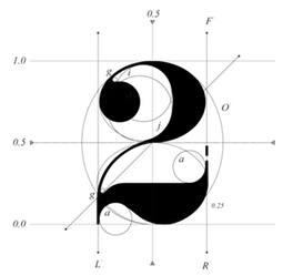 Here is what Beta Field is, in their own words: Beta-field is an interdisciplinary design/research office with a multimodal approach to practice. Our work includes buildings, landscapes, environments, installations, exhibitions, texts, design workshops and research projects. With backgrounds in architecture, industrial design, landscape architecture, and exhibition design, along with experience working as researchers, designers, and educators, we developed a view of design practice that operates through various modes of inquiry, development, and production. We focus not only on the built environment, but also on the effects of design on knowledge, technology and culture.
 The principals are Michael Leighton Beaman and Zaneta Hong. Michael holds a Bachelor's degree in Architecture from North Carolina State University and a Master's degree in Architecture from the Harvard University. He teaches at the University of Virginia and is associated with the Rhode Island School of Design. His research covers speculative future of technology in architecture. Zaneta is a professor in landscape archirecture at the University of Virginia, where she teaches courses in information-based digital practices and materials systems and technology. One of Beta Field's projects is the decorative didone typeface Pistilli Mutatio (2017). It is a parametric digitization of John Pistilli's 1964 phototype typeface Pistilli Roman. [Google]
[More] ⦿
|
Bilal Ahmed
[Graphic Out]
|
[More] ⦿
|
Billy Hayes
[Chicken Billy]
|
[More] ⦿
|
Blake Cotterill

|
 UK-based designer of Lowbridge Hand (2019), an all caps typeface designed to annotate sketches (for product designers, fashion designers, architects and garden designers). [Google]
[MyFonts]
[More] ⦿
|
Blambot!
[Nate Piekos]

|
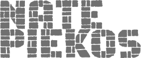 Blambot Comics Fonts was founded in 1999 by graphic designer and illustrator, Nate Piekos, and is located in East Providence, RI. Blambot has a huge number of original free comics fonts and balloons by Nate Piekos (East Providence, RI, b. RI, 1975). Comic Lettering is an alternate URL, where you can also order logo designs, custom fonts, and custom lettering. Fontspace link. The fonts:
 - 2021: Collect Em Now BB (a comic strip font), Spinner Rack Pro BB.
- 2020: Out of Line Pro BB, Ready for More BB, Nightmark BB, Tight Spot BB, Budrick BB, Flannel Shirt BB (a sans family).
- 2019: Tire Swing BB, Ready For Anything BB.
- 2018: Invulnerable BB.
- 2017: Collect Em All BB, Spinner Rack BB.
- 2016: Friend Or Foe Tall BB, Friend Or Foe BB, Astrogator BB, Out Of Line BB.
- 2015: Susurrus BB (sans family), Inkcantation BB (slightly creep jhand-drawn serif font), Blambastic BB, Brushzerker BB.
- 2014: Hundredwatt BB, Piekos Toons BB, Beelzebnrush BB, Astounded Round BB, Astounder Squared BB, Sleuth Serif BB, Crypto Creep BB, Wretched Remains BB (brushy Halloween font), Mech Effects 1 BB, We Come in Peace BB, Manga Master BB.
- 2013: Unearthed BB (Celtic), Always Angry BB, Sequentialist BB, Might Makes Right BB, Fight To The Finish BB, Palooka BB, ManlyMen BB, Trash Cinema BB, Bulletproof BB, Ticking Timebomb BB (LED font), Potty Mouth BB (dingbats), Vengeful Gods BB (Greek simulation face), Blowhole BB (fat finger font family), Shrunken Head BB, Perihelion (+Condensed: elliptical sans).
- 2012: Dungeon Dweller BB, Mark of the Beast BB (Halloween font), Monsterific BB, Tough as nails BB, Longbow BB (a rough-edged blackletter), Gamma Rays BB, Inkslinger BB (a true comic book style family), Saucer BB (sketch font), Smells Like Tacos BB, Mutant Academy BB, Destroy Earth BB, Mandroid BB, Fundead BB, Stupid Head BB, Spellbreaker BB, Elevations BB (2012, a blueprint typeface), Revenger BB (angular family).
- 2011: Silver Bullet BB (a fat hand-drawn blackletter face), Shallow Grave BB, Imaginary Friend BB, Highjinks BB, ShallowGrave BB, Quahog BB (angular, calligraphic), Mumble Grumble BB, Action Figure BB, Piekos FX Rough BB, ChainsawzBB, Heavy Mettle, Billy The Flying Robot BB, Longbox BB.
- 2010: Ninjutsu BB, Protest Paint BB, Rock Steady BB, Ladylike BB, Protest Paint BB (grunge), Tone Deaf BB, Clown Teeth BB, Irish Stout BB (beer label face), Sans Sanity BB, Straight To Hell, Unmasked, Piekos FX BB, Hometown Hero BB, Piekos Professional; BB, Big Bad Bold BB, Crash Landing, HoneyMead BB, Secret Origins (2010).
- 2009: Dragonbones BB, MeanStreets BB, Two Fisted BB, RedStateBlueState BB, Scream Queen, Fresh Meat BB, Gone Fission BB, Black Hole, Life Form, Crimewave BB, Firepower BB, Artists Alley BB, Stronghold BB, Village Idiot, Raging Red Lotus (2009, oriental simulation), Dwarven Axe BB, Silver Age BB, Flyboy BB (2009, techno), Giant Sized Spectacular BB (2009).
- 2008: Snake Oil Salesman (old typewriter face), Earthman and Earthman Extended (a nice 12-style retro sans family), Clairvoyant BB, KrakHead BB [one of my favorites], Blambot FXPro BB, Sangre BB, Dearly Departed BB, Boogers, Bada Boom BB, Old Crone BB (2008, bewitched style).
- 2007: Fire Fight BB, After Dark BB, Post Mortem BB, Fold and Staple BB (with Brandon J. Carr), Dunce Cap BB, DeathRattle BB, Potty Mouth BB, Dominatrix BB (grunge), Shore Leave BB (based on sailor tattoos), Cloudsplitter BB, Drawing Board (inspired by Tekton), Warhorse BB, Warmonger BB.
- 2006: Duty Calls BB, Hellfire BB, AveAveBB, Indie Star, Blamblam BB, Braaains BB (dingbats), Musashi BB, Atland Sketches, Double Life BB, SkinDeep BB, SkinDeep Swashes BB, Newsflash.
- 2005: KeelhauledBBBold, KeelhauledBB, MainframeBBBold, MainframeBB, Alter Ego BB, Entrails, Mastermind BB, Zooom BB, Whitechapel BB (handwriting), Sucker Punch, Crimefighter, 10c Soviet, CyranoBB, Praetorium, Spectre Verde, Hired Goons, Afterlife BB (2005, tall ascendered face), Seven Monkey Fury (oriental simulation face), Spectre Verde, FeedbackBB.
- 2004: Atland, Creative Block, Midnightsnack BB, Bloody Murder BB, Seven Swordsmen, Webletterer, Rackum Frackum, Oh Crud, CatholicSchoolGirlsBB, Antihero, Dark Arts, Bearded Lady BB, BottleRocket, Streetcred, Lowrider, Extra pickles (2004).
- 2003: Square Jaw BB, Shinobi, Bar Brawl, Holy Mackerel (2003, Craterface BB, Zombie Guts, Knuckle Sandwich, Workingman, Fat Stack BB, Santa's Big Secret, ArrMatey, Tokyo Robot, JackLanternBB, Perils of Piekos, Turntablz, Wicked Queen (2003, free), Golden Oldie, Badaboom, OhCrap, Whoop Ass, Damn Noisy Kids, Paperboy, Armor Piercing, Radioactive Granny, Sidekick International, Digital Strip, Mighty Zeo, Arcanum, Zud Juice, Ale&Wenches, Bar Brrawl, Bar Brawl BB, Armored Science BB, Blamdude, Shinobi, Man of Science, Sidekick BB (2003).
- 2002 and earlier: AndroidNation, Blambot-Custom, Blambot-Standard, Captain-Spandex, Casket-Breath, Concetta, Dupuy-Bold, Edible-Pet-II, Edible-Pet, Edible-PetInternational, Enchilada, Evil-Genius, Flat-Earth-Scribe, Gunhead-Chick, Lovecraft's-Diary, Mouth Breather, Mighty-Tomato, MonkeyChunks, Monkeyboy, Mummy-Loves-You, Mutant-Supermodel, Nate's-Choice, PiranhaSexual, Red-Right-Hand, Roboshemp, Space-Pontiff, Squeezy-Cheez, Urinetoast, Voodoo-Doll, YellaBelly, Zartz!, TwelveTonFishstick, TwelveTonSushi, A.C.M.E.-Explosive!-Bold, A.C.M.E.-Explosive!, GrungeUpdate, Mothership, Twelve-Ton-Goldfish, Whoop-Ass, WickedQueen BB, Winter-in-Gotham, 13 O Clock, ACMEInternational, ChroniclesofaHero, ChroniclesofaHeroBold, FanboyHardcore, KidKosmic, LetterOMatic, MangaTemple, GorillaMilkshake, Caeldera, Belizarius, Bottix, ChatteryTeeth, OrangeFizz, OrangeFizzItalic, Pythia, SpiritMedium. Direct access.
- Commercial fonts: Knuckle Sandwich, Utility Belt, Tentacle Jones, Rocketboy, Seargent Six-Pack, Secret Identity, Edible Pet 3, Piekostype, LintMcCree Mysteries, Doc Seismic, Mike Allred's AAA, AAARGH, Allred's Aliens Invade, Asteroids for Lunch, Action Away, Allred's Amazing Stupendous, ArmorPiercing, Mars Police, Irezumi, Holy Macxkerel, Hudson VC, CreepingEvil, BlambotPro (great), Creeping Evil, Rooftop Run, AAA Redmeat, Eurocomic, Comic Geek, Jack Armstrong (nice), Rivenshield (useful), Howard Bros (nice), Mighty Zeo, Cajun Boogie, Betty Noir, Sand Diego '02, Wrecking Ball, Miskatonic, Roswell Wreckage, WizardSpeak, Glass Jam, BucketOBlood, Three Arrows, Damn Noisy Kids, Humbucker, Oh Crap, Caveman, Blambot Casual, 10CentComics, BettyNoir, BigBlokeBB, BlamDudeBB, BlamDudeBBItalic, CajunBoogie, DetectivesInc, Irezumi, IrezumiItalic, SpiritMedium, VanHelsing.
Over 1000 free fonts here: 10CentSoviet, 10CentSovietBold, ACMEExplosive, ACMEExplosiveBold, ACMESecretAgent, ACMESecretAgentBold, ACMESecretAgentItalic, AleandWenchesBB, AleandWenchesBBBold, AndroidNation, AndroidNationBold, AndroidNationItalic, AnimeAce, AnimeAceBold, AnimeAceItalic, Arcanum, ArcanumBold, ArcanumItalic, ArmorPiercing, ArmorPiercing20BB, ArmorPiercing20BBItalic, ArmorPiercingItalic, ArrrMateyBB, BadaBoomBB, BattleLines, BettyNoir, BigBlokeBB, BlamDudeBB, BlamDudeBBItalic, BlambotCustom, Bottix, BottleRocketBB, BottleRocketBBBold, Caeldera, CajunBoogie, CatholicSchoolGirlsBB, ChroniclesofaHero, ChroniclesofaHeroBold, CreativeBlockBB, CreativeBlockBBBold, CrimeFighterBB, CrimeFighterBBBold, DamnNoisyKids, DarkArtsBB, DetectivesInc, DigitalStrip, DigitalStripBold, DigitalStripItalic, DwarfSpiritsBB, EvilGeniusBB-Bold, EvilGeniusBB, FanboyHardcore, FanboyHardcoreBold, FanboyHardcoreItalic, FatStackBB, FeastofFleshBB, FeastofFleshBBItalic, FeedbackBB, FeedbackBBItalic, FlyboyBB, GorillaMilkshake, GorillaMilkshakeItalic, Irezumi, IrezumiItalic, JackLanternBB, KeelhauledBB, KeelhauledBBBold, KidKosmic, KidKosmicBold, KidKosmicItalic, LetterOMatic, LetterOMaticBold, LetterOMaticItalic, MainframeBB, MainframeBBBold, MangaTemple, MangaTempleBold, MangaTempleItalic, MarsPolice, MarsPoliceItalic, MightyZeo20, MightyZeo20Bold, MightyZeo20Italic, MightyZeoCaps20, MightyZeoCaps20Bold, MightyZeoCaps20Italic, Miskatonic, MouthBreatherBB, MouthBreatherBBBold, NewsflashBB, OhCrap, OhCrudBB, OrangeFizz, OrangeFizzItalic, PraetoriumBB, PsiphoonBB, Pythia, RagingRedLotusBB-Italic, RagingRedLotusBB, RoswellWreckage, SanitariumBB, SantasBigSecretBB, SergeantSixPack, SevenMonkeyFuryBB, SevenSwordsmenBB, ShockTherapyBB-Italic, ShockTherapyBB, SpectreVerdeBB, SpectreVerdeBBBold, SpiritMedium, SwingSetBB, TurntablzBB, TurntablzBBBold, TwelveTonFishstick, TwelveTonSushi, Umberto, Vampiress, VillageIdiotBB, WarmongerBB, WebLettererBB, WebLettererBBBold, WhoopAss, WickedQueenBB, WizardSpeak, WizardSpeakWorn, Yoshitoshi, YoshitoshiBold, YoshitoshiItalic, ZudJuice, ZudJuiceBold, ZudJuiceItalic. Dafont link. Klingspor link. Fontspace link. View the Blambot typeface liubrary. [Google]
[MyFonts]
[More] ⦿
|
Bob Hensen
|
During his graphic design studies, Utrecht-based Bob Hensen designed the engineering drawing typeface Line ABC (2013). Behance link. [Google]
[More] ⦿
|
Borus Design
[Lazaro Gloria]
|
Aka Borus Design. Creator of Architect's Hand (2013, free caps face). [Google]
[More] ⦿
|
Bram Vermeyen
|
Located in Leuven, Belgium, Bram Vermeyen developed an architectural font based on the architectural forms of Stéphane Beel. He is also working on Phatboy (2006). [Google]
[More] ⦿
|
Bram Vermeyen
[A3]
|
[More] ⦿
|
Brian J. Bonislawsky
[Astigmatic One Eye]

|
 [MyFonts]
[More] ⦿
|
Brianda Lopez
|
Graphic designer of Rock Hill, SC. The typeface Arkitekt (2013) was designed as a tribute to an existing hand-rendered shop sign found in Chester, South Carolina. [Google]
[More] ⦿
|
Bruce Rotherham
|
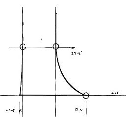 Kiwi architect (1926-2004) who made a font called Wedge. This font was posthumously published by P22 in 2014. The story below is an edited version of the story of Wedge, as told by P22.
 Noted New Zealand architect Bruce Rotherham was inspired by Herbert Bayer's universal alphabet created at the Bauhaus in 1927. While he admired Bayer's pure geometry, Rotherham felt it was virtually unreadable. The Bauhaus-inspired inclination for architectural publications to use sans serif typefaces provoked Rotherham to consider how a readable Roman book typeface might be approached using some of Bayer's same principles of simplification, but also retracing the evolution and use of the Roman form in an analytic manner. Bruce Rotherham spent his formative years working at his father's commercial printing business and was tuned in to typography from an early age. The Wedge alphabet was started in 1947 when Rotherham was an architecture student at the University of Auckland. In 1958, after years of development and consultation with his father, who was a master printer, Rotherham approached Monotype to consider producing his typeface for commercial release. After some back and forth with Monotype advertising manager A.D.B. Jones and typographical advisor John Dreyfus, and despite trial proofs being made, the design was politely declined for being too much of a specialist face. Rotherham continued to practice architecture in New Zealand and Great Britain for over thirty years. By chance, he heard the BBC radio show Science Now discussing the topic of computer typesetting. Not content to give up on Wedge, he contacted the item's producer, Adrian Pickering, at the University of Southampton School of Electronics and Computer Science. Pickering worked closely in collaboration with Rotherham in the production of the digital version of the face. The type was shown posthumously for Rotherham in the 2009 exhibit Printing Types: New Zealand Type Design since 1870, held at Objectspace, in Auckland. P22 link. [Google]
[More] ⦿
|
Bruno Tricot

|
Creative Alliance designer of Monotype HighScript (1998), an architectural lettering font with tall ascenders. [Google]
[MyFonts]
[More] ⦿
|
CADJET EZ FONTS
|
Architectural style AUTOCAD fonts at 50 dollars per face. No samples on the web page. From HLB Technology. [Google]
[More] ⦿
|
Cadu Braga
|
During his studies at Escola De Design UEMG in Belo Horizonte, Brazil, Cadu Braga designed the architectural typeface Alla Fontana (2016), which was inspired by the architecture of the La Fontana neighborhood of Milan. [Google]
[More] ⦿
|
Cagil Aygen
[Velvele Design Community]

|
 [MyFonts]
[More] ⦿
|
Caitlin Hottinger
|
During her studies at the University of Wisconsin-Madison, Saint Paul, MN-based Caitlin Hottinger designed the architectural font Cahedral (2016). Home page. [Google]
[More] ⦿
|
Candy Chin
|
Cheras, Malaysia-based designer of the techno typeface Angle Builder (2014). [Google]
[More] ⦿
|
Carine Teyrouz
|
During her design studies in Beirut, Carine Teyrouz created the architctural typeface Lashing Knots (2010, Friday Fonts. [Google]
[More] ⦿
|
Carly Allred
|
 Pasco WA-based designer of Papaya Caps (2017), a technical writing font in the Tekton genre. Creative Market link. [Google]
[More] ⦿
|
Carolina Mejia Villegas
|
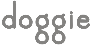 Medellin, Colombia-based designer (b. 1972) who graduated from UPB University in 1998. Creator of the free hand-printed typefaces Astrid (2012), Yelly (2006), Margorosa (2006), Luna (2006), Lush (2006), and CaroHand (2012).
 At iFontMaker, she created the hand-printed typefaces Enjoy (2012, stencilish), Oats Bold (2012) and Oats. She started selling her own fonts in 2013. Commercial, mostly hand-drawn, typefaces from 2014 include Grilled Font, Roman Classic, Kimble, Doggie Bold, Doggie, Yuju, First Step, Farmer, Nigel, Lola, Barrel and Enjoy. Typefaces from 2013: Freelast, Heats Dingbats, Fresh Regular, Chispa, Freshitalic, Cristian, Chains Condensed, Melisa, Chains, Paty, Slim, Miranda, Tiny Script, Snow, Second Chance, Simplecaps. Typefaces from 2015: Afinity (brushed typeface), Quakes, Dalina Script, Bonita, Caro Thin, Great Font, Fini Font, Grilled Ornaments, Finetrace (architectural style alphabet). Fontspace link. Dafont link. Creative Market link. [Google]
[More] ⦿
|
CAT Design Wolgast
[Peter Wiegel]
|
 Wolgast-based type designer Peter Wiegel (b. 1955) runs CAT Design Wolgast. Designer of these free fonts:
 - In 2019: Kufi Pattern.
- In 2018: Aurach Tri (a trilined typeface), Googee (monoline circle-themed sans), Gianna (medieval script), Hamburger Schwabacher.
- In 2017: Eyechart (heavy slab serif), Border Control (inline), Espresso Dolce (rounded sans), Gotisch Weiss, Halt (a dry brush typeface after Walter Hoehnisch's Stop from 1939), Kanzler, Llewie (rounded sans), Schulze Werbekraft (expressionist, after Arthur Schulze, 1926).
- In 2016: Ronaldson Gothic (after a MacKellar, Smiths & Jordan Co original), Vorgang (a great 1920s geometric sans), 5by7 (LED pixel font), BP 12-22 (industrial sans), u DIN 1451 Mittelschrift, Flubby, Gaeilge (Irish / uncial), Junior CAT (after Hans Heimbeck, 1936), CAT Liebing Gotisch (after Kurt Liebing), Tippa (an old typewriter font based on Adler Tippa 1).
- In 2015: Nuernberg (blackletter), CAT Schmalfette Thannhaeuser (blackletter), Offenbacher Reform (a revival of Offenbacher Reform, a blackletter typeface by Roos & Junge), Autobahn (blackletter), Barloesius Schrift (after Georg Barloesius's Barlösius Schrift, 1906), CAT-Franken-Deutsch (after Alfons Schneider, 1936), Fuckin Gwenhwyfar, CAT Kurier (a script after Herbert Thanhaeuser's Kurier from 1939), CAT Linz, CAT Rhythmus (a sharp-edged black grotesk after a Schriftguss AG original), DIN Schablonierschrift (DIN-based stencil), CAT North Licht, Feronia, Fette National Fraktur (after Walter Hoehnisch, 1934), Grobe-Plakat-Fraktur, CAT Childs (fifties style cursive typeface), Jena Gotisch (decorative caps), Kabinett Fraktur (after Johann Friedrich Unger, 1793-1794), Wattauchimma (heavy hipster sans), Friedolin (blackletter), Lorem Ipsum, Symphonie (a calligraphic script, reviving Imre Reiner's Symphonie (1938), also called Stradivarius (1945)), Power (a retro techno typeface), Krugmann Brush, Omega.
- In 2014: BernerBasisschrift1, BernerBasisschrift2 (school script), Berolina, Brausepulver (after Brause & Co., 1912), Fette Mikado (psychedelic style oriental look), Germanica, Gloria, HentimpsCirclet (blackletter), Hofstaetten (blackletter), Kleinsemmering, KuenstlerGotisch (blackletter), LacledeCAT (psychedelic), NeptunCAT, Neue Zier Schrift (a mischievous curly script), Pommern Gotisch, Reclame, CAT Report (retro brush script), Rueck-Italic, Rueck, RueckLeft, RueckLicht, RundschriftCAT (hairline ronde), Standard Graf (German expressionist and hexagonal typeface), Teutonic, VerzierteFavorite, VictoriaCAT, AdmiralCAT (a retro script), Dynamo (poster font), Des Malers Fraktur, Kanzleyrath (blackletter), Ober-Tuerkheim (art nouveau), PopplFrakturCAT (blackletter), Rundkursiv, Modeschrift (fifties script), Biedermeier Kursiv, Ehmcke Federfraktur (after a 1935 font by F.H. Ehmcke), Wernicke Schwabacher (after an original by Emmi Wernicke), Gotische Missalschrift, Hand Textur (after a 1935 font by F.H. Ehmcke), Renata (after a 1914 bastarda by Bauersche Giesserei), Rundgotisch Rauh (possibly after a Schelter & Giesecke design from 1903), Offenbacher Schwabacher (after Kurt Wanschura's bastarda from 1900), Incopins Clusters (multilined typeface), BadGong, Bernardo Moda (Bold, Semibold, Moda, Contrast: modeled after Lucian Bernhard's Bernhard fashion), CAT-Hohenzollern (after a 1902 art nouveau font by Bauersche), CATNorth, CATNorthLicht, CATNorthShadow, CAT Zentenaer Fraktur UNZ1 (a blackletter after a 1937 original by F.H.E. Schneidler), Coggers-Tariqa, EirikRaude, Fabrik (a geometric sans), Grobe Deutschmeister (German expressionist face), Harry Piel (or Piehl--a tattoo font), Kanalisirung, Klaber-Fraktur, Peter Obscure, Rumburak (a fat retro script), Flottflott (retro script), Indira K, Regent UNZ (a Schwabacher), Postamt, TGL 0-1451 Engschrift (a DIN-like font).
- In 2013: Spartakus (+Round), Cut Me Out (white on black sans), 5by9 (dot matrix face), Tartlers End (high-contrast ball terminal face), Alpha 54 (rounded flared script face), Chunk Five Ex (slab serif; he writes: With permission of Meredith Mandel, the original author of the ASCII-Font Chunk Five, I have extended Chunk Five Ex to a full featured unicode font with all figures used in Latin and Cyrillic writing), Simple Print (simple sans), Fette Bauersche Antiqua (a didone fat face), Manuskript Gothisch (after Manuskript Gotisch (1899, Bauersche), which was modeled after Wolfgang Hopyl's 1514 Textura), Quast (hairy font).
- Still in 2013, he published a number of school scripts, including Neue Rudelskopf, Deutsche Normalschrift, Imrans School, Rastenburg (German school font), and Bienchen.
- In 2012: Hardman (connected fifties script), Immermann (a quaint slab serif), Quast (grunge), Fundamental Brigade (sans family), DiffiKult (a bilined face), Men Nefer (a Memphis lookalike), Fette Unz Fraktur (like Fette Fraktur), Mutter Krause (for the reconstruction of the 1929 silent movie "Mutter Krausens Fahrt ins Glück", where it is used for intertitles, that where missing. The font is redrawn from the original intertitles), Youbilee (a font with laurels).
- In 2010: Alfabilder (dingbats), Gondrin (athletic lettering with a 3d effect), Helvetia Verbundene (making Helvetica into a school script? The original typeface was by Carl Albert Fahrenwaldt 1901), Proletarsk (a grotesk face), Vis-à-vis (great idea--a double-storied serif face), ApolloASM (Victorian), BertholdrMainzerFraktur, Doergon-Regular (license plate font), DoergonBackshift, DoergonShift, Eureka (Victorian, ornamental face), GoeschenFraktur (1880-style Fraktur used in Sammlung Göschen books), Makushka, MakushkaKontura, MakushkaQuadriga, MakushkaSecunda, Moderne3DSchwabacher, ModerneGekippteSchwabacher, StrassburgFraktur, TGL0-16 (same as DIN 16), TGL0-17 (same as DIN 17), TGL0-17Alt, Tank (emblems of gas companies), EricaType-Bold, EricaType-BoldItalic, EricaType-Italic, EricaType-Regular (typewriter), ErikaOrmig, Fibel Vienna (2012, a high-legged sans), GreifswalderTengwar-Regular, GreifswalerDeutscheSchrift (German Schreibschrift), Midroba-Regular (a strong mechanical octagonal face), MidrobaSchatten, MMX2010 (futuristic), Präsent60, Rotunda Pommerania (blackletter), TengwarOptime, TengwarOptimeDiagon, cbe-Bold, cbe-BoldItalic, cbe-Italic, cbe.
- In 2009: 18thCenturyInitials, 18thCenturyKurrent-Regular, 18thCenturyKurrentAlternates, German writing from the 18th century), CentreClaws, CentreClawsBeam1, CentreClawsSlant, Cöntgen Kanzley Regular (blackletter), Cöntgen Kanzley Aufrecht (2009), ElficCaslin, H1N1, Loxembourg1910Shadow (an art nouveau-influenced stencil face), Luxembourg1910, Tschichold, VarietScala (an art deco sans family), Varietee, VarieteeArtist, VarieteeCabaret, VarieteeCascadeur, VarieteeCasino, VarieteeCirque, VarieteeColege, VarieteeConferencier, VarieteeFolies, VarieteeIkarier, VarieteeJongleur, VarieteeMirage, VarieteeRevue, VarieteeTheatre, KochFetteDeutscheSchrift (blackletter), MoradoFelt-Regular (upright connected script), MoradoMarker (2009), MoradoNib, PreussischeVI9 (DIN-like family), PreussischeVI9Linie, PreussischeVI9Schatten-Linie, PreussischeVI9Schatten, SchatternvonPreussischeVI9, Stage (art deco), Ring Matrix (dot matrix), Nathan, Amptmann Script (2009, upright connected script), Cat Shop, Blankenburg (blackletter), Murrx (arched face), Schwaben Alt (1988, bastarda), Vrango, 14LED (Regular, Phattt-Heavy, Rised-Black), 24LED (+Bright, +Grid, +Modul), DIN1451fetteBreitschrift1936-Regular, FibelNord (basic sans family with an architectural twist), FibelSued (family), PaneuropaBankette, PaneuropaCrashbarrier-Black, PaneuropaFreeway, PaneuropaHighway, PaneuropaRoad, PaneuropaStreet, PaneuropaWrongWay, Quirkus (family), RingMatrix (dot matrix family), RingMatrix3D, RingMatrixTwo, DiscipuliBritannica (connected script), GruenewaldVA-Regular (connected school script), Rudelskopfdeutsch-Aufrecht, WiegelLatein (connected school script), WiegelLateinMedium (2009), Morado, Moebius Bicolor (art deco), Elbaris (sans), ElbarisOutline, Nomitais (multiline face), RostockKaligraph, Waschkueche, WaschkuecheGrob-Ultra, WiegelKurrent (traditional German school script), WiegelKurrentMedium, XAyax, XAyaxOutline (2009), Kaufhalle (squarish), Quimbie (art deco), CasaSans-Regular, Elb-Tunnel, MeyneTextur (blackletter), Yiggivoo, TGL 31034-1 (futuristic sans), Beroga (a simple organic sans).
- Before 2009: Xayax, PreussischeIV44Ausgabe3 (2006, a severe sans), Utusi Star (1989, very condensed all-caps face), Avocado (2006, script face), CbeNormal (2006, script face), Leipzig Fraktur (+Bold) (2006), Berlin Email (2006, a condensed sans family, followed in 2009 by Berlin Email Serif), MaassslicerItalic (2006, a futuristic typeface made for Rudolf Maass + Partner GmbH), Powerweld (a gorgeous avant-garde typeface made for OPTI Pumpen und Technik GmbH), WolgastScript (2005), WolgastTwo (2006, connected script), WolgastTwoBold, ZeichenDreihundert-Regular, ZeichenHundert-Regular, ZeichenVierhundert-Regular, ZeichenZweihundert-Regular (2006, traffic dingbats), Djerba simplified (Arabic font, Computer and Technologie, Hamburg, 1995; it can be downloaded here), Titus FrakturBaltic (1998), TITUS FrakturEast Normal (1998), and TITUS FrakturWest Normal (1998) [which used to be downloadable here; these fonts were retired and the Titus name dropped; most of the glyphs made it to Schwaben Alt].
Dafont link. One more URL. Fontspace link. Yet another URL. Font Squirrel link. Fontsy link. The list of his truetype and opentype typefaces as of 2011: 18thCenturyInitials, 18thCenturyKurrentStart, 18thCenturyKurrentText, Alfabilder, AlteDIN1451Mittelschrift, AlteDIN1451Mittelschriftgepraegt, AmptmannScript, ApolloASM, Avocado, Barnroof, BerlinEmail, BerlinEmail2, BerlinEmailBold, BerlinEmailBold, BerlinEmailHeavy, BerlinEmailHeavy, BerlinEmailOutline, BerlinEmailOutline, BerlinEmailSchaddow, BerlinEmailSchaddow, BerlinEmailSemibold-Bold, BerlinEmailSemibold-Bold, BerlinEmailSerif, BerlinEmailSerif, BerlinEmailSerifSemibold, BerlinEmailSerifSemibold, BerlinEmailSerifShadow, BerlinEmailWideSemibold, BerlinEmailWideSemibold, Beroga, Beroga, BerogaFettig-Bold, BerogaFettig-Bold, BertholdMainzerFrakturUNZ1A-Italic, BertholdMainzerFrakturUNZ1A, BertholdrMainzerFraktur, Blankenburg-Regular, BlankenburgUNZ1A-Italic, BlankenburgUNZ1A, CasaSans-Regular, CasaSans, CasaSansFettig-Bold, CatShop, CentreClaws, CentreClawsBeam1, CentreClawsSlant, ChunkFiveEx, CntgenKanzley-Regular, CntgenKanzleyAufrecht, DIN1451fetteBreitschrift1936-Regular, DiscipuliBritannica, DiscipuliBritannicaBold, Doergon-Regular, DoergonBackshift, DoergonShift, DoergonWave-Regular, Elb-Tunnel, Elb-TunnelSchatten, Elbaris, ElbarisOutline, ElficCaslin, EricaType-Bold, EricaType-BoldItalic, EricaType-Italic, EricaType-Regular, ErikaOrmig, Eureka, FibelNord-Bold, FibelNord-BoldItalic, FibelNord-Italic, FibelNord, FibelNordKontur, FibelSued-Bold, FibelSued-BoldItalic, FibelSued-Italic, FibelSued, FibelSuedKontur, GoeschenFraktur, GoeschenFrakturUNZ1A-Italic, GoeschenFrakturUNZ1A, Gondrin, GreifswalderTengwar-Regular, GreifswalerDeutscheSchrift, GruenewaldVA-Regular, GruenewaldVA1.Klasse, GruenewaldVA3.Klasse, H1N1, HelvetiaVerbundene, KochFetteDeutscheSchrift, KochFetteDeutscheSchriftUNZ1A-Italic, KochFetteDeutscheSchriftUNZ1A, LeipzigFrakturBold, LeipzigFrakturHeavy-ExtraBold, LeipzigFrakturLF-Bold, LeipzigFrakturLF-Normal, LeipzigFrakturNormal, LeipzigFrakturUNZ1A-Bold, LeipzigFrakturUNZ1A-BoldItalic, LeipzigFrakturUNZ1A-Italic, LeipzigFrakturUNZ1A, Luxembourg1910, Luxembourg1910Contur, Luxembourg1910Ombre, MMX2010-Regular, Maassslicer3D, Maassslicer3D, MaassslicerItalic, MaassslicerItalic, Makushka, MakushkaKontura, MakushkaQuadriga, MakushkaSecunda, MeyneTextur, MeyneTexturUNZ1A-Italic, MeyneTexturUNZ1A, Midroba-Regular, MidrobaSchatten, Moderne3DSchwabacher, ModerneFetteSchwabacher, ModerneFetteSchwabacherUNZ1A-Italic, ModerneFetteSchwabacherUNZ1A, ModerneGekippteSchwabacher, MoradoFelt-Regular, MoradoMarker, MoradoNib, MoradoSharp-Regular, Murrx, Nathan-CondensedRegular, Nathan-ExpandedRegular, Nathan-Semi-expandedRegular, Nathan, NathanAlternates-CondensedRegular, NathanAlternates-ExpandedRegular, NathanAlternates-Semi-expandedRegular, NathanAlternates, Nomitais, Nomitais, Numikki, Numukki-Italic, Numukki-Italic, Numukki, Powerweld, PreussischeIV44Ausgabe3, PreussischeIV44Ausgabe3, PreussischeVI9, PreussischeVI9Linie, PreussischeVI9Schatten-Linie, PreussischeVI9Schatten, Proletarsk, Prsent60, Quimbie, Quimbie3D, QuimbieShaddow, QuimbieUH, Quirkus-Bold, Quirkus-BoldItalic, Quirkus-Italic, Quirkus, QuirkusOut, QuirkusUpsideDown, RostockKaligraph, RotundaPommerania, RotundaPommeraniaUNZ1A-Italic, RotundaPommeraniaUNZ1A, Rudelskopfdeutsch-Aufrecht, SchatternvonPreussischeVI9, Schulfibel-Nord-Linie-2, SchwabenAlt-Bold, SchwabenAltUNZ1A-Italic, SchwabenAltUNZ1A, Stage, StrassburgFraktur-Regular, TGL0-16, TGL0-17, TGL0-17Alt, TGL31034-1, TGL31034-1, TGL31034-2, TGL31034-2, Tank, TengwarOptime, TengwarOptimeDiagon, TitilliumMaps29L-1wt, TitilliumMaps29L-400wt, TitilliumMaps29L-800wt, TitilliumMaps29L-999wt, TitilliumText22L-1wt, TitilliumText22L-250wt, TitilliumText22L-400wt, TitilliumText22L-600wt, TitilliumText22L-800wt, TitilliumText22L-999wt, TitilliumTitle20, UtusiStar-Bold, UtusiStar, VarietScala, Varietee, VarieteeArtist, VarieteeCabaret, VarieteeCascadeur, VarieteeCasino, VarieteeCirque, VarieteeColege, VarieteeConferencier, VarieteeFolies, VarieteeIkarier, VarieteeJongleur, VarieteeMirage, VarieteeRevue, VarieteeTheatre, Via-A-Vis, Vrng, Waschkueche, Waschkueche, WaschkuecheGrob-Ultra, WaschkuecheGrob-Ultra, WiegelKurrent, WiegelKurrent, WiegelKurrentMedium, WiegelKurrentMedium, WiegelLatein, WiegelLateinMedium, WolgastScript, WolgastScript, WolgastTwo, WolgastTwo, WolgastTwoBold, WolgastTwoBold, XAyax, XAyax, XAyaxOutline, XAyaxOutline, YiggivooUnicode-Italic, YiggivooUnicode-Italic, YiggivooUnicode, YiggivooUnicode, YiggivooUnicode3D-Italic, YiggivooUnicode3D-Italic, YiggivooUnicode3D, YiggivooUnicode3D, ZeichenDreihundert-Regular, ZeichenDreihundertAlt, ZeichenHundert-Regular, ZeichenHundertAlt, ZeichenVierhundert-Regular, ZeichenZweihundert-Regular, ZeichenZweihundertAlt, cbe-Bold, cbe-BoldItalic, cbe-Italic, cbe, kaufhalle, kaufhalle, kaufhalleblech, kaufhalleblech, moebius. His type 1 fonts as of 2011: Avocado, BerlinEmail, BerlinEmail2, BerlinEmailBold, BerlinEmailHeavy, BerlinEmailOutline, BerlinEmailSchaddow, BerlinEmailSemibold-Bold, BerlinEmailSerif, BerlinEmailSerifSemibold, BerlinEmailSerifShadow, BerlinEmailWideSemibold, Beroga, BerogaFettig-Bold, CasaSans, Elb-Tunnel, Elb-TunnelSchatten, Maassslicer3D, MaassslicerItalic, Numukki-Italic, Numukki, Powerweld, PreussischeIV44Ausgabe3, Quimbie, QuimbieUH, RostockKaligraph, TGL31034-1, TGL31034-2, UtusiStar-Bold, UtusiStar, Waschkueche, WaschkuecheGrob-Ultra, WolgastScript, WolgastTwo, WolgastTwoBold, YiggivooUnicode-Italic, YiggivooUnicode, YiggivooUnicode3D-Italic, YiggivooUnicode3D, cbe-Bold, cbe-BoldItalic, cbe-Italic, cbe, kaufhalle, kaufhalleblech. A list of typefaces in alphabetical order, with descriptive comments provided by Reynir Heidberg Stefansson from Iceland: 18th Century Kurrent (Kurrent-style handwriting, Wiegel-coded), Alfabilder (Alphabetic picture font for the German alphabet), Amptmann Script (Partly-connected, upright writing, used on Prussian Railways pattern drawings), ApolloASM (Jugendstil, vaguely resembling an ornate Bocklin), Avocado (Handwriting, broad-nib pen-style), Berlin Email (Narrow sans-serif, based on emailled signage; Wiegel-coded), Berlin Email Serif (Narrow serif, based on emailled signage; Wiegel-coded), Beroga (All-minuscule, rounded marker-style sans-serif with ca. 8° slope), Berthold Mainzer Fraktur (Fraktur in Wiegel (Regular only) and UNZ1(A) coding), Blankenburg (Semicondensed Tannenberg in Wiegel (Regular only) and UNZ1(A) coding), Casa Sans (Squarish, broad-nib pen-style block writing), CatShop (Serif, soft of an acid-washed didone), cbe Normal (Sans-serif, narrow, somewhat cuneiform), Centre Claws (Sans-serif, Art Deco display, a bit like Broadway), Cöntgen Kanzlei (Cöntgen Kanzley) (Fraktur-based calligraphy by Heinrich Hugo Cöntgen, Wiegel coding), DiffiKult (Sans-serif, display, no horizontal lines), DIN 1451 fette Breitschrift 1936 (The now-withdrawn Wide version of DIN 1451 traffic font), Discipuli Britannica (UK school handwriting), Doergon (Slab-serif, narrow-ish, all majuscule), CAT Eckmann, Elabris (Elbaris) (Sans-serif, caps/smallcaps, shades of DIN1451 Engschrift), Elb-Tunnel (Sans-serif, based on signage in the old Elbe tunnel in Hamburg), Elbic Caslon (Elfic Caslon, Elfic Caslin) (a Caslon for the Queen Galadriel), Erika Type (Erica Type) (Slab-serif, typewriter, comes from Wiegel's old Erika typewriter), Eureka (Serif, caps/smallcaps, Art Deco/Jugendstil), Fibel Nord (2009, sans-serif, based on German school primer), Fibel Sued (2009, sans-serif, based on German school primer), Fibel Vienna (Sans-serif, based on Austrian school primer), Fundamental Brigade (Sans-serif, geometric, some UNZ1 ligatures), Göschen Fraktur (Goeschen Fraktur) (Fraktur with a biblical feel, Wiegel (Rg only) and UNZ1 coding), Gondrini (Gondrin) (Sans-serif, geometric, display, shaded outlines, cookie-cutter), Greifswalder Deutsche Schrift (Handwriting, based on Rudolf Koch's Offenbacher Kurrent, Wiegel coding), Greifswalder Tengwar (Tengwar handwriting in Offenbach style), Gruenewald VA (Latin-style schoolhand, Wiegel coding), H1N1 (Heavy display typeface made of parallel wavetrains), Hardman (Heavy, wide, squarish logotype with connecting letters), Helvetia Verbundene (Swiss handwriting), Immermann (Display, resembles a seriffed Radio/Rundfunk, UNZ1 coding), Kaufhalle (Display, recreation of HO Kaufhalle logotype), Koch Fette Deutsche Schrift (Very plain fraktur, Wiegel (Rg only) and UNZ1 coding), Leipzig Fraktur (Fraktur for bread text, Wiegel coding), Leipzig Fraktur UNZ1A (Fraktur for bread text), Luxembourg 1910 (Sans-serif, Jugendstil display typeface from old spice drawers), Maass Slicer (Maassslicer) (Sans-serif, oblique display face, orig. logotype), Makushka (Sort-of an Elabris with minuscules, looks overlayable), Men Nefer (Slab-serif, geometric, UNZ1 coding), Midroba (Spur-serif, display, all-majuscule, heavy, octal), MMX2010 (Sans-serif, display, caps/smallcaps, TV game machine feel), Moderne Schwabacher (Heavily reworked, Wiegel coding), Moderne Fette Schwabacher UNZ1A (Heavily reworked, Wiegel coding), Möbius (moebius) (Sans-serif, display, bicolour (u/c = non-spacing fills, l/c = spacing outlines)), Morado (Connected handwriting with nib or marker pen), Murrx (Heavy display typeface made from ellipsoids on NE-SW axis), Mutter Krause (Serif, slanting, Jugendstil-feel), CAT Neuzeit and CAT Neuzeit Schatten (2012-2014), Nathan (Slab-serif, hand-drawn.), Nomatais (Nomitais) (Elabris with multiple levels of outlines), Numukki (Conlang, knotted-line, good for separators and scenebreaks), Powerweld (Sans-serif, Bauhaus style, all-minuscule), Präsent 60 (PI font with various East German logos), Preussische IV 44 (PreussischeIV44Ausgabe3) (Repro of Prussian Railways pattern type IV 44 version 3), Preussische VI 9 (Repro of Prussian Railways pattern type VI 9 version 2), Proletarsk (Sans-serif, monoline, doubled-up questionmark), Quast (Brush type, all-majuscule, very rough outline), Quimbie (Sans-serif, all-majuscule, resembles Amelia), Quirkus (Sans-serif), Ring Matrix (LED matrix with ring LEDs, solid LEDs and ring LEDs with shadow), Rostock Kaligraph (Very round calligraphy, resembles rotunda), Rotunda Pommerania (Rotunda style, Wiegel-code (Regular only) or UNZ1-coded), Rudelskopf deutsch (Sans-serif, based on Kurrent-style letterforms), Schwaben Alt (Schwabacher in Wiegel- (Rg only) or UNZ1-coding.), Stage (Sans-serif, narrow, Art Deco, fleeting taste of Broadway), Strassburg Fraktur (Handwritten fraktur, ornate majuscules, Wiegel-coding), Tank (PI font with (gas/petrol) tank station logos), TengwarOptime (Optima for Tengwar), TGL 0-16/0-17 (East German versions of DIN 16 and DIN 17 blueprint types), TGL 31034-1, TGL 31034-2 (East German versions of DIN 6776 / DIN EN ISO 3098 blueprint types), Utusi Star (Sans-serif, slight resemblance with Rundfunk), Varieté (Sans-serif, all-majuscule or caps/smallcaps), Vis-A-Vis (Serif, all-majuscule, split in middle), Volk Redis (Kurrent handwriting, anno 1930-1941), Vrångö (LED matrix type like Ring Matrix), Waschküche (Serif, resembles Antykwa Torunska), Wiegel Kurrent (Kurrent-style handwriting), Wiegel Latein (Latin-style handwriting), Wolgast Script (Sloppy-looking handwriting with a broad-nib pen), Wolgast Two (Latin/Cyrillic handwriting), XAyax (Serif, Jugendstil, narrow, all-majuscule), Yiggivoo Unicode (Sans-serif, wide, tall x, board game packaging feel), Youbilee (PI font with various jubilee laurels), Verkehrszeichen (Zeichen) (PI fonts with traffic signs (in layers)), Verkehrszeichen alt (Zeichen Alt) (PI fonts with old traffic signs (in layers)). Abstract Fonts link. Dafont link. Kernest link. Klingspor link. CAT Fonts link. Fontesk link. [Google]
[More] ⦿
|
Cercurius (was: Lars Törnqvist Typografi)
[Lars Törnqvist]

|
 Born in Karlstad, Sweden, in 1952, Lars Törnqvist now lives in Stockholm. Lars Törnqvist's designed many typefaces, first at Lars Törnqvist Typografi, and then at Cercurius:
 - Dialekt Svi: a series of three phonetic fonts for Swedish dialects.
- Dialekt Uni (2001): a huge Unicode phonetic font that includes the West European characters, the characters and diacritics of the Swedish dialect alphabet and most of the IPA characters.
- Fitzronald (2013). Based on Ronaldson Old Style (Alexander Kay, 1884).
- Hnias (2004): a unicode runic font.
- Remington Reseskrivmaskin (2000): a typewriter font.
- DecCode (2000) and HexCode (2000): numerical fonts.
- Pitmanita, a font containing the characters of Sir James Pitman's Initial Teaching Alphabet. This alphabet was used in many English schools in the 1960s.
- Morsealfabetet, a Morse-Code font.
- Korsstygn 1, a cross-stitch font.
- Tant Brita (2006), Tant Ingrid (2006), Tant Ulla (2006), Tant Gertrud (2006), Tant Lilian (2006): stitching typefaces.
- Knappast (2006), Knappolog (2013), Endast (2006), Emedan (2006): letters in circles or rounded rectangles.
- Karolinus Fraktur (2006): A slightly regularized digital version of a late Baroque Fraktur type, probably from the beginning of the 18th century, issued by the Norstedts type foundry in Stockholm in 56 point size as Sju petit fraktur nr 2.
- Simpliciter Sans (2006), a rounded sans family in three styles, based on the standard round-pen ink lettering used on technical drawings in the middle of the 20th century.
- Huruvida (2006). Varvid and Varvid Caps (2006, a bilined tubular caps stencil face).
- Vibertus (2007): a didone headline typeface based on Gras Vibert (1840, Vibert, for the Didot type foundry).
- Yxlofon (2015). a dot matrix display typeface.
And a jump list for Fraktur fonts. MyFonts link to his foundry, Lars Törnqvist Typografi. View Lars Törnqvist's typefaces. [Google]
[MyFonts]
[More] ⦿
|
Charles-Édouard Jeanneret

|
Aka Le Corbusier. Swiss architect, designer, urban planner, sculptor, writer, modern furniture designer, and painter. Born in La Chaux-de-Fonds, Switzerland, in 1887, he died in Roquebrune-Cap-Martin, France, in 1965. His lettering inspired the Letraset rubdown dry transfer typeface Charrette. He also inspired many digital fonts: - Jeanneret NF (2011): a stencil typeface by Nick Curtis.
- Le Corbusier: a stencil typeface by Philippe Desarzens at Lineto.
- Modular Stencil (1994): a stencil typeface by Gregory La Vardera.
- LeCorbusier (great stencil font, 1999), Le Corbusier Condensed (1999): a stencil typeface by Nico Schweizer at Lineto.
- In 2013, Henry Valerian created a typeface that is based on the blocky construction of Le Corbusier's Cité Radieuse in Marseille.
- Villa Savoye (1929-1931) inspired Nicolas Jover to create the compass-and-ruler typeface Savoye Sans in 2013.
[Google]
[MyFonts]
[More] ⦿
|
Chelsea Chick
|
Graduate of Eastern Michigan University. During her graphic design studies, she created Barton (2013), a font that is based on the architecture in Barton Hills, Ann Arbor, MI. [Google]
[More] ⦿
|
Chelsea Gassert
|
Pottsville, PA-based Chelsea Gassert's pentagon-shaped Katto font (2015) was heavily inspired by Swedish architecture. Behance link. [Google]
[More] ⦿
|
Chester Jenkins
[Village]

|
[MyFonts]
[More] ⦿
|
Chicken Billy
[Billy Hayes]
|
ChickenBilly.com offers art and illustrations by Billy Hayes from Fort Worth, TX, who describes his site as follows: Take Hanna Barbera, Hulk Hogan, James Brown, Fort Worth Zoo, B.B. King, Hank Williams III and Jesus Christ, mix until the image is bright like a angel. Add a pair of cowboy boots and jeans, some Mexican beer, your choice, and put it all on a page using only flat vector shapes.. Creator of the crazy outline caps typeface Pollo Pueblo (2012) and the Tekton-style architectural typeface Skwirl (2012). [Google]
[More] ⦿
|
Choirul Masruroh
[Nge Font]
|
[More] ⦿
|
Chris Papasadero
[Fwis]
|
[More] ⦿
|
Christian Jung
[Christian Pannicke]
|
 [More] ⦿
|
Christian Pannicke
[Christian Jung]
|
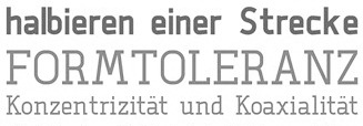 Christian Pannicke (Christian Jung) is a typeface designer and art director based in Berlin. His typefaces:
 - During his communication design studies in Berlin in 2013, Christian Pannicke created three typefaces, Aggi (a great carefully manicured display face), Alir (a modular squarish sans) and Neiga (a noteworthy free monoline Swiss slab serif described by Christian as glasklar und einfach).
- The didone display typeface Agigi (2014), possibly renamed from Aggi.
- The macho geometric sans serif typeface Amok (2014).
- The roundish sans typeface Rodina (2014).
- He designed Neue Cafe Grotesk for a final school project entitled Typography as a cultural embassy in the architecture of Berlin.
- Nora (2014) and Nora Bold (2016): wedge serif magazine titling typefaces.
- The letterpress emulation typeface family Heinrich (2017), which comes with several inline and textured styles.
- The 20-style layerable poster typeface family Faust (2018).
[Google]
[More] ⦿
|
Christian Schwartz

|
 Christian Schwartz was born in 1977 in East Washington, NH, and grew up in a small town in New Hampshire. He attended Carnegie Mellon University in Pittsburgh, Pennsylvania, where he graduated in 1999 with a degree in Communication Design. After graduation, he spent three months as the in-house type designer at MetaDesign Berlin, under the supervision of Erik Spiekermann. In January 2000, he joined Font Bureau. Near the end of 2000, he founded Orange Italic with Chicago-based designer Dino Sanchez, and left Font Bureau in August 2001 to concentrate full-time on developing this company. Orange Italic published the first issue of their online magazine at the end of 2001 and released their first set of typefaces in the beginning of 2002. Presently, he is an independent type designer in New York City, and has operated foundries like Christian Schwartz Design and Commercial Type (the latter since 2009). He has designed commercial fonts for Emigre, FontShop, House Industries and Font Bureau as well as proprietary designs for corporations and publications. In 2005, Orange Italic joined the type coop Village.
 His presentations. At ATypI 2004 in Prague, he spoke about "The accidental text face". At ATypI 2006 in Lisbon, he and Paul Barnes explained the development of a 200-style font family for the Guardian which includes Guardian Egyptian and Guardian Sans. FontShop's page on his work. Bio at Emigre. At ATypI 2007 in Brighton, he was awarded the Prix Charles Peignot. Jan Middendorp's interview in October 2007. Speaker at ATypI 2009 in Mexico City, where he announced his new type foundry, simply called Commercial. FontShop link. Font selection at MyFonts. A partial list of his creations: - FF Bau (2001-2004): Art direction by Erik Spiekermann. Released by FontShop International. He says: Bau is based on Grotesk, a typeface released by the Schelter&Giesecke type foundry in Leipzig, Germany at the end of the 19th century and used prominently by the designers at the Bauhaus. Each weight was drawn separately, to give the family the irregularity of the original, and the Super is new.
- Neutraface (2002, House Industries) and Neutraface Condensed (2004). Art directed by Ken Barber and Andy Cruz. MyFonts offers Neutraface Slab Text, Neutraface Slab Display, Neutraface Display and Neutraface Text. Schwartz states: Neutraface was an ambitious project to design the most typographically complete geometric sans serif family ever. We didn't have many actual samples of the lettering that the Neutras used on their buildings, so it ended up taking a lot of interpretation. There was no reference for the lowercase, so it's drawn from scratch, looking at Futura, Nobel, and Tempo for reference. Stephen Coles reports: Reminiscent of the recent FB Relay and HTF Gotham, Neutraface is an exaggerated Nobel with nods to Bauhaus and architectural lettering. Yes, and maybe Futura? Maggie Winters, Ioana Dumitrescu, Nico Köckritz, Nico Kockritz and Michelle Regna made great Neutraface posters.
- Neutraface No. 2 (2007), discussed by Stephen Coles: By simply raising Neutrafaces low waist, most of that quaintness is removed in No. 2, moving the whole family (which is completely mixable) toward more versatile, workhorse territory. This release is surely Houses response to seeing so many examples of Neutraface standardized by its users. Also new is an inline version. Who doesn't love inline type? It so vividly recalls WPA posters and other pre-war hand lettering. There are other heavy, inlined sans serifs like Phosphate, but one with a full family of weights and text cuts to back it up is very appealing. A typophile states: Designed by Christian Schwartz for House Industries, Neutraface captures the 1950s stylings of architect Richard Neutra in a beautiful typeface meant for application on the screen, in print, and in metalwork. If you are ever in need of a classy retro face, they don't get any more polished than this.
- At House Industries, Christian Schwartz, Mitja Miklavcic and Ben Kiel co-developed Yorklyn Stencil.
- Farnham (2004, Font Bureau) and Farnham Headline (2006, Schwartzco). Commissioned by Esterson Associates and de Luxe Associates. Winner of an award at TDC2 2004. Based on work by Johannes Fleischman, a German punchcutter who worked for the Enschedé Foundry in Haarlem in the mid-to-late 1700s. Schwartz: Truly part of the transistion from oldstyle (i.e. Garamond) to modern (i.e. Bodoni) Fleischman's romans are remarkable for their energy and "sparkle" on the page, as he took advantage of better tools and harder steel to push the limits of how thin strokes could get. In the 1800s, Fleischman's work fell into obscurity as tastes changed, but interest was renewed in the 1990s as digital revivals were designed by Matthew Carter, the Hoefler Type Foundry, and the Dutch Type Library, each focusing on a different aspect of the source material. I think the DTL version is the most faithful to the source, leaving the bumps and quirks inherent to metal type untouched. I've taken the opposite approach, using the source material as a starting point and trying to design a very contemporary text typeface that uses the basic structure and character of Fleischman without duplicating features that I found outdated, distracting, or unttatractive (i.e., the extra "spikes" on the capital E and F, or the form of the y).
- FF Unit (2003-2004, Fontshop, designed with Erik Spiekermann). A clean and blocky evolution of FF Meta intended as a corporate typeface for the Deutsche Bahn (but subsequently not used).
- Amplitude (2001-2003, Font Bureau), Amplitude Classified and Amplitude Headline. A newspaper-style ink-trapped sans family, unfortunately given the same name as a 2001 font by Aenigma. Winner of an award at TDC2 2004. The typeface selected by the St Louis Post Dispatch in 2005. One of many agates (type for small text) successfully developed by him. This page explains that they've dumped Dutch 811 and Bodoni and Helvetica and Franklin Gothic and News Gothic (whew!) for various weights of Amplitude, Poynter Old Style Display and Poynter Old Style Text. AmplitudeAubi was designed in 2002-2003 by Schwartz and Font Bureau for the German mag AutoBild.
- Simian (2001, House Industries): SimianDisplay-Chimpanzee, SimianDisplay-Gorilla, SimianDisplay-Orangutan, SimianText-Chimpanzee, SimianText-Gorilla, SimianText-Orangutan. Designed at Font Bureau. Art Direction by Ken Barber and Andy Cruz. Schwartz: "Although Simian's roots are in Ed Benguiat's logos for the Planet of the Apes movies, Simian wound up veering off in its own direction. The display styles look very techno, and we really went nuts with the ligatures, since this was one of House's first Opentype releases."
- Publico (2007): A predecessor of Guradian Egyptian. Schwartz writes: During the two year process of designing the typeface that would eventually become Guardian Egyptian, Paul Barnes and I ended up discarding many ideas along the way. Some of them were decent, just not right for the Guardian, including a serif family first called Stockholm, then renamed Hacienda after the legendary club in the Guardian's original home city of Manchester. Everyone involved liked the family well enough, but it didn't fit the paper as the design evolved, and several rounds of reworking left us more and more unsure of what it was supposed to look like. In the summer of 2006, Mark Porter and Esterson Associates were hired to redesign Publico, a major Portuguese daily newspaper, for an early 2007 launch. He asked us to take another look at Hacienda, to see if we might be able to untangle our many rounds of changes, figure out what it was supposed to look like in the first place, and finish it in a very short amount of time. Spending some time away from the typeface did our eyes a world of good. When we looked at it again, it was obvious that it really needed its "sparkle" played up, so we increased the sharpness of the serifs, to play against softer ball terminals, and kept the contrast high as the weight increased, ending up with an elegant and serious family with some humor at its extreme weights. As a Spanish name is not suitable for a typeface for a Portuguese newspaper, Hacienda was renamed once more, finally ending up as Publico. Production and design assistance by Kai Bernau. Commissioned by Mark Porter and Esterson Associates for Publico
- Austin (2003): Designed by Paul Barnes at Schwartzco. Commissioned by Sheila Jack at Harper's&Queen.
- Giorgio (2007): Commissioned by Chris Martinez at T, the New York Times Sunday style magazine. Small size versions produced with Kris Sowersby. Not available for relicensing. A high contrast condensed "modern" display typeface related to Imre Reiner's Corvinus. Ben Kiel raves: Giorgio, like the fashion models that it shares space with in T, the New York Times fashion magazine, is brutal in its demands. It is a shockingly beautiful typeface, one so arresting that I stopped turning the page when I first saw it a Sunday morning about a year ago. [...] Giorgio exudes pure sex and competes with the photographs beside it. The designers at T were clearly unafraid of what it demands from the typographer and, over the past year, kept on finding ways to push Giorgio to its limit. Extremely well drawn in its details, full of tension between contrast and grace, it is a typeface that demands to be given space, to be used with wit and courage, and for the typographer to be unafraid in making it the page.
- Empire State Building (2007): An art deco titling typeface designed with Paul Barnes for Laura Varacchi at Two Twelve Associates. Icons designed by Kevin Dresser at Dresser Johnson. Exclusive to the Empire State Building.
- Guardian (2004-2005): Commissioned by Mark Porter at The Guardian. Designed with Paul Barnes. Not available for relicensing until 2008. Based on an Egyptian, this 200-style family consists of Guardian Egyptian (the main text face), Guardian Sans, Guardian Text Egyptian, Guardian Text Sans and Guardian Agate.
- Houston (2003): Commissioned by Roger Black at Danilo Black, Inc., for the Houston Chronicle. Schwartz: As far as I know, this typeface is the first Venetian Oldstyle ever drawn for newspaper text, and only Roger Black could come up with such a brilliant and bizarre idea. The basic structures are based on British Monotype's Italian Old Style, which was based on William Morris's Golden Type. The italic (particularly the alternate italic used in feature sections) also borrows from Nebiolo Jenson Oldstyle, and there is a hint of ATF Jenson Oldstyle in places as well.
- Popular (2004): Commissioned by Robb Rice at Danilo Black, Inc., for Popular Mechanics. An Egyptian on testosterone.
- Stag (2005): Commissioned by David Curcurito and Darhil Crooks at Esquire. Yet another very masculine slab serif family. Schwartz writes I showed them a range of slab serifs produced by French and German foundries around 1900-1940, and synthesized elements from several of them (notably Beton, Peignot's Egyptienne Noir, Georg Trump's Schadow, and Scarab) into a new typeface with a very large x-height, extremely short ascenders and descenders, and tight spacing. Also, we find Stag Sans (2007, Village) and Stag Dot (2008, Village).
- Plinc Hanover (2009, House Industries). A digitization of a blackletter font by Photo Lettering Inc.
- Fritz (1997, Font Bureau). Schwartz: "Fritz is based on various pieces of handlettering done in the early 20th century by Ozwald Cooper, a type designer and lettering artist best known for the ubiquitous Cooper Black. Galapagos Type foundry's Maiandra and Robusto are based on the same pieces of lettering."
- Latino-Rumba, Latino-Samba (2000, House Industries). Art Direction by Andy Cruz. Designed with Ken Barber. Jazzy letters based on an earlier design of Schwartz, called Atlas (1993).
- Pennsylvania (2000, FontBureau). A monospaed family inspired by Pennsylvanian license plates. Schwartz: "Thai type designer Anuthin Wongsunkakon's Keystone State (1999, T26) is based on the exact same source."
- Plinc Swiss Interlock (by Christian Schwartz and Adam Cruz for House Industries). Based on originals by PhotoLetteringInc.
- Luxury (2002, Orange Italic, co-designed with Dino Sanchez). Gold, Platinum and Diamond are the names of the 1930s headline typefaces made (jokingly) for use with luxury items. The six-weight Luxury family at House Industries in 2006, contains three serif text weights called Luxury Text, as well as three display typefaces, called Platinum (art deco), Gold, and Diamond (all caps with triangular serifs).
- Los Feliz (2002, Emigre). Based on handlettered signs found in LA.
- Unfinished typefaces: Masthead, Reform, Bitmaps, Bilbao, Boyband, Addison, Elektro, Sandbox, Vendôme, Bailey.
- Fonts drawn in high school: Flywheel (1992, FontHaus), Atlas (1993, FontHaus, a "a fairly faithful revival of Potomac Latin, designed in the late 1950s for PhotoLettering, Inc"), Elroy (1993, FontHaus), ElroyExtrasOrnaments, Hairspray (1993, "a revival of Steinweiss Scrawl, designed in the mid-1950s by Alex Steinweiss, best known for his handlettered record covers": HairsprayBlonde, HairsprayBrunette, HairsprayPix, HairsprayRedhead), Twist (1994, Precision Type and Agfa), Zombie (1995, Precision Type and Agfa), Morticia (1995, Agfa/Monotype), Gladys (1996, an unreleased revival of ATF's turn-of-the-century Master Script).
- Ant&Bee&Art Fonts (1994-1995): three dingbat fonts, Baby Boom, C'est la vie, and Raining Cats&Dogs, based on drawings by Christian's aunt, Jill Weber. Released by FontHaus.
- Digitizations done between 1993-1995: Dolmen (Letraset), Latino Elongated (Letraset), Regatta Condensed (Letraset), Fashion Compressed (Letraset), Jack Regular (Jack Tom), Tempto Openface (Tintin Timen).
- Hand-tuned bitmap fonts: Syssy, Zimmer's Egyptian, Elizzzabeth, Newt Gothic, Trags X, Tibia, Fibula, Tino, Digest Cyrillic (based on Tal Leming's Digest). Free downloads of the pixel typefaces Newt Gothic, Tibula and Fibia here.
- At Village and Orange Italic, one can get Local Gothic (2005), now in OpenType, a crazy mix of Helvetica Bold, Futura Extra Bold, Franklin Gothic Condensed and Alternate Gothic No. 2. It is a collection of alternates one can cycle through---thus a for of randomization.
- FF Oxide (2005), a Bank Gothic style stencil family. FF Oxide Light is free!
- Graphik (2008), a sans between geometric and grotesk made for thew Wallpaper mag. Kris sSwersby writes: In a sweltering typographic climate that favours organic look-at-me typefaces bursting with a thousand OpenType tricks, Graphik is a refreshing splash of cool rationality. Its serious, pared-back forms reference classic sans serifs but remain thoroughly modern and never get frigid. Any designer worth their salt needs to turn away from the screen&pick up the latest copy of Wallpaper magazine. There you will find one of the most beautiful, restrained sans serifs designed in a very long time. See also Graphik Wide (2018).
- In 2011, he created a 22-style revival of Helvetica called Neue Haas Grotesk (Linotype), which offers alternates such as a straigt-legged R and a differently-seriffed a. It is based on the original drawings of Miedinger in 1957.
Schwartz also made numerous custom fonts: [Google]
[MyFonts]
[More] ⦿
|
Christopher Newton
|
Montreal-based graphic designer. His work includes a typeface, Plateaux (2009, a hairline architectural drawing face)---clean as a whistle, it seems to have been used in some movie titles. [Google]
[More] ⦿
|
Christopher Slye

|
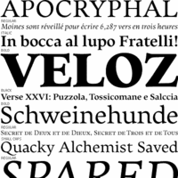 Born in Los Altos, CA, Christopher Slye studied art history at the University of California at Santa Cruz and worked as a graphic designer until joining the type group at Adobe in 1997, where he assisted with the design and production of Adobe's type library. He was involved in the creation of Adobe's OTF fonts, and had a hand in both Myriad Pro (1992, with Robert Slimbach, Carol Twombly and Fred Brady) and Tekton Pro. At Font Bureau, he designed Elmhurst (1997), a 7-style transitional family. He was Technical Product Manager, Type, at Adobe in San Jose, and managed all type-related business and licensing activity at Adobe, including its cloud font service, Adobe Fonts. In 2021, he became president of Type Network, succeeding Paley Dreier in that role.
 FontShop link. MyFonts link. FontBureau link. Adobe link. At ATypI 2011 in Reykjavik, he spoke on CFF on the web. The abstract is quite promising and the talk may quite opossibly be the highlight of the technical program at that meeting: Digital type outlines are described, for the most part, in either of two fundamental formats: PostScript or TrueType. Today, OpenType fonts convey PostScript outlines with CFF (the Compact Font Format), which is an optimized successor to the original Type 1 font format. Although the world of print output has been dominated by PostScript Type 1/CFF, the TrueType format has prevailed in the Windows and Mac OS operating systems. TrueType is well known for its accommodation for extensive hinting instructions, evident in many Windows core fonts which have become de facto standards on the web.In the explosion of web fonts during recent years, TrueType's reputation as a screen font format and its superior rendering in Windows browsers has made it a virtual requirement for those seeking consistency and quality in type rendering with web fonts. However, with recent improvements in text rendering from Microsoft's DirectWrite, CFF rendering quality will soon be comparable to TrueType in the next generation of Windows browsers. Despite its second class status on the web today, CFF still possesses advantages worth assessing as its rendering quality on screens approaches parity with TrueType. For example, CFF is inherently compact, and its PostScript (Bezier) paths are the default format for virtually all font designers. This presentation will explain the technical and practical advantages of the CFF font format and compare them to TrueType. It will examine what the future holds for CFF as a web font format, and make the case for CFF as a worthy, if not superior, solution for web typography. Klingspor link. Speaker at ATypI 2016 in Warsaw. [Google]
[MyFonts]
[More] ⦿
|
Chuck Rowe
[Moonlight Type and Technology]

|
[MyFonts]
[More] ⦿
|
Cinthia Balbuena
|
Sydney, Australia-based designer of Clara (2018: a school font) and the free architecturally-inspired typeface Articular (2018). [Google]
[More] ⦿
|
Civico13
[Andrea Zanchetta]
|
Italian free font outfit based in Torino headed by Politecnico di Torino graduate Andrea Zanchetta. Their creations include Fetta di Polenta Extra Narrow (2008) and Sweetest (2008), both based on lettering used by architects on drawings, and made by Andrea Zanchetta. Linkedin link. [Google]
[More] ⦿
|
Claude Fayette Bragdon
|
Claude Fayette Bragdon (b. Oberlin, OH, 1866-1946) was an American architect, writer, and stage designer based in Rochester, New York, up to World War I, and in New York City after that. He was known for his creative geometric ornaments. At some point, he proposed this modern American italic for architectural plans. Check also his set of modern small letters. This page shows his art nouveau art. [Google]
[More] ⦿
|
Claudia de Castro
|
During her studies at Florida State University, Claudia de Castro designed the decorative architectiral caps alphabet Helvedeco (1988). See U&LC Vol. 15, No. 3, 1988. [Google]
[More] ⦿
|
Clayton Cowan
|
Creator of the (free) architectural lettering family Flux Architect (2004). Font Squirrel link. Fontsy link. [Google]
[More] ⦿
|
Coffee Napkin
|
Roseville, CA-based graphic designer who created the custom draftsman's hand typeface Jasmine Victoria (2013). [Google]
[More] ⦿
|
Coktel
|
Unknown designer of the architectural typeface Adi1 (1997). [Google]
[More] ⦿
|
Computer Support Corporation
|
Defunct foundry which published a cheap font collection in 1996. Their known fonts are listed here. This is a renamed collection: Tekton became Tek, and so forth. The fonts are now sold by Arts&Letters (in Carrollton, TX) under the name BOSS Fonts. [Google]
[More] ⦿
|
Corradine Fonts
[Manuel Eduardo Corradine]

|
 Manuel Eduardo Corradine Mora was born in Bogotá in 1973. He graduated from the School of Graphic Design of the National University of Colombia in 1996, and became a graphic designer. He started by custom-designing fonts and by making typefaces for his own company, Casa Papelera El Cedro (The Cedar Papermaking House), for printing invitation cards. With other designers like Carlos Fabián Camargo, John Vargas and César Puertas he formed Tipográfico in 2007 to strengthen the type discipline in Colombia. Corradine Fonts is Manuel Corradine's own foundry in Bogotá, Colombia, founded in 2006. Today, he is one of Colombia's principal type designers. He also teaches at Universidad Piloto de Colombia in Bogota.
 Fonts from 2007: Kidwriting (a family which includes Kidwriting Dingbats 1 and 2), Garabata (a fantastic handwriting face), Garabata Dingbats, Hexagona Digital, Quadrat (grunge), Quadrat Old (grunge), Quadrat Dirty (grunge), Quadrat Broken, Quadrat Ugly, Neogot (experimental, 8 styles). Fonts from 2008: Mucura (handwriting), Prissa (handwriting), Salpicon (a script), Cuento Serif (a bouncy hand-printed family), Memoria (brush script), Charco, Happy Day (comic book family with Happy Day Dingbats), Espectro (a swinging script with swashes and a Dingbats style), Furia (handwriting), Candelaria (based on house signs in the La Candelaria neighborhood of Bogotá), Old Village (1600's style), Old Village Ornaments, Rapidda (a successful simulation of quick handwriting), Hueca (an outline children's script), Antigua (an old swashbuckler family), Colegial (a great-looking hand script), Pincel (a fantastic paint brush family with accompanying splatter dingbats), Trazo (Corradine's handwriting), Arcos (a techno family), Caveman (a primitive stone-look type family), Rumba (two styles; an elegant flowing brush script), Parche (graffiti family), Elegance Monoline (a greeting card script typeface that won an award at Tipos Latinos 2008), Abuelito (script). Fonts from 2009: Helga (flowing script), Mussica (+Swash, +Antiqued: a delicate Victorian typeface; followed in 2017 by Mussica Italic), Guarapo (hand-printed), Toxic (futuristic stencil), Emotion (comic book face), Bloque 3D, Rock and Cola, Betco's Hand, Telefante (comic book family), Nancy's Hand (more comic book hand-printing), Alambre (multiline/paperclip), Sensual (calligraphic hand), Zape (in the style of Tekton), Antrax Tech (grunge), Masato (handwriting), Hu Kou (oriental simulation). Fonts fgrom 2010: Miel (a curly script), Oferta (a signage script), Corradine Handwriting (and Corradine Handwriting Italic, 2015), Alberto (connected hand), Changua (hand-printed). Fonts from 2011: Plebeya (2011, connected hand), Mimi's Hand Connected, Legendaria (an extensive connected calligraphic family). Fonts from 2012: Tecna (a techno family co-designed with Sergio Ramirez), Neuron (a fantastic 16-style rounded elliptical sans family created together with Sergio Ramirez), Bucanera Soft (blackletter), Bucanera Antiqued (grungy blackletter), Official (a simple monoline sans family), Almibar (a connected calligraphic Spencerian script), Eterea (a roman all-caps family), Eterea LC (the lower case set), Canciller (an italic roman, done with Sergio Ramirez), Quarzo (2012, a formal copperplate script done with Sergio Ramirez). Typefaces from 2013: Neuron Angled (still with Sergio Ramirez), Alianza Slab (a great-looking slab family), Alianza Italic and Alianza Script (a packaging font), all made jointly by Manuel Eduardo Corradine and Sergio Ramirez. Typefaces from 2014: Whisky (a large blackletter family with inlines and fills for layering co-designed with Sergio Ramirez; related to German expressionism, it won an award at Tipos Latinos 2016), Whisky Italics, Beauty Script (with Juan Sebastian Rincon), Emblema and Emblema Headline (tall-legged art deco sans family by Duvan Cardenas), Wild Pen (a 1200-glyph set of typefaces that can be used to simulate handwriting thanks to smart replacements in Opentype), Sinffonia (a thin informal typeface with oodles of choices for swashes). Typefaces from 2015: Be Creative (a vintage display typeface), Typnic (a varied handcrafted layered and script typeface family; rhymes with picnic), Typnic Headline Slab. Typefaces from 2016: Naugles (thick display face based on the Naugles logo), Scrans (a modern signage script), Bloque (heavy slab family), Bloque Italic. Typefaces from 2017: Cristal (layered, triangulated and beveled font family, including exquisite Cristal Dingbats and Cristal Frames), Almibar Pro (connected calligraphic script). Typefaces from 2018: Tierra Script, Pueblito (rustic style). Typefaces from 2019: Austera Text (a comfortable workhorse serif). Typefaces from 2020: Kidwriting Pro. Klingspor link. Behance link. Creative Market link. MyFonts link. Fontspring link. Font Squirrel link. View Corradine's typefaces. [Google]
[MyFonts]
[More] ⦿
|
Cottage Graphics
[David Rood]
|
David Rood is the Harrisonburg, VA-based designer of BluePrint in 1992, a Tekton lookalike, and Rood Caps. Alternate URL. [Google]
[More] ⦿
|
Cover Poets
[Matthew Vest]

|
Cover Poets is a type foundry set up by UCLA music librarian and font enthusiast Matthew Vest (Los Angeles, CA) in 2020. Matthew focuses on new fonts inspired by 20th century architects and designers. His typefaces: - Highway Bungalow (2020). Inspired by Austrian-born American architect Rudolf Michael Schindler's hand lettering, this 8-style font adheres to two principles: first of all, all strokes are either vertical or horizontal; and secondly, all lower case letters, "x" excepted, have one of two heights (and oddly, "a", "e", "s" and "z" belong to the "tall" category).
[Google]
[MyFonts]
[More] ⦿
|
Cristhian Gomez
|
At Open Font Library in 2017, Cristhian Gomez (Cordoba, Argentina) published the free 4-style architectural and engineering sans typeface Tecnico, which follows the IRAM 4503 norms. Fontsquirrel link. Behance link. [Google]
[More] ⦿
|
Cubo
[Florent Courtaigne]

|
 Florent Courtaigne graduated in graphic design - ENSAD / Art Décoratifs de Paris. He founded created Cubo Fonts in 2008, and works as a graphic designer and drawing teacher in the LISAA Design School in Paris. Now a graphic designer, illustrator and art director based in Paris, Florent Courtaigne is the creator of the free circle arc and straight-line fonts Cyclo and Cyclo Bold (2006).
 In 2008, Florent started selling fonts at Myfonts: Cyclo (which used to be free), Cortex (2010, monoline sans), Maline (2008, an upright script), Phylactere (2008, a technical, almost architectural, script), Mercurio, Delicate (2009, connected script typeface renamed Delikaat some time later). In 2009, Florent added Chaman (Tibetan influences) and Pixo (named after the graffiti style in Sao Paulo, pixação). The 3d interlocking character font family Volume was designed in 2011. In 2012, Florent Courtaigne and Grégoire Pierre co-designed the Leonardian typeface family. Courtaigne created Liliming (2012), a slab serif family that was orginally designed for Liliming, a famous Shanghainese feminine fashion brand. Typefaces from 2013: Crealab (an organic techno font family originally designed for CREALAB, a company in Shanghai). In 2014, Courtaigne made the circuit font poster Hack Yizu. Typefaces from 2022: Fluid (a fluid, liquid typeface). Klingspor link. Dafont link. Behance link. Old URL for Cubo. View all typefaces by Cubo Type / Florent Courtaigne. [Google]
[MyFonts]
[More] ⦿
|
Culmus Project
[Maxim Iorsh]
|
In 2002, Maxim Iorsh started the Culmus project, aiming at providing the Hebrew-speaking Linux and Unix community with a basic collection of Hebrew fonts for X Windows. The fonts are visually compatible with URW++ Century Schoolbook L, URW++ Nimbus Sans L and URW++ Nimbus Mono L families, respectively. The (free) fonts include David (3 weights; based on Charter), Aharoni (4 weights; based on URW++ Gothic L), Frank Ruehl (4 weights; based on URW++ Century Schoolbook L), CaladingsCLM, DrugulinCLM (2 weights; based on URW++ Nimbus Roman No9 L), ElliniaCLM (4 weights), MiriamCLM (2 weights), YehudaCLM (2 weights; based on Tekton), Nachlieli (4 weights; based on URW++ Nimbus Sans L), and Miriam Mono (4 weights; based on URW++ Nimbus Mono L). The fonts were developed by Maxim Iorsh at the Technion from 2002-2004. Nachlieli-Light is also here. Yoram Gnat designed Taamey Ashkenaz, Shofar, Taamey David CLM, Taamey Frank CLM, Keter Aram Tsova, Keter YG, ca. 2012. Alternate URL. He contributed glyphs to the Hebrew (U+0590-U+05FF) range in the GNU Freefont project. [Google]
[More] ⦿
|
Cynthia Zheng
|
During her studies in Sydney, Australia, Cynthia Zheng designed an architecturally inspitred typeface (2018). [Google]
[More] ⦿
|
Cyrill Golikov
[Echad Type]

|
[MyFonts]
[More] ⦿
|
Dale R. Kramer

|
Designer of the architectural Tekton-like caps typeface Harvey (Letraset, 1989). Linotype link. FontShop link. Klingspor link. [Google]
[MyFonts]
[More] ⦿
|
Dan M. Zadorozny
[Iconian Fonts]
|
 [More] ⦿
|
Dan X. Solo
[Solotype]

|
 [MyFonts]
[More] ⦿
|
Daniel Johnson
|
 Canadian type designer. His typefaces:
 - Aguardiente (2010, heavy sans).
- Deka (2010, a monospace font designed for very small display sizes).
- Didact Gothic (2010, a simple and readable sans i in the form most often used in elementary classrooms).
- He contributed to the GNU Freefont project. In particular, he created by hand a Cherokee range specially for FreeFont to be "in line with the classic Cherokee typefaces used in 19th century printing", but also to fit well with ranges previously in FreeFont. Then he made Unified Canadian Syllabics in Sans, and a Cherokee and Kayah Li in Mono. And never to be outdone by himself, then he did UCAS Extended and Osmanya. His GNU Freefont ranges:
- Armenian (serif) (U+0530-U+058F)
- Cherokee (U+13A0-U+13FF)
- Unified Canadian Aboriginal Syllabics (U+1400-U+167F)
- UCAS Extended (U+18B0-U+18F5)
- Kayah Li (U+A900-U+A92F)
- Tifinagh (U+2D30-U+2D7F)
- Vai (U+A500-U+A62B)
- Latin Extended-D (Mayanist letters) (U+A720-U+A7FF)
- Osmanya (U+10480-U+104a7)
- Grana Padano (2010).
- Judson (2010, designed for African literacy).
- Jura (2009). A sans family with support for Burmese, Cyrillic and Greek; redesigned and improved by Alexei Vanyashin in 2016; a variable font was added in 2019 by Mirko Velimirovic). Johnson explains: Jura is a family of sans-serif fonts in the Eurostile vein. It was originally inspired by some work I was doing for the FreeFont project in designing a Kayah Li range for FreeMono. (Kayah Li is a language used by a minority people group in Burma. Because the Burmese government suppresses the teaching of minority scripts, the Kayah Li script is taught only in schools in refugee camps in Thailand.) I wanted to create a Roman alphabet using the same kinds of strokes and curves as the Kayah Li glyphs, and thus Jura was born. Github link for Jura.
- Megrim (2010, a monoline drawing table sans).
- Pacaya (2013, a medium-weight sans).
- Pfennig (2010, an extensive humanist sans family).
- Rahel (2009, Hebrew).
- Sacco-Vanzetti (2009, sans).
- Stanislav Caps (2013).
- Travelogue (2008).
- Triad Postnaya (2010). An old Church Slavonic typeface and its Latin simulation twin. Free at the Open Font Library. Triod Postnaya attempts to mimic the typefaces used to publish Old Church Slavonic service books prior to the 20th century. It also provides a range of Latin letters in the same style.
Klingspor link. Fontspace link. Dafont link. Kernest link. Fontsquirrel link. Google Plus link. [Google]
[More] ⦿
|
Daniel Kluwe
|
Berlin-based graphic designer. Creator of the monoline architectural typeface Positive Sans (2012). [Google]
[More] ⦿
|
Daniel Laruelle
|
Marseille, France-based designer of the display sans typeface Laruelle Sans (2017) and the architectural typeface Amsterdam (2017). [Google]
[More] ⦿
|
Daniel Will-Harris
[Will-Harris House]

|
[MyFonts]
[More] ⦿
|
Darcy Baldwin
[DJBFontography]
|
[More] ⦿
|
Darren Embry
|
Louisville, KY-based designer of the free technical drawing font Routed Gothic (2017). Darren writes: I created this font by purchasing a Leroy Lettering set, using Inkscape to trace the scanned letterforms of one of its templates, and some FontForge Python scripting. Github link. [Google]
[More] ⦿
|
Darren Embry
[Darren Embry's list of technical drawing fonts]
|
[More] ⦿
|
Darren Embry's list of technical drawing fonts
[Darren Embry]
|
Darren Embry's list of technical drawing fonts in 2020: [Google]
[More] ⦿
|
Dave Lanphear
[Active Images (or: Comic Book Fonts, or: Comicraft)]
|
[More] ⦿
|
David Buck
[Sparky Type (or: Sparky Malarkey)]

|
[MyFonts]
[More] ⦿
|
David Fleming Nalle
[Scriptorium (Ragnarok Press, Fontcraft)]

|
 [MyFonts]
[More] ⦿
|
David Kloeg
[Kloeg Architecture]

|
[MyFonts]
[More] ⦿
|
David Pache
|
 Multimedia designer, creative consultant, a brand and identity designer in Saint Cergue, Switzerland, b. 1983. He runs (ran?) a brand design company called Dache. Creator of the grunge typeface Agnoti (2005) and the ballpoint/serif typeface Hurt Majesty (2006). Abstractfonts link. He created some free fonts using iFontMaker in 2010: Sion is a striped typeface, and Hinwil is an informal script face. Another link. Dafont link.
 Fonts planned for 2011: the pixel / modular typefaces Interlaken and Avenches, the hand-printed typefaces Furna and Dalpe, the minimalist monoline sans typeface Surpierre, the geometric sans Duvin, and the display typefaces Glaris, Wildberg, Faoug, Carona, Marbach, Montagny, Coeuve, Kaisten (organic), Mathod (a construction face), Kloten, Calpiogna, Hirchberg, Plagne, Reute. iFontmaker link. [Google]
[More] ⦿
|
David Rood
[Cottage Graphics]
|
[More] ⦿
|
David Siegel

|
 Educated at Stanford (M.Sc. in digital typography in 1985 under the supervision of Donald Knuth and Charles Bigelow) and before that at the University of Colorado at Boulder (undergraduate math degree in algorithms under Hal Gabow). Type designer. Creator of these architecturally-inspired type families:
 - Eaglefeather (1999), P22). An arts and crafts font made for the Frank Lloyd Wright Foundation, which owns various manuscripts of the beautiful lettering of this American artist and designer, 1867-1959. This font family is based on the alphabet designed by Frank Lloyd Wright for the Eaglerock project in 1922. Extended in 2012 and 2018 to P22 Eaglefeather Pro. Codesigned with Carol Toriumi-Lawrence.
- Tekton (1988, Adobe). Tekton was released by Adobe in 1989. Ideal for architectural writing, an OpenType family, called Tekton Pro, was released in 2000. Adobe lists Jim Wasco as a co-designer. The glyphs are based on the hand-lettering of Seattle-based architect and author Francis D.K. Ching.
- Graphite (1991, FontBureau). Graphite (FontBureau, 1991) is a drafting letter based on the hand of San Francisco draftsman Anthony Celis LaRosa.
- He worked with Hermann Zapf, trying to get Knuth's METAFONT program to produce beautiful typefaces. He worked again with Zapf on Zapfino.
His page has discussions on typography in general, and handwriting and architectural fonts in particular. He heads Studio Verso, a site-design consultancy in San Francisco. Author of The Euler project at Stanford Stanford, CA (1985, Stanford University, Department of Computer Science). CV at FontBureau. Interview. FontShop link. Klingspor link. MyFonts link. [Google]
[MyFonts]
[More] ⦿
|
David Urbisaglia
|
Created about 50 fonts in the "Dave Collection". Could not find a web page. The fonts: Accamazzy, Accircomazzy, ArchiSym, ArchitectLefty, AtalHyk, AutoTrapper, BGuacchio, BiSlung, BoltsNuts, Bombo13, Bombo13Outline, BuzzBah, Cents, ComarOutline, Comina, Comino, CumTyp, Cuspeed, CuspeedBold, CuspeedContrary, CuspeedCrazy, CuspeedExtraBold, CuspeedItalic, CuspeedLefty, CuspeedOutline, CuspeedThin, D-Line-Bar, DLinealThin, DadaVid, DaveTechBold, DaveTechLight, DaveTechThin, DavidBalls, DavidBit, DavidFats, DavidFatsCheap, DavidStars, Davidglowing, Di-Time, DiFat, DiMetropolis, Dinsignificant, Egiz, Eurohelasta, GiNo, GiNoOutline, Guacchio, HanDavidBit, HeiElan, ISOpunkt, IlleggiBilly, KappaDoc, Kappadocia, KatiusciaBold, KatiusciaOutline, LetterFloating, Lira, Mayonext, Mayonoise, OnlyNumbers, OverClouds, Paestum, Paleolitik, Papozzi, Pengouin, PengouinOutline, PennaBilly, Phoenix1000BC, Pochi, QuKulii, QuadrasHombre, Quadrashome, Quibis, RoaRound, SQwilli, Sdoubler, SlabDavidFace, Slung, SquareedBlack, SquareedCheap, SquareedCompress, SquareedOutLeft, SquareedOutline, Squizzy, StiroUp, Textures, Trapper, Trustbank, UrbiOutLine, UrbiTopsyTurvy, Urbilissom, Urbistilus, UrbitSpace, Uuijrcle, UuijrcleOutline, Uxtreme, UxtremeCap, UxtremeTap, UzbechDU, VerticalAble, VerticalDisable, WWisDave, XD37, Ximu-Viru, YukkudiBic, ZDa-Zip. [Google]
[More] ⦿
|
Dayeong Yu
|
 Seoul, Korea-based designer of these display typefaces: Constellation (2015: connect-the-dots style), Zedo (2015: architectural), Maze (2015: pixelish), Angle (2015), Radioactivity (2015: dingbat font), Hangeul (Korean). [Google]
[More] ⦿
|
DBXL
[Donald Beekman]

|
 Donald Beekman (DBXL, est. 1999) is a graphic and audiovisual designer (b. Amsterdam, 1961), who studied at the Rietveld Art Academy from 1979 to 1984 and then started his own graphic and music studio in Amsterdam. He designed many typefaces, most of them emanating from logos or artwork designed for his clients, often from the music and entertainment industry. Since 2004 he has been co-hosting Typeradio, the radio- and podcast-station on design and typography. He set up Vette Letters. Dafont link. Alternate URL. His fonts:
 - At FontFont: Automatic, FF Atomium (2007), FF Beekman (1999), Backbone, Imperial, Droids, FF Massive (2010: a logo family consisting of ultra-fat octagonal designs), Overdose, Stargate (1999), Totem, Tsunami, FF Flava (2003: Beekman calls this a hip-hop font), FF Manga Steel, FF Manga Stone, FF Webfonts, FF Backbone 2 (2003, a futuristic face) and FF Noni (2000).
- At the DBXL web site: DBXL Softsoul, DBXL Monodon, Brak Bold, DBXL Hardsoul, DBXL Atonium, DBXL Nightfever (free).
- At Die Gestalten: Breeze, Beatbox (2007, tilted stencil).
- At Vette Letters: VLNL Cleaver (2017), VLNL Bon Bon (2013), VLNL Brokken (2009, fat octagonal face), VLNL Brak, VLNL Decks, VLNL Donuts (2015: originally designed in 2005 by DBXL as a logo for a Dutch funky house music outfit), VLNL Breakz.
- Berlage (2013). A Dutch art deco typeface family based on lettering found in the Amsterdam Beurs (stock exchange) building, designed by architect H.P. Berlage, and other lettering found all over Amsterdam. It was published by FontShop in 2016 as FF Berlage Burcht and FF Berlage Beurs. The granite carving on the Berlagebrug in Amsterdam from 1932 inspired Beekman to design VLNL Berlagebrug (2019).
- VLNL Kouseband (2019). A striking 5-style monolinear decorative sans with tall ascenders and an architectural lettering feel, perhaps Beekman's best typeface to date.
Speaker at ATypI 2013 in Amsterdam. Dafont link. Klingspor link. FontShop link. [Google]
[MyFonts]
[More] ⦿
|
De Biasse & Seminara Architects
|
Martinsville, NJ-based architectural studio. Their architectural alphabet from 2011 is based on floor plance by J.D. Steingruber. [Google]
[More] ⦿
|
Debi Bauer
|
Designer of a handcrafted architectural typeface (2015). [Google]
[More] ⦿
|
Dennis Pasternak

|
American designer (b. Holyoke, Massachusetts, 1952) at Galapagos Design Group located in Littleton, MA, which he founded in 1994. Before that, he worked at Compugraphic and Bitstream. His typefaces: - Baltra GD: a proud serif font.
- Bartholome Open: this typeface won an award at Bukvaraz 2001. See also here.
- Bing (2002).
- Bisco Condensed (2002): an informal face.
- Bitstream Chianti (1993): a flared humainst sans designed for use on web pages.
- LittletonMM: a 3-axis multiple master designed for an unnamed museum in Massachusets, a sort of multiple master version of New GothicBT. They say that this is the only 3-axis multiple master ever made as an OEM or commercially.
- Maiandra GD.
- ITC Stylus (1995): in the orbit of Tekton.
View Dennis Pasternak's typefaces. [Google]
[MyFonts]
[More] ⦿
|
Didik Pratikno
|
 Yogyakarta, Indonesia-based creator (b. 1987) of the counterless architectural lettering typeface Ruler Elementary (2011), of Cool Stuff (2011, dingbats), of Djoewana (2011, dingbats), and of the flip clock typeface Solari (2011).
 In 2012, he made Munir (scanbat font with images of Munir Said Thalib, 1965-2004, one of Indonesia's most famous human rights and anti-corruption activists who was poisoned by an Indonesian government airline agent with arsenic on a flight to Amsterdam), Papan Kita (dingbats of Asian buildings), Sepeda (bicycle dingbats), Volkswagen (dingbats), Perangko Wayang, (shadow puppets) and Senyum (facial dingbats). Typefaces from 2013: Paralis (multiline, prismatic). Typefaces from 2014: Cermin Pahlawan (scanbats related to Hari Pahlawan), Toer (scanbats of Pramudya Ananta Toer, an Indonesian author and human rights activist who went to jail for his opinions). Typefaces from 2015: Sekar Arum (textured caps). Typefaces from 2016: Torajamatra (patterns), Ikatan (Indonesian symbols; inside the font, the designer is identifed as Rumah Joana). Typefaces from 2017: Tegel (dingbats with tile patterns). Dafont link. Fontspace link. [Google]
[More] ⦿
|
Dilara Sebnem Esendemir
|
 Istanbul-based designer of Ch. Vladica (2014), which was inspired by the name plate of architect Ch. Vladica from İstanbl---it was created during Dilara's studies. Dikara also designed the cury paperclip typeface Naturel (2014). Behance link. [Google]
[More] ⦿
|
Dimitris Kolyris
[Sirylok (was: Popdog Fonts, or Fiberia)]
|
[More] ⦿
|
Din Studio (or: Doni, Ditatype)
[Donis Miftahudin]

|
 Yogyakarta, Indonesia-based designer (b. 1990) of these script typefaces in 2018: Radicalis (script), Blacktail (layered, spurred, Western), Aniyah (formal calligraphic script), Angelina Script, White Star, Better Saturday, Volaroid, Gravity Handwritten, Wellington (Sans), Mister Froggie, Amadora (upright script), Brilliant, Portland, Adora Queen, Fox Tail, Deliciously (+Sans), Breaking Down (brush-lettered), Welcome Home.
 Typefaces from 2019: Smooth Fantasy, Le Jour (font duo), Kafina, The Stranger (dry brush), Rolling Back, Marline, Blue Rose, Better Summer, Lemonday, Rottely (a decorative serif) (by Muhammad Romzul Khoir?), Monday Vacation (a dry brush or chalk font; +Sans), Brilliant Soulmate (a signature font), Perfect Redemption (dry brush), Redemption (dry brush), Andasia, Saturday Lovers, Pondspell (a free dry brush font), Sailing Heart (dry brush script), Calling Loves Script, Just Calling, Zingakon (a brush font), Anastik, Miracle Script, Camellia, Blueberry, Lovely, Gulali (a heavy monoline script), Boga Bogi, Bigtime (script). Typefaces from 2020: Bright Angels, Blaster Timers, Hawken (a sharp-edged display typeface), Lemonlove (squarish and interlocking), Darknight (a dystopian typeface), Kickout (a sports font), Vintage Melody (a vintage signage script), Anyva (a formal calligraphic script), White Pigeon (a heavy retro signage script), Ayalena, Gamerock (squarish, dystopian), Marrline (an upright monoline script), Black Bones, Westlake (a bold display serif), Anzilam (a regular script with a beheaded lower case f), Among (a condensed monolinear sans), Black Indie, Blue Rose, Kanetin (a sans), Menthol Signature, The Fox Tail (a lava lamp script), Willson (all caps, slightly flared), Kasdio, Lovely, Miftah, Shall Blossom (a dry brush script), Striker (squarish, modular and characterized by square counters), Waranty (a display serif), Aiytha (formal calligraphic), Blastine (a fine inky script), Sporten (squarish; a sports font), Vantely (a one-style monolinear sans), Atteron (a refined decorative all caps typeface), Carade (a decorative serif), Esporte (constructivist), Kafina (a decorative serif), Netraly (a condensed bold organic sans), Regular Brush (a dry brush script), Jafrine, Watterline, Redkits (a dry brush script), Feel Better (a dry brush font), Maraton (a blackboard bold font), Hellomind (a monoline script), Rodwick (a sports font), Norwill (a sports font), Kaithryn (an inky script), Ventralie (blackletter), Kingroad (a blackletter or tattoo font), Hunterlife (a blackletter font), Lovera (a display serif with tall x-height), Rankfine (a formal script), Slashmine (a calligraphic blackletter font), Blackside (a blackletter or tattoo font), Fiosthic (an inky script), Calvera (squarish), Revillia (a decorative serif), Aniyah (formal calligraphy), Better Saturday, Gacor (sans), Bright Rainbow, Dellons Signature, Le Jour, Mister Jacky (brush script), Panama (brush script), Roaster Brush (a dry brush script), Speedline, Sawah (a wide techno logo font), Finest Butter, Garetha (a decorative serif), Rithem (a dry brush script), Vintage Rotter (a monoline script), Amelliyo (a dry brush script), Okinawa (a dry brush script), Rostave (futuristic), Voyntea (calligraphic), Montheylin (a formal calligraphic script), Soage (all caps, mini-serifed), Avalors (a sci-fi font), Mister Sally, Razor Bland (all caps, a heavy razor-sharp sans), Request, Halvert (layered, all caps, vintage), Jasson Gillen (script), Mertalion (a vintage all caps mini-wedge serif), Black Bones (a dry brush script), Halleyo (a dry brush script), Pitchey Bloom, Rocklay (a smooth brush script), Black Arcade (Tuscan), Blaster Timers, Batteny, Bettermind Signature, Castrade (a thin architectural sans), Brown Sunflower, Slash Signature, Chyali, Rockel (squarish, techno, cybernetic), Best Quotes (a brush script), Sweet Fig, Remind (a heavy decorative serif), Stradas (spurred, Victorian), Neon Planet (a neon or paperclip font), Neon Planet Script, Malion (a display serif), Akserant, Akserant Display, Moderrat (a 7-style wide tuxedoed sans family), Pretty Queen, Cybero (a techno / cyberpunk typeface), Sisterhood (a dry brush script), Qeskile Voyage, Breathing (a dry brush script), Fogie (a ten-style display serif), Feeling Passionate, Bella Vista (a thin monoline script), Spring Sunday, Bogota (a display serif), Marcelo (an all caps train font), Montaseli (Sans, Script), March (a display mini-serif font family), Crowded (a vintage font), Grown, Gellatio (a dry brush font), The Poisoned Heart (an art nouveau style script), Costa Rica (script), Brightwall (a dry brush script). Typefaces from 2021: Valiety (an 8-style display serif), Lafayette (a dry brush script), Margita (an 8-style cultured sans), Steamy Miracles, Smiling Lovely (a dry brush script), Grandift (a squarish typeface), Writable Story (an inky script), Beach Vibes (a brush font), Bigruns Brush (a horror brush font), Blimps (a dry brush script), Yellow Palette (dry brush script), Hysteria Rollers (a brush script font duo), Wild Month (a chubby flared all caps typeface), Denlia, Mirava (an 8-style geometric sans, from hairline to bold), Medyan Script (a bold retro signage script), Morning Vintage (a heavy reverse stress retro script), Misslena (a decorative serif), Boldy Vintage (a bold retro signage script), Finest Vintage (a creamy retro signage script), Reverse Vintage (a reverse stress script), Brave Gates (a dry brush font), Retro Vibes (a signage script), Angella White (a dry brush script), Carloti (a stylish all caps sans), Fitriyah (a decorative, almost painted, serif), Stay Retro (a signage script), Arthur Keith (a brush script oozing personality), Beauty Satine (script), Handoyo Signature, Lost Monday (a heavy monoline script), Vintage Round (a vintage signage script), Vintage Lander (a fat script), Sending (a dry brush script), Sweet Moments (a dry brush script), Vilane (a 7-style geometric sans), Windey Signature (calligraphic), Wonderful Branding (a dry brush script), Glory Signature (upright), Basking (a decorative serif), Billie Sight (an inky script), Finding Beauty, Antique Heritage (a rounded monolinear upright script), Fancy Matter (a monoline script), Safira March (a display serif), Beauty Swing (a decorative serif), White Space (a decorative serif), Billion Miracles (a signature script), Kickoff (a squarish font), Skater Squad (a graffiti font), Streetbomber (graffiti), Streetfire (graffiti), Streetlife (graffiti), Bomber Dreams (graffiti), Bosskids (graffiti), Bostero (a graffiti font), Urban Blocker (a fine bulky graffiti font), Bomberboy (a graffiti font), Billionary (a 7-style slab serif), Magelo (a thin-slabbed serif; seven styles), Miguel (a tuxedoed mini-serif typeface in seven styles), Chicago Makers (a fine vintage decorative serif; eight styles), Feeling Steady (a dry brush script), Flatlion (a monolinear script), Javyer (a thin script), Romely (a 7-style fashionable Peignotian typeface), Billastim (a thin and wild script), Universe (futuristic, octagonal), Wertign (a thin and wild script), Boomber Rockstar (a graffiti font), Vintage Rovery (a plumpish decorative serif), Starstone (squarish, modular), Portaly (a rounded monolinear sans), Spaceline (a sci-fi font). Din Studio spun off Vintage Division in 2021, where it published their vintage fonts. The initial collection in 2021: Big Flask, Black Arcade, Blacktail, Boosters, Carlingthon, Cravery, Crowded, Dracolas, Fieldstone, Finest Vintage, Lastones (art deco), Lostcowboy, Medyan Script, Mertalion, Monoline Fighter, Morning Vintage, Mostlatest, Reverse Vintage, Royale Dreams, Stay Retro, Vintage Bridge, Vintage Feeling, Vintage Lander, Vintage Melody, Vintage Rotter, Vintage Round, Vintage Rovery, Western Brother. Typefaces from 2022: Stainger (a 16-style display sans), Rakeny (a 7-style sharp-edged display serif), Billstone Signature. [Google]
[MyFonts]
[More] ⦿
|
dinno369
|
Creator of Gehry Typeface (2013), named after architect Frank Gehry. [Google]
[More] ⦿
|
DJBFontography
[Darcy Baldwin]
|
 Darcy Baldwin (DJBFontography) is the Texas-based designer of these handwriting typefaces in 2007: DJBABITOFFLAIRE, DJBADEE1, DJBAMANDAG, DJBANGELA, DJBANNALISE, DJBANNETTEscript, DJBCHERE, DJBCHRISTINEC, DJBCINDA, DJBCINDAs, DJBDAWN, DJBDOODLEDOO, DJBELIZABETHK, DJBELKE1, DJBEMILYS, DJBEuroscript, DJBGINAE, DJBGISELLA, DJBJANELLE, DJBJANINE, DJBJENB2, DJBJENNA, DJBJENNIFER, DJBJENNIFERscript1, DJBJOAN, DJBJOYscript, DJBKATHERINE, DJBKATRINE, DJBKEELYB, DJBKEELYBscript, DJBKELLEY, DJBKENNAscript, DJBKIRA, DJBLINDSE1, DJBLINDY, DJBLIZ, DJBLORRAINE1, DJBMANDY, DJBMEGAN, DJBMETA2, DJBMISH, DJBMichael, DJBPOOKIEDOO, DJBRITA2, DJBSOFEE1, DJBTABITHAscript, DJBWENDY, DJBWENDYPscript, DJBWRITESALOT. In 2008, she made DJB Treasure Hunt, DJB Curlie Wurlie, DJB 2Cute4U, DJB Heart of Dixi. Fonts made in 2009: DJB For Annie, DJB Sloppy Joe.
 In 2011, she made DJB C Lyle Run, DJB Blueprint, DJB Crazy Goofy Cool, and DJB Cassandra. Typefaces designed in 2012: DJB Play Misty For Me (made in conjunction with Misty Cato), Bean Pole, DJB Liz, DJB Worn at the knees, DJB Cris Script, DJB Doodle Beans, DJB Squirly Q, DJB Jacked Up Kinda Luv, DJB Lena, DJB Pookiedoo, DJB Geeks Who Wear Glasses, DJB Brewhaus Special, DJB Emily's Garden (curly alphabet, co-designed with Lauren Grier), DJB Room Mother Script, Lucy Lu. In 2013, Darcy published the outline typeface Just an Outty (made together with Lauren Grier), the curly swirly DJB Swirl Me Around (made in conjunction with Shawna Clingerman), and the hand-printed DJB Boyfriend Jeans. In 2014, she made DJB Tweenybopper, DJB Holly Serif, DJB Chalk It Up, DJB Angel Baby, Upstairs at the Abbey (blackboard bold), Scruffy Angel, This Font Is Empty, All Cool Chicks, DJB Me and My Office, DJB Holly Serif, DJB Tweenybopper, DJB Angel Baby, DJB Holly Jolly, DJB All The Cool Chicks, DJB Doodle Beans, DJB Bad Stamp Job, DJB 2 Cute 4 U, DJB A Bit if Flaire, DJB I'm No Wizard, DJB Annalise The Bold, DJB This is my life, DJB This Font is Bold, DJB Holly Berry Wonderland, DJB Baby Bump, DJB Upstairs Downstairs, DJB Coffee Shoppe (Venti, Buzzed, Espresso), DJB Holly Enchanted, DJB Dear St. Nick, DJB Color Me Chic, DJB Coffee Shoppe Buzzed, DJB A Bit of Flaire, DJB Sarah Prints, DJB Monkey Scratches (scratched, sketched typeface), DJB This Font Is Worn, DJB Vintage Find Stamped (with Jennifer Barrette), DJB This Font Is Bold, DJB This Font Is Stressed, DJB This Font Is Empty, DJB Werecow of Danville, DJB Geordie Girl, DJB Fancy Nancy, DJB Fizza Wizza Wowza, DJB What A Babe, DJB Chubby Muffins, DJB Rubia's Tiny Print, DJB Chicken Scratchez, DJB High Zombie, DJB Holly Enchanted, DJB Coffeeshoppeespresso, DJBHeatherG, DJBZoraPrints, DJB Belly Button Outtie, DJB Skritch Skratch, DJB It's Full of Stars, DJB It's Full of Dots, DJB Doodle E Doo, DJB Mess in My Head, DJB Miss Liz, DJB About A Boy, DJB This Moment, DJB Danielle 2.0, DJB Merry, DJB BellyButton-Innie, DJB I Love A Ginger, Hand Stitched, Hand Penned, Baby Bump, Rubia Tuesday, DJB Bailey, DJB Emphatic, DJB You make Me Blush, DJB Doodled Bits, DJB Hunky Chunk, DJB Bad Stamp Job 1 (2), DJB In Such A Rush, DJB Sheldon's Girlfriend, DJB Uncertain Tense, DJB Holly Jolly B'Golly (a great poster typeface), DJB Lemon Head (hand-drawn), My Boyfriend's Handwriting, Sugar Shock. Typefaces from 2015: DJB On The Spot, DJB The Generic, DJB Nouveau (beatnik typeface), DJB Nouveau Straight, DJB Monogram Font, DJB Ransom Note Clipped, DJB-Another-Mandy, DJB-Dear-Mr-Claus, DJB-Eggsellent-Wobbly, DJB-Eggsellent, DJB-Got-No-Time-For-That, DJB-Lemon-Head-Dots, DJB-Speak-the-Truth-Bold, DJB-Speak-the-Truth-Boldly, DJB The Generic Kinda Funky All Caps, DJB It's Our Choices, DJB Mr. Claus, DJB Sunflowers for Vincent, DJB Standardized Test (+Oval), DJB Up on the Scoreboard (dot matrix font), DJB Friday Night Lights (dot matrix font), DJB My Last Amen, DJB The Cheerleader, DJB Drives Me Dotty, DJB This Font is Bold, DJB This Font is Empty, DJB On The Spot, DJB Don't Call Me Crazy, DJB Sticky Tape, DJB Messy Amanda Goes Bold, DJB Pokey Dots Font, DJB Friday Night Lights, DJB Up On The Scoreboard (dot matrix font), DJB Starry Starry, DJB Linus Pumpkin, DJB Number 2 Pencil, DJB In A Hurry, DJB Gonna Share My Story, DJB Stinky Marker, DJB Get Digital (LED font), DJB My Last Amen (sans), DJB Standardized Tests, DJB Number 2 Pencil (in the style of Comic Sans), DJB Sticky Tape Labels, DJB Speak Softly, DJB Ransom Note, DJB Meet Me At My Locker, DJB Ransom Note, DJB Lemon Head Dots, DJB Messy Amanda Goes bold (handwriting font), DJB Jenna, DJB Speak Up, DJB Sandra Dee, DJB Speak Out (outlined sans), DJB Pinky Swear, DJB Oh Suzannah, DJB Gimme Space, DJB My Mood Ring Says Blah, DJB Elliephont, DJB Fan Girl, DJB Sissy, JB I'm No Wizard, DJB Writes A Lot, DJB Letter Game Tiles (scrabble font), DJB Just An Outty, DJB Speak Up, DJB Poppyseed, DJB Lemon Head, DJB Miss Molly Brown, Holly Typed, Speak Out, DJB Writes A Lot, DJB On The Lighter Side, This Font Is Stressed, DJB Straight Up Now, DJB See Spot Run, DJB Jacked Up Kinda Luv, DJB I Love Me Some Brook, DJB This is me, DJB I Love Me Some Aly, DJB This Is Me, DJB Speak The Truth Boldly, DJB Me and My Shadow, DJB Rubia's Tiny Script, DJB Fresh Start, DJB Poppyseed, DJB Tootsie Wootsie, DJB Tootsie Wootsie Bold, DJB Downstairs at the Abbey, DJB Holly Typed Too Much, DJB Heart Attack, DJB That Font I Saw On TV, DJB Constance Beauregard (architectural lettering font), DJB I Love Me Some Aly, DJB Annalise, DJB Carly Sue Got Married, DJB Miss Molly Brown, DJB This Font is Worn, DJB Almost Perfect, DJB Holly Typed, DJB What A Babe, DJB How Cute Am I, DJB Brit's Thick Pen, DJB Brit's Thin Pen, DJB Scruffy Angel, DJB Sand Shoes and a Fez. Typefaces from 2016: DJB Hunky Chunk, DJB Ornamental (alphadings in Christmas balls), DJB Shape Up Stars (alphadings), DJB Candy Corn, DJB File Folder Labels, DJB File Folder Tabs, DJB About A Boy, DJB It's My Birthday, DJB Happily Ever After (curly font), DJB Journaling, DJB Yard Sale Marker, DJB Gonna Share My Story, DJB Smarty Pants, DJB This Font Is (Bold, Stressed, Worn, Empty), DJB Elliephont, DJB Nouveau, Cutouts, Drives Me Dotty, It's Our Choices. Typefaces from 2017: DJB Shape Up Hearts, DJB Another Mandy, DJB Almost Perfect. Typefaces from 2018: DJB Miss Jinkie Van Pelt, DJB Holly Jolly, Snarky Bess, Mia Script. Dafont link. Creative Market link. Fontspace link. Klingspor link. [Google]
[More] ⦿
|
Doc Iacobus
[Dociacobus]
|
 [More] ⦿
|
Dociacobus
[Doc Iacobus]
|
 FontStructor who made the grotesk typefaces CanPicafort (2011), canPicafort Mono (2011) and Mono Grossa (2011), and the high-contrast headline typeface Microfont (2011). Farrutx (2011) is a hairline architectural-look face. Ternelles (2011) is a great monoline sans typeface with tall ascenders. Kares (2011) is a scanbat fontstruction (---how did he do that???---) with typefaces of Beethoven, Che Guevara, Dalai Lama, Einstein, Grouxo Marx, Hepburn, Jordan, Grace Kelly, Lennon, Mahatma Gandhi, Norma Jean Baker (Marilyn), Steve Jobs, Therese of Calcutta, William "Bill" Gates, Hugh Laurie (House), Elvis Presley, Maria Sklodowska (Mme Curie) and Will Smith. [Google]
[More] ⦿
|
Dogukan Karapinar
[Sömestr Studio]

|
 [MyFonts]
[More] ⦿
|
Dom Nokes
|
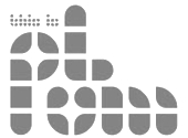 Designer at FontStruct in 2008 of Waffle, Nice Shot (target alphading face), Plumstruct (a beautiful partition face), Roadblock, and Mthr Fckr (stencil, +Alt). In 2009, we find Trouble and Stripe (vertical stripes), Quarterback (athletic lettering face), Fuzz (experimental texture face), Nice Shot (alphadings), Metric, Fourmat, Mongol Metric (squarish), Volume Metric (3d), Volume Metric (+LO, +HI, 3d typefaces), Archityped (based on Bayer's Architype), Subbed Station, Neo Modul (counterless), Heffer (counterless), Perfd (dot matrix), South Central Swiss, Jaunt, Checkout II, Kurrupttd, Checkout, Container ISO Regular, Perfd Regular (pixelish), Lost Outline Condensed (pixel face), Nice Shot (alphadings), Korruptica (Helvetica grungified), Aurora (+II), Beagle (blackletter), Yoga, Trouble and Stripe, Roadblock. [Google]
[More] ⦿
|
Don Marciano
[Juan Miguel Castillo]
|
 San Salvador, El Salvador-based illustrator. Designer of the oriental simulation typeface La Oriental (2018), the casual typeface Cipote (2018), the wide sans typeface Draper (2018), the fat display typeface Hornet (2018), the free athletic lettering font Varsity Team (2018), the free all caps comic book typefaces Benja (2018) and Sivar Regular (2016), the fat rounded sans Yeyey (2016, kawaii-inspired), the rounded sans typeface Lola (2016), the display typeface Contrastes (2016), and the free cartoon font JuanMikes (2016). Typefaces from 2017 and 2018: Castillo (free blackletter), Brand Co, Galactico (a sci-fi font), Cuadra (a block font), Arqui (a blueprint font), Bootcamp (+Bootcamp Morsecode), Camar (a heavy sans poster font), Cipitillo (a horror font), Don Graffiti, Hache, Innova (a techno font).
 Typefaces from 2019: Bloody Scary (a Halloween font), Invader (a Halloween font), Kabuto (an oriental simulation font based on katakana and hiragana), Bend (bilined), E-Muse (a sports font), Slugger Monogram, Amore, Slugger (signage script), Alvaro. Typefaces from 2020: Edge, Play Heavy, Natalia (a vintage script), Mystico, Castillo (blackletter), Marquez (a vintage serif), Poster, Torque, Ernesto, Frida, Don Graffiti (graffiti font), Recluta Stencil (a military stencil), Carmela (a bold script), Andrea Script, Freelancer Display, Junior (a casual script), Hugo Slab, Vaglio (an all caps sans), Alambre Lowrider Thin (squarish), John West (a spurred Western font), Santa Monica. Typefaces from 2021: Farrah (art deco), Noticia (a news headline font), Turmeric, Comico (a cartoon font), Soria (a bold caps font), Buggy (a lumpy font), Zorro (a Western font), Puerto (a vintage titling sans), Only You (an upright script), Pupusa. [Google]
[More] ⦿
|
Donald Beekman
[DBXL]

|
[MyFonts]
[More] ⦿
|
Donis Miftahudin
[Din Studio (or: Doni, Ditatype)]

|
 [MyFonts]
[More] ⦿
|
Draftsman Gothic
|
Draftsman Gothic or Draftsman Italic is a light gothic with an extreme slope of about 30 degrees, intended for map work. It was produced by Monotype for the U.S. Geodetic Survey in Washington, D.C., and was released in 1948. [Source: Mac McGrew] [Google]
[More] ⦿
|
Dragon Tongue Foundry
[Scott Spensley]

|
Graphic designer, computer technician and technical drawer in Christchurch, New Zealand. In 2021, when he set up shop at MyFonts, he wrote: The foundry of Dragon Tongue came in to being around 40 years ago, to be a source of new music and graphic design ideas. The first real high quality digital font from this Foundry was created around 20 years ago. It was a digitised version of Scott's wife's calligraphy. It was stunningly good, and admired by all who saw it. It was never released. Sadly, after the his wife passed away from cancer, and multiple hard-drive crashes, the font was lost, and there are now no versions of it remaining. In 2021, he released DT Squished Stuff (a children's book font), DT Paperside (6 styles; it seems like a smooth version of Papyrus, but can also be used as an architectural blueprint font), the ten-strong stylized typeface family DT Skiart. Typefaces from 2022: DT Dragon Quill (in Goth, Gothic and Tribal Tattoo versions), DT Partel (an elliptical font), DT Lythmore (16-styles; based on Carol Twombly's Lithos (1990, Adobe)). [Google]
[MyFonts]
[More] ⦿
|
Drei Cortez
|
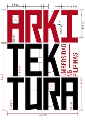 Designer in Quezon City, The Philippines, who created the stunning constructivist / architectural typeface Istruktura (2012), with a beautiful poster to illustrate it.
 Behance link. [Google]
[More] ⦿
|
Driemeyer Design
[Antje Driemeyer]

|
 Type foundry in München run by independent designer Antje Driemeyer, a graduate from the University of Applied Sciences Augsburg, Faculty of Design in 2004. Antje specializes in type design, corporate design and editorial design.
 Creator of Halvan (2012) and Henny (2012, hand-printed). In 2013, Antje designed the remarkable rounded blueprint sans family Herrmann, which comes in ten styles. Near the end of 2013, she published the avant garde architectural sans family Bauhans. Hanami (2015) is a set of kaleidoscopic ornaments. Frieda (2015) is a thin calligraphic typeface. [Google]
[MyFonts]
[More] ⦿
|
DTP Types Limited
[Malcolm Wooden]

|
 DTP Types Ltd was launched in 1989 by Malcolm Wooden (b. London, 1956) from Crawley, West Sussex, England. Wooden worked at Monotype for over 20 years just before that. Malcolm Wooden joined Dalton Maag early 2008 to work on font engineering and production. DTP Types does/did custom font work, and sells hundreds of retail fonts.
 In the Headline Font Collection (50 fonts), we find reworked and extended designs (Apollo, New Bodoni (1996-2002), Camile, Engravers, and so forth), as well as fresh typefaces (Hellene handwriting, Finalia Condensed, Birac, Delargo Black, Delargo DT Rounded (comic book family), Dawn Calligraphy). In the Elite Typeface Library, there are type 1 and truetype typefaces for Western and East-European languages. For example, Elisar DT (1996, see also Elisar DT Infant) is a humanist sans family made by Malcolm and Lisa Wooden. Fuller Sans DT (1996) is a grotesk family by Malcolm Wooden. Greek and Cyrillic included. Other typefaces: Garamond 96, Pen Tip (Tekton-like). Fonts distributed by ITF and MyFonts.com: Berstrom DT, Beverley Sans DT (2007, comic book style face), Birac DT, Century Schoolbook DT, Convex DT, Delargo DTInformal, Delargo DT Infant, Engravers DT (1990), Finalia DT Condensed, Garamond DT, Garamond Nine Six DT, Goudy Old Style DT, Graphicus DT (1992, a 24-style geometric sans family), Kabel DTCondensed, Leiden DT (1992: after Dick Dooijes's Lectura), Macarena DT, Modus DT (2007), New Bodoni DT (1992), Newhouse DT (1992, a large neo-grotesque family), Office Script DT (1994, copperplate script), Pelham DT (1992), Pen Tip DT, Pen Tip DT Infant, Pretorian DT (a revival of an old Edwardian font by P.M. Shanks done by Ron Carpenter and Malcolm Wooden in 1992; for a free version, see Vivian by Dieter Steffman), Solaire DT, Triest DT, Vigor DT (2000---a slab serif family). Discussion: Something I don't get is that Vecta DT (2006) is based on Vecta (2005, Wilton Foundry)---same name, same sans family, what gives? Duet DT (2006, a calligraphic script) is by Robbie de Villiers of Wilton, based on his own Duet (2004). MyFonts page. The typophiles reserve harsh judgment: I recognize these designs by their original names. Slightly manipulating Times Roman, Optima, Icone, Franklin Gothic, Sabon, Tekton, does not make them new or original. Many of the designs are identical to the originals they're derived from (Carl Crossgrove), The DTP Types outfit sells the usual rip-off fonts under new and old names (e.g. Century Schoolbook DT, Engravers DT, Goudy Old Style DT, Kabel DT, etc.) (Uli Stiehl). Typefaces from 2007: Rustikalis DT (after a phototype by VGC from the 1960s), Appeal DT (a revival of the Victorian typeface Apollo designed ca. 1900 by Aktiengesellschaft für Schriftgiesserei und Maschinenbau), Fatbrush DT, Kardanal DT, Pamela DT (semi-blackletter). In 2008, DTP announced a new newspaper and magazine text family, Arbesco DT (PDF), based on a 1980s photolettering family (see also here), and a simple 24-style architectural sans family called Sentico Sans DT (elliptical). They also published the marker family Pen Tip DT Lefty in 2008. In 2009, the calligraphic Trissino DT was published: it was named after Gian Giorgio Trissino (1478-1550) the Italian Renaissance humanist, poet, dramatist, diplomat and grammarian who was the first to explicitly distinguish I and J as seperate letter sounds. In 2020, he released Hastrico DT (a 13-style grotesque family), Hastrico DT Condensed. View the DTP Types typeface library. [Google]
[MyFonts]
[More] ⦿
|
Duran Hernandez
|
Clovis, CA-based designer of the architectural typeface Eames (2014), designed to honor Eames's architecture. [Google]
[More] ⦿
|
Dustin Maciag
|
 Graphic designer in Bay City, MI. In 2011, he designed a type family called Swiss Miss.
 In 2012, that was followed by the tall condensed font Vega, and the architectural / mechanical typeface Hans Bellmer. Behance link. [Google]
[More] ⦿
|
Echad Type
[Cyrill Golikov]

|
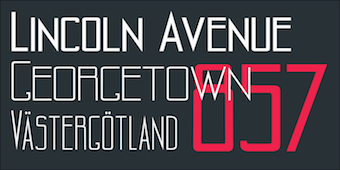 Russian civil engineer with experience in technical drawing and graphic design. His typefaces:
 - The technical font Alpaim (2020).
- Kumo Sans (2021). A hand-printed typeface in seven styles.
- Kantarell, (2022). A sans typeface for Latin and Cyrillic inspired by calligraphy.
- Gmbh Sans (2022). A 7-style geometric sans advertized as an architectural sans.
[Google]
[MyFonts]
[More] ⦿
|
Ed Rose
|
Ed Rose's Tekton-like font CraftsmanType. [Google]
[More] ⦿
|
Eero Saarinen
|
Finnish American architect who drew the squarish lettering for Eero, a type family created in 2003 by Christian Schwartz. Eero is used in the Dulles International Airport, and was commissioned by House Industries. In 2014, Miranda Roth (P22) created a set of eight fonts in Saarinen's architectural style, simply called P22 Saarinen. [Google]
[More] ⦿
|
Elaine Cristina
|
Elaine Cristina (Elaine Fortes, Sao Paulo, Brazil) created the architectural elliptical typeface Indefinit in 2015 during her studies. [Google]
[More] ⦿
|
Elwin Berlips
[FontMeister]

|
[MyFonts]
[More] ⦿
|
Emilie Rollandin
|
 Born in 1977, Emilie Rollandin, an architect, lives in Val d'Aosta, Italy. Her company is Studio Archistico. She created the sketched typeface Archistico (2013), the blueprint lettering typeface RollandinEmilie (2014), and the handcrafted Ritaglio (2016).
 Dafont link. [Google]
[More] ⦿
|
Emily Schmid
|
During her studies at Kutztown University of Pennsylvania, Emily Schmid designed a blocky Le Corbisier-inspired typeface in 2017. [Google]
[More] ⦿
|
Enzos
|
Clean architectural fonts: ISOCT and ISOCP (Autodesk, 1997), Text (Autodesk, 1997), StylusBT, and a few others. In truetype. More fonts here. [Google]
[More] ⦿
|
Eric A. Jarlsson
[Greyscale Net]
|
[More] ⦿
|
Eric Massoud
|
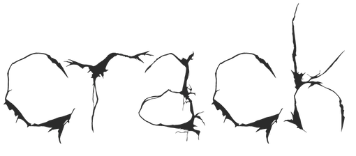 During his design studies in Beirut, illustrator and graphic designer Eric Massoud created the Treefrog-style typeface Crack (2010, Friday Fonts. Behance link. [Google]
[More] ⦿
|
Erick Molina
|
Graphic designer in Tijuana, Mexico, who created the architecural script typeface Good Night (2016) and the free signature script typeface George Harrison (2016). It is advertized as free, but the links do not work. Dafont link. [Google]
[More] ⦿
|
Erik Pal
|
During his studies in Eger, Hungary, Erik Pal (Hajduböszörmeny, Hungary) redesigned Mikko Nuuttila's Jaapokki (2014) to make the fart-themed font Jaapukki (2018). He also created the modernist furniture-themed font Mies van der Rohe (2018), which is named after the famous German-American architect---his real name was v---who lived from 1886 until 1969. [Google]
[More] ⦿
|
Ethan Paul Dunham
[Fonthead Design]

|
[MyFonts]
[More] ⦿
|
Evan Lelliott
[Increments]

|
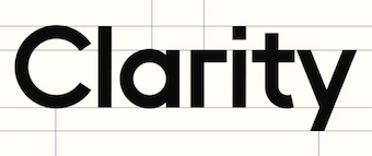 [MyFonts]
[More] ⦿
|
Evgeniy Bobrov
|
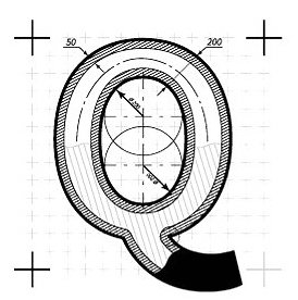 Designer of HandDrawn Cute Funky (2016), Glitch (2016), Glossy Golden Metal (2016), Black Newspaper Letters (2016), Colorful Newspaper Letters (2016, ransom note font), Isometry (2016), Hand-Drawn Dirty Ink Font (2015), Lighting Bulb Pixel (2015) and Retro Type Grunge Font (2015). In 2016, he published Bright Red Neon Letters, Bright Realistic Neon Letters (vector format), Decorative Red Font (EPS format) and Transparent Letters With Long Shadow (vector format).
 Typefaces from 2017: Medieval Inventor Sketches, Braille, Vintage Hippie Alphabet, Sign Language Interpreter Font, Blueprint Style. [Google]
[More] ⦿
|
F. Scott Garland

|
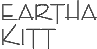 American graphic and type designer who made Enviro (1982, Letraset, and now ITC), an architectural typeface in the Tekton genre. Imitations include Sansibar (Greenstreet), Entebbe (2012, SoftMaker), and Garland (1996, SPSL).
 Letraset sees it in a different light: This light-hearted, sans serif typeface evokes the style of the movie industry during the 1920s and 30s. Linotype link. FontShop link. [Google]
[MyFonts]
[More] ⦿
|
Fábio Fafers
|
Brazilian designer (b. 1977) of the hand-printed font Fafers (2002), of Fafers Ireegular Serif (2010), and of the architectural typeface Fafers Technical (2010). Dafont link. [Google]
[More] ⦿
|
Faizan Shahid
|
Graphic and game designer in Lahore, Pakistan. In 2015, Ameer Hamza Qureshi and Faizan Shahid co-designed the free architectural hand font Who Cares. Behance link. [Google]
[More] ⦿
|
Fauzul Azmi
[Pojol Type]

|
[MyFonts]
[More] ⦿
|
Febri Creative
[Febrianto Yuwono]

|
 Yogyakarta, Indonesia-based designer, b. 1977, of the script typefaces Thimberly (2019: a signature script), Jacktro (2019: Script+Serif), Jengky (2019), Cintacha (2019), Centhil (2019: monoline script), Styniar (2019: a monoline script), Fisha Script (2019), Amaliani (2019), and Rashida (2019). Other typefaces include the comic book font Stockly (2019).
 Typefaces from 2020: Bomanda Signature, Dellycia (script), Gendos (a basic monoline almost architectural sans), Giamatti (an elegant script), Windha (a stretched signature script). [Google]
[MyFonts]
[More] ⦿
|
Febrianto Yuwono
[Febri Creative]

|
[MyFonts]
[More] ⦿
|
Felipe Zveibil Fisman
|
Sao Paulo, Brazil-based designer, b. 1988. Creator of the angular alomst architectural typeface Vazari Sans Serif (2006). Flickr page. Fontsy link. [Google]
[More] ⦿
|
Felipy Procopio
|
 Madrid-based designer of a display typeface called Madrid (2014), which was inspired by the wiremesh architecture of Palacio de Cristal. [Google]
[More] ⦿
|
Ferodootomo
|
FontStructor who made the gridded LCD screen typeface Bixel (2011) and the thin architectural lettering typeface F002 (2011). [Google]
[More] ⦿
|
Filip Matejicek
|
Czech graphic designer and typographer from Prague who is currently studying graphic design at the Pilsen College of Art and Design. Creator of the geometric futuristic typeface Matey (2009), the geometric typeface Donator (2010, free), and the architectural print typeface Qart (2009). In 2017, he designed the sans typeface Nuckle. [Google]
[More] ⦿
|
Florent Courtaigne
[Cubo]

|
 [MyFonts]
[More] ⦿
|
Florian Wachter
|
Zurich-based designer of the modular geometric architectural display typeface family Agolia (2014). [Google]
[More] ⦿
|
Florian Weidmann
|
French designer of Uspenski (2019), which was inspired by the Finnish Uspenski cathedral. [Google]
[More] ⦿
|
Fontenwerkplaats
[Richard Keijzer]
|
 Richard Keijzer is the Dutch designer of many art deco typefaces that are often based on typefaces found on buildings or in Dutch publications, reviving styles known as Dutch deco from the 1920s and 1930s. Starting in 2021, his typefaces will have the prefix RAK. Most of his fonts are free:
 - Mokum Betondorp (2005). A great art deco display typeface in the style of Broadway. He writes: I'm currently trying to reconstruct a font that was designed around 1924 by the architect D. Greiner in the Netherlands. He needed a special font to decorate some of the building in the then new subsurb Watergraafsmeer. The building project was a so-called garden village, that was nicknamed Betondorp (Concrete Village).
- Mokum Plons, after a 1929 sign outside Het Sportfondsenbad in Amsterdam.
- Mokum Tooneel (2006). Based on lettering by Anton Kurvers, a disciple of the Dutch architect Hendrik Wijdeveld (1885-1987).
- Mokum Oorkonde (2006). Based on art deco lettering found in the archives of the city of Amsterdam.
- Mokum Giro (2006). As found on the antique letterboxes of the Amsterdam Municipal Giro Service.
- Mokum Expo (2006) takes inspiration from a 1975 poster for the Amsterdam Municipal Museum.
- Mokum Cohen and Mokum Cohen Top (2006) are both art deco fonts based on lettering by Fré Cohen in the Annual Report of the Municipal Giro 1930.
- Mokum Kruyswijk (2006, art deco) is named after Cornelis Kruyswijk (1884-1935), an architect in Amsterdam.
- Mokum GGD was added in early 2007.
- Quota (2007) is based on the sculptures made by Hendrik van den Eijnde for the main Post Office at the Neude in Utrecht. He finished it in 2018 and called the free typeface Post Utrecht, locally pronounced as Pos Utereg.
- Mokum Stad (2008) is modeled after Dutch deco lettering found in Groningen and designed in 1925 by architect Siebe Jan Bouma. It was renamed and revived in 2022 as Rak Stad.
- Mokum Schip (2013): My inspiration for this font came from a phone booth in Amsterdam. Not just "a" phone booth but one in the former Post Office in building complex The Ship in Amsterdam. This Post Office closed in 1999 and since then that part of the building houses Museum Het Schip.
- Dudok (2014). A Dutch deco typeface based on letter types by Willem Marinus Dudok, a Dutch architect. More specifically, the typeface is based on samples found in the city hall and under the train station of Hilversum, The Netherlands.
- Karbouw (2014). A typeface based on Dutch postal stamps from 1934 that showed a karbouw, a kind of water buffalo found in Indonesia.
- Bungehuis (2015). Based on art deco facade lettering at the Bungehuis in Amsterdam.
- Mokum Bengel (2018). After a design by Dick Greiner in 1922 for the Beursbengel in Amsterdam.
- Rak Neude (2022). A Dutch deco typeface based on texts on the sculpture in the central hall of the former post office in Utrecht, ca. 1924.
- Rak Wilhelminakerk (2022). Based on a memorial stone in Utrecht's Wilhelminakerk, a building designed by architect H.F. Mertens in 1930.
- Rak Gelderlander (2020-2022). Based on the building facade of the De Gelderlander newspaper office at Lange Hezelstraat 21 in Nijmegen.
- Rak Oldenkoppel (2022). The name Oldenkoppel combines Oldenhove en Oldenhoeck, two houses designed by Dutch architect Warners.
- Rak Ortelius (2023). Named after a street in Amsterdam and a letter type by architects Gulden and Geldmaker.
Alternate URL. Blog. Klingspor link. [Google]
[More] ⦿
|
FontFarmers (was: FarmHouse Studio)
|
Phoenix, AZ-based designer of Penmanship (2015), a 4-style monoline sans serif with handwriting roots. In 2016, he designed the rounded monoline sans typeface Speakeasy and the architectural blueprint font, Schematic. [Google]
[More] ⦿
|
Fonthead Design
[Ethan Paul Dunham]

|
 FontHead Design (Wilmington, DE) sells cool fonts designed by Ethan Dunham (b. 1972, Glens Falls, NY), who now heads Fontspring. A partial list: Mother Goose (2008), Allise, GoodDogCool, Fontheads (dingbats), Randisious, Greyhound (1997, an arts and crafts face), Rochester, Samurai, AsimovSans, Gurnsey20, Scrawl, BadDog, Holstein, SlackScript, Bessie, SloppyJoe (gone?), Blearex, HandSkriptOne, SmithPremier, BlueMoon, HolyCow, SororityHack, Bonkers, HotCoffeeFont, SpillMilk, BraveWorld, Isepik, Sputnik, Brolga, TekStencil, Carnation, Mekanek (1995), Teknobe (1995), Merlin, Toucan Grunge (gone?), Tycho, TypewriterOldstyle, MotherGoose, Croissant, Democratika (now Americratika--I think Emigre forced FontHead to change the name), Noel (1996-1997, Lombardic all caps face, with an open version added), LillaFunk (gone?), Margo Gothic (gone?), Toddler (gone?), NoelBlack, WashMe, Diesel, Orion, Gritzpop, Pesto, BattleStation, CircusDog, Dandelion, DraftHand, Flowerpot, Navel, ShoeString, Stiltskin, ZipSonik. Plus JohnDoe, and old typewriter font. Free fonts: Font Heads (dings), Smith Premier, Vladimir, Tycho, Typewriter Oldstyle, ScareCrow, Millennia, SpillMilk, GoodDog, Holstein, Red Five. All formats, Mac and PC. In the comic font series, look for Stan Lee (now Comic Talk), FH Excelsior (now Titlex), Grimmy (now Flim Flam), and Kirby (now Grit).
 Dafont link. Fonts created in 1999: AppleSeed, Caterpillar, Chinchilla, ChinchillaBlack, ChinchillaDots, CrowBeak, CrowBeakLight, CyberMonkey, DanceParty, DingleHopper, FourScore, FourScoreTitling, Hopscotch, HopscotchPlain, Ladybug, Leaflet-Regular, LeafletBold, LeafletLight, ReadOut, ReadOutSuper, Smoothie, Swizzle, TwoByFour, VeryMerry. Made in 2001: ButterFinger, ButterFingerSerif, CatScratch, Catnip, FighterPilot, FrenchRoast, Handheld, HandheldItalic, HandheldRaised, HandheldRaisedItalic, HandheldRound, HandheldRoundItalic, Kingdom, OldGlory, Quadric, QuadricSlant. MyFonts page. In 2006, several dingbats fonts were added, such as the ClickBits Arrow series and the ClickBits Icon series. In 2008, he created InfoBits Things and InfoBits Symbols, Abigail, Assembler, Click Clack, Drawzing (children's font, crayon or chalk style), El Franco (grunge), Good Dog New (hand-printed), Helion (futuristic), Lead Paint (brush), Schema (architectural lettering), Skizzors (paper cut font), Tachyon (2008, techno, futuristic). Free font download. This place has Allise, Americratika, AppleSeed, AsimovSans, Asterix-Blink-Italic, Asterix-Blink, Asterix-Italic, Asterix-Light-Italic, Asterix-Light, Asterix, BadDog, BattleStation, Beckett, Bessie, BlackBeard, Blearex, BlueMoon, Bonkers, BraveWorld, Brolga, BrownCow, Carnation, CatScratch, Caterpillar, Chinchilla, ChinchillaBlack, ChinchillaDots, CircusDog, CornDog (2004), Croissant, CrowBeak, CrowBeakLight, CyberMonkey, DanceParty, Dandelion, Dannette-Outline, Dannette, DayDream, Democratika, Diesel, DingleHopper, DoomsDay, DraftHand, Flowerpot, Font-Heads, FourScore, FourScoreTitling, FunkyWestern, Goliath, GoodDog-Bones, GoodDog-Cool, GoodKitty, Greyhound, Grimmy, Gritzpop, GritzpopGrunge, Gurnsey20, HandskriptOne, Holstein-Bold, Holstein, HolyCow, Hopscotch, HopscotchPlain, HotCoffeeFont, HotTamale, Isepik, JohnDoe, JollyJack, Keener, Klondike-Bold, Klondike, Ladybug, Leaflet-Regular, LeafletBold, LeafletLight, LillaFunk, Log Jam (+Inline), MargoGothic, MarvelScript, MatrixDot-Condensed, MatrixDot, Mekanek, Merlin, Millennia, Mondo-Loose, MotherGoose, Navel, Network, Noel, NoelBlack, Oatmeal, Orion, Pesto, Randisious, ReadOut, ReadOutSuper, RedFive, Rochester, Samurai, Scarecrow, Scrawl, ShoeString, ShoeStringRound, SlackScript, SloppyJoe, SmithPremier, Smock, Smoothie, SororityHack, SpaceCowboy, SpillMilk, Sputnikk, StanLee-Bold, StanLee-BoldItalic, StanLee-Regular, Stiltskin, Submarine, Swizzle, TekStencil, Teknobe, Torcho, ToucanGrunge, TwoByFour, Tycho, Typewriter2, TypewriterOldstyle, VeryMerry, Vladimir, WashMe, Watertown-Alternate, Watertown-Black, Watertown-Bold, Watertown, ZipSonik-Italic, ZipSonik, ZipSonikSketch-Italic, ZipSonikSketch. Font Squirrel carries ElliotSix (simple handwriting), GoodDog (children's hand) and Millennia (squarish). In fact, in 2009-2010, Ethan Dunham became a very active web font persona, offering a commercial web font service, Fontspring, and a free font service, Fontsquirrel. Klingspor link. Creative Market link. [Google]
[MyFonts]
[More] ⦿
|
FontMeister
[Elwin Berlips]

|
 FontMeister is the commercial foundry of Elwin Berlips in Almere, The Netherlands.
 In his first life, he ran a free font site called 11th Floor, where he made these free typefaces in 1999: Civilization (octagonal), Plastik-Film (grungy semi-stencil), Raw (grunge), Rocket-Fuel, Timeline, Greenlight (dot matrix), Interstatic (futuristic), Handsolo, Optimum, Roswell (handwritten), Jean-Pierre (handwriting), 11th Floor (gridded). At FontMeister, he published - FM Eva (2011). A hand-printed chalkboard or poster face.
- FM Bebel (2011). A monoline organic rounded sans family.
- FM Secessionist (2011). Inspired by the Vienna secessionist Joseph Maria Olbrich, as seen on his architectural drawings from the 1920s.
- FM Rossija (2011). A modular CD label face.
- FM Julie (2011). An architectural hand.
- FM Aloysius (2011). Also inspired by the Viennese secessionists.
- FM Monomo (2011) is a simple, all caps, monospaced font.
- FM Kaantaa (2011) is a bold typeface that draws inspiration from stencil and technical typefaces.
- FM Ted (2012) is a simple geometric sans typeface.
- FM Pointifax (2012) is a dot matrix typeface.
In a third life, now as Elmigo at Dafont, he published the circle-based font Modern Ringflash (2012). View Font Meister Elwin Berlips's typefaces. [Google]
[MyFonts]
[More] ⦿
|
Francesco Zorzi
|
Florence, Italy-based illustrator. Designer of Ovo (2014), a font designed to be used for the cultural institutions of the town of Montevarchi, Italy. Its shapes are influenced by the architecture of the medieval town, and is based on arcs and a grid. Behance link. [Google]
[More] ⦿
|
Francielly Pereira
|
During her studies in Porto Alegre, Brazil, Francielly Pereira created the architecture-inspired decorative caps typeface Arquitetando (2015). Behance link. [Google]
[More] ⦿
|
Francis Stephen Lestingi
[Signs of Gold]

|
[MyFonts]
[More] ⦿
|
Francisco Capuzzi
|
Aka Coco. During his studies at FADU at the University of Buenos Aires, Francisco Capuzzi created the quanit draftsman typeface Ludllow (2012). [Google]
[More] ⦿
|
Francisco Rivera Navarrete
|
Mexico City-based designer of the monoline sans typeface Arquitectura (2013). [Google]
[More] ⦿
|
Frank Hainze
[MicroLogic Software]
|
[More] ⦿
|
Frank Lloyd Wright

|
 American architect, artist and designer, b. Richland Center, WI, 1867, d. Phoenix, AZ, 1959. He was associated with the Arts and Crafts movement. His lettering inspired many to create typefaces based on them. The Frank Lloyd Wright museum is near the University of Chicago. He lived in Oak Park, IL, two blocks away from Luc Devroye's daughter. A partial list of fonts related to FLW:
 - David Siegel made Eaglefeather (1994-1999) for the Frank Lloyd Wright Foundation, which owns various manuscripts with his beautiful lettering. P22 made a few typefaces based on his hand.
- Christina Torre (P22) created P22 FLW Exhibition and P22 FLW Terracotta in 2000 (revival in 2018), based on alphabets by Frank Lloyd Wright published in 1931 and in 1896-1897 (in his book The House Beautiful), respectively.
- Paul Hunt made the FLW Midway font family (2006-2018), comprising Midway One, Two and Ornaments. This set is based on the lettering found on the Midway Gardens working drawings of Frank Lloyd Wright---tall-legged and casual.
- There are several free fonts. For example, swiftw5 created the typeface Hendrikus Wijdeveld (2010), based on a Hendrikus Wijdeveld poster entitled Architecture Exhibition / Frank Lloyd Wright from 1931.
- Funky Lloyd Wright (2002) by Kristian Walker (Eurekaville) is an experimental font based on Frank Lloyd Wright's ideas.
FontShop link. View Frank Lloyd Wright fonts. [Google]
[MyFonts]
[More] ⦿
|
Frank (or Francis) D.K. Ching
|
 West Coast architect whose book Architectural Graphics (1975) made a big splash. His lettering in that book was at the basis of David Siegel's Tekton architectural lettering family (Adobe, 1989-1993) and Harold Lohner's Frank the Architect (2004). This page quotes a University Week news story about the design of Tekton: In 1972, a former classmate working at Ohio University needed someone to teach drawing, so he contacted Ching. As part of preparing lectures in architectural graphics, Ching hand-drew and hand-lettered 400 pages of lecture notes. They came to the attention of Forrest Wilson, chairman of the School of Architecture, who showed them to his publisher, Van Nostrand Reinhard, and the rest is history. Free version of Tekton. [Google]
[More] ⦿
|
Frantisek Storm
[Storm Type Foundry]

|
 [MyFonts]
[More] ⦿
|
Fwis
[Chris Papasadero]
|
 Fwis is a graphic design group in Portland, Cupertino and Brooklyn. One of its art directors is Chris Papasadero. As a sideline, they will design an occasional font. Pylon (2007, art deco) is their first production. No downloads. 2009 fonts, again without downloads: Omnistroke Sans, Omnistroke Square, Eurochair, Paratype and Nuit. Koolhand (2009) is a free experimental typeface designed by Chris Papasadero inspired by some of the architecture of Rem Koolhaas. [Google]
[More] ⦿
|
Gabriela Todeschi
|
Belo Horizonte, Brazil-based designer of the architecturally inspired typeface Quintana (2016) for a project at UEMG. For another university project, she created the rounded circle-based sans typeface Circum (2016). [Google]
[More] ⦿
|
GalloFonts (was: Graphics by Gallo)
[Gerald Gallo]

|
 GalloFonts is part of Graphics by Gallo, founded in 1974 by Gerald Gallo (b. Lucernemines, PA, 1941), and based in Bethesda, MD. The fonts: Bullish (squarish), Display Brutal Rough (2015), Display Black Serif Rough (2015), Pristine Light (2014: caps only squarish sans family), Display Pump (2014), Display University (2005, athletic lettering), Angulatte Light, Angulatte Medium, Angulatte Bold, Anniversary Seals (2003), Basic Bullets, Blooming Ornaments (2008), Brashee Regular, Brashee Bold, Calendar Font One, Calendar Font Two, Calendar Font Three, Carved Initials, Chiseled Initials, Cleancut, Dexterous (2010, art nouveau), Diamond Monogram - 2 Characters, Diamond Monogram - 3 Characters, Display Black Serif (2010, angular), Display Dots Five (2010), Display Dots Six (2010), Display Grungy (2010), Display Robust (2010), Dooddle, Embossed Shallow, Embossed Medium, Embossed Deep, GG Casual Light (2002, was Gallo Casula: hand printing family), GG Casual Medium, GG Casual Bold, GG Dingbats (was Gallo Dingbats, like Zapf Dingbats), GG Serif (1993, was Gallo Serif), Geometric Arrows, Geometric Ornaments, Gnarlee, Greetings, Home Sweet Home, Isometric Initial Caps - Bird's Eye View (1994), Isometric Initial Caps - Worm's Eye View, Isometric Ornaments, Jackolantern Assortment (2002) Just Bugs, Kruede Light, Kruede Regular (handwriting), Kruede Bold, Leaf Assortment (1994), Leaves Falling, Logotype, Magnificent Ornaments (2006, Victorian era decorations), Make Tracks (2002, animal footprints), Number Ornaments, Numbers 0-99 Style One - Circle Negative, Numbers 0-99 Style One - Circle Positive, Numbers 0-99 Style One - Diamond Negative, Numbers 0-99 Style One - Diamond Positive, Numbers 0-99 Style One - Square Negative, Numbers 0-99 Style One - Square Positive, Numbers 0-99 Style Two - Circle Negative, Numbers 0-99 Style Two - Circle Positive, Numbers 0-99 Style Two - Diamond Negative, Numbers 0-99 Style Two - Diamond Positive, Numbers 0-99 Style Two - Square Negative, Numbers 0-99 Style Two - Square Positive, Numbers 0-99 Style Three - Circle Negative, Numbers 0-99 Style Three - Circle Positive, Numbers 0-99 Style Three - Diamond Negative, Numbers 0-99 Style Three - Diamond Positive, Numbers 0-99 Style Three - Square Negative, Numbers 0-99 Style Three - Square Positive, Ornate Initials - Style One (2002), Ornate Initials - Style Two, Ornate Initials - Style Three, Pleasant Hand Light (2002) Pleasant Hand Medium, Pleasant Hand Bold, Precision, Rolling Ball Cursive, Serene (1993), Slender, Smiling Faces, Snowflake Assortment (1994), Snowflakes Falling (2001), Sport Numbers, Star Assortment (2002), Stature (2010, compressed sans), Swiss Folk Ornaments - Critters&Things, Swiss Folk Ornaments - Floral, Swiss Folk Ornaments - Geometric, Time Clocks, Woozee, Display Prominent (2005), Ultimate Ornaments (2005), Cross Ornaments (2005), Heraldic Creatures (2006), Victorian Leaf Ornaments (2006: great!), Quilt Patterns One (2007), Holy Ornaments (2007), Oriental Ornaments (2007), Gothic Initials One through Six (2007-2008), Interlaced Ornaments (2007), Modest Ornaments (2008), Art Nouveau Flowers (2008), Art Nouveau Ornaments (2008), Quilt Patterns Two (2008), Display Gothic (2008, blackletter), Plant Assortment (2008), Birds Flying (2009), Happy Go Lucky (2009, Victorian), Fish Fresh (2009), Display Dots One (2009, dot matrix face), Display Art Two and Three (2009, art nouveau alphabets), Display Dots Two Serif and Sans (2009, dot matrix typefaces), Display Dots Three Serif and Sans (2009), Display Dots Four Serif and Sans (2009), Display Robust (2010), Quilt Patterns Three and Four (both 2009), Gothic Initials (Seven, Eight, Nine: 2009), Carefreed (2009, a Halloween script?), Glorita (2009, casual condensed sans), Fancy Flowers (2010), Rectilinear Ornaments (2010), Display Brutal (2010, grunge), Cross Stitch Graceful (2010), Cross Stitch Regal (2011), Cross Stitch Formal (2010), Cross Stitch Discreet (2010), Cross Stitch Classic (2010), Display Dots Seven (2011), Cross Stitch Majestic (2011), Cross Stitch Elaborate (2011), Cross Stitch Medieval (2011), Cross Stitch Ornaments (2013), Display Squares One and Two (2011, gridded or dot matrix typefaces), Display Digits One through Seven (2011), Display Crisp (2012, octagonal), Blue on Blue (2012, shadow face), Green on Green (2012, 3d shadow face), White on White (2012), Orange on Orange (2012, a 3d shadow face), Victorian Ornaments (2012), Printers Plant Ornaments (2012, a floral typeface), Simple Ornaments, Numbers Style Three Diamond Positiv Regular (2012), Charisma (2013, inspired by the hand lettering used by draftsmen and architects), Display Explicit (2013), Display Uncanny (2013, unicase), Display Carlos (2013, a piano key typeface), Mighty Oaks (2013, stylized oak leaves), Sweet Hand (2014), Fast Hand (2014), Medallion Ornaments (2016), Vigorous (2016, octagonal), Heavy Duty (2016, a bold condensed sans), Tight Hand (2016), Hasty Hand (2016), Neat Hand (2016), Bullish (2017), Impossible Ornaments (2018: based on Escher's ideas), Flair Hand (2018), Severe (2018: squarish).
 Typefaces from 2022: Flashie (technio caps), Illustrious (chamfered caps), Sturdie (condensed, squarish), Jubilant (squarish), Noteworthy, Sensuous (art deco), Loftie (chamfered caps), Pudgie, Brilliante (squarish), Fervent (an all caps condensed slab serif), Bevelle (a beveled chamfered slab serif), Lankie (a gas pipe font), Rotunde (a blocky sans), Rigide (a 6-style squarish sans). View Gerald Gallo's typefaces. [Google]
[MyFonts]
[More] ⦿
|
Gary Munch
[MunchFonts]

|
[MyFonts]
[More] ⦿
|
Gary Powell
|
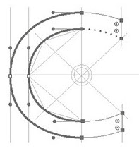 Kent, UK-based designer of the architectural typographic poster Top Tech (2017). [Google]
[More] ⦿
|
Gary Vranic
|
Artist and illustrator in Cleveland, OH. Designer of the blueprint /comic book all caps typeface Vranic Hand (2013). Dafont link. [Google]
[More] ⦿
|
George Elliott-Hunter
|
Designer of the architectural lettering font Anglean (2012). [Google]
[More] ⦿
|
Gerald Gallo
[GalloFonts (was: Graphics by Gallo)]

|
 [MyFonts]
[More] ⦿
|
Gert Wiescher
[Wiescher Design]

|
 [MyFonts]
[More] ⦿
|
Giancarlo Barison
|
Italian artist. Designer of Linotype Graphena (1997), a very aesthetic architectural font. FontShop link. Linotype link. [Google]
[More] ⦿
|
Giles Peyton-Nicoll
|
Giles is a senior creative director, consultant, designer and illustrator in London. Behance link. In 2010, he created a very original 3d blocky typeface called 40Four that he used as decoration on walls of homes. [Google]
[More] ⦿
|
Global Lithuanian Net
[Jonas Skendelis]
|
About hundred Lithuanian truetype fonts from the following families: Antique Olive, Compacta, Algiers. Allegro, Arabia, Baltika, Brush Script, Impuls, Sans, ZypfHumanist (sic), Tekton, Trafalgar, Shelley Andante, AmericanText, Ariston, AvantGarde, Eras, Gothic825, Optima, GoudyOldstyle, Shotgun, Century Schoolbook, Letter Gothic, Garamond, Kastler, Memorandum, Mural Script, Palatino, Eurostile, Futura, Bremen, Stencil, Bookman, Blippo, Amazone, Amelia, Charter, Broadway, Brochure, Britannic, Impress, Mister Earl, Park Avenue. All fonts by Jonas Skendelis. JS_ShelleyAllegroScript and JS_Mariage are here. [Google]
[More] ⦿
|
Glyph Systems
|
Font vendor. Custom font design in most languages. MS Arabic Windows distributor in US: additional fonts for $79. P.O. Box 134, Andover, MA 01810, USA. Also sells Hebrew fonts. Seels for Agfa, Alagha Associates, Arthur Baker Designs, ITC, Maverick Designs, Boutros International, and Sakkal Designs. Headed by Steve Reef. For 89USD, get 16 beautiful Arabic fonts: ITC Boutros Rokaa, Koufi, Ousbough, Arabic Borders, Diwani, Architect, ITC Boutros Modern Kufic, AGA Andalus (some of these in multiple weights). For 72USD, get 13 Hebrew fonts (some in multiple weights): Khadeysh, Ktav, Rashi, and Mesorati. The latter fonts, plus Diwani and Architect, are original fonts by Glyph Systems. [Google]
[More] ⦿
|
Gorkem Isme
|
Izmir, Turkey-based designer of the circuit typeface Pofi (2014), which was inspired by architecture. [Google]
[More] ⦿
|
Gracie Vee
|
Bangkok-based and American-born designer of the free experimental architectural grid fonts Remarkable (2012) and Remark (2012). In 2013, she made the ultra-condensed ID typeface. Dafont link. Fontspace link. [Google]
[More] ⦿
|
Grant Marshall
|
South African designer of the architectural handwriting font Architext (2003). See also here. Grant, a wood turner, was born in Johannesburg and lives in Knysna. [Google]
[More] ⦿
|
Graphic Out
[Bilal Ahmed]
|
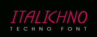 Lahore, Pakistan and/or London, UK-based designer of Contour (a titling sans), Chubby (2019), the free display sans Linicircle (2017), the free rounded sans typeface Roudge or Wasey E (2019), the modular typeface Bract (2019), the copperplate serif Billag (2019), the color font Taster (2019), Zonta (2019), the techno or architectural lettering font Italichno (2018), the geometric shape fonts Shape (2019) and Shape Out (2019), and the semi-stencil typeface CoolCut (2019). Behance link for Graphic Out. [Google]
[More] ⦿
|
Greg Kolodziejzyk
|
Designer of Signature (1987, ICG), similar to Letraset's Freestyle Script. In 1989, he designed the elegant geometric sans typeface Linotype Arquitectura. FontShop link. [Google]
[More] ⦿
|
Greyscale Net
[Eric A. Jarlsson]
|
Eric Jarlsson (Greyscale Net) (b. 1979) is the designer of the architectural drawing sans family Greyscale Basic (2007, 4 styles). Free downloads. Klingspor link. [Google]
[More] ⦿
|
Guillaume Simmen
|
Graphic designer in Lausanne, Switzerland, who created the sans typeface Sans Plomb 95 (2012). [Google]
[More] ⦿
|
Gulay Inceoglu
|
Brooklyn, NY-based creator of BAMQ (2013) and Brkln Regular (2013), a set of free fonts that were inspired by the modern minimalist architecture, and have an art deco feel. She also made Bklyn Iconic (2013). Behance link. Hellofont link. [Google]
[More] ⦿
|
Gustav Jerlardtz
|
In 2009, Jerlardtz graduated as Art Director from Forsbergs in Stockholm, Sweden. He created Vilhelmia (2009, paper fold face) and Teodoria (2009, an artistic counterless family; + Round, Sharp, Square), Schmo (2011, a monoline sans) and Bartholomeus (2011, squarish architectural sans). Behance link. [Google]
[More] ⦿
|
Guy Haynie
[Haynie Design Co]
|
[More] ⦿
|
H.A.
|
Hong-Kong based designer of the asymmetric-serifed typeface Architecture (2006). [Google]
[More] ⦿
|
Hakeemah Julaihi
|
During her studies in Bandar Seri Begawan, Brunei Darussalam, Hakeemah Julaihi created the typeface Modern Architecture (2014). [Google]
[More] ⦿
|
Han Zeyu
|
Shijiazhuang, China-based designer of the (Latin) blueprint typeface Britomart (2015). [Google]
[More] ⦿
|
Hank Gillette
|
Designer of the freeware fonts Architect (1992, architectural lettering), Alexandria (1990, squarish slab serif), Playbill, Saint Francis. Dafont link. Abstract Fonts link. Fontspace link. [Google]
[More] ⦿
|
Hans Bacher

|
 German animation artist who lives in Southern California where he works for Disney Feature Animation. He is a member of the Academy of Motion Picture Arts and Sciences. His typefaces were mostly made at Agfa-Monotype:
 Catalog. FontShop link. Klingspor link. [Google]
[MyFonts]
[More] ⦿
|
Harold Bowers
[HLB Technology]
|
[More] ⦿
|
Harold Lohner
[Harold's Fonts]
|
 [More] ⦿
|
Harold Van Buren Magonigle
|
New Jersey-born American architect best known for his memorials, 1867-1935. His lettering included these Modern American Capitals. [Google]
[More] ⦿
|
Harold's Fonts
[Harold Lohner]
|
 Harold Lohner was born in upstate New York in 1958. He received an MFA in printmaking from the University at Albany and is Professor of Visual Arts at Sage College of Albany. He began making fonts in 1997 and starting distributing them the next year through Harold's Fonts. He lives in Albany, NY, with his partner, Al Martino. Originally, most of his typefaces were freeware or shareware, but gradually, he started selling most on his site or via FontBros. His typefaces:
 Link at Dafont. . Abstract Fonts link. [Google]
[More] ⦿
|
Harrisson
[Open Source Publishing (or: OSP)]
|
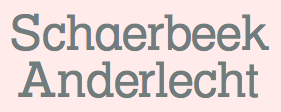 [More] ⦿
|
Haynie Design Co
[Guy Haynie]
|
Atlanta, GA-based designer of Service Station (2017, a free auto repair shop font), the dry brush all caps display typeface Wildwood (2017) and the architectural typeface Grifter (2017). Typefaces from 2018: Rust & Nails (weathered vintage style). [Google]
[More] ⦿
|
Helen Triantafillou
|
Helen Triantafillou is a retired Greek nurse who made a simple free architectural font, Helen. [Google]
[More] ⦿
|
Hendricus Theodorus Wijdeveld

|
Hendrik Wijdeveld was a Dutch architect and art deco paper artist (1885-1987). He founded the trendsetting art deco magazine Wendingen in 1918 and remained its chief editor until 1931. Wijdeveld designed many letter types for special projects, such as book covers, buildings, and letterheads. Examples include a poster entitled Architectuur Tentoonstelling (1931), a poster entitled Internationaal Theater Tentoonstelling (1922), and an illustration for De Bijenkorf (1922). In 2003, Hans Oldewarris published Wijdeveld---Art Deco Design on Paper at 2010 Publishers. That book shows stencil-like art deco typefaces such as Wendingen and Amsterdam Deventer, both designed in the 1920s. Wijdeveld's lettering and alphabets inspired these digital typefaces: - AF Wendingen (1998, Christian Küsters for ACME Fonts). An LED simulation typeface named after Wijdeveld's art deco magazine.
- Architectuur NF (2006, Nick Curtis).
- Hendrikus Wijdeveld (2010). By swiftw5 at FontStruct. Based on the poster entitled Architectuur Tentoonstelling Frank Lloyd Wright (1931).
- Wijdeveld by Matthew Bardram of Atomic Media.
[Google]
[MyFonts]
[More] ⦿
|
Henri Morin
|
Author of Receuil et Principes des Differents Genres d'Ecritures Employés dans le Dessin des Plans (Paris, ca. 1910). This is a 4-sheet set showing letters to be used on architectural designs. [Google]
[More] ⦿
|
Henry Valerian
|
Strasbourg, France-based creator of a geometric typeface that was inspired by a building designed by Le Corbusier (2013). It was finished during his studies in Strasbourg. [Google]
[More] ⦿
|
Hiroaki Yokoyama
|
Tokyo-based designer, who created the connect-the-dots typeface Architect (2015). Behance link. [Google]
[More] ⦿
|
HLB Technology
[Harold Bowers]
|
Commercial GD&T fonts by Harld Bowers for "geometric dimensioning and tolerancing". And Engineering/Technical fonts in truetype at 15 USD a shot. Architectural CAD drawing fonts. And Make-A-Screw truetype font for 99USD. [Google]
[More] ⦿
|
Hoefler (was: Hoefler&Frere-Jones, and Hoefler Type Foundry)
[Jonathan Hoefler]

|
 Born in 1970 in New York, Jonathan Hoefler ran the Hoefler Type Foundry (or: HTF) in New York. It employed Tobias Frere-Jones, Josh Darden, and Jesse Ragan. In 2004, it was renamed Hoefler&Frere-Jones, or HFJ for the cognoscenti. However, a legal problem between Jonathan and Tobias led to a corporate divorce in 2014---the company is renamed again The Hoefler Type Foundry. In September 2021, Monotype acquired Hoefler, and that is the end of that chapter. Their typefaces:
 - Acropolis.
- Archer (2001, by Jonathan Hoefler and Tobias Frere Jones). A humanist slab serif originally designed for Martha Stewart Living. It has a great range of features, including a classy hairline style. However, I see trouble down the road with the name Archer which has been used previously by several other foundries such as SignDNA, Arts&Letters and Silver Graphics. Some say that Archer is just Stymie with some ball terminals. Nevertheless, it became a grand hit, and has been used by Wes Anderson in The Budapest Hotel, and in Wells Fargo's branding. David Earls on Archer: with its judicious yet brave use of ball terminals, and blending geometry with sexy cursive forms, all brought together with the kind of historical and intellectual rigour you fully expect from this particular foundry, Archer succeeds where others falter.
- Champion Gothic.
- Chronicle Text. In 2007, HFJ published the "blended Scotch" newspaper serif text family Chronicle, which led to Chronicle ScreenSmart in 2015. See also Chronicle Display. In 2016, Hoefler published Chronicle Hairline. In Wired Magazine, Margaret Rhodes writes that it is for men who wear dress shoes without socks. Chronicle Hairline is a didone that breaks the didone rules. It is rounder, asymmetric (as in the mouth of the C), and as Hoefler puts it, more musical. As of 2016, the Chronicle typeface family consists of the display styles Chronicle Hairline, Chronicle Display (+Condensed, +Compressed), and Chronicle Deck (+Condensed), and the 60-style Chronicle Text family, which comes in G1, G2, G3 and G4 subfamilies.
- Many custom and branding typefaces, including, e.g., General GG (2005-2007) and typefaces for The New York Times Magazine, Times Mirror, Esquire and McGraw-Hill (1995, free download). Time.com provides previews of fonts made for Esquire, Lever House, eCompany Now, The Guggenheim Museum, The New York Times, and the Whitney Museum.
- Cyclone.
- Decimal (2019). A sans based on early wristwatch typefaces, i.e., the microscopic letters used by Swiss watchmakers in La Chaux-de-Fonds.
- Didot. HTF carefully designed and complete families include HTF-Didot (1991) in 42 weights/variations, originally designed for Harper's Bazaar; based on the grosse sans pareille no. 206 of Molé le jeune.
- Eyes Only (2019). A stencil typeface.
- Forza (2010). A sans typeface. Not to be confused with the 2007 font Forza by Michel Luther at Die Gestalten.
- Geometer Screen Fonts. Free Mac fonts.
- Giant.
- Gotham (2003). The stylish sans typeface made famous by Obama. See also Gotham Rounded.
- Historical Allsorts. This includes Historical-EnglishTextura, Historical-FellType, Historical-GreatPrimerUncials and Historical-StAugustin.
- Hoefler Text (+Ornaments). This antiqua text typeface consists of 27 fonts made in 1991-1992, and is distributed with many Apple products.
- Hoefler Titling.
- Ideal Sans. A slightly flared humanist sans. In the 1996 Morisawa Awards competition, Hoefler received a bronze prize for Ideal Sans. In 2011, HFJ writes it up beautifully: Typefaces are born from the struggle between rules and results. Squeezing a square about 1% helps it look more like a square; to appear the same height as a square, a circle must be measurably taller. The two strokes in an X aren't the same thickness, nor are their parallel edges actually parallel; the vertical stems of a lowercase alphabet are thinner than those of its capitals; the ascender on a d isn't the same length as the descender on a p, and so on. For the rational mind, type design can be a maddening game of drawing things differently in order to make them appear the same. Twenty-one years ago, we began tinkering with a sans serif alphabet to see just how far these optical illusions could be pushed. How asymmetrical could a letter O become, before the imbalance was noticeable? Could a serious sans serif, designed with high-minded intentions, be drawn without including a single straight line? This alphabet slowly marinated for a decade and a half, benefitting from periodic additions and improvements, until in 2006, Pentagram's Abbott Miller proposed a project for the Art Institute of Chicago that resonated with these very ideas. As a part of Miller's new identity for the museum, we revisited the design, and renovated it to help it better serve as the cornerstone of a larger family of fonts. Since then we've developed the project continuously, finding new opportunities to further refine its ideas, and extend its usefulness through new weights, new styles, and new features. Today, H&FJ is delighted to introduce Ideal Sans, this new font family in 48 styles. Ideal Sans is a meditation on the handmade, combining different characteristics of many different writing tools and techniques, in order to achieve a warm, organic, and handcrafted feeling.
- Idlewild (2012). A wide sans typeface family.
- Isotope (2018). A squarish typeface family. Not to be confused with Isotope by Fábio Duarte Martins, designed six years earlier.
- Inkwell (2017). Hoefler writes: Inkwell is provided in a range of styles with which readers already have clear associations: a bookish Serif and a cleanly printed Sans, a conversational Script, a ceremonial Blackletter, a fancy Tuscan for decoration, and a stately Open for titles. Each style is offered in six weights, from a technical pen Thin to a graffiti marker Black. Inkwell is a name used as far back as 1992 by Sam Wang, and additional older fonts called Inkwell exist by Dan Solo, Philip Cronerud and MXB Foundry.
- Knockout. The Knockout collection was designed to celebrate the beauty and diversity of nineteenth century sans serif wood types.
- Knox.
- Landmark (2013). In Regular, Inline, Shadow and Dimensional styles. A collection of architectural caps which started out as a custom typeface for Lever House in New York.
- Leviathan.
- Mercury Text and Mercury Display.
- Nitro & Turbo (2016). Hoefler writes: We designed Nitro for Pentagram's Michael Bierut, as part of a new identity for the New York Jets football team. Originally named Jets Bold, Nitro is rooted in the styles of lettering used by the team throughout its fifty-year history: even as its logotype evolved, it consistently used heavy, slanting forms to imply force and movement. and ends with corporate babble: Nitro embodies this indomitable spirit in the context of a fresh, contemporary design. About the naming: AF Nitro was made by Sylvia Janssen at the very popular Die Gestalten Studio in Germany, in 2001. It will be fun to watch that battle between giants. Not to mention that lesser known players also made commercial fonts called Nitro more than a decade earlier---these include Jack Wills at Sign DNA and Markus Schroeppel (in 2004).
- Numbers. In 2006, HFJ published the Numbers family, 15 fonts with nothing but numbers from various sources: Bayside (based on a set of house numbers produced around 1928 by H. W. Knight & Son of Seneca Falls, New York), Claimcheck (inspired by ticket stubs), Delancey (from tenement doorways), Depot (modeled on vintage railcars), Deuce (based on playing cards), Dividend (from an antique check writer), Greenback (based on U. S. currency), Indicia (inspired by rubber stamps), Premium (after vintage gas pumps), Prospekt (based on Soviet house numbers), Redbird (inspired by New York subways), Revenue (from cash register receipts), Strasse (after European enamel signs), Trafalgar (inspired by British monuments), Valuta (after Hungarian banknotes).
- Obsidian. In 2015, Jonathan Hoefler and Andy Clymer cooperated on the decorative copperplate engraved emulation typeface Obsidian. Various kinds of 3d illumination in Obsidian were obtained by an algorithmic process. Not to be confused with about ten other fonts called Obsidian--for example, we have Obsidian (pre 2003, Silver Graphics), Obsidian (2014, Steffi Strick), Obsidian (2012, Krzysztof Stryjewski), Obsidian Deco (2013, Yautja), Obsidian (2005, Sparklefonts), and Obsidian Chunks (pre 2002, Jeni Pleskow).
- Operator, Operator Mono, Operator Screensmart and Operator Screensmart Mono. The non-typewriter typewriter type..
- Peristyle (2017). A stylish condensed typeface family with piano key elements, and described by Hoefler as dramatic.
- Quarto.
- Requiem (1991-1994).
- In 2003, they published Retina (which was originally designed for the stock listings in the Wall Street Journal), but that font disappeared from their listing.
- Ringside.
- St. Augustin Civilité: St. Augustin Civilité is a digitization of Robert Granjon's extraordinary type of 1562, now in the collection of the Enschedé type foundry, Haarlem. This typeface is reproduced in Civilité Types by Harry Carter and H. D. L. Vervliet (Oxford Bibliographical Society, by the Oxford University Press, 1966.) As figures and punctuation were lacking in the original, these have been borrowed from two other Granjon types, the Courante and Bastarde of 1567. (The remainder of the character set has been invented.)
- Sagittarius (2021). A soft-edged compact semi-futuristic headline sans. In keeping with tradition, Hoefler dismisses or ignores the fact that the name Sagittarius was taken by a handful of other fonts since about 22 years ago.
- Saracen.
- Sentinel. Sentinel (1999) is HFJ's take on a Clarendon. I can't understand why they picked a name already taken by many foundries such as Graphx Edge Fonts, Comicraft, Dieter Steffmann and Sentinel Type. Anyway, in 2020, Sentinel got un upgrade (with smallcaps and ornaments) in 2020 in Sentinel Pro.
- Shades (2003). In Cyclone, Topaz, Giant and Knox weights.
- Surveyor (2014). An exquisite mapmaker and newsprint didone font family with Fine, Display and Text subfamilies.
- The Proteus Project.
- Topaz.
- Tungsten (2009) and Tungsten Rounded. Their sales pitch: That rarest of species, Tungsten is a compact and sporty sans serif that's disarming instead of pushy - not just loud, but persuasive. Douglas Wilson compares Tungsten with Alternate Gothic No. 3 (Morris Fuller Benton). Not to be confused with Tungsten (2005, Sparklefonts).
- Uncategorized early typefaces: Gestalt-HTF, Fetish-HTF (blackletter modernized, 1995), Ehmcke-HTF.
- Verlag (2006). A 30-style art deco-inspired semi-Bauhaus geometric sans family based on six typefaces originally designed for the Guggenheim. HFJ writes: From the rationalist geometric designs of the Bauhaus school, such as Futura (1927) and Erbar (1929), Verlag gets its crispness and its meticulous planning. Verlag's fairminded quality is rooted in the newsier sans serifs designed for linecasting machines, such as Ludlow Tempo and Intertype Vogue (both 1930), both staples of the Midwestern newsroom for much of the century. But unlike any of its forbears, Verlag includes a comprehensive and complete range of styles: five weights, each in three different widths, each including the often-neglected companion italic.
- Vitesse (2010). The typophiles react to the slab family with praise: I think they're chasing Cyrus Highsmith, Dispatch and Christian Schwartz, Popular on this one. Doing a pretty good job of it too! [...] Looks to me like the love-child of Eurostile and City. In 2020, Jonathan Hoefler added the inline Cesium, which forced him to modify the glyphs somewhat.
- Whitney. In 2004, they produced an amazing 58-weight sans serif family, Whitney (by Tobias Frere-Jones), designed for use in infographics. Whitney's sales blurb: While American gothics such as News Gothic (1908) have long been a mainstay of editorial settings, and European humanists such as Frutiger (1975) have excelled in signage applications, Whitney bridges this divide in a single design. Its compact forms and broad x-height use space efficiently, and its ample counters and open shapes make it clear under any circumstances. See also Whitney Condensed and Whitney Narrow.
- Ziggurat.
Hoefler received Bukvaraz 2001 awards for HTF Guggenheim, HTF Knockout, HTF Mercury (1997, no relationship with Goudy's Mercury of 1936) and HTF Requiem. At ATypI in 2002, he received the Charles Peignot award. FontShop link. [Google]
[MyFonts]
[More] ⦿
|
House Industries
[Andy Cruz]

|
 Foundry located in Yorkly, DE. House Industries is run by Rich Roat and Andy Cruz with designer Ken Barber as Typography Director. Originally founded in 1993 by principals Andy Cruz and Rich Roat, House Industries has grown into a studio which sells unique display typography, illustration and design services, and, most recently, clothing and accessories. Fonts sell for 50 USD per face, and about 175 USD for ten. Many of the typefaces are grungy or special effect fonts, and all font names have the word "house" in them, as in the graffiti font Phathouse. Custom font service available. Alternate URL. Free fonts: United Stencil, House Slant, SpaceAgeRound.
 Type designers: Andy Cruz (Warehouse, Roughouse), Allen Mercer, Ken Barber, Jeremy Dean, Kristen Faulkner, Nicole Michels, David Coulson, Tal Leming, Ben Kiel. The early typefaces by House include United Sans (octagonal and stencil), Neutra (2002, a 30-weight stylish architectural sans family named after architect Richard Neutra), Global Font (renamed to Bullet), the Chalet Milan, Cologne, Hong Kong, Los Angeles, Paris, New York, London and Tokyo font families (in versions called 60s, 70s and 80s), Chalet Silhouettes, the Simian font collection (2001: OrangUtan, Chimpanzee, Gorilla, Sacred Scroll). In 2003, they released the Shag Collection, which includes Shagbats, Exotica, Mystery and Lounge. Andy Cruz designed Roughouse (1993) and Printhouse (1994), and co-designed Spookhouse and HauntedHouse in 1996 with David Coulson. House published House (2004, Gestalten Verlag), a 240-page specimen book. Also in 2004, they released five typefaces based on the lettering of Ed Benguiat: Ed Interlock (1400 ligatures), Ed Roman (animated bounce), Ed Script, Ed Gothic andi Bengbats. In 2005, they started digitizing the PhotoLettering collection, which they had acquired in 2003. This was done in partnership with Christian Schwartz and Erik van Blokland. They published Holiday Gothic, Holiday Sans and Holiday Script in the same year. In 2006, the 105-font family United was published. The six-weight Luxury family, also done in 2006, contains three serif text weights called Luxury Text, as well as three display typefaces, called Platinum (art deco), Gold, and Diamond (all caps with triangular serifs). They were designed by Christian Schwartz and Dino Sanchez. In 2007, we welcome Burbank, a large casual and quirky sans family, and Blaktur, a blackletter typeface which an award for display typeface at TDC2 2008. The lively signpainting typefaces Studio Lettering Sable, Studio Lettering Slant and Studio Lettering Swing also won awards in that competition. Show and Tell is their blog. In 2009, the low-to-zero contrast Alexander Girard family was published. It consists of Girard Sky, Girard Script, Girard Display, Girard Sansusie and Girard Slab in many weights and styles. It was created by Laura Meseguer based on the lettering used to announce the textile designs that Alexander Girard did for Herman Miller in 1955. Additions in 2010 include Eames Century Modern (+Poster Numerals, Cover Numerals, Thin, Ornaments, Stencil, +Black Stencil), a 26-style family of medium-to-low contrast modern typefaces in the Clarendon mode that feature nifty tricks on the ligature side---jointly developed by Erik van Blokland and House Industries type designers Andy Cruz and Ken Barber. Blacktur is a blackletter family. In 2012, House Industries was busy digitizing typefaces from the Photo-Lettering collection. Some of the typefaces in that collection have the prefix Plinc or PLINC in the name. This included typefaces such as Worthe Numerals (fat didone numbers) and Norton Tape (by Kimberly Winder; based on the stencil paperfold typeface Norton Tape by S.E. Norton). Among typefaces added in 2013 and 2014, we note Velo Serif designed by House Industries, Christian Schwartz, Mitja Miklavcic and Ben Kiel. At MyFonts: Velo Serif Text and Velo Serif Display. In 2016, they published Municipal Cast. Municipal (a font family inspired by the beefy iron letterforms on manhole covers; by Ken Barber, Quentin Schmerber of Production Type, Teja Smrekar, and Ben Kiel), which was released in 2020. In 2021, House Industries started selling its fonts through MyFonts. [Google]
[MyFonts]
[More] ⦿
|
House of Burvo
[Matthew Burvill]

|
 House of Burvo is the UK-based foundry of Matthew Burvill (b. 1984, Kent, UK) located in Colwyn Bay, Wales. His typefaces:
 - Big Softie (2011). A fat round bubble gum typeface destined to become a hit. It is Burvill's most popular typeface.
- Checks (2010). Patterns for checks.
- FreeDee (2010). A 3d typeface.
- GHS (2010). GHS stands for Geometric Hairline Serif. It is influenced by the didone style.
- Links (2010, modular).
- NK Fracht Round and NK Fracht Square (2010). An octagonal typeface family.
- Neue Konstrukteur Round and Neue Konstrukteur Square (2010, an engineered, mechanical typewriter font).
- Poster Hand (2010).
- Sequencia (2011). A monospace and semi-monospace typeface done at Die Gestalten.
- This collection of typefaces from 2007: Angel of Death (techno), Architect, Baby's Definate Hit (art deco heavy stencil), Beauty Full (rounded), Burvo (art deco stencil), Bürvo Konstrukteur (octagonal), Indivisual (art deco stencil), Killer (octagonal), Neg Space (pixelish), Optical (geometric, experimental), PUMP (ultra black art deco).
MyFonts link. Behance link. Klingspor link. View Matthew Burvill's typefaces. [Google]
[MyFonts]
[More] ⦿
|
Howard Ott
|
Voorhees, NJ-based designer of the architectural typeface Formations (2013). [Google]
[More] ⦿
|
HT Enhanced
|
Unknown outfit that has its name in these fonts: Florence'Striped', Florence'Stripped', GreatPrimerUncials'SnowBound', NewYorkTimes, Puffy'SandStone', Tekton'WhiteOnBlack' (2002). [Google]
[More] ⦿
|
Hucklebuck Design Studio
[Andy Hayes]
|
Andy Hayes (Hucklebuck Design Studio, springfield, OH) created Reverend Italic (2011), an architectural drawing italic as seen on Foundfont. Priest Condensed (2011) is a condensed wood type headline face. It is unclear if they also made the grotesk typeface Modelfont (2011). Vanity Numbers (2009) is a number font based on old Californian license plates. Model Plane Slab (2009) is a slab serif headline typeface with wood type influences. In 2010, they made M.C. Gothic Condensed. Grain-O (2011) is another grotesk headline face. In 2012, Andy Hayes designed Bad Postcard and Postal Gothic. [Google]
[More] ⦿
|
Hugo Dath
|
 Graphic designer in Lille, France. Codesigner with Adrien Coquet of the rounded monoline display sans semicircle-patterned typeface Slot (2015: free). Earlier, he created Bauhaus (2015), a typeface family that was inspired by Marcel Breuer's slatted chair. Lowly (2015) is a modular typeface based on arcs of circles. Behance link. [Google]
[More] ⦿
|
Hunt Brothers
[Walter Bernard "Ben" Hunt]
|
 Walter Bernard "Ben" Hunt (b. 1888, Greenfield, WI, d. 1970) was an American artist, outdoor educator and author. His books covered native American arts, woodworking, scouting, pioneering, jewelry making, metalworking, and calligraphy. Quoting wikipedia: Hunt was born in Greenfield, Wisconsin and grew up in a log cabin. He attended Milwaukee's South Division High School, but did not graduate, dropping out to become lithographic engraver at the Bruce Publishing Company. Hunt moved to Hales Corners, Wisconsin with his wife, Laura, in 1920. In 1924, Hunt, along with his father-in-law and his brother, Edwin C. Hunt, built a log cabin behind his home. The cabin, a 16x28-foot structure, made of tamarack logs, was the subject of Hunt's first article, How We Built Our Log Cabin. During the late 1930s, Hunt began to study the work of Native American artists. As part of his research, Hunt met with artists and leaders such as Nick Black Elk, Frank Smart (or Chief Gogeoweosh), and James F. "Buck" Burshears. Hunt shared his knowledge of "Indian lore" with Milwaukee's boy scout leaders and, in 1942, Hunt started writing articles for Boy's Life. He became a regular member of its staff, ultimately writing over 1,000 articles. Hunt's work for Boy's Life, led him to serve on the staff of the National Boy Scout Jamboree in 1950, 1953, 1957, and 1960.
 Edwin and Ben Hunt published Fifty Alphabets (1931), Lettering of Today (1935, revised in 1941), 60 Alphabets (1935, Bruce Publishing), and 101 Alphabets (1954, 1958). Several digital typefaces resulted from those publications. Grouped by type designer: - Pablo Mateu: HFF Hunts Deco (2012). Based on an alphabet designed by the Hunt Brothers in Lettering of Today.
- Nick Curtis: Moonshine Script NF (2004). A casual connected script patterned based on 60 Alphabets (Hunt Brothers, Bruce Publishing, 1935).
- Dick Pape created 11 fonts in 2012 that are based on 101 Alphabets, all named HuntBros101Plate followed by a plate number. Plate 02 is a Trajan typeface. Plate 5 is a Trajan face. Plate 6 is an art nouveau face. Plate 7 is a flared caps typeface. Plate 10 is a textured poster typeface. Plate 11 is an ornamental caps face. Plate 13 is a condensed caps face. Plate 14 could be considered as a Mexican vernicular typeface. Plate 18 is an antique italic face. Plate 25 is an upright script. Plate 26 Brush is fifties brush signage at its best. Plate 29 (octagonal), Plate 46 (Celtic), Plate 52 (German expressionist), Plate 54 Blackletter, Plate 56 (Lombardic), Plate 62 (uncial), Plate 63 Script, Plate 65 (Victorian ornamental caps), Plate 66 (Western typeface), Plate 74 (Mexican fiesta font), Plate 68 (Arabic simulation), Plate 71, Plate 76 (architectural lettering), Plate 77 (inline caps) and Plate 83 (stencil face) complete the collection.
Download some typefaces based on the latter publication. Flickr site sith images of 101 Alphabets, courtesy of Diane Zerr. Local download of 101 Alphabets. Download link for Pape's typefaces. [Google]
[More] ⦿
|
hwllq
|
Designer at FontStruct in 2008 of fwnt_1. In 2009, he added Arkitect (Regular, Heavy), De Stijl-like creations. Home page. [Google]
[More] ⦿
|
HypoTypo
|
HypoTypo (real name: Walter J. P.) is the designer in 2002-2004 of several ornamental fonts, which he showcased via alt.binaries.fonts. His typefaces: Amber'Shadowed', AnnabelleJF'LessItalic', AntiqueThings-01, AridiRenaissanceCaps, Asphalt'Wicker', Bauhaus'StainedGlass'-Heavy, BigRigs, Centurnalus'Deluxe', ChurchText'Replicant', ChurchText'Shaded' (blackletter), Coventree'Deluxe', CupieDoll, CupieDoll Buckshot (2004), Dantium'Tracing', FearFactor'3D', FearFactor'SmallCaps', FearFactor, FearFactorBlack, FearFactorText, Florence'Striped', Florence'Stripped', FuturexRoughlySliced, GillSans'MonkeyBars'-UltraBold, Gramius Blizzard (snow-cover alphabet), Gramius'ChromeDeco', Gramius'StainedGlass', GreatPrimerUncials'SnowBound', Guppulla'RoughlySliced', HopScotch'Denim', HopScotch'ElectricEddie', Kreepshow'Frigid', Lancastershire (2004), Licinia'Aged' (2003: weathered), Licktenstein'Chromed', Malaki'Continuum', Malaki'Deluxe', Metilius'BongoWood', Metilius'LeadedGlass', Metilius'PopCulture', Modius'Frigid', NewYorkTimes, Oleander'RoyalTablets', Oleander'StainedGlass', Ornam-oodles-01, PhoenixScriptUpr'Shadowed', PhoenixScriptUpright, Plautius'Branded', Plautius'LeadedGlass', Plautius'Rugged', Point-Dexter, Puffy'SandStone', Quintus'StainedCameo', QuintusLeadedGlass, Rocillius'QuickSilver', RocilliusBlack'Arson', Sintex'3D'UltraBlack, SkuareNot'BongoWood', Snoilies-01, Snoilies-02, Tekton'WhiteOnBlack', Timrombo'Erroded-DoubleVision'-Tall, VehicleDecals'Flames&Art', WoodsWorld'Deluxe', WoodsWorld'LeadedGlass', WoodsWorld'Melting', WoodsWorld'Quilted', WoodsWorld'StainedGlass', Auriol 'Shaded' Black (posted 09-02-2002), Bauhaus 'Shaded' Heavy (posted 09-19-2002), Bauhaus 'StainedGlass' Heavy (posted 10-23-2002), Bauhaus 'Textile' Heavy (posted 09-14-2002), Broadway 'Corroded' (posted 09-19-2002), Cooper 'Chromed' Heavy (posted 10-22-2002), Kid Type 'Flintstones' (posted 10-17-2002), Zapf 'SnowBound' Heavy (posted 10-19-2002), Zapf Int'l 'BubbleWrap' Heavy (posted 10-06-2002), LocusDelecti'Sibylline', SkuareNot'PlankYou', SkuareNot'Waveform', TexasWilly'Tracing', Half SunBurst-w4-01 (2003), Half SunBurst-w4-02 (2003), Half SunBurst-w4-03 (2003), NurfStar 'Shaded' (2003), StarBurst-w4-01 (2003), HavingWrit, IceCrystals-01'Continuum', IceCrystals-01'Impressions', IceCrystals-01 (snowflakes), PictoGlyphs, PlymouthRock'SnowDusted', Santa'sSleighFull-Bold, Santa'sSleighFull (a silent movie / art nouveau font), Zoophel (2003), Monika'Engraved'-Italic, Monika'Upright', Monika-Italic (2003), DotsType (Regular and 'OnFilm'), Hearts-O-Plenty, PinWheel, SchoolsOut, ButterCream'Tracing' (2004), Bartholomeow, ChitownScript (Regular, Bold, Light, Italic, Bold Italic and Light Italic), Guppula 'Ripples', Gramius Blizzard (2004), Letter People Things, Point-Dexter, TownSquare ('Grate' and 'Lattice'), StarryType. [Google]
[More] ⦿
|
Hyun Joo
|
Creator of the architectural or structural typeface Wright Flyer (2012) based upon drawings of the first airplane. [Google]
[More] ⦿
|
Iakov Georgievich Chernikhov
|
A Russian architect and artist, Iakov Chernikhov was born in 1889 in Pavlograd, Yekaterinenskav Gubernia, Ukraine (now Dnepropetrovskay Oblast). He died in 1951 in Moscow. He studied at the Odessa Art School, a branch of the St. Petersburg Academy of Arts. In 1914, having graduated from the Art School, he moved to St. Petersburg and entered the Academy of Arts. In 1916 Chernikhov transferred from the painting faculty to the architecture department and graduated in 1925. He became a successful architect, and taught at the Leningrad Institute of Transportation Engineers (after 1933 LIIZhT) in the school of architecture (1928-45), at the Industrial Academy (NKTP) in the course for factory and plant construction (1930-32), at the Stalin Transportation Academy (NKPC) (1930-32), and at the Institute of Engineers of Water Transportation (1929-31). He published Fundamentals of Modern Architecture (1929-1930), Construction of Architectural and Machine Forms (1931), and Architectural Fantasies. 101 Compositions (1933). These classics are all about architectural fantasies. The last work of Iakov Chernikhov, which remained uncompleted, was the book An Analysis of the Construction of Classical Typeface (written in 1945-1951). It was published in 1958, seven years after his death. Iakov Chernikhov used for construction of the types some principles taken from the theory of architectural forms having much in common with the type forms that obey the same regularities. Some of his work looks like the early attempts at regularization by Duerer and Tory, or as found in the Romain du Roi. In 2009, Dmitry Yakovlevich Chernikhov (editor), Uta Keil (German translation) and Heike Maria Johennig (English translation) published the Russian / German / English text Graphic masterpieces of Yakov Georgievich Chernikhov : the collecton of Dmitry Yakovlevich Chernikhov (DOM Publishers, Berlin). Wiki page. Scans: I, II, III, IV. Image of his Cyrillic Trajan (1945-1951). [Google]
[More] ⦿
|
Iconian Fonts
[Dan M. Zadorozny]
|
 Born in Philadelphia and a resident of McKinney, Texas, Dan Zadorozny's creations at Iconian. He is a prolific type designer who specializes in techno and sci-fi typefaces. Dafont link. Fontsy link. Abstract Fonts link. Font Squirrel link. His fonts in alphabetical order:
 - #44 font (2002), 00Starmap (2001, pixel font), 1968 Odyssey (2016), 1st Cav (2008), 1st Enterprises (2017), 2-Tech, 21 Gun Salute (2013), 2nd Amendment (2007, guns), 2nd Amendment 2050 (2009, more gun silhouettes), 2Toon, 300 Trojans (2008, comic book family), 4114 Blaster (2008, futuristic), 5th Agent (2008, techno), 7th Service (2002), 8th Element (2013), 911Porscha, 98 Bottles of Beer (2016).
- Achilles, Action-Men (2008), Action Women (2008, female outlines), Aegis (2010, Greek simulation family), Aetherfox (2013), AirCobra (2002), Aircruiser (2011, trekkie family), AirForce (planes and copters), Airstrike (2013), Airstrip One (2003), Aldo's Moon, Aldo's Nova, Alexis (2001), Alien League, Alpha Century (2020), Alpha Men (2015), Alpha Sentry, Alpha Taurus (2007, octagonal, athletic lettering), Amalgam, American Kestrel (2019), Americorps (2012), Ampire (2019), Anakefka (2009, ultra-fat family), Annapolis (2016), Antietam (2015), Antikythera (2013, Greek simulation face), Antilles (2009, sans family), Arctic Guardian (2019), Argosy, Arilon (2008), Armed Lightning (2017), Army Rangers (2013, octagonal), Assassin Nation (2015, scary and perhaps referring to the "tradition" of school shootings in the USA), Astro Armada (2020: sci-fi), Astropolis (2009), Atlantia (2012, futuristic), Avenger (2008, futuristic).
- Babes&Bond (2009, erotic silhouettes), Babe-alicious (2002, erotic outlines), Bad Axe (2017), Bad Robot (2007, computer game look), Bal-Astaral (2016, octagonal), Bamf (2011, techno family), Banjin (2016), Banshee Pilot (2016), Barcade (2018), Battlefield, Battleworld (2016), Beam Rider, Beam Weapon (2015), Beastian (2011), Behemoth (2018), Ben Zion (2008, Hebrew simulation), Berserker (2008, grunge), Beta Biergärten (2008), Big Blue Bug (2021), Bio-disc, Bio-discSolid, Bio-discThin, Bionic Comic (2002), Bionic Type (2002), Birds of a Feather (2007, dingbats), Black Bishop (2015), Black Gunk (2016), Blade Singer (2021), Blizzard Shaft (2020), Block, Blood Crow (2009), Blood Drenched (2020), Bloodlust (2011, dripping blood face), Blue Cobra (2020), Blue July (2009), Body Swipers (2014, Halloween font), Bog Beast (2013), Bomber Escort (2020), Boomstick (2015), Borgsquad (2014, mechanical/octagonal), Bretton (2018), Brin Athyn (2008, uncial/Celtric), Broken Cyborg (2019), Bronic (2004), Bubble Butt (2014, bubblegum typeface), Buchanan (2016), Buddy Champion (2015), Bummer (2007, octagonal), Bushido (2008, oriental simulation), Butch and Sundance (2013), Buttons the Bear (2008, children's hand), Byte Police.
- Camp Justice (2018), Capella (2011, a wide techno family), Capricus (2018), Captain Canaveral (2019), Carnival Corpse (2016), CasperComics, Centaurus (2015), Chardin Doihle (2008), a useful informal handprinting family), Charlemagne, Charlie's Angles (2018: octagonal), Charmling (2019), Cheyenne Hand (2008), Chicago Express (2016), Christendom, Classic Cobra (2016), Clubber Lang (2013, grungy), Cobalt Alien (2015), C.O.D.E.R. (2012), Coffin Stone (2019: a stone age font), College Collage (2017), Colony Marines (2017), Colossus (2011, old chipped stone look), Combat Droid (2019), ComicBookCommando, ComicFX, Commonwealth, Concielian, Concielian Break (2015), Concielian Classic (2018), Concielien Jet (2015), Contour of Duty (2016), Corinthian, Count Suckula (2015, horror font), Covert Ops (2012, army stencil), Coyote Deco (2007, art deco), Crappity-Crap-Crap (2007), Crazy Ivan (2017: constructivist), Creepy Crawlers (2015, horror font), Crime Syndicate (2013), Crixus (2011, a squarish sans that includes an athletic lettering style), Cro-Magnum (2003), Cruiser Fortress (2016), CryUncial, Cyberdyne (2016), Cyberia (like Soviet: neat Russian imitation letters), Cyborg Rooster (2015), Cydonia Century (2017), Cyrus The Virus (2012, grungy, hand-printed).
- DS Man, Daedalus (2008), Daemonicus (2012), Dagger Dancer (2020), Dameron (2016), Dangerbot (2016), Danger Flight (2015), Dan Stargate (2008), Dan'sHand, Dark Alliance (2014), Dark Dominion (2019), Dark Hornet (2020: a great blocky mechanical typeface family), Dark Horse (nice brush font), Darklighter (2018), Darkwind, Dassault (2013), Deathblood (2014, Halloween font), Deathshead (2019: a metal band font), Deceptibots (2019: stencil), Defcon Zero (2016), Dekaranger (2015), Delta Phoenix (2019), Delta Ray, Demon Priest (2013), Department-K, DepartmentH, Deranian (2008), Devil's Tongue (2019), Detonator, Devil Summoner (2014), DiegoCon (2004), Digital Desolation (2014), Ding-o-saurs (2007), Direktor (2008, Cyrillic simulation techno), Dire Wolf (2013), Disco-Dork, Disco Deck (2005), Disco Duck, Discotechia (2015), Dodger, Dokter Monstro (2017: a great fat hand-painted typeface), Domino Jack (2016, an octagonal stencil typeface), Domino Mask Condensed (2016), Dotcom (2002), Drafting Board (2008), Drafting Table (2008), Dragon Order (oriental simulation), Dread Ringer (2015), Drid Herder (2002), Drive (2015, techno font), Droid-Lover (2008), Drone Tracker (2016), Drosselmeyer (my favorite), Dusk Demon (2020: grungy).
- Eagleclaw (2009), Eaglemania, Eagle Strike (2015), Early Warning (2021), Earth Orbiter (2016), Earthrealm (2013), Earthshake (2013), Earth's Mightiest (2002), East West (2015, constructivist), Echo Station (2017), Eco-files, Edge Racer (2917), Egg Roll (2016, oriental simulation), Elastic Lad (2020), Eldebaran (2012), Elder Magic (2009), Election Day (2009), Elephant Gun (2021), Elite Danger (2017), Emissary (2014, sci-fi), Empire Crown (2011, blackletter), Enduro, Ensign Flandry, Ephesian (2007), Eridanus (2015, octagonal / mechanical), Erin Go Bragh (2009, Celtic/uncial), Escape Artist (2015), Eskindar (2013), Eternal Knight (2013), Eurofighter (2015), Eva Fangoria (2018: a dripping blood font), EverettSteele'sHand, Excelerate, Excelsior, Excelsior Comics, Exedore (2008), Exoplanet (2013, techno), Extechchop (2005), Eyes Only (2018).
- Factor (2016), Falconhead, Falcon Punch (2015), Famous Spaceships (2007), Famous Spaceships 2 (2019), Fanfare Ticket (2018: dot matrix family), FantasticCreatures, Fantazian (2003), Fantom (2009, bad handwriting), Federal Blue (2019), Federal Escort (2014), Federal Service (2011), Federapolis (2008, octagonal techno face), Fedyral (2019), Fedyral-II (2019), Feldercarb (2003, octagonal font), Ferret Face (2013), Fiddler's Cove (2012), Fight Kid (2009), Final Front (2019), First Order (2001), Flash Rogers (2016), Flesh Eating Comic (2013, grunge), Flight Corps (2008, techno/pixelish), FlyingLetaherneck (2002), Force Commander (2019), Force Majeure (2016), Foreign Alien (2020), Foucault (2014, uncial), Fox on the Run (2018), Fox on the Run Academy (2018: athletic lettering), Frank-n-Plank (2013, a wooden plank font), Freakfinder (2014: Halloween font), Free-Agent (2008), Freedom Fighter (2013, stencil), From Bond With Love (2014: military stencil), Front Runner (2019), Frost Giant (2019), Frozen Crystal (2016, LED font), Funk Machine (2016, a great ultra-black techno family of typefaces), FunnyPages, Furiosa (2019), Future Forces (2015), Futurex Grunge (2005).
- Galactic Storm (2014), Galant, Galaxy-1 (2008), Galaxy Far Far Away (2009, futuristic dingbat font), Galaxy Force (2014), Galga (2008, futuristic), Gamma Sentry, Gemina (2011, sci-fi / techno family), Gemina2 (2013), Generation Nth, Gentleman Caller (2014), GeoBats (2007), Gearhead (2013, octagonal), Ghost Clan (2014), GI Incognito (2012), Global Dynamics (2014), Globe Trekker (2021), Goalie (2008, hockey mask alphading), Goblin Creek (2016: Halloween font), Gods of War, Gotharctica (2015, blackletter for horror flicks), Governor (2017), Graffiti Street (2019), Grand National (2015), Grand Sport (2015), Graymalkin (2011, trekky), Grease Gun (2012), Grendel's Mother, Grim Ghost (2013), Ghoulish Intent (2016: Halloween font), Grimlord (2009), Groovy Smoothie (2018), Guardian (2008), Guardian-Laser (2008), Guardian-Pro (2008), Guardian-Shadow (2008), Gunner Storm (2015), Gunrunner (2016: techno), Gunship, Gunship V2 (2002), Gypsy Killer (2013), Gyrfalcon.
- Hadriatic (2008, roman lettering), Half Elven (2013), Halfshell Hero (2013), Hall of Heroes (2007), Halo, Hanging Tree (2019: a wood print emulation font), Han Solo (2013), Hard Science (2019), Harrier (2002), Hawkmoon (2011), Head Human (2021), Heavy Copper (2020), Heavy Falcon (2019), Hello Copters (2013: helicopter dingbats), Hemogoblin (2017: spooky font), Heorot (2009, stone age fonts), Hermetic Spellbook (2017: alchemic), Heroes Assemble (2011), Heroes Assemble Dingbats (2014: all Avenger characters), Hero Worship (2021), Hexgon (2018), Hexkey (2020), Highrise Heaven (2007, city skyline dingbats), Hip Pocket (2014: psychedelic), Hitchblock (2017), Hollow Point (2015), Holly Dingle (2015), Holy Empire, Home Base (2020), Homemade-Robot, Holo Jacket (2016), Homebase (2020: heavy, octagonal), Homelander (2020), Homeworld (2003), Homeworld Translator (2003), Hong Kong Hustle (2015), Horroroid (2015), Horroween (2013, Halloween font), Hot Kiss (2017: paint splatter font), Howlin Mad (2017), Hula Hoop Girl (2019), Hulkbusters, Hydronaut (2019), Hydro Squad (2014), Hyper Vyper (2019: octagonal), Hypno Agent.
- Iapetus (2014, sci-fi), Icebox Art (2012), iChrono (2018),
 IWantMyTTR!, Iconian (2002), Iconified, iDroid (2020), Illuminati, Illumino (2016), Imaginary Forces (2008, mythical dingbats), Imperial Code (2003, Startrek style face), Imperium, Incubus, Incubus-Italic (2008), Incubus-Shadow (2008), Indigo Demon (2017), Infinity Formula (2003, super techno), Infobubble, Inhumanity (2014), I-House Edition (2014), Inspector General (2020), Instand Zen (2016: Halloween font), Inter Bureau (2019), Interceptor (2008), Interdiction (2012), Intergalactic (2017), International Super Hero (2002), Intrepid, Iron-Cobra (2008), Iron Forge (2012). IWantMyTTR!, Iconian (2002), Iconified, iDroid (2020), Illuminati, Illumino (2016), Imaginary Forces (2008, mythical dingbats), Imperial Code (2003, Startrek style face), Imperium, Incubus, Incubus-Italic (2008), Incubus-Shadow (2008), Indigo Demon (2017), Infinity Formula (2003, super techno), Infobubble, Inhumanity (2014), I-House Edition (2014), Inspector General (2020), Instand Zen (2016: Halloween font), Inter Bureau (2019), Interceptor (2008), Interdiction (2012), Intergalactic (2017), International Super Hero (2002), Intrepid, Iron-Cobra (2008), Iron Forge (2012). - Jack's Candlestick (2013), Jackson, Jannisaries, Jedi Special Forces (2012), Jeebra (2018), Jerusalem (1999, Hebrew font simulation)[see also here], Jetta, JettaTech, Jetway (2012, a stencil face), Johnny Torch (2012), Joy Shark (2018), Judge, Judge Hard, Jugger Rock (2018), Justice (2009), Jumpers (2017), Jumptroops (2003-2015), Justinian.
- Kahless, KameraDings (2009), Kangaroo Court (2018), KarateChop (2009), Kartoons (2008), Katana, Kaylon (2019), Kennebunkport (2013, script), Keystone (pixel font), Khazad-Dum (2011), Kid Cobalt (2008, comic book face), Kinex, King Commando (2011), King's Ransom, Kinnihuman (2020: dingbats), Knievel, KnightsTemplar, Kittrick (2019: a heavy octagonal type), Knock Furious (2003, dingbats), Kobold (2008, futuristic), Kondor (2013), Kountry Kodes (2008, international license plate lettering), Kovacs (2018), Kovacs-Spot (2016), Kreature Kombat (2018), Kreeture (2002), Kubrick (2008).
- Lamprey (2012, techno family), LandShark (2001), LandWhale (2001), Laredo Trail (2013, a Western face), Laser Corps (2020), Laserian, Laser Wolf (2018), Law and Order (2005, dingbats), League Wars (2013, sci-fi stencil), Leatherface (2013), LED Sled (2016, LED font), Left-Hand Luke (2016), Legacy Cyborg (2019), LegalTender, Legion, Legionnaires (2017: silhouettes), Legio Sabina (2017), Lethal (2014), Liberty Island (2013, sci-fi), Liberty Legion (2015), Lifeforce (2018), Light Brigade (2018), Lightsider (2011, Star Trekkish family), Lincoln Lode, Livewired (2015, sci-fi), Lionel (2009), Low Gun Screen (2008, a totally square screen type family), Lincoln Chain, Lionheart, Lobo-Tommy (2008), Lord of the Sith, Loveladies, Low Gun Screen (2008, screen face), Lux Contra Tenebras (2018: a fat Textura typeface).
- Machiavelli, Mad Marker, Magic Beans (2007), Major Force (2016), Mandalore (2019: squarish), Marathon-II, Marathon, Marsh Thing (2014, Halloween font), Masked Marvel (2002), Master Breaker (2017), Masterdom (2004), Merri Christina (2015, children's hand), Metal Storm 3D (2008), Metronauts (2013), Metroplex, MetroplexLaser, MetroplexShadow, Michaelmas, Michigan (2015), Milk Bar (2003), Micronian (2008, extensive pixel-based family), Military-RPG (2008), Mindless Brute (2015), Miracle Mercury (2017), Missile Man (2002, futuristic), Miss Amanda Jones (2004, brush style), Mister Twisted (2018), Mobile Infantry, Modi Thorson (2013, techno), Monsterama (2011, scary face), Monster Hunter (2017), Montroc (2015: squarish and varsity style), Moon Dart (2008), Moon Runner (2016), Morse Kode, MorseNK, Motorama (2018: car maker icons), Movie Gallery (2008, dingbats), Mrs. Monster (2013, Halloween brush font), Mystery Mobile (2015), Mystic Singler (2008, rough brush face).
- Nathan Brazil (2013, art deco), National Express (2003), Native Alien, Navy Cadet (2016), Nemesis Enforcer (2013), Neo-Geo (like the letters on the Neon cars), Neo Navy (2015), Neuralnomicon, Neuralnomicon (2018), Neutron Dance (2020), New Come Title (2016), New Mars (2015), New York Escape (2015), Nextwave (2014), NGC 292 (2020), Nick Turbo (2001), Nicomedia (2020), NifeFite, NifeFiter, NifeFites, Nightchilde (2013), Nightmare Alley (2016: Halloween font), Nightrunner (2008, sci-fi), Night Traveler (2020), Nightwraith (2011, techno family), Ninja Garden (2018), Ninjas (2002), Nobody's Home (2014: poster font), NoloContendre, Northstar (2014), Nostromo, Nuevo Passion (2013), Nyet (2002, Soviet letter simulation).
- Oberon, Oberon-Deux, Obsidian Blade (2020), Obsidiscs (2003, dingbats), Oceanic Drift (2013), October Guard (2013, Cyrillic simulation face), Odinson (2007, runes), Oh Mighty Isis (2014, Greek simulation family), Olympic Carrier (2017), Olympicons (2003), Omega 3 (2010, futuristic), Omega Flight (2020), Omega Force (2013, octagonal / mechanical), Omega Sentry, Omni Boy (2019), OmniGirl (2003, techno), Opilio (2012), Opus Magnus (2013, metal band font), Opus Mundi (2015), Oramac (2004), Ore Crusher (2013), Oubliette (2020), Outlands-Truetype (2001), Outrider (2013), Overstreet Bible (2014, hand-printed), Ozda (2011, a fat techno family with several horizontally striped styles), Ozymandias.
- Psyonic VII (2012), Paladins (2015), Pandemonious Puffery (2002), Parker's Hand (2002, handwriting), Peace & Houston (2019: squarish), Pepperland (2019), Perdition, Peregrine, Phantacon (2017), Phaser Bank (2008, techno), Philadelphia, Philly Dings (2003), Phoenicia (2015), Piper Pie (2007), Pistoleer (2011), Planet N (2016), Planet S, Planet X, Player 1 Up (2012: architectural family), Pocket Ball (2016, dot matrix style), Pocket Monster (2016), Police Cruiser (2013), Postmaster, Power Lord (2011), Predataur (2019), Presley-Press (2007), Press Darling (2012), Procyon, Prokofiev (2009, rounded and squarish), Promethean (2008), Protoplasm, Prowler (2013), Pseudo Saudi (1999, Arabic simulation), Psycho Butcher (2014, ransom note font), PuffAngel, Pulsar Class (2018), Pulsar Class Solid (2018), Pulse Rifle (2009), Punch (2020), Pyrabet.
- QTs (2013: erotic silhouettes), Quake-&-Shake, Quantum of Malice (2013), Quark Storm (2013), Quarrystone (2015), Quartermain (2002), Quasar Pacer (2018), Quasitron (2009, futuristic), Quatl (2002, an Inca font), Queen&Country (2009), Quest Knight (2009), Questlok, Quicken (2013, horizontal stencil), Quickening (2014), QuickGear (2019), Quickmark (2004), Quick Quick (2019), Quick Strike, QuickTech, Quill Sword (2016: soft blackletter style).
- RCMP, Racket Squad (2017), RadZad, Radio-Space, Raider Crusader (2016), Raise Your Flag (2013), Range Paladin (2018), Ranger Force (2020), Realpolitik, Rebecca, Rebel Command (2012, Star Trek family), Redcoat (2008, blackletter), Red Delicious (2019), Redline (2015), Red Rocket (2011, techno), Red Undead (2016: Halloween font), Regulators, Renegado (2014), Replicant, Repulsor (2013, pixelish), Rhalina (2011, a nice upright script), Rhinoclops (2019), Righteous Kill (2009), Right Hand Luke (2016), Robo Clone (2018), Robotaur (2008), Rocket Junk, Rocket Pop (2016), Rocket Type (2002), Rockledge (2019: an eroded stone look font), Rogue-Hero, Roid Rage (2003), Ro'Ki'Kier (2008), Rosicrucian (2009, stone age font), Royal Samurai (2018), Rubber Boy (2013, poster font family), Rumble Tumble (2020: a rough military stencil), Rune Slasher (2019).
- Sable Lion (2002), Sagan (2008, futuristic), Samurai Terrapin (2018: blocky), Scarab, ScarabScript, Sci-Fi (2008), SDF (2013), Sea-Dog, Searider-Falcon (2008), Secret Files (2011), Sever, Shablagoo (2015: thick creamy poster font), Shining Herald (2013), Shogunate (2019: a heavy octagonal typeface), Singapore Sling (2014), SisterEurope, Skirmisher (2014), Sky Cab (2017), Skyhawk (2014), Sky Marshal (2015), Sky Ridge (2020), Snubfighter (2009, sci-fi), Soldier (2011), Soloist (2018), Sound FX (2003), Soviet, Space Cruiser, Space Junker, Space Ranger (2013), Space Runner (2019), Spartaco (2016), Speed Phreak (2020), Speedwagon (2015), SPQR (2008, grunge roman), Spy Agency (2012), Spy Lord (2001), Starcruiser (2019), Starduster (2011), Star Eagle (2014), Star Fighter (2017), Star Guard (2019), Star Navy (2009: dingbats), Star Nursery (2018, fat stencil), Stranger Danger (2014: grunge), Strike Fighter (2017), Strikelord (2011, trekkie family), Stuntman, Subadai Baan (2013), Super Commando (2015), Super Soldier (2014, silhouettes), Super Submarine (2017: stencil), SuperUltra911, Superago (2002), Swordtooth (2017).
- Talkies (2008, dingbats), Tarrget (2013, based on the Tekken "Tag Tournament" logo), Taskforce (2008), Tauro (2012), Team America (2014), Team Galaxy (2020), Tele-Marines, Tempest Apache (2018), Terra Firma, Terran, Terror Babble (2017), Texas, Texas2, The Immortal (2019), TheRifleman, The Shire (2009), The Shooter (2012: gun dingbats), Texas Ranger (2014: Western font), Thundergod, Thundergod II (2013), Thunder-Hawk (2011, an aviation techno face), Thunderstrike (2016), Thunder Titan (2017), Thunder Trooper (2017: stencil), Tigershark (2013), Timberwolf (2011), Time Warriors (2007), Tokyo Drifter (2016), Tool (2012, dingbats of tools), Toon Town Industrial (2005, comic book font), Tower Ruins (2014: stencil), Tracer (2015), Trajia (2008, a techno/stencil/athletic lettering family), TransAmerica (2015), Traveler (2008), Travelicons (2009), Travesty (2003, scrawly handwriting), Trek Trooper (2008, Startrek font), Trigger Man (2013, octagonal and mechanical), Trireme (2011, Star trek family), Tristram (2008, uncial), Troopers (2011, futuristic), Trueheart (2009, Celtic), Turbo Charge (2016), Turtle Mode (2020: heavy octagonal), Tussle (2002), Typeecanoe (hand-printed), Typhoon (2013).
- Uberholme, Uberholme Lazar (2001), UFO Hunter (2009), Uglier Things (2018), Ultra 911, Ultramarines (2013), Underground Rose (2014, connect-the-dots), Union Gray (2015), Unisol, United Palanets (2014), UniversalJack, Uno Estado (2009, constructivist), Urban Defender (2019), U.S.A., US Angel (2017), USArmy, US Army II (2013), US Marshal (2012), US Navy (2007), U.S.S. Dallas (2008), Usuzi.
- Valerius (2009, uncial), Valiant Times (2021), Valkyrie (2008), Valley Forge (2008), Vampire Bride (2016: Halloween font), Vampire Games (2001), VariShapes (2001), Viceroy of Deacons (2016), Vicious Hunger (2014, grunge), Victory Comics (2017), VideoStar, Vigilante Notes (2003), Viking Squad (2015, stencil), Villain Team-Up (2020: a fat finger font), Vilmos Magyar, Vindicator (2012, techno), Virgin Hybrid (2014), voxBOX, Voortrekker Pro (2009: octagonal and athletic lettering family), Vorpal (2012: sci-fi stencil face), Vorvolaka (2013), Voyage Fantastique (2013), VX Rocket (2014, fat octagonal face), Vyper (2008, futuristic stencil).
- War Eagle (2009), Warlock's Ale (2014), War Machine, War Priest (2012), Warp Thruster (2013: military or Star Trek stencil), Warrior Nation (2011), Wars of Asgard (2009), Watchtower (2012), Weaponeer (2008, military lettering), Ween Dings (2918: Halloween dingbats), Were-Beast (2008), Westdelphia (2015, blackletter), Western Rail (2015), Wet Works (2013, grungy stencil), Whatafont, Ensign Flandry (2003), Whiskey Bravo (2003), Whovian (2015, scanbats of all Dr. Who characters owned by the British Broadcasting Corporation), Wiccan Ways (2020: alien writing), Wicker Man (2017), Wildcard (2011, Star trek family), Wimp Out (2004), Winter Solstice (2016), Wolf Brothers (2015), Wolf's Bane (+II, +Super-Extended, 2013), Woodgod (2013), Worldnet (great), Worm Cuisine (2016), Write Off, Writer's-Block, WyldStallyns.
- Xaphan (2003), XBones (2018), XCryption (1999, a hacker face), X-Fighters (2014), XPED, Xcelsion (2002), Xeno Demon (2017), Xenophobia, Xephyr, Xeppelin (2005, zeppelin dingbats), X-Grid (2008), Xiphos (2007), Xmas Xpress (2013), Xoxoxa, X-Racer (2012).
- Yahren, Yamagachi 2050 (2019), Yama Moto (2009: oriental simulation), Yankee Clipper (2011), Yay USA (2013), Year 2000, Year3000 (2001), Yellow Jacket (2002), Yeoman Jack (2021), Y-Files (2016), Yiroglyphics (2004), Yorstat (oriental simulation), Younger Brothers (2014), Younger Blood (2017), Young Frankenstein (2013), Young Patriot (2019: squarish), Youngtechs (2008, futuristic), Yukon Tech, Yummy Mummy (2018).
- Za's Vid (2001, pixel font), Zado (2002, dot-matrix font), Zakenstein (2011, caps only grunge), Zamboni Joe (2002, hand-printed)), Zealot (2008), Zee Lance, Zen Masters (2002, pixelish), Zero Prime (2019), Zeta Reticuli (2019), Zeta Sentry (2009, techno/futuristic), Zirconian (2021), Zollern (2013), Zombie Control (2013: a bloody paint drip face), Zone Rider, Zoologic (2009, animal dingbats), Zoomrunner (2016), Zounderkite (2017), Zyborgs, Zymbols.
[Google]
[More] ⦿
|
Ignace De Keyser

|
Ceramist and architect based in Antwerp, Belgium. Creator of Annotate (2021: a handwritten, monospace blockletter font that shows his architectural background). [Google]
[MyFonts]
[More] ⦿
|
Igor Ovsyannykov
[Inspiration Feed]
|
[More] ⦿
|
Igor Stepanchenko
[ISTF]

|
[MyFonts]
[More] ⦿
|
Iknu
[Bernardo Ramonfaur]

|
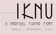 Mexican designer of the architectural Tekton-style lettering font Iknu (2022). [Google]
[MyFonts]
[More] ⦿
|
Increments
[Evan Lelliott]

|
 UK-based designer of II Vorkurs (2020: a 6-style geometric sans inspired by Bauhaus and Futura), II Balfron (2020), an all caps typeface about which he writes: Inspired by the Ernö Goldfinger's east London tower block of the same name, II Balfron is an imposing, all caps, one-weight typeface. Brutalist in form, the characters embody the principles of the distinctive 27-storey concrete profile with unexpected angles set within a rigid, structural grid. Much like Goldfinger's humanist, utopian housing ideals, the font is best viewed at large scale. [Google]
[MyFonts]
[More] ⦿
|
Inspiration Feed
[Igor Ovsyannykov]
|
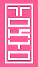 Warrenton, VA and Washington, DC-based designer in 2015 of Bitcraft, Tokyo Typeface (inspired by inkan seals), Pixel Patterns, Flight (dot matrix typeface), Hand Drawn Arrows, Hype (techno), Galaxy (techno/futuristic), Fluffy, Detective (typewriter font), Funky (hand-drawn font), Hacker (a cyber typeface), Yeti (handcrafted) and Game Over (video game font).
 In 2016, he designed Architect. Creative Market link. Behance link. [Google]
[More] ⦿
|
Intergraph Corporation
|
A series of 15 truetype fonts (called EMS or ANSI) that appear to be just right for architectural or CAD drawings. Made in 1996, they appear to be free. Dead link. [Google]
[More] ⦿
|
International Standards Organisation
|
 Swiss organization which in the type world is best known for its simple monoline rounded typeface Isonorm proposed in 1980. The font is appropriate for drafting and architectural purposes, as well as for technical charts and graphics. This typeface was digitally implemented by many, including:
 - Isonorm D by URW.
- Isonorm by Linotype.
- Isonorm MN by Mecanorma.
- Isonorm EF (Elsner & Flake).
- Isonorm SB (2004, by Scangraphic).
- FF Isonorm by Robert Kirchner (1992-1993). In four weights and with a monospaced option.
- Isotope (2012) by Fabio Duarte Martins (Scannerlicker). This is the largest collection. While all others have one or at most two weights, Scannerlicker offers 18 weights.
- Iso Metrix NF (2012) by Nick Curtis.
- Instant Schrift (2000) by Edgar Walthert. This is a redesign of Isonorm 3098 matching the radical restrictions of the Instant design-manual.
- Isonorm by Infinitype.
- PF Isotext Pro (2005, Panos Vassiliou, Parachute). A Latin / Greek family based on Isonorm.
View some digital fonts based on Isonorm. [Google]
[More] ⦿
|
Ira Lensberr
|
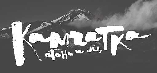 Talented lettering artist, calligrapher and type designer in Volgograd, Russia, who graduated from BHSAD in Moscow in 2014. Ira's typefaces include Stuff (2014), Filum (2014, thin, techno face), Koolhaas (2014: inspired by architect Rem Koolhaas; renamed Gebouw), Staket (2014, a war movie font), Bodler (2014, named after Charles Baudelaire, this inky calligraphic typeface is exceptionally beautiful). All fonts cover Latin and Cyrillic.
 In 2014, Ira finished Manola, an expressive flared lapidary sans typeface family with applications in stone carving, developed under the guidance of Alexander Tarbeev. [Google]
[More] ⦿
|
ISTF
[Igor Stepanchenko]

|
Russian designer of the free typeface Rounded (2019) and the free squarish Latin / Cyrillic typeface Architectural (2019). In 2022, he released the bloated belly slab serif Kidder for Latin and Cyrillic. [Google]
[MyFonts]
[More] ⦿
|
Ivan Phillipov
[Neogrey]
|
 [More] ⦿
|
Ivar Lyngner
|
Norwegian architect, and graphic and type designer who lives in Jar, Norway. Creator of the free fonts Mir II (futuristic) and Mir III (like architectural lettering). [Google]
[More] ⦿
|
Jade Wong
|
Designer in Boise, ID, who created the architecturally-inspired typeface Union Block (2012). Behance link. [Google]
[More] ⦿
|
Jake Luedecke
[Luedecke Design Font Co (was: LDF Fonts)]
|
 [More] ⦿
|
James Cromar Watt
|
Scottish architect, 1862-1940. He was part of the Arts and Crafts movement. Examples of his alphabets include Modern Roman Capitals. [Google]
[More] ⦿
|
James Zachman
|
James Zachman (Chicago, IL) created the marker typeface Natalie (2012), which is sufficiently well-mannered for uses on architectural plans and technical or semi-official presentations. [Google]
[More] ⦿
|
Jan van Dijk

|
Dutch designer of Demian (1984 at ITC, like Tekton) and Van Dijk (1982, hand-printed). Full list of his typefaces: FontShop link. Jan van Dijk's typefaces. [Google]
[MyFonts]
[More] ⦿
|
Jan Vranovsky
|
Designer of the paper-fold logotype Fontai (2009), Average (2012, an averaged typeface), Architekti (2009, headline face), and the logo typefaces Kruzynski (2009) and Candy Cane O (2009). He does identity and branding in Prague. [Google]
[More] ⦿
|
Jason Francisco
|
Industrial designer in Johannesburg, South Africa. In 2019, he published Zeitz, which was based on the architecture of Zeitz MOCAA (Museum of Contemporary Art Africa). [Google]
[More] ⦿
|
Jaume Mercader
|
Architect in Barcelona. Designer of the free condensed all caps sans typeface Kompakt (2017). Behance link. [Google]
[More] ⦿
|
Javier Valenzuela
|
Mexican designer of the free architectural slab serif typeface Brixar (2017). [Google]
[More] ⦿
|
JB Foundry
[Jean Boyault]

|
 JB Foundry was established by Jean Boyault (b. 1960, Suilly La Tour, France), a type designer who lives in Suilly La Tour. He is the designer of the cursive and other school fonts for teachers, all free and made in 2006-2007: JBCursive, JBEtude-Regular, JBMatrice, JBBatonRond-Bold, JBBatonRond-Extra, JBBatonRond-Italic, JBBatonRond-Regular, JBChantier, JBCursive++Feutre, JBCursive++Marqueur, JBCursive++Normal, JBFil, JBRond, JBScolaireT1-Bold-Italic, JBScolaireT1-Bold, JBScolaireT1-Italic, JBScolaireT1, JBScolaireT2-Bold-Italic, JBScolaireT2-Bold, JBScolaireT2-Italic, JBScolaireT2.
 Typefaces made after 2007: Simple Ronde (2011, upright connected script), JB Etude (2007), JB Script (2010), JB Haut>, JB Lames (2008), JB Elegant (2008), JB Cursive, JBStyle (2008), JB Fil Std (2009) and JB Calli (2008). Commercial typefaces: JB Davayé (2010, connected upright script), Belladone (2010, a graceful display family), Maceriam (2010, +Nova, +Putri, +Lapide: letters cemented into walls---a great idea). From 2011: Old French School Bold (upright connected script), Filature (a monoline connected upright script). Typefaces from 2012: Only One Dollar (a shaky script), JB Cursive 3, Purple Line, Purple Deco, Suilly La Tour, Typha Latifolia, Bouclettes (a curly upright typeface). Typefaces from 2013: Friandise (a decorative typeface reserved for chocolate enthusiasts), Capucine (a chocolate store pair of typefaces), Cuivrerie (a flared interlocking typeface based on lapidary inscriptions found in Bourgogne), Suilly La Tour (calligraphic script), Gaston (a large script family), Typha, Centaurea (a beautifully executed layered type system based on a didone with curved serifs), Toubib (hand-printed). Typefaces from 2014: Hirondelle (connected script), Lecteur Heureux (connected upright loopy script), Happy Reader (connected script), Hopeful Giraffe (a very tall and thin upright script). Typefaces from 2015: HopefulGrasshopper (a fun printed script), Henri Modeste (an experimental didone typeface), Gaston (upright connected ronde script), R+C (the ultimate explicit ruler-and-compass technical drawing typeface with filled, outlined and sketched substyles). Typefaces from 2016: Belle Allure (connected upright school script). Typefaces from 2017: Badinerie (flowery semi-connected connected script), Badinerie Love (with hearts added), badinerie Christmas. Fontsy link. Klingspor link. Dafont link. [Google]
[MyFonts]
[More] ⦿
|
Jérôme Bruley
|
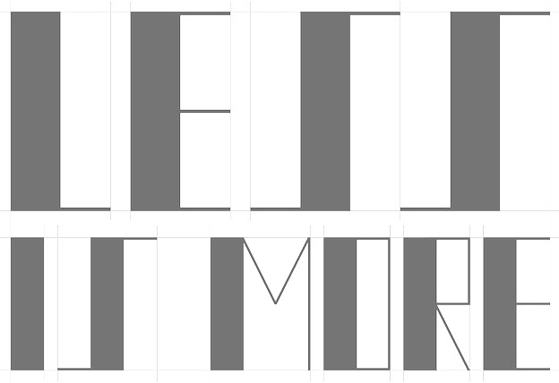 In 2014, Jérôme Bruley was studying design in Lille, France. In that same year, he created a Bauhaus-style typeface called LMVDR, which is named after Mies Van Der Rohe, architect and director of the Bauhaus school, on who's work the font is based. In particular, the piano key glyphs are inspired by the German Pavillion in Barcelona (1929). He also created Sail Font (2014) and the free AI format watercolor brush typeface Bud Powell (2015).
 Behance link. [Google]
[More] ⦿
|
Jean Boyault
[JB Foundry]

|
 [MyFonts]
[More] ⦿
|
Jeff Farmer
|
Phoenix, AZ-based designer of the drafting font Schematix (2019), the set of signpainters fonts Handbrushed Gothic (2019) and Handbrushed Spure (2019). [Google]
[More] ⦿
|
Jeff Levine
[Jeff Levine: Additional typefaces]

|
 [MyFonts]
[More] ⦿
|
Jeff Levine: Additional typefaces
[Jeff Levine]

|
 This is a list of fonts by Jeff Levine not categorized anywhere else on my pages.
 - A: Adelanto JNL (2009), Adhesive Letters JNL (2011), Adhesive Serif Letters JNL (2015), Adventure Film JNL (2021: a casual sans based on the titles and credits for Texas Across the River, 1966), Afternoon Edition JNL (2015), Air Circus JNL, Aisle Seats JNL (2006, based on letters cut by the Redikut Letter Company of Hawthorne, CA), Album Cover JNL (2008), Alleway JNL (2012, a condensed sans), Allograph JNL (2007), Alphacal JNL (2008, outlined, and like Juneway JNL, based on water-applied decals once made by the Duro Decal Company (now Duro Art Industries) of Chicago), Alton JNL (2010: a bold display sans), Amateur Printer JNL (2007, grunge), Ampersorts JNL (2011: ampersands), And So Forth JNL (2011), Anecdote JNL (2009), Announcement Board JNL (2018: white-on-black), Antique Packaging JNL (2019: Victorian), Antique Price Tags JNL (2019), Arcaro JNL (2013, a calligraphic typeface based on the movie credits of the ABC TV series Naked City, 1958-1963, starring detective Frank Arcaro), Antique Show Card JNL (2018: based on an alphabet from the first Speedball Lettering Book in 1915), Arch Creek JNL (2010, an all caps revival of Beton), Ardball (2006), Arrevederci JNL (2018), Arrow Callouts JNL (2021: an arrow-themed alphading font), Art Deco Monograms JNL (2015), Arte Critique JNL (2009), Artist Colony JNL (2009), Arts District JNL (2014), Art Student JNL (2010), Art Techno JNL (2017), Astrospy JNL (2008: techno), Awkward Gothic JNL (2008), Axelby JNL (2013).
- B: Backpage Article JNL (2010), Bal Harbour JNL (2008), Balcony Seats JNL (2007, narrow retro sans), Ball Game JNL (2018), Bandmaster JNL (2021: based on the opening movie titles from the 1940 musical comedy Strike up the Band starring Judy Garland and Mickey Rooney), Barricade (2011, a great shadowed caps face), Bayview JNL (2008, based on Inland Type Foundry's Studley), Best Bet JNL (2014, a slab serif redesign of Beton), Bike Decals JNL (2008), Billing and Shipping JNL (2010), Bingo Player JNL (2010), Birch Beer JNL (2008), Bitmap Typewriter JNL (2017), Bit Part JNL (2017: extra condensed), Bit Player JNL (extra-condensed tall poster font) (2015), Bloktor Mosaik JNL (2007), Blue Parrot (2006), Bluesman JNL (2014: based on the lettering of the blues album "I'm Jimmy Reed" released on the legendary Vee-Jay label out of Chicago), Bold Display Sans JNL (2016: based on an imge in a Speedball book), Bonehead JNL (2013, bones), Bookkeeper JNL (2019: based on R. Hunter Middleton's slab serif, Karnak), Bookkeeping JNL (2019, like an extra bold version of R. Hunter Middleton's slab serif Karnak (1936)), Boss Jock JNL (2021: an informal font based on the title and credits from the 1965 film Strange Bedfellows), Box Lunch JNL, Brass Rail JNL (2015), Brazil Nut JNL (2015), British Cinema JNL (2021, based on the hand lettered titles and credits from the 1945 British film The Way to the Stars), British Vehicle JNL (2020; based on the UK license plate font created by Charles Wright in 1935; with Ahmed Eraqi), Broadcast JNL (2015), Broadletter JNL (2009), Brochure Sans JNL (2022: based on Sans Serif No.7 from the 1921 Miller & Richard type specimen book), Brogado (2006), Brookside JNL (2016), Brushmark JNL (2011), Brush Off JNL (2017), Bulk Weight JNL (2017), Bum Steer JNL (2015), Burger Joint (2006), Burger Royale JNL (2007), Burlesk Queen JNL (2020: blocked letters), Business Helpers JNL (2014), Business Letter JNL (2021: based on the squarish typeface Geometric in the 1894 catalog of the John Ryan Foundry in Baltimore, MD).
- C: Calendar Blocks JNL (2009), Calling Card JNL (2010), Callouts JNL (2011, in Circle and Square styles; white letters on black background), Canby (2006, a squarish caps face), Candle Wax JNL (2014, based on the movie poster for Bell, Book and Candle starring James Stewart), Cast And Crew JNL (2015, condensed monoline), Cast Shadow JNL (2010), Casual Lunch JNL (2009), Casual Friday JNL (2008, roman lettering), Casual Tune JNL (2015), Catalog Serif JNL (2015), Catalog Sheet JNL (2022: based on an extra condensed serif typeface from the 1892 MacKellar, Smiths & Jordan type foundry specimen book), Catch Words JNL (2009), Channel Tuning JNL (1999), Channel Surfing JNL (2010), Charlies Bar BQ JNL (2008, heavy slab serif), Charmer JNL (2014), Chive Turkey JNL (2007), Chunky Nouveau JNL (2020), Circuletter JNL (2016), Ciribiribin JNL (2014), Classification JNL (2015), Classroom JNL (2009), Cling Vinyl JNL (2009), Coal Train (2004), Cocktail Hour JNL (2016, a beatnik typeface based on the opening title for the 1962 Blake Edwards film Days of Wine and Roses starring Jack Lemmon and Lee Remick), Coffee Bar JNL (2021: a squarish typeface), Coldfield JNL (2008), College Nouveau JNL (2018), Colmar JNL (2018), Columnist JNL (2020, after Morris Fuller Benton's News Gothic, 1908, ATF), Commentary JNL (2010, almost typewriter type---easy on the eye), Composer JNL (2017), Concierge JNL (2014), Conscription JNL (2017), Corkboard JNL (2010: a rounded all caps family), Cornfield JNL (2008), Crepe Paper JNL (2018), Criminal Intent JNL (2018: based on the trailer of the 1942 movie Mr. and Mrs. North), Crown Heights JNL (2007, slab serif caps), Cruise Director JNL (2021: an inline typeface based on a hand-lettered title on the poster for the 1933 musical comedy film Melody Cruise), Courtship JNL (2018), Cover Letter JNL (2019), Curtain Up JNL (2018), Cyberglass (2010, techno), Cybrox JNL (2012, grunge).
- D: Dance Hall JNL (2011), Dance Lesson JNL (2015, a wedge serif in the style of Latin Wide), Rotisserie Menu JNL (2021: based on a 1928 menu for the restaurant Rotisserie Du Cardinal), Dangits JNL (2009), Danish Script Initials JNL (2019, based on letters designed by Copenhagen-born industrial artist and letterer Gustav Boerge Jensen (1898-1954), Date Book JNL (2021; based on the credits of the movie The Awful Truth, 1937), Decal (2006), Decalcomania JNL (2017), Deco Of Tomorrow JNL (2014), Deconstructed JNL (2012), Decorative Panels JNL (2009), Deco Template JNL (2018: squarish), Deerfield JNL (2006, Bank Gothic style), Department Store JNL (2019), Desk Jockey JNL (2008), Deskplate JNL (2011: an all caps copperplate font), Desk Job JNL (2018), Detective Client JNL (2021: based on the cast credits of the 1941 film, The Maltese Falcon), Detention JNL (2007, hand-printed), Diamond Callouts JNL (2019, letters in triangles), Diamond Jim (2010), Diamondwood JNL (2015, rhombic), Dip Pen JNL (2017, rounded, handcrafted), Disclaimer JNL (2010, condensed thin headline face), Display Board JNL (2020: based on Paul Renner's Futura Display from 1932), Display Inline JNL (2009), Displayced (2006, LED font), Display Roman JNL (2014), Doggone It JNL (2019: based on the movie posters for the 1962 film, Mono Cane), Do It Yourself JNL (2008), Doo Wop Initials JNL (2007), Doowop (2006), Dormitory Decals JNL (2009), Double Take JNL (2008), Drafting Class JNL (2021: based on an all caps alphabet in The Essentials of Lettering by Thomas E. French and Robert Meiklejohn (circa 1912)), Dreamy JNL (2017), Dual Line Roman JNL (2021: an inline titling typeface), Duonor JNL (2010), Durable JNL (2016, based on a 1940s cover of a catalog for the Duro Decal Company of Chicago).
- E: Eastport JNL (2019: an interpretation of Morris Fuller Benton's 1931 classic, Stymie Extra Bold), Eat More Fruit JNL (2016), Eccentric Sans JNL (2018), Edessa JNL (2009: chiseled stone look, faux Greek), Editorial Comment JNL (2009, grotesk caps-only headline face), Edits and Credits JNL (2008), Egg Farm JNL (2021: based on the opening titles and credits of the 1947 film comedy The Egg and I), Electric Newspaper JNL (2021: a dot matrix font based on the moving message board electric newspaper from 1931 installed by the Los Angeles Times---in partnership with the Richfield Oil Company---on its building), Electrostatic JNL (2017, textured), Elite Resort JNL (2017, slab serif), Elsinor (2006), Endless Journey JNL (2009), Ensemble Inline JNL (2014), Entitled JNL (2007, squarish as in Bank Gothic), Evening Edition JNL (2009), Evening Event JNL (2021; based on hand lettering from the title credits for the 1950 film All about Eve), Evening Paper JNL (2015), Evening Walk JNL (2018), Expressions (smilies).
- F: Factual JNL (2010,headline face), Fairgrounds (2006), Fancy Free JNL (2016: decorative caps), Fancy Show Card JNL (2021), Farragut JNL (2008, hairline geometric), Fastenating JNL (2012, paper clip font), Federal Agent JNL (2021: a condensed typeface based on the opening title of the 1959 premiere season of The Untouchables), Feltboard JNL (2008), Fence Post JNL (2012), Festival Nights (fancy letters), File Clerk JNL (2020, Jeff Levine: based on Cushing (1897)), File Folder JNL (2010, Bank Gothic style family), Film Crew JNL (2009), Fincastle JNL (2011, all caps sans titling face), First Responder JNL (2017: a left-slanted version of Catalog JNL), Flagstaff JNL (2010), Flatbush Beanery (2006), Flipboard JNL (2011), Flivver (2006, a slab-serif display font), Floor Tiles JNL (2009), Florida (2006, retro), Food Vendor JNL (2011), Fordham JNL (2011, all caps slab serif), Formal Invite JNL (2021: thin, condensed serif lettering found in a 1937 magazine ad for Chris Craft boats), Formal Notice JNL (2020: a revival of an alphabet by Samuel Welo in Studio Handbook for Artists and Advertisers), Frankly Plain JNL and Franky Ornate JNL (2010, all caps typefaces after Franklin Gothic), Frantic Pace JNL (2016, a bouncy retro party font), Free Form Retro JNL (2021: an all caps sans based on the titles and credits from the 1960 French film Le Passage Du Rhin), French Calligraphic JNL (2019), French Cinema JNL, French Serif Moderne JNL (2009), French Slab Serif JNL (2018: based on the 1934 French lettering instruction book L'Art du Tracé Rationnel de la Lettre), French Song JNL (2021: a whimsical typeface based on the titles and credits of the 1952 British comedy Song of Paris), Freunlaven JNL (2006, psychedelic), Front Row JNL (2017: a tall condensed typeface that reinterprets Morris Fuller Benton's Empire from 1937), Fruit Juice JNL (2020), Fun and Games (2011, a casual retro typeface redrawn from the lettering found on the cover of a 1935 Speedball Lettering Pen book).
- G: Gene Condensed JNL (2014), Generic Sans JNL (2022: modeled after Condensed Blair from the 1907 specimen book of the Inland Type Foundry), Generic Gothic JNL (2013: an interpretation of Franklin Gothic Condensed), Genesee JNL (2010), Gift List JNL (2016), Gift Wrap JNL (2014), Gilbert JNL (2011, after Eric Gill's sans), Go Home JNL (2017), Good Sport JNL (2019), Goose Creek JNL (2021: based on hand lettered credits from the 1942 British film comedy The Goose Steps Out), Go To Town JNL (casual inline type style) (2015), Gothic Grotesk JNL (2020; a revival of Royal Gothic (1930s, Stevens, Shanks & Sons), which in turn was based on Charter Oak (1899, Keystone Foundry)), Greenwich Village JNL (2014), Groovy 3D Caps JNL, Groovy Happening JNL (2005, psychedelic, in the style of Action Is), Groovy Summer (2006, a casual sans), Guadalajara JNL (2014, a Mexican party font), GummedAlphabet JNL (2011), Gummed Letters JNL (2010).
- H: Halavah Twist JNL (2007; see also its extension Zydeco JNL in 2009), Hallandale (2006), Halliday JNL (2013: an outlined typeface based on Beton Open Condensed), Handbills And Posters JNL (2015), Handmade Caslon JNL (2015), Handmade Dropshadow JNL (2010), Handmade Gothic JNL (2011, inspired by lettering samples in a 1941 Speedball Lettering Pen instructional booklet), Handmade Headline JNL (2018: a 1940s style typeface), Handmade Roman JNL (2011), Hand Stamped JNL (2006, rubber stamp look), Hanford (2010, a sans headline family), Hash and Beans JNL (2007), Headstone Roman JNL (2015), Hectonoid JL (2008), Heller Sans JNL (2019: after an experimental alphabet by Steven Heller), Highbrow Cafetorium JNL (2009), Hippie Comics JNL (2021: based on poster lettering in the 1920 edition of How to Paint Signs and Sho Cards by E. C. Matthews), Home Address JNL (2019), Home Economics JNL (2018), Home Room JNL (2009), Horse Puckey JNL (2008), Hotel Suite JNL (2017), Hoxie JNL (2008).
- I-J: Impecunious JNL (2017), Impressionable JNL (2012, based on a rubber stamp set), Incarceration JNL (2020), Industriality JNL (2015), Informational Gothic (2013: The Wood-Regan Instruments Company (Wrico) of New Jersey manufactured for decades a line of lettering kits called the Wrico Sign Maker. With only special ink pens, plastic templates and a template guide anyone could letter clean, clear signs, posters and notices. This typeface is based on one of those kits), Informational Sans JNL (2021: squarish, caps only), Initial Seals JNL (2012), Inkpad Letters JNL (2011), Inline Lettering JNL (2011, inspired by the opening title of a classic 1940s horror film, The Invisible Man's Revenge), Inlet JNL (2017), Inline Square JNL (2017), Innerspring JNL (2015), Intermediate JNL (2019: based on a home movie titling kit from circa the 1950s or 1960s called the Magna Tech Titler Number 312, modeled after Futura Bold), Interoffice Memo (2011), Intrigue JNL (2014, based on the hand-lettered movie titles from one of the William Powell / Myrna Loy Thin Man series of films), Island Time JNL (2015), Jalopy (2014), Jive Jump (2006), Jobseeker JNL (2011: hand-printed), Juneway (2006, modeled after a set of water-applied decals made by the Duro Decal Company of Chicago), Jungle Drums JNL (2017, African theme), Junior Printer JNL (2015), Just Great JNL (2016: angular display typeface).
- K-L: Katydid JNL (2015, a connect-the-dots typeface), Katz Pajamas JNL (2017), Keyden Drop Caps JNL (2021: a set of slab serif framed capitals based on John Alden Initials, shown in the 1906 edition of the Keystone Type Foundry specimen book), Key Largo JNL (2011, all caps slab serif), Lakeland JNL (2013), Kiddie Blokz JNL (2010), Kids Activities JNL (2017, handcrafted), Lamp Post JNL (2012, an interpretation of Post Old Style, ca. 1901), Last Date JNL (2018), Lasting Impression JNL (2008), Late Breaking News JNL (2016, headline sans), Late Hours JNL (2021: inspired by the hand lettered titles for the 1961 film The Children's Hour), Lecture Hall JNL (2012), Lefferts (2006, squarish display face), Legal Brief JNL (2021), Legal Eagle JNL (2017, with engraved lines), Les Folies JNL (2009, Victorian), Lettering Lesson JNL (2021: a bold serif typeface based on the 1922 instructional booklet from the St. Louis Show Card School), Lettering Pen JNL (2015, handcrafted), Library Book Initials JNL (2018: Library Book Initials JNL was modeled from examples of Sidney Gaunt's Publicity Initials; originally sold in metal type by Barnhart Brothers and Spindler as a companion to the Publicity Gothic typeface), Liebestraum JNL (2014, a decorative caps font), Limited Appeal JNL (2016), Linem Up (2010), Lobby Card JNL (2010), Local News JNL (2021: a condensed sans based on the hand lettered title for the 1954 film Power of the Press), Location JNL (2017), Longbranch Initials (2006, for decorative monograms), Longacre JNL (2013, fat rounded sans), Long And Thin Initials JNL (2015), Loose Leaf JNL (2010), Love Notes JNL (2011: alphadings), Luminum JNL (2007).
- M: Made in Japan (2014), Mailbox Letters JNL (2008), Main Feature JNL (2017, a marquee sans), Mainline JNL (2014), Manual Typewriter JNL (2017: allegedly after a 1933 example by Morris Fuller Benton), Manufactory JNL (2019, a wedge serif not unlike the ones used in advertizing in the late 19th century), Manufacturer JNL (2020: a reinterpretation of the Extra Bold Extended weight of Bauersche's Venus Grotesk (ca. 1907)), Marble Cutter JNL (2015, based on dies used for stamping text into marble headstones or other monuments manufactured by The Vermont Marble Company (Vermarco), which operated from the 1880s until 1976), Marching Band JNL (2019), Margate JNL (2013, based on water-applied decals manufactured in 1962 by the American Decalcomania Company for Goodyear), Marketing Strategy JNL (2017), Marking Device JNL (2014), Maryland JNL (2014), Matchbook JNL (2014: based on lettering on a matchbook from the Carrousel Restaurant in Miami Beach), Mayville JNL (2009), McCadden JNL (2013, inspired by the hand-lettered credits for the George Burns and Gracie Allen Show [1950-1958]), Meal Ticket JNL (2008, squarish), Merchandiser JNL (2010), Merchandising JNL (2014, brush signage script), Merchant Trade JNL (2020, after the Matthews Series by Inland Type Foundry, 1901), Merrymakers JNL (2020), Midnite Movie JNL (2017, inspired by the hand lettered title credits from the 1961 Hammer Pictures film Curse of the Werewolf), Millport (2006, squarish display face), Mimeograph Template JNL (2019: based on a plastic lettering guide manufactured by the Albert Blake Dick Company of Chicago), Misdirection JNL (2009), Mixed Messages JNL (2007, ransom note), Mocombo JNL (2010, an African look typeface that is a slightly modified version of one of the numerous alphabets created by the late Alf R. Becker for Signs of the Times Magazine during the period of the 1930s through the 1950s), Model Railroad JNL (2015), Moderator JNL (2013), Modern Appliances JNL (2014), Monoline Rounded JNL (2014), Monster Movies JNL (2018: a Halloween font), Monthly Meeting JNL (2013), Monthly Newsletter JNL (2011), Monthly Statement JNL (2018: based on the 1934 French lettering instruction book L'Art du Tracé Rationnel de la Lettre), Morning Edition JNL (2021), Morning Paper JNL (2015), Morningside Heights JNL (2015), Morningstar JNL (2012, named after Jeff's friend, Estella Dawn Roberts of Stella Roberts Fonts), Movieland JNL (2008), Movie Night JNL (2011), Movie Set JNL (2021: an all caps wedge serif based on a 1911 movie poster for the film How Bella Was Won), Movie Show JNL (2021: an all caps wedge serif based on a 1911 movie poster for the film How Bella Was Won), Moving Message JNL (2015, dot matrix typeface), Musical Arrangements JNL (2014), Musical Comedy JNL (2021: hand-printed), Musical Score JNL (2015), Music Course (2019), Mystery Show JNL (2018: modeled after the hand lettered titles found on various early episodes of the 1950s TV suspense program Alfred Hitchcock Presents).
- N: Naroid Initials JNL (2010, one of the most ultra-compressed sets of initials available in digital type), Narrow Minded JNL (2014), National Spirit JNL (2009), Newark JNL (2014: a strong slab serif), New Car Tag JNL (2020: based on the new license plates in Florida, which were introduced in 2018), Newsbreak JNL (2008), Newsbreaker JNL (2016; a vintage newspaper titling typeface), News Crew JNL (2017), Newshawk JNL (2007, a condensed sans), Newspaper Publisher JNL (2021: based on a headline in the 1917 edition of Logansport, Indiana Pharos-Observer), Newsprint JNL (2011), Newsreel Caps JNL (2014), Newsreel Text JNL (2021), News Ticker JNL (2021: based on the New York Times Square ticker operational in the 1930s), Newsworthy JNL (2011: a condensed headline sans), New Thin Roman JNL (2019, based on an alphabet called Compressed Roman in Essentials of Lettering, 1912), Nightcap JNL (2011), Nighthawk JNL (2009, a retro headline sans), No Entry JNL (2021: a bold blocky slab serif based on the hand lettered titles and credits from the 1958 war film The Young Lions), Nondescript JNL (2012), Nouveau Date JNL (2021: arts and crafts style), Nouveau Fashion JNL (2018), Nouveau Spur JNL (2019: neither art nouveau nor spurred), Nouveau Standard JNL (2018), Nouveau Handlettered JNL (2017), Nouveau Lettering JNL (2019, based on a 1916 slab serif alphabet by Thomas Wood Stevens), Nouveau Romance JNL (2017), Nouveau Roundcorner JNL (2015), Nouveau Square JNL (2017, squarish), Nouveau Standard JNL (2018), Nouveau Work JNL (2018), Nouveau Years JNL (2019), Nouveau Yorke JNL (2015), Novelty Nouveau JNL (2021), Now Playing JNL (2010).
- O: Oblogram JNL (2008, techno), Occidental Tourist JNL (2009), Odditype JNL (2006, computer simulation), Off Duty JNL (2021: based on the hand lettering from the titles and credits of the 1964 French film comedy Le Gendarme de Saint-Tropez), Office Staff JNL (2021: a version [with serifs added] of Popularity JNL---a condensed art deco design based on a popular typeface known as Radiant), Office Space JNL (2021: based on Condensed Edina from the 1921 Miller & Richard type specimen book), Office Work JNL (2021: a squarish typeface based on the title and credits of the 1965 film Mirage), Off The Wall JNL (2008). Old Bodoni Wide JNL (2016), Old Songs JNL (2018), Old Tijuana JNL (2018: in the serape style of pseudo-Mexican lettering found on ad designs of the 1930s and 1940s), Order Form JNL (2021: after MacKellar, Smiths & Jordan's Lining Gothic Extended from their 1892 catalog), Ordinary Gothic JNL (2017: gaspipe style), Outline Sans JNL (2018), Overnight JNL (2017), Oversimplified JNL (2019), Overton JNL (2017, based on early letter designs of Rudolf Wolf).
- P-Q: Pacific Atoll JNL (2021: a stylized slab serif type design based on the movie title lettering for the 1942 wartime film Pacific Rendezvous), Pacific Island JNL (2017: a tiki font based on the sheet music cover for the title song from the 1957 Marlon Brando movie Sayonara), Packaged Cookies JNL (2021; based on the first Oreo Sandwich package from 1923), Packaged Goods JNL (2016), Park Slope JNL (2014), Parfum de Paris JNL (2014), Paint Store JNL (2006), Parking Lot Sale JNL (2021: a flag font), Parkitechture (2006), Part and Parcel JNL (2009), Partial Eclipse JNL (2012), Patriotica JNL (2011, American flag face), Pavement JNL (2010, based on the extra-condensed lettering used on roadway information signs as revised by the U.S. Government in 2000), Pendraw Roman (2006), Pen Elegant JNL (2018, after an alphabet from a 1918 lettering instruction book by William Hugh Gordon), Pen Gothic JNL (2017: a rounded sans), Penmanshift JNL (2006, ronde style), Pen Nib Square JNL (2019), Penny Wise JNL (2017), Pen Sans Rounded (2019: based on a Speedball book from 1940), People Talk JNL (2021; a squarish all caps typeface based on a title card with cast credits for the 1935 movie The Whole Town Talking starring Edward G. Robinson and Jean Arthur), Performer JNL (2014, re-drawn from condensed hand lettering found on a piece of vintage sheet music), Personal Invitation JNL, Personalization (2019: a squarish typeface), Personal Note JNL (2011), Photo Developer JNL (2021), Picz JNL (2009), Pillow Puff JNL (2008, fluffy and cloud-like lettering), Pistol Twelve JNL (2008), Pitkin JNL (2006, a hand-lettered sans), Plastic Display JNL (2010, sketched from photo examples in an old sales promotion sheet for the Movitex Do-It-Yourself Plastic Sign Kit by Pryor Marking Products of Chicago), Plastic Template JNL (2011), Pleasantville JNL (2012, a condensed slab serif), Pocket Initials JNL (2008), Podunk JNL (2007), Political Poster JNL (2021: a condensed casual sans inspired by the hand lettering on a 1940 campaign poster for Franklin Delano Roosevelt), Pool Deck JNL (2015), Popstix JNL (2013), Pop Tune JNL (2014), Popularity JNL (2014, after Radiant), Port Of Call JNL (2015), Postal JNL (2009, white on black, as on stamps), Poster Contoured JNL (2018), Poster Pen JNL (2017), Poster Inline JNL (2014), Poster Plain JNL (2012), Poster Project JNL (2020), Post Production JNL (2021: a slab serif modeled after title card of the 1950 Humphrey Bogart and Gloria Grahame drama In a Lonely Place), Prehysteric JNL (2010), Presentation JNL (2011, a slabby family), Press Run JNL (2015, a reinterpretation of the classic typeface Cheltenham Condensed), Pricing Labels JNL (2010), Printed Letters (2006, made from stamped impressions made by a 1940s childrens sign making set), Printing Set JNL (2006, based on a rubber stamp alphabet), Printing Sorts JNL (2009), Prismatiq JNL (2009, shadow face), Privilege Sign JNL (2021: based on above-the-store signage for many newspaper stands, soda shops, candy stores, luncheonettes and pharmacies of the 1950s and early 1960s), Privilege Sign Two JNL (2021: based on decorative signage for many drive-ins, motels, food stores and other businesses of the 1940s), Promotional Copy JNL (2012), Proofreader JNL (2011, a rounded slab serif face), Prospect Heights JNL (2015), Public Notice JNL (2009), Public Transportation JNL (2008), Public Utility JNL (2012), Public Works JNL (2007: emulates the hand-cut lettering silk screened onto metal), Publication JNL (2010, a revival of DeVinne, 1890), Punch Tape JNL (2016, dot matrix font), Quick Meal (2019: a hand lettered interpretation of Morris Fuller Benton's 1905 design Miehle Extra Condensed Title), Quick Poster JNL (2019), Quick Response JNL (2015, based on QR codes), Quick Titling JNL (2019), Quorfid JNL (2010).
- R: Raccoon Coat JNL (2014), Radio Interference (2019: grungy), Radio Show JNL (2019: based on a logo from the TV show Car 54 Where Are You?), Rail Bum JNL (2016, basically Morris Fuller Benton's Hobo with slab serifs added), Railway Station (2019: a spurred wedge serif), Recording Artist JNL (2019), Record Jacket JNL, Recreation JNL (2013, outlined shadow face), Red Border Labels JNL (2015), Rendering (2011, architectural draftman's lettering), Reprint JNL (2013), Restaurant And Lounge JNL (2015, handcrafted), Retail Merchant (2006), Retail Monoline JNL (2021: a stylish thin headline typeface), Retail Packaging JNL (2019), Recruitment JNL, Retail Price JNL (2021, +Inline; for catchy price cards), Retail Shop JNL (2018: based on vintage New York City neon signage), Retirement JNL (2021: a flared headline typeface based on the hand lettered film credits for the 1937 movie Make Way for Tomorrow), Retro Packaging JNL (2018), Retro Resort JNL (2011), Reveler JNL (2019), Reverberation JNL (2011, horizontally striped face), Reverse Calendar Blocks JNL (2011), Rhineland Roman JNL (2017), Ritz Slab Serif JNL (2018), Road Picture JNL (2021: modeled after the hand lettered title and credits for the 1940 Bob Hope-Bing Crosby semi-musical comedy Road to Singapore), Roadside Diner JNL (2021: a signpainting font in the style of pre-war Miami), Rockaway JNL (2006, titling sans), Rock Concert JNL (2021; an all caps curly Victorian typeface inspired by the opening title and credits for the 1964 motion picture comedy Send Me No Flowers starring Rock Hudson, Doris Day, and Tony Randall), Roma Initial Caps JNL (2009), Rotisserie Menu JNL (2021: based on a 1928 menu for the restaurant Rotisserie Du Cardinal), Rough Print JNL (2012, rubber stamp lettering), Roundpoint Pen JNL (2011, based on instructional lettering found in an old Speedball Pen textbook), Roughshod (2006), Running Board JNL (2017, monoline, pen-lettered), Rural Route JNL (2010), Rustic Inn JNL (2014).
- S: Salad Bar JNL (2013), Sales Convention JNL (2021: a squarish typeface based on a menu printed in 1937 for the Starlight Room of the Waldorf-Astoria in New York City), Sales Pitch JNL (2014), Sales Slip JNL (2013), Sandcastle JNL (2011), Sans Poster Bold + 3D, Savings And Loan JNL (2014), Scandals JNL (2017), School Project JNL (2015, based on self-adhesive poster board letters once made by the E-Z Letter Stencil Company and sold under the name Quik Stik), Schoolroom JNL (2020: a school font based on the type style used for the Superior Sign and Chart Printer No. 929), School Age (2019: based on Trixy Toy Educator, a 1930s-era set of letters and numbers for teaching children, manufactured by the Durrel Company of Gardner, MA), Schoolyard Blues JNL (2018), Sea Cruise JNL (2015), Scoreboard JNL (2014: dot matrix typeface), Screentext JNL (2010, pixel), Screenwriter JNL (2021; based on the all caps hand lettered credits from the 1950 Humphrey Bogart film In a Lonely Place), Second Guess JNL (2017), Second Impression JNL (2008), Sennetarium JNL (2008, after lettering in a Charlie Chaplin movie), Semi Calligraphic JNL (2018), Sentzoff Coupon (2006, stitched), Series A Signage JNL (2018: this is based on Highway Gothic, also known as FHWA, by the United States Federal Highway Administration; the widths varied from A (condensed) to F (wide), but A was discontinued, hence the motivation to create Series A Signage), Serif Callouts JNL (2017), Sew What JNL (2010, stitching face), Shareholder JNL (2015), Shelf Numbers JNL (2008), Shelf Tags JNL (2017), Shicken Zoop JNL (2008, Hebrew), Shipping Carton JNL (2012), Sign and Poster JNL (2009, die-cut letters), Sign and Display JNL (2019: a companion of Sign and Poster), Shopkeeper JNL (2010, after a a vintage rubber stamp sign and chart printing set), Shopping Guide (2019), Short Subject JNL (2016, based on some hand-lettered title cards from various vintage Columbia Pictures two-reel comedies), Show Card Freehand JNL 2021; based on the title and credits for the 1951 Dick Powell and Rhonda Fleming film Cry Danger), Show Card Pen JNL (2021: based on an alphabet in the 1920 edition of How to Paint Signs and Sho Cards by E. C. Matthews), Show Card Sans JNL (2021: based on an alphabet in the 1922 book Modern Show Card Writing), Showmanship JNL (2017), Show Poster JNL (2021: A vernacular typeface based on a design from the 1960 edition of Samuel Welo's Studio Handbook for Artists and Advertisers), Shutterbug JNL (2021: a blocky typeface based on the signage of Jerry Lewis's Camera Exchange on Vine Street in Hollywood in 1950), Sightseeing Boat JNL (2021: based on the titles and credits for the 1966 romantic comedy The Glass Bottom Boat), Sign Expert JNL (2021: based on an alphabet in The Expert Sign Painter, 1922), Sign Studio JNL (2019: a multiline typeface modeled after an alphabet found in Martin Meijer's Album de Lettres Arti (1949)), Sign Template JNL (2015, based on one of the many plastic lettering guides manufactured by the now-defunct Wright-Regan Instrument Company also known as Wrico), Silent Film JNL (2021: a display slab serif used by the Uptown Theater in Wichita, Kansas, in 1928), Silent Movies JNL (2021; a rounded monolinear sans of the interbellum period), Silly Behavior (2019: a shaded bouncy letter font that revives a 1930 alphabet from 100 Alphabets Publicitaires dessinés par M. Moullet), Simplicity JNL (2014), Simply Grotesk JNL (2012, Peignotian), Simply Nouveau JNL (2017), Slab Compact JNL (2019), Sleuth JNL (2013, after the trailer for the 1936 movie After The Thin Man), Slim Chance JNL (2015, an ultra-narrow font based on an image of vintage packaging for Aquapruf Ear Drum Protectors), Slim Nouveau JNL (2017), Snack Shop JNL (2007, the retro diner look in a bold outline face), Snorkel JNL (2014), Snow Job JNL (2017, inspired by the hand-lettered titles for the 1964 Rankin-Bass animated holiday classic Rudolph the Red Nosed Reindeer), Socialite JNL (2009), Soda Fountain JNL (2015, bilined), Solid Serif JNL (2014), Songbook JNL (2014), Song Composer JNL (2017), Song Merchant JNL (2017), Song Plugger JNL (2014), Song Publisher JNL (2015), Song Stylist JNL (2016), Song Vendor JNL (2017), So Unusual JNL (2021: based on the hand lettered credits for the 1942 film comedy I Married a Witch), Southwest Serenade JNL (2015), Special Edition JNL (2021: based on a newspaper headline font used in 1924), Specimen Book JNL (2020: based on Lining Antique (1889. Illinois Type Foundry) and Central Lining Antique (1892, Central Type Foundry)), SplintersJL (2004), Sporting Event JNL (2021: a slab serif based on the title and credits of a British boxing film from 1953 called The Square Ring), Sportsboard JNL (2020: a flipboard font), Sport Shaded JNL (2009), Spring Fashion JNL (2010), Spring Season JNL (2020: textured caps), Spur Handlettered JNL (2008), Squarity JNL (2008), Stage Production JNL (2020), Stage Show JNL (2021: based on the movie credits for 9 Garcons...Un Coeur starring Edith Piaf), Stamp of Approval JNL (2007), Stamped Metal JNL (2012, beveled), Starlight Sans, Stationer JNL (2018), Stellator JNL (2006, a high-tech modular font), Stenographer JNL (2021: close to Bank Gothic Condensed), Stickball JNL (2017), Stonecut JNL (2014), Store Clerk JNL (2020: outlined), Store Tags JNL (2011), Streetcar JNL (2019: a vintage railroad wagon lettering font), Streeter JNL (2013, based on Beton Bold Condensed), Stylish Title JNL (2021: based on the cover title of the July 1935 issue of Harper's Bazaar), Subscription JNL (2018), Summer Holiday JNL (2021; based on the hand lettered production credits for the 1930 film Holiday), Summertime Breeze JNL (2021: based on the opening title sequence for the 1958 film The Long, Hot Summer), Sunlight JNL, Sunny South JNL (2015), Sunshine Susie JNL (2018), Supporting Cast JNL (2011), Surf Bum (2019), Swing Band JNL (2013: inspired by the title lettering from "Hi-De-Ho", a 1930s all-black cast film starring legendary bandleader Cab Calloway), Swing Vote JNL (2020: a beatnik font).
- T: Tabloid Edition JNL (2021: based on a headline newspaper font from UK's Daily Mail in 1918), Tabloid News (2019: an all caps condensed slab serif), Tabloid Press JNL (2015), Take Charge JNL (2016, based on the opening title card for the 1936 film The Charge of the Light Brigade starring Errol Flynn, Olivia de Havilland, Donald Crisp and David Niven), Tallahassee Chassis JNL (2007, modeled from a toy rubber stamp set imported from Japan), Tall And Narrow JNL (2015), Tamiami JNL (2009, Victorian, known as "Cuba"), Tea Bag JNL (2013), Tea Time JNL (2014), Technerd JNL (2011, a thin technical/mechanical face), Technopen JNL (2013: a rounded techno sans from a 1929 instructional booklet for the Esterbrook Drawlet Pens), Teenagers JNL (2021: a beatnik font that was inspired by the hand lettered opening credits for The Many Loves of Dobie Gillis, a teen-oriented television comedy that ran from 1959 to 1963 on CBS), Teen Years JNL (2021: a blocky sans inspired by the hand lettered name for the Joyce Records label (circa 1956)), Template Basic JNL (2021: a simple sans), Template Sans (2019: based on a lettering template by the Wright-Regan Instrument Company (Wrico)), Template Shadow (2019), Tenement JNL (2020: based on a Cooper Black style alphabet by Harry Lawrence Gage that was shown in Thomas Woods Stevens's book Lettering (1916)), Terrace JNL (2015), Terror JNL, That Stuff JNL (2009), Theater Lights JNL (2014), Theater Tickets JNL (2021: Based on the marquee signage for Detroit's Majestic Theater built in 1934), Theatrics JNL (2009, 3d face), Thin Mint JNL (2011), Thinly Disguised JNL (2016), Three Day Pass JNL (2009), Tiler JNL (2012, a gridded face), Title Block Sans JNL (2011, an avant-garde titling face), Too Much Information JNL (2007), Top Billing JNL (2008, dot matrix), Top Forty (2019: handcrafted), Topographic Sans JNL (2018: a mapmaking sans featured in a U.S. Army Corps of Engineers topographic drafting manual), Toucan Tango JNL (2007, multiline face), Tough Guy (2006, shaded titling face), Tough Stuff JNL (2008), Toy Decals JNL (2018), Toy Letters JNL (2018: based on die-cut letters and number by Village Toys (circa 1930s or 1940s)), Toyprint JNL (2009, grunge), Trade Journal JNL (2010), Trade Printer JNL (2007, Victorian-era sans emulation), Train Car JNL (2021: based on the hand-lettered opening credits of Alfred Hitchcock's Strangers on a Train (1951)), Transactive JNL (2007, dot matrix), Transcendental JNL (2017), Tribal Council JNL (2011, jungle lettering with a linocut look), Trilium JNL (2010, triline face), Tropicano JNL (2013, a wavy typeface), Tunesmith JNL (2014, Victorian), Twelve Oaks (2006), Two Cents Plain JNL (2012), Two Reeler JNL (2006; see also its follow-up typeface Positive Vibe JNL, 2007, both modeled after title cards of an early Charlie Chaplin movie), Two Step Nouveau JNL (2018), Type Catalog (2011, bilined all caps face), Typemonger JNL (2022: based on Two Line Sans Serif from the British type specimen book of Vincent Figgins (circa 1860)), Typesetter JNL (2011), Type Vendor JNL (2012), Typewriter Sans JNL (2015), Type Wronger JNL (2013, old typewriter typeface).
- U-V: Unpretentious JNL (2014), Urmeba JNL (2012, named after amoebas and co-designed with Ray Larabie; a barf font), Used Cars (2012), Utica JNL (2010, squarish all caps face), Vacation Resort JNL (2021: based on the hand lettered cast and production credits for the 1942 musicl comedy Holiday Inn starring Bing Crosby and Fred Astaire), Vaudevillian JNL (2017), Utility Signage JNL (2017), Vehicle JNL (2010, a condensed block font as for car plates), Vendor JNL (2010, Victorian era ribbon face), Vertical Roundpoint JNL (2011, found in a 1941 edition of the Speedball Lettering Pen instruction book and re-drawn digitally by Jeff Levine), Victorian Typewriter JNL (2020), Vintage Designs JNL (2009, dingbat which has some fists), Vintage Price Tags JNL (2015), Vododeo JNL (2014).
- W: Washington Heights JNL (2016), Wavely (2010), Weekend Date JNL (2020), Weeneez JNL (2011, wiener-shaped glyhs), Welcome Home JNL (2009), Werble JNL (2010), What A Night JNL (2018), Whoosh JNL (2007), Wild About Myself JNL (2015), Willoughby JNL (2006, based on 1950s toothpaste lettering), Window Sign JNL (2013), Wine Cellar JNL (2014), Winery JNL (2012: a soft-serifed caps face), Winkle Picker JNL (2021: a cut paper font based on the 1963 movie poster for an Italian documentary called Sexy Nudo), Winter Garden JNL (2017), Wireline JNL (2021: a paperclip font), Wire Mesh JNL (2009), Work Force JNL (2011), Wynwood JNL (2009).
- X-Y: Yankee Doodle Boy JNL (2017), Yard Sale JNL (2013), Yargo JNL (2009, hand-printed), Yayazout JNL (2008, fun titling face), Yorso Square JNL (2007).
- Z: Zera JNL (2007, intersecting rings), Zodor JNL (2010), Zoning Department JNL (2012), Zydeco JNL (2009).
[Google]
[MyFonts]
[More] ⦿
|
Jefferson Cortinove
[Sea Types]

|
 [MyFonts]
[More] ⦿
|
Jericho Jayme
|
Auckland, New Zealand-based designer of the architectural decorative caps typeface Pride of Place (2017). [Google]
[More] ⦿
|
Jessica Kim
|
Creator of Interlace (2012), a typeface inspired by the designs of Dutch architect Rem Koolhaas. [Google]
[More] ⦿
|
Jessica McCarty
[Magpie Paper Works]

|
 [MyFonts]
[More] ⦿
|
Jevgeni Tarlokov
|
 London-based creator of The Red Fox On The Lemon Tree typeface (2013), which was inspired by old Slavonic and by art nouveau. The London Eye (2013) is an architecture-inspired typeface that has elements of bicycle spokes. [Google]
[More] ⦿
|
Jim Wasco

|
 Type designer who worked at Adobe from 1989-2002 and for Monotype from 2003 until today. His typefaces in chronological order:
 - 1974 to 1989: As a freelance, he assisted Jim Parkinson in the Cochin, and Kennerley revivals, an old Perspective metal type design, and Rolling Stone alphabet additional weights Elephant, Italics and Condensed, done in pen and ink. For several ad agencies, he designed the Franzia winery logo, and many other logos for packaging and advertisementsi and was mainly a lettering a logo artist.
- 1985: He produced font designs for DHL Express and SFO International Airport at Primo Angeli Inc.
- 1986 to 1989: He produced various font families like Garamond, Goudy, Eras, American Typewriter, Futura and Stymie at SlideTek using a B-Spline vector graphic system.
- 1989 to 2002: He produced fonts at Adobe Systems in Redwood City, CA. There, he designed Tekton Bold, Mythos (1993: a mythical figure caps face done together with Min Wang), Tekton GX (with David Siegel), Waters Titling word ligatures. He designed and produced the Romaji Latin characters of Heisei Maru Gothic W4 and W8, Adobe Sans and Adobe Serif. He did font production work on ITC Garamond, ITC Cheltenham, Albertus, Castellar. He helped expand Adobe Originals to Pro character sets in Jenson Pro, Minion Pro, Kepler, Sanvito Pro, Cronos, and Calcite Pro. He played an important role in the production of Multiple Master fonts.
- 2003 to present: He produced fonts at Monotype Imaging:
- For Microsoft, he designed the family of five weights of Segoe based on Segoe Regular.
- He directed design production and programmed OpenType features for Segoe Script and Segoe Print.
- He designed Wasco Sans a font for the gaming and flight simulator groups at Microsoft.
- He designed AT&T Sphere Gothic Sans fonts.
- He designed a new slab serif family for Gatorade.
- He directed a new design for General Electric called GE Sans.
- He designed and directed production of various non-Latin scripts for Monotype for Armenian, Ethiopic, Khmer, Thai, Arabic, Hebrew and African language scripts including Tifinagh, N'Ko and Bamum.
- He designed the original geometric sans font family Harmonia Sans (2011), which is a blend of contemporary geometric sans serif lettershapes and classic calligraphic proportions. Jim Wasco was aided by George Ryan in the production of the typeface family. He said: I wanted to create a simple and legible typeface by pulling the best aspects of classic geometric sans designs, such as Futura and ITC Avant Garde Gothic.
- He directed a language expansion project for Edward Johnston's London Transport fonts, adding Cyrillic and Greek.
- He designed a script typeface based on Ed Benguiat's calligraphy for the ITC logo in 1970 called Elegy (2010-2011). Elegy has 1546 glyphs, and was awarded at TDC2 2011.
- He designed nine new weights for the Neue Aachen font family (2012) expanding it to 18 fonts including Italic.
- He designed swash caps and directed Morris Freestyle.
- He designed ITC Avant Garde Pro ligatures for the new OpenType version.
- He designed Baskerville Cyrillic and Greek for E reader fonts (2012).
- Daytona (2015) is a sans family that grew out of a desire to provide improved fonts for use in televised sporting events.
- Elicit Script (2018, by Laura Worthington and Jim Wasco). A hybrid (casual and formal) scrpt typeface based on pointed pen Spencerian Script handwriting.
Linotype link. Linotype interview. FontShop link. Pic. His talk at ATypI 2014 in Barcelona was entitled OpenType features for Script Typefaces. Linotype link. Klingspor link. [Google]
[MyFonts]
[More] ⦿
|
Jingru Liao
|
 Designer of the experimental typeface Ascend (2016). He explains: The concept of Ascend is inspired by the visual appealing of topography and Zaha Hadid's architecture. Ascend adapted Zaha Hadid's concept of parametric design. Behance link. [Google]
[More] ⦿
|
J.L. Mathieu Lauweriks
|
Johannes Ludovicus Mathieu Lauweriks was a Dutch architect and designer, b. Roermond, 1864, d. Amsterdam, 1932. As a theorist and an artist, Lauweriks had great influence on early 20th-century movements such as the Amsterdam School, De Stijl and the Bauhaus. He was also a key propagator of proportion theory and system thinking. He taught at the School voor Kunst en Kunstnijverheid in Haarlem (1900-1904), the Kunstgewerbeschule in Düsseldorf (1904-1909) and the Staatliche Handfertigkeitskurs in hagen (1909-1916), where he was director. After returning to the Netherlands in 1916, he taught art and architecture at Voortgezet en Hooger Bouwkunst Onderricht in Amsterdam, from 1916 onwards. From 1918 until 1931, he was editor in chief of the art magazine Wendingen. He created Quadratuuralfabet in 1900. That typeface was digitally revived and extended by Nick Sherman ca. 2019 as Lauweriks. [Google]
[More] ⦿
|
Joanne Paul

|
American designer at BluHead Studio of Joanne Script BH (2006), a techno script, almost architectural. [Google]
[MyFonts]
[More] ⦿
|
Joao Pucci
|
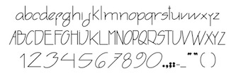 During his studies at IED in Firenze, Italy, Joao Pucci, who hails from Brazil, designed Trytype (2013). This typeface was designed using geometric principles, and looks like an architectural typeface, a far relative of David Siegel's Tekton. [Google]
[More] ⦿
|
Jochen Hasinger
[Typeimage]

|
[MyFonts]
[More] ⦿
|
Joe Burke
|
Graphic designer in Manchester, UK, who created the hexagonal typeface Metabolist in 2014. He explains: Typeface Design based upon an architectural movement in Japan during the 1960's called Metabolism. It attempted to merge architectural megastructures with ideas of biological and organic growth. One famous example of this is the Nakagin Capsule Tower by Kisho Kurokawa (1972, Tokyo). Baurean (2015, "Braun + Korean") is influenced by simple Hangul text forms and by the compass-and-ruler Braun logo designed by Wolfgang Schmittel (1952). [Google]
[More] ⦿
|
Joe Chau
|
Hong Kong and/or USA-based designer of the free geometric sans typeface Rayjoe (2014) and of Mens Romance (2014). Handkerchief (2014) and Kindergarden (2014) are hand-drawn typefaces. His typeface Queenamor (2014) can be bought at Fontever for 2200 dollars. He also designed the architectural drawing font Centi (2016). Joe Chau is the founder of Fontever. Dafont link. [Google]
[More] ⦿
|
Joel Santos
[yrmk (was: Youremin)]

|
[MyFonts]
[More] ⦿
|
Joel Wolter
|
Designer in Mundelein, IL. He created a 3d typeface, Interiors, that emulates frames of chairs and tables. [Google]
[More] ⦿
|
Joey Stephen Maul

|
 Born in Bedford, IN, in 1959, Joey runs Joey Maul in Paoli, IN. Creator of the ultra-fat Duro (2008), Finelight (2009), Smitty (2009), Quatrus (2009, pixel), Rainsong (2010, a display font inspired by the art and symbols of the Native Americans), Bunkhouse (2009, mechanical/octagonal), Tranzit (2009, rounded architectural drawing face), Ampmosphere (2010, music instruments), Spring #7 (2011), Applbitz (2011, a pixel family), and the techno typeface Crubster (2009). [Google]
[MyFonts]
[More] ⦿
|
Johann Merken
|
Creator of Liber Artificiosus Alphabeti Maioris (ca. 1782). His designs were engraved by Heinrich Coentgen. I quote: The first and only edition (published in two parts) of this rarely complete calligraphy book included fifty six engraved plates. Besides the elaborate alphabets there are example writing styles, portraits, silhouettes (Lavater purloined one of the plates - not shown - for his 'Physiognomy'), monograms, calendars, fantasy geometrical and architectural figures, emblems, genealogical tables and ornamental letters. Scans: I, II, Scans: III, IV, Scans: V, VI. [Google]
[More] ⦿
|
John Moore

|
 Born in 1951, John Moore is a Venezuelan type designer. He studied graphic design in the Institute of graphic design Neumann from 1972 until 1976. In 1980 he took a workshop with Milton Glaser and since 1983 he has worked as an art director and creative director in many advertising agencies. He designs type since 1976.
 His typefaces Gordis (a fattish comic book family) and Tepuy won awards at Tipos Latinos 2008 in the non-text and experimental typeface categories, respectively. At Tipos Latinos 2010, he won twice in the display category, for Victorina and Radio Time. His typefaces: (New) Maracay (2013, a large layered Victorian signage family), Fine Art OT (2013, brushy typeface), Roadline Italic (2013, a retro script), JMTF Robin (2013, a layered post-modernist display family), Virgin Script (2013), Radio Time (2013, fat retro signage script), Radio Time Icons (2013), Palaima (2013, an aboriginal style face), Factor (2012, a layered geometric font), Onda (2012, a wavy psychedelic face), Blockee (2012), Aliykit Open (2012, a multiline typeface), VE Inconexa (2006, outline architectural face), VE Makiritare (2006, a double labyrinthine script that is based on symbolisms used by the Makiritare or Yecuana, river people who live in the village of Santa Maria de Erebato in the Venezuelan jungle on the border with Brazil), VE Moho (2006; or simply Moho in 2014), VE Palaima (2006, futuristic, Amazonian), Radio Time (fifties style script, with Alejandro Paul at Sudtipos), Fruta (stencil, influenced by Glaser?), Glaser Stencil Round, Gothike (sharp-edges), Aqua (ultra round), Club, Caracas (sans; +Caracas Pro, 2015; see also Caracas Stencil Pro, 2015), Factor (hookish), Space Lab (futuristic family), Robin (headline), Victorina (multiline Victorian poster typeface which won an award at Tipos Latinos 2010), Victorina Black Shadow (2011), Waterman (2010, a flowing undulating script family), Spacelab (2010, futuristic) and RobinBienalII (2005). Sudtipos sells these fonts of his via MyFonts: Makiritare (bilined, based on woven baskets), Palaima (experimental, runic), Precolombino (petroglyphs), Tepuy (rounded version of Makiritare), Roadline (2009, fifties diner font), Sacred Geo (2011, a geometric dingbat font that won an award at Tipos Latinos 2012), DeCoro (2011, art deco family), Sacred Geo Tiling (2011), Primate (2012, an African look typeface family), Morenita (2012, a connected fifties or school script), Takox (2012), Petroglifos (2012), Xtencil (2012, a rounded stencil influenced by Milton Glaser; followed by Xtencil LC and UC in 2013 and Xtencil Pro in 2015). Typefaces from 2014: Moho Sport Pro (layered athletic lettering typeface family), Scripta Pro and Gothic (40s-style lettering typeface inspired by the style of L.H. Copeland), InkArt Labels, Moho (named after Laszlo Moholy-Nagy), MohoBis Pro (a multilined version of Moho), Moho Condensed, Moho Script, Duvall (named after Edward J. Duvall, who published Modern Sign Painting in the late 1940s; Duvall won an award at Tipos Latinos 2014). In 2015, the Moho series continued with Moho Style. He also made Arthaus (2015, a fantastic Bauhaus font family inspired by Herbert Bayer's universal alphabet), MyCard (a techno type), NeoScript Pro and Hierra (after a font by Dan Solo) in 2015. In 2016, he designed Artime (a sci-fi font), Virtual. Typefaces from 2017: FunFont (cartoon style). Klingspor link. MyFonts link. Behance link. Poster. View John Moore's typefaces. [Google]
[MyFonts]
[More] ⦿
|
Johnny Feron
[Jvne77 Studio]

|
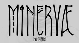 [MyFonts]
[More] ⦿
|
Jonas Skendelis
[Global Lithuanian Net]
|
[More] ⦿
|
Jonathan Gene Ullery-Smith
|
Midland, MI-based graphic designer. He is working on this blackletter face (2006), this simple architectural sans face (2006) and this blackletter face (2006). Home page. Another URL. [Google]
[More] ⦿
|
Jonathan Hill
[The Northern Block (TNB)]

|
 [MyFonts]
[More] ⦿
|
Jonathan Hoefler
[Hoefler (was: Hoefler&Frere-Jones, and Hoefler Type Foundry)]

|
 [MyFonts]
[More] ⦿
|
Jonathan Munjak

|
Israeli type designer who made the Hebrew typeface Architekt MF (1992, Masterfont). Klingspor link. [Google]
[MyFonts]
[More] ⦿
|
Jordan Angell
|
Branding expert in Calgary, who has created some curly logotypes in 2009. In 2010, he made the geometric beveled face Architype, and the octagonal techno typeface Phreeker. [Google]
[More] ⦿
|
Jorge Gallardo
|
 Toledo, Spain-based creator (b. 1984) of the heavy octagonal sci-fi typeface Base 45 (2013) and of Chain Anchor Font (2014). In 2015, he designed Popova Type (a grotesque font based on the design of an exhibition poster by Russian constructivist artist Liubov Popova in 1923 for the contemporary art piece "Wall of fame"), a great set of initial caps, and El Lissitzky style numbers.
 In 2016, he designed a decorative architectural all caps alphabet. Behance link. [Google]
[More] ⦿
|
Jorge Machicado
|
 Born in 1989, Jorge lives in La Paz, Bolivia. His design studio in La Paz. He created the gridded paper-fold typeface Origami (2010) and the architectural sans typeface Develuz (2011). He also uses the name Gerrero Design. [Google]
[More] ⦿
|
José Manuel Urós

|
 Aka Josema Uros. Self-taught programmer in Barcelona, b. 1956, who set up the type foundry Type-O-Tones in 1992. He is also involved in Neue in Barcelona. Since 1993 he has been teaching at Eina, Elisava, ESDI and IDEP. His typefaces:
 - Arboria (2013). An art deco or architectural sans family published by Type O Tones. Its skeleton was used in the art deco sans stunner, Arbotek (2013).
- Designer at type-o-tones in Barcelona of Ebu Script (2007). This is a techno script created together with Joan Barjau.
- Chico (2009). Chico was by designed by Javier Mariscal and Josema Uros specifically for the final roll of credits in the animated film Chico y Rita. It was commercially released in 220 by Type-O-Tones as Chico.
- Hannover Modern (1996, Type o Tones). Part of a series of fonts used at the Estudio (Javier) Mariscal in Barcelona.
- Joost (1995-2010). Also done at Type o Tones, this is a monoline geometric / organic family with an odd Futura Black style piano key Stencil thrown in. He writes that the inspiration came from the Bauhaus Dessau im Gewerbemuseum Basel exhibition poster, designed in 1929 by Franz Ehrlich after a sketch by Joost Schmidt, and hence the name Joost.
- Memimas (2007). A connected upright script, done with Joan Barjau at Type o Tones.
- Matricia (2007). A dot matrix typeface done at TypeOTones done with Pera Ribalta.
- Mundo Demibold (1997, Type o Tones). This comic book typeface is inspired by a series of drawings used in the Señor Mundo comic strip of the 1990s. It is in the style of Javier Mariscal.
- Vulcano (2007, TypeOTones). A typeface developed together with Tori Alimbau and Luis Mendo.
- At KABK in Den Haag, where he did graduate work in type design, he created Rumba as a final project (2004).
- DINosaur (2016, Type-o-Tones). A rounded sans related to the DIN norm.
- Skope (2019, Type-o-Tones). Skope is an experiment in horizontal stress and the extreme lettering style of comic masters such as Josep Coll or Manuel Urda from his cartoons in the pages of the classic TBO (Barcelona, 1917-1998). Some of the features of Skope are borrowed from the masthead of the magazine Triunfo (Valencia, Spain, 1946-1982), and remind this reviewer of the work of Lucian Bernhard in the 1910s.
- Rothwood (2020). A slab serif family.
- Final Six (2021, Type-o-Tones). A commercial adaptation of lettering developed for the European Waterpolo Final in 2014.
Interview by MyFonts. Klingspor link. FontShop link. [Google]
[MyFonts]
[More] ⦿
|
Juan Miguel Castillo
[Don Marciano]
|
 [More] ⦿
|
Juan Mondragon
|
Juan Mondragon (San Jose State University, class of 2013) created the decorative typeface Onda in 2013. This wavy typeface was inspired by Frank Gehry's architecture. Behance link. [Google]
[More] ⦿
|
Juana Martignone
|
During her studies at FADU/UBA in Buenos Aires, Juana Martignone designed the architecturally-inspired typeface Highway (2019). [Google]
[More] ⦿
|
Juergen G. Eixelsberger
|
Austrian designer of the (free) architectural drawing font Erdapfel (2006). He says about himself: I am a graphic designer with my own design studio "designation" located in the south of Austria. My main areas at work are corporate design, communication and advertising design as well as media design. [Google]
[More] ⦿
|
Juho Hiilivirta
|
 Rovaniemi, Finland-based type designer at Helsinki Type Studio. His Bachelor Thesis work led to a great sans typeface, Oranssi. Its proportions are based on the golden ratio as suggested in Le Corbusier's work.
 In 2012, he created the sans family Mogul and the monospaced Tutankhamono. In 2014, he published Turi (a slab serif inspired by Sami author Johan Turi's simultaneous perspective illustrations). In 2015, he made Tyrant. In 2015, Juho Hiilivirta, Niklas Ekholm and Jaakko Suomalainen co-designed the custom typeface Finlandica. Finlandica was commissioned by the Prime Minister's Office as part of a visual identity for Finland. They write: Ink traps like cuts from a blunt ax, makes the typeface reliable in small sizes and gives it character in large headlines. Like the Finnhorse it's a breed suitable both as riding horse and workhorse. Free download. In 2016, he created the sans typeface Rodham, and in 2017 the widely monospaced typeface Railo Thin. [Google]
[More] ⦿
|
Julie Echavidre
|
Parisian designer of the octagonal semi-architectural typeface Chiver's (2011). [Google]
[More] ⦿
|
Julie Weber
|
Julie Weber is a graphic designer educated at Eastern Michigan University. She created the monoline architectural caps typeface Handwritten (2011). Behance link. [Google]
[More] ⦿
|
Julieta Casabuono
|
Buenos Aires-based designer of Render Font (2014, a 3d architectural typeface). [Google]
[More] ⦿
|
Justin Chen
|
 Architecture student in Vancouver. He used FontStruct in 2009 to make Infinite Suite, a set of lowercase alphabets based on elements of an architectural floor plan. Each letter is a "room," equips with partition, stair, table, window, or a bed. Home page. [Google]
[More] ⦿
|
Jvne77 Studio
[Johnny Feron]

|
 Lyon, France-based designer (b. 1977) of these typefaces:
 - The industrial / sci-fi octagonal typefaces Smoothdron (2018: free) and Squaredron (2018, +V2).
- The blackletter typeface JVNE Blackie (2017).
- Edith Lite (2018).
- JVNE Porte (2018). Art deco.
- JVNE Fiction (2018).
- JVNE Coalworks (2018). An attempt to recreate the "Fireworks" 7 inches vinyl sleeve lettering from 1982 by Siouxsie & the Banshees.
- Dreamhouse Kissies (2018). Arts and crafts style.
- JVNE WOPR Pro and JVNE WOPR 83 (renamed JVNE Wopper83;) (2018). Based on the titles of the 1983 Wargames movie. Made with FontStruct.
- Gialle (2019). A brushed typeface.
- Feronne Serif (2019).
- Arcachon (2019). Art deco.
- JVNE Minervae (2019). A stunning hand-printed all caps typeface family.
- JVNE Broomstx (2019). A brush typeface.
- Weiss Modern Gothic (2019). Earlier called W.Modern Gothic Display. A German expressionist typeface. He writes that W.ModernGothicDisplay is the first digital re-creation with a lot of improvements of a typeface by Bauer known as Weiss Initials Extra Bold or Weiss Modern Gothik. That Bauer design was inspired by Weiss Initialen No2 drawn by Emil Rudolf Weiss (1875-1942).
- Sauvage (2021). A neon light monolinear script font.
- Citta Novela (2021). A 12-style condensed Peignotian typeface that celebrates the architecture between the 1920s and 1960s by Oscar Niemeyer, Friedrich Kiesler, Le Corbusier and the Bauhaus school.
- Arkham77 (2021). A detective story font inspired by the works of Howard Philips Lovecraft (1890-1936), and the witchcraft city of Arkham.
- Futurette (2021). A large squarish / techno sans family.
[Google]
[MyFonts]
[More] ⦿
|
Kaer
[Roman Korolev]

|
 Roman Korolev (Kaer, Vologda, Russia) designed the wood stick brush typeface WoodStick in 2016.
 Typefaces from 2017: OneLine Bold (rounded fat color font). Typefaces from 2019: Antique Initials (regular and color; with a flower pattern), OneLine Overlap (a color font). Typefaces from 2020: Pagesso (a lava lamp font), Avery (a monolinear connected sans), Sailem (an inline art deco font), Old Stamp (a fingerprint font), Silvery (a display typeface on the theme of thick and thin), Blueberry Spot, Coffee Chalk (a textured typeface), Allegro (a blueprint type), Northern Monk (beveled), Westland (blackletter), Neon Line, Bronze (art deco, +color, +texture), Shtrih (dry brush), Geoline (sketched, textured), Flowline, Foliageant (floral, curly), Northern Runes (rune emulation), Neon (color font), Parallel Lines, Bronzen Abundance (a display family with textured and color options), Sharp Stroke (a heavy brush typeface), Renaissance Initial, Celtic Spiral, Lace Line. Typefaces from 2021: Atta Weird (a font for LSD addicts), Three Neon Lines, Dead Saint (a Halloween alphabet), Lockdown Christmas (a dot matrix font), Nordic Folk (a layerable typeface family with Scandinavian texture; plus Nordic Folk Icons), Hewy (a display typeface), Planny (a blueprint font), Sportlight (a speed font), Wesloy (a brush serif font), Carle (a 3d polygonal children's book font; +Shadow, +Colored), Absundo (a playful dual weight font), Wide Plump (a geometric solid typeface), Colton (a condensed boutique serif), Aztec Initials (+a colored version), Adrim (a thin floriated sans), Northern Monk (an inscriptional ustav-inspired typeface), Sogia (a decorative serif). Typefaces from 2022: Asl Line (an American Sign Language font). [Google]
[MyFonts]
[More] ⦿
|
Kane Garland
|
 While studying towards a BA Graphic Communications at University of Creative Arts Farnham, UK, Kane Garland (London) created the compass-inspired all-caps typeface Artkitec (2014). [Google]
[More] ⦿
|
Karen Mosby
|
Graphic designer in Toronto, who made several hand-printed and brush typefaces in 2012, including a typeface family called Bonfire. She also made the ornamental caps typeface Architecture Type (2012). [Google]
[More] ⦿
|
KaryAmo Studio
[Amar Arif]

|
Yogyakarta, Indonesia-based designer (b. 1996) who founde KaryAmo Studio in 2020. iHis typefaces include the monoline script typeface Tyllapia (2020) and the six-style monolinear architectural lettering font Archee (2021, for Latin, Greek and Cyrillic). [Google]
[MyFonts]
[More] ⦿
|
Kathryn Clement
|
Graphic design graduate from the University of Salford, UK. Graphic designer in Manchester, UK, who created Tour de France (2012). Salford Type Foundry link. [Google]
[More] ⦿
|
Kawisara Vacharaprucks
[Kawisara Vacharaprucks]

|
 Wundertype is a foundry set up in Bangkok in 2020 by Kawisara Vacharaprucks, a Thai type designer who published at Stawix Type foundry before 2020. His first typeface at Stawix was Rit Graph (2014), which emulates the writing by engineers and architects on technical drawings. His second typeface, with Stawix Ruecha, was the beautiful Frygia (2015, a rounded industrial sans in 20 styles, from Hairline to Heavy).
 In 2017, he designed the fun 3-style rounded sans typeface Merlod at Stawix. Typefaces from 2018: Yotin, Infoma (a techno sans done with Stawix Ruecha), Kinn (an industrial sans). In 2020, Wundertype published the 18-style geometric slab serif Chom, designed by Stawix Ruecha. [Google]
[MyFonts]
[More] ⦿
|
Kawisara Vacharaprucks
[Kawisara Vacharaprucks]

|
 [MyFonts]
[More] ⦿
|
Kemie Guaida
[Pixilate Designs]

|
 [MyFonts]
[More] ⦿
|
Kenya Carroll
|
During her studies at the Queensland College of Art in Brisbane, Australia, Kenya Carroll created an unnamed architectural lettering font (2013). Behance link. [Google]
[More] ⦿
|
Kevin Magalhaes
|
 Graphic designer and illustrator in Lille, France, who created the display typeface Apparence (2015) and the rounded bold display typeface Sable (2015).
 In 2016, he designed the sturdy web serif typeface Abaque (apparently influenced by medieval architecture). Typefaces from 2017 include the monospaced sans typeface Narita, which is inspired by the new signage at Tokyo's airport. Typefaces from 2018: Archetype (a wide architectural sans). [Google]
[More] ⦿
|
Khair Unnas
[Zelow Type (was: Khaiuns)]

|
 [MyFonts]
[More] ⦿
|
Kimberly Geswein

|
 Born in Missouri in 1979, Kimberly moved first to Texas and later (in 2007) to China, and most recently, to Orlando, FL. She made some free fonts (often handwriting styles), and also ran a personal handwriting font service [those fonts have names that start with KGD]. MyFonts link. FontSquirrel link. Home page. Fontspace link. Dafont link. Fontsy link. Abstract Fonts link. Fontspring link. Klingspor link. Google Web Font Directory link. Creative Market link. Family home page. Her fonts, by year:
 - 2007: The grunge typefaces XiaoGao, More-than-Enough, Eat More Chocolate, JoyfulJuliana (2007, and its Pro version, 2010), LoveYaLikeASister, Colourmepurple, KingcooLKC and You Are Loved (in 2009, Roger S. Nelsson completed it to You Are Loved Pro). She also made the handwriting typefaces Patient Paige, Promised Freedom, Xiao Gao, Complete in Him (made into a commercial Pro version by Roger S. Nelsson), Burst My Bubble (commercialized at CheapProFonts as Burst My Bubble Pro), JustMeAgainDownHere, Surrendered Heart, It Ain't Rocket Science (in 2010, Roger S. Nelsson made a Pro version at CheapProFonts), Sue-Ellen-Francisco, and the curly Jheri Curls and Tuna-and-Hot-Dogs-on-Rye.
- 2008: the handwriting typefaces Come Unto Me and Loved by the King.
- 2009: BattyGirl, Bina Bina, Lollipop, NeverLetGo, Scrogglet, Sunshine In My Soul, YooHaeMool, Celebrate The Day (extended by Roger S. Nelsson in 2009 to Celebrate The Day Pro), Mighty To Save, King Kool KC Pro (kid's hand; done with Roger S. Nelsson, CheapProFonts).
- 2010: Shelter Me (handwriting), Elizajane (handwriting), Written on his hands (handwriting), Contrary Mary (hand-printed), Shining Like Stars (hand-printed), Give You Glory, Nothing You Could Do, Who Needs Consistency, happyhanneke, Zeyada, He Formed My heart, Change Tomorrow Today, Frangipani Rose, Blocked Off, Throw My Hands Up In The Air, Indie Flower, You Wont Bring Me Down, Addis Ababa, Cedarville Pnkfun (1 Cursive, 1 Print), Swanky and Moo Moo, Husband of the Millennium, Soggy Kitten, The Truth of a Thousand Lies, Soli Deo Gloria, Annie Use Your Telescope, Waiting for the Sunrise, La Belle Aurore, Airplanes In The Night Sky Pro, Dawbing of a new day, Shadows into light (+Two), Covered by your grace, Architect's Daughter.
- 2011: A Safe Place to Fall, Shark in the Water, Architects Daughter (architectural lettering), A Year Without Rain, My Hands Are Holding You, Discover Beauty, Lavender Lime, Later Allie-gator, You Found Me, I missed you, Kate The Great, Pizza Is My Favorite, A Hundred Miles, Hanging by a thread, My Lucky Penny, Jar of hearts, Never grow up, My Lucky Penny, Beautiful Every Time, Never Say Never, Swanky and Moo Moo, Over the Rainbow, Sue Ellen San Francisco, Pineapple Delight, Viva La Vida, The Only Exception, Written in the stars, we are broken, The Only Exception, Brick by boring brick, She paints me blue, Beautiful every time, Jar of hearts, Dancing in the Minefields, My Hands are Holding You, You Found Me, Blessings through raindrops, Stars from our eyes, From where you are, Throw my hands up in the air, The great escape, Today I Feel (emoticons), Cedarville Cursive, Coming home, Learning to trust, Viva La Vida, Janda Siesta Sunrise, Janda Curlygirl Chunky, Janda Curlygirl Pop, Janda Sparkle and Shine, Janda Love and Rain, Janda Fabulous, Janda Capslock, Janda Siesta Sunset, Janda Snickerdoodle Serif, Janda Everyday Casual, Janda Curlygirl Serif (hand-printed blackboard bold font), Janda Curlygirl Chunky, Janda Romantic, Janda Scrapgirl Dots, Janda Quick Note, Talking to the moon, Set fire to the rain, KG Shadow of the day, Just realize, Ignite the light, Love ya like a sister, Loved by the king, Give you glory, KG small town southern girl, KG Shadow of the day, Gloria Hallelujah, KG Sunny Afternoon, KG Hope for a cure, Janda Polkadot, Janda Capslock, KG June Bug, KG Fall For You, KG Luck of the Irish, KG Domo Is My Favorite, Gloria Hallelujah, KG Love You Through It (2011), KG Shadow of the Night (2011), KG Keep Your Head Up (2011), KG Dancing on the rooftop (2011), KG Party on the Rooftop (2011), KG Like A Skyscraper, KG Mulally, KG God Gave Me You, KG Les Bouquinistes de Paris (neatly hand-printed), Janda Swirlygirl (curly), Janda Sparkle and Shine, Janda Lova and Rain (curly), The Great Escape, KG Legacy of Virtue, KG Sweet N Sassy, KG Legacy of Virtue, Just Realize, KG Like a skyscraper, Janda Christmas Doodles, Just Realize, Janda Everyday Casual, Janda Snickerdoodle Serif, Love Ya Like A Sister (sketch face), The Only Exception, KG Luck of the Irish, Janda Fabulous, KG God Gave Me You, KG You Wont Bring Me Down, Set Fire To The Rain, KG You Wont Bring Me Down, KG Mercy in the morning, KG Heart Doodles, KG Skinny Latte.
- Typefaces from 2012: Janda Apple Cobbler, Janda Swirly Twirly, Janda Manatee, Janda Polkadot (2012), Shadows Into Light (2012, architectural style: see Google Web Fonts), Never Let Go, Janda Spring Doodles, Beautiful every time, Janda scrapgirl Dots, Written in the stars, Nothing you could say, KG Ray of Sunshine, More than enough, A hundred miles, Waiting for the sunrise, Janda Safe and Sound, Janda Silly Monkey, Janda Quirkygirl (curly font), From where you are (paint brush face), KG Empire of Dirt, KG Strawberry Limeade, KG A Thousand Years, Janda Amazing Grace, Janda Happy Day, Janda Elegant Handwriting (connected script), KG Somebody that I used to know, KG Kiss me slowly (curly), KG Call me maybe, KG Two is better than one, KG Ten Thousand Reasons, KG Beautiful Ending (grunge), KG Payphone (a nice cleanly hand-printed typeface), Janda Shine Your Light On Us, KG Beautiful Ending, KG Ten Thousand Reasons (chalkboard font), KG Only Hope, KG Eyes Wide Open (connected script), KG All Things New (high-contrast script face), KG Change This Heart (monolined and informal), Janda Stylish Script, KG Be Still and Know, KG Seven Sixteen, KG This is not goodbye, Janda Someone Like You, KG One Thing, KG I Like To Move It, KG Makes You Stronger, Janda As Long As You Love Me, KG The Fighter, KG Chasing Pavements (textured typeface), KG Always a Good Time, KG Grace for Today, KG Turning Tables (brush script), KG Falling Slowly, KG One More Night, KG Attack of the Robots, KG Ways to Say Goodbye (an upright script---one of her best typefaces to date), KG Janda Truly Madly Deeply, Janda Closer To Free, Ignite The Light, Janda Cheerful Script, Janda Hide and Seek, Janda Flower Doodles (a very useful dingbat set), Janda Celebration Script (swashy script), KG What the teacher wants, KG True Colors (connect-the-dots font), KG True Colors, Janda Closer to Free (chunky script), KG How Many Times, KG Behind These Hazel Eyes, KG Lego House (monoline rounded sans), KG Covered by your grace, KG Follow you into the world, KG Dark Side, KG Part of Me (neatly printed typeface), KG Begin Again, KG Cold Coffee, KG Something To Believe In (a stamped font).
- Typefaces from 2013: KG The Last Time, KG Feeling 22, Today I Feel (smilies), KG Primary Penmanship (a very clean rounded hand-printed typeface), KG Teacher Helpers (dingbats), KG Fractions (geometric dingbats), KG Flavor and Frames, KG Primary Dots (school font), KG Build A Game, KG Faith Hope and Love, KG As The Deer, KG Just Give Me A Reason, KG Girl on Fire, KG Daylight, KG I Want Crazy, KG Flavor and Flames Two, KG Flavor and Flames Three, KG Flavor and Flames Four, KG Flavor and Flames Five, KG Skinny Love, KG Traditional Fractions, KG Hard Candy, KG Alphabet Regurgitation, KG Second Chances (sketched typeface), KG Math Bar Models, KG Next to You (sketched typeface), KG Next to Me (+Sketched), KG Love Somebody, KG Beneath Your Beautiful, KG Primary Italics (school font, lined and regular), KG Wake Me Up (typewriter type), KG A Little Swag, KG Royals, KG What Does The Fox Say, KG Drops of Jupiter, KG Let Her Go, KG Why You Gotta Be So Mean, KG Tangled Up In You (sketched typeface), KG Chasing Cars, KG Melonheadz, KG Let Her Go (+outline and athletic lettering styles), KG By The Grace of God, KG Counting Stars, KG Christmas Trees, KG Bless Your Heart.
- Typefaces from 2014: KG Summer Sunshine, KG Say Something, KG I and Love and You, KG Corner of the Sky (rounded Comic Sans lookalike), KG All of Me (letterpress emulation), KG Flavor and Frames Six, KG Flavor and Frames Seven, KG Happy, KG First Time In Forever, KG Defying Gravity (white on black letters), KG When Oceans Rise, KG Summer Sunshine (shaded and arched poster lettering), KG Primary Whimsy, Janda Stylish Monogram, KG Modern Monogram, KG Already Home, KG Only Human, KG Miss Kindergarten, KG Arrows, KG No Regrets, KG Broken Vessels Sketch (sketched typeface), KG Manhattan Script, KG I Need A Font, KG Shake It Off, KG All of the Stars, KG-I-Need-A-Heart-Font, KG Red Hands (plump rounded sans), KG Blank Space (a typeface with metallic texture), KG Thank You Stamp, KG Tribeca Stamp, KG Candy Cane Stripe.
Typefaces from 2015: Janda Stylish Script, KG Chelsea Market Script, KG Adipose Unicase, KG Geronimo Blocks, KG Miss Speechy IPA (covers the entire phonetic alphabet), KG Thinking Out Loud, KG Tightrope, Kg Pdx Bridgetown, KG Camden Market Script (watercolor brush), KG Neatly Printed, KG PDX Blocks, KG Summer Storm, KG A Teeny Tiny Font, KG Piece By Piece, KG Sorry Not Sorry. Typefaces from 2016: KG Miss Kindy Collection, KG Satisfied Script, KG Who Tells Your Story, KG Life Is Messy, KG Inimitable Original, KG Eliza Schuyler Script. Typefaces from 2017: KG Compassion, KG Eliza Schuyler Script, KG Inimitable Original, KG She Persisted, KG Rise UP. Typefaces from 2018: KG Crossing a Line, KG Do You Love Me, KG One More Light, KG Laughter Lines. Typefaces from 2019: KG No Matter What (monoline script), KG Love is Love is Love. Typefaces from 2021: KG Ever Since New York. Creative Market link. Google Plus link. Open Font Library link. [Google]
[MyFonts]
[More] ⦿
|
Kirsty Humphries
|
During her studies in Leed, UK, Kirsty Humphries designed an architectural display typeface (2014). [Google]
[More] ⦿
|
Kisuaheli
|
A Brendel Informatik cleanly printed script face, 1994. [Google]
[More] ⦿
|
Kloeg Architecture
[David Kloeg]

|
 David Kloeg is a designer and student of architecture. He has been working for several architecture offices since 2012. David graduated from the University of Technology in Delft, the Netherlands. His company, Kloeg Architecture (est. 2015, in Australia(?)), is involved in building and type and icon design. In 2016, David started a Masters degree in architecture at the University of Liechtenstein. He lives in Vaduz, Liechtenstein.
 In 2016, he designed the minimalist sans typeface family Essence, followed in 2018 by Essence Round, which includes 150 free icons. [Google]
[MyFonts]
[More] ⦿
|
Konstantin Lukyanov
|
Russian designer, at Art Lebedev, of the Latin / Cyrillic handwriting typeface Vlas (2018), the slab serif NF64 (2018), the informal Junior (2019), the straight-edged Dutch rococo Brevier (2019), the bubble motiv font January (2019), and the architectural blueprint typeface Arc (2019). With Ksenia Erulevich and Konstantin Lukyanoiv, he co-designed the soccer shirt font Russian Premier League (2018, at Art Lebedev). [Google]
[More] ⦿
|
Kosal Sen
[Philatype]

|
 [MyFonts]
[More] ⦿
|
Kristians Sics
[Lamatas un Slazdi]

|
 [MyFonts]
[More] ⦿
|
l87bkv
|
FontStructor who made Wright on Dude (FLW) (2010), a typeface made to celebrate Frank Lloyd Wright. [Google]
[More] ⦿
|
Laetitia Levan
|
Antwerp-based designer of the flared typeface Victor Horta (2015), in honor of the famous Belgian architect and designer (b. Gent, 1861; d. Brussels, 1947) who put his stamp on the art nouveau architecture that makes the center of Brussels so spectacularly beautiful. [Google]
[More] ⦿
|
Lamatas un Slazdi
[Kristians Sics]

|
 Design studio, est. 1999 in Riga, Latvia. They are doing some type design under the guidance of Kristians Sics, aka Chris Lamatas. No sales or downloads as far as I can tell. Kristians Sics (b. 1961, Riga), who studied at the Art Academy of Latvia, now lives in Puerto Vallarta, Mexico, where he is a graphic designer and illustrator. In 2010, Sics established the commercial foundry Lamatas un Slazdi. Typefaces (from 2010 or just before 2010):
 - Burtnieks: comic book face. Covers Latin and Cyrillic.
- Cukurgrauds: meaning Sugarcube, this typeface is for children's or comic books.
- Dienasgaisma: pleasant informal face; for restaurant menus or invitations to art galleries. I guess that this became Gaisma (2010), which was advertised by Kristians as an art nouveau family. Images: Greek and Cyrillic, Greek, Latin and Greek, Latin, sample, example.
- Fette Deutsche Schrift (2011). Fette Deutsche Schrift also known as Koch-Fraktur or Kochschrift was created by Rudolf Koch for Klingspor foundry between 1908 and 1910.
- Frio (2011). A 15-style elliptical family with pereft balance and proportions.
- Kochschrifts: after Rudolf Koch's Kochschrift (1910).
- Lamatas: a mix between ransom note typefaces and informal wood types.
- Liturgisch (2013): after Otto Hupp's Liturgisch (1906).
- Oro y Plata (2013): The collection Oro y Plata (Gold and Silver) is a Mexican style blackletter, dedicated to the three big silver cities---Taxco, Zacatecas and Guanajuato. Taxco is more angular compared to rounded Zacatecas and elaborate Guanajuato. All three are based on vernacular types seen in these cities.
- Ozollapa: a psychedelic face.
- Pastkaste: an elliptical / hexagonal corporate typeface for inbox.lv.
- Periodika: advertised as a typewriter face, but it isn't.
- Piektdiena: informal sans. Contains Cyrillic.
- Tautumeita: an all caps display face.
- TradeGothicBlurred: blurred Trade Gothic Extended.
- Zebiekste: inspired by an architect's hand.
Creations from 2011: Aramara Chromatic (+Base, + Engraved). Jaquizaca (2001-2013). Originally created as a TV program titling typeface in 2001, it became a retail font in 2013. The adjectives to describe it are cartoonish, upbeat, joyful, and buoyant. Klingspor link. [Google]
[MyFonts]
[More] ⦿
|
Lars Törnqvist
[Cercurius (was: Lars Törnqvist Typografi)]

|
 [MyFonts]
[More] ⦿
|
Laura Baxter
|
As a student at Middlesex University, London-based Laura baxter designed the architectural typeface Dawson Construct (2018). [Google]
[More] ⦿
|
Laura Eydmann
|
Graphic designer in Brixham, UK, aka Laura Pakora Design. For a University of Plymouth project, she was asked to design letterforms based on Gino Severini's work. She looked into Futurism, Cubism and Pointillism, and created the experimental typeface Eclectic (2010) by cutting up Helvetica Bold into angular pieces. Petallic (2010) is an experimental typeface based on the architecture and design of the Guggenheim, Bilbao. [Google]
[More] ⦿
|
Laurène Bettcher
|
Strasbourg, France-based designer of the architectural decorative typeface Indus (2017) that is based on the work of Hilla and bernd Becher. [Google]
[More] ⦿
|
Lauren Azzis
|
Graphic designer in Lyon, France, who drew a decorative architectural alphabet called Konnexion (2016) and the Clarendon/ Capsuula hybrid The Pastemporary (2016, for the antique shop Lecomte Antiquités located near Nantes). Behance link. Another home page. [Google]
[More] ⦿
|
Lauren Rose
|
During her studies at Rocky Mountain College of Art & Design in Denver, CO, Lauren Rose created Renzo, an elegnat typeface that was inspired by the work of architect Renzo Piano, who is famous for The Shard in London and the Centre Pompidou in Paris. [Google]
[More] ⦿
|
Layla Booth
|
Nottingham, UK-based designer of Aarhus (2019), a typeface whose shapes are inspired by the Isbjerget building in Aarhus, Denmark. It was created for a school project at Nottingham Trent University. [Google]
[More] ⦿
|
Lazaro Gloria
[Borus Design]
|
[More] ⦿
|
Legend Art
[Andrii Mahda]
|
Designer of these display typefaces in 2016: Askold (a monoline runic simulation typeface), Flawourite, Architect Sans. In 2017, he designed Fine River. [Google]
[More] ⦿
|
Leonardo Laurensius
|
During his studies in Singapore, Leonardo Laurensius created the roundish typeface Architype (2014), which was inspired by the shapes of modern furniture. [Google]
[More] ⦿
|
Leonel Torres

|
Architect whose handwriting was used for the typeface Leonel (2001) by Kemie Guaida at Pixilate Designs. [Google]
[MyFonts]
[More] ⦿
|
Lesha Pushkarev
|
 Moscow, Russia-based co-designer, with Vladyslav Boyko, of the free Latin / Cyrillic display typeface Rimma Sans Bold (2021), that takes inspiration from concrete buildings and monumental architecture. Rimma Sans is rooted in the square grid and is named after Russian architect Rimma Aldonina. [Google]
[More] ⦿
|
LetteringDelights.com
|
This outfit will make your handwriting into a font. There are commercial fonts from Cock-A-Doodle Design (2USD/font), Creating Keepsakes (names start with CK), Inspire Graphics, Karen Foster Design (names start with KF, as in KF Bonkers, KF Bugs, KF Carnival, KF Fun Font), LetteringDelights.com (names start with LD), PrintDog Design, PC Hugware. If you fill out a form, send email, become a member and spend ten minutes on their page, you'll get five free fonts. List of about 500 fonts as of April 2003. All fonts have an "Inspire Graphics" copyright notice. A partial list of the LD fonts: LDAgua, LDAmore, LDAntique, LDAntler, LDApple, LDArchitect, LDArtsy, LDBabyPin, LDBaby, LDBallet, LDBaseball, LDBasketball, LDBatBall, LDBeach, LDBeehive, LDBikini, LDBillboard, LDBooBoo, LDBoogie, LDBows, LDBubbles, LDBubbley, LDButterfly, LDButton, LDCake, LDCalligraphix, LDCamping, LDCandles, LDCarolers, LDCats, LDCeltic, LDChalk, LDCharming, LDChildish, LDChristmasBulbs, LDChristmasLights, LDChubby, LDCityScape, LDClover, LDConfetti, LDCool, LDCostumes, LDCritters, LDCrosstich, LDCupid, LDCuteCurls, LDDabble, LDDainty, LDDaisy, LDDelightful, LDDenim, LDDerby, LDDiary, LDDiver, LDDoodles, LDDotty, LDDoubleLine, LDEarMuffs, LDEasterBasket, LDEasterEggs, LDEasy, LDElementary, LDFallingLeaves, LDFierro, LDFigureSkating, LDFillIn, LDFinePrint1, LDFinePrint10, LDFinePrint11, LDFinePrint12, LDFinePrint13, LDFinePrint14, LDFinePrint15, LDFinePrint16, LDFinePrint17, LDFinePrint2, LDFinePrint3, LDFinePrint4, LDFinePrint5, LDFinePrint6, LDFinePrint7, LDFinePrint8, LDFinePrint9, LDFineScript1, LDFineScript2, LDFineScript3, LDFineScript4, LDFineScript5, LDFineScript6, LDFineScript7, LDFirecracker, LDFloaties, LDFlora, LDFlowers, LDFlurry, LDFlyfish, LDFootball, LDFrankenstein, LDFrosty, LDFunky, LDFunnySerif, LDGala, LDGhosts, LDGhouls, LDGift, LDGingerbread, LDGirlyCurls, LDGobble, LDGoingNuts, LDGolf, LDGreeting, LDGridiron, LDGrin, LDHand, LDHappyHats, LDHeartThrob, LDHeliumEars1, LDHolly, LDHuggyBear, LDHugs, LDIrish, LDItalic, LDJersey, LDJournaling, LDJoyful, LDJubilee, LDJumpy, LDLaundry, LDLeaves, LDLoneStar, LDLoveStruck, LDLuvnLace, LDMaple, LDMasquerade, LDMickE, LDMickE, LDMixed, LDMonster, LDMusic (2001), LDMusical, LDNativity, LDNativity, LDNeighborhood, LDNorthPole, LDNotePad, LDNotebook, LDOwie, LDPalmTrees, LDParade, LDPartyHats, LDPartyTime, LDPeekABoo, LDPenInk, LDPlank, LDPlumbing, LDPoof, LDPookie, LDPopCorn, LDPotoGold, LDPresents, LDPretty, LDPrint1, LDPrint10, LDPrint11, LDPrint12, LDPrint13, LDPrint14, LDPrint15, LDPrint16, LDPrint17, LDPrint18, LDPrint19, LDPrint2, LDPrint20, LDPrint21, LDPrint3, LDPrint4, LDPrint5, LDPrint6, LDPrint7, LDPrint8, LDPrint9, LDPuffy, LDPumpkin, LDQuickScript, LDQuilt, LDRV, LDRiverRun, LDRosebud, LDRoses, LDRounded, LDRoyal, LDSailing, LDSandCastle, LDScouter, LDScrapbooking, LDScratch, LDScratchyPen, LDScript1, LDScript2, LDScript3, LDScript4, LDScript5, LDScroll, LDSeashells, LDShadow, LDShamrock, LDShellyPrint, LDShellyScript, LDSign, LDSketch, LDSlanted, LDSlapHappy, LDSleek, LDSlender, LDSmiles, LDSmokey, LDSmooch, LDSnowman, LDSoccerBall, LDSoccer, LDSpecs, LDSpider, LDSplash, LDSpooks, LDSportDots, LDSports, LDSpringtime, LDSquiggle, LDStarSerif, LDStars, LDStencil, LDStringBean, LDStylin, LDSunflower, LDSunshine, LDSuper, LDTallPen, LDTallTale, LDTennis, LDTopHat, LDTuxedo, LDTwitterpated, LDUSA, LDVolleyball, LDWalt, LDWaterski, LDWeb, LDWildFlower, LDWitchy, LDWormy, LDWroughtIron, LDYoungster, LDZoo. Typefaces from 2007: LD Unique. Fonts from 2008: LD Platform Soul, LD Little Piggy, LD Little Buggy (scratchy face), LDJ Boxed Flirt, LD Santa Fe (grunge), LD Socialite, LD Teensel, LDJ Verdant Leaves. Additions at the end of 2009: LD Adornment, LD Dear Miss Rose, LD Bostonian, LD Artist's Intent, LD Abe Lincoln, LD Baskin Sundae, LD Bold Blake, LD Edward, LD Bella, LD Bon Vivant. Fonts from 2010: LD Dear Diary (hand-printed). [Google]
[More] ⦿
|
LGF Fonts (or LG Tipos)
[Manuel Lage]

|
 LGF fonts is the foundry of Manuel Lage Novo, a Galician type designer in La Coruña, b. 1970. He inherited the Richard Gans collection.
 Manuel specialized initially in sexy silhouette fonts: Sexy Spanish Erasmus Girls (2007), Chicas y Mujeres (2007), Sexy Spanish Woman (2007), Gimnasia (2009). He also made the distressed typefaces TNewPro (2009) and Carboncillo Palo (2007), Galería Coruña (2008, Victorian), the geometric display typeface WFF Lage Grafica (2007) and the elegant upright script Lage Goyesca (2008). In 2009, he published Sistemas Font BT, which seems to be a copy of or very close to the well-known stencil typeface Futura Black BT. Fuck This Copy (2011) is a counterless grunge face. In 2012, he published LGF Goyesca, LGF Disco Inferno, LGF Terra Demo and LGF Patuko (fat finger face). In 2013, he created Belter (a vinyl disk font), LGF Besitos Square, LGF Besitos Round, LGF Lovevelyn, LGF Lage Logo TresD (a 3d shadow face), and the inline typeface Elucidar Titulares. Fonts from 2015: LGF Centelleo, LGF Cup. Typefaces from 2016: Circus LGF (an art deco layered family, ideal for coloring), Primavera LGF (based on Richard Gans's Primavera, and extended with a bold weight), Alicia LGF (a Broadway style art deco typeface based on Fatima, a font designed by Karl Hermann Schaefer in 1933 at Schriftguss), Mario LGT, LGF Avadar (an inline display typeface), ImanRG (a great shadow headline typeface after Richard Gans's Iman), Lgf Besitos Round Light (an architectural font). Typefaces from 2017: Decorativa RG (after Richard Gans), Elucidar, Ornato, Escorial RG (after Richard Gans), Rias Altas Ribadeo, Escritura Luis XVI (after Richard Gans), Maruxa (a script typeface after Richard Gans), Ortegal, Gauntlet LGt (a great neon / metal / disco typeface), LGF A Lage Logo (origami), Alage Evo + Evo Century (octagonal). Typefaces from 2018: Ornamentos Orlas y Vinetas. Typefaces from 2020: Patri LG (a belle epoque display typeface). Typefaces from 2021: Volvoreta RG LG (or Bolboreta; a revival of Richard Gans's Decorativa). Dafont link. Klingspor link. Abstract Fonts link. [Google]
[MyFonts]
[More] ⦿
|
Libby
|
Tasmanian designer of the free hand-drawn draftsman typefaces ArchiStud (2013) and Dribble Guts (2013), and of Libby's Hand (2013). [Google]
[More] ⦿
|
Lola Martin
|
At Bath Spa University (Bath, UK), Lola Martin designed the 3d outlined typeface Geometric (2015-2016). [Google]
[More] ⦿
|
Louise Kelly
|
UK-based FontStructor (student at Bristol UWE) who was inspired by the architecture of the churches in Bristol when she made Edifice (2010). [Google]
[More] ⦿
|
Lucas Gil-Turner
|
Creative director in Madrid who created the squarish typeface Balistraria (2014) and the architectural typeface Moneo (2019), which was based on Rafael Moneo's work. Behance link. [Google]
[More] ⦿
|
Luedecke Design Font Co (was: LDF Fonts)
[Jake Luedecke]
|
 Jake Luedecke (LDF Fonts, or Luedecke Design Font Co) (b. 1999) is the Dallas, TX-based creator of preponderantly hand-printed and pixel typefaces. These include:
 - Typefaces from 2012: Boston Regular, University, Historian (hand-printed), Helveticamazing, TM Tonite (an art deco poster font), Cozumix, Swagger Capitals, Flovio and Dotty (hand-printed).
- Typefaces from 2013: Mild East (sketched typeface), Knew It All, Five Dollar Font, Output (outlined face), Take Two (outline face), DayLight (outline face), Nineteen Oh Five (3d poster face), Licensepl8 (sketched typeface), Always Here (Victorian), Stereoscope, Villa (a 3d outline face), Plateaux (a sketch font), Slab Thing (a sketched font), Electronica (hand-printed), Red Wood, Waking Up, Earthy, Rekles, Figurativative (sic) (sketched font), TeleVision, Dynasty (a beautiful 3d sketched outlined typeface), Mom's Diner (sketched didone font), Flatbread (+Inline), LDF Comic Sans, Splinterwood (Kafkaesque), Best Day Ever, Kibby Sans, Kibby Slab (an extra-condensed FontStruct typeface), Variety (textured caps), Spring Time, Blue Printed, Exposition (fat finger face, +Shadow), Okay (outlined face), Anthro, Vintage One (an outlined and shaded face), (a minimalist sans), Barua, Vibe (a multiline typeface), University Two, Ovrlap (outlined), Swirlvetica (sketch font), Futurr (textured typeface based on Futura Bold Condensed), Maximum, Carrier Hand (a hand-printed Courier), Stroke (a scratchy typeface), Three Dee, Blue Noon (textured typeface), Cordova (pixel font), Komik (comic book face), Eggs, Eggs Extra Yolk, CymoPxl (pixel face), Pxlvetrica (pixel face), Cymo, Promoleus.
- Typefaces from 2014: Apparitions, Peach, Folktale (a sketched font), Influence (a beveled typeface), Reckoning (a shaded typeface based on Clarendon), Apparitions (2014).
- Typefaces from 2015: Moose, Parcel (sketched), Wooden Cabin, Lindy's Diner (a great handcrafted didone), Libro Showtime (sketched).
- Typefaces from 2019: Folktale (sketched).
Fontspace link. Dafont link. Old URL. Behance link. Old URL. Creative Market link. Another Fontspace link. [Google]
[More] ⦿
|
Luis Bolaños

|
Ecuadorian type designer. Award winner at Tipos Latinos 2010 for his experimental typeface Chacana. At Pixilate, he published the hand-printed typeface Lu Px with Kemie Guiada in 2004. It is based on an architect's hand. [Google]
[MyFonts]
[More] ⦿
|
Luisa Silva Gomes
|
During her design studies at FBAUP, Luisa Silva Gomes (Porto, Portugal) created the squarish typeface Casa (2014) and the oriental simulation typeface Niau (2015). In 2016, she created Genotype, a squarish typeface that is inspired by the architecture of the Faculty of Fine Arts of the University of Porto (FBAUP). [Google]
[More] ⦿
|
Luke Sanders
|
Welshman, b. 1990, who created Arch Window (2012), an architectural font, and the Star Trak font 5 Star League (2013), which was meant for a snooker tournament. [Google]
[More] ⦿
|
M. Qutbul Suhaimi
|
As a student in Bandar Seri Begawan, Brunei Darussalam, M. Qutbul Suhaimi designed the free hexadecagonal typeface Brunei Islamic Architecture (2016). [Google]
[More] ⦿
|
Maggie Brennan
|
Graphic designer in San Diego, CA. In 2013, she designed Structured (2013), a technical / architectural typeface with joyous rhythm and New York style sophistication. [Google]
[More] ⦿
|
Magnus Rakeng
[Melkeveien designkontor]
|
[More] ⦿
|
Magnus Rakeng

|
Norwegian graphic designer, born in Lillehammer in 1967, who works in Oslo. His fonts are distributed by Thirstype. He now runs Millimeter Design. He is also involved in the Norwegian design studio Melkeveien designkontor, where all his fonts can be ogled. They include: - Pilot (1994, thirstype).
- Envy (1996).
- Telenor, designed by Magnus Rakeng&Stian Berger as part of the new corporate identity for Telenor.
- Superduper (1999-2000).
- Radio (1998), a fifties-style connected script. This is his most famous font. It was reinvented and made it to the new foundry Constellation in 2013. Always (2005) is a connected 1950's style typeface done with Stian Berger at Melkeveien. It was based on Radio.
- The 4-year old children's handwriting font Amanda4 (free).
- Radio (1998) was at the basis of later extensions, such as Quality (a custom typeface at Melkeveien done for Leo Burnett Chicago; a cooperation with Chester) and Always (2005, with Stian Berger at Melkeveien).
- Eyecon (2005, designed with Thirstype).
- With Stian Berger at Melkeveien he made Ålesund jugendstilsenter (2004, based on architect H. Schytte Berg's architectural lettering).
[Google]
[MyFonts]
[More] ⦿
|
Magpie Paper Works
[Jessica McCarty]

|
 Type foundry in the United Staes, run by lettering artist Jessica McCarty, which specializes in hand-drawn, pen-drawn and hand-printed typefaces. In 2017, she co-founded Rare Bird Font Foundry.
 The following fonts were released in 2012: Vermandois (a great irregular vintage penman's hand, accompanied by Vermandois Splatter), Saltpetre (grungy medieval outline face), Plinth (architectural typeface), Mignonette, Jacob Riley (a vintage 18th century printers' specimen revival, hand-illustrated with calligraphy nibs dipped in walnut ink), Ghouligoo, Cerise (curly hand), Sullivan, Saissant (Treefrog style), Campland. In 2013, she made the upright calligraphic script typeface Ahra and the children's script typeface Mirabelle (not to be confused wit an earlier typeface called Mirabelle by Alessandro Colizzi, or the 1926 Mirabelle typeface by Wagner&Schmidt). Ondise (2013) and Dasha (2013) are other decorative scripts in the mould of Emily Lime's Bombshell Pro. Typefaces from 2014: Woolen (a hand-inked & italicized serif, based upon a 17th century type specimen by Jean Jannon. Many of the capital letters are decorated with subtle sprigs and leaves, while the lowercase letters remain classically styled). Typefaces from 2015: Quimbly, Rivea Twist, Rivea Upright: two calligraphic scripts. Typefaces from 2017: Liesel (a watercolor brush typeface family consisting of Regular, Brush, Pencil, Shadow, Printed, Icons). Typefaces from 2019: RF Marshall. Behance link. Creative Market link. View Jessica McCarty's typefaces. [Google]
[MyFonts]
[More] ⦿
|
Malcolm Wooden
[DTP Types Limited]

|
[MyFonts]
[More] ⦿
|
Manfred Klein
[TypOasis 2004]

|
 [MyFonts]
[More] ⦿
|
Manfred Klein
[Manfred Klein: Geometrical type designs]

|
[MyFonts]
[More] ⦿
|
Manfred Klein: Font Hosting
|
 In July 2017, Typoasis / Moorstation shut down. Run by Petra Heidorn out of Hamburg, Germany, it hosted her own fonts, as well as those of the popular and talented type designer and artist Manfred Klein (Frankfurt, Germany). Manfred, who was an active type designer from the late 1990s until about 2007, created over 3600 fonts in that period. Those fonts are now hosted at my site, thanks to Petra Heidorn. Manfred's oeuvre is too large to consume and analyze in one sitting or even one month.
 This zip file contains all his fonts. For those interested in particular styles, please visit this web page for downloads of individual fonts, or fonts grouped by these themes: 3d, Africa, aliens, animals, architecture, arrows, astrology, birds, calligraphy, cave style, codex, Christmas, dada, decorative caps, didone style, dingbats, display style, Egypt, eyes, fists, Fraktur, handcrafted typefaces, Karla, kids, Laurens, masks, medieval styles, Mexico, monsters, native themes, ornaments, painters, peace, people, pixel fonts, runes, Sans, serif, slab, stencil, stone age, typewriter, uncial, wood and woodcuts. [Google]
[More] ⦿
|
Manfred Klein: Geometrical type designs
[Manfred Klein]

|
Manfred is always keenly aware of the geometrical nature of objects and things. Sometimes he is seduced by geometry for the sake of geometry. His Archimedean perversions have led him to a number of superb experimental type designs: AbstractConcretLogo, ArchitectsDreams, ArchitectsDreamsDwa, Architypo, ArchitypoOblique, Architypogra, ArchitypograPsychodeliqu, FamousBuildings, GalleriaGeometricaA, GalleriaGeometricaB, GeometricWanderlust, Graphis, GridPix, RomanArchitectura, TechnoMK, Typotraces-Cinque, WorkWithGridsStageC. Download page. Download all these fonts in onze zip file. [Google]
[MyFonts]
[More] ⦿
|
Manuel Eduardo Corradine
[Corradine Fonts]

|
 [MyFonts]
[More] ⦿
|
Manuel Lage
[LGF Fonts (or LG Tipos)]

|
 [MyFonts]
[More] ⦿
|
Manuel Ramos

|
 Based in Valencia, Spain, and born in Madrid in 1969, Manuel Ramos is the creator of these free and commercial typefaces in 2012: Astralia (oblique monoline sans), Datura (upright unconnected script), Humana (fat finger face), Fantastica (hairline), Cristal, Vernissage (display face), Humate (thin script), Graff, Retorica (an elegant wide techno face), Arsone (graffiti font), Future, Artesana, Subatomic, Aura (caps only), Radiance (thin face), Romantica, Alameda (an Arabic simulation typeface that conjures up Granada), Abstracta (textured techno face), Understand (an elegant lachrymal typeface), Metropolis (a stiletto deco typeface), Aritmetica (angular), Regard (hairline display face), Artistica (art deco), Iniciatica (bilined), Isabel (bilined caps-only face), Regard (hairline), Glubgraff (graffiti), Graffont (graffiti font), Extraterrestrial, Expresiva, Rotorica (spiky), Passion (a hairline avant-garde typeface), Infinita (hairline avant-garde sans), Cosmonautica (fashion mag typeface with just capitals; also called Eternal), New World (thin octagonal), Modes (condensed and straight-edged), Lavande, Modesta (thin octagonal) and Garbage.
 Typefaces from 2013: Transient, Evaow, Stella, Oval, Koda, Amaral (a technical pencil font), Astralasia. Typefaces from 2014: Radiance (avant garde), Valerie, Akasic, Destiny, Ensure (a casual sans), Exacta, Oldskool. Typefaces from 2015: Arsone (graffiti style), Manuscripta (script), Valerie (high contrast cursive typeface), Bertica, Exacta, Manuscripta, Spirituality, Bertica, Pleiadian, Positive Thinking, Lovelica, Dawn (sketched), Picasa (sketched painter's font), Abstracta, Future, Akasic. Typefaces from 2016: Artesana, Graff, Astralia, Idilica (avant garde), Yass, Sharik. Typefaces from 2017: Magnetic, Soma (an elegant tall display font), Solar (avant garde), Reason (a geometric hairline sans). Typefaces from 2019: Zen Garden (oriental simulation), Sistematica, Inedita, Galaxy, Existence (art deco), Amaral (architectural lettering), Kasparosky, Destiny (graffiti letters), Yes (a hairline art deco sans). Dafont link. Fontspace link. Behance link. Old URL. View Manuel Ramos's commercial typefaces. Newer Behance link. [Google]
[MyFonts]
[More] ⦿
|
Marc Kappeler
[Moiré]
|
 [More] ⦿
|
Marcel Blijleven
|
 Design student in Hoofddorp, The Netherlands, whose first font is the high-contrast art deco typeface Ecoutez (2012).
 Creator of the geometric sans typeface Selvage (2012, in Raw (pure forms) and Worn (filled in ink trap form) styles), the architectural lettering font Resoluut (2012, +Cyrillic), the tattoo font Galera (2012), and the monoline typeface Monodrone (2012, Ultratypes). In 2013, he published Fat Boy (a grotesk display face), Optic (alchemic). [Google]
[More] ⦿
|
Marcella Cawthray
|
Brisbane, Australia-based designer of the modular all caps typeface Architext (2018). [Google]
[More] ⦿
|
Marcus Lien Gundersen
|
 During his studies at Norges Kreative Fagskole in Trondheim, Norway, and at Solent University, Southampton, UK, Marcus Lien Gundersen designed these typefaces:
 - The great free bold architectural all-caps typeface Tracion (2014).
- The creepy sharp-edged typeface Feral (2014, also free).
- Floki (2014). A free rune simulation font.
Behance link. [Google]
[More] ⦿
|
Marie Blaise
|
Designer in Nantes, France, of an experimental typeface (2015) that was inspired by the architecture of Ieoh Ming Pei. This typeface was created for a school project at L'Ecole de Design Nantes Atlantique. Behance link. [Google]
[More] ⦿
|
Marina Ivana Jordan
|
Sydney, Australia-based designer of Artektura (2019). [Google]
[More] ⦿
|
Mårten Nettelbladt
[Omkrets arkitektur]

|
[MyFonts]
[More] ⦿
|
Marissa Fabrizio
|
Architectural intern Marissa Fabrizio (Carlisle, MA) created Offset Dim (2012), a typeface with the squarish regularity and artistic rhythm of a beautiful architectural project. [Google]
[More] ⦿
|
Mark Simonson
[Mark Simonson Studio]

|
 [MyFonts]
[More] ⦿
|
Mark Simonson Studio
[Mark Simonson]

|
 Mark Simonson Studio is located in StPaul, MN. Mark founded Mark Simonson Studio around 2000, and describes himself as a freelance graphic designer and type designer. From his CV: Early in my career I worked mainly as an art director on a number of magazines and other publications including Metropolis (a Minneapolis weekly, 1977), TWA Ambassador (an inflight magazine, 1979-81), Machete (a Minneapolis broadsheet, 1978-80), Minnesota Monthly (Minnesota Public Radio's regional magazine, 1979-85), and the Utne Reader (1984-88). I was head designer and art director for Minnesota Public Radio (1981-85) and an art director for its sister company, Rivertown Trading Company (1992-2000). During that time, I designed over 200 audio packages, including most of Garrison Keillor's, along with several hundred products (t-shirts, mugs, rugs, watches, etc.) for the Wireless, Signals, and other mail order catalogs. I have frequently done lettering as part of design projects I'm working on. This has always been my favorite part, so in 2000 I opened my own shop specializing in lettering, typography and identity design. I've also been interested in type design since my college days. I started licensing fonts to FontHaus in 1992, and since starting my new business, stepped up my efforts in developing original typefaces. I now have more than 70 fonts on the market with many more to come. This is increasingly becoming the focus of my activities. His fonts:
 - Coquette (2001). He says: Coquette could be the result of a happy marriage of Kabel and French Script.
- Anonymice Powerline (2009-2010). This is probably a hack by some people based on Anonymous. It is available in some Github directories.
- Kandal: a 1994 wedge serif, now also at MyFonts).
- Proxima Sans (1994, a geometric sans, rereleased in 2004), followed in 2005 by his massively successful Proxima Nova in 42 styles/weights. Followed by Proxima Nova Soft (2011). The rounded version of Proxima Nova is Proxima Soft (2017). For a variable font that captures all styles, see Proxima Vara (2021). In 2022, he added Proxima Sera (an 18-style workhorse serif that combines old style forms with contemporary and modern typefaces).
- Mostra (2001): based on a style of lettering often seen on Italian Art Deco posters and advertising of the 1930s. Look at the Light and Black versions, and drool...... The 2009 update is called Mostra Nuova. Selected styles: Mostra Nuovo Bold, Mostra One Light, Mostra Three Bold, Mostra Two Heavy.
- In 2001, he made the Mac font Anonymous. Its updated version is Anonymous Pro (2009-2010), a TrueType version of Anonymous 9, which was a freeware bitmap font developed in the mid-90s by Susan Lesch and David Lamkins. It was designed as a more legible alternative to Monaco, the mono-spaced Macintosh system font.
- In 1998 and 2001, he produced the (free) 3-style Atari Classic family.
- In 2003, he released Blakely Bold and Heavy (an art deco font first done for the Signals mail order catalog). The original Blakely is from 2000.
- Goldenbook Light, Regular, and Heavy, based on the logotype of the 1920s literary mag called "The Golden Book Magazine".
- Metallophile Sp 8 Light and Light Italic (2008): a "faithful facsimile of an 8-point sans as set on a 1940s-vintage hot metal typesetting machine".
- Refrigerator Light and Heavy, Refrigerator and its extension Refrigerator Deluxe (2009) (geometric sans).
- Changeling Light, Regular, Bold, Stencil, and Inline (2003): a redesign and expansion of China, a VGC photo-typositor typeface from 1975 by M. Mitchell, which includes unicase typefaces; see also Changeling Neo, 2009.
- Sanctuary Regular and Bold: a computerish typeface based on lettering in the 1976 movie Logan's run--later withdrawn from the market.
- Sharktooth (+Bold, +Heavy).
- Felt Tip Roman, Woman and Senior (based on his own handwriting). Felt Tip Senior (2000) is based on the hand of Mark's father. Felt Tip Woman Regular and Bold are based on the handwriting of designer Patricia Thompson.
- Filmotype Gay (2011).
- Filmotype Honey (2010): fifties brush lettering face. For a free alternative, see Honey Script (2000) by Dieter Steffmann.
- Raster Gothic Condensed Regular and Bold (12 fonts total), and Raster Bank (a pixelized version of Bank Gothic).
- Other free bitmap fonts for the Mac [the PC version was made by CybaPee]. MyFonts page.
- He digitized Phil Martin's family, Grad (2004, inspired by Century Schoolbook, and originally done by Martin in 1990).
- His 2006 production includes three script typefaces: Kinescope is a connected script based on title lettering in Fleischer Studios' animated Superman films from the 1940s. Snicker is a cartoony block letter type. Both were published at Font Bros. And Launderette is a connected very slanted script based closely on lettering used in the titles of the 1944 Otto Preminger film, Laura.
- In 2007, he revived and extended Filmotype Glenlake (2007, sold at Font Bros).
- Lakeside (2008) is a flowing 1940s-style brush script. It was inspired by hand-lettered titles in the classic 1944 film noir movie Laura.
- In 2008, he revived Filmotype Zanzibar, about which he writes: That Zanzibar is nearly an anagram of bizarre seems fitting. The surviving people from Filmotype (later Alphatype) have not been able to tell us who designed this gem, so we have no record of the designers intentions. Released in the early 1950s, it seems somewhat inspired by the work of Lucian Bernhard (Bernhard Tango, 1934) and Imre Reiner (Stradivarius, 1945). At first, it appears to be a formal script, but there are no connecting strokes. It would be better described as a stylized italic, similar to Bodoni Condensed Italic or Onyx Italic, with swash capitals.
- Filmotype Vanity (2008) is an outline typeface based on a 1955 design by Filmotype. It was derived from Filmotype Ginger.
- Filmotype Alice (2008) is casual handwriting. However, MyFonts now credits Patrick Griffin with the digitization.
- Filmotype MacBeth (2008) is a freestyle face.
- Filmotype Ginger (2008) is a heavy display typeface with an aftertaste of Futura.
- Boxy2 (2008) and Boxy1 (2008) are severely octagonal typefaces made to test out FontStruct. See also bubblewrap.
- In 2008, Mark Solsburg and Mark Simonson cooperated on the digital revival of the calligraphic Diane Script, originally designed in 1956 by Roger Excoffon.
- In 2009, Mark worked on SketchFlow Print, a font for Microsoft. It will be bundled with the next version of Christian Schormann's Expression Blend, part of Microsoft's Expression Studio suite. The fonts, based upon the handwriting of architect Michaela Mahady of SALA Architects, Inc., give that well-known architectural printing look (like Tekton).
- Filmotype Gem (2011). A sans headline typeface that was first drawn by Filmotype in the 1950s.
- Bookmania (2011) is a revival of Bookman Oldstyle (1901) and the Bookmans of the 1960s, but with all the features you would expect in a modern digital font family. Especially, Simonson's Bookmania story is worth reading.
- In 2018, he published the 25-style Acme Gothic at Fontspring. He explains: Acme Gothic (2018) is based on the thick and thin gothic lettering style popular in the U.S. in the first half of the twentieth century. There have been typefaces in this genre before, but they were either too quirky (Globe Gothic), too English (Britannic), too Art Deco (Koloss), too modern (Radiant), or too Art Nouveau (Panache). None captures the plain, workman-like style of Acme Gothic.
- Parkside (2018) is a script typeface inspired by typefaces and lettering of the 1930s and 1940s. Parkside uses OpenType magic to automatically select letter variations that seamlessly connect to the letters coming before and after.
- In 2018, he emulated wood type in his HWT Konop at P22. Named for Don Konop, a retired Hamilton Manufacturing employee, who worked from 1959 to 2003, this typeface is monospaced in both x and y directions so that letters can be stacked vertically and horizontally. All proceeds go to the Hamilton Wood Type and Printing Museum.
- Etna (2020). A 30-style text and display family that started out from William H. Page's Victorian wood type Aetna (1874), and was remolded by Simonson into a useful typeface family though still distinctly linked to its ancestor. Etna includes three different condensed widths in all six weights (intended for display use), four different figure styles, alternate characters, true small caps, and a selection of dingbats, including arrows, stars, asterisks, and manicules.
Links to his typefaces, in decreasing order of popularity: Proxima Nova, Bookmania, Mostra Nuova, Proxima Nova Soft, Coquette, Refrigerator Deluxe, Felt Tip Roman, Grad, Changeling Neo, Goldenbook, Lakeside, Kinescope, Metallophile Sp8, Blakely, Felt Tip Woman, Snicker, Felt Tip Senior, Kandal, Sharktooth, Anonymous, Raster Bank, Raster Gothic. FontShop link. Fontspace link. MyFonts interview. View all typefaces designed by Mark Simonson. Fontspring link. Google Plus link. Klingspor link. Abstract Fonts link. Kernest link. I Love Typography link. Font Squirrel link. [Google]
[MyFonts]
[More] ⦿
|
Marko Grewe
|
Co-founder in 2008 of Avoid Red Arrows in Karlsruhe, Germany. Designer of the matchstick typeface Zuendli (2009, Avoid Red Arrows). Quitt (2008) is an architectural blackboard face. Markos Hand (2008) is his own handwriting. Fital (2008) is experimental. Empties (2008) is a dotted line face. Dirn (2009) is a fat bouncy face. Klingspor link. [Google]
[More] ⦿
|
Martin B. Brilliant
|
Holmdel, NJ-based designer of the Open Font Library fonts Cammel (2008, bold italic) and Ridiculous (2008, an architectural drawing font). View the fonts here, and download them here. [Google]
[More] ⦿
|
Martin Kotulla
[SoftMaker Software GmBH (or: freefont.de)]

|
 [MyFonts]
[More] ⦿
|
Mary Elizabeth Hendon
|
Creative media designer in Baton Rouge, LA, who created Frankie (2014), a typeface inspired by the architecture of Frank Lloyd Wright. [Google]
[More] ⦿
|
Matthew Burvill
[House of Burvo]

|
 [MyFonts]
[More] ⦿
|
Matthew Vest
[Cover Poets]

|
[MyFonts]
[More] ⦿
|
Matthieu Cortat
[Nonpareille (was: Chastellun.net)]

|
 [MyFonts]
[More] ⦿
|
Maxim Iorsh
[Culmus Project]
|
[More] ⦿
|
Maximiliano Palomeque
|
During his studies in Buenos Aires, Maximiliano Palomeque designed the squarish typeface architect (2015). Behance link. [Google]
[More] ⦿
|
Megan Snelten
|
During her studies at the University of Kansas, Megan Snelten (Lawrence, KS) was inspired by Amsterdam's leaning houses when she designed Gable in 2017. Design at KU link. Behance link for Design at KU. [Google]
[More] ⦿
|
Mehmet Abaci
[Studio Typo]
|
 [More] ⦿
|
Melanie Sloan
|
Interior architect and graphic designer in Pittsburgh, PA. Creator of the slabby pooster typeface Blake (2012), which is based upon Rockwell. [Google]
[More] ⦿
|
Melkeveien designkontor
[Magnus Rakeng]
|
Norwegian design studio. They made the logotype Generator Group / Canal Digital (2003), the stencil typeface Nasjonale festningsverk (2004), Think (2008, an organic visual identity typeface done with Stian Berger and Melkeveien), Always (2005, a connected 1950's style face, designers Magnus Rakeng and Stian Berger; based on Rakeng's very popular earlier typeface Radio) and the Jugendstil style typeface Ålesund jugendstilsenter (2004, designers Magnus Rakeng and Stian Berger: based on architect H. Schytte Berg's architectural lettering), Eyecon (Magnus Rakeng), Telenor (a family of five for Telenor), some typefaces for Statoil [samples: i, ii, iii], I am Totally Sonja Henie (for Henie Onstad Kunstsenter), Superduper (by Magnus Rakeng, a comic book style typeface sold by Village), Quality (another connected script based on Radio, this time produced by Magnus Rakeng and Chester, from Village Type). An example can be seen here. In 2010, they designed Statoil, a display sans family. Klingspor link. [Google]
[More] ⦿
|
Merle Scholtz

|
 Born in Durban, South Africa, in 1947, Merle Scholtz specializes in designing African and Indian ethnic patterns and logos. Her work with ethnic patterns began as a result of her fascination with, and collection of, ethnic African masks and beadwork. Together with Anton Scholtz, she runs Scholtz Fonts. Her typefaces include:
 - African Shield (2005). Patterned after the cow-hide shields of the Zulu tribe.
- Crime Inc (2012). A grungy sans.
- Crostini (2011). A script for menus and invitations.
- Fragrance (2011). A cosmetic industry or wedding invitation calligraphic face.
- Gatsby SF (2007). A gorgeous art deco face.
- Giraffe Skin, LeopardSkin.
- Girl Script and Girltalk. These are curly typefaces.
- Nordika (2007). A condensed sans.
- Palm Court (2007).
- Qotho (2010). She codesigned the versatile almost architectural sans family Qotho with Anton Scholtz.
- Romi. A curly face.
- Smart Casual (2007). An artsy architectural face.
- Stoan: a texture face.
- Tertius (2008). A Carolingian style family that could also be mistaken for an Arabic simulation face. Codesigned with Anton Scholtz.
- ZebraSkin.
- Zim.
- Zulu-Ndebele Pattern (2007). Zulu-Ndebele Pattern is based solely on the traditional decorative patterns of the Zulu and Ndebele tribes of South Africa.
Klingspor link. [Google]
[MyFonts]
[More] ⦿
|
Metis Digital Type Foundry (or: Studio Io, or: Metis Foundry; was: Volume2a)
[Simon Bent]
|
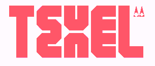 Simon Bent from Melbourne (Metis Foundry, or: Studio Io; was: Volume2a) designed these typefaces in 2007-2008: Epsilon, Annual (modular, architectural), Tangerine, Deccade (experimental), Hoax [more scans: i, ii, iii, iv], Babylon (another modular experiment).
 In 2012, he created the geometric sans typeface Acumen, and the sans family Silence. He is working on Fragile, Terminal, Link, Recurrence (very experimental), Autonomy, Motor, Velcro, and Elevator. In 2013, he designed the sans typeface Figure. In 2016, he published the ultra-condensed blackletter typeface Optimum Compress in Textura style. In 2018, he published the great condensed brutalist octagonal typeface Texel, the experimental geometric typeface Pyxis (published by The Designers Foundry), and the geometric solid typeface Geometer. In 2019, he added the ultra-fat Dot19, the monoline experiment LXII, the modular Alexandro, the geometric sans typefaces Software and Gertrudes, and the sans font Mizzen. Typefaces from 2020: Geometer. Typefaces from 2021: LXII Display (a prismatic typeface). [Google]
[More] ⦿
|
Mette Ahrensbach
|
Aarhus, Denmark-based designer of an unnamed thin font with technical / architectural roots. Behance link. [Google]
[More] ⦿
|
Michael Daines

|
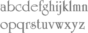 Designer at Letraset of University Roman, 1972-1983 (originally a font from the 1960s: Typographic Systems International [TSI]/Lettergraphics). Redesign by Michael Daines in 1972, and re-redesign by Timothy Donaldson & Phillip Kelly in 1977 in the Letraset Type Studio, based on his and Mike Daines' original design.
 His Hawthorn (1968) is a slightly serifed black typeface of elegant proportions. The lower case a is too far below the baseline though. He also released the Monotype Small Office/Home Office package: Diversities (dingbats), Gravura (calligraphy), Humana Medium, Humana Sans Medium, Orbon Bold, Pink (distressed), Stylus (architectural lettering) and University Roman. I am not sure if this is the same Michael Daines, but a certain Michael Daines made the iFontMaker font Monzter (2010, hand-printed). Linotype link. FontShop link. [Google]
[MyFonts]
[More] ⦿
|
Michael Elliott
|
At the University of Hertfordshire, Michael Elliott (London, UK) designed the experimental Hatfield Architecture typeface (2016). [Google]
[More] ⦿
|
Michael Hassler
|
Michael Hassler (b. 1972, Denton, NC) designed the free spurred biker style typeface Hassified (2017), Comic Ink (2017), Architects Draft (2017) and Architects Pen (2017). Dafont link. [Google]
[More] ⦿
|
Michael Herold

|
 Born 1964 in Detmold (East Westphalia/Lippe, Germany), Michael Herold did his undergraduate studies in communication design at the Muthesius Fachhochschule für Gestaltung from 1986 until 1991. Since then, he is a freelance designer in Itzehoe (Northern Germany).
 Creator of the Lamont family (URW++, 2009). In 2012, he published Fou Pro at URW as an alternative for Trade Gothic. Fou Serif followed in 2015. In 2016, he designed the La Casa typeface family, named after the urban villa Dupli Casa by architect J. Mayer. H. In 2018, he designed Corner, a sans with 14 styles published by Fontforum. I find it stunning that Fontforum was able to trademark the name Corner. Still in 2018, Herold published the elliptical typeface Lux. [Google]
[MyFonts]
[More] ⦿
|
Michael Leighton Beaman
[Beta Field]
|
[More] ⦿
|
Michael Muranaka
|
 San Salvador-based designer (b. 1985) of the thin slab typeface Espacio (2011), the monoline extended sans typeface Añejo (2011), the playful Antelope (2011), the razor blade-themed Font Interrupted (2011), the sci-fi typeface Cerebro (2011), the headline sans Jenkins (2011), the stencil typeface Mura Knockout (2011), which can be downloaded from Dafont.
 He also made Diminuto (2011, monoline slabby face), Wednesday (2011, gridded), Diamante (2011, elliptical architectural sans face), 50 Blizzards (2011, stencil face), Kiona (2011, headline caps face), the geometric logotype New Drop Era (2011), the angular typeface A Brand New Day Midnight (2011), Catman (2011), Lowery (2011), and the tattoo font Slayer Dragon (2011). Naomis Citadel (2011) is a font comissioned by author Rick Austinson for his upcoming Consecution Books series. Ocho Siete (2011) and La Quince de Mayra (2011) are hairline sans typefaces. Ciudad Nueva Caps (2011) is a geometric avant garde caps face. Home page. Mariko Chan (2011) is a soft rounded and friendly monoline display sans. Alto Voltaje (2011) is also a monoline typeface but its sharp corners make it much more threatening. Typefaces from 2012: Bad Handwriting, Sessions, Gorila (sic) (techno sans), Daiichi (hairline elliptical sans), Elite Hacker Corroded, Impalinger (hand-printed). In 2013, he made Dolce Vita (avant garde sans), Blackbook Two, Giorgio (organic sans), Blackbook One (graffiti face), Tokyo Pop Star. Typefaces from 2014: Tranquila (grungy), Blackbook 3rd (graffiti brush face), Bobby Corwin, Outlier (sci-fi face). Typefaces from 2015: Break Label (monoline techno font), Generica (clean sans), Sylphie, Mnml Fnt (experimental stroke removal font), Espacio Novo (thin slab serif). Typefaces from 2017: Head Traffic. Dafont link. Klingspor link. [Google]
[More] ⦿
|
Michaela Fleri Soler
|
As a student at MCAST Institute for the Creative Arts, Malta, San Giljan (St Julian's), Malta-based Michaela Fleri Soler designed the architectural typeface Vertice (2016) and the text typeface Kefa (2016). [Google]
[More] ⦿
|
Michelle Briffault
|
During her media arts studies in Hamilton, New Zealand, Michelle Briffault created the architectural lettering typeface Land Downunder (2014). [Google]
[More] ⦿
|
MicroLogic Software
[Frank Hainze]
|
Frank Hainze (Emeryville, CA) used to sell typefaces such as Adorable, Artisan, Celebrity, Crescent, Duchess, Elegance, Formal, Heather, Imperial, ImperialBold, ImperialBoldItalic, ImperialItalic, Legend, MajesticBold, MasonBook, MasonBookOblique, MasonDemi, MasonDemiOblique, Opera, Salsa, Samurai, Victorian (blackletter, 1994), Wedding. No longer in business. The fonts are still out there, however. For example, check Samurai here. Ulrich Stiehl documents all forged fonts on the PrintMaster CD and reports that the quality is remarkably good. Examples: Advantage = ITC Avant Garde Gothic, Architect = Adobe Tekton, Editor = ITC American Typewriter, Enchanted = ITC Korinna, Fantasy = ITC Tiffany, Gallery = ITC Galliard, Geneva = Linotype Helvetica, Gourmand = ITC Garamond, Imperial = ITC New Baskerville, Manuscript = Linotype Palatino, Mason = ITC Lubalin Graph, Mirage = ITC Benguiat, Optimum = Linotype Optima, Tiempo = Monotype Times. [Google]
[More] ⦿
|
Mika Hautamäki
|
 During his studies, Oulu, Finland-based Mika Hautamäki designed the mini-serifed Latin / Cyrillic / Icelandic headline typeface Pyramiden (2016) and thin architectural sans typeface Arkkari Light (2016). [Google]
[More] ⦿
|
Miles Newlyn
[Newlyn (was: TextPref, x&y)]

|
 [MyFonts]
[More] ⦿
|
Mindy Duits
|
Mindy Duits (Huntington Beach, CA) created the decorative typeface Flloyd in 2014. Its design is inspired by Frank Lloyd Wright's stained glass windows. [Google]
[More] ⦿
|
Miquel Lloret
|
Valencia-based designer of the architectural hand typeface Enric Miralles (2014). [Google]
[More] ⦿
|
Miranda Roth
|
 Miranda Roth graduated from Daemen College (Buffalo, NY) and joined P22 as an in-house type and graphic designer. Creator of these typefaces:
 - HWT Antique Tuscan No.9 (2012, Hamilton Wood Type). The HWT explanation: A very condensed 19th century Tuscan style wood type design with a full character set with ligatures. This design was first shown by Wm H Page Co in 1859.
- Roman Extended Light (2012). A revival of No. 251 in the 1872 wood type catalog of Page Manufacturing Company.
- HWT Catchwords (2013).
- HWT Republic Gothic (2013, with Richard Kegler).
- LTC Athena (2013). A condensed art deco typeface. Based on drawings from the 1950s in the Baltotype material (and in particular, a 1955 font by George Battee called Athena). Baltotype was acquired ca. 1993 by Rich Hopkins, a printing historian.
- LTC Archive Ornaments (2014, with Richard Kegler).
- P22 Saarinen (2014). A set of eight architectural styles based on the lettering of Finnish American architect Eero Saarinen.
- LTC Goudy Initials (2005). Based on the original proofs of large sizes of Cloister Initials by Frederic Goudy.
- P22 Dearest Pro (by Christina Torre and Miranda Roth). Dearest is a distinct flowing script based on handwritten characters found in a 19th Century German book chronicling a history of the Middle Ages. Originally released in 2001 as a set containing two styles, Script and Swash, Dearest was expanded in 2014 as a pro font with several hundred new characters including support for Central European, Cyrillic and Greek languages.
P22 link. [Google]
[More] ⦿
|
Mischa Herzog

|
 Mischa Herzog completed architectural studies at Vienna University of Technology. Since 2007, he is a designer and project leader with Buero Bauer In 2021, Erwin Bauer, Mischa Herzog and Daniel Schaffer co-designed Mono To Go, a monospaced typeface with a constructed, grid-based body and a playful spirit. It is entirely based on modular pieces such as circles and other simple geometric shapes. [Google]
[MyFonts]
[More] ⦿
|
Mitiya Masuda
|
 Japanese designer of the quite interesting Konatu family (Konatu, Konatu Tohaba): Latin, Cyrillic, dingbats, kanji, kana, the works. Konatu seems most appropriate for setting programs and lettering architectural drawings. A later update of this is called Systema 21. [Google]
[More] ⦿
|
Moiré
[Marc Kappeler]
|
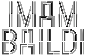 Zurich-based graphic design studio that often work for art and architecture clients. It is run by Marc Kappeler, Markus Reichenbach and Ruth Amstutz. Font subpage. Regina (2008) is a custom rounded typeface in Latin and Cyrillic for Regina Gallery in London and Moscow. Balkankaravan (2008) is a layered typeface custom-designed for Balkankaravan. In 2010, they made an ornamental caps typeface consisting of building demolitions.
 In 2012-2013, Grilli Type published their typeface family GT Pressura (with monospaced and proportional versions), which was inspired by type stamped on shipping boxes. GT Pressura was co-designed by Ruth Amstutz and Dominik Huber. In 2014, Dominic Huber, Marc Kappeler and Noel Leu published the extensive text family GT Sectra (Grilli Type), which, in view if its breadth and angular design will prove to be one the world's major releases of 2014. GT Sectra won first prize in the TDC 2015 Type Design competition. Their blurb: GT Sectra was originally designed for the German-language magazine Reportagen, a bi-monthly publication specializing in literary reporting. Its long-form stories require a typeface that works well in text, but not at the expense of character. GT Sectra strikes that balance. In 2020, Dominic Huber and Marc Kappeler co-designed the 112-style GT Flexa at Grilli Type. Flexa is also a variable type with width, slant and thickness axes, and has a monospaced subfamily. GT Flexa is characterized by simple shapes and penetrating ink traps. [Google]
[More] ⦿
|
Monica Ramos
|
Barcelona-based designer of the typeface Architexture (2012). [Google]
[More] ⦿
|
Moonlight Type and Technology
[Chuck Rowe]

|
American custom type design and font technology consulting, by Chuck Rowe. Some fonts such as Draftsman Casual (2001) are on the Bitstream Type Odyssey CD (2001). Klingspor link. [Google]
[MyFonts]
[More] ⦿
|
Motin Blanco
|
Buenos Aires-based designer of the decorative caps typeface Vision (2018), which is based on architectural plans. It was developed at FADU / UBA. [Google]
[More] ⦿
|
Muhammad Ridha Agusni
[38 Lineart Studio (or: Grayscale, or: Fontsources)]

|
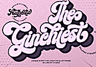 [MyFonts]
[More] ⦿
|
MunchFonts
[Gary Munch]

|
 Gary Munch (born 1953) is the Stamford, CT-based principal of MunchFonts. He teaches at Norwalk Community College and at the University of Bridgeport Shintaro Akatsu School of Design.. His typefaces:
 - GMAhuramazda (runes).
- Calligraphic.
- Candara (2005), a flared typeface done for Microsoft's ClearType project. Candara received a TypeArt 05 award.
- GMChanceryModern.
- Munch produced three new Cherokee fonts in 2011 in response to a request by Joseph Erb, of language technology and education services at the Cherokee Nation: Chancery Modern ProCherokee (a sleek sans serif semi-cursive font), Neogrotesk Cherokee (a multipurpose workhorse design), and Munch Chancery Cherokee (a calligraphic font that resembles handwriting). The Cherokee Nation is using Munch Chancery at its Cherokee Immersion School.
- GMClavier.
- GMDuomo.
- Linotype Ergo.
- The 8-weight didone font family GMFidelio is my favorite.
- Finerliner (linked handwriting).
- GMGlobe.
- GMHieroglyphic.
- GMHyperspace.
- GMLondinium (1993, a blackletter face), and GM Londinium Versals (a Lombardic face).
- GMMage.
- GMMedallion. An architectural writing font made in 1997.
- GMMeter.
- GMMunchfonts.
- GMMunchies.
- GMNanogram.
- GMPepRally.
- GMPrentice.
- Linotype Really (1997). An almost-didone family with Cyrillic and Greek extensions for which he received an award at the TDC2 2001 competition, and obtained third prize at the 3rd International Digital Type Design Contest by Linotype Library. It was updated to Really No2 in 1999.
- GM SPQR. A Trajan type family.
- UrbanScrawlButtah, UrbanScrawlChill, UrbanScrawlDown, UrbanScrawlFly.
- GM Wodensday.
Klingspor link. FontShop link. Linotype link. Old home page. Showcase of Gary Munch's fonts. [Google]
[MyFonts]
[More] ⦿
|
MyFonts: Architectural fonts
|
MyFonts selection of architectural typefaces. [Google]
[More] ⦿
|
MyFonts: Blueprints
|
View typefaces that are appropriate for blueprints. See also this longer list. [Google]
[More] ⦿
|
MyFonts: Drafting typefaces
|
Drafting typefaces, as selected from the MyFonts library. [Google]
[More] ⦿
|
MyFonts: Draftsman typefaces
|
Draftsman typefaces, as selected from the MyFonts library. [Google]
[More] ⦿
|
Nasri Khattar
|
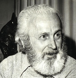 Nasri Khattar (1911-1998) was an architect and designer who studied at the American University of Beirut and the Yale School of Architecture, where he obtained an MA in Architecture in 1940. He worked with Frank Lloyd Wright in Spring Green, WI, and Scottsdale, AZ. In 1947, he submitted his Unified Arabic designs to the U.S. Patent and Trademark Office resulting in a patent for the printed form of Arabic in 1950. He designed the first Arabic computer font, Unified Arabic Neo N. [Poster by Brittany Cox].
 I am quoting verbatim the biography submitted to Arabic Type by his daughter: Architect, Type Designer, Inventor, Painter, Sculptor, Poet, 1911-1998. Nasri Khattar, architect, practiced his profession for thirty-five years in the United States; in Colombia, South America; and in his country of origin, Lebanon, where he pursued his early education at the American University of Beirut (AUB) with a B.B.A. awarded in 1930. In 1940, he earned an M.A. in Architecture from Yale University, in New Haven, Connecticut. In 1939, he was associated with Frank Lloyd Wright's Fellowship in Taliesin, Spring Green, Wisconsin; and in Taliesin West, in Scottsdale, Arizona.A dual American-Lebanese national, Mr. Khattar was an Arabic consultant to IBM in the fifties, and architect, Arabic calligrapher, and Arabist to Arab-American Oil Company (Aramco) in New York City, 1950-1957. During this time, he made innumerable calligraphic works for both Aramco and the Arabs. He received a Ford Foundation grant for the years 1958-1961, to promote his Unified Arabic, UA system. Unified Arabic is Mr. Khattar's Arabic type system that simplifies the printing and teaching of Arabic, Urdu, Farsi, and other languages utilizing the Arabic alphabet. As he continued to work on his Unified Arabic, Mr. Khattar designed new Arabic typefaces, practiced architecture, and lectured at the American University of Beirut. His topics were Frank Lloyd Wright's architectural achievements and principles of design, and his own work on the writing and design of Arabic type. Impressed by Mr. Khattar's versatility, Martin Giesen of AUB's Architectural Department, called him "the Renaissance Man", for being architect, calligrapher and type designer, painter and caricaturist, poet, and inventor (30-40 patents and copyrights). "It's been a long time since I've seen such perfection," wrote Mr. Giesen in 1977. In 1986, Reverend Dennis Hilgendorg and Dr. Ben Wood, Director of Educational Research at Columbia University, nominated Mr. Khattar for the Nobel Peace Prize for his life's visionary achievements and their vast implications for the fields of linguistics, literacy, printing, computers, and telecommunications. Mr. Khattar is survived by his spouse, Jacqueline Hedrick Khattar, and by his twin daughters, Alexandra Khattar and Camille Khattar Hedrick. His son, Christopher Khattar, passed away in 1992 after a long illness. As for digital revivals, we can cite Pascal Zoghbi's 29LT UA Neo B (or UA Beirut Modern) and UA Neo N (or UA Neo Nashki) (2007-2013). It can be purchased at 29 LT. [Google]
[More] ⦿
|
Natalie Harris
|
During her studies at Nottingham Trent University, London-based Natalie Harris designed the blackboard bold typeface called Nottingham Contemporary Architecture (2016). [Google]
[More] ⦿
|
Nate Piekos
[Providence Type]

|
[MyFonts]
[More] ⦿
|
Nate Piekos
[Blambot!]

|
 [MyFonts]
[More] ⦿
|
Nathan Eady
|
Based in Galion, OH, Nathan Eady (b. 1974) used the free tools Inkscape and FontForge to make the free architectural lettering font family Blooming Grove (2009, Open Font Library). Blog. [Google]
[More] ⦿
|
Nathan Richards
|
Graphic designer in Auckland, New Zealand. Creator of Draftsman (2012). [Google]
[More] ⦿
|
Neale Davidson
[Pixel Sagas (was: Protoform Project, and Fontshack)]
|
 [More] ⦿
|
Neil Summerour
[Positype]

|
 [MyFonts]
[More] ⦿
|
Neogrey
[Ivan Phillipov]
|
 Ivan Phillipov (Neogrey, also written as Ivan Filipov) has offices in Plovdiv, Bulgaria and Turkey. He designed the techno typefaces Research Remix (1993), Neogrey (2004) and Red October (2004, inspired by Soviet poster art; can be used for Cyrillic simulation; followed by Red October Stencil, 2009). Release Yourself (octagonal), Research Remix (rounded octagonal), Arkitech Light, Discophat and Neogrey Medium appeared in 2009. In 2011, he published Artitech Round and Syntha.
 In 2012, the free round monoline typeface Syntha and the techno typeface Arkitech Medium were published. Multicolore (2012) is a free EPS-format round sans typeface for coloring (a monochromatic version is free in truetype format). In 2013, he designed Arkitech Bold and in 2019 Arkitech Stencil. In 2014, he created the free roundish squarish typeface Ronduit (+Capitals). Typefaces from 2015: Tricolore (multicolored rounded sans), Lausanne (a free font inspired by the Prada and Louis Vuitton fashion house logos). In 2017, he designed a free color font called Color Tube. Typefaces from 2019: Konstruktor (constructivist), Red October Eroded, Arkitech Stencil. Typefaces from 2020: Syntha Nova (a free round sans advertized as the electronic music font), Fattern (a free color font with textures and patterns influenced by Romero Britto's work). Typefaces from 2021: Cimero Pro (a free color SVG font). Alternate URL. Dafont link. Fontspace link. Abstractfonts link. Behance link. Creative Fabrica link. [Google]
[More] ⦿
|
Neubau Berlin (or: NB Typography, or: Neubau Laden)
[Stefan Gandl]
|
 Stefan Gandl was the designer at Designer Shock in Berlin of the pixel fonts DS1D, DS2D, DS3D, DSClone, DSClone3D, DSCutout, DSImitate, DSMufdi, DSMufdi3DL, DSMufdi3DR, DSNSW45, DSNSW55, DSNSW65, DSNSW75, DSNSW85, DSNSW95, DSP9RMX (with Markus Angermeier), DSP9RMX3D, DSSQR35, DSSQR45, DSSQR55, DSSQR553DL, DSSQR553DR, DSSQR65, DSSQR75, DSSQR85, DSTicket35, DSTicket45, DSTicket55, DSTicket65, DSTicket75, DSTicket85, DSTicket95, DSVDOTXT1, DSVDOTXT2, DSVDOTXTError. At the end of 2001, he established Neubau Berlin or NB Typography. He created DS Yakuti (experimental) and DS Lane (2001, trilined) at Die Gestalten. Fonts at Neubau include NB55RMS, NB55RBX, NB55RLS, NB55MS, NB55BX, NB55SET, NBFETT, NBFORM, NBRUND, NBTRANSFER, NBUNIVERS, and NBBLOCK, which are all mostly futuristic-looking designs. In 2008, they added the beautiful 6-weight (35, 45, 55, 65, 75, 85) NBGrotesk family (+Mono, +Mono Stencil), also by Stefan Gandl. In the Neubau series, we also find the gorgeous didone display typeface NB Antiqua Nero (+Italic), NB Antiqua Roman, Antiqua Libro, and NB Typewriter.
 NB Architekt and NB Architekt Neue (2015) pay tribute to blueprint typefaces used during the Letraset era. The typeface is a classic modern monoline monospace that was originally designed by Gandl in 2002 and named NB55RMS. Neubau made a concerted effort in the Akzidenz Grotesk genre. The classical AG became the starting point for the development of Neubau's distilled grotesque NBGrotesk (2008)---a strongly restricted, grid-based, brutally honest and optically non-corrected mono line type system comprising 28 styles. An optically balanced version of NB Grotesk's skeleton resulted in Neubau's popular NB International (2014) type system paying homage to the "international style" era. Coming full circle with NB International's conceptual successor---NB Akademie---(2016-2020) is a more distinctive and refined follower inspired by the studio homegrown Berlin influences. The in house, non-retail and beta versions of NB Akademie are called NB National. Gandl writes: The typeface's infuences and naming go way back to legendary German type designer Ferdinand Theinhardt and his revolutionary typeset Royal Grotesk (1880) designed for the publications of the Königlich-Preußischen Akademie der Wissenschaften zu Berlin. After selling his own type foundry Ferd. Theinhardt Schriftgiesserei Berlin Theinhardt's Royal Grotesk became internationally successful as Berthold's Akzidenz Grotesk (1896)---the godmother of all modern grotesque typefaces. Other typefaces: NB Plan Pro, Postmates (2017). Alternate URL. Yet another URL. [Google]
[More] ⦿
|
Neutura
[Alexander McCracken]

|
Neutura was formed in 2003 by Alexander McCracken, who is located in San Francisco. His typefaces have a large geometric component: Aerion, Aperture (slab serif family), Autobahn, Belfast (octagonal black-bowled headline face), Cerie Outline, Children (paperclip face), Circle (avant garde style), Deuce (ultrafat), Deuce Round (fat and counterless), Estrella (2011, a high-contrast fat vogue didone titling face), Frank (fat and counterless), Frank Stencil, Frank3, Gulden Draak (blackletter), Interpol (texture face), Magnum (2006, for Neo2 magazine: free), Maisalle, Neutrino (ultra-fat futuristic beauty, 2006), Neutura (clean geometric sans family), Orange (geometric hairline sans), Orange Round, Rabbit, Register (architectural sans), Royale (fat decorative didone), Sabre (octagonal), Sarcophagus (very original blackletter), Slayer Heavy, Spade (fat and counterless), SPQRExlight, Syrup (paperclip font), Vendella (2011), Wafer (ultrafat). At T-26, he published Children (2006, a paperclip font), Deuce and Sarcophagus. Behance link. Klingspor link. Abstract Fonts link. [Google]
[MyFonts]
[More] ⦿
|
Newlyn (was: TextPref, x&y)
[Miles Newlyn]

|
 Miles Newlyn (b. 1969) graduated from St Martins College of Art, London, in 1991. He worked with various London agencies, including Wolff Olins. x&y in London was Miles Newlyn's web site where you could buy his creations from 2002-2004. In 2004, he set up Newlyn.com. Around 2015, he founded TextPref. Many of his typefaces are retail (via, e.g., Emigre), but he speciaizes in commissioned type as well. He is well-known for his logo work (Honda, Cadillac, Saab, Land Rover, Sky, EE, two Olympics). He is based in London.
 Creations: - TP Atten (2015). A rounded sans typeface named after David Attenborough. Rejuvenated as New Atten and New Atten Round in 2018.
- Becker (LED font).
- Bugini (1996).
- Democratica (Emigre). Roman with a Greek touch, 1991.
- EE Nobblee. A family of dot matrx fonts.
- Ericsson Sans (2006) and Ericsson Capital.
- Ferox (a blackletter face, 1995; see Umbrella Type).
- FNB Sans (2010). A rounded sans typeface family. There are vey few, if any, differences with the Frank typeface family.
- Frank (2010-2011). A humanist sans family done with Francesca Bolognini. Now available as TP Frank and as New Frank.
- HTC Script (2009). A fat finger font for HTC Corporation.
- Luvbug (a 3D font).
- The curly Missionary (1992, Emigre).
- Modena (2008). A corporate type family. There are also IR Modena and HMRC Modena.
- Neulin 9 Roman (1994).
- In 2021, Miles Newlyn, Riccardo Olocco and Krista Radoeva co-designed New Spirit, a 10-style typeface that revives the comfort food font Windsor.
- Nuke Plain (1994). In the early nineties style of Democratica and Barnbrook's atheist-meets-crusader style.
- Remington German and Remington Plain. Heavy typefaces made in 1994.
- Rubrik (2011). A well-rounded monoline sans family reminiscent of architectural drawings. At Type Network, you can buy New Farm (2013).
- Sabbath Black (1994, Emigre). A blackletter font.
- Sky Text (2009). A custom sans typeface for BSkyB Ltd.
- Style (2004). A painters font.
- Tonnage Sans and Tonnage Serif (Emigre, 1996). An homage to David Harris's Chromium typeface.
- Verona (2007). A sturdy condensed text typeface.
- A set of six typefaces for David Carson to use in Raygun Magazine.
- TP Hero (2015).
- TP Zen (2015, rounded sans) and New Zen (2017, developed in collaboration with Elena Schneider).
- TP Farm or New Farm (2015).
- In 2016, Elena Schneider and Miles Newlyn co-designed the almost reverse contrast typeface family New Herman.
Bio at Emigre. Most of his typefaces can be bought from Veer and MyFonts. Klingspor link. FontShop link. [Google]
[MyFonts]
[More] ⦿
|
Nge Font
[Choirul Masruroh]
|
Indonesia-based designer (b. 1995) of script and display typefaces. His catalog in early 2022 showed these fonts: Alice, Autumn, Baby Witch, Birthdays, Camping, Celestial, Daily Quotes, Ekschool, Elegant, Grock, Logue, Magnolia, Morgan (an inline display typeface), Planning (an architectural font), Procreate, Rekt (a free sketched blueprint typeface ), Stylish, Sublimation, Watercolor, Wedding. [Google]
[More] ⦿
|
Nicholas Lim Wen Kai
|
Singapore-based creator of Scape (2012, an architectural typeface). Behance link. [Google]
[More] ⦿
|
Nick Curtis

|
Nick Curtis (b. Chicago, 1948) lived in Texas from 1952-1997, and lives since 1997 in Gaithersburg, MD and Alexandria, MD. From ca. 1990 onwards, he has been designing fonts, first for free, and then commercially. He had a great reputation as a "revivalist" type designer, with a particular interest in retro fonts and art deco types. In 2003, his site had become too popular and too expensive to maintain, and thus he went commercial as Nick's Fonts. In 2013, he stopped making fonts, and donated his collection of rare books and type material to the University of Virginia. Interview. Complete list of names and other info, maintained by Sander de Voogt. Interview in which we learn about his fondness for Corel Draw as a type design tool. Near the end of 2012, he posted this comment on his web site: Fifteen years ago, I embarked on a wonderful voyage of discovery, when I created my very first font with Fontographer 3.15. My maiden voyages were, frankly, rather clunky and amateurish, but I have been told that they showed promise. Well, sure enough, thanks to the diligent (and patient) efforts of Ilene Strizver, I polished up my craft enough to sell my humble efforts---first as a sideline business and, since 2006, as my full-time job. In total, I have produced over eleven hundred fonts---almost five hundred of them freeware fonts, which I conservatively estimate have been downloaded and enjoyed by over three million people worldwide. Unfortunately, this past year has brought a series of unanticipated setbacks, culminating in the loss of my wife's beautiful mind and soul to the scourge of alcoholism. In an effort to generate extra income to cover the expenses for her long-term care, I have proposed a number of, I believe, innovative ways to revamp the online font business; unfortunately, those efforts have fallen flat, primarily due to the professional font community's abject fear of crossing the $165 million Elephant in the Room. I even offered a special discount rate of 75% off retail price for full-time students of Typohile Forum. To date, there have been zero takers. Hell: even the webfont kit of one of my own fonts which I purchased from myfonts.com turned out to be an empty folder. Talk about a run of bad luck. Which leaves my with you, dear readers. If you or someone you know has had fun or made a buck from my humble efforts throughout the years, please donate whatever you can---even a lousy dollar would help---to help me out. I would greatly appreciate it. Home page. Dafont link. FontShop link. Klingspor link. Abstract Fonts link. View the typefaces designed by Nick Curtis. [Google]
[MyFonts]
[More] ⦿
|
Nick Curtis
[Nick Curtis: Commercial typefaces]

|
[MyFonts]
[More] ⦿
|
Nick Curtis
[Nick Curtis: Typefaces from 2011]

|
 [MyFonts]
[More] ⦿
|
Nick Curtis: Commercial typefaces
[Nick Curtis]

|
Nick Curtis (b. Chicago, 1948) lived in Texas from 1952-1997. Since 1997, he is in Gaithersburg, MD and Alexandria, MD. Since the 1990s, he has been designing fonts, first for free, and then commercially. He had a great reputation as a "revivalist" type designer, with a particular interest in retro fonts and art deco types. In 2003, his site had become too popular and too expensive to maintain, and thus he went commercial as Nick's Fonts. Interview. Free downloads at TypOasis. Complete list of names and other info, maintained by Sander de Voogt. Interview in which we learn about his fondness for Corel Draw as a type design tool. Home page. His free fonts are listed elsewhere. On MyFonts, he says this about himself: Nick's Fonts is a modest little foundry dedicated to the preservation of our rich typographic heritage. Most of the foundry's designs are based on authentic historical sources, gleaned from the massive collections of the Library of Congress. If you are looking for a font that captures the essence of the Wild West, the Gay Nineties or the Jazz Age, look here first: if it is not in the catalog, it will be soon. [Google]
[MyFonts]
[More] ⦿
|
Nick Curtis: Typefaces from 2011
[Nick Curtis]

|
 Typefaces made by Nick Curtis from 2011, not listed elsewhere on these pages: Jersey City NF (modeled after Times Gothic (1905, ATF)), Petty Despot NF (2011, also modeled after Times Gothic, and possibly renamed from Jersey City NF after Berthold---yes, the same Berthold again---complained about the name Jersey since one of its fonts by Gustav Jaeger was named Jersey. This is my educated guess..., and two thumbs up to Nick for picking the appropriate name Petty Despot NF). Olde Megrat NF is patterned after Antikva Margaret, designed by Zoltán Nagy for VGC in the mid-60s. Herkimer Bunrab NF is an upright scriptish typeface with bunnyears that is based on Hercules (1926, Amsterdam Type foundry). Blackbarry NF (2011) is a faithful revival of Deutsch Black (1966, Barry Deutsch, VGC), a unicase piano key typeface. Bindlestiff NF (2011), which won the 2011 Devroye Memorial Medal for funniest typeface name, revives Schmallfette Binder Style (1959, Joseph Binder, Stempel AG), a squarish tightly set headline face. Decked Out NF (2011) is a fat inline typeface modeled on Dektiv in Homage to the Alphabet. Bazoo Tow NF (2011) is a fun fattish headline typeface that is a faithful reroduction of Basuto (1927, Stanley Baxter for Stephenson Blake). Are You Shaw NF (2011) is an all-caps blackboard bold typeface inspired by Pygmalion, a typeface found in Homage to the Aplhabet. Hoodoo U NF (2011) is a roly-poly romp through the alphabet, based on Jürgen Riebling's irrepressible Mr. Big from the 1970s. Big, bold, bubbly and a little brash, it's a natural choice for happy headlines. The handlettered Mikeys Roman NF (2011) has an uppercase based on the work of Mike Stevens, and a lowercase based on the work of Alf Becker. Outgribe NF (2011) is a rough, raw typeface that is based on the lettering in Ben Shahn's iconic poster protesting the execution of Nicolo Sacco and Bartolomeo Vanzetti in 1927. Nellie Kay NF (2011) is a monoline script face, based on an example by Ross F. George. Shaq Attack NF (2011) is a wooden plank style or brushy typeface inspired by an alphabet of Alf R. Becker. Relampago NF (2011) revives Hans Möhring's bilined typeface Elegante Lichte (1928). Squirrely Shirley NF (2011) is a bouncy typeface based on Phoenix (unknown creator) in Schriftatlas. Spread Out NF (2011) is modeled after Ross F. George's Split Caps. Salzburger Plakat NF (2011) is based on an Austrian winter sports festival poster from 1907 by Swiss poster designer Otto Baumberger (1889-1961). Rightly So NF (2011) is a squarish typeface based on Geometric Gothic (1884, Palmer and Rey)---it is hard to imagine that this almost pixelish style was around at that epoch. Kenotaph NF (2011) is a condensed headline slab serif modeled after Stymie Obelisk (1930s, Morris Fuller Benton). Vasari NF (2011) is based on Ancient Gothic (1891, William W. Jackson, Keystone Type Foundry). Moslem (Boston Type Foundry) was revived as Suffiya NF (2011). Looky Cookie NF (2011) has eyes placed on the glyphs. Iago NF (2011) is a powerful headline sans inspired by two ATF typefaces from the 1880s, Othello and ATF Black Caps. Big Bag NF (2011) is called an industrial-strength titling face by Nick Curtis---it has design elements of Hans Eduard Meier's Syntax Antiqua. Highpoint Gothic NF (after Morris Fuller Benton's 1932-1935 typeface Raleigh Gothic Condensed). Fernburner NF is an all caps shadow face, modeled after Hans Bohn's 1929 typeface Orplid. Planscribe NF is based on types used by the Leroy Automatic Lettering Machine, a tool for architects. [Google]
[MyFonts]
[More] ⦿
|
Nick Edward Matavka
|
Creator of the classic Germanic blackletter hand simply called Blackletter Hand (2014). It has elements of Suetterlin. Creator of Cyanotype (2014) and EngineerHand (2014), both engineering or architect draftsman scripts. In 2014, he created an irregular handwriting font, Saucy Jack, and wrote: A true Victorian handwriting font. Don't use the Jane Austen font to emulate Victorian or later handwriting; by the Victorian era, the pen had been invented and people no longer used quills like Miss Austen did. This was very obviously written with an actual pen rather than with a dipper, quill or biro; it comes from a letter purportedly written by the famous Englishman, Mr John D. Rypper. It is suited to any period ranging from the invention of the pen (1830) to the popularity of the biro (1965). Ron's Font (2014, in a style not unlike hat of Jack Kerouac or Hunter Thompson) and Nick's Font (2014) emulate irregular handwriting as well. Station (2014) is an all-caps sans typeface based on the font used in Toronto's subway stations. DN Titling (2014) is an ultra-compressed font based on the titling used in the pop-psychology textbook Dianetics: The Modern Science of Mental Health. He designed the following Greek / Coptic fonts in 2014: Antonios-B, Antonios-D, Athanasius-B, Athanasius-D, Copt-A, Copt-B, Copt-D, Coptic-A, Coptic-B, Mina-A, Mina-B, Shenouda-A, Shenouda-D. In 2015, he published Draughtsman, an internationally standardized typeface for Latin, Greek and Curillic for labelling architectural and engineering blueprints, as found in the GOST standard 2.304-81. Open Font Library link. Fontspace link. Open Font Library link. [Google]
[More] ⦿
|
Nicolas Jover
|
Graphic designer Nicolas Jover (Aix-en-Provence, France) created the compass-and-ruler typeface Savoye Sans (2013). It was based on architectural drawings by Le cirbusier for his Villa Savoye (1929-1931). [Google]
[More] ⦿
|
Nicole Fichera
|
Boston-based designer who focuses on architecture and branding. She created a nice logo for an architectural publication called Draft (2012), and designed a custom organic sans typeface for a non-profit company called Roxbury Gardens (2012). [Google]
[More] ⦿
|
Nina Gregier
|
Polish graphic designer who is based in Krakow. Nina is exploring geometric concepts such as in her Alfabetczi White (2012), My Republic, Teleport (2011, monoline hexagonal), in her Stripes typeface (2010), in Do Not Cut (2011), in CLN 3000 ID (2011), in the multiline typeface Pink Twist Alphabet (2011), in the hand-printed poster typeface Bambi Letters (2011), and in Garaz (2011). Ksavery (2011) is an architectural typeface designed for the logo of the Krakow School of Art and Fashion Design's blog. In 2012, she created the alchemic typeface Keep Going. Fruits of the Forest (2013) is an alchemic typeface family. Classic Geometry (2013) also uses geometric patterns. In 2014, she created the geometric display typeface Baltazar, the multilined typeface Wake Up, and the avant-garde Proste Wnetrze (for the interior design studio by that name). In 2015, Nina designed the free EPS format polygonal typeface Kendrick. Home page. Home page. Hellofont link. Behance link. [Google]
[More] ⦿
|
Nisrina Aulia
|
Malang, Indonesia-based designer of Kalif Std (2018). It is inspired by the architecture of ziggurats. [Google]
[More] ⦿
|
Noel Campos
|
Creator of the free textured display typeface Lisboa Calatrava (2013). This font was inspired by Gare do Oriente, Lisboa, which was constructed by Santiago Calatrava. [Google]
[More] ⦿
|
Nonpareille (was: Chastellun.net)
[Matthieu Cortat]

|
 Matthieu Cortat was born in Délémont (Switzerland) in 1982, and became a French citizen later. After a degree in graphic design in 2005, at the University of Art&Design Lausanne (Ecal), he obtained a Masters at the Atelier National de Recherche Typographie in Nancy (France). Cortat heads the Master Type design program at the École d'art de Lausanne (ECAL). He lives in Lyon where he is advisor to the collections of the museum of Printing and Graphic communication. He created the French typographical corpus, which brings together the typefaces in France between 1850 and today. He set up Nonpareille. Most of his typefaces can be bought at 205 Corp.
 His typefaces: - Bentham (transitional).
- Bonesana (2009, Gestalten, an elegant text family straight out of the 18th century).
- Brett (2004). A rounded pixel face.
- Chastelmail (a modification of ITC Officina).
- Goupil (2008, by Regis Tosetti).
- Ecstrat (2009, ornamental 18th century type in the style of Fournier or Rosart).
- Fairplay (transitional newspaper face).
- Glovis (2007, a monospaced typewriter typeface with ball terminals; with Régis Tosetti).
- Liberté.
- Tartan.
- Monolith.
- Stockmar (2007, Optimo: a 12-style baroque family inspired by by Johann Rudolf Genath II (1679-1740)).
- Stuart Pro and Stuart Standard (Nonpareille, 2008). These almost Venetian low-contrast text type families come in 18 styles each, and have three optical choices for the ranges below 8pt, 8-12 pt and above 12pt.
- Ecstrat.
- Glovis.
- Louize (2013). This is a contemporary revival of the Augustaux designed by Louis Perrin between 1846 and 1855. It mixes roman square capitals with a set of transitional / old style / incised lower case. In 2021, he added Louize Display Condensed. He explians: In 1846, Lyonnese printer, Louis Perrin commissioned founder Francisque Rey to cut a series of capitals inspired by monumental roman inscriptions. They have been used to compose "Les Inscriptions antiques de Lyon", a book by Alphonse de Boissieu. In 1855, the typeface was completed by a series of lowercase, some coming from the printshop of Rey, others designed by Perrin himself. His Augustaux, one of the first revivals in the history of typography, became rapidly successful, launching the Renouveau Elzévirien" movement. With the Louize Family, Matthieu Cortat provides a contemporary reinterpretation of the Augustaux. It retains a wise and serene tone, a clear grey of text, the soft roundness of the curves. Louize is discreet, calm, harmonious.
- Chrysaora (2013). An all caps art deco typeface family based on the engraved letters on the Palais de la Porte Dorée in Paris.
- Ebnor (2013). A digital version of the Écriture Bâton Normalisée (standardized sans serif) presented by M. Brun in a self-published booklet of 1959. The shape of letters respects the standard E-04-105 of the French Association for Standardization (AFNOR) which sets norms for industry, engineering and architecture. All letters are monolined and warmly rounded.
- Svafa (2013). This is a rune simulation typeface that revives lettering designed by Eugène Grasset in 1893, on a poster for Richard Wagner's opera, Valkyrie.
- Petit Serif (2013): Petit Serif is a caps typeface with copperplate endings, described as an interpretation (with Latin, Greek and Cyrillic versions) based on the lettering done at 55 Broadway, S.W.1, London, by Percy J. Delf Smith. It is a sans serif presenting the classic proportions of the Roman Square Capitals, yet it does show tiny serifs due to the use of a brush.
- Mecano Sans and Mecano Serif (2013). A revival of a condensed geometric Nebiolo family.
- Henry (2013). They write: Henry is a personal reinterpretation of the Garamond cut for the Deberny & Peignot type foundry between 1914 and 1926 by Henri Parmentier, under the management of Georges Peignot, who owned the foundry. Their purpose was to recreate the gracefulness of Claude Garamont's type typeface while allowing for the development of modern paper making, with its wood pulp paper, as opposed to 16th century rag paper. This elegant and smooth text family has its own mind: Henry is based on the text sizes (9 to 14) of the Garamond Peignot. It is a light and fluid Garald, rather skinny and narrow, with a slender grace. There is an art nouveau spirit in its z leaning on the left, its serpentine a and J, the roundish lower bowl of its t, the wide tail of its Q.
- Hans (2013). A dark Koch-style textura blackletter.
- Battling (2013). This is quite an interesting sans family, in the geometric style of 1930s Europe. The original rough model was a typeface family called Universelles by the Dutreix foundry in Limoges, first produced in the 1930s. The heavier weights are characterized by small cactus spurs. Apparently, Universelles is a renamed version of Hans Moehring's Elegant Grotesk (1928-1929).
- Anacharsis (2012). An experimental geometric sans family.
- Basetica Pro (2013). Even though only offered in two styles, the announcement says that Basetica aims to be the Helvetica for 2013.
- Helvetius (2016). A reinterpretation of a Fournier-style font used in a 1178 edition of De L'Homme by French philosopher Claude-Adrien Helvetius.
- Cosimo (2017, Bureau 205). A humanist sans.
- Yorick (2018). Yorick is based on a monospace typewriter font (model 3402U) found in the Campionario caratteri e fregi tipografici of the Nebiolo type foundry, dated 1920, but the font might probably be older. The source is a slab serif form very common in typewriter fonts (Pica, according to Olivetti naming system) with a little touch of classical flavour from the Imperial style (i.e. with thick and thin contrasts).
- Molitor (2019, 205TF). A great art deco-inspired sans typeface that looks great even for text on a screen.
- Muoto (2021), a variable sans serif font designed by Matthieu Cortat, Anthony Franklin and Sander Vermeulen (Base Design). They write: Muoto is the synthesis of a sensitive and human approach to modernist design. This font combines full curves and solid stems, showing that functionalism can actually be warm and softly effective. With its robust structure and subdued proportions, it evokes organic forms dear to Finnish architect Alvar Aalto, who in 1957 wrote: "We should work for simple, good, undecorated things, but things which are in harmony with the human being and organically suited to the little man in the street".
Speaker at ATypI 2017 Montreal. Klingspor link. View Matthieu Cortat's typefaces. View Nonpareille's font library. [Google]
[MyFonts]
[More] ⦿
|
Nor Eddine Bahha
[NorFonts (was: NorMusic)]

|
[MyFonts]
[More] ⦿
|
NorFonts (was: NorMusic)
[Nor Eddine Bahha]

|
 Nor Eddine Bahha (jazz pianist, composer, copyist, researcher and teacher at "The Karawen Music School" in Morocco) designed the NorMusic fonts in 2005. This is a set of jazz music fonts with a handwritten look designed to work with Finale, Sibelius, Overture, Mozart, NoteWorthy Composer and Encore/MusicTime Deluxe. He coauthored Jazzology.
 In 2007, he released the BopMusic font family for Sibelius and Finale. This is a third party set of music symbol fonts which can be used with Sibelius to produce handwritten music in a style similar to that of many jazz charts, including a complete script font for text, chord symbols, and hundreds of symbols for jazz and commercial music. The fonts set includes BopMusic, BopMusic Script, BopMusic Chords, BopMusic Text, BopMusic Special, BopMusic Metronome and BopMusic Time. All the fonts are commercial. BopMusic Script and NorText are two handwritten fonts that are sold separately. NorScript Fonts v2 (2009) contains seven new handwrittren text fonts similar to JazzText with different effects: NorScript Bold Font v2, NorScript Cased Oblique Font v2, NorScript Cased Font v2, NorScript Italic Font v2, NorScript Font v2, NorScript Shadow Font v2 and NorScript Title Font v2. In 2011, he designed RealScore Jazz Font Set for Sibelius and Finale. This is a third party music symbols font which can be used with Sibelius to produce handwritten music in a style similar to that of many jazz charts, including a complete script font for text, chord symbols, and hundreds of symbols for jazz and commercial music. The fonts set includes seven accompanying fonts to help transform the overall appearance of the music and titles. RealScore Sibelius includes these fonts: RealScore, RealScore Script, RealScore Extended, RealScore Oblique, RealScore Chords, RealScore Text, RealScore Special, RealScore Metronome, RealScore Time, RealScore Title. In 2020, he released the architectural lettering font family NorB Architect, NorB Architect CF, NorB Architect Pencil Condensed, NorB Architect Line and NorB Architect Pencil, Jazz Copyist (an informal comic book font), NorB Type Writer Roughen, NorB Croquis, Ricks Cafe, NorB Bop, NorB Cobalt, NorB TypeWriter, NorB Sans, NorB Sans Expanded, NorB Scribe, NorB Casual, NorB Chalk, NorB Pen, NorB Pen Cased, NorB Sketch, NorPen Script, NorB Comic (a comic book font), NorB Note, NorB Felt Tip, NorB Marker, NorB Felt Marker, and LeadSheet Pen. [Google]
[MyFonts]
[More] ⦿
|
Ole Schäfer
[Primetype]

|
[MyFonts]
[More] ⦿
|
Oles Mizernyi
|
Graphic designer in Lviv, Ukraine, who created the arched geometric semi-architectural typeface Apriori (2015) for Latin and Cyrillic. Free download of Apriori Regular and Apriori Light. [Google]
[More] ⦿
|
Olivia Moores
|
As a student at Falmouth University in the UK, Olivia Moores designed Graphitecture (2016). [Google]
[More] ⦿
|
Omkrets arkitektur
[Mårten Nettelbladt]

|
Swedish architect Mårten Nettelbladt (Omkrets arkitektur, Stockholm) is the designer of some typefaces such as Indikator (2004), which has nifty geometric roots. He also designed the architectural lettering font family Miso (2006), which can now be freely downloaded, e.g., here. In 2012, he set up his own commercial foundry: Mårten Nettelbladt. He published the ASCII art font Several Seven (2012) there, as well as the full Miso family (2006). Typefaces from 2018: Polyline (monline, monospaced, technical and octagonal). Font Squirrel link. Kernest link. Abstract Fonts link. Fontspring link. [Google]
[MyFonts]
[More] ⦿
|
Ondrej Jób
[Setup (was: Urtd)]

|
 [MyFonts]
[More] ⦿
|
Ondrej Kahanek

|
 Koprivnice, Czechia-based designer, b. 1989, Bilovec, Czechia. His typefaces include Trendy Roma (2012, sans and slab), Steelovy (2011, art deco prismatic typeface), Inspiration (2011, a thin architectural typeface), and Spock (2011, modular, logical, and mini-slabbed). In 2014, he set up his own type foundry. In 2014, Ondrej created Zirkel, a geometric sans in 16 weights.
 Behance link. [Google]
[MyFonts]
[More] ⦿
|
Open Source Publishing (or: OSP)
[Harrisson]
|
 Free software project based in Belgium and run by four people (and I quote from their web page):
 - Harrisson: Graphic designer and typographer, based in Liege and Brussels. Started to use as much Open Source software as possible on his Macintosh, as part of a research project The Tomorrow Book at the Jan van Eyck Academy in Maastricht.
- Pierre Huyghebaert: Exploring for eighteen years several practices around graphic design, he currently drives his own studio Speculoos. Interested to use free sofware to re-learn to work in others way and collaboratively on cartography, type design, web interface, schematic illustration, teaching and book design.
- Nicolas Malevé: Systems- and software developer from Brussels with a long interest in the politics and practice of software. Uses Linux since 1998 and makes publishing- and distribution systems for collaborative work.
- Femke Snelting: Graphic designer and artist based in Brussels. Most of her current work is for the web. Recently switched to Linux after using Apple Macintosh for more than ten years.
Alternate URL. They also describe interesting autotrace software included in Inkscape and UNIX batch tools for good autotracing of images. Designers of free fonts: - Alfphabet (2009). Based on the Belgian road signage system in use from 1945 until 1975. It came from Minneapolis to Brussels with 3M.
- Broodthaers.
- Cimatics (2009). Totally experimental. This font was designed in July 2009, for the graphic identity of Cimatics A\V Platform. It gathers glyphs from FreeSerif, FreeSerifItalic, DejaVuSans, DejaVuSerif, the OSP_frog mascot, the Cimatics two piece heart, a baronchon_palm_tree from Open Clip Art Library and private use dingbats drawn for Cimatics (Cimatics_scare_eye, white_pentagon).
- Crickx. A digital reinterpretation of a set of adhesive letters.
- Distilled Spirit and Whisky Jazz. In September 2009, Harrisson and Jean Baptiste Parre from LPDME remixed URW Gothic (Avant Garde) and published the free fonts Distilled Spirit and Whisky Jazz.
- DLF. DLF stands for Dingbats Liberation Fest.
- Libertinage. In August 2008, Harrisson designed 26 variations on Philipp H. Poll's 2006 font Libertine, and called the new family Libertinage. It covers Greek, Latin and Cyrillic.
- Limousine. This font was made for a poster to support nine people accused of "criminal association for the purposes of terrorist activity". They were arrested the 11th of November 2008, in France. They and others are the victims of a witch-hunt where the word "terrorism" was applied to any idea or practice which challenges the status quo. An international movement is emerging in their support. For the poster, we re-mixed an open font, the Free Sans from Free UCS Outline Fonts. Open Font Library link.
- Logisoso. Logisoso is a reinterpretation of the Delhaize logo lettering.
- NotCourierSans. NotCourierSans is a reinterpretation of Nimbus Mono and was designed in Wroclaw at the occasion of Linux Graphics Meeting (LGM 2008). We took Nimbus as the base of the design. We proceeded to remove the serifs with raw cuts. We did not soften the edges. We are not here to be polite.
- OSP-DIN (2009). The first cut of OSP-DIN was drawn for the festival Cinema du réel.
- Polsku Regula (2010). Polsku Regula is inspired by polish signage, street signs and shop windows lettering.
- Reglo (2011) was used for the new identity of Radio Panik.
- Sans Guilt (2011). The three Sans Guilt fonts have been produced during "Read The Fucking Manual", an OSP workshop at Deparment 21 (Royal College of Art), using Gimp, Fonzie and Fontforge. They are different versions of Gill Sans based on three different sources. Sans Guilt MB: based on a rasterized pdf made with the Monotype Gill Sans delivered with Mac OSX. Sans Guilt DB: Based on early sketches by Eric Gill Sans Guilt LB: Based on lead type from Royal College of Arts letterpress workshop. Open Font Library link.
- Univers Else (2010-2012). A geometric sans, about which they write: Univers Else is an experiment, a first attempt to escape the post ’80 era of geometrical purity that is so typical of Postscript vector based font drawing. The shapes of Univers Else were obtained from scanning printed textpages that were optically composed by cheap phototypesetting machines in the sixties and seventies. Some of Univers Else beautiful features are: round angles, floating baselines, erratic kerning. More precisely in this case, George Maciunas of the Fluxus group used an IBM composer (probably a Selectric typewriter) for most of his own work, and as a former designer, for all Fluxus work. In the 1988 book Fluxus Codex, kindly given to Pierre Huyghebaert by Sylvie Eyberg, the body text is typeset in a charmingly rounded and dancing Univers that seems to smile playfully at its dry swiss creator. Different scans were assembled by Grégoire Vigneron following different grids. These huge bitmaps were processed with appropriate potrace settings by the Fonzie software* through a .ufo font format as a working format, and an OpenType as output. Some testing and fine-tuning was done by Pierre Marchand, Delphine Platteeuw and Pierre Huyghebaert in FontForge and the font was ready, in a finished state enough to typeset the book. The oblique versions was simply slanted on the fly.
- VJ12 (2009).
- W Droge. In 2008, they ran a workshop in Wroclaw, Poland, to design a font in a day with the free tools Inkscape, Gimp and FontForge---called W Droge. It was based on Polish traffic signs. Cooperation with Dave Crossland, Alexandre Prokoudine and Nicolas Spalinger. The designers were Malwina Pukaluk, Marcin Wajda, Anna Bartoszek, Kacper Lenczuk, and Ludivine Loiseau.
- Le Patin Helvète (2011) is a slab typeface derived from Nimbus L. It covers Latin, Greek, Cyrillic and Hebrew: Patin Helvete is a attempt to turn the slick propergol purity of the modernist lines back to the coal dirt of the iron horse by going backward in time and space through little pieces of rail. Designed by Harrisson, Ludi Loiseau and Sebastien Sanfilippo.
- Mill (2012) is an architectural style typeface that has been created for engraving building instructions into the wood of a bench.
- Sans Guilt Wafer (2012) is described by OSP as follows: Gill Sans eats a Gaufrette.
[Google]
[More] ⦿
|
Oscar Ginter
|
During his studies at ESAG Penninghen in Paris, Oscar Ginter created the experimental typeface Parchi (2014) that was inspired by the architecture of the bridges in Paris. [Google]
[More] ⦿
|
Özhan Yurtseven

|
Turkish designer of the modular typeface Arpa (2017) and Hadid (2017). Hadid is a typeface that reflects the liquid architectural style of Zaha Hadid. [Google]
[MyFonts]
[More] ⦿
|
Outside The Line Fonts
[Rae Kaiser]

|
 Outside The Line Fonts was founded by Rae Kaiser (b. 1951, Marshfield, WI), and is based in Eau Claire, WI, on the shores of Lake Monona. Rae's fonts include
 - Typefaces from 2019: Wilderness and Home Collection(Architectural Lettering, Plz Print Bold Condensed, Best Regardz, Wilderness Doodles, Woodland Doodles, Dickybirds, Lake Vacation Doodles, House Doodles, Farm Doodles, Home Sweet Home Dingbats)
- Typefaces from 2016: Wilderness Doodles, Rae's Monogram Family (hand-lettered styles, and a set of dingbats called Rae's Monogram Doodles).
- Typefaces from 2015: Dear Rae, Love Dad (watercolor script), Dickybird Doodles.
- Typefaces from 2014: Nautical Doodles, Flourishes & Ornaments, Kitchen Doodles, Woodland Doodles.
- Typefaces from 2013: RSVP Brush (a fat brush face), Farm Doodles, Chicago Doodles, Happy Hour Doodles.
- Typefaces from 2012: Flower and Leaf Borders, New Orleans Doodles, Ultra Condensed, Birthday Doodles, Reading and Writing Doodles.
- Waikiki Doodles (2011), Vibrant Women (2011, female figure dingbat typeface done with Nancy Vala), London Doodles (2011), Woof (2011, dog silhouettes done with Nacy Vala), Lake Vacation Doodles (2011), Drop Cap One (2011), Cowboy Doodles (2011), Cordially Yourz (2011, hand-printed).
- Yuletide Doodles (2010), House Doodles (2010), Paisley and Swirl Doodles (2010), Fondly Yourz (2010, hand-drawn serif face), Paris Doodles (2010---a great dingbat face), Leaf Doodles (2010).
- Knitting And Sewing Doodles (2009), Just People (2010, with justine Childs), Just Shoes and Purses (2009), Sincerely Yourz (2009, child's hand), Flower Doodles (2009), Just Flower Pots (2009, dingbats; with Justine Childs), Just Christmas (2009, Xmas dings done with Justine Childs), Just Frames (2009: with Justine Childs), Frames and Borders (2009, followed by Frames and Borders Too, 2010).
- Wedding Doodles (2008, dingbats, followed in 2009 by Wedding Doodles Too), Hearts and Swirls (2008, heart dingbats), Fruit and Veggie Doodles (2008), Crowns (2008, with Justine Childs), Yourz Truly (2008), Font Doodles Too (2008, a 31-glyph food clipart dingbat font), Home Sweet Home Dingbats (2008), Hodgepodge (2008, +Handlettered, 2010), Dearest John (2008, handwriting), Doodles (2008), Diva Doodles (2008), Architectural Lettering (2008), Plz Script (2008, brush), Plz Print (2008, brush), BlobsBrushstrokesAndBalloons (2009), Baby Doodles (2008), Doodles Too (2008), Guy Doodles (2008), Party Doodles (2007), Party Doodles Too (2008).
- Christmas Doodles (2007, dingbats), Christmas Doodles Too (2008), Holiday Party Words (2007, comic book style letters), Fleurons of Paris (2007), Ornaments of Paris (2007), Heart Doodles (2007, followed by Heart Doodles Too in 2008).
- Coffee and Tea Doodles (2006), Diva Doodles Too (2006, fun diva dingbats), Justine (2006, with Justine Childs), Architectural Lettering (1999), Cross Stitch, Doodles, DoodlesTheAlphabet, Food Doodles, Fooddoodles, Hat Doodles (2006), Tall Skinny Condensed.
See also here. Agfa/Monotype sells Architectural Lettering, Cross Stitch, CurlyQ, Doodles, DoodlesTheAlphabet, Food Doodles, Holiday Doodles, Office Doodles, Plz Print, Plz Print Brush, Plz Print Bold Condensed, Plz Script, the hand-printed series (Best Regardz, Dearest John, Yourz Truly and Sincerely Yourz, 2009) and Tall Skinny Condensed (1999). MyFonts link. Font Bros link. MyFonts interview. Klingspor link. Creative Market link. View Rae Kaiser's typefaces. [Google]
[MyFonts]
[More] ⦿
|
Pablo Schiavo
|
Graphic designer in Buenos Aires, who created Architect Font in 2012. [Google]
[More] ⦿
|
Panos Voulgaris
|
Panos Voulgaris (b. 1983) is an architectural student in Venice, Italy. He lists his place of residence as Thessaloniki, Greece. Creator at FontStruct (under the alias Rotweiler83) of the modular techno typeface Raptor Sans (2009). [Google]
[More] ⦿
|
Paola Reyes
|
Mexican designer of Pols (2017), a set of architecturally-inspired typefaces of varying stem widths. [Google]
[More] ⦿
|
Paolo Cadeddu
[Paulfalco]
|
[More] ⦿
|
Parag Chitale
|
For a school project at Haute Ecole des Arts du Rhin in Mulhouse, France, Ahmedabad, India-based Parag Chitale designed L'Avenir Dupont (2016), a bridge-themed modification of Avenir Next Light. He is currently studying at the National Institute of Design in India. [Google]
[More] ⦿
|
Patrick Griffin

|
 Type designer at Canada Type. Wikipedia tells us that Patrick Griffin had been locked away in a mental institution by Carter and Barbara, after he walked in on his mother performing oral sex on Jackie Gleason. He had a nervous breakdown and was sent to a mental hospital, where he came to the conclusion that Gleason was evil because he was fat, leading him to hate fat people. However, that is a different Patrick Griffin. The real Patrick Griffin, a graduate of York University, lives and works in Toronto, where he founded Canada Type and made it the most successful Canadian type foundry. His work is summarized in this 2009 interview by MyFonts. It includes lots of custom work for banks, TV stations, and companies/groups like New York Times, Pixar, Jacquin's, University of Toronto, and the Montreal Airport. His retail fonts include the following.
 - Ambassador Script (2007): a digital version of Juliet, Aldo Novarese's 1955 almost upright calligraphic (copperplate style) connected script, with hundreds of alternates, swashes, ends, and so forth. Done with Rebecca Alaccari.
- Autobats (2005).
- Ballantines Twelve (2014). A custom typeface for Allied Domecq Spirits & Wine Limited, the brand owner of Ballantine's Scotch Whisky.
- Bananas (2020). An 18-style informal sans.
- P22 Barabajagal (2018): P22 Barabajagal is a unique take on the display fat face by way of doodling fun. Somewhat informed by the shapes of an uncredited 1960s film type called Kap Antiqua Bold, this font's aesthetic is the stuff of boundless energy and light humour. This is the kind of font that makes you wonder whether it was drawn with rulers, protractors and compasses, or just by a mad doodler's crazy-good free hand.
- Bigfoot (2008), the fattest font ever made (sic).
- Blackhaus (2005), an extension of Kursachsen Auszeichnung, a blackletter typeface designed in 1937 by Peterpaul Weiß for the Schriftguss foundry in Dresden.
- Blanchard (2009): a revival and elaborate extension of Muriel, a 1950 metal script typeface made by Joan Trochut-Blanchard for the Fonderie Typographique Française, that was published simultaneously by the Spanish Gans foundry under the name Juventud.
- Bluebeard (2004), a blackletter face.
- Book Jacket (2010): this is a digital extension of the film type font Book Jacket by Ursula Suess, published in 1972.
- Boondock (2005): a revival of Imre Reiner's brush script typeface Bazaar from 1956.
- Borax (2011-2021). An ode to the typography scene of New York City and Chicago in the late 1970s.
- Broken (2006): grunge.
- Bunyan Pro (2016, Patrick Griffin and Bill Troop). Bunyan Pro is the synthesis of Bunyan, the last face Eric Gill designed for hand setting in 1934 and Pilgrim, the machine face based on it, issued by British Linotype in the early 1950s---the most popular Gill text face in Britain from its release until well into the 1980s.
- Chalice (2006). Religious and Cyrillic influences.
- Chapter 11 (2009): an old typewriter face.
- Chikita (2008): an upright ronde script done with Rebecca Alaccari, and rooted in the work of 1930s Dutch lettering artist Martin Meijer.
- Clarendon Text (2007). A 20-style slab serif that uses inspiration from 1953 typefaces by Hoffmann and Eidenbenz and the 1995 font Egizio by Novarese.
- Classic Comic (2010).
- Coconut and Coconut Shadow (2006). Great techno pop typefaces.
- Coffee Script (2004): the digital version of R. Middleton's Wave design for the Ludlow foundry, circa 1962. Designed with Phil Rutter.
- Colville (2017). A set of sans headline typefaces based on letters used by Canadian painter Alex Colville.
- Comic book typefaces: Caper or Caper Comic (2008), Captain Comic (2007), Classic Comic (2010), Collector Comic (2006, a comic balloon lettering family), Common Comic (2013).
- Counter (2008): A futuristic beauty with a double-lined cursive thrown in. Available exclusively from P22. This typeface was based on the idea for an uncredited film typeface called Whitley, published by a little known English typesetting house in the early 1970s.
- Cryptozoo (2009): Late director of design for VANOC, the Vancouver 2010 Olympic Committee, Leo Ostbaum, commissioned Canada Type to make a typeface for the Vancouver Winter Olympics. Patrick Griffin came up with a rounded signage font called Cryptozoo, whose Notice reads Concept and design by Leo Obstbaum, VANOC Brand & Creative Services. Additional character data and technical production by Canada Type. Copyright 2007 VANOC Brand&Creative Services.
- Dads Handwriting (2014, custom typeface).
- Dancebats (2004).
- Davis (2016, a slab serif) and Davis Sans (2016). Typeface families designed for precision-engineered corporate use. All proceeds will go towards higher education expenses of design graduates.
- Dokument Pro (2014). This is a reworking of a typeface made in 2005 by the late Jim Rimmer: Jim Rimmer aptly described his Dokument family as a sans serif in the vein of New Gothic that takes nothing from News Gothic. Dokument Pro is thoroughly reworked and expanded, with different widths still in the pipeline.
- Dominion (2006). Based on an early 1970s film type called Lampoon. Dominions severely geometric shapes are a strange cross between early Bauhaus minimalism and later sharp square typefaces used for instance in Soviet propaganda posters.
- Doobie (2006). 60s psychedelic style.
- Driver Gothic (2008): based on the typeface used for Ontario license plates. Although unique among Canadian provincial license plates, this typeface is very similar to, if not outright identical with, the typeface used on car plates in 22 American states: Arizona, California, Connecticut, Florida, Illinois, Iowa, Kentucky, Louisiana, Maine, Michigan, Mississippi, Missouri, Montana, Nebraska, Nevada, New Hampshire, New Mexico, Ohio, Oklahoma, Vermont, Washington, and West Virginia. Ideal for license plate forgers.
- Expo (2004): an octagonal family.
- Fab (2007). A tube-design family reminiscent of the 1980s. Ricardo Cordoba writes: Fab reminds me of leafing through my first Letraset catalog in the mid-1980s all those decorative typefaces with rounded ends and tubular shapes, trying to imitate the look of neon signage. But Fab, with its contemporary twist on that aesthetic, and its unicase characters, manages to look like a cross between Cholla Bold and Frankfurter Highlight. Its handtooled, narrow shapes are perfectly suited to pop subject matter and bright colors. Fab Trio can be used to create layered chromatic effects, but its components can stand alone, too. The Seventies sure aint drab in Patrick Griffin's hands.
- Fantini (2006). An update of the curly art nouveau typeface Fantan, a film type from 1970 by Custom Headings International.
- Feather Script (2012). A revival of an old Lettering Inc font from the 1940s, known then as Flamenco.
- Fido (2009) is the official font of dog owners everywhere. Has Saul Bass influences.
- Filmotype fonts: Filmotype Ace (2015; based on a Filmotype script from 1953), Alice (2008, a casual hand-printed design based on a 1958 alphabet by Filmotype), Filmotype Arthur (2015; based on a Filmotype script from 1953), Athens (2014), Filmotype Brooklyn (2009, a casual script based on a 1958 Filmotype font), Filmotype Candy (2012), Filmotype Carmen (2012), Filmotype Hemlock (2013, a retro signage script), Hickory (2014), Filmotype Homer (2014, a brush signage script), Filmotype Hudson (1955, based on a 1955 original), Filmotype Jessy (2009, a flowing upright connected script based on a 1958 design by Filmotype), Filmotype Jupiter (2015; based on a Filmotype brush script from 1958), Filmotype Kellog (2013), Filmotype Lakeside (2013, a retro signage typeface), Filmotype Leader (2013), Filmotype Liberty (2015; based on a Filmotype brush script from 1955), Filmotype Giant (2011, a condensed sans done with Rebecca Alaccari) and its italic counterpart, Filmotype Escort (2011, done with Rebecca Alaccari), Filmotype Keynote (2013, a connected bold advertising script), Filmotype Lacrosse (2013, a retro script from the 1950s sometimes used in department store catalogs of that era), Filmotype LaSalle (2008, based on a 1952 retro script by Ray Baker for Filmotype), Filmotype Harmony (2011, original from 1950 by Ray Baker), Filmotype Kentucky (a 1955 original by Ray Baker), Filmotype Kingston (a 1953 original by Ray Baker), Filmotype Lucky (2012, based on a font by Ray Baker), Filmotype Hamlet (a 1955 original by Ray Baker), Filmotype Panama (2012, a flared casual serif typeface based on a 1958 original), Filmotype Prima (2011, with Rebecca Alaccari), Filmotype Quiet (2010, based on a 1954 military stencil typeface by Filmotype), Filmotype Yale (2012, a wedding invitation script based on a 1964 original by Filmotype), Filmotype York (2014).
- Flirt (2005). Based on an art deco typeface found in a Dover specimen book.
- P22 Folkwang Pro (2017, at P22). A revival of Hermann Schardt's Folkwang (1949-1955, Klingspor).
- Fuckbats (2007).
- Fury (2008): an angry techno family.
- Gala (2005, expanded in 2017). By Griffin and Alaccari. Gala is the digitization of the one of the most important Italian typefaces of the twentieth century: G. da Milanos 1935 Neon design for the Nebiolo foundry. This designs importance is in being the predecessor - and perhaps direct ancestor - of Aldo Novareses Microgramma (and later Eurostile), which paved the worlds way to the gentle transitional, futuristic look we now know and see everywhere. It is also one of the very first designs made under the direction of Alessandro Butti, a very important figure in Italian design.
- Gallery (2004): art deco.
- Gamer (2004-2006), by Griffin and Alaccari: modeled after a few 1972 magazine advertisement letters, the origin of which was later identified as a common film type called Checkmate.
- Gaslon (2005): a modification of A. Bihari's Corvina Black from 1973.
- Gator (2007). A digital version of Friedrich Poppl's Poppl Heavy (1972), which in turn was one of the many responses by type designers to Cooper Black.
- Genie (2006): a psychedelic typeface based on a 1970s film type called Jefferson Aeroplane.
- Gibson (2011, with Kevin King and Rod McDonald). This 8-style humanist sans family is a revival of McDonald's own Monotype face, Slate. It was named to honour John Gibson FGDC (1928-2011), Rod's long-time friend and one of the original founders of the Society of Graphic Designers of Canada. All the revenues from its sale will be donated by Canada Type to the GDC, where they will be allocated to a variety of programs aiming to improve the creative arts and elevate design education in Canada.
- Go (2005): a techno face.
- Goudy Two Shoes (2006): a digitization and expansion of a 1970s type called Goudy Fancy, which originated with Lettergraphics as a film type.
- Gumball (2005). A bubblegum font modeled after Richard Weber's 1958 font, Papageno.
- Hamlet (2006): medieval. Based on an old type called Kitterland.
- Happy (2005). Happy is the digital version of one the most whimsical takes on typewriters ever made, an early 1970s Tony Stan film type called Ap-Ap. Some of the original characters were replaced with more fitting ones, but the original ones are still accessible as alternates within the font. We also made italics and bolds to make you Happy-er.
- Heathen (2005). A grunge calligraphic script: The original Heathen was made by redrawing Phil Martin's Polonaise majuscules and superposing them over the majuscules of Scroll, another Canada Type font. The lowercase is a superposition of Scrolls lowercase atop a pre-release version of Sterling Script, yet another Canada Type font.
- Hortensia (2009): a semi-script Victorian typeface modeled after Emil Gursch's Hortensia (1900). Codesigned with Rebecca Alaccari.
- Hunter (2005). A revival of a brush script by Imre Reiner called Mustang (1956).
- Hydrogen (2007, a rounded geometric unicase family.
- Informa (2009): a comprehensive 36-style sans serif text family based on traditional lettering. He says: While some typefaces classified as such exhibit too much calligraphy (like Gill Sans, Syntax and Optima), and others tend to favor geometric principles in rhythm and proportion (like Agenda, Frutiger and Myriad), Informa stays true to the humanist ideology by maintaining the proper equilibrium between the two influences that drive the genre, and keeping the humanist traits where they make better visual sense.
- Jackpot (2005): The idea for Jackpot came from a photo type called Cooper Playbill, which as the name implies was simply a westernized version of Cooper Black. The recipe was simple: Follow Mr. Coopers big fat hippy idea, cowboy it with heavy slabs, give it true italics, then swash away at both for beautiful mixture. And there you have the bridge between groovy and all-American. There you have the country lover shaking hands with the rock and roll enthusiast. There you have your perfect substitute for the very overused Cooper Black.
- Jazz Gothic (2005): an expansion of an early 1970s film type from Franklin Photolettering called Pinto Flare. Image.
- Jezebel (2007).
- The psychedelic typeface Jingo (2014, with Kevin Allan King): This is the digital makeover and major expansion of a one-of-a-kind melting pot experiment done by VGC and released under the name Mardi Gras in the early 1960s. It is an unexpected jambalaya of Art Nouveau, Tuscan, wedge serifs, curlycues, ball endings, wood type spurs and swashes, geometry and ornamental elements that on the surface seem to be completely unrelated.
- Johnny (2006): with Rebecca Alaccari; based on Phil Martin's Harem or Margit fonts from 1969.
- Jupiter (2007): based on Roman lettering.
- P22 Klauss Kursiv (2018). A revival, at P22, of Karl Klauss's crisp fifties script typeface Klauss Kuriv (1956-1958, Genzsch & Heyse).
- Latex (2015). A layered all caps decal typeface.
- Leather (2005): an expansion of Imre Reiner's blackletter typeface Gotika (1933).
- Libertine (2011). Libertine (done with Kevin Allan King) is an angular calligraphic script inspired by the work of Dutchman Martin Meijer (1930s): This is the rebel yell, the adrenaline of scripts.
- Lionheart (2006). A digitization and extension of Friedrich Poppl's neo-gothic typeface Saladin.
- Lipstick (2006): handwriting. Plus Lipstick Extras.
- Louis (2012). A faithful digital rendition and expansion of a design called Fanfare, originally drawn by Louis Oppenheim in 1927, and redrawn in 1993 by Rod McDonald as Stylu.
- Maestro (2009) is a 40 style chancery family, in 2 weights each, with 3350 characters per font, co-designed with calligrapher Philip Bouwsma. This has to be the largest chancery/calligraphy family on earth.
- Magellan (2014). A custom stencil typeface.
- Martie (2006). Done with Rebecca Alaccari. Based on the handwriting of Martie S. Byrd.
- Marvin (2010): a fat cartoon typeface that recalls older Looney Tunes and Merrie Melodies lettering.
- In 2013, Kevin Allan King and Patrick Griffin revived Georg Trump's transitional typeface Mauritius (1967, Weber).
- Memoriam (2009): An extreme-contrast vogue display script which was commissioned by art director Nancy Harris for the cover of the 2008 commemorative issue of the New York Times magazine. He also did the typography and fonts for the 2010 issue. This became an unbelievably successful family, and was extended in 2011 with headline, Outline and Iline variants.
- Merc (2007). Based on an all-cap rough-brush metal typeface called Agitator, designed by Wolfgang Eickhoff and published by Typoart in 1960.
- Messenger (2010), a calligraphic script. Patrick Griffin writes about Messenger (2010, Canada Type): Messenger is a redux of two mid-1970s Markus Low designs: Markus Roman, an upright calligraphic face, and Ingrid, a popular typositor-era script. Through the original film typefaces were a couple of years apart and carried different names, they essentially had the same kind of Roman/Italic relationship two members of the same typeface family would have. The forms of both typefaces were reworked and updated to fit in the Ingrid mold, which is the truer-to-calligraphy one.
- Middleton Brush (2010): a redigitization of R.H. Middleton's connected brush typeface Wave, ca. 1962; see also an early Canada Type face, Coffee Script.
- Miedinger (2007). Created after Max Miedinger's 1964 face, Horizontal. Canada Type writes: The original film typeface was a simple set of bold, panoramically wide caps and figures that give off a first impression of being an ultra wide Gothic incarnation of Microgramma. Upon a second look, they are clearly more than that. This typeface is a quirky, very non-Akzidental take on the vernacular, mostly an exercise in geometric modularity, but also includes some unconventional solutions to typical problems (like thinning the midline strokes across the board to minimize clogging in three-storey forms). This digital version introduces a new lighter weight alongside the bold original..
- Militia (2007). An octagonal and threatening stencil.
- Militia Sans (2007).
- Monte Cristo (2012, with Kevin Allan King) is a grand type family with five styles and 1630 characters with many swashes and ways of connecting the calligraphic glyphs---it is the ultimate wedding font.
- Neil Bold (2010): an extension of the fat typeface Neil Bold (1966, Wayne J. Stettler).
- Nightlife (2005): inspired by a pre-desktop publishing grid design by L. Meuffels.
- Nuke (2005): a fat stencil grunge weith pizzazz.
- In 2011, he and Kevin Allan King published the refined Orpheus Pro family, which was based on the elegant Orpheus by Walter Tiemann (1926-1928, Klingspor), and its Italic which was called Euphorion (Walter Tiemann, 1936). Their enthusiastic description: The Orpheus Pro fonts started out as a straightforward revival of Tiemann's Orpheus and Euphorion. It was as simple as a work brief can be. But did we ever get carried away, and what should have been finished in a few weeks ended up consuming the best part of a year, countless jugs of coffee, and the merciless scrutiny of too many pairs of eyeballs. The great roman caps just screamed for plenty of extensions, alternates, swashes, ligatures, fusions from different times, and of course small caps. The roman lowercase wanted additional alternates and even a few ligatures. The italic needed to get the same treatment for its lowercase that Tiemann envisioned for the uppercase. So the lowercase went overboard plenty alternates and swashes and ligatures. Even the italic uppercase was augmented by maybe too many extra letters. Orpheus Pro has been a real ride. Images of Orpheus: i, ii, iii, iv, v.
- Outcast (2010): a grunge family.
- Oxygen (2006): a great grid-based design.
- Paganini (2011,(with Kevin Allan King) is another jewel in Canada Type's drawers: Designed in 1928 by Alessandro Butti under the direction of Raffaello Bertieri for the Nebiolo foundry, Paganini defies standard categorization. While it definitely is a classic foundry text typeface with obvious roots in the oldstyle of the Italian renaissance, its contrast reveals a clear underlying modern influence.
- The last joint project of King and Griffin in 2012 was Pipa, a pseudo-psychedelic groovy bellydancing font: Originally made for a health food store chain we cannot name, Pipa is the embodiment of organic display typography.
- Player (2007). An 11-style athletic lettering family.
- Plywood (2007): a retro typeface based on Franklin Typefounders's Barker Flare from the early 1970s.
- Press Gothic (2007). A revival of Aldo Novarese's Metropol typeface, released by Nebiolo in 1967 as a competitor to Stephenson Blakes Impact.
- Quanta (2005, stencil). Two weights, East and West.
- In 2011, Kevin Allan King and Patrick Griffin completed work on an exceptionally beautiful revival, Ratio Modern (the original by F.W. Kleukens is from 1923). This is a didone family with a refined humanist trait.
- Rawhide (2006): a bouncy Western saloon font based on cover page lettering of the Belgian comic book series Lucky Luke.
- Recta (2011, with Kevin King). This is eighteen-stye sans family that extends Novarese's Recta.
- Rhino (2005): a revival of the informal typeface Mobil (1960, Helmut Matheis, Ludwig&Mayer).
- Normandia (2021, by Patrick Griffin and Hans van Maanen). A digital revival of the fatface typeface Normandia by Alessandro Butti at Nebiolo (1946-1949).
- Noteworthy (2009). A font commissioned for the Apple iPad. It is based on Griffin's earlier revival typeface Filmotype Brooklyn.
- Ronaldson Regular (2008, with Rebecca Alaccari), a 17-style oldstyle family based on the 1884 classic by Alexander Kay, Ronaldson Old style (MacKellar, Smith&Jordan). Griffin reconstructed this family from the metal typeface and from many scans from rare documents provided by Stephen O. Saxe, Philippe Chaurize and Rebecca Davis.
- Roos (2009): A 10-style revival of Sjoerd Hendrik de Roos's De Roos Romein (1948), created in cooperation with Hans van Maanen.
- Robur (2010): Done with Kevin King, this set of two fonts revives Georges Auriol's Robur Noir from 1909.
- Runway (2004): racetrack lettering.
- Rush (2005): futuristic.
- Sailor (2005): digital rendition of West Futura Casual (late 1970s film type).
- Salden (2019, by Hans van Maanen and Patrick Griffin). A grand effort to collect the lettering of Dutch book and book cover designer Helmut Salden in a series of typefaces.
- Salome (2008). Done with Rebecca Alaccari, this is a revival and expansion of a photolettering era typeface called Cantini (1972, Letter Graphics).
- Santini (2004): Bauhaus-inspired architectural lettering.
- One of Heinz Schumann's unpublished typefaces from the early 1960s was revived in 2017 by Patrick Griffin and Richard Kegler at P22 as P22 Schumann Pro.
- Screener (2006): an extensive octagonal family, including Screener Symbols.
- Sears Social (2014). A custom typeface family that includes Sears Social Monocase.
- Secret Scrypt (2004): four shaky script styles done for a New York restaurant. With Alaccari.
- Semplicita Pro (2011). A grand revival of Alessandro Butti's Futura-like Semplicità, executed between 2009 and 2011 by Patrick Griffin and Bill Troop. Image of the Medium weight.
- Shred (2010): an octagonal heavy metal face.
- Siren Script (2009-2010): Done with Rebecca Alaccari, this six-style script family is based on the metal typeface Stationers Semiscript (BBS, 1899).
- Skullbats (2005).
- Serial Killer (2005): bloody.
- Slang (2004): a blood scratch face.
- Slinger (2010): a flared art nouveau face.
- Social Gothic (2007). After Tom Hollingsworth's Informal Gothic, a squarish unicase grotesk done in 1965. Followed by Social Stencil (2011-2012) and Social Gothic 2 (2014).
- Soft Press (2012). A rounded version of Canada Type's Press Gothic.
- Sol Pro (2010): a 20-style revival and extension of the monoline sans typeface Sol by Marty Goldstein and C.B. Smith (1973, VGC), done with Kevin Allan King. Griffin writes: This is not your grandfather's Eurostile. This is your offspring's global hope, optimism, and total awareness.
- Spade (2012). A super-heavy slab face, done with Kevin King.
- Spadina (2010): a psychedelic / art nouveau revival with Kevin Allan King of Karlo Wagner's Fortunata (1971, Berthold).
- Sterling Script (2005): done with Rebecca Alaccari. Sterling Script was initially meant to a be digitization/reinterpretation of a copperplate script widely used during what effectively became the last decade of metal type: Stephenson Blake's Youthline, from 1952. Many alternates were added, so this is a virtually new type family.
- Sultan: a Celtic-Arabic simulation typeface after "Mosaik" (1954) by Martin Kausche.
- Stretto (2008) is a revival and expansion of the reverse stress font Sintex 1 (Aldo Novarese, Nebiolo and VGC, 1973), a funky nightclub face. It was used as the basis of Cowboy Hippie (2010, CheapProFonts). Similar typefaces include ITC Zipper (1970) and Berthold Beat Star (1972).
- Symposium Pro (2011). This Carolingian family was drawn by Philip Bouwsma. Patrick helped with the production.
- Tabarnak (2012) and its shaded version, Tabarnouche (2012). Lovingly named to attract business from Quebec, this is a packaging or signage pair of fonts.
- Taboo (2009) is a geometric display typeface that was inspired by lettering by Armenian artist Fred Africkian in 1984.
- Testament (2010): a calligraphic uncial family done with Philip Bouwsma.
- Tomato (2005): done with Rebecca Alaccari, this is the digitization and quite elaborate expansion of an early 1970s Franklin Photolettering film type called Viola Flare.
- Treasury (2006): a huge type family based on a calligraphic script by Hermann Ihlenburg from the late 19th century. Canada Type writes: The Treasury script waited over 130 years to be digitized, and the Canada Type crew is very proud to have done the honors. And then some. After seven months of meticulous work on some of the most fascinating letter forms ever made, we can easily say that Treasury is the most ambitious, educational and enjoyable type journey we've embarked upon, and we're certain you will be quite happy with the results. Treasury goes beyond being a mere revival of a typeface. Though the original Treasury script is quite breathtaking in its own right, we decided to bring it into the computer age with much more style and functionality than just another lost script becoming digital. The Treasury System is an intuitive set of fonts that takes advantage of the most commonly used feature of todays design software: Layering.
- Trump Gothic (2005): a revival and expansion of two different takes on Signum (1955, Weber), Georg Trumps popular mid-twentieth-century condensed gothic: Less than one year after Signum, the Czech foundry Grafotechna released Stanislav Marso's Kamene, a reinterpretation of Signum. The differences between the two were quite subtle in most forms, but functionally proved to offer different levels of visual flexibility. Marso changed a few letters, most notably the wonderful a and g he added, and also made a bold weight. Trump Gothic West is a revival of Trump's original Signum, but in three weights and italics for each. Trump Gothic East is a revival of Marso's Kamene, but also in three weights and corresponding italics.. In 2013, Patrick Griffin redrew and optimized these condensed and ultra-economical typefaces in his Trump Gothic Pro and the rounded version, Trump Soft Pro.
- Trump Script (2010) revives the African look script by Georg Trump called Jaguar (1962). An improvement on an earlier Canada type family called Tiger Script.
- Tuba (2010).
- Valet (2006): inspired by an uncredited early 1970s all-cap film type called Expression.
- Veronica Polly (2005).
- Vintage Deco (2017).
- Vox (2007): a 24-style monoline sans family done with Rebecca Alaccari. This was followed in 2013 by a softer version, Vox Round.
- Wagner Grotesk (2010): a sturdy grotesk, after a typeface from the Johannes Wagner foundry. Kevin King is also credited.
- Wagner Script Pro (2011). Done together with Kevin King, this is a revival of Troubadour (1926, Wagner&Schmidt).
- King and Patrick Griffin published Wonder Brush in 2012. This is partly based on a signage brush script called Poppl Stretto (1969) by Friedrich Poppl.
- Opentype programming help for several fonts by Michael Doret, such as Deliscript (2009), Dynascript (2011) and Steinweiss Script (2010). Deliscript (a winner at TDC2 2010) is an upright connected script with accompanying slanted version. Steinweiss Script is a 2200-glyph curly script typeface called Steinweiss Script (2010), which captures a lot of the spirit of Steinweiss's album covers from the late 1930s and 1940s.
- HWT Tangent (2021, at P22). This revives a Morgans & Wilcox wood typeface known as Tangent in the Hamilton Manufacturing collection (after Hamilton took over Morgans & Wilcox).
- Patrick Griffin did the final mastering in 2021 for P22 Underground Pro, which was developed over the years by Richard Kegler (1997), Paul D. Hunt (2007) and finally, Dave Farey (2021) and James Todd (2021). This comes close to being thee ultimate implementation of Johnston's Underground.
- Filmotype Andrew (2021). A bold and wide extension of the retro casual script font Filmotype Athens.
- Ronaldson Pro (2021). A revision and extension of Griffin's 2006 font, Ronaldson Old Style. It now has four weights and two variable fonts.
Klingspor link. [Google]
[MyFonts]
[More] ⦿
|
Patrycja Zywert
|
The beautiful typographic designs by Patrycja Zywert (High Wycombe, United Kingdom) include her paperclip logo (2009) and Avocado (2009), and the hexagonal / 3d typeface Foster (2010) created to celebrate architect Norman Foster. More ornamental art. [Google]
[More] ⦿
|
Paul Reis
|
Paul Reis (Covington, KY) created the 3d architectural typeface Pane (2012). Ana (2012) is a bicolored typeface made to be seen with 3d red/cyan glasses. In 2013, he designed Wabeco (a free 6-style art deco typeface family), Brooklyn (+Inline). Free download here and here. Promesh (2013, an athletic lettering font) is also free. Typefaces from 2014: Promesh Two (free), Wafer (3d face: free), Redbud (a free vintage set with a letterpress feel). Typefaces from 2015: Royals (a free mechanical octagonal typeface). [Google]
[More] ⦿
|
Paula Nazal Selaive

|
 Santiago de Chile-based creator of Selaive (2011, Latinotype), a geometric monoline sans with an extreme hairline weight, a bold, and several curly alternates. She also made the curly swashy script typeface Dulce (2011; Dulce Pro appeared in 2013 at Latinotype). Dulce has slight teardrop terminals.
 In 2012, she and Daniel Hernandez created the Bosque family at Latinotype, which comes with six variants, Normal, Wood, Shadow, Wood Shadow, Dingbats and Shadow One. Julieta is a curly swashy thin monoline typeface family. Romeo (Latinotype) is a swashy curly condensed unicase typeface. In 2013, with Daniel Hernandez, she designed the layered type system Trend, also at Latinotype. See also Trend Rough (2014). In 2014, together with Daniel Hernandez, she created the upright good-spirited coffee shop script Showcase. It is morally supported by a set of Ornaments and a few Sans and Slab styles. Revista (2015, Paula Nazal Selaive, Marcelo Quiroz and Daniel Hernandez, at Latinotype) is a typographic system that brings together all the features to undertake any fashion magazine-oriented project. It has Revista Script (connected style), Revista Stencil, Revista Dingbats, Revista Inline and the didone Revista all caps set of typefaces. Revista won an award at Tipos Latinos 2016. In 2016, she designed the delicate display didone typeface family Camila (Latinotype), for which she was influenced by Coco Chanel. In 2017, Paula Nazal and Daniel Hernandez co-designed Trenda, a geometric sans family based on the uppercase of Trend. The rounded edge version of Trenda is Boston [corrections and review by Alfonso Garcia and Rodrigo Fuenzalida]. In 2018, Paula Nazal and Daniel Hernandez co-designed the monoline connected script font Save The Date. Facundo (2020, Paula Nazal Selaive and Daniel Hernandez, at Latinotype) is a 14-style geometric sans family. [Google]
[MyFonts]
[More] ⦿
|
Paulfalco
[Paolo Cadeddu]
|
Italian designer who researches classical Italian typefaces, designs related digital fonts, and writes books about his findings. His typefaces include - Revivals of Alessandro Butti's Titano (1929) published between 2019 and 2021: Titano Inline, Titano Shadow, Titano Black, all captured in his Digital Titano family.
- Digitizations of stencil fonts by Fausto Bassini originally designed between 1913 and 1940: Architettura, Cubitale 900, Imperiale, Duo, all done in 2021.
- Neolt No 7 (2021). Based on a 1941 stencil font for architects and surveyors for floor plan titling.
- Highalto (2013).
- He also designed the Italian art deco fonts Decoita, Rovdeco, Decorabile, and Decolilla, the display typeface Hopifa, and the experimental typefaces Balor, Fusion Liqid and Penguin.
Author of L'Italia nascosta---Oggetti, grafica e caratteri usi e costumi (2022) (translated: Hidden Italy---Graphic objects and typefaces, uses and customs). This book tells the story of Alessandro Butti's Titano font and other types derived from the shapes of the 1930 italian stencils. [Google]
[More] ⦿
|
Paulo Prospero
|
 Fontstructor who made the architectural typeface City Edge (2011). [Google]
[More] ⦿
|
Peter Wiegel
[CAT Design Wolgast]
|
 [More] ⦿
|
Petra Blahova
|
Petra Blahova (Carlisle, UK) created the octagonal experimental typeface Architecture (2013) and the decorative caps typeface Wonderland (2013). Behance link. [Google]
[More] ⦿
|
PG Music Inc
|
PG Text (like Tekton) and PG-Music, two fonts by PG Music Inc, 1995-1996. [Google]
[More] ⦿
|
Phat Phonts
[Wayne Thompson]

|
Phat Phonts is an Aussie foundry run by Wayne Thompson. Their fonts: - Architectural lettering family: Architect Bold, Architect Bold Oblique, Architect Light, Architect Light Oblique, Architect Medium, Architect Medium Oblique.
- Sans typefaces: Euron, Equaliser, Equaliser Black, Equaliser Bold, Equaliser Stencil, Equaliser Stencil Black, Equaliser Stencil Bold.
- Techno typefaces: Fresh, Pontoon (2004).
- Experimental: Fuse Box Dry, Fuse Box Splat, Fuse Box Wet.
- Grunge typefaces: Carbon Credit (2008), Carbon Tax (2008), Guttersnipe (2008), Not Sassure, RatBag (2005), Virus (2001), Stakeout (2007), Whatever (2007), Decon (2004), Wobbly Boot (2007: an eerie font), Chowdahead (2007), Demented Avenger, Dont Panic, Panic.
- Playful typefaces: Ogre, PP Jungle Bones (2005, free).
- Display typefaces: Otis Condensed, Lankas.
- Handwriting: Zoobie Decaf (2006), Zoobie Doubleshots, Tully Bold (2007), Tully Light, Tully Medium, Bosin, Grimsby Hand, ITCDjango.
- Comic book style typefaces: Spud Black Italic, Spud Black Upright, Spud Bold Italic, Spud Bold Upright, Spud Italic, Spud Upright.
- Stencil: Zebbidy Stencil (2006).
FontShop link. Klingspor link. [Google]
[MyFonts]
[More] ⦿
|
Philatype
[Kosal Sen]

|
 Kosal Sen (b. 1982, Philadelphia) is a graphic and identity designer, aka Koleslaw. He used to live in Philadelphia, but is now in Anaheim, CA.
 - His early typefaces, some of which were free, include the graffiti typeface Drupal (2005), Unnamed Sans (2009), "Kosal Says Hy" (sic, 2003), Olney (2010, a basic square sans), Gravity Sans (2010, slab serif; +GravityNova, GravitySupernova), Merge (2011, a plumpish round monoline sans family), Philly Sans (2008, comic book style face) and the comic book typeface Arfmoochikncheez (2006).
- In 2009, he founded Philatype. At Philatype [Twitter link], he created Olney (2010; inspired by the Bank Gothic style; Olney Light is free), Ryno Slab (2009, macho), Markup (2007, a fresh hand-printed comic book style face), Gravity (2010, slab serif), Tryst (2013, transitional: free download), Lovato (2014, a 5-style wedge serif family with a free Lovato Light style), and Merge (2011, free). Merge Pro Greek and Cyrillic (2012) are co-designed with Elexei Vanyashin.
- Creator of this heavy slab face (2006) in true Western wood type style.
- Regalia (2014) is a heavy angular typeface.
- Sen is a free 3-style geohumanist sans.
- Toddle (2015): a sans modeled after Google's logo.
- In 2016, he started work on Grotesque MetaUltra.
- Regalia (2018). Inspired by Emigre's typeface Brothers.
- Tylerwolf (2018). An architectural marker font.
- In 2021, he released the octagonal typeface Brothers Circus.
- Lansen (2021).
- Bourse (2021). An all-caps wedge serif typeface based on the letters adorning the entrance of the historic Philadelphia Bourse building. Has a chiseled version as well. .
Kosal was embroiled in a minor controversy. He claimed that Wilton's commercial font Shallow (2005) was based on Kosal Says Hi. Wilton subsequently removed it from its site. Also called Typophilesal Ko, and Koleslaw. 1001 Fonts link. Klingspor link. Behance link. Dafont link. Behance link. Fontspring link. Alternate URL. Creative Market link. [Google]
[MyFonts]
[More] ⦿
|
Philip Trautmann
[Shaped Fonts (was: Phitra Design)]
|
[More] ⦿
|
Pierfrancesco Annicchiarico
|
 Freelance graphic designer in Grottaglie, Italy. Stones inspired Pierfrancesco Annicchiarico to design the experimental typeface Secco (2009). The Cà brùtta building by Giovanni Muzio in Milan got him to design the free font Monumentale (2009). The 2010 logo for Bar Marangi in his home town is also quite refreshing. He also made the free experimental geometric typeface Cutoff (2011) and Apulia Round (2010).
 In 2012, he created the free monoline octagonal typeface Segmentum, and the poster typeface Sportiva. Grottangeles (2014) is possibly named after the cholo graffiti style practiced in Los Angeles. He also designed a set of wayfinding icons in 2014. Other typefaces: Ballphabet (2015, an experimental circle-based typeface family), El Santo (2014, a hipster typeface). Pierfrancesco's logo and typography work includes beauties such as a fish called Aperitivo (2011), and a foot illustration called Walking (2011). Behance link. [Google]
[More] ⦿
|
Pierre-Yves Brun
|
French graphic designer in Montpellier who made several experimental fonts in 2010, such as Architekt, Progress and Delicious as Hell. In 2011, he added Forest (ultra-black poster face) and Sunrise. [Google]
[More] ⦿
|
Piet Zwart

|
 Dutch designer, b. 1885, Zaandijk, d. 1977, Wassenaar. Author of Cable Book (1925) and creator of many classic advertisements for the Netherlands Post Office (PTT). His work was influenced by Hungarian De Stijl artist Vilmos Huszar and Dutch architect Jan Wils, whom he met when he moved in 1913 to Voorbug. Wils had worked for Berlage. In 1913-1914, he studied at TU Delft and started his career with Berlage in Voorburg. From 1919 until 1922 he worked for Wils. In 1959, he received the Quellinus Prize in typography. The David Roellprijs followed in 1964. In 2000, Zwart was posthumously awarded the "Designer of the Century" award by the Association of Dutch Designers. From 1919 until 1933 he taught at the Rotterdamse Academie van Beeldende Kunsten en Technische Wetenschappen.
 Quoting Design Observer: Piet Zwart's work was multi-disciplinary and spanned the gamut of industrial design, typography, photography, and most notably graphic design. As an industrial designer, Zwart is best known for his design of the Bruynzeel modular kitchen in 1937, which is still available today. As a graphic designer, the work he produced for Nederlandse Kabelfabriek Delft (Dutch Cable Factory in Delft) and Dutch Postal Telegraph and Telephone Company (PTT) is arguably among the best known Dutch graphic design of the 20th century. His graphic design work clearly shows the influence of Constructivism and, though he was not a part of the De Stijl, his work reflects elements of this movement. Recurring themes are the use of repetitious patterns, lines, circles, primary colors, photomontage and explorations of experimental typography. Examples: Toneel Wij Nu, 1925, Kataloog PTT, 1924, Nutter margarine inpakpapier, 1923. Type revivals of Piet Zwart's typefaces include - Trio Grotesk (2012, Florian Schick at Bold Monday, and since 2020 at Type Network), a rounded sans family. It revives Zwart's Kaart Antieke from 1909.
- Rubber Vloeren (Ian Lynam, Wordshape). A geometric display typeface adapted from an alphabet used by Piet Zwart in the Netherlands for a series of advertisements for rubber flooring.
- Zoa Wassenaar (2013, David Rudnick).
- Monumental Grotesk (2016, Robin Mientjes, Tiny Type Co) is a stone-carving emulation typeface based on Piet Zwart's lettering for his architect friend, Hendrik Berlage.
[Google]
[MyFonts]
[More] ⦿
|
Pinhead Graphix
|
Outfit that is responsible for these fonts made in 1997: 3D, Ace, Architect, Artlook-3-D, BLADES-Outline, LookMom, MIMFONT, Markfont. [Google]
[More] ⦿
|
Pixel Sagas (was: Protoform Project, and Fontshack)
[Neale Davidson]
|
 Free original designs, often with a science fiction feel, by Neale Davidson (b. 1971). Does some custom font work. Adventure.
 Neale Davidson's typefaces: - 4E Dings (based on those used in WotC's 4E Dungeons and Dragons game).
- AdventureNormal (1998), AdventureSubtitlesNormal, Alpha Mutation (2012, based on the title logo to the 2011 version of "Gammaworld"), Algol (2013, based on the logo for R Talsorian's "Mekton Zero" role-playing game), Alternity, Amuro (2013, +Condensed: an ocragonal typeface), Anayanka (2013, Cyrillic simulation font), Ancient Thorass (2013), Angel Arms (2012, a shothole font), Anglo Celestial (2014, connect-the-dots typeface), Anglorunic (2011), AngloYsgarth (2014), Angolmois (2013, based on the Hasbro 'Dark Energon' exclusive toy line), Armorhide (2013, sci-fi face), Arneson (2013), Artifact (2011; became Ravenwood), Aurebesh (2013, based on the WEG version of Star Wars Imperial Writing).
- Bantorain (2013, spurred), Barazhad (2014, flourished, runic typeface based on the demonic and occult and necrotic languages from Wizards of the Coast's Dungeons and Dragons game), BattleBeasts (2000), Bayformance (2014), Beastformer (2011, based on the long-ago logo of Hasbro's "Battle Beasts"), Bayformance (2014), Beast Wars (2011, based on the logo of the show of the same name), Betazed (2013, for Star Trek betazoids), Bidan (2013, constructivist), Bienvenu (2011, pixel face), Blitzwing (2013, octagonal family), Blofeld (2013, a distressed font based on the title logo of Exile's cult-classic "Evil Genius"), Bloomingworth (2013), Braddington (2013, art deco), Britannian (2014, runes), Broadmoor (2012, art deco).
- Callie Mae (2013: a rounded organic sans), Cardosan (2013, runic script), Carlton (2012), Celestial, Chapleau (2012, art deco), Chinyen (2005, oriental simulation), Clark (2013), Classic Robot (2011), Coburn (2013: military stencil), Colony Wars (replaced by Gallonigher), Comic Book, Constitution Class Hull, Convoy (2011, based on the logo for "Armada" and "Robots in Disguise"), Counterfire (2014, stencil), Crichton (2013, an avant-garde font based on the title logo from the "Farscape" television series), 2015 Cruiser (2013, based on the police-car lettering used in the move "Back to the Future II"), Crystal Deco (2008, based on the logo for much of the merchandising for "Indiana Jones and the Crystal Skull"), CuniformEnglishNormal, Cyberfall (2013, octagonal / mechanical typeface based on the logo of the console game "Fall of Cybertron"), Cybertron Generations (dingbats, now replaced by Transdings), Cybertron Metals, Cybertron OpCode (2014), Coulson (2014, stencil), Cyberverse (2011, futuristic), Cyrodiil (2014).
- Daedra (2012: based on the Elder Scrolls series of games), Dai Atlas (2013, based on the original Transformers logo from Hasbro), DalelandsNormal (a Celtic typeface based on the lettering used in early TSR Dungeons and Dragons products), Datacron (2013: based on the Fall of Cybertron toyline), Davek (2014, based on the dwarven and "under-mountain" runic scripts found in Wizards of the Coast's Dungeons and Dragons fourth edition role-playing game), Decahedron (2012), Destronic Graffiti (2013), Dethek Stone (2011, runes), DiamondFantasyNormal, Dinobots (based on the Dinobots logo from Hasbro's Beast Machines line), Dodecahedron (2012), Downlink (2013, techno), Dragonmaster, Droid (2015), Dunkin and Dunkin Sans (2012, based on the rounded fat letters of the Dunkin Donuts logo), Dovahkiin (2013), dPoly (2013, polyhedra and game dingbats), Duodecahedron (2012), Dwemer (2013), Dynotherm (2013, a heavy octagonal face).
- Eladrin (2011, based on the third edition version of the Elven font used in Dungeons and Dragons), Electrorocket (2012, art deco), Elminster, Emotion Engine (2012, based on the Playstation 2 logo from Sony), Empanada (2013), Emulator (based on the old Nintendo game font), Energon (2011), Equestria (2012: based on the My Little Pony Line), Erte (2013), Espruar (2011, based on the Elvish script found within TSR's "2nd Edition: Dungeons and Dragons" Forgotten Realms Elvish script), Eurocorp (2012, based on the logo and menus within the classic "Syndicate Wars" game from Bullfrog Entertainment), Exodite Distressed (2013, a custom design for LPJ's "Neo-Exodus" Pathfinder campaign world), Explorien (2014), Eyvindr (2014, rune simulation font).
- Falmer (2013), Fhokki (2014), Flipbash (2012, an octagonal typeface that is based on the logo of Hasbro's Bot Shots), Flynn (2011, futuristic stencil face), Fontana (2011, techno-futuristic), Fractyl (2013, used for the Predacons' speaking bubbles in the BotCon "Ground Zero" comic in 1997), Furmanite (2011).
- Gaiking (2012: Based on the logo of Mattel's Giant Robot toyline, Shogun Warriors), Galaxy Force (2011, based on Hasbro's Transformers: Cybertron logo), Gallonigher (was Colony Wars), Gamedings, Gargish (2013), Gargoyles, Garriott (2013, runic), Geddes (2011, art deco sans related to Futura), Gemcut (2013), Generation Two, GIColton (2014), GiediAncientAutobot (2014), GiediDecepticonGraffiti, GiediGoldenDisk, GiediMaximal, GiediPredacon, Gin Rai (2011, based on the logo of Hasbro's latter-era "Generation One" Transformers series), Gold Box (2012, a pixel typeface based on the in-game lettering from the classic SSI "Gold Box" game collection, featuring Dungeons and Dragons: Pool of Radiance, Curse of the Azure Bonds, and so on), Gosub (2011, a pixel typeface similar to the on-screen lettering of the Timex Sinclair), Gotham Nights (2011, based on the lettering used in "Batman: The Animated Series"), Green Martian (2013), Gutcruncher (2011, based on the logo from the famous Blood Bowl game), Graalen (2013: an alien-glyph typeface based on the Andorian writing found in Last Unicorn Games' Among the Clans supplement for their Star Trek: Roleplaying Game).
- Harker (2013), Harpers (runes), Hauser (octagonal, futuristic; Former "Action Force", based on the logo of GI Joe), Hellpoint (2013, based on some of the plate markings founds in IDW's "Transformers" comic series), Hetfield (2013: a spurred typeface), Hexahedron (2012: dice), Hexahedron Rounded (2013), Hyperspace (2012, thin monoline octagonal, based on the original Atari vector font from Battlezone, and on Asteroids).
- Imaki (2011, futuristic; was Cybertron Metals; based on the logo of the Japanese Beast Wars Metals series), Indiana (2012, from the titling for the Indiana Jones movies and comics), Instruction (2012, monospaced and monoline caps typeface for engineering applications), Interceptor (2014, sci-fi), Invaders (2012, based on posters for the 1960s movie), Iokharik (2014, a Mandarin-stylized runic typeface based on the language described in Wizards of the Coast's Dungeons and Dragons), Iori (2013, octagonal stencil family).
- Jedi (2012: Star Wars logo font), JediHollowNormal, JediSolidNormal, Jefferies (former Constitution Class Hull, based on the original Star Trek Enterprise lettering), Jhiaxus (2011, based on the logo of "Transformers: Generation Two"), Joystick (2011, based on the lettering used from Sears' Tele-Games cartridges), Jumpman (2012, based on the logo of the original Donkey Kong game from Nintendo).
- Kanno (a geometric sans formerly called Sharon Apple), Kargi (2014), Kentaurus (2013, Greek simulation typeface; he writes: This 'microgramma-like' font is based on the "Kentaurus" writing found within Franz Joseph's "Star Trek: Technical Manual"), Ketchum (2011, a comic book typeface based on the logo of the popular Pokemon franchise), Kehdrai (2014), Kreon (2011, a round techno typeface based on the logo of Hasbro's Kre-O line).
- LaBoeuf (2011, techno: based on Indiana Jones subtitles), Laser Rod (2011, based on the Transformers line), Lassiter (2012, a spurred Western typeface), Lorre (art deco).
- Mage Script (2013), Majel (2013, an avant-garde typeface), Majoram (2012, a hairline avant garde typeface), Majoram Serif (2012), Manga (2011, oriental simulation), Mara's Eye (2013, based on the lettering used on Disneyland's Indiana Jones "Forbidden Eye" ride), Marston (2013, on the title logos of numerous Spaghetti westerns), Masterforce, MasterforceHollow, MasterforceSolid, MaximalBeasts, Maximus, Mechalock (2013, based on the "Combiners" subline logo from Hasbro's "Robots in Disguise" Transformers series), Mech Tech (2013, based on Hasbro's "Transformers: Dark of the Moon's" toys' "Mech Tech" logo), Medabots (based on the Hasbro toy line), Megatron (2011, based on the logo of the live-action Transformers movies), Microgramma Extended (later replaced by Probert), Minerva (2012: based on the logos used for Shout's releases of Transformers: Headmasters, Masterforce, and Victory), Mission GT-R (2013, based on Takara's "Transformers: GT-R"), Mode X (2012, based on lettering from classic "Mode X" games of the early 1990s), Modern Cybertronic (2013: an alien-dings font based on Jim Sorenson's "Ancient Autobot" script), Modern Destronic (2013: based on Jim Sorensen's "Ancient Decepticon" script), Modern Iaconic (2014: based on the 'runic' letting found in Transformers: Legacy), Mons Olympia (2014, sci-fi), Montalban (2011, based on the title credits of Star Trek II: The Wrath of Khan), Moria (runes), Morse Tech, MysticEtchingsNormal.
- Nakadai (2011, a unicase techno font based on Hasbro's Transformers: Prime figures), Neo Gen (2011, based on the logo for the SD Gundam series of games), Neostar (2012, sci-fi), Neverwinter (2011, based on the logo of the popular "Neverwinter Nights" computer game from Bioware) (see also here), Night Warrior, Nippon Tech (faux oriental), Nite Club (2011, dot matrix), Nyctographic (2014).
- Octohedron (2012), Okuda (formerly Okudagrams; based on the LCARS characters from Star Trek: The Next Generation), Omnicron, Ophidian, Optic (2011), Optimus (2011, based on the original Transformers logo from Hasbro), Orion (2012, a techno-style font based on the "Robots in Disguise" logo from Hasbro's 2012 Transformers toyline), Overseer (2011).
- Pacmania (2013), Palisoc (2013), Pcap Terminal (2014, sci-fi face), Phoenixians (2012: based on the logo of Centuri's Phoenix arcade game), Pixel Cowboy (2015), Pixel Musketeer (2013, based on Sony's Wild Arms and Wild Arms 2 games for the Playstation), Pixel Azure Bonds (2015), Pixel Combat (2015), Pixel NES (2013: based on screen fonts of Colecovision, Timex Sinclar, Nintendo, SimTech's ModeX VGA, Tandy Color), Planewalker (formerly called Magic Cards. Based on the text used in older Magic: The Gathering cards), PlanewalkerDings (2014), Plavsky (2013), Pokemon, Politik (2014, constructivist), Powerpuff (based on the logo of "The Powerpuff Girls" from Cartoon Network), PredaconBeasts, Probert (replaces Microgramma Extended), Protoculture (2012, based on the franchise logo of Robotech).
- Qijomi (2013), Quintanar (2011), Quantum (2013: based on the title credits of the James Bond movie "Quantum of Solace").
- Rapier Zero (2013), Ravenwood (2011), Razorclaw (2013: based on the logo of the Beast Hunters Transformers line), Reanaarian (2014), Reconstruct (2013), Red World (2014), Regen (2012: a science-fiction font based on the logo used on the cover of the Transformers: Regeneration One comics), Rellanic (2014), Renegade (2013, techno stencil, based on FASA's "Renegade Legions" gaming line), Resavy (2012, a Broadway style art deco beauty), Rio Oro (2012, a Far West Tuscan marquee font), Robot Masters (now called Takara), Roddenberry (2011, based on the StarTrek logo), Roughknight (formerly Materia Arms. Based on the Wild Arms 5 video game logo---it simulates wood type and is Western in concept), RubCaps (2013), RunicEnglishNormal.
- SandsofFireNormal, Schnaubelt (2011, rounded technical caps face), Semphari (2014), SharpAvienne (2014), Sierra Madre (2012: an avant-garde typeface based on the Sierra Madre casino's logo from Fallout: New Vegas: Dead Money), Silverball Oblique (2012, LED font), Simple Runes, Sinescript (2013), SkeksisNormal, Skir, Sorenson (2013, a stencil typeface), StarburstPips (2014), StarcraftNormal, Starfleet (2004), Stark (2012: based on the title logo of the Iron Man and Iron Man 2 movies), Steamcog Caps (2013), Steampuff (2012), Steamwreck (2012), Steiner (2014), Sternbach (2011), Straczynski (2011, based on the opening credits for the classic television series "Babylon 5"), Strongarm (2014, based on the title logo of Hasbro's Transformers: Robots in Disguise (2015) line), Suchet (2013: a nice art deco typeface inspired by the material of BBC Production's legendary "Poirot" series starring David Suchet), Symtext (2012, a faux 5x5 bitmap font based on the lettering used in early VGA games, such as Syndicate).
- Taibaijan (faux Arabic), Takara (former Robot Masters; based on the "Robot Masters" logo from Takara's Transformers), Tandysoft (2011, based on the old typeface of the MC-10 computer), Tellarite (2013: based on the canonical glyphs of the "Tellarite" language from Paramount's Star Trek franchise), Tetrahedron (2012), Thorass (runes), Thundara (the old name was Thundercats), Tirolese (2013, an alien glyph font), Tonopah (2012, western font), Toril (2011), Transdings (replaces Cybertron Generations: based on Transformers logos from Hasbro), Transformers, TransformersHollowNormal, TransformersSolidNormal, Transmaidens, Transmetals (based on Hasbro Inc's, "Beast Wars: Transmetals" logo), Trek Arrowheads (2013), Trek Arrowcaps (2013), Tsa Script (2011, based on logos used within TSR's classic "Dragon Magazine"), Turok (2011, based on the logo of the "Turok" video game), Turtles (2011, based on the popular classic "Teenage Mutant Ninja Turtles" logo; for an extension, see Dieter Steffmann's Turtles), Twobit (2013, LCD font).
- Vector Sigma (2011, based on the secondary "Beast Machines" logo), Vecna (2014), Videopac (2013, a stencil typeface based on a Philips gamme from the 1970s), Virtucorp (2014), Visionaries, Visitor Script (2013), Volkoff (2013, a Russian style tencil face).
- Warlords (2011, based on the logo of the game series), Whitestone (2014, octagonal), Whittle (2013, octagonal), Winslett (2012, Far West face), Wreckers (2013, octagonal).
- XBall (2013, loosely based on several title logos from Electronic Arts's (EA's) sports gaming titles).
- YsgarthEnglishNormal (2011, almost blackletter).
- Zarathos (2012, based on the titles for the Ghost Rider movie series), Zebulon (2013, sci-fi typeface based on the title logo of TSR's classic "Star Frontiers" game series), Zentran (2013, based on the Zentraedi glyphs found in Harmony Gold's "Robotech" franchise).
- Typefaces from 2014: Rebellion, Politik (squarish).
- Typefaces from 2015: Diner Bold, RPM, Pixel Calculon, Pixel Intv, Pixel Digivolve (based loosely on the title logo from the classic Digimon), Mechfire (military stencil and octagonal styles), Aurabesh Cantina (Star Wars font), Huggy Bear, Sigma Five, dPoly Block Dice, dPoly Imperial, dPoly Steampips (steampunk genre), Pixel Gosub, Pixel Symtext, Strongarm (circled glyphs), Chromia, Pixel Countdown, Pixel Tactical, Pixel Azure Bonds, Pixel Combat, Pixel Cowboy, IDroid.
- Typefaces from 2016: Hastings (art deco), Timepiece, Norfolk (octagonal; based on US Navy ship lettering), Nuffle (slab serif), Nuffle Dice, Outland (octagonal), Subspace (based on the early logo for CBS/Paramount's 2017 Star Trek television series), Spellweaver Nodes (a simple runic connect-the-dots font based on Dragon Magazine's fantasy hieroglyphics), Gobotronic (based on a design from Jim Sorenson, Gobotronic is a symbolic interpretation of the language of Hanna-Barbera's own take on robots in disguise), Kaplah (angular sans), Brainstorm, Manhattan Tower, Persis, Exostencil, Phelps (based on the Mission Impossible series), Inquisitor (insipired by the Dark Heresy sub-titles from Fantasy Flight Games), Steamwheel (steampunk style), Horizon, Thirty-Seven (art deco), Draconis (loosely on the title logos of Wizards of the Coast's Dungeons and Dragons: Fifth Edition game line).
Dafont link. See also here and here, here, and here. Klingspor link. Abstract Fonts link. Devian Tart link. Fontspace link. [Google]
[More] ⦿
|
Pixilate Designs
[Kemie Guaida]

|
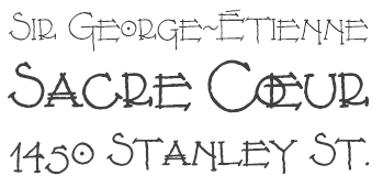 Download the following beautiful handwriting and handprinting fonts made by Mexican designer Kemie Guaida, who lives in Helsingborg, Sweden: Balderas (2002), BlackoutSans (2001), BlackoutSerif (2001), Manita (2001, a simplistic hand, done with Jorge Villalobos), Manita Dingbats (2000), Leonel (based on characters drawn by architect Leonel Terres, 1999-2001), Montreal Architect (1998), Patchanka (2001), Marginal (2001), Soli (1998, with Solange Guaida), OnderBold (2001), Kemie (2001), Rafa (2001), Unicase (2001). Pixel/bitmap typefaces include Antenna8, Antenna10, Antenna11, AntennaSemi, Beachball, Egghead (2002), Gardenias (connected pixel script), Ladybug, Lilabit, Pixilated (2002), Roundabout, Sober, Stoneheart and Unipixel. She was working on the connected script typeface Monolinear (2004). Further typefaces include Lu Px (2004, another architecture's handwriting face), Tokig Px (2012, hand-printed), Rolig Serif Px (2008), Lango Px (2008), Lango Px Thin (2013), Lango Px Fat (2013).
 In 2013, Kemie published an ornamented low-contrast sans typeface called Bellota (based on Gesine Todt's Snippet) and the hand-printed Pocket Px, Pocket Swash, and Pocket Serif Px. Bellota and Bellota Text are now downloadable from Google Fonts and Github. In 2014, Kemie published a warm replacement family for Comic Sans, called Jolly Good Sans. It was expanded in subsequent years and seems especially suited for children's books. Typefaces from 2015: JollyGood Proper, Pocket Swash Px. Typefaces from 2016: Raski, JollyGood Sans Condensed, JollyGood Proper Unicase. Typefaces from 2017: Jolly Good Proper Condensed, Amike (an architectural handwriting font family). Typefaces from 2018: JollyGood Serif. Typefaces from 2019: Bookbag (a rounded sans font family for teaching children to read and write), Skriva (a comic book or blueprint script). Typefaces from 2020: Jolly Good Proper Serif. Alternate URL. Klingspor link. Creative Market link. View Kemie Guaida's typefaces. [Google]
[MyFonts]
[More] ⦿
|
Pojol Type
[Fauzul Azmi]

|
Indonesia-born architect. Designer of Barranom (2020: rounded, octagonal), Cartoon Book (2020), Sketsa (2020: an architectural blueprint font), and the informal monolinear elliptical sans typeface Handhuel (2020). Typefaces from 2021: Blancos (a ligature-rich sans), Velove (a scrapbook script), Battafia (a calligraphic script), Bondtique (a heavy round monolinear sans), English1707 (bilined), Alfatih (a display typeface), Ceudah (futuristic, art deco). [Google]
[MyFonts]
[More] ⦿
|
Popkern
[Anna Seslavinskaya]

|
 Letterer, open source supporter, and visual designer from Russia (b. 1988) who is based in San Francisco. Graduate of BHSAD (the British Higher School of Art and Design) in Moscow, class of 2013. She founded Popkern. Her typefaces:
 - The hexagonal (student project) display typeface Sanity (2013). Free download.
- The oriental simulation typeface Sangha (2014). free download. see also here. Extended to the free Sangha Kali in 2018. Both Sanity and Sangha cover Latin and Cyrillic.
- The hipster typeface La Revolution Française (2015).
- At Popkern, she published the oblique all caps sans typeface Twelkmeyer (2017). It was inspired by the pathos of the late revolutionary asceticism and architectural projects of V.F. Twelkmeyer. Dedicated site for Twelkmeyer.
- Luftayah (2018).
- The free blackletter typeface Health Goth. For a retail, version, see Type Tomorrow.
Github link. Type Tomorrow link. [Google]
[MyFonts]
[More] ⦿
|
Positype
[Neil Summerour]

|
 Positype was founded in 2002 by Athens and/or Jefferson, GA-based designer and type designer Neil Summerour (b. 1972, Azores, Portugal). Neil began developing typefaces in 1996 with the 1996 Olympic Brick Paver Project proprietary typeface. He is the co-principal and senior designer of Athens-based interactive, design, and advertising agency Genetic:ICG. In the summer of 2003, he began teaching Advanced Electronic Design in the Graphic Design Department at The University of Georgia.
 Swash & Kern is the bespoke lettering and typeface design alter ego of Neil Summerour. In 2001, Neil published his first two type designs with [T-26] Digital Type Foundry in Chicago, IL. Since then, he has released tens of font families including hiragana and katakana fonts. Positype fonts are sold by Myfonts.com and [T-26]. Klingspor link. Facebook link. Blog. Behance link. Union Fonts link. The list of his fonts: - Aago (2017). A 54-style sans family.
- Aaux, Aaux Office (2002), Aaux Pro (2004), Aaux Next (2009, 72 typefaces), Aaux Alphanumera, Aaux Emoticons.
- Agent Sans (2021). An economical 22-style sans intended to be warm although the name seems to contradict that.
- The Air superfamily (2011), which consists of 81 sans typefaces. Followed by Air Soft (2011), Air Pro (2021), Air Pro Condensed (2022) and Air Pro XCondensed (2022). He writes about Air: Heavily influenced by Summerour's Aaux Next typeface and Akzidenz-Grotesk, the typeface features a very efficient footprint, logical weight options, small caps, expanded numeral sets, extensive language support, and 5 total widths.
- Altar (8-weight Gothic family).
- Akagi (2008): 20 style sans family. Extended and refreshed in 2011 into Akagi Pro.
- AMP (at Union fonts).
- Anago (2012) is a softly rounded sans family, the product of a designer addicted to designing sans families.
- Anarcharsis (2002): a serif family inspired by incomplete rubbing made from a stone wall located in the Bahamas.
- Angel Script (2009, TypeTrust).
- Baka (2005, a fantastic scratchy handwriting face), Baka Too (2006; followed in 2010 by Baka Expert).
- The Bodoniesque family (Umbrella Type).
- Cherry Blossoms (2018). A crayon script.
- Claustrum (2003).
- Clear Sans (2013). Starting from a monoline rather geometric set of thin weights, this typeface family morphs into a more humanist beast, with a, b, d and g having a squeezed look at the intercepts. And maybe because of that, this unclassifiable typeface is quite appealing. Followed by Clear Sans Text and Clear Sans Screen.
- Courage (2019). A high contrast ultra black poster typeface.
- Couture (2015) and Couture Sans (2015). Summerour was charmed by Imre Reiner's Corvinus when he designed this extremely high-contrast pair of fashion mag typeface families together with Mary Catherine Pflug.
- Cynapse (2003; or Cynapse Pro. 2004, 12 weights). A sans family.
- In 2018, Martina Flor and Neil Summerour published the layerable Tuscan typeface family Decorata.
- Delphi (2014). A decorative multiline typeface by Lily Feinberg and Neil Summerour.
- Directors Gothic (2013, Lettering Inc). A large retro sans family.
- Donatora (2004).
- Dream Big (2019). A swashy script typeface with weathered edges.
- Ego (2003, octagonal family).
- Epic (2007-2009, a 12-style contemporary garalde).
- Ether, Ether Connected.
- Eva (2003).
- Filmotype Dancer (2012).
- Filmotype Harvard (2015). Based on a Filmotype brush script from 1955.
- Filmotype Horizon (2011).
- Flirt Script (2014). Flirt Script won an award at TDC 2014.
- Friendly (2012). In part based on Morris Fuller Benton's upright script typeface Announcement.
- Fugu (2009, rough-outlined script family, winner at TDC2 2010).
- Ginza (2008, a squarish techno family), and Ginza Narrow (2011).
- Good Karma (2017). A sumi brush font. See also Good Karma Smooth (2020).
- Grava (2018, twenty fonts) and Grava Display: Quirky and sharp, Grava is Neil Summerour's injection of warmth within the geometric sans font category.
- Halogen (2012). An organic wide techno sans family. In 2014, he added Halogen Slab and Halogen Flare (flared). All have hairlines.
- Headcold (2004).
- Hype (2019). A collection of 432 low contrast gothic sans typefaces consisting of three subfamilies of 144 fonts each: Hype vol 1, Hype vol 2, Hype vol 3.
- Ice Cream (2021). A creamy vernacular non-connected script for food packaging.
- Iru1, Iru2.
- Juicy (T-26, 2004, brushdrawn family).
- Kari and Kari Pro (2005): a connected upright script. Kari Display (2009). Redrawn in 2020 and released as Kari (2020).
- Kryptk Flash (2003).
- Kurosawa Bastard, Kurosawa Hand, Kurosawa Sans, Kurosawa Serif, Kurosawa Hiragana, Kurosawa Katakana.
- Love Script (2014). A high energy high contrast brush pen / marker script. Love Script won an award in the TDC 2015 Type Design competition.
- Luce (2004).
- Lush Script (2011). A connected script inspired by the 1940s.
- Lust (2012), a curvy hight-contrast didone in the Pistilli style. Neil: The result yielded a rather diverse typographic gene pool: a little Scotch Modern, a little Didone and Didot, a dominant dose of Caslon, and a pinch of Baskerville-- all wrapped up in the leggy body of a Brazilian supermodel. A confident, self-reliant typeface that shows just enough to keep everyone staring and leave them wanting more. Followed by Lust Slim (2014). In 2015, these were extended to the large families Lust Pro [dedicated page] and Lust Pro Didone.
- Lust Script (2013). This is a curvier, sexier (Neil's words) version of Lust. For use in fashion magazines and large sizes.
- Macha (2012). A sans family. In 2015, this was followed by Lust Hedonist, which has Didone, Italic and Script sub-styles---the ultimate fashion mag typeface. In 2021, he added Lust Sans (a 12-style high-contrast fashion mag typeface family), Lust Didone (a 6-style contribution to the fat face genre), Lust Stencil (six styles), Lust Text (ten styles).
- The Type Trust: Magneta (2009, The Type Trust). Includes a Condensed subfamily.
- Marshmallow (2017). A super-creamy high-contrast script typeface straight from a parisian bonbonnerie.
- Murecho (2021). Murecho is a low-stroke contrast, flat terminal sans serif Japanese typeface designed for text settings in Japan. It covers Hiragana, Katakana, and Kanji (JOYO+). It also supports Latin, Cyrillic, and Greek.
- Muscle (2009, TypeTrust---a futuristic family).
- Nori (2010): a calligraphic brush typeface obtained by applying the Pilot Japan Kanji Fude brush pen on paper. It has over 1100 glyphs, 250 ligatures, 487 alternate characters, 125+ swash and titling alternates, lining and old style numerals. Awarded at TDC2 2011.
- Organic (2009). A rounded warm sans family. In 2021, he published the 16-style Organic Pro.
- Penumbra.
- Plastek (2004-2009).
- The R.E.M. Athens project involves three fonts published in 2009, REM Orange, REM Accelerate and REM Tourfont. They are based on ideas by Chris Bilheimer for the band R.E.M. (Michael Stipe and Chris Bilheimer). Both attended the fine arts program at the University of Georgia. Michael Stipe, singer and lyricist, formed R.E.M. in 1980. Bilheimer began working with the band in 1994.
- In 2019, Martina Flor and Neil Summerour released the extensive typeface family Ribbons at Positype.
- Romp (2009, condensed hand-printed).
- Reserve (2018). A text typeface family designed to accompany Summerour's Scotch typeface family.
- Rhythm (2011). An italic inline and solid display family based on ATF's Ratio (ca. 1930) and Herbert Thannhaeuser's Adastra (1928).
- Rough Love (2014). A brushy crayon script.
- Scotch (2017). An 31-style scotch roman typeface family consisting of Scotch Text, Scotch Display (more contrast), Scotch Deck (for subheads) and Scotch Dingbats. In 2020, he added Scotch Compressed to the set.
- Shameless (2013). A connected penmanship-style script.
- Sneakers (2003-2004): athletic lettering family. Also, Sneakers Script and Sneakers Max (2019: rounded and ultra fat).
- So Lovely (2019).
- Tactical (2011, octagonal mechanical face; +Stencil).
- In 2012, he won the Second Akashi Prize in the kanji (!!!) category of the Morisawa Type Design Competition for Tegaki. Tegaki also won at TDC 2013.
- Truss Ultra Light (2006): hairline architectural font.
- Vekta Serif (2009), Vekta Neo and Vekta Sans (2009, a sans family at TypeTrust).
- Wasabi Condensed and Wasabi (2010): an organic elliptical family, based on Iru.
- Yumi (2003, techno font, Union Fonts).
His life in hiw own words: Neil Summerour is a type designer, lettering artist, calligrapher and designer based in Georgia, USA with one foot in Takamatsu, Japan. After graduating from The University of Georgia Lamar Dodd School of Art with a BFA in Graphic Design, he soon found himself opening his own studio to deal with the flow of freelance work. [...] Neil opened his personal type foundry, Positype, in 2000 to feed his ever-growing desire for type design. He later co-founded TypeTrust (2002) with Silas Dilworth as his addiction to type and lettering grew. [...] He was an adjunct art professor at The University of Georgia in graphic design and taught graphic design at the Governor's School for the Arts. [...] As a typeface designer, he has published over 60 typeface families and produced numerous custom typefaces for clients worldwide. [...] He has won the Type Directors Club Certificate of Excellence in Type Design in 2010 and 2011 for Fugu and Nori, respectively. Showcase of Neil Summerour's fonts. [Google]
[MyFonts]
[More] ⦿
|
Primetype
[Ole Schäfer]

|
Ole Schäfer is a German type and logo designer (born 1970 in Gütersloh) who specializes in sans and slab type. He studied graphic design at the Fachhochschule Bielefield under Gerd Fleischmann. From 1995 until 99 he worked at MetaDesign as type designer and as type director for Audi, Volkswagen, Boehringer Ingelheim, Düsseldorf Airport, Sächsische Zeitung, Berlin's public transport company BVG and others. Schäfer now works as an independent type designer and teacher for type design and typography in Berlin. During 2006-2007, he taught typography at the University of Hildesheim. He launched his own foundry, Primetype, in 2002 with new typefaces by himself and other designers. With Erik Spiekermann at FontFont he did FFInfoOffice (1999), and earlier they co-designed ITC Officina Sans and Serif (1990-1998). He designed the huge FF Fago family, as well as FF Info Text (1998), FF Info Display (1998), FF Govan (2001, by Ole Schaefer and Erik Spiekermann), FF Turmino (2002), FF Zine (2001, in Sans, Serif and Slab flavors), CstBerlinEast (2000, FontFont), and CstBerlinWest (2000, FontFont, with Verena Gerlach). His typefaces at Primetype include PTL Adigo (2002), PTL Touja (2002: Sans, Slab), PTL Fabrik (2004), PTL Fabrik Two, PTL Golary Red (2002), PTL Notes (2003), PTL Notes Soft (2004), PTL Notes Mono, PTL Notes Tec Mono (20908, techno, typewriter), PTL Scetbo (2004), PTL Speech (2004: made for WDR television), PTL Zatro, PTL Strom, PTL Manual (2004: Extra, Round, Sans, Semi, Slab, Office, Mono), PTL Qugard (2002: Sans, Slab), PTL Zupra Sans. Verena Gerlach's fonts there include PTL Lore (2002), PTL Tephe (2002), PTL Trafo (2002). His custom typefaces include Audi Sans, Audi Serif (both for Audi, done while he was at Meta Design; they were replaced by Audi Type (van der Laan and van Rosmalen) in 2009), Boehringer Sans, Serif (Boehringer Ingelheim), VW Utopia (Volkswagen), Glasgow 1999 (City of Glasgow), Officina Sans Display (The Economist), EcoNewtext, Newhead (The Economist), SZ Headline (Sächsische Zeitung), Fago SZ (Süddeutsche Zeitung), and Fago Ns (New Scientist). At Primetype, Verena Gerlach's PTL Blinkenlights is free. In 2004, Ralph de Carrois contributed PTL Maurea, a sans family, to Primetype. Alternate URL. Speaker at ATypI 2007 in Brighton. In 2009, he helped revive three superfamilies of Karl-Heinz Lange, each having between 60 and 94 styles, the humanist sans families PTL Minimala and PTL Publicala, and the geometric (Futura-like) family PTL Superla, my favorite of these three. Linotype link. FontShop link. Klingspor link. View Ole Schäfer's typefaces. [Google]
[MyFonts]
[More] ⦿
|
Providence Type
[Nate Piekos]

|
From East Providence, RI, Nate Piekos' foundry started near the end of 2002. Nate Piekos (b. 1975, RI) also runs the comic font foundry Blambot. His fonts are being sold at MyFonts.com. These include East Side NDP, Clam Cakes NDP (2003), KennedyPlazaNDP (2003), Number42BusNDP (2003), ThayerStreetNDP (2003), WestminsterNDPItalic (2003), WestminsterNDP (2003), Coffee Milk NDP (2003) and Prov Draftsman NDP. [Google]
[MyFonts]
[More] ⦿
|
Quiet Design Fonts
[Ron P. Dunant]

|
Quiet Design Fonts is a Grass Valley, CA-based design consulting firm, which sells the Architect Small Block font (2004, by Ron Dunant), a serious competitor for Comic Sans. The company is run by Ron and Mary Ann Dunant. MyFonts site. [Google]
[MyFonts]
[More] ⦿
|
R. Grant
|
UK-based FontStructor (student at Bristol UWE) who was inspired by the windows in Bristol when he made Windowstruct (2010). [Google]
[More] ⦿
|
Rachel Duynslaeger
|
At Esa Saint-Luc in Tournai, Belgium, Rachel Duynslaeger designed the architecturally-inspired typeface daniel Libeskind (2016). [Google]
[More] ⦿
|
Rae Kaiser
[Outside The Line Fonts]

|
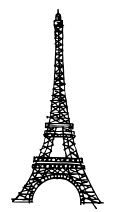 [MyFonts]
[More] ⦿
|
Ralph Michael Unger
[RMU (Ralph Michael Unger Typedesign)]

|
 [MyFonts]
[More] ⦿
|
Ralph Oliver du Carrois
[bBox Type]
|
[More] ⦿
|
Rangga Singgih Subekti
[Subectype]

|
[MyFonts]
[More] ⦿
|
Raul Israel Meza Lorca

|
 Architect who studied at Universidad Austral de Chile (Valdivia, Chile), who co-founded Compañía Tipogáfica de Chile). Now located in Santiago (Chile), he created the angular typeface Tejuela (2015; published in 2019 first at TipoType and eventually at Underground), which was influenced by the shapes of old churches of Chiloe, in southern Chile. In 2020, it became LC Tejuela at Compañia Tipogáfica de Chile.
 In 2017, he published the monolinear rounded condensed display typeface Forjada at Latinotype, which was inspired by wrought iron window and door grills on facades of historic buildings. In 2018, he designed the neo-humanist typeface Costanera at W Foundry. Typefaces from 2019: LC Gianluca (a flared or glyphic typeface; at Compañia Tipogáfica de Chile), Centenario (free: a sans typeface based on the street signs of Chiloe, in southern Chile). Typefaces from 2020: LC Marichiweu (a German expressionist typefaces inspired by Rudolf Koch's calligraphy). Typefaces from 2021: LC Timaukel (a serif family in the Dutch tradition). [Google]
[MyFonts]
[More] ⦿
|
Ray Larabie
[Typodermic]

|
 [MyFonts]
[More] ⦿
|
Regina Coraldi
|
In 2016, during her studies, Regina Coraldi (Albany, NY) created the Frank Lloyd Wright Stained Glass Font. [Google]
[More] ⦿
|
Rem Koolhaas
|
This architect provided inspiration for the geometric experimental typeface Koolhaasian (2009). Koolhand (2009) is a free experimental typeface designed by Chris Papasadero inspired by some of the architecture of Rem Koolhaas. [Google]
[More] ⦿
|
Remi Mortimer
|
FontStructor who made Sharp (2011, a bilined straight-edged face), Sharp2 (2011, a paperclip face), and Sharp Plus Dash (2011, architectural lettering). Other fonts by him include Triangle, Remi, Thin and Bendy. [Google]
[More] ⦿
|
Remy Chard
|
Brisbane, Australia-based Remy Chard explains her experimental typeface Shadow Line (2013): Shadow Line was inspired by the architecture of The Queensland Museum to reflect the structural and geometric nature of the building and its continuous evolution of shadowing. The shadows cast from the museum were deconstructed to create elements that would form the typeface. [Google]
[More] ⦿
|
Renee Jasperse
|
During her studies, Renee Jasperse (Heerhugowaard, The Netherlands) created Guggenheim (2014), a typeface that is based on the architecture of Frank Gehry's Guggenheim buildings. [Google]
[More] ⦿
|
Rhys Phillips
|
For an architectural project at Queensland University of Technology, Rhys Phillips (Brisbane, Australia) designed Argyle (2015). [Google]
[More] ⦿
|
Richard Keijzer
[Fontenwerkplaats]
|
 [More] ⦿
|
Richard Neutra
|
 Architect (b. 1892, Vienna, d. 1970, Wuppertal) who is considered as most representive of modernist architecture. Neutraface (2002, Christian Schwartz, House industries) is a stylish sans family that is based on Richard Neutra's architecture and design principles. [See this nice poster of Neutraface by Michelle Regna, and this photograph by Katie Schaefer.] House Industries offers Neutraface Display, Neutraface Condensed (2004) and Neutraface Text. [Google]
[More] ⦿
|
Rick Valicenti

|
 Rick Valicenti was born in 1951 in Pittsburgh, PA. After working for The Design partnership in Chicago, he founded R. Valicenti Design in 1981. Later, in 1989, he founded Thirst/3st, an internationally recognized design firm. The type design section of Thirst is Thirstype. Rick Valicenti is based in Barrington, IL. The White House honored Valicenti in 2011 with the Smithsonian Cooper-Hewitt National Design Award for Communication Design. In 2006, he received the AIGA (American Institute of Graphic Arts) Medal, the highest honor of the graphic design profession, for his sustained contribution to design excellence and the development of the profession.
 Rick designed Commerce (1992, with Greg Thompson, Font Bureau), Punch (1999, pixel family done by Valicenti and Gregg Brokaw), Ooga Booga (1993, with Greg Thompson), Bronzo, UltraBronzo, and Love. In FUSE 4, he published Uck 'n Pretty. In 2002, Rick and Chester designed the sans serif family Infinity (20 weight architectural drawing family) and Alexey (2002, free stencil font family, with Chester Jenkins). Handjob (2002, with Brian McMullen) is a gorgeous set of capitals made out of wire-meshed hands. Twiggies (with Dakota Brown) is a free set of EPS-format caps made from twigs. Other creations: Apex Serif (2003, with Chester Jenkins, Constellation / Village), Apex Sans (2004, a 40-style sans family done with Chester Jenkins, Constellation / Village), EZ (2003), a monospaced family, and Veejay (2003, a funny dingbat family done with Chad Johnston). Books abut Valicenti include Art with Function: The Design of Rick Valicenti (Paul Carlson). Klingspor link. FontShop link. [Google]
[MyFonts]
[More] ⦿
|
RMU (Ralph Michael Unger Typedesign)
[Ralph Michael Unger]

|
 Ralph M. Unger (b. 1953, Thuringia, East Germany) says this about himself at MyFonts: Typesetter from the composing stick via Linotype setting machines to the Mac. Jobs in various Thuringian printeries. Barred further education by Communist authorities due to political reasons. Imprisoned in East Germany. Since 1988 in the state of Baden-Wuerttemberg, former West Germany. Jobs in several newspaper printing houses as advertisement compositor. Own office since 1995, in Aalen, Baden-Wuerttemberg. He lives in Schwaebisch Gmuend, and was a freelance type designer for Profonts and URW++, where he contributed frequently to their libraries between 2002 and 2009. In 2009, he founded RMU. MyFonts link. I split his contributions into two groups, the URW / Profonts group, and the RMU group. The prefix FontForum refers to a subseries of URW++ fonts. Unless specifically mentioned, all the following fonts are at URW++ and/or Profonts:
 - FontForum Admiral Script (2005): revival of Middleton's Admiral script from 1953.
- Amitié (2009): a garalde family.
- Arabella Pro (2006): after the script by Arnold Drescher from 1936, published at Joh. Wagner.
- Fontforum Atrament (2006): architectural lettering. Do not confuse with a Suitcase Type Foundry font from 2003 by the same name.
- Atze (2010): a comic book family.
- Behrensschrift D (2007): after the jugendstil typeface Behrens Schrift, 1902, by Peter Behrens.
- FontForum Bernhard Script (2005): after Bernhard Script from the 1920s.
- Bradley (2005): blackletter, after the original by William H. Bradley.
- Breite Kanzlei (2007).
- Breitkopf Fraktur (2003): after the original by Johann Gottlob Immanuel Breitkopf, done in 1793.
- Brocken (2011) is a signage typeface inspired by a design of Volker Küster (1960s).
- Profonts Bureau (2010, Profonts): a minimalist rounded sans family.
- FontForum Calypso (2005): a revival of Roger Excoffon's Calypso (1958).
- Card Pro (2006): a decorative display based on Ella Cursief (1916, Sjoerd Hendrik de Roos, Lettergieterij Amsterdam).
- Chaweng (2006, Profonts): an oriental all caps simulation face.
- Civilite URW (2005).
- Compliment (2004, casual script). Based on a 1965 script by Helmu Matheis for Ludwig & Mayer.
- Cranach (2007): a blackletter typeface modeled after Kuenstler Gotisch from the Krebs Foundry.
- Dominante (2007): a serif family based on Johannes Schweitzer's font by that name, 1959.
- Dominique (2010, profonts): an informal typeface.
- FontForum URW Ecsetiras (2005): revival of Ecsetirás (Zoltan Nagy, 1967, a brush face).
- Edda Pro (2008). An art nouveau typeface that revives a Heinrich Heinz Keune typeface from 1900.
- Energia Pro (2008, Profonts): connected monowidth script, based on Arno Drescher's Energos from 1932.
- Estro (2003, Western lettering). Seems close to Nebiolo's Estro from the 60s.
- Eurobrush Pro (2007, Profonts): handwriting.
- EuroSans (2008).
- Euroscript Pro (2006, Profonts): school script typeface based on his own handwriting.
- Flashes (2007): a revival of Crous-Vidal's Flash, 1953.
- Fox (2007): a brush script based on W. Rebhuhn's original from the 1950s.
- Gamundia (2010): a calligraphic copperplate script inspired by Excoffon's Diane.
- Ganz Grobe Gotisch (2006): a fat blackletter modeled after the original by F.H.E. Schneidler.
- Gmuender Elan Pro (2011) is a 1950s style script face.
- Gradl Nr 1 (2008): based on hand-drawn art nouveau upper case characters by M. J. Gradl, ca. 1900.
- Graphique Pro (2008): shaded caps face, based on Graphique, which was originally created by Swiss designer Hermann Eidenbenz in 1945, and issued as hot metal font by Haas'sche Schriftgießerei. See also New Graphique Pro (2011).
- Handel Slab (2009): a 6-style extension of Trogram's 1980 typeface Handel Gothic.
- Hanseat (2010): a grotesque family done at Profonts. It was heavily inspired by Germany's official DIN 1451 Engschrift.
- Iova Nova (2007): based on Jowa Script, designed by J. Wagner in 1967.
- Profonts>Impression (2008): art deco.
- Jessen Schrift (2004): after the Rudolf Koch blackletter typeface by that name.
- FontForum URW Konzept Pro (2005): revival of Konzept (1968, Martin Wilke's handprinting face).
- Legende (2002): a script typeface based on the original typeface of Friedrich Hermann Ernst Schneidler (1937).
- Leipziger Antiqua. The original Leipziger Antiqua by Alfred Kapr at Typoart dates from 1971 until 1973. The digital version of Leipziger Antiqua was developed by Ralph M. Unger in 2005.
- Manuskript Antiqua (2005): after Oldrich Meinhart's Manuskript Antiqua.
- The Maszynysta family of heavy industrial sans typefaces (2010) have a textured style (Struktura), a Shadow, and a plain Roman.
- Maxim (2003, Profonts): The heavy brush typeface Maxim was originally designed by Peter Schneidler in 1956 for the Bauer foundry.
- New Bayreuth (2008): after Friedrich Hermann Ernst Schneidler's Bayreuth from 1932.
- Old Borders and Lines (2010). A free font.
- Ornella (2008): Jugendstil.
- Peter Schlemihl (2008, Profonts): a revival of a blackletter by Walter Tiemann.
- Pedell (2009): a casual script.
- Polo (2002): a brush face modeled after Carl Rudolph Pohl's Polo (1960).
- In 2012, Ivana Koudelkova co-designed the grungy headline typeface Retroactive Pro with Ralph M. Unger at Profonts.
- Fontforum Rhapsody (2006): a revival of Ilse Schüle's rotunda face.
- Roberta (2003): art nouveau typeface after obert Trogman's typeface for FotoStar.
- FontForum Signs and Symbols (2006).
- Splendor (2009): a revival of a brush script typeface by Wilhelm Berg, Schriftguss, 1930. See also Splendor Pro (2014).
- Sportowy (2009): an outline face.
- Stanford (2011). A sports lettering face.
- Stiletto (2006): a medieval script.
- Fontforum Stripes (2007): a multistripe op art display typeface based on a Letraset font from 1973 by the same name.
- Fontforum Thalia (2006): retro font.
- Tintoretto (2006): shadow display face based on an origonal by Schelter & Giesecke.
- Tip Top Pro (2008): a Julius Klinkhardt art nouveau typeface revival.
- FontForum Unciala (2005): a revival of Oldrich Menhart's typeface Unciala (1953, Grafotechna).
- Unger Chancery (2005).
- Unger Script (2003): based on H. Matheis' Slogan typeface designed for Ludwig&Mayer in 1957.
- Veltro (2007): after a 1931 original by G. da Milano at Nebiolo.
- Profonts Woodpecker (2008).
The list of RMU fonts: - Affiche (2017). A revival of Helios Reklameschrift of the Klinkhardt foundry.
- Aldo Manuzio (2017). After a house typeface from 1897 by Schelter&Giesecke.
- Amati Pro (2010): after Georg Trump's condensed didone face, Amati, 1951.
- Antiqua Florenz (2021). A revival and extension of Paul Zimmermann's Antiqua Florenz (1960, Ludwig & Mayer), which is based on Venetian romans.
- Avus Pro (2012). A sans family that extends Gert Wunderlich's Maxima (1970).
- Baroque Pearl (2016). A pearly typeface that revives Peter A. Demeter's Fournier Geperlt (1922, Schriftguss).
- Behrens Kursiv (2013). After a 1906 original by Peter Behrens.
- RMU Belvedere (2020). A revival of Heinrich Wieynck's art nouveau / fin-de-siècle typeface Belvedere (1906, Bauer).
- RMU Bison (2020). A revival of Julius Kirn's brush script Bison (1935-1938, C.E. Weber).
- Bernhard Blackletter (2016). After Lucian Bernhard's extrafette Bernhard Fraktur (1921).
- Bernhard Cursive Extra Bold (2010).
- Borghese (2015). An art nouveau font after a Schelter & Giesecke original from 1904.
- Borgis Pro (2012). A Clarendon-style text family.
- Boulette (2015, a fat creamy script).
- RMU Bowery (2019) A revival of Old Bowery (1933, ATF)).
- Bravura Pro (2013). After G.G. Lange's Publica.
- Bricklayers (2012). An original fat slab display face.
- Brillant (2009): art nouveau and ultra heavy.
- Butti (2011). A script family paterned after Fluidum (1951, Alessandro Butti, Nebiolo).
- Cable Condensed (2014). Based on Koch's Kabel.
- Caesar Pro (2011). A flared sans typeface after Caesar Schrift (1913, Georg Schiller, C.F. Rühl).
- Capitol Pro (2012). An art deco typeface based on Capitol (Karl Hermann Schaefer for Schriftguss, 1931).
- Carina Pro (2017). A calligraphic script typeface based on Rautendelein (1929, Schriftguss).
- Carla Pro (2013). A broad-nibbed script modeled after Ballantines Script (Elsner & Flake, 1974; see also Ballantines Serial by SoftMaker).
- Carlsbad (2018). A couple of art nouveau typefaces based on originals from 1895 by H. Berhold called Regina Cursiv and Hansa Cursiv.
- Caslon Gotisch (2009): after the original by William Caslon from 1763.
- Celebration (2009): blackletter.
- Circensis (2016). A Western circus font based on a concept of Fritz Richter.
- Claudius (2010): after a 1937 blackletter font at Klingspor.
- Constanze Pro (2012). A light cursive typeface based on Constanze (1954, Joachim Romann, Klingspor).
- Contact Pro (2010): after Contact, a 1963 font by Helmut Matheis.
- Dante Alighieri (2018). Based on a Schelter & Giesecke original.
- Daphnis (2016). A revival of Daphnis (1929, Walter Tiemann).
- Deutschmeister (2017). A textura blackletter typeface after Deutschmeister by Berthold Wolpe for Ludwig Wagner in 1934. (Some dispute that Wolpe made this font.)
- Diamant Pro (2012). A transitional serif face.
- Emilia (2016). Based on Weiss Antiqua (1928) by Emil Rudolf Weiss.
- Neue Echo (2016). Based on Echo for Schriftguss.
- Elbflorenz (2020). A revival of Albert Auspurg's display typeface Miami (1934, Schriftguss).
- Emilia Gotisch (2016). After Weiss Gotisch (1936) by Emil Rudolf Weiss.
- Emilia Fraktur (2021). A revival of Emil Rudolf Weiss's Weiss Fraktur (1913).
- Erler Titling (2015). After Erler Versalien (1953, Herbert Thannhaeuser for Typoart).
- Eurotech Pro (2011): a slabby techno family.
- Faulkner Pro (2011): a connected heavy signage script based on Alan Meeks's Kestrel.
- Fette Kanzlei (2019).
- Fette Unger Fraktur (2010).
- Fichte Fraktur (2020). After Walter Tiemann's Fichte Fraktur (1934).
- Fontanesi RMU. An ornamental caps typeface that revives Aldo Novarese's Fontanesi (2018).
- Forelle Pro (2010): after the original Forelle script typeface by Erich Mollowitz, 1936.
- Frankenberg Pro (2012). An antique script face.
- Gabor Pro (2014). A connected copperplate script.
- Gaby Pro (2017). A revival of Hans Möhring's script typeface Gabriele (1938 or 1947, C.E. Weber).
- Garamond Antiqua Pro (2015).
- RMU Gilgengart (2020). A revival of Hermann Zapf's Fraktur font Gilgengart (1938).
- Gillray Pro (2015). A copperplate script after Hogarth Script (by Harald Bröder for Typoart).
- RMU Gloria (2019). After Gloria (1898, Emil Gursch).
- RMU Gong (2020). Based on Arno Drescher's Super Grotesk Schmalfett first released in 1933 at Schriftguss.
- Gmuender Gravur (2011). A 3d shadow face. Gmuender Antiqua Pro (2015) is influenced by the metal font Imprimatur (1952-1955, Konrad F. Bauer and Walter Baum). Gmuender Kanzlei (2018) is a blackletter typeface.
- Goethe Fraktur (2022). A revival of a blackletter typeface by Wilhelm Woellmer (1905).
- Gravira (2021). A revival of Herbert Thannhaeuser's Gravira, released by Schelter & Giesecke in 1935 .
- Haenel Antiqua (2020, based on a 19th century antiqua by Eduard Haenel) and Haenel Fraktur (2011, after Haenel Fraktur, ca. 1840).
- Hanse Textura (2020). A revival of a textura by Hermann Zapf.
- RMU Helion (2020). A revival of the 3d titling typeface Helion (1935, Arno Drescher for Schriftguss Dresden).
- RMU Herkules (2019). After a late 19th century font by Bauer and Berthold called Reklameschrift Herkules.
- Hoelderlin (2018). After Eugen Weiss's Hoelderlin blackletter font (1937).
- Hoyer Script (2017). After Hanns Thaddeus Hoyer's Hoyer Schoenschrift (1939, Stempel).
- Hupp Fraktur (2016). After Otto Hupp, 1911.
- Impuls (2010): a brushy typeface based on Paul Zimmermann's Impuls (1945).
- Initials RMU One (2012) consists of revivals of Rudhardsche Initialen (Otto Eckmann, ca. 1900) and Walthari Initials (ca. 1900, Rudhardsche Giesserei). Initials RMU Two (2012) consists of revivals of Jubilaeumsinitialen (by Bauersche) and Augsburger Initialen (by Peter Schnorr, 1901).
- Jean Paul Fraktur (2021). A revival of Breitkopf's Fraktur font Jean-Paul-Schrift (1798).
- Jobs Gravure (2011). It had to happen---a few days after Steve Jobs' death, Unger released the beveled engraved typeface Jobs Gravure, which is an extension of Trump Gravur (1954, Weber).
- Jolly Polly (2012): a curly non-connected script face.
- Kis Antiqua Pro (2018). A revival of Hildegard Korger's Kis Antiqua at Typoart.
- Kleist Fraktur (2010): after Walter Tiemann's original.
- Kompress Pro (2013). Two compressed sans typefaces.
- RMU Kontrast (2021). An art deco typeface that revives Kontrast (1930, F.H.E. Schneidler at Weber).
- Koralle RMU (2018). A revival of Schelter and Giesecke's Koralle (1915).
- Korpus Pro (2014). A text typeface family. Followed later in 2014 by Korpus Sans Pro.
- Korpus Serif Pro (2021). A revival and extension of Timeless (Typoart) that covers Greek, Latin and Cyrillic.
- Leibniz Fraktur (2012) is modeled after the famous Genzsch & Heyse blackletter font.
- Lenbach (2021). Inspired by a German font from the Victorian era.
- Liliom Pro (2012). A beautiful fat didone typeface based on an original from the Fonderie Française.
- Lipsia Pro (2011). An angular serif family.
- Literatura Pro Book (2012).
- Litfass (2021). A revival of an art nouveau font by Flisch.
- Lutetia Nova (2014). A fresh two-style take on Jan van Krimpen's Lutetia (1924).
- RMU Luchs (2021). A redesign of Jakob Erbar's inline all caps art deco font Lux (Ludwig & Mayer, 1929).
- Luxor Pro (2010): a Victorian/Western display face.
- Lyrica (2014). A revival of the informal blackletter typeface Lyrisch (1907, Georg Schiller).
- RMU Magnet (2021). A redesign and revival of Magnet (1951, Arthur Murawski at Ludwig & Mayer).
- RMU Manolo (2019). Based on the art nouveau typeface Manolo (Ludwig & Mayer).
- Manutius Pro (2012).
- Meister Antiqua (2011, +Bold, +Book). A Typoart original from 1951 in the tall flared ascender serif genre, revived and extended.
- Mitropaschrift (2016). An octagonal original.
- Mobil Pro (2011). A semi-script typeface in the fifties style of Matheis.
- Monument (2010): a 3d shadow roman caps face created after Oldrich Menhart's Monument.
- Narziss (2018). A revival of Walter Tiemann's Narziss from 1921.
- RMU Neptun (2021). A revival and extension of the art nouveau typeface Neptun by Aktiengesellschaft fuer Schriftgiesserei und Maschinenbau, Offenbach.
- Neue Kurier (2011). Typoart's popular signage script font in a new, completely remastered version.
- Neue Muenchner Fraktur (2010).
- Neue Schwabacher (2021). After Albert Anklam's Neue Schwabacher (Genzsch & Heyse, 1876).
- Neue Thannhaeuser (2011).
- Old Towne Pro (2010): a Western font.
- RMU Omega (2020). After Omega, an art deco typeface by Friedrich Kleukens at Stempel in 1926.
- Orbis Pro (2016). A revival of Walter Brudi's shadow typeface Orbis (1953, Stempel).
- Orplid Pro (2019). a layerable typeface that revives and extends Hans Bohn's all caps Bauhaus era typeface Orplid (1929).
- Parcival Antiqua (2016). A revival of Parcival Antiqua (1926, Herbert Thannhaeuser).
- Parfum (2013). A low x-height script that was inspired by Howard Allen Trafton's Quick (1933, bauer).
- Parler Fraktur (2018). A revival of Friedrich Poppl's Poppl Fraktur.
- Parler Gotisch (2011). A blackletter face.
- RMU Pittoreske (2019). A decorative Victorian typeface.
- Plastica Pro (2015, a chiseled typeface inspired by a J. Lehmann design).
- RMU Pergola (2021). A vintage shadow typeface inspired by a late-19th century font of Georg Giesecke.
- Post Fraktur (2014) and Postillon (2014). After Herbert Post, 1933-1937.
- Primana Pro (2012). A seductive geometric grotesk family.
- Prinzess Gravur (2010): a blackletter typeface modeled after Prinzeß Kupferstichschrift (1905, Berthold).
- Prisma Pro (2011). Revival and extension of Rudolf Koch's multiline typeface Prisma (1931).
- Reklame Fraktur (2016). After Reklame Fraktur by Albert Christoph Auspurg, 1914.
- Reflex Pro (2018). All caps, with an inline style.
- Reznicek Pro (2011) is a post-Victorian pre-art nouveau typeface named after Ferdinand von Reznicek (1868-1909), one of the leading artists and illustrators of those times.
- Rekord Antiqua (2020). A revival of the art nouveau era text typeface Rekord Antiqua (1911, Wagner & Schmidt).
- Rhythmus Pro (2016). After a Schriftguss AG and Schelter&Giesecke original grotesk, and extended to cover Cyrillic.
- Ridinger Std (2012). Based on Riedingerschrift (Franz Riedinger, 1906, for Benjamin Krebs Succ.).
- Ronde Pro (2011): roundhand script.
- Royal Grotesque (2021). A revival of Wotan by Wagner & Schmidt, 1914. Did this typeface become RMU Royal Sans (2022)?
- Salzmann Fraktur (2019). A revival of Max Salzmann's blackletter font released by Schelter & Giesecke in 1912.
- Saskia Pro (2016). Revival of Jan Tschichold's Saskia (1931, Schelter & Giesecke).
- Schmale Anzeigenfraktur (2009): based on Koch's Schmale Deutsche Anzeigenschrift, 1923, Klingspor.
- Schmale Mediaeval (2020). Based on Schelter & Giesecke's Schmale Mediäval (1840).
- Schmuckinitialen (2009): an ornamental caps typeface in the art nouveau style based on Walthari Initials [Walthari (1899, Heinz König for the Rudhard'sche Giesserei) in the upper case and Eckmann Initials (ca. 1900, by Otto Eckmann, Germany's chief art nouveau type designer) in the lower case].
- Schreibmeister (2021). Ralph's interpretation of Arno Drescher's formal cursive typeface for Ludwig Wagner (1958, Leipzig).
- Schwabacher Book (2013).
- Sebaldus (2019). A heavy blackletter typeface, after Sebaldus Gotisch (1926, H. Berthold).
- Senatsfraktur (2020). After Friedrich Bauer's Senats Fraktur done in 1907 for Genzsch & Heyse.
- Concordia (2020). A revival of Sensation Schmalfett (1914, Heinrich Hoffmeister).
- Siegfried Pro (2017). A revival of the art nouveau typeface Siegfried (1900, Wilhelm Woellmer).
- RMU Skizze (2021). This revives Walter Höhnisch's script typeface Skizze (1935, Ludwig&Mayer).
- Staxx Pro (2013). A prismatic typeface.
- Staufer Gotisch (2015). An engraved blackletter typeface modeled after Herbert Thannhaeuser's Hermann Gotisch (Schriftguss, 1934).
- Steinschrift Pro (2015). A single style condensed sans serif.
- Sylphe Pro (2019). A vintage script font that revives Schelter & Giesecke's Isabel (not Sylphide, as claimed by him).
- Tablica (2017). After Karl-Heinz Lange's DDR telephone directory font Minima (1984).
- Thannhaeuser Fraktur (2013) is a redesign of Typoart's Thannhaeuser Fraktur.
- Thomasschrift (2014). A rustic typeface that revives and extends Thomas-Schrift by Friedel Thomas (1957-1958, Typoart).
- Titanschrift (2011). A yummy soft and fat display face.
- Tombola (2018). After an alphabet from the 1920s by Otto Heim.
- RMU Trianon, renamed RMU Trifels (2020). After Heinrich Wieynck's Trianon (1905, Bauersche Giesserei).
- Trocadero Pro (2010): an extension and revival of Trocadero Kursiv, 1927, Albert Auspurg, Trennert.
- Troubadour Pro (2010): In Medium and Engraved styles.
- Trump Deutsch (2011): a blackletter face, after the 1935 original by Georg Trump.
- Trybuna (2013). Based on Herbert Thannhaeuser's Liberta Antiqua (1958), but completely redrawn.
- Turnier (2019). A revival of G.G. Lange's derby (1952-1953).
- Tyton Pro (2013). A brush script after Heinz Schumann's famous 1964 Stentor.
- Typoskript Pro (2010): a revival of Hildegard Korger's Typoskript, first done at TypoArt in 1968.
- Unger Fraktur (2010): after a 1793 design by Johann Friedrich Unger; includes fett and mager.
- Walbaum Antiqua Pro (2013). A revival of Justs Erich Walbaum's didone classic.
- RMU Wallau (2019). After Rudolf Koch's rotunda typeface Wallau (1926-1934).
- Werbedeutsch (2021). A revival of the blackletter typeface Buchdeutsch (Ernst Schneidler, 1926).
- Wieynck Fraktur (2019). after Heinrich Wieynck's Wieynck Fraktur (1912).
- Wieynck Gotisch (2018). After Wieynck Gotisch (1926, Heinrich Wieynck).
- Zentenar Fraktur (2010): mager and halbfett; after the 1937 workhorse by Ernst Schneidler at Bauer.
- Zierfraktur (2010): after Deutsche Zierschrift, an engraved blackletter font that was cut by Rudolf Koch between 1919 and 1921 for Klingspor.
Ralph made some typefaces outside URW/Profonts and RMU, such as Stripes (2014, a prismatic typeface puvlished by Thinkdust). Klingspor link. View Ralph M. Unger's typefaces. [Google]
[MyFonts]
[More] ⦿
|
Robby Woodard
[WoodardWorks Type Design (was: Robby Woodard Design and Illustration)]

|
 [MyFonts]
[More] ⦿
|
Robert Frye
|
Designer of the Tekton lookalike, Missive. [Google]
[More] ⦿
|
Robin Gates
|
Denver, CO-based designer of the architectural script font Urban Tribe (2017) and the handcrafted Fiala (2018). She operates as Robin Faye Gates Art. Creative Market link. [Google]
[More] ⦿
|
Robin Mientjes
[Tiny Type Co]
|
 [More] ⦿
|
Roland W. Paul
|
 British architect actve ca. 1900, known for his penmanship. His lettering led Nick Curtis to develop a font called Chantilly Lace NF (2005).
 In 2012, Dick Pape made the free font LFD Penwork 181 based on Paul's work. [Google]
[More] ⦿
|
Roman Chernyshev
|
 Roman Chernyshev (Ariy Design) created the vector format typeface Engineer Technical Vector Font (2016). [Google]
[More] ⦿
|
Roman Korolev
[Kaer]

|
[MyFonts]
[More] ⦿
|
Ron P. Dunant
[Quiet Design Fonts]

|
[MyFonts]
[More] ⦿
|
Ronna Penner
[Typadelic]

|
[MyFonts]
[More] ⦿
|
Rony Setya Siswadi
|
Palangka Raya, Indonesia-based architect (b. 1974). Designer of the architectural script typefaces RonyHand Pop and RonyHand Rough (2021). [Google]
[More] ⦿
|
Rosheimi Jusoh
|
Shah Alam, Malaysia-based designer of the architectural typeface Penang Bridge (2014). [Google]
[More] ⦿
|
Rotis
|
Comments on Otl Aicher's Rotis by Robert Kinross and Erik Spiekermann. Robert Kinross: Isn't the truth about Rotis, that the sans works quite well in very large sizes, as an architectural and signing letter (as Foster Associates realised); but that it is just mediocre (the sans) or actually incompetent (the seriffed fonts) as a typographic letter; ductus is pretty important in the way letters work together. I cant see that these ill-fitting, ill-suited letters are even an honourable failure, as has been suggested warm-heartedly, because its not clear that their designer had any coherent purpose in mind. Otl Aicher was a good graphic designer, a fine photographer, made some very nice posters, and did some pretty good magazine design work, but despite what he liked to think he wasn't a good typographer or book designer. His work in that sphere is very formalist: just disposing areas of grey texture around the page. He thought lines of text should form an even block of tone, without visible line space (he told me this proudly when I interviewed him, and it is explained in his book Typographie, as I remember). I suppose Rotis was made with that view of text in mind. - Erik Spiekermann: Isn't the truth about Rotis, that it has some great letters, but they never come together in one typeface. It looks best on gravestones and similar large architectural applications, as Robin suggests. We have a word for that in German: Rotis is a Kopfgeburt, it is born from (by?) the head. Aicher wrote a great theory about how one would have to make the most legible typeface ever but then proceeded to prove with Rotis that a theory makes a typeface not. He was a graphic designer, and the difference between us and them is that they start with an image of a page (preferably with all type looking evenly grey) and assemble elements images, headlines, text until that mental image corresponds to the look of the page. We the typographic designers read the text, think about who might read it and where, choose a size for the publication, a typeface, a column width, margins, etc. The resulting page may never win prizes and certainly won't be art (in the creative sense), but it will be legible, even readable and it should also be aesthetically pleasing. As many designers seem to lack critical faculties (present company obviously excepted), they judged Rotis by the theory cleverly provided and not by the evidence in front of their eyes. Whenever I speak out against Rotis, I am accused of jealousy and not giving credit to a fellow typedesigner. It is interesting to note that not one real type designer considers Rotis a typeface. Aicher certainly didn't do himself a favour by aiming so high with his first proper type design (he had previously adapted Univers for Bulthaupt and the Traffic typeface for Munich airport).
View digital typefaces that are like Rotis. [Google]
[More] ⦿
|
Ruben Tarumian

|
 Ruben Tarumian, aka Ruben Hakobyan (b. 1963, Yerevan), is an Armenian architect and font designer, and son of architect Khachatur Hakobyan. In 1985 he graduated from the Faculty of Architecture and Construction of Yerevan Polytechnical Institute. He started designing typefaces in 1986. In 1989 he created one of the first computer fonts in Armenia, for Xerox Ventura Publishers. Since 2006 he is the chairman of NGO "Association of Type Designers".
 His typefaces include ArTarumianAnpuit (Rage Italic extension, I guess), ArTarumianBakhum, ArTarumianBarak (really BernhardFashionBT), ArTarumianErevan, ArTarumianGovazdItalic, ArTarumianGrig, ArTarumianHamagumar, ArTarumianKamar, ArTarumianPastar, ArTarumianAfrickian, ArTarumianAnpuit, ArTarumianGrqiNor, ArTarumianGrqiNorBold, ArTarumianGrqiNorBoldItalik, ArTarumianGrqiNorItalic, ArTarumianHeghnar, ArTarumianMHarvats, ArTarumian Ishkhan (for Latin and Cyrillic), ArTarumianMatenagir, ArTarumianMatenagirBold, ArTarumianMatenagirBoldItalic, ArTarumianMatenagirItalic, ArTarumianNorMatenagir. These fonts from 1994-1995 are Armenian generalizations of Latin fonts. Arian was created in 2007. In 2019, he published ArTarumianKhachatur (a fantastic architectural drafting or blueprint font) and ArTarumianVard (a lapidary or stone-carving font). Typefaces from 2020: Ar Tarumian Behrens Initialen (a revival of the art nouveau typeface Behrens Initialen by Peter Behrens; for latin, Cyrillic and Armenian), ArTarumianGrigNor (a comic book font). [Google]
[MyFonts]
[More] ⦿
|
Russell Naylor
|
Venice, CA-based winner in the Chartpak Designer Velvet Touch Transfer Lettering Typeface Competition in 1988 for his architectural drawing typeface Architect. [Google]
[More] ⦿
|
Sam Vickars
|
During his studies at the School of Architecture, University of waterloo, Canada, Sam Vickars (based in Toronto and London, UK) designed the 3d display typefaces Nostalgia and Vaudeville 3D (2013). In 2014, he created Bearings Sans (free download). Home page. Behance link. [Google]
[More] ⦿
|
Sam Wang
|
 Clemson, SC-based designer of Partridge-Thin (1994), the Art Nouveau fonts Sarah Caps (1992), Ambrosia Caps (1992), Greeting (1992), ArgosANouveau (1992), Edda Caps (1993), Isadora Caps (1993) and Gismonda (1992, after an original phototype font by Geoff Nicholson from 1971), Maidstone Script (1992), Handsign (1993, Irish sign language font---not ASL), Harrington (1991, Victorian), Mira, Lampoon Brush (1992), Libby Script (1992), Uncio Gothic (2008, Lombardic), Thalia (2008), Arctic (1992), Celtic (1992), Fatso Caps (1992, psychedelic), Inkwell (1992), Arctic2, Columbus (1992, Victorian), Handwriting, Hokusai (brush script, 2008), LampoonBrush2, Partridge-ThinOblique, Saki Script (2008, faux oriental), Sumibrush (2008), Sycamore Sans (2008, draftsman style), New Hand (1995), Tamarind (1999).
 See also here. Fontspace link. [Google]
[More] ⦿
|
Samara Mutawi
|
During her studies at UCA Farnham, UK, Samara Mutawi designed the architectural typeface Blue Print (2016). [Google]
[More] ⦿
|
Santiago Roldan
|
Graphic design student at UBA in Buenos Aires in 2013. His typeface Blueprint (2013) has its roots in drafting and architectural design. [Google]
[More] ⦿
|
Schlafmuetzenpirat
[Stefan Motzigemba]
|
 German photographer based in Karlsruhe and Trier. Creator of the simple architectural drawing typeface Lelim (2008, 4 weights: lelim200, lelim300, lelim600, lelim800; Lelim Pro followed in 2009) and of the ultra fat artsy Orthogon (2009).
 Home page. Dafont link. Fontspace link. [Google]
[More] ⦿
|
Scholtz Fonts
[Anton Scholtz]

|
 Scholtz Fonts was started by Anton Scholtz (b. Durban, 1941) in 1997. This South African design company is located in Durban, where the Zulu culture of the region has greatly influenced Anton's font design. Klingspor link
 Scholtz sells a fine selection of display types that ooze African themes. An alphabetical list: - Aarde (2005), Aarda Brush
- Ability (2009). Calligraphic
- Affable (2008). Calligrahic
- African Elegance
- African Gold (2007)
- African Jazz (2005)
- African Jungle (2007)
- African Patchwork (2008)
- African Pattern (2004)
- African Shield (2005). Patterned after the cow-hide shields of the Zulu tribe. Made by Anton and Merle Scholtz
- Afrimod
- AfroFlare
- African Textile (2007)
- Ala Kazam (2015)
- Always (2010). A fantastic swashy calligraphic face, and its multiline sister, Filigree, 2010
- Amaboxi (2007) or Amabokhisi. White on black
- Amanzi (1999)
- Aplomb (2008)
- Aqua Casual (2008)
- Arabesque (2009). A flowing calligraphic typeface
- Archivo (2011)
- Art Nouveau SCF (2008)
- Asakire (2006)
- Assegai (2007)
- Bad Girl (2008). Grunge
- Bakuba
- Baluba and Baluba Snake
- Banquet SCF (2007). Brush script
- Baobab
- Black Tie (2007)
- Blackout SCF (2008)
- Blythe (2009). Connected script
- Bongo
- Bongani (2008)
- Brazza (2008). Brush
- Brillig (2008). Informal hand
- Button (2008)
- Buzz (2008)
- Camy (2009). Hand-printed
- Carve (2008). Chiseled look
- Catholic Girls (2008). Script
- Centric (2007). Zebra-striped, or op art
- Certificate (2008). Calligraphic
- Collette (2007). After an art deco font called "Independant" designed in 1930 by Collette and Dufour
- Comical (2007)
- Coral (2008) and Coral Pro (2012)
- Crime Inc
- Crostini
- Debs (2013). Hand-printed
- Deco Doni (2011)
- Delikat (2010). A script, followed in 2013 by Thaun
- Doorn (1998), Doorn Body, Doorn Display
- DragonFyre (2008). Calligraphic
- Dufour (2011). After an art deco font called "Independant" designed in 1930 by Collette and Dufour
- Dusk Til Dawn (2012). Art deco
- Elegance SF (2005). Art deco
- Estravaganza (2012)
- Et Cetera (2015). A classy breezy connected script
- Excalibur SCF (2007). A beautiful rough-edged hand
- Fable (2007). A type family for wizards
- FadedRose
- Figment (2008)
- Filigree
- Fracture (2008). Glaz krak style
- Fragrance
- Gatsby SF
- Genevieve (2007). Calligraphic
- Genial (2009). A flowing connected script
- Giraffe Skin (2007)
- Girl Script (2008). Curly hand
- Girltalk (2008). Curly script
- Gladly (2016). A 17-style decorative and romantic typeface
- Gossamer (2011). A wedding script
- Greek (2008). Chiseled
- Groom (2007). A connected brush type
- Grunge Formal (2007), Grunge Piazza (2007), Grunge Standard (2009)
- Hard Rain (2007)
- HiTone. Niely handcrafted
- Hobi (2008). A ghastly script
- Honeybird (2011)
- Hoofer (2014). A mega family of retro scripts
- Iliad (2007)
- Inja
- Jazz
- Jolie (2015). A connected calligraphic script for romance and weddings
- Josephine (2007). Art deco
- Kassena (2006)
- Kau (2016)
- Klatter (2007)
- Kuba (2007). A tribal stencil
- Kunjani (2008). African look
- Lagos
- Leah (2008). Handwriting
- LeopardSkin (2005)
- Lovers Pro (2011). A fantastic calligraphic hand---ready for red carpet treatment
- Lualaba Snake (2007)
- Lumina (2008)
- Madrigalle (2011). A calligraphic wedding script
- Mafuta (2006)
- Makonde (2007)
- Manhattan Midnight
- Margaux (2013). A vintage 1900s script
- Martini Script (2011)
- Maypole (2007)
- Melodica (2012)
- Miss Donna (2009). A script typeface
- Mtwane (2009)
- Nocturne (2012). An art deco family based on work from the 1920s by Paul Carlyle and Guy Oring
- Noobia (2013). An inky pen font
- Nordika
- Oxamu (2009). A wonderful angular African-themed font
- Pacific Script (2011). A font inspired by an alphabet created by Howard Trafton in the 1930s
- Palm Court (2007). A Bauhaus typeface by Merle Scholtz
- Parchemin (2008). Parchment look
- Phat Chance (2008). Organic
- Piazza (2007)
- Proper (2008)
- Qotho (2010). An almost architectural sans family, done with Merle Scholtz
- Queen (2008). Nice handwriting
- Quirky and Quirky Kurlz (2013). A spidery script based on a book of etchings by British artist Graham Clarke
- Refresh A 1950s script
- Riposte (2009). A dynamic script
- Romi (2008). A thin calligraphic typeface
- Rondalia (2008)
- Sage Sage (2008). Brush script
- SandWriting (2007)
- Sangoma (2007)
- Scratch SCF (2007). A scratchy hand
- Scrittura (2011). Calligraphic. +Antiqua, +Fantasia
- Shapely (2010). Swashy calligraphic typeface
- Silken (2009). Calligraphic
- Siyabonga
- Silver Dagger (2007)
- Smart Casual (2007). An artsy architectural typeface by Merle Scholtz
- Sondela (2007)
- Spaza (2007). African look
- Sprig (2010). A signpainting typeface
- Stoan (2008)
- StoneWash (2008). Grunge
- Tabwa (2007) Inspired by Koch's Neuland, but on an African theme
- Tamboti
- Tertius (2008). Also, Tertius Romantic and Tertius Crenellated (2008). Scripts based on the Carolingian hand
- Thaun (2013)
- Thought (2009)
- Thystle (2010)
- Tokoloshe (2008)
- Toulouse (2007). Art nouveau handcrafted typeface
- Tshikona (2005). Hand-crafted
- Tsotsi (2007)
- Ubuvila (2004)
- Umkhonto (2003)
- Umoya (2009). Organic
- Utshani (2000). African theme
- WildSong (2010). A calligraphic script
- Woodcarve.
- Write Now (2008). Connected script
- WriteHand (2008)
- Yseult (2009). Script
- Zaire SF (2007)
- ZebraSkin (2007)
- Zest (2007)
- Zim (2007). Octagonal
View the typefaces designed by Anton Scholtz. [Google]
[MyFonts]
[More] ⦿
|
Scott Carslake
[Voice]
|
[More] ⦿
|
Scott Spensley
[Dragon Tongue Foundry]

|
[MyFonts]
[More] ⦿
|
Scriptorium (Ragnarok Press, Fontcraft)
[David Fleming Nalle]

|
 Dave Nalle was born in Beirut in 1959, but lives and works in Texas. He is currently in Manor, TX. From his wiki page: Dave Nalle is a political writer, game author and font designer who was active in the early history of the development of the internet. He is Chairman of the Republican Liberty Caucus, a group that promotes libertarianism within the Republican Party and is Senior Politics Editor at Blogcritics online magazine and is the CEO of Scriptorium Fonts. A creative and prolific designer, he has made hundreds of beautiful (often historic) fonts. His outfit, Scriptorium (based near Austin, TX, est. 1989), also does custom font and logo design. At some points, Scriptorium was also known as Ragnarok Press and Fontcraft. It specializes in artsy and ancient typefaces. Some subset of the fonts is made by Michael Scarpitti. Free font demos.
 Images of his best selling fonts. Special subpages: - Three free fonts: Onuava (a mini-serifed hybrid fixed-width font), Divona (sans), Sirona (based on Lombardic calligraphy).
- Lombardic: Aneirin, Benevento (8th century Lombardic), Cymbeline, Fabliaux, Formidable, Locksley.
- Decorative initials such as the 20th century sign lettering initials set Pencraft Initials (2009), New Saxon Initials (2016, based on work by F.G. Delamotte), Delamotte Initials One (2016), Delamotte Initials Two (2016), Holly Initials (2010, based on Real PenWork (1880s, Knowles and Maxim), Vyones (2010), Vergennes (2001), Cascade (2009), Bergling (2010; based on initials by John M. Bergling).
- Steampunk typefaces: Clockwork, Gearhead, Gears, Verne, Draughtwork, Belgravia, Boetia, Blackthorn, Linthicum, Good-fellow, Necromantic, Mephisto.
- Wild West fonts: Academy, Alcalde, Atkinson Boomtown (2009, after the lettering of Frank Atkinson), Atkinson Eccentric (2009), BigIron, Cibola, Del Norte, Lachesis, Perdido, Plowright, Primer, Riudoso, Niederwald, San Lorenzo (2011, with a Mexican and Tuscan look), Stonehouse, Manquo, Rochambeau, Purcell, Vaquero.
- Arabic simulation fonts: Samaritan is based on the poster lettering of Alphons Mucha from his poster for the play La Samaritan. Serendib and Waziri are based on the hand lettering of René Bull from his edition of the Arabian Nights. Caliph (1993) is derived from Ernst Schneidler's classic Legende font, with variant characters based on his original lettering. Also: Satampra, Jerash, Samarkand, Isfahan.
- Celtic fonts: the fonts include Constance, Durrow (1993, traditional rendering of Insular Minuscule calligraphy), Malvern, Glendower (based on the most common lettering in the Book of Kells), Knotwork (caps based on Celtic knots), Alba Text (modernized text font based on Celtic uncial lettering), Lindisfarne (based on a square uncial style), Stonecross (1997, derived from Celtic cross and gravestone inscriptions), Celtic Spirals (dingbats), Celtic Borders font (lets you combine key strokes to form decorative borders; many frames and borders are original Celtic designs by Arts&Crafts period artists like Evelyn Paul and Louis Rhead), Spiral Initials, Brigida (based on Rudolph Koch's interpretation of a squared uncial), Macteris Uncial, Coverack (heavy non-traditional uncial), Dahaut (modernized uncial), Dunsany, Glendower, Morgow (1999, spiral uncial), Teyrnon (elaborate spurred uncial), Padstow (heavy uncial), Vafthrudnir (2011, uncial), Sualtim and Columba (decorative initials based on characters found in the Book of Kells), Albemarle (2001).
- Oriental simulation fonts: Yoshitoshi (2003, based on the 1900-style writing by Yoshi Toshi.
- Gothic fonts, including Alt Gothic, Koch Gothic, Barnabas (2011), Sternhagen (2014), Montgisard (2010, roman capitals with blackletter lower case), Serenissima, Gelderland, Alcuin, Monumental, Goldwork, Waldeck, Roncesvalles, Montressor (2010, ornamental blackletter capitals), T4C Beaulieux (1998, a free copy here), Bastarda (2011), Burgundian, Cadeaulx, Collins Old English, Courtrai, Descant, Ereshkigal, Faustus, Franconian (1993, a Schwabacher), Froissart (2000), Ghost Gothic, Katisha, Koch Gothic, Ligeia, Magdeburg, Magdelena, Melusine, Pyle Gothic, Rheingold, Sanctum, Stuttgart Gothic (2010), Textura, Theodoric, Yngling (2002).
- German expressionist: Dromon.
- Renaissance fonts: Monumental Gothic, Caswallon (a Caslon family), humanist cursive (Palmieri, Castiglione and Hanes Italic), quirky Italian cursives (Fiorenza and Alleghieri), a Roman style hand-lettered font (Rudolfo and Rudolfo Swash), a Trajan-style Roman lettering (Hadrianus), a classic flourished cursive (Trinculo) and a set of floral intials from the Quattrocento (Fraticelli).
- Modern poster fonts: Ascelon, Bilitis, Cosmic Dude, Dromon, Ducatus Rough, Eglantine (after Central Type Foundry's Quaint Roman), Ekberg (2002, based on Samuel Welo's posters), Fortinbras, Hamilton, Jambon, Oblivion, Posada (2008, based on the poster lettering of Mexican artist José Guadalupe Posada), Squiffy, Suspicion, Magnin (2003).
- Mapmaker fonts: building elements are available in Basilica; Ortelius is a map dingbat font; Queensland (based on lettering by artist and calligrapher Eric Sloane), is bold, hand-drawn and reminiscent of medieval writing on maps. There are also Brandywine, Daresiel, Hesperides, Longhorne, Windlass (1996), and Cityscape. Orford (2008) is based on samples of hand lettering from a 1693 manuscript collected by Lewis Day in his classic book on historical paleography, Alphabets Old and New.
- Calligraphic fonts: Albemarle (2001), Azariel, Moncrief (2011, based on the calligraphy of J.M. Bergling), Pavane, Rasael (2009), Abdiel (2005), Roncesvalles, Gazardiel (2003, connected script), Spoonbill (2003, arts and crafts), Macteris (Roman uncial font), Antioch Uncial (Roman uncial font), Burgundian (Classic black letter font), Franconian (993, a classic black letter font), Castiglione (Attractive Renaissance lettering), Cicero (Roman Rustica font), Formidable (1993, very bold late medieval / Lombardic style), Collins Old English (Classic Old English style gothic), Corbei Uncial (Roman uncial font), Cymbeline (late medieval lettering), Durrow (Standard insular minuscule uncial font), Theodoric (Classic black letter font), Gazardiel, Ghost Gothic (Unusual gothic font), Glendower (Uncial font based on Book of Kells), Gloriana (Interesting hand lettering style), Folkard (from the hand-lettering of Charles Folkard), Offenbach Chancery, Ranegund Merovingian Courthand, Benevento (8th century Lombardic), Hesperides.
- Art deco typefaces: Imperatore (2018: based on a hand lettered design from California art deco master designer Pedro de Lemos in the 1920s), Speakeasy (2018), Gates of the West (2018), Lyceum (2014), Borealis (2009), Criterion (2011), Illuminata, Madding (2009, a bold poster font that grew out of Aventine), Alexandrine (2009), art Deco Stencil (2009, based on samples of Art Deco stencil lettering by Pedro Lemos), Falmouth.
- Art nouveau typefaces: Acadian, Agravain (2009), Amphitryon (2009), Ariosto, Asphodel, Averoigne, Beaumains (2011, based on J.M. Bergling's lettering), Beauvoir, Belgravia (based on J.M. Bergling), Bernhardt (based upon the lettering of the Czech art-nouveau artist Alphonse Mucha), Bentham, Berenicia, Boetia (2003, based on J.M. Bergling's lettering), Bruges, Bucephalus (1993), Burd Ellen (2009), Butterfield (1993; in Alfred Roller's style), Cafe Society (2018), Curetana, Damariscotta, Elsene (2011, based on lettering by early 20th century illustrator Clara Elsene Peck), Elysian, Exotique, Flaubert, Gaheris, Ganelon, Gehenna, Goodfellow, Grammophon (2019: a bold Jugendstil poster font), Harbinger, Huyot (2016, after Georges Auriol's types), Jugendstil Kunsthand (2003), Lysander, Maginot (1993; after Peter Schnorr, 1898), Munich (after the Munchner Jugend magazine), Norumbega, Odeon, Ormandine (2010), Pantagruel, Phaeton, Reggio, Rochmbeau, Rockne (2009), Rudolfo, Setebos, Sprite, Summerisle, Sylphide (2005), Undine, Valentin (2008), Vambrace (2010), Walhal, Wendingen (2016), Wormwood (2018), Zeitschrift (2016, based on the Ver Sacrum magazine).
- Modern poster fonts: Field Day (2003), Ascelon, Bilitis, Cosmic Dude, Dromon, Ducatus Rough, Eglantine (after Central Type Foundry's Quaint Roman), Ekberg (2002, based on Samuel Welo's posters), Fortinbras, Hamilton, Jambon, Oblivion, Squiffy.
- Constructivist fonts: Krasny Mir (2009), Vrubel, Structura (1997).
- Futuristic fonts: Alecto, Angelus, Circuit, Culdrose, Gearhead, Ironclaw, Parika, Sanhedrin, Semiramis (1997), Slither, Structuro, Yazata, Adastra (dings).
- Borders and ornaments. These include New Arets and Crafts Borders (20912, based on The Calendar of Golden Thoughts (Barse and Hopkins Publ, 1911).
- Boneyard fonts: Undertaker (2014), Antrobus (2010), Sepultura (2002), Halloweenies, Dementia, Boneyard, Skull and Bones, Malagua (1999-2013), Paleos (2002, from titling of B movies in the cave girl genre), Carmilla, Abaddon, Black Cow (1998), Valdemar, Cuede, Ligeia, Mayhem, Mephisto, Golgotha, Sanguinary, Ironworks, Moravia, Gehenna, Nosegrind (2005, graffiti), Corpus, Ghostly.
- School fonts: Schoolhand (2010).
- Arts and Crafts movement (late Victorian period, 19th century), based on work and lettering by Walter Crane, William Morris, Charles Rennie Mackintosh and Elbert Hubbard. The Arts&Crafts movement was enormously influential on the works of designers, artists and architects of the 20th century, and inspired the Art Nouveau and Art Deco movements. Fonts include William Morris' Kelmscott (based on Morris' Troy type), and True Golden, fonts from the Glasgow branch of the movement like Chelsea Studio (1997), which is based on Charles Rennie Mackintosh's lettering, fonts from the Roycrofters of New York like Semiramis and Ganelon, fonts based on Walter Crane's work such as Crane Gothic, Pencraft Initials (2009) and Walter Crane, and even fonts from the California Arts&Crafts period of the early 1900s like Coloma. Other typefaces: Jesse M. King (refreshed in 2015, and based on hand lettering from a frontispiece design by Glasgow-based Jessie King who was known for her lavish book covers), Aylward, Palmyra (based on work by the Roycrofters, a design community founded by Elbert Hubbard), Aylward (2010, Victorian), Hyacinth Initials, Spoonbill, Adresack (1996: inspired by the arts and crafts lettering styles of designers like Charles Rennie MacKintosh and Jessie M. King), Brandywine, Changeling (2009, based on lettering by fairy artist Fanny Railton), Goddard, and Advertising Gothic (2003), Valentin, Gaheris, Agravain (2009). Delaguerra (2001-2009) is based on a lettering style originating in the California Arts&Crafts period commonly associated with Mission Style. It is still in common usage in signage at historical sites in California.
- Victorian: Beaumarchais, Berenicia, Bilibin, Brandywine, Brigidis, Curetana, Durendal, Elphinstone, Flaubert, Folkard, Gjallarhorn, Gloriana, Hermia, Ironclaw, Magnus.
- Typewriter: Fontcraft Courier.
- Anthroposophic: Ekberg (2002, based on a sample of poster lettering by Samuel Welo).
- Medieval fonts of Scriptorium, critiqued by Marc Smith, page 65: Batwynge is based on lettre gffe by Geofroy Tory (1529), and not on an illuminated manuscript of the tenth century as claimed by Scriptorium. Perigord (1993) is based on a Carolingian alphabet drawn by Ernst Bentele in 1952. Allencon is a calligraphic font based on an interpretation of 6th century Ostrogothic Italian calligraphy.
Some selected fonts: Finchley (psychedelic), Captain Kidd (2012, an original font design based on the title lettering from the classic pirate movie starring Charles Laughton), Aerobrush (2011), Fondry Ornament (2009), Atkinson Egyptian (2008, after the lettering of Frank Atkinson), Verne (2008: remade in 2020 into Covid19), Goldwork (almost blackletter), BigBlok (2010), LetterpressGothic (2010), Plymouth (2010, in the style of Cooper Bold), Broadley (2008, an architecturally inspired script based on lettering by British architect and designer C.F.A. Voysey), Locksley (2004, medieval lettering), Tuscarora (curly lettering), Fiorenza (Renaissance calligraphy), Hesperides (old colonial calligraphic script), Angelus (beautifully printed monospaced script), Esperanza (1996, connected medieval handwriting), Ithuriel (2002), Alleghieri (2002), Hamilton (2002), Spiral Initials, Zothique (great font, based on hand lettering from a map of Clark Ashton Smith's fantasy world of Zothique), Reynard (semi-Celtic), Daresiel (elegant script), Caliph (1992, Arabic simulation), Bassackwards, Rosalinde (1999, handwriting), Arakne (2000, connected handwriting), Falconis (by Michael Scarpitti), Asrafel (semi-Celtic), Swithin (2004), Tyrfing (Art Nouveau/Fraktur, 1999), Waldeck (2008, blackletter), Woburn Initials, Stampwork, Draughtwork, Roughwork (a codex font derived from Nalle's own True Golden which is based on a=n earlier typeface by arts and crafts master William Morris), Melusine (gothic calligraphy), Corbei (uncial), Niederwald (hand lettering), Gjallarhorn (great uncial), Gaiseric (early medieval uncial), Taranis (1987, an uncial first drawn as a font for the cover of the old Ysgarth roleplaying system), De Bellis (roman era, by Michael Scarpitti), Engravers Gothic, Monimental Initials, Sanhedrin (Enemy of the State font), Vespasiano (roman capitals, by Michael Scarpitti), Bilitis, Hendrix (2002), Collins OE (old English), Samedi, Praitor, Evadare (1993, based on a character set which was hand calligraphed by Rudolf Koch), Koch Fantasie (1993), Black Cow (1998). Zothique, Ruritania, Mariner (2004, based on hand lettering originally done by Willy Pogany), Trinculo (a swinging cursive font), Texas Star (2002), Octavian (antique demi-serif font), Ruffian (antique type font), Ascelon (thin sans serif font), Munich (title lettering from Munchner Jugend magazine), Necromantic (bizarre bold titling font), Titania (romantic decorative lettering font), Oberon (bold romantic font), Knotwork, Guede (1993), Pullman, Purcell (Victorian circus poster style font), Allegheny, Carmilla, Malagua (1999-2013), Ardenwood, Platthand, Buccaneer, Cochin Archaic (2010), Boswell (1994), Guilford (based on lettering by artist and calligrapher Eric Sloane), Death Ray (2012, constructivist), Alecto (futuristic), Candlemas (2003), Bridgeport (2003, based on lettering by artist and calligrapher Eric Sloane), Medieval Tiles (2003), Linthicum (2003), Draughtwork (2003), Yngling (Fraktur, 2003), Rheingold (elaborate Fraktur: Music Hall Text elsewhere; see also Teuton Text, Cincinnati Type Foundry, 1877), Kidd (2003), Belgravia (2004), Peck Shields (2004), Scrawlies (2000, handcrafted), Albrecht Durer Gothic (2004), Orpheus (2004), InduXtrial (2004, a grunge face), Yoshitoshi (2003), Veronique (2004), Veneto (2006), Vidilex (1993, monospaced), Abelarde (2006), John Speed (1993: a mapmaker font), Furbelow (2006), Estoril (2006), Tangle, Aventine (sans), Texas Star (2002), Groningen (Bauhaus design), Nevins Hand, Scrapple (2011, Victorian, ornamental), Leodegar (2011, based on samples of 7th century Frankish hand lettering), Candlemass (2012). Fonts from 2013: Doge (a Venetian font based on a J.M. Bergling revival), Original Django (after the titling font in Quentin Tarantino's movie Django Unchained). Fonts from 2014: Highball, Carillon (based on a typeface by Samuel Welo), Edifice (based on lettering by J.M. Bergling). Fonts from 2015: Gods of Mars (an inline sci-fi typeface), Rykov (based on a 1930s Ukrainian constructivist style; Latin and Cyrillic), Vie Moderne (French art deco), Dahlgren, Grand Concours (art deco), Tantalus, Power Tie (art deco), Marquis Greeking. Fonts from 2016: Ekberg Modern (based on lettering samples by Samuel Welo from poster designs of the 1920s), Knuckleduster, Tzaphkiel, Sarandiel, Primrose Initials, Elizabethan Script (chancery style), Zeitschrift (an art nouveau font based on the Ver Sacrum magazine), Wendingen (Dutch deco), Memento Mori (Tuscan), Rounders (art deco). Fonts from 2017: Buzzmill (wooden plank font), Pumpkin Patch Initials, Talinn, Reliquary, Nopalito, Scattershot (script). Typefaces from 2018: Marionettas (a Mexican horror movie poster font), Fascination, Architextura, Santa Sangre, Glyphos. Typefaces from 2019: Cafe Corso (art nouveau), Comic Classix. Fnts released in 2020: Epigramatic (based on lettering by Dard Hunter for the Roycroft Press in the early 1900s), Cryptos (graffiti). Klingspor link. Abstract Fonts link. Dafont link. View David Nalle's typefaces. Scriptorrium's library. [Google]
[MyFonts]
[More] ⦿
|
Sea Types
[Jefferson Cortinove]

|
 Sea Types is the partly free partly commercial type foundry of Jefferson Cortinove (artist, designer, teacher, sailor and wine maker) and publicist Márcio Duarte in Florianopolis and Marilia, Brazil, est. 2007. Their initial typefaces include FloriGlyphos (2013, multilined alchemic typeface based on petroglyphs found on Santa Catarina island), TCC Sans (2013), Cort9Hand (hand-printed), Ink9 (2009), Leftheria (2009, condensed; based on the Greek Ionic columns; improved to Leftheria Pro in 2017), Prostimo Sans (2011), Lilith, Sailing (2011, a flowing type), Decliv9 (techno face), Wabi MD (2009, a free typeface by Marcio Duarte), Nucleo (2010, a free sci-fi typeface by Duarte), Ladle (2013, hairline organic sans), Text Box (2010-2013, a free regular and stencil family by Marcio Duarte), 9Sans (2013), Coffee (2013, hairline sans), Elancho (2013, vernacular typeface).
 Typefaces from 2014: Nautikka, Metric Navy (a thin monoline architectural lettering font, followed in 2015 by Metric Navcy Pro), Cambirela (a 12-style superelliptical typeface family for Latin and Cyrillic). Typefaces from 2015: Buozzi (a text typeface inspired by sketches and notes by Sao Paulo-based printer Walter Buozzi), Add (circle-based decorative typeface). Typefaces from 2016: Kareemah (humanist sans typeface family), Hercilio (inspired by the architectural forms of the Hercilio Luz Bridge in Florianopolis). Typefaces from 2017: DiGrado (after the book cover lettering in the 1960s by Brazilian designer Vicente Di Grado). Typefaces from 2018: Ballarih (humanist sans), Agake (a comic book or cartoon font), Selma. Behance link. Dafont link. Another Dafont link. Another Behance link. [Google]
[MyFonts]
[More] ⦿
|
Sergey Oganesyan
|
Designer in Fayetteville, AR, who created the vhighly experimental font Adius (2013), for which he drew inspiration from Frank Lloyd Wright's architecture. [Google]
[More] ⦿
|
Sergio Martins
|
Portuguese designer of the display typeface Cabra (2014), which is named after its source of inspiration, the Coimbra University Tower. In 2015, he made the circle-based avant-garde typeface Undique. In 2016, he designed Clarendon Stencil and Sudoeste. Behance link. Another Behance link. [Google]
[More] ⦿
|
Sergiy Tkachenko
[4th February]

|
 [MyFonts]
[More] ⦿
|
Setup (was: Urtd)
[Ondrej Jób]

|
 Bratislava-based type and graphic designer (b. 1984, Czechoslovakia). He graduated from AFAD Bratislava, and in 2009 from the Type and Media program at KABK, where he designed Doko, a serifed text family derived from handlettering. Earlier, he created the Preissig-look family Kompilat (2007), and the monospace font Monoxil (2007).
 In 2008, Peter Bilak, Eike Dingler, Ondrej Jób, and Ashfaq Niazi created the 21-style family History at Typotheque: Based on a skeleton of Roman inscriptional capitals, History includes 21 layers inspired by the evolution of typography. These 21 independent typefaces share widths and other metric information so that they can be recombined. Thus History has the potential to generate thousands of different unique styles. History 1, e.g., is a hairline sans; History 2 is Peignotian; History 14 is a multiline face; History 15 is a stapler face, and so forth. He founded Urtd in 2009 in Liptovsky Hradok, Slovakia, and renamed it Setup in 2016. He sells these fonts: the ION family (2010, LED simulation typefaces), Outliner (2008, architectural lettering), and the icon sets Ico Weather (2010), Ico Time (2010) and Ico Phone (2010). Klimax Bold (2008) is in the ultra-ultra-fat art deco category, and won an award at TDC2 2009 for display face. See also Klimax Plus (2009). Creations in 2011: Clip (2011) is a 4-style Opentype-feature-loaded paperclip family. Typefaces made in 2012: Remi (useful monospaced geometric sans family), Bismuth (angular techno family), Bismuth Stencil. In 2013, Ondrej Job published the script typeface Odesta. Odesta won an award at TDC 2014. Typefaces from 2014: Woodkit (a series of grungy wood emulation typefaces for Latin, Greek and Cyrillic published at Typotheque; Woodkit won second prize in the TDC 2015 Type Design competition), Pexico and Pexico Micro (pixel typefaces). Woodkit won an award at Modern Cyrillic 2014. In 2020, he designed the warm sligtly flared typeface family Clarinet. See also Clarinet Wide (2020). Corporate typefaces by Ondrj Job include Milkface, About Face and Fox Sports Netherlands. MyFonts link. Typedia link. Behance link. Klingspor link. Village link. Future Fonts link. [Google]
[MyFonts]
[More] ⦿
|
Shaped Fonts (was: Phitra Design)
[Philip Trautmann]
|
 Philip Trautmann (Phitra Design, b. 1996) is the Düsseldorf, Germany-based founder of Phitra Design in 2016. He renamed the foundry Shaped Fonts and was joined by Christoph Dörre and Nora Bruckhoff.
 Creator of the free handcrafted fonts PhitraDesign Handwritten (2013), Cookies+Milk (2016), Inkina (2016), Georgina (2016, a rounded stencil typeface), PhitraDesign Ink (2016), Skybird (2016), Skybird Rough (2016, free), and the sans typefaces Aquino (2016) and Sequel (2016: free). In 2016, Trautmann designed the letterpress emulation typeface Prequel, the informal monoline typeface Kanada and the experimental typeface Artypa. Typefaces from 2017: Grape, Coffee & Tea, Fish & Chips. Typefaces from 2018: Shelta Hand (comic book font). Typefaces from 2019: Snow Hut. Typefaces from 2020: Argio (a rounded all caps sans; +Rough, +Shadow), Honey & Jam. Typefaces from 2021: Magic Owl, Prequel Shadow, Patron (a variable rounded sans font with almost architectural letters), IceBear (art deco caps), Sunshine (script), Fresh Tea (a tall hand-printed font), Lifestyle (a monolinear signature font), Equil (roman caps, plus a stencil set). Typefaces from 2022: Mind The Caps. Behance link for Phitra Design. [Google]
[More] ⦿
|
Shawn Grima
|
Maltese designer of the squarish typeface Architect (2012), which was inspired by Wim Crouwel's work. [Google]
[More] ⦿
|
Shea Sjoberg
|
Graphic designer at Astro Studios in San Francisco. In 2016, he created the free monospaced typeface Arkitextura. Behance link. [Google]
[More] ⦿
|
Shuji Kikuchi
[Sugargliderz]

|
 [MyFonts]
[More] ⦿
|
SICC RG
|
Outfit in St. Petersburg that made GeolSpecial (1999), an architectural drafting font. [Google]
[More] ⦿
|
Signs of Gold
[Francis Stephen Lestingi]

|
Francis Lestingi (b. 1963, Long Island City, NY) started out in type design at Letterhead Fonts, where he made the calligraphic script typefaces Pierre (2006) and LHF Pierre Fancy (2007). In 1994, while teaching physics at the State University College at Buffalo, he started Sign of Gold, Inc. with his son Stephen. He enjoyed it so much, he took early retirement and went full time carving. As a "recovering college professor", Francis has garnered nine First Place Awards from the USSC Sign Design Competition and the International Sign Association since 1999, and has been profiled in Signs of the Times, Sign Business, and SignCraft magazines. His first commercial typeface at Signs of Gold is Fran Hand (2009), an architct's font. In 2010, he added the signage typeface Stefano. He lives in Williamsville, NY. [Google]
[MyFonts]
[More] ⦿
|
Simon Bent
[Metis Digital Type Foundry (or: Studio Io, or: Metis Foundry; was: Volume2a)]
|
[More] ⦿
|
Simon Schönmann
|
Designer of Architecture (2019). [Google]
[More] ⦿
|
Simon Tatham
|
British computer scientist who offers free software and fonts. "mkwinfont" is a small program that generates Windows bitmap fonts from a text description. Also supplied is dewinfont, which generates the text description files from the source fonts. The programs are written in Python. Tektite is a 9x15-pixel bitmap font, in the style of Tekton. Tatham provides PCF, BDF and FON format bitmap fonts. [Google]
[More] ⦿
|
Simone Fuchs
|
After graduating from an Austrian Graphic Design College, she studied for three years at the University of Northampton, UK, and is scheduled to graduate there in 2011. She created an architectural typeface in 2011. [Google]
[More] ⦿
|
Simone Mariano
|
Graphic designer in Rome, who used Roger Penrose's Penrose tiling in the construction of a set of ornamental numbers in 2013. For the Order Of Architects, P.P.C. of Rome and Province and the Order Of Engineers of Rome, he created a prismatic caps typeface called Seventeen Lines (2012). [Google]
[More] ⦿
|
Sirylok (was: Popdog Fonts, or Fiberia)
[Dimitris Kolyris]
|
 About 30 free original truetype fonts by Athens, Greece-based Dimitris Kolyris (b. 1973), half of which are grungy in style: Hip Priest (2016), Raw Macro (2016, architectural or blueprint style), Glasnost (2010), Victor Vector, Slang King (2003), Datatrash, DataTrash2, Ziperhead, CRAMPED, CRAMPS, CrackedJohnnie, DISCOBOX, DISCONNECTHOST, EVOL, POP1280, RANXEROX, Roundermultistyled, TomViolenceAUTOSPACED, UGLYLOVER, Vandaloop (hacker font), ZWISDOM, Bonviver, Corazon, HappyDaze, Recover, Tom Violence, Viper Nora, Benny Blanco, DEADLINE, HEATWAVE.
 In 2016, he strtaed a commercial foundry, Sirlok. His fonts there include Data Trash Retro Futuristic (2016: constructivist style). Homepage invalid. Dafont link. And another URL. Old Popdog Fonts link. [Google]
[More] ⦿
|
Sofie Schytz Juul
|
Architect in Copenhagen, who created an unnamed geometric sans typeface in 2013. Behance link. [Google]
[More] ⦿
|
SoftMaker Software GmBH (or: freefont.de)
[Martin Kotulla]

|
 SoftMaker, Martin Kotulla's German foundry in Nürnberg, is selling the 10,000-TrueType font Megafont XXL CD (50 USD, www.megafont.de). Every month, a different font or font family (TT and T1) is given away for free. The MegaFont XXL has most standard Monotype/Adobe/Linotype families (up to 1995/1996). They say that most fonts are licensed from URW++ and Brendel Informatik (Cologne). Contents of MegaFont XXL's predecessor, MegaFont Profi CD, here. Since early 2001, you can download one font family from the CD MegaFont XXL here. Martin Kotulla also started infiniType, a collection of 5050 fonts at a good price (Mac and PC). That collection grew to 7444 fonts in InfiniType 4 in 2016. The XXL series has character sets for Western and Central European languages, Turkish, and Celtic, and comes with many expert sets. For historical accuracy: older packages by Softmaker include the 3333-font (TT and T1) MegaFont Profi CD-2.0 (99DM), the 5000-font MegaFont Euro (50 Euro), the Truepack Profi-CD and the 500-font TypeMaker 5.0 Profi-Pack (10DM).
  Their early fonts were renamed and had the attribute Serial in the name. Samples of some of these fonts/families: Adelon Serial (1996, after Albertus MT), Melbourne Serial, Nashville Serial (+Heavy), Nevada Serial, On Stage Serial, Ornitons Serial, Penthouse Serial, Plakette Serial, Priamos Serial, Quadrat Serial, Quebec Serial, Riccione Serial, Rochester Serial, Salzburg Serial, Stafford Serial, Sunset Serial, Sydney Serial, Thames Serial, Toledo Serial, Valencia Serial (Heavy), Valencia Serial (Xlight), Verona Serial, Volkswagen Serial, Wichita Serial. Their early fonts were renamed and had the attribute Serial in the name. Samples of some of these fonts/families: Adelon Serial (1996, after Albertus MT), Melbourne Serial, Nashville Serial (+Heavy), Nevada Serial, On Stage Serial, Ornitons Serial, Penthouse Serial, Plakette Serial, Priamos Serial, Quadrat Serial, Quebec Serial, Riccione Serial, Rochester Serial, Salzburg Serial, Stafford Serial, Sunset Serial, Sydney Serial, Thames Serial, Toledo Serial, Valencia Serial (Heavy), Valencia Serial (Xlight), Verona Serial, Volkswagen Serial, Wichita Serial.
In 2008, SoftMaker started selling fonts on MyFonts: fonts there include the 28-style Suetterlin family (2008), based on the handwriting taught in German schools in the first half of the 20th century, Harald Handwriting (2009), Agilo Handwriting (2009), Wally Handwriting (2009), Vittorio Handwriting (2009), Turandot Handwriting (2009), Tommi Handwriting (2009), Veneto Handwriting (2009), Tolomeo Handwriting (2009), Sarx Handwriting (2009), Salew Handwriting (2009), Roxana Handwriting (2009), Renate Handwriting (2009), PizPaz Handwriting (2009, Mexican style), Schneid Handwriting (2009), Pietro Handwriting, Phil Handwriting, Nadine Handwriting, Kuno Handwriting, Larissa Handwriting, Lizzy Handwriting, Juri Handwriting, Jeff Handwriting (2009), Josh Handwriting (2009), Jelena Handwriting (2009), Jaro Handwriting (2009), Jacques Handwriting (2009), Hilly Handwriting (2009), Harico Handwriting (2009), Hakon Handwriting (2009), Stone Handwriting (2009), Federico Handwriting (2009), Fabio Handwriting (2009), Emmi Handwriting (2009), Davio Handwriting (2009), Alec Handwriting (2009), Brian Handwriting (2009), Armand Handwriting (2009), Claude Handwriting (2010), Cathy Handwriting (2010), Clay Handwriting (2010), Danielle Handwriting (2010), Feliks Handwriting (2010), Foster Handwriting (2010), Giorgio Handwriting (2010), Giovanna Handwriting (2010), Guga Handwriting (2010), Giuliano Hanriting (2010), Carlo Handwriting (2009), Brouet Handwriting (2010), Bjarne Handwriting (2009), Fuego (2015: a retro script, after Letraset's Flamenco), Agnieszka Handwriting (2009) and Thery Handwriting (2009).  Additions in 2010: Tabasco (a geometric based on the phototype font by John Schaedler), Tabasco Twin (a bilined typeface after John Schaedler's Paprika), Advertisers Gothic (a revival of a 1917 typeface by Robert Wiebking), Ad Lib (a revival of a quirky 1961 typeface by Freeman Craw for ATF), Accent (brush face), Flagstaff (oblique techno face), Cornered (with angular pieces), Abilene (Western; caps only), Comix, Cathedral Open (nice open face), Boa Script (2010), Bryce (2010, brush script), Brush Script (2010, after the original ATF font by Robert E. Smith from 1942), Bernhard Fashion (2010), Abbott Old Style (2010, after a 1901 semi-Victorian font by Joseph W. Phinney), Artistic (2010, after Ariston, a 1933 typeface by Martin Wilke), Elegant Script (2010, a revival of Berthold's Englische Schreibschrift), Garamond Serial (2011), the Suetterlin family. Additions in 2010: Tabasco (a geometric based on the phototype font by John Schaedler), Tabasco Twin (a bilined typeface after John Schaedler's Paprika), Advertisers Gothic (a revival of a 1917 typeface by Robert Wiebking), Ad Lib (a revival of a quirky 1961 typeface by Freeman Craw for ATF), Accent (brush face), Flagstaff (oblique techno face), Cornered (with angular pieces), Abilene (Western; caps only), Comix, Cathedral Open (nice open face), Boa Script (2010), Bryce (2010, brush script), Brush Script (2010, after the original ATF font by Robert E. Smith from 1942), Bernhard Fashion (2010), Abbott Old Style (2010, after a 1901 semi-Victorian font by Joseph W. Phinney), Artistic (2010, after Ariston, a 1933 typeface by Martin Wilke), Elegant Script (2010, a revival of Berthold's Englische Schreibschrift), Garamond Serial (2011), the Suetterlin family.
The typefaces remastered in 2012 include Chandler Pro (this is Rofer Excoffon's 1955 brush typeface Choc; see also Staccato 555 by Bitstream and Chalk by Corel), Cheltenham Pro, Cleargothic Pro (after Morris Fuller Benton's flared version of Clearface, Clearface Gothic, 1907), Cooper Black Pro (+Stencil), Bristol Pro, Tioga Script Pro (after Georg Trump's 1956 script by that name, but aka Time Script). Free download: Huntington-Bold [-> Handel Gothic], Huntington-Light, ImperialStd-Bold [-> URW Imperial] ImperialStd-BoldItalic, ImperialStd-Heavy, ImperialStd-HeavyItalic, ImperialStd-Italic, ImperialStd-Medium, ImperialStd-MediumItalic, ImperialStd-Regular, ImperialStd-Xbold, ImperialStd-XboldItalic, KremlinScript-Bold [-> Kuenstler Script], RaleighSerial-Bold, RaleighSerial-Heavy, RaleighSerial-Regular, Scott [-> Stop], TiogaScript-Bold [-> Time Script], TiogaScript-Light, TiogaScript-Medium. Handwriting fonts shown at MyFonts in 2013: Allan Handwriting, Andrew Handwriting, Eleanor Handwriting, Enrico Handwriting, Estelle Handwriting, Jay Handwriting, Jaz Handwriting, Jesco Handwriting, Justine Handwriting, Kris Handwriting, Laszlo Handwriting, Lennart Handwriting, Luitpold Handwriting, Manolo Handwriting, Marbo Handwriting, Marcello Handwriting, Murielle Handwriting, Pablo Handwriting, Paolo Handwriting, Pascal Handwriting, Picto Handwriting, Rainer Handwriting, Reyno Handwriting, Ronaldo Handwriting, Teje Handwriting, Theo Handwriting, Valerian Handwriting, Vincent Handwriting, Vogel Handwriting, Volker Handwriting, Wilma Handwriting. The blackletter collection published in 2016 by SoftMaker includes these typefaces: Albrecht Duerer Fraktur Pro, Barock 1720, Breitkopf Fraktur Pro, Coburg No1, Coburg No2, Coelnische Current Pro, Diamant Gotisch Pro, Fleischmann Gotisch Pro, Fraktur No2 Pro, Fraktur No3 Pro. Later in 2016, SoftMaker published its revival collection, which includes Alternate Gothic Pro, Amsterdamer Garamont Pro, Antiqua Pro, Balloon Pro (brush), Caslon Antique Pro, Century Old Style Pro, Elmore Pro (architectural hand), Falcon Pro (retro brush), Cheltenham ExtraCondensed Pro Bold, Casual Pro (a copy of Thomas Nevison's Casual Pro from 1935), Garamond Nova Pro, Giulio Pro (a copy of Gillies Gothic), Josephs Brush Pro (a copy of Joseph Churchward's Churchward Brush), Malaga Pro (a copy of Roger Excoffon's Mistral), Melville Pro (after Murray Hill), Pedro Pro (a revival of the brush script Dom Casual by Peter Dombrezian, 1950-1953, at ATF), Salmon Pro (a revival of François Boltana's Stilla from 1973), Soledad Pro (based on Helmut Matheis's Slogan (1959, Ludwig & Mayer)), Somerset Pro (a revival of the Letraset font Shamrock designed in 1978 by Alan Withers), Sterling Pro (based on Stentor, designed in 1964 by Heinz Schumann at Typoart), Violin Script Pro (based on Vladimir Script by Vladimir Andrich, 1978). Typefaces from 2019: American Text (after an original condensed textura by Morris Fuller Benton), Angelo (after a Victorian typeface called Anglo by Barnhart Brothers ans Spindler, ca. 1895), Balloon No2 (just like SoftMaker's Balloon, based on Max Kaufmann's Balloon from 1939 at ATF), Balzac (after Johannes Boehland's Balzac from 1951), Amber (after Amelia by Stanley Davis, 1964), Karin Pro (a revival of OttoWeisert's art nouveau script Kalligraphia), Beale Charming (2019, after an art deco typeface by Collis Clements, ca. 1974), Bernhard Condensed No2, Bluff No2 (2012-2019, after Julius Kirn's brush script Bison, 1938), Boss (2012, after the sci-fi typeface ITC Bolt (1970, Tom Carnase and Ronne Bonder)), Broadway No2 (2012), Cavalier (2012), Century Schoolbook Pro (2019: after Morris Fuller Benton's typeface from 1919), Century PS Pro (2019: after New Century Schoolbook), Commercial Script No2 (2012, after Morris Fuller Benton's Spencerian script), Cristoforo (2012: after Columbus, a Victorian typeface by Hermann Ihlenburg), Dillon No2 (2012, after Jan Van Dijk's Demian), Disco (2012), Dom (2012; after Peter Dombrezian's Dom, 1952), Durango No2 (2012; after K. Sommer's Dynamo, 1930), Egyptian Wide (2012, after walter H. McKay's Egyptienne from 1952), Eller Initials (2012), Entebbe (2012: after F. Scott Garland's Enviro, 1982), Estelle (2012, based on Vince Whitlock's Equinox from 1988), Florentine (2012, after Ludvig S. Ipsen's ATF Florentine Old Style (1896)), Fraktur No2 (2012, after Johann Christian Bauer's Fette Fraktur, 1850), Frenzy (2012), Giulio No2 (2012, after William S. Gillies's Gillies Gothic, 1935), Greyhound (2012), Harlekin (2012, after Colin Brignall's retro script Harlow Solid (1977)), Hobo No2 (2012, after Morris Fuller Benton's Hobo, 1910), Hubert (2012, after Jan van Dijk's Van Dijk from 1982), Hudson (2012, a brush script), Ingrid (2012), Inverserif (2012), Japanette (2012, an oriental simulation face modeled after Barnhart Brothers and Spindler's 1893 font, Wedge Gothic ML, aka Japanet), Kalligraphia (2012, after Otto Weisert's art nouveau script, Kalligraphia, from 1902), Legend Script (2012, after F.H. Ernst Schneidler's faux Arabic simulation font Legende from 1937), Looking Glass (2012, after Phil Martin's Introspect, 1971), Messing (2012, after W. Schwerdtner's Metropolis from 1928), Metallic Sky (2012, after Mekanik, a Letraset typeface from 1988 by David Quay), Mister Big (2012, after Juergen Riebling's Mr. Big from 1972), Openface No2 (2012, after Augustea Open done in 1951 by Alessandro Butti and Aldo Novarese), Organ Grinder (2019, based on Franz Heigemeir's Organda from 1972), Paladin (2012, a blackletter, also called P650 Blackletter and Excalibur), Pergamon (2012, a deco hairline sans modeled after Premier Lightline (1969, Colin Brignall for Letraset)), Pinocchio (2012, based on a psychedelic typeface by Gustav Jaeger from 1973; earlier called P732 Deco by SoftMaker), Pretoria (2012, earlier called P820 deco by SoftMaker; a revival of the Edwardian typeface Pretorian by P.M. Shanks and Sons, ca. 1880s), Publicity Gothic (2012, based on Sidney Gaun's 1916 typeface for BBS), Quartz (2012, after Alan Birch's LCD from 1981), Reflex (2012, based on Refracta, made in 1988 by Martin Wait), Regency Script (2012: was R690 Script), Rosa (2019, after Herb Lubalin's ITC Ronda, 1970), Rough Script (2012, based on Imre Reiner's Reiner Black, 1955), Rovinj (2012, after a font by Phil Martin), Shotgun (2019, based on a film font from 972 by J. Looney for VGC), Siegfried (2012, art nouveau style), Slager (2012, based on Flash by Edwin Shaar, 1937), Sprint (2012, after Aldo Novarese's Sprint from 1974), Station Script (2012, after a 1946 typeface pair, Studio and Flambard, by Adolf Overbeek), Status (2012, after Michael Neugebauer's Squire from 1980-1987), Tico (2019), Unziale (2012), Yorkshire (2019, formal calligraphy), Zanzibar (2019, after a 1950s Filmotype font), Zephyr (2019; after Rofger Excoffon's Mistral, 1953). View the Softmaker library of typefaces. See also here. [Google]
[MyFonts]
[More] ⦿
|
Solana Roeleveld
|
During her studies at Grafisch Lyceum Rotterdam, Solana Roeleveld designed an experimental typeface entotled Architecture (2017). [Google]
[More] ⦿
|
Solange Guaida

|
Codesigner with Kemie Guaida in 1998 of Soli (Pixilate Designs, Sweden), a typeface that is based on an architect's handwriting. That typeface can now be bought at MyFonts. [Google]
[MyFonts]
[More] ⦿
|
Solotype
[Dan X. Solo]

|
 Dover Press sold Oakland's Dan X. Solo's digitizations. Dan Solo (b. 1928, d. 2012) has collected over 13,000 sets of metal fonts, starting when he was 9 years old and growing up in Oakland, CA. Finally, in 2002, he stopped doing that and began converting all of his fonts to computer type. Solotype, his company, was established in Alameda, CA. He printed 30 books on fonts (with Dover), including The Solotype catalog of 4,147 display typefaces, and created hundreds of fonts. In 2007, Dan Solo retired from the font business. He died in 2012.
 Robert Trogman writes: I know Dan X. Solo personally. He ran a typographic studio in Berkeley for over 30 years. He had a large collection of film fonts, including some of my own. He created thousands of fonts and is now retired and is an avocational prestigitator. Copyrights have run out on most of his fonts. He also protected himself by creating pseudonyms on the questionable font names. Stuart Sandler confirms that many of the fonts in Solo's Dover books are in fact from the Filmotype collection, which Stuart is digitizing right now. Gene Gable writes: Dan Solo of Solotype in Berkeley was experimenting with photo type as early as 1945 and started doing optical special effects in the early '60s. And a number of the larger display-type shops developed their own techniques. But in terms of opening up new markets for display type (and giving designers more control over type setting), Visual Graphics and Letraset lead the way. These companies were proud of, and promoted, the fact that that their products could be used by non-typesetters with little training. Bio. He wrote about himself: Dan X. Solo The Solotype Archive was begun in 1942 when I was 14. I was a kid printer for several years before that. At 16, after a quick three months of training, I dropped out of school and went to work full time as a radio actor and announcer in San Francisco. (Easy to get jobs in those days, due to the war-induced manpower shortage.) In 1949 and 1950, I created a magic show which played West Coast theatres with some success. After that, back to broadcasting. By 1962, I was completely burned out on radio, so I decided to see if I could make a living with my collection of antique types, which numbered about a thousand fonts at that time. In 1962, I sent out 4,000 catalogs showing the type to ad agencies all over the U.S. The timing was perfect (no thanks to me) because there was developing at that time a renewed interest in the old types. Business took off immediately. The Solotype collection was one of four commercial collections at the time, but I seemed to have been more aggressive in marketing than the other chaps. (Well, Morgan Press certainly knew how to market.) Two years into the business, I began to collect alphabets on paper for conversion to photo lettering, which was just becoming mainstream in the type business. We closed the shop for a month every year and went on a type hunt, mostly in Europe where there didn't seem to be much competition among collectors. Other typographers couldn't understand how we could do this, but I believe it made people appreciate the resource we offered even more. Over the years, the collection became quite large. When I closed Solotype a couple of years ago, I got rid of about half the archive (because the fonts were dull, or already digitized, or for a variety of other reasons) leaving me with about 6,000 fonts on paper or film. In 1974, I began to supply Dover Publications with mechanicals for books of 100 alphabets on a particular theme. I did 30 of these books over the years, and 30 more of printers' ornaments, borders, and so forth. Sometime in the 1990s, Dover asked me to digitize books of 24 fonts each, to be sold with a disk in the back. I did 12 of these. The Dover relationship came to an end when Hayward Cirker, the owner and my special friend, died and the company was sold to another publisher. Dover felt that they had covered the type field thoroughly. Now in my old age, my wife and I have a mindreading act that is great fun and good for the ego. Even so, when not traveling, I digitize type for relaxation and enjoyment, but have made no effort to sell it. Until now. Solo's wood type/Western/ headline/ Victorian collection includes Acantha, Bindweed, Dime Museum (2004, a French Clarendon revived by ATF in 1933 under the name P.T. Barnum), Egyptian Oldstyle, Excelsis, Extravaganza, Rigney, Assay, Baraboo Banner, Beijing, Brevet (after a Victorian typeface from 1887 by Ernst Lauschke), Brussels, Cathedral, Cleopatra, Cognac, Crossroads, Dainty Lady, Dangerfield, Diablo, Dutch Treat, Grecian, Lord Mayor, Malibu, Minnesota, Moulin Rouge, Penny Arcade (1992, a Victorian face after an 1890 original called Mural by Boston Type Foundry), Trixie, Valerie, Valjean, and Zorro. Alaska is based on an 1890 design of Marder, Luse and co. Arcade imitates an 1888 design of Barnhart Brothers&Spindler. Bamboo (oriental simulation face) is based on a 1889 creation of Barnhart Brothers&Spindler. Behrens Antiqua and Behrens schrift are revival of early 20th century typefaces by Peter Behrens. Eccentric is a digitization of a 1898 arts and crafts typeface by Kingsley/ATF. Hansard is a revival of a display type published in 1887 by MacKellar, Smiths,&Jordan. Pekin is a digitization of a face, first designed by Ernst Lauschke in 1888 and issued by Barnhart Bros.&Spindler foundry in Chicago under the name Dormer, and revived by them in 1923 under the name Pekin. Charles Henry Beeler made a condensed sans serif issued by Mackellar, Smiths&Jordan foundry in 1887: it was digitally revived as Roundhead. Monument is a revival of a 1893 typeface by the Boston Type Foundry, but was also cast at the Central Type Foundry. Vienna Light is a delicate early 1900s type originally created by the German foundry of Schelter&Gieseke. Other designs: Bareback, Campaign (ca. 1970), Cigar Label (1997), Estienne, Farringdon (a western face), Goodfellow (digitization of wood type from 1895 found at Hamilton and probably due to W.H. Page), Harlem Text (blackletter), Houdini (ca. 1992), Memorial, Quadrille 2 (a simplified Tuscan face), Sparticus, Vanities (a Victorian type), Whirligig. In 2005, MyFonts added Seminary (after a Victorian font from 1885 by Bruce Type Foundry), Margie (formal script based on Marggraff Bold Script by the Dresden foundry vormalig Brüder Butter, 1920s), Fancy Dan, Bamberg (2005, after a condensed wood type from ca. 1850), Fat Face No. 20, French Ionic (quite ugly--based on an 1870 Clarendon derivative by the Cincinnati Type Foundry), Hearst Italic (based on a 1904 typeface by Carl Schraubstadter of the Inland Type Foundry), Hearst Roman (based on a typeface from the Inland Type Foundry allegedly stolen from a hand lettering job done by Goudy, acccording to Goudy himself), Tally Text (early photolettering type of the comic book style), Welcome 1 (based on Van Loey-Nouri's art nouveau typeface from 1900). A list of some digitized fonts: - Art Deco: Advertisers Gothic Light, Alex, Beverly Hills, Boul Mich, Capone Light, Chic (after Morris Fuller Benton's Chic, 1927), Clyde, Eagle Bold, Eagle Narrow, Eden Bold, Eden Light, French Flash, Gallia, Graybar Book, Grock, Matra, Modernique (art deco), Parasol, Parisian, Phoenix American, Plaza Suite, Publicity Gothic, Salut, Stymie Obelisk, Zeppelin.
- Victorian: Anglo, Arboret, Campanile, Chorus Girl, Fancy Celtic, Ferdinand, Floral Latin, Glorietta, Grant Antique, Gutenberg, Hogarth, Jagged, Katherine Bold, Lafayette, Meisteringer, Olympian, Phidian, Ringlet (1998, a Victorian typeface after an 1882 original by Hermann Ihlenburg), Romanesque, Rubens, Stereopticon, Templar, Wedlock, Zinco.
- Script/Cursive: Amapola, Artists Script, Carpenters Script, Certificate Script, Commercial Script, Conway (an architectural script), Elegance, Engrossing Script, Figaro, Flare, Gloria Script, Hanover, Helvetica Cursive, Holly, Kunsteler Bold, Liberty, Manuscript, Orion Script, Pantagraph Script (+No2, +No3), Park Avenue, Romany Script, Trafton Script, Typo Upright, University Script, Virginia Antique.
- Art Nouveau: Ambrosia, Argus, Artistik, Auriol, Baldur, Bocklin, Cabaret (2003, as in Murder She Wrote), Carmen, Childs, Edda Black, Excelsior, Francomia, Giraldon, Harrington, Isadora, Metropolitan, Murillo, Oceana, Odessa, Orbit Antique, Palmetto (2005; an art nouveau typeface based on a 1887 typeface called Palm from the A.D. Farmer Foundry), Siegfried, Skjald, Spartana, Titania.
- Gothic/Medieval: Academy Text, American Uncial, Antique Black, Becker Bold, Bradley, Castlemar, Celebration Text Fancy, Church Text, Engravers Old English, Frederick Text, Freehand, Hingham Text, Initials-Bradley and Caxton, Kanzlei Light, Lautenbach, Lautenbach Fancy Caps, Libra, Morris Black, Nicholini Broadpen, Rhapsodie Swash Caps, Scottford Uncial, Solemnis, Washington Text, Wedding Text.
- Celtic: Anglo Text, Camden Text, Chappel Text, Cimbrian, Colchester Black, Durer Gothic, Durwent, Fenwick, Genzsch Initials, Gloucester Initials, Gutenberg Gothic, Hansa Gothic, Harrowgate, Kaiser Gothic, Kings Cross, Konisburg, Malvern, Medici Text, Middlesex, Progressive Text, Tudor Text, Warwick, Westminster Gothic, Yonkers.
- Special-Effects Display Fonts: Azteca Condensed, Buddha (oriental simulation face, after a Schelter&Giesecke type), Burst, Campaign (1970), Chinatown (oriental simulation), Cigar Label (1997-2002), Colonial Dame, Contract Banner (2004, a take on Mezzotint from 1880), Direction, Fillet, Filmstar (1999), Firebug, Headhunter, Hollywood Lights, Igloo Solid, Import, Lariat, Needlepoint, Old Glory, Protest, Rustic, Scimitar (Arabic simulation face), Scoreboard, Skyline, Starburst, Sundown Shadow, Tableau, Tonight, Xerxes.
- Other: Acantha, Assay, Baraboo Banner, Beijing, Bindweed, Brevet (after a Victorian original by Ernst Laushke, 1887), Brussels (positioned inbetween Stephenson Blake's Flemish Expanded and Flemish Condensed), Cathedral, Cleopatra, Cognac, Crossroads, Dainty Lady, Dangerfield, Diablo, Dime Museum, Dutch Treat, Egyptian Oldstyle, Excelsis, Extravaganza, Grecian, Lord Mayor, Malibu, Minnesota, Moulin Rouge, Penny Arcade, Rigney, Trixie, Valerie, Zorro.
Images of selected typefaces: Agency Gothic, Alpha Midnight, Alpha Twilight, Anita Lightface (1977), Art Deco Display Alphabets, Ashley Crawford, Ashley Inline, Astur, Bamberg, Banco, Beans, Blackline, Bobo Bold, Braggadocio, Broadway Engraved, Busorama Bold, Busorama Light, Bust, Charger, Checkmate, Colonel Hoople, Corral, Dudley P Narrow, Dynamo, Earth (a futuristic / prismatic typeface revived by nick Curtis in 2015 as Terranova NF), Eclipse, Empire, Ewie, Fat Cat, Fatso, Festival, Futura Black, Futura Inline, Gillies Gothic Bold, Greeting Monotone, Grooviest Gothic, Hess Neobold, Hotline, Huxley Vertical, Inkwell Black, Joanna Solotype, Joyce Black, Koloss, Lampoon, Mania, Mania Contour A, Mania Contour B, Margit, Mindy Highlight, Modernistic, Monograms Stencil, Mossman, Neon, Neuland (+Inline), Phosphor, Piccadilly, Pickfair, Polly, Prismania P, Quote, Rhythm Bold, Shady Deal, Sheet Steel, Sinaloa. The Solotype Catalog is a file with information on Dan Solo's typefaces, annotated with remarks about name equivalences and digitizations. The original file was due to Thibaudeau, but typophiles on alt.binaries.fonts have added to it in 2010. PDF version. Excel version. Text version. See also here. View Dan Solo's typefaces. Another page on Solotype. Dan Solo's typefaces listed in decreasing order of popularity. View Dan Solo's typefaces. View Dan Solo's typefaces. [Google]
[MyFonts]
[More] ⦿
|
Sonia Pippinato
|
Graduate of the type design program at Consorzio Poli.design di Milano. Her graduation project involved the stencil / architectural face Primo Nomografo (2009). [Google]
[More] ⦿
|
Sömestr Studio
[Dogukan Karapinar]

|
 Istanbul, Turkey-based designer (b. 1993, Bandirma) who studied fine arts at Marmara University and set up his own commercial type foundry in 2014. Creator of the free poster font Bakunin (2014: Regular, Outline, Stencil), which is named after anarchist philosopher Mikhail Alexandrovich Bakunin.
 In 2015, he created the deco typeface A Demetracopulo, named after the architect, and the octagonal typeface Rolanti. Typefaces from 2019: Intern Color (the layerable color font version of Intern Sans), Intern Sans (a monolinear sans family). [Google]
[MyFonts]
[More] ⦿
|
Sparky Type (or: Sparky Malarkey)
[David Buck]

|
From Wellington, New Zealand, David Buck's creations at SparkyType: Blankey (2002, OpenType, free), Kiwi (2001), Goose, Billy (1998), Charmy (2001), Panhandler (2004, hand-inked look), Pants, Munch Corn, Tarnation (2000, with Craig Duffney), Yakitty, Paste, Sheriff, Rubic (2001), Chicken (2000), ChickenBonus (2000). All fonts have a hand-printed look. Some fonts are sold at Chankstore: Cuba3D, Thri (2001, three-lined glyphs), Rubble, Timberlake, Stacker (2002), Chicken, McKracken (2001), Munter. In addition, Chankstore offered these free fonts by David Buck: Lowery Auto (2001), SpaceToaster, and PolarBear (2001). David worked from 2001-2002 at Chank Fonts in Minneapolis. Since 2003, his typefaces can also be bought at MyFonts: Amoeba (2007, computer look), Antelope (2007, futuristic), Milford (2007, art deco black without holes), Skyler (2007, almost architectural lettering family), Billy, Tarnation, Munter (2001), Rubic, Thri, Chickens, McKracken, Rubble, Lodge, Nisswa (2003, Western slab serif), Nine Thousand (2010), Fancy, Jolene (2003), Farmer (2003), Messcara (2004, handwriting), Ruby (2005, comic book face), Licenz (2006, license plate font), Sudsy (2007, comic book style), Milford (2007, art deco), Sundae (2005, informal script at YouWorkForThem), Billy Serif (2006), David Propane (2005). In 2003, David started DavidBuck.Com. You Work For Them link. Klingspor link. View David Buck's typefaces. [Google]
[MyFonts]
[More] ⦿
|
Stacey
|
Designer of the hand-printed architectural lettering typeface Stacey Trial (2011, iFontmaker). [Google]
[More] ⦿
|
Stefan Gandl
[Neubau Berlin (or: NB Typography, or: Neubau Laden)]
|
 [More] ⦿
|
Stefan Motzigemba
[Schlafmuetzenpirat]
|
[More] ⦿
|
Steph Marlow
|
 During her studies at Nottingham Tent University in the UK, Steph Marlow designed Beton Brut (2016), a semi-square rounded architectural sans serif typeface inspired by the Barbican centre in London. [Google]
[More] ⦿
|
Stephanie Swanton
|
Graphic designer in Sydney, who designed the paperclip typeface Gheresque (2012). She writes: Gheresque is a modern, uppercase display font inspired by the magnificent work of Frank Gehry. The quirks and folds of the letterforms are designed to reflect the strengthening and structural properties of Gehry's cardboard furniture creations from the series 'Easy Edges' (1972). Cargo Collective link. [Google]
[More] ⦿
|
Stephen French
|
 Stephen French (Crosscut Media Productions) is based in Richmond, VA. He studied at VCUarts (class of 2021). Designer of these typefaces:
 - Konstant Grotesk (2018). Free download. Followed in 2019 by Konstant Grotesk Neue.
- The oldstyle typeface Cologne (2017).
- Anderson Grotesk (2017). Free download. See also the free Anderson Grotesk Black (2018).
- The geometric display sans typeface Umpqua (2017).
- The free slab serif typeface Sac Prairie that was inspired by the Prairie School of Architecture in Chicago. Sac Prairie is characterized by horizontal strokes, an angular structure and overhanging eaves.
- The free monoline script typeface Lucinda (2017, +Dashed).
- The free oldstyle typeface Williwaw Book (2017).
- The Italian typeface Gunn (2018).
- Aventine (2018). An oldstyle typeface based on Louis Perrin's Lyons Capitals (1860).
- Capitoline (2021). A geometric sans.
- Quadrille (2021). A vintage sans.
- Yeoman (2021). A quirky sans serif done for How Now Studio in Richmond, VA.
[Google]
[More] ⦿
|
Stian Berger
|
Norwegian co-designer with Magnus Rakeng at Millimeter Design of Telenor (2001, sans) for the new corporate identity for Telenor. Still with Rakeng, but now at Melkeveien designkontor, he cocreated Always (2005, a connected 1950's style face, based on Rakeng's very popular earlier typeface Radio) and the Jugendstil style typeface Ålesund jugendstilsenter (2004, based on architect H. Schytte Berg's architectural lettering). [Google]
[More] ⦿
|
Storm Type Foundry
[Frantisek Storm]

|
 Storm Type is a major Czech foundry that offers the inspiring work of Frantisek Storm (b. 1966, Prague). Most typefaces are made by Storm himself. The typefaces:
 - Aaahoj: a ransom note font.
- Abald (2005): Abald adds to the number of "bad-taste" alphabets as seen on faded commercial inscriptions painted on neglected old houses.
- Academica: Josef Týfa first published Academia in 1967-68. It was the winning design in a competition for scientific typefaces, announced by Grafotechna. It was cut and cast in metal in 1968 in 8 and 10 point sizes in plain, italic and semi-bold designs. In 2003 Josef Týfa and Frantisek Storm began to work on its digital version. The new name Academica distinguishes the digital execution (and modifications) from the original Academia. In 2021, Frantisek Storm added Academica Sans.
- Aichel: originally designed for use in architecture (in this particular case for a UNESCO memorial plaque for a church built by Jan Santini-Aichel on Zelenà Hora). It has a stone-chiseled look.
- Alcoholica
- Alebrije (2015). A 42-cut exaggerated cocaine-driven typeface family with instantly recognizable v and w that have slabs on their baselines.
- Amor Sans and Amor Serif (2005).
- Amphibia (2016). A lapidary typeface family.
- Andulka (2004): 24 weights for use in books, mags and newspapers. Extended in 2011 to Andulka Sans.
- Antique Ancienne, Moderne&Regent (2000): Baroque typefaces.
- Anselm Sans and Serif (2007): 20 styles about which Storm writes The ancestry of Anselm goes back to Jannon, a slightly modified Old Style Roman. I drew Serapion back in 1997, so its spirit is youthful, a bit frisky, and it is charmed by romantic, playful details. Anselm succeeds it after ten years of evolution, it is a sober, reliable laborer, immune to all eccentricities. It won an award for superfamily at TDC2 2008. It covers Greek as well.
- Areplos (2005): Based on Jan Solpera's 1982 typeface with serifs on top and serifless at the bottom.
- Bahnhof: poster typeface from the 1930s.
- Baskerville Original Pro (2010) comprising Baskerville 10 Pro, Baskerville 10 Cyr, JBaskerville, and JBaskerville Text. This is an important and thoroughly studied execution starting from photographs of prints from Baskerville's printing office, ca. 1760.
- Beletrio and Beletria (2018). Beletria (26 styles) is intended as a modern book type. Beletrio is a peaceful accompanying sans.
- Bhang (2011) is a flat brush signage family of exceptional balance.
- Biblon (2000; note: ITC Biblon is a watered down version of Biblon, so please go for the original, not the ITC version). Biblon Pro (2006) is even better; 6 weights.
- Briefmarken (2008): letters that look dented like postage stamps.
- The 64-style Carot type system (2020), which consists of Carot Sans, Carot Display, Carot Slab and Carot Text.
- Clara Sans and Clara Serif (2014). Based on sketches by Rotislav Vanek, and published at Signature Type Foundry.
- Clichee
- Cobra (2001)
- Comenia Script (Radana Lencov&acaute;), an upright script with a handwritten look for teaching writing.
- Comenia Text (2006): a serif family for school books. Also called Comenia Pro Serif.
- Compur (2000).
- Coroner (2018). A blackletter first sketched in 1988.
- Defender (2008): a heavy slab family.
- Digita (2004)
- Dracula (2017). A great blackletter family.
- Dynamo Grotesk (1995): Storm's 60-weight sans family going back to the early sans traditions. In 2009, this was updated to Dyna Grotesk Pro.
- Enamelplate (2011).
- Etelka (2005, 42 styles): a corporate identity sans family, which became commercial in 2006. Four Etelka Monospace styles were added in 2008. Etelka Sans and Etelka Slab were released in 2019.
- Evil
- Excelsior Script (1995-1996), perhaps renamed Excelsor Script around 2000.
- Farao (a great Egyptienne font in 3 weights)
- Friedhof (2011). A family based on tombstone lettering from ca. 1900. It contains handtooled and shaded (Geist + Deko) variations.
- Gallus Konzept (2007, in many weights):
- Carolingian-Roman-Gaelic-Uncial script, or an exploration into how the Latin alphabet could look were the evolution of the Carolingian Minuscule to stop in the 8th century AD in Sankt Gallen.
- Genre: a modern face.
- Fenix 21 through 23 (2010): An elliptical sans family that includes a hairline (21).
- Header (2009): a magazine headline family.
- Hercules (2001). A didone family originally influenced by Monotype's fat face Falstaff (1935).
- Hexenrunen (2006, + Reverb): a runic simulation face.
- Ideal Gothic
- Inicia (2018). A sans originally drawn in the 1980s.
- Jannon (this is a formidable Garalde family). Jannon Pro appeared on MyFonts in 2010.
- Jannon Sans (2011).
- Jannon Text Moderne (2001): thicker hairlines and smaller x-height than Jannon Text, thus more generally useful
- Jasan (2017). A 36-strong sans family with lots of wide styles.
- JohnBaskerville (2000)
- JohnSans (2001, a 72-weight sans version of Baskerville)
- Josef Sans (2013, with Jan Solpera). A humanist sans family related to Josef Tyfa's Tyfa Roman (Tyfa Antikva).
- Juvenis (2003)
- Kompressor: techno typeface
- Lexicon Gothic: newspaper and magazine type family, created in 2000. Renamed Lexon Gothic.
- Libcziowes: based on the oldest lettering found in Bohemia, on a gravestone in Libceves dating from 1591
- LidoSTF (2001, free): a redrawn Times with lots of individuality, yet still a newspaper typeface
- Lokal Script (2009): a large hand-printed letter family.
- ITC Malstock (1996-1997), a condensed film poster face.
- Mediaeval
- Metron (2004, a digital version by F. Storm and Marek Pistora after a huge sans design from 1973 by Jiri Rathousky, which was commissioned by the Transport Company of the Capital City of Prague in 1970 to be used in the information system of the Prague Metro. In 1986, the metro started using Helvetica): this typeface is eminently readable!
- Modell: techno
- Monarchia [The Monarchia family, consisting of three designs, is a transcription of "Frühling" of the German type designer Rudolf Koch, enriched by a bold and text design]
- Moyenage (2008): a 25-style blackletter family for Latin and Cyrillic, almost an experiment in blackletter design and flexibility. Winning entry at Paratype K2009.
- Mramor (1988-2013). A roman caps typeface with lower case added. Storm: The text designs are discontinued since they were replaced by the related Amor Serif family (along with its -sans version). Even so, ten display styles are left.
- Negro
- Ohrada: condensed upper case
- Ornaments 1+2
- Ozdoby 1+2 (great dingbats): The set includes heraldic figures, leaves, decorative endings, various skull forms, weather signs, borders and many more.
- Patzcuaro
- Pentagramme
- Pentagraf: a slab serif
- Pepone and Pepone Stencil. Designed for setting belles-lettres, this serifed family defies classification.
- Pivo (2006), a connected diner script inspired by Bohemian beer labels.
- Plagwitz (2000, blackletter). Plagwitz poster by Lissa Simon (2012).
- Politic (2004): a clunky fat octagonal family made for billboards, flyers, posters, teabags, and matches for the green Party in the 2004 Czech elections. Caps only.
- Preissig Antikva + Ornaments: a 1998 digitization and interpretation of Preisig's polygonal type from 1925. The Pro version is from 2012.
- Preissig 1918: a typeface by Vojtech Preissig cut in linoleum
- Preissig Ozdoby
- Regent Pro (2015): a rustic Baroque typeface that oozes energy out of its semi-transitional semi-didone orifices.
- Quercus Whiteline, Quercus 10, Quercus Serif, and Quercus Sans (2015). Four large families, created for informational and magazine design, corporate identity and branding. The sans has a Gill flavor.
- Regula Text and Regula Old Face. Regula is named after the secular monastic order Regula Pragensis. Initially, the digitized font (regular old Face, which is now free) had jagged edges and a rather narrow range of applications until the summer of 2009, when Storm added text cuts. Regula was a baroque alphabet faithfully taken over from a historical model including its inaccuracies and uneven letter edges.
- Rondka (2001)
- Sebastian (2003, a sans with a funky italic), about which he writes: Sans-serif typefaces compensate for their basic handicap---an absence of serifs---with a softening modulation typical of roman typefaces. Grotesques often inherit a hypertrophy of the x-height, which is very efficient, but not very beautiful. They are like dogs with fat bodies and short legs. More# Why do we love old Garamonds? Beside beautifully modeled details, they possess aspect-ratios of parts within characters that timelessly and beauteously parallel the anatomy of the human body. Proportions of thighs, arms or legs have their universal rules, but cannot be measured by pixels and millimeters. These sometimes produce almost unnoticeable inner tensions, perceptible only very slowly, after a period of living with the type. Serifed typefaces are open to many possibilities in this regard; when a character is mounted on its edges with serifs, what is happening in between is more freely up to the designer. In the case of grotesques, everything is visible; the shape of the letter must exist in absolute nakedness and total simplicity, and must somehow also be spirited and original.
- Serapion (a Renaissance-Baroque Roman typeface with more contrast than Jannon)
- SerapionII (2002-2003): early Baroque
- Solpera (digitization of a type of Jan Solpera, 2000)
- SplendidOrnamenty (1998, a formal script font)
- Splendid Quartett: an Antiqua, a sans, a bold and a script. Stor writes: The script was freely transcribed from the pattern-book of the New York Type Foundry from 1882, paying regard to numerous other sources of that period.
- St Croce (2014). Based on worn-out lettering on tombstones in the St. Croce Basilica in Florence, this is a flared lightly stenciled typeface family.
- Technomat (2006): this typeface takes inspiration from matrix or thermal dot printers.
- Tenebra: a combination of the Baroque inscriptional majuscule with decorative calligraphic elements and alchemistic symbols
- Teuton (2001): a severe sans family inspired by an inscription on one German tomb in the Sudetenland
- Traktoretka
- Trivia Sans (2012), Trivia Serif (2012, a didone), Trivia Serif 10 (2012), Trivia Grotesk (2012, 48 cuts), Trivia Gothic (2013), Trivia Slab (2012), and Trivia Humanist (2013, a strong wedge serif family: I wanted a clear and majestic typeface for book jackets, LP cover designs, posters, exhibition catalogues and shorter texts).
- Tusar (2004): a digitization of a type family by Slavoboj Tusar from 1926
- Tyfa ITC + Tyfa Text: Designed by Josef Týfa in 1959, digitized by F. Storm in 1996.
- Vida Pro (2005), a big sans family designed for TV screens. Vida Stencil Demo is free.
- Walbaum Text (2002). Walbaum 10 Pro (2010) and Walbaum 120 Pro (2010) are extensive (and gorgeous!) didone families, the latter obtained from the former by optical thinning. Storm quips: I only hope that mister Justus Erich won't pull me by the ear when we'll meet on the other side. Advertised as a poster sans family, he offers Walbaum Grotesk Pro (2011).
- Wittingau (2016). A wonderful decorative blackletter typeface family, with a great set of Wittingau Symbols.
- Zeppelin (2000): a display grotesk
This foundry cooperates in its revivals with experienced Czech designers Ottokar Karlas, Jan Solpera and Josef Týfa. Alternate URL. Myfonts write-up. At ATypI 2004 in Prague, he spoke about his own Czech typefaces, on his Czech Typeface Project, and on the life of Josef Týfa. Linotype link. FontShop link. Klingspor link. [Google]
[MyFonts]
[More] ⦿
|
Studio Feed (or: Feedtype)
[Anouk Pennel]
|
 Studio Feed (or: Feedtype) is a Montreal-based studio, est. 1999. Its typefaces:
 - Vells Mono (2017). Originally designed for the visual identity of SSSVLL, but now a retail typeface. Designer unknown.
- In 2011, it published the retail typeface Wigrum, a sans serif with strong references to both geometrical sans of the thirties, and to their current influence. It can be bought from BAT Foundry. The designers, Anouk Pennel and Raphaël Daudelin, explain: Wigrum was born in 2011, when Anouk Pennel and Raphaël Daudelin, from Montréal-based design studio Feed, were preparing the book design for Daniel Canty's latest novel. Canty, a contemporary writer from Québec, writes in Wigrum about a mysterious character who moves at the border between fiction and reality, between Second World War time and present time, between Eastern and Western Europe.
- Ottomono (2014). A monospaced font developed for the Ottopapax project: A collaboration between designers Patrick Bisson, Étienne Hotte and Anouk Pennel, the idea behind Pliage No1 was to develop a product combining object and graphic design, with the potential for mass production while remaining affordable. Pliage No1 consists of a single sheet of cardboard worked in an industrial manner. In the same way, Ottomono is formed by sturdy yet simples shapes, both industrial and familiar.
- Atelier Mono (2014): a custom monospaced all caps font for the branding of Atelier Général, an architecture agency based in Montreal.
- Guillon (2016: manufactured by Coppers and Brasses). They write: Guillon, a Montreal-minded sans serif influenced by the international style, is named in honour of designer Jacques Guillon. It was created for the rebranding of GSM Project. After designing the Cord Chair (1953), Mr. Guillon lent his initial to GSM Project, the multidisciplinary design agency he started with Morley Smith and Laurent Marquart. Right from the beginning, GSM has breathed a modernist, international life into Montreality, with notable contributions to Expo 67, the design of the Montreal Metro, and the furnishings of the head office of Alcan aluminium corporation. Guillon was also adopted as the official typeface for the identity of the ATypI conference in Montreal in 2017.
- Feed Mono.
- Multiplex.
- Adaptive (octagonal).
- More Gothic (2017): the loud and loutish font with a crooked tongue for the project A Book About, commissioned by Corinn Gerber and Benjamin Thorel at Art Metropole, in Toronto. This display font presents an assortment of boxy and rowdy letterforms, whose common denominator is their vernacular brashness.
- Infrafonte.
- Toxstruct. A modular typeface possibly made with Fontstruct.
- MML Mono.
- Uno (2014): A custom rounded sans typeface done for the Canadian Centre for Architecture in Montreal. The shapes of the characters are directly inspired by the stencils formerly used for architectural blueprints.
- Citerne (2021). The tough face with leakproof joints, this no-nonsense sans was conceived in 2017 as part of the new visual identity for Reservoir, a gourmet brew pub on Montreal's Duluth Street.
- Youth Grotesque (2021). Feedtype writes: This razor-edged family of seven weights was first developed as an artistic proposition for the project Dans un monde post: un événement post-punk. Sharp angles and hijacked historical references lend a bombastic individuality to the typeface.
- E8888 No 001 (2022). A sans developed during the COVID pandemic and Putin's invasion of Ukraine. Studio Feed writes: E/8888 No001 was designed in 2019 for Editions 8888, the Montreal-based collective creating the accoutrements of a dystopian optimism. E/8888 No001, the very first Editions 8888 product and spearhead of its visual identity. One weight, its italics, that's all. E/8888 No001, an all-purpose Grotesque. Rough shapes, solid width, dissonant details, a fusion of historical references and industrial strategies, the raw material of an approach devoid of artifice. E/8888 No001, the very first Brutaluxe font, offers no apologies and has no regrets.
Old Studio Feed link. Behance link. Newest Behance link. [Google]
[More] ⦿
|
Studio Moccoro
|
Architecturally oriented FontStructor who made the Latin / Greek squarish typefaces Oh Suzie Q, Oh Mikron, Oh Mega, and Oh My Font in 2011. Home page. Catalog. [Google]
[More] ⦿
|
Studio Typo
[Mehmet Abaci]
|
 Mehmet Abaci (b. 1978) is based in Istanbul. In 2014, he established Studio Typo, where one can buy his typefaces. Limited forms of the fonts can be downloaded fpr free from the Dafont site.
 Creator of the elegantly plump rounded sans typeface Vinyl Cuts (2013), Samatya (2013, a unicase piano key typeface), Boldie (2013), Laundry Day (2013, alphadings), and the wood log typeface Timbers (2013). Typefaces from 2014: Smush, Slim Fir (athletic lettering), Typonome, Typo Slab, Neons, E-Square (sci-fi typeface), Screamer, Typoline (piano key typeface), Omniblack (flared display face), Papillons (flared caps), Typoster (a great fat geometric slab serif typeface family accompanied by an equally great shaded outline style), Typo Comica (a family drawn to compete with Comic Sans), Tipo Press, Manyeto (calligraphic), Quatroline (prismatic typeface), Wardoom, Cabold Comic, Digiform, Akaju (oily fat typeface with lighting effects), Almira, Bonebastic, Comic White Rabbit, Sinema (a bit of retro movie art deco), Sober, Cali Brush, Tiny Plate, College Player, Smart Kid, Barbed, Wideroy, Angella (+outline: a poster family), Megi Sans. Typefaces from 2015: Bro 4D (outlined 3d capitals), Typo GeoSlab, H&B Sketch (a gorgeous sketched didone), Mixiva (a six-style athletic lettering slab serif family), Typo Sketch (sketched font), Malter Sans, Parole Script, Degaws (a great sketch font), Typo Comics, Gribal, Gribal Shadow, Early Times (a sans family), Quizma (an elegant sans family), Super Seven (shaded), Typo Slab Inline, Type Slab Irregular, Geoma (hairline geometric sans), Double Bubble (bubblegum typeface), Mona Bella, Typo Grotesk, Typo Grotesk Rounded, The Matic, Typografix (avant garde sans), Move X (techno family), Savaro Stencil (in the geometric style that is characteristic of Futura Black), MindBlue (sans), A Space. Typefaces from 2016: Wox Striped (multiline typeface), Wox Modelist (organic sans), Aprikas (sans), Meltix (techno sans family), Widolte (sans family), Mayeka, The Wireframe, Typo College (athletic lettering), Halftone Poster, Chocolate Bar (oily and gleaming), Type Round (circle-based sans typeface family). Typefaces from 2017: Zelta Six (octagnal), Wida Round (round sans), Prestij (geometric sans), Typo Style, Naughty Squirrel (fat poster typeface family that includes hatched and shadow styles), Typo Quik, Ageta (bubblegum style), Rock On (glaz krak typeface), Typo Square, Typo Angular Rounded, Planetium-X (monoline, techno), Big Pixel (octagonal), White Festive, Watchword Hairline. Typefaces from 2018: At the Midday, Typo Hoop (rounded circle-based sans family), Typo Longest (tall condensed sans), Maccos (a multilined font family), Asectica, Magettas (rounded monoline sans), Bluefish, Bluefish Eroded, Bluefish Scratched, Quesat (rounded sans), Quesat Striped. Typefaces from 2019: Manti Slab College, Pesta Stencil, Type Draft (a drafting font), Pages Grotesque (a caps only geometric sans), Typo Cut-Out, Swera, Minalis (futuristic). Typefaces from 2020: Typo Cut-Out Shaky, Typo Oval, Typo Formal (a tall monolinear sans), Typo Ring (circle-based, monolinear), Manti Slab, Manti Sans (+Fixed), Geco Strong (a fat sans), Tually, Slabten (an inline typeface), Minalis Double (an inline typeface). Home page. Fontspace link. [Google]
[More] ⦿
|
Stylus
|
Creator of the free grotesk font Egill Malt (2011). He also made the free Bifur-like art deco font FanarcStylusDisplay (2012), which is based on Jakob Nylund's vecor alphabet Soraya. ArchitectStylus (2011) is based on vector outlines of the alphabet Architectual Prismatic in signmaker ARKRamos's Catalog 2010. In 2012, he created Victorian Leafy and ITC Fat Face (Swash version). [Google]
[More] ⦿
|
SU Ling TSP
[Thomas Björkstrand]
|
Swede Thomas Björkstrand designed two architectural drawing fonts, Truetrans1 and Truetrans2 (1998). [Google]
[More] ⦿
|
Subectype
[Rangga Singgih Subekti]

|
Subectype is the team of Rangga Subekti and Ari Liari. Madiun / Surabaya, Indonesia-based designer (b. 1993) of the handcrafted typefaces Brownie Sundae (2020), Brosia (2020), Jumping Unicorn (2020), Martina (2020), The Crafter (2020), Abu Dhabi (2020), Daisy Girl (2020), Million (2020: a fat finger font), Wishline (2020), Rollanda (2020), My Brother (2020), Kind Heart (2020: a monoline elementary school script), Superion (2020: a dry brush script), Outbreak (2020), Blues Malone (2020), Ardila (2020), Amerio (2020: weathered letters), Smothink (2019: architectural drafting letters), Anantasia (2019: script), Larianti (2019), Awesome Journey (2019: brush), Kalline (2019: formal), Adelina Camarie (2019), School Holic (2019: +Sketch, +3D), Horthen (2019), Darkline (2019: brush script), Be Strong (2019), Marthin (2019: script), Smilen (2019: a layerable font), Herlambang (2019), Golden Class Font Duo (2019: Script, Serif), Sabryne, Romantine (2019: curly Victorian), Bill Smith (2019), Butterland (2018: a free monoline upright script), Good Feeling Script (2018), Realstone (2018), Pageone (2018: dry brush script), Selter (2018), Beegal (2018: a Halloween script), Shortime (2018) and Oureet (2018). Typefaces from 2019: Brush King, Omiwa, Brillion, Madelican, Realistic, Little Miku, Le Gusto, Odesty, Belligan, After Fall, Caramel Macchiato, Really Better, Secret Midnight (a Halloween font), Being Strong, Smilen, Katrine, Funking, Gemmo, Amalina Script, Single Fighter (Asian brush), Yonkie, Bathilda (signature script), Rasionil (beatnik style), Homina, Madeline, Katrine, Aldania, Failing Star, Onarie (upright script), Maulidine (script), Donattio, Rezdone (unicase), Lovantine (a Valentine font), Govani Emire (script), Sensaka (brush script), Hanna Monica, Romi Diorama, Billea Quin, Bad Racer (weathered), Hey Elsie, Hey Elsie Cute, Feeling Lovely, Romantine Dingbat, Nour Manise, Harold Flower, Hello Linnea, Quick Divine, Saturdate (font duo). Typefaces from 2020: Cute Gorilla, Billion Dreams (2020, by Mans Grebäck and Rangga Subekti: a heavy signage script), Rockies, Spring Daily, Highline, Great Feeling Sans, Feeling, Easteria (a fat finger font), Black Bruno (dry brush), Candy Cake, Right Side, Lightside (brush script), Velfo, Hola Zozo, Fontarian (a Valentine's Day font), Nadilla, Adinda Melia, Wonderline. Typefaces from 2021: Mermaid Babies (a scrapbook font), Wonderful Today (a roundish script), Love Craft (a scrapbook script), Shining Monday (a chubby display typeface), Backline (a monolinear fat finger script), With You (script), Holidream (a monoline script), Hello Angel (a scrapbook font), Malira (an upright monoline script), Urban Black (a graffiti font), Gold Night (a brush script), Baby Sakura (script), Magic Holiday (a fat finger font), My Beloved, Jumping Unicorn. Typefaces from 2022: Alyson Signature (a wild calligraphic signature script). [Google]
[MyFonts]
[More] ⦿
|
Sudtipos
[Alejandro Paul]

|
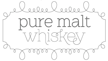 Alejandro Paul's Argentinian foundry is called Sudtipos. Veer writes about Paul: Alejandro Paul is one of the founders of the Sudtipos project, the first Argentinian type foundry collective. He taught graphic design and typography at the Universidad de Buenos Aires from 1996 until 2004 and has worked as an art director in prestigious Argentina-based studios, handling high-profile corporate brands such as Arcor, Marta Harff, Morph, SC Johnson, Danone and Movicom. He has walked away with awards from several design competitions. In 2003, he began working with artist Angel Koziupa, designing fonts and lettering for several top packaging agencies. In 2006 he was a speaker at TMDG06, the largest Latin American graphic design event - more than 4,000 designers were in attendance. His work has been featured in publications around the globe, including Step and Creative Review. He has walked away with awards from numerous design competitions. He has received two Type Directors Club TDC2 awards, in 2008 for Burgues Script and in 2009 for Adios Script. He teaches a postgraduate typography program at the University of Buenos Aires, where he previously taught graphic design.
 Sudtipos has made a reputation as the place to go to for script and signage type. Faces include Brownstone Sans (2010), Brownstone Slab (2013), Politica (2008, an architectural lettering superfamily, used, e.g., by Discovery Channel), Domingo (by Ariel Garófalo), Plumero (connected handwriting font by Diego Giaccone, which is also in the Umbrella Type collection), Murga (display font by Alejandro Paul based on lettering of Angel Koziupa, 2003), and these typefaces by Alejandro Paul: Tierra, Latinaires (2003-2018), Reflex (unicase), Downtempo, and Stardust. Free fonts: Mosaico (2003, pixel typeface by Alejandro Paul), Mabella (2001, Ramiro Espinoza), Rolinga (Carlos Carpintero). Divina (2004) is a Latinized digitization of Kurrent (designed by Rudolph Koch in 1927 and cut in 1935). Myfonts link. Pictures of their fonts in use. YouWorkForThem link. Blog / Facebook group. Additions in 2010: Business Penmanship (which is based on models of American business education penmanship, ca. 1900). Poem Script is another Spencerian face---it won an award at TDC2 2011 and at Tipos Latinos 2012. Fonts from 2011: Calgary Script (brush signage face), Viento (a lively version of Brisa, 2004, another font done with Angel Koziupa), Semilla (2011, a retro script based on an alphabet drawn by Ernst Bentele in 1953). Fonts from 2012 include the angular pair Bayoneta Pro and Machete Pro, both co-designed by Alejandro Paul and Angel Koziupa. Platinus Script Pro (done with Angel Koziupa) is a wedding font. His Hipster Script won an award in the TDC 2012 competition and at Tipos Latinos 2012. In 2013, he created Seashore Script (described as a feminine script, it has horizontal stress and is backslanted; some may consider it an Arabic simulation typeface). At Tipos Latinos 2014, Alejandro Paul cleaned up, winning awards for Bellissima Script, Seashore Script, Auberge Script (a penmanship font in the style of the French bâtarde and coulée), and Bayoneta. Typefaces from 2014: Jugo Script (a supermarket script, done with Angel Koziupa), Courtesy Script (a connected Zanerian script based on a model from 1876). Typefaces from 2015: Blog Script (an informal handwriting font, with Carolina Marando), Auberge Script (which was started in 2014). Typefaces from 2016: Wink (a connected script font co-designed with Joluvian), Henderson Slab and Henderson Sans (a large slab serif family loosely based on an alphabet drawn in 1906 by Albert Du Bois for the Henderson Sign Painter Book), Prangs (a thinly connected italic didone named after Prussian-American printer and lithographer Louis Prang (1824-1909)). Typefaces from 2017: In 2017, Tropical (with Joluvian: this package contains a bold, wet-looking display script, an inky, textured brush script, and hand-penned capitals with a felt-tip look). Typefaces from 2018: Fixture (a 72-font grotesk family published by Sudtipos). Typefaces from 2019: Replete Sans (a seven-style mainly art deco typeface inspired by early 20th century lettering on metropolitan buildings all over the world), Tafel Sans (a contemporary take on early- to mid-century geometric fonts). Typefaces from 2020: Antica (a wedge serif based on Latin poster and billboard typefaces from the 19th century). Typefaces from 2021: Statement Sans (an 18-style neo-humanist sans with an exquisite Black weight, by the Sudtipos team; it includes a variable font). Klingspor link. View Alejandro Paul's typefaces. Adobe link. [Google]
[MyFonts]
[More] ⦿
|
Sugargliderz
[Shuji Kikuchi]

|
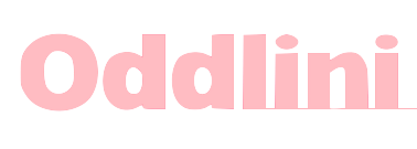 Shuji Kikuchi from Hadano, Kanagawa, Japan, was born in 1972 in Osaka. His foundry, est. 2006, is called Sugargliderz.
 Free fonts: Frail (2011, a 6-style grungified didone family), Cuneiform (2006-2008, this is a cuneiform simulation font), Fragment Core, Proto Uncertain (handwriting), Shears, Unnamed. Commercial fonts: Puchiflit (2020: a typewriter slab serif that according to Kikuchi is a felt tip pen font), Pinch Remix (2020: hand-printed), Oddlini (2019: a 360-style basic grotesk family that covers all widths; it has obliques instead of italics), Oddlini 2 (2019), Knock Type (2017, a kana-Latin-Braille transcription font), Du (2016, a hand-printed font), Magendfret (2016, a warm typewriter family), Artlessness (2015), Bush (2014), Nora Pen (2014, a didone influenced by Walbaum), Uncertain Felttip (2008), the Palindrome family (2006, experimental), Pinch (2007, hand-printed), ScratchWithTheCoin (2007, grunge), Bagworm (2007, four styles, influenced by Tekton), Decay (2008, grunge), Beg Before (2008, grunge), Beg After (2008, grunge), Phoebus Palast (2008), Kropotkin (2008, 24 styles of a sturdy early 20th century grotesk), Rebuild-Square (2009, totally square family), Ponytail (2009, rounded), Violadabraccio (2009, serif), Lettera, Bush, Long Haul Trucker (2009, alphading/logo font), Michel (2009, didone). Klingspor link. Dafont link. View Shuji Kikuchi's typefaces. [Google]
[MyFonts]
[More] ⦿
|
Sunny Tudu
|
 Dhaka, Bangladesh-based designer, who created the cursive script typeface Autograph (2013), the organic display typeface Radius (2013), Cartoon (2013, a comic book family in Solid, Bevel, Border and Shadow styles), Script (2013), Quarto (2013, a thin organic sans), Blackbelt (2013, futuristic), and Story (2013, hand-printed). Other typefaces from 2013 include Acute, Paradox (bilined), Summer, Kinetic (bilined), Romantica, Ranger, Erode, Bermuda, Turning, Techno, Floral, Century (futuristic), Master.
 In 2014, Sunny published the scratchy typeface Bristle, the multilined typefaces Echo and Have A Nice Day, Denim, Broken (glaz krak), Creator, Euclidean, Medieval, Revelation, Supreme, Bravado, Origami, Grand Hand, Typeart, Redled, Techfont, Metallic, Because, Elegantia, Author, Rejoice, Mazematics, Serenity, Fruity, Inspired, Inbox, Stonehenge, Intense, the sharp-edged sans typeface Pleasant, the graceful script typeface Sprinter and the flowing script typeface Charcoal. Typefaces from 2015: Brave (futuristic), Increment, New Direction, Devils Hand, Oxygen, Cozy Sans, January, Ascent, Geometric, Fontana. Typefaces from 2016: Regards (connected handwriting font). Typefaces from 2017: Black Road, Select, Concept (connected retro diner script), Dependable (a great hand-printed script), Ready (signature font), Fresh Air, Mark (brush font), Gray River. Typefaces from 2018: Mustang (signature font), Horizontal (a signature or architectural lettering font), Keep On Shining. Purchase his fonts at Graphic River. [Google]
[More] ⦿
|
swiftw5
|
FontStructor who made Hendrikus Wijdeveld (2010), based on a Hendrikus Wijdeveld poster entitled Architecture Exhibition / Frank Lloyd Wright from 1931. [Google]
[More] ⦿
|
Tabular Type
[Toshi Omagari]

|
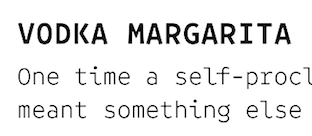 Tabular Type was set up in the United Kingdom by Toshi Omagari. In 2019, he designed Comic Code (a monospaced programming font created to compete with Comic Sans; see also Comic Code Ligatures), Tabulamore Script, which combines a monoline monospaced wide script with a casual architect's style. Other typefaces from 2019 include Belinsky Text and Belinsky (a monospaced sans).
 William Dwiggins worked with multiple typewriter manufacturers including Underwood, Remington Rand, and IBM, but none of them were finished. He left a number of intriguing drawings which are now kept at the Boston Public Library. In his Dossier (2020), Toshi Omagari combined these materials to make a cohesive monospaced typeface family: the upright was taken from a drawing of monospaced lowercase for an unknown client, and the italic was from the work Dwiggins did for Underwood, called Aldine. Typefaces from 2021: Codelia (a 26-style humanistic monospaced programming font). [Google]
[MyFonts]
[More] ⦿
|
Talita Kessia
|
During her studies in Lisbon, Talita Kessia designed Niemeyer (2013), a typeface named after Oscar Niemeyer. [Google]
[More] ⦿
|
TAM Page
|
TAM Line Font Normal and Bold are two free architectural octagonal fonts. [Google]
[More] ⦿
|
Tarin Yuangtrakul
|
 Designer in Bangkok, who runs Tabby Design. He made the experimental geometric typeface Invisible Color (2010), the sketchy typeface Self-Contradiction (2010), and the curvy high-contrast free typeface Hyperbola (2010). In 2011, he created the free geometric monoline architectural lettering typeface Infinity, as well as Golden Sans, an alchemic hairline sans that is based on the golden ratio.
 In 2012, he designed Rush, a typeface in which letters are sliced and reconstructed. Behance link. Hellofont link. Klingspor link. [Google]
[More] ⦿
|
Tatiana Magalhães
|
Porto Alegre, Brazil-based designer of a school project architectural typeface in 2015. [Google]
[More] ⦿
|
Tess Claes
|
Vorselaar, Belgium-based designer of Baku (2015), an elegant display typeface based on the work of architect Zaha Hadid. [Google]
[More] ⦿
|
The Northern Block (TNB)
[Jonathan Hill]

|
 The Northern Block (TNB) is Jonathan Hill's foundry based in Leeds and/or Sheffield and/or Newcastle, UK, est. 2006. The designer and funder is Jonathan Hill (b. Sheffield, 1971) who lives in Newcastle-upon-Tyne, UK. Maria Pigoulevskaya joined The Northern Block as type designer in 2012. Home page. Free fonts by Jonathan Hill can be found at Dafont and Fontspace.
 Another Dafont link. MyFonts link. Hellofont link. Behance link. Klingspor link. Abstract Fonts link. Alternate URL. In 2010, he started FontStructing typefaces. His first was the grungy wooden plank typeface Timber Remnants. Also in this category is Laser Disco (2008, futuristic). Typefaces from 2006 until 2008: Sylar (2008, a techno family in 16 styles), Geta Robo (2008, a mechanical typeface influenced by Japanese animation), Arctic Patrol (angular family), Dokter Bryce (2008, octagonal and severe), Orange Royale (2008, 8 styles of fat techno and stencil fonts), CorTen (2008, octagonal ultra-fat stencil), QueueBrick (2008, LED simulation), Center Forward (2008, futuristic), Platform One (2008, a futuristic family), Line Wire (2008, octagonal, influenced by the work of Dutch designer #Wim Crouwel), StealWerks (2006, LED-inspired stencil face; published at T-26) and Blockout (2007, 5 weights of a futuristic blocky type family). In 2008, these were followed by more computer-related typefaces such as VideoTech (futuristic), JoyRider and AstroNaut (octagonal+futuristic, now at T-26). WerkHaus (2008) is a 5-style family inspired by the minimal sans typefaces of Herbert Bayer and the Bauhaus movement. Typefaces from 2009: Scriber (2009, octagonal techno family), Get A Robo (2009, a 10-weight mechanical family influenced by Japanese animation (Anime)), Ten Gu (2009, paperclip font remastered from the 1970's Letragraphica font Tangui), Orange Royal (2009, rounded stencil), VideoTech (2009, inspired by computer games for the Commodore 64), SkyWing (2009, rounded typeface inspired by Japanese computer console games, such as Captain Tsubasa created by Yoichi Takahashi), VanBerger (2009, an octagonal family influenced by the De Stijl movement), Logan Five (2009, techno family inspired by the 1976 sci-fi film Logan's Run), Zaius (2009, a bold sans family that includes a stencil style, all based on Ed Benguiat's work for the 1968 movie poster for Planet of the Apes), Oric Neo (2009, a free octagonal techno family; +Stencil), VanBerger Stencil (2009, a free geometric sans influenced by Theo Van Doesburg and the De Stijl movement), Aldo (2009, +Open: a bold stylized type typeface re-worked from the original 1970s movie poster The Battle For The Planet Of The Apes), Sylar Stencil. Typefaces from 2010: Intropol (2010; image), Arcle (a monoline organic sans), Hoxton (humanist sans family), Lintel (monoline sans family with a large x-height), Knul (monoline sans), Dohrma (a machismo geometric face; +Inline), Planer (a technical writing family), Otomo (a Japanese techno family that includes a stencil), Yodo (a geometric experimental family in 3 weights), Nu Order (a sans family that includes a very thin weight), PyeMan (2009, a piano key font named after the PacMan game), ProtoFet, DraftWerk (a minimal rounded typeface inspired by architecture and furniture detail drawings), DyeLine (a geometric face with a great hairline weight), Cobol (2010, great octagonal monowidth face), Draftwerk (architectural lettering), Olympik (a gorgeous multiline family based on Letraset's Optex, 1970), Kaine (a slab family inspired by 1960s spaghetti westerns: +Stencil, +Outline, +Italic +Block; Hill says that The grid template is based on Welt Extra Bold from Letraset with detailed changes, additional characters and new style variations.), Brion (a modernization and extension of A. Mailay's rounded sans font Arpad (1971, VGC); Kaine Block, the counterless version, is free at Dafont). Mekon (2010) is a fat sans display typeface with a free horizontally striped style. It revives and extends Peter Steiner's phototype Black Body (1973). MarkusLow (2010) is a revival and extension of Basilea (1965, Markus Low, VGC). Teletex (2010; +Ultra Light, +Light, +Medium) is a typewriter style slab serif whose design was influenced by Rockwell.  Typefaces from 2011: Dekal (nice fat multiline family, +Inline), Norpeth (2011, a humanist neutral sans family), Bosko (+Stencil, +Block), Bosko Block (2011, free), Woolworth (sans family), NeoGram (sans family), Juhl (an organic/ geometric sans family with the bowls of b, c, d. p and q modeled after chairs). Millar (2011) is a simple monoline sans family. Tondu (2011) is a strong sans poster face---its early version, Tondu Beta (2011), is free. Gelder Sans (2011) is a clean modern sans serif typeface. Brokman (2011) is a contemporary 10-style sans family. Vitro (2011) is a monoline geometric sans family. Beval (2011) is a humanist sans family. Nurom (2011), Monsal (2011), Tadao (2011) and Kuro (2011) are additional sans families. Heltar (2011) is a revamping, TNB style, of Helvetica. Regan Slab is a readable slab family. It was followed in 2012 by Regan (the sans version) and Regan Alt. Typefaces from 2011: Dekal (nice fat multiline family, +Inline), Norpeth (2011, a humanist neutral sans family), Bosko (+Stencil, +Block), Bosko Block (2011, free), Woolworth (sans family), NeoGram (sans family), Juhl (an organic/ geometric sans family with the bowls of b, c, d. p and q modeled after chairs). Millar (2011) is a simple monoline sans family. Tondu (2011) is a strong sans poster face---its early version, Tondu Beta (2011), is free. Gelder Sans (2011) is a clean modern sans serif typeface. Brokman (2011) is a contemporary 10-style sans family. Vitro (2011) is a monoline geometric sans family. Beval (2011) is a humanist sans family. Nurom (2011), Monsal (2011), Tadao (2011) and Kuro (2011) are additional sans families. Heltar (2011) is a revamping, TNB style, of Helvetica. Regan Slab is a readable slab family. It was followed in 2012 by Regan (the sans version) and Regan Alt.
Jonathan Hill's most popular typefaces. Type designs done in 2012: Hackman (elliptical sans), Borda (octagonal), Savile (humanist sans), Metrik (a nice geometric---borderline organic---sans family), Metral (rounded octagonal typeface), Uniman, Kobern (a strong sans), Reznik (techno sans). Type designs from 2013 by Jonathan Hill: Nauman (a humanist sans family with attention paid to the triple (1, i, j)), Gunar, Nuber (followed in 2018 by Nuber Next), Eund (a modulated sans), Corbert (Bauhaus-inspired sans), Corbert Condensed. Typefaces from 2014: Byker (geometric sans), Schar (humanist sans), Loew (geometric information design sans; extended in 2018 by him and Donna Wearmouth to Loew Next (for Latin and Cyrillic) and Loew Next Arabic), Bitner (spurless organic sans named after bitcoins), Modum, Modum. Typefaces from 2015: Facto (a simple sans family with large x-height), Halcom (influenced by Futura), Scharf, Itoya. Typefaces from 2016: Syke Mono (a stylish monospaced typeface family), Oyko (an octagonal industrial typeface family), Kylo Sans, Syke (a sans typeface family), Hoxton North (a condensed humanist, very British, sans), Celdum (geometric sans). Typefaces from 2017: Tomarik, Typold. Typefaces from 2018: Paradroid, Sprout (a low-contrast 6-weight sans). Typefaces from 2019: Roag (an industrial geometric sans paying homage to mechanical designs of the 1930s), Syke (14-style sans), Scharf (a sturdy sans family), Mynor (a modern squarish sans inspired by machine-readable typefaces of the 1950s including OCR-A and B). Typefaces from 2020: Corbert Wide, Blom (a humanist sans family). Typefaces from 2021: Waldo (a 4-style bold, stencil-focused display typeface loosely based on a 1973 science fiction movie poster for The Battle For The Planet of The Apes), Nauman Neue (a 60-style humanist sans), Kopik (a comic book typeface with rounded forms; it was inspired by the 1960's architectural handwriting style practised by draftsmen), Duran (a 14-style geometric sans with built-in strength). Creative Fabrica link. View Jonathan Hill's typefaces. Another list of Jonathan Hill's fonts. Interview in 2014. [Google]
[MyFonts]
[More] ⦿
|
Thomas A. Rickner

|
 American type designer, born in Rochester in 1966, who has worked for various foundries including Monotype. He graduated from the Rochester Institute of Technology. He lives in Madison, WI, and is currently employed by Monotype, after a short period at Ascender. He co-designed a revival of W.A. Dwiggins' beautiful Eldorado family, Amanda (1996), Hamilton, the Western font Buffalo Gal (1992-1994, TTGX variations font done while he was at Apple). He worked at Monotype from 1994 onwards, where he hinted Carter's Georgia, Tahoma, Nina and Verdana fonts, for example, commissioned by Microsoft. While employed by Apple Computer, Tom oversaw the development of the first TrueType fonts to ship with Apples System 7. He worked on a freelance basis for Font Bureau for the last 12 years. He has worked on custom font solutions for companies such as Adobe Systems, Apple Computer, Hewlett-Packard, IBM, Lexmark, Lotus, Microsoft and Nokia. His custom fonts include a revival of Bodoni to serve Lexmark as their new corporate typeface. His experience with non-Latin scripts is broad, having designed fonts for the Greek, Cyrillic, Hebrew, Thai, Thaana and Cherokee scripts. Tom also played a key role in the development of fonts for Agfa Monotype's proprietary stroke font format. In his own words, However I did the bulk of the drawing for Siegel's Graphite, and I did about 1/2 of the Tekton MultipleMaster (with Jill Pichotta and Tobias Frere-Jones on the other half of the masters) while in Palo Alto. In 2004, he co-founded Ascender Corporation, where he published
 - Arial Mono (Ascender).
- Buffalo Gals (1992 and 2016): Buffalo Gals is one of the very first variable fonts, originally made in 1992 for an Apple TrueType GX developer CD. It was intended to push the boundaries on the number of stylistic axes in a font, with 6 axes in total, none of them being weight or width. Based upon wood type of the late 1800s, Buffalo Gals enables control over features with names like Cookies, Fringe, Hooves, Concavity and Bracketing. It offers 144 distinct combinations of these attributes, and seemingly infinite intermediate interpolations as well. Free download here.
- Circus Poster Shadow (2005): based an 1890s Tuscan style wood type.
- Goudy Borders (2009) and Goudy Forum Pro (2009), a revival and expansion Frederic W. Goudy's "Forum Title" (1911, inspired by Roman inscriptions on the Trajan's column monument).
- Hamilton (Ascender). A wood type face.
- Rebekah Pro (2006): a revival of ATF's Piranesi family, the regular being designed by Willard Sniffin, and the remaining weights designed by Morris Fuller Benton. Tom Rickner first revived Benton's Italic for use in his wedding invitations for his marriage to Rebekah Zapf in 2006. He completed the character set in 2009.
Will-Harris interview. Agfa bio. Ascender Corporation bio. FontShop link. MyFonts link. Klingspor's PDF. [Google]
[MyFonts]
[More] ⦿
|
Thomas Averin
|
Portland, OR-based designer of the mini-stencil typeface Do It Again (2011, caps only---almost like architectural lettering), developed while he studied type design under Pete McCracken at the Pacific Northwest College of Art in Oregon. Home page with a free download. MyFonts has the commercial version sold by Thinkdust. HypeForType link. Behance link. [Google]
[More] ⦿
|
Thomas Björkstrand
[SU Ling TSP]
|
[More] ⦿
|
Thomas Ewing French
|
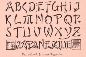 Scientific lettering expert, 1871-1944. His book The Essentials of Lettering (1912, McGraw-Hill, New York), coauthored with Robert Meiklejohn, has many historical examples and takes the reader on a grand tour of lettering. The tease. Local download.
 For a digital revival of some alphabets, see Jeff Levine's New Thin Roman JNL (2019) and Drafting Class JNL (2021). [Google]
[More] ⦿
|
Thomas Perrin
|
 Thomas Perrin obtained a BAC Scientifique, Sciences de l'ingénieur (option Art) from the Lycée des métiers de l'audiovisuel et du design Léonard de Vinci, Villefontaine. From 2011 until 2012 he is studying at DNAP in the Ecole des Beaux arts of Besançon.
 He created Game Over (2011, an experimental game/pixel font). He was also commissioned by Puzzle SAS in 2011, a company that specializes in assembling real estate transactions, focusing on old buildings. His architecturally-inspired typeface Puzzle is a high-contrast caps face done for them. [Google]
[More] ⦿
|
Thomas Richardson
|
During his graphic design studies in Wellington, New Zealand, Thomas Richardson created the alchemic typeface Rometric (2013). Rometric draws inspiration from the Wellington City Gallery and has many clean geometric and circular forms. [Google]
[More] ⦿
|
Thonny Flores
|
Thonny Flores, a graphic designer in Caracas, Venezuela, designed Archetype (2013), a typeface inspired by the architecture of Woman's Bridge and by olitical upheaval in Venezuela. [Google]
[More] ⦿
|
Tim Drabandt
[Type Machine]
|
[More] ⦿
|
Tina M
|
Creator of the free font Draftsman Caps (2005). [Google]
[More] ⦿
|
Tiny Type Co
[Robin Mientjes]
|
 Tiny Type Co. was established by Dutch graphic and type designer Robin Mientjes in 2016, in Oslo, Norway. Robin writes about herself: Robin Mientjes is a genderqueer feminist type designer, with an obsession for baking, cooking, and thoughtful graphic design. She's been designing for print and web for fifteen years, and studied at the KABK. Her typefaces:
 - She contributed to the open source font project Open Baskerville (2009).
- Dover Display in Sans and Serif versions (2012-2016), with some contrast, sharp edges, and historic influences from the British types Caslon and Gill Sans. Dover Text (Sans and Serif) followed in 2017. Mientjes: Dover Serif Text is a modern Caslon, and Dover Sans Text is the Gill Sans you've always wanted to pair it with. Together, they do it all.
- Hume (2016): a collection of sans and display typefaces for the redesign of BNordaaker.
- Peaches. A pixel font designed for a comic book artist.
- Charlotte Greeven. A high-contrast didone typeface created for fashion designer and illustrator Charlotte Greeven.
- Antikva. An angular design based on Oldrich Menhart's Manuskript Antikva (1943). It was developed during her studies at KABK.
- Monumental Grotesk (2016). Based on the architectural lettering of Piet Zwart for his friend, Hendrik Berlage.
Home page. [Google]
[More] ⦿
|
Todd Albertson
|
Washington, DC-based art director at AARP Media who has worked for The York Times Magazine. He created some retail and custom typefaces such as Rittenhouse (stencil face), Colosseum (fat octagonal), Barbarossa (modular typeface) and a thin octagonal typeface, co-designed with Tom Brown, for Architecture Magazine. Behance link. [Google]
[More] ⦿
|
Toko
|
Sydney-based graphic design company which first started in Rotterdam in 2001 but relocated to Australia in 2006. They have a "confused type project", an architectural typeface, and various experimental typefaces done for some specific projects. [Google]
[More] ⦿
|
Tom Beemsterboer
|
Graphic designer in Amsterdam. Creator of the architecturally inspired sans typeface Haus (2012). Behance link. [Google]
[More] ⦿
|
Toshi Omagari
[Tabular Type]

|
[MyFonts]
[More] ⦿
|
Tracy Jenkins

|
Wife and partner of Chester Jenkins at Village. Designer at Thirstype of the playful outline font Dee (2003). With Chester, she made a wood type face, Satchel Paige (2003), after a wood type original spotted in the Hamilton Woodtype Museum and the architectural hairline outline typeface Daily (2003, Village). [Google]
[MyFonts]
[More] ⦿
|
Triangle & Cross
[Vladimir Likh]

|
Vlad Likh (Triangle & Cross) is an art director in Moscow. Creator of the free variable width Latin / Cyrillic sans font Konduktor (2013). In 2019 he designed the tall hairline sans typeface Option, which was inspired by geometric architectural fonts. [Google]
[MyFonts]
[More] ⦿
|
Typadelic
[Ronna Penner]

|
 Ronna Penner (b. Niagara, Ontario, Canada, 1958) founded Typadelic, a commercial foundry. She won an award at Bukvaraz 2001 for Sketchley (2001, now a Bitstream font), which is based on her own handwriting. She is located in Waterloo, Ontario. Sketchley and Sketchley Swash are available from Bitstream. Font list: Avril (gorgeous handprinting), Butterflies (dingbats), BlackJack (2002, free), Clarissa (2002), Corky, Frivolous (2002), FiddlestixFunnyCaps (2002), FamousFolks (2002), Inkster (2002), Stone Hinge (2003), JellyBean, Jot, Mayfield, Moonbeam, Pointed Brush, Rendezvous (2003, calligraphic), Lee Ann (2003, calligraphic), Java Jive (2003, comic book style), Ronita (2000, Bitstream), Sketchley, Silver Script (2002), Silver Script Flourishes (2002), Velvet Script (2002), Fiddlestix, Garden Party (2002), Quigley (2002, great art nouveau font), Hayseed (2003), Fresh Paint (2002, handwriting), Frisco Serif (2002), Frisco Sans Serif (2002), Sunnydale (2003, handwriting), American Writer (2003, a Tekton-like font), Amelie (curly handwriting), Rockford (2003, handwriting), Persimmon (2004, brush script), Peach Fuzz, Sheree (2009), Journal Hand (2009), Dream Cake (2009), Sweet Pea, Mirielle (2004), Natural Script (2004), Not Too Shabby (2004), Schlub (2004), Tweedledee (2004), Type Keys (2004), Urban Scrawl (2004), Jinxed (2004), Wazoo (2004), Stylin (2008, a monoline face), Love Ya Honey (2009, a 1950s style hand-printed script), Shes All That (2009), Sharpy (2009, monoline), Tanked (2009), Cattapilla (2009, children's handprinting), Average Joe (2009) and Sweetheart Script (2004, sold via FontBros).
 Fonts from 2011: Pink Lemonade (child's hand), Little Sunshine (Open, Solid: slightly Victorian letters), Gaffer, Ruff N Ready, Elisabeth (rough-edged antiqua), Miss Demeanor (based on 1930s script), Wee Todd (2011, kid's hand), Crush (grunge). FontShop link. Fontspace link. Font Squirrel link. Klingspor link. Dafont link. [Google]
[MyFonts]
[More] ⦿
|
Type Machine
[Tim Drabandt]
|
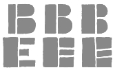 Tim Drabandt (Type Machine, located in Minneapolis, MN) is the designer of Eighthourday (2009, a commissioned sans face), Airborne (2009, octagonal typeface based on WWII airplane lettering), Eggman, an irregular font (2002), Savalas, Victor Hailey (2001) and Whipple (2002, an architectural font), also shown here, MiG (handwriting). These free fonts are incomplete and under development. At Chank, he published the calligraphic font Brimley (2003) and the falred roman typeface Venis (2003). You Work For Them link. Krakt (2009, You Work For Them) is an homage to the geometric typefaces used during the De Stijl movement. The letterforms are primarily composed of geometric shapes, which aid in it's modularity. [Google]
[More] ⦿
|
Typeimage
[Jochen Hasinger]

|
Jochen Hasinger (b. 1964, München) lives in Frankfurt am Main, Germany. From 1992 until 1994, he studied typography with Wolfgang Weingart and André Guertler at the Schule für Gestaltung in Basel, and studied in Stuttgart before that, rom 1985-1988. He became art director at various ad agencies in Frankfurt and Hamburg. He founded Typeimage in 2003. Klingspor link. Typefaces designed by Jochen Hasinger: - Covent BT (2003, a display sans family, Bitstream). Covent Nano (2006, a narrow version of Covent).
- TIPS (2004, Linotype). This family consists of six logo and image fonts: BComTIPS, ThisWayTIPS, TravelTIPS, ActiveTIPS, AstroTIPS, CountTIPS. Linotype page where TIPS is discussed: Tips (which stands for Type-Image-Piktogramm-Schrift in German, or type-image-pictogram-font in English) contains six different fonts of pictograms and stylized icons. Tips Active is a font filled with characters reminiscent of Otl Aicher's sports pictograms from the 1972 Olympic Games. Tips Astro contains astrological signs. Tips Bcom depicts icons for use in business communication or web page design. Tips Count is a font featuring numbers inside of various circles. Tips This Way and Tips Travel are both collections of pictograms for use in navigation and other signage systems.
- Sabin (2006).
- Architextura (2001).
- Botta (1989, modern).
- DryGin (1979, headline face).
[Google]
[MyFonts]
[More] ⦿
|
TypeTrough
[Andrew Walsh]
|
 Andrew Walsh (TypeTrough) is the Kiltimagh, Mayo, Ireland-based creator of a mechanical ornamental caps typeface called Macha (2011). ZigZag (2011) is a beautiful experimental typeface made for an architectural company. Gosdin (2015) is an elegant inline serifed headline typeface.
 Walsh is also a talented illustrator. Behance link. [Google]
[More] ⦿
|
TypOasis 2004
[Manfred Klein]

|
 Manfred Klein's typefaces from 2004: Bauernschrift (the original Bauernschrift, published in 1911 by Bauersche Gießerei, had a Jugendstil form and a classical gothic form), ArthritishSpringtime, Declared, DigitsCarpet, FraktKonstruct, GalleriaGeometricaA, GalleriaGeometricaB, Logotrainer, MKLatin-Bold, MKLatin-BoldOblique, MKLatinLight, MkLatinLight-Oblique, OldiesButGoodies, RomaMonumentalBC, SportSatyre-Medium, Uncitronica-Medium, Nasenbear, CircusEarth, FolksXXHeavy, PoliticiansWorking, AlkoInitialsFramed, AlkoInitials, CutAwayOne, FragmentBO4, FragmentF, LetterSoupMainz, MKaos-Regular, Menschenskinder, RodGauApesInitials, StoneCapsIngrid, TangramBlack, TangramWhiteBlack, TixBats, TypoApish, Ubahn-Light, Ubahn, UltraCondensedSansSerif, WalbaumTorsoThree-Regular, ArrowFaces, Associations, AssociationsBirds, DotCapsMK, FrakturaFonteria, GuernicaMemories, MultiCapsOne, MultiCapsTwo, Schwabach, SketchesOfSpain, DotsCapsTwo, KleerikaleConBlack, ManiaK, MonksWriting, MonospaceTypewriter, PablosChildren, RuebenNosesFour, SometimesSmiley, TherapeuticApplications, TraditionellSans-Bold, TraditionellSans-Normal, VForVictory, EuroGyptians, Fabeltiere04, GiambattistaDueMille-Oblique, GiambattistaDueMille, KlillLightCondensed, PhonebookFont, PreColumbus, StrokeBorn-Bold, StrokeBorn, TracesOfKandinsky, Amputation, EarthquakeTypewriter, HandwrittenSlim, MyPrivateZoo, PotatoMonsters, RoundOpArt, Sansumi-DemiBold, Sansumi-Regular, Sansumi-UltraLight, Santana-Black, Santana-BlackCondensed, Santana-Bold, Santana-RegularCondensed, Santana, SantanaXtraCondensed, WacObats, Warlord, AfterAtomWar, AnAlphaBetIsmXtreme, AnalphabetismBats, Eulenspiegel, FlyingWomen, FraktalConPablos, KleinsTypen, Napoleodoni, BackgroundBricks, Decreations, Faustant, Faustitalic, GeoGraphics, GuantanamoHumanism, LipoDVectorized, MKritzeleien, Napoleodoni-Bold, ReadingRailroad3D, ReadingRailroad, SchoenspergerCaps, StageGlyphs, StageGlyphsTwo, CarneVale, Cock-Bold, Cock-Italic, Cock (high ascender face), FranklySpokenTwo, GenManipulated, GenManipulatedRounded, KarlasAndManfreds, Lipsiantiqua-Regular, PostConstructivism, PostConstructivismInvers, SketchedCassiusBroken, SpaceGarbage, WinterCoat, Artistiques-Bricks, DoubleBrokenTextura, GoetheGothic, GoetheGothicBold, GoetheGothicOblique, PabloSansCaps, PreRomanCaps, RodgauHeads, ScribblesCalligraphique, SomeParts, SomePartsAlphabet, WomanWithDoveTwo, WritersFont, Russian, SpikyBrush, TechnoMK, Bastarda-K, LuFraktorso, OldGreekButtons, SchwabachScribbles, ToscanButtons, TrajanusBricks, Couples, LookForLeonardo, Morphes, NanaBallett, Rocky, BeastlyBats, ChildrenSketchings, CloseUp, IdenOfMarch, OrnaRosettes, StrangePeople, SurReal, TrajanSmallCaps, Aprilapril, Confuseyecons, Cucumbers, DuererUnd, Exhumations, MankBalloons, MankZieglers, OptimusPrinceps, OptimusPrincepsSemiBold (roman Trajan style), SlabRomana-Bold, SlabRomana-BoldOblique, SlabRomana-Oblique, SlabRomana, CapsRandomish, CapsRandomishBricks, CondensansPaneurope-Medium, CondensansPaneurope-MediumOblique, CondensansPaneurope-Oblique, CondensansPaneurope, HansSchoenspergerRandomish, HelloSirPeter, MankSans-Medium, MankSans-MediumOblique, MankSans-Oblique, MankSans, StencilBricksMK, StencilBricksRandom, AfriquArtes, EggsOne, EggsTwo, EggsnPills, FaceToFace, KarlasWelt, LookBrokenTypes, Schablonski-LessFat, Schablonski (stencil), BlaxxOnGrid, DancingVampyrish, EmkaSansCondensed-Bold, EmkaSansCondensed, Othermil, OwlsNOtherWitches, PrisonBricks, Renaiss-Italic, Runners, VignettSketches, AbsoluteImprovisations, Aparta, BlackLiving, Blowing, BullerBuPapercut-BoldOblique, BullerBuPapercut, CryArgentina, EnFace, EyeBeings, KidsPhantasies, Klats, Linearus, LinearusCentSix, Monofred-UltraLight, Pabloesques, Planless-Bold, Planless, ScribbleDichFrei, SilhouettesAnimalish, Spontifex, Spontifex, TokyoFrankfurtRound, XamStern, BlackSplinters, Linolphabet, Tomahawked, Typobricks, AmericanInhabitants, HypocriSymbols, LastWit, MK-Symbols, StrokesFonds, ThinkBats, UseBats, Klimes, MonoSpatial, Architypogra, CaslonDadaesque, Cuneate, CuneateCaps, MauMauKlein, FatGrafCalliKlein, CavePaint, Goblins, NudesSilhous, RainyDay, AidaSerifaShadow, BodonisBulemy, SuperSansCondLight, Adonis-Bold, Batmania, CactusBlossom, CrazyCrazySans, Eyeballs, FacesAndCaps, FigaroFigaro, FraxBricKs, LaughBajazzo, M-sKetches, MKGrotesque, MoreMonK, NextGeneration, Orcas, PragRoman, RomanGridCaps, StrangeCharacters, TypoTracesOne, Typotraces-Cinque, Typotraces-Four, Typotraces-Three, Typotraces-Zwo, UmDieEckePlus, Vampyrish, VespasianCaps, VespasiansFlorials, Wacofaces04, ZagzagHeads, Klexalfabeta, GotischeMajuskel, PompejiPetit, Birrrdds, Spontcomic, SprayersSujets, TypoElements, WacoMusish, BemBolz, BrokenRoman-Bold, MarinumBreezed, SansFat, Africaans, AllHands, AlwaysPeople, BauAHaus-Black, DeconstructaWide-ExpandedUltra, GrafFittyPunk, LeArchitect, MiszellenKOne, MiszellenTwo, OhLauri, Shamanbats, TrajanusBriX-Invers, TrajanusBricks, TrajanusBricksXtra, Wenceslas-Oblique, Wenceslas, Monofred Ultralight Update, GenotypiPrototype, VivaBodoni, WhatsHappened, Cancellereska, JuniusIrish, LombardPlattfuß, SketchesDuererInvers, TornielloInitials, Birds-Relaunch, KoeppHeads, MiszellenThree, ImperiumCond, KleinsWrittenCaps, SigismundoDiFanti, Zwiebelfisch, ChildWritten, KleinKallig, GoGo, FantasyBats, KarlasMiszellen, LosAngelesBold, MiszCinque, MiszellenQuattro, MouseTraps, LittleRock, Dinotiqua-Heavy, MountFirtree, FarmFont, Karlas704, MesoFaunaBats, PhaistosAlphabet, Quicktypes, AbstractBats, AztecBats, BienMaya, ForefathersSketches, HumanDeformations, MiszellenJuly, NativeAmericans, OldEgyptGlyphs, PeoplesParts, RainmansWeatherreport, SheAndHe, MKlimesCondensed, SansBlack, WinterthurCondensed, MonoSerifBased70, Rehacles, RustiCalligraphia, ScrapDealer, Vampyriqua, Zebraesq, FracturiaSketched, FracturiaSketchedCaps, OrnamentInitials, CavePeoplePainting, FontBetaOne, HierobatsSketches, PrehistFantasies, Roundlings, VampyrBats, WacoheadsTwo, Cybatiqua, HassianUncial, PittoresqJugendstil, BonFood, PoeticRound, ReligionSpirituality, Running Gnomes, WesternPastHeroes, WritersReaders, AdAstra, Practiqua, DistroyA, DottyShadow, QuickMary, QuickMax, StrokeyHand, EasterIslandsToday, EthnicReconstructions, MotherAfrica, Scherenschnitt, Napoleon, Newspaper, RoundSlabSerif, DisPropBold, FishHooks, VariationsForImre, GoticaBastarda, ImresFraktur (modeled after a blackletter by Reiner), ToskanaCapsRound, KidsStuff, MKDingBats, Offbeats, PeopleSketches, StrangeTypes, WeatherBats, MoldauQua, Postertypes, ThinManGiambattista, AnimalTypeFaces, DoubleFaces, ItalianEvolution, TodayRunes, BeachBats, MiszellenEight, PrettyPeople, ZeroPoints, Scherenschnitt, ScissorThree, Crosses, MayanMexican, MKarlasBats, LimesCondensed, SkiCargo, MonogramsToolbox, SerifCaps, SpaceDreams, TaxTaxation, ArrowsCompetition, Damaged, TypewriterCondensed, AfricanAngels, AfricanArtifacts, AfricanQueens, CaviarBats, CircusClowns, Hands, HelloDoc, MedicoBats, ModernPeace, SchoolStuff, LatinumTall-X, LucaPacioliCaps, LucaPacioliRough, UnclassicQuill-Condensed, ChildrenBats, Sketched, Egypt, SlimSans, WeekdaysRomanSlant, AbcariFond, Gastronom, HalfEnough-Bold, HelloweeniA, Mkristall, Stoerung, WildQuill, Artests, Burlesque, Exercises, FacesFaces, MenFiftyTwo, MSkizzen, BradbOGilvy, Centuriqua-Ultra, Ogirema, Africain, Angelinos, Assoziazione, BadCircumstances, FacesTypes, Gymnastics, HalloweenTwo, KidsStuffAdded, Proportions, Roaring29, ToyToy, WellnessBoom, WoodcutsOne, WoodcutsTwo, Bamboo, SansBlackSmall, FilledABC, FolksInCubes, SprayersTypes, JoeCaxton04, AfricEggs, BusinessPeople, DueMillePix, EarlyMidage, Musicus, NiceBoys, Sculpturs, SilhouettA, WildAnimalsOne, WoodcutAnimals, RomanSerif, RomanSerifOblique, DiskO-LightInverse, GreeKish, BatsDa, Djungle, E-Motions, EyesTests, HalloweensUfos, OldEgyptOne, OldEgyptTwo, RareClothes, SeeItInMuseum, SFAliens, Shamanish, TrafficVehicles, Users, Sansibar-CXCondensed, KidsFirstABC, KleinsKrempelTypes, QuasimodoCaps, VisitCard, ZigZagThree, QuadrataRomaMediumOblique, Climbers, EmkaBats, Homunculus, ReligiousSymbols, Schoolish, GrotesqueBoldTallX, RightSo, RomanWoodcut, Diogenes, HappyBirdsday, ProthesisBlack, StylosCapitale, Kinderkram, ReallyAnimalishOne, ReallyAnimalsTwo, VoteMe, JoaoCond-Light, JoaoImprovisations, LeiterplattenSans, ProthesisCaribiqu, ArmadaPirata, Bikers, DancingPeople, DeepSwimmers, Engel, MusicMuseal, PiratesOne, PiratesTwo, PiratesThree, PiratesSymbols, PreColumbats, RohrschachEtcetera, SciencesBats, Swimming Beautys, TrialNError, TwelveYearsAfter, WintersAbstract, WoodcutsAgain, YoungScene, UglyQua, SchneidlerSolitaires, Bibelschrift (with Petra Heidorn), CircusAir, FreeLife, Mirodish, Pixelsoup, PrositBats, Sports, Unlucky, WorkingClassHero, XmasOne, Zoobats, GeosansLightOblique, HoffmanFL, HamletOrNot (with Petra Heidorn), AstroCalligraphs, AstroDingbats, AtHome, BiblishPictures, BusyPeople, FamousBuildings, Landscapes, MoreDancing, Neighbours, RomansAntePortas, Seefahrer, Shopping, TheaterSymbols, Callimundial, OgiremaSlab, Delitsch Initialen, HartzVier, Hingehudelt, Hingeschludert-Black, MatisseThree, MrKlein, RemiDur, Burgfest, DelitschInitialen, UncialeOrnamentale, UncialeXpressLight, AbermalsAnimals, Buddhism, BuyMe!, LifeEyecons, LifeIcons, Tourists, Wintersports, FourEarsArrows, MensFriends, MKartoonsHeads, OetzisTimesWillCome, SportsTraining, XmasBatzz, ClassicBats, FramesAnd, HistoricMoments, OldFramesSymbols, PabloInTown, RomanArchitectura, Sleep, VeryBusy, BrokenHand, Burtinomatic (blackletter based on Burte Fraktur), MonumentA, Athena, DisPropSans, Zyprian, MiscellenDec04, MiszellenK, MoreBusy, OldTestament, ScienceFictions, Taucher, XmasOnMoon, Weiß Fraktur (with Petra Heidorn), DeutscherSchmuck (with Petra Heidorn, based on Schmuck für Deutsche Druckschrift by E. Ege, 1922), SchmaleGotischMK (after type by Ernst Schneidler), SchmalfetteGotisch (with Petra Heidorn, again based on Ernst Schneidler), SchneidlerSchwabachInitials, Serpentina, Schooltime, HistoricPeople, WYSIWYG, MK-Signatures, TheManyMKFaces. [Google]
[MyFonts]
[More] ⦿
|
Typodermic
[Ray Larabie]

|
 Ray Larabie (b. 1970, Ottawa, Canada) ran Typodermic in Mississauga, ON, which opened in the Fall of 2001. In 2006, it moved to Vancouver, BC, and in 2009 it moved on to Nagoya, Japan. Dafont page. Ray Larabie has been making fonts since 1996, but those early fonts were freeware. His pre 2001 fonts are grouped under the label Larabie Fonts. In 2001, he set up Typodermic. Latest additions.
 The Typodermic fonts: - 2022: Biphoton (a monospaced sans with the same proporions as Letter Gothic 12), Valve (an industrial muffler shop font), Deception (a sub-pixel typeface with ten captivating effects---Deception Array (wide blocks), Deception Bars (text viewed through lenticular glass), Deception Blocks (as in heavy JPEG degradation), Deception Diamonds, Deception Lines (for a grayscale effect), Deception Particles, Deception Plusses, Deception Process (simulates grayscale LCD text or a thermal printer on the fritz), Deception Scanline (television picture tube text rendering), Deception System (1-bit dithering gone haywire)), Monofonto (a monospaced sans), Encercle Draft (permitting users to create numbers in borders), Encercle Sans, Heavy Heap (a groovy psychedelic typeface with a scorching look, reminiscent of 1960s hot-rod culture and die-cast toy vehicles), Ggx89 (a 48-style tightly spaced Swiss style sans family).
- 2021: Quadrillion (a 12-style rounded monoline sci-fi family), Mochon (a wall writing or chalk font based on the lettering of Donald Mochon, dean of the RPI School of Architecture until 1966; the Mochon samples were provided by an ex-student of Mochon, Karl A. Petersen), Steelfish Hammer (a subtly rustic version of Larabie's most popular typeface, Steelfish), Wavetable (sci-fi), Xyzai (an LED emulation font, described by Ray Larabie as a hardcore, Y2K-style techno typeface), Geoparody (a 12-style squarish typeface inspired by a late 1960s font called Anonymous), Typewriter Spool (122 fonts, modeled after the Underwood No. 5 typewriter font).
- 2020: Gravtrac (a 56-style condensed to crushed slab serif family inspired by mid-twentieth century classics like Univers 59 Ultra-Condensed, Helvetica Inserat and Compacta; +Greek, +Cyrillic), Vinque Antique (a rustic handcrafted blackletter in eight styles).
- 2019: Dealerplate (17 license plate styles for various states and provinces in the USA and Canada, current as of 2019; included are California, New York, New Jersey, Ohio, Illinois, Pennsylvania, Florida, Maryland, Michigan, Wisconsin, Massachusetts, Missouri, Washington, North Carolina, Virginia, Quebec, and Ontario), Kenyan Coffee Stencil, Good Timing, Steelfish Rounded, Bitcrusher (a consumer electronics / techno font), Galderglynn 1884 (a nineteenth-century style sans-serif typeface that exp[ands his Galderglynn Esquire).
- 2018: Cybermontage, Crack Man (a pac man font), Propaniac (a 1980s-style postmodern typeface inspired by a Pointer Sisters record sleeve which was designed by Shoot That Tiger Creative Services), Zelega Zenega, Spectrashell.
- 2017: Minicomputer (MICR style), Squirty, PCTL9600, PCTL4800 (retro techno), Ultraproxi (semi-monospaced and influenced by the high speed computer printers from the 1950s to 1970s), Toxigenesis (techno sans), Venus Rising, Vanchrome (a compact sans-serif headliner with chromatic layers), Krait (a layered geometric typeface designed for architectural display), Xylito (a layered font for chromatic or 3d effects).
- 2016: Refuel (octagonal, based on military aircraft markings), Expressway Soft (a sans-serif font family inspired by the U.S. Department of Transportation's FHWA Series of Standard Alphabets, also known as Highway Gothic), Conthrax (squarish, techno), Cornpile (cartoonish), Electric, Evensong (art deco), Fledgling (a very tall typeface), Gymkhana (sans), Remissis (sans), Sunday Evening (a reverse contrast typeface), Meloche (Meloche is a unique grotesque sans-serif typeface influenced by hand-painted French signs of the late nineteenth century. It's available in 7 weights and obliques).
- 2015: Canada 150 (a custom font for the Canadian government; see here, here, this coverage regarding the Inuktitut part of the font, and this reaction by the curmudgeons in Toronto who complain that Ray did this work for free), Autoradiographic (sans family), Built Titling (for compact headlines), Chickweed Titling (cartoon titling font), Cardigan Titling (flared headline face), Bench Grinder Titling, Kleptocracy Titling, Palamecia Titling (rounded black comic book typeface), Quasix Titling, Galderglynn Titling (all caps sans family from hairline to black), Mixolydian Titling, Stormfaze (a sci-fi font started in 1996 and finished in 2015), NK57 Monospace (a 60-style programmer typeface), Gargle, Athabasca (a sans family designed for the rugged Canadian oil patch).
- 2014: Mesmerize (a large free sans family), Kingsbridge (a large slab serif family with sharp points on the A, M, N, V and W), Manbow (a layered geometric art deco display font which includes solid, clear, stripe, polka-dot and screen patterns), Breamcatcher (an all caps art deco font inspired by the piano sheet music for With Every Breath I Take which was featured in the Bing Crosby/Kitty Carlisle musical comedy film, Here is my Heart), Kilsonburg (Dutch deco based on an old Vogue magazine cover), Uchiyama (poster typeface), Goldsaber (art deco design), Vexler Slip (unicase), Rakesly, Dacquoise, Pretender, Rimouski (a rounded geometric font family), Nulshock (techno), Recharge (techno/industrial font), Interrogator Stencil, Strange Alphabets (arts and cratfs font), Angerpoise Lampshade (free).
- 2013: Numbers With Rings, Shookup (funky cartoon font), Pastrami on Rye (cutout comic book style), Chickweed, Built (a condensed headline sans), Fluctuation (a softly rounded elliptical sans family), Astrochemistry (sci-fi, techno with rounded edges), Snasm (sci-fi).
- 2012: Engebrechtre (2000-2012), Die Nasty (1999-2012: free), Strasua (1999-2012), Planet Benson (1997-2012), Husky Stash (1998-2012), Barbatrick (1999-2012: a speed emulation font), Zero Hour (1997-2012), Urkelian (1998-2012: very condensed), Zolasixx (inspired by the video game Zaxxon), Ampacity (neon font), Chromakey (a space deco headline font inspired by box art classic video games including Matrix Marauders and Magical Chase), Disassembler (1980s style bitmap font), Zerbydoo (a dot matrix family), Superego (a geometric-techno font inspired by the cabinet graphics for the 1981 Stargate arcade game), Rukyltronic (a set of dot matrix typefaces), Nerdropol (pixel family), Gulkave (rounded pixel font), Cyclopentane, Palamecia (a fat finger poster face), Gameness (a 1990 retro industrial deco font), Camulogen (headline face), Color Basic (a pixel typeface inspired the by TRS-80 Color Computer), Triac Seventy One (a funky face), Acroyear (retro all-caps headline font), Troll Bait, Strenuous (unicase), Permanence (a retro=futuristic font based on Alvin Toffler's cover of Future Shok, 1970), Clockpunk (octagonal and quaint), Battlemaze (trekkie face), Mixolydian (industrial sans).
- 2011: Ugocranis (a brutalist typeface), Clipwave, Wheaton (MICR-inspired), Mango Scribble, TRS Million (dot matrix face), Ugogranis (constructivist), Gomoku (paper cut face), From The Internet.
- 2010: Cranberry Gin (2010, octagonal), Restore (all caps, geometric sans), From The Stars (an elliptical techno family done with Chikako Larabie), Thrusters (space age face), Dream Orphanage, Dream Orphans (2000-2012), Kengwin (rounded slab serif), Gleaming The Cube (Greek simulation face), Vectipede (a slab serif family), Great Escape (an elliptical sans family), Subrocs (connected script), Hackensack (with Chikako Larabie), Polarband (bilined stackable headline face), Naked Power, Special Forces (a great macho slab serif headline face---watch for awards to roll in), Warugaki (handpainted), Warmer, Honfleur (art deco; with Chikako Larabi), Voivode (a headline typeface done with Chikako Larabie), Hachimitsu (Asian look face, done with Chikako Larabie), Kadeworth (rounded retro look sans, done with Chikako Larabie), Gnuolane Jump (2010, with Chikako Larabie), Markerfield (brush), Board of Directors (Bank Gothic style family, done with Chikako Larabie), GGX88 (a Swiss sans family), Body Goat, Reversal, Gord (techno), Computechnodigitronic (LED, LCD geek-look font), Bench Grinder, Inklea (a bubbly face), Skygirls (retro brush script), Gloss (a paint brush typeface based on Champion, 1957, G.G. Lange), Galderglynn Esquire.
- 2009: Maqui (an industrial headline sans family), Zingende (art deco family: caps only), Misadventures, Gaz (large retro sans family), Acrylic Brush, Enamel Brush (a digitization of Catalina, 1955, Emil J. Klumpp), DDT (neutral sans), Thump (fat, casual), Desperate Glamour, Pricedown (an update of his free 1990s font, patterned after the lettering on The Price Is Right show), Mitigate (monoline and slabbed; has some typewriter styles), Catwing, Walken (slab serif stencil), Silicone (soft rounded sans family), Movatif (sans), Gunplay (a stencil family inspired by the poster for the 1972 Steve McQueen/Ali MacGraw film The Getaway), Fragile Bombers (octagonal), Forgotten Futurist (techno sans, 19 styles), Bullpen (slab serif), Coolvetica (35 styles), Duality, Good Times, Strenuous, Shlop (paint-drip style), Dirty Baker's Dozen (stencil), Junequil (VAG Rounded style), Owned (graffiti), Domyouji, Threefourtysixbvarrel (stencil), Enacti, Uniwars (futuristic, 16 styles).
- 2008: Madawaska (a rugged slab serif), Ebenezer (grunge), Gnuolane Stencil, Raincoat, Report School (avant garde sans), Jesaya, Carouselambra (art nouveau), Debusen (rounded), Barge (military font), Renju (2008, potato or rubber stamp print face), Otoboke (handlettered), Hit (informal hand), R6 D8 (futuristic sans family), Rexlia (an octagonal machinistic family), Hybrea (a display sans with TV screen rounding), Sweater School, Tussilago (2008, a neutral sans family), Presicav (extended sans), Hover Unit, Addlethorpe (grunge), Scheme (rounded sans), Usurp (bouncy poster lettering), Negotiate (technical sans family), Divulge, Sewn, Gnoulane (condensed sans), Moja, Teeshirt (old typewriter face), Pound (art deco marries grunge), Graveblade (heavy metal font), Synthemesc (psychedelic anti-Starbucks font), Chysotile (white on black grunge), Cardigan (sans), Gurkner (balloon style), Reagan (grunge).
- 2007: Tight (a copy of Dean Morris's 1976 Letraset chrome font Quicksilver), Headlight, Meloche (a 3-style grotesk), Octin Spraypaint (grunge stencil), Octin Vintage (grunge), Bouffant (script), Octin Prison (stencil), Octin Sports (octagonal), Octin College (octagonal, for sports jerseys), Octin Stencil (free octagonal font family), Burnaby Stencil (stencil), Superclarendon, Conceal, Ohitashi, Stud (grunge), Bristles (grunge), Skirt, Cotton (grunge), Kelvingrove (a bit of copperplate gothic, rounded and shaved), Augustine, Containment, Snowa, Veriox, Scrubby, Transmute, Sheaff, Injekuta (techno), Rinse (grunge), Polyflec, Domyouji (square sans), Winthorpe (old style), Cutiful (script), Flyswim (grunge), Dirtstorm (spray-painted stencil), Shnixgun (grunge), Neuzon (grunge), Oxeran (old typewriter), PRINTF (grunge all caps monospaced), Akazan (sans), Nyxali (a metal tag face), Nesobrite (25 styles of Bank Gothic lookalikes), Meloriac (a heavy headline sans inspired by Futura), Walnut (graffiti face), Gnuolane (a narrow superelliptical sans), Edifact (a damaged computer font), Darkheart, Stampoo (squarish), Raymond (rough script), Hayate (oriental look), Telephoto. The entire Octin series is free at DaFont.
- 2006: Octynaz (grunge), Paltime (ornamented), Jolie Ecriture Desard (children's hand), Mango (comic book face), Desard (child's hand), Bulltoad, Lerku (eroded serif), Charbroiled (also eroded), Ceroxa (eroded stencil), Nagomi (a chiseled-look Asian font based on calligraphy of Chikako Suzuki from Nagoya), Whiterock, Yellande, Chilopod (a futuristic typeface inspired by the logo from the 1980s videogame, Atari Centipede), Order, Goldburg (based on a typeface by George Bowditch, 1957), Laserjerks (2006, brutalist), Milibus (futuristic), Bonobo (serifed), Ohitashi, Sarasori (TV-tube shaped typeface in the style of Oban), Structia (an octagonal family), Betaphid (octagonal), Gendouki (futuristic stencil), Slugger (athletic lettering), Marianas (a gorgeous art deco face), Lineavec (octagonal), Corzinair (serif family), Buxotic (a great caps face), Cinecav X (for closed caption TV and DVD), Salsbury (comic book face), Lonsdale (loosely based on a font called Parkway Script, which was designed by Emil Hirt in 1964), Alepholon (futuristic), Kwokwi, Mikadan (a tribute to Stephenson Blake's Verona from 1948, which was in turn based on William Dana Orcutt's Humanistic from 1904), Marion (2012: a beautiful transitional family adopted as a standard Mac OS X font), Quasix (hookish), Skraype (grunge stencil), Bleeker (casual lettering), Linefeed (monospaced line printer font), Draculon (a casual typeface inspired by the letterforms of William Orcutt's humanist font from 1904 which was in turn based on an Italian manuscript from 1485), Mahavishnu (a mix between 1970s psychedelics and art nouveau), Doradani (a corporate identity sans family), Korotaki (futuristic).
- 2005: Beat My Guest, Kadonk (a Halloween face), Report (a VAG-Rounded style face), Croteau (a poster face), Heroid (ook face), Barrista (informal script), Wyvern (sans serif), Wubble (like puddles of water), Caryn (casual script), Folder (a rigid sans family), Venacti (a futuristic family), Xenara (a keyboard lettering family), Emory (a destructionist sans family), Ligurino (neat sans&serif family), Biondi (update of Copperplate Gothic; followed in 2010 by Biondi Sans; these copperplate style typefaces are in the style of AT Sackers), Byington (Trajan column lettering), Sayso Chic, Expressway (28 weights, a highway signage family), Algol (pixel type), Meposa (fat display face), Tandelle (condensed), Vigo, Maychurch, Mecheria, Vactic (dot matrix), Zosma, Topstitch, Windpower, Llandru, Soap (a creative extension of Cooper Black, with dingbats), Kleptocracy (1999-2005), Owned, Rimouski (sans), Burnstown Dam (2005, a wooden plank font), Sinzano (sans with opentype ligatures galore; compare, e.g., House Ed Interlock), Zamora.
- 2004: Affluent, Threefortysixbarrel (stencil face), Tank, Telidon (dot matrix face), Funboy, Neuropol X, Neuropol Nova, Mufferaw (comic book face), Larabiefont, Zekton (techno), Strenuous 3D, Silentina (advertised as "a silent movie font"), Amienne (brush script), Fenwick Outline (free), Betsy Flanagan (1998, a keyboard face), Boopee (children's handwriting), Pirulen (in the general Bank Gothic style), Zalderdash.
- 2003: Zupiter, Blue Highway.
- Before 2002: the dot matrix family Telidon, Telidon Ink, Butter Belly, Almonte (1999), the architectural font Jillican (octagonal), Snowgoose, Bomr, Pakenham, Neuropol, Nasalization, Fenwick, Kleptocracy DLX, Sui Generis, Dirty Bakers Dozen (faded stencil), Minya Nouvelle, Asterisp, Chinese Rocks, Jillsville (great artsy Courier), Ulian, Wevli (including Wevli Dingbats), Sappy Mugs (funny mugshots), Sofachrome (1999, inspired by Pontiac car emblems), Eden Mills (1999).
MyFonts interview. Fontspace link. Fontspring link. Catalog of the typefaces in the Larabie Fonts collection. Klingspor link. Catalog of the Typodermic library in decreasing order of popularity. Extensive (large page warning) Typodermic catalog. Font Squirrel link. Creative Fabrica link. Fontsquirrel link. Fontdaily link. [Google]
[MyFonts]
[More] ⦿
|
Unhumanism
|
Unhumanism (Belgrade) created the modular / structured multiline typeface Dome (2011). [Google]
[More] ⦿
|
Velvele Design Community
[Cagil Aygen]

|
 Milan, Italy-based design group that published these fonts, which unless mentioned otherwise, are all by Cagil Aygen, a Turkish graphic designer (who is also based in Milan):
 - VVE Giallo (2018). A geometric sans with a large x-height.
- Neuf (2016). A hybrid of art deco and blueprint lettering font.
- Nora Grotesque (2017), Nora Art (2018; this contains Nora Art Glitch and many other derived styles) and Nora Slab (2018).
- Suidae (2017). A bubblegum font.
- The geometric layering typeface Vecmetry (2017).
[Google]
[MyFonts]
[More] ⦿
|
Veronica Yap
|
 During her studies in Singapore, Veronica Yap created Planr (2014): Planr is typeface inspired by Singapore's housing system (HDB) and blueprints. As the name suggests, it is a planar view of living spaces. The inner designs includes home, garden and pool plans. [Google]
[More] ⦿
|
Vertigo
[Adam Ryszewski]

|
American graphic designer who graduated from and teaches at the Academy of Fine Arts. In 2020, he released the 6-style geometric sans Latica, the 2-style Latica Stamp, the 3-style sans family Rafter, Planca (a monolinear architectural sans), and Reduta (a wide inviting sans). Typefaces from 2021: Crypto (squarish). [Google]
[MyFonts]
[More] ⦿
|
Vibha Jindal
|
 For a school project at College of Art, Chandigarh, India, in 2015-2016, Vibha Jindal designed Kairos, a Latin typeface that is inspired by ancient Greek architecture. [Google]
[More] ⦿
|
Village
[Chester Jenkins]

|
 Foundry of Chester and Tracy Jenkins, which is based in the East Village of New York City. Under their own label, established in 2005, they published Galaxie Polaris (2005, geometric sans; the Light is very thin). Village is also a type coop for these foundries:
 - Feliciano Type Foundry (Mario Feliciano in Portugal): Rongel (2005), B-Sides (2004), Morgan Project (2003), Flama (2002), Stella (2000), Garda (1998), Grotzec Headline Condensed (1998), Merlo (1997).
- Joshua Darden (Brooklyn, NY): Omnes (2005).
- KLTF (Karsten Luecke in Goettingen, Germany): Litteratra (2005).
- Lux Typographics (Michael Rey and Greg Lindy in LA): Crank 8, Section, Lux Sans, Nova.
- Orange Italic (Christian Schwartz in NYC): Local Gothic (2005).
- Thirstype: launched in 1994 by Rick Valicenti to publish his font Bronzo, and soon expanded to present the work of Barry Deck, Magnus Rakeng, Patric King, Chester, Paul Sych, Frank Ford, Patrick Giasson, Claudio Piccinini, and Hugo d'Alte. Faces: Kaas (Hugo d'Alte, a "blackletter typeface for the 21st century, with Latin, Cyrillic, and Hebrew alphabets", Mavis (Chester), and the architectural hairline outline typeface Daily (2003, with Tracy Jenkins).
- Type Initiative: Type Initiative is a typefounding and design collective based in Canada and Greece. It was co-founded by type designers Michail Semoglou and Keith Chi-hang Tam. Faces: Arrival (2005).
- Underware: Bello (2005), Auto (2004), Sauna (2002), Dolly (2001).
- Kontour (Sibylle Hagmann): Odile (2005).
- Hugo d'Alte: Kaas (2005), a geometric blackletter covering extended Latin, Cyrillic, and Hebrew.
[Google]
[MyFonts]
[More] ⦿
|
Virginie Debeaune
|
During her studies in Lille, France, Virginie Debeaune designed the architectural typeface Porte de Paris (2018) and the figurine alphabet Natation Synchronisée (2018). [Google]
[More] ⦿
|
Vladimir Likh
[Triangle & Cross]

|
[MyFonts]
[More] ⦿
|
Vladimir Mitrovic
|
Melbourne, Australia-based creator of Convergence (2014), an experimental typeface inspired by the dynamic forms of Frank Gehry's Guggenheim Museum in Bilbao, Spain. Behance link. [Google]
[More] ⦿
|
Vladyslav Boyko
|
 Warsaw, Poland-based co-designer, with Lesha Pushkarev, of the free Latin / Cyrillic display typeface Rimma Sans Bold (2021), that takes inspiration from concrete buildings and monumental architecture. Rimma Sans is rooted in the square grid and is named after Russian architect Rimma Aldonina. [Google]
[More] ⦿
|
Voice
[Scott Carslake]
|
 Scott Carsdale (Voice Design) is the Australian designer of Letraset Globale (2001, a sans in six styles). In 2006, he made the gorgeous hand-printed typefaces ITC Kloegirl Lotus (an open hand-printed face) and ITC Kloegirl New York (lettering for architectural drawings), which are based on the hand of Australian fashion designer Chloé Papazahariakis. Other typefaces by him: Adelaide (display) and Day Project 21hR. [Google]
[More] ⦿
|
Votum Sanguinis
|
Los Angeles-based outfit with many Mexican influences. Alternate page. In 2010, they designed a number of gothic (blackletter or horror) fonts, including Fontorror, Pakalian, Posada Diablo, Llorona, Nican Mopohua Regular (grungy), Kansas Rainbow (based on the lettering in the 1939 Wizard of Oz movie), Otto Regular (in Saul Bass's movie style), and Federico Fellini Amarcord (art deco--after the movie). Infante, Pendleton Demibold, Volturi, Barathion, Schindler Active (inspired by the style of Austrian and later American architect Rudolph Schindler (1887-1953)), and Captiva were created in 2011, Nutcracker Script was designed in 2012, and Boxeo, John Carpenter Halloween Movie Font, Mimiloco (influenced by the Mexican and Korean cultures dominating the Los Angeles scene) and Cinderella Slipper Font in 2013. Personal web page. [Google]
[More] ⦿
|
Walter Bernard "Ben" Hunt
[Hunt Brothers]
|
[More] ⦿
|
Walter Paggioro

|
 Italian designer who set up his own studio, Raptus, in 1993. Creator of the dingbat font Linotype Caciocavallo (1997).
 His free---mostly hand-drawn---fonts, shown in 2013 on Dafont, include Catena (connect-the-dots), Ludico, Mussati, Asilum, Anoressic, and Cancello. Other early typefaces include Cubi (2011: constructivist), Linotype Graphema (1997), Mause and Orale (dingbats consisting of mouths). Typefaces in 2017: Normograph (architectural drawing sans), Fibra (fibre-textured), Angoletta (script). Typefaces from 2018: Chirone (a connect-the-dots font). Fontshop link. [Google]
[MyFonts]
[More] ⦿
|
Wayne Thompson
[Phat Phonts]

|
[MyFonts]
[More] ⦿
|
Wayne Thompson
[Australian Type Foundry (ATF)]

|
[MyFonts]
[More] ⦿
|
Whitney Ray
|
Student at Lipscomb University in Nashville, TN, in 2014. Creator of the architectural hand typeface Clean Beats (2014). [Google]
[More] ⦿
|
Wico Valk
[Archiness]

|
[MyFonts]
[More] ⦿
|
Wiescher Design
[Gert Wiescher]

|
 Gert Wiescher was born in Braunsbach am Kocher, Germany, in 1944. Based in München, Gerd Wiescher designed many classy and classic Bodoni families, as well as New Yorker Type (1985). All of his typefaces are carefully fine-tuned and balanced. Wiescher founded first Munich Type and then Wiescher Design and Autographis. He is known as a hard, fast and prolific worker. His exquisite typefaces can be bought at MyFonts. Catalog of his bestselling typefaces. Interview in 2008. Wikipedia page. Creative Market link. List of typefaces:
 - Scripts: Prima Script (2017: for menus and cookbooks), Marmelade (2015, +Fruits, a set of dingbats), Triana (2014, a thin monoline penmanship script named after a Spanish sailor on the Pinta who in 1492 was the first to see America---in this case the Bahamas), Floral Script (2014, copperplate style script), Sherlock Script (2014: this comes with Sherlock Stuff (fingerprints) and Sherlock Stuff Dots (ink stains)), Felicita (2013, a swashy copperplate script), Vividangelo (2013, after the handwriting of a real person), Dreamline (2013, connected monoline cursive wedding scripts in A, B and C styles), Fiorentina (2012, a renaissance style script with 650 characters), Excelsia Pro (2012), Delicia Pro (2012, a fat brushy signage script), Nono (2011, formal swashy calligraphic family), Dyane (2011), Penn (2011), Lettera (2011, hand-drawn formal face), Tosca (2010, a high-contrast calligraphic typeface with 730 glyphs), Grandcafe (2010), Loulou (2010, curly and of extreme contrast), Schoolblock (2010, hand-printed school font), Grandezza (2010, calligraphic family; +Xtra), Sixtra (2010, a curly didone script), English Script (2010, classic Spencerian calligraphic script), Savage Initials (2009), Morning News (2009), Revolte (2009, a brush script for demonstration signs), Estelle (2009), Scriptofino (2008, 4 calligraphic styles to give Zapfino a run for its money), Exprima (2008), Daiquiri (2008), Lisa Bella, Lisa Fiore and Lisa Piu (2008, connected and calligraphic), Tati (2008), Movie Script (2007), Cake Script (2007), Eddy (2007, grungy calligraphy), Pointino (2007), Bohemio (2007, a great oriental-brush script), Artegio (2007, two calligraphic scripts), Xylo (2006, in the tradition of the 18th-century English calligrapher George Bickham and the 19th-century American calligrapher Platt Rogers Spencer), Tamara (2005, art-deco script based on some initials for Semplicita made in the 1930s by the Nebiolo foundry), Tecon, Ellida (2005, inspired by the elaborate scripts of 18th-century English calligrapher George Bickham, with additional influences from 19th-century American calligrapher Platt Rogers Spencer), Eloise (2009, a high-contrast version of Ellida), Nadine Script (2005, an elegant script inspired by a set of initials the French designer and artist Bernard Naudin drew for Deberny&Peignot in the 1920s), Royal Classic (2005, unbelievable script based on a design that has initially been comissioned by King Ludwig I of Bavaria for in-house-use), DesignerScript, Filzer Script (1995, handwriting), Futuramano-Condensed-Bold, Futuramano-Condensed, Futuramano-Plain, Futuramano-Thin, Giambattista, Scriptissimo-Plain, Scriptissimo-Forte, Scriptissimo-Swirls, Squickt (1989), Konstantin A, B and C (2005), Konstantin Forte (2005), MyScript, GrocersScript, Swanson (2006). Scriptissimo (2004) has versions named Start, Middle and End, tweaked for their position in the word, and there are plenty of ligatures. Check also Bodoni Classic Chancery (2007) and Bodonian Script (2012).
- Sans: Brute Sans (2018), Xpress (2018), Xpress Rounded (2019), Classic Sans (2017, a revival of Theinhardt Grotesk), Classic Sans Rounded (2017), Maxi (2017), Nic (2017), Azur (a large almost geometric sans famly with 1950s Roger Excoffon-style French flavours, called a Medterranean grotesk by Wiescher himself), Royal Sans (2017, after Theinhardt's Royal Grotesk---the forerunner of Akzidenz Grotesk--- from 1880), Docu (2016, a workhorse elliptical sans family), Viata (inspired by Bauhaus), Noticia (2016, in the Bauhaus tradition, with very pointy v and w, and a bipartite k; not to be confused with the 2011 Google Web Font Noticia Text by José Solé; followed in 2019 by Noticia Rounded), Avea (2015), Aramis, Nota Bene (2015: squarish, narrow, technical), Nota (2015, technical and cold: the rounded version, Nota Rounded, followed in 2019), Dylan Condensed (2014), Dylan Copperplate (2014), Supra (2013, grotesk: Supra Thin is free. See also Supra Condensed (2013), Supra Mezzo (2013, between regular and condensed), Supra Extended (2013), Supra Rounded (2015), Supra Classic (2014), and Supra Demiserif (2013, slab serif derived from Supra)), Dylan (geometric sans), Franklin Gothic Raw (2013, like Franklin Gothic but with raw, not rough, outlines, only visible at very large sizes), Blitz (2012, a flared family), Blitz Condensed (2012), Contra Sans (2011, which led to Contra Slab, Contra Condensed and Contra Flare), Vedo (2011, a Bauhaus style family that include a hairline weight), Germania (2011, a useful and beautiful monoline sans family), Geometa (2011, +Rounded, +Rounded Deco, +Deco: all based initially on Renner's Futura), Geometra Rounded (2011, a rounded family based on Futura and "much less boring than DIN"), Bombelli (2010, ultra-wide architect's hand), Bluenote Demi (2010, a grungy Franklin Gothic Condensed), Perfect Sketch (2010, sketched grotesque), Unita (2009), Antea (2009), Eterna (2009, sans with a swing), Pura (2008, an uncomplicated grotesk family), Purissima (2010, a decorated extension of Pura; +Bold), Copperplate Gothic Hand (2009, after a 1901 design by Goudy), Copperplate Alt (2011), Copperplate Wide (2011), FranklinGothicHandDemi (+Shadow), Franklin GothicHandCond (2009), Franklin Gothic Condensed Shadow Hand (2010), and Franklin Gothic Hand Light (2009, a hand-drawn version of Franklin Gothic), Papas (2005, sturdy, slightly curly), Julienne (2005, a condensed sans family; see the new versions Moanin and Julienne Piu, 2017), Cassandra (1996, an art deco style after Adolphe Mouron Cassandre), Futura Classic (2006), Cassandra Plus (2012), Ela Sans (2005, a large family), Mondial-Bold (2004), Mondial-Demi, Mondial-Light, Mondial-Medium, Mondial-Normal, Mondial-XBold, Monem-Bold, Monem-Medium, Monem-Normal, Monem-Roman.
 Serif: Imperia (2011, a Trajan column caps face), Monogramma (2012, a Trajan family for monograms), Imperium (2005, a precursor of Imperia with a Relief shadow style included), Hard Times (2011), Fat Times (2011, retraced Times), Elegia (2011, slightly Victorian family), Breathless (2010, a spiky family, inspired by nouvelle vague movie posters), Bodoni Classic 1, Bodoni Classic 2, Bodoni Classic 3, BodoniClassic-Condensed, BodoniClassic-Handdrawn, BodoniClassic-Swashes, BodoniClassic-Text, Bodoni Classic Deco, Bodoni Classic Swirls (2009), Bodoni Classic Pro (2011), Bodoni Classic Inline (2012), Bodoni Classic Fleurs (2014, ornamental caps), Bodoni Comedia (2010, one of my favorites: a funny "live one day at a time" curly Bodoni cocktail), Bodoni Classic Swing (2010), Bodoni Classic Free Style (2010, curly), Bodoni Classic Ultra (2010), La Bodoni Plain (+Italic, 2008), Take Five (2005, a jazzy take on Bodoni Classic), DonnaBodoniAa, DonnaBodoniBe, and DonnaBodoniCe (three scripts named after Bodoni's wife, Margharita dell'Aglio, who published his complete works, the Manuale Tipografico, in 1818, five years after his death), Edito, Robusta. A great series, some of which were originally published at Fontshop, see, e.g., FFBodoniClassic (1994). MyFonts: When the first of Wiescher’s Bodoni Classic fonts came out in the 1993, there was nothing like it. Up to then, virtually all Bodoni revivals had been given clear-cut forms and square serifs. But Bodoni’s originals from the late 1800s were never as straight and simplistic as is often assumed: they had rounded serifs and slightly concave feet. Wiescher digitized a wide range of Bodoni letterforms, including a wonderful script-like family called Chancery and a nice series of Initials. Having accomplished his mission twelve years later, he began making personal additions to the family, such as the more decorative Bodoni Classic Swashes. Recently a useful little family was added to the clan: LaBodoni is sturdier and less optically delicate than most Bodonis, and therefore more usable as a text face. Wiescher made Metra Serif (2009), Principe (2008) and Paillas (2009). Prince (2009) is a curlified didone. Serif: Imperia (2011, a Trajan column caps face), Monogramma (2012, a Trajan family for monograms), Imperium (2005, a precursor of Imperia with a Relief shadow style included), Hard Times (2011), Fat Times (2011, retraced Times), Elegia (2011, slightly Victorian family), Breathless (2010, a spiky family, inspired by nouvelle vague movie posters), Bodoni Classic 1, Bodoni Classic 2, Bodoni Classic 3, BodoniClassic-Condensed, BodoniClassic-Handdrawn, BodoniClassic-Swashes, BodoniClassic-Text, Bodoni Classic Deco, Bodoni Classic Swirls (2009), Bodoni Classic Pro (2011), Bodoni Classic Inline (2012), Bodoni Classic Fleurs (2014, ornamental caps), Bodoni Comedia (2010, one of my favorites: a funny "live one day at a time" curly Bodoni cocktail), Bodoni Classic Swing (2010), Bodoni Classic Free Style (2010, curly), Bodoni Classic Ultra (2010), La Bodoni Plain (+Italic, 2008), Take Five (2005, a jazzy take on Bodoni Classic), DonnaBodoniAa, DonnaBodoniBe, and DonnaBodoniCe (three scripts named after Bodoni's wife, Margharita dell'Aglio, who published his complete works, the Manuale Tipografico, in 1818, five years after his death), Edito, Robusta. A great series, some of which were originally published at Fontshop, see, e.g., FFBodoniClassic (1994). MyFonts: When the first of Wiescher’s Bodoni Classic fonts came out in the 1993, there was nothing like it. Up to then, virtually all Bodoni revivals had been given clear-cut forms and square serifs. But Bodoni’s originals from the late 1800s were never as straight and simplistic as is often assumed: they had rounded serifs and slightly concave feet. Wiescher digitized a wide range of Bodoni letterforms, including a wonderful script-like family called Chancery and a nice series of Initials. Having accomplished his mission twelve years later, he began making personal additions to the family, such as the more decorative Bodoni Classic Swashes. Recently a useful little family was added to the clan: LaBodoni is sturdier and less optically delicate than most Bodonis, and therefore more usable as a text face. Wiescher made Metra Serif (2009), Principe (2008) and Paillas (2009). Prince (2009) is a curlified didone. - Romain du roi: In 2008, Wiescher designed the two-style Royal Romain, which is based on the Romain du Roi of Philippe Grandjean, which was completed in 1745 after Grandjean's death by Grandjean's successor Jean Alexandre and Louis Luce. Wiescher: The Romain du Roi was for the exclusive use of the Louis XIV. It was never sold or given to any other king or government. The king of Sweden tried to scrounge a set, but the king refused. This font is the basic design for such famous fonts as the Fournier and Bodoni. Just so the Romain du Roi doesn't get lost in the digital turmoil I set out to redesign it in 2004 and finished now in early 2008. I did a lot of research in France's National Library. A good excuse to visit Paris is always welcome!!!
- Engravers: Dylan Copperplate (2014), Cavaliere (2010), Guilloche A (2009), Guilloche B (2013, op-art borders), CopperplateClassic-Plain, CopperplateClassic-Round, CopperplateClassic-Sans, Copperplate Classic Light Floral (2009), Cimiez-Bold, Cimiez-Roman (2004), Ela-Demiserif, Ela-Sans (2004), Eleganza (2008).
- Blackletter/Fraktur: Renais (2011, renaissance initials), Flipflop (2011), Fraktura and Fraktura Plus (2008), Royal Bavarian (2004, based on a typeface commissioned by King Ludwig 1st of Bavaria about 1834), Royal Blossom (2009), Royal Bavarian Fancy (2004), Bold Bavarian (2010, a heavy version of Royal Bavarian), Monkeytails (2008), Fat Fritz (2006, rounded endings), Ayres Royal (2005, blackletter typeface based on drawings of London's calligrapher John Ayres, ca. 1700; to be used with RoyalBavarian; followed in 2010 by BoldAyres).
- Slab serif: Slam Normal (2017), Slam Rounded (2017), Suez (2017: with extra tall ascenders and descenders), Egyptia (2010), Egyptia Rounded (2010).
- Typewriter: Lettera (2014), Lectra (2011), QuickType-Bold, QuickType-Plain, QuickType-Sans.
- Decorative: Tric (2017, art deco), Franklin Gothic Raw Semi Serif (2015), Frank Woods (2013, letterpress simulation based on Franklin Gothic Heavy), Ohio Bold (2012, a rough headline type in the tradition of Louis Oppenheim's Lo-Type from 1913), Viking Initials (2012), Cannonball (2012, a psychedelic typeface derived from a jazz record-sleeve for Cannonball Adderley), Byblos (2011, derived from the logo of St. Tropez's famous Hotel Byblos), Blockprint (2013, early 1900 German expressionist grunge face, renamed Bannertype after 24 hours), Ferrus (2010, inspired by Cassandre's Acier Noir, 1936), Petite Fleur (2009, flowery embellishments and the capitals of his redesigned Royal Romain, which in turn is based on the famous romain du roi), Glass Light (2012, a decoirative art nouveau type family based on Glass Light by Franz Paul Glass, 1912), Penstroxx (2009, 5 fonts that are based on the powerful, expressive Traits de plume (penstrokes) designed in Paris around 1930 by Alfred Latour), Liquoia A, B and C (2008, decorative scripts), Modernista (2008, an art nouveau headline face, based on an 1898 sample by Peter Schnorr), Ornata A, B, C, D, E, F and G (2008-2009: ornaments), Fleuraloha (2008), Floralissimo (2008: flowery ornaments), Frank Flowers (2011), Scrolls A (2010, penman's dingbats), Bacterio (2007), Alpha Bravo, Alpha Charlie, Alpha Echo (2006), Barracuda, Cacao (2005, fifties style), Cassandre Initials (2004, Elsner&Flake, after the 1927 original by Adolphe Mouron Cassandre), Contype, Fleurie (2005), Fleurons Two (2006), Fleurons Three (2006), Fleurons Four (2006), Fleurons Initials (2007), Fleurons Six (2008), Fleuron Labels (2008), HebrewLatino, Julius, Lunix (2006), MyHands, NewYorkerType (1985; extended in 2011 to NewYorker Plus, and in 2020 to New Yorker Type Classic and New Yorker Type Pro; after Rea Irvin's well-known typeface for The NewYorker), Venice Initials (2006, after a 15th century find, but Wiescher added about half of the caps), Ventoux, Vivian (2005), Woody.
- Pixel and/or futuristic: Nexstar (2013: this octagonal typeface is also useful or athletic lettering), Alpha Fox (2007), Alpha Juliet (2010), Alpha Papa (2010), Alpha Square (2010), Alpha Jazz (2010), Alpha Papa (2010, LED meets stencil).
- Stencil typefaces: Dripps (2010, handpainted, perhaps brutalist), Red Tape Plus (2014).
- Comic book fonts or brush fonts: Breezy (2015), Caboom (2014).
- Dingbats: Wayside Ornaments (2012), XX Century Ornaments (2012), Thistle Borders (2012), Greenaway Mignonettes (2012, after Kate Greenaway (1846-1901), author and illustrator of childrens books), Collins Florets (2012), Flourishes A (2010), Jingle Doodles (2010).
- Art deco: Trix (2017), Zelda (2017, named after F. Scott Fitzgerald's wife).
- Commissioned and special typefaces include a version of the logotype for the Munich's newspaper Abendzeitung, Maxi (variable width sans), NIC Grotesk, Tric (art deco), a Cyrillic version of Bodoni Classic for Vogue Moscow, a special Bodoni Classic for Ringier Publishers in Zurich, and Red Tape, a typeface that is on permanent exhibition at the German National Library in Leipzig.
- Typefaces from 2019: Elita (a condensed sqaurish typeface), Artis Sans, Sigma Condensed and Sigma (simplified readable sans families), Cosma (an elegant high-contrast text family with tapered upstrokes and crossbars, but otherwise didone roots), Quincy (a bebop typeface that started from some letterutouts), Phoebe (an elliptical techno family), Phoebe Rounded, Polygon A, Polygon I, Polygon X.
- Typefaces from 2020: Bullets Bannertype, Alpha One (a counterless experiment), Exec (a 14-style sans family), Exec Corners, Exec Demiserif, Penta (a grotesque family with large counters that make the ExtraLight style quite striking), Penta Rounded.
Author of many books, including Zeitschriften & Broschüren (Systhema-Verlag, München, 1990), Schriftdesign (Systhema-Verlag, München, 1991), and Blitzkurs Typografie (Systhema-Verlag, München, 1992). The following text was excerpted from his wikipedia page: At 14 years of age, Wiescher went to Paris to study fine art. He financed his stay by doing portraits on the Place du Tertre on Montmartre. In the sixties Wiescher studied graphic design at the Berlin Academy of Fine Arts. (Since November 2001, Berlin University of the Arts.) He financed his studies by sidewalk painting and drawing portraits. While doing sidewalk paintings, he met the typeface designer Erik Spiekermann, who inspired his love of this branch of design. After two years he quit his studies, and went to Barcelona where he worked at the offices of Harnden & Bombelli, for whom he designed the OECD-Pavilion of the 1970 Osaka World Expo. In 1972 he moved on to Johannesburg working as an art director at Grey and Young advertising . In 1975, he returned to Germany, working first for DFS+R-Dorland, and then for the "Herrwerth & Partner" ad agency. At Herrworth, he was involved in introducing IKEA into the German market. In 1977 he became a creative partner in the Lauenstein & Partner ad agency, creating mainly campaigns for large German retail chains. In 1982 he started his own design office, creating work for editors (Markt & Technik, Systhema and Langen-Müller-Herbig), computer companies (House of Computers, FileNet) and he worked for Apple Computers designing their publications (Apple-Age and Apple-LIVE). View Gert Wiescher's typefaces. Wikipedia link. [Google]
[MyFonts]
[More] ⦿
|
Willem Coenraad Brouwer
|
Dutch designer, 1877-1933. He created some art deco lettering on buildings, such as on the front of Atlantic Huis (1930). [Google]
[More] ⦿
|
Will-Harris House
[Daniel Will-Harris]

|
General typography site run by Daniel Will-Harris (USA). In Type pairs, he lists pairs of fonts that go well together. His Architect Pack has six truetype fonts (Mr.Hand, Sketcher, Stamped, Scribble, Heavyhand, and Glasgow) for 42 dollars. Not sure if he made the Petroglyphs and Bride of Petroglyph fonts. Other fonts: Americratica (medieval lettering simulated). You can also buy fonts by Judith Sutcliffe and David Rakowski. [Google]
[MyFonts]
[More] ⦿
|
William K. McChesney

|
 Pennsylvanian designer of fonts at Garagefonts, including the Livery family (2000) and Spring Creek (2002). At T-26, he created Violette (2007), a condensed and severe Spanish inquisition style family, Nexus (2007, a clean sans family), Yipe (2008, T-26, architectural lettering), Nox (2007, a basic geometric sans family), the Western saloon font Peyote Slab Serif (2007), McChesney (2008, heavy display sans), Yipe (2008, flared; comic book style) and the Tuscany-eared Teaberry (2007).
 Klingspor link. FontShop link. View William McChesney's typefaces. [Google]
[MyFonts]
[More] ⦿
|
William Overington
|
 Located in Worcestershire, England. Designer in 2005-2006 of the free fonts 10000, 10000Outline, ArtisticText, HouseBricks, HouseBricksOutline, BUILD3D, CHESS3D, Chronicle, ChronicleTextDocument, ChronicleTextLozenge, ChronicleTextOutline, ChronicleTextSublozenge, ChronicleText, FontofSpaces, ForSupermarketWallSigns, GalileoLetteringEnamelled, GalileoLetteringGilding, GalileoLettering, GalileoLetteringMosaic, GalileoLetteringSubmosaic, GothicSplendour, Invention103, PaperSimulation, PixelPolka, PixelPolkaOutline, Poetical, QuestChess, Questtext, SculptureGarden, SpanglewareBlues, Stones, Style, StyleArtFont, TomatoesOrangesandLimes. Those are mostly pixel-inspired and techno fonts.
 Fonts made in 2006: AlternateGlyphSelectorsV, CropMarks, EutopianArchitecture (architectural writing face). From 2007: the futuristic but also art deco KernDeco-Italic, KernDeco, KernDecoOutline-Italic, KernDecoOutline, KernDecoShadowLayer, KernDecoShadowLayer2. And PicturesLandscape, PicturesPortrait, Sonnet to a Renaissance Lady, Sonnet Large Initials. From 2008: TRAIAN Experiment. From 2009: FOODQUALITYCOLOURSHAPES. From 2011: Disc and Annuli, Art Test, Sonnet Calligraphic. [Google]
[More] ⦿
|
WoodardWorks Type Design (was: Robby Woodard Design and Illustration)
[Robby Woodard]

|
 Robby Woodard is the Fresno, CA-based designer of fonts at Garagefonts such as Clarice (2004, a lapidary semi-sans with 16 weights), Arbuckle (2001-2003, fat comic book style; see Black, Bright: bubblegum typefaces), Clairmont (2002, a huge sans serif family), Dixon (2001, a monoline sans family with a hairline weight, garagefonts), Elkhorn, Fargon (2002, avant-garde family), P22 Hedonic (2003, a delicate slab serif family; +a chiseled version), Montclaire (2003, an interesting way of adding serifs to a sans serif font) and Bancroft (2000). At the L'ab [dead link], he designed the avant garde family Ashby (2001). He is working on Wiggins (2004) and Laconic (2007, a severe-looking futuristic sans). Alternate URL. Other fonts: Inyo (a high contrast slab serif), Joachim (Basque style), Kritter (mythological dings), Veggieburger (cartoon caption font with hints of Tekton), Nudgewink (2010-2018, P22, a bouncy comic book face), Clarice (2001-2009, a lapidary (flared serif) family, Garagefonts). FontShop link. Myfonts link. Laconic and Veggieburger are free at Fontsquirrel.
 In 2019, he added extreme weights (from hairline weights to extra black weights) to Joshua Darden's popular Freight series: Freight Big Compressed Pro (2019, a sturdy rational newspaper masthead and book cover typeface by Robby Woodard and Phil's Fonts), Freight Display Compressed Pro (2019), Freight Text Compressed Pro (2019), Freight Sans HPro Hairlines, Freight Sans HCnd Pro Hairlines, Freight Sans HCmp Pro, Freight Sans UPro Ultra Black. Typefaces from 2020: P22 Posies (a six-font system for creating multi-colored floriated initial caps in the spirit of illuminated manuscripts), P22 Bangersfield (P22: a casual monoline comic book font designed to replace or compete with Comic Sans). Typefaces from 2021: Quirkwood (Canada Type: a reverse stress Western font; Canada Type describes it as a spaghetti western with Shazam and Wile E. Coyote cast in prominent starring roles, a bluegrass album of Edith Piaf covers). Typefaces from 2022: ,a href="https://canadatype.com/product/robbins/">Robbins (a soft flared slightly undulating sans). Fontspace link. Klingspor link. Kernest link. View Robby Woodard's commercial typefaces. [Google]
[MyFonts]
[More] ⦿
|
Woodside Graphics (was: Arroyo-Style California, or: Rustic Spirit)

|
 This graphic design firm in Westlake, Oregon makes original fonts. Through MyFonts.com, they are selling
 - Presidio (2001). Presidio is a stylized version of the hand-lettered calligraphy typical of the Mission era of early California.
- Craftsman (2001). The Craftsman font is a faithful reproduction of the logo, or Title typeface used for Gustav Stickley's Craftsman Magazine, the foremost journal of the American Arts & Crafts Movement during its publication years of 1901-1916.
- G+G (1996). The only authentic digitized version of the unique handlettering of Pasadena architects Charles and Henry Greene.
- Syracuse (1999). The explanation for this arts & crafts typeface: In Syracuse you will find hints of Dard Hunter's work at the Roycrofters in East Aurora, New York, a little of the Art Nouveau style of 1900 Vienna, even a touch of Charles Rennie Mackintosh's design ideas in Glasgow, Scotland. The font was named for the city in New York where Gustav Stickley produced his Craftsman furniture.
- Mission Art (2001). Mission Art contains 26 design elements from many of the California missions.
- Stickley Decorations (1997). Stickley Decorations contains 26 classic images from Gustav Stickley's Craftsman Magazine.
- Batchelder Ruff (2000). Batchelder Ruff is a battered version of the typeface used for titling in the catalogs and advertising of the Batchelder Tile Company in Pasadena, California in the 1920s.
- Greene Designs (1997). This font consists of 26 design elements derived and adapated from various architectural works of Charles and Henry Greene who created hundreds of designs for houses, furniture and decorative arts in their own unique interpretation of the Arts & Crafts style in the early years of the 20th Century, mostly in Pasadena, California.
- Batchelder Elements (2000). Batchelder Elements contains 26 images from legendary Pasadena tilemaker Ernest Batchelder's design books of the 1920s.
Other designs include Wild Wood, Prairie, and handmade notecards drawn from early designs featured in Gustav Stickley's Craftsman Magazine, published between 1901 and 1916. [Google]
[MyFonts]
[More] ⦿
|
Xavier Dupré

|
 French type designer (b. 1977), who studied graphic design in Paris as well as calligraphy and typography at the Scriptorium de Toulouse. From 1999 to 2001, he worked as a type designer in a packaging design agency. He collaborated with Ladislas Mandel on Renaissance writings. Since 2001, he lives at least part of the time in Asia. During this period, he designed Latin and Khmer typefaces for NGOs in Cambodia, for example. On his web site, he says that he enjoys full freedom in his work. When he is not designing typefaces, he spends time in nature or prepares vegetarian food and pastries. His work was discussed by Yves Peters. Dribble link. FontShop link. He designed the following fonts:
 - The aesthetic text font Humanix, 1998.
- FF Parango (2001). A garalde typeface.
- The beautifully balanced family FF Reminga (2001) and FF Reminga Titling.
- The swinging FF Jambono (2002).
- The fifties font FF Tartine Script (2002).
- The elegant garalde text family FF Angkoon (2003, FontFont, winner of an award at TDC2 2004).
- The slab serif family FF Absara (2004). This typeface won an award at the TDC2 2005 type competition. It was followed in 2005 by FF Absrara Sans (FontShop) and in 2007 by FF Absara Headline and FF Absara Sans Headline.
- Region Bretagne (2003-2016), an exclusive typeface for the Brittany province in France, based on his 12-weight typeface family Spotka (T-26, 2003), which was created in cooperation with Silas Dilworth.
- Meteor (2003, T-26).
- FF Megano (2005, FontShop), a humanist sans in six weights and a very eye-catching "g".
- Zingha (Font Bureau), an all-round serif family.
- Vista Sans (2005, Emigre): this won an award at TDC2 2006.
- Two Khmer fonts commissioned in 2003 and 2004 for Cambodia: ApsaraLight, ApsaraRegular, ApsaraMedium, ApsaraBold, ChriengCKS-Regular, ChriengCKS-RegularAlternate (done with the help of Michel Antelme).
- FF Sanuk (2006, FontFont), a 27-style family rooted in architectural drawing letters. FF Sanuk has subfamilies with standard suffixes such as Office, Pro, and so forth. In 2018, he added FF Sanuk Round. FF Sanuk Big Pro (2016) is a headline family with exaggerated x-height and tiny ascenders and descenders: all lungs and no legs.
- Malaga (2007, Emigre), a 32-weight serif family with a distinctive flat-topped lower case a.
- Vista Slab (2008, Emigre: 108 styles).
- FF Masala (2009, round scriptish sans) and FF Masala Script (2009).
- FF Yoga Sans and Serif (2009), a type system conceived for newspapers and magazines. The FontShop ad: FF Yoga, with its sturdy serifs is a good choice for body text, but it also serves as an original headline typeface with its subtly chiseled counters. The typeface mixes the dynamic tension of angular cuts with the balanced rhythm and elegant curves of Garalde typefaces. FF Yoga Sans is a contemporary alternative to Gill Sans and a sober companion to the serif FF Yoga.
- Mislab (2013, Typofonderie). A slightly cursive and fully humanist slab family in 32 styles and three widths. Mislab won an award at TDC 2014.
- Garalda (2016). A totally new Garamond with a lot of personality that was inspired by the Garamond Ollière (1914) cut by Maurice Ollière. The roman introduces angular elements, while the gorgeous italic is quite smooth and clean. The serifs on f, h, i, k, l, m, n, p, q and r are square.
- The daring attention-grabbing sturdy slab serif typeface Molto (2018, Type Together). Earler, this was called Miniad (2015).
- Ciabatta (2019). A great food packaging / "creamy" script in five weights, published by Sudtipos. It is based on Xavier's earlier typeface Nougato (2017, Fontstore: no longer available).
- Khmer School (2017). A Khmer typeface in 7 fonts (including a dotted one) to teach Khmer writing. This family is free.
- FF Pastoral (2019). This sans family features a large x-height and unusually tilted terminal strokes.
View Xavier Dupré's typefaces. A long interview with Julien Gineste became a book, Xavier Dupré, itinéraire typographique / typographical itinerary (2019, Zeug). [Google]
[MyFonts]
[More] ⦿
|
Yash Bharani
|
 During his architecture studies at Indian Institute of Technology Roorkee (India), Yash H. Bharani designed the free architectural drawing font family DAP IIT Roorkee (2019). [Google]
[More] ⦿
|
Yasuhiko Kuroda
|
Tokyo-based designer of the architectural sans typeface MAT01 (2016). [Google]
[More] ⦿
|
Yoan Villegente
|
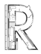 Bordeaux, France-based designer of Architectural Ground Plan (2015, a typeface based on architectural drawings), Alphabet Modulaire (2015, based on intersections of circles) and the beautiful geometric experimental Alphabet Cyrillique (2014). Behance link. [Google]
[More] ⦿
|
yrmk (was: Youremin)
[Joel Santos]

|
Type foundry located in Lobão, Santa Maria da Feira, Portugal, run by Joel Santos (b. 1988, Porto, Portugal). Designer of Rounded Teen (2008, a very round and fat version of VAG Rounded), Rosley (2008, a decorative modern face), Simples (2008, hairline architectural sans), and Hausi Hausi (2008, experimental). MyFonts link. [Google]
[MyFonts]
[More] ⦿
|
Yuliya Prokharava
|
Graphic designer in Vilnius, Lithuania, who created Architectonic (2012), a typeface inspired by architectural design. [Google]
[More] ⦿
|
Zachary Cashion
|
Florida-based designer of the geometric / architectural typeface CS (2015). [Google]
[More] ⦿
|
Zaid F. Sbeitan
|
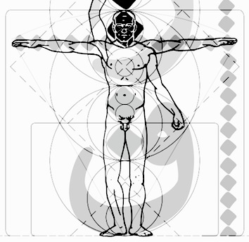 Architect / designer in Frankfurt am Main, Germany. Most of his artistic work, including his typefaces, show his architectural background. Typefaces include Geo Arial (2013-2014), which is Arial modified to make it more geometric and logical. Designed in Autocad, it is advertized as a typeface for architects. [Google]
[More] ⦿
|
Zelow Type (was: Khaiuns)
[Khair Unnas]

|
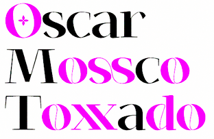 Kecamatan Syiah Kuala, Banda Aceh and/or Jakarta, Indonesia-based type designer (b. 1997). Creator in 2019 of Good Morning (script), Barokatt, Lamender (a signature font), Efothryo Script, Auro Rumpthut (a hairline signature font), Yasmin, Hello Fhillya, Jalitta (wild calligraphy), Lihataja Brush, Lamender (signature script), Meurandeh, Lettyh (script), Appenzell (monoline script), Pasa Baroe (font duo) and Bineh Gunong.
 Typefaces from 2020: Woonder (an inky script), Sattin (a grungy font duo), Glora Sans (a fun casual sans in six styles), Lovtony (a free font duo), Mightam (a thin script), Gatha (script), Loffers (calligraphic), Kallem (wild calligraphy). Typefaces from 2021: Zt Sigata (a 6-style sans and serif experimental hybrid), Bolkit (a 9-style display serif), Mudzil (a curious 12-style slab serif), Raylig (a ten style display serif), Molika (an architectural blueprint font), Virzo (a daring and dynamic fashion mag typeface), Kolligio (an artsy ligature-rich display serif), Mukbeng (signage script). [Google]
[MyFonts]
[More] ⦿
|
Zichun Wang
|
American designer of the modular display typeface Architecture Time (2017). [Google]
[More] ⦿
|
Zijiang He
|
London-based graphic designer who designed the 3d Architecture font in 2012. Behance link. [Google]
[More] ⦿
|


 Architect and designer in Banda Aceh, Indonesia, b. 1980, who set up Grayscale, then 38 Lineart, and finally
 2013:
2013:  Southampton, UK-based foundry, est. 2006. Font families include Regalese (2008, 8 weights with stylish rounded serifs), Arrow Heaven (2007, 6 styles of fonts with 62 arrows in 40 orientations each), Lydiard (2007, sans cum comic book), Demigrunge (2007), Nidex (2007, caps-only grunge), Rocksolid (2007),
  Brazilian designer (b. 1997) based in Bairro Manoel Satiro. As an architecture student at Universidade de Fortaleza, he created the blueprint / architectural drawing font Adalbs (2021). [
 [
[
 Architect, designer and photographer in San Fernando, Spain. In 2013, he designed the pair of avant garde typefaces
  [
[ Modern American design pioneer (b. 1915, Denver, CO, d. 1955), known for his books, graphic design, interior and architectural design, and typefaces. Lustig studied design at Los Angeles City College, Art Center, and independently with American architect Frank Lloyd Wright at his Taliesin studio and French painter Jean Charlot. He began his career designing book jackets in 1937 in Los Angeles. In 1944 he became Director of Visual Research for Look Magazine. He also designed for Fortune, and Girl Scouts of the United States. The Rochester Institute of Technology maintains an Alvin Lustig Collection.
  The American Technical Society published
  Vilnius-based designer of
  [
[ [
[ [
[ Annemarieke Kloosterhof was born and grew up in The Netherlands. In 2012 she started her graphic design studies at Central Saint Martin's University of the Arts in London. During her studies, she created Alphabet for Architects (2014).
  [
[ [
[ Mexico City-based designer, b. Huauchinango. He studied graphic design at Universidad del Valle de Mexico in Queretaro City, and received a diploma in corporate identity from LISAVA in Barcelona in 2005. He opened his own graphic design studio in Mexico City in 2016.
  [
[ Auckland, New Zealand-based designer of the compass-and-ruler typeface Parti (2014). This great typeface was developed during his studies at AUT. It was influenced by architectuiral lettering. [
 Archiness is a foundry, est. in 2009 in Delft, The Netherlands, by
  Andrew Footit (b. 1984) runs his own type foundry in Johannesburg, South Africa. He is also known as Arkitype. Until 2014, his type studio was called Virtue Creative and before that, Virtue84. In 2017, he set up
 Design studio in Gijon, Spain, set up by Asturian designers Raul Garcia del Pomar and Ismael Gonzalez. One of them studied graphic design in Salamanca. Atipo produced the donationware typeface
  Berlin-based type foundry run by Ralph du Carrois and Anja Meiners. Their friends are Jenny du Carrois, Natalie Rauch, Mark Froemberg, and they cooperate with Erik Spiekermann, FontShop, Monotype, (URW)++, Adam Twardoch, Alphabet Type, Okan Tustas, The Fontpad, TN Typography, Mota Italic, Akaki Razmadze, Hasan Abu Afash, Fontef, Lettersoup, and Thomas Maier. As of 2018, their typefaces include:
  Glasgow-based graphic designer. He made the refined and architecturally-inspired
  German type designer (b. Offenbach, 1905, d. London 1989), who studied under Rudolf Koch from 1924-27 at the Kunstgewerbeschule in Offenbach. With the help of Stanley Morison, he emigrated to England in 1935 because of his Jewish background. Wolpe taught at the Camberwell College of Art (1948-53), at the Royal College of Art in London (1956-75) and at the City&Guilds of London School of Art (from 1975 onwards). From 1941 until 1978, he worked as a book designer for Faber&Faber in London, designing over 1500 book jackets. He published Schriftvorlagen (Kassel 1934), Marken und Schmuckstücke (Frankfurt am Main, 1937), A Book of Fanfare Ornaments (London, 1939), Renaissance Handwriting (with A. Fairbanks, London 1959), and Architectural Alphabet. J. D. Steingruber (London, 1972). Designer of
  Here is what Beta Field is, in their own words: Beta-field is an interdisciplinary design/research office with a multimodal approach to practice. Our work includes buildings, landscapes, environments, installations, exhibitions, texts, design workshops and research projects. With backgrounds in architecture, industrial design, landscape architecture, and exhibition design, along with experience working as researchers, designers, and educators, we developed a view of design practice that operates through various modes of inquiry, development, and production. We focus not only on the built environment, but also on the effects of design on knowledge, technology and culture.
  UK-based designer of
  Blambot Comics Fonts was founded in 1999 by graphic designer and illustrator, Nate Piekos, and is located in East Providence, RI.
  [
[ Kiwi architect (1926-2004) who made a font called Wedge. This font was
  [
[ Pasco WA-based designer of Papaya Caps (2017), a technical writing font in the Tekton genre.
  Medellin, Colombia-based designer (b. 1972) who graduated from UPB University in 1998. Creator of the free hand-printed typefaces Astrid (2012), Yelly (2006),
  Wolgast-based type designer Peter Wiegel (b. 1955) runs CAT Design Wolgast. Designer of these free fonts:
  Born in Karlstad, Sweden, in 1952,
  [
[ Christian Pannicke (Christian Jung) is a typeface designer and art director based in Berlin. His typefaces:
  Christian Schwartz was born in 1977 in East Washington, NH, and grew up in a small town in New Hampshire. He attended Carnegie Mellon University in Pittsburgh, Pennsylvania, where he graduated in 1999 with a degree in Communication Design. After graduation, he spent three months as the in-house type designer at MetaDesign Berlin, under the supervision of Erik Spiekermann. In January 2000, he joined Font Bureau. Near the end of 2000, he founded
  Born in Los Altos, CA, Christopher Slye studied art history at the University of California at Santa Cruz and worked as a graphic designer until joining the type group at Adobe in 1997, where he assisted with the design and production of Adobe's type library. He was involved in the creation of Adobe's OTF fonts, and had a hand in both
  Manuel Eduardo Corradine Mora was born in Bogotá in 1973. He graduated from the School of Graphic Design of the National University of Colombia in 1996, and became a graphic designer. He started by custom-designing fonts and by making typefaces for his own company, Casa Papelera El Cedro (The Cedar Papermaking House), for printing invitation cards. With other designers like Carlos Fabián Camargo, John Vargas and César Puertas he formed Tipográfico in 2007 to strengthen the type discipline in Colombia.
  Florent Courtaigne graduated in graphic design - ENSAD / Art Décoratifs de Paris. He founded created Cubo Fonts in 2008, and works as a graphic designer and drawing teacher in the LISAA Design School in Paris. Now a graphic designer, illustrator and art director based in Paris, Florent Courtaigne is the creator of the free circle arc and straight-line fonts Cyclo and Cyclo Bold (2006).
  [
[ Canadian type designer. His typefaces:
  [
[ Multimedia designer, creative consultant, a brand and identity designer in Saint Cergue, Switzerland, b. 1983. He runs (ran?) a brand design company called
  Educated at Stanford (M.Sc. in digital typography in 1985 under the supervision of Donald Knuth and Charles Bigelow) and before that at the University of Colorado at Boulder (undergraduate math degree in algorithms under Hal Gabow). Type designer. Creator of these architecturally-inspired type families:
  Seoul, Korea-based designer of these display typefaces: Constellation (2015: connect-the-dots style), Zedo (2015: architectural), Maze (2015: pixelish), Angle (2015), Radioactivity (2015: dingbat font), Hangeul (Korean). [
 Yogyakarta, Indonesia-based creator (b. 1987) of the counterless architectural lettering typeface
  Istanbul-based designer of Ch. Vladica (2014), which was inspired by the name plate of architect Ch. Vladica from İstanbl---it was created during Dilara's studies. Dikara also designed the cury paperclip typeface Naturel (2014).
  Yogyakarta, Indonesia-based designer (b. 1990) of these script typefaces in 2018: Radicalis (script), Blacktail (layered, spurred, Western), Aniyah (formal calligraphic script),
  Darcy Baldwin (DJBFontography) is the Texas-based designer of these handwriting typefaces in 2007: DJBABITOFFLAIRE, DJBADEE1, DJBAMANDAG, DJBANGELA, DJBANNALISE, DJBANNETTEscript, DJBCHERE, DJBCHRISTINEC, DJBCINDA, DJBCINDAs, DJBDAWN, DJBDOODLEDOO, DJBELIZABETHK, DJBELKE1, DJBEMILYS, DJBEuroscript, DJBGINAE, DJBGISELLA, DJBJANELLE, DJBJANINE, DJBJENB2, DJBJENNA, DJBJENNIFER, DJBJENNIFERscript1, DJBJOAN, DJBJOYscript, DJBKATHERINE, DJBKATRINE, DJBKEELYB, DJBKEELYBscript, DJBKELLEY, DJBKENNAscript, DJBKIRA, DJBLINDSE1, DJBLINDY, DJBLIZ, DJBLORRAINE1, DJBMANDY, DJBMEGAN, DJBMETA2, DJBMISH, DJBMichael, DJBPOOKIEDOO, DJBRITA2, DJBSOFEE1, DJBTABITHAscript, DJBWENDY, DJBWENDYPscript, DJBWRITESALOT. In 2008, she made DJB Treasure Hunt, DJB Curlie Wurlie, DJB 2Cute4U, DJB Heart of Dixi. Fonts made in 2009: DJB For Annie, DJB Sloppy Joe.
  [
[ FontStructor who made the grotesk typefaces CanPicafort (2011), canPicafort Mono (2011) and Mono Grossa (2011), and the high-contrast headline typeface
  [
[ Designer at FontStruct in 2008 of Waffle, Nice Shot (target alphading face),
  San Salvador, El Salvador-based illustrator. Designer of the oriental simulation typeface La Oriental (2018), the casual typeface Cipote (2018), the wide sans typeface Draper (2018), the fat display typeface Hornet (2018), the free athletic lettering font Varsity Team (2018), the free all caps comic book typefaces Benja (2018) and Sivar Regular (2016), the fat rounded sans Yeyey (2016, kawaii-inspired), the rounded sans typeface Lola (2016), the display typeface Contrastes (2016), and the free cartoon font JuanMikes (2016). Typefaces from 2017 and 2018: Castillo (
 [
[ Designer in Quezon City, The Philippines, who created the stunning constructivist / architectural typeface
  Type foundry in München run by independent designer Antje Driemeyer, a graduate from the University of Applied Sciences Augsburg, Faculty of Design in 2004. Antje specializes in type design, corporate design and editorial design.
 Graphic designer in Bay City, MI. In 2011, he designed a type family called
  Russian civil engineer with experience in technical drawing and graphic design. His typefaces:
  Born in 1977, Emilie Rollandin, an architect, lives in Val d'Aosta, Italy. Her company is Studio Archistico. She created the sketched typeface
  During his design studies in Beirut, illustrator and graphic designer Eric Massoud created the Treefrog-style typeface
  [
[ Designer of HandDrawn Cute Funky (2016), Glitch (2016), Glossy Golden Metal (2016), Black Newspaper Letters (2016), Colorful Newspaper Letters (2016, ransom note font), Isometry (2016), Hand-Drawn Dirty Ink Font (2015), Lighting Bulb Pixel (2015) and Retro Type Grunge Font (2015). In 2016, he published Bright Red Neon Letters, Bright Realistic Neon Letters (vector format), Decorative Red Font (EPS format) and Transparent Letters With Long Shadow (vector format).
  American graphic and type designer who made
  Yogyakarta, Indonesia-based designer, b. 1977, of the script typefaces
  Madrid-based designer of a display typeface called Madrid (2014), which was inspired by the wiremesh architecture of Palacio de Cristal. [
 [
[ Richard Keijzer is the Dutch designer of many art deco typefaces that are often based on typefaces found on buildings or in Dutch publications, reviving styles known as Dutch deco from the 1920s and 1930s. Starting in 2021, his typefaces will have the prefix RAK. Most of his fonts are free:
 FontMeister is the commercial foundry of
  American architect, artist and designer, b. Richland Center, WI, 1867, d. Phoenix, AZ, 1959. He was associated with the Arts and Crafts movement. His lettering inspired many to create typefaces based on them. The Frank Lloyd Wright museum is near the University of Chicago. He lived in Oak Park, IL, two blocks away from Luc Devroye's daughter.
  West Coast architect whose book Architectural Graphics (1975) made a big splash. His lettering in that book was at the basis of David Siegel's
  [
[ Fwis is a graphic design group in Portland, Cupertino and Brooklyn. One of its art directors is Chris Papasadero. As a sideline, they will design an occasional font.
  GalloFonts is part of Graphics by Gallo, founded in 1974 by
  Kent, UK-based designer of the architectural typographic poster Top Tech (2017). [
 [
[ [
[ Lahore, Pakistan and/or London, UK-based designer of Contour (a titling sans), Chubby (2019), the free display sans Linicircle (2017), the free rounded sans typeface Roudge or Wasey E (2019), the modular typeface Bract (2019), the copperplate serif Billag (2019), the color font Taster (2019), Zonta (2019), the techno or architectural lettering font Italichno (2018), the geometric shape fonts Shape (2019) and Shape Out (2019), and the semi-stencil typeface CoolCut (2019).
  German animation artist who lives in Southern California where he works for Disney Feature Animation. He is a member of the Academy of Motion Picture Arts and Sciences. His typefaces were mostly made at Agfa-Monotype:
  [
[ Harold Lohner was born in upstate New York in 1958. He received an MFA in printmaking from the University at Albany and is Professor of Visual Arts at Sage College of Albany. He began making fonts in 1997 and starting distributing them the next year through Harold's Fonts. He lives in Albany, NY, with his partner, Al Martino. Originally, most of his typefaces were freeware or shareware, but gradually, he started selling most on his site or via
  [
[ Born in 1970 in New York, Jonathan Hoefler ran the
  Foundry located in Yorkly, DE. House Industries is run by Rich Roat and Andy Cruz with designer Ken Barber as Typography Director. Originally founded in 1993 by principals Andy Cruz and Rich Roat, House Industries has grown into a studio which sells unique display typography, illustration and design services, and, most recently, clothing and accessories. Fonts sell for 50 USD per face, and about 175 USD for ten. Many of the typefaces are grungy or special effect fonts, and all font names have the word "house" in them, as in the graffiti font Phathouse. Custom font service available.
  House of Burvo is the UK-based foundry of
  Graphic designer in Lille, France. Codesigner with Adrien Coquet of the rounded monoline display sans semicircle-patterned typeface Slot (2015:
  Walter Bernard "Ben" Hunt (b. 1888, Greenfield, WI, d. 1970) was an American artist, outdoor educator and author. His books covered native American arts, woodworking, scouting, pioneering, jewelry making, metalworking, and calligraphy. Quoting wikipedia: Hunt was born in Greenfield, Wisconsin and grew up in a log cabin. He attended Milwaukee's South Division High School, but did not graduate, dropping out to become lithographic engraver at the Bruce Publishing Company. Hunt moved to Hales Corners, Wisconsin with his wife, Laura, in 1920. In 1924, Hunt, along with his father-in-law and his brother, Edwin C. Hunt, built a log cabin behind his home. The cabin, a 16x28-foot structure, made of tamarack logs, was the subject of Hunt's first article, How We Built Our Log Cabin. During the late 1930s, Hunt began to study the work of Native American artists. As part of his research, Hunt met with artists and leaders such as Nick Black Elk, Frank Smart (or Chief Gogeoweosh), and James F. "Buck" Burshears. Hunt shared his knowledge of "Indian lore" with Milwaukee's boy scout leaders and, in 1942, Hunt started writing articles for Boy's Life. He became a regular member of its staff, ultimately writing over 1,000 articles. Hunt's work for Boy's Life, led him to serve on the staff of the National Boy Scout Jamboree in 1950, 1953, 1957, and 1960.
  Mexican designer of the architectural Tekton-style lettering font
  UK-based designer of
  Warrenton, VA and Washington, DC-based designer in 2015 of Bitcraft, Tokyo Typeface (inspired by inkan seals), Pixel Patterns, Flight (dot matrix typeface), Hand Drawn Arrows, Hype (techno), Galaxy (techno/futuristic), Fluffy, Detective (typewriter font), Funky (hand-drawn font), Hacker (a cyber typeface), Yeti (handcrafted) and Game Over (video game font).
  Swiss organization which in the type world is best known for its simple monoline rounded typeface Isonorm proposed in 1980. The font is appropriate for drafting and architectural purposes, as well as for technical charts and graphics. This typeface was digitally implemented by many, including:
  Talented lettering artist, calligrapher and type designer in Volgograd, Russia, who graduated from BHSAD in Moscow in 2014. Ira's typefaces include Stuff (2014), Filum (2014, thin, techno face), Koolhaas (2014: inspired by architect Rem Koolhaas; renamed Gebouw), Staket (2014, a war movie font), Bodler (2014, named after Charles Baudelaire, this inky calligraphic typeface is exceptionally beautiful). All fonts cover Latin and Cyrillic.
  [
[ [
[
 In 2014, Jérôme Bruley was studying design in Lille, France. In that same year, he created a Bauhaus-style typeface called LMVDR, which is named after Mies Van Der Rohe, architect and director of the Bauhaus school, on who's work the font is based. In particular, the piano key glyphs are inspired by the German Pavillion in Barcelona (1929). He also created Sail Font (2014) and the
  [
[ [
[ This is a
  [
[ [
[ London-based creator of
  Type designer who worked at Adobe from 1989-2002 and for Monotype from 2003 until today. His typefaces in chronological order:
  Designer of the experimental typeface Ascend (2016). He explains: The concept of Ascend is inspired by the visual appealing of topography and Zaha Hadid's architecture. Ascend adapted Zaha Hadid's concept of parametric design.
  During his studies at IED in Firenze, Italy, Joao Pucci, who hails from Brazil, designed
  Born in Bedford, IN, in 1959,
  Born in 1951,
  [
[ [
[ [
[ Toledo, Spain-based creator (b. 1984) of the heavy octagonal sci-fi typeface
  Born in 1989, Jorge lives in La Paz, Bolivia.
  Aka Josema Uros. Self-taught programmer in Barcelona, b. 1956, who set up the type foundry Type-O-Tones in 1992. He is also involved in
  [
[ Rovaniemi, Finland-based type designer at
 Lyon, France-based designer (b. 1977) of these typefaces:
  Roman Korolev (Kaer, Vologda, Russia) designed the wood stick brush typeface WoodStick in 2016.
  While studying towards a BA Graphic Communications at University of Creative Arts Farnham, UK, Kane Garland (London) created the compass-inspired all-caps typeface Artkitec (2014). [
 Wundertype is a foundry set up in Bangkok in 2020 by Kawisara Vacharaprucks, a Thai type designer who published at Stawix Type foundry before 2020. His first typeface at Stawix was
  [
[ [
[ Graphic designer and illustrator in Lille, France, who created the display typeface Apparence (2015) and the rounded bold display typeface Sable (2015).
  [
[ Born in Missouri in 1979, Kimberly moved first to Texas and later (in 2007) to China, and most recently, to Orlando, FL. She made some free fonts (often handwriting styles), and also ran a personal handwriting font service [those fonts have names that start with KGD].
  David Kloeg is a designer and student of architecture. He has been working for several architecture offices since 2012. David graduated from the University of Technology in Delft, the Netherlands. His company, Kloeg Architecture (est. 2015, in Australia(?)), is involved in building and type and icon design. In 2016, David started a Masters degree in architecture at the University of Liechtenstein. He lives in Vaduz, Liechtenstein.
  [
[ [
[ Design studio, est. 1999 in Riga, Latvia. They are doing some
  [
[ Moscow, Russia-based co-designer, with Vladyslav Boyko, of the
  LGF fonts is the foundry of Manuel Lage Novo, a Galician type designer in La Coruña, b. 1970. He inherited the Richard Gans collection.
  Jake Luedecke (LDF Fonts, or Luedecke Design Font Co) (b. 1999) is the Dallas, TX-based creator of preponderantly hand-printed and pixel typefaces. These include:
  Type foundry in the United Staes, run by lettering artist Jessica McCarty, which specializes in hand-drawn, pen-drawn and hand-printed typefaces. In 2017, she co-founded
  [
[ In July 2017, Typoasis / Moorstation shut down. Run by Petra Heidorn out of Hamburg, Germany, it hosted her own fonts, as well as those of the popular and talented type designer and artist
  [
[ [
[ Based in Valencia, Spain, and born in Madrid in 1969, Manuel Ramos is the creator of these free and commercial typefaces in 2012: Astralia (oblique monoline sans),
  [
[ Design student in Hoofddorp, The Netherlands, whose first font is the high-contrast art deco typeface
  During his studies at Norges Kreative Fagskole in Trondheim, Norway, and at Solent University, Southampton, UK, Marcus Lien Gundersen designed these typefaces:
  [
[ Mark Simonson Studio is located in StPaul, MN. Mark founded Mark Simonson Studio around 2000, and describes himself as a freelance graphic designer and type designer. From
  [
[ [
[ [
[ [
[ Born in Durban, South Africa, in 1947, Merle Scholtz specializes in designing African and Indian ethnic patterns and logos. Her work with ethnic patterns began as a result of her fascination with, and collection of, ethnic African masks and beadwork. Together with Anton Scholtz, she runs
  Simon Bent from Melbourne (
 Designer at Letraset of
  Born 1964 in Detmold (East Westphalia/Lippe, Germany), Michael Herold did his undergraduate studies in communication design at the Muthesius Fachhochschule für Gestaltung from 1986 until 1991. Since then, he is a freelance designer in Itzehoe (Northern Germany).
  San Salvador-based designer (b. 1985) of the thin slab typeface
  During his studies, Oulu, Finland-based Mika Hautamäki designed the mini-serifed Latin / Cyrillic / Icelandic headline typeface Pyramiden (2016) and thin architectural sans typeface Arkkari Light (2016). [
 [
[ Miranda Roth graduated from Daemen College (Buffalo, NY) and joined P22 as an in-house type and graphic designer. Creator of these typefaces:
  Mischa Herzog completed architectural studies at Vienna University of Technology. Since 2007, he is a designer and project leader with Buero Bauer In 2021, Erwin Bauer, Mischa Herzog and Daniel Schaffer co-designed
  Japanese designer of the quite interesting
  Zurich-based graphic design studio that often work for art and architecture clients. It is run by Marc Kappeler, Markus Reichenbach and Ruth Amstutz.
  [
[ Gary Munch (born 1953) is the Stamford, CT-based principal of MunchFonts. He teaches at Norwalk Community College and at the University of Bridgeport Shintaro Akatsu School of Design.. His typefaces:
  Nasri Khattar (1911-1998) was an architect and designer who studied at the American University of Beirut and the Yale School of Architecture, where he obtained an MA in Architecture in 1940. He worked with Frank Lloyd Wright in Spring Green, WI, and Scottsdale, AZ. In 1947, he submitted his
  [
[ [
[ [
[ Ivan Phillipov (Neogrey, also written as Ivan Filipov) has offices in Plovdiv, Bulgaria and Turkey. He designed the techno typefaces Research Remix (1993), Neogrey (2004) and Red October (2004, inspired by Soviet poster art; can be used for Cyrillic simulation; followed by
  Stefan Gandl was the designer at
 [
[ Typefaces made by Nick Curtis from 2011, not listed elsewhere on these pages:
 Nor Eddine Bahha (jazz pianist, composer, copyist, researcher and teacher at "The Karawen Music School" in Morocco) designed the NorMusic fonts in 2005. This is a set of jazz music fonts with a handwritten look designed to work with Finale, Sibelius, Overture, Mozart, NoteWorthy Composer and Encore/MusicTime Deluxe. He coauthored
  [
[ Koprivnice, Czechia-based designer, b. 1989, Bilovec, Czechia. His typefaces include
  Free software project based in Belgium and run by four people (and I quote from their web page):
  Outside The Line Fonts was founded by
  Type designer at Canada Type.
  Santiago de Chile-based creator of
  Fontstructor who made the architectural typeface
  [
[
 Freelance graphic designer in Grottaglie, Italy. Stones inspired Pierfrancesco Annicchiarico to design the experimental typeface Secco (2009). The Cà brùtta building by Giovanni Muzio in Milan got him to design the
  Dutch designer, b. 1885, Zaandijk, d. 1977, Wassenaar. Author of Cable Book (1925) and creator of many classic advertisements for the Netherlands Post Office (PTT). His work was influenced by Hungarian De Stijl artist Vilmos Huszar and Dutch architect Jan Wils, whom he met when he moved in 1913 to Voorbug. Wils had worked for Berlage. In 1913-1914, he studied at TU Delft and started his career with Berlage in Voorburg. From 1919 until 1922 he worked for Wils. In 1959, he received the Quellinus Prize in typography. The David Roellprijs followed in 1964. In 2000, Zwart was posthumously awarded the "Designer of the Century" award by the Association of Dutch Designers. From 1919 until 1933 he taught at the Rotterdamse Academie van Beeldende Kunsten en Technische Wetenschappen.
  Free original designs, often with a science fiction feel, by Neale Davidson (b. 1971). Does some custom font work.
  Download the following beautiful handwriting and handprinting fonts made by Mexican designer Kemie Guaida, who lives in Helsingborg, Sweden: Balderas (2002), BlackoutSans (2001), BlackoutSerif (2001),
  Letterer, open source supporter, and visual designer from Russia (b. 1988) who is based in San Francisco. Graduate of BHSAD (the British Higher School of Art and Design) in Moscow, class of 2013. She founded Popkern. Her typefaces:
  [
[ [
[ Architect who studied at Universidad Austral de Chile (Valdivia, Chile), who co-founded
  [
[ [
[ Rick Valicenti was born in 1951 in Pittsburgh, PA. After working for The Design partnership in Chicago, he founded R. Valicenti Design in 1981. Later, in 1989, he founded Thirst/3st, an internationally recognized design firm. The type design section of Thirst is Thirstype. Rick Valicenti is based in Barrington, IL. The White House honored Valicenti in 2011 with the Smithsonian Cooper-Hewitt National Design Award for Communication Design. In 2006, he received the AIGA (American Institute of Graphic Arts) Medal, the highest honor of the graphic design profession, for his sustained contribution to design excellence and the development of the profession.
  Ralph M. Unger (b. 1953, Thuringia, East Germany) says this about himself at
  [
[ [
[ British architect actve ca. 1900, known for his
  Roman Chernyshev (Ariy Design) created the vector format typeface Engineer Technical Vector Font (2016). [
 Ruben Tarumian, aka Ruben Hakobyan (b. 1963, Yerevan), is an Armenian architect and font designer, and son of architect Khachatur Hakobyan. In 1985 he graduated from the Faculty of Architecture and Construction of Yerevan Polytechnical Institute. He started designing typefaces in 1986. In 1989 he created one of the first computer fonts in Armenia, for Xerox Ventura Publishers. Since 2006 he is the chairman of NGO "Association of Type Designers".
  Clemson, SC-based designer of Partridge-Thin (1994),
  German photographer based in Karlsruhe and Trier. Creator of the simple architectural drawing typeface
 Dave Nalle was born in Beirut in 1959, but lives and works in Texas. He is currently in Manor, TX. From his
  Sea Types is the partly free partly commercial type foundry of Jefferson Cortinove (artist, designer, teacher, sailor and wine maker) and publicist Márcio Duarte in Florianopolis and Marilia, Brazil, est. 2007. Their initial typefaces include
  [
[ Bratislava-based type and graphic designer (b. 1984, Czechoslovakia). He graduated from AFAD Bratislava, and in 2009 from the
  Philip Trautmann (Phitra Design, b. 1996) is the Düsseldorf, Germany-based founder of Phitra Design in 2016. He renamed the foundry Shaped Fonts and was joined by Christoph Dörre and Nora Bruckhoff.
  [
[ About 30 free original truetype fonts by Athens, Greece-based Dimitris Kolyris (b. 1973), half of which are grungy in style: Hip Priest (2016), Raw Macro (2016, architectural or blueprint style), Glasnost (2010), Victor Vector, Slang King (2003), Datatrash, DataTrash2, Ziperhead, CRAMPED,
 Their early fonts were renamed and had the attribute Serial in the name. Samples of some of these fonts/families:
  Additions in 2010:
  Dover Press sold Oakland's
  Istanbul, Turkey-based designer (b. 1993, Bandirma) who studied fine arts at Marmara University and set up his own commercial type foundry in 2014. Creator of the free poster font Bakunin (2014: Regular, Outline, Stencil), which is named after anarchist philosopher Mikhail Alexandrovich Bakunin.
  [
[ During her studies at Nottingham Tent University in the UK, Steph Marlow designed Beton Brut (2016), a semi-square rounded architectural sans serif typeface inspired by the Barbican centre in London. [
 Stephen French (Crosscut Media Productions) is based in Richmond, VA. He studied at VCUarts (class of 2021). Designer of these typefaces:
 Studio Feed (or: Feedtype) is a Montreal-based studio, est. 1999. Its typefaces:
  Mehmet Abaci (b. 1978) is based in Istanbul. In 2014, he established Studio Typo, where one can buy his typefaces. Limited forms of the fonts can be downloaded fpr free from the Dafont site.
  Alejandro Paul's Argentinian foundry is called Sudtipos. Veer writes about Paul: Alejandro Paul is one of the founders of the Sudtipos project, the first Argentinian type foundry collective. He taught graphic design and typography at the Universidad de Buenos Aires from 1996 until 2004 and has worked as an art director in prestigious Argentina-based studios, handling high-profile corporate brands such as Arcor, Marta Harff, Morph, SC Johnson, Danone and Movicom. He has walked away with awards from several design competitions. In 2003, he began working with artist Angel Koziupa, designing fonts and lettering for several top packaging agencies. In 2006 he was a speaker at TMDG06, the largest Latin American graphic design event - more than 4,000 designers were in attendance. His work has been featured in publications around the globe, including Step and Creative Review. He has walked away with awards from numerous design competitions. He has received two Type Directors Club TDC2 awards, in 2008 for
 Dhaka, Bangladesh-based designer, who created the cursive script typeface
  Tabular Type was set up in the United Kingdom by Toshi Omagari. In 2019, he designed
  Designer in Bangkok, who runs Tabby Design. He made the experimental geometric typeface
  The Northern Block (TNB) is Jonathan Hill's foundry based in Leeds and/or Sheffield and/or Newcastle, UK, est. 2006. The designer and funder is
  Typefaces from 2011:
  American type designer, born in Rochester in 1966, who has worked for various foundries including Monotype. He graduated from the Rochester Institute of Technology. He lives in Madison, WI, and is currently employed by Monotype, after a short period at Ascender. He co-designed a revival of W.A. Dwiggins' beautiful
  Scientific lettering expert, 1871-1944. His book
  Thomas Perrin obtained a BAC Scientifique, Sciences de l'ingénieur (option Art) from the Lycée des métiers de l'audiovisuel et du design Léonard de Vinci, Villefontaine. From 2011 until 2012 he is studying at DNAP in the Ecole des Beaux arts of Besançon.
  Tiny Type Co. was established by Dutch graphic and type designer Robin Mientjes in 2016, in Oslo, Norway. Robin writes about herself: Robin Mientjes is a genderqueer feminist type designer, with an obsession for baking, cooking, and thoughtful graphic design. She's been designing for print and web for fifteen years, and studied at the KABK. Her typefaces:
 Tim Drabandt (Type Machine, located in Minneapolis, MN) is the designer of Eighthourday (2009, a commissioned sans face), Airborne (2009, octagonal typeface based on WWII airplane lettering),
  Andrew Walsh (TypeTrough) is the Kiltimagh, Mayo, Ireland-based creator of a mechanical ornamental caps typeface called
 Ray Larabie (b. 1970, Ottawa, Canada) ran Typodermic in Mississauga, ON, which opened in the Fall of 2001. In 2006, it moved to Vancouver, BC, and in 2009 it moved on to Nagoya, Japan.
  Milan, Italy-based design group that published these fonts, which unless mentioned otherwise, are all by Cagil Aygen, a Turkish graphic designer (who is also based in Milan):
  During her studies in Singapore, Veronica Yap created Planr (2014): Planr is typeface inspired by Singapore's housing system (HDB) and blueprints. As the name suggests, it is a planar view of living spaces. The inner designs includes home, garden and pool plans. [
 For a school project at College of Art, Chandigarh, India, in 2015-2016, Vibha Jindal designed Kairos, a Latin typeface that is inspired by ancient Greek architecture. [
 Foundry of
  Scott Carsdale (Voice Design) is the Australian designer of Letraset Globale (2001, a sans in six styles). In 2006, he made the gorgeous hand-printed typefaces
  Italian designer who set up his own studio, Raptus, in 1993. Creator of the dingbat font
  Gert Wiescher was born in Braunsbach am Kocher, Germany, in 1944. Based in München,
  Serif:
  Pennsylvanian designer of fonts at Garagefonts, including the Livery family (2000) and Spring Creek (2002). At
  Located in Worcestershire, England. Designer in 2005-2006 of the free fonts 10000, 10000Outline, ArtisticText, HouseBricks, HouseBricksOutline, BUILD3D, CHESS3D, Chronicle, ChronicleTextDocument, ChronicleTextLozenge, ChronicleTextOutline, ChronicleTextSublozenge, ChronicleText, FontofSpaces, ForSupermarketWallSigns, GalileoLetteringEnamelled, GalileoLetteringGilding, GalileoLettering, GalileoLetteringMosaic, GalileoLetteringSubmosaic, GothicSplendour, Invention103, PaperSimulation, PixelPolka, PixelPolkaOutline,
  Robby Woodard is the Fresno, CA-based designer of fonts at
  This graphic design firm in Westlake, Oregon makes original fonts. Through
  French type designer (b. 1977), who studied graphic design in Paris as well as calligraphy and typography at the Scriptorium de Toulouse. From 1999 to 2001, he worked as a type designer in a packaging design agency. He collaborated with Ladislas Mandel on Renaissance writings. Since 2001, he lives at least part of the time in Asia. During this period, he designed Latin and Khmer typefaces for NGOs in Cambodia, for example. On his web site, he says that he enjoys full freedom in his work. When he is not designing typefaces, he spends time in nature or prepares vegetarian food and pastries. His work was
  During his architecture studies at Indian Institute of Technology Roorkee (India), Yash H. Bharani designed the
  Bordeaux, France-based designer of Architectural Ground Plan (2015, a typeface based on architectural drawings), Alphabet Modulaire (2015, based on intersections of circles) and the beautiful geometric experimental Alphabet Cyrillique (2014).
  Architect / designer in Frankfurt am Main, Germany. Most of his artistic work, including his typefaces, show his architectural background. Typefaces include Geo Arial (2013-2014), which is Arial modified to make it more geometric and logical. Designed in Autocad, it is advertized as a typeface for architects. [
 Kecamatan Syiah Kuala, Banda Aceh and/or Jakarta, Indonesia-based type designer (b. 1997). Creator in 2019 of Good Morning (script), Barokatt, Lamender (a signature font), Efothryo Script, Auro Rumpthut (a hairline signature font), Yasmin, Hello Fhillya,