|

|

|

|
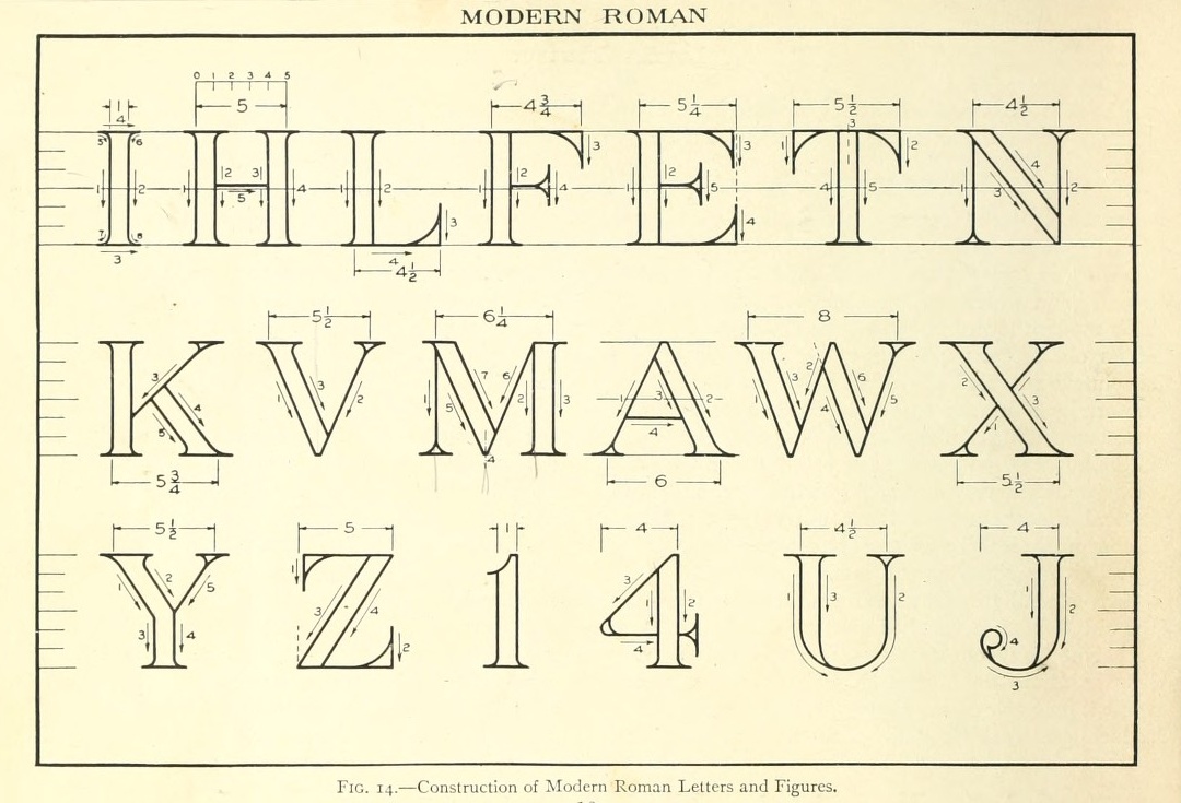
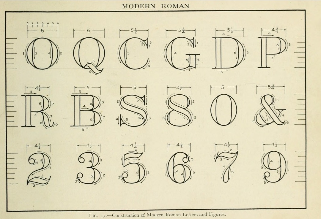
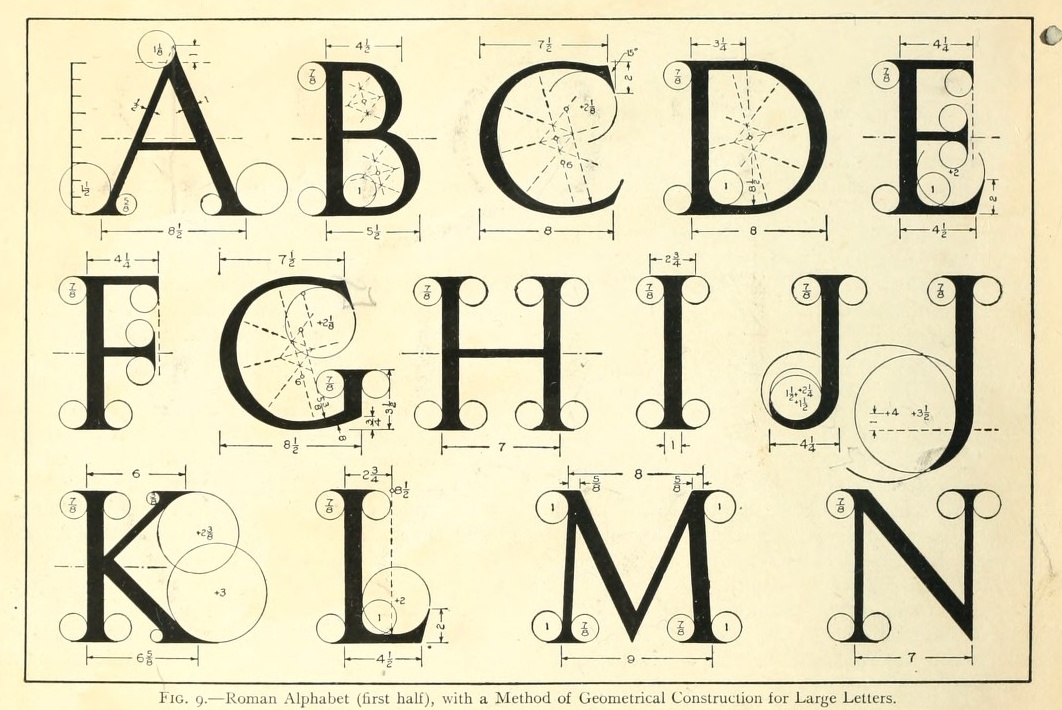
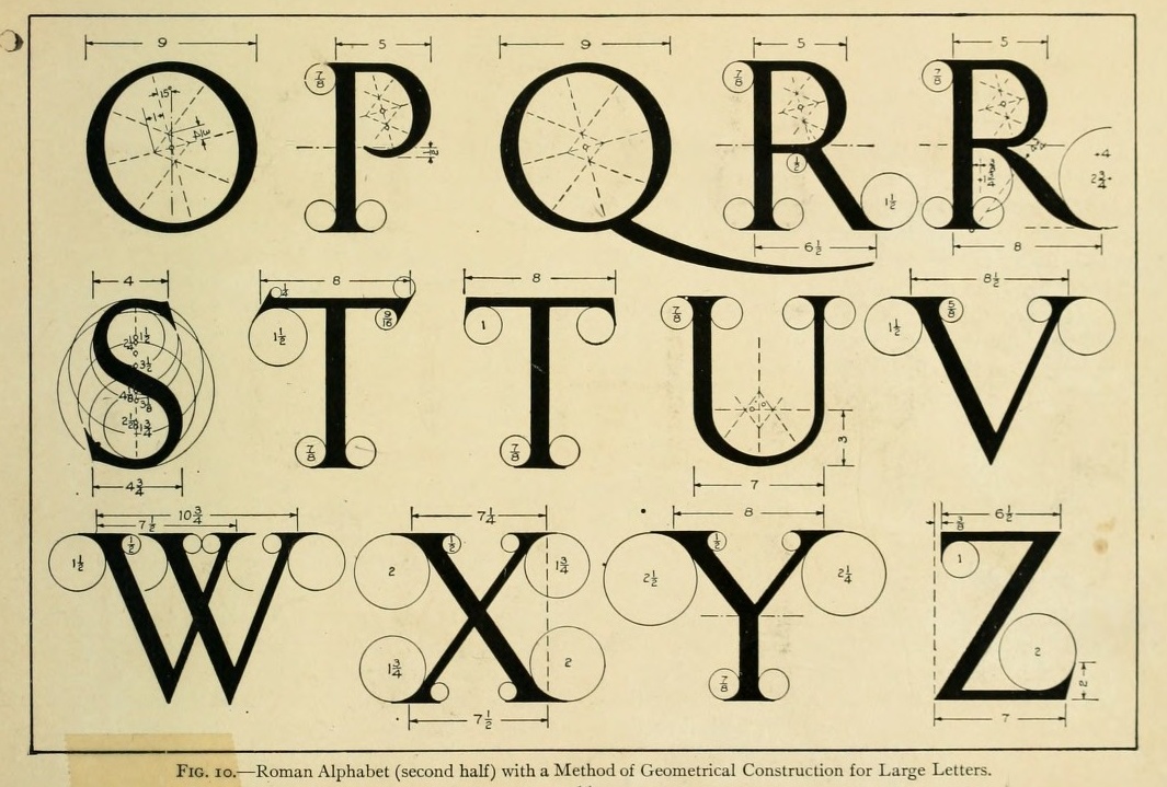
A typical Roman alphabet, together with its geometric definition in the style of Durer's alphabet and the Romain du Roi. Compass and ruler suffice.
Thomas Ewing French (1871-1944) was a scientific lettering expert. The Essentials of Lettering (1912, McGraw-Hill, New York), coauthered with Robert Meiklejohn, has many historical examples and takes the reader on a grand tour of lettering.
This page has some of the work shown in that book.
|
|
A typical Roman alphabet, together with its geometric definition in the style of Durer's alphabet and the Romain du Roi. Compass and ruler suffice. | ||||
|
| ||||||
|
|
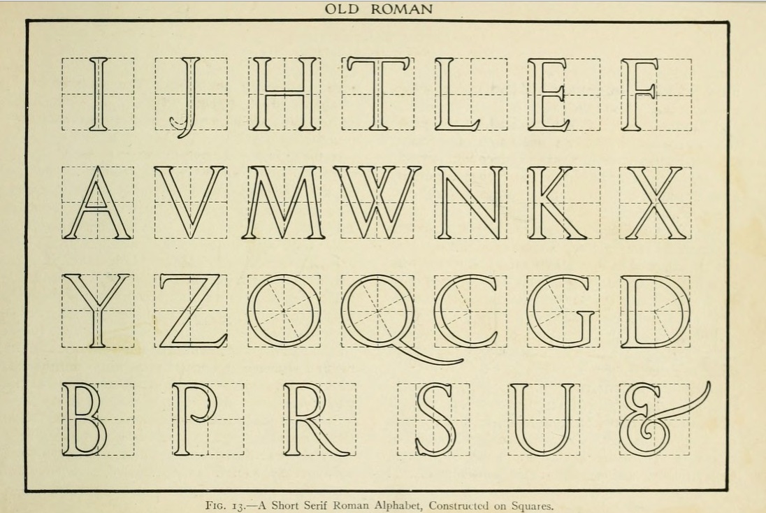
It is also possible to construct an alphabet on a square grid (left)---the example shown is a Roman alphabet with short serifs. Right: the definitions are now given in terms of distances, like in an architectural drawing. For a typeface like this blackboard bold style, popular with mathematicians, such an approach seems natural. | ||||
|
| ||||||
|
|
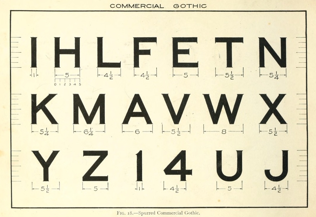
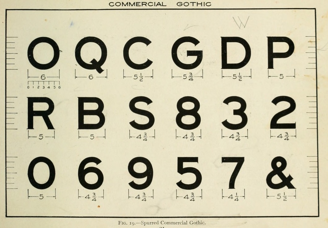
Right: French calls this a spurred commercial gothic. Here the rule is that the stem thickness is exactly one sixth of the height of the letters. The sturdy feel would make this a good starting point for lettering on highway signs and license plates. | ||||
|
| ||||||
|
|
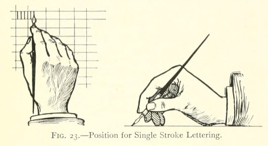
Position of the hand. | ||||
|
| ||||||
|
|
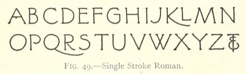
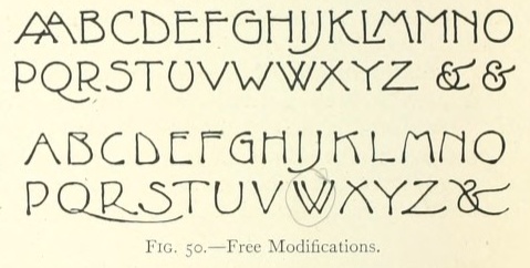
French shows these alphabets in a section reserved for architectural lettering. The single stroke roman (left) is easy to draw and quite effective. The forms on the right are morphed from the letters on the left, and have the high waist that is reminiscent of the Rennie Mackintosh types. But this is 1912! | ||||
|
| ||||||
|
|
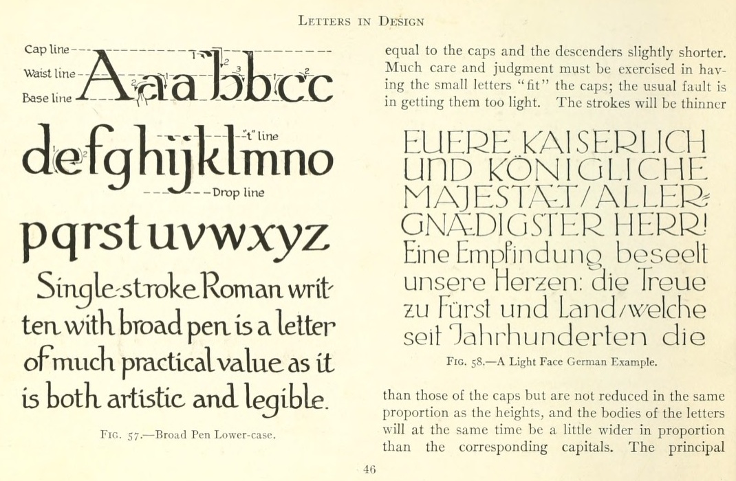
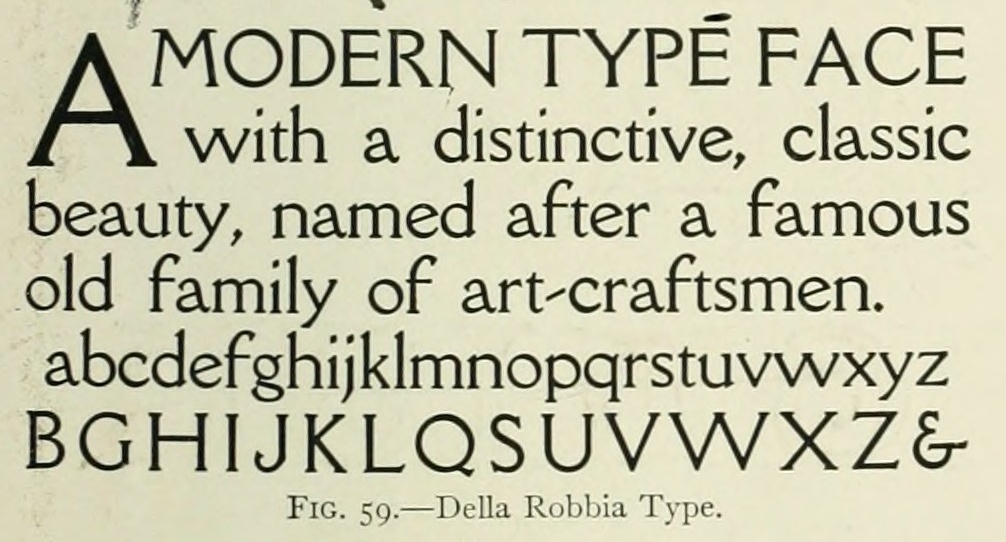
Left: Broad pen lower case, with particular attention paid to ascenders and descenders. Right: A light face from von Larisch's Unterricht, an influential lettering book at the time. Right: The Della Robbia type. | ||||
|
| ||||||
|
|
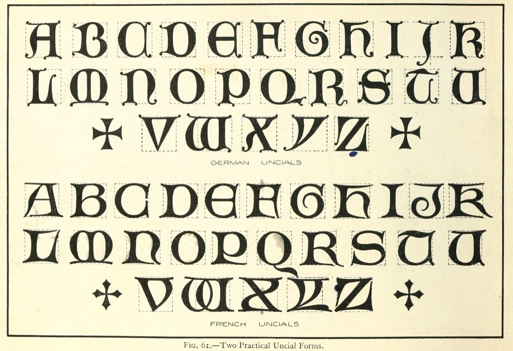
Uncials. Top left are German, and bottom left are French. | ||||
|
| ||||||
|
|
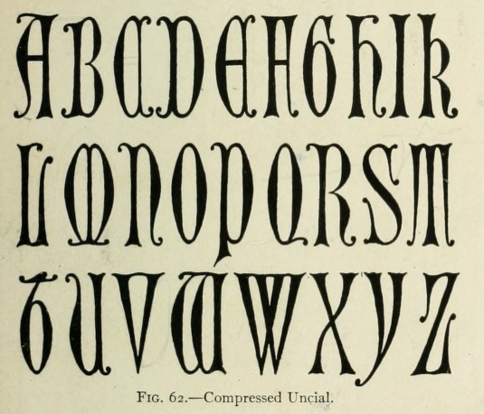
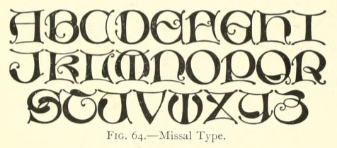
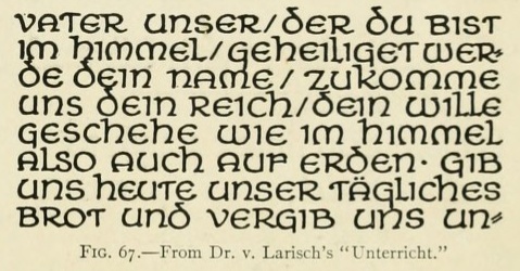
The uncial on the left, the Missal type, is said to be American. Right: Another example from von Larisch's Unterricht. | ||||
|
| ||||||
|
|
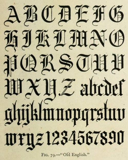
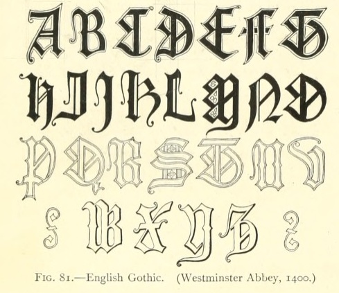
Blackletters. On the left, Old English. On the right, English Gothic (1400, Westminster Abbey). | ||||
|
| ||||||
|
|
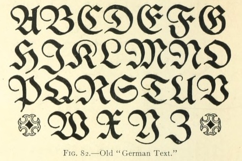
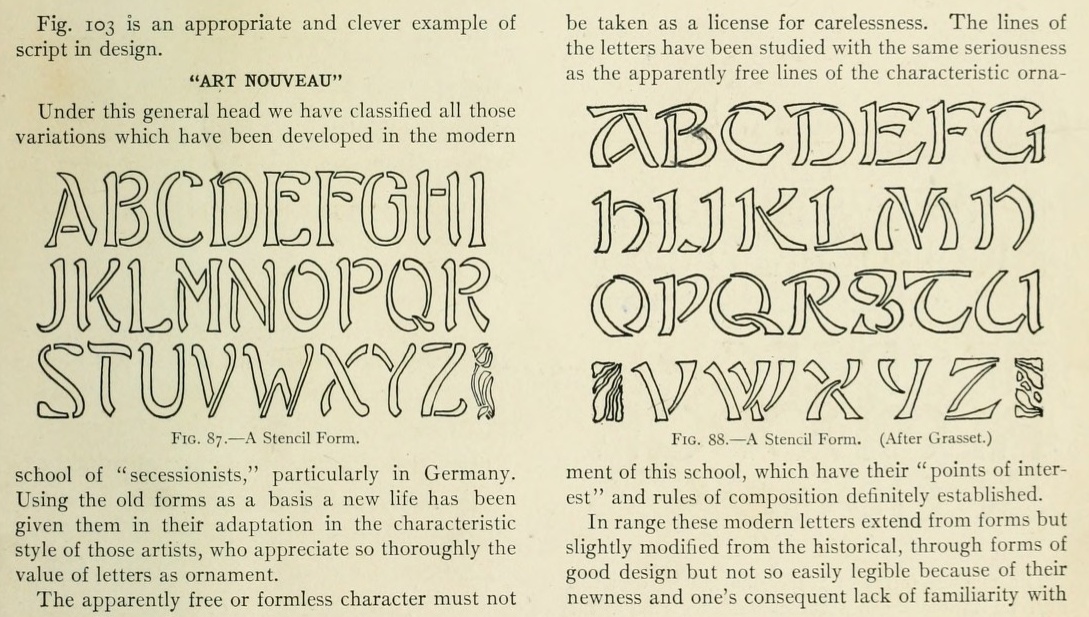
Left: Old German Text, a harder to read blackletter. Right: examples of art nouveau alphabets handdrawn by French. Both examples here are stencil forms. the right one is adapted from forms designed by Eugène Grasset who used to work for Peignot. | ||||
|
| ||||||
|
|
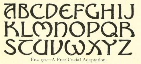
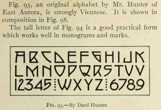
Left: An uncial adapted to art nouveau times. Right: an alphabet by Dard Hunter, in the style of the Viennese Secession (part of the art nouveau group of movements). | ||||
|
| ||||||
|
|
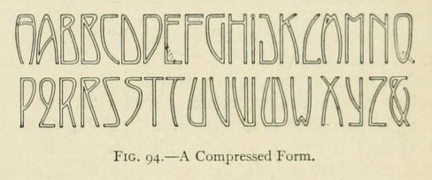
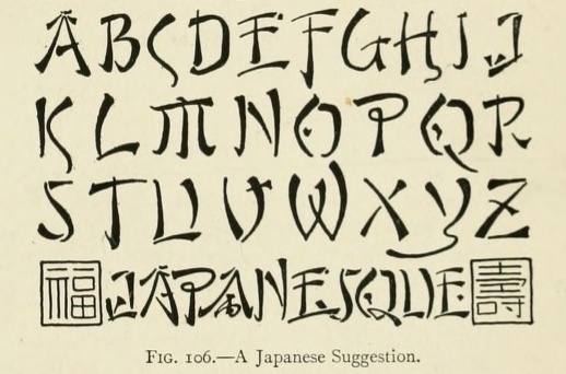
Left: Further art nouveau experimentation. Right: Called Japanesque, this is an oriental simulation alphabet that I have not yet seen in digital form. | ||||
|
| ||||||
| Contact |
Luc Devroye |