TYPE DESIGN INFORMATION PAGE last updated on Mon May 6 08:18:10 EDT 2024
FONT RECOGNITION VIA FONT MOOSE

|
|
|
|
|
Dan X. Solo | ||
|
|
|
|
SWITCH TO INDEX FILE
A.D. Farmer
| |
A Broadway style art deco typeface shown in Dan X. Solo's Art Deco Display Alphabets rom 1982. [Google] [More] ⦿ | |
Alex Rosario
| |
Alex Rosario Type
| Alex Rosario (b. New York City) revived Roc Mitchell's retro-futuristic phototype Corporate as Corporatus (2018). As Neologix on FontStruct, he made these pixelish or modular typefaces: Harpoon Art (2016, loosely based on Dan X. Solo's Lampoon), Negesis (2014-2017, after the Sega Genesis logotype), New Era Software (2014-2017), Trigger (2011-2018: a pure pixel family). Alex explains: Descended from the classic Chicago font, Trigger Bold is a recreation of the original dialogue font from the award-winning game, Chrono Trigger. Other typefaces include Ensconce Sans (2017; free demo): Taking inspiration from the Univers family of typefaces, Ensconce is a project undertaken to recreate in a digital format the work originally performed by Girvin Design for the English branding of the Super Nintendo Entertainment System. Taking great measures to retain the design choices of the original logotype, Ensconce has been successfully used to recreate the SNES logo currently in use on Wikipedia. [Google] [MyFonts] [More] ⦿ |
Alex Sheldon
| |
Allen Moore
| |
Designer in the art nouveau era. One on his alphabets, page 71 of the Solotype catalog, was digitized in 2010 by Claude Pelletier as Le Golf. [Google] [More] ⦿ | |
This list was compiled by "Character" in 2012:
Other in the Legend style include L690 Script (Softmaker), Legende (by Fraktur.de, and Legende (by AR Types). [Google] [More] ⦿ | |
| |
Creator of the (free) fat brushy typeface Army-F29 (2012), which is based on Army, a font seen on page 89 of The Solotype Catalog of 4,147 Display Typefaces by Dan X. Solo. [Google] [More] ⦿ | |
Andreas Seidel lists the blackletter typefaces published by the Benjamin Krebs foundry (and I added a few):
| |
Boston Type Foundry
|
Free specimen books: Condensed specimen book from the Boston Type Foundry (1860, John K. Rogers&Co, Boston), Popular designs for artistic printers. Selected from the novelties manufactured by the Central type foundry, of St. Louis and Boston type foundry, of Boston. The only manufacturers of copper alloy type (1892). Digital revivals:
View digital typefaces derived from the Boston Type Foundry. [Google] [MyFonts] [More] ⦿ |
Faux Chinese font from Bruce's Type Foundry, 1867, originating from Bruce's Ornamented no. 1048. Paul Shaw notes: Mikita is considered by type historians to be the oldest ethnic type since it has an "Asian" quality and can be traced back to a design by Bruce's New York Type Foundry in 1867. But that face, created by Julius Herriet, Sr., underwent a number of name changes, based on how it was perceived over the years. Originally called Bruce's Ornamented no. 1048, it was copied in England the following year by the foundry of J.&R.M. Wood, which named it Novel. Bruce later renamed it Rustic Shaded, a descriptive name that suggests a cabin's carpentry. But in the mid-'50s, when Charles Broad, the owner of Typefounders of Phoenix, dubbed it Mikita, the letters must have been equally suggestive of Japanese woodworking. A decade or so later, the Visual Graphics Corporation, a leading manufacturer of display phototype fonts, offered it as Bruce Mikita (TB-29). The digital version of the typeface was created in 2000 by Harold Lohner of Harold's Fonts. Although unaware of the type's history-on his website, Lohner asks, "Who was Bruce Mikita?"-Lohner recognized the font's latent qualities, writing, "It seems handcrafted and rustic and suggests East Asian calligraphy." Lohner based his version on a showing of the typeface in Dan X. Solo's Victorian Display Alphabets (1976). Interestingly, Solo, the owner of Solotype Typographers, considered the typeface Victorian rather than Japanese. [Google] [More] ⦿ | |
The Inland Type Foundry in Saint Louis was established in 1892 by the three sons of Carl Schraubstadter (1827-1897), William A. Schraubstadter (1864-1957), Oswald Schraubstadter (1868-1955) and Carl Schraubs Jr. (1862-1947). Carl had run the Central Type Foundry in Saint Louis and sold it to ATF (American Type Founders) in 1892, and the sons reacted by setting up Inland. Until 1911, Inland was one of the most successful foundries in the United States. In 1911 Inland was purchased by ATF and its equipment divided between that foundry and Barnhart Brothers and Spindler (BBS). Carl Junior is credited with a typeface that was later digitized by Dan Solo (Solotype) as Hearst Roman and Hearst Italic. Goudy claimed that these were designs stolen from him. Solo mentions the date 1904. Alan Jay Prescott made New Hearst Roman and Italic in 1995. A further digitization of these types is due to Nick Curtis in 2006: Ragged Write NF, Ragged Write NF Italic. In 1905, Schraubstadter patented a slab serif typeface. [Google] [MyFonts] [More] ⦿ | |
Castcraft [3649 W Chase Ave Skokie, IL 60026], showed off a comprehensive library of fonts, all with extended character sets for multi-language typography. OptiFont is a trademark filed in 1990 by Fredric J. Kreiter of Castcraft. Castcraft sold a CD-ROM Type Library Volume 1 at 200 USD. Its entire font collection was sold for 1000 USD. It also made some custom fonts. Most post-1990 fonts have the prefix OPTI. For example, OPTI-Peking is an oriental simulation font. OPTI-Favrile is a copy of Tom Carnase's Favrile (WTC). A visitor warned me that there is absolutely zero security when you order from this outfit, so you are warned--this is a dangerous site! It seems that Manny Kreiter (d. 2005) was the last President&CEO, and that his family (Abe, Harry and Ned Kreiter) have been at it since the days of metal type (1936) starting as Type Founders of Chicago. I found this on their pages: Castcraft has licensing [sic] the entire 20,000 TypeFaces from "Type Films of Chicago" and the entire "Solotype Alphabets" collection. Mike Yanega claims that most of their fonts are clearly not original any more than most of Bitstream's are original, and like them they re-name many of their fonts to avoid copyright issues. Their fonts all appear to be a "dead collection" of copies of relatively old designs that have already appeared in many other collections from the likes of WSI and SSi. In 2010, John Brandt reports: Castcraft, aka Type Founders of Chicago, moved decades ago from Hubbard St in Chicago to a close-in suburb (Skokie? Niles?) and was still operating within the past few years when I happened to drive by. I failed to find any current incarnation, but they used several names even years ago as a prominent pirate. Besides pirated fonts (Typositor to later, generally poor digital), they were a big metal vendor (I have a partial metal set of Helvetica gifted as they left downtown in the 1970s), and also had a guy (whose name escapes me) who did fabulous high-end signage, from sand-blasted glass to the created-on-building inscribed metal logo for a well-known Michigan Ave mall. Longtime owner Manny Kreiter died in 2005, but whether Boomie or any of the others who may still be around kept it going is unknown. Aside from simply having ANY version of their many offerings, most would consider their collection worthless. Anyone who has a digital "OPTIfont" and a font editor can readily view the problems, including usually several times too many Bezier points within any character. I counted 78 control points on a minimal character, for instance, that should have had less than a dozen. Mark Simonson: Castcraft was notorious in the sixties and seventies for pirating film fonts for headline setting machines, such as the Typositor. They would acquire a film fonts from franchisees of VGC (who also made the Typositor) or Filmotype or Alphabet Innovations, and then make duplicates and sell them to typesetting houses, usually changing the font names. Companies like Alphabet Innovations even put deliberate mistakes into individual fonts sent to franchisees just to try to see where Castcraft was getting them. Florian Hardwig: OPTI is a label used by Castcraft (also/previously known as Typefounders of Chicago and Type Films of Chicago) for digital fonts they produced around the early 1990s. My understanding is that virtually all of them are based on designs by others, made and distributed without authorization and without compensating the original designers or IP holders. Technically, many were likely based on the copies Castcraft previously made for phototype. They typically have names different from the original to avoid trademark issues. The company is long defunct and, ethical issues aside, the fonts are of subpar quality. Listing of Castcraft fonts (compiled by myself). The 802 fonts listed here are all dated between 1990 and 1994. I know there are at least 1,000 digital fonts made by them, so my list is incomplete. This link maintained by alt.binaries.fonts regulars contains most OPTI fonts for free download. It contains in particular some scans of one-line listings (i, ii, iii), and lists of name equivalences (i, ii). Picture of Ned, Abe, Harry and Manny Kreiter. Defunct Castcraft Software link. Typophile discussion. Font name equivalences (by Philippededa, 2012). List of equivalences of Castcraft names. List of Castcraft typefaces as of July 2014. [Google] [More] ⦿ | |
| |
Character
|
His typefaces:
Fontspace link. Dafont link. Fontspace link. And another one. See also at abfonts. Dafont link. [Google] [More] ⦿ |
Type designer, b. 1855 Philadelphia, d. 1934. He made a condensed sans serif issued by Mackellar, Smiths & Jordan foundry in 1887, and digitally revived as Roundhead by Dan Solo (Solotype). In fact, this type already appears in an 1883 specimen book by Mackellar, Smiths & Jordan. For a second revival of Roundhead, see LevellerNF (2014, Nick Curtis). Still at Mackellar, he created a fist-based alphading typeface in 1891. Hansard (1887) and Telegraph (1895), Victorian designs, were also revived by Dan Solo. Manifesto Bold (2003, Dan Solo) is a further revival. Google patent link. MyFonts catalog. Klingspor link. Patent office link. [Google] [MyFonts] [More] ⦿ | |
Charles Tubbs
| |
A film type perhaps first shown by Dan X, Solo (although that is a wild conjecture) that was revived multiple times:
| |
Digital revivals include Chic (Dan Solo), Odalisque NF (2009, Nick Curtis) and Odalisque NF Stencil (2010, Nick Curtis). [Google] [More] ⦿ | |
Cincinnati-based foundry (est. 1817), also called Oliver&Horace Wells, Horace Wells, Agant, and L.T. Wells, Agent. Among digitizations, we find French Ionic (Dan X. Solo, Solotype: quite ugly--based on an 1870 Clarendon derivative by the Cincinnati Type Foundry). Free specimen books on the web:
| |
Dafont link. Yet another URL. Abfonts carries many of his fonts. Fontspace link. His typefaces:
| |
Dan X. Solo
| |
Dan X. Solo
| |
Dan X. Solo
| |
| |
Dan X. Solo: Art Deco Display Alphabets
| Dan Solo wrote Art Deco Display Alphabets (1982, Dover Pictorial Archives). The images of the book were scanned in by Google. View them here [large web page warning]. [Google] [MyFonts] [More] ⦿ |
Dan X. Solo: Digitizations by Dick Pape
| Dick Pape based the following digitizations (2008-2010) of blackletter, art deco, Celtic, initial caps, and other ornamental typefaces shown by Dan X. Solo in his Dover books: DXSAlphaMidnight, DXSAlphaTwilight, DXSBeansBold, DXSBlackline (prismatic, art deco), DXSBoboBold, DXSBrusselsInitials, DXSBuckinghamInitials, DXSBust, DXSCharger, DXSCheckmate, DXSCorral, DXSDevon, DXSDevonian, DXSDudleyPNarrow, DXSFatCat, DXSFestival, DXSFrankfortInitials, DXSFuturaInline, DXSGrooviestGothic, DXSGuildhall, DXSHessNeobold, DXSHotline, DXSHuntingtonInitials, DXSJoyceBlack, DXSKupferInitials, DXSLampoon, DXSLeipzigInitials, DXSLeister, DXSLowenbrau, DXSMonogramStencil, DXSMonumentBold, DXSNottinghamInitials, DXSOrbit, DXSOttoHuppInitials, DXSPickfair, DXSPolly, DXSPotsdamInitials, DXSPrismaniaC, DXSPrismaniaP, DXSQuote, DXSRegalBlack, DXSRhythmBold, DXSRickyTick, DXSRoco (art deco), DXSSansSouci, DXSShadyDeal, DXSSheetSteel, DXSSilverShadowBlack, DXSStuttgartInitials, DXSTester, DXSThedaBara (counterless geometric art deco), DXSTulo, DXSTuxedo, DXSUrban (psychedelic), DXSVeronica, DXSWestmorland, DXSWienText, DXSYagiBold.bmp DXSYagiDouble, DXSYorkshireInitials, DXSZany, DXSZephyr. Images: DXSBlackline, DXSBust, DXSDudleyPNarrow, DXSGrooviestGothic, DXSJoyceBlack, DXSMonogramStencil, DXSPrismania'P', DXSRickyTick, DXSRoco, DXSSheetSteel, DXSTulo, DXSUrban, DXSYagiDouble, DXS Alpha Twilight, DXS Brussels Initials, DXS Kupfer Initials, DXS Lowenbrau, DXS Otto Hupp Initials, DXS Theda Bara, DXS Urban. Download page. [Google] [More] ⦿ |
Dan X. Solo: His books
|
|
Dan Solo (1928-2012) was a colorful figure. He wrote the following text about Solotype when he set up his digital business at MyFonts. The Solotype Archive was begun in 1942 when I was 14. I was a kid printer for several years before that. At 16, after a quick three months of training, I dropped out of school and went to work full time as a radio actor and announcer in San Francisco. (Easy to get jobs in those days, due to the war-induced manpower shortage.) In 1949 and 1950, I created a magic show which played West Coast theatres with some success. After that, back to broadcasting. By 1962, I was completely burned out on radio, so I decided to see if I could make a living with my collection of antique types, which numbered about a thousand fonts at that time. In 1962, I sent out 4,000 catalogs showing the type to ad agencies all over the U.S. The timing was perfect (no thanks to me) because there was developing at that time a renewed interest in the old types. Business took off immediately. The Solotype collection was one of four commercial collections at the time, but I seemed to have been more aggressive in marketing than the other chaps. (Well, Morgan Press certainly knew how to market.) Two years into the business, I began to collect alphabets on paper for conversion to photo lettering, which was just becoming mainstream in the type business. We closed the shop for a month every year and went on a type hunt, mostly in Europe where there didn't seem to be much competition among collectors. Other typographers couldn't understand how we could do this, but I believe it made people appreciate the resource we offered even more. Over the years, the collection became quite large. When I closed Solotype a couple of years ago, I got rid of about half the archive (because the fonts were dull, or already digitized, or for a variety of other reasons) leaving me with about 6,000 fonts on paper or film. In 1974, I began to supply Dover Publications with mechanicals for books of 100 alphabets on a particular theme. I did 30 of these books over the years, and 30 more of printers' ornaments, borders, and so forth. Sometime in the 1990s, Dover asked me to digitize books of 24 fonts each, to be sold with a disk in the back. I did 12 of these. The Dover relationship came to an end when Hayward Cirker, the owner and my special friend, died and the company was sold to another publisher. Dover felt that they had covered the type field thoroughly. Now in my old age, my wife and I have a mindreading act that is great fun and good for the ego. Even so, when not traveling, I digitize type for relaxation and enjoyment, but have made no effort to sell it. Until now. [Google] [More] ⦿ | |
Dan X. Solo: Testimonial by Allen Moore
| Allen Moore wrote this in November 2010, just over a year before Dan Solo died: I was hired by Dan X. Solo in 1978, on a temporary basis, to set alphabets for some of his Dover books. He was/is a very private man and as the previous poster stated, he rarely allowed typography clients to come to his home. The exceptions were a very limited number of Bay Area graphic designers that he had developed a relationship relationship with over the years. I can actually only think of two that he ever allowed inside his house, but I don't think they were ever allowed in his shop, which was in the basement of his Oakland Hills home on Crestmont Drive. All of his headline/display type was set using a VGA PhotoTypositor, which actually exposed and developed one character at a time on a two inch-wide strip of photographic paper. Many of his 'Typositor' fonts were not commercially made, but rather contructed by Mr. Solo himself. I was an experienced Typositor operator and process cameraman, which is why he hired me. Each morning I would arrive at his basement door and be given a list a alphabets that he wanted set. Mr. Solo is, of course, known for his Dover Publication books, each containing 100 alphabets in a given style of type. His Victorian and Art Nouveau books were already huge sellers to the graphic arts community worldwide. I set the type for several books myself, including Brush Scripts, Scripts and Semi-Scripts, Blackletter, Modern Sans Serif, etc. Additionally, Mr. Solo would give me lists of alphabets to set for his SoloType catalog. He would write the sample lines of each font to match the style of 'feel' of each font. He later got tired of coming up with the sample lines each day and allowed me to use my imagination to make up the sample lines myself, and I set thousands of them in as many different typestyles. Despite developing a very close professional relationship, Mr. Solo one day informed me that the job had ended. I had hoped he would hire me on permanently, but he had made it very clear from the onset that the job was temporary. I moved on, getting a typography job down in Hollywood, then returned to the Bay Area and worked in a couple of other type houses. The one day Mr. Solo, who was friends with my current employer, offered me a fulltime position as his apprentice, which I gladly accepted. That's when our professional relationship became additionally a personal friendship. I again worked on Dover books and samples for what would become the highly collectible SoloType's Cheap Catalog, which contained thousands of type sample lines, most of which I came up with myself. The earlier poster eluded to Mr. Solo's 'distorting device', which was his own invention, which he named the Altergraph. The Altergraph, which he personally trained me on, photomechanically modified lines of type into a variety of curves and arches. The other modification machine, which he trained me to use, was the Graphics Modifier. It was a commercially manufactured modification table that created outlines and dropshadows. Everything was done with using graphic arts film or photographic papers and the processes were quite time consuming, which is why the were so expensive. All the work done at SoloType was either for other typehouses, ad agencies or high-end designers. I was accustomed to employers who would not turn down any job and promise them to clients, even when they knew the jobs could not be produced in the turnaround time being requested. I'm reminded of a cartoon from my days as a printing student at California Trade School in Hayward, California. It was this funny charter jumping around in circles, with a caption that read: Do you want me to rush this rush before the rush I'm rushing to rush now? Mr. Solo, on the other hand, had a quite different attitude. I can't begin to say how many times I would hear him tell a client on the phone, "No." That word was virtually unheard of in those days. He frequently turned down jobs that he either knew could not be produced in the required time or that he felt could be done by any average typehouse. He was, afterall, considered to be the world's foremost authority on the subject of antique and ornamental display. That's not just my opinion. One time during time with Mr. Solo he left me in charge of SoloType and flew to Chicago for a week to testify in a typestyle piracy suit in federal court. It was the federal judge who declared Mr. Solo the most knowledgable person in the world on the subject of type. I was beside myself that he would entrust me with doing all the jobs that came into SoloType during that week, and again, another time, when he and his first wife, Beverly, took a vacation to England. I distinctly recall how tickled he was when he went into a large bookstore in London and asked the clerk if she had any books by Dan Solo. She didn't know he was Dan Solo, but know who Dan Solo was immediately, and took him straight to a section that had all of his Dover Books. He was a very wonderful man and treated me like a son, even buying a brand new Volkswagon Rabbit for me to use, so my wife could have our car during the day. He had already had an extremely interesting life before he started SoloType. As a child, he had collected hundreds of complete fonts of lead type before he ever thought of becoming a typographer. A little known fact is that Dan Solo was once a radio broadcaster and had, in fact, started the very first FM radio station in the San Francisco Bay Area. He had a dynamic, deep voice and always answered the phone, "Hello... Dan Solo." He was also an accomplished magician. He became a typographer when he purchased the Columbia Gazette in Columbia, California and the heart of the gold country. He produced the Gazette the old fashioned way, using his collection of antique metal type. He had confided to me that he planned to retire one day and turn SoloType over to me and I can only imagine how my life would have been different had that happened. Unfortunately, I had a turbulant marriage which I was trying desperately to save. My wife decided we had to move out of the area and I was forced to quit me job at SoloType. It broke my heart and, I think, his as well. He was gracious enough to credit me for my work in some of his books and catalogs and if you ever find one, you'll see my name in it. I, like the previous poster, last heard of Dan X. Solo and his later wife, working as an entertainer on a cruise ship line. [Google] [More] ⦿ |
Dan X. Solo: The Horse and Buggy Printer
|
|
David Koehne
| |
Dick Pape
| |
In 2013, he reappeared at Fontspace and posted these free Victorian / Western / circus style ornamental caps typefaces: Gardenia Victorian, Radiant Antique, Caliope Victorian. All three were scanned from Dan Solo's Victorian Display Alphabets in 2001. Fontspace link. [Google] [More] ⦿ | |
| |
Edward Pelouze
| |
| |
Farmer, Little&Co.
|
Catalogs published by Farmer include Specimens from the A. D. Farmer&Son Type Founding Co. Including Book, Newspaper and Jobbing Type, Brass Borders and Rules, with Complete Price List, &c, New York, 1897. Farmer and Little published The Reduced Price List and Latest Specimens of Printing Types Etc. (In an Abridged Form.) Cast by Farmer, Little&Co., Type Founders in New York in 1882. In 1900, A.D. Farmer & Son published Typographic specimens: illustrated catalogue. Farmer, firm, type-founders, New York, a 607-page catalog. Linotype link. [Google] [MyFonts] [More] ⦿ |
Fonderie typographique Van Loey-Nouri
| Fonderie typographique Van Loey-Nouri was Henri Van Loey's foundry in Brussels around 1900. They published Spécimen des caractères (1905). According to some sources, their other book, Spécimen de la Fonderie Van Loey-Nouri dates from ca. 1930. One of their art nouveau typefaces from 1900 was digitized by Dan X. Solo as Welcome 1 (Solotype). [Google] [More] ⦿ |
Creator of the textured typeface Modernique at Photolettering. Not to be confused with Dan Solo's art deco typeface Modernique. [Google] [More] ⦿ | |
Gene Gable
| |
For Face Photosetting in London in 1971, Geoff Nicholson created the photo type art nouveau style font Gismonda. Face Photosetting ceased operations in the 1980s. There are modern digital clones, but none give proper credit. These include:
| |
Type designer, graphic designer and painter, b. 1892, Dubrow. He lived in Berlin. He created the blackletter typeface Marggraff-Deutsch (1939, Schriftguss: leicht, halbfett, fett) and the script typeface Marggraff Kursiv (1928, followed by Marggraff Kursiv Zarte in 1929; at Schriftguss), and Marggraff Light Italic (1929, Schriftguss--the upstrokes in the g, r, m, n are thin and separate from the downstrokes). Some of his work. Marggraff Bold Script was digitized (and modified) by Dan X. Solo as Margie (Solotype). Solotype mentions the Dresden Foundry, not Schriftguss as the source of the latter face. Sometimes his first name is written Gerhardt. [Google] [More] ⦿ | |
American designer of the art nouveau typeface Vanden Houten (1904, Keystone Foundry, Philadelphia). This font was remade by Dan X. Solo as Dutch Treat at Solotype. [Google] [MyFonts] [More] ⦿ | |
P22 reports this story about the foundry's theft of a design by Goudy: In 1900 Frederick Goudy was commissioned by W.W. Denslow to letter his edition of Mother Goose stories for the McClure, Phillips Co. of New York. (Denslow was the Illustrator of the original Wizard of Oz and also an occasional Roycroft illustrator.) The lettering that Goudy designed featured short ascenders and descenders, as well as a tall x-height. Shortly thereafter the Inland type foundry of St. Louis released a typeface that was a direct copy of Goudy's lettering. Goudy seemed to be more offended that the font was named "Hearst" after the notorious newspaper mogul, than by the fact that they copied his designs. As Goudy had put it: "To my surprise, a little later on, the Inland Type foundry of St. Louis, without consultation with me, brought out a new type copied--not inspired--from my Denslow lettering, and added insult to injury by naming it "Hearst." Goudy's reaction was to create his own type typeface for release. The result of Goudy's attempt to outdo a copy of his design evolved into the Pabst type face. Created for the Pabst Brewing Company, this type design has some similarities to Hearst, but is clearly its own unique face. The ascenders are much taller than Hearst and the x-height is reduced. The distressed edging of the letters and the caps bear a similarity, but clearly these are two distinct typefaces. Five years later in 1907, Goudy's "Powell" typeface was created for the Mandel Brother department store in Chicago. This "Powell" typeface bears a closer similarity to "Hearst." The Hearst Roman typeface was later digitized by Dan Solo (Solotype) and by Nick Curtis in 2006 as Ragged Write NF. Alan Jay Prescott made New Hearst Roman and Italic in 1995. [Google] [More] ⦿ | |
Have Fun Fonts (was: Sobredosis)
| Have Fun Fonts (was: Sobredosis) is the free font foundry of Pablo Mateu (Mexico). Pablo created HFF Young Wanna (2012, a Western pair of typefaces based on Juanita from page 35 of The Solotype Catalog of 4,147 Display Typefaces), HFF Air Apparent (2012), Recto (2012, a hand-printed poster typeface), HFF Hunts Deco (2012, based on an alphabet designed by the Hunt Brothers in "Lettering of Today" published in 1935 and revised in 1941), Mala (2012, a Halloween font), A Mano Boldensada (2012, hand-printed), Masking Type (2012) and Test Font HF (2012). In 2013, he designed the hand-drawn typefaces HFF Low Sun, A Mano Blaxtendida (fat finger style) and A Mano Regulold, and the art deco typeface HFF Zeldom Zen. Fontspace link. Dafont link. Another Fontspace link. [Google] [More] ⦿ |
Typefaces made in 2009: HFF Pessoas Lindas (based on Anita Lightface, from page 7 of Brushstroke and Free-Style Alphabets: 100 Complete Fonts by Dan X. Solo, first published by Dover Publications in 1977. Anita Lightface is also listed on page 88 of The Solotype Catalog of 4,147 Display Typefaces), HFF Ribbon, and HFF Kids Stuff (children's all caps font based on an alphabet created by Mary Mapes Dodge in St. Nicholas an Illustrated Magazine for Young People XXXIV). HFF Kids Stuff is based on the alphabet created by Mary Mapes Dodge in St. Nicholas an Illustrated Magazine for Young People XXXIV: Part 2: 667. Dingbat fonts, all released in 2009: HFF Aqua Stencil, HFF Bird Stencil, HFF Floral Stencil, HFF Chinese Dragon. Alphabet fonts from 2009, all based on typefaces found in Dan X. Solo's books (names in parentheses): HFF Black Steel (Acier Noir), HFF Clip Hanger (Convoy: a paperclip face), HFF Fire Dancer (Flamo), HFF Modern Strand (Strand), HFF Pessoas Lindas (Anita Lightface), HFF Splintered Dream (Split/Split Caps), HFF Whirly Whorl (Whitestone Scrawl). Typefaces made in 2010: HFF Eye Sore (based on Grab Bag, page 82 of The Solotype Catalog of 4,147 Display Typefaces), HFF Quick Draw (based on Robard from page 76 of "Condensed Alphabets: 100 Complete Fonts" by Dan X. Solo), HFF Iconic Ionic (based on Moderna Condensed from page 61 of "Condensed Alphabets: 100 Complete Fonts" by Dan X. Solo), HFF Sultan of Swat (an art deco typeface based on Maharaja from page 57 of "Condensed Alphabets: 100 Complete Fonts" by Dan X. Solo), HFF Ice Bergman (based on Casablanca Light Condensed from page 13 of "Condensed Alphabets: 100 Complete Fonts" by Dan X. Solo; The Font Cpmany digitized the same typeface in 1992), HFF Fourth Rock (based on Mars Bounce from page 83 of Brushstroke and Free-Style Alphabets: 100 Complete Fonts by Dan X. Solo and also on page 92 of The Solotype Catalog of 4,147 Display Typefaces), HFF Pure Vain (based on Peruvian, from page 91 of Brushstroke and Free-Style Alphabets: 100 Complete Fonts by Dan X. Solo, first published by Dover Publications in 1977), HFF High Tension (based on Bamberg, from page 11 of Circus Alphabets: 100 Complete Fonts by Dan X. Solo, first published by Dover Publications in 1989. Bamberg is also featured on page 32 of The Solotype Catalog of 4,147 Display Typefaces). From page 73 of that same book, a font called Siamese by Dan Solo, we find a revival called HFF Thai Dye (Thai simulation face: based on Siamese in Special Effects and Topical Alphabets by Dan Solo). HFF Jammed Pack is based on Triple Condensed Gothic from page 91 of Condensed Alphabets: 100 Complete Fonts by Dan X. Solo. Triple Condensed Gothic is also featured on page 166 of "The Solotype Catalog of 4,147 Display Typefaces". For a commercial digitization of the same face, see Red Rooster. Typefaces made in 2011: HFF Xmas Hoedown is a Western font based on Kid Ory B, from page 51 of Condensed Alphabets: 100 Complete Fonts by Dan X. Solo. Kid Ory B is also shown on page 37 of The Solotype Catalog of 4,147 Display Typefaces; other digitizations of Kid Ory B include Tissot by Iza W, and Texarkana JNL by Jeff Levine), HFF Beer Van (a spurred typeface that is based on the font on pages 36 and 38 of The Solotype Catalog of 4,147 Display Typefaces by Dan X. Solo, but with slightly different names), HFF Greek ExCon (based on Grecian Extra Condensed from page 33 of "The Solotype Catalog of 4,147 Display Typefaces"), HFF Lasdof Twunyliven (read: last day of 2011; based on Herald Square from page 171 of "The Solotype Catalog of 4,147 Display Typefaces"). Typefaces from 2012: RTA Ermine (dingbats), HFF Hunts Deco (based on an alphabet designed by the Hunt Brothers in "Lettering of Today" published in 1935 and revised in 1941), HFF Light Petals (based on Pastel (Bounce) from Brushstroke and Free-Style Alphabets (Dan X. Solo). Pastel was released by Filmotype as a phototype in the 1950s). HFF Air Apparent is based on Prince from page 92 of The Solotype Catalog of 4,147 Display Typefaces. Typefaces from 2013: RTA Cross (crosses), HFF Low Sun (free: based on Luzon Script on page 106 of the Solotype Catalog), HFF Zeldom Zen (a round display typeface based on an alphabet from a book by Harry R. Wright, published in 1950). Typefaces from 2014: HDD Code Deco (art deco). Typefaces from 2017: HFF Cotton Balls. Typefaces from 2019: HFF Warped Zone (based on Mindanoa, originally designed by Rosemary Tissi and first published by Engler Text-Bild-Integration AG in 1975). Download link. Another download link. Dafont link. [Google] [More] ⦿ | |
Henri Van Loey
| |
Herbert F. Van Brink
| |
Hobo
|
(Thanks to Boston’s Bill Ricker and Dick Miller for coaxing me to cough this story up finally. I originally mentioned it in comp.fonts about 20 years ago, but the “O” situation, recently discovered, offers incontrovertible proof of the theory.) As a master trade typographer in Chicago in the 1980’s and 1990’s, I was the last of the breed here before desktop publishing finally made our race extinct. I imagine there were only two or three of us in that generation. Among the very few others in Chicago were Adam Kallish and Jason Pickleman, who both were working for the irascible Harvey Hunt, a Berthold guy, when he closed down his Typographic Resource and moved to Mac. (Harvey and his wife inherited ownership of the Berthold font collection. For decades Berthold was a top-quality typesetting platform.) I was working upstairs from them during the storied heyday of InfoComm, a pioneering PostScript service bureau, at 213 W. Institute Pl., site of the early Schwinn bicycle factory. You can still see thousands of bicycle screws embedded in the wood floors of that building. We were young and, with proficiency in computers, were able to bridge old and new technologies easily. We were also font whores. Most kids in those days used to save their money up for model airplanes or blow it all on Twinkies. When we were children, my brother Greg and I used to haunt Chicago art stores, scraping up money for Zipatone dry-transfer, or “rub-down,” lettering. Our favorites were things like Calypso, Mistral, and others by Roger Excoffon, Herb Lubalin, Ed Benguiat, Rosemarie Tissi, and the many other designers of that prolific period. I also did a lot of calligraphy. I still do work with flat and pointed pen as well as flat and pointed brush (a devotee of Father Catich to the end). In later life I was briefly president of the Chicago Calligraphy Collective. Despite my skills and interest, I was never admitted into the higher church: East Coast: Ephram “Ed” Benguiat had me out for a tongue-lashing. The famous Jewish cigar-chomping dean of New York letters walked me around the labyrinth of Photo-Lettering, Inc., his huge Manhattan shop. Stopping at various stations to introduce me to his team, he would pointedly ask each guy how long they’d been working for him. “I’ve been on this very Staromat in this very darkroom for 25 years,” I remember one of them saying. (I was a VGC Typositor guy myself, thanks in part to the support of my beloved mentor, Al Blitz of Photofont.) Then he introduced me to the sub-basement, where I met Marco, an art student almost ten years younger than I. “You still wanna to work here?” Ed challenged me. “Marco’s my new right-hand.” And he stubbed out his cigar in one of the shop’s numerous overflowing ashtrays. Apparently this trip was just for him to show me that if I wanted to move to Manhattan to be his apprentice, I’d have to work in the basement for years, getting behind even young Marco, who after three years was still making $6 an hour touching up the edges of Ed’s drawings. West Coast: David Lemon of Adobe flew me out for a lavish two-day interview session with the type staff. I remember getting to know Linnea Lindquist, Bob Slimbach, Carol Twombly, and this really nice guy who had worked for the inimitable Dan X. Solo. I knew he and I would be best friends when I moved out there, but I never got the call. I think I was too crude for them, not an artist like most of them, just some schmuck without much flair, trained in the many nameless shops. Back home: The market was getting too tight. Dean of Chicago of lettering Charlie Hughes (designer of Indy and, coincidentally, of the Benton variant Century Nova) chose calligrapher Eliza Schulte over me as his apprentice. Holly Dickens, for her part, though I know she loves me dearly, was never the type to take on help. George Lee before he died told me that I already had too much experience to be anyone’s apprentice, but I knew I was also far too unsophisticated and too inept at business to forge out without first getting a leg up. It didn’t help that I was stranded in the Windy City (a bygone typographic center, former home of much that we can be proud of), circumstantially unable to move to one of the coasts, where the action really was. The best we had here by then was Castcraft, widely felt by respectable industry to be the worst font plagiarists in history. Anyone who is friendly with the Kreiter family would still never consider their shady world a place for a skilled young designer to hang one’s hat for a career. It would have been even more pathetic for me to take Boomie Kreiter up on his frequent offers than to wait for young Marco to free up his naugahyde seat in Benguiat’s dusty office. I would never get a job at Adobe or Font Bureau with that on my resume. Despite heading toward that dead end, I did become the guy in Chicago who knew fonts. I probably can’t tell Helvetica from Helios these days; it’s been 30 years since I’ve had to compare them. But wherever I worked, my reputation followed me. Every few days, at one or another type shop, someone would yell out: “Pete. Someone just called, wants you to identify a font.” Soon I’d see coming in on the fax machine a request from some designer, or from another mope at another harried River North type shop, asking me to identify some obscure font sample. For about 10 years, everyone in town apparently knew that if anyone could figure out which foundry and font they were trying to match, I could. There were times when I would do no more than glance at the sample, and then call them back: “It’s Stempel Garamond; you can tell by the cipher.” “Gosh, Pete. We really appreciate it. What do you want for this?” “Just send me a check with lots of Stempel Garamond zeroes. Better yet, buy me a drink at the Redhead Friday night. We’ve got a massive annual report to finish, but we may get off before midnight.” Other times I’d pore over a stack of thick books from VGC, Photo-Lettering Inc., and Castcraft before I finally found the match. But I could not easily be stumped. I could quickly tell a Benguiat brush script from knock-offs, and I knew when I’d have to pull out VGC’s or Castcraft’s massive tomes and start flipping pages for 15 or 20 minutes. And then there was the ponderous TypEncyclopedia, whose sheer weight could kill a grown man. This was the heyday of the proliferation of advertising design and numerous competing typographic platforms, each with a knock-off and variants of a popular font. This was the high-water mark in American typographic activity. There were dozens of foundries and tens of thousands of fonts. And it all came crashing down as quickly, and today I have no memory, and everything is all washed away, and I wonder how I could have wasted so much of my life on so profitless a pursuit. Nobody remembers me, and no one cares. Even in Chicago I was just a fax number to most famous designers, just someone somewhere who could help them make a quicker profit a few minutes sooner. And I always did it gratis. But in that day font substitution was done only as a last resort, so I had to do it. * * * In those days, to pass the time lovers of letters would walk up and down the streets of their cities and simply name fonts they saw in windows, sometimes self-righteously adding the designer’s name and perhaps the approximate year of the design. “You’re wrong, that’s not Helvetica Bold, it’s Vladimir Andrich’s Claro Bold.” In those days as ever, Hobo was everywhere. It is one of the two or three best-known and most-used display fonts in history, and it has long enjoyed a kind of cult following. But while one of the easiest of fonts to identify, no typophile will dispute that the mystery of its name is easily one of the most rampantly speculated typographic questions over the last century. A few years ago, my pal Kibo and I came up with the answer to this century-old mystery, as well as an insight into the design of this odd Art Deco font. Morris Fuller Benton was the contented son of Linn Boyd Benton, the latter one of the most influential figures of all time in the graphic arts, arguably ranking somewhere near the pantheon among Gutenberg and Bi Sheng. Through the 19th century, the Wyeths did painting, the Brontës did writing---and the Bentons did type. Every industry in every age has its salon powerhouses, those titans whose magic could rub off on you if you could only get near enough. But of course unless you actually were family, often nothing was bound to happen. Grandpa Benton, as it happens, owned the Milwaukee Daily News and also became a congressmen, and his father in turn was a prominent East Coast physician. In fact, Grandpa was under consideration as a presidential candidate but lost out to Stephen Douglas. Patricia Cost wrote a wonderful history about the Benton family that tells even more. But, nepotism aside, Morris Fuller became quite a prolific and celebrated type designer in his own right, surpassed by only a few others in the number of iconic font designs to his name.  The two main stories behind the naming of Hobo are both probably apocryphal. The first is that the bow-legged shape of the letters suggested the legs of a hobo. The second is more creative, but it too lacks much support. According to one writer, Emil Klumpp of ATF gave a talk at the APA Wayzgoose conference in 1977 and mentioned the origin of the name. In his 1993 book American Metal Typefaces of the Twentieth Century, historian Mac McGrew apparently summarizes Klumpp’s report: “One story is that it was drawn in the early 1900s [when Art Nouveau was still in fashion] and sent to the foundry without a name…but further work on it was continually pushed aside, until it became known as ‘that old hobo’ because it hung around so long without results.” * * * McGrew died a few years ago, as did Emil Klumpp, but I wish they were still alive so that we could debate these facts. Both were born long after the font. There is absolutely no evidence that the font’s design was begun earlier than 1910; that speculation may well owe itself only to its convenience to the story itself. Something just doesn’t seem to add up. We have, however, harder facts. The quintessential nerd, James “Kibo” Parry worked on the Atari 2600 design team. He became a household name on the early Internet by haunting Usenet newsgroups and contriving numerous online larks to amuse the digital populace, which at the time did not yet number 50,000 or so worldwide. Kibo once had a two-page feature all to himself in Wired magazine. He had a religion called Kibology named after himself, with a bizarrely popular online discussion group of thousands of subscribers. Kibo was even immortalized in the Geek Code, an early Internet fad that one would put in the signature of one’s e-mails and online posts to indicate level of geekiness and hence high-tech social status. There were several indicators, such as how well you knew the C language, or whether you were Unix (good) or MS-DOS (bad). The number of pluses after a letter code indicates the level of accomplishment. C is, predictably, C, and the Unix/Windows letter codes are U and w. There is even a flag for how close one is to Kibo. At the top end, it included: “K++++ I’ve met Kibo,” “K+++++ I’ve had sex with Kibo,” and “K++++++ I am Kibo.” At the bottom are several negative indicators, such as “K–” I dislike Kibo. I have the dubious distinction of being somewhere close to the K+++++ category, because technically I’ve, uh, slept with Kibo---well, at least I’ve shared his bedroom. Here is Kibo’s own e-mail signature which, although over 1,000 lines long, does not include a Geek Code. But it does give you an idea of the strange humor that is Kibo. Apart from all of this, Kibo is also a lover of type, and very knowledgeable about it. He and I were wandering around downtown Boston sometime around 1992, the morning after a rather snooty ATypI wine-tasting event hosted by David Berlow’s Font Bureau, celebrating Matthew Carter. Seeing the well-dressed and well-paid scions chatting and sipping red wine, it was impossible to picture us really fitting in there. And, of course, nobody paid the least attention to us. Another time, in 1994 in San Francisco, ATypI met, and the pushy, competitive nature of the nascent PostScript font industry took a more direct form. The Dutch youth, Erik van Blokland, Luc de Groot, and brothers Just and Guido van Rossum, had crossed the pond. There was a kind of technical mosh pit established as a playground for us 15 or so “youngsters” in which to create the show daily. This playground was billed as a social collaborative activity. But I recall the four Dutchmen muscling over this and other activities with equal, shall we say, zeal. A couple of less pushy participants raised a stink to the elders and yet the rebellion was discreetly put down. As is the case in such societies, most of us budding young craftsmen were hoping for some attention, but we were not nearly as forward about it as these tough Europeans. To be sure, they had talent. But we, at least, were aware that our eyes and minds and skills were as ready as theirs. I recall Luc de Groot simply drawing the nameplate for the publication, without any discussion from anyone else. An arguably enviable post that he had simply arrogated to himself. My recollection is that his skills were not much up to the task that day and I was pretty certain that I could have done better. Again, that year, nobody paid any attention to us.  [The shot of Kibo used for the Wired article – he’s not quite as exciting as all this, no red aura in real life.] [The shot of Kibo used for the Wired article – he’s not quite as exciting as all this, no red aura in real life.]Kibo and I were bored out of our skulls that morning after the Font Bureau affair in Boston, and probably a bit hung over and cynical. Presumably, we were already heading toward failure in the type world. Kibo lived right across from the Commons, in a cockroach-infested flat dotted with empty carry-out containers. I had slept on the floor. Walking somberly through the streets of old Boston, Kibo showed me how to pick locks with the metal bristle from a street-cleaning truck’s brushes, which bristles, to my amazement, can be found near the curb of almost any street in the world. We shared work horror stories. We sneered at the cult of personality that was the typographic design world in those high-flying days. Frankly, we were probably a bit jealous. And of course we showed off by pointing at signs and identifying many fonts. We also stopped in at several bookshops. At one particularly cozy little shop, I was flipping through a Russian poster art book, surveying a nice Art Nouveau poster for Duchess Tobacco. Kibo, looking over my shoulder, asked me what the poster said. I said it was for the “new and wonderful” Duchess Tobacco, 1/4 pound for 40 kopecks, from tobacconists Kolobova and Bobrova of St. Petersburg. I think Kibo said something like, “Huh. Why does it say ‘Hobo’ at the top? Those guys don’t look like hobos.” Indeed, the two characters pictured helping themselves to a box of the Eastern-style cigarettes known as papirosi were young Russian gentlemen. But I explained to Kibo that HOBO was the Cyrillic spelling of the word novo (“New!”). It was then that we both noticed that the poster was drawn in something very like the font Hobo. Of course, this was hand-lettered, but it was certainly in that Art Nouveau splayed style. That led to speculation that Benton could have seen this poster or one like it in a Russian neighborhood. Certainly the four-by-five–foot poster in a window of a Russian tobacco shop or grocer would have been amusing to non-Russians seeing the word “HOBO!” at the top, and it could very well have inspired any talented type designer to throw together a font in its honor.   The Russian word “Chudno” (above) means “wondrous.” What’s really wondrous is the unique similarity of Benton’s majuscule O and the one drawn at the poster’s extreme right. The shape of the letters in the word “HOBO!” don’t hurt the argument, and of course the name buttresses it. To me, the striking coincidence of this single “O” letterform crowns the argument and should lay to rest the mystery of Hobo. This evidence shows that Morris Fuller Benton must have seen this poster somewhere. Perhaps he was somehow reluctant to admit that the source of his inspiration came from outside his famously insecure mind? The Russian word “Chudno” (above) means “wondrous.” What’s really wondrous is the unique similarity of Benton’s majuscule O and the one drawn at the poster’s extreme right. The shape of the letters in the word “HOBO!” don’t hurt the argument, and of course the name buttresses it. To me, the striking coincidence of this single “O” letterform crowns the argument and should lay to rest the mystery of Hobo. This evidence shows that Morris Fuller Benton must have seen this poster somewhere. Perhaps he was somehow reluctant to admit that the source of his inspiration came from outside his famously insecure mind?In fact, the “O” in the word “Чудно!” at the far right side of the poster looks as if it could have been traced by Benton as the model for his Hobo majuscule O. In fact, it is so close that it would arguably be more of a coincidence if this were not the case. The characters “HOBO” at the top of the poster, their general design formula, and the identical shape of that O, I feel, lay to rest the hundred-year mystery of the source of both the font’s name and design formula. There was also motive, method, and opportunity. This is far better substantiation than what we have from the two chief theories that have circulated all these decades. Moreover, what this suggests is that the original inspiration for Hobo probably was not Benton’s own mind, but the pen of an unknown graphic artist at the world-renowned Wefers lithographic press in St. Petersburg. It is not some great scandal that Benton failed to mention this, but it is true that Benton was famously insecure. Admitting that the source of the design of this font was something so pedestrian was not, and is still not, a common part of the ethical standard of the creative industry. It’s one thing for Carol Twombly (who once admitted to me that she didn’t know one end of a flat brush from the other) to acknowledge, even revere, the origins of Trajan. This is another thing entirely. In this case, you would think with such a cute origin, Benton would have been sharing the anecdotal pun with his pals at ATF. Perhaps he did and that history has been lost. Finally, if we believe the connection of the Hobo font to this Russian poster, then Benton’s naming of the font was very deliberately tied to Benton’s use of the poster as his exemplar. I bought the book and gave it to my uncle Boris and aunt Tanya in Boston, and they probably still have it. The poster included details on the date, but I recall it was around 1903 or 1905, and that agrees with the design style. As David Berlow has remarked, Morris Benton and his father often lived together and over the years would commute between home and the various locations of the ATF foundry in New York, later in Jersey City, and still later in Elizabeth. In fact, the northeastern New Jersey area where the Bentons lived, worked, and presumably played at the time had over 300,000 Russian Jews. We also know that at that time corner stores literally were at almost every street corner. I don’t know for certain whether the Bentons’ travels went through any of the Russian neighborhoods. It seems that for the period in question they were probably living in Plainfield and commuting more than 20 miles, probably by car, to Jersey City. They may well have seen this poster at some point. Possibly they saw it in another place. Or perhaps Morris Fuller might have taken a trip to Russia around that time. That part is speculation. Perhaps Benton historian Patricia Cost could illuminate a bit. In any event, while the type snobs were sipping fine wine, slapping one another on the back, and tooling around Boston in their nice cars, all paid by typography, a couple of bums momentarily came from out of nowhere, and went nowhere in particular. While there, they quietly and unceremoniously found a plausible solution to a celebrated typographic mystery, that of the origin of the Hobo font. * * * I know it’s speculated that Morris Fuller Benton was controlled by his father. No one can actually say if he was truly contented or not, and it seems he may have been one poor sap. But clearly his family had a good deal to do with his success. My own father would have been 100 today, March 21, 2014. I recently turned half that. It would have been nice to have gotten a leg up. My father could do nothing for me; in general, he could do little for himself. Actually, he and I worked together in a small print shop once, one of the many odd jobs he had. He was rather skilled on the offset press. But he couldn’t even manage to get me through high school. My brother and I had to take care of both of our parents in our father’s last few years, and that put a big dent in our own midlife plans; we fought so bitterly over how to do it that we spent over a year in court on it. I am past my prime and am doing other things, having no further time for typography. I don’t even care that much about letterforms anymore. That work is chiefly for the quality children of quality people; over the years I have long been elbowed aside by such creatures. Whether employing ambition, birthright, or actual talent, the competition has been fiercer than one would expect for what was once a very humble craft. I will note that David Berlow’s son Sam, who really had nothing to do with type in his youth, is now in the stable at Font Bureau. Just sayin’. I suppose I may be one of Fred Warde’s typographically shipwrecked mariners. I have to hustle in the meantime on other business. Right now, I’m working 60 hours a week designing a 3D printer for mass production, for two young and impetuous entrepreneurs of some wealth. I really didn’t have time for this story. I do not know if I got much of it right, but in any event each of us should hope to make little contributions to our little worlds, and this is one of mine. [Google] [More] ⦿ |
His typefaces Gordis (a fattish comic book family) and Tepuy won awards at Tipos Latinos 2008 in the non-text and experimental typeface categories, respectively. At Tipos Latinos 2010, he won twice in the display category, for Victorina and Radio Time. His typefaces: (New) Maracay (2013, a large layered Victorian signage family), Fine Art OT (2013, brushy typeface), Roadline Italic (2013, a retro script), JMTF Robin (2013, a layered post-modernist display family), Virgin Script (2013), Radio Time (2013, fat retro signage script), Radio Time Icons (2013), Palaima (2013, an aboriginal style face), Factor (2012, a layered geometric font), Onda (2012, a wavy psychedelic face), Blockee (2012), Aliykit Open (2012, a multiline typeface), VE Inconexa (2006, outline architectural face), VE Makiritare (2006, a double labyrinthine script that is based on symbolisms used by the Makiritare or Yecuana, river people who live in the village of Santa Maria de Erebato in the Venezuelan jungle on the border with Brazil), VE Moho (2006; or simply Moho in 2014), VE Palaima (2006, futuristic, Amazonian), Radio Time (fifties style script, with Alejandro Paul at Sudtipos), Fruta (stencil, influenced by Glaser?), Glaser Stencil Round, Gothike (sharp-edges), Aqua (ultra round), Club, Caracas (sans; +Caracas Pro, 2015; see also Caracas Stencil Pro, 2015), Factor (hookish), Space Lab (futuristic family), Robin (headline), Victorina (multiline Victorian poster typeface which won an award at Tipos Latinos 2010), Victorina Black Shadow (2011), Waterman (2010, a flowing undulating script family), Spacelab (2010, futuristic) and RobinBienalII (2005). Sudtipos sells these fonts of his via MyFonts: Makiritare (bilined, based on woven baskets), Palaima (experimental, runic), Precolombino (petroglyphs), Tepuy (rounded version of Makiritare), Roadline (2009, fifties diner font), Sacred Geo (2011, a geometric dingbat font that won an award at Tipos Latinos 2012), DeCoro (2011, art deco family), Sacred Geo Tiling (2011), Primate (2012, an African look typeface family), Morenita (2012, a connected fifties or school script), Takox (2012), Petroglifos (2012), Xtencil (2012, a rounded stencil influenced by Milton Glaser; followed by Xtencil LC and UC in 2013 and Xtencil Pro in 2015). Typefaces from 2014: Moho Sport Pro (layered athletic lettering typeface family), Scripta Pro and Gothic (40s-style lettering typeface inspired by the style of L.H. Copeland), InkArt Labels, Moho (named after Laszlo Moholy-Nagy), MohoBis Pro (a multilined version of Moho), Moho Condensed, Moho Script, Duvall (named after Edward J. Duvall, who published Modern Sign Painting in the late 1940s; Duvall won an award at Tipos Latinos 2014). In 2015, the Moho series continued with Moho Style. He also made Arthaus (2015, a fantastic Bauhaus font family inspired by Herbert Bayer's universal alphabet), MyCard (a techno type), NeoScript Pro and Hierra (after a font by Dan Solo) in 2015. In 2016, he designed Artime (a sci-fi font), Virtual. Typefaces from 2017: FunFont (cartoon style). | |
K22 Fonts
|
|
Typefaces: Admiral, Ayer (Mac McGrew: Ayer was introduced by Keystone Type Foundry in 1909, which said it was "named for F. Wayland Ayer, founder of Keystone Type Foundry and the great advertising agency which bears his name." The non-kerning italic was added in 1910.), Ben Franklin, Ben Franklin Condensed, Ben Franklin Open, Bulletin, Caslon Adbold, Caslon Adbold Extended, Caslon Adbold Extra Condensed, Caslon Bold, Caslon Bold Condensed, Caslon Bold Extended, Caslon Bold Italic, Caslon Lightface, Caslon Lightface Condensed, Caslon Lightface Italic, Caslon Title Extended, Charcoal, Charter Oak (1899), Compressed Gothic, Condensed Lining Gothic, Crayonette, Elite Typewriter, Gothic Condensed No. 3, Gothic No. 102, Gothic No. 114, Harris Italic (1910), Harris Roman (1909), Herculean Gothic, Italia Condensed (1906), John Alden Decorative Initials (1906), John Hancock, John Hancock Condensed, John Hancock Extended, John Hancock Outline, Keystone Gothic, Laureate (1906: revived in 2012 by Isabel Urbina), Lining Antique [Keystone], London Gothic (1910 or earlier), New Model Remington Typewriter, Outline, Outline Condensed, Remington, Remington Typewriter, Round Gothic (1884), Skeleton Lining Gothic, Skeleton Lining Gothic No. 19, Smith Premier, Title Gothic [Title Gothic No. 9, Condensed Title Gothic No. 11], Venezia, Washington Text (1902, blackletter), Washington Text Shaded. Digital pictures I took from the Specimen Book of Type (1903): Bulletin, Keystone Bikes, Boldface Cellini, Crayonette Open, Keystone Cyclers, Encore, Lining Antique, Lining Gothic, Outing Initials, Remington Typewriter, Remus, Ronde Initials, Salem (a wedge serif revived in 2021 by Latinotype as Osbourne), Venezia, Victoria Italic, Worcester. Catalog A-C, Catalog C-P, Catalog P-Z. Digitizations:
Comments by Mac McGrew:
| |
Match&Kerosene
|
Typefaces designed by Sheldon (b. Michigan, 1984) include Slab Sheriff (2009), Western, Kerosene Boxley (2009, a multiline art deco revival of a Solotype font; some say that it is based on a pair of 1972 alphabets by Marcia Loeb called Zig Zag and Rainbow), Kerosene Woodtype (2009), Kerosene Retroface, Kerosene Stereo (2009, revival of an Italian typeface from 1869), Kerosene Killowatt, White Wolf (2009, condensed horror movie face). Typefaces designed in 2011: Quimby (Copperplate Gothic style titling face), Black Bear (2011, straight-edged display family), Swifty (2011), Grizzly Bear (a set of 12 constructivist titling typefaces), Detroit (a modular family for superpositions), Prismatic (another superimposable multi-purpose family), Duotone (2011, Duotone is a layered font system that allows one to title two-tone headlines), Volcano Gothic (+Inline), Volcano Island (jungle look family), Lightyears. [Google] [MyFonts] [More] ⦿ |
During a course at ESPM in Brazil, Natalia Vale created the stressed serif textface Amapola (2013) [not to be confused with several other similarly named typefaces, including Dan Solo's Amapola]. [Google] [More] ⦿ | |
Nick Curtis
| |
Nick Curtis
| |
Nick Curtis
| |
Nick Curtis
| |
Nick Curtis
| |
Nick Curtis
| |
Nick Curtis
| |
Nick Curtis
| |
Nick Curtis
| |
Nick Curtis
| |
Nick Curtis: Stencil typefaces
|
|
Nick Curtis: Typefaces from 2004
|
|
Nick Curtis: Typefaces from 2005
|
|
Nick Curtis: Typefaces from 2006
|
|
Nick Curtis: Typefaces from 2007
|
|
Nick Curtis: Typefaces from 2008
| Typefaces made by Nick Curtis from 2008, not listed elsewhere on these pages: Dave West's Nickelodeon was revived by Curtis as Lily Hilo NF (2008). Funky Rundkopf NF (2008) is an adaptation of an LED simulation font of Ray Larabie, called Dignity of Labour. Daffadowndilly NF (2007-2008) is based on art work by Alf Becker from the 1940s. Babes In Toyland NF (2008) has some of the Rennie Mackintosh charm and is based on "Sheet music for Babes in Toyland, USA, 1903". Anagram Shadow NF (2008) is based on handlettering from a 1928 poster for a steamship line by renowned British artist Austin Cooper. Kandinsky NF (2008) is based on shapes found on Kandinsky's painting Succession (1935). An experimental typeface by Jeremy Pettis, illustrating the concept of kangaroo, inspired Pal Joey NF (2008). One of René Knip's experiments, a unicase typeface with an Arabic feel, was digitized by Nick Curtis as Turban Hey NF (2008). Calamity Jane (2008) is a stylish Edwardian script based on a 1930s logotype for the Theatre Moderne in Paris. Orion Radio NF (2008) is a 1930s style display typeface on an African theme. Quinceanera NF (2008) is a a new take on an old dry-transfer standard from the 70s named Barrio. Jobber Wacky NF (2008) is a bouncy handlettering font based on designs of Alan Denney found on greeting cards in the 1950s and 1960s. Franciscan Caps (2008) is based on a 1932 typeface by Frederic Goudy called Franciscan. Morning Glory (2008) is a simple display typeface that goes back to the Cleveland Type Foundry, 1893. Tickety Boo (2008) is a take on Goudy Fancy (or: Goudy Black Elongated Swash). Yo Quiero Taquitos uses letters taken from Rotalución Decorativa (Barcelona, 1940s), Disco 79 (2008, multiline), Eclectic Crumpany (2008, multiline monocase neon or paperclip typeface based on The Electric Company TV Show), Fire Down Below (2008, block gothic), Joufflou NF (2008, very fat), Bala Cynwyd NF (2001) is an Arts&Crafts style poster typeface inspired by lettering of Dard Hunter. Csiszarz Latein NF (2008) recreates an old typeface (ca. 1910) of J.V. Csiszarz. Owah Tagu Siam NF (2008) is a faux Thai font. Langoustine Rouge NF (2008) is based on Dan Solo's Sorbonne. Cecil Wade again provided inspiration for Bloc Party NF (2008). My Little Eye NF (2008) is an elegant piano key font. Roundabout NF (2008) is rounded octagonal. Neubank NF (2008) is Nick Curtis's take on Bank Gothic. Warp Three NF (2008) is a Bank Gothic-style family with an uppercase as in Agency Gothic (1932-1933, Morris Fuller Benton) and a lowercase from Square Gothic (1888, James Conner). [Google] [MyFonts] [More] ⦿ |
Nick Curtis: Typefaces from 2009
|
|
Nick Curtis: Typefaces from 2010
|
Typefaces made in 2010: Conners Corners NF (2010: gleaned from the 1888 specimen books of James Conner's Sons United States Type Foundry), Tumbling Dice NF and Banner Year NF (both were done after scroll typefaces featured in the 1869 MacKellar Smiths and Jordan specimen book), Standing Room Only NF (after Broadway, designed by Morris Fuller Benton for ATF in 1928, originally named Broadway Poster), Proud Mary NF (a plump typeface based on Joseph Churchward's Marianna), Slapsie Maxi NF (based on a Carl Holmes alphabet found in Holmes's ABC of Lettering), Umbriago NF (trying to do a Cooper Black Swash Italic), Picaro NF (based on Harlequin), Palo Pinto NF (based on Pacella Vega Extended 10, a 1960s typeface by Vincent Pacella), Cartella NF (a 3d beveled shadow typeface based on a Morris Fuller Benton 1934 offering for American Type Founders called Poster Gothic), Pracht Antiqua NF (a faithful rendering of the cuddly headline script typeface Pracht Antiqua Schmallfett, which was designed by Carl Pracht for the Norddeutsche Schriftgießerei in 1942), Gitfiddler NF (a futuristic oblique typeface based on the lettering on a package of Gibson guitar strings from the 1950s), Seta Reta NF (after Walter Diethelm's 1965 VGC typeface Arrow), Kleukens Kursiv NF (after Kleukens Scriptura, 1926 by F.W. Kleukens), Kallilu NF (a display face, after George Piscitelle's VGC typeface Thomac from the 1960s), Occidental Tourist NF (an avant-garde sans inspired by Dave West's Futura Casual), Schelter Grotesk NF (after Schelter's Breite Grotesk, 1886), Vuvuzela NF (a casual, almost sign-painted, and nearly African display face), Block Party NF (2008, a 3d face), Cromwell NF (a faithful digitization of Cromwell, 1913, Morris Fuller Benton, ATF), Liguria NF (2010, after a typeface found in a Nebiolo specimen book, ca. 1900), Pony Express NF (2010, after Palmer and Rey's Courier from 1885), Linndale Square NF (a beefed up version of Geometric, 1885, Cleveland Type Foundry---a typewriter style face), Binghamton NF was inspired by the wedge-serifed angular typeface Bingham (Vincent Patella, PLINC). Albert Kapr designed Faust in 1959, so Nick's derived sans typeface is called Kaprice NF. Double D NF (2010, +Fill, +Outline) is a 3d beveled typeface based on Dave Davison's Dimensional from the 1970s. Old Softy NF (2010) is a rounded typeface based on Round Gothic (Keystone Type Foundry, 1884 catalog). [Google] [MyFonts] [More] ⦿ |
Nick Curtis: Typefaces from 2011
|
|
Nick Curtis: Typefaces from 2015
|
|
Pablo Mateu
| |
PaleAle's Fonts
| Dingbat and scanbat fonts by David Koehne: Aboutface, Airwars, AmericanWoman, Bacall, Bogie, Centerfoldsdingbats, DecoDings (2000, by Jeri Ingalls), GlimmerQueen, GraumansChinese, HaveSomeFaith, Heartbreak, LookingBuffDingbat, MatchbookAds01, NightMoves, ProlongedGazedingbat, SpikeYourDrink, Strut2, Strut, UncaPale2, Xenafont, Gentlemen, Mandy, Milking, Solos, Visitation. Fontsanon has EveInitials (2000, the gorgeous caps used at Fontsanon), Heartbreak (2000, picture font), GourmetDisplay (1999, converted from the Solotype catalog), UncaPale1 (2000), UncaPale2 (2000), TarantellaDisplay (1999, based on a font in Dan Solo's catalog). Alternate URL. [Google] [More] ⦿ |
Peter Zelchenko
| |
A 3d beveled or chrome typeface from the phototype era. It is shown on page 82 of Dan X. Solo's Outline Alphabets. The Face Photosetting and Letraset phototype collections also had it. Various digital versions exist:
| |
A small very selective but interesting archive. It has SPADORE by Sebastian Boschert (1998, a Novella lookalike), PS Bluegum Forest by Tris Nguyen for Postsadness, 1998: better than Burton's Nightmare, and very close to Solotype's Glorietta), Mayonaise by ¡eM pleH (1998), InfiniteDingbats by Shaun Kardinal (1998), SantasSleigh (a Novella lookalike), and Mayonaise (1998) and Mayo (1998) by ¡eM pleH (1998). Smashing Pumpkins fonts are archived here as well: pick up Graceful Swans by Shaun Kardinal, based on Constructivist from P22, Bank Gothic, BatmanForever, Intimacy, Graphis, LatinExtraCondensed, ElectraCondensed (a Font Bureau Romeo Medium Condensed lookalike also known as FZ Basic---of course, Electra itself is Winkow's original on which Romeo was based), Tonite (Cochin Italic lookalike), Infinit Dingbats (1998) and VI University. [Google] [More] ⦿ | |
The Solopedia (previously known as the Solotype Catalog spreadsheet) attempts to document the digital versions of typefaces featured in the Solotype Catalog of 4,147 Display Typefaces by Dan X. Solo (Dover Publications, Inc., 1992.) The Solopedia also covers the various alphabet books authored by Dan X. Solo, the digital fonts from the CDs that came with the alphabet books, and commercial fonts digitized by Dan X. Solo from his collection of metal types. Fontana started the Solopedia and posted it in Excel spreadsheet (XLS) format at annexcafe.fonts. Additional entries or matches were suggested by patrons of the newsgroup. Character brought the spreadsheet to alt.binaries.fonts which generated interest among those who frequent the newsgroup. The Solopedia is being updated in both annexcafe.fonts and alt.binaries.fonts. The term Solopedia was first used by La Vie Dansante to refer to the spreadsheet and is now used to refer to the Solotype Catalog spreadsheet. [Google] [More] ⦿ | |
Solotype
|
Robert Trogman writes: I know Dan X. Solo personally. He ran a typographic studio in Berkeley for over 30 years. He had a large collection of film fonts, including some of my own. He created thousands of fonts and is now retired and is an avocational prestigitator. Copyrights have run out on most of his fonts. He also protected himself by creating pseudonyms on the questionable font names. Stuart Sandler confirms that many of the fonts in Solo's Dover books are in fact from the Filmotype collection, which Stuart is digitizing right now. Gene Gable writes: Dan Solo of Solotype in Berkeley was experimenting with photo type as early as 1945 and started doing optical special effects in the early '60s. And a number of the larger display-type shops developed their own techniques. But in terms of opening up new markets for display type (and giving designers more control over type setting), Visual Graphics and Letraset lead the way. These companies were proud of, and promoted, the fact that that their products could be used by non-typesetters with little training. Bio. He wrote about himself: Dan X. Solo The Solotype Archive was begun in 1942 when I was 14. I was a kid printer for several years before that. At 16, after a quick three months of training, I dropped out of school and went to work full time as a radio actor and announcer in San Francisco. (Easy to get jobs in those days, due to the war-induced manpower shortage.) In 1949 and 1950, I created a magic show which played West Coast theatres with some success. After that, back to broadcasting. By 1962, I was completely burned out on radio, so I decided to see if I could make a living with my collection of antique types, which numbered about a thousand fonts at that time. In 1962, I sent out 4,000 catalogs showing the type to ad agencies all over the U.S. The timing was perfect (no thanks to me) because there was developing at that time a renewed interest in the old types. Business took off immediately. The Solotype collection was one of four commercial collections at the time, but I seemed to have been more aggressive in marketing than the other chaps. (Well, Morgan Press certainly knew how to market.) Two years into the business, I began to collect alphabets on paper for conversion to photo lettering, which was just becoming mainstream in the type business. We closed the shop for a month every year and went on a type hunt, mostly in Europe where there didn't seem to be much competition among collectors. Other typographers couldn't understand how we could do this, but I believe it made people appreciate the resource we offered even more. Over the years, the collection became quite large. When I closed Solotype a couple of years ago, I got rid of about half the archive (because the fonts were dull, or already digitized, or for a variety of other reasons) leaving me with about 6,000 fonts on paper or film. In 1974, I began to supply Dover Publications with mechanicals for books of 100 alphabets on a particular theme. I did 30 of these books over the years, and 30 more of printers' ornaments, borders, and so forth. Sometime in the 1990s, Dover asked me to digitize books of 24 fonts each, to be sold with a disk in the back. I did 12 of these. The Dover relationship came to an end when Hayward Cirker, the owner and my special friend, died and the company was sold to another publisher. Dover felt that they had covered the type field thoroughly. Now in my old age, my wife and I have a mindreading act that is great fun and good for the ego. Even so, when not traveling, I digitize type for relaxation and enjoyment, but have made no effort to sell it. Until now. Solo's wood type/Western/ headline/ Victorian collection includes Acantha, Bindweed, Dime Museum (2004, a French Clarendon revived by ATF in 1933 under the name P.T. Barnum), Egyptian Oldstyle, Excelsis, Extravaganza, Rigney, Assay, Baraboo Banner, Beijing, Brevet (after a Victorian typeface from 1887 by Ernst Lauschke), Brussels, Cathedral, Cleopatra, Cognac, Crossroads, Dainty Lady, Dangerfield, Diablo, Dutch Treat, Grecian, Lord Mayor, Malibu, Minnesota, Moulin Rouge, Penny Arcade (1992, a Victorian face after an 1890 original called Mural by Boston Type Foundry), Trixie, Valerie, Valjean, and Zorro. Alaska is based on an 1890 design of Marder, Luse and co. Arcade imitates an 1888 design of Barnhart Brothers&Spindler. Bamboo (oriental simulation face) is based on a 1889 creation of Barnhart Brothers&Spindler. Behrens Antiqua and Behrens schrift are revival of early 20th century typefaces by Peter Behrens. Eccentric is a digitization of a 1898 arts and crafts typeface by Kingsley/ATF. Hansard is a revival of a display type published in 1887 by MacKellar, Smiths,&Jordan. Pekin is a digitization of a face, first designed by Ernst Lauschke in 1888 and issued by Barnhart Bros.&Spindler foundry in Chicago under the name Dormer, and revived by them in 1923 under the name Pekin. Charles Henry Beeler made a condensed sans serif issued by Mackellar, Smiths&Jordan foundry in 1887: it was digitally revived as Roundhead. Monument is a revival of a 1893 typeface by the Boston Type Foundry, but was also cast at the Central Type Foundry. Vienna Light is a delicate early 1900s type originally created by the German foundry of Schelter&Gieseke. Other designs: Bareback, Campaign (ca. 1970), Cigar Label (1997), Estienne, Farringdon (a western face), Goodfellow (digitization of wood type from 1895 found at Hamilton and probably due to W.H. Page), Harlem Text (blackletter), Houdini (ca. 1992), Memorial, Quadrille 2 (a simplified Tuscan face), Sparticus, Vanities (a Victorian type), Whirligig. In 2005, MyFonts added Seminary (after a Victorian font from 1885 by Bruce Type Foundry), Margie (formal script based on Marggraff Bold Script by the Dresden foundry vormalig Brüder Butter, 1920s), Fancy Dan, Bamberg (2005, after a condensed wood type from ca. 1850), Fat Face No. 20, French Ionic (quite ugly--based on an 1870 Clarendon derivative by the Cincinnati Type Foundry), Hearst Italic (based on a 1904 typeface by Carl Schraubstadter of the Inland Type Foundry), Hearst Roman (based on a typeface from the Inland Type Foundry allegedly stolen from a hand lettering job done by Goudy, acccording to Goudy himself), Tally Text (early photolettering type of the comic book style), Welcome 1 (based on Van Loey-Nouri's art nouveau typeface from 1900). A list of some digitized fonts:
Images of selected typefaces: Agency Gothic, Alpha Midnight, Alpha Twilight, Anita Lightface (1977), Art Deco Display Alphabets, Ashley Crawford, Ashley Inline, Astur, Bamberg, Banco, Beans, Blackline, Bobo Bold, Braggadocio, Broadway Engraved, Busorama Bold, Busorama Light, Bust, Charger, Checkmate, Colonel Hoople, Corral, Dudley P Narrow, Dynamo, Earth (a futuristic / prismatic typeface revived by nick Curtis in 2015 as Terranova NF), Eclipse, Empire, Ewie, Fat Cat, Fatso, Festival, Futura Black, Futura Inline, Gillies Gothic Bold, Greeting Monotone, Grooviest Gothic, Hess Neobold, Hotline, Huxley Vertical, Inkwell Black, Joanna Solotype, Joyce Black, Koloss, Lampoon, Mania, Mania Contour A, Mania Contour B, Margit, Mindy Highlight, Modernistic, Monograms Stencil, Mossman, Neon, Neuland (+Inline), Phosphor, Piccadilly, Pickfair, Polly, Prismania P, Quote, Rhythm Bold, Shady Deal, Sheet Steel, Sinaloa. The Solotype Catalog is a file with information on Dan Solo's typefaces, annotated with remarks about name equivalences and digitizations. The original file was due to Thibaudeau, but typophiles on alt.binaries.fonts have added to it in 2010. PDF version. Excel version. Text version. See also here. View Dan Solo's typefaces. Another page on Solotype. Dan Solo's typefaces listed in decreasing order of popularity. View Dan Solo's typefaces. View Dan Solo's typefaces. [Google] [MyFonts] [More] ⦿ |
A large catalog of the typefaces shown in Dan X. Solo's books, annotated with remarks about name equivalences and digitizations. The original file was due to Thibaudeau, but typophiles on alt.binaries.fonts have added to it in 2010. PDF version. Excel version. Text version. [Google] [More] ⦿ | |
Toto
| |
Designer at Postsadness Fonts of PS Bluegum Forest (1998). It is claimed to be better than Burton's Nightmare, and very close to Solotype's Glorietta. [Google] [More] ⦿ | |
Tubbs Mfg Co
| American wood type manufacturer. The company, located in Luddington, MI, started in 1903 when Charles Tubbs (of Tubbs and Co. in South Windham, CT) died. It was sold to Hamilton in 1918. Antique Extended (1900, Tubbs) is a version of the 1838 font by George Nesbitt. Dick Pape's AWT Tubbs Modified Gothic XX Cond (2013) is a revival of a design by Tubbs. Valjean (Dan X. Solo) is based on wood type by Solo. [Google] [More] ⦿ |
Foundry, est. Chicago in 1936. It moved from Hubbard Street in Chicago to a suburb after a few decades---to Skokie and/or Niles. The name changed to Castcraft [3649 W Chase Ave Skokie, IL 60026], and then to Castcraft Software Inc. It owned a comprehensive library of fonts, all with extended character sets for multi-language typography. OptiFont is a trademark filed in 1990 by Fredric J. Kreiter of Castcraft. Castcraft sold a CD-ROM Type Library Volume 1 at 200 USD. Its entire font collection was sold for 1000 USD. It also made some custom fonts. Most post-1990 fonts have the prefix OPTI. For example, OPTI-Peking is an oriental simulation font. OPTI-Favrile is a copy of Tom Carnase's Favrile (WTC). A visitor warned me that there is absolutely zero security when you order from this outfit, so you are warned--this is a dangerous site! It seems that Manny Kreiter (d. 2005) was the last President&CEO, and that his family (Abe, Harry and Ned Kreiter) have been at it since the days of metal type (1936) starting as Type Founders of Chicago. I found this on their pages: Castcraft has licensing [sic] the entire 20,000 TypeFaces from "Type Films of Chicago" and the entire "Solotype Alphabets" collection. Mike Yanega claims that most of their fonts are clearly not original any more than most of Bitstream's are original, and like them they re-name many of their fonts to avoid copyright issues. Their fonts all appear to be a 'dead collection' of copies of relatively old designs that have already appeared in many other collections from the likes of WSI and SSi. In 2010, John Brandt reports: Castcraft, aka Type Founders of Chicago, moved decades ago from Hubbard St in Chicago to a close-in suburb (Skokie? Niles?) and was still operating within the past few years when I happened to drive by. I failed to find any current incarnation, but they used several names even years ago as a prominent pirate. Besides pirated fonts (Typositor to later, generally poor digital), they were a big metal vendor (I have a partial metal set of Helvetica gifted as they left downtown in the 1970s), and also had a guy (whose name escapes me) who did fabulous high-end signage, from sand-blasted glass to the created-on-building inscribed metal logo for a well-known Michigan Ave mall. Longtime owner Manny Kreiter died in 2005, but whether Boomie or any of the others who may still be around kept it going is unknown. Aside from simply having ANY version of their many offerings, most would consider their collection worthless. Anyone who has a digital "OPTIfont" and a font editor can readily view the problems, including usually several times too many Bezier points within any character. I counted 78 control points on a minimal character, for instance, that should have had less than a dozen. Specimen books include Type Specimens by Neon Type Division Typefounders of Chicago (1962) and Catalog Typefounders of Chicago 1100 South Kostner Chicago (late 1940s?). Listing of Castcraft fonts (compiled by myself). The 802 fonts listed here are all dated between 1990 and 1994. I know there are at least 1,000 digital fonts made by them, so my list is incomplete. Typophile discussion of Castcraft. OPTI Castcraft equivalence list by Philippedada [last update May 2012]. Some download links: i, ii. A revival includes Dick Pape's free font Bon Aire (2011), which revives Castcraft's Bon Aire. OPTI Fonts Archive. List of equivalences of Castcraft names. List of Castcraft typefaces as of July 2014. [Google] [More] ⦿ | |
Designer of the über-ornamental Victorian monstrosity, Circlet (1878, Barnhart Brothers and Spindler). Dan X. Solo digitized it in 1990-1991 and added a lowercase to it. [Google] [MyFonts] [More] ⦿ |

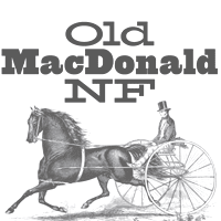 [
[ [
[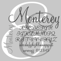 This script started out in 1958 as Intertype's reaction to ATF's successful script typeface Murray Hill. AtMahogany Script, or simply Mahogany Script was a Compugrapghic / Agfa typeface. Today, it is sold by Monotype Imaging. Solo called it Hallmark Script, while Linotype and Bitstream call it
 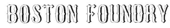 Boston-based foundry, est. 1817 by
 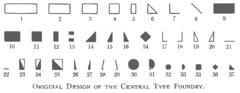 Foundry from St. Louis, est. 1872. It became "Central Division of ATF" in 1893.
  Prolific Woodland Hills, CA-based typophile and type designer (1937-2013) whose portfolio consisted largely of revivals and who used the alias Character for his typographic work. The Los Angeles Times posted
  A typeface designed by Morris Fuller Benton in 1927. Mac McGrew: Chic is a novelty typeface designed by Morris Benton in 1927 and released by ATF the following year. It has no lowercase; its thin lines are very delicate and its normally thick lines are opened with two parallel white lines. The result is airy but very mechanical. The 48-point size was cut but no showing has been found; in fact the series was not shown at all in specimens appearing as early as 1931. Compare Boul Mich, Broadway, Gallia.
  Quebec-based typographer and type designer (aka Diogene) who specializes mainly in revivals of obscure or old typefaces.
  [
[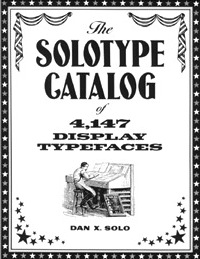 Dan Solo's books contain a series called "Ready-to-use...". These are not included in the chronological list given here.
 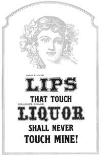 Gene Gable reviews Dan Solo's contributions. He writes: Dan X. Solo spent a lifetime building Solotype, one of the world's most interesting type collections. For three decades he ran his business with unparalleled character and panache. Type designers and graphic artists tend to fall into two categories. You either like ornate old typefaces or hate them. I'm a big fan -- the more ornate and over the top the better. So it was a terrific find when I came across a box of original Solotype catalogs, brochures, and other promotional material. The Solotype shop closed in the early 1990s, leaving a big hole in the availability of unique and unusual type designs. Dan X. Solo, who still lives in Alameda, California, was born in 1928. For his ninth birthday his grandfather gave him a small Kelsey letterpress, and he quickly became a self-described boy printer. He started collecting typefaces in earnest at age 14, and the Solotype collection officially began. After dropping out of high school, Solo became a radio announcer and sometime-actor. In 1949, the 21-year-old put together a magic act and toured the West Coast with some success. Along the way he continued to collect old typefaces, which were plentiful around his native Oakland and the San Francisco Bay area. In 1962, Solo decided to see if he could make a living from his type collection, which by then numbered about 1,000 unique fonts. He printed 4,000 catalogs, sent them to ad agencies around the country, and waited for the orders to come in. This flyer is from 1962 when the Oakland shop opened. The shop took off, as the '60s were a time of design experimentation and there was a keen interest among some designers in ornate and unusual type designs. Solo didn't just offer typesetting. He was a one-man consulting service on the history and appropriate use of his type designs. In 1974 Solo connected with Hayward Cirker, owner of Dover Publications, and a long relationship began that resulted in 30 books showing various type collections, mostly organized by era or theme. The Solotype catalog, reproduced by Dover, reached graphic artists all over the world and inspired a generation of type designers. The type designs weren't the only unusual thing about Solotype. Its business practices and the attitude that Solo fostered were unique. Here are several sections from early Solotype catalogs addressing the way Solo preferred (or insisted) on doing business. Unlike most type shops of the era, which were accustomed to being available to customers on demand, Solotype closed every year for the month of October. During this time, Solo traveled around the country and the world, collecting more type designs and fonts. In the early '90s, Dan X. Solo realized that the digital era was rendering his services obsolete. By that time, he had a collection of more than 13,000 type designs. During that decade he did convert many of his designs to digital format and sold them as collections through Dover, but the type business was changing, and bookstores were not the preferred distribution method for type. Since many of the designs in the Solotype collection are public domain and not associated with any active foundry, they do crop up here and there, mostly in low-priced, generic font collections. But of the thousands of Solotype designs, probably only a few hundred can be had in digital form from any foundry. Perhaps a future resurgence in historic typestyles will make it worthwhile for someone to digitize those that remain. The Solotype collection is an important and historically significant part of type history, even if considered lowbrow by some type purists. Some images scanned by Gables:
 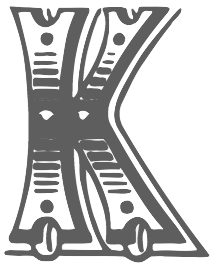 Creator of
 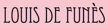 An orphaned arts and crafts font, identical to the digital fonts all called Eccentric published by
  Nineteenth century engraver (b. Germany, 1872, d. 1944) in Chicago. He designed these typefaces:
  New York-based foundry, also called White's Type Foundry and A.D. Farmer Foundry. It was created in New York in 1862, and sold to ATF in 1892. Many of its typefaces were digitized in recent years, such as the art nouveau typeface Palm (1887), which resurfaced as
  Company (aka HFF) that offers free revival fonts.
  Peter Zelchenko, a master trade typographer in Chicago in the 1980s and 1990s, gave me permission to tell his story about the origins of Hobo---both the name and the typeface. He contradicts Mac McGrew, but his explanation is more likely than all others that have been proposed. So here we go (all text below by Peter).
 Born in 1951,
  Quezon City or Kyusi (Philippines)-based designer of revivals and opportunistic typefaces, who is quite active on newsgroups like alt.binaries.fonts. His production is impressive:
  Philadelphia-based foundry, 1888-1917. The history of this short-lived foundry was told by James Eckmann in The Keystone Type Foundry, 1888-1917: a reprint [from] Printing&graphic arts, volume VI, number 1, February 1958 (Lunenburg, Vermont: The Stinehour Press, 1958). Their work appeared in Keystone Type Foundry, 1901 (362 pages),
 [
[ [
[ [
[ [
[ [
[ [
[ [
[ Nick Curtis designed these stencil typefaces:
  Typefaces made by Nick Curtis from 2004, not listed elsewhere on these pages. Bayern Handschrift, De Rigueur NF, Refugio Rustic WBW, Refugio Refined WBW, Ponte Vecchio NF, Brazzaville NF (based on Congo, a 1910 font by Barnhart Brothers \& Spindler),
  Typefaces made by Nick Curtis from 2005, not listed elsewhere on these pages.
  Typefaces made by Nick Curtis from 2006, not listed elsewhere on these pages:
  Typefaces made by Nick Curtis from 2007, not listed elsewhere on these pages:
  Typefaces made by Nick Curtis from 2009, not listed elsewhere on these pages:
  Typefaces made by Nick Curtis from 2010, not listed elsewhere on these pages.
  Typefaces made by Nick Curtis from 2011, not listed elsewhere on these pages:
  Typefaces made by Nick Curtis in 2015:
  Dover Press sold Oakland's
  [
[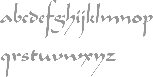
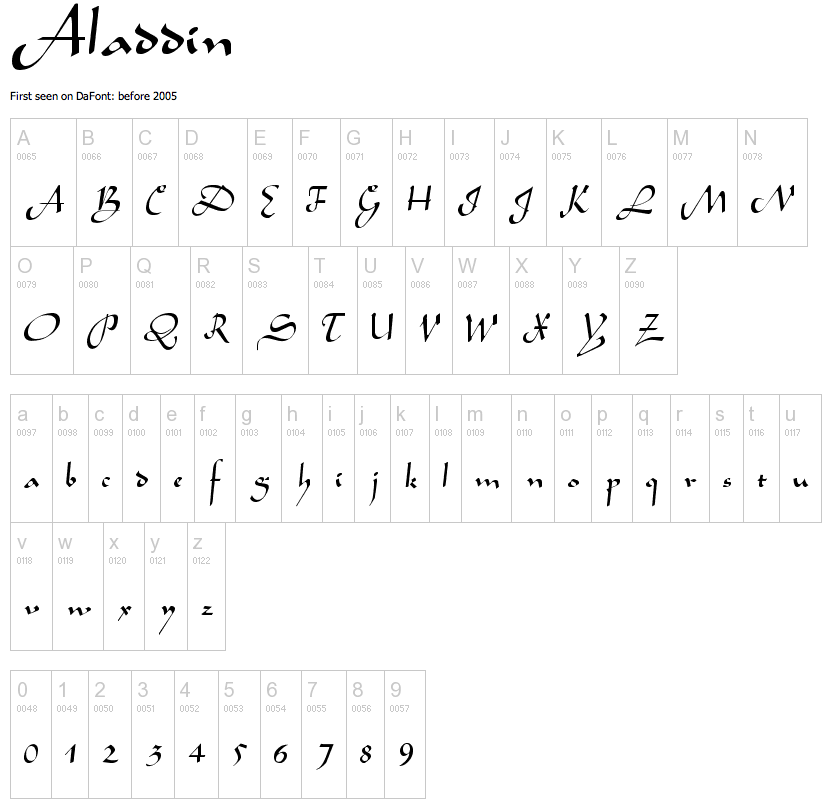
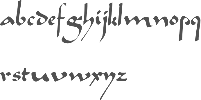
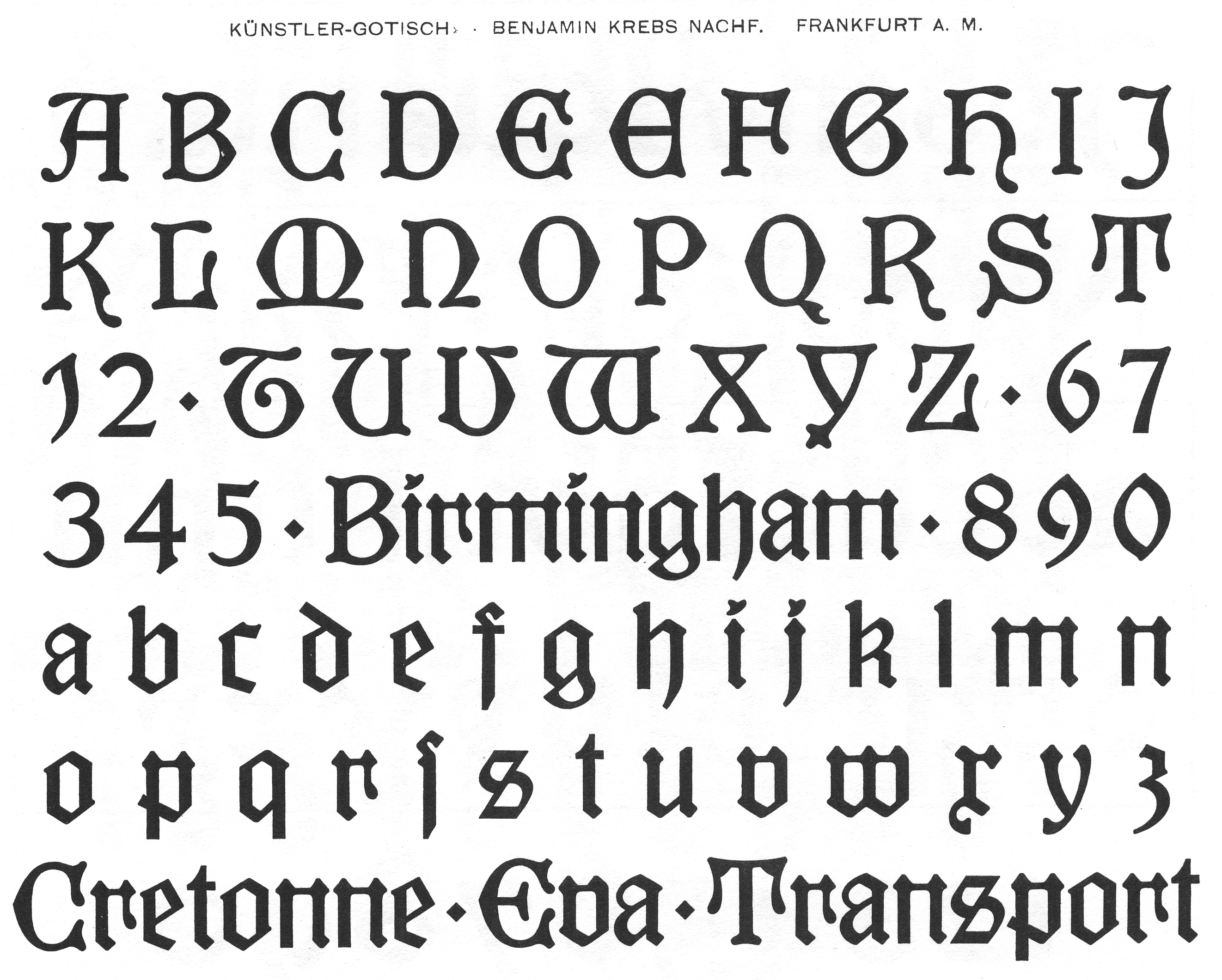
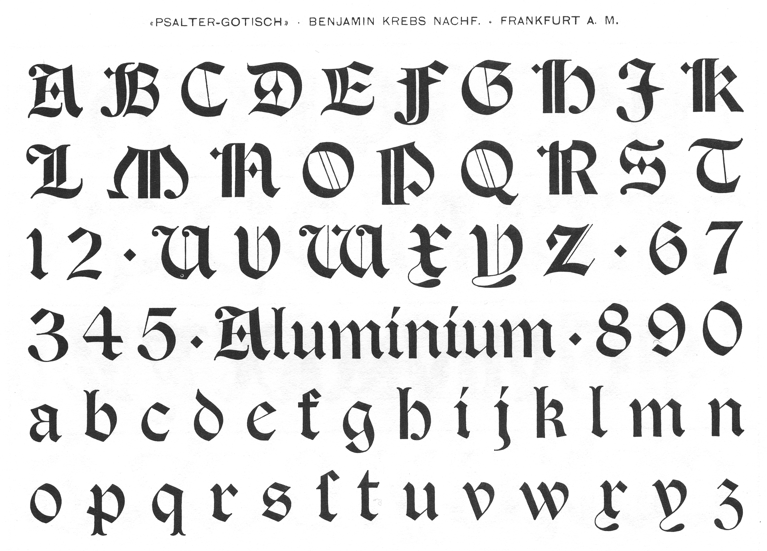
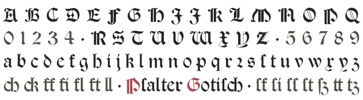
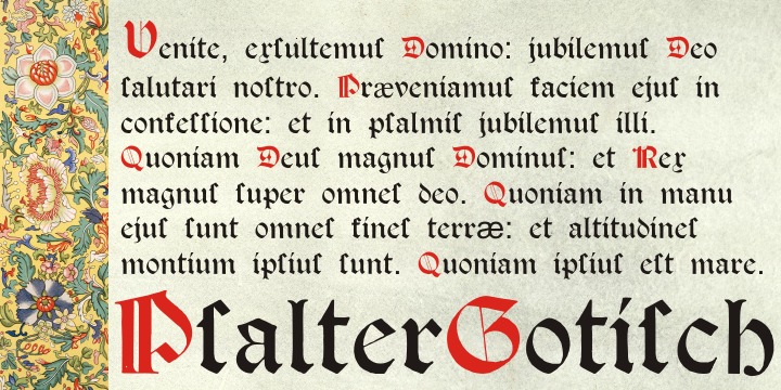
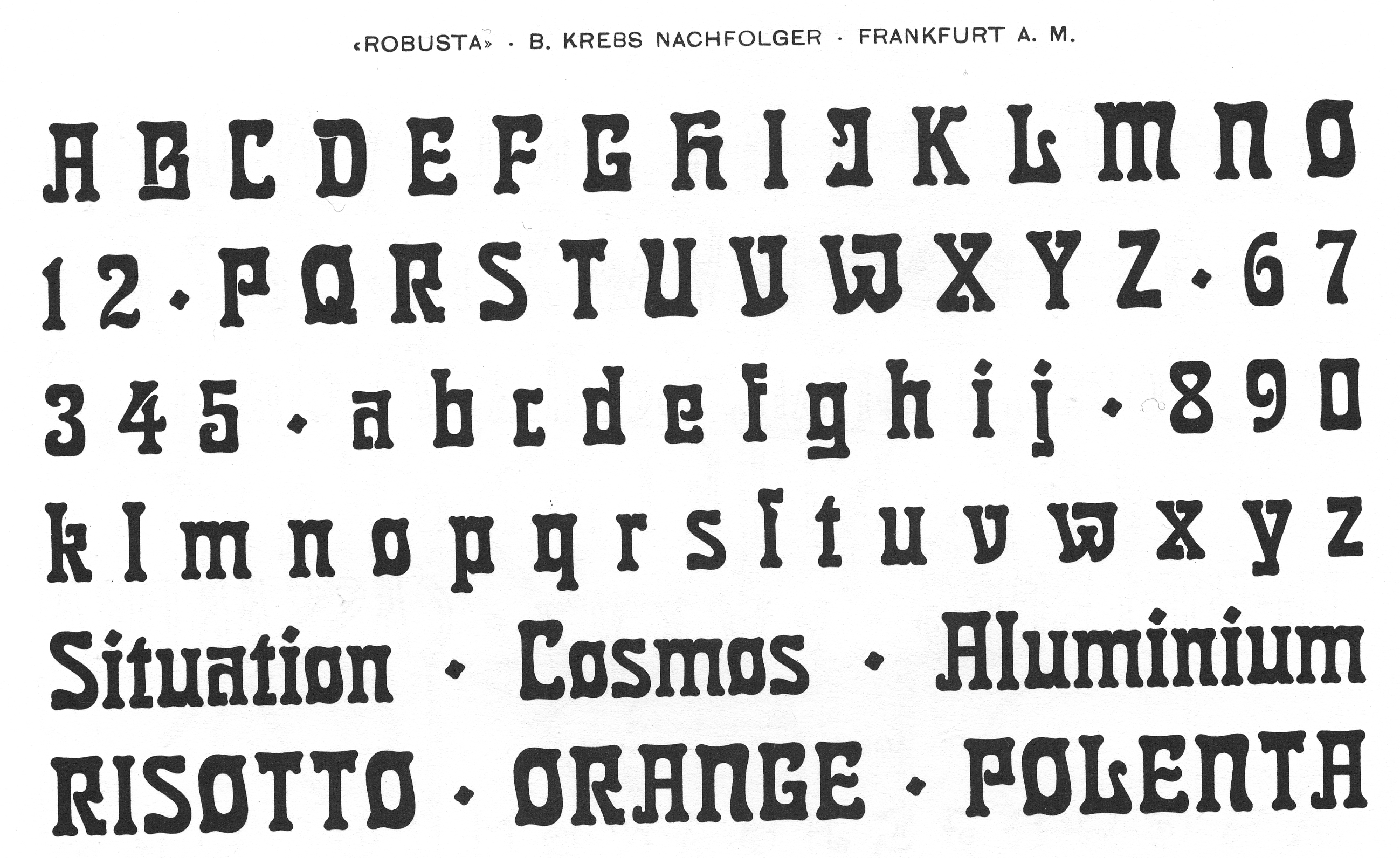
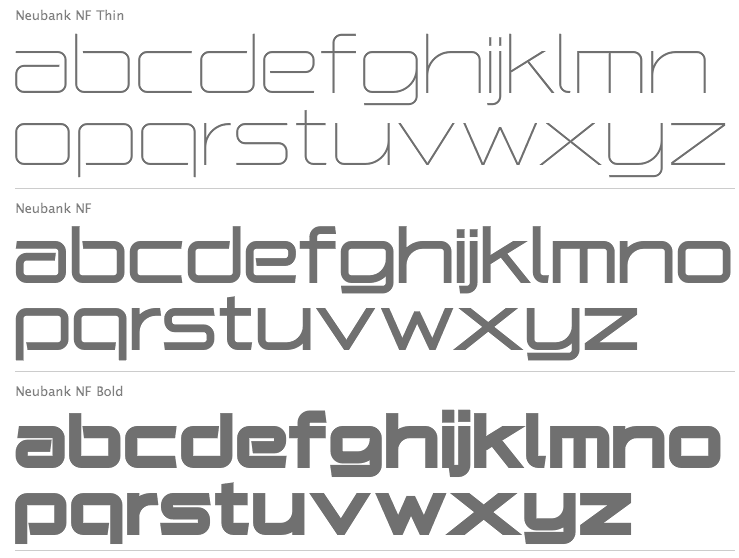
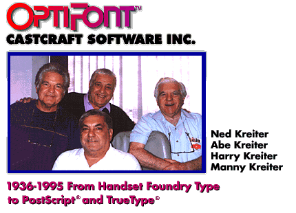
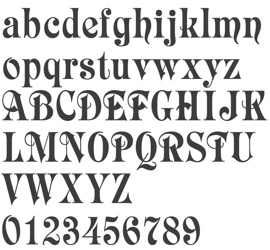
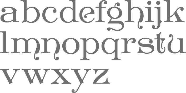
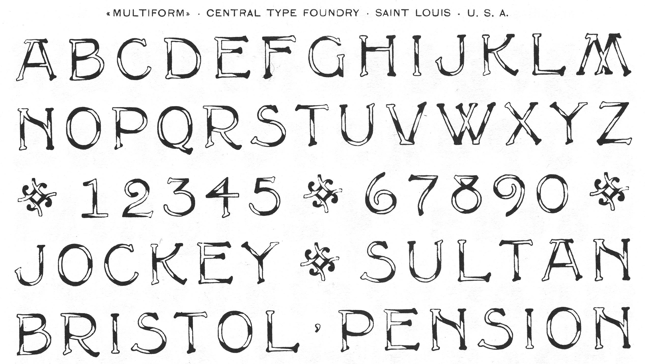
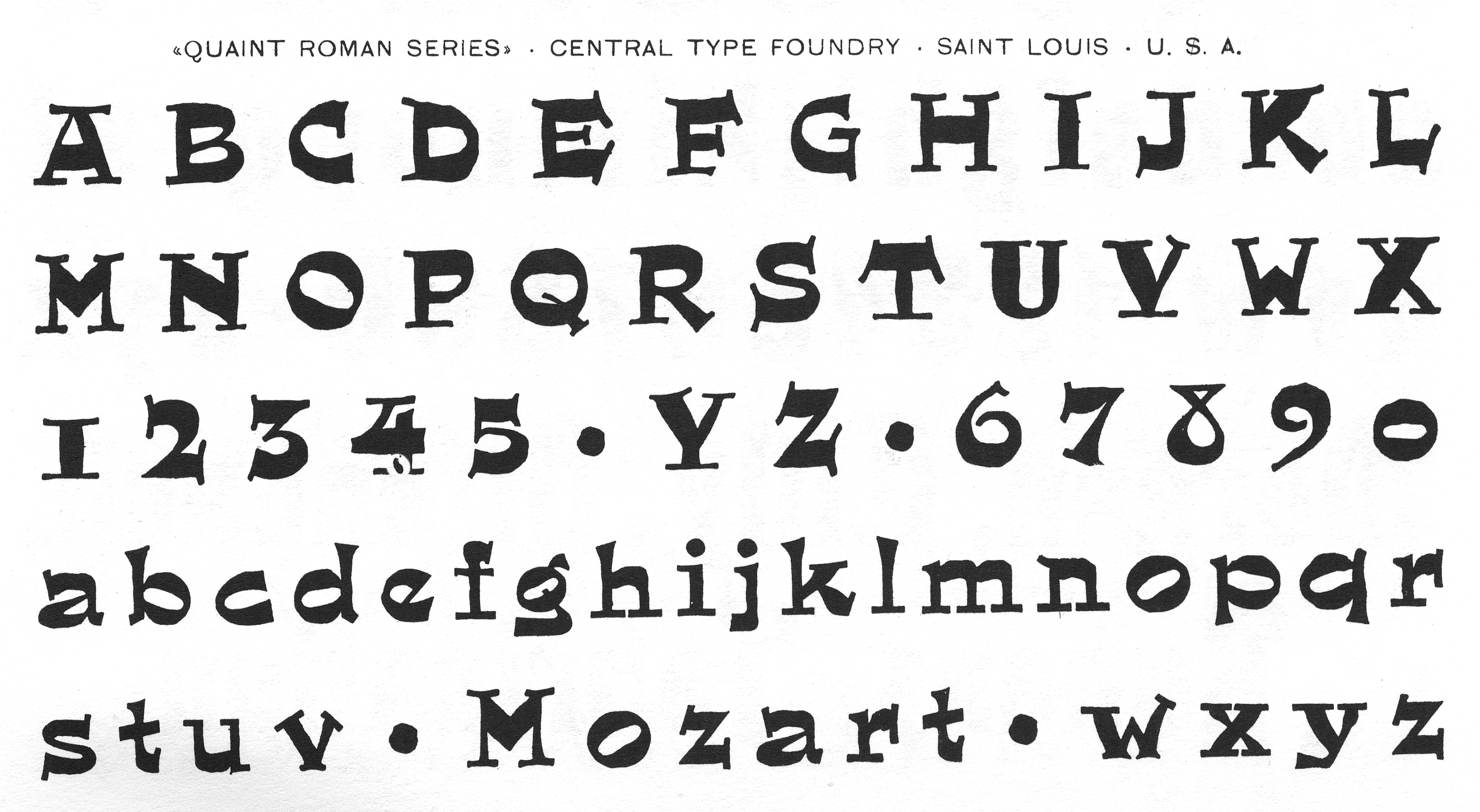
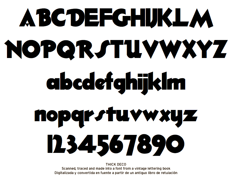
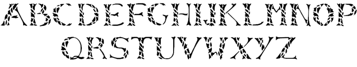
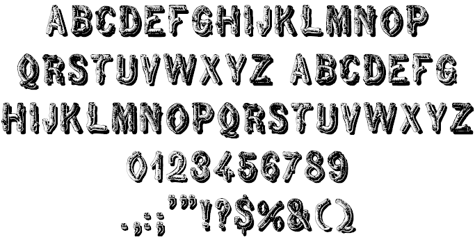
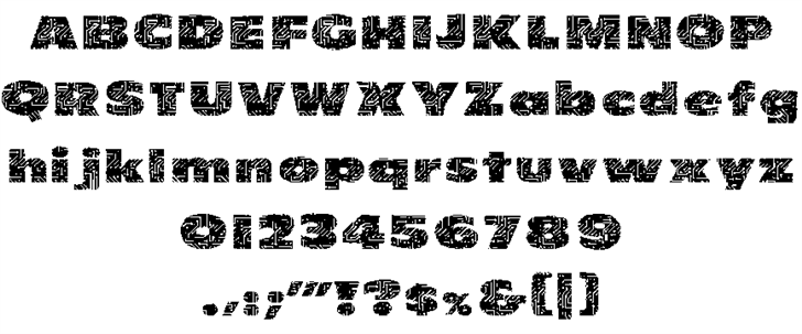
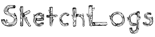
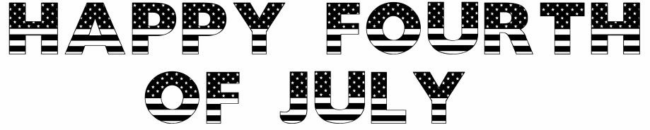
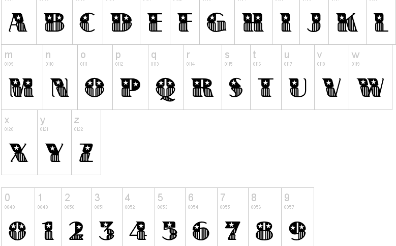
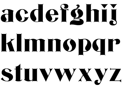
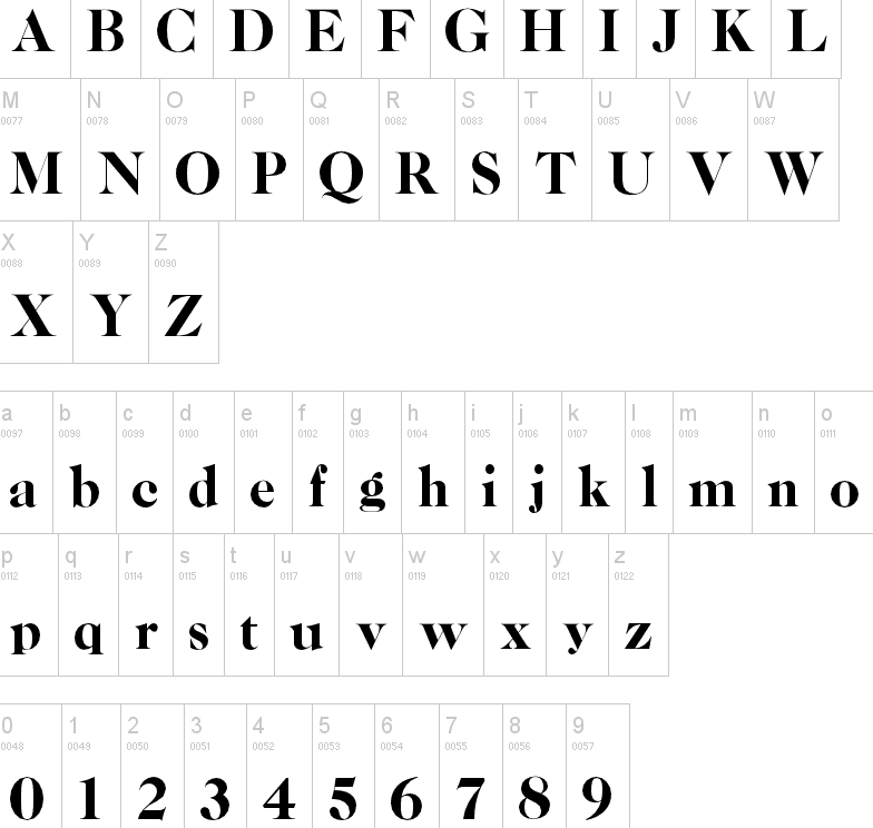
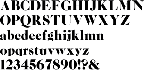
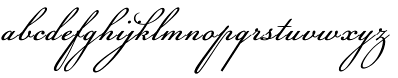
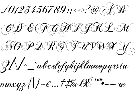
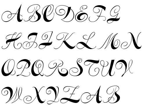
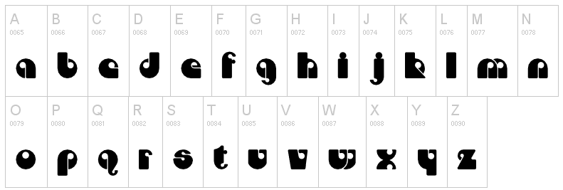
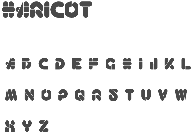
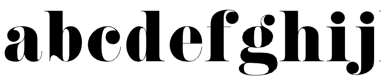
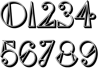
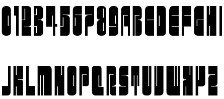
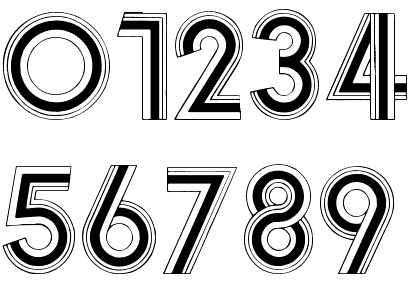
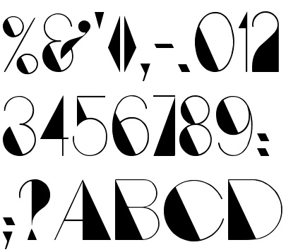
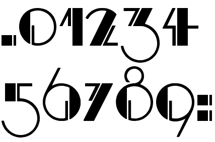
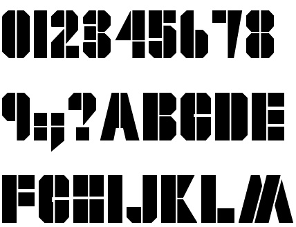
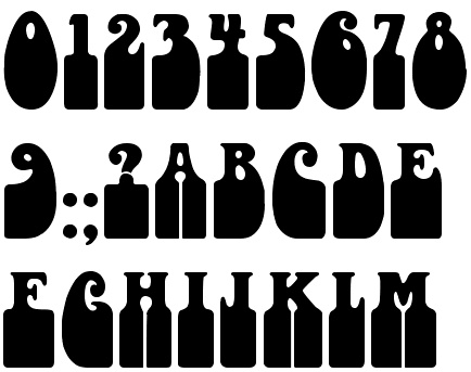
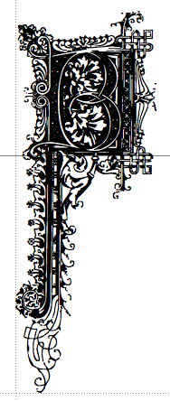
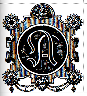
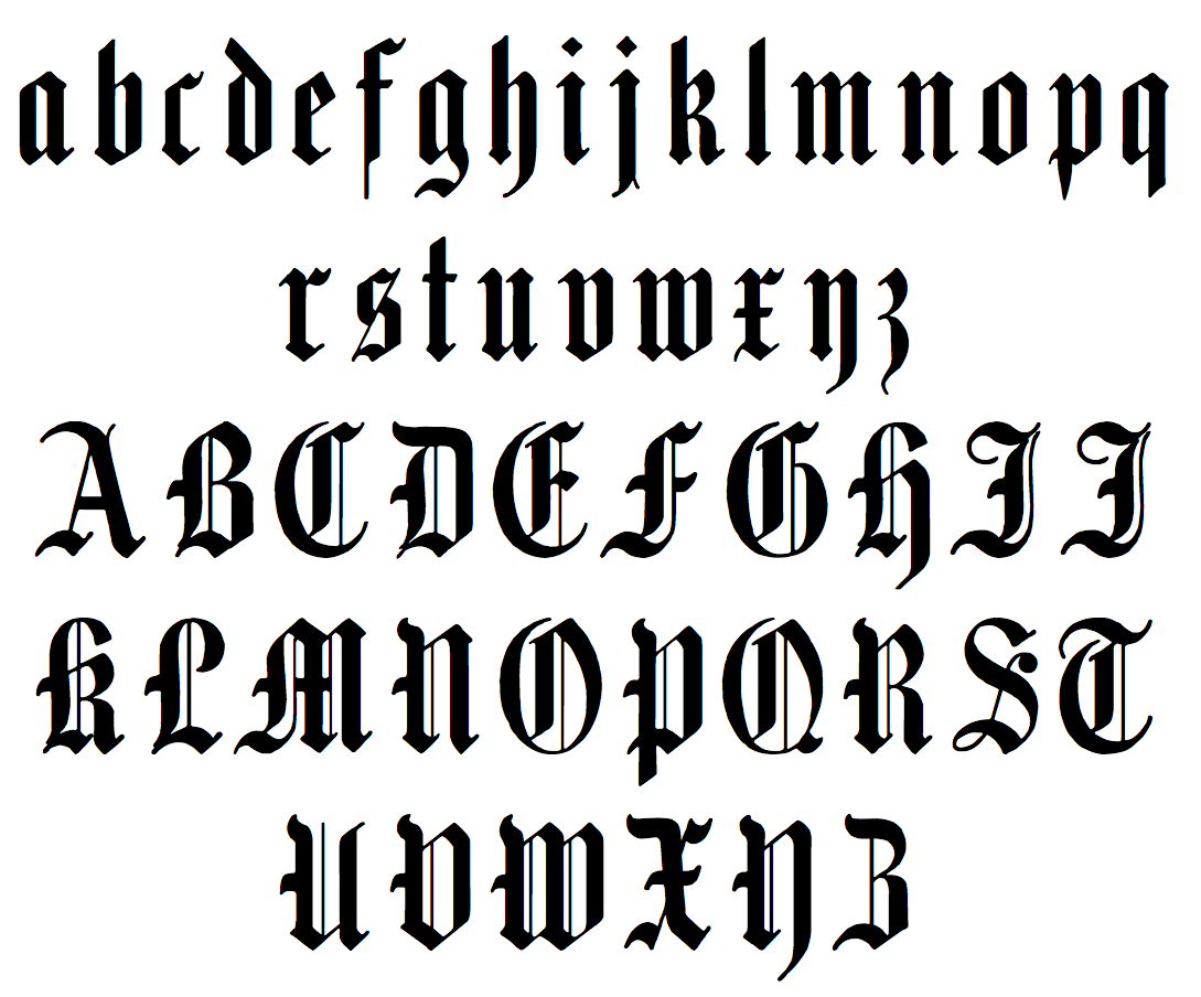
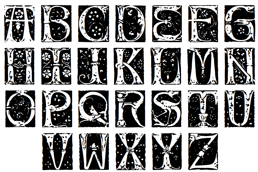
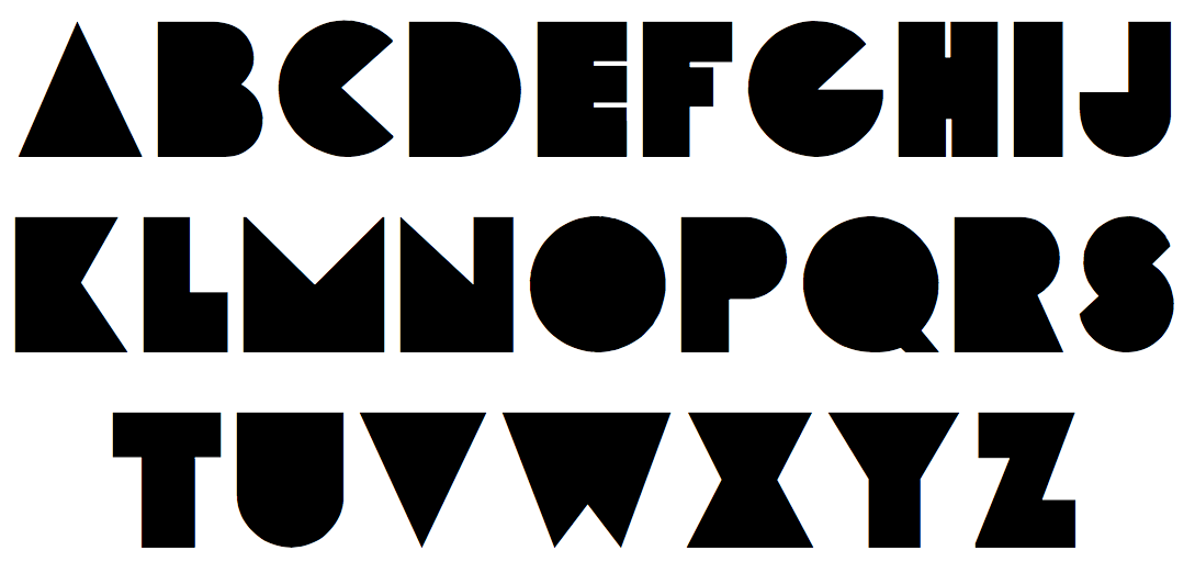
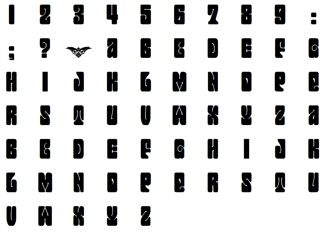
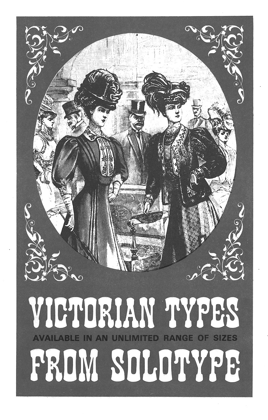
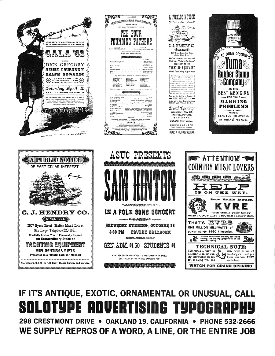
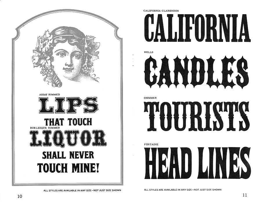
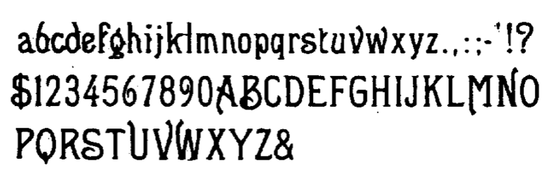
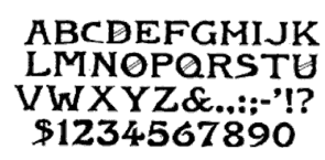
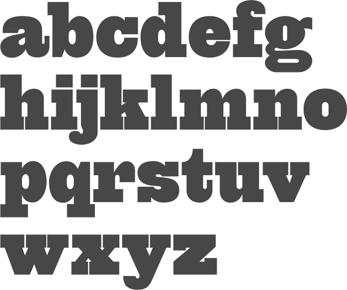
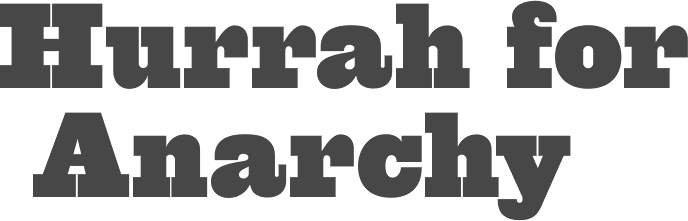
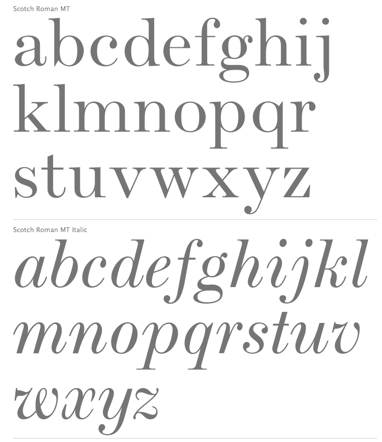
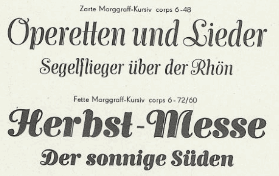
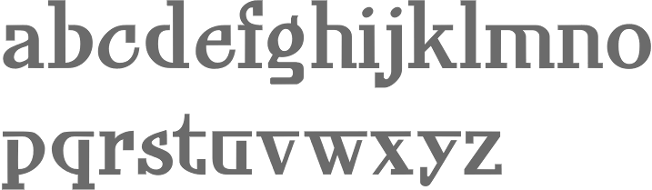
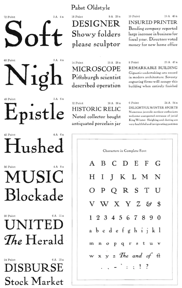
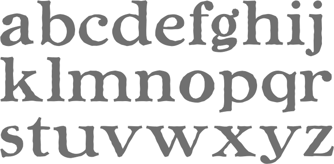
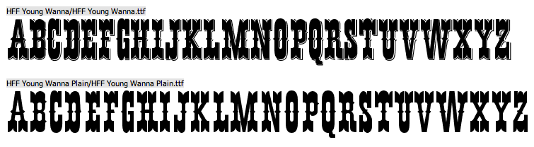
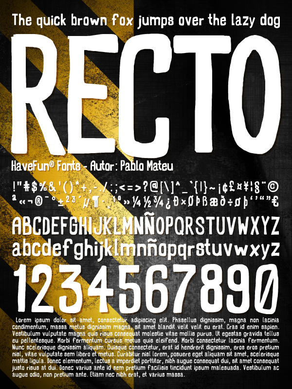
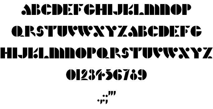
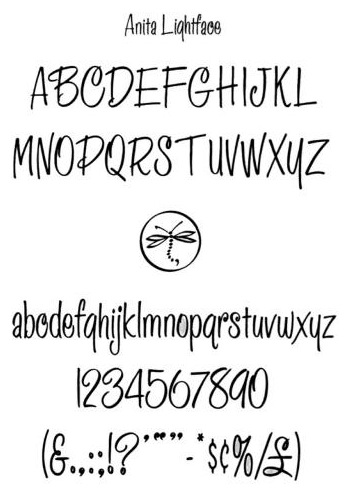
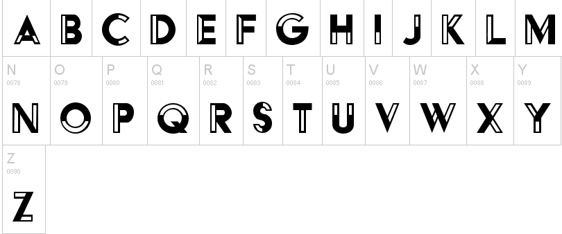
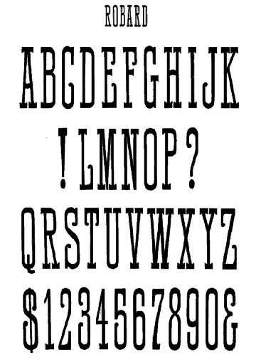
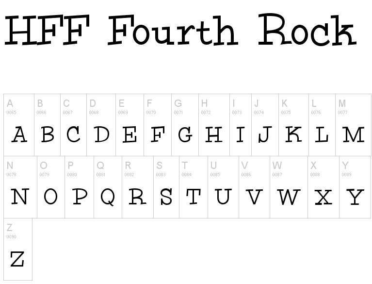
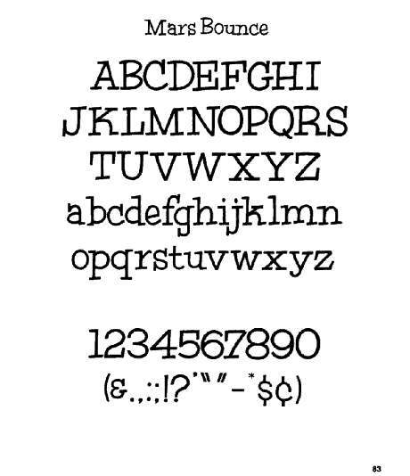
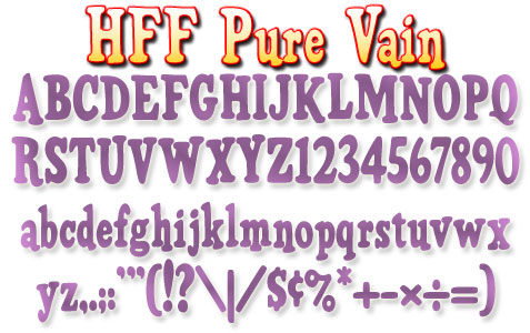
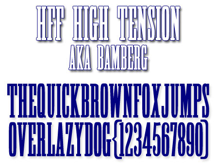
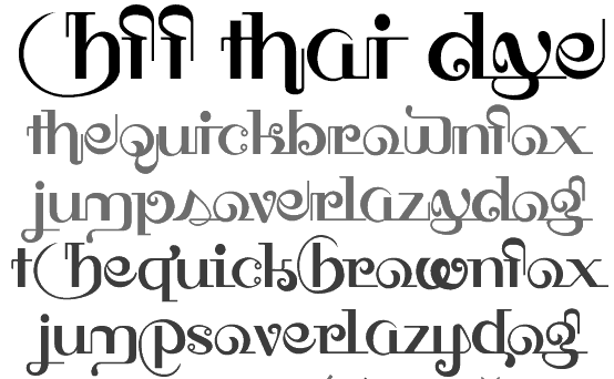
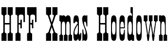
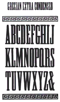
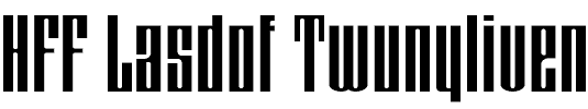
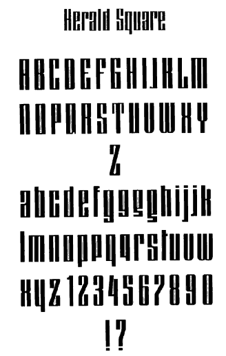
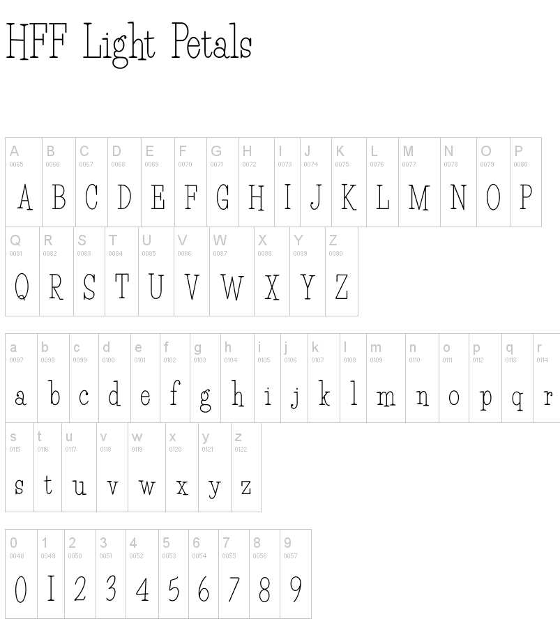
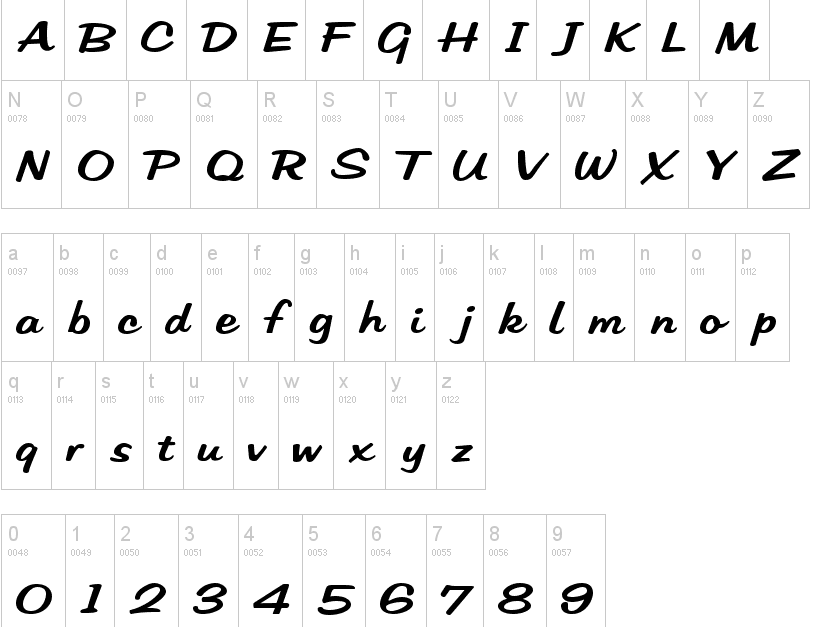
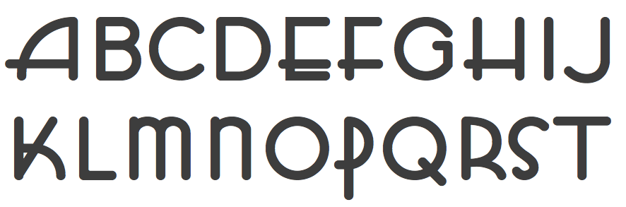
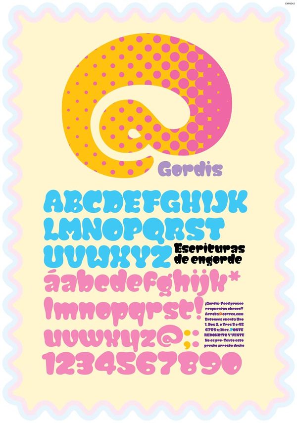
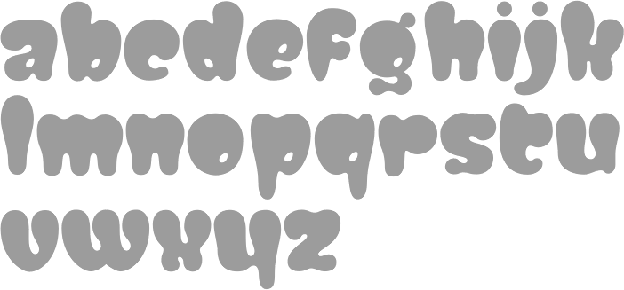
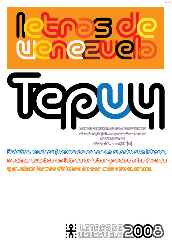
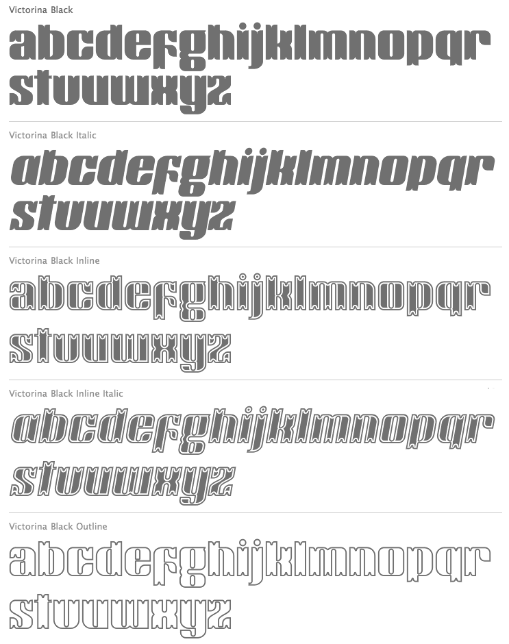
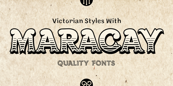
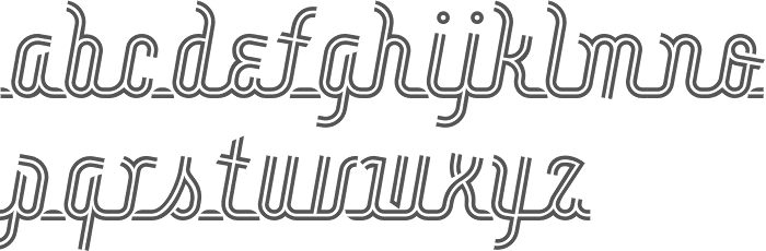
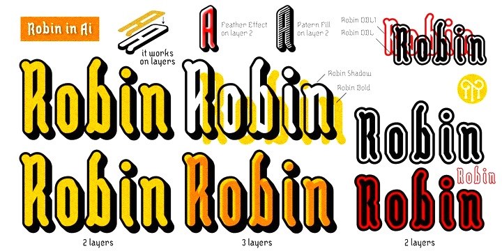
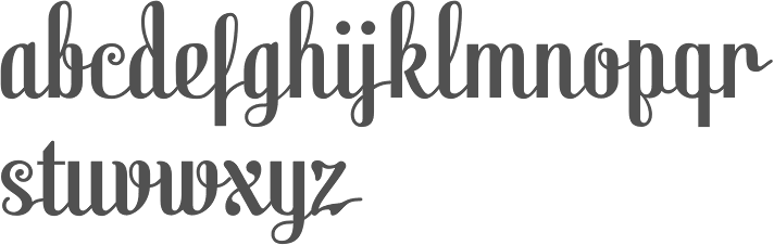
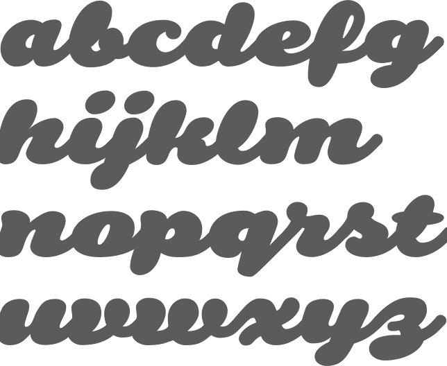
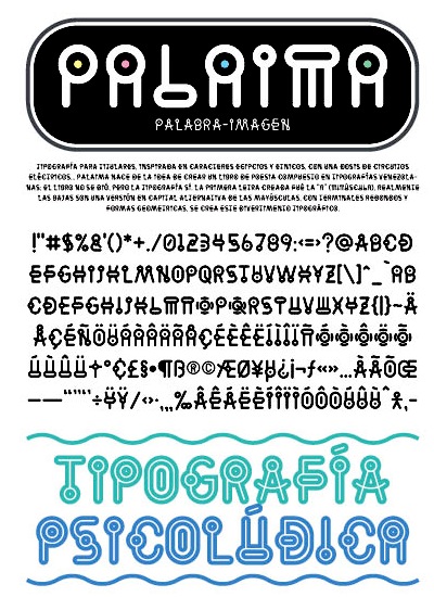
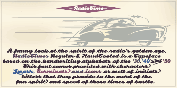
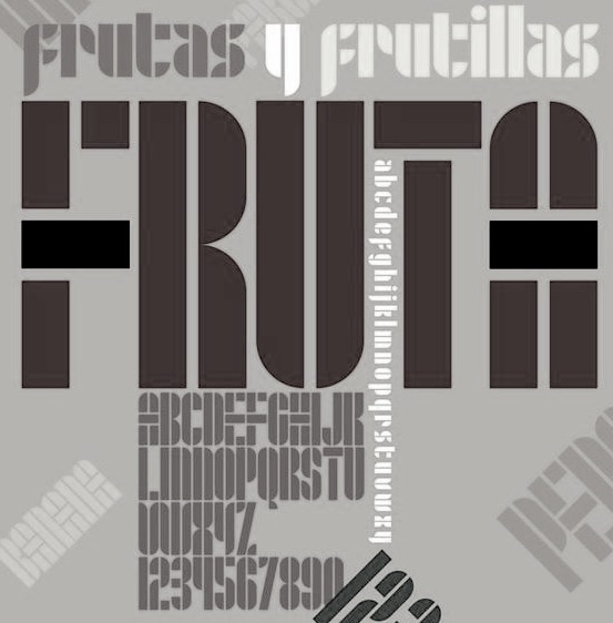
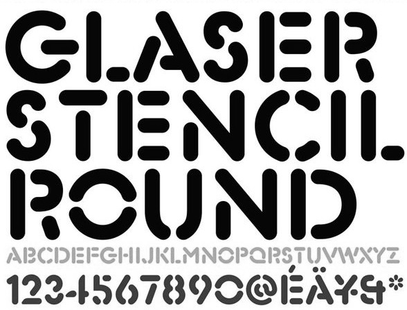
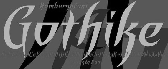
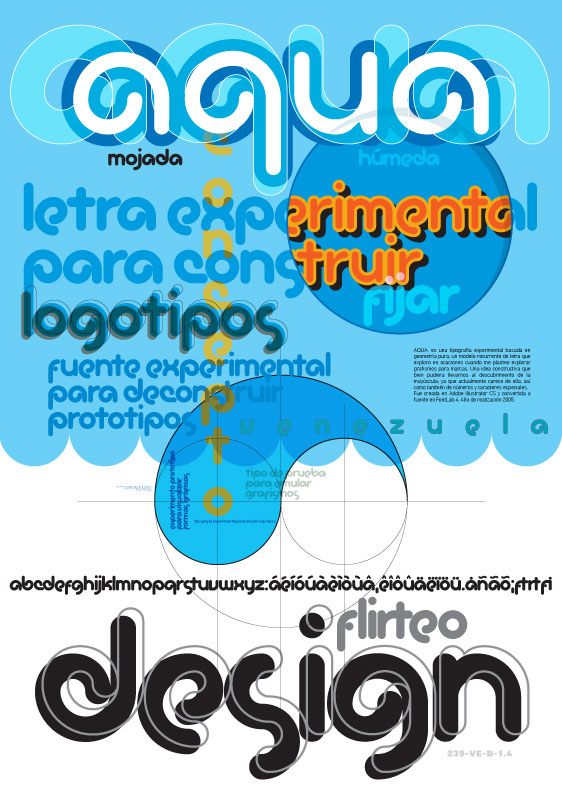
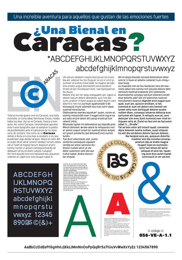
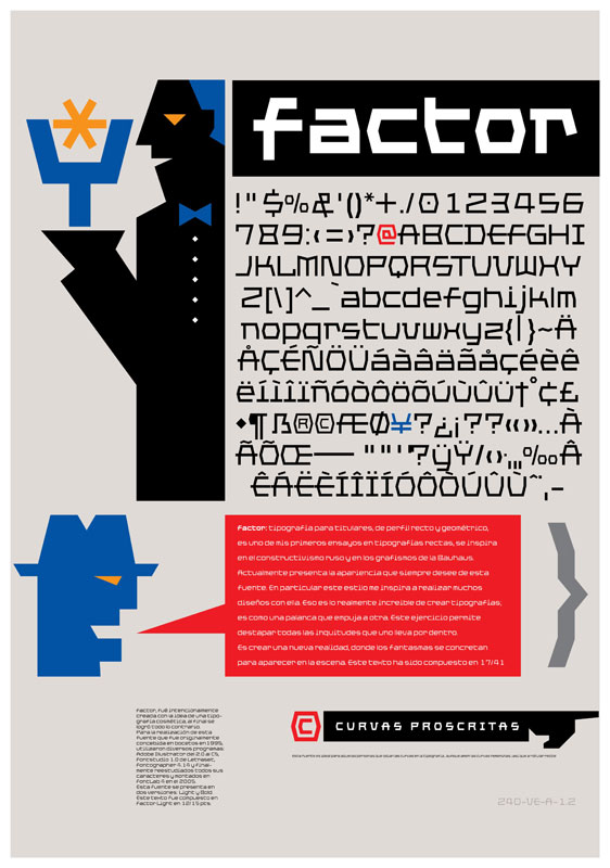
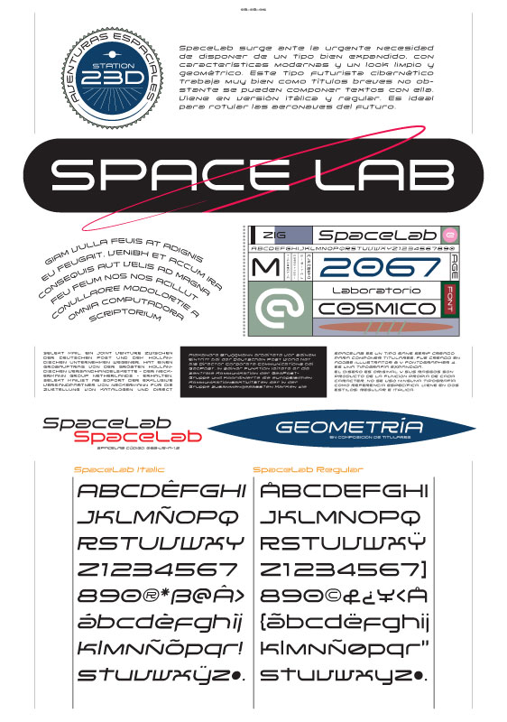
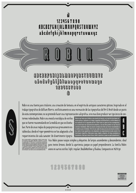
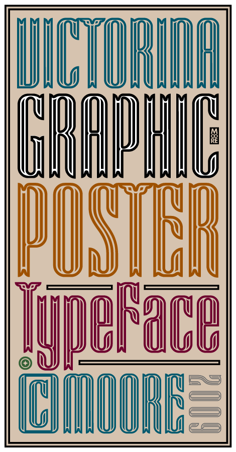
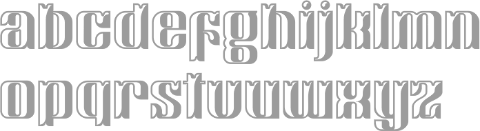
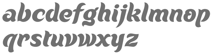
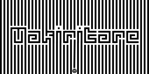
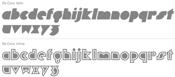
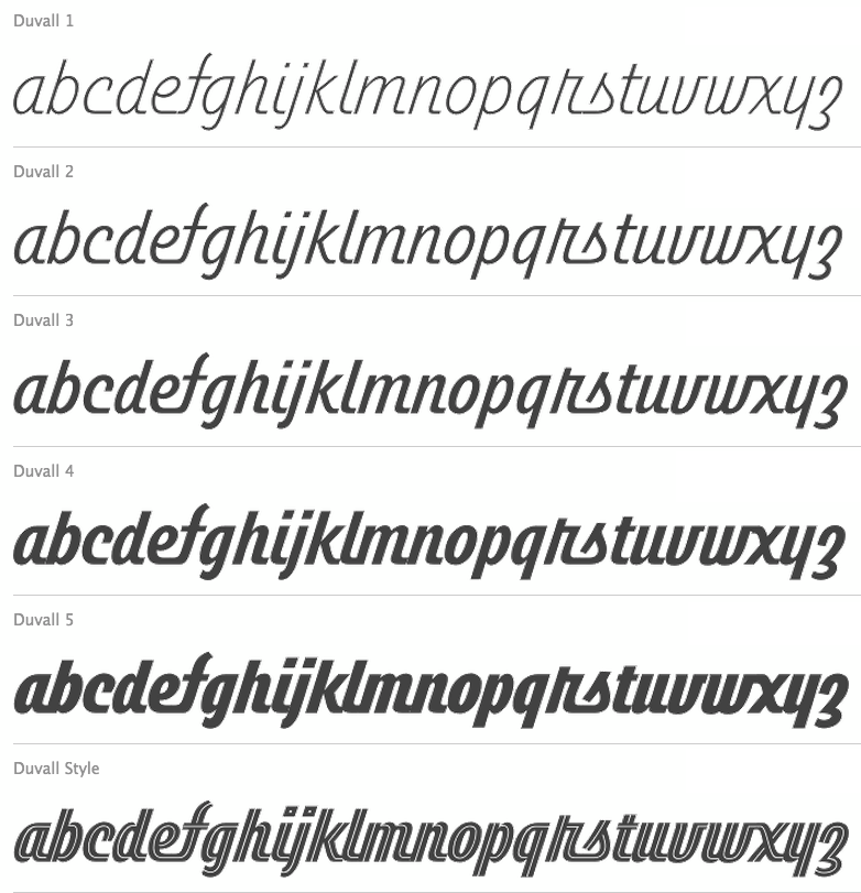
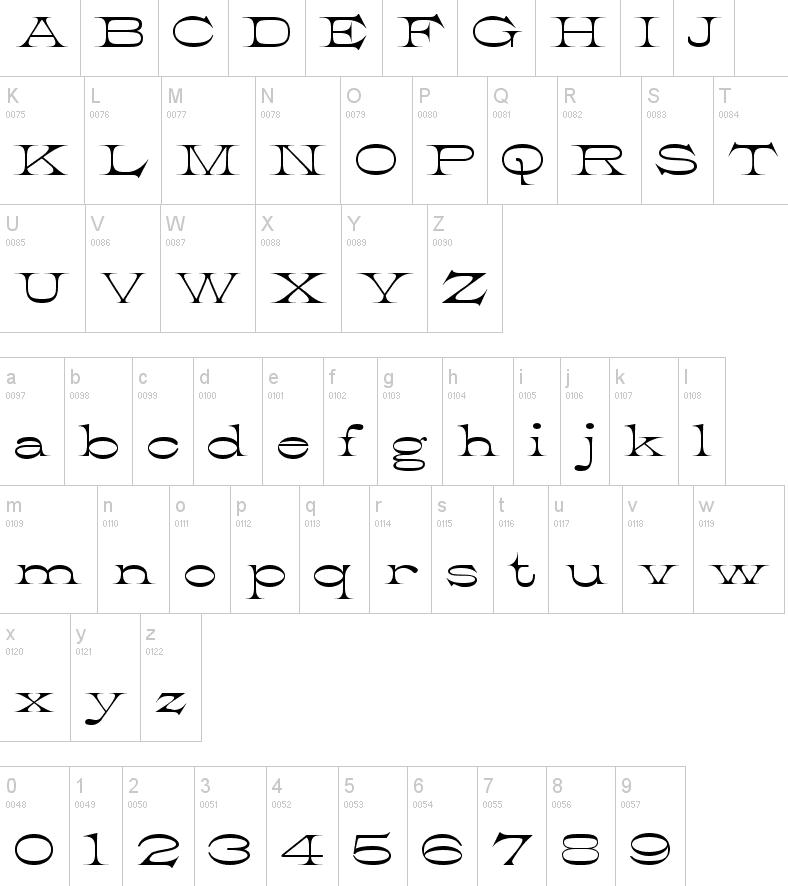
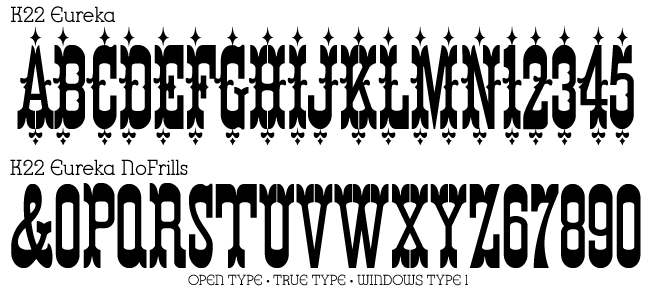
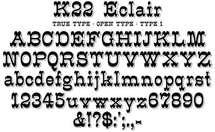
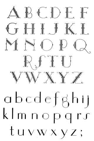
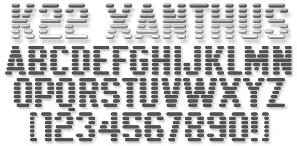
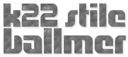
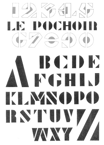
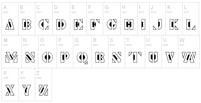
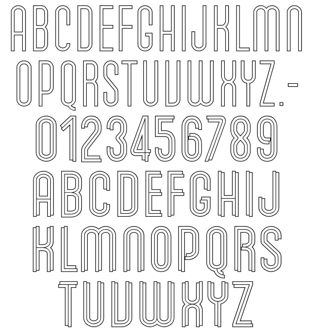
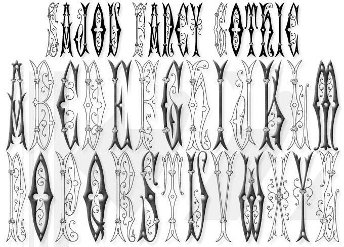
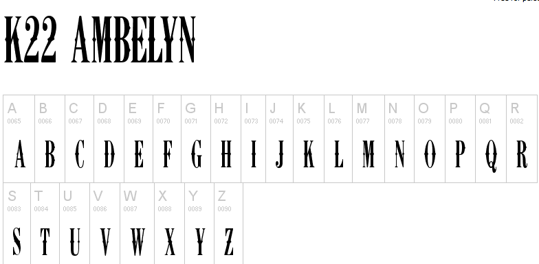
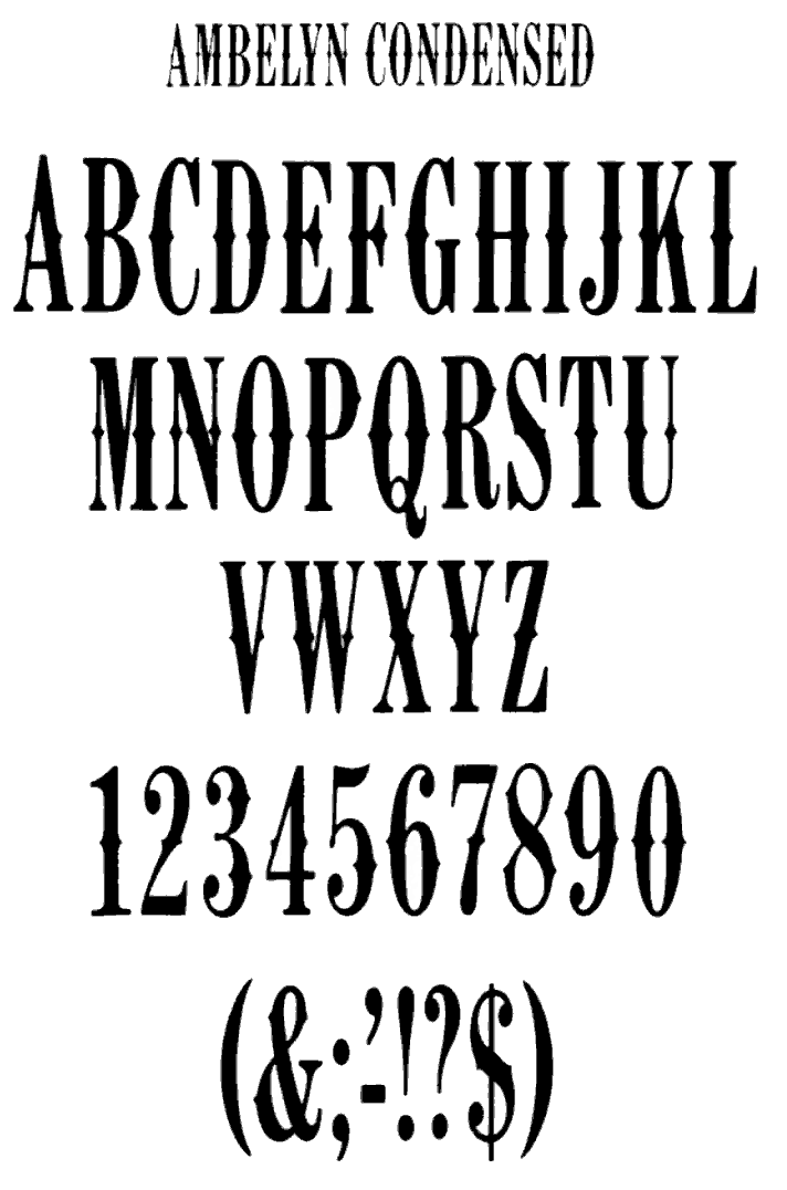
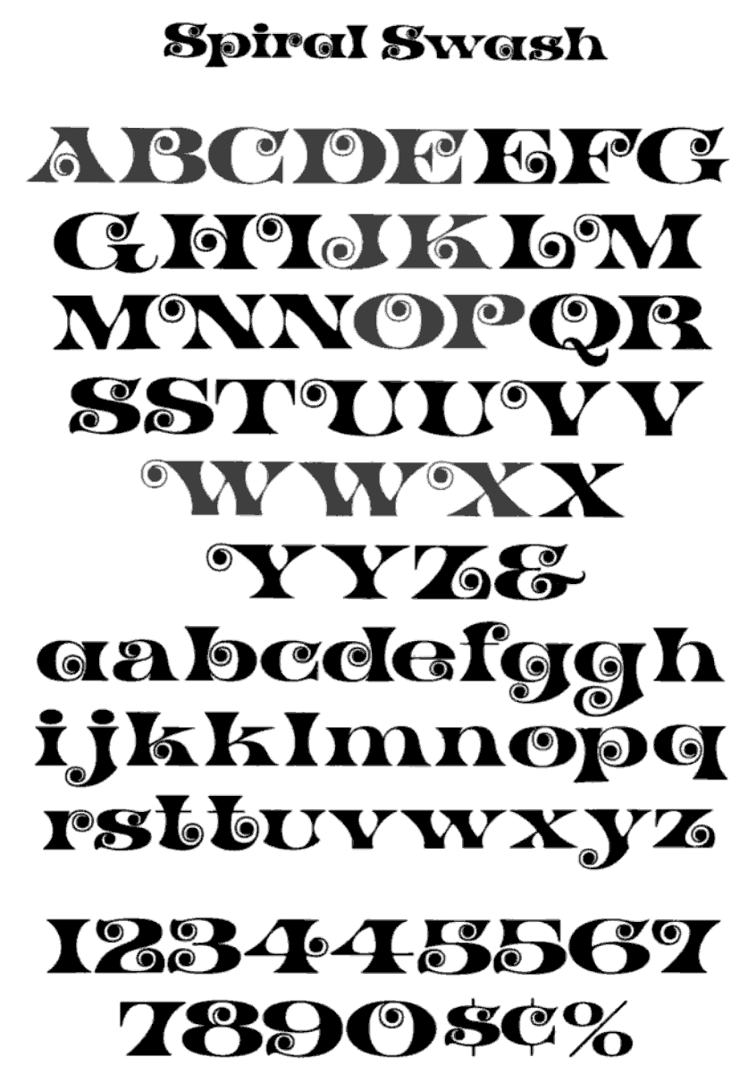
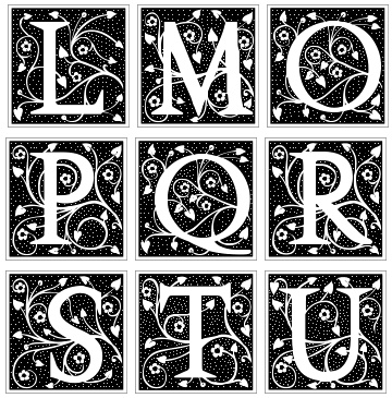
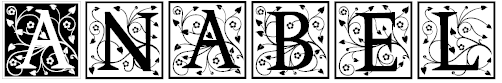
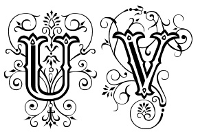
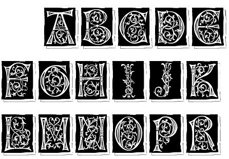
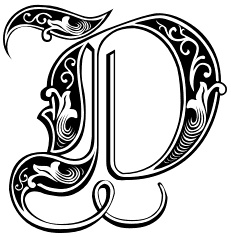
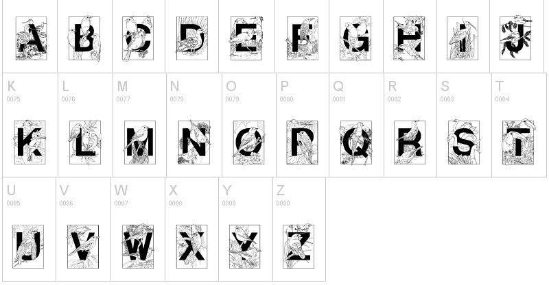
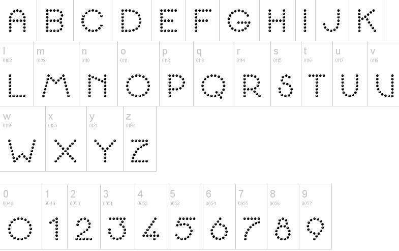
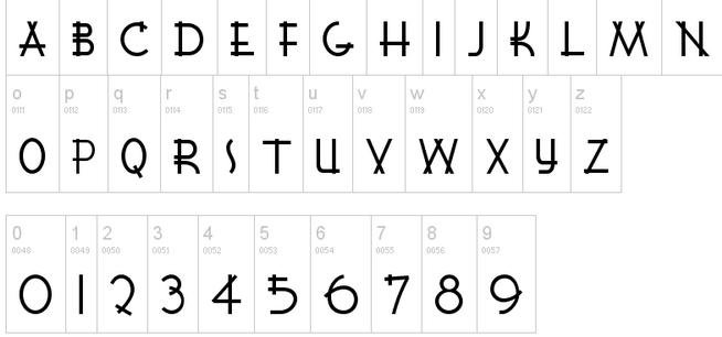
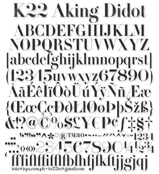
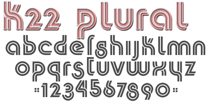
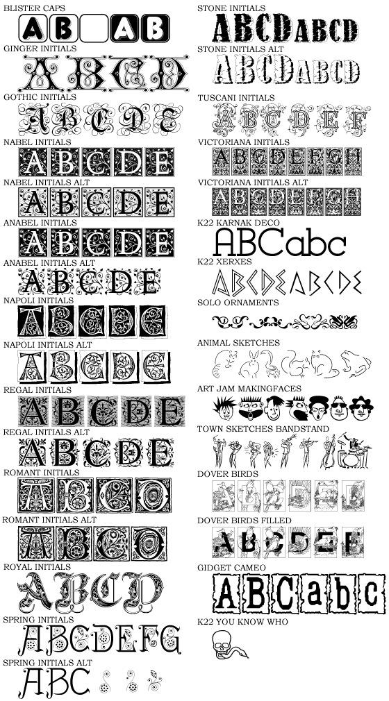
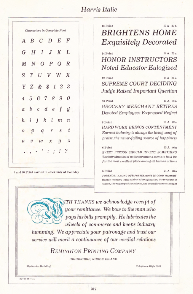
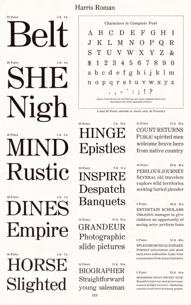
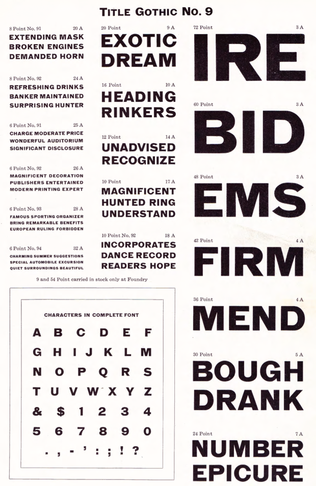
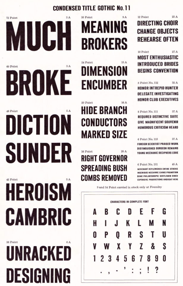
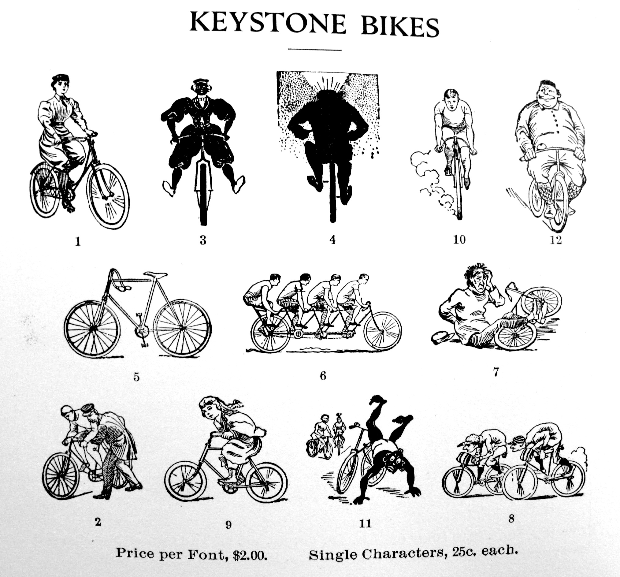
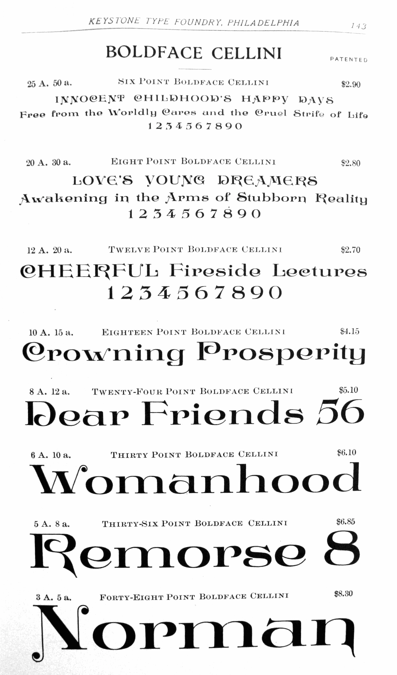
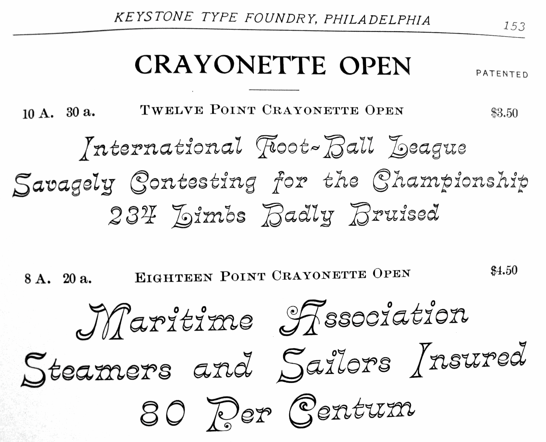
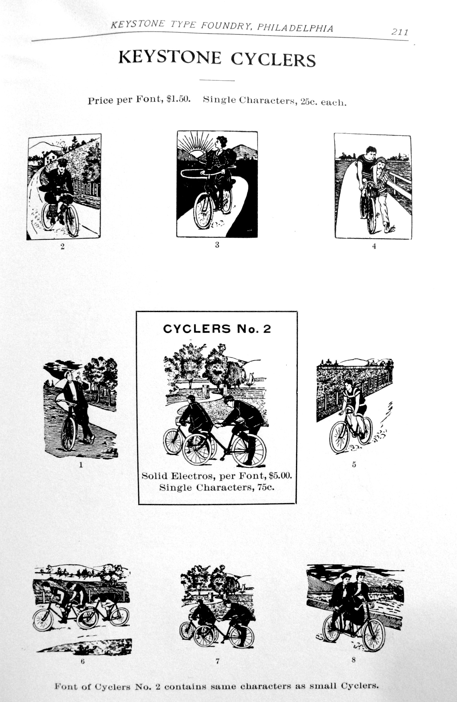
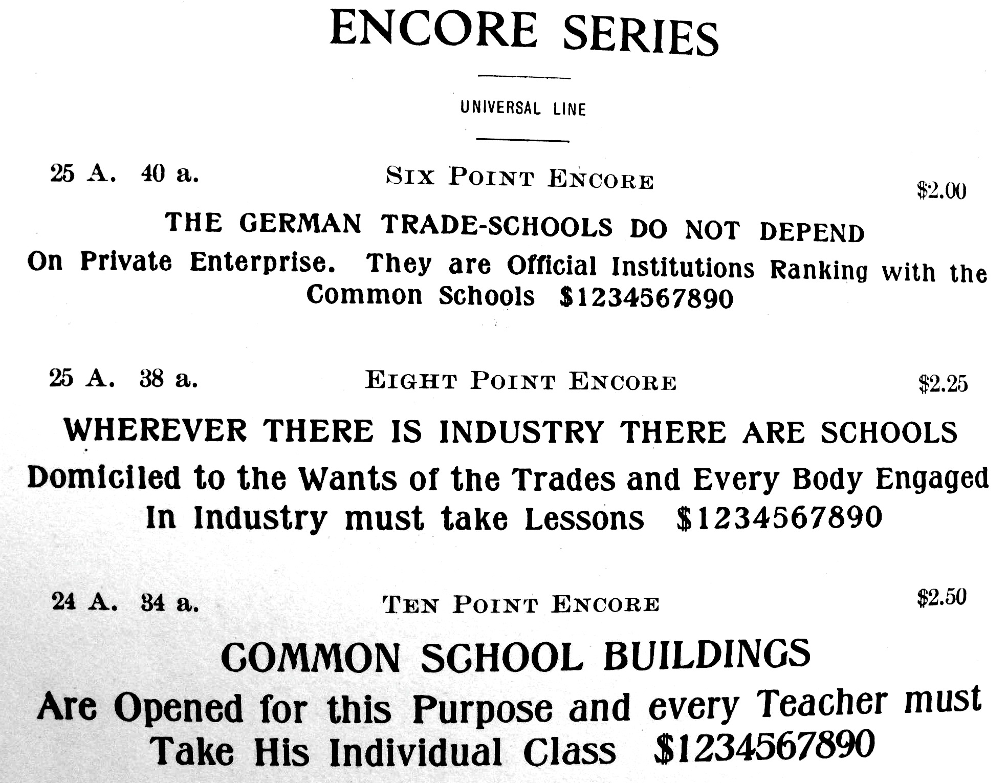
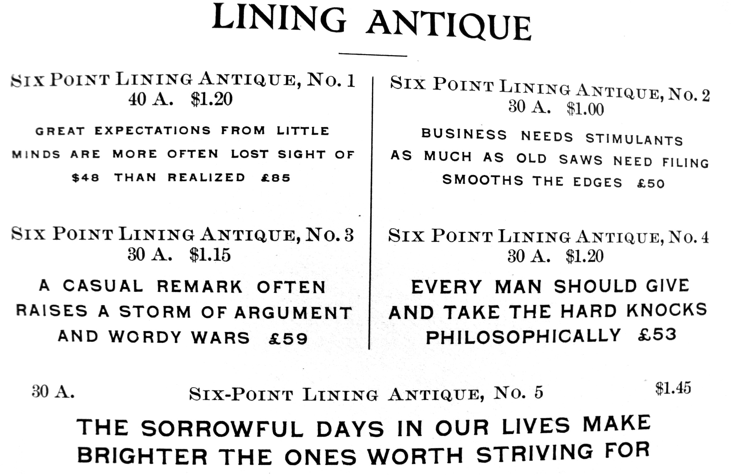
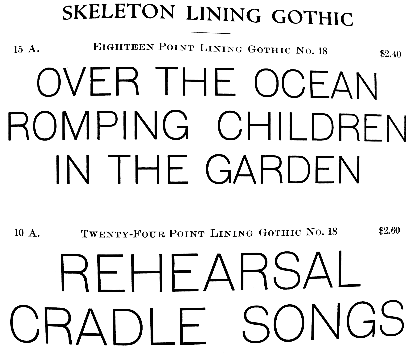
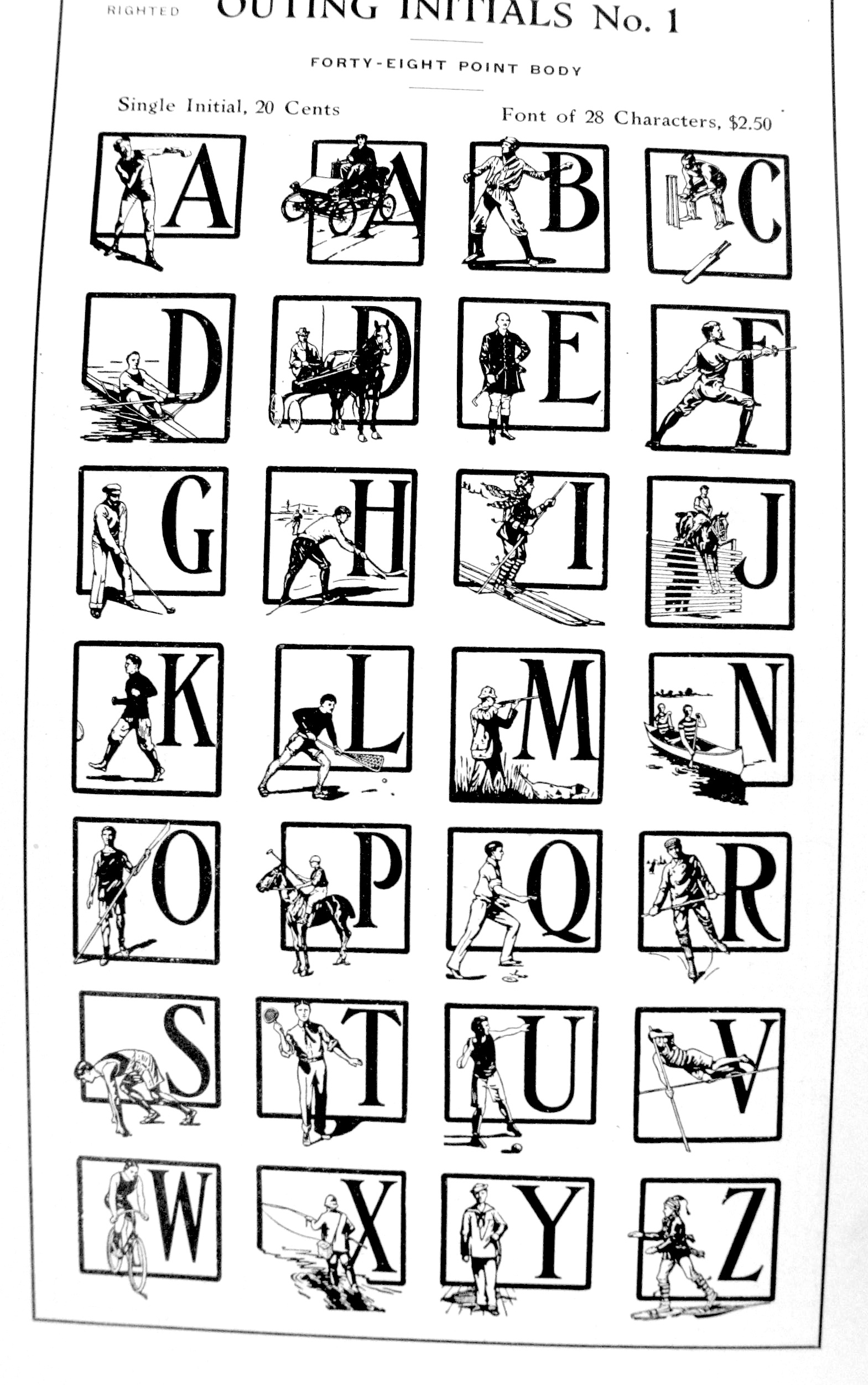
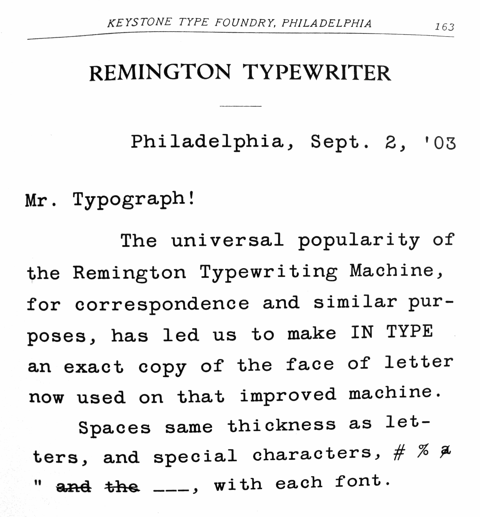
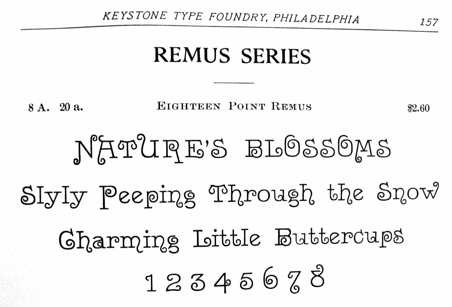
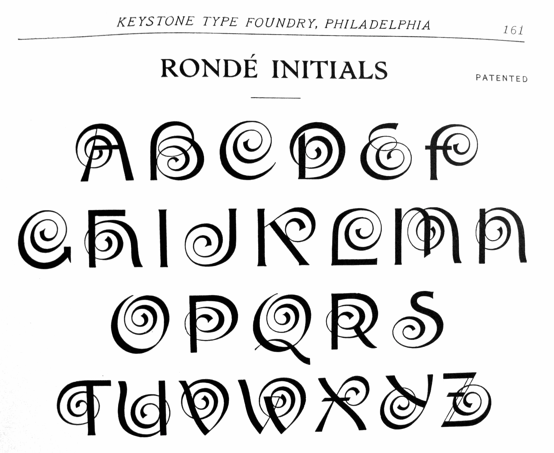
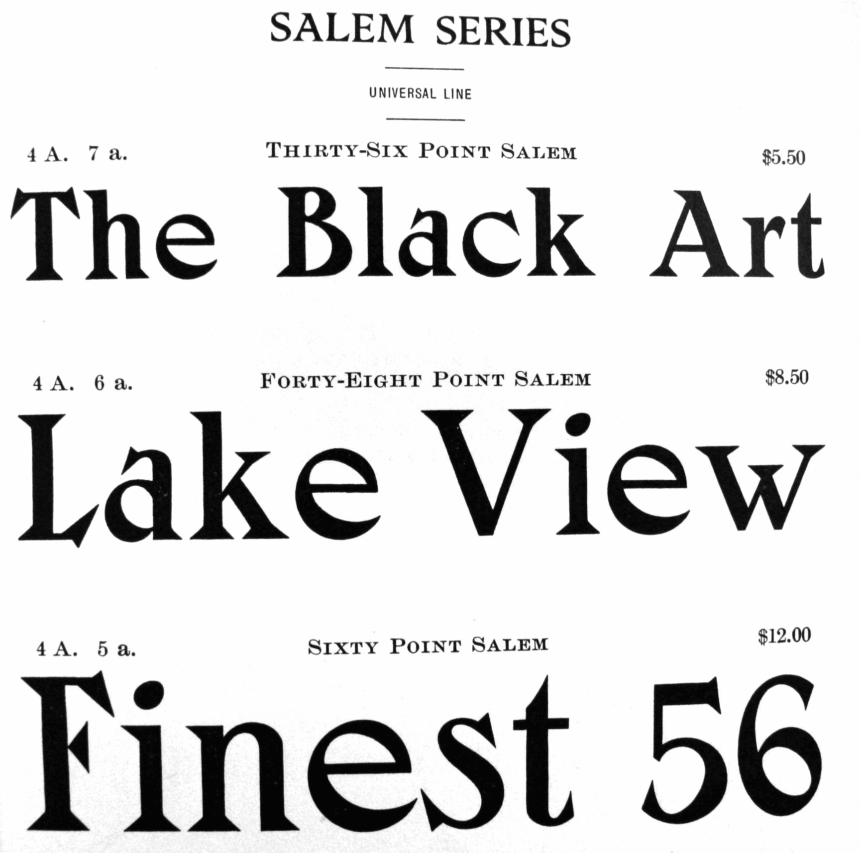
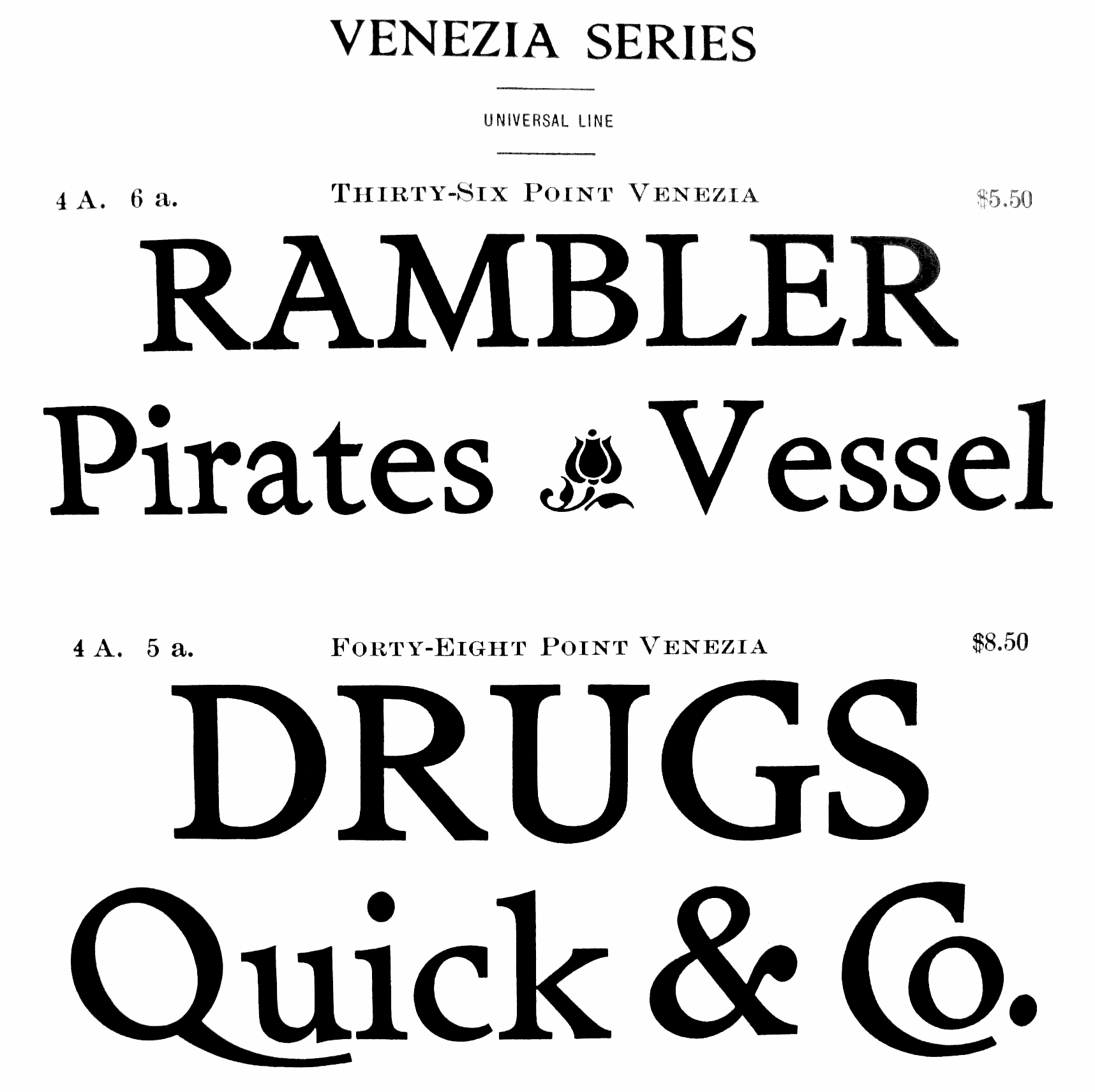
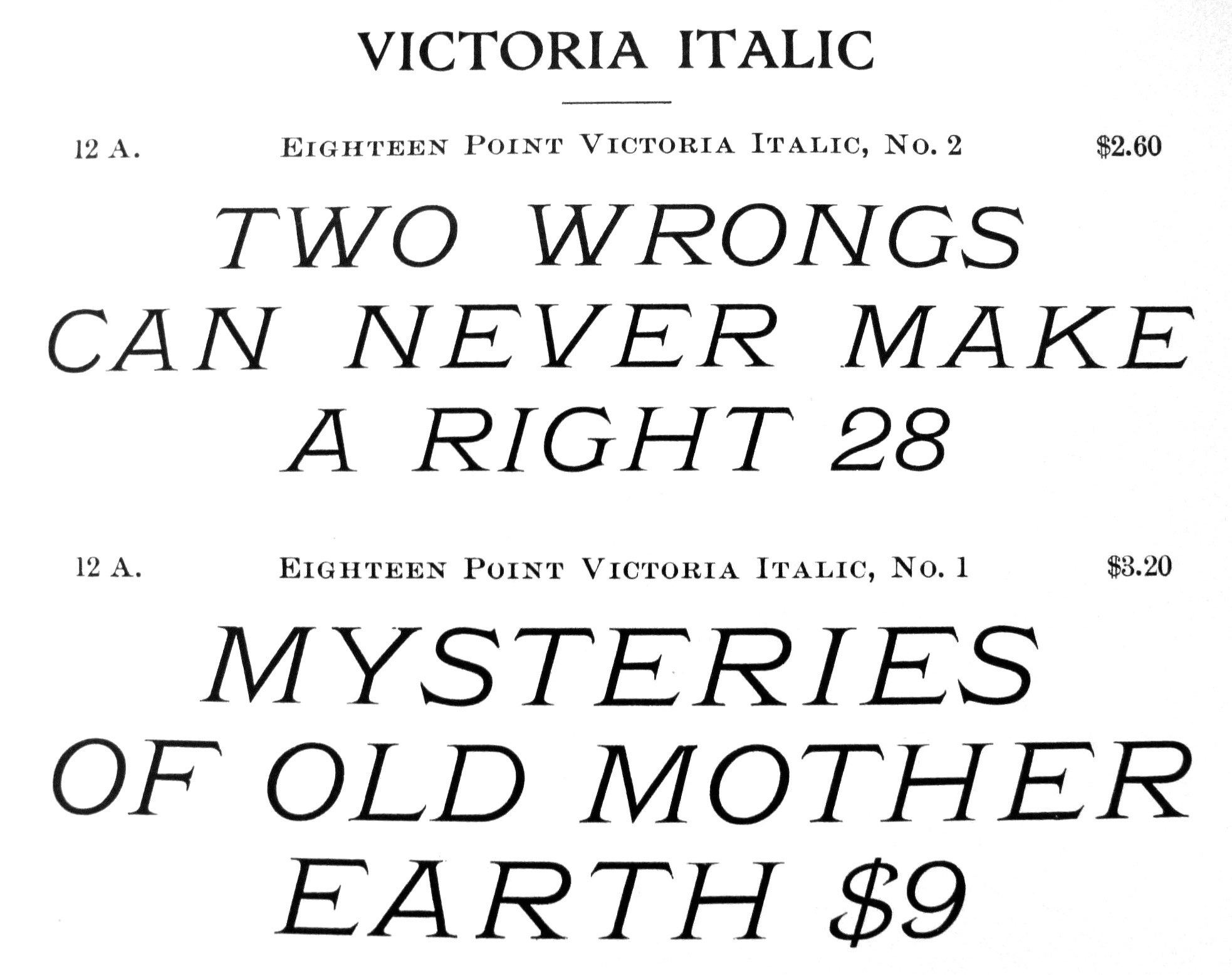
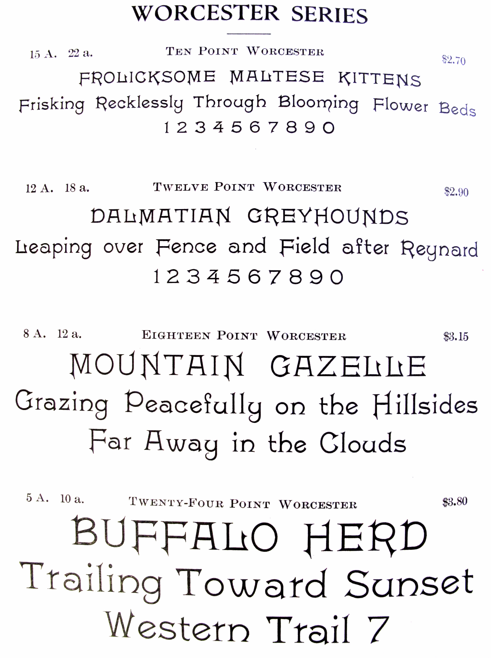
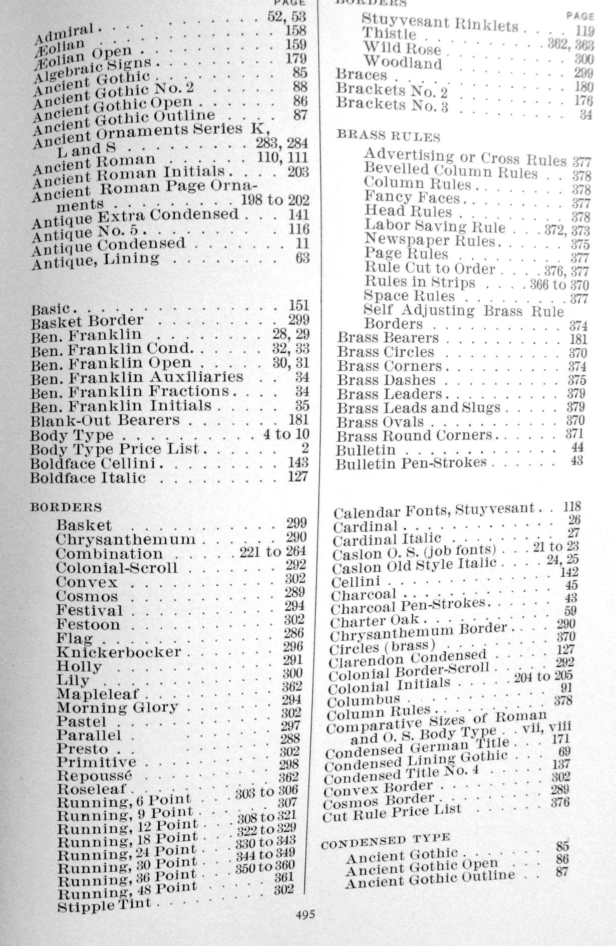
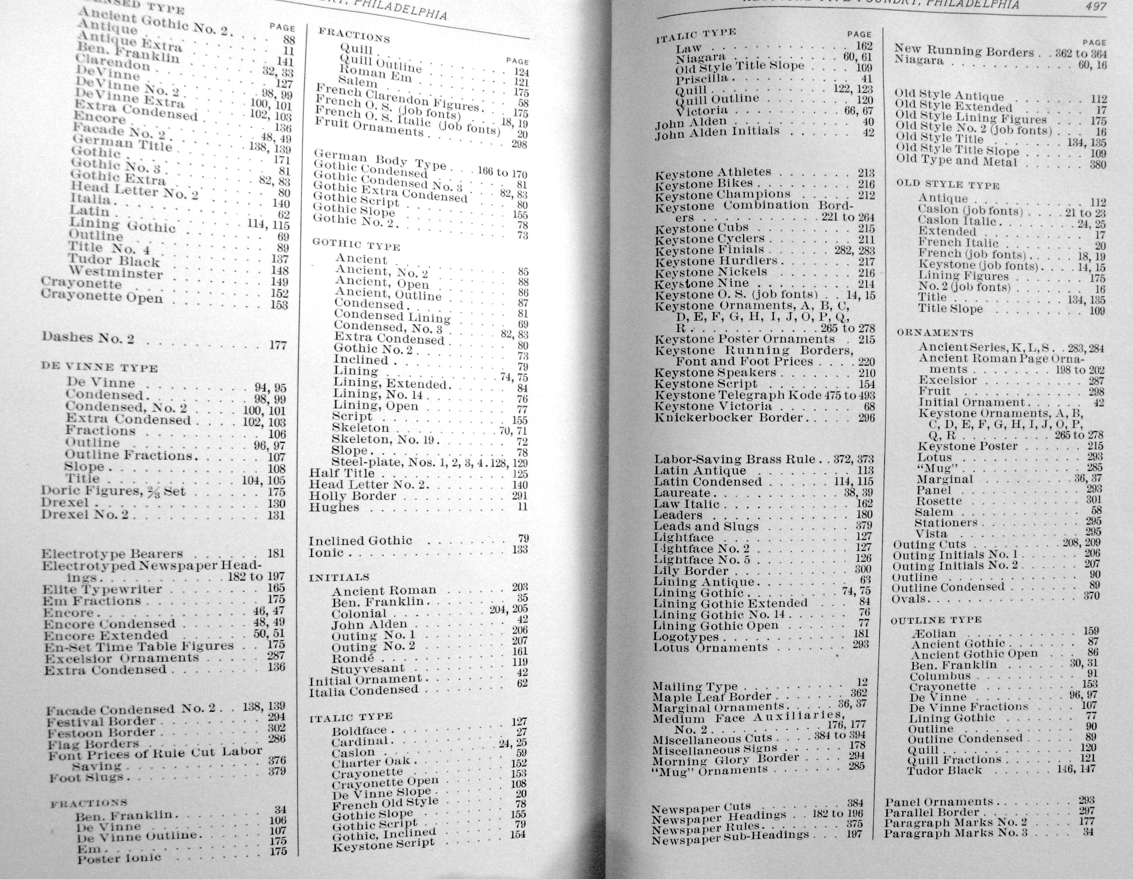
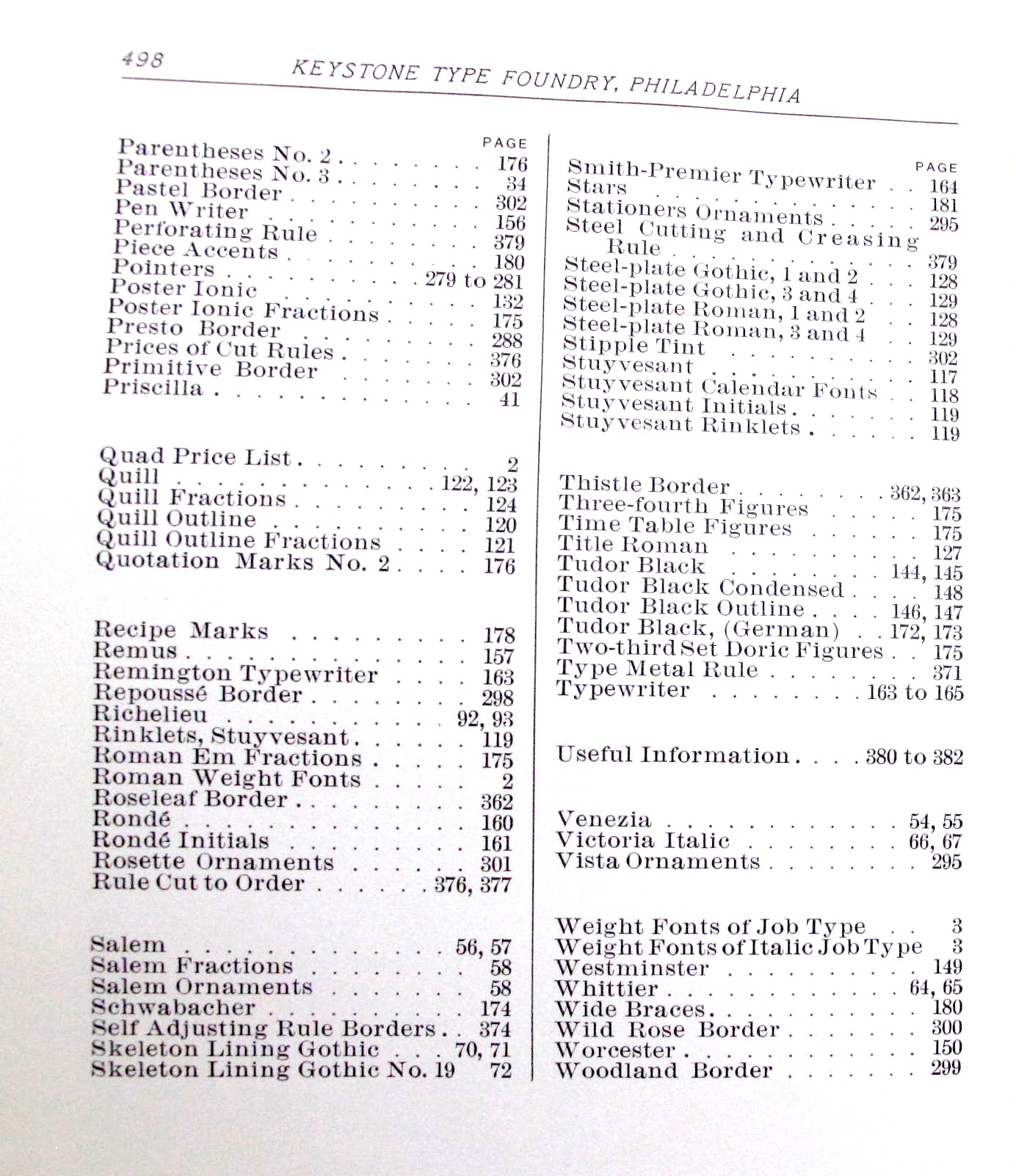
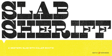
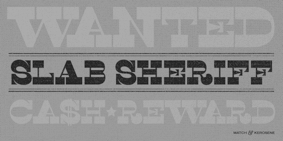
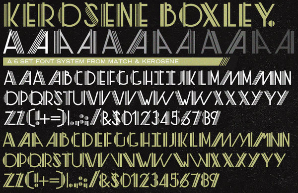
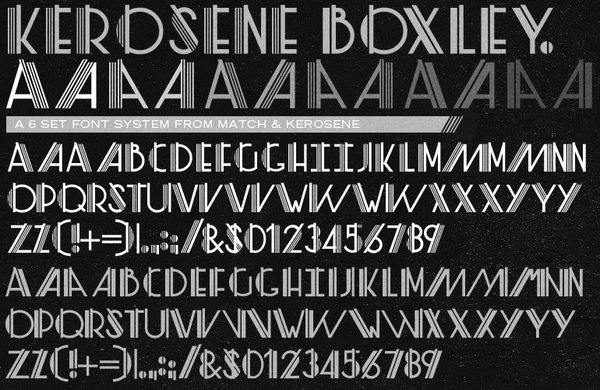
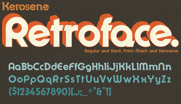
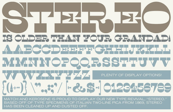
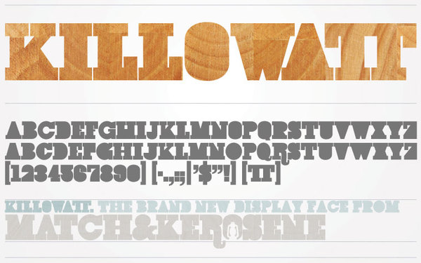
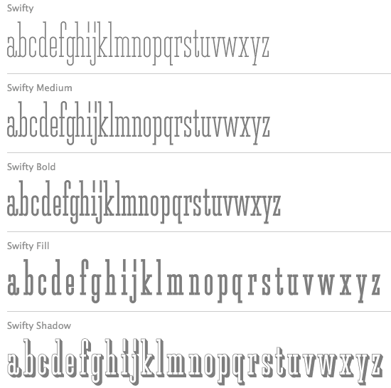
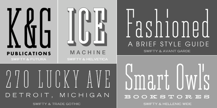
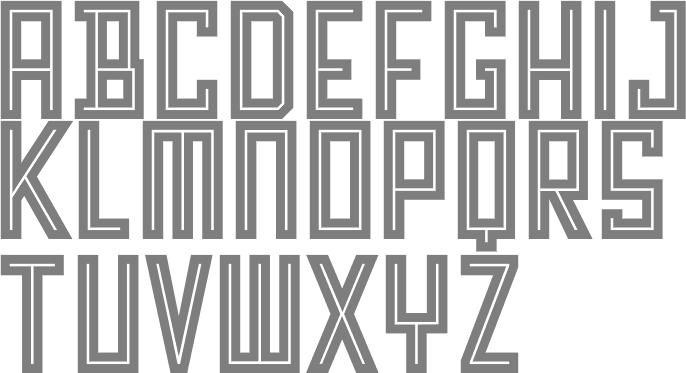
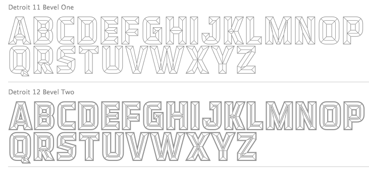
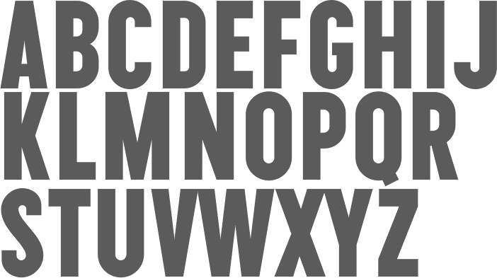
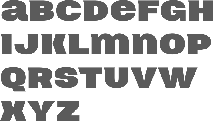
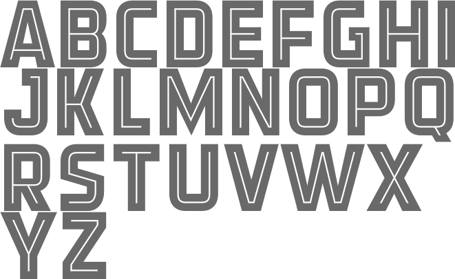
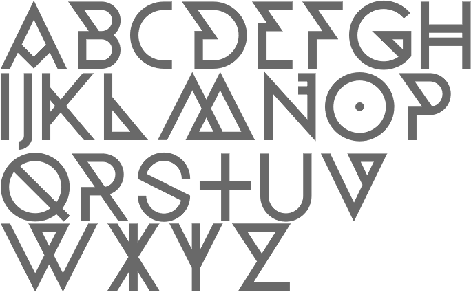
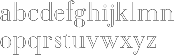
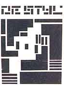
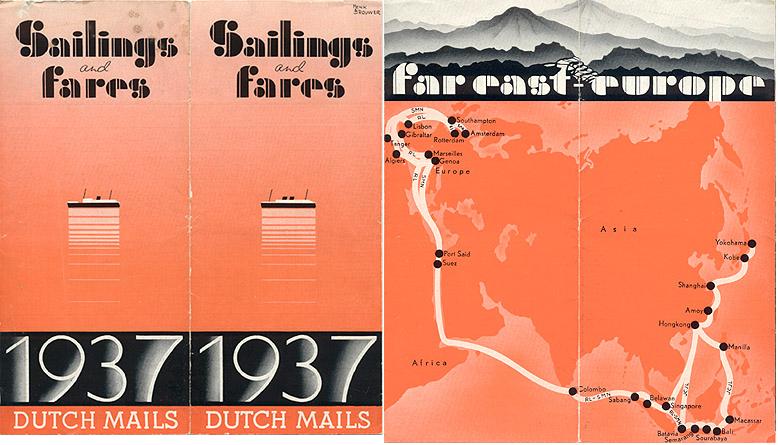
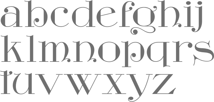
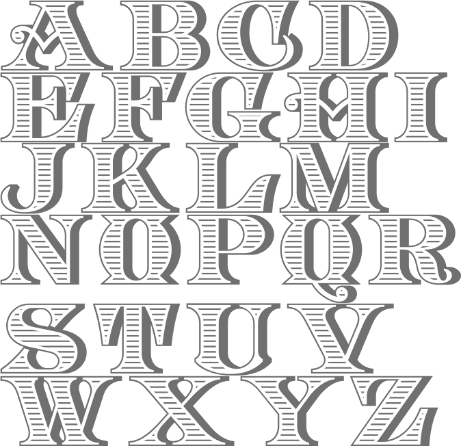
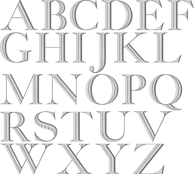
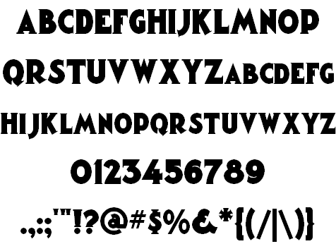
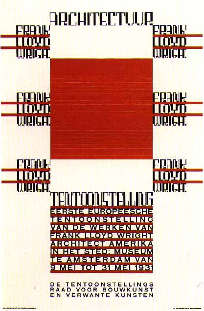
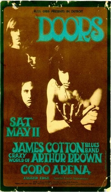
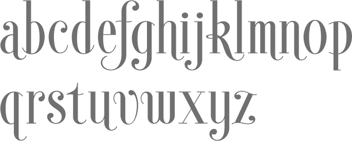
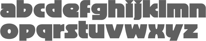
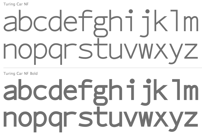
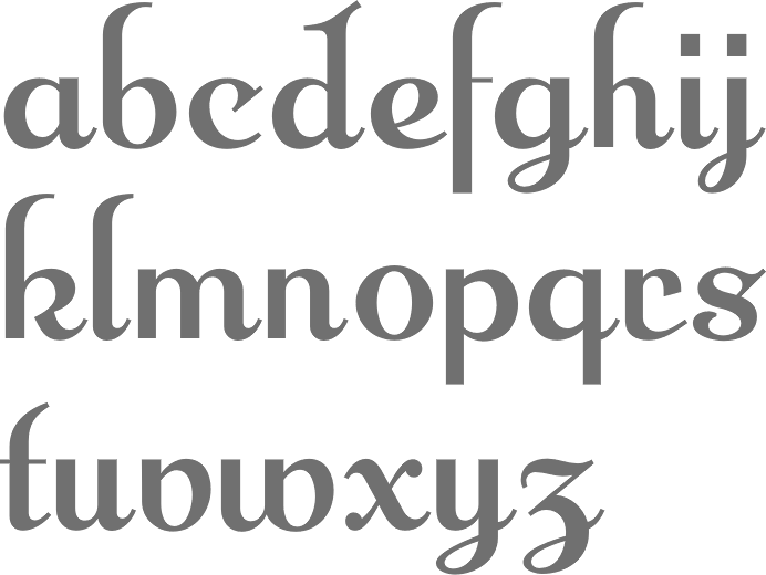
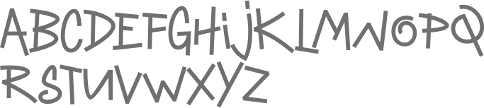
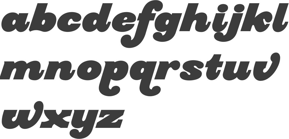
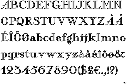
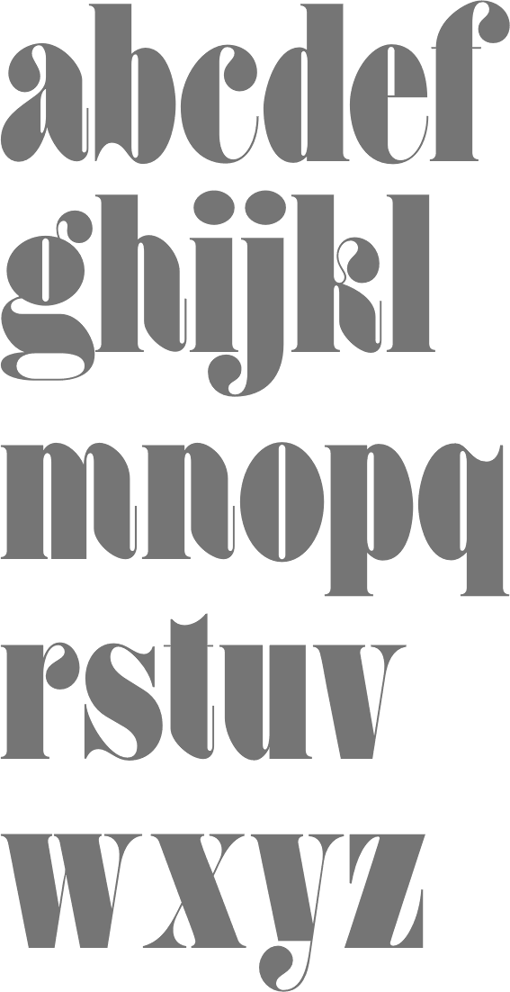
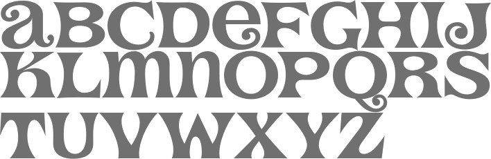
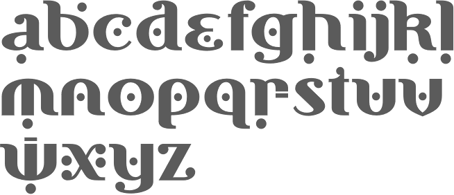
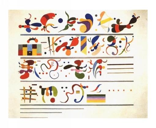
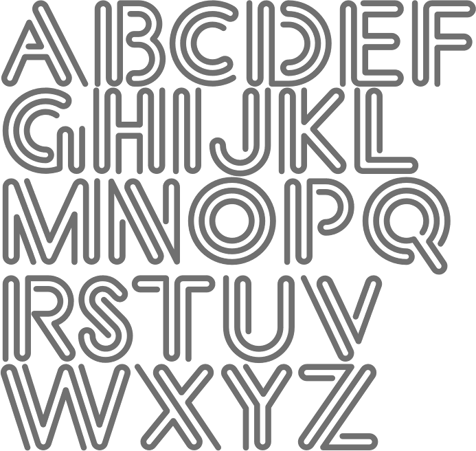
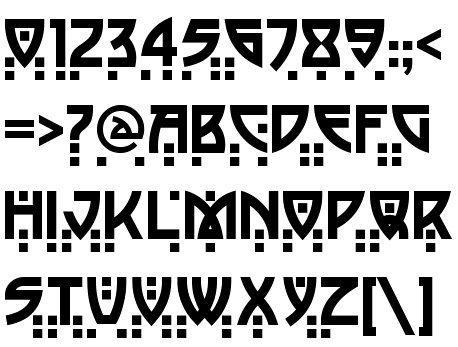
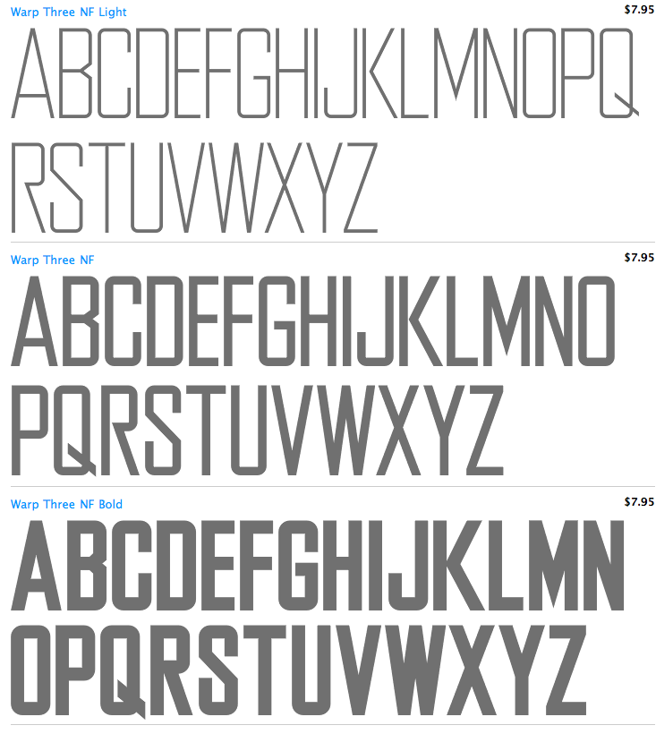
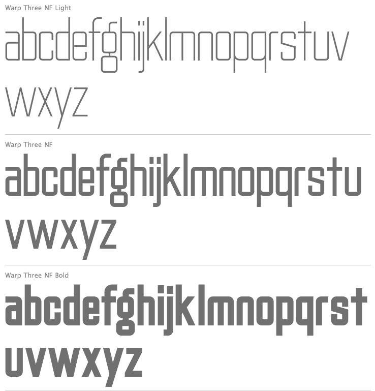
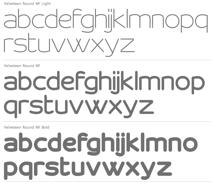
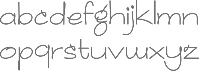
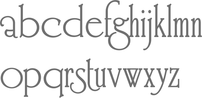
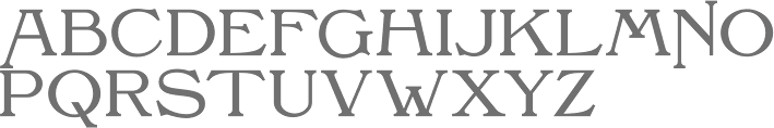
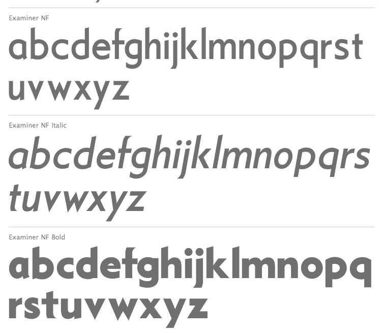
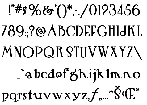
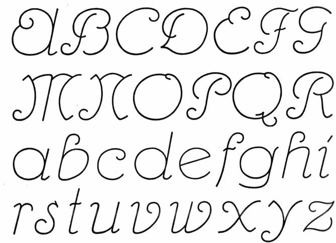
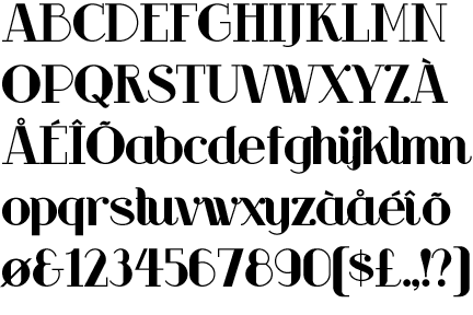
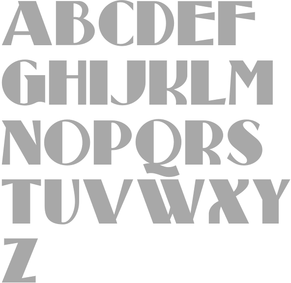
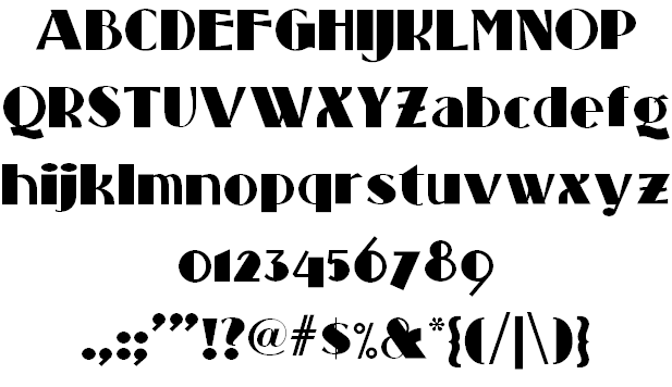
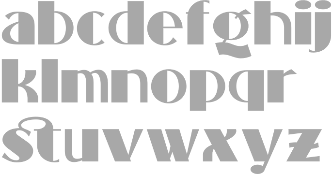
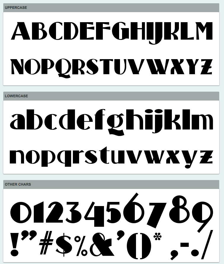
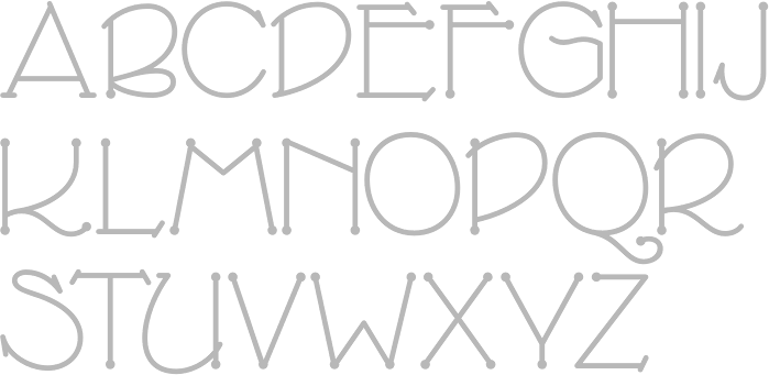
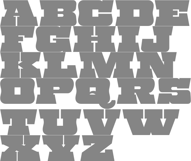
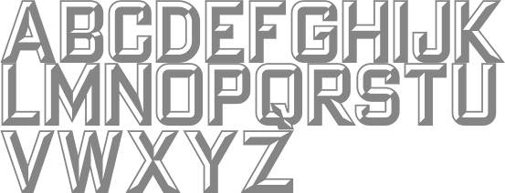
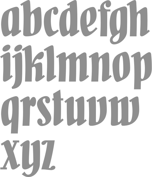
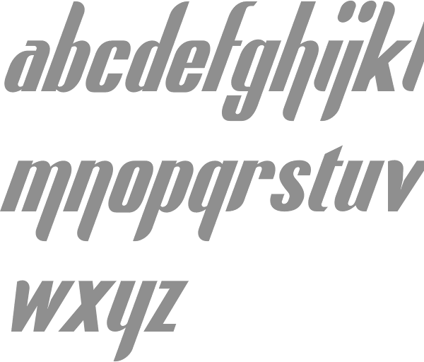
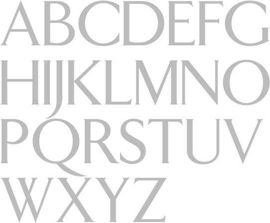
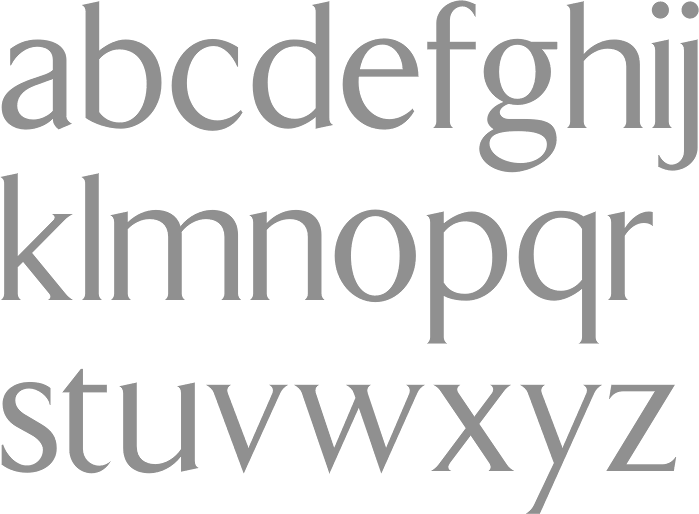
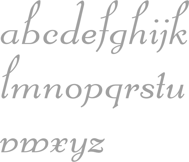
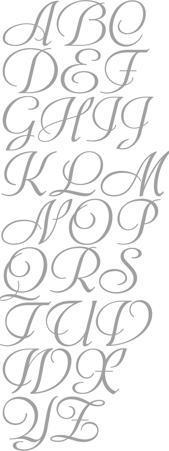
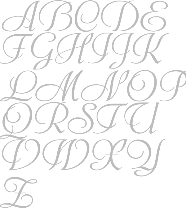
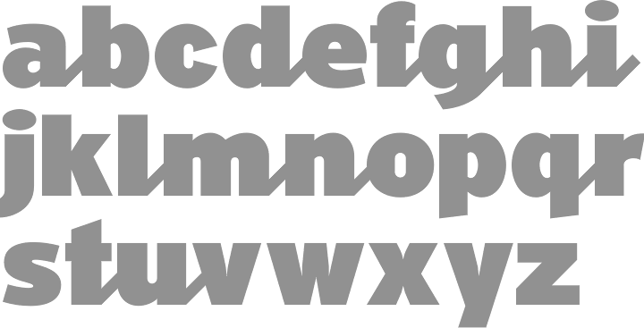
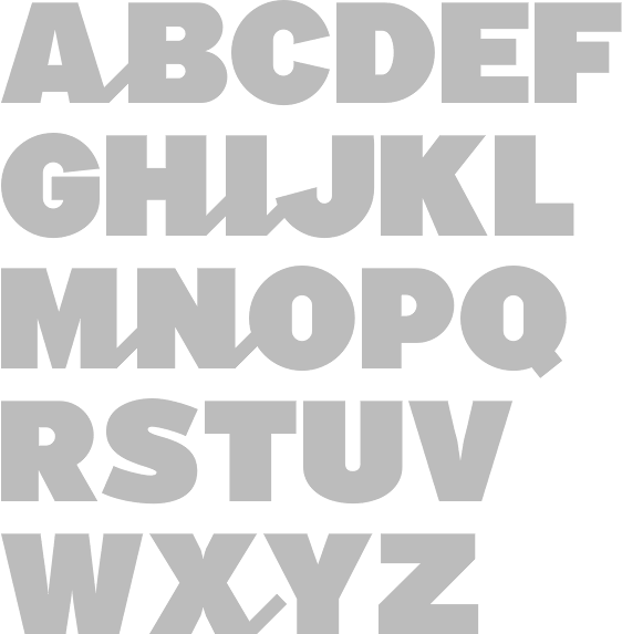
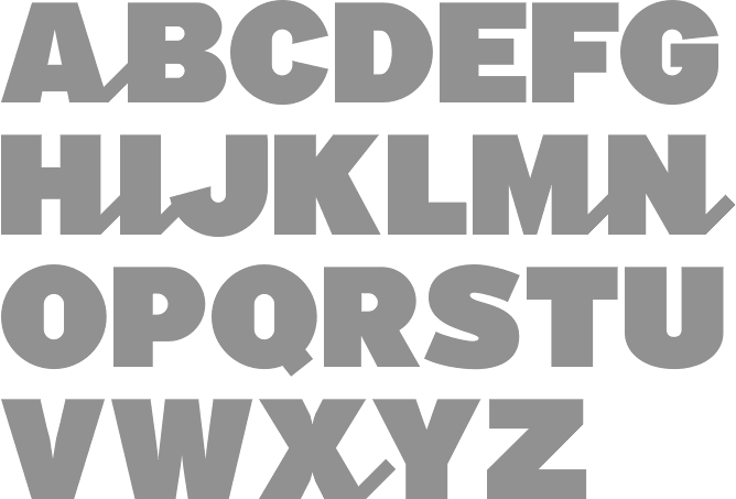
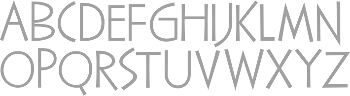
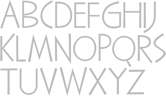
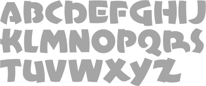
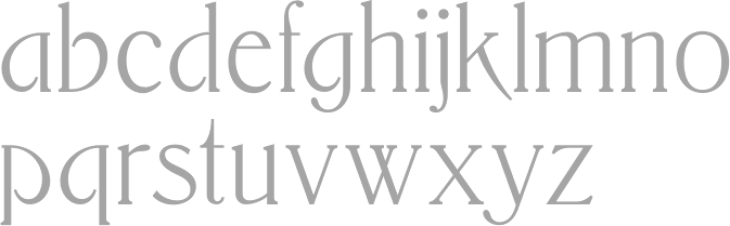
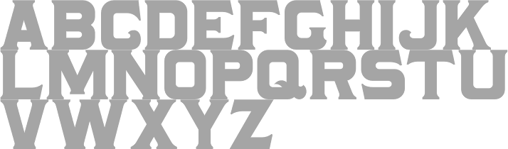
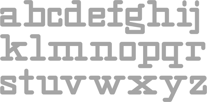
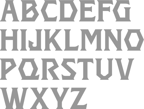
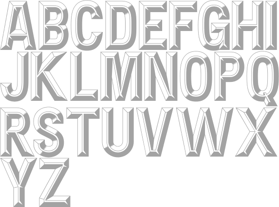
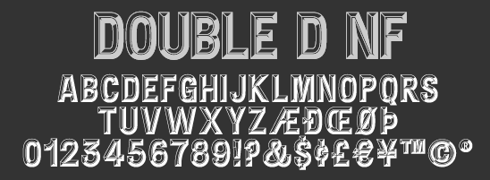
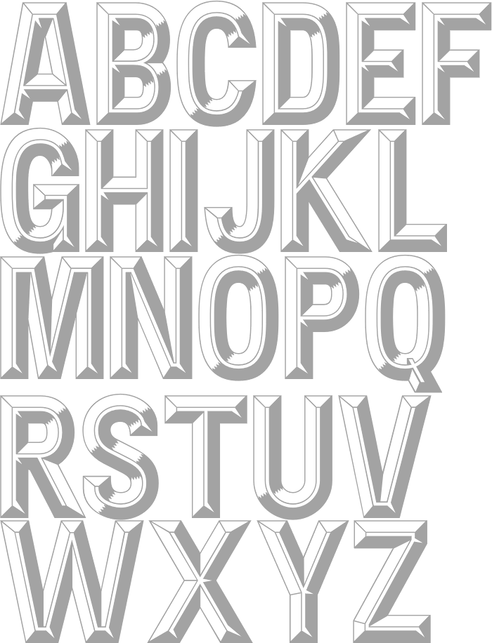
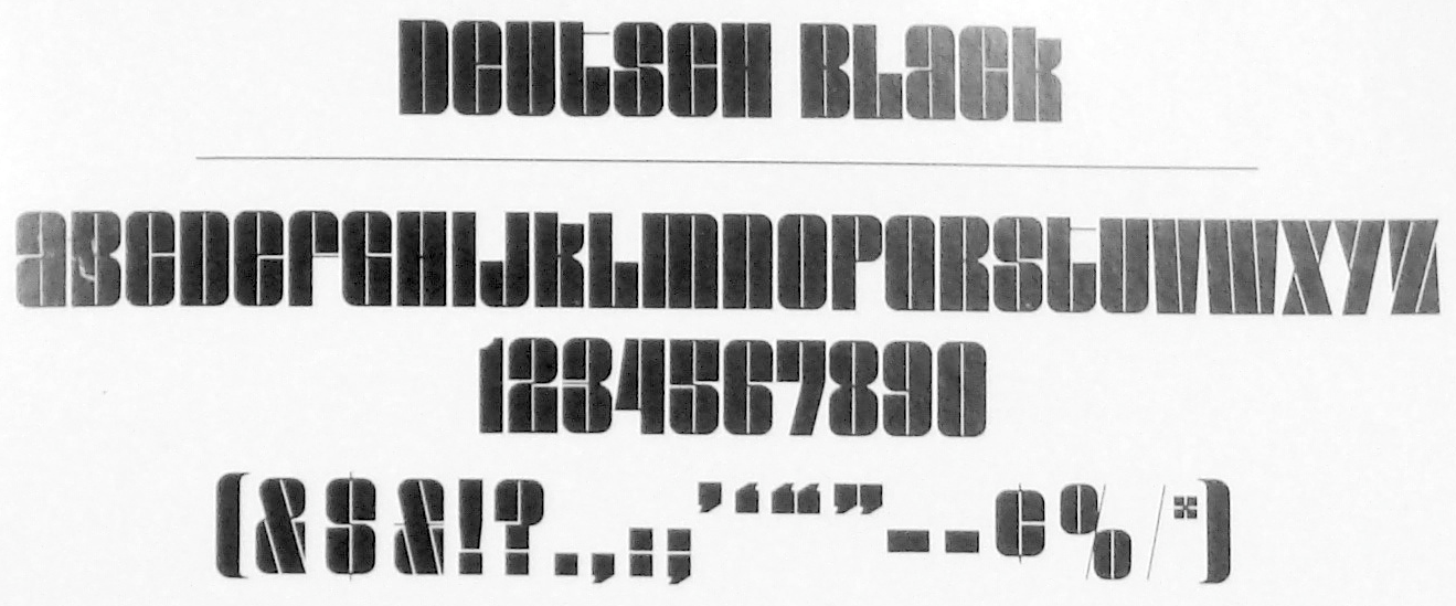
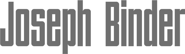
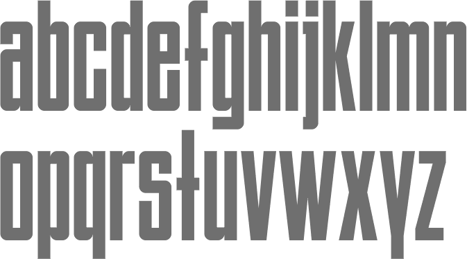
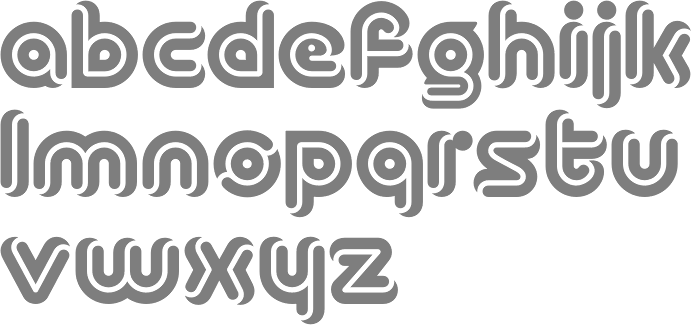
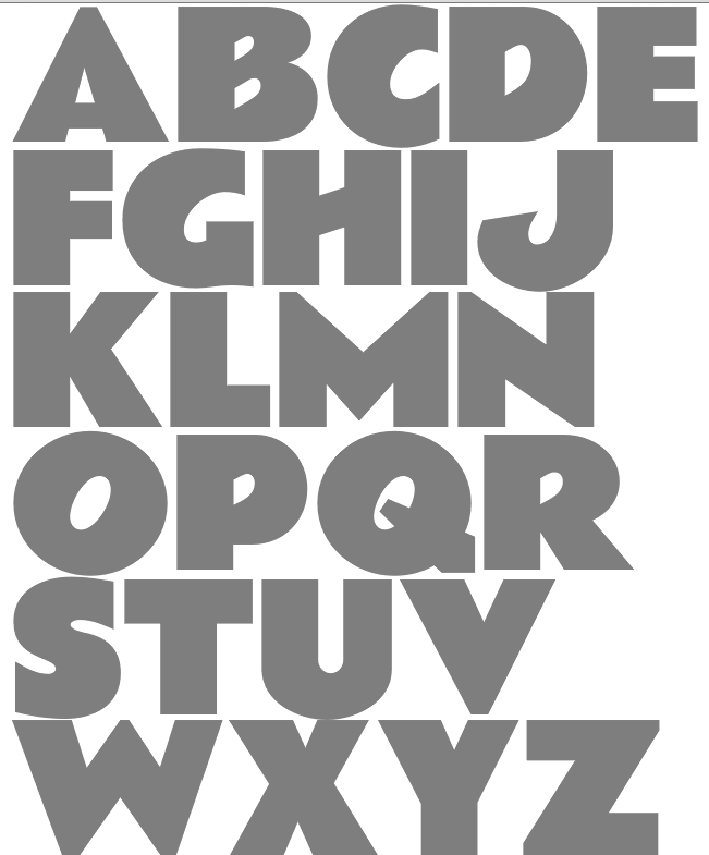
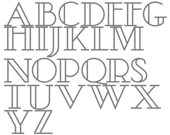
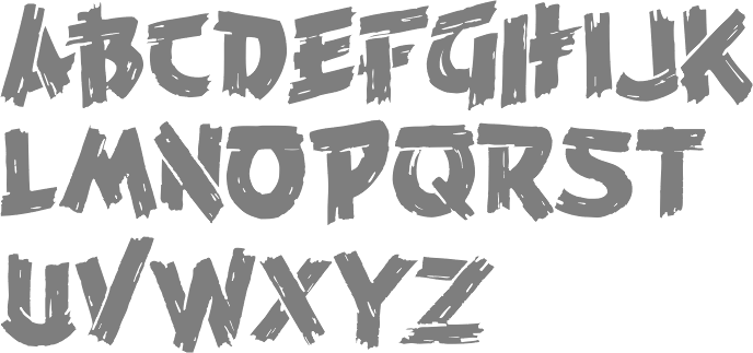
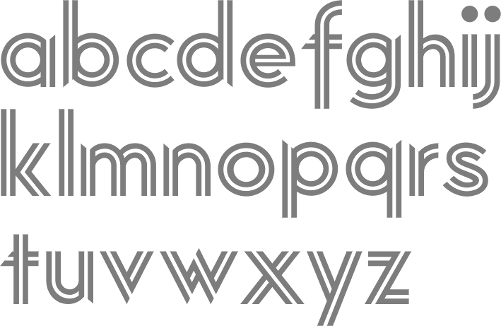
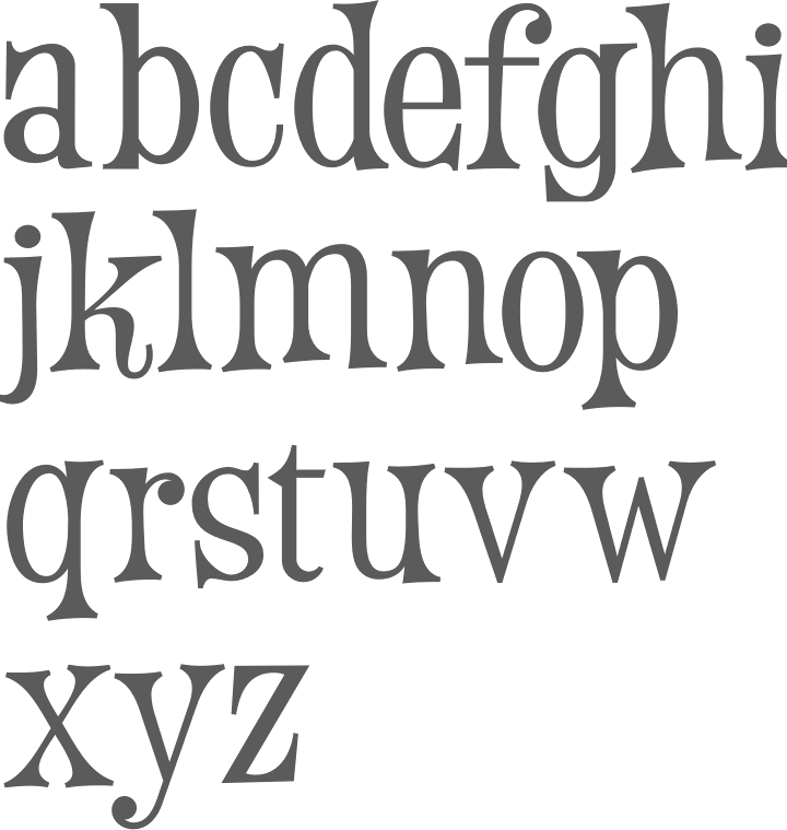
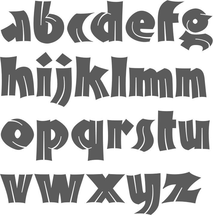
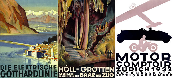
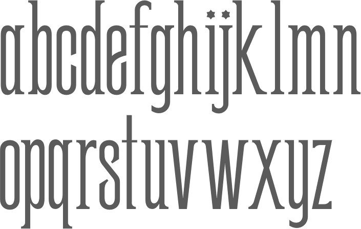
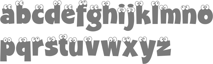
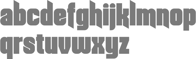
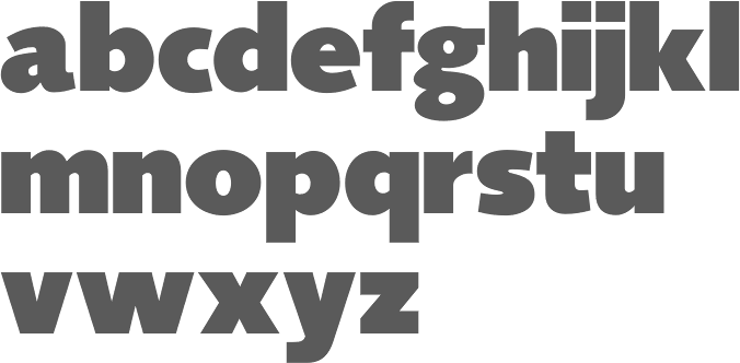
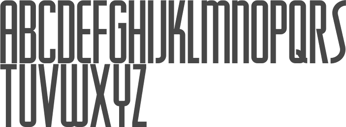
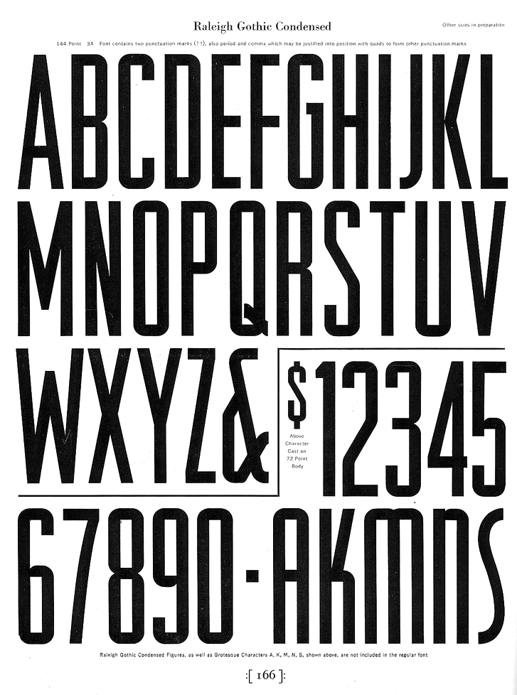
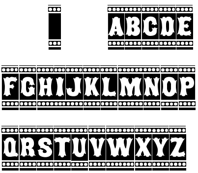
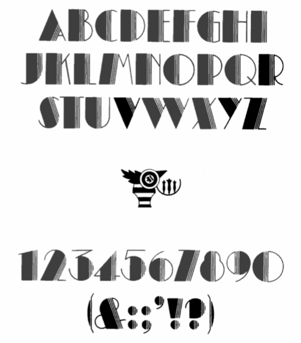
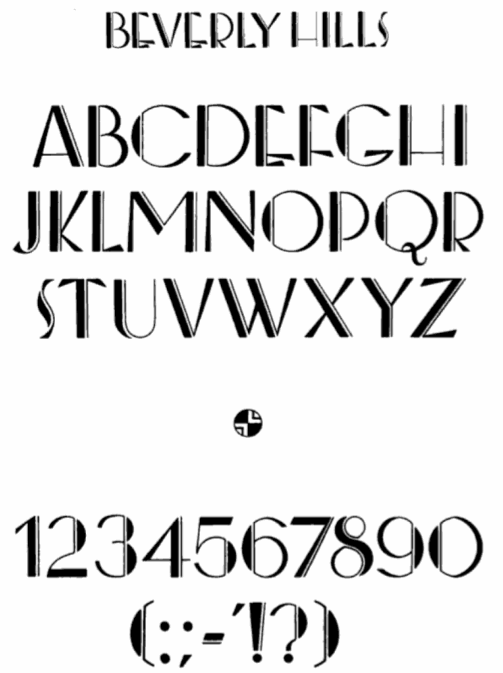
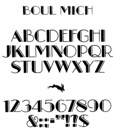
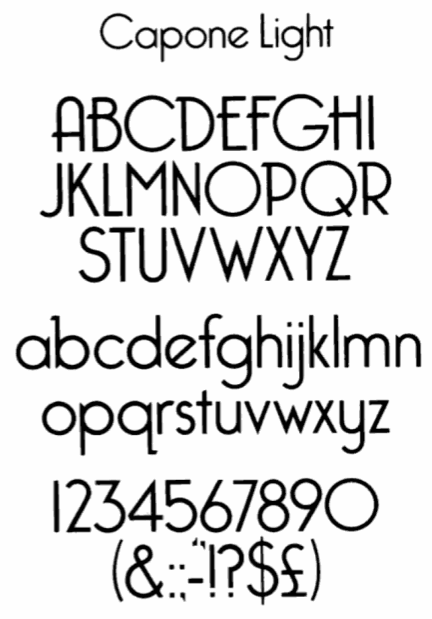
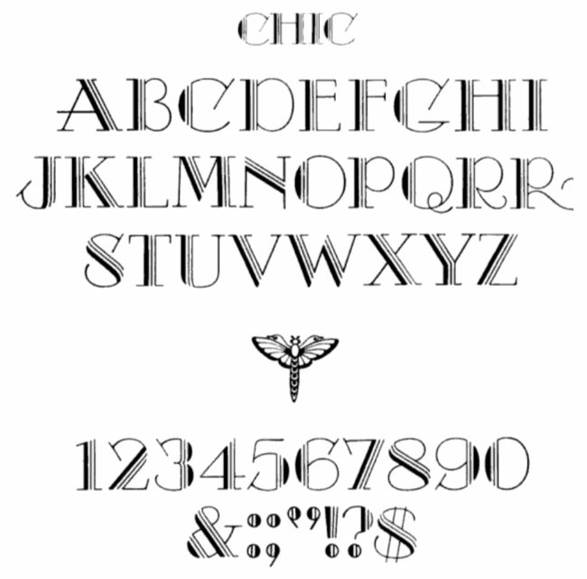
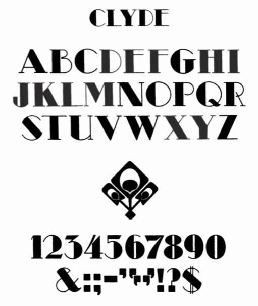
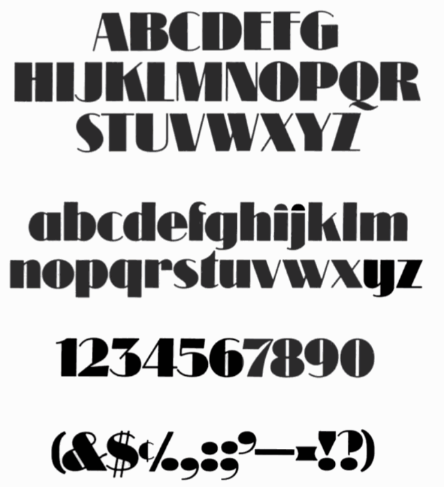
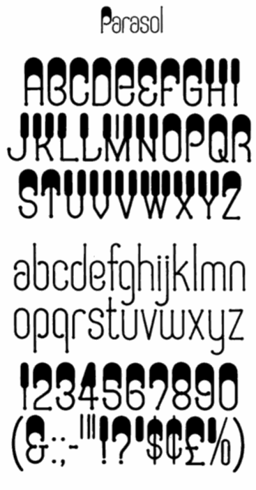
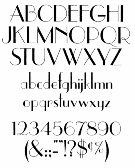
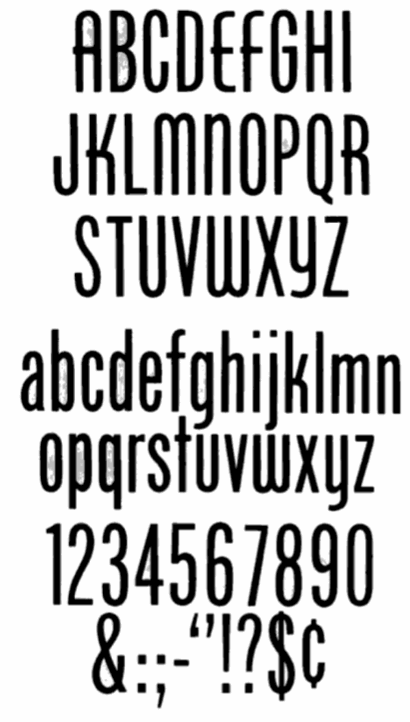
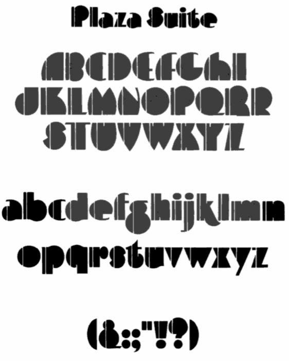
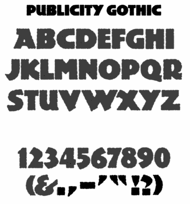
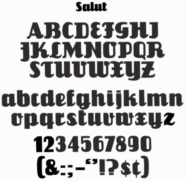
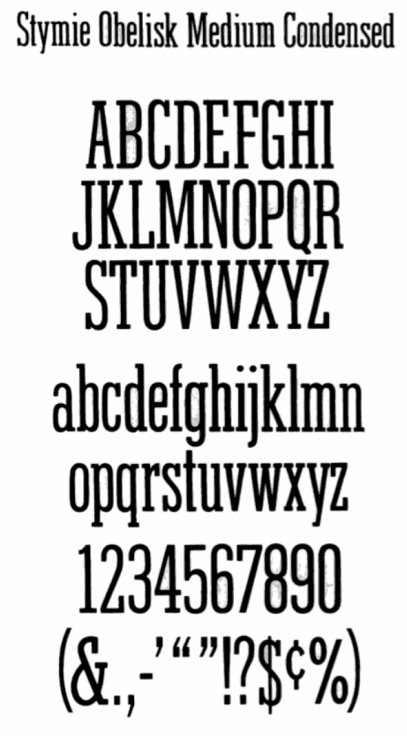
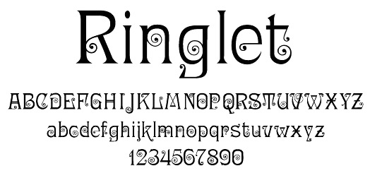
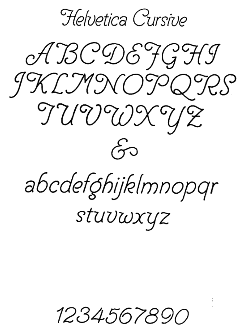
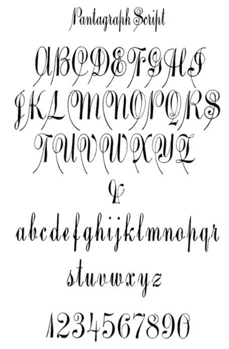
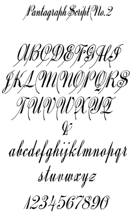
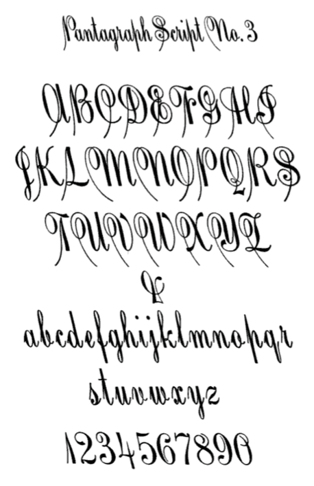
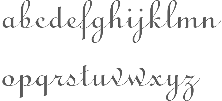
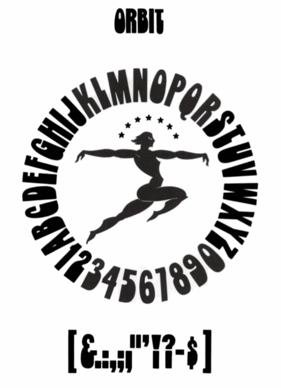
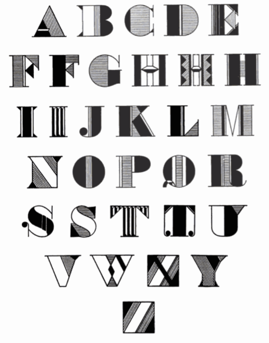
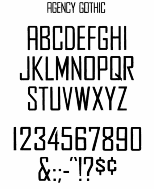
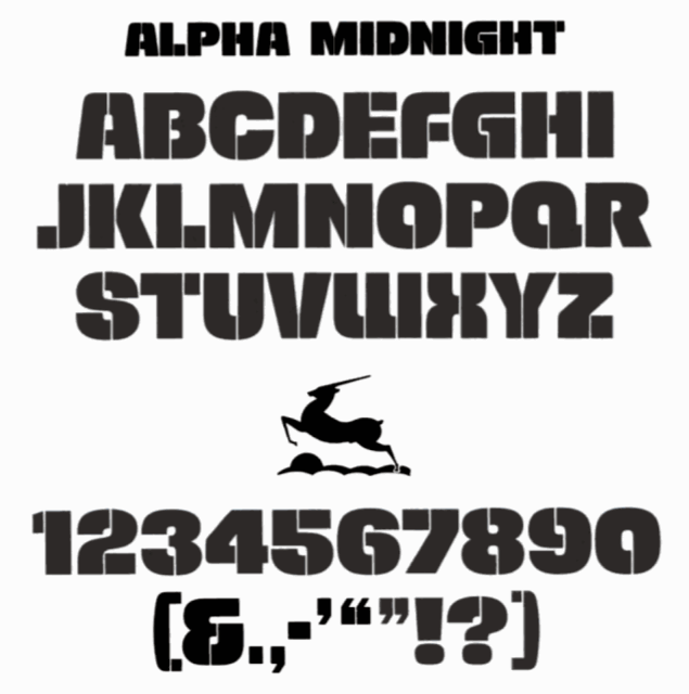
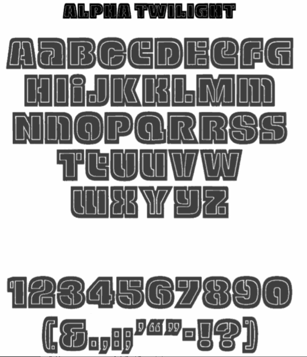
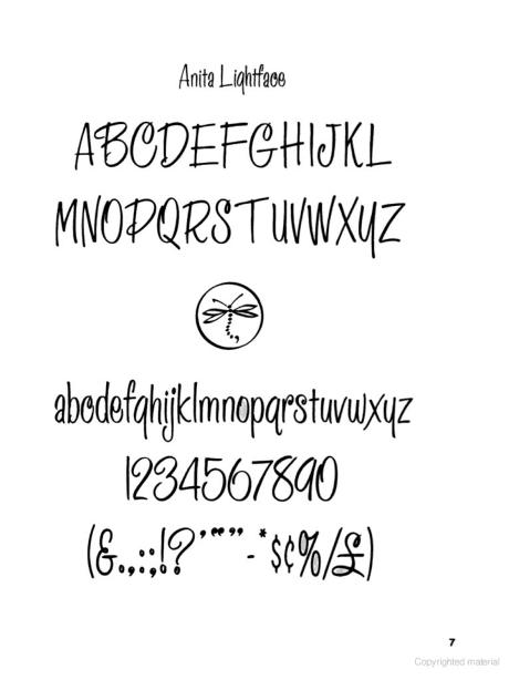
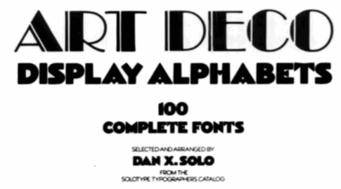
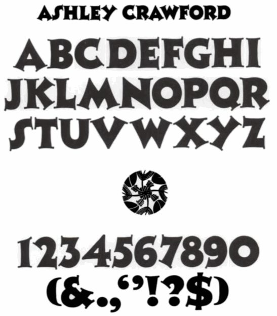
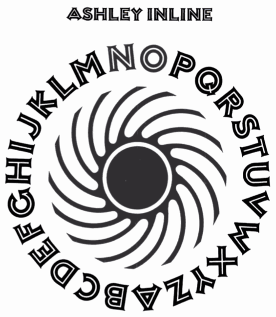
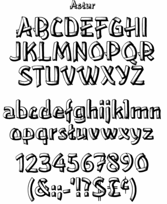
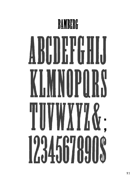
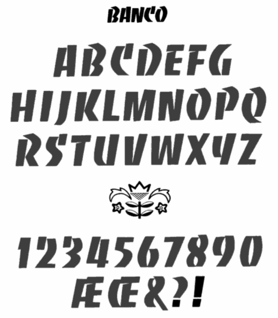
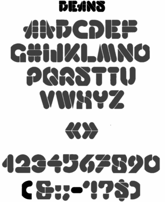
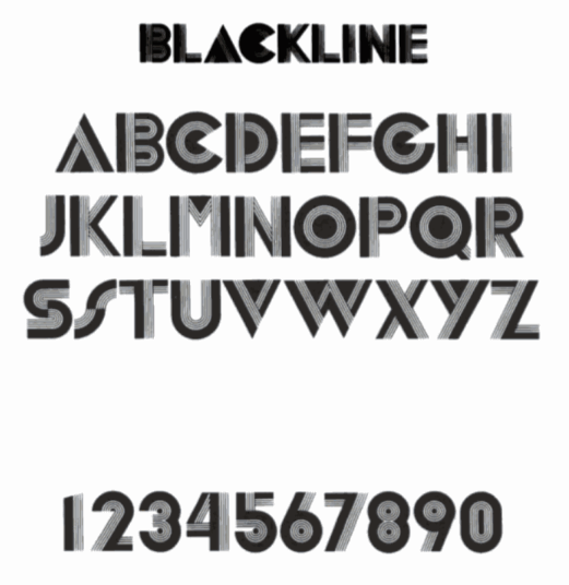
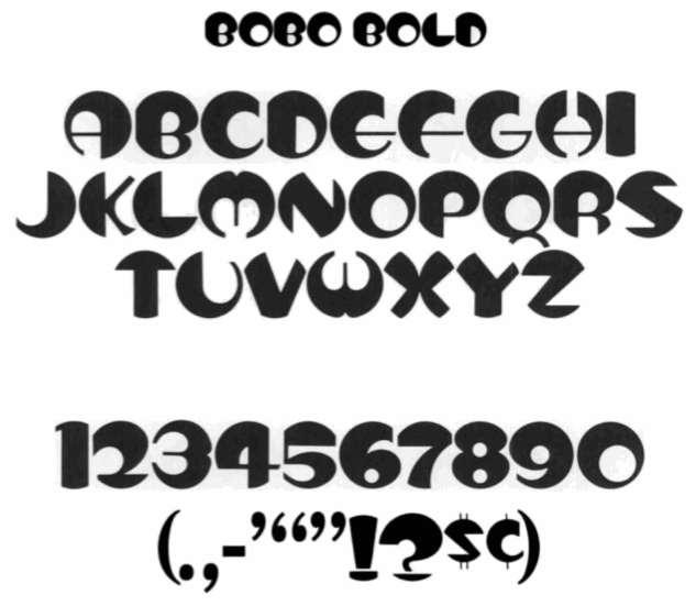
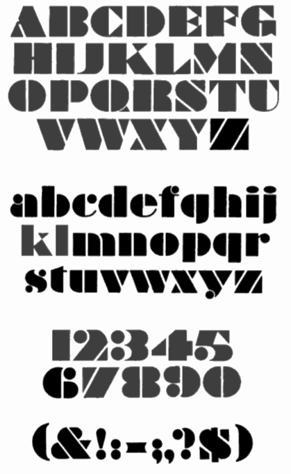
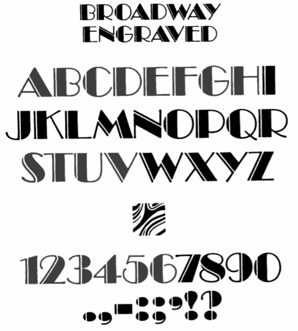
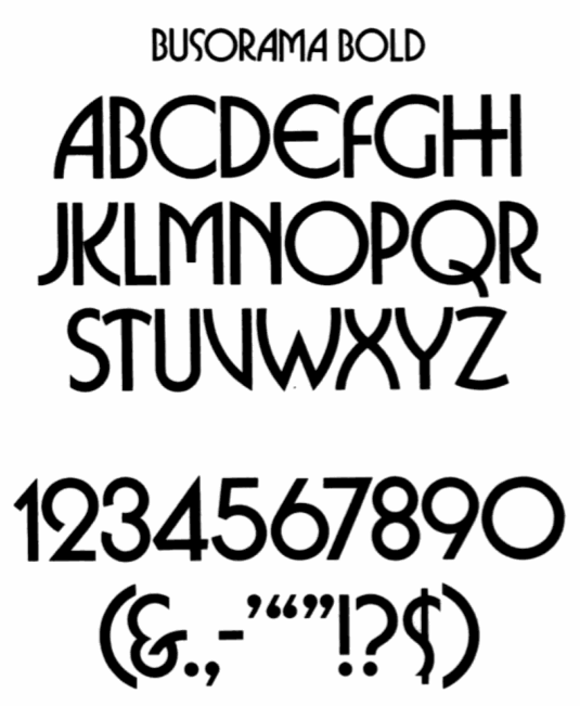
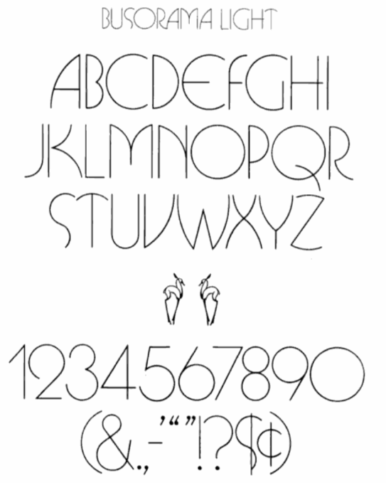
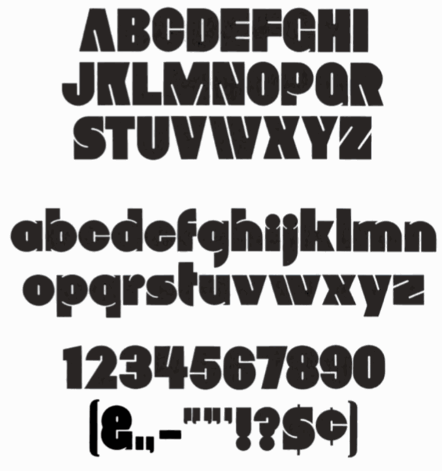
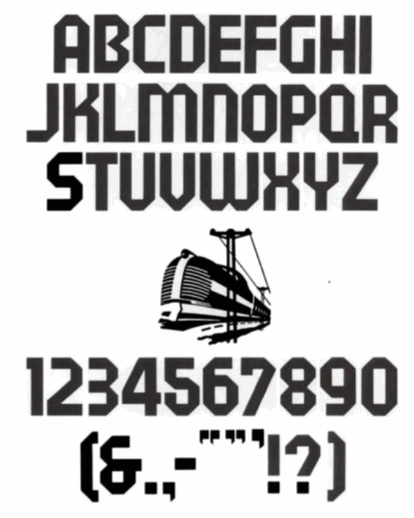
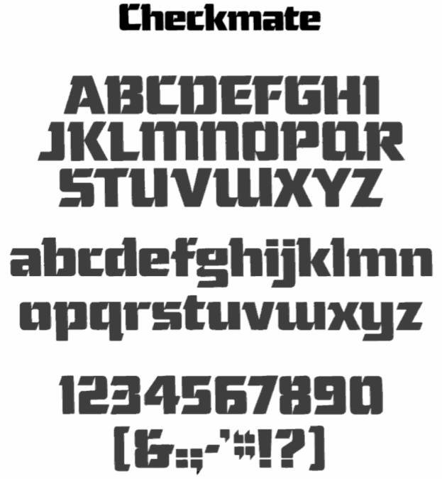
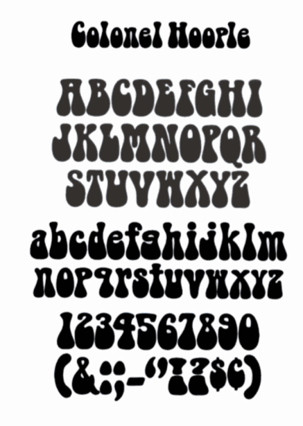
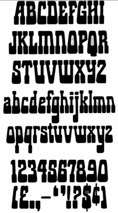
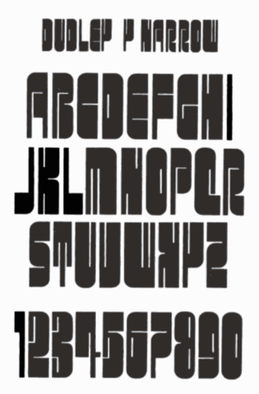
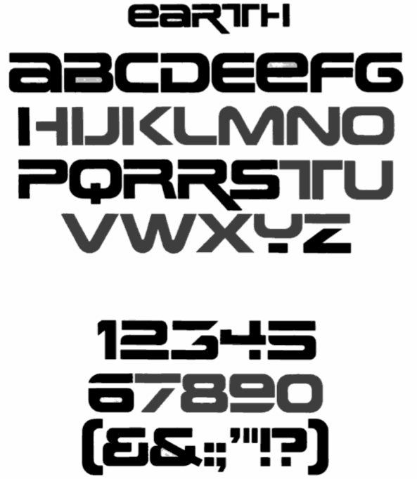
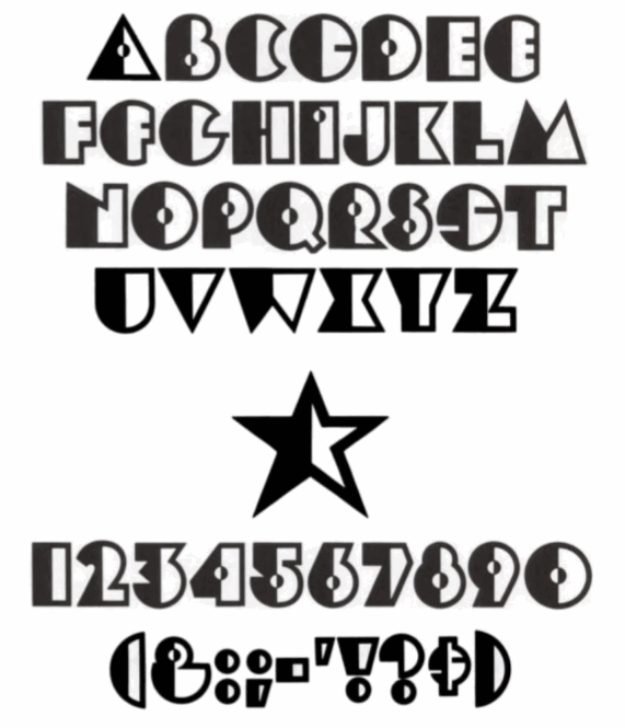
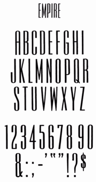
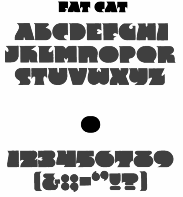
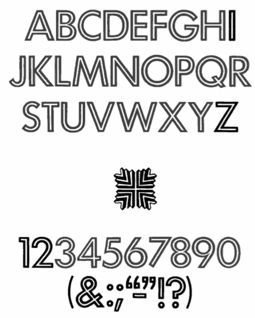
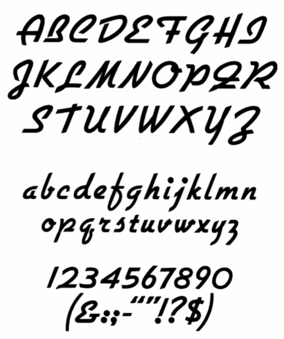
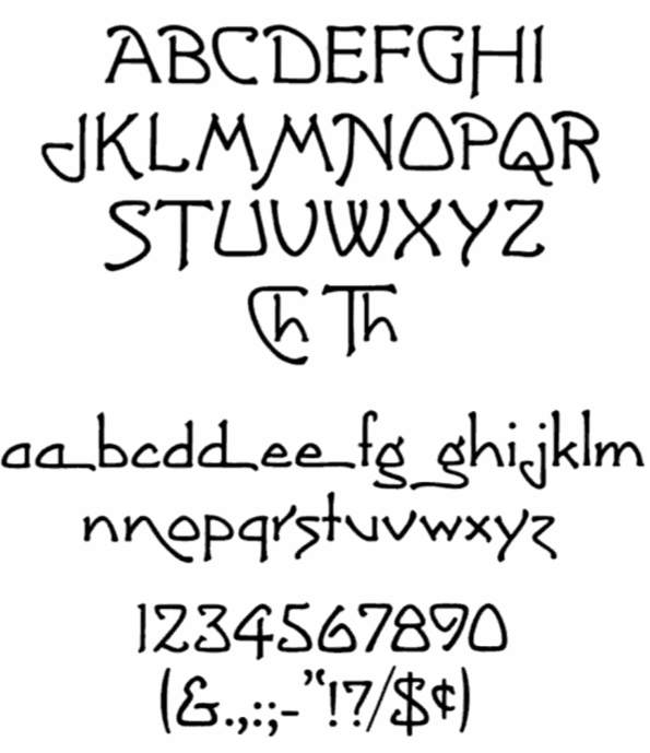
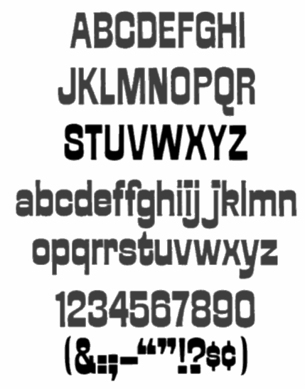
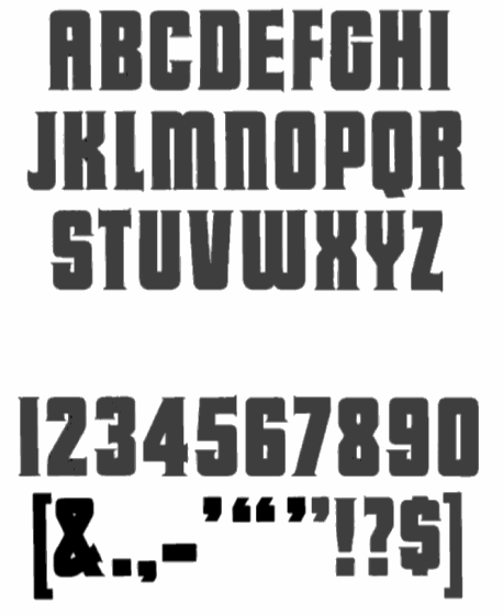
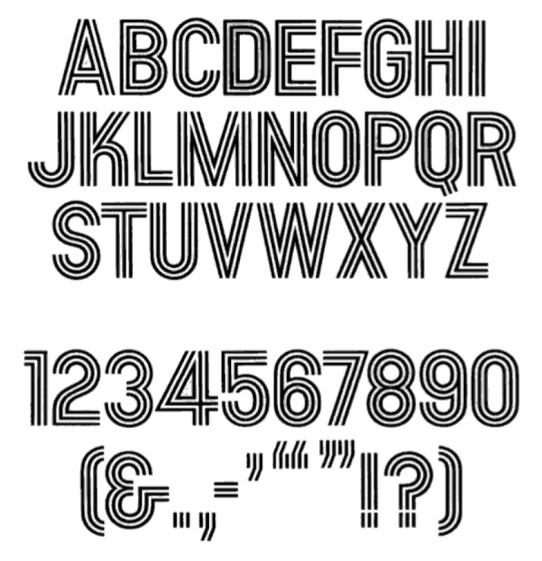
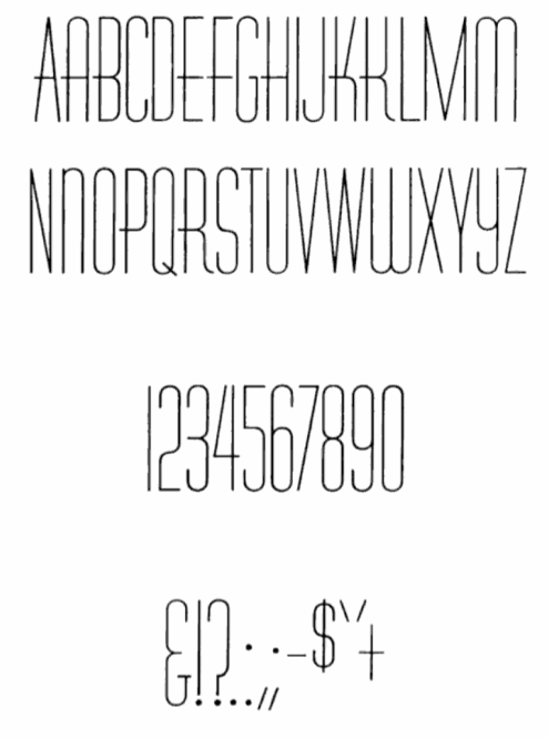
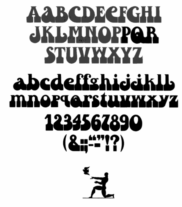
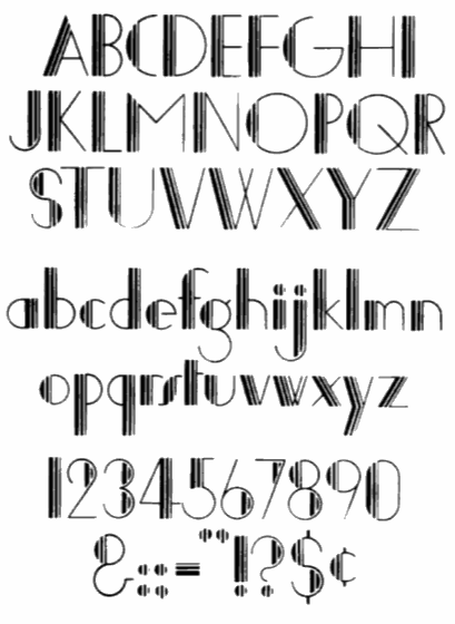
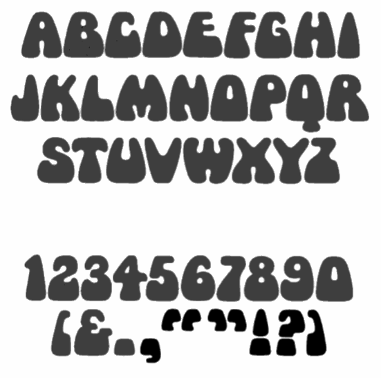
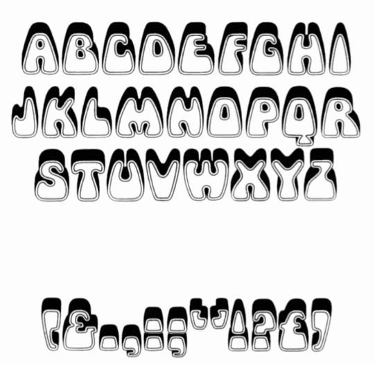
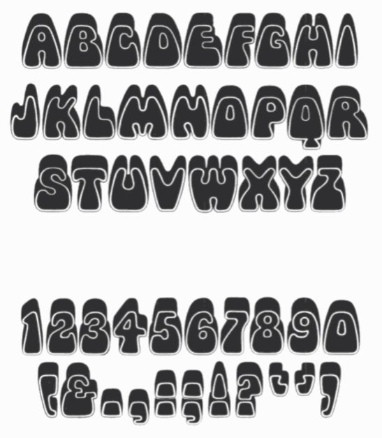
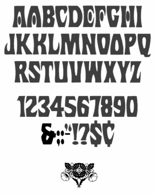
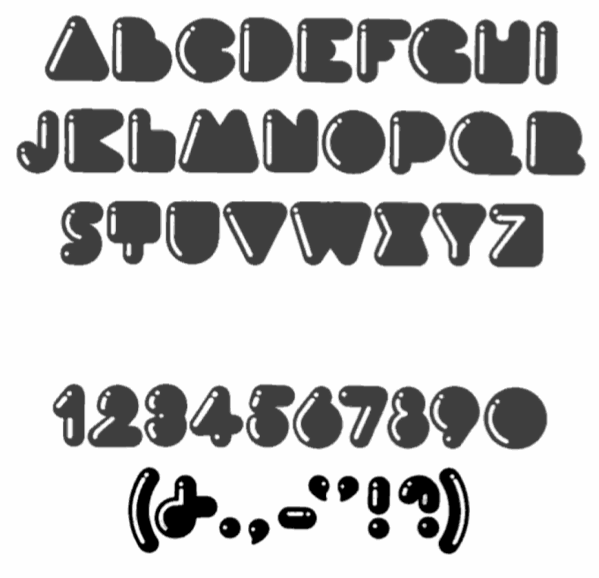
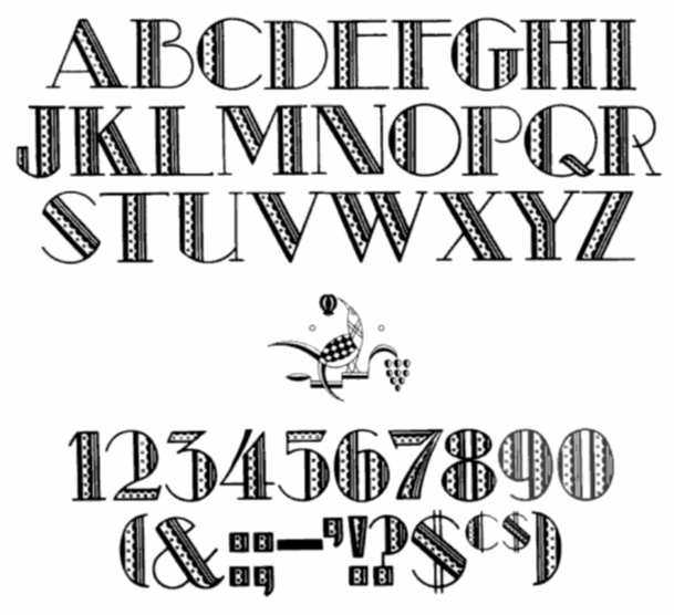
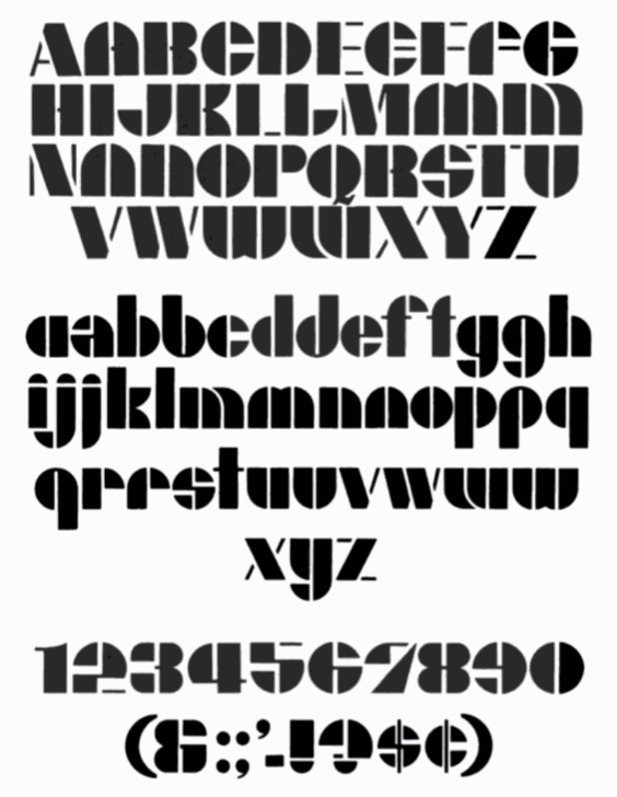
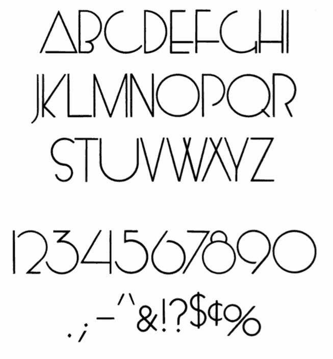
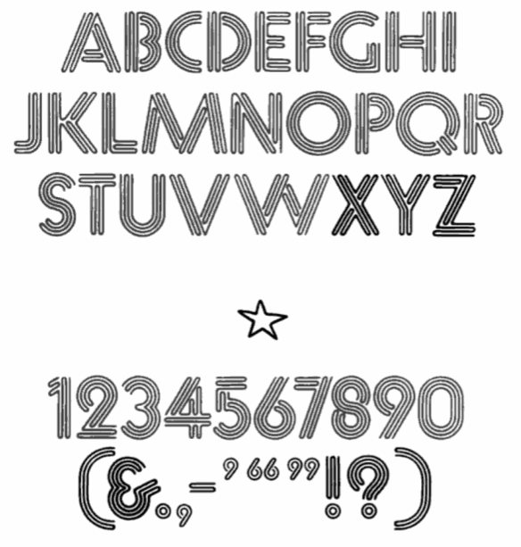
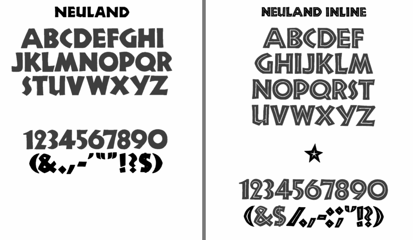
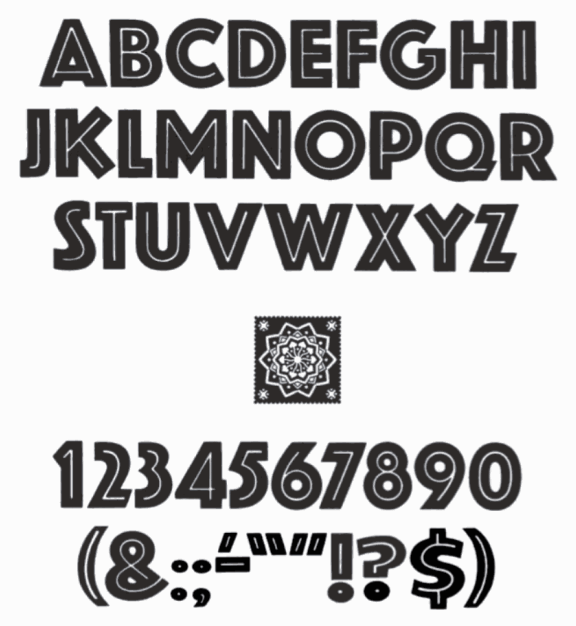
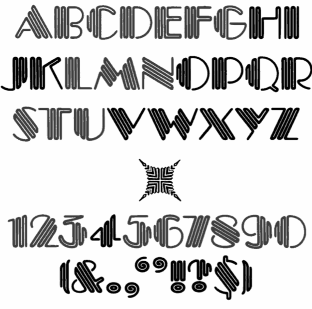
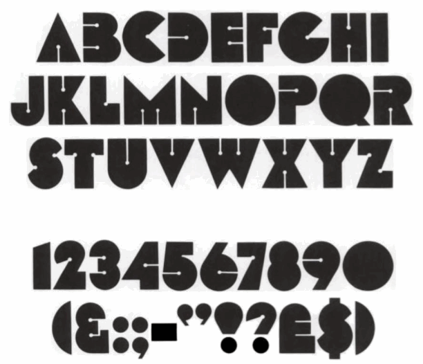
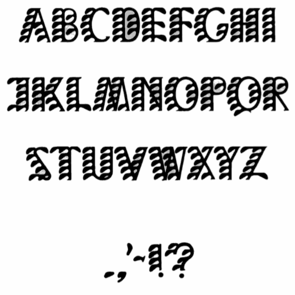
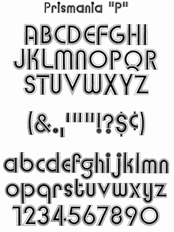
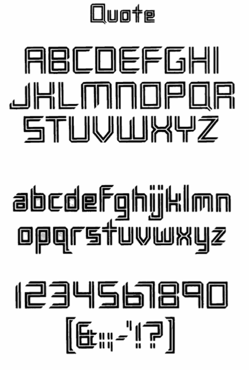
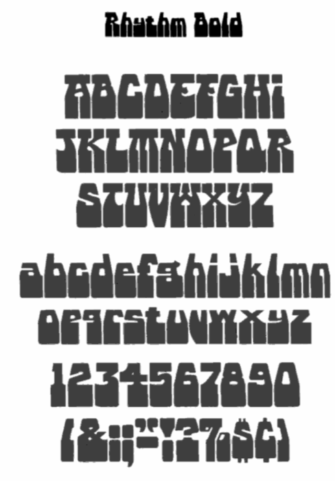
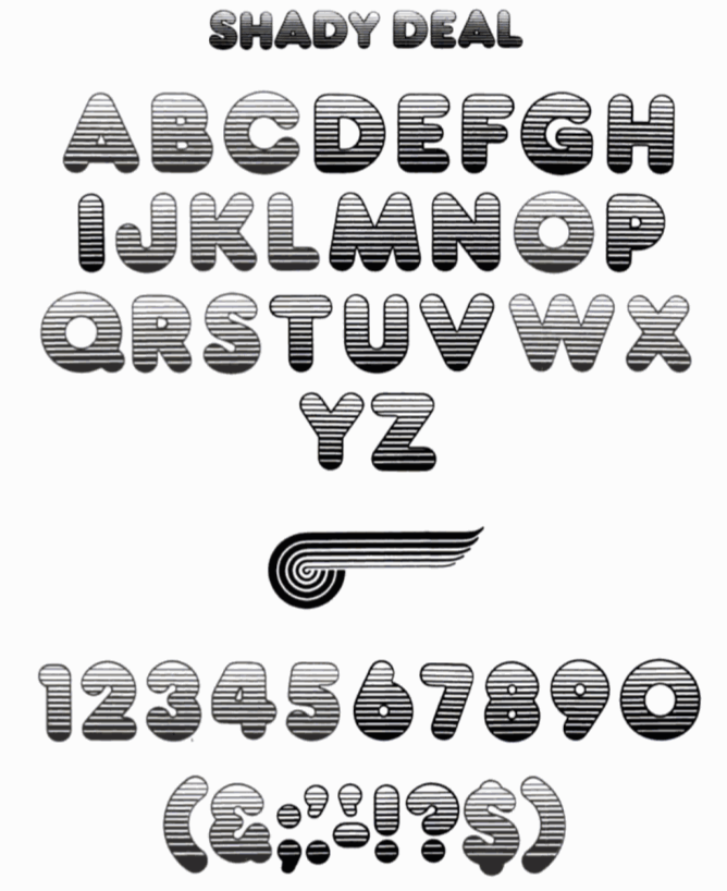
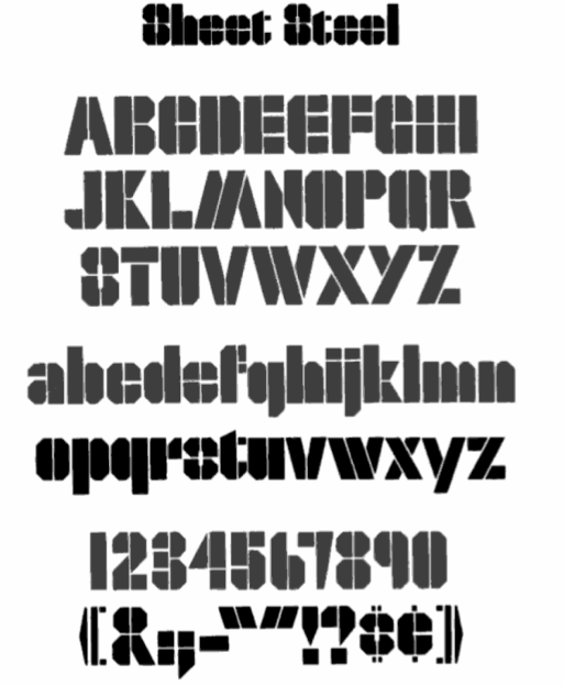
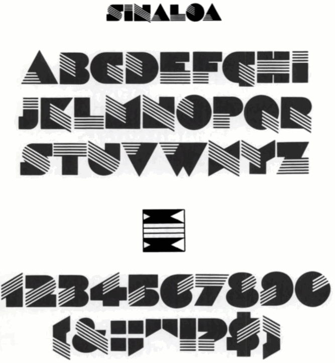
|
|
|
|