TYPE DESIGN INFORMATION PAGE last updated on Mon May 6 09:06:34 EDT 2024
FONT RECOGNITION VIA FONT MOOSE

|
|
|
|
|
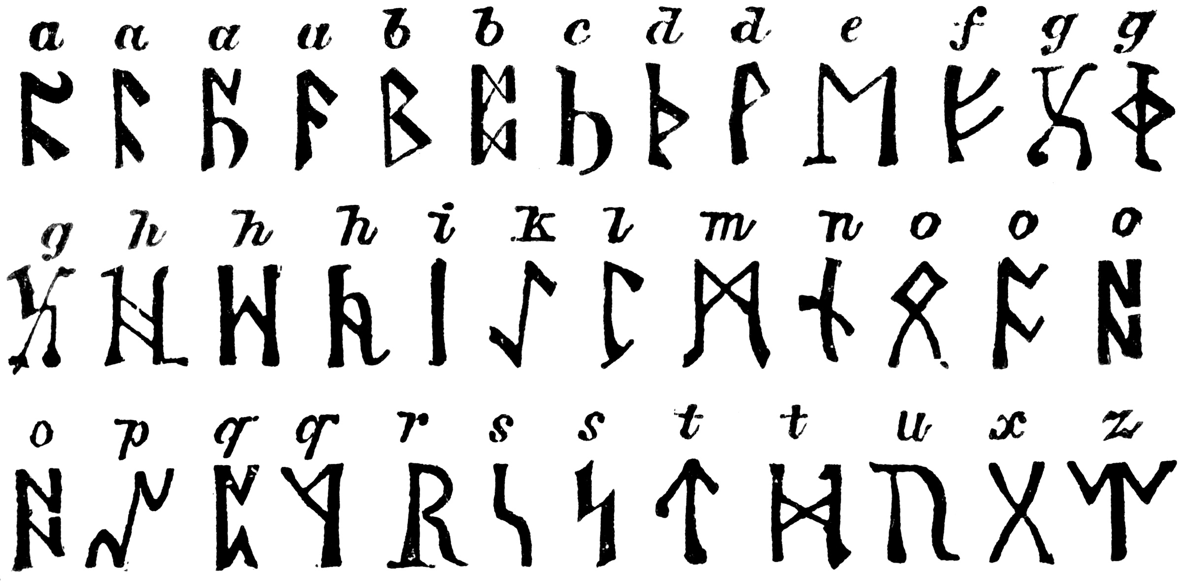
Rune fonts | ||
|
|
|
|
SWITCH TO INDEX FILE
Typefaces made in 2011: t4le (a tall piano key face inspired by In Her Memory by Softhunterdevil), Theek, Theek Open (blackboard bold face), Tukan, Theen, Fluid, Sharp (angular). Typefaces from 2012: Lined (stencil), amcbl. [Google] [More] ⦿ | |
Small rune font archive. Has, for example, from Ecological Linguistics, their Maya glyph fonts DaysBF, DaysCodBold, DaysCodBoldItalic, DaysCodItalic, DaysCod, all made in 1994. From the American Philological Association, Jeffrey Rusten's Greek font Athenian (1991). Also, the Maya glyph fonts Abaj, AbajBold, TunBold, Tun, Wuuj, WuujBold, WuujBoldItalic, WuujItalic. [Google] [More] ⦿ | |
Designer of the runic font Daedric (2001). See also here. [Google] [More] ⦿ | |
Designers of the original typefaces Ancients (almost runic), Forixx (similar) and Cruxxed (with a bit of a Rennnie Mackintosh influence), all at FontStruct in 2008. [Google] [More] ⦿ | |
Alan M. Stanier from Essex University (UK) has created the following metafonts: ams1, cherokee, cypriote, dancers (the "Dancing Men" code of Conan Doyle), estrangelo (ancient Syriac language), georgian, goblin, iching, itgeorgian, ogham (found on ancient Irish and pictish carvings), osmanian (twentieth-century font used in Somalia), roughogham, shavian, southarabian (for various languages circa 1500BC), ugaritic (ancient cuneiform alphabet). More direct access. [Google] [More] ⦿ | |
Grosseto, Italy-based designer (b. 1973) of the Etruscan simulation font AM False Etruscan (2003). Klingspor link. [Google] [MyFonts] [More] ⦿ | |
A cooperative of designers who created Al-Bhed (2005), a futuristic runes face [Google] [More] ⦿ | |
The Cyrillic font Saltan (2002) was designed by Alex Dscheremet. [Google] [More] ⦿ | |
Alex Ivanov
| |
Alex Moseley
| |
Alex Révész
| |
Alexander Faber
| |
Allrunes
| Carl-Gustav Werner is a mathematician at Sweden's Lunds Universitet. He created metafont code for runes (2001-2014) of all kinds, including Scandinavian, Continental, Gothic, Anglo-Frisian, Normal, Short-Twig, Staveless, and Medieval. He explains: Several fonts exists for typesetting runes, for a list, see here. Most of them are rather limited. [...] I try to cover most varieties that ever existed. Since I prefer LaTeX for document writing, I have created the font with Metafont and set up a package for easy use in LaTeX. CTAN download site. [Google] [More] ⦿ |
Alphabetum
| Juan-José Marcos García (b. Salamanca, Spain, 1963) is a professor of classics at the University of Plasencia in Spain. He has developed one of the most complete Unicode fonts named ALPHABETUM Unicode for linguistics and classical languages (classical&medieval Latin, ancient Greek, Etruscan, Oscan, Umbrian, Faliscan, Messapic, Picene, Iberic, Celtiberic, Gothic, Runic, Modern Greek, Cyrillic, Devanagari-based languages, Old&Middle English, Hebrew, Sanskrit, IPA, Ogham, Ugaritic, Old Persian, Old Church Slavonic, Brahmi, Glagolitic, Ogham, ancient Greek Avestan, Kharoshti, Old Norse, Old Icelandic, Old Danish and Old Nordic in general, Bengali, Hindi, Marathi, Phoenician, Cypriot, Linear B with plans for Glagolitic). This font has over 5000 glyphs, and contains most characters that concern classicists (rare symbols, signs for metrics, epigraphical symbols, "Saxon" typeface for Old English, etcetera). A demo font can be downloaded [see also Lucius Hartmann's place]. His Greek font Grammata (2002) is now called Ellenike. He also created a package of fonts for Latin paleography (medieval handwriting on parchments): Capitalis Elegans, Capitalis Rustica, Capitalis Monumentalis, Antiqua Cursiva Romana, Nova Cursiva Romana (2014), Uncialis, Semiuncialis, Beneventana Minuscula, Visigothica Minuscula, Luxoviensis Minuscula, Insularis Minuscula, Insularis Majuscula, Carolingia Minuscula, Gothica Textura Quadrata, Gothica Textura Prescissa, Gothica Rotunda, Gothica Bastarda, Gothica Cursiva, Bastarda Anglicana (2014) and Humanistica Antiqua. PDF entitled Fonts For Latin Palaeography (2008-2014), in which Marcos gives an enjoyable historic overview. Alphabetum is not Marcos's only excursion into type design. In 2011, he created two simulation fonts called Sefarad and Al Andalus which imitate Hebrew and Arabic calligraphy, respectively. Cyrillic OCS (2012) is a pair of Latin fonts that emulate Old Church Slavonic (old Cyrillic). In 2013, he created Cuneus, a cuneiform simulation typeface. Paleographic fonts for Greek (2014) has ten fonts designed by Marcos: Angular Uncial, Biblical Uncial, Coptic Uncial, Papyrus Uncial, Round Uncial, Slavonic Uncial, Sloping Uncial, Minuscule IX, Minuscule XI and Minuscule XV. These fonts are representative of the main styles of Greek handwriting used during the Classical World and Middle Ages on papyrus and parchments. There is also a short manual of Greek Paleography (71 pages) which explains the development of Greek handwriting from the fourth century B.C. to the invention of printing with movable type in the middle of the fifteenth A.D. He wrote a text book entitled History of Greek Typography: From the Invention of Printing to the Digital Age (in Spanish; second edition, 2018). See also here and here. [Google] [More] ⦿ |
Amanye Tenceli: Tengwar Calligraphy
| Tengwar calligraphic page by Måns Björkman from Sweden. Free fonts made by him include Sarati Eldamar (2005), Valmaric Eldamar (2006), Tengwar Scribe, Tirion Sarati (2002), Tengwar Parmaite. Plus many calligraphic notes. He explains: This page is dedicated to the beautiful writing systems that in Tolkien's works derived from the continent of Aman. They are often collectively called Tengwar, although strictly speaking this is wrong, Tengwar being the name of Feanor's writing system (Feanors Tengwar) but not of the Sarati, Rúmils script (the Tengwar of Rúmil). Alternate URL. [Google] [More] ⦿ |
Amir El Habashy
| |
Ancient Scripts
| Ancient scripts: great jump page by Lawrence Lo. In 2003, he made the runic font Cypriot and the Old Italic font Oscan, which can be downloaded here. [Google] [More] ⦿ |
German graphic designer who designed the runic typeface Creatividad Agotada (2011). [Google] [More] ⦿ | |
Andreas Höfeld
| |
Creator of many free runes and artificial language fonts in 2006: CircularGlyphs, CrudeRunes, DrakonesRunes, ElvenScript, Elvish, Incanalas, Jolesk, Karee, Naigach, Notras, Notras-Simple, Rische, Shad'houth, Slithzerikai, Templar, Undead-Runes, Vakaun. [Google] [More] ⦿ | |
Andreas Stötzner
| |
Orem, Utah-based designers of the beautiful dingbat font ArborisFolium (1976), and of Agathodaimon (runes and astrological symbols) and Animal Tracks. At Plazm, Andrew D. Taylor published Avenatha (1995). Avenatha at Mindcandy. Agathodaimon (alternate site). Dafont link. Abstract Fonts link. [Google] [More] ⦿ | |
Creator of the free font Brush Runes (2013, OFL). [Google] [More] ⦿ | |
António Martins
| |
Aradia is a free runes and astrology font developed in 2000 by Merlin Software. [Google] [More] ⦿ | |
archaic
| Peter R. Wilson's metafont code (2000-2005) for many archaic languages: Proto-Semitic (16bc), Phoenician (10bc), Greek (6bc), Greek (4bc), Etruscan (8bc), Futharc (Anglo-Saxon, 6ad), Hieroglyphics (30bc: the hieroglf provides a Metafont version of about 80 Egyptian hieroglyphs from Serge Rosmorduc's comprehensive hieroglyph package, see here for a type 1 version called Archaic-Poor-Mans-Hieroglyphs (2005)), Cypriot (9bc). Peter also developed metafont fonts for bookhands. The Archaic ollection contains fonts to represent Aramaic, Cypriot, Etruscan, Greek of the 6th and 4th centuries BCE, Egyptian hieroglyphics, Linear A, Linear B, Nabatean old Persian, the Phaistos disc, Phoenician, proto-Semitic, runic, South Arabian Ugaritic and Viking scripts. The bundle also includes a small font for use in phonetic transcription of the archaic writings. The bundle's own directory includes a font installation map file for the whole collection. The authors are Peter R. Wilson, Uwe Zimmermann and Apostolos Syropoulos. See here for the type 1 fonts Archaic-OandS (2005) and Archaic-OandS-Italic (2005). Here we find type 1 versions called Square-Capitals (2005) and Square-Capitals-Bold (2005). He also made the type 1 typefaces Archaic-Etruscan (2005), Archaic-Runic (2005) and Archaic-ProtoSemitic (2005). Further packages of type 1 and metafont fonts: Archaic-Aramaic (2005), South Arabian (2005, for the South Arabian script, in use for about 1000 years from roughly 600 BC; based on a metafont by Alan Stanier), Archaic-Linear-B (2005: a syllabary used in the Bronze Age (15bc) for writing Mycenaean Greek), Archaic-Nabatean (2005: the Nabatean script used in the Middle East between the fourth centuries BC and AD), Archaic-Old-Persian (2005: the Old Persian Cuneiform script in use between about 500 to 350 BC.), Archaic-Ugaritic-Cuneiform (2005: the Ugaritic Cuniform script in use about 1300 BC), Archaic-Cypriot (1999-2005). [Google] [More] ⦿ |
Archive with some rune, medieval and Greek fonts. Alternate URL. [Google] [More] ⦿ | |
Victor Kalashnikov's Greek, Hebrew and Old Church Slavonic truetype font archive. Contains a few goodies such as the dingbats called FaithOrnaments (Proclaim Communications, 1994) and OldChurchSlavonic (Monotype). In all, about 100 Greek, Old Church Slavonic and Hebrew fonts. Among the Hebrew fonts, we find Moses Judaika, Pecan Sonc, and Gideon Medium. [Google] [More] ⦿ | |
Aridoshi, or Happy Vamil, is an American designer (b. 1992) who designed a font for the letters of Xenocristian, the language Vamil speaks. The font is ARGHDARITALLXENOCRISTIAN (2007). [Google] [More] ⦿ | |
Arild Hauge's rune font link site. Also, every imaginable rune alphabet is shown and explained. [Google] [More] ⦿ | |
French creator of the rune font Rune (2007). [Google] [More] ⦿ | |
German designer of the Interkosmo and Interkosmo2 rune fonts, and of the Perry Rhodan Standard FS font. See also here. [Google] [More] ⦿ | |
Asgard Studios (Ottawa, Canada) used iFontmaker in 2011 to create Runes Hand Painted. [Google] [More] ⦿ | |
Astigmatic One Eye
|
Fontsquirrel link. Dafont link. Fontspace link. A partial list of the AOE fonts made in 2011: Engagement (2011, a free brush script at Google Web Fonts), Fascinate (2011, an art deco typeface at Google Web Fonts; +Inline), Original Surfer (2011, a free Google Web Font inspired by a vintage advertisement for the "California Cliffs Caravan Park"), Smokum (2011, a Western / Italian face), Yellowtail (2011, signage face), Redressed (2011), Special Elite (2010, a free old typewriter face), Aclonica (2011). Typefaces from 2008 or before: Horseplay AOE (2008, Western style), Cake and Sodomy AOE (2008), Good Eatin AOE (2008), Paradiso AOE (2008, inspired by logotype of the Paris Resort and Casino in Las Vegas), Montelago AOE (2007, a script inspired by the logotype of the Mirage Resort and Casino in Las Vegas), Jack Chain AOE (2007), Henhouse (2007), Schnitzle (2007), Luxurian AOE (2007, inspired by the logo of the Luxor Hotel&Casino in Las Vegas), Digital Disco AOE (2007), Mighty Tuxedo AOE (2007), Makeshift AOE (2007), Clarity AOE (2007, slab serif headline; + grungy version), Red Pigtails AOE (2007), Run Tron 1983 (2002), Eyeliner AOE (2006, Tekton-like), Mother Hen (2007), Gloversville (2007, comic book style), Mighty Tuxedo AOE (2007, condensed sans), Quick Handle AOE (2007), Surfing Bird (2007), Hydrogen (2004), Hardliner (2004, fifties diner style), Big Ruckus (2004), SS Antique No. 5 (2004), Europa Twin (2003), EuroMachina (2003, techno), Lord Rat (2003: papercut sans), Love Anxiety (2003), BuzzSaw (2003), Skullbearer (2003, skull dingbats), Beatnick Blue (2002), Geisha Boy (2002), Mardi Party (2002), Midcrime (2002), Ocovilla (2002), Ruthless (2002), Saltie Doggie (2002), Whiskers (2002), Royal Gothic, Family, Eggit, Jericho, Wild Monkeys (2002), 5FingeredGothSW, AlienArgonautAOE, AlphaMackAOE, AmphibiPrint, AngiomaAOE, AntiChristSuperstar, AntiChristSuperstarSW, AstigmaSolid, BigLimboAOE, BigLimbodOutAOE, BoneRollAOE, BoneRollAOEBold, BoundAOE, BrailleAOE, BulletBallsAOE, ButterflyChromosome, ButterflyChromosomeAOE, ButtonButton, ButtonButtonAOE, CType, CTypeAOE, CelticLionAOE-Bold, CelticLionAOE-BoldItalic, CelticLionAOE-Italic, CelticLionAOE, CharailleAOE, ChickenScratch, ChickenScratchAOE, ClunkerAOE, ClunkerAOE-Bold, CropBats, CropBatsAOE, CropBatsIIAOE, DarkNightAOE, DeadGrit, DeliveryMatrixAOE, DetourAOE, DigitalDiscoAOE, DigitalDiscoAOEOblique, DingleBerries, DoggyPrintAOE, DraxLumaAOE, DungeonKeeperII, DungeonKeeperIIBold, DungeonKeeperIIItalic, EggItAOE, EggitAOE-Italic, EggitOutlineAOE, ElectricHermes, ElectricHermesAOE, ElectricHermesAOECharge, FearAOE, FilthAOE, FishyPrintAOEOne, FishyPrintOneAOE, FishyPrintTwoAOE, FutharkAOE, FutharkAOEInline, FutharkAOEInline, GateKeeperAOE, Ghoulish Fright AOE (2006), GlagoliticAOE (1999, grungy glagolitic), GorgonCocoonAOE, Gotik, GreyAlienSW, HAL9000AOE, HAL9000AOEBold, HAL9000AOEBoldItalic, HAL9000AOEItalic, HandageAOE, HandageAOEBold, HauntAOE, HybridLCDAOE, IDSupernovaSW, IslanderAOE, JokerWildAOE, KillMeCraig, KillMeCraigAOE, Kinderfeld, KittyPrint, KittyPrintAOE, Kornucopia, KornucopiaAOE, LinusFace, LinusFaceAOE, LinusPlayAOE, LinusPlaySW, Lochen, LovesickAOE, Manson, MasterPlan, Mervale Script Pro (2012: a brushy script based on the 1940's Fawcett Publications Mary Marvel comic), Microbe, MooCowSW, MotherlodeLoadedAOE-Italic, MotherlodeLoadedAOE, MotherlodeStrippedAOE-Italic, MotherlodeStrippedAOE, MysterioSWTrial, NightmareAOE, OrnaMental, Pantera, PapaManoAOE, PenicillinAOE (described as a bacterial stencil typeface), PixelGantryAOE, PixelGantryAOEBold, PixelGantryAOEBoldItalic, PixelGantryAOEHeavy, PixelGantryAOEHeavyItalic, PixelGantryAOEItalic, PixelGantryHiliteAOE, PixelGantryHiliteAOEItalic, PoppyAOE, PoseidonAOE, Prick, QuiltedAOE, QuiltedAOEBlack, QuiltedTrial, RippleCrumb, RippleCrumbUltraCon, ROCKY, ROCKYAOE, RustedMachineSW, SSExpAntiqueAOE, Schizm, Schrill, SchrillAOE, SchrillAOEOblique, Scrawn, ScrawnAOE, ScrawnCyrAOE, ScrawnKOI8AOE, ScrewedAOE, ScrewedAOEOblique, ScrewedSW, SeaweedFireAOE, SenthAOE, ShampooSW, ShottyTransferTrial, SkinnerAOE, SlurCrumb, SpatCrumb, SpikeCrumbGeiger, SpikeCrumbSwizzle, SpikeCrumbSwollen, SteelcapRubbingTrial, StruckSW, StrutterAOE, SunspotsAOE, SurferComicTrial, TRANSHUMANALPHABET10, TRANSHUMANKATAKANA20, TannarinAOE, TannarinAOEOblique, TibetanBeefgardenAOE, TibetanBeefgardenAOE, TouristTrapAOE, TransponderAOE, TransponderGridAOE, UglyStickAOE, VanguardIIIAOE-Bold, VanguardIIIAOE-BoldOblique, VanguardIIIAOE-Oblique, VanguardIIIAOE, Ventilate, VentilateAOE, Y2KPopMuzikAOE, Y2KPopMuzikOutlineAOE, YoungItchAOE, ZeichensSW, ZenoPotionAOE, Zombie, BeatnikBlueAOE, BeatnikBlueFillAOE, GeishaBoyAOE, MardiPartyAOE, MindCrimeAOE, OcovillaAOE, PolynesianTouristAOE, RuthlessAOE, SaltyDoggieAOE, SpruceAOE, WhiskersAOE-Oblique, WhiskersAOE, WhiskersAltCapsAOE-Oblique, WhiskersAltCapsAOE (2002), Habitual, Automatic (techno), Bitrux, Filth (an eerie brush script), Cake&Sodomy, Gulag, Bad Comp, Detour, Alien Argonaut, Dark Night, GateKeeper (Halloween font), Gargamel Smurf, Invocation, Neuntotter, Geisha Boy, Saratoga Slim, Gobe, Stingwire, Lavatype, Tapehead, Islander, Clunker, Digelectric, Gargamel, Krulo-Tag, Krelesanta, SurferComic, Bound, Culture Vulture, Intruder, Cavalier, Anoxia, Synchrounous (IBM logo style lettering), Luna, Data Error, Lunokhod, Jericho. There are many techno and gothic fonts. Kill Me Craig is the first 26 death scene dingbat font (scenes by Craig Dowsett). KittyPrint takes the LinusFace font concept to more realistic cat head dingbats. Krelesanta (not free) is a funky font inspired by the band Kreamy Electric Santa. The free ButtonButton is useful for making buttons. Lovesick AOE is a scrawly, lovelorn typeface, i's dotted with hearts. Strutter AOE is based on the KISS logo. Senth AOR is a runic font. Charaille is one of the many dot matrix fonts. Cavalero is inspired by the logotype of the Chevy Cavalier. At Bitstream in 2001, AOE published Cavalero, Stingwire and Tannarin. And in 2002, he published the comic book font Big Limbo, Euro Machina BT and Islander there. Bio at Bitstream. In 2005, Bonislawsky and Sandler realeased 500 fonts, via Bitstream and MyFonts, under the label Breaking The Norm. In 2006, Astigmatic published their typewriter collection, which includes Military Document, Bank Statement, State Evidence Small Caps, State Evidence, Urgent telegram, Library Report, Overdrawn Account, Customs Paperwork, Incoming Fax and Office Memorandum. From the bio and various pieces of information, one is led to believe that Brian was born in Poland, and now lives in Miami, but that may be wrong. In 2010, he placed a free font at the Google Directory, Syncopate. Along the same lines, we find the derived square serif typeface Stint Ultra Condensed (2011, Google Web Fonts) and Stint Ultra Expanded (2012). In 2011, several other typefaces followed there, like Ultra (fat didone), Maiden Orange, Special Elite (2010, a free old typewriter face), Just Another Hand, Crushed, Luckiest Guy (comic book face), Aclonica, Redressed, Montezuma (a curly connected upright script), Devonshire (brush script), Fondamento (calligraphic lettering), Yellowatil (connected retro script), Righteous (free at Google Web Fonts: inspired by the all capitals letterforms from the deco posters of Hungarian artist Robert Berény for Modiano), Ribeye and Ribeye Marrow> (cartoon and/or tattoo style lettering---free at Google Web Fonts), Spicy Rice (2011, free festive display typeface at Google Web Fonts). Contributions in 2012: Marcellus (2012, Trajan, flared roman, at Google Fonts and CTAN), Eagle Lake (a free calligraphic font at Google Web Fonts), Uncial Antiqua, Jim Nightshade (2012, free at Google web fonts), Dynalight (2012, a retro script inspired by a vintage luggage tag for the Southern Pacific 4449 Daylight steam locomotive), Yesteryear (a retro script loosely based on the title screen from the 1942 film The Palm Beach Story), Parisienne (Google Web Fonts: casual connected script based on a 1960s ad for bras), Shojumaru (Google Web Fonts: an oriental simulation typeface inspired by a poster for the Marlon Brando movie Sayonara), Berkshire Swash (Google Web Fonts), Audiowide (Google Web Fonts), Romanesco (Google Web Fonts: a narrow calligraphic style), Galindo (Google Web Fonts), Oregano (Google Web Fonts: based on cartoon style lettering of calligrapher and logo designer Rand Holub. This style of hand lettering adorned many retro brochures and advertisements of the late 40's through the 1960's), Peralta (Google Web Fonts: an Egyptian comic book face), Eagle Lake (Google Web Fonts: calligraphic), McLaren (Google Web Fonts: comic book style alphabet), Freckle Face, Hanalei Fill, Hanalei [Polynesian bamboo or tiki lettering], Purple Purse, Margarine, Risque, Clicker Script [image], Stalemate [a gracious script, by Jim Lyles for AOE], Mouse Memoirs, Quintessential [Google Web Fonts: chancery hand], Bigelow Rules, Englebert [Google Web Fonts: from the title screen of the 1930's film titled Der blue Engel, starring Marlene Dietrich], Sacramento [Google Web Fonts: connected script]. Typefaces from 2013: Freckle Face (grunge), Grand Hotel, Purple Purse (Purple Purse draws its inspiration from a vintage Ivory Soap ad from the 1950's. Somewhat of a cross between Bodoni and Pixie, this font finds that it never truly takes itself seriously). Stiggy & Sands is the American type foundry of Brian Bonislawsky and Jim Lyles, est. 2013. Their first commercial typefaces, all jointly designed, are Luckiest Guy Pro (a fat comic book font based on vintage 1950s ads) and Marcellus Pro (a flared roman inscriptional typeface with both upper and lower case, originally published in 2012 by Astigmatic). Typefaces from 2014: Franken Jr AOE Pro (inspired by the title screen from the 1966 Hanna Barbera cartoon Frankenstein Jr), Good Eatin Pro AOE (inspired by the title screen from the 1942 Warner Bros. cartoon Dog Tired), Ghostkid AOE Pro (comic letter style). Typefaces from 2015: Shanks Antique 5 AOE (after the newspaper typeface Memorial (1865, Stevens, Shanks & Sons)), Reliquaire AOE (a somber blackletter typeface inspired by Memorial (1881, Boston Type Foundry)). Typefaces from 2016: Mailuna Pro AOE (a gothic sans), Kentish AOE Pro (art deco). Reardon AOE (a digitization of a film typeface called Joyce Black by LetterGraphics), Berkmire AOE (1970s style robot-inspired techno font), Blackheath Pro AOE (this typeface started as a digitization of a film typeface called Roberts Square by LetterGraphics), Delaware Pro AOE (art deco), Rutland AOE (a futuristic font that is a digitization of a film typeface called Maccaro by LetterGraphics). In 2016, Brian J. Bonislawasky and Jim Lyles published the rugged octagonal mega typeface family Tradesman at Grype. In 2017, they added the art deco typeface Cowling Sans AOE (which is based on alphabet from "Lettering for Commercial Purposes" by Wm. Hugh Gordon). In 2018, they published the letterpress emulation typeface Prison Pro, Pink Sangria (50s style movie font), Manic Tambourine, Motenacity (a Martian cartoon font), the old typewriter font Office Memorandum Pro, and the Flintstone font Strongman. Typefaces from 2021: Klutz AOE Pro (a condensed all caps beatnik font), Data Error AOE Pro (based on early dot matrix printers), Customs Paperwork AOE Pro (based on the NuMode Type No. 61 vintage typewriter), Rinzler AOE Pro (a great stencil font that revives LetterGraphics' Caren), Restraining Order AOE Pro (an old typewriter font), Brazarri AOE Pro (an Aztec emulation font based on MacKeller, Smiths and Jordan's Bizarre from 1884). View Astigmatic's typeface library. View the typefaces made by Brian Bonislawsky. Fontsquirrel link. Dafont link. Fontspace link. Creative Market link. [Google] [MyFonts] [More] ⦿ |
Astral Spirits (or: Yuki's Fonts)
| Designer of the free game fonts FFU-Font (2001, runic), MelniksFont (2000, alien language gluphs), MusyaFont (2001, runic symbols). The company has been known as Astral Spirits, FF:U, NAMCO and CAPCOM. The latter are names of games marketed by them. [Google] [More] ⦿ |
Designer of the artificial rune pixel font Picorean for the invented Picori language (2008). [Google] [More] ⦿ | |
He designed Migrant (2017), a simplified version of the ancient Hungarian script that was used by nomadic Hungarian tribes who migrated for centuries before settling down. Migrant was published during his studies in Edinburgh, Scotland. [Google] [More] ⦿ | |
Avallaen
| The Avallaen alphabet is the creation of Thomas Maska and is modelled, to some extent, on the script of the Voynich Manuscript. Thomas created the alphabet to write his conlang, also known as Avallaen. [Google] [More] ⦿ |
Artificial language/rune fonts Boriani (1999) and Urboriani (1999) for an imaginary world. [Google] [More] ⦿ | |
Designer of the rune font simply called Rune (2000-2001). Alternate URL. [Google] [More] ⦿ | |
Australian designer who drew the glyphs for Su Lucas' Junari Claws runes font (2002). [Google] [More] ⦿ | |
Ben Debaan
| |
Ben Whitmore
| |
Fontstructor who made these typefaces in 2011: Poster Capitals (beveled face), Calculation (LED face), Keybored, Shadow 1.0, Printedserif, Filled 1.0, Outline 2.0, Outline 1.0, Ytwo, Sharpequill, Plugh.xyzzy, Roundal, 8bit. Runicals (2012) is based upon the runes found on the map and on the title pages of both The Hobbit and he Lord of the Rings by J. R. R. Tolkien. [Google] [More] ⦿ | |
Designer of the free fonts Artemis Fowl (2005), Heavy Weight Gamer (2005), Spindle's End (2005), Suze (2005), Astra Lines (2005) and Pixel Chunker (2005). Dafont link. [Google] [More] ⦿ | |
Welsh youngster (b. 1993) who created Dwarvish (2008, runes). [Google] [More] ⦿ | |
In 2012, he published a number of medieval style typefaces: Throrian, Mirkwood Chronicle, Gothic Birthday Cake, Elementary Gothic (+Bookhand), EG Dragon Caps, Renny Hybrid, Bruce, East Anglia (Lombardic). Abstract Fonts link. A second Dafont link. FontM link. [Google] [More] ⦿ | |
Rune archive page by Björn Asle Taranger. Interesting fonts: Merlin, Lincoln (blackletter), both by Corel, Lakise (Mac font), Hermetic, Futhark, Enochian and HebrewScript (the latter three all by the Digital Type Foundry), Dethek-Dwarvish-FR, Fantasy Forgotten Realms. [Google] [More] ⦿ | |
Rune fonts. Plus Woolbats (has some astrological dingbats), LinearB and Moonphases by Curtis Clark. [Google] [More] ⦿ | |
Designer of Skaven (1999), a truetype font based on the Skaven runes and symbols from the Army Book. [Google] [More] ⦿ | |
Bob Oswald
| |
Full list, at the end of 2008: AngstRidden (angst-ridden handwriting, dated 2002 under the label Mahoney Fine Arts), Bolt-Cutter-Light, Bolt-Cutter-Nasty, Bolt-Cutter, CSAR-Italic, CSARVESTMENT (illuminated caps), Bloody Irish Bastard or Congeal (2001), Deborah (Western), DeborahCondensed, DeborahExtrasOrnaments, DeborahFancyDress, Dominatrix, EutemiaI-Italic, EutemiaII-BoldItalic, EutemiaIII-BoldItalic, EutemiaOrnaments, GeneticEngine, GideonPlexus, KREMLINMINISTRY-DemiBoldItalic, Kremlin-Advisor-Display-Kaps-Bold, Kremlin-Samovar-Extra-Bold, Kremlin-Samovar, Kremlin-Soviet-Italic, Kremlin-Tsaritsa-Italic, Kremlin, KremlinAdviser, KremlinAlexander-Bold, KremlinBolshevik-Bold, KremlinComrade, KremlinCzar, KremlinDuma-Bold, KremlinEmperor-Bold, KremlinEmpire, KremlinGeorgianI3D, KremlinGrandDuke, KremlinImperial, KremlinKiev, KremlinKommisar, KremlinKourier-II, KremlinKourierII-Bold, KremlinMenshevik-Bold, KremlinMenshevik-BoldItalic, KremlinMinister-Black, KremlinMinister-Bold, KremlinMinister, KremlinMinisterBlack3D-Bold, KremlinOrthodoxChurch, KremlinPravda-Italic, KremlinPravda, KremlinPremier, KremlinStarets, KremlinSynod, MarquisDeSade, MarquisDeSadeAlternates, MarquisDeSadeOrnaments, Kremlin Chairman, Metal-Macabre, NewSymbolFont, ODINS-SPEAR-HOLLOW (2002, runes), ODINS-SPEAR (runic), OurSacredRights-Bold, PhatGrunge-Bold, Precious (calligraphic), StarmanCrusader, TEK-HED-AGGRESIVE (the TEK (techno) series is from 2003), tEK-HED-ANGRY, TEK-HED-BOLIMIC, TEK-HED-LAZY, TekHedRegular, ThorsHammerCarved (2008, chiseled look), csar, csarparadedress. Fonts from 2009: Vlad tepes II (creepy). Fonts from 2010: Sarcophagus. Fonts from 2012: Baris Cerin (a bastardized Garamond caps face). Fonts from 2013: Precious (connected formal script). Fontspace link. Open Font Library link for Tyler Schnitzlein. [Google] [More] ⦿ | |
Boudewijn Rempt
| |
Designer of the Trondheim runes font, which can be downloaded here. Harold Sauer, an MD at Michigan State University writes: Bradley Poulson, M.D. was a dear friend and medical classmate of mine. He was also an avid Macintosh user, buying his first Mac on the first day the computer was available in January of 1984. He was an internist in Manitowoc/Two Rivers, Wisconsin, U.S.A. who also liked to design fonts, like Trondheim. Bradley (1953-1990) met an untimely end in a car accident in his adopted Wisconsin on a snowy and icy day in December of 1990. [Google] [More] ⦿ | |
Brian J. Bonislawsky
| |
Creator of the fonts Zereskaoate (Mihu, Modern Hunzai Standard) and Zereskaoate Simplified (Mihu) (2008) for the conlang (artificial language) Zereskaoate Mihu. [Google] [More] ⦿ | |
Livingston, NJ-based designer of the free Nordic rune and Nordic rune emulation typeface Norsk (2017). [Google] [More] ⦿ | |
Original fonts by "Browny": Farscape1 (based on the commercial font Prichard) and Delvian Script, a rune font. Farscape was further improved by Scorpwanna in Farscape2 (Farscape Complete). [Google] [More] ⦿ | |
Bruce Kvam made the free rune font Angerthas, also downloadable from eksten. Alternate URL. [Google] [More] ⦿ | |
| |
Carl-Gustav Werner
| |
Designer of the free font "Greek Garamond". The page also archives some fonts by others, such as Academiury-ITV, CopticNormal, CopticNormal_II, Cyrillic-Regular, Greek-garamond-1.1, Greek-garamond, Greek, Linear-B, Masis, Ultima-Runes----ALL-CAPS, gothic-1. [Google] [More] ⦿ | |
Carolyn Horn (aka Andy Schaeff) posted her own fonts on abf on November 4, 2002: a1_bln_ogham, a1koelbren, a1_runes, A&ModernCarolynian. [Google] [More] ⦿ | |
One runic truetype font for all this: Elder Futhark - Old-Germanic/Teutonic Runes, Younger Futhark - Norse Runes of the Viking age, Anglo-Friesian Futhork - the Runes of the Anglo-Saxon England and Friesland, Arman Futhork - 18 Runes according to Guido von List. [Google] [More] ⦿ | |
Archive with rune and uncial fonts, as well as a few other typefaces. The fonts in caps are by Arc Media (1997) and are blatant copies of existing typefaces: ANDREIAN-Regular (1997, an Arc Media copy of Arnold Boecklin), AngloSaxonRunes, AngloSaxonRunes1, AngloSaxonRunes2, AvalonQuestRegularSWFTE, BeaniePlain, BlackChancery, BookAntiqua-Bold, BookAntiqua-BoldItalic, BookAntiqua-Italic, BookAntiqua, CelticBold, CirthErebor, CopperplateGothic-Bold, CopperplateGothic-Light, DANIEL-Regular, DOROSIA-Regular, DwarfRunes, DwarfRunes1, DwarfRunes2, ExocetHeavy, ExocetLight, FERGUSON-Regular, LucidaBlackletter, MaturaMTScriptCapitals, MerlinPlain, Nosferatu, OakWood, OldEnglish, PHILEMON-Regular, PapyrusLetPlain, Patrick, ROSANNA-Regular, TOLOISI-Regular, TREVOR-Regular, TengwarCursive, TengwarGandalfMedium, TengwarNoldor, TengwarNoldor1, TengwarNoldor2, TengwarQuenya, TengwarQuenya1, TengwarQuenya2, TengwarSindarin, TengwarSindarin1, TengwarSindarin2, TirionSarati, Tolkien, VikingMedium, Windsor, WindsorBOLD. [Google] [More] ⦿ | |
Cercurius (was: Lars Törnqvist Typografi)
|
And a jump list for Fraktur fonts. MyFonts link to his foundry, Lars Törnqvist Typografi. View Lars Törnqvist's typefaces. [Google] [MyFonts] [More] ⦿ |
American creator (b. 1979) of an artificial language font, Common Radian (2009), which is based on an alphabet used by characters in The Peacock King. She lives in Portland, OR. [Google] [More] ⦿ | |
Charles Woolbright (aka Razorwing) is the designer from South Georgia of Espruar Third Edition (2003), which was used in "Wizards of the Coast's Forgotten Realms". [Google] [More] ⦿ | |
Chiba Chiba
| Frederico Antunes (Chiba Chiba) is a designer From Porto Alegre, Brazil. At T-26, he published the runic display face Pixo (2007). In 2009, he created the boxy rave and drugs-inspired Fiasco (YouWorkForThem) and the experimental Cabulosa (YouWorkForThem). Other fonts include VoidJam and Cachorra (based on urban Brazilian street calligraphy called pixacao). MyFonts link. YouWorkForThem link. MyFonts foundry link. Personal home page. Klingspor link. [Google] [MyFonts] [More] ⦿ |
Graphic Design student in 2013 at Leeds College of Art. Creator of a nordic typeface called Nutharc (2013), named after the Futhark style. [Google] [More] ⦿ | |
Athens-based photographer, b. 1986, aka Kailor. Creator of Kaifo (2007, a hookish display face), and AnglosaxonicRunic (2007). Alternate URL. [Google] [More] ⦿ | |
Christopher J. Noyes
| |
Seattle-based designers of Armanic Runes (2000), a font with rune symbols used by some people that are into the occult. [Google] [More] ⦿ | |
Designer of D'Ni, a strange script font (D'Ni is a trademark of Cyan Productions). [Google] [More] ⦿ | |
Comicraft (was: Active Images)
|
In 2014, John Roshell published the school font Dash To School. Typefaces from 2015: Samaritan Lower (by Richard Starkings and John Roshell), Dusk Till Dawn Buried (expressionist). Typefaces from 2016: Questionable Things (with John Roshell: a question mark font). Typefaces from 2017: Evil Schemes (by Richard Starkings and John Roshell), Regeneration, Obey Obey Obey (by Starkings and Roshell). Typefaces from 2018: Samaritan Tall Lower (by Starkings and Roshell), Blah Blah Upper (by John Roshell and Richard Starkings), Evil Doings (by Richard Starkings and John Roshell). Typefaces from 2020: Elektrakution (a Greek simulation font family by Richard Starkings and John Roshell), This Man This Monster (by John Roshell and Richard Starkings). Typefaces from 2021: Richard Starkings Brush (2021; a comic book typeface by Richard Starkings and John Roshell), Scoundrel (a comic book face by Richard Starkings and John Roshell). Creative Market link. View Comicraft's typefaces. Fontsquirrel link. [Google] [MyFonts] [More] ⦿ |
Rune and rune dingbat font archive: ChaoSquat, Eldar, Imperial1, Marines, Morpheus, Orky1. [Google] [More] ⦿ | |
Conceptual Tengwar fonts
| |
Constructed Languages
| Boudewijn Rempt's fonts for imaginary and not-so-imaginary languages: Afaka-Roman (from Suriname, with the help of Rob Nierse), Bugis-Makassar, DendenChancelleresca, Eqalar3 (for Pablo Flores' language Draseleq), goidel, gothic-1, Keiaans-(Kayenian), Mandeville-Hebreeuws, Meroitic-boldItalic, Mandeville-Chaldeeuws, Mandeville-Grieks, Mandeville-koptisch, Mandeville-Saracen, Nosjhe-standard (with Christophe Grandsire), hPhags-pa-(rotated), selang, selang-cursief, Ü-chan, ValdyaansKlerkenschrift, 2ValdyaansKlerkenschrift. He created Gothic after the alphabet devised by the Visigothic Bishop Wulfila (Lat. Ulfilas), 311-383 AD. [Google] [More] ⦿ |
Cornisch is a rune font. Unclear for which time and place. [Google] [More] ⦿ | |
Dead link. Stephan Baitz's informative page about Ancient Scripts and Fonts, including fantasy fonts, alien and sci-fi fonts, Blackletter fonts, uncials, runes, symbolic fonts, Indic simulation fonts, Arabic simulation fonts (such as Caliph) and exotic fonts. Lots of links are provided as well. Fonts are displayed an can be downloaded from an archive. His page looks great too. [Google] [More] ⦿ | |
FontStructor whose fonts in 2011 include the runic simulation typeface Stanley. [Google] [More] ⦿ | |
Crazy Diamond Design Historical Fonts
|
|
Cumberland Fontworks
|
Fontspace link. Dafont link. Klingspor link. Abstract Fonts link. Wikipedia link. [Google] [More] ⦿ |
From Encyclopaedia Britannica: System of writing used in the ancient Middle East. The name, a coinage from Latin and Middle French roots meaning "wedge-shaped", has been the modern designation from the early 18th century onward. Cuneiform was the most widespread and historically significant writing system in the ancient Middle East. The origins of cuneiform may be traced back approximately to the end of the 4th millennium BC. At that time the Sumerians, a people of unknown ethnic and linguistic affinities, inhabited southern Mesopotamia and the region west of the mouth of the Euphrates known as Chaldea. Many of the cultures employing cuneiform (Hurrian, Hittite, Urartian) disappeared one by one, and their written records fell into oblivion. The same fate overtook cuneiform generally with astonishing swiftness and completeness. [Google] [More] ⦿ | |
CuneiformComposite
| A University of Pennsylvania site where a great free cuneiform font, CuneiformComposite (2004-2007) can be found. It was created and is maintained by Steve Tinney. Alphabetician and font designer Michael Everson of Evertype corrected many glyph problems. [Google] [More] ⦿ |
Curtis Clark of the Biological Sciences Department at California State Polytechnic University in Pomona, CA, designed these fonts between 1992 and 1998: Linear B, Piecharts, Female and Male Symbols (1996), Moon Phases, Celtic Ogham, Elder Futhark, Beth-Luis-Rearn, Beth-Luis-Nion and Woolbats (occult dings, astrological symbols). Free downloads. His site is also called Mockingbird Font Works. Dafont link. Fontspace link. [Google] [More] ⦿ | |
D. Paul Alecsandri
| |
Hungarian designer at FONTana Typestudio of the rune font Csenge. [Google] [More] ⦿ | |
Daedric is a rune font for the Tamriel Daderic Alphabet. It is used in the Battlespire Files game. [Google] [More] ⦿ | |
Daehej
| This artificial language by Alexander Faber has its own fonts: DaehejBlock, DaehejHandwriting (1999). [Google] [More] ⦿ |
Dan M. Zadorozny
| |
Dan Smith's Fantasy Fonts for Windows
| Dan Smith's historical/rune fonts for Germanic, Anglo/Saxon and Dwarvish, RUNenglish (runic-looking English), Celtic-looking knotwork fonts (DS_Celtic_Border-1), Tolkien-Tengwar fonts (Tengwar Quenya, Tengwar Sindarin, Tengwar Noldor), Mysticora (2001), DS Charity, DS Aqua, DS Khazuldum (for an alphabet invented by David De Lane Snow), DS_Sinenya (also for an alphabet invented by David De Lane Snow), and Tolkien-Cirth fonts (Cirth-Erebor has 6 weights including various Caps). All free. Current font list: AmericanUncialNormal, AngloSaxonRunes, AngloSaxonRunes1, AngloSaxonRunes2, DwarfRunes, DwarfRunes1, DwarfRunes2, GermanicRunes, GermanicRunes1, GermanicRunes2, VikingMedium, CelticBold, DSAqua1, DSCeltic1, DSCeltic2, DSCelticBorder1, DSCharity, DSKhazuldum, DS_Mysticora, DSNasilnese, DSRUNEnglish1, DSRUNEnglish2, DSSinenya, TengwarNoldor, TengwarNoldorA, TengwarNoldor1, TengwarNoldor2, TengwarQuenya, TengwarQuenyaA, TengwarQuenya1, TengwarQuenya2, TengwarSindarin, TengwarSindarinA, TengwarSindarin1, TengwarSindarin2, CelticBold, DwarfRunes, DwarfRunes1, DwarfRunes2, GermanicRunes, GermanicRunes1, GermanicRunes2, VikingMedium. Fontspace link. Dafont link. Mirror. Alternate URL. Archive of some of Smith's fonts. [Google] [More] ⦿ |
Designer of Younger Futhark Short Twig Made (2019). [Google] [More] ⦿ | |
Cartoonist in Kent, UK (b. 1984), who created Tengwar of Fëanor (2006) and Angerthas Runes (2006). Home page. [Google] [More] ⦿ | |
Daniel Poeira was Daniel Leal Werneck. Researcher at midia@rte - Multimedia Lab at the School of Fine Arts / UFMG (Brazil). Visual artist who lives in Belo Horizonte, b. 1979. Designer of the handwriting typefaces Dwerneck (2005) and Alex Toth (2010), of Papercuts (2007), of Sonic Comics (2009, comic book face), of Monteiro Lobato (2007, grunge), of Metropolitan Regular (2010, grunge), of Glagolitsa (2008, runic), of Brecht (2008, squarish), and of Psicopatologia de la Vida Cotidiana (2005). Alternate URL. Alternate URL. Alternate URL. FADU-UBA link. [Google] [More] ⦿ | |
Daniel S. Smith
| |
This small archive has, e.g., Atlantean (1999, Walt Disney Company: runes), Disney-Dingbats, Dracula, Kidnap, MorseCode (Corel), MusicalSymbolsNormal, SignLanguage, Signs, Tribal, WDIMemo (Monotype). [Google] [More] ⦿ | |
Daniel Steven Smith
| |
Daniel Viberg
| |
In 2014, he designed the sans typeface Fryda (free beta version). Behance link. [Google] [More] ⦿ | |
Darien Valentine
| |
American digital artist who created a runic alphabet in 2011. [Google] [More] ⦿ | |
Darren Rigby
| Refreshing fonts created by Canadian Darren Rigby using High-Logic. The fonts come in truetype format (in 2000): Bayern (fraktur font), Beltane (2002), Brasspounder (2004), Con Jitters (2002, handwriting), Enigmatic, EnigmaticUnicodeRegular, Fitzgerald, GangueOuais (2002), HindsightUnicode (2001, with all European languages, Cyrillic, Armenian, and IPA), HindsightSmallCaps, HindsightRegular, HindsightMonospaceRegular, IntruderAlert, QuicktypeRegular, ThinDime, TorturerUpright, SilverDollar, DontWalkRun, History-Repeating (1999-2000), HistoryHappens, HistoryRepeatingH, HistoryHappens, HistoryRepeatingV, Lemon, Norse-Code (runes), OneEighty, TorturerBound, TorturerCrushed, Daybreaker, Yerevan, Seebreaze, Jareth, Tin Birdhouse, Tin Doghouse, Three-Sixty, Three-Sixty Condensed, Levity (2001, Western font), Gravity, River Avenue, Water Street, Warer Street Detour (unicase), Meridiana, Torquemada, Torquemada Starved, Torquemada Starved Unicode, Radian (2002), All Hooked Up (2002), Brasspounder (2004), Quilljoy (2004). [Google] [More] ⦿ |
Darren Rigby
| |
David Bale (DASH Software) made some rune fonts such as Dethek (1994) and Common Tongue. See also here. See also here. [Google] [More] ⦿ | |
David Kerkhoff
| |
David Kovalchik
| |
David Myriad Rosenbaum
| |
David Myriad's FontORama
| David Myriad Rosenbaum (El Sobrante, CA) created high quality free fonts for Ugaritic (Ugaritic 3.1) and old Phoenician (Phoenician Moabite). Fontspace link. [Google] [More] ⦿ |
Dawnland
|
He created the Chaos font series, which comprises Paradox (1999, trembling hand face; +Paradox X, 2011, +Paradox Runa, 2011), Lamenta (1999, scratchy face), Lamenta X (2011), Lilith (2000, initials made with human figures), Nihil (2011, grungy) and Dissonus (2004, a nihilist grunge typeface inspired by the type treatments of Dave McKean as well as the Manson Anti Christ Superstar-artwork). Other typefaces include Victualia (brushy), Aeterna (2011, grunge), Haakke (2011, a children's hand), Awe (hand-printed), Victualia X (2011, a hand-drawn brush font), Chaos 1996 (2011, pen illustrations), Massiva GrotesQ (2012), Lore (2012, blackletter), Nokturnia, Nekromantea, Pandemonia, Meep (2013), Blck Phnx (2013, a lava lamp font), Auntie Lee (2013, hand-printed), Uncle Lee (2013, hand-printed), Ponderous (2013, a poster titling face), Cirque De La Lune (2013, poster lettering), Dulcet (2014, vintage script), Left Hand path (2015, hand-printed), Lost + Forlorn (2017, a punk/horror typeface), Wounds (2018: a scribbly horror font), Murk (2020: an all caps typeface with 26 ghastly creatures). Behance link. Creative Market link. Klingspor link. Dafont link. [Google] [MyFonts] [More] ⦿ |
De Nada Industries
| Mike Allard (DeNada Industries, Gainesville, FL) is the designer in 1992 of many early shareware fonts. The text provided by DeNada: Founded by a grumpy fellow when some software installation actually required a company name in the registration line. DeNada Industries has grown to include one employee (aka Mike Allard). A producer of typefaces in their early years, De Nada has slowly undeveloped over the years to include the odd Theatre Flyer design for out-rageous amounts of money. Their advertising budget is so severely limited as to preclude your being aware of their existence except by sheer accident. DeNada Industries is one of the slowest growing non-corporate entities in all of North America encompassing a wide variety of activities including: Typeface creation, flyer design, theatrical scenic and lighting design (in conjunction with The Shumway Brothers Moving Company) and a wide variety of other activities that defy specific categorization despite the heroic efforts of our staff. Dafont link. His typefaces:
Klingspor link. Fontspace link. [Google] [More] ⦿ |
Dene Studios
| Known as James Dene or James Partington. Malaga, Spain-based designer of the handcrafted typefaces Rune (2018), Calx (2018), Calligraphy Rough (2018), Back to School (2018). In 2019, he published Barleycorn, Atomic, Lost in Space, Centuria (a clean modern sans), Nadir, Geneva, Control, Cosmic, Myrkheim (a Norse or hipster font), Perehilion (a paperclip font), Aphilion (stencil), Equinox (a connect-the-dots typeface), Revolve (hipster style), Ascension, Orion (circle-based), Nova (sci-fi), Voyager (stencil), Black Velvet, Quamir (a hipster sans), Norse Elder Futhark, Interlace (a multiline typeface), Exoplanet, Orson (a serif typeface), Dr Jekyll & Mr Hyde, Sterling, Queen, Horace, Amos (a fashion mag sans), Allegra (serif), Archibald (slab serif), Cuneiform, the medieval typeface Reznor, the blackletter typefaces Griffin, Edgar and Deimos, Matrix, Egyptian Hieroglyph, Elder Futhark and Detective (a fingerprint texture font). Typefaces from 2020: Horizon, Barleycorn, Ancient Language Package, Perihelion (a paperclip typeface), Maze, Lost in Space, Quick, Assassin, Constantine, Drastica, Grace, Orson, Alistair, Antoinette, Bernard, Edgar, Lila, Anastasia, Angelica, Annabelle, Black Velvet, Centuria, Jinx (handcrafted). [Google] [MyFonts] [More] ⦿ |
Deniart Systems
|
List of font packages: Aglab, Alchemy Symbols, American Sign Alphabet, Ancient Writings Vol. 1, Ancient Writings Vol. 2, Angelica, The Astrologer Bundle, Astrologer, Aztec Day Signs, Black Magick, Braille Alphabet, Castles&Shields, Celestial Writing, Celtic Astrologer, Certar, Chinese Zodiac, Coptic Alphabet, Daggers Alphabet, Dendera, Dinosauria, Dragons, Egyptian Deities, Enochian Writing, Egypt. Hieroglyphics Vol 1, Egypt. Hieroglyphics Vol 2, Egypt. Hieroglyphics Vol 3, Egypt. Hieroglyphics Vol 4, Futhark, Greco, Hebrew Basic, Hypnotica, Magi Writing, Magick&Mystic, Malachim Writing, Masonic Writing, Maya Day Names, Maya Month Glyphs, Meso Americano, Meso Deko, Morse Code, Old Persian Cuneiform, Passing the River, Phaistos, Pike's Alphabets, Powers of Marduk, Sanskrit Writing, Semaphore Code, Signals&Signs, Skeleton Alphabet, Sublimina, Tengwanda Gothic, Tengwanda Namarie, Theban Alphabet, The Egyptologist, Tolkien Scripts, WhiteMagick, Skeleton Alphabet, Hebrew Basic, Sanskrit Writing. Note: I cannot find an entry for Jan Koehler at MyFonts, where all Deniart fonts are said to have been made by Denise Koehler. [Google] [MyFonts] [More] ⦿ |
| |
Organized font archive. Many subcategories including Party fonts, Holiday fonts, Balloons, Halloween, Christmas, screen fonts, phonetic fonts, African, Balinese, Bengali, Burmese, Cambodian, Croata-glagolitic, Cyrillic, Ethiopic, Georgian, Greek, Hebrew, Hindi, Hmong, Japanese, Javanese, Khmer, Lao, Malayan, Nepali, Nko, runes, Tamil, Vietnamese. [Google] [More] ⦿ | |
An original free rune font here, called No. 1 Futhark Rune. [Google] [More] ⦿ | |
Digital Type Foundry
| Digital Type Foundry is James Banner's (extinct) Seattle-based foundry that produced typefaces such as Angelic, Bamberg-Initials, Bamberg, Burton, Caxton-Initials, Daggers, Enochian, FetteFraktur, Fraktur, Futhark-Gothic, Futhark, Hebrew, Hermetica, Titling-Ornaments-1 and Turkish, around 1991-1992. Some fonts can be downloaded for free at Fontspace. He wrote: I started making fonts in 1988 and still produce work, although as it became more difficult to upload my work or share it using the University of Michigan FTP server, I haven't released much. Most recently, I issued the Geoffroy Tory initial letters as a Type 1 font and separately as EPS files as Freeware. I've produced 20-30 fonts since the DTF Volume Three bundle package came out. The foundry disappeared. The licensing today is unclear. Fontspace link. Old URL. Defunct URL. [Google] [More] ⦿ |
Designer/drawer with Nikolay Dubina (fontographer) of the 3-font family Runic (2001, with Cyrillic versions included). [Google] [More] ⦿ | |
Russian designer with Nikolay Dubina of the Runic font series (2001). See also here. [Google] [More] ⦿ | |
D'ni Fonts
| Dnifont (1998): free but strange script rune font by Leon (or: Lee) Lanthier (Cyan Inc). Lanthier also designed Flamboyant Handwriting (1999). [Google] [More] ⦿ |
Rune font archive: AngloSaxonRunes, AngloSaxonRunes1, AngloSaxonRunes2, DwarfRunes, DwarfRunes1, DwarfRunes2, GermanicRunes, GermanicRunes1, GermanicRunes2, TengwarNoldor, TengwarNoldor1, TengwarNoldor2, TengwarNoldorA, TengwarQuenya, TengwarQuenya1, TengwarQuenya2, TengwarQuenyaA, TengwarSindarin, TengwarSindarin1, TengwarSindarin2, TengwarSindarinA, all by Daniel Steven Smith. Plus Tolkien (WSI, 1995). [Google] [More] ⦿ | |
At Shirley J. Rollinson's site in Portales, New Mexico, an archive with Greek, Coptic, Hebrew and dingbat fonts. A sampling: AWI105 (Amien World International), Alex, Altrussisch, AltrussischBold, AltrussischBoldItalic, AltrussischItalic, American-PresidentsSAMPLE, AngloSaxonRunes, AngloSaxonRunes1, AngloSaxonRunes2, Animals, Animals2, AntoniousJJencom, AntoniousJJencomHollow, AntoniousJJencomThin, AntoniousJJencomWide, AntoniousNormal, AntoniousNormalHollow, AntoniousNormalThin, AntoniousNormalWide, AntoniousOLOverLine, AntoniousOLOverLineHollow, AntoniousOLOverLineThin, AntoniousOLOverLineWide, Athenian, Athletes, BSTGreek, BSTHebrew, Basics, CU_SYMBL, CarrAnimalDingbats, CarrArrowsfilled, CarrArrowsoutline, CarrDingbats2, CarrDings, CelticPatterns, ChayaBold, ChemCycles, ChristianCrosses, ClassifiedDingbats, CommonBulletsNormal, Coptic-Regular, Coptic-Regular, CopticNormal, Dastafarin-Regular, Dingbat-Cats2, DivChem, DwarfRunes, DwarfRunes1, DwarfRunes2, Eggs, FOOD, Fabeldyr-2, Flower-Show, FontForFree, Futura-Thin, Futura-ThinItalic, GermanicRunes, GermanicRunes1, GermanicRunes2, GideonMedium, Grammata, Greek-Regular, Greek-Regular, Greek, GreekOldFace, GreekOldFaceC, HWGreek, Hebpar, Hebrew-Italic, Hebrew-Regular, Inter, Ismini, KirillicaWincyr, Kitchentile, KoineMedium, Koptos-Regular, Korinthus-Italic, Korinthus, Kur2siv-Italic, Lashon-Tov, Lavra-Plain, Linear-B, LudlowDingbats, MENA-1, Martin-Vogel's-Symbols, Medicine, MendelSiddurBold, MendelSiddurMW-Bold, Milan-Greek, MonitorNormal, New-Dingcats, Noam-New-Hebrew, NovaNormal, Novgorod-Plain, Ornaments, Paleo-Hebrew-NormalA, PecanSoncHebrew, Pni2na, Pointers, QuiltersDelight, RK-Meroitic-(Demotic), RK-Meroitic-(Hieroglyphics), RK-Meroitic-Transscript, RK-Persian-Cuneiform, RK-Sanskrit, RK-Ugaritic-Transscript, RK-Ugaritic, Rashi, Roman-Catholic, RuthFancy, SILDoulosIPA, SILGalatia, SILGalatiaBold, SILGalatiaExtras, SILGalatiaExtrasBold, SILManuscriptIPA, SILSophiaIPA, SPAchmim, SPDamascus, SPDoric, SPEdessa, SPEzra, SPIonic, SPTiberian, Sgreek-Fixed, Sgreek-Medium, ShalomOldStyle, ShalomOldStyle, ShalomScript, ShalomStick, ShebrewMedium, States, Statuer, Symbol-Accentuated, SymbolMW-Bold, SymbolMW-BoldItalic, SymbolMW-Italic, SymbolMW-Normal, TLHelpCyrillic, TattooNo1, TattooNo2, TimesNewRomanNavajo, TimesNewRomanNavajoBold, TimesNewRomanNavajoBoldItalic, TimesNewRomanNavajoItalic, TorahSofer, TransliterationItalic, Tzipporah, Ugarit, VintageDingbats, WarnSymbols1, WarnSymbols2, WarnSymbols3, WarnSymbols4, WarnSymbols5, YourKeys, ZapfDingbats, button_by_fanta, fantas-second, hebrew, persische-Keilschrift. [Google] [More] ⦿ | |
Runes and dingbat fonts that used to be at Warhammer, but have been spruced up: Dwarven-Runes, Eldar-Runes, Imperial-Symbols, Ork-Glyphs (1995). They also made the blackletter font Wagner. The fonts have disappeared, it seems. [Google] [More] ⦿ | |
American designer of the artificial language typeface Old Kicoereian (2005). [Google] [More] ⦿ | |
Dry Heaves Fonts (was: Phil Fonts)
|
The list: BlownDroid, Neatified, HappyLarry, IShotTheSheriff, Alien Marksman, EvilCow, Corporate Suit, BadHairDay, Tiptonian, Philbats. Grouped as Scroll fonts from the dead Sea, we find: Habbakuk Scroll (Hebrew), Manual of Discipline (Hebrew), Parthenon (Greek), Ambrosius, Problem Secretary (old typewriter), DeadCircuit, MoldyPillow, Pastorswrit, RadiatedPancake, StolenLlama, Untitled, WetNapkin, Worn Manuscript (1999, grungy blackletter), DustyWombat, NasalDrip, Alphasnail, CarbonatedFont, RaptorAttack (2001), Warped Greased Monkey, Alphasnail (2001), Beth David (1999, Hebrew), Greased Monkey (2001), Lost City (1999, Hebrew), Missing man out (2001), No Brainer (2001), Raptor Kill (2001), Spazbats (2002, dingbats), Speed of Oatmeal (2001), Troglodyte (2001), Polyphemus (2000), Infestation (2000), Hand Drawn Wasabi (2002, katakana font), I Am A Font Designer (2003, scanbats), Neosight (2003), FirstTemple (2003, an old Phoenician lettering font), ScreamingGuitar (2002, guitar dingbats), DHUgaritic (2003), PeskyPhoenicians (2003). Devian tart link. Alternate URL. Fontspace link. Dafont link. Abstract Fonts link. [Google] [More] ⦿ |
Edith Marold
| |
Designer who created the artificial language typeface Dreyconicean (2004) and the handwriting typeface WhateverHand (2004). Alternate URL. [Google] [More] ⦿ | |
Archive with rune, gothic and medieval fonts. [Google] [More] ⦿ | |
Eli T. Evans
| |
Professor Elmer H. Antonsen, Head Department of Linguistics at the University of Illinois, has developed a runic font for the Mac called Vimose (this font is not on his site though). [Google] [More] ⦿ | |
Three original rune fonts here: 24-futh, 29-futh, AN-futh. [Google] [More] ⦿ | |
engwar
| |
Enrique Mombello
| |
Eric VanDycke
| |
Italian archive with old language fonts, alchemy symbol fonts, rune fonts, and dingbats. Contains MarseilleTarotA (1997). [Google] [More] ⦿ | |
Creator of the runic typeface Elder-Futhark (2008, FontStruct). [Google] [More] ⦿ | |
Free Mac fonts in the EversonMono series for CSX, Celtic, Croatian, Cyrillic, Esperanto, Gaelic, Georgian, Greek, Icelandic, Inuktitut, Ogham, Romanian, Sami, and Turkish. [Google] [More] ⦿ | |
Every Witch Way
| D. Paul Alecsandri designed the runic fonts Futharc (2001), NewSymbolFont (2000) and Samaritan (2001). We also find the rather complete Unicode truetype font Roman-Unicode (2001), which cover all European, Arabic, Hebrew, Greek, Cyrillic, Thai and Indic languages, and provide kana as well (but not kanji). All parts of unicode covered. See also here. Samaritan (2001) deals with a pre-Samaritan or pre-Babylonian Hebrew. Originally designed for linguistics, the free typeface Chrysanthi Unicode (2001) contains all Unicode Latin characters (including Basic Latin, Latin 1 Supplement, Latin Extended A&B, IPA, and Latin Extended Additional) as well as Greek, Cyrillic, Hebrew, and everal others. Fontspace link. [Google] [More] ⦿ |
The Ewellic script (pronounced yoo-WELL-ik) was invented by Doug Ewell in 1980. It is a monocase, phonemic script, designed primarily to represent the general pronunciation of English without requiring the phonetic precision of systems such as the International Phonetic Alphabet (IPA). [Google] [More] ⦿ | |
This 200-font archive has Cherokee, MalaguaDemo (and many other Scriptorium fonts), Roar, Battel-Abbey,-8th-c. and Goethe. [Google] [More] ⦿ | |
Fantasy fonts archive. Includes CRL_1 (Greek), several Startrek fonts (such as STCardassian), KeplerAstro and Hermetic (astrology fonts), rune fonts (such as Enochian and Dethek-Dwarvish-FR), and Tim Gathercole's Tencton. [Google] [More] ⦿ | |
Felipe Navarro
| |
| |
Feòrag NìcBhrìde
| |
Feorag's Place
| Nice designs by Feòrag NìcBhrìde (or Feòrag Forsyth) from Edinburgh, Scotland. Her Mac TrueType and PostScript fonts are mostly reproductions of historic type. Styl, Styl Round, Astradyne and DaySquareCut are futurist in inspiration. Chapbook and Chapbook Italic are based on 17th century type and Vespasian is taken from a late 7th century manuscript. Symbats and Orkney Runes are of particular interest to occultists. Flgheadh, my first shareware font, makes the creation of knotwork rows as easy as typing three characters which happen to be next to one another on the keyboard. Viking Runes from the Orkney Isles, Taisean (2010, angular uncial), Accelerando (2009, nice simple techno face), Day Square Cut (1997; based on lettering designed by Lewis Day, some time around 1900), Cianán (Mac type 1 font based on an old Irish manuscript, 1998), Astradyne (based on the font used on Ultravox's Vienna LP from 1980), Symbats (1997-2008, a Pagan dingbats font), Innsmouth Plain (2011, hand-printed), Skelett (2011, blackletter), Maeshowe (2014, Futhark runes), Orkahaug (2014, a grungy version of Maeshowe), Lindberg (2007-2014, a beer bottle font), Lindberg Caffeine (2014), Springmarch (2014). In 2016, he designed the Victorian typeface Whittier. Dafont link. Older URL for her free stuff. [Google] [More] ⦿ |
Ffenoc is a language developed by Josef Jahn and Franz Ivancsich in 1998. Ffenoc consists of a set of substitute characters as well as a whole new language complete with vocabulary, grammar and syntax. Free font Ffenoc (SDT Austria). [Google] [More] ⦿ | |
About 120 fonts here, including some Tolkien fonts. [Google] [More] ⦿ | |
Fixedsys
| Free truetype fonts: Tai Le Valentinum (for the Tai Le script used in China, Burma and Laos), Valentine Arabic, the faux pixel font Sounds of Apathy, and the unicode faux pixel font Fixedsys Excelsior 2.0 (2007). The latter covers Latin, Greek, Cyrillic, Hebrew, Armenian, Tamil, Hylian, N'Ko, Ethiopic, blackletter, Dehong Dai, Pahawh Hmong, Thaan, Arabic, Thai, Ogham, runic, and IPA. All fonts made by Darien Valentine in 2004. See also here. [Google] [More] ⦿ |
FontStructor specializing in rune simulation typefaces. He made Viking Runes (2012) in styles called Younger, Middle, and Elder. He writes: VIKING is a false-historical font evolving from Elder Futhark Runes. This runic typeface is based upon the ancient Germanic symbols later adapted by the Goths, Anglo-Saxons, Vikings, The Third Reich, and within Fantasy genera, depicted as Dwarven Runes. ELDER VIKING is almost an exact interpretation of Elder Futhark plus a few extra characters corresponding as a best fit to the basic 26 upper-case Latin characters. MIDDLE VIKING is the second generation evolution Rune based upon Elder Futhark. Designed as a semi-cryptic, visually interesting type but intended to be almost-readable as a Latin equivalent (unlike ELDER VIKING), MIDDLE VIKING contains numeric runes and basic punctuation. YOUNGER VIKING is the third generation rune type which is a fully modern interpretation of Elder Futhark. [Google] [More] ⦿ | |
Archive specializing in fantasy and medieval fonts. Nice presentation! Has a special Celtic font archive. Mac, PC. Among the Celtic fonts: Viking, Stonecross, Samedi, Ondine, Noel, King Arthur, and Gaeilge. Wonderful page. Check also the page on rune fonts and Gothic fonts. [Google] [More] ⦿ | |
Font Monkey
| Font Monkey (P.D. Magnus) offers these free fonts: 4fun_lib (LED font), 4fun_str, Fearth, Gomo (oriental look), HSRunesAlethic, HSRunesSimple, Ambages (Mayan look lettering), DecoCard, Memo2Self (handwriting). Alternate URL. [Google] [More] ⦿ |
Fontgrube AH
|
Dafont link. Abstract Fonts link. Klingspor link. Fontspace link. [Google] [More] ⦿ |
Fontikon
|
Her Symbolikon set (2020) contains over 800 symbols / icons from the following cultures: Adinkra, Africa, Alchemy, American Native Rock Art, Ashtamangala, Asia, Astrology, Aztec, Buddhism, Celtic, Central America, Central Europe, Chakra, Christianity, Egyptian, Flowers, Greek Mythology, Hopi, Inca, Islam, Lakota Sioux, Latvian, Lovecraftian Mythos, Maori, Mapuche, Maya, Mu, Norse, Norse Runes, North America, North Europe, Pacific Area, Sacred Geometry, Slavic, South America, South Europe, Taino, Tarot Major Arcana. [Google] [More] ⦿ |
Fonts at the Enochian Coffee House
| Free Enochian trueType font by Jerry Schueler: Schuelers_Enochian. [Google] [More] ⦿ |
Dino Manzella's draft on a book entitled Forgotten Scripts: a Book of Runes. Fantastic pages in all respects! Many fonts can be downloaded. Includes Academiury-ITV (Georgian, by Alexander&Temuri Imnaishvili), Rashi, Alex and ChayaBold (by Aaron Schmiedel), Angelic and Enochian (by Digital Type Foundry), several rune fonts by Dan Smith, Beth-Luis-Fearn and Beth-Luis-Nion (by Curtis Clark), Cherokee (by Joseph LoCicero), Moonrune (Morton Bek, 1995), Eshmoon (by Salim G. Khalaf, Family Health International), Glagoljica UGL and Glagoljica OBL (old Croatian; by Zox), RK Meroitic, RK Sanskrit, RK Ugaritic, Mendel Siddur, Nug-Soth (by Daniel U. Thibault), Tzipporah and RuthFancy (by AFS Ltd), and RNIB Braille. [Google] [More] ⦿ | |
Danish rune font archive. Has Allan Daugaards Runefont, Grxlheim Runefont, Brynjolfson Runefont. [Google] [More] ⦿ | |
During his computer science studies at the University of Hamburg, Frank Bruder, a supporter of open source code software, designed several typefaces. Creator of the Open Font Library fonts Tomson Talks (2008, comic lettering), Block Stencil (2008), Far Side (2008, sci-fi) and Futhaark hnias (2008, runes), Tomson Talks (2010, hand-printed). Aka Skotan. Dark End is a hand-coded SVG font---check the source code to see what can be done with so little! Devian tart link. [Google] [More] ⦿ | |
Frantisek Storm
| |
Frederico Antunes
| |
Freyja
| At this site, we can download two rune fonts, Rune PC (1999, Gosei Ranchiki) and Trondheim (1988, Bradley Poulson). [Google] [More] ⦿ |
Rune font archive zipped up: ElderFutharkVer11, gothic-1, IPAPhonBoldItalic, IPAPhonBold, IPAPhonItalic, IPAPhonRoman, BritannianRunes, AngloSaxonRunes1, AngloSaxonRunes2, AngloSaxonRunes, Anglo-Saxon,-8th-c., GermanicRunes1, GermanicRunes2, GermanicRunes, Hnias, Junicode-Bold, Junicode-BoldItalic, Junicode-Italic, Junicode-Regular, OlofR-Viking-16-characters, Runar-Viking-16-characters. Alternate URL. [Google] [More] ⦿ | |
Designer of the rune font Becker-Fraktur (1999). [Google] [More] ⦿ | |
Archive with rune fonts, gothic (dark) fonts, medieval fonts, Startrek fonts. [Google] [More] ⦿ | |
Five megabytes worth of truetype fonts in about 20 zip files. A sampling: MatrixTall (Emigre, 1990), MegadethCryptic (Shane McFee, 1998), Marydale (Three Islands Press, 1995), Malkavian (Frank D. Mascarello III, 1998), GoudyCatalogueBT-Regular, Gilligans Island (Mark Riddle, 1995), Brady Bunch (Adam Nerland, 1998), BlackAdderII (Bruce Marx, 1991), and many Tolkien/runes fonts. [Google] [More] ⦿ | |
Gábor Hosszú
| Beautiful Hungarian rune fonts by Gábor Hosszú: RovasFS, RovasFS, RovasFSJB, RovasFSJB, RovasMA, RovasMA, RovasMAJB, RovasMAJB, RovasSada, RovasSadaJB, RovasSumJB, RovasSumer, RovasSzabvany, RovasSzabvany, RovasSzabvanyJB, RovasSzabvanyJB, RovasV1, RovasV1, RovasV1JB, RovasV1JB, Csenge. See also here. [Google] [More] ⦿ |
Gábor Hosszú
| |
Gabriel Martinez Meave
| |
Gary Munch
| |
Gaspar Sinai
| |
Creator of the runic typeface Futhark Adapted (2011, OFL). [Google] [More] ⦿ | |
Giedi Prime Fonts (was: Reflex Point Fonts)
| Science fiction and fantasy fonts. There are archived fonts, as well as Jim Sorenson's own creations: Know Future, based on the Zik Zak corporate Logo (Max Headroom), Zentraedi and Tiresian, Gargish Runes and Ophidian Runes, Rylodian from The Last Starfighter, and fonts based on the writing in ID4 and Predator. There is also a font based on the numerals of the AVIAN/MYRMICAT races from Rama. Finally, look for Ancient Autobot, from Transformers, and two Decepticon fonts. Also has a small font archive. A Babylon 5 subpage, and a StarTrek subpage, with 1.1MB mass download option. Fontspace link. [Google] [More] ⦿ |
Rune archive. Has Runar Viking, OlofR Viking, Corel's Viking, Viking Medium and about ten other truetype fonts. Has Celtic Tattoo, Celtic Border and Celtic Frames. [Google] [More] ⦿ | |
Glenn Ellul, a graphic designer in Haz-Zebbug, Malta, created Runic (2013), an experimental runic typeface. Behance link. [Google] [More] ⦿ | |
Self-proclaimed mad scientist, concept artist, illustrator and graphic artist from Burträsk, Sweden (b. 1982). Creator of the rune font Theban Alphabet (2008) and Old Norse Runes (or: Urnordiska Runor) (2008). On behalf of Ba'al Graphics, he made the blackletter typeface Scaenarium Unus (2008). He also created the dripping blood typeface Terror Production (2008). Alternate URL. Devian Tart site. Old home page. [Google] [More] ⦿ | |
Fontstructor who made Medieval Runes (2011). [Google] [More] ⦿ | |
Golden Dawn Research Center
| Links to rune fonts, medieval fonts, and fonts for alchemy and astrology. [Google] [More] ⦿ |
Gosei Ranchiki
| |
Cirdan's rune font archive with mainly (exclusively?) Dan Smith fonts for Tengwar and some runes. [Google] [More] ⦿ | |
Grølheims Rune side
| Danish rune site. The following free rune fonts by Morten Grølsted are available: Brynjolfson, Grolheim16, Grolheim24, GrolheimAS, GrolheimHal, GrolheimLim, GrolheimStung, GrolheimVal. These fonts also have many Viking dingbats. [Google] [More] ⦿ |
Swedish designer of Modern Runic (2013). Dafont link. [Google] [More] ⦿ | |
Guincho, 1421
| Free original TrueType fonts: Ugarit, Cherokee Arial, ISO 3166-2, Sulawesi (Buginese), and Vexillogical Symbols. By Portugal's António Martins. [Google] [More] ⦿ |
| |
Small rune font archive. Carries Skaven (1997, Jim Sorenson). [Google] [More] ⦿ | |
Created of the free Celtic runic typeface Standard Celtic Rune (2015). [Google] [More] ⦿ | |
Hanoded
|
In 2011, he went partially commercial via MyFonts. His typefaces became more diversified and are quite stunning at times:
|
Astro-SemiBold, Astro, Elder-Futhark, Moon-Phases, hebrew. [Google] [More] ⦿ | |
Harn
| Free fonts by Amir El Habashy: Harn Lakise (runes, 1995), HarnRunicNormal (1995), HarnSymbols (beautiful stamp-like dingbats, 1995). His company seems to be called Synthetic Reality, Inc. [Google] [More] ⦿ |
Harold Lohner
| |
Harold's Fonts
|
|
Harri Perälä from Finland created this gorgeous connected handwriting font, Tengwar Cursive TrueType Font v0.95. Free. Tengwar font tutorial. See also here. See also here. [Google] [More] ⦿ | |
Harry C. Pears
| |
The file fonty.zip is an archive with these rune fonts: TengwarNoldor1, TengwarNoldor2, TengwarNoldor, TengwarNoldorA, TengwarParmaite, TengwarQuenya1, TengwarQuenya2, TengwarQuenya, TengwarQuenyaA, TengwarCursive. [Google] [More] ⦿ | |
Medium-sized rune and gothic font archive. [Google] [More] ⦿ | |
New Jersey native who lives in San Francisco. He states: "Over the years I've had the good fortune to be very involved with photolettering and type design. In the 1980's I set headlines, letter by letter by letter, on a VGC Typositor at Phil's Photolettering in Washington DC. The desktop computer quickly destroyed that entire industry, and that is how I became involved with computer graphics. In the early 1990s, I designed type for FontBank, and consulted for several other type companies, including Microsoft and Galoob Toys. It's nearly impossible to make a living in type design these days, as the industry was basically done in by a combination of legal precedents and rampant piracy. Having worked on "conventional" / Wester / Roman fonts for so long, I've acquired a preference for unusual or obscure fonts or alphabets. I am always available for type design work or consulting." His designs (not downloadable) include Coptic Chelt, Fruthrak Sans, Ojibway Futurae, Cyrillic-Helv-Flash-8pt, KTR-katakana10, Celestia, Daggers, Enochian Times and Nugsoth. [Google] [More] ⦿ | |
Herman Miller made several typefaces for Kolagian languages (runes): Kisuna, MizarianUni, OlaeUni, ZireenUni, CispaNormal, OlaetyanNormal, Thryomanes, Zirinka (font used for Zireen languages including Zírí:nká and Zharranh), Lhoerr (font used for Jarrda and Jaghri), Pintek (Braille-type font), Velika, Minza, Lindiga, Teamouse VS, Tirelat (2001), Ludireo, Tilya, Czirehlat. TIPANormal, ThrIPANormal and ThrSAMPANormal are fonts designed for phonetics. Livagian (2003) has a reasonable character set. TeamouseLX, TeamouseVS, TeamouseVS (all 2001) are Miller's versions of Times Roman. He also made the unicode font Thryomanes (fully accented Times, with Greek, Latin, Celtic/uncial and Cyrillic). FTP source. Direct link. Older alternate URL. Fontspace link. Dafont link. [Google] [More] ⦿ | |
Designer of the runic font The One (2019). [Google] [More] ⦿ | |
Designer of the free rune fonts Runa Mono (2015), Runa Hollow (2015), Runa Serif (2013-2015) and Runa Sans (2013-2015), all published at Open Font Library. Additional download site. [Google] [More] ⦿ | |
A free hand-drawn runes font, HeroQuest Core Runes (2002, Issaries, Inc). Other fonts (not downloadable): Orlanth Runes, Ernalda Runes, Storm Tribe Runes. [Google] [More] ⦿ | |
Designer of the free font Comic Dragon Runes (2014): The equivalent of MC Comic Sans for the Dragon Tongue of TES V: Skyrim. In 2015, hiith made Torsha, Simple Dragon Runes and Calligraphy Dragon Runes. [Google] [More] ⦿ | |
Creator of the free rune font Ancient Runes (2013). [Google] [More] ⦿ | |
Czech designer of Grabstein (2019: Handschrift, Sans, Gotik), Bar Forst (2019: script) and Stone Runes (2018). [Google] [More] ⦿ | |
Hosszú Gábor
| |
Hubertian Maps
| Rune fonts for an imaginary world called Tellene created by Jonas Eckerman in 2000: WFBrandobian, WFBrandobianAncient, WFDwarvish, WFFhokki, WFHobgoblin, WFKalamaran, WFKalamaranAncient, WFKingdomsofKalamar, WFLowElvish, WFReanaarese, WFSvimohzish. Designer of the artificial language typefaces WF Dvärg (2002) and WF Havet (2002). Copyright of Kenzer and Company, which published the product Kingdoms of Kalamar. [Google] [More] ⦿ |
Omniglot's page on Hungarian runes. I quote: Hungarian runes (Székely Rovásírás) are are thought to have descended from the Turkic script (Kök Turki) used in Central Asia, though some scholars believe the Hungarian runes pre-date the Turkic script. They were used by the Székler Magyars in Hungary before István, the first Christian king of Hungary, ordered all pre-Christian writings to be destroyed. In remote parts of Transylvania however, the runes were still used up until the 1850s. [Google] [More] ⦿ | |
Iconian Fonts
|
|
Sascha Krasny's archive of cuneiform, adventure, and archaic fonts. [Google] [More] ⦿ | |
Incantation
| Incantation in Highland Park, CA, sells the fonts of Pei-Ti Ying, such as the runic font Incantation Runic (2002). [Google] [MyFonts] [More] ⦿ |
German designer of the experimental typefaces Funke and Runic in 2010. Another URL. [Google] [More] ⦿ | |
40 medieval and rune truetype fonts in this archive. [Google] [More] ⦿ | |
Issaries Inc publishes the free HeroQuest Core Runes font (2002). Not yet finished or not downloadable are Ornalth Runes, Erlanda Runes and Storm Tribe Runes. [Google] [More] ⦿ | |
Norwegian type designer who created these fonts:
| |
James Banner
| |
Designer of DTF Volume 3 (has runes and Hebrew). [Google] [More] ⦿ | |
Fontspace link. [Google] [More] ⦿ | |
FontStructor who made Anglo Saxon Runes (2010). [Google] [More] ⦿ | |
James Partington
| |
Jan Koehler
| |
Jason Biggs (Kurai Studios, Florida) is the designer (b. 1985) of 3Dot (2004) and Anchrish Runes (2004). [Google] [More] ⦿ | |
FontSructor who made the runic fonts Anglo-Saxon Runes Formal and Anglo-Saxon Runes Informal in 2012, and Dwarvish Alphabet in 2011. His pixel typefaces include Times New Greek (2011), and Times New Greek 2 (2012). He created Mach I Speed (2012) and Icelandic Runes Formal (2012, the runes used in the cryptogram in Jules Verne's A Journey to the Center of the Earth). [Google] [More] ⦿ | |
Jean McGuire
| |
| |
Jeff Anderson
| |
Designer of the rune font Elder Futhark (1998). [Google] [More] ⦿ | |
Jennifer Diane Reitz
| |
Jerry Schueler
| |
Designer of the free Mac font RQRoughRunes, a carved-looking version of the Theyalan runes. [Google] [More] ⦿ | |
Jim Sorenson
| |
Jobst-Hartmut Lueddecke
| |
Swede Johan Nordlander's runic font pack. Nice original designs. Demos available, but the fonts must be ordered. All formats (type 1, truetype, Mac and PC). Johan says: "I have been developing these runic fonts since 1991 in close collaboration with one of the world's foremost experts on Old English runes, Professor Bengt Odenstedt. " Fonts: Old Norse, Old English, Danish, Short-Twig, Staveless runes, Gothic runes, Scientific runes. Plus lots of references on runes! [Google] [More] ⦿ | |
In 2013, he went commercial, and started the Johan Winge type foundry out of Uppsala. His commercial typefaces include the round monospaced techno retro-futuristic typeface Cubiculum (2013) about which he says: Cubiculum is a clean revival of a kind of font that was widely available for different electronic typewriters in the 80s and early 90s. Typically, each manufacturer had their own slightly different design, and also their own name for this font: commonly known as Cubic, it was also marketed as Techno, Report, Block, and Quadro. Dafont link. Another URL. Old Uppsala University link. [Google] [MyFonts] [More] ⦿ | |
Rune font archive containing Angerthas-Moria, Angerthas, Anglo-Saxon-Caps, Beowulf1, Beowulf1Alt, Beth-Luis-Fearn, Beth-Luis-Nion, Dethek-Dwarvish-FR, Elder-Futhark, ElderFutharkVer11, Espruar-ElvishFR, Futharken, GayaZ, Junius-Rough, Junius, JuniusBold, JuniusBoldItalic, JuniusItalic, JuniusModern, JuniusModernBold, JuniusModernBoldItalic, JuniusModernItalic, JuniusSmallCaps, JuniusStandard, JuniusStandardBold, JuniusStandardBoldItalic, JuniusStandardItalic, Moon-Runes, Moon, New, RQ, Runic-Regular, Stonehenge, TengwarGandalfMedium, TengwarQuenya, TengwarSindarin, Times-OldEnglishItalic, Times-OldEnglishRegular, Tolkien-Dwarf-Runes, Ultima-Runes----ALL-CAPS, Ultima-Runes, Viking-Normal, Woolbats. [Google] [More] ⦿ | |
John Harrison's rune font archive with some Dan Smith fonts for Tengwar and some runes. Includes the Gaya Z font, and a Futhark font by Jeffrey S. Powell, and Morton Bek's MoonRunes. [Google] [More] ⦿ | |
Tattoo artist in Florida, b. 1969, whose business is Vicious Ink. He posted 21 free fonts in 2011 at Dafont all at once. Many of these have calligraphic or Celtic influences. There are of course several blackletter and illuminated caps typefaces, as one would expect in a tattoo parlor. The fonts were all made in 2010: Pauls3-DTribal, PaulsBloodSweat&Tears, PaulsCelticFont1, PaulsCelticFont2, PaulsCelticFont3, PaulsCircusFont (Lombardic), PaulsEstherFont (tattoo style), PaulsFancyScript, PaulsGothicCurls, PaulsGraffitti, PaulsHeartlessFont, PaulsIlluminatedCelticFont, PaulsKanjiFont-Bold (oriental simulation), PaulsPoisonFont-Italic, PaulsRansomNoteFont, PaulsRealCelticRuneFont, PaulsSUPERFont, PaulsSinnerFont, PaulsSouthPacific, PaulsSwirlyGothicFont, PaulsWhimsyFont, Paul's Bloody, Paul's Weight, Paul's California (a fun script). Klingspor link. [Google] [More] ⦿ | |
Rune font archive: TengwarQuenya, AngloSaxonRunes, AngloSaxonRunes1, AngloSaxonRunes2, DwarfRunes, DwarfRunes1, DwarfRunes2, GermanicRunes, GermanicRunes1, GermanicRunes2, TengwarSindarin. [Google] [More] ⦿ | |
Jonas Eckerman
| |
Designer of the runes font Thorass (2000). [Google] [More] ⦿ | |
During his studies in Strasbourg, Jonathan Kleinpeter created the typeface Runica (2014). It consists of Runica True (a runic font) and Runica and Runica Bold, which are runic simulation typefaces. [Google] [More] ⦿ | |
Jordan Greywolf
| Free PC fonts made in 2002 and 2003 by American designer Todd Jordan "Greywolf" Peacock: GreywolfGlyphs (hieroglyph), GreywolfHeater, GreywolfNouveau (art nouveau), GreywolfPaperHeroes01, GreywolfPaperHeroes02, GreywolfPaperHeroes03, GreywolfPaperHeroes04, GreywolfQuirk (curly lettering), GreywolfStarshipFactory01, GreywolfTreasureItems01, IronclawPaperHeroes01, IronclawPaperHeroes02, IronclawPaperHeroes03, IronclawPaperHeroes04, IronclawPaperHeroes05, IronclawScenery1, IronclawStandUps1, IronclawStandUps2, IronclawStandUps3, IronclawStandUps4, IronclawStandUps5, IronclawSymbols, MagicIconsGW, SkavenIconsGW. Dafont link. [Google] [More] ⦿ |
In 2016, Woodbury, NJ-based Jordan Watts designed the runic typeface Highstone and the equally mysterious Hightower. In 2018, he added the grungy typeface Plague. [Google] [More] ⦿ | |
Jorgensen Fonts
|
MyFonts link. Klingspor link. [Google] [MyFonts] [More] ⦿ |
Designer of the free rune font Espruar-ElvishFR (1993). See also here. [Google] [More] ⦿ | |
Designer (b. Fort Lauderdale, FL, 1965) of a few metafonts such as old uncial and cirth (Tolkien runes), to be found here, and Celtic Knotwork Font. Designer of the metafont Cun (runes, cuneiform). Now software engineer for IBM/Lotus in Ireland. [Google] [More] ⦿ | |
| |
Josh, aka Simon Hackmaster, is an American flash designer. Web page. Creator of the artificial language font Zok (2007). [Google] [More] ⦿ | |
Josh Thomas
| |
Swiss designer (Zofingen, b. 1996) of Elbisch (2013), described as the Elbisch letters for the German language In 2014, he made Handwriting Schwabacher and the runic typeface Zwerge (based on Herr der Ringe by J.R.R. Tolkien). [Google] [More] ⦿ | |
Juan-José Marcos García
| |
Julian Bradfield
| |
Lyon, France-based student-designer of Prune's Beers (2016, beer icons) and a runic typeface (2016). [Google] [More] ⦿ | |
Designer of the handcrafted rune font Dwarvinian (2019). [Google] [More] ⦿ | |
Keith Bates
| |
FontStructor who made the runic typeface Angerthas Kevinus (2010). [Google] [More] ⦿ | |
At AUA in Yerevan, Armenia, Kharatyan designed Armenian Rune (2017). [Google] [More] ⦿ | |
Kimera Type (was: Diseño Kimera)
|
Meave.org deals with illustrations and other occult arts. Behance link. Speaker at ATypI 2009 in Mexico City. Interview. Some of his early typefaces were published at Tiypo. Diseño Kimera has made numerous custom fonts for Mexican clients. His typefaces:
Klingspor link. Behance link. Old Kimera type link. [Google] [MyFonts] [More] ⦿ |
Kinetic Plasma Fonts (was: Cannot Into Space Fonts)
|
The fonts include first and foremost the large geometric sans typeface family Nordica (2014) and the large grotesque family Hussar (2014). Other typefaces: Warszawa (2016: a wide display sans), Camo3 (2016, camouflage pattern fonts), Armata (2016, sans), Bolshevik (2016, constructivist), Rabbid Highway Sign II (2015, a sans, followed by IV in 2016), Rocketfuel (2015, by Mew Too), Charger (2015, a sans by Jasper; see also the 2016 typeface Charger Pro), Kabina (2015), Just Breathe (2015), Polan Stronk (2015), Apple Storm (2015), Numb Bunny (2015), Hi (2015, with Mew Too), Hussar Motorway (2015, an arrow font), Hussar Szturm (2015), Hussar Print (2015), Happy Time (2015, transitional; done with Mew Too and forked from TeX Gyre Termes), Distraught (2015), Curly Kue (2014), Filament (2014), Thicker Than (2014), BigWriter (2014), SuplexDriver (2014), Loogie Hawk (2014), Squared Hand (2014), Polan Writings (2014), Waterfire (2014), RDJ Hand (2014, a pixel typeface), Bwahh (2014, FontStruct font), DinKursivschriftEng, DinKursivschriftGhostEng, DinKursivschriftLeftEng, PolanCannotInto (2014, +DIN, +Shqip), PolskiDINKursivschrift (2014), Rabbid-Highway-Sign (2014, FontStruct font). Typefaces from 2015: Warsaw Gothic (a modification of a font by The League of Movable Type, 2009), Sztylet Bold (not a "Cannot Into Space Fonts" font, this heavy geometric sans is a derivative of Hussar by "Crazy Dave" at Plus One Fonts), Trueno (by "Jasper"; an extensive sans family based on Julieta Ulanovsky's Montserrat (2014)), Passageway (based on an Ascender design from 2010), Fog Sans (a derivative of Intel's Clear Sans from 2012), Asimov (a derivative of Roboto), Rocketfuel, Be Happy (a smiley doodle font by Mew Too), CSF Camouflage Kit (dingbats), Stormning Aesir (an outlined version of Stormning, with Mew Too), Blink (a condensed sans in nine styles, by Mew Too), DIN Kursivschrift (an update of the earlier font), Stormning (a Norse runic font co-designed with Mew Too; followed in 2016 by Ny Storming), Analytik, Through The Black, Ruined Serif, Warp Storm, Give A Hoot (2016: sans family). Special mention: Hussar Techniczy (2015), Hussar Ekologiczny (2015), Hussar Paneuropjskich (2015, a hacker font). In Jablonski's own words, it is an April Fool's day joke font. We were inspired to make it by Erik Spiekermann's April Fool's day joke font "FF Mt", which was a disemvoweled version of Meta, and by "Lato Saves Billions", by Lukasz Dziedzic and Adam Twardoch, a Miniaturized version of Lato. Hussar Paneuropjskich (Polish for Paneuropean) is a "universal European font". Designs made with FontStruct: Bwahh, Rabbid Highway Sign, Handwriting series, Waterfire, Numbbunny, Squarish, Proton, Jag Elskar Dig (I Love You), Applestorm, BigWriter, Squared Hand, Gib Font Plox, Blanket, Dictator, Krieg Font, Thicker Than..., HoneyBee, Just Breathe, Reckless Catfish, Tape, Polanwritings, Filament Serie, Curlykue, Børk Börk, Loogie Hawk, Take Off, Piccolo, Suplexdriver, Kabina, Polanstronk, Subtitle, CiSf OpenHand, Mewtoo Hand, Distorted series, I Like Turtles, Analytik, Koop, Carwash, Anarchic Type, Messed Up, Drag You Down, Blindside, Through The Black, Warpstorm, Ruined Serif, Distraught, Photofail, Sprayer, PlasticEraser. Typefaces from 2016: Ember, Retroscape (a pixel typeface made with FontStruct). Typefaces from 2018: Hussar Motorway (arrows), Anxiety, Mew Too Catdings. Typefaces from 2019: Connection II (pixel font). Fontspace link. FontStruct link. Dafont link. Open Font Library link. One Drive link to download all his fonts at once. [Google] [More] ⦿ |
Kojima 2087
| American designer (aka Kojima2087) who used Fontifier to create Awesomeness (2005, handwriting). He also designed the artificial language typeface Naamu (2005). [Google] [More] ⦿ |
KoNuS
| Chilean Felipe Navarro (KoNuS) is the designer of Harry Potter (2002), the rune font Tolkien (2001), graffiti style fonts Yahoo (2002) and MatrixCode (2003) and of the old typewriter font Counter-Strike (2003). [Google] [More] ⦿ |
This Russian archive has Cyrillic, CyrillicBold, CyrillicNormal-Italic, CyrillicBold-Italic, Anarchy-Normal, BluejackURWT-Ligh, BluejackURWT-Medi, BluejackURWT-Bold, BluejackURWT-ExtrBold, BluejackURWT-LighItal, DisneyPark, DSBrushes-Normal, QuakeCyr, Runic, RunicAlt, RunicAltNo, as well as Neville Brody's Harlem family. [Google] [More] ⦿ | |
Writing system used by Turkic-speaking peoples in Central Asia from the 6th to the 8th century AD. It is sometimes called Kök Turki runes because of the resemblance of its letter forms to those of the (Germanic) runic alphabet. The script occurred in two forms, monumental and cursive, and was written either vertically downward or horizontally from right to left. [Google] [More] ⦿ | |
Designer of the remarkable free display typeface Alanesiana (2017)C: Alanesiana is a font created in accordance with the idea to read the text in a slightly insecure form, and supports exactly 5650 characters. Each character has its own character, looks different from the rest, but all are made in a similar style and have a similar thickness, so the text still looks consistent, making it perfect for longer texts as opposed to many other decorative fonts that tire the reader. What is important Alanesiana supports not only Latin alphabet but also Cyrillic, Greek, Hebrew, Armenian, Georgian and phonetic and mathematical symbols as well as some emoticons and other symbols, alphabets such as Coptic. [Google] [More] ⦿ | |
K-Type
|
Commercial typefaces:
His free fonts:
Custom / corporate typefaces: With Liverpool-based art director Liz Harry, Bates created a personalized font, loosely based on Coco Sumner's handwritten capitals, for the band I Blame Coco. Medium and Semibold weights of Gill New Antique were commissioned by LPK Design Agency. Stepping Hill Hospital and Bates created Dials, a pictorial font to help hospital managers input data about improvements. A custom font was designed for Bolton Strategic Economic Partnership. Abstract Fonts link. View Keith Bates's typefaces. Dafont link. Yet another URL. Fontspace link. Fontsy link. Behance link. [Google] [MyFonts] [More] ⦿ |
One 720K file fonts.zip with fonts such as Avalon Quest (Swfte), Common Tongue (David Bale), Espruar (Joseph DuBois), Hunter (Hunter Engineering), Hunter Wingdings; RUNEnglish, Anglo-Saxon runes, Dwarf runes, Germanic runes, Tengwar Sindarin, and Quenya (all by Daniel S. Smith). [Google] [More] ⦿ | |
Lars Bergquist
| |
Lars Törnqvist
| |
Designer of Runes Regular, or at least I think so. It is unclear. [Google] [More] ⦿ | |
Québec City-based creator (b. 1952) of the octagonal font Vegesignes (2009, FontStruct). This font also appeared in 2010 at Open Font Library. It consists of almost 7,615 glyphs.As of 2014, 188 languages care covered, inclufing Afrikaans, Arabic, Archaic Greek Letters, Armenian, Baltic, Basic Cyrillic, Basic Greek, Basic Latin, Bengali, Catalan, Central European, Cherokee, Devanagari, Dutch, Euro, Farsi, Georgian, Gujarati, Hanunó'o, Hebrew, Igbo Onwu, IPA, Kannada, Kazakh, Lao, Malayalam, Myanmar, New Tai Lue, N'Ko, Ogham, Oriya, Pashto, Pinyin, Polytonic Greek, Romanian, Runic, Sindhi, Syriac, Tai Le, Tai Tham (Lanna), Telugu, Thaana, Thai, Tibetan, Turkish, Uighur, Unified Canadian Aboriginal Syllabics, Urdu, Vietnamese, Western European. Dafont link. Fontspace link. Aka Leaurend-Lavie-Hyppere (Laval) Chabon and as Joseph Rosaire Laval Frandey Leaurend Lavie Hyper Chabom. [Google] [More] ⦿ | |
Lawrence Lo
| |
Britannian Runes (Norwick) and three DwarfRunes fonts by Daniel Smith. [Google] [More] ⦿ | |
Brazilian type designer who studied at UFPE in Recife. Aka "Buggy". He made Cordel (1997), the bitmap font Disquete, Oxe, Palm, Stone (a rune face), Ferro de Boi and Regua at Tipos do aCaso. He created the Manguebat dingat series there, together with some others. Armoribat 1 (codesigned with Gustavo Gusmao) and Armoribat 2 (codesigned with Matheus Barbosa) won awards at Tipos Latinos 2008. [Google] [More] ⦿ | |
Categorized archive: historical, script, bizarre, Runes, Gothic, symbols, title. [Google] [More] ⦿ | |
Swedish type designer, calligrapher and graphic designer, b. 1939, who lives in Skane, Denmark. He created RunaSerif (for Miles, 1995: inspired by the forms of ancient Viking runes, this typeface won the Nordic Typeface Competition in Copenhagen), Crane (1995, Agfa), Renasci (1997, based on old Danish inscriptions, mainly in churches), ZiP (Agfa Creative Alliance), and Hansson Stencil (Mecanorma). CV (in Swedish). | |
Designer of Fallkhar Runes (2017) and Drenns Runes (2017). [Google] [More] ⦿ | |
Leon Lanthier
| |
J.-C. Loubet del Bayle sketches the development of Tolkien's runic writing systems, Tengwar and Cirth. [Google] [More] ⦿ | |
Levia (Michael M) designed the rough artificial language / runic typeface Leviathan Big (2010). [Google] [More] ⦿ | |
2009 creations: Haemophobe (pixel), Star Wreck, Mouthcaster (a bilined typeface based on the lettering on the front of the 1978 edition of the Scoutmaster's Handbook), Pasta (white on black), Medical Station Alpha (techno), Disco Stud (Chrome, Solid, Chrome Oblique, Solid Oblique), Affix, Infix (experimental and minimalist), Pinball Blizzard, Tears in Rain (a simplistic textura), Five Minute Hair Colour (slab serif), Seg Sixteen (LED face), Trajedy (pixel), Nobody 8 Italic (pixel), Home Sweet Home (a cross-stitch font), Wotan, Tiki Deaky, Writetyper, Chromatose (shadow family), Chocobot (an octagonal family containing Dark, Stacked (multilined), Milk, White), Big Fat (Shaded, Vibrate, Solid). 2010 creations: Fungal Sharp, Fungal Rounded (described by himself as a unicase stovepipe sans), Elliptical Lasso (Western ornamental caps), Astral Projection (a dot matrix typeface that updates Astra, a Letraset font designed by François Robert and Natacha Falda in 1973), Brick-block tops (3d effect), Knots, Spacerock (an extensive arc-based geometric family), Telephone (counterless), Pixular, StarWreck the Next Generation, Hockey Club, Brick-Block Tops, Bubblemania, Ziabelle Remix (outline, 3d, shaded), Hextone, Falcone (robotic face), but I didn't Trap the Deputy (Egyptian), Dinosaur Gothic. Fonts from 2011: Apé'ritif (bilined), Csillagok (a futuristic face based on a Hungarian Star Wars poster), Valhalla (faux runic), Birodalom, Haboruja, Piezo, Felix (black art deco face). Typefaces from 2013: Portafina, Portofino. Typefaces from 2014: Hanz and Franz, McRasky (a MICR font), Apricpt, Classic Spacerock, Five Minute Hair Colour. Typefaces from 2015: Big Fat Shaded Neue, Rampy, Managrom (monogram font), Spagett (connected cursive script). [Google] [More] ⦿ | |
Tallahassee, FL-based designer of Dragonrune (2017). [Google] [More] ⦿ | |
Find the rune fonts Moon-Runes, TengwarQuenya, Tolkien, TengwarGandalfRoman and the pixel fonts Acknowledge TT (Aenigma) and 04b_03b. [Google] [More] ⦿ | |
Logos Bible Software
| Company located in Bellingham, WA, which is involved in ancient languages. Eli Evans developed some fonts for Ugaritic, a Semitic language written in cuneiform, in use around 1300 bc in the city of Ugarit in modern Syria. The fonts, called Zebel Open, are part of a commercial Ugaritic package. Here we learn that he designed Gotisch (2003) with letters representing the Gothic alphabet, as written by Wulfila and presumably as used by the Goths (pre-uncial). This was followed by a bold version, Gothic 1. He also created the runes font Futhorc. [Google] [More] ⦿ |
Lord Kyl's Medieval and Fantasy Fonts
|
Alternate URL at TypOasis. Other archive categories: runic fonts, gothic, versals (initial caps), uncial, roman era, anglo-saxon. Old URL. Dafont link. Fontspace link. [Google] [More] ⦿ |
Luke Harbinson (b. 1985, U.K.) is the designer of the rune font Matrix Code Font (2002). Home page. [Google] [More] ⦿ | |
MacCampus
| Europe's largest independent foreign language font developer for the Macintosh, which is directed by Sebastian Kempgen from Germany. Fonts include: Western Languages (CoreFont series), Eastern Europe (CE-Font series), Cyrillic (Professional series: RomanCyrillic Pro, Ladoga Pro etc. (text fonts); DEsign fonts: Faktor, Inessa Cyr etc. (headline, handwriting); Olliffe Fonts: Batumi, Schechtel, Russian Open (display type; example: Mashinka); Scientific Cyrillic (includes old orthography, accents, old characters); Old Church Slavonic (Cyrillic and Glagolitic, Square and Round); Non-Slavic Cyrillic: Roman CyrTurk, Ladoga CyrTurk), Greek (Modern Greek and Classical Greek (Agora and Parmenides)), Icelandic&Faeroese (PolarFont series), Irish&Welsh (Gaelic, Celtic in the CeltoFont series), Romanian (DacoFont series), Turkish (TurkoFont series), BalkanFont series (Hungarian, Romanian, Turkish, Azerbaijani, Maltese), Basque (BaskoFont series), Saami (SamoFont series), Georgian, Armenian, Coptic (such as the Pachomius font), Cuneiform, Sabean, SinoFont series for Vietnamese plus more or Chinese (Pinyin) transliteration, phonetic Fonts (Trubetzkoy&Phonetica), Transliteration Fonts. Some of its fonts (like Campus Ten/Twelve and Magister Book) are now sold through Agfa/Monotype. Names of some fonts: Breitkopf Fraktur, Campus Sans, CampusRoman Pro, CampusSans Block, Dareios, Faktor, Glagol Pro, Inessa, Konkret, Kronstadt, Marib, Method, Moskva Pro, Parmenides, Retrograd, Tafelkreide, Tatlin, Trubetzkoy. [Google] [More] ⦿ |
Manfred Klein
| |
Manfred Klein
| |
Manfred Klein
| |
Manfred Klein: Runes
| Manfred Klein retraced the roots of writing in central Europe before the middle ages. There was indeed a Germanic hookish style of writing that I will group under "runes". Some of his typefaces: ArmsIdeasNParts, CalligImprovis-Bold, CalligImprovis-BoldPlus, GerManishTwo, GermanishOne, LatinLoversRunes, MKRunes, MKRunes-Light, MKRunes-Light, MKRunes, ModernRunes, PetitexBut-Bold, PetitexBut-Light, PetitixBut-Normal, PetitixThreeCallig-Bold, PetitixThreeCallig-Light, PetitixThreeCallig-Normal, ReadableGothic, RuneStones, RunesWritten-Bold, RunesWritten, RuniK100-Bold, RuniK50-Normal, RuniKleinFreeform, RunishMKMedium, RunishQuill-BlackSquares, RunishQuillMK-Medium, RunishQuillMK, TheRomanRunesAlliance, TodayRunes, Twiggy-Bold, Twiggy-Light. Download page. Download all these fonts in onze zip file. [Google] [MyFonts] [More] ⦿ |
Manfred Klein's Fonteria
|
|
Marc Gascoigne
| |
Graphic designer and architect in Wroclaw, Poland, who runs Camfora Design Studio. He seems to have created two typefaces in the family Tengwar New (2009). [Google] [More] ⦿ | |
Czech designer (b. 1975) who lives in Olomouc. He made the runic font HlaholiceBold (2001). [Google] [More] ⦿ | |
Måns Björkman
| |
Designer of a public domain Unicode font in 2005 called MPH 2B Damase. It can be found here. Created by Mark Williamson, it covers Armenian, Cherokee, Coptic (Bohairic subset), Cypriot Syllabary, Cyrillic (Russian and other Slavic languages), Deseret, Georgian (Asomtavruli and Nuskhuri but no Mkhedruli), Glagolitic, Gothic, Greek (including Coptic characters), Hebrew, Latin, Limbu, Linear B (partial coverage of ideograms and syllabary), Old Italic, Old Persian cuneiform, Osmanya, Phoenician, Shavian, Syloti Nagri (no conjuncts), Tai Le (no combining tone marks), Thaana, Tifinagh, Ugaritic, Vietnamese. See also here. The font is used by the popular Debian Linux software. Mark Williamson also designed a free fonts for Osmanya, Ugaritic and Shavian called Andagii (2003). His Penuturesu covers Linear B. Mark contributed to the GNU Freefont project, which used these ranges:
Dafont link. [Google] [More] ⦿ | |
German designer who lives in Huerth. Creator of the runic Stargate font High Antarian (2008). [Google] [More] ⦿ | |
American creator (b. 1987) of the artificial langauge typeface Elabeth Script (2008). [Google] [More] ⦿ | |
Mathieu Klomp
| |
Matt Masanko
| |
Matt Mesanko
| |
American designer (b. 1984) of Nefraka Print (2006, runes for an artificial language). Home page. [Google] [More] ⦿ | |
Designer in the FUSE 13 collection of the rune font Babel. [Google] [More] ⦿ | |
Maximillian Limpo
| |
Professor at IDG Wien (Indogermanistik Wien) of the Instituts für Sprachwissenschaft der Universität Wien. She designed Aal, Aal-Bold, Aal-BoldKursiv, Aal-Kursiv, AalTimes, AalTimesNewRoman-Kursiv, Aatoch, AatochFett, Aatoch-BoldKursiv, AatochKursiv, Aaron, Aaron-Bold, Aaron-BoldKursiv, AaronKursiv, AaronPunkt, AaronPunkt-Kursiv, Agriech (based on a typeface of Peter J. Gentry&Andrew M. Fountain, 1993), Agriech-Kursiv, Amairgin, Amairgin-Bold, Amairgin-BoldKursiv, Amairgin-Kursiv, AmairginTimes, AmairginTimesNewRomanPS-ItalicMT, Aspgriech, Aspgriech-Kursiv, and Keltiberisch (2001, a runes font). No downloads. [Google] [More] ⦿ | |
American designer who created the pictograph font PROTObyte (2004), which contains dingbats from Linear B, Indus Valley Script, Snake River, Cretan, Elamite, Iberian and Coptic. He also made Glitch Millennium Serif (2004). [Google] [More] ⦿ | |
Metafont Quellen
| Jobst-Hartmut Lueddecke's page has metafont sources for Suetterlin (by B. Ludewig), old Irish Uncial (by Jo Jaquinta), Italic (Cancellaresca corsiva) of Ludovico degli Arrighi, called Vicentino (Italy, early 16. century) by Willibald Kraml, yfrak, yinit, ygoth, yswab and cmfrak, Fraktur fonts by Yannis Haralambous. Also, the rune fonts bard (Celtic Bard Runes by Jobst-Hartmut Lueddecke), futhark (by Micaela Pantke and Sigrid Juckel), srune (by Jobst-Hartmut Lueddecke), the fantasy fonts cirth (dwarven runes created by J.R.R.Tolkien, by Jo Jaquinta), engwar (by Michael Urban), goblin (by Alan M. Stanier), tengwar (elven runes created by J.R.R.Tolkien, by Michael Urban), Jörg Knappen's EC fonts, hksym (a dingbat font by Hartmut Kennhöfer and Jobst-Hartmut Lueddecke), moonphases (dingbats by Stanislav Brabec, and wasy (dingbats by Roland Waldi). [Google] [More] ⦿ |
Designer of Riven (1998). This font was singled out by the typophiles as a problematic pirate font---even the name of its parent, Perpetua, was left inside the font file. [Google] [More] ⦿ | |
Michael S. Elliott made the free Tolkien Tengwar font, and TengwarGandalfRoman (1993). Alternate URL. Dafont link. [Google] [More] ⦿ | |
Michael Urban
| |
Polish designer of the Tolkien-inspired font TengwarFormal11 (2004). [Google] [More] ⦿ | |
Michela Graziani
| |
Mike Allard
| |
Mind Kinetics
| Shigeru Hasegawa (Mind Kinetics) designed these free fonts: Kollong-Bold, Kollong-Regular (2002, runic), Atle-D (runic), futuu3-kana (kana pixel face), Ninepoint (pixel face), Razor-Edge-Alphabet (pixel face), Razor-Edge-Katakana, SteelArm (kana pixel face). Earlier versions of his pages were called Tabledesign and SITEUNTITLED. He also had Slantica, Enkin (techno), and Squarepuller (techno-kana) back then. [Google] [More] ⦿ |
Original rune fonts: Coelbren is based on a Gaelic set of runes, and a Futhark font. [Google] [More] ⦿ | |
British youngster, b. 1992, who created Digimon Digicode (2009), an artificial or coded language font. [Google] [More] ⦿ | |
Morton Bek (Denmark) used to run The Tolkien Homepage. He designed the free fonts Futharken (1995; old Swedish/Norwegian from 700AC), Moon Runes (1995; Anglosaxon runes, supposed to resemble the writings on the maps from The Hobbit, by J.R.R.Tolkien) and Angerthas-Moria (1997; a Cirth font). Alternate page. Yet another URL. [Google] [More] ⦿ | |
Morten Grølsted
| |
MunchFonts
|
Klingspor link. FontShop link. Linotype link. Old home page. |
Creator of the runic typeface Munk Black (2010). [Google] [More] ⦿ | |
Music of the Ancient Near East
| Richard Dumbrill's page. Find a free font Akkadian-1, and a commercial family, RD-Akkadian (cuneiform signs). Plus RD-Times Scholar (commercial). Furthermore, custom font design for Syriac, Ugaritic, Hittite cuneiforms, South Arabian, Phoenician. [Google] [More] ⦿ |
Fontspace link. Dafont link. Klingspor link. [Google] [More] ⦿ | |
Brazilian site with Angerthas, TengwarQuenya1, TengwarQuenya2, TengwarQuenya, AngloSaxonRunes, AngloSaxonRunes1, AngloSaxonRunes2, DwarfRunes, DwarfRunes1, DwarfRunes2, Tolkien. [Google] [More] ⦿ | |
Neale Davidson
| |
| |
Designer of the Mac font Drow Runes based on the Dark Elven Runes created by TSR for use with AD&D. And of R'zal'Shii, based on the Drakmarian language which was created by Nitehawk Jarrett back in 1989. Based in Hazleton, PA. [Google] [More] ⦿ | |
Rune and Celtic font archive: Anglo-Saxon,-8th-c., Anglo-Saxon-Caps, AngloSaxonRunes, AngloSaxonRunes1, AngloSaxonRunes2, AvalonQuestRegularSwfte, Becke-rFraktur-Regular, Beowulf1, Beowulf1Alt, Bunchlo, CeltGael, CelticFrames, CelticHand, CelticPatterns, CelticmdDecorativeWDropCaps, DSCelticBorder1, DiabloHeavy, DragonOrder, DwarfRunes, DwarfRunes1, DwarfRunes2, Folkard, Futhark-(jung), Futhark-Dänisch, Futhark-angelsächsisch-(um-88), Futhark-anglofriesisch,-Themse, Futhark-schwed.-norweg.2, Futhark-schwedisch-norwegisch, Futhark1-dän.-ab-9.Jahrh., Gaelach, GermanicRunes, GermanicRunes1, GermanicRunes2, Hälsingland-(12.Jahrh.), KeltNormal, Parchment-Regular, Pi-RhoRunestones, RUNEnglish1, RUNEnglish2, Stonecross, Stonehenge, Tuamach-Regular, Viking-Normal. [Google] [More] ⦿ | |
This is an archive of 20 fonts including BloodFeast, BloodOfDracula, Brrrrr-Regular, CSLUncialUSA, CelticBold, CelticmdDecorativeWDropCaps, CommonTongue, FetteFraktur, Heidelberg-Normal, RUNEnglish1, RUNEnglish2, GermanicRunes, SchwabenAlt-Bold, Sherwood-Regular, Suetterlin, WindsorDemi.fog, AuntJudy, DalelandsNormal, Dethek, Espruar-ElvishFR, MysticEtchingsNormal, Runic-Regular, Thorass (Catherine Keene). [Google] [More] ⦿ | |
The frfonts.zip file has AuntJudy (Judith Sutcliffe, 1992), BloodFeast, BloodOfDracula, Brrrrr-Regular, CSLUncialUSA, CelticBold, CelticmdDecorativeWDropCaps, CommonTongue (David Bale, 1995), DalelandsNormal, Dethek (David Bale, 1994), Espruar-ElvishFR, FetteFraktur, Heidelberg-Normal, MysticEtchingsNormal, RUNEnglish1, RUNEnglish2, GermanicRunes, Runic-Regular, SchwabenAlt-Bold, Sherwood-Regular, Suetterlin, Thorass. Many of these fonts are uncial or rune fonts. [Google] [More] ⦿ | |
Great links page maintained by Reinhard G. Lehmann (Lecturer for Classical Hebrew and Old Aramaic, Johannes-Gutenberg Universitaet Mainz) with links related to Hebrew, old Aramaic, Greek, Coptic, old Syrian, Ugaritic and Phoenician. [Google] [More] ⦿ | |
Odd Einar Haugen (b. 1954) is professor of Old Norse Philology (norrøn filologi) at the University of Bergen, Norway. He was born and grew up in Lunde, Telemark, but moved to Bergen in 1973 when he began his studies at the university. He obtained his PhD from that university in 1992 and became professor there in 1993. At the Department of Scandinavian languages and literature at the University of Bergen, Norway, he maintained interesting pages on rune fonts. He wrote: The two Rune fonts, Gullskoen and Eggja cover the Viking age and younger Scandinavian Runes (Gullskoen) and the older 24 rune Germanic Futhark + the Anglo Saxon runes (Eggja). Both fonts will be available as Postscript fonts and as TrueType fonts, and both will be available for Apple's Macintosh and for MS Windows. His typefaces:
| |
The script of some ancient (8th to 1st centuries BC) dialects of Central Italy, which are a subdivision of the western group of Indo-European languages spoken in Italy. These dialects included Etruscan, Faliscan, Middle Adriatic, North Picene, Oscan, South Picene, and Umbrian. The Old Italic script dialects show some similarity to Celtic and, to a lesser degree, Germanic. The Germanic runic alphabet was derived from one of these alphabets by the 2nd century AD. [Google] [More] ⦿ | |
Oliver Jovanovic made the free RuneQuest font called RQ (1993). See also here or here or here. [Google] [More] ⦿ | |
Omega Font Labs
|
Typefaces: OmegaSwirls (a neat collection of spirals and swashes), Curbature (an earthy outline font), SpahrtyGirl (1998, a great curly typeface), Shamantics (music-inspired), Doodle Dudes of Doom (funny dingbats), BirthdayBats, Big Ham, Black Shirt Slime Trail, Bazzomba, Big Blocko, Androganamous, 52 Spheroids, Vadim'sHand, Tom'sWriting (nice), Kim'sHandwriting, Jennifer'sHand, Fanny's Treehouse, Chris's Handwriting, Armageddon, Awl Scrawl, Kim'sToons, Max's Handwriting, Frog Mess 1 (by Froggie), and Frog Dings 1 (by Froggie), Halloween Boosta, Blottooo, Border Bats, Death Valley, Runes of Omega, Retrobats, Pittoresk, Runes of the Dragon, Cthulhu Runes, the fantastic DocNimbusBats, SpaceWooziesExtraz, Oriental Patterns, OldTimeAdDings, MonsterMasher (to make a monster font), Monsters of Stone, Garden Dings, DaFunkBrothers, Cultural Icons, Celtic Patterns, Celtic Frames, Cerbature, Callallied, Callaxis, Asian Dings, 52 Sphereoids (very original), gothic hijinx (phenomenal!), Spazzz Caps, Oogie Boogies, XRayTid, XXonXXoff, SwampType, Speedy12, SlapHappy, Kaptain Kurk (OK font!), jaunty, GrungePuddles, Frankendork, Evil Signature, Elevator Buttons, Chewed Straw, Chilly Moe, 4 Star typeface Font, Amosis Technik, Space Woozies, Schizoid Trout, Halloween Border Bats, Bloody Stump (dripping blood face), BubblyFrog, Cathzulu (+Hollow, +Extraz), Chunk-o-Muffin, Kallamar, Lyarith (curlies!), PsiBorgZ, Purple Burple, and Quasidipitous. Archive at Font-A-Sea. Archive at Mouser Fonts. Alternate URL. And another one. Fontspace link. Dafont link. [Google] [More] ⦿ |
OMGWTF (or: Akumu)
| Free fonts, mostly for artificial languages, by Jeff Anderson (Akumu). These include Aram, Rhaelik, SexyScript, Sketchy-Tirin, Tengwar-Typewriter, Tirin-Hand, Tirin-Script, Tirin-Type. [Google] [More] ⦿ |
Omniglot's page on the Orkhon alphabet. I quote: The earliest known examples of writing in any Turkic language were found in the Orkhon river valley in Mongolia in the 19th century. They date from the early 8th century AD and the script in which they are written is known as the Orkhon alphabet. Inscriptions dating from the later 8th century AD in a slight variant of the Orkhon alphabet, known as Yenisei or Siberian runes, have also been found around Yenisei and other parts of Siberia. Because of a superficial resemblance to the Runic alphabet, the alphabet is also known as Orkhon or Turkic runes. This resemblance is probably a result of the writing materials used - most inscriptions are in hard surfaces, such as stone or wood, and curved lines are difficult to inscribe in such surfaces. The Orkhon alphabet is thought to have been derived from or inspired by a non-cursive version of the Sogdian script. By the 9th century AD, the Orkhon and Yenisei alphabets were replaced by the Uighur alphabet, which developed from the cursive version of the Sogdian script. [Google] [More] ⦿ | |
Illustrator, painter and occasional type designer in Bandhagen, Sweden. He created Futhark, Bent (2010), and Lined (2009). Via MyFonts, one can buy Lined. Klingspor link. HypeForType link. Behance link. [Google] [MyFonts] [More] ⦿ | |
Osman Nuri Alkan
| |
Otani Hideaki
| |
Designer at FontStruct in 2008 of Elvish Runes (based on the runes seen in Lord of the Rings). [Google] [More] ⦿ | |
Oyar Mickevics
| |
P22 Type Foundry
|
The fonts are: Industrial Design (an industrial look font based on letters drawn by Joseph Sinel in the 1920s---this font is free!), LTC Jefferson Gothic Obliquie (2005, free), Sinel (free), P22Snowflakes (free in 2003 and P22 Snowflakes (retail) in 2020, finishedd by Richard Kegler and Terry Wüdenbachs), Acropolis Now (1995, a Greek simulation typeface done with Michael Want), P22 Albers (1995; based on alphabets of Josef Albers made between 1920 and 1933 in the Bauhaus mold), Arts and Crafts (based on lettering of Dard Hunter, early 1900s, as it appeared in Roycroft books), Ambient, Aries (2004, based on Goudy's Aries), Arts and Crafts ornaments, Atomica, Bagaglio (Flat, 3D; in the style of Il Futurismo), P22 Basel Roman (2020, Richard Kegler: an update of a 2015 typeface, P22 Basel, based on a garalde font used by Johannes Herbst (aka Ioannes Oporinus) in 1543 to publish Andreas Vesalius' On the Fabric of the Human Body (De humani corporis fabrica) in Basel), Bauhaus (Bauhaus fonts based on the lettering of Herbert Bayer), Bifur (2004, Richard Kegler, after the 1929 original by Cassandre), Blackout, P22 Brass Script Pro (2009, Richard Kegler; based on an incomplete script fond in a booklet from Dornemann&Co. of Magdeburg Germany, ca. 1910 entitled Messingschriften für Handvergoldung; for years, P22 and MyFonts claimed that Michael Clark co-designed this, but Michael does not want any credit, as he did only about 20 letters), Cage (based on handwriting and sketches of the American experimental composer John Cage), P22 Casual Script (2011, Richard Kegler, a digitization of letters by sign painter B. Boley, shown in Sign of the Times Magazine), Cezanne (Paul Cezanne's handwriting, and some imagery; made for the Philadelphia Museum of Art), Child's Play, Child's Play Animals, Child's Play Blocks, Constructivist (Soviet style lettering emulating the work of Rodchenko and Popova), Constructivist extras, Czech Modernist (based on the design work of Czech artist Vojtech Preissig in the 20s and 30s), Daddy-o (Daddy-o Beatsville was done in 1998 with Peter Reiling), Daddy-o junkie, Da Vinci, Destijl (1995, after the Dutch DeStijl movement, 1917-1931, with Piet Mondrian inspired dingbats; weights include Extras, P22 Monet Impressionist (1999), Regular and Tall), Dinosaur, Eaglefeather, Escher (based on the lettering and artwork of M.C. Escher), P22 FLW Exhibition, P22 FLW Terracotta, Folk Art (based on the work of German settlers in Pennsylvania), Il futurismo (after Italian Futurism, 1908-1943), Woodtype (two Tuscan fonts and two dingbats, 2004), P22 Woodcut (1996, Richard Kegler: based on the lettering carved out in wood by German expressionists such as Heckel and Kirchner), Garamouche (2004, +P22 Garamouche Ornaments; all co-designed with James Grieshaber), GD&T, Hieroglyphic, P22 Infestia (1995), Insectile, Kane, Kells (1996, a totally Celtic family, based on the Book of Kells, 9th century; the P22 Kells Round was designed with David Setlik), Koch Signs (astrological, Christian, medieval and runic iconography from Rudolf Koch's The Book of Signs), P22 Koch Nueland (2000), Larkin (2005, Richard Kegler, 1900-style semi-blackletter), London Underground (Edward Johnston's 1916 typeface, produced in an exclusive arrangement with the London Transport Museum; digitized by Kegler in 1997, and extended to 21 styles in 2007 by Paul D. Hunt as P22 Underground Pro, which includes Cyrillic and Greek and hairline weights), Pan-Am, Parrish, Platten (Richard Kegler; revised in 2008 by Colin Kahn as P22 Platten Neu; based on lettering found in German fountain pen practice books from the 1920s), P22 Preissig (and P22 Preissig Calligraphic, 2019), Prehistoric Pals, Petroglyphs, Rodin / Michelangelo, Stanyan Eros (2003, Richard Kegler), Stanyan Autumn (2004, based on a casual hand lettering text created by Anthony Goldschmidt for the deluxe 1969 edition of the book "...and autumn came" by Rod McKuen; typeface by Richard Kegler), Vienna, Vienna Round, Vincent (based on the work of Vincent Van Gogh), Way out West. Now also Art Nouveau Bistro, Art Nouveau Cafe and the beautiful ornamental font Art Nouveau Extras (all three by Christina Torre, 2001), the handwriting family Hopper (Edward, Josephine, Sketches, based on the handwriting styles of quintessential American artist Edward Hopper and his wife, Josephine Nivison Hopper, and was produced in conjunction with the Whitney Museum of American Art), Basala (by Hajime Kawakami), Cusp (by James Grieshaber), P22 Dearest (calligraphic, by Christina Torre and Miranda Roth), Dwiggins (by Richard Kegler), Dyrynk Roman and Italic (2004, Richard Kegler, after work by Czech book artist Karel Dyrynk), Gothic Gothic (by James Grieshaber), La Danse (by Gábor Kóthay;), Mucha (by Christina Torre), Preissig Lino (by Richard Kegler), P22Typewriter (2001, Richard Kegler, a distressed typewriter font), the William Morris set (Morris Troy, Morris Golden, Morris Ornaments, based up the type used by William Morris in his Kelmscott Press; 2002), Art Deco Extras (2002, Richard Kegler, James Grieshaber and Carima El Behairy), Art Deco Display, the Benjamin Franklin revival font Franklin's Caslon (2006), Dada (2006) and the Art Nouveau font Salon (bu Christina Torre). In 2006, Kegler added Declaration, a font set consisting of a script (after the 1776 declaration of independence), a blackletter, and 56 signatures. Many of the fonts were designed or co-designed by Richard Kegler. International House of Fonts subpage. Lanston subpage (offerings as of 2005: Bodoni Bold, Deepdene, Flash, Fleurons Granjon, Fleurons Garamont, Garamont, Goudy Thirty, Jacobean Initials, Pabst, Spire). In-house fonts made in 2008 include Circled Caps, the Yule family (Regular, Klein Regular, Light Flurries, Heavy, Klein heavy, Heavy Snow, Inline; all have Neuland influences). Kegler / P22 created a 25-set P22 Civilité family in 2009 based on a 1908 publication from Enshedé, the 1978 English translation by Harry Carter, and a 1926 specimen also from Enshedé. P22 Declaration (Script, Signatures, Blackletter, 2009) is based on the lettering used in the 1776 Declaration of Independence. At ATypI 2004 in Prague, Richard spoke about Vojtech Preissig. Speaker at ATypI 2010 in Dublin, where he presented Making Faces: Metal Type in the 21st Century about which he writes: This film has the dual aim of documenting the almost-lost skill of creating metal fonts and of capturing the personality and work process of the late Canadian graphic artist Jim Rimmer (1931-2010). P22 type foundry commissioned Mr. Rimmer to create a new type design (Stern) that became the first-ever simultaneous release of a digital font and hand-set metal font in 2008. At ATypI 2011 in Reykjavik, he showed Making Faces. Typefaces from 2014: LTC Archive Ornaments (Richard Kegler and Miranda Roth). Typefaces from 2020: Showcard Script (by Terry Wüdenbachs, based on an original of Beaufont at the Hamilton Wood Type Museum, custom designed by the Morgan Sign Machine Company of Chicago). Typefaces from 2021: P22 Glaser Houdini (a layerable family, after Glaser's Houdini from 1964), P22 Glaser Babyteeth. Kegler writes: In 2019, P22 Type Foundry met with Milton Glaser (1929-2020) to initiate the official digital series of typefaces designed by Glaser in the 1960s and 70s. P22 Glaser Babyteeth is the first family released in the series. Milton Glaser's inspiration for his Babyteeth typeface came from a hand painted advertisement for a tailor he saw in Mexico City. He was inspired by that E drawn as only someone unfimilar with the alphabet could have concieved. So he set about inventing a completelly ledgible alphabet consistant with this model. P22 Glaser Babyteeth was based on original drawings and phototype proofs from the Milton Glaser Studios archives. Over the years there have been many typefaces that borrowed heavily from the Glaser designs, but these are the only official Babyteeth fonts approved by Milton Glaser Studio and the Estate of Milton Glaser. The solid and open versions are designed to overlap for two-color font effects and can even be mixed and matched for multi layer chromatic treatments. In 2021, he published the 3d art deco shadow font P22 Glaser Kitchen which is based on Big Kitchen (1976). View Richard Kegler's typefaces. View the IHOF / P22 typeface library. [Google] [MyFonts] [More] ⦿ |
Links to runes, symbol fonts and dingbat fonts that are relevant to pagans. [Google] [More] ⦿ | |
Brazilian designer of Tengwar v.3, v.4 and v.5 (1994). Alternate URL. See also here. Dafont linbk. Fontspace link. [Google] [More] ⦿ | |
Brazilian creator of Angeloid Runes (2011), a hand-printed font based on the Enochian script. [Google] [More] ⦿ | |
P.D. Magnus
| |
Icelandic linguistics professor at the University of Stockholm. Since 1989, he has made fonts for phonetic transcription and fonts for writing out Old Icelandic as it appears in Icelandic manuscripts. He also works with the Árni Magnússon Institute in Iceland, an institute devoted to the preservation and publication of Icelandic manuscript texts. With two other Icelanders, Jörundur Hilmarsson and Sigurdur H. Pálsson, he has made these fonts, which hopefully will soon be available for free download:
| |
Pei-Ti Ying
| |
On this page called "The Art of Roleplaying-Games", a zipped file with fonts such as Angerthas, BeeskneesITC, Blaccttf, BernhardFashionBT, BurnOut, Espruar-ElvishFR (by Joseph DuBois), LucidaHandwriting-Italic, Runic-Regular, Morpheus. [Google] [More] ⦿ | |
Per Baasch Jørgensen
| |
Per Olof Rizell's free runic fonts Runar and OlofR, truetype for Windows. [Google] [More] ⦿ | |
This site has the free Interkosmo rune font, and the Perry Rhodan Standard FS font. For these, and Interkosmo2, see also Armand Wendt's site or here. [Google] [More] ⦿ | |
Peter Baker's old English page at the University of Virginia
|
Alternate URL. Dafont link. Open Font Library link, where he is known as psb6m. Fontspace link. Link to his foundry, Thornbec Staefwyrhtan. Github link. [Google] [More] ⦿ |
Pete "The Hutt" Klassen (Germany) created the "Lord of the Rings" movie logo font, Ringbearer Medium (2002), as well as Aniron (2004, Latin & Cyrillic), an uncial typeface that was used in the credits of the same movie. See also here and here and here. There is also a small rune archive. The all caps Three Point Six Roentgen font (2019) is inspired by HBO/Sky's TV miniseries Chernobyl. Alternate URL. [Google] [More] ⦿ | |
Peter R. Wilson
| |
Peter Rempel
| |
Peter S. Baker
| |
Designer who created the pixel grid typeface z001-rom (2008), Katerina (2010, almost LED face), Kinryu (2010), Kinryu No. 14 (2009), z001-rom_v10.4, Normal (2009, pixel face), Elektrogothic (2008, futuristic), Laurier Test (2009, serifed), Laurier No. 7 (2009, an extensive Unicode typeface that covers Latin, Greek, Cyrillic, most Indic languages, Thai, Hebrew, Lao, Tibetan, runic, Khmer, and mathematical, chess and other symbols), Kinryu No. 8 Regular (2009, an extension of Laurier towards Japanese), Clucky Duck (2008, rounded), and the double-scratch handwriting typeface Wild Freak (2008). [Google] [More] ⦿ | |
Phillip Andrade
| |
Phoenician Alphabet
| At NC-based Salim George Khalaf's page on ancient Phoenicia, find free truetype fonts (Mac, PC): Nakht Hieroglyphics, Eshmoon (1996; Phoenician runes by Salim himself) and Ugaritic1 (by David Myriad Rosenbaum, El Sobrante, CA). Alternate URL. It has a great tree of language genealogies, placing Phoenician around 1600BC, with as child languages Proto-Arabic (1500BC), Old Hebrew (900BC), Archaic Greek (1000BC), Etruscan/Latin (900BC) and Aramaic (800BC). Alternate URL. [Google] [More] ⦿ |
Pixel Sagas (was: Protoform Project, and Fontshack)
|
Neale Davidson's typefaces:
Dafont link. See also here and here, here, and here. Klingspor link. Abstract Fonts link. Devian Tart link. Fontspace link. [Google] [More] ⦿ |
PR Fonts
|
He writes about himself: educated in music composition and visual design. In his family home, there were many wall plaques with German Bible verses, rendered in a variety of gothic and fraktur lettering styles. In the 1980s he discovered the art of calligraphy, first through the speedball lettering textbook, and later by joining the calligraphers Guild of Manitoba. He has studied a variety of lettering styles, but his strongest interest is in the letter styles of the Middle Ages, starting with the German Fraktur styles he knew from childhood, and extending back, into uncials, runic shapes, and the Classical Roman Letter. The Chancery cursive, or Italic hand, which to many people is synonymous with calligraphy, never held much interest for him. He released his first shareware fonts in 1996. In 2010, he went partially commercial. His first pay font is PR Pointers (2010, an arrows font). In 2011, he designed the commercial typefaces PR Mapping and PR Stars. In 2012, he published PR Arco (arcs for framing curved lines of text, in a style common on Victorian posters and almanac covers) and PR Hydra (a Greek simulation font). Typefaces from 2013 include PR Snowflakes 01, PR Bramble Wood 1 and 2, PR Valendoodle 01 (Valentine's Day ornaments), PR Swirlies (in series numbered 01 through 13), PR Swirlies Frames, PR HallowDoodles (Halloween dingbats), PR Nouveau Ornaments (art nouveau), PR Viking (a rune simulation face), PR Foxtail 01, PR Foxtail 02, PR Scrolls 03, 04 and 05 (2014), PR Sprucewood (2014), PR Swells One (2014), PR Xmas Doodles (2014), PR Hearts Take Wing 01, PR Mysticon 01 (star dingbats), PR Pointers 01 (arrows), PR Valknut (Norse god symbolism), PR Scrolls, PR Uncial (1998), PR Dim Sum (brush face), PR Columban (a Celtic uncial, named after Irish monk Columbanus), PR Columbian. Typefaces from 2014: PR Cauldron (a scary Celtic style font), Vanaheim (a flared display typeface influenced by Nordic runes). Typefaces from 2015: PR Hallow Doodles 03, PR Ex Cathedra (Trajan capitals). MyFonts link. MyFonts foundry link. Klingspor link. Fontsy link. Dafont link. Castles&Crypts link. [Google] [MyFonts] [More] ⦿ |
Archive with fonts for Hebrew, Greek, alchemy, Persian, Sanskrit, Coptic and runes. [Google] [More] ⦿ | |
British designer of Dragonscript (2007), a rune font. Home page. [Google] [More] ⦿ | |
Designer at the Open Font Library of Beorc Gothic (2015), a runic font family with a design inspired by the European sans-serif typefaces of the 19th and 20th centuries. It contains a full implementation of the "Runic" block of Unicode 7.0, as well as Arabic numerals and many useful punctuation characters and symbols. Github link. In 2015, he made Raidho Theodings (Open Font Library), a free font with religious and magical symbols. In 2016, he created the Anglo-Saxon runic font Bramham Serif. | |
DSA (Das schwarze Auge) fonts by Ralf D. Renz: Nanduria, Zhayad, and Alchimistische-Symbole and Astrologische-Symbole. Alternate URL. See also here and here. [Google] [More] ⦿ | |
| |
Prolific creator at FontStruct in 2009 of the 3d typefaces Alphabox, Alphabox Reverse, Alphabox Lite, Alphabox Lite Complete, Alphabox Shadow and Alphabox Basic. He also made RM Playtime (outlined 3d family), Art DECOrated, Single DECOr, Romantic (+Carved, +Carved Shadow), TripleDECOr, New Romantic, SOFA, Mondrianish, Eye Test, Meltdown (grunge), Ameslan (American Sign Language), DECO Noir, DECOction, DECOserif (+Bold), DECOoction (+Bold Open), DEChrome, DECOpix, DECOr (a pure art deco typeface like Levine's Art Lover JNL), DECOThin (+Medium), Scrapheap, Westward (Far West font), Cheese Fondue, Alphabox Reverse (shadow font), AlphaRune, Spaced, Gothicky, Grand Prix, Entrees (alphadings), Compround, Phatzzo (nice!), DECOr8, Gothicky, Gothicky Grey, RM Ginger, RM Albion (blackletter), and Opening (outline face). RM Squarial (2009) is a hairline sans. Its 3d version is RM Squarial 3D. RM Typewriter (2009, +Medium, +Bold, +Old) is an old typewriter face. RM Serifangle (outline art nouveau face, +3D, +Chrome, +3DChrome) and RM Corrugation (postage stamp, white on black style) are both interesting. RM DECO Serif (2009) is in the RM Typewriter style series. RM Bowie Basic is a futuristic typeface based on the typeface used on Mars in "The Waters of Mars" (2009). RM Playtime Stencil (2009) is a rounded stencil typeface based on RM Playtime Solid. There are more styles such as RM Playtime 3D. Additions in 2010: RM New Albion (blackletter), RM Lined, RM Serifancy (Western face), RM Almanack (+Old), RM Tubeway (+Chrome), RM Thinny, RN White Letter, RM Blacklet, RM Squarial (+Ribbon, +3d), RM Typewriter Old, RM 7even, RM SideSlip, RM Teeny, RM Teeny 1.5, RM Narrowboat (+3D) (athletic lettering). His typefaces at MyFonts include RM Victoriana (2010, caps only Victorian face), RM Whiteletter (2010), RM Signwriter (athletic lettering), RM Deco (pure Broadway art deco), RM True to Type (typewriter face), RM Scrapheap, RM Elegance (condensed, with high ascenders), RM Playtime, Graphite Creations in 2011: RM Celtic, RM Uncialic (+RMWL Uncialic: Carolingian), RM Opensans, RM A Sign of the Times, RM Sans, RM Oliver (bold rounded sans), RM Soft Sans (wonderfully round sans), RM True To Old Type (old typewriter), RM True to Type (new typewriter), RM Middy, RM Phatso (textured), RM Phatso 2.0, RM Phatso 2.0 Solid (texture typefaces). Creations in 2012: RM Luceat (a bullethole typeface), RM Jazz Age, RM Basic Serif (roman face), Alphabox (a 3d family: +Reverse, +Lite, +Reverse Stencil), RM Slab, RM Slabb, RM Tubes (3d typeface), RM Smoothsans (rounded sans), RM Romantic Carved (+Shadow: a beautiful set of beveled typefaces), RM Westward, RM Typerighter, RM Uncorrugated, RM Snowtime, RM Smooth Jazz, RM Smooth Age, RM Nova Albion (blackletter), RM Tubes Chrome, RM Squarial FS10, RM Basic Serif. Typefaces from 2013: RM Bloc, RM Greek, RM Victoriana, All Bricks, RM Deco, RM Random Outline, RM Random 3D, RM Random (cartoon face), RM Celtic Condensed, RM Westus Condensed, RM Westus (Western, spurred), RM Hunky (chunky and modular), RM Thunk (piano key face, thick and chunky), Westward Ho (spurred Western face), RM Hangle (chuunky and elliptical). Typefaces from 2014: RM Firmstone (+Outline, +Condensed, +Outline Condensed), RM Ebdon Outline, RM Imber Outline, RM Moss Outline, RM Imber, RM Art Decorated, RM Celtic Inline. Typefaces from 2015: RM Deco, RM Stoney, RM Mondrianish, RM Stoney Shaded, RM Middy, All Bricks, RM Shepherds. Abstract Fonts link. Dafont link. [Google] [MyFonts] [More] ⦿ | |
FontStructor who made Dwarvish (2010, runic). [Google] [More] ⦿ | |
Redruth's Basement Software
| Tom Redruth is the American designer of Black Sam's Gold, based on handwritten characters from a map reprinted in the NATIONAL GEOGRAPHIC (vol. 195 no. 5; May 1999). Looks like treasure map writing. He designed Fountain Pen Frenzy in 2001 [compare with Treefrog]. This font was used on the cover of an album by Belle Monroe&her Brewglass Boys. Other typefaces include Bellamy's-Mapbats, Whydah-Heck-Poker, and the old typewriter typeface Carpal Tunnel (2003, based on a Remington typewriter). Finally, he made the Tolkien rune typefaces Tengwar-Teleri (2003) and Tengwar Marzabul (2002). Fontspace link. [Google] [More] ⦿ |
Reinhold Kainhofer
| |
Santiago, Chile-based designer of the Viking rune-inspired display typeface Ansuz (2018). [Google] [More] ⦿ | |
In 2010, he added Linea Chiara (white on black), Amanuensis (blackletter) and Claredont (like Clarendon) and Claredont Stencil (2011). In 2011, he did the Yin Yang typeface Taiji, Noptical (+2x2), Genjimon, Festive, and the stencil typeface Vertical Basic. FontStructions from 2012: Belltower (a narrow didone), Stark (inspired by the Iron Man movie logo). | |
Richard J. Dumbrill
| |
Richard Kegler
| |
Thomaston, CT-based author of The Barefoot Hiker (1993). FontStructor whose fonts in 2011 include Frumfceaft Uncial (an outlined art nouveau typeface with uncial roots), Barefoot Hikers (a roman typeface done for his book), Caedmon, Nikonorian (needlepoint face), Frumfceaft Rune (an anglo-saxon rune face), Barefoot Standard. [Google] [More] ⦿ | |
Aka the "Undergrond Grammarian". Designer of Amazigh-GraphicLight (a Berber font), ThebGL (Greekish runes, 1994), Morelife, Landliebe (2001, a connected roughly outlined script), Scarlett (2007, a gorgeous Mexican party theme font), Graphic Light, and Light Painter (1994). Font Squirrel link. Dafont link. [Google] [More] ⦿ | |
Richard Starkings
| |
RK Ancient Fonts
| Free fonts for Sanskrit, Old Greek, Ugaritic, Meroitic, Oldpersian Cuneiform by Reinhold Kainhofer: RK-Meroitic-(Demotic), RK-Meroitic-(Hieroglyphics), RK-Meroitic-Transscript, RK-Persian-Cuneiform, RK-Sanskrit, RK-Ugaritic-Transscript, RK-Ugaritic. Kainhofer is based at Karl Franz University in Graz, Austria. Direct download. Dafont link. [Google] [More] ⦿ |
Robert D. Anderson
| |
Robert Jablonski
| |
Designer of the rune font Robert's_Runes (2001), free at the Technische Universitat Wien site. Ten more complete fonts here for 8USD. [Google] [More] ⦿ | |
Basel, Switzerland-based designer of Dragomooriya (2019), an artificial language typeface fashioned after FE Runes. [Google] [More] ⦿ | |
Roland Hüse
| |
Designer of the Tengwar font Tencele Latinwa (2004, Mans Björkman's Tengwar Parmaite), Elfetica (2004, based on Max Miedinger's Helvetica), and Tengwar Hereno (2004, a completion of Paulo A. Otto's 1994 font Tengwar 04). He also made the rune font Gondolinic (2003). Designer at FontStruct in 2008 of connexa, metrica. Another URL. Another URL. [Google] [More] ⦿ | |
rov-ket
| rov_ket.ttf is a runes script truetype font created by Dr. Hosszú Gábor. Page in Hungarian. See also here. [Google] [More] ⦿ |
Creator of Odisea Astral Hacia Ganímedes (2007, runic) and HURT ME Please (2007, gothic). Home page. [Google] [More] ⦿ | |
American artist (b. 1989). Designer of the artificial language font Uteran (2006). [Google] [More] ⦿ | |
Rune Fonts
| Bob Oswald's commercial rune fonts foundry in the UK. Each font contains 40 characters representing all the runes of both the Elder (Norse) Futhark and the Anglo-Saxon (Frisian) Futhorc: RuneGrafic (Bevel, Engraved, Ruins, Twigs), RuneSans (Regular, Bold, Italic, Light, Outline), RuneCraft (Regular, Bold, Italic, Light, Outline), RuneMaster (Regular, Bold, Italic, Light, Outline). [Google] [More] ⦿ |
Rune fonts at TypOasis
| Rune font site where one can download Manfred's runes: EtruskRough (2005), ModernRunes (2003), Petitx (2003), PetitixButSet, PetitixCallig, ReadableGothic (2003), Runes Written (2003), TheRomanRunesAlliance (2003), Twiggy (2001), GerManish (2003), RuneStones (2003), RuniK (2002), RunishMK (2002), RunishQuill (2003), TodayRunes (2004). Other free fonts there include Gothic Love Letters (1999, Belladonna), Gothic (Petra Heidorn) and Futharken (1995, Morton Bek). [Google] [MyFonts] [More] ⦿ |
Links to rune fonts and ancient script fonts, by Daniel Steven Smith. [Google] [More] ⦿ | |
Dead link. Great pages on the history and background of the rune script, brought to you by CybaPee and Manfred Klein, who also contributes a few new rune fonts to the pages: ModernRunes, PetitixButSet, PetitixCallig, ReadableGothic, Runes Written, TheRomanRunesAlliance, GerManish, RuneStones. [Google] [More] ⦿ | |
Runenprojekt Kiel
| At the University of Kiel, Prof. Edith Marold and Dr. Christiane Zimmermann are working on a runes project. There is a free font for now: Runenprojekt (2000). It seems though that both the font and the project are stalled. [Google] [More] ⦿ |
Pages about the history and development of the rune script. [Google] [More] ⦿ | |
Runes & Fonts (or: My Handwritings)
|
Typefaces from 2013: November Sky (art deco sans), Windy Wood, Cool Weekdays, Yellow Peas Light (clean thin monoline sans; free), Back To The Future 4, Yellow Peas Demo (hairline sans), Yellow Peas Bold, Pagan Winter (bilined), Beer Money (brush face), Poor Weekdays (+Serif), Hun Legion (inspired by ancient Hungarian runes), Freehand Roman, Esthajnal (inspired by ancient Hungarian runes), Buffalo Chicken (a connected script), Telihold. Typefaces from 2014: Sunny Winter (thin script), Sunny Merry Christmas (dingbats), Fox in the snow (connected hand), Dersu Uzala Brush (Asian brush), Good Karma (connected script), Stitch Warrior, Chickpeas, Jaspers Handwriting, Margarita in August, Wheatland, Slim Extreme (a gorgeous geometric hairline sans), Sparkler (a clean geometric sans), Factory Worker, Brushido (Japanese simulation font), Mojito in June, Mesa Grande, Altering The Future, Black Olives (thin calligraphic script), Hangyaboly (comic book font), Fecske (Peignotian sans), Windy Rain, Rainy Wind (calligraphic script), Comic Roman, Wizard of the Moon, Urban Stone (grunge version of Urban Tour), Urban Tour (avant garde sans), Wacky Sushi (hiragana emulation), Constrocktion (multilined typeface). Typefaces from 2015: She Always Walk Alone (handcrafted), Transatlantic Cruise (an outline script), Csemege (upright connected script), Milano Traffic (sketched typeface), Undergrunge Tornado (a great brush font, +Cyrillic, +Hiragana, +Katakana), Dirt Road, Kikelet, Kikelet Brush, Have A Great Day (rough brush script), Sorsod Borsod, City Birds (script), Loonaria, Texas Grunge (brush script), Solaria (minimalist techno), Biloxi Script, Chicken Fried Steak, Texas Grunge (brush face), Sharky Spot, Autumn Chant (connected script). Typefaces from 2016: Tribal Case (decorative caps), Shopping Script, Biloxi Calligraphy, Tribal Case (tattoo font), Ting Tang, Alaska Script, Take It Easy (fat finger font), Mi Amor (wide monoline handwriting), Spring Script, Fox in the Snow (connected school script), Kazincbarcika Script (a gorgeous calligraphic script). Typefaces from 2017: Interconnected, Bar Hoppers, Ciao Baby (retro signage script), De Rotterdam, Abigail Script. Typefaces from 2018: Christmas Wish Calligraphy, Christmas Wish Monoline, Chicago Moonshine (art deco), Poker in October (a layered color typeface), Personalitype (connected monoline script), Yellow Peas (sans), The Laughing Wolf (script), Italian Breakfast, Saturday Champagne, Teach (by Moataz Ahmed), Long Night (signature script), Relapse (rough brush script), Just Be (brush script), Air in Space (stencil), Beach Script, Interconnected, Beaumaris (slab serif). Typefaces from 2019: Christmas Wish (calligraphic script), Brachetto (a formal calligraphic typeface developed together with lettering artist Leah Chong), Mulled Wine Season, Colder Weather (spurred), Unlocking Your Dreams (brush script), Gold Under The Mud (a fine scratchy brush script), The Mumbai Sticker (script). Typefaces from 2020: Delugional, Roberts Script, Alone Together Script (a swashy tattoo script), Shopping Script (a signature font), Shape Variable Script (a variable script font that can be programmedi to react to music), Jam Session (blackboard bold), Un Jour Merveilleux (a script), Stars + Love. Typefaces from 2021: Long Story Short (a monolinear signature script), The Racoon Quest (a condensed all caps typeface), Delugional (Greek emulation), Neon Love (a monolinear neon sign script font released at Schriftlabor). Fontspace link. Dafont link. Creative Market link, Old URL. Home page. Another Fontspace link. Creative Fabrica link. [Google] [MyFonts] [More] ⦿ |
FontStructor who made the blackletter rune font Swortstaefs (2012). [Google] [More] ⦿ | |
RuneTide
| The RuneTide truetype font was created by Oyar Mickevics. [Google] [More] ⦿ |
Runfonter
| From Sweden, Svante Lagman's rune fonts, Runlitt and Futhark-A. These are some of the most professional rune fonts available today. [Google] [More] ⦿ |
Rune alhabet as shown in William Dwight Whitney's The Century Dictionary and Cyclopedia: An encyclopedic Lexicon of the English Language (New York: The Century Co., 1889). [Google] [More] ⦿ | |
Runic bibliography by Jan Axelson (Stockholm/Uppsala), James E. Knirk (Oslo) and Jonas Nordby (Oslo). [Google] [More] ⦿ | |
Runic World Tamgaci
| Gumushane, Turkey, and Gothenburg, Sweden-based designer of fonts developed based on old European runic inscriptions, old Asian runic inscriptions, old Hungarian runic inscriptions, runic inscriptions found in Africa, and italic inscriptions such as Etruscan and Iberian. Typefaces from 2022: Ongunkan All Runic Unicode A (a major font that covers Latin, Old Hungarian, Old Turkic, Old Italic, runic, Tifinagh, Lycian, Lydian, Carian, Phoenician, Cypriot, Ogham, Old South Arabian, Old North Arabian, Old Persian, and Ugaritic), Ongunkan Phrygian, Ongunkan Armanen Runes (a series of 18 runes, closely based on the historical Younger Futhark, introduced by Austrian mysticist and Germanic revivalist Guido von List in his Das Geheimnis der Runen, published as a periodical article in 1906, and as a standalone publication in 1908), Ongunkan Danish Futhark (he explains: Prior to 500 AD the 24-rune Elder Futhark was used in Denmark. From 500 AD to 800 AD there were many transitional futharks, reflecting a change from the 24-rune Futhark to the 16-rune Futharks. By the end of this period, the 24-rune Futhark went completely out of use and the 16-rune Futharks had prevailed.), Ongunkan Gothenburg Futhark Swe (based on the 26-letter Bohuslän runes, which are used in the west coast area), Ongunkan Latin Space, Ongunkan Latin Techno, Ongunkan Norwegian Futhark (he explains: The oldest runes discovered in Norway date from 400 AD. They were based upon the 24-rune Elder Futhark of Germanic origin. Two of the runes in the Elder Futhark, Pertra and Eoh, have never been found in any Norwegian rune text. From 550 AD to 700 AD there was a transition period between the older 24-rune Futhark and the newer 16-rune Futharks. By the end of this period, the 24-rune Futhark went completely out of use and the 16-rune Futharks had prevailed. About 900 AD, the Shorttwiggs-runes were introduced from Sweden. Shortly thereafter, from 1000 AD, Futharks with more than 16 runes became more prevalent, as these were more consistent with the Latin alphabet. These types of runes were used in Norway up to 1800 AD), Ongunkan Anglo Saxon Spirit, Ongunkan Younger Futhark One, Ongunkan Younger Futhark (he explains: The Younger Futhark, also called Scandinavian runes, is a runic alphabet and a reduced form of the Elder Futhark, with only 16 characters, in use from about the 9th century, after a transitional period during the 7th and 8th centuries. The reduction, somewhat paradoxically, happened at the same time as phonetic changes that led to a greater number of different phonemes in the spoken language, when Proto-Norse evolved into Old Norse. Also, the writing custom avoided carving the same rune consecutively for the same sound, so the spoken distinction between long and short vowels was lost in writing. Thus, the language included distinct sounds and minimal pairs that were written the same. The Younger Futhark is divided into long-branch (Danish) and short-twig (Swedish and Norwegian) runes; in the 10th century, it was further expanded by the "Hälsinge Runes" or staveless runes. The lifetime of the Younger Futhark corresponds roughly to the Viking Age. Their use declined after the Christianization of Scandinavia; most writing in Scandinavia from the 12th century was in the Latin alphabet, but the runic scripts survived in marginal use in the form of the medieval runes (in use ca. 1100-1500) and the Latinised Dalecarlian runes (ca. 1500-1910)), Ongunkan Fantastic Latin, Ongunkan Modern Latin, Ongunkan Sweden Futhark, Ongunkan Sweden Dalecarlian Run (a late version of the runic script that was in use in the Swedish province of Dalarna until the 20th century), Ongunkan Sweden Dalecarlian Run, Ongunkan Old Turkic Yenisei (based on the Yenisei inscriptions, which consist of a total of 158 Turkish inscriptions, kurgans (graves) and rock stones that have been found along the Yenisei river, which passes through the Khakasya, Tuva and Altai autonomous republics in Russia. The inscriptions were written with Turkish stamps, also known as the Orkhon Alphabet), Ongunkan Old Turkic Arrival (based on an alien language in the science fiction movie called Arrival), Ongunkan Old Turkic Predator (old Turksih runic; based on alien script from the Fantastic Predator movie), Ongunkan Runic Predator (runic; based on alien script from the Fantastic Predator movie), Ongunkan Runic, Ongunkan Greek Script, Ongunkan Karamanli Turkic Scrip (based on the Greek alphabet used by the Karamanli Turks (who are Orthodox Christians) and adapted to Turkish), Ongunkan Kensington Runestone (a rune-covered slab of brownstone that was claimed to have been discovered in central Minnesota in the United States in 1898; probably a hoax perpetrated by its discoverer, Olof Öhman), Ongunkan Old Hungarian Runic (used in parts of Transylvania until the 1850s; banned by Istvan, the first Christian king of the Hungarians (Szekel)), Ongunkan Rosetta Stone (ancient Greek as seen on Egypt's rosetta stone), Ongunkan Tifinagh Berber. [Google] [MyFonts] [More] ⦿ |
Espen S. Ore is the project leader at Norwegian Computing Centre for the Humanities, Bergen, Norway. As part of this work a database comprising the runic inscriptions at the Historic Museum in Bergen will be built. Other runes will be added, and plans are to expand the search to Sweden and Denmark as well. Anne.Haavaldsen is another runologist heading the project. The steering committee consists of professors Helge J.J. Dyvik, Odd Einar Haugen and Richard H. Pierce of the University of Bergen. Included is the Gullskoen font (Odd Einar Haugen (University of Bergen, Department of Scandinavian languages and literature, Sydnesplassen 7, 5007 Bergen, Norway) and Gullhornet. [Google] [More] ⦿ | |
List of runologists maintained by James knirk. [Google] [More] ⦿ | |
Rune fonts such as TengwarGandalfRoman (1993, Michael S. Elliott), DSA-Symbole (Ralf D. Renz), Zhayad and Nanduria. [Google] [More] ⦿ | |
Salim George Khalaf
| |
Designer in Melbourne. A runic alphabet inspired him to create the futuristic high-contrast typeface Saxon (2010) and the runic Saxon Stone (2010). Behance link. [Google] [More] ⦿ | |
The "Scandinavian runic text database" is a data base of runic scripts. By Lennart Elmevik and Lena Peterson Institutionen för nordiska språk of Uppsala universitet. [Google] [More] ⦿ | |
Samuel John Ross
| |
Five truetype fonts like Enochian Regular and Elder Futhark. [Google] [More] ⦿ | |
Sarah Combs (aka Queen Simia) is a cartoonist from the Midwest United States. She designed Precursor Alpha (2005), an artificial language font seen in Naughty Dog Inc's Jak and Dexter. Home page. [Google] [More] ⦿ | |
15 Gothic and runic fonts are archived here. [Google] [More] ⦿ | |
FontStructor who made Fin-struct (2012), Scawtish Broadpen (2012, calligraphic face), Eldar Furhark (2012), Iltantu Tiveta (2012, Tibetan), Iltantu Romu (2012), Anglo-Saxon Small (2012), Alesati Neo-block (2012). [Google] [More] ⦿ | |
Original rune fonts by "Schueler", and some other ones: AlphGeniiFzpg100 (runes by Fuzzypeg), Alphabet-of-the-Magi, Angelic-Regular (Digital Type Foundry, 1992), AntoniousNormalThin (Greek), AntoniousOLOverLineThin, Astro (astrological symbols, Laser Printing Solutions&Cosmorama Enterprises, 1991-1992), DEEnoch (1997), Daggers (Digital Type Foundry, 1992), Enochian-Regular (Digital Type Foundry, 1991), Gary (astrological symbols), KoineMedium (Greek), Malachim (by Fuzzypeg), Schuelers-Enochian, Shalom (1993, Hebrew), ThebGL (Greekish runes by Richard Mitchell, the Underground Grammarian, 1994), Theban. [Google] [More] ⦿ | |
Japanese designers of the Hebrew font Yahweh, the rune font Odein, and the angelic font Michael. [Google] [More] ⦿ | |
Sebastian Kempgen
| |
Sebastien martin
| |
Designer of the rune font "Icelandic Runes" (1998). [Google] [More] ⦿ | |
Shigeru Hasegawa
| |
American cartoonist. Creator of the runes typeface Post Apocalyptic Font (2008). [Google] [More] ⦿ | |
SIAS (or: Signographical Institute Andreas Stötzner)
|
He created Andron Scriptor (2004, free), with original ideas for Greek and Cyrillic alphabets. The Andron project intends to extend this Venetian text typeface in many directions: right now, it covers Latin, Greek, Coptic, Gothic, runes, Cyrillic, Etruscan and Irish scripts, musical symbols, astronomical and meteorological symbols, and many dingbats. The Andron MC Corpus series (2012) contains Uncial, Mediaeval and Capital styles. He also created Andron 1 Monetary (2014), Andron 1 Alchemical and Andron 2 ABC (2014, for children's literature). On or before 2006, he created a few typefaces for Elsner & Flake. These include EF Beautilities, EF Ornamental Rules, EF Squares, EF Topographicals, EF Typoflorals, EF Typographicals, EF Typomix, EF Typosigns, EF Typospecs, EF Typostuff. Fonts from 2007-2010: Gramma (2007, three dingbats with basic geometric forms), Andron Corpus Publix (2007, dingbats including one called Transport), SIAS Freefont (2007, more dingbats), SIAS Lineaturen (2007, geometric dingbats) SIAS Symbols (2009), Andron Freefont (2009, text font), Andron 1 Latin Corpus (2009), Andron 1 Greek Corpus (2009), Andron Kyrillisch (2009, consisting of Andron 1 CYR, Andron 2 CYR and Andron 2 SRB where SRB stands for Serbian), Andron 2 English Corpus (2010, blackletter-inspired alphabet), Andron 2 Deutsch Corpus (2010), Andron Ornamente (2012), Reinstaedt (2009, blackletter family), Crisis (2009, economic sans). Lapidaria (2010) is an elegant art deco sans family that includes an uncial style and covers Greek. Hibernica (2010) is a Celtic variant of Lapidaria. Symbojet Bold (2010) is a combination of a Latin and Greek sans typeface with 400 pictograms. Rosenbaum (2012) is a festive blackletter face, obtained by mixing in didone elements. In 2013, he published Arthur Cabinet, a six-style inline art deco caps collection of typefaces, with accompanying Arthur Ornaments and Arthur Sans. Meanwhile, Andron Mega grew to 14,700 unicode glyphs in 2013. Typefaces from 2014: Behrens Ornaments (art nouveau ornaments based on Behrens Schuck by Peter Behrens, 1914), Fehlian (an open capitals typeface family with Plain, Gravur and Precious styles), Happy Maggie (a hand-drawn script based on Maggie's sketches when she was 13 years old), Abendschroth (for lullabies, girl's literature, murder poems, short stories and Christmas gift books), Abendschroth Scriptive, Albyona English No. 1 (as Andreas writes, suitable for children's books, fantasy literature, crime novels, natural food packaging and poison labeling, for infancy memories, vanitas kitsch items, dungeon museum bar menu cards, introductions to herbalism and witchcraft manuals), Lindau (a Venetian Jensonian typeface with considerable flaring in the ascenders), Grund (based on the 1924 art deco signage in Leipzig's Untergrundmesshalle Markt whose architect was Otto Droge), Leipziger Ornamente (based on variopus buildings in Gohlis, Leipzig, dating from the 1920s-1950s), Kaukasia Albanisch (ancient writing system of the Caucasus region, allegedly created by Mesrop Mashtots who also invented the Armenian alphabet in 405). Commissioned fonts include Runes (commission by Ludwig Maximilian University Munich), Lapidaria Menotec, Old Albanian, Dania (a special notation for Danish dialectology. Font extension of Latin Modern Italic (Open source), commissioned by the Arnamagnanean Institute, Copenhagen Universit). Typefaces from 2015: Andron 2 EIR Corpus (uncial, Gaeli), Artemis Sans (Greek version of Arthur Sans), Ardagh (a Gaelic / Irish version of Arthur Sans). Don Sans (a sturdy sans). Typefaces from 2016: Popelka (an uncial fairy tale font modeled after the opening sequence of the 1973 movie Drei Haselnüsse für Aschenbrödel). MyFonts. Behance link. Abstract Fonts link. Klingspor link. Showcase of Andreas Stötzner's typefaces at MyFonts. View the SIAS typeface library. [Google] [MyFonts] [More] ⦿ |
Simon Wright
| |
Dead link. Interesting type pages on old Norwegian lettering. [Google] [More] ⦿ | |
FontStructor who made Tolkien Dwarvish (2010), Regality (2011, kitchen tile face), Regal (2011), Bit Trip (2011, from the Bit Trip series of games), TRON Legacy (2010, +Full, +UC: futuristic, after the movie), Negative UC (2010), Razorback UC (2010). [Google] [More] ⦿ | |
Designer of Gimbutas (1999), a font for Vinca symbols (Mac, PC), found on many of the artefacts excavated from sites in south-east Europe, in particular from Vinca near Belgrade, but also in Greece, Bulgaria, Romania, Eastern Hungary, Moldova, Southern Ukraine and the former Yugoslavia. The artefacts date from between the 7th and 4th millennia BC and those decorated with these symbols are between 8,000 and 6,500 years old. Sorin works at the Department of Slavic Languages and Literature at the University of Bucharest, Romania. The drawings of the Gimbutas font were by Doina Mihaila. See also here. [Google] [More] ⦿ | |
Designer of the runic or artificial language typeface ChaosPattern (2010). [Google] [More] ⦿ | |
Born in Oslo in 1982, Stein Strindhaug is a developer. He designed the artificial language fonts Qvasi Chalem (2007), Qvasi Pen Font (2007) and Qvasi Runes Font. [Google] [More] ⦿ | |
German designer of the freeware font Alphabet of the Magi, Alphabet of Daggers, and of Masonic-Rosicrucean (1997). [Google] [More] ⦿ | |
Steve Tinney
| |
Stichting Malatië Adventures
| Three original truetype fonts for magical effects and encrypting text: Priesterrunen and Malatië Magisch Maanschrift (1997) are made by Alex Révész. Drakenrunen (Nanduria) is by Ralph Renz. Can't find the fonts any more. [Google] [More] ⦿ |
FontStructor who made the modular typefaces Basic (2010) and Greater Robotics (2010). [Google] [More] ⦿ | |
Storm Type Foundry
|
Alternate URL. Myfonts write-up. At ATypI 2004 in Prague, he spoke about his own Czech typefaces, on his Czech Typeface Project, and on the life of Josef Týfa. Linotype link. FontShop link. Klingspor link. [Google] [MyFonts] [More] ⦿ |
A few truetype fonts including the rune font NeoNordic. [Google] [More] ⦿ | |
Foundry in Vienna that makes gorgeous commercial fonts for African languages. These pictograms are so nice that I will list each of them. The complete font set retails for about 1000 USD.
| |
Sue Lang ("Zillah", "Moon in Aquarius") died on December 28, 2008. Under the alias Zillah, she made many free fonts at her now defunct Moon in Aquarius site, mostly made between 2001 and 2003: Zahstro Two, Zahstrology (handwriting; with astrological symbols), Zill O Wisp, Zill-O-Zynth, Zill Spills, ZillahModern (+Thin, Outline, Narrow, Expanded), Zillah Zoodles, Zillaroonies (runes and polyhedra), Zillgothex, Zilluncial. Her dingbat fonts were based on drawings by Last Horse (2003): Z-Most Critter, Z-Most Critter 2, Z-Most Devil, Z-Most Diva, Z-Most Eye 1, Z-Most Eye 2, Z-Most Foot, Z-Most Kachina 1, Z-Most Kachina 2, Z-Most Kachina 3, Z-Most Trickster, Z-Most Zimple. Postscriptum: I found a Sue Lang at the Zillah Library in Zillah, WA. Could that have been her? Can anyone help? Fontspace link. [Google] [More] ⦿ | |
Sun-ExtA and Sun-ExtB are two full free Unicode fonts, covering everything under the sun. Inside, we find information that these fonts were made by Beijing ZhongYi Electronics Co. [Google] [More] ⦿ | |
Svante Lagman
| |
Dutch graphic designer from Zaandam (b. 1944), who created the Swip alphabet and typeface in 2002. It is an alphabet in which each symbol represents one Latin character, as in a code. Careful: this page resets the browser window size. [Google] [More] ⦿ | |
Creator in 2009 at FontStruct of Blizzard Rune. [Google] [More] ⦿ | |
Tales of Doth
| Matt Mesanko's original fonts for the Tales of Doth pages, halfway between horror and rune fonts: Dothen-Elisorel (2000), Eslisler (2000). [Google] [More] ⦿ |
Ted Kloba
| |
Ted Kloba's Conlang Orthography Museum
| Ted Kloba offers fonts for artificial languages: Qibu and Qiqidu are for Abibin. Fmexrdiei and Gacaya are for Agryziexabeiuie, an alphabet influenced by Georgian (mkhedruli), Armenian and Malayalam (vattezhuthu). [Google] [More] ⦿ |
Tengwar and Cirth
| |
Tengwar (English)
| Daniel S. Smith's page on Tengwar fonts. Has free fonts for Mac and PC. Metafont examples by Julian Bradfield and Michael Urban. [Google] [More] ⦿ |
Tengwar (French)
| Sebastien Martin's French page on J.R. Tolkien fonts. Has some free fonts. Has free fonts for Mac and P C. Metafont examples by Julian Bradfield and Michael Urban. [Google] [More] ⦿ |
Teup
| Mathieu Klomp (Teup) is the Dutch designer of Barbed Ink (2003, a liquid font) and Runes (2003). Alternate URL. Web page was located in Tokelau??? Dafont link. [Google] [More] ⦿ |
The Briar (was: Alphabets Magical, or: Fuzzypeg's Homepage)
|
In 2014, we rediscovered Ben Whitmore as The Briar. He published Coelacanth, a free typeface family inspired by Bruce Rogers' legendary Venetian typeface, Centaur, described by some as the most beautiful typeface ever designed. He writes: There are surprisingly few digital revivals of Centaur, and none that I know of providing the smaller optical sizes that were available in the original metal type. Centaur was tremendously versatile, as elegant and readable in the smallest caption text as it was at display sizes. He created the italics from scratch. Interestingly, Coelacanth has six weights from Thin to Heavy, and six optical styles, 4pt, 6pt, 8pt, 14pt, 24pt and 60pt. CTAN link for downloading Coelacanth. |
The Cemetary
| Free truetype fonts by Simon Wright from Leeds: F&H-Ronish---export, F&H-Ronish---scratch, F&H-Ronish---style, F&H-Ronish---freehand, F&H-Ronish---freehand-2. These are Ronisch "runes" mixed in with a Latin font. [Google] [More] ⦿ |
"Ronish fonts for MS Windows, Ronish is the in-character alphabet for Fools and Heroes." The fonts are created by Simon Wright from Leeds. List: F&H-Ronish---export, F&H-Ronish---scratch, F&H-Ronish---style, F&H-Ronish---freehand, F&H-Ronish---freehand-2. [Google] [More] ⦿ | |
Page on Hungarian runic writing by Gábor Heves. [Google] [More] ⦿ | |
The Tales of Doth
| Matt Masanko's runic and medieval font archive. He made Esisler and Elisorel. [Google] [More] ⦿ |
The Tengwar of Fëanor
| Enrique Mombello is the Argentinian designer of the Tengwar Elfica fonts (2003). [Google] [More] ⦿ |
60-font archive. Mainly medieval, gothic and uncial fonts. [Google] [More] ⦿ | |
Celtic font archive (PC). Includes some Futhark, Angerthas, Ogham and Tengwar runes. Plus several Celtic links. Celtic dingbats with goodies such as Celtic Frames, Orient Patterns, Celtic Patterns, Tattoo, Spirals, Celtic Border. Also, Celtic Zoomorphics was created by Vicky Yan. [Google] [More] ⦿ | |
Danish designer of the rune font Elver Runer. [Google] [More] ⦿ | |
Thomas Maska
| |
Rune, Viking, Celtic, Germanic font archive. [Google] [More] ⦿ | |
Designer of Oxford Runes (2005). I could not locate that font on his site, which is now dedicated to photography. Tilman also runs the successful German / English font archive Fontasy.de. Dafont link. [Google] [More] ⦿ | |
Tim Rolands
| |
Tim Rolands Digital Studio (was: TR Typographic Services, Phont Typographics, Stylus Digital Typography, Studio Renaissance)
|
Tim's creations include Orlando (free), Anvil (also available in OpenType), Valor (2006, an experimental modern typeface that combines geometry and mediaeval Lombardic ideas), Miranda (an Aldine, roman caps family: Pro version appeared in 2012), Aegis, Prospero (1997, inspired by the early Romans of Nicolas Jenson; see Prospero Pro (1997-2008)), Illiad, Kimberly, Timotheus, Envoy (2001, garalde family), Odyssey (2001, classical Roman caps; see Odyssey Pro in 2017), Alexander, Runik Futhark (based on the earliest Germanic-Norse runes, known as the Elder Futhark). |
Timberwolf Type
|
|
Truetype fantasy font by The Sarati of Rúmil based on Tolkien, The Book of Lost Tales. [Google] [More] ⦿ | |
FontStructor who made the runic typefaces Runic With Markings (2011), Runic Younger Futhark (2011), and Runic Short Twig (2011). [Google] [More] ⦿ | |
Todd Jordan Greywolf Peacock
| |
Californian anime artist. Creator of the runic simulation typeface Runic Facade (2007). [Google] [More] ⦿ | |
Small archive with Tolkien rune fonts. Direct access. [Google] [More] ⦿ | |
Tolkien fonts for integration with TeX. The authors explain: Here are a number of freely available fonts for writing with the scripts invented by J.R.R. Tolkien. This package makes it vastly easier to use those fonts with pdfTeX and pdfLaTeX. The fonts themselves are not part of the package. Specifically, this package provides support for writing English, Quenya, and Sindarin with tengwar and cirth/angerthas. It also provides support for writing Dwarvish with cirth, Quenya with sarati and valmaric letters, and English with Anglo-Saxon runes, as used in The Hobbit. It supports the use of the fonts Tengwar Annatar, Cirth Erebor, Sarati Eldamar, Valmaric Eldamar, and can be easily edited to support Tengwar Eldamar, Tengwar Parmaite, Tengwar Noldor, Tengwar Quenya, and Tengwar Sindarin. [Google] [More] ⦿ | |
German sitewith two Tolkien truetype fonts. [Google] [More] ⦿ | |
Tom Redruth
| |
| |
Tommy of Escondido's Alien Fonts Page
| The best Startrek and Alien Fonts page. Many fonts here are made by Tommy of Escondido (in real life: Californian Ben Debaan), Mike H. Lee and Josh Dixon. You will find: Bajoran, Borg, Cardassian, Dominion/Jem Hadar canon, Ferengi, Tim Miller Ferengi, Old Style Klingon, Hollow, New Style Klingon, Q'onos, Rihannsu Romulan, Trill, Old Vulcan beta release, Modern Vulcan, Qo'noS (1998), Kazon, Fabrini, Preserver, Binar, El Aurian, Malcorian, Voth, Vidiian, Krenim, Nyrian, Taresian. Centauri, Cardassian, B5 Windings, Binar, StarTrek, Babylon 5, SF Alien fonts. Also, a Dune Chakobsa language page. Great alian fonts page. Has special pages with Startrek fonts such as Kilrathi, Babylon 5 alien fonts, made principally by Mike H. Lee (Vorlon, Minbari, Minbari type II, Shadow, Narn, Pak'ma'ra, The Great Machine of Epsilon 3, Centauri, Babylon 5 wingdings, Markab, Brakiri, Gaim, Drazi, Hyach, Abbai, Llort, Anti-Life Runes, B5 Station Human). We also find New Aurabesh by Peter Schuster, Yavin 4 by Tommy of Escondido, Ewok by Mike H. Lee, Guild by Mike H. Lee&Josh Dixon, Fremen by Mike H. Lee, Josh Dixon&John Quijada, Galach (Imperial) by Mike H. Lee, Josh Dixon, Dinotopian by Mike H. Lee&Josh Dixon, Drac by Mike H. Lee&Josh Dixon, Krell by Mike H. Lee, Kromagg by Mike H. Lee, Kzinti by Daniel U. Thibault, SG-1 Go-ald by Tommy, Thomas More Utopian by Mike H. Lee, Visitor by Tommy. Newest fonts: ST Insurrection Son'a.ttf, Twighlight Zone "to serve man" Kanamit.ttf, Babylon 5 Life Machine ttf. Time Digital on Ben Debaan. [Google] [More] ⦿ |
Norwegian freelance graphic designer since the mid 1980s. He joined the P22 crew in 2008. His fonts there:
| |
Typefaces from 2012: Valley (a ball and stick display face), Basel (Basel is a heavy sans serif font that began as a revival of the metal type Spartan Black, an American copy of Futura developed in 1936, but ultimately took on a character of its own during the process). Behance link. Klingspor link. [Google] [More] ⦿ | |
Free dingbats and runes "for mapping the continents, towns, castles, and dungeons of the Ultima series of roleplaying games made by Origin Systems": UltimapDungeon (1999), UltimapEntities (1999), UltimapIntown (1999), UltimapLetters (1999), UltimapOutdoors (1999). [Google] [More] ⦿ | |
Australian designer (b. 1984, based in Newcastle) of Old Republic (2007, headline sans), 5x5 (2006, pixel), Blokhed (2006, a fat octagonal face), Runic Font (2004) and Charon Script (2004), used for an artificial language. Dafont link. [Google] [More] ⦿ | |
Designers of the runes fonts Thorass (2000) and TSR Elvish Alphabet Key. They had the dingbat font DL5AIcons Regular custom-designed for them. [Google] [More] ⦿ | |
TwoNineFive
| Indonesian designer (b. 1995) of DAV Sets (2017: dot matrix), V-Insider (2017), BlockoBit (2017, pixel typeface), Shelter Code (2017, a pixel font) and Madeon Runes (2017). Both are based on fonts seen in the performances of the band Porter Robinson & Madeon Shelter. Typefaces from 2018: Crystal Watch (an LED font), Weasterne, Die Automatons, Micdrawer (a sketched font), Barmorse, Digicode, Cake n Truffles, Another Xanadu, Baby Boomer (a pixel font). [Google] [More] ⦿ |
A truetype font called Tyeif Prayers, with symbols that mean something to a Hindu sect (I guess). They also have at same site an AUM font with a religious logo. [Google] [More] ⦿ | |
Typeface Research Pty Ltd
|
Harry is the owner of Typeface Research Pty. Ltd. of Lake Cathie, Australia. Author of Decorate with Type An encyclopedia of decorative and novelty fonts (2011), in which he proposes a new categorization of decorative types. MyFonts link. Bio at Bitstream. FontShop link. Klingspor link. [Google] [MyFonts] [More] ⦿ |
Typography by Vid the Kid
| David Kovalchik (Vid the kid) is the designer of the free monospaced font StringLiteral (2005), which is specially crafted for reading computer code on screen (large differentiation between characters). Other free fonts, all dated 2004-2005: EngineeringPlotLight, Magick-Medium (bewitched curly letters), Old-Block-Black, StringVariable, VidsNorse (rune font), DavidSys (pixel face), DavidCons (pixel face). Dafont link. [Google] [More] ⦿ |
Designer of Pixel Runes (2014, iFontmaker). [Google] [More] ⦿ | |
From Essex University, Alan M. Stanier's metafont for Ugaritic, a cuneiform alphabet (as opposed to the syllabic cuneiform of Akkadian or Hittite), as found on tablets dated from the Late Bronze Age (ca 1400 - 1200 BC) in Northern Syria and Palestine, notably in the archives at Ugarit. [Google] [More] ⦿ | |
Medium-sized archive with many gothic and rune fonts: ACharmingFont, ACharmingFontExpanded, ACharmingFontItalic, ACharmingFontLeftleaning, ACharmingFontOutline, ACharmingFontSuperexpanded, Abaddon, Anglican, Anglo-Saxon-Caps, AngloSaxonRunes, AngloSaxonRunes1, AngloSaxonRunes2, Barock, BarronRegularSWFTE, Beckett, Belphebe, Beowulf1, Beowulf1Alt, BlackNight, BloodOfDracula, Buffied, Cadeaulx, CasablancaAntiquePlain, CheshireInitials, CloisterBlackBT-Regular, Dearest, DearestOpen, DearestOutline, DemonNight, Deutsch-Gothic, Diamond-Gothic, Die-Nasty, DingMaps, Distress, DropCaps, DwarfRunes, DwarfRunes1, DwarfRunes2, EddieTrial, EngraversOldEnglishBT-Regular, EtTuBrute, ExocetHeavy, ExocetLight, Florana_Initials, FutharkAOE, FutharkInlineAOE, GF-Gesetz, GargoyleSSi, GermanicRunes, GermanicRunes1, GermanicRunes2, Goethe, GoreFontII, GothicHijinx, GothicHijinxHollow, GothicHijinxRough, Gothic_Love_Letters, Gothicum, GoudyMedieval, Helloween, HieroglyphRL, IRONGATE, IcedEarth, InvisibleKiller, Iron-Maiden, Junius-Rough, Junius, JuniusBold, JuniusBoldItalic, JuniusItalic, JuniusModern, JuniusModernBold, JuniusModernBoldItalic, JuniusModernItalic, JuniusSmallCaps, JuniusStandard, JuniusStandardBold, JuniusStandardBoldItalic, JuniusStandardItalic, Karloff, LinguineLinguist, LogosCorporate-VOL1A, Magdeburg, ManuscriptRegularSWFTE, MegadethCryptic, Minster6, MinsterNo1, MinsterNo2, MinsterNo3, MinsterNo4, MinsterNo5, Morpheus, Mortbats, Ogilvie, OldEnglish, Pastor-ofMuppets, PrinceNormal, RK-Meroitic-(Hieroglyphics), RammsteinRemix, RingbearerMedium, Riot-Act, RoadSign, Ruritania, Shlop, Shredded, Slayer, SolsticeOfSuffering, Squealer, TengwarCursive, TengwarGandalfMedium, TfuTfu, Times-OldEnglishItalic, Times-OldEnglishRegular, TrollOathbound, TudorSSi, TudorScriptSSi, Uechi-Regular, VikingMedium, deicide, gothic-1, naked-monk. [Google] [More] ⦿ | |
Unicorn Jelly
| Free rune-type font by Jennifer Diane Reitz entitled Alpabe (2002). [Google] [More] ⦿ |
Uppercase Type
| Baltimore, MD-based foundry of Zach Risso (b. 1988), an American novelist who is attended Maryland Institute College of Art for a BFA in graphic design. Risso designed the dot matrix typeface Found Receipt (2008), Schriftbild Grotesk (2008), and the rune typeface Elder Futhark (2008). Alternate URL. Home page. Dafont link. [Google] [MyFonts] [More] ⦿ |
German designer (b. 1976) who lives near Düsseldorf. For roleplaying, she created the runic font Anja1Anja1 (also called Hemoroui) (2008). [Google] [More] ⦿ | |
Uwe Zimmermann
| |
Vates Design
|
In 2018, he designed the beautiful Spencerian penmanship font Jamaica Script, which was inspired by Louis Madarasz. In 2019, he released Rough Antiqua and Viking Caps (a rune and rune emulation typeface). Typefaces from 2020: Lodbrok (Celtic). Typefaces from 2021: Marquise (a calligraphic script). Link to a business that makes vintage coat-of-arms logos. [Google] [More] ⦿ |
Malmö, Sweden-based designer of the free rune simulation font Vidir Futhark (1997). Danish home page. [Google] [More] ⦿ | |
Viking
| Uwe Zimmermann designed the metafont Viking (2003). He explains: "The package VIKING contains the two 16 letter runic alphabets as used by the vikings in Scandinavia. It is based on the archaic font series by Peter Wilson and uses the same, simple installation and interface routines." [Google] [More] ⦿ |
Designer of the free rune font Bubble Runes (2015). [Google] [More] ⦿ | |
Small archive: AuntJudy, BloodFeast, BloodOfDracula, Brrrrr-Regular, CSLUncialUSA, CelticBold, FetteFraktur, GermanicRunes, Heidelberg-Normal, MysticEtchingsNormal, RUNEnglish1, RUNEnglish2, Runic-Regular, SchwabenAlt-Bold, Sherwood-Regular, Suetterlin. [Google] [More] ⦿ | |
Berlin-based designer of Belgrad (2012, based on Futura, and inspired by German industry fonts from the late 19th century), Runes (2012), Bukarest (2017, a semi-offical handwriting font) and Spike (2020: dingbats). [Google] [More] ⦿ | |
The Verdurian language is an artificial language for which some truetype fonts were created, e.g., Verduria (1994, Mark Rosenfelder). Other artificial language fonts on this site: Eleisa (1994, Mark Rosenfelder), Barakhinei (1999, Verdurian Computing), Axunashin (1998, Mark Rosenfelder). [Google] [More] ⦿ | |
Belgrade, Serbia-based designer of the Anglo-Saxon rune typeface Nordun (2016). Behance link. [Google] [More] ⦿ | |
Designers of the 4 USD typeface Neutral Glyphs (2003), which has 65 arcane symbols. They also made Halfling Hero (2003) for game-playing purposes. Other fonts: Law Glyphs&Runes, Chaos Runes&Glyphs, Draconic, Deep Dwarven, Wizard Kanji, Dark Urth Heiroglyphic. [Google] [More] ⦿ | |
This small dingbat archive has some fonts from Dragon Den's Foundry: Ork-Glyphs (1995), Imperial-Symbols (1998). Also: JFRockOutcrop (2000., Jester Font Studio), Tau (2000, Games Workshop Ltd, digitixzed by Marc Gascoigne of the Black Library), Orky, Marines, ChaoSquat, Eldar. [Google] [More] ⦿ | |
Walt Disney releases some fonts such as its own rune font, Atlantean (1999), made for the movie Atlantis. Direct download. [Google] [More] ⦿ | |
Warhammer fonts
| Five original dingbat fonts in truetype: ChaoSquat, Eldar Runes, Imperial1, Marines, Orky1, all made in 1995. The name of the creator is "Mike". And Tau, a gorgeous futuristic font, made in 2000 by Marc Gascoigne. See also here. [Google] [More] ⦿ |
Pogo is a Buenos Aires-based design and art boutique established in 2008 by Ardi and Pampa. Creators of Know Type (2009, experimental), Zombienation (2009, graffiti), Primavera (2009, geometric experiment), Know Type (2010, geometric), Bufallo Type (2010), and Departure Type (2009, runic), Moonwalker (2010). Soko is an independent online magazine entirely designed and illustrated by POGO. Scumbag (2011) is a Victorian wedge serif face. Typefaces from the latter part of 2011 and the first half of 2012: Unicenter, Sailor, Rudy, Powa, Mery (Trajan caps), Lotus Flower, Liberty, Aquarius Bold (Trajan caps). [Google] [More] ⦿ | |
Wesley A. Bomar (yi3artist) is the American designer of the artificial language script typefaces PhonnishBrushed, PhonnishCourier, PhonnishThick (2003). This page explains the coding scheme of Phonnish. [Google] [More] ⦿ | |
Wintertree Software
| Programmer and gamer based in Aiken, SC. Designer of the commercial font package Arcane Alphabets and the free font Instahex. These typefaces go back to ca. 1997, but updates have been made until 2019. . Purchase fonts here:
|
Runes at YLC: DTF Futhark (Digital Type Foundry), German Rune, Trondheim, Bryggen (by Odd Einar Haugen at the University of Bergen, Norway), DTF Turkish Runes (Digital Type Foundry). All fonts for the Mac. [Google] [More] ⦿ | |
Yasuhiro Yamaoka
| |
Yehuda Ronen
| |
Free fonts with a Norse/Celtic theme: YY Sword and Dagger (2005), YY Norseman Dingbats (2005), YY Old English Dingbats (2005), YY Uncial Most Irish (2005, uncial), YYUMIExtendedCharacters (2005). In 2006, these dingbat fonts were added: 001Disney'sPooh1, 001Disney'sPooh2, 001Disney'sPooh3, 001PoohClassicDings, 001PoohHolidayDings, 001StarshipGmma (Startrek theme), 001 Once Upon a Time (2006), 001 Medieval Daze (2006), 001 Stretched-Strung (2006), Broken Robot (2006, pixelized), 001 Interstellar Log (2006), 001 System Analysis (2006), 001 Once Upon a Time 2 (2006). [Google] [More] ⦿ | |
YOFonts
| YOFonts offers beautiful fonts like Trafica and Engraver Sans by Yasuhiro Yamaoka. Most are commercial. Some can be downloaded as freeware or shareware. Fontsquirrel link [where one can download Eau (+Douce Sans, +Naturelle Sans, 2003), EPF (1999-2006), Grov (2000-2002), Midiet (1990-2009, sans and serif), Nord (1992-2000, elliptical), and Telegrama (1992, pixelish)]. Freeware fonts (Mac/PC): Crematec Bold, Glyphian (runic), Grov Alphabet Regular / Italic / Condensed (1999), Grov Katakana, Grov Hiragana, Laitty (1993-1997, upright connected script), Lapidit (1994-2002, experimental), Liq (1995, LCD face), IgnorantModern (1993), Initia (geometric, circular), OneZero Alphabet, OneZero Katakana (pixel face), Ovals (border font), Quads (borderfont), SmooHG, SmooKK, Opuscula (2008-2011), Practica, Ovals Regular (Border font), Quads Regular (Border font). Font of the month (free): Philo AB, Philo KK, Philo HG. Other fonts: Angrite-Regular (1998), ArchaeoDeco (2001, art deco), Botaniq (organic, 2001-2002), Circles, CremSBold (1995-1997), CremacBea, CremacBeaBold, Crematec (techno), Cybertalk (2000), DippleKKS (1998, organic, molecular), Elementa (1990-1998, a techno family in Sans, Serif and Script styles), Engraver Sans (1995, Greek simulation family), Fact (1995-2005, information design family), Fol (1995, octagonal family), LiqMono, LiqMonoOblique, LiqRegular, LiqRegularOblique, ModCircle (1995), ModQuad (1996), Moderno (1997-2002, sans), Philo (1995-1996), Pica (1993-2005), Pixe (1992-1998), Practica (1991-2002, +Practica MsF), Nord-Bold (1998), OneZero-ABOneZero (1998), OneZero-ABZeroOne (1998), OneZero-ABZeroZero (1998), OneZero-KKOneOne (1998), OneZero-KKOneZero (1998), OneZero-KKZeroOne (1998), OneZero-KKZeroZero (1998), Serian (1997-2005, a German Schreibschrift), Trafica (1999-2002). In Font Pavilion 12 [dead link]: Smoo (1997-1998, Latin, katakana, hiragana). [Google] [More] ⦿ |
Yudit
| Yudit V1 is a sans typeface developed around 2008 by Gaspar Sinai with the help of Peter Soos, Ross Summerfield, George Sutton and Gabor Hosszu. Free download. The typeface also has some runic symbols. Others in this series include Yudit V1 JB (2008) and Yudit JB (2008). [Google] [More] ⦿ |
Yuki Ishimaru
| |
Zach Risso
| |
American creator (b. 1991) of Ciorheta (2009, a runic font for an artifcial language). His real name is Zach M. [Google] [More] ⦿ | |
zx26 (also: Zero Xenon 26)
| Free Mac and Windows fonts. Fonts at this Japanese site include Zasf, Vzx, Zxr, ZX26, Xecrics, 35base, 35rounds, 35lines, 35base-wide, WA50 (katakana), WA100 (kata), Cookai (strange kanjis), Zecoo (stranger kanjis), Toyokuni (are these old Japanese glyphs?), Izumo (weird glyphs), Ahiru (same), Ainu (runes), Maya2012 (Maya dingbats), Jet 1999 (under construction), Hotsuma (runes). All fonts are futuristic and may (?) have been made by Otani Hideaki from Tokyo. Hint: click on the 24 buttons on the left part of the cockpit. [Google] [More] ⦿ |
 FontStructor who made these fonts in 2010:
 [
[ [
[ [
[
 [
[ Ohioan Bill Roach (b. 1966) created the script typeface Goldilocks (2009, +Reprised), Hollow Roachian Futhark (2009, runic), Anfalas (bumpy poster font), and the techno typeface Glyphstream (2009).
  Creators in 2008 of a series of detailed free fonts:
  [
[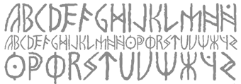 Argentinian designer, b. 1984, and graphic design student at FADU in Buenos Aires. Creator of the award-quality simulated runic typeface
  Born in Karlstad, Sweden, in 1952,
  Comicraft was founded by Richard Starkings and John Roshell in 1992. Located in Santa Monica and Los Angeles, they do lettering and design for the comic book industry and make comic book fonts. At one point they were also called Comic Book Fonts. The current presidents are Rita Simpson and
 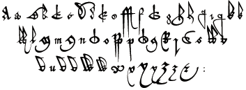 Wonderful 16-th century (commercial) fonts from this Manchester, UK-based foundry, including:
  Game writer, game designer, graphic artist, and the creator and owner of Cumberland Games & Diversions, b. Cumberland, MD, 1971. He lived in Austin, TX, but is in Denver, CO, since 2014. Typefaces by S. John Ross include Sex Nerd (2021), Guacamole Quickstep (2019), Cynocel Poster (2019), Monesque (2019), Flagstones (2018), Kentucky Fireplace (2016), Bad Guy Black (2015, an engraved currency font), Silvery Tarjay (2015), Iron and Brine (2015), Afton James (2015), Fountain Avenue (2013),
  [
[ Graphic designer in Sierre and Lausanne (Switzerland). During his studies at ECAL (Lausanne), he made a cinematographic signage typeface called
  [
[
 Great fonts for astrology, hieroglyphics, alchemy and the occult, by Toronto's Jan and Denise Koehler, mostly designed between 1993 and 1995. They moved to Litomerice and then Teplice, the Czech Republic, recently.
  Partner of Jan Koehler in
  Not to be confused with Phil's Fonts, Phil Fonts offers charityware fonts by Phillip Andrade who uses the nicknames Dry Bohnz, neatoguy and
  [
[ Art director in Munich, Germany.
  At Fontgrube AH, Andreas Höfeld, a protestant pastor from Erbach/Odenwald, designed these typefaces:
  Rome, Italy-based designer. In her Fontikon font project (2020), ishe has produced eight fonts, each with letters and culture symbols: Alchemy Complex, Adinkra Wisdom, Aztec Empire, Celtic Iron, Lovecraftian Neue, Japan Kamon, Viking Norse, Slavian Ustav.
  [
[ [
[ Japanese font foundry committed to making open license fonts based on old prints. It is run by Judicare and Eunice.
  Hanoded is the
  [
[ Harold Lohner was born in upstate New York in 1958. He received an MFA in printmaking from the University at Albany and is Professor of Visual Arts at Sage College of Albany. He began making fonts in 1997 and starting distributing them the next year through Harold's Fonts. He lives in Albany, NY, with his partner, Al Martino. Originally, most of his typefaces were freeware or shareware, but gradually, he started selling most on his site or via
  Born in Philadelphia and a resident of McKinney, Texas, Dan Zadorozny's creations at Iconian. He is a prolific type designer who specializes in techno and sci-fi typefaces.
  Ripon, CA-based designer of
  [
[ Marseille and/or Paris, France-based designer (b. 1961) of Argor Fast Scaqh (2015), Argor Priht Scaqh (2007, blackletter), Argor Brujsh Scaqh (2007, blackletter), Argor Cwar Scaqh (2006, pixel blackletter), Argor Biw Scaqh (2006, blackletter), Argor Flahm Scaqh (2001, blackletter), Argor-Got-Scaqh (2001, blackletter) and Argor-Man-Scaqh (2001). The author's fonts can be used for his artificial language Silarg.
  As a Swedish student at Uppsala University, based in Knutby, Johan Winge created the
  Foundry in Copenhagen which sells the fonts made by
  Fairfax, VA-based creator (b. 1990) of the informally hand-printed font Rushil (2008).
  [
[
 Cannot Into Space Fonts is the free font studio of Robert Jablonski (b. 1991), who is based in Indiana. Before this studio, Robert used to make fonts at FontStruct under the alias Rabbid Bahh. Mew Too (b. 1991, Indiana) is co-lead designer for Cannot Into Space Fonts. Jasper (b. 1996) joined in 2015.
 [
[ [
[ Calgary-based designer of
 Gary Munch (born 1953) is the Stamford, CT-based principal of MunchFonts. He teaches at Norwalk Community College and at the University of Bridgeport Shintaro Akatsu School of Design.. His typefaces:
  Aussie Nancy Lorenz (aka Lothlorien, and aka Queen of Spain Font Girl) created fonts in the theme of Lord of the Rings, all in a medieval handwriting or uncial style or Tolkien style: Party Business, Bilbo-hand-Bold-Bold (2002), Bilbo-hand-fine (2002), Bilbo-handRegular (2002),
  [
[ Danish art director, based in Copenhagen. Creator of Casa Madero (2012, a logotype for the winery), Douwe Egberts (2012),
  Freeware fonts by Eric VanDycke from Warnerville, NY, aka Dr. Nimbus. Original and very very enjoyable creations from 1997-1998. The site was closed in March 1999, unfortunately! Thanks to CybaPee, you can download the whole collection now.
 Peter S. Baker, an English professor at the University of Virginia, offers free TrueType and PostScript fonts. these include:
  [
[ Free original designs, often with a science fiction feel, by Neale Davidson (b. 1971). Does some custom font work.
  Peter Rempel (b. 1958) is a Winnipeg-based calligrapher.
  During his studies in Trier, Germany, Rasselbock created FK Hoc (2015), FK Cut (2012, a cut paper dada typeface), FK Zeugma 2012, (an irregular eerie sans inspired by bad movie titling fonts from the 1930s), FK Futhark (2012, Germanic runes), FK Epiphany (2013, blackletter), FK Permutata (2013, an angular octagonal corporate typeface) and FK Neoz (2012, a smooth sans display family). In 2011, he designed FK Beo. [
 Aka p2pnut, b. Wales, 1943, who started making fonts in 2009 at FontStruct.
  Designer at
  [
[ [
[ [
[ [
[ Kazincbarcika, Hungary-based type designer Roland Hüse (b. 1980) sells his fonts through My Handwritings (Kazincbarcika, Hungary), which was renamed Runes&Fonts. His first font is
  [
[

 Alphabets Magical had freeware rune and old writing system fonts by Ben Whitmore from Auckland, New Zealand. They included AngelicR100, BarddasWRR100, DaggersR100, IEFutharkR100, Malachim, PVEnochian100, PWRunesR100, ThebanBW100, AlphGeniiFzpg100, Enochian-Regular, PictSwirlR100. He also had Enochian-Regular by the Digital Type Foundry, 1991.
 Lars Bergquist is the Swedish type designer (b. 1936) who runs Timberwolf Type in Sollentuna, just outside Stockholm. Bergquist designed numerous successful text families and display typefaces, including the free
  Aka Rursus, this Swedish viking calls himself a nerd and a cyber vagabond---exactly my kind of guy! Designer of the slab typewriter font for Latin and Cyrillic called Rursus Compact Mono (2007-2010), an
  Travis Stearns (was:
  Australian Harry Pears (b. The Quirindi, Australia) is a veteran of the type world. He started his career as a colour camera operator and then as a phototypesetter. He started marketing digital typefaces in Australia, and has designed a few fonts himself. Creator in 2001 of the Celtic look family
  Moscow-based illustrator specializing in vintage style, calligraphy, ornate crests and emblems. In 2014, Vates Design created the commercial copperplate script typeface Bodega Script and the engraved currency font Bold Price. In 2015, Vates added the copperplate gothic typeface Barracuda Display and the curly Austen Display. In 2016, they published the calligraphic chancery style November Script. Fonts from 2017 include Achievement (a brush script) and Black Spot (vintage style).
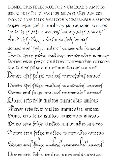
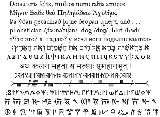
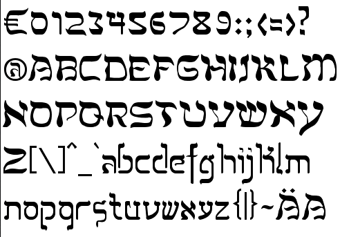
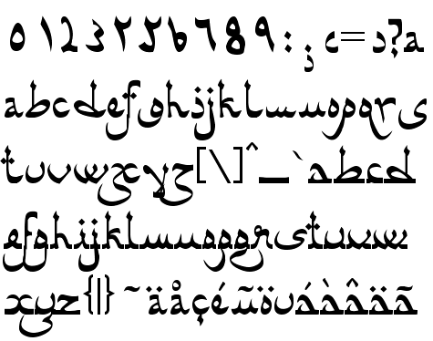
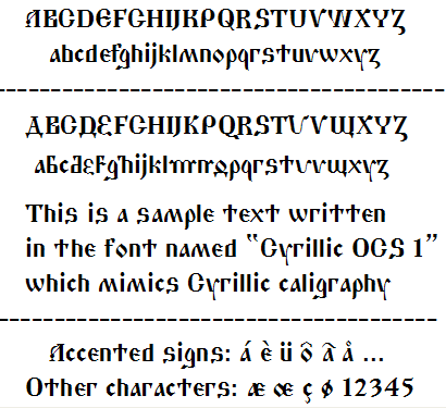
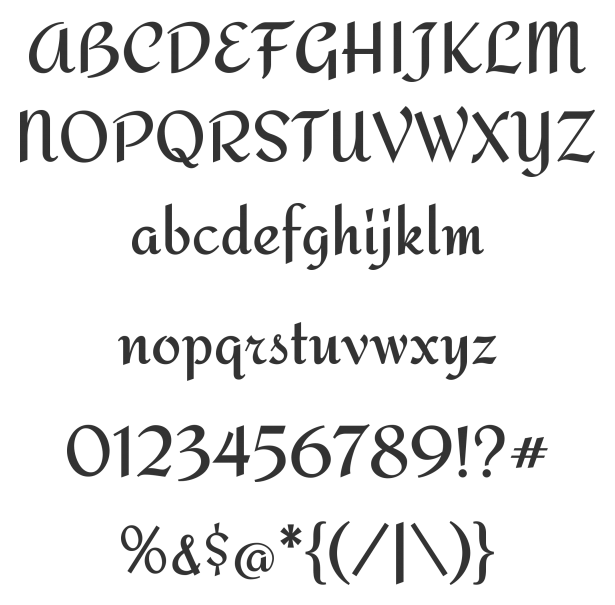
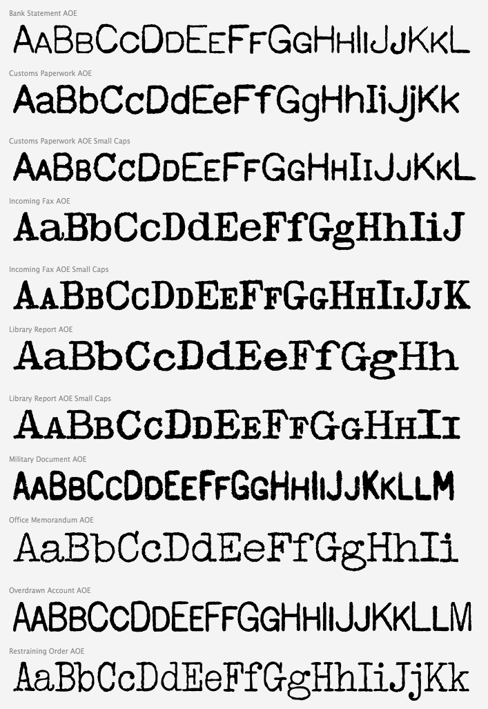
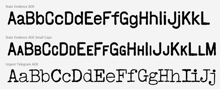
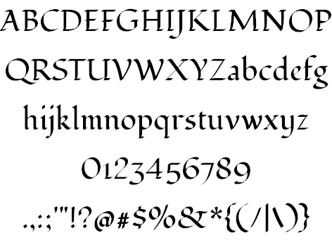
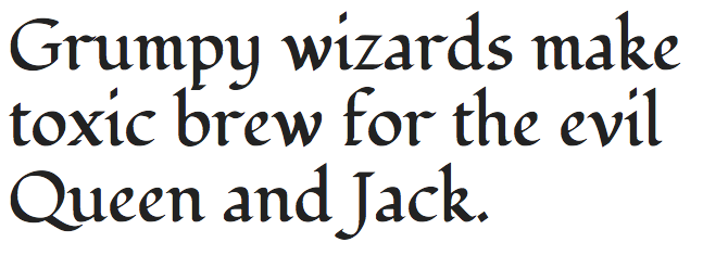
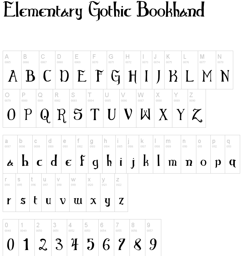
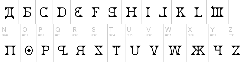
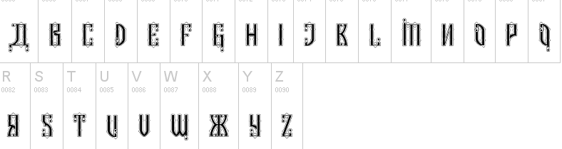
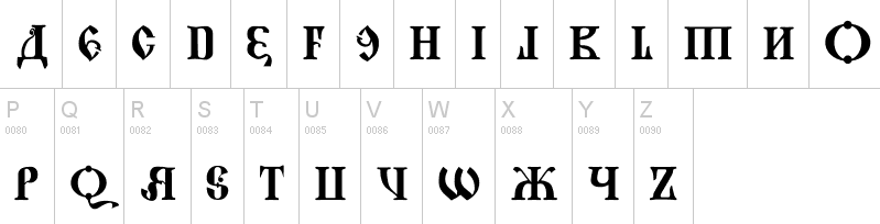
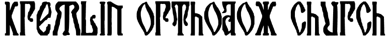
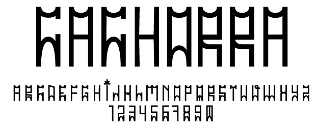
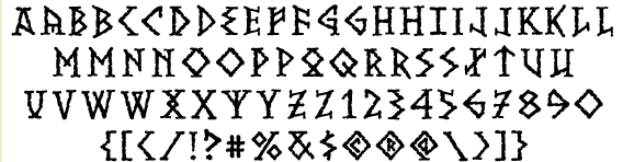
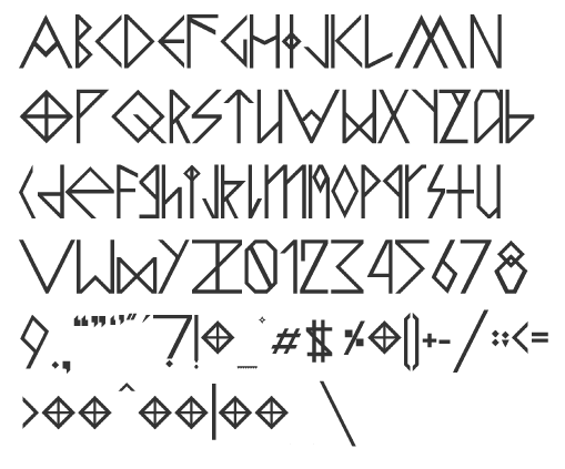
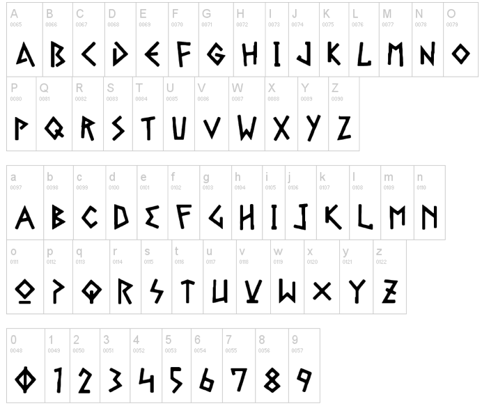
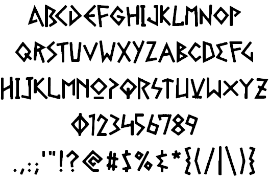
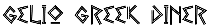
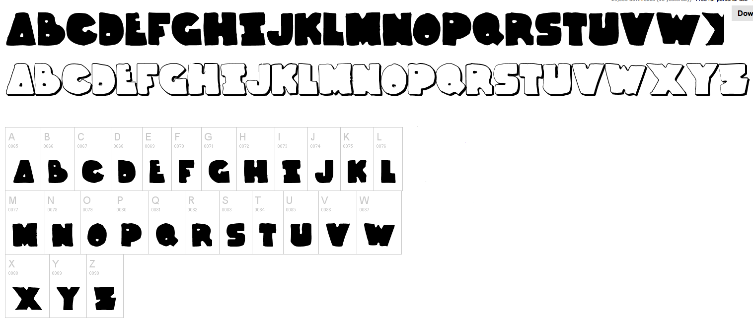
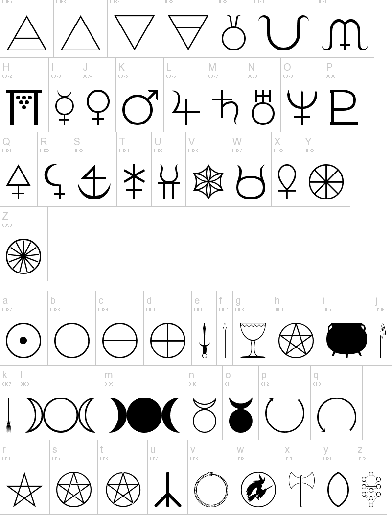
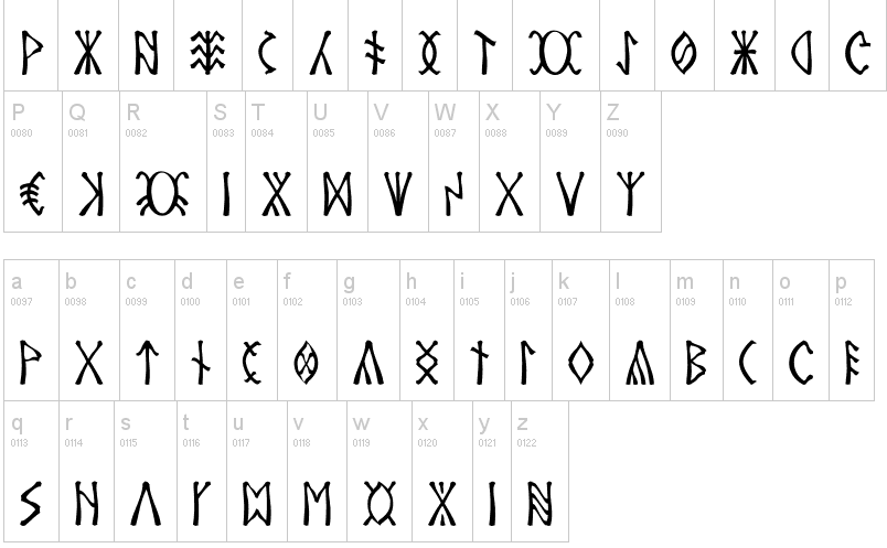
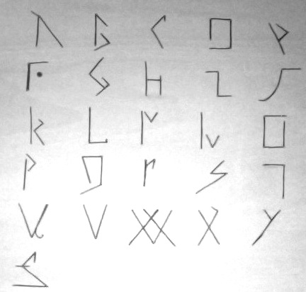
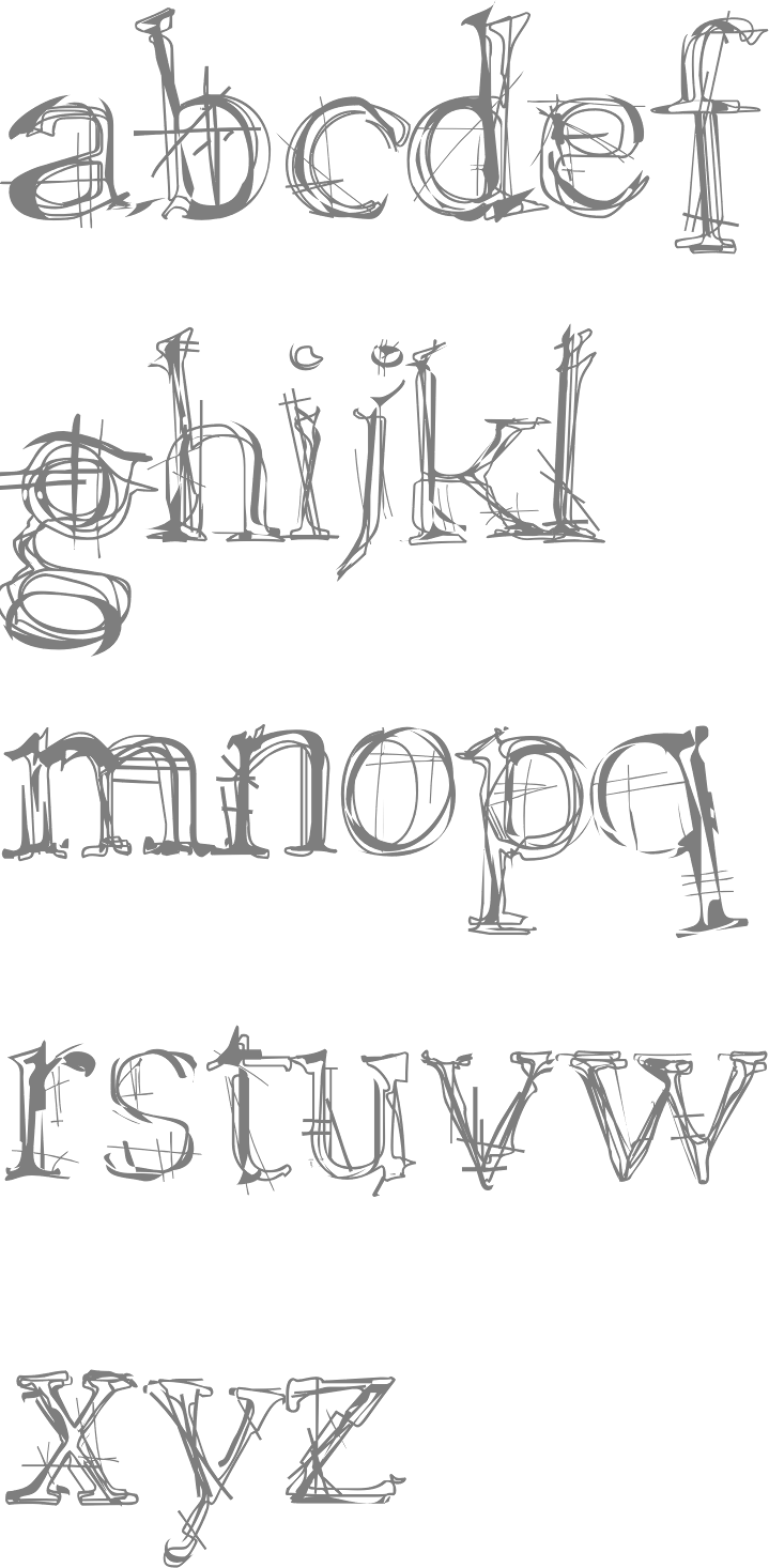
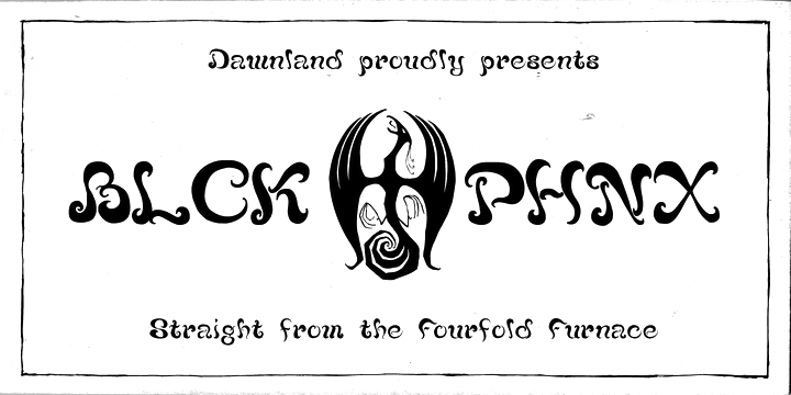
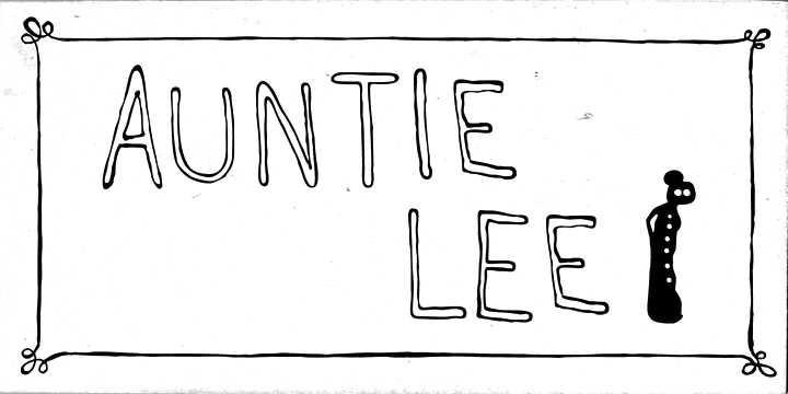
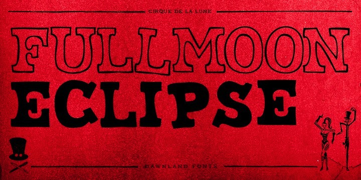
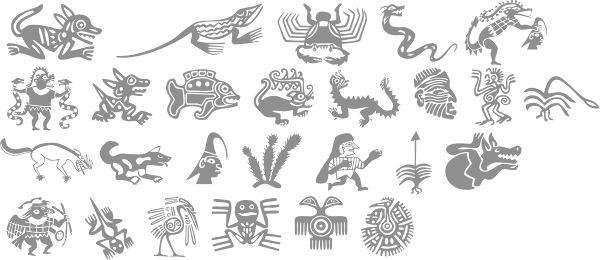
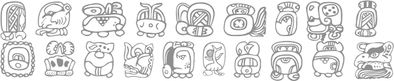
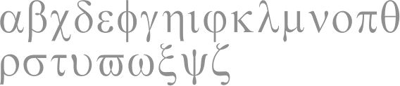
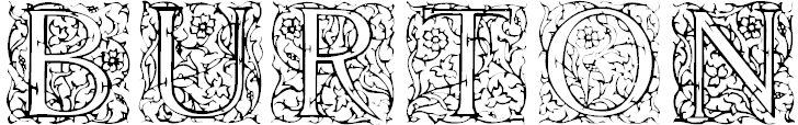
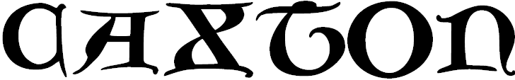
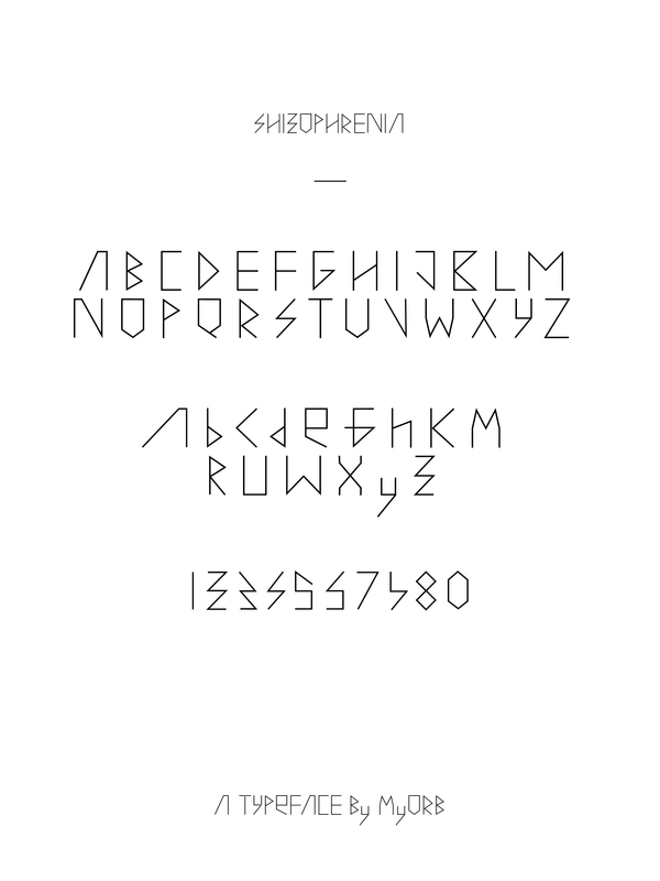
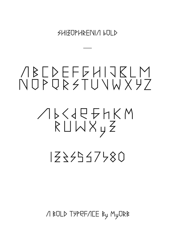
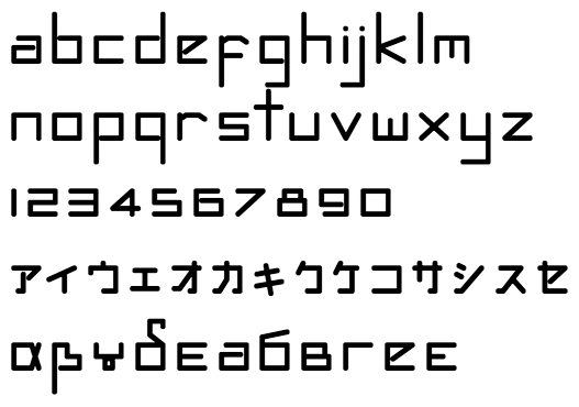
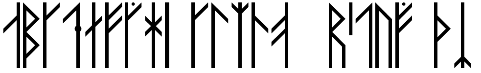
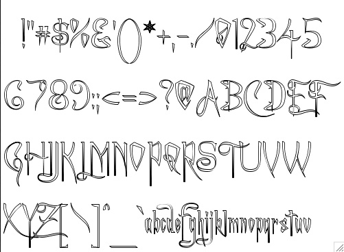
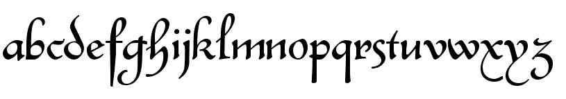
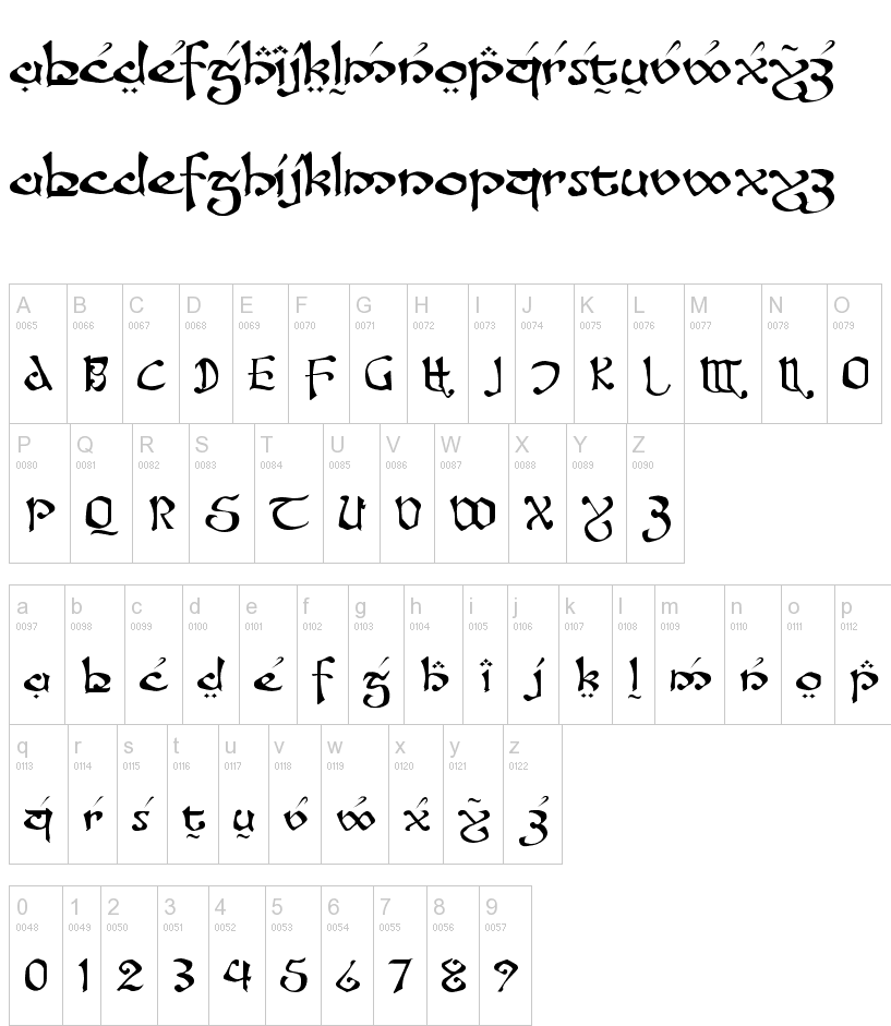
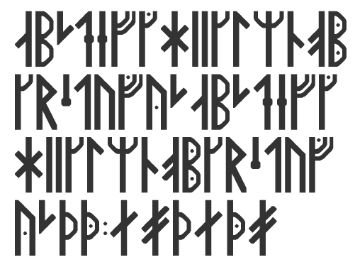
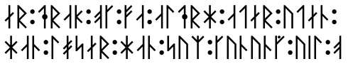
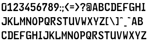
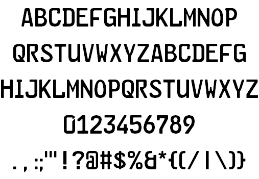
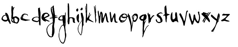
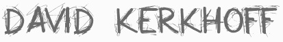
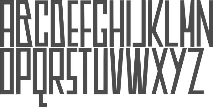
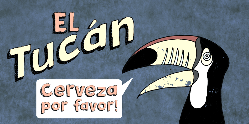
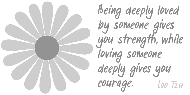
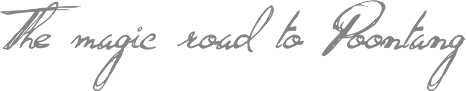
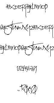
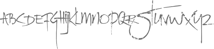
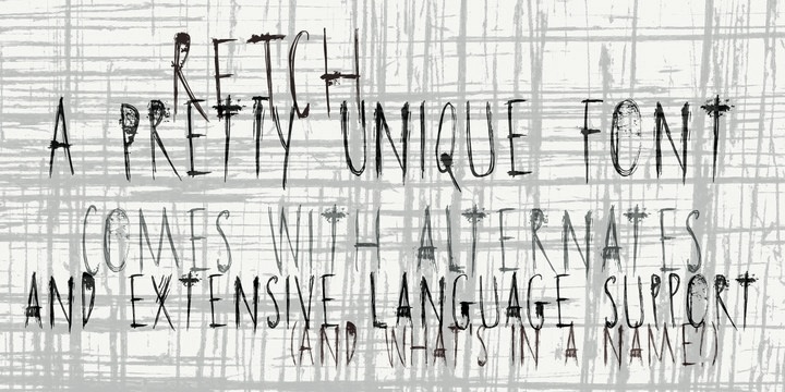
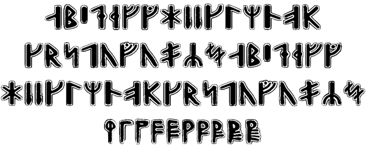
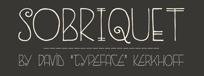
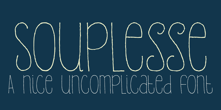
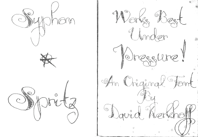
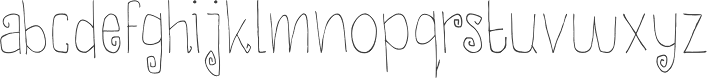
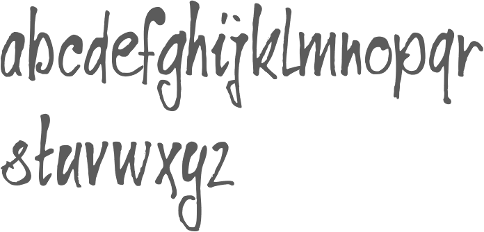
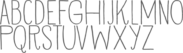
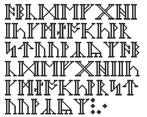
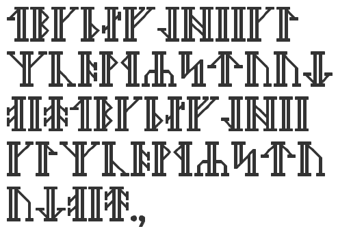
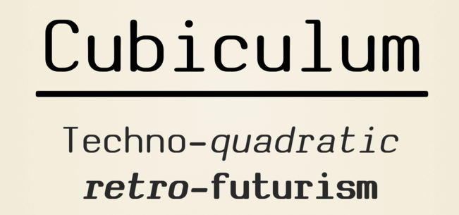
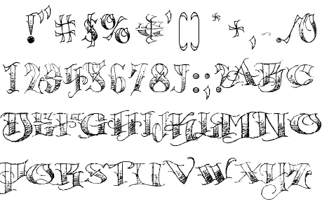
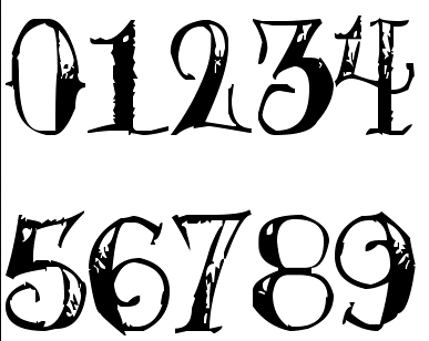
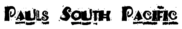
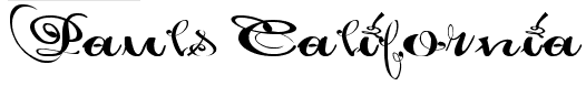
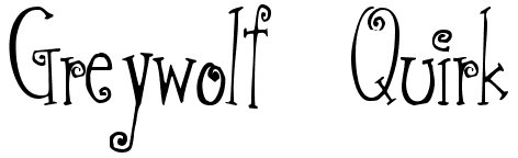
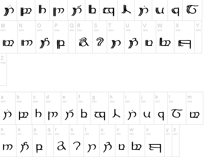
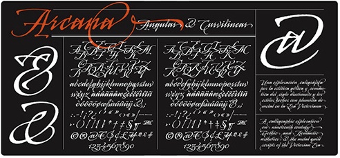
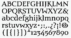
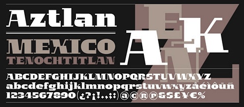
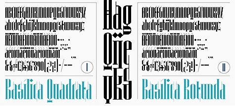
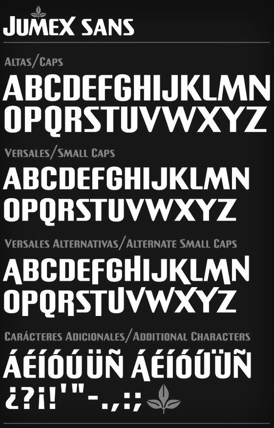
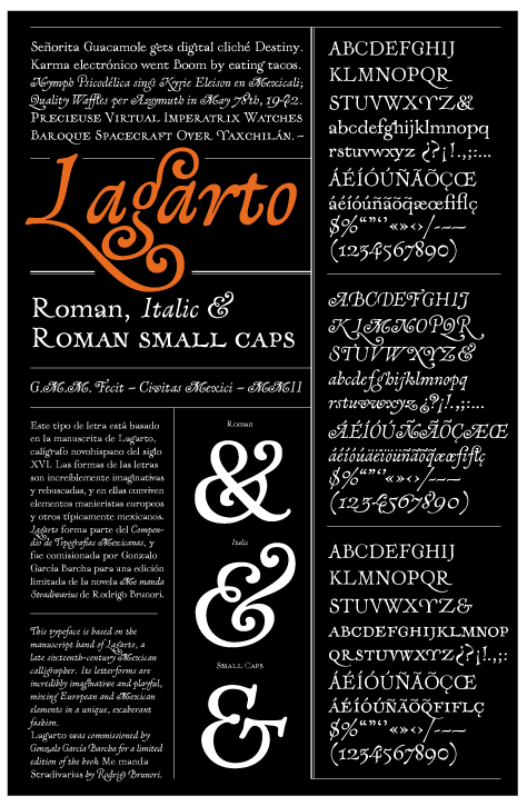
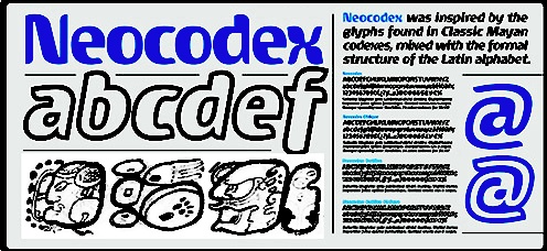
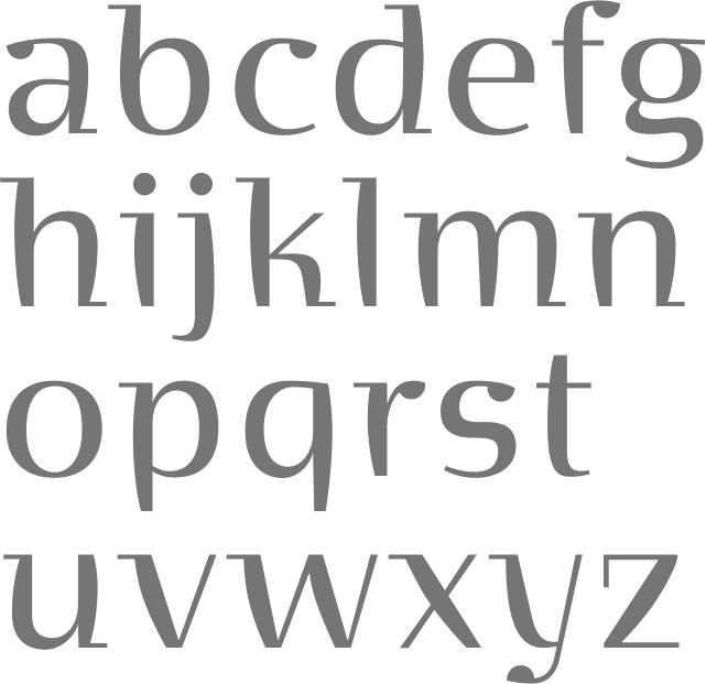
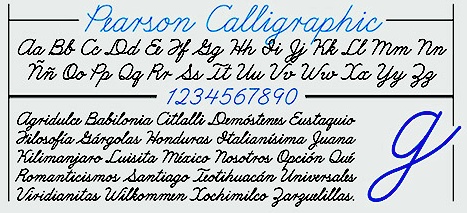
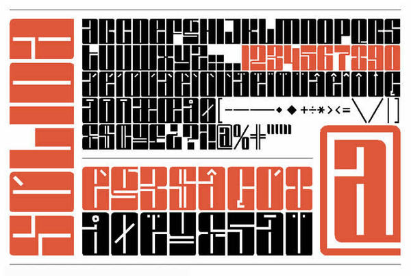
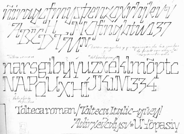
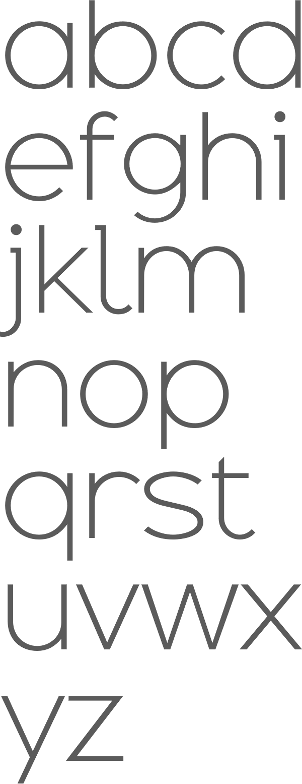
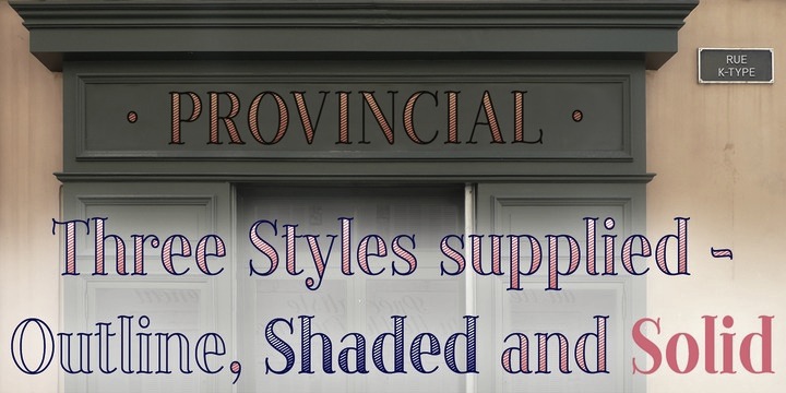
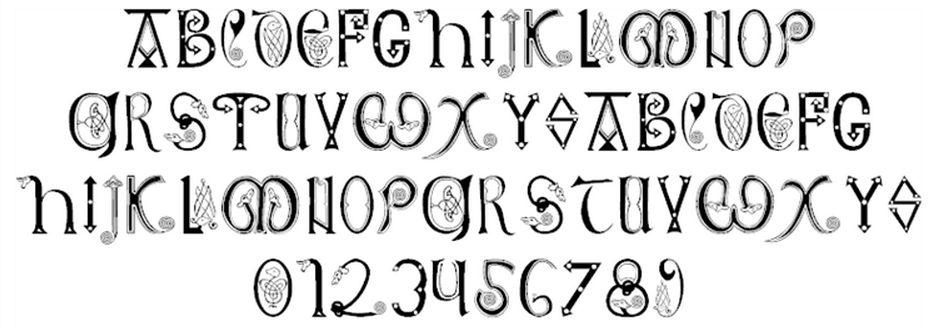
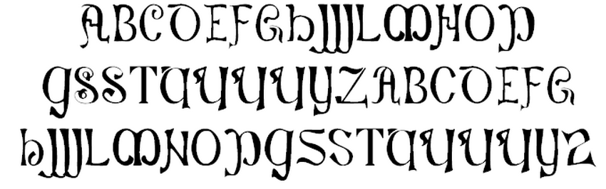
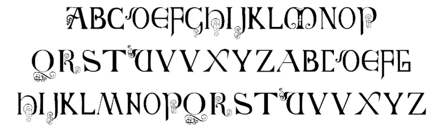
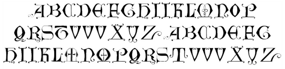
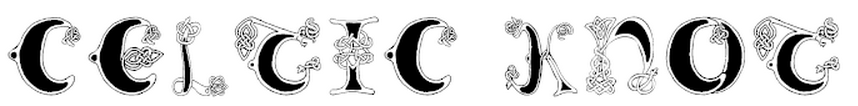
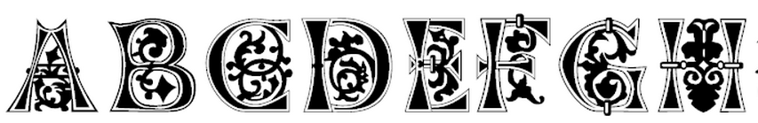
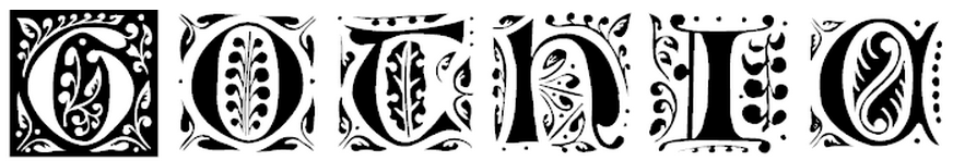
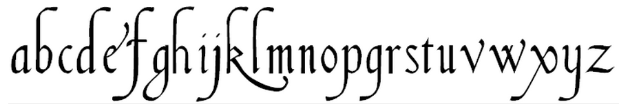
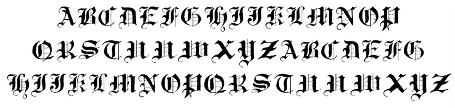
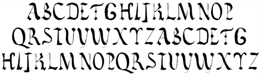
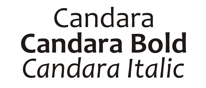
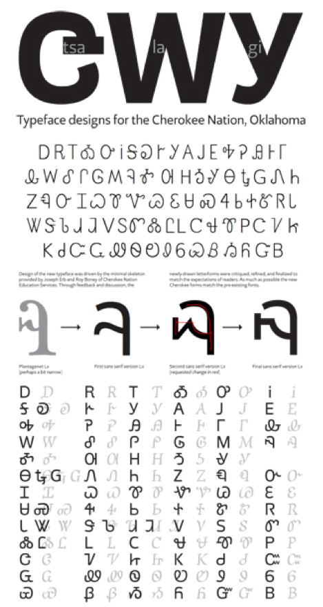
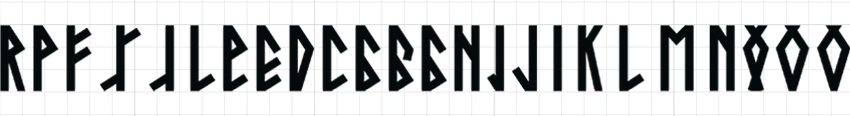
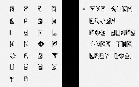
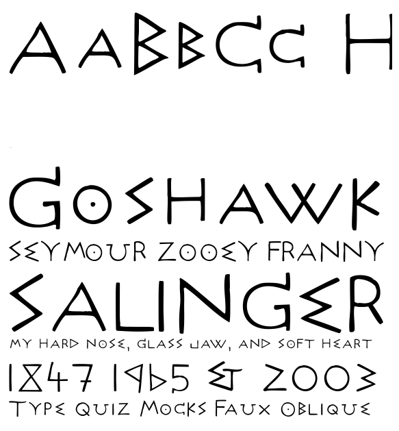
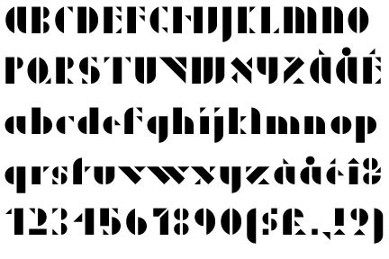
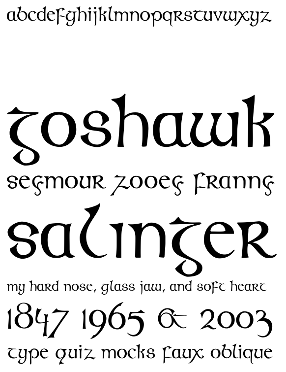
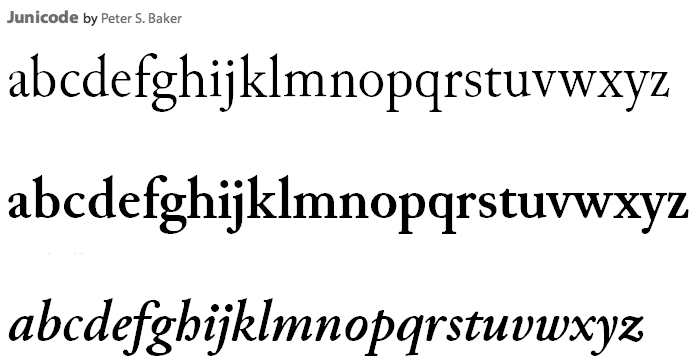
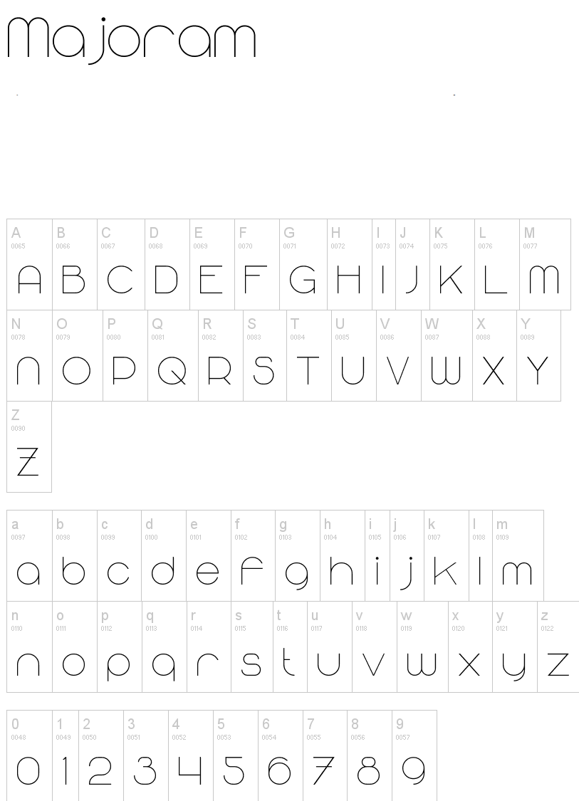
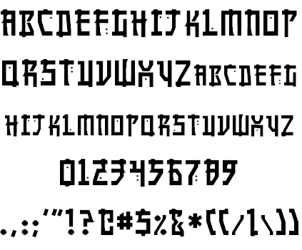
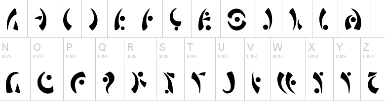
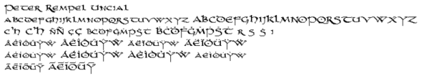
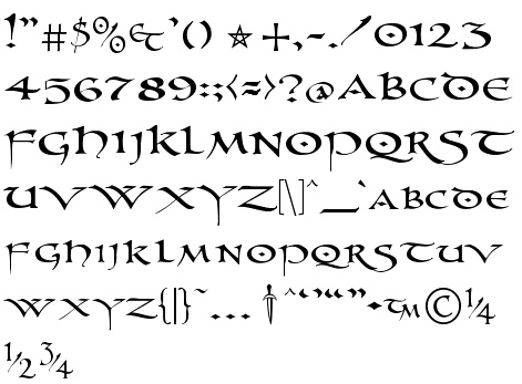
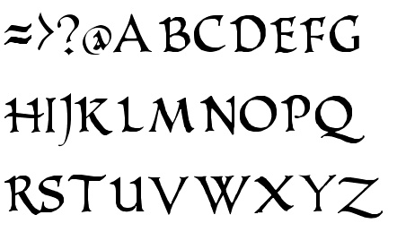
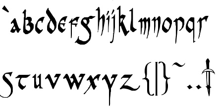
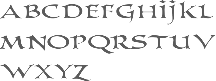
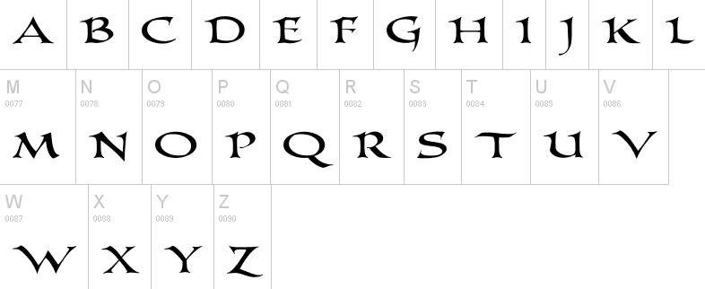
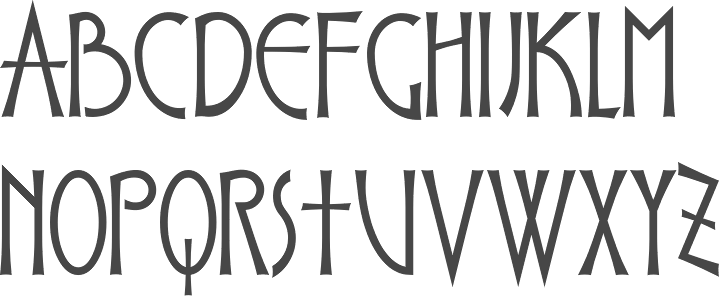
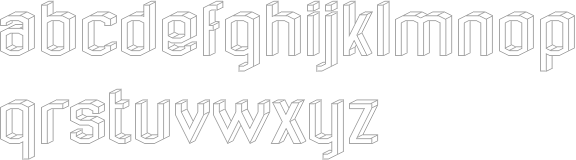
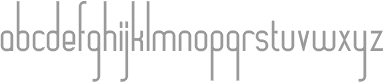
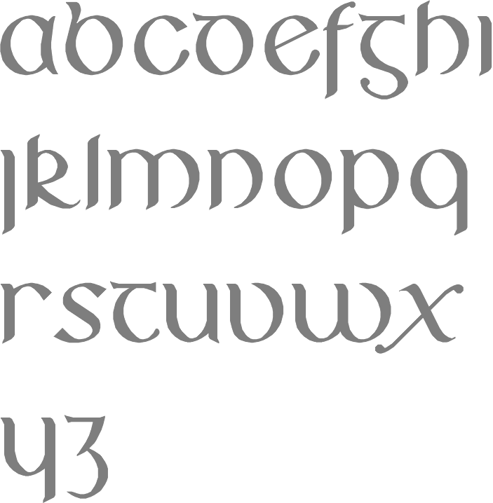
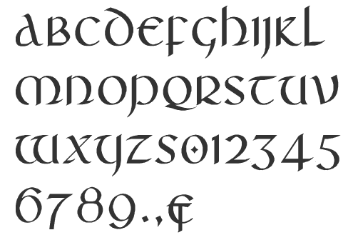
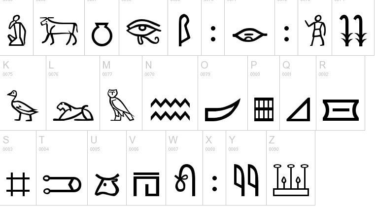
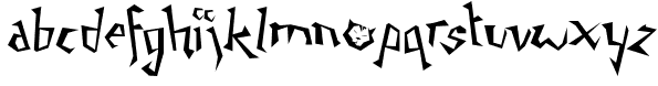
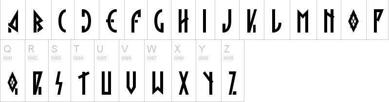
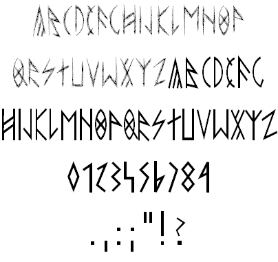
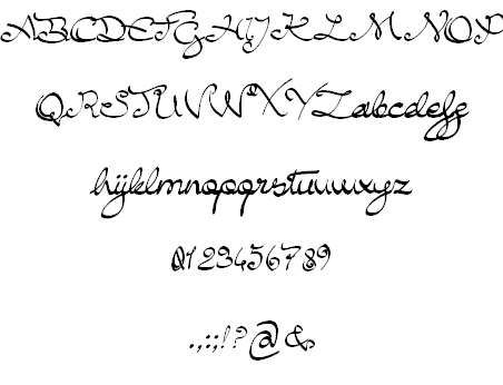
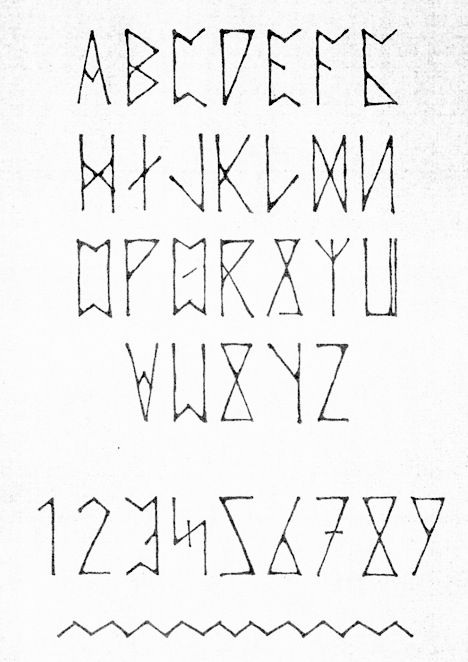
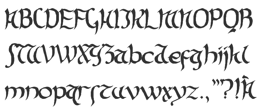
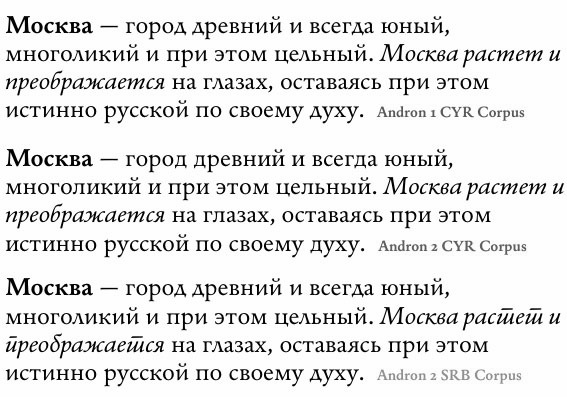
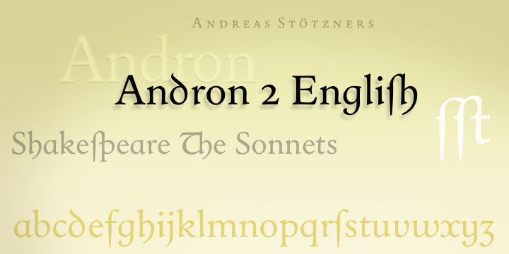
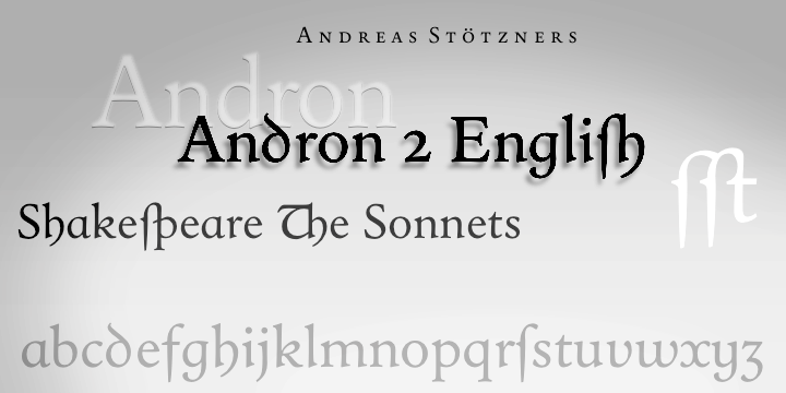
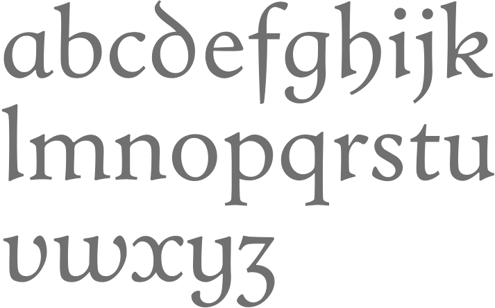
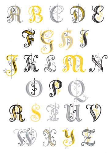
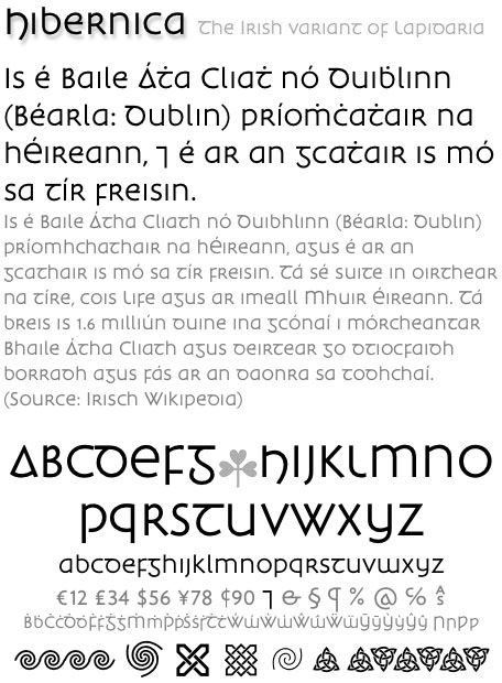
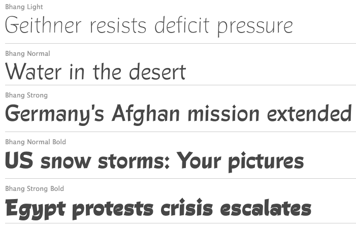
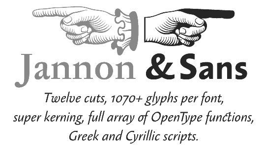
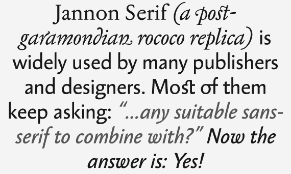
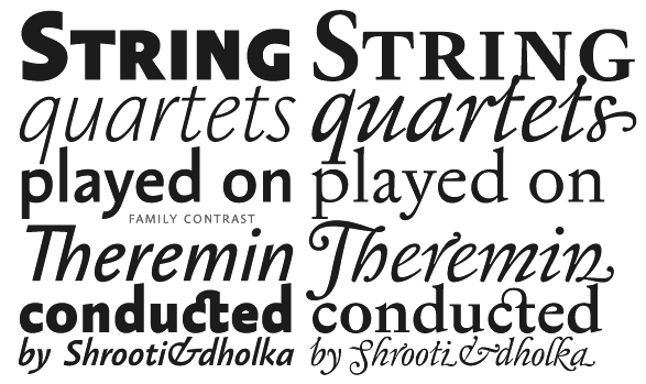
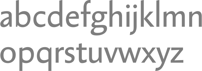
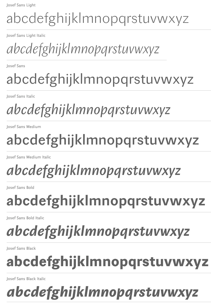
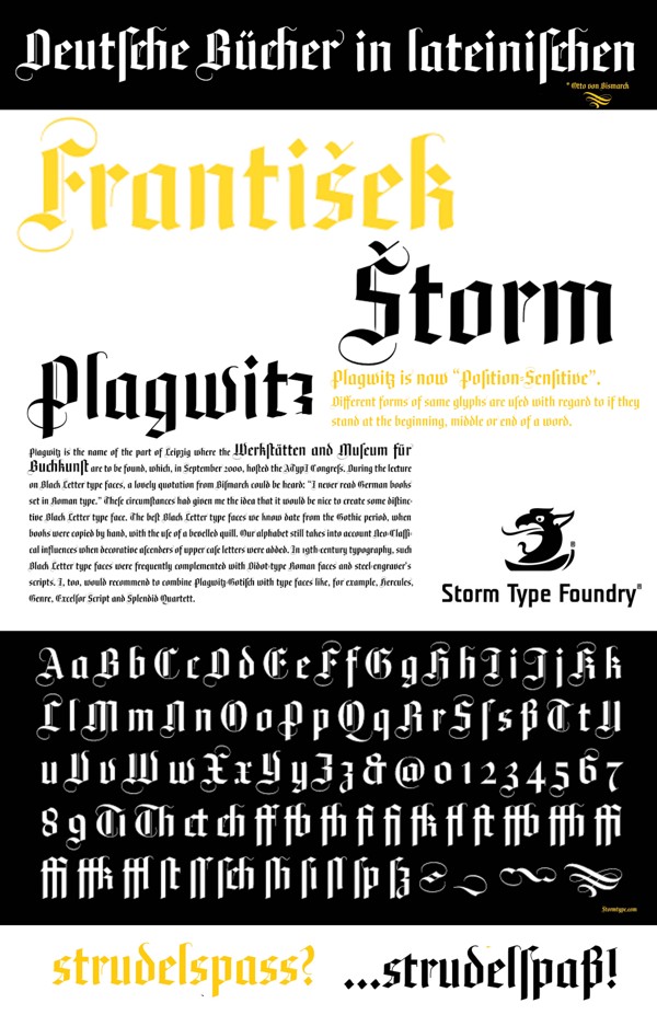
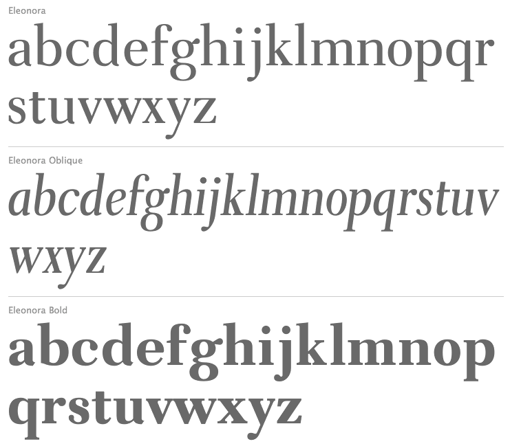
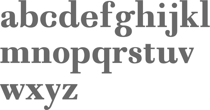
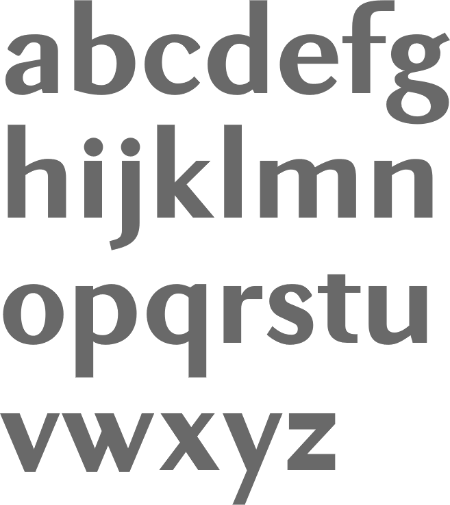
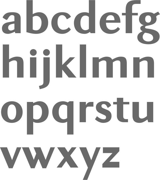
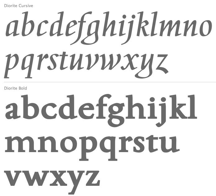
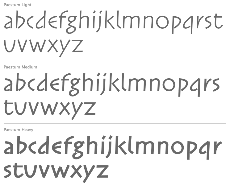
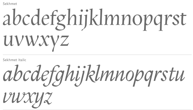
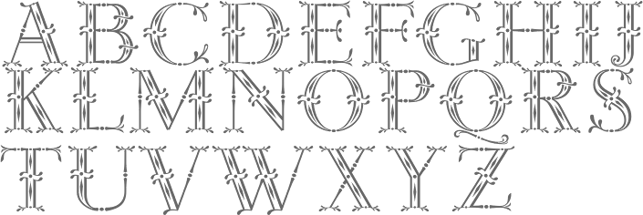
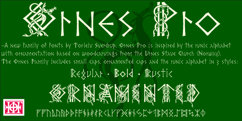
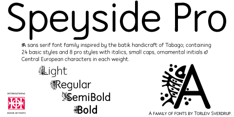
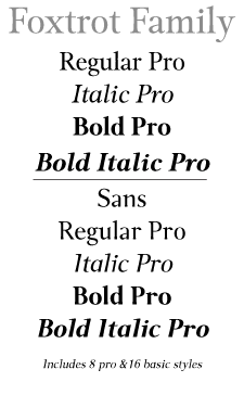
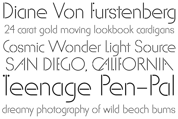
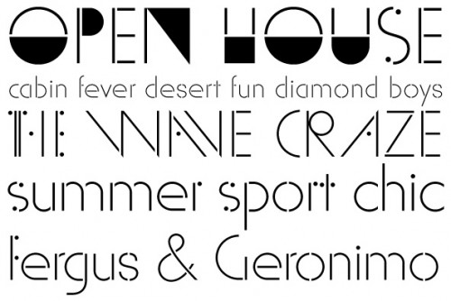
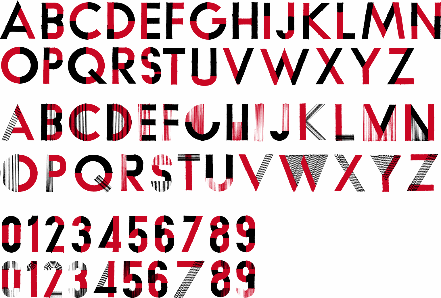
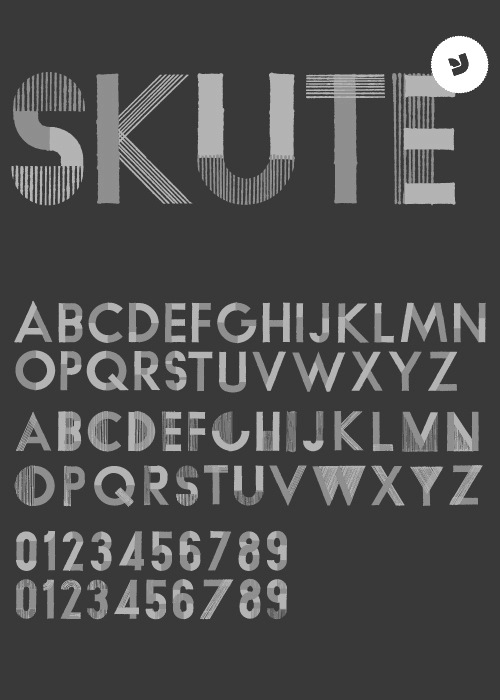
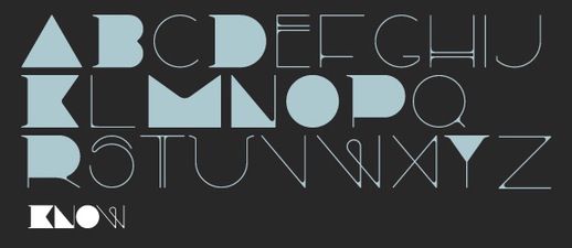
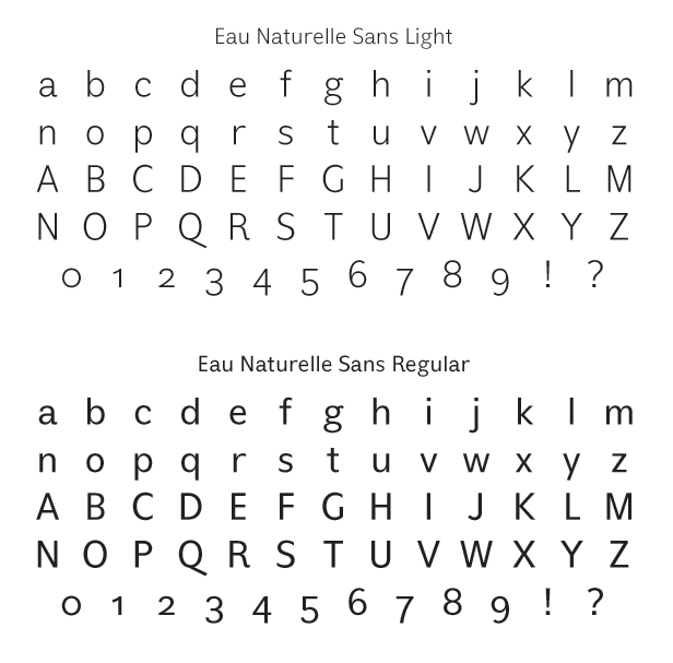
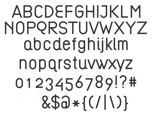
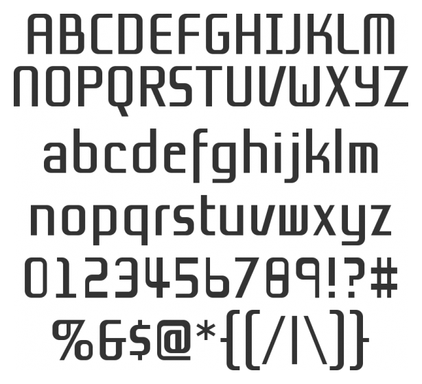
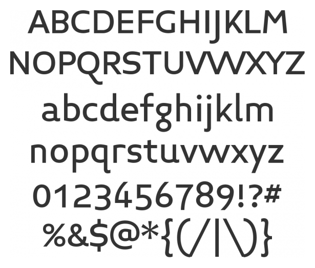
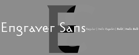
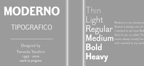
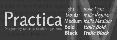
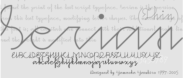
|
|
|
|