| | |
2000clipart
|
Ten clipart fonts for 25USD. One free clipart font. By the religious group Les Chemins D'En Haut. [Google]
[More] ⦿
|
Aaron Wolber
|
During his studies at he Akademie für Gestaltung in Köln, Germany, Aaron Wolber created the display sans typeface Gemeinschaft (2013, custom made for a catholic community in Geyen), the geometric sans Basic Alphabet (2013), and the serif typeface Zwanzig (2013). Behance link. [Google]
[More] ⦿
|
Achim Stump
[Alt-Katholiken in Deutschland]
|
[More] ⦿
|
Aleksandar Nikolovski
|
Rochester, NY-based designer of Aligned (2012), a typeface that was influenced by the shapes of the Cyrillic letters of the Orthodox church. One could call it a Cyrillic simulation typeface. [Google]
[More] ⦿
|
Aleksandr Andreev
[Church Slavonic Initiative]
|
 [More] ⦿
|
Aleksandra Slowik
|
 Saint Petersburg, Russia-based designer.
 Typefaces from 2015: Sacred (alchemic, mysterious), LAM and Larch Brush. Typefaces from 2016: Line Flat (circuit font), Line Flat Icons. Typefaces from 2018: Volos (a great textured poster font), Ancient Geometry (alchemic), Slowik Emphasis (a geometric logo font). She also specializes in alchemic symbolism, with sets of ornaments called Golden Section, Unalome (a script with Buddhist symbols) and Sacred Symbols. [Google]
[More] ⦿
|
Alp
|
Creator of Symbol Crucifix (2008), a detailed medieval symbols font. It has Fleur de Lis, crosses, Tomoe, Mon, and baroque floral patterns. [Google]
[More] ⦿
|
Alphabetum
[Juan-José Marcos García]
|
Juan-José Marcos García (b. Salamanca, Spain, 1963) is a professor of classics at the University of Plasencia in Spain. He has developed one of the most complete Unicode fonts named ALPHABETUM Unicode for linguistics and classical languages (classical&medieval Latin, ancient Greek, Etruscan, Oscan, Umbrian, Faliscan, Messapic, Picene, Iberic, Celtiberic, Gothic, Runic, Modern Greek, Cyrillic, Devanagari-based languages, Old&Middle English, Hebrew, Sanskrit, IPA, Ogham, Ugaritic, Old Persian, Old Church Slavonic, Brahmi, Glagolitic, Ogham, ancient Greek Avestan, Kharoshti, Old Norse, Old Icelandic, Old Danish and Old Nordic in general, Bengali, Hindi, Marathi, Phoenician, Cypriot, Linear B with plans for Glagolitic). This font has over 5000 glyphs, and contains most characters that concern classicists (rare symbols, signs for metrics, epigraphical symbols, "Saxon" typeface for Old English, etcetera). A demo font can be downloaded [see also Lucius Hartmann's place]. His Greek font Grammata (2002) is now called Ellenike. He also created a package of fonts for Latin paleography (medieval handwriting on parchments): Capitalis Elegans, Capitalis Rustica, Capitalis Monumentalis, Antiqua Cursiva Romana, Nova Cursiva Romana (2014), Uncialis, Semiuncialis, Beneventana Minuscula, Visigothica Minuscula, Luxoviensis Minuscula, Insularis Minuscula, Insularis Majuscula, Carolingia Minuscula, Gothica Textura Quadrata, Gothica Textura Prescissa, Gothica Rotunda, Gothica Bastarda, Gothica Cursiva, Bastarda Anglicana (2014) and Humanistica Antiqua. PDF entitled Fonts For Latin Palaeography (2008-2014), in which Marcos gives an enjoyable historic overview. Alphabetum is not Marcos's only excursion into type design. In 2011, he created two simulation fonts called Sefarad and Al Andalus which imitate Hebrew and Arabic calligraphy, respectively. Cyrillic OCS (2012) is a pair of Latin fonts that emulate Old Church Slavonic (old Cyrillic). In 2013, he created Cuneus, a cuneiform simulation typeface. Paleographic fonts for Greek (2014) has ten fonts designed by Marcos: Angular Uncial, Biblical Uncial, Coptic Uncial, Papyrus Uncial, Round Uncial, Slavonic Uncial, Sloping Uncial, Minuscule IX, Minuscule XI and Minuscule XV. These fonts are representative of the main styles of Greek handwriting used during the Classical World and Middle Ages on papyrus and parchments. There is also a short manual of Greek Paleography (71 pages) which explains the development of Greek handwriting from the fourth century B.C. to the invention of printing with movable type in the middle of the fifteenth A.D. He wrote a text book entitled History of Greek Typography: From the Invention of Printing to the Digital Age (in Spanish; second edition, 2018). See also here and here. [Google]
[More] ⦿
|
Alt-Katholiken in Deutschland
[Achim Stump]
|
A truetype font called Alt-Katholiken, with religious logos, made by Achim Stump. Free, but you need to ask by email. In German. [Google]
[More] ⦿
|
Andreas Seidel
[astype.de (or: Astype)]

|
 [MyFonts]
[More] ⦿
[MyFonts]
[More] ⦿
|
Andrei Izotov
|
Andrei Izotov (Moscow State University) is the creator of the old Slavonic typeface Church AI (1995), which can be found here. [Google]
[More] ⦿
|
Andrei Nesterov
|
Russian designer of the beautiful Open Font Library uncial Cyrillic typeface Ostromirovo (2008), which is based on Ostromirovo evangeliye [Ostromir Gospel] (1056-1057). Other typefaces there include Rus Sans Pokrytie (2009, based on Luxi Sans; withdrawn in 2010) and Rus Sans 3 (2010). [Google]
[More] ⦿
|
Andrey Font Design
[Stephanus Prabowo]
|
Andrey Design is run by Stephanus Prabowo, who also uses the name Andrean Prabowo. Yogyakarta, Indonesia-based designer (b. 1989) of these (mostly script) typefaces in 2020: Christmas Story (a wild calligraphic script), Welcome Santa Claus (script), Vennesia (a wild script), Black Venom, Hope (a script font for monograms), Good Day, Stay at Home, Bekah Dalem, Bubble Cute (a bubblegum font), Valentina, Asem, Aqua. Typefaces from 2021: Good Father (a display typeface on the theme of religious crosses), Hello Dark (a dripping blood font), Shine Himawari (a romantic script), Thanks Bunny (a scrapbook font), Rathya (a wild calligraphic script), Love Valentina (a romantic curvaceous script), Love Baby (a Valentine's Day script), Sheyla (a swashy script), Resonance Love (wild calligraphy), Christmas Thania (a hyper-curly script), Holy Christmas Tree (script). [Google]
[MyFonts]
[More] ⦿
|
AnonMoos
|
 Creator of free symbol fonts. These include:
 - Fivefold-OrnamentsEtc (2010): decorative abstract geometric patterns with five-fold symmetry or quasi-symmetry.
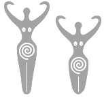
- Goddess-Symbols (2008): a number of quasi-traditional Goddess symbols or variants.
- Gorean-BrandsSymbols (2010): depictions of various symbols described verbally in John Norman's series of Gor novels.
- Ownership-IconsFlag (2007): basic versions of the Tanos ownership icons.
- TengwarElfetica (2005): a simple sans-serif font for writing the characters of J.R.R. Tolkien's Tengwar writing system. This is a revised version of the original "Elfetica" font by Ronald Kyrmse.
- NoCurvesBoustrophedon (2011) is an angular face.
Open Font Library link. [Google]
[More] ⦿
|
Ash Kamiya
|
Mexican designer of Puebla 79 (2010). In Nueva Espana (2010), Kamiya scan-fonted a typeface used in the printing of Nueva Espana in the XVIth century. Download it here. Concilium II (2010) is a geometric, almost symbolic, headline sans face. All the fonts have religious roots. [Google]
[More] ⦿
|
Ashoora
|
Aka Ashura. Tehran, Iran-based designer of the calligraphic Arab script dingbat typeface SHia (2007). Very original. Alternate URL. [Google]
[More] ⦿
|
astype.de (or: Astype)
[Andreas Seidel]
|
 Astype.de is a German foundry started in 2003 by illustrator and type designer Andreas Seidel (b. 1975, bad saarow, near Berlin, Germany). He lives in Cottbus, Germany. In 1998, he obtained a Masters degree in business administration. In 2007, he and Ingo Preuss set up The German Type Foundry. In 2017, he joined the initial crew at Fust & friends. The typefaces:
 - One of his first typefaces was Crayfish (originally a URW font, but withdrawn by Seidel from URW in 2002). Crayfish is a display type originally designed for an American Football club. The Crayfish typefaces are sold as Thunder Bold and Titan Bold.
- Check his nice weather symbols (not a font).
- He finished Ornaments Thanksgiving and the great ASTYPEOrnaments-WineGrape A (2004).
- He is working on 14th century initials (2003).
- He created Sattler (2003): Joseph Kaspar Sattler, one of the great German art nouveau artists created these nice initials in 1897 for the famous royal monumental book project Die Nibelunge for the Reichsdruckerei Berlin. Only 200 exclusive signed masterpieces were printed in four years from 1900 till 1904. Joseph Sattler was the art director, type designer and designer in one person. The Reichsdruckerei showed samples of the unfinished work in 1900 at the world exhibition in Paris to advertise the high craftsmanship of the German presses.
- He made Heraut (2003), an art nouveau lettering typeface based on a 1901 design of Hermann Hoffmann called Herold Reklameschrift.
- He created Sveva AS Versal (2003, art nouveau).
- About Missa Solemnis, he writes: Solemnis was designed by Günter Gerhard Lange and first cut in metal 1953 (this is the date he quotes himself, other sources mention 1950 or 1952). It seems to be one of his earliest typeface designs that he had done as a freelancer for H. Berthold AG in Berlin. [...] Missa Solemnis AS is a new, remastered and extended version of Mr Lange's typeface. The font is available in the OpenType format and comes in two styles: 1953 and 2003. The 1953 style contains all characters of the original metal type, as well as a few additions. [...] The 2003 cut is more delicate and makes extensive use of the OpenType format. It contains over 650 glyphs, covering Roman-based languages of Western and Central Europe. His Solemnis inspired Simeon AS (2003), a 650-glyph uncial style face.
- In 2004, he created Missale Incana, an interpretation of a typeface from Herbert Thannhaueser.
- Still in 2004, he created ASTYPE Ornaments Christmas A2 and ASTYPE Ornaments Christmas A. These were followed in 2005 by ASTYPE Ornaments Christmas B.
- He made Missale Lunea (2004). This has astroligical symbols, moon phases and medieval characters.
- In 2005, the exquisite calligraphic script typeface Gracia was added, consisting of Gracia No. 44, 45, 54 and 55 (graceful calligraphic script), and Gracia Solo.
- Paola is a redesigned, new interpretation of a brush typeface from Carl Rudolf Pohl.
- He made Adana (2005): The roots of Adana going back to the year 1930, to the Berlin-based German graphic designer Wilhelm Berg. His typeface can be interpreted as an answer to Lucian Bernhards Schönschrift. The Initials are nearly close to the original drawings but the Circular typeface was changed dramaticly. Excentric, unusual forms and loops were changed to fit todays needs. Due to the lack of a corresponding Roman letter form, the Regular version was designed including small caps, fitting the contrast and swinging shapes of Adana Circular. Both typefaces play well together in all kinds of adverts, as well with designs like Bodoni or Didot.
- Alea AS Initials (2005) is a floral faced based on the drawings of Maria Ballé.
- Taiko (2006). A revival of Otto Arpke's Arpke Antiqua (1928, copperplate).
- ASTYPE Ornaments Accolades A (2007), and ASTYPE Ornaments Accolades C (2011).
- GTF Toshna Std (2008, German Type Foundry) is a garaldic type family in three optical weights, after a 1955 family called Tschörtner-Antiqua by Hellmuth Tschörtner that was very popular in the DDR.
- Secca (2009, German Type Foundry) is a simple sans family rooted in early German grotesque type designs. See also Secca Soft (2014) and Secca Stencil (2015).
- Nepos (2010) is an experimental modular type kit consisting of ready-made typefaces and a set of special BUILD fonts to build your own letters and ornaments. These BUILD fonts can be used on layers with different colors and overprinting for special effects. The effects like Antiplex can be considered as kitchen tiles. There are also color inversions and stencil types.
- Secca Saloon (2011) is a versatile ornamental Western family.
- Popsil (2011) is a white-on-black hand-printed poster face.
- Ademo (2011) is a classic shaded layered 3d caps face, based on two typefaces designed by Carl Albert Fahrenwaldt that were published in 1931-1932 by Schriftguss AG.
- Wood Bonnet Antique No.7 (2012) is based on real vintage wood type blocks from Switzerland.
- VTG Stencil US No. 4 (2012) is based on plate US No. 4 from New York Stencil Works. This revolving stencil-plate was invented by Eugene L. Tarbox and patented in 1868. The military stencil fonts VTG Stencil US No. 2 (+Ornaments), VTG Stencil US No. 51, VTG Stencil UK No. 76, VTG Stencil Germany No. 101 (2014, modeled after historic blackletter stencil plates from Bavaria), and VTG Stencil US No. 72 followed in 2014. In 2016, he added Vtg Stencil DIN.
- VTG Stencil Germany No. 1 (2013) is a set of nicely executed didone stencil typefaces based on real models used in Germany from 1871-1918 and later. There is a Sketch style.
- Wood Poster Eight (2015) is a free wood type slab serif.
- Alea Initials (2017, floriated caps).
- Wood Bonnet Grotesque No 4 (2017).
- The Vtg Stencil France series (2017) in substyles Vtg Stencil France No1, Vtg Stencil France No3 and No. 5.
- The expressionist typeface Alarm (2017, Fust & Friends), which is based on an old design of Heinz König also called Alarm (1928, at Trennert).
- Presto (2017, Fust & Friends), a revival of a script by Helmut Matheis (1970).
- Vtg Stencil Italy No2 (2018).
- Rocaie (2018). Decorative caps base on antique rococo letters from a gilding workshop.
- Wood Heinz No.4 (2019). Wood Heinz No.4 offers up to four printed look variations of all the Latin base letters and figures. An OpenType letter rotator is programmed into the fonts to emulate the randomness of wood type printing. Also: Wood Heinz No.2 (2019).
- Missale Solis (2019). An uncial typeface that overhauls Missale Lunea (2004).
- Vtg Stencil UK No2 (2019).
- Vtg Stencil Marsh (2020). Based on one inch stencils, cut by a Marsh machine. Marsh was an American stencil machine maker in the 1920s.
- Bonnet Grotesque Narrow (2020). A condensed grotesque family.
Behance link. Creative Market link. Fust & Friends link. Klingspor link. Home page. See also here. View Andreas Seidel's typefaces. [Google]
[MyFonts]
[More] ⦿
|
Asyan Design
[Ismail Abdurrasyid]
|
 Bantul, Indonesia-based designer of several icon sets (Ecommerce, Football, Bathroom, Moslem Worship), and handcrafted typefaces sucxh as Kinley (2019: monoline script), Layla Script (2019), Star Medina (2019: an Arabic simulation typeface), Zamalek (2019: a script typeface), Seggo Jagung (2019: a minimalist monoline sans), Jaguar (2019: squarish), Sinau (2019: a script typeface) and Modaz (2019: an all caps brush typeface for horror applications).
 Typefaces from 2020: Sharifa (script), Emyrla (2020: a minimalist futuristic sans), Samosan (2020: titling sans), and Marrowish (titling serif). Creative Fabrica link. [Google]
[More] ⦿
|
Avana Vana
|
New York City-based designer of Hermetica (2018), a dingbat font that contains 750 cultural and religious symbols. [Google]
[More] ⦿
|
Bannigan Artworks
[Todd M. Hallock]
|
 Based in Perry, OK, Bannigan Artworks was founded in 1998 by Todd Hallock (b. 1969). His fonts include Arts&CraftsGS (2001, inspired by decorative lettering by Glaswegian illustrator Jessie Marion King (1876-1949) and by the Scottish style of Charles Rennie Mackintosh (1868-1928). This font was published by Jack Yan), Renaissance Caps (2005, floriated), Celtic Knots-BA (2002), Celtic BA (2003), Celtic Ornaments BA (2008), Christianity BA (2004, Christian symbols), and the futuristic font Hallock.
 Home page on Celtic Art. Agfa/Monotype sells Hallock, Celtic-BA and Celtic Knots. At MyFonts, we find the Keltic caps typeface Medieval Caps BA (2006), Left Hand BA (2007) and Art Nouveau 2 BA (2007). Archibald BA (2009) is inspired by the art nouveau lettering of Archibald Knox (1864-1933), a designer for Liberty&Co. from the Isle of Man. In 2014, he created Arts and Crafts Sans BA. In 2015, Todd published Circle BA. Klingspor link. View Todd Hallock's typefaces. [Google]
[MyFonts]
[More] ⦿
|
Bayo Suti XV
[Imran Nasution]
|
Imran Nasution [Bayo Suti XV] is the Medan, Indonesia-based designer (b. 1997) of the dingbat typeface Masjid Al Imran (2014), which consists of silhouettes of mosques. Other typefaces from 2014: Semaphore Pramuka, Kingsland Timur (2014, caps), Lake Toba (textured capitals), Ali Air (cursive script), Gang of Sipirok (outlined typeface). In 2015, he designed INF Simpang Ampek (a simple script) and Alphabet SNK (a hacker font). Dafont link. [Google]
[More] ⦿
|
Ben McGehee
[UnAuthorized Type]
|
[More] ⦿
|
Ben Weiner
[Reading Type]
|
[More] ⦿
|
Beuron
[Keno Wehr]
|
 The free Beuron package maintained by Keno Wehr (University of Oldenburg, Germany) provides the typeface used in the works of the Beuron art school for use with TeX and LaTeX. It is a monumental script consisting of capital letters only. The fonts are provided as Metafont sources and in the Type 1 format. This package was launched in 2016, and includes suitable font selection commands for use with LaTeX.
 Wehr explains Beuronese art: Beuronese art was a reform movement of Christian art, established by Peter Lenz (1832-1928) and Jakob Wueger (1829-1892), who were friends from their studies in Munich, during their stay in Rome in the 1860s. On the one hand, it arose from the art of the Nazarene movement, but on the other hand, it turned away from the naturalism of the Romantic period and strove for a more geometrically stylized depiction of Christian themes. An important impact on this had the examination of ancient Egyptian art, which becomes noticable especially by a far-reaching renunciation of spatial depth in depiction. Lenz and Wueger entered the Benedictine abbey of Beuron (near Sigmaringen in Southern Germany) in 1872 and 1870 respectively, where they worked as Pater Desiderius and Pater Gabriel. Beuronese art was essentially carried by the circle of their pupils from the monastery in the following decades up to the 1930s. The Beuronese artists were not only commissioned to paint and furnish the monastery of Beuron itself, reestablished in 1863, but also quite a lot of other churches and monasteries in several countries of Europe. The Beuron art school reached its summit about 1900, when it received attention by the world of art beyond the religious milieu through the participation in various exhibitions. Due to the Second World War and church renovations in the following period many works of Beuronese art were partially or totally destroyed. Today remaining works can be seen for instance in Beuron (Chapel of St Maurus1 and Archabbey of St Martin), Ruedesheim am Rhein (Abbey of St Hildegard), Prague (churches of the former abbeys of Emaus and St Gabriel), but also in America in Conception/Missouri (Basilica of the Immaculate Conception). The murals painted by the artists of the Beuron school were provided with monumental inscriptions, taken from the Holy Bible or the prayer tradition of the Church, which support the didactic character of the paintings. For these paintings a script with some striking features was used, recurring in the most murals and also craft objects of the school with only minor variations. Unfortunately the art-historic literature dealing with Beuronese art says absolutely nothing about this script, although it constitutes obviously an integral part of that art. So the origin of the script is a matter of conjecture. Possibly it is in influenced by the inscriptions of early Christian basilicas in Italy. The Beuron typeface is recommended for headings and ornaments in prayer books, hymnals and the like. References: Hubert Krins: Die Kunst der Beuroner Schule. Wie ein Lichtblick vom Himmel, Beuron: Beuroner Kunstverlag, 1998. Harald Siebenmorgen: Die Anfaenge der Beuroner Kunstschule. Peter Lenz und Jakob Wueger 1850-1875. Ein Beitrag zur Genese der Formabstraktion in der Moderne, Sigmaringen: Thorbecke, 1983. [Google]
[More] ⦿
|
Brody Fonts (was: Brody Associates, Research Studios, Research Arts UK)
[Neville Brody]
|
 Neville Brody (b. 1957, North London) is a famous graphic designer who has influenced the practice of design in the 1990s. He created record covers, did magazine design and was art director for projects for companies like Christian Dior, Nike, and the BBC. His company was first called Research Studios, and then morphed into Brody Associates. In 2018, Brody joined Type Network with a new foundry, Brody Fonts.
 Largely focused on typography, Brody has been at the forefront of many developments in type culture, from his hand-drawn headlines for The Face magazine and experimental typographic platform FUSE to global fonts for Coca-Cola, Samsung, and Channel4. Iconic posters by him include the Tyson vs Tubs Tokyo poster from 1988. Check also Pat Tmhu's Brody-style Weather Forecast poster (2012). Other people working on Brody's original site include Mike Williams and Simon Staines. His early type was experimental, and was collected under the name FUSE fonts. Direct access. He did the following FUSE fonts: in FUSE 1, he started with the experimental font State; in FUSE 5, he published Virtual; at FUSE 6, he published Code; at FUSE 7, he drew Crash (Regular and Cameo); in FUSE 8, he showed us Religion (Order, Obidience, Loss of Faith); at FUSE 9, he did F-AutoSuggestion (1994); in FUSE 11, he published Peep, a font only showing parts of letters; in FUSE 13, Ritual, in FUSE 14, CyberStatic, in FUSE 15, F-City Avenue (1997), in FUSE 16, GeneticsSecond Generation, in FUSE 17, Echo Downloaded, Page Three, in FUSE 18, Lies. Born in 1957 in London, his fonts include FF Autotrace (1994, a sans family progressively distorted by Fontographer's autotrace feature), F Cyber Static (1997, letters based on layered sequences of halftone dots), Arcadia (1990), Industria (1990, readapted in 2012 by Yautja into the free font Instrumenta), Insignia (1990), Blur (1991; FF Blur is from 1992; see poster), FF Pop (1991, a rectagular font originally made for a German music TV program), FF Dirty (1994), Gothic (1991), Harlem (1991). In 1993, Neville Brody published the poster font family FF World (FontFont), which used his lettering from his Tyson versus Tubbs Tokyo match poster (1988). This became a free web font in 2010 over at FontFont under the name FF World Wide Web. In 2006, Neville Brody published Times Modern, designed for The Times. The press release states: The new typeface, called "Times Modern", encapsulates the paper's heritage while adapting to the demands of the new compact format. Like The Times' previous typeface, Times Classic, Times Modern has been designed as a bespoke type family. The Times is the only newspaper to create and use bespoke fonts, all other UK newspapers purchase ready-to-use fonts. The project has been led by Ben Preston, Deputy Editor of The Times, in partnership with Neville Brody, formerly art director of The Face, and lead designer on Actuel, City Limits and Arena magazines. Brody also worked on the redesign of Times2 in 2005. Collaborating with Neville is lead designer Jon Hill supported by Research Studios' Luke Prowse. Jon has worked on many large editorial projects, including the design of supplements for The Guardian, the redesign of Swiss newspaper Le Temps and UK business-to-business magazine Media Week. Twenty-three year old Prowse has created the new Times Modern headline font for the newspaper. That press release has been blasted by the typophiles for being plainly wrong ("The Times is the only newspaper to create and use bespoke fonts, all other UK newspapers purchase ready-to-use fonts." What, and how about The Guardian, for example?) and disrespectful of its designers (you really have to dig through it to learn that Luke Prowse actually did the type work). And controversy keeps following Neville Brody: in 2009, New Deal, a constructivist typeface, was made for the Micheal Mann film "Public Enemies", starring Johnny Depp and Christian Bale. The bloggers comment that the type is "rubbish" (sic), and that others such as Chank beat him to this type style. In 2012, Research Studios published Vetena (HypeForType). For FIFA's World Cup in 2014, Neville Brody custom-designed Case Brody for England's Nike kit. In 2015, Neville Brody designed Horseferry and Chadwick for the new visual identity for UK broadcaster Channel 4. In 2018, Brody Associates announced their custom font, TCCC Unity, for Coca Cola. It was jointly designed by Neville Brody and Luke Prowse. The first fonts at Brody Fonts in 2018 are BF Bonn (1989-2018) and BF Buffalo. Neville Brody originally designed the geometric sans BF Bonn for The Boon Ausstellungshalle and the Bundeskunsthalles signage and identity systems in 1989-1991. BF Buffalo (2009-2018) is a soft octagonal punk-meets-sci-fi design debuted as an editorial type in 2009 in Arena Homme Plus. It later appeared as the signature face for London's Anti Design Festival. Brody significantly reworked Buffalo with the help of David Jonathan Ross. Linotype link. Klingspor link. FontShop link. FontFont link. Short bio. Check out another biography at FontNet. Type Network link. View Neville Brody's typefaces. [Google]
[MyFonts]
[More] ⦿
|
Buddhist images: Dick Pape
[Dick Pape]
|
 Dick Pape (2008-2010) digitized several Buddhist and religious Tibetan fonts from 2008 until 2010. These include Buddhist Images-Group 5 [from images drawn for the new edition of the Rinchen Terdzod that was undertaken at Shechen monastery, Kathmandu in 2005. The images were mainly drawn by the resident artist of the Tsering Art School, Knochog-la], Buddhist Images-Group 1 [from a collection of images by Cliff Meurer, a student of Lama Tharchin in California], BuddhistImages-Group2 (a and b) [from a collection of images from the Asian Classic Input Program], Buddhist Images-Group 3 [from line drawings made by highly respected local Tibetan artists (Drukpa Kagyu Heritage Project and Drigung Kagyu Publisher's Pecha Images)], Buddhist Images-Group 4 [from a collection of line drawings related to the Kagyu lineage originally scanned and cleaned by Keith Downman].
 Download here. [Google]
[More] ⦿
|
By The Font (or: BTF)
[Kelly Klages]
|
 By The Font is a Canadian typeface and clip-art design and vanity press operation, run by Pastor Alex and Kelly Klages. The name was chosen in reflection of the Lutheran faith of its founders. Free fonts include some FontStruct fonts made in 2009 (BTF Struct (a pipelineish font), BTF 7x5 (a 7x5 dot matrix font), and BTF Bitter (a font which looks vaguely like the old 8-bit screen fonts)), and LutheranPics (2007: a Lutheran-themed font of pictures, hand-drawn by Kelly Klages). [Google]
[More] ⦿
By The Font is a Canadian typeface and clip-art design and vanity press operation, run by Pastor Alex and Kelly Klages. The name was chosen in reflection of the Lutheran faith of its founders. Free fonts include some FontStruct fonts made in 2009 (BTF Struct (a pipelineish font), BTF 7x5 (a 7x5 dot matrix font), and BTF Bitter (a font which looks vaguely like the old 8-bit screen fonts)), and LutheranPics (2007: a Lutheran-themed font of pictures, hand-drawn by Kelly Klages). [Google]
[More] ⦿
|
Byzantine Catholics in Slovakia
[David Pancza]
|
The following fonts can be downloaded at this Slovak site of the Byzantine catholic church in Slovakia: the music fonts Juhasevic (2006, David Pancza), Lviv (2006, David Pancza), Lvov (2006, David Pancza), Manjava (2006, David Pancza), and the Olsavica family (also 2006, David Pancza). Also: S407 (David Pancza), Izitsa StarosloviencinaA (1995, old Slavonic), bwgrkl (1994, Michael S. Bushell), pismotest, znamC (David Pancza). [Google]
[More] ⦿
|
Byzantine Music Fonts
[Ioannis A. Vamvakas]
|
The Byzantine Music Fonts (2005) were designed by Ioannis A. Vamvakas. Aesthetic help came from Panagiotis Kotopoulis. The metafont contains the Jesus Christ symbol, Greek Capital Letters, and music symbols. Byzantine music is the official ecclesiastical music used by the Greek Orthodox Church. Alternate URL. [Google]
[More] ⦿
|
Carlos Galan Rubio
|
Carlos Galan Rubio (Barcelona) created the delicate display typeface Gracia Divina in 2012, which was custom designed for a store that sells religious articles. Behance link. [Google]
[More] ⦿
|
Chalices
|
From the Unitarian Universalist Church of Silver Spring, MD, a wonderful religious symbol truetype font: Chalices---1. [Google]
[More] ⦿
|
Christer Meijer
[Meijer Workgroup]
|
[More] ⦿
|
Christian Bortey
|
 Toronto-based graphic designer who created the alchemic typeface Lord & Saviour (2012), dedicated to Jesus Christ. [Google]
[More] ⦿
Toronto-based graphic designer who created the alchemic typeface Lord & Saviour (2012), dedicated to Jesus Christ. [Google]
[More] ⦿
|
Christopher Koelle
|
American illustrator and designer who works at Portland Studios. Koelle Ornaments (2007) is a set of ornamental typefaces (One, Two, Light, Christian) based on his etchings and produced by Dooley Type (aka "insigne"). Blog. [Google]
[MyFonts]
[More] ⦿
|
Church Slavonic Initiative
[Aleksandr Andreev]
|
 As part of the Church Slavonic Initiative, we find a set of free church slavonic style typefaces at the CTAN site, with TeX support. Church Slavonic (also called Church Slavic, Old Church Slavonic or Old Slavonic; ISO 639-2 code cu) is a literary language used by the Slavic peoples; presently it is used as a liturgical language by the Russian Orthodox Church, other local Orthodox Churches, as well as various Byzantine-Rite Catholic and Old Ritualist communities. The fonts are designed to work with Unicode text encoded in UTF-8. The package is maintained (in 2016, at least) by Mike Kroutikov and Aleksandr Andreev. The main people of the Church Slavonic Initiative are Aleksandr Andreev, Yuri Shardt and Nikita Simmons. The fonts:
 - Acathist (2013-2020, by Aleksandr Andreev and Nikita Simmons).
- Cathisma Unicode (2013-2020, by Aleksandr Andreev and Nikita Simmons). Cathisma Unicode is based on Kathisma UCS, designed by Vlad Dorosh. e typeface is used for titling in many 18th-20th century liturgical editions.
- Fedorovsk Unicode. Fedorovsk Unicode is based on the Fedorovsk font designed by Nikita Simmons. It has been re-encoded for Unicode, with added OpenType and Graphite features by Aleksandr Andreev (2013-2015). The Fedorovsk typeface is supposed to reproduce the typeface of the printed editions of Ivan Fedorov produced in Moscow, for example, the Apostol of 1564. The font is intended primarily for typesetting pre-Nikonian (Old Rite) liturgical texts or for working with such texts in an academic context.
- Indiction Unicode (1996-2017). By Vladislav V. Dorosh. e Indiction Unicode font reproduces the decorative style of drop caps used in Synodal Slavonic editions since the late 1800s. The original Indyction font was developed by Vladislav V. Dorosh and was distributed as Indyction UCS as part of CSLTeX, licensed under the LATEX Project Public License. It was reencoded for Unicode and edited by Aleksandr Andreev, and is now distributed as Indiction Unicode under the SIL Open Font License. It is intended for use with bukvitsi (drop caps) in modern Church Slavonic editions.
- Menaion Unicode. This typeface is supposed to be used for working with text of Ustav-era manuscripts. It contains the full repertoire of necessary Cyrillic and Glagolitic glyphs as well as glyphs of Byzantine Ecphonetic notation of the kind used in Cyrillic or Glagolitic manuscripts. Menaion was originally designed by Victor A. Baranov at the Manuscript Project. It was re-encoded for Unicode by Aleksandr Andreev in 2013-2015 with permission of the original author.
- Acathist (2013-2020, by Aleksandr Andreev and Nikita Simmons).
- Monomakh Unicode (2011-2017). By Alexey Kryukov and Aleksandr Andreev. Monomakh Unicode is based on the Monomachus font designed by Alexey Kryukov. It has been modi ed with permission. Monomakh Unicode is a Cyrillic font implemented in a mixed ustav/poluustav style and intended to cover needs of researches dealing with Slavic history and philology. It includes all historical Cyrillic characters currently de ned in Unicode font also includes a set of Latin le ers designed to be stylistically compatible with the Cyrillic part.
- Oglavie Unicode (2013-2020, by Aleksandr Andreev and Nikita Simmons). Oglavie Unicode is based on Oglavie UCS, designed by Vlad Dorosh. The typeface is used for titling in many 18th-20th century liturgical editions.
- Pochaevsk Unicode (2019-2020; by Aleksandr Andreev and Nikita Simmons).
- Pomorsky Unicode. The Pomorsky Unicode font is a close (idealized) reproduction of the decorative calligraphic style of book and chapter titles, which was most likely developed in the 1700s by the scribes of the Old Ritualist Vyg River Hermitage. It is seen extensively in the chant manuscripts, liturgical manuscripts, hagiographic and polemical works of the Pomortsy and Fedoseyevtsy communities, and is a traditional and organic style of lettering lacking any obvious influence from western European and Latin typography. The Pomorsky typeface was originally designed by Nikita Simmons in 1999-2000. It was edited and re-encoded for Unicode by Aleksandr Andreev in 2015. It is intended for use with bukvitsi (drop caps) and decorative titling.
- Ponomar Unicode. Ponomar Unicode is a font that reproduces the typeface of Synodal Church Slavonic editions from the beginning of the 20th Century. It is intended for working with modern Church Slavonic texts (Synodal Slavonic). Ponomar Unicode is based on the Hirmos UCS font designed by Vlad Dorosh. The current version is by Aleksandr Andreev, Yuri Shardt, and Nikita Simmons (2011-2015).
- Shafarik (2014-2020; by Aleksandr Andreev and Nikita Simmons). A specialized font intended for an academic presentation of Old Church Slavonic (OCS) texts wri en in both the Cyrillic or Glagolitic alphabets.
- Triodion Unicode (2013-2020, by Aleksandr Andreev and Nikita Simmons).
- Vertograd Unicode (2019-2020; by Aleksandr Andreev and Nikita Simmons). Based on Vertograd UCS by Vlad Dorosh, Vertigrad Unicode is a decorative drop caps and titling font. The typeface was commonly used in pre-revolution Russian liturgical editions.
Home page. Github link. [Google]
[More] ⦿
|
CL Fonts
[Ilja Pfeijffer]
|
CL fonts is a package that contains GaramondLatin, a professionally produced typeface (by Rubicon Computer Labs Inc, 1998) that provides macrons, brevia, apices/stress marks, common inscriptional characters, characters for printing scanned poetry, and a few medieval and religious symbols. Free, sponsored by the CAES, the Classical Association of the Empire State. On this page, you can also download the Anaxiphorminx font (1998): Dr. Ilja Pfeijffer of the University of Leiden has created a metrical font for scholars and advanced students of Greek and Latin. Anaxiphorminx is a metrical font designed for advanced work in Greek and Latin metrics. It was created on the Macintosh by Dr. I.L. Pfeijffer of the University of Leiden. Page by David Perry. [Google]
[More] ⦿
|
Cross and Crucifix
|
Information about the origins and history of crosses and crucifixes as symbols. Books on the design of crosses: - Rudolf Koch, Christian Symbols (1996).
- Rudolf Koch, The Book Of Signs (1955).
- Johannes Troyer, The Cross as Symbol and Ornament (1961).
- Flinders Petrie, Decorative Patterns of the Ancient World (1986).
- Eva Wilson, Ornament 8000 Years: An Illustrated Handbook of Motifs (1994).
- Adrian Frutiger, Signs and Symbols : Their Design and Meaning (1989).
[Google]
[More] ⦿
|
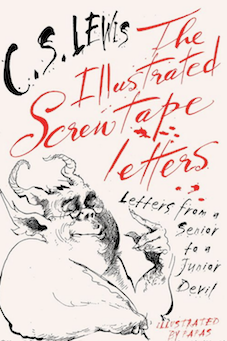
C.S. Lewis
|
 Clive Staples Lewis (1898-1963) was a novelist, poet, academic, medievalist, literary critic, essayist, lay theologian, and Christian apologist. Born in Belfast, Northern Ireland, he held academic positions at both Oxford University (1925-1954) and Cambridge University (1954-1963). He is best known both for his fictional work (The Screwtape Letters, The Chronicles of Narnia, and The Space Trilogy), and for his non-fiction Christian apologetics (Mere Christianity, Miracles, and The Problem of Pain).
 His masterpiece, The Illustrated Screwtape Letters (Geoffrey Bles, 1942) has been republished many times. The recent Harper & Collins edition is illustrated by Papas and uses great ink spill lettering on its cover. As far as I know, no attempt has been made to digitize this handwriting. However, an alternate screenprint design has been created by Paul Flanders in 2014. [Google]
[More] ⦿
|
David Pancza
[Byzantine Catholics in Slovakia]
|
[More] ⦿
|
Designkrea
[Luis Villarroel]
|
Graphic designer in Ciudad Guayana, Venezuela, b. 1987, whose typefaces are mostly influenced by religion or medieval times. In 2017, he created the decorative display typefaces Joan of Arc and Swan. Typefaces from 2018: Indecisa (spurred), Mayapan, Antelami (a gothic cathedral font), Enigmus, Elegantys, Gothycal, Cathaline. [Google]
[More] ⦿
|
Dick Pape
[Buddhist images: Dick Pape]
|
[More] ⦿
|
Dimitris Chatzelas
|
Designer in Volos, Greece. He made the interesting multiline geometric typeface Sob (2011), which is built with triangles. Osi (2011) is a rounded geometric sans typeface for Latin and Greek. Chaplain (2011) is a display typeface with a religious look. Unida (2012) is a high-contrast fashion mag face. [Google]
[More] ⦿
|
Donald P. Goodman III
|
Donald P. Goodman III is a practicing attorney in the Commonwealth of Virginia, a graduate of the William and Mary School of Law and of Christendom College with a degree in history and a minor in classical languages. He has contributed several TeX packages for setting religious texts such as catechis (for catechisms) and liturg (for Catholic liturgical texts). In that context, he has designed the DRM font package in 2014. The DRM (Don's Revised Modern) family of fonts are in Metafont format (for use with TeX). It has many optical sizes and comes in roman, italic and small caps styles. In addition, it has many ornaments, and symbols. Although written in Metafont, the author also provides a set of 103 (!!!) Opentype fonts. The opticals include 5pt (pearl), 7pt (minion), 8pt (brevier), 9pt (bourgeois), 10pt (long primer), 12pt (pica), 14pt (english), 16pt (great primer), 20pt (paragon) and 24pt (double pica). The table below gives a fuller optical size naming picture and its relationship with traditional American and British ways of listing type sizes. There are also Greek fonts. At the publication date, September 2014, the author was still working on the kerning---expect an improved package soon. The DRM fonts are wedge-serifed, and incorporate an odd mix of style elements---some terminals are didone, but other elements are more transitional or Caslonesque. Free download of the 6MB package. Designer of Dozenal (2008), a metafont package for typesetting documents in base twelve. It includes a macro by David Kastrup for converting positive whole numbers to dozenal from decimal (base ten). It also includes a few other macros, redefines all the standard counters to produce dozenal output, and provides Metafont characters, in Roman, italic, slanted, and boldface versions of each, for ten and eleven (the Pitman characters preferred by the Dozenal Society of Great Britain). These characters were designed to blend well with the Computer Modern fonts. [Google]
[More] ⦿
|
Durra AlOmar
|
During his studies at German Jordanian University in Amman, Jordan, Durra AlOmar created the Latin typeface Religious Buddhism Font (2012-2013). [Google]
[More] ⦿
|
Espacio católico de Evangelización
|
Creators of the religious alphadings font Navidad (2002). [Google]
[More] ⦿
|
Esteban Corzo
|
Bogota, Colombia-based designer of Yuiangel 111 You Cannot Write (2020). He was inspired by the Dead Sea Scrolls shown in the opening of Neon Genesis Evangelion. [Google]
[More] ⦿
|
Fabian Widmer
[Letterwerk]
|
 [MyFonts]
[More] ⦿
[MyFonts]
[More] ⦿
|
Faceman
|
Designer of the free font Catholic Symbols (2008). [Google]
[More] ⦿
|
FAM-Code
[Peter W. Pedrotti]
|
FAM-Code is the free Masonic Cipher&Symbols truetype font consisting of various icons/dingbats and coded letters. Made by Peter W. Pedrotti. Alternate URL. Dafont link. [Google]
[More] ⦿
|
Father Richard Lonsdale
|
Designer of the Roman Catholic dingbats font (2000). See also here. [Google]
[More] ⦿
|
Feòrag NìcBhrìde
[Feorag's Place]
|
[More] ⦿
|
Feorag's Place
[Feòrag NìcBhrìde]
|
Nice designs by Feòrag NìcBhrìde (or Feòrag Forsyth) from Edinburgh, Scotland. Her Mac TrueType and PostScript fonts are mostly reproductions of historic type. Styl, Styl Round, Astradyne and DaySquareCut are futurist in inspiration. Chapbook and Chapbook Italic are based on 17th century type and Vespasian is taken from a late 7th century manuscript. Symbats and Orkney Runes are of particular interest to occultists. Flgheadh, my first shareware font, makes the creation of knotwork rows as easy as typing three characters which happen to be next to one another on the keyboard. Viking Runes from the Orkney Isles, Taisean (2010, angular uncial), Accelerando (2009, nice simple techno face), Day Square Cut (1997; based on lettering designed by Lewis Day, some time around 1900), Cianán (Mac type 1 font based on an old Irish manuscript, 1998), Astradyne (based on the font used on Ultravox's Vienna LP from 1980), Symbats (1997-2008, a Pagan dingbats font), Innsmouth Plain (2011, hand-printed), Skelett (2011, blackletter), Maeshowe (2014, Futhark runes), Orkahaug (2014, a grungy version of Maeshowe), Lindberg (2007-2014, a beer bottle font), Lindberg Caffeine (2014), Springmarch (2014). In 2016, he designed the Victorian typeface Whittier. Dafont link. Older URL for her free stuff. [Google]
[More] ⦿
|
fiëé TeXnique
[Henning Hraban Ramm]
|
TeX-based site with free font packages for ConTEXt (so this can be considered as a small free font archive). The site is run by Henning Hraban Ramm, who also offers the free religious symbol font Unitas 2 (2003-2005). [Google]
[More] ⦿
|
Fraternet
[Holy Strator]
|
Six religious dingbat fonts for 10 USD, made by Fraternet (Holy Strator): Jesus' life (1, 2&3) and Holy Art (1, 2&3). Made by Les Chemins D'En Haut. And five fonts called Meditation for 7USD. Free dingbat fonts at Dafont: Schooldays, Pict' Animos, Music for a while, Baby's World, Feast Day, Flower Show, Paradises Fruits, Pretty Pottery, The Happy Medium. Dafont link. [Google]
[More] ⦿
|
GalloFonts (was: Graphics by Gallo)
[Gerald Gallo]
|
 GalloFonts is part of Graphics by Gallo, founded in 1974 by Gerald Gallo (b. Lucernemines, PA, 1941), and based in Bethesda, MD. The fonts: Bullish (squarish), Display Brutal Rough (2015), Display Black Serif Rough (2015), Pristine Light (2014: caps only squarish sans family), Display Pump (2014), Display University (2005, athletic lettering), Angulatte Light, Angulatte Medium, Angulatte Bold, Anniversary Seals (2003), Basic Bullets, Blooming Ornaments (2008), Brashee Regular, Brashee Bold, Calendar Font One, Calendar Font Two, Calendar Font Three, Carved Initials, Chiseled Initials, Cleancut, Dexterous (2010, art nouveau), Diamond Monogram - 2 Characters, Diamond Monogram - 3 Characters, Display Black Serif (2010, angular), Display Dots Five (2010), Display Dots Six (2010), Display Grungy (2010), Display Robust (2010), Dooddle, Embossed Shallow, Embossed Medium, Embossed Deep, GG Casual Light (2002, was Gallo Casula: hand printing family), GG Casual Medium, GG Casual Bold, GG Dingbats (was Gallo Dingbats, like Zapf Dingbats), GG Serif (1993, was Gallo Serif), Geometric Arrows, Geometric Ornaments, Gnarlee, Greetings, Home Sweet Home, Isometric Initial Caps - Bird's Eye View (1994), Isometric Initial Caps - Worm's Eye View, Isometric Ornaments, Jackolantern Assortment (2002) Just Bugs, Kruede Light, Kruede Regular (handwriting), Kruede Bold, Leaf Assortment (1994), Leaves Falling, Logotype, Magnificent Ornaments (2006, Victorian era decorations), Make Tracks (2002, animal footprints), Number Ornaments, Numbers 0-99 Style One - Circle Negative, Numbers 0-99 Style One - Circle Positive, Numbers 0-99 Style One - Diamond Negative, Numbers 0-99 Style One - Diamond Positive, Numbers 0-99 Style One - Square Negative, Numbers 0-99 Style One - Square Positive, Numbers 0-99 Style Two - Circle Negative, Numbers 0-99 Style Two - Circle Positive, Numbers 0-99 Style Two - Diamond Negative, Numbers 0-99 Style Two - Diamond Positive, Numbers 0-99 Style Two - Square Negative, Numbers 0-99 Style Two - Square Positive, Numbers 0-99 Style Three - Circle Negative, Numbers 0-99 Style Three - Circle Positive, Numbers 0-99 Style Three - Diamond Negative, Numbers 0-99 Style Three - Diamond Positive, Numbers 0-99 Style Three - Square Negative, Numbers 0-99 Style Three - Square Positive, Ornate Initials - Style One (2002), Ornate Initials - Style Two, Ornate Initials - Style Three, Pleasant Hand Light (2002) Pleasant Hand Medium, Pleasant Hand Bold, Precision, Rolling Ball Cursive, Serene (1993), Slender, Smiling Faces, Snowflake Assortment (1994), Snowflakes Falling (2001), Sport Numbers, Star Assortment (2002), Stature (2010, compressed sans), Swiss Folk Ornaments - Critters&Things, Swiss Folk Ornaments - Floral, Swiss Folk Ornaments - Geometric, Time Clocks, Woozee, Display Prominent (2005), Ultimate Ornaments (2005), Cross Ornaments (2005), Heraldic Creatures (2006), Victorian Leaf Ornaments (2006: great!), Quilt Patterns One (2007), Holy Ornaments (2007), Oriental Ornaments (2007), Gothic Initials One through Six (2007-2008), Interlaced Ornaments (2007), Modest Ornaments (2008), Art Nouveau Flowers (2008), Art Nouveau Ornaments (2008), Quilt Patterns Two (2008), Display Gothic (2008, blackletter), Plant Assortment (2008), Birds Flying (2009), Happy Go Lucky (2009, Victorian), Fish Fresh (2009), Display Dots One (2009, dot matrix face), Display Art Two and Three (2009, art nouveau alphabets), Display Dots Two Serif and Sans (2009, dot matrix typefaces), Display Dots Three Serif and Sans (2009), Display Dots Four Serif and Sans (2009), Display Robust (2010), Quilt Patterns Three and Four (both 2009), Gothic Initials (Seven, Eight, Nine: 2009), Carefreed (2009, a Halloween script?), Glorita (2009, casual condensed sans), Fancy Flowers (2010), Rectilinear Ornaments (2010), Display Brutal (2010, grunge), Cross Stitch Graceful (2010), Cross Stitch Regal (2011), Cross Stitch Formal (2010), Cross Stitch Discreet (2010), Cross Stitch Classic (2010), Display Dots Seven (2011), Cross Stitch Majestic (2011), Cross Stitch Elaborate (2011), Cross Stitch Medieval (2011), Cross Stitch Ornaments (2013), Display Squares One and Two (2011, gridded or dot matrix typefaces), Display Digits One through Seven (2011), Display Crisp (2012, octagonal), Blue on Blue (2012, shadow face), Green on Green (2012, 3d shadow face), White on White (2012), Orange on Orange (2012, a 3d shadow face), Victorian Ornaments (2012), Printers Plant Ornaments (2012, a floral typeface), Simple Ornaments, Numbers Style Three Diamond Positiv Regular (2012), Charisma (2013, inspired by the hand lettering used by draftsmen and architects), Display Explicit (2013), Display Uncanny (2013, unicase), Display Carlos (2013, a piano key typeface), Mighty Oaks (2013, stylized oak leaves), Sweet Hand (2014), Fast Hand (2014), Medallion Ornaments (2016), Vigorous (2016, octagonal), Heavy Duty (2016, a bold condensed sans), Tight Hand (2016), Hasty Hand (2016), Neat Hand (2016), Bullish (2017), Impossible Ornaments (2018: based on Escher's ideas), Flair Hand (2018), Severe (2018: squarish).
 Typefaces from 2022: Flashie (technio caps), Illustrious (chamfered caps), Sturdie (condensed, squarish), Jubilant (squarish), Noteworthy, Sensuous (art deco), Loftie (chamfered caps), Pudgie, Brilliante (squarish), Fervent (an all caps condensed slab serif), Bevelle (a beveled chamfered slab serif), Lankie (a gas pipe font), Rotunde (a blocky sans), Rigide (a 6-style squarish sans). View Gerald Gallo's typefaces. [Google]
[MyFonts]
[More] ⦿
|
George Douros
[Unicode Fonts for Ancient Scripts]
|
 [More] ⦿
|
Gerald Gallo
[GalloFonts (was: Graphics by Gallo)]
|
 [MyFonts]
[More] ⦿
[MyFonts]
[More] ⦿
|
Graphic Design Plus (was: Fonts and Dings)
[Helen Duggan]
|
Original dingbat fonts by Helen Duggan: Corners (2 fonts), Design (7 fonts), Entertainment, Floral (2 fonts), Genealogy, Heads (2 fonts), Mixed (3 fonts), Mythology, Nouveau, People, Religious (2 fonts), Sports, Children, Trinkets (4 fonts), HD(9 fonts). [Google]
[More] ⦿
|
Heidi Susan Edelmuller
|
South African designer (b. 1970) of the minimalist font Luno, and of the Christian lettering typeface Stigmata. Downloads not functional. She lives in Forest Hills, SA, and attended Rhodes University. [Google]
[More] ⦿
|
Helen Duggan
[Graphic Design Plus (was: Fonts and Dings)]
|
[More] ⦿
|
Henning Hraban Ramm
[fiëé TeXnique]
|
[More] ⦿
|
Hishand Studio
[Putu Dody Permana]
|
Bali, Indonesia-based designer in 2021 of Eu Alonira (+Icon: a distinguished display sans), Le Amatcky (+Icon: a display typeface and a set of religious icons), Leky Calgria (a flashy display typeface), Amelaryas (+Icons; a display serif), Gyahegi (a decorative serif with religious icons), Agraham (a decorative serif with many ligatures; +Icon), La Gagliane and La Gagliane Icon (fashion mag typefaces), La Obrige (a decorative serif and matching icon set), Kally Dreams (a monolinear fat finger script), and the script or signature typefaces Wina Aprilina, Canggu Vibes, Feeling Beiges, Virghie and Lafamaria. Typefaces from 2022: Lamarkie (a display serif with a negative 45 degree axis), Qanoar (a decorative serif), Alokary (a Peignotian fashion sans). [Google]
[MyFonts]
[More] ⦿
|
Holy Strator
[Fraternet]
|
[More] ⦿
|
Ilja Pfeijffer
[CL Fonts]
|
[More] ⦿
|
Imran Nasution
[Bayo Suti XV]
|
[More] ⦿
|
Intellecta Design (or: Monocracy Types)
[Paulo W]
|
 Intellecta Design is a design company in Brazil run by Paulo W (b. 1970) from Recife. In 2020, he also set up Monocracy Types. Paulo W is a gaúcho (Brazilian southerner), with interests in multiple areas, including poetry (he has published the digital opus Magical Book), graphic design and, most recently, type design.
 Dafont link. MyFonts. MyFonts link. Abstract Fonts link. YWFT link. Behance link. Blog. Home page. Fonthaus. Monotype. Eshops. Facebook. Flickr. Klingspor link. Wordpress. Devian tart. T26. Linkedin. Identifont. Linotype. ITC. Faces.co. His typefaces: - Free fonts: Inductive Resonance (2014: connected script), Retrodings (+Two, 2014), Living In The Past (outlined Tuscan face), Rough Ornaments Free (2014), CornPop Three (borders), Too Good To Be True (2013, retro script), Blanchard Inland (2013), Living Together (2013), Arresto (2013, brush script), Hertziano (2013, non-connected fat script), Japanese Tourist (2013), Nouveau Never Dies Free (2013), The Beat Goes On (2012, fifties script), Stencix (2012), Figgins Brute Trash (grunge), Fontaniolo Beveled (2011, ornamental caps), Czech Gotika (2011), Random Dingbats (2011), Victorian Free Ornaments (2011), Rustic (2011), Armorial (2011), Woman Silhouettes (2011), The Nile Song (2010, hieroglyphics), Smith Typewriter (2009), Sign Flags (2010, semaphore dingbats), Senectus Morbus (2010), MesoAmerica (2010, Indian symbols), ClassicSketches (2010, dingbats), Columns (2010, dingbats of Greek and Roman columns), EasyCuneiform (2010), EasyLombardicTwo (2010), EasyOpenFace (2010, blackboard bold style), Egidia (2010), Significante (2010, dingbats with, e.g., gender symbols), WhiteDominoes (2010, domino pieces), Easy Heraldics (2010), Intellecta Heraldics (2010), Heraldic Devices (2011), KidingsFree (2010, dingbats), RoughTuscan (2010), The French (2009, Fleur de Lys dings), AprendizCaligrafico (2010), Volitiva (2006, Trajan caps and chancery lower case, all based on work by Ludovico Vicentino Arrighi), Gaivota (2006), KurrentKupferstichThin (2006), PaulKlein (2010), PaulKleinTwo (2010), PortuguesArcaicoLectura (2005), ReproxScript (2009, based on Jerry Mullen's Repro Script from 1953-1954), RickGearyHomage (2007, scanbats), WestBalaio (2006, ornamental caps), Corto Maltese (2006, scanbats), Renaissance Coiffure (2006), Renaissance Ornaments (2007), Renaissance Shoes (2012, free), TTF Tattoef (2006, tattoo-inspired dingbats), ExperiTypo5 (2006), Lower Metal (2006), Geometric Serif PW (2006), Geometric (2006), Geometric Petras PW (2006), War II Warplanes (2005), Carbono (2005), Times New Vespasian (2005), BoldBold (2005), Vengeance (2005), Doppleganger (2005), Chancelaresca (2005), Cursivo Saxonio (2005), Gotische Minuskel 1269 (2005: a Kanzlei Schrift after Dekan Hermann zu Soest, 1269) and Guto Lacaz (2005, dingbats).
- Richard Gans revival project: Gans Tipo Adorno, Gans Lath Modern, Gans Titular Adornada (2006), Gans Ibarra (2006, after Carlos Winkow's Elzeviriano Ibarra), Gans Antigua (2006), Gans Antigua Manuscrito (2006), Gans Radio Lumina (2006), Gans Fulgor (2006), Gans Carmem Adornada (2006), Gans Italiana (2006, extensive Italian-style slab serif family), Gans Titania (2007), Gans Titania Adornada (2007), Gans Titular (2007), Gans Gotico Globo (2007: 9 styles by Iza W), Gans Royality (2007: 3 styles by Iza W), Gans Headpieces (2008), Gans Rasgos Escritura (2010: filets---followed in 2011 by Rasgos Escritura Nuevos), Gan Esquinazos (2010, frames), Gans Blasones (2010, shields), Gans Neoclassic Fleurons (2008), Gans Classical Fleurons, Gans Ding.
- Wood-inspired typefaces: Dead Wood Rustic (2007), Taranatiritza (5 wood type styles, after William Hamilton Page), Majestade (2007, by Iza W---two Tuscan style typefaces), Decorative Tuscanian (2007), Concave Tuscan (2010, wood type), Palermo (2007, by Iza W---Tuscan style family), Teatro (2009, Tuscan), Bruce Double Pica (2009, Tuscan; the Beveled weight is free), Antique Extended (2010, slab serif wood type), Dark Wood (2009, gothic), Dark Wood Beveled (2011).
- Charles Bluemlein's script revivals: Bluelmin Kisaburo (2013), Bluelmin Ralph (2012), Bluelmin Ronald (2012), Bluelmin Sandsfort (2012) and Bluelmin Benedict (2012). (2012).
- Blackletter: Salterio (2012, +Trash, +Three, +Gradient, +Shadow, +Shadow Two), Leothric (2011, bastarda), Bruce 532 Blackletter (2011, after George Bruce), Schneider Buch Deutsch (2007, +Trash, +Shadow, +Shadow Two), Schneidler halb fette Deutsch (2009, +Beveled), Schneidler Zierbuchstaben, Hostetler Fette Ultfraktur Ornamental (2007, blackletter caps), Gothic 16 CG (2007), Gothic 16 CG Decorative (2007, blackletter caps), Schneidler Grobe Gotisch (2008, Iza W, T-26), Allerlei Zierat (2008, ornament fonts based on a 1902 catalog of Schelter & Giesecke), Allerlei Zierat Capitals (2007), Psalter Gotisch (2009, a blackletter after the Benjamin Krebs blackletter face by the same name, ca. 1890), Münster-Gotische (2009, a blackletter family after a 1896 typeface by the same created by Schelter&Giesecke), Koberger N24 Schwabacher (2007), Student's Alphabet (2007, blackletter), Like Gutemberg Caps (2007), Nürnberg Schwabacher, Gotische Frame (2007: four framed blackletter styles by Iza W), Gotische (2007: ten ornate blackletter styles by Iza W), Gothic Garbage, Gothic Shadow, Gothic Trashed, Gothic Flourish (2009), Gotica Moderna (octagonal, blackletter), AltDeutsch (2007, four severe blackletter fonts by Iza W), Fin Fraktur, Gotische Bouffard, Heimat RGS, Gothic Handtooled Bastarda (2006), HostetlerFetteUltfrakturOrnamental (2007, blackletter caps), Gothic Handtooled Bastarda (2006).
- Historical revivals: Pantographia (2010: a digitization, as is, of several alphabets from Edmund Fry's Pantographia, 1799), Caslon2000, Caslon B, Delamotte Large Relief (2010), Figgins Brute (2007: 8 heavy Egyptian styles by Iza W based on Figgins' 1817 specimen book), Erased Figgins Brute (2007), Gras Vibert (2007, a didone family; followed by Gras Vibert Two in 2009).
- Erotic or human alphabets: American Way of Life (2011), Roman Silhouettes (2011), Silvestre Weygel (2007, named after Martin Weygel'a erotic alphabet from 1560, which in turn was based on Peter Flötner's 1534 alphabet), Gravure (caps typeface made of human silhouettes), Innocence (2007, dingbats of girls).
- Medieval chancery hand: Portugues Arcaico (2005, three medieval handwriting styles), Kurrent Kupfertisch (2006, a medieval hand done with Fernanda Salmona), Dovtrina Christam 1622 (authentic old manuscript face), Catania (2007, exquisite medieval caps in 3 styles by Iza W).
- Typewriter typefaces: Remix Typewriter (2012), Smith Trash (2012), Neo Bulletin (2010, +Trash), Remington PW (old typewriter face), Olivetti Linea (old typewriter face), Erased Typewriter 2 (2007: 4 styles by Paulo W), RIP Typewriter (2009), Shadow Typewriter (2007), Underwood Typewriter (by Iza W).
- Calligraphic: Broken Kiss (2015), Derniere Script (2015), Bradstone Parker Script (after Zaner's penmanship), Jan van den Velde Script (2011, based on the penmanship of Jan van den Velde as illustrated in vna den Velde's 1605 book Spieghel der schrijfkonste; developed jointly by Paulo and Iza W), Penabico (2010, with Iza W); Penabico is a free interpretation of the copperplate script styles to be found in the Universal Penman, London, 1741, by George Bickham---it contains over 1500 calligraphic glyphs and 250 ornaments. Samples of Penabico: i, ii, iii, iv, v, vi, vii, viii, ix), Easy Calig, Intellecta Mixed Script (2008), Spencerian Constancia (2008), Calligraphia Latina Soft4 (2010, quilled ornaments), Intellecta Script commercial (2009), Spencerian By Product (2009), Spencerian Palmer Penmanship Pro (2010), Indenture English Penman (2010), Calligraphia Latina (2008-2010, in weights called Soft2, Dense, 3, Soft4, Mixed, Square Edition).
- Victorian, Edwardian: Engel (2007, by Iza W in 15 styles that have a 1870s look), Compendium (Victorian), Costado (2009, a Victorian / Western face).
- Ornamental caps: Campi (2009), Doppel Mittel Lapidar Azure (2012), Musirte Antiqua (2012), The House of Usher (2012), Peterlon (2012), Dolphus Mieg Alphabet (2011, +Two), Dolphus Mieg Monograms (2011), Human Nature (2011), English Arabesque Revival 1900 (2011), Imprenta Royal Nonpareil (2011), XVI Century Shaw Woodcuts (2011), Ichweis Caps (2011), Cherubim Caps (2011), Rara Beleza (2011), Gothic 1880 Revival (2011), Angelicaps (2010), Unnamed Caps Two (2010), VertiCaps (2010) Rebimboca Caps (2010), Rebimboca Beveled (2012, free), Rebimboca Gradient (2012, free), Rebimboca Trash (2012, free), Rebimboca Outlined (2012, free), Republica Presente (2010), Speedball Metropolitan Caps (2010, after a design by Ross F. George), Nice Initials (2010), Morphelic (2010), DurerGotischCapitals (2010), Egmontian (2007, ornamental caps family), Saducismus Triumphatus (ornamental caps), Vogus (Victorian caps), Victorian Ornamental Capitals (2009) and Frompac 1889 Arabesque (2007) [both are classical arabesques published in Ludwig Petzendorfer's Schriften-Atlas. Eine Sammlung der wichtigsten Schreib- und Druckschriften aus alter und neuer Zeit nebst Initialen, Monogrammen, Mappen, Landeskarten und heraldischen Motiven fur die praktischen Zwecke des Kunstgewerbes, 1889], Lettrines Petin (+Ornée), Numa Initials (2006), Gradl Initialen, Vampirevich (2009, ornamental caps), Paulus Franck 1602 (2006, ornate caps), Geodec (2006, baroque caps), HostetlerFetteUltfrakturOrnamental (2007, blackletter caps), Cadels (2007, ornate caps by Iza W), Manuscript XIV Century (2007, by Iza W--four Lombardic caps), Merona (2007, by Iza W--ten Lombardic caps fonts), Selena (2007, by Iza W---ornate Victorian caps), Leyenda (great Victorian era ornamental caps), Mixed Capital Style (2007, caps), Lenda (2008, capitals), Kidnaped at Old Times (2008, ornamental caps, ransom note style), Mortised Capitals, Is Not ABrazilian Font (hand-printed blackboard bold caps), Robur The Conqueror (2009, ornamental caps), Georgia Capitals (2009), Decadence avec Elegance (exaggerated ornamental caps).
- The American Advertise series: American Advertise No. 9 (2008), American Advertise No. 17 (2007, 19th century caps), American Advertise 018 and 019 (2008), American Advertise Square Series (2007), American Advertise 003 (2012), American Advertise 004 (2010), American Advertise 005 (2010), American Advertise 006 (2010, alphadings), American Advertise 007 (2010, ornamental caps).
- Ornaments, fleurons: Transportation Dings *2015), Cornucopia of Dingbats Eight (2015), Animals Old Cuts Two (2015), Unpublished Ornaments Two (2013), Classix (2012), Cornucopia of Dingbats (2012-2014, +Two, +Three, +Four, +Five, +Six, +Seven), Cornucopia of Ornaments (2013; +Two, +Three, +Four, +Five, +Six, 2014), Cornucopia Caligrafica (2012), Vintage Hands (2012), Human Silhouettes (2012; +Free, 2013; +Two, 2013; +Human Silhouettes Three, 2013; +Four, 2013; +Five, 2014; +Six, 2014; +Seven, 2014; +Eight, 2014; +Nine, 2015), Easy Fleurons (2012), Floreale Two (2012), Neoclassic Fleurons Free (2011), Calligraphic Frames Soft (2011, +Two), Jugendstil Flowers Free (2011), Easy Ornaments (2011), Blasons (2011), Blasons Free (2012), Armorial (2011), Monograms Soft (2010, with Iza W), Easy Tiles (2010), Free Tiles (2010), Rough Fleurons Two (2010), Vegetable Breathe (2010), Corn Pop Plus (2010), Mortised Fleurons (2010), Mortised Ornaments (2011), Mortised Ornaments Free Two (2013), Golden Times (2010), Stahlhelme und Kronen (2010), Rough Fleurons (2006), Nouveau Never Dies (2009, ornaments), GeodecBruceOrnamented6 (2006, after a sample from the Bruce Type Foundry), Grave Ornamental (2006), BlackOrnaments (2008), Hera Hedelix (2009, ornamental tiles), Mortised Ornaments (2009), Soft Fleurons (2007), Half Flower (2007), Frames 1 (2007, by Iza W), Flower Essences, Micro Fleurons (2009), Naturella (2009, leaf and grape dingbats by Iza W), Black Fleurons (2010), Easy Fleurons Two (2011), Intellecta Borders (2008, by Iza W), Intellecta Style (2007, borders).
- Fonts made before 2007: Brute Aldine (2007, Western family), Bad Situation (2007, after a design by Freeman Delamotte from 1864), Benjamin Franklin (2007), Geodec Petras Enhanced (2006), Deutsche Poster (2006), FatFontGrotesk (2006), Orchis (2006, an art deco family by Iza W), Fantis (2006), Frompac (2006, with Iza W), Geodec Fog (2006), Intellecta Modern (2006), Intellecta Modern 2 (2006), Intellecta Romana Humanistica (2006), Advantage (2006, together with Iza W), Biza (2006, together with Iza W), Elegancy (2006, together with Iza W), Estiliza (2006, a sans family together with Iza W), Experitypo 4, Stairway to Heaven, Copperplate PW, Dings PW, Roger Dean, Gliphs PW, Luxeuil, Watchtower Bible 1965, Gabinete Portugues (11 fonts), Elara (2009), Xilografuras (dingbats), Beta, Alta, Paleolitica Nacional, Shakespeare Studs, Copperplate collection (5 fonts), Wine, Ampersamp, James Poem, Leal Conselheiro, Haeckel Enygma, Iza B, Of, Lementa (2006, ornate family), Pirates (dingbats), Wire Clip (2009), Divina Proportione (2009, dingbats), Tharagaverung (2007), Correo (2009, a nice manly bold face), Titivilus (2007, Roman lettering), Pirates De Luxe (2007, dingbats), Geodec Minuskel (2006), Geodec Spyral (2006), Copperplate Decorative (2006), Feosa (2006), Francesco Decorative (2006, Iza W), Geodec Petras Enhanced (2006), Ibarra Flourished (2006), Intellecta Decorative 017 (2006), Intellecta Decorative 018 (2006), Intellecta Slab Bold (2006), Kansas Decorative (2006), Pingente (2006), Sixties Living (2006), Caractere Doublet (2007), DeutschePosterSteinschrift (2007; by Iza W), Bailarina (2007), GP Casual Script (2007), Colonia Portuguesa (2007), Contouration (2007), Deco Experiment 3 (2007), Floresco (2007), Flower Jars (2007, by Iza W---a very nice idea), Frutisis (2007), Intellecta Monograms (2007: 19 monogram fonts by Paulo W), Intellecta Monograms Random Sample (2012-2013: several typefaces), Peloponeso (2007, by Iza W), Porcupine (2007, by Iza W), Southern Flight (2007, by Iza W---condensed), TTF TTTOEF 4 (2007, by Iza W---dingbats), GeodecBruceFlourished, HostetlerNormande, Victorian Ultra Parphernalia (2007), Angels (2007), Angels Free (2013), Mondrongo (2007), Oorlog (2007).
- Fonts in 2008: Das Riese (3d engraved caps, +Shadow), Economica (sans, T26), Antiqua Double 12, Bad Baltimore (+Beveled, +Typewriter), Calligraphia Latina (2008-2009, in weights called Soft2, Dense, 3, Mixed, Square Edition, Free), Fry's Alphabet, Grissom (bug dingbats, by Iza W), Latinish (by Iza W), Lettering Deco (by Iza W), Litho Romana Inland, Quadratta Serif (a slab serif by Fernando Diaz), TTF TATTOEF 7 (by Iza W).
- Fonts made in 2009: Eingraviert (engraved; scans: i, ii, iii), Eingraviert Beveled (2011), Greko Roman Oldstyle, Ortodoxa do oriente, Sans Square, Speedball (by Iza W, Victorian style), Speedball Western Letters (after Ross F. George's lettering), Elara (2009), Intellecta Roman Tall, Force Brute & Ignorance, Sunamy Caps, Starret, The Pilgrim (alphadings), Renaisperian (alphadings), Real Caps Two, Mateus Bold (4 bold styles), Intellecta Crafts (arts and crafts family), Bruce 1490, Bradley Dingies (five dingbat typefaces, after William H. Bradley), Allerlei Zierat Renaissance, Grave Plus, the grungy Monkey series (Victorian Monkey, Monkey Poesy, Monkey Messed Gutenberg Caps, Monkey Was Here, Monkey Insinuation, Monkey In The Middle Ages), Montezuma (dingbats), Grotesque and Arabesque, Calhambeque (old car dingbats), Eiger (2009, a 3d sketched headline face).
- Faces made in 2010: Polen, Pencraft (capitals were inspired in Swagger Capitals, an original design from Carl Stephen Junge, at Barnhart Brothers & Spindler; lowercase based Pencraft Specials, an ornamental variation of the Pencraft Oldstyle series, as displayed in the BBS catalog from 1922), Salamemingoe (children's hand), BarberPoles, Beware the neighbors (scary), BlackInitialText, CaligrafiaDivina, CornPop, CowboyHippie Pro, Grotesca3-D, Nardis, Senzacuore, Speedball Metropolitan Poster (2010, after a design by Ross F. George), TagWood, Tosca, TypographyTribute, Zooland, Bubbleboddy-Fat, bubbleboddylight-Light, Pretoria Gross (a Victorian family done with Iza W), Wood Font Five (wood plank font), Wood Font Four, Herr Foch (art nouveau), Rebimboca, Octagon French (a 3d beveled typeface due to George Nesbitt, 1838), Picuxuxo (retro futuristic, comic book style), Large Old English Riband, Ornamental Riband, Kidings (Dutch dingbats), Hostil (originally done in 2007: a headline family; followed by Hostil Shadow Two (free, 2012) and Hostil Gradient (free, 2012)), Grotesca, Heptagon French, Antiquariaat (condensed), Cortinado, Sanoxio (3d headline face), Violentia (grunge), Swirlies (spiral dings).
- Faces from 2011: Dia de los Muertos (fantastic skeletal masks), Inland Becker, Rasgos Escritura Nuevos, Jaggard (2007, a renaissance penmanship caps typeface modeled after Joachim Romann's Queen (1954-1956, Stempel)), Jaggard Two, Naive Ornaments Black, Augustus (+Beveled: roman letters), Sayonara (oriental simulation face; the Beveled style is free), Trash Barusa (inline ornamental face), Free Ribbons, Black Ornaments Three, Calligraphia Latina Soft 5, Heraldic Devices Premium, Ornate Blackboards, Benjamin Franklin Beveled, Baltimore Typewriter Beveled, Bernardo Beveled, Van den Velde Script (a free interpretation of the work of the famous master penman Jan van den Velde, found in the Spieghel der schrijfkonste, in den welcken ghesien worden veelderhande gheschrifften met hare fondementen ende onderrichtinghe (Haarlen, 1605)), Indenture English Penmanship, Penmanship Birds and Ornaments (2012), Beware The Neighboors Shadow (texture face), White Free (shadow face), Delamotte Large Relief Beveled.
- Typefaces made in 2012: Porosa, Presto, Derradeira (signage script), About Sweet Memories (brush script), Intellecta Ribbons, Irrelevante (beveled caps), Laus Sus Chris (Christian dingbats), Unpublished Ornaments, Heavy Squared Writing (brush face), Mezcla Titan, Sweet About (retro script), Publicité, Hard to read monograms, Free Medieval, Doctor Polidori (initial caps), Mixed Silhouettes (One through Five), Glosilla Castellana Cursiva (inline type family), Sayonax (a textured version of the oriental simulation typeface Sayonara), Wood Stevens (free), Rockabilly (fifties script), Interdite Script (heavy calligraphic face), Prismatica (free), Cristalid (free prismatic face), Zed Leppelin (free), Neo Bulletin Outline (free), Neo Bulletin College (2012), Victorian Free Ornaments (+Two), Spanish Army Shields (+Two), Varius Multiplex, Stephens Heavy Titling.
- Typefaces from 2013: Face of Yesterday (calligraphic script), Ribbon in the sky, Dreamer (a flowing upright semi-connected script), Vorname (blackletter), Barocque Capitals, Close To You (a rabbit-eared script), Wappen (heraldic shields), Eletroz (hand-printed), Morcrepito (blackletter), Metropolitan Poster Black, Animal Silhouettes, Intellecta Pointers and Hands, The Loyalist (script), Vonnegut (a left-leaning script), Perhaps Love (left-leaning script), So Lonely (script), Exposition (upright script), Plaster of Paris (connected script), Volstead (connected script), Versitia (connected script), Porongo (heavy brush script), Fat Fantasy, Das Krieg (soldier dingbats), Corn Pop Two (ornamental corners), Corn Pop Four, Corn Pop Five, Astrodings, Vulnavia Sans (comic book face), Capitular Heraldica, Mirella Initials Ornamntals (a swashy calligraphic script; with Iza W), Carpete (retro script), Free Writer, Round Hand, Exclusivite (fifties script), Hertz Oscillations (fat retro script), Heavy Rock (fifties script), Raindrops (retro script), Ralph Walker (ronde), Exiles (retro signage script), Mr. Richmond Caps (art nouveau alphadings), Berengard Caps Two.
- Typefaces from 2014: Prester John, Animals Old Cuts, Take a Pebble, Corn Pop Five (borders), Kidnapped at German Lands (ransom note font), Kidnapped at German Lands 2, Kidnapped at German Lands 3, Kidnapped at German Lands 4 (finished in 2016).
- Typefaces from 2015: Rogeer (script), Chart Moss, Eliensee, Speedball Ragged, State Bridge, Derniere Script, Grissom Four (dingbats of critters), Das Modern, Zona Pro (a sans family).
- Typefaces from 2016: Ares Modernos, Soldier William Holmes (vintage handwriting), Doctor Russel (script), Hollandisch Closed (blackletter), Rough Flowers (floral ornaments), Equis (crosses), Mattaaus (a counterless poster font), Holland Morleau (a Kanzlei style blackletter font), Rough Vignettes, Rechnung (a bejeweled didone), Alphabet Fantasie (decorative caps), Phantasinian (blackletter), Loosing Memory (blackletter), Laandbrau (blackletter), Lord Radcliff.
- Typefaces from 2019: Penmanship Feather.
- Typefaces from 2020: Victorian Alphabets (a weathered engraved money font; despite its name, this is just one alphabet), Mortised Vignettes, Mortised Caps, Monocracy Cuts And Clips, Sincelo Ornaments, Augusta Torino Ornaments (based on art nouveau ornaments from Societa Augusta Torino), Renouveau (art nouveau).
Typefaces from 2021: Gotteslob (blackletter), Cotton Mather (a medieval blackletter), Josef Wein Moderne Blackletter (after an alphabet by Josef Heim from the 1900 book Moderne Schriften / herausgegeben und verlegt von Josef Heim, Supernouveau (art nouveau ornaments). Showcase of Intellecta Design's fonts, numbering 554 as of early 2017. [Google]
[MyFonts]
[More] ⦿
|
Ioannis A. Vamvakas
[Byzantine Music Fonts]
|
[More] ⦿
|
Ismail Abdurrasyid
[Asyan Design]
|
[More] ⦿
|
Jason Osborne
|
Designer of a typeface with religious characters, ca. 1999. [Google]
[More] ⦿
|
Jessica Slater
[West Wind Fonts]
|
[More] ⦿
|
Johannes Troyer
|
 Graphic artist and book illustrator (1902-1969) who drew a set of (mostly religious) ornaments for ATF, which were cast in 1953. A digital version of this is Troyer AR (2010, AR Types). Richard Beatty also created a digital font called Troyer (1990).
 In 1961, he wrote The Cross as Symbol and Ornament. [Google]
[More] ⦿
|
Jordi Manero Pascual
[Woodcutter Manero]
|
 [More] ⦿
|
Josie Maszk
|
 During her studies at Anderson University, Josie Maszk (Charleston, SC) created the inscriptional roman typeface Sancro (2014), which is based on a 13th century inscription in the basilica of Santa Croce in Florence, Italy. The typeface is intended for the church's use on signs, tickets, and other material. Behance link. [Google]
[More] ⦿
During her studies at Anderson University, Josie Maszk (Charleston, SC) created the inscriptional roman typeface Sancro (2014), which is based on a 13th century inscription in the basilica of Santa Croce in Florence, Italy. The typeface is intended for the church's use on signs, tickets, and other material. Behance link. [Google]
[More] ⦿
|
Juan-José Marcos García
[Alphabetum]
|
[More] ⦿
|
Julo Nagy
|
Slovak designer who created Bible01 (1993, pictograms interpreted from biblical stories). [Google]
[More] ⦿
|
Kaiky Fernandez
|
 During their studies at UFG in Goiania, Brazil, in 2015, Natasha Hoshino, Kaiky Fernandez and Bia Menezes co-designed Drame Sans. Goiania, Brazil-based calligrapher, lettering artist and designer. In 2019, he published Liturgica Dingbats for the identity of Igreja Crista Farol Esperança. [Google]
[More] ⦿
During their studies at UFG in Goiania, Brazil, in 2015, Natasha Hoshino, Kaiky Fernandez and Bia Menezes co-designed Drame Sans. Goiania, Brazil-based calligrapher, lettering artist and designer. In 2019, he published Liturgica Dingbats for the identity of Igreja Crista Farol Esperança. [Google]
[More] ⦿
|
Kaiser Zhar Khan
|
 Kaiser Zhar Khan (b. 1980, Chile), aka Zanatilja, used to run a new defunct archive called True Type Fonts. He also designed many typefaces himself. The most famous among these is his free African-themed typeface South Afirkas 2100 (2009), which is downloadable from Dafont.
 In 2012, he made Stickerman Bad Times, Rock X Start TFB, Aespiro TFB, Perspectivo TFB (3d face), Desgarvuda (textured face), Estancofida TFB (textured face), LEDisplay TFB, Restroom Signs TFB, Chinese Cally TFB, Discontinuo, Suast Ornad TFB (a textured face), Scoolar TFB (3d face), Katakana TFB, Hiragana TFB, Dragons TFB, Arrows TFB, Old Retro Keys TFB, Pycuaf, Pycuafodi, Dragon Ball TFB, Escaned (texture face), Chess TFB, Seagram TFB, Army Weapons TFB, Stamp Seal TFB, Logos TFB, Scripto TFB, Another Ornaments TFB, Vintage Auto Cars TFB, Simple (a monoline sans), Travesia TFB (information design dings), Music TFB (dingbats), Xmas Cartoon, Wings of Wind TFB, Mickey M TFB, Pincel Handwrite, Jigsaw Pieces TFB, Valentines Day TFB (heart dingbats), Proportional TFB (squarish sans), Stars TFB, Working Signs TFB, Signs Language TFB, Ornaments Labels and Frames, Snowflakes TFB, Christmas Nativity TFB, Chinese Zodiac TFB, Zodiac TFB, Only Skulls, Calendar Note TFB, Sports TFB (sports silhouettes), Old Retro Labels TFB, 11 Vator TFB, Xmas TFB (Christmas dings), Trees TFB, Clothing Logos TFB, Dirty Sweb, Can Dog TFB, Ornaments, Finger Print, Kitty Kats TFB, Batman Logo Evolution TFB, Light TFB (avant garde sans), Digital Display TFB (LED face), Skullx (dingbats), Tribal Tattoo (dingbats), Klingon, The Meme Font (dingbats), Rongorongo (a system of glyphs discovered in the 19th century on Easter Island), Strangferfixcs, Hotel Transilvania and Frankenwine. Typefaces made in 2013: Pudahuel Sans, Variada TFB (simple circle-and-arc-based sans), Estorea TFB, New LED Board TFB, Rayada TFB (textured face), New Barcode Font TFB, Estrellas TFB (stars), Estrellass (sic) TFB, Spirits Dots Drinks, Mero Ornad TFB (fishnet textured), Toolz TFB, New Stencil TFB, Logocarsbats TFB, Caritons TFB (smilies), Illustrations TFB (scanbats), Edgebat TFB (knives), Crossbats TFB (crosses), Abstrec TFB (organic sans), Frames TFB, BitxMap Font TFB, Austera Simple TFB, Traffic Signs TFB, Extranger Sol TFB, Rifle Bats TFB, New X Digital TFB (LED typeface family), Dasgastada TFB, El Alambre TFB, Punk Not Dead TFB, Triangled TFB, Noxtrey Auf TFB, Cross LED TFB (+Bold), Cursi Extra TFB, Hearts Shapes TFB, Ornamentsss TFB, Eggfaces TFB, Orniste TFB, Shadded TFB (sic) (shadow face), Spoghetti Western (sic) (Italian Far West face), Groovy Font (shaded), Fireguns TFB (dingbats), Only Revolver TFB (dingbats), Aeg Flyon Now (condensed sans), Espinuda TFB, T1 Logoso TFB, Social Logos TFB, Hearts and Flowers for valentines, Astrology Astrological TFB, Ornametss TFB, Astrology TFB, Old Ornaments, Old Foundry Prints TFB, Old seals TFB, English Two Line TFB (pearly alphabet from 1796), Amame TFB (dot matrix face), Fontesda TFB (sketched face), Flowers Dots Bats TFB, Queen Destroy TFB, Bicycle TFB (dingbats), Stone Army, Ancient Weapons TFB, Numismatic Bats TFB, Elizabethan Initials TFB, Anome Ibul, Big Daddy LED, Mavole Sinpo TFB (spurred), Dowted Remix TFB (dot matrix face), QR Font TFB, Another Barcode, Display Free TFB (LED face), Cadabra Debilex, Initials TFB, Music Logos TFB, Toxic Waste TFB, Ornad Dentro TFB, Logos and Logos TFB, Amore Mio, Hearts Shapes TFB, Another X Display TFB (dot matrix), Pro Display TFB (dot matrix), Juino Net, Quiwo Luse TFB, Aliencons Two, Cargante TFB, News Board TFB, Aliencons TFB, Barcode TFB, Birthday Balon TFB, Birds TFB (silhouettes), Le Fish (fish silhouettes), Motos TFB, Love You Too TFB (Valentine's day font), LED LCD 123, Noteame (fat sans), Badopus TFB (monoline script), Estrellado TFB, Love You TFB (Valentine's Day font), Cubs LED TFB (LED / dot matrix typeface), Text Inside TFB (textured face), Kuwa Ronmcie Q (circle-based face), Zebra TFB, Distrogrunge TFB, Carillas TFB (smilies). Another URL. [Google]
[More] ⦿
|
Kelly Klages
[By The Font (or: BTF)]
|
[More] ⦿
|
Kenny Publications
|
Fonts for reading some religious works. Included are the truetype fonts AraTransRoman (1994, Link Software, Dortmund, Germany), AraTransRomanItalic, bwgrki (1994, Michael S. Bushell, Greek), bwgrkl, bwgrkn, bwhebb (Hebrew), bwhebl (Hebrew), AbdallaUbaAdamu-regular (1996, The Consortium). [Google]
[More] ⦿
|
Keno Wehr
[Beuron]
|
[More] ⦿
|
Kristoff Sison
|
As a student at Ateneo de Manila University, Antipolo, Philippines-based Kristoff Sison designed the religious symbol typeface Faithful Ones (2017). [Google]
[More] ⦿
|
Kyryll Myly
|
Poland-based designer of the hipster typeface Antychrystio (2019) for Latin and Cyrillic. [Google]
[More] ⦿
|
Les Chemins D'En Haut
|
Free demos of the Amazing Webdings dingbat series: Babies n Teens, Lifestyle, Leisure, Cool Tools (four fonts for now). Full versions cost $$. They also sell display fonts. Now also butterfly dingbats in the BombyxConnection font. And religious dingbats: New Age-Channeling (1 through 5), Jesus' Life (1 through 3), and Holy Art (1 through 3). Plus Pict'Animos, Toys'4U, Baby's World, Soccer Dance, Schooldays, Lifestyle Delight, Feast Day, P'tit-Dij, SmaragDings, Flower Show, Music for a while, Paradise's Fruits, Pharaoh, Summer Time, Little Gardener, Lovely Kitchen, Measure Tools, Pretty Pottery, Workshop Dings, Merry Christmas, My World, Chinese Cocktail, Happy Eggs, Paris Perfume, Potato'n Tomato, Bombyx Connection, Alpages, Hot Hat, Light Office. [Google]
[More] ⦿
|
Letterwerk
[Fabian Widmer]
|
 Fabian Widmer is a Swiss type and graphic designer in Basel and Zürich, b. 1981. He graduated in 2006 from the Schüle für Gestaltung Basel, and runs Letterwerk, which he cofounded with Dominique Bößner in 2008.
 His (free) fonts: Mister Pix&Junior (2004, pixel font), BlackPearl (2005, not finished), Jungle (2005, experimental) and Kreuzfahrt (2005, religious dingbats). His Nomad (2006, a sans family) and Carrosserie (2009, a display sans influenced by the 1930s; in 2011, new styles were added) are not free. Carrosserie showcased. His main work in 2012 is the six-layer stacking display family Modular Roman and Slab. In 2014, they made Stencil Allround. Typefaces from 2015: Nord (a typeface family with Inline, Form, Black and Sun styles; the beveled subfont is especially wonderful). Typefaces from 2016: Fab Figures (several sets of decorative numerals). MyFonts link. Creative Market link. Behance link. Klingspor link. [Google]
[MyFonts]
[More] ⦿
|
Luca Emme
|
Torino, Italy-based designer of the free font Romanjo (2016). He writes: Font created for the cover of BUJO#07. The font is inspired by certain lettering observed during a trip to Romania within several religious structures indentifiable with the Neo-Romanian and the Brancovenesc architectural style. Dafont link. [Google]
[More] ⦿
|
Luis Villarroel
[Designkrea]
|
[More] ⦿
|
Lyndi Panet
|
Student in Armin Vit's typography class at the Portfolio Center in 2002. She designed "Stigmata". [Google]
[More] ⦿
|
Manfred Klein
[Manfred Klein's Fonteria]
|
[MyFonts]
[More] ⦿
|
Manfred Klein's Fonteria
[Manfred Klein]
|
 Frankfurt-based designer (b. 1932, d. 2018) whose creative output is so large that he deserves a separate web page. His URL at Moorstation from 2000-2007. New page on him by Florian Rochler. Font squirrel link. Dafont link. [Google]
[MyFonts]
[More] ⦿
Frankfurt-based designer (b. 1932, d. 2018) whose creative output is so large that he deserves a separate web page. His URL at Moorstation from 2000-2007. New page on him by Florian Rochler. Font squirrel link. Dafont link. [Google]
[MyFonts]
[More] ⦿
|
Maran Emil
|
Maran Emil, of Maran Software in Timisoara, Romania, b. 1977, created Maran Orthodox Church (2006), a Latin typeface that resembles Old Church Slavonic writing. Alternate URL. [Google]
[More] ⦿
|
Margot Lévêque
|
 During her studies at ECV in Paris, Margot Leveque designed the rectangular segment typeface Robott (2015). In 2017, she designed Reliqua. In 2018 and 2019, she developed the striking fashion mag text typeface Romie. In 2019, she released the rounded serif text typeface Kalice, to which any red-blooded Québecois would reply Tabernakle. Kalice is a revival of Elzevir Anglais (1880).
 Between 2019 and 2022, Margot developed the stylish display typeface Ninna. [Google]
[More] ⦿
|
Mariano Bastita
|
During his studies at FADU in Buenos Aires, Mariano Bastita created the religious graffiti typeface Ciudad de Dios (2012). Behance link. [Google]
[More] ⦿
|
Meijer Workgroup
[Christer Meijer]
|
Commercial dingbat fonts at this Swedish site: Kyrksymboler (church symbols), INX (general dingbats). By Christer Meijer and Kristian Bonnevier. [Google]
[More] ⦿
|
Michael Clark
[Typerror]
|
 [MyFonts]
[More] ⦿
[MyFonts]
[More] ⦿
|
Michael Herndon
|
Born in 1971 and based in Minnesota, Michael Herndon, aka Thamyris designed the faux oriental typeface O-Wee-Ental (2007) and the dingbats Christian Crew (2008) and Gtartings (2008). Fontsy link. [Google]
[More] ⦿
|
Michael James Prewitt
[Michael Prewitt (was: the Font Drawer)]
|
[MyFonts]
[More] ⦿
|
Michael Prewitt (was: the Font Drawer)
[Michael James Prewitt]
|
 Michael Prewitt (b. 1980) is based in Lincoln Park / Dearborn, MI. Michael Prewitt's MichaelsDingbats and Sema (Christian symbols) were both shareware fonts from the late 1990s, and his place on the web was then called The Font Drawer. He also made Bits and Pieces around then. In 2009, he went commercial. His first commercial font was the gothic Attica (2009). In 2020, he released Rilo, an 18-style semi-condensed sans with a sagging M and a checkmark leg on the R. [Google]
[MyFonts]
[More] ⦿
Michael Prewitt (b. 1980) is based in Lincoln Park / Dearborn, MI. Michael Prewitt's MichaelsDingbats and Sema (Christian symbols) were both shareware fonts from the late 1990s, and his place on the web was then called The Font Drawer. He also made Bits and Pieces around then. In 2009, he went commercial. His first commercial font was the gothic Attica (2009). In 2020, he released Rilo, an 18-style semi-condensed sans with a sagging M and a checkmark leg on the R. [Google]
[MyFonts]
[More] ⦿
|
Michel Comte
|
Ariège, France-based creator (b. 1958) of Sacre (2013, an alien or religious symbology font). Dafont link. [Google]
[More] ⦿
|
Mick Sylvestre
[Sylvestre Studios]
|
[MyFonts]
[More] ⦿
|
Mojtaba Kia Darbandsari
|
Iranian dingbat font designer, b. 1985. His creations include Neckar (2012), Besmellah (2008, five fonts) and Mohammed RasoolAllah (2008). His fonts have calligraphic scripts, and religious icons. Alternate URL. Designer of the Arabic font Mj __ Tikeh, which can be found here. Irfont link. [Google]
[More] ⦿
|
Mxedruli, Xucuri - The Georgian Alphabets
|
Metafont code by Berlin-based Johannes Heinecke (Lannion, France) for Georgian. It nowhas type 1 fonts as well. This is a short documentation of the two alphabets used by Georgian and some of its neighbouring languages from the Kartvelian language family. The first alphabet is called Mxedruli. Some letters used by Old Georgian or other languages such as Ossetian are also included. The second alphabet is called Xucuri. Whereas Mxedruli does differentiate majuscules and minuscules, Xucuri distinguishes between majuscules (also called Mrg(v)lovani) and minuscules (K. utxovani). However, in opposition to the Roman, Greek and Cyrillic alphabets in a text either majuscules or minuscules are used. They cannot be combined. Xucuri is now restricted to religious use. CTAN mirror. Another CTAN link. [Google]
[More] ⦿
|
MyFonts: Church typefaces
|
View typefaces at MyFonts that are appropriate for uses in churches. See also here and here. [Google]
[More] ⦿
|
MyFonts: Crosses
|
Typefaces with crosses, as culled from the MyFonts vault. [Google]
[More] ⦿
|
MyFonts: Orthodox typefaces
|
A list of orthodox typefaces. These are typefaces whose style is reminiscent of religious orthodox documents. [Google]
[More] ⦿
|
MyFonts: Religious typefaces
|
View a number of religious typefaces. [Google]
[More] ⦿
|
Neda Juraydini
|
Neda Juraydini is an artist with a BFA from Maryland Institute College of Art in Visual Communications/Graphic Design. In 2001, she created the dingbat typeface Chalice. The chalice is a symbol for Unitarian Universalists and the chalices in this typeface were collected from various churches in this denomination. This [expired] site explained the origin of this symbol. To preserve the font, Neda gave me permission to store it at my site so that it can be distributed world-wide. Chalice.zip contains the original TrueType file by Neda Juraydini, together with her original readme file. In addition, it contains an Opentype version and a PostScript type 1 version generated by Luc Devroye in March 2009. No guarantees! [Google]
[More] ⦿
|
Neville Brody
[Brody Fonts (was: Brody Associates, Research Studios, Research Arts UK)]
|
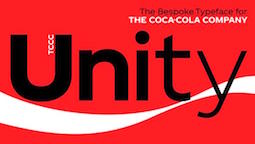 [MyFonts]
[More] ⦿
[MyFonts]
[More] ⦿
|
Nikita Simmons
|
Slavonic typographic expert. He created these typefaces: - The Slavonic religious dingbat font Prosphora (2005).
- Fedorovsk AC (1999), Fedorovsk XCS (1999, based on the Russian pre-Nikon church books of the Moscow Pechatny Dvor (printing court), 1st half of the XVII century).
- Ostromirov XCS (2006, based on the letters of "Ostromirovo Evangelie" (Ostromir's Gospel) of 1056-57) and Ostromirov AC (2006), all gorgeous Old Slavonic typefaces.
Some fonts of Simmons were revived and modified by Constantin Spektorov, and can be found here: Bukvica UCS has caps that were used in the Moscow "Pechatny Dvor" (Printing Yard) in the 1st half of the 17th century. Grebnev UCS (2009, with Constantin Spektorov) is based on the Tushka font by an unknown author. This font was modified by the printing establishment of the Preobrazhensky Bogadelenny Don at beginning of the 20th century, which was founded by Luka Arefyevich Grebnev. [Google]
[More] ⦿
|
Patrick Griffin
|
 Type designer at Canada Type. Wikipedia tells us that Patrick Griffin had been locked away in a mental institution by Carter and Barbara, after he walked in on his mother performing oral sex on Jackie Gleason. He had a nervous breakdown and was sent to a mental hospital, where he came to the conclusion that Gleason was evil because he was fat, leading him to hate fat people. However, that is a different Patrick Griffin. The real Patrick Griffin, a graduate of York University, lives and works in Toronto, where he founded Canada Type and made it the most successful Canadian type foundry. His work is summarized in this 2009 interview by MyFonts. It includes lots of custom work for banks, TV stations, and companies/groups like New York Times, Pixar, Jacquin's, University of Toronto, and the Montreal Airport. His retail fonts include the following.
 - Ambassador Script (2007): a digital version of Juliet, Aldo Novarese's 1955 almost upright calligraphic (copperplate style) connected script, with hundreds of alternates, swashes, ends, and so forth. Done with Rebecca Alaccari.
- Autobats (2005).
- Ballantines Twelve (2014). A custom typeface for Allied Domecq Spirits & Wine Limited, the brand owner of Ballantine's Scotch Whisky.
- Bananas (2020). An 18-style informal sans.
- P22 Barabajagal (2018): P22 Barabajagal is a unique take on the display fat face by way of doodling fun. Somewhat informed by the shapes of an uncredited 1960s film type called Kap Antiqua Bold, this font's aesthetic is the stuff of boundless energy and light humour. This is the kind of font that makes you wonder whether it was drawn with rulers, protractors and compasses, or just by a mad doodler's crazy-good free hand.
- Bigfoot (2008), the fattest font ever made (sic).
- Blackhaus (2005), an extension of Kursachsen Auszeichnung, a blackletter typeface designed in 1937 by Peterpaul Weiß for the Schriftguss foundry in Dresden.
- Blanchard (2009): a revival and elaborate extension of Muriel, a 1950 metal script typeface made by Joan Trochut-Blanchard for the Fonderie Typographique Française, that was published simultaneously by the Spanish Gans foundry under the name Juventud.
- Bluebeard (2004), a blackletter face.
- Book Jacket (2010): this is a digital extension of the film type font Book Jacket by Ursula Suess, published in 1972.
- Boondock (2005): a revival of Imre Reiner's brush script typeface Bazaar from 1956.
- Borax (2011-2021). An ode to the typography scene of New York City and Chicago in the late 1970s.
- Broken (2006): grunge.
- Bunyan Pro (2016, Patrick Griffin and Bill Troop). Bunyan Pro is the synthesis of Bunyan, the last face Eric Gill designed for hand setting in 1934 and Pilgrim, the machine face based on it, issued by British Linotype in the early 1950s---the most popular Gill text face in Britain from its release until well into the 1980s.
- Chalice (2006). Religious and Cyrillic influences.
- Chapter 11 (2009): an old typewriter face.
- Chikita (2008): an upright ronde script done with Rebecca Alaccari, and rooted in the work of 1930s Dutch lettering artist Martin Meijer.
- Clarendon Text (2007). A 20-style slab serif that uses inspiration from 1953 typefaces by Hoffmann and Eidenbenz and the 1995 font Egizio by Novarese.
- Classic Comic (2010).
- Coconut and Coconut Shadow (2006). Great techno pop typefaces.
- Coffee Script (2004): the digital version of R. Middleton's Wave design for the Ludlow foundry, circa 1962. Designed with Phil Rutter.
- Colville (2017). A set of sans headline typefaces based on letters used by Canadian painter Alex Colville.
- Comic book typefaces: Caper or Caper Comic (2008), Captain Comic (2007), Classic Comic (2010), Collector Comic (2006, a comic balloon lettering family), Common Comic (2013).
- Counter (2008): A futuristic beauty with a double-lined cursive thrown in. Available exclusively from P22. This typeface was based on the idea for an uncredited film typeface called Whitley, published by a little known English typesetting house in the early 1970s.
- Cryptozoo (2009): Late director of design for VANOC, the Vancouver 2010 Olympic Committee, Leo Ostbaum, commissioned Canada Type to make a typeface for the Vancouver Winter Olympics. Patrick Griffin came up with a rounded signage font called Cryptozoo, whose Notice reads Concept and design by Leo Obstbaum, VANOC Brand & Creative Services. Additional character data and technical production by Canada Type. Copyright 2007 VANOC Brand&Creative Services.
- Dads Handwriting (2014, custom typeface).
- Dancebats (2004).
- Davis (2016, a slab serif) and Davis Sans (2016). Typeface families designed for precision-engineered corporate use. All proceeds will go towards higher education expenses of design graduates.
- Dokument Pro (2014). This is a reworking of a typeface made in 2005 by the late Jim Rimmer: Jim Rimmer aptly described his Dokument family as a sans serif in the vein of New Gothic that takes nothing from News Gothic. Dokument Pro is thoroughly reworked and expanded, with different widths still in the pipeline.
- Dominion (2006). Based on an early 1970s film type called Lampoon. Dominions severely geometric shapes are a strange cross between early Bauhaus minimalism and later sharp square typefaces used for instance in Soviet propaganda posters.
- Doobie (2006). 60s psychedelic style.
- Driver Gothic (2008): based on the typeface used for Ontario license plates. Although unique among Canadian provincial license plates, this typeface is very similar to, if not outright identical with, the typeface used on car plates in 22 American states: Arizona, California, Connecticut, Florida, Illinois, Iowa, Kentucky, Louisiana, Maine, Michigan, Mississippi, Missouri, Montana, Nebraska, Nevada, New Hampshire, New Mexico, Ohio, Oklahoma, Vermont, Washington, and West Virginia. Ideal for license plate forgers.
- Expo (2004): an octagonal family.
- Fab (2007). A tube-design family reminiscent of the 1980s. Ricardo Cordoba writes: Fab reminds me of leafing through my first Letraset catalog in the mid-1980s all those decorative typefaces with rounded ends and tubular shapes, trying to imitate the look of neon signage. But Fab, with its contemporary twist on that aesthetic, and its unicase characters, manages to look like a cross between Cholla Bold and Frankfurter Highlight. Its handtooled, narrow shapes are perfectly suited to pop subject matter and bright colors. Fab Trio can be used to create layered chromatic effects, but its components can stand alone, too. The Seventies sure aint drab in Patrick Griffin's hands.
- Fantini (2006). An update of the curly art nouveau typeface Fantan, a film type from 1970 by Custom Headings International.
- Feather Script (2012). A revival of an old Lettering Inc font from the 1940s, known then as Flamenco.
- Fido (2009) is the official font of dog owners everywhere. Has Saul Bass influences.
- Filmotype fonts: Filmotype Ace (2015; based on a Filmotype script from 1953), Alice (2008, a casual hand-printed design based on a 1958 alphabet by Filmotype), Filmotype Arthur (2015; based on a Filmotype script from 1953), Athens (2014), Filmotype Brooklyn (2009, a casual script based on a 1958 Filmotype font), Filmotype Candy (2012), Filmotype Carmen (2012), Filmotype Hemlock (2013, a retro signage script), Hickory (2014), Filmotype Homer (2014, a brush signage script), Filmotype Hudson (1955, based on a 1955 original), Filmotype Jessy (2009, a flowing upright connected script based on a 1958 design by Filmotype), Filmotype Jupiter (2015; based on a Filmotype brush script from 1958), Filmotype Kellog (2013), Filmotype Lakeside (2013, a retro signage typeface), Filmotype Leader (2013), Filmotype Liberty (2015; based on a Filmotype brush script from 1955), Filmotype Giant (2011, a condensed sans done with Rebecca Alaccari) and its italic counterpart, Filmotype Escort (2011, done with Rebecca Alaccari), Filmotype Keynote (2013, a connected bold advertising script), Filmotype Lacrosse (2013, a retro script from the 1950s sometimes used in department store catalogs of that era), Filmotype LaSalle (2008, based on a 1952 retro script by Ray Baker for Filmotype), Filmotype Harmony (2011, original from 1950 by Ray Baker), Filmotype Kentucky (a 1955 original by Ray Baker), Filmotype Kingston (a 1953 original by Ray Baker), Filmotype Lucky (2012, based on a font by Ray Baker), Filmotype Hamlet (a 1955 original by Ray Baker), Filmotype Panama (2012, a flared casual serif typeface based on a 1958 original), Filmotype Prima (2011, with Rebecca Alaccari), Filmotype Quiet (2010, based on a 1954 military stencil typeface by Filmotype), Filmotype Yale (2012, a wedding invitation script based on a 1964 original by Filmotype), Filmotype York (2014).
- Flirt (2005). Based on an art deco typeface found in a Dover specimen book.
- P22 Folkwang Pro (2017, at P22). A revival of Hermann Schardt's Folkwang (1949-1955, Klingspor).
- Fuckbats (2007).
- Fury (2008): an angry techno family.
- Gala (2005, expanded in 2017). By Griffin and Alaccari. Gala is the digitization of the one of the most important Italian typefaces of the twentieth century: G. da Milanos 1935 Neon design for the Nebiolo foundry. This designs importance is in being the predecessor - and perhaps direct ancestor - of Aldo Novareses Microgramma (and later Eurostile), which paved the worlds way to the gentle transitional, futuristic look we now know and see everywhere. It is also one of the very first designs made under the direction of Alessandro Butti, a very important figure in Italian design.
- Gallery (2004): art deco.
- Gamer (2004-2006), by Griffin and Alaccari: modeled after a few 1972 magazine advertisement letters, the origin of which was later identified as a common film type called Checkmate.
- Gaslon (2005): a modification of A. Bihari's Corvina Black from 1973.
- Gator (2007). A digital version of Friedrich Poppl's Poppl Heavy (1972), which in turn was one of the many responses by type designers to Cooper Black.
- Genie (2006): a psychedelic typeface based on a 1970s film type called Jefferson Aeroplane.
- Gibson (2011, with Kevin King and Rod McDonald). This 8-style humanist sans family is a revival of McDonald's own Monotype face, Slate. It was named to honour John Gibson FGDC (1928-2011), Rod's long-time friend and one of the original founders of the Society of Graphic Designers of Canada. All the revenues from its sale will be donated by Canada Type to the GDC, where they will be allocated to a variety of programs aiming to improve the creative arts and elevate design education in Canada.
- Go (2005): a techno face.
- Goudy Two Shoes (2006): a digitization and expansion of a 1970s type called Goudy Fancy, which originated with Lettergraphics as a film type.
- Gumball (2005). A bubblegum font modeled after Richard Weber's 1958 font, Papageno.
- Hamlet (2006): medieval. Based on an old type called Kitterland.
- Happy (2005). Happy is the digital version of one the most whimsical takes on typewriters ever made, an early 1970s Tony Stan film type called Ap-Ap. Some of the original characters were replaced with more fitting ones, but the original ones are still accessible as alternates within the font. We also made italics and bolds to make you Happy-er.
- Heathen (2005). A grunge calligraphic script: The original Heathen was made by redrawing Phil Martin's Polonaise majuscules and superposing them over the majuscules of Scroll, another Canada Type font. The lowercase is a superposition of Scrolls lowercase atop a pre-release version of Sterling Script, yet another Canada Type font.
- Hortensia (2009): a semi-script Victorian typeface modeled after Emil Gursch's Hortensia (1900). Codesigned with Rebecca Alaccari.
- Hunter (2005). A revival of a brush script by Imre Reiner called Mustang (1956).
- Hydrogen (2007, a rounded geometric unicase family.
- Informa (2009): a comprehensive 36-style sans serif text family based on traditional lettering. He says: While some typefaces classified as such exhibit too much calligraphy (like Gill Sans, Syntax and Optima), and others tend to favor geometric principles in rhythm and proportion (like Agenda, Frutiger and Myriad), Informa stays true to the humanist ideology by maintaining the proper equilibrium between the two influences that drive the genre, and keeping the humanist traits where they make better visual sense.
- Jackpot (2005): The idea for Jackpot came from a photo type called Cooper Playbill, which as the name implies was simply a westernized version of Cooper Black. The recipe was simple: Follow Mr. Coopers big fat hippy idea, cowboy it with heavy slabs, give it true italics, then swash away at both for beautiful mixture. And there you have the bridge between groovy and all-American. There you have the country lover shaking hands with the rock and roll enthusiast. There you have your perfect substitute for the very overused Cooper Black.
- Jazz Gothic (2005): an expansion of an early 1970s film type from Franklin Photolettering called Pinto Flare. Image.
- Jezebel (2007).
- The psychedelic typeface Jingo (2014, with Kevin Allan King): This is the digital makeover and major expansion of a one-of-a-kind melting pot experiment done by VGC and released under the name Mardi Gras in the early 1960s. It is an unexpected jambalaya of Art Nouveau, Tuscan, wedge serifs, curlycues, ball endings, wood type spurs and swashes, geometry and ornamental elements that on the surface seem to be completely unrelated.
- Johnny (2006): with Rebecca Alaccari; based on Phil Martin's Harem or Margit fonts from 1969.
- Jupiter (2007): based on Roman lettering.
- P22 Klauss Kursiv (2018). A revival, at P22, of Karl Klauss's crisp fifties script typeface Klauss Kuriv (1956-1958, Genzsch & Heyse).
- Latex (2015). A layered all caps decal typeface.
- Leather (2005): an expansion of Imre Reiner's blackletter typeface Gotika (1933).
- Libertine (2011). Libertine (done with Kevin Allan King) is an angular calligraphic script inspired by the work of Dutchman Martin Meijer (1930s): This is the rebel yell, the adrenaline of scripts.
- Lionheart (2006). A digitization and extension of Friedrich Poppl's neo-gothic typeface Saladin.
- Lipstick (2006): handwriting. Plus Lipstick Extras.
- Louis (2012). A faithful digital rendition and expansion of a design called Fanfare, originally drawn by Louis Oppenheim in 1927, and redrawn in 1993 by Rod McDonald as Stylu.
- Maestro (2009) is a 40 style chancery family, in 2 weights each, with 3350 characters per font, co-designed with calligrapher Philip Bouwsma. This has to be the largest chancery/calligraphy family on earth.
- Magellan (2014). A custom stencil typeface.
- Martie (2006). Done with Rebecca Alaccari. Based on the handwriting of Martie S. Byrd.
- Marvin (2010): a fat cartoon typeface that recalls older Looney Tunes and Merrie Melodies lettering.
- In 2013, Kevin Allan King and Patrick Griffin revived Georg Trump's transitional typeface Mauritius (1967, Weber).
- Memoriam (2009): An extreme-contrast vogue display script which was commissioned by art director Nancy Harris for the cover of the 2008 commemorative issue of the New York Times magazine. He also did the typography and fonts for the 2010 issue. This became an unbelievably successful family, and was extended in 2011 with headline, Outline and Iline variants.
- Merc (2007). Based on an all-cap rough-brush metal typeface called Agitator, designed by Wolfgang Eickhoff and published by Typoart in 1960.
- Messenger (2010), a calligraphic script. Patrick Griffin writes about Messenger (2010, Canada Type): Messenger is a redux of two mid-1970s Markus Low designs: Markus Roman, an upright calligraphic face, and Ingrid, a popular typositor-era script. Through the original film typefaces were a couple of years apart and carried different names, they essentially had the same kind of Roman/Italic relationship two members of the same typeface family would have. The forms of both typefaces were reworked and updated to fit in the Ingrid mold, which is the truer-to-calligraphy one.
- Middleton Brush (2010): a redigitization of R.H. Middleton's connected brush typeface Wave, ca. 1962; see also an early Canada Type face, Coffee Script.
- Miedinger (2007). Created after Max Miedinger's 1964 face, Horizontal. Canada Type writes: The original film typeface was a simple set of bold, panoramically wide caps and figures that give off a first impression of being an ultra wide Gothic incarnation of Microgramma. Upon a second look, they are clearly more than that. This typeface is a quirky, very non-Akzidental take on the vernacular, mostly an exercise in geometric modularity, but also includes some unconventional solutions to typical problems (like thinning the midline strokes across the board to minimize clogging in three-storey forms). This digital version introduces a new lighter weight alongside the bold original..
- Militia (2007). An octagonal and threatening stencil.
- Militia Sans (2007).
- Monte Cristo (2012, with Kevin Allan King) is a grand type family with five styles and 1630 characters with many swashes and ways of connecting the calligraphic glyphs---it is the ultimate wedding font.
- Neil Bold (2010): an extension of the fat typeface Neil Bold (1966, Wayne J. Stettler).
- Nightlife (2005): inspired by a pre-desktop publishing grid design by L. Meuffels.
- Nuke (2005): a fat stencil grunge weith pizzazz.
- In 2011, he and Kevin Allan King published the refined Orpheus Pro family, which was based on the elegant Orpheus by Walter Tiemann (1926-1928, Klingspor), and its Italic which was called Euphorion (Walter Tiemann, 1936). Their enthusiastic description: The Orpheus Pro fonts started out as a straightforward revival of Tiemann's Orpheus and Euphorion. It was as simple as a work brief can be. But did we ever get carried away, and what should have been finished in a few weeks ended up consuming the best part of a year, countless jugs of coffee, and the merciless scrutiny of too many pairs of eyeballs. The great roman caps just screamed for plenty of extensions, alternates, swashes, ligatures, fusions from different times, and of course small caps. The roman lowercase wanted additional alternates and even a few ligatures. The italic needed to get the same treatment for its lowercase that Tiemann envisioned for the uppercase. So the lowercase went overboard plenty alternates and swashes and ligatures. Even the italic uppercase was augmented by maybe too many extra letters. Orpheus Pro has been a real ride. Images of Orpheus: i, ii, iii, iv, v.
- Outcast (2010): a grunge family.
- Oxygen (2006): a great grid-based design.
- Paganini (2011,(with Kevin Allan King) is another jewel in Canada Type's drawers: Designed in 1928 by Alessandro Butti under the direction of Raffaello Bertieri for the Nebiolo foundry, Paganini defies standard categorization. While it definitely is a classic foundry text typeface with obvious roots in the oldstyle of the Italian renaissance, its contrast reveals a clear underlying modern influence.
- The last joint project of King and Griffin in 2012 was Pipa, a pseudo-psychedelic groovy bellydancing font: Originally made for a health food store chain we cannot name, Pipa is the embodiment of organic display typography.
- Player (2007). An 11-style athletic lettering family.
- Plywood (2007): a retro typeface based on Franklin Typefounders's Barker Flare from the early 1970s.
- Press Gothic (2007). A revival of Aldo Novarese's Metropol typeface, released by Nebiolo in 1967 as a competitor to Stephenson Blakes Impact.
- Quanta (2005, stencil). Two weights, East and West.
- In 2011, Kevin Allan King and Patrick Griffin completed work on an exceptionally beautiful revival, Ratio Modern (the original by F.W. Kleukens is from 1923). This is a didone family with a refined humanist trait.
- Rawhide (2006): a bouncy Western saloon font based on cover page lettering of the Belgian comic book series Lucky Luke.
- Recta (2011, with Kevin King). This is eighteen-stye sans family that extends Novarese's Recta.
- Rhino (2005): a revival of the informal typeface Mobil (1960, Helmut Matheis, Ludwig&Mayer).
- Normandia (2021, by Patrick Griffin and Hans van Maanen). A digital revival of the fatface typeface Normandia by Alessandro Butti at Nebiolo (1946-1949).
- Noteworthy (2009). A font commissioned for the Apple iPad. It is based on Griffin's earlier revival typeface Filmotype Brooklyn.
- Ronaldson Regular (2008, with Rebecca Alaccari), a 17-style oldstyle family based on the 1884 classic by Alexander Kay, Ronaldson Old style (MacKellar, Smith&Jordan). Griffin reconstructed this family from the metal typeface and from many scans from rare documents provided by Stephen O. Saxe, Philippe Chaurize and Rebecca Davis.
- Roos (2009): A 10-style revival of Sjoerd Hendrik de Roos's De Roos Romein (1948), created in cooperation with Hans van Maanen.
- Robur (2010): Done with Kevin King, this set of two fonts revives Georges Auriol's Robur Noir from 1909.
- Runway (2004): racetrack lettering.
- Rush (2005): futuristic.
- Sailor (2005): digital rendition of West Futura Casual (late 1970s film type).
- Salden (2019, by Hans van Maanen and Patrick Griffin). A grand effort to collect the lettering of Dutch book and book cover designer Helmut Salden in a series of typefaces.
- Salome (2008). Done with Rebecca Alaccari, this is a revival and expansion of a photolettering era typeface called Cantini (1972, Letter Graphics).
- Santini (2004): Bauhaus-inspired architectural lettering.
- One of Heinz Schumann's unpublished typefaces from the early 1960s was revived in 2017 by Patrick Griffin and Richard Kegler at P22 as P22 Schumann Pro.
- Screener (2006): an extensive octagonal family, including Screener Symbols.
- Sears Social (2014). A custom typeface family that includes Sears Social Monocase.
- Secret Scrypt (2004): four shaky script styles done for a New York restaurant. With Alaccari.
- Semplicita Pro (2011). A grand revival of Alessandro Butti's Futura-like Semplicità, executed between 2009 and 2011 by Patrick Griffin and Bill Troop. Image of the Medium weight.
- Shred (2010): an octagonal heavy metal face.
- Siren Script (2009-2010): Done with Rebecca Alaccari, this six-style script family is based on the metal typeface Stationers Semiscript (BBS, 1899).
- Skullbats (2005).
- Serial Killer (2005): bloody.
- Slang (2004): a blood scratch face.
- Slinger (2010): a flared art nouveau face.
- Social Gothic (2007). After Tom Hollingsworth's Informal Gothic, a squarish unicase grotesk done in 1965. Followed by Social Stencil (2011-2012) and Social Gothic 2 (2014).
- Soft Press (2012). A rounded version of Canada Type's Press Gothic.
- Sol Pro (2010): a 20-style revival and extension of the monoline sans typeface Sol by Marty Goldstein and C.B. Smith (1973, VGC), done with Kevin Allan King. Griffin writes: This is not your grandfather's Eurostile. This is your offspring's global hope, optimism, and total awareness.
- Spade (2012). A super-heavy slab face, done with Kevin King.
- Spadina (2010): a psychedelic / art nouveau revival with Kevin Allan King of Karlo Wagner's Fortunata (1971, Berthold).
- Sterling Script (2005): done with Rebecca Alaccari. Sterling Script was initially meant to a be digitization/reinterpretation of a copperplate script widely used during what effectively became the last decade of metal type: Stephenson Blake's Youthline, from 1952. Many alternates were added, so this is a virtually new type family.
- Sultan: a Celtic-Arabic simulation typeface after "Mosaik" (1954) by Martin Kausche.
- Stretto (2008) is a revival and expansion of the reverse stress font Sintex 1 (Aldo Novarese, Nebiolo and VGC, 1973), a funky nightclub face. It was used as the basis of Cowboy Hippie (2010, CheapProFonts). Similar typefaces include ITC Zipper (1970) and Berthold Beat Star (1972).
- Symposium Pro (2011). This Carolingian family was drawn by Philip Bouwsma. Patrick helped with the production.
- Tabarnak (2012) and its shaded version, Tabarnouche (2012). Lovingly named to attract business from Quebec, this is a packaging or signage pair of fonts.
- Taboo (2009) is a geometric display typeface that was inspired by lettering by Armenian artist Fred Africkian in 1984.
- Testament (2010): a calligraphic uncial family done with Philip Bouwsma.
- Tomato (2005): done with Rebecca Alaccari, this is the digitization and quite elaborate expansion of an early 1970s Franklin Photolettering film type called Viola Flare.
- Treasury (2006): a huge type family based on a calligraphic script by Hermann Ihlenburg from the late 19th century. Canada Type writes: The Treasury script waited over 130 years to be digitized, and the Canada Type crew is very proud to have done the honors. And then some. After seven months of meticulous work on some of the most fascinating letter forms ever made, we can easily say that Treasury is the most ambitious, educational and enjoyable type journey we've embarked upon, and we're certain you will be quite happy with the results. Treasury goes beyond being a mere revival of a typeface. Though the original Treasury script is quite breathtaking in its own right, we decided to bring it into the computer age with much more style and functionality than just another lost script becoming digital. The Treasury System is an intuitive set of fonts that takes advantage of the most commonly used feature of todays design software: Layering.
- Trump Gothic (2005): a revival and expansion of two different takes on Signum (1955, Weber), Georg Trumps popular mid-twentieth-century condensed gothic: Less than one year after Signum, the Czech foundry Grafotechna released Stanislav Marso's Kamene, a reinterpretation of Signum. The differences between the two were quite subtle in most forms, but functionally proved to offer different levels of visual flexibility. Marso changed a few letters, most notably the wonderful a and g he added, and also made a bold weight. Trump Gothic West is a revival of Trump's original Signum, but in three weights and italics for each. Trump Gothic East is a revival of Marso's Kamene, but also in three weights and corresponding italics.. In 2013, Patrick Griffin redrew and optimized these condensed and ultra-economical typefaces in his Trump Gothic Pro and the rounded version, Trump Soft Pro.
- Trump Script (2010) revives the African look script by Georg Trump called Jaguar (1962). An improvement on an earlier Canada type family called Tiger Script.
- Tuba (2010).
- Valet (2006): inspired by an uncredited early 1970s all-cap film type called Expression.
- Veronica Polly (2005).
- Vintage Deco (2017).
- Vox (2007): a 24-style monoline sans family done with Rebecca Alaccari. This was followed in 2013 by a softer version, Vox Round.
- Wagner Grotesk (2010): a sturdy grotesk, after a typeface from the Johannes Wagner foundry. Kevin King is also credited.
- Wagner Script Pro (2011). Done together with Kevin King, this is a revival of Troubadour (1926, Wagner&Schmidt).
- King and Patrick Griffin published Wonder Brush in 2012. This is partly based on a signage brush script called Poppl Stretto (1969) by Friedrich Poppl.
- Opentype programming help for several fonts by Michael Doret, such as Deliscript (2009), Dynascript (2011) and Steinweiss Script (2010). Deliscript (a winner at TDC2 2010) is an upright connected script with accompanying slanted version. Steinweiss Script is a 2200-glyph curly script typeface called Steinweiss Script (2010), which captures a lot of the spirit of Steinweiss's album covers from the late 1930s and 1940s.
- HWT Tangent (2021, at P22). This revives a Morgans & Wilcox wood typeface known as Tangent in the Hamilton Manufacturing collection (after Hamilton took over Morgans & Wilcox).
- Patrick Griffin did the final mastering in 2021 for P22 Underground Pro, which was developed over the years by Richard Kegler (1997), Paul D. Hunt (2007) and finally, Dave Farey (2021) and James Todd (2021). This comes close to being thee ultimate implementation of Johnston's Underground.
- Filmotype Andrew (2021). A bold and wide extension of the retro casual script font Filmotype Athens.
- Ronaldson Pro (2021). A revision and extension of Griffin's 2006 font, Ronaldson Old Style. It now has four weights and two variable fonts.
Klingspor link. [Google]
[MyFonts]
[More] ⦿
|
Paulo W
[Intellecta Design (or: Monocracy Types)]
|
 [MyFonts]
[More] ⦿
[MyFonts]
[More] ⦿
|
Peter W. Pedrotti
[FAM-Code]
|
[More] ⦿
|
Philip Jones
|
Creator in 1999 of the following fonts for use in religious texts: pjheg, pjspgrk (Greek), pjspheb (Hebrew). [Google]
[More] ⦿
|
Pierre François
[Roman Liturgy]
|
[More] ⦿
|
PME Publishing Symbolon Fonts
|
Fresh Swedish foundry with an exemplary web page. Free fonts: car dingbats and two fonts called SymbolonStellar (star dingbats). All the fonts are sharp and of the highest quality. Exquisite, really. Also, SmallCreatures, Birds, Religion, Parrots, Fish, Borders and Crests. Will also make company logos. [Google]
[More] ⦿
|
Proclaim Communications
|
Creators in 1994 of the orthodox religious dingbat font FaithOrnaments. [Google]
[More] ⦿
|
Proportional Lime
[Shane Brandes]
|
 Oberlin, OH-based foundry of Shane Brandes (b. Lakefield, MN, 1974), who made the historic semi-blackletter revival Augsburger2009 (2009), which was inspired by one of Ernhardt Ratdolt's (1442-1528) many beautiful typefaces. Ratdolt was a printer from Augsburg, hence the name. River Liffey (2009) is based on a typeface used by James Williams an Irish printer active in Dublin during the late 18th century. Rising Sun (2009, blackletter) was inspired by Gering and Remboldt's work during the late 1490s in Paris.
 Charlemagne (2010) is an imaginary medieval script. Fleurious (2010) are ornaments. Sweynheym Pannartz (2010) is modeled after an example Conrad Sweynheym and Arnold Pannartz used in their early printing venture in Subiaco, Italy which began around 1465. Ballard (2010) was inspired by a font used by Henrie Ballard, who operated on Fleet Street at the Signe of the Bear in London from ca. 1597-1608. White Now (2010) is a music note font. Enn'agrammaton (2010) is a cryptographic font. Pluton (2010) is a fixed width font with over 1400 glyphs. Old Venexia (2010) simulates an irregular medieval type. Black Tie (2010) is a simple monoline sans family. Azabercna (2010) is based on gothic principles. Alchimistes (2010) is a medieval symbol face, while Florati (2010) provides a set of ornamental caps. Wappenstein (2010) is an angular stone-carved face: The font Wappenstein was inspired by the carving on a memorial stone located in Paderborn, Germany. The stone was a Epitaph of the Brenkener family, and the carver is known as the Meister des Brenkener Familienepitaphs. The carving, dating to 1562, currently is curated by the Erzbischöfliches Diözesanmuseum in the city of Paderborn and was originally in the Brenkener Pfarr Kirche. Boston 1851 (2010) is based on a stereotype used by Wier and White, Printers of Boston, that was created by the New England Stereoype Foundry under the auspices of Hobart and Robbins, also of Boston. Cruxially (2010) is a 500-glyph dingbat font with crosses. Gaspardo (2011) is an art deco display face. Anguillette (2011) is a quaint grungy face. Ernst (2011) is a very simple but large hand-printed face. The blackletter typeface Schoeffer (2011) is based on Typ.7:146/148G also known as Gesellschaft für Typenkunde plate no. 258, by Peter the Younger (son of Peter Schoeffer), cut ca. 1509-1520. Printers in Marks is a printer mark dingbat typeface created in 2011. Cat E Poultry (2011) is a scanbat typeface of cats. Lucas Brandis (2011) is based on section headings used by printer Lucas Brandis, the first printer to operate in the city of Lübeck around 1473. Creations in 2012: Vine Street, Nicolaus Kesler (a blackletter type based on one of the typefaces of Basel-based Nicolaus Kessler, 15th century), Modality Antiqua (straight-edged and mechanical), Martin Crantz (2012: Martin Crantz (or sometimes Krantz) of the three, including Ulrich Gering and Michael Friburger, that set up a press at the Sorbonne in 1470 was likely the fellow who had the technical know how how to cast the type itself, hence the name of this new typeface that is based on his work.). Modality Antiqua and Modality Novus are explorations of the octagonal principle. Zainer is a rough-edges renaissance era typeface named after Augsburg-based printer Günther Zainer who was active from 1468 until 1478. Swine And Roses is based on a Free Mason script. Ammurapi is a Ugaritic script face. Typefaces from 2013: Michael Wenssler (an incunabula / blackletter typeface based on Michael wenssler typeface from 1482), Andreae (a Fraktur based on a 16th century font by Hieronymus Andreae, who first worked as woodblock cutter and then became a publisher in the city of Nuremberg until his death in 1565), Dropsomaniacal (Lombardic), Therhoernen (grungy medieval script after a Cologne-based printer Arnold Therhoernen, active from 1470 until 1483), Rusch (a 1000-glyph revival of a late 15th century antiqua by Adolf Rusch von Ingweiler, who was active in Strasbourg from 1460 until 1489), Gutknecht (a Schwabacher based on a font used by Jobst Gutknecht, a printer in Nuremburg from 1514 until 1542). The rough blackletter typeface Kachelofen and Konrad Kachelofen are named after Konrad Kachelhofen, a printer in Leipzig active from 1482 until 1529. Albrecht Pfister (2013) is a textura typeface based on Biblia Paperum, which was printed by Pfister in Bamberg, ca. 1460. Amerbach 883 (2013) is a rotunda typeface based on a typeface by Basel-based printer and typefounder Johann von Amerbach, who was active from 1477 until 1513. Typefaces from 2014: Willie Caxton (a blackletter used by William Caxton in his 1476 edition of Chaucer's Canterbury Tales), Azabercna, Lion of Antwerp (an incunabula typeface: Gerard Leeu met his untimely end in a work-related altercation in 1492. He was a notable printer in both the cities of Gouda and Antwerp. This font typeface is based on the "Die gesten of gheschienisse van romen" typeface, ca. 1481.), Hildegardis (an alphabetic cipher that was invented in the 12th century by Hildegard von Bingen to obscure a language called Lingua Ignota. The exemplar was found in the Riesencodex), Lady Vittoria (vampire script based on a German cross stitch pattern from the 1870s), Trowel. Typefaces from 2016: Holle There (a re-cut of a typeface that Lienhart Holle used in his epic edition of Ptolemy's Cosmographia that dates to the early 1480's, even predating italics). Typefaces from 2017: Archbishop (based on the legal documents of Archbishop Arnold von Selenhofen, who granted Hildegard von Bingen and her nuns rooms at the Rupertsberg Monastery in the year 1150), Schoensperger Der Altere (after a blackletter font used by the first female printer, Anna Ruuml;gerin, who was Johann Schönsperger der Altere's sister; Johann was a famous printer in Augsburg, Germany, during the last 20 years of the 15th century). Typefaces from 2018: Zell (a rough blackletter based on 15th century German typeface by Ulrich Zell), Captain Cookie (based on the original font used to print a short history of Captain Cook's exploits around the world), Adelheid (a great curly blackletter based on a 16th century Swiss publication), Feodorov (named after Russia's first printer, Ivan Feodorov). Creative Market link. Klingspor link. [Google]
[MyFonts]
[More] ⦿
|
Putu Dody Permana
[Hishand Studio]
|
[MyFonts]
[More] ⦿
|
raidh0
|
Designer at the Open Font Library of Beorc Gothic (2015), a runic font family with a design inspired by the European sans-serif typefaces of the 19th and 20th centuries. It contains a full implementation of the "Runic" block of Unicode 7.0, as well as Arabic numerals and many useful punctuation characters and symbols. Github link. In 2015, he made Raidho Theodings (Open Font Library), a free font with religious and magical symbols. In 2016, he created the Anglo-Saxon runic font Bramham Serif. Home page. [Google]
[More] ⦿
|
Reading Type
[Ben Weiner]
|
Reading Type is a UK enterprise that offers free fonts designed by Ben Weiner, a British information designer specialising in internet work. Fonts: Acknowledgement (2001, heavy slab serif), Bentham (2008, didone), Crop, Geo (1999, a squarish typeface completed in four hours---influenced by modernist designers such as Theo van Doesberg and Herbert Bayer), GeoOblique, Lineastraightforward, Puritan (grotesque), PuritanBold, PuritanBoldItalic, PuritanItalic, RolloutBold, RolloutBoldItalic, RolloutPlain, RolloutRegularItalic, St. Margaret's Cross (2008, a Victorian Gothic revival cross drawn over a photo of a stone cross in the masonry of St Margaret's church, Oxford, England). Acknowledgement (2001, OFL) is an Egyptian face. Dafont link. Another URL. And another Open Font Library URL. Fontsquirrel link. Google Code link. Klingspor link. Fontspace link. Google Plus link. [Google]
[More] ⦿
|
Religious
|
A religious dingbat font at Monotype Imaging. [Google]
[More] ⦿
|
Religious Clip Art
|
Religious clip art jump page. [Google]
[More] ⦿
|
Roman Liturgy
[Pierre François]
|
Pierre François (who runs Roman Liturgy and lives in Amsterdam) made a 4-symbol font for religious documents, which he called Liturgy (2003). Since his download buttons do not work, here you have the TTF file, the PFB file and the AFM file. [Google]
[More] ⦿
|
Rudolf Koch
|
 Great German type designer (b. Nürnberg, 1876; d. Frankfurt, 1934) who worked mainly at the Klingspor foundry. He founded the Offenbach Werkstatt in 1921.
 Many of his typefaces can be classified as German expressionist. These include Kabel (a sans), and Neuland (an angular poster face). An early Nazi sympathizer and supporter, Koch's fonts were heavily used by the Nazi regime. This page lists 158 royalty-free Christian symbols drawn by Rudolf Koch, a religious Lutheran, with the collaboration of Fritz Kredel (1900-1973) (see also here). His typefaces, with notes on digitizations: - Claudius (1931-1934, 1937, D. Stempel AG). His son Paul Koch followed Rudolf's instructions to make one weight in 1931-1934. Klingspor completed it in 1937. Delbanco (as DS-Claudius) and Klaus Burkhardt (1991) digitized it. Based on the latter, Manfred Klein made ClaudiusImperator (2001). Dieter Steffmann made Claudius, ClaudiusAlternate, and ClaudiusHeadline in 2003. Ralph M. Unger published Claudius in 2010.
- Deutsche Anzeigenschrift (1913-1914), Deutsche Anzeigenschrift schmal (1916-1923, D. Stempel AG). revivals include SchmaleAnzeigenschrift (2002) and SchmaleAnzeigenschriftZier (2002) by Dieter Steffmann, and Schmale Anzeigenfraktur (2009) by Ralph Unger. Later weights by Koch: Deutsche Anzeigenschrift eng (1923) , Deutsche Anzeigenschrift breit (1923, D. Stempel AG) , Deutsche Anzeigen. schmalhf. (1934, D. Stempel AG).
- Deutsche Schrift (1908-1921), consisting of Deutsche Schrift schmal (1913, Gebr. Klingspor), Deutsche Schrift fett (1910, Gebr. Klingspor), Deutsche Schrift mager (1918, Gebr. Klingspor) and Deutsche Schrift halbfett (1912, Gebr. Klingspor). Also known as Koch Fraktur. Revived by Gerhard Helzel as KochFrakturSchmaleHalbfette (2000), by Christian Richter as Rudolf Koch (2003), and by Delbanco as DS Koch Fraktur. It was a popular family, known in England as Oxford. For comparison, here is a phototype version. Deutsche Schrift fett, aka Fette Deutsche Schrift, was revived by Dieter Steffmann in 2002 (as Fette Deutsche Schrift) and by Alter Littera in 2012 as Deutsche Schrift.
- Deutsche Schrägschrift (1912, Gebr. Klingspor).
- Deutsche Werkschrift (1934, D. Stempel AG) and Deutsche Werkschrift hablfett (1934, D. Stempel AG): This is really the "mager" version of Deutsche Anzeigenschrift. Delbanco revived it digitally as DS Deutsche Werkschrift.
- Deutsche Zierschrift (1919-1921, Gebr. Klingspor). Revived as Dutesche Zierschrift (2002) and Zierinitialen> (2002) by Dieter Steffmann. See also Delbanco's DS Deutsche Zierschrift.
- Frühling (1913-1917, Gebr. Klingspor). A blackletter that seems to have been executed with a shaky hand---it is definitely one of Koch's weakest and ugliest designs. Incredibly, the revival gang was still eager to spring into action: it was revived and interpreted by Frantisek Storm in Monarchia. See also Delbanco's DS Frühling. For another revival, see Next Stringtime by Manfred Klein (2003). Frühling is sometimes called Kartenschrift.
- Geschriebene Initialen zur Grotesk (1930, Gebr. Klingspor).
- Grotesk Initialen (1933, Gebr. Klingspor). Paul Hayden Duensing made Koch Initials (metal).
- Holla (1932, Gebr. Klingspor). Digitized by Dieter Steffmann in 2001.
- Jessen Schrift (1924-1930) is a hybrid of gothic (blackletter) minuscules and roman capitals (including the characteristic Basque capital A) designed and cut without preliminary drawings in Offenbach am Main by Rudolf Koch for The Four Gospels, which was printed at the Klingspor press in 1926 and published by Koch himself. Formerly named Bibel-Gotisch, the type was developed between 1924 and 1929 as Peter Jessen Schrift and released as Jessen in several sizes by the Klingspor foundry in 1930. See DS-Jessen-Schrift (1998, Christian Spremberg), Peter Jessen Schrift (Delbanco), Jessica Plus (2002) and JessicaSerif (2003) by Manfred Klein, Peter Jessen Schrift Pro (Softmaker, 2016), and Jessen Schrift (2004, Ralph M. Unger). Jessen Mittel 14 and Jessen Cicero 12 were developed by Alexis Faudot and Rafael Ribas in 2016 during an ANRT workshop in Valence, France.
- Kabel (1927, Gebr. Klingspor), Klingspor's competing design for Paul Renner's Futura. The most famous digitization of this Koch Sans family is by Victor Caruso in ITC Kabel (1976), and with its exaggerated x-height, much larger than the original, it is a poor bastard. The modern Bitstream version is called Geometric 231. Softmaker calls it Koblenz. Poster by Jorge Martinez. At Linotype, Marc Schütz designed the large family Neue Kabel (2016) that revives Kabel by making it more consistent. This version overshadows all previous digital versions or extensions of Kabel. Dates of the various weights: Kabel Kursiv (1929, Gebr. Klingspor), Kabel groß (1928, Gebr. Klingspor), Kabel Kursiv groß (1930, Gebr. Klingspor), Norm Kabel (1930, Gebr. Klingspor): LinotypeLibrary, Kabel fett (1929, Gebr. Klingspor): LinotypeLibrary, Kabel schmal (1930, Gebr. Klingspor), Kabel schmalhalbfett (1929, Gebr. Klingspor).
- Koch Antiqua (or: Locarno) (1920-1922, Gebr. Klingspor). It was sold by Continental Type in the United States as Eve. This gorgeous tall-legged and flared typeface was designed in 1917, but cut in 1922. Koch Kursiv (1923, Gebr. Klingspor) is the Kursiv version of Koch Antiqua. See also Koch Kursiv groß (1929, Gebr. Klingspor) and Koch Antiqua fett (1926, Gebr. Klingspor: some give the date 1923-1924). Rivoli is a similar metal typeface. Digital versions include Rudolf Antiqua (2018, Now Type), Eva Antiqua, Eva SG (Spiece Graphics), Eva (Monotype), AIKochAntiqua (a multiple master font by Randall Jones for Alphabets Inc), Astaire Pro (2004, Bergslund Design, or Hackberry), Koch Altschrift (2004, Moorstation crew), Locarno (1985, Alan Meeks for Letraset), Kuenstler 165 (Bitstream), Koch Antiqua (Adobe, Linotype), Evadare (David Nalle), Hellen (2019, Genilson Lima Santos).
- Koch Kurrent (1933, Gebr. Klingspor). This is Koch's version of school scripts, a variant of his earlier proposal, Offenbacher Schrift (1927). It was only cut in 1935. See Rudolf Koch Kurrent at Delbanco .
- Koch Schrift (1909) is a Schwabacher first known as Neudeutsch and later as Koch Schrift. It was used by the Deutsche Reichsbahn, ca. 1930. For a digital revival, see, e.g., Koch Schrift (1998-2021) by Ingo Zimmermann.
- Marathon (1930-1938, Gebr. Klingspor). Digitized by Linotype in 2003 as Marathon LT (by Ute Harder, aka Frau Jenson), and by Softmaker a bit earlier. The best digital version is by the Koch Memorial team of Petra Heidorn under the name Romantha (a permutation of the letters) in 2003 (it preserves the original x-height better, for example).
- Maximilian Antiqua (1913-1917, Gebr. Klingspor). Digitization by Manfred Klein, who made Maximilian Antiqua (2003) and MaximilianAntiquaSmallCaps (2003). For an initial caps extension, see Typograf's Maximilian Antiqua Initialen (2015).
- Maximilian (Gotisch) (1914-1917, Gebr. Klingspor). Walden Font has a revival. See also Maximilian at Delbanco. Castletype made MaximilianCS. In 1995, Doug Olena revived it as Maximilian. Dieter Steffmann made Maximilian (2002) and Maximilian Zier (2002). Maximilian (2012) is due to Alter Littera. Drawings for Maximilian-Gotisch. Gerhard Helzel's revival from 1995. Stephen Miggas's revival is called Gothicus (2006).
- Neu Fraktur (1933-1934, Gebr. Klingspor): Koch's last Fraktur.
- Neuland (1923, Gebr. Klingspor) and Neuland licht (1928, Gebr. Klingspor), an outline version of Neuland. Neuland is all caps German expressionist typeface chiseled directly by Koch from metal. Copied by Monotype in 1929 as OthelloMT. Digitized by Linotype Library. Also digitized as Newland Black by Andrey Mel'man. In 1995, Doug Olena (Keystrokes) revived it as FFD Neuland (1995). A lower case and hair-serifed extension was created by Manfred Klein as On Kochs Roots (2002) and KochNeu-ExtraBlack (2003). Nick Curtis made Jungle Fever and Jungle Fever Shaded (2008) after Neuland. In 2010, Ian Lynam published yet another update, Neuerland. In 2013, Lazar Dimitrijevic created Cal Neuland Bold.
- Offenbach (1928-1934, Gebr. Klingspor). Made for display in church windows, Koch designed the "mager" weight (1931) and an uncial version. His student Hans Kühne finished the "halbfett" and the gothic after his death.
- Prisma (1928-1931, Gebr. Klingspor): A four-lined art deco face. Revived by Dieter Steffmann (2003-2004) as Prisma, and by Ralph Unger as Prisma Pro (2011). See also the 10-style typeface family LL Prismaset at Lineto (2003-2017, Mauro Paolozzi, James Goggin, Alex Rich, Arve Båtevik, and Raphael Koch).
- Stahl (1933-1939): Done with H. Kühne. Revived by J.F.Y.Daniel Gauthier (GautFonts) as StahlSteel (2003) and StahlSteelRiveted (2003).
- Wallau (1924-1932, Gebr. Klingspor), Wallau halbfett (1930, Gebr. Klingspor), Wallau fett (1935, Gebr. Klingspor), Wallau schmal (1934, Gebr. Klingspor). See Wallaby on the SoftMaker MegaFont XXL CD, 2002, or Wallau by Fraktur.de or DS Wallau by Delbanco, or Wallau (2012) by Alter Littera. Pictures by Dan Reynolds about Klingspor's Wallau speciman book (1939). Wallau, which comes in rotunda (Rundgotisch) and uncial, was named after Heinrich Wallau (1852-1925), a printer from Mainz. Originally, the typeface was going to be called Missale. Also revived by Dieter Steffmann (as WallauDeutsch-Bold (2002), Wallau Rundgotisch Heavy (2002), Wallau Rundgotisch OsF Heavy (2002), WallauUnzial-Bold (2002) and WallauZierBold (2002)) iand by PrimaFont.
- Wilhelm-Klingspor-Schrift. (1920-1926, Gebr. Klingspor): This was originally called Missal. To commemorate Wilhelm Klingspor, who died in 1925 from a war injury, it was renamed Wilhelm-Klingspor-Gotisch. Paul Hayden Duensing made a metal version under the latter name. Digitizations by Fraktur.de and Delbanco. See also Wilhelm-Klingspor-Schrift at LinotypeLibary, Wilhelm Klingspor Schrift (2012) by Alter Littera, Wilhelmschrift (2006) by Stephen Miggas, and Missal by Dieter Steffmann (2003). Matching decorative caps were made in 2004 by Paul Lloyd under the name Holzschnitt-Initialen.
- Zeppelin (1929, Gebr. Klingspor). This is a decorative (inline) version of Kabel. Revived as Zeppelin (2003, Dieter Steffmann) and Evadare (1993, David Nalle).
In 1984, Wolfgang Hendlmeier discussed the blackletter typefaces in Koch's oeuvre: A, B, C, D, E, F, G. Brief bio by Wolfgang Hindlmeier (1984). Koch's involvement in handwriting education in Germany led to these Schreibschrift examples from 1930 (also called Deutsche Verkehrsschrift), and to the development by Martin Hermersdorf of the Deutsche Schreibschrift for fourth graders in Bavaria in 1950. Wood engraving of Koch by Bernard Brussel-Smith. Publications by Rudolf Koch: - Die Schriftgießerei im Schattenbild, Offenbach 1918.
- Das Schreiben als Kunstfertigkeit, Leipzig 1921.
- Das ABC-Büchlein, Leipzig 1934.
- Das Schreibbüchlein, Kassel 1939.
- Klassiche Schriften.
- Das Zeichenbuch. This book contains 493 old-world symbols, monograms and runes and was reprinted in 1955 in the Dover Pictorial Archive Series as The Book of Signs.
- Das Blumenbuch.
References: - Gerald Cinamon: Rudolf Koch: Letterer, Type Designer, Teacher (2000, Oak Knoll Press and The British Library).
- Georg Haupt: Rudolf Koch der Schreiber, Leipzig 1936.
- Wilhelm H. Lange: Rudolf Koch, ein deutscher Schreibmeister, Berlin, Leipzig 1938.
- Oskar Beyer: Rudolf Koch. Mensch, Schriftgestalter und Erneuerer des Handwerks, Berlin 1949.
- Friedrich Friedl, Nicolaus Ott (Editor), Bernard Stein: Typography An Encyclopedic Survey of Type Design and Techniques Throughout History, Könemann Verlagsgesellschaft mbH.
Rudolf Koch's carved lettering inspired spin-offs like PGF Americas (2021, Pedro Gonzalez). FontShop link. Klingspor link. Biography by Nicholas Fabian. Bio at Linotype. Bio in German. The Koch Memorial page [now defunct] offered historical notes and many free revivals of his typefaces. View digital typefaces based on Rudolf Koch's work. [Google]
[MyFonts]
[More] ⦿
|
Sami Artur Mandelbaum
[Samtype]
|
[MyFonts]
[More] ⦿
|
Samtype
[Sami Artur Mandelbaum]
|
Sao Paulo, Brazil-based designer of Pirkei Avot (2008), a calligraphic Hebrew font modeled after the Hebrew Book by the same name. It has a GNU license and was designed for biblical Hebrew applications. Free download. Another free download. In 2019, he published the Hebrew typeface Tora Calligrasphy. Typefaces from 2020: Magalith Tanach Pro (for a Hebrew prayer book), Magalith (a Hebrew typeface inspired by prayer books from the early 1900s). Typefaces from 2021: Hebrew Dot III, Hebrew Sara, Hebrew Century (from the Xth century), Hebrew Marge, Hebrew Castel, Hebrew Mairi, Hebrew Europa, Hebrew Marge Tanach, Hebrew Kria Tanach, Hebrew Ariel Std, Hebrew Ariel Tanach, Hebrew Text Tanach, Hebrew Karina, Hebrew Caligraphic Stam, Hebrew Tsefat, Hebrew Stam, Hebrew Frank Tanach, Hebrew Dot II, Hebrew Rinat Kids, Hebrew Vilna Old Style Tanach, Hebrew Crown, Hebrew Esther Std, Hebrew Esther Tanach, Hebrew Classic Tanach (as in Hebrew prayer books), Hebrew Torah Sans, Hebrew Dot, Hebrew Rose Pro, Hebrew Vilna Std, Rinat (a Hebrew font), Hebrew Juless. Typefaces from 2022: Hebrew Caligraphic Stam Std, Hebrew Liane Std, Hebrew Le Be Tanach (based on Guillaume le Bé's Hebrew typeface), Hebrew Le Be Std, Hebrew Alter Rebbe of Liadi, Hebrew Gigi Std, Hebrew Sevilha Tanach, Hebrew Julit, Hebrew Moses Std VF, Hebrew Esther Tanach VF, Hebrew Kria Tanach VF, Hebrew Liane Tanach. [Google]
[MyFonts]
[More] ⦿
|
Serbian Orthodox Church
|
Links for Greek, Georgian and Greek polytonic fonts. They offer 60 Latinica fonts (Direct access) and 60 Cirilica fonts by Dino Art Corporation (1993) (Direct access). The font names: Cirilica60, Cirilica80, AmerigoYU, AmericanTypewriterBoldYU, AmericanTypewriterYU, AmericanUncialCirilica, ArabiaCirilica, AardvarkCirilicaBold, AardvarkCirilica, ArialCirilicaBold, ArialCirilicaItalic, Arial-Cirilica, ArialCirilicaBoldItalic, AristonCirilicaBoldItalic, AtletaCirilica, AvantGardeBoldYU, AvantGardeYU, AvantGardeBoldYU, AvantGardeLightYU, BahamasYU, BahamasCirilica, BahamasBoldYU, BahamasHeavyYU, BahamasLightYU, BangkokYU, BangkokBoldYU, BangkokCirilicaBold, BangkokCirilica, BarnumYU, BedrockCirilica, BekerCirilicaBold, BlippoBoldYU, BodnoffYU, BodoniYU, BodoniBoldYU, BodoniBoldItalicYU, BodoniItalicYU, BodoniCirilicaBold, BodoniCirilicaItalic, BodoniCirilica, BodoniRomanCirilica, BodoniCirilicaBoldItalic, BookCirilicaBold, BookCirilicaItalic, BookmanYU, BookmanBoldYU, BookmanBoldItalicYU, BookmanItalicYU, BookCirilica, BookCirilicaBoldItalic, BremenCirilica, BroadwayBoldYU, BroadwayCirilica, BrooklynBoldYU, BrooklynBoldItalicYU, BrooklynItalicYU, BrooklynYU, BrunswikBoldYU, BrunswikBoldItalicYU, BrunswikItalicYU, BrunswikYU, BrushScriptCirilica, CalligraphYU, CalligraphBoldYU, CalligraphBoldItalicYU, CalligraphItalicYU, CaligraphCirilica, CasablancaBoldYU, CasablancaBoldItalicYU, CasablancaItalicYU, CasablancaYU, CasperOpenFaceYU, CenturionOldBoldYU, CenturionOldYU, CenturionOldItalicYU, CenturyCirilicaItalic, CenturyCirilica, CharterYU, CharterBoldYU, CharterBoldItalicYU, CharterItalicYU, CheltenhamYU, CheltenhamBoldYU, CheltenhamBoldItalicYU, CheltenhamItalicYU, ChinaYU, ClarendonYU, ClarendonBoldYU, CloisterYU, CzarCirilicaBold, CzarCirilicaItalic, CzarCirilica, CzarCirilicaBoldItalic, GoliatCirilicaBold, Goliat-Cirilica, HelveticaCirilicaBold, HelveticaCirilicaItalic, HelveticaCirilica, HelveticaCirilicaBoldItalic, HippoCirilicaBold, Hippo-CirilicaOutline, Madrone-Cirilica, MemorandumCirilica, Miroslavljeva-Cirilica, MurmanskCirilica, OdessaScriptCirilica, RenfrewCirilica, SouthernCirilicaItalic, Southern-Cirilica, TimesCirilicaBold, TimesCirilicaItalic, Times-Cirilica, TimesRomanCirilicaItalic, TimesRomanCirilica, TimesRomanCirilicaBoldItalic, TimesCirilicaBoldItalic, UnicornCirilica. [Google]
[More] ⦿
|
Sergey Poluhin
|
Sergey Poluhin (Saint Petersburg, Russia) created the Latin font Svod Display in 2015 and wrote: Svod is a display typeface inspired by the forms of architectural vaults of medieval cathedrals and the shape of their stained-glass windows. [Google]
[More] ⦿
|
Sergey Shanovich
|
Designer at Type Market (Moscow) of the Cyrillic fonts Fita_church (1994), Fita_Poluustav (1995), Fita_Vjaz (1995), HeliosCond (1993), OpiumNew (1996), Palladium-Bold (1994), Romul (1995: after Carol Twombly's Trajan Pro), Secretary (1996, based on ITC American Type Writer). See also here. Klingspor link. [Google]
[More] ⦿
|
Shane Brandes
[Proportional Lime]
|
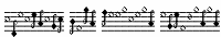 [MyFonts]
[More] ⦿
[MyFonts]
[More] ⦿
|
Shawn Eyer
|
Adjunct Professor in the Department of Liberal Studies, John F. Kennedy University. Creator of the Phoenician symbol dingbat font Kadosh Samaritan (2000-2003), which can be found at the site of Orinda Lodge, Orinda, CA. He writes: The Samaritan typeface is a particularly ornate and fascinating form of the Semitic alphabet. It presents the letters of the Hebrew script in a form more akin to ancient Phoenician than modern Hebrew. The characters in Kadosh Samaritan are based on the Samaritan letters as found in the Masonic writings of Albert Pike (1809-1891). This typeface will be useful to Biblical scholars as well as to researchers of the literature of Freemasonry. Kadosh Samaritan follows the modified Michigan-Claremont encoding scheme found in the popular Scholars Press Hebrew fonts. This allows the user to transform unpointed Hebrew set in a Scholars Press font into Samaritan characters simply by changing the font. To facilitate this function, I have duplicated some characters where appropriate because in Tiberian there are special versions of certain letters (kaf, mem, nun, peh, tzadi) when they come at the end of a word. This was not done in ancient manuscripts, and there are no final forms of Samaritan glyphs. On the many keys unused by Samaritan characters, Kadosh Samaritan offers a number of useful kabbalistic and Masonic symbols, with a particular emphasis on the Scottish Rite. Among the supplements to be found are the double-headed eagle, the logo of the Scottish Rite Research Society, and the various crosses used in Scottish Rite signatures. Another URL. [Google]
[More] ⦿
|
Simon Egli
|
 Swiss art director who has done substantive typographic work for some clients. For Tess model agency in London, he custom-designed a typeface and logo in collaboration with Mind Design. Sea Ark Sheep (2010) is a contextual typeface that was started as a project at Central Saint Martins, and ended up being released by Die Gestalten in collaboration with Stian W. Bugten in Norway.
 In 2012, he was based in New York City. In 2016, Simon published the free superfamilies Sean Slab and Sean Sans. The typeface is about to be renamed Canola. Github link for Metapolator: Canola is the first typeface created using Metapolator. It includes Sean Devanagari. As part of his Biblia Libre project, he addded Bold and Italic to Apostrophic Lab's free Day Roman font family (2020), which is based on François Guyot's 16th century types. [Google]
[More] ⦿
|
Stephanus Prabowo
[Andrey Font Design]
|
[MyFonts]
[More] ⦿
|
Steve Bridenbaugh
|
Designer of Chalices (a religious dingbat face). [Google]
[More] ⦿
|
Sylvestre Studios
[Mick Sylvestre]
|
 New Westminster, BC-based foundry of Mick Sylvestre (b. Regina, Saskatchewan, 1968), who designed the gothic families Cardinal (2005) and Scriptura (2005). He also created Hashi (2006, techno), Voussoir (2006, heavy display face), Caricatura (2005, hand-printed), Dingums (2005, dingbats), Diva Pop (2006, avant garde), Cannabis (2005), Glam Rock (2005), Vlad (2005, condensed and sectarian), Bramare (2006), Pepperjack (2006, blocky with round holes), Colby Script (2006, brush), Mickster (2006, comic book lettering), Nine Volt (2007, grunge), Savasato (2007, art nouveau look) and Quadra (2005, black blocky face).
 Additions in 2009: the handwriting typefaces Caramella, Fantillo, Shaelynn, Manta, Seussian, and the LED-meets-art deco font Katzenklo. In 2015, Sylvestre designed the carnival font Rodinia (Latin and Cyrillic) and the curly kitschy typeface Garish. Klingspor link. View Mick Sylvestre's typefaces. [Google]
[MyFonts]
[More] ⦿
|
Synaxis
|
Dead link for Cyrillic and Old Slavonic font sources. Downloads included ALBXHRNormal (1994, I.M. Grhgorioy), Altrussisch, AltrussischBold, AltrussischBoldItalic, AltrussischItalic, Bukvica (1999, URW), Byzantine (2005), Constantin (1994, L. Jake Jacobson/Slavic/University of Pittsburgh), ConstantinBold, ConstantinItalic, DSCoptic (2000, Dubina Nikolay), DSCyrillic (1999, Dubina Nikolay), DSRussiaDemo (1999, Dubina Nikolay), DSUstavHand (1999, Dubina Nikolay), DSYermak_D (2000, Dubina Nikolay), Evangelje-Plain (1995), FaithOrnaments (1994, religious dingbats by Proclaim Communications, Inc), HellasSouv (1994, I.M. Grhgorioy), KALIGRAFIKA (1997, I.M. Grhgorioy), KirillicaWincyr, Knyazcyr, LCBagira, Lavra-Plain, Methodius (1994, L. Jake Jacobson), MtAthos, NB-Byzantine-NB (1999, Nikolaos), Neobyzantine, Nestor-Condensed, Nestor (1999, V. Romanov, Moscow), Novgorod-Plain, OldChurchSlavonicCyr, OldChurchSlavonicGla, OrnamentTM (1993, Type Market Ltd. Moscow), OrnamentTT (1994 by Dmitry Komissarov, ParaGraph), OrthodoxOrnament (1997-2000, Solovetsky Monastery), PigraphBTT (1994 by Dmitry Komissarov, ParaGraph), Prosphora (2005, religious dingbats by Nikita Simmons), Saltan (2005), TitusAsomtavruliMrglovani (2000, Jogi Weichware, Frankfurt), TitusAsomtavruliNuskhuri, TitusNuskhaKhutsuri, TitusOldGeorgian, Triod, UB-Byzantine-Italic (1996, Unibrain S.A.), UB-Byzantine, Ukrdings (2004, Ukrainian dingbats), VityazCyr (1999), WP-CyrillicA, WP-CyrillicB. [Google]
[More] ⦿
|
Tamil Fonts Page by Suganthan
|
A big Tamil truetype font archive: AAbohi-PC, AParanar (R. Kalaimani, 1996), Bavani-Regular, Bamini-Plain (Harangraph, 1993), DenukaPC (Ethno Multimedia, 1995), Dheepa-Plain (religois dingbats by Ethno Multimedia, 1992), EELANADU-byAharamFonts (Jeeves Systems, 1996), ELANGO-TML-Panchali-Normal (Cadgraf Computers, 1994), Hamsathvani-Regular (Ethno Multimedia&B. Gnanapandithan, 1995), Hindolam-Regular (Ethno Multimedia, 1995), Karaharapriya-Regular (Ethno Multimedia, 1994), Kamaas-Regular (Ethno Multimedia&Ranjan Shivakumar, 1993), Kathanakuthugalam-Regular, Keeravani-Regular (B. Gnanapandithan&Ethno Multimedia, 1994), Lathangi-Regular (Ethno Multimedia, 1994), Madhuvanthi-Regular (Ethno Multimedia, 1992), Malayamarutham-Regular (Ethno Multimedia, 1994), Myp, Nattai-Regular, Needhimathi-Regular (Ethno Multimedia, 1995), Ranjani-Plain (Ethno Multimedia, 1992), Rathnangi-Regular, Sangeetha-Regular (Indian drums, by Ethno Multimedia, 1993), Saraswathy-Plain (Ethno Multimedia, 1992), Sahaanaa-Regular (Ethno Multimedia&Gnanapandithan, 1995), Saavaeri-Regular, Sevvanthi-Regular (Ethno Multimedia, 1992), Sindhubairavi-Regular (Ethno Multimedia, 1995), TamilwebPlain (Jeyachandran Kopinath, OviyaResearch, 1996), TAMLKamban-Normal (Learnfun Systems, Chennai, 1999), Thodiragam-Regular, Amudham, Anantha-Regular (EthnoMultimedia&Ranjan Shivakumar, 1993), Boopalam-Regular, Cheithi2 (Selliah Selvaratnam, 1998), Kurinji-Regular (S. Kannan, 1992), KalkiNormal, LT-TM-Kurinji (Lastech, 1992), Saraswathy-Regular (Ethno Multimedia, 1992), mylai, TamilZone, TboomisBold (shreedhar of EssDee Softvarhouse), TMNEWS (Chennai Kavigal, 2000), Vikatan, JaffnaNormal. [Google]
[More] ⦿
|
Tharwat Emara Thuluth
[Tharwat Mohamed Emara]
|
Egyptian designer (b. 1972) of the calligraphic Arabic typefaces Naskh (2017), Modern (2017, for signage), Ruqaa (2017) and Thuluth (2017), and the royal Naskh font Dewani (2017). In 2018, Tharwat designed Almona Dewany (an interlocking Arabic typeface usedful for official graduation certificates, certificates of appreciation and decorations), Almona Ornament (a religious font), Almona Thuluth (calligrahic, for Latin, Farsi, Urdu and Arabic), Al Thuluth, Osama Modern, Ahmed New (for Arabic, Urdu, Farsi and Latin) and Dr Mohammed and Sara. Typefaces from 2019: TE Aldewan, TE Alkhatat, TE Start2, Alruqaa TE, TE Start1, TE Poster, TE Banner, TE Sarah, TE Heading, Alnaskh Quraan, Tharwat Emara Thuluth Golden 2, Thulth Tharwat Emara Golden. Typefaces from 2020: TE Aldwawin (Diwani calligraphy), TE Nastaaliq , Te Reqaa Gold, Sara Tharwat Emara Modern. Typefaces from 2021: TE Fantasy, TE Cathrine, TE Cathrine 2, TE Classic Tharwat Emara, TE Rekaah3, TE Rekaah (Arabic), TE Rekaah 2 , TE HAFS (a Naskh Font for writing the Holy Quran by Raweya Hafs). [Google]
[MyFonts]
[More] ⦿
|
Tharwat Mohamed Emara
[Tharwat Emara Thuluth]
|
[MyFonts]
[More] ⦿
|
Todd M. Hallock
[Bannigan Artworks]
|
[MyFonts]
[More] ⦿
|
T.S. Haller
|
Designer of the religious dingbat font Ceremony (1999). [Google]
[More] ⦿
|
Tyeif Prayers
|
A truetype font called Tyeif Prayers, with symbols that mean something to a Hindu sect (I guess). They also have at same site an AUM font with a religious logo. [Google]
[More] ⦿
|
Typerror
[Michael Clark]
|
 Michael Clark (b. 1952) set up Typerror in 2011. His calligraphy is showcased at Michael Clark Design. Richmond, VA-based Clark does book covers, CD covers and greeting cards. His typefaces:
 - At Typerror: Lucilee (2011, connected script).
- At Font Bureau: Pouty (2001, calligraphic). It was reintroduced at P22 in 2017 as P22 Pouty Pro.
- At P22, where he did and does most of his work: P22 Sting (2005, a blackletter with roman capitals), Peanut (2006, a bouncy rough-edged display typeface that won an award for display type at TDC2 2007), P22 Peanut Sans, P22 Sweepy (2005, connected script which won an award at TDC2 2006), P22 Pooper Black (2003, connected script), P22 Frenzy-Marks (2003), P22 Frenzy-Regular (2003), P22 Frenzy-Sans (2003), P22 Shibumi (2003, brush face), P22 Monumental Titling (2005), P22 Sneaky (2008, the connected version of Pooper Black), P22 Lucilee (2011), P22 Lucilee Pro (2017), P22 FleurCross (2020: 76 stylized crosses).
- At Stereo Typehaus: the condensed font Paris.
- At Letraset: Katytude.
- Proprietary: Colonial Williamsburg Script (calligraphic, connected), Icons Sisters of St. Clare (crosses and religious symbols), Michael Podesta Design.
Gofundme page in 2021 to help Michael with his medical bill to treat his Parkinson's disease. More examples of his work. MyFonts page. An old URL. Klingspor link. FontShop link. [Google]
[MyFonts]
[More] ⦿
|
Typikon
|
Russian type site with Cyrillic and Slavonic fonts: Abur, Greek, Knyazcyr, Lavra-Plain, Novgorod-Plain, OldChurchSlavonicCyr, OldChurchSlavonicGla, OrnamentTM, Peterb_Mod, Izhitsa, IzhitsaC, IzhitsaCTT, IzhitsaShadowC-Regular, PigraphBTT and OrnamentTT (1994, all six by Dmitry Komissarov), Putiata, BlagovestFiveDecor, BlagovestFiveRegular, BlagovestFiveRegularSerif, BlagovestFourNormal, BlagovestFourSerif, BlagovestOne, BlagovestSix, BlagovestThree, BlagovestTwo-Regular (all by DoubleAlex Team), FaithOrnaments (1994, Proclaim Communications), FitaPoluustav, Fita_church. FitaVjaz (the last three all 1995, Sergey Shanovich, Type Market Ltd. Moscow). [Google]
[More] ⦿
|
UnAuthorized Type
[Ben McGehee]
|
UnAuthorized Type is run by Ben McGehee, who is famous for his Christian Crosses dingbats. A list of his freeware/shareware fonts: 2ProngTree, 3ProngTree, AlanDen, AlphaDance, Another, Anyway-Bold, Anyway, AnywayLight, Aswell-Bold, BetaDance, ChristianCrosses, ChristianCrossesII, ChristianCrossesIII, ChristianCrossesIV, Chrysalis (2001), ChrysalisFilled, EDBIndians, EDBSweatinIt, EDBWildThings (EDB series with Ed Buri), ExplodingSheep, Flubber, KnockedAround-Regular, Previewance, RockyMountainSpottedFever, Sketchbook, SlightlyHollow-Regular, SpottedFever, SwollenSlightly, Today, TouchOfNature (1997), UASquared, UA Serifed, Wesley (1998, handwriting), ZhangQA, Fundamental Rush, Kelp Ban (2001), Briaroak Shire (2002, based on an idea of Ed Buri). Alternate URL. Fontspace link. Dafont link. [Google]
[More] ⦿
|
Unicode Fonts for Ancient Scripts
[George Douros]
|
 This is a fantastic source of free high-quality fonts for scripts of the greater Aegean vicinity, Egyptian Hieroglyphs, Meroitic, Sumero-Akkadian Cuneiform, Musical Symbols and all Symbol Blocks in the Unicode Standard. George Douros is their Greek font designer. His free fonts come with this exemplary footnote: In lieu of a licence: Fonts in this site are offered free for any use; they may be opened, edited, modified, regenerated, posted, packaged and redistributed. Many of his fonts contributed to important section in the GNU Freefont project. Here is the list:
 - Abidos (2018). An attempt to catalogue about 8000 Egyptian hieroglyps. His Nilus font (2018) catalogues the Gardiner hieroglyphs.
- Aegean (2007-2012). Covers Basic Latin, Greek and Coptic, Greek Extended, some Punctuation and other Symbols, Linear B Syllabary, Linear B Ideograms, Aegean Numbers, Ancient Greek Numbers, Ancient Symbols, Phaistos Disc, Lycian, Carian, Old Italic, Ugaritic, Old Persian, Cypriot Syllabary, Phoenician, Lydian, Archaic Greek Musical Notation. Other things in it: Linear A, Cretan Hieroglyphs, Cypro-Minoan, Ancient Greek Alphabets, Phrygian, Old Italic Alphabets (Cumaean, Archaic Etruscan, Neo Etruscan, Ancient Latin, Lugano, Faliscan, Marsiliana, Messapic, Middle Adriatic South Picene, North Picene, Oscan, Umbrian), the Arkalochori Axe and Anatolian Hieroglyphs.
- Aegyptus (2007-2020) and Gardiner. Over 7000 hieroglyphs. In addition, we have Basic Latin, Greek and Coptic, Egyptian Transliteration characters, some punctuation and other symbols.
- Akkadian (2007). Basic Latin, Greek and Coptic, some Punctuation and other Symbols, Ugaritic, Cuneiform, Cuneiform Numbers and Punctuation.
- Alexander (2007, text typeface built around the Greek letters originally designed by Alexander Wilson in 1744; compare with Wilson Greek (1996, Matthew Carter) and Junicode (2006, Peter S. Baker)). The Latin and Cyrillic parts are based on Garamond.
- Alfios. Lowercase upright Greek were designed in 1805 by Firmin Didot (1764-1836) and cut by Walfard and Vibert. The typeface, together with a complete printing house, was donated in 1821 to the new Greek state by Didot's son, Ambroise Firmin Didot (1790-1876). Lowercase italic Greek were designed in 1802 by Richard Porson (1757-1808) and cut by Richard Austin. They were first used by Cambridge University Press in 1810. Capitals, Latin and Cyrillic, as well as the complete bold weights, have been designed in an attempt to create a well-balanced font. The font covers the Windows Glyph List, Greek Extended, various typographic extras and some Open Type features (Numerators, Denominators, Fractions, Old Style Figures, Historical Forms, Stylistic Alternates, Ligatures); it is available in regular, italic, bold and bold italic.
- Anaktoria. Douros: Grecs du roi was designed by Claude Garamond (1480-1561) between 1541 and 1544, commissioned by king Francis I of France, for the exclusive use by the Imprimerie Nationale in Paris. Greek in Akaktoria is based on a modern version of Grecs du roi prepared by Mindaugas Strockis in 2001. Lowercase Latin stems from the titles in the 1623 First Folio Edition of Shakespeare. Scott Mann & Peter Guither prepared a modern version for The Illinois Shakespeare Festival in 1995. Cyrillic has been designed to match the above Greek and Latin.
- Analecta (2007, Byzantine style). An ecclesiastic scripts font, in Byzantine uncial style, covering Basic Latin, Greek and Coptic, some Punctuation and other Symbols, Coptic, typographica varia, Specials, Gothic and Deseret.
- Anatolian
- Aroania: In 1927, Victor Julius Scholderer (1880-1971), on behalf of the Society for the Promotion of Greek Studies, got involved in choosing and consulting the design and production of a Greek type called New Hellenic cut by the Lanston Monotype Corporation. He chose the revival of a round, and almost monoline type which had first appeared in 1492 in the edition of Macrobius, ascribable to the printing shop of Giovanni Rosso (Joannes Rubeus) in Venice. Aroania is a modern recast of Victor Scholderer's New Hellenic font, on the basis of Verdana.
- Asea (2020, Latin-Greek-Cyrillic). A modern font based on Firmin Didot's Greek type.
- Assyrian.
- Atavyros. Douros writes: Robert Granjon (1513-1589) produced his Parangonne Greque typeface (garmond size) at the instigation of Christophe Plantin as a counterpart to Garamond's Grec du roi, in Antwerp Holland, between 1560--1565. It was used in Plantin's multilingual Bible of 1572. Versions of Granjon's type were used for the 1692 edition of Diogenes Laertius and for the Greek-Dutch edition of the New Testament in 1698, both published by Henric Wetstenium in Amsterdam. A digital revival was prepared by Ralph P. Hancock for his Vusillus font in 1999. Latin and Cyrillic are based on a Goudy typeface.
- Avdira. Douros: Upright is based on the lowercase Greek letters in the typeface used by Demetrios Damilas for the edition of Isocrates, published in Milan in 1493. A digital revival was prepared by Ralph P. Hancock for his Milan (Mediolanum) font in 2000. Italic Greek were designed in 1802 by Richard Porson (1757-1808) and cut by Richard Austin. They were first used by Cambridge University Press in 1810.
- Maya. Maya covers the glyphs in J. Eric S. Thompson's A Catalog of Maya Hieroglyphs (1962, University of Oklahoma Press).
- MusicalSymbols (2007) or Musica (2013). Basic Latin, Greek and Coptic, some Punctuation and other Symbols, Byzantine Musical Symbols, (Western) Musical Symbols, Archaic Greek Musical Notation. There is also the Greek musical notation font EE Music (2018) for Hellenic ecclesiastic music.
- UnicodeSymbols (2007, in the Computer Modern style) and UniDings (2013). It has every imaginable symbol: Basic Latin, Latin-1 Supplement, Latin Extended-A, IPA Extensions, Greek, Cyrillic, Cyrillic Supplementary, General Punctuation, Superscripts and Subscripts, Combining Diacritical Marks for Symbols, Letterlike Symbols, Number Forms, Arrows, Mathematical Operators, Miscellaneous Technical, Control Pictures, Optical Character Recognition, Box Drawing, Block Elements, Geometric Shapes, Miscellaneous Symbols, Dingbats, Miscellaneous Mathematical Symbols-A, Supplemental Arrows-A, Supplemental Arrows-B, Miscellaneous Mathematical Symbols-B, Supplemental Mathematical Operators, Miscellaneous Symbols and Arrows, CJK Symbols and Punctuation, Yijing Hexagram Symbols, Vertical Forms, Combining Half Marks, CJK Compatibility Forms, Specials, Tai Xuan Jing Symbols, Counting Rod Numerals, Mathematical Alphanumeric Symbols, Mahjong Tile Symbols, Domino Tile Symbols.
- Symbola (2013) is an unbelievably rich font. It contains Basic Latin, IPA Extensions, Spacing Modifier Letters, Combining Diacritical Marks, Greek and Coptic, Cyrillic, Cyrillic Supplement, General Punctuation, Superscripts and Subscripts, Currency Symbols, Combining Diacritical Marks for Symbols, Letterlike Symbols, Number Forms, Arrows, Mathematical Operators, Miscellaneous Technical, Control Pictures, Optical Character Recognition, Box Drawing, Block Elements, Geometric Shapes, Miscellaneous Symbols, Dingbats, Miscellaneous Mathematical Symbols-A, Supplemental Arrows-A, Braille Patterns, Supplemental Arrows-B, Miscellaneous Mathematical Symbols-B, Supplemental Mathematical Operators, Miscellaneous Symbols and Arrows, Supplemental Punctuation, Yijing Hexagram Symbols, Combining Half Marks, Specials, Byzantine Musical Symbols, Musical Symbols, Ancient Greek Musical Notation, Tai Xuan Jing Symbols, Counting Rod Numerals, Mathematical Alphanumeric Symbols, Mahjong Tiles, Domino Tiles, Playing Cards, Miscellaneous Symbols And Pictographs, Emoticons, Ornamental Dingbats, Transport And Map Symbols, Alchemical Symbols, Geometric Shapes Extended, Supplemental Arrows, and Symbols of occasional mathematical interest. It is one of a hanful fonts that dares to have a glyph that shows the middle finger. Github link for free download. see also Symbola Goomoji (2013).
- Unidings. Various glyphs and icons.
Since George permits redistribution, I am offering his work for download here. [Google]
[More] ⦿
|
Valentyn Tyshchenko
|
Art director in Warsaw, who created the modular Chrifis typeface in 2013. It was inspired by sacred art. [Google]
[More] ⦿
|
Valery Moiseev
|
 Moscow-based designer who created the display type Linear (2015) in vector format. He also drew a great set of Monsters in vector format. Icon sets by him include 1000 Icons, Churches, Christmas, Flat Cars, Thin Line Icons. Behance link. [Google]
[More] ⦿
Moscow-based designer who created the display type Linear (2015) in vector format. He also drew a great set of Monsters in vector format. Icon sets by him include 1000 Icons, Churches, Christmas, Flat Cars, Thin Line Icons. Behance link. [Google]
[More] ⦿
|
Vladimir Nikolic
|
 Belgrade, Serbia-based designer (b. 1981) of these typefaces:
 - The dingbat fonts Canavarlar (2020: funny men), Haircut (2020: women's hairdos), Ornament Borders (2020), Gourdy (2020: birds), Lizards (2020), Mantra (2020), All Star (2020), Speel (2020), Soavely (horses) (2020), Forma (2020), Hell Beasts (2020), Mistresses (2020), Paraiso (2020), Crow (2020), Traverser (2020: crosses), Cats (2020), Dogs (2020), Negative-Heads (2020), Otu (2020), Wakazi (2020), Risk (2020), Wurm (2020), Beard Man (2020), Hoder (2020), Damen (2018), Damen 2 (2020), Foliga (2020), Solo Drinker (2020), Congress (2020), Farmacy (2020), Elections (2020), Emergency (2020), VN Arrows (2020), Hexagonos (2020), Automobiles (2020), Cars (2020), Emoji Boom (2020), Bestia (2020), Aliens (2020), Insect (2020), Bytost (2020), Monstero (2020), Aveto (2020), Dancing Cat (2020), Atradimas (2020), Womanhood (2020), Figur (2020: an alien insect font), Halfwits (2020), Silly Donkey (2020), Crazy Monkey (2020), Round Masks (2020), The Quick Dog (2020), Flying Birds (2020), Maskid (2020), Monstra (2020), Bull Skulls (2020), War Items (2020), Public Transport (2020), Loomad (2020), Mokhabiso (2020: African patterns), Record (2020), Mulher (2020), Heroez (2020), Bulls (2020), Madarak (2020: birds), Bold People (2020), Munari (2019: a collection of drawings based on Bruno Munari's book "Artista e designer" from 1966), Screws (2019), White Mouse (2019), Schepselen (2019), Glatze (2019), Crosses (2019), Chefs (2019), Diamond Blocks (2019), Hexagons (2019), Maumbo (2019), Circles (2019), Enfeite (2019), Pigs (2019), Mythos (2019), Kreaturen (2019), Baby Alien (2019), Body Moving (2019), Various Boys (2019), Lines and Objects (2019), Mouvman (2019), Watch (2019), Credit Card (2019), Cycles (2019), Devil Emoji (2019), Fare (2019), Mund (2019), Labbra (2019), Circular Ornaments (2019), Cranium (2019), Ugok (2019), Ansigter (2019), Tsim (2019), Schmetterlinge (2019), Jungfrau Maria (2019: religious icons), Knights Helmets (2019), Kinderskizzen (2019), Wolves (2019), Various Cats (2019), Owls (2019), Spiral Object 3D (2019), Zodiac Signs (2019), Cyborg (2019), Duck (2019), Cat 3D (2019), Object 3D (2019), Circle and Line (2019), Various Girls (2019), Dulcet (2019), Erotic Symbols (2019), Frauen (2019), Pierre the Vampire (2019), Robotter (2019), Middle Finger (2019), Claudio The Cat (2019), Medusa (2019), Veggie (2019), Pablo (2019), Fishes (2019), Dream of Picasso (2019), Stam (2019), Animality (2019), Ink Drops (2019), Faces (2019), Bayan (2019), Froggy (2019), Senhoras (2019), Diamondo (2019), Skallen (2019: skulls), Swimmers (2019), Churches (2019), Easter Icons (2019), Lippen (2019), Gullar (2019), Bankwesen (2019), Creatures with Horns (2019), Vehicles (2019), Various Hands (2019), 3D Animals (2019), Abantu (2019), Herr (2019), Menge (2019), Funny Aliens (2019), Mustachos (2019), Kids Drawings (2019), Tierfarm (2019), Troep (2018), Women Heads (2018), Cats and Dogs (2018), Wanita (2018), Eyez (2018), Animales (2018), Peoples (2018), Mobile Icons (2018), Controllers (2018), Womano (2018), Lost in Space (2018), Blumen (2018: flowers), Tetriso (2018), Snowflake (2018), Meine (2018: masks), Horoscopicus (2018), Esoterica (2018), Astrologicus (2018, astrolical symbols), Abbild (2018: African masks), Being (2018: monsters), Gebell (2018), Headed (2018), Falter (2018), Filling (2018), Anichka (2018), Cyclopia (2018), Buggus (2018), Opa (2018), Messe (2017), Head of Idol (2018), Diavolo Nero (2017: funny silhouettes).
- The boxed or encircled alphabets Audience Capitals (2020), Galileo (2020), Compare (2020), Compare-Light (2020), Hexagonas (2020), Select (2020), Before (2020), Before-Dark (2020), Boxes (2020), Boxes-Extravagant (2020), Boxes-Fancy (2020), Calf-Negative (2020), Capital-Relationship (2020), Pyxidas (2020), Capitalica (2020), Tundra (2020), Ordinary Capitals (2020), Broadway Capitals (2020), Browser Capitals (2020), Capitalismo (2019), Schwarzenberg Capitals (2019), Retrospective Capitals (2019), Official Capitals (2020), Impression (2020), Oriental (2020), and Letters in Circles (2018).
- Shadowed caps: Cleopatra (2021), Farmers Market (2021), Erkekler (2021), Assignation (2021), Greek Tragedy (2021), Distorted (2021), Lightshow (2021), Credenza (2021), Ragusa (2021), Comunismo (2021), Scordia (2021), Gazelle (2021), Organ (2021), Strizhi (2021), Umoya (2021), Ninja Justice (2021), Unlimited (2021), Unicorns (2021), Labyrinth (2021), True Artisans (2021), Poker (2021), Donald (2021), Ferrari (2021), Booster (2021), Madness (2021), Favorita (2021), Vitamin (2021), Robot (2021), Robust (2021), Engine (2021), Whether (2021), Nucleus (2021), Trunk (2021), Ombre (2021), Viscosus (2021), Jewelry (2021), Verge (2021), Pursue (2021), Keener (2021), Visor (2021), Korvo (2021), Squash (2021), Scum (2021), Darker (2021), Education (2021), Cimice (2021), Tomb (2021), Bambola (2021), Calla (2021), Rump (2021), Complex (2021), Razor (2021), Driveller (2021), Karambol (2021), Princino (2021), Berger (2021), Adopted (2021), Bugbear (2021), Samara (2021), Talisman (2021), Waterway (2021), Megabus (2021: a marquee font), Roller (2021), Numerica (2020), Bond (2020), Gloom (2020: a marquee font), Chalkboard (2020: sketched), Unboxing (2020: techno), Antennas (2020), Secca (2020), Umfo (2020), Sabbia (2020), Squirrel (2020), Byzan (2020), Debtor (2020), Bridge (2020), Familie (2020), Lake (2020), Roma (2020), Tissue (2020), Bombay (2020), Osteology (2020), Restroom (2020), Speaker (2020), Bebika (2020), Center (2020), Gismo (2020), Fierce (2020), Gambler (2020), Afterparty (2020), Birdbrain (2020), Boner (2020), Divine (2020), Gelatin (2020), Lost (2020), Marshland (2020), Quadri (2020), Shadow (2020), Stairs (2020), Superba (2020), Techno (2020), Underman Book (2020), Wired Capitals (2020), Fineliner (2020), Fictive Kinship (2020), Exotica (2020), Ural (2020), Devianza (2020), Kultur (2020), Unmute (2020), Antiqua (2020), Chains (2020), Scheme (2020), Stumble (2020), Aroma (2020), Beans 2 (2020), Cover (2020), Cronica (2020), Fundament (2020), Horna (2020), Loce (2020), Mademoiselle (2020: art nouveau), Melodia (2020), Penny (2020), Taikun (2020), Assault (2020), Athletica (2020), Baraka (2020), Brassica (2020), Builder (2020), Chancellery (2020), Gwara (2020), Pliez (2020), Recinzione (2020), Right (2020), Rimes (2020), Seal (2020), Service (2020), Scorpions (2020), Terraces (2020: American flag font), Wedding Cabbage (2020), Wild Girl (2020), Tragedy (2020), Indos (2020), Starfish (2020), Vintage (2020), Adriatica (2020), Funeral (with American flag texture) (2020), Voleur (2020), Calzino (2020), Peshkop (2020), Metzger (2020), Asshole (2020), Puppet (2020), Broeksel (2020), Hals (2020), Escort (2020), Vortex (2020), Dades (2020), Boild Hedgehog (2020), Mermer (2020), Grower (2020), Rainbow (sketched) (2020), Baise (2020), Necklace (2020), Angels (2020), Smuggler (2020), Dommage (grungy) (2020), Squalor (2020), Fusto (2020), Course (2020), Fisheye (2020), Baiser (2020), Banda (2020), Cantaloupe (2020), Canto (2020), Begriff (2020), Trapeze (2020), Arabeska (2020), Silver (2020), Wasco (2020), Kosaken (2020), Triangle (2020), Banquet (2020), Demode Capitals (2020), Cultus Capitals (2020), Idiot Capitals (2020), Granary Capitals (2020), Liberta (2020), Montblanc (2020), Granary (2020), Blanket (2020), Tuyaux (2020), Wolf (2020), Comeback (2020), Oliba (2020), Idiot (2020), Trailer (2020), Bricks (2020), Toys (2020), Luxury (2020), Hertz (2020), Signal (2020), Serenada (2020), Kurven (2020), Schnecke (2020), Mona (2020), Sierra (2020), Search (2020), Tranchante (2020), Eccentric (2020), Fast (2020), Mosquito (2020), Speed-of-Light (2020), Thanks (2020), Album (2020), Boyhood (2020), Ending (2020), Trend (2020), Universal-Serial-Bus (2020), Fixed (2020), Kings (2020), Holiday (2020), Range (2020), Numbers (2020), Shipman (2020), Officer (2020), Video (2020), Order (2020), Route (2020), Cosa-Nostra (2020), Clowns (2020), Unique (2020), Voyeur (2020), Shape (2020), Brigadier (2020), Allora (2020), Spartacus (2020), Advisor (2020), Ambis (2020), Cables (2020), Genesa (2020), Horse (2020), Laptop (2020), Pork (2020), Mafioza (2020), Mucho (2020), Athens (2020), Audience (2020), Rotor (2020), Mundo (2020), Olympus (2020), Border (2020), Scale (2020), Survival (2020), Trouble (2020), Turnabout (2020), Catharsis (2020), Parade (2020), Discoteque (2020), Rude (2020), Fame (2020), Safran (2020), Ausweis (2020), Mechanica (2020), Moscowian-Party (2020), Beers (2020), Strengthen (2020), Tempo (2020), Unreal (2020), Poetico (2020), Bach (2020), Bach-Fat (2020), Energy (2020), Alexandra (2020), Basket (2020), Cushion (2020), Model (2020), Organiser (2020), White (2020), Anabela (2020), Cannibal (2020), Casablanca (2020), Castle (2020), Control (2020), Crazy (2020), Crazy-Gradient (2020), Emotion (2020), Honey-Bunny (2020), Knockout (2020), Linearo (2020), Murmure (2020), Polished (2020), Reon (2020), Sparrow (2020), Storms (2020), Street-Stars (2020), Franchise (2020), Pencil (2020), Ruanda (2020), Pepito (2020), Megalomania (2020), Rouleaux (2020), Frozen (2020), Together (2020), Saldo (2020), Museum (2020), Network (2020), Hunk (2020), Cultus (2020), Creator (2020), Flow (2020), Blocchi (2020), Possession (2020), Bad Germans (2020), Discounted (2020), Traversal (2020), Mangalica (2020), Murmansk (2019), Summer Candy (2019), Question (2019), Second Channel (2019), 3D Models (2019), Memory (2019), Computer (2019), Diversity (2019), Elastic Letters (2019), Businessman (2019), Kuchen (2019), Demode (2019), Objective (2019), Medication (2019), Nonsense (2019), Plagiat (2019), Toledo (2019), Tricks (2019), Common (2019: a trompe-l'oeil font), Mafia (2019), Releases (2019), Extradition (2019), Shoot To Kill (2019), Groowing (2019), Enough (2019), President (2019), Silence (2019), Dressed (2019), Already (2019), Hocus Pocus (2019), Password (2019), Ready (2018) and Messages (2017).
- The ornamental caps typefaces Mahal (2021), Stamp (2021), Hell Door (2021), Tangram (2021), Custom (2021), Remake (2021), Studio (2021), Adagio (2021), Oxidizer (2021), Mondial (2021), Paraglide (2021), Tattoo (2021), Developer (2021), Dama (2021), Lobby (2021), Gabaritos (2021), Sence (2021), Ombre (2021), Cresa (2021), Anniversary (2021), Wire (2021), Triton (2021), Lamina 92021), Hangup (2021), Years (2020), Dowry (2020), Sephora (2020), Jewels (2020), Straightforward (2020), Dance (2020), Necklace (2020), Maria (2020), Taxi2 (2020), Outlaw (2020), Combat (2020), Chewed (2020), Fantasy (2020), Observation (2020), Cure (2020), Pioneer (2020), Near (2020), Kleid (2020), Unitas (2020), Tomato (2020), Blader (2020), Canal (2020), Baked Snails (2019), Alcoholic (2019), Bonjour (2019), Zylinder (2019), Phenomenal (2019), Surfaces (2019), Success (2019: as in De Stijl), Retailer (2019: multilined), Havana (2019: multilined), Mechanismo (2019) and Pencil Letters (2019).
- The display typefaces Trader (2020), Oysters (2020), Furious Ride (2020), Portfolio (2019), Pontos (2019), Swordsman (2019), Regular (2019), Andrey (2019), Retrive (2019), Connected (2019), Locator (2018), Tracking (2018), Iceberg (2018: snow-capped letters), New Amsterdam (2018), Ana (2018), Enemy (2018), New Yorkers (2018), Happy Day at School (2018), Focused (2018), Modish (2018), Beholder (2018) and Principality (2017).
- The alphadings Birthdays and Parties (2021), Bahanalia (2020), Icecreams (2020), Brailler (2020), Night Dreams (2020), Flower Capitals (2020), Jingle Bells (2020), Neuron Capitals (2020), Easter Time (2020), Hearts and Arrows (2018), Penguins (2018), Kitties (2018), Doggy (2018), Teddy Bears (2018), International Capitals (2018), Aafia Capitals (2018), Answer Capitals (2018), Beholder Capitals (2018).
- The circuit font Simple Repairs (2021).
- The 3d typefaces Sharp (2021), Edited (2021), Three Dimensions (2020), Rental (2020), Shiny Blocks (2020), Turbulence (2020), Labor (2020), Worship (2020), Fantasy-3D (2020), Zucker (2020: stacked blocks) Perfetto (2020), Rude-3D (2020), Lover (2020), Kasten (2020), 3D Models (2019), Tricks (2019) and Metallic (2019).
- The multiline typefaces Yiphi (2021), Porker (2020), Formula (2020), Laguna (2020), Hypochondria (2020), Majestic (2020), Vibes (2020), Tubes (2020), Yogurt (2020), Turkish (2020), Question (2019), Pancake (2019), Remained (2017), Liquidrom (2018), Second Channel (2019), 3D Models (2019), However (2019), Confarreatio (2018) and Fudged (2018).
- The textured typefaces Incompetent (2021), Autumn (2021), Sangria (2021), Studio (2021), Kino (2021), Elixir (2021), Espace (2020), Mistress (2020), Heritage (2020), Silicone (2020), Hornettio (2018), Ignorant (2018), Americans (2020: the American flag embedded into the glyphs), Pollution (2020), Jakob (2019), Diversity (2019), Townscape (2019), Patriotic (2019: American flag theme), Meshes (2018), Complained (2019), Duration (2018) and its solid counterpart, Duration Book (2018).
- The Slavonic emulation typeface Russian Land (2017) and the Cyrillic emulation typefaces Monarch (2021), Cold War (2021), Beograd (2020), Ukrainian Princess (2019), Territory (2019), Kalinka (2019), Rubles (2018), Maniac (2018), Jurij (2018), Kachusha (2018), Soviet Program (2018), Armenia (2017), Fontograd (2018) and Russian Spring (2017).
- The constructivist typefaces Tokarev (2017), Russiano (2018), Suggested (2018), Hungaria (2018) and Schwachsinn (2018).
- Art deco typefaces: Cavalier (2021), Performer (2021), Angelica (2019), Protocol (2019), Retrospective (2019), Leculier (2018, after an alphabet in Georges Leculier's art deco lettering book from ca. 1930), Better (2018), Critical (2017).
- Art deco caps: Reverse (2020), Bathroom (2019), Idiotism (2019).
- The chess fonts Schach (2020) and Wisdom Chess (2020).
- The weather icon font Weather Symbols (2020).
- The decorative sans typefaces Shock (2021), Energia (2021), Pitviper (2021), Nemesis (2021), Addiction (2021), Nehad (2021), Chewer (2021), Nightfall (2021), Gourmet (2021), Flipside (2021), Layered Letters (2019), Imbecile (2019), Answer (2018), Hours (2018), Abandoned (2018), Sea Gardens (2017), Forvertz (2018), Yeysk (2018) and Closeness (2018).
- Sans: Wollicht (2021), Ministro (2021), Lonely (2021), Noix (2021), Messina (2021), Samara (2021), Rickrack (2021), Broadcaster (2021), Catamaran (2021), Official (2019).
- Comic book fonts: Reset (2021).
- Artsy fonts: Hornstick (2021), Kikundi (2021), Shanghai (2021), Skewed (2021), Company (2021), China (2020).
- The headline sans typefaces Finance (2020), Marija (2020), Fashion (2020), Magazine (2020), Policemen (2020), Impressum (2019), Educated Deers (2019), Hindenburg (2019) and Fixation (2018).
- The rounded organic sans typefaces Hofmann (2020), Adelino (2020), Available (2018) and Biysk (2018).
- The handcrafted typefaces Diana (2020), Flood In London (2019), Milord (2018), Sex and Breakfast (2018), Sweet Handwrite (2018), Industrial Revolution (2018), Oh Maria (2017), Sofija (2017) and Travelling (2017).
- The bubblegum typefaces Roller (2020), Jellies (2020), Designero (2019), Bubblicious (2019) and Icecreamer (2017), and its oily companions Gummy (2018) and Liquid (2018).
- The heavy deco typefaces Guest (2019), Bigger (2018), Hours (2018), Intransitive (2018: Dutch deco), Theatrical (2017) and Consequences (2017).
- The beveled fonts Iron (2020), Rising (2020), Novgorod (2020), Troy (2020), Fake Hope (2019), Diamond Ring (2019), Playback (2018) and Member (2018).
- The starred caps typefaces Farmers Market (2021), Donald (2021), Citizen (2021), Wizard (2021), Adrenaline (2021), Diabolo (2021).
- The stencil fonts Browser (2019), Serbia (2019), Belgrado (2019), Further (2019), Generals (2018), Mayor (2018) and Olga (2018).
- The semi-stencil all caps typefaces Restaurant Menu (2019), Queen Dea (2019), Latest (2019) and Large (2019).
- The fat rounded sans typefaces Guest (2019) and Subscribe (2019).
- The Western fonts Newlywed (2020) , Tombola (2019), Permission (2019), Alexander (2019), Retrosonic (2019), Kasplysk (2019).
- The experimental typeface Typo Layer (2019).
- The German expressionist outline typeface Robert (2018).
- Current Moment (2019): a digitized "Zuccini" plate by Frits Jonker.
- The LED fonts Remaster (2021), Ringing (2022), Gigabytes (2020), Error (2020) and Technology (2018).
- The octagonal athletic lettering fonts Academy (2021), Junk (2020), Barbara (2019), Soccer (2020), and Soccer League (2018) and the outlined athletic font Onderneming (2018).
- Leculier (2018). After an alphabet in Georges Leculier's art deco lettering book from ca. 1930.
- The speed fonts Live News (2020) and Speed Racing (2019).
- Essere (2018).
- The squarish typefaces Archipelago (2021), Haine (2020), Augsburg (2020), Legionary (2020), Cyber Princess (2019), Professor (2019), Layers (2018) and Cataclysmo (2017).
- Driving Around (2018).
- The decorative floral caps typefaces Floral Capitals (2018) and Narcissus (2018).
- Gradientico (2018). A textured didone.
- The Greek simulation font Meteora (2018).
- Griddy Blocks (2018) and Blocky Letters (2018).
- Decorattio (2018).
- Ordinary (2018) and Mina is Gone (2018).
- The trilined typeface Trio (2017).
- The connected handwriting typeface Eric's (2016).
- The military typefaces Login (2018), Commanders (2017) and Hunt (2017, after an alphabet by the Hunt Brothers in their 1930s book Lettering of Today).
- The neon typeface Bubble 3D (2017), and the neon and shadow font family Magia (2019).
- Schaeffer (2017). A revival of the famous multiline typeface Fatima (1933, Karl Hermann Schaefer).
- The grungy typefaces Horizont (2020), Cosmas (2020), Drunk Millionaire (2019), Leave No Fingerprints (2018), Haziness (2017) and Victorious (2017).
- The molecular typeface Neuron (2019).
- The inline caps typefaces Panther (2021), Africa (2021), Look (2019) and Speed (2019).
- The inline typefaces Green (2020), Bernard (2020), and Games (2017).
- The display serif typefaces Kandinsky (2021), Funia (2021), Army Guys (2021), Hoodie (2019).
- The marquee typefaces Squad (2021), Grotto (2021), Megabus (2021), Plagiat (2019), Dropped (2019), Casino (2018) and Chicago (2018).
- The layerable marquee font Rockefeller (2018).
- Movie fonts: Film Letters (2018).
- The outlined typeface Important (2018).
- The white-on-black typeface Circusant (2019).
- The didone typeface Vogue (2018).
- The geometric solid typeface family Ivan (2019).
- The geometric sans typeface Occupied (2017).
- Rise of Kingdom (2017).
- Cartoonish (2017).
- Hesitation (2017). A rounded handcrafted poster font.
- Leben and Leben Shadow (2018).
- Braillenum (2018).
- The condensed grotesks Around (2020), Heinrich (2019) and Schwarzenberg (2019).
- Schreibmaschine (2017). A dusty old typewriter font.
- The vintage initial caps typefaces Nautiica 3d (2018), Fantasy Capitals (2018) and Herne Capitals (2018).
- The Arabic emulation typefaces Bayram (2020) and Sinbad (2018).
- Herne (2018).
- Passage (2018).
- Knotty (2018).
- The Mexican style font Mexicanera (2018), Dilemma (2018: Mexican Calavera skulls), and Mexican Tequila (2018).
- The techno typefaces Flight 21 (2019), Cyber Princess (2019), Passionate Relationship (2019), Neighbor (2018), Bombardment (2018) and Leprosy (2018).
- The avant-garde typeface Typolino (2018).
- Regensburg (2018).
- The ultra-fat typefaces Crime (2020), Owners (2018) and Housebreak (2019).
- The prismatic typefaces Jumble (2020), Boogie Woogie (2019), Running (2019), Bigger Italic (2018; based on Bigger Book), Linerine (2018) and Cosmology (2018).
- Failed (2018).
- The codex typefaces Grille (2020), Compass (2020) and Measurements (2018).
- Damages (2018).
- The circle-themed fonts Sparks (2020) and Condition (2018).
- The textured typefaces Mitesser (2020), Object (a meshed font) (2020), Noisy Walk (2020), Brightness (2020), Mistress (2020), Heritage (2020), Silicone (2020), Hornettio (2018) and Ignorant (2018).
- The oriental simulation fonts Dasvidaniya Book (2020), Pearl Harbor (2020), Chinese Dragon (2019), Sudoku (2019), Hiroshima (2019) and Kamikaze (2018).
- Monograms: Quintete (2020), Formogram (2020), Diamond Monogram (2020), Ribbon-Monogram (2020), Bulged Monogram (2020), Monogramus (2019), Blocky Monogram (2018) and Monograma (2018).
- Blackletter: Bramble Princess (2021), Drunks (2021), Cosmopolite (2020).
- Fists: The-Point (2020).
- Scanbats: Retro-People (2020), Vladimir (2019: Putin scanbats), Portraits de Femmes (2019: scanbats), Notre Dame and Notre Dame de Paris (2019: scanbats), Hollywood Actors (2019: scanbats), European Leaders (2018: scanbats), Trumpolina (2018: Trump scanbats).
- Word fonts: Black-Lives-Matter (2020).
- Plank fonts: Wooden Planks (2020).
- The outlined typefaces Carwash (2020), Hypno (2020), George (2020), 3D Letters (2018), Milk & Chocolate (2018: trilined), Czar (2018), Classica (2018) and Created (2018).
- The glitch fonts Elderberry (2021), Sparkle (2021), Eclairages (2021), Nectar (2021), Check Your Connection (2020), Horizons (2020) and Searching For Signal (2019).
- The glaz krak font Smashed (2018).
- The circus font Amigo (2020).
- The kitchen tile font New Message (2020).
- The 3d dingbats typefaces Basic Objects (2020: geometric shapes) and Jigsaw Puzzles 3D (2018).
- The modular typefaces Orenburg (2018), Broadway (2018) and Assyrian (2018).
- Escher style: Illusion (2019), Vologda (2019).
- Slinky typefaces: Rings (2020), Zylinder (2019), Pipes (2019).
- Lombardic caps: Moher (2020), Dublin (2020), Moderno (2020).
- Ransom note caps: Today (2020).
- Artistic font: Meute (2020).
- Halftone fonts: Tourner (2020), Cinquecento (2020), Devotion (2020), Gulliver (2020), Bamboo (2020).
- Ornaments: Adornos (2020).
- Antique caps: Grandes (2020), Reveler (2020: from Draughtsman's Alphabets (1877) by Hermann Esser)).
- Funny faces: Isitolo (2020).
- Angular caps: Milk (2020), Strike (2020), Worldwide (2020).
- Tall sans caps: Bungler (2020), Shakeout (2020).
- Mecano typefaces: Shakers (2020).
- Titling sans: Steinberg (2020).
- Titling serif: Love (2020).
- Break (2020).
- China (2020).
Creative Fabrica link. [Google]
[More] ⦿
|
West Wind Fonts
[Jessica Slater]
|
 Designers in 2001 of DearestFriendlite, DearestFriend, DearestOpen, DearestOutline, Dearest (the Dearest family is in the blackletter style), Exotica-Medium (ornamental caps used by Vogue Paris), HoppyRibbitday (alphadings), ShadyCharacters-Medium (3d face), WePray (2001, made in commemoration of the September 11 tragedy, alphading and blackletter), Florabet, Alphapix (alphadings), Celtic Eels (Celtic caps), Circus Train (alphadings), Billboard (2003, alphadings), Leafy (2001), Face (2001, great smilies Faceoff and Faceit), Autumn Gifts (2001), Leafyglade, Leafyshade (2001, leafy caps), LittleDaisy, Little Days (2001, connected handwriting, an interpretation of Memimas by Type-o-tones), Little Days Alt (2003), Notethis (2001), Yippy Alt (2003), Yippy Skippy (2001, handwriting), Yippy Skippy Alt (2003), Toy Train (2001), Wild West (2001), KitchenKapers (2001, alphadings), Cast Iron (2001), Santa Time (2001, letters made up of Santas), Applejuiced (2001), Ziggy Zoe (2001, handwriting).
 Fontspace link. Dafont link. [Google]
[More] ⦿
|
Woodcutter Manero
[Jordi Manero Pascual]
|
 Prolific Barcelona-based type designer. He started out by creating the counterless hand-printed typefaces Woodcutter Dripping Nightmare (2012) and Woodcutter MMXII (2012).
 In 2013, he created Gothic Winter (snow-capped blackletter), Woodcutter Anonymous (ransom note font; +part2, 2014), The Shining (movie scanbats), Woodcutter Optical Army (op-art), Viking Runes Shields, Fresh Blood, Pig Rules, Pole Dance, Music+Party, Asian Food, Deers (sic), Woodcutter Amor de Madre (curly tattoo font), Tattoo Vieja Escuela 1, 2 and 3, Origami (animal dingbats), Vintage Motorcycle Club (scanbats), Vintage Christmas (dingbats), Terry Richardson World (scanbats), Woodcutter Wire Fence, Woodcutter Points (textured face), Made in Spain 4, I Love 80s (dings), Drugs (drug paraphernalia dings), Barber Shop (dingbats), Woodcutter del Reves, Adventure Time, New York New York (1 and 2), Woodcutter Dripping Classic, Woodcutter Tinta China (ink splatter font), Woodcutter Cross, Nightmare on Social Media, Breaking Bad (scanbats), Fight Club (boxing scanbats), Boligrafo (sketched font), Robots, Luxury Brands, Woodcutter Buena Lettra, Barcelona (scanbats), Devoto (religious dingbats), Joker (dingbats), Woodcutter Typewritter (sic), Banksy (scanbats), Made in Spain 1, 2 and 3 (company logos), Animal City (funny dingbats), LSD Junior (a scary alphading font), Woodcutter Army (army stencil), Woodcutter El Día De Todos Los Santos (Mexican dingbats), Woodcutter Summer Shadows, and the monster dingbat typeface Woodcutter El Dia del Juicio. Still in 2013, he designed Woodcutter Black Square, DaPunk, Woodcutter Pollita Alegre (a penis font), Woodcutter Hungry Pig, and Woodcutter Hand Light. Typefaces from 2014: Hospital Icons, Woodcutter Rare Drawings, Headache, Irresistible (rounded sans), Doctor Garcia (textured), Violence, Hipster Icons, Saint Valentine's Day, Mister Manson, Casino (dingbats), Christian Icons, Christmas Icons, Hermes Manero, Beauty (dingbats), Art Icons & Tools, Clouds Mix, Malamadre (grunge), Offset Punk, Manos de Cerdo, Hotel Oriental, Basic Trip, Popeye (scanbats), Viva la Fiesta (flag alphadings), Street Stencil, Supermarket, Ebola Font, Vintage Halloween, Motel Imperial, Clothes, The Second World War (army stencil), Tahs On A Rope, Penis (dingbats), Regular Show (dingbats), Parkinsonism, The 70 Greatest Directors of All Time (scanbats), Smartphone (alphadings), Dripping, Chaos in Wisconsin, Saturno, Gym (dingbats), Angie, Antique Book, Black Rodeo, Gutierrez+, Matias-Font, Viejo-Oeste, Woodcutter-Prison-Tattoo, old+sailor, Italian Revolution, Kid Nightmare, Anderson (rough stencil), Manero (scratchy script), Tecno-Chaos (dot matrix font), Neverland, Martian Font, Radical Block, Woodcutter Delicada, Bon Appetit, Termica, Kandinsky, Hotel Paradiso, Seven Arts, Street Icons, Militaria (dingbats), Undergramo (poster font), Woodcutter Avispa, Fuego Fatuo, Other Space, Electrica Sals, Woodcutter Dramatica, Cocinitas (cooking dingbats), Bad Mother Fucker, Quentin Tarantino (scanbats), El Extraño, Fine Disorder, Woodcutter BCN Style (dripping blood font), Woodcutter Virus, Efectiva, Mogambo (fat brush), Duck Tape, Warriors, Cutre Glam, Woodcutter Sutill Shadow, Woodcutter Future, Rage, Woodcutter Negative, Manolo, Vegetables, Woodcutter Storm (lightning texture), Woodcutter Rare Drawings, Rustic Heavy Metal, Grass, Virgin Mary (scanbats), Laurus Nobilis (wreaths), Mister Bambu, Woodcutter Barcode, Conquest, Multimedia Icons, Preschool, Cursors, Woodcutter Kaos, Woodcutter Lines, Ukraine (constructivist), Meccano, Woodcutter Simple Font, Crux (crucifixes), Dolores (3d), Eyes, MoneyMoneyMoney, Made in Spain 5, Barcelona Mon Amour, New Society (a 3d shadow face), Federico (a hand-printed shadow typeface), Aranea (spider dings), Fifth Avenue (art deco), Beware of Pitbull, Dictators (scanbats), Woodcutter Vintage Cartoon, The American (textured face), Woodcutter Mixed Icons, Apple Japanese Keyboard, Vintage Classics Disney, Carnage College (blood splatter font), Vintage Porn (scanbats), Woodcutter Fontana (textured caps), Woodcutter Mixed Icons, Woodcutter Jet Set, Woodcutter Gothic Drama (blackletter), Woodcutter Relieve, Mixed Icons Vol. 1, Woodcutter Electric, Woodcutter Cloth, Street Style (graffiti font), Gothic Punk, Human Body Parts, Dirty Harry, Woodcutter Fine Sketch, Woodcutter Invisible, Miley Cyrus (scanbats), Old Guard, Circus and Fair, Comic Cover, Woodcutter Gigantismo, Clockwork Orange (scanbats), Dosmilcatorce, The Walking Dead (scanbats). Typefaces from 2015: Rude High School, Imprenta Gonzales (white on black), Estrategia (textured style), Monkey Business, Venganza (dripping blood font), Woodcutter Executive, Left Hand Comic (textured), Dirty News, Gorilla BCN (a great handcrafted athletic lettering typeface), Neo Protein (bio-grunge), Barrio-Santo (graffiti style), Periodic-Table-of-Elements, TerrorToons, Vanilla-Candy, Baseball-Icons, Boots, Fine-Homage, Jesus-Christ (religious icons), Lock, Meredith (texturted typeface), Neo-Victorian, Old-Europe (soft blackletter), White-Army (military stencil), HeadWear, Oil-Icons, Pollito-Peligroso (white-on-black letters), Taxi, The-Dentist, Planeta Zero (white-on-black letters), Cronenberg, Hell Bar, Horror Poster, Big Gipsy Bro, Peccatum (bloo drip font), Tempus Fugit (grunge), Indiana State (a great shaded titling face), DJ Icons, Gentleman Icons, Dope Crisis (textured), Bad Quality, Love and Hate, Smoking (dingbats), Phantom of the Opera (dripping blood font), Video Games (dingbats), Beauty Initials, Knife, Ciudad Capital, System Error (dot matrix font), Rejilla (gridded font), Punk Survival, Watches, Barrio Chino (grungy typeface), Delayed (dot matrix font), Impertinencia, Ecology, Anchor, Comic Sandchez, Beard, Globe Icons, Jalisco Company (handcrafted 3d typeface), Summer Icons, New Art Deco (textured art nouveau typeface), Gordita Alegre, Banned World, Pixel Chaos, Dirty Grunge, Metal Curvy, Jazz Club, One Percent, Profile, Scoreboard, Sentencia, The Octopus (silhouettes of octopi), New Sailor (tattoo script), Cleaner, Bear Icons, Woodcutter Trama, Manolete (wavy font), Skully (alphadings), Big Designer, Vintage Punk (white on black), Streets of Fire (textured), Nordica, Belle Epoque (art deco), Bakery, The Worlds Best Logos, Special Unit (textured typeface), Manifesto, Shooter, Woodcutter Carnage, Black Rain (sketched), Soft Addiction, Digital Camera Symbols, Surf, Tailoring, Palo Santo, Morbida (rounded athletic letters), Fine Shadows, The Woodcutter (dings), Experimento (textured typeface), Seven Sisters, Senior Citizen (dingbats), Hotel California, Woodcutter Hand 2015, Fire Department (scanbats), Dolor de Muelas [toothache], Hamburger, Vintage Mixed Vol 1 and 2, Torremolinos, Ol Torero (bullfight scanbats), Formula 1 (scanbats), Presidents of the United States of America, Furure Blood (dripping blood typeface), Wild West Icons, Maravillosos, Territorio (textured display face), Forced Flowers, Black Hole, The Death, Extra Fat (comic book font), Cristobal, Cirilico, Fuck Off (a very useful raised middle finger font), Mexican Skull (the best Mexican skull font anywhere), Old Nuremberg, Maria Dolores, China, Street College, Rodriguez, Tourism, Community, Oklahoma (varsity font), Smartphone Icons, Science Icons, Horse, Greek Mythology, Persiana (a Venetian blind font), Alcohol, Whatsap Emoticons, Library (possibly the best library icon font today), Candelita, Remember Me, Flamenco, Universidad 2015 (athletic lettering), Sneakers, Fire, Industrial Worker, Europe, Abstemious, Police, School, Paris, Savage Empire, Nautical (dingbats), Crusader (dingbats), Woodcutter MMXV, Rats, Monster Mash, 5th Avenue Stencil, Baby Icons, New Space, City Icons, Diamonds, Punkland, Temblores, Puttana Antique, Human Anatomy (dingbats), Guerra Santa, Winter Icons, Farm, NeoWriter, Russia. Typefaces from 2016: Woodcutter People Faces, Ear, Codociosa (grungy), Viking Hell, Simple Myopia (textured, halftone style), Bulbs, Emblem, Vegan Icons, Fleur de Lis, Pregnancy, Harley Davidson, Window, Owl, Native American Indians, The Toy Castle, Aristogramos Chernow, Mediogramo (monogram font), Yes Darling, Dilema Emocional (white on black), Original 301 (draftsman style), Emperador Oscuro (scribbly), Vespa (scanbats), Fine-Sheriff, Hard-Western, Olivia-Garcia (brush script), Woodcutter-Rude-Press (a great handcrafted poster typeface), Printing, Disabled Icons, Golf Icons, Electric Guitar Icons, Airport-Icons, Prudencia (pixel style), Rude-Basic, Stencil-Guerrilla, Tramita-club, Drone, Garden Icons, Feminine Hygiene, Psycho Dad, Intransigencia (textured), Fat Food Icons, Torrebruno, Home Appliances, La Pecosa (textured), Gyn Toons, Insect Icons, Bomb, Special Forces, Business, Irish, Female Underwear, Zombie Salad, Isometric Love, Dinastia (textured), Fireworks, Happy Birthday, Snake Mix, US Election, Spectrum, Extreme Simple, Drunk Sailor (tattoo font), Mountain (dingbats), Cafe Madrid (white on black), Celebration, Rabbit, Rude College, Words, Wingding Review, Transilvania (blood drip font), Tattoo Museum, El Arropeiro (dry brush font), TV (scanbats), Western Dead, Star Wuarras, File Types, Industrial Poison (grunge), Future War, Masacre Digital, Senor Domingo (grungy), Workout Routine (dingbats), Gipsy Bar, Finegrams (ornamental caps, monogram font), Diving (dingbats), Extupida, Dictadura, Euro Estilazo, Cul de Sac, Lions, Woodcutter Olla Barrejada, Cocaine, Monogramos, Gobierno (rounded sans), Maldita Comebolsas, Macho (spurred style), Eagle (great eagle-themed dingbats for East European coup d'etats ca. 1880), Fuck Love, Woodcutter Rocks (white on black), England (dingbats), Mechanic (garage mechanic dingbats), Rodaja (script), Le Petit Chaos, Old Deutschland (blackletter), Mister George, Cloud Candy, Ceporro, Old School Toons, Big Drama (fat poster style), Serial Font, Hotel Madriz, Lady Fiesta, Punk Army, Enfermo Rules, The Laguna, Casa Camaron, Mister Muerte (dripping blood font). Typefaces from 2017: Sea Life, Sushi Sushi, Destruccion, The Barrio Caps (blackletter for gangs), Prehistoric Paintings, Sumo, Hot Air Balloons, Woodcutter Self-Portraits, Manero Universe (grune), Digital Dark Sister (LED font), New Watch (LED style), Free Biker (spurred tattoo font), The King, Canada, Super Hero, Target Shooting, Smokeland, Rabia Absoluta, Infringement, Gifts Icons, Sprinkled (textured), Miopia Internacional, Chupapollas, Orientalismus (oriental emulation), Technopollas, Doctor Punk (ransom note font), Global Terror, Bananas Social Club, Wedding, Coffee Icons, Archeology, Graffiti Tags, Maquina de Escribir (old typewriter font), Little Candy Shop, Madre Superiora (script), Territorial, Diogenes, Cyber Tittle, Pain Explosion, Panchito Style, Lightning Bolt, Pixeland, Club Seven Espadas, Chandelier, Computer Mouse, Restroom, Wash Care, Hell Circus, Extraterrestre, Pix Punk, Lamp, Pizza, Pirate Style, Vacaciones, Hecatombe, Fuente Manerismo, La Cucaracha (white on black), Plastic Surgery, Mafia Mix, Dirty Classic Machine (old typewriter), Woodcutter Noise, Cokelines, Simple Cream, Vintage Poison, Lighter Icons, Pacific Break, Maldito Gringo, Bazar Costa, Doctor Satan (dripping blood font), Caja Fuerte (textured stencil typeface), Saint Peter (brush script), Bela-Lisboa, Ear, Future-Socialism (constructivist), Poop, Retro-Toons, Tattoo-Pro-Icons, Victorian-Gang, Woodcutter-Justice, Writing, Amusement-Park, Linoleum, Funny Barber (shaded), Decadence, Victorian Gang, Depalma (spurred sans), Bela Lisboa. Typefaces from 2018: La Gilda, Portugal Vintage, Call to Huesi, Wood Xmas, Black Empire (a fancy blackletter), Benedicto (a textured all caps typeface), Pixel Icons, Hysterical, Cadalso 74 (grunge), Gramitos, Negroni Chaos, Carajillo de Anis, Hail Disney, Pen Icons, Neo Spain (a glitch font), Adolfito, Anesthesia, Don Pasquale, The Imperial, Juanita Banana, Sovereignty, Bloody Winter (dripping blood font), Drunk College, Sunset Boulevard (shadow font), Miss Order (3d effect font), Burning Manero, Dirty War (a grungy military stencil), Press Division (a shadow font), Fight Team 18, Time To Dead (grunge), Woodcutter Clasica, La Nueva Vieja Escuela (a paint drip font), Woodcutter Animal Faces, Crochet (a softly spurred typeface), Marshal Manero, Nou Barris Bcn, Bad Things (a dripping blood font), Biker Vamp, Insuperable, Pain Shop, El Monstruo del Raval, Arabesque Ornaments, Fans, Tarraco City, Woodcutter Basic Viking (rune simulation), The Hurraca Company, Broken Press, Carnage 1974 (a dripping blood font), Manicomio Woodcutter (a very funny comic book style dingbat font), Amor (spurred), Rompetechos, Electric Punk, Happy Square, Bad Signal (a glitch font), Funny Death, Fresh Nieve (paint drip font), Rota en mil Pedazos (a glitch font), Perra Gorda, Goma de Mascar (a bubblegum font), Mister Love, La Deco Klan, Glitchland, Hackerchaos, Vicious Stencil, Hippie (dings), Skate (dingbats), Dinosaur Icons, Mastodontus, Alphaletras, Torito Style (a woven font), Problems in Wisconsin, Alarma Social, Rue Mademoiselle, Tree Icons, Go Go Sports, Rage Against Mom, Hell Kitchen, Black Order, Black Trident, Sale, War Times (dingbats), Ice Cream Icons, Bastardo, Titi Yayo Rules, Jailbreak, Britannia (blackletter), Venenosa (grungy letterpress), The Gallery (3d, sketched), El Puto Amo, Finolis, Lovegramos (monogram font), Smartwatch, Interferencias (glitch font), Hostage (ransom note font), Miss Antonia (grungy caps), Bocadilla de Mortelada, Bitcoin, Car Parts, Celtic Knots, Cock (rooster dingbats), Dubious Reputation, Funny Chaos, Garage Imperio (shaded, vintage), Geometriarquia (archeological stone font), Good Morning, Graphic Design (dings), Hard Core, HoldFast (spurred), MacizoCompany, Milk, New Gang (garage dingbats), Ninja and Samurai, PhayaThai (Thai emulation), Robotic Arm, Rotunda, Social Media Circled, Stone Block, Unicorn, Victorious (Victorian), Gypsyland, Modernist Chaos, Rata Negra, MMA Champ, Love Initials, Doctor Glitch, Mad College, E-Commerce (dingbats), Sheriff (dingbats), Outline Mix, Stencil Icons, Fairy Tales (dingbats), Alfabetizacion, Night Fever Again, Jodido & Noble, Woodcutter Oligarquia, Screwdriver, Baroque Explosion, Seville Kid, Huesitos, Hanging Party, Brave Grams, Tower of London (outlined, Tuscan), Quintanar de la Orden, Punk West, El Forastero, The Enemigo (ink splash font), El Camino, Finisterre (thin sans). Typefaces from 2019: Ho Chi Minh City, Retro Team, Brushland, Stamp Empire, The Drama Army (an irregular military stencil), Space Grunge, Disturbed (a glitch font), Dead Corporation, El Tito Adolfo (textured), Dirty Deco, Mister Black, Grunge Manifesto, Dark College, Indian casino (a striped Far West font), Heil West (Tuscan), Bonesitos (a bone font), Bad Santa Company, Felipe Segundo, Vanity Garden, Rough Blacky, Rough City (textured, weathered caps), California, Canarias, Chernobyl (weathered), Beauty Bee (an inky script), Chain Style (a bike chain font), Spaniard Soldier, The Matadero (a slimey font), Lapicero, The Minima, House Icons, La Distinguida, Fuente Jalisco, Cordoba, Extreme Glitch, Simulacro, Dies Irae Saloon, El Hispano (decorative Tuscan capitals), Senorita Esmeralda (Tuscan; white on black), Easy Listening, Cool Chaos, Guarrilla, Big Dealer (a grungy poster typeface), Lord British (decorative caps), Cantina Jalisco (Tuscan), Disco Paradiso (brush font), Dark Metal Institute, Asteroide, Bloody Office (dripping blood font), Los Chapters, Home Entertainment, Witch, Cemetery King (dripping blood font), Steel Soldier (a military stencil), Estreno (a dot matrix font), Cat Faces, Gears Icons, Flower Icons, Hardcore Poster, Northern Army (a military stencil), Casimiro, Pantano Gipsy (sic), Zodiac Mix, Insane Empire, Break Summer, Wood Hell Company, Merluza Company (a grungy typeface), Metalurgia Sexual, Aztec Icons, Cemetery Picnic, Pantano Thing, Falange Punk, Jupiter Team, Breakdance, Origaminator, Gothic Gotera, Friday 14, Wifi Icons, Parque del Buen Retiro, Bato Todo El Rato (a graffiti font), Neo Nacional (a shadow font), Capitan Morgan (a Tuscan pirate font), Habitacion 37, Santa Monica (a shadow font), Casino Bar (shaded font), El Boxeador, Attack the Block, Sister Ant, Hard Tree, Another Round, Charcuteria, Thor Gonzalez, Crappy Town (grungy), European War (eroded military stencil), Rock of Times (3d), Crazy Saigon (shaded), Diamondgrams (monograms), Humanoide 2014 (a dripping blood font), Cheddar Cheese (weathered type), Alberto ha Vuelto, Sweet Cake, Cortocircuito (a glitch font), Potorro Angular, Hijo Puta Peligroso (a 3d shadow font), Constitution, Mastodonte, Street Reich, Hispania Manero, Pureta, Pandora, Spray Letters, Roca de Escama, Fat Mom Rules, Thespian, Stencil Time, Isometria Club (3d), Meteoritox, Cinema Capitol, Barna Break, Scratch Night Team, The Estampada, Afterhours, B-Team, Caballito, Ampersand, Gothic Manus, Espana (spurred, Western), Circus Manerus (Tuscan circus font), Hood Army Stencil, Negative System, Positive System, Pagan Symbols, Andy Capp, American Sign Language, Tiki Idols, Greek Column, Maze, Euro Western, Speed Grams, Tiki Tako, Burgos City (waethered caps), The Company (inline caps), Waste Money (a striped money font), Speedy Retro (a circus font), La Rapidita (a speed emulation font), Chill-out Gang, Resistance (grunge), Normandy Squad (condensed military stencil), Last Round, Tecno Extrema, Madrid Grunge, Escabetxina, Face To Sun, Sailor Gonzalez (a tattoo font), Times Now (a codex font), Sergi Tete, Orgasm Co. Typefaces from 2020: Pocket Change, Basura Humana, Korean Icons, Construction Icons, Cowboy Manero (handcrafted, Western), National College, Big Junkie Joe, New World Order, Le Club Parisien, Hardcore Attitude (grungy), Orchestra Icons, Soccer Icons, Tennis, Billiard, Startup Icons, The Fortune, Imperator, La Ramera de Barcelona, The North Hell, Soccer Team, Traditional Punk (a ransom note font), Seismo Club (a glitch font), Ugly, Pistolas, Thailand Icons, Renderland (beveled), Traditional Tattoo Parlour, Retro Computer (halftone font), Vintage Glitch, Torquemada in da house, Louisiana Biker Shop, Le Casino Royale (vintage caps, almost Tuscan), Property of Thor, Los Angeles MMXX (a dripping blood blackletter), American Dreamer (a circus font), American Signs, Back To The Fantasy, Badass Draws, Ballooning, Barcelona Streets (a dripping paint font), Battle of Gettysburg, Bisturi Night Club (a marquee font), Born To be Strong (grungy), Bourbon Whiskey, Century Manero (blackletter), Crunch Motel, Decorative Stencil, Drunk Company, Fat Enterprise, Fellini Club, Gameboard, Gorilla Team, Grandma Rules (a stitching font), Grindcore Records (a scratchy font), Hygiene Icons, La Cebadita, Laia the Great Blondie, Latino Heart, Mass Hysteria, Neo Metropolis, Old Celtiberian (blackletter), Oscuro Club (a heavy grungy brush font), Pandemic&co, Poster Queen, Retro Killer (splattered blood font), Saint-Tropez, Sangre y Arena, Se Esta Lianado, Skate Brand (grungy), Spanish Nightmare (a glitch font), The Happy Bear, The Poster King (grungy), Trabello, Trapeze Artist, Western Samurai, City of Brussels, Daddy Ink (a dripping blood font), Conflictive, Albacete Team, Ornaments Salad, Strong Brain, Hand Shadows Icons, Hello Kitty, Bunker Lowercase (a blackletter), LSD Glitch, Rounder Dirty Team, Ole Torrero, Doctor Terror, Hello Chilly (a glitch font), Donuts Icons, Candy Icons, Holy Bible, Old Japanese, Gothic Notausgang, Adventure Magazine, Nordic Thunder, Black Metal, Franco Bros, Saigon Hotel, Piratas, English Bulldog, Mount Olympus (stone cut Greek emulation), Recreativos, Coronavirus, Dirty And Elegant (grungy), 18 Army (an army stencil), Dirty Streets (grungy), Dark Citizen (grungy), Wild Spain, Marbella, Woodcutter People Faces Vol2, Hawaiian Icons, Vietnam, Maps of USA, Comandante Glitch, Planets, Documenta (a shadow font), Ghetto Bros, Charnego (a wooden plank font), Westfalia (a blackletter), Oi!oi!oi! Party (a ransom note font), Bad Gringo (Tuscan), La Formalita, Sabandija Asquerosa, Woman Faces, Dark Tales, Model Woman Silhouettes, Super Impacto, Adolfo's Punk Restuarant, Virginia, Henry McCarty (a grungy western font), Neo Euskal Herria (a Basque font), Heartbreaking, Battery Icons, Space Rangers, Terremoto, La Distorsionada (a glitch font), New York Press (textured ultra fat caps). Typefaces from 2021: Retro Grunge West, The Bandido (spurred), Casino Madrid, Rosita's Dinner, Mom's Gang (a grungy slab serif), Las Brigadas (a military stencil), Typewriter Grunge, Fire Safety Icons, Zodiac Killer Code, Hearts Salad, American Offset (a halftone texture font) Schizoid Personality, Happy Ending (a dripping semen font), María Magdalen, Nuevo Orden Nacional, Future Shit, Carnage Movie Poster (brush), Big Holidays (counterless), San Judas Tadeo, The King Of Wall (a ransom note font), Graffiti City, Spanish College (a sports font), Campo De La Bota, History Icons, Gothic War, Rocking Bunny, White Storm, Police Department, Rebel Hero, Graphic Lady, La Casa Del Cementerio, Picapiedra (a 3d stone font), Barcelona Scared (a dripping blood font), Nightmare On Raval Streets, High Moon, The Lord of War, La Isla Tortuga (a pirate font), Carmen Polo Superstar (script), Napolitana, New Dimension (3d), Heavy Steel, Barna Hardcore, Fine Books (Initial caps), Descompensada (a ransom note font), Rifle Casual, Espana Imperial, Big Titles, La Costa Dorada is Spain, Brasil Icons, Indonesian Icons, Los Guripas (a grungy blackletter). [Google]
[More] ⦿
|
Woodside Graphics (was: Arroyo-Style California, or: Rustic Spirit)
|
 This graphic design firm in Westlake, Oregon makes original fonts. Through MyFonts.com, they are selling
 - Presidio (2001). Presidio is a stylized version of the hand-lettered calligraphy typical of the Mission era of early California.
- Craftsman (2001). The Craftsman font is a faithful reproduction of the logo, or Title typeface used for Gustav Stickley's Craftsman Magazine, the foremost journal of the American Arts & Crafts Movement during its publication years of 1901-1916.
- G+G (1996). The only authentic digitized version of the unique handlettering of Pasadena architects Charles and Henry Greene.
- Syracuse (1999). The explanation for this arts & crafts typeface: In Syracuse you will find hints of Dard Hunter's work at the Roycrofters in East Aurora, New York, a little of the Art Nouveau style of 1900 Vienna, even a touch of Charles Rennie Mackintosh's design ideas in Glasgow, Scotland. The font was named for the city in New York where Gustav Stickley produced his Craftsman furniture.
- Mission Art (2001). Mission Art contains 26 design elements from many of the California missions.
- Stickley Decorations (1997). Stickley Decorations contains 26 classic images from Gustav Stickley's Craftsman Magazine.
- Batchelder Ruff (2000). Batchelder Ruff is a battered version of the typeface used for titling in the catalogs and advertising of the Batchelder Tile Company in Pasadena, California in the 1920s.
- Greene Designs (1997). This font consists of 26 design elements derived and adapated from various architectural works of Charles and Henry Greene who created hundreds of designs for houses, furniture and decorative arts in their own unique interpretation of the Arts & Crafts style in the early years of the 20th Century, mostly in Pasadena, California.
- Batchelder Elements (2000). Batchelder Elements contains 26 images from legendary Pasadena tilemaker Ernest Batchelder's design books of the 1920s.
Other designs include Wild Wood, Prairie, and handmade notecards drawn from early designs featured in Gustav Stickley's Craftsman Magazine, published between 1901 and 1916. [Google]
[MyFonts]
[More] ⦿
|
Yegor Nachinkin
|
Designer of SBibSlav (2003), a Slavic Orthodox typeface (2000). See also here. [Google]
[More] ⦿
|
Yoram Gnat
|
Israeli type designer (d. 2016) who in the context of the Culmus Project (free Hebrew fonts) made these free Hebrew typefaces: - Taamey Ashkenaz. Inspired by the type faces used to print the Hebrew Bible during the end of the 19th and the beginning of the 20th century, in particular by BHK (Biblia Hebraica Kittel). All variants of this font support Cantillation marks positioning.
- Shofar. nspired by Koren type, with redesigned letter forms and the height-to-width ratio. The cantillation marks are based on ancient forms (like those found in the Alleppo and Leningrad codices).
- Taamey David CLM. Based on David CLM.
- Taamey Frank CLM. Adaptation of the classical Frank Ruehl Hebrew font. Glyph spacing and line spacing are wider then usual so as to leave space for all marks. Inside the font we find the dates 2003 and 2007 and the names Ralph Hancock and John Hudson.
- Keter Aram Tsova. Based on Aleppo codex (10th century C.E.).
- Keter YG. A odern adaptation of Aleppo codex script.
[Google]
[More] ⦿
|
Zynnia Rose
|
Designer of the dingbat fonts Gods and Goddesses, 2000. And also of JillyBeans, Charlieboy, Chloe, Fizzy, Pentadings, Witchybats. [Google]
[More] ⦿
|


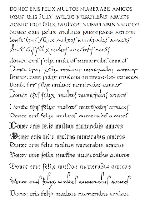
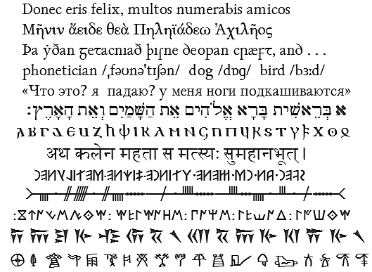
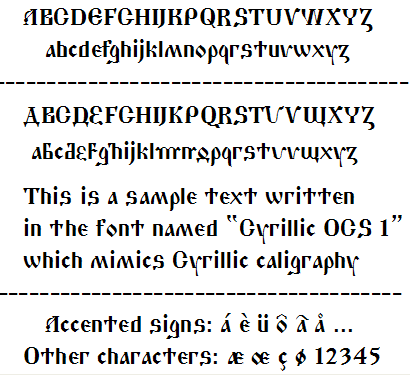
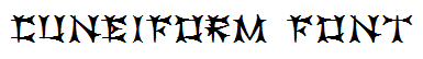
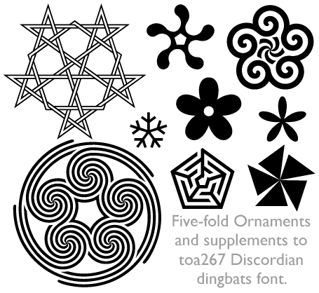
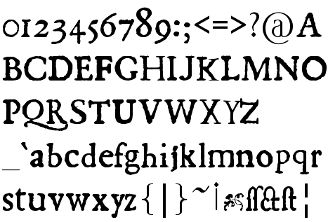
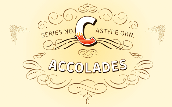
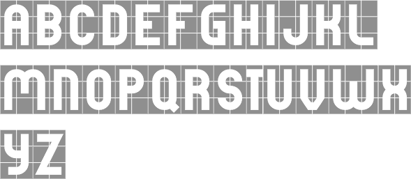
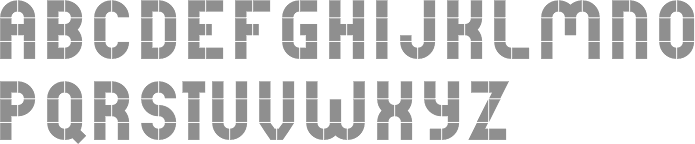
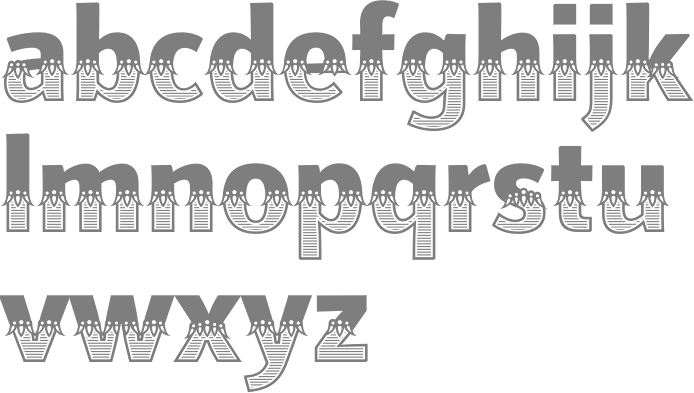
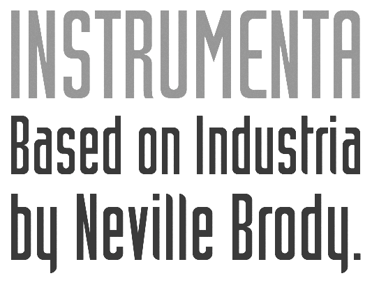
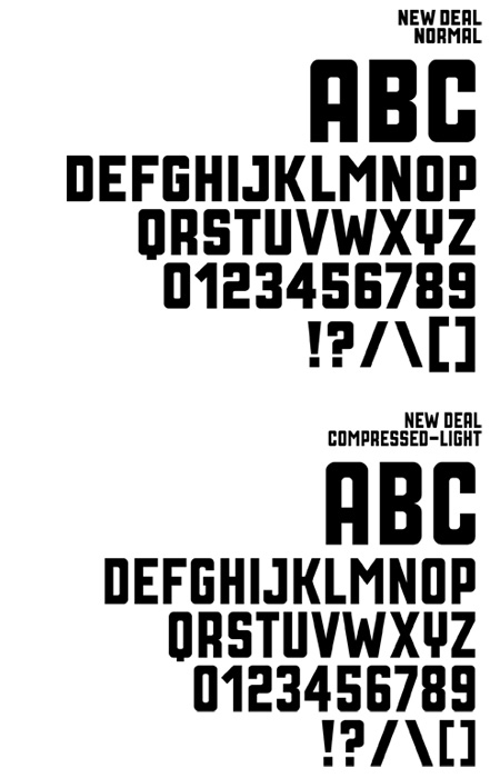
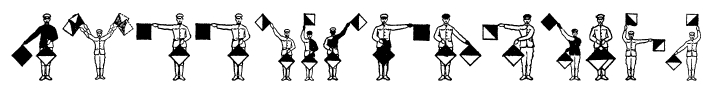
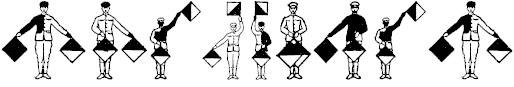
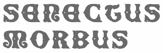
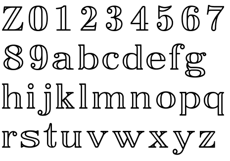
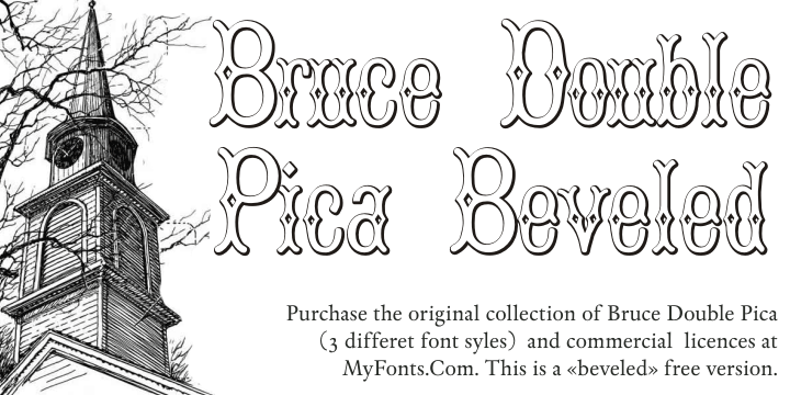
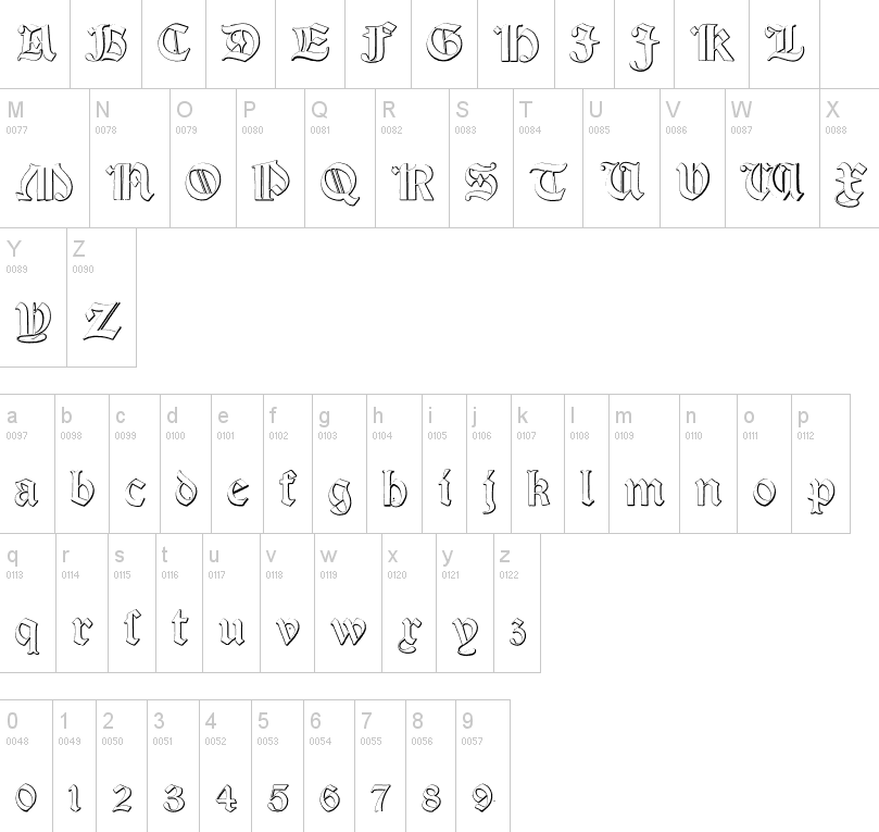
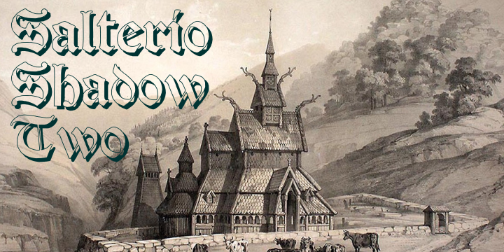
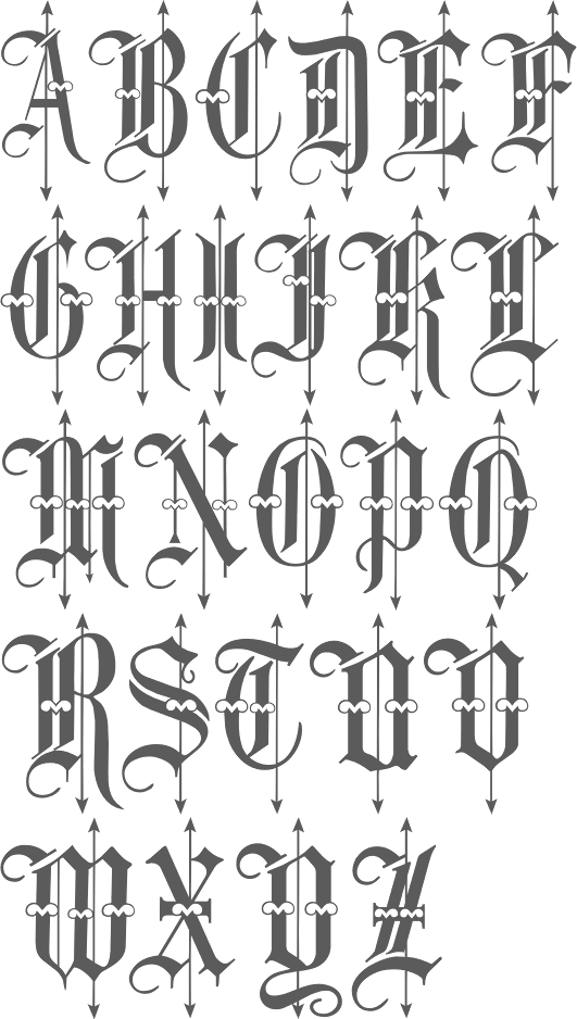
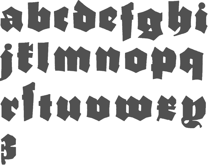
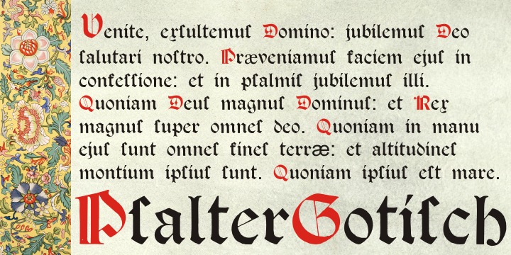
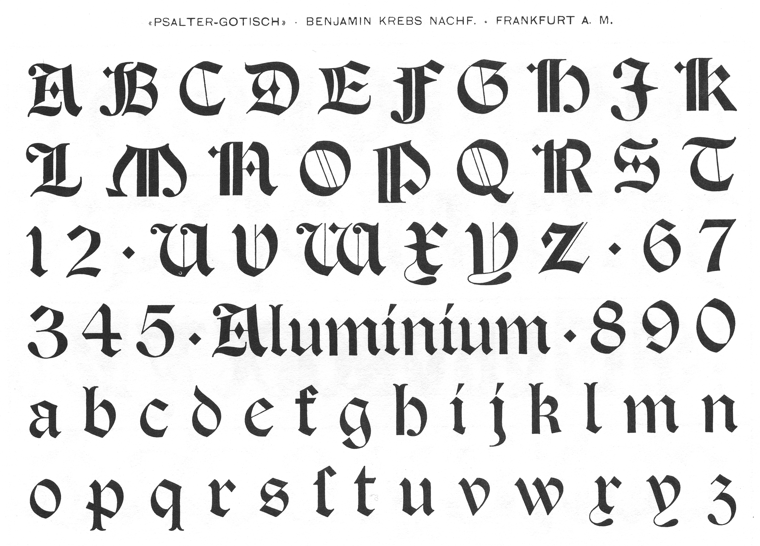
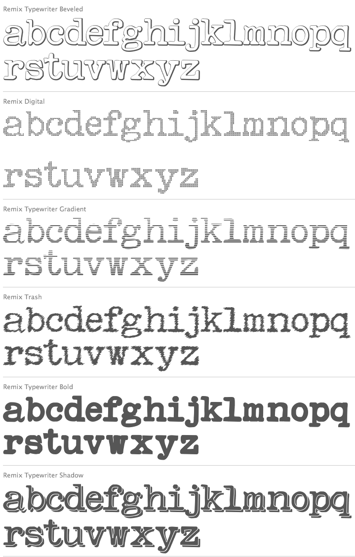
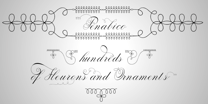
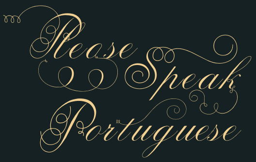
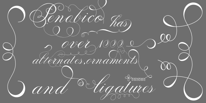
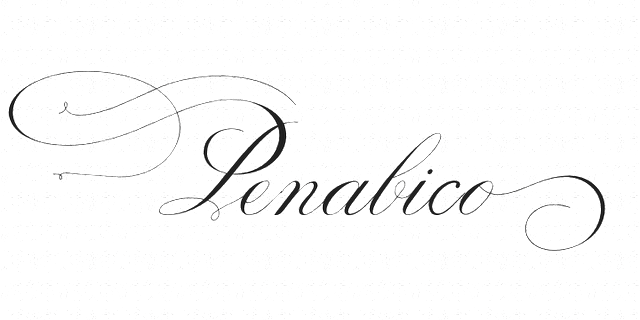
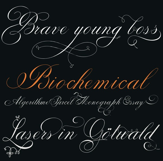
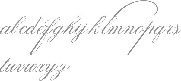
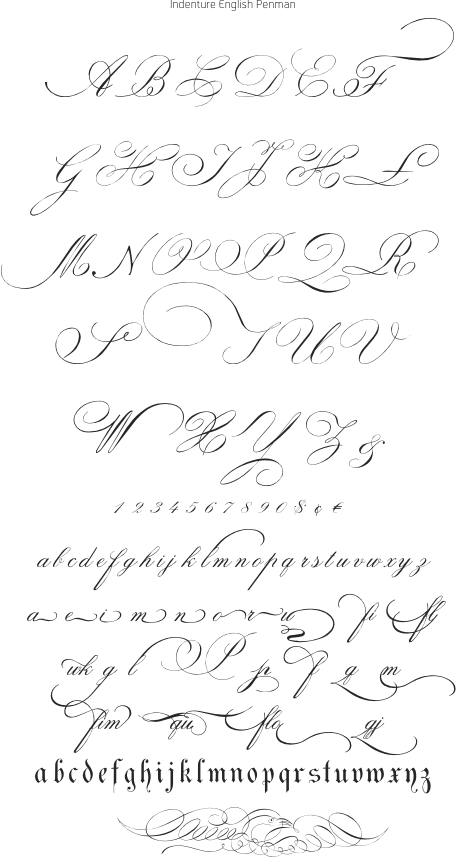
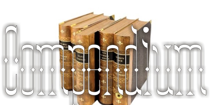
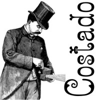
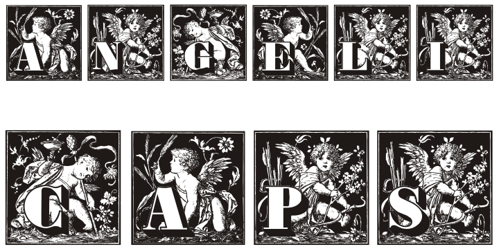
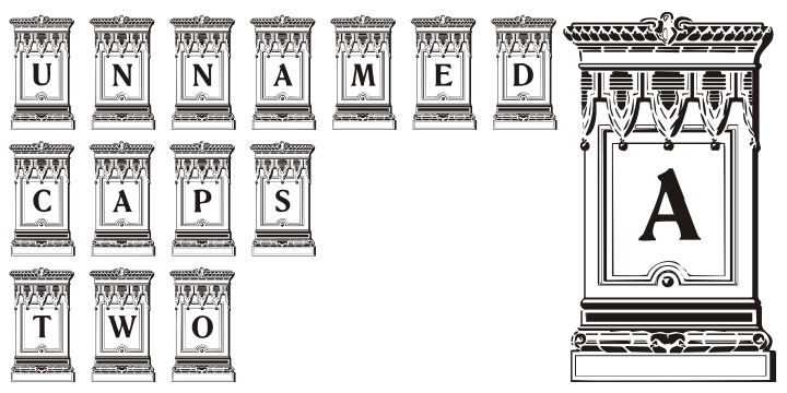
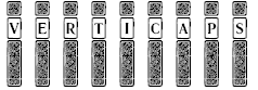
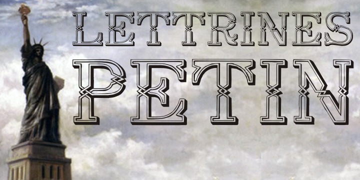
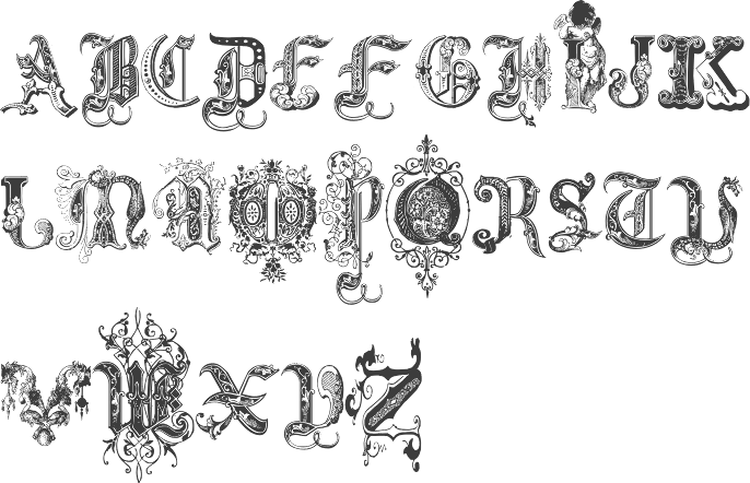
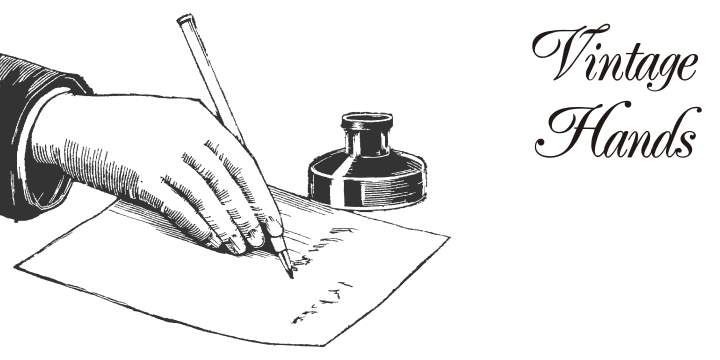
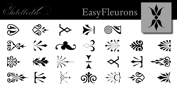
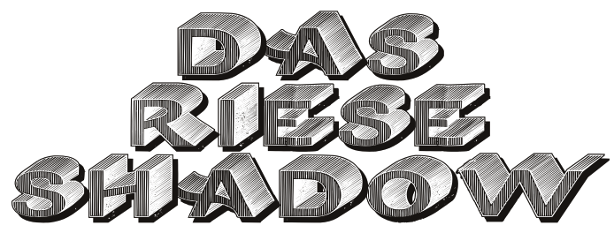
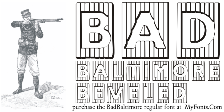
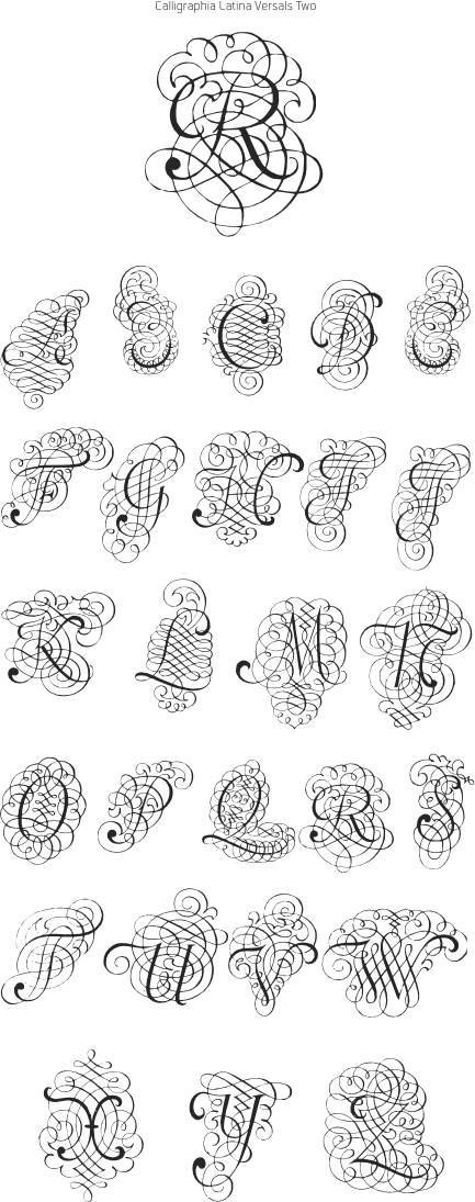
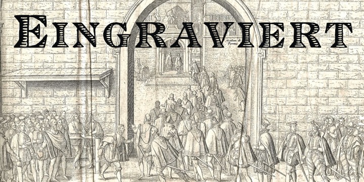
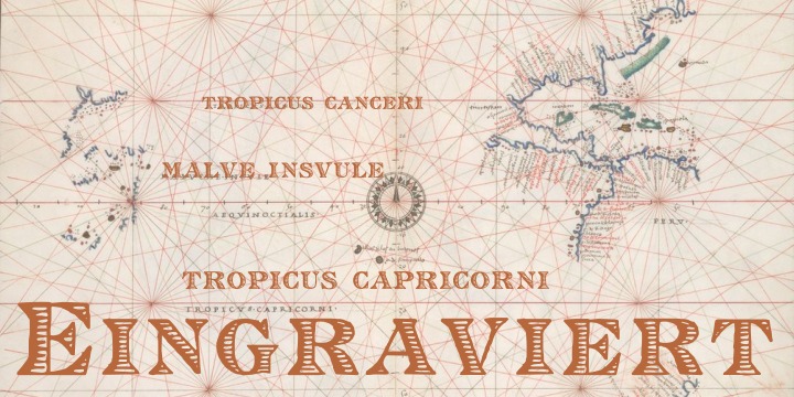
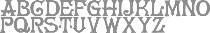
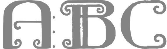
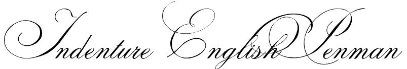
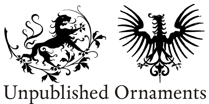
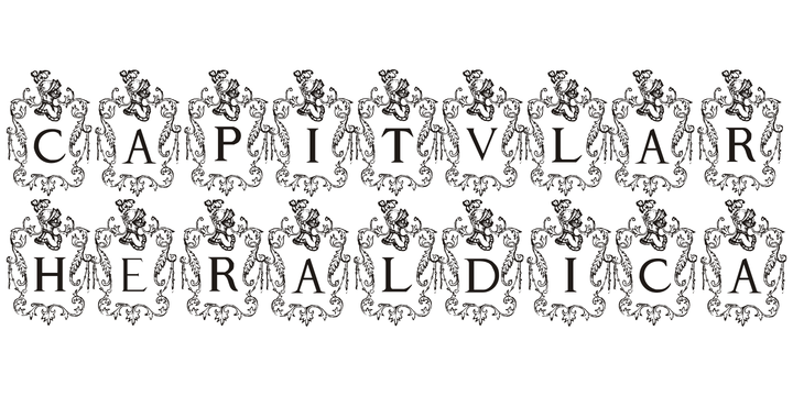
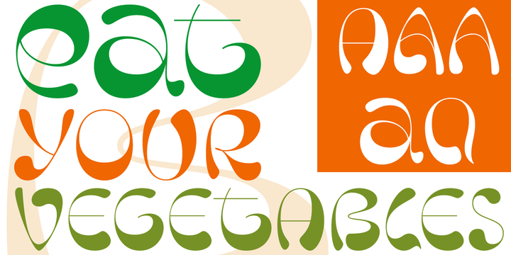
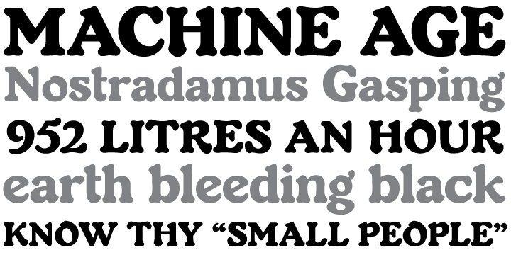
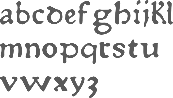
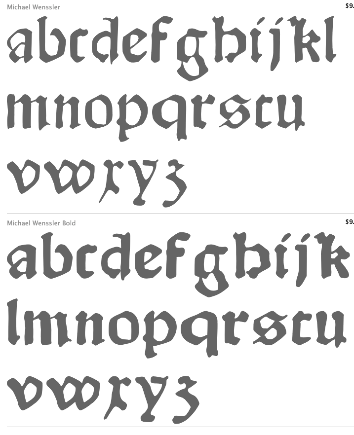
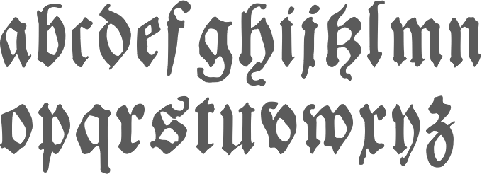
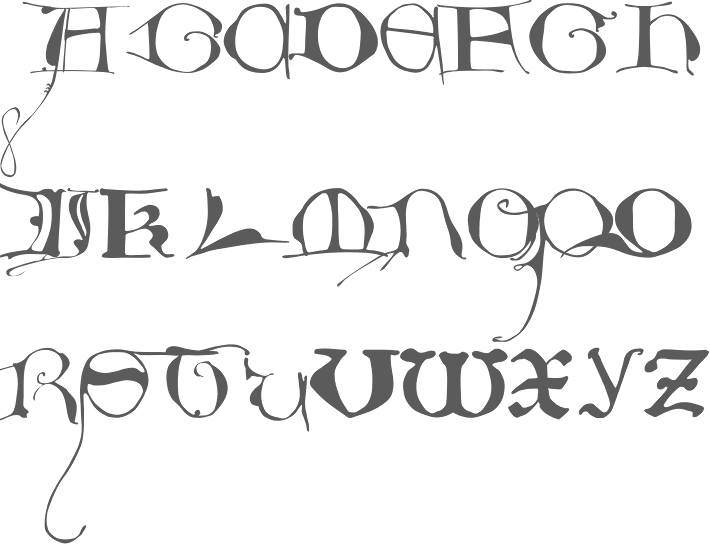
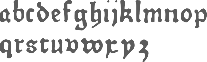
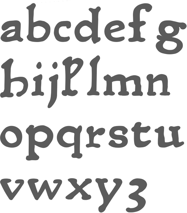
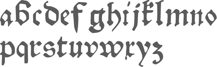
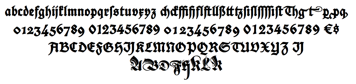
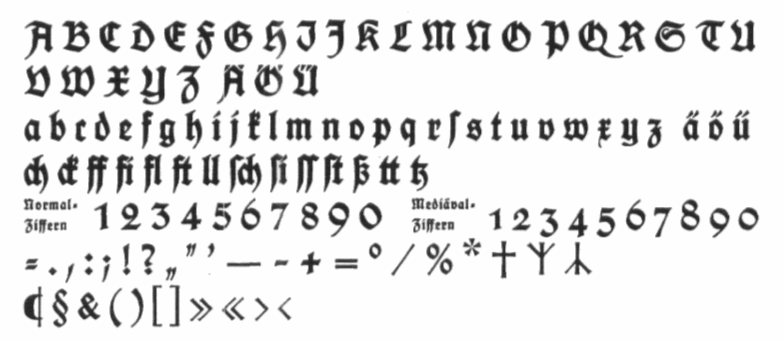
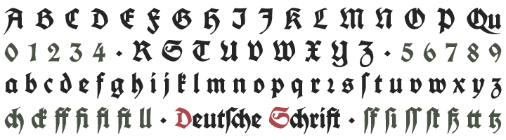
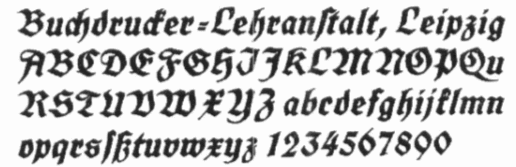
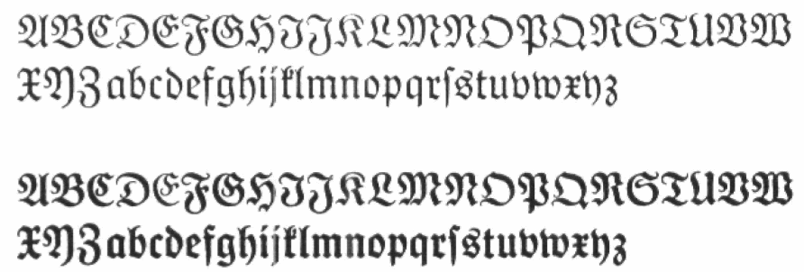
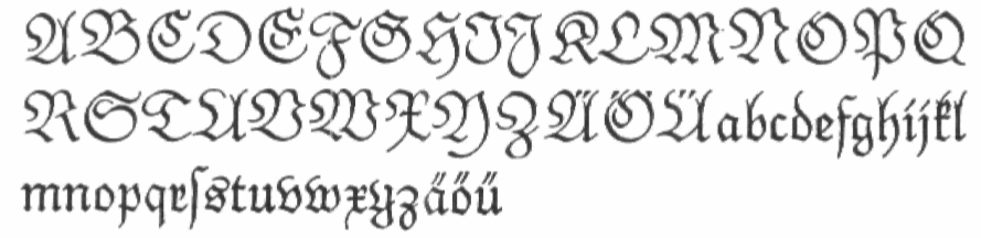
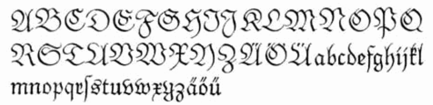
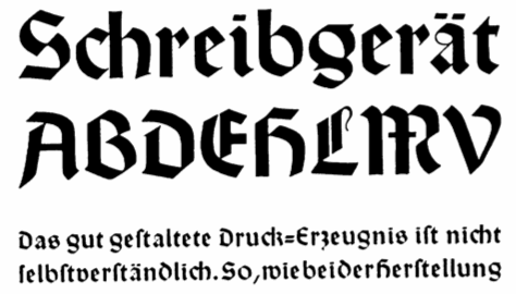
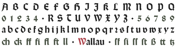
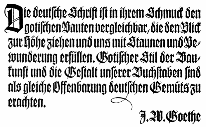
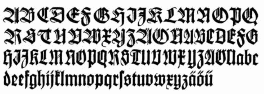
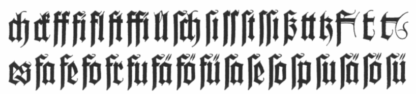
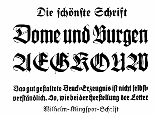
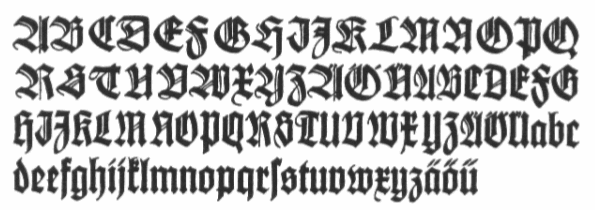
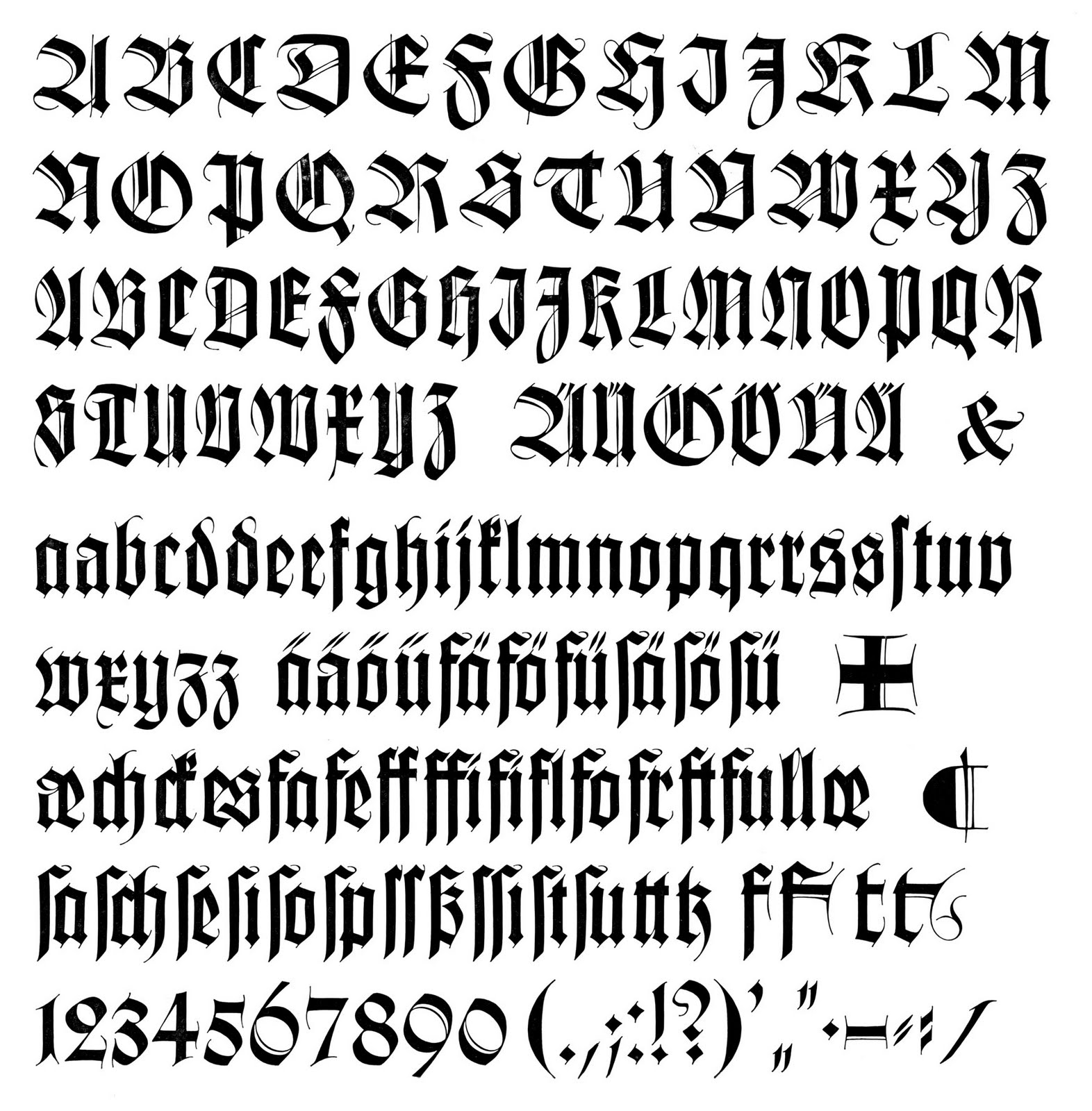
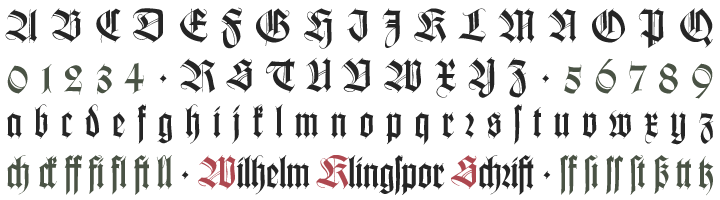
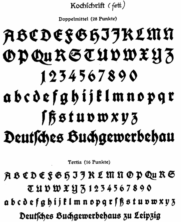
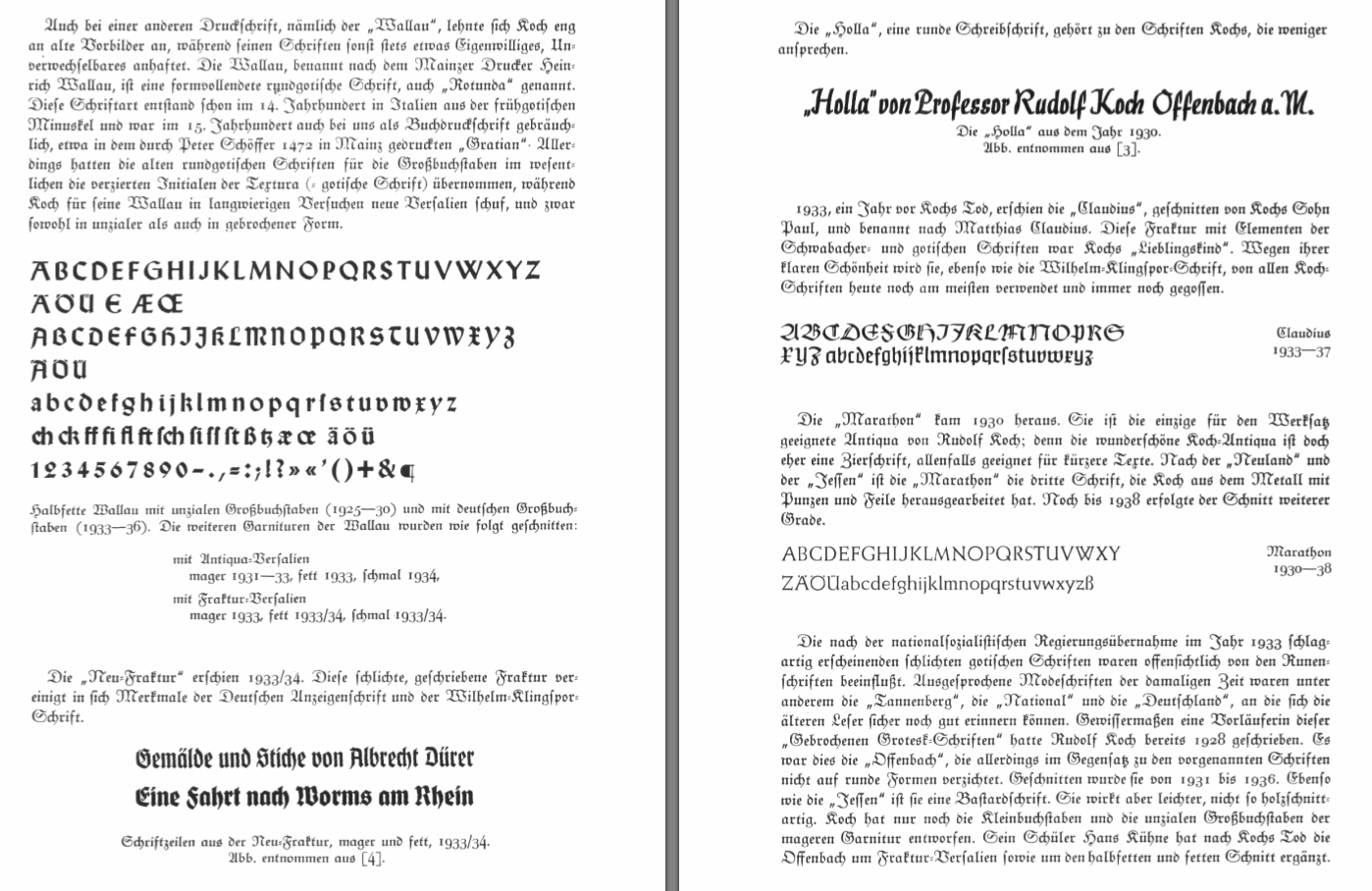
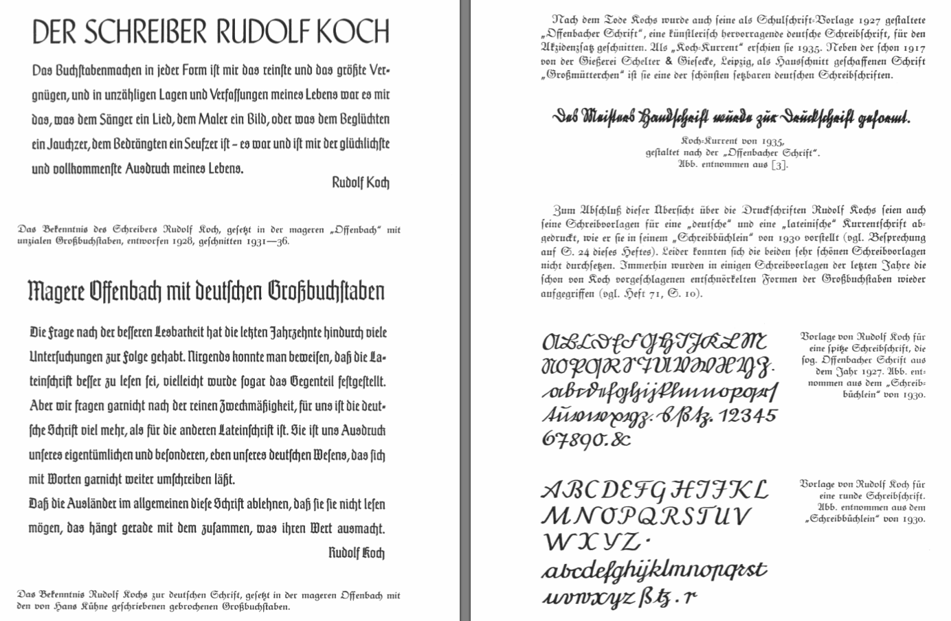
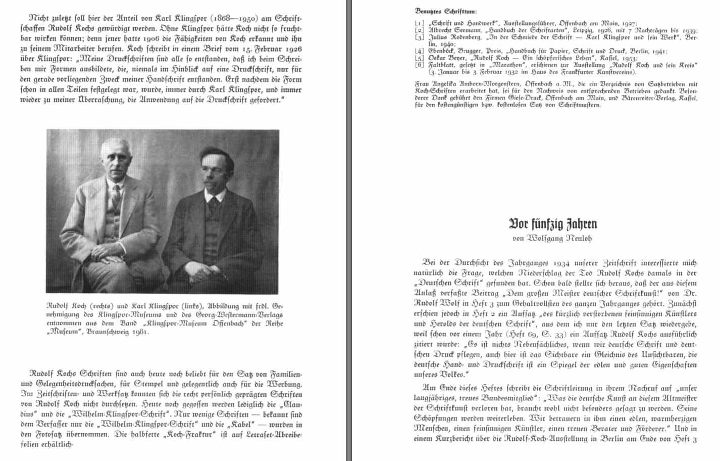
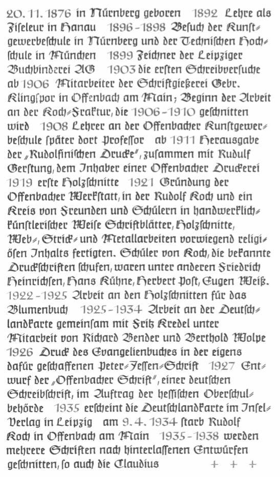
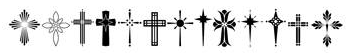
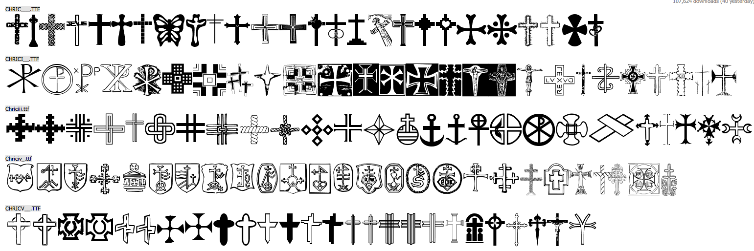
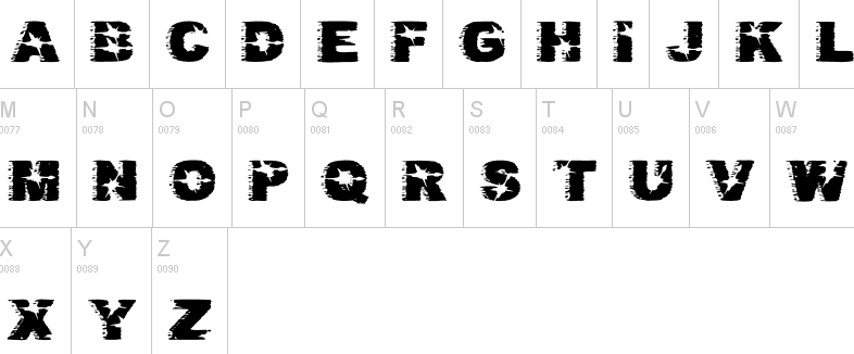