
Commentary
September 8, 2003
Was Memimas copied?
.....
¶ Memimas is a children's typeface commissioned by Barcanova, a Barcelona-based publisher, to Type-o-Tones, a foundry in that same city. During 1991-1995, the typeface family was created by José Manuel Urós and Joan Barjau. It can now be purchased from Type-o-Tones. In 2001, Jen at Westwind created a new version of this typeface (starting from a paper version, not the electronic file!), called Little Days. The Little Days font is freeware.
¶ We find a page of comments on the web by Stephen Coles at "Loobylu's Journal": "Little Days looks like a not-so-subtle knockoff of the beautiful MeMima." Stephen Coles then contacted Petra Heidorn, the owner of the typoasis web site that hosts all the Westwind fonts, as well as Jen, and told her that "it would be considerate to contact Type-Ř-Tones and let them know your intentions were good and take the fonts from your site and replace them with an explanation as to their origin." On September 11, 2003 (!!!), Jen buckled and withdrew that font [look however for the reworked version, Little Days Alt]. Besides the fact that it is not his business unless he is paid by Type-o-tones, Stephen, who recognizes typefaces as well as anyone I know, dropped a stitch here: the typeface is indeed based on Memimas, but it is not a "not-so-subtle" knockoff. In the same category of "not-so-subtle" knockoffs, we find many typefaces by nearly all major type houses: Book Antiqua (Monotype knockoff of Palatino), URWPalladio (URW knockoff of Palatino), Le Monde (Porchez's typeface genetically linked to Times), Cronos (Adobe's knockoff of Today), and so on. I will show some sample characters below that prove that the "distance" between Little Days and Memimas is entirely within the tolerance level of today's industry.
The letters
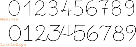
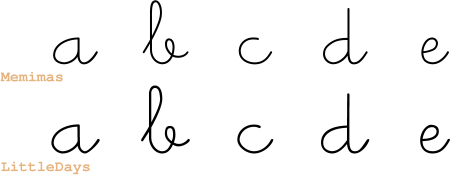
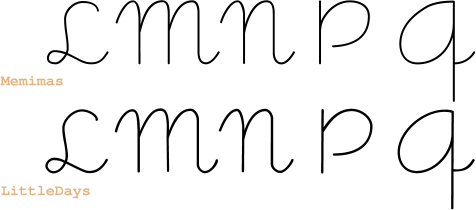
¶ A quick look at the basic alphabet shows that some characters of Little Days have no relationship to Memimas (especially the numbers), while others are related, but certainly executed in a different manner. The strokes are thin, so we better blow up the characters.
Blow-up
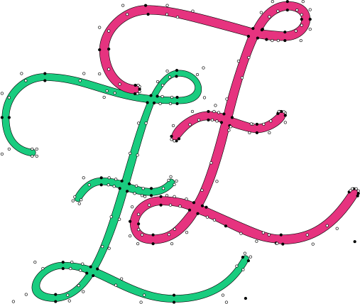
The pink letter Z is from Little Days, while the green
one belongs to Memimas.
It is interesting to see that the Bezier curves
are entirely different. Memimas violates the vertical
breakpoint rule all the time, which is a mistake
not found in professional fonts, while Little Days,
the free font, has a much more consistent stroke width,
smoother derivatives, and standard vertical and horizontal
between-section breakpoints.
In any case, no one would be able to claim that the pink
letter was electronically deduced from the green one.
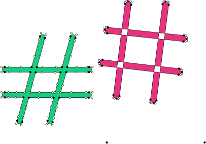
The number sign is another matter. Here, I used
the same baseline, yet the Little Days number sign is
tilted, too high, and shows the characteristic blank holes
where two incorrectly turned outlines intersect.
So, here, the Memimas execution is better, and the
score is even.
I could go on, but both fonts are imperfect, and there is
no clear winner.
Conclusion
¶ Clearly, Westwind should have acknowledged on its web page or readme file where the idea of the glyphs came from. But this is the only mistake Westwind made. Otherwise, I see no harm in delivering a free font that tries to execute a certain idea in another way. Legally, this is the point of view taken by the American courts: the shapes of the letters themselves are not copyrightable. If Little Days is a "not-so-subtle" knock-off of Memimas in Stephen Coles's eyes, then Stephen would help all of us greatly by publishing a complete list of "not-so-subtle" knock-offs by all the big players. If he thinks that the American law is not right, let him fight to change it, and, once changed, apply it first to the big font vendors, and then to the small hobby font enthusiast, in that order.
Copyright © 2003
Luc Devroye
School of Computer Science
McGill University
Montreal, Canada H3A 2K6
luc@cs.mcgill.ca
http://cg.scs.carleton.ca/~luc/index.html