| | |
Adolf Behrmann

|
 Born in Tockum (near Riga, Latvia) in 1876, he died in Bialystok in 1942. German type designer who designed the classical display typeface Rundfunk at Berthold in 1928. This typeface was digitized by Nick Curtis as Radio Ranch NF. He also designed Radio and Radio Versal in 1928 at H. Berthold AG.
 FontShop link. Klingspor link. [Google]
[MyFonts]
[More] ⦿
|
Andinistas
[Carlos Fabián Camargo Guerrero]
|
 Bogotá-based Colombian graphic design studio and type foundry Andinistas was founded in 1998 by Carlos Fabián Camargo Guerrero, Lennyn Salinas, Mariangeles Valero, Juan Carlos Valero, Jorge Alexander Camargo Guerrero, Rafael Rincón, and Jordi Teres. It was first located in Caracas, Venezuela, but moved in 2003 to Bogotá, Colombia. New names in its organization include Alexander Moreno. Many of its designers are Venezuelan.
 Among their typefaces: Nikona, Magola (2008, puffy script), Angelita, Pepelepu, Zerotipo, Skuke, Retro, Radio Bemba, Pumarosa, Pr1, Oficia, Nativa, Mongol (free), Lirrot, Leroy (1999-2008, computer screen stripes), Leroy Dingbats (1998-2008), Hiroformica, Hibrida, Guerilla, Guerilla Outline, Gruada, Gancho Petare, Escuedra, Esbelta, DSNett, dia-D, Download, Denego, Cristal, Codiga, Codiga Icon, Codiga Destroy, Codiga Codec, Chacao Petare, Cazon Gothic, Boa, Biol, Ave-cedario, Anaira. Cazon (2007, Camargo Guerrero) is a family of calligraphic origin consisting of 7 styles: Gris, Negra, Uno, Dos, Tres, Dingbats A and B and is based on the paintbrush letters found in the popular markets of La Guaira, Caracas. This family won an award in the experimental typeface category at Tipos Latinos 2008. Lirrot (2007) is a 6-style grunge handwriting typeface bordering on the psychotic, and comes with Lirrot Dingbats. It too won an award at Tipos Latinos 2008. PP Lepu (1998-2008) is pixel grunge. Josefina (+Dingbats1) is a curly script also made in 2008. Navaja (2008) and Diad are collections of grunge fonts with grungy dingbats. Lucrecia 1 through 3 (2008) is a fat connected script family ranging from clean to splattered. Telesforo (2008) radiates anger from its brushy grungy limbs. Telesforo Black won an award at Tiupos Latinos 2012. Ninja 1 and Ninja 2 (2008) are script fonts, and are accompanied by Ninja Dingbats (2008). Dsnet (2008) is a 6-style bare-bones rounded squarish family. Flaminia and Flaminia Dingbats (2008) are useful for food-related signage. Modelia (2008) is thick, informal, and looks like it was brushdrawn. Modelia won an award at Tipos Latinos 2010. Filomena (2008) is a brush family with a goth theme and an accompanying goth dingbats. Obdulia (2008) and Floro (2008) are extreme mural grunge fonts. Marimonda (2009) is grunge calligraphy. Typefaces from 2012: Demetria (a hellish script), Ciclope (army stencil), Meteora (a sturdy weathered family), Kamuy (a grunge typeface, with dingbats, that links to Asian comic style lettering, and Japan in the Pacific War), Naturalia (an informal sans family). In 2013, he made Gluten (a poster typeface family), Bengala Script (a distant relative of Mistral), Chef Script (a large signage script influenced by Ross F. George's Speedball lettering manual (1957)), Chef Script Dingbats (hilarious restaurant dings and fists), Sumergible Script. Typefaces from 2014: Citronela (cartoon or Caribbean hotel signage font family), Bemol (a set of script fonts in craftsman style), Nemocon (creamy script), Acustica (a calligraphic Acustica Script, with didone Acustica Caps, and a decorative Acustica Dingbats), Cereal (+ Script (a vampire script), Skin and Dingbats). Typefaces from 2015: Draw (which includes a gorgeous calligraphic Draw Script), Coffee Break (signage script family, +dingbats), Solar (a set of seven handcrafted styles). Typefaces from 2016: Enjoy (Script, Caps). Typefaces from 2017: Warhol (irregular scripts), Makeup (a crayon font by Carlos Guerrero and Carolina Suarez). Typefaces from 2018: Bechamel (a delicious curly brush script), Bechamel Roman (based on the unicase letterings of the movie Willy Wonka and the chocolate factory), Stevia (script). Typefaces from 2019: Bleak (an experimental layerable font inspired by wood type, Piet Zwart, Lissitzky and van Doesburg), Nutcake CatchWords. Sonora won an award at Tipos Latinos 2014. Combine Script and Combine Caps (layerable colorable fonts), and Nemocon, won awards at Tipos Latinos 2016. Winner at Tipos Latinos 2018 for Clothing, a titling typeface published at Andinistas by Camilo Zamora and Carlos Fabian Camargo. Typefaces from 2020: Cherrypie (a food packaging script), Rapsodia (a decorative all-caps family with curl, spurs, Victorian details, and decadent frills). Typefaces from 2021: Visible (an inky script family), Caribe (Script, Caps, Shields). View the typefaces designed by Andinistas. Klingspor link. Dafont link. Behance link. [Google]
[MyFonts]
[More] ⦿
|
Ardyan Permana
[Omaikraf Studio]
|
[MyFonts]
[More] ⦿
|
Aring Typeface
[Måns Grebäck]
|
 Måns Grebäck (Aring Typeface, Örebro, Sweden) is a prolific Swedish designer (b. Lindesberg, Sweden, 1990), who lives in Borlänge, Sweden. Måns Grebäck has a bachelor's degree in graphic design from the University of Dalarna (2012). In 2010, he went commercial, and started selling fonts through MyFonts. In 2011 he started Mawns Design. In 2013, that was renamed to Aring Typeface. In 2011 he already had over seven million downloads of his fonts, which were featured at websites such as Dafont and Myfonts. He also does custom type work. His typefaces, both free and commercial:
 - Acryle Script (2014).
- Actonia (2016). A monoline script.
- Adielle (2018).
- Aerofoil (2017). A vintage bottom-heavy script.
- Airways (2016). A signage script.
- Akayla Script (2018). Calligraphic.
- Aliey (2021). A 4-style Victorian copperplate serif.
- Aliment (2018). A sharp geometric sans.
- Amertha (2020). a fat finger font.
- Amplify (2013). A signage script.
- Angars Runes (2019: medieval, with gothic cathedral curves).
- Angilla Tattoo (2013). A connected spurred tattoo typeface. Followed by Angilla Script (2020).
- Antlers (2012). A calligraphic script.
- Aquate Script (2019).
- Arachnids (2011, graffiti face)
- Artely Inks (2016).
- Artisual Deco (2021). Pure art deco.
- Artographie (2020). An all caps art deco typeface family.
- Atelas (2015). Signage type, baseball script.
- Atures (2018). Futuristic and monoline.
- Autograf (2015) and Autografia (2021). Signature typefaces.
- Ave (2016) in styles called Ave Utan, Ave Betwan and Ave Fedan. A family of baseball scripts.
- Avelana. A connected script.
- Backpack (2014). A thick signage script typeface.
- Backyard (2016). A blackletter typeface.
- Barkants (2011, elegantly hand-printed family).
- Barley Script (2017). A signage script.
- Baystar Script (2021).
- Beautiful Trouble (2012). A rabbit-eared upright connected script.
- Beaked Tyrant (2014). A copperplate calligraphic script.
- Beckasin (2011, signage face)
- Before The Rain (2011, calligraphic) Before The Rain Arabic (2016).
- Belladio (2021). An urban script.
- Bellino (2018).
- Bezar (2020). A script.
- Billion Dreams (2020, by Mans Grebäck and Rangga Subekti). A heavy signage script.
- Billion Stars (2013). A tattoo script font.
- Bira (2012). A retro connected brush / signage script.
- Blaak (2019).
- Black Fox (2014). A sirupy brush face.
- Black Signature (2021). A bold signature font.
- Black Larch (2016) and Dark Larch (2016).
- Bloc Boy (2016). Like handwriting.
- Blockography (2011). A sketched typeface.)
- Block Talk (2011, with Zaydek Michels-Gualtieri)
- Blods (2011, a great blotty brush face)
- Blueberry Script (2017; with Noah Kinard).
- Botanink (2011)
- Bouncy (a cartoon font).
- Bourdos2022). A script typeface.
- Brannboll (2011, baseball signage face), Brannboll NY (2013), Brannboll Connect (2020), Brannboll Stencil (a baseball script) (2020).
- Bready (2011). A retro signage script with art nouveau aroma.
- Brev Script (2014). A connected secretary hand from the 19th century.
- Bronze Script (2014).
- Brother Tattoo (2012).
- Bumblebees (2012). A plump curvy script.
- Bunya (2016). A geometric slightly deco sans typeface family.
- Calendary Hands (2012).
- Caligraf (2020).
- Canela Bark (2015, co-designed with Luis Miguel).
- Caneletter Sans and Script (2013). Upright unconnected and connected scripts.
- Cantona Script (2019).
- Canyon (2021). A wide elliptical sans in 18 styles, featuring a coathanger lower case f.
- Capoon (2018). A ten-style sans family.
- Caprica Sans (2014) and Caprica Script. A plump script.
- Caravela (2020). A pirate map script.
- Casat Cap (2017). An all caps brush typeface family.
- Caster (2019). A heavy poster script.
- Castro Script (2012).
- Catchland (2021). A retro baseball script.
- Celebrater (sic) (2012). An oily font.
- Cellos Script (2013).
- Centeria Script (2012).
- Channel (2011, connected upright script)
- Chapel Script (216). For signage.
- Characteristic (2011).
- Chavenir (2011).
- Chinal (2018).
- Choko (2011, released in 2016). Chocolate and cream-themed decorative typeface.
- Christmas Miracle (2018), Christmas Reign (Tuscan, all caps) (2020), and Christmas Sparkle (2018).
- Chrysante (2020). A monoline flowing pen script.
- Clear Line (2012). A fat finger / signage typeface.
- Clipper Script (2011).
- Clothe (2017).
- Coneria Script (2012). A connected script.
- Conture Script (2018). Elegant, classical, and with exaggerated capitals.
- Crackin (2011).
- Crunchy (2016). An upright connected script.
- Cruz Quaste (2020). A handcrafted blackletter typeface.
- Cubest (2021). A squarish monospaced techno family.
- CutScript (2011, connected script).
- Danbury (2022). A speed-emulating sans.
- Dark Crow (2020). a dry brush script.
- Dollie Script (2013).
- Ebbing (2018).
- Echinos Park Script (2012).
- Ederson (2018). A vintage signage script.
- Ekologie Hand (2012).
- Ekorre 2021). Aa vintage decorative serif.
- Elaya Script (2019). A creamy signage script.
- Electronics (2017). A retro signage script.
- Elevate (2016).
- Emiral Script (2017). A baseball script.
- Encina Script (2016). A thin calligraphic typeface.
- Enlighten (2011)
- Delinquente (2012).
- Denigan (2011, hairline)
- Equal Sans (2012).
- Espesor Olas (2011, fine hand-printed calligraphic family)
- Esplanade Script (2015, by Mario Arturo).
- Ethernal (2017). A connected script.
- Europe Underground (2010, geometric sans with a hairline weight).
- Fabulous (2017) and Fabulous Gold (2017). Signage script.
- Falkin Sans (2016), Falkin Script (2016), Falkin Serif (2016).
- Faltura (2011, constructivist), Faltura Alien (grunge), Faltura Guerra (grunge)
- Faltura Animals (2011)
- Feathergraphy Decoration (2011, calligraphic).
- Duera (2016). A variable width sans typeface family.
- Fargo (2021). A cursive script.
- Fat Wandals (2018). A graffiti font.
- Feathergraphy Clean (2011).
- Fibography (2013). A caps typeface composed of fibers.
- Filbert Brush (2012), Filbert Color (2013, a soft brush font).
- Finition (2017). A connected brush script.
- Fireplace (2020). A connected script.
- Firstly (2020). A flowing calligraphic signature script.
- First Lyrics (2011).
- First Reign (2022). A medieval typeface. Second Reign (2022), Third Reign (2022) and Fourth Reign (2022) are further medieval typefaces.
- Flighter (2018). A retro airplane font.
- Fondy Script (2018).
- Frankentype (2013). An all-caps brush typeface for signage.
- From Skyler (2016).
- Funkygraphy (2011, fat and counterless).
- Gecko (2015, a fine creamy signage script).
- Geza Script (2017). A great angular almost Arabic-looking script.
- Ghang (2011, graffiti family).
- Gingo (2020). A script.
- Goatskin Brush (2015). A great brush typeface.
- Golden Hopes (2021). A signature script.
- Gonzi (an 31-style sans). Published in 2021.
- Graced Script (2016). A wide calligraphic connected brush script.
- Grandi (2016). A ten-style display sans.
- Gready (2021). A fat signage script.
- Greback Grotesque (2012). The Thin is very very thin.
- Gretoon (2011, cartoon family)
- Griphite (2018). A rough brush typeface.
- Guld Script (2015).
- Habanero (2016). A fat signage typeface.
- Handtalk (2010, silhouettes)
- Harbell (2013).
- Hard Block (2011, Western slab face).
- Hastafi (2022). An 8-style sharp-edged display serif.
- Haydon Brush (2016).
- Heavy Rain (2021). Decorative initials, and an all caps wedge serif.
- Hemicube (a wide squarish all caps sans) (2020).
- Hemmet (2013). A signage script.
- Hierograf (2016). A layered textured handcrafted poster typeface family.
- Hitalica (2011).
- Honeymoon (2017). A connected script.
- Housegrind (2013, connected script).
- House of the Dragon (blackletter). Published in 2021.
- Hoyle (2020). A slab serif.
- Hundred Miracles (a signage script). Published in 2021.
- Impregnable (2013). A connected script.
- Indiana Script (2017). A baseball script.
- Inked Bones (2019). a hand-painted blackletter font.
- Intrique Script (2013). A baseball script.
- Isle Body (2019), Isle Headline (2019).
- Jacked Eleven (2011), Jacked Eleven Highlight (2011), Jack Pirate (2020: a tattoo blackletter typeface), January Script (2013).
- Jaymont (2018). A sharp-edged wedge serif typeface family.
- Jengotan (2021). A dry brush script.
- Jumper (2021). A 13-style sans. Free download for personal use only.
- Kandira (2018). A sleek sans family.
- Kanvas (2020). A script typeface.
- Kerater (2011, sans)
- Lace 2.0 (2012). A thin connected script co-designed with Matteo Milazzo.
- Lacosta (2020). A signage script.
- Kompar (2018).
- Krinkes (2015, baseball script). A connected swashy signage script.
- Kurri Island (2020).
- Lakesight (2014). A connected script.
- Larch (2016). A crisp script typeface.
- Largelake (2021). A signage script.
- Las Enter (2013). A neon light script.
- Leaders (2020). A blackletter font.
- Ledare (2021). A 14-style bold and expressive sans.
- Letric (2021).
- Let Me Ride (2011)
- Levitee (2011, a lively connected script).
- Lighthouse (2013). A bold high-contrast script face.
- Lina Script (2012). A tattoo script done with Vicky Mardian.
- Lourino (2018).
- Low Casat (2017) and Low Casat Fat (2017).
- Lyrics Movement (2011, tall-ascendered hand).
- Lyster (2020).
- Mandoul Script (2021) and Mandoul Black (2021: a brush script).
- Mainland (2018). A sans family.
- Mainstream (2017). Graffiti style.
- Manofik (a 4-style warm retro serif with a coathanger lower case f; for Latin, Cyrillic and Arabic). Published in 2021.
- Martyric (2014, brush script),
- Masteries (2013). A connected formal script.
- Mastoc (2014).
- Mauritz Caps (brushed) and Mauritz (a great wild script family), both published in 2021. Followed by Mauritz Sans (a brush script with a strong personality and a cartoon vibe) in 2022.
- Mean Casat (2018).
- Medish Script (2018). A great calligraphic handwriting typeface.
- Together with Noah Kinard, he designed the calligraphic typeface Melay Script (2016).
- Middle Ages (2019). A Lomardic blackletter in Regular and Deco styles.
- Milasian Circa (2015) and Milasian. A connected script.
- Merry Christmas (2015). A retro script in Flake and Star styles. Followed in 2017 by the color script font Merry Christmas Color.
- Milkyway Hotel (art deco sans).
- Miraikato Hand (2022) and Miraikato Script (a rustic script) (2022).
- Mistuki (2015). An oriental brush simulation font.
- Mochary (2016). A signage or tattoo script.
- Molly Sans (2019). Caps only.
- Monsta Tag (2013): a graffiti font.
- Motion Picture (2013). A heavy connected retro script.
- Mount (2012).
- MAWNS Graffiti (2010) and MAWNS Serif (2010)
- MAWNS Handwriting (2010).
- Made With B (2011, sketched face).
- Mardian (2012). A calligraphic tattoo script done with Vicky Mardian.
- Markera (2011, marker pen family)
- Many Weatz (2011)
- Mawns Rock (2011)
- Monoment (2011). A fat upright connected script.
- Moneymachine (2022).
- Monosphere (2012-2016). A futuristic monospaced typeface.
- Murality (2022). A readable graffiti or mural typeface.
- Myteri Tattoo (2021) and Myteri Script (2021: a calligraphic script).
- Nacinth (2020). A script.
- Nino Script (2018). A tattoo font.
- Nobella (2021). A retro baseball script.
- Normale (2014). A set of distressed typewriter fonts.
- Notera (2014). A connected handwriting font. Followed by Notera 2 in 2018.
- Odenburgh (2020). A medieval calligraphic typeface.
- Optien (2011, techno face)
- Ordinatum (2011, a severe sans).
- Original Black (2021). A fat blackletter typeface.
- Ornamental Versals (2011, ornamental caps)
- Painter (2016). A sign painting script.
- Patched (2021).
- Pennybridge 1563 (2010, blackletter)
- Pharmount (2014). A calligraphic connected script.
- Phraell (2013). A great italic formal calligraphic script with optional swashes.
- Pigeon (2016).
- Pineapple (2012).
- Plates Napery (2015).
- Plicata (2016).
- Pligo (2016). A balloon or cartoon font.
- Preside (2017).
- Prime Script (2012).
- Prognostic (2011)
- Qaskin (2015). A semi-formal connected script typeface with Black and White (outlined) styles.
- Qhuman (2021). A 6-style Victorian serif.
- Qraxy (2016). Quache Variable (2020) and Quache (2020). A 28-style flexible sans family.
- Quanton (2022). An 8-style angular serif.
- Querino Sans (2019). A very bold sans. Followed by Querino Script (2019).
- Quickier Pro (2012). A swashy calligraphic script face.
- Quincho Script (2016).
- Quintal Script (2021). A retro signage font.
- R-2014 (2011, LED face).
- Rabento (2021). A 6-style condensed display slab serif.
- Race Fever Pro (2015, in Brush and Pen versions) and Race Fever Brush (2015).
- Radio 187.5 (2010, techno family)
- Rakoon (2014). A creamy ultra-fat upright script. Followed by Rough Rakoon in 2016.
- Rangly (2017-2018). A paint roll font.
- Raspberry Script (2017).
- Recorda Script (2013). A formal calligraphic script.
- Reditum (2014). A decorative script.
- Reeler (2014, with Noah Kinard).
- Remachine Script (2013). Retro signage script. In 2020, Mans added Remachine Script Arabic.
- Respective (2011, calligraphic script, +Swashes).
- Respondent (2021). A script.
- Rider (2011, a 30-style "versal" sans family)
- Ringer (circle and arc-based sans)
- Ristella (2017). A baseball script.
- Rivera 2022). A narrow sans in 10 styles.
- Rodrigues (2021). A script typeface.
- Roona Sans (2018: modernist and organic curves).
- Ropest (2018). A rope font.
- Roskrift (2011, calligraphic; + Roskrift Clean).
- Rougant (2021). An organic display font.
- Roughen (2020).
- Rurable (2015).
- Ruthless Wreckin (graffiti typefaces), Ruthless Drippin' (dripping paint family)
- Safir Script (2016). A fat baseball script.
- Saker Sans (2017).
- San Andre (2021) and San Andreas (2021), the free version. A baseball script.
- Santa Claus (2019). A blackletter typeface, accompanied by Santa Claus Deco, a snow crystal font.
- Scantype (2016).
- Sculptor's Hand (2011, connected chancery hand).
- Second Lesson (2022). A wide script.
- Second Lyrics (2011, Treefrog-style handwriting)
- Sequal (2020). Graffiti style.
- Sicret (2020) and Sicret Mono (2020). An all caps family.
- Servin' for Salute (2011)
- Shaded Larch (2016).
- Sharpe (2019). A sharp-edged high-contrast serif typeface family. See also Sharpe Variable (2020).
- Shenandoah (flowing signage script).
- Shimes (2015).
- Shipped Goods (2011). A copperplate calligraphic script.
- Shortbrush (2011)
- Signerica (2011, connected flowing hand)
- Sketchica (2011, sketchy face)
- Skyzhi (2016). An advertising headline typeface.
- Society Editor (2013, connected script).
- Snacker Comic (2013).
- Snowstreet (2013, an octagonal typeface) and Snowy (2013).
- Some Weatz (2011, calligraphic, copperplate; +Swashes)
- Sonika (2018).
- South African (2014). A movie poster brush typeface.
- Southern Aire (2013, connected script face).
- Specify (2016). A 40-style sans family. Download, free for personal use.
- Spoken (2019). A graffiti font.
- Sponger (2021). In the VAG Round genre.
- Square Worm (2011)
- Stackyard (2015). A script.
- Stainy (2013). A signage script.
- Starella Script (2019) and Starella Tattoo (2019).
- Starge (2019).
- Starkey (2020).
- Stormland (2021). A wide monoplinear sans.
- Stormline (2021). All caps, wide and outlined.
- Strawberry Script (2017).
- String Lines (2018).
- Stroke Dimension (2011). A 3d typeface.
- Struck Base (2021). A baseball script.
- Suecos Locos (2011---yummy!).
- Sultan Cafe (2014). An interlocking poster typeface.
- Sunny Sam (2020). A script typeface.
- Sverige Script (2012). Calligraphic wedding font.
- Tall Casat (2018).
- Tamoro Script (2014).
- Taylor Hand (2020). A signature script.
- Tevegraphy (2011, elliptical)
- The Hills (2017).
- The World is Yours (2011, quaint)
- Throwupz (2011)
- Toley Hand (2019).
- Tipbrush Script (2011).
- Tomino (2016).
- Top Comic (2013). A very fat cartoon bubble face.
- Treehouse (2011, upright connected script; +Snowhouse for a snow-covered version)
- Tusch Touch 1 (2011)
- Two and Three (2011: a tattoo parlor blackletter family)
- Typographic Onedalism (2011, graffiti simulation face).
- Undergone (2014). Decorative and calligraphic.
- Unthrift (2015). A pen script.
- Vacer Sans and Vacer Serif (2016). The latter is a slab serif.
- Validity Script (2020, with Misti Hammers).
- Ventography (2013). A bold signage script.
- Vinho De Amora (2021). A vintage all caps wedge serif and a stencil version.
- Waiter (2017).
- Walk Da Walk One
- Wandals (2018). A graffiti font.
- Wankstaberg Battles (2010, a tall fat script)
- White Dream (2021). A retro script.
- White Larch (2016). A connected script typeface.
- Wholecar (2021). An unerground train graffiti typeface family.
- Wild Growth (2011).
- Wildline (2021).
- Winfield Script (2019).
- World Series (2021). A baseball script.
- Xtreem (2012) and Xtreem2 (2014).
- Yanty, Yanty Big, Yanty Script, and Yanty Script Big (2012).
- Yaquote Script (2014).
- Yaty (2019).
- Yoghurt (2011).
- Zoney (2021).
View Mans Grebäck's typefaces. Abstract Fonts link. Fontspace link. MyFonts link. Another URL. Dafont link. Klingspor link. Buy fonts directly from Måns Grebäck. Old URL. [Google]
[MyFonts]
[More] ⦿
|
Art deco typefaces by Nick Curtis: I
[Nick Curtis]
|
 Free art deco typefaces by Nick Curtis, made between 1997 and 2003. Nick Curtis also made commercial art deco typefaces, but these will be listed elsewhere.
 - AmstelHeavyNF (2002): based on this poster from 1926 by C. De Haas.
- AmsterdamTangram (2002): based on this poster by Joost Swarte from 1987 entitled "De wereldtentoonstelling van Joost Swarte".
- AnchorSteamNF (2002): based on a poster from 1923 by Wilhelm Poetter.
- Rainbow Bass (1982, Saul Bass) a vertically striped disco style design, was remade by Nick Curtis as Backstage Pass (1999, 2008).
- BeckerBlackNF (2002, 2007): Based on Alf R. Becker's lettering.
- BigAppleNF (2000, 2007).
- BoogieNightsNF, BoogieNightsShadowNF (2002, 2007): based on this poster from 1916 by Paul Hosch and Hans Melching. In 2009, CheapProFonts made a "pro" version.
- BoomerIngueNF (2002, 2007).
- Bric-aBraqueNF (1999, 2007). Bric-a-Braque was based on Cubist Bold (John W. Zimmerman, 1929).
- ChainsawGeometric (1999). Based on this alphabet by Draim (1928).
- ChippewaFallsNF (2002, 2007). Originally called Hiawatha. See this roadside photograph that inspired Nick.
- Coaster Poster (1999).
- DayPosterBlackNF, DayPosterShadowNF (2002, 2007).
- DebonairInlineNF (2000, 2007). The commercial Debonair Inline (2008) is an extension (uppercase, etc.) of Herbert Bayer's 1931 monocase typeface Architype Bayer, also known as the universal moderrn face.
- DecoBordersNF (1999) and DecoDingbatsNF (2000).
- Drumag Studio NF (2003, 2007).
- DustyRoseNF (2000), DustyRoseRevised (2007): Dusty Rose is an art deco typeface based on the logotype for the Dutch magazine Geillustreerd Schildersblad in 1940, by Anton Kurvers. The commercial Dusty Rose NF was published in 2008.
- EastMarket (1999), EastMarketTwoNF (2007).
- GradoGradooNF (2002, 2007): a Bauhaus-style font, based on this 1932 poster by Urbano Corva.
- Great Lakes (2003, 2007), GreatLakesShadowNF (2007): based on this poster by Peter Ewart (1935).
- Heavy Tripp NF, Heavy Tripp Ultra Bold (2001, 2007). Both Day Tripper NF and Heavy Tripp are based on Dignity Roman, a typeface from 1929 by art deco alphabet designer Alphonso E. Tripp.
- HeraldSquareNF, HeraldSquareTwoNF (2002, 2007): a font family based on a design by Welo shown in Studio Handbook for Artists and Advertisers (1927).
- High Five Jive NF, High Five NF (2001, 2007).
- Indochine NF (2003, 2007). Based on this poster by Joseph-Henri Ponchin (1931).
- Ironick-Normal (1999, 2007): an exaggerated Bernhard Modern.
- KerfuffleNF (2000, 2007). Based on this poster by Chris Van Der Hoef (1920).
- KismetNF. A free font. Based on this lettering.
- LabyrinthCapital, Labyrinth (1999, 2007). Based on this poster.
- MetroRetroNF (1999, 2007). MetroRetroRedux (2001, 2010) is a commercial version of that.
- Milton Burlesque NF (2000, 2007).
- Monkey Fingers NF (1999, 2007). Based on an alphabet by Otto Heim published in Farbige Alphabete (1925).
- MunchausenNF (2003, 2007). Based on a poster for an exhibition by Ludwig Heinrich Jungnickel (1911). This is inbetween art deco and art nouveau.
- NickerbockerNF (1999, 2007).
- NightcapCapital, Nightcap NF (1999, 2007). Based on Disque (A. Bardi, 1931).
- OdalisqueNF, OdalisqueRevised (2000, 2007). The commercial versions are Odalisque NF (2008) and Odalisque Stencil (2010). These art deco typefaces are based on Morris Fuller Benton's Chic (1927).
- ParkLaneNF, ParkLaneRevised (2000, 2007).
- PhattPhreddyNF (2001, 2007).
- PinballWhizNF (2002, 2007). Based on this logotype by Joost Swarte for the comic-strip series "Katoen + Pinbal" (1975).
- PlatonickNF (1999, 2007).
- PlugNickelNF (+Black) (1999, 2007): a reworking of Bremen Black, with small caps and a rather skeptical uppercase R added.
- RadioRanchNF (1999, 2007). Adolf Behrmann designed the classical display typeface Rundfunk at Berthold in 1928. This typeface was digitized by Nick Curtis as Radio Ranch NF.
- RaskalnikovNF (2003, 2007). A Cyrillic simulation typeface based on this poster.
- RialtoEngraved, Rialto NF (2000, 2007): a Broadway style art deco face.
- RiotSquadNF (2000, 2007). after a design by Otto Heim from Heim's 1925 book, Farbige Alphabete.
- RitzyRemixNF (2000, 2007). RitzyNormal is based on Tom Carnase's Busorama.
- Seaside Resort NF (2003, 2007). A bilined titling typeface based on a 1933 poster by Italy's Bertarelli Studios.
- SelznickNormal, SelznickRemixNF (1999, 2007). An art deco typeface inspired by movie theaters of the 1930s. Based on ITC Anna (1991, Daniel Pelavin).
- Sesquipedalian, SesquipedalianAlternates (2000, 2007). Inspired by a handlettered logo for Torre's Buckdruckerei in Vienna, circa 1919.
- Sid The Kid NF (1999, 2007).
- Skittles N Beer NF (2007) is based on handlettering on a 1929 brochure for the P&O British-India Steamship Line.
- Standing Room Only NF (1999, 2007). Modeled after Broadway, designed by Morris Fuller Benton for ATF in 1928, originally named Broadway Poster.
- Stony Island NF (2002, 2007). An adaptation of an art deco font called Chicago Modern, designed by lettering artist Alf Becker, whose designs graced the pages of Signs of the Times magazine from the late 30s into the 50s.
- StudebakerNF-Bold, Studebaker (1999, 2007). Based on the lettering on a package for True-Mark Brand Typewriter Ribbons, circa 1938, designer unknown.
- TaraBulbousCapital, TaraBulbousNF (1999, 2007). TaraBulbous NF (the commercial version is from 2008) is a fat-lettered font based on Carlyle-Oring lettering. See also here.
- TitanickDisplayNF (1999, 2007): a remake of the bold pin-striped trilined Dextor by L. Meuffels.
[Google]
[MyFonts]
[More] ⦿
|
Ben Morris
|
Scottish illustrator (b. Nottingham) who designed Animals (2004), a dingbat font available from Union Fonts. Ben Morris began his career as a graphic designer at two of Scotland's best known design agencies, Tayburn and Teviot. In 1993 he became a freelance illustrator and has subsequently contributed to many periodicals, such as Radio Times, Which? Magazine, Daily Express and Time Magazine. He lives in Edinburgh. [Google]
[More] ⦿
|
Brandon Peterson
|
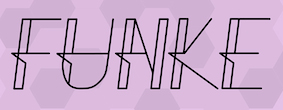 Sterling, KS-based designer of the fine radio era retro display typeface Funke (2016). [Google]
[More] ⦿
Sterling, KS-based designer of the fine radio era retro display typeface Funke (2016). [Google]
[More] ⦿
|
burodestruct (or: Typedifferent.com)
[Lorenz Lopetz Gianfreda]
|
 Lorenz Lopetz Gianfreda's foundry in Bern, Switzerland, est. 1994, called Burodestruct and Typedifferent.com.
 Free fonts include(d) the gorgeous GalaQuadra (by Angela Pestalozzi, 1999), Eject Katakana (1998), Dippex (1995, grunge font), Ticket (1995), Rocket 70 (1996), Ratterbit (1995, pixel font), Plakatbau (1995), Lodel Fizler (1996), Flossy (1995), Faxer (1995), Console Remix (1998), Cravt (1998, by "Katrin"), Stereotype (1998, by M. Brunner), Brockelmann (1995, free), Kristallo (1997, very original display face) and Billiet (1996). Other fonts: Acidboyz (1998), Alustar (1999), BD Asciimax (1999, ascii art font), BD Billding, Bdr_mono (1999), Brick (1996, like Kalendar), Cluster (1996), Console (1997), Doomed (1998), Eject (1998), Electrobazar (1995), Elside (1995), Globus (1996), Fazer (1996), Lofi (1997), Medled (1995), Paccer (1995), Solaris (1998), Spicyfruits_brush_rmx (1998, a nice high-contrast face), Spicyfruits_rmx, Wurst (free, by Heiwid, 2000), Relaunch (2000), Relaunch Katakana (2000, free), Rainbow (2000), DeLaFrance (2000, free, by Heiwid), Electronic Plastic (2000), Colonius (2001), Cash (2001), Cashbox (2001), Bilding (2001), Meter (2001), Mustang (2001), Bankwell (2001), BD Alm (2001), Balduin (2001), Tatami (2001, oriental look font), Hexades (2001, free), Nippori (2002, techno), Jura (2002), Bonbon (2002, free), Band (2002, free), Navyseals (2002, kitchen tile font), Ritmic (2002), BDR Mono (1999, OCR-like font), Mann (2003, ultra fat stencil), Aroma (2003), Zenith (2003), Nebraska (2003), BD Equipment (2004), BD El Autobus (2004), BD Unexpected (2004), BD Wakarimasu (2004, free kana face), BD Bernebeats (2004, futuristic), BD Deckard (2004), BD Spinner (2004), BD Victoria (2004), BD Designer (2004), BD Kalinka (2005, a curly ultra-fat display face), BD Equipment (2004), BD El Autobus (2004), BD Unexpected (2004), BD Varicolor (2005, stencil), BD Chantilly (2005), BD Memory (2005), BD Emerald (2005, beveled), BD Kalinka (2005, Cyrillic simulation), BD Extrwurst (2005), BD Aquatico (2005), BD Mandarin (2005), BD Polo (2005), BD Beans (2005), BD Tiny (2005, pixel face), BD Times New Digital (2006), BD Panzer (2006), BD Jupiter, BD Jupiter Stencil (2006), BD Pipe (2006), BDR Mono 2006 (2006), BD Fimo Outline (2007, free, by Nathalie Birkle), BD Bermuda (2007, experimental and geometric), BD Smoker (2007, psychedelic), BD Radiogram (2007), BD Mother (2007, exaggerated black Egyptian), BD Fimo Regular (2007, free), BD Demon (2007), BD Reithalle (2007, free), BD Halfpipe (2007, free), BD Broadband (2008, free; not to be confused with the much older fonts BroadbandICG or FLOP Design's Broadband), BD Viewmaster and BD Viewmaster Neon (2008), BD Electrobazaar (2008), BD Motra (2008, stencil), BD Virtual (2008), BD Spacy 125 (2008), BD AsciiMax, BD ElAutobus (2004), BD Equipment (2004), BD Ramen (2003), BD Retrocentric (2009), BDR A3MIK (2009, virile Latin and Cyrillic slab), BD HitBit (2009), BD Unicorse (2010, unicase and techno), BD Telegraph (2011), BD Schablone (2012, stencil face), BD Pankow (2013, stencil), BD Algebra (2014), BD Hiragana Kuro (2014), BD Qualle (2014, a fat poster typeface), BD Tribler (2015, a tribal font). Alphabetical listing of their pre-2015 free typefaces: Algebra, Alm, Apotheke, AsciiMax, Baldrian, Band, Bankwell, Bardust, Beans, Billding, Billiet, Bonbon, Brockelmann, Burner, Cash, Cashbox, Chantilly, Circo, Console, Console Remix, Cravt, Delafrance, Designer, Destination, Dippex, Eject Katakana, ElAutobus, Elmax, Elside, Equipment, Faxer, Fazer, Fimo, Flossy, Fluke, Galaquadra, Geminis, Halfpipe, Hexades, Hiragana Kuro, Jayn Fonta, Kristallo, Lodelfizler, Lofi, Medled, Meter, Mustang, Outline, Paccer, Pipe, Plakatbau, Plankton, Polo, Ragout, Ramen, Ratterbit, Reithalle, Relaunch, Relaunch Ktna, Rocket70, Sirca, Sirca Rmx, Solaris, Spacy125, Spicyfruits, Spinner, Stella, Stencler, Stereotype, Ticket, Times New Digital, TinyFont, Tribler, Unfold, Wakarimasu. Alphabetical listing of their pre-2015 commercial typefaces: A3mik, Acidboyz, Alustar, Aquatico, Aroma, Balduin, BDR Mono 2006, Bermuda, Bernebeats, Breakbeat, Brick, Broadband, Calamares, Central, Cluster (Corporate), Colonius, Deckard, Demon, Discount, Doomed, Edding850, Eject, Electrobazar 2008, Electronicplastic, Elk, Emerald, Endless, Extrawurst, Fontabello, Globus, Good Wood, Hell, Hitbit, Jupiter, Jura, Kalinka, Kameron, Kinski, Las Palmas, Mandarin, Mann, Memory, Mother, Motra, Naranino (2012: a children;s script), Navyseals, Nebraska, Nippori, Nokio, Orlando, Pankow, Panzer, Qualle, Radiogram, Rainbow, Retrocentric, Ritmic, Robotron, Schablone, Showlong, Smoker, St.Moritz, Stalker, Stonehenge, Sweethome, Tatami, Telegraph, Unexpected, Unicorse, Varicolor, Victoria, Viewmaster, Virtual, Wotka, Wurst, Wurst Directors Cut, Zenith. In 2015, Gianfreda designed BD Barbeaux (a condensed typeface with the fashionable chic of the French art nouveau or film noir). Typefaces from 2016: BD Kickrom Mono (LED emulation type). Typefaces from 2018: BD Westwork. Typefaces from 2020: BD Aubergin (an experimental poster font with Bauhaus elements), BD Microna (a pixelish variable font), BD Micron Robots (dingbats). Typefaces from 2021: BD Supper (a food packaging sans), BD Roylac (a stylish poster font that evokes modern furniture), BDRmono 2021 (hipster style techno). Alternate URL. Dafont link. Behance link. View the Typedifferent typeface library. [Google]
[MyFonts]
[More] ⦿
|
Captain Falcon
|
Canadian designer of the squarish typeface Jet Set (2011), which is based in part on the font used in the Jet Set Radio game. He also made the pixel family Mecha (2012, FontStruct). Fontspace link. FontStruct link. [Google]
[More] ⦿
|
Carlos Fabián Camargo Guerrero
[Andinistas]
|
 [MyFonts]
[More] ⦿
[MyFonts]
[More] ⦿
|
Carlos Winkow
|
 Carlos Winkow is a version of his original name, Carl Winckow. Winkow (1882-1952) was born in Sömmerda, Germany but worked in Spain from 1909 until 1934 for Richard Gans, in Germany from 1936 until 1939 for Norddeutschen Schriftgiesserei in Berlin, and in Spain again from 1940 onwards at Fundicion Tipografica Nacional in Madrid. His typefaces include
 - Alfrodita (1946). An engraved typeface published by FT Nacional.
- Alcazar (FT Nacional, 1944). An inline 3d titling font.
- Astur (1948, FT Nacional). A wooden plank typeface.
- Belinda (FT Nacional).
- Cursiva Rusinal (FT Nacional). This is identical to Reporter except in the alternates.
- Electra (FT Nacional, early 1940s). An almost avant-garde sans family, which includes the ultra thin Estrecha Fina weight. Romeo (Font Bureau) takes some cues from Electra and says that it is a spectacular art deco sanserif with an unusually fine condensed series. See also Casablanca (1997, Steve Jackaman for ITF, now Red Rooster Collection; a revival of Electra Clara) and Carlos (Jason Castle, CastleType). Klingspor dates Electra Fina in 1942.
- Elzeviriano Ibarra (1931, for Fundicion Tipografica Richard Gans). Lucia Walter revived Winkow's 1931 text typeface Elzeviriano Ibarra in 2011. See also Gans Ibarra (2006, Intellecta Design).
- Gong (1945, Johannes Wagner; Norddeutschen Schriftgiesserei). A chalk script face. Jaspert mentions the date 1951. A standard non-chalk version of Gong was done by J. Wagner in 1967, and was published as Jowa Script (Jowa Schreibschrift), which in turn provided inspiration for Iova Nova (2007, Ralph M. Unger)
- Grotesca Radio (Richard Gans Foundry), at least according to some sources. For a revival and reinterpretation, see Radar (2019) by Marta Sanchez Marco for Type-o-Tones.
- Hispalis (+Cursiva, +Negro, +Titling, +Negro Titling) (1940, FT Nacional).
- Iberica (FT Nacional, 1942). An open shaded inclined 3d lineale. See Roller (1997, Pat Hickson, ITF and Red Rooster Collection).
- Nacional (+Cursiva, +Negra) (1941, Nacional). A calligraphic roman in old medieval Spanish style with Clasico Nacional 1 and Clasico Nacional Negro weights. See Madrid (Steve Jackaman, Red Rooster Collection) for a digital revival.
- Numantina (1940, FT Nacional). Revived by Nick Curtis as Numancia NF (2011, Nicks Fonts).
- Radar (1940, FT Nacional). a brush script.
- The brush script typeface Reporter (1938, the Wagner foundry; Norddeutschen Schriftgiesserei). Digital revivals: Reporter No. 2 (Adobe), Reporter 2 (Linotype).
- Rusinol (1941, FT Nacional).
Linotype page. Klingspor link. FontShop link. View some digital versions of Winkow's typefaces. [Google]
[MyFonts]
[More] ⦿
|
Chamichaze
|
Designer in 2008 at FontStruct of Lala (pixelish script), Sunday (great vertical-stripe stencil), Radiotic (rounded), Blabla (experimental). [Google]
[More] ⦿
|
D. Stempel (or: Stempel Studio)
|
 Frankfurt-based type foundry started in 1895 by David Stempel. Took over Roos&June in 1915. Gained a majority share in Klingspor Bros in 1917. Takes over Leipzig's Heinrich Hoffmeister foundry in 1918 and Leipzig's W. Drugulin foundry in 1919. Gains shareholding in the Haas'sche type foundry in 1927, and Benjamin Krebs in 1933. It becomes owner of Klingspor in 1956. In 1985 D. Stempel's type division was taken over by Linotype, and became Linotype's type department. Stempel's history, 1895-1955. Designers and fonts:
 - J. F. G. Binder: Binder Style (1959).
- J. Boehland: Balzac (1951).
- H. Bohn: Mondial (1936).
- Walter Brudi: Orbis (1953), Pan (1954).
- W. Buhe: Buhe Fraktur (1915).
- W. Chappell: Trajanus (1939).
- J. Christiansen: Christiansen Schrift (1909).
- F. Heinrichsen: Gotenburg (1935-1937).
- K. Hoefer: Prima (1957), Zebra (1965).
- H. Hoffmeister: Amts Antiqua (1909), Stempel Fraktur (1914).
- Holzhausen: Holzhausen Antiqua (1916).
- M. Jacoby-Boy: Bravour (1912).
- M. Kausche: Mosaik (1954).
- F. W. Kleukens: Gotische Antiqua (1914), Helga Antiqua (1913), Ingeborg Antiqua (1910), Kleukens Fraktur (1911), Omega (1926), Radio Latein (1923, display didone).
- R. Koch: Anzeigenschrift Deutsch (1923).
- H. König: Heinz-König-Setzmaschinen-Fraktur (1913).
- E. Meyer: Tannenberg (1933-1935).
- Hans Eduard Meier: Syntax (1968).
- H. Möhring: Elan (1928), Elegant Grotesk (1928).
- C. Wilhelm Pischiner: Neuzeit Grotesk (1929).
- H. Pauser: Petra (1954).
- I. Reiner: Bazar (1956), Mustang (1956).
- P. Renner: Renner Antiqua (1939).
- H. Rhode: Humboldt Fraktur (1938).
- F. K. Sallwey: Present (1974).
- A. M. Schildbach: Montan (1954).
- F. Schweimanns: Diana (1909), Propaganda (1901), Graziella (1905), Korso (1913).
- W. Schwerdtner: Metropolis (1928), Mundus Antiqua (1929), Standard Latein (1929).
- J. Tschichold: Sabon (1967).
- M. Wilke: Diskus (1938), Gladiola (1936), Konzept (1968).
- Friedrich Hermann Wobst: Globus (1932).
- Rudolf Wolf: Memphis (1930).
- Hermann Zapf: Gilgengart, Kompakt (1954), Melior (1952), Michelangelo (1950, roman caps), Optima (1958), Palatino (1950), Saphir (Linotype, 1953), Sistina (1951), Virtuosa (1952, revived in 2009 as Virtuosa Classic at Linotype with the help of Akira Kobayashi).
- G. Zapf-von Hesse: Diotima Antiqua (1952), Smaragd (1953).
- Staff: Büxenstein Antiqua (1912: revival by Gerhard Helzel), GerhardHelzel-BuxensteinFraktur-after-DStempel-1912.png">Büxenstein-Fraktur (1912: revival by Gerhard Helzel), AltSchwabacher, Europe, Eurostile, Forma, Garamond, Künstlerschreibschrift (1902), Univers, and the typewriter types Deberny, Haas and Olive.
Specimen book of 1920. View the Stempel typeface library. [Google]
[MyFonts]
[More] ⦿
|
Dan M. Zadorozny
[Iconian Fonts]
|
 [More] ⦿
|
Design Observer
[Michael Bierut]
|
A design site where one sometimes finds discussions on type. The founding writers are Michael Bierut, William Drenttel (an ex-typographer practicing law), Jessica Helfand and Rick Poynor. From Bierut's CV: Michael Bierut studied graphic design at the University of Cincinnati's College of Design, Architecture, Art and Planning. Prior to joining Pentagram in 1990 as a partner in the firm's New York office, he worked for ten years at Vignelli Associates, ultimately as vice president of graphic design. His clients at Pentagram have included The Council of Fashion Designers of America, Harley-Davidson, The Minnesota Children's Museum, The Walt Disney Company, Mohawk Paper Mills, Motorola, Princeton University, the Brooklyn Academy of Music, and the New York Jets. Bierut's work is represented in the permanent collections of the Museum of Modern Art and the Metropolitan Museum of Art in New York, and the Musee des Arts Decoratifs, Montreal. He has served as president of the New York Chapter of the American Institute of Graphic Arts (AIGA) from 1988 to 1990 and is president emeritus of AIGA National. Michael was elected to the Alliance Graphique Internationale in 1989, and was elected to the Art Directors Club Hall of Fame in 2003. Michael is a Senior Critic in Graphic Design at the Yale School of Art. He writes frequently about design and is the co-editor of the four-volume series Looking Closer: Critical Writings on Graphic published by Allworth Press. In 1998 he co-edited and designed the monograph Tibor Kalman: Perverse Optimist. His commentaries about graphic design in everyday life can be heard nationally on the Public Radio International program "Studio 360." He received the AIGA Medal in 2006, and was a winner in the Design Mind category at the 2008 Cooper-Hewitt National Design Awards. He is a cofounder of the website Design Observer. Michael's book 79 Short Essays on Design was published in 2007 by Princeton Architectural Press. His collection of new essays, Now You See It, was published in the fall of 2017. In 2018, Michael Bierut and Village type director Chester Jenkins talk collaborated on the Sherman typeface designed as the linchpin of the new identity for Syracuse University. The typeface revives a design created by Frederic Goudy in 1912 which ended up in the possession of the University. Additional material and links on Bierut: The Atlantic Talks Typography: interview with M. Bierut, Pentagram link, Reasons to Choose a Particular Typeface For a Project. In 2013, Bierut redesigned the New York City parking signs. [Google]
[More] ⦿
|
Device Fonts
[Rian Hughes]
|
 Rian Hughes studied at the LCP in London before working for an advertising agency, i-D magazine, and a series of record sleeve design companies. Under the name Device he now provides design and illustration for the advertising, entertainment, publishing, and media industries. He works from Richmond, UK, as a comic book artist, letterer and typefounder---his foundry is called Device. He creates mostly display type. List of fonts. Interview. Review by Yves Peters. Monotype Imaging page. Interview by Die Gestalten. Various (overlapping) font listings, still unorganized.
 - Dingbats: Pic_Format, Mastertext Symbols, MacDings, RiansDingbats, Autofont.
- FontFont fonts: Identification (1993), Revolver, Rian's Dingbats, LustaOneSixtySans, Knobcheese, CrashBangWallop, and Outlander.
- [T-26] fonts: English Grotesque (1998), Data90 (2003; a free FontStruct typeface that is virtually identical to Data90 is Bitrate by Kummaeno (2010)), Flak Heavy (2003, stencil), Flak (2003, stencil), Freeman (2003), Klaxon (2003, kitchen tile font), Cordite, Substation (2003), September (2003), West Way (2003), Egret (2003), Paralucent Complete (2003), Paralucent Condensed, Paralucent Stencil (2003), Mercano Empire (2003), Iconics (2003), Cantaloupe (2003), Gravel (2003), Acton (blocky screen font, 2002), Ainsdale, Amorpheus, Anytime Now (alarm dingbats), Bingo, Blackcurrant (Blackcurrant Cameo (1997) is free), Bordello, Elektron, Haulage (U-Haul lettering, 2002), WexfordOakley, Telecast, Terrazzo, Transit, Untitled, Scrotnig, Skylab (2002), Silesia (1993), SlackCasual, Ritafurey, Reasonist-Medium, Regulator, GameOver, Novak, Quagmire, PicFormat, Jakita Wide (2000, techno font), Metropol-Noir, Motorcity, Mastertext, Mystique (2002), MacDings, Lusta, Laydeez, Sinclair, Paralucent (sans serif), Judgement, Bullroller, Zinger (a fifties font), Citrus (2002), Popgod (2003), Range (2000, a futuristic font), Hounslow, Jemima, Griffin, GranTurismo, Gargoyle, Foonky, DoomPlatoon, Darkside ("remixed" by FontStructor Kummaeno in his Ubangi (2011)), Kallisto (2010), Kallisto Lined (2010), Cyberdelic, Contour, and the very original Stadia Outline family (Stadia is a kitchen tile font).
- List of all fonts by Rian Hughes, as of 2004: Acton, Ainsdale, Amorpheus, Anytime Now, Bingo, Blackcurrant, Bordello, Bull Roller, Chascarillo, Contour, Cottingley (1992), FF CrashBangWallop, Cyberdelic, Darkside, Data90, Doom Platoon (1996), Elektron, English Grotesque, Flak, Foonky, Freeman, Game Over, Gargoyle, Gran Turismo, Griffin, Haulage, Hounslow, Iconics, FF Identification, Jakita, Jemima, Judgement, FF Knobcheese, Laydeez Nite, Lusta (big family), Mac Dings, Mastertext, Men Swear, Metropol Noir, Motorcity, Mystique, Novak, FF Outlander, Paralucent, Pic Format, Platinum, Quagmire, Range, Reasonist, Register (A and B), Regulator, FF Revolver, FF Rian's Dingbats, Ritafurey, Scrotnig, September, Silesia, Sinclair, Skylab, Slack Casual, Space Cadet, Stadia, Substation, Telecast, Terrazzo, Transmat, Untitled One, Vertex, Westway, Wexford Oakley, Why Two Kay, Zinger.
- At Veer, in 2005, these Device fonts were published: Gentry, Gridlocker, Valise Montreal, Custard, Box Office (moviemaking letters), Sparrowhawk, Monitor, Moonstone, Miserichordia, Yolanda (a great playful medieval text typeface in three styles: Duchess, Princess, Countess), Gusto, Dauphine, Rogue, Ritafurey, Dynasty, Radiogram, Xenotype, Roadkill (grunge), Payload (stencil family comprising Regular, Outline, Spraycan, Narrow, Narrow Outline, Wide, Wide Outline), Catseye, Electrasonic, Absinthe (psychedelic style), Straker, and Chantal (brush).
- In 2006, Veer added these: Profumo, Ironbridge, Cheapside, Battery Park (grunge), Forge, Shenzhen Industrial, Hawksmoor (grunge), Coldharbour Gothic, Wormwood Gothic (grunge), Chase (grunge), Diecast, Roadkill Heavy, Tinderbox (fuzzy blackletter), Dazzle (multiline face), Nightclubber (art deco), Klickclack (2005, comic book or cartoon caper typeface), Vanilla (art deco), Wear it's at (grunge), Diecast, Drexler, Box Office (movie icon font).
- Fonts from 2007: DF Conselheiro (2007, grunge), DF Glitterati (2007), Indy Italic (script), DF Apocrypha (2006, rough outline), DF Quartertone (2007), DF Lagos (2007, rough stencil), DF Pulp Action, DF Reliquary #17 (2006, grunge didone), DF Dukane (2007, octagonal grunge), DF Strand (2007, striped stencil), DF Rocketship from Infinity (2006, futuristic), DF Appointment with Danger (2006), DF Las Perdidas (2006, grunge stencil), DF Kelly Twenty (2007, grunge stencil), DF Heretic, DF Roadkill, DF Ironbridge, DF Forge, DF Shenzhen Industrial, DF Hawksmoor, DF Cheapside, DF Battery Park, DF Saintbride, DF Profumo, DF Coldharbour Gothic, DF Wormwood Gothic, DF Tinderbox, DF Flickclack, DF Vanilla (multiline art deco face), DF Chase, DF Nighclubber (art deco jazz club face), DF Diecast, DF Dazzla, DF Zond Diktat (grunge), DF Yellow Perforated, DF Mulgrave (grunge), DF Ministry B, DF Ministry A (with a hairline weight), DF Gridlocker, DF Gentry, DF Valise Montréal (grunge), DF Custard, DF Box Office, DF Roadkill, DF Payload Wide, DF Payload Narrow, DF Catseye Narrow, DF Catseye, DF Yolanda, DF Xenotype, DF Telstar, DF Straker, DF Sparrowhawk, DF Rogue Serif, DF Rogue Sans Extended, DF Rogue Sans Condensed, DF Rogue Sans, DF Ritafurey B, DF Ritafurey A, DF Radiogram, DF Pitshanger, DF Payload (stencil), DF Outlander Nova, DF Moonstone, DF Monitor, DF Miserichordia, DF Interceptor, DF Gusto, DF Glitterati, DF Galicia (2004), DF Galaxie, DF Electrasonic, DF Dynasty B, DF Dynasty A, DF Drexler, DF Dauphine, DF Chantal, DF Absinthe, DF Register Wide B, DF Register Wide A, DF Register B, DF Register A, DF Quagmire B, DF Cordoba (2007, grunge), Mellotron (2004, stencil), Seabright Monument (2007), Charger (2007, grunge).
- T-26 releases in 2007: Klickclack, Hawksmoor (grunge), Heretic, Ironbridge (old letter simulation), Battery Park (grunge), Chase (grunge), Cheapside (grunge), Dazzle (multiline art deco), Diecast (grunge), and Forge (grunge).
- T-26 releases in 2008: Automoto (fat multiline deco face), Straker (organic). Also from 2008: Mission Sinister (grunge), Gonzalez (grunge).
- FontBros release in 2009: Filmotype Modern. Other Filmotype series fonts include Filmotype Miner (2012), Filmotype Manchester (2012), Filmotype Meredith (2012), Filmotype Marlette (2012), Filmotype Mansfield (2012), Filmotype Power (2012) and Filmotype Major (2012: this is based on a typeface used as the titling font for the popular children's book by Dr. Seuss entitled One Fish Two Fish Red Fish Blue Fish, 1960). Other 2009 fonts: Degradation (grunge).
- Creations in 2010: Pod (2010, fat round stencil), Korolev (2010, a 20-style monoline sans family based on communist propaganda from 1937), DF Agent of the Uncanny (2010, brush face), DF Destination Unknown (2010, Kafkaesque brush), DF Maraschino Black (a sleek, sophisticated high-contrast swash capital font).
- Creations in 2011: DF Capitol Skyline, DF Capitol Skyline Underline and DF Capitol Skyline Capitals (a multi-weight all-caps pair that epitomizes Streamline Moderne), DF Korolev (a 20-weight sans serif family based on lettering by an anonymous Soviet graphic designer who did the propaganda displays at the Communist Red Square parade in 1937. Named in honor of Sergey Pavlovich Korolyov, or Korolev, considered to be the father of practical astronomics). In 2018, Korolev was expanded to Korolev Rounded and Korolev Rough.
- Typefaces from 2012: Ember (informal script), Kane (based on the Batman logo), Glimmer Glossy, Glimmer Mate, Galleria (avant-garde caps), Clique (flared sans).
- Typefaces from 2013: Wulf Utility (grungy), Charterhouse (an aggressive black sans), Filmotype Melon (after a 1959 original, this is an offbeat Googie era doo-wop typeface), Filmotype Melody (similar to Melon), Filmotype Mellow (also similar to Melon), Raw (worn wood type), Cadogan (a rhythmic connected script), Whiphand (brush face), Steed (heavy codensed masculine sans inspired by the titles of the Avengers TV show), State Stencil (Clean and Rough: in the style of Futura Black), Korolev Military Stencil (named after Sergei Korolev, father of Soviet astronautics, and based on signs from the Red Army parade of 1932), Armstrong (a 1950s automobile font).
- Typefaces from 2015: 112 Hours (numerals font).
- Typefaces from 2016: Typex (an angular yet rounded monospaced typewriter or OCR-style typeface based on the lettering used on Alan Turing's and Tutte's famous code-breaking machine at Bletchley Park, the Bombe, and the subsequent British answer to the German Enigma machine, the Typex), Serenity (a legible sans family).
- Typefaces from 2017: Pitch (a heavy block sans in chrome and solid variants), Shard (originally commissioned for Nickelodeon's 3D reboot of the Teenage Mutant Ninja Turtles franchise), Championship Inline, Mood (a great liquid deco font), Grange, Grange Rough, Dazzle Unicase, Urbane (sans), Urbane Rounded, Albiona (a modern take on Clarendon; includes Albiona Heavy Stencil), Albiona Soft (a rounded version of Albiona), Pact (a modular geometric font).
- Typefaces from 2018: Rutherford, Salvation (a potato cut font), Kano (inspired by the work of Dutch furniture designer and architect Gerrit Rietveld, one of the principal members of the Dutch artistic movement De Stijl), Rogue Sans Nova, Fairtrade (rough-edged font), Goddess (Victoriana), Neuropa (a five-weight semi-extended sans that projects a muscular corporate authority), Worthington Arcade (a caps-only lapidary typeface), Zeno (a piano key stencil typeface), Vektra (an experimental crosshatch-textured typeface), Recon (a quartz display font), Kinesis (Kinesis is inspired by the work of Dutch furniture designer and architect Gerrit Rietveld, one of the principal members of the Dutch artistic movement De Stijl. It is a modular headline font, constructed from white, black and grey overlapping rectangles), Freehouse (Freehouse is a reinterpretation of the well-remembered Watney's logo, a brewery and pub chain infamous for its poor quality beer and brutalist decor.), Zipline (a great multiline typeface), Argent Sans, Craska (a multiline font), Panther Black, Carilliantine (art nouveau with many interlocking letter pairs), Regulator Nova, Broadside, Bubblegum Pop, Heft (a heavy slab serif), Faction (stencil style), Metaluna (techno, engineering), Magnetron (futuristic), Urbane Rough, Urbane Adscript (a monoline semi-linking sans), Revolver (original from 1992), Albiona Inked (a Clarendon).
- Typefaces from 2019: Gerson Rand, Gravesend Sans (an all caps sans family based on the unique typeface used for the iconic grass-green signage for the now-defunct Southern Railway in England).
- Other: Customised Foonky Starred, Altoona, DfAncestorITC, DfAttitudesPlain, HotRod (2002).
- Typefaces from 2020: Breach (a display typeface with partitioned capital letters), Epiphany (stencil), Aurore Grotesque (an elegant geometric art deco sans family with small x-height), Faculty (a geometric sans with large x-height), Fathom (a flared serif typeface), Atomette (a stylized comic book typeface family), Conquera (a stylish extended caps-only font in five weights plus an inline), Dare (a tape font, that borrows a pinch of the hand-drawn swagger of Bauer's Cartoon (designed in 1936 by H. A. Trafton), used as Dan Dare's signature logo in the British boy's comic Eagle, and also the upward-pointing serifs of machine-moderne typefaces such as Dynamo (designed by K. Sommer for Ludwig & Mayer in 1930), Urbane Condensed.
- Typefaces from 2021: Maximum (a blocky techno or sports font), Paralucent Slab (a monolinear slab serif), Guildhall (a 10-style strong-willed mechanical font family), Broadside Text (14 styles), Cynosure (a 14-style elliptical sans), Valvolina (a geometric display typeface inspired by Italian Futurismo), Chassis (a sci-fi or computer game font), Fomalhaut (a space exploration font), Disclosure (a grungy font), Sheffield Fiesta (a squarish font based on the brutalist concrete landmark nightclub in Sheffield, now the Odeon Cinema), Grange Text (a 14-style sans), Wilko (a fat rounded poster typeface), Farthing (a 5-style wedge serif).
- Typefaces from 2022: Bradbury Five (a vernacular / bubblegum / supermarket / cartoon typeface in 18 styles), Tracker (an inline space-age disco font from the 1960s or 1970s, reminiscent of the Mexico City olympics font), Salient (a 12-style didone).
FontShop link. Klingspor link. [Google]
[MyFonts]
[More] ⦿
|
Doyald Young
[Doyald Young: Logotypes and Letterforms]
|
 [MyFonts]
[More] ⦿
[MyFonts]
[More] ⦿
|
Doyald Young: Logotypes and Letterforms
[Doyald Young]
|
 Graphic designer, typographer, type designer, author, teacher and lecturer, born in 1926 in Holliday, TX. He died on February 28, 2011 due to complications following a heart operation. He attended Los Angeles City College, Los Angeles Trade Technical Jr. College, and Art Center College of Design where he has taught for 27 years and holds the honorary title Inaugural Master of the School. Doyald drew characters, often of a calligraphic or handlettered nature. He was deeply influenced by his mentor, Hermann Zapf.
 Steve Heller writes: When digital programs like Fontographer made it easy for anyone with a computer to create typefaces, many of them purposefully inelegant, he advocated a high level of craftsmanship that he believed had been lost. In so doing, Mr. Young challenged a new generation to reject so-called grunge design in favor of precision. When the American Institute of Graphic Arts awarded Young its 2009 Medal for Lifetime Achievement, Marian Bantjes wrote Taste. Practicality. Formality. Understated prestige. The combination of those qualities forms as perfect a descriptor of Young's work as any you are likely to find, both in the process and the result. Although he is widely known for his elegant curves and scripts, he has never been a showy designer---there is not a trace of ego in his work. The range of letterforms able to flow at any time from his hand is great, and there is no way to particularly define Young's mark unless you have seen the hand-drawn comp. That is where his work is unmistakable: perfect letterforms drawn in pencil at a surprisingly small size without so much as a mark of hesitation or awkwardness. The style varies but the fluidity and perfection do not. Links and media: Scott Erickson's movie on Doyald Young. FontShop link. Klingspor link. Short obituary and video. Longer video about his life. Steven Heller's obituary in the New York Times. Obituary by Marian Bantjes for AIGA. He was adored and respected for his craft and gentleness. Portrait. Another portrait (credit: Louise Sandhaus). Author of several influential texts: - Logotypes and Letterforms (1993, Delphi Press). Review. It includes the corporate typefaces and original and revised logotypes he created for General Electric, Sony, Hilton International, John Deere and other businesses. Steve Heller: It was well received by designers for its defiance of fashionable trends.
- Fonts&Logos (1999, Delphi Press, and 2000, Sherman Oaks). A book of examples, it includes many logos designed by him for the cosmetic, fashion and entertainment industries. Review. Bette Midler logo (2002). Grammy Awards logo (1988). Prince, The Hits Collecton, cover (2000). Sinatra, The Man and his Music TV Special (1981). Logo for Apex Engraving (1974).
- The Art of the Letter (2003, Smart Papers, Hamilton, Ontario).
- Dangerous Curves Mastering Logotype Design (2008, Delphi Press). Delphi Press was his own company.
His typefaces include the extra bold condensed sports scripts fonts Home Run Sanscript (1999) and Home Run Script (1999, a connected bold retro signage script), Young Gallant (2010, a formal calligraphic script based on the alphabets his teacher, Leach, trained him on), ITC Eclat (1985, 1992, fat script face, which was used for titles by Comedy Central and the Queen Latifah movie Beauty Shop), Young Finesse (2003, an Optima-inspired thin headline typeface used in his book, Fonts&Logos), Young Finesse Italic (2006), Guts (1976, VGC), and Young Baroque (1984, 1992, Letraset; calligraphic Spencerian copperplate script; this is copied by Castcraft as OPTI Yen Script). [Google]
[MyFonts]
[More] ⦿
|
Dresser Johnson
[Kevin Dresser]
|
Corporate identity and print design company in New Paltz, NY, est. 2003 in New York City by Kevin Dresser and Kate Johnson. Kevin Dresser (b. 1971, Rochester, NY), its head, was a type designer at Hoefler Type Foundry from 1997 until 2000, when he started Dresser & Sons. His work there included art deco typefaces and iconography for the signage program at Radio City Music Hall, a redesign of the classic Cheltenham typeface for The New York Times Magazine, a custom typeface in Hebrew for the Rodeph Sholom Synagogue, a grunge typeface for Florent Restaurant, custom typefaces for Architectural Design Magazine, iconography for The Museum of Modern Art, lettering for TypeCon 2005, and a few retail typefaces. In 2003, he published the 15-weight sans family General at Thirstype, which is now also available for licensing from Dresser Johnson. Kate Johnson is a graphic designer who graduated from the Rhode Island School of Design. Typefaces from 2012: Terminus (dot matrix face). [Google]
[MyFonts]
[More] ⦿
|
Elena Kowalski
[Glen Jan]
|
 [MyFonts]
[More] ⦿
[MyFonts]
[More] ⦿
|
Enric Jardi
|
 Born in Barcelona in 1964. Graphic design teacher at Elisava in Barcelona since 1988. Director of the Master on Advanced Typography at the Eina school of art and design, in collaboration with the Autonomous University of Barcelona. He also teaches a Master's course on art direction and advertising at Ramon Llull University. Author of Twenty-two tips on typography (that some designers will never reveal) and twenty-two things you should never do with typefaces (that some typographers will never tell you) (Actar).
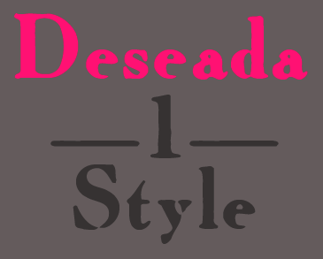
 At type-o-tones in Barcelona, Enric Jardi created Neeskens (1991-2007), Retorica Buida (1995, blackboard bold), Retorica-Plena (1995), Deseada (1995, a blurred roman), Escher, Magothic, Mayayo (1991, great children's book display font in Inline, Holes and Black styles), Peter Sellers (2007), Poca (1995, pixelish), Radiorama (1995), Verdaguera (1995, a classical weathered typeface)), Wilma (1995-2007: a chromatic type system), Xiquets Forever (1995, dingbats). Interview by MyFonts. Klingspor link. Type-o-tones link. FontShop link. Type-o-tones link. [Google]
[MyFonts]
[More] ⦿
|
Erté
|
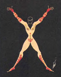 Erté (Romain de Tirtoff) was a well-known art deco era artist. Born in St. Petersburg, Russia in 1892, he died in 1990 in Paris. In 1912, Erté moved to Paris. In 1915, he began an association with Harper's Bazaar by designing covers of each of their magazines for the next 22 years. He became known for elegant lithographs and sculptures for the fashion industry. On my pages, you find an elegant set of capitals and numerals in which the glyphs are formed by elegantly drawn naked women, from The Alphabet Suite (Chicago, 1976).
 Wikipedia. [Google]
[More] ⦿
|
Est71
|
American vector artist. Designer of Charged Insomnia (2008, LED font), Mezzanine (2007, ultra-fat), S.O.T.D. (2006, 1890-style caps face), Dog Star (2006, modeled after the Sirius radio font), Blowback (2007, display face), Alpha (2006, outline pixel face) and Pf Animals (2006, a stencil typeface modeled after Pink Floyd's "ANIMALS" album). [Google]
[More] ⦿
|
Fidel Peugeot
[Fontdesign by Fidel Peugeot]
|
[MyFonts]
[More] ⦿
|
Flat-It
[Ryoichi Tsunekawa]
|
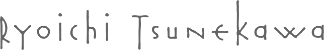 Japanese foundry in Nagoya that offers free and commercial Latin fonts made by Ryoichi Tsunekawa, who also runs Bagel & Co, Dharma Type, HolidayType and Prop-A-Ganda. Most of his work was done at Flat-It. His typefaces:
 - 2021: Best Choice (a monospaced sans), Short Films (an art deco sans in twelve styles), Golden Decades (a 16-style sans that borrows from several sans genres).
- 2019: Mid Century Sans, Tamba Sans, Rama Gothic Rounded, Bio Sans Soft.
- 2018: Fairweather (clean sans), Kaneda Gothic (a basic severe condensed gothic), Vincente (a tall condensed display didone family).
- 2017: Calling Code (monospaced programming font), Commuters Sans (elegant wide sans), Mighty Slab, Rigid Square (octagonal), Taro.
- 2016: Bio Sans, Gomme Sans, Quiet Sans, Siro (sans).
- 2014: Pero (condensed rounded organic sans), Kiro (minimalist organic sans), Graphie (modern geometric sans), Compasse (semi-condensed sans), Como (rounded sans).
- 2013: Spoon (organic, rounded, monoline sans family), Antoinette Monogrammes (based on early 1900s embroideries by Janon Co; with frames), Clonoid (a sci-fi family that pays tribute to arcade game logos in 80s and 90s), All Round Gothic Demi (a sans based on perfect circles), Griffon (copperplate titling face), Antique Spenserian (based on Spencerian Script by Mackellar, Smiths and Jordan).
- 2012: Geom Graphic (a retro sci-fi family that can be considered as a squarish version of Eurostile), Sheepman (modular), House of Cards, Space Colony (a lovely monoline futuristic techno family), Rama Slab (an antiqued wood-style slab serif), Rama Gothic. An antiqued sans serif family that recalls the wood type era), Diamond Ring (an art deco typeface inspired by Japanese cosmetics-packaging designs and posters from the late 19th and early 20th centuries), Controller (techno meets organic in this rounded squaris sans family), Revolution Gothic (an extended version of PAG Revolucion), 2008, which was inspired by retro propaganda posters and wallpainting in Cuba from the 60s to 80s; Revolution Gothic P followed in 2014), Diamond Ring (art deco).
- 2011: Yummo (monoline organic sans), Sheepman (based on the wood type No. 506 of William Page), Onick (2011, an art deco neojaponist fat display face done for Wordshape), Shiva (2011, hairline sans), Mocha Mattari (2011, grunge), Dharma Slab (2011, inspired by 1800s-style wood type), Dharma Gothic (2011, +P), Rama Gothic (2011, also inspired by 1800s-style wood type), Dimensions (2011, squarish), Design System (2011, a large family based on 70s style techno typefaces), Speedometer (2011, condensed piano key face).
- 2010: Stereo Gothic (2010: an extended all caps slightly techno sans family), Behrensmeyer Vigesimals (2010, a pixel format connected script), Civilite Vigesimals (2010, pixelized Civilite), Flat10 Arts and Crafts (2010), Flat20 Hippies, Flat10 Segments (2010), Flat10 Antique (2010), Flat20 Gothic (2010), Flat20 Streamer (2009, pixelized ribbon font), Flat10 Fraktur, Flat10 holy, Flat10 Holly, Flat10 Stencil, Flat20 Headline, Flat10 Artdeco, Word From Radio (2008-2010). Cigarette (2007, Bauhaus/Peignot-style).
- 2009: African Elephant Trunk (2009), Concrete Script, Concrete Stencil (2009, a stencil calligraphic script), Perfect Magic (2009), HT Maison (2009, signage face), HT Farmacia (2009, connected school script), HT Espresso (2008, upright script), HT Cartoleria (2008, connected script), HT Cafe (2009), Sneaker Script (2009).
- 2007-2008: Bistro Mono (2007, an awkward monoline face), Thousands (2007), Balaghat (2008), Garash Script (2008, a Halloween face), Woodstamp (2008), Banana (2008, brush script), Rebel Train Goes (2007, a piano key font), Rouge (2007, an elegant lipstick-on-the-bathroom-mirror pair of typefaces), Yasashii (2007, a great geometric art deco Broadway-style family, famous for being used in Damien Chazelle's La La Land, the 2017 blockbuster movie), Lily Wang (calligraphic script), Nothing (2007), Garash (2007, Arabic simulation), Moon Star Soul (2007, Western saloon font), Grandes Vacances (+ Une, Deux) (2007), Pansy Bo (calligraphic), Dremie (2007, an art deco headline typeface with Open and Fill weights), Grandes Vacances (2007, based on 19th century billboard letters), Xesy (2007, a fantastic "ronde" high-contrast upright connected script), Deluta Black (2007, a soft blackletter), Cotoris (2007, a 4-style family that takes inspiration from Koch Antiqua and the art nouveau movement).
- 2006: Daisy Lau (calligraphic), Agedage Luxeuil (based on a monasteric script from the 8th century), Agedage Cancellaresca, Agedage Beneventan, Agedage Simple Versal (2006, Lombardic caps simplified), Amsterdam Modern (art nouveau influences), Flat10 [Holly, Holy, Stencil, Fraktur] (a set of pixel typefaces), Machiarge (a heavy connected brushed signage script), Chic Hand (connected script), Double Dagger (geometric stencil family), Fault (an art deco striped lettering face), Killernuts (headline serif typeface with brush stroke endings), Underconstructionism! (a rectangular look family with associated dingbats), Machia (decorative script), Kiwi (geometric hairline), Bagel (roundish comic book face), Jaguarundi (distressed), Boycott (distressed), Tokyotrail (futuristic techno family), Coconut (noisy outline face), Coconut Split, Fresh Tomato (LED simulation), El Piedra (letterpress emulation), Dried Tomato (LED simulation), Dutch Style, Mocha Harrar (great stencil face), 103 (experimental, Bank Gothic style), Airhead, ArealBlack, Awkward, BagelNew, BagelOld, Banbino, Bebas (2005, industrial sans), Bebas Kai (2014: free!), Bebas Neue (2010: free!), Bebas Neue Bold, Berlin89, Blackout (redesigned in 2011 as the ulta-narrow Dimensions), Boycott (grunge), Built-1970, Bunyan, Busted, Camera (2007), Canstop, Chiangmai (Thai simulation face), DBLline, Dijkstra, Dutchstyle, Fling, Graphite, Harcomaso, Hiexplosive, Hitech, Honeycomb, Junkmix, Kanatypo, KemikalHi, Machia (a calligraphic family), Meegoreng, Mikrob, Natsupopy, Overwork, Palsu, Plamo, Plasitico, REC001, REC002, REC003, Resistance, SQRT, STdigi (LED font), Shandy, Superstar, Tembaga, Tenaga, Tomodachi, Tragedia, Trucker, VRdigital, VRembroidery, Welcome2M, Workaholic, Zeebraa, plot-A, plot-K, Appendix 3, Gesso (grunge), Pusab (ultra round; one free weight), Sushitaro, Typewrong, Celtics Modern (a Celtic family of fonts). At T-26, he published CRZ (2006), Guppy, Ohana (octagonal), Picnica (2006), and Wearetrippin.
MyFonts link. Fontsquirrel link for their free fonts such as Bebas (2005, industrial sans), Boycott, Gesso, and Pusab. Typefaces from 2022: Senpai Coder, Madromit (a layerable futuristic font inspired by the early computer fonts), Tokyo Olive (art deco), Poipoi (a layerable 3d or bubblegum font). YWFT link. Bagel & Co. link. Klingspor link. Dafont link. Dafont link. Interview. View Ryoichi Tsunekawa's typefaces. Kernest link. Adobe link. [Google]
[MyFonts]
[More] ⦿
|
Font Frontline
|
A collection of fonts by Japanese artists (not free): FRONTLINE01 (Bonus Title Font), Add (AddBlackImpact), COOZ (BMspiral), C-FONT (Cube01), CLOPS (Dachshund), COSMIC-COSMOS/Kenichiro (Neroppu), COUT WORKS (DSCF), Designers High (elephant), DigitalDreamDesign (D3 Groovism), Digital Works Updside K (Aoi-Kaku), FLOP DESIGN (FRONTLINE), Graphic Arts Unit (editmode16), GRAYVISION (Solidstate), KEIY (Pipot), Kivart (Punition), kuzumiHK (DustGhost), Miffies (M42_FLIGHT 721), Maniackers Design (ARAWASU), Naba (STONE), norm09 (Virus), nowconceptsite/makoto (sandpaper), PSYCHOGRAPHERS!/KOU (BIRDISH), SHAKAGRAPHICS/COLA (GRIDSYSTEM), Smile Girls with FD (Cutie Girl), softroclub (Janis Heavy), Third Entertainment featuring MKSD (Honey), Tosouka Utaru (Gatload), holiday (Ribbontic), Love Radio (TMRfont), YUKI (flow&passage), ZETUEI FONTS (emiwareru -oblique (Hiragana)), RIM FILMs (Suehirogari+90), kurihara taketugu (Frost-Medium), Denenchofu Design (poppers), Petuko (OLDA), OHMINATO Kazuaki Design (Twist(Katakana)), Wing.zero (TYPE-CHAIR), plus about four other fonts. [Google]
[More] ⦿
|
Fontdesign by Fidel Peugeot
[Fidel Peugeot]
|
 [MyFonts]
[More] ⦿
[MyFonts]
[More] ⦿
|
Fundicion Tipografica Richard Gans
[Richard Gans]
|
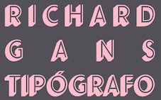 The Richard Gans Foundry is a defunct Spanish foundry which existed from 1888-1975. Richard Gans was the son of a medic from Karlsbad, Austria. He emigrated to Spain in 1874, and died in 1925. Until 1936 the foundry was led by Mauricio Wiesenthal, but in 1936, his children, Ricardo, Manuel and Amalia Gans Gimeno, now adults, took over. Ricardo and Manuel were assassinated during the Civil War. The foundry was used to make ammunition, and after the war, Amalia Gans and then Reinaldo Leger Tittel started anew in run-down buildings. The foundry operated roughly from 1881-1975. Throughout its existence, types were designed by a number of people from within and outside the foundry. Designers included José Ausejo Matute (d. 1998), Antonio Bilbao (who created Escorial in 1960), the son Ricardo Gans, and Carl Winkow. In the post-war era, Reinaldo Leger and Amalia Garcia Gans made typographic decisions on which types to produce, and acted as typographic directors. Richard Gans' grandson, José Antonio Gans García, is still alive today. Manuel Lage informed me in 2017 that he has inherited the Richard Gans collection.
 Six specimen books were published with titles like Fundicion Richard Gans Muestrario Edicion V. The first and second editions, rare books indeed, were published between 1883 and 1903. Editions 3 through 6 appeared in the period 1903-1922. The 1922 edition is here in its entirety (thanks to J.R. Penela). See also here. In 1965, a small catalog was published under the name Tipos Gans. The National Library in Madrid has Muestrario de Richard Gans (Madrid, Richard Gans, 1903, 410 pages) and Catalogo provisional (Madrid, 1950). On the web, the most complete discussion of Richard Gans is in the PDF file Fundicion Tipografica Richard Gans Historia y Actividad 1888-1975 (2004) by Dimas García Moreno and José Ramón Penela. Catalog of font names. Fonts: Until 1925, there were basically no original types. Almost everything in the specimen books of that era is due to German foundries, principally those of Wilhelm Woellmer in Berlin and Edmund Koch in Magdeburg. Some of those typefaces in common with Koch include Grotesca Chupada Redonda, Ronda Universal. Early types in this category also include Escritura Selecta, Escritura Favorita, Escritura Luis XV (it is being digitally revived by Manuel Lage), Gótico Globo (blackletter), Gótico Uncial (blackletter), Nueva Titular Adornada, Tipos de Adorno, Latina Moderna, Grotesca Ancha, Grotesca and Grotesca Chupada. Many, if not most of these, saw the light at the end of the 19th century and survived until 1965. It is fashionable now to revive all the typefaces. Nick Curtis created a few (see below), and Paulo W (Intellecta Design, Brazil) did many more. Intellecta Designs revivals include Gans Tipo Adorno, Gans Lath Modern, Gans Titular Adornada, Gans Ibarra, Gans Antigua, Gans Antigua Manuscrito, Gans Fulgor, Gans Radio Lumina, Gans Carmem Adornada, Gans Animals, Gans Italiana, and Gans Titania. The original Gans types can be categorized as follows: - Aldine.
- Anchas Americanas.
- Antigua El Greco (+Adornada, Cursiva, Negro, Negro Cursiva, Seminegro, Seminegro Cursiva, Titular), aka El Greco Antique. Weights include Antigua El Greco (1924), El Greco Adornado Titular (with Mexican-style sawteeth). Greco was the inspiration for Melina BT (Nick Curtis, 2003). Curtis' Melina Fancy is based on Greco Adornado. For a free version of Adornado, see GrekoDeco (1992, Dave Fabik). Revived as Kifisia Antigua NF in 2005 by Nick Curtis.
- Antigua. See the digital family Gans Antigua (2006, Paulo W). The Antigua series includes weights like Esbelta, Estrecha, Heraldo, Heraldo Cursiva, I, I Cursiva, I Titular, Mercantil, Negra, Prolongada, Universal, Universal Cursiva, Universal Negra, Universal Negra Cursiva, Universal Negra Estrecha, Universal Seminegra, Veneciana, Veneciana Cursiva, Veneciana Cursiva Fantasia.
- Antigua Manuscrito: a semiscript typeface designed by Hermann Delitsch at the Royal Academy of Graphic Arts in Leipzig. Delitsch was Tschichold's teacher. Digitized as a family by Paulo W as Gans Antigua Manuscrito (2006).
- Antigua Progreso (1923) (+Cursiva, Negra): an interesting serif face. A digital version called Bellini was made by A. Pat Hickson, 1992. Linotype sells Greco (DsgnHaus, 1996) which really is Progreso.
- Arabe.
- Atlántida.
- Azures.
- Bodoni and Bodoni Redonda.
- Carmen, Carmen Adornada, Velázquez, Españolas Adornadas, Antigua Adornada, Utopian, Tipos de Adorno, Americanas (Tuscan style), Americanas-Titular, Elzevirianas Adornadas: Late 19-th century style display typefaces. Paulo W (Intellecta Design) created the beautiful digital family Gans Tipo Adorno (2006). He also made the family Gans Titular Adornada (2006).
- Cartel.
- Cursiva Comercial.
- Dalia (or Ibarra Vaciada): a two-line display face. Similar to Delphian Open Titling (Middleton, Ludlow, 1928).
- Decorativa. Digitally revived by Manuel Lage as Decorativa RGf in 2017 and Volvoreta RG LG in 2021.
- Egipcia in weights called Estrecha, Negra and Nueva, ca. 1923; Egipcia Progreso (1923). The serifs are Venetian, heavy and oblique in the lower case. The ascenders and descenders are short and the strokes have almost no contrast, giving the typeface a stocky appearance. The e has a diagonal Venetian stroke, while the tail of the g is open.
- Elzeviriano: Anchas, Adornado, B, B Cursiva, Chupado, Ibarra, Ibarra Cursiva, Ibarra Titular, Negro.
- Escorial: a display typeface with Koch Antiqua influences, designed ca. 1960 by Antonio Bilbao. Additional weights include Cursiva, Seminegra and Titular. It is being digitally revived by Manuel Lage.
- Escritura Juventud (1950, Joan Trochut Blanchard): a great script with lots of identity and swing. Other Escritura styles: Decorativa (Manuel Lage is working on a digital revival), Gloria reformada, Isabel, Luis XV, Selecta.
- Espanolas.
- Etienne Ancha.
- Filetes de Bronce, Filetes de Metal.
- Fulgor (1930): a connected script face.
- Gacela.
- Galeria Coruna. Revived by Manuel Lage in 2008 as Galeria Coruna LG. In 2017 Lage was working on a further refinement of this typeface.
- Gaviota.
- Gloria (already listed above under Escritura), Gloria Reformada (1930): a connected script family. Gloria was revived by Nick Curtis in 2005 as Pismo Clambake NF.
- Gótico Cervantes (1928): blackletter with regular and ornamental caps.
- Gótico Globo: art nouveau style with blackletter influences. Revived by Intellecta Design in 2007.
- Gótico Uncial (blackletter).
- Graciosa (+Gris).
- Griego.
- Grotesca Ancha (+Fina, Negra, Nueva, Vaciada).
- Grotesca Antigua.
- Grotesca Chupada and Grotesca Chupada Redonda: a rounded sans.
- Grotesca Colón.
- Grotesca Compacta.
- Grotesca Cursiva (+Seminegra).
- Grotesca Estrecha Hercules.
- Grotesca Mercantil, Grotesca Mercurio, Grotesca Negra Cursiva.
- Grotesca Ideal (Negra, Fina, Entrelina), Grotesca Favorita, Grotesca Reformada.
- Grotesca Radio: a geometric no-contrast sans. Styles: Editorial, Estrecha Fina, Estrecha Negra, Fina, Fina Cursiva, Negra, Negra Cursiva, Seminegra, Seminegra Cursiva. For a revival and reinterpretation, see Radar (2019) by Marta Sanchez Marco for Type-o-Tones.
- Helenica (+Ancha, Ancha Negra, Ancha Seminegra, Cursiva, Seminegra).
- Ibarra (1931) and Ibarra Cursiva: a tall ascender garalde family. Ibarra Negra, Ibarra Negra estrecha, Ibarra Vaciada, Ibarra Redonda. See also under Elzeviriano above. Iniciales Ibarra.
- Imán: a shadow headline all-caps face. This was digitally revived in an authoritative way by Manuel Lage in 2016 as Iman RG.
- Inglesa Excelsior.
- Italiana (Cursiva, Titular), 1951, a black caps face. Italienne (Chupada, Moderna).
- Luxor (+Cursiva, Negro, Negro Estrecho).
- Manos (manicules, fists).
- Maquina de Escrebir.
- Maruxa. Manuel Lage is working on a digital version of this script type.
- Normanda (Ancha Negra, estrecha Negra).
- Nueva Antigua No. 1 and No. 2. Nuevas Titulares Adornadas.
- Orlas de Linea.
- Preciosa: Showboat-style Western look.
- Primavera: a condensed sans. Paulo W digitized a condensed family called Gans Lath Modern (2006). See also the extension Primavera (2016, Manuel Lage).
- Radio Bicolor: a headline sans family.
- Radio Gris. Scans of the Radio catalog of 1930.
- Radio Lumina: a display sans. Digitized as Gans Radio Lumina (2006) by Paulo W at Intellecta Design.
- Regina (+Estrecha), Helios, Vulcano (1920s): art nouveau style. Ludlow's Vulcan Bold is based on Vulcano.
- Renacimiento Ancha.
- Romana I (+Cursiva, Egipcia, Estrecha, Negra).
- Royalty.
- Senefelder: engraved look all caps.
- Talla Dulce (+Cursiva).
- Tipo Sombreado, Tipos Adornados, Tipos de Texto.
- Titania (1933): an elegant two-line poster face. See the revival (2006, Nick Curtis).
- Veneziana Negra.
showcase-gans/">View the digital revivals of typefaces by Gans. [Google]
[More] ⦿
|
Futura: Wikipedia
|
 From the Wikipedia entry:
 Futura is a geometric sans serif typeface designed in 1927 by Paul Renner. Although Renner was not associated with the Bauhaus, he shared many of its idioms and believed that a modern typeface should express modern models, rather than be a revival of a previous design. Renner's initial design included several geometrically constructed alternative characters and ranging (old style) figures which can be found in the typeface Architype Renner. Futura was commissioned by the Bauer type foundry. The success of Futura coincided with the creation of many competing geometric sans serif typefaces including Kabel, Metro, Vogue, Erbar and Spartan, Twentieth Century, and Century Gothic among others. Futura has an appearance of efficiency and forwardness. The typeface is derived from simple geometric forms (near-perfect circles, triangles and squares) and is based on strokes of near-even weight, which are low in contrast. (This is most visible in the almost perfectly round stroke of the o, but the shape is actually slightly ovoid.) In designing Futura, Renner avoided the decorative, eliminating non-essential elements. The lowercase has tall ascenders, which rise above the cap line. The uppercase characters present proportions similar to those of classical roman capitals. Uses of Futura by businesses: Graphic identity of Volkswagen and Union Pacific, Swissair (1950s to the 1990s), Boeing's flightdeck labeling, films by Wes Anderson and Stanley Kubrick, the commemorative plaque left on Earth's moon by Apollo 11 astronauts in July 1969, Ikea Sans and Opel Sans (Futura-based house fonts designed by Robin Nicholas), Doctor Who (BBC series), RAI Radiotelevisione Italiana, and Ferrovie dello Stato. [Google]
[More] ⦿
|
Gekiketz
|
Japanese free font maker. Besides some kana fonts, the following Latin fonts were available in 2007-2009: GKZ-0701 (pixel), GKZ-BurnBurn (pixel), GKZ-CLB (pixel), GKZ-Frox (party face), GKZ-GAZI, GKZ-KAKU, GKZ-Oriduru (oriental simulation), GKZ-Speedwrite, GKZ-crossjam, GtsAbstract, GtsArcadia, GtsImprovisation, Gtsfrontline, Gtsgazigazi, Gtslandscape, Gtsprogressive, Gtsshiranami, Gtstransition. Most of these are pixel fonts or experimental. Hiragana typefaces: GKZ-Okome, GKZ-Shiranami, Katakana typefaces: GKZ-ORIDURUKANA, GKZ-RAIGEKI, GKZ-Radiohour (pixel), GKZ-Sryder. Obsolete URL. [Google]
[More] ⦿
|
George Toumbalis
|
 Giorgos Toumbalis studied Image processing and DTP at DOME Design School in Athens. He is considered an expert on graphic design issues and he is a regular columnist in +Design, the Greek magazine on aesthetics and design issues. He started his first business in 1996 and some of his major clients include Sony Music, BMG, Warner Music, Capital Radio 96.5, Planet Works, Filmnet, Flash.gr. Some of his font designs, released by Parachute, include PF Mechanica B (2002-2006: a tiled typeface for Latin, Greek and Cyrillic) and PF Overload. [Google]
[More] ⦿
Giorgos Toumbalis studied Image processing and DTP at DOME Design School in Athens. He is considered an expert on graphic design issues and he is a regular columnist in +Design, the Greek magazine on aesthetics and design issues. He started his first business in 1996 and some of his major clients include Sony Music, BMG, Warner Music, Capital Radio 96.5, Planet Works, Filmnet, Flash.gr. Some of his font designs, released by Parachute, include PF Mechanica B (2002-2006: a tiled typeface for Latin, Greek and Cyrillic) and PF Overload. [Google]
[More] ⦿
|
Glen Jan
[Elena Kowalski]
|
 Glen Jan is the foundry of type designer Elena Kowalski (b. 1986) in Ufa, Russia. Elena created the Latin / Cyrillic typeface Sreda Slab Serif (2011), Road Radio Sans Serif (2011) and Affect Sans Serif (2011, a fashion sans family for Latin and Cyrillic).
 Typefaces from 2012: Road Radio (sans family), Sceptica (a 12-style sans text family), Room (a display geometric all caps sans serif typeface family), Idealist Sans (a humanist sans for Latin and Cyrillic: free download), Echoes Slab, Echoes Sans. Typefaces from 2013: Leto Sans, Leto One (a display slab), Leto One Condensed, Leto Two, Affect. Typefaces from 2014: Certa Sans (a very legible Latin/Cyrillic sans family with some flaring in the strokes; Medium is free), Leto Slab. Typefaces from 2015: Leto Text Sans (a neutral sans family). Typefaces from 2017: Asket (sans). Typefaces from 2018: Morpha (by Elena Kowalski and A. Ego), Certa Serif. Typefaces from 2019: the sans typeface Atenta (2019, with A. Ego). Typefaces from 2020: Alter Biom (by Elena Kowalski and A. Ego), Alter Aves (by Elena Kowalski and A. Ego), Minor (a 12-style grotesk by Elena Kowalski and A. Ego). Behance link. Open Font Library link. [Google]
[MyFonts]
[More] ⦿
|
Graphunki
|
Free and commercial (predominantly techno) fonts. Among the free fonts: KZ-Cubist, KZ-Gravity, KZ-Turbo. The commercial fonts are sold on a CD: KZ Tank, KZ Spellbound, KZ Scratcher, KZ Radiostar, KZ Racer, KZ Lord, KZ Cybone1 and 2. [Google]
[More] ⦿
|
Hal Taylor
|
 Designer of Radio at T-26 in 2001. In 2005, he created ITC Stepp, a text and display family based on the 1930 logo for the Stetson Shoe Company of Weymouth, MA. See also here. In 2007, he designed Flexion Pro (Red Rooster), about which MyFonts writes: Flexion developed out of design philosophy and ambigramatic artwork of John Langdon. Based on the contents in Johns book Wordplay, author Dan Brown hired John to create ambigrams for his forthcoming novel Angels&Demons. Mr. Brown was so impressed with his work he even named the main character Robert Langdon after John. After the success of Angels&Demons, Dan Brown wrote The Da Vinci Code. When the movie adaptation of that book was in the works, Dan suggested that John create titles for the movie based on ambigrams. John contacted Hal Taylor to create a font based on the lettering treatment to be used for the credits at the end of the movie. Unfortunately, it was decided that the film was running long and the original title concept was scrapped. By this time, Hal was well into developing a full type family, including small caps, alternate characters, lining and ranging figures. John was impressed with the way the design was turning out and decided that it had enough merit to be released as Flexion. Jeeves (2009, Red Rooster) is an elegant script face. Wells Grotesque (2010, Red Rooster) was inspired by the H.G.Wells science fiction novel War of the Worlds, first published in 1898.
 FontShop link. Klingspor link. [Google]
[MyFonts]
[More] ⦿
|
Harold Lohner
[Harold's Fonts]
|
 [More] ⦿
|
Harold's Fonts
[Harold Lohner]
|
 Harold Lohner was born in upstate New York in 1958. He received an MFA in printmaking from the University at Albany and is Professor of Visual Arts at Sage College of Albany. He began making fonts in 1997 and starting distributing them the next year through Harold's Fonts. He lives in Albany, NY, with his partner, Al Martino. Originally, most of his typefaces were freeware or shareware, but gradually, he started selling most on his site or via FontBros. His typefaces:
 Link at Dafont. . Abstract Fonts link. [Google]
[More] ⦿
|
Hugo Beyts
|
 UK-based creator (b. 1975) of the poster typeface Ice Station Awesome (2011), Bright Young Things (2011), and the scratchy hand Yellow Back Radio (2011). John Wayne Ford (2014) is a poster typeface based on the ads for The Train Robbers. Cinder (2014) is a poster typeface.
 Dafont link. [Google]
[More] ⦿
|
Iconian Fonts
[Dan M. Zadorozny]
|
 Born in Philadelphia and a resident of McKinney, Texas, Dan Zadorozny's creations at Iconian. He is a prolific type designer who specializes in techno and sci-fi typefaces. Dafont link. Fontsy link. Abstract Fonts link. Font Squirrel link. His fonts in alphabetical order:
 - #44 font (2002), 00Starmap (2001, pixel font), 1968 Odyssey (2016), 1st Cav (2008), 1st Enterprises (2017), 2-Tech, 21 Gun Salute (2013), 2nd Amendment (2007, guns), 2nd Amendment 2050 (2009, more gun silhouettes), 2Toon, 300 Trojans (2008, comic book family), 4114 Blaster (2008, futuristic), 5th Agent (2008, techno), 7th Service (2002), 8th Element (2013), 911Porscha, 98 Bottles of Beer (2016).
- Achilles, Action-Men (2008), Action Women (2008, female outlines), Aegis (2010, Greek simulation family), Aetherfox (2013), AirCobra (2002), Aircruiser (2011, trekkie family), AirForce (planes and copters), Airstrike (2013), Airstrip One (2003), Aldo's Moon, Aldo's Nova, Alexis (2001), Alien League, Alpha Century (2020), Alpha Men (2015), Alpha Sentry, Alpha Taurus (2007, octagonal, athletic lettering), Amalgam, American Kestrel (2019), Americorps (2012), Ampire (2019), Anakefka (2009, ultra-fat family), Annapolis (2016), Antietam (2015), Antikythera (2013, Greek simulation face), Antilles (2009, sans family), Arctic Guardian (2019), Argosy, Arilon (2008), Armed Lightning (2017), Army Rangers (2013, octagonal), Assassin Nation (2015, scary and perhaps referring to the "tradition" of school shootings in the USA), Astro Armada (2020: sci-fi), Astropolis (2009), Atlantia (2012, futuristic), Avenger (2008, futuristic).
- Babes&Bond (2009, erotic silhouettes), Babe-alicious (2002, erotic outlines), Bad Axe (2017), Bad Robot (2007, computer game look), Bal-Astaral (2016, octagonal), Bamf (2011, techno family), Banjin (2016), Banshee Pilot (2016), Barcade (2018), Battlefield, Battleworld (2016), Beam Rider, Beam Weapon (2015), Beastian (2011), Behemoth (2018), Ben Zion (2008, Hebrew simulation), Berserker (2008, grunge), Beta Biergärten (2008), Big Blue Bug (2021), Bio-disc, Bio-discSolid, Bio-discThin, Bionic Comic (2002), Bionic Type (2002), Birds of a Feather (2007, dingbats), Black Bishop (2015), Black Gunk (2016), Blade Singer (2021), Blizzard Shaft (2020), Block, Blood Crow (2009), Blood Drenched (2020), Bloodlust (2011, dripping blood face), Blue Cobra (2020), Blue July (2009), Body Swipers (2014, Halloween font), Bog Beast (2013), Bomber Escort (2020), Boomstick (2015), Borgsquad (2014, mechanical/octagonal), Bretton (2018), Brin Athyn (2008, uncial/Celtric), Broken Cyborg (2019), Bronic (2004), Bubble Butt (2014, bubblegum typeface), Buchanan (2016), Buddy Champion (2015), Bummer (2007, octagonal), Bushido (2008, oriental simulation), Butch and Sundance (2013), Buttons the Bear (2008, children's hand), Byte Police.
- Camp Justice (2018), Capella (2011, a wide techno family), Capricus (2018), Captain Canaveral (2019), Carnival Corpse (2016), CasperComics, Centaurus (2015), Chardin Doihle (2008), a useful informal handprinting family), Charlemagne, Charlie's Angles (2018: octagonal), Charmling (2019), Cheyenne Hand (2008), Chicago Express (2016), Christendom, Classic Cobra (2016), Clubber Lang (2013, grungy), Cobalt Alien (2015), C.O.D.E.R. (2012), Coffin Stone (2019: a stone age font), College Collage (2017), Colony Marines (2017), Colossus (2011, old chipped stone look), Combat Droid (2019), ComicBookCommando, ComicFX, Commonwealth, Concielian, Concielian Break (2015), Concielian Classic (2018), Concielien Jet (2015), Contour of Duty (2016), Corinthian, Count Suckula (2015, horror font), Covert Ops (2012, army stencil), Coyote Deco (2007, art deco), Crappity-Crap-Crap (2007), Crazy Ivan (2017: constructivist), Creepy Crawlers (2015, horror font), Crime Syndicate (2013), Crixus (2011, a squarish sans that includes an athletic lettering style), Cro-Magnum (2003), Cruiser Fortress (2016), CryUncial, Cyberdyne (2016), Cyberia (like Soviet: neat Russian imitation letters), Cyborg Rooster (2015), Cydonia Century (2017), Cyrus The Virus (2012, grungy, hand-printed).
- DS Man, Daedalus (2008), Daemonicus (2012), Dagger Dancer (2020), Dameron (2016), Dangerbot (2016), Danger Flight (2015), Dan Stargate (2008), Dan'sHand, Dark Alliance (2014), Dark Dominion (2019), Dark Hornet (2020: a great blocky mechanical typeface family), Dark Horse (nice brush font), Darklighter (2018), Darkwind, Dassault (2013), Deathblood (2014, Halloween font), Deathshead (2019: a metal band font), Deceptibots (2019: stencil), Defcon Zero (2016), Dekaranger (2015), Delta Phoenix (2019), Delta Ray, Demon Priest (2013), Department-K, DepartmentH, Deranian (2008), Devil's Tongue (2019), Detonator, Devil Summoner (2014), DiegoCon (2004), Digital Desolation (2014), Ding-o-saurs (2007), Direktor (2008, Cyrillic simulation techno), Dire Wolf (2013), Disco-Dork, Disco Deck (2005), Disco Duck, Discotechia (2015), Dodger, Dokter Monstro (2017: a great fat hand-painted typeface), Domino Jack (2016, an octagonal stencil typeface), Domino Mask Condensed (2016), Dotcom (2002), Drafting Board (2008), Drafting Table (2008), Dragon Order (oriental simulation), Dread Ringer (2015), Drid Herder (2002), Drive (2015, techno font), Droid-Lover (2008), Drone Tracker (2016), Drosselmeyer (my favorite), Dusk Demon (2020: grungy).
- Eagleclaw (2009), Eaglemania, Eagle Strike (2015), Early Warning (2021), Earth Orbiter (2016), Earthrealm (2013), Earthshake (2013), Earth's Mightiest (2002), East West (2015, constructivist), Echo Station (2017), Eco-files, Edge Racer (2917), Egg Roll (2016, oriental simulation), Elastic Lad (2020), Eldebaran (2012), Elder Magic (2009), Election Day (2009), Elephant Gun (2021), Elite Danger (2017), Emissary (2014, sci-fi), Empire Crown (2011, blackletter), Enduro, Ensign Flandry, Ephesian (2007), Eridanus (2015, octagonal / mechanical), Erin Go Bragh (2009, Celtic/uncial), Escape Artist (2015), Eskindar (2013), Eternal Knight (2013), Eurofighter (2015), Eva Fangoria (2018: a dripping blood font), EverettSteele'sHand, Excelerate, Excelsior, Excelsior Comics, Exedore (2008), Exoplanet (2013, techno), Extechchop (2005), Eyes Only (2018).
- Factor (2016), Falconhead, Falcon Punch (2015), Famous Spaceships (2007), Famous Spaceships 2 (2019), Fanfare Ticket (2018: dot matrix family), FantasticCreatures, Fantazian (2003), Fantom (2009, bad handwriting), Federal Blue (2019), Federal Escort (2014), Federal Service (2011), Federapolis (2008, octagonal techno face), Fedyral (2019), Fedyral-II (2019), Feldercarb (2003, octagonal font), Ferret Face (2013), Fiddler's Cove (2012), Fight Kid (2009), Final Front (2019), First Order (2001), Flash Rogers (2016), Flesh Eating Comic (2013, grunge), Flight Corps (2008, techno/pixelish), FlyingLetaherneck (2002), Force Commander (2019), Force Majeure (2016), Foreign Alien (2020), Foucault (2014, uncial), Fox on the Run (2018), Fox on the Run Academy (2018: athletic lettering), Frank-n-Plank (2013, a wooden plank font), Freakfinder (2014: Halloween font), Free-Agent (2008), Freedom Fighter (2013, stencil), From Bond With Love (2014: military stencil), Front Runner (2019), Frost Giant (2019), Frozen Crystal (2016, LED font), Funk Machine (2016, a great ultra-black techno family of typefaces), FunnyPages, Furiosa (2019), Future Forces (2015), Futurex Grunge (2005).
- Galactic Storm (2014), Galant, Galaxy-1 (2008), Galaxy Far Far Away (2009, futuristic dingbat font), Galaxy Force (2014), Galga (2008, futuristic), Gamma Sentry, Gemina (2011, sci-fi / techno family), Gemina2 (2013), Generation Nth, Gentleman Caller (2014), GeoBats (2007), Gearhead (2013, octagonal), Ghost Clan (2014), GI Incognito (2012), Global Dynamics (2014), Globe Trekker (2021), Goalie (2008, hockey mask alphading), Goblin Creek (2016: Halloween font), Gods of War, Gotharctica (2015, blackletter for horror flicks), Governor (2017), Graffiti Street (2019), Grand National (2015), Grand Sport (2015), Graymalkin (2011, trekky), Grease Gun (2012), Grendel's Mother, Grim Ghost (2013), Ghoulish Intent (2016: Halloween font), Grimlord (2009), Groovy Smoothie (2018), Guardian (2008), Guardian-Laser (2008), Guardian-Pro (2008), Guardian-Shadow (2008), Gunner Storm (2015), Gunrunner (2016: techno), Gunship, Gunship V2 (2002), Gypsy Killer (2013), Gyrfalcon.
- Hadriatic (2008, roman lettering), Half Elven (2013), Halfshell Hero (2013), Hall of Heroes (2007), Halo, Hanging Tree (2019: a wood print emulation font), Han Solo (2013), Hard Science (2019), Harrier (2002), Hawkmoon (2011), Head Human (2021), Heavy Copper (2020), Heavy Falcon (2019), Hello Copters (2013: helicopter dingbats), Hemogoblin (2017: spooky font), Heorot (2009, stone age fonts), Hermetic Spellbook (2017: alchemic), Heroes Assemble (2011), Heroes Assemble Dingbats (2014: all Avenger characters), Hero Worship (2021), Hexgon (2018), Hexkey (2020), Highrise Heaven (2007, city skyline dingbats), Hip Pocket (2014: psychedelic), Hitchblock (2017), Hollow Point (2015), Holly Dingle (2015), Holy Empire, Home Base (2020), Homemade-Robot, Holo Jacket (2016), Homebase (2020: heavy, octagonal), Homelander (2020), Homeworld (2003), Homeworld Translator (2003), Hong Kong Hustle (2015), Horroroid (2015), Horroween (2013, Halloween font), Hot Kiss (2017: paint splatter font), Howlin Mad (2017), Hula Hoop Girl (2019), Hulkbusters, Hydronaut (2019), Hydro Squad (2014), Hyper Vyper (2019: octagonal), Hypno Agent.
- Iapetus (2014, sci-fi), Icebox Art (2012), iChrono (2018), IWantMyTTR!, Iconian (2002), Iconified, iDroid (2020), Illuminati, Illumino (2016), Imaginary Forces (2008, mythical dingbats), Imperial Code (2003, Startrek style face), Imperium, Incubus, Incubus-Italic (2008), Incubus-Shadow (2008), Indigo Demon (2017), Infinity Formula (2003, super techno), Infobubble, Inhumanity (2014), I-House Edition (2014), Inspector General (2020), Instand Zen (2016: Halloween font), Inter Bureau (2019), Interceptor (2008), Interdiction (2012), Intergalactic (2017), International Super Hero (2002), Intrepid, Iron-Cobra (2008), Iron Forge (2012).
- Jack's Candlestick (2013), Jackson, Jannisaries, Jedi Special Forces (2012), Jeebra (2018), Jerusalem (1999, Hebrew font simulation)[see also here], Jetta, JettaTech, Jetway (2012, a stencil face), Johnny Torch (2012), Joy Shark (2018), Judge, Judge Hard, Jugger Rock (2018), Justice (2009), Jumpers (2017), Jumptroops (2003-2015), Justinian.
- Kahless, KameraDings (2009), Kangaroo Court (2018), KarateChop (2009), Kartoons (2008), Katana, Kaylon (2019), Kennebunkport (2013, script), Keystone (pixel font), Khazad-Dum (2011), Kid Cobalt (2008, comic book face), Kinex, King Commando (2011), King's Ransom, Kinnihuman (2020: dingbats), Knievel, KnightsTemplar, Kittrick (2019: a heavy octagonal type), Knock Furious (2003, dingbats), Kobold (2008, futuristic), Kondor (2013), Kountry Kodes (2008, international license plate lettering), Kovacs (2018), Kovacs-Spot (2016), Kreature Kombat (2018), Kreeture (2002), Kubrick (2008).
- Lamprey (2012, techno family), LandShark (2001), LandWhale (2001), Laredo Trail (2013, a Western face), Laser Corps (2020), Laserian, Laser Wolf (2018), Law and Order (2005, dingbats), League Wars (2013, sci-fi stencil), Leatherface (2013), LED Sled (2016, LED font), Left-Hand Luke (2016), Legacy Cyborg (2019), LegalTender, Legion, Legionnaires (2017: silhouettes), Legio Sabina (2017), Lethal (2014), Liberty Island (2013, sci-fi), Liberty Legion (2015), Lifeforce (2018), Light Brigade (2018), Lightsider (2011, Star Trekkish family), Lincoln Lode, Livewired (2015, sci-fi), Lionel (2009), Low Gun Screen (2008, a totally square screen type family), Lincoln Chain, Lionheart, Lobo-Tommy (2008), Lord of the Sith, Loveladies, Low Gun Screen (2008, screen face), Lux Contra Tenebras (2018: a fat Textura typeface).
- Machiavelli, Mad Marker, Magic Beans (2007), Major Force (2016), Mandalore (2019: squarish), Marathon-II, Marathon, Marsh Thing (2014, Halloween font), Masked Marvel (2002), Master Breaker (2017), Masterdom (2004), Merri Christina (2015, children's hand), Metal Storm 3D (2008), Metronauts (2013), Metroplex, MetroplexLaser, MetroplexShadow, Michaelmas, Michigan (2015), Milk Bar (2003), Micronian (2008, extensive pixel-based family), Military-RPG (2008), Mindless Brute (2015), Miracle Mercury (2017), Missile Man (2002, futuristic), Miss Amanda Jones (2004, brush style), Mister Twisted (2018), Mobile Infantry, Modi Thorson (2013, techno), Monsterama (2011, scary face), Monster Hunter (2017), Montroc (2015: squarish and varsity style), Moon Dart (2008), Moon Runner (2016), Morse Kode, MorseNK, Motorama (2018: car maker icons), Movie Gallery (2008, dingbats), Mrs. Monster (2013, Halloween brush font), Mystery Mobile (2015), Mystic Singler (2008, rough brush face).
- Nathan Brazil (2013, art deco), National Express (2003), Native Alien, Navy Cadet (2016), Nemesis Enforcer (2013), Neo-Geo (like the letters on the Neon cars), Neo Navy (2015), Neuralnomicon, Neuralnomicon (2018), Neutron Dance (2020), New Come Title (2016), New Mars (2015), New York Escape (2015), Nextwave (2014), NGC 292 (2020), Nick Turbo (2001), Nicomedia (2020), NifeFite, NifeFiter, NifeFites, Nightchilde (2013), Nightmare Alley (2016: Halloween font), Nightrunner (2008, sci-fi), Night Traveler (2020), Nightwraith (2011, techno family), Ninja Garden (2018), Ninjas (2002), Nobody's Home (2014: poster font), NoloContendre, Northstar (2014), Nostromo, Nuevo Passion (2013), Nyet (2002, Soviet letter simulation).
- Oberon, Oberon-Deux, Obsidian Blade (2020), Obsidiscs (2003, dingbats), Oceanic Drift (2013), October Guard (2013, Cyrillic simulation face), Odinson (2007, runes), Oh Mighty Isis (2014, Greek simulation family), Olympic Carrier (2017), Olympicons (2003), Omega 3 (2010, futuristic), Omega Flight (2020), Omega Force (2013, octagonal / mechanical), Omega Sentry, Omni Boy (2019), OmniGirl (2003, techno), Opilio (2012), Opus Magnus (2013, metal band font), Opus Mundi (2015), Oramac (2004), Ore Crusher (2013), Oubliette (2020), Outlands-Truetype (2001), Outrider (2013), Overstreet Bible (2014, hand-printed), Ozda (2011, a fat techno family with several horizontally striped styles), Ozymandias.
- Psyonic VII (2012), Paladins (2015), Pandemonious Puffery (2002), Parker's Hand (2002, handwriting), Peace & Houston (2019: squarish), Pepperland (2019), Perdition, Peregrine, Phantacon (2017), Phaser Bank (2008, techno), Philadelphia, Philly Dings (2003), Phoenicia (2015), Piper Pie (2007), Pistoleer (2011), Planet N (2016), Planet S, Planet X, Player 1 Up (2012: architectural family), Pocket Ball (2016, dot matrix style), Pocket Monster (2016), Police Cruiser (2013), Postmaster, Power Lord (2011), Predataur (2019), Presley-Press (2007), Press Darling (2012), Procyon, Prokofiev (2009, rounded and squarish), Promethean (2008), Protoplasm, Prowler (2013), Pseudo Saudi (1999, Arabic simulation), Psycho Butcher (2014, ransom note font), PuffAngel, Pulsar Class (2018), Pulsar Class Solid (2018), Pulse Rifle (2009), Punch (2020), Pyrabet.
- QTs (2013: erotic silhouettes), Quake-&-Shake, Quantum of Malice (2013), Quark Storm (2013), Quarrystone (2015), Quartermain (2002), Quasar Pacer (2018), Quasitron (2009, futuristic), Quatl (2002, an Inca font), Queen&Country (2009), Quest Knight (2009), Questlok, Quicken (2013, horizontal stencil), Quickening (2014), QuickGear (2019), Quickmark (2004), Quick Quick (2019), Quick Strike, QuickTech, Quill Sword (2016: soft blackletter style).
- RCMP, Racket Squad (2017), RadZad, Radio-Space, Raider Crusader (2016), Raise Your Flag (2013), Range Paladin (2018), Ranger Force (2020), Realpolitik, Rebecca, Rebel Command (2012, Star Trek family), Redcoat (2008, blackletter), Red Delicious (2019), Redline (2015), Red Rocket (2011, techno), Red Undead (2016: Halloween font), Regulators, Renegado (2014), Replicant, Repulsor (2013, pixelish), Rhalina (2011, a nice upright script), Rhinoclops (2019), Righteous Kill (2009), Right Hand Luke (2016), Robo Clone (2018), Robotaur (2008), Rocket Junk, Rocket Pop (2016), Rocket Type (2002), Rockledge (2019: an eroded stone look font), Rogue-Hero, Roid Rage (2003), Ro'Ki'Kier (2008), Rosicrucian (2009, stone age font), Royal Samurai (2018), Rubber Boy (2013, poster font family), Rumble Tumble (2020: a rough military stencil), Rune Slasher (2019).
- Sable Lion (2002), Sagan (2008, futuristic), Samurai Terrapin (2018: blocky), Scarab, ScarabScript, Sci-Fi (2008), SDF (2013), Sea-Dog, Searider-Falcon (2008), Secret Files (2011), Sever, Shablagoo (2015: thick creamy poster font), Shining Herald (2013), Shogunate (2019: a heavy octagonal typeface), Singapore Sling (2014), SisterEurope, Skirmisher (2014), Sky Cab (2017), Skyhawk (2014), Sky Marshal (2015), Sky Ridge (2020), Snubfighter (2009, sci-fi), Soldier (2011), Soloist (2018), Sound FX (2003), Soviet, Space Cruiser, Space Junker, Space Ranger (2013), Space Runner (2019), Spartaco (2016), Speed Phreak (2020), Speedwagon (2015), SPQR (2008, grunge roman), Spy Agency (2012), Spy Lord (2001), Starcruiser (2019), Starduster (2011), Star Eagle (2014), Star Fighter (2017), Star Guard (2019), Star Navy (2009: dingbats), Star Nursery (2018, fat stencil), Stranger Danger (2014: grunge), Strike Fighter (2017), Strikelord (2011, trekkie family), Stuntman, Subadai Baan (2013), Super Commando (2015), Super Soldier (2014, silhouettes), Super Submarine (2017: stencil), SuperUltra911, Superago (2002), Swordtooth (2017).
- Talkies (2008, dingbats), Tarrget (2013, based on the Tekken "Tag Tournament" logo), Taskforce (2008), Tauro (2012), Team America (2014), Team Galaxy (2020), Tele-Marines, Tempest Apache (2018), Terra Firma, Terran, Terror Babble (2017), Texas, Texas2, The Immortal (2019), TheRifleman, The Shire (2009), The Shooter (2012: gun dingbats), Texas Ranger (2014: Western font), Thundergod, Thundergod II (2013), Thunder-Hawk (2011, an aviation techno face), Thunderstrike (2016), Thunder Titan (2017), Thunder Trooper (2017: stencil), Tigershark (2013), Timberwolf (2011), Time Warriors (2007), Tokyo Drifter (2016), Tool (2012, dingbats of tools), Toon Town Industrial (2005, comic book font), Tower Ruins (2014: stencil), Tracer (2015), Trajia (2008, a techno/stencil/athletic lettering family), TransAmerica (2015), Traveler (2008), Travelicons (2009), Travesty (2003, scrawly handwriting), Trek Trooper (2008, Startrek font), Trigger Man (2013, octagonal and mechanical), Trireme (2011, Star trek family), Tristram (2008, uncial), Troopers (2011, futuristic), Trueheart (2009, Celtic), Turbo Charge (2016), Turtle Mode (2020: heavy octagonal), Tussle (2002), Typeecanoe (hand-printed), Typhoon (2013).
- Uberholme, Uberholme Lazar (2001), UFO Hunter (2009), Uglier Things (2018), Ultra 911, Ultramarines (2013), Underground Rose (2014, connect-the-dots), Union Gray (2015), Unisol, United Palanets (2014), UniversalJack, Uno Estado (2009, constructivist), Urban Defender (2019), U.S.A., US Angel (2017), USArmy, US Army II (2013), US Marshal (2012), US Navy (2007), U.S.S. Dallas (2008), Usuzi.
- Valerius (2009, uncial), Valiant Times (2021), Valkyrie (2008), Valley Forge (2008), Vampire Bride (2016: Halloween font), Vampire Games (2001), VariShapes (2001), Viceroy of Deacons (2016), Vicious Hunger (2014, grunge), Victory Comics (2017), VideoStar, Vigilante Notes (2003), Viking Squad (2015, stencil), Villain Team-Up (2020: a fat finger font), Vilmos Magyar, Vindicator (2012, techno), Virgin Hybrid (2014), voxBOX, Voortrekker Pro (2009: octagonal and athletic lettering family), Vorpal (2012: sci-fi stencil face), Vorvolaka (2013), Voyage Fantastique (2013), VX Rocket (2014, fat octagonal face), Vyper (2008, futuristic stencil).
- War Eagle (2009), Warlock's Ale (2014), War Machine, War Priest (2012), Warp Thruster (2013: military or Star Trek stencil), Warrior Nation (2011), Wars of Asgard (2009), Watchtower (2012), Weaponeer (2008, military lettering), Ween Dings (2918: Halloween dingbats), Were-Beast (2008), Westdelphia (2015, blackletter), Western Rail (2015), Wet Works (2013, grungy stencil), Whatafont, Ensign Flandry (2003), Whiskey Bravo (2003), Whovian (2015, scanbats of all Dr. Who characters owned by the British Broadcasting Corporation), Wiccan Ways (2020: alien writing), Wicker Man (2017), Wildcard (2011, Star trek family), Wimp Out (2004), Winter Solstice (2016), Wolf Brothers (2015), Wolf's Bane (+II, +Super-Extended, 2013), Woodgod (2013), Worldnet (great), Worm Cuisine (2016), Write Off, Writer's-Block, WyldStallyns.
- Xaphan (2003), XBones (2018), XCryption (1999, a hacker face), X-Fighters (2014), XPED, Xcelsion (2002), Xeno Demon (2017), Xenophobia, Xephyr, Xeppelin (2005, zeppelin dingbats), X-Grid (2008), Xiphos (2007), Xmas Xpress (2013), Xoxoxa, X-Racer (2012).
- Yahren, Yamagachi 2050 (2019), Yama Moto (2009: oriental simulation), Yankee Clipper (2011), Yay USA (2013), Year 2000, Year3000 (2001), Yellow Jacket (2002), Yeoman Jack (2021), Y-Files (2016), Yiroglyphics (2004), Yorstat (oriental simulation), Younger Brothers (2014), Younger Blood (2017), Young Frankenstein (2013), Young Patriot (2019: squarish), Youngtechs (2008, futuristic), Yukon Tech, Yummy Mummy (2018).
- Za's Vid (2001, pixel font), Zado (2002, dot-matrix font), Zakenstein (2011, caps only grunge), Zamboni Joe (2002, hand-printed)), Zealot (2008), Zee Lance, Zen Masters (2002, pixelish), Zero Prime (2019), Zeta Reticuli (2019), Zeta Sentry (2009, techno/futuristic), Zirconian (2021), Zollern (2013), Zombie Control (2013: a bloody paint drip face), Zone Rider, Zoologic (2009, animal dingbats), Zoomrunner (2016), Zounderkite (2017), Zyborgs, Zymbols.
[Google]
[More] ⦿
|
Intellecta Design (or: Monocracy Types)
[Paulo W]
|
 Intellecta Design is a design company in Brazil run by Paulo W (b. 1970) from Recife. In 2020, he also set up Monocracy Types. Paulo W is a gaúcho (Brazilian southerner), with interests in multiple areas, including poetry (he has published the digital opus Magical Book), graphic design and, most recently, type design.
 Dafont link. MyFonts. MyFonts link. Abstract Fonts link. YWFT link. Behance link. Blog. Home page. Fonthaus. Monotype. Eshops. Facebook. Flickr. Klingspor link. Wordpress. Devian tart. T26. Linkedin. Identifont. Linotype. ITC. Faces.co. His typefaces: - Free fonts: Inductive Resonance (2014: connected script), Retrodings (+Two, 2014), Living In The Past (outlined Tuscan face), Rough Ornaments Free (2014), CornPop Three (borders), Too Good To Be True (2013, retro script), Blanchard Inland (2013), Living Together (2013), Arresto (2013, brush script), Hertziano (2013, non-connected fat script), Japanese Tourist (2013), Nouveau Never Dies Free (2013), The Beat Goes On (2012, fifties script), Stencix (2012), Figgins Brute Trash (grunge), Fontaniolo Beveled (2011, ornamental caps), Czech Gotika (2011), Random Dingbats (2011), Victorian Free Ornaments (2011), Rustic (2011), Armorial (2011), Woman Silhouettes (2011), The Nile Song (2010, hieroglyphics), Smith Typewriter (2009), Sign Flags (2010, semaphore dingbats), Senectus Morbus (2010), MesoAmerica (2010, Indian symbols), ClassicSketches (2010, dingbats), Columns (2010, dingbats of Greek and Roman columns), EasyCuneiform (2010), EasyLombardicTwo (2010), EasyOpenFace (2010, blackboard bold style), Egidia (2010), Significante (2010, dingbats with, e.g., gender symbols), WhiteDominoes (2010, domino pieces), Easy Heraldics (2010), Intellecta Heraldics (2010), Heraldic Devices (2011), KidingsFree (2010, dingbats), RoughTuscan (2010), The French (2009, Fleur de Lys dings), AprendizCaligrafico (2010), Volitiva (2006, Trajan caps and chancery lower case, all based on work by Ludovico Vicentino Arrighi), Gaivota (2006), KurrentKupferstichThin (2006), PaulKlein (2010), PaulKleinTwo (2010), PortuguesArcaicoLectura (2005), ReproxScript (2009, based on Jerry Mullen's Repro Script from 1953-1954), RickGearyHomage (2007, scanbats), WestBalaio (2006, ornamental caps), Corto Maltese (2006, scanbats), Renaissance Coiffure (2006), Renaissance Ornaments (2007), Renaissance Shoes (2012, free), TTF Tattoef (2006, tattoo-inspired dingbats), ExperiTypo5 (2006), Lower Metal (2006), Geometric Serif PW (2006), Geometric (2006), Geometric Petras PW (2006), War II Warplanes (2005), Carbono (2005), Times New Vespasian (2005), BoldBold (2005), Vengeance (2005), Doppleganger (2005), Chancelaresca (2005), Cursivo Saxonio (2005), Gotische Minuskel 1269 (2005: a Kanzlei Schrift after Dekan Hermann zu Soest, 1269) and Guto Lacaz (2005, dingbats).
- Richard Gans revival project: Gans Tipo Adorno, Gans Lath Modern, Gans Titular Adornada (2006), Gans Ibarra (2006, after Carlos Winkow's Elzeviriano Ibarra), Gans Antigua (2006), Gans Antigua Manuscrito (2006), Gans Radio Lumina (2006), Gans Fulgor (2006), Gans Carmem Adornada (2006), Gans Italiana (2006, extensive Italian-style slab serif family), Gans Titania (2007), Gans Titania Adornada (2007), Gans Titular (2007), Gans Gotico Globo (2007: 9 styles by Iza W), Gans Royality (2007: 3 styles by Iza W), Gans Headpieces (2008), Gans Rasgos Escritura (2010: filets---followed in 2011 by Rasgos Escritura Nuevos), Gan Esquinazos (2010, frames), Gans Blasones (2010, shields), Gans Neoclassic Fleurons (2008), Gans Classical Fleurons, Gans Ding.
- Wood-inspired typefaces: Dead Wood Rustic (2007), Taranatiritza (5 wood type styles, after William Hamilton Page), Majestade (2007, by Iza W---two Tuscan style typefaces), Decorative Tuscanian (2007), Concave Tuscan (2010, wood type), Palermo (2007, by Iza W---Tuscan style family), Teatro (2009, Tuscan), Bruce Double Pica (2009, Tuscan; the Beveled weight is free), Antique Extended (2010, slab serif wood type), Dark Wood (2009, gothic), Dark Wood Beveled (2011).
- Charles Bluemlein's script revivals: Bluelmin Kisaburo (2013), Bluelmin Ralph (2012), Bluelmin Ronald (2012), Bluelmin Sandsfort (2012) and Bluelmin Benedict (2012). (2012).
- Blackletter: Salterio (2012, +Trash, +Three, +Gradient, +Shadow, +Shadow Two), Leothric (2011, bastarda), Bruce 532 Blackletter (2011, after George Bruce), Schneider Buch Deutsch (2007, +Trash, +Shadow, +Shadow Two), Schneidler halb fette Deutsch (2009, +Beveled), Schneidler Zierbuchstaben, Hostetler Fette Ultfraktur Ornamental (2007, blackletter caps), Gothic 16 CG (2007), Gothic 16 CG Decorative (2007, blackletter caps), Schneidler Grobe Gotisch (2008, Iza W, T-26), Allerlei Zierat (2008, ornament fonts based on a 1902 catalog of Schelter & Giesecke), Allerlei Zierat Capitals (2007), Psalter Gotisch (2009, a blackletter after the Benjamin Krebs blackletter face by the same name, ca. 1890), Münster-Gotische (2009, a blackletter family after a 1896 typeface by the same created by Schelter&Giesecke), Koberger N24 Schwabacher (2007), Student's Alphabet (2007, blackletter), Like Gutemberg Caps (2007), Nürnberg Schwabacher, Gotische Frame (2007: four framed blackletter styles by Iza W), Gotische (2007: ten ornate blackletter styles by Iza W), Gothic Garbage, Gothic Shadow, Gothic Trashed, Gothic Flourish (2009), Gotica Moderna (octagonal, blackletter), AltDeutsch (2007, four severe blackletter fonts by Iza W), Fin Fraktur, Gotische Bouffard, Heimat RGS, Gothic Handtooled Bastarda (2006), HostetlerFetteUltfrakturOrnamental (2007, blackletter caps), Gothic Handtooled Bastarda (2006).
- Historical revivals: Pantographia (2010: a digitization, as is, of several alphabets from Edmund Fry's Pantographia, 1799), Caslon2000, Caslon B, Delamotte Large Relief (2010), Figgins Brute (2007: 8 heavy Egyptian styles by Iza W based on Figgins' 1817 specimen book), Erased Figgins Brute (2007), Gras Vibert (2007, a didone family; followed by Gras Vibert Two in 2009).
- Erotic or human alphabets: American Way of Life (2011), Roman Silhouettes (2011), Silvestre Weygel (2007, named after Martin Weygel'a erotic alphabet from 1560, which in turn was based on Peter Flötner's 1534 alphabet), Gravure (caps typeface made of human silhouettes), Innocence (2007, dingbats of girls).
- Medieval chancery hand: Portugues Arcaico (2005, three medieval handwriting styles), Kurrent Kupfertisch (2006, a medieval hand done with Fernanda Salmona), Dovtrina Christam 1622 (authentic old manuscript face), Catania (2007, exquisite medieval caps in 3 styles by Iza W).
- Typewriter typefaces: Remix Typewriter (2012), Smith Trash (2012), Neo Bulletin (2010, +Trash), Remington PW (old typewriter face), Olivetti Linea (old typewriter face), Erased Typewriter 2 (2007: 4 styles by Paulo W), RIP Typewriter (2009), Shadow Typewriter (2007), Underwood Typewriter (by Iza W).
- Calligraphic: Broken Kiss (2015), Derniere Script (2015), Bradstone Parker Script (after Zaner's penmanship), Jan van den Velde Script (2011, based on the penmanship of Jan van den Velde as illustrated in vna den Velde's 1605 book Spieghel der schrijfkonste; developed jointly by Paulo and Iza W), Penabico (2010, with Iza W); Penabico is a free interpretation of the copperplate script styles to be found in the Universal Penman, London, 1741, by George Bickham---it contains over 1500 calligraphic glyphs and 250 ornaments. Samples of Penabico: i, ii, iii, iv, v, vi, vii, viii, ix), Easy Calig, Intellecta Mixed Script (2008), Spencerian Constancia (2008), Calligraphia Latina Soft4 (2010, quilled ornaments), Intellecta Script commercial (2009), Spencerian By Product (2009), Spencerian Palmer Penmanship Pro (2010), Indenture English Penman (2010), Calligraphia Latina (2008-2010, in weights called Soft2, Dense, 3, Soft4, Mixed, Square Edition).
- Victorian, Edwardian: Engel (2007, by Iza W in 15 styles that have a 1870s look), Compendium (Victorian), Costado (2009, a Victorian / Western face).
- Ornamental caps: Campi (2009), Doppel Mittel Lapidar Azure (2012), Musirte Antiqua (2012), The House of Usher (2012), Peterlon (2012), Dolphus Mieg Alphabet (2011, +Two), Dolphus Mieg Monograms (2011), Human Nature (2011), English Arabesque Revival 1900 (2011), Imprenta Royal Nonpareil (2011), XVI Century Shaw Woodcuts (2011), Ichweis Caps (2011), Cherubim Caps (2011), Rara Beleza (2011), Gothic 1880 Revival (2011), Angelicaps (2010), Unnamed Caps Two (2010), VertiCaps (2010) Rebimboca Caps (2010), Rebimboca Beveled (2012, free), Rebimboca Gradient (2012, free), Rebimboca Trash (2012, free), Rebimboca Outlined (2012, free), Republica Presente (2010), Speedball Metropolitan Caps (2010, after a design by Ross F. George), Nice Initials (2010), Morphelic (2010), DurerGotischCapitals (2010), Egmontian (2007, ornamental caps family), Saducismus Triumphatus (ornamental caps), Vogus (Victorian caps), Victorian Ornamental Capitals (2009) and Frompac 1889 Arabesque (2007) [both are classical arabesques published in Ludwig Petzendorfer's Schriften-Atlas. Eine Sammlung der wichtigsten Schreib- und Druckschriften aus alter und neuer Zeit nebst Initialen, Monogrammen, Mappen, Landeskarten und heraldischen Motiven fur die praktischen Zwecke des Kunstgewerbes, 1889], Lettrines Petin (+Ornée), Numa Initials (2006), Gradl Initialen, Vampirevich (2009, ornamental caps), Paulus Franck 1602 (2006, ornate caps), Geodec (2006, baroque caps), HostetlerFetteUltfrakturOrnamental (2007, blackletter caps), Cadels (2007, ornate caps by Iza W), Manuscript XIV Century (2007, by Iza W--four Lombardic caps), Merona (2007, by Iza W--ten Lombardic caps fonts), Selena (2007, by Iza W---ornate Victorian caps), Leyenda (great Victorian era ornamental caps), Mixed Capital Style (2007, caps), Lenda (2008, capitals), Kidnaped at Old Times (2008, ornamental caps, ransom note style), Mortised Capitals, Is Not ABrazilian Font (hand-printed blackboard bold caps), Robur The Conqueror (2009, ornamental caps), Georgia Capitals (2009), Decadence avec Elegance (exaggerated ornamental caps).
- The American Advertise series: American Advertise No. 9 (2008), American Advertise No. 17 (2007, 19th century caps), American Advertise 018 and 019 (2008), American Advertise Square Series (2007), American Advertise 003 (2012), American Advertise 004 (2010), American Advertise 005 (2010), American Advertise 006 (2010, alphadings), American Advertise 007 (2010, ornamental caps).
- Ornaments, fleurons: Transportation Dings *2015), Cornucopia of Dingbats Eight (2015), Animals Old Cuts Two (2015), Unpublished Ornaments Two (2013), Classix (2012), Cornucopia of Dingbats (2012-2014, +Two, +Three, +Four, +Five, +Six, +Seven), Cornucopia of Ornaments (2013; +Two, +Three, +Four, +Five, +Six, 2014), Cornucopia Caligrafica (2012), Vintage Hands (2012), Human Silhouettes (2012; +Free, 2013; +Two, 2013; +Human Silhouettes Three, 2013; +Four, 2013; +Five, 2014; +Six, 2014; +Seven, 2014; +Eight, 2014; +Nine, 2015), Easy Fleurons (2012), Floreale Two (2012), Neoclassic Fleurons Free (2011), Calligraphic Frames Soft (2011, +Two), Jugendstil Flowers Free (2011), Easy Ornaments (2011), Blasons (2011), Blasons Free (2012), Armorial (2011), Monograms Soft (2010, with Iza W), Easy Tiles (2010), Free Tiles (2010), Rough Fleurons Two (2010), Vegetable Breathe (2010), Corn Pop Plus (2010), Mortised Fleurons (2010), Mortised Ornaments (2011), Mortised Ornaments Free Two (2013), Golden Times (2010), Stahlhelme und Kronen (2010), Rough Fleurons (2006), Nouveau Never Dies (2009, ornaments), GeodecBruceOrnamented6 (2006, after a sample from the Bruce Type Foundry), Grave Ornamental (2006), BlackOrnaments (2008), Hera Hedelix (2009, ornamental tiles), Mortised Ornaments (2009), Soft Fleurons (2007), Half Flower (2007), Frames 1 (2007, by Iza W), Flower Essences, Micro Fleurons (2009), Naturella (2009, leaf and grape dingbats by Iza W), Black Fleurons (2010), Easy Fleurons Two (2011), Intellecta Borders (2008, by Iza W), Intellecta Style (2007, borders).
- Fonts made before 2007: Brute Aldine (2007, Western family), Bad Situation (2007, after a design by Freeman Delamotte from 1864), Benjamin Franklin (2007), Geodec Petras Enhanced (2006), Deutsche Poster (2006), FatFontGrotesk (2006), Orchis (2006, an art deco family by Iza W), Fantis (2006), Frompac (2006, with Iza W), Geodec Fog (2006), Intellecta Modern (2006), Intellecta Modern 2 (2006), Intellecta Romana Humanistica (2006), Advantage (2006, together with Iza W), Biza (2006, together with Iza W), Elegancy (2006, together with Iza W), Estiliza (2006, a sans family together with Iza W), Experitypo 4, Stairway to Heaven, Copperplate PW, Dings PW, Roger Dean, Gliphs PW, Luxeuil, Watchtower Bible 1965, Gabinete Portugues (11 fonts), Elara (2009), Xilografuras (dingbats), Beta, Alta, Paleolitica Nacional, Shakespeare Studs, Copperplate collection (5 fonts), Wine, Ampersamp, James Poem, Leal Conselheiro, Haeckel Enygma, Iza B, Of, Lementa (2006, ornate family), Pirates (dingbats), Wire Clip (2009), Divina Proportione (2009, dingbats), Tharagaverung (2007), Correo (2009, a nice manly bold face), Titivilus (2007, Roman lettering), Pirates De Luxe (2007, dingbats), Geodec Minuskel (2006), Geodec Spyral (2006), Copperplate Decorative (2006), Feosa (2006), Francesco Decorative (2006, Iza W), Geodec Petras Enhanced (2006), Ibarra Flourished (2006), Intellecta Decorative 017 (2006), Intellecta Decorative 018 (2006), Intellecta Slab Bold (2006), Kansas Decorative (2006), Pingente (2006), Sixties Living (2006), Caractere Doublet (2007), DeutschePosterSteinschrift (2007; by Iza W), Bailarina (2007), GP Casual Script (2007), Colonia Portuguesa (2007), Contouration (2007), Deco Experiment 3 (2007), Floresco (2007), Flower Jars (2007, by Iza W---a very nice idea), Frutisis (2007), Intellecta Monograms (2007: 19 monogram fonts by Paulo W), Intellecta Monograms Random Sample (2012-2013: several typefaces), Peloponeso (2007, by Iza W), Porcupine (2007, by Iza W), Southern Flight (2007, by Iza W---condensed), TTF TTTOEF 4 (2007, by Iza W---dingbats), GeodecBruceFlourished, HostetlerNormande, Victorian Ultra Parphernalia (2007), Angels (2007), Angels Free (2013), Mondrongo (2007), Oorlog (2007).
- Fonts in 2008: Das Riese (3d engraved caps, +Shadow), Economica (sans, T26), Antiqua Double 12, Bad Baltimore (+Beveled, +Typewriter), Calligraphia Latina (2008-2009, in weights called Soft2, Dense, 3, Mixed, Square Edition, Free), Fry's Alphabet, Grissom (bug dingbats, by Iza W), Latinish (by Iza W), Lettering Deco (by Iza W), Litho Romana Inland, Quadratta Serif (a slab serif by Fernando Diaz), TTF TATTOEF 7 (by Iza W).
- Fonts made in 2009: Eingraviert (engraved; scans: i, ii, iii), Eingraviert Beveled (2011), Greko Roman Oldstyle, Ortodoxa do oriente, Sans Square, Speedball (by Iza W, Victorian style), Speedball Western Letters (after Ross F. George's lettering), Elara (2009), Intellecta Roman Tall, Force Brute & Ignorance, Sunamy Caps, Starret, The Pilgrim (alphadings), Renaisperian (alphadings), Real Caps Two, Mateus Bold (4 bold styles), Intellecta Crafts (arts and crafts family), Bruce 1490, Bradley Dingies (five dingbat typefaces, after William H. Bradley), Allerlei Zierat Renaissance, Grave Plus, the grungy Monkey series (Victorian Monkey, Monkey Poesy, Monkey Messed Gutenberg Caps, Monkey Was Here, Monkey Insinuation, Monkey In The Middle Ages), Montezuma (dingbats), Grotesque and Arabesque, Calhambeque (old car dingbats), Eiger (2009, a 3d sketched headline face).
- Faces made in 2010: Polen, Pencraft (capitals were inspired in Swagger Capitals, an original design from Carl Stephen Junge, at Barnhart Brothers & Spindler; lowercase based Pencraft Specials, an ornamental variation of the Pencraft Oldstyle series, as displayed in the BBS catalog from 1922), Salamemingoe (children's hand), BarberPoles, Beware the neighbors (scary), BlackInitialText, CaligrafiaDivina, CornPop, CowboyHippie Pro, Grotesca3-D, Nardis, Senzacuore, Speedball Metropolitan Poster (2010, after a design by Ross F. George), TagWood, Tosca, TypographyTribute, Zooland, Bubbleboddy-Fat, bubbleboddylight-Light, Pretoria Gross (a Victorian family done with Iza W), Wood Font Five (wood plank font), Wood Font Four, Herr Foch (art nouveau), Rebimboca, Octagon French (a 3d beveled typeface due to George Nesbitt, 1838), Picuxuxo (retro futuristic, comic book style), Large Old English Riband, Ornamental Riband, Kidings (Dutch dingbats), Hostil (originally done in 2007: a headline family; followed by Hostil Shadow Two (free, 2012) and Hostil Gradient (free, 2012)), Grotesca, Heptagon French, Antiquariaat (condensed), Cortinado, Sanoxio (3d headline face), Violentia (grunge), Swirlies (spiral dings).
- Faces from 2011: Dia de los Muertos (fantastic skeletal masks), Inland Becker, Rasgos Escritura Nuevos, Jaggard (2007, a renaissance penmanship caps typeface modeled after Joachim Romann's Queen (1954-1956, Stempel)), Jaggard Two, Naive Ornaments Black, Augustus (+Beveled: roman letters), Sayonara (oriental simulation face; the Beveled style is free), Trash Barusa (inline ornamental face), Free Ribbons, Black Ornaments Three, Calligraphia Latina Soft 5, Heraldic Devices Premium, Ornate Blackboards, Benjamin Franklin Beveled, Baltimore Typewriter Beveled, Bernardo Beveled, Van den Velde Script (a free interpretation of the work of the famous master penman Jan van den Velde, found in the Spieghel der schrijfkonste, in den welcken ghesien worden veelderhande gheschrifften met hare fondementen ende onderrichtinghe (Haarlen, 1605)), Indenture English Penmanship, Penmanship Birds and Ornaments (2012), Beware The Neighboors Shadow (texture face), White Free (shadow face), Delamotte Large Relief Beveled.
- Typefaces made in 2012: Porosa, Presto, Derradeira (signage script), About Sweet Memories (brush script), Intellecta Ribbons, Irrelevante (beveled caps), Laus Sus Chris (Christian dingbats), Unpublished Ornaments, Heavy Squared Writing (brush face), Mezcla Titan, Sweet About (retro script), Publicité, Hard to read monograms, Free Medieval, Doctor Polidori (initial caps), Mixed Silhouettes (One through Five), Glosilla Castellana Cursiva (inline type family), Sayonax (a textured version of the oriental simulation typeface Sayonara), Wood Stevens (free), Rockabilly (fifties script), Interdite Script (heavy calligraphic face), Prismatica (free), Cristalid (free prismatic face), Zed Leppelin (free), Neo Bulletin Outline (free), Neo Bulletin College (2012), Victorian Free Ornaments (+Two), Spanish Army Shields (+Two), Varius Multiplex, Stephens Heavy Titling.
- Typefaces from 2013: Face of Yesterday (calligraphic script), Ribbon in the sky, Dreamer (a flowing upright semi-connected script), Vorname (blackletter), Barocque Capitals, Close To You (a rabbit-eared script), Wappen (heraldic shields), Eletroz (hand-printed), Morcrepito (blackletter), Metropolitan Poster Black, Animal Silhouettes, Intellecta Pointers and Hands, The Loyalist (script), Vonnegut (a left-leaning script), Perhaps Love (left-leaning script), So Lonely (script), Exposition (upright script), Plaster of Paris (connected script), Volstead (connected script), Versitia (connected script), Porongo (heavy brush script), Fat Fantasy, Das Krieg (soldier dingbats), Corn Pop Two (ornamental corners), Corn Pop Four, Corn Pop Five, Astrodings, Vulnavia Sans (comic book face), Capitular Heraldica, Mirella Initials Ornamntals (a swashy calligraphic script; with Iza W), Carpete (retro script), Free Writer, Round Hand, Exclusivite (fifties script), Hertz Oscillations (fat retro script), Heavy Rock (fifties script), Raindrops (retro script), Ralph Walker (ronde), Exiles (retro signage script), Mr. Richmond Caps (art nouveau alphadings), Berengard Caps Two.
- Typefaces from 2014: Prester John, Animals Old Cuts, Take a Pebble, Corn Pop Five (borders), Kidnapped at German Lands (ransom note font), Kidnapped at German Lands 2, Kidnapped at German Lands 3, Kidnapped at German Lands 4 (finished in 2016).
- Typefaces from 2015: Rogeer (script), Chart Moss, Eliensee, Speedball Ragged, State Bridge, Derniere Script, Grissom Four (dingbats of critters), Das Modern, Zona Pro (a sans family).
- Typefaces from 2016: Ares Modernos, Soldier William Holmes (vintage handwriting), Doctor Russel (script), Hollandisch Closed (blackletter), Rough Flowers (floral ornaments), Equis (crosses), Mattaaus (a counterless poster font), Holland Morleau (a Kanzlei style blackletter font), Rough Vignettes, Rechnung (a bejeweled didone), Alphabet Fantasie (decorative caps), Phantasinian (blackletter), Loosing Memory (blackletter), Laandbrau (blackletter), Lord Radcliff.
- Typefaces from 2019: Penmanship Feather.
- Typefaces from 2020: Victorian Alphabets (a weathered engraved money font; despite its name, this is just one alphabet), Mortised Vignettes, Mortised Caps, Monocracy Cuts And Clips, Sincelo Ornaments, Augusta Torino Ornaments (based on art nouveau ornaments from Societa Augusta Torino), Renouveau (art nouveau).
Typefaces from 2021: Gotteslob (blackletter), Cotton Mather (a medieval blackletter), Josef Wein Moderne Blackletter (after an alphabet by Josef Heim from the 1900 book Moderne Schriften / herausgegeben und verlegt von Josef Heim, Supernouveau (art nouveau ornaments). Showcase of Intellecta Design's fonts, numbering 554 as of early 2017. [Google]
[MyFonts]
[More] ⦿
|
Jakob Fischer
[PizzaDude]
|
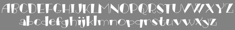 [MyFonts]
[More] ⦿
[MyFonts]
[More] ⦿
|
James Barnardo
|
London, UK-based creator of the free oriental simulation typeface Reading From The East (2012), which is entirely based on hiragana for lowercase and on kanji for uppercase. He also made Roarin Twenties Counterfeit (2012, art deco), Halftone Nium (2014), Radium Corporation (2014), Uraenium (20143), Coradium (2014), Radiometry (2014), and Longhaul (2016, techno typeface). In 2019, he designedthe tall condensed sans typeface Brusio. [Google]
[More] ⦿
|
Jermaine Rogers
|
American poster artist. A poster for Radiohead in the 1990s inspired Funky Rundkopf (2007, Nick Curtis). [Google]
[More] ⦿
|
John M. Fiscella
[Production First Software]
|
[MyFonts]
[More] ⦿
|
John Moore
|
 Born in 1951, John Moore is a Venezuelan type designer. He studied graphic design in the Institute of graphic design Neumann from 1972 until 1976. In 1980 he took a workshop with Milton Glaser and since 1983 he has worked as an art director and creative director in many advertising agencies. He designs type since 1976.
 His typefaces Gordis (a fattish comic book family) and Tepuy won awards at Tipos Latinos 2008 in the non-text and experimental typeface categories, respectively. At Tipos Latinos 2010, he won twice in the display category, for Victorina and Radio Time. His typefaces: (New) Maracay (2013, a large layered Victorian signage family), Fine Art OT (2013, brushy typeface), Roadline Italic (2013, a retro script), JMTF Robin (2013, a layered post-modernist display family), Virgin Script (2013), Radio Time (2013, fat retro signage script), Radio Time Icons (2013), Palaima (2013, an aboriginal style face), Factor (2012, a layered geometric font), Onda (2012, a wavy psychedelic face), Blockee (2012), Aliykit Open (2012, a multiline typeface), VE Inconexa (2006, outline architectural face), VE Makiritare (2006, a double labyrinthine script that is based on symbolisms used by the Makiritare or Yecuana, river people who live in the village of Santa Maria de Erebato in the Venezuelan jungle on the border with Brazil), VE Moho (2006; or simply Moho in 2014), VE Palaima (2006, futuristic, Amazonian), Radio Time (fifties style script, with Alejandro Paul at Sudtipos), Fruta (stencil, influenced by Glaser?), Glaser Stencil Round, Gothike (sharp-edges), Aqua (ultra round), Club, Caracas (sans; +Caracas Pro, 2015; see also Caracas Stencil Pro, 2015), Factor (hookish), Space Lab (futuristic family), Robin (headline), Victorina (multiline Victorian poster typeface which won an award at Tipos Latinos 2010), Victorina Black Shadow (2011), Waterman (2010, a flowing undulating script family), Spacelab (2010, futuristic) and RobinBienalII (2005). Sudtipos sells these fonts of his via MyFonts: Makiritare (bilined, based on woven baskets), Palaima (experimental, runic), Precolombino (petroglyphs), Tepuy (rounded version of Makiritare), Roadline (2009, fifties diner font), Sacred Geo (2011, a geometric dingbat font that won an award at Tipos Latinos 2012), DeCoro (2011, art deco family), Sacred Geo Tiling (2011), Primate (2012, an African look typeface family), Morenita (2012, a connected fifties or school script), Takox (2012), Petroglifos (2012), Xtencil (2012, a rounded stencil influenced by Milton Glaser; followed by Xtencil LC and UC in 2013 and Xtencil Pro in 2015). Typefaces from 2014: Moho Sport Pro (layered athletic lettering typeface family), Scripta Pro and Gothic (40s-style lettering typeface inspired by the style of L.H. Copeland), InkArt Labels, Moho (named after Laszlo Moholy-Nagy), MohoBis Pro (a multilined version of Moho), Moho Condensed, Moho Script, Duvall (named after Edward J. Duvall, who published Modern Sign Painting in the late 1940s; Duvall won an award at Tipos Latinos 2014). In 2015, the Moho series continued with Moho Style. He also made Arthaus (2015, a fantastic Bauhaus font family inspired by Herbert Bayer's universal alphabet), MyCard (a techno type), NeoScript Pro and Hierra (after a font by Dan Solo) in 2015. In 2016, he designed Artime (a sci-fi font), Virtual. Typefaces from 2017: FunFont (cartoon style). Klingspor link. MyFonts link. Behance link. Poster. View John Moore's typefaces. [Google]
[MyFonts]
[More] ⦿
|
Kaaya
[Love Font Vapour Trail]
|
[More] ⦿
|
Keith Bates
[K-Type]
|
 [MyFonts]
[More] ⦿
[MyFonts]
[More] ⦿
|
Kevin Dresser
[Dresser Johnson]
|
[MyFonts]
[More] ⦿
|
K-Type
[Keith Bates]
|
 K-Type is Keith Bates' (b. 1951, Liverpool) foundry in Manchester, UK, est. 2003. Keith works as an Art&Design teacher at a Salford High School. They custom design type, and sell some of their own creations.
 Commercial typefaces: - Adequate (2012). A basic geometric monoline sans family.
- Adventuring (2010, comic book style)
- Alan Hand (2005, based on some blobby lettering, handwritten by printer and mail artist, Alan Brignall)
- Alex (2002-2004)
- Alright (2004, cursive script)
- Anna (2002-2007).
- Argot (2019). Characterized by square counters, this typeface family exhales brutalism and industrialism. See also Argot Machine (2019).
- Artist Hand (2019).
- Axis
- Bank of England (2012, blackletter): Bank of England is loosely based on blackletter lettering from the Series F English twenty pound banknote introduced in 2007. The font also takes inspiration from German Kanzlei (Chancery) typefaces and the 17th century London calligrapher, John Ayres.
- Banks & Miles (2018). Inspired by the geometric monoline lettering created for the British Post Office in 1970 by London design company Banks & Miles, a project initiated and supervised by partner John Miles, which included Double Line and Single Line alphabets. The new digital typeface is a reworking and extension of both alphabets.
- Barbica (2015). A glyphic typeface.
- Bricola (2020).
- Brush Hand New (2013): Brush Hand New is a full font based on a copy of Flash Bold called Brush Hand marketed by WSI in the 1990s and more recently distributed through free font sites. Brush Hand was an anonymous redrawing of Flash which simplified, slightly lightened, smoothed out ragged edges, and improved the legibility of the original classic created by Edwin W. Shaar in 1939.
- Building&Loan (2007, engaved face)
- Bigfoot (2005, a Western font based on the slab capitals used by Victor Moscoso in his 1960s psychedelic rock posters)
- Bolshy (2009)
- Bolton750 (2003, a mechanical typeface done with John Washington).
- Chancery Lane (2021). An italic text typeface that is based on chancery scripts.
- Charles Wright (2016). A set of fonts based on the UK license plate fonts.
- Chock (2009)
- Circa (geometric sans)
- Cloudbuster (2019). Inspired by Imre Reiner's Corvinus Skyline of 1934.
- Club.
- Coinage Caps (2017). Coinage Caps is a trilogy of small caps fonts based on the roman lettering used for the designs of British coinage. Coinage Caps Eric Gill is a regular weight, spur serif style drawn by Eric Gill for silver coin designs in the 1920s which were rejected by the Royal Mint. Coinage Caps Humphrey Paget is a medium weight serif based on the lettering of Thomas Humphrey Paget, designer of the Golden Hind Halfpenny first struck in 1937. This font simulates the soft, slightly rounded corners of the minted letterforms. Coinage Caps Kruger Gray is a glyphic, flare serif font typical of the bold style engraved by George Kruger Gray for numerous British and Commonwealth coins during the 1920s and 30s. This font also simulates the slightly rounded corners of the minted letterforms.
- Collegiate (2009)
- Component (2012). A font for lost civilizations and dungeon rituals.
- Context (experimental)
- Credit Card (2010, font for simulating bank cards)
- Curwen Sans (2018). A monoline sans from the early 1900s originally created for in-house use at the Curwen Press in London.
- Cyberscript (2006, connected squarish face)
- Deansgate (2015). Deansgate and Deansgate Condensed are based on the clearest and most distinctive of the sans-serif letterforms used on Manchester street nameplates, and easily identified by a pointy Z and pointed middle vertices on M and W.
- Designer
- Digitalis
- English
- Enamela (2013). Keith writes: Enamela (rhymes with Pamela) is based on condensed sans serif lettering found on vitreous enamel signage dating from the Victorian era and widely used in Britain for road signs, Post Office signs, the plates on James Ludlow wall postboxes, railway signs, direction signs and circular Automobile Association wayfinding plaques throughout the first half of the twentieth century. The original model goes back to Victorian times, ca. 1880.
- Engravia (2018). Engravia is a didone display typeface supplied in three varieties of engraving---Inline, Shaded and Sawtooth---plus a plain basic font.
- Example (2017). A workhorse neo-grtesque typeface family.
- Excite
- Flip (2011), a western grotesk billboard face.
- Flyer (2009, techno)
- Frank Bellamy (2009, an all-capitals family based on the hand lettering of English artist Frank Bellamy, who is most famous for his comic art for Eagle and TV21, and his Dr Who illustrations for Radio Times)
- Future Imperfect
- Gill New Antique (2003)
- Greetings
- Helvetiquette
- Hapshash (2010): an all capitals font inspired by the 1960s psychedelic posters of British designers Hapshash and the Coloured Coat (Michael English and Nigel Waymouth), in particular their 1968 poster for the First International Pop Festival in Rome. A dripping paint font.
- Irish Penny (2016). An uncial typeface based on the lettering from Percy Metcalfe's influential pre-decimal coinage of Ireland, the Barnyard Collection.
- Ivan Zemtsov (2009)
- Kato (2007, oriental simulation face)
- Keep Calm (2015). A geometric sans inspired by a British war poster from 1939.
- Keith's Hand
- Klee Print (2010, Klee Print is based on the handwriting of American artist Emma Klee)
- Latinate (2013). A vintage wedge serif wood style typeface, and a rough version.
- Lexie (an improved or "adult" version of Comic Sans) and Lexie Readable (2006, modified in 2015). Keith writes: Lexie Readable (formerly Lexia Readable) was designed with accessibility and legibility in mind, an attempt to capture the strength and clarity of Comic Sans without the comic book associations. Features like the non-symmetrical b and d, and the handwritten forms of a and g may help dyslexic readers.
- Licencia (2016). A blocky typeface inspired by the tall, soft-cornered lettering on vehicle licence and registration plates world-wide.
- Londinia (2016).
- Matchbox
- Max
- Ming
- Modernist Stencil (2009).
- Monterey Pop (2020). A psychedelic / popart typeface based on Tom Wilkes's poster lettering for the Monterey International Pop Festival in June 1967.
- Mythica (2012). A slightly condensed lapidary roman with copperplate serifs.
- Modulario (2010): a contemporary sans.
- New Old English (2010, blackletter)
- Norton (2006)
- Nowa (2004, a play on Futura)
- NYC (octagonal)
- Openline (2008, an art deco pair)
- Oriel Chambers Liverpool: A Lombardic small caps font based on the masonry lettering on Peter Ellis's 1864 building, Oriel Chambers, on Water Street in Liverpool.
- Pentangle (2008, based on album lettering from 1967)
- Pixel
- PixL (2002-2004)
- Plasterboard (2004-2005)
- Pop Cubism (2010) is a set of four texture fonts, combining elements of cubism and pop art.
- Poster Sans (2006). A wood type family based on Ludlow 6 EC. See also Poster Sans Outline.
- Rick Griffin (2006, more psychedelic fonts inspired by a 1960s Californian artist)
- Rima (2020). A stencil typeface with heavy slabs.
- Roundel (2009, white on black)
- Runestone (2010, runic).
- Sans Culottes (2008, grunge)
- Serifina
- Solid State (2008, art deco blocks)
- Solus (2004, a revival of Eric Gill's 1929 typeface Solus which has never been digitized; read about it here)
- Stockscript (2008, down-to-earth script based on the pen lettering of the writer, Christopher Stocks)
- Susanna (2004)
- Ticketing (2011): pixelish.
- Total and Total Eclipse (2004, squarish display typefaces based on the four characters of Jaroslav Supek's title lettering for his 1980s mailart magazine, Total)
- Transport New (2009: a redrawing of the typeface designed for British road signs. In addition to the familiar Heavy and Medium weights, Transport New extrapolates and adds a previously unreleased Light weight font originally planned for back-lit signage but never actually applied. Originally designed by Jock Kinneir and Margaret Calvert beginning in 1957, the original Transport font has subtle eccentricities which add to its distinctiveness, and drawing the New version has involved walking a tightrope between impertinently eliminating awkwardness and maintaining idiosyncrasy.)
- Union Jack (octagonal)
- Victor Moscoso (2008, psychedelic)
- Wanda (2007, art nouveau)
- Waverly
- Wes Wilson (2007, psychedelic, inspired by 1960s psychedelic poster artist Wes Wilson).
- 3x5
- Zabars (2001): a Western face.
His free fonts: - Blue Plaque (2006: a distressed font based on English heritage plaques)
- Blundell Sans (2009)
- Celtica (2007) has Celtic influences
- Dalek (2005, stone/chisel face: Dalek is a full font based on the lettering used in the Dalek Book of 1964 and in the Dalek's strip in the TV21 comic, spin-offs from the UK science fiction TV show, Doctor Who. The font has overtones of Phoenician, Greek and Runic alphabets). See also Dalek Pinpoint (2018).
- Designer Block (2006)
- Flat Pack (2006)
- Future Imperfect (2006, grunge)
- Gommogravure (2005)
- Greetings (2006), Greetings Bold (2006)
- Insecurity (2005, experimental) won an award at the 2005 FUSE type competition.
- International Times (2006, inspired by the masthead of the International Times underground newspaper of the 1960s and 1970s)
- Keep Calm (2011). Related to London Underground.
- Kindersley Sans (2017). A modernized version of David Kindersley's 1950s type used for many street name plates in Britain, about which Bates writes: Kindersley Sans is a humanist sans-serif that conserves the Gill-inspired character and some of the calligraphic qualities of Kindersley's lettering, it retains the Roman proportions and its Britishness, but traditional prettiness and intricacy are discarded in favour of a clean modernity.
- Klee Capscript (2005: based on the handwriting and capitals drawn by artist Emma Klee (USA) for her Color Museum Mail Art invitation. The upper case is based on Emma's capitals and the lower case is freely adapted from her script)
- Lexia and Lexia Bold (2004)
- MAGraphics (2004)
- Magical Mystery Tour (2005, outlined shadow face), Magical Mystery Tour Outline Shadow (2005), Magica (2015, a serifed titling typeface family).
- Mailart (2004), Mailart Rubberstamp (2004), Mailart Rubberstamp Sans (2018).
- Mandatory (2004, a UK number plate font based on the Charles Wright typeface used in UK vehicle registration plates).
- McKnight Kauffer (2021). A retro poster font in the style of poster artist Edward McKnight Kauffer.
- Motorway (2015), a companion typeface to Transport, the British road sign lettering. This is an extension of an original design by Jock Kinneir and Margaret Calvert: The Motorway alphabet was created for the route numbers on motorway signage, and is taller and narrower than the accompanying place names and distances which are printed in Transport. However, for Motorway Jock Kinneir and Margaret Calvert created only the numbers 0 to 9, the capitals A, B, E, M, N, S and W, ampersand, slash, parentheses and a comma. So, although the lettering made its first appearance on the Preston bypass in 1958, K-Type Motorway is the first complete typeface and contains all upper and lower case letters, plus a full complement of punctuation, symbols and Latin Extended-A accented characters. As with the Transport alphabet the starting point was Akzidenz Grotesk, Motorway taking inspiration from condensed versions. Changes were mainly driven by a quest for legibility, resulting in some reduced contrast between horizontal and vertical strokes, and Gill-esque straight diagonal limbs on the 6 and 9, and high vertex for the M.
- Penny Lane (2014). A a sans serif derived from twentieth-century cast-iron signs displaying Liverpool street names.
- Possible (2020). A 10-style mini-serif typeface.
- Provincial (2014). A Victorian set of outline fonts.
- Ray Johnson (2006-2008)
- Roadway (2005, based on New York roadside lettering).
- Romanica (2017). A humanist sans.
- Sam Suliman (2020). A condensed squarish typeface which was inspired by lowercase lettering on a Sarah Vaughan album cover designed by Sam Suliman in 1962. Suliman was born in Manchester, England in 1927. After working for McCann Erikson in London, he moved to New York where he took on freelance work designing album covers, particularly celebrated are his striking minimalist designs for jazz records. He moved back to England in the early 1960s, designing many book jackets, film titles and fabrics, also working in Spain and India before settling in Oxford in the 1980s.
- Savor (2011). An art nouveau family.
- Sgt Peppers Lonely Hearts Club (2014).
- Sinkin Sans (2014, free) and Sinkin Sans Narrow (2015, commercial). Open Font Library link.
- Soft Sans (2010)
- Subway Ticker (2005)
- Taxicab (2016). A squarish style.
- This Corrosion (2005).
- Toppler (2018). A modern and full range top-heavy cartoon font family that includes a Popdots style. Bates was striving to improe on 1990s clasics such as Baby Kruffy (Ben Balvanz), Comix Heavy (WSI) and Startling (Dave Bastian).
- Wildcat (2016). An athletics typeface family.
- Zinc (2018). A monoline sans with diagonal nubs.
- Colnage Caps Kruger Gray (2018). Coinage Caps is a trilogy of lapidary small caps fonts based on the Roman lettering used for the designs of British coinage.
- Dalek Pinpoint (2018). Based on Dalek comic book lettering from the 1960s.
- Icky Ticket Mono (2018). IckyTicket Mono is a monospaced font based on the coarsely printed numbering from 1960s bus tickets.
- Sexbomb (2018). A psychedelic typeface family.
- Mancunium (2019). A monoline sans family.
- Straight Line (2020). An outlined font with chamfered corners and straight edges, possibly useful as a blackboard bold type.
- We The People (a blackletter font based on the peamble of the American constitution).
- Bowdon (2021). A six-style warm, Bodoni-inspired English Modern, influenced by the 1930s lettering of designer Barnett Freedman.
- Oxford Street (2021). A condensed grotesque with horizontal and vertical stem terminals; it is a street a signage font that began as a redrawing of the capital letters used for street nameplates in the borough of Westminster, which in turn were designed in 1967 by the Design Research Unit using custom lettering based on Adrian Frutiger's Univers 69 Bold Ultra Condensed.
Custom / corporate typefaces: With Liverpool-based art director Liz Harry, Bates created a personalized font, loosely based on Coco Sumner's handwritten capitals, for the band I Blame Coco. Medium and Semibold weights of Gill New Antique were commissioned by LPK Design Agency. Stepping Hill Hospital and Bates created Dials, a pictorial font to help hospital managers input data about improvements. A custom font was designed for Bolton Strategic Economic Partnership. Abstract Fonts link. View Keith Bates's typefaces. Dafont link. Yet another URL. Fontspace link. Fontsy link. Behance link. [Google]
[MyFonts]
[More] ⦿
|
Lorenz Lopetz Gianfreda
[burodestruct (or: Typedifferent.com)]
|
 [MyFonts]
[More] ⦿
[MyFonts]
[More] ⦿
|
Love Font Vapour Trail
[Kaaya]
|
Japanese foundry with principally free bitmap-style truetype fonts and some techno faonts, all made in 2001: BlockBlackBitA12, BlockWhiteBitA12, CherishBitH7, CherishBitK7, ChibiBitA5, DayDreamTrainH, DayDreamTrainK, DayDreamTrain, FloppyBitA16, HappyBirthdayMoon, JungleGymBitA6, OneBitA10, PopsceneBitK9, PopTuneBitA12, PopTuneOutBitA12, PopTuneRound, RadioRadioRadioBitA10, Romantic, SavouryBitK7, ShoplifterABitA16, ShoppingBitA10, SoLongBitA15, SpreadBitA10, StadiumBitA10, StartBitA10, StetchBitA13, SugarBoy, TinyBoxBitA10, TinyBoxBlackBitA8, TinyBoxCollageBitA12, WeekBitA10. The designer is "Kaaya". [Google]
[More] ⦿
|
Mads Quistgaard
[PLEKS]
|
[More] ⦿
|
Magnus Rakeng
[Melkeveien designkontor]
|
[More] ⦿
|
Magnus Rakeng
|
Norwegian graphic designer, born in Lillehammer in 1967, who works in Oslo. His fonts are distributed by Thirstype. He now runs Millimeter Design. He is also involved in the Norwegian design studio Melkeveien designkontor, where all his fonts can be ogled. They include: - Pilot (1994, thirstype).
- Envy (1996).
- Telenor, designed by Magnus Rakeng&Stian Berger as part of the new corporate identity for Telenor.
- Superduper (1999-2000).
- Radio (1998), a fifties-style connected script. This is his most famous font. It was reinvented and made it to the new foundry Constellation in 2013. Always (2005) is a connected 1950's style typeface done with Stian Berger at Melkeveien. It was based on Radio.
- The 4-year old children's handwriting font Amanda4 (free).
- Radio (1998) was at the basis of later extensions, such as Quality (a custom typeface at Melkeveien done for Leo Burnett Chicago; a cooperation with Chester) and Always (2005, with Stian Berger at Melkeveien).
- Eyecon (2005, designed with Thirstype).
- With Stian Berger at Melkeveien he made Ålesund jugendstilsenter (2004, based on architect H. Schytte Berg's architectural lettering).
[Google]
[MyFonts]
[More] ⦿
|
Mami Kobayashi
|
Codesigner, ca. 2007, with Masayuki Sato (Maniackers Design) of Detroit Type City-AL, Foood-AL, KT, Pokupoku-AL, KT, HR, Ball2-AL, Box2-AL, Button2-AL, Xtal-AL, KT, HR, Ikaho-AL, KT, MD Radiogram-KT, HR, Nepon-AL. By herself, still at Maniackers, the following fonts were designed: Ikaho-HR, TypeCantabile-KT, Kotodama-KT, Sandy-AL / 2Type, Yonimofushigina-AL, KT, Cloooud-AL, Yonimofushigina-HR, Timber-AL,KT, HR, Sunday-AL / 3Weight, Hyonnakotokara-AL, KT, HR. In 2009, Mami designed the pen scratch typeface Dandro AI. [Google]
[More] ⦿
|
Maniackers Design (or: MKS)
[Masayuki Sato]
|
 About 150 free original fonts by Masayuki Sato (from Futaba and/or Takasaki, Japan), over half of them pixel fonts. Maniackers designers started in 1995. For most fonts, he has a Latin alphabet (denoted by AL) and a katakana alphabet (denoted by KT). Some also have a hiragana version (denoted by HR). All fonts were made between 1998 and 2009.
 - By Masayuki Sato&Tsuyoshi Nagae: Merumo-AL, KT, PonyPony-AL, KT, HR, Topo-AL, TM Extended-AL / 2Type, MinnanoUta-AL, KT, HR, Seele-AL / 2Type, Robin-AL, Peco-AL, KT, Honey-AL, Blur-AL.
- By Masayuki Sato&Eri Nagae: Stitch-AL.
- By Masayuki Sato&T. Waka: Chihuahua-AL, KT, HR / 3Type.
- By Masayuki Sato&Mami Kobayashi: Alphabet Man, Detroit Type City-AL, Foood-AL, KT, Pokupoku-AL, KT, HR, Ball2-AL, Box2-AL, Button2-AL, Xtal-AL, KT, HR, Ikaho-AL, KT, MD Radiogram-KT, HR, Nepon-AL.
- By Mami Kobayashi: Ikaho-HR, TypeCantabile-KT, Kotodama-KT, Sandy-AL / 2Type, Yonimofushigina-AL, KT, Cloooud-AL, Yonimofushigina-HR, Timber-AL,KT, HR, Sunday-AL / 3Weight, Hyonnakotokara-AL, KT, HR.
- By Eiji Sunaga: Tanrei 2.0-KT.
- By Junya Yamada (Channel 67): Drip-KT, Bobo-AL.
- By Masayuki Sato&Junya Yamada: Maniac 2-AL, KT.
- By Atsushi Moda: Angle.
- By Shinji Naka: Typobokan katakana (at least, the graphics of this comic book style font were by Shinji Naka).
- By Masakazu Fukushima: Lucha-doll mask (a fantastic mask dingbat font).
- By Atsuko Onozato: Pazool.
- By Malte Haust of Bionic Systems: DorisOrange.
- By André Nossek: Collage Rmx-AL, Hard Rmx-AL.
-
- By Masayuki Sato&Hiroko Takiguchi: Holiday Bitmap14-AL, Holiday Ultra-AL, KT, HR, Holiday Bold-AL, KT, HR, Holiday-AL, KT, HR, Holiday-illust, Holiday Tategaki-KT, HR, Holiday-MDJP03 / 2Byte, Holiday-MDJP02, Ribbontic 2.0-AL.
- By Masayuki Sato and Masashi Kato: Pico (2009, rounded comic book style).
- By Masashi Kato&Mayucco: Yakitori-AL, KT, HR / 2Byte.
- By Masayuki Sato&Ryo Asoda: Wallpainting-AL, Cosmic-AL, Bellows-AL, KT.
- By Masayuki Sato&Kaori Inada: Sennin-AL.
- By Masayuki Sato&Shizuka Yamazaki: SwingingBird-AL, KT, HR.
- By Masayuki Sato&Junichi Omi: Omiyage-AL, KT, HR.
- By Masayuki Sato&Rollingcradle: Poranger-AL, Lucha doll-mask.
- By Masayuki Sato&Omnikono: Gt informat-AL, KT.
- By Masayuki Sato: Donki-KT (2010), Cherry-Cherry KT (2010), 239 Schablone-AL (2010), RBIO-AL (2010), FSB08 Klang-AL (2010), 224 MKSD-AL (2010), 223 MKSD-AL (2010), 235MKSD (2009, thin octagonal), Nepon-KT, Nepon-HR, Monday-AL / 3Type, Childish-AL, KT, HR, Volt-AL, KT, HR, Gavadon Ultra-KT, Building 2-AL, KT, Gachapon 2-KT, CinemaMa-AL, KT, HR, Skinny-AL, Magatama-AL, Astro 3.0-AL, KT, 160MKSD-AL, KT, TypoBokan-KT (3DCG), Lunch-KT, HR, Partner-AL / 3Type, Pico Super Ultra Bold-AL, 096MKSD-Synapse-AL, Millennium 5lines-AL, Tekuteku Round-AL, Warp-AL, Cherry Cherry-KT, Donki-KT, 078MKSD Medium Con-AL, Poco-AL, Temporary Extra-AL, 071MKSD Medium-AL, KT, 071MKSD Bold-AL, KT, Paco-AL, Collage-AL, Zerozero Nine-AL, KT, HR, Finger Five-AL, Electronica Nine-AL, Drifter Five-AL, Ultra Seven-AL / 3Type, Thaitype Ten-Thai, AL, KT, Gogo Five 2.0-AL, System Seven-AL / 7Type, 201MKSD-AL / 4Type, Fluorescent-AL / 2Type, FSB07 Astra-AL, KT, HR / 4Type, Nihonbashi 2.0-AL, KT, 176MKSD-AL, Continue-AL, Spaghettini-AL / 3Type, Pinponpan2, 3, 4-HR / 3Type, Pico-AL / 2Type, Kokecco2-KT, Charakyoro-AL, Coppepan-AL, KT, HR, Sardinen-KT, HR, Hachipochi Eight-AL, KT, Janis Heavy-AL, Futaba-KT, April Fool-AL, KT, HR, Arawasu-KT, Airline-AL, KT, HR, Astro 2.0-KT, Snail-AL, KT, Akachan-AL, KT, HR (Flop Design), Dorisorange-AL, KT (T26), Parade20-AL, KT, UFOnt-51silhouette, Rabbit35-silhouette, Dog30-Silhouette, Coil-AL, KT / 3Type, Frankfurter Custum Black-AL, COLOR-AL, Fivemani-AL, KT, Astroro-AL, KT, Puco-AL, 184MKSD Omnibus-AL, Alfadental-AL, FSB08 Klang-AL, KT / 3Type, TDA140607-AL, Shotaro V3-AL, KT, Colopocle-AL, KT, Melt-AL / 3Type, Tekuteku-AL, Crayon-AL, Digits-AL, Performar-AL, Pinponpan-HR, Airplane 2.0-AL, KT, Button-AL, Ball-AL, Box-AL, OLD CUBE-AL, Elekitel-HR, Retroket-AL, MKS Dot-AL, RikuKaiKu-Illust, Angle-AL, FontRemix 02 (36-kanji dingbat font). Font Pavilion sells these fonts: Building, Gavadon (kata), Volt (romaji, kata), Colopocle (katakana, romaji), Shotaro (katakana, romaji). Typo Bokan, Sennin, Snail. At Digitalogue, he published the screen font series Zerozero in 2000.
- Between 2009 and 2011 he designed 232 MKSD Round.
Abstractfonts link. Fontspace link. Artistic rendering of a kanji character. Behance link. [Google]
[More] ⦿
|
Måns Grebäck
[Aring Typeface]
|
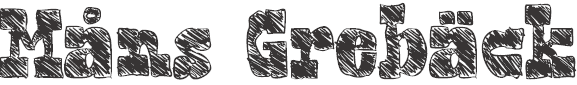 [MyFonts]
[More] ⦿
[MyFonts]
[More] ⦿
|
Mark Simonson
[Mark Simonson Studio]
|
 [MyFonts]
[More] ⦿
[MyFonts]
[More] ⦿
|
Mark Simonson Studio
[Mark Simonson]
|
 Mark Simonson Studio is located in StPaul, MN. Mark founded Mark Simonson Studio around 2000, and describes himself as a freelance graphic designer and type designer. From his CV: Early in my career I worked mainly as an art director on a number of magazines and other publications including Metropolis (a Minneapolis weekly, 1977), TWA Ambassador (an inflight magazine, 1979-81), Machete (a Minneapolis broadsheet, 1978-80), Minnesota Monthly (Minnesota Public Radio's regional magazine, 1979-85), and the Utne Reader (1984-88). I was head designer and art director for Minnesota Public Radio (1981-85) and an art director for its sister company, Rivertown Trading Company (1992-2000). During that time, I designed over 200 audio packages, including most of Garrison Keillor's, along with several hundred products (t-shirts, mugs, rugs, watches, etc.) for the Wireless, Signals, and other mail order catalogs. I have frequently done lettering as part of design projects I'm working on. This has always been my favorite part, so in 2000 I opened my own shop specializing in lettering, typography and identity design. I've also been interested in type design since my college days. I started licensing fonts to FontHaus in 1992, and since starting my new business, stepped up my efforts in developing original typefaces. I now have more than 70 fonts on the market with many more to come. This is increasingly becoming the focus of my activities. His fonts:
 - Coquette (2001). He says: Coquette could be the result of a happy marriage of Kabel and French Script.
- Anonymice Powerline (2009-2010). This is probably a hack by some people based on Anonymous. It is available in some Github directories.
- Kandal: a 1994 wedge serif, now also at MyFonts).
- Proxima Sans (1994, a geometric sans, rereleased in 2004), followed in 2005 by his massively successful Proxima Nova in 42 styles/weights. Followed by Proxima Nova Soft (2011). The rounded version of Proxima Nova is Proxima Soft (2017). For a variable font that captures all styles, see Proxima Vara (2021). In 2022, he added Proxima Sera (an 18-style workhorse serif that combines old style forms with contemporary and modern typefaces).
- Mostra (2001): based on a style of lettering often seen on Italian Art Deco posters and advertising of the 1930s. Look at the Light and Black versions, and drool...... The 2009 update is called Mostra Nuova. Selected styles: Mostra Nuovo Bold, Mostra One Light, Mostra Three Bold, Mostra Two Heavy.
- In 2001, he made the Mac font Anonymous. Its updated version is Anonymous Pro (2009-2010), a TrueType version of Anonymous 9, which was a freeware bitmap font developed in the mid-90s by Susan Lesch and David Lamkins. It was designed as a more legible alternative to Monaco, the mono-spaced Macintosh system font.
- In 1998 and 2001, he produced the (free) 3-style Atari Classic family.
- In 2003, he released Blakely Bold and Heavy (an art deco font first done for the Signals mail order catalog). The original Blakely is from 2000.
- Goldenbook Light, Regular, and Heavy, based on the logotype of the 1920s literary mag called "The Golden Book Magazine".
- Metallophile Sp 8 Light and Light Italic (2008): a "faithful facsimile of an 8-point sans as set on a 1940s-vintage hot metal typesetting machine".
- Refrigerator Light and Heavy, Refrigerator and its extension Refrigerator Deluxe (2009) (geometric sans).
- Changeling Light, Regular, Bold, Stencil, and Inline (2003): a redesign and expansion of China, a VGC photo-typositor typeface from 1975 by M. Mitchell, which includes unicase typefaces; see also Changeling Neo, 2009.
- Sanctuary Regular and Bold: a computerish typeface based on lettering in the 1976 movie Logan's run--later withdrawn from the market.
- Sharktooth (+Bold, +Heavy).
- Felt Tip Roman, Woman and Senior (based on his own handwriting). Felt Tip Senior (2000) is based on the hand of Mark's father. Felt Tip Woman Regular and Bold are based on the handwriting of designer Patricia Thompson.
- Filmotype Gay (2011).
- Filmotype Honey (2010): fifties brush lettering face. For a free alternative, see Honey Script (2000) by Dieter Steffmann.
- Raster Gothic Condensed Regular and Bold (12 fonts total), and Raster Bank (a pixelized version of Bank Gothic).
- Other free bitmap fonts for the Mac [the PC version was made by CybaPee]. MyFonts page.
- He digitized Phil Martin's family, Grad (2004, inspired by Century Schoolbook, and originally done by Martin in 1990).
- His 2006 production includes three script typefaces: Kinescope is a connected script based on title lettering in Fleischer Studios' animated Superman films from the 1940s. Snicker is a cartoony block letter type. Both were published at Font Bros. And Launderette is a connected very slanted script based closely on lettering used in the titles of the 1944 Otto Preminger film, Laura.
- In 2007, he revived and extended Filmotype Glenlake (2007, sold at Font Bros).
- Lakeside (2008) is a flowing 1940s-style brush script. It was inspired by hand-lettered titles in the classic 1944 film noir movie Laura.
- In 2008, he revived Filmotype Zanzibar, about which he writes: That Zanzibar is nearly an anagram of bizarre seems fitting. The surviving people from Filmotype (later Alphatype) have not been able to tell us who designed this gem, so we have no record of the designers intentions. Released in the early 1950s, it seems somewhat inspired by the work of Lucian Bernhard (Bernhard Tango, 1934) and Imre Reiner (Stradivarius, 1945). At first, it appears to be a formal script, but there are no connecting strokes. It would be better described as a stylized italic, similar to Bodoni Condensed Italic or Onyx Italic, with swash capitals.
- Filmotype Vanity (2008) is an outline typeface based on a 1955 design by Filmotype. It was derived from Filmotype Ginger.
- Filmotype Alice (2008) is casual handwriting. However, MyFonts now credits Patrick Griffin with the digitization.
- Filmotype MacBeth (2008) is a freestyle face.
- Filmotype Ginger (2008) is a heavy display typeface with an aftertaste of Futura.
- Boxy2 (2008) and Boxy1 (2008) are severely octagonal typefaces made to test out FontStruct. See also bubblewrap.
- In 2008, Mark Solsburg and Mark Simonson cooperated on the digital revival of the calligraphic Diane Script, originally designed in 1956 by Roger Excoffon.
- In 2009, Mark worked on SketchFlow Print, a font for Microsoft. It will be bundled with the next version of Christian Schormann's Expression Blend, part of Microsoft's Expression Studio suite. The fonts, based upon the handwriting of architect Michaela Mahady of SALA Architects, Inc., give that well-known architectural printing look (like Tekton).
- Filmotype Gem (2011). A sans headline typeface that was first drawn by Filmotype in the 1950s.
- Bookmania (2011) is a revival of Bookman Oldstyle (1901) and the Bookmans of the 1960s, but with all the features you would expect in a modern digital font family. Especially, Simonson's Bookmania story is worth reading.
- In 2018, he published the 25-style Acme Gothic at Fontspring. He explains: Acme Gothic (2018) is based on the thick and thin gothic lettering style popular in the U.S. in the first half of the twentieth century. There have been typefaces in this genre before, but they were either too quirky (Globe Gothic), too English (Britannic), too Art Deco (Koloss), too modern (Radiant), or too Art Nouveau (Panache). None captures the plain, workman-like style of Acme Gothic.
- Parkside (2018) is a script typeface inspired by typefaces and lettering of the 1930s and 1940s. Parkside uses OpenType magic to automatically select letter variations that seamlessly connect to the letters coming before and after.
- In 2018, he emulated wood type in his HWT Konop at P22. Named for Don Konop, a retired Hamilton Manufacturing employee, who worked from 1959 to 2003, this typeface is monospaced in both x and y directions so that letters can be stacked vertically and horizontally. All proceeds go to the Hamilton Wood Type and Printing Museum.
- Etna (2020). A 30-style text and display family that started out from William H. Page's Victorian wood type Aetna (1874), and was remolded by Simonson into a useful typeface family though still distinctly linked to its ancestor. Etna includes three different condensed widths in all six weights (intended for display use), four different figure styles, alternate characters, true small caps, and a selection of dingbats, including arrows, stars, asterisks, and manicules.
Links to his typefaces, in decreasing order of popularity: Proxima Nova, Bookmania, Mostra Nuova, Proxima Nova Soft, Coquette, Refrigerator Deluxe, Felt Tip Roman, Grad, Changeling Neo, Goldenbook, Lakeside, Kinescope, Metallophile Sp8, Blakely, Felt Tip Woman, Snicker, Felt Tip Senior, Kandal, Sharktooth, Anonymous, Raster Bank, Raster Gothic. FontShop link. Fontspace link. MyFonts interview. View all typefaces designed by Mark Simonson. Fontspring link. Google Plus link. Klingspor link. Abstract Fonts link. Kernest link. I Love Typography link. Font Squirrel link. [Google]
[MyFonts]
[More] ⦿
|
Marta Sanchez Marco
|
 Spanish designer of Radar (2019, Type-o-Tones), which revives and reinterprets Carl Winkow's tall radio font Grotesca Radio, which was published by Richard Gans. [Google]
[MyFonts]
[More] ⦿
Spanish designer of Radar (2019, Type-o-Tones), which revives and reinterprets Carl Winkow's tall radio font Grotesca Radio, which was published by Richard Gans. [Google]
[MyFonts]
[More] ⦿
|
Masayuki Sato
[Maniackers Design (or: MKS)]
|
[More] ⦿
|
Matej Syxra
[Page42 Type Foundry]
|
[More] ⦿
|
Medialoot
[Tony Thomas]
|
 Graphics cooperative in Philadelphia that sells some fonts. These include:
 - From 2019: Elouise, Ragnarok (rune emulation font), Dalston (monoline script).
- From 2018: Oakwood (rustic), Drive-in (inline), Annabelle (script), Aviator (art deco caps), Outdoors (a park signage font), Maria Signature, Fault (a glitch font), Neon Tubes Cursive.
- From 2017: Lipstick (handcrafted), Oak Barrel, Listicons, Circle Monogram Font, Mammoth (a formal didone, tending towards the fat face genre).
- From 2016: Monarchy Rough, Neon Tubes (a paperclip font), Shoreditch.
- From 2015: Andea (+Clean, +Rounded, +Rough).
- From 2014: Monarchy (a tall humanist meets slab serif font family by Birmingham, UK-based Tony Thomas), Asche, Meddle (rounded sans), Viro (humanist sans by Tony Thomas).
- From 2013: Operator, Sketch Slab, SkooledSerif.
- From 2012: Monsters, Jamie's Hand, On Air (a retro radio or broadcasting font, art deco style)Sketch-It.
Most fonts are made by Nathan Brown (Austin, TX). Medialoot's community manager is Jenn Coyle (Philadelphia, PA). Behance link for Tony Thomas. Creative Market link. [Google]
[More] ⦿
|
Melkeveien designkontor
[Magnus Rakeng]
|
Norwegian design studio. They made the logotype Generator Group / Canal Digital (2003), the stencil typeface Nasjonale festningsverk (2004), Think (2008, an organic visual identity typeface done with Stian Berger and Melkeveien), Always (2005, a connected 1950's style face, designers Magnus Rakeng and Stian Berger; based on Rakeng's very popular earlier typeface Radio) and the Jugendstil style typeface Ålesund jugendstilsenter (2004, designers Magnus Rakeng and Stian Berger: based on architect H. Schytte Berg's architectural lettering), Eyecon (Magnus Rakeng), Telenor (a family of five for Telenor), some typefaces for Statoil [samples: i, ii, iii], I am Totally Sonja Henie (for Henie Onstad Kunstsenter), Superduper (by Magnus Rakeng, a comic book style typeface sold by Village), Quality (another connected script based on Radio, this time produced by Magnus Rakeng and Chester, from Village Type). An example can be seen here. In 2010, they designed Statoil, a display sans family. Klingspor link. [Google]
[More] ⦿
|
Michael Bierut
[Design Observer]
|
[More] ⦿
|
Nick Curtis
|
Nick Curtis (b. Chicago, 1948) lived in Texas from 1952-1997, and lives since 1997 in Gaithersburg, MD and Alexandria, MD. From ca. 1990 onwards, he has been designing fonts, first for free, and then commercially. He had a great reputation as a "revivalist" type designer, with a particular interest in retro fonts and art deco types. In 2003, his site had become too popular and too expensive to maintain, and thus he went commercial as Nick's Fonts. In 2013, he stopped making fonts, and donated his collection of rare books and type material to the University of Virginia. Interview. Complete list of names and other info, maintained by Sander de Voogt. Interview in which we learn about his fondness for Corel Draw as a type design tool. Near the end of 2012, he posted this comment on his web site: Fifteen years ago, I embarked on a wonderful voyage of discovery, when I created my very first font with Fontographer 3.15. My maiden voyages were, frankly, rather clunky and amateurish, but I have been told that they showed promise. Well, sure enough, thanks to the diligent (and patient) efforts of Ilene Strizver, I polished up my craft enough to sell my humble efforts---first as a sideline business and, since 2006, as my full-time job. In total, I have produced over eleven hundred fonts---almost five hundred of them freeware fonts, which I conservatively estimate have been downloaded and enjoyed by over three million people worldwide. Unfortunately, this past year has brought a series of unanticipated setbacks, culminating in the loss of my wife's beautiful mind and soul to the scourge of alcoholism. In an effort to generate extra income to cover the expenses for her long-term care, I have proposed a number of, I believe, innovative ways to revamp the online font business; unfortunately, those efforts have fallen flat, primarily due to the professional font community's abject fear of crossing the $165 million Elephant in the Room. I even offered a special discount rate of 75% off retail price for full-time students of Typohile Forum. To date, there have been zero takers. Hell: even the webfont kit of one of my own fonts which I purchased from myfonts.com turned out to be an empty folder. Talk about a run of bad luck. Which leaves my with you, dear readers. If you or someone you know has had fun or made a buck from my humble efforts throughout the years, please donate whatever you can---even a lousy dollar would help---to help me out. I would greatly appreciate it. Home page. Dafont link. FontShop link. Klingspor link. Abstract Fonts link. View the typefaces designed by Nick Curtis. [Google]
[MyFonts]
[More] ⦿
|
Nick Curtis
[Art deco typefaces by Nick Curtis: I]
|
 [MyFonts]
[More] ⦿
[MyFonts]
[More] ⦿
|
Nick Curtis
[Nick Curtis: Commercial typefaces]
|
[MyFonts]
[More] ⦿
|
Nick Curtis: Commercial typefaces
[Nick Curtis]
|
Nick Curtis (b. Chicago, 1948) lived in Texas from 1952-1997. Since 1997, he is in Gaithersburg, MD and Alexandria, MD. Since the 1990s, he has been designing fonts, first for free, and then commercially. He had a great reputation as a "revivalist" type designer, with a particular interest in retro fonts and art deco types. In 2003, his site had become too popular and too expensive to maintain, and thus he went commercial as Nick's Fonts. Interview. Free downloads at TypOasis. Complete list of names and other info, maintained by Sander de Voogt. Interview in which we learn about his fondness for Corel Draw as a type design tool. Home page. His free fonts are listed elsewhere. On MyFonts, he says this about himself: Nick's Fonts is a modest little foundry dedicated to the preservation of our rich typographic heritage. Most of the foundry's designs are based on authentic historical sources, gleaned from the massive collections of the Library of Congress. If you are looking for a font that captures the essence of the Wild West, the Gay Nineties or the Jazz Age, look here first: if it is not in the catalog, it will be soon. [Google]
[MyFonts]
[More] ⦿
|
Norddeutsche Schriftgießerei
|
Berlin-based foundry established in 1921 by Johannes Wagner together with his brother Ludwig and his brother-in-law Willy Jahr. That business moves to Ingolstadt in 1949. Their metal types included Krystal-Grotesk, Grotesk Pfeiler (1927: a tall radio font), Reporter (Carlos Winkow, 1938), Kurmark (1934, blackletter; revived by Gerhard Helzel; it was also published originally with Wagner & Schmidt) and Kabinett-Fraktur (1938, also called Unger-Fraktur as it is based on work of Johan Friedrich Unger; Unger-Fraktur also made it to Berthold, ca. 1925), and Sütterlin-Schreibschrift (1939). [Google]
[More] ⦿
|
Omaikraf Studio
[Ardyan Permana]
|
Omaikraf was founded in 2013 by Denpasar, Bali-based designer Ardyan Permana (b. 1980). Creator of these typefaces in 2020: Adelaide Sky (a handcrafted display typeface), Merkurius (a retro diner or speed font), Chahna (handcrafted), Kaliquas (handcrafted), Tegal (all caps, bold sans), Phalang (futuristic), and Agni (a medieval font). Typefaces from 2021: Seminyak (script), Budapest Girl, Anger Styles, Wrath Styles, Rotterdam (a tall radio font), Surabaya (a decorative condensed ball terminal didone), Phalang. [Google]
[MyFonts]
[More] ⦿
|
Page42 Type Foundry
[Matej Syxra]
|
Czech type, graphic and visual design studio run by Matej Syxra (b. 1980) in Prague. Creators of Flatform (2008, slab serif), TripSans (2008: exclusively licensed to Radio 1 for their new corporate identity designed by Klára Nemravová), Wosk Blur (2009), Strobe (2009, modern sans), Ween (2009), and Vitamin (2006, exclusively licensed for LIPOXAL medical products). At Dafont, one can download Flatform and the TripSerif CE family (2008, done with Jan Moravec). Aka Matej Sychra. [Google]
[More] ⦿
|
Paulo W
[Intellecta Design (or: Monocracy Types)]
|
 [MyFonts]
[More] ⦿
[MyFonts]
[More] ⦿
|
P-Font Dispenser (was: Yuji-3001)
[Yuji Adachi]
|
Free original fonts by Yuji Adachi: Nice Age, Arcade (pixel font family that includes a horizontally-striped style, 1998), Bop Gun, No Problem, Dymos, One Nation, Atari 80, Bad Matrix and Lavalite, Dimension (kids' orthographic font, 1999), UHF (baseball shirt lettering, 1999), LogoSystem (1998), Bangalore (Stephen Coles says that this is still the world's best small pixel script), Radio Dept, Ole Segments, Code3X (barcode font, 1999), Neo Dymos, Major Kong (handprinting, 1999), Ohio Player. Font Pavilion sells his Dymos (katakana), One Nation, Bop Gun, Logo System. In Digitalogue's DPI72 package, he published the screen pixel fonts CODE14X (1999), DryBones7 (1999), Tempo9 (1999). Promised fonts: Wax, Problems, Bad Matrix, Atari80, Neo Dymos, No Problem, Ole Segments. Fontspace link. Dafont link. [Google]
[More] ⦿
|
PizzaDude
[Jakob Fischer]
|
 The Great Dane from Copenhagen, Jakob Fischer, is a kindergarten teacher who designed over 600 typefaces. Mini-catalog, part I, part II. Aka PizzaDude, he started out making free fonts, but switched to commercial fonts later. His typefaces:
 - Typefaces from 2022: Chumpsy (handprinted), Kitchen Disaster (a 3d outlined handcrafted typeface).
- Typefaces from 2021: Easy Game, Empty Page, Mundbind DK, Biscuit Kids (a beatnik typeface), Bonkey, Drowsy Lunch, Message from Mars, Grid Hero ( chamfered retro space font), Thirsty Cream, Solo Beats, Respektable, Dress Quote, Table Shake, Peanut Bite, Silly Treat (a marker pen font), Fedtspiller, Busy Day (kid's writing), Plain Stupid, Nosy Note, Quote Note, Snushane, Spicy Note (unicase), Funny Note, Planetary Steam (hand-drawn, squarish).
- Typefaces from 2020: Friday Jeans (a cartoon font), Mango Flavor, Party Trick, Cheap Skit, Kids Yock (a kids book or cartoon font), Soft Time (a cartoon font), Orange Energy, Blastered (hand-printed and interlocking), Imaginary Cash, Friendly Yellow (a sketched font family), Pumpkin Boy, Salacious, Soapy Feelings, Eventyr, Soundlunch, Sleepy Head, Notebug, Dynamic Outfit, Krydderi, Dog Friendly, Allergic to Waffles, Risky Biscuit, Greenalyzed, Guideline, Elevator Music, Calorie Suit (a cartoon font), Happy Laundry (a fat finger font), Satin Blues, Thick Fun, Grape Feud, Chilling Atmosphere, Squeam, SlowFoot, Sunshine Formula, Spoiler, Spatchers, Scratchers, Busy Scratch, Handy Snack, Another Fool, Bottle Fork (a stamped, carved letter font), Lazy Dance, Basic Choice (sketched), Solo Print, Soft Lime, Spicy Hour, Eksperiment, Simple Mints, Minimum Waste, Barking Frenzy, Blank Lemon, Head Strung, Bike Jam, Bedtime Jewel, Happy Fingers (a fun decorative textured alphabet), Peanut Jam, Mystery Shot, Tasty Joke, Obnoxious Tie, Cowboy Funk, Tacky Shoes, Killer Garbage, Lucky Days, Pass This On (white on black letters), Bike Power, Public Beat, Beat Fool, Beach Fool, Unlikely, Peanut Square Layer, Pixel Pants, Bonus Jerk, Primitivus, Paper Sting Stencil, Pepperminta, Peanut Slap, Veggie Spray, Drum Shake, Muggy Feet.
- Typefaces from 2019: Mental Duck, Holiday Dish, Positive Feature, Gutter Pigeon, Zero Output, Square Bite (five fonts with goofy square box drawings), Sunday Fish, Heavy Pitch, Things, Thirsty Spine, Onion Mill, Rocket Please, Cookie Powered, Sugar Free, Dynamique (squarish, techno), Sugar Joint, Killing Time (interlocking letters), Lemon Flush, Indbydelse, Overbeat, Boys on mopeds, Plastic Waist, Disposable, Bloody Charm, Monster Scheme, Festabe, Quick Fix (a sketched handcrafted typeface), Disco Jaw, Random Thoughts, Flapstick, Chip Dip, Play It Cool, Cirkus Fantastiko (a hand lettered layered circus font family), Limited Budget, Tasty Chat, Stupid War (stencil), Futureboy, Videomax, Dash Wisher, Pillow Fight, Flamingo Plush, Mugpie, Smart Cookie, One of the guys, Overloaded (eroded type), Beat Boy, Jolly Beat, Lucky Lunch, Lucky Lips (lipstick crayon script), Digitalika, Just in case, Stranger Blue, Dancing Fool, Cherry Cake, Vegetable Shampoo, I Dream Of Cake, Staring Contest, Just Add Water (a sketch font), Honey Muffin, Super Toast, Silly Notes, Butterzone, Kids Rock (comic book style), Party Crush, Silent Treatment.
- Typefaces from 2018: Vokalia, Regular Fashion, Muskelbundt (a layerable family with an inline version), Party Jam, Friendly Reminder, Mineralius, Friendly Advice, Friendly Terms, Desperate Joke, Superkraut, Chargeback (a condensed headline font family), Maskina (retro futuristic), Vandmelon, Spitzenklasse (a squarish sans), Stankelben, Sugarbell, Universitet, Omtanke, Slughals, Skrivemaskine (handcrafted typewriter emulation typeface), Vigtigper, Romantisk, Charly, Straffespark, Madpakke, Sukkerfri, Volumen, Lakrids, Bangebuks (multilined), Mundlam, Grineflip, Solopgang (sans), Genbrug (children's book lettering), Strooilicht, Empty Streets, Lichtspel, Sovetryne, Foulmouth, Natteravn, Gevinst, Knofedt.
- Typefaces from 2017: Petuino, Fersken (dry brush), Klementin, Bottomline, Nonchalant, Indikation, Abrikos, Deliberately, Cut It Out, Grateful, Underdoug, Spiced Cheese, Dirty Jab, Straphang, Foolish People, Frokost, Observant, Reaktion (hand-drawn art deco style), Flottenheimer (dry pen font), Katastrofe (a grungy stencil protest font against Trump), Fortunate, Dingeling, Deliver, Response, Bottle Party, Tradizional (3d, sketched), Biscuit Chicken, Spektakel (scratchy script), Troublemarker (scratchy script), Pompelmus.
- Typefaces from 2016: Organique (sketched), Barking Cat, Bouledoug, Cowboy Junk, Bacon Buffet, Daddy In Space, Personality, Houseplant, Charlatan, Sugarpunch, Ansichtkaart, Hogfish, Provokateur, Garlic Embrace, Pigment (crayon font), Breakfast, Repetition, Ordinary Guy, Generous, Flicker, Reliable, Pigeon Wing, Dizzy Edge, Disposition (dry brush style), Honeyvoid, Porceleina, Houseplant, Murky Buzz, Junkyard Plush, Nickname, Glueboy, Moonfish, Jellygurp, Snack Patrol, Square Aware, Heart Strung, Petangue, Sillyheads, Jealous Mint, Burgerfrog (3d and shadow typeface family), Sillyheart (a hypercurly typeface), Kropicania, Rugsnatcher, Heatwerk (renamed Heatwert?), Murderous Desire (grunge), Strawberry Gossip, Cheesegum, Monkey Hat (a great beatnik style typeface), Imagine This, Surfing Ashtray (inspired by surfing movie poster from the 1960s), Rub Gum (a cartoon font), Calaboose (Wild West font), Karamelia (grungy brush).
- Typefaces from 2015: Make Fun Of Me (3d, handcrafted), Stay With Me (shadow font), Cherily Blussom, Anchovy Road, Gumblery (poster typeface with many interlocking lettes), Only Kidding, Kaleidoxope.
- Typefaces from 2014: Mummbler, Respexable, Nothing So Childish, Tied To A Stick, Reminders (an interlocking retro futuristic font), Like A Cat (sketched 3d poster typeface), Today We Escape, Quiet Night (brush face), Love From Me, Love From You, Love From Us, Burph, HundredYears (comic book style font), Shake Hands (sketched font), Laughing at you, Unseen Shores (tattoo font).
- In 2013, he published these commercial fonts: Coin Slot (grainy poster font), Swallow Money, Instant Soup, Inked Lights, Kiss Me Dead (grungy serif face), Show No Shame (comic book font), Imperious, Find A Way, City by the Lake, Breathtaking Beauty, Almost Lovely, Maybe I Was Joking, You Could Be Right, Keep Writing Letters, Words You Lost, Urgency Of Now, Believe In Me, Talk To Me, Summer Fades Away, Piece Of Youth, Not A Chance, Never Fade.
- In 2012: Mixed Up.
- In 2011: Bumbastika (poster face), Blowout (rounded signage face), Hangout (grunge), Regreat (comic book typeface with square counters).
- In 2010: Shuffle Steps (a sketched face), Shakeout (comic book face), Atrofobia, Splurx, Klumpft (grunge), No Consequence, Poilet Paper, Universal Fruitcake, Vitamin, Year Supply of Fairy Cakes, Yesterdays Meal (brush face), Undercover (bilined), Streetwise, Jilly Bean (art deco, hand-printed), Zanoix, Amfost (comic book face), Funky Mother (a curly face), Chicken Salad (comic book face), Retroxoid, Quirky, Mono Exolia, Mono Neox, Mono Litrox, Mono Hexular, Mono Orxith, Mono Iltra, Mono Chix, Gumbutcha (cartoon face), Ghenilo, Firewerk, Family Bird, Bodywerk (a grungy constructivist face), Wagerton (grunge), Strawn (signage face), Drunken Tower (ransom note face; + Drunken Shower), Elogy, Olazy, Hoakey, Nipey, Laxory, Iquory, Chorxy.
- In 2009: Funkboy, Nusqie, Junkwerk, Geekabeat, Flicka (a bouncy comic book face), Sir Render, Imperial Quortex, Jourba, Kurph (round children's script), Ginky, Stereoxoid, Earthwerk, Gibarish, Insiano, Unsprit, Whacker, Natuxal, Battlexoid, Change, Chusp, Aspektogram, Axteroid, Floink.
- In 2008: Everything (comic book), Superxoid (white on black grunge), Eyeful (comic book style), Punctured Bicycle (grunge), Spleach, Sir Spicious, Mirla, Skramp, Jilkyway, Fristy, Sqweash, Aprilfuel, Intense Eve, Drunken Shower, Dandygal, Alien Segment, Endorfinia, Runaway, Scentogram, Typewrither, Ultraxoid (grunge), Legoix (a nice scrapbook pencil font), Heruina (connected hand).
- In 2007: Indoxine (an informal horizontally-striped outline font, one of his best creations), Infilto (sketchbook face), Murbia (printed hand), Orange Gush, Epsiolet (blackboard script), Grut Stuph (comic book), Orange Gush (curly hand), Drunken Hour (ransom note face), Flixuble, Butterfool, Whexjable (paper bag cutouts), Flabioga (grunge), Flambster, Axionhero, Skratzy, Ulsteros, Craptoy, Megaxoid, Nine Thousand, Retrozoid.
- In 2006: Ultinoid, Sabtine (nice curly hand), Sadnez, Happyjamas, Fudshake, Diskojuice, Damaged Guts, Zugarbody, Popfork, Hyperspit, Junktoy, Melonheads, Mister Dorky.
- In 2005: Party Noid, Doktor Terror, Fligerish (romantic retro lettering face), Tomoli2, Teaster (Easter egg dings), Ankertill Brewer, Omibez, Tomoli, Family Dog (comic book face), Vegacute (curly retro lettering).
- In 2004: Jerky Tash, Hopeless Heart, Sure Shot, Chawsy, Hefty Galloon, Phatburner, Imazeng (Asian imitation), Zir Gera, Glammer Girl (T-26), Japperneese (oriental imitation font), Marmelade Guys, Tagboy, Malonia Voigo, Raskal, Kickshaw.
- In 2003: Abdominal Krunch, Mucho Macho, Just A Dream, Tagboyhardcore (graffiti font), Omegalomania, Cheeky Git, Chenilo (a grunge poster face), Bigbrain, Pizzabot, Schoolbully, Rapjack, Slammertag, Hlytus, Hold Your Breath, Bigmouth, Stumbeleina, Slowmotion Girl, Omegalomania, Bigbrain, Zitkid, Mr Fahrenheit Go, Atomic Clock Radio (dot matrix font), Kitchen Police, Arcade Classic, Digital Dream, Arsenique, Lie Detector, Spamsucker, Ghostboy, Funkheads, Slime Tag, TagStar Hardcore, Diet Riot, Elevator Boy (Chank), Flim (22-style family), Lemon Lies.
- In 2002: Fearless, Good Foot, Idolwild, Ruinik, AngerIsAGift, Insane Hours, MuchTooLoud, Abduction2002, You are what you eat, Yggdrasil, Easily Amused, Toxic Waist, Words of Love, Yesterdays Meal, Dope Jam, Famous Fromage, Geek A Byte, Vinyl Repair Kit, Bring Tha Noize 2, Fancy Footwork 2, Fandango (a comic book font), Quit Smoking, Japan Knees (2002, an oriental LED simulation font at Chank's), Secret Handshake, Eternal Life, Insektogram, Krooked Teeth, Super Glue, Love Bug (a Valentine's font).
- Other earlier or undated fonts: Grand Stylus, jiggery pokery, Monafont (a font with hearts), Fancy Footwork, Grouser, Not Just A Toy, Orangutan, VeryBadPosture, Treasure, Tantrum Tongue, HangTheDJ, MonsterFreak, MouthfulOfBeer, WarmMilk, WideAwake (techno), Wisecrack, DT104, Quickometer, Cirkledingz, HarshLanguage, Vanish, GluttonMan, Radiohead, Radioland (LED face), Eat Your Heart Out (kitchen tile font), Exit Font, In The Arms Of Sleep, Popcorn Not Included, Flashboy, Kill Your Darlings, Nonfiction, Gringo Nights (eroded Western font; almost Mexican), Push, Grunt Reaper, Ultrasonik, As Seen On TV, More Than Human, Raveheart, 10Minutes, 20000dollarbail, 4mylover (Valentine's day lettering font), Abduction, Acquaintance, AgentOrange, Anodetonoone, Anticlimax, Arcade, ArcadeClassic, Autobahn, Backto1982, Ballsontherampage, Bedbug, BeyondControl, BeyondControlvolume2, BionicKidSimple, BionicKidSimpleSlanted, BionicKidSlanted3d, Biteme, Blackboysonmopeds, Blaster, Blatant, BlindMelon, Blindfold, Blobs, Bluelines, BrokenToys, Brushed, Brutality, BrutalityExtra, BubbleBath, Bubbleboy, Bubblegums, Bumbastika, Burlesque, Chinese Takeaway (oriental simulation), ComputerAmok, Creamandsugar, Crosspatchersdelight, Crosspatchersdelightnormal, Curmudgeonly, Delirium, Desperation, Digitek, Diskoteque, Dreammachine, Dreamofme, Earthquake, Embroidery, Exoneration, Extravirgin, EyeOnlyHaveEyesForYou, Fadetogrey, FakePlastic, FatBoySmiles, Fazingsone, Firestarter, FlakJacket, Flaphead, Flashback, Flashbackversion3, Flashit, Foot Fight (2003), FreaksofNature, FunkyStoneage, Funnyfarmhard, Funnyfarmsoft, Futurism, Guineapigs, Gasoline, Ghostwriter, Glamour Girl, Greaseballs, GreatVengeance, Greenhousegas, Guineapigs, Hangover, Highspeed, Holiday, Homeboysarebackintown, Humanoid, Humanoidstraight, Innocentbystander, Imperfectfont, InnerSanctum, InternationalPlayboy, Invasion2000, IronMan, JointbyPizzaDude, JamesBond, JellyBelly, JointbyPizzaDude, JoyCards, JuneBug (fat comic book face), JustAnotherFont, Kometenmelodie2, Kitchenpolice (techno/futuristic), Klytus, Kleptomaniac, Knucklesandwich, KometenMelodie1, Kookaburra, Lazerbeamsurprise, Liquidism (dripping blood), Liquidismpart2, Logiclodger, LotsOfDotz, LoveLetters, MassiveHeadache, MunsterBash, Mutant, Mute Fruit (stencil font), Madscientist, Madscientist, Malapropism, MammaGamma, MassiveHeadache3, MassiveHeadacheII, MaximumSecurity (horizontally striped), Miserable, Mixedup, MotorcycleEmptiness, MunsterBash, Naghead (2004), NeverSayDie, Nonstop, Nonstopitalic, Nugacity, Nyctalopia, Nyctalopiatilt, Obliviousfont, Onceinawhile, Operatinginstructions (glyphs with writing direction arrows), Opium, Oxygene1, PartyBalloons, Piracy, PizzaDudeFatOutline, PizzaDudesHandwriting, PlanetDust, Plastique, PrivateInvestigations, Protection, Pusher, Questionoftime, Questionoftimesimple, Quicksilver, QuotedPositivity, RepeatUntilFalse, Retaliator, Radioaktivitet, RainyDays, RepeatUntilFalse, Retaliator, Robotica, RoboticaAllCaps, Rocketman, Rubberneck, Sk8ordye, Slammertag (2003), Scratchmyback, Shakethatbooty, Shopliftersunite, SkaterDudes, SoftSugarfade, SoftSugarplain, SomewhereInSpace, Spaceboy, SpeedCrazy, SqueezeMeBaby, StickAroundForJoy, StrangePhenomenaNormal, StrangePhenomenaOutlined, Sweetascandy, SyntheticSyncronism, TagsXtreme, TagsXtreme2, TastelessCandy, Teenageangst, Timebomb, Toforgive, Transistor215, Typewriterfromhell, Ultimatum, Underattack, Underattackskew, Undercover, UnfinishedSympathy, UnfinishedSympathy2, Us, Venusflytrapthebug, VeryChristmess (2003), Videophreak, Vitamin, Vitaminoutlined, VulgarDisplayOfPower, WakingtheWitch, WishfulWaves, Wreckage, Xtraordinary, Youngatheart, Youthquake, Zitcream, Zenith2000, ElectricBoots, Jealousy, Noodlesoup, PizzaDudePointers, PizzaDudeStars, Waybeyondblue, XrayTed, XrayTedskew, ZingDing, DigitalDream (2003, LED simulation), PizzaDuide Bullets, Bubbleboy 2, Endeavour Forever, Konspiracy Theory, Krazy Nights (hand-printed).
Direct downloads. In 2004, he started selling some typefaces through Union Fonts. MyFonts link. Home page. Fontsquirrel link. Fontspring link. Dafont link. . View Jakob Fischer's typefaces. View Pizzadude's typefaces. [Google]
[MyFonts]
[More] ⦿
|
PLEKS
[Mads Quistgaard]
|
Mats Quistgaard is creative director at Pleks, a graphic design studio in Denmark. He studied at The Royal Academy of Fine Arts School of Architecture and at Central Saint Martins, MA. Then he worked as a designer for Sleazenation, and art-directed and designed Frieze magazine. He co-founded design collective APOGS in 2001. He taught at the The Royal Academy of Fine Arts School of Architecture and Central Saint Martins, and founded Pleks in 2004. He founded Danish Faces in 2005. He created a number of corporate typefaces, such as an identity typeface for the public channel DR (Danish State Radio and Television) called DR1, DR2 and DRi (Dutch Radio, 2003---this font is by apogs.com, and the Dutch Radio is not the Danish Radio, so I am uncertain as to whether it belongs in this list at all); FRH; KRAT (an Egyptian face); Telia (grunge); Nyco Sans (for NYCOMED); BeoFont (2007; for Bang & Olufson). Another URL. Facebook page. [Google]
[More] ⦿
|
Presidential Election Fonts 2008
[Sam Berlow]
|
 Sam Berlow (Font Bureau) is interviewed on New York Public Radio (WNYC radio) about the candidates' fonts. On the same topic, he also published a piece in the Boston Globe. Quotes:
 - Bush&Cheney in 2004: It had that incredible NASCAR feel with that slanted sans serif saying "We are going really fast, hang on".
- Obama [who uses Gotham for headlines]: It's classy, very metrosexual. If it were a suit, it would be Armani.
- Hillary Clinton [who uses a modified Baskerville]: It's a high-wasted serif from the 70s, the pants pulled up too high. It feels like a bad Talbot suit, it does not quite feel right.
- McCain: [About his logo] The star with the yellow bars clearly says he is a general.
- Huckabee: About a way to improve on Huckabee's cluttered and confusing look, Sam muses If it didn't look like a Daytona 500 car, that would be a good start.
[Google]
[MyFonts]
[More] ⦿
|
Production First Software
[John M. Fiscella]
|
Production First Software offers edriginal, revival and historic designs and specializing in non-latin scripts including Armenian, Cyrillic, Greek, Hebrew, Thai, mathematical symbols and pi characters. It is run by John M. Fiscella in San Francisco since 1990, with most typefaces created immediately after that. John M. Fiscella designed the fonts for symbols and many of the alphabetic scripts for the unicode charts and all typefaces complky with unicode standards. List of typefaces: BernalPF, Blck2LineGothicPF Logo, Blck3LineGothicPF Logo, Blck4LineGothicPF Logo, CourPF, CourPF Bold, CourPF BoldOblique, CourPF Oblique, EdwardianMansePFTitling, EriePF, EuroPF-Bold, EuroPF-BoldOblique, FiftiesPopPF, GrandVictorianPFTitling, HlvPF Bold, HlvPF BoldOblique, HlvPF Medium, HlvPF Oblique, ItalianatePF, ItalianateMulticolor1PF, ItalianateMulticolor2PF, ItalianateMulticolor3PF, ItalianateSansPF, LafayettePF, LosPFBold, MisionPFAntique, MisionPFBold, MisionPFBook, MisionPFBookMetal, MisionPFLight, MisionPFTitling, PalouPFTitling, PiazzaPFScript, RadioPF, RadioCityPF, SymbolPF Bold, SymbolPF BoldItalic, SymbolPF Italic, TexMexPF, TmsPF Bold, TmsPF BoldItalic, TmsPF Cursive, TmsPF Italic, TmsPF Rom +, TmsMathPF Cursive, TmsHebWidePF Rom, UnvPF Bold, UnvPF BoldOblique, UnvPF Oblique, UnvPF Medium, UviewPF Bold, UviewPF BoldOblique, UviewPF Oblique, UviewPF Medium, ZenonPFTitling. [Google]
[MyFonts]
[More] ⦿
|
RGB107,6
|
RGB is Radio Galibasel. The site carried DIE GUTE FUER ALLE font collection by Fidel Peugeot (Vienna), Karl Rottweiler (Basel), Peggy Boon, Robi Watt, Hermine Demoriane, Quentin Magnus, Christian Anders, Betti Sauter, Feit F. Stauffer, Nadja Z, Cosima v. Gestern and the RGB107,6 crew (Vienna-based outfit): nice handwriting fonts for general use. It seemed like it was a free collection, but the download page was not operational. All this is moot now, as the original font site disappeared. The list of typefaces: Omen (Karl Rottweiler) is great, Gabel (by Fidel Peugeot) is a grunge font, Stukkie (by Peggy Boon) is normal handwriting, Ling (by Fidel Peugeot) is curly handwriting, Cuisinette (by Hermine Demoriane) is childish handwriting, Kanguruh (by Robi Watt) is hurried, HerrKlee (by Fidel Peugeot) is for graffiti, Mokka (by Fidel Peugeot) is for 8-year olds, the Waldmeister family (by Veit F. Stauffer) is for writing with chalk on trees, Sticker (by Christian Anders) is a disaster, Quentin Magnus der Wilde (by Fidel Peugeot) is so-so, Pirona (by Babette) is open and inviting hand-titling, BettisHand (by Betti Sauter) and Dr. R (by Dr. R) are regular handwriting fonts, Erdbeere (by Cosima von Gestern) is a doodling food-based dingbat font, Nadja's Trolle is so-so, and Trompete is Fidel Peugeot's Trumpet dingbat font. [Google]
[More] ⦿
|
Rian Hughes
[Device Fonts]
|
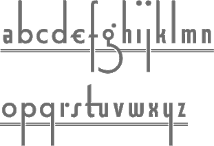 [MyFonts]
[More] ⦿
[MyFonts]
[More] ⦿
|
Richard Gans
[Fundicion Tipografica Richard Gans]
|
 [More] ⦿
|
Robert Casey
[wa2ise TTF fonts]
|
[More] ⦿
|
RUSH Font Project
[Sami Artur Mandelbaum]
|
From the web site: The Rush Font Project is a collaboration between Rush fans who have pooled their resources to compile a library of all available fonts used in the album art of Rush [...] The Rush Font Project is a collaboration between Eric Hansen, Hank Niemczyk and Sami Mandelbaum, whose assistance in creating the Rush fonts has been invaluable. Special thanks to Dave Ward, creator of the "Hemispheres" font. The fonts, mostly dated 2005-2006: AShowofHands, Anatomy, AnatomyFill, AnatomyGuides (a Codex-style typeface), AnatomyGuides, AnatomyOutline, AnatomyOutline, Bravado, CaressofSteel, Chronicles, Counterparts-Italic, Counterparts, DerTrommler-Regular, Dreamline, Exit...StageLeft-Bold, Exit...StageLeft-BoldItalic, Exit...StageLeft-Italic, Exit...StageLeft, FarewellToKings, FeedBack (Arnold Boecklin ripoff?), FlyByNight, GhostRider, GraceUnderPressure, GrandDesigns, GrandDesignsLined, Hemispheres, HoldYourFire, HoldYourFireBlack, JacobsLadder, Kofia, Limbo-Italic, MaskedRider, MomosDanceParty, MovingPictures, MyFavoriteHeadache, OBaterista, OneLittleVictory, PermanentWaves (the text says that this is a Stu's Diner font from 1999), PoweWindows, Presto, R30, R40, Replay-Bold, Replay-Regular, RoadShow, RollTheBones-Bold, RollTheBones, Signals, Snakes&Arrows-Bold, Snakes&Arrows, Snakes&ArrowsLight, SpiritofRadio, Strangiato, SummertimeBlues, Syrinx, TestForEcho-Italic, TestForEcho, VaporTrail, Victor, WorkInProgress-Bold, WorkInProgress-BoldItalic, WorkInProgress-Italic, WorkInProgress, WorkInProgressSwash-RomanItalic, WorkingMan. Mandelbaum made Chronicles and FlyByNight. Unclear who "made" the other fonts. I say "made", because this sure looks like an exercise in renaming commercial fonts. [Google]
[More] ⦿
|
Ryoichi Tsunekawa
[Flat-It]
|
 [MyFonts]
[More] ⦿
[MyFonts]
[More] ⦿
|
Sam Berlow
[Presidential Election Fonts 2008]
|
 [MyFonts]
[More] ⦿
[MyFonts]
[More] ⦿
|
Sami Artur Mandelbaum
[RUSH Font Project]
|
[More] ⦿
|
Stian Berger
|
Norwegian co-designer with Magnus Rakeng at Millimeter Design of Telenor (2001, sans) for the new corporate identity for Telenor. Still with Rakeng, but now at Melkeveien designkontor, he cocreated Always (2005, a connected 1950's style face, based on Rakeng's very popular earlier typeface Radio) and the Jugendstil style typeface Ålesund jugendstilsenter (2004, based on architect H. Schytte Berg's architectural lettering). [Google]
[More] ⦿
|
Tony Thomas
[Medialoot]
|
[More] ⦿
|
wa2ise TTF fonts
[Robert Casey]
|
TrueType fonts designed by Robert Casey, typically characters surrounded by something such as cat typefaces, Saturn, an old radio, an egg or a comet. Also a vacuum tube font. And now a Christmas tree font, a Morse font and an Easter Egg font. [Google]
[More] ⦿
|
Walter Dorwin Teague
|
W.D. Teague was a designer of some beautiful border ornaments at ATF in the early part of the 20th century. Later he became an industrial designer, famous for art deco designs of radios and gas stations. [Google]
[More] ⦿
|
Wilson Thomas
|
 Designer (aka Funk King, b. Fort Knox, KY) who lives in Orlando, FL, and/or Apopka, FL. He used FontStruct in 2008-2009 to make over 550 decorative fonts, and became one of the world's top experts on FontStruct, FontShop's on-line font editor. Most of his fonts were withdrawn in 2012. He did a few commercial typefaces at his commercial foundry, Funk King. His creations include
 - A Bit Eccentric.
- Alphabots
- Alphadings: Picnic Basket (2014), Rat Race (2014), Pod Invasion (2014), On Hangers (2012, a commercial series that includes Pants on Hangers, etc), Dog Tag, Black Bird, Easter Egg Dots, Ser Egghead T. handlebar, Ovoidotta (now called Sniff), Play Book, BuddhaBuddha, Swizzle Sticks, Computer Backplate, Milky Way, Sprout, Football, Clapboard (for movie makers), Teed Off, Book Stack, Speaker Box, Ant Farm, Sound and Vision, Speaker Grill, Tom Tom, Caged Type, Conga Lounge, Spinal, Add Van, Frostruct, Picket Fence, Regatta, Cranestruct, Impossible Alphabet, Igloo Village, Mortar Board, Jack, Marionette, Golden Gate (+Short, +Solid), Crossed, Eff U ("the finger"!), Tall Big Top, Jackpot, Skulls&Cross Bones Redux, Crosshairs, Drama Club, Good Day Sunshine, Butterfly, Steps and Windows, Heartbroken, O Christmas Tree, Christmas Lights, Candle, Supper Time (alphadings of plates), Sands of Time (alphadings of hour glasses), Fishbones (commercial since 2012), Handy (alphading with hands), Hang Ten (feet alphadings) and High Five (hand alphadings), Armade and Ghost Ship Armada (ship alphadings), Cut Here (stitching alphadings), Schematic (electric circuit alphading), Masquerade, Mortar Board, Gear Bits, Gearswork, Hi-Lo Gears, Gears, Resistor, Gear Shift, Castle, Castle with Flags, Antique Keys, Rounded Keys, Pods, Piano Keys (+Alt, +Correct), Framework, Dixieland Jazz, Spats, and City of New Orleans (the last three are alphdings based on the same Victorian alphabet), Saturn, Piggy Bank, Voodoo Doll, Dice, Fist Bump.
- Antennas, Antennas Outline
- Antiquity
- Arcostellati, Arcostellato, Arcangolo, Arcontorno (2011): a blackletter family.
- Architect, Ruled, Gridworks, Blueprint (Solid, Dashed), Quadular (+Serif), Isometric Modified (+Light, +Bold Outline), Isometric (a 3d gridded family: +Basic Latin, +Basic Latin Lite, +More Latin, +Bold, +Black).
- Art deco: Arc Neuvo (rounded letters), Arc Nuevo (2012, commercial), Toneelschuur (based on the letterhead created for the Theatre Toneelschuur Haarlem), Shift (bold), Eye Spy (this says Peter Sellers), Mod Squad.
- Atomic.
- Avenue, Avenue Alphabet (white on black).
- Badge
- Ball And Chain (neat), Ball Bearings.
- Balls and Bats
- Banjo (2012).
- Barber Shop
- Barcoded
- Basket
- Beachwear (horizontally striped)
- Beat Block, Beat Box.
- Beatnik.
- Beltway.
- Birdseye
- Birdsteps
- Bitten
- Blackletter: Abbey
- Blanket Serif Caps, Blanket Sans Serif
- Block Inline Block
- Block Mosaic (great gridded letters)
- Blockheads
- Blood Sweat&Tears
- Bolla Fratturato (2011): outlined blackletter face.
- Bolt, Bolted
- Bon Mots.
- Break, Balance Beam, After Party (2010).
- Bubble Zwrap (2010).
- Build A Bridge
- Buzz Kill
- Cafe Fumante.
- Carp Black, Carp Blanc
- Caterpillar, Tall Caterpillar.
- Cattails
- Chain Gang, Krazy King
- Channel
- Check Mate (checkered flag font).
- Cherry Bomb.
- Chubby
- Cinder Block (2010): a 3d typeface with texture thrown in.
- Circuit Board Solid, Circuit Board Outline, Circuit Board Outline Numbers, Circuit Board Simple, Micro Clean, Microcircuitz, Circuit Board Simple, Schematode (2013).
- Circus Maximus Outline
- Cirquela (2012). a non-FontStruct font, this is his first hand-printed typeface.
- Clean
- Cobblestones
- Code Hijack (2014).
- Compass (+Plain)
- Connected scripts: Cruise, Jet Cruise (2009), Notched Script (upright, connected), Rough Script (italic, connected), square Script (pixelish, connected).
- Computer Backplate, Milky Way.
- Contempole
- Crimped Pincushion (2010).
- Crispy Inline (classy)
- Crooked Marker, Marker
- Crop Circles
- Crownbar.
- Curls And Twirls
- Cut Here
- Daisies (nice rounded square letters with painted daisies)
- Decoscriptic, Decoish.
- Diamonds Are Forever, Liberty (dot amtrix fonts)
- Didactic fonts: Back to School.
- Digital, Digital Whimsy (gorgeous fonts in which the meat of the glyphs is made up of 0's and 1's), Digital Italics, Digital Non-italics.
- Dingbats: Digital Biz Bitz (2012), Capitalist Pictograms (2012), Kapitalist Kit (2011), Weather System (2011), Twelve Days of Christmas (2010), Learning For Business (2010), Calder Symbols (2010), Mad Aliens (2010), FSEmoticons, Maven Pictograms, Temp (weather dings), Sports Wave, Bullet Arrows
- Dinner at 8
- Diode
- Directional
- Ditier Cycles (2010): a grunge version of J. Hughes's Dirt Cycles.
- Disco Ball, Disco Salvation.
- Doggie Tracks (2010).
- Dollars and Cents.
- Domestic Bliss (+Solid), Blissful Hearts (Valentine's Day alphadings).
- Domino, Dominodot
- Dot matrix fonts: Belly Button (2013), Fandangle (2013), Trace Remains (2013), Billiards (2013), Pome (2013), Cow Poke (2013), Rouletto (2014), Crawler (2014), Zephyrelli (2012), Yoyo (2012), Carousel (2011), Corsivo Punti (2011), Wisp (2011), Amusement (2011), Menagerie (2011), Junk (2011), Iphont (white on black dot matrix face), Lyrical (dot matrix script), Petits Pois, Elli, Industrial Magic, Wind Chime, Domestic Bliss (2010, +Serif, +Sans Serif), Ying Yang (2009)
- Double Decker
- Eau de Kerning.
- Efficiency (2010).
- Eiffel family: mechanical.
- Electrifunkified (2013).
- Emergency
- eq Regular, eq Radio Waves, eq Tight.
- Erector Set (2010).
- Extension Cord
- Fairy Tale (curly)
- Fantastic
- Fast Cars, Fast Lane, Fast Forward
- Fifty Famous Fairy Tales (bi-lined and bejeweled)
- Flair Ornate, Flaired Script, Flair, Flaired
- Floor Plan
- Flash (gridded face)
- Folk Art (wooden plank simulation)
- Font Troll
- Fractal, Wireframe, Hemisphere, Origami (now Mummification): experiments in glyph partitioning.
- Funk, Funky palms
- Gancio (2014). Hand-drawn.
- Gemstone (letters in a mosaic)
- Glyphs made from broken objects: Broken Combs, Broken Glasses
- GI Joe
- Grain
- Graphont
- Grid1, Grid2, Pas De Grille Pli Isométrique (+Plombé), Grille Noir Pli Isométrique (+Plombé), Grille Intrépide Pli Isométrique (+Plombé), Grille Facile Pli Isométrique (+Plombé).
- Grunge typefaces: Feather (2010).
- Gummy (2010).
- Happily Ever After (2010).
- Heath Robinson (gorgeous mechanical font).
- Hexcavated (2010).
- High Anxiety.
- High Wire (dotted).
- Honeycomb Black (hexagonal).
- Horizontally Phased (like IBM logo from afar), Vertically Phased, Field Goal.
- Hot Diggity Dog (2010): a monoline rounded sans.
- Void.
- Inline: Hi-Fi Deco, Track (+Filled), Crispy Inline
- Imperfect Optical Experiment.
- Ironside, Ironworks.
- Isomixed (+Inline, +Inverted, +Light, +Inline Light), Isomixerd Moire (nine textured styles).
- Jacks (2010): a stitching font.
- Jeannie
- Jelly Bean series: I's, Wide, O's, Split
- Jetsons (futuristic).
- Jolly Swash 9+Tall, +Tall Wide Tail).
- Kaleidoscope, Kaleidoscope Solid
- Kitchen tile typefaces: MadisonAveAvenue (2010), Edgar Fernhout (2012).
- Lace
- Ladder
- Last Days Of Summer, Endless Summer, Beach.
- Lattice, Lattice Black
- Lean
- Leaves
- l-e-display
- Little Miss Muffet.
- Loom.
- Love, Love Letters
- Martini
- Metroliner and Metroliner Deluxe.
- MICR fonts: Wedge Solid.
- Mike
- Mitered, Zietgeist: striped 3d typefaces.
- Modal.
- Modern Ancient (chiseled font imitation)
- Molecular (+Complex, +Complex 1), Dense Molecular Complex (1 through 5), Molecular Architecture, Tessellation 1 (+Continuous), Tessellation 2.
- Monkey Bars.
- Montreal (+Italics)
- Monumental, Less Monumental,
- Mortar Booted (+Thick, Separated, Mission, Booted Mission).
- Mouthy
- Music fonts: Fret Full (2010), Fret Station (2010).
- MyBlock
- Mystere (2012, grunge).
- Necklace
- Ninja.
- Oblique
- Octovision Remix
- Open&Shuttered Day, Open&Shuttered Night
- Oriental simulation/look: Shoji Pixel, Shoji Stage&Screen Soapbox, Chinese Democracy, Asian Influence.
- Origami City (2010): formerly Simply Elevated Black. Simple Elevation (2012) is in the same family.
- Outline Habitat
- Ozmosis (2014), Ozian (2014), Cardinal (2014), Emblem (2014), Oblio (2014), Hollow Branch (2014)
- Pallina (2010, + Stampino, +Diluente).
- Palm, Tall Palm
- Paperclip typefaces: Neue Werner Paperclip (2012).
- Patterns
- Pavers
- Piccadilly (2010).
- Pipes
- Pisa.
- Pixel Dust, Pixels Dusted, Zogg Domination (video game font)
- Plaid
- Pop Arc (2010). In the same style: Conveyor Belt, Milk Bottle, Cookie Cutter, Erector Set (2010).
- Popsicle Sticks (nice vertically striped glyphs).
- Playbook (2010).
- Power Grid, Power Gridlocked
- Process This (2010) and Flowcahrt (2010): based on graphs of computer programs.
- Pump Boys (2010).
- Puzzle
- Quagmire (2010)
- Radio Waves
- Razorback Block
- Receipt (2012): a dot matrix face.
- Regular Habitat
- Relativity
- Remixintag (2011, a clone of Wallachia by Intaglio).
- Repeat
- Ribbodini (2010, ribbon font).
- Riveted
- Road Trip
- Sausalito Nautica (2011).
- Say What? (Exaggerated ink trap face)
- Scaffoldini (2010): a 3d gridded face. Followed by Scaffo (2012), Scaffoldini Senza Griglia (2010), Scaffoldini Ascendente Contrario SG, Scaffoldini Ascendente Senza Griglia, Scaffoldini Contrario Senza Griglia, Scaffoldini Ascendente, Scaffoldini Contrario, and Scaffoldini Ascendente Contrario, Scaffoldini Prospettico (+Contrario, +SG).
- Scichosis.
- Scripts: Diode (+Dioded, Diodoubled, Diodocked, Diodedocked, Diodiced), Scherzando, Fontstitution, Rough Script, Scriptilicious, Whipped Cream, 45 Degrees, Script Town (2013), Aloha (2013), Sinal Strength (2013), Ink Well (2013).
- Skulls, Skully
- Slice N dice
- Skyscraper.
- Small Wonder, Small World
- Snowflake (2010).
- Soap.
- Sole
- Soma (2009): 3d letters mades from cubes.
- Spooky Eyeballs (2009).
- Squiggles
- Stained Glass, Stained with Cross
- Starburst
- Stencil fonts: GI Joe (2012, military), Kid's Stencil (white on black), Black Tie, Matchstick, Stensei, Stencillated, Tri-Fold, Tri-Fold Cut, Tri-Fold Rounded, Stencil, Stencil Plate, Stencil Face, Semi Stencil, Psuedo Stencil, Psychedelic Stencil.
- Stitching fonts: Cross Worded (2013), Cut Here (2014), Sampler
- T-Shirts on a Clothesline
- Swamp Frog and Tadpole: artsy fat letters
- Swamp Funk, Mojo (curly letters)
- Swatches.
- Tabular
- Tall Habitat
- Techno look: Technified, Slick, Tangential (2010).
- Tanqueray (2010): octagonal face.
- Teepee (wood look)
- Tennis themed: Racket, Net Ball, World Cup.
- Tetrominoes Black (2010): a 3d typeface cloned from TP2 Marriott's Tetrominoes.
- Textile
- Texture fonts: Global (2011, globes), SS Half Tone (One, Two, Three), SS Watermark, SS Silk Screen (2010). These brush texture typefaces were cloned from Swifted Strokes by Mike Lee. Tramarada (2011) has a stunning woven look.
- Thalistic.
- The Adventure of the Dancing Men (2011, dingbats).
- The Big Top
- The Real McCoy
- Tiki.
- Time
- Timpani, Timpaniless, Timpaniblok, Alien Crop Circles (outer space face).
- Toothpaste (2011): imitating oozing toothpaste.
- Trapezoidot, Zoidot, Dotz (dotted typefaces).
- Upright connected scripts: Madie (2009)
- Valentine's fonts: Hearts and Flowers, Hearts and Arrows, Keys to your Heart, Bed of Hearts
- Vapors and Mirage: evaporating glyphs.
- Vibration (2010). This multiline typeface was followed by Echo (2010).
- Victorian fonts: Alouette, Swamp Funk
- Void.
- Waveform
- WPA Household Arts Stripes, WPA Household Arts Chex, WPA Household Arts (poster stencil face)
- Wee The People, Small World.
- Werner Paperclip (2009), Paperclip (2010): paperclip typefaces after a 1974 original by Ad Werner.
- Western fonts: Bolo (2010), Bow Tie (2010), Bowl (2010), Western Doodle, Sparky, Buckaroo, Diamond Buckaroo, Saloon and Desert Rose. Western style alphadings: Cart Before The Horse, Wagon Train
- Weird
- White on black typefaces: Tabs, Dot Keys, Rounded Keys, Block Keys, Keys.
- Wiggles
- Wim Crouwel-related fonts: Unknown Crouwel #1, Edgar Fernhout (2012: a Wim Crouwel tribute font in kitchen tile style taken from a 1963 poster), Kalender 1976 Letters (octagonal based on a Wim Crouwel calendar from 1976), Kalender 1976, Brusselmans (based on a Wim Crouwel poster), Rabobank (based on a Wim Crouwel poster), Brabant (based on a Wim Crouwel poster)
- Woodcut, Woodcut Recut, Woodcut Banjo.
- Woven.
- Wrenched
- Yay Team
- Zebeast (Zebra-striped letters)
- Zodiac Block
In 2012, he added these fonts at MyFonts: Architect, Black Tie, Carousel, Check Mate, Cobblestones, Cruise, Dog Tag, Edgar Fernhout (2012), Fifty Famous Fairy Tales, Fratturato Digitale (pixelish blackletter face), Ghost Town, Jackpot, Jelly Bean, Keyboard, Kingdom (a castle font), Lagniappe (Victorian), Lyrical, Madie, Matchstick, Menagerie, Q Typ, Scaffo, Sprinkle, Stained Glass, Stencillated, Stensei (stencil), Sweet Valley, Toothpaste, Vibration MF, Yoyo, Zephyrelli. Typefaces from 2013 (no longer freely downloadable!): Pome (dot matrix), Cow Poke (dot matrix), Sausalito Nautica, Cut Here (stitching typeface), Belly Button (dot matrix face), Rouletto (bejeweled typeface), Picnic Basket (alphadings), Fandangle (dot matrix), Trace Remains (dot matrix), Billiards (dot matrix), Cross Worded, Script Town, Schematode (connect-the-dots), Electrifunkified, Aloha, Signal Strength, Ink Well, Satellite, Supper Time (alphadings), Mike (alphadings), Licorice, Conga Lounge OF, Monkey Bars, Daisies, Fractal OF (textured face), Saloon OF, Ball and Chain, Say What. Typefaces from 2014: the multilined or inline typefaces Ozmosis, Ozian, Cardinal, Hollow Branch, Emblem, and Oblio. The alphading typefaces Rat Race and Picnic Basket. The pearly dot matrix typeface Rouletto and Crawler. The video game typefaces Pod Invasion and Zogg Domination. The stitching typeface Cut Here. The pixelized typeface Code Hijack. Klingspor link. Dafont link. Fontspace link. Additional URL. Myfonts link. MyFonts foundry link. View Wilson Thomas's commercial typefaces. [Google]
[MyFonts]
[More] ⦿
|
Yuji Adachi
[P-Font Dispenser (was: Yuji-3001)]
|
[More] ⦿
|

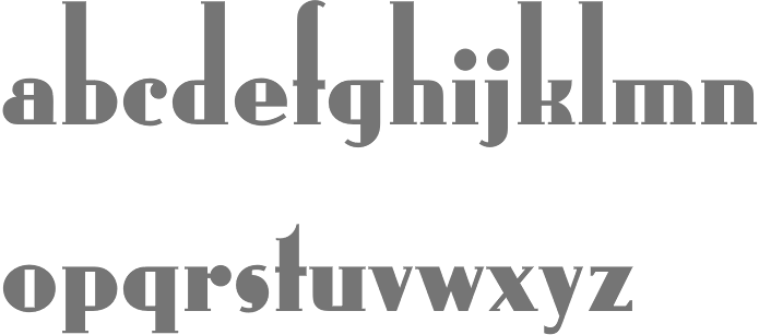
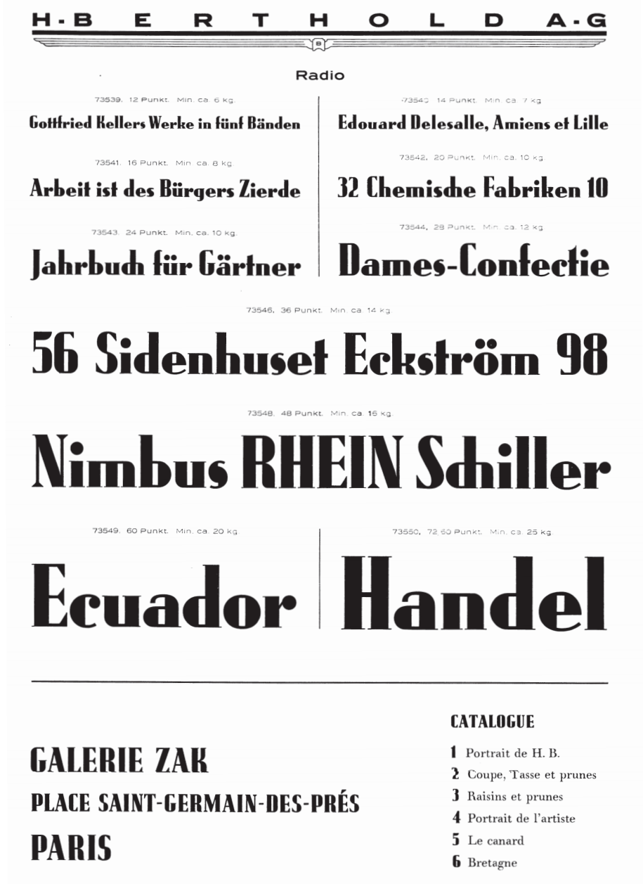
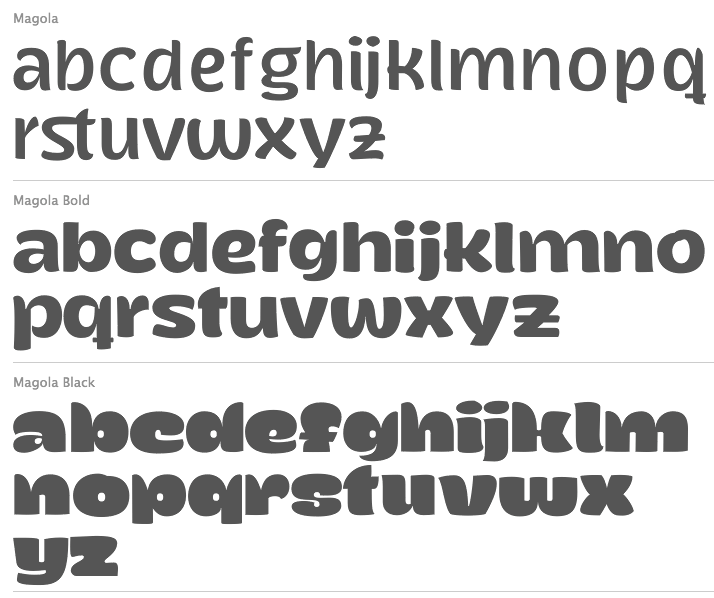
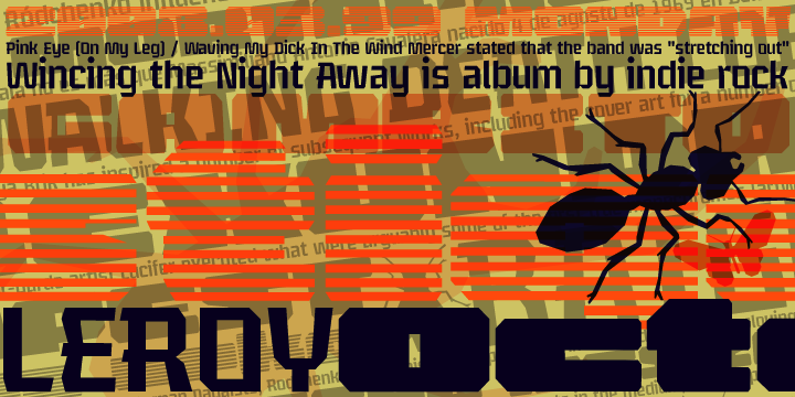
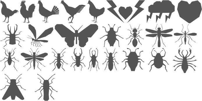
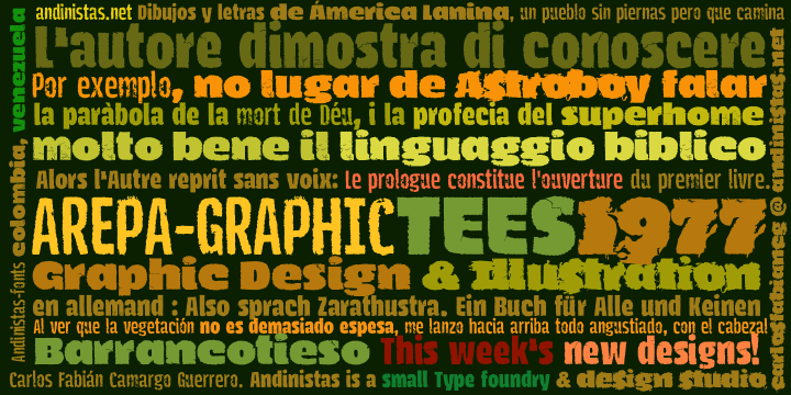
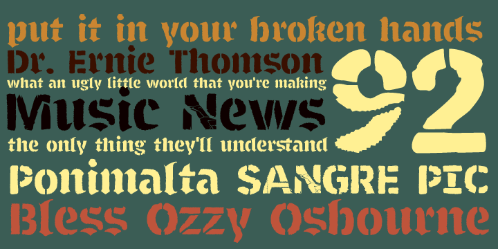
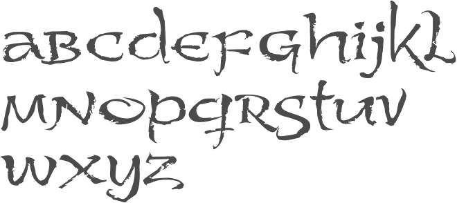
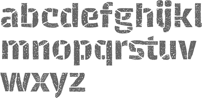
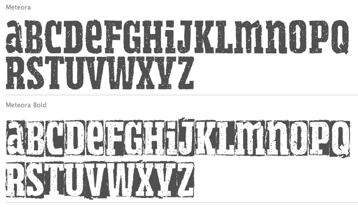
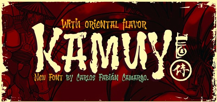
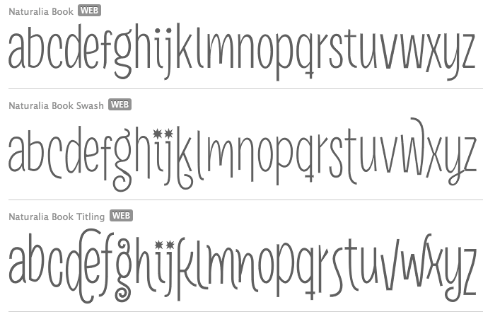
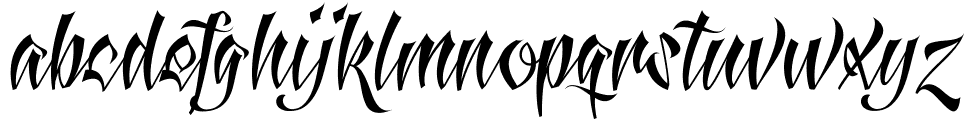
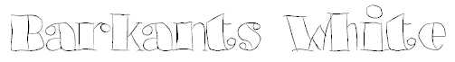
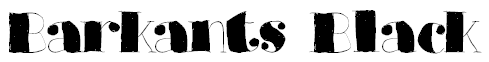
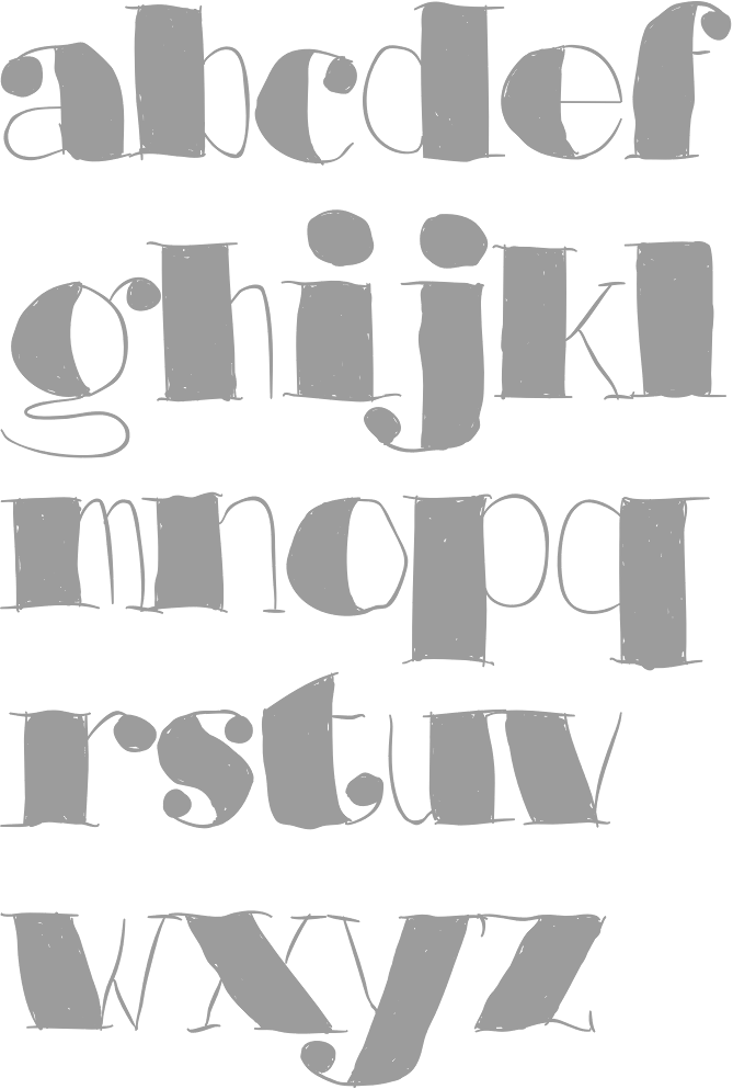
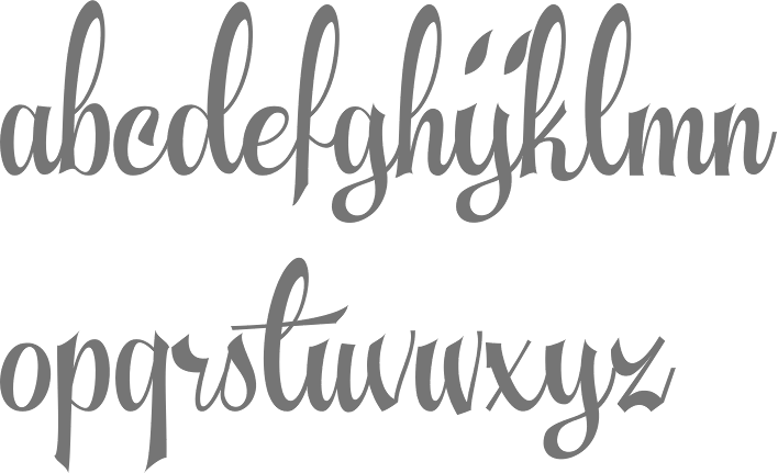
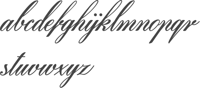
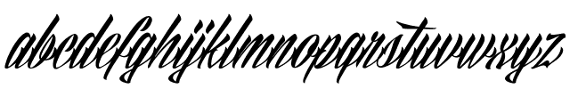
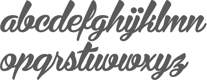
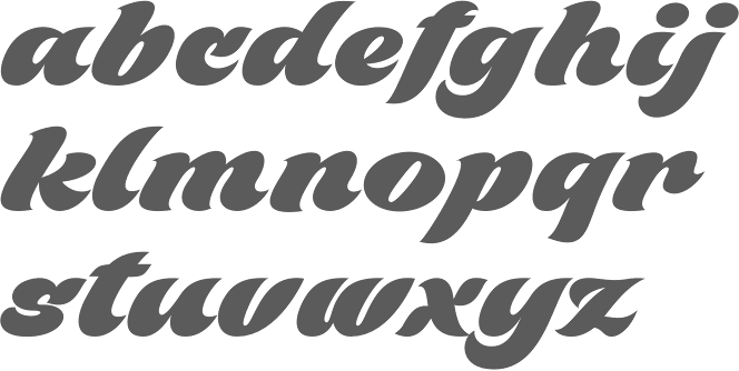
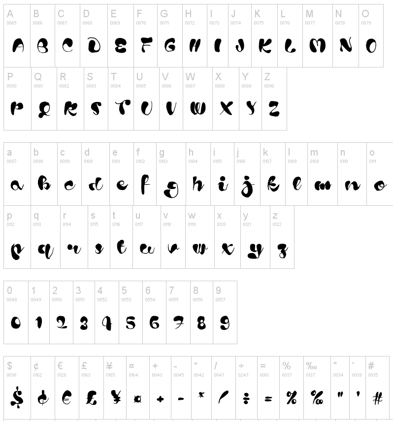
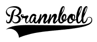
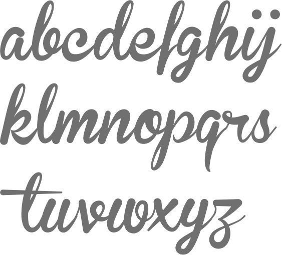
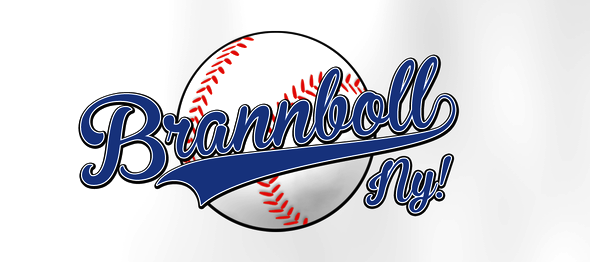
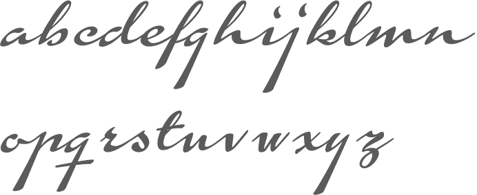
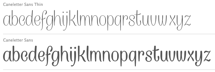
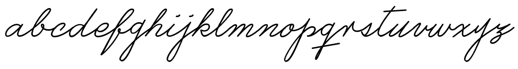
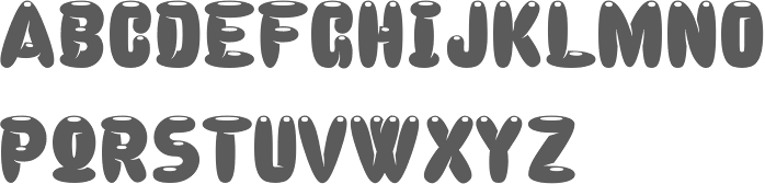
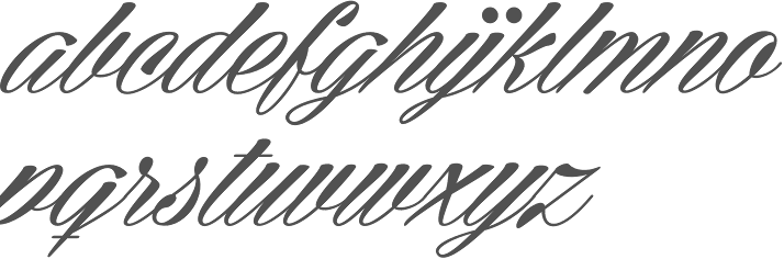
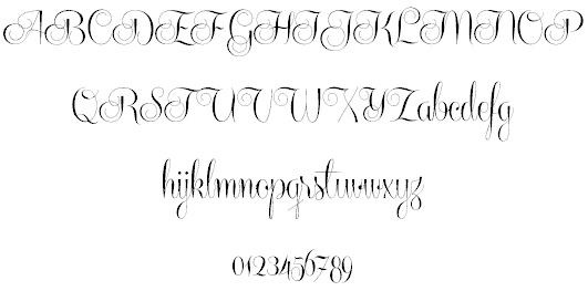
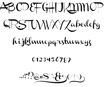
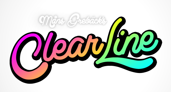
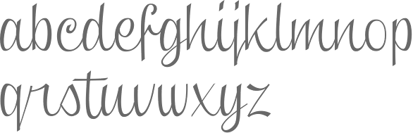
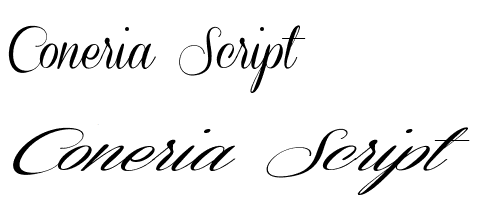
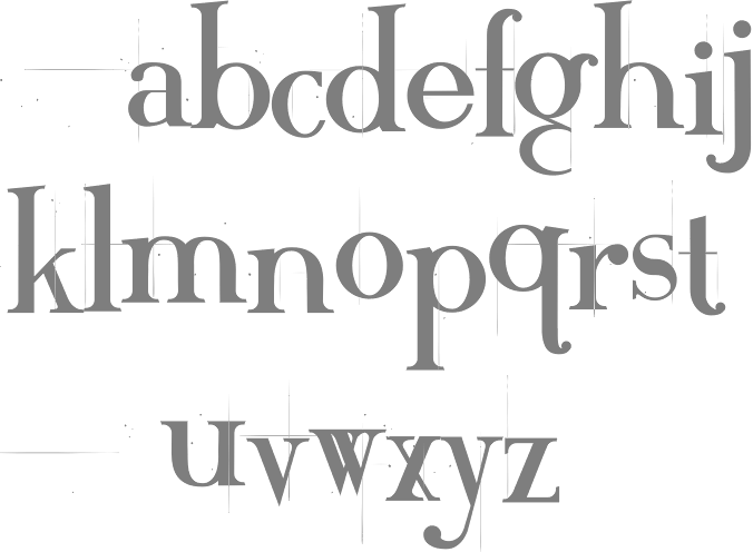
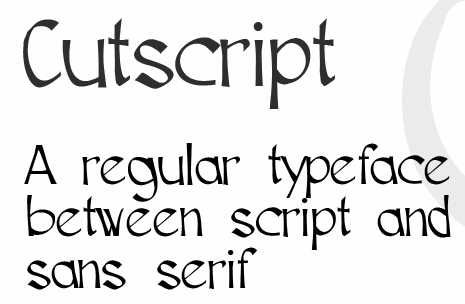
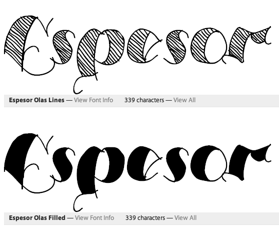
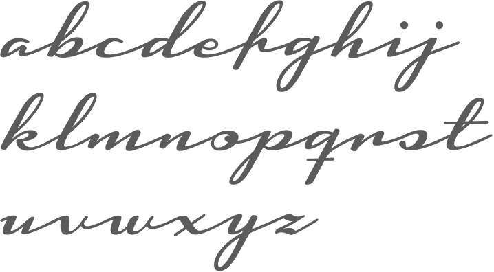
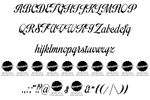
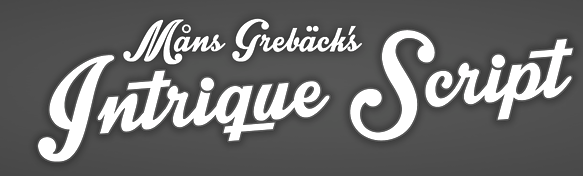
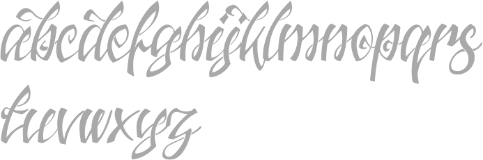
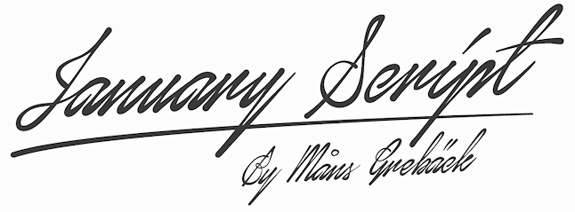
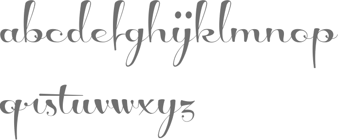
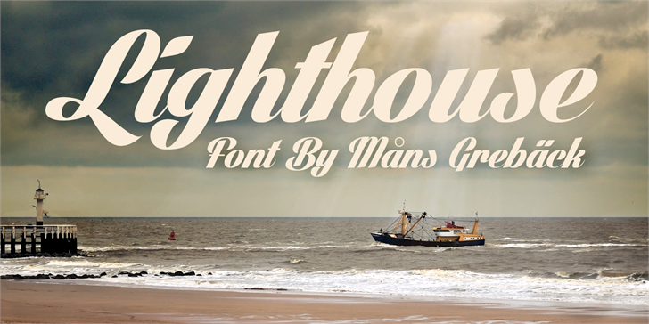
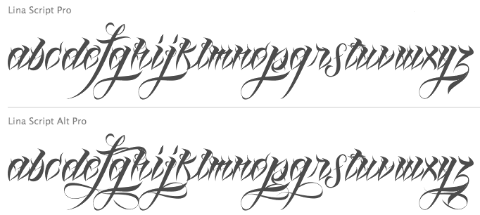
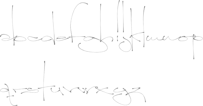
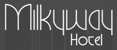
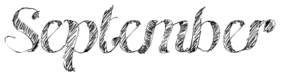
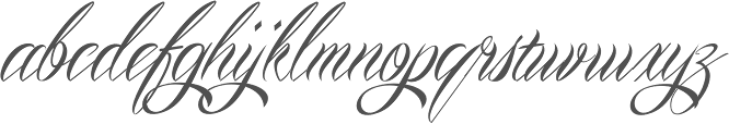
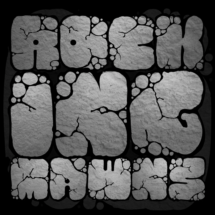
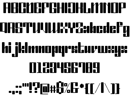
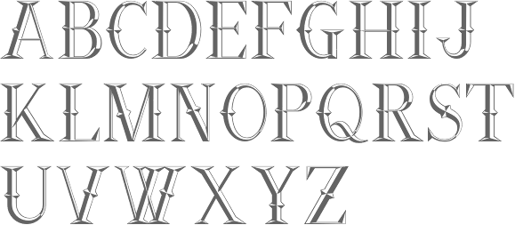
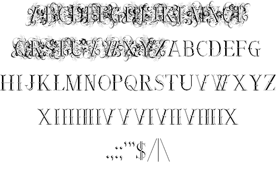
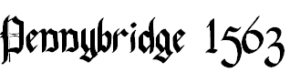
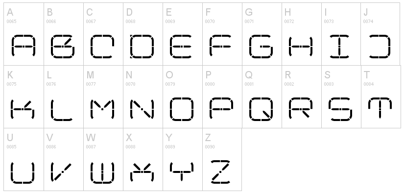
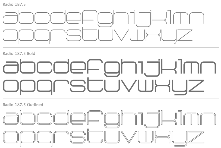
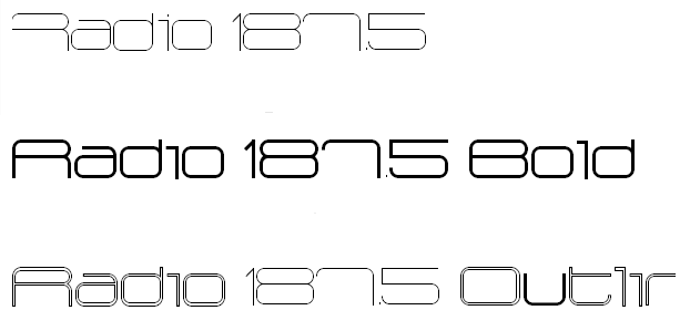
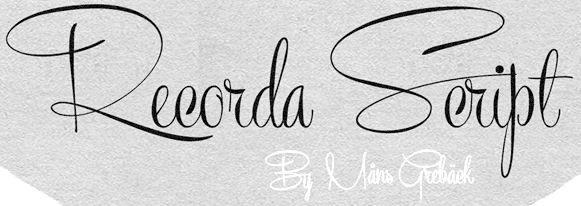
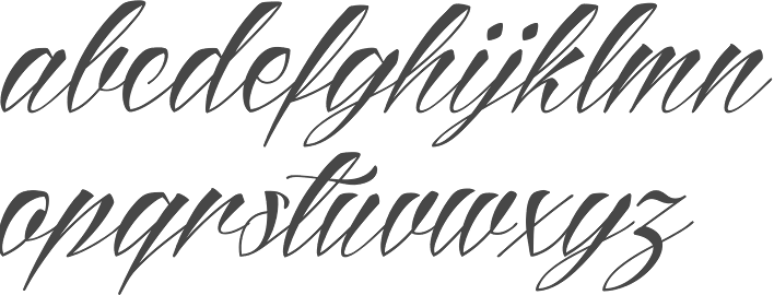
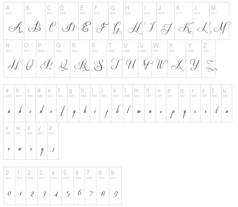
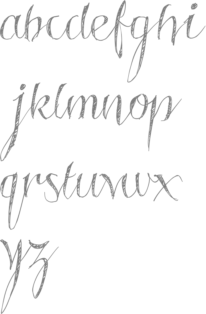
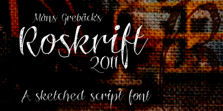
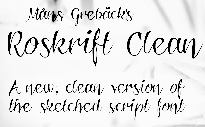
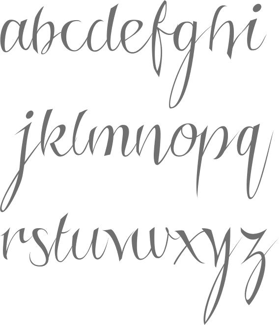
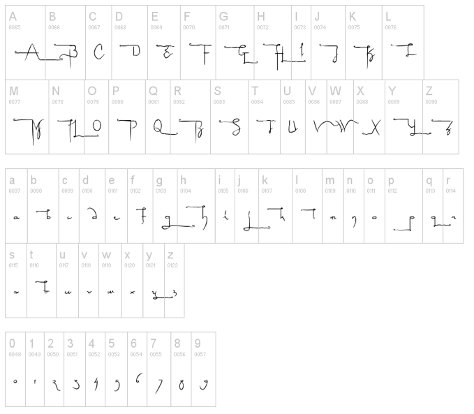
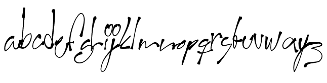
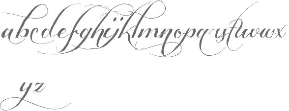
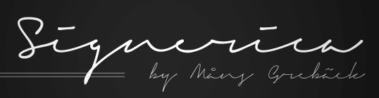
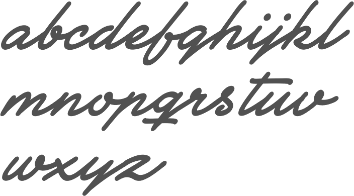
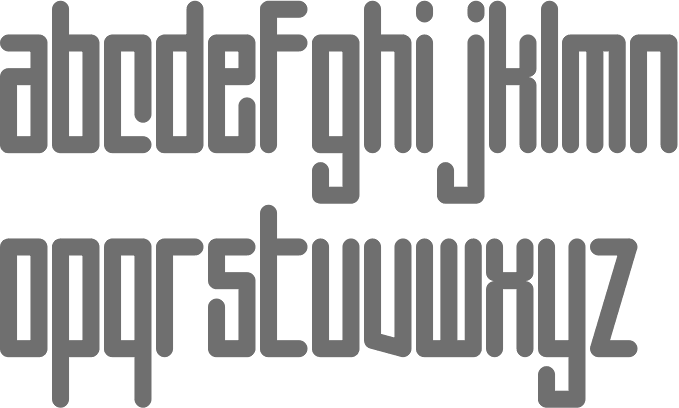
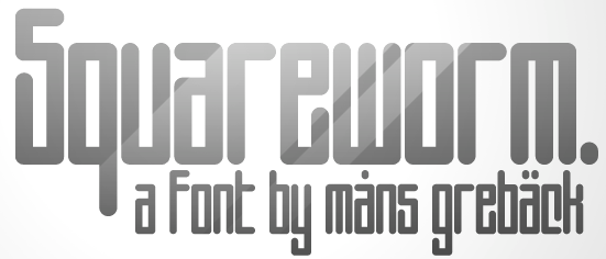
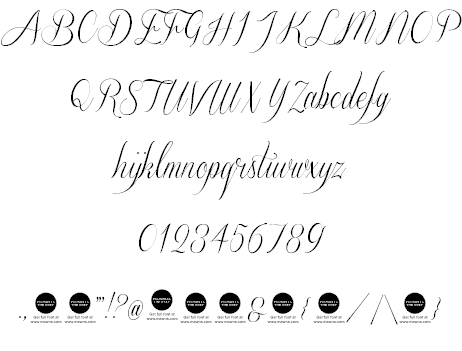
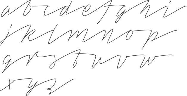
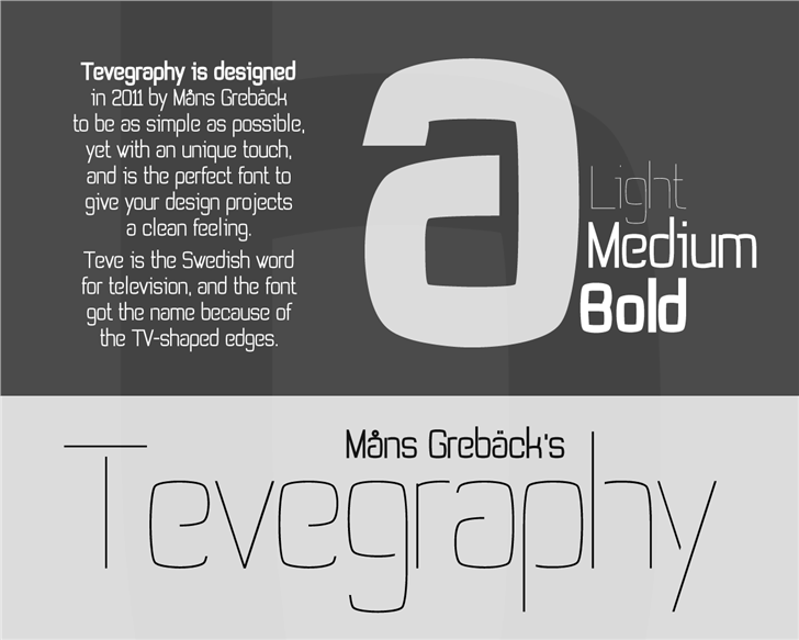
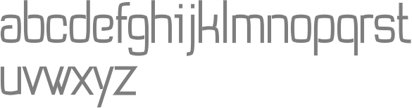
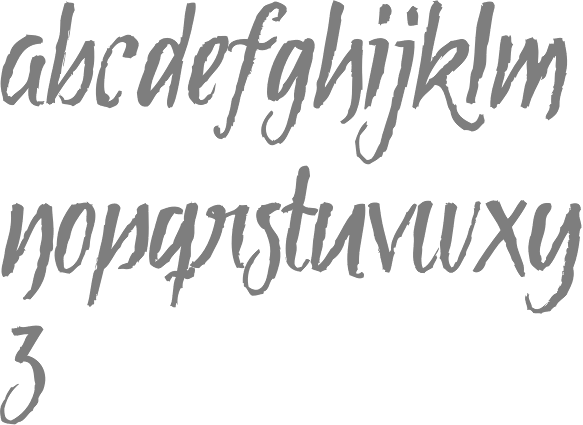
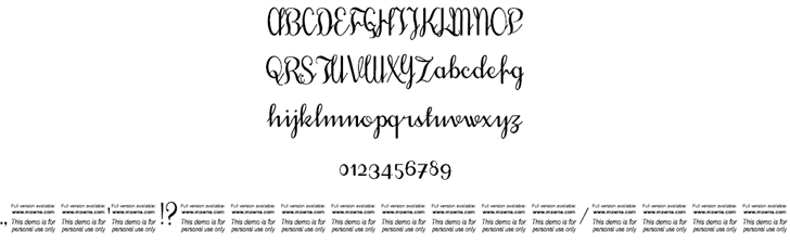
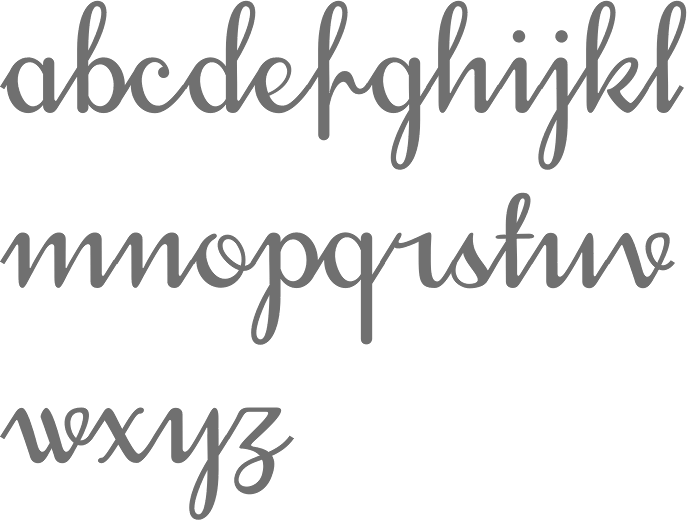
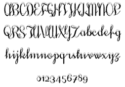
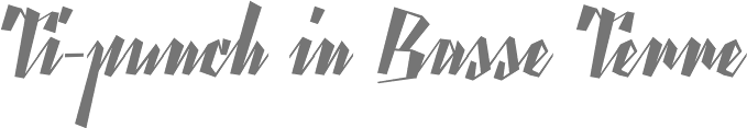
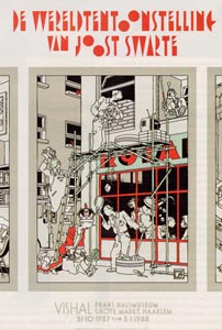
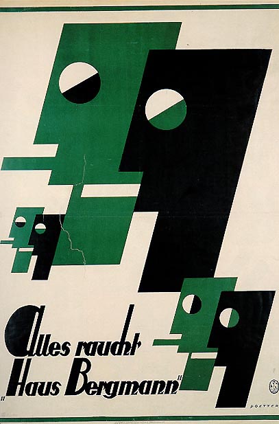
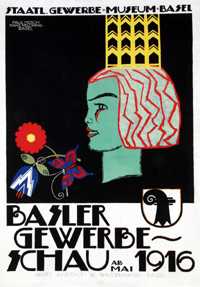
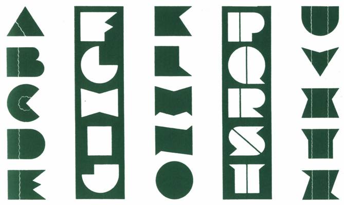
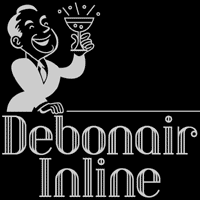
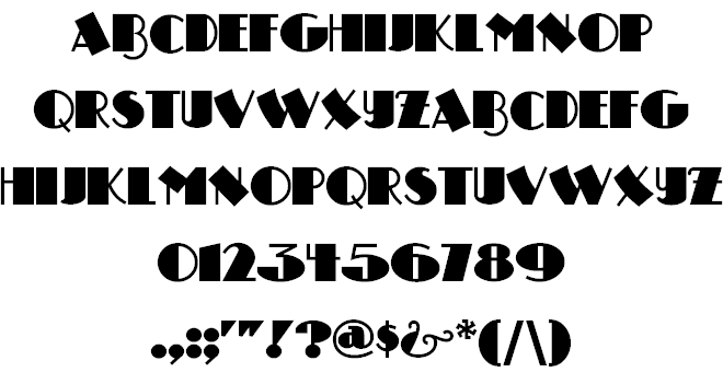
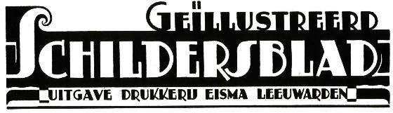
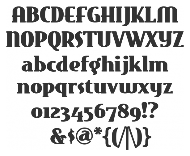
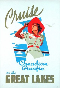
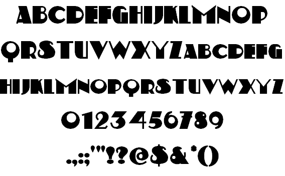
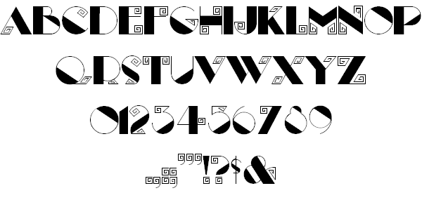
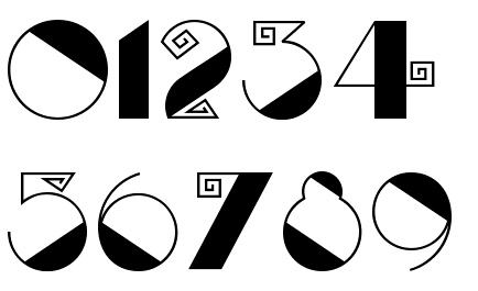
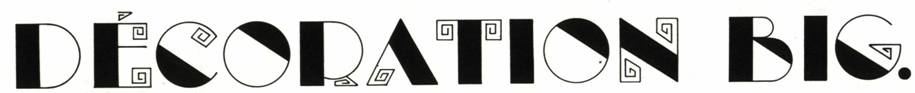
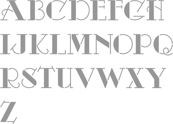
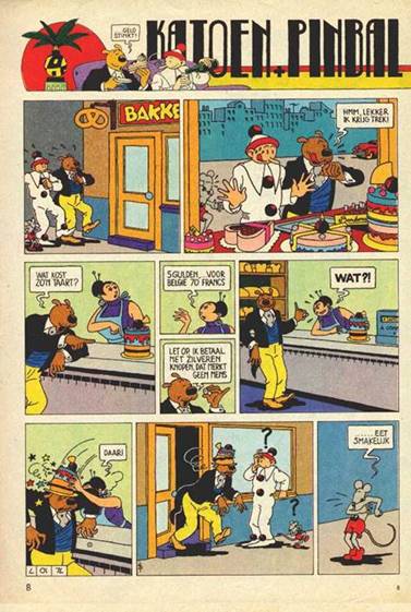
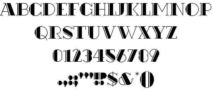
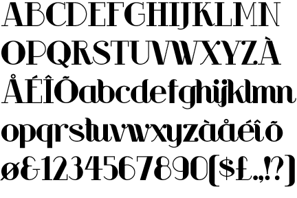
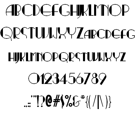
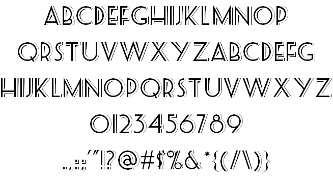
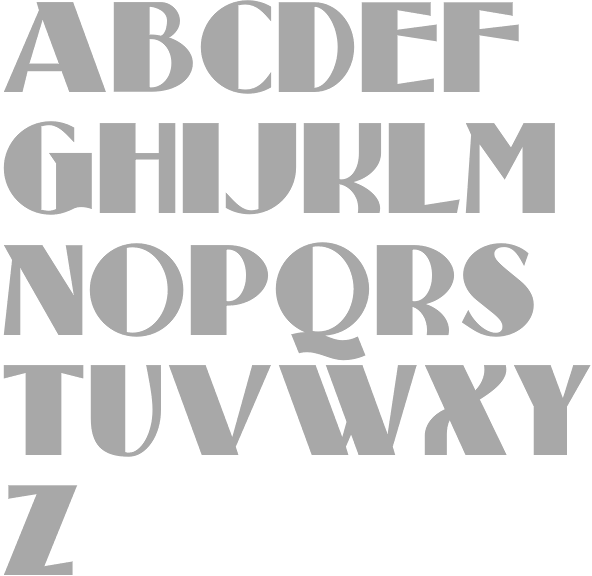
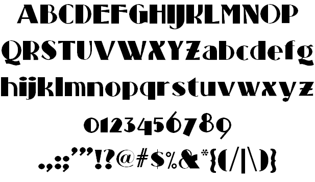
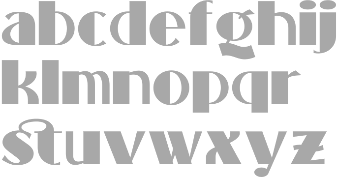
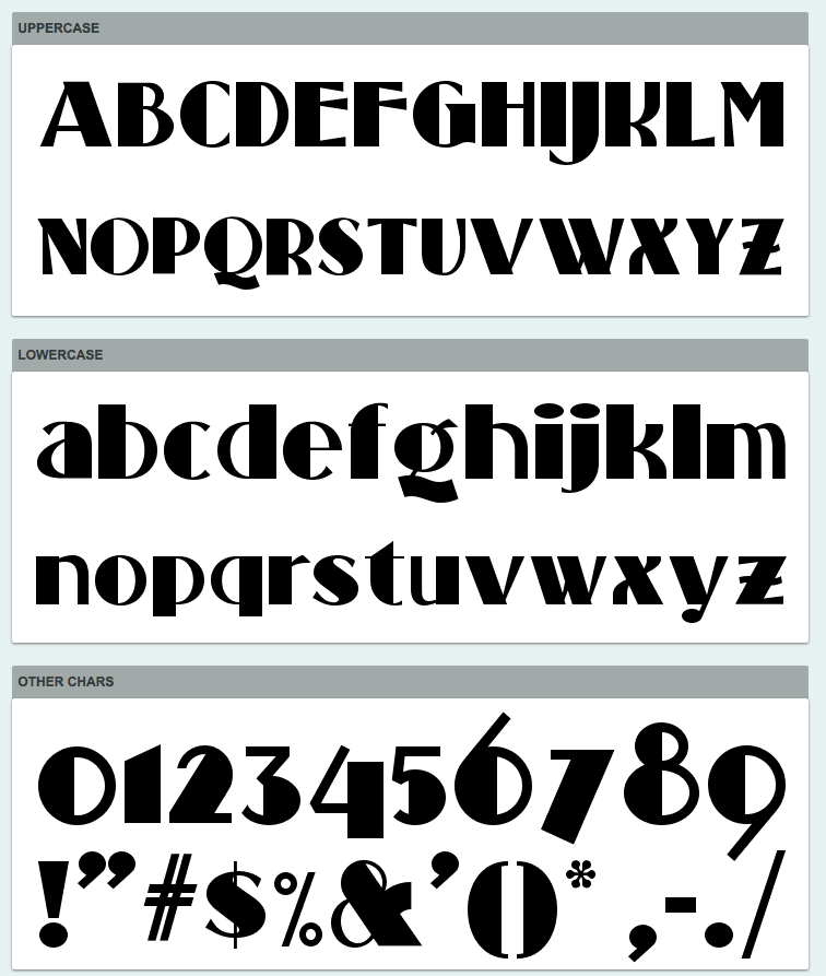
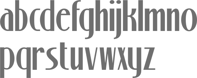
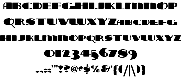
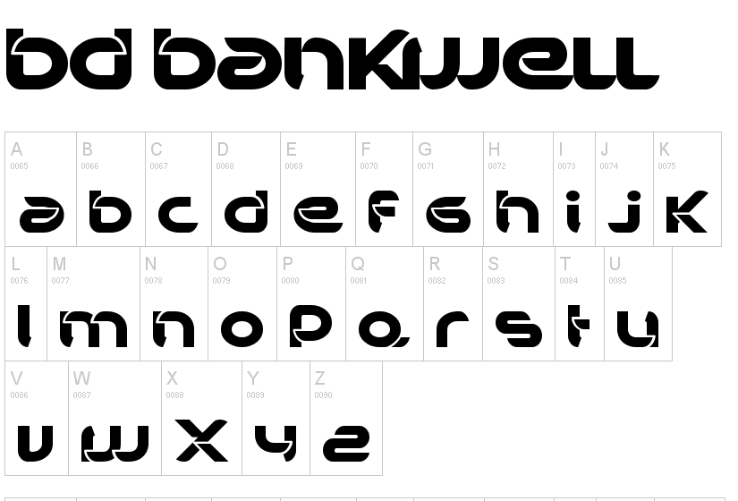
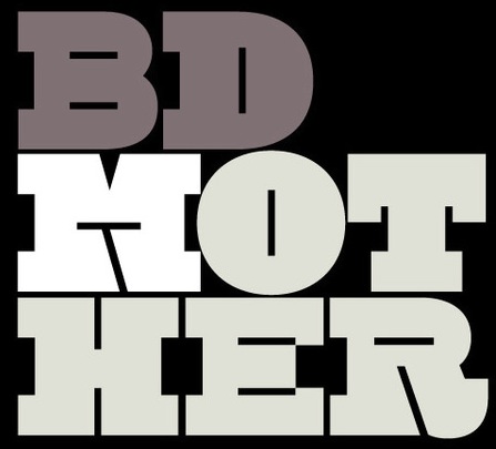
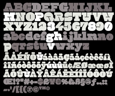
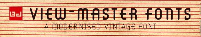
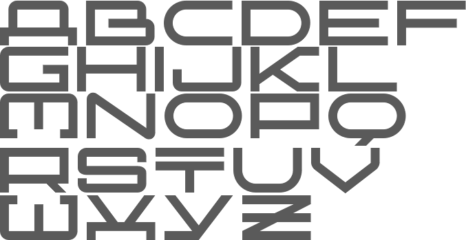
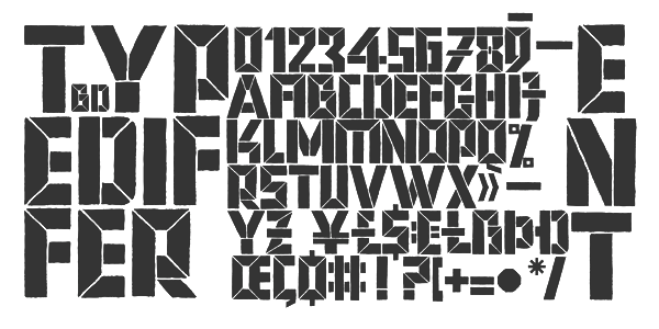
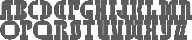
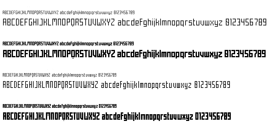
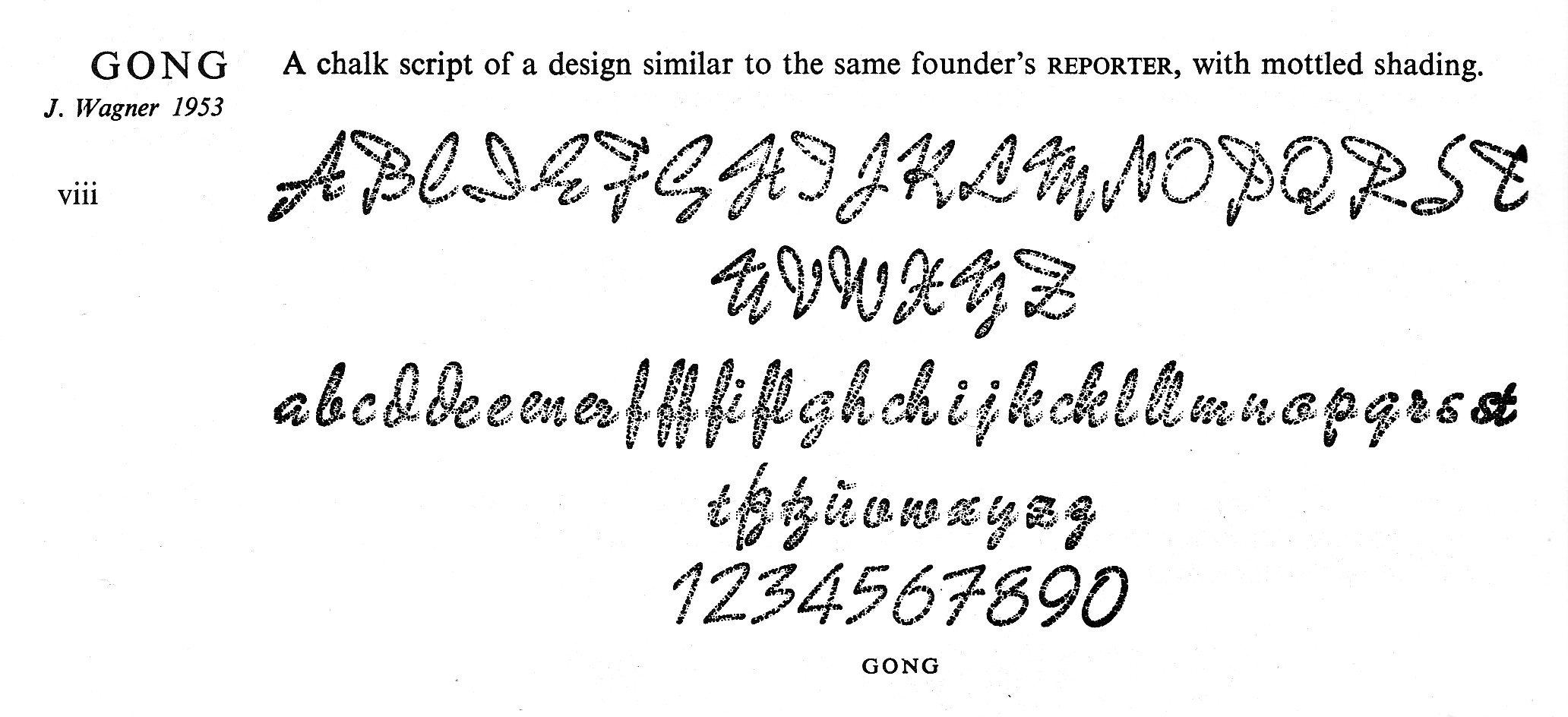
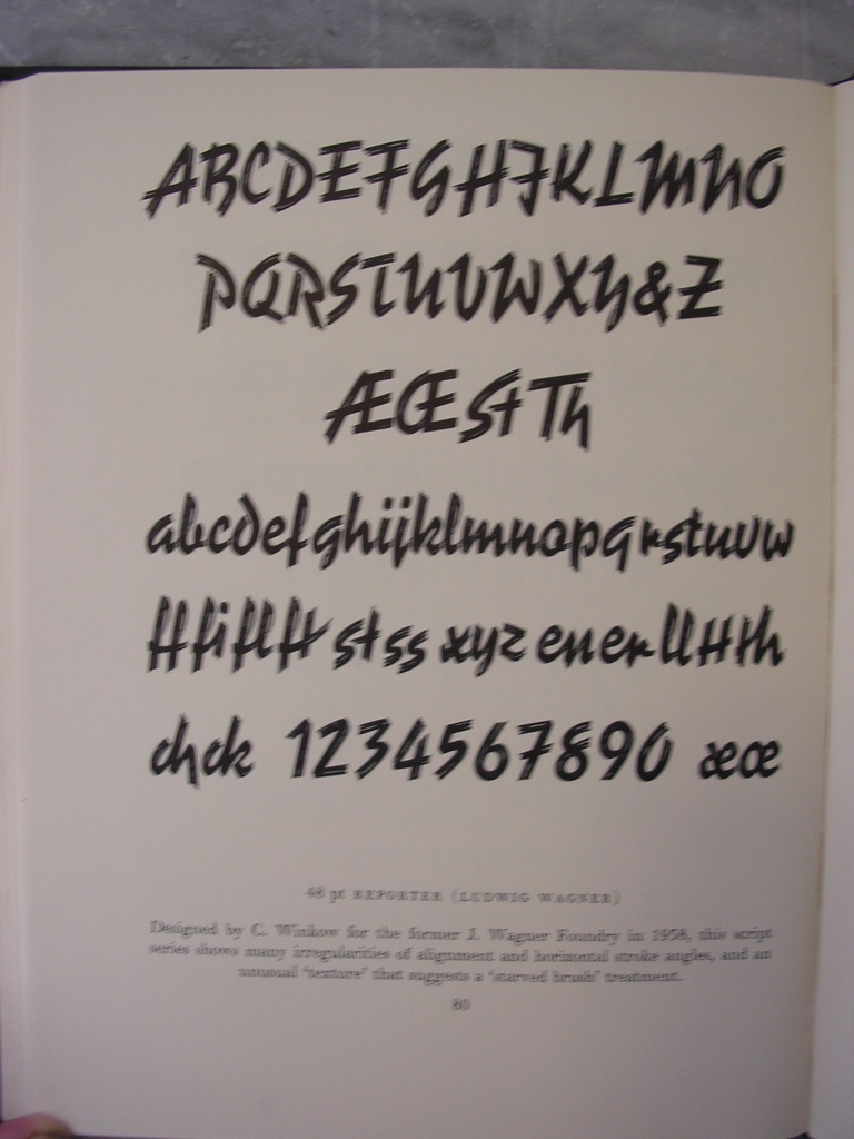
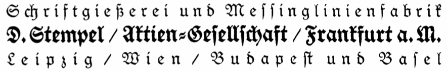
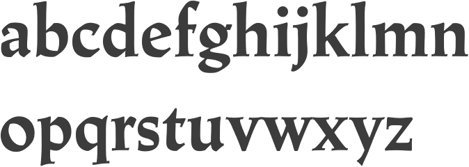
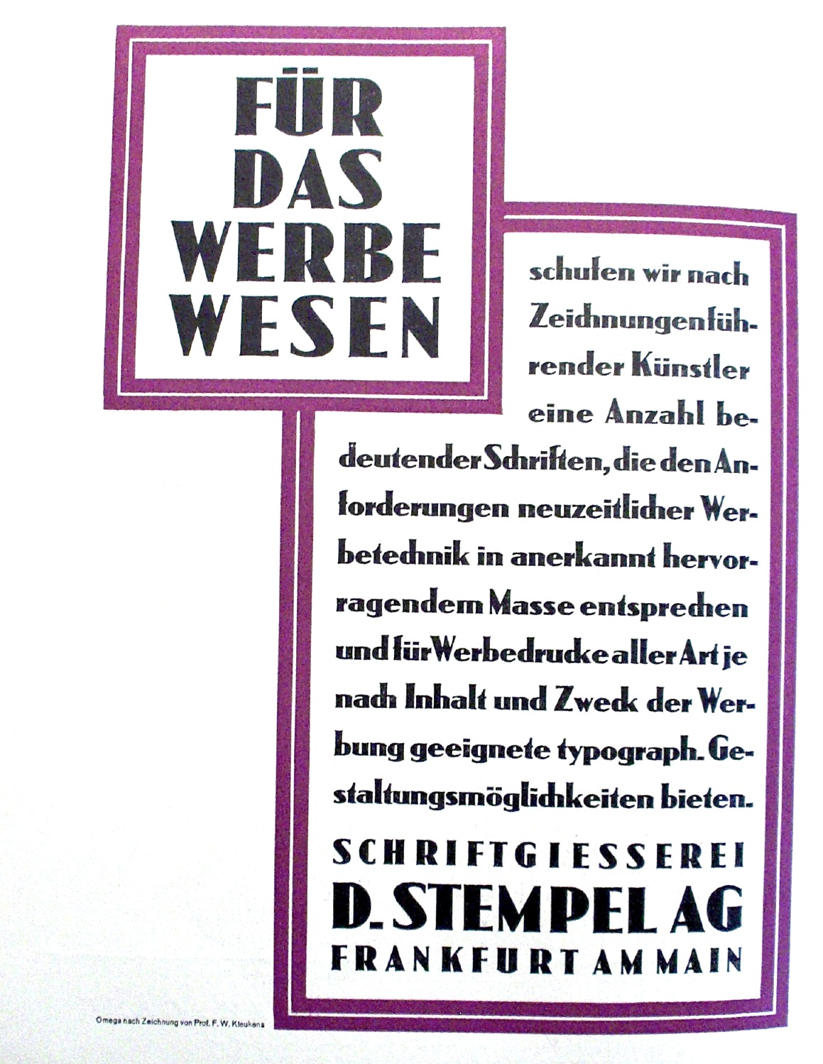
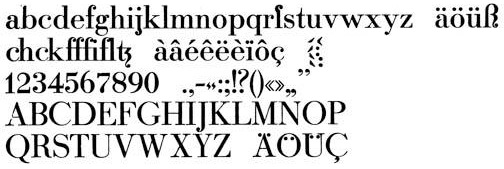
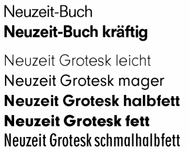
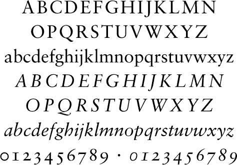
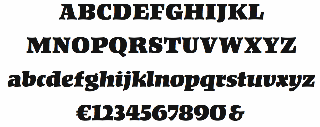
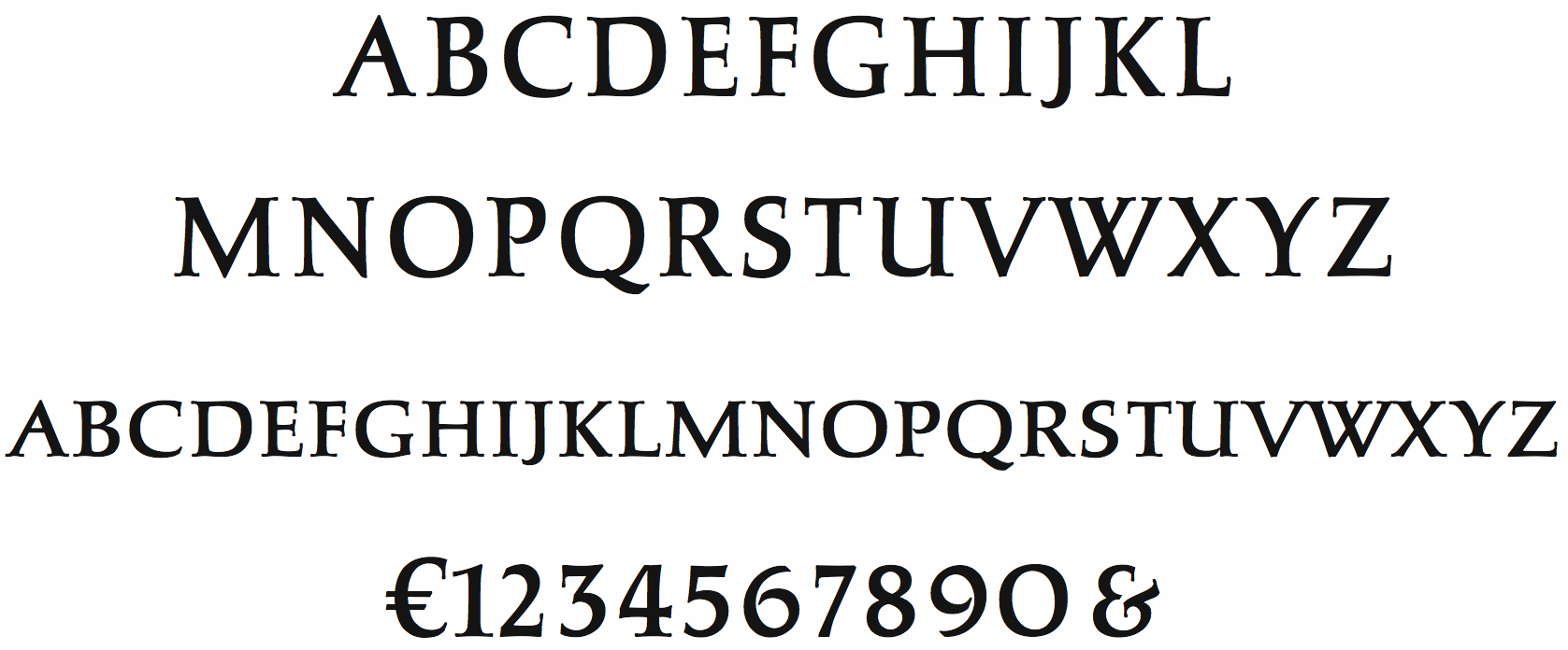
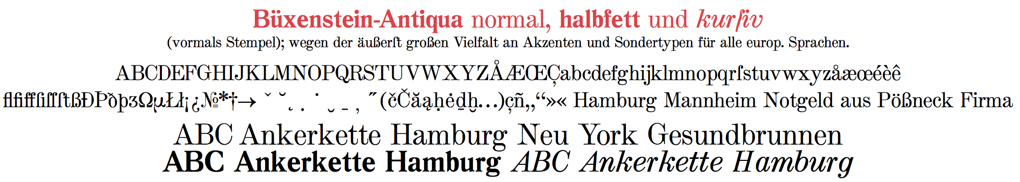
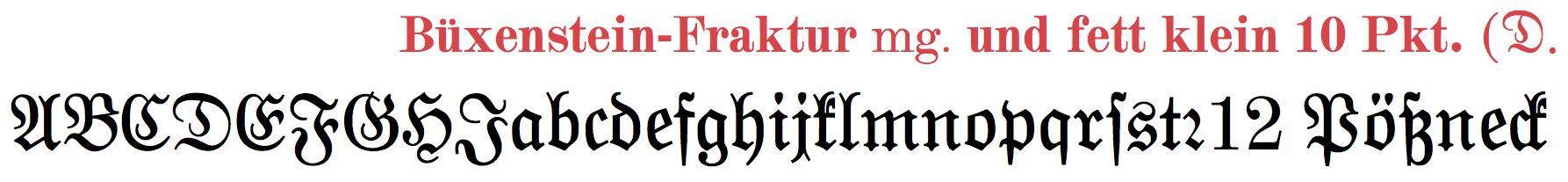
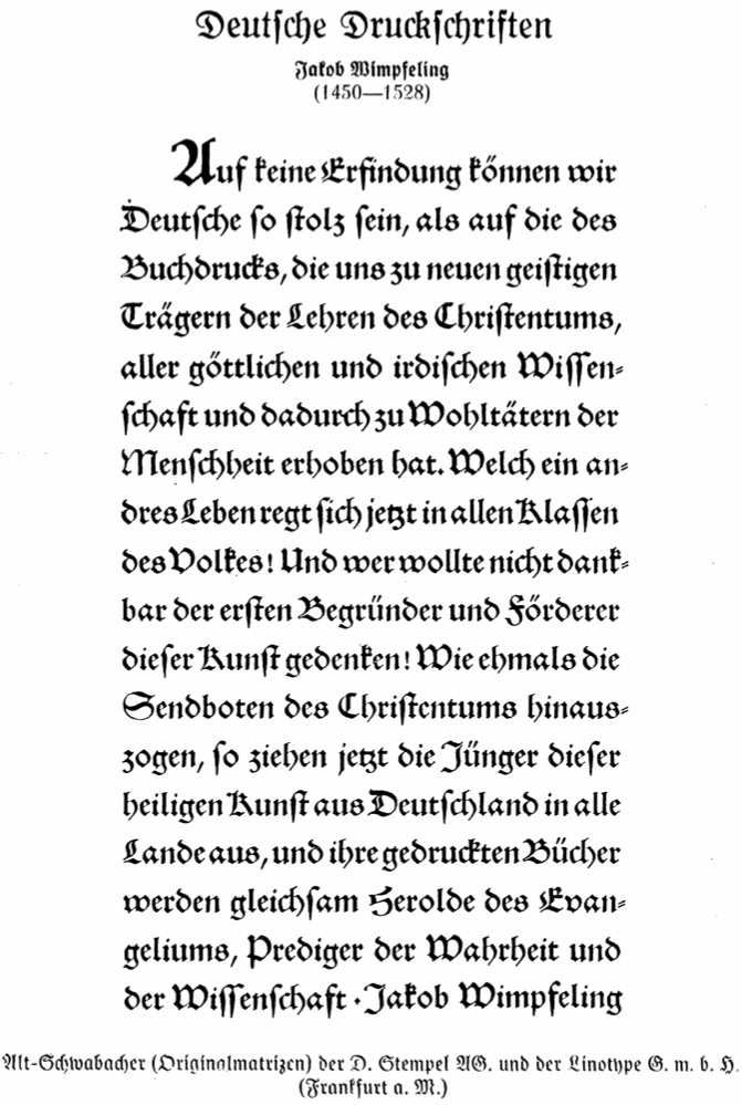
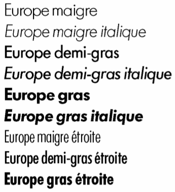
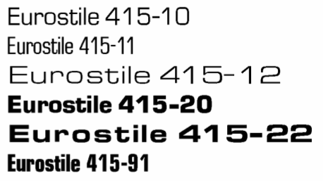
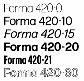
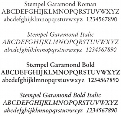
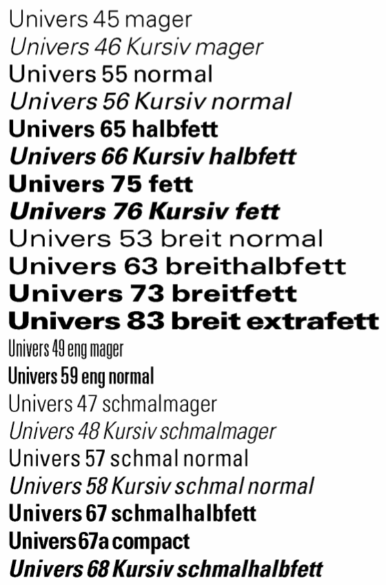
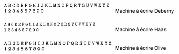
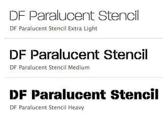
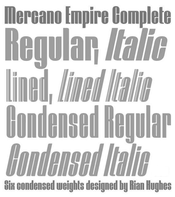
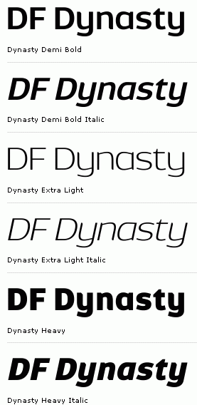
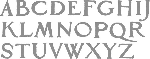
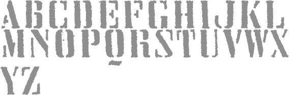
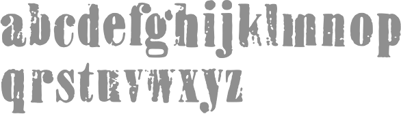
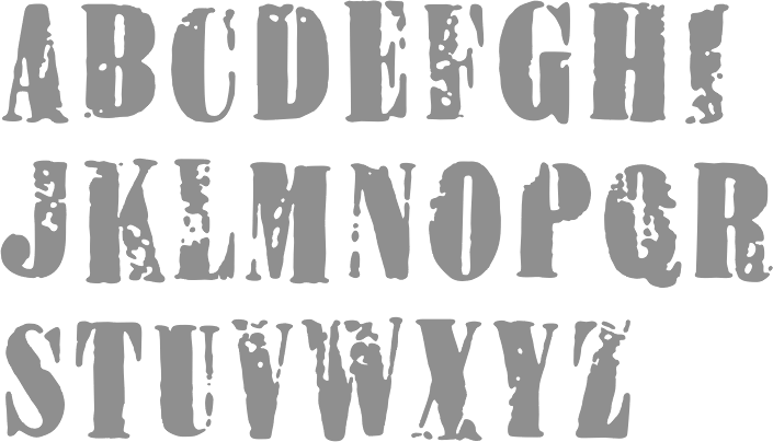
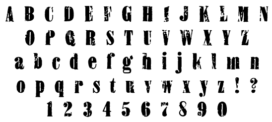
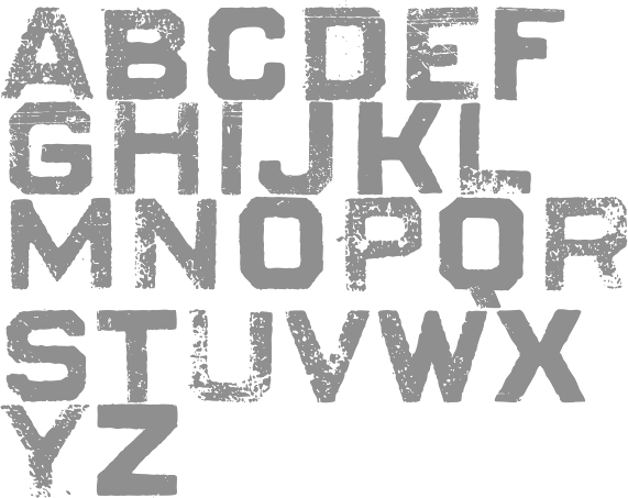
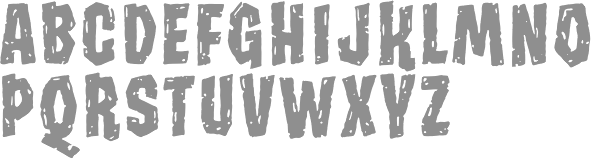
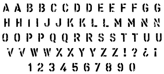
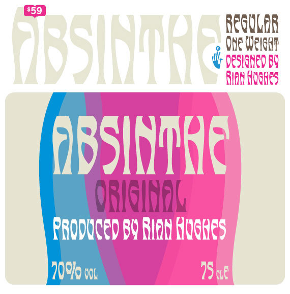
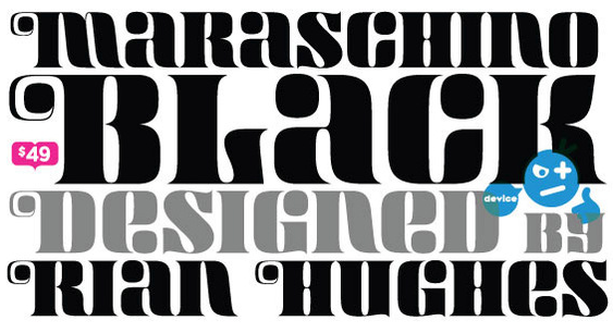
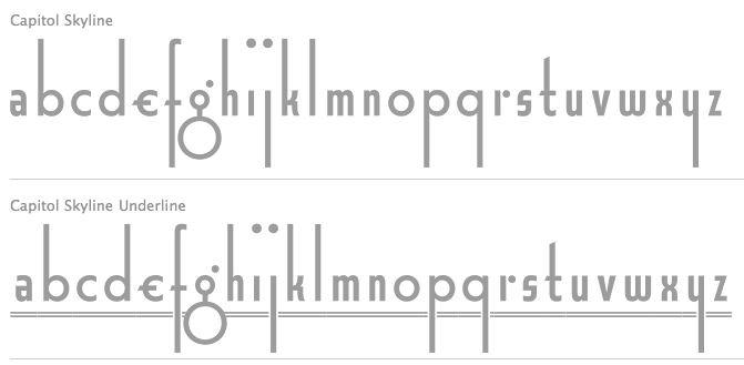
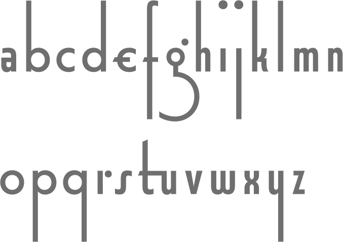
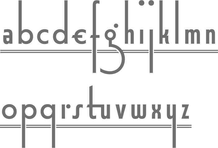
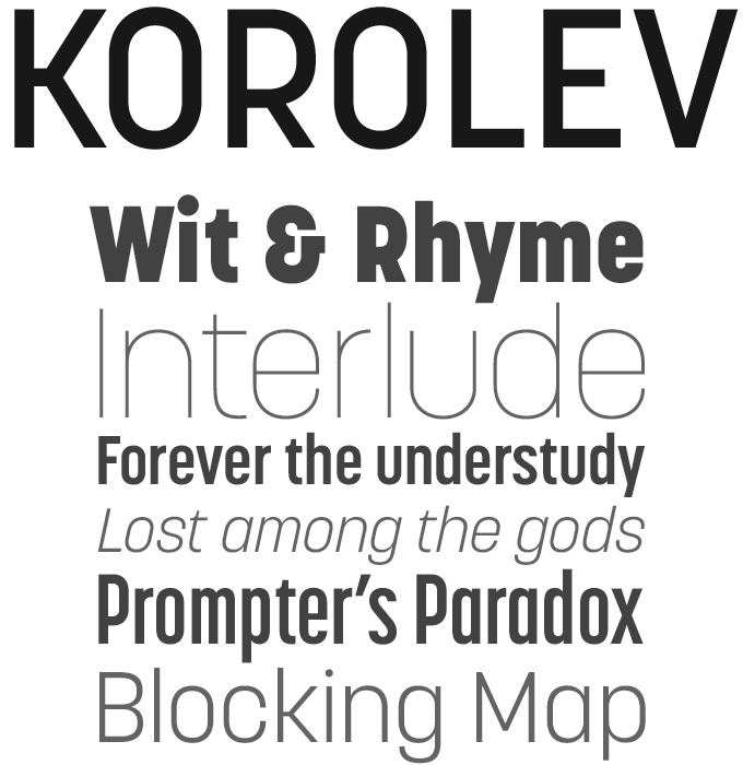
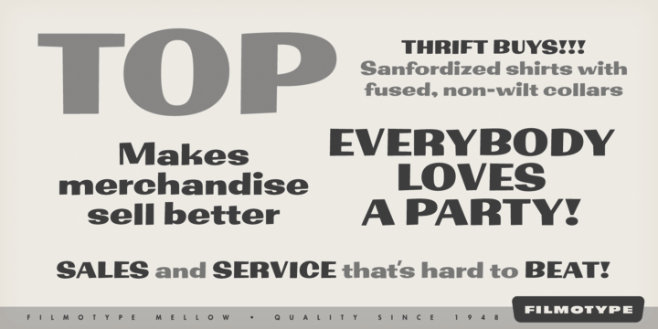
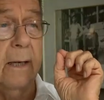
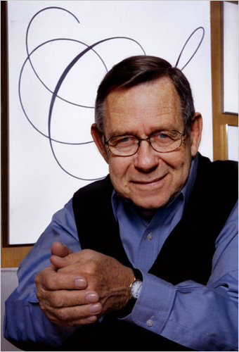
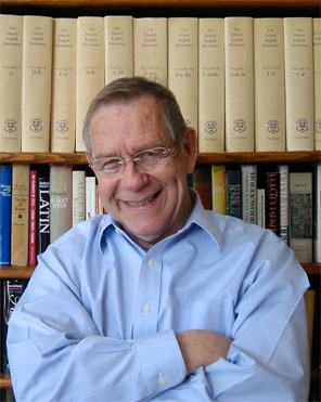
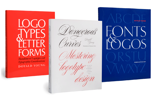
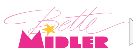
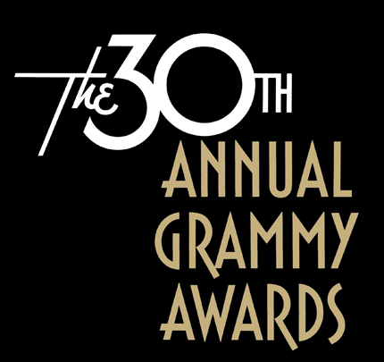
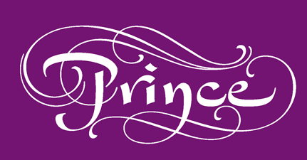
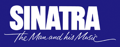
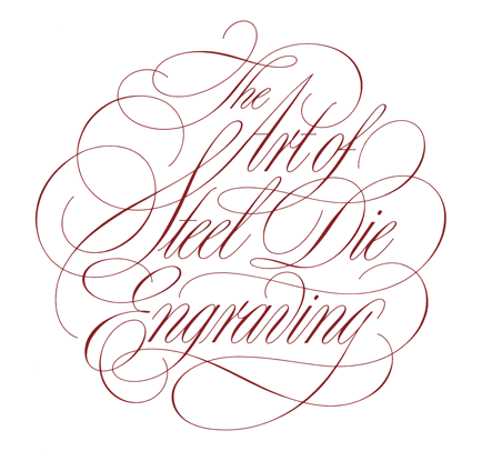
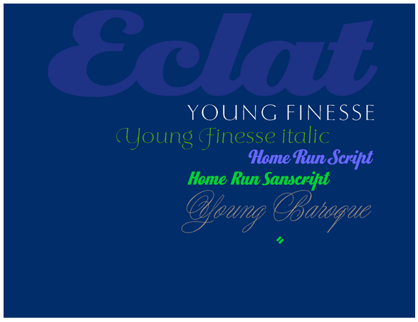
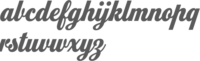
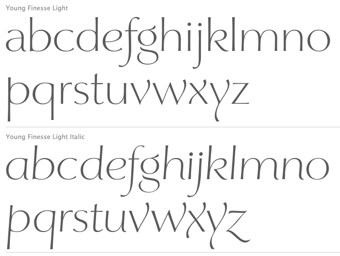
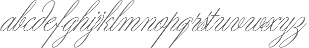
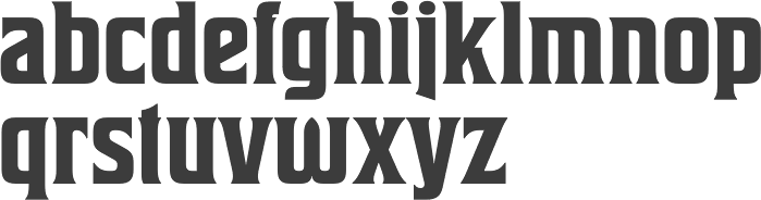
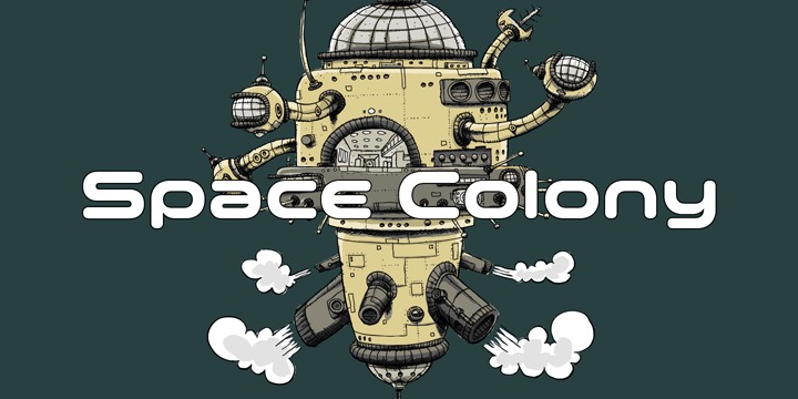
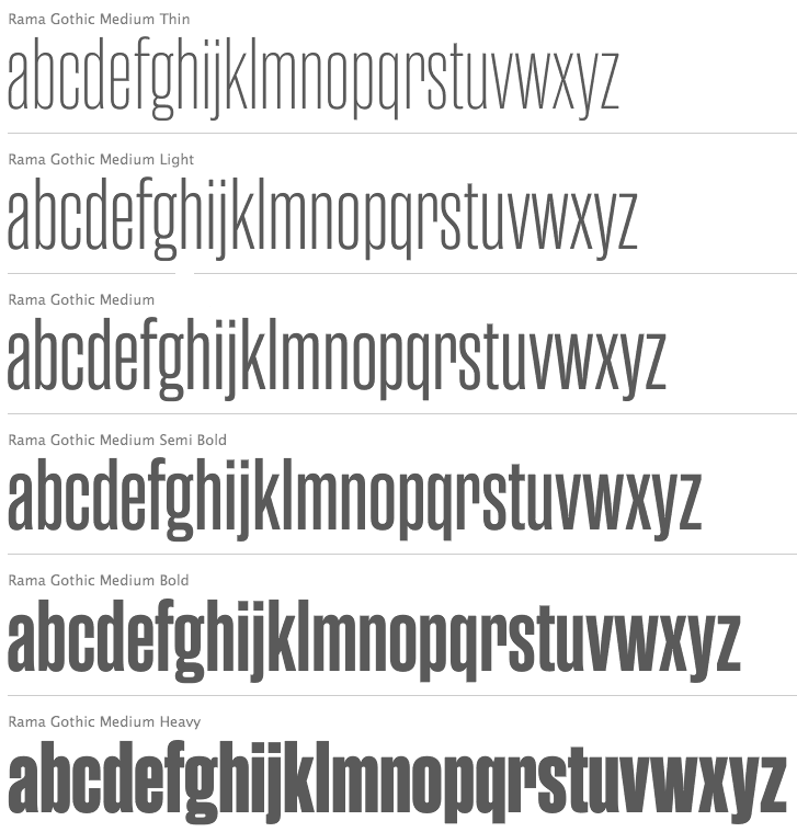
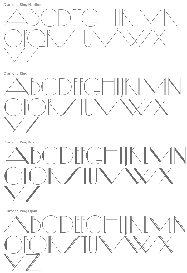
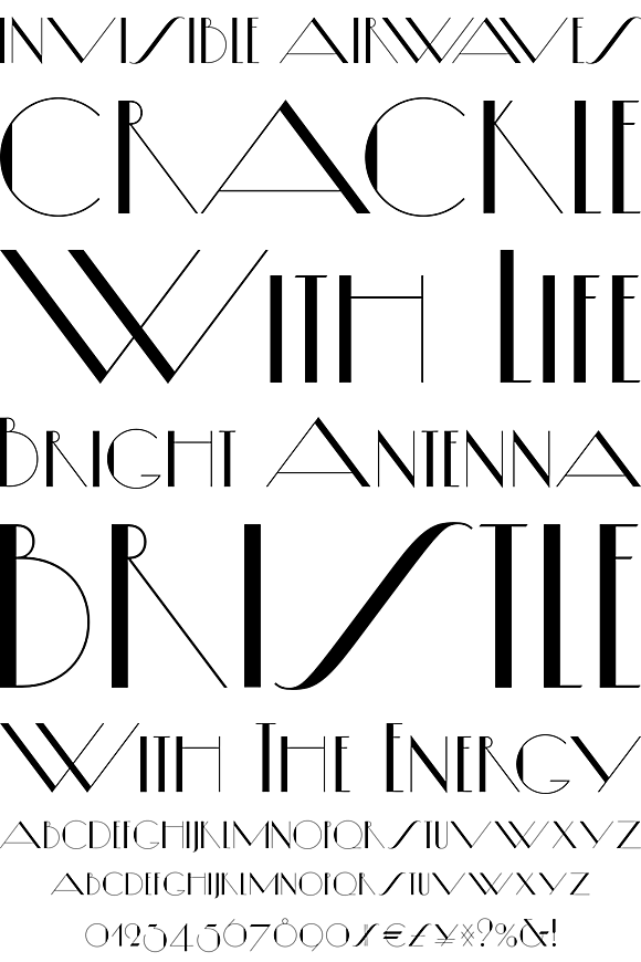
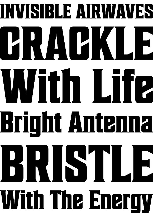
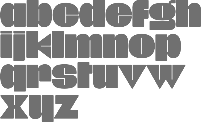
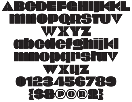
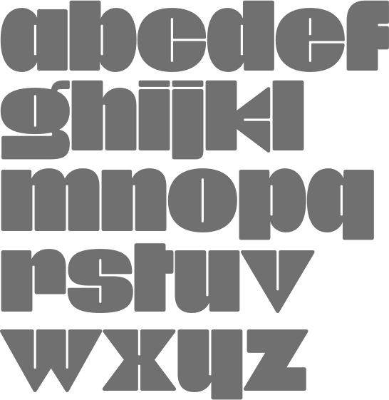
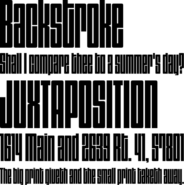
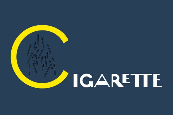
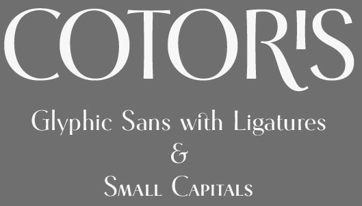
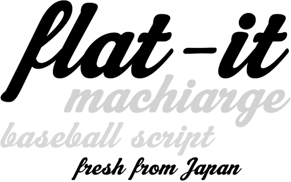
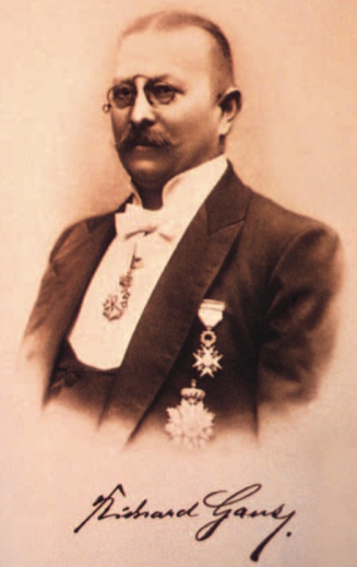
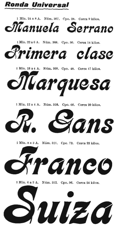
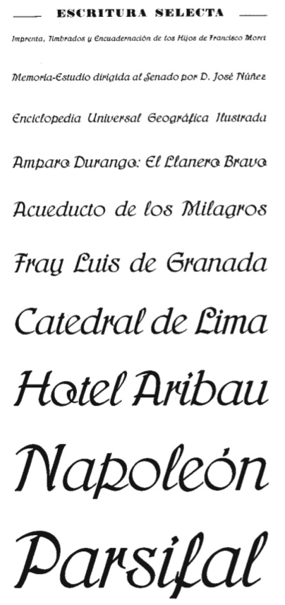
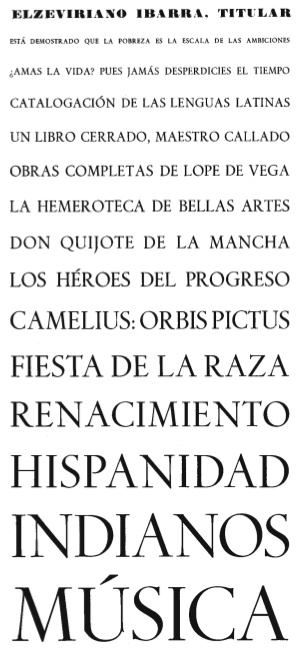
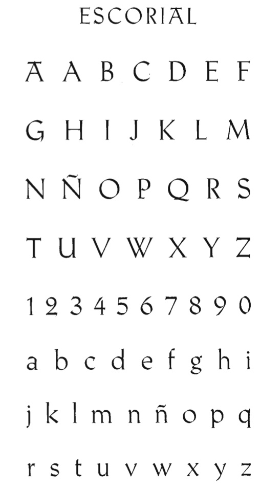
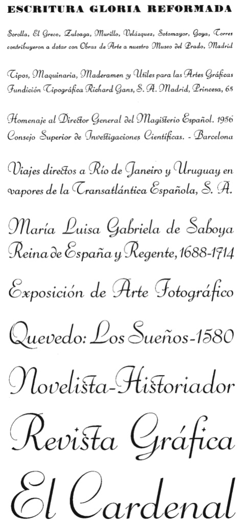
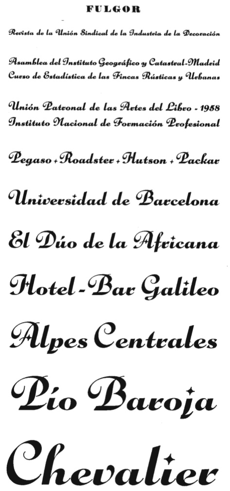
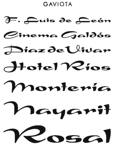
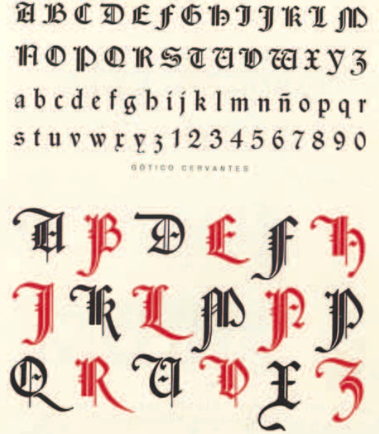
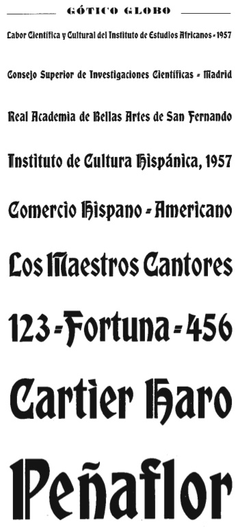
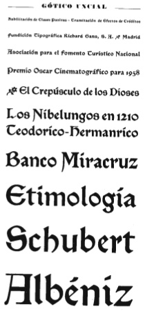
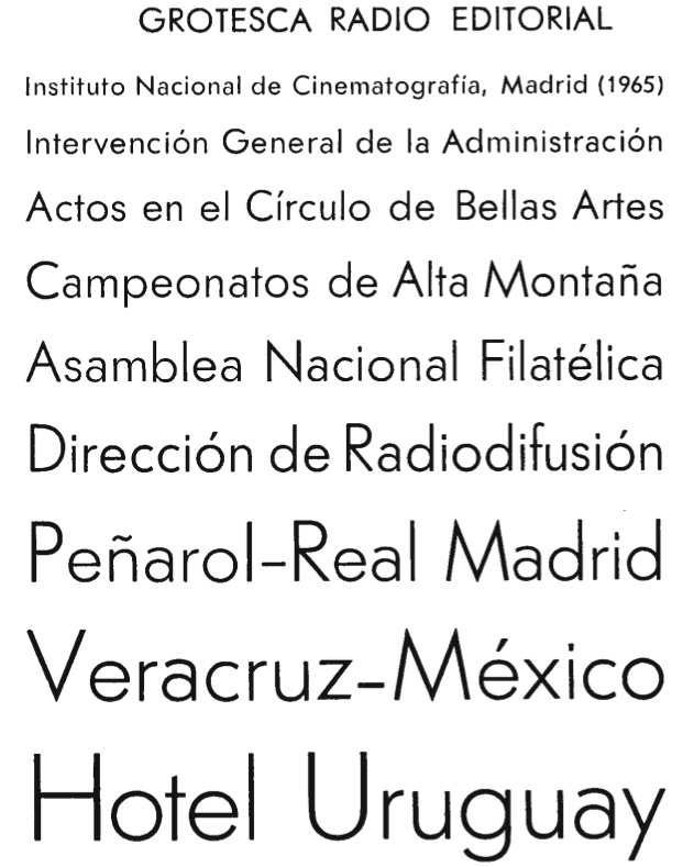
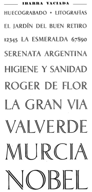
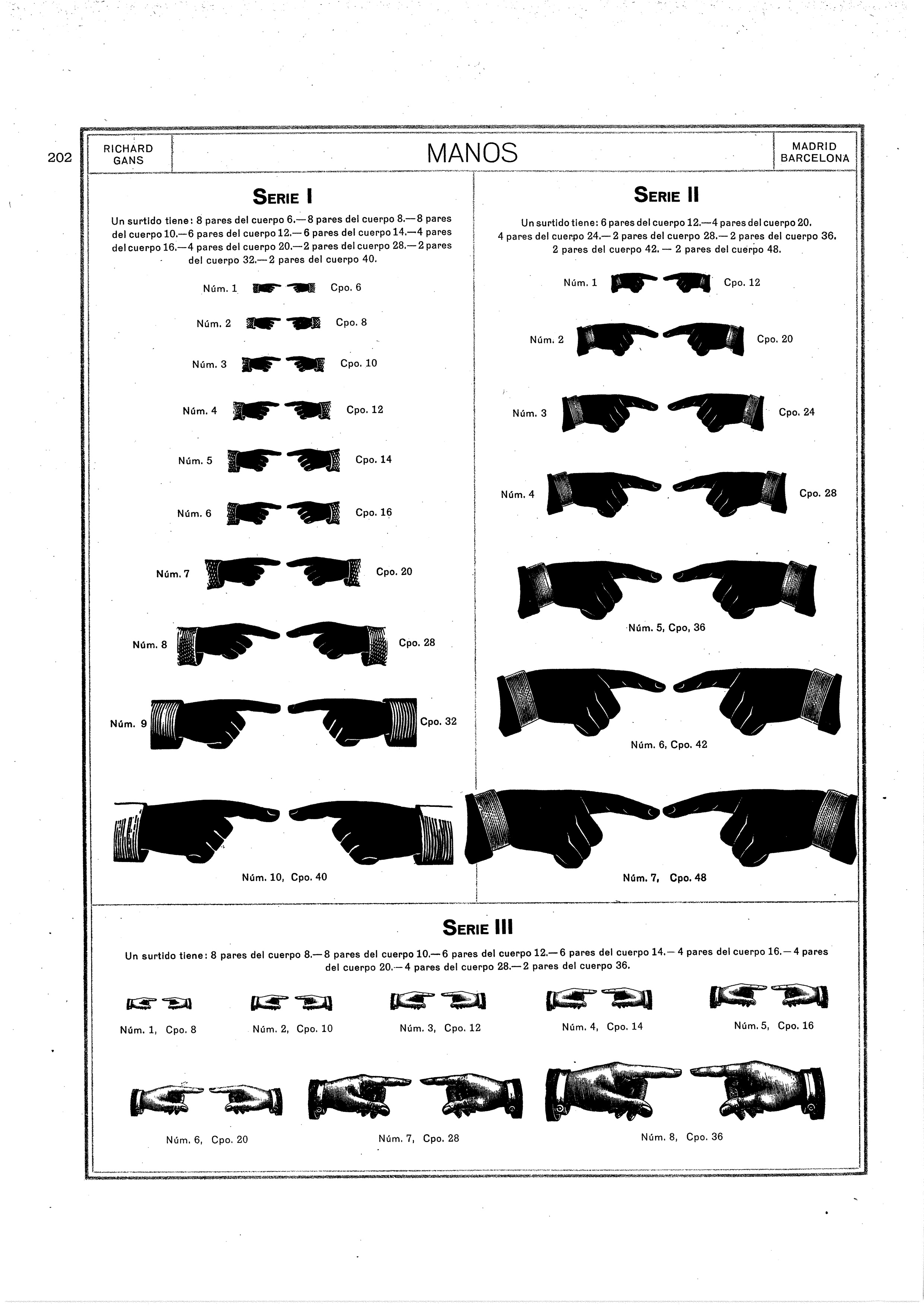
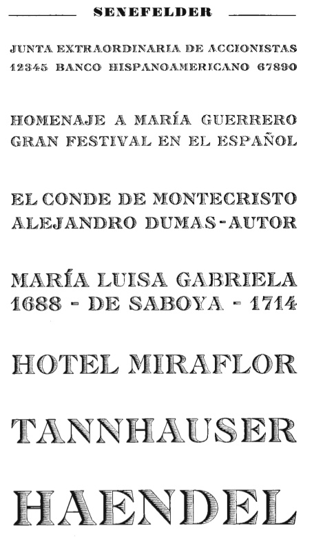
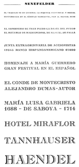
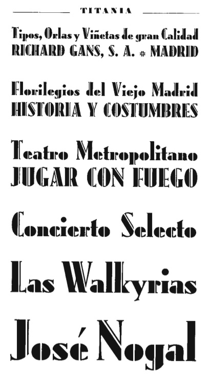
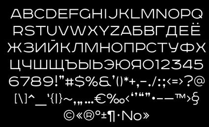
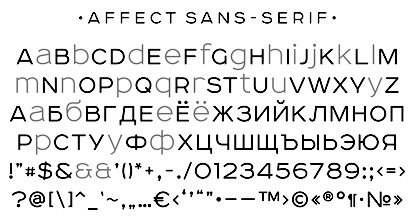
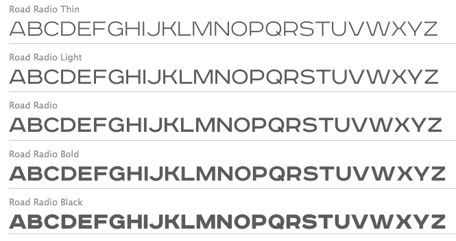
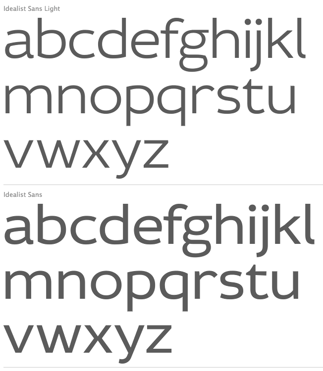
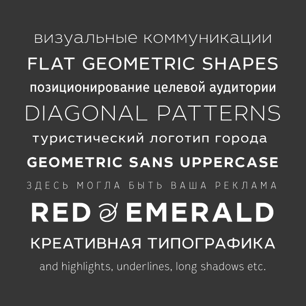
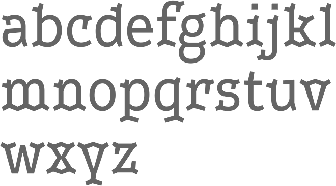
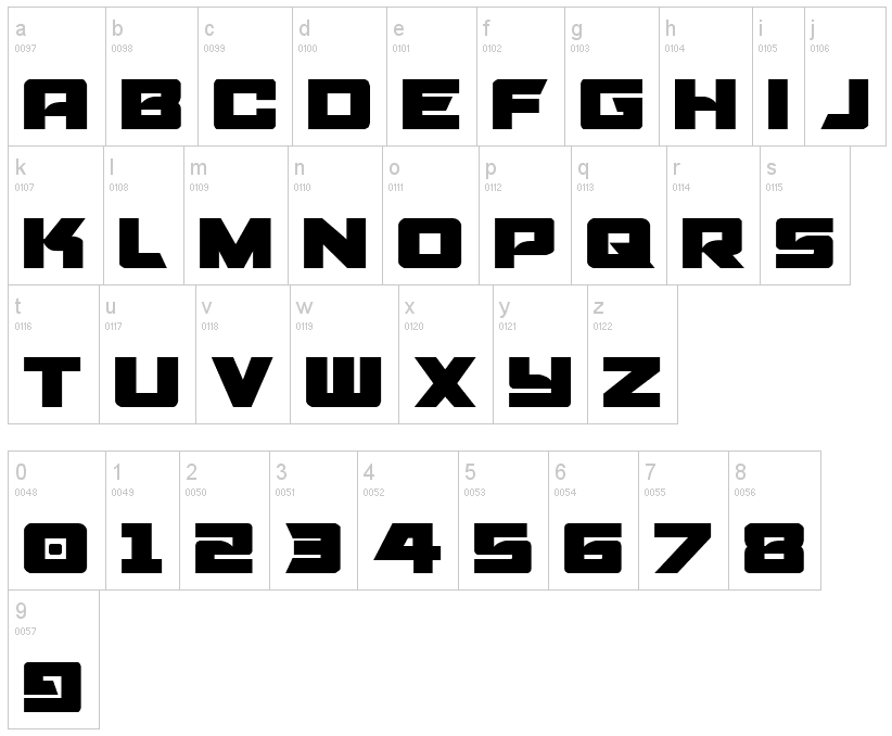
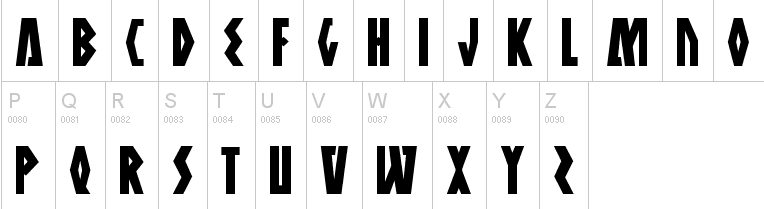
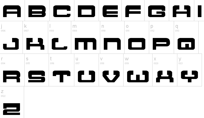
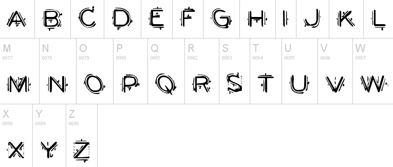
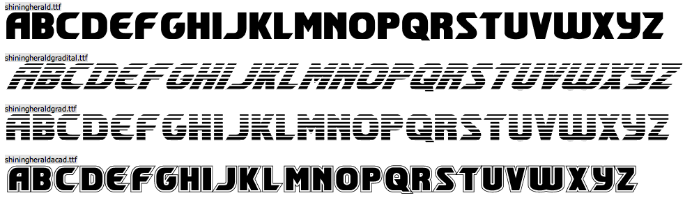
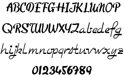
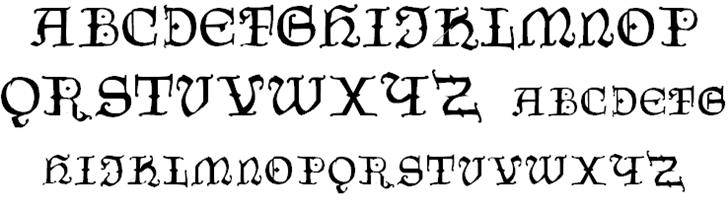
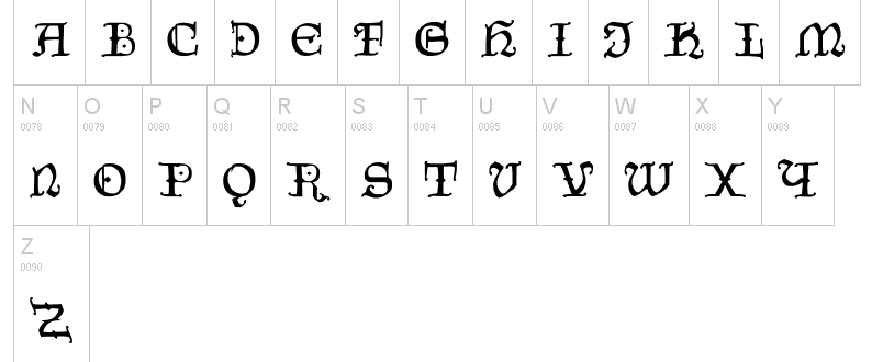
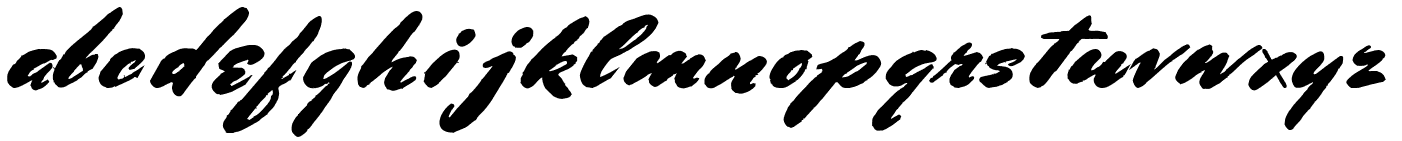
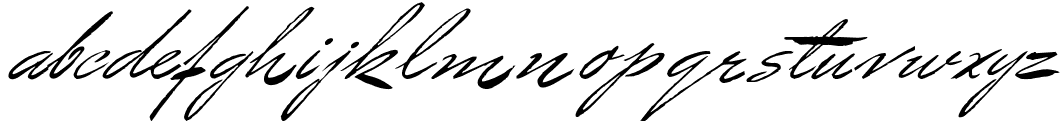
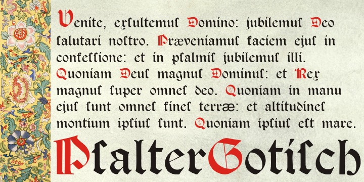
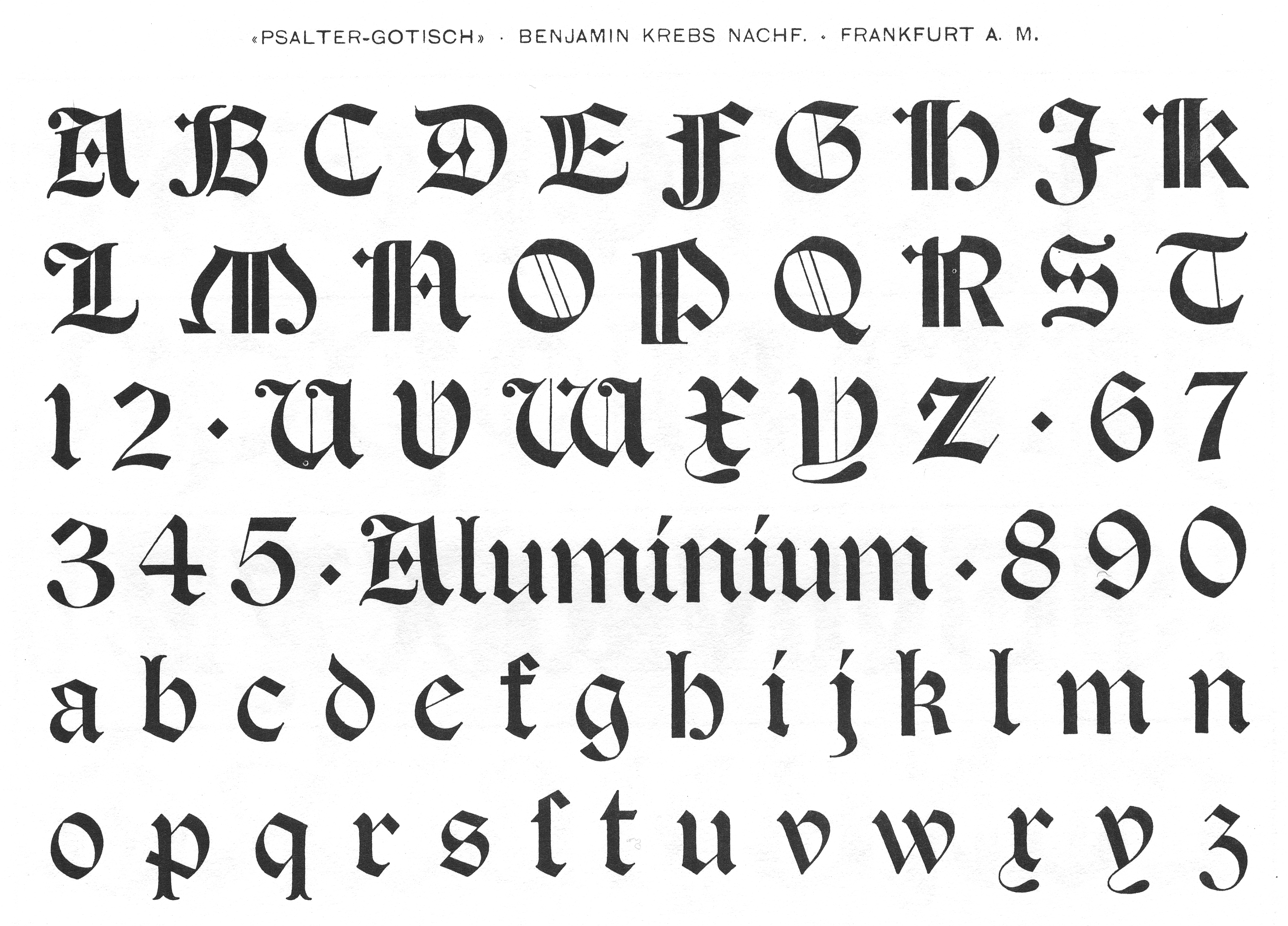
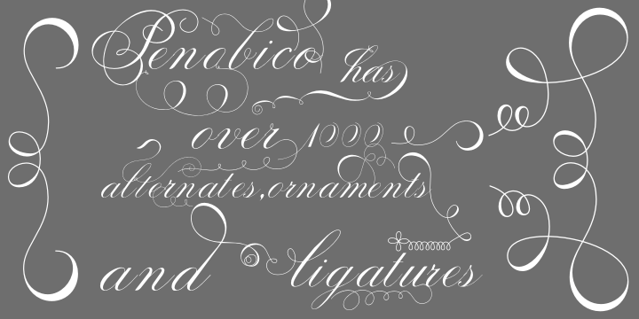
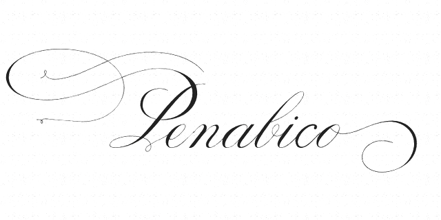
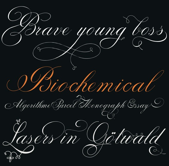
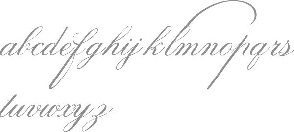
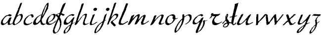
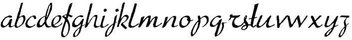
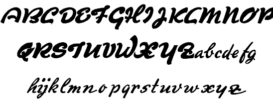
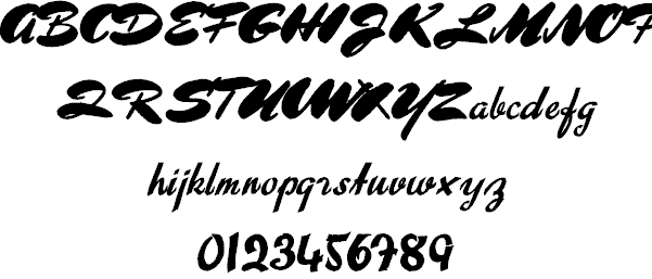
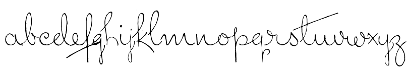
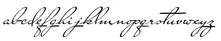
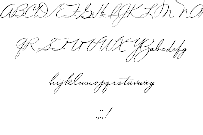
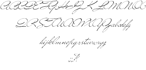
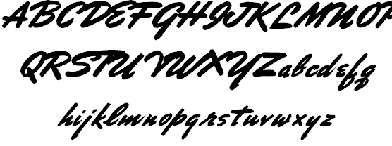
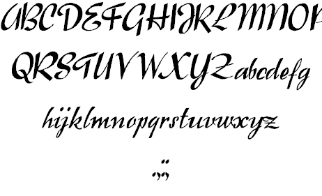
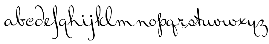
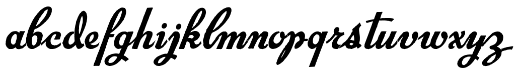
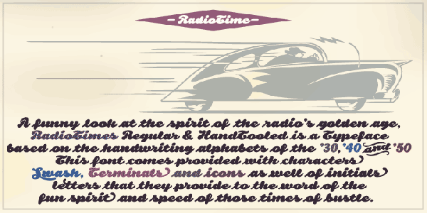
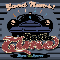
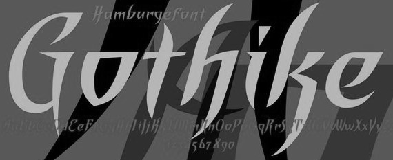
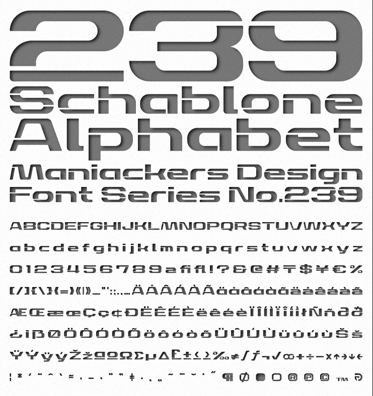
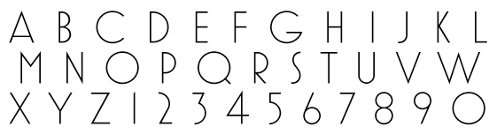
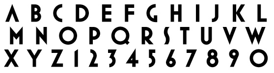
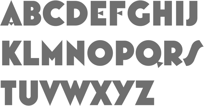
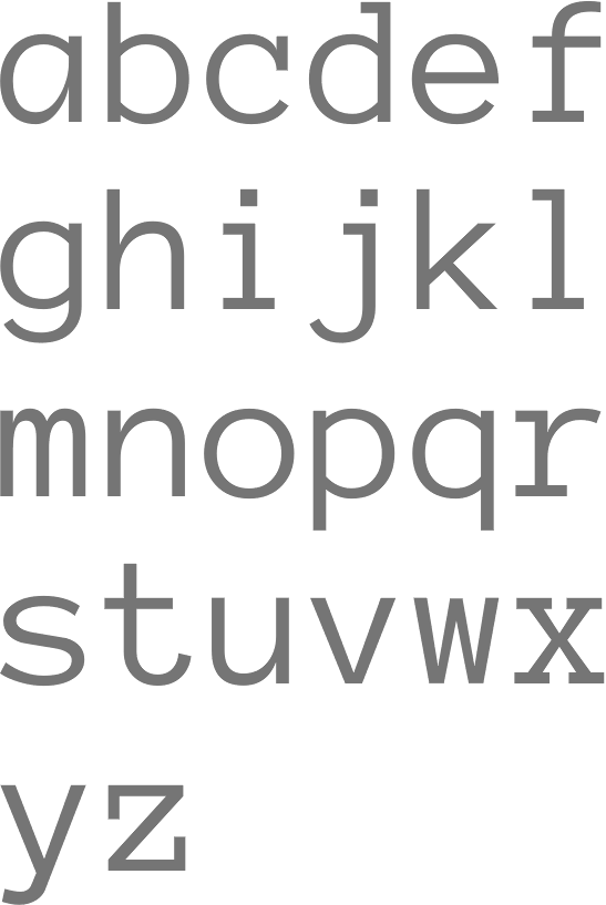
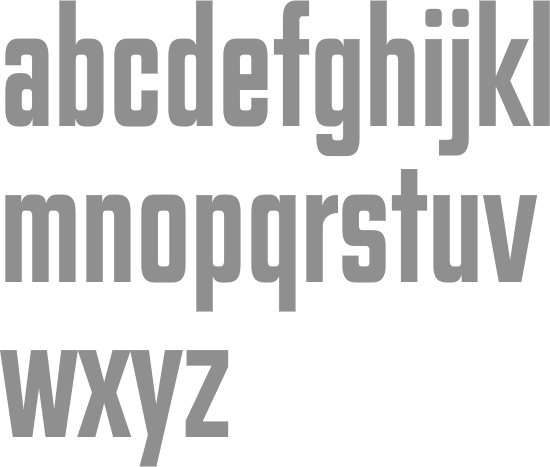
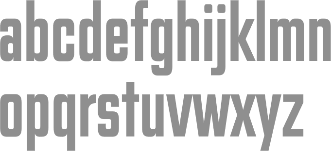
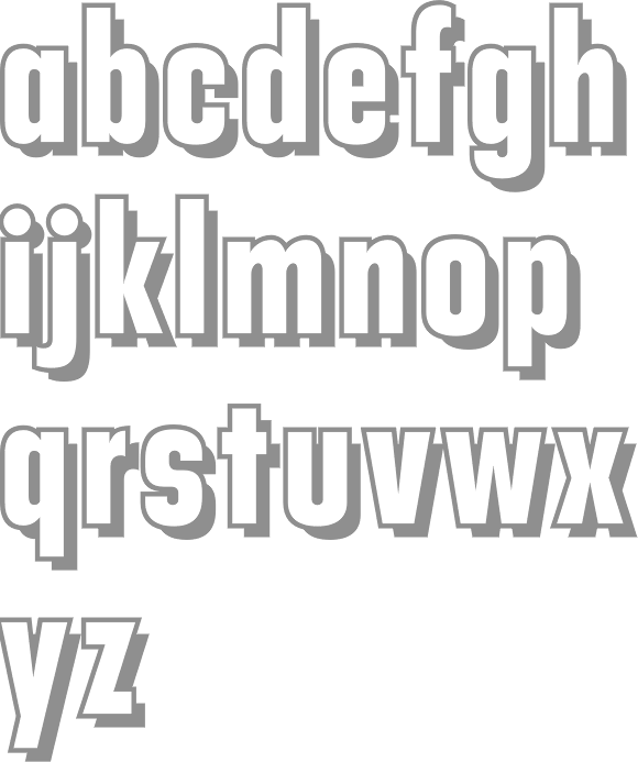
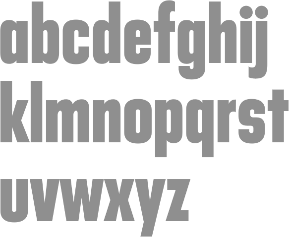
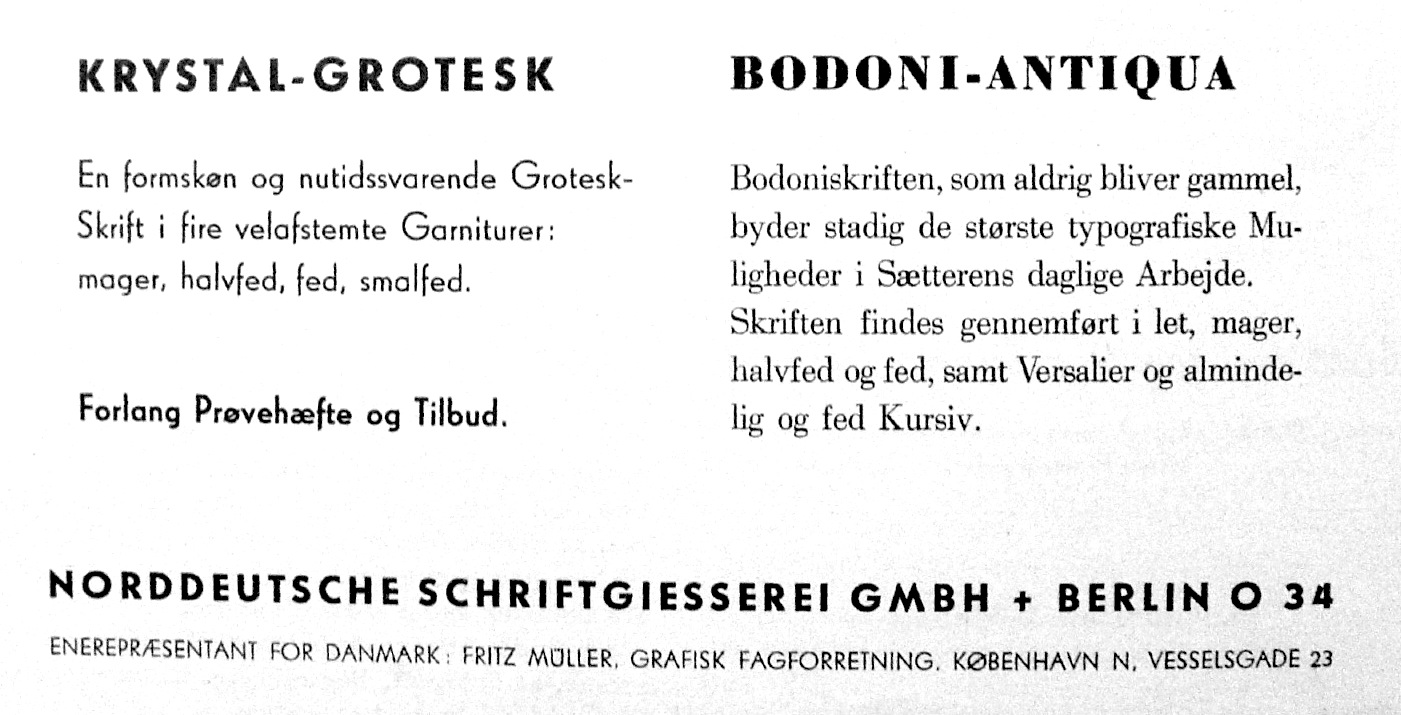
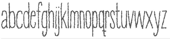
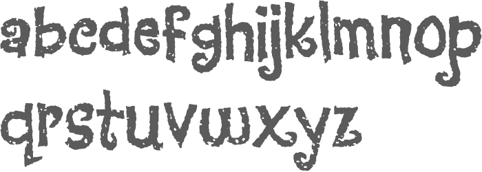
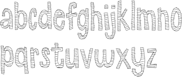
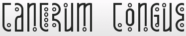
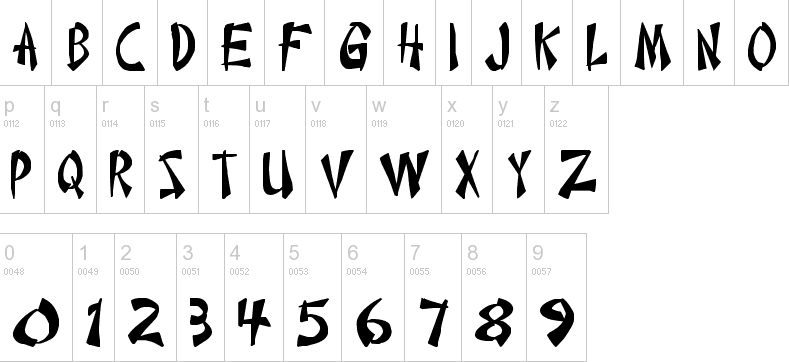
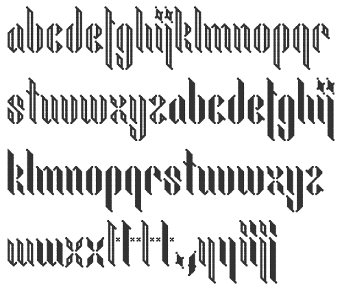
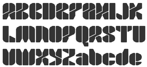
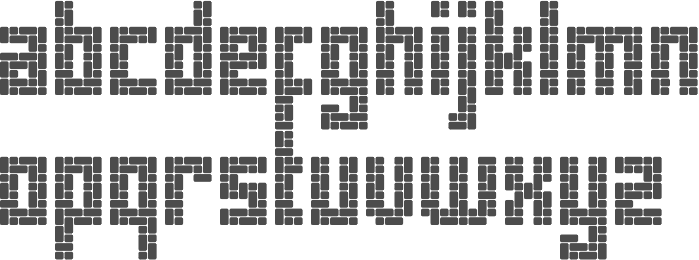
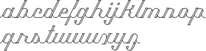
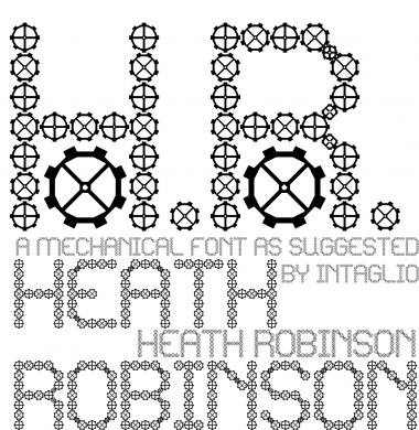
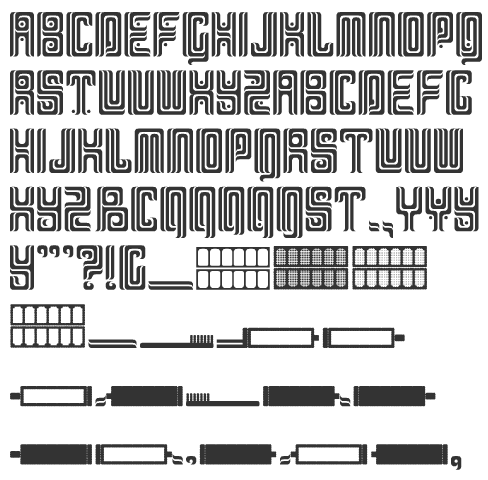