| | |
Ahoi
|
Paul Rädle's great jump page for foreign fonts and phonetic fonts. [Google]
[More] ⦿
|
Akkphon
|
Akkphon (1999) is a free phonetic font found at the Hungarian Akadémiai Kiadó. [Google]
[More] ⦿
|
ALD Sprache
|
A bunch of truetype fonts with many accents, probably for some German dialect: ALDlight, ALD1Italic, ALD2Italic, ALD3Italic, ALD4Italic, ALD5Italic, ALD6Italic, ALD7Italic, ArialMT, Arial-Black. [Google]
[More] ⦿
|
Aleksas Girdenis
|
Lithuanian professor at the University of Vilnius who in 1997-1998, together with Petras Skirmantas, created the Lithuanian fonts Fontra1italic, Fontra2italic, Fontra3italic, Fontra4italic, Fontra5italic, Fontra6italic, Fontra7italic, Fontra8italic, Fontra9italic, IndoBalt-0-italic, IndoBalt-1-italic, IndoBalt-2-italic, IndoBalt-3-italic, IndoBalt-4-italic, IndoBalt-5-italic, IndoBalt-6-italic, Fontra0italic, Fontra0Normal, Fontra1Normal, Fontra2Normal, Fontra3Normal, Fontra4Normal, Fontra5Normal, Fontra6Normal, Fontra7Normal, Fontra8Normal, Fontra9Normal. These fonts were designed for (phonetic) transcriptions of Indo-Baltic languages. [Google]
[More] ⦿
|
Alexander Tarbeev
[TFaces]

|
 [MyFonts]
[More] ⦿
[MyFonts]
[More] ⦿
|
Alphabetum
[Juan-José Marcos García]
|
Juan-José Marcos García (b. Salamanca, Spain, 1963) is a professor of classics at the University of Plasencia in Spain. He has developed one of the most complete Unicode fonts named ALPHABETUM Unicode for linguistics and classical languages (classical&medieval Latin, ancient Greek, Etruscan, Oscan, Umbrian, Faliscan, Messapic, Picene, Iberic, Celtiberic, Gothic, Runic, Modern Greek, Cyrillic, Devanagari-based languages, Old&Middle English, Hebrew, Sanskrit, IPA, Ogham, Ugaritic, Old Persian, Old Church Slavonic, Brahmi, Glagolitic, Ogham, ancient Greek Avestan, Kharoshti, Old Norse, Old Icelandic, Old Danish and Old Nordic in general, Bengali, Hindi, Marathi, Phoenician, Cypriot, Linear B with plans for Glagolitic). This font has over 5000 glyphs, and contains most characters that concern classicists (rare symbols, signs for metrics, epigraphical symbols, "Saxon" typeface for Old English, etcetera). A demo font can be downloaded [see also Lucius Hartmann's place]. His Greek font Grammata (2002) is now called Ellenike. He also created a package of fonts for Latin paleography (medieval handwriting on parchments): Capitalis Elegans, Capitalis Rustica, Capitalis Monumentalis, Antiqua Cursiva Romana, Nova Cursiva Romana (2014), Uncialis, Semiuncialis, Beneventana Minuscula, Visigothica Minuscula, Luxoviensis Minuscula, Insularis Minuscula, Insularis Majuscula, Carolingia Minuscula, Gothica Textura Quadrata, Gothica Textura Prescissa, Gothica Rotunda, Gothica Bastarda, Gothica Cursiva, Bastarda Anglicana (2014) and Humanistica Antiqua. PDF entitled Fonts For Latin Palaeography (2008-2014), in which Marcos gives an enjoyable historic overview. Alphabetum is not Marcos's only excursion into type design. In 2011, he created two simulation fonts called Sefarad and Al Andalus which imitate Hebrew and Arabic calligraphy, respectively. Cyrillic OCS (2012) is a pair of Latin fonts that emulate Old Church Slavonic (old Cyrillic). In 2013, he created Cuneus, a cuneiform simulation typeface. Paleographic fonts for Greek (2014) has ten fonts designed by Marcos: Angular Uncial, Biblical Uncial, Coptic Uncial, Papyrus Uncial, Round Uncial, Slavonic Uncial, Sloping Uncial, Minuscule IX, Minuscule XI and Minuscule XV. These fonts are representative of the main styles of Greek handwriting used during the Classical World and Middle Ages on papyrus and parchments. There is also a short manual of Greek Paleography (71 pages) which explains the development of Greek handwriting from the fourth century B.C. to the invention of printing with movable type in the middle of the fifteenth A.D. He wrote a text book entitled History of Greek Typography: From the Invention of Printing to the Digital Age (in Spanish; second edition, 2018). See also here and here. [Google]
[More] ⦿
|
Amtliche Regelung zur deutschen Rechtschreibung
|
Roman Schneider's page with a downloadable SIL-IPA font. [Google]
[More] ⦿
|
Ana Paula de Bragança Megda
|
Argentinian (Brazilian?) editorial designer. In 2012, she made an exceptionally graceful free Google Web Font text typeface that should withstand small sizes. Called Lusitana, the two-weight family was inspired by the type found in the 1572 first edition of "The Lusiads", a Portuguese epic poem by Luís Vaz de Camões. Award winner at Tipos Latinos 2010 for her text and IPA typeface Voces (done with Pablo Ugerman). The latter typeface appeared in 2012 at Google Web Fonts. [Google]
[More] ⦿
|
Ari Rafaeli
[ARTypes]
|
 [MyFonts]
[More] ⦿
[MyFonts]
[More] ⦿
|
ARTypes
[Ari Rafaeli]
|
 ARTypes is based in Chicago, and is run by Ari Rafaeli. List of their typefaces categorized by revival type:
 - Hermann Eidenbenz: Graphique (1946) now called Graphique AR, a shadow face.
- Jan van Krimpen (Enschedé) revivals: Romulus Kapitalen (1931), Romulus Open (1936), Curwen Initials (Van Krimpen did these in 1925 for The Curwen Press at Plaistow, London), and Open Kapitalen (1928).
- Jacques-François Rosart: Rosart811, a decorative initial typeface that is a digital version of the 2-line great primer letters cut by J. F. Rosart for Izaak&Johannes Enschedé in 1759 (Enschedé no. 811).
- Stephenson Blake revivals: Borders, Parisian Ronde.
- Rudolf Koch (Klingspor) revivals: Holla, Koch-Antiqua-Kursiv Zierbuchstaben, Maximilian-Antiqua, Neuland 24pt.
- Bernard Naudin (Deberny&Peignot) revival: Le Champlevé.
- W. F. Kemper (Ludwig&Mayer) revival: Colonia. P.H. Raedisch: Lutetia Open (2007) is based on the 48-pt Lutetia capitals engraved by P. H. Raedisch under the direction of Jan van Krimpen for Enschedé in 1928.
- Richard Austin: Fry's Ornamented (2007) is a revival of Ornamented No. 2 which was cut by Richard Austin for Dr. Edmund Fry in 1796. Stephenson, Blake&Co. acquired the type in 1905, and in 1948 they issued fonts in 30-pt (the size of the original design), 36-, 48- and 60-pt.
- Max Caflisch (Bauer) revival: Columna.
- Elisabeth Friedlaender (Bauer) revivals: Elisabeth-Antiqua, Elisabeth-Kursiv (and swash letters). Linotype Friedlaender borders.
- Herbert Thannhaeuser (Typoart) revival: Erler-Versalien.
- O. Menhart (Grafotechna) revivals: Manuscript Grazhdanka (cyrillic), Figural, Figural Italic (and swash letters). Also, Grafotechna ornaments (maybe not by Menhart).
- Hiero Rhode (Johannes Wagner) revival: Hiero-Rhode-Antiqua (2007).
- F. H. E. Schneidler (Bauer) revival: Legende.
- Herbert Post revival: Post-Antiqua swash letters.
- Georg Trump (Weber) revivals: Trump swash letters, Trump-Gravur (called Gravur AR now). The outline caps typeface Forum I-AR is derived from the Forum I type designed by Georg Trump (1948, C. E. Weber). Signum AR-A and Signum AR-B (2011) are based on Trump's Signum (1955, C.E. Weber). Palomba AR (2011) is based on Trump's angular calligraphic typeface Palomba (1954-1955, C.E. Weber). Amati AR (2011) is based on a Georg Trump design from 1953.
- Hermann Zapf revival: Stempel astrological signs.
- F.H. Ernst Schneidler: Zentenar Initialen is based on the initials designed by Prof. F. H. E. Schneidler, ca. 1937, for his Zentenar-Fraktur types.
- Isaac Moore: Old Face Open (Fry's Shaded) is a decorative Baskerville which was probably cut by Isaac Moore for Fry ca. 1788. A revival was issued in eight sizes by Stephenson Blake in 1928.
- Border units and ornaments: Amsterdam Apollo borders, Gracia dashes, Primula ornaments, Bauer Bernhard Curves, Weiß-Schmuck, Curwen Press Flowers, Klingspor Cocktail-Schmuck, Nebiolo fregi di contorno, Attika borders, English (swelled) rules, Künstler-Linien, an-Schmuck, Primavera-Schmuck.
- Freie Initialen are derived from initials made for the Stempel Garamond series. The type was issued in 1928 in three sizes (36, 48, and 60 pt); the AR version follows the 60-pt design.
- Initiales Grecques, based on Firmin Didot's design, ca. 1800.
- Emil A. Neukomm revivals: Bravo AR (2007; originally 1945).
- Ernst Bentele revivals: Bentele-Unziale (2007).
- Joseph Gillé: Initiales ombrées (2007) is based on Gillé's original all caps typeface from 1828.
- Maria-Ballé-Initials (2007), after an original font from Bauersche Giesserei.
- Raffia Initials (1952, Henk Krijger): revived by ARTypes in 2008 as Raffia.
- Ornaments 1 AR (2010): from designs from 18th and 19th century typefounders that were ancestors of the Stephenson Blake foundry.
- Ornaments 2 AR (2010): Ornaments 2 contains designs for the Fanfare Press by Berthold Wolpe (1939) and for the Kynoch Press by Tirzah Garwood (ca. 1927).
- Ornaments 3 AR (2010): based on designs by Bernard Naudin for Deberny et Peignot, c. 1924; and ornaments based on designs by Oldrich Menhart, Karel Svolinsky and Jaroslav Slab for the state printing office of Czechoslovakia and Grafotechna.
- Ornaments 4 AR (2010): based on the Amsterdam Apollo and Gracia ornaments and the Amsterdam Crous-Vidal dashes (designed by Crous-Vidal).
- Ornaments 5 AR (2010): based on the Amsterdam Primula ornaments designed by Imre Reiner, 1949.
- Ornaments 6 AR (2010): based on designs for the Curwen Press by Edward Bawden and Percy Smith.
- Yü Bing-nan revival: Freundschafts-Antiqua AR (2010). Freundschafts-Antiqua (which was also called Chinesische Antiqua) was designed in 1962 by the Chinese calligrapher Yü Bing-nan when he was a student at the Hochschule für Grafik und Buchkunst at Leipzig in 1960.
- Sans Serif Inline (2011). Based on the 36-point design of the Amsterdam Nobel Inline capitals (1931).
- Hildegard Korger revivals: Typoskript AR (2010) is based on a metal type which was produced in 1968 by VEB Typoart, Dresden, from a design of the German calligrapher and lettering artist Hildegard Korger.
- Hans Kühne revival: Kuehne-Antiqua AR (2010) revives a Basque typeface by Hans Kühne.
- The Troyer AR ornaments (2010) are based on the first series of ornaments designed for American Type Founders by Johannes Troyer in 1953.
- The Happy Christmas font (2011) is a snowflake font that is based on designs by Amsterdam and Haas, c. 1950. December Ornaments (2011) contains the 36 Amsterdam designs which were originally issued in 24 and 36 point.
- Walter Diethelm: Diethelm AR (2011) revives Walter Diethelm's Diethelm Antiqua (1948-1951, Haas).
- Walter Brudi revivals: Pan AR (2010, based on a 1957 font by Brudi).
- Hermecito (2013) is a 46-style type system based on an angular serif. It covers Cyrillic, Latin, Greek and several other scripts. Besides being eminently readable, it also has extensive coverage of mathematical and phonetic symbols. Renzo (2013) is along the same lines but with sharpened serifs.
- Spiral (2014) is a revival of a typeface called Spiral designed by Joseph Blumenthal and cut bu Louis Hoell in 1930. In 1936, Monotype reissued that type as Emerson 320.
- Custom typefaces include Fabrizio (2016), a classical serif typeface family for Hebrew, Latin, Cyrillic and Greek, with hints of Garamond and Caslon. Ari writes that Fabrizio made its first appearance in Saggi di Letteratura Italiana: Da Dante per Pirandello a Orazio Costa, by Lucilla Bonavita, printed at Pisa in March 2016 by Fabrizio Serra Editore for whom the type was specially designed.
MyFonts link. View the typefaces made by Ari Rafaeli / ARTypes. [Google]
[MyFonts]
[More] ⦿
|
Berg Soft
|
Daniel Berg's commercial product for phonetic transcription is "Just As Spoken" v2.0. For Winword-, Excel- and WordPerfect documents. Phonetic TrueType fonts included. [Google]
[More] ⦿
|
Berthold Crysmann
[Palatino TIPA]
|
[More] ⦿
|
Brill
[John Hudson]
|
 E.J.Brill is an academic publisher in Leiden, The Netherlands. In 1989, DecoType produced the first ever computer-typeset Persian and English dictionary for them. In 2009, Brill has resumed its 325 year old tradition of Arabo-Dutch typography by adapting Tasmeem for its Arabic texts. In 2008, Brill commissioned John Hudson to make a text face. Hudson's PDF explains how Brill had been working mostly with Baskerville, so the new Brill typeface is also transitional, but narrower, resulting in savings of paper. Greek and Cyrillic are covered by Brill as well.
 In 2012, Brill was made available for free download for non-commercial use. While Brill is an original design by John Hudson, the blackletter range of characters was made by Karsten Lücke. Gerry Leonidas and Maxim Zhukov were consulted for Greek and Cyrillic, respectively. The fonts follow Unicode and contain nearly all symbols people in the humanities may ever need. [Google]
[More] ⦿
|
Bruce Hayes
[Phonetic Fonts]
|
[More] ⦿
|
Carnegie-Mellon University
|
Four Cyrillic fonts, and the phonetic series SILDoulosIPA-Regular, SILManuscriptIPA-Regular, SILSophiaIPA-Regular. [Google]
[More] ⦿
|
Carrois Type Design
[Ralph du Carrois]
|
 Carrois Type Design (Berlin, Germany) started up officially ca. 2010, although Ralph du Carrois has been designing typefaces since ca. 2002. This dynamic company in Germany has three art directors, Jenny du Carrois, Anja Meiners and Botjo Nikoltchev. All three also design typefaces, as well as Adam Twardoch, Andreas Eigendorf and Ralph du Carrois himself. The company specializes in custom type.
 Typefaces (a *very* incomplete list, with apologies, but I can't tell from the web site who made what...): - Allzweck MvdR (2010-2011), a revival of a sans typeface influenced by Planzkissen by Mies van der Rohe. This was commissioned by Neue Nationalgalerie.
- The corporate typeface Cisco Sans (2010), which is positioned midway between Helvetica and Akzidenz Grotesk.
- Fira Sans (2013, for Firefox; with Erik Spiekermann). Google Web Font link. Mozilla download page. Google web Fonts published Fira Sans Condensed and Fira Sans Extra Condensed (2012-2016) in 2017. CTAN link.
- Krikrikrak and Blumenkohl (2013, children's scripts).
- PTL Manohara (2010, Primetype: a humanist sans by Botio Nikoltchev), Sadgirl(2006, Primetype), and PTL Maurea (2005, Primetype). Ralph du Carrois made many more fonts at Primetype prior to the establishment of Carrois Type design.
- Free Google Web Fonts made in 2012: ABeeZee (Anja Meiners: a sans typeface created to help children), Carrois Gothic, Carrois Gothic SC, Finger Paint (brush face).
- Icon fonts for a number of companies: Bosch (2011), Herzberger Bäckerei (2011), Hybride Iconwelt (2007), Ponce, Russian Rail, Sentres Wettericons, ZDF Nachrichten.
- Several typefaces were created in cooperation with Erik Spiekermann's group between 2007 and 2012. These include work on Meta Serif Pro (2011), Meta Science (2012: done for De Gruyter, it is based on Meta and Meta serif), FF Meta (2008: some thin italic weights), TERN or Trans European Road Network (2007-2008), ZDF Nachrichten (2009, plus many icons), Lautschrift (2012: a phonetic script done for Erik Spiekermann to add to his Meta and Meta Serif families), and Unit Slab Pro (2009).
- Inarea Sans (2003) and Inarea (2003-2005).
- FR Classic (2002). This typeface was used in the redesign of the Frankfurter Rundschau. This didone is based on a reworking of LT Gianotten by Antonio Pace.
- Two condensed sans typefaces done for the subway system in Rome in 2005. Some icons were also made in that project.
- Share (2006). A free techno monospaced family made for the TYPO3 Association.
- An angular grotesk done in 2008 for the Russian Railways. This work was carried out with Dmitri Lavrow, and invloved Andreas Eigendorf and Ralph du Carrois.
- Suzuki (2006) is a corporate gothic font that replaces Franklin Gothic at Suzuki as house style.
About Ralph du Carrois, b. 1975: He graduated at the Staatliche Hochschule für Gestaltung Karlsruhe in 2004 with his first typeface family PTL Maurea. Since 2000 he has worked for different companies or agencies. In 2003 he founded the studio seite4 in Berlin with its main focus on type design and corporate identity design. [Google]
[More] ⦿
|
Cascadilla Press
|
Somerville, MA-based outfit that created Arboreal, a PostScript font for making syntax trees. It also released fonts for linguists. [Google]
[More] ⦿
|
Cercurius (was: Lars Törnqvist Typografi)
[Lars Törnqvist]
|
 Born in Karlstad, Sweden, in 1952, Lars Törnqvist now lives in Stockholm. Lars Törnqvist's designed many typefaces, first at Lars Törnqvist Typografi, and then at Cercurius:
 - Dialekt Svi: a series of three phonetic fonts for Swedish dialects.
- Dialekt Uni (2001): a huge Unicode phonetic font that includes the West European characters, the characters and diacritics of the Swedish dialect alphabet and most of the IPA characters.
- Fitzronald (2013). Based on Ronaldson Old Style (Alexander Kay, 1884).
- Hnias (2004): a unicode runic font.
- Remington Reseskrivmaskin (2000): a typewriter font.
- DecCode (2000) and HexCode (2000): numerical fonts.
- Pitmanita, a font containing the characters of Sir James Pitman's Initial Teaching Alphabet. This alphabet was used in many English schools in the 1960s.
- Morsealfabetet, a Morse-Code font.
- Korsstygn 1, a cross-stitch font.
- Tant Brita (2006), Tant Ingrid (2006), Tant Ulla (2006), Tant Gertrud (2006), Tant Lilian (2006): stitching typefaces.
- Knappast (2006), Knappolog (2013), Endast (2006), Emedan (2006): letters in circles or rounded rectangles.
- Karolinus Fraktur (2006): A slightly regularized digital version of a late Baroque Fraktur type, probably from the beginning of the 18th century, issued by the Norstedts type foundry in Stockholm in 56 point size as Sju petit fraktur nr 2.
- Simpliciter Sans (2006), a rounded sans family in three styles, based on the standard round-pen ink lettering used on technical drawings in the middle of the 20th century.
- Huruvida (2006). Varvid and Varvid Caps (2006, a bilined tubular caps stencil face).
- Vibertus (2007): a didone headline typeface based on Gras Vibert (1840, Vibert, for the Didot type foundry).
- Yxlofon (2015). a dot matrix display typeface.
And a jump list for Fraktur fonts. MyFonts link to his foundry, Lars Törnqvist Typografi. View Lars Törnqvist's typefaces. [Google]
[MyFonts]
[More] ⦿
|
Charis SIL
|
Charis SIL (1997-2006) is similar to Bitstream's Charter, one of the first fonts designed specifically for laser printers. It is highly readable and holds up well in less-than-ideal reproduction environments. It also has a full set of styles---regular, italic, bold, bold italic. Charis is a serif, proportionally-spaced font optimized for readability in long printed documents. Above all, it is a free four-weight Unicode-based font for all European and Slavic languages. Phonetic symbols are also covered. Contributors include Walt Agee, Miriam Martin, Annie Olsen, Victor Gaultney, Lorna Priest, Alan Ward, Bob Hallissy, Martin Hosken, Sharon Correll, Jon Coblentz, and Jonathan Kew. Typedia link. Charis SIL download. [Google]
[More] ⦿
|
Chin-chuan Cheng
|
Designer at the City University of Hong Kong of the phonetic font DOCIPA (1993) designed for the Dialects of China (DOC) database. [Google]
[More] ⦿
|
CHOMP font collection
[Elliot Weinstein]
|
CHampions Of the Mac Proletariat. Fonts created by Elliot Weinstein (freeware). Included are many East-European language fonts such as Bryansk, Cracow, and Sverdlovsk. There is also a phonetic font. Other fonts are Chefdijon (with cooking symbols), Fontana, Fraction Fonts, Newport News and Riverside. Can't find the fonts any longer. Elliot Weinstein used to run Devonian International Software Company out of Montclair, CA. [Google]
[More] ⦿
|
Clark T. Riley
|
Clark T. Riley (Baltimore, MD) used to run Clark Riley Custom Font Design in the 1990s. His designs included Cairo (a famous free dingbat font), Orchids (a flower dingbat font), PhonBaskewrtown (a phonetic font), and the Recycle dingbats. At that time, his web site was located at the Johns Hopkins Medical Institute in Baltimore, MD. Clark Riley has been growing orchids since 1957 and is a popular speaker on orchids. After a PhD in chemistry from the University of Chicago, he became a Senior Field Engineer for Chesapeake Systems in Baltimore. He gives the timeline for Cairo: In 1984 the Macintosh was introduced, which included a bitmap dingbat font by Susan Kare called Cairo. In 1992, Clark Riley created an outline (Type 1 Postscript) font based on it. In 1994, this was converted to TrueType technology, with Riley's approval. Cairo Unicode is the same design, updated to use Unicode technology. Download Cairo Unicode (2014) at Open Font Library. [Google]
[More] ⦿
|
Coji Morishita
[M+ Fonts]
|
 [More] ⦿
|
Computer Aided Learning programs for Actuarial Maths&Statistics
|
The r16fzip file has these fonts: From Monotype, BookAntiqua, BritannicBold, CenturySchoolbook, CenturySchoolbook-Bold, CenturySchoolbook-BoldItalic, CenturySchoolbook-Italic. Other fonts: Fences (Microsoft, 1992), OPAC92-Special (a phonetic font, The British Library, 1993), OPAC92-Cyrillic (The British Library, 1993), SvobodaFWF (a Latin/Cyrillic font by Casady&Greene, 1991). [Google]
[More] ⦿
|
CUHK
[Gladys Tang]
|
A free phonetic font at CUHK (Chinese University of Hong Kong) called Handkey2002. The web site belongs to Professor Gladys Tang. [Google]
[More] ⦿
|
D. Paul Alecsandri
[Every Witch Way]
|
[More] ⦿
|
Dana Peretz
|
Designer in Haifa, Israel, who created an experimental font based on mouth movemens in 2013, called Phonetica. Behance link. [Google]
[More] ⦿
|
Darren Rigby
[Darren Rigby]
|
Refreshing fonts created by Canadian Darren Rigby using High-Logic. The fonts come in truetype format (in 2000): Bayern (fraktur font), Beltane (2002), Brasspounder (2004), Con Jitters (2002, handwriting), Enigmatic, EnigmaticUnicodeRegular, Fitzgerald, GangueOuais (2002), HindsightUnicode (2001, with all European languages, Cyrillic, Armenian, and IPA), HindsightSmallCaps, HindsightRegular, HindsightMonospaceRegular, IntruderAlert, QuicktypeRegular, ThinDime, TorturerUpright, SilverDollar, DontWalkRun, History-Repeating (1999-2000), HistoryHappens, HistoryRepeatingH, HistoryHappens, HistoryRepeatingV, Lemon, Norse-Code (runes), OneEighty, TorturerBound, TorturerCrushed, Daybreaker, Yerevan, Seebreaze, Jareth, Tin Birdhouse, Tin Doghouse, Three-Sixty, Three-Sixty Condensed, Levity (2001, Western font), Gravity, River Avenue, Water Street, Warer Street Detour (unicase), Meridiana, Torquemada, Torquemada Starved, Torquemada Starved Unicode, Radian (2002), All Hooked Up (2002), Brasspounder (2004), Quilljoy (2004). [Google]
[More] ⦿
|
Darren Rigby
[Darren Rigby]
|
[More] ⦿
|
David D
|
Download Monotype's Times New Roman Phonetics truetype font. [Google]
[More] ⦿
|
DejaVu Fonts
[Stepan Roh]
|
The DejaVu fonts form an open source font family based on the Bitstream Vera Fonts. Free download. Its purpose is to provide a wider range of characters (see Current status page for more information) while maintaining the original look and feel through the process of collaborative development. Included are DejaVuSans-Bold, DejaVuSans-BoldOblique, DejaVuSans-Oblique, DejaVuSans, DejaVuSansCondensed-Bold, DejaVuSansCondensed-BoldOblique, DejaVuSansCondensed-Oblique, DejaVuSansCondensed, DejaVuSansMono-Bold, DejaVuSansMono-BoldOb, DejaVuSansMono-Oblique, DejaVuSansMono-Roman, DejaVuSerif-Bold, DejaVuSerif-BoldOblique, DejaVuSerif-Oblique, DejaVuSerif-Roman, DejaVuSerifCondensed-Bold, DejaVuSerifCondensed-BoldOblique, DejaVuSerifCondensed-Oblique, DejaVuSerifCondensed. Authors and contributors comprise Adrian Schroeter, Ben Laenen, Dafydd Harries, Danilo Segan (Cyrillic), David Jez, David Lawrence Ramsey, Denis Jacquerye, Dwayne Bailey, James Cloos, James Crippen, Keenan Pepper, Mashrab Kuvatov, Misu Moldovan (Romanian), Ognyan Kulev, Ondrej Koala Vacha, Peter Cernák, Sander Vesik, Stepán Roh (project manager; Polish), Tavmjong Bah, Valentin Stoykov, and Vasek Stodulka. The idea is to eventually cover most of unicode. Currently, this is covered: Latin (+supplement, extended A and part of extended B), IPA, Greek, Coptic, Cyrillic, Georgian, Armenian, Hebrew, N'ko, Tifinagh, Lao, Canadian aboriginal syllabics, Ogham, Arabic, math symbols, arrows, Braille, chess, and many dingbats. Alternate download site. Wiki page with download information. Fontspace link. Open Font Library link. [Google]
[More] ⦿
|
DEPOTzNET
|
Organized font archive. Many subcategories including Party fonts, Holiday fonts, Balloons, Halloween, Christmas, screen fonts, phonetic fonts, African, Balinese, Bengali, Burmese, Cambodian, Croata-glagolitic, Cyrillic, Ethiopic, Georgian, Greek, Hebrew, Hindi, Hmong, Japanese, Javanese, Khmer, Lao, Malayan, Nepali, Nko, runes, Tamil, Vietnamese. [Google]
[More] ⦿
|
Diogo Tomas
|
During his studies in Lisbon, Portugal, Diogo Tomas designed the experimental phonetic alphabet Less (2017). His geometric solid typeface Aedifico (2017) only uses rectangles and triangles. [Google]
[More] ⦿
|
Doulos SIL
|
Doulos SIL is derived from the earlier SIL Doulos font, released in 1992 by the Summer Institute of Linguistics. It is provided for free. The goal of Doulos was to provide a single Unicode-based font family that would contain a comprehensive inventory of glyphs needed for almost any Roman- or Cyrillic-based writing system, whether used for phonetic or orthographic needs. In addition, there is provision for other characters and symbols useful to linguists. Doulos SIL is very similar to Times/Times New Roman, but only has a single face: Regular. It was developed in 2006 by Walt Agee, Miriam Martin, Annie Olsen, Victor Gaultney, Lorna Priest, Alan Ward, Bob Hallissy, Martin Hosken, Sharon Correll, Jon Coblentz and Jonathan Kew. In 2020, the CTAN package was being maintained by Niranjan Vikas Tambe. Gitlab link. [Google]
[More] ⦿
|
Dr. Heather L. Ramsdell
|
Creator of IPA Base Symbols (2011, iFontMaker), a phonetic fat finger font. [Google]
[More] ⦿
|
Edward Detyna
[Electronic Font Foundry]
|
[More] ⦿
|
Eesti Keele Instituut
|
Phonetic font archive in Estonia with the RusEE family [RusEEBold, RusEEBoldItalic, RusEEItalic, RusEE, RusEERItalic, RusEER] (Monotype, 1992, a Microsoft core font), Venelane (Cyrillic), VenelaneTrans (Latin), Fone (Corel), and the Phonetic Times family (Monotype, 1992) [PhoneticTimesC, PhoneticTimesCBold, PhoneticTimesCBoldItalic, PhoneticTimesCItalic, PhoneticTimesEMS, PhoneticTimesEMSBold, PhoneticTimesEMSBoldItalic, PhoneticTimesEMSItalic, PhoneticTimesIMSK, PhoneticTimesIMSKBold, PhoneticTimesIMSKItalic, PhoneticTimesIMSKBoldItalic, PhoneticTimesISBoldItalic, PhoneticTimesS, PhoneticTimesSBold, PhoneticTimesSBoldItalic, PhoneticTimesSItalic, PhoneticTimesSL, PhoneticTimesSLBold, PhoneticTimesSLBoldItalic, PhoneticTimesSLItalic, PhoneticTimesV, PhoneticTimesVBold, PhoneticTimesVBoldItalic, PhoneticTimesVItalic]. Site maintained by Indrik Hein. Some of the weights of Phonetic Times are by Esko Oja (Türnpu 11-3, Tallinn EE0001, Estonia) for the Institute of Estonian Language (Roosikrantsi 6, Tallinn). [Google]
[More] ⦿
|
EFI Home Page (Educational Fontware)
|
Sells handwriting-fonts designed to exactly replicate many educational handwriting styles. In particular, they have these: - D'Nealian: DN Cursive and DN Manuscript.
- Zaner-Bloser: ZB Manuscript, ZB Cursive, OZ Manuscript, OZ Cursive.
- A Beka: AB Cursive and AB Manuscript, based on the style shown in workbooks developed by A Beka Book, Inc.
- Bob Jones University: CCU Cursive and CCU Manuscript, ugly fonts based on materials copyrighted by Bob Jones University.
- DKL Cursive and DKR Cursive, patterned after the handwriting methods in the workbooks Cursive Writing Skills (Educators Publishing Service, Inc, 31 Smith Place, Cambridge, MA), by Diana Hanbury King.
- Frank Schaffer: FS Classic, FS Contemporary, and FS Manuscript, developed using materials copyrighted by Frank Schaffer Publishing.
- Getty-Dubay Italic: GDI Basic, GDI Combined, and GDI Cursive, a handwriting method developed by Barbara M. Getty and Inga S. Dubay at Portland State University, Continuing Education Press. EFI worked with Getty and Dubay to develop its GDI fonts.
- Handwriting Without Tears: HWT Cursive and HWT Manuscript, pretty upright cursives and a hairline geometric sans. Handwriting Without Tears is a registered trademarked of Jan Z. Olsen.
- Harcourt Brace: HB Cursive and HB Manuscript.
- Loops and Groups: LG Cursive, based on the handwriting samples in the copyrighted Instructor's Manual Loops and Other Groups---A Kinesthetic Writing System by Mary Benbow.
- McDougal, Littell: McD Cursive and McD Manuscript, based on materials copyrighted by McDougal, Littell&Company.
- Palmer: Palmer Manuscript (simple hairline sans), Vintage Palmer and New Palmer, which include several variations of the cursive handwriting style that constitute the Palmer Method. Vintage Palmer is based on a 1923 workbook, and New Palmer on a 1987 workbook.
- Pentime: PT Cursive and PT Manuscript, developed for use by the Amish communities, through workbooks rather than directly with computers. The fonts were created for JKL Services, who use the fonts to produce handwriting materials for the Amish community.
- Peterson Directed Handwriting: PM Cursive, PM Block, and PM Slant.
- Queensland: QM Cursive and QBA Manuscript, based on samples from workbooks by Horowitz Martin Education.
- Russian: RU Cursive and Manuscript families (9 fonts) for Cyrillic.
- Seattle School District: SSD Cursive and SSD Printscript, based on handwriting samples and methods developed by Patricia Heller and Elaine M. Aoki for the Seattle Public Schools. samples were found in a 1993 K-5 handwriting manual called Write It Right (Seattle Public Schools).
- Steck Vaughn: SV Cursive and SV Manuscript, developed using materials copyrighted by Steck Vaughn Company.
- Specialty Fonts: four Ball-and-stick and Dashes fonts, Braille 24 and Braille 24 Hollow, Clocks, EFI Count Dots on Numbers, EFI Direct Instruction, EFI Music Symbols, Emo-faces, Fingerletters (for American Sign Language), Lettersound Pictures, Morse Code, Phonetics Phont, POSTNET-16.
[Google]
[More] ⦿
|
Ekke Wolf
[Wannatype (was: Typic)]
|
 [MyFonts]
[More] ⦿
[MyFonts]
[More] ⦿
|
Electronic Font Foundry
[Edward Detyna]
|
The Electronic Font Foundry (EFF) in Ascot, Berkshire, UK, sold most classical fonts at about 15 dollars per weight, and made custom fonts. Established in 1984, the foundry had 1300 fonts by 2012. The font designer and owner was Edward Detyna, who died in March 2014. People are reporting to me that the fonts are in limbo, and that Detyna's family is not replying to requests for information. On July 4, 2002, Apostrophe wrote this: I'm currently having a difficult time trying to predict the past of EFF LondonA, EFF Liz, EFF Eric and EFF Formal, to name a few. I have a feeling that these folks just happen to be twins with entities that are currently across the Atlantic from them, namely Adobe Garamond, Cooper Black, Gill Sans and Copperplate Gothic. A friend of Detyna's writes this: When I met him at least twenty years ago, Edward and his associates had a font design studio based in Ascot, near London. He is a mathematician/statistician turned typographer, and was really on top of type design at the time. There are academic articles published on mathematical subjects on the internet. He's an old man now, but still a very smart guy. When he started, with fonts for Acorn RISC-OS (now defunct, but leading-edge British computer of mid-eighties to -nineties), he had very advanced and sophisticated algorithms for anti-aliasing and hinting, and his hand-hinting is still better than almost any other fonts I have used for screen work. He still sells fonts and adapts to user requirements promptly. I recently asked him to adjust the hinting on a font and he turns it around in a day. Jason Koxvold wrote to me in 2017: I knew Edward back in 1990 or so, when I was 13, and he mentored me to a great degree. For a while I worked an internship of sorts at EFF, and then one day, my mother came to see what I was up to---he gave her the job of office manager. He was a tremendously helpful and meaningful person to me then as a very young man with a passion for typography. Closed captioning fonts for TV, made according to the EIA 708-B specifications, include EFF Sans Serif CC, EFF Serif CC, EFF Sans Serif Mono CC, EFF Serif Mono CC, EFF Casual CC, EFF Script CC, EFF Small Caps CC. EFF also has fonts for Vietnamese, Greek, Hebrew, and Cyrillic. EFF Primary is a large family of educational fonts. EFF Utamaru is an oriental simulation font. [Google]
[More] ⦿
|
Elite Latina
|
Free fonts at this Guatemalan site include Ab'ajA (1995, Mayan dingbats), TunA (1995, same as previous one), WuujA (1995, more Mayan dingbats), Maya (1994, Mayan numerals), OKMAFonetica (1996, phonetic font). See also here. [Google]
[More] ⦿
|
Elliot Weinstein
[CHOMP font collection]
|
[More] ⦿
|
Emma Pease
[Phonetic metafonts]
|
[More] ⦿
|
Encyclopaedia Aethiopica
[Thomas Rave]
|
Run by Evgenia Sokolinskaia at the University of Hamburg, this page offers four phonetic truetype fonts of the EAE Garamond family made by Thomas Rave in 2000: EAE-GaramondBolditalic, EAE-GaramondBold, EAE-GaramondItalic, EAE-GaramondRegular. [Google]
[More] ⦿
|
Esko Oja
|
Tallinn-based Estonian designer of some weights of the Phonetic Times family for the Institute of Estonian Language (Roosikrantsi 6, Tallinn) in 1994. [Google]
[More] ⦿
|
Every Witch Way
[D. Paul Alecsandri]
|
D. Paul Alecsandri designed the runic fonts Futharc (2001), NewSymbolFont (2000) and Samaritan (2001). We also find the rather complete Unicode truetype font Roman-Unicode (2001), which cover all European, Arabic, Hebrew, Greek, Cyrillic, Thai and Indic languages, and provide kana as well (but not kanji). All parts of unicode covered. See also here. Samaritan (2001) deals with a pre-Samaritan or pre-Babylonian Hebrew. Originally designed for linguistics, the free typeface Chrysanthi Unicode (2001) contains all Unicode Latin characters (including Basic Latin, Latin 1 Supplement, Latin Extended A&B, IPA, and Latin Extended Additional) as well as Greek, Cyrillic, Hebrew, and everal others. Fontspace link. [Google]
[More] ⦿
|
Ewellic
|
The Ewellic script (pronounced yoo-WELL-ik) was invented by Doug Ewell in 1980. It is a monocase, phonemic script, designed primarily to represent the general pronunciation of English without requiring the phonetic precision of systems such as the International Phonetic Alphabet (IPA). [Google]
[More] ⦿
|
Explogos
[Steve Gardner]
|
 Suffolk, UK-based creator of many free typefaces. Designer of the free sans typefaces Smiley (2013, a hairline circle-based sans), Larke Sans (2013), Statement (2013), Formation Sans (2013) and Creativ Zoo (2013, +Serif), and the free serif typefaces Formation Serif (2013) and Edmundsbury Serif (2013), and its sans companion Edmundsbury (2013). As Cute As (2013) is a hand-drawn typeface.
 Typefaces from 2014: Larke Neue (sans family), Explogos (a free organic sans typeface, and a 778-glyph commercial extension that covers, e.g., Greek and Cyrillic besides all Latin-based European languages), Squarea (squarish), Cirqua (circle-based sans), Chapaza (transitional text typeface, +Italic), Plateia (a sans typeface for Latin, Greek and Cyrillic), Coughy Machine, Kalypsa (free sans with 2300 glyphs and coverage of Basic Latin, Latin-1 Supplement, Latin Extended-A, Latin Extended-B, IPA Extensions, Spacing Modifying Letters, Combining Diacritical Marks, Greek & Coptic, Cyrillic, Cyrillic Supplement, Latin Extended Additional, Greek Extended, General Punctuation, Superscripts & Subscripts, Currency Symbols, Letterlike Symbols, Number Forms, Mathematical Operators, Coptic), As Cute as Comic, UFont Sans Medium, Bedric's Worth, Pragma Sans, Bold As Cute As, As Cute As Comic. Typefaces from 2015: Tretton, Baqacents (sic), Reformation Sans. Typefaces from 2016: Tretton Serif, Qaranta Bold. Typefaces from 2018: Calamity Wayne (a reverse-contrast slab serif for Latin, Greek and Cyrillic, inspired by the wild west French Clarendons and Italians of the late-1800s). Typefaces from 2022: Caliventa (a flared angular text typeface). [Google]
[MyFonts]
[More] ⦿
|
Fanetiks
|
A phonetic roman-character based proposal by L. Craig Schoonmaker (New York). [Google]
[More] ⦿
|
Fontboard (was Nyelvészeti Fontok)
[Gyula Zsigri]
|
Free truetype fonts for linguistics by Gyula Zsigri include Uralica, Saecula Hungarica, OctoCyrillic and ExtraLow. All are fonts with plenty of accents for Hungarian and Cyrillic. Linguistic fonts: direct link. Alternate URL. Check out Gyula Zsigri's cards font called "Cards" (1998). Hungarian mirror. Another Hungarian mirror. Uralica and OctoCyrillic are also here. [Google]
[More] ⦿
|
Fontmenu.com
[Michel Bujardet]
|
Michel Bujardet (a Frenchman living in West Hollywood, CA) runs Matchfonts, and started Fontmenu.com in August 2001. Commercial fonts, and free demos in all formats. A partial list of fonts: - Square Text (old English).
- Block Letters (orthography for kids), Skryptaag (2001, educational).
- Boulons (letters made from nuts and bolts).
- Kindergarten (funny typefaces), Learning Handwriting (K2), Learning Cursive Handwriting (Grade 2-4), Japanese Hiragana-Katakana (Year 1).
- Morse code.
- Dictionary phonetic notation for pronunciation.
- The calligraphic fonts Chancellerie Moderne (1998, chancery hand), Oncial, Rodolphe, Willegha.
- The dingbat fonts Dinosotype, Matched Potato, Nahkt hieroglyphs, SilBooettes, Angelots, Sceaux, Seraphiques, Talismans.
- The monospaced fonts Bordofixed, Dactylographe (1997), Normafixed, Oloron fixed width screen font).
- The mathy fonts Oloron program, Hexalist and Numberslist.
- The handwriting fonts Charlotte, Louise, Mariette, Milko, Pierre, Quinze, Raoul, and Thibault.
- The pixel font 8-PinMatrix.
- The Bauhaus font BabyFace.
- The Chinese simulation font Chinoiseries.
- The LED fonts Diode, Cristolikid and Display.
- The Greek simulation font Grecques.
- The display fonts Zébrures (striped letters), Venitiennes, Ruban Dis-Moi, Parador, Osselets, Octogone, Metropolitain (art nouveau), Malabars, Halloween Match, Coulures, Chapou Relief, Candy Kane, Calebasse, Bujardet Freres and Big Bacon.
- The MICR font MICR E13B.
- The serif typefaces Baguad, Chap Clerk, Parlante, Presse, TSF&Co (art deco; +Heavy).
- The sans serif typefaces Bordini, Boum-Boum, Halotique (a sans family), Junien, and Normographe.
Alternate URL for his shareware typefaces. MyFonts link for his commercial typefaces. Alternate MyFonts link. Fontspace link. Dafont link. [Google]
[MyFonts]
[More] ⦿
|
FREELANG Fuentes
|
Spanish language site for various non-Latin language fonts. A sampling: Afus Deg Wfus 2 (for Berber), AlKatib1 (2001, an Arabic typeface by Naseem Amjad), Albanian, Alice_0 (Lao typeface by by Ngakham Southichack), LAOMAY_5 CHAREUNSILP (Lao typeface by by Soupasith Bouahom), Arial AMU (1999, Armenian typeface by Ruben Tarumian), BaltFrutigerLight, BaltHelveticaMedium, BaltNewCenturySchoolbookMedium, BaltOptimaMedium, BaltTiffanyMedium, BaltUniversityMedium, CarloAtor (1997, Arabic family by Timm Erickson, Summer Institute of Linguistics), Caligraf-W, Ciula (1996, a Romanian typeface by Paul Hodor), Cursiv (Romanian), AnlongvillKhek, GabrialAtor (another Arab family by Timm Erickson), Gin, Greek (1993, by Peter J. Gentry&Andrew M. Fountain), HandSign (1993, Sam Wang), HFMassisShantNUnicode (1990-1994, an Armenian unicode typeface by BYTEC Computers and Massis Graphics), HONGKAD (1994, a family by Dr. Hongkad Souvannavong), IsmarBold, IsmarLight, Lakshmi, X000000A (1994, a lao typeface by Sith Bouahom), LAOMAY_2-CHAREUNSILP, Alice3Medium, Alice0Medium, Langagedessignes (1998, by Philippe and François Blondel), NorKirk (1997, a great Armenian typeface by Ruben Tarumian), NovaTempo (for Esperanto), Pazmaveb (for Armenian), ILPRumanianB100 (1996, by Charles J. Coker), Saysettha-Lao, Saysettha-LaoBold, SenzorgaAnhok, Timok, Tribuno, Turn-W, TimesUnicode, ArialAMU, PoliceTypeAPI (for Armenian), Cieszyn-Regular, PoojaNormal, Shibolet (1995, Hebrew), Shree-Ass-0552 (2000, by Modular InfoTech), Tudor-Semi-Lite, Webdunia, TimesNRCzech, TNRLiboriusVII (2001, a fully accented Times typeface by Libor Sztemon), GreatMoravia (2001 Libor Sztemon, Czechia), Johaansi-ye-Peyravi (2001, a full accent blackletter typeface by Libor Sztemon, Czechia), TimesNREuskaraEuransiEsperanto (2001, Libor Sztemon). [Google]
[More] ⦿
|
Georg Duffner
|
 Austrian designer who is trying hard to give the free software world an excellent qualitatively competitive free Garamond family. At Google Web Fonts, we find his EB Garamond family (2011), which covers Latin and Cyriilic. It is named after Egelnoff and Berner.
 He explains: The source for the letterforms is a scan of a specimen known as the Berner specimen, which, composed in 1592 by Conrad Berner, son-in-law of Christian Egenolff and his successor at the Egenolff print office, shows Garamont's roman and Granjon's italic fonts at different sizes. Hence the name of this project: Egenolff-Berner Garamond. Also planned are polytonic Greek, IPA and ornaments. In 2017, Octavio Pardo entered the EB Garamond project. The fonts can now be downloaded from Github. For Valentine's Day, a certain Bryn replaced the o and the tittles by hearts, and called the font Better EB Garamond (2017). Designer of the free font OMW Ayembedt (2013): Ayembedt is a font aiming to recreate the symbolic typeface called Daedric, found in the Elder Scrolls video game series, most notably in The Elder Scrolls III: Morrowind. Klingspor link. Open Font Library link. CTAN download of EB Garamond. Google Plus link. Duffner's Github link. [Google]
[More] ⦿
|
Gibran Ramos
|
Creator of Fonetica (2013) and Phonetic (2013). [Google]
[More] ⦿
|
Gladys Tang
[CUHK]
|
[More] ⦿
|
GNU Freefont (or: Free UCS Outline Fonts)
[Steve White]
|
 The GNU Freefont is continuously being updated to become a large useful Unicode monster. GNU FreeFont is a free family of scalable outline fonts, suitable for general use on computers and for desktop publishing. It is Unicode-encoded for compatability with all modern operating systems. There are serif, Sans and Mono subfamilies. Also called the "Free UCS Outline Fonts", this project is part of the larger Free Software Foundation. The original head honcho was Primoz Peterlin, the coordinator at the Institute of Biophysics of the University of Ljubljana, Slovenia. In 2008, Steve White (aka Stevan White) took over. URW++ Design&Development GmbH. URW++ donated a set of 35 core PostScript Type 1 fonts to the Ghostscript project.
 - Basic Latin (U+0041-U+007A)
- Latin-1 Supplement (U+00C0-U+00FF)
- Latin Extended-A (U+0100-U+017F)
- Spacing Modifier Letters (U+02B0-U+02FF)
- Mathematical Operators (U+2200-U+22FF)
- Block Elements (U+2580-U+259F)
- Dingbats (U+2700-U+27BF)
Yannis Haralambous and John Plaice. Yannis Haralambous and John Plaice are the authors of Omega typesetting system, which is an extension of TeX. Its first release, aims primarily at improving TeX's multilingual abilities. In Omega all characters and pointers into data-structures are 16-bit wide, instead of 8-bit, thereby eliminating many of the trivial limitations of TeX. Omega also allows multiple input and output character sets, and uses programmable filters to translate from one encoding to another, to perform contextual analysis, etc. Internally, Omega uses the universal 16-bit Unicode standard character set, based on ISO-10646. These improvements not only make it a lot easier for TeX users to cope with multiple or complex languages, like Arabic, Indic, Khmer, Chinese, Japanese or Korean, in one document, but will also form the basis for future developments in other areas, such as native color support and hypertext features. ... Fonts for UT1 (omlgc family) and UT2 (omah family) are under development: these fonts are in PostScript format and visually close to Times and Helvetica font families. - Latin Extended-B (U+0180-U+024F)
- IPA Extensions (U+0250-U+02AF)
- Greek (U+0370-U+03FF)
- Armenian (U+0530-U+058F)
- Hebrew (U+0590-U+05FF)
- Arabic (U+0600-U+06FF)
- Currency Symbols (U+20A0-U+20CF)
- Arabic Presentation Forms-A (U+FB50-U+FDFF)
- Arabic Presentation Forms-B (U+FE70-U+FEFF)
Yannis Haralambous and Wellcome Institute. In 1994, The Wellcome Library The Wellcome Institute for the History of Medicine 183 Euston Road, London NW1 2BE, England, commissioned Mr. Haralambous to produce a Sinhalese font for them. We have received 03/09 official notice from Robert Kiley, Head of e-Strategy for the Wellcome Library, that Yannis' font could be included in GNU FreeFont under its GNU license: Sinhala (U+0D80-U+0DFF). Young U. Ryu at the University of Texas at Dallas is the author of Txfonts, a set of mathematical symbols designed to accompany text typeset in Times or its variants. In the documentation, Young adresses the design of mathematical symbols: "The Adobe Times fonts are thicker than the CM fonts. Designing math fonts for Times based on the rule thickness of Times =,, +, /, <, etc. would result in too thick math symbols, in my opinion. In the TX fonts, these glyphs are thinner than those of original Times fonts. That is, the rule thickness of these glyphs is around 85% of that of the Times fonts, but still thicker than that of the CM fonts." Ranges: Arrows (U+2190-U+21FF), Mathematical Symbols (U+2200-U+22FF). Valek Filippov added Cyrillic glyphs and composite Latin Extended A to the whole set of the abovementioned URW set of 35 PostScript core fonts, Ranges: Latin Extended-A (U+0100-U+017F), Cyrillic (U+0400-U+04FF). Wadalab Kanji Comittee. Between April 1990 and March 1992, Wadalab Kanji Comittee put together a series of scalable font files with Japanese scripts, in four forms: Sai Micho, Chu Mincho, Cho Kaku and Saimaru. The font files were written in custom file format, while tools for conversion into Metafont and PostScript Type 1 were also supplied. The Wadalab Kanji Comittee has later been dismissed, and the resulting files can be now found on the FTP server of the Depertment of Mathematical Engineering and Information Physics, Faculty of Engineering, University of Tokyo: Hiragana (U+3040-U+309F), Katakana (U+30A0-U+30FF). Note that some time around 2009, the hiragana and katakana ranges were deleted. Angelo Haritsis has compiled a set of Greek type 1 fonts. The glyphs from this source has been used to compose Greek glyphs in FreeSans and FreeMono. Greek (U+0370-U+03FF). Yannis Haralambous and Virach Sornlertlamvanich. In 1999, Yannis Haralambous and Virach Sornlertlamvanich made a set of glyphs covering the Thai national standard Nf3, in both upright and slanted shape. Range: Thai (U+0E00-U+0E7F). Shaheed Haque has developed a basic set of basic Bengali glyphs (without ligatures), using ISO10646 encoding. Range: Bengali (U+0980-U+09FF). Sam Stepanyan created a set of Armenian sans serif glyphs visually compatible with Helvetica or Arial. Range: Armenian (U+0530-U+058F). Mohamed Ishan has started a Thaana Unicode Project. Range: Thaana (U+0780-U+07BF). Sushant Kumar Dash has created a font in his mother tongue, Oriya: Oriya (U+0B00-U+0B7F). But Freefont has dropped Oriya because of the absence of font features neccessary for display of text in Oriya. Harsh Kumar has started BharatBhasha for these ranges: - Devanagari (U+0900-U+097F)
- Bengali (U+0980-U+09FF)
- Gurmukhi (U+0A00-U+0A7F)
- Gujarati (U+0A80-U+0AFF)
Prasad A. Chodavarapu created Tikkana, a Telugu font family: Telugu (U+0C00-U+0C7F). It was originally included in GNU Freefont, but supoort for Telugu was later dropped altogether from the GNU Freefont project. Frans Velthuis and Anshuman Pandey. In 1991, Frans Velthuis from the Groningen University, The Netherlands, released a Devanagari font as Metafont source, available under the terms of GNU GPL. Later, Anshuman Pandey from Washington University in Seattle, took over the maintenance of font. Fonts can be found on CTAN. This font was converted the font to Type 1 format using Peter Szabo's TeXtrace and removed some redundant control points with PfaEdit. Range: Devanagari (U+0900-U+097F). Hardip Singh Pannu. In 1991, Hardip Singh Pannu has created a free Gurmukhi TrueType font, available as regular, bold, oblique and bold oblique form. Range: Gurmukhi (U+0A00-U+0A7F). Jeroen Hellingman (The Netherlands) created a set of Malayalam metafonts in 1994, and a set of Oriya metafonts in 1996. Malayalam fonts were created as uniform stroke only, while Oriya metafonts exist in both uniform and modulated stroke. From private communication: "It is my intention to release the fonts under GPL, but not all copies around have this notice on them." Metafonts can be found here and here. Ranges: Oriya (U+0B00-U+0B7F), Malayalam (U+0D00-U+0D7F). Oriya was subsequently dropped from the Freefont project. Thomas Ridgeway, then at the Humanities And Arts Computing Center, Washington University, Seattle, USA, (now defunct), created a Tamil metafont in 1990. Anshuman Pandey from the same university took over the maintenance of font. Fonts can be found at CTAN and cover Tamil (U+0B80-U+0BFF). Berhanu Beyene, Prof. Dr. Manfred Kudlek, Olaf Kummer, and Jochen Metzinger from the Theoretical Foundations of Computer Science, University of Hamburg, prepared a set of Ethiopic metafonts. They also maintain the home page on the Ethiopic font project. Someone converted the fonts to Type 1 format using TeXtrace, and removed some redundant control points with PfaEdit. Range: Ethiopic (U+1200-U+137F). Maxim Iorsh. In 2002, Maxim Iorsh started the Culmus project, aiming at providing Hebrew-speaking Linux and Unix community with a basic collection of Hebrew fonts for X Windows. The fonts are visually compatible with URW++ Century Schoolbook L, URW++ Nimbus Sans L and URW++ Nimbus Mono L families, respectively. Range: Hebrew (U+0590-U+05FF). Vyacheslav Dikonov made a Braille unicode font that could be merged with the UCS fonts to fill the 2800-28FF range completely (uniform scaling is possible to adapt it to any cell size). He also contributed a free Syriac font, whose glyphs (about half of them) are borrowed from the free Carlo Ator font. Vyacheslav also filled in a few missing spots in the U+2000-U+27FF area, e.g., the box drawing section, sets of subscript and superscript digits and capital Roman numbers. Ranges: Syriac (U+0700-U+074A), Box Drawing (U+2500-U+257F), Braille (U+2800-U+28FF). Panayotis Katsaloulis helped fixing Greek accents in the Greek Extended area: (U+1F00-U+1FFF). M.S. Sridhar. M/S Cyberscape Multimedia Limited, Mumbai, developers of Akruti Software for Indian Languages (http://www.akruti.com/), have released a set of TTF fonts for nine Indian scripts (Devanagari, Gujarati, Telugu, Tamil, Malayalam, Kannada, Bengali, Oriya, and Gurumukhi) under the GNU General Public License (GPL). You can download the fonts from the Free Software Foundation of India WWW site. Their original contributions to Freefont were - Devanagari (U+0900-U+097F)
- Bengali (U+0980-U+09FF)
- Gurmukhi (U+0A00-U+0A7F)
- Gujarati (U+0A80-U+0AFF)
- Oriya (U+0B00-U+0B7F)
- Tamil (U+0B80-U+0BFF)
- Telugu (U+0C00-U+0C7F)
- Kannada (U+0C80-U+0CFF)
- Malayalam (U+0D00-U+0D7F)
Oriya, Kannada and Telugu were dropped from the GNU Freefont project. DMS Electronics, The Sri Lanka Tipitaka Project, and Noah Levitt. Noah Levitt found out that the Sinhalese fonts available on the site metta.lk are released under GNU GPL. These glyphs were later replaced by those from the LKLUG font. Finally the range was completely replaced by glyphs from the sinh TeX font, with much help and advice from Harshula Jayasuriya. Range: Sinhala (U+0D80-U+0DFF). Daniel Shurovich Chirkov. Dan Chirkov updated the FreeSerif font with the missing Cyrillic glyphs needed for conformance to Unicode 3.2. The effort is part of the Slavjanskij package for Mac OS X. range: Cyrillic (U+0400-U+04FF). Abbas Izad. Responsible for Arabic (U+0600-U+06FF), Arabic Presentation Forms-A, (U+FB50-U+FDFF), Arabic Presentation Forms-B (U+FE70-U+FEFF). Denis Jacquerye added new glyphs and corrected existing ones in the Latin Extended-B (U+0180-U+024F) and IPA Extensions (U+0250-U+02AF) ranges. K.H. Hussain and R. Chitrajan. Rachana in Malayalam means to write, to create. Rachana Akshara Vedi, a team of socially committed information technology professionals and philologists, has applied developments in computer technology and desktop publishing to resurrect the Malayalam language from the disorder, fragmentation and degeneration it had suffered since the attempt to adapt the Malayalam script for using with a regular mechanical typewriter, which took place in 1967-69. K.H. Hussein at the Kerala Forest Research Institute has released "Rachana Normal" fonts with approximately 900 glyphs required to typeset traditional Malayalam. R. Chitrajan apparently encoded the glyphs in the OpenType table. In 2008, the Malayalam ranges in FreeSerif were updated under the advise and supervision of Hiran Venugopalan of Swathanthra Malayalam Computing, to reflect the revised edition Rachana_04. Range: Malayalam (U+0D00-U+0D7F). Solaiman Karim filled in Bengali (U+0980-U+09FF). Solaiman Karim has developed several OpenType Bangla fonts and released them under GNU GPL. Sonali Sonania and Monika Shah covered Devanagari (U+0900-U+097F) and Gujarati (U+0A80-U+0AFF). Glyphs were drawn by Cyberscape Multimedia Ltd., #101, Mahalakshmi Mansion 21st Main 22nd "A" Cross Banashankari 2nd stage Banglore 560070, India. Converted to OTF by IndicTrans Team, Powai, Mumbai, lead by Prof. Jitendra Shah. Maintained by Monika Shah and Sonali Sonania of janabhaaratii Team, C-DAC, Mumbai. This font is released under GPL by Dr. Alka Irani and Prof Jitendra Shah, janabhaaratii Team, C-DAC, Mumabi. janabhaaratii is localisation project at C-DAC Mumbai (formerly National Centre for Software Technology); funded by TDIL, Govt. of India. Pravin Satpute, Bageshri Salvi, Rahul Bhalerao and Sandeep Shedmake added these Indic language cranges: - Devanagari (U+0900-U+097F)
- Gujarati (U+0A80-U+0AFF)
- Oriya (U+0B00-U+0B7F)
- Malayalam (U+0D00-U+0D7F)
- Tamil (U+0B80-U+0BFF)
In December 2005 the team at www.gnowledge.org released a set of two Unicode pan-Indic fonts: "Samyak" and "Samyak Sans". "Samyak" font belongs to serif style and is an original work of the team; "Samyak Sans" font belongs to sans serif style and is actually a compilation of already released Indic fonts (Gargi, Padma, Mukti, Utkal, Akruti and ThendralUni). Both fonts are based on Unicode standard. You can download the font files separately. Note that Oriya was dropped from the Freefont project. Kulbir Singh Thind added Gurmukhi (U+0A00-U+0A7F). Dr. Kulbir Singh Thind designed a set of Gurmukhi Unicode fonts, AnmolUni and AnmolUni-Bold, which are available under the terms of GNU license from the Punjabu Computing Resource Center. Gia Shervashidze added Georgian (U+10A0-U+10FF). Starting in mid-1990s, Gia Shervashidze designed many Unicode-compliant Georgian fonts: Times New Roman Georgian, Arial Georgian, Courier New Georgian. Daniel Johnson. Created by hand a Cherokee range specially for FreeFont to be "in line with the classic Cherokee typefaces used in 19th century printing", but also to fit well with ranges previously in FreeFont. Then he made Unified Canadian Syllabics in Sans, and a Cherokee and Kayah Li in Mono! And never to be outdone by himself, then did UCAS Extended and Osmanya.... What next? - Armenian (serif) (U+0530-U+058F)
- Cherokee (U+13A0-U+13FF)
- Unified Canadian Aboriginal Syllabics (U+1400-U+167F)
- UCAS Extended (U+18B0-U+18F5)
- Kayah Li (U+A900-U+A92F)
- Tifinagh (U+2D30-U+2D7F)
- Vai (U+A500-U+A62B)
- Latin Extended-D (Mayanist letters) (U+A720-U+A7FF)
- Osmanya (U+10480-U+104a7)
George Douros, the creator of several fonts focusing on ancient scripts and symbols. Many of the glyphs are created by making outlines from scanned images of ancient sources. - Aegean: Phoenecian (U+10900-U+1091F).
- Analecta: Gothic (U+10330-U+1034F)
- Musical: Byzantine (U+1D000-U+1D0FF)&Western (U+1D100-U+1D1DF)
- Unicode: many miscellaneous symbols, miscellaneous technical, supplemental symbols, and mathematical alphanumeric symbols (U+1D400-U+1D7FF), Mah Jong (U+1F000-U+1F02B), and the outline of the domino (U+1F030-U+1F093).
Steve White filled in a lot of missing characters, got some font features working, left fingerprints almost everywhere, and is responsible for these blocks: Glagolitic (U+2C00-U+2C5F), Coptic (U+2C80-U+2CFF). Pavel Skrylev is responsible for Cyrillic Extended-A (U+2DEO-U+2DFF) as well as many of the additions to Cyrillic Extended-B (U+A640-U+A65F). Mark Williamson made the MPH 2 Damase font, from which these ranges were taken: - Hanunóo (U+1720-U+173F)
- Buginese (U+1A00-U+1A1F)
- Tai Le (U+1950-U+197F)
- Ugaritic (U+10380-U+1039F)
- Old Persian (U+103A0-U+103DF)
Primoz Peterlin filled in missing glyphs here and there (e.g., Latin Extended-B and IPA Extensions ranges in the FreeMono family), and created the following UCS blocks: - Latin Extended-B (U+0180-U+024F)
- IPA Extensions (U+0250-U+02AF)
- Arrows (U+2190-U+21FF)
- Box Drawing (U+2500-U+257F)
- Block Elements (U+2580-U+259F)
- Geometrical Shapes (U+25A0-U+25FF)
Jacob Poon submitted a very thorough survey of glyph problems and other suggestions. Alexey Kryukov made the TemporaLCGUni fonts, based on the URW++ fonts, from which at one point FreeSerif Cyrillic, and some of the Greek, was drawn. He also provided valuable direction about Cyrillic and Greek typesetting. The Sinhala font project has taken the glyphs from Yannis Haralambous' Sinhala font, to produce a Unicode TrueType font, LKLUG. These glyphs were for a while included in FreeFont: Sinhala (U+0D80-U+0DFF). Fontspace link. Crosswire link for Free Monospaced, Free Serif and Free Sans. Download link. [Google]
[More] ⦿
|
gnu.org
|
Chinese truetype fonts. And 20 MB worth of international bitmap fonts. The fonts at the latter link contain PCF and BDF sources, and some truetype and type 1 fonts. Among the bitmap (BDF) fonts: ISO8859 series 1 through 9 (Latin, Greek, Cyrillic), KOI8 (Cyrillic), Indic, Lao, Tibetan, Thai, Vietnamese, Chinese, Japanese, Korean, Ethiopic, Arabic, IPA, Hebrew. Truetype: Latin-X fonts, Vietnamese (VISCII roman). Type 1: Latin-X fonts, Vietnamese (VISCII roman), Thai (TIS620), Thai National Font. The readme goes: "We greatly appreciate the contribution of Yannis Haralambous and Tereza Tranaka. They made free TrueType and Type1 fonts for Latin-X series, Thai, and Vietnamese. They will eventually make fonts for more character sets." The fonts are called OmegaSerif, and were made in 1999. Also included is the Thai National font Nf3, made by Yannis Haralambous and Virach Sornlertlamvanich in 1999. [Google]
[More] ⦿
|
Gyula Zsigri
[Fontboard (was Nyelvészeti Fontok)]
|
[More] ⦿
|
Harukos
|
SILDoulosIPA and SymbolMT. [Google]
[More] ⦿
|
Heinrich Heine Universität Düsseldorf
|
Free phonetic fonts: SILDoulosIPA-Regular, SILManuscriptIPA-Regular, SILSophiaIPA-Regular, TimesNewRoman-OldEnglish-KT, TimesNewRoman-OldEnglish-KT-BoldItalic, TimesNewRoman-OldEnglish-KT-Bold, TimesNewRoman-OldEnglish-KT-Italic, TimesNewRoman-OldEnglish-KT. [Google]
[More] ⦿
|
Henri Rogelet
[PiROG]
|
 [More] ⦿
|
Henry Rogers
|
Henry Rogers (Department of Linguistics at the University of Toronto), creator of the phonetic symbol font IPAPhon. Free downloads. [Google]
[More] ⦿
|
Herman Miller
|
Herman Miller made several typefaces for Kolagian languages (runes): Kisuna, MizarianUni, OlaeUni, ZireenUni, CispaNormal, OlaetyanNormal, Thryomanes, Zirinka (font used for Zireen languages including Zírí:nká and Zharranh), Lhoerr (font used for Jarrda and Jaghri), Pintek (Braille-type font), Velika, Minza, Lindiga, Teamouse VS, Tirelat (2001), Ludireo, Tilya, Czirehlat. TIPANormal, ThrIPANormal and ThrSAMPANormal are fonts designed for phonetics. Livagian (2003) has a reasonable character set. TeamouseLX, TeamouseVS, TeamouseVS (all 2001) are Miller's versions of Times Roman. He also made the unicode font Thryomanes (fully accented Times, with Greek, Latin, Celtic/uncial and Cyrillic). FTP source. Direct link. Older alternate URL. Fontspace link. Dafont link. [Google]
[More] ⦿
|
Himalayan Linguistics Fonts
|
This site has free typefaces for rendering technical phonetic characters and characters in the Nepali and Tibetan alphabets. They are available in PC and Mac formats: Himalb, LTibetan, TimesLinguist2Oblique, TimesLinguist2BoldOblique, TimesLinguist2Bold, TimesLinguistBoldOblique, TimesLinguistBold, TimesLinguistNormal, TimesLinguistOblique, TimesLinguist2Normal. All the TimesLinguist2 fonts are by Michael Noonan. [Google]
[More] ⦿
|
H.P.'s software: Phonemic Font Pack
|
Austrian site offering two Mac PostScript fonts in shareware format, InternationalPhonemic and PhonemicTwo. [Google]
[More] ⦿
|
Icestar Software (or: IS Software)
|
Icestar Software or IS Software are the Canadian designers of Child Handwriting (2003) and IPA Font (2003). [Google]
[More] ⦿
|
Igor Freiberger
|
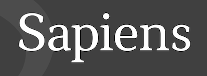 Type and graphic designer in Porto Alegre, Brazil. In his first big commercial typeface project, he published the multilingual text typeface Sapiens (2014), and writes: Contemporary serif typeface with support to Latin, Cyrillic, Greek and Phonetic scripts. Includes full sets of small caps and petite caps, combining diacritics, superiors, inferiors, superscript, subscript, arrows, bullets, Math operators, and a wide number of additional symbols. Punctuation and figures are variable accordingly to the set in use. The font brings several language alternate glyphs respecting cultural variations, as long as design alternates to let the user choose optimal typesetting.
 Behance link. [Google]
[More] ⦿
|
Information-technology Promotion Agency, Japan
|
A large free Japanese kanji font that also covers IPA and comes in several styles: IPAGothic, IPAMincho, IPAPGothic, IPAPMincho, IPAUIGothic. [Google]
[More] ⦿
|
International Phonetic Alphabet
|
Page by Zdravko Batzarov. No fonts here. [Google]
[More] ⦿
|
Into the Type
[Slavka Jevcinova]
|
 Or Slava Jevcinova. Designer from Bardejov, Slovakia, now located in Nice, France, whose first degree was an MA from J.E. Purkyne University in Czechia. She interned at Mota Italic in Berlin, and then started working for Fontwerk, a company specicializing in TrueType hinting. Since 2013 she is a freelancer and she regularly collaborates with the Rosetta Type foundry.
 Graduate of the Type & Media program at KABK in Den Haag in 2014, where she created Kin, an unconventional serif type family which explores distinctive styles while maintaining consistency. It has phonetic support and a drop-dead gorgeous black. In 2015, the 72-font family Skolar Sans (see also, Skolar Sans PE, 2016), codeveloped by David Brezina and Slava Jevcinova at Rosetta Type Foundry, won a silver medal at the European Design awards. In 2017, Slavka Jevcinova published Avory Latin at Rosetta Type Foundry. Calling it retro-chic, she writes about this sturdy Latin / Greek / Cyrillic sans typeface family: Avory is a gently condensed sans that challenges convention. Tall, with broad shoulders, easily spotted from afar. Inspired by the lettering work of Czech designer Jaroslav Benda. In 2019, she released the fashionable sans typeface Clarette at Future Fonts. Clarette pays special attention to Vietnamese. In 2019, at Rosetta Type, together with William Montrose and David Brezina, she released the variable font Adapter (with three axes, for Latin, Greek and Cyrillic). Typefaces from 2020: Wilmer (a multilayered three-dimensional ornamental Tuscan type family), Polaire (a monoline cursive stencil). Future Fonts link. [Google]
[MyFonts]
[More] ⦿
|
I.P.A. fonts
|
Jumplist for IPA fonts at the International Phonetic Association site. Pages run by Michael K. C. MacMahon, Phonetics Laboratory, Department of English Language, University of Glasgow, Glasgow G12 8QQ, UK. [Google]
[More] ⦿
|
IPA in Unicode
|
Professor John C. Wells (Department of Phonetics and Linguistics, University College London) tells about displaying Unicode phonetic symbols. Fonts with these capabilities include - Arial Unicode MS
- Code 2000
- Lucida Sans Unicode
- MS Mincho
The first three of these fonts are freely downloadable from the site. There is plenty of other information too, including the unicode tables for phonetic symbols. [Google]
[More] ⦿
|
IPA International Phonetic Alphabet fonts
|
Summer Institute of Linguistics has IPA fonts in type 1 and TTF. [Google]
[More] ⦿
|
IPA_One
|
A phonetic font, dated 1999, that can be found here. [Google]
[More] ⦿
|
IPA-SAM phonetic fonts
|
UK-based site: The IPA-SAM fonts are proprietary copyrighted Encore fonts created using Typecaster software supplied by the Summer Institute of Linguistics. However, they can now be downloaded free of charge (see above). If you prefer to have them supplied on diskette, you may purchase a diskette from the Department of Phonetics and Linguistics, University College London. Families of TrueType IPA fonts. Address: Department of Phonetics and Linguistics, University College London, Wolfson House, 4 Stephenson Way, London NW1 2HE, UK. The site is run by Professor John C. Wells of the Department of Phonetics and Linguistics. The fonts: Intone-dIntonSILDoulosLBoldItalic, Ipa-samdUclphon1SILDoulosLItalic, Ipa-samdUclphon1SILDoulosLBold, Ipa-sammUclphon1SILManuscriptLBold, Ipa-sammUclphon1SILManuscriptLItalic, Ipa-samdUclphon1SILDoulosLBoldItalic, Ipa-samsUclphon1SILSophiaLBold, Ipa-samsUclphon1SILSophiaLItalic, Ipa-samdUclphon1SILDoulosL, Ipa-sammUclphon1SILManuscriptL, Ipa-sammUclphon1SILManuscriptLBoldItalic, Ipa-samsUclphon1SILSophiaL. To help out: Doulos is similar to Times, Sophia is a sans serif, and Manuscript is similar to Courier. See also the original site at the Summer Institute of Linguistics. [Google]
[More] ⦿
|
J. Victor Gaultney
|
Type designer (b. Minneapolis, MN, 1962) at SIL International, UK since 1991, and an ex-M.A. student in type design at the University of Reading. He has worked on non-Latin typefaces, as well as his own extended Latin design, Gentium (2002). [Download from places such as OFL and FreeBSD]. Gentium Plus supports a wide range of Latin, Greek and Cyrillic characters. It was developed between 2003 and 2014 by J. Victor Gaultney (main designer), Annie Olsen, Iska Routamaa, an Becca Hirsbrunner. Papers by him include Multitudinous Alphabets: The design of extended Latin typefaces (2001), The influence of pen-based letterforms on Devanagari typefaces (2001), Balancing Typeface Legibility and Economy, Gentium---A Typeface for The Nations, Problems of Diacritic Design, and "Problems of diacritic design for Latin script text typefaces" (2002). The last one is a must-read. Projects in which he is the main or only designer include SIL Dai Banna Fonts, SIL Tai Dam Fonts, SIL Greek Font System, SIL IPA Fonts, and SIL Encore Fonts. At ATypI 2004 in Prague, he spoke about the technical problems with East European type. In 2008, he published Gentium Basic and Gentium Book Basic, each in four weights, but essentially limited to Latin, and added them to the Google Font Directory link. At ATypI 2010 in Dublin, he spoke about sculptural letterer Arnold Flaten (1900-1976). Speaker at ATypI 2011 in Reykjavik. Speaker at ATypI 2013 in Amsterdam: Open and collaborative font design in a web fonts world. Speaker at ATypI 2017 Montreal. Kernest link. Klingspor link. Google Plus link. [Google]
[More] ⦿
|
Jan Thor
[jGaramond]
|
[More] ⦿
|
Jean-François Porchez
[Typofonderie (was: Porchez Typofonderie)]
|
 [MyFonts]
[More] ⦿
[MyFonts]
[More] ⦿
|
Jean-Pierre Paillet
|
Developer of ph10, a bitmap IPA font used with TeX for typesetting the Canadian Journal of Linguistics. See also here. For a specimen, consult Christina Thiele's paper "TeX, Linguistics, and Journal Production" in "\TeX\ Users Group Eighth\/} {\em Annual Meeting: Conference Proceedings", pp. 5-26, 1988. [Google]
[More] ⦿
|
Jeff Anderson
[OMGWTF (or: Akumu)]
|
[More] ⦿
|
jGaramond
[Jan Thor]
|
Jan Thor developed Unicode versions of Garamond in 2001. His family, called jGaramond, covers Basic Latins, Latin-1 Supplement, Latin Extended - A, Latin Extended - B, Latin Extended Additional, Mathematical Operators, Letterlike Symbols, Currency Symbols, Arrows, Number Forms, IPA Extensions, Spacing Modifier Letters, Combining Diacritical Marks, Greek, Greek Extended. Bold, Italic and Regular weights only. See also here. [Google]
[More] ⦿
|
JL-types Ky
[Juhani Lehtiranta]
|
Juhani Lehtiranta holds a Ph.D. in linguistics, and lives and works in his place of birth, Nurmijärvi, near Helsinki. He has been busy with special fonts since 1985. In 1990 he established font design company, JL-types Ky. Lehtiranta's special interests are typefaces for European minority languages (e.g., Greek, Baltic, Sami, Cyrillic, Central European) and custom made fonts (e.g., barcode fonts (JLCode128, JLEAN, JLCode39, JLInterleaved2/5)). He created the first fonts for the Uralic Phonetic Alphabet in 1985 and published an OpenType phonetic font in 2005. He spoke at ATypI 2005 in Helsinki on A wild play with diacriticts, in which he discusses the Finnish language, Sami, and other special aerial languages. [Google]
[More] ⦿
|
John Brandon Lowe
|
A consultant in Berkeley, CA, who created a font in 1993 for Tangut, an extinct Tibeto-Burman language written in an ideographic script of about 6,000 characters which superficially resembles Chinese, while he was a visiting researcher at Vakgroep Verglijkende Taalwettenschappen, Rijksuniversiteit Leiden, The Netherlands. Co-developer in 1993 of the phonetic font STEDT, based on an original bitmap designed by Stephen P. Baron in the late eighties. [Google]
[More] ⦿
|
John Hudson
[Brill]
|
 [More] ⦿
|
Juan-José Marcos García
[Alphabetum]
|
[More] ⦿
|
Juhani Lehtiranta
[JL-types Ky]
|
[More] ⦿
|
Karambir Singh Rohilla
|
Graduate of Rajasthan University. Indian type designer in New Delhi whose creations cover Devanagari, Gurumukhi, Gujarati, Bengali / Assamese, Malayalam, Tamil, Telugu, Kannada, Oriya. I could not locate the fonts on the web site. Futuristic Hindi face (2011). In 2013, he designed a Bengali typeface for small portable devices, called AR Hebe Sans. He also did an unnamed Oriya typeface in that year. In 2015, Rohilla created the phonetic typeface Unspell and the experimental Ink Save Font. Alternate site. Behance link. [Google]
[More] ⦿
|
Khaled Hosny
[Libertinus]
|
[More] ⦿
|
Kimberly Geswein
|
 Born in Missouri in 1979, Kimberly moved first to Texas and later (in 2007) to China, and most recently, to Orlando, FL. She made some free fonts (often handwriting styles), and also ran a personal handwriting font service [those fonts have names that start with KGD]. MyFonts link. FontSquirrel link. Home page. Fontspace link. Dafont link. Fontsy link. Abstract Fonts link. Fontspring link. Klingspor link. Google Web Font Directory link. Creative Market link. Family home page. Her fonts, by year:
 - 2007: The grunge typefaces XiaoGao, More-than-Enough, Eat More Chocolate, JoyfulJuliana (2007, and its Pro version, 2010), LoveYaLikeASister, Colourmepurple, KingcooLKC and You Are Loved (in 2009, Roger S. Nelsson completed it to You Are Loved Pro). She also made the handwriting typefaces Patient Paige, Promised Freedom, Xiao Gao, Complete in Him (made into a commercial Pro version by Roger S. Nelsson), Burst My Bubble (commercialized at CheapProFonts as Burst My Bubble Pro), JustMeAgainDownHere, Surrendered Heart, It Ain't Rocket Science (in 2010, Roger S. Nelsson made a Pro version at CheapProFonts), Sue-Ellen-Francisco, and the curly Jheri Curls and Tuna-and-Hot-Dogs-on-Rye.
- 2008: the handwriting typefaces Come Unto Me and Loved by the King.
- 2009: BattyGirl, Bina Bina, Lollipop, NeverLetGo, Scrogglet, Sunshine In My Soul, YooHaeMool, Celebrate The Day (extended by Roger S. Nelsson in 2009 to Celebrate The Day Pro), Mighty To Save, King Kool KC Pro (kid's hand; done with Roger S. Nelsson, CheapProFonts).
- 2010: Shelter Me (handwriting), Elizajane (handwriting), Written on his hands (handwriting), Contrary Mary (hand-printed), Shining Like Stars (hand-printed), Give You Glory, Nothing You Could Do, Who Needs Consistency, happyhanneke, Zeyada, He Formed My heart, Change Tomorrow Today, Frangipani Rose, Blocked Off, Throw My Hands Up In The Air, Indie Flower, You Wont Bring Me Down, Addis Ababa, Cedarville Pnkfun (1 Cursive, 1 Print), Swanky and Moo Moo, Husband of the Millennium, Soggy Kitten, The Truth of a Thousand Lies, Soli Deo Gloria, Annie Use Your Telescope, Waiting for the Sunrise, La Belle Aurore, Airplanes In The Night Sky Pro, Dawbing of a new day, Shadows into light (+Two), Covered by your grace, Architect's Daughter.
- 2011: A Safe Place to Fall, Shark in the Water, Architects Daughter (architectural lettering), A Year Without Rain, My Hands Are Holding You, Discover Beauty, Lavender Lime, Later Allie-gator, You Found Me, I missed you, Kate The Great, Pizza Is My Favorite, A Hundred Miles, Hanging by a thread, My Lucky Penny, Jar of hearts, Never grow up, My Lucky Penny, Beautiful Every Time, Never Say Never, Swanky and Moo Moo, Over the Rainbow, Sue Ellen San Francisco, Pineapple Delight, Viva La Vida, The Only Exception, Written in the stars, we are broken, The Only Exception, Brick by boring brick, She paints me blue, Beautiful every time, Jar of hearts, Dancing in the Minefields, My Hands are Holding You, You Found Me, Blessings through raindrops, Stars from our eyes, From where you are, Throw my hands up in the air, The great escape, Today I Feel (emoticons), Cedarville Cursive, Coming home, Learning to trust, Viva La Vida, Janda Siesta Sunrise, Janda Curlygirl Chunky, Janda Curlygirl Pop, Janda Sparkle and Shine, Janda Love and Rain, Janda Fabulous, Janda Capslock, Janda Siesta Sunset, Janda Snickerdoodle Serif, Janda Everyday Casual, Janda Curlygirl Serif (hand-printed blackboard bold font), Janda Curlygirl Chunky, Janda Romantic, Janda Scrapgirl Dots, Janda Quick Note, Talking to the moon, Set fire to the rain, KG Shadow of the day, Just realize, Ignite the light, Love ya like a sister, Loved by the king, Give you glory, KG small town southern girl, KG Shadow of the day, Gloria Hallelujah, KG Sunny Afternoon, KG Hope for a cure, Janda Polkadot, Janda Capslock, KG June Bug, KG Fall For You, KG Luck of the Irish, KG Domo Is My Favorite, Gloria Hallelujah, KG Love You Through It (2011), KG Shadow of the Night (2011), KG Keep Your Head Up (2011), KG Dancing on the rooftop (2011), KG Party on the Rooftop (2011), KG Like A Skyscraper, KG Mulally, KG God Gave Me You, KG Les Bouquinistes de Paris (neatly hand-printed), Janda Swirlygirl (curly), Janda Sparkle and Shine, Janda Lova and Rain (curly), The Great Escape, KG Legacy of Virtue, KG Sweet N Sassy, KG Legacy of Virtue, Just Realize, KG Like a skyscraper, Janda Christmas Doodles, Just Realize, Janda Everyday Casual, Janda Snickerdoodle Serif, Love Ya Like A Sister (sketch face), The Only Exception, KG Luck of the Irish, Janda Fabulous, KG God Gave Me You, KG You Wont Bring Me Down, Set Fire To The Rain, KG You Wont Bring Me Down, KG Mercy in the morning, KG Heart Doodles, KG Skinny Latte.
- Typefaces from 2012: Janda Apple Cobbler, Janda Swirly Twirly, Janda Manatee, Janda Polkadot (2012), Shadows Into Light (2012, architectural style: see Google Web Fonts), Never Let Go, Janda Spring Doodles, Beautiful every time, Janda scrapgirl Dots, Written in the stars, Nothing you could say, KG Ray of Sunshine, More than enough, A hundred miles, Waiting for the sunrise, Janda Safe and Sound, Janda Silly Monkey, Janda Quirkygirl (curly font), From where you are (paint brush face), KG Empire of Dirt, KG Strawberry Limeade, KG A Thousand Years, Janda Amazing Grace, Janda Happy Day, Janda Elegant Handwriting (connected script), KG Somebody that I used to know, KG Kiss me slowly (curly), KG Call me maybe, KG Two is better than one, KG Ten Thousand Reasons, KG Beautiful Ending (grunge), KG Payphone (a nice cleanly hand-printed typeface), Janda Shine Your Light On Us, KG Beautiful Ending, KG Ten Thousand Reasons (chalkboard font), KG Only Hope, KG Eyes Wide Open (connected script), KG All Things New (high-contrast script face), KG Change This Heart (monolined and informal), Janda Stylish Script, KG Be Still and Know, KG Seven Sixteen, KG This is not goodbye, Janda Someone Like You, KG One Thing, KG I Like To Move It, KG Makes You Stronger, Janda As Long As You Love Me, KG The Fighter, KG Chasing Pavements (textured typeface), KG Always a Good Time, KG Grace for Today, KG Turning Tables (brush script), KG Falling Slowly, KG One More Night, KG Attack of the Robots, KG Ways to Say Goodbye (an upright script---one of her best typefaces to date), KG Janda Truly Madly Deeply, Janda Closer To Free, Ignite The Light, Janda Cheerful Script, Janda Hide and Seek, Janda Flower Doodles (a very useful dingbat set), Janda Celebration Script (swashy script), KG What the teacher wants, KG True Colors (connect-the-dots font), KG True Colors, Janda Closer to Free (chunky script), KG How Many Times, KG Behind These Hazel Eyes, KG Lego House (monoline rounded sans), KG Covered by your grace, KG Follow you into the world, KG Dark Side, KG Part of Me (neatly printed typeface), KG Begin Again, KG Cold Coffee, KG Something To Believe In (a stamped font).
- Typefaces from 2013: KG The Last Time, KG Feeling 22, Today I Feel (smilies), KG Primary Penmanship (a very clean rounded hand-printed typeface), KG Teacher Helpers (dingbats), KG Fractions (geometric dingbats), KG Flavor and Frames, KG Primary Dots (school font), KG Build A Game, KG Faith Hope and Love, KG As The Deer, KG Just Give Me A Reason, KG Girl on Fire, KG Daylight, KG I Want Crazy, KG Flavor and Flames Two, KG Flavor and Flames Three, KG Flavor and Flames Four, KG Flavor and Flames Five, KG Skinny Love, KG Traditional Fractions, KG Hard Candy, KG Alphabet Regurgitation, KG Second Chances (sketched typeface), KG Math Bar Models, KG Next to You (sketched typeface), KG Next to Me (+Sketched), KG Love Somebody, KG Beneath Your Beautiful, KG Primary Italics (school font, lined and regular), KG Wake Me Up (typewriter type), KG A Little Swag, KG Royals, KG What Does The Fox Say, KG Drops of Jupiter, KG Let Her Go, KG Why You Gotta Be So Mean, KG Tangled Up In You (sketched typeface), KG Chasing Cars, KG Melonheadz, KG Let Her Go (+outline and athletic lettering styles), KG By The Grace of God, KG Counting Stars, KG Christmas Trees, KG Bless Your Heart.
- Typefaces from 2014: KG Summer Sunshine, KG Say Something, KG I and Love and You, KG Corner of the Sky (rounded Comic Sans lookalike), KG All of Me (letterpress emulation), KG Flavor and Frames Six, KG Flavor and Frames Seven, KG Happy, KG First Time In Forever, KG Defying Gravity (white on black letters), KG When Oceans Rise, KG Summer Sunshine (shaded and arched poster lettering), KG Primary Whimsy, Janda Stylish Monogram, KG Modern Monogram, KG Already Home, KG Only Human, KG Miss Kindergarten, KG Arrows, KG No Regrets, KG Broken Vessels Sketch (sketched typeface), KG Manhattan Script, KG I Need A Font, KG Shake It Off, KG All of the Stars, KG-I-Need-A-Heart-Font, KG Red Hands (plump rounded sans), KG Blank Space (a typeface with metallic texture), KG Thank You Stamp, KG Tribeca Stamp, KG Candy Cane Stripe.
Typefaces from 2015: Janda Stylish Script, KG Chelsea Market Script, KG Adipose Unicase, KG Geronimo Blocks, KG Miss Speechy IPA (covers the entire phonetic alphabet), KG Thinking Out Loud, KG Tightrope, Kg Pdx Bridgetown, KG Camden Market Script (watercolor brush), KG Neatly Printed, KG PDX Blocks, KG Summer Storm, KG A Teeny Tiny Font, KG Piece By Piece, KG Sorry Not Sorry. Typefaces from 2016: KG Miss Kindy Collection, KG Satisfied Script, KG Who Tells Your Story, KG Life Is Messy, KG Inimitable Original, KG Eliza Schuyler Script. Typefaces from 2017: KG Compassion, KG Eliza Schuyler Script, KG Inimitable Original, KG She Persisted, KG Rise UP. Typefaces from 2018: KG Crossing a Line, KG Do You Love Me, KG One More Light, KG Laughter Lines. Typefaces from 2019: KG No Matter What (monoline script), KG Love is Love is Love. Typefaces from 2021: KG Ever Since New York. Creative Market link. Google Plus link. Open Font Library link. [Google]
[MyFonts]
[More] ⦿
|
KODEKS
[Sebastian Kempgen]
|
 KODEKS is the German slavistics server run by Professor Sebastian Kempgen from the University of Bamberg. Kempgen's fonts include
 - Eckige Glagolica and Runde Glagolica, both for Glagolitic.
- The mediaeval Cyrillic face Preslav.
- Kliment (2005). For old church slavonic, covering all of these: Altkirchenslawisch, Altrussisch, Altbulgarisch, Altserbisch, Old Russian, Old Bulgarian, OCS, Old Serbian). It can be downloaded here and here.
- Kiril, RomanCyrillicStd (2003) and CampusRomanStd (2008) are free fonts designed for slavic language specialists. The latter two fonts are quite complete and unicode-compliant since 2007. RomanCyrillic Std has more than 4,400 characters as of 2020, and supports Unicode 12 (2019) and 13 (2020). It covers monotonic and polytonic Greek, Cyrillic with all historic variants, Soviet additions to the Cyrillic Alphabet (Kazakh, etc.), IPA phonetic characters and much more.
- The BukyVede font (2008), which is used by the journal "Polata knigopisnaja" (Mario Capaldo and William R. Veder, eds.), published by William R. Veder&Michael Bakker, Slavisch Seminarium, Amsterdam. It is based on CyrillicaOhrid and GlagolicaBulgarian (with additions from Rumen Lazov), and adapted to Unicode 5.1, and enhanced by William R. Veder, Chicago. Final touches, additional characters and font generation by Sebastian Kempgen.
- Method Std is the Unicode 5.1 version of the Method font series originally created by the author, Sebastian Kempgen, in the 1980's. The blueprint for this font is the classic printing type devised by slavists and used in learned editions of Old Church Slavonic texts.
- Via MacCampus, which he seems to run, he published Breitkopf Fraktur (2008, with Sascha Selke) and Trubetzkoy (2005, a serif typeface for phonetics).
FontShop link. [Google]
[More] ⦿
|
Kreative Korporation (was: Relay Fonts, or: Kreative Software)
[Rebecca Bettencourt]
|
Relay Fonts (Rebecca Bettencourt, aka Beckie RGB, and also known as Kreative Korporation and Kreative Software) offers a number of free fonts. - Their main list of fonts, 2003-2010: Alisha, CosmicSpamMS, DotCom, Eighteen, Felicia, FluorineLite, FluorineLiteMikiana, Glass, GlathenGirl, Infinity, Kaileen, Kawakimi, LongIsland, LongIslandIcedTea, Madgecrack, MikaPro, Miranda25, Miranda27, OpenDocRocks (hairline sans), SixthKristenSquirt, Sorority, Tenbitesch, ThiMegaTampon.
- Designers in 2008 of the large free typeface Constructium seen at the Open Font Library.
They write: Constructium is a free font for supporting constructed scripts, as encoded in the Unofficial ConScript Unicode Registry. It is based on SIL Gentium and thus released under the SIL Open Font License. Constructium is ideal for mixed Latin/Greek/Cyrillic, IPA, and conlang text, thus well suited for conlangers' web sites. In addition to most Latin and Greek, basic Cyrillic, and IPA extensions, Constructium supports the following conscripts: Tengwar, Cirth, Amman-Nar, Olaetyan, Seussian Latin Extensions, Sylabica (isolated forms only, no syllables), Unifon, Solresol, Glaitha-A, Glaitha-B, Deini, Kamakawi (encoded at U+F000), and Klingon. - They made the pixel fonts Chixa, Epilepsy Sans (2011), Fairfax (+Bold, +Italic, +Serif), FluorineMicro, Goethe (+Bold), Hippauf, KKFixed4x5, KKFixed4x7, KKPx4, Magdalena (+Bold), McMillen (+Bold), Mischke (+Bold), Monterey (+Bold), SeaChelUnicode, SixteenSegments, dwtMicro, dwtMicroMask.
- Fontstructor who made SF Subway (2011), a kitchen tile typeface based on tiled lettering seen in the San Francisco MUNI system, Underclocked (2012), Great Rounded Matrix (2012, a dot matrix face), Fonteriana (2014), Thin Martin (2014).
- Discontinued fonts: Berkelium Bitmap, Endcurled, Lauren, Sunflower's Illegible Writing, Berkelium Type, Fluorine, Mikkav, Unmodified Fax, C Colon Backslash, Hydrogenfluoride, Modern Grease, Copyright Renewed, Infinite, Signatures.
- Conlang fonts: Constructium, Nuvenon (Tehano Venon for Ayeri).
- The Urban Renewal series revives the old Apple typefaces with new names: Liverpool (aka London), Sanfrisco (aka San Francisco), Los Altos (aka Los Angeles), Torrance (aka Toronto), Athene (aka Athens), Parc Place (aka Cream, aka Palo Alto), Valencia (aka Venice).
- Faithful recreations in 2011 of pixel fonts of old computers, notably Apple II [BerkeliumIIDHR, BerkeliumIIHGR, PRNumber3, PrintChar21, Shaston320, Shaston640, ShastonHi320, ShastonHi640], Commodore 64 [Berkelium1541, Berkelium64, Giana, PetMe, PetMe128, PetMe1282Y, PetMe2X, PetMe2Y, PetMe64, PetMe642Y], Apple Lisa [EmptyFolders2X3Y, EmptyFoldersRaw, Engelbart2X3Y, EngelbartRaw, LisaCalcPaper2X3Y, LisaCalcPaperRaw, LisaGraphPaper2X3Y, LisaGraphPaperRaw, LisaGuidePaper2X3Y, LisaGuidePaperRaw, LisaProjectPaper2X3Y, LisaProjectPaperRaw, LisaSketchPaper2X3Y, LisaSketchPaperRaw, LisaTerminalPaper2X3Y, LisaTerminalPaperRaw, LisaTerminalPaperSmall2X3Y, LisaTerminalPaperSmallRaw, PriamWhamos2X3Y, PriamWhamosRaw, SomeAcronym2X3Y, SomeAcronymRaw, StartupFrom2X3Y, StartupFromRaw, Twiggy2X3Y, TwiggyRaw], and others [Antiquarius, CandyAntics, ColleenAntics, DosStartDefaultFont, ItalianPlumber, Speccy].
- Custom fonts: Jewel Hill, Miss Diode n Friends, This is Beckie's Font.
- Under the alias of Jon Relay, Rebecca made mostly handwriting fonts: Eighteen, Nineteen, Felicia (2002), Ditch The Logical, Endcurled, Alisha (2003), AdministratorPassword, BerkeliumBitmap, BerkeliumType, CopyrightRenewed, Cosmic Spam, DotCom, DWT, Eighteen, Fluorine (+Lite), Fonteri, Glass (3d face), Glathen Girl (2004), Hydrogenfluoride, Infinity, Jewel Hill, Kaileen (2004), Kawakimi, Make Lots of Graphs, Jon'sNewRoman, Jon'sSupercondensed, Kelly, Lauren, Matal, Miranda 27, Mikkav, Modern Grease (Greek simulation), OpenDocRocks, Plastic, ReturnofRelayScript, SCSIPort, Sexy Sara (2002), Sixth Kristen Squirt, Sorority, Teen Dreem Magazeen, Tenbitesch, UnmodifiedFax, Jewel Hill (2002, based on artwork by Amy Taramasso).
- Typefaces from 2012: Hippauf (pixel face), Fairfax (pixel family), Thi Mega Tampon, Tenbitesch (curly face), Sorority, Miranda 25, Mika Pro, Madgecrack, Long Island, Long Island Ice Tea.
- Typefaces from 2013: Constructium (a text typeface adapted from J. Victor Gaultney's Gentium (2003)).
- Typefaces from 2017-2019: Kreative Square (a wide monospaced sans), Fairfax HD.
Dafont link. Fontspace link. Abstract Fonts link. Klingspor link. Open Font Library link. [Google]
[More] ⦿
|
Kris Alans
|
Designer of the remarkable free display typeface Alanesiana (2017)C: Alanesiana is a font created in accordance with the idea to read the text in a slightly insecure form, and supports exactly 5650 characters. Each character has its own character, looks different from the rest, but all are made in a similar style and have a similar thickness, so the text still looks consistent, making it perfect for longer texts as opposed to many other decorative fonts that tire the reader. What is important Alanesiana supports not only Latin alphabet but also Cyrillic, Greek, Hebrew, Armenian, Georgian and phonetic and mathematical symbols as well as some emoticons and other symbols, alphabets such as Coptic. [Google]
[More] ⦿
|
Lao Phonemic
|
A phonemic Lao font from 1992. [Google]
[More] ⦿
|
Lars Törnqvist
[Cercurius (was: Lars Törnqvist Typografi)]
|
 [MyFonts]
[More] ⦿
[MyFonts]
[More] ⦿
|
LaserIPA Fonts
|
LaserIPA fonts from Linguist's Software: IPAKielSeven, IPAExtras, IPAHighLow, IPAKiel, and IPAsans. Commercial, available in type 1 and truetype. [Google]
[More] ⦿
|
Lerfu
[Mark E. Shoulson]
|
Lerfu is Mark E. Shoulson's foundry located in Highland Park, NJ. Creator of a variety of fonts: - The Visible Speech Fonts in metafont and truetype cover a phonetic alphabet invented by Alexander Melville Bell (his son was Alexander Graham Bell). Bell was a teacher of the deaf (as was the younger Bell), and this alphabet was intended as an aid to teaching the deaf how to pronounce words. An example is VS MetaPlain PUA.
- Marin, MarinCaps, MarinCapsItalic, MarinItalic: four free extensive phonetic truetype fonts made in 2004. They also cover Cyrillic, Greek and Hebrew.
- Okuda: A metafont for "Okuda" orthography of pIqaD (Klingon language). This font was later modified by Olaf Kummer.
- Gill Hebrew (2004, based on Gill Sans) and Shen (2004), both sold via Shoulson's foundry at MyFonts, called Lerfu.
- Itonai (2005), a Hebrew version of Times New Roman, also sold via Lerfu.
[Google]
[MyFonts]
[More] ⦿
|
Libertine Open Fonts Project
[Philipp H. Poll]
|
 Now, here is a project with a name I like! This project by Philipp H. Poll has been started in order to create fonts that can be released under the GNU Public License. As of early 2005, we have the following Times New Roman lookalikes: LLibertineCaps, LinLibertine, LinLibertine-Italic, LinLibertineBd. Libertine Grotesque is next on the list of things to do. The fonts came in truetype and fontforge (SFD) text formats, but have now been extended to include opentype and type 1 as well. Linux Libertine covers a big range of Unicode, including all characters in MES-1 (Afrikaans, Albanian, Basque, Breton, Catalan, Croatian, Czech, Danish, Dutch, English, Esperanto, Estonian, Faroese, Finnish, Frensh, Frisian, Galician, German, Greenlandic, Hungarian, Icelandic, Irish Gaelic (new orthography), Italian, Latvian, Lithuanian, Luxemburgish, Maltese, Manx Gaelic, Moldavian (with restrictions), Northern Sámi, Norwegian, Occitan, Polish, Portuguese, Rhaeto-Romanic, Romanian (with restrictions), Scottish Gaelic, Slovak, Slovenian, Lower Sorbian, Upper Sorbian, Spanish, Swedish, Turkish, Welsh (with restrictions)), IPA, Greek, Cyrillic, math symbols, and a host of other symbol and language sets. TeX archive. The typophiles are not impressed. Charles Ellertson writes: The bowl of the "a" doesn't fit other letters, the top and terminal of the "f" doesn't know where it is going, the descender of the "y" doesn't balance quite right, and the serif on the upper arm of the "z" (which probably reminded the original poster of Caslon) seems out of place. I get the impression, again from the small sample, that the font doesn't quite know whether it is supposed to be slightly condensed or slightly expanded.
 In 2007, the following weights are available: Normal, Kursiv, Fett, Fett Kursiv, Kapitaelchen, Unterstrichen, Grotesk. As a measure of the success of the font, we find that is now used on the logo of Wikipedia. As a companion font, they offer Linux Biolinum (2010): The Biolinum is an organic sans-serif and could be also described as organogrotesque (non-linear sans serif). It is still in a beta stage. Biolinum is meant for emphasizing titles but could be used also for short passages of text. For longer texts a serif font such as the Libertine should be used in favour of readability The Biolinum has the same vertical metrics and visual weight as the Libertine, so that it fits perfectly to the Libertine and can be also used for emphasizing within the body text. In 2017, Biolilbert was born out of Biolinum. Biolilbert's name is a portmanteau from Biolinum and Hilbert. In 2012, Bob Tennent created type 1 versions of Biolinum and Libertine. In 2016, LibertineGC was published by Michael Sharpe at CTAN, adding LaTeX support files for Greek (essentially complete LGR, supporting monotonic, polytonic and ancient features) and Cyrillic. Another effort at corrections was undertaken by Khaled Hosny in 2016 in his Libertinus family. The Libertinus font family is a fork of Linux Libertine and Linux Biolinum with many bug fixes and improvements. Also included are Libertinus Math, Libertinus Serif (from Lunux Libertine), Libertinus Sans (forked from Linux Biolinum) and Libertinus Mono (from Linux Libertine Mono). Github link. CTAN link for Libertinus, maintained by Herbert Voss. Dafont link. Fontspace link. CTAN link for Libertineotf. CTAN link for Libertine download. Klingspor link. Klingspor link. CTAN link. [Google]
[More] ⦿
|
Libertinus
[Khaled Hosny]
|
 The extensive open source font family Libertinus is a fork of the Linux Libertine and Linux Biolinum fonts that started as an OpenType math companion of the Libertine font family, but has grown as a full fork to address some of the bugs in the fonts. The family consists of:
 - Libertinus Serif: forked from Linux Libertine.
- Libertinus Sans (lapidary): forked from Linux Biolinum.
- Libertinus Mono: forked from Linux Libertine Mono.
- Libertinus Math: an OpenType math font for use in OpenType math-capable applications like LuaTeX, XeTeX or MS Word 2007+. See also the slightly modified Libertinus T1 Math (2017) by Michael Sharpe.
- Libertinus Keyboard.
Portions of the fonts are copyright of Khaled Hosny (2012-2016), while the Linux Libertine material is originally due to Philipp H. Poll (2003-2012). All fonts have over 2000 characters, and cover all European languages, including Greek, Hebrew and Cyrillic. In addition, there is an excellent coverage of symbols in addition, of course, to the plentiful mathematical symbols. Khaled Hosny was the primary contributor and maintainer from 2012 until 2020, and passed the poupon in 2020 to Caleb Maclennan. Github link. [Google]
[More] ⦿
|
M+ Fonts
[Coji Morishita]
|
 Free font producer in Japan that started out as a bitmap font specilaist. The M+ Fonts Project is jointly run by Coji Morishita, Hiroki Kanou, Imazu Kazuyuki and Taro Muraoka.
 All fonts are totally free: Unlimited permission is granted to use, copy, and distribute them, with or without modification, either commercially or noncommercially. . Download page. Free monospaced and variable width outline fonts containing kana, kanji (97% coverage of jinmeiyo), Chinese (81% coverage of traditional Chinese), Korean, Cyrillic, Greek, Hebrew, and Latin (sans), all made between 2006 and 2016 and still being developed: mplus-1p-black, mplus-1p-bold, mplus-1p-heavy, mplus-1p-light, mplus-1p-medium, mplus-1p-regular, mplus-1p-thin, mplus-2p-black, mplus-2p-bold, mplus-2p-heavy, mplus-2p-light, mplus-2p-medium, mplus-2p-regular, mplus-2p-thin. In 2018, they published MPlusRounded1c at Google Fonts. Additions in 2021: M Plus Code Latin, M Plus 1 Code. Mplus 1 Code is a sans serif programming font with seven weights from Thin to Bold, supporting 5,700+ kanjis for Japanese with GF Latin Plus. iM Plus Code Latin is a multi-weight programming font for Latin only. Both have variable fonts as well. Open Font Library link. Local download of the M+ family. Google Fonts link. Github link. [Google]
[More] ⦿
|
MacCampus
[Sebastian Kempgen]
|
Europe's largest independent foreign language font developer for the Macintosh, which is directed by Sebastian Kempgen from Germany. Fonts include: Western Languages (CoreFont series), Eastern Europe (CE-Font series), Cyrillic (Professional series: RomanCyrillic Pro, Ladoga Pro etc. (text fonts); DEsign fonts: Faktor, Inessa Cyr etc. (headline, handwriting); Olliffe Fonts: Batumi, Schechtel, Russian Open (display type; example: Mashinka); Scientific Cyrillic (includes old orthography, accents, old characters); Old Church Slavonic (Cyrillic and Glagolitic, Square and Round); Non-Slavic Cyrillic: Roman CyrTurk, Ladoga CyrTurk), Greek (Modern Greek and Classical Greek (Agora and Parmenides)), Icelandic&Faeroese (PolarFont series), Irish&Welsh (Gaelic, Celtic in the CeltoFont series), Romanian (DacoFont series), Turkish (TurkoFont series), BalkanFont series (Hungarian, Romanian, Turkish, Azerbaijani, Maltese), Basque (BaskoFont series), Saami (SamoFont series), Georgian, Armenian, Coptic (such as the Pachomius font), Cuneiform, Sabean, SinoFont series for Vietnamese plus more or Chinese (Pinyin) transliteration, phonetic Fonts (Trubetzkoy&Phonetica), Transliteration Fonts. Some of its fonts (like Campus Ten/Twelve and Magister Book) are now sold through Agfa/Monotype. Names of some fonts: Breitkopf Fraktur, Campus Sans, CampusRoman Pro, CampusSans Block, Dareios, Faktor, Glagol Pro, Inessa, Konkret, Kronstadt, Marib, Method, Moskva Pro, Parmenides, Retrograd, Tafelkreide, Tatlin, Trubetzkoy. [Google]
[More] ⦿
|
Madalena Silva Carlos
|
During her studies, Cascais, Portugal-based Madalena Silva Carlos proposed a new alphabet called Magografia (2017), and published a new Alfabeto Fenetico International (2017). [Google]
[More] ⦿
|
Margaret S. Ratz
[Unifon (or: Unifon Press)]
|
[More] ⦿
|
Mark E. Shoulson
[Lerfu]
|
[MyFonts]
[More] ⦿
|
Match Fonts
[Michel Bujardet]
|
 Match Fonts is the West Hollywood, CA-based foundry led by Michel Bujardet (b. Bordeaux, France, 1951), who is Mike Budge on alt.binaries.fonts. They make and sell interesting font paks. A particular favorite of mine is the Calligraphic Fonts Pack 2, which has the beautiful medieval-look typeface Rodolphe (2001), together with the Chancellerie family, the blackletter font SquareText, and a few Uncial fonts called Oncial. Free demos. Cursive Handwriting is a 6-font pak for teaching handwriting. Also offering a handwriting and signature font service. Among free offerings, check Le Blackmail (ransom font). Also, commercial fonts for these languages: Armenian, Bulgarian, Croatian, Czech, Estonian, Greek, Hawaian, International Phonetic (IPA), Hebrew, Hieroglyphs, Hungarian, Japanese, Latvian, Lithuanian, Macedonian, Marshallese, Polynesian, Polish, Romanian, Russian, Serbian, Slovak, Turkish, Ukrainian, Yiddish.
 Interesting typefaces: Boulon (letters with bolts), Bujardet Freres (French restaurant type), Calebasse (1997, semi-psychedelic), Chinoiseries (Chinese look-alike), Cristolikid (LCD), Diodes Light, Grecques, Halloween, Malabars, Metroplitain (art nouveau), Monogram, Octogone, Osselets (bones), Parador, Ruban Dis-Moi, SilBooettes, TSF et Compagnie, Venitienne, Yiddilatin, Zebrues, and the dingbats Dinosotype, Alphabetzier, Nahkt Hieroglyphics, Norman Prince (children's handwriting), Angelots, Sceaux, Seraphiques, Talismans, La Main Guided, La Main Solid (both children's tracing fonts), Bordini, Bordofixed, BoumBoum, ChapClerk, Dactylographe (nice!), Halotique (sans serif), Tortillon (2001, art deco), Normographe (great too!), Normafixed, Oloron, Parlante (serif family), Presse (typewriter), Technicien. Plus handwriting fonts Skrypta, Skryptaag (upright and connected), Willegha. a Morse Code font. The Halloween pack includes Coulures, Halloween, Osselets and SilBooettes. Fixed width fonts include Dactylographe, Oloron, Bordo, Norma. Direct access. Interview and photo. Alternate URL (in French), with many more fonts, such as the handwritten Pierre, Mariette. MICR E13 B font. Fontspace link. [Google]
[MyFonts]
[More] ⦿
|
Michael T. Henderson
|
Creator in 1997 of the KuldIPA phonetic font at Kansas University. [Google]
[More] ⦿
|
Michel Bujardet
[Fontmenu.com]
|
[MyFonts]
[More] ⦿
|
Michel Bujardet
[Match Fonts]
|
[MyFonts]
[More] ⦿
|
Moraic
|
"Moraic is a TrueType font which allows you to connect adjacent levels of phonological structures quickly and easily, right in your word processor. Moraic gives you solid, dashed, and barred lines, all as simple keystrokes." Commercial product. [Google]
[More] ⦿
|
N.K. Dyson
|
Designer of PhonFont-v1.5phoneticchars (1994) for Attica Cybernetics. Downloadable here. [Google]
[More] ⦿
|
noonan
|
The following phonetic/linguistic fonts can be found here in truetype format: Times-Linguist (8 weights, great family!), LinguisticsNormal, StoneChantyalMedium (Adobe, 1990). [Google]
[More] ⦿
|
Notabene
|
Free phonetic font IPA. [Google]
[More] ⦿
|
Odden
|
Four phonetic truetype fonts called Phonetic (Monotype) in the style of TimesNewRoman. [Google]
[More] ⦿
|
Ohio State University
|
Pick up the Phonetic family of truetype fonts, in Monotype's TimesNewRoman style. [Google]
[More] ⦿
|
Olthuis
[Samisk Datautvalg]
|
This Dutch site contains phonetic fonts such as Cyrillic-1, PhoneticaItalic, SKTimesDictionaryItalic, STimesDictionary, SamCourierW2Normal, SamHelveticaW2Bold, SamHelveticaW2BoldItalic, SamHelveticaW2Italic, SamHelveticaW2Normal, SamTimesW2Bold, SamTimesW2BoldItalic, SamTimesW2Italic, SamTimesW2Normal [the Sam series are by Samisk Datautvalg], SkTimesDictionaryBold, TimesNewRomanPS-ItalicMT. In addition, we find Corel's WordPerfect font package: WP-ArabicScriptSihafa, WP-ArabicSihafa, WP-BoxDrawing, WP-CyrillicA, WP-CyrillicB, WP-GreekCentury, WP-GreekCourier, WP-GreekHelve, WP-HebrewDavid, WP-IconicSymbolsA, WP-IconicSymbolsB, WP-Japanese, WP-MathA, WP-MathB, WP-MathExtendedA, WP-MathExtendedB, WP-MultinationalAHelve, WP-MultinationalARoman, WP-MultinationalBCourier, WP-MultinationalBHelve, WP-MultinationalBRoman, WP-MultinationalCourier, WP-Phonetic, WPTypographicSymbols. [Google]
[More] ⦿
|
OMGWTF (or: Akumu)
[Jeff Anderson]
|
Free fonts, mostly for artificial languages, by Jeff Anderson (Akumu). These include Aram, Rhaelik, SexyScript, Sketchy-Tirin, Tengwar-Typewriter, Tirin-Hand, Tirin-Script, Tirin-Type. [Google]
[More] ⦿
|
Ordiecole
|
Phonetic font link list. [Google]
[More] ⦿
|
Pablo Ugerman
|
 Argentinian type designer who lives in Buenos Aires where he runs UGR Design. Award winner at Tipos Latinos 2010 for his text and IPA typeface Voces (done with Ana Paula de Bragança Megda). The latter typeface appeared in 2012 at Google Web Fonts.
 At Tipos Latinos 2012, he won awards for Sopi (an ornament and border typeface published by Tipo in 2014) and Rosarivo (2011, Google Web Fonts: a typeface designed at FADU-UBA for use in letterpress printing). Google Plus link. [Google]
[MyFonts]
[More] ⦿
|
Palatino TIPA
[Berthold Crysmann]
|
Berthold Crysmann's modification of the TIPA font for making a Palatino-look set of phonetic characters. In metafont and type 1. He also has similar sources for BIPA (TIPA in CM-Bright), and CIPA (TIPA in Knuth's Concrete). Finally, he also provides TIPA in type 1 format. [Google]
[More] ⦿
|
Palle Jørgensen
|
Danish designer of these typefaces: - FoekFont (2006). The title font of the Mads Foek magazine.
- Fonetika Dania (2006). A font bundle with a serif font and a sans serif font for the Danish phonetic system Dania. Both fonts exist in regular and bold. The fonts are based on URW Palladio and Iwona Condensed.
- Frimurer (2020). Fonts and TeX support for the frimurer (freemasons) cipher.
- The aesupp package: updates of TEX Gyre Bonum, TEX Gyre Schola, TEX Gyre Pagella and Latin Modern fonts with a better designer for the ae ligature.
[Google]
[More] ⦿
|
Paul Jones
|
FontStructor who made these techno typefaces in 2010: UniCandiru2, DC2 Ghoti (Shavian alphabet), BloxFont 26 (an emulation of Bradbury Thompson's Alphabet 26 unicase font), BF26 Hollow, Heptadiox, Grdman2, AurabeshX, InterlacX (DC Comics' Interlac Alphabet), Milborough Gothic, Phonotypy2, Canidruita, UnigrafM, UnifonDC2, Alpha26, CandiruExtended, ShavianDC2, SimlishDC (artificial language face), Bloxfontexp, Phonotypy, Bloxfont Normal, Unicandiru (unicase), CompacCandiru, KozmikAycee (a Unicode font with 1724 glyphs!), Kamenwriter, DCTelStar (over 100 glyphs). The Phonotypty family is an interpretation of Issac Pitman's Phonotypy (for phonetic writing). Ancient DC2 (2011) is based on the Ancients alphabet from Stargate SG-1. Aka Dreaded Candiru2. [Google]
[More] ⦿
|
Paul Tremblay
|
Creator of the Open Font Library phonetic fonts Thoth (2007), Thoth Uni (2007), Thoth Sampa (2007) and Readspel (2008). [Google]
[More] ⦿
|
Pepper Font
|
In the Phonology Project at the University of Wisconsin, the free Pepper Font family was developed: each font contains 43 regular and bold phonetic symbols for all of the American English consonants, vowels, and diphthongs, and 45 diacritic symbols and special characters. [Google]
[More] ⦿
|
Peter Bilak
[Typotheque]
|
 [MyFonts]
[More] ⦿
[MyFonts]
[More] ⦿
|
Philip Barton Payne
|
President of The Payne Loving Trust, which owns Linguist's Software (Edmonds, WA). A selection of the fonts of "Payne Loving Trust" that are floating around in cyberspace includes AradLevelVI, CityBlueprint, CountryBlueprint, EuroRoman, EuroRomanOblique, Graeca, PanRoman, Romantic, RomanticBold, RomanticItalic, SansSerif, SansSerifBold, SansSerifBoldOblique, SansSerifOblique, SuperFrench, Supergreek, TbilisiCaps, TbilisiText, TbilisiText13215, Technic, TechnicBold, TechnicLite. Apparently, Linguist's Software calls upon a battery of nameless typographers for font design. They also sell LaserIPA fonts (IPARoman, IPAKiel, IPAKielSeven and IPAExtras). [Google]
[More] ⦿
|
Philip Tagg
|
Philip Tagg from the Faculty of Music at the University of Montreal has these fonts on his page: Athenian, Cyrillic, CyrillicBold-Italic, CyrillicBold, CyrillicNormal-Italic, MSReference1, MSReference2, SILDoulosIPA, SILManuscriptIPA, SILSophiaIPA, Translit98, Translit98Bold, Translit98BoldItalic, Translit98Italic, Treefrog, Webdings, GeographicSymbols-Normal, Keypunch-Normal, Keystroke-Normal, Kids-Normal. [Google]
[More] ⦿
|
Philipp H. Poll
[Libertine Open Fonts Project]
|
[More] ⦿
|
Philippe Cochy
|
French (Corsican) designer of the semi-calligraphic script typeface Pecita (2009) and of OTFPOC (2012). Home page, which is entirely set in this script, yet is text-searchable and used as a regular font---great example to follow. Pecita also covers Greek, Turkish, Cyrillic, Vietnamese and IPA. In 2014, they published the rounded connected script typeface Aghja at OFL. Fontsquirrel link. Open Font Library link. Kernest link. Fontspace link. Dafont link. Newer OFL link. Google Plus link. [Google]
[More] ⦿
|
Philippe et François Blondel
[Polices True-Type Manuscrites]
|
[More] ⦿
|
Phone
|
Free phonetic symbol font. [Google]
[More] ⦿
|
Phonetic Fonts
[Bruce Hayes]
|
Bruce Hayes (Department of Linguistics, UCLA) introduces some phonetics fonts from the Summer Institute of Linguistics: Gentium, SILDoulosIPA93, Doulos SIL. [Google]
[More] ⦿
|
Phonetic metafonts
[Emma Pease]
|
Phonetic metafont collection by Emma Pease, based on Computer Modern. [Google]
[More] ⦿
|
Phonetik Heidelberg
|
Phonetic fonts: SILDoulosIPA93Bold, SILDoulosIPA93BoldItalic, SILDoulosIPA93Italic, SILDoulosIPA93Regular, SILManuscriptIPA93Bold, SILManuscriptIPA93BoldItalic, SILManuscriptIPA93Italic, SILManuscriptIPA93Regular, SILSophiaIPA93Bold, SILSophiaIPA93BoldItalic, SILSophiaIPA93Italic, SILSophiaIPA93Regular. [Google]
[More] ⦿
|
PiROG
[Henri Rogelet]
|
 Free school fonts by Frenchman Henri Rogelet, ca. 2000: Abaque (2011, abacus font), Alphonetic, AlphoneticGB (two phonetic fonts), Cursiv, Monsieur et Madame (a funny dingbat font, 2002), Scriptcasecole, Scriptecole, Scriptecole2. [Google]
[More] ⦿
Free school fonts by Frenchman Henri Rogelet, ca. 2000: Abaque (2011, abacus font), Alphonetic, AlphoneticGB (two phonetic fonts), Cursiv, Monsieur et Madame (a funny dingbat font, 2002), Scriptcasecole, Scriptecole, Scriptecole2. [Google]
[More] ⦿
|
Polices True-Type Manuscrites
[Philippe et François Blondel]
|
Original truetype fonts by Philippe and François Blondel 9France): New Bernard (2013), CNC Vector (2012, hairline sans), Braille 1998, Braille 1998 3d version, Braille (2012), Accords (for guitar), Langage des signes (ASL), Signes, Phonetique. He also designed many handwriting fonts: Michelle, Ginette, Sophie, Amandine, Virginie, MissClaude, LalexBigBadaboum, Karine. All these fonts are free. For font services: 40 USD for a handwriting font, 70 for a connected handwriting font, 10 USD for a logo font, 8USD to add the Euro symbol to any font, 50 USD for any on-demand truetype font based on your drawings. Handwriting type designer Philippe Blondel offers some of his handwriting fonts (such as BrandysHand, PatriciasHand, JaninesHand, LisasHand, LaurensHand, FarrahsHand, CarolinesHand, RandysHand, BrooksHand, Philing (1998-2009), Jean-Claude'sHand and Jimmy-Hand) regularly for free. Send in your handwriting on the form he provides: each week, he'll make one of the samples into a TrueType font (for free). Additional fonts include 7LED (2010, LED face), Philippe, Bernard, Adelyne, Georges, Brigitte, Barguzin, Breeze, Fog, Lightning, Monsoon, Stream, Valerie, Jami, and Zephyr. Typefaces from 2014: Shade of Adelyne. Fontspace link. Dafont link. Abstract Fonts link. Alternate URL. Yet another URL. Another Fontspace link. [Google]
[More] ⦿
|
Primecole
|
Children's orthographic fonts by Philippe Tassel (Ducahier) and C.Verchery (CrayonE, CrayonL, PlumNAE, PlumNAL). Plus a phonetic Arial-lookalike by Réal Saint-Jacques (Apicar). Plus several relevant links. [Google]
[More] ⦿
|
Primoz Peterlin
|
Slovenian font and font software specialist, who works at the Institute of Biophysics of the University of Ljubljana, Slovenia. Early on, he created type 1 outlines for the Devanagari fonts of Frans Velthuis, which dated back to ca. 1990. But his main project was the Free UCS Outline Fonts project, which was part of the Free Software Foundation. It morphed into the GNU Freefont project that set out to provide three monster fonts, FreeMono, FreeSerif and FreeSans, to cover many Unicode blocks. Primoz himself filled in missing glyphs here and there (e.g., Latin Extended-B and IPA Extensions ranges in the FreeMono family), and created the following UCS blocks: - Latin Extended-B (U+0180-U+024F)
- IPA Extensions (U+0250-U+02AF)
- Arrows (U+2190-U+21FF)
- Box Drawing (U+2500-U+257F)
- Block Elements (U+2580-U+259F)
- Geometrical Shapes (U+25A0-U+25FF)
In 2008, he ceded the command of that project to Steve White. [Google]
[More] ⦿
|
Rainer Holtei
|
At Rainer Holtei's site at the University of Duesseldorf, the phonetic and old English fonts SILDoulosIPA-Regular, SILManuscriptIPA-Regular, SILSophiaIPA-Regular, TimesNewRoman-OldEnglish-KT. [Google]
[More] ⦿
|
Rainer Will
[Will Software]
|
[More] ⦿
|
Ralf Vollmann
|
Ralf Vollmann's page at the University of Graz is now defunct. It featured the Tibetan fonts: Esama, Esamb, Esamc, the Greek font "Greek", the Hebrew font "Hebrew", and the phonetic fonts IPARoman2, IPARoman1, SILDoulosIPA, SILDoulosIPA93Bold, SILDoulosIPA93BoldItalic, SILDoulosIPA93Italic, SILDoulosIPA93Regular, SILManuscriptIPA93Bold, SILManuscriptIPA93BoldItalic, SILManuscriptIPA93Italic, SILManuscriptIPA93Regular, SILSophiaIPA93Bold, SILSophiaIPA93BoldItalic, SILSophiaIPA93Italic, SILSophiaIPA93Regular. [Google]
[More] ⦿
|
Ralph du Carrois
[Carrois Type Design]
|
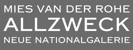 [More] ⦿
|
Rasir Dex
|
Designer of Kingsoft Phonetic (1997), based upon Arial and a SIL font. See also here. [Google]
[More] ⦿
|
Réal Saint-Jacques
|
Creator of the free phonetic typeface Apicar. Home page. [Google]
[More] ⦿
|
Rebecca Bettencourt
[Kreative Korporation (was: Relay Fonts, or: Kreative Software)]
|
[More] ⦿
|
Rei Fukui
[TIPA]
|
[More] ⦿
|
Rhmipa
|
Rhmipa01 and Rhmipa02 are two free phonetic truetype fonts (2001). Installation help. [Google]
[More] ⦿
|
Ria Anderson
|
Oakland, CA-based graphic designer and typographer. She created RF Franklin Phonetic (2011), RF Shavian (2011), and RF Deseret (2011). These were all designed to be part of the RF Phonetic Suite, a group of typefaces designed to support historic phonetic English alphabet reform. She also completed the Tamil typefaces Jatiya (2007, Tamil complement to the open-source Latin/Greek/Cyrillic typeface Gentium, designed by Victor Gaultney) and Surai (2011). [Google]
[More] ⦿
|
S. Bolotov
|
Designer of the Cyrillic/Latin/phonetic font TimesNewRomanStar. [Google]
[More] ⦿
|
Samisk Datautvalg
[Olthuis]
|
[More] ⦿
|
SAMPA computer readable phonetic alphabet
|
John Wells about computer readable phonetic alphabets. [Google]
[More] ⦿
|
SDL, IIT Madras
|
Free fonts from SDL, IIT Madras covering most Indic scripts: iitmoriya, iitmbeng, iitmguj, iitmhind, iitmipa, iitmkann, iitmmal, iitmpunj, iitmsans, iitmtam, iitmtel, iitmuni. [Google]
[More] ⦿
|
Sebastian Kempgen
[KODEKS]
|
[More] ⦿
|
Sebastian Kempgen
[MacCampus]
|
[More] ⦿
|
Shan Wu
|
Taiwan-based designer of a Mandarin phonetic symbol font (2014). [Google]
[More] ⦿
|
SIL
|
Phonetic fonts at the Summer Institute of Linguistics. [Google]
[More] ⦿
|
SIL Encore fonts
|
The SIL Encore Font System, version 3.0, is a library of over 1600 phonetic characters and linguistic symbols in truetype and type 1 formats. Four font families are included in the SIL Encore Fonts package: SIL Doulos (similar to Times), SIL Sophia (similar to Helvetica), SIL Manuscript (monospace, like Prestige), and SIL Charis (enlarged x-height). The pre-1993 family can be downloaded for free here. A free subset, SIL IPA93 Fonts 2.0, can also be obtained here [it does not include SIL Charis]. [Google]
[More] ⦿
|
SIL-IPA fonts
|
Type 1 versions of the SIL-IPA phonetic font family. [Google]
[More] ⦿
|
Siouan Fonts
|
Standard Siouan truetype fonts: includes Dakotanist fonts (orthographies of Riggs, Williamson, Boas&Deloria, and Buechel), BAE fonts (orthographies of Dorsey, LaFlesche, and Swanton), Siouan phonetic fonts, Siouan ANSI fonts. Free. Page by John Koontz. [Google]
[More] ⦿
|
Sismo
|
Designer of Msn Weird (2007), a phonetic tribute, based on Arial, to the decline of Microsoft. [Google]
[More] ⦿
|
Skylla Magazin
|
Alexander Svensson's German ezine about languages. Has regular contributions on fonts (with downloads). Three free IPA fonts, Sophia, Doulos and Manuscript. Includes the Euro Collection v1.03. [Google]
[More] ⦿
|
Slavka Jevcinova
[Into the Type]
|
 [MyFonts]
[More] ⦿
[MyFonts]
[More] ⦿
|
SlyveR
|
Creator of IPAFont (free phonetic font). [Google]
[More] ⦿
|
Sofia Carvalho
|
Designer and illustrator in Lisbon. Creator of several typefaces in 2012, including a phonetic one, a modular one, and a dingbat typeface. [Google]
[More] ⦿
|
South African Languages
|
Download IPAPhonBoldItalic, IPAPhonBold, IPAPhonItalic, IPAPhonRoman, ZAsymbolsArial, ZAsymbolsRoman. The last two truetype fonts have special characters and diacritics that can be used for isiNdebele, isiZulu, Sepedi, Setswana and Tshivenda. The former fonts are phonetic. [Google]
[More] ⦿
|
Southern Software Inc. (SSi)
|
In the late 1990s, SSi used to sell foreign fonts for Arabic, Urdu, Greek, Hebrew, Armenian, Baltic, Burmese, Cherokee, Cyrillic, Cree, Simplified Chinese, Ethiopian, Inuktitut, Gaelic, IPA, Japanese, Korean, Laotian, Mayan. Farsi, Punjabi, Sanskrit, Syriac, South Arabian, Tamil, Thai, Tibetan, Turkish, Ugaritic, and Vietnamese. Plus musical dingbats. Of course, they did not make a single of these fonts themselves. [Google]
[More] ⦿
|
Stanford University
|
The MACCTimes family (Cyrillic), in truetype. And ASAPSILCharisRegular, ASAPSILDoulosRegular, ASAPSILManuscriptRegular, ASAPSILSophiaRegular, phonetic fonts from the Summer Institute of Linguistics. [Google]
[More] ⦿
|
STEDT Font
[Stephen P. Baron]
|
STEDT is a free phonetic font that is being maintained and developed by a number of people. From the web site: "To accomodate the various orthographies of our source transcriptions, a special Macintosh Font was developed. The original bitmap font developed by Stephen P. Baron in the late 1980's evolved with advances in typographic technology into the STEDT Font for Macintosh a TrueType outline font, created early in 1993 by John Brandon Lowe. STEDT Font for Windows is currently available for beta testing. Currently being maintained by Richard Cook, the current (2001/02/22) release version of the STEDT Font is 5.1.5." STEDT stands for UC Berkeley's Sino-Tibetan Etymological Dictionary and Thesaurus (STEDT) Project. [Google]
[More] ⦿
|
Stepan Roh
[DejaVu Fonts]
|
[More] ⦿
|
Stephen P. Baron
[STEDT Font]
|
[More] ⦿
|
Steve Gardner
[Explogos]
|
[MyFonts]
[More] ⦿
|
Steve White
[GNU Freefont (or: Free UCS Outline Fonts)]
|
[More] ⦿
|
Stone Sans Phonetic
|
Info on Stone Sans Phonetic (IPA font from Adobe), made by John Renner in 1992. [Google]
[More] ⦿
|
Stone Type Foundry
[Sumner Stone]
|
 The Stone Type Foundry in Guinda (ex-Rumsey and ex-Palo Alto), CA, is Sumner Stone's outfit, which he founded in 1990. Born in Venice, Florida in 1945, Sumner Stone is a major designer, and creator of the Stone family. He studied calligraphy with Lloyd Reynolds at Reed College in Portland, Oregon, and then went to work for Hallmark cards as a lettering artist. In 1979, he became type director at Autologic, and in 1984, he became the Director of Typography at Adobe Systems (until 1989). His typefaces:
 - ITC Stone Sans (1992, Linotype), ITC Stone Sans II (2010, ITC), ITC Stone Sans (Adobe), ITC Stone Sans (ITC), ITC Stone Sans (Linotype). The ITC Stone family was co-designed by John Renner.
- Stone Phonetic (with John Renner, 1992).
- ITC Stone Informal (ITC), ITC Stone Informal (Adobe), ITC Stone Informal (Linotype).
- ITC Stone Serif (ITC), ITC Stone Serif (Linotype), ITC Stone Serif (Adobe).
- ITC Stone Humanist (2005, ITC).
- Stone Print (Stone Type Foundry, 1991). Designed for Print: America's Graphic Design Magazine.
- Magma II (Stone Type Foundry, 2014), Magma (2004), Magma Halo (2004) and Magma Thin (2009). These are extensive informal humanist sans text families that could be used as Greek simulation typefaces.
- Tuff (Stone Type Foundry, +Halo, +School, 2008-2009) started from his Magma. This flared informal typeface is slightly Greek in its vision, and has hints of Morris Fuller Benton's Souvenir, Stone's own ITC Stone Informal, and Dennis Pasternak's Maiandra.
- Munc (Stone Type Foundry, 2005). The uncial version of Magma. It has some Basque influences.
- Silica (Stone Type Foundry, 1993). A humanist slab serif.
- Arepo (Stone Type Foundry (1995). A modern text family related to his SFPL family developed for the San Francisco Public Library in 1999 and 2003.
- SFPL (Stone Type Foundry: minipage). Part of a new identity of the San Francisco Public Library.
- Sator (1995, Stone Type Foundry), Popvlvs (2010, Stone Type Foundry), Davanti (2010, Stone Type Foundry). Roman inscriptional typefaces.
- Cycles (Stone Type Foundry, 2004). Cycles comes in 7 optical scales: 5, 7, 9, 11, 18, 24 and 36pt, each in numerous weights and figure styles.
- Basalt (Stone Type Foundry). Basalt won an award at Bukvaraz 2001 and was first used for signage at the Cecil H. Green Library of Stanford University.
- Leaves + Straw (Stone Type Foundry). A dingbat font.
- Nvma Titling (Stone Type Foundry). Numa Titling is an Etruscan letterform used in centuries -7 through -3. While roman, it is runic and chiseled in appearance. See also Numaiota.
- Scripps College Old Style (Monotype, 1997). Scripps College commissioned his revival of Scripps College Old Style (1997, Agfa-Monotype), originally designed by Frederic Goudy. Compare with Richard Beatty's Goudy Claremont, another good revival of that family.
- From 1994-1995: ITC Bodoni Six (ITC), ITC Bodoni Twelve (ITC), ITC Bodoni Seventy-Two (ITC), ITC Bodoni Seventy-Two Std (Linotype), ITC Bodoni Seventy-Two (Linotype), ITC Bodoni Seventy-Two Pro (Linotype), ITC Bodoni Twelve (Linotype), ITC Bodoni Ornaments (ITC), Bodoni Display Figures. Based on Bodoni's original designs, there are 6, 12 and 72-point optical sizes. The family was developed under Stone's guidance who was partially aided by Holly Goldsmith (Six Roman), Janice Prescorescott-Fishman (Seventy-two Roman) and Jim Parkinson (Six Italic).
- Dignitas (2011). Commissioned by Hallmark.
At ATypI 2007 in Brighton, he spoke about The foundation of the humanist sans serif. As of 2008, his entire collection can be licensed for 20 computers in an educational lab for just 300 dollars. Scripps College pages. CV at Agfa. Bio at Linotype. Page at Emodigi. His lecture in 2007 on W.A. Dwiggins. PDF file of his work. Signature. 2012 Newyear's card. Interview by MyFonts in 2014. FontShop link. Klingspor link. View Sumner Stone's typefaces. Summary overview of Sumner Stone's typefaces. [Google]
[MyFonts]
[More] ⦿
|
Stürtze AG
|
Tibor Tscheke, who was head of the Computer Science Department at Universit\"{a}tsdruckerei, Stürtze AG (Wurzburg, Germany), was at some point in the early nineties selling an IPA font. See here. [Google]
[More] ⦿
|
Sumner Stone
[Stone Type Foundry]
|
 [MyFonts]
[More] ⦿
[MyFonts]
[More] ⦿
|
Tableaux des symboles phonétiques de l'API
|
French page with a listing of the tables of international phonetic symbols. [Google]
[More] ⦿
|
Tetyana Golodynska
|
Lisbon, Portugal-based designer of a modular typeface in 2016. Her experimental Sonimpar typeface (2016) changes provides several shapes for each letter according to its sound. She also made the symbol font Aerospace Code in 2016. [Google]
[More] ⦿
|
TFaces
[Alexander Tarbeev]
|
 Alexander Tarbeev is Russian type designer, graphic artist and tutor. He graduated from Moscow Electrotechnical Institute of Communication in 1979 and Moscow Polygraphic Institute in 1988, and worke in the type department of NII Polygrafmash (Institute for Scientific Research of Printing Machinery, Moscow). Between 1989 and 1997, Tarbeev worked as type designer at ParaGraph. He set up the type studio TFaces in Moscow.
 Designer of Cyrillic versions of ITC typefaces like ITC Garamond, ITC Benguiat Gothic, Friz Quadrata and other Cyrillic typefaces. Other typefaces by Alexander Tarbeev include BetinaScript, BigCity, Dagger, DenHaag, Diderot, Gauge, Jakob, Lissitzky, Montblanc, Matterhorn, Pankov, Pollock, Smarty and Tauern. He also designed typefaces for Russian magazines such as Afisha, Bolshoi Gorod, Kak, Smart Money, Ezhenedelny Zhurnal, and (the Russian version of) L'Officiel, and for newspapers such as Vedomosti and Noviye Izvestiya. Alexander Tarbeev is professor and head of type design department at Moscow State University for Printing Arts (currently a branch of Moscow Polytechnic University). He also taught at British Higher School of Art and Design (Moscow), and Moscow State University, Faculty of Journalism.. Showcase of Alexander Tarbeev's typefaces at MyFonts. List of the new designs and the old typefaces designed since 1988 for NPO Poligraphmash, ParaGraph/ParaType and TFaces: Academy, AdverGothic, ITC Anna, ITC Baltica, ITC Benguiat Gothic (1994-1997, ParaGraph; he made the Hebrew typeface Benzion in 1991 based on Benguiat Gothic as well), ITC PT Benzion, FF Beowolf, PT Bernhard, PT BetinaScript (1992, based on the handwriting of the German graphic artist Betina Kuntzsch), PT Bodoni (1989-1997), MathFont 1 (1987, Polygraphmash, based on the math font of Kudryashevskaya Encyclopedicheskaya, 1960-74, a typeface by Nikolai Kudryashev and Zinaida Maslennikova), PT Compact, PT Courier (1997; the original Cyrillic weights were done by Tagir Safayev), PT Crash (1995), PT Dagger (1996), Den Haag, Dots, DoubleClick, PT Drunk (1997), Exposure, PT FixSys (1995, pixel font), ITC Friz Quadrata (1997, ParaGraph, based on the typeface by Ernst Friz for Visual Graphic Corp. in 1965), PT Futuris, ITC Garamond (1993-1995, based on Tony Stan's 1975 version), PT Graffiti (1996, ParaGraph), PT Hermes (1993, ParaGraph), Inform, Izhitsa (1994: he added a shadow syle to Svetlana Yermolaeva's 1988 original), PT Jakob (1994), [kAk), Lazurski, PT Matterhorn (1993), PT MonoCondensed (1990), PT Montblanc (1993), PT Newton (1994, ParaGraph, a phonetic font), PT Pollock (1995), PT Pragmatica (1989), Sketch, PT Star (1995), PT Tauern (1993, extra compressed), Titanic, PT Wind (1995, based on TextBook, 1987, by Emma Zakharova). Honorable Mention at the 3rd International Digital Type Design Contest by Linotype Library for Linotype Den Haag. Free fonts made for fun at FontStruct in 2008: giammba, schlange, squaresans, squaresans_heavy, TFa BCode (extremely condensed), TFa KnightRider. In 2019-2020, he designed the large text, headline and letterpress family Gauge (Type Today). [Google]
[MyFonts]
[More] ⦿
|
The Linguist List
|
Edited by James Yuells, this site offers links for foreign typography and phonetic fonts. Very helpful! They also have free phonetic fonts for the Mac, a Cree font (TTF for PC), and the SIL-IPA fonts. [Google]
[More] ⦿
|
Theunis de Jong
|
Typesetter in Dordrecht, The Netherlands. He did a custom typeface for JB Publishing woth Pieter Lamers called Minion Phonetic Pro. It is embedded in this PDF file. [Google]
[More] ⦿
|
Thomas Rave
[Encyclopaedia Aethiopica]
|
[More] ⦿
|
Times Phonetic
|
Adobe's Times Phonetic. [Google]
[More] ⦿
|
TIPA
[Rei Fukui]
|
Rei Fukui's IPA metafonts and type 1 fonts. Rei Fukui is at the Graduate School of Humanities and Sociology of the University of Tokyo. CTAN link. [Google]
[More] ⦿
|
Tom C. Lai
|
Three phonetic truetype fonts: SILDoulosIPA, SILManuscriptIPA, SILSophiaIPA. Dafont link. [Google]
[More] ⦿
|
Toshi's archive
|
Some phonetic fonts, and a few other ones: SILDoulosIPA93Bold, SILDoulosIPA93BoldItalic, SILDoulosIPA93Italic, SILDoulosIPA93Regular, SILManuscriptIPA93Bold, SILManuscriptIPA93BoldItalic, SILManuscriptIPA93Italic, SILManuscriptIPA93Regular, SILSophiaIPA93Bold, SILSophiaIPA93BoldItalic, SILSophiaIPA93Italic, SILSophiaIPA93Regular, TransCyrillic, TransCyrillicSans, tCNIVKH2win. [Google]
[More] ⦿
|
Trevor Mill
|
Graphic designer based in London. Creator of Ezra Phonetic (2011) and Wyndham Roman&Compressed (2011). The latter is a caps only typeface that was designed by using the golden ratio. There are no frilly things here. He says: At times this typeface erred on the side of Din Mittleshrift (German motorway signage fonts) but I fought back and feel it has a touch of the lettering found on the side of WWII British fighter planes. [Google]
[More] ⦿
|
TSIPA
|
Based on Knuth's Computer Modern, TSIPA is a phonetic metafont made by Hajime Kobayashi, Rei Fukui, and Shun Shirakawai in 1992, improving the older WSUIPA phonetic font. However, it too has now been superseded by TIPA, a 256-position font. [Google]
[More] ⦿
|
Typofonderie (was: Porchez Typofonderie)
[Jean-François Porchez]
|
 Jean-François Porchez (b. 1964) lived in Malakoff near Paris until 2006, when he moved to Sèvres, and from there to Clamart in 2008. He studied at the Atelier Nationale de Recherche Typographique (or ANRT), and caught the world's attention when he created a new type family for Le Monde in 1994. His fonts Angie and Apolline were prize-winning entries at the Morisawa Typeface competition. He received the Charles Peignot award in 1998, and many awards at Bukvaraz in 2001 for fonts such as Ambroise and Anisette. He runs an increasingly important foundry, Porchez Typofonderie, and is the main typographical driving force in France today. He set up ZeCraft. Until 2004, he taught typography at ENSAD in Paris, and teaches occasionally at Reading. From 2004 until 2007, he was President of ATypI. His fonts:
 - Airco Std (2020). An italic at 27 degrees to evoke speed.
- Allumi PTF (2009---Eurostile meets Frutiger). Allumi comes in 27 styles. In 2021, Allumi Inline was added. Allumi Dingbats (2009) is free: it has several fists and arrows.
- Alpha Poste (2005). A sans family for the group La Poste.
- Ambroise, Ambroise Firmin (condensed) and Ambroise François (extra condensed) (2001, 30 fonts in all). Inspired by late style (1830s) Didot's, and with g, y and k as in the types of Vibert, the Didot family punchcutter as per the specimen books of the Fonderie Générale. This family was updated and extended with a new italic in 2016 as Ambroise Pro.
- Angie (1995, FontFont). A flared humanist sans in six styles.
- Anisette (1997, Font Bureau), Anisette Petite (2001-2008). Anisette is an art deco / avant garde family. The Petite is trending towards a more standard geometric sans. Anisette Pro Petite appeared in 2013.
- The Typelab fonts Antwerpen (1993) and Antarée (1993).
- Apolline (1995-1998, Porchez Typofonderie).
- Arcane (1997, Ogilvy-Quérac).
- Ardoise (2010). An extension of the Charente typeface (1999), which Porchez designed for the daily La Charente Libre, following the simple style of Franklin Gothic. The typeface extension to normal widths was developed from 2006 by Porchez and was used in 2010 in the redesign of the magazine Pelerin. Porchez: Ardoise PTF and its 45 series could be considered as an homage to Antique Olive. [...] It is virtually immune to distortion.
- Audace Std (2020). A curvy sans.
- Bienvenue (1999-2000, for France Telecom), Francetelecom-Demi (1999-2000, also for France Telecom).
- Charente (2000).
- AW Conqueror (2010). Jean-François Porchez was approached at the end of 2009 by Reflex Image to create a set of typefaces to relaunch the Conqueror papers collection. AW Conqueror is a family of free fonts available at the slow, chaotic and dysfunctional Conqueror.com / Arjo Wiggins web site. Styles include AW Conqueror Sans, AW Conqueror Slab, AW Conqueror Inline, AW Conqueror Didot and AW Conqueror Carved (with horizontal stripes as in money fonts). Not to be confused with the 2005 family called Conqueror by Yuri Gordon.
- Courrier (1997).
- Deréon (2005). Custom design for Beyoncé Knowles, remotely related to Dwiggins' Caledonia.
- Disney Channel (1997).
- Henderson Serif & Sans [2006). A Baskerville-meets-Arial family conceived by J.-F. Porchez, but extended and perfected by J.-B. Levée.
- La Terre (1994-2000). Circulated on abf under the names BAAAAALaTerre-Regular in 2002.
- Le Monde Journal (1997), Le Monde Sans (1997), Le Monde Livre and Le Monde Livre Classic (1997), Le Monde Journal Ipa (2003, a phonetic family), Le Monde Costa (Costa Crociere), Le Monde Courrier (2002).
- Linotype Sabon (2002). An interpretation of Tschichold's Sabon. This project was conceived at Type Sexy Night in Leipzig with a thoroughly drunk Bruno Steinert.;
- Lion (1998, Peugeot automobiles).
- Pyrénée (1996, Albert Boton, Carré Noir).
- Mencken (2005). For the Baltimore Sun, dubbed a contemporary Didot by JFP himself. Mencken replaces Retina for the stock tables and small print---Retina was originally created by typographer Tobias Frere-Jones of Hoefler&Frere-Jones for use in The Wall Street Journal, but seems harder to read than Mencken). In 2017, it was developed into a 163-style family, consisting the low contrast transitional Mencken Text, and the Scotch didone Mencken Head. It was also used near the end of presidential campaign of Emmanuel Macron. It is named after American journalist and satirist Henry Louis Mencken (1880-1956). For a retail version, see Mencken (2020, Typofonderie).
- Parisine (1996). Read about the history here. Parisine Office was done in 2005 for the RATP. Other weights include Parisine Clair, Parisine Sombre, Parisine Plus.
- Renault Identité (2004). Designed for Renault, and based on lettering by Eric de Berranger.
- Retiro (2006-2009). A Didot headline suitably ibericized for the magazine Madriz. Winner at TDC2 2010.
- Singulier (2012) is a geometric sans typeface created for Yves Saint Laurent Parfums. It was inspired by the monogram and logotype called Yves Saint Laurent that was created by Cassandre in the early 1960s.
- Sitaline (a corporate type for SITA, 1998).
- Vuitton Persona (2007). An all-capital two-color custom font designed for Louis Vuitton Malletier. Retail since 2008.
- Ysans was conceived in 2010 and published in 2017. Influenced by Cassandre's lettering, this geometric sans is aimed at the fashion industry. Its beveled multiline version is Ysans Mondrian.
- In 2020, he designed Arteria, a compressed display typeface family inspired by Italian shop signs and wood types.
- In 2021, Porchez developed the wonderful copperplate calligraphic typeface family Altesse, which is a typographic adaptation of the scripts engraved by the French copperplate masters from the 19th and 20th centuries. Altesse comes in many optical sizes. It won the grand prize in the 2022 Tokyo TDC competition.
- In late 2021, he released Astronef Super, a retro-futuristic typeface family with seven weights pushed to the extreme on both ends.
FontFont write-up. Adobe write-up. Bio. At ATypI 2004 in Prague, he spoke about Parisine and legibility. In 2014, Adverbum published the French/English book Jean François Porchez L'excellence typographique---The haute couture of typeface design, which has pieces by Karen Cheng, Aaron Levin, Muriel Paris and Sumner Stone. Linotype link. Behance link. Another Behance link. FontShop link. MyFonts link. MyFonts interview in 2009. Behance link. Speaker at ATypI 2010 in Dublin. View the typefaces made by Typofonderie Porchez. Adobe link. [Google]
[MyFonts]
[More] ⦿
|
Typotheque
[Peter Bilak]
|
 Typotheque is an initiative of Peter Bilak and ui42 out of Bratislava (Slovakia), and later, The Netherlands: Typotheque is an Internet-based independent type foundry. It offers quality fonts for PC and Macintosh platforms in standard European character set and in CE (central european) character set. All fonts have full (european) character sets, are thoroughly tested and manually kerned.
 Typotheque also offers its own type utilities: AccentKernMaker and FontAgent. In 2000, with Stuart Bailey, Peter Bilak co-founded art and design journal Dot Dot Dot. Along with Andrej Kratky he co-founded Fontstand.com, a font rental platform. Peter is teaching at the Type & Media postgraduate course at the Royal Academy of Arts, The Hague. Free fonts: Remix Typotheque and RaumSüd. Commercial fonts: Fedra Sans (2001, 30 weights), Holy Cow (2000), Champollion (2000), Eureka (2000), Eureka Phonetik (2000), Eureka Arrows (2000), Eureka Glyphs (2000), Jigsaw (Light and Stencil, 2000, by Johanna Balusikova), Fedra Mono (2002), Fedra Bitmaps (2002), Fedra Serif (2003, 48 weights, with a characteristic shy female A, toes pointing inwards), Fedra Serif Display (2006) and Fedra Arabic (2006) . Greta (2006-2007, Greta Text and Greta Display) is a newspaper type family designed initially for the main Slovak newspaper, SME. Greta Text won an award at TDC2 2007. It is also being used by the Sunday Times (along with Sunday Times Modern by Emtype and Flama by M. Feliciano). Greta Symbol (2012) is a 10-style 1200-glyphs-per-style superfamily of symbols commonly used in newspapers, magazines and online publications. Finally, Greta Mono (by Peter Bilak and Nikola Djurek) saw the light in 2015. Codesigner with Daniel Berkovitz of Greta Sans Hebrew (2015), which won an award at TDC 2016 and was released in 2017. Greta Sans supports Latin, Greek, Cyrillic, Armenian, Arabic, Hebrew, Devanagari, Thai and Hangul. Greta Sans was designed by Peter Bilak, produced together with Nikola Djurek. Irina Smirnova designed the Cyrillic version. The Latin part has been published in 2012, the Cyrillic and Greek in 2015. In 2015, Greta Sans was recognised by the Tokyo TDC. The Arabic version was designed by Kristyan Sarkis and published in 2015. Greta Sans Devanagari was published in 2017, designed by Hitesh Malaviya at ITF under the supervision of Satya Rajpurohit. The Thai version was designed by Smich Smanloh from Cadson Demak, and published in 2019. This Hangul version was designed by Sandoll designers Yejin We and Jinhee Kim, and directed by Chorong Kim. In 2005, Collins Fedra Sans and Serif were published for use in the Collins dictionaries. A slightly modified version of Fedra Sans is used by the Czech Railways. In 2008, Peter Bilak, Eike Dingler, Ondrej Jób, and Ashfaq Niazi created the 21-style family History at Typotheque: Based on a skeleton of Roman inscriptional capitals, History includes 21 layers inspired by the evolution of typography. These 21 independent typefaces share widths and other metric information so that they can be recombined. Thus History has the potential to generate thousands of different unique styles. History 1, e.g., is a hairline sans; History 2 is Peignotian; History 14 is a multiline face; History 15 is a stapler face, and so forth. In 2009, Bilak published the extensive Irma (Sans, Slab) family, which includes a hairline. Typotheque's other designer is Johanna Balusikova. Collection of over 90 articles on type design by by Stuart Bailey, Michael Bierut, Peter Bilak, Andrew Blauvelt, Erik van Blokland, Max Bruinsma, David Casacuberta, Andy Crewdson, Paul Elliman, Peter Hall, Jessica Helfand, Steven Heller, Roxane Jubert, Emily King, Robin Kinross, Rosa Llop, Ellen Lupton, Martin Majoor, Rick Poynor, Michael Rock, Stefan Sagmeister, and Dmitri Siegel. In 2011, he created Julien, a playful geometric display typeface loosely inspired by the early 20th century avant-garde. It is based on elementary shapes and includes multiple variants of each letter. It feels like a mix of Futura, Bauhaus, and geometric modular design. Julien (2012) is a playful geometric display typeface loosely inspired by the early 20th century avant-garde. Karloff (2012, Typotheque: Positive, Negative, Neutral) is a didone family explained this way: Karloff explores the idea how two extremes could be combined into a coherent whole. Karloff connects the high contrast Modern type of Bodoni and Didot with the monstrous Italians. The difference between the attractive and repulsive forms lies in a single design parameter, the contrast between the thick and the thin. Neutral, the offspring, looks like a slab face. They were made by Peter Bilak, Nikola Djurek and Peter van Rosmalen. Lumin (2013) is a family that includes slab-serif, sans serif, condensed and display typefaces, and no attept is made to make them uniform in style. Lava (2013) is a magazine typeface originally designed for Works That Work magazine. It was extended to a multilingual workhose typeface family. It as extended in 2021 to Lava 2.0, at which time they added a variable version of Lava that does this size-specific tracking optimization automatically---Typotheque calls it optical spacing. By 2021, Lava covered Latin, Greek, Cyrillic, Devanagari, Telugu and Kannada. Typotheque collaborated with type designers Parimal Parmar, who drew the Devanagari; and Ramakrishna Saiteja, who drew Kannada and Telugu companions for Lava Latin, designed by Peter Bilak. For Musée des Confluences in Lyon, France, Typotheuqe designed the custom sans typeface Confluence (2014). For Buccellati Jewellery and Watches in Milan, Typotheque made the classy sans typeface Buccellati in 2013. In 2016, Peter Bilak, Nikola Djurek and Hrvoje Zivcic published the Uni Grotesk typeface family at Typotheque. It is based on Grafotechna's 1951 typeface Universal Grotesk, which in turn is based on 1934 design by Vladimir Balthasar. Noteworthy also is the prismatic style Uni Grotesk Display. In 2016, Peter Bilak designed the wayfinding sans typeface family November for Latin, Greek, Cyrillic and Hebrew. Its rounded version is October. November, co-designed by Peter Bilak, Irina Smirnova and Kristyan Sarkis, won two awards at Granshan 2017. November Stencil was published in 2018. The Q Project was conceived in 2016 by Peter Bilak, and published in June 2020. Nikola Djurek produced the Q Shape 01, loosely based on the Edward Catich's basic brush strokes from his book The Origin of the Serif: Brush Writing and Roman Letters. Bilak explains: The Q Project is a game-like [modular] type system that enables users to create a nearly infinite number of variations. Inspired by toys like Lego or Meccano, Q invites you to explore its vast creative space and discover not only new solutions, but also new problems. Q consists of ix uppercase Base fonts and 35 attachments that can be added as individual layers (Q Base and Serifs). It also comes with a variable font with a motion axis (Q Mechanic), as well as three levels of basic shapes that can be combined into new forms (Q Shapes). In 2021-2022, Typotheque custom-designed the humanist sans typeface NRK Sans for the Norwegian broadcaster, NRK. History won an award at ProtoType in 2016. Behance link. Typedia link. [Google]
[MyFonts]
[More] ⦿
|
Unifon (or: Unifon Press)
[Margaret S. Ratz]
|
Unifon is a free font that serves as a proposal for a phonetic alphabet to help people read better and faster. It was proposed by Margaret S. Ratz in 1966. Unifon D 2005 (2005) is OCR-like and Uniforn Ra (2005) is roman. T [Google]
[More] ⦿
|
Universal-Lexikon
|
A two-font family called LexiconTimesPhonetic (Times with phonetic characters added), copyright "The Art of Thinking". [Google]
[More] ⦿
|
University of Kansas Linguistics Department
|
A free Truetype IPA font. Mac and PC. [Google]
[More] ⦿
|
University of Kentucky
|
A selection of truetype and type fonts: Nina is a 1996 Garamond-like family of heavily accented fonts, copyright of the International Journal of Tantric Studies. SILDoulosIPA (1993) is a phonetic font. Sanskrit 1.2, Sanskrit 1998 (both 1998, Omkarananda Ashram Himalayas, Rishikesh, India) and SanskritVijay (Vijay K. Patel) are Indic fonts. The Times_CSX+ Sanskrit family is by URW (1994). The Translit98 family is a Nina-lookalike. [Google]
[More] ⦿
|
Vasta.org
|
You can pick up the SILIPA 1993 collection here. This comprises SILDoulosIPA93Bold, SILDoulosIPA93BoldItalic, SILDoulosIPA93Italic, SILDoulosIPA93Regular, SILManuscriptIPA93Bold, SILManuscriptIPA93BoldItalic, SILManuscriptIPA93Italic, SILManuscriptIPA93Regular, SILSophiaIPA93Bold, SILSophiaIPA93BoldItalic, SILSophiaIPA93Italic, SILSophiaIPA93Regular. [Google]
[More] ⦿
|
Wannatype (was: Typic)
[Ekke Wolf]
|
 Austrian type designer (b. 1972) who published with URW, but started his own type Vienna-basedfoundry, Ekke Wolf, which became Typic some time later, and most recently, Wannatype.
 Creator of Atlantic Sans and Atlantic Serif, both legible informal families, done in 2003 at URW++. There is also the grunge typeface Atlantic Sea Washed. Ekke designed the informal hand-drawn sans typeface Barack in 2012 at URW, to pay homage to Barack Obama. In 2017, after Trump's election, Ekke's nostalgia for better times and a decent past president shone through in Barack Pro. In 2013, Wolf designed Liebelei Pro Italic, and wrote: The typeface Liebelei has its roots back in 1932, when Vienna-based painter Rudolf Vogl created the poster for a movie called Liebelei after the popular play by Arthur Schnitzler. Only the title letters existed of that typeface. I loved the letters from first sight and proceeded by adventurously interpreting the missing characters. In 2015, he continued his nostalgic tour of Vienna with Calafati Pro (a connected cursive font named after magician Basilio Calafati (1800-1878) who worked in the Wiener Prater), Runde Wien (a rounded sans typeface family, including unicase styles), and Wien Pro (a vintage sans family withy Oblique, Superoblique and Unicase subfamilies). Typefaces from 2017 include Ermis Pro. Typefaces from 2019: Funny Toons (a rounded cartoon family by Ekke Wolf and Alexander Bobrov), ZAP (an all-caps monospaced and (almost) monolined typeface family). Typefaces from 2021: Convey (by Gabriele Lenz). Typefaces from 2022: Franzi (a 20-style neutral sans with large x-height that covers Latin, Greek, Cyrillic and phonetic IPA). Klingspor link. You Work For Them link. [Google]
[MyFonts]
[More] ⦿
|
Will Software
[Rainer Will]
|
Rainer Will Softwareentwicklung (Schöffengrund, Germany) developed many school and cursive writing fonts, ca. 1996-2005. They sell their fonts in 10 to 30-font packages, such as handwriting, Altdeutsche schrift, Barcodes, Schulschriften (school fonts). There are also East-European, Cyrillic, Greek, Thai and IPA fonts. Here, we have demos for various programs, and if you download and unzip them, you will discover these alphading fonts: FT-BruchTon, FT-HochztsGlocken, KD-Kaesweich, HB-Kegel, HB-Kegelhardt, HB-Kegelweich, KD-Pilz, KD-Singvogel, and these dingbat fonts: NW-BioBlatt (leaves, 1998), Pikto5 (1997). The caps font IN-Barock is here. Will Software made hundreds of fonts, including the handwriting fonts Jeff and HW Stone (1998), KL-Antiqua2, Old-London, Fraktur. A fuller list, by type: - Alte Schriften (blackletter): Black-For, Chevalin, Civotype, Fleisman, Fraktur, German-Script, Germen-Type, Ghiollier, Goethe, Gotik, Gudenberg, Heinrich-Kanzlei, IN-Barock, IN-Barock2, IN-Barock3, IN-Florentine, IN-Fraktur2, IN-Fraktur3, IN-Geometric, IN-Gothic, IN-Gothic1880, IN-Innsbruck, IN-Jugendstil, IN-Jugendstil1920, IN-Jugendstil3, IN-LaRose, IN-OldGothic, IN-Schwabach, IN-Silhouette, IN-Uncial1475, IN-Walbot1, IN-Woodcut, IN-Woodcut2, KL-Antiqua1, KL-Antiqua2, KL-CapitalisQuadrata, KL-Fraktur1, KL-Gotic1, KL-Gotic2, KL-HKursive1, KL-HKursive2, KL-HKursive3, KL-Karolin1, KL-MKursive1, KL-MKursive2, KL-Rotunda1, KL-Rotunda2, KL-Unziale1, KL-Unziale2, Limpach, Luthan, MA-BastardAnglicana, MA-Bastarda1, MA-Bastarda3, MA-Current, MA-FereTextura, MA-GKursiv1, MA-GKursiv2, MA-Gotbuch, MA-Gotic, MA-InsularMinuscule, MA-Kurrent1814, MA-KurrentBarock, MA-Minuskel1, MA-Minuskel2, MA-Schreibschrift1900, MA-Schreibschrift1900Bold, MA-Urkunde, Meriage, Offenbacher, Old-Germen, Old-London, Petjes, Ried, Romand-Genealogie, Schlei, Schwaben, Suetterlin-2, Theudan, Verdn17, Verdn2, Walbot, Zentar-Bold, Zentar.
- Alte Schriften 2 (more blackletter fonts): AD-AlbrechtDuerer, AD-AltSchwaben, AD-Ballo, AD-Barock1720, AD-Blackpool, AD-British, AD-Burgundy, AD-CalligraphicAntiqua, AD-CalligraphicFraktur, AD-CalligraphicTextura, AD-Celtic, AD-CelticCollege, AD-Coburg1, AD-Coburg2, AD-Diagoth, AD-Dublin900, AD-Fraktur2, AD-GothQuad, AD-Gothisch, AD-Gotisch2, AD-Gotisch3, AD-GottfriedLeibniz, AD-Handschrift1, AD-Handschrift2, AD-Handschrift3, AD-Handschrift4, AD-Handschrift5, AD-Handschrift6, AD-Hans, AD-Herefordshire, AD-Hohenstein, AD-Huddersfield, AD-Italia1650, AD-Kaiser, AD-Odin, AD-Offenbach, AD-OldEire, AD-Patron, AD-Ponti, AD-Renaissance, AD-Sachsen, AD-Stebark, AD-Thingvellir, AD-Toulouse, AD-Turin, AD-University, AD-Wallgau, AD-Zierfraktur, Col-Barock, Col-Barock3, Col-Celtic, Col-Florentine, Col-Fraktur3, Col-Geometric, Col-Gothic, Col-Gothic1880, Col-Jugendstil, Col-Jugendstil1920, Col-Jugendstil3, Col-LaRose, Col-OldGothic, Col-Uncial1475, Col-Woodcut, Col-Woodcut2, Suetterlin-2, Suetterlin-4, Suetterlin.
- Familienschriften (fonts for kids, alphadings, dingbats): ArGlas3, ArSchatten7, Calos-Glas1, EffOutline, FT-Amor, FT-BruchGlas, FT-BruchTon, FT-GluecksKaefer, FT-GluecksKlee, FT-GluecksSchwein, FT-HerzanHerz, FT-Herzhardt, FT-Herzkranz, FT-Herzweich, FT-HochztsGlocken, FT-HochztsHerz, FT-Karneval, FT-Klecks, FT-Osterhase, FT-Sektknall, FT-Trommler, FT-WeihnachtsBaum, FT-WeihnachtsMann, Fingprnt-1, HB-Brfmarkclassic, HB-Brfmarkhardt, HB-Dart, HB-Fackel, HB-Fechten, HB-Filmklappe, HB-FrzBlattHardt, HB-Kegel, HB-Kegelhardt, HB-Lorbeerkranz, HB-Palette, JD-Halali, JD-Kerbe, JD-Pille, JD-Popblut, JD-Pseudokinese, JD-Pseudonippon, JD-Pseudoruski, JD-Schachhardt, JD-Timur, JD-Wurm, KD-Blumehardt, KD-Esel, KD-Franja, KD-Handschrift, KD-Kaeshardt, KD-Kaesmaus, KD-Katze, KD-LKW, KD-Lamm, KD-Nacht, KD-Obstigel, KD-Schneemann, KD-Zwerg, Revont-Kraeusel1, Teje.
- Festtagsschriften (holiday-themed fonts): FT-Amor, FT-Babyputte, FT-Babystorch, FT-Bethand, FT-Betkind, FT-BruchGlas, FT-BruchTon, FT-Clownslachen, FT-Cupido, FT-Eihardt, FT-Eikranz, FT-Eiweich, FT-Familienbande, FT-Getreide, FT-GluecksKaefer, FT-GluecksKlee, FT-GluecksSchwein, FT-HerzanHerz, FT-Herzbruch, FT-Herzhardt, FT-Herzkranz, FT-Herzweich, FT-HochztsGlocken, FT-HochztsHardt, FT-HochztsHerz, FT-HochztsJubilaeum, FT-HochztsKranz, FT-HochztsPaar, FT-Hufeisen, FT-Kalenderblatt, FT-Kanzel, FT-Karneval, FT-Kerze, FT-Klecks, FT-Kreuzlamm, FT-Menora, FT-Osterhase, FT-Schule, FT-Sektknall, FT-Spiegelfrau, FT-Spiegelmann, FT-Spukhaus, FT-Torte, FT-Trauerzweig, FT-Trommler, FT-Trompeter, FT-WeihnachtsBaum, FT-WeihnachtsMann, FT-ZuckrtuetHardt, FT-ZuckrtuetWeich, FTH-Fische, FTH-Jungfrau, FTH-Krebs, FTH-Loewe, FTH-Schuetze, FTH-Skorpion, FTH-Steinbock, FTH-Stier, FTH-Waage, FTH-Wassermann, FTH-Widder, FTH-Zwillinge, HB-Fackel, HB-Lorbeerkranz, HW-Handpic, KD-Blumebundt, KD-Lamm, KD-Nacht, KD-Schneemann, SP-Blume, SP-DRHH2, SP-DRHH3, SP-Face, WinterNacht.
- Geheimschriften (codes or secret fonts): SP-DRBYQuadrat, SP-DRHHQuadrat, SR-Abstrakt1, SR-Abstrakt2, SR-Abstrakt3, SR-Abstrakt4, SR-Abstrakt5, SR-Abstrakt6, SR-Astro, SR-Blatt, SR-Braille, SR-Chaos, SR-ChaosBold, SR-ChaosItalic, SR-Finger, SR-Geheim0, SR-Gesicht, SR-Labyrinth, SR-LabyrinthBold, SR-Marine, SR-Morse, SR-Puzzle, SR-Radierer, SR-Rune, SR-Schatten, SR-Schiffe, SR-Schloss, SR-Schmetterling, SR-Skyline, SR-Strichmann, SR-Tiere, SR-Wabe, SR-WabeBold, SR-Wappen.
- Handschriften: A1, A2, A3, Agnieszka, F1, F10, F2, F3, F4, F5, F6, F7, F9, Ghiollier, Goethe, HW-Agilo, HW-Andrew, HW-Brouet, HW-Burg, HW-Clay, HW-Emmi, HW-Feliks, HW-Foster, HW-Guga, HW-Handpic, HW-Harico, HW-Hilly, HW-Jeff, HW-Jesco1, HW-Jesco3, HW-Jesco7, HW-Josh, HW-Marbo, HW-Pablo, HW-Phil, HW-PizPaz, HW-Renate, HW-Sarx, HW-Schneid, HW-Stone, HW-Tolomeo, HW-Tommi, HW-Turandot, HW-Veneto, HW-Vincent, HW-Vogel, HW-Volker, Handwrites-CTrac, KD-Handschrift, KG-Hand, Limpach, Offenbacher, Ried, Rw2, Schlei, Teje, Uggy, Verdn17, Verdn2.
- Handschriften 2: HW-Alec, HW-Allan, HW-Armand, HW-Bjarne, HW-Brian, HW-Carlo, HW-Cathy, HW-Claude, HW-Danielle, HW-Dario, HW-Eleanor, HW-Enrico, HW-Estelle, HW-Fabio, HW-Federico, HW-Giorgio, HW-Giovanna, HW-Giuliano, HW-Hakon, HW-Harald, HW-Jacques, HW-Jaro, HW-Jelena, HW-Juri, HW-Justine, HW-Kuno, HW-Larissa, HW-Laslo, HW-Lennart, HW-Lizzy, HW-Luitpold, HW-Manolo, HW-Marcello, HW-Murielle, HW-Nadine, HW-Paolo, HW-Pascal, HW-Pietro, HW-Roxana, HW-Thery, HW-Valerian, HW-Vittorio, HW-Wally, HW-Wilma.
- Schulschriften (lined fonts, didactic fonts): DR-HH, DR-HH1, DR-HH1Bold, DR-HH2, DR-HH2Bold, DR-HH3, DR-HH3Bold, DR-HH4, DR-HH4Bold, DR-HHBold, DR-HHEl, DR-HHEl1, DR-HHEl1Bold, DR-HHEl2, DR-HHEl2Bold, DR-HHEl2Italic, DR-HHEl3, DR-HHEl3Bold, DR-HHEl3Italic, DR-HHEl4, DR-HHEl4Bold, DR-HHEl4Italic, DR-HHElBold, DR-HHElItalic, DR-HHOL, LA-El, LA-El1, LA-El1Bold, LA-El2, LA-El2Bold, LA-El3, LA-El3Bold, LA-El4, LA-El4Bold, LA-ElBold, LA-ElOL, MA-Schreibschrift1900, Offenbacher, SAS-1, SAS-2, SAS-2Bold, SAS-3, SAS-3Bold, SAS-4, SAS-4Bold, SAS-Bold, SAS-OL, SAS, SP-AnlEssen, SP-AnlHaus, SP-AnlTiere, SP-Anlaut1, SP-Anlaut2, SP-Anlaut8, SP-Anlaut9, SP-Bear, SP-Blume, SP-DRHH1, SP-DRHH2, SP-DRHH3, SP-DRHHKubik, SP-DRHHQuadrat, SP-Dino, SP-Face, SP-VAKubik, SP-VAQuadrat, SPAnlMensch, Suetterlin-2, Suetterlin-4, Suetterlin, VA-Ansi, VA-Pe, VA-Pe1, VA-Pe1Bold, VA-Pe2, VA-Pe2Bold, VA-Pe3, VA-Pe3Bold, VA-Pe4, VA-Pe4Bold, VA-PeA, VA-PeABold, VA-PeBold, VA-PeOL.
[Google]
[More] ⦿
|
WSUIPA
|
IPA metafonts from Washington State University. [Google]
[More] ⦿
|

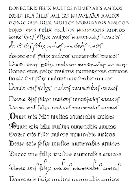
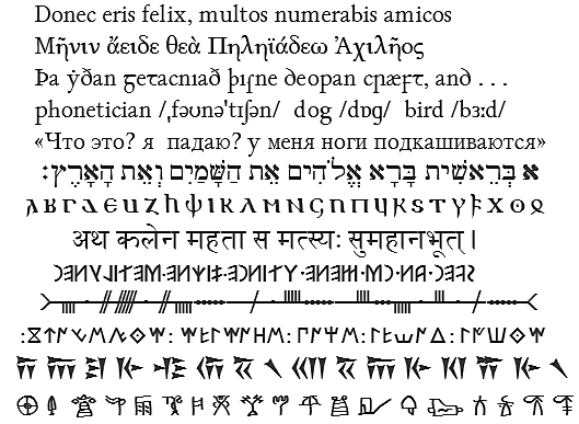
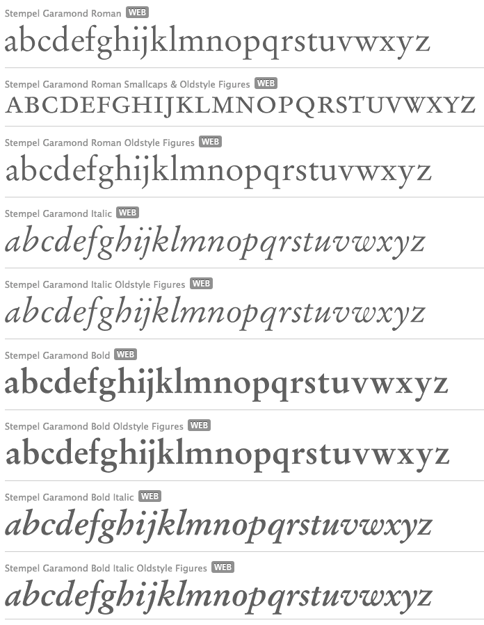
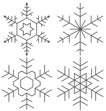
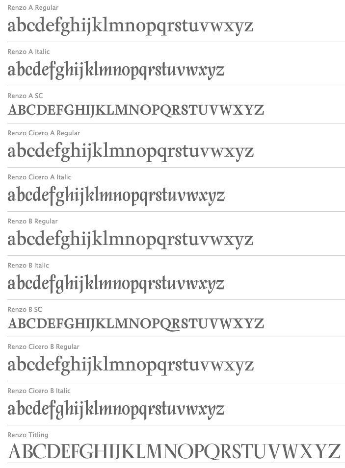
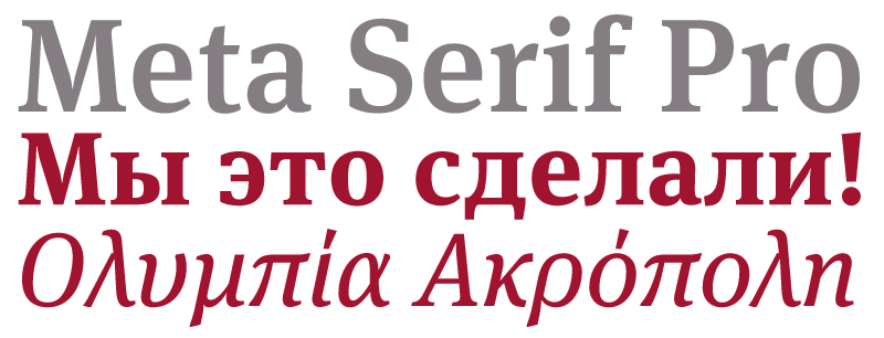
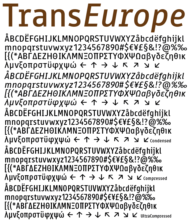
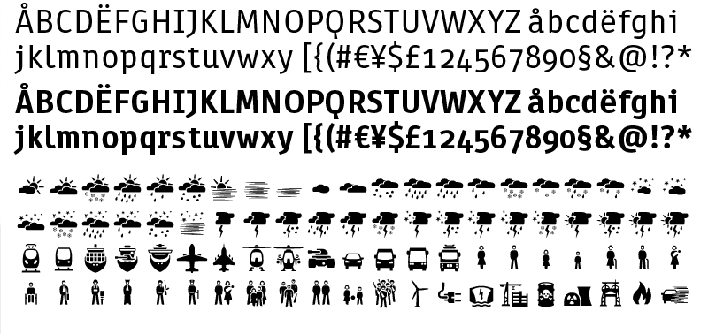
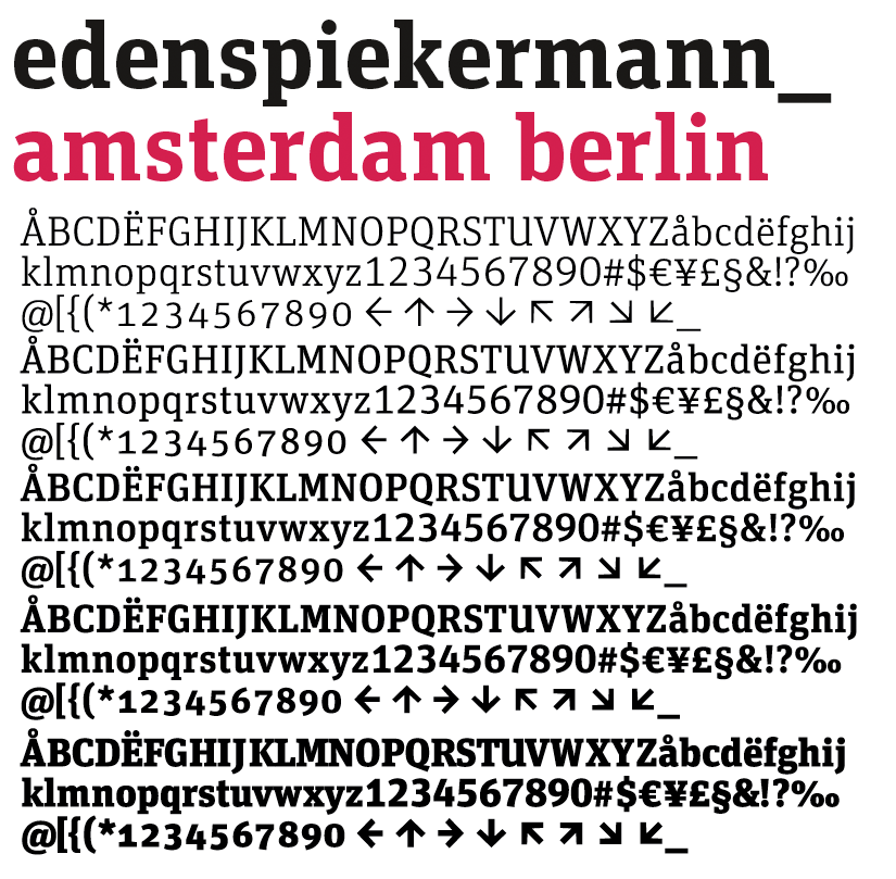
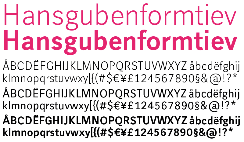
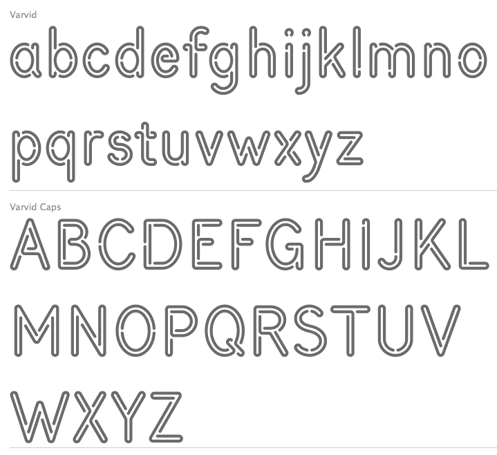
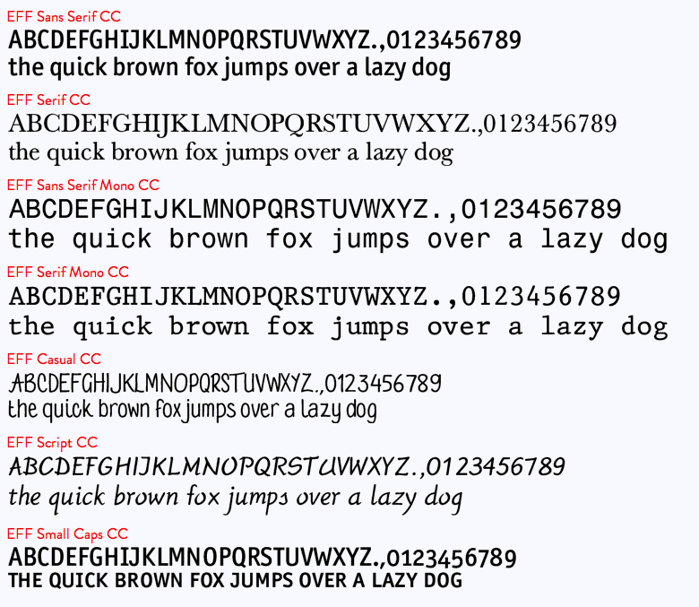
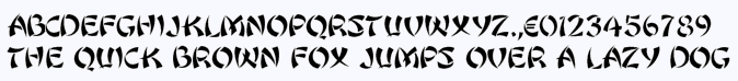
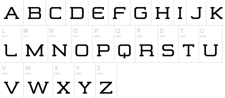
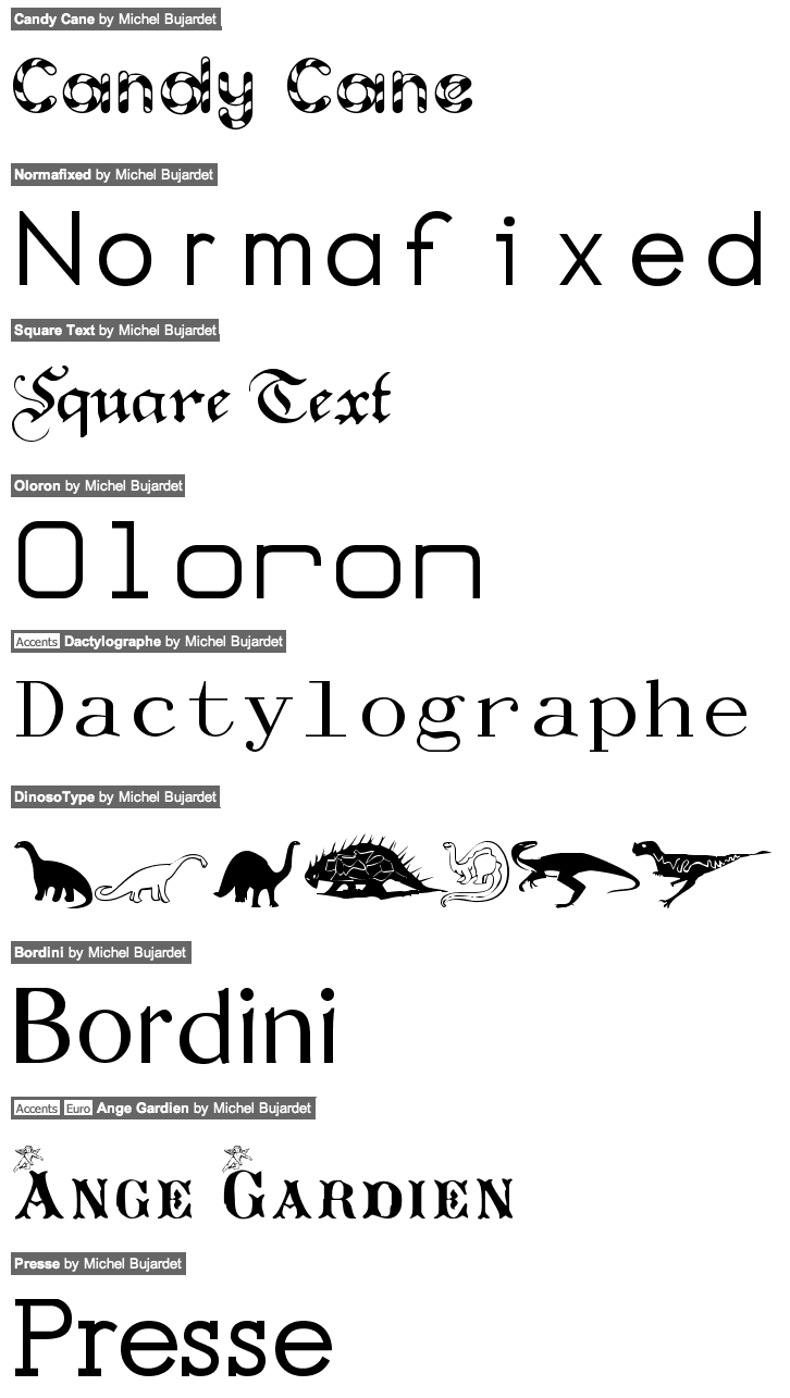
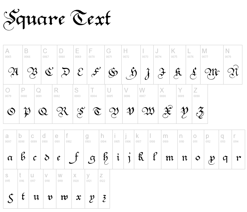
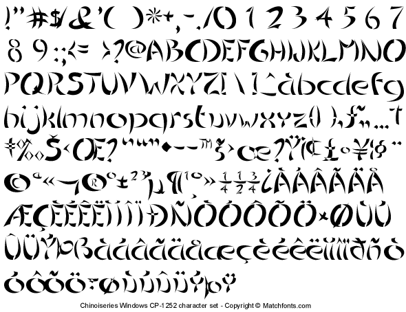
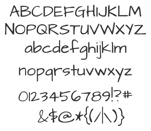
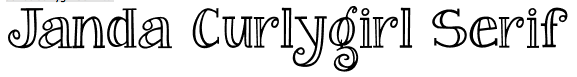
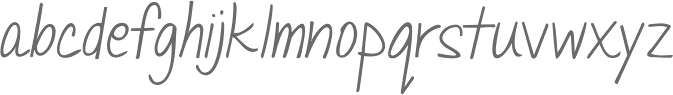
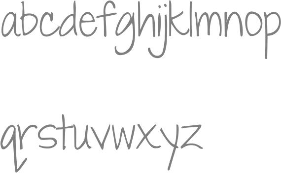
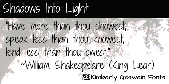
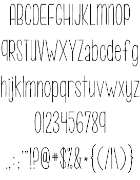
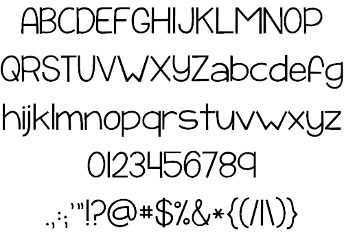
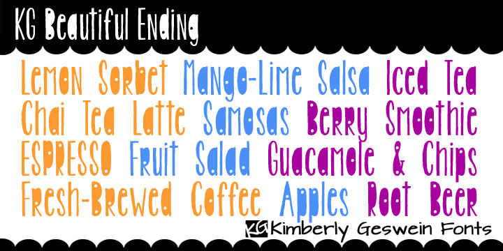
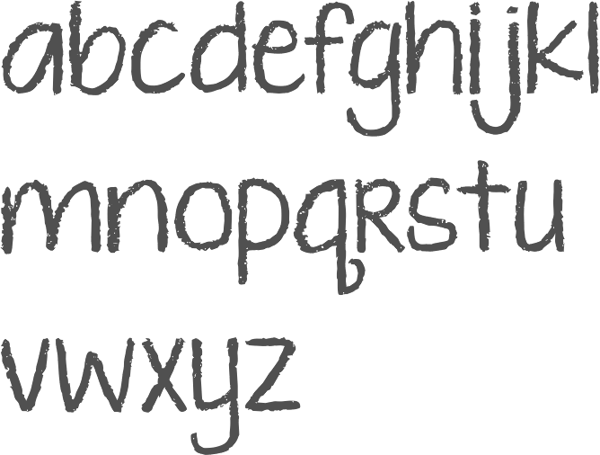
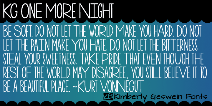
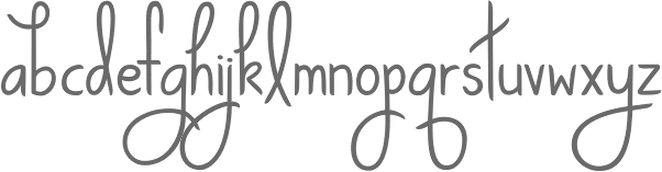
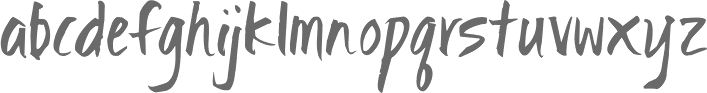
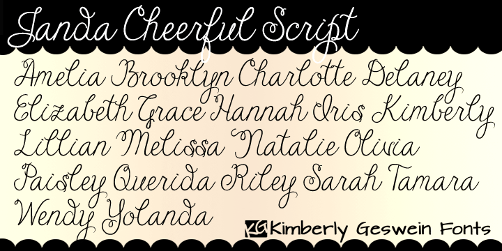
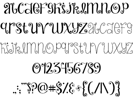
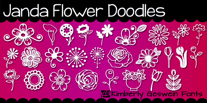
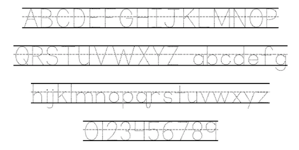
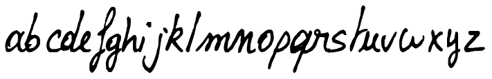
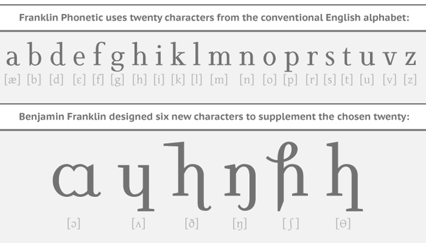
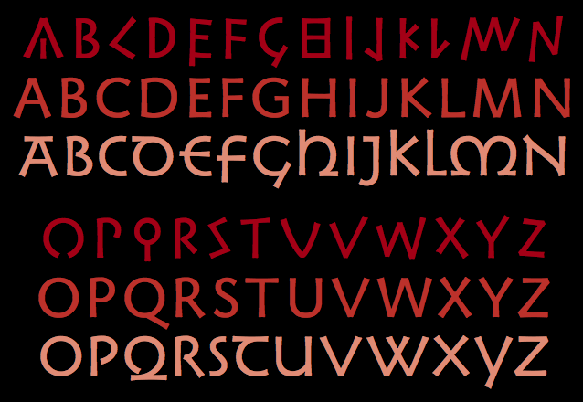
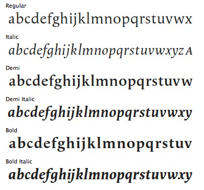
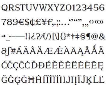
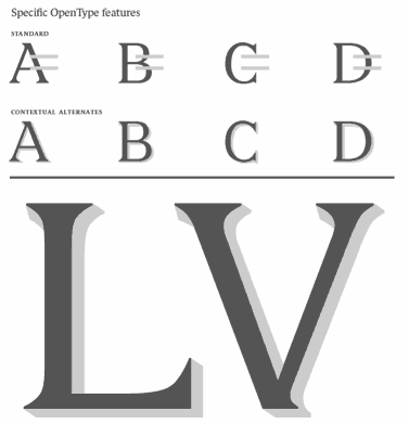
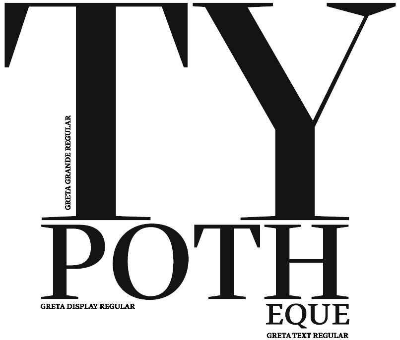
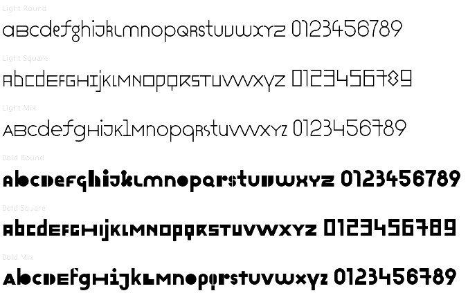