| | |
177 Studio
|
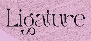 Aka Kenz, b. 1996. Studio in Singapore, specializing in display fonts. Their work is characterized by the frequent use of special ligatures. In 2020, 177 studio published the handcrafted typefaces Yambag, Good Things Script, Acmedia, Apollo, Autolinker, Medio, Qubely, Rigel Star, The Wave (wavy, zebra-striped), Tornado Night Party, Unique, Bqtrack-Script, Generating-Script, Hotel-Script, Sangi-Serif, Themify-Brush (a dry brush script), Extra Serif, Rhythm Script, Blogger 1983 Brush (dry brush), Bambi (monoline script), Staples Calligraphy, Bimber Brush (dry brush), Stthomas Script, Quotes (a dry brush font), Raghen (a monoline script) and Royal (a brush font). Other typefaces from 2020: Queens Gambit, Fashionable, Allright, Abnes, Ocean Wave (textured), Nuvel (textured caps), Okemo (a decorative serif), Omegle, High Speed, Kingsley, Medio Vintage (heavy caps), Karen, Amigh, Paint Drops, The Barista, Rainy Day.
 Befonts link. Typefaces from 2021: Aretha Bridge (a decorative serif), Aerobic (a decorative serif), Aristotle, Akashic, Celebrate (a display serif), Chaman (decorative), Conical Condensed, Coxxon (a logo font), Character with Text (textured), Digital Geometric, Gimbal Extended, Gramling, Hamachi (a decorative serif), Matiott (a display serif), Mclassic (stylish thin roman caps), Newton Howard, Ostrich Habitat (a display serif), Rothko Sans, Space (a futuristic speed font), Strarat (perhaps a horror font), String Beads, The Shouting, The Solstice, Theories (a tall modern sans), Travel (a modern display sans), Walting, Wind Creek (wind emulation), Cake Circle, Aremat (a rounded monolinear sans, perhaps a neon font), Urial, Gangitem (a ligature-rich serif), Roblox (futuristic), Selena Marin (a multi-width font), Wolf (octagonal), Amidala, Qaitan (a ligature-themed display serif), Raugi, Excellent (blackletter), Abington (sans), Aweber (an avant-garde sans), The Bangles (a vintage sans), Ohio (an all caps monolinear geometric sans), Mailyn, Celattin (a hipster sans), Landing, Soothing, Tommy. [Google]
[More] ⦿
|
A baroque font extravaganza
|
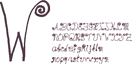 Waaiberg (1994) was drawn by hand with a very thin pen as some sort of ultimate test for Sandro's bitmap to type 1 conversion program. The pen's thin strokes are well reproduced, and the program handled touching spirals very nicely. Don't ever use this font for anything but titles or slogans. Viandra is a type 3 PostScript font obtained by writing on a magnetic pad and capturing important points of the stroke (not the outline) via a program written by François Belair, a brilliant undergraduate student at McGill. These points are processed by a font generation program written by Luc Devroye. The nib of the pen is selected at will by the user. The special neon effect is done directly in PostScript. [Google]
[More] ⦿
|
A Hendry Mulyana
|
Bandung, Indonesia-based designer of the outlined neon light font Adeeva (2019) and the script font Pratama (2019). [Google]
[More] ⦿
|
A2 Type
[Henrik Kubel]

|
 A2-Type (or simply, A2) is a type foundry set up in the autumn of 2010 by the London based design studio A2/SW/HK. The designers are Henrik Kubel and Scott Williams. A2's bespoke type design is mainly the responsibility of Henrik Kubel, though every typeface is developed and approved by both partners. Kubel is self-taught, making his first typefaces while studying at Denmark's Design School from 1992 until 1997. Their typefaces:
 - 4590
- 60 Display.
- Amplify (2013) won an award at TDC 2014.
- Antwerp (2011). A readable text family designed by Kubel during an Expert Type Design Class in 2011 at Plantin Genootschap in Antwerp.
- A2 Archi (2005, Henrik Kubel): an octagonal face.
- A2 Aveny-T (2000, Henrik Kubel): Poster typeface commissioned as aprt of the identity of the Aveny-T theatre in Copenhagen.
- Agriculture.
- Archi.
- Banknote.
- A2 Battersea (1999, Henrik Kubel): inspired by Meta, DIN and Transport Alphabet. Followed in 2012 by Battersea Slab.
- Bauhouse.
- A2 Beckett (2008). A condensed sans family with the masculinity of Impact.
- Boing.
- Copenhagen
- A2 CPH Tram (2009, Henrik Kubel): revival of an odd mini-serifed type found on the exterior of Danish trams, ca. 1920.
- A2 CWM (2008, Henrik Kubel): constructivist type designed for the headlines and cover of Cold War Modern Design 1945-1970. Octagonal.
- Dane.
- A2 Danmark (2008, Henrik Kubel): a display stencil family.
- A2 Ergonomics (2011).
- Flavin Medium. A neon tube font.
- A2 Flowers (2005, Henrik Kubel): arrows, fists, flourishes, ornaments.
- A2 FM: slab serif family.
- Foundation (2018) in Sans (Number 44, Condensed, Wide), Serif, and Serif Didot subfamilies. These are all revivals of skeletal typefaces. Foundation Sans Number 44 was inspired by Circular Gothic No. 44 (1879, Charles E. Heyer, for the Great Western Type Foundry). Foundation Sans Condensed and Foundation Sans Wide are derived from two types described as Caractères pour Marques de Linge (typefaces for marking on linen) in the Signes section of the first volume of Spécimen Général des Fonderies Deberny et Peignot (ca. 1934). Foundation Serif is based on Caractère No. 7, another Caractère pour Marques de Linge in that 1934 Deberny & Peignot specimen book. Kubel's inspiration for Foundation Serif Didot was a sheet of lettering (dated 1939) he discovered in the archive of the influential Danish architect and graphic/industrial designer Gunnar Biilmann Petersen, 1897-1968.
- Grand. A stencil typeface.
- A2 Grot 10 (2009, Henrik Kubel): a take on the Grot Series by Stephenson Blake. Grot 12 followed in 2015.
- A2 Impacto (2005-2011, Henrik Kubel): Impact?
- A2 Klampenborg (1997, Henrik Kubel): industrial style sans.
- Kunstuff.
- London (2010).
- Magna.
- Maximum.
- A2 Mazarin (2017). A2 writes: Originally designed as a Garamond-inspired metal typeface by Robert Girard ca. 1921-1923, and published under the name Astrée by Deberny Peignot, the typeface was soon recut and renamed Mazarin by the English foundry Stephenson Blake in 1926. That single style original has now been expertly restored and reimagined as a contemporary typeface in multiple styles.
- Melissa Script (2010).
- A2 Monday (2003-2016, Henrik Kubel): based on 19th century English vernacular serif signage type.
- Moscow Sans (2014-2015). Award winning custom fonts and pictogram system for Moscow Metro. Art directed and designed by A2 (Scott Williams and Henrik Kubel) with Margaret Calvert as type and pictogram consultant. Cyrillic script designed in collaboration with Ilya Ruderman.
- Naive.
- New Grotesque Square series (2015). A newspaper typeface modeled after a Stephenson Blake typeface. Followed by New Grotesque Round in 2015-2016.
- New Rail Alphabet (2009). A refreshed and expanded version of Margaret Calvert's alphabet from the 1960s which saw nationwide use with British Rail, BAA, and the NHS. Developed in cooperation with Margaret Calvert.
- New Transport (with Margaret Calvert). A digital version of Transport, the Jock Kinnear and Margaret Calvert typeface for the British road signs. New Transport will be commercially released in September 2013.
- Register (2012-2017). A text typeface family inspired by French renaissance types.
- Regular (2012-2016). Think Futura in new clothes. Accompanied by Regular Slab.
- Sans, Slab and Serif typefaces for a redesign of The New York Times Magazine in 2015. The starting point for the Serif font is the Stephenson Blake Garamond-ish metal typeface Mazarin also known as Astrée from French foundry Deberny & Peignot. The slab fonts used for pull quotes and headlines are a continuation of the magazines existing Stymie font but in a condensed format. The sans fonts are linked to the industrial grotesque types, with metal type specimen versions of Futura and Akzidenz fonts as loose models for inspiration.
- Nosferato.
- Ole.
- Outsiders (+Outsiders Light and many other weights). A slab serif family.
- Parsons Green Medium.
- A2 Record Gothic (2019, Henrik Kubel), after Robert H. Middleton's American grotesk, Record Gothic (1027, Ludlow). Kubel writes: In celebration of Record Gothic's eclectic history, we designed four related but independent styles: Slab, Mono, Stencil and Outline.
- Square.
- Staton.
- Tagstyle.
- Test.
- Triumph.
- A2 Typewriter (2000, Henrik Kubel): based on Olivetti Typewriter 22.
- A2 Vogue Floral: a fashion mag modern display face in two styles.
- Vogue Paris. Granshan 09 Type Design Competition. 1st Prize, Display fonts.
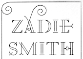
- A2 Zadie (2005, Henrik Kubel): inspired by Edwardian railings surrounding the Royal Army Military College in London. Used on the cover of the Zadie Smith bestseller On Beauty (2005, Penguin Press, NY). Granshan 10 Type Design Competition. 3rd Prize, Display fontt described as an ornamental blackboard bold type.
- In 2014, Scott Williams and Henrik Kubel (A2 Type) co-designed A23D, a 3d-printed letterpress font. It was fabricated by model making specialists Chalk Studios. The font is presented by New North Press, which specializes in traditional letterpress printing. Adrian Harrison made a short film about the birth of the font, charting its progress from preliminary sketches to first inking and printing at New North Press. A23D won an award in the TDC 2015 Type Design competition.
- English 1766 (2017). Kubel's take on Caslon.
- Regular (2017). A sans family inspired by Memphis, Karnak, Stymie and Futura.
- Schwiss (2018). Inspired by Akzidenz Grotesk and Helvetica.
Custom type by them include an alphabet for Qantas Airlines (2017), a masthead for Toronto Life (2010), a custom typeface for Banca Sella (2018), Qualcomm (2017), Arne Jacobsen (2018?), Evening Standard Newspaper (2018: 43 fonts), New York Times Magazine's Olympics issue (2018: a monowidth font for stacking), Eurosport Pyeongchang 2018, Weekendavisen (2007-2010), Design Museum London (2010), Faber&Faber (2009-2010), Afterall Publishing (2006-2010), Faulkner Browns Architects (2007), Penguin Press (2005), and Norrebro Bryghus (2005). At ATypI 2013 in Amsterdam, he spoke about New Transport. Winner of the type design prize at the Tokyo Type Directors Club TDC 2019, with Matt Willey, for the New York Times Magazine Olympic font. [Google]
[MyFonts]
[More] ⦿
|
Abdul Malik Wisnu
[Almarkha Type]

|
 [MyFonts]
[More] ⦿
|
Acmé-Paris
[Élodie Mandray]
|
 Acmé-Paris is a design studio in Paris run by Élodie Mandray and Caroline Aufort. Creators of New Gothic Textura (2009), Canevas (2010-2012, stitching font), Acme (2013), Tropique (2011, experimental), Minuscule (2012), Tribute (2012, children's hand), Juicy (2010), Eclipse, Thésard, the music-inspired Swing (2010), the heavy monoline sans typeface Acmé (2013), the titling sans typeface Le Creux (2013), and the stitching font Canevas (2013).
 Typefaces from 2015 include the multiline neon font Neo Neon. In 2016, Acmé Paris designed the copperplate style poster typeface Aylak, the titling sans Truck, the art nouveau typeface Bertand, the art deco typeface Beaumont, and the avant-garde typeface Cattolica. In 2017, they designed the artsy rounded sans typeface Kasha. Typefaces from 2022: Madrid (inspired by vintage posters from the Spanish Civil War). [Google]
[More] ⦿
|
Adelaide Laureau
|
French designer of Neon (2017). [Google]
[More] ⦿
|
Adrian Frutiger

|
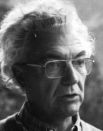 Famous type designer born in 1928 in Unterseen, Switzerland, who died in September 2015. He closely cooperated with Linotype-Hell AG, after having been artistic director at Deberny-Peignot in Paris since 1952. He established his own studio in 1962 with André Gürtler and Bruno Pfaftli. Art director for Editions Hermann, Paris 1957 to 1967. Frutiger lived near Bern, Switzerland, and was very interested in woodcuts. In 2009, Heidrun Osterer and Philipp Stamm coedited Adrian Frutiger Typefaces The Complete Works (Birkhäuser Verlag), a 460-page opus based on conversations with Frutiger himself and on extensive research in France, England, Germany, and Switzerland. Quote: Helvetica is the jeans, and Univers the dinner jacket. Helvetica is here to stay. He designed over 100 fonts. Here is a partial list:
 - Président (Deberny&Peignot, 1954). Digitized by Linotype in 2003.
- Delta.
- Phoebus (Deberny&Peignot, 1953).
- Element-Grotesk.
- Federduktus.
- Ondine (Deberny&Peignot, 1953-1954). The Bitstream version of this font is Formal Script 421. Adobe, Linotype and URW++ each have digital versions called Ondine. Bitstream's Calligraphic 421 is slightly different.
- Méridien (Deberny&Peignot, 1955-1957). Digitized by Adobe/Linotype in 1989.
- Caractères Lumitype.
- Univers (Deberny&Peignot, 1957). About the name, Frutiger wrote I liked the name Monde because of the simplicity of the sequence of letters. The name Europe was also discussed; but Charles Peignot had international sales plans for the typeface and had to consider the effect of the name in other languages. Monde was unsuitable for German, in which der Mond means "the moon". I suggested "Universal", whereupon Peignot decided, in all modesty, that "Univers" was the most all-embracing name!. Univers IBM Composer followed. In 2010, Linotype published Univers Next, which includes 59 Linotype Univers weights and 4 monospaced Linotype Univers Typewriter weights, and can be rented for a mere 2675 Euros. In 2018, Linotype added Univers Next Typewriter. In 2020, Linotype's Akira Kobayashi dusted off Univers Next Cyrillic and Univers Next Paneuropean.
- Egyptienne F (1955, Fonderie Deberny&Peignot; 1960, for the Photon/Lumitype machine).
- Opéra (1959-1961, Sofratype).
- Alphabet Orly (1959, Aéroport d'Orly).
- Apollo (1962-1964, Monotype): the first type designed for the new Monotype photosetting equipment.
- Alphabet Entreprise Francis Bouygues.
- Concorde (1959, Sofratype, with André Gürtler).
- Serifen-Grotesk/Gespannte Grotesk.
- Alphabet Algol.
- Astra Frutiger. A typeface variant of Frutiger licensed under Linotype. It is the font used on the highways in Switzerland.
- Serifa (1967-1968, Bauersche Giesserei). URW++ lists the serif family in its 2008 on-line catalog. Other names include OPTI Silver (Castcraft), Ares Serif 94, and Sierra. Bitstream published the digital typeface Serifa BT. But it is also sold by Adobe, Tilde, Linotype, URW++, Scangraphic, and Elsner & Flake. The slab serif is robust and is based on the letterforms of Univers.
- OCR-B (1966-1968, European Computer Manufacturers Association).
- Alphabet EDF-GDF (1959, Électricité de France, Gaz de France).
- Katalog.
- Devanagari (1967) and Tamil (1970), both done for Monotype Corporation.
- Alpha BP (1965, British Petroleum&Co.).
- Dokumenta (1969, Journal National Zeitung Suisse).
- Alphabet Facom (1971).
- Alphabet Roissy (1970, Aéroport de Roissy Charles de Gaulle).
- Alphabet Brancher (1972, Brancher).
- Iridium (1972, Stempel). A didone with slight flaring.
- Alphabet Métro (1973, RATP): for the subway in Paris.
- Alphabet Centre Georges Pompidou. The CGP typeface (first called Beaubourg) used in the Centre Georges Pompidou from 1976-1994 is by Hans-Jörg Hunziker and Adrian Frutiger, and was developed as part of the visual identity program of Jean Widmer. It is said that André Baldinger digitized it in 1997.
- Frutiger (1975-1976, Stempel, with Hans-Jörg Hunziker). In 1999, Frutiger Next was published by Linotype. In 2009, that was followed by Neue Frutiger (a cooperation between Frutiger and Linotype's Akira Kobayashi). In fact, Frutiger, the typeface was made for the Charles De Gaulle Airport in 1968 for signage---it was originally called Roissy, and had to be similar to Univers. It was released publically as Frutiger in 1976. The modern Bitstream version is called Humanist 777. Frutiger Next Greek (with Eva Masoura) won an award at TDC 2006. Other digital implementations of Frutiger: M690 (SoftMaker), Quebec Serial (SoftMaker), Frutus (URW), Provencale (Autologic), Frontiere (Compugraphic), Freeborn (Scangraphic), Siegfried (Varityper). In 2018, under the aegis of Akira Kobayashi, the Monotype Design studio published the 150-language superfamily Neue Frutiger World (including coverage for Latin, Greek, Cyrillic, Georgian, Armenian, Hebrew, Arabic, Thai and Vietnamese).
- Glypha (1979, Stempel). See Gentleman in the Scangraphic collection).
- Icône (1980-1982, Stempel, Linotype). Digitized by Linotype in 2003.
- Breughel (1982, Stempel; 1988, Linotype).
- Dolmen.
- Tiemann.
- Versailles (1983, Stempel).
- Linotype Centennial (1986). Based on Morris Fuller Benton's Clarendon typeface Century, Linotype Centennial was designed for Linotype's 100th birthday.
- Avenir (1988, Linotype). In 2004, Linotype Avenir Next was published, under the supervision of Akira Kobayashi, and with the help of a few others. In 2021, the Monotype team released Avenir Next Paneuropean (56 styles, by Akira Kobayashi). Avenir Next World, released by Linotype in 2021, is an expansive family of fonts that offers support for more than 150 languages and scripts. The subfamilies include Avenir Next Hebrew, Avenir Next Thai, Avenir Next Cyrillic, Avenir Next Arabic and Avenir Next Georgian. Avenir Next World contains 10 weights, from UltraLight to Heavy.
Contributors besides Adrian Frutiger and Akira Kobayashi: Anuthin Wongsunkakon (Thai), Yanek Iontef (Hebrew), Akaki Razmadze (Georgian), Nadine Chahine (Arabic), Toshi Omagari (Arabic) and Elena Papassissa (Greek, Armenian). Lovely poster by Ines Vital (2011). - Westside.
- Vectora (1991, Linotype).
- Linotype Didot (1991). See also Linotype Didot eText Pro (2013), which was optimized by Linotype for use on screens and small devices.
- Herculanum (1989, Linotype): a stone age font.
- Shiseido (1992).
- Frutiger Capitalis (2006, Linotype): a further exploration in the style of Herculanum, Pompeijana and Rusticana. Linotype trademarked that name even though at least five fonts by the name Capitalis already exist.
- Pompeijana (1993, Linotype).
- Rusticana (1993, Linotype).
- Frutiger Stones (1998, Linotype) and Frutiger Symbols.
- Frutiger Neonscript.
- Courier New, based on Howard Kettler's Courier, was one of Frutiger's projects he was involved in ca. 2000.
- AstraFrutiger (2002): a new signage typeface for the Swiss roads. Erich Alb comments: With a Frutiger condensed Type and illuminated signs during night it is mutch better readable.
- Nami (2008) is a chiseled-stone sans family, made with the help of Linotype's Akira Kobayashi.
- Neue Frutiger (2009, with Akira Kobayashi) has twice as many weights as the original Frutiger family.
- In 2019, the Linotype team released variable fonts for Frutiger's main typeface families, Avenir Next Variable, Neue Frutiger Variable, and Univers Next Variable.
Bio by Nicholas Fabian. Erich Alb wrote a book about his work: Adrian Frutiger Formen und Gegenformen/Forms and Counterforms (Cham, 1998). Winner of the Gutenberg Prize in 1986 and the 006 Typography Award from The Society for Typographic Aficionados (SOTA). Famous quote (from a conversation in 1990 between Frutiger and Maxim Zhukov about Hermann Zapf's URW Grotesk): Hermann ist nicht ein Groteskermann. A quote from his keynote speech at ATypI1990: If you remember the shape of your spoon at lunch, it has to be the wrong shape. The spoon and the letter are tools; one to take food from the bowl, the other to take information off the page... When it is a good design, the reader has to feel comfortable because the letter is both banal and beautiful. Frutiger's books include Type Sign Symbol and Signs and Symbols. Their Design and Meaning (1989, with Andrew Bluhm, published by Studio Editions, London; Amazon link). Linotype link. FontShop link. Adrian Frutiger, sa carrière française (2008) is Adèle Houssin's graduation thesis at Estienne. Klingspor link. Wikipedia link. View Adrian Frutiger's typefaces. View some digital versions of Avenir. Vimeo movie on Frutiger by Christine Kopp and Christoph Frutiger entitled "Der Mann von Schwarz und weiss: Adrian Frutiger". More Vimeo movies. [Google]
[MyFonts]
[More] ⦿
|
Aga Magdziak
|
Warsaw, Poland-based designer of magnificent experimental typefaces in various vector formats. These include: - The free AI-format experimental slinky font family Scribble (2018).
- The free color font Balloon (2018) and the free PSD-format font Balloon (2018).
- The free textured font Neon (2017-2018).
- The free experimental color font Splash Letters (2018).
- The free vector typeface Brush (2017).
[Google]
[More] ⦿
|
Ahmad Syarif Afandi
[Letterafandi Studio (was: Letterafa Studio, Peterdraw, Delapan Studio)]

|
[MyFonts]
[More] ⦿
|
Aldo Novarese

|
 Italian designer, 1920-1995, who designed most of his typefaces at Nebiolo in Turin. Until 1975, he made about 30 families at Nebiolo, and after 1975, he produced about 70 further families of fonts. With weights included, he created about 300 fonts. Biography by Sergio Polano. He was very influential, and wrote two important books, Alfa Beta: Lo Studio e il Disegno del Carattere, a study on font design and history (1964), and Il Segno Alfabetico (1971). Essay by Sergio Polano on Novarese. The list of fonts done at Nebiolo:
 - Landi Linear (1942). This was revived in digital form in 2011 by Toto as K22 Landi Linear.
- Etruria (1940-42)
- Express (1940-43)
- Normandia (1946-49, with Butti, and 1952)
- Athenaeum Initials (with A. Butti, 1945-1947)
- Fluidum (+Bold) (1951, script). Revived by Ralph Unger as Butti (2011).
- Fontanesi (1951-54, an all caps rococo font). Digital revivals include Fontanesi RMU (2018, Ralph M. Unger) and Fontanesi (2003, a free font by Frogii).
- Microgramma (1952, with A. Butti; available at URW++). This was done as an alternative to Bank Gothic, and is identical to Eurostile Bold Extended.
- Nova Augustea (1951, ITC Augustea Open)
- Egizio (1953-57), a slab serif [see E710 Roman on the SoftMaker MegaFont XXL CD, 2002, or Egizio URW (2009, quite complete family with 5 styles) or Egizio EF (2001), or Thierry Gouttenègre's Aldogizio (2013)]. For a specimen, see here.
- Cigno (1954). This script typeface was revived an extended as P22 Cigno (2008, Colin Kahn, P22).
- Swan (1954), aka Cigogna (with A. Butti).
- Juliet (1954-55). For a superb revival and extension of this copperplate script, see Canada Type's Ambassador Script (2007).
- Ritmo (1955)
- Rhythm (1955)
- Garaldus (1956-ff). A garalde digitally revived in 2012 as Garaldus by Flanker.
- Slogan (1957). Digital revival by Terry Wudenbachs in 2010 called P22 Slogan.
- Recta (1958-1961). This is a large sans family. Canada Type published an 18-font revival in 2011, also called Recta.
- Estro (1961). A western font now found in the Mecanorma collection.
- Fancy (1961)
- Exempla (1961). Published by VGC in 1966. Third Prize in the 1966 VGC National Type Face Design Competition.
- The Eurostile family (1952: caps, with Alessandro Butti; 1962: lower case). This is carried by many foundries such as Adobe, Linotype, and URW++. Eurostile lookalikes include Aldostile (Autologic), ES (Itek), Eurasia (SoftMaker), Eurogothic, Eurostar (MGI Software), Eurostile, Eurostile Next (Akira Kobayashi), Gamma, Jura (Daniel Johnson), Microgramma, MicroSquare (SoftMaker), Microstyle (Compugraphic), NuevoSolStile (Cayo Navarro), SD Eurostile Elite (Justin Rotkowitz), Square 721 (Bitstream), Waltham. Noteworthy is Eurostile Round (2014), a rounded version of Eurostile by URW++.
- Patrizia
- Magister (1966)
- Forma (1966). Alessandro Colizzi explains: From 1965, following a marketing-oriented approach focused on the user, the management set a research group of graphic designers to work on a new typeface design. Headed by Novarese, who provided the basic alphabet, the team included Franco Grignani, Giancarlo Iliprandi, Till Neuburg, Ilio Negri, Pino Tovaglia, Luigi Oriani, and Bruno Munari. The collective design process was based on an analysis of contemporary sanserif typefaces and legibility tests, to develop a more mature, humane interpretation of the Swiss sanserif trend. The process was quite laborious with monthly meetings spanning across over two years. In 1968, Forma was eventually released as lead type. As its name implies, Forma aimed at representing the ideal letterform of its time, equally appealing to designers, printers and the general public. The typeface was favourably received by the design community (it won a special mention at Compasso d'oro in 1970), but although initial sales were encouraging, it could not really compete in a market already saturated by Univers, Helvetica and the like. . A grand revival of Forma, described by Indra Kupferschmdt, was organized by Roger Black for Hong Kong Tatler (as fashion mag). The revival was executed by Font Bureau's David Jonathan Ross in 2013. See David Jonathan Ross's site.
- Oscar (1966)
- Lambert (Compacta lookalike)
- Metropol (1967). This gaspipe typeface was digitized by Patrick Griffin at Canada Type in 2007 as Press Gothic. Originally, it was meant as an alternative to Geoffrey Lee's Impact at Stephenson Blake.
- Elite (1968, a boring linear script, digitized in 2005 by Canada Type as Fontella)
- Fenice
- Stop (1971; available at Mecanorma, Linotype, URW++, Elsner&Flake)
- Dattilo (1974, an Egyptian face) (1974): his last creature for Nebiolo, a typewriter type. It was considered as a slab serif companion of Forma. This typeface was revived as a variable font in 2020 by David Jonathan Ross.
His post-Nebiolo fonts: - Primate (1972), for AG Berthold. For a digital revival of this wedge serif, see Luca Terzo's Noctis (2020).
- Sintex 1 (VGC, 1973). A revival and expansion of this funky nightclub typeface was done in 2008 by Patrick Griffin at Canada Type as Stretto (2008).
- Sprint (1974). A script typeface. Digital versons: Sprint (Linotype), Sprint (2019, SoftMaker).
- Bloc (1974, VGC)
- Mixage (1977 Haas, a lineal font, now ITC Mixage) 1985?
- Novarese Book (1978, now ITC Novarese Book)
- Lapidar (1977)
- Andromeda (1978, VGC)
- Global (1978, VGC)
- Fenice (1977-80; now ITC Fenice)
- Expert or Expert Haas (1982-1983). At Haas'sche Typefoundry.
- Floreal Haas (1983). A decorative and slightly wavy serif published by Haas'sche Schriftgiesserei.
- Colossal (1984); see Colossalis at Berthold, a slab serif sports lettering family)
- Stadio (1974). A reverse contrast sans that was published only as a rub-on transfer typeface. Revived in 2020 by the Zetafonts team as Stadio Now.
- Symbol (1982-1984, now ITC Symbol)
- Arbiter (1989, Berthold)
View Aldo Novarese's typefaces. [Google]
[MyFonts]
[More] ⦿
|
Aleksandra Rybak
|
Vilnius, Lithuania-based creator of Neon font (2014, Cyrillic). [Google]
[More] ⦿
|
Alessandro Butti

|
 Italian designer and teacher (b. Turin, 1893, d. Turin, 1959), who spent most of his life designing type at Nebiolo, where he was also art director. He headed Studio Artistico della Nebiolo from 1936-1952. Bio by Gio Fuga in 2010. His> typefaces:
 - Paganini (under the direction of Raffaello Bertieri, 1928), a very elegant roman family. Jessica Svendsen digitized this in 2010 under the same name. Patrick Griffin and Kevin Alan King created a revival at Canada Type in 2001 simply called Paganini.
- Semplicità (1930), a sans serif family with a fresh feel that includes an Ombra version. This Futura-like family was revived in a 16-style family by Ben Blom called Simplo (2011). Bill Troop and Patrick Griffin created the carefully executed and powerful Semplicita Pro family (2011, Canada Type). Semplicità (2015) by Studio di Lena is another digital revival. Studio Gothic (2017, by Francesco Canovaro, Cosimo Lorenzo Pancini and Andrea Tartarelli) is an 8-style geometric sans family based on Semplicita.
- Quirinus (1939).
- Landi (1939-1943): Butti designed the slab serif Landi Echo (with inclined inline). The corresponding outline, Landi Linear, was designed by Aldo Novarese. Landi Echo was digitally revived in 2011 under the same name by Claude Pelletier.
- Hastile (1941). [Others say this was done in 1952.]
- Athenaeum (1945, Nebiolo, initials by Aldo Novarese), a roman typeface with schizophrenic M and Q letters.
- Normandia (1946, with Aldo Novarese). This fatface didone was published in 1949 at Nebiolo in three styles, tono, corsivo and contornata. For a digital revival of the entire family, see Normandia (2021, by Patrick Griffin and Hans van Maanen at Canada type).
- Rondine (1948, with Aldo Novarese). There is a digital version called Bella Donna (2004, Rebecca Alaccari at Canada Type).
- Augustea Open and Augustea, both all caps fonts, were done in 1951. They were the forerunners of the full font Nova Augustea (done with Aldo Novarese). For revivals of Augustea Open, see Openface No. 2 (2012, Softmaker), and the earlier SoftMaker typefaces Openface and A850 Deco.
- Microgramma (1952, with Aldo Novarese) is a checkbook font. Novarese would use this as model for his famous Eurostile (1962).
- Cigogna (1950 or 1954): a quill pen lettering script.
- Fluidum (1937-1951): a script with heavy contrasts. Revived by Ralph M. Unger as Butti (2011).
- Titano (1929). Original characters in lead and wood. Thanks to Paolo Cadeddu's research, we now know the exact date of Titano's design, 1929. The shadowed version was added in the 1940s. Titano was digitally revived in Black, Shadowed and Inline versions by Paolo Cadeddu between 2019 and 2021. In 2022, Cadeddu published the story of Titano in Author of L'Italia nascosta---Oggetti, grafica e caratteri usi e costumi (translated: Hidden Italy---Graphic objects and typefaces, uses and customs).
- Neon Ombrato, using Giulio di Milano's Neon from 1935.
- Quirinus (1939).
- Juliet (1955), done with Aldo Novarese.
- Recta. Well, he did the first sketches, and Aldo Novarese finished the font in 1958.
[Google]
[MyFonts]
[More] ⦿
|
Alessandro Colizzi

|
 Alessandro Colizzi (b. Rome, 1966) is associate professor at Milan's Politecnico, Department of Design, where he teaches graphic design history, typography, and type design. He was professor at the Ecole de design of UQAM (Montreal) from 2005 to 2019, and visiting professor at the Design Academy Eindhoven (2014/15). He holds a PhD from the University of Leiden (with a thesis on Bruno Minari), an MA in Type Design from The Hague's Koninklijke Academie van Beeldende Kunsten, a postgraduate diploma from the Atelier National de Recherche Typographique (Nancy, France, 2001), and an MLitt in English Literature from the University of Rome La Sapienza (1985-2000). He researches graphic design history, typography, and information design and interned in 1999 with Paul Shaw at Parsons School of Design in New York. He is a member of the Nebiolo History Project and has been a member of the cooperative Italian type foundry CAST since 2019.
 His typefaces include: - Mignonne (2004, aka Mirabelle). This was specially designed for small text setting under modern printing conditions.
- The condensed Offbeat (1998, T-26, with Marco Tancredi).
- Neon Nbl (2019-2020, CAST). Neon Nbl is a display typeface working at its best for headlines, posters and logos. It is the faithful digital redesign of the original geometric monocase sans designed by Giulio da Milano and released by Nebiolo in 1933-1934. The original face had different proportions with varying widths for each type size, ranging from extra narrow (72 pt) to wide (6 pt), while Neon Nbl comes in a coordinated range of weights (Thin to Bold) and proportions (UltraCondensed to Normal). Neon Nbl also comes in a shaded titling version (Ombra) in four styles. Colizzi extended the oroginal character set which now contains 700 glyphs per font.
Speaker at ATypI 2013 in Amsterdam: Forma, Dattilo, Modulo. Nebiolo's last effort to produce a 'universal' typeface. Organizer of ATypI 2017 in Montreal. Speaker at ATypI 2018 in Antwerp. [Google]
[MyFonts]
[More] ⦿
|
Alessandro Fulciniti
|
Alessandro Fulciniti (Axel or Alex Fulton) is the designer at FontStruct in 2008 of Digg (based on the Digg.Com logo), SmartShop, Triple-X, Last Brick (3d brick face), Last Brick Neon, Bubble Gum, Maxxell, Pico (pixel face), Omino (dingbats of men), jelly_fish_1, pixel_runner, red_light_district (dot matrix face), three_am. Son of Statement and Statement are heavy block fonts. Other typefaces: Acchooga (condensed), Dottic (2008, pixel face), Headshop (2008), Three AM (2008), Red Light District (2008, dot matrix face) and Fat Bit Lova (2008, pixel face), Brooklin Bros (2008, octagonal), Absurd, Dottic (pixel face), Hybrid Boost, Five AM, Futuristica (Bank Gothic-inspired), HeadShop, Americana (American flag-themed glyphs), Elevator (lightbulb signage font), Bombay (Indic simulation), Regent (octagonal, between two horizontal lines), Spaceman (pixel meets kitchen tile), Faster Baby, Fontharrt, Subpixel, Promises, Best-before-end (horizontal stripes), Weekend (fat headline face), Predator's Alphabet, Futures, Magnus (constructivist), Zeppa (great---Far West meets LED), Wide Horizon, Pixelity, Wide Horizon Rounded, Snipers' Font, Gunny (heavy metal stencil), Pinball Special 5, Gallop, Horizon Condensed, Western Zappa (Far West font), Wide Horizon Rounded, Nano Spaceman (nice fat kitchen tile style), Black Sheep, Best-before-end, Black-Sheep, Bubble-Gum, Crazy-Pixel, Faster,-baby!, Gallop, Horizon-Condensed, Last-Brick, Little-Spaceman, Magnus, Pinball-Special-5, Promises, Teenage-Mutant-Ninja-Font, Weekend, Zeppa, maxxell, pic. Born in 1975 in Northern Italy, he is a columnist for the Italian web design portal html.it since 2003, who has written extensively on CSS, javascript and web design. Web site. [Google]
[More] ⦿
|
Alex Etewut

|
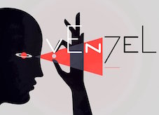 Moscow-based artist who created these typefaces in 2016: Buena Onda, Londa (a connected script), Foie Gras (signage script), Fuego, Cama (a thick connected script), Blackthorn, Savoiardi (connected monoline script), Savoiardi Sans, Savoiardi Display, Zimbra (a zebra stripe font), Signal, the Vincent Van Gogh-inspired Absinth, the Russian fairy tale font Anchor, the handcrafted Swan, the weathered Cliché Font, the constructed extraterrestrial font Structure, the geometric solid typeface Forma, the semi-calligraphic Absinthe and Glasgow, the calligraphic oriental brush typeface Yakudza, and the brush typefaces Augenblick and Barbada.
 Typefaces from 2017: Curator (a curvy decorative didone), Gluck (a rounded monoline sans family with outlined and double outlined styles), Laser Dots, Zarathustra (a soft blackletter typeface family), Pedrera and Pedrera Script, Hooley (advertized as a party font), Forma (free counterless typeface), Fuego (calligraphic script), Arc Boutant (a vintage ballpoint-laden text typeface), Moloko (script), Etalon (a 33-style organic sans family), Molodos All Caps, Click (Stripes, Black), Geometry Pair, Venzel (an interesting experimental deco typeface), Batllo (inspired by Gaudi), Pluma (handwriting). Typefaces from 2018: Pistoletto (a jelly or toothpaste script inspired by the work of Roy Lichtenstein and Michelangelo Pistoletto), Lento (a monoline script family), Rajomon (a dry brush typeface), Solomonk (an inky script), Ma Tilda, Warka, Abudabi (connected script), Lunar, Tilda (a monoline sans with character), Jeunes (connected script), Danken (a textured all caps typeface family), Salud (a hand-drawn slab serif, with some interesting sketched and arched styles), Hoochie, Brutto (stencil with alyering and coloring potential), Hvala, Mafond (slab serif), Tadaam, Liberal (a simple monoline sans). Typefaces from 2019: Etewut Serif, Etewut Sans, New Lobster (sigange script). Typefaces from 2020: Vulgary (a glistening oily font family), Spiro 2020 (a rounded sans), Chakra (script), Baker ST (spurred, all caps), Geraldica (a monoline script). Typefaces from 2021: Domosed (sci-fi), Riley Wow (a round oily font for emulating glows). As Etewut Graphics in Florence Italy, he published Pronto (2018, a monoline sans) and Allora (2018). Typefaces from 2022: Domosed Slab Serif. [Google]
[MyFonts]
[More] ⦿
|
Alex Haigh
[HypeForType]

|
 [MyFonts]
[More] ⦿
|
Alexander Sizenko
|
 Russian creator of the free chess font Chess 7 (2008), the free pixel fonts LED Stadion 7 (2013), Dash Dot Square 7 (2013), Enhanced Dot Digital 7 (2013), Small Dot Digital 7 (2013), Modern Dot Digital 7 (2013), Square Dot Digital 7 (2013), Bold Dot Digital 7 (2013), Serif Dot Digital 7 (2013), Serif LED Board 7 (2013), Modern LED Board 7 (2013), Half Bold Pixel 7 (2013), Dash Pixel 7 (2013), Serif Pixel 7 (2013), Power Pixel 7 (2013), Enhanced LED Board 7 (2013), Thin Pixel 7 (2013), Smallest Pixel 7 (2013), Modern LCD 7 (2013), Advanced LED Board 7 (2012), Digital 7 (2008, LED face), Post Pixel 7 (2013), Triple Dot Digital 7 (2013), Dash Dot Square 7 (2013), Enhanced Dot Digital 7 (2013), Dash Digital 7 (2013), Light Pixel 7 (2013), High Pixel 7 (2013), Mini Pixel 7 (2012), Long Pixel 7 (2013), LED Counter 7 (2013), Digital Counter 7 (2013), LED Digital 7 (2013), LED Board 7 (2013), Light LED Board 7 (2013), Advanced LED Board 7 (2013), Printed Circuit Board 7 (2013), Brick LED 7 (2013), Rounded LED Board 7 (2013), Pixel Dingbats 7 (2013), Square Wood 7 (2013), Small Bold Pixel 7 (2013), Rounded Pixel 7 (2013), Line Pixel 7 (2013), Bold LED Board (2013), Narrow Rectangle 7 (2013), Dot Digital 7 (2013, +Advanced), Square Metal 7 (2012), Stencil Pixel 7, Computer Pixel 7 (2012), Small Pixel 7 (2012), LED Counter Plus 7 (2013), LED 7 Display (2012, +Light), Neon Pixel 7 (2012), Old Pixel 7 (2012), Square Stone 7 (2012), Square Pixel 7 (2012), Pixel Font 7 (2012, +Outline), Pixel LCD7 (2012), Advanced Pixel 7 (2012), Ice Pixel 7 (2012), Void Pixel 7 (2012), Dash Dot LCD 7 (2012), Dash Dot Square 7 (2013), Enhanced Dot Digital 7 (2013), Double Pixel 7 (2012), Advanced Pixel 7, Advanced Dot Digital 7 (2013), ZX Spectrum 7 (2012), Bubble Pixel 7, Cyrillic Pixel 7, Basic Square 7 (2013), Basic Sans Serif 7 (2013), Effective Way 7 (2013), Arrow 7 (2013), Abricos 7 (2013), Computer 7 (2013), Disco 7 (2013), Software Tester 7 (2013), Elegant Line 7 (2013), Soft Lines 7 (2013), Effective Way 7 (2013), and the free LED display font Digital-7 (2008).
 Typefaces from 2014: Game Font 7, Square Sans Serif 7, High Sans Serif 7, Smooth Line 7, Bright Line 7, Double Line 7, Rounded Line 7, Rounded Sans Serif 7, Android 7, Arial Narrow 7, Bold Sans Serif 7, Light Sans Serif 7 (avant-garde sans), Modern Sans Serif 7, Software Kit 7 (dingbats), Advanced Sans Serif 7m Strong Line 7. Typefaces from 2015: Steel Blade 7, Semi Rounded Sans Serif 7, Bold Game Font 7, Double Force 7, Roman Font VII, Game Sans Serif 7, Sans Serif Plus 7, Soft Sans Serif 7, Smooth Pixel 7, Clear Metal 7, Military Font 7 (stencil). Typefaces from 2019: Clear Line 7. Open Font Library link. Fontspace link. See also here. Aka Chess 7 and as Style 7. [Google]
[More] ⦿
|
Alexandra Bango
|
Budapest-based designer of Lightline (2013, a paperclip font) and Papercut (2014, octagonal), two typefaces that were created during her studies. [Google]
[More] ⦿
|
Alexey Popov
[Popskraft Lab]

|
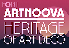 [MyFonts]
[More] ⦿
|
Alf R. Becker

|
Alf Becker (b. St. Louis, IL, d. 1959, St. Petersburg, FL) was a sign artist in the 1930's and 40's. Beginning in January 1932, at the request of editor E. Thomas Kelly, Becker supplied the Signs of the Times (The National Journal of Display Advertising) magazine's new Art and Design section with an alphabet a month, a project initially predicted to last only two years. Misjudging the popularity of the series, it instead ran for 27 years, ending finally two months before Becker's death in 1959, for a total of 320 alphabets. In late 1941, just ten years after the first alphabet was published, 100 of those alphabets were compiled and published in book form under the title 100 Alphabets, by Alf R. Becker. The American Sign Museum shows the following death notice, taken from the April 1959 issue of Signs of the Times: A chapter of almost 27 years of extensive influence upon the development of sign and outdoor advertising lettering came to a close March 10 in the passing of Alf R. Becker, whose alphabets had been presented consistently in Signs of the Times since January, 1932. Death came in St. Petersburg, FL, where he had been hospitalized since last November. The funeral services were in St. Louis, March 16. Mr. Becker had operated a commercial sign business in East St. Louis, IL., and was widely known for his lettering ability when requested 27 years ago by the late E. Thomas Kelley, then editor of Signs of the Times, to do a series of alphabets for the magazine. They had estimated that 24 alphabets which would be presented in a period of two years would serve the purpose. The series was so enthusiastically received and so many readers urged continuation that it was projected indefinitely to eventually each a total of 320 before failing health of Mr. Becker forced him to give up that creative work. His last alphabet for ST appeared in the January issue this year. Countless are the signmen and women who broadened the horizons of their lettering ability by thorough study of Mr. Becker's alphabet. In 1941, his book, "100 Alphabets" was published by Signs of the Times, and all 3,000 copies that were printed were sold out long ago. Numerous requests have been received for a reprinting, but in view of the changes of time in lettering styles, it has not been considered advisable. Mr. Becker's failing health in 1957 influenced him and Mrs. Becker moving to St. Petersburg, where they bought a home, and where he went into semi-retirement. His love of the sign business was such that he continued his alphabets in spite of the problems of his illness. Many of his typefaces have art deco influences. LHF Monogram at Letterhead is a digital version of one of his fonts. Other digitizations include Whomp (2006) and Buffet Script (2006) by Alejandro Paul (Sudtipos) and Daffadowndilly (2007) and Stony Island NF (after Becker's art deco typeface Chicago Modern), Quaint Notions (2003), and Shaq Attack NF (2011, a wood plank font) by Nick Curtis. The Fontry (James Stirling and/or Adkins) is undertaking a grand digitization project, and releases free and pay fonts with names that start with ARB, followed by the font number, the font name, and the month and year of issue. In The Fontry's ARB series, we find ARB-187 Moderne Caps AUG-47 (2013, didone), ARB-85 Poster Script (2011, after a 1939 typeface by Becker), ARB 70 Modern Poster, ARB 93 Steel Moderne, ARB 44 Chicago Modern, ARB 66 Neon (2010, after a 1937 font, +Block, +Line), ARB 85 Modern Poster JAN-39 (2011, after Modern Poster Script, 1939), and ARB 67 Modern Roman, and ARB08ExtremeRomanAUG-32CASNormal (2009; the original is from 1932). Jeff Levine created a number of typefaces based on Becker's work as well: Show Card Casual JNL (2018: based on a single stroke brush alphabet by Alf Becker), Casual Signage JNL (2018), Modern English JNL (2018), Kanona JNL (2010), Karaoke JNL (2010), Mocombo JNL (2010). John Davis created LHF Pipeline (2012) based on Becker's designs. Kaitlin Sims designed LHF Becker No. 45 (2015). FontShop link. Catalog of some of his digitized typefaces. View the digital typefaces that are based on Becker's work. Showcase of Alf R. Becker's fonts. [Google]
[MyFonts]
[More] ⦿
|
Alief Syahru
[arukidz.fl]

|
[MyFonts]
[More] ⦿
|
Alisson Ribeiro
|
Sao Paulo-based designer of the paperclip / neon typeface Caqui (2013), which is designed by ruler and compass. [Google]
[More] ⦿
|
Aliv Pandu
[Sehat Co (or: Duasatu)]

|
 [MyFonts]
[More] ⦿
|
Allen R. Walden
|
 Type designer. Not to be confused with "Walden Font", a commercial foundry run by Oliver Weiss. Dafont link. Full list of his work: African (1993, a jungle font), Amelia, Asimov, Beveled, CalculatorItalic, Checkbook (MICR-like font), CrystalItalic, FinalFrontier (1993), FinalFrontierOldStyle, FinalFrontierShipside, Goethe, Japan, Jurassic, Lansbury (1993), Neon Lights (1993, based on Quantum), NewYorker (after Rea Irvin's irvin Font for tThe NewYorker), OliviaBrush, StencilExport (1993: based on Gerhard Schwekendiek's Gesh Export, 1972), Terminator (techno).
 Lansbury is a free art nouveau typeface that mimics the font used in the TV series Murder She Wrote. The actual font used for the title of that series was URW's Art Gothic (specimen). Fletcher Gothic (1992, Casady&Greene) is another free version of it. [Google]
[More] ⦿
|
Almarkha Type
[Abdul Malik Wisnu]

|
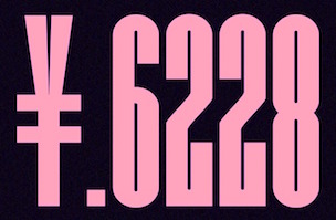 Indonesian designer of the brush script Sometimes (2019), the high contrast serif typeface Quakiez (2019), the serif typeface Romerio (2019), the condensed all caps piano key typeface Romestone (2019), and the script typefaces Cherolina (2019), Photorichies (2019), Photography Script (2019), Retrochips (2019), Mountecarlo (2019: monoline), Beautinela (2019: monoline), Ophelie (2019, Script+Sans), Denalova (2019), Shelline (2019), and Mathelline (2019).
 Typefaces from 2020: Banana Juice, Bella Sweety, Bubble Bobble (a bubblegum font), Dear Sunshine, Oatlander (retro baseball script), Sweet Purple, Monieta (an inky and creamy rabbit ear script), Orange Milk (a playful handcrafted typeface), Rockbitz (a children's book font), Seathera, Avocado Creamy, Bolyvina, Charlie Angela (an inky calligraphic script), Lovemy, Chadelova (an enhanced script), Grumbear, The Mezirane, Charlotte Amalie, Crash Soul (a dry brush script), Costiera (a dry brush script), Handestonie (a monoline script), Mentality (a signage script), Technovier (a monolinear squarish sans), Antiquesta (a dry brush script), Belgium Catherine, Cronisse (a display serif), Pronave (an all caps display typeface), Uniser (condensed all caps sans), Westack (a display serif), Avone (a stencil serif), The Roletta (a dry brush script), Waluxe (a fashion mag all caps sans with flared stems), Dear Sunshine, Mikalotta (poster script), Walker Knight (a vintage all caps typeface), Towards (stencil), Cronisse (a decorative serif), Avaneonz (a neon font), The Heista Killer (a dry brush horror font), Someone (a dry brush font), Vicenza (an all caps skyline font), Bristone (a wide sans in six styles; perhaps for car tire ads), Shutterlocks (a dry brush script), Romantics (a creamy script), Revoxa, Yippie Yeah, Wonderful Day (calligraphic), Girly (a girly script), Kamelitta (a wild curvy script), Roadstore (a spurred vintage all caps typeface), Springloved (a paper cutout typeface and a a fine inline poster font), Saturated, Choxr, Blackheat (a super condensed all caps sans), Retrohols, Alibabe, Lordcorps (an octagonal sports or military font; with a stencil style), Headcorps (a sports shirt or military stencil font), Pineforest (with soft spurs), Airborne 86 (a military stencil), Orchide (a dry brush script), Beneficha (wild calligraphy), Radens (a retro bold signage script), Brokenz (a heavy condensed sans), Delninoys (a playful sans), Lorenza (sans), Elcatraz (Mexican simulation font), Hubby Bunny, Rosadetta (script), Swingsnug, Chickens Lovers, Rollinkland, Grumbear, Bubble Bobble (a bubblegum font), Blackheat (a heavy ultra condensed typeface), Brokenz (a muscular display sans), Lorenza (a fashion mag sans), Belgium Catherine (a signature script), Amazed Breath (script), Rockmore (a brush script), Empirez (an octagonal slab serif sports font), Amazed Breath. Typefaces from 2021: Neurock (pure sci-fi), The Cheelaved (spurred, Victorian), Headbears (a sports font), The Antique (a vintage typeface), Vespalogy (a vintage display font), Bestorika (a decorative serif by Abdul Malik Wisnu and Rivo Adriansyah), Quakerhack (a rough brush font), Balietta (a flowing script), Brothery (a retro signage script), Beauticella (a signature script), Glamorez (a luxurious serif), Reloaded (a military stencil font), Austragen (a bold sharp-edged display typeface), Bearetta (script), Keawneta (a display font), Racerz (a speed font), Stangith (a decorative serif co-designed with Rivo Adriansyah), Quick Letter (a wide signature script), Arcinoll (a graffiti font), Charlie Brocklin (a thin signature script), Retrolight (a multiline neon sign typeface), Mokalatte (a wild script), Thugolatz (an all caps typeface with many interlocking ligatures), Author Think (a signature script), Bionetha (calligraphic), Bouncyland (a stylish wild script), Little Knight (a scrapbook typeface), The Brushentica (a beautiful dry brush script), The Soulmate (a dry brush script), Bettawork (a dry brush script), Philips Dutcher (a signature script), Recons (a techno font), Heezpiero (futuristic), Milky Quaker (a playful supermarket font), Rostemary (a fat finger font), Therestone (a Flintstone font), The Checkmate, Chick Chack (a heavy rushed script), Retroman (an Italian Western font), Brown House (a national park font), Emeralde Chamerions (a serif and script duo), Redzein (an octagonal slab serif), Rostera (a bold script), Sketchup (a sketched font), Thealiens (a condensed all caps sans), Williesh (a meaty display serif), Amazing Sweety (a scrapbook font), Heellaaz (an all caps children's book font), Almeira, Americans Classy, The Corps 86 (a military stencil), Brexo (a techno font with solid and stencil versions), Romeline (a scrapbook font), Yippie Yeah (a rounded monolinear marker pen font), Avaneonz (a neon or paperclip font), Sangira (a stylish serif), The Blackheads (a bold script), Kandaline, Marinaga (a creamy brush script), Mochalosta (script), Morning Sweety, Rockmore (a bold script), Deloire (a 4-style all caps sans), Montelova (script), Quinger (a monolinear decorative serif), Wonderella, Wonderful Sunset, Bellachia (a scrapbook script), Choxr (a very condensed all caps sans), Keepsmile (a rounded children's book font), Lovely Sweetie (a scrapbook font), Melanista (a wild script), Rollinkland (a brush font), Bellamona (a monolinear script), Bettanesia (handwriting), Bonalisha (script), Overwave (wavy), Beautimy (a wild script), Melatie (a wild script), Memorita (a wild script), The Handnature (a Treefrog script), Heinch (a 5-style all caps sans), Sweetie Banana (a scrapbook script), Sweetie Moment (a wild calligraphic script), The Dear (a retro script), Winterline (a wild script), Young Evaline (a signature script), Salt + Pepper, Sindenetta (a signature script), Autumnilla, Bella Ciao, Rosadetta (a wild calligraphic script), Saturated (a wild calligraphic script), Wondiletta, Bubblez, Lovely Orange, Milkalotta, Luxoorea (a stylish fashion-model-skinny all caps typeface), Momotako (a paper cutout font), Neonblitz (a neon font), Unione Force (an octagonal sports or military font; with a stencil style), Westman (a Western font), Delamoore (an all caps high-contrast display serif), Delaproza (an all caps display serif), Kinglead (a cartoonish font), Modesfa (an all caps display serif), Hexore (a slab serif), Deluxes (a stylish display sans), Kenzomaru (an oriental brush font), Lumbero (wooden plank font), Pineforest (a Victorian label or sign painting font), Beneficha (a wild calligraphic script), Brokenz (a bold condensed sans), Orchide (a dry brush script), Revoxa (a 4-style sans), Romantics (script), Schein (a sans and slab serif pair), Someone (a dry brush script), Towards (a minimalist stencil font), Averox (a futuristic all caps sans), Chicken Lovers (a playful informal font), Hubby Bunny (a cute display sans), Swingsnug (an informal monolinear sans). As Typotypea">Typotypea, he published the script typeface Manthoels (2020) and the roman all caps typeface Stinker (2020). Typefaces from 2022: Signattimes (a signature script), Thematheka (a constructivist font published on the day Putin invaded Ukraine), Overbillions (a dry brush script), Brolachess (a stylish all caps semi-serif), Suntage (a wide vintage all caps font). Typefaces from 2021 published by Gassstype but made by Abdul Malik Wisnu: Ruthless (a heavy dry brush font), Timeless Nature (script), Unranked (a rough mural font). Creative Fabrica link. [Google]
[MyFonts]
[More] ⦿
|
Alphabet Soup (or: Michael Doret)
[Michael Doret]

|
 Michael Doret is a commercial hand lettering artist in Hollywood, CA, but born in New York in 1946. A graduate of The Cooper Union, he was interviewed by MyFonts in 2011. He worked at PhotoLettering as an assistant of Ed Benguiat. Klingspor link. Behance link. Veer writes: A graduate of the Cooper Union, Michael has run his own design studio for many years - first in New York City - and currently in Hollywood. An eight-time winner of the New York Art Directors Club Silver Award, Michael is a specialist in logos and letterforms. His unique typographic vision blends elements of lettering, illustration and graphic design. The inspiration for his work has come from such diverse sources as matchbook covers, theater marquees, enamel signs, early and mid-20th century packaging, and various other artifacts of this great land of ours. Although for much of his career he executed his work in traditional media, he now works almost exclusively in a digital format. In 2006, he set up his own foundry, Alphabet Soup.
 Fonts sold by MyFonts. Behance link. FontShop link. His typefaces: - Dark Angel (2013). A gloomy black blackletter hybrid.
- Deliscript (2009): an upright connected script with accompanying slanted version. It was inspired by neon signs in from of Canter's restaurant in Hollywood. Winner at TDC2 2010. And a winner in the Type Design category, CA Magazine's Award of Excellence in their 2011 Typography issue.
- Deluxe Gothic (2010), a Bank Gothic style face. DeLuxe Gothic was also the name that Intertype used for their version of Bank Gothic. Images: i, ii), iii.
- Dynascript (2011). Patrick Griffin did the Opentype programming. Dynatype (2012) is the upright, slightly more formal cousin of Dynascript.
- Grafika (2009): a gorgeous 1930s art deco typeface originally designed for the credits of the movie Savages. Doret calls it extreme deco.
- Metroscript (2006, Alphabet Soup): a connected retro script.
- Orion (2003): an upright, linear script, based on an enameled sign (probably of 1930s vintage) that designer Michael Doret picked up at a Paris flea market.
- Power Station (2006): a 3-d athletic lettering and beveled family, with styles such as Block, Wedge, Block Low, Block High.
- Steinweiss Script (2010): a 2200-glyph curly script typeface called Steinweiss Script (2010), which captures a lot of the spirit of Steinweiss's album covers from the late 1930s and 1940s. (Opentype programming help by Patrick Griffin).
Creative Market link. View Michael Doret's typefaces. The typeface libray at Alphabet Soup. [Google]
[MyFonts]
[More] ⦿
|
Ana Elisa Ribeiro
|
 Located in Recife, Brazil, Ana Elisa Ribeiro, a student at UFPE, created Brick (2012, FontStruct: a squarish face), Neon (2012, dot matrix face), Chippendale (2012, informal caps face), Continental (a spiked family based on the lettering for the aguardente by that name). [Google]
[More] ⦿
|
Anass Qara
[Qaratype]

|
[MyFonts]
[More] ⦿
|
Anastasia Belozerova
|
Russian graphic designer. She made the neon-sign based Cyrillic typeface Provoloka (2009). [Google]
[More] ⦿
|
Andfonts (was: Andrikos)
[Andrii Shevchyk]

|
Ukrainian designer (b. 1987) of the sans display typefaces Mitroe (2017) and Andtioh (2017, perhaps useful as a neon or sci-fi font). In 2019, he published the very tilted script typeface Olean and the stylish text typeface family Agatho. Typefaces from 2020: Arlian (formal, cursive), Xbka (a techno speed circuit font), Alyin (hand-printed at a very steep slope), Strila (cyberpunk). Typefaces from 2021: Saneyi (a high-contrast display typeface), Ausion (a six-style sans with micro wedge serif terminals), Riveruta (a monolinear geometric sans), Sklow (an avant-garde monolinear sans). Typefaces from 2022: Galifex (a wide monolinear modernist sans). [Google]
[MyFonts]
[More] ⦿
|
Andre Toet Design (was: SO Design)
[André Toet]

|
 Andre Toet Design (and before that, SO Design is a Dutch studio run by André Toet (b. 1950, Den Haag). He was educated at the KABK under Gerrit Noordzij from 1974 until 1976, and at the Central School of Art and Design in London under Nicolete Gray from 1976 until 1977. From 1979 until 1980, he worked as a designer at Total Design with Jurriaan Schrofer and Wim Crouwel. Andre Toet Design is located in Apeldoorn (was: Amsterdam).
 Creator of Artu (2012, monospaced display face), Battersea (multiline face), Billiard (2012), Bloggy (experimental), AT Move Bloggy (2010), Decoupe (experimental), AT Move Decoupé (2012: a modular font based on a French game from 1906), Holborn, Mezzo (mimimalist), AT Move Pipi (2012, a playful textured caps typeface created jointly with Jasper Nijssen), AT Move Mezzo, AT Move Powerplay (1976, and redone in 2011: multilined), Musica, Nath, Powerplay, Tremelo, Wiggle. Creations from 2012: AT Move Holborn (a 3d outlined neon sign face), AT Move Tremelo (based on the logotype Microtel), Artu, AT Move Wyggle, AT Move Wolfszn, AT Move Skewy (2012), AT Move Specx and AT Move Specx Stencil (a slab serif based on the cover of a 1955 French School-Notebook; help with the design from Jasper Nijssen). Typefaces made in 2013: AT Move Altera, AT Move Altera, AT Move Herengracht (an inline typeface), AT Move Artu Super Super Heavy, AT Move Bulky (glaz krak font), AT Move Quipo (an amoebic font), AT Move MMM (with Jasper Terra and Jasper Nijssen: a rounded organic sans typeface. They write: The design is based on a old Soap-Powder advertisement. MMM is very useful for headings and/or logotypes.), AT Move Strano (squarish stencil), AT Move Nath (optical illusion typeface first made in 1974 at the Central School of Art and Design in London, and digitized in 2013 with the aid of Jasper Terra). Typefaces from 2014: AT Move Frutta, AT Move Straw (by André Toet and Jasper Nijssen), AT Move Riff Raff (octagonal, with Jasper Nijssen). Typefaces from 2015: Bombola. Typefaces from 2016: AT Move Bombola (elliptical style). Typefaces from 2017: Tremelo. Typefaces from 2018: Powerplay (trilined). Behance link. Another Behance link. [Google]
[MyFonts]
[More] ⦿
|
Andrea Braccaloni
[Leftloft]

|
 [MyFonts]
[More] ⦿
|
André Toet
[Andre Toet Design (was: SO Design)]

|
 [MyFonts]
[More] ⦿
|
André Uenojo
|
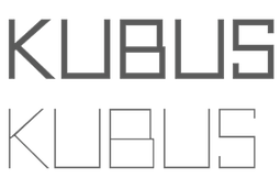 Brazilian creator in Sao Paulo (b. 1989) of Neou (2012, h free airline sans caps face), Kubus (2012, cubist face), Oval Track (2011) and VIP Roman (2011).
 He created the beautiful commercial font Contrasto in 2013. Behance link. Dafont link. [Google]
[More] ⦿
|
Andres Moreno Walter
[Nima Type (or: Nima Visual)]
|
[More] ⦿
|
Andrii Shevchyk
[Andfonts (was: Andrikos)]

|
[MyFonts]
[More] ⦿
|
Andy Clymer
|
 Andy Clymer grew up in Irvine, CA and studied at San Diego State University in 1998. At that time, he was working on Stencil Fraktur (2002). In 2004-2005, he studied type design in the Masters program of the KABK in Den Haag. He joined the typeface development department of Hoefler&Frere-Jones in New York in 2005. He has been an instructor in the Type@Cooper program in New York since 2011.
 From 2005 until 2018, Andy worked at the Hoefler&Co. type foundry, where he contributed to the typefaces Vitesse, Forza, Ideal Sans, Archer, Surveyor, and spearheaded the design of Operator and Obsidian (2015: a decorative copperplate engraved emulation typeface---various kinds of 3d illumination in Obsidian were obtained by an algorithmic process. In 2019, he co-developed Mingei Mono for the Mingei International Museum along with Yomar Augusto. In 2020, he released Tilt. Tilt is a family of (variable) typefaces inspired by three dimensional lettering found in storefront signage. Subfamilies: Tilt Neon (mimics the construction of neon tube lettering), Tilt Prism (based on prismatic lettering, cast or cut in a material), Tilt Warp (resembles peeling vinyl stickers). The variable fonts have two axes, horizontal rotation and vertical rotation. Github link. [Google]
[More] ⦿
|
Angelica Baini
|
 Angelica Baini was born in Castiglion Fiorentino, Italy in 1990. During her studies at the New World School of the Arts in Miami, FL, she designed the blackletter typeface Infinitüm (2013), which can be bought from Ten Dollar Fonts and The Designers Foundry. Creator of the alchemic typeface Marina (2012). In 2014, she designed the retro diner signage font Nighthawk Script.
 In 2017, Tatiana Gancedo and Angelica Baini co-designed the free modular typeface Renasci. Behance link. Cargo Collective link. You Work For Them link. [Google]
[More] ⦿
|
Ania Wielunska
[Stolat Studio]

|
 [MyFonts]
[More] ⦿
|
Ann Forrest
|
For the identity of the Melbourne Theatre Company, Ann Forrest created a neon sign font called MTC (2012). [Google]
[More] ⦿
|
Antidesign
[Santi Vilagran Casanovas]
|
Freelance designer in Girona, Spain. Behance link. He created the multiline neon-look techno typeface Adtype01 (2010) and the futuristic typeface Adtype00 (2010). [Google]
[More] ⦿
|
Ardi Parwito
[Green Adventure Studio]
|
[More] ⦿
|
Ardian Radityo
[TSV Creative]
|
[More] ⦿
|
Ardyana Putra
[Ardyana Types]

|
[MyFonts]
[More] ⦿
|
Ardyana Types
[Ardyana Putra]

|
Bali-based designer (b. 1989) of Neon Absolute (2018: Sans, Script), Brusthy (2018: a brush script), Rafttel Script (2018), Tiffany Script (2018), Tiffany Sans (2018), First Script (2017), Jovanka (2018) and Hamilton (2018, a signature script). Typefaces from 2019: Kallimata Script, Himsomnia, Hollows (a dripping paint horror font), Doogle (a fat finger font), Moonline or Moonllime (a heavy monoline script), Sweet Candy (a monoline script), Domillion Brush, Rosewell Font Collection (script, black, standard, mono), Rapha Talia, Hamillton Two, Just Do It, Bosthon Brush, Fontania (brush), The Brown Wall (cursive script). Typefaces from 2020: Fomtage Script, Holla Monday (a marker pen font), Paper Works (an all caps cartoon font), Lover Bunny, Bana Chiips, Cathrine, The Domillion, Hello Bunny, Mount Hotham, Lovely, Molitha, Naughty Monster, Romello. Typefaces from 2021: Fontanio (a 7-style psychedelic font family with reverse stress), Ropers (a warm bold serif in the Windsor genre), Eleganto Sans (a 6-style fashion mag sans), Pumpkin Island (a Halloween font), Classical Romance (a 12-style decorative serif with many swashy alternate glyphs), The Sunmora (a decorative serif with elephant feet; 12 styles), Arabilla Signature, Boldoy (a bold decorative typeface), Moontok (a vernacular script), Breadley Serif, Breadley Sans (a Peignotian sans), Balivia (a 13-style display serif), Kintamani Script (formal calligraphy), Rolling Bold. Typefaces from 2022: Negaroa (an 8-style slightly wavy display serif), Crabs (a 9-style chunky sans), Austen Aesthetic (an 8-style decorative serif with flared terminals), Ottine Slab. [Google]
[MyFonts]
[More] ⦿
|
Aring Typeface
[Måns Grebäck]

|
 Måns Grebäck (Aring Typeface, Örebro, Sweden) is a prolific Swedish designer (b. Lindesberg, Sweden, 1990), who lives in Borlänge, Sweden. Måns Grebäck has a bachelor's degree in graphic design from the University of Dalarna (2012). In 2010, he went commercial, and started selling fonts through MyFonts. In 2011 he started Mawns Design. In 2013, that was renamed to Aring Typeface. In 2011 he already had over seven million downloads of his fonts, which were featured at websites such as Dafont and Myfonts. He also does custom type work. His typefaces, both free and commercial:
 - Acryle Script (2014).
- Actonia (2016). A monoline script.
- Adielle (2018).
- Aerofoil (2017). A vintage bottom-heavy script.
- Airways (2016). A signage script.
- Akayla Script (2018). Calligraphic.
- Aliey (2021). A 4-style Victorian copperplate serif.
- Aliment (2018). A sharp geometric sans.
- Amertha (2020). a fat finger font.
- Amplify (2013). A signage script.
- Angars Runes (2019: medieval, with gothic cathedral curves).
- Angilla Tattoo (2013). A connected spurred tattoo typeface. Followed by Angilla Script (2020).
- Antlers (2012). A calligraphic script.
- Aquate Script (2019).
- Arachnids (2011, graffiti face)
- Artely Inks (2016).
- Artisual Deco (2021). Pure art deco.
- Artographie (2020). An all caps art deco typeface family.
- Atelas (2015). Signage type, baseball script.
- Atures (2018). Futuristic and monoline.
- Autograf (2015) and Autografia (2021). Signature typefaces.
- Ave (2016) in styles called Ave Utan, Ave Betwan and Ave Fedan. A family of baseball scripts.
- Avelana. A connected script.
- Backpack (2014). A thick signage script typeface.
- Backyard (2016). A blackletter typeface.
- Barkants (2011, elegantly hand-printed family).
- Barley Script (2017). A signage script.
- Baystar Script (2021).
- Beautiful Trouble (2012). A rabbit-eared upright connected script.
- Beaked Tyrant (2014). A copperplate calligraphic script.
- Beckasin (2011, signage face)
- Before The Rain (2011, calligraphic) Before The Rain Arabic (2016).
- Belladio (2021). An urban script.
- Bellino (2018).
- Bezar (2020). A script.
- Billion Dreams (2020, by Mans Grebäck and Rangga Subekti). A heavy signage script.
- Billion Stars (2013). A tattoo script font.
- Bira (2012). A retro connected brush / signage script.
- Blaak (2019).
- Black Fox (2014). A sirupy brush face.
- Black Signature (2021). A bold signature font.
- Black Larch (2016) and Dark Larch (2016).
- Bloc Boy (2016). Like handwriting.
- Blockography (2011). A sketched typeface.)
- Block Talk (2011, with Zaydek Michels-Gualtieri)
- Blods (2011, a great blotty brush face)
- Blueberry Script (2017; with Noah Kinard).
- Botanink (2011)
- Bouncy (a cartoon font).
- Bourdos2022). A script typeface.
- Brannboll (2011, baseball signage face), Brannboll NY (2013), Brannboll Connect (2020), Brannboll Stencil (a baseball script) (2020).
- Bready (2011). A retro signage script with art nouveau aroma.
- Brev Script (2014). A connected secretary hand from the 19th century.
- Bronze Script (2014).
- Brother Tattoo (2012).
- Bumblebees (2012). A plump curvy script.
- Bunya (2016). A geometric slightly deco sans typeface family.
- Calendary Hands (2012).
- Caligraf (2020).
- Canela Bark (2015, co-designed with Luis Miguel).
- Caneletter Sans and Script (2013). Upright unconnected and connected scripts.
- Cantona Script (2019).
- Canyon (2021). A wide elliptical sans in 18 styles, featuring a coathanger lower case f.
- Capoon (2018). A ten-style sans family.
- Caprica Sans (2014) and Caprica Script. A plump script.
- Caravela (2020). A pirate map script.
- Casat Cap (2017). An all caps brush typeface family.
- Caster (2019). A heavy poster script.
- Castro Script (2012).
- Catchland (2021). A retro baseball script.
- Celebrater (sic) (2012). An oily font.
- Cellos Script (2013).
- Centeria Script (2012).
- Channel (2011, connected upright script)
- Chapel Script (216). For signage.
- Characteristic (2011).
- Chavenir (2011).
- Chinal (2018).
- Choko (2011, released in 2016). Chocolate and cream-themed decorative typeface.
- Christmas Miracle (2018), Christmas Reign (Tuscan, all caps) (2020), and Christmas Sparkle (2018).
- Chrysante (2020). A monoline flowing pen script.
- Clear Line (2012). A fat finger / signage typeface.
- Clipper Script (2011).
- Clothe (2017).
- Coneria Script (2012). A connected script.
- Conture Script (2018). Elegant, classical, and with exaggerated capitals.
- Crackin (2011).
- Crunchy (2016). An upright connected script.
- Cruz Quaste (2020). A handcrafted blackletter typeface.
- Cubest (2021). A squarish monospaced techno family.
- CutScript (2011, connected script).
- Danbury (2022). A speed-emulating sans.
- Dark Crow (2020). a dry brush script.
- Dollie Script (2013).
- Ebbing (2018).
- Echinos Park Script (2012).
- Ederson (2018). A vintage signage script.
- Ekologie Hand (2012).
- Ekorre 2021). Aa vintage decorative serif.
- Elaya Script (2019). A creamy signage script.
- Electronics (2017). A retro signage script.
- Elevate (2016).
- Emiral Script (2017). A baseball script.
- Encina Script (2016). A thin calligraphic typeface.
- Enlighten (2011)
- Delinquente (2012).
- Denigan (2011, hairline)
- Equal Sans (2012).
- Espesor Olas (2011, fine hand-printed calligraphic family)
- Esplanade Script (2015, by Mario Arturo).
- Ethernal (2017). A connected script.
- Europe Underground (2010, geometric sans with a hairline weight).
- Fabulous (2017) and Fabulous Gold (2017). Signage script.
- Falkin Sans (2016), Falkin Script (2016), Falkin Serif (2016).
- Faltura (2011, constructivist), Faltura Alien (grunge), Faltura Guerra (grunge)
- Faltura Animals (2011)
- Feathergraphy Decoration (2011, calligraphic).
- Duera (2016). A variable width sans typeface family.
- Fargo (2021). A cursive script.
- Fat Wandals (2018). A graffiti font.
- Feathergraphy Clean (2011).
- Fibography (2013). A caps typeface composed of fibers.
- Filbert Brush (2012), Filbert Color (2013, a soft brush font).
- Finition (2017). A connected brush script.
- Fireplace (2020). A connected script.
- Firstly (2020). A flowing calligraphic signature script.
- First Lyrics (2011).
- First Reign (2022). A medieval typeface. Second Reign (2022), Third Reign (2022) and Fourth Reign (2022) are further medieval typefaces.
- Flighter (2018). A retro airplane font.
- Fondy Script (2018).
- Frankentype (2013). An all-caps brush typeface for signage.
- From Skyler (2016).
- Funkygraphy (2011, fat and counterless).
- Gecko (2015, a fine creamy signage script).
- Geza Script (2017). A great angular almost Arabic-looking script.
- Ghang (2011, graffiti family).
- Gingo (2020). A script.
- Goatskin Brush (2015). A great brush typeface.
- Golden Hopes (2021). A signature script.
- Gonzi (an 31-style sans). Published in 2021.
- Graced Script (2016). A wide calligraphic connected brush script.
- Grandi (2016). A ten-style display sans.
- Gready (2021). A fat signage script.
- Greback Grotesque (2012). The Thin is very very thin.
- Gretoon (2011, cartoon family)
- Griphite (2018). A rough brush typeface.
- Guld Script (2015).
- Habanero (2016). A fat signage typeface.
- Handtalk (2010, silhouettes)
- Harbell (2013).
- Hard Block (2011, Western slab face).
- Hastafi (2022). An 8-style sharp-edged display serif.
- Haydon Brush (2016).
- Heavy Rain (2021). Decorative initials, and an all caps wedge serif.
- Hemicube (a wide squarish all caps sans) (2020).
- Hemmet (2013). A signage script.
- Hierograf (2016). A layered textured handcrafted poster typeface family.
- Hitalica (2011).
- Honeymoon (2017). A connected script.
- Housegrind (2013, connected script).
- House of the Dragon (blackletter). Published in 2021.
- Hoyle (2020). A slab serif.
- Hundred Miracles (a signage script). Published in 2021.
- Impregnable (2013). A connected script.
- Indiana Script (2017). A baseball script.
- Inked Bones (2019). a hand-painted blackletter font.
- Intrique Script (2013). A baseball script.
- Isle Body (2019), Isle Headline (2019).
- Jacked Eleven (2011), Jacked Eleven Highlight (2011), Jack Pirate (2020: a tattoo blackletter typeface), January Script (2013).
- Jaymont (2018). A sharp-edged wedge serif typeface family.
- Jengotan (2021). A dry brush script.
- Jumper (2021). A 13-style sans. Free download for personal use only.
- Kandira (2018). A sleek sans family.
- Kanvas (2020). A script typeface.
- Kerater (2011, sans)
- Lace 2.0 (2012). A thin connected script co-designed with Matteo Milazzo.
- Lacosta (2020). A signage script.
- Kompar (2018).
- Krinkes (2015, baseball script). A connected swashy signage script.
- Kurri Island (2020).
- Lakesight (2014). A connected script.
- Larch (2016). A crisp script typeface.
- Largelake (2021). A signage script.
- Las Enter (2013). A neon light script.
- Leaders (2020). A blackletter font.
- Ledare (2021). A 14-style bold and expressive sans.
- Letric (2021).
- Let Me Ride (2011)
- Levitee (2011, a lively connected script).
- Lighthouse (2013). A bold high-contrast script face.
- Lina Script (2012). A tattoo script done with Vicky Mardian.
- Lourino (2018).
- Low Casat (2017) and Low Casat Fat (2017).
- Lyrics Movement (2011, tall-ascendered hand).
- Lyster (2020).
- Mandoul Script (2021) and Mandoul Black (2021: a brush script).
- Mainland (2018). A sans family.
- Mainstream (2017). Graffiti style.
- Manofik (a 4-style warm retro serif with a coathanger lower case f; for Latin, Cyrillic and Arabic). Published in 2021.
- Martyric (2014, brush script),
- Masteries (2013). A connected formal script.
- Mastoc (2014).
- Mauritz Caps (brushed) and Mauritz (a great wild script family), both published in 2021. Followed by Mauritz Sans (a brush script with a strong personality and a cartoon vibe) in 2022.
- Mean Casat (2018).
- Medish Script (2018). A great calligraphic handwriting typeface.
- Together with Noah Kinard, he designed the calligraphic typeface Melay Script (2016).
- Middle Ages (2019). A Lomardic blackletter in Regular and Deco styles.
- Milasian Circa (2015) and Milasian. A connected script.
- Merry Christmas (2015). A retro script in Flake and Star styles. Followed in 2017 by the color script font Merry Christmas Color.
- Milkyway Hotel (art deco sans).
- Miraikato Hand (2022) and Miraikato Script (a rustic script) (2022).
- Mistuki (2015). An oriental brush simulation font.
- Mochary (2016). A signage or tattoo script.
- Molly Sans (2019). Caps only.
- Monsta Tag (2013): a graffiti font.
- Motion Picture (2013). A heavy connected retro script.
- Mount (2012).
- MAWNS Graffiti (2010) and MAWNS Serif (2010)
- MAWNS Handwriting (2010).
- Made With B (2011, sketched face).
- Mardian (2012). A calligraphic tattoo script done with Vicky Mardian.
- Markera (2011, marker pen family)
- Many Weatz (2011)
- Mawns Rock (2011)
- Monoment (2011). A fat upright connected script.
- Moneymachine (2022).
- Monosphere (2012-2016). A futuristic monospaced typeface.
- Murality (2022). A readable graffiti or mural typeface.
- Myteri Tattoo (2021) and Myteri Script (2021: a calligraphic script).
- Nacinth (2020). A script.
- Nino Script (2018). A tattoo font.
- Nobella (2021). A retro baseball script.
- Normale (2014). A set of distressed typewriter fonts.
- Notera (2014). A connected handwriting font. Followed by Notera 2 in 2018.
- Odenburgh (2020). A medieval calligraphic typeface.
- Optien (2011, techno face)
- Ordinatum (2011, a severe sans).
- Original Black (2021). A fat blackletter typeface.
- Ornamental Versals (2011, ornamental caps)
- Painter (2016). A sign painting script.
- Patched (2021).
- Pennybridge 1563 (2010, blackletter)
- Pharmount (2014). A calligraphic connected script.
- Phraell (2013). A great italic formal calligraphic script with optional swashes.
- Pigeon (2016).
- Pineapple (2012).
- Plates Napery (2015).
- Plicata (2016).
- Pligo (2016). A balloon or cartoon font.
- Preside (2017).
- Prime Script (2012).
- Prognostic (2011)
- Qaskin (2015). A semi-formal connected script typeface with Black and White (outlined) styles.
- Qhuman (2021). A 6-style Victorian serif.
- Qraxy (2016). Quache Variable (2020) and Quache (2020). A 28-style flexible sans family.
- Quanton (2022). An 8-style angular serif.
- Querino Sans (2019). A very bold sans. Followed by Querino Script (2019).
- Quickier Pro (2012). A swashy calligraphic script face.
- Quincho Script (2016).
- Quintal Script (2021). A retro signage font.
- R-2014 (2011, LED face).
- Rabento (2021). A 6-style condensed display slab serif.
- Race Fever Pro (2015, in Brush and Pen versions) and Race Fever Brush (2015).
- Radio 187.5 (2010, techno family)
- Rakoon (2014). A creamy ultra-fat upright script. Followed by Rough Rakoon in 2016.
- Rangly (2017-2018). A paint roll font.
- Raspberry Script (2017).
- Recorda Script (2013). A formal calligraphic script.
- Reditum (2014). A decorative script.
- Reeler (2014, with Noah Kinard).
- Remachine Script (2013). Retro signage script. In 2020, Mans added Remachine Script Arabic.
- Respective (2011, calligraphic script, +Swashes).
- Respondent (2021). A script.
- Rider (2011, a 30-style "versal" sans family)
- Ringer (circle and arc-based sans)
- Ristella (2017). A baseball script.
- Rivera 2022). A narrow sans in 10 styles.
- Rodrigues (2021). A script typeface.
- Roona Sans (2018: modernist and organic curves).
- Ropest (2018). A rope font.
- Roskrift (2011, calligraphic; + Roskrift Clean).
- Rougant (2021). An organic display font.
- Roughen (2020).
- Rurable (2015).
- Ruthless Wreckin (graffiti typefaces), Ruthless Drippin' (dripping paint family)
- Safir Script (2016). A fat baseball script.
- Saker Sans (2017).
- San Andre (2021) and San Andreas (2021), the free version. A baseball script.
- Santa Claus (2019). A blackletter typeface, accompanied by Santa Claus Deco, a snow crystal font.
- Scantype (2016).
- Sculptor's Hand (2011, connected chancery hand).
- Second Lesson (2022). A wide script.
- Second Lyrics (2011, Treefrog-style handwriting)
- Sequal (2020). Graffiti style.
- Sicret (2020) and Sicret Mono (2020). An all caps family.
- Servin' for Salute (2011)
- Shaded Larch (2016).
- Sharpe (2019). A sharp-edged high-contrast serif typeface family. See also Sharpe Variable (2020).
- Shenandoah (flowing signage script).
- Shimes (2015).
- Shipped Goods (2011). A copperplate calligraphic script.
- Shortbrush (2011)
- Signerica (2011, connected flowing hand)
- Sketchica (2011, sketchy face)
- Skyzhi (2016). An advertising headline typeface.
- Society Editor (2013, connected script).
- Snacker Comic (2013).
- Snowstreet (2013, an octagonal typeface) and Snowy (2013).
- Some Weatz (2011, calligraphic, copperplate; +Swashes)
- Sonika (2018).
- South African (2014). A movie poster brush typeface.
- Southern Aire (2013, connected script face).
- Specify (2016). A 40-style sans family. Download, free for personal use.
- Spoken (2019). A graffiti font.
- Sponger (2021). In the VAG Round genre.
- Square Worm (2011)
- Stackyard (2015). A script.
- Stainy (2013). A signage script.
- Starella Script (2019) and Starella Tattoo (2019).
- Starge (2019).
- Starkey (2020).
- Stormland (2021). A wide monoplinear sans.
- Stormline (2021). All caps, wide and outlined.
- Strawberry Script (2017).
- String Lines (2018).
- Stroke Dimension (2011). A 3d typeface.
- Struck Base (2021). A baseball script.
- Suecos Locos (2011---yummy!).
- Sultan Cafe (2014). An interlocking poster typeface.
- Sunny Sam (2020). A script typeface.
- Sverige Script (2012). Calligraphic wedding font.
- Tall Casat (2018).
- Tamoro Script (2014).
- Taylor Hand (2020). A signature script.
- Tevegraphy (2011, elliptical)
- The Hills (2017).
- The World is Yours (2011, quaint)
- Throwupz (2011)
- Toley Hand (2019).
- Tipbrush Script (2011).
- Tomino (2016).
- Top Comic (2013). A very fat cartoon bubble face.
- Treehouse (2011, upright connected script; +Snowhouse for a snow-covered version)
- Tusch Touch 1 (2011)
- Two and Three (2011: a tattoo parlor blackletter family)
- Typographic Onedalism (2011, graffiti simulation face).
- Undergone (2014). Decorative and calligraphic.
- Unthrift (2015). A pen script.
- Vacer Sans and Vacer Serif (2016). The latter is a slab serif.
- Validity Script (2020, with Misti Hammers).
- Ventography (2013). A bold signage script.
- Vinho De Amora (2021). A vintage all caps wedge serif and a stencil version.
- Waiter (2017).
- Walk Da Walk One
- Wandals (2018). A graffiti font.
- Wankstaberg Battles (2010, a tall fat script)
- White Dream (2021). A retro script.
- White Larch (2016). A connected script typeface.
- Wholecar (2021). An unerground train graffiti typeface family.
- Wild Growth (2011).
- Wildline (2021).
- Winfield Script (2019).
- World Series (2021). A baseball script.
- Xtreem (2012) and Xtreem2 (2014).
- Yanty, Yanty Big, Yanty Script, and Yanty Script Big (2012).
- Yaquote Script (2014).
- Yaty (2019).
- Yoghurt (2011).
- Zoney (2021).
View Mans Grebäck's typefaces. Abstract Fonts link. Fontspace link. MyFonts link. Another URL. Dafont link. Klingspor link. Buy fonts directly from Måns Grebäck. Old URL. [Google]
[MyFonts]
[More] ⦿
|
Arkara (or: Fopifopi)
[Edy Bagus Pamungkas]
|
Edy Bagus Pamungkas (aka Arkara) is a Jakarta, Indonesia-based type designer born in 1986 or 1989. His typefaces: - From 2019: ARK Reunio, ARK Seychelle, ARK Misha (+Script), Allice, Brooks, Dark Slide.
- From 2018: Toonish, Willex (experimental brush), Savage Odette (brush), Friday Killer, Enamel Lovers, Festivo, Lucinta (a rounded all caps color font).
- From 2017: Ghost Trick, Outcast Motofont, Bompail (brush), Baby Arthara, Nanda (handcrafted).
- From 2016: Foxy Brush, Hello Creamy, Artsins (art brush style), Toonish, Summerica, Willex Brush.
- From 2015: Fiestalogy, Happy Trippy, Varsita (athletic lettering), Caraka (curly script), Artchiko Brush, Slicks (Victorian signage), DarkSide (brush typeface), Allice, Halays, Artsy Brush, Futur Attire (cursive script), High Pride (Greek simulation brush), Ozzombie, Paud.
- From 2014: The free modular decorative typeface Sekruplongbo, Retrophoria (a tall condensed neon sign font), Cyr52 (a geometric font inspired by sci-fi movie posters), and Arkara (fat finger typeface). Also known as Fopi Fopi and Win Rico, he created the free speed simulation typeface Fopi Rush and the rounded display typeface Fopi Artchiko. Commercial typefaces (via Creative Market) include Chiko Cookies, Late Halloween, Doddy Boldy (a block font), Punk Machine (+ vector-format retro motorcycle dingbats), Abraham (Gothic medieval font), King Arthur, Smokey (wavy font), Warastika and Mama Bear.
Behance link. Dafont link. Buy Edy's fonts at Creative Market. Dafont link for Fopifopi. Fopifopi link. Creative Market link for Fopifopi. Old Tumblr link. [Google]
[More] ⦿
|
Artem Sukhinin
|
Graphic designer in London, UK, who seems to specialize in geometric and modular type. His creations include SQ (2010, free at Dafont, a FontStruct font), T2 (2010, a tall multiline typeface of extraordinary grace), Infographique (2010), Mod Gothic (2010, metal band face), and Pyramid (2010). In 2012, he made the (free) neon tube font Chrome (+Light, +Black). Dafont link. [Google]
[More] ⦿
|
arukidz.fl
[Alief Syahru]

|
 Bekasi, Indonesia-based designer of the script typefaces Paper Sign (2019) and Bente (2019), the glaz krak typeface Ice Mirror In Winter Kei (2019), the sans typefaces Nu Kei (2019), Kei (2019), Winter Kei (2019) and Snow Kei (2019: textured), and the bilined typeface Neon Future (2019).
 Typefaces from 2020: Baby Marker, Sakura kei, Snow Kei 2, Bold Kei (sans), Caferesto, Lovely Coffee, Sun Brush (script), Lovely Kei (a Valentine's Day font), 2020 Outline Kei, 2020 Outline Fortune Kei, [Google]
[MyFonts]
[More] ⦿
|
Arve Båtevik
[Store Norske Skriftkompani]
|
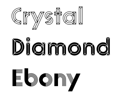 [More] ⦿
|
Avalon Design
|
 Studio in London. In 2016, they designed these typefaces: Opal, Emery Sans, Nova Display, Chopsticks (asian look), Holiday, Game Over (squarish), Pumpkin (Halloween font), Neons Display, Styllo (art deco, fashionable), Lans Sans Serif, Greenvine, Unfinished, Indigo Handcrafted (calligraphic blackletter), Audovera (techno; organic sans).
 Typefaces from 2017: Roadtrip, Samara, Glowe, Easy, Corona, Fibo Serif, Pablo (handcrafted), California, Jules Sans Serif, Pisano, HappyB. Behance link. Creative Market link. [Google]
[More] ⦿
|
Backpacker
[George Triantafyllakos]
|
 George Triantafyllakos was born in Thessaloniki, Greece, in 1980. In 2004, he was a PhD student, Department of Informatics, Aristotle University of Thessaloniki. Founder, with Manolis Pratsinakis, of Backpacker, where one can find free Latin and Greek typefaces: BPLatinNumerals, BPbigHead, BPchildLefty, BPchildFatty, BPchubby, BPchubbyFat, BPdots, BPilialena, BPletterSquares, BPletterSquaresWide, BPmolecules, BPmouse, BPmyhand, BPneon [paperclip face], BPpong [light stencil face], BPsquareHand, BPtall, BP PhD Sans, BP PhD Italic, BP PhD Mono, BP Inktrap, BP Script. These include quite a few handwriting typefaces. Commercial handwriting fonts at Cannibal (2001-2005): BPPallas, BPOlga, BPMaria, BPHaroula. In 2007, he added BP display black, BP mono and BP mono italics, and BP script. In 2008, BPreplay was created as a correction of MgOpenModata. Creations in 2009 and 2010: BPOApeloig, BPScript, BP Typewrite, BP Imperial (think Impact), BP Dots (30 monospaced dot fonts).
 He set up the independent foundry Atypical. Designer of TapeBold (2015, iFontMaker). In 2016, he released the free all caps sans typeface Hellenica for Latin, Greek and Cyrillic. In 2017 he participated in the team of designers who won the competition for the design of the new visual identity of the National Library of Greece (George D. Matthiopoulos, Dimitris Papazoglou, George Triantafyllakos and Axel Peemöller). Fontsquirrel link. Kernest link. iFontMaker link. Cannibal Fonts link. [Google]
[More] ⦿
|
Bakoom Studio
|
Barcelona-based designer of the free neon typeface Neoneon (2017). Behance link. [Google]
[More] ⦿
|
Balint Sebestyen
|
Budapest, Hungary-based designer of the vector format display typefaces Oldschl, Broadway, Glassy, Glass and Wood, Neon, and Colorful. Creative Market link. [Google]
[More] ⦿
|
Bayu Suwirya
[Illushvara]

|
[MyFonts]
[More] ⦿
|
Bernard Allum
|
Type designer, b. 1946, based in Twickenham, United Kingdom. He made a career in the broadcast business and has for for Channel One Television, Swan Media and The Graphics Department. In the 1970s, he designed these art deco typeface designs for Panache Photosetting / Face Ronchetti: Allumette, Ruthie, Danny Boy. He also designed the Neon Condensed weight for the Pink Floyd album Koda, but Neon was conceived by someone else. Linkedin link. [Google]
[More] ⦿
|
Big Cat Creative
[Erica Hartwick]
|
 Designer in 2018 of the script typefaces Lovely (a retro monoline script), Ellisa (font duo), Jolly, Unleash, Dawn and Edmonton, the art deco typeface Empire, the display font duo Wild One, the fashion mag typefaces Lucky and Vienna, the curly serif Erica, the display typeface Abigail, the layerable shadow typeface Peachy, and the sans typefaces Super Basic, Neon, Lumina (Peignotian), Jolly Sans, Unleash Sans, and Tropicana.
 Typefaces from 2019: Audrey, Just Keep Breathing, Firefly, Iridescent, Qraffito (a classy bold sans). [Google]
[More] ⦿
|
Bing Febby Aldiansyah
[Rvq Type Foundry (was: Hey Bing Type Foundry)]

|
 [MyFonts]
[More] ⦿
|
Brandon Conboy
|
Pullman Junction, WA-based designer of the neon typeface Neon90s (2017). [Google]
[More] ⦿
|
Brandspark
[Razvan Miclaus]
|
Turda, Romania-based designer of these handcrafted typefaces in 2017: Monky (sic), Journey, Aventura (brush style). In 2018, he designed Minima One and the free typeface Neon One. [Google]
[More] ⦿
|
Breauhare Fonts
[Harry Warren]

|
 Foundry created in 2006 by Virginia Beach, VA-based Harry Warren (b. 1961, Cape Charles). Digitization of the typefaces was initially done by Bob Alonso (of BA Graphics).
 MyFonts sells Cooper Goodtime (2007, inspired by the lettering used on the CBS-TV variety series The Glen Campbell Goodtime Hour (1969-1972)), Happy Trails (2007, based on the lettering (all upper case) that was used on most Trailways buses from 1936 through the very early 1960s), Jesus Saves (2008), Jesus Heals (2010), Neon Bugler (2008, a neon-light or paperclip font; digital help by John Bomparte; +Neon Bugler Squared), Future Bugler (2008), Future Bugler Upright (2010), Future Bugler Soft (2015, digitized by John Bomparte), Handmade Bugler (2009, digitized by John Bomparte), Southern Nights (2009, disconnected script), Scan (2010, a barcode-themed font), My Left Hand (2011), Minnesota Plaid (2011, a gaspipe family digitized by John Bomparte), Bauhaus Bugler (2013, digitized by John Bomparte: monoline Bauhaus style sans; compare with Qero Nite), Bauhaus Bugler Soft (2015), Fast Food (2014), Daddys Hand (based on Harry Warren's father's hand; digitized by John Bomparte), Chili Beans (2021: a Bauhaus-inspired wide grotesque with oval shoulders), and Dime Store (2007). Klingspor link. Showcase of Harry Warren's typefaces at MyFonts. [Google]
[MyFonts]
[More] ⦿
|
Bromz Studio
|
Pulau We, Indonesia-based designer of these display typefaces in 2018: Brave Youth (a hipster typeface), Brokeline (a neon outline font), Hermano (a tottoo font), Bare Book (script), Badabooks (script), Linealone (paperclip font), Revault (glitch font). [Google]
[More] ⦿
|
Burhanul Jauhar Arifin
[Shakatype]
|
[More] ⦿
|
burodestruct (or: Typedifferent.com)
[Lorenz Lopetz Gianfreda]

|
 Lorenz Lopetz Gianfreda's foundry in Bern, Switzerland, est. 1994, called Burodestruct and Typedifferent.com.
 Free fonts include(d) the gorgeous GalaQuadra (by Angela Pestalozzi, 1999), Eject Katakana (1998), Dippex (1995, grunge font), Ticket (1995), Rocket 70 (1996), Ratterbit (1995, pixel font), Plakatbau (1995), Lodel Fizler (1996), Flossy (1995), Faxer (1995), Console Remix (1998), Cravt (1998, by "Katrin"), Stereotype (1998, by M. Brunner), Brockelmann (1995, free), Kristallo (1997, very original display face) and Billiet (1996). Other fonts: Acidboyz (1998), Alustar (1999), BD Asciimax (1999, ascii art font), BD Billding, Bdr_mono (1999), Brick (1996, like Kalendar), Cluster (1996), Console (1997), Doomed (1998), Eject (1998), Electrobazar (1995), Elside (1995), Globus (1996), Fazer (1996), Lofi (1997), Medled (1995), Paccer (1995), Solaris (1998), Spicyfruits_brush_rmx (1998, a nice high-contrast face), Spicyfruits_rmx, Wurst (free, by Heiwid, 2000), Relaunch (2000), Relaunch Katakana (2000, free), Rainbow (2000), DeLaFrance (2000, free, by Heiwid), Electronic Plastic (2000), Colonius (2001), Cash (2001), Cashbox (2001), Bilding (2001), Meter (2001), Mustang (2001), Bankwell (2001), BD Alm (2001), Balduin (2001), Tatami (2001, oriental look font), Hexades (2001, free), Nippori (2002, techno), Jura (2002), Bonbon (2002, free), Band (2002, free), Navyseals (2002, kitchen tile font), Ritmic (2002), BDR Mono (1999, OCR-like font), Mann (2003, ultra fat stencil), Aroma (2003), Zenith (2003), Nebraska (2003), BD Equipment (2004), BD El Autobus (2004), BD Unexpected (2004), BD Wakarimasu (2004, free kana face), BD Bernebeats (2004, futuristic), BD Deckard (2004), BD Spinner (2004), BD Victoria (2004), BD Designer (2004), BD Kalinka (2005, a curly ultra-fat display face), BD Equipment (2004), BD El Autobus (2004), BD Unexpected (2004), BD Varicolor (2005, stencil), BD Chantilly (2005), BD Memory (2005), BD Emerald (2005, beveled), BD Kalinka (2005, Cyrillic simulation), BD Extrwurst (2005), BD Aquatico (2005), BD Mandarin (2005), BD Polo (2005), BD Beans (2005), BD Tiny (2005, pixel face), BD Times New Digital (2006), BD Panzer (2006), BD Jupiter, BD Jupiter Stencil (2006), BD Pipe (2006), BDR Mono 2006 (2006), BD Fimo Outline (2007, free, by Nathalie Birkle), BD Bermuda (2007, experimental and geometric), BD Smoker (2007, psychedelic), BD Radiogram (2007), BD Mother (2007, exaggerated black Egyptian), BD Fimo Regular (2007, free), BD Demon (2007), BD Reithalle (2007, free), BD Halfpipe (2007, free), BD Broadband (2008, free; not to be confused with the much older fonts BroadbandICG or FLOP Design's Broadband), BD Viewmaster and BD Viewmaster Neon (2008), BD Electrobazaar (2008), BD Motra (2008, stencil), BD Virtual (2008), BD Spacy 125 (2008), BD AsciiMax, BD ElAutobus (2004), BD Equipment (2004), BD Ramen (2003), BD Retrocentric (2009), BDR A3MIK (2009, virile Latin and Cyrillic slab), BD HitBit (2009), BD Unicorse (2010, unicase and techno), BD Telegraph (2011), BD Schablone (2012, stencil face), BD Pankow (2013, stencil), BD Algebra (2014), BD Hiragana Kuro (2014), BD Qualle (2014, a fat poster typeface), BD Tribler (2015, a tribal font). Alphabetical listing of their pre-2015 free typefaces: Algebra, Alm, Apotheke, AsciiMax, Baldrian, Band, Bankwell, Bardust, Beans, Billding, Billiet, Bonbon, Brockelmann, Burner, Cash, Cashbox, Chantilly, Circo, Console, Console Remix, Cravt, Delafrance, Designer, Destination, Dippex, Eject Katakana, ElAutobus, Elmax, Elside, Equipment, Faxer, Fazer, Fimo, Flossy, Fluke, Galaquadra, Geminis, Halfpipe, Hexades, Hiragana Kuro, Jayn Fonta, Kristallo, Lodelfizler, Lofi, Medled, Meter, Mustang, Outline, Paccer, Pipe, Plakatbau, Plankton, Polo, Ragout, Ramen, Ratterbit, Reithalle, Relaunch, Relaunch Ktna, Rocket70, Sirca, Sirca Rmx, Solaris, Spacy125, Spicyfruits, Spinner, Stella, Stencler, Stereotype, Ticket, Times New Digital, TinyFont, Tribler, Unfold, Wakarimasu. Alphabetical listing of their pre-2015 commercial typefaces: A3mik, Acidboyz, Alustar, Aquatico, Aroma, Balduin, BDR Mono 2006, Bermuda, Bernebeats, Breakbeat, Brick, Broadband, Calamares, Central, Cluster (Corporate), Colonius, Deckard, Demon, Discount, Doomed, Edding850, Eject, Electrobazar 2008, Electronicplastic, Elk, Emerald, Endless, Extrawurst, Fontabello, Globus, Good Wood, Hell, Hitbit, Jupiter, Jura, Kalinka, Kameron, Kinski, Las Palmas, Mandarin, Mann, Memory, Mother, Motra, Naranino (2012: a children;s script), Navyseals, Nebraska, Nippori, Nokio, Orlando, Pankow, Panzer, Qualle, Radiogram, Rainbow, Retrocentric, Ritmic, Robotron, Schablone, Showlong, Smoker, St.Moritz, Stalker, Stonehenge, Sweethome, Tatami, Telegraph, Unexpected, Unicorse, Varicolor, Victoria, Viewmaster, Virtual, Wotka, Wurst, Wurst Directors Cut, Zenith. In 2015, Gianfreda designed BD Barbeaux (a condensed typeface with the fashionable chic of the French art nouveau or film noir). Typefaces from 2016: BD Kickrom Mono (LED emulation type). Typefaces from 2018: BD Westwork. Typefaces from 2020: BD Aubergin (an experimental poster font with Bauhaus elements), BD Microna (a pixelish variable font), BD Micron Robots (dingbats). Typefaces from 2021: BD Supper (a food packaging sans), BD Roylac (a stylish poster font that evokes modern furniture), BDRmono 2021 (hipster style techno). Alternate URL. Dafont link. Behance link. View the Typedifferent typeface library. [Google]
[MyFonts]
[More] ⦿
|
C. E. Weber

|
 Stuttgart-based foundry established in 1827, and taken over by D. Stempel in 1970, which in turn became Linotype in the eighties. Their library included Druckhaus Antiqua (1919), Schadow Antiqua (1938), Mars Grotesk, Weber Fraktur (1860) and typefaces by these designers:
 - Albert Auspurg: Start (1935).
- Julius Kirn: Bison (1935-1938). This brush typeface was revived as Brush 738 BT (Bitstream) and as RMU Bison (2020, Ralph M. Unger).
- Walter Jakobs (or Jacobs): Chronika (1936), Verzierte Chronika (1937), Chronika fett (1938) and Chronika licht (1939).
- Hans Möhring: Gabriele (1938; Hastings mentions 1947).
- Erich Mollowitz: Forelle and Forelle Auszeichnung (1936, script types).
- Willy Schaefer: Neon (1935).
- Friedrich Hermann Ernst Schneidler: Bayreuth (1935), Deutsch Roemisch (1923; Kursiv in 1926, fett in 1930), Roemisch fett (1930), Kontrast (1930), Suevia Fraktur (+halbfett).
- Georg Trump: Amati (1951), Codex (1954), Delphin I and II (1951), Forum I and II (1948 and 1952), Jaguar (1965), Palomba (1954, script), Schadow (Antiqua 1938, Antiqua werk, 1948, Kursiv 1942, Antiqua Fett 1952, Antiqua halbfett 1939, Antiqua Schmalfett 1945), Signum (1955), Time Script (+Light and Medium) (1956), Trump Mediaeval (1954; Kursiv and halbfett in 1956; fett in 1958; Kursiv fett and schmal halbfett in 1962).
- Wagner&Schmidt, Leipzig: Colonna Antiqua (1908; halbfett in 1911), Druckhaus Kursiv, Druckhaus Antiqua (1919; +fett, + halbfett, +schmalhalbfett), Ekkehard (1903), Erika (1920; +halbfett), Margarete (<1927), Orient Antiqua (1914), Parlements Fraktur (1908), Progress Reklameschrift.
[Google]
[MyFonts]
[More] ⦿
|
Canada Type
[Rebecca Alaccari]

|
 Foundry in Canada, est. 2004 by Rebecca Alaccari in Toronto, and run by her and Patrick Griffin. Interview with Rebecca. Her typefaces can be bought via MyFonts: Storyville (2015, a curly script), Centennial Script (2007, a revival of an 1874-1876 high-contrast calligraphic script by Hermann Ihlenburg), Valet (2006, superb art deco face), Freco (2006, an art deco typeface loosely based on designs and letters of Fré Cohen), Silk Script (2006, based on 1956 Helmut Matheis script called Primadonna), Dominion (2006, based on an early 1970s film type called Lampoon), Johnny (2006, an art nouveau poster typeface that revives the Harem/Margit typeface by Phil Martin, 1969), Guillotine (2007), Mayfair (2006, a calligraphic typeface based on Mayfair Cursive by Middleton, 1932), Happy Birthday (2006, script), Geronimo (2005, brush style poster font), Rostrum (2005, a revival and expansion of a type called Oleander, designed in 1938 by Julius Kirn for the Genzsch&Heyse foundry in Hamburg), Apricot (2005; based on A.R. Bosco's Romany for ATF, 1934, but a major extension with many ligatures), Heathen (2005), Cougar (2004, a digital version of Martin Wilke's 1968 handwriting typeface Konzept), Puma (2004, brush typeface based on Herbert Thannhaeuser's 1954 Kurier), Big Brush (brush), Diva (connected script), Odette (a high ascender display typeface after the Morris Fuller Benton 1918 American classic, Announcement Roman), Crucifix (2004, a severe octagonal face), Fore (2004, a bullethole face), Formula, Gamer (2004), Formula (2004), Kofi, Platoon (2004, a stencil face), Verso (2004), Secret Scrypt (2004, a handwriting face), Bluebeard (2004, blackletter by Patrick Griffin), Bolero (2004), Janice (2004, psychedelic), Jimi (2004, also psychedelic), Scroll (2004), Dominique (2004, upright script), Moxie (2004, a fat display family which includes a stencil), StockA (2004), StockB (2004, a fat stencil face), Stalker (2004, a destructionist face), Scroll (2004), Jonah (2005, a hippie typeface based on an early 1970s film type from Franklin Photolettering called Urban). MyFonts page. Phil Rutter and Patrick Griffin made Coffee Script (2004), the digital version of R. Middleton's Wave design for the Ludlow foundry, circa 1962. Phil Rutter and Rebecca Alaccari designed Almanac (2004), a script typeface based on Imre Reiner's London Script (1957) (and Rebecca did a subsequent redigitization in 2007 that led to Reiner Hand), Tiger Script (2004, based on Georg Trump's wild brush script Jaguar done in 1967 for C. E. Weber), and Ali Baba (2004), an Arabic simulation typeface originally designed by Georg Trump as Palomba (1955, C.E. Weber foundry). Patrick Griffin made Leather (2005, after Imre Reiner's 1933 blackletter face), Secret Scrypt (2005), Skullbats (2005), Slang (2004, a blood scratch face), Bluebeard (2004), Expo (2004, an octagonal family), and Dancebats (2004). Simone Wilkie designed Boyscout (2004) after the handwriting of her son. Helmut Matheis' Contact (1963, flowing script/brush) was digitized by Rebecca in 2004 as Bruschetta. Rebecca also made Steiner Special (2007, a revival of Swing, a film type by Peter Steiner, 1974), Genesis (2007, a digitization and extension of Grayda, a 1939 calligraphic script of Frank H. Riley at ATF), Evolver (2006, futuristic family), Redwood (2007, a calligraphic script based on Willard T. Sniffin's Raleigh Cursive (1929, ATF)), Orotund (2005, after the 1970s typeface Eight Ball; this was extended again in 2006 in her art nouveau typeface Huckleberry, which is a revival of the 1973 typeface of Gustav Jaeger called Mark Twain), Pendulum (2005, a fantastic flowing script based on Nebiolo's Americana, 1945), Jojo (2005, a flower child typeface after Spring, by Bernard Jacquet), Mascara (2004), Gala (2004, after Neon (1935, Giulio da Milano at Nebiolo)) and Bella Donna (2004, after a script made by Alessandro Butti in 1948, called Rondine).
 Typefaces made in 2005: Jazz Gothic (Patrick Griffin), Showboat, Hunter (a revival of Imre Reiner's brush script Mustang, 1956), Quanta (stencil), Quiller (a script typeface based on J.J. Sierke's 1964 typeface Privat), Rhino (revival of Mobil, a 1960 typeface by Helmut Matheis for Ludwig&Mayer), Dominique (donated to FontAid), Secret Scrypt (donated to FontAid), Jackpot (2005, Western typeface remotely based on Cooper Playbill which in turn is related to Cooper Black, but it also has hippy 1968 influences), Sincerely (handwriting typeface based on Karlgeorg Hoefer's 1968 Elegance), Fontella (a digitization of Novarese's calligraphic script Elite), Boondock (digitization of Imre Reiner's Bazaar from 1956), Gumball (digitization of Papageno, a 1958 bubblegum font by Richard Weber for Bauer), Runway, Gamer, Dominique (OpenType handwriting face), Sterling Script (2005, by Alaccari and Griffin: a 7-weight digitization and extension of Stephenson Blake's 1952 clean copperplate script Youthline Script), Vox (2007, a 24-style monoline sans family done with Patrick Griffin), Vox Round (2013, a softer version), Swan Song (2006: a calligraphic typeface based on the hand of Alexander Nesbitt. A later document states that it is based on work by British artist Rachel Yallop from 1986), Evolver (2006, a 9-style futuristic family), Ambassador Script (2007, an Alaccari-Griffin revival of the angle-reduced calligraphic script Juliet by Nebiolo, 1955). In 2005, Philip Bouwsma joined Canada Type, and designed a great calligraphic blackletter-inspired family, Torquemada. He designed many other typefaces for Canada Type in subsequent years. VIP (2007, Rebeca Alaccari) is a humanist sans serif uppercase (and figures) combined with a freshly redrawn revival of the classic VGC Constanze initials originally designed by Harry Brodjian in 1970, and even further back, the Constanze Initials by Joachim Romann (1954-1956, Stempel). Chopper (2007, by Rebecca Alaccari) is a revival of Venture (a 1972 typeface for VGC by Harry Villhardt). Walter (2007, Rebecca Alaccari) is a digitization of Heritage (1952, ATF, a calligraphic script by Walter H. McKay). Celebrity (2007, Rebecca Alaccari) revives and extends the retro/techno typeface Latus (Willy Wirtz, 1971). Sympathique (2008, Alaccari) is an ultra-thin and ultra-tall typeface in the mold of Bernhard Fashion and other era poster or film typefaces (they say that it is rooted in the film typefaces Hairstreak and Mossman). Mullen Hand (2008) is a revival of Repro Script (1953, Jerry Mullen, ATF). Filmotype Giant (2011, a condensed sans) and its italic counterpart, Filmotype Escort (2011) were both co-designed with Patrick Griffin. In 2020, they released the variable informal sans typeface Bananas: Bananas was sourced from multiple American film era faces, all from 1950s and 1960s, when the casual sans genre was at its popular peak. Headliners' Catalina and its very similar cousin, Letter Graphics' Carmel, served as initial study points. Catalog of its typefaces. Klingspor link. [Google]
[MyFonts]
[More] ⦿
|
Carlos de Toro

|
 Born in Logroño, Spain, Carlos studied graphic design at ESDIR (Escuela Superior de Diseño de La Rioja), and type design in the Advanced Typography Master class of the Universidad Autónoma de Barcelona (EINA). He was first based in Barcelona, but currently works out of London.
 In 2013, he designed the humanist mediterranean sans typeface Born (tweetware). In 2014, he created Neon (2014), a set of capital numerals, for the September issue of Yorokobu Magazine. Neon is inspired by American road movies from the 80's and 90's. In 2015, he created Yorokobu numbers for the magazine. Still in 2015, he designed Recia (Indian Type Foundry): an angular ten-style wedge serif typeface family. Free at Fontshare. Typefaces from 2016: 3D Experimental. In 2018, he graduated from the TypeMedia program at KABK in Den Haag. His graduation typeface, Azor, was designed for editorial use. He explains: Azor is a typeface for display and text that requires comfortable legibility, personality and a human touch. Azor's italics are quite angular for added contrast with the romanstyles. [Google]
[MyFonts]
[More] ⦿
|
Carlos Matteoli
[Q-BO]

|
 [MyFonts]
[More] ⦿
|
Catarina Pinto
|
Lisbon, Portugal-based designer of Neon Type (2016) and Lights Font (2017). Creative Market link. [Google]
[More] ⦿
|
Céline Ibanez
|
Parisian designer of the rounded circular stencil typeface Neon (2014). Behance link. [Google]
[More] ⦿
|
Chandler Caso
|
As a student in Cheshire, CT, Chandler caso designed Neon Lights (2015) [Google]
[More] ⦿
|
Chelsea Bunkelman
|
At UW-Stout, Chelsea Bunkelman (Menomonie, WI) designed Neon Lights Typeface (2016). Behance link. [Google]
[More] ⦿
|
Chester Jenkins
[Constellation]
|
 [More] ⦿
|
Chloe Stein
|
Designer at Animography.net of the animated neon font Radiate (2015). [Google]
[More] ⦿
|
Chris Maclean
|
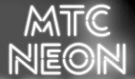 Creative Director for Interbrand Australia. For Melbourne Theatre Company (MTC) he created MTC Neon (2013, with Joao Peres). Many of his other corporate identity projects also involve custom-designed typefaces. [Google]
[More] ⦿
|
Christian Munk
|
 Danish designer (b. 1991), aka CMunk, who used FontStruct to create most of his typefaces. Dafont link.
 In 2008 he designed Flag Semaphore (+Smooth, Peace), Articulate, Font from NATO (military slab serif), Glockenwerk (pixel clock font), Glockenwerk Uhrzeit, Flags-and-NATO (dingbats), Font from NATO alpha, Tall, Flying-Circus (Western showtime typeface to imitate the Monty Python titling font), LCD-display, Simple (stencil font with 700 glyphs), TMNT, Tetris, sharp-pixels, Raster, Quad (nice stencil face), Inverted, Propaganda (Cyrillic font simulation), Empty Monospace, Pride, Stadium, Rounded, Dear God (script pixel face), Celtic Style. In 2009, he added 7x12 Pixel Mono, @bcde, Abstract Letter Patterns, Music, Texture, Diagonal, Gothic, Illusio, Unispace (typewriter type), Narrow Serif, Delta, Alien Double (great!), Donut, Flags-and-NATO, Simple-Fraktur-Initial, Simple-Fraktur, Texture, Friendly Serif, (+Soft), Invisible, Sharp, Heavy Diacritics, Concentrium, Continuous Digital Display, Elves, Pixies, Space Movie (+Ligatures), Flag Semaphore (+Smooth, +Peace), Articulate, BBT Biline Twist, Biline Twist, Empty Monospace, Unfix, Infix, Pride, Tyre Stencil (like tire threads---nifty...), and Overlap. FontStructions from 2010: Even (gridded), Brilliance, Slalom Vision, Quirky Serif, 7x12PixelMono, Ball Terminator, Gearbox, Prefix, Upside Down, Way Too Small (a minimalist pixel face), Butterfly, Ribbon Gymnastics, 2D Barcode, Horizon Stencil, Biline Twist, Blocktur, Symmetricus (alien writing?). FontStructions in 2011: 12 dice, Monotwist (tall, monospaced), Squarific (fat octagonal), Swirl (curly), Sweet (Victorian), Easter Eggs, 50 Fifty (experimental, geometric), Squarific (+Stencilious), Spiralix (spiral-themed for Latin and Cyrillic), Bloccus, Feet (monospaced). Creations from 2012: Düpbøl (German expressionist face), Slice, Blocktur, Alien Double, 7:12 serif (pixel face), Blick, Dry Heat (Isolates and Initials, Medials, Finals: an Arabic simulation family), FF9 Coin Slots, FF8 Untalic, FF7 w1de, FF6 Lean Mean, FF5 Bamana, FF4 Circulation, FF3 3times7, FF3 Runization, FF1 Glitchy, Squared, Puzzlish, Steep, Digitalis (octagonal), 50 Fifty (artsy and geometric), Monotwist, Infix. FF stands for Forgotten Fonts. Typefaces made in 2013: Ribbons And Banners, Digital Rome (pixel face), Censorship, Interlock, Bouma, Glaedelig Script, Hand XL Smooth, Vascomat, Spitzschtruct (emulation of Suetterlin), Neonic, Fish Scales, 7:12 Serif, Analogly, Squarific Fraktastic, Metro Sans (pixelish). Typefaces from 2014: Word Games, Shadows, Yuuroppuna pixel, Spines, Numbers, Tal Dansk, Zahlen Deutsch, Insular Typewriter, Nudge Nudge (dot matrix), 7:12 Serif (monospaced pixel font), Jovian, Squarafic Fraktastic, Computer Says No, Runic, Fluorescent (neon tube typeface). Typefaces from 2015: Hexagonia, Kapow (a comic book font), Fauxreign (a Thai emulation font). Typefaces from 2016: Ziplock (art deco), Vexillum (maritime signal flags). Typefaces from 2019: Drop Cap (Lombardic), Fun with Cubes (3d). [Google]
[More] ⦿
|
Christopher King
[Wing's Art Studio]

|
 [MyFonts]
[More] ⦿
|
Cisma
|
T-26 designer who made the neon / paperclip font Relava (2008). [Google]
[More] ⦿
|
Cleber Rafael de Campos
[Makumba]

|
[MyFonts]
[More] ⦿
|
Constellation
[Chester Jenkins]
|
 Constellation is a creator and publisher of contemporary typefaces and is run by its two partners, Chester Jenkins (based in New York, born in Montreal) and Tracy Jenkins. They also feature typefaces by Magnus Rakeng, Patrick Giasson, Kris Sowersby, Rick Valicenti, and Jeremy Mickel. Constellation contains the main elements of the previous Village and Thirstype foundries. Typefaces including bespoke typefaces by Chester Jenkins:
 - Aero (2011, Chester Jenkins and Jeremy Mickel). Based on Roger Excoffon's Antique Olive.
- Apex Sans (2003), Apex Serif (2003), Apex New (2005) and Apex Rounded (2010). All by Chester Jenkins. Apex Serif and Apex Sans were co-designed with Rick Valicenti.
- Apollo. A bespoke multiline typeface for the Apollo Theater.
- Arbor (2010). Arbor was originally commissioned by the New York Times magazine for use in their 2008 Hollywood special issue. The source was Rob Roy Kelly's book of woodtype samples, and the D and H from Caslon's Italian of the 1820s. An original representative of this Western genre.
- Barclays Center (2012). A bespoke athletic lettering and stencil family.
- Brooklyn (2013, a brutalist typeface) and Brooklyn Stencil (2013, an octagonal stencil). The original was commissioned in 2007 by Michael Bierut for a sports complex.
- The Cooper Hewitt Smithsonian Design Museum in New York City is giving away for free its bespoke house typeface, a sans designed in 2014 by Chester Jenkins. Even the original UFO files are made available.
- Cosmica (2018).
- Endzone Slab (+Condensed) and Endzone Sans (2017) are bespoke typeface done for the NFL.
- Galaxie Cassiopeia (2006). A round connected upright script. By Chester Jenkins.
- Galaxie Copernicus (2009). An interpretation of Christophe Plantin's Plantin (cut by Robert Granjon) and Frank Hinman Pierpont's Monotype revival of Plantin. By Chester Jenkins and Kris Sowersby.
- Indestructible Language (2006, with Mary Ellen Carroll): The Precipice Alliance, a non-profit corporation collaborating with artists to direct public attention to global warming, launched with this inaugural artwork by the contemporary artist Mary Ellen Carroll. This lettering was a collaboration with Ms. Carroll to design letterforms that could be rendered 8-feet tall in neon tubing. Each neon letter was to be placed, in a 900-foot-long installation, in the window bays of all five former American Can factory buildings in Jersey City, New Jersey to be exhibited from November 2006 to April 2007. The 8-foot high, carbon neutral neon letters were clearly visible (and legible) to drivers on both the Pulaski Skyway and the New Jersey Turnpike, and by planes heading to and from Newark International Airport.
- Maharam (ca. 2017). A bespoke Futura revival typeface for Maharam.
- A bespoke sans titling typeface for the NYC Opera.
- Galaxie Polaris, Galaxie Polaris Condensed (2004-2013). Two sans families by Chester Jenkins.
- Oz (1999). A round typeface family by Patrick Giasson. Designed as an homage to Oswald Cooper (whose nickname was Oz), whose Oswald Cooper inspired the fat shapes.
- Pink Sans, Pink Slab and Pink Outline are bespoke typefaces for Victoria's Secret Pink campaign.
- Radio (1998). A retro script family by Magnus Rakeng.
- Robledo Stencil. For Slanted Magazine.
- Sharpie Script. a bespoke script typeface for the identiy of Michael Kors.
- A revival of Frederic Goudy's lost Sherman type for Syracuse University with Michael Bierut and his team at Pentagram.
- For Snickers, Chester designer Chiat Day.
[Google]
[More] ⦿
|
CORE.NU Fonts
[Martin Fredrikson Core]

|
 Free fonts by Swedish designer Martin Fredrikson Core (b. Gothenburg, 1970), whose real name is Martin Lexelius:
 - Chank fonts: Industri No. 35 (2002), Oh La La (2002 screen font), Sauerkrauto (2000), Som Ett Hus (2001).
- T4 fonts: Corpse Grinder (gothic font), Kantor (2002, since 2007 commercial at T4), Motor Mouth (2006).
- Fountain fonts: Borgstrand (styles called Regular, Web, Stencil, Hellas; originally a Fountain Type font, it migrated in 2015 to Martin Lexelius Core's foundry), Filt (2001, a fat display face), Jalapeño (Mexican-style diner display, see here), Malmö Sans (2000, Fountain Type, and 2015 at his own type foundry).
- CORE.NU fonts (mostly free): Backstabber Grotesk, Backstabber Roman (1999), Banditos, Bilprovning Gothic, Blocky Smocky (2002), Bodoni Natural, Bodoni Slapp (2000), Bongonaut (1999), Boy-O (2002), Bunth Serif (1999), Daniel Hando, Darlito, Das Kavel Gotisch, Dot City (1999), DrunkPunk (2002), Executive Producer, Fizzo (1998), Flake Anfang (1999), Funky Mushroom (2000), Gentleman Caller (2002 (pixel font), Grill Sans (2000 (a funny hotdog and hamburger dingbat font, together with Finn Hallin and Simon Grdenfors), Felvetica (2001), Il Tempo Gigante (2001 (extra wide screen font), Isterburk (2001), Komputter (2002), Lager Neon, Lindhagen Script, Marfhaus (1998 (his take on the Bauhaus "Universal" unicase font), Messages, MuskelBengt (2000), No Reklamo, Nuderflaken (2002), Oblata Kurrenta (1999), Pixelette (1998), Plugger, Practicamente, RunStop, Sarcastic Girl Scout Bitch (2000), Sensory Input (2001), Serge Hand, Small Talk (1999 (nice screen font family with styles called Tight, Tight Mono, Wide, Wide Mono), Stiffy99, The Perfect Font.
FontShop link. MyFonts link for the Martin Lexelius type foundry. MyFonts link for Cre. [Google]
[MyFonts]
[More] ⦿
|
Corey Holms

|
 Graduate from Cal Arts (1996), who runs CoreyHolms.Com in Fullerton, near Los Angeles. MyFonts link. MyFonts foundry link. Most of his fonts were republished in the 2020s at Canada Type.
 Designer of Compunabula (2015: a low resolution, 8-bit alphabet imagined for our high resolution world), NE10 (2010, a stencil / neon tube typeface), This (a stencil typeface), Area (2008, Umbrella Type, an art deco nightclub face; hints of Avant Garde), Mode (2007, experimental modular type, Umbrella and later Canada Type, Babbage (2005, Umbrella Type, a capricious typewriter font), Sange (2002, a dot matrix blackletter font), Brea and Brea Light (2004, a dot matrix blackletter family at Umbrella Type; republished in 2021 at Canada Type), Mince and Mince Shadow (2004, Umbrella Type), DecadesOS (2002, for Decades Inc), Air-Port (1999), Attractor (2001, based on Alexei Tylevich's NoGlow), Granule (2009, fat rounded sans), Cartridge (2001), Claes (2001, based on a Wim Crouwel design), Consume (1996), Den (1998, for the Digital Entertainment Network), Digital (1997, for "The Apartment"), Empire (1995), Fascia (2002), Hobart (2001, a kitchen tile font), Pea (2005, Veer: letters made up of springs), Phia (another kitchen tile font), Progress (2001, for Progress City), Rasputin, RMX, Savante (1999), Sears (2000), Stencil, Thirty, Untitled and WebType (2000). Many of these fonts are futuristic, experimental, logo-inspired or minimalist. Behance link. [Google]
[MyFonts]
[More] ⦿
|
Craig Eliason
[Teeline Fonts]

|
 [MyFonts]
[More] ⦿
|
Cyanotype
[Damian Guerrero]

|
Damian Guerrero Cortes is the Mexico City-based designer of the 48-style multi-texture layerable pixel-based font families Dance Floor (2019) and 2nd Dance Floor (2020). Damian's take on Bookman is Bookseller Bk (2020): it has straightened serifs on the ascenders and features some ball terminals to distinguish it from the original Bookman. Damian's italic is totally different though. Damian says that Bookseller is based on a typeface found in a French book published between 1882 and 1893 and cites Didot, Scotch Roman and Clarendon as distant references. Bookseller covers Greek and Cyrillic and shows sturdiness for small print. See also Bookseller Cp (2020: a 12-style Scotch family). Typefaces from 2021: Sweetener (a sugary script), MultiType Brick, MultiType Rows (34 fonts with horizontal stripes as in retro video games), MultiType Brick (brick-textured), MultiType Glitch, MultiType Gamer (a 24-style retro gaming font family), MultiType Pixel. [Google]
[MyFonts]
[More] ⦿
|
Damian Guerrero
[Cyanotype]

|
[MyFonts]
[More] ⦿
|
Dan M. Zadorozny
[Iconian Fonts]
|
 [More] ⦿
|
Dan X. Solo
[Solotype]

|
 [MyFonts]
[More] ⦿
|
Daniel Lanz

|
Swiss designer (b. 1958, Schaffhausen) and type designer, who started out as a letter carver for 20 years. His typefaces: - Diverda Sans and Diverda Serif (which should be called Diverda Slab Serif), 2002-2004. He published both 10-weight font families with Linotype in 2004.
- Katherina, 2004
- Lamont, 2004
- Pixot, 2006, a pixel typeface
- Studio 5, 2006, after a neon sign. Published by Lafonts.
Klingspor link. Linotype link. [Google]
[MyFonts]
[More] ⦿
|
Danika Smith
|
Graphic designer in Chippewa Falls, WI, who created the inline typeface Neon in 2016. [Google]
[More] ⦿
|
Darrell Flood
|
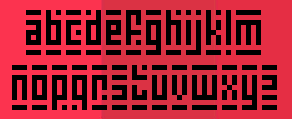 Dundee, Scotland-based designer of the squarish or pixelish typefaces Rusting Robotica (2014, grunge), DigitalDotRoadsign (2014), ElectricButterflies (2014), Mad-Midnight-Marker (2014), Robotastic-Regular (2014), Super Skinny Pixel Bricks (2014), Dupstep Dungeons (2014), Electrobyte (2014), Terrablox (2013), Technomicon (2013), Thinman, Bit Chips and Dubsteptrix in 2013. These were mostly made with the help of FontStruct. Brush typefaces include Scribble Scrawl (2014).
 In 2014, he made Creepy Scrawly, Balloon Floats (alphadings), King Dubstepikz. Magic Marbles, Smooth Circular (a circle-based sans), Vampire Raves (fat art deco sans), GoGo Poster Punch (heavy sans caps), Sophisticated Slims, Happy Potatoes, Freaky Paper Cutouts, Absolute Zero (FontStruct), Big Bad Blocks (FontStruct), CheerioOldChap, CrazyInkSplats, Dadiomouse, Da Mad Rave (FontStruct), ExtinctionEvent (FontStruct), FriendlyFeltTips, NeonNanoborg (a neon emulation font made with FontStruct), NightmareInk, NinjaRush (FontStruct), Oilslick, Sandscrape, StretchedElectrons (FontStruct), SyntheticSharps (2014, FontStruct), TowerBlock, Ghostly Prints, Kurly Kyoots. Typefaces from 2016: Paint Blobs, Chalk Dash, Go Faster Brush, Splay Brush, Cartoon Marker, 3D Hand Drawns, Serial Killers, Thick Marker Talls, Alphabet-Souplings, Barbed-Wires, Cartoon-Inkstrokes, Dot-Stick-Doodles, Jelly-Wobblers, Kiddy-Paints, Taped-Up-Tight, Angular-Anarchy, Balloon-Friends, Bead-Necklace, ChunkyFunks, Circular-Abstracts, Fat-Brush, Inky-Scrawls, Long-Loving-Letters, Prehistoric-Caveman, Volcanic-Dungeon (glaz krak style), Roundy Rainbows, Digital Dreamers, Scifi Adventure, Space Superstars, Slim Thin Pixelettes, Scrapbook Scribblers, Dark Scroll Scripts. Typefaces from 2017: Marshmallows, Swirltastic, Sweetpaint, Shockers, Cyborg City, Baubles, Funny & Cute, Splatink, Snowblobs, Dear Santa, Paint Brush, Noise Machine (sci-fi), Curvy Thins, Skinny Things, Chublings (fat cartoon font), Snowy Skies, Zombiebites, Skinny Sunbeams, Japanese 3017 (oriental simulation), Robot Crush (squarish), Virtual Rave, Outliners, Christmas Curls, Vector Waves, Signboard, Signup, Signoff, Horrorshow, Mad Meka, Gameshow, Cute Notes, Perfect Princess, Bankjob, Paintling, Spooky Light, Playtime, Stringz, Comictastic, Loveables, Technotot (octagonal), Boss Fight (rough brush), Adorable, Tokyo 2097 (sci-fi), Awesome (beatnik), Knick Knack, Ninja Strike, Fairies (uncial), Wowsers, Funhouse, Sourdough, Love and Romance, Kissy, Ultrathins, Skin and Bones, Skinnymalink, Board Marker, Rockbiter (Flintstone font), Hackattack, Rosegarden, Grungelings, Splatlings, Rush, Sketchalot, Trashtalk, Blobtastics, Madjumbles, Daydreamer, Moonlight, Inkbleeds, MooMoo, Maximum Impact, Boxy Brush, Wibble, Exquisite, Dragonlands, Cut It Out, Inkling (inky font), Shiny Darks, Quirky Thins, Off Kilter, Coarse Fuzz, Scraggly, Flowing Flowers, Zebra Blobs, Shiver, Bare-Bones, Fats Are Good, Fighting Force, Inked-Out, Kid-Marker, Love-Me, Neon Adventure, Quiet Streets, Slice, Scribble Lines, Square Chunks, Da Serif Kid, Squidgy, Crazy Guy, Madhouse, Alien Beasts, Cogs and Bolts (octagonal), Spatial Anomaly, Fun Smiles, Balloonish, Chunky Cheese, Pirate Plunder, Squiggler, Scribble Wire, Quicky Brush, Scratchies, Nerdy Norms, Cartoonlings, Neat Chalk, Spidery (crayon style), Speeding Brush, Super Sketch, Patchwork Stitchings, Skinny Marker, Blob-Toon-Shadows, Brisk-Bristle-Brush, BurntFirewood, Childlike-Blobs, Comical-Cartoon, Drunk-Handwriting, Mad-Stick-Brush, Pipecleaners, Roundish-Toons, Scribbletastic-Brush, Sick-Sketchlings, Sloppy-Paint, Almost-Outlines, Archaic-Asian-Inks (oriental brush font), Brisk-Bristle-Brush, Chunky-Boulder-Outlines, Expressive-Inks, Fast-Flat-Brush, Fat-Wobble-Outlines, Rapid-Inks, Rough-Comic-Outlines, Single-Stroke-Inks, Square-Brush, Swirly-Curly-Inks, Thin Toon Outlines. Typefaces from 2018: Superfats, Toon Balloon, Comic Queens, Big Black Bear, Mad Hacker (a glitch font), Space Quest, Aliens Among Us, Neon Overdrive, Tech Headlines, Megalopolis X, Neon Vortex (octagonal), Son of a Glitch, Space cadets, House on Mars, Robotronics, Alien Cyborg, Dreamlands, This is the Future, Alien Robot, Zen Os, Speed Freaks, Martian Sunrise, GoGo Hack, Squaresharps, Quirky Robot, Android Assassin, Positrons, Virtual Realm, Robot Reavers, Dark Dimension, Alien Wars, Whimsical Lovelies, Superchunky, Bunny Ears, Sunshiny, Lovehearts, Only Organic, Mars Mission, Alien Android, Angry Android, Baby Blues, Cryogenix, Robot Renegades, Invasion, Reavers, Haunting, Ghastly, Ghost House, Extra Fruity, Blueberry, Gingerbread, Iced Cookies, Turnaround, Chunky Chalk, Chalk About, Raptors, Calamitech, Robot Radicals, Juice Monster, Silky Smooth, Slender Scratch, Super Scratchy, Wide Scratch, Megabomb, Pink Rocket, Nebulari, Solaria, Sunspire, Slimbots, Jumping, Sleeping, Walking, Lovelings, Xenosphere, Lovebuzz, Shadowkingz, Western Wonderment, Sudden Desires, Cookies, Starborn, Slimlines, Solid Grooves, Delicious, Martian Wars (constructivist), Ironworks, Newsflash, Space Madness, Neon Machine, Kings Feast (great fat caps), Casual Caps, Crazy Dots, Splatter Kings, Squidgy Slimes, Ghostz, Android, Casual Friday, Quickly, Quioet Meows, Lovely Serifs, Penelope, Chubby, Fireworks Kid, Fat Cat, Dreamwalks, Cartoons 23, Rise & Shine, Bright & Early, Alien Mushrooms, Monsterz, Digital Dare, Kinda 3D, Flower Powers, Simply Be, Balloon Pops, Heart to Heart, Boardgamers, Cloudheads, Game Over Dude, Roundish, Snake Chan, Cactus Cuties, Veggie Seedlings (monoline handcrafted typeface), Martian Signpost, Forever After, Curved Square, Happy Bomb, Machinations, Super Turnips, Summer Love, Kawaii Stitch, Cutesy Kisses, Toon Cats, Comic Kings, Mushy Love (beatnik style), Patchy Robots, Robot Blocks, Robotica, Kids Stuff, Aine, Begorra, Malarky, Shenanigans, Spring in My Step, Never Surrender, Juicy Fruity, Gorgeous Girls, Knife Princess, Massive Bassline, Jelly Kids, Magic Moons, Fairies Are Real, Super Sweet, Unconditionally, Love The Fonts, Forever, Jelly Donuts, Cute Stitch, Ninja Note, Comic Panels, Love You Angel, Shine With Me, Express Yourself, Superstar, Rave King, I Am Awake, Android 101, Robot Children, Machine Madness, Kissy Hugs, Natural Sugars, Fresh Cream, Planetoid, Asteroid 7337, Zombie Apocalypse, Russian Dollmaker (constructivist), Sunshine Smiles, Sushi Roll, Snowy Sparkles (textured), Lovely Madness (beatnik style), Hello Angel, Dubstep Heroes, Space Crusader, Pixelopolis 9000, Dungeons, Stroketastic, Brushalot, Delicious Doom, Skinny Dipping, Sparkly Hearts, Swirlstory, Circuitboard, Yours Truly, Scawlamajig. Fonts from 2019: Chinatown Champs (oriental simulation), Modern Machine, Hyper Helix, Alien Mine, Robot World, Future Worlds, Pumpkin King, Vampire Wars, Halloween Treats, Zombie Night, Deadly Cute, School Play, Love The Trees, Moonbase Omega, Japanese Robot, To Japan, Moonlighting, Cyberjunkies (sci-fi), Spotsticks, Chalktastic, Megabot Five, Xen Galaxy (trekkie font), Gorgeous Grafix, Comic Marker Deluxe, Speedy Marker, Maxi Marker, Love Marker, Natural Marker, Juice It Up, Oldschool Tag, Marker, Cutout City, Renegade Moons, Marker Notes, Angelic Child, Natural Toons, Miss Chalkboard, Quirky Cat, Delicious Scrawl, Super Tasty, Patchwork Stitchlings, Neptune Lander, Saturn 3, Supernova, Moonbase Delta (a heavy octagonal typeface), Daydreamers (marker pen font), Marker Notes (marker pen font), Martian Robotiocs (mechanical), Super Sunrise (marker pen font), Space squadron (squarish), Robotronica, Retronoid, Mechacubes, Beyond The Stars, Neon Vampire, Magical Markers, Lovely Notes, Super Toons. Typefaces from 2020: Cartoon Fun, Robot Z, Scary Horrors, Pumpkin Soup, Halloween Hex, Ultraquick, Killer Bassline, Blackmoon Quest, Toy Box, Alien-Realities, Cyberpunks, GoGo-Poster-2020, Japanese-2020 (oriental emulation), Monster-Mech, Stitchy-Missy, ToyBox. Typefaces from 2021: Ninja Attack, Squaremaze, Gen Z, Big 500, Drum N Bass, Deadly Advance, Deadman, From Beyond, Alien Skyline, Never Better, Flourish, Dubai Dubstep, Zef Rave. Creative Fabrica link. [Google]
[More] ⦿
|
Dave Savage

|
Savage Monsters Industries is Dave Savage, a one man studio specializing in fun graphics for web and print. Products and services include illustration, graphic design, original fonts, hand lettering, and animation, Dave Savage's work has shown in gallery shows in New York, Los Angeles, Kansas City, DC, Atlanta, Durham, Cleveland, and Seattle. The Savage Monsters Secret Lair is currently located in the Pacific Northwest, but was oroginally in Los Angeles. He has been creating fonts since 1994. These are mainly grungy, scary and comic book typefaces. Typefaces in alphabetic order: BackwaterSaint, BlockoEmpty, BlockoSolid, BlockoSupremo, Bloodsnot, Burnout, CheapFantasy, Cluck, Comic, Creepy, Enchilada, FancyTrashBag, FancyTrashDiamond, FancyTrashJewel, FancyTrashNeon, Fiendish, FonziesErawaxEmporium, Gladwell, GladwellDisintegrated, GoonheadDeluxe, GrafIcks, GreekFreak, IndustrialSpill, IronSpleen, KookyKarakturs, LardoDeluxe, MidnightCoffee, NuggetBoy, Pirate, PortlyShoplifter, SavageBlock, SavageMonsters, Scratch, SlimShoplifter, SpikedPunch, SuggestionBox, UphillBattle, WiggleVision, Zombie. In 2018, Aaron Bell and Dave Sac=vage co-designed Industrial Spill, Tipsy Waitress (beatnik, cartoonish) and Super Chill MC. [Google]
[MyFonts]
[More] ⦿
|
Dave Simpson
[Sign DNA]
|
[More] ⦿
|
David Einwaller
|
 Salzburg, Austria-based creator of these typefaces:
 - Bolivia (2017-2019). This typeface started as an interpretation of Albert Hollenstein's famous Brasilia from 1958. A second version with vertical terminals was drawn in order to let the modernistic feeling collide with a more humanistic expression. The atypical long tails of f, j, r and t are emphasized and accompanied with stylistic alternatives to give it a more contemporary feeling.
- Brubeck (2018). A revival of a vernaciular 1960s jazz album cover sans.
- Bull 5 (2019). A monospaced sans.
- Delphia (2016-2020). Delphia's design references early 20th century Gothics like ATF's Lining Gothic and Gothic No. 545.
- Elaphus (2020). David writes: With great support of Bruce Kennett and others, I was able to get my hands on original drawings of an unfinished typeface by W. A. Dwiggins for Linotype in 1947. I wanted to keep a warm and organic quality within my interpretation for a lively texture, in true with Dwiggins' intent and style. For the italics I went back even further in time, to one of the best punchcutters to ever do it: Robert Granjon and his Gros Romain from ca. 1550. This project is in a very early stage and a display version with a modern twist will soon be the counterpart to this classic, soft text-face.
- Flatspot (2019). A grotesque influenced by Permanent (Karlgeorg Hoefer, 1962-1969).
- Modulo (2020). A monolinear rounded sans influenced by Nebiolo experiments from the 1960s and Nebiolo types like Recta.
- The horseshoe-serifed transitional typeface Morion (2015, The Designers Foundry).
- The 1920s art deco sans typeface Neue Droschke (2013, Ten Dollar Fonts).
- Undo Sans (2020). An inline / neon typeface influenced by the 1970s.
Tumblr link. [Google]
[More] ⦿
|
David Harris

|
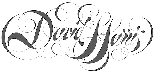 British lettering artist based in Exeter who specializes in the medieval versal cadel (or cadeau) letter. He created these typefaces:
 - Alexei Copperplate (1982, Letraset). A copperplate calligraphic script.
- Chromium One (1983, Letraset, and later ITC). A decorative neon-light all caps typeface.
- Becka Script (1985, ITC).
- Julia Script (1983, psychedelic).
Author of The Art of Calligraphy (Dorling Kindersley), Calligraphy: Inspiration, Innovation, Communication (Anaya), and The Calligrapher's Bible (A&C Black). FontShop link. Klingspor link. Linotype link. Behance link. [Google]
[MyFonts]
[More] ⦿
|
Dayun Shin
|
Greenville, SC-based designer of the bilined typeface Neon (2017). [Google]
[More] ⦿
|
Dean Morris

|
Born in Bay City, MI. New-York based designer of Quicksilver (1976, Letraset), a neon / glass tube chrome all caps display typeface from the disco era. He writes: I am Dean Morris, the designer of the typeface "Quicksilver" that came out in 1976 as part of Letraset's Letragraphica range of rub-down fonts, the stylishly aggeressive ones in the yellow pages of the catalog. I named the typeface "Quicksliver" because it looked like bent thermometers - quicksilver being a nickname for mercury (I never meant it to suggest neon), and because "Quicksilver" had some of the cooler letters such as Q, K, E, and R. The name was my second choice, however. Letraset Englishly felt that my first choice, "Polished Sausage", would be "rather unpopular iln foreign markets". About the genesis, e says: I designed it as a 16 year-old kid in John Glenn High School in Bay City, Michigan, and sent Letraset a xerox of a tight sketch of 3" letters kerned with the heavy outlines slightly overlapping as I originally intended. I drew only the skinny S without an alternate and submitted no punctuation (what did I know?). Letraset must have wanted it real fast (fifties nostalgia and disco were WHITE HOT then, remember), because they did the finished art themselves at 5" high (they can't have known my age, maybe they had no confidence in my technical talent), starting with the E as did I in the design stage. And what a gorgeous rendering job they did in the pre-Mac days of ruling pens, straightedges, and hand-drawn curves (those aren't compass curves)! Letraset stayed very close to my tight sketch, designed the punctuation, and suggested an alternate but wierd wide S, which I approved, figuring there was probably no other decent way to design it. I imagined the punctuation would match the stroke width of the letters but they drew them narrower and slightly oddly, but I figured what the hell. If you wondered, "What was I thinking?" when you looked at the A, B, E, F, K, N, Q, R, and Y, I'll tell you. I was simply trying to describe part of the letter being drawn in the wrong direction. I thought I was so clever. For instance the E cross-stroke goes from right to left rather than from left to right like, oh, any other Roman cap E in history. R and Q diagonals came from waaaaaaaay on the other side, N goes waaaaaaay around the wrong way before starting the diagonal. "Chrome" letters can branch but these "glass tube" letters don't! And then the seventies ended. Dean: Alas, digitization came along eventually and fontographer technology followed. Crash went sales of rub-down type, and control of artwork was pirated without my knowledge and beyond my control, which I don't condone but I totally understand. The first album cover I saw with Quicksilver was Men At Work's first smash LP, then punk pioneer Stiff Records' logo appeared on 45 rpm labels with a clearly Quicksliver-inspired F. For about ten years I, family, and friends collected food packages, posters, took photos of signs, etc. with Quicksliver from around the world. I think it's about the easiest typeface to mishandle ever. Eventually I stopped trying to keep track of it. Maybe I'm overestimating its popularity now after 30 years (I totally forgot about it for about a decade), but to me seeing it around at all is itself a rave. Ray Larabie published Tight in 2007 at Typodermic, which is a digital revival of Quicksilver. Dean Morris's photo stream at Flickr. Klingspor link. [Google]
[MyFonts]
[More] ⦿
|
Dedi Tri Anggara
[PandAE86]

|
[MyFonts]
[More] ⦿
|
Design Culture (was: Cubanica Fonts)
[Pablo A. Medina]

|
Pablo A. Medina designs all fonts at Cubanica Fonts in New York. He is a Communication Design professor at Parsons the New School for Design and lives in the East Village of New York City. He has also taught at Maryland Institute College of Art. MyFonts page. Cubanica became Design Culture in 2016. Cubanica fonts: - 24hrs.
- Calaveras (2011). Based on a signage style in Buenos Aires called Fileteado.
- Cuba (1996). A 3d signage typeface based on a sign for the restaurant La Flor de Cuba on Bergenline Avenue in Union City, New Jersey. It evokes of hand-painted signs on glass.
- Dekalb (2017).
- Diablitos (2011).
- First Avenue (2000). Based on an old metal neon sign, it was first published at Plazm.
- Imbalance (2002). An experimental sans.
- Marquee.
- Medina Gothic (2005). A clean sans family.
- North Bergen (1996). A vernacular sans.
- Sailor Gothic (2003).
- Sombra.
- Vitrina (1996). A connected signage typeface first published at Plazm.
- Union Square. A bold stitching font, and at the same time a nice homage to the mosaic typography in the New York subway system.
Klingspor link. View Cubanica's library of typefaces. View Pablo Medina's typefaces. [Google]
[MyFonts]
[More] ⦿
|
Design Tourist
[Henning Brehm]

|
 Calling himself a design tourist, German designer Henning Brehm makes fonts for films. His company in Berlin is also called Design Tourist. VLNL Agitka (2010-2020, 8 styles) contains Latin and Cyrillic characters, in a constructivist theme, and has a Neon sub-style that was used in the film Bourne Ultimatum. This family could originally be bought at Gestalten, but in 2020 the typeface was added to the Vette Letters collection.
 In 2010, he published Kraut, a round outline face, and Koffer (a screen font family). Pandorum (2012, a spaceship typeface, by Henning Brehm and Alejandro Lecuna) was especially designed for film sets in the science fiction movie Pandorum starring Ben Foster, Antje Traue and Denis Quaid. At Vette Letters, Henning Brehm created the squarish oriental simulation typeface VLNL Kimchi: The Kimchi font had its starting point in the making of the film Cloud Atlas, based on the novel by David Mitchell and directed by Lana & Andy Wachowski and Tom Tykwer. A first version of Kimchi was created for Papa Song---an underground fast food restaurant in a futuristic Neo Seoul in the year 2144. It was used for the menus, advertisement and packaging. In 2021, he released VLNL Gindicate at Vette Letters. He explains: The alcoholic beverage Gin is drunk around the world, as far back as the 13th century. Originally distilled as a medicine, it draws its main flavour from juniper berries. Gin is colourless itself but a major ingredient in a long list of famous colourful cocktails. Gimlet, Singapore Sling, Negroni, Charlie Chaplin, French 75, Vesper, Tom Collins, White Lady, Aviation, Monkey Gland, Southside, Gin Gin Mule and New Orleans Fizz are but a few of them. That made us decide it simply cannot be missing from the Vette Letters font collection. Vette Letters designer Henning Brehm originally designed VLNL Gindicate for the 2015 action movie Hitman: Agent 47. It was specifically used for the logo and signage of the maverick Syndicate International organisation in the film. It lay dormant in a folder for a while, when it was reworked into this flashy 5 weight family. [Google]
[MyFonts]
[More] ⦿
|
Digital Type Slut (or: Catsuit)
|
Freeware fonts of the grunge type made by Catsu!t (sic) using CorelDraw in the 1990s: Bubble Bath, Sludge Bucket, Sugarfish, Romeo, Psycho Poetry, Grimace, Grotto, Due Date (grungy stencil font), SleepTalk, Aural Sects, White Neon and Acid Bath. [Google]
[More] ⦿
|
Din Studio (or: Doni, Ditatype)
[Donis Miftahudin]

|
 Yogyakarta, Indonesia-based designer (b. 1990) of these script typefaces in 2018: Radicalis (script), Blacktail (layered, spurred, Western), Aniyah (formal calligraphic script), Angelina Script, White Star, Better Saturday, Volaroid, Gravity Handwritten, Wellington (Sans), Mister Froggie, Amadora (upright script), Brilliant, Portland, Adora Queen, Fox Tail, Deliciously (+Sans), Breaking Down (brush-lettered), Welcome Home.
 Typefaces from 2019: Smooth Fantasy, Le Jour (font duo), Kafina, The Stranger (dry brush), Rolling Back, Marline, Blue Rose, Better Summer, Lemonday, Rottely (a decorative serif) (by Muhammad Romzul Khoir?), Monday Vacation (a dry brush or chalk font; +Sans), Brilliant Soulmate (a signature font), Perfect Redemption (dry brush), Redemption (dry brush), Andasia, Saturday Lovers, Pondspell (a free dry brush font), Sailing Heart (dry brush script), Calling Loves Script, Just Calling, Zingakon (a brush font), Anastik, Miracle Script, Camellia, Blueberry, Lovely, Gulali (a heavy monoline script), Boga Bogi, Bigtime (script). Typefaces from 2020: Bright Angels, Blaster Timers, Hawken (a sharp-edged display typeface), Lemonlove (squarish and interlocking), Darknight (a dystopian typeface), Kickout (a sports font), Vintage Melody (a vintage signage script), Anyva (a formal calligraphic script), White Pigeon (a heavy retro signage script), Ayalena, Gamerock (squarish, dystopian), Marrline (an upright monoline script), Black Bones, Westlake (a bold display serif), Anzilam (a regular script with a beheaded lower case f), Among (a condensed monolinear sans), Black Indie, Blue Rose, Kanetin (a sans), Menthol Signature, The Fox Tail (a lava lamp script), Willson (all caps, slightly flared), Kasdio, Lovely, Miftah, Shall Blossom (a dry brush script), Striker (squarish, modular and characterized by square counters), Waranty (a display serif), Aiytha (formal calligraphic), Blastine (a fine inky script), Sporten (squarish; a sports font), Vantely (a one-style monolinear sans), Atteron (a refined decorative all caps typeface), Carade (a decorative serif), Esporte (constructivist), Kafina (a decorative serif), Netraly (a condensed bold organic sans), Regular Brush (a dry brush script), Jafrine, Watterline, Redkits (a dry brush script), Feel Better (a dry brush font), Maraton (a blackboard bold font), Hellomind (a monoline script), Rodwick (a sports font), Norwill (a sports font), Kaithryn (an inky script), Ventralie (blackletter), Kingroad (a blackletter or tattoo font), Hunterlife (a blackletter font), Lovera (a display serif with tall x-height), Rankfine (a formal script), Slashmine (a calligraphic blackletter font), Blackside (a blackletter or tattoo font), Fiosthic (an inky script), Calvera (squarish), Revillia (a decorative serif), Aniyah (formal calligraphy), Better Saturday, Gacor (sans), Bright Rainbow, Dellons Signature, Le Jour, Mister Jacky (brush script), Panama (brush script), Roaster Brush (a dry brush script), Speedline, Sawah (a wide techno logo font), Finest Butter, Garetha (a decorative serif), Rithem (a dry brush script), Vintage Rotter (a monoline script), Amelliyo (a dry brush script), Okinawa (a dry brush script), Rostave (futuristic), Voyntea (calligraphic), Montheylin (a formal calligraphic script), Soage (all caps, mini-serifed), Avalors (a sci-fi font), Mister Sally, Razor Bland (all caps, a heavy razor-sharp sans), Request, Halvert (layered, all caps, vintage), Jasson Gillen (script), Mertalion (a vintage all caps mini-wedge serif), Black Bones (a dry brush script), Halleyo (a dry brush script), Pitchey Bloom, Rocklay (a smooth brush script), Black Arcade (Tuscan), Blaster Timers, Batteny, Bettermind Signature, Castrade (a thin architectural sans), Brown Sunflower, Slash Signature, Chyali, Rockel (squarish, techno, cybernetic), Best Quotes (a brush script), Sweet Fig, Remind (a heavy decorative serif), Stradas (spurred, Victorian), Neon Planet (a neon or paperclip font), Neon Planet Script, Malion (a display serif), Akserant, Akserant Display, Moderrat (a 7-style wide tuxedoed sans family), Pretty Queen, Cybero (a techno / cyberpunk typeface), Sisterhood (a dry brush script), Qeskile Voyage, Breathing (a dry brush script), Fogie (a ten-style display serif), Feeling Passionate, Bella Vista (a thin monoline script), Spring Sunday, Bogota (a display serif), Marcelo (an all caps train font), Montaseli (Sans, Script), March (a display mini-serif font family), Crowded (a vintage font), Grown, Gellatio (a dry brush font), The Poisoned Heart (an art nouveau style script), Costa Rica (script), Brightwall (a dry brush script). Typefaces from 2021: Valiety (an 8-style display serif), Lafayette (a dry brush script), Margita (an 8-style cultured sans), Steamy Miracles, Smiling Lovely (a dry brush script), Grandift (a squarish typeface), Writable Story (an inky script), Beach Vibes (a brush font), Bigruns Brush (a horror brush font), Blimps (a dry brush script), Yellow Palette (dry brush script), Hysteria Rollers (a brush script font duo), Wild Month (a chubby flared all caps typeface), Denlia, Mirava (an 8-style geometric sans, from hairline to bold), Medyan Script (a bold retro signage script), Morning Vintage (a heavy reverse stress retro script), Misslena (a decorative serif), Boldy Vintage (a bold retro signage script), Finest Vintage (a creamy retro signage script), Reverse Vintage (a reverse stress script), Brave Gates (a dry brush font), Retro Vibes (a signage script), Angella White (a dry brush script), Carloti (a stylish all caps sans), Fitriyah (a decorative, almost painted, serif), Stay Retro (a signage script), Arthur Keith (a brush script oozing personality), Beauty Satine (script), Handoyo Signature, Lost Monday (a heavy monoline script), Vintage Round (a vintage signage script), Vintage Lander (a fat script), Sending (a dry brush script), Sweet Moments (a dry brush script), Vilane (a 7-style geometric sans), Windey Signature (calligraphic), Wonderful Branding (a dry brush script), Glory Signature (upright), Basking (a decorative serif), Billie Sight (an inky script), Finding Beauty, Antique Heritage (a rounded monolinear upright script), Fancy Matter (a monoline script), Safira March (a display serif), Beauty Swing (a decorative serif), White Space (a decorative serif), Billion Miracles (a signature script), Kickoff (a squarish font), Skater Squad (a graffiti font), Streetbomber (graffiti), Streetfire (graffiti), Streetlife (graffiti), Bomber Dreams (graffiti), Bosskids (graffiti), Bostero (a graffiti font), Urban Blocker (a fine bulky graffiti font), Bomberboy (a graffiti font), Billionary (a 7-style slab serif), Magelo (a thin-slabbed serif; seven styles), Miguel (a tuxedoed mini-serif typeface in seven styles), Chicago Makers (a fine vintage decorative serif; eight styles), Feeling Steady (a dry brush script), Flatlion (a monolinear script), Javyer (a thin script), Romely (a 7-style fashionable Peignotian typeface), Billastim (a thin and wild script), Universe (futuristic, octagonal), Wertign (a thin and wild script), Boomber Rockstar (a graffiti font), Vintage Rovery (a plumpish decorative serif), Starstone (squarish, modular), Portaly (a rounded monolinear sans), Spaceline (a sci-fi font). Din Studio spun off Vintage Division in 2021, where it published their vintage fonts. The initial collection in 2021: Big Flask, Black Arcade, Blacktail, Boosters, Carlingthon, Cravery, Crowded, Dracolas, Fieldstone, Finest Vintage, Lastones (art deco), Lostcowboy, Medyan Script, Mertalion, Monoline Fighter, Morning Vintage, Mostlatest, Reverse Vintage, Royale Dreams, Stay Retro, Vintage Bridge, Vintage Feeling, Vintage Lander, Vintage Melody, Vintage Rotter, Vintage Round, Vintage Rovery, Western Brother. Typefaces from 2022: Stainger (a 16-style display sans), Rakeny (a 7-style sharp-edged display serif), Billstone Signature. [Google]
[MyFonts]
[More] ⦿
|
Dmitry Lamonov

|
Or Dima Lamonov. Graphic designer, lettering and calligraphy artist from Saint Petersburg, Russia, who has been working at Art Lebedev Studio since 2014. In 2017, he created the outlined / neon display typeface family ALS Lamon (published at Art Lebedev), which won an award at Granshan 2017 and at TDC Typeface Design 2018 (where credit is only given to Artemy Lebedev who was trhe art director of the project). [Google]
[MyFonts]
[More] ⦿
|
Donis Miftahudin
[Din Studio (or: Doni, Ditatype)]

|
 [MyFonts]
[More] ⦿
|
Douglas Knapton
|
Brooklyn, NY-based designer of the neon typeface Duodash (2015). Behance link. [Google]
[More] ⦿
|
Dreamy Design
|
Dhaka, Bangladesh-based outfit. Vendor of ripped-off typefaces (copied with a new name). The typefaces include Legacy (2018: a sans), Nayori (2018), Lemon Love (2018), Alita (2018), Adamant (2018), Ping Pong (2018, possibly a neon font), Scriptton (2018), Forest (2018), Latest Zig Zag (2018), Latest Shadow (2018), Latest Outline (2018), Latest Blur (2018), Latest Distort (2018), Latest Round (2018), Positive (2018), Victory (2018: script), Lider (2018: paperclip style), Victory (2017), Parachute (2017: monoline script), Glamour (2017: script), Simplesign (2017, brush script), Runway (2017, script), Skyline Script (2017), Legend (2017), Signtouch (2017, signature font), Dreamland Brush (2017), Signesign (2017), Crown (2017), Decor Brush Script (2017), Breeze (2017), Humorous Handwriting (2017), Divine Signature (2017), Captain Signature Brush (2017), Hunter (2017: gothic), Popular (2017), Amethyst (2017), Snow White (2017), Zaytun (2017), Blanket (2017), Piano (2017: a monoline script), Alpana (2017), Wizard (2017, script), Neptune (2016), Cloud Camp (2016), Benjamin (2016), Imagination (2016), Portfolio (2016), Miniver (2016: futuristic), Karikatur (2016), Gravity (2015), Revolution (2015), Arch (2015), California (2015, multi-lined; +AR, +AR Distressed), Sea Beach (2015), Neuron (2015: a sans and serif typeface family, +Outline), Butterfly (2015), Iron (2015), Dominion (2015), Dominion Style (2015), Electron (2015), Manama (2015), La Fontana (2015) and Valentine's Day Font (2015: an illegal copy of Calligri by Summit Type). Behance link. [Google]
[More] ⦿
|
Dusan Tomic
[Protium Design]
|
[More] ⦿
|
Élodie Mandray
[Acmé-Paris]
|
 [More] ⦿
|
Eden Lewis
|
As a student in Saint Louis, MO, Eden Lewis created the circle-and-arc-based typeface Neon Romancer (2013). [Google]
[More] ⦿
|
Edward Taylor
|
 Brooklyn, NY-based creator (b. 1989) of the ornamental caps typeface Cityscape (2012). Other typefaces done for various clients in 2013 include Seabeam, Neon and Songbird Thin (a stencil face).
 Behance link. [Google]
[More] ⦿
|
Edy Bagus Pamungkas
[Arkara (or: Fopifopi)]
|
[More] ⦿
|
Elisa Branco
|
Graphic designer in Rio de Janeiro, Brazil. She created a neon light typeface called New Retro Font (2009). [Google]
[More] ⦿
|
Emanuel Nicolas
|
 Graphic designer in Buenos Aires who created the neon light typeface Casanova, the gothic typeface Lady Monster (2014), and the vintage teardrop typeface Parisien (sic) Hooker in 2014. [Google]
[More] ⦿
|
Emil Karl Bertell
[Fenotype]

|
 [MyFonts]
[More] ⦿
|
Erica Hartwick
[Big Cat Creative]
|
 [More] ⦿
|
Erik Bertell
[Erik Jarl Bertell]

|
 Helsinki, Finland-based Erik Bertell graduated from Lahti Institute of Design. His fonts include Neon, Mama and Mama Round. Born in Helsinki in 1980, Erik was at first a type designer for Fenotype, which was founded by his brother Emil Bertell. He holds an MA in graphic design from aalto University in Helsinki. Around 2012, he set up his own foundry, simply called Erik Bertell.
 Erik's fonts EB Base Mono (2009, monospaced), EB Futuretro (2002, bilined art deco techno face), EB Neon (2002), EB Boogie Monster (2002, multiline prismatic op art family), EB Vintage Future and EB Humboldt (2002, ultra fat). EB Martin (2010) is, in his own words, a post modern take on several traditional blackletter types. EB Bellissimo Display (2010) is a rounded monoline geometric sans typeface family. EB Jessica (2011) is part typewriter, part cemetery. Typefaces from 2013: Steamer (which he calls a grimy grotesque), EB Vintage Future, EB Martin (blackletter), EB Jessica Condensed Book. Moomin (2015) is a custom typeface designed for the Moomin brand. It is based the type used in the early comic strips by Tove Jansson, the author and creator of the Moomins. Cavalier (2016) is an avant-garde sans in the style of the 1970s. Typefaces from 2018: Capital (a sans and serif family by Teo Tuominen, Erik Jarl Bertell and Emil Karl Bertell). Typeface from 2019: Portland (a reverse contrast typeface by Emil Bertell, Erik Bertell and Teo Tuominen), Taurus (an all caps logotype family by Emil Bertell, Erik Bertell and Teo Tuominen), Zeit (a transitional text typeface by Emil Bertell, Erik Bertell and Teo Tuominen), Avion (a sans family by Emil Bertell, Erik Bertell and Teo Tuominen), Fabrica (a decorative frilly didone by Emil Bertell, Erik Bertell and Teo Tuominen), Tapas (by Emil Bertell, Erik Bertell and Teo Tuominen: a Serif, Sans, Deco and Script collection), Galatea (a 48-style sans family by Erik and Emil Bertell), Well (Erik Bertell and Toni Hurme: a wavy custom display typeface for Well Coffee), Morison (a great 32-style wedge serif typeface by Erik and Emil Bertell and Teo Tuominen), Frank Sans (grungy). Typefaces from 2020: Laurel (by Teo Tuominen, Emil Bertell and Erik Bertell: a 4 style sans with amnay wedge elements), Resolve Sans (by Teo Tuominen, Emil Bertell and Erik Bertell: an extensive grotesk super family of 124 fonts: from compressed to extended, thin to black), Rockford Sans (2020: an 8-style geometric sans with large x-height and slightly rounded corners; Emil Bertell, Erik Bertell and Teo Tuominen), Walden (a heavy rustic serif typeface by Emil Bertell, Erik Bertell and Teo Tuominen), Klik (a geometric sans family with Bauhaus influences, by the dynamic trio of Emil Bertell, Erik Bertell and Teo Tuominen). Typefaces from 2021: Imagist (a 12-style sharp-edged serif by Emil Bertell, Erik Bertell and Teo Tuominen), Alonzo (a 24-style Peignotian sans by Emil Bertell, Erik Bertell and Teo Tuominen), Maine (a 12-style modernized book antiqua by Emil Bertell, Erik Bertell and Teo Tuominen), Lagom (a 16-style slab serif with some Clarendon charm; by Emil Bertell, Erik Bertell and Teo Tuominen), Wonder (a 12-style rounded serif in the style of Windsor; by Emil Bertell, Erik Bertell and Teo Tuominen), Grand Cru (a refined serif family with 36 styles; by Emil Bertell, Erik Bertell and Teo Tuominen). Link to Bond Creative Agency. Behance link. [Google]
[MyFonts]
[More] ⦿
|
Erik Jarl Bertell
[Erik Bertell]

|
 [MyFonts]
[More] ⦿
|
Essqué Productions
[Stephen M. Knouse]

|
Stephen Knouse (Essqué Productions) is the Alaskan designer in Wasilla (b. 1976) of several free fonts. These include the display typeface Petal Glyph (2007), Avante Go (2008, avant-garde) and Avante Return (2008, avant-garde). He also created the free comic book fonts Happy Sans (2009, beatnik style) and Happy Serif (2008), Diagano (2012, monoline avant-garde sans), the trekkie typeface Dark Future (2011), and Neon 80s (2010, a rounded sans in the style of VAG Round but more so a faux neon font). Spyced (2012) evokes Arabian nights, lava lamps, and Indian mystery. In 2014, Stephen designed Geo Grid 9 (a kitchen tile font) and Tall & Lean. In 2016, he added the octagonal trekkie font Commander Edge. Typefaces from 2021: Power Talks (a bold tuxedoed art deco sans for Latin, Hebrew, Greek and Cyrillic). Dafont link. Fontspace link. Devian tart link. Creative Market link. Behance link. [Google]
[MyFonts]
[More] ⦿
|
Evgeniy Bobrov
|
 Designer of HandDrawn Cute Funky (2016), Glitch (2016), Glossy Golden Metal (2016), Black Newspaper Letters (2016), Colorful Newspaper Letters (2016, ransom note font), Isometry (2016), Hand-Drawn Dirty Ink Font (2015), Lighting Bulb Pixel (2015) and Retro Type Grunge Font (2015). In 2016, he published Bright Red Neon Letters, Bright Realistic Neon Letters (vector format), Decorative Red Font (EPS format) and Transparent Letters With Long Shadow (vector format).
 Typefaces from 2017: Medieval Inventor Sketches, Braille, Vintage Hippie Alphabet, Sign Language Interpreter Font, Blueprint Style. [Google]
[More] ⦿
|
Fabian Korn
[Format Studio]
|
[More] ⦿
|
Fenotype
[Emil Karl Bertell]

|
 Fenotype, a Finnish type foundry, has the original (often techno) designs of Emil Bertell (b. 1983, Helsinki) and his brother Erik Bertell and wife Kea Bertell. Emil has been studying graphic design at University of Art&Industrial Design in Helsinki since 2004. He designed most of his typefaces during 2001-2004, and works as a freelance illustrator. Behance link.
 Typefaces made in 2002: Disco (prismatic), Lakmus, Valimo, FUTU, Test1, Foton Torpedo, Cheaptype, Personal Computer, Copycut, Unicode 0024, HKI Metro, HKI NightLife, Digital Kauno, Fenotravels (dingbats), Tivoli, Kosmonaut, 10124, JouluFonttiFenotype, Testi, 1laitos, 1120, 0629 (2002, a kitchen tile font), 0927, 0210, FTdingsprevi, Fenotypedings#lego3, Genotype, NeoPangaia, NeoPangaia 2, Nipponblocks, Pectopah, Personalcomputer, Pouttu, Samarin (2002, athletic lettering), Unicode0024, URALphat, URALthin, URAL, URAL3d (all Latin/Cyrillic fonts with incomplete punctuation though), Automania (multiline), Copycut, Halo, 222_2003, Tantor, Letters, Rikos, Lastu, ThreeTheHardWay, Bukkake, Halo. Emil's brother Erik designed Neon (paperclip face), Mama and Mama Round (paperclip typefaces). In private email, he calls himself Carl. The foundry evolved from 2theleft. Fonts made in 2003: Military Dingbats, 08 02 03 Fenotype, Projectsfenotype, Rock-it. Fonts made in 2004: Scandinavian Titan white, Scandinavian Titan, Acid Test 2, Acid Test (texture typefaces), 080203, Letters11, Linja, Projects, Rock it, Simpletype. Commercial typefaces: Sapluuna, Shortcut, Transeuro-Express, Omega-Uros, Fenotype Dings, Military Dingbats, Nippon Noodle. Typefaces made in 2004: Kolari, Kolari Light, FTfaces, Twisted Ontogenesis. Alternate URL. In 2005: RoundAbout, Nihilist Philosophy, Boogie Monster, Chunky Hunk (Western), Diy Typeface (kitchen tile style), Futuretro (stencil-like), 3TheHardWayOverrun, Pedant Dilettante, FT Rosecube, FT Blockbuster, 3TheHardWayRMX, Adios Gringo (Western face), Helsingfurt (3d oil glow face), Cream Soda (liquid), Thashed Paper Bag, Big Medium. In 2006: Rock It Deluxe (grunge), Cassette (dingbats), Kings Garden (Japanese trees as dingbats). MyFonts link, opened in 2009, where one can buy 080203, 3 The Hard Way Overrun, 3 The Hard Way RMX, Adios Gringo, Depth Charge, FT Helsingfurt, FT Roundabout, FT Scandinavian Titan, FT Twisted Ontogenesis, Ice Cream Soda, Kings Garden, Kolari, Nihilist Philosophy, Old Note, Rock It, November Script, and Majestic Mishmash (ransom note caps), Digital Kauno (2002, upright script), 10.12, EB Vintage Future, Fenotype Dingbats, FT Forest, FT Funghis, FT Military Dingbats, FT Weapon of Choice, Motel Xenia, URAL, Valima. Additions in 2010: Linguine (connected script), FT Telegraph (slab serif), FT Brush, FT Industry Machine, FT Giorgio, Killer Elephant (signage), FT Supervisor (ultra-condensed), FT Dead Mans Diary (scribbly), FT Grandpa Script (grunge calligraphy), FT Stamper (angular lettering), FT Tantor (fat, rounded), FT Bronson (fat display typeface with mustache dings thrown in), FT Master of Poster (bi-level display typeface with many ligatures and interlocking letters), FT Hidden Forest (tree dingbats), FT Mammoth (grotesque headline face), Rikos (futuristic), Squarendon Extra Bold (2010, a Clarendon), FT Moonshine Script (a Treefrog style face), Billboard (a hand-printed rounded caps family), EB Bellissimo Display (rounded monoline sans), Malamondo (an all caps display typeface with a large number of interlocking ligatures), Linja (2002 and 2010, a rounded ultra condensed family), Punavuori (2002 and 2010: a monoline sans family), Signor (2010, a rounded all caps family), Mrs. Lolita (connected script), Funghi Mania (mushroom dingbats), Funghi Mania Script, Darlington (very open upright connected script family), Archipelago (+Caps: an upright connected script), Tower (pieces that enable one to modularly construct towers when stacked; created as a school assignment at the University of Industrial Art&Design Helsinki in 2006), Monster (just as Tower but for monsters), Verna (informal face with ball terminals), Verner (2010, a connected script version of Verna), Verner (2010, a connected script version of Verna). Typefaces from 2011: Pepita Script (an upright connected script with small lachrymal terminals), Pepito (its nonconnected version), Barber (upright script family), Banzai Bros (a fat caps-only signage face), Mishka (an upright connected script with tear drop terminals). In 2012, he created Salamander Script, Taiga (connected upright script), Mercury Script (a set of upright connected script typefaces), Slim Tony (a bubblegum retro signage face) and Mercury Ornaments. Typefaces from 2013: No. Seven (a successful brushy signage or baseball script), Alek and Alek Ornaments (an upright signage script), Voyage (a vintage script), Barracuda Script (brushy signage face), Bonbon (signage script), Bonbon Ornaments, Scaramouche (a playful connected script). Typefaces from 2014: Larry (sturdy connected script), Silver (upright connected script), Powder Script, Peaches And Cream (creamy signage or baseball script), In and Out (a connected retro signage script), The Carpenter (a script family in the style of Mercury Script). Typefaces from 2015: HMS Gilbert (a collection of 14 hand-crfated vintage types), Lager (a signage script family with adaptable swashes and other opentype goodies), Vanilla Shot, Journey (a smooth and elegant vintage script family of four weights and a matching ornament set, packed with alternate characters, and, in Bertell's style, perfect connections between glyphs), Tea Biscuit (signage script), Skipper, Skipper (connected script), Frost (a signage typeface that is just right, a sure award winner), Monday (sign apinting typeface). Typefaces from 2016: Jazz Script, Fragola (sign painting font), Syrup (sign painting font), Cosmopolitan (monoline connected script), Bluebell (copperplate calligraphic script), Inkston (vernacular brush script together with the standard handcrafted sans and text styles), Beaujolais (brush script), Black Script (a heavy signage script), Beaujolais (an organic brush script), Cold Brew (signage script), Inkheart (tattoo style). Typefaces from 2017: Camper (monoline script, accompanied by Camper Print), Aether Rain (thin script), Thang, Big Fish, Bolton (Bolton Script and Bolton Script, and the degraded Bolton Print pack), Vodka (Slab, Sans, Pen and Brush), Poster Brush, Fresh Press (signage style), Praktika (grotesk), Praktika Rounded, Blossoms, Kitchen (sign painting brush), Letterpress Studio, Takeaway, Aether Rain, Pitcher (baseball script), Karu (a workhorse sans), Bluebell (calligraphic), Roster (signage script), Dog Days, Catsy, Alfons (in Script, Display, Sans, Serif, Tiki, Extras and Ornaments subfamilies), Cosmopolitan (monoline script and sans pair), Snooker (retro signage script), Salty (a creamy brushed signage typeface). Typefaces from 2018: Aster Script, Audrey (a monoline script and sans duo), Galatea (a 48-style sans family by Erik and Emil Bertell), Double Porter (an 18-style font collection with scripts, sans, and grunge faces thrown in the mix), Matchstick, Fruitos, Corner Deli (a layerable set of fonts in script and sans styles), Bayamo (a brush script done for Monotype), Sidecar (a connected monoline neon sign script, and a matching sans), Ginger John, Brush Marker, Shirataki (monoline soft pen script), Ash (a crayon font), Breakfast Script, Dallas Print Shop (a display family by Teo Tuominen and Emil Karl Bertell), Capital (a sans and serif family by Teo Tuominen, Erik Jarl Bertell and Emil Karl Bertell). Elixir, Maestri (a classical connected scrupt by Teo Tuominen and Emil Karl Bertell), Popcorn (brush script), Cherry (signage script), Goodwater, Signature Script, Kingfisher (a beer botle signage script), Sonder (brush script). Typefaces from 2019: Taurus (an all caps logotype family by Emil Bertell, Erik Bertell and Teo Tuominen), Ex Libris (a high contrast flared serif titling font), Riley (a retro sign painting script), Allison Script, Milky (a sign-painting brush script), Portland (a reverse contrast typeface by Emil Bertell, Erik Bertell and Teo Tuominen), Zeit (a transitional text typeface by Emil Bertell, Erik Bertell and Teo Tuominen), Boardwalk Avenue Rough (a monoline script and a weathered all caps sans), Avion (a sans family by Emil Bertell, Erik Bertell and Teo Tuominen), Yes Script, Gainsborough (script), Florian (a roman typeface with crisp edges and some contrast), Vogue Sans (a haute couture all caps contrast sans), Fabrica (a decorative frilly didone by Emil Bertell, Erik Bertell and Teo Tuominen), Chai (an expressive sans / serif hybrid), Rainmaker Script (monoline), Aequitas (a stylish sharp-edged roman typeface family), Tapas (by Emil Bertell, Erik Bertell and Teo Tuominen: a Serif, Sans, Deco and Script collection), Lawrence (a stylish roman typeface), Kallio Brush (a signage brush script), Morison (a great 32-style wedge serif typeface by Erik and Emil Bertell and Teo Tuominen), Felicity Serif (a juicy bold high-contrast serif), Las Palmas (Brush, Pen, Slab, Condensed), Honey Drops, Explorer, Boardwalk Avenue (a sans/script font duo), Skye (a heavy decorative didone), Leftfield (a retro baseball script), Steak And Cheese, Agile Sans (a humanist sans by Emil Karl Bertell, Erik Jarl Bertell, and Teo Tuominen), Punk Rocker, Silverline, Perfume (Pen, Brush and Sans), Hops And Barley, Allison. Typefaces from 2020: Laurel (by Teo Tuominen, Emil Bertell and Erik Bertell: a 4 style sans with amnay wedge elements), Omnipop (Sans, Brush, Script), Paper Tiger (a Victorian Script accompanied by a condensed flared serif in two weights and a chunky sans serif), Resolve Sans (by Teo Tuominen, Emil Bertell and Erik Bertell: an extensive grotesk super family of 124 fonts: from compressed to extended, thin to black), Gambler (a 14-style display type collection), Rockford Sans (2020: an 8-style geometric sans with large x-height and slightly rounded corners; Emil Bertell, Erik Bertell and Teo Tuominen), Slacker (a brush script), Grand Atlantic (a vintage display package), Magnolia (Brush, Serif), Walden (a heavy rustic serif typeface by Emil Bertell, Erik Bertell and Teo Tuominen), Klik (a geometric sans family with Bauhaus influences, by the dynamic trio of Emil Bertell, Erik Bertell and Teo Tuominen), Rose Garden Deluxe (a font duo), Felicity (a heavyweight display sans). Typefaces from 2021: Alonzo (a 24-style Peignotian sans by Emil Bertell, Erik Bertell and Teo Tuominen), Imagist (a 12-style sharp-edged serif by Emil Bertell, Erik Bertell and Teo Tuominen), Maine (a 12-style modernized book antiqua by Emil Bertell, Erik Bertell and Teo Tuominen), Briston (a bold creamy serif in the Windsor genre), Lagom (a 16-style slab serif with some Clarendon charm; by Emil Bertell, Erik Bertell and Teo Tuominen), Skillet (a chubby Cooper Black-genre typeface full of hedonism and joie de vivre), Kings Valley (a decorative serif), Shaker Script (monolinear), Wonder (a 12-style rounded serif in the style of Windsor; by Emil Bertell, Erik Bertell and Teo Tuominen), Ellie Script (a signature script), Dirty Sundae (a casual font), Grand Cru (a refined serif family with 36 styles; by Emil Bertell, Erik Bertell and Teo Tuominen), Kiosk (a 4-style vintage headline typeface family in Script and Sans versions). Typefaces from 2022: Blood Orange (in the Cooper Black / Windsor / Souvenir genre), Tomato Ketchup (supermarket kitsch in the fat rounded Windsor genre). Dafont link. Behance link. Creative Market link. MyFonts interview. View the Fenotype typeface library. View Emil Bertell's typefaces. [Google]
[MyFonts]
[More] ⦿
|
Fiodar Kuleunich
|
Strasbourg, France-based designer of the modular circle-based typeface Neon Type (2019). [Google]
[More] ⦿
|
Flashfonts
[Leslie Cabarga]

|
 Flashfonts is Zavier Leslie Cabarga's Los Angeles-based foundry. Leslie Cabarga is a baby boomer from New Jersey and author of The Lettering and Graphic Design of F.G. Cooper, the Illustrator/Fontographer/Fontlab resource book, Logo Font&Lettering Bible (2004), and Learn Fontlab Fast (2004, with Adam Twardoch). He runs Leslie Cabarga Design in Los Angeles. His lettering prowess is apparent in this drive-in sign for "Betty Boop's Drive-In" (which inspired Nick Curtis to make Drive-Thru NF), FontShop link. MyFonts link.
 Leslie Cabarga's typefaces: - Raceway (1995), a famous retro script.
- Casey (2007), a fat-bottomed script at Font Bureau.
- Streamline. Another fifties diner or Chevrolet grille font.
- Kobalt and Kobalt Kartoon (at Font Bureau), great for displays.
- Ojaio, a beautiful art deco font.
- Central Station, an original display face.
- The retro script Magneto.
- Neon Stream (1995, Font Bureau). Connected retro nightclub letters.
- Peace: an original psychedelic 60s font based on an alphabet copyright 1997 by Wes Wilson, creator of the classic 1960s Fillmore Poster Lettering style; see here.
- Saber (2002), a mix of uncial, Fraktur, gothic and Exocet.
- Love, a psychedelic 60s font also based on Wes Wilson's lettering. In Solid, Open and Stoned styles. At Font Bureau, 1997.
- Esselte's Cabarga Cursiva. Cabarga Cursive was jointly designed in 1982 by Leslie Cabarga and his father Demetrio.
- Cocoanut, Grassy Knoll, Straight Light, Straight Medium, Rocket (1995), Progressiv, Cymbal Regular, Dotcom Medium, Generik Regular, Graffiti Regular, Angle, Badtyp, Haarlem (2000), Margarete, Primitiv, Progressiv, Rocket, Rocket Gothic, Straight, Bellbottom, Hihat, Baseball. Jo the Webmistress on Cabarga.
Abstract Fonts link. [Google]
[MyFonts]
[More] ⦿
|
Flop Design
[Kato Masashi]
|
 Japanese site with original fonts by Kato Masashi (b. 1973), who lives in Takasaki (Gunma prefecture, Japan): Parismatch (2004), SAKUalp (2000, handwriting), Steeltype, Broadband, Hivision, Cinematime, Ultracomic, Ice Cream, Be Happy, Summer Beauty, Flyermix, Cheerscript, Breakstyle, Breakfont, Round, H-Five, Natsucomi, Long Vacation, Lovers, Breakfont (2003, graffiti style), Pokkaman, BeHappy, Natsucomi, Momolcan, Seasons Dings, Electron, Round, Lovers, FlyerMix (fifties style), CheerScript (comic book style), Hi-Five (pixel font), Summer Beauty, SummerDrive, White Day, Long Vacation, Amayadori (high contrast kana font), Fuyucomi, Icecream, Pickett, 321, Pingpong, Frontline, Ginza, Yago (nice free dings), Polaris, 321eng, 321kana, APPLE, CLIQUE, Clover (kitchen tile font, 1998), DIGI, Eneneng, Enenhira, FDalp, FDwhie, Hnoodle, Hanko (free black on white stamp font, 1998, see also here), MKCuer, MOOGIRLALP, MOOMILKKANA, Noodle, Origami, Pers, SA0kmh, SA100kmh, SA50kmh, SK0kmh, SK100kmh, SK50kmh, Template6, Tenten, Ami Font, Speedfont, Supercar, Sakura, Regoty, Shopping Famiry, Ticket, Yohic, Recording, Akachan, Wafont, Frontbit7, MusicNetwork, Yakitori (free handwriting font), Ticket, Folkdance (pixelized people), Human Building (dings of famous buildings), Bunny (free), Frontline0, Side5 (pixel font), Side6, Side7. Some pixel fonts, many techno fonts, some kana fonts, and the Japanese kids dingbat font, Folkdance. Some fonts, such as his Latin/Japano font ShoppingFamily (1998), are sold by Font Pavilion. Major Japanese free font links.
 In 1999, he published the AMI screen pixel font series in Digitalogue's DPI72 package. Other commercial fonts: Pine Apple, the WM family, Cutie Girl, Astratic, PictPlasma, Minivan, Frontbit 7, Ginza, Zoological. Free fonts as of 2007: Aiko, a 4-weight rounded sans with support for Latin and kana (see also here). Fonts made in 2007-2008: MobileDisco, AbbeyRoad-Alternative, HighwayStar, Kompakt, AbbeyRoad, Prefuse, Readymade (didone inspired by Corvinus and Giorgio). Additions in 2009: Kanna W4, Sweet Doughnuts (rounded sans). Fonts made between 1998 and 2008: 321, AirExpress, AirTickt, AMAYADORI, AMIFONT, APPLE, ASTRA, AYANO, BeHappy, bitneon, BORDER7, BREAKFONT, BroadBand, BUNNY, CALENDER, CheerScript, CinemaTime, CLIQUE, CLOVER, CutieGirl, Departure, DIGIT, ELECTRON, FlyerMix, FolkDance, FOLKDANCE2, FrontBit, FRONTLINE, FRONTLINE01, FUYUCOMI, GINZA, HANKO, HappyEnd, hiFive, HumanBuild, IceCream, ICHIGO, JAPON2, KAKIZOME, KEYMODE, LabLife, LongVacation, LoversMINIMONO, MKCUTTER, MOMOKAN, MooFont, MusicNet, NATSUCOMI, Nenga, Noodele, OnePiece, oneBox, Origami, ParisMatch, Pers, Pickett, PICTdings, PictPlasma, PineApple, PingPong, pokkaman, Polaris, PopStar, Puzzle, Recoya, REGO, ROUND, SAKURA, SAMACAN, Seazons, Shopping, SIDE5, SIDE51byte, SIDE6, SIDE61byte, SIDE7, SPEED, STAMPER, SteelType, SummerBeauty, SummerDrive, SuperCar, Template5, TenTen, Ticket2, UltraComic, WHITEday, Yabako, Yago, Yakitori (handwriting of Mayumi Kakegawa), Yothic, Zoological, Nippondings, Caredings, TraficSignsWLD, TraficSigns, JPN, Kamondings, Kamondings2, Kurashidings, Okonomi, FunnyFace, Hotsuma, Toyokuni, Constellation, SunnyDay, BOXdings, Machinedings, CLICKdings, Berrys, Container Box, Twinkleline, Minivan, Akachan. Dingbats: Kurashidings, IchigoC, TraficsignsWLD, TraficsignJPN, Nenga, Kamondings2, Kamondings, Breakstyle, Pictdings, Zoological, Caredings, Clickdings, Funnyface, seasons, Pictplasma, Humanbuilding, Nippondings, Yago, Boxdings, Toyokuni, Constellation (astrological symbols), Machinedings, Hotsuma, Folkdance, Calender. Japanaese handwriting fonts: Aiko, Haruka, Syuntaro, YUKI, Ryunosuke. Futuristic/ geometric fonts: MobileDisco, AbbeyRoad-Alternative, HighwayStar, Kompakt, AbbeyRoad, Prefuse. "Funny" fonts: IchigoR, Ultracomic, Amayadori, Parismatch, hanko, LongVacation, Cinamatime, Natsucomi, Okonomi, IceCream, Yakitori, Cutiegirl, Monokan Wa, Shopping, Lovers, Fuyucomi, Berrys, Akachan, Bunny, Clover, Pokkaman, Pickett, Electron. Cool fonts: Sunnyday, HiVision AirTicket, Lablife, Flyermix, Popstar, AirExpress, Broadband, Recording, Breakfont, Frontline, Ami, Minivan, Side5, Side6, Summerdrive, Digit, Supercar, Frontline00, BeHappy, Steeltype, Onepiece, Puzzle, Astlatic, Stamper. Download page of their free silhouette dingbat images. In 2014, they created the free art deco typeface Jazzkissa. In 2018, they published the full CJK font Soukou Mincho (by Ken Lunde and Masataka Hattori) at Fontsquirrel for free download. Dafont link. Abstract Fonts link. Fontspace link. Direct access. Alternate URL for free stuff. And another URL. Klingspor link. Fontsquirrel link. [Google]
[More] ⦿
|
Florence Klein

|
German graphic and type designer, b. 1982, Mainz. From 2007 until 2009, she studied at FH Mainz. At Volcano she created Shine (a multiline connected retro face, a cross between a neon face, a paperclip face, and the Chevrolet logo). Klingspor link. Volcano Type link. [Google]
[MyFonts]
[More] ⦿
|
Font Diner (or: Stu's Font Diner)
[Stuart Sandler]

|
 Stuart Sandler (Minneapolis) runs six foundries: Font Diner (est. 1996), Sideshow, Breaking The Norm, the Tart Workshop, Font Bros (est. 2006), and Filmotype (est. 2006). He runs a handful of other companies and web shops as well, including Mister Retro (est. 2004). He is passionate about retro type. DaFont link for their free fonts. Fontspace link. Interview.
 Catalog of the best selling Font Diner fonts. Images of Stuart Sandler's best-selling fonts. Free fonts: Rickles (2007, script), AirConditioner (2002, fifties style upright script), BahamaSlim (2004), BlackNight (2002, blackletter), BlackWidow, BubbleMan, ChannelTuning, Corrupter, CreakyFrank, DecayingKuntry, FeaturedItem, FontOnAGrain, FontOnAStick, Fontdinerdotcom (one of the earlist beatnik style digital typefaces), FontdinerdotcomHuggable, FontdinerdotcomLoungy, FontdinerdotcomSparkly, Fontdinerdotcom Jazz Dark, Fontdinerdotcom Jazz Light, Hothead, KeeponTruckinFW, Leftovers (2002), MaverickBE (stencil face), Musicals, PickAx, Rickles (2009; upright script), RocketScript (2002, retro script), Schnookums, SinsofRhonda, Spacearella (2002), StencilGothicBE, ThatsSuper, Turnpike (2009), Witless, XerkerFW. Commercial fonts: Continental Railway (1998, retro connected script), Anastasia, Chatty Cocktails (1998, art deco), El Nino, Guest Check, Hamburger Sandwitch (1998), Jumping Bean (1998, comic book style), Lionel Classic (1998, an art deco all caps face), Milwaukee, Motor Oil, and the greatest of them all, Coffee Shop (1998, exaggerated ascenders), a must! Other typefaces: Permanent Waves (1998, + Expanded: retro connected script), Yarn Sale (curlies), Fat Sam (not bad!), Etiquette, Taylors (1998, another great display font; co-designed with Dan Taylor), Kentucky Fried (1998, comic book / signage style), Beer Wip, Seuss, Jack Bisio and FinerDiner, Shivering, Dry Cleaners (2002), Singlesville Script (2002), Dripping Blood, Bowlorama, Action Is, Automatic, Chicken King (2002), CocktailShaker (2002, at Chank), Concurso Italian and Concurso Moderne (2003), DoggieBagScript, Johnny Lunchpail (2000, comic book style), Kitchenette (connected retro script), Lil Tipsy (2003), Milwaukee Neon (1998), Milwaukee Neon Shadow (1998), Motorcar Atlas (2000), Regulator, Stovetop (2002), Swinger (2002), WARNING (2002, rough stencil), BEBlob, BECROSS, DecayingAlternate, Decaying, EvilBrew, TheBlob, Insane Asylum, Creepy Crawly, Crossover, Fire Baaaad!, Rotten Teeth, Candy Good, EvilOfFrankenstein, HMan, HManPt2, PlasmaRain, Chicken Basket (2004), Chowderhead (2004), Cocktail Script (2004, upright), Country Store (2004, Western style), Dairyland (2004), Emblem Chief (2004, fifties diner script), Motel King (2004), Queen Rosie (2004), Sweet Rosie (2004, blackboard bold), Secret Recipe (2004), Square Meal (+Hearty) (2004), Bahama Slim (2004), Space Immortalizer, Matchbook and BE Streetwalker. Many font have a cool retro/fifties look. The InFlight Meal font set (2001) includes Al's Motor Inn, American Highway, Kiddie Cocktails, Lionel Text, Mosquito Fiesta, New York to Las Vegas, Pink Flamingo, Refreshment Stand, Starlight Hotel, Volcano King. The LasVegas font set: El Ranchero (2002), Hamburger Menu, Hamburger Menu Marquee, Holiday Ranch, International Palms, Lamplighter Marquee, Lamplighter Script, Las Vegas to Rome (stone chisel face), Leisure Script, Leisure Script Marquee, Mirage Bazaar (2002), Mirage Zanzibar (Arabic theme face), Mister Television, StarburstLanes, Starburst Lanes Twinkle, Vegas Caravan. At ITC, he published ITC Kiddie Cocktail (2003), ITC Mosquito Fiesta (2003), ITC Volcano King (2003). In 2006, Font Diner acquired the Filmotype collection and its trademark, Filmotype. Sandler writes: Filmotype initially manufactured a simple manual phototype machine utilizing display typeface designs on 2-inch filmstrips. Additional films were sold to start-up typesetting companies in order to increase their product selection. Font Diner will create new digital versions of the Filmotype collection, recreating it to meet todays graphic design standards. [...] We intend to release the Filmotype library in OpenType format so the original designs can be fully realized with a dynamic feature set including alternate glyph forms and automatic substitutive ligatures. In 2007, Font Diner started publishing digitizations of the collection: Glenlake (condensed Bank Gothic, by Mark Simonson), MacBeth (script), Alice (casual script), Zanzibar (calligraphic), La Salle (brush writing originally by Ray Baker in the 1950s, named after Chicago's LaSalle Street), Ginger (Mark Simonson; masculine headline typeface genetically linked to Futura), Austin (paintbrush), Brooklyn (hand-printed), Honey (handlettered script), Jessy (handwriting), Modern, Vanity, Filmotype Ford. In 2010, Stuart Sandler published a book entitled Filmotype by the Letter, in which he details the company's history. Free fonts on the Google Directory, dated 2010: Fontdiner, Swanky, Cherry Cream Soda, Permanent Marker, Homemade Apple, Schoolbell. In 2012, David Cohen and Stuart Sandler published these typefaces at Neapolitan: Irish Grover Pro (2010, a bouncy face), Satisfy Pro (2011, a connected retro script face), and Slackey Pro (2010, a paper cut out style face). At the same place, he also published Crafty Girls Pro (2010, co-designed with Crystal Kluge). With Crystal Kluge, he also co-designed the flowing connected script typeface Aya Script (2012). At Sideshow, he published the pen-drawn connected script Mister Brown (2013) and the retro signage script typeface Cocktail Sauce (2014). View Stuart Sandler's typefaces. Jolly Lodger (2012, Google Web Fonts) is an informal retro script. Typefaces from 2018: Cherry Soda, Deviliette, Fat Sam, Doggie Bag Script, Cherry Soda, Deviliette, Fat Sam, Doggie Bag Script, Black Night (an eerie blackletter), American Cheese (retro display style). Typefaces from 2019: Madelinette Grande (by Stuart Sandler and Crystal Kluge: created by hand with traditional pointed pen, it includes calligraphic penmanship and rustic styles). Typefaces from 2021: Bon Marche (a curly vernaculat script by Stuart Sandler and Crystal Kluge), Los Angelino (a script by Stuart Sandler and Crystal Kluge), La Bohemienne deLuxe (a calligraphic script by Stuart Sandler and Crystal Kluge), Epicursive Pro (a script by Stuart Sandler and Crystal Kluge). [Google]
[MyFonts]
[More] ⦿
|
Fontyoufonts.com
[Henrik Kubel]
|
Nearly all (Mac only) fonts at Fontyoufonts.com are made by Henrik Kubel, who works at the London-based design studio A2-GRAPHICS/SW/HK in London, which was founded in 2000 by Royal College of Art graduates Scott Williams and Henrik Kubel. Henrik Kubel is visiting lecturer at Royal College of Art since 2009. In 2010, Kubel and Williams set up A2 Typwe. Kubel's text fonts include FY-Battersea, FY-Klampenborg, FY-Neon, FY-ParsonsGreen, FY-M.Carpenter, FY-Gt.Eastern, FY-Stencil, FY-Typewriter, FY-Centera, FY-Cubitt Fax, FY-S.Staton. The display fonts include FY-Grot-7, FY-Boing, FY-Army, FY-Woodblock, FY-Rodeo, FY-Ornamenta, FY-Italic One, FY-Signsystem, FY-Black, FY-Stencil. There are grid-based/pixel fonts such as FY-Lego-Logo, FY-Bauhaus (a kitchen tile font), FY-Link, FY-Optic, FY-Graduate, FY-MeSoHungry, FY-Buckminster, FY-3D (2001), FY-Dictate, FY-Angel, FY-DotZero, FY-Square. Finally, there are the dingbat fonts FY-Pictogrammes, FY-Early Learning Dingbats. Kubel is also the designer at ACME of 4590, AF-Battersea (1999, a grotesque family), AF-CENTERA, AF-Copenhagen, AF-Klampenborg (1997-1999, grotesque sans, done with Scott Williams), CPH-ArabicNumbers, CPH-Medium, Grot-25. With Margaret Calvert, he updated the British Rail fonts in 2009, adding East European characters, for example. At ATypI 2010 in Dublin, he spoke about New Rail Alphabet, a revival of that typeface, still with Margaret Calvert. During the Expert Type Design Class (2011, Plantin Genootschap, Antwerp), he created the text family called Antwerp. [Google]
[More] ⦿
|
Format Studio
[Fabian Korn]
|
 During his studies, Schaffhausen, Switzerland-based Fabian Korn (b. Zurich) designed the free circle-based sans typeface Rostock (2015), the free rounded sans typeface Goldin (2015), the free hipster typeface Quito (2015), the free rounded sans typeface Quest (2015), the free modular typeface Tempete (2015), the free hipster typeface Beyno (2015) and the free pixacao-inspired typeface Gabo (2015).
 Typefaces from 2016: Boba (free), Bonkers (free), Ultra (paperclip or neon style), Four (free circle-themed font). Typefaces from 2017: Santa Cruz (condensed sans). Typefaces from 2018: Selim (hipster style), Noise (geometric sans). [Google]
[More] ⦿
|
Franko Luin
[Omnibus Typographi]

|
[MyFonts]
[More] ⦿
|
Frazer Sparham
|
Leeds, UK-based designer of an experimental neon alphabet (2014). [Google]
[More] ⦿
|
Gabriel Ratzlaff
|
Novo Hamburgo, Brazil-based art director (b. 1982). Together with Carla Musa and Emilly Trees, he designed the script typeface Juntos (2015). In 2018, together with Leonardo Ratzlaff, he designed the outlined typeface Coffee Shop (2018). In 2018, Leonardo and Gabriel Ratzlaff set up the type foundry Typa and in 2019 Ratzlaff Type. In 2019, Leonardo and Gabriel Ratzlaff co-designed the neon font Late At Night. [Google]
[More] ⦿
|
Gabriela Golinska
|
Warsaw, Poland-based designer of the cursive script typeface Delikatesy (2016). This school project was inspired by the neon signs from the 1960s and 1970s. In 2017, while studying at the Academy of Fine Arts in Warsaw, she created a great custom lettering poster entitled Longing For Beauty. [Google]
[More] ⦿
|
Gatot Triardi Pramaji
[Typehead Studio]

|
[MyFonts]
[More] ⦿
|
George Triantafyllakos
[Backpacker]
|
[More] ⦿
|
Gilberto Moya Perona
[Pisto Casero]

|
 [MyFonts]
[More] ⦿
|
Giovanna Ghio
|
San Francisco-based web and graphic designer. Creator of the handwriting typeface NeonGigi-Medium (2005). Digital type student at City College of San Francisco. [Google]
[More] ⦿
|
Giulio da Milano

|
 Giulio da Milano (1987-1990) was an Italian painter and type designer. He was the first director of Nebiolo in Turin (from 1930-1936), and was succeeded in 1936 by Alessandro Butti. All his fonts were published at Nebiolo:
 - The lineale titling font Neon (1933-1935), with Alessandro Butti. Gala (2005, Canada Type; redrawn in 2017) is an extensive digital family by Patrick Griffin and Rebecca Alaccari that revives Neon. Canada Type writes: Gala is the digitization of the one of the most important Italian typefaces of the twentieth century: G. da Milano's 1935 Neon design for the Nebiolo foundry. This designs importance is in being the predecessor - and perhaps direct ancestor - of Aldo Novarese's Microgramma (and later Eurostile), which paved the worlds way to the gentle transitional, futuristic look we now know and see everywhere. It is also one of the very first designs made under the direction of Alessandro Butti, a very important figure in Italian design. It is quite strange, not to mention unfair, that this typeface, though way ahead of its time, is rarely mentioned in type history, but one could reason that it must have been treated with disdain like much of the immediate pre-war Italian artwork, and was later filed under the more visible gems Nebiolo produced through the prolificacy of Butti and Novarese. Alessandro Colizzi did another revival and extension in 2019-2020 at CAST simply called Neon Nbl.
- The condensed lineale titling font on a black mesh background, Razionale (1935).
- Triennale (1933).
- In 1931, he designed a connected handwriting font, Veltro. This was digitized in 2007 by Ralph Unger at URW as Fontforum Veltro. It is available at Profonts as Veltro Pro.
[Google]
[MyFonts]
[More] ⦿
|
Gk-creative
|
London, UK-based designer of the vector format neon light typefaces Retro Lightbulb (2017) and PSD Neon (2016). In 2019, they published Cube 3d. [Google]
[More] ⦿
|
Gliphmaker.com
[Ivan Zeifert]
|
 Russian language site with an archive (specializing in calligraphic and display scripts), some original fonts by Ivan Zeifert of Ivan Zeifert Works, tens of free fonts by Alexandra Gophmann, and links to free and commercial font sites. Commercial scripts nearly all by Zeifert, and nearly all are cyrillicized versions of Latin typefaces. Free scripts: Cansellarist (2003, Ivan Zeifert, cyrillicized version of Cancellaresca Script Plain), ChampagneCyrillic (2005), Copyist (2004, Ivan Zeifert), Drakkar (2004), Figurny (2006, an exaggerated Victorian face, done with Anatole and Alexandra Gophmann), Flibustier-Thin (2005), HeatherScriptOne (2005, Alexandra Gophmann), HeatherScriptTwo (2005, Alexandra Gophmann), KabarettSimple-Thin (2004, a Showboat-style face, cyrillicized by Ivan Zeifert), KabarettDecorDEMO-Thin (2004), Marianna (2006), RockletterSimple (2005), RockletterTransparent (2005), RosamundaOne-Normal (2005, Alexandra Gophmann), RosamundaTwo (2005, Alexandra Gophmann). These are all by Ivan Zeifert: Flibustier-Thin (2005), Twin Brush (2006), Custodian (2006), Acquest Script (2006), Auric Script (2006), Calligraphist, ChampagneCyrillic (2005), Cansellarist (2003, cyrillicized version of Cancellaresca Script Plain), Chancellor, Chaplain, Chromium Plated, Connetable, Counterbalance, Copyist, Countess, Decree Art One and Two, Decree (Narrow, Thin, Wide), Drakkar, Engraver, Forest, Gissmonda, Kabarett Decorated, Kabarett Transparent, Languedoc, Maghreib, Medieval, Neon Italic, Patience, Rockletter Decorated, RockletterSimple (2005), RockletterTransparent (2005), Saloon, Splinter, Twin Brush, Whirlpool, Wooden Ship Decorated, Wooden Ship One and Two. News. [Google]
[More] ⦿
|
Graham Meade
[Typotheticals (was: F.O.N.Type)]

|
 [MyFonts]
[More] ⦿
|
Green Adventure Studio
[Ardi Parwito]
|
Kediri, Indonesia-based designer (b. 1995) of the stencil / neon font Softbox (2019) and the script typeface Samurai (2019). Typefaces from 2020: The Flybirds (a dry brush script), Creatours (script), Astagina Signature, Milli Nathan, Lastnocis (script), Moonday, Shofar (monoline sans), Roasted (a circlar monoline sans), Rush Hour (monoline script), Gallant (a grungy mural font), gaston Villa, Patricia safari, Aletheia (script), Hellena, Hillal (a signature script), Pulang Malam, Mister Child, Zippy, Labirin, Arsenic, Forza (brush), Bottom Scooter, Brontoseno. [Google]
[More] ⦿
|
Guguh Gumantoro
[Letter Stock (was: Gumacreative)]

|
 [MyFonts]
[More] ⦿
|
Gustavo Arrieta
|
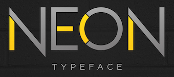 Graphic designer in Caracas, Venezuela, who designed the stylish neon stencil typeface Neon (2016). [Google]
[More] ⦿
|
Haidi Shabrina
[Mahameru Type (or: Haidi Illustration, or: Mahameru Type, or: HN Fonts)]

|
 [MyFonts]
[More] ⦿
|
Hamam Jauhari
[Wacaksara Co]

|
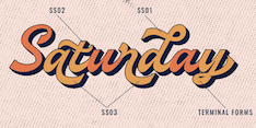 [MyFonts]
[More] ⦿
|
Hamid Azzafrar
[Zefrar]

|
[MyFonts]
[More] ⦿
|
Harold Lohner
[Harold's Fonts]
|
 [More] ⦿
|
Harold's Fonts
[Harold Lohner]
|
 Harold Lohner was born in upstate New York in 1958. He received an MFA in printmaking from the University at Albany and is Professor of Visual Arts at Sage College of Albany. He began making fonts in 1997 and starting distributing them the next year through Harold's Fonts. He lives in Albany, NY, with his partner, Al Martino. Originally, most of his typefaces were freeware or shareware, but gradually, he started selling most on his site or via FontBros. His typefaces:
 Link at Dafont. . Abstract Fonts link. [Google]
[More] ⦿
|
Harry Warren
[Breauhare Fonts]

|
[MyFonts]
[More] ⦿
|
Hart Armstrong
|
Art director in Los Angeles. Creator of Black Light Type (2012), a colorful alphabet poster. [Google]
[More] ⦿
|
Hendra Pratama
[HP Typework (was: Mikrojihad Inc.)]

|
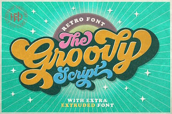 [MyFonts]
[More] ⦿
|
Henning Brehm
[Design Tourist]

|
[MyFonts]
[More] ⦿
|
Henrik Kubel
[A2 Type]

|
 [MyFonts]
[More] ⦿
|
Henrik Kubel
[Fontyoufonts.com]
|
[More] ⦿
|
Hirday Pal Aujla
|
Jalandhar, India-based designer of the neon typeface Virtue (2018). [Google]
[More] ⦿
|
Holiday Type
[Ryoichi Tsunekawa]

|
A 2008-2009 project by Ryoichi Tsunekawa, who also runs Flat-It and Propaganda. At Holiday Type, he sells script fonts with a 1950s feel, often connected. These are: HTGelateria, HTLibreria, HTPizzeria, HTTabaccaio, HTCafe, HTCartoleria, HTFiorista, HTEspresso, HTMaison, HTMotel, HTNeon, HTOrologiaio, HTPasticceria, HTProfumeria, HTTrattoria, HTOsteria, HTFarmacia. [Google]
[MyFonts]
[More] ⦿
|
HP Typework (was: Mikrojihad Inc.)
[Hendra Pratama]

|
 Banten or Serang, Indonesia-based designer (b. 1985) of Brookline (2020: sans), Hardome (2020: script), Sketsa Ramadhan (2020: Arabic emulation), Hoffermond (2020: script), Harvey Script (2020: monoline), Brotherline (2020: an upright monoline script), Shopie (2020), Sticky Notes (2020), Hugheid (2020: script), Rawk Brush (2020: dry brush style), Autography (2020: a signature font), Crossover, Sticky Notes (2020), Gillimore (2020: script), Nuchelle (2020: script), Bigfat Script (2020), Lovely Script (2020), Rottersand (2020), Birthland (2020), Quicklamb (2020), Alifia (2020), Rutheride (2020), Cartagena (2019: a dry brush script), Hisyam Facelift (2019), Hassanah (2019), Broderick (2019), Reactive (2019: a stencil font), Bellarina (2019: script), Sherlina (2019: script), Brushwell (2019: a dry brush script), Election Script (2019: monoline), Billgates (2019: brush script), Phallains (2019: a monoline script), Michland (2019: script), Blacktroops Stencil (2019), Hangover Brush, Colgneries, Spagheti (sic), Charmline Script (2019), Retrofunk (2019: a baseball script), Quick Signature (2019), Ramadhan Karim (2019: Arabic simulation font), Silent Fighter (2019), Groovy Script (2018, psychedelic signage script), Hisyam Script (2018), the free Barista Script (2018), the monolinear neon font Lazy Ride (2018), the free brush pen calligraphic typeface Azkia Script (2017), Knight Brush (2017), The Black Veil (2017, spurred), Hijrnotes (2016, connected script published at Aring), Banten Unfamous 2 (2016), Raven Script (2016, tattoo font), Nouradilla Script (2016), Bukhari Script (2015), Ababil Script (2015, tattoo script), Granada (2015, a wedge serif titling typeface), Al Ghifari (2015, brush script), MJ Zhafira (2015, a signage script; free demo font), Blacktroops (2015, a military typeface family with Basic, Rough, Inline and Stencil styles), Scriptonite (2015), Barber Kills (2015), Alisandra Script (2015, a brush pen signage script), Bukhari Script (2015, a free bold monoline cursive font), The Blackfat Script (2015, fat signage typeface), Granada (2015, spurred typeface), Fadli Script (2015), Jibriel (2015, ominous spurred vintage typeface), Umar (2014, a free spurred constructivist typeface), Aisha (2014, a spurred signage script), Rodja (2014, an Arabic simulation typeface), Banten Unfamous (2014), The Wahhabi Script (2014, free), The Black Veil (2014, a spurred font), Khadija Script (2014, free connected baseball script; +Khadija Spurs). Umar (2014) is an all caps font family that includes a stencil style and many athletic lettering styles. Dafont link. Home page. Behance link. Creative Market link. Fontspace link. Creative Fabrica link. Behance link for HP Typework. Dafont link for Hendra Pratama. [Google]
[MyFonts]
[More] ⦿
|
HypeForType
[Alex Haigh]

|
 British foundry started in 2009 in Sheffield, but now located in Dronfield. Their fonts include Nanami (2013, avant-garde sans), Nanami 3D (2014, free shadow typefaces, among the prettiest ones ever created), Miyagi (2008, a paperclip / neon sign typeface that revives Letraset's Yagi Link Double, a 1970s typeface of Robert Trogman for Facsimile Fonts) and Taku (2008, Taku stencil), BAQ Outline, BAQ Rounded (like VAG Rounded), Hiruko (geometric sans family, free at Dafont), Hiruko Pro (2013), Ebisu (2010), Sukato (very fat), Aiko, Kata (2009, grandissimo grunge).
 It seems that this foundry grew out of Alex Haigh's Thinkdust in Nottingham, UK. They have some exclusive typefaces by Si Scott (the curly typeface Hunter, 2009), Alex Trochut (Neo Deco, 2009), HelloHikimori (Lace, 2009), Luke Lucas (Lukano, 2009), and Jon Burgerman (the hand-drawn fun type Burgerman, 2009). Thinkdust link. Behance link. Dafont link. [Google]
[MyFonts]
[More] ⦿
|
Ichiro Style
|
FontStructor who is experimenting with Japanese influences in type design. In 2010, he made Simply Radical, Chigau Kanji, and Neon Japan. [Google]
[More] ⦿
|
Iconian Fonts
[Dan M. Zadorozny]
|
 Born in Philadelphia and a resident of McKinney, Texas, Dan Zadorozny's creations at Iconian. He is a prolific type designer who specializes in techno and sci-fi typefaces. Dafont link. Fontsy link. Abstract Fonts link. Font Squirrel link. His fonts in alphabetical order:
 - #44 font (2002), 00Starmap (2001, pixel font), 1968 Odyssey (2016), 1st Cav (2008), 1st Enterprises (2017), 2-Tech, 21 Gun Salute (2013), 2nd Amendment (2007, guns), 2nd Amendment 2050 (2009, more gun silhouettes), 2Toon, 300 Trojans (2008, comic book family), 4114 Blaster (2008, futuristic), 5th Agent (2008, techno), 7th Service (2002), 8th Element (2013), 911Porscha, 98 Bottles of Beer (2016).
- Achilles, Action-Men (2008), Action Women (2008, female outlines), Aegis (2010, Greek simulation family), Aetherfox (2013), AirCobra (2002), Aircruiser (2011, trekkie family), AirForce (planes and copters), Airstrike (2013), Airstrip One (2003), Aldo's Moon, Aldo's Nova, Alexis (2001), Alien League, Alpha Century (2020), Alpha Men (2015), Alpha Sentry, Alpha Taurus (2007, octagonal, athletic lettering), Amalgam, American Kestrel (2019), Americorps (2012), Ampire (2019), Anakefka (2009, ultra-fat family), Annapolis (2016), Antietam (2015), Antikythera (2013, Greek simulation face), Antilles (2009, sans family), Arctic Guardian (2019), Argosy, Arilon (2008), Armed Lightning (2017), Army Rangers (2013, octagonal), Assassin Nation (2015, scary and perhaps referring to the "tradition" of school shootings in the USA), Astro Armada (2020: sci-fi), Astropolis (2009), Atlantia (2012, futuristic), Avenger (2008, futuristic).
- Babes&Bond (2009, erotic silhouettes), Babe-alicious (2002, erotic outlines), Bad Axe (2017), Bad Robot (2007, computer game look), Bal-Astaral (2016, octagonal), Bamf (2011, techno family), Banjin (2016), Banshee Pilot (2016), Barcade (2018), Battlefield, Battleworld (2016), Beam Rider, Beam Weapon (2015), Beastian (2011), Behemoth (2018), Ben Zion (2008, Hebrew simulation), Berserker (2008, grunge), Beta Biergärten (2008), Big Blue Bug (2021), Bio-disc, Bio-discSolid, Bio-discThin, Bionic Comic (2002), Bionic Type (2002), Birds of a Feather (2007, dingbats), Black Bishop (2015), Black Gunk (2016), Blade Singer (2021), Blizzard Shaft (2020), Block, Blood Crow (2009), Blood Drenched (2020), Bloodlust (2011, dripping blood face), Blue Cobra (2020), Blue July (2009), Body Swipers (2014, Halloween font), Bog Beast (2013), Bomber Escort (2020), Boomstick (2015), Borgsquad (2014, mechanical/octagonal), Bretton (2018), Brin Athyn (2008, uncial/Celtric), Broken Cyborg (2019), Bronic (2004), Bubble Butt (2014, bubblegum typeface), Buchanan (2016), Buddy Champion (2015), Bummer (2007, octagonal), Bushido (2008, oriental simulation), Butch and Sundance (2013), Buttons the Bear (2008, children's hand), Byte Police.
- Camp Justice (2018), Capella (2011, a wide techno family), Capricus (2018), Captain Canaveral (2019), Carnival Corpse (2016), CasperComics, Centaurus (2015), Chardin Doihle (2008), a useful informal handprinting family), Charlemagne, Charlie's Angles (2018: octagonal), Charmling (2019), Cheyenne Hand (2008), Chicago Express (2016), Christendom, Classic Cobra (2016), Clubber Lang (2013, grungy), Cobalt Alien (2015), C.O.D.E.R. (2012), Coffin Stone (2019: a stone age font), College Collage (2017), Colony Marines (2017), Colossus (2011, old chipped stone look), Combat Droid (2019), ComicBookCommando, ComicFX, Commonwealth, Concielian, Concielian Break (2015), Concielian Classic (2018), Concielien Jet (2015), Contour of Duty (2016), Corinthian, Count Suckula (2015, horror font), Covert Ops (2012, army stencil), Coyote Deco (2007, art deco), Crappity-Crap-Crap (2007), Crazy Ivan (2017: constructivist), Creepy Crawlers (2015, horror font), Crime Syndicate (2013), Crixus (2011, a squarish sans that includes an athletic lettering style), Cro-Magnum (2003), Cruiser Fortress (2016), CryUncial, Cyberdyne (2016), Cyberia (like Soviet: neat Russian imitation letters), Cyborg Rooster (2015), Cydonia Century (2017), Cyrus The Virus (2012, grungy, hand-printed).
- DS Man, Daedalus (2008), Daemonicus (2012), Dagger Dancer (2020), Dameron (2016), Dangerbot (2016), Danger Flight (2015), Dan Stargate (2008), Dan'sHand, Dark Alliance (2014), Dark Dominion (2019), Dark Hornet (2020: a great blocky mechanical typeface family), Dark Horse (nice brush font), Darklighter (2018), Darkwind, Dassault (2013), Deathblood (2014, Halloween font), Deathshead (2019: a metal band font), Deceptibots (2019: stencil), Defcon Zero (2016), Dekaranger (2015), Delta Phoenix (2019), Delta Ray, Demon Priest (2013), Department-K, DepartmentH, Deranian (2008), Devil's Tongue (2019), Detonator, Devil Summoner (2014), DiegoCon (2004), Digital Desolation (2014), Ding-o-saurs (2007), Direktor (2008, Cyrillic simulation techno), Dire Wolf (2013), Disco-Dork, Disco Deck (2005), Disco Duck, Discotechia (2015), Dodger, Dokter Monstro (2017: a great fat hand-painted typeface), Domino Jack (2016, an octagonal stencil typeface), Domino Mask Condensed (2016), Dotcom (2002), Drafting Board (2008), Drafting Table (2008), Dragon Order (oriental simulation), Dread Ringer (2015), Drid Herder (2002), Drive (2015, techno font), Droid-Lover (2008), Drone Tracker (2016), Drosselmeyer (my favorite), Dusk Demon (2020: grungy).
- Eagleclaw (2009), Eaglemania, Eagle Strike (2015), Early Warning (2021), Earth Orbiter (2016), Earthrealm (2013), Earthshake (2013), Earth's Mightiest (2002), East West (2015, constructivist), Echo Station (2017), Eco-files, Edge Racer (2917), Egg Roll (2016, oriental simulation), Elastic Lad (2020), Eldebaran (2012), Elder Magic (2009), Election Day (2009), Elephant Gun (2021), Elite Danger (2017), Emissary (2014, sci-fi), Empire Crown (2011, blackletter), Enduro, Ensign Flandry, Ephesian (2007), Eridanus (2015, octagonal / mechanical), Erin Go Bragh (2009, Celtic/uncial), Escape Artist (2015), Eskindar (2013), Eternal Knight (2013), Eurofighter (2015), Eva Fangoria (2018: a dripping blood font), EverettSteele'sHand, Excelerate, Excelsior, Excelsior Comics, Exedore (2008), Exoplanet (2013, techno), Extechchop (2005), Eyes Only (2018).
- Factor (2016), Falconhead, Falcon Punch (2015), Famous Spaceships (2007), Famous Spaceships 2 (2019), Fanfare Ticket (2018: dot matrix family), FantasticCreatures, Fantazian (2003), Fantom (2009, bad handwriting), Federal Blue (2019), Federal Escort (2014), Federal Service (2011), Federapolis (2008, octagonal techno face), Fedyral (2019), Fedyral-II (2019), Feldercarb (2003, octagonal font), Ferret Face (2013), Fiddler's Cove (2012), Fight Kid (2009), Final Front (2019), First Order (2001), Flash Rogers (2016), Flesh Eating Comic (2013, grunge), Flight Corps (2008, techno/pixelish), FlyingLetaherneck (2002), Force Commander (2019), Force Majeure (2016), Foreign Alien (2020), Foucault (2014, uncial), Fox on the Run (2018), Fox on the Run Academy (2018: athletic lettering), Frank-n-Plank (2013, a wooden plank font), Freakfinder (2014: Halloween font), Free-Agent (2008), Freedom Fighter (2013, stencil), From Bond With Love (2014: military stencil), Front Runner (2019), Frost Giant (2019), Frozen Crystal (2016, LED font), Funk Machine (2016, a great ultra-black techno family of typefaces), FunnyPages, Furiosa (2019), Future Forces (2015), Futurex Grunge (2005).
- Galactic Storm (2014), Galant, Galaxy-1 (2008), Galaxy Far Far Away (2009, futuristic dingbat font), Galaxy Force (2014), Galga (2008, futuristic), Gamma Sentry, Gemina (2011, sci-fi / techno family), Gemina2 (2013), Generation Nth, Gentleman Caller (2014), GeoBats (2007), Gearhead (2013, octagonal), Ghost Clan (2014), GI Incognito (2012), Global Dynamics (2014), Globe Trekker (2021), Goalie (2008, hockey mask alphading), Goblin Creek (2016: Halloween font), Gods of War, Gotharctica (2015, blackletter for horror flicks), Governor (2017), Graffiti Street (2019), Grand National (2015), Grand Sport (2015), Graymalkin (2011, trekky), Grease Gun (2012), Grendel's Mother, Grim Ghost (2013), Ghoulish Intent (2016: Halloween font), Grimlord (2009), Groovy Smoothie (2018), Guardian (2008), Guardian-Laser (2008), Guardian-Pro (2008), Guardian-Shadow (2008), Gunner Storm (2015), Gunrunner (2016: techno), Gunship, Gunship V2 (2002), Gypsy Killer (2013), Gyrfalcon.
- Hadriatic (2008, roman lettering), Half Elven (2013), Halfshell Hero (2013), Hall of Heroes (2007), Halo, Hanging Tree (2019: a wood print emulation font), Han Solo (2013), Hard Science (2019), Harrier (2002), Hawkmoon (2011), Head Human (2021), Heavy Copper (2020), Heavy Falcon (2019), Hello Copters (2013: helicopter dingbats), Hemogoblin (2017: spooky font), Heorot (2009, stone age fonts), Hermetic Spellbook (2017: alchemic), Heroes Assemble (2011), Heroes Assemble Dingbats (2014: all Avenger characters), Hero Worship (2021), Hexgon (2018), Hexkey (2020), Highrise Heaven (2007, city skyline dingbats), Hip Pocket (2014: psychedelic), Hitchblock (2017), Hollow Point (2015), Holly Dingle (2015), Holy Empire, Home Base (2020), Homemade-Robot, Holo Jacket (2016), Homebase (2020: heavy, octagonal), Homelander (2020), Homeworld (2003), Homeworld Translator (2003), Hong Kong Hustle (2015), Horroroid (2015), Horroween (2013, Halloween font), Hot Kiss (2017: paint splatter font), Howlin Mad (2017), Hula Hoop Girl (2019), Hulkbusters, Hydronaut (2019), Hydro Squad (2014), Hyper Vyper (2019: octagonal), Hypno Agent.
- Iapetus (2014, sci-fi), Icebox Art (2012), iChrono (2018),
 IWantMyTTR!, Iconian (2002), Iconified, iDroid (2020), Illuminati, Illumino (2016), Imaginary Forces (2008, mythical dingbats), Imperial Code (2003, Startrek style face), Imperium, Incubus, Incubus-Italic (2008), Incubus-Shadow (2008), Indigo Demon (2017), Infinity Formula (2003, super techno), Infobubble, Inhumanity (2014), I-House Edition (2014), Inspector General (2020), Instand Zen (2016: Halloween font), Inter Bureau (2019), Interceptor (2008), Interdiction (2012), Intergalactic (2017), International Super Hero (2002), Intrepid, Iron-Cobra (2008), Iron Forge (2012). IWantMyTTR!, Iconian (2002), Iconified, iDroid (2020), Illuminati, Illumino (2016), Imaginary Forces (2008, mythical dingbats), Imperial Code (2003, Startrek style face), Imperium, Incubus, Incubus-Italic (2008), Incubus-Shadow (2008), Indigo Demon (2017), Infinity Formula (2003, super techno), Infobubble, Inhumanity (2014), I-House Edition (2014), Inspector General (2020), Instand Zen (2016: Halloween font), Inter Bureau (2019), Interceptor (2008), Interdiction (2012), Intergalactic (2017), International Super Hero (2002), Intrepid, Iron-Cobra (2008), Iron Forge (2012). - Jack's Candlestick (2013), Jackson, Jannisaries, Jedi Special Forces (2012), Jeebra (2018), Jerusalem (1999, Hebrew font simulation)[see also here], Jetta, JettaTech, Jetway (2012, a stencil face), Johnny Torch (2012), Joy Shark (2018), Judge, Judge Hard, Jugger Rock (2018), Justice (2009), Jumpers (2017), Jumptroops (2003-2015), Justinian.
- Kahless, KameraDings (2009), Kangaroo Court (2018), KarateChop (2009), Kartoons (2008), Katana, Kaylon (2019), Kennebunkport (2013, script), Keystone (pixel font), Khazad-Dum (2011), Kid Cobalt (2008, comic book face), Kinex, King Commando (2011), King's Ransom, Kinnihuman (2020: dingbats), Knievel, KnightsTemplar, Kittrick (2019: a heavy octagonal type), Knock Furious (2003, dingbats), Kobold (2008, futuristic), Kondor (2013), Kountry Kodes (2008, international license plate lettering), Kovacs (2018), Kovacs-Spot (2016), Kreature Kombat (2018), Kreeture (2002), Kubrick (2008).
- Lamprey (2012, techno family), LandShark (2001), LandWhale (2001), Laredo Trail (2013, a Western face), Laser Corps (2020), Laserian, Laser Wolf (2018), Law and Order (2005, dingbats), League Wars (2013, sci-fi stencil), Leatherface (2013), LED Sled (2016, LED font), Left-Hand Luke (2016), Legacy Cyborg (2019), LegalTender, Legion, Legionnaires (2017: silhouettes), Legio Sabina (2017), Lethal (2014), Liberty Island (2013, sci-fi), Liberty Legion (2015), Lifeforce (2018), Light Brigade (2018), Lightsider (2011, Star Trekkish family), Lincoln Lode, Livewired (2015, sci-fi), Lionel (2009), Low Gun Screen (2008, a totally square screen type family), Lincoln Chain, Lionheart, Lobo-Tommy (2008), Lord of the Sith, Loveladies, Low Gun Screen (2008, screen face), Lux Contra Tenebras (2018: a fat Textura typeface).
- Machiavelli, Mad Marker, Magic Beans (2007), Major Force (2016), Mandalore (2019: squarish), Marathon-II, Marathon, Marsh Thing (2014, Halloween font), Masked Marvel (2002), Master Breaker (2017), Masterdom (2004), Merri Christina (2015, children's hand), Metal Storm 3D (2008), Metronauts (2013), Metroplex, MetroplexLaser, MetroplexShadow, Michaelmas, Michigan (2015), Milk Bar (2003), Micronian (2008, extensive pixel-based family), Military-RPG (2008), Mindless Brute (2015), Miracle Mercury (2017), Missile Man (2002, futuristic), Miss Amanda Jones (2004, brush style), Mister Twisted (2018), Mobile Infantry, Modi Thorson (2013, techno), Monsterama (2011, scary face), Monster Hunter (2017), Montroc (2015: squarish and varsity style), Moon Dart (2008), Moon Runner (2016), Morse Kode, MorseNK, Motorama (2018: car maker icons), Movie Gallery (2008, dingbats), Mrs. Monster (2013, Halloween brush font), Mystery Mobile (2015), Mystic Singler (2008, rough brush face).
- Nathan Brazil (2013, art deco), National Express (2003), Native Alien, Navy Cadet (2016), Nemesis Enforcer (2013), Neo-Geo (like the letters on the Neon cars), Neo Navy (2015), Neuralnomicon, Neuralnomicon (2018), Neutron Dance (2020), New Come Title (2016), New Mars (2015), New York Escape (2015), Nextwave (2014), NGC 292 (2020), Nick Turbo (2001), Nicomedia (2020), NifeFite, NifeFiter, NifeFites, Nightchilde (2013), Nightmare Alley (2016: Halloween font), Nightrunner (2008, sci-fi), Night Traveler (2020), Nightwraith (2011, techno family), Ninja Garden (2018), Ninjas (2002), Nobody's Home (2014: poster font), NoloContendre, Northstar (2014), Nostromo, Nuevo Passion (2013), Nyet (2002, Soviet letter simulation).
- Oberon, Oberon-Deux, Obsidian Blade (2020), Obsidiscs (2003, dingbats), Oceanic Drift (2013), October Guard (2013, Cyrillic simulation face), Odinson (2007, runes), Oh Mighty Isis (2014, Greek simulation family), Olympic Carrier (2017), Olympicons (2003), Omega 3 (2010, futuristic), Omega Flight (2020), Omega Force (2013, octagonal / mechanical), Omega Sentry, Omni Boy (2019), OmniGirl (2003, techno), Opilio (2012), Opus Magnus (2013, metal band font), Opus Mundi (2015), Oramac (2004), Ore Crusher (2013), Oubliette (2020), Outlands-Truetype (2001), Outrider (2013), Overstreet Bible (2014, hand-printed), Ozda (2011, a fat techno family with several horizontally striped styles), Ozymandias.
- Psyonic VII (2012), Paladins (2015), Pandemonious Puffery (2002), Parker's Hand (2002, handwriting), Peace & Houston (2019: squarish), Pepperland (2019), Perdition, Peregrine, Phantacon (2017), Phaser Bank (2008, techno), Philadelphia, Philly Dings (2003), Phoenicia (2015), Piper Pie (2007), Pistoleer (2011), Planet N (2016), Planet S, Planet X, Player 1 Up (2012: architectural family), Pocket Ball (2016, dot matrix style), Pocket Monster (2016), Police Cruiser (2013), Postmaster, Power Lord (2011), Predataur (2019), Presley-Press (2007), Press Darling (2012), Procyon, Prokofiev (2009, rounded and squarish), Promethean (2008), Protoplasm, Prowler (2013), Pseudo Saudi (1999, Arabic simulation), Psycho Butcher (2014, ransom note font), PuffAngel, Pulsar Class (2018), Pulsar Class Solid (2018), Pulse Rifle (2009), Punch (2020), Pyrabet.
- QTs (2013: erotic silhouettes), Quake-&-Shake, Quantum of Malice (2013), Quark Storm (2013), Quarrystone (2015), Quartermain (2002), Quasar Pacer (2018), Quasitron (2009, futuristic), Quatl (2002, an Inca font), Queen&Country (2009), Quest Knight (2009), Questlok, Quicken (2013, horizontal stencil), Quickening (2014), QuickGear (2019), Quickmark (2004), Quick Quick (2019), Quick Strike, QuickTech, Quill Sword (2016: soft blackletter style).
- RCMP, Racket Squad (2017), RadZad, Radio-Space, Raider Crusader (2016), Raise Your Flag (2013), Range Paladin (2018), Ranger Force (2020), Realpolitik, Rebecca, Rebel Command (2012, Star Trek family), Redcoat (2008, blackletter), Red Delicious (2019), Redline (2015), Red Rocket (2011, techno), Red Undead (2016: Halloween font), Regulators, Renegado (2014), Replicant, Repulsor (2013, pixelish), Rhalina (2011, a nice upright script), Rhinoclops (2019), Righteous Kill (2009), Right Hand Luke (2016), Robo Clone (2018), Robotaur (2008), Rocket Junk, Rocket Pop (2016), Rocket Type (2002), Rockledge (2019: an eroded stone look font), Rogue-Hero, Roid Rage (2003), Ro'Ki'Kier (2008), Rosicrucian (2009, stone age font), Royal Samurai (2018), Rubber Boy (2013, poster font family), Rumble Tumble (2020: a rough military stencil), Rune Slasher (2019).
- Sable Lion (2002), Sagan (2008, futuristic), Samurai Terrapin (2018: blocky), Scarab, ScarabScript, Sci-Fi (2008), SDF (2013), Sea-Dog, Searider-Falcon (2008), Secret Files (2011), Sever, Shablagoo (2015: thick creamy poster font), Shining Herald (2013), Shogunate (2019: a heavy octagonal typeface), Singapore Sling (2014), SisterEurope, Skirmisher (2014), Sky Cab (2017), Skyhawk (2014), Sky Marshal (2015), Sky Ridge (2020), Snubfighter (2009, sci-fi), Soldier (2011), Soloist (2018), Sound FX (2003), Soviet, Space Cruiser, Space Junker, Space Ranger (2013), Space Runner (2019), Spartaco (2016), Speed Phreak (2020), Speedwagon (2015), SPQR (2008, grunge roman), Spy Agency (2012), Spy Lord (2001), Starcruiser (2019), Starduster (2011), Star Eagle (2014), Star Fighter (2017), Star Guard (2019), Star Navy (2009: dingbats), Star Nursery (2018, fat stencil), Stranger Danger (2014: grunge), Strike Fighter (2017), Strikelord (2011, trekkie family), Stuntman, Subadai Baan (2013), Super Commando (2015), Super Soldier (2014, silhouettes), Super Submarine (2017: stencil), SuperUltra911, Superago (2002), Swordtooth (2017).
- Talkies (2008, dingbats), Tarrget (2013, based on the Tekken "Tag Tournament" logo), Taskforce (2008), Tauro (2012), Team America (2014), Team Galaxy (2020), Tele-Marines, Tempest Apache (2018), Terra Firma, Terran, Terror Babble (2017), Texas, Texas2, The Immortal (2019), TheRifleman, The Shire (2009), The Shooter (2012: gun dingbats), Texas Ranger (2014: Western font), Thundergod, Thundergod II (2013), Thunder-Hawk (2011, an aviation techno face), Thunderstrike (2016), Thunder Titan (2017), Thunder Trooper (2017: stencil), Tigershark (2013), Timberwolf (2011), Time Warriors (2007), Tokyo Drifter (2016), Tool (2012, dingbats of tools), Toon Town Industrial (2005, comic book font), Tower Ruins (2014: stencil), Tracer (2015), Trajia (2008, a techno/stencil/athletic lettering family), TransAmerica (2015), Traveler (2008), Travelicons (2009), Travesty (2003, scrawly handwriting), Trek Trooper (2008, Startrek font), Trigger Man (2013, octagonal and mechanical), Trireme (2011, Star trek family), Tristram (2008, uncial), Troopers (2011, futuristic), Trueheart (2009, Celtic), Turbo Charge (2016), Turtle Mode (2020: heavy octagonal), Tussle (2002), Typeecanoe (hand-printed), Typhoon (2013).
- Uberholme, Uberholme Lazar (2001), UFO Hunter (2009), Uglier Things (2018), Ultra 911, Ultramarines (2013), Underground Rose (2014, connect-the-dots), Union Gray (2015), Unisol, United Palanets (2014), UniversalJack, Uno Estado (2009, constructivist), Urban Defender (2019), U.S.A., US Angel (2017), USArmy, US Army II (2013), US Marshal (2012), US Navy (2007), U.S.S. Dallas (2008), Usuzi.
- Valerius (2009, uncial), Valiant Times (2021), Valkyrie (2008), Valley Forge (2008), Vampire Bride (2016: Halloween font), Vampire Games (2001), VariShapes (2001), Viceroy of Deacons (2016), Vicious Hunger (2014, grunge), Victory Comics (2017), VideoStar, Vigilante Notes (2003), Viking Squad (2015, stencil), Villain Team-Up (2020: a fat finger font), Vilmos Magyar, Vindicator (2012, techno), Virgin Hybrid (2014), voxBOX, Voortrekker Pro (2009: octagonal and athletic lettering family), Vorpal (2012: sci-fi stencil face), Vorvolaka (2013), Voyage Fantastique (2013), VX Rocket (2014, fat octagonal face), Vyper (2008, futuristic stencil).
- War Eagle (2009), Warlock's Ale (2014), War Machine, War Priest (2012), Warp Thruster (2013: military or Star Trek stencil), Warrior Nation (2011), Wars of Asgard (2009), Watchtower (2012), Weaponeer (2008, military lettering), Ween Dings (2918: Halloween dingbats), Were-Beast (2008), Westdelphia (2015, blackletter), Western Rail (2015), Wet Works (2013, grungy stencil), Whatafont, Ensign Flandry (2003), Whiskey Bravo (2003), Whovian (2015, scanbats of all Dr. Who characters owned by the British Broadcasting Corporation), Wiccan Ways (2020: alien writing), Wicker Man (2017), Wildcard (2011, Star trek family), Wimp Out (2004), Winter Solstice (2016), Wolf Brothers (2015), Wolf's Bane (+II, +Super-Extended, 2013), Woodgod (2013), Worldnet (great), Worm Cuisine (2016), Write Off, Writer's-Block, WyldStallyns.
- Xaphan (2003), XBones (2018), XCryption (1999, a hacker face), X-Fighters (2014), XPED, Xcelsion (2002), Xeno Demon (2017), Xenophobia, Xephyr, Xeppelin (2005, zeppelin dingbats), X-Grid (2008), Xiphos (2007), Xmas Xpress (2013), Xoxoxa, X-Racer (2012).
- Yahren, Yamagachi 2050 (2019), Yama Moto (2009: oriental simulation), Yankee Clipper (2011), Yay USA (2013), Year 2000, Year3000 (2001), Yellow Jacket (2002), Yeoman Jack (2021), Y-Files (2016), Yiroglyphics (2004), Yorstat (oriental simulation), Younger Brothers (2014), Younger Blood (2017), Young Frankenstein (2013), Young Patriot (2019: squarish), Youngtechs (2008, futuristic), Yukon Tech, Yummy Mummy (2018).
- Za's Vid (2001, pixel font), Zado (2002, dot-matrix font), Zakenstein (2011, caps only grunge), Zamboni Joe (2002, hand-printed)), Zealot (2008), Zee Lance, Zen Masters (2002, pixelish), Zero Prime (2019), Zeta Reticuli (2019), Zeta Sentry (2009, techno/futuristic), Zirconian (2021), Zollern (2013), Zombie Control (2013: a bloody paint drip face), Zone Rider, Zoologic (2009, animal dingbats), Zoomrunner (2016), Zounderkite (2017), Zyborgs, Zymbols.
[Google]
[More] ⦿
|
Identikal Foundry
[Nick and Adam Hayes]

|
 Identikal is a UK foundry run by identical twins Nick and Adam Hayes. Fonts made in 2000, sold through Atomic Type and/or [T26]: 21stA, 21stB, 21stComplete (2007, a rounded sans family), 22ndClosed, 22nd Open, 45degrees, ACTStern (2001), Angol (octagonal), Attac, B4, Breeze, Bully, Canal Extra, Chord, Click (2003), Corisande (2003), Positec (2003, techno), Curvature, Dieppe (2002, techno family in six weights), DigiGraf (2002), Distilla (2009, sans, HypeForType), Formatt, Kanal, Kneeon (2008, a paperclip or neon typeface), Curvature (futuristic, 2002), Rebirth (futuristic, 2002), Masta, Metron, Monark (2003), Camo Sans (2003, T-26, an octagonal stencil font), Multimedia Blitz, Panic, Phat, Phlex (dot matrix font), Phuture, Plotta, Podium, Rally, Rayzor, Reaction, Rebirth, Revalo Classic (2003; regular weight is free), Revalo Modern (2003), Robustik (2003), Sampler, Seize, Sharp, Skak (2003, octaogonal font), Stalk, Trak, Tremble, UNDA Series 1, 21st, UNDA Series 2, Wages (2002, dot matrix font), Wired, Zero (2000, Nick Hays, an octagonal font), Angol (2003, an octagonal font), Skrean (a stitching font, T-26), 22nd Closed and 22nd Open (2006, T-26, stencils), Loxley Serif (2006), Emporio (2006), Alwyn (2006), Direkt (T26, 2006), Baksheesh (2006, simple sans), Loxley Sans (2006, T-26), Loxley Mix (2006, T-26), Kowboy (2006, T-26: futuristic), Kelt (2006, 6 weights, T-26), Neutraliser Sans, Caps and Serif (2006, 24 weights in all, T26), Ramblok (2006, T26), Identikal Sans (2006, T26, 8 weights), BQE (2011, piano key family, T-26). Some pixel font families, and many futuristic designs.
 Fontworks site. Catalog. Klingspor link for Adam Hayes. Klingspor link for Nick Hayes. View Identikal's typefaces. [Google]
[MyFonts]
[More] ⦿
|
Illushvara
[Bayu Suwirya]

|
 Denpasar, Bali-based designer, b. 1989, of Love Santa (2019), Candy (2019), Hello Kids (2019), Round Light (2019: free), the curly scipt typeface Brandalls (2019) and the Greek emulation font Surfbreaks (2019, + Surf Breaks Swash).
 Typefaces from 2020: Brown Peanut, Karisa House (hand-printed, all caps), Angela Sweet, Gold Brush, Winter Swash, Violetdays, Christ Moon , Cerellia (an upright script with attractive ascenders), Silver Rocky (a dry brush script), Sans Autumn, Diamond Pride (a clean needle-anbd-thread script), Baking Pastry, Jimuella, Eye Monsta, Allamanda, Flintoye, Fully Moon, Spooky Green, Lemon Rolls, Honey Butterfly, Small Bunny, Foliage Monogram, Afilia, Berthan, Black Halloween, Eye Monsta, Leafing, Meowcats, Slabs, The Roseville (a fat finger font), Vintage Parker Leafing. Typefaces from 2021: Dragons Gravity, Neon Magic (a neon font), Woodyland (hand-crafted), Rainy Candy (a scrapbook font), Valo (a tuxedoed typeface), Pinky Scream (a horror font), Valley (script), Jelly Billy (a children's font), Rushline (an all caps brush font), Enjoy Things (a scrapbook font), Crafty Notes (scrapbook font), Kidy Smile (a monolinear children's font). Typefaces from 2022: Boldies (a stylized bold serif), Retro Bawl (retro and hand-crafted). Creative Fabrica link. [Google]
[MyFonts]
[More] ⦿
|
in the habit
[Tiziana Haug]
|
Design firm of Tiziana Haug, a Swiss designer who lives in New York. Tiziana has made some custom type such as Typographica (2001, a circle and crosshair dingbat face) and a folded paper-theme alphabet font in 2007 called ADC Paper Expo. Other typefaces: Built (2005), Home Sweet Home (2005, stitching face), Trace (2004, Neon light simulation). [Google]
[More] ⦿
|
Ines Silva
|
Designer in Guimaraes, Portugal, who created the neon light and rough metal-inspired typeface Triad (2019). [Google]
[More] ⦿
|
Ink Drop
|
London-based designer of these handcrafted typefaces in 2015: Newington (rough fat brush), Raid (rough brush), Evering, Stria, Buchanan (brush), Haight, Lytchett (handcrafted blackboard bold), Jervis (sketched), Theydon, Quavery. Typefaces from 2017: Blue Neon, CMYK (a color font), Popsicle (a color font), Emoji (a bitmap color font), Neon (a color OpenType font), Arrival (an arrival or departure signage font in colour OTF format). Typefaces from 2018: Gold Foil (an SVG based opentype font). [Google]
[More] ⦿
|
Iulia Strejan
[Miss Shiva]
|
[More] ⦿
|
Ivan Zeifert
[Gliphmaker.com]
|
[More] ⦿
|
Jackeline González Morocho
|
Salinas, Ecuador-based designer of some geometric display typefaces in 2014 such as Neon and Prism. [Google]
[More] ⦿
|
James Brendan Williams
|
James Williams is an artist and designer residing in the San Francisco Bay Area, where he recently concluded a residency at Headlands Center for the Arts. During his studies at Type West in 2019, James Williams designed Barry, a typeface that was influenced by the early 20th century typeface Berthold Bloch and the robust curves of early neon lettering. [Google]
[More] ⦿
|
James Garbett
|
During his studies in London, James Garbett designed the modular typeface City Type (2013). I believe that the neon light / paperclip typeface Students in Soho (2013) is complete, but I am not sure of that. [Google]
[More] ⦿
|
Jamilla Grannetia
|
Hilversum, The Netherlands-based designer of the grid-based typeface family Formgiving (2017) and the textured typeface Rotten (2017). Typefaces from 2018: Morbid Icons, Fluid, Point, Dweeb (a neon typeface). [Google]
[More] ⦿
|
Jayvee D. Enaguas
[Moad Jameel]
|
Jayvee lives in Al-Khobar, Saudi Arabia, and was born in 1996. Known as Grand Chaos, he also calls himself Nippon Central Fontmaster, NipCen Hacks Incorporated, and SMWCNC, and uses the abbreviation NC in some of his fonts. Recently, he started posting as Moad Jameel from Jeddah, Saudi Arabia. Home page. Dafont link. Devian tart link. Another Devian Tart link. And yet another Devian Tart link. FontStruct link. In 2009, he made Reality Pursuit NC and Pixel Operator (2009-2018). In 2010, he created the hand-printed typefaces Retrieve NC, NipCen's Print, NipCen's Handwriting, CartoonicMassive, CartoonicMassive3D, CartoonicMassiveCollage, CartoonicMassiveWacky, Cartonsix NC, and Basic Comical (a take on Comic Sans). Other 2010 typefaces include Retroville NC (pixel), Matthan Sans (mechanical sans), Monkirta Pursuit NC (squarish face), AeromaticsSmallCapsNC (techno), DynoNC (octagonal, techno), MatrixComplex3DNC (dot matrix face), MatrixComplexNC, MatrixComplexWaveNC, SpotlightTypewriterNC, SuplexmentaryComicNC, Coyotris (hand-printed), SMWTextNC (pixel family), and AeromaticsNC (angular face). In 2011, he made Neon Teocho NC (a techno face), Burbin Casual (2011, a casual sans face), Curse Casual (2011), Squaren Daren NC (2011, constructivisit), Hauracherell NC (2011, a movie lettering font based on "Senorella and the Haurache", 1961), Burvetica (2011, grungy), Allegre Sans (2011), 8bitoperator JVE (2011, pixel typeface done at FontStruct), The 2K12 (2011, dot matrix face, FontStruct), and Big Bimbo (2011, hand-printed). Typefaces from 2012: Minercraftory, New Era Casual (based on Dom Casual, 1951), Splendid Plan 9 (headline all-caps sans face), Aeromatics (inspired by Plan 9 from Outer Space), Destroyed Aero, Aeromatics Stencil, That's Font Folks (after the famous That's All Folks of Looney Tunes fame, 1930s), Dyno Sans, Stanberry (hand-printed), Pixisma (techno), Ander Hedge (octagonal), Jengle Jungallery, Freedom, Freeroad, Receiptional Receipt (dot matrix), Dimbo, Capital Daren, Tepeno Sans, Kemco Smooth, Kemco Pixel, Slabby Pices (an Egyptian), Mattelit (pixel typeface based on a Mattel game font from 1979), Barthowheel (comic book font), Minecraftory (pixel face). Typefaces from 2013: Moder DOS 437 (pixel face), Telespania (pixel face: Telespania is a monospaced pixel font, based from Teletext 1.5 for TVE (Television Espanola) in Spain or other services in Austria, Germany and Portugal), Sanidana (squarish), Santitechtro (a sans), Sanitrixie, Soniano Sans (octagonal), Magzetician, Grand9K Pixel (pixel face), Deluxe16 (pixel face), Polentical Neon (octagonal), Nechao Sharp (octagonal face), Magzetician (alien writing simulation), Saniretro. Typefaces from 2014: Reality Hyper (octagonal). Typefaces from 2017: Strow (free). Typefaces from 2018: Generic Mobole System (a pixel font). Typefaces from 2019: Half Eighties (a pixel font), Aire Exterior (a geometric sans serif typeface based on the title screen of the 1959 film Plan 9 from Outer Space). [Google]
[More] ⦿
|
Jeff Levine
[Jeff Levine: Art Deco Typefaces]

|
 [MyFonts]
[More] ⦿
|
Jeff Levine
[Jeff Levine: Signage]

|
[MyFonts]
[More] ⦿
|
Jeff Levine
[Jeff Levine: Additional typefaces]

|
 [MyFonts]
[More] ⦿
|
Jeff Levine: Additional typefaces
[Jeff Levine]

|
 This is a list of fonts by Jeff Levine not categorized anywhere else on my pages.
 - A: Adelanto JNL (2009), Adhesive Letters JNL (2011), Adhesive Serif Letters JNL (2015), Adventure Film JNL (2021: a casual sans based on the titles and credits for Texas Across the River, 1966), Afternoon Edition JNL (2015), Air Circus JNL, Aisle Seats JNL (2006, based on letters cut by the Redikut Letter Company of Hawthorne, CA), Album Cover JNL (2008), Alleway JNL (2012, a condensed sans), Allograph JNL (2007), Alphacal JNL (2008, outlined, and like Juneway JNL, based on water-applied decals once made by the Duro Decal Company (now Duro Art Industries) of Chicago), Alton JNL (2010: a bold display sans), Amateur Printer JNL (2007, grunge), Ampersorts JNL (2011: ampersands), And So Forth JNL (2011), Anecdote JNL (2009), Announcement Board JNL (2018: white-on-black), Antique Packaging JNL (2019: Victorian), Antique Price Tags JNL (2019), Arcaro JNL (2013, a calligraphic typeface based on the movie credits of the ABC TV series Naked City, 1958-1963, starring detective Frank Arcaro), Antique Show Card JNL (2018: based on an alphabet from the first Speedball Lettering Book in 1915), Arch Creek JNL (2010, an all caps revival of Beton), Ardball (2006), Arrevederci JNL (2018), Arrow Callouts JNL (2021: an arrow-themed alphading font), Art Deco Monograms JNL (2015), Arte Critique JNL (2009), Artist Colony JNL (2009), Arts District JNL (2014), Art Student JNL (2010), Art Techno JNL (2017), Astrospy JNL (2008: techno), Awkward Gothic JNL (2008), Axelby JNL (2013).
- B: Backpage Article JNL (2010), Bal Harbour JNL (2008), Balcony Seats JNL (2007, narrow retro sans), Ball Game JNL (2018), Bandmaster JNL (2021: based on the opening movie titles from the 1940 musical comedy Strike up the Band starring Judy Garland and Mickey Rooney), Barricade (2011, a great shadowed caps face), Bayview JNL (2008, based on Inland Type Foundry's Studley), Best Bet JNL (2014, a slab serif redesign of Beton), Bike Decals JNL (2008), Billing and Shipping JNL (2010), Bingo Player JNL (2010), Birch Beer JNL (2008), Bitmap Typewriter JNL (2017), Bit Part JNL (2017: extra condensed), Bit Player JNL (extra-condensed tall poster font) (2015), Bloktor Mosaik JNL (2007), Blue Parrot (2006), Bluesman JNL (2014: based on the lettering of the blues album "I'm Jimmy Reed" released on the legendary Vee-Jay label out of Chicago), Bold Display Sans JNL (2016: based on an imge in a Speedball book), Bonehead JNL (2013, bones), Bookkeeper JNL (2019: based on R. Hunter Middleton's slab serif, Karnak), Bookkeeping JNL (2019, like an extra bold version of R. Hunter Middleton's slab serif Karnak (1936)), Boss Jock JNL (2021: an informal font based on the title and credits from the 1965 film Strange Bedfellows), Box Lunch JNL, Brass Rail JNL (2015), Brazil Nut JNL (2015), British Cinema JNL (2021, based on the hand lettered titles and credits from the 1945 British film The Way to the Stars), British Vehicle JNL (2020; based on the UK license plate font created by Charles Wright in 1935; with Ahmed Eraqi), Broadcast JNL (2015), Broadletter JNL (2009), Brochure Sans JNL (2022: based on Sans Serif No.7 from the 1921 Miller & Richard type specimen book), Brogado (2006), Brookside JNL (2016), Brushmark JNL (2011), Brush Off JNL (2017), Bulk Weight JNL (2017), Bum Steer JNL (2015), Burger Joint (2006), Burger Royale JNL (2007), Burlesk Queen JNL (2020: blocked letters), Business Helpers JNL (2014), Business Letter JNL (2021: based on the squarish typeface Geometric in the 1894 catalog of the John Ryan Foundry in Baltimore, MD).
- C: Calendar Blocks JNL (2009), Calling Card JNL (2010), Callouts JNL (2011, in Circle and Square styles; white letters on black background), Canby (2006, a squarish caps face), Candle Wax JNL (2014, based on the movie poster for Bell, Book and Candle starring James Stewart), Cast And Crew JNL (2015, condensed monoline), Cast Shadow JNL (2010), Casual Lunch JNL (2009), Casual Friday JNL (2008, roman lettering), Casual Tune JNL (2015), Catalog Serif JNL (2015), Catalog Sheet JNL (2022: based on an extra condensed serif typeface from the 1892 MacKellar, Smiths & Jordan type foundry specimen book), Catch Words JNL (2009), Channel Tuning JNL (1999), Channel Surfing JNL (2010), Charlies Bar BQ JNL (2008, heavy slab serif), Charmer JNL (2014), Chive Turkey JNL (2007), Chunky Nouveau JNL (2020), Circuletter JNL (2016), Ciribiribin JNL (2014), Classification JNL (2015), Classroom JNL (2009), Cling Vinyl JNL (2009), Coal Train (2004), Cocktail Hour JNL (2016, a beatnik typeface based on the opening title for the 1962 Blake Edwards film Days of Wine and Roses starring Jack Lemmon and Lee Remick), Coffee Bar JNL (2021: a squarish typeface), Coldfield JNL (2008), College Nouveau JNL (2018), Colmar JNL (2018), Columnist JNL (2020, after Morris Fuller Benton's News Gothic, 1908, ATF), Commentary JNL (2010, almost typewriter type---easy on the eye), Composer JNL (2017), Concierge JNL (2014), Conscription JNL (2017), Corkboard JNL (2010: a rounded all caps family), Cornfield JNL (2008), Crepe Paper JNL (2018), Criminal Intent JNL (2018: based on the trailer of the 1942 movie Mr. and Mrs. North), Crown Heights JNL (2007, slab serif caps), Cruise Director JNL (2021: an inline typeface based on a hand-lettered title on the poster for the 1933 musical comedy film Melody Cruise), Courtship JNL (2018), Cover Letter JNL (2019), Curtain Up JNL (2018), Cyberglass (2010, techno), Cybrox JNL (2012, grunge).
- D: Dance Hall JNL (2011), Dance Lesson JNL (2015, a wedge serif in the style of Latin Wide), Rotisserie Menu JNL (2021: based on a 1928 menu for the restaurant Rotisserie Du Cardinal), Dangits JNL (2009), Danish Script Initials JNL (2019, based on letters designed by Copenhagen-born industrial artist and letterer Gustav Boerge Jensen (1898-1954), Date Book JNL (2021; based on the credits of the movie The Awful Truth, 1937), Decal (2006), Decalcomania JNL (2017), Deco Of Tomorrow JNL (2014), Deconstructed JNL (2012), Decorative Panels JNL (2009), Deco Template JNL (2018: squarish), Deerfield JNL (2006, Bank Gothic style), Department Store JNL (2019), Desk Jockey JNL (2008), Deskplate JNL (2011: an all caps copperplate font), Desk Job JNL (2018), Detective Client JNL (2021: based on the cast credits of the 1941 film, The Maltese Falcon), Detention JNL (2007, hand-printed), Diamond Callouts JNL (2019, letters in triangles), Diamond Jim (2010), Diamondwood JNL (2015, rhombic), Dip Pen JNL (2017, rounded, handcrafted), Disclaimer JNL (2010, condensed thin headline face), Display Board JNL (2020: based on Paul Renner's Futura Display from 1932), Display Inline JNL (2009), Displayced (2006, LED font), Display Roman JNL (2014), Doggone It JNL (2019: based on the movie posters for the 1962 film, Mono Cane), Do It Yourself JNL (2008), Doo Wop Initials JNL (2007), Doowop (2006), Dormitory Decals JNL (2009), Double Take JNL (2008), Drafting Class JNL (2021: based on an all caps alphabet in The Essentials of Lettering by Thomas E. French and Robert Meiklejohn (circa 1912)), Dreamy JNL (2017), Dual Line Roman JNL (2021: an inline titling typeface), Duonor JNL (2010), Durable JNL (2016, based on a 1940s cover of a catalog for the Duro Decal Company of Chicago).
- E: Eastport JNL (2019: an interpretation of Morris Fuller Benton's 1931 classic, Stymie Extra Bold), Eat More Fruit JNL (2016), Eccentric Sans JNL (2018), Edessa JNL (2009: chiseled stone look, faux Greek), Editorial Comment JNL (2009, grotesk caps-only headline face), Edits and Credits JNL (2008), Egg Farm JNL (2021: based on the opening titles and credits of the 1947 film comedy The Egg and I), Electric Newspaper JNL (2021: a dot matrix font based on the moving message board electric newspaper from 1931 installed by the Los Angeles Times---in partnership with the Richfield Oil Company---on its building), Electrostatic JNL (2017, textured), Elite Resort JNL (2017, slab serif), Elsinor (2006), Endless Journey JNL (2009), Ensemble Inline JNL (2014), Entitled JNL (2007, squarish as in Bank Gothic), Evening Edition JNL (2009), Evening Event JNL (2021; based on hand lettering from the title credits for the 1950 film All about Eve), Evening Paper JNL (2015), Evening Walk JNL (2018), Expressions (smilies).
- F: Factual JNL (2010,headline face), Fairgrounds (2006), Fancy Free JNL (2016: decorative caps), Fancy Show Card JNL (2021), Farragut JNL (2008, hairline geometric), Fastenating JNL (2012, paper clip font), Federal Agent JNL (2021: a condensed typeface based on the opening title of the 1959 premiere season of The Untouchables), Feltboard JNL (2008), Fence Post JNL (2012), Festival Nights (fancy letters), File Clerk JNL (2020, Jeff Levine: based on Cushing (1897)), File Folder JNL (2010, Bank Gothic style family), Film Crew JNL (2009), Fincastle JNL (2011, all caps sans titling face), First Responder JNL (2017: a left-slanted version of Catalog JNL), Flagstaff JNL (2010), Flatbush Beanery (2006), Flipboard JNL (2011), Flivver (2006, a slab-serif display font), Floor Tiles JNL (2009), Florida (2006, retro), Food Vendor JNL (2011), Fordham JNL (2011, all caps slab serif), Formal Invite JNL (2021: thin, condensed serif lettering found in a 1937 magazine ad for Chris Craft boats), Formal Notice JNL (2020: a revival of an alphabet by Samuel Welo in Studio Handbook for Artists and Advertisers), Frankly Plain JNL and Franky Ornate JNL (2010, all caps typefaces after Franklin Gothic), Frantic Pace JNL (2016, a bouncy retro party font), Free Form Retro JNL (2021: an all caps sans based on the titles and credits from the 1960 French film Le Passage Du Rhin), French Calligraphic JNL (2019), French Cinema JNL, French Serif Moderne JNL (2009), French Slab Serif JNL (2018: based on the 1934 French lettering instruction book L'Art du Tracé Rationnel de la Lettre), French Song JNL (2021: a whimsical typeface based on the titles and credits of the 1952 British comedy Song of Paris), Freunlaven JNL (2006, psychedelic), Front Row JNL (2017: a tall condensed typeface that reinterprets Morris Fuller Benton's Empire from 1937), Fruit Juice JNL (2020), Fun and Games (2011, a casual retro typeface redrawn from the lettering found on the cover of a 1935 Speedball Lettering Pen book).
- G: Gene Condensed JNL (2014), Generic Sans JNL (2022: modeled after Condensed Blair from the 1907 specimen book of the Inland Type Foundry), Generic Gothic JNL (2013: an interpretation of Franklin Gothic Condensed), Genesee JNL (2010), Gift List JNL (2016), Gift Wrap JNL (2014), Gilbert JNL (2011, after Eric Gill's sans), Go Home JNL (2017), Good Sport JNL (2019), Goose Creek JNL (2021: based on hand lettered credits from the 1942 British film comedy The Goose Steps Out), Go To Town JNL (casual inline type style) (2015), Gothic Grotesk JNL (2020; a revival of Royal Gothic (1930s, Stevens, Shanks & Sons), which in turn was based on Charter Oak (1899, Keystone Foundry)), Greenwich Village JNL (2014), Groovy 3D Caps JNL, Groovy Happening JNL (2005, psychedelic, in the style of Action Is), Groovy Summer (2006, a casual sans), Guadalajara JNL (2014, a Mexican party font), GummedAlphabet JNL (2011), Gummed Letters JNL (2010).
- H: Halavah Twist JNL (2007; see also its extension Zydeco JNL in 2009), Hallandale (2006), Halliday JNL (2013: an outlined typeface based on Beton Open Condensed), Handbills And Posters JNL (2015), Handmade Caslon JNL (2015), Handmade Dropshadow JNL (2010), Handmade Gothic JNL (2011, inspired by lettering samples in a 1941 Speedball Lettering Pen instructional booklet), Handmade Headline JNL (2018: a 1940s style typeface), Handmade Roman JNL (2011), Hand Stamped JNL (2006, rubber stamp look), Hanford (2010, a sans headline family), Hash and Beans JNL (2007), Headstone Roman JNL (2015), Hectonoid JL (2008), Heller Sans JNL (2019: after an experimental alphabet by Steven Heller), Highbrow Cafetorium JNL (2009), Hippie Comics JNL (2021: based on poster lettering in the 1920 edition of How to Paint Signs and Sho Cards by E. C. Matthews), Home Address JNL (2019), Home Economics JNL (2018), Home Room JNL (2009), Horse Puckey JNL (2008), Hotel Suite JNL (2017), Hoxie JNL (2008).
- I-J: Impecunious JNL (2017), Impressionable JNL (2012, based on a rubber stamp set), Incarceration JNL (2020), Industriality JNL (2015), Informational Gothic (2013: The Wood-Regan Instruments Company (Wrico) of New Jersey manufactured for decades a line of lettering kits called the Wrico Sign Maker. With only special ink pens, plastic templates and a template guide anyone could letter clean, clear signs, posters and notices. This typeface is based on one of those kits), Informational Sans JNL (2021: squarish, caps only), Initial Seals JNL (2012), Inkpad Letters JNL (2011), Inline Lettering JNL (2011, inspired by the opening title of a classic 1940s horror film, The Invisible Man's Revenge), Inlet JNL (2017), Inline Square JNL (2017), Innerspring JNL (2015), Intermediate JNL (2019: based on a home movie titling kit from circa the 1950s or 1960s called the Magna Tech Titler Number 312, modeled after Futura Bold), Interoffice Memo (2011), Intrigue JNL (2014, based on the hand-lettered movie titles from one of the William Powell / Myrna Loy Thin Man series of films), Island Time JNL (2015), Jalopy (2014), Jive Jump (2006), Jobseeker JNL (2011: hand-printed), Juneway (2006, modeled after a set of water-applied decals made by the Duro Decal Company of Chicago), Jungle Drums JNL (2017, African theme), Junior Printer JNL (2015), Just Great JNL (2016: angular display typeface).
- K-L: Katydid JNL (2015, a connect-the-dots typeface), Katz Pajamas JNL (2017), Keyden Drop Caps JNL (2021: a set of slab serif framed capitals based on John Alden Initials, shown in the 1906 edition of the Keystone Type Foundry specimen book), Key Largo JNL (2011, all caps slab serif), Lakeland JNL (2013), Kiddie Blokz JNL (2010), Kids Activities JNL (2017, handcrafted), Lamp Post JNL (2012, an interpretation of Post Old Style, ca. 1901), Last Date JNL (2018), Lasting Impression JNL (2008), Late Breaking News JNL (2016, headline sans), Late Hours JNL (2021: inspired by the hand lettered titles for the 1961 film The Children's Hour), Lecture Hall JNL (2012), Lefferts (2006, squarish display face), Legal Brief JNL (2021), Legal Eagle JNL (2017, with engraved lines), Les Folies JNL (2009, Victorian), Lettering Lesson JNL (2021: a bold serif typeface based on the 1922 instructional booklet from the St. Louis Show Card School), Lettering Pen JNL (2015, handcrafted), Library Book Initials JNL (2018: Library Book Initials JNL was modeled from examples of Sidney Gaunt's Publicity Initials; originally sold in metal type by Barnhart Brothers and Spindler as a companion to the Publicity Gothic typeface), Liebestraum JNL (2014, a decorative caps font), Limited Appeal JNL (2016), Linem Up (2010), Lobby Card JNL (2010), Local News JNL (2021: a condensed sans based on the hand lettered title for the 1954 film Power of the Press), Location JNL (2017), Longbranch Initials (2006, for decorative monograms), Longacre JNL (2013, fat rounded sans), Long And Thin Initials JNL (2015), Loose Leaf JNL (2010), Love Notes JNL (2011: alphadings), Luminum JNL (2007).
- M: Made in Japan (2014), Mailbox Letters JNL (2008), Main Feature JNL (2017, a marquee sans), Mainline JNL (2014), Manual Typewriter JNL (2017: allegedly after a 1933 example by Morris Fuller Benton), Manufactory JNL (2019, a wedge serif not unlike the ones used in advertizing in the late 19th century), Manufacturer JNL (2020: a reinterpretation of the Extra Bold Extended weight of Bauersche's Venus Grotesk (ca. 1907)), Marble Cutter JNL (2015, based on dies used for stamping text into marble headstones or other monuments manufactured by The Vermont Marble Company (Vermarco), which operated from the 1880s until 1976), Marching Band JNL (2019), Margate JNL (2013, based on water-applied decals manufactured in 1962 by the American Decalcomania Company for Goodyear), Marketing Strategy JNL (2017), Marking Device JNL (2014), Maryland JNL (2014), Matchbook JNL (2014: based on lettering on a matchbook from the Carrousel Restaurant in Miami Beach), Mayville JNL (2009), McCadden JNL (2013, inspired by the hand-lettered credits for the George Burns and Gracie Allen Show [1950-1958]), Meal Ticket JNL (2008, squarish), Merchandiser JNL (2010), Merchandising JNL (2014, brush signage script), Merchant Trade JNL (2020, after the Matthews Series by Inland Type Foundry, 1901), Merrymakers JNL (2020), Midnite Movie JNL (2017, inspired by the hand lettered title credits from the 1961 Hammer Pictures film Curse of the Werewolf), Millport (2006, squarish display face), Mimeograph Template JNL (2019: based on a plastic lettering guide manufactured by the Albert Blake Dick Company of Chicago), Misdirection JNL (2009), Mixed Messages JNL (2007, ransom note), Mocombo JNL (2010, an African look typeface that is a slightly modified version of one of the numerous alphabets created by the late Alf R. Becker for Signs of the Times Magazine during the period of the 1930s through the 1950s), Model Railroad JNL (2015), Moderator JNL (2013), Modern Appliances JNL (2014), Monoline Rounded JNL (2014), Monster Movies JNL (2018: a Halloween font), Monthly Meeting JNL (2013), Monthly Newsletter JNL (2011), Monthly Statement JNL (2018: based on the 1934 French lettering instruction book L'Art du Tracé Rationnel de la Lettre), Morning Edition JNL (2021), Morning Paper JNL (2015), Morningside Heights JNL (2015), Morningstar JNL (2012, named after Jeff's friend, Estella Dawn Roberts of Stella Roberts Fonts), Movieland JNL (2008), Movie Night JNL (2011), Movie Set JNL (2021: an all caps wedge serif based on a 1911 movie poster for the film How Bella Was Won), Movie Show JNL (2021: an all caps wedge serif based on a 1911 movie poster for the film How Bella Was Won), Moving Message JNL (2015, dot matrix typeface), Musical Arrangements JNL (2014), Musical Comedy JNL (2021: hand-printed), Musical Score JNL (2015), Music Course (2019), Mystery Show JNL (2018: modeled after the hand lettered titles found on various early episodes of the 1950s TV suspense program Alfred Hitchcock Presents).
- N: Naroid Initials JNL (2010, one of the most ultra-compressed sets of initials available in digital type), Narrow Minded JNL (2014), National Spirit JNL (2009), Newark JNL (2014: a strong slab serif), New Car Tag JNL (2020: based on the new license plates in Florida, which were introduced in 2018), Newsbreak JNL (2008), Newsbreaker JNL (2016; a vintage newspaper titling typeface), News Crew JNL (2017), Newshawk JNL (2007, a condensed sans), Newspaper Publisher JNL (2021: based on a headline in the 1917 edition of Logansport, Indiana Pharos-Observer), Newsprint JNL (2011), Newsreel Caps JNL (2014), Newsreel Text JNL (2021), News Ticker JNL (2021: based on the New York Times Square ticker operational in the 1930s), Newsworthy JNL (2011: a condensed headline sans), New Thin Roman JNL (2019, based on an alphabet called Compressed Roman in Essentials of Lettering, 1912), Nightcap JNL (2011), Nighthawk JNL (2009, a retro headline sans), No Entry JNL (2021: a bold blocky slab serif based on the hand lettered titles and credits from the 1958 war film The Young Lions), Nondescript JNL (2012), Nouveau Date JNL (2021: arts and crafts style), Nouveau Fashion JNL (2018), Nouveau Spur JNL (2019: neither art nouveau nor spurred), Nouveau Standard JNL (2018), Nouveau Handlettered JNL (2017), Nouveau Lettering JNL (2019, based on a 1916 slab serif alphabet by Thomas Wood Stevens), Nouveau Romance JNL (2017), Nouveau Roundcorner JNL (2015), Nouveau Square JNL (2017, squarish), Nouveau Standard JNL (2018), Nouveau Work JNL (2018), Nouveau Years JNL (2019), Nouveau Yorke JNL (2015), Novelty Nouveau JNL (2021), Now Playing JNL (2010).
- O: Oblogram JNL (2008, techno), Occidental Tourist JNL (2009), Odditype JNL (2006, computer simulation), Off Duty JNL (2021: based on the hand lettering from the titles and credits of the 1964 French film comedy Le Gendarme de Saint-Tropez), Office Staff JNL (2021: a version [with serifs added] of Popularity JNL---a condensed art deco design based on a popular typeface known as Radiant), Office Space JNL (2021: based on Condensed Edina from the 1921 Miller & Richard type specimen book), Office Work JNL (2021: a squarish typeface based on the title and credits of the 1965 film Mirage), Off The Wall JNL (2008). Old Bodoni Wide JNL (2016), Old Songs JNL (2018), Old Tijuana JNL (2018: in the serape style of pseudo-Mexican lettering found on ad designs of the 1930s and 1940s), Order Form JNL (2021: after MacKellar, Smiths & Jordan's Lining Gothic Extended from their 1892 catalog), Ordinary Gothic JNL (2017: gaspipe style), Outline Sans JNL (2018), Overnight JNL (2017), Oversimplified JNL (2019), Overton JNL (2017, based on early letter designs of Rudolf Wolf).
- P-Q: Pacific Atoll JNL (2021: a stylized slab serif type design based on the movie title lettering for the 1942 wartime film Pacific Rendezvous), Pacific Island JNL (2017: a tiki font based on the sheet music cover for the title song from the 1957 Marlon Brando movie Sayonara), Packaged Cookies JNL (2021; based on the first Oreo Sandwich package from 1923), Packaged Goods JNL (2016), Park Slope JNL (2014), Parfum de Paris JNL (2014), Paint Store JNL (2006), Parking Lot Sale JNL (2021: a flag font), Parkitechture (2006), Part and Parcel JNL (2009), Partial Eclipse JNL (2012), Patriotica JNL (2011, American flag face), Pavement JNL (2010, based on the extra-condensed lettering used on roadway information signs as revised by the U.S. Government in 2000), Pendraw Roman (2006), Pen Elegant JNL (2018, after an alphabet from a 1918 lettering instruction book by William Hugh Gordon), Pen Gothic JNL (2017: a rounded sans), Penmanshift JNL (2006, ronde style), Pen Nib Square JNL (2019), Penny Wise JNL (2017), Pen Sans Rounded (2019: based on a Speedball book from 1940), People Talk JNL (2021; a squarish all caps typeface based on a title card with cast credits for the 1935 movie The Whole Town Talking starring Edward G. Robinson and Jean Arthur), Performer JNL (2014, re-drawn from condensed hand lettering found on a piece of vintage sheet music), Personal Invitation JNL, Personalization (2019: a squarish typeface), Personal Note JNL (2011), Photo Developer JNL (2021), Picz JNL (2009), Pillow Puff JNL (2008, fluffy and cloud-like lettering), Pistol Twelve JNL (2008), Pitkin JNL (2006, a hand-lettered sans), Plastic Display JNL (2010, sketched from photo examples in an old sales promotion sheet for the Movitex Do-It-Yourself Plastic Sign Kit by Pryor Marking Products of Chicago), Plastic Template JNL (2011), Pleasantville JNL (2012, a condensed slab serif), Pocket Initials JNL (2008), Podunk JNL (2007), Political Poster JNL (2021: a condensed casual sans inspired by the hand lettering on a 1940 campaign poster for Franklin Delano Roosevelt), Pool Deck JNL (2015), Popstix JNL (2013), Pop Tune JNL (2014), Popularity JNL (2014, after Radiant), Port Of Call JNL (2015), Postal JNL (2009, white on black, as on stamps), Poster Contoured JNL (2018), Poster Pen JNL (2017), Poster Inline JNL (2014), Poster Plain JNL (2012), Poster Project JNL (2020), Post Production JNL (2021: a slab serif modeled after title card of the 1950 Humphrey Bogart and Gloria Grahame drama In a Lonely Place), Prehysteric JNL (2010), Presentation JNL (2011, a slabby family), Press Run JNL (2015, a reinterpretation of the classic typeface Cheltenham Condensed), Pricing Labels JNL (2010), Printed Letters (2006, made from stamped impressions made by a 1940s childrens sign making set), Printing Set JNL (2006, based on a rubber stamp alphabet), Printing Sorts JNL (2009), Prismatiq JNL (2009, shadow face), Privilege Sign JNL (2021: based on above-the-store signage for many newspaper stands, soda shops, candy stores, luncheonettes and pharmacies of the 1950s and early 1960s), Privilege Sign Two JNL (2021: based on decorative signage for many drive-ins, motels, food stores and other businesses of the 1940s), Promotional Copy JNL (2012), Proofreader JNL (2011, a rounded slab serif face), Prospect Heights JNL (2015), Public Notice JNL (2009), Public Transportation JNL (2008), Public Utility JNL (2012), Public Works JNL (2007: emulates the hand-cut lettering silk screened onto metal), Publication JNL (2010, a revival of DeVinne, 1890), Punch Tape JNL (2016, dot matrix font), Quick Meal (2019: a hand lettered interpretation of Morris Fuller Benton's 1905 design Miehle Extra Condensed Title), Quick Poster JNL (2019), Quick Response JNL (2015, based on QR codes), Quick Titling JNL (2019), Quorfid JNL (2010).
- R: Raccoon Coat JNL (2014), Radio Interference (2019: grungy), Radio Show JNL (2019: based on a logo from the TV show Car 54 Where Are You?), Rail Bum JNL (2016, basically Morris Fuller Benton's Hobo with slab serifs added), Railway Station (2019: a spurred wedge serif), Recording Artist JNL (2019), Record Jacket JNL, Recreation JNL (2013, outlined shadow face), Red Border Labels JNL (2015), Rendering (2011, architectural draftman's lettering), Reprint JNL (2013), Restaurant And Lounge JNL (2015, handcrafted), Retail Merchant (2006), Retail Monoline JNL (2021: a stylish thin headline typeface), Retail Packaging JNL (2019), Recruitment JNL, Retail Price JNL (2021, +Inline; for catchy price cards), Retail Shop JNL (2018: based on vintage New York City neon signage), Retirement JNL (2021: a flared headline typeface based on the hand lettered film credits for the 1937 movie Make Way for Tomorrow), Retro Packaging JNL (2018), Retro Resort JNL (2011), Reveler JNL (2019), Reverberation JNL (2011, horizontally striped face), Reverse Calendar Blocks JNL (2011), Rhineland Roman JNL (2017), Ritz Slab Serif JNL (2018), Road Picture JNL (2021: modeled after the hand lettered title and credits for the 1940 Bob Hope-Bing Crosby semi-musical comedy Road to Singapore), Roadside Diner JNL (2021: a signpainting font in the style of pre-war Miami), Rockaway JNL (2006, titling sans), Rock Concert JNL (2021; an all caps curly Victorian typeface inspired by the opening title and credits for the 1964 motion picture comedy Send Me No Flowers starring Rock Hudson, Doris Day, and Tony Randall), Roma Initial Caps JNL (2009), Rotisserie Menu JNL (2021: based on a 1928 menu for the restaurant Rotisserie Du Cardinal), Rough Print JNL (2012, rubber stamp lettering), Roundpoint Pen JNL (2011, based on instructional lettering found in an old Speedball Pen textbook), Roughshod (2006), Running Board JNL (2017, monoline, pen-lettered), Rural Route JNL (2010), Rustic Inn JNL (2014).
- S: Salad Bar JNL (2013), Sales Convention JNL (2021: a squarish typeface based on a menu printed in 1937 for the Starlight Room of the Waldorf-Astoria in New York City), Sales Pitch JNL (2014), Sales Slip JNL (2013), Sandcastle JNL (2011), Sans Poster Bold + 3D, Savings And Loan JNL (2014), Scandals JNL (2017), School Project JNL (2015, based on self-adhesive poster board letters once made by the E-Z Letter Stencil Company and sold under the name Quik Stik), Schoolroom JNL (2020: a school font based on the type style used for the Superior Sign and Chart Printer No. 929), School Age (2019: based on Trixy Toy Educator, a 1930s-era set of letters and numbers for teaching children, manufactured by the Durrel Company of Gardner, MA), Schoolyard Blues JNL (2018), Sea Cruise JNL (2015), Scoreboard JNL (2014: dot matrix typeface), Screentext JNL (2010, pixel), Screenwriter JNL (2021; based on the all caps hand lettered credits from the 1950 Humphrey Bogart film In a Lonely Place), Second Guess JNL (2017), Second Impression JNL (2008), Sennetarium JNL (2008, after lettering in a Charlie Chaplin movie), Semi Calligraphic JNL (2018), Sentzoff Coupon (2006, stitched), Series A Signage JNL (2018: this is based on Highway Gothic, also known as FHWA, by the United States Federal Highway Administration; the widths varied from A (condensed) to F (wide), but A was discontinued, hence the motivation to create Series A Signage), Serif Callouts JNL (2017), Sew What JNL (2010, stitching face), Shareholder JNL (2015), Shelf Numbers JNL (2008), Shelf Tags JNL (2017), Shicken Zoop JNL (2008, Hebrew), Shipping Carton JNL (2012), Sign and Poster JNL (2009, die-cut letters), Sign and Display JNL (2019: a companion of Sign and Poster), Shopkeeper JNL (2010, after a a vintage rubber stamp sign and chart printing set), Shopping Guide (2019), Short Subject JNL (2016, based on some hand-lettered title cards from various vintage Columbia Pictures two-reel comedies), Show Card Freehand JNL 2021; based on the title and credits for the 1951 Dick Powell and Rhonda Fleming film Cry Danger), Show Card Pen JNL (2021: based on an alphabet in the 1920 edition of How to Paint Signs and Sho Cards by E. C. Matthews), Show Card Sans JNL (2021: based on an alphabet in the 1922 book Modern Show Card Writing), Showmanship JNL (2017), Show Poster JNL (2021: A vernacular typeface based on a design from the 1960 edition of Samuel Welo's Studio Handbook for Artists and Advertisers), Shutterbug JNL (2021: a blocky typeface based on the signage of Jerry Lewis's Camera Exchange on Vine Street in Hollywood in 1950), Sightseeing Boat JNL (2021: based on the titles and credits for the 1966 romantic comedy The Glass Bottom Boat), Sign Expert JNL (2021: based on an alphabet in The Expert Sign Painter, 1922), Sign Studio JNL (2019: a multiline typeface modeled after an alphabet found in Martin Meijer's Album de Lettres Arti (1949)), Sign Template JNL (2015, based on one of the many plastic lettering guides manufactured by the now-defunct Wright-Regan Instrument Company also known as Wrico), Silent Film JNL (2021: a display slab serif used by the Uptown Theater in Wichita, Kansas, in 1928), Silent Movies JNL (2021; a rounded monolinear sans of the interbellum period), Silly Behavior (2019: a shaded bouncy letter font that revives a 1930 alphabet from 100 Alphabets Publicitaires dessinés par M. Moullet), Simplicity JNL (2014), Simply Grotesk JNL (2012, Peignotian), Simply Nouveau JNL (2017), Slab Compact JNL (2019), Sleuth JNL (2013, after the trailer for the 1936 movie After The Thin Man), Slim Chance JNL (2015, an ultra-narrow font based on an image of vintage packaging for Aquapruf Ear Drum Protectors), Slim Nouveau JNL (2017), Snack Shop JNL (2007, the retro diner look in a bold outline face), Snorkel JNL (2014), Snow Job JNL (2017, inspired by the hand-lettered titles for the 1964 Rankin-Bass animated holiday classic Rudolph the Red Nosed Reindeer), Socialite JNL (2009), Soda Fountain JNL (2015, bilined), Solid Serif JNL (2014), Songbook JNL (2014), Song Composer JNL (2017), Song Merchant JNL (2017), Song Plugger JNL (2014), Song Publisher JNL (2015), Song Stylist JNL (2016), Song Vendor JNL (2017), So Unusual JNL (2021: based on the hand lettered credits for the 1942 film comedy I Married a Witch), Southwest Serenade JNL (2015), Special Edition JNL (2021: based on a newspaper headline font used in 1924), Specimen Book JNL (2020: based on Lining Antique (1889. Illinois Type Foundry) and Central Lining Antique (1892, Central Type Foundry)), SplintersJL (2004), Sporting Event JNL (2021: a slab serif based on the title and credits of a British boxing film from 1953 called The Square Ring), Sportsboard JNL (2020: a flipboard font), Sport Shaded JNL (2009), Spring Fashion JNL (2010), Spring Season JNL (2020: textured caps), Spur Handlettered JNL (2008), Squarity JNL (2008), Stage Production JNL (2020), Stage Show JNL (2021: based on the movie credits for 9 Garcons...Un Coeur starring Edith Piaf), Stamp of Approval JNL (2007), Stamped Metal JNL (2012, beveled), Starlight Sans, Stationer JNL (2018), Stellator JNL (2006, a high-tech modular font), Stenographer JNL (2021: close to Bank Gothic Condensed), Stickball JNL (2017), Stonecut JNL (2014), Store Clerk JNL (2020: outlined), Store Tags JNL (2011), Streetcar JNL (2019: a vintage railroad wagon lettering font), Streeter JNL (2013, based on Beton Bold Condensed), Stylish Title JNL (2021: based on the cover title of the July 1935 issue of Harper's Bazaar), Subscription JNL (2018), Summer Holiday JNL (2021; based on the hand lettered production credits for the 1930 film Holiday), Summertime Breeze JNL (2021: based on the opening title sequence for the 1958 film The Long, Hot Summer), Sunlight JNL, Sunny South JNL (2015), Sunshine Susie JNL (2018), Supporting Cast JNL (2011), Surf Bum (2019), Swing Band JNL (2013: inspired by the title lettering from "Hi-De-Ho", a 1930s all-black cast film starring legendary bandleader Cab Calloway), Swing Vote JNL (2020: a beatnik font).
- T: Tabloid Edition JNL (2021: based on a headline newspaper font from UK's Daily Mail in 1918), Tabloid News (2019: an all caps condensed slab serif), Tabloid Press JNL (2015), Take Charge JNL (2016, based on the opening title card for the 1936 film The Charge of the Light Brigade starring Errol Flynn, Olivia de Havilland, Donald Crisp and David Niven), Tallahassee Chassis JNL (2007, modeled from a toy rubber stamp set imported from Japan), Tall And Narrow JNL (2015), Tamiami JNL (2009, Victorian, known as "Cuba"), Tea Bag JNL (2013), Tea Time JNL (2014), Technerd JNL (2011, a thin technical/mechanical face), Technopen JNL (2013: a rounded techno sans from a 1929 instructional booklet for the Esterbrook Drawlet Pens), Teenagers JNL (2021: a beatnik font that was inspired by the hand lettered opening credits for The Many Loves of Dobie Gillis, a teen-oriented television comedy that ran from 1959 to 1963 on CBS), Teen Years JNL (2021: a blocky sans inspired by the hand lettered name for the Joyce Records label (circa 1956)), Template Basic JNL (2021: a simple sans), Template Sans (2019: based on a lettering template by the Wright-Regan Instrument Company (Wrico)), Template Shadow (2019), Tenement JNL (2020: based on a Cooper Black style alphabet by Harry Lawrence Gage that was shown in Thomas Woods Stevens's book Lettering (1916)), Terrace JNL (2015), Terror JNL, That Stuff JNL (2009), Theater Lights JNL (2014), Theater Tickets JNL (2021: Based on the marquee signage for Detroit's Majestic Theater built in 1934), Theatrics JNL (2009, 3d face), Thin Mint JNL (2011), Thinly Disguised JNL (2016), Three Day Pass JNL (2009), Tiler JNL (2012, a gridded face), Title Block Sans JNL (2011, an avant-garde titling face), Too Much Information JNL (2007), Top Billing JNL (2008, dot matrix), Top Forty (2019: handcrafted), Topographic Sans JNL (2018: a mapmaking sans featured in a U.S. Army Corps of Engineers topographic drafting manual), Toucan Tango JNL (2007, multiline face), Tough Guy (2006, shaded titling face), Tough Stuff JNL (2008), Toy Decals JNL (2018), Toy Letters JNL (2018: based on die-cut letters and number by Village Toys (circa 1930s or 1940s)), Toyprint JNL (2009, grunge), Trade Journal JNL (2010), Trade Printer JNL (2007, Victorian-era sans emulation), Train Car JNL (2021: based on the hand-lettered opening credits of Alfred Hitchcock's Strangers on a Train (1951)), Transactive JNL (2007, dot matrix), Transcendental JNL (2017), Tribal Council JNL (2011, jungle lettering with a linocut look), Trilium JNL (2010, triline face), Tropicano JNL (2013, a wavy typeface), Tunesmith JNL (2014, Victorian), Twelve Oaks (2006), Two Cents Plain JNL (2012), Two Reeler JNL (2006; see also its follow-up typeface Positive Vibe JNL, 2007, both modeled after title cards of an early Charlie Chaplin movie), Two Step Nouveau JNL (2018), Type Catalog (2011, bilined all caps face), Typemonger JNL (2022: based on Two Line Sans Serif from the British type specimen book of Vincent Figgins (circa 1860)), Typesetter JNL (2011), Type Vendor JNL (2012), Typewriter Sans JNL (2015), Type Wronger JNL (2013, old typewriter typeface).
- U-V: Unpretentious JNL (2014), Urmeba JNL (2012, named after amoebas and co-designed with Ray Larabie; a barf font), Used Cars (2012), Utica JNL (2010, squarish all caps face), Vacation Resort JNL (2021: based on the hand lettered cast and production credits for the 1942 musicl comedy Holiday Inn starring Bing Crosby and Fred Astaire), Vaudevillian JNL (2017), Utility Signage JNL (2017), Vehicle JNL (2010, a condensed block font as for car plates), Vendor JNL (2010, Victorian era ribbon face), Vertical Roundpoint JNL (2011, found in a 1941 edition of the Speedball Lettering Pen instruction book and re-drawn digitally by Jeff Levine), Victorian Typewriter JNL (2020), Vintage Designs JNL (2009, dingbat which has some fists), Vintage Price Tags JNL (2015), Vododeo JNL (2014).
- W: Washington Heights JNL (2016), Wavely (2010), Weekend Date JNL (2020), Weeneez JNL (2011, wiener-shaped glyhs), Welcome Home JNL (2009), Werble JNL (2010), What A Night JNL (2018), Whoosh JNL (2007), Wild About Myself JNL (2015), Willoughby JNL (2006, based on 1950s toothpaste lettering), Window Sign JNL (2013), Wine Cellar JNL (2014), Winery JNL (2012: a soft-serifed caps face), Winkle Picker JNL (2021: a cut paper font based on the 1963 movie poster for an Italian documentary called Sexy Nudo), Winter Garden JNL (2017), Wireline JNL (2021: a paperclip font), Wire Mesh JNL (2009), Work Force JNL (2011), Wynwood JNL (2009).
- X-Y: Yankee Doodle Boy JNL (2017), Yard Sale JNL (2013), Yargo JNL (2009, hand-printed), Yayazout JNL (2008, fun titling face), Yorso Square JNL (2007).
- Z: Zera JNL (2007, intersecting rings), Zodor JNL (2010), Zoning Department JNL (2012), Zydeco JNL (2009).
[Google]
[MyFonts]
[More] ⦿
|
Jeff Levine: Art Deco Typefaces
[Jeff Levine]

|
 Art deco is another style that appeals to Jeff Levine. He has created some beauties:
 - Acceptable JNL (2014).
- Afterword JNL (2021). An art deco typeface based on a card shown in the 1931 gangster film The Public Enemy.
- Aircheck (2006, retro CBS font).
- Airliner JNL (2008, all caps, based on a promotional postcard for Kitty Davis' Airliner - a popular Miami Beach night spot of the 1940s).
- Allerton (2019).
- Aparcero JNL (2015).
- Apparel JNL (2020). An art deco stencil.
- Artistry JNL (2017).
- Art Class JNL (2014). Art Class JNL was re-created from the titling of a lettering booklet called Drawlet Portfolio, published by the Esterbrook Pen Company in the 1930s. Drawlet pens were Esterbrook's answer to the popular Speedball lettering pens, and the booklet was an instructional manual on hand lettering with the pen nibs.
- Art Event JNL (2021). Based on a 1930s WPA (Works Progress Administration) poster advertising an exhibit of New Jersey area posters. It had its main lettering rendered in a very condensed hand lettered interpretation of Futura Black.
- Art Lover JNL (2007, based on an art deco typeface from a Dan Solo book).
- Art Materials JNL (2021). Based on the cover of the 1930s-era Catalog of Artists' Materials from Ernst H. Friedrichs, Inc. in New York.
- Art Museum JNL (2016).
- Artwork Stencil JNL (2018, based on an art deco stencil alphabet by Georges Léculier, 1939).
- Autumn Song JNL (2019).
- Bandleader JNL (2014).
- Bandshell JNL (2020).
- Bargain Shopping (2019). Based on an old storefront sign of F.W. Woolworth.
- Barn Dance JNL (2018).
- Bay Ridge JNL (2015).
- Beachfront Hotel JNL (2018).
- Bed And Bath JNL (2016, from the hand-lettered name on a 1930s-era tin for Cadet condoms).
- Belmont JNL.
- Bensonhurst JNL (2016).
- Big Band JNL (2011) is a brash typeface that is based on a lettering example found in a 1941 Speedball Lettering Pen instruction book.
- Bill of Fare JNL (2021). A stylish art deco serif based on a 1942 menu cover for the restaurant at the Biltmore Hotel in Los Angeles.
- Blue Orchid JNL (2015).
- Borough Park JNL (2014).
- Brand X JNL (2013),
- Brookhurst (2006, compressed art deco font).
- Cabana Club (2006, Miami Deco inspired font with a razor-thin double outline).
- Cafe Society JNL and Cafe Society Monoline JNL (2014).
- California Bound JNL (2015). Based on the hand lettering found on the side of the old California Zephyr passenger trains.
- Canarsie JNL (2006, a hand-lettered art deco face), Canarsie Slab JNL (2001).
- Casting Call JNL (2015).
- Casual Deco JNL (2019).
- Catalog JNL (2012). A blocky headline typeface.
- Central Park JNL (2014).
- Changing Times JNL (2017).
- Chanson De Paris JNL (2018).
- Chinese Song JNL (2019).
- Chocolate Bar JNL (2016).
- Clean Deco JNL (2020).
- Cleveland Neon JNL (2016, based on the art deco neon sign for the iconic Clevelander Hotel located in the Art Deco district of Miami Beach).
- Club Lunch JNL (2016).
- Common Area JNL (2015).
- Contintental Gothic (2006).
- Cortland JNL (2009): modeled [in part] from lettering spotted in the opening credits of Columbia Pictures 1945 Batman serial.
- Counter Servive JNL (2021).
- Courtroom JNL (2021). Based on the hand lettered opening title for the 1935 Perry Mason movie, The Case of the Lucky Legs.
- Cover Art JNL (2016). Based on a cover of an art deco era Portuguese magazine called Illustracao.
- Cover Charge JNL.
- Crestview Six JNL (2010). And its outline and shadow versions called Gramercy Eight JNL (2010).
- Cut Stencil JNL (2011).
- Dance and Sing JNL (2021). An art deco stencil based on a 1932 fan magazine from Spain entitled Films Selectos.
- Dance Band JNL (2017).
- Dance Moderne JNL (2020). An art deco typeface based on an alphabet in Portfolio of Alphabet Designs for Artists, Architects, Designers & Craftsmen (1938, Irene K. Ames).
- Dance Number JNL (2015).
- Dance Partner JNL (2015). Based a movie poster for the 1935 RKO picture "Roberta" starring Fred Astaire and Ginger Rogers, which in turn was based on the hit 1933 stage play that introduced the song Smoke Gets in Your Eyes. The play itself was based on the Alice Duer Miller novel Gowns by Roberta.
- Dance Routine (2019).
- Dance Time JNL (2021). Based on an appearance poster from 1936 for the Benny Goodman orchestra.
- Dancing Girl JNL (2021). An art deco font based on a poster for the 1930 film Show Girl in Hollywood.
- Dancing Marathon JNL (2021). An art deco font based on the cover of the 1932 sheet music for Dancing Marathon.
- Date Night JNL (2016, based on the opening title card for the 1931s pre-code movie drama Other Men's Women starring Mary Astor, Regis Toomey, James Cagney and Joan Blondell.
- Deco Days JNL (2018).
- Deco Design JNL (2020).
- Deco Diva JNL (2020).
- Deco Drop Caps JNL (2018). Based on an alphabet shown in Modèles de lettres modernes par Georges Léculier (1925).
- Deco Eccentrique JNL (2018) and Deco Multiline JNL (2018).
- Deco Banner JNL (2016), Deco Edition JNL (2017), Deco Moderne JNL (2017), Deco Nights JNL (2017), Deco Pen JNL (2017), Deco Redux JNL (2020: an all caps counterless art deco typeface), Deco Revisited JNL (2020).
- Deco Romance JNL (2020).
- Deco Roundpoint JNL (2018), Deco Semi Serif JNL (2017).
- Deco Signage JNL (2021).
- Deco Sketch JNL (2020).
- Deco Spot Initials JNL (2020). A set of rounded art deco initials set inside circular borders, after Georges Léculier's Modèles de Lettres Modernes.
- Deco Hotel JNL (2015). A hairline deco typeface.
- Deco Geometric Stencil JNL (2015).
- Deco Style JNL (2018).
- Deco Paragraph Initials JNL (2015).
- Deco Pennant Initials JNL (2013).
- Deco Elongated JNL (2013).
- Deco Triline JNL (2017).
- Deco Wide JNL (2020). Based on an alphabet in Georges Léculier's Models of Modern Letters.
- Delancey JNL (2014). Inline and squarish.
- Design District (2006, art deco inspired design elements).
- Desk Clerk JNL (2010).
- Dine and Dance JNL (2015). Supper club deco, multilined.
- Dining Out JNL (2021). An art deco sans based on a 1940s ad flier for the Los Angeles restaurant Lucca Paris Inn.
- Direkta JNL (2012).
- Dip Pen Deco JNL (2019). Made with a round nib pen.
- Discotheque JNL (2018).
- Double Bill JNL (2013). Inspired by the promotional movie trailer for 1938 gangster comedy A Slight Case of Murder starring Edward G. Robinson.
- Double Line Deco JNL (2015).
- Drawing Tablet JNL (2011).
- Dress Shirt JNL (2018).
- Drexel JNL (2018).
- Dual Line Deco JNL (2017).
- Dutch Deco JNL (2020). Based on Anton Kurvers's hand lettering on the front cover of the 1927 magazine Het Vlaamsche Volstooneel.
- East Village JNL (2016).
- East To West JNL (2014).
- Easy Living JNL (2015).
- Easy Money JNL (2014).
- Erratic JNL (2014).
- Estella JNL (2008, starry art deco version of Farragut JNL). Jeff writes: Her father named her Estella Dawn, or morning star. She truly shines bright, for as the owner of Stella Roberts Fonts, she has dedicated part of her net profits to helping her siblings pay for their medication; they both suffer from Cystic Fibrosis and diabetes. Calm in spirit, loyal to friends and family, nurturing and caring, Stella has been a friend of Jeff Levine's for years. His Estella JNL font was dedicated to her, as is this other namesake font, Morningstar JNL.
- Eckhardt Showcard JNL (2008).
- Evening Gown JNL (2015). Based on an ad for the 1935 musical "Roberta" starring Fred Astaire and Ginger Rogers.
- Evening Initials JNL (2015).
- Evening Out JNL (2018).
- Evening Wear JNL (2014).
- Family Deco JNL (2021). Inspired by the bold art deco hand lettering of the movie credits for the 1936 Laurel and Hardy comedy Our Relations.
- Fancy Dancing JNL (2015). Based on sheet music titling for the 1938 movie musical "Carefree" starring Fred Astaire and Ginger Rogers.
- Fancy Deco JNL (2018: based on the 1934 French lettering book L'Art du Tracé Rationnel de la Lettre by D. Duvillé).
- Fancy Roman JNL (2018).
- Fashionable JNL (2016, art deco: based on print ads for the Hickok Jewelry Company).
- Fashion Statement JNL (2018).
- Faux Decaux (2007, fat art deco).
- Favorite Hangout JNL (2009).
- Film Noir (2010). A counterless art deco typeface based on Alf R. Becker's examples.
- Fine And Dandy JNL (2018, curly art deco).
- Fine Dining JNL (2016: inspired by the opening titles for the 1940 Barbara Stanwyck-Fred MacMurray film Remember the Night).
- Fine Food (2019).
- Finery JNL (2014).
- Flirtation Walk JNL (2018).
- Floorwalker JNL (2013). Based on stencils made in 1926 by Display Material Company of St. Paul, MN.
- Flower Shop JNL (2021).
- Foreign Film JNL (2021). An art deco typeface based on opening credits for the 1936 French drama La Belle Equipe.
- Formal Dance JNL (2018, Dutch deco).
- Formal Event JNL (2021). Based on hand lettered actors' credits on a title card from the 1937 film Shall We Dance.
- Free Form Deco (2019).
- French Bistro JNL (2018, based on the 1934 French lettering instruction book L'Art du Tracé Rationnel de la Lettre).
- French Deco JNL (2018).
- French Geometric JNL (2018, based on an art deco alphabet by Georges Léculier, 1939).
- French Pastry JNL (2015).
- French Wine JNL (2018).
- Frisco Bay JNL (2007, a nice art deco).
- Funny Business JNL (2018).
- Funny Papers JNL (2017).
- Gambling Resort JNL (2014).
- Gidley (2007).
- Golden Beach JNL (2015).
- Golden Moment JNL (2021). An art deco font based on the hand lettered cast credits for the 1939 film Golden Boy starring Barbara Stanwyck, Adolphe Menjou, William Holden and Lee J. Cobb.
- Golden Opportunity JNL (2015).
- Golden Years JNL (2021).
- Graduating Class JNL (2017).
- Grand Central JNL (2010): multi-line Art Deco font is reminiscent of all of the glitz and glamour associated with Manhattan in the 1930s and 1940s.
- Hatchery JNL (2016).
- Hollenbeck JNL (2008).
- Hollywood Revue JNL (2015). Inspired by a movie poster for The Hollywood Revue of 1929.
- Home Movies JNL (2012). Based on 1950s cling vinyl letters made by the Clingtite Letters Company of Chicago.
- Horse Drawn Carriage JNL (2016. Based on the title card for a 1935 Bette Davis feature entitled The Girl from 10th Avenue.
- Hotel District JNL (2016).
- Huntington (2006, an art deco typeface inspired by the opening titles of the film Casablanca).
- Hybrid Deco JNL (2020).
- Industrial Arts JNL (2017). An interpretation of Morris Fuller Benton's Phenix American, 1935.
- Informational Sign JNL (2016).
- Inline Retro JNL (2019).
- Jams And Jellies JNL (2016).
- Jazz Guitar JNL (2020).
- Jazz Trumpeter JNL (2021; an art deco typeface modeled after the title card for the 1945 movie comedy The Horn Blows at Midnight starring Jack Benny).
- Juke Joint JNL (2014).
- Junior Clerk JNL (2017).
- Kiddie Show JNL (2017).
- Last Tango JNL (2021).
- Lauderdale JNL (2013).
- Light Line Deco JNL (2018).
- Limousine JNL (2010, counterless, caps only).
- Lobby Poster JNL (2021). Based on hand lettered cast credits for the 1932 George Arliss film The Man Who Played God.
- Local Jeweler JNL (2021). Thin art deco caps.
- Love Song JNL (2014).
- Malagueña Stencil JNL (2015).
- Mantequilla JNL (2021). Pure art deco lettering modeled after the cover of the 1924 edition of Joaquin Belda's novel, La Hora del Abandono.
- Maplehurst JNL (2010): a beautiful rounded ultra-fat face.
- Market JNL (2009).
- Metalworker JNL (2009), and its star-spangled derived face, NationalSpiritJNL (2009).
- Metalet Modern JNL (2008, based on the letters found within the Metalet Movie Titling Set manufactured by the Modern Display Advertising Company of Hollywood, California circa the 1940s. Each stamped metal letter would be affixed to the background surface via the use of miniature magnets. Once in place, titles for home movies or slides could be photographed, the letters then returned to their storage area in their box.).
- Midtown JNL (2010) and its serifed version, Crosstown JNL (2010).
- Millbrae JNL (2015). Named after the old Millbrae Theater in Millbrae City, CA.
- Modular Deco JNL (2018). Based on an alphabet shown in Modèles de lettres modernes par Georges Léculier (1925).
- Monoline Deco JNL (2014).
- Monthly Adventures JNL (2012).
- Moonlit Night JNL (2017).
- Moonlit Walk JNL (2017).
- More Deco Lettering JNL (2015).
- Movie Classic JNL (2021). Based on hand lettered title card from the 1935 melodrama Magnificent Obsession.
- Movie House JNL (2013). A trilined typeface.
- Movie Matinee JNL (2021). A marquee font based on a 1926 trade ad for the silent comedy The Nut-Cracker starring Edward Everett Horton.
- Movie Musical JNL (2021).
- Movie Screen JNL (2020). An art deco typeface based on the hand-lettered opening titles from the 1944 Laurel and Hardy comedy The Big Noise.
- Movie Set JNL (2021). Based on the hand lettered title on the poster for the 1929 film comedy Why Leave Home?.
- Mulholland JNL (2015).
- Musical Number JNL (2015) and Musical Prelude JNL (2017), Music Lesson JNL (2020).
- Nameplate JNL (2016).
- Narrow Deco JNL (2019).
- Nice and Easy JNL (2021). Based on art deco hand lettered title and credits for the 1937 film Easy Living starring Jean Arthur and Edward Arnold.
- Night Life JNL (2012).
- Nightspot JNL (2011). A bilined headline typeface based on lettering by Alf R. Becker.
- Nightowl JNL (2011): a headline font encased in rectangles inspired by an Art Deco hand-lettered alphabet found in a 1941 edition of the Speedball Lettering Pen instruction book.
- Nouveau Poster JNL (2011). based on an alphabet found in Modern Pen Lettering (1915, C. Howard Hunt pen company).
- Nyack (2010, Inline, Solid, Monoline): tall, caps only.
- Paducah JNL (2021). Based on hand lettered screen credits for the 1940 film The Proud Valley.
- Parisian Playboy JNL (2017).
- Parkitecture JNL (2006): counterless and fat.
- Park West JNL (2020). An art deco slab serif.
- Party Invite JNL (2016).
- Passenger Train JNL (2021). Based on a 1940s travel poster for the Florida East Coast Railway.
- Pencil Pusher JNL (2014).
- Pen Lettering Sans JNL (2017, handcrafted art deco).
- Pen Work JNL (2017).
- Penwrite JNL (2017).
- Performing Arts JNL (2018).
- Perfume Counter JNL (2017).
- Periodical JNL (2016). Based on a cover of a 1920s Spanish magazine called Nuevo Mundo.
- Period Piece JNL (2015).
- Piano Lesson JNL (2015).
- Piano Solo JNL (2015).
- Pin Spotter JNL (2021: art deco).
- Oceanfront Property JNL (2017).
- Office Visit JNL (2021).
- Playwright JNL (2010): Levine's version of Broadway.
- Old Miami Beach JNL (2012). Based on signs of the Roney Plaza hotel in South Miami Beach.
- On The Town JNL (2016).
- Opening Night JNL (2013).
- Ormond JNL (2011) and Ormond Inline JNL (2011). The latter is a blackboard bold style face.
- Pocatello JNL (2016. Based on the cast and crew credits for Presenting Lily Mars (1943), (starring Judy Garland and Van Heflin.
- Pocomoke JNL (2015).
- Ornate Deco (2019). Based on an alphabet by Martin Meijer in Album de Lettres Arti (1949).
- Postmodern Moderne (2019). Based on an alphabet by Paul Carlyle and Guy Oring in their 1935 book, Letters and Lettering.
- Poultry And Fish JNL (2016).
- Presswork JNL (2020).
- Private Eye JNL (2019). Based on signage seen in 77 Sunset Strip, an ABC series that ran from 1958 until 1964.
- Prospect Park JNL (2015).
- Quite Animated JNL (2016).
- Radio Singer JNL (2017).
- Rail Service JNL (2021). Based on extra bold, squared art deco sans hand lettering found on a 1940s travel poster for the Pennsylvania Railroad.
- Rail Travel JNL (2021). Based on a hand lettered 1930s travel poster from the Pennsylvania Railroad.
- Railway Depot JNL (2018: based on the 1934 French lettering instruction book L'Art du Tracé Rationnel de la Lettre).
- Regal Suite (2006, display art deco).
- Retail Establishment JNL (2021). Based on the 1935 catalog for Vitrolite. LI>Revelry Deco JNL (2021). Based on the dust jacket for the 1926 book Revelry.
- Rhythmic Revue JNL (2018).
- Ridgewood JNL (2012).
- Ritz Stencil JNL (2011).
- Riverside JNL (2017).
- Romance Song JNL (2021). An art deco sans serif lettering used for the opening titles of the 1941 melodrama Penny Serenade starring Cary Grant.
- Roney JNL (2008, a stylized version of his own art deco typeface Metalet Modern).
- Screen Star JNL (2020). A rounded monolinear art deco typeface.
- Seahawk JNL (2019).
- Screenplay JNL (2010): modeled after the signage seen in an old photo of the RKO movie studios building circa the 1930s.
- Service Deluxe JNL (2015).
- Sheet Music JNL (2011).
- Shopping Spree JNL (2016). Inspired by the hand lettering on the title card for the 1938 film Fast Company starring Melvyn Douglas and Florence Rice.
- Show Biz JNL (2013).
- Show Card Deco JNL (2017).
- Showgirl JNL (2011). Based on the neon letters of a 1940s marquee.
- Showpiece JNL (2014).
- Signage JNL (2013). A stencil in the style of Futura Stencil.
- Silver Screen Deco JNL (2020).
- Sleuth JNL (2013, after the trailer for the 1936 movie After The Thin Man).
- Social Gathering JNL (2016).
- Society Column JNL (2016. Based on the title card for the 1938 screwball comedy Four's a Crowd starring Errol Flynn, Olivia de Havilland and Rosalind Russell.
- Solid Deco JNL (2016).
- Song Album JNL (2016).
- Song And Dance JNL (2014).
- Song Sheet JNL (2014).
- Deco Drop Caps JNL (2018). Based on an alphabet shown in Modèles de lettres modernes par Georges Léculier (1925).
- Space Deco JNL.
- Stage Play JNL (2015).
- Summerhaven JNL (2009).
- Social Club JNL (2021). Based on a movie poster for the 1934 comedy/crime drama Jimmy the Gent starring James Cagney.
- Society Dame JNL (2008).
- Solitude JNL (2015).
- Song Folio JNL.
- Stationery Department JNL (2015).
- Streamlined Stencil JNL (2015).
- Striptease JNL (2012). A 1930s burlesque show marquee typeface.
- Stagehand JNL (2014).
- Stocks and Bonds JNL (2021). Based on the hand lettered opening title for the 1935 movie Thanks a Million.
- Structural Glass JNL (2020). An art deco typeface based on a 6-letter example from a 1931 Vitrolite catalog.
- Student Council JNL (2021). Based on a lithographed cardboard sign (circa 1930s) for Spizz Sparkling Water, a bottled seltzer from the Dr. Pepper Bottling Company of Lexington, Kentucky.
- Stuffed Shirt JNL (2013).
- Stylette JNL (2007, an art deco typeface after Stylor JNL).
- Stylor JNL (2006, hairline art deco).
- Suggestion Box JNL (2015).
- Supper Club JNL (2007).
- Swing Era JNL (2015).
- Table Fortu JNL (2007, art deco stencil).
- Tall Order JNL (2015, a revival of Raleigh).
- Tanawonda JNL (2010).
- Tarpon Springs JNL (2021).
- Theater Bar JNL (2021).
- Thoroughfare JNL (2014).
- Ticket Booth JNL (2016). Based on the opening title card for 1940's Two Girls on Broadway.
- Tin Pan Alley JNL (2014).
- Top Hat JNL (after Art Lover JNL).
- Totally Deco JNL (2017).
- Town And Country JNL (2014).
- Transit Station JNL (2021). Based on a neon sign above the Greyhound bus terminal entrance in a 1930s New York City photo.
- Travel Brochure JNL (2016, based on a vintage booklet from the Japan Tourist Bureau entitled How to See Matsushima and Environs).
- Travel Plans JNL (2021). An art deco typeface based on a 1930s travel poster from American Airlines.
- Triborough JNL (2008).
- Tropical Tourist (2011). A 1934 advertisement for the Roney Plaza Hotel at 23rd Street and Collins Avenue on Miami Beach yielded the inspiration for Tropical Tourist JNL.
- Type Uncommon JNL (2015).
- Upscale JNL (2014, based on a 1939 alphabet by Sanford Ink Company).
- Uptown JNL (2013). Based on the book Sixty Alphabets (1944).
- Tap Water JNL (2016).
- Thin Line Deco JNL (2016).
- Throughway JNL (2020). A revival of an art deco alphabet from A Portfolio of Alphabet Designs for Artists, Architects, Designers & Craftsmen (Irene K. Ames, 1938).
- Top Tune JNL (2018).
- Torrid Tango JNL (2018).
- Uptown Line JNL (2015), Uptown Residence JNL (2015), and Uptown Review JNL (2017).
- Van Wyck JNL (2008).
- Variety Store JNL (2015).
- Vaudeville JNL (2012).
- Vocalist JNL (2014).
- Weekend Plans JNL (2020).
- Westbrook JNL (2012, a monoline all-caps typeface).
- Western Suburbs JNL (2021). An art deco typeface based on the cover of a 1932 edition of Sunset Magazine.
- Window Dressing JNL (2012).
- Window Treatment JNL (2013). A Broadway style marquee face.
- Wingate JNL (2006, a narrow monolinear art deco type).
- Wonderful JNL (2014).
- Words And Music JNL (2014). Based on the 1934 sheet music for I'll String Along with You from the Dick Powell-Ginger Rogers musical 20 Million Sweethearts.
- World Travel JNL (2021: inspired by the hand lettering found on a 1930s travel poster promoting visits to India).
[Google]
[MyFonts]
[More] ⦿
|
Jeff Levine: Signage
[Jeff Levine]

|
Signage typography has also attracted the attention of Jeff Levine. Here are some typefaces in that category: Brushmark JNL, Dollar Days JNL (2015, based on the National Show Card Writer sign making set), Cleveland Neon JNL (2016, based on the art deco neon sign for the iconic Clevelander Hotel located in the Art Deco district of Miami Beach), Dubois JNL (2007: DuBois JNL is based on hand lettering designed by Albert DuBois of New York City, and originally titled Round Block, which was found in an old sign painting design book from the early 1900s and has been translated to digital form by Jeff Levine), Eckhardt Brushletter JNL (2011), Eckhardt Casual JNL (2011), Haute Couture JNL (2009; see Signboard JNL for similar lettering), Koehler Sans (2006, a grotesk inspired by a set of cardboard sign kit letters made by the Koehler Sign Company of Missouri in the late 1940 or early 1950s), Laughter JNL (2011), Lettering Project JNL (2015, based on one of the many sign making kit templates made by the Wood-Regan Instrument Company also known as Wrico), Merchandising JNL (2014, brush signage script), Moving Headlines JNL (2015: a marquee lightbulb font inspired by the news ticker at Times square and the 1933 Warner Bothers film Picture Snatcher starring James Cagney), Night Sign JNL (2011, neon sign font), Sheldrake JNL (2006, condensed; the outline version is Sign Decal JNL, 2009), Sign Artist (2006), Sign Crafter JNL (2009, and its reworking, Sign Trade JNL), Sign Crafters JNL (2011), Sign Display Casual JNL (2014), Sign Engraver JNL (2011, a rounded sans), Sign Kit (2006, based on the Webway Font Cabinet sign lettering system), Sign Letters JNL (2016, based on the decals manufactured by the Duro Decal Company of Chicago), Sign Maker JNL (2009), Sign Project JNL (2011, based on decals by the Meyercord Decal Company of Chicago), Sign Sans JNL (2016), Signboard JNL (2008, based on die-cut cardboard display lettering once made by the Duro Decal Company (now Duro Art Industries) of Chicago), Signed JNL (2005), Sign Letterer JNL (2010), Sign Merchant JNL (2013), Sign Painter JNL (2010, based on a sales catalog sheet from the American Decalcomania Company, ca. 1950), Signed Production JNL (2009), Sign Shop JNL (2010, retro), Sign Card JNL (2011, mad by adding slabs to Sign Shop JNL), Sign Designer JNL (2012), Sign Man JNL (2010, hairline face), Sign Writer JNL (2012), Stock Signs JNL (2011), Market JNL (2009), Waite Park JNL (2010, also based on the Webway Font Cabinet sign lettering system), Fountain Service JNL (2010). [Google]
[MyFonts]
[More] ⦿
|
Jesus Garcia Lopez
|
Maturin, Venezuela-based designer of the display typeface Luxia (2019) and the neon script typeface Bayshore (2019). [Google]
[More] ⦿
|
Jesus Maldonado
|
San Diego, CA-based designer of the school project font Place Base Neon (2016: multilined). [Google]
[More] ⦿
|
Jethro Lawrence
|
Graphic designer, illustrator and photographer in Sydney, Australia. He made the neon script typeface Phophos (2009). Behance link. He writes: I was born in Suva, Fiji in 1988. I am however, an Australian. My mum is an artist, so I guess I just caught onto the creative bug from an early age. I started out with photography and eventually introduced it into more graphic illustration based design. I studied Fine Art as an A level subject at St Georges School in Switzerland, dealing with the "misplacement of general concepts" which links to surrealism. NEWS!!! I have been accepted into UTS in Sydney Australia studying in Visual Communications, my dream course. [Google]
[More] ⦿
|
Jim Wong
|
Hong Kong-based designer of the 10 Day Fest decorative typeface (2015). Behance link. [Google]
[More] ⦿
|
Joao Peres
|
Senior designer at Interbrand Sydney who was born in Brazil. For Melbourne Theatre Company (MTC) he created MTC Neon (2013, with Chris Maclean). Behance link. [Google]
[More] ⦿
|
John B. Wundes
[Wundes]

|
[MyFonts]
[More] ⦿
|
Johnny Feron
[Jvne77 Studio]

|
 [MyFonts]
[More] ⦿
|
Joko Triwijayanto
[Yanto Design]
|
[More] ⦿
|
Jonathan Keene
[Snail Fonts]
|
[More] ⦿
|
Jorge Martinez
|
 Cali, Colombia-based creator of the dot matrix font Punkte (2013) and the multicolored font Table Type (2013). In 2016, he designed the multiline neon font Groove. [Google]
[More] ⦿
|
José Antonio Garrido Izquierdo
[Noem9 Studio]

|
 [MyFonts]
[More] ⦿
|
José Velázquez
|
Monterrey, Mexico-based designer of Antler (2011, a piano key typeface), Fontera (2011) and VUJ (2012, octagonal). Creator of the neon typeface Rech Neon PseudoScript (2012) done for Brazilian film maker Rafael Rech. Behance link. Home page. [Google]
[More] ⦿
|
Josh Casas
|
Tijuana, Mexico-based designer of a 3d neon-style script font in 2018. [Google]
[More] ⦿
|
Jovan Velez
|
Graphic designer in Melbourne, Australia. He created the inline headline typeface Neonic (2012) and the beautiful art deco bold sans typeface Zed (2012). [Google]
[More] ⦿
|
Juan Manuel Escobar Bernal
|
Mexican designer of Neon Lights (2013), En Mi Cuadra Nada Cuadra (2013), Mundonick (2010, unicase), Partofme (2012), Moonstone (2011), Princess And The Frog (2011), When the goes sun scene (2011, avant garde), Jessie Normal (2011, grunge face), Grachi (2011, bouncy spiky face, modeled on Fontdiner.com), Anahi (2011, art nouveau), Grachi 2 (2011), Tangled (2011, tattoo face), Femme 2 (2011), and Carly (2011). [Google]
[More] ⦿
|
Jukka Virkkunen
|
Finland-born and Londrina, Brazil-based designer of Oliveira's Neon (2013), a FontStruct typeface that was inspired by neon signs from the 1920s. [Google]
[More] ⦿
|
Julie Brock
|
During her graphic design studies in Stoke-on-Trent, UK, Julie Brock created a neon light lettering poster entitled A Trip to Blackpool (2013). [Google]
[More] ⦿
|
Justin Wheeler
|
Graphic designer in Idaho Falls, ID, who created the typeface Neon Psycho in 2015, which was inspired by Hitchcock's famous thriller, Psycho. Behance link. [Google]
[More] ⦿
|
Jvne77 Studio
[Johnny Feron]

|
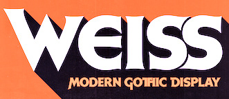 Lyon, France-based designer (b. 1977) of these typefaces:
 - The industrial / sci-fi octagonal typefaces Smoothdron (2018: free) and Squaredron (2018, +V2).
- The blackletter typeface JVNE Blackie (2017).
- Edith Lite (2018).
- JVNE Porte (2018). Art deco.
- JVNE Fiction (2018).
- JVNE Coalworks (2018). An attempt to recreate the "Fireworks" 7 inches vinyl sleeve lettering from 1982 by Siouxsie & the Banshees.
- Dreamhouse Kissies (2018). Arts and crafts style.
- JVNE WOPR Pro and JVNE WOPR 83 (renamed JVNE Wopper83;) (2018). Based on the titles of the 1983 Wargames movie. Made with FontStruct.
- Gialle (2019). A brushed typeface.
- Feronne Serif (2019).
- Arcachon (2019). Art deco.
- JVNE Minervae (2019). A stunning hand-printed all caps typeface family.
- JVNE Broomstx (2019). A brush typeface.
- Weiss Modern Gothic (2019). Earlier called W.Modern Gothic Display. A German expressionist typeface. He writes that W.ModernGothicDisplay is the first digital re-creation with a lot of improvements of a typeface by Bauer known as Weiss Initials Extra Bold or Weiss Modern Gothik. That Bauer design was inspired by Weiss Initialen No2 drawn by Emil Rudolf Weiss (1875-1942).
- Sauvage (2021). A neon light monolinear script font.
- Citta Novela (2021). A 12-style condensed Peignotian typeface that celebrates the architecture between the 1920s and 1960s by Oscar Niemeyer, Friedrich Kiesler, Le Corbusier and the Bauhaus school.
- Arkham77 (2021). A detective story font inspired by the works of Howard Philips Lovecraft (1890-1936), and the witchcraft city of Arkham.
- Futurette (2021). A large squarish / techno sans family.
[Google]
[MyFonts]
[More] ⦿
|
K-0000
|
Florida-based graphic designer who made the neon light font Electric Ship (2010). [Google]
[More] ⦿
|
K22 Fonts
[Toto]
|
 Quezon City or Kyusi (Philippines)-based designer of revivals and opportunistic typefaces, who is quite active on newsgroups like alt.binaries.fonts. His production is impressive:
 - Typefaces from Dan Solo's books: Pluto Outline (2012), a 3d beveled typeface from page 82 of Solo's Outline Alphabets. K22 Angular Text (2012, an interpretation of Herman Ihlenburg's 1884 Victorian typeface Angular Text at MacKellar, Smiths and Jordan), K22 Helve Cursive (based on Helvetica Serif by Dan Solo; other digitizations include Pen Tip (WSI) and Renania (Intellcta)), K22 Spiral Swash (Victorian), K22 Athenian Wide (2011: K22 Athenian Wide is Athenian Wide on page 5 of Circus Alphabets: 100 Complete Fonts by Dan X. Solo; see also Tobias SSK), K22 TriLine Gothic (2011, a multiline art deco typeface based on Ross F. George's TriLine Gothic from 1956), K22 Timbuctu (2011: this is the Arabic simulation typeface Timbuctu on page 73 of The Solotype Catalog of 4,147 Display Typefaces and on page 95 of Special Effects and Topical Alphabets: 100 Complete Fonts by Dan X. Solo), K22 Didoni (2011, + Swash: a fat typeface based on Didoni from page 33 of Swash Letter Alphabets: 100 Complete Fonts by Dan X. Solo and also on page 140 of The Solotype Catalog of 4,147 Display Typefaces), K22 K22 Eureka (2010, based on Eureka from Dan X. Solo's book "Circus Alphabets, 100 Complete Fonts"), K22 Monastic (2010, based on Monastic from Victorian Display Alphabets by Dan X. Solo), Solo Ornaments (2003, based on Solo's books), K22 Eclair (2010, a decorative Western typeface Toto found in Dan X. Solo's book on Victorian alphabets, but which in fact dates back to Hans Brehmer in 1868), K22 Karnak Deco (2009, a slab serif based on Karnak Deco from the Moderne Alphabets by Dan X. Solo and published by Dover Publications in 1999).
- Revivals of Letraset phototypes: K22 Lucifer No. 1 (2012, a beveled neon-look face).
- Typefaces from 101 Alphabets (W. Ben. Hunt and Ed. C. Hunt, The Bruce Publishing Company, New York, 1958): Saisa (2011, art deco face), K22 Amihan (2011, an art deco face, after this original).
- MICR fonts: K22 GKW Computer (2011, a MICR font which is based on KW Computer from ATF, and looks very similar to Moore Computer), Auto Mission (2011, after Auto Mission was derived from the MICR font Automation Shaded on page 3 of Solo's Special Effects and Topical Alphabets, and is more complete than Otto Mason SH, the Soft Horizon digitization of Automation).
- Fonts based on work by Ross F. George: K22 TriLine Gothic (2011) is based on Tri-Line Gothic by Ross F. George in Speedball Text Book, 17th Edition, 1956.
- K22 Xanthus (2012, based on Xanthus Computer, a dry transfer (or rub-on) font from Mecanorma).
- K22 Stile Ballmer (2011, after an art deco typeface made by Walter Ballmer for Olivetti), Mallary (2011, based on Mallary from page 43 of Dan X. Solo's Moderne Alphabets).
- K22 Landi Linear (2011, after Nebiolo's Landi Linear).
- Le Pochoir (2011, an art deco stencil typeface (à la Futura Stencil) based on an alphabet from Plate 40 of La Lettre dans la Peinture et la Publicité by Jean Joveneaux, Paris, 1987), Le Pochoir Creux (2011), Lettre dans le decor (2011, based on an alphabet from "La Lettre dans le Decor et la Publicité Modernes").
- Splash Gordon (2011, +Inline; after the title of Flash Gordon, the movie).
- Soccer shirt fonts: Brooks Chile (2011, used by Chile in the 2010 world cup), SwitchImage FC Copenhagen (2011, used by FC Kopenhagen), Azmie WC2010 South Korea (2010), SwitchimageACMilan (2010), FCBarcelona (2010), Azmie WC2010 United States (2010), Azmie WC2010 England (2010), Azmie WC2010 Australia (2010), Azmie WC2010Brazil (2010, based on a vector image by Kuala Lumpur-based Azmie for the Brazilian World Cup team), Azmie WC2010Portugal, Azmie WC2010Netherlands, Azmie2Slovenija-2010, Real Madrid 2011 (2010), ABFonts RCD Mallorca 2012 (based on the shirts of Real Club Deportivo Mallorca, for the 2012-2013 season).
- K22 EricGill Shadow (2011, after Gill's 1929 face, Gill Sans Shadow 338; and K22 EricGill Shadow Line, an inline version).
- Sajou Fancy Gothic (2011, based on pages 3 and 4 of Sajou No. 236, a late 19th century French embroidery booklet).
- RAWB (2010, ultra fat family).
- Linyat Bilog (2010). A geometric monoline typeface.
- K22 Ambelyn Condensed (2010, based on Ambelyn Condensed, page 2 of Condensed Alphabets: 100 Complete Fonts by Dan X. Solo and also page 21 of The Solotype Catalog of 4,147 Display Typefaces where it is called Ambelyn), K22 Spiral Swash (2010, based on Spiral Swash from Dan X. Solo's Swash Letter Alphabets (p79)).
- Art Jam MakingFaces (2003, a great dingbat font based on designs found in Image Club Graphics' volume 30, called Art Jam).
- Town Sketches Bandstand (2003, based on volume 35 (Sketches On The Town)).
- Fonts based on Aridi's designs: Nabel Initials (2005, based on Marwan Aridi's Nabel from the Initial Caps Vol I), Anabel (2005, a simpler version of Nabel Initials), Blister Caps (2005, based on the Blister set from the Aridi Initial Caps Vol. 1), RegalAlt, RegalInitials (2005, based on the Regal set from the Aridi Initial Caps Vol. I), SpringAlt, SpringInitials (2005, based on the Spring set from the Aridi Initial Caps Vol. I), VictorianaAlt, VictorianaInitials (2005, based on the Victoriana set from the Aridi Initial Caps Vol. III), Tuscan Initials (2005, based on more of Marwan Aridi's alphabets), Napoli Initials (2009, more Aridi capitals), Gothic Initials (2009, Aridi-based), Romant Initials (2009, Aridi-based), Royal Initials (2009, Aridi-based), Stone Initials (2009, also based on Aridi).
- K22 You Know Who (2004, dingbats based on Dark Mark from the Harry Potter books).
- Gidget Cameo (2004).
- K22 Xerxes (2003, a stone carving typeface).
- Dover Birds (2012, based on the Birds Alphabet Coloring Book by Ruth Soffer, Dover Publications).
- K22 Spotty Face (2012, +Cyrillic) is a dot matrix font based on Tony Huggett's Spotty (Zipatone).
- K22 Gadget Lined (2012) is an art deco typeface based on Gadget Lined by Peter Bennett at Zipatone. See also K22 Gadget (2014).
- K22 Lawenta (2012). A teepee-styled typeface (check also Nick Curtis's Wigwam NF). He says: The font is based on the alphabet on page 63 of 101 Alphabets by W. Ben. Hunt and Ed. C. Hunt (The Bruce Publishing Company, New York, 1958).
- K22 My Didot (2012). This is one of three known digitizations of CBS Didot.
- K22 Aking Didot (2012). free.
- K22 Plural (2013) is a revival of the op-art font Plural made in 1971 by Vicente Rojo for the Mexican magazine Plural.
- Sabbath Paranoid (2018). It is based on the letters used in Paranoid, the 1970 album of Black Sabbath.
- UP Fighting Maroons (2018). An unreleased custom font based on the sports font on the shirts of the Fighting Maroons at the University of the Philippines. The original Fighting Maroons font, called Maroons (Sharp Strong, Wide) is an octagonal family by AJ Dimarucot, Joanna Malinis of Plus63 Design Co., and Dan Matutina of Plus63 Design Co.
Alternate URL. Fontspace link. Partial catalog from 2010. Dafont link. Abstract Fonts link. [Google]
[More] ⦿
|
Kaer
[Roman Korolev]

|
 Roman Korolev (Kaer, Vologda, Russia) designed the wood stick brush typeface WoodStick in 2016.
 Typefaces from 2017: OneLine Bold (rounded fat color font). Typefaces from 2019: Antique Initials (regular and color; with a flower pattern), OneLine Overlap (a color font). Typefaces from 2020: Pagesso (a lava lamp font), Avery (a monolinear connected sans), Sailem (an inline art deco font), Old Stamp (a fingerprint font), Silvery (a display typeface on the theme of thick and thin), Blueberry Spot, Coffee Chalk (a textured typeface), Allegro (a blueprint type), Northern Monk (beveled), Westland (blackletter), Neon Line, Bronze (art deco, +color, +texture), Shtrih (dry brush), Geoline (sketched, textured), Flowline, Foliageant (floral, curly), Northern Runes (rune emulation), Neon (color font), Parallel Lines, Bronzen Abundance (a display family with textured and color options), Sharp Stroke (a heavy brush typeface), Renaissance Initial, Celtic Spiral, Lace Line. Typefaces from 2021: Atta Weird (a font for LSD addicts), Three Neon Lines, Dead Saint (a Halloween alphabet), Lockdown Christmas (a dot matrix font), Nordic Folk (a layerable typeface family with Scandinavian texture; plus Nordic Folk Icons), Hewy (a display typeface), Planny (a blueprint font), Sportlight (a speed font), Wesloy (a brush serif font), Carle (a 3d polygonal children's book font; +Shadow, +Colored), Absundo (a playful dual weight font), Wide Plump (a geometric solid typeface), Colton (a condensed boutique serif), Aztec Initials (+a colored version), Adrim (a thin floriated sans), Northern Monk (an inscriptional ustav-inspired typeface), Sogia (a decorative serif). Typefaces from 2022: Asl Line (an American Sign Language font). [Google]
[MyFonts]
[More] ⦿
|
Karoline Stangvik
|
Danish graphic designer and illustrator living in Copenhagen. Her typefaces include the brown bag typeface Traktor (2011) and the Latin American pearly ornamental typeface Oro (2011). In 2012, she added the geometric monoline family Neoneon. Behance link. [Google]
[More] ⦿
|
Katheryn Poling
|
During her studies in Fort Wayne, IN, Katheryn Poling designed the neon tube typeface Prism (2017). [Google]
[More] ⦿
|
Kato Masashi
[Flop Design]
|
 [More] ⦿
|
Kicky Xu
|
Guangzhou, China-based designer of the paperclip or neon light typeface One Touch (2014). [Google]
[More] ⦿
|
Konstantine Studio

|
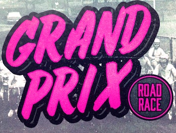 Commercial typeface foundry in Jakarta, Indonesia, run by "Ian" and "Abdilah". Its first typeface is Muffler (2014), which is inspired by retro brush signage for car races. Lacydes (2014) is a spurred advertizing typeface. Upjohn (2014) is a horror movie poster typeface. Curely (2014) is a free hand-drawn curly typeface, expanded to Curely Pro in 2017. Hemera (2014) is based on vintage matchbox packages.
 Typefaces from 2015: Marthas, Risoless Script, Elska (a thick warm watercolor brush script), The Chalker (crayon font), The Bride, The Groom (brush script), Wanderlove (brush script), Rumbell (handcrafted poster typeface). Typefaces from 2016: Easy Lullabye (Swash, Sans), Wiggle (brush script). Typefaces from 2017: Fathers (a vintage packaging script), Ride Slow (a handcrafted set of motorcycle culture fonts), Delight, Kehlin (retro poster style), Butter Love (dry brush), Fathers Script (vintage), Fili & Kyla (thin script), Husky Giggle (casual hand stroked brush font), Ruffle (dashing brush script), Dollyn Script, Halloween Rock, Love Hurts (ballpoint pen font), Moneyroll, Trakster, Trakster Serif, Noswatt, Noswatt Serif (copperplate style), Notstar, Rodenda, Hammet, Hastagirl (watercolor brush), Arzeti Script (informal monoline wedding script), Sicero (vintage display typeface by Abdilah), Sign Panthers Brush Script, Magle Sans, Magle Script. Typefaces from 2018: Millerstone (connected calligraphic script), Bad Taste, Conserta (Victorian), Grestal Script, Beclave, Double Aunofa (Script and Serif), Summer Classico, Ahoy Amigo (font duo), Aunofa Serif, Aunofa Script, Delphin Spring, Delight Lettering Script, Tropical Asian, Vedacity (calligraphic), Rothe (vintage), Bigger Love (script), First Choice (calligraphic), Love Hurts, Hall Of Fun, Casual Font Bundle (which includes Easy Monoline Script, Subber Sans, Sintix, Rebel Four, and Grotes Sans), Hemera II (a vintage Victorian matchbox typeface), Asian Skyline, Queen Waffle, Rosse, Harvest Barn (script), Oh Samantha, Simple Monologue (calligraphic), Sweet Getaway (handwriting). Typefaces from 2019: Vango (a sci-fi or speed font), Aghony (script), Conserta Royal (Victorian), Roast Serif, Mister Quenos (a fast food store signage font), Calisatt (an SVG brush font), Redstock Script, Suspiria Vampira (a Halloween font set), Hoffers (a children's book font), Closer (a Swiss sans), Hoffers (a marker pen font), Mackle (Script, Serif), Blante (Sans + Script), Millerstone, Kimball, Henave (flared sans), Valsday (Sans, Script). Typefaces from 2020: Destrokes, Kremato (+Script, +Short, +Tall), Krasher (a painted brush SVG font), Rebelton (a 12-style all caps sans), Koutura (a fashion mag font), Kalleco (a free hand-printed typeface), Citypop (1990s Japanese retro pop style, with subfamilies Main Display, Neon, Screen, Digital and Automotive), Urban Shock (ultra-condensed), Renin (a Western super-heavy slab serif), Jaksel (a bold squarish sans typeface), Alkaria (a retro display typeface). Typefaces from 2021: Kingsad (a 5-style wide flared display family), Ahoy Amigo (a type duo), Harvest Barn (script), Simple Monologue (a calligraphic script), Magle (a script typeface), The Sign Painters, Makalo (an African tribal font), Discopia (neo-futurist), Daguin (a fashionable display typeface inspired by the Middle Ages), Tropical Asian (a painted font), Fosty Blue, Kofje (a daring decorative serif). Typefaces from 2022: Vogatron (sci-fi), Hwaiting Handwriting (emulating Korean), Hwaiting Serif, Hwaiting Sans (an experimental Korean vibe font), Walanor (a pop art font). Tumblr link. Graphicriver link. Fontspace link. [Google]
[MyFonts]
[More] ⦿
|
Laitto Design
|
Designer (b. 1984) of the squarish typeface Gabato (2017) and the neon typeface Heon (2017). In 2020, he released the circle font Dugun. [Google]
[More] ⦿
|
Lars Bergquist
[Timberwolf Type]

|
 [MyFonts]
[More] ⦿
|
Lasse Strøm

|
Copenhagen, Denmark-based designer of Strom (2019). Strom (+Rounded, +Divided) is a simple organic rounded sans typeface family. [Google]
[MyFonts]
[More] ⦿
|
Lauritta Ivanova
[Lux Font]

|
 [MyFonts]
[More] ⦿
|
Leftloft
[Andrea Braccaloni]

|
 Leftloft is a visual communications studio in Milan, founded in 1997 by graphic designer Andrea Braccaloni (b. Bologna, 1973), Francesco Cavalli, Bruno Genovese and David Pasquali. The studio is mainly engaged in corporate identity, and now also has an office in New York. Andrea Braccaloni teaches visual communication at the III Faculty of Architecture/Design at the Politecnico di Milano. At ATypI in Rome in 2002, he spoke about new typefaces he designed the old-fashioned way, as a handicraft. Within the studio, there is a small lab for type design, called "Die kleine Fonderie", at which Andrea Braccaloni and Veronika Burian are active. Designs include LL Egeo (1999, shifted letters), LL Mila (2002, a condensed sans with a trademark "g"), LL Etica (2001-2002, a sans family that derives its name from Helvetica, and has soft strokes and wide apertures---in 2009, Etica Seriffo was published by Type Together as the "trappist type family"; see also LFT Etica Sheriff in 2016, and LFT Etica Mono in 2019), LL Chicane (2001, geometric and experimental, between paperclip and neon sign), LL Impresa (2001, octagonal-themed font), LL SanSiro (masculine sans family), LL EU (a delicate sans), LL Alice ditalunghe (transitional text face), LL Officiel (extreme didone titling face, developed for French fashion magazine L'Officiel, in collaboration with Patricia Sartori), LL Crudo (experimental, now LFT Crudo), LL Ubu Re (2002, made by lines and circles only), Lemon (1998), L'Amante Perduto (1999), Solferino Text (2007, with Luciano Perondi, for Corriere della Sera), Brera (2007, a sans family by Leftloft and Molotro).
 In 2014, Leftloft published the semi-techno wayfinding typeface family LFT Iro Sans at Type Together. It has a unicase set of styles. In 2020, he released the flared humanist sans typeface LFT Arnoldo at TypeTogether. Klingspor link. [Google]
[MyFonts]
[More] ⦿
|
Leonardo Ratzlaff
[Ratzlaff Type (was: Typa)]

|
[MyFonts]
[More] ⦿
|
Leslie Cabarga
[Flashfonts]

|
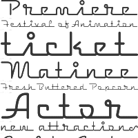 [MyFonts]
[More] ⦿
|
Letter Stock (was: Gumacreative)
[Guguh Gumantoro]

|
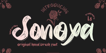 Bandung, Indonesia-based designer (b. 1982) of Masura (2016, brush style), Space Cake (2016, sci-fi style), Caroline Script (2016), Morning Fever (2016), Binzo (2016), Morning Cloud (2016, handcrafted), Rancha (2016: grungy style), Alkhali (2016), Gath Is A Robot (2015) and Scarlet (2015, textured typeface).
 Typefaces from 2018: Vanhala (Tuscan), Orchard, Solitaire, Founder (a thin script), Elanor, Callous (signature script), Keith (script), Subsky (script), Hamburger (artsy script), Smith (monoline rounded sans). Typefaces from 2019: Steven Mattew, Romansa (script), Pianicas, Infamous, Voltras, Faddox, Slayer Creeper (a dripping blood blackletter font), Hellioum (a balloon font), Grootten Beast (a wooden plank font), Lazarrous (beatnik), Salmounth (a clean script), Damaskush (a blackletter), Neurotic (spurred, blackletter), Maclucash, Neowave, Throoper, Maldivine, Morrisette (signage script), Descrendent (sans), Athlenstan, Hole Script, Cardigan, Lenox, Aero Space, Esentrik (over-decorated), Lethal (sans), Markwell (script), Hallmark, Fymous (signature script), Brighford (spurred), Bulb (a bubblegum font), Wavecraft. Typefaces from 2020: Flinch (a stone cut Flintstone font), Jack Miller (a signature script), Jaguar Jugglers (squarish, constructivist), Lazarrous (beatnik style), Jane Frediction, Grindmore (a calligraphic blackletter typeface), Descendent (a monolinear rounded coffee shop sans), Oliver Queen (a fat brush script), Orangutan, Chadwick (a Halloween font), Oakleaf, Buckles, Hackwell, Susan Brooks, Jacqueline, Alistair Morrison, Gibson Walsh, Slapstick, Monkey Werch, Rooselyn, Northway (lettering for outdoor or nature trail signage), Ghotana, Apija, Rawkin Pickles, Lockdown, Linger (a curly delight), Nuttyclash (a dry brush typeface), Ghosie, Kuro (a brush script). Typefaces from 2021: Bellamind (a decorative serif), Bingana (a playful typeface with oriental influences; appropriate for toys), Cheshire (sketched, textured), Creepycall, Croftler (a grungy athletic shirt font), Goldenwick (a vintage decorative serif), Karlburns (an ultra-decorative font by Vic Carless), Shorelly (an arts and crafts all caps serif), Walkingblue (a round vernacular slab serif), Garlicha (a great formal copperplate calligraphic font that unfortunately features a lower case r that can be confused with a lower case n), Hamingduck (copperplate calligraphy), Antucious (an ornamental serif), Monkeymod (a textured reverse srtress display font), Eightbit (a retro pixel font), Maloney West (art nouveau), Adamovick (a spurred Halloween font), Grindleaf (organic), Cronicalypse (a reverse stress elephant foot display font), Houston Palace (a monolinear retro script), Raceryouth (a weathered stencil font), Lyonade (a monolinear script based on retro motorbike posters), Alleysondust (a calligraphic script), Carlosberg (a spurred Victorian typeface), Clubeight (a trilined neon typeface that is reminiscent of Wyman's designs for the 1968 Olympics in Mexico), Slacksluger (a decorative inline typeface with medieval terminals), Beckmarine (a rough typeface inspired by retro cartoon and retro motorbike posters), Bullmars (a heavy font), Sinofluck (a stylish brush script inspired by a samurai poster), Scandlers (a dry brush script), Melvines (a thick paint brush font), Rockapolis (stencil), Lexaviers (a rune simulation font), Mylo (a dry brush typeface), Meckatler, Machiates (a vintage signage font), Fluxion (a dry brush script), Black Marilyn (blackletter), Palermosh, New Kids on the Font, Psychonaut (a reverse contrast, or even a Western, font), Black Valentine (a decorative blackletter), Buckles (a dry brush font), Smegh Mouth (a dry brush font), Armthadore, Brookland (a dry brush script), Khian Shantang (a decorative blackletter), Laekar (a hand-drawn blocky poster font), Schoutler (an ornamental fantasy font), Sonoxa (a heavy and creamy dry brush typeface), Classicloud (a decorative and festive blackletter). Typefaces from 2022: Gavin Zoo (a vintage decorative serif), Sallam (Arabic emulation), Sururim Maudunah (emulating Arabic), Ar Rayyan (Arabic emulation), Hollybucks (a round handprinted typeface), Mack Dutch (a weathered elephant foot serif), Obidel (a squarish vernacular typeface), Pinkerton (a playful cartoonish font), Sloopy Joe (a condensed sans with some curly terminals), Xylo Macloud (a decorative serif), Hickenwitch (a decorative serif), Parkwilson (a decorative serif), Buckedtalk (an inline blackletter typeface), Buckedtalk (an inline blackletter typeface). Creative Fabrica Script. [Google]
[MyFonts]
[More] ⦿
|
Letterafandi Studio (was: Letterafa Studio, Peterdraw, Delapan Studio)
[Ahmad Syarif Afandi]

|
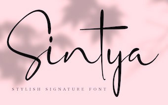 Yogyakarta, Indonesia-based designer (b. 1994) who started out as Peterdraw and in 2019 joined Delapan Studio, where his fonts are marketed. His studio was renamed Letterafa in 2020.
 Creator of the display typefaces Pistachio (2019), and Brewok (2019: a sans with hairy outlines), Glippy (2019: a glitch font), and Neon Desmon (2019), the fat finger fonts Granada (2019) and Macadamia (2019), the rounded handcrafted sans typefaces Maven (2019) and Dear Audrey (2019), and the script typefaces Attaya (2019), Sabrina (2019), La Petite (2019), Molita (2019), Geulis Stylish (2019), Gladyss (2019), Nina Ninut (2019), Lulla (2019), Dear Audrey Script (2019) and Camellia (2019). Typefaces from 2020: Sparkle (a connected script), Mischella (a signature script), Chia Seeds, Summer Pisces, Jerome (a condensed slab serif in three weights), Marylinda (script), New Interspeaker, Revnosa (a dry brush typeface), Chasy (script), Sherletta, Candela (a monoline script), Danyla, Grand Duke (a display serif), Sintya (a stylish script), Hey Monday, Chapillada, Butterfly, Good Vibes, Techno Space (futuristic), Oregano, Sabrina, Femme, Bilderberg (a display serif), Sagara (a vintage text typeface co-designed by Ahmad Syarif Afandi and Tri Kuncoro). Typefaces from 2021: Agathis, Allenisa (an open connected script), Beautiful Variella, Betteryou (a smooth script with contrast), Bitterlove (a curly script), Black Thunder (a fat finger font), Bunnyheart, Christhine (an elongated bean font), Christmas Craft (a blackboard bold font), Christmas Heart, Christmas Weather (script), Christmas Winter, Early Christmas (a scrapbook script), Easter Story, Evelyne, Febriella (a fine script), Firstlove (an upright script), Fishbone, Gabriella, Geollitta, Halloween Monoline, Hillarie, Holidate, Honey Love Bunny, Jaggielka, Kattsia, Lovebird, Nathilda (a calligraphic script), Phitaya (a hand-printed typeface with small x-height), Rabitta, Salminah (a monoline script), South Town (a monoline script), Spooky Hunter, Summer Beach (a playful font), Sweet Christmas, Thanks Mom (a scrapbook script), Violethe (a painter's font), Warilah, We Love Mom (a fat finger font), Wolfriend, Yattina (script). Old link for Peterdraw. Old link for Delapan. Typefaces from 2022: Angolla (a textured hand-crafted display font). [Google]
[MyFonts]
[More] ⦿
|
LGF Fonts (or LG Tipos)
[Manuel Lage]

|
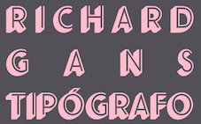 LGF fonts is the foundry of Manuel Lage Novo, a Galician type designer in La Coruña, b. 1970. He inherited the Richard Gans collection.
 Manuel specialized initially in sexy silhouette fonts: Sexy Spanish Erasmus Girls (2007), Chicas y Mujeres (2007), Sexy Spanish Woman (2007), Gimnasia (2009). He also made the distressed typefaces TNewPro (2009) and Carboncillo Palo (2007), Galería Coruña (2008, Victorian), the geometric display typeface WFF Lage Grafica (2007) and the elegant upright script Lage Goyesca (2008). In 2009, he published Sistemas Font BT, which seems to be a copy of or very close to the well-known stencil typeface Futura Black BT. Fuck This Copy (2011) is a counterless grunge face. In 2012, he published LGF Goyesca, LGF Disco Inferno, LGF Terra Demo and LGF Patuko (fat finger face). In 2013, he created Belter (a vinyl disk font), LGF Besitos Square, LGF Besitos Round, LGF Lovevelyn, LGF Lage Logo TresD (a 3d shadow face), and the inline typeface Elucidar Titulares. Fonts from 2015: LGF Centelleo, LGF Cup. Typefaces from 2016: Circus LGF (an art deco layered family, ideal for coloring), Primavera LGF (based on Richard Gans's Primavera, and extended with a bold weight), Alicia LGF (a Broadway style art deco typeface based on Fatima, a font designed by Karl Hermann Schaefer in 1933 at Schriftguss), Mario LGT, LGF Avadar (an inline display typeface), ImanRG (a great shadow headline typeface after Richard Gans's Iman), Lgf Besitos Round Light (an architectural font). Typefaces from 2017: Decorativa RG (after Richard Gans), Elucidar, Ornato, Escorial RG (after Richard Gans), Rias Altas Ribadeo, Escritura Luis XVI (after Richard Gans), Maruxa (a script typeface after Richard Gans), Ortegal, Gauntlet LGt (a great neon / metal / disco typeface), LGF A Lage Logo (origami), Alage Evo + Evo Century (octagonal). Typefaces from 2018: Ornamentos Orlas y Vinetas. Typefaces from 2020: Patri LG (a belle epoque display typeface). Typefaces from 2021: Volvoreta RG LG (or Bolboreta; a revival of Richard Gans's Decorativa). Dafont link. Klingspor link. Abstract Fonts link. [Google]
[MyFonts]
[More] ⦿
|
Lizy Gershenzon
[Vectro Type Foundry (was: Scribble Tone)]
|
 [More] ⦿
|
LLW Studio
[Lori LeBeau-Walsh]

|
 Lori LeBeau-Walsh (LLW Studio, Winchester, CA) is an American commercial artist and graphic designer who has a passion for lettering and typography.
 In 2010, she made Ocean Beach, Studio Neon, a classical multiline display family. Market Street Neon (2011) is a multiline caps face. Asta (2011), named after the pup in the Thin Man movies from the 1930s and early 1940s, is an art deco / streamline moderne all-caps display font. In 2015. Lori created the Christmas holiday font Studio Ribbon. Klingspor link. [Google]
[MyFonts]
[More] ⦿
|
Lorenz Lopetz Gianfreda
[burodestruct (or: Typedifferent.com)]

|
 [MyFonts]
[More] ⦿
|
Lorenzo Attenni
|
Rome-based designer of the free font Ozneo (2014), a geometric sans-serif that is inspired by neon signs. [Google]
[More] ⦿
|
Lori LeBeau-Walsh
[LLW Studio]

|
 [MyFonts]
[More] ⦿
|
Lovindha Kintani
[Vermilione (was: Lovoos)]
|
[More] ⦿
|
Lucas Fogaça
|
Piracicaba, Brazil-based student-designer of the neon font Hey Mr DJ (2014) and the striped TV screen typeface Lotaçao (2014). [Google]
[More] ⦿
|
Luisa Penna
|
Rio de Janeiro, Brazil-based designer of Neon Light (2018). [Google]
[More] ⦿
|
Lund Sundson
|
Designer at Die Gestalten of the free fonts RussianBread (2008), Neon Glow, DrEye, Dopener Kebap Light, Doener Kebap Light, and Doener Kebap Strong. [Google]
[More] ⦿
|
Lux Font
[Lauritta Ivanova]

|
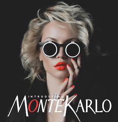 Odessa (was: Donetsk), Ukraine-based designer of these fonts in 2018: Monte Karlo, Monblank, Manchester, Gabrielle (upright script), California, Casablanca (script and sans duo), Fabiano (rounded sans).
 Typefaces from 2019: Bonita (inky script), Aquatype (a watercolor brush font), Boldini (an art deco sans accompanied by a color SVG font that plays with transparency), Klark (an all caps art deco typeface). Typefaces from 2020: Retroline (an 8-style color sans family), Pacardo (a 6-style geometric sans), Minimaly (a 6-style minimalist sans), Echowarp (warped and colored), Longtype (a tall 6-style sans), Dewave (a wavy font family in 12 styles), Culoare (a color hologram font with glitch effects: eleven SVG styles; this font is identical to Cosmos), Anaglyph (a glitch font), Cosmos (eleven space-bright colored hologram and technical glitch fonts: the font was renamed Culoare because of trademark issues), Doodly, Bumbon, Charmini (a soft text typeface family). Typefaces from 2021: Blureo (a blurry font), Culoare v.2 (neon type), Miluero (a colored sans), Multilinear (an experimental color font with identical glyphs stacked vertically), Neotype (a semi-colored font based on Boldini), Pationi (hand-printed), Retrotype (flared weathered caps), Baluno (a multicolor cartoon font), Retrio (a huge family of echo fonts, with some color options; Retrio is not retro, but nevertheless evokes electro music and discos), Colarino (an 31-style multicolored all caps family based on Pacardo). [Google]
[MyFonts]
[More] ⦿
|
Made Mo1
|
An orphaned neon tube font that one can download at abfonts. The font's readme says: This font is based on screen capture of the opening title sequence of the 1972 movie Made. The missing letters and numerals were created in the style of existing letters. Alpha-numeric characters were digitized and/or created by C. The alternate numeral 8 in the asterisk key created by T. It is T's fault if you do not like how the font was kerned. [Google]
[More] ⦿
|
Mahameru Type (or: Haidi Illustration, or: Mahameru Type, or: HN Fonts)
[Haidi Shabrina]

|
 Mahameru Type is Haidi Shabrina (b. 1992) and/or Nasir Udin, depending upon where you look. Semarang and Bali, Indonesia-based designer of the brush typeface Faito (2017), Faito Rough (2017), the creamy brush script typeface Shabrina (2017) that was inspired by vintage chocolate biscuit packaging. He or she also made Discobaby (2017, a great connected marker pen script), Parisien Night (2017), Sweet November (2017: script), The Flowery Spring (2017, curly script), Nandito (2017: handcrafted), and Ayanna (2017: watercolor brush).
 Typefaces from 2018: Arkipelago (a free brush script), La Patio (a monoline script), Belmonte (signage script), The Bouquet List, Lactosa (signage script), Barton Graph (fifties script), Barton Ink. Typefaces from 2019: Restora (an old style serif type family with 16 weights), Freich (a bold angular poster font), Freich Monsta (for Halloween), Fonseca (a layerable art deco sans, +Rounded, +Grande; free demo), Frunch. Typefaces from 2020: Opheline (a nine-style all caps display serif by Nasir Udin and Haidi Shabrina), Restora Neue (a quirky 18-style transitional roman), Proda Sans (an 18-style humanist sans with small x-height), Pockota (a warm rounded display serif family), Mondia (a sharply cut semi-serif in 18 styles). Typefaces from 2021: Mylon (a 14-style Peignotian fashion mag sans by Nasir Udin and Haidi Shabrina), Debira (a 14-style wedge serif with a coathanger lower case f that is de rigueur in 2021; with Nasir Udin), Departura (sans), Montas (a 7-style decorative serif by Nasir Udin and Haidi Shabrina). Graphicriver link. Dafont link. Another Dafont link. Home page. Graphicriver link. Fontsquirrel link. [Google]
[MyFonts]
[More] ⦿
|
Maja Brncic
|
Serbian designer of these vector format typefaces in 2015: Alphabet Buttons Type Machine, Alphabet Vector Neon Color, English Cream Alphabet, Flat Icons Alphabet, Alphabet Chalk Vector, Vector Alphabet Set White Shadow. Typefaces from 2016: Neon Pink, Neon Green and Pink, Pink Color Neon, Pink Yelllow Neon, Ornament Font, Alphabet Paper Vector Pink, Colored Font Flat, Flat Font White And Grey, Minimalistic, Creative, 3D Vector Font, 3D Font, Pop Art Creative Fonts, Neon Buttons, Neon (ornamental caps), Love Letter, Love Alphabet (Valentine's Day vector fonts with superimposed hearts), Creative Fun Fonts, Colored Font Flat Design, ColorfulFontNeon, Old Style, Paint Colorful, Simple & Minimalistic, Colorful Metallic. Typefaces from 2017: Pink, Silver, Minimalistic, Neon Modern, Sports, Cream Color, Font Trendy, Pink (White, etc.) with Shadow, Neon White Color Outline. [Google]
[More] ⦿
|
Makumba
[Cleber Rafael de Campos]

|
Cleber de Campos is a Brazilian graphic designer based in London. He works mainly on editorial and identity projects. In 2017, he set up the commercial type foundry Makumba. In 2017, he designed the informal sans typeface Kinky and wrote: The development of the typeface started in 2015, inspired by neon signs, the aesthetic of sex clubs, and typefaces such as Suburban (Emigre), Lyon (Radim Pesko) and Euclid Flex (Swiss Typefaces). [Google]
[MyFonts]
[More] ⦿
|
Malgorzata Ruminska
|
Warsaw, Poland-based designer of the retro connected typeface Neon (2017). This typeface was published during her studies at the Academy of Fine Arts in Warsaw. [Google]
[More] ⦿
|
Manuel Lage
[LGF Fonts (or LG Tipos)]

|
 [MyFonts]
[More] ⦿
|
Manuel Viergutz
[Typographic Design]

|
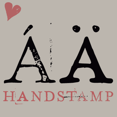 [MyFonts]
[More] ⦿
|
Marco Bonilla
|
Cartago, Costa Rica-based creator of the neon sign font Neonia (2012), the calligraphic Sakura logo (2012), and Almendra Unicase (2013). Behance link. [Google]
[More] ⦿
|
Måns Grebäck
[Aring Typeface]

|
 [MyFonts]
[More] ⦿
|
Mark Richardson
[Superfried]

|
[MyFonts]
[More] ⦿
|
Mark White
|
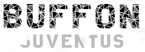 Mark White (Bournemouth, UK) designed the free playful soccer-inspired triptych Tiki Taka (2016, in Mediocentro, Trequartista and Ramdeuter styles), the free monoline sans typeface Inflecto and the free thin avant garde typeface Abyssopelagic in 2016. In 2017 he designed the free all caps sans typeface False Nine, the modular typeface Petrichor and the free neon typeface Klaxons. [Google]
[More] ⦿
|
Markus Nielsen
|
Great example of glowing multiline neon lettering. [Google]
[More] ⦿
|
Martin Fredrikson Core
[CORE.NU Fonts]

|
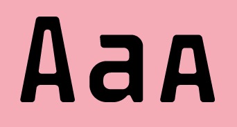 [MyFonts]
[More] ⦿
|
Martin Lexelius

|
 Born in Gothenburg, Sweden, in 1970, Martin Lexelius (aka Core, aka Martin Fredrikson Core) started his career in the 1990s an an artist and freelance illustrator. Then he designed type, publishing at Chank's place, at T4, at Fountain, and at his own outfit, Core, where one can find his free fonts. Martin Fredrikson Core (b. Gothenburg, 1970), whose real name is Martin Lexelius:
 - Chank fonts: Industri No. 35 (2002), Oh La La (2002 screen font), Sauerkrauto (2000), Som Ett Hus (2001).
- T4 fonts: Corpse Grinder (gothic font), Kantor (2002, since 2007 commercial at T4), Motor Mouth (2006).
- Fountain fonts: Borgstrand (styles called Regular, Web, Stencil, Hellas), Filt (2001, a fat display face), Jalapeño (Mexican-style diner display, see here), Malmö Sans (2000 (styles Regular, Alts&Ligatures, Bold, Oblique, Bold Oblique, Headline, Small Caps, Small Caps Lining Numbers, Small Caps Lining Numbers Mono, Small Caps Bold).
- CORE.NU fonts (mostly free): Backstabber Grotesk, Backstabber Roman (1999), Banditos, Bilprovning Gothic, Blocky Smocky (2002), Bodoni Natural, Bodoni Slapp (2000), Bongonaut (1999), Boy-O (2002), Bunth Serif (1999), Daniel Hando, Darlito, Das Kavel Gotisch, Dot City (1999), DrunkPunk (2002), Executive Producer, Fizzo (1998), Flake Anfang (1999), Funky Mushroom (2000), Gentleman Caller (2002 (pixel font), Grill Sans (2000 (a funny hotdog and hamburger dingbat font, together with Finn Hallin and Simon Grdenfors), Felvetica (2001), Il Tempo Gigante (2001 (extra wide screen font), Isterburk (2001), Komputter (2002), Lager Neon, Lindhagen Script, Marfhaus (1998 (his take on the Bauhaus "Universal" unicase font), Messages, MuskelBengt (2000), No Reklamo, Nuderflaken (2002), Oblata Kurrenta (1999), Pixelette (1998), Plugger, Practicamente, RunStop, Sarcastic Girl Scout Bitch (2000), Sensory Input (2001), Serge Hand, Small Talk (1999 (nice screen font family with styles called Tight, Tight Mono, Wide, Wide Mono), Stiffy99, The Perfect Font.
FontShop link. [Google]
[MyFonts]
[More] ⦿
|
Maru Martel
|
Buenos Aires-based creator of the fascinating pulsating multiline typeface Neon Deco (2014), which was developed in Longinotti's class at FADU / UBA. [Google]
[More] ⦿
|
Mary Ellen Carroll
|
Designer, with Chester Jenkins, of the bespoke typeface Indestructible Language. Chester explains: The Precipice Alliance, a non-profit corporation collaborating with artists to direct public attention to global warming, launched with this inaugural artwork by the contemporary artist Mary Ellen Carroll. This lettering was a collaboration with Ms. Carroll to design letterforms that could be rendered 8-feet tall in neon tubing. Each neon letter was to be placed, in a 900-foot-long installation, in the window bays of all five former American Can factory buildings in Jersey City, New Jersey to be exhibited from November 2006 to April 2007. The 8-foot high, carbon neutral neon letters were clearly visible (and legible) to drivers on both the Pulaski Skyway and the New Jersey Turnpike, and by planes heading to and from Newark International Airport. [Google]
[More] ⦿
|
Matei Nichitescu
[MonoGram Design]
|
[More] ⦿
|
Mathias Nösel
|
 Munich-based designer who created the neon light / paperclip font Kabel (2011). [Google]
[More] ⦿
|
Matthew Rumbelow
|
Coventry-based graphic designer. He created the fat counterless neon light typeface Bass Apple (2009). [Google]
[More] ⦿
|
Max Infeld
[Xerographer Fonts]
|
 [More] ⦿
|
Mechanismatic
[Michael W. Moss]

|
American creator of the futuristic typeface Airstream Futuropolis, the octagonal typeface Future Not Found (2014) and Android Insomnia (2015, a sci-fi sans). Typefaces from 2018: Jabba The Font, Neck Romancer, Section 9 (squarish). Typefaces from 2019: Screaming Neon, Rachel's Requiem. Typefaces from 2020: The Devils Poetry (blackletter / tattoo font). Devian Tart link. [Google]
[MyFonts]
[More] ⦿
|
Medialoot
[Tony Thomas]
|
 Graphics cooperative in Philadelphia that sells some fonts. These include:
 - From 2019: Elouise, Ragnarok (rune emulation font), Dalston (monoline script).
- From 2018: Oakwood (rustic), Drive-in (inline), Annabelle (script), Aviator (art deco caps), Outdoors (a park signage font), Maria Signature, Fault (a glitch font), Neon Tubes Cursive.
- From 2017: Lipstick (handcrafted), Oak Barrel, Listicons, Circle Monogram Font, Mammoth (a formal didone, tending towards the fat face genre).
- From 2016: Monarchy Rough, Neon Tubes (a paperclip font), Shoreditch.
- From 2015: Andea (+Clean, +Rounded, +Rough).
- From 2014: Monarchy (a tall humanist meets slab serif font family by Birmingham, UK-based Tony Thomas), Asche, Meddle (rounded sans), Viro (humanist sans by Tony Thomas).
- From 2013: Operator, Sketch Slab, SkooledSerif.
- From 2012: Monsters, Jamie's Hand, On Air (a retro radio or broadcasting font, art deco style)Sketch-It.
Most fonts are made by Nathan Brown (Austin, TX). Medialoot's community manager is Jenn Coyle (Philadelphia, PA). Behance link for Tony Thomas. Creative Market link. [Google]
[More] ⦿
|
Mehmet Abaci
[Studio Typo]
|
 [More] ⦿
|
Meneer de Zwart
|
Graphic designer in Amsterdam. Creator of the stencil typeface Geissler Serif (2013), which was named after Heinrich Geissler (1814-1879), the inventor of the Geissler tube, which later led to neon tubes. Behance link. [Google]
[More] ⦿
|
Metaphase Brothel Graphix
|
 bobistheowl (lower case b) is the Ontario-based designer of the dingbat fonts HaydenPanettiereBats (2007, about 30 headshots of Hayden Panettiere) and LaetitiaBats1 and 2 (2007, based on images of Corsican supermodel Laetitia Casta). He also digitized the Rider-Waite-Smith Tarot (copyright Pamela Colman Smith for The Rider Company, 1909) in 2007 as Gypsy-Tarot-Major-Arcana, Gypsy-Tarot-Minor-Arcana, Gypsy-Tarot-Minor-Arcana-Inverted. Other fonts: Through the Looking Glass (2007, based on images dating from 1871 by Sir John Tenniel for the first Edition of Lewis Carroll's Through the Looking Glass, and What Alice Found There), Alice in Wonderland (2007, based on Sir John Tenniel's 1865 illustrations of Lewis Carroll's Alice in Wonderland), Apoux (2007, a digitization of the naughty all-caps collection of letters by Joseph Apoux, ca. 1880, called Alphabet Pornographique), KleinKarpets (2007, a snake skin-based geometric pattern font dedicated to Manfred Klein), AmyBats 1 though 4 (2008, Amy Winehouse scanbats), JessicasSoftballFont (2008, softball scanbats), GrimNatwickBettyBoop (2008, a Betty Boop dingbat font), Obey (2009---a huge family of scanbats), SINSofBOBCO (2008, a one glyph font made for Bob Dobbs), Woodland Creatures (2008, forest animals), Princess Madeleine of Sweden (2008). In 2010, he added FixCystNeon, a typeface that emulates Terminal, the 1981 IBM systems font.
 In 2012, he made MockingJay XL (a single glyph dingbat face), Outstanding (a Victorian caps set that looks like a rounded version of Ernst Voelker's Vineta (1973)), and Beauty Marks (an erotic silhouette scanbat font). In 2016, he finally published Cabbagetown, which he started in 2014. Cabbagetown is based on Light Shade (1874, Richard Smith). It later appeared in Dan X. Solo's The Solotype Catalog of 4,147 Display Typefaces on page 17 as Night Shade. The first known digital version of this typeface was Nigel SadeSH (1993, Soft Horizons). Other versions include Shadowed Serif (1994, James Fordyce), Cameo Antique (2009, by Character), and Outstanding (2012, Bobistheowl). Link at Dafont. Fontspace link. Abstract Fonts link. Devian Tart link. [Google]
[More] ⦿
|
Michael Doret
[Alphabet Soup (or: Michael Doret)]

|
 [MyFonts]
[More] ⦿
|
Michael Gene Adkins
[The Fontry]

|
 [MyFonts]
[More] ⦿
|
Michael W. Moss
[Mechanismatic]

|
[MyFonts]
[More] ⦿
|
Michel Waxman
|
Creator of the multiline typefaces Oxford (1970s), Optex (1970, Letraset) and Michel (1970s, A. Hollenstein). At Mecanorma, he created Bronx (Shaded, Dropshadow) and Surprise. Optex was digitized and extended in 2010 by Jonathan Hill as Olympik. [Google]
[More] ⦿
|
MIIM
|
 Designer of Transt (2015: 3d lettering), Blue Neon 3D (2015), Blue Neon 2 3D (2015) and Yellow Neon 3D (2015). Grunge Wood (2015), Stone (2015) and Wood (2015) are rough-looking typefaces with 3d effects. All pre 2016 fonts are in vector or PNG format.
 Typefaces from 2016: Palma (neon sign or multiline font family), Chrome (a set of six ultra black deco fonts), Conello (patterned typeface), Bionic, Krakatao (Victorian), Nemesis, Ultra-Modern, Shiro (inline), Terminal, Circus Circus (3d), Jello, Blocksy, Metro (a 10-style spurred font family), Ballona, Minoru (spurred typeface), Montana (rounded monoline typeface). Typefaces from 2017: Phantom, dark Glass 3D. [Google]
[More] ⦿
|
Miles Newlyn
[Newlyn (was: TextPref, x&y)]

|
 [MyFonts]
[More] ⦿
|
Miss Shiva
[Iulia Strejan]
|
Iulia Strejan (Miss Shiva) is the Bucharest, Romania-based designer of the 6-style rounded sans typeface family Flashing Lights (2016), which has neon and stencil versions. [Google]
[More] ⦿
|
Moad Jameel
[Jayvee D. Enaguas]
|
[More] ⦿
|
Mohamed Ibrahiem
|
Tanta / Cairo, Egypt-based designer of a Latin/ Arabic logotype called Neon, of the Arabic typeface Tiwen (2013), of a rounded Arabic typeface called Anas (2012), and of the Arabic techno fonts Bono and Sawra in 2013. [Google]
[More] ⦿
|
MonoGram Design
[Matei Nichitescu]
|
 Matei Nichitescu (Monogram Design, Romania, and now Tønsberg, Norway) created these typefaces in 2014: Dendricula (connect-the-dots), Piper, Typewriter, Thinster, Monogram, Neon, Revolution, Printed Revolution, Halftone Revolution. In 2015, he added Designer, Chalk Bar and the handcrafted typefaces Manufactura (ultra tall) and Olive Oil. [Google]
[More] ⦿
|
Multiline fonts: Mike Yanega
|
Mike Yanega has the ultimate listing of multiline fonts. Let me group them for you: - Agfa/Monotype: Zeppelin.
- From the book Homage to the Alphabet: Churchward Metallic (also Italic), Dektiv, Aki Lines, Maxie Lined, Prismania K, Skin & Bones.
- FontBank: Skinny, Legerdemain (Elektrik), Neptune (Neon).
- George Williams: Mirage, Picadilly..
- Elsner + Flake: Pump Triline (+ Initials).
- ParaType: Dublon.
- Blue Vinyl: Macrame Super.
- T26: Kaa, Maxigroove, F-Groove 76, F-Groove 77, F-Groove 78, F-Groove 79, F-Groove 80, F-Groove 81, 21st Outline (+ Italic).
- DustBust: Dreamland, Vectroid Astro.
- Sparky Fonts: Thri.
- ITC: ITC Neon.
- Font-a-licious: Rolloglide, Supreme, Gemini Outline, Gemini 1972.
- Linotype: Labyrinth.
- Churchward Type: Churchward Design Lines.
- Fontlicker Fonts: Phatburner.
- You Work For Them: Trisect.
- DS4.Sale: DS Lane.
- Typotek: La Chaufferie (Basic, Basic Special, Super, Super Special).
- Fontomas: Mass Striped.
- Fenotype: 79 Retro.
- Nick Curtis: Buenos Aires.
- Ray Larabie: Mexcellent, Mexcellent 3D, Soul Mama, Street Cred.
- Red Rooster: Roller.
- C-Font: Crossbar.
- Fenotype: Automania.
- Miguel Hernandez (Atomic Media): Groobit.
- From a Spanish Letraset catalog: Oxford, Michel (by Michel Waxman), Stack, Stripes (1973), Optex (1970), Yagi Link Double (see picture here), Good Vibrations (1973, Trevor Hatchett).
- Axel Pfaender: Excellence (1997).
- Canada Type: Gala (Biline, Triline).
[Google]
[More] ⦿
|
MyFonts: Neon typefaces
|
MyFonts selection of neon typefaces. See also here. [Google]
[More] ⦿
|
Nadegda Ravaeva
|
Ryazan, Russia-based designer of several sets of glowing vector format fonts (2017). [Google]
[More] ⦿
|
Nadiia Ravaieva
|
Russian designer of Bengal Sparks (2016) and the neon effect Glowing Font series (2016, EPS format). [Google]
[More] ⦿
|
Nasir Udin

|
 Bali-based designer who used to run Mahameru Type. As Nasir Udin, his typefaces include Opheline (2020: a nine-style all caps display serif by Nasir Udin and Haidi Shabrina) and Elgraine (2020: an 18-style transitional typeface family with a large x-height).
 Typefaces from 2021: Mylon (a 14-style Peignotian fashion mag sans by Nasir Udin and Haidi Shabrina), Mauren (a 14-style text typeface with an almost chancery script italic set), Debira (a 14-style wedge serif with a coathanger lower case f that is de rigueur in 2021; with Heidi Shabrina), Fonseca Grande, Departura (sans), Montas (a 7-style decorative serif by Nasir Udin and Haidi Shabrina), Karsten (a 27-style bastard didone named after Dutch architect Thomas Karsten who designed many buildings in Java). Typefaces from 2022: Incognia (a 10-style classical roman display serif), Rasbern (a 16-style display serif with elephant feet). Fontsquirrel link. [Google]
[MyFonts]
[More] ⦿
|
Natalia Grosner
|
Toronto-based freelance graphic designer who moved to New York City. Creator of the multiline typeface Neon (2007), the hairline avant garde typefaces Gisele (2014) and Daria (2014), and the display typeface Electro Font (2014). Behance link. [Google]
[More] ⦿
|
Nathan Miller
|
 Cardiff, Wales-based illustrator and designer. In 2015, he created the trilined typeface Tokyo, which was influenced by the kanji neon sign of that metropolis. Behance link. [Google]
[More] ⦿
|
Nathaniel Killam
|
Menomonie, WI-based designer of the neon sign or paperclip font Liqud Fire (2016), which was published during his studies at the University of Wisconsin Stout. [Google]
[More] ⦿
|
nazlfrag
|
 FontStructor who made many fonts, including the unicase typeface Nerug (2010, based on the futuristic logo of the TV show Gruen Transfer), the Stringbead family (2010), Silicon Neon Straight (2010), Therlea (2010, an angular fat didone face), Globus (white on black), Miagan (pixel face), Mertinal (2010: a graph theory face), Xharon (2010: a techno stencil), Deebee Dee (2010: like Futura Black), Logoremix (kitchen tile face), Logoremix Thin, Ragett, Ells Split Peas, Barowin, Desert Bean (floral face), Tonkted (knotted face), Belumt, Plink (blocky futuristic face).
 Typefaces from 2011: Recused, Recused 3x3, Trec Funch (an artsy stencil face), Tied Lance, Curdevic. [Google]
[More] ⦿
|
Neon Gray
|
Graphic design and art direction studio. They created the custom art deco typeface Olimpyc (2007). It is a cooperative run from Baltimore and San Francisco by Liam Devowski, Benjamin Domanico, Joyce Kim, and Samuel Ortiz-Payero. [Google]
[More] ⦿
|
Neon Type Foundry
|
Typefounders of Chicago (or: Castcraft) acquired the Neon Type Foundry (Pittsburgh) in 1959. The Neon Type Division of Typefounders of Chicago (Castcraft) published a specimen book in 1962 which can be downloaded from Archive.Org in two 1 GB parts: Part I, Part II. See also here and here. [Google]
[More] ⦿
|
Neon280
|
Designer of the fat outline pixel typeface 7x7 Pixel Font (2008, FontStruct). [Google]
[More] ⦿
|
Newlyn (was: TextPref, x&y)
[Miles Newlyn]

|
 Miles Newlyn (b. 1969) graduated from St Martins College of Art, London, in 1991. He worked with various London agencies, including Wolff Olins. x&y in London was Miles Newlyn's web site where you could buy his creations from 2002-2004. In 2004, he set up Newlyn.com. Around 2015, he founded TextPref. Many of his typefaces are retail (via, e.g., Emigre), but he speciaizes in commissioned type as well. He is well-known for his logo work (Honda, Cadillac, Saab, Land Rover, Sky, EE, two Olympics). He is based in London.
 Creations: - TP Atten (2015). A rounded sans typeface named after David Attenborough. Rejuvenated as New Atten and New Atten Round in 2018.
- Becker (LED font).
- Bugini (1996).
- Democratica (Emigre). Roman with a Greek touch, 1991.
- EE Nobblee. A family of dot matrx fonts.
- Ericsson Sans (2006) and Ericsson Capital.
- Ferox (a blackletter face, 1995; see Umbrella Type).
- FNB Sans (2010). A rounded sans typeface family. There are vey few, if any, differences with the Frank typeface family.
- Frank (2010-2011). A humanist sans family done with Francesca Bolognini. Now available as TP Frank and as New Frank.
- HTC Script (2009). A fat finger font for HTC Corporation.
- Luvbug (a 3D font).
- The curly Missionary (1992, Emigre).
- Modena (2008). A corporate type family. There are also IR Modena and HMRC Modena.
- Neulin 9 Roman (1994).
- In 2021, Miles Newlyn, Riccardo Olocco and Krista Radoeva co-designed New Spirit, a 10-style typeface that revives the comfort food font Windsor.
- Nuke Plain (1994). In the early nineties style of Democratica and Barnbrook's atheist-meets-crusader style.
- Remington German and Remington Plain. Heavy typefaces made in 1994.
- Rubrik (2011). A well-rounded monoline sans family reminiscent of architectural drawings. At Type Network, you can buy New Farm (2013).
- Sabbath Black (1994, Emigre). A blackletter font.
- Sky Text (2009). A custom sans typeface for BSkyB Ltd.
- Style (2004). A painters font.
- Tonnage Sans and Tonnage Serif (Emigre, 1996). An homage to David Harris's Chromium typeface.
- Verona (2007). A sturdy condensed text typeface.
- A set of six typefaces for David Carson to use in Raygun Magazine.
- TP Hero (2015).
- TP Zen (2015, rounded sans) and New Zen (2017, developed in collaboration with Elena Schneider).
- TP Farm or New Farm (2015).
- In 2016, Elena Schneider and Miles Newlyn co-designed the almost reverse contrast typeface family New Herman.
Bio at Emigre. Most of his typefaces can be bought from Veer and MyFonts. Klingspor link. FontShop link. [Google]
[MyFonts]
[More] ⦿
|
Nick and Adam Hayes
[Identikal Foundry]

|
[MyFonts]
[More] ⦿
|
Nick Curtis
[Nick Curtis: Typefaces from 2004]

|
[MyFonts]
[More] ⦿
|
Nick Curtis
[Nick Curtis: Typefaces from 2005]

|
 [MyFonts]
[More] ⦿
|
Nick Curtis
[Nick Curtis: Typefaces from 2006]

|
 [MyFonts]
[More] ⦿
|
Nick Curtis
[Nick Curtis: Typefaces from 2007]

|
 [MyFonts]
[More] ⦿
|
Nick Curtis
[Nick Curtis: Typefaces from 2008]

|
[MyFonts]
[More] ⦿
|
Nick Curtis
[Nick Curtis: Typefaces from 2009]

|
 [MyFonts]
[More] ⦿
|
Nick Curtis
[Nick Curtis: Typefaces from 2010]

|
 [MyFonts]
[More] ⦿
|
Nick Curtis
[Nick Curtis: Typefaces from 2011]

|
 [MyFonts]
[More] ⦿
|
Nick Curtis: Typefaces from 2004
[Nick Curtis]

|
 Typefaces made by Nick Curtis from 2004, not listed elsewhere on these pages. Bayern Handschrift, De Rigueur NF, Refugio Rustic WBW, Refugio Refined WBW, Ponte Vecchio NF, Brazzaville NF (based on Congo, a 1910 font by Barnhart Brothers \& Spindler), Moonshine Script NF (a casual connected script patterned after an offering from the 1930s chapbook 60 Alphabets by The Hunt Brothers), West Coast Antics (based on a showing from Carl Holmes' 1950s book, ABC of Lettering), Nanki Poo NF (based on Mikado from the Boston Type Foundry), Picture Postcard NF (a Broadway style typeface based on work by lettering artist Alf Becker), Curly Shuffle NF (described as a mix of Alf Becker's style and Leslie Cabarga's), Hardy Har Har NF (based on Samoa from BB&S, 1900), Krazy Kracks NF (based on the so-called California style of lettering used extensively in travel posters of the 30s to the 50s. This version is based on its interpretation by Carl Holmes in a Walter T. Foster artbook entitled ABC of Lettering), Whoa Nelly NF (a comic book face--based on Dan X. Solo's Funhouse), Bushwacked, Cressida (triline face), New Boston (far West typeface of the "italian" kind), Rumble Seat, Kartoon Kutz 3&4 NF, Magic Twanger NF, Snoodle Toons NF, Beanie Kopter NF, Delysian NF (based on Greeting card from the 1923 catalog of BB&S), Mazurka NF (based on Swagger Capitals and Gothic Novelty title from the 1923 catalog of BB&S), Jungle Holiday Cuts NF (based on holiday ornaments by Carl S. Junge, 1929), Stone Soup NF (based on lettering for a 1925 Buster Keaton movie), Tintern Abbey NF (based on the lettering for a 1905 poster for the Austrian National Highway by artist Gustav Jahn), Period Borders NF, Parsnip and Parsnip Outline (Will Ransom designed the exemplar for this series for Barnhart Brothers&Spindler in the early 1900s---the typeface was originally named Parsons (1918), after the advertising director of a Chicago department store), Wurstwagen (suggested by a poster for beer, designed by German artist Ludwig Hohlwein around 1920), Jackson Park NF (1920s style), Kenosha Antique NF (from the 1903 Racine typeface of Barnhart Brothers&Spindler), Catty Wumpas (based on lettering of Ross F. George). [Google]
[MyFonts]
[More] ⦿
|
Nick Curtis: Typefaces from 2005
[Nick Curtis]

|
 Typefaces made by Nick Curtis from 2005, not listed elsewhere on these pages. Chantilly Lace NF (2005: uppercase letters by Bergling and lowercase letters by Roland W. Paul), Edda MorganaNF (medieval English), Gnarly Dude NF (rough script based on material of Ross F. George), Whirled Peas NF (based on a typeface called Whitestone Scrawl by Dan X. Solo in his "Showcard Alphabets"), Cool Cat Jim NF (based on a 1953 headline by Jim Flora in Park East Magazine), Sulphur Springs WBW (bone font), Grand Rapids (based on a typeface named Archer from the 1905 specimen book from Barnhart Brothers&Spindler), Hasta La Pasta (designed after a typeface from a pre-1900 specimen book from the Central Type Foundry of St. Louis, called Spiral), La Coupole (based on lettering on a 1927 menu by prominent poster artists Razzia), Shadowlands (this is like Wilcox Initials from the 1992 Solotype Catalog), Possum Saltare NF (a Trajan column style caps face), Pismo Clambake NF (a connected formal script typeface after a Richard Gans handwriting typeface from 1933, Gloria), Ransom Clearcut NF (an extension of Will Ransom's 1920s caps-only typeface Clearcut Shaded Caps for BBS), Almost Heaven (sold in the early 1900s as Perfection), Goodbye Crewel World (stitching font), Jimbatz NF (dingbats inspired by album cover artist Jim Flora), Bad Dookie NF (from The Advertising Cartoon Clip Art Book, 1971), Maple Leaf Rag NF (revival of Nova Bold by Continental Typefounders), Surely You Jest NF (called Arbor in the 1890's type specimen catalog from Farmer, Little&Co), Merry Old Soul NF (a display typeface discovered in one of the many books on sign writing produced by Eric Matthews), Funky Tut NF (205; the caps are based on J.M. Bergling's Morocco (1914), and the lower cases on Bergling's Kermaic Text (1914)), Groove Thang NF (based on a font called Dado), Novadam Obese (geometric black modern typeface based on a logotype by the same name of Joan Trochut Blanchard, ca. 1940s), Smackeroo NF (2005, engraved US dollar-bill style typeface based on Steelplate, a monocase typeface from ca. 1900 by Barnhart Brothers&Spindler), Snooty Fox NF (an elegant typeface found in Pen&Brush Lettering and Practical Alphabets, Blandford Press, Ltd., London, 1929), Chez Nous (based on Card Italic from a 1930s Mergenthaler Linotype Company specimen book), Slapdash Deco NF (2005, based on a showcard alphabet presented by Cecil Wade in his Manual of Lettering), Rockin Roman NF (from Blandford Press' Pen&Brush Lettering and Practical Alphabets), Kunstgewerbe NF (artsy typeface after work by J.M. Bergling, 1914), Details Details NF (a geometric design from Pen and Brush Lettering and Practical Alphabets), Escondido NF (inspired by an Austrian travel poster designed by Johann Süssenbek in the 1930s), Ballyhaunis NF (based on Celtic lettering by Laurence Schall, early 1900s), Inglenook Corner NF (based on art nouveau lettering by Laurence Schall, early 1900s), Mohair Sam NF (caps based on letters of Samuel Welo, and lower case based on ATF's Romany Script), Partenkirchen NF (a Basque style display face), Helena Handbasket NF (after Antique Light, found in the 1888 edition of the James Conner & Sons United States Type Foundry specimen book), Kudos Kaps NF (2006: five nice ornamental caps and associated alphabet and border sets, including a Lombardic set, an engraved set; they are based on typefaces from Ludwig&Mayer). [Google]
[MyFonts]
[More] ⦿
|
Nick Curtis: Typefaces from 2006
[Nick Curtis]

|
 Typefaces made by Nick Curtis from 2006, not listed elsewhere on these pages: Magic Lantern NF, Duly Noted NF (after an ATF typeface from 1912 called Freeahand), Got That Bling NF (a connected script based on the work of Al Mack, from his Lettering: Brush&Pen in the Single Stroke), Haarlem Nights NF (based on a 1920 Dutch poster for Public Placement Services by Johan Dijsktra), Architectuur NF (based on De Stijl type lettering by H. Th. Wijdeveld, 1925), Gandy Dancer NF (a revival of Tabard, ca. 1912, ATF), Pomfrit Dandy NF (based on Frys Ornamented No. 2 by Stephenson Blake), Smith Premier (Clean and Schmutzy) NF (a typewriter pair after the letters of the Smith Premier No. 3), ed Hot Mama NF (2006), Jumbo Mumbo NF (a revival of Independant done in 1930 by Collette and Dufour), Union Telegraph NF (2006), Major Production NF (which was followed in 2009 by Major Pro Extras NF), Teeny Boppin NF (gleaned from Schrifti Alphabeti, a book of Cyrillic alphabets published in Kiev in 1979), Rutin Tutin NF (based on Wild West lettering found in Schrifti Alphabeti, 1979), Jampact NF (2006, an ultra fat headline face), Beagle Boyz NF (a bouncy typeface based on a Cyrillic alphabet presented in the book Schrifti Alphabeti, 1979), Midtown Tessie NF and Downtown Tessie NF (mosaic tile typefaces), Scary Scrimshaw (based on a 1968 poster for a Doors concert), Speedball No1, Speedball No2 SW (2001), Speedball No3 (2001), Bellagio NF (an interpretation of Robert Wiebking's 1917 font Advertisers Gothic, designed for BB&S), High Society NF (2006, a fashion mag typeface based on an alphabet found in Lettering for the Commercial Artist by Blandford Press, 1946), Osiyo Dohitsu NF (based on letterforms in the Cherokee Syllabary, reputedly devised by Sequoyah in the early nineteenth century; it has petroglyphs as well), Micro Manager NF (pixel face), Paper Caper NF (2006), Shady Grove (a condensed version of Thorne Shaded), American Pi NF (2006: ATF ornaments from the catalogs between 1913-1934, including some designed by Will Bradley, Frederic Goudy and George Trenholm), The Donald NF (a hyper-curly decorative face), Boo Meringue NF (a Halloween font based on Lithotint (1897, ATF)), Lesser Arcana (a mystical type), Zyklop NF (2006), Deux Chasses NF (based on ATF's Thermotype), Bon Mot NF (based on Barnhart Brothers&Spindler's Engravers Upright Script), Munchkin Land NF (based on a work called Thor, issued by Frederic Wesselhoeft Ltd of London in the 1930s), Didgeree Doodle NF (2006, a curly cursive originally released as Bernhard Heavy Antique Cursive by the Bauersche Giesserei by Lucien Bernhard), Kudo Kaps One, Two, Three and Four NF (a total of eight classical initial caps typefaces), Crane Titling NF (medieval-inspired uppercase letters drawn by famed book illustrator Walter Crane with charming, if somewhat quirky, lowercase letters by J. W. Weekes), DecimoSexto NF (+italic) (includes Spanish Roman letters and Griffo style italics, both hand-drawn by Francisco Lucas in Madrid, 1577), Visillo Adornado (a caps typeface based on the typeface Vesta, originally designed by Albert Auspurg for H. Berthold AG, Berlin in 1926), Edsel Font, Deco Dingbats. [Google]
[MyFonts]
[More] ⦿
|
Nick Curtis: Typefaces from 2007
[Nick Curtis]

|
 Typefaces made by Nick Curtis from 2007, not listed elsewhere on these pages: Dundee Castle NF (based on lettering by Harvey Hopkins Dunn, 1930), Sheik Of Araby NF (2007), Aethelred NF (a unicase typeface, with alternate characters in several of the lowercase positions, is patterned after Mosaik, designed by Martin Kausche for Schriftgiesserei Stempel in 1954; Sultan (2005, Canada Type) is also based on Mosaik). Cerulean NF (a sans based on Lining Gothic No. 71 (BBS and ATF, 1907)), Rimshot NF (script), Jaunty Gent NF (based on the upright connected script Forelle, aka Rheingold Kräftig, by Erich Mollowitz in 1936-1937 for the Hamburg foundry of J. D. Tennert&Sohn), Baby Cakes NF (a bubblegum face based on a 1974 release by Karlgeorg Hoefer at the Ludwig&Mayer foundry called Big Band), Amper Sans NF (after Hobby, a script designed in 1956 by Werner Rebhuhn for Schriftgießerei Genzsch&Heyse), Wacky Duck NF (2007), By George Titling NF (inspired by silent movie lettering), Dinky Rink NF (partially based on Steile Futura), Fuller Brush NF (a bouncy signage script from The New Lone Pine ABC of Showcard and Ticketwriting by Australian author C. Milnes), Tiddly Winks NF (2007), Iraan (a stars and stripes typeface based on the ATF typeface Rodeo), Haut Relief (a 3d typeface based on a 1960s typeface called Sculpture), Fiddle Sticks (based on West Banjo (Dave West, 1960s)), Djibouti (an African theme font modeled after African Queen (Dave West, 1960s), Wacky Duck NF (2007), Turing Car NF (2007, a monospaced typeface based on a lineprinter font from the 1960s, the Unisys 0776), Route 66 NF (based on the typefaces used on U.S. Highway signs from the 1930s to the 1950s), Anna Nicole NF (2007, based on the upright semiscript Mirabelle (1926, Wagner&Schmidt); Nick Curtis: Round, firm and fully-packed, it is sure to get attention anywhere it is used.), Keynote Speaker NF (an awkward blocky typeface patterned after Bloomsbury (1920s, P. M. Shanks&Sons)), Twitty Bird NF (2007, an architectural drawing font based on Dan X. Solo's Conway), Balder Dash NF (the caps are based on Breda-Gotisch (1928, H. Berthold AG) and the lowercase on Goudy Text)), Outer Loop NF (2007), Tutti Paffuti NF (after Stymie Black Flair by Dave West for Photolettering), Weedy Beasties NF (after a variation of Seymour Chwast's Blimp), Bully Pulpit NF (2007), Keepon Truckin NF (a 3d typeface based on Milton Glaser's Baby Fat). In the 1970s, Vincent Pacella made a Photolettering Egyptian headline typeface called Blackjack, which was digitized in 2007 by Nick Curtis as Flap Jacks NF. ITC Jeepers and Woodley Park (based on Naudin) won awards at the TDC2 Type Directors Club's Type Design Competition 2002. Artone (Seymour Chwast, 1968) was revived as Loose Caboose NF (2007). Edwin Sisty's upright curly semiscript Belcanto (1970s, Photolettering) was revived in 2007 by Nick Curtis as Glissando NF. F.W. Kleukens' Kleukens Antiqua (1910) was digitized by Nick as Kleukens Antiqua NF (2007). Holo Fernes NF (2007) is based on Christian Heinrich Kleukens' Judith Type (1923), a hookish hell-inspired face. Pudgy Puss (2007) is an ultra-fat modern display type based on Fat Face (Herb Lubalin, Tom Carnase). Omaha Bazoo (2007) is patterned after Viola Flare, issued by Franklin Photolettering in the 1970s. Lateral Incised NF (2007) is an engraved old style typeface originally released in 1929 as Gravure by the London foundry of C. W. Shortt. Tall Scrawl NF (2007) is an original Curtis hand-printed font. Alfred Riedel's Domino (Ludwig&Mayer, 1954) was revived as Idle Fancy NF (2007). Boxcar Willie NF (2007) is a quaint curly face. [Google]
[MyFonts]
[More] ⦿
|
Nick Curtis: Typefaces from 2008
[Nick Curtis]

|
Typefaces made by Nick Curtis from 2008, not listed elsewhere on these pages: Dave West's Nickelodeon was revived by Curtis as Lily Hilo NF (2008). Funky Rundkopf NF (2008) is an adaptation of an LED simulation font of Ray Larabie, called Dignity of Labour. Daffadowndilly NF (2007-2008) is based on art work by Alf Becker from the 1940s. Babes In Toyland NF (2008) has some of the Rennie Mackintosh charm and is based on "Sheet music for Babes in Toyland, USA, 1903". Anagram Shadow NF (2008) is based on handlettering from a 1928 poster for a steamship line by renowned British artist Austin Cooper. Kandinsky NF (2008) is based on shapes found on Kandinsky's painting Succession (1935). An experimental typeface by Jeremy Pettis, illustrating the concept of kangaroo, inspired Pal Joey NF (2008). One of René Knip's experiments, a unicase typeface with an Arabic feel, was digitized by Nick Curtis as Turban Hey NF (2008). Calamity Jane (2008) is a stylish Edwardian script based on a 1930s logotype for the Theatre Moderne in Paris. Orion Radio NF (2008) is a 1930s style display typeface on an African theme. Quinceanera NF (2008) is a a new take on an old dry-transfer standard from the 70s named Barrio. Jobber Wacky NF (2008) is a bouncy handlettering font based on designs of Alan Denney found on greeting cards in the 1950s and 1960s. Franciscan Caps (2008) is based on a 1932 typeface by Frederic Goudy called Franciscan. Morning Glory (2008) is a simple display typeface that goes back to the Cleveland Type Foundry, 1893. Tickety Boo (2008) is a take on Goudy Fancy (or: Goudy Black Elongated Swash). Yo Quiero Taquitos uses letters taken from Rotalución Decorativa (Barcelona, 1940s), Disco 79 (2008, multiline), Eclectic Crumpany (2008, multiline monocase neon or paperclip typeface based on The Electric Company TV Show), Fire Down Below (2008, block gothic), Joufflou NF (2008, very fat), Bala Cynwyd NF (2001) is an Arts&Crafts style poster typeface inspired by lettering of Dard Hunter. Csiszarz Latein NF (2008) recreates an old typeface (ca. 1910) of J.V. Csiszarz. Owah Tagu Siam NF (2008) is a faux Thai font. Langoustine Rouge NF (2008) is based on Dan Solo's Sorbonne. Cecil Wade again provided inspiration for Bloc Party NF (2008). My Little Eye NF (2008) is an elegant piano key font. Roundabout NF (2008) is rounded octagonal. Neubank NF (2008) is Nick Curtis's take on Bank Gothic. Warp Three NF (2008) is a Bank Gothic-style family with an uppercase as in Agency Gothic (1932-1933, Morris Fuller Benton) and a lowercase from Square Gothic (1888, James Conner). [Google]
[MyFonts]
[More] ⦿
|
Nick Curtis: Typefaces from 2009
[Nick Curtis]

|
 Typefaces made by Nick Curtis from 2009, not listed elsewhere on these pages: Society Page NF (semi-script based on Morris Fuller Benton's Announcement, 1916), Glyphix One NF (dingbats), Glyphix Two NF (dingbats), Velveteen Round NF (based on Vellvé's only font, 1971), Steno Stout NF (the venerable Underwood Victoria typewriter on steroids), Diosa Rubia NF (condensed headline face), Mono Amono NF (octagonal), Turista Flaca NF (based on Baltimore Type Foundry's Tourist Extra Condensed), Boop Boop NF (based on handlettering found on Hallmark Studio Cards of the 1950s), Samosata NF (based on Bernhard Gothic), Waddem Choo NF (based on Tschichold's Transito from 1931), Jane Plain NF (architectural blueprint style), Hacky Sack NF (a zany typeface based on Ross F. George's Stunt Roman), Free Holeys NF (after the 1972 Letraset font Beans by Dieter Zembsch), Kingstown NF (semiscript), Kudos Kaps NF (2006: five nice ornamental caps and associated alphabet and border sets, including a Lombardic set, an engraved set; they are based on typefaces from Ludwig&Mayer), Melvin Eustace NF (handlettered), Weekly Bazaar NF (based on Harpers by the Central Type Foundry), Really Big Shoe NF (after a Cleveland Type Foundry typeface called Oxford), Bellwether Antique NF (after a 1913 typeface by Georg Belwe), Garmisch Rund NF (inspired by Rundgotisch, Emil Rudolf Weiss, 1937), Whitefriars NF (based on a font from the Blackfriars Type Foundry in London), Society Page NF (a curly serif typeface based on Morris Fuller Benton's Announcement Roman, designed for American Type Founders in 1917), USA Resolute NF (a unicase headline typeface based on Morris Fuller Benton's Eagle, ATF, 1934), Saturday Morning Toast (2001, based on the logotype font of the Saturday Evening Post from the 1920s), Examiner NF (based on Dwiggins' Metro from the 1930s). Hans Lijklema's Free Font Index has a CD which contains AirstreamNF-Italic, CalamityJaneNF-Bold, CalamityJaneNF, DaddyLonglegsNF, HamburgerHeavenNF, HeavyTrippNF, HutSutRalstonNF (2001), OrionRadioNF, ParkLaneNF, PhattPhreddyNF, RhumbaScriptNF (a silent movie font), Riot Squad NF (2000, after Otto Heim). [Google]
[MyFonts]
[More] ⦿
|
Nick Curtis: Typefaces from 2010
[Nick Curtis]

|
 Typefaces made by Nick Curtis from 2010, not listed elsewhere on these pages.
 Typefaces made in 2010: Conners Corners NF (2010: gleaned from the 1888 specimen books of James Conner's Sons United States Type Foundry), Tumbling Dice NF and Banner Year NF (both were done after scroll typefaces featured in the 1869 MacKellar Smiths and Jordan specimen book), Standing Room Only NF (after Broadway, designed by Morris Fuller Benton for ATF in 1928, originally named Broadway Poster), Proud Mary NF (a plump typeface based on Joseph Churchward's Marianna), Slapsie Maxi NF (based on a Carl Holmes alphabet found in Holmes's ABC of Lettering), Umbriago NF (trying to do a Cooper Black Swash Italic), Picaro NF (based on Harlequin), Palo Pinto NF (based on Pacella Vega Extended 10, a 1960s typeface by Vincent Pacella), Cartella NF (a 3d beveled shadow typeface based on a Morris Fuller Benton 1934 offering for American Type Founders called Poster Gothic), Pracht Antiqua NF (a faithful rendering of the cuddly headline script typeface Pracht Antiqua Schmallfett, which was designed by Carl Pracht for the Norddeutsche Schriftgießerei in 1942), Gitfiddler NF (a futuristic oblique typeface based on the lettering on a package of Gibson guitar strings from the 1950s), Seta Reta NF (after Walter Diethelm's 1965 VGC typeface Arrow), Kleukens Kursiv NF (after Kleukens Scriptura, 1926 by F.W. Kleukens), Kallilu NF (a display face, after George Piscitelle's VGC typeface Thomac from the 1960s), Occidental Tourist NF (an avant-garde sans inspired by Dave West's Futura Casual), Schelter Grotesk NF (after Schelter's Breite Grotesk, 1886), Vuvuzela NF (a casual, almost sign-painted, and nearly African display face), Block Party NF (2008, a 3d face), Cromwell NF (a faithful digitization of Cromwell, 1913, Morris Fuller Benton, ATF), Liguria NF (2010, after a typeface found in a Nebiolo specimen book, ca. 1900), Pony Express NF (2010, after Palmer and Rey's Courier from 1885), Linndale Square NF (a beefed up version of Geometric, 1885, Cleveland Type Foundry---a typewriter style face), Binghamton NF was inspired by the wedge-serifed angular typeface Bingham (Vincent Patella, PLINC). Albert Kapr designed Faust in 1959, so Nick's derived sans typeface is called Kaprice NF. Double D NF (2010, +Fill, +Outline) is a 3d beveled typeface based on Dave Davison's Dimensional from the 1970s. Old Softy NF (2010) is a rounded typeface based on Round Gothic (Keystone Type Foundry, 1884 catalog). [Google]
[MyFonts]
[More] ⦿
|
Nick Curtis: Typefaces from 2011
[Nick Curtis]

|
 Typefaces made by Nick Curtis from 2011, not listed elsewhere on these pages: Jersey City NF (modeled after Times Gothic (1905, ATF)), Petty Despot NF (2011, also modeled after Times Gothic, and possibly renamed from Jersey City NF after Berthold---yes, the same Berthold again---complained about the name Jersey since one of its fonts by Gustav Jaeger was named Jersey. This is my educated guess..., and two thumbs up to Nick for picking the appropriate name Petty Despot NF). Olde Megrat NF is patterned after Antikva Margaret, designed by Zoltán Nagy for VGC in the mid-60s. Herkimer Bunrab NF is an upright scriptish typeface with bunnyears that is based on Hercules (1926, Amsterdam Type foundry). Blackbarry NF (2011) is a faithful revival of Deutsch Black (1966, Barry Deutsch, VGC), a unicase piano key typeface. Bindlestiff NF (2011), which won the 2011 Devroye Memorial Medal for funniest typeface name, revives Schmallfette Binder Style (1959, Joseph Binder, Stempel AG), a squarish tightly set headline face. Decked Out NF (2011) is a fat inline typeface modeled on Dektiv in Homage to the Alphabet. Bazoo Tow NF (2011) is a fun fattish headline typeface that is a faithful reroduction of Basuto (1927, Stanley Baxter for Stephenson Blake). Are You Shaw NF (2011) is an all-caps blackboard bold typeface inspired by Pygmalion, a typeface found in Homage to the Aplhabet. Hoodoo U NF (2011) is a roly-poly romp through the alphabet, based on Jürgen Riebling's irrepressible Mr. Big from the 1970s. Big, bold, bubbly and a little brash, it's a natural choice for happy headlines. The handlettered Mikeys Roman NF (2011) has an uppercase based on the work of Mike Stevens, and a lowercase based on the work of Alf Becker. Outgribe NF (2011) is a rough, raw typeface that is based on the lettering in Ben Shahn's iconic poster protesting the execution of Nicolo Sacco and Bartolomeo Vanzetti in 1927. Nellie Kay NF (2011) is a monoline script face, based on an example by Ross F. George. Shaq Attack NF (2011) is a wooden plank style or brushy typeface inspired by an alphabet of Alf R. Becker. Relampago NF (2011) revives Hans Möhring's bilined typeface Elegante Lichte (1928). Squirrely Shirley NF (2011) is a bouncy typeface based on Phoenix (unknown creator) in Schriftatlas. Spread Out NF (2011) is modeled after Ross F. George's Split Caps. Salzburger Plakat NF (2011) is based on an Austrian winter sports festival poster from 1907 by Swiss poster designer Otto Baumberger (1889-1961). Rightly So NF (2011) is a squarish typeface based on Geometric Gothic (1884, Palmer and Rey)---it is hard to imagine that this almost pixelish style was around at that epoch. Kenotaph NF (2011) is a condensed headline slab serif modeled after Stymie Obelisk (1930s, Morris Fuller Benton). Vasari NF (2011) is based on Ancient Gothic (1891, William W. Jackson, Keystone Type Foundry). Moslem (Boston Type Foundry) was revived as Suffiya NF (2011). Looky Cookie NF (2011) has eyes placed on the glyphs. Iago NF (2011) is a powerful headline sans inspired by two ATF typefaces from the 1880s, Othello and ATF Black Caps. Big Bag NF (2011) is called an industrial-strength titling face by Nick Curtis---it has design elements of Hans Eduard Meier's Syntax Antiqua. Highpoint Gothic NF (after Morris Fuller Benton's 1932-1935 typeface Raleigh Gothic Condensed). Fernburner NF is an all caps shadow face, modeled after Hans Bohn's 1929 typeface Orplid. Planscribe NF is based on types used by the Leroy Automatic Lettering Machine, a tool for architects. [Google]
[MyFonts]
[More] ⦿
|
Nick Lawson
|
Designer of Neon Tubes (2019, FontStruct). [Google]
[More] ⦿
|
Nijel Taylor
|
Graphic designer in New York City who created the neon typeface simply called Neon (2016). Behance link. [Google]
[More] ⦿
|
Nils von Blanc
|
German graphic designer and photographer. His free fonts, all dated 2008: Reclaim (grunge), Space Pez (2008, dot matrix, almost kitchen type), Starry Stitch (stitching font), L-MEN-RAVE-IT (handwriting), Neon (Neon sign font; also reminds me of the logo of the Neon car), Reclaim (stencil), Urban Brush (2008), Urban Rubber, Urban Sketch, Stahlbetontraeger-College (athletic lettering), Stahlbetontrger-Compressed, Stahlbetontrger-Outline, Stahlbetontrger-Stripes (all inspired by Patric Schwarz's original Stahlbeton), Urban-Sketch, Urban-Constructed. At FontStruct, he made the pixel typeface SPACE PEZ (2008). Fonts from 2009: Defatted Milk (condensed sans). In 2012, he published the striped typeface Zebretica, and the hand-printed outline typeface Kalligedoens. In 2016, he added Karopapier (octagonal typeface). Behance link. Dafont link. Klingspor link. [Google]
[More] ⦿
|
Nima Type (or: Nima Visual)
[Andres Moreno Walter]
|
Andres Moreno Walter (Nimo Visual, Bogota, Colombia) started out by creating free typefaces. In 2018, Nima went commercial, via this site. Nima Visual created the free monoline avant-garde geometric sans typeface Time Burner (2012), the thin modular typeface Trench (2013), the counterless Diskopia (2013), the display typeface Breve SC (2014), and the sci-fi typefaces Moonhouse (2013), Breve SC (2014), Krunch (2014), Quango (2015, a free organic font), Superfruit (2015: a grocery store font), Worm Box (2015, squarish and techno), Monopoly (2015: a clean sans), Neonclipper (2016: a free neon light font family), Quesha (2016), and Clearlight (2016). Typefaces from 2017: Quesha, Autobus (modular). One free weight. Typefaces from 2018: Monopoly Inline, Pauraque Serif Rough. Typefaces from 2021: Balinera (a condensed poster typeface), Kubots (blocky, octagonal). Fontspace link. Behance link. Creative Market link. Tumblr link. [Google]
[More] ⦿
|
Nirmana Visual
[Sigit Dwipa]

|
Or Sgt. Nirmana. Denpasar, Bali-based designer (b. 1989) of the script typefaces Classy Beautiful (2018), Ballistick (2018), Britson (2018) and Absolute Neon Script (2018), the brush typefaces Raskhal (2018), Marker Brush (2018), Raskhal (2018) and Khalif Irsyad (2018), Halowen (sic) (2018), Corona (2018: Victorian), and Neon Absolute (2018). Typefaces from 2019: Sharoe (brush), Loveyou (script), Club Style (a fat finger font), Halentine (script), The Absolute, The Absolute Brush, The Prestige Signature, Helowen Monsta, Naibacarte, Jabetta, Antreh (a brush font), Mellurack, Laryo (script), Jokowi Prabowo, Ralisto (signature script), Urban Retro, Brashio, Diary Kidies, Bakusho (a dry brush typeface), Bigarus (a rough brush type), Summer Kidoza (a marker pen font), Rikabrush, Sabrva (free; hyper-ornamental, Victorian), Retroholic, Yavato (a great all caps dry brush), David Elika (brush type), Fatye (signature script), Hesrat (rough brush font), Angel Bilsh (a curly vampire font), Artistik (a painter's font), Brushot, Retro Type (post-psychedelic), Angel Brish, The Rustic (or Rusteak). Typefaces from 2020: Retro Signature, Summer Magic, Lovely Girl, Gatkins (a signature script), Shettricka, Star Light, Rustgia (script), Kallisha, Gilas (wild calligraphy), Belagia (a sweeping script), Gelathy (script), Bentho (wild calligraphy), Playfull, Ramadhan (Arabic emulation font), Craft Holic, Awesome Brush, Blooms, Crafter, Hiromi (calligraphic), Sketchy. Typefaces from 2021: Vako Mave (a display serif with a coathanger f), Airthay, Regist Bong (all caps, hand-drawn). Typefaces from 2022: Handsta Signature, Retro Boldy (a vintage bold display serif accentuated by deep penetrating inktraps). [Google]
[MyFonts]
[More] ⦿
|
Noah Kinard

|
 Red Lion, PA-based designer of a free set of vector format icons called Softee Icons (2013), and the commercial typefaces Avante (2014), Reeler (2014, with Mans Grebäck at Aring Type), Willow (2014, multiline neon tube font), Koil (2014), Nello (2014), Wear (2014), Chili (2014), Oil Field (2014, rounded sans), Stout (2014), Ale (2014), Indie (2014, outlined face), and Ale Pro (2014).
 Typefaces from 2015: Urethane, Hijinx (rounded handcrafted sans caps typefaces), Mortyr Black (blackletter). Typefaces from 2016 in his Tradesman series include Driver, Goblet (blackletter), Gallows (blackboard bold), Deere and Cordial. Together with Mans Grebäck at Aring Type, he designed the calligraphic typeface Melay Script (2016). Still in 2016, he designed the all caps sans typefaces Himalayan (pixelish), Makers Sans, Ale Ligs, Driver, Ranchero (modular), Golden Nugget, Frank, Frankie, Franklin and Graver, the rounded poster typefaces Creature, Cordial and Mill Smith, the connected script typeface Vivien, and the blackletter typeface Sandoval. Typefaces from 2017: Starlite, Slab Sans, Slab Sans Stencil, Ironire (occult blackletter), Charter Sans, Blueberry Script (with Mans Grebäck), Dockhouse (rounded all caps sans). Typefaces from 2018: Misty Forest (pixel font), Roses (8-bit pixel font). Behance link. Creative Market link. [Google]
[MyFonts]
[More] ⦿
|
Noem9 Studio
[José Antonio Garrido Izquierdo]

|
 Noem9 Studio is an online studio created by Jose A. Garrido, a graphic designer who was born in Alcañiz, Teruel, Spain, in 1987, and lived in Zaragoza. Noem9 is currently based in London.
 He created Avanth (2012), a modular experimental typeface that is very useful for logos and titles. Typefaces from 2012 include Ballege (a partially free slab serif family that uses details often seen in college sports and that was inspired by the film MoneyBall by Bennet Miller). Typefaces from 2013: Chronic (a free alchemic / hipster font inspired by native American legends), Essay (a copperplate headline sans published by Avondale). In 2016, he made the custom prismatic typeface Happy Ending, and 36 days of Type (decorative caps). They also published the layered multiline retail typeface family eNeon (2016). Typefaces from 2017: Kick Off (based on sports graphics from the 1970s). Typefaces from 2029: Inndam (modular). Typefaces from 2020: Locker Numerals, Creattica link. Creative Market link. Behance link. Dafont link. Graphicriver link. [Google]
[MyFonts]
[More] ⦿
|
Octavio Colina
|
Valencia, Venezuela-based designer of the striped speed typeface Velocidad (2017) and the bilined circle-themed and perhaps neon sign typeface Cartel (2017). [Google]
[More] ⦿
|
Official Designs
|
Designer of the monolinear square-spaced neon light font family Night Variable Display (2020). [Google]
[More] ⦿
|
Oleh Holovchenko
|
 Ukrainian graphic and type designer who lives in Kiev. Behance link. His typefaces include Bricks N Laces (2009), a wonderful art deco typeface for "jazzy type compositions". His other work is equally experimental, and includes Black Neon, Numberfreak Sans and Numberfreak Serif (all letters are made up from number glyphs). [Google]
[More] ⦿
|
Oliver Hofmann
|
 Viennese type designer (aka olewood), illustrator and graphic designer who cooperates at Typisch Beton. Behance link. Designer of Elevador (2010, a tall condensed sans face). He is working on the neon sign typeface Pharmacia Head (2011). Announcement. [Google]
[More] ⦿
|
Omnibus Typographi
[Franko Luin]

|
 Fonts designed by talented Swedish designer Franko Luin (born in Trieste, Italy in 1941, to Slovenian parents). Luin immigrated to Sweden in 1961. After studying at the Grafiska Institutet during the 1960s, Franko Luin spent two decades as a print designer for Ericsson before becoming independent. In the 1990s he was involved in multimedia and typeface design. In 1996, he founded his own typographic studio, Omnibus Typografi. At some point, he led a course in Web Typography at the Berghs School of Communication in Stockholm. Franko Luin passed away on September 15, 2005, in Tyresö, Sweden. Autobiography. Obituary by Dan Reynolds. Linotype pages on Luin.
 His typefaces, all at Linotype: View Franko Luin's typefaces. [Google]
[MyFonts]
[More] ⦿
|
On The Spot Studio
[Tiffany Willett]
|
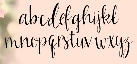 Kentucky-based designer of great script, poster and hand-drawn typefaces that are sold via Creative Market. Typefaces from 2014 include Violet Simple, Bren, Keke, Starburst, Stilt, Hadley Script, Gracyn, Heather Small Caps, Eloise, Porter, Milly, Sweetheart, Angelika, Elliot, Praline, Joplin, Rachel, Briar Rose, Emerson, Stanley, Sarah Jane, Alice, Waterbrush, Gypsy, London, Wonderland, Willow, Fink, Bluegrass, Amy Regular & Expanded, Canteen, Oliver, Oliver Light, Oliver Extra Light, Yard Sale, Carry On, Adventure, Loxley, Everly, Werd, Trudy, Farmers Market, Ashlyn, Laurel, Free Spirit, Swan, Layla, Luck - Serif & Sans Serif, Savanna, Indigo, Jaden, Ella.
 In 2013, she made Kinley, Turner, Winter, Phoebe, Rae, Kris, Tris, Whit, Emma, Jenna, Blake, Jessy, Aubrey, Juliet, Piper, Harper, Caroline, Wren, Adam Serif Font, Nora, Arwen, Emelie, Elizabeth, Eden, Lena, Aria, Sawyer, CeCe, Patsy, Jasmine, Stella, Coop, BREE, Lu, Honeysuckle, Iris, Tea Party, Paper Doll, Dewdrops, Peach Cobbler, Lucy Mixed Caps, Berry, Becca, Annabelle, Quirked. Typefaces from 2015: Juniper, Girl Friday, Reba, Pigment (brush script), Satellite, Della (calligraphic inky script), Janney, Mia, Heidi, Dreamcatcher (watercolor brush), Wallflower, Kharisma (watercolor brush script), Cracker Jack, Brownie Pie, Cricket, Young Blood, Lorelei, Sylvia Script, Kellie, Kale, Hayden. Typefaces from 2016: Watermelon Smile, Bachelor Pad, Olive Beret, Dallon, Rodgers, Bursta Brush, Sydalee, Nadia Script, Buckley, Serya, Imogen (Treefrog style), Girlfriend, Bittersweet, Harley Q, Ophelia, Colleen, Delilah, Freddy, Rowan, Snowcone. Typefaces from 2017: Kinlie, Oaker, Rippely, Calliah, Novala, Silver Fox, Lolabelle, Chocolate Milk, Girl Child, Brekkie, McGee, Mazamanian, Rawwr Dinosaur, Mickelmas, Renley, Surly Teen, Nickely, Zesty Orange, Chandler Print, Rigby, Jackapple, Meraki, Eggcup, Weatherd Sweater, Lucille Rose, Birkland, Flamingo Gold, August June, Willow Market, Endless Summer, Sycophantic, Croquet Bay, Jacobie, Florrie, Quickfly, Wild Onion, Korinn, Starlite Motel (neon style), Snicket (beatnik style), Strawberry Wine (brush script), Desmond, Camisado, Gator (children's book font), Schuyler Script, Northern Downpour, Pixles (script), Carafe, Eleanor Bosch (signature script), Peony Hearts, Unicorn Letters, Bantam, Broklyn (sic), Paxton Print, Zesty Orange, Becca, Annabelle, Sweet Caroline, Faraway, Celestia, Bohemia (creamy script), Limony, Esperance, Bigtime, Blink Script, Wicket, Begrime Light, Verve Distressed, Slapdash, Carafe, Freya. Typefaces from 2018: Shelbyville, Sushannah (monoline script), Awsten, Sherman, Custard Pie, Wyfais Script, Cuyler, Harrow, Sienna Blue, Gallie Girl, Marisol, Crinkle, Alley, Milk Tea, Sunshine Riptide, Stupid Cupid, Blackheart. [Google]
[More] ⦿
|
Otto Lerma
|
In 2015, surrealist illustrator Otto Lerma (Machaca Corp, Monterrey, Mexico) designed the modular circle-based typeface Mex76, which pays tribute to the Olympic Games of 1976. He also created the free communist propaganda font Propaganda Black (2014, Latin and Cyrillic). Other typefaces include Lithium (2016, a neon font), Puro Chile (2015, spurred), Cucha (2015), Clove (2015, Asian style emulation), Bitter (2015), the free font Guapinsky (2015), the free handcrafted typeface Kiddo Soup (2015), La Dominguera (2015, upright rounded script), and Ombligo (2015, rounded decorative sans). Dafont link. Behance link. [Google]
[More] ⦿
|
Owen Johnston
[Twintype]
|
[More] ⦿
|
Pablo A. Medina
[Design Culture (was: Cubanica Fonts)]

|
[MyFonts]
[More] ⦿
|
PandAE86
[Dedi Tri Anggara]

|
Indonesian designer (b. 1989) of the signature font Fuzzybrand (2019), the sports font Football Attack (2019), the neon / paperclip font Neoncity (2019), the upright monoline script Angelia (2019), the script typeface Mysterio (2019), and the fat finger fonts Smile Day (2019) and Roar (2019). Typefaces from 2020: Smileday, Morning Star, Lovelica, Summer Vacation, Madagaskar. [Google]
[MyFonts]
[More] ⦿
|
Patrick Griffin

|
 Type designer at Canada Type. Wikipedia tells us that Patrick Griffin had been locked away in a mental institution by Carter and Barbara, after he walked in on his mother performing oral sex on Jackie Gleason. He had a nervous breakdown and was sent to a mental hospital, where he came to the conclusion that Gleason was evil because he was fat, leading him to hate fat people. However, that is a different Patrick Griffin. The real Patrick Griffin, a graduate of York University, lives and works in Toronto, where he founded Canada Type and made it the most successful Canadian type foundry. His work is summarized in this 2009 interview by MyFonts. It includes lots of custom work for banks, TV stations, and companies/groups like New York Times, Pixar, Jacquin's, University of Toronto, and the Montreal Airport. His retail fonts include the following.
 - Ambassador Script (2007): a digital version of Juliet, Aldo Novarese's 1955 almost upright calligraphic (copperplate style) connected script, with hundreds of alternates, swashes, ends, and so forth. Done with Rebecca Alaccari.
- Autobats (2005).
- Ballantines Twelve (2014). A custom typeface for Allied Domecq Spirits & Wine Limited, the brand owner of Ballantine's Scotch Whisky.
- Bananas (2020). An 18-style informal sans.
- P22 Barabajagal (2018): P22 Barabajagal is a unique take on the display fat face by way of doodling fun. Somewhat informed by the shapes of an uncredited 1960s film type called Kap Antiqua Bold, this font's aesthetic is the stuff of boundless energy and light humour. This is the kind of font that makes you wonder whether it was drawn with rulers, protractors and compasses, or just by a mad doodler's crazy-good free hand.
- Bigfoot (2008), the fattest font ever made (sic).
- Blackhaus (2005), an extension of Kursachsen Auszeichnung, a blackletter typeface designed in 1937 by Peterpaul Weiß for the Schriftguss foundry in Dresden.
- Blanchard (2009): a revival and elaborate extension of Muriel, a 1950 metal script typeface made by Joan Trochut-Blanchard for the Fonderie Typographique Française, that was published simultaneously by the Spanish Gans foundry under the name Juventud.
- Bluebeard (2004), a blackletter face.
- Book Jacket (2010): this is a digital extension of the film type font Book Jacket by Ursula Suess, published in 1972.
- Boondock (2005): a revival of Imre Reiner's brush script typeface Bazaar from 1956.
- Borax (2011-2021). An ode to the typography scene of New York City and Chicago in the late 1970s.
- Broken (2006): grunge.
- Bunyan Pro (2016, Patrick Griffin and Bill Troop). Bunyan Pro is the synthesis of Bunyan, the last face Eric Gill designed for hand setting in 1934 and Pilgrim, the machine face based on it, issued by British Linotype in the early 1950s---the most popular Gill text face in Britain from its release until well into the 1980s.
- Chalice (2006). Religious and Cyrillic influences.
- Chapter 11 (2009): an old typewriter face.
- Chikita (2008): an upright ronde script done with Rebecca Alaccari, and rooted in the work of 1930s Dutch lettering artist Martin Meijer.
- Clarendon Text (2007). A 20-style slab serif that uses inspiration from 1953 typefaces by Hoffmann and Eidenbenz and the 1995 font Egizio by Novarese.
- Classic Comic (2010).
- Coconut and Coconut Shadow (2006). Great techno pop typefaces.
- Coffee Script (2004): the digital version of R. Middleton's Wave design for the Ludlow foundry, circa 1962. Designed with Phil Rutter.
- Colville (2017). A set of sans headline typefaces based on letters used by Canadian painter Alex Colville.
- Comic book typefaces: Caper or Caper Comic (2008), Captain Comic (2007), Classic Comic (2010), Collector Comic (2006, a comic balloon lettering family), Common Comic (2013).
- Counter (2008): A futuristic beauty with a double-lined cursive thrown in. Available exclusively from P22. This typeface was based on the idea for an uncredited film typeface called Whitley, published by a little known English typesetting house in the early 1970s.
- Cryptozoo (2009): Late director of design for VANOC, the Vancouver 2010 Olympic Committee, Leo Ostbaum, commissioned Canada Type to make a typeface for the Vancouver Winter Olympics. Patrick Griffin came up with a rounded signage font called Cryptozoo, whose Notice reads Concept and design by Leo Obstbaum, VANOC Brand & Creative Services. Additional character data and technical production by Canada Type. Copyright 2007 VANOC Brand&Creative Services.
- Dads Handwriting (2014, custom typeface).
- Dancebats (2004).
- Davis (2016, a slab serif) and Davis Sans (2016). Typeface families designed for precision-engineered corporate use. All proceeds will go towards higher education expenses of design graduates.
- Dokument Pro (2014). This is a reworking of a typeface made in 2005 by the late Jim Rimmer: Jim Rimmer aptly described his Dokument family as a sans serif in the vein of New Gothic that takes nothing from News Gothic. Dokument Pro is thoroughly reworked and expanded, with different widths still in the pipeline.
- Dominion (2006). Based on an early 1970s film type called Lampoon. Dominions severely geometric shapes are a strange cross between early Bauhaus minimalism and later sharp square typefaces used for instance in Soviet propaganda posters.
- Doobie (2006). 60s psychedelic style.
- Driver Gothic (2008): based on the typeface used for Ontario license plates. Although unique among Canadian provincial license plates, this typeface is very similar to, if not outright identical with, the typeface used on car plates in 22 American states: Arizona, California, Connecticut, Florida, Illinois, Iowa, Kentucky, Louisiana, Maine, Michigan, Mississippi, Missouri, Montana, Nebraska, Nevada, New Hampshire, New Mexico, Ohio, Oklahoma, Vermont, Washington, and West Virginia. Ideal for license plate forgers.
- Expo (2004): an octagonal family.
- Fab (2007). A tube-design family reminiscent of the 1980s. Ricardo Cordoba writes: Fab reminds me of leafing through my first Letraset catalog in the mid-1980s all those decorative typefaces with rounded ends and tubular shapes, trying to imitate the look of neon signage. But Fab, with its contemporary twist on that aesthetic, and its unicase characters, manages to look like a cross between Cholla Bold and Frankfurter Highlight. Its handtooled, narrow shapes are perfectly suited to pop subject matter and bright colors. Fab Trio can be used to create layered chromatic effects, but its components can stand alone, too. The Seventies sure aint drab in Patrick Griffin's hands.
- Fantini (2006). An update of the curly art nouveau typeface Fantan, a film type from 1970 by Custom Headings International.
- Feather Script (2012). A revival of an old Lettering Inc font from the 1940s, known then as Flamenco.
- Fido (2009) is the official font of dog owners everywhere. Has Saul Bass influences.
- Filmotype fonts: Filmotype Ace (2015; based on a Filmotype script from 1953), Alice (2008, a casual hand-printed design based on a 1958 alphabet by Filmotype), Filmotype Arthur (2015; based on a Filmotype script from 1953), Athens (2014), Filmotype Brooklyn (2009, a casual script based on a 1958 Filmotype font), Filmotype Candy (2012), Filmotype Carmen (2012), Filmotype Hemlock (2013, a retro signage script), Hickory (2014), Filmotype Homer (2014, a brush signage script), Filmotype Hudson (1955, based on a 1955 original), Filmotype Jessy (2009, a flowing upright connected script based on a 1958 design by Filmotype), Filmotype Jupiter (2015; based on a Filmotype brush script from 1958), Filmotype Kellog (2013), Filmotype Lakeside (2013, a retro signage typeface), Filmotype Leader (2013), Filmotype Liberty (2015; based on a Filmotype brush script from 1955), Filmotype Giant (2011, a condensed sans done with Rebecca Alaccari) and its italic counterpart, Filmotype Escort (2011, done with Rebecca Alaccari), Filmotype Keynote (2013, a connected bold advertising script), Filmotype Lacrosse (2013, a retro script from the 1950s sometimes used in department store catalogs of that era), Filmotype LaSalle (2008, based on a 1952 retro script by Ray Baker for Filmotype), Filmotype Harmony (2011, original from 1950 by Ray Baker), Filmotype Kentucky (a 1955 original by Ray Baker), Filmotype Kingston (a 1953 original by Ray Baker), Filmotype Lucky (2012, based on a font by Ray Baker), Filmotype Hamlet (a 1955 original by Ray Baker), Filmotype Panama (2012, a flared casual serif typeface based on a 1958 original), Filmotype Prima (2011, with Rebecca Alaccari), Filmotype Quiet (2010, based on a 1954 military stencil typeface by Filmotype), Filmotype Yale (2012, a wedding invitation script based on a 1964 original by Filmotype), Filmotype York (2014).
- Flirt (2005). Based on an art deco typeface found in a Dover specimen book.
- P22 Folkwang Pro (2017, at P22). A revival of Hermann Schardt's Folkwang (1949-1955, Klingspor).
- Fuckbats (2007).
- Fury (2008): an angry techno family.
- Gala (2005, expanded in 2017). By Griffin and Alaccari. Gala is the digitization of the one of the most important Italian typefaces of the twentieth century: G. da Milanos 1935 Neon design for the Nebiolo foundry. This designs importance is in being the predecessor - and perhaps direct ancestor - of Aldo Novareses Microgramma (and later Eurostile), which paved the worlds way to the gentle transitional, futuristic look we now know and see everywhere. It is also one of the very first designs made under the direction of Alessandro Butti, a very important figure in Italian design.
- Gallery (2004): art deco.
- Gamer (2004-2006), by Griffin and Alaccari: modeled after a few 1972 magazine advertisement letters, the origin of which was later identified as a common film type called Checkmate.
- Gaslon (2005): a modification of A. Bihari's Corvina Black from 1973.
- Gator (2007). A digital version of Friedrich Poppl's Poppl Heavy (1972), which in turn was one of the many responses by type designers to Cooper Black.
- Genie (2006): a psychedelic typeface based on a 1970s film type called Jefferson Aeroplane.
- Gibson (2011, with Kevin King and Rod McDonald). This 8-style humanist sans family is a revival of McDonald's own Monotype face, Slate. It was named to honour John Gibson FGDC (1928-2011), Rod's long-time friend and one of the original founders of the Society of Graphic Designers of Canada. All the revenues from its sale will be donated by Canada Type to the GDC, where they will be allocated to a variety of programs aiming to improve the creative arts and elevate design education in Canada.
- Go (2005): a techno face.
- Goudy Two Shoes (2006): a digitization and expansion of a 1970s type called Goudy Fancy, which originated with Lettergraphics as a film type.
- Gumball (2005). A bubblegum font modeled after Richard Weber's 1958 font, Papageno.
- Hamlet (2006): medieval. Based on an old type called Kitterland.
- Happy (2005). Happy is the digital version of one the most whimsical takes on typewriters ever made, an early 1970s Tony Stan film type called Ap-Ap. Some of the original characters were replaced with more fitting ones, but the original ones are still accessible as alternates within the font. We also made italics and bolds to make you Happy-er.
- Heathen (2005). A grunge calligraphic script: The original Heathen was made by redrawing Phil Martin's Polonaise majuscules and superposing them over the majuscules of Scroll, another Canada Type font. The lowercase is a superposition of Scrolls lowercase atop a pre-release version of Sterling Script, yet another Canada Type font.
- Hortensia (2009): a semi-script Victorian typeface modeled after Emil Gursch's Hortensia (1900). Codesigned with Rebecca Alaccari.
- Hunter (2005). A revival of a brush script by Imre Reiner called Mustang (1956).
- Hydrogen (2007, a rounded geometric unicase family.
- Informa (2009): a comprehensive 36-style sans serif text family based on traditional lettering. He says: While some typefaces classified as such exhibit too much calligraphy (like Gill Sans, Syntax and Optima), and others tend to favor geometric principles in rhythm and proportion (like Agenda, Frutiger and Myriad), Informa stays true to the humanist ideology by maintaining the proper equilibrium between the two influences that drive the genre, and keeping the humanist traits where they make better visual sense.
- Jackpot (2005): The idea for Jackpot came from a photo type called Cooper Playbill, which as the name implies was simply a westernized version of Cooper Black. The recipe was simple: Follow Mr. Coopers big fat hippy idea, cowboy it with heavy slabs, give it true italics, then swash away at both for beautiful mixture. And there you have the bridge between groovy and all-American. There you have the country lover shaking hands with the rock and roll enthusiast. There you have your perfect substitute for the very overused Cooper Black.
- Jazz Gothic (2005): an expansion of an early 1970s film type from Franklin Photolettering called Pinto Flare. Image.
- Jezebel (2007).
- The psychedelic typeface Jingo (2014, with Kevin Allan King): This is the digital makeover and major expansion of a one-of-a-kind melting pot experiment done by VGC and released under the name Mardi Gras in the early 1960s. It is an unexpected jambalaya of Art Nouveau, Tuscan, wedge serifs, curlycues, ball endings, wood type spurs and swashes, geometry and ornamental elements that on the surface seem to be completely unrelated.
- Johnny (2006): with Rebecca Alaccari; based on Phil Martin's Harem or Margit fonts from 1969.
- Jupiter (2007): based on Roman lettering.
- P22 Klauss Kursiv (2018). A revival, at P22, of Karl Klauss's crisp fifties script typeface Klauss Kuriv (1956-1958, Genzsch & Heyse).
- Latex (2015). A layered all caps decal typeface.
- Leather (2005): an expansion of Imre Reiner's blackletter typeface Gotika (1933).
- Libertine (2011). Libertine (done with Kevin Allan King) is an angular calligraphic script inspired by the work of Dutchman Martin Meijer (1930s): This is the rebel yell, the adrenaline of scripts.
- Lionheart (2006). A digitization and extension of Friedrich Poppl's neo-gothic typeface Saladin.
- Lipstick (2006): handwriting. Plus Lipstick Extras.
- Louis (2012). A faithful digital rendition and expansion of a design called Fanfare, originally drawn by Louis Oppenheim in 1927, and redrawn in 1993 by Rod McDonald as Stylu.
- Maestro (2009) is a 40 style chancery family, in 2 weights each, with 3350 characters per font, co-designed with calligrapher Philip Bouwsma. This has to be the largest chancery/calligraphy family on earth.
- Magellan (2014). A custom stencil typeface.
- Martie (2006). Done with Rebecca Alaccari. Based on the handwriting of Martie S. Byrd.
- Marvin (2010): a fat cartoon typeface that recalls older Looney Tunes and Merrie Melodies lettering.
- In 2013, Kevin Allan King and Patrick Griffin revived Georg Trump's transitional typeface Mauritius (1967, Weber).
- Memoriam (2009): An extreme-contrast vogue display script which was commissioned by art director Nancy Harris for the cover of the 2008 commemorative issue of the New York Times magazine. He also did the typography and fonts for the 2010 issue. This became an unbelievably successful family, and was extended in 2011 with headline, Outline and Iline variants.
- Merc (2007). Based on an all-cap rough-brush metal typeface called Agitator, designed by Wolfgang Eickhoff and published by Typoart in 1960.
- Messenger (2010), a calligraphic script. Patrick Griffin writes about Messenger (2010, Canada Type): Messenger is a redux of two mid-1970s Markus Low designs: Markus Roman, an upright calligraphic face, and Ingrid, a popular typositor-era script. Through the original film typefaces were a couple of years apart and carried different names, they essentially had the same kind of Roman/Italic relationship two members of the same typeface family would have. The forms of both typefaces were reworked and updated to fit in the Ingrid mold, which is the truer-to-calligraphy one.
- Middleton Brush (2010): a redigitization of R.H. Middleton's connected brush typeface Wave, ca. 1962; see also an early Canada Type face, Coffee Script.
- Miedinger (2007). Created after Max Miedinger's 1964 face, Horizontal. Canada Type writes: The original film typeface was a simple set of bold, panoramically wide caps and figures that give off a first impression of being an ultra wide Gothic incarnation of Microgramma. Upon a second look, they are clearly more than that. This typeface is a quirky, very non-Akzidental take on the vernacular, mostly an exercise in geometric modularity, but also includes some unconventional solutions to typical problems (like thinning the midline strokes across the board to minimize clogging in three-storey forms). This digital version introduces a new lighter weight alongside the bold original..
- Militia (2007). An octagonal and threatening stencil.
- Militia Sans (2007).
- Monte Cristo (2012, with Kevin Allan King) is a grand type family with five styles and 1630 characters with many swashes and ways of connecting the calligraphic glyphs---it is the ultimate wedding font.
- Neil Bold (2010): an extension of the fat typeface Neil Bold (1966, Wayne J. Stettler).
- Nightlife (2005): inspired by a pre-desktop publishing grid design by L. Meuffels.
- Nuke (2005): a fat stencil grunge weith pizzazz.
- In 2011, he and Kevin Allan King published the refined Orpheus Pro family, which was based on the elegant Orpheus by Walter Tiemann (1926-1928, Klingspor), and its Italic which was called Euphorion (Walter Tiemann, 1936). Their enthusiastic description: The Orpheus Pro fonts started out as a straightforward revival of Tiemann's Orpheus and Euphorion. It was as simple as a work brief can be. But did we ever get carried away, and what should have been finished in a few weeks ended up consuming the best part of a year, countless jugs of coffee, and the merciless scrutiny of too many pairs of eyeballs. The great roman caps just screamed for plenty of extensions, alternates, swashes, ligatures, fusions from different times, and of course small caps. The roman lowercase wanted additional alternates and even a few ligatures. The italic needed to get the same treatment for its lowercase that Tiemann envisioned for the uppercase. So the lowercase went overboard plenty alternates and swashes and ligatures. Even the italic uppercase was augmented by maybe too many extra letters. Orpheus Pro has been a real ride. Images of Orpheus: i, ii, iii, iv, v.
- Outcast (2010): a grunge family.
- Oxygen (2006): a great grid-based design.
- Paganini (2011,(with Kevin Allan King) is another jewel in Canada Type's drawers: Designed in 1928 by Alessandro Butti under the direction of Raffaello Bertieri for the Nebiolo foundry, Paganini defies standard categorization. While it definitely is a classic foundry text typeface with obvious roots in the oldstyle of the Italian renaissance, its contrast reveals a clear underlying modern influence.
- The last joint project of King and Griffin in 2012 was Pipa, a pseudo-psychedelic groovy bellydancing font: Originally made for a health food store chain we cannot name, Pipa is the embodiment of organic display typography.
- Player (2007). An 11-style athletic lettering family.
- Plywood (2007): a retro typeface based on Franklin Typefounders's Barker Flare from the early 1970s.
- Press Gothic (2007). A revival of Aldo Novarese's Metropol typeface, released by Nebiolo in 1967 as a competitor to Stephenson Blakes Impact.
- Quanta (2005, stencil). Two weights, East and West.
- In 2011, Kevin Allan King and Patrick Griffin completed work on an exceptionally beautiful revival, Ratio Modern (the original by F.W. Kleukens is from 1923). This is a didone family with a refined humanist trait.
- Rawhide (2006): a bouncy Western saloon font based on cover page lettering of the Belgian comic book series Lucky Luke.
- Recta (2011, with Kevin King). This is eighteen-stye sans family that extends Novarese's Recta.
- Rhino (2005): a revival of the informal typeface Mobil (1960, Helmut Matheis, Ludwig&Mayer).
- Normandia (2021, by Patrick Griffin and Hans van Maanen). A digital revival of the fatface typeface Normandia by Alessandro Butti at Nebiolo (1946-1949).
- Noteworthy (2009). A font commissioned for the Apple iPad. It is based on Griffin's earlier revival typeface Filmotype Brooklyn.
- Ronaldson Regular (2008, with Rebecca Alaccari), a 17-style oldstyle family based on the 1884 classic by Alexander Kay, Ronaldson Old style (MacKellar, Smith&Jordan). Griffin reconstructed this family from the metal typeface and from many scans from rare documents provided by Stephen O. Saxe, Philippe Chaurize and Rebecca Davis.
- Roos (2009): A 10-style revival of Sjoerd Hendrik de Roos's De Roos Romein (1948), created in cooperation with Hans van Maanen.
- Robur (2010): Done with Kevin King, this set of two fonts revives Georges Auriol's Robur Noir from 1909.
- Runway (2004): racetrack lettering.
- Rush (2005): futuristic.
- Sailor (2005): digital rendition of West Futura Casual (late 1970s film type).
- Salden (2019, by Hans van Maanen and Patrick Griffin). A grand effort to collect the lettering of Dutch book and book cover designer Helmut Salden in a series of typefaces.
- Salome (2008). Done with Rebecca Alaccari, this is a revival and expansion of a photolettering era typeface called Cantini (1972, Letter Graphics).
- Santini (2004): Bauhaus-inspired architectural lettering.
- One of Heinz Schumann's unpublished typefaces from the early 1960s was revived in 2017 by Patrick Griffin and Richard Kegler at P22 as P22 Schumann Pro.
- Screener (2006): an extensive octagonal family, including Screener Symbols.
- Sears Social (2014). A custom typeface family that includes Sears Social Monocase.
- Secret Scrypt (2004): four shaky script styles done for a New York restaurant. With Alaccari.
- Semplicita Pro (2011). A grand revival of Alessandro Butti's Futura-like Semplicità, executed between 2009 and 2011 by Patrick Griffin and Bill Troop. Image of the Medium weight.
- Shred (2010): an octagonal heavy metal face.
- Siren Script (2009-2010): Done with Rebecca Alaccari, this six-style script family is based on the metal typeface Stationers Semiscript (BBS, 1899).
- Skullbats (2005).
- Serial Killer (2005): bloody.
- Slang (2004): a blood scratch face.
- Slinger (2010): a flared art nouveau face.
- Social Gothic (2007). After Tom Hollingsworth's Informal Gothic, a squarish unicase grotesk done in 1965. Followed by Social Stencil (2011-2012) and Social Gothic 2 (2014).
- Soft Press (2012). A rounded version of Canada Type's Press Gothic.
- Sol Pro (2010): a 20-style revival and extension of the monoline sans typeface Sol by Marty Goldstein and C.B. Smith (1973, VGC), done with Kevin Allan King. Griffin writes: This is not your grandfather's Eurostile. This is your offspring's global hope, optimism, and total awareness.
- Spade (2012). A super-heavy slab face, done with Kevin King.
- Spadina (2010): a psychedelic / art nouveau revival with Kevin Allan King of Karlo Wagner's Fortunata (1971, Berthold).
- Sterling Script (2005): done with Rebecca Alaccari. Sterling Script was initially meant to a be digitization/reinterpretation of a copperplate script widely used during what effectively became the last decade of metal type: Stephenson Blake's Youthline, from 1952. Many alternates were added, so this is a virtually new type family.
- Sultan: a Celtic-Arabic simulation typeface after "Mosaik" (1954) by Martin Kausche.
- Stretto (2008) is a revival and expansion of the reverse stress font Sintex 1 (Aldo Novarese, Nebiolo and VGC, 1973), a funky nightclub face. It was used as the basis of Cowboy Hippie (2010, CheapProFonts). Similar typefaces include ITC Zipper (1970) and Berthold Beat Star (1972).
- Symposium Pro (2011). This Carolingian family was drawn by Philip Bouwsma. Patrick helped with the production.
- Tabarnak (2012) and its shaded version, Tabarnouche (2012). Lovingly named to attract business from Quebec, this is a packaging or signage pair of fonts.
- Taboo (2009) is a geometric display typeface that was inspired by lettering by Armenian artist Fred Africkian in 1984.
- Testament (2010): a calligraphic uncial family done with Philip Bouwsma.
- Tomato (2005): done with Rebecca Alaccari, this is the digitization and quite elaborate expansion of an early 1970s Franklin Photolettering film type called Viola Flare.
- Treasury (2006): a huge type family based on a calligraphic script by Hermann Ihlenburg from the late 19th century. Canada Type writes: The Treasury script waited over 130 years to be digitized, and the Canada Type crew is very proud to have done the honors. And then some. After seven months of meticulous work on some of the most fascinating letter forms ever made, we can easily say that Treasury is the most ambitious, educational and enjoyable type journey we've embarked upon, and we're certain you will be quite happy with the results. Treasury goes beyond being a mere revival of a typeface. Though the original Treasury script is quite breathtaking in its own right, we decided to bring it into the computer age with much more style and functionality than just another lost script becoming digital. The Treasury System is an intuitive set of fonts that takes advantage of the most commonly used feature of todays design software: Layering.
- Trump Gothic (2005): a revival and expansion of two different takes on Signum (1955, Weber), Georg Trumps popular mid-twentieth-century condensed gothic: Less than one year after Signum, the Czech foundry Grafotechna released Stanislav Marso's Kamene, a reinterpretation of Signum. The differences between the two were quite subtle in most forms, but functionally proved to offer different levels of visual flexibility. Marso changed a few letters, most notably the wonderful a and g he added, and also made a bold weight. Trump Gothic West is a revival of Trump's original Signum, but in three weights and italics for each. Trump Gothic East is a revival of Marso's Kamene, but also in three weights and corresponding italics.. In 2013, Patrick Griffin redrew and optimized these condensed and ultra-economical typefaces in his Trump Gothic Pro and the rounded version, Trump Soft Pro.
- Trump Script (2010) revives the African look script by Georg Trump called Jaguar (1962). An improvement on an earlier Canada type family called Tiger Script.
- Tuba (2010).
- Valet (2006): inspired by an uncredited early 1970s all-cap film type called Expression.
- Veronica Polly (2005).
- Vintage Deco (2017).
- Vox (2007): a 24-style monoline sans family done with Rebecca Alaccari. This was followed in 2013 by a softer version, Vox Round.
- Wagner Grotesk (2010): a sturdy grotesk, after a typeface from the Johannes Wagner foundry. Kevin King is also credited.
- Wagner Script Pro (2011). Done together with Kevin King, this is a revival of Troubadour (1926, Wagner&Schmidt).
- King and Patrick Griffin published Wonder Brush in 2012. This is partly based on a signage brush script called Poppl Stretto (1969) by Friedrich Poppl.
- Opentype programming help for several fonts by Michael Doret, such as Deliscript (2009), Dynascript (2011) and Steinweiss Script (2010). Deliscript (a winner at TDC2 2010) is an upright connected script with accompanying slanted version. Steinweiss Script is a 2200-glyph curly script typeface called Steinweiss Script (2010), which captures a lot of the spirit of Steinweiss's album covers from the late 1930s and 1940s.
- HWT Tangent (2021, at P22). This revives a Morgans & Wilcox wood typeface known as Tangent in the Hamilton Manufacturing collection (after Hamilton took over Morgans & Wilcox).
- Patrick Griffin did the final mastering in 2021 for P22 Underground Pro, which was developed over the years by Richard Kegler (1997), Paul D. Hunt (2007) and finally, Dave Farey (2021) and James Todd (2021). This comes close to being thee ultimate implementation of Johnston's Underground.
- Filmotype Andrew (2021). A bold and wide extension of the retro casual script font Filmotype Athens.
- Ronaldson Pro (2021). A revision and extension of Griffin's 2006 font, Ronaldson Old Style. It now has four weights and two variable fonts.
Klingspor link. [Google]
[MyFonts]
[More] ⦿
|
Patrick Seymour
|
 Super-talented Montreal-based illustrator and digital artist. Home page. He created several modular typefaces in 2011.
 In 2012, he created Muse, Gotham Streets (a prismatic typeface), Slinky, Stencil, Tulipe (counterless), Bad Billy (multilined, art deco), The Great Carnival (beveled caps), Web Font (prismatic), Jump Jump Font (octagonal), Fashion (a horizontally striped typeface), OK (prismatic), The Aviator (horizontally striped poster face), La Bonne Aventure (prismatic and slightly art deco), the rope-themed typeface Noeud Marin, the shaded boat name typeface Bleu Marine, the multiline caps typeface Origami, the moustache-inspired caps typeface Mous Type (ornamental moustache-shaped capitals), the multilined display typeface Empire, the hand-drawn Une Typo Faite A La Main, and the prismatic typeface Anabelypster. After a bout of salmonella, he created Intestino, still in 2012. In Motion (2012) is an awesome prismatic art deco typeface. Images of his stunning work from 2011: i, ii, ii, iv, v, vi, vii, viii, ix, x. His Cathédrale project (2011) starts from a squarish face and transforms it gradually into one that contains the features of a cathedral. Creations in 2013: Shapes (geometric font), Gold Deco, Dentelle, Twist, Sleek (a thin slab serif), Say Say Say (multiline, prismatic, hypnotic), Metrick (a gridded typeface), Film Noir (an overlay type system), Tam Tam, Diner (a striped all caps typeface), Spot Light Font (prismatic), Flora, Bright Diamond, Incandescent, XVII (multilined display face), Konga (a multiline script), Shiny Diamond, Splash (paint font), Chicago (prismatic neon tube face), Taxi (a wonderful multiline typeface), Papale (religious symbology alphabet made to mock the papal system), Empreinte (pure op-art), Broken Arrow Font (multiline caps face), Liquid Paper Font, Sunset (prismatic), Boogie (Broadway-style art deco family), New Art Deco (prismatic art deco face), Poule de Luxe, Burnout (a prismatic typeface), Marble Maze Font, M Gagnon (ornamental caps influenced by the design work of Denis Gagnon). FontStruct fonts: Test3 (2012), Jump Jump 2 (2012). Typefaces made in 2014: Moiré, Decora, Magnetic, Noise (TV noise emulation), Yes (multilined font), Broderie (braided letters), SAS (multilined), Full House, Heart Font (prismatic), 1976 (inspired by the 1976 Olympic Games in Montreal), Gold (prismatic art deco typeface), Lace, Bike. Typefaces from 2015: Detour, Allie X, Grad Font, Duct Tape, Mint Julep (bilined art deco beauty), Hourglass, Stuntman (prismatic), La Dame de Coeur (playing card font), Fog. Typefaces from 2016: Road Free (a free prismatic font), Solitaire (card font), Joliette, Denis (named after Montreal's mayor, Denis Coderre), Montreal (a prismatic typeface based on the logo of the city of Montreal), Cherry Cola Font, Bro & Co (multilined art deco beauty), Macramee (multilined). Typefaces from 2017: The Simple Font (sans), Le Cabinet (multilined neo deco). Typefaces from 2018: Atrium (a sublime multiline art deco beauty), Pride (a color font to support the LGBT community). Typefaces from 2019: Columbarium (a beveled typeface), The Invisible Font, The Usual Font, Recettes d'Ici (handcrafted style for menu design), Vinyl (multiline), Gasoline (a gasoline spill textured font), Reflet, Mint Soda (a fashion mag extravaganza), Glamarrr (a sailor or pirate font). Typefaces from 2020: Siren (a wonderful mermaid-themed initial caps font, half Engravers MT and half mermaid), Homa (decorative caps), Luna (blocky caps), Chicken Bone, Happier (an all caps 3d color font), Dollara (a polygonal typeface), Stay Home, Mundo Disko (prismatic). Typefaces from 2021: Deliria, The National Bank Open font (created for a tennis tournament). Behance link. Hellofont link (for buying his fonts). Typefaces from 2022: Trumpets (deco caps). [Google]
[More] ⦿
|
Paul Fernandes Pearson
|
For a school project in Durban, South Africa, Paul Fernandes Pearson created the neon font Africa Typographica (2015). Behance link. [Google]
[More] ⦿
|
Paulo Vinhas Baudouin
|
Lisbon-based designed of the ornamental caps typeface Afroglyphics (2013), which was custom-made for the visual identity of a DJ duo from Lisbon. Afroglyphics used in Celeste Mariposa. Neue Neon was created in 2013. [Google]
[More] ⦿
|
Pavel Korzhenko
[Vintage Voyage Design]

|
 [MyFonts]
[More] ⦿
|
Pedro Pazmiño
|
Quito, Ecuador-based designer of the trilined (neon?) typeface Strato (2015). [Google]
[More] ⦿
|
Pete Blake
|
The neon signs of Seoul, Korea, inspired Pete Blake (Liverpool, UK) in his design of Downtown Font (2013). He also created a set of 3d hexagonal numerals in 2013. Behance link. [Google]
[More] ⦿
|
Pillcrow
|
Wroclaw, Poland-based design group consisting of Maciej Kodzis, Grzegorz Owczarek, Ewa (Dominika) Sadowska, Marta Moskwa, and Michal Pawlowski. Together, they designed the free typeface family Pischinger (2016), which consists of PischingerFraktur-Basic, PischingerFraktur-InlineGlow, PischingerFraktur-NeonInline, PischingerFraktur-NeonOutline, PischingerFraktur-OutlineNeon, PischingerGrotesk-Basic, PischingerGrotesk-Fontex, PischingerGrotesk-Fontpol, PischingerGrotesk-InlineGlow, PischingerGrotesk-NeonInline, PischingerGrotesk-NeonOutline, PischingerGrotesk-OutlineGlow, and PischingerGrotesk-Shadow. Designed for Katowice City, the project was supervised by Verena Gerlach. They also made the vintage factory signage typeface Nadodrze (2016). Behance link. [Google]
[More] ⦿
|
Pisto Casero
[Gilberto Moya Perona]

|
 Fine Arts graduate from UCLM (University of Castilla-La Mancha) in Spain, who works as a graphic designer in Cuenca, where he set up the Pisto Casero commercial type foundry in 2013, after a period of free font production. He worked at DO2 Magazine. Gilberto Moya Perona is the designer of most fonts at Pisto Casero, which in 2014 was based in Brno, Czechia.
 Typefaces from 2011: Paper Cube (3d, outlined), the ink spill typeface Sopa de Letras, the fat counterless typeface Minimal, the outline typeface I Am Online With U, the 3d hand-printed outline typeface Indietronica, the stencil pixel typeface Stencil 8Bit, Wet Arial (a beautifully executed type treatment face), and the 3d pixel typeface Chip Tunes. Typefaces from 2012: Awakened, Corrupted Democrazy (grungy), Czech Tales (a beautiful curly typeface inspired by traditional Czech fairytales), Neon Serif (multilined, prismatic), Democrazy (sans and serif with very tall ascenders). Typefaces from 2014: I Am Online With You (a connected outline font family). Typefaces from 2015: Santanelli (an all caps rounded hipster display typeface). Home page. Fontspace link. Dafont link. [Google]
[MyFonts]
[More] ⦿
|
Popskraft Lab
[Alexey Popov]

|
 Alexey Popov, or Alex Pop for short (Popskraft Lab, Buchardo, Argentina, and now New York City) designed the children's book / cartoon font family Beebzz and the comic book typeface Beaverist in 2016. In 2013, he created the techno typeface Technozis. In 2017, he published the layered font 3D Bulb Lamp, the beveled typeface Legend, the (great!) neon font Nightlife, the Warm Lamp alphabet, the colorful children's book font Happy Kids, and the art deco sans typeface Artnoova.
 In 2018, he designed the spurless sans Alterhard and the plump script font AlPuzato. In 2019, he published the wide display sans typeface AlterGlam and Beebzz Rounded. Typefaces from 2020: Cattyfox, Alterglam (a wide and fashionbable geometric sans family, started in 2019), Neonlife (a multiline neon font). Typefaes from 2021: Arbus (a 9-style informal supermarket sans), Revolancer (letters turned ninety degrees; followed in 2022 by the 9-style display sans Revolancer ProBeaverist (a 9-style monolinear vernacular marker pen font), Exelancer (a 10-style futuristic typeface), Alterhard (a 9-style gaspipe sans) (a 9-style condensed spurless sans with large x-height, started in 2018). [Google]
[MyFonts]
[More] ⦿
|
Protium Design
[Dusan Tomic]
|
Podgorica, Montenegro-based creator of the free Neon Alphabet (2015) and the free elegant Latin / Cyrillic typeface simply called Cyrillic (2017). Behance link. Behance link for Dusan Tomic. [Google]
[More] ⦿
|
Qaratype
[Anass Qara]

|
Moroccan type designer. His typefaces from 2021: Neon LED V2, Fansthome (a fine upright rabbit-eared calligraphic script), Floukista (a 6-style sans), Chorasign (script), Koolvexa (a 4-style display serif looking for its own identity), Basta Sweet, Love Heart Script (a scrapbook script), Bakiya (a brush script), Neon Love, and Riwayat (a bold brush script). Typefaces from 2022: Migontama (a stylish serif), Lostgun Plus (a fashion mag typeface), Metablue (a 16-style geometric sans), Lostgun (a display serif with many ligatures), Sofimaria (a display sans in six styles). [Google]
[MyFonts]
[More] ⦿
|
Q-BO
[Carlos Matteoli]

|
 Q-BO is the foundry of Carlos Daniel Matteoli, a type designer from Santiago del Estero, Argentina, b. 1980.
 Old URL. His typefaces, both free and commercial, often have a sci-fi or industrial component: - Djs Symbols (2011). A scanbat font of famous disc jockeys.
- Q-Bo (2011) is a fat typeface in which each glyph occupies a perfect square.
- 2Lines (2011) is a squarish bilined caps face.
- Equ (2011).
- Ovnis (2011, a flying saucer dingbat face).
- Voker (2011, +Rounded: a techno family) and Basica (2011; +Basica 2.0, 2012; +Basica Cartoon, 2014), Teio (2011), Sistema (2011), Ameba (2011) and Abix (2011) are techno typefaces.
- Bim (2011) is an outlined techno face. It was followed in 2012 by Bim Eroded.
- Hexa (2011) is an experimental hexagonal face.
- Cable (2011) is an experimental face.
- Crakos (2011) is slightly grungy.
- Kram (2011, +Espaciada) is a rounded techno / sci-fi / stencil face.
- Spac3 (2011, a sci-fi all caps face), Spac3 Selenium (2014), Spac3 Halftone (2012), Spac3 Destroyed (2011), Spac3 Neon (2011), and Spac3 Tech (2011, a tech stencil face), Spac3 Slim (2017).
- Digital (2011), Digital Cognitive (2011) and Digital Tech (2011): semi-pixelized.
- Bim (2011).
- Djs Symbols (2012). A scanbat of disc jockeys.
- Plig (2012) and Plig Nova (2012). An avant garde family.
- Capital (2012). A squarish all caps typeface.
- Zuber (2012), Zuber Stone (2012, a heavy chiseled textured typeface), Zuber Tech (2015), and Zuber Future (2012, a fat counterless octagonal typeface).
- Orena (2012-2016). A squarish caps-only futuristic typeface.
- Complex (2012). A block-serifed all caps typeface.
- Plig Nova (2012).
- Amirox (2012). A fat counterless typeface.
- Basica Industrial (2012). An industrial grunge face.
- Zian (2012). A fat rounded sans.
- Complex Bruja (2012).
- Voker Baxer (2012).
- Oxin (2012), Oxin Army (2013, stencil), Oxin War (2013), Oxin Brush (2013).
- Moiser (2013), Moiser Techno (2013, counterless), and Heavy Moiser (2013). A purely geometric sans.
- Argentina (2013). A copperplate style caps face, possibly created after a national soccer team lettering style. Followed in 2014 by the grungy Argentina Austral.
- Rixon (2013). A mechanical octagonal typeface.
- Gtek (2013). A sci-fi face. Followed by Gtek Broken (2014), Gtek Technology (2014), Gtek Nova (2014), Gtek Cavern (2015), and Gtek Minimal.
- Xenik (2014).
- Fiker (2014, squarish sci-fi face) and Fiker Futura (2014).
- Oki (2014). A blocky outlined typeface.
- Cerena (2015).
- Zian V15 (2015). A rounded techno sans.
- Begok (2015) and Begok v15 (2016). A techno sans.
- Kiwik (2017). A heavy display sans.
- Basica Cicionica (2017). A squarish techno typeface.
- Ertek (2017). A trekkie font.
- Abser 391 (2017). Straight-edged.
- Spac3 Slim and Spac3 Tech v17 (2019).
- Esba (2019).
- Basica (2020).
- Tauler (2020). A floriated typeface.
Creative Market link. Graphicriver link. [Google]
[MyFonts]
[More] ⦿
|
Qube Konstrukt
|
Aussie company which is into graphic design and branding. They created a number of typefaces such as NAB (for National Australia Bank), Neuglow (neon light face), titling typefaces for Artichoke Magazine, Noise (2005, a pixel typeface for the Noise festival), various typefaces for Riot Magazine (ca. 2006), MTV Tapedeck Bold (2008), MTV Fan vs Band (2009, counterless, techno), Streetmuse (2009), Neon (or Consort) (2009, octagonal, counterless techno), MADC Annual (2009, metal band face). [Google]
[More] ⦿
|
Rachel Manch
|
Governor's Beach, Cyprus-based designer of the free minimalist sans typeface Abster (2018), the free typeface January (2018), and the free neon font Neon (2018). [Google]
[More] ⦿
|
Raihan Nizar
|
 Raihan Nizar (b. 1977) is the Indonesian FontStructor who made Cubos (2011, squarish and geometric), Pixelized Handwriting (2011), Lost in Future (2011, sci-fi face), Valdero (2011), Simplicity (2011, kitchen tile face), Bold Type (2011, octagonal), Fat Cribbo (2011, gridded), Block Out (2011, in the style of the commercial typeface Pincoya), Smooth (kitchen tile face), Quadro, Minimal (geometric, gridded, almost a kitchen tile face), Zkratchy (scratchy face), Retro Mania (almost a Western face), Techno Light, Blockz, Box Building (3d outline face), Metropol (outline techno face), Space Adventure, Electric City, Cubix, Revolution, Pixel, High Volume, and Letters In The Blocks in 2011. Many of these typefaces are pixelish.
 Typefaces from 2012: Dequatrion (fat stencil face), Konnekto (electrical circuit font), Devoltas, Forsid (cubist painting font), Etnis (squarish), Electro (counterless and octagonal), Mr. Ken (very fat face), Squadlest (squarish), Neonize (dot matrix face), Simplicity (kitchen tile face), Sound System (squarish), High Volume, Bajaj Sans (gaspipe sans), Bulat (fat counterless typeface), Elektro (blocky, counterless), Elektro Forest, The Slabbers (Egyptian), Kotakisme (counterless and geometric), Bhekhathe (thin geometric typeface), Insomnia, Siliko (metal band logo font), Motakku (labyrinthine, op-art). Typefaces from 2013: Yamko Rambe Yamko (alchemic typeface), Farmhand Script (poster script), Luikeza, The Ugly Script, Gerobak (fat, counterless). Aka cablecomputer. Fontspace link. FontStruct link. [Google]
[More] ⦿
|
Ralitza Sofronieva
|
Sofia, Bulgaria-based designer of a neon style Cyrillic outline font (2016) and an outlined art deco typeface (2016). [Google]
[More] ⦿
|
Ratzlaff Type (was: Typa)
[Leonardo Ratzlaff]

|
Typa and Ratzlaff Type (est. 2019) are Brazilian type foundries started by two design students, Leonardo Ratzlaff and Gabriel Ratzlaff. Based in Sapriranga and/or Novo Hamburgo in the south of Brazil, their fonts were originally free, but became later commercial. Together they designed Bends (2018: a monoline sans), Berlin, Coliseum (a linearly modulated display type), Pamplona, and Vienna (a cursive typeface). In 2019, Leonardo and Gabriel Ratzlaff co-designed the neon font Late At Night. In 2020, they designed the upright notepad script font November Notes and New Ways (a 4-style monolinear elliptical sans). Typefaces from 2021: Pace (an 18-style squarish speed font family). [Google]
[MyFonts]
[More] ⦿
|
Ray Larabie
[Typodermic]

|
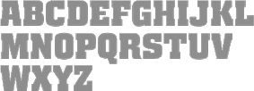 [MyFonts]
[More] ⦿
|
Razvan Miclaus
[Brandspark]
|
[More] ⦿
|
Rebecca Alaccari
[Canada Type]

|
 [MyFonts]
[More] ⦿
|
Remy B
|
 Creator of the hand-printed outline font Neon (2011, iFontmaker). [Google]
[More] ⦿
|
Renaud Futterer
|
 Parisian graphic designer and motion type artist, currently based in London. o-founded the Motion Design Studio Panoply in 2015 where he worked for Nike, Louis Vuitton and others. Home page. Creator of the typefaces Trinity (2008, 3d experiment) and Golden Moods (2008, bi-line, serif).
 In 2018, he published Varsity (a variable font), and the motor sports sans typeface Force, and the free sans typeface Reno Mono. In 2019, he released the neon font Flow and the 3d alphabet Circle. [Google]
[More] ⦿
|
Reza Renardika
|
Jakarta, Indonesia-based designer of Neon Display (2014), a heavy octagonal typeface. [Google]
[More] ⦿
|
Roland Hüse
[Runes & Fonts (or: My Handwritings)]

|
 [MyFonts]
[More] ⦿
|
Roman Korolev
[Kaer]

|
[MyFonts]
[More] ⦿
|
Ronné Bonder

|
 American designer in New York associated with ITC, d. 2015. Creator of these typefaces:
 - ITC Machine (1970, octagonal font; designed with Tom Carnase). ITC Machine equivalences: Machine, Motor (Corel-branded version of Bitstream's Machine), Automaton Caps (SSK), Mechanic (Softmaker), M651 Deco (SoftMaker), Pittsburgh (SWFTE), Metal Encasement (SWFTE), Monotone (WSI/IMSI).
- ITC Grouch (1970, with Tom Carnase). A heavy Caslon face. This is Dutch 791 at Bitstream and Zepp at SoftMaker.
- ITC Gorilla (1970, with Tom Carnase). This rough-edged typeface is based on Post Oldstyle.
- ITC Pioneer (1970, with Tom Carnase).
- ITC Toms Roman (1970, with Tom Carnase).
- ITC Honda. A heavy expressionist typeface.
- ITC Ronda (1970). By Tom Carnase and Ronne Bonder. MyFonts credits Herb Lubalin though. It is R791 Deco and Rosa (2019) over at SoftMaker.
- ITC Grizzly (1970, with Tom Carnase). Borrows elements of Kabel.
- ITC Bolt (1970, with Tom Carnase). A squarish and modular sci-fi typeface. Copied by Bitstream as Square 821 and by SoftMaker as Boss (2012).
- ITC Neon (1970; jointly by Ronné Bonder and Tom Carnase). Based on Prisma, and initially shown by Photo-Lettering as Neon. Prisma in turn was based on Rudolph Koch's Kabel. Digitizations include Neptune (FontBank, 1990-1993) and the free shadowed Multistrokes (Manfred Klein, 2003).
His fonts are available from ITC, Bitstream and Elsner&Flake (such as Pioneer No2 EF). Linotype link. FontShop link. Klingspor link View Ronne Bonder's typefaces. [Google]
[MyFonts]
[More] ⦿
|
ruCandy
|
Moscow-based designer of these fonts in 2014: Funtastic, Silva, Big Three, Big Fish, Disco, Pirate Mars One. Graphicriver link. [Google]
[More] ⦿
|
Runes & Fonts (or: My Handwritings)
[Roland Hüse]

|
 Kazincbarcika, Hungary-based type designer Roland Hüse (b. 1980) sells his fonts through My Handwritings (Kazincbarcika, Hungary), which was renamed Runes&Fonts. His first font is Zuider Postduif (2012, an informal type family). Florida Shark (2012) is a free Death Metal or tattoo version of one of his commercial fonts. Tamiami (2012) is a headline typeface. Granny's Handwriting (2012), Script Demolition (2012), Sharon Lipschutz's Handwriting (2012), Isa Por Es Homou (2012) and Kinga's Handwriting (2012) are hand-printed typefaces. Napping Cat (2012) and Cubic Sub (2012) are angularly designed, while Mgla (2012) is round and plump. Greek Stone (2012) is a squarish Greek simulation face. On The Road (2012) is a textured typeface. Whirly Wood (2012), Hargita (2012, inspired by ancient Hungarian runes), Dreamcatcher (2012) and Bee Ridge Vantage (2012: see also Bee Ridge) are grunge typefaces. Individigital (2012, +Black, +Thin) is a techno set of typefaces.
 Typefaces from 2013: November Sky (art deco sans), Windy Wood, Cool Weekdays, Yellow Peas Light (clean thin monoline sans; free), Back To The Future 4, Yellow Peas Demo (hairline sans), Yellow Peas Bold, Pagan Winter (bilined), Beer Money (brush face), Poor Weekdays (+Serif), Hun Legion (inspired by ancient Hungarian runes), Freehand Roman, Esthajnal (inspired by ancient Hungarian runes), Buffalo Chicken (a connected script), Telihold. Typefaces from 2014: Sunny Winter (thin script), Sunny Merry Christmas (dingbats), Fox in the snow (connected hand), Dersu Uzala Brush (Asian brush), Good Karma (connected script), Stitch Warrior, Chickpeas, Jaspers Handwriting, Margarita in August, Wheatland, Slim Extreme (a gorgeous geometric hairline sans), Sparkler (a clean geometric sans), Factory Worker, Brushido (Japanese simulation font), Mojito in June, Mesa Grande, Altering The Future, Black Olives (thin calligraphic script), Hangyaboly (comic book font), Fecske (Peignotian sans), Windy Rain, Rainy Wind (calligraphic script), Comic Roman, Wizard of the Moon, Urban Stone (grunge version of Urban Tour), Urban Tour (avant garde sans), Wacky Sushi (hiragana emulation), Constrocktion (multilined typeface). Typefaces from 2015: She Always Walk Alone (handcrafted), Transatlantic Cruise (an outline script), Csemege (upright connected script), Milano Traffic (sketched typeface), Undergrunge Tornado (a great brush font, +Cyrillic, +Hiragana, +Katakana), Dirt Road, Kikelet, Kikelet Brush, Have A Great Day (rough brush script), Sorsod Borsod, City Birds (script), Loonaria, Texas Grunge (brush script), Solaria (minimalist techno), Biloxi Script, Chicken Fried Steak, Texas Grunge (brush face), Sharky Spot, Autumn Chant (connected script). Typefaces from 2016: Tribal Case (decorative caps), Shopping Script, Biloxi Calligraphy, Tribal Case (tattoo font), Ting Tang, Alaska Script, Take It Easy (fat finger font), Mi Amor (wide monoline handwriting), Spring Script, Fox in the Snow (connected school script), Kazincbarcika Script (a gorgeous calligraphic script). Typefaces from 2017: Interconnected, Bar Hoppers, Ciao Baby (retro signage script), De Rotterdam, Abigail Script. Typefaces from 2018: Christmas Wish Calligraphy, Christmas Wish Monoline, Chicago Moonshine (art deco), Poker in October (a layered color typeface), Personalitype (connected monoline script), Yellow Peas (sans), The Laughing Wolf (script), Italian Breakfast, Saturday Champagne, Teach (by Moataz Ahmed), Long Night (signature script), Relapse (rough brush script), Just Be (brush script), Air in Space (stencil), Beach Script, Interconnected, Beaumaris (slab serif). Typefaces from 2019: Christmas Wish (calligraphic script), Brachetto (a formal calligraphic typeface developed together with lettering artist Leah Chong), Mulled Wine Season, Colder Weather (spurred), Unlocking Your Dreams (brush script), Gold Under The Mud (a fine scratchy brush script), The Mumbai Sticker (script). Typefaces from 2020: Delugional, Roberts Script, Alone Together Script (a swashy tattoo script), Shopping Script (a signature font), Shape Variable Script (a variable script font that can be programmedi to react to music), Jam Session (blackboard bold), Un Jour Merveilleux (a script), Stars + Love. Typefaces from 2021: Long Story Short (a monolinear signature script), The Racoon Quest (a condensed all caps typeface), Delugional (Greek emulation), Neon Love (a monolinear neon sign script font released at Schriftlabor). Fontspace link. Dafont link. Creative Market link, Old URL. Home page. Another Fontspace link. Creative Fabrica link. [Google]
[MyFonts]
[More] ⦿
|
Rvq Type Foundry (was: Hey Bing Type Foundry)
[Bing Febby Aldiansyah]

|
 Bing F. Aldiansyah (Hey Bing Type Foundry or Heybing Supply Co, Bandung, Indonesia; b. 1988, Bandung) designed the sans titling typeface Confession (2015, +Serif), the retro brush script Anastasia (2015), the brush signage script Northshire Script (2015, with ink splatters), Glorious Sunday (2015, brush script), Hepburns Type (2015), the retro font Violina (2015), the blackletter typeface The Mariam Story (2015), the pure Victoriana fonts Burton Slab (2015, Tuscan) and Briliants (2015), Hours (2015), the poster typeface Brawls (2015), the Victorian typefaces Dacota (2015, a great layered vintage circus font, with dingbats) and Aseina (2015), the brush scripts Washington (2015) and Hazelnut (2015), the Victorian typefaces Hours (2015) and Warden (2015), the spurred Victorian typefaces Riotic (2015) and Harsh (2015), and the vampire type Furach (2015).
 Typefaces from 2016: Monolith, Ashtone (signage script), Black Vision (Victorian), The Minier, Bellarious, The Sectione Bright Script (heavy brush), Capricorn (decorative blackletter), Blings (signage type), Weinston (vintage signage typeface), Weinston Sans, Hours, Quinte, Monttier Script, Shine (signage script), Holywants (brush script), Choconut. Typefaces from 2017: Skylight Graffiti, The Wednesday (swashy blackletter), Java Heritages (a fine layered vintage signage typeface). Typefaces from 2018: Amstrong (tattoo or black metal blackletter), Typefaces from 2019: Hustle Times (a neon font), Giver (dry brush), Hunting Season (brush script), California (a swashy blackletter). Typefaces from 2021: Diamond History (a graffiti font). Typefaces from 2021: Northen (a horror font), Nightmare Gothic. On Behance, we find the name Rifqi Triana (b. 1989, Bandung). Creative Market link. Behance link. Alternate URL. Graphicriver link. [Google]
[MyFonts]
[More] ⦿
|
Ryoichi Tsunekawa
[Holiday Type]

|
[MyFonts]
[More] ⦿
|
Saji Johnny Kundukulam
|
 Creator of the scratchy hand Saji Johnny Kundukulam (2010), Wall Painting (2012, mosaic tile face), New York (2012, neon look face), Soak (2011-2012, a textured face), Revolution (2012, a grotesk headline typeface), Revolution II (2012), Builder (2011, pixel face), Cheese Pizza (2011, a caps typeface with runny joints), Bark (2011, texture face), Radar (2011, roundish face), Richmond (2011, dadaist), Ginger 2971 (2011, grungy), Saint (2011), Who Am I (2011, grungy), Dam (2012, an organic caps face), Mercury (2012, liquid look face), Muddy Tyres (2012), Dodge (2011), Moulded Saji (2011), Nibiru (2011, grunge), ECG Saji (2010), DRAGONFLY Saji (2011, Treefrog-style face), Trash (2011, grunhge), New York (2011, grunge), FACE Saji (2011, scanbats), Save Our Souls Saji (2011), Truck Driver (2011), Dragon (2011, grunge), and Wired Saji (2010).
 Fontspace link. Another link. [Google]
[More] ⦿
|
Sanne Drieenhuijzen
|
During her graphic design studies in Eindhoven, Sanne Drieenhuijzen created the typefaces iPhone Font (2013), Script (2013), Eindhoven (2013) and Lectric (2013, neon light font). [Google]
[More] ⦿
|
Sanora Rodrigo
|
Based in Colombo, Sri Lanka, Sanora Rodrigo, who studies at the Academy of Design in Colombo, created the neon tube font Electromec in 2012. [Google]
[More] ⦿
|
Santi Vilagran Casanovas
[Antidesign]
|
[More] ⦿
|
Sarah Ihab El Tahtawi
|
During her studies at the German University in Cairo, Egypt, Sarah Ihab El Tahtawi designed the Arabic typeface Demaa (2014) and the Latin paperclip / neon tube typeface Tineous (2014). At FontStruct, she experimented with modular typeface design. These typefaces include the circle-based Shielo (2014), Shiet (2014, an octagonal / origami typeface). [Google]
[More] ⦿
|
Schuyler Shipley
[Skyline Type Foundry]
|
 [More] ⦿
|
Sehat Co (or: Duasatu)
[Aliv Pandu]

|
 Aliv Pandu is a Yogyakarta, Indonesia-based designer.
 In 2016, he created these typefaces: Thillends (2016, a thick brush script by Aliv Pandu and Hamam Jauhari), Hastadaya (a brush script co-designed with Hamam Jauhari at Wakacsara), Anthares, Aerokids Script, Marsmello (monoline fifties script), Sandat (connected script), Aduhay (calligraphic), Corder. Before that, he designed Realitium (2015, spurred Victorian style), Dianjuli (2015), Logawa (2015), Fantai (2015, a great brush poster typeface), Sandat (2015, a painted font), Wanih (2015, a signage script), Hayuk Script (2015), Aduhay (2015), Arisyan Script (2015), Greget (2015, painted type), Solecha (2015, +Rough), and the tall handcrafted typeface Flush (2014). Typfaces from 2017: The Austten (brush script), Cosmoball (a signage script by Aliv Pandu and Hamam Jauhari), Museum Sonobudoyo (curly Victorian typeface influenced by traditional Javanese patterns). Typefaces from 2017: Underland (a dry brush script by Aliv Pandu), Santhen (a sign painters font by Aliv Pandu and Hamam Jauhari), Sailoria (by Aliv Pandu and Hamam Jauhari), Baksoda (by Aliv Pandu and Hamam Jauhari), Austten (brush script), Mattcool (by Aliv Pandu and Hamam Jauhari), Cosmoball (a signage script by Aliv Pandu and Hamam Jauhari), Anthares (brush script). Typefaces from 2018: Delichia (a monoline script by Aliv Pandu and Hamam Jauhari), Southbeach, Rocket Clouds (a neon font done with Hamam Jauhari), Machineat (with Hamam Jauhari). Typefaces from 2019: Quadrone (by Aliv Pandu and Hamam Jauhari), Everland Script. Behance link for Sehat Co. Behance link for Duasatu. Another Behance link. Aka Ahya Agawiss (Pacitan and/or Yogyakarta, Indonesia). Dafont link. Creative Market link for Wacaksara. [Google]
[MyFonts]
[More] ⦿
|
Sergio Galan
|
Graphic designer in Bogota, Colombia, who operates as Ink Sega. Creator of the multilined neon light-inspired art deco typeface PhotoCab (2014). Dafont link. Behance link. [Google]
[More] ⦿
|
Shakatype
[Burhanul Jauhar Arifin]
|
 Malang, Indonesia-based designer of display typefaces, b. 1990. The catalog in 2022 showed these fonts: Neonisans (a neon font), Rafaiza (a swashy calligraphic script), Oulina (a formal script), Ramphal (a rhythmic script), Adara (a curly typeface), Beauty Angelin (an upright script). [Google]
[More] ⦿
|
Si Billam
|
Si Billam designed the neon signage font Doppler (2008) at the Archetypal Foundry. [Google]
[More] ⦿
|
Sigit Dwipa
[Nirmana Visual]

|
[MyFonts]
[More] ⦿
|
Sign DNA
[Dave Simpson]
|
 SignDNA is run by Dave Simpson (Winters, CA). Commercial sign and display fonts, including many scripts, often by Dave Simpson himself. Other designers:
 - Bob Behounek made ChicagoStyle, NewCity, SantaFe, KedzieLite, Heading Script, Pravda Casual, Pulaski Script, Archer. (This must be in error--there is a contradiction between the web page and the information in the fonts.) In the latest page, these fonts are credited to "Behounek". I can't follow this.
- Paul Martin made Caz Fat, El Sid, Journeyman, WarBird (great signature-type font), RaceCarChisel, FastEddie, Squirt (upright, calligraphic).
- Wm. J. Krupinski designed Bill's Holiday, Cube a Rama, Toon Copy, Med Ved, Toon Block.
- Dan Antonelli created the 3-d fonts Banner Priz, Corinne, Lori Slant, Nicole, Tommy B, Rocinante, Zak, Prizmatic Numbers.
- Mike Stevens made Magic, Stix, Happy Script, Master, ArRoyo, Tahoe, Staton, BigSur, DuVall, BigRed, BigMedicine, Tenor, Phoenix, Vasona.
- Jack Wills made Nitro, Whoa, Brougham, Kreem, Buzz, Daffy Script, Hot Rod, Matilda, Jules Shado, Jules, Brave Heart, Monterey Script, Mr. Charles, Newmann.
- Tramp Designs (Tramp Warner) made Eurolian (techno), Grafix (techno), Metal, Radical, Ripped, Salza, Sawblade, Starbound, Straight Laced, Tramp and Victory.
- Kirby Stafford made Big Boy (2001), Lowered, Pencil Stroke and Whoop T Do.
- Ray Larabie made Mecheria, Silentina, Soap, Tank, Zosma Bold, and Zosma Lite.
- Gary Godby made Monika (script).
- House fonts (by Dave Simpson, I guess): Amazing Grace, American Eagle, Amps, Ands, Andy, Auction Block, Autographic, Automat, Aztec, Banner Heavy, Banner Long n Lean, Big Cheese, Big Kiss, BuckShot, Bull Frog, Bulletin Black, Cadet, CopsRobbers, Crown Title, CrownTitle Priz Wide, Cut Out Script, Daytona Script, Dave the Wave, Deco Roman, Denny, Denny Bold, Dogwood, Downtown, Dragonfly, FiveCents, Golden Eagle, Half Dome Block, Half Dome Script, Heaven, Hell, Hex, Hillbilly Opteamaw, HogWort, Huckelberry, Jade, Kaylon, kaylon Heavy, Lone Wolf, Loose Spokes, los Pintores, Lumax, Lynewood Crakd, Mac, Marcel Dubo, Marcel Jones, Marker Magic, Marvels Navel, Medicine Hat, Miss Kitty, Monika, Nelson ShoCard, Nelson ShoCard Fat, Neon, Neon Script, Neon Tubes, O'Daly, Picasso, Playground, Race Car Casual, Race Way, Raceway Priz, Rosebud, Santa Cruz, Savage, Scriptboy, Shakey Jake, Shoefly, Slope, Smoothy, Snappy, Snappy Thin, Space Patrol, Spatz, Spatz HiLite, Speed Stroke, Street Rod, Stringline, Strout, Sundowner, Swing, Tank, Taylor Caz, Thin Man, Thin Man Bold, Tug Boat, Tys Optimus, Waldo, Woody.
Note: Nick Curtis: Dave Simpson purchased the rights to [Nick Curtis's] Creampuff for $167, and has been selling it for the past 11 years or so as Waldo. [Google]
[More] ⦿
|
Silver Stag
|
Designer of the SVG dry brush and watercolor font families Amsterdam (2019), Maria Rose (2019), Sky Love (2018), Loving Rose (2018) and Loving Celine (2018), and the thin display typeface Marseille (201). Typefaces from 2020: Esther (a ligature-rich serif), Seven Neon, Vicky Christina, Amelie (wild calligraphy), Lovers SVG Serif, January Love, Coral Lovers, Charles (a decorative serif), Onyx (a hand-painted SVG font), Skylar, Lovescript, Verona, Amore (script). Typefaces from 2021: Le Vivre Ensemble (a bold SVG font), Chic Lovers (a watercolor SVG font), Ognes (a display serif), Giorgia (decorative. with hipster elements), Lucky Feelings, Lumiere, Skyline (grungy), Quick (a hand-painted SVG font). [Google]
[More] ⦿
|
Simon Stratford
|
 London-based creator of the free shaded caps font Airbag (2013), which imitates the successful genre of Trend (Latinotype). Before Breakfast (2013) is a free hand-printed typeface. Packt (2013) started out from watercolor lettering. Distractor (2013) is a tweetware grungy slab serif reminiscent of letterpress---it is partially based on Bevan. In Limbo is a free vernacular typeface. Typefaces from 2014: Type Old Writer, Before Breakfast, Hitchcut (paper cutout inspired by Saul Bass's poster for Hitchcock's movie Vertigo), Separator (octagonal), Dirty Slab (letterpress emulation), Enfold (hand-drawn).
 Typefaces from 2015: Neon, Buckley, Buckley Serif, Bold Riley (a handcrafted serif), Balham to Brooklyn (fifties script), Petit Jardin, Gently Script, Troupe (an inline Tuscan typeface), Mr. Blue Sky (an inline typeface), Moorgate (fat brush font), Sunshine, Dogtown (grunge), Gods Own Junkyard (neon sign font, named after Chris Bracey's neon sign store in London), Teardrop (watercolor brush with dripping ink), Western Grit (spurred), In The Wood, Gallow Tree (free brush font), Thirsty Dog (scratchy brush), Dear Prudence. Typefaces from 2016: Get Lucky, Take Me To The River, Lawless (vintage display typeface), Not My Type (old typewriter font), Roadhouse Blues, Just Like Heaven, Resize, Atomic Dustbin, Mind The Gap (stencil family), Munky (a fun children's book typeface), Hunky Dory (a handcrafted children's book typeface), Little Wonder (brush script), Mister Rooster, Whippin Piccadilly (handcrafted), Bangers & Mash, Mr. Chumley. Typefaces from 2017: Hunky Dory, Circus Freak, Fake Empire, Gilly Script, Banoffee (a kooky handcrafted typeface), Tuck Shop (a chalk font), Fake Empire (grunge), Mu-Th-Ur (a free octagonal typeface inspired by the film Prometheus). Typefaces from 2018: Be More Human (for Reebok), Higgs Boson Blues (SVG font), Fierce (dry brush SVG font), Yeah Foil Balloon (color font), Wild Irish Rose (brush script). Typefaces from 2021: Beautiful Freak, Neon. Behance link. Another Behance link. Envato link. [Google]
[More] ⦿
|
Skyline Type Foundry
[Schuyler Shipley]
|
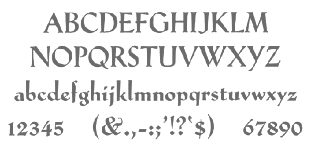 Metal font foundry in Prescott, AZ (was: Kampsville, IL), est. 2004. Run by Schuyler (Sky) Shipley, b. 1954. Shipley collects, restores and operates antique presses. He has been involved with type and letterpress printing since 1962. Check also T.H. Groves's site.
 As of 2010, Skyline's typefaces include Sans Serif Light w. Alts, Egmont Decorative Initials, Park Avenue, McMurtrie Title, Mercury Borders, Bewick Roman, Bradley, Cazxtonian, Cochin, Cooper Ted, Crayonette, Della Robbia, Extended Black, Fournier le Jeune, Glyptic (after Hermann Ihlenburg's Glyptic from 1878), Hadriano Stone-Cut, Ben Franklin Decorative Initials, John Alden Decorative Initials, Massey Two-Color Initials, Iroquois Condensed, Keynote, Lexington, Narciss, Neon, Neuland, Neuland Inline, Othello, Othello Inline, Paramount, Playbill, Sans Serif Light, Sans Serif Light Italic, Schoeffer Old Style, Trocadero, Worrell Uncial. They also have quite a number of ornamental border fonts. [Google]
[More] ⦿
|
Snail Fonts
[Jonathan Keene]
|
One money font, "tweeker", plus free fonts boomerang monkey, boomerang monkey deluxe, dilate, earthling, five cents, indian poker, internal, neon-like, number one (dingbat), poodle lover, possum droppings, rathole, reverence, space cowboy, special k, sugar, sugar [dissolve], tweed, and wetalmorker. The designer is Jonathan Keene from Dallas, TX, who created these fonts at the young age of 14. Dafont link. [Google]
[More] ⦿
|
Solotype
[Dan X. Solo]

|
 Dover Press sold Oakland's Dan X. Solo's digitizations. Dan Solo (b. 1928, d. 2012) has collected over 13,000 sets of metal fonts, starting when he was 9 years old and growing up in Oakland, CA. Finally, in 2002, he stopped doing that and began converting all of his fonts to computer type. Solotype, his company, was established in Alameda, CA. He printed 30 books on fonts (with Dover), including The Solotype catalog of 4,147 display typefaces, and created hundreds of fonts. In 2007, Dan Solo retired from the font business. He died in 2012.
 Robert Trogman writes: I know Dan X. Solo personally. He ran a typographic studio in Berkeley for over 30 years. He had a large collection of film fonts, including some of my own. He created thousands of fonts and is now retired and is an avocational prestigitator. Copyrights have run out on most of his fonts. He also protected himself by creating pseudonyms on the questionable font names. Stuart Sandler confirms that many of the fonts in Solo's Dover books are in fact from the Filmotype collection, which Stuart is digitizing right now. Gene Gable writes: Dan Solo of Solotype in Berkeley was experimenting with photo type as early as 1945 and started doing optical special effects in the early '60s. And a number of the larger display-type shops developed their own techniques. But in terms of opening up new markets for display type (and giving designers more control over type setting), Visual Graphics and Letraset lead the way. These companies were proud of, and promoted, the fact that that their products could be used by non-typesetters with little training. Bio. He wrote about himself: Dan X. Solo The Solotype Archive was begun in 1942 when I was 14. I was a kid printer for several years before that. At 16, after a quick three months of training, I dropped out of school and went to work full time as a radio actor and announcer in San Francisco. (Easy to get jobs in those days, due to the war-induced manpower shortage.) In 1949 and 1950, I created a magic show which played West Coast theatres with some success. After that, back to broadcasting. By 1962, I was completely burned out on radio, so I decided to see if I could make a living with my collection of antique types, which numbered about a thousand fonts at that time. In 1962, I sent out 4,000 catalogs showing the type to ad agencies all over the U.S. The timing was perfect (no thanks to me) because there was developing at that time a renewed interest in the old types. Business took off immediately. The Solotype collection was one of four commercial collections at the time, but I seemed to have been more aggressive in marketing than the other chaps. (Well, Morgan Press certainly knew how to market.) Two years into the business, I began to collect alphabets on paper for conversion to photo lettering, which was just becoming mainstream in the type business. We closed the shop for a month every year and went on a type hunt, mostly in Europe where there didn't seem to be much competition among collectors. Other typographers couldn't understand how we could do this, but I believe it made people appreciate the resource we offered even more. Over the years, the collection became quite large. When I closed Solotype a couple of years ago, I got rid of about half the archive (because the fonts were dull, or already digitized, or for a variety of other reasons) leaving me with about 6,000 fonts on paper or film. In 1974, I began to supply Dover Publications with mechanicals for books of 100 alphabets on a particular theme. I did 30 of these books over the years, and 30 more of printers' ornaments, borders, and so forth. Sometime in the 1990s, Dover asked me to digitize books of 24 fonts each, to be sold with a disk in the back. I did 12 of these. The Dover relationship came to an end when Hayward Cirker, the owner and my special friend, died and the company was sold to another publisher. Dover felt that they had covered the type field thoroughly. Now in my old age, my wife and I have a mindreading act that is great fun and good for the ego. Even so, when not traveling, I digitize type for relaxation and enjoyment, but have made no effort to sell it. Until now. Solo's wood type/Western/ headline/ Victorian collection includes Acantha, Bindweed, Dime Museum (2004, a French Clarendon revived by ATF in 1933 under the name P.T. Barnum), Egyptian Oldstyle, Excelsis, Extravaganza, Rigney, Assay, Baraboo Banner, Beijing, Brevet (after a Victorian typeface from 1887 by Ernst Lauschke), Brussels, Cathedral, Cleopatra, Cognac, Crossroads, Dainty Lady, Dangerfield, Diablo, Dutch Treat, Grecian, Lord Mayor, Malibu, Minnesota, Moulin Rouge, Penny Arcade (1992, a Victorian face after an 1890 original called Mural by Boston Type Foundry), Trixie, Valerie, Valjean, and Zorro. Alaska is based on an 1890 design of Marder, Luse and co. Arcade imitates an 1888 design of Barnhart Brothers&Spindler. Bamboo (oriental simulation face) is based on a 1889 creation of Barnhart Brothers&Spindler. Behrens Antiqua and Behrens schrift are revival of early 20th century typefaces by Peter Behrens. Eccentric is a digitization of a 1898 arts and crafts typeface by Kingsley/ATF. Hansard is a revival of a display type published in 1887 by MacKellar, Smiths,&Jordan. Pekin is a digitization of a face, first designed by Ernst Lauschke in 1888 and issued by Barnhart Bros.&Spindler foundry in Chicago under the name Dormer, and revived by them in 1923 under the name Pekin. Charles Henry Beeler made a condensed sans serif issued by Mackellar, Smiths&Jordan foundry in 1887: it was digitally revived as Roundhead. Monument is a revival of a 1893 typeface by the Boston Type Foundry, but was also cast at the Central Type Foundry. Vienna Light is a delicate early 1900s type originally created by the German foundry of Schelter&Gieseke. Other designs: Bareback, Campaign (ca. 1970), Cigar Label (1997), Estienne, Farringdon (a western face), Goodfellow (digitization of wood type from 1895 found at Hamilton and probably due to W.H. Page), Harlem Text (blackletter), Houdini (ca. 1992), Memorial, Quadrille 2 (a simplified Tuscan face), Sparticus, Vanities (a Victorian type), Whirligig. In 2005, MyFonts added Seminary (after a Victorian font from 1885 by Bruce Type Foundry), Margie (formal script based on Marggraff Bold Script by the Dresden foundry vormalig Brüder Butter, 1920s), Fancy Dan, Bamberg (2005, after a condensed wood type from ca. 1850), Fat Face No. 20, French Ionic (quite ugly--based on an 1870 Clarendon derivative by the Cincinnati Type Foundry), Hearst Italic (based on a 1904 typeface by Carl Schraubstadter of the Inland Type Foundry), Hearst Roman (based on a typeface from the Inland Type Foundry allegedly stolen from a hand lettering job done by Goudy, acccording to Goudy himself), Tally Text (early photolettering type of the comic book style), Welcome 1 (based on Van Loey-Nouri's art nouveau typeface from 1900). A list of some digitized fonts: - Art Deco: Advertisers Gothic Light, Alex, Beverly Hills, Boul Mich, Capone Light, Chic (after Morris Fuller Benton's Chic, 1927), Clyde, Eagle Bold, Eagle Narrow, Eden Bold, Eden Light, French Flash, Gallia, Graybar Book, Grock, Matra, Modernique (art deco), Parasol, Parisian, Phoenix American, Plaza Suite, Publicity Gothic, Salut, Stymie Obelisk, Zeppelin.
- Victorian: Anglo, Arboret, Campanile, Chorus Girl, Fancy Celtic, Ferdinand, Floral Latin, Glorietta, Grant Antique, Gutenberg, Hogarth, Jagged, Katherine Bold, Lafayette, Meisteringer, Olympian, Phidian, Ringlet (1998, a Victorian typeface after an 1882 original by Hermann Ihlenburg), Romanesque, Rubens, Stereopticon, Templar, Wedlock, Zinco.
- Script/Cursive: Amapola, Artists Script, Carpenters Script, Certificate Script, Commercial Script, Conway (an architectural script), Elegance, Engrossing Script, Figaro, Flare, Gloria Script, Hanover, Helvetica Cursive, Holly, Kunsteler Bold, Liberty, Manuscript, Orion Script, Pantagraph Script (+No2, +No3), Park Avenue, Romany Script, Trafton Script, Typo Upright, University Script, Virginia Antique.
- Art Nouveau: Ambrosia, Argus, Artistik, Auriol, Baldur, Bocklin, Cabaret (2003, as in Murder She Wrote), Carmen, Childs, Edda Black, Excelsior, Francomia, Giraldon, Harrington, Isadora, Metropolitan, Murillo, Oceana, Odessa, Orbit Antique, Palmetto (2005; an art nouveau typeface based on a 1887 typeface called Palm from the A.D. Farmer Foundry), Siegfried, Skjald, Spartana, Titania.
- Gothic/Medieval: Academy Text, American Uncial, Antique Black, Becker Bold, Bradley, Castlemar, Celebration Text Fancy, Church Text, Engravers Old English, Frederick Text, Freehand, Hingham Text, Initials-Bradley and Caxton, Kanzlei Light, Lautenbach, Lautenbach Fancy Caps, Libra, Morris Black, Nicholini Broadpen, Rhapsodie Swash Caps, Scottford Uncial, Solemnis, Washington Text, Wedding Text.
- Celtic: Anglo Text, Camden Text, Chappel Text, Cimbrian, Colchester Black, Durer Gothic, Durwent, Fenwick, Genzsch Initials, Gloucester Initials, Gutenberg Gothic, Hansa Gothic, Harrowgate, Kaiser Gothic, Kings Cross, Konisburg, Malvern, Medici Text, Middlesex, Progressive Text, Tudor Text, Warwick, Westminster Gothic, Yonkers.
- Special-Effects Display Fonts: Azteca Condensed, Buddha (oriental simulation face, after a Schelter&Giesecke type), Burst, Campaign (1970), Chinatown (oriental simulation), Cigar Label (1997-2002), Colonial Dame, Contract Banner (2004, a take on Mezzotint from 1880), Direction, Fillet, Filmstar (1999), Firebug, Headhunter, Hollywood Lights, Igloo Solid, Import, Lariat, Needlepoint, Old Glory, Protest, Rustic, Scimitar (Arabic simulation face), Scoreboard, Skyline, Starburst, Sundown Shadow, Tableau, Tonight, Xerxes.
- Other: Acantha, Assay, Baraboo Banner, Beijing, Bindweed, Brevet (after a Victorian original by Ernst Laushke, 1887), Brussels (positioned inbetween Stephenson Blake's Flemish Expanded and Flemish Condensed), Cathedral, Cleopatra, Cognac, Crossroads, Dainty Lady, Dangerfield, Diablo, Dime Museum, Dutch Treat, Egyptian Oldstyle, Excelsis, Extravaganza, Grecian, Lord Mayor, Malibu, Minnesota, Moulin Rouge, Penny Arcade, Rigney, Trixie, Valerie, Zorro.
Images of selected typefaces: Agency Gothic, Alpha Midnight, Alpha Twilight, Anita Lightface (1977), Art Deco Display Alphabets, Ashley Crawford, Ashley Inline, Astur, Bamberg, Banco, Beans, Blackline, Bobo Bold, Braggadocio, Broadway Engraved, Busorama Bold, Busorama Light, Bust, Charger, Checkmate, Colonel Hoople, Corral, Dudley P Narrow, Dynamo, Earth (a futuristic / prismatic typeface revived by nick Curtis in 2015 as Terranova NF), Eclipse, Empire, Ewie, Fat Cat, Fatso, Festival, Futura Black, Futura Inline, Gillies Gothic Bold, Greeting Monotone, Grooviest Gothic, Hess Neobold, Hotline, Huxley Vertical, Inkwell Black, Joanna Solotype, Joyce Black, Koloss, Lampoon, Mania, Mania Contour A, Mania Contour B, Margit, Mindy Highlight, Modernistic, Monograms Stencil, Mossman, Neon, Neuland (+Inline), Phosphor, Piccadilly, Pickfair, Polly, Prismania P, Quote, Rhythm Bold, Shady Deal, Sheet Steel, Sinaloa. The Solotype Catalog is a file with information on Dan Solo's typefaces, annotated with remarks about name equivalences and digitizations. The original file was due to Thibaudeau, but typophiles on alt.binaries.fonts have added to it in 2010. PDF version. Excel version. Text version. See also here. View Dan Solo's typefaces. Another page on Solotype. Dan Solo's typefaces listed in decreasing order of popularity. View Dan Solo's typefaces. View Dan Solo's typefaces. [Google]
[MyFonts]
[More] ⦿
|
Stefan Huebsch
[Typocalypse Types]

|
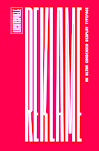 [MyFonts]
[More] ⦿
|
Stefan Kostic
|
Graphic designer in Novi Sad, Serbia, who created the monoline Cyrillic typeface Neonka (2017). Neonka is a contraction of Neon and Azbuka (alphabet in Serbian). In 2018, he designed the all caps Cyriilic typeface Aria. [Google]
[More] ⦿
|
Stefan Trifan
|
Creative director in Bucharest, Romania, who designed the stencil typeface Neon Light (2015). Behance link. [Google]
[More] ⦿
|
Stephen M. Knouse
[Essqué Productions]

|
[MyFonts]
[More] ⦿
|
Steven Downie
|
Winnipeg, Canada-based designer of these typefaces in or just before 2003: Techno-Industrial (1998), Totaly (2003, neon sign font), Bit Map, Positronic (2003), Aiden (2003, fridge door letters), Forever (2003). Behance link. [Google]
[More] ⦿
|
Stolat Studio
[Ania Wielunska]

|
 Stolat Studio is a Warsaw-based creative agency founded by Michal Janica, Igor Kubik and Ania WielunDska. Irt specializes in branding, communication design, strategy and typography. Type designer Anna Wielunska (b. 1992) is based in Warsaw, and studied at the Warsaw Academy of Fine Arts. She created Musso (2016), a remarkable brushy vernacular script typeface that is loaded with alternates to emulate real handwriting. Since about 2010, there has been an explosion of brushy typefaces, but even in this crowded field, Musso stands out. Later in 2016, Ania Wielunska and Mateusz Machalski co-designed the weathered typeface family Gangrena. Her last typeface from 2016 was the connected school script Koszyki, also co-designed with Mateusz Machalski.
 In 2016, as part of Warsaw Types, she designed the (free) elegant artsy typeface Lombard, which is loaded with ball terminals and slightly inclined. She writes: Lombard is a combination of an expressive script inspired by traditional Warsaw neon lettering and block letters typical for local craftsmen signage. The design was influenced by the Jubiler neon sign. This combination resulted in a font that is decorative and yet modular. In 2017, she designed the 18-style typeface Gelato Sans (Borutta). That typeface was republished in 2020 at Stolat Studio. In 2017, she participated in the Bona project, which set out to revive and extend Andrzej Heidrich's old typeface Bona. Mateusz Machalski contacted him for advice on the revival project. The resulting typeface families were published by and are available from Capitalics. The centerpiece is the warm and wonderful text typeface Bona Nova. It is supplemented by the extreme contrast typeface family Bona Title and the inline typeface family Bona Sforza. Participants in the project also include Leszek Bielski, Ania Wielunska and Michal Jarocinski. Google Fonts link for Bona Nova. Github link for Bona Nova. In 2018, Ania Wielunska designed Lazarus (Regular, Italic, Upright Italic, Fraktur). Dedicated web site. A revival of the New Polish Karakter from 1594 by Jan Januszowski, Jan Kochanowski and Lukasz Gornicki. Typefaces from 2020: Gangrena (a weathered black typeface originally done in 2016). In 2020, the team at Capitalics in Warsaw, namely Mateusz Machalski, Borys Kosmynka and Ania Wielunska, revived Adam Poltawski's Antykwa Poltawskiego (1928-1931) as Poltawski Nowy (2020). [Google]
[MyFonts]
[More] ⦿
|
Store Norske Skriftkompani
[Arve Båtevik]
|
 Norwegian type designer, b. 1991, who graduated from Westerdals School of Art in Oslo in 2015 and ECAL in 2017. At ECAL in Lausanne, he finished an MA in Art Direction and completed an exhaustive comparative study of the Geometric Sans genre. He joined Lineto in 2017 and returned to Norway in 2020, where he set up his own commercial type foundry, Store Norske Skriftkompani, in Volda. His typefaces:
 - During his studies at Westerdals in Oslo, Arve Båtevik created the display typeface Toulouse (2014). Toulouse consists of a basic sans skeleton. Arve then added two weights, one in a 2 to 1 ratio, and one in a 1 to 2 ratio. This allows for some great designs for logos and posters.
- In 2015, from his then base in Zurich, he created Sagen Grotesk as an interpretation of Schelter Grotesk (after Schelter Breite Grotesk, 1886), and developed Passelig Sans from the bottom up.
- With Maura Paolozzi, he co-designed LL Prismaset A and B at Lineto (2003-2017). Both LL Prismaset A and LL Prismaset B are based on Rudolf Koch's Prisma (1930).
- LL Supreme (2020, Lineto). He writes: LL Supreme presents a new take on Paul Renner's Futura (1927). [...] Working against the current tendency of interpolating entire families, each cut of LL Supreme was drawn separately and, as a consequence, has its own identity.
- LL Ruder Plakatschrift. Done with Hans-Christian Pulver.
- Store Norske Jazz Book & Italic (2015-2020) and Store Norske Jazz (2021). A sans typeface inspired by Frutiger's Univers and Hoefer's Permanent. In the end it is closer to Univers and a bit more playful (which is not hard---Frutiger's fonts are hardly playful). He writes: Store Norske Jazz is a typeface well within the aesthetically dodgy territory of the contrasted sans serif.
- Store Norske Tyggis (2016-2020). A prismatic typeface that extends the phototype Or (1967, Andy Song for Studio Hollenstein).
- Store Norske Trafikk Medium & Italic (2014-2020). A constructed sans serif, based on the Norwegian road sign typeface Trafikkalfabetet (Karl Petter Sandbaek, 1965, for the Norwegian Public Roads Administration). Trafikkalfabetet is modeled after the German road sign typeface DIN 1451, and the British road sign typeface Transport.
- Store Norske Brus (2017-2020). Mecano-inspired letters.
- Store Norske Foto Book & Italic (2015-2020). A sans that pays homage to phototype.
- Store Norske Mekaniske (2020). A constructivist typeface based on the lettering on Akers Mekaniske Verksted's shipyard workshop in Oslo.
- Store Norske Maleri (2020): Store Norske Maleri is a remix of Ehmcke's Mediaeval (Designed in 1917, published by Schriftgiesserei D. Stempel AG in 1920). I find the original intriguing in many ways, especially how he managed to sneak so many circles, triangles and squares---while still maintaining a rough arts and crafts aesthetic. In my version the capitals are quite true to the original, although I did put some more circles, triangles and squares in there. The lowercase, numbers and the remaining characters deviate quite a bit from the original.
- Store Norske Stilig (2021). A colour remix and elaboration of a display phototype named Indigo by Andy Song (1936-1995), which was designed in 1972 for Studios Hollenstein Phototypo in Paris. In addition to the colour font, Stilig exists in Dark, Light, Solid and Open styles.
- Store Norske Funksjon (2021). A display colour geometric solid font, based on a lettering alphabet by Erich Mollowitz that was featured in Moderne Vindusreklame [Modern Window Advertisement] (1933, Knut Schjefstad in 1933), an instructional book on shop front decoration. Knut Schjefstad (1905-1943) is best known for playing the long neck banjo in Norway's first jazz orchestra Sixpence.
- Store Norske Ja (2021). A sans typeface that started out as a revival of Akzidenz Grotesk.
- Store Norske Samvirke (2020) is an all-caps typeface based on the lettering found on the Oslo Samvirkelag store in the Kampen city district.
- Store Norske Neon (2020-2021) is a remix of the Metall Standardbokstaver alphabet used by the sign makers at Neon Electric Limited AS, which was operational in the 1950s. Neon Electric was one of the main neon sign suppliers in Norway. They created signage for big events and important buildings, like the signs for the Oslo 1952 Winter Olympics and the Deichmanske Bibliotek [Oslo's Main Public Library].
- Store Norske Bygg (2020-2021) is a monospaced typeface based on a lettering found on the offices of Frimann Bye & Winsvold A, a mortar and construction supplier in Oslo, in the 1920s and 1930s.
- Store Norske Tango (2016-2021). A geometric typeface that sprung out of Arve Båtevik's MA diploma at ECAL in Lausanne. The project was based on Intertype Vogue (1930), the American response to the geometric wave in Europe in the 1920s. Store Norske Tango builds on Vogue's naiveté, according to Arve. It is more rude and playful, as it focuses on pure geometric shapes, with almost no optical correction. Most letters are nearly monolinear. The typeface has old school hyper slanted italics, often found in early sans serifs, offering two options for the degrees of tilt.
- Store Norske Magi (2021). A sans family.
- Store Norske Graut (2021). A wonderful rounded sans family that includes a Mono style.
- Store Norske Skandia (2021). Arve explains its roots: Store Norske Skandia is a remix of "Skiltskrift", a typeface made for the redesign of Norwegian National Railway (NSB) in 1977. In 1973, Knut Skuland became the director of NSB. The company's communication was eclectic, and he wanted to unify their visual identity. They first bought the rights to use the British Rail identity. Skuland spoke with the director of the Danish National Railways who had bought the same identity some years before. The Danish director convinced Skuland of the impact the identity would have on Norway's visual culture. Skuland then decided to put together a team to reshape the British Rail identity, to fit the Norwegian environment and frame of mind. He commissioned industrial designer Odd Thorsen, art historian and Alf 130e, and designers John Engen, Knut Harlem, Paul Brand, Ruedi a Porta and Arild Eugen Johansen. They redesigned everything from the trains and uniforms to the type and colours. Paul Brand collaborated with a paint factory in Nittedal, to produce a colour blue that would be dark enough to contrast the white type, but still bright enough to be perceived as blue in dark Norwegian lighting conditions. The typeface is similar to the British Rail Alphabet in weight, but is a lot softer and more geometric. Unfortunately, many of the people involved in the project have passed away. I have spoken with John Engen, Halvor Thorsen (son of Odd), Paul Brand, Ruedi a Porta and Arild Eugen Johansen and none of them have any clear answers to who actually designed the typeface. But if there ever was a Norwegian grotesk from the modernist era, this is it. The original typeface was a single bold cut made for signage, and for the rest of the identity they used Helvetica. I have extrapolated on the "Skiltskrift" design, and made it into a small family of three weights, with matching italics.
- Store Norske Baguette (2022). A primitive all caps sans based on several old French signage typefaces.
- Store Norske Stempel (2022). After an alphabet used for certain texts on old Norwegian license plates (See also Store Norske Jernskrift.)
- Store Norske Jernskrift (2022). Store Norske Jernskrift is a typeface based on the numbers found on old Norwegian number plates. He explains: On the 17th of january 1929, new regulations for car number plates took effect in Norway. They were referred to as Vertikal Jernskrift [vertical iron letters]. The design is similar to local hand painted roadsigns of the era. Most, if not all, were produced at Christiania Chablon & Stempelfabrikk (G. Enderle, 1904-1933) and Mignon Chablon & Stempelfabrikk (Jallik Johnsen, Wilh Olsen, 1931-1958).
Personal site. [Google]
[More] ⦿
|
Stuart Sandler
[Font Diner (or: Stu's Font Diner)]

|
 [MyFonts]
[More] ⦿
|
Studio Typo
[Mehmet Abaci]
|
 Mehmet Abaci (b. 1978) is based in Istanbul. In 2014, he established Studio Typo, where one can buy his typefaces. Limited forms of the fonts can be downloaded fpr free from the Dafont site.
 Creator of the elegantly plump rounded sans typeface Vinyl Cuts (2013), Samatya (2013, a unicase piano key typeface), Boldie (2013), Laundry Day (2013, alphadings), and the wood log typeface Timbers (2013). Typefaces from 2014: Smush, Slim Fir (athletic lettering), Typonome, Typo Slab, Neons, E-Square (sci-fi typeface), Screamer, Typoline (piano key typeface), Omniblack (flared display face), Papillons (flared caps), Typoster (a great fat geometric slab serif typeface family accompanied by an equally great shaded outline style), Typo Comica (a family drawn to compete with Comic Sans), Tipo Press, Manyeto (calligraphic), Quatroline (prismatic typeface), Wardoom, Cabold Comic, Digiform, Akaju (oily fat typeface with lighting effects), Almira, Bonebastic, Comic White Rabbit, Sinema (a bit of retro movie art deco), Sober, Cali Brush, Tiny Plate, College Player, Smart Kid, Barbed, Wideroy, Angella (+outline: a poster family), Megi Sans. Typefaces from 2015: Bro 4D (outlined 3d capitals), Typo GeoSlab, H&B Sketch (a gorgeous sketched didone), Mixiva (a six-style athletic lettering slab serif family), Typo Sketch (sketched font), Malter Sans, Parole Script, Degaws (a great sketch font), Typo Comics, Gribal, Gribal Shadow, Early Times (a sans family), Quizma (an elegant sans family), Super Seven (shaded), Typo Slab Inline, Type Slab Irregular, Geoma (hairline geometric sans), Double Bubble (bubblegum typeface), Mona Bella, Typo Grotesk, Typo Grotesk Rounded, The Matic, Typografix (avant garde sans), Move X (techno family), Savaro Stencil (in the geometric style that is characteristic of Futura Black), MindBlue (sans), A Space. Typefaces from 2016: Wox Striped (multiline typeface), Wox Modelist (organic sans), Aprikas (sans), Meltix (techno sans family), Widolte (sans family), Mayeka, The Wireframe, Typo College (athletic lettering), Halftone Poster, Chocolate Bar (oily and gleaming), Type Round (circle-based sans typeface family). Typefaces from 2017: Zelta Six (octagnal), Wida Round (round sans), Prestij (geometric sans), Typo Style, Naughty Squirrel (fat poster typeface family that includes hatched and shadow styles), Typo Quik, Ageta (bubblegum style), Rock On (glaz krak typeface), Typo Square, Typo Angular Rounded, Planetium-X (monoline, techno), Big Pixel (octagonal), White Festive, Watchword Hairline. Typefaces from 2018: At the Midday, Typo Hoop (rounded circle-based sans family), Typo Longest (tall condensed sans), Maccos (a multilined font family), Asectica, Magettas (rounded monoline sans), Bluefish, Bluefish Eroded, Bluefish Scratched, Quesat (rounded sans), Quesat Striped. Typefaces from 2019: Manti Slab College, Pesta Stencil, Type Draft (a drafting font), Pages Grotesque (a caps only geometric sans), Typo Cut-Out, Swera, Minalis (futuristic). Typefaces from 2020: Typo Cut-Out Shaky, Typo Oval, Typo Formal (a tall monolinear sans), Typo Ring (circle-based, monolinear), Manti Slab, Manti Sans (+Fixed), Geco Strong (a fat sans), Tually, Slabten (an inline typeface), Minalis Double (an inline typeface). Home page. Fontspace link. [Google]
[More] ⦿
|
Superfried
[Mark Richardson]

|
Manchester-based graphic design collective, est. in London in 2007 by Mark Richardson. Blox (2011) is a fat rounded stencil typeface with both horizontally and vertically stencilled alphabets, created using FontStruct. They also made Sqair (2011, squarish), Plug (2011), Asian (2011), Basik (2011, a simple clean monoline sans), Slash (2011), Twist (2011), Blob, Slick (2011) and Slice (2011). Typefaces made in 2012: Brix (like Lego blocks). Typefaces from 2014: Slash, Twist, Box (multilined), Neon (neon tube, or paperclip font), Rails (+Broken). MyFonts links for the typefaces: Blob, Blox, Plug, Slice, Sqair, Twist, Box, Neon, Slash, Rails, Basik. Typefaces from 2015: Orb (a bilined caps typeface), Carga (octagonal), Arx, Asia Display. Typefaces from 2018: Kapital (an all caps sans / stencil family). Behance link. Dafont link. Hellofont link. YWFT link. [Google]
[MyFonts]
[More] ⦿
|
Tal Leming
[Type Supply]

|
 [MyFonts]
[More] ⦿
|
Tamas Sipos
|
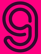 During his studies at the Visual Arts Institute in Eger, Hungary, Tamas Sipos designed the neon light font Konekt (2019). [Google]
[More] ⦿
|
Ted McFarland
|
Graphic designer in Fountain Valley, CA, who created Section 3 (2015, a constructivist typeface), Super Neon (2015, a neon light stencil typeface), and Remote Security Camera Icons (2015, on commission for Zettaguard's remote IP camera viewing/management website). [Google]
[More] ⦿
|
Teeline Fonts
[Craig Eliason]

|
 Teeline Fonts is a digital type foundry launched by Craig Eliason (b. 1969, Houston, TX) in 2010. A professor of modern art and design history in the Department of Art History at the University of St. Thomas in Saint Paul, MN, Craig researches the history of type design, and particularly the history of its classification and vocabulary. He began designing his own fonts in 2008. Craig obtained a Ph.D. from Rutgers in 2002. Read, for example, Face the Nation: National Identity and Modern Type Design 1900-1960.
 His typefaces: - Ambicase Modern (2010), a unicase font, and Ambicase Fatface (2011).
- Flipper (2013), later renamed Backflip. Flipper won an award at the Morisawa Type Design Competition 2014.
- Cuttlefish (2021). A five-headed sans (+variable) superfamily with very different substyles called Neutral, Pragmatic, Optimistic, Luxe and Modern. He writes: Cuttlefish Pragmatic is a friendly sans in the mode of early-20th-century American Gothics. The Optimistic style is inspired by 20th-century ‘serifless romans’ that themselves took inspiration from Renaissance letters. The Modern styles are patterned after 18th-century high-contrast types, but excised of most serifs. Cuttlefish Luxe is a light and sophisticated contrasted sans. The Neutral styles are straightforward grotesques with even stroke weights.
- Plenaire (2021). A pebbled and speckled optical effect font family.
- Feneon (2021). An elegant multiline font family with possible uses as a neon font.
[Google]
[MyFonts]
[More] ⦿
|
Terence Bergagna
|
Designer at the Australian foundry Prototype Font Design (which he founded in 1992) of Academy, Baseline, Bodoni Anorexia, Bodoni Catwalk, Fat Neon Inline, Flanger, Funky Reverb, FuzzBox, Galley Family, Gimp, Gimp's Brother, Gimp's Sister, Hardwear Nth, Hardwear Sth, Mezzo Family, National Guard, Next century, Next Times, Pseudo Deco, Spy Force, Tank Gothic, Uni code, X-Kommunicate. Prototype Font Design went out of business some time before 2004. [Google]
[More] ⦿
|
Terminal
|
Terminal is the IBM systems font, in use since 1981. A digital version of it was painstakingly created by bobistheowl in 2010: FixCystNeon. [Google]
[More] ⦿
|
TGIF STD
|
 TGIF STD stands for Thanks God I'm Fontmaker Studio. Located in Bandung, Indonesia, this commercial type foundry produced these typefaces in 2016: Sigismund No. 7, Eugiene (monoline script), Aiden, Hodor (inspired by the character Hodor from Game of Thrones), Bengrraas (monoline ans), New Autumn (soft hand-printed), The Arms Race (bilined), Brushcheetah (brush script), Eugiene (poster typeface), Landon (deco), Camille (signage script), Neorah (neon style), December Script, Companion (spurred Victorian style), Boullevard (sic), Adeft (brush face), Vignette Script (calligraphic), Mewton, Castle John (Victorian), Pixelo, Desmodo, Elliot (fun script), Montour (geometric slab serif), Aiden (handcrafted slab serif), Madison (Victorian).
 Typefaces from 2017: Kakamora, The Servant (sans), Chaiaathah, Hollawinds (a rough rounded sans), Sunshine Boy, Remembrance, Beornheard, Glodiolusy, Caang, Sanur Beach, Jomantara, Daddy Day (titling sans), Fatherly (inline), Amorette Light (elementary geometric sans), Badstar, Scriptonesia, Adeft. Typefaces from 2018: Lucky Irish Dingbats, Lucky Prince Lettering Dingbats, Easterica, Mongli (all caps sans), Cincoyo (Tuscan), Hippo Letto, Huckleberries, Iacott Neue, Valentine's Dingbats, The Rogue (textured), Thank You Dingbats, Sun Pepper, Reilly, Regan Slab, Rawwwing (eerie style), Penny Farthing, Oliemolly, New Autumn, Ms Orange Sky, Little Girl (children's script), Leo Bronx (weathered athletic lettering), Leaderson, Laudya Bloods, Juneville (octagonal), Hellowins, Helldings, Echizen (brush), Coast Redwood (a pirate font), Chukies, Caldwell (+Easter eggs), Baileyns, Brodetto, Bellquina, Audie, Von Everect, Gustavo (art deco sans), The Queen (inline, spurred), Stardust Moonlight, Serenity (calligraphic), Questro (inline stencil), Otakaku, Dhangdose (spurred), Desmodus, Romaniesta, Emery (octagonal). [Google]
[More] ⦿
|
The Fontry
[Michael Gene Adkins]

|
 The Fontry is a Watts, OK, based outfit, est. 1992 by Michael Gene Adkins (b. 1965, OK) and James L. Stirling (b. 1964, OK): Digital type for computer-aided signmaking, with fonts designed for signmakers by signmakers.
 Since 2009, they have been producing various digitizations of alphabets designed by Alf R. Becker in the 1930s and 1940s. Gene Adkins designed ARB-187 Moderne Caps AUG-47 (2013, didone), ARB 85 Modern Poster JAN-39 (2011, after Modern Poster Script, 1939), ARB-70 (1995), ARB-67 (1998), ARB-66 Neon (2010, +Block, +Line), ARB-44 (1995), ARB-96 Jitter Display DEC-39 (1999), SCRIPT1 ARB-85 Poster Script Normal (2000), ARB-66 Neonline Block, ARB114 Hillbilly Roman JUN-41 Normal (1999), ARB-187 Moderne Caps AUG-47 CAS family (2009, a beautiful didone display face), the ARB 08 Extreme Roman AUG-32 CAS family (2009), ARB-218 Big Blunt (2010), ARB-218 Neon Blunt. Another product is the Wild Bunch Pak #3: Danthr Skal, Kastaka, Gas Bumps, Skrawl 613, Sharrpe Gothik, Levo Fraz, Kommerce, Stellar Spice, Infected Hurt. Wild Bunch Pak #2 (50 USD) has Marbles&Strings, Keetoowah, Peppermint, Ghixm (2008: a retrospective of the horror comics and movie posters of the 1960s and the 1970s), Klash, all outline fonts. In Wild Bunch Pak #1, look for Toxia. Race Pak #1 contains 5 chiseled fonts, including ARB67, Brannt Chiseled, Excursions, JLS Ultra, and Race Checkers. 50 USD. There are also Greek Pak #1 (12 Greek fonts for 25 USD, including GRK Orbit, GRK Universe City, GRK Albert, and GREK Bodnaut) and Signfaces Narrow Pak #1. At Garagefonts, Wild Larra, Wild Ruts, Wild Toxia, Wild Nobody families (1999), Jackport (2014, athletic lettering and Western typeface family). Adkins also designed the commercial font First Vision at GarageFonts in 1998. Review at &Type. List of the fonts on his CD. MyFonts sells FTY Garishing Worse (2011---there is a free version at Dafont), SCRIPT1 Team (2010), SCRIPT1 Toon (2010), SCRIPT1 Voodoo Script (1999-2009, signage script), What Sound Pounds (2009), WILD3InfectedHurtNormal (2010), WILD1 Firstvision (1997), WILD1 Larra (1997, grunge), WILD1 Nobod (1997, grunge), WILD1 Ruts (1997), WILD1 Toxia (1997) and the blackletter typefaces Ironhorse and Ironrider (2007), revivals of classic wood type typefaces. FontShop link. Some fonts are inspired by sign painter Frank H. Atkinson. These include the Broken Poster series done in 2010, FHA Modernized Ideal Classic (2011), and FHA Nicholson French (1999-2014: art nouveau). In 2008, The Fontry published the Greek Font Set, Copper Penny DTP (after Copperplate Gothic, but with lower case included), Droeming (an eerie family) and Earth A.D. (more eerie stuff, metallic, and with sharp serifs). It then generated a break-away subfoundry that carries fonts solely designed by James Stirling, Fontry West. Fontry West is located in Tulsa, OK. At MyFonts, these Fontry West fonts can be bought: Iron, WILD1 Firstvision, WILD1 Larra, WILD1 Nobody, WILD1 Ruts, WILD1 Toxia, WILD2 Ghixm, Greek Font Sets 1 and 2 (not Greek, only Geek-ish, made for fraternity use), and a large Comic Fanboy set which includes glyphs painted with stars and stripes (CFB1 American Patriot, CFB1 Captain Narrow, CFB1 Shielded Avenger, all made by Adkins). The CFB1AmericanPatriot family (2009), and the SCRIPT1 Rager Hevvy family (2009) are free here. JLS Overkill (2009, Bloque, Stencil, Grunge, Champion [athletic lettering], Hammer) is a sturdy family covering everything from SUV-strength stencils to grunge stencils and macho slab serif headline typefaces. After Disaster (2008), FHA Eccentric French Normal (2008, wood type after an alphabet created by Frank H. Atkinson in 1908), WHATSOUNDPOUNDS?Normal (2009) are free at Dafont. Sinder (2010) is a grunge face. FTY Konkrete (2010) is constructivist, and has a beveled weight. FTY Strategycide (2010-2018) is a similar severe headline sans family. Sinder (2010) and Demon Sker (2011) are free grunge typefaces. American Purpose (2011) is a grotesk family. American Purpose Casual and American Purpose Stripe (2011) are follow-ups. Garishing Worse (2011) is a casual bold face. Sharpe Gothik (2011) is hand-drawn. American Captain (2011, a manly retro squarish propaganda headline face; see also American Captain Patrius 02 FRE). Deathe Maach (2012) is a sturdy 6-style display family. Avengeance (2012) is a techno typeface. FHA Condensed French (2012, by Michael Gene Adkins and James L. Stirling) and FHA Nicholson French (1999-2014, art nouveau) are based on Frank H. Atkinson's examples. Typefaces from 2013: FHA Broken Gothic (a layered chiseled family done with James Stirling, based on Broken Poster by Frank H. Atkinson), FTY SKRADJHUWN (a flared family), Iron Man of War (with layering effects, +001Rivet), Iron Man of War 2 NCV, RACE1 Brannt (prismatic, beveled, art deco), FTY Skorzhen (mini-spurred), FTY Speedy Casual, FTY Skradjhuwn NCV (comic book family). Typefaces from 2014: FHA Tuscan Roman (2014, Michael Gene Adkins, James L Stirling), FTY Varoge Saro Noest. Typefaces from 2015: FHA Sign DeVinne (after a popular sign painting design by Frank H. Atkinson named after DeVinne). Typefaces from 2016: FTY Delirium (+Neon), Delirium NCV. Typefaces from 2017: FTY Galactic VanGuardian. Typefaces from 2021: Fty Old Sport (a slab serif athletic lettering font family, one of the best in this genre). Typefaces made by Fontry West. Typefaces by Mike Adkins. Fontspace link. Klingspor link. Dafont link. Abstract Fonts link. Creative Market link. [Google]
[MyFonts]
[More] ⦿
|
The Student
|
Essen, Germany-based designer of the experimental neon light alphabet Generativ Jazz (2011). Not a font, I think. [Google]
[More] ⦿
|
Tiffany Willett
[On The Spot Studio]
|
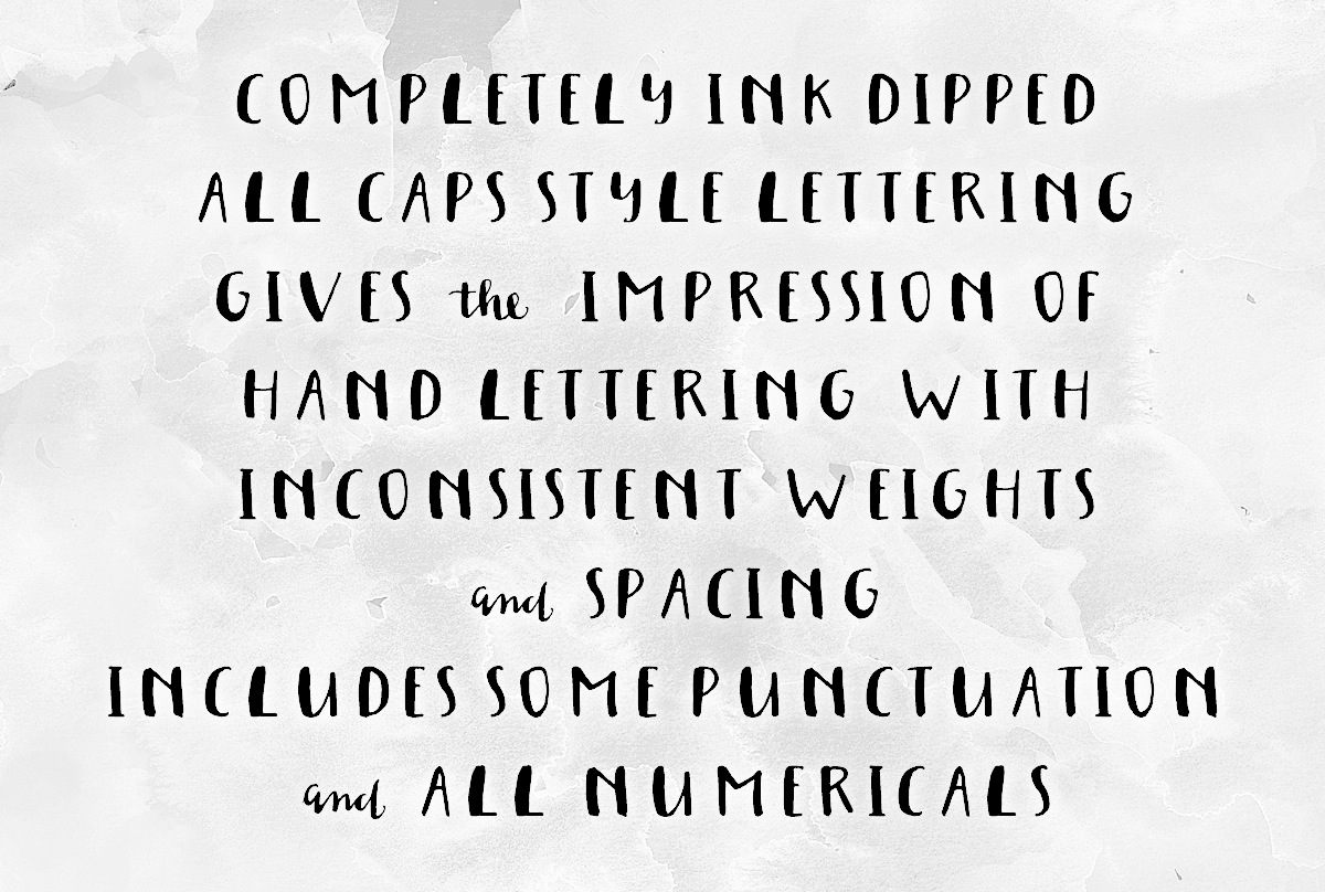 [More] ⦿
|
Timberwolf Type
[Lars Bergquist]

|
 Lars Bergquist is the Swedish type designer (b. 1936) who runs Timberwolf Type in Sollentuna, just outside Stockholm. Bergquist designed numerous successful text families and display typefaces, including the free Beryll typeface. In 2016, the collection moved over to (was bought by?) 3IP. Some offerings:
 - Old Style romans: Sarabande (1998; based on Jean Jannon's famous "Garamond" of 1621), Pavane (1998, based on a text typeface by Rudolf Koch), Philomela (2000, also at PsyOps), Montrachet (2002, Fountain: a garalde family), Monteverdi (Fountain: with Granjon's Plantin Ascendonica italic).
- Baroque/transitional: Leyden, Leyden News (PsyOps, 2000), Baskerville 1757 and Baskerville Caps (1998; winner of a Bukvaraz award in 2001, available at Type Quarry).
- New Style Romans: Millennium, Eleonora (1999), Prospero (1998, a didone family), Waldstein (2003, Fountain: a Scotch typeface).
- Sans typefaces: Millennium, Millennium Sans, Millennium Linear, New Millennium, New Millennium Sans and New Millennium Linear (2000).
- Display typefaces: Diorite (2005, a calligraphic angular family), Corsiva Italica (2003), Paracelsus (2003, Fountain: a modern version of Schwabach), Foliant Blackletter (German 15th C Textur), Zeppelin Bauhaus Gothic, Berserk Scandinavian runes, Escorial (at PsyOps), Paestum (2001, a Greek simulation family), Sekhmet (2000), Praetorian, Pressroom (2003), Proconsular, Palaestra (the latter three are inspired by informal, painted Roman wall writing), Triumphalis Caps (also inspired by Roman imperial inscriptions), Bucintoro (1999, a modern version of the rotunda blackletter), Midnight (2000; a neon light/ blackboard bold family), Karolin Fraktur (at Psy/Ops: Fraktur modeled after the Bible of King Charles XII, printed in Stockholm in 1703), Rococo Titling (2001, ornate titling caps based on work done by Jacques-François Rosart (1714-1777) and Pierre Simon Fournier (1712-1768), and the Renaissance family Ronsard (at PsyOps, 2000).
Some fonts are available at Fountain, Psy/Ops and Type Quarry. Bukvaraz gave him an award for Absolut Type, a classic Renaissance family, so I wonder if that is not the same as Baskerville 1757. Lars says that Absolute Vodka complained, so the type is sold by Psy/Ops as Aalborg (2002). He published Whitenights at Linotype in 2003. FontShop link. Klingspor link. [Google]
[MyFonts]
[More] ⦿
|
Tiphaine Micheneau
|
Nantes, France-based designer of Neon (2019). [Google]
[More] ⦿
|
Tipoteca Italiana fondazione
|
Italian type museum in Cornudo (Treviso), also called Museo del Carattere e della Tipografia. It has a printshop, library and archive, and it organizes casting workshops. The museum has some section devoted to Italian type designers and Italian type. The following types are exhibited: - Pastonchi (F. Pastonchi and E. Cotti, 1927)
- Griffo (G. Mardersteig, 1929)
- Semplicitä (Studio Nebiolo, 1930)
- Triennale (Fonderia Reggiani, 1933)
- Neon (G. Da Milano, 1935)
- Landi (A. Butti, 1939)
- Hastile (A. Butti, 1941)
- Microgramma (A. Butti, 1941)
- Dante (G. Mardersteig, 1946-52)
- Tallone (A. Tallone, 1949)
- Garaldus (A. Novarese, 1941)
- Garamond Simoncini (F. Simoncini, 1958)
- Eurostile (A. Novarese, 1962)
- Forma (A. Novarese, 1968)
Occasionally, meetings are organized, such as Bunker (June 22-24, 2007). [Google]
[More] ⦿
|
Tiziana Haug
[in the habit]
|
[More] ⦿
|
Tom Carnase

|
 Type designer Thomas Paul Carnase was born in The Bronx, New York City in 1939. He graduated from New York City Community College in 1959. Carnase started making fonts in the photolettering era, and lived through the transition to digital. In the 1960s, he opens the studio Bonder & Carnase Inc. From 1969 until 1979, he is vice-president and partner of the agency Lubalin, Smith, Carnase Inc. In 1979, he founds the Carnase Computer Typography studio. In 1980, Carnase becomes co-founder and president of the World Typeface Center Inc., an independent type design agency. He manages the in-house magazine Ligature published by the World Typeface Center from 1982 to 1987. Besides type design, Carnase has designed graphics for packaging, exhibitions, corporate identities and logos for numerous clients, including ABC, CBS, Coca-Cola, CondéNast Publications, Doubleday Publishing and NBC. He has held teaching positions at the University of Cincinnati in Ohio, the Pratt Institute in New York, the Herron School of Art in Indiana, the Parson's School of Design in New York, the Cleveland Institute of Art in Ohio, the University of Monterrey in Mexico, and the Rochester Institute of Technology in New York, among others. His fonts include:
 - Fonts at WTC: WTC Carnase Text, WTC Favrile (1985), WTC Goudy (sold by URW++), WTC Our Bodoni (with Massimo Vignelli), WTC Our Futura, WTC 145. Clones of Favrile abound: OPTI Favrile (Castcraft), Fascinate (NovelFonts), Francois (Serials).
- At LSC (LSC stands for Lubalin Smith Carnase Inc, an agency he co-ran in the 70s), he created a number of typefaces such as LSC Book, LSC Condensed and LSC Caslon No. 223.
- ITC Busorama, a geometric titling typeface that started with an ad for a bus company. Busorama, despite its innate ugliness, has been copied tens of times. Nick Curtis managed to turn it into an art deco typeface in 1999 with his Ritzy Normal.
- With Herb Lubalin, he designed L&C Hairline (ca. 1966, VGC) and L&C Stymie Hairline (1973, VGC).
- At ITC: ITC Manhattan (1970), ITC Avant Garde Gothic (with Herb Lubalin and Ed Benguiat, 1970), ITC Bolt Bold (with Ronne Bonder, 1970), ITC Gorilla (with Ronne Bonder, 1970), ITC Grizzly (with Ronne Bonder, 1970), ITC Grouch (with Ronne Bonder, 1970: this Caslon headline typeface was mimicked and extended in 2011 by Tomi Haaparanta as Grumpy Black; see also Softmaker's Zepp and Bitstream's Dutch 791), ITC Machine (with Ronne Bonder, 1970), ITC Pioneer (with Ronne Bonder, 1970), ITC Ronda (with Ronne Bonder, 1970), ITC Tom's Roman (with Ronne Bonder, 1970), ITC Fat Face Western, ITC Pioneer No. 2, ITC Honda, ITC Didi (a high contrast didone revived in 2013 by Jason Anthony Walcott as Domani CP), ITC Bernase Roman, ITC Neon (1970; jointly by Ronné Bonder and Tom Carnase; based on Prisma, and initially shown by Photo-Lettering as Neon; Prisma in turn was based on Rudolph Koch's Kabel; digitizations include Neptune (FontBank, 1990-1993) and the free shadowed Multistrokes (Manfred Klein, 2003)), and Milano (with Ronne Bonder).
- L'Eggs, ca. 1969. A custom font for a line of hosiery to be called L'eggs by designer Roger Ferriter and Tom Carnase.
Author of Type: the best in digital classic text fonts (1995, Graphis, with Baruch Gorkin), about which Hrant Papazian writes: I just went through the Carnase/Gorkin book - I'd forgotten how lousy it is---please don't buy it. FontShop link. Klingspor link. View Tom Carnase's typefaces. [Google]
[MyFonts]
[More] ⦿
|
Tom Hathaway
|
If you wonder what the effects are of morphine on type design, look no further than Neon, a font made by FontStructor Tom Hathaway in 2011. [Google]
[More] ⦿
|
Tom Lukacs
|
Antwerp, Kortrijk and now Oostende, Belgium-based desktop publisher. Designer of the connected upright script and dingbat typeface Candyland (2006), the connected 50s roadster font Coeliakie (2007), the pixel typeface Micropolis (2007), the stencil and comic book typeface Pragmatica Nimbus (2006), this simple wide sans face (2007) and the paperclip and neon sign typeface Shananigan (2006). [Google]
[More] ⦿
|
Tony Thomas
[Medialoot]
|
[More] ⦿
|
Toto
[K22 Fonts]
|
 [More] ⦿
|
Triin Alas
|
During her studies in Tartu, Estonia, in 2014, Triin Alas created a paperclip / neon tube typeface. [Google]
[More] ⦿
|
TSV Creative
[Ardian Radityo]
|
Ardian Radityo (TSV Creative, Yogyakarta, Indonesia, b. 1984) created the typefaces Outrunner Retro Script (2016: connected neon style script), Proudly Signature Script (2015), Dignity (2015), Luvdove Script (2015, curly script), AXR Airpena (2015, spurred vintage letters) and Neverland Handmade (2015). TSV stands for Three Seven Visual. [Google]
[More] ⦿
|
Twintype
[Owen Johnston]
|
Twintype is the company of graphic designer Owen Johnston, who was born in 1979 in New Zealand, and works in the UK. He created several pixel or techno typefaces (no sales, no downloads): Minus (pixel family), Midgit, Frown Box (2010, multilined), Typhoon, Twice (bilined). Double Up is a bilined stencil-like typeface reminiscent of neon lights. Species is a two-line square techno face. [Google]
[More] ⦿
|
Txaber
|
 Bilbao-based designer of the experimental typeface Multiply Type (2013) and of the geometric Txaber Logotype (2012). New Neon (2013) is an artistic 3d creation of Taxber---it is a full alphabet rendered in 3d using paint and neon tube themes.
 Behance link. [Google]
[More] ⦿
|
Type Supply
[Tal Leming]

|
 Tal Leming is a graphic designer, type designer and letterer who lived in Wilmington, DE, but moved his stakes to Baltimore, MD. He graduated from Louisiana State University in 1997. As a Python scripting guru, he worked with Letterror and House Industries on projects using FontLab and Robofab. An avid RoboFog scripter, he joined Erik van Blokland and Just van Rossum to initiate the RoboFab project in 2003. After graduation in 1997 from the Louisiana State University Graphic Design program, he worked as a designer at two agencies in south Louisiana. In September of 2001, Tal joined the House Industries staff as a designer in the Type Development, Product Promotions and Python Systems Implementation Department. He worked on the Ed Benguiat collection, for example.
 In 2005, he left House and started his own company eventually called Type Supply. Type Supply designs typefaces for corporations and publications. Their typefaces: - Baxter. An informal typeface used as a casual typeface in MyPublisher's BookMaker software. Commissioned by Christian Schwartz.
- Bullet (House). Bullet is based on a bit of lettering drawn by Ken Barber for the House Industries Pop Art package.
- Burbank (2006-2007, House Industries), a bouncy signage, animation, and package lettering family, about which Christian Schwartz writes: Well-drawn one-off display typefaces are easy to find, especially bouncy sans serifs. Complete suites of typefaces in this genre, however, are nearly impossible to find, especially families that are crafted with as much care as Burbank. I really appreciate seeing the attention to detail that usually goes into serious text family put into a family primarily intended for display use.
- House Gothic 23. Tal Leming writes: The family was originally designed by Allen Mercer for use on the company's commissions, most notably the legendary promotions for Custom Papers Group. In 1995, House released the family to the public with modest success, but it was largely relegated to the back of House's catalogs. House went through a bit of a sans serif obsession in the early 2000s and decided that it was time to give House Gothic its time in the spotlight. Rich Roat asked me to polish up House Gothic and make it a bit more usable. I completely reworked Allen's original drawings, making the letterforms work better in headlines, added accented glyphs, reorganized the styles and more. Once that was done, I added completely new Extended and Text styles. The family more than doubled its size into 23 total fonts and was rechristened House Gothic 23.
- Marigny (2014). He writes about this pleasant casual roundish typeface: Marigny, designed by Tal Leming, is a casual typeface that was drawn with serious typography in mind. It has the same basic proportions as classical oldstyle typefaces (think of Garamond and friends) and these give it a similar typographic rhythm to one that we have known for several hundred years. The hand-rendered forms transform this familiar texture into something very warm and pleasant. In a way, dipping into a block of text set in Marigny is like putting on your favorite pair of comfortable slippers.
- Mission and Control. An athletic lettering family commissioned by Reebok for their 2008 NFL Sideline and NHL Center Ice collections.
- Ohm (2009). A neon type family.
- Queue and Queue Mono (2021). A sans typeface family.
- Runway (House). Runway is an ode to House's sans serif obsession of the early 2000s.
- Shag Lounge. a signage family: When I was working at House Industries, we decided that we should develop a font kit inspired by the work of Josh "Shag" Agle. Josh hadn't done much lettering work so we asked him to send us samples of lettering that he liked. Many of the things he sent featured whimsical, hand-cut lettering from the 1960s. We were really into this as well, so that formed the starting point for Shag Lounge. The typeface evolved into an amalgamation of a neo-grotesque style sans serif and hand-cut lettering.
- Timonium (2012) can be bought from Type Supply.
- Torque. An octagonal family with a great inline style. Torque (2009) began its life as an amalgamation of an American athletic lettering style and classic space lettering styles. There were also references to the video games, laser games and 1980s pre-teen sci-fi action movies of my youth.
- United Ark. A military stencil face: Clint Schultz hired me to create a custom version of United for use on props in a Paramount feature film. The main goal of the project was to perfectly match stenciled lettering seen in a film released 27 years earlier. How exciting was it to make a typeface for a sequel to a classic film that I grew up with? Very, very, very, very exciting. This font is not, and will never be, available for relicensing, so please don't ask.
- United. House industries commissioned me to develop the United family as an homage to stereotypical U.S. Military lettering styles. [...] United has become quite popular since its release and it has been seen just about everywhere from NFL coverage on FOX to the New York Times editorial page.
- Balto (2007-2014) is a large American Gothic family.
- In 2016, Tal Leming created 90 Minutes, a typeface that is exclusive licensed to the United States Soccer Federation in perpetuity. He writes: I wanted to introduce some more American typographic and lettering influences. We have a rich history from Morris Fuller Benton's iconic work to the impactful lettering on Works Progress Administration posters to the bluntness of wood type on letterpressed event posters. I wanted to subtly reference these to make the typeface as distinctively American as possible. The typeface her 37 unique styles partitioned over three families, 90 Minutes Display, 90 Minutes Kit (a set of styles developed exclusively for use on uniforms, taking into account FIFA regulations), and 90 Minutes Text (drawn specifically for use in small sizes, paragraphs and tables of statistics).
- Stoneleigh. A fashion mag Caslon revival done for Martha Stewart Living. Stoneleigh is licensed exclusively to Martha Stewart Living through October 2019.
- Smoosh (2015-2020). A super-compressed high-contrast typeface with thorny serifs designed to work in very big sizes.
- Iota (2021). A geometric sans family that he made only because of his fear of not being innovative. And not because every other foundry is making its own geometric sans. But he could not resist throwing in some distractions that make Iota a geometric with a tantrum.
- Epoxy (2022). An experimental sans with odd shapes.
At ATypI 2008 in St. Petersburg, his talk (shared with Ken Barber) was entitled Pac-Man fever, quantum mechanics and the design of digital type. Tal Leming's personal web site. Village link. Author of Letters. [Google]
[MyFonts]
[More] ⦿
|
Typehead Studio
[Gatot Triardi Pramaji]

|
Medan, Sumatra-based designer of these typefaces in 2022: - The 9-style sans typeface Librada Pro (a 9-style sans).
- Hollandia. An ornamental Victorian circus font.
- Neon Quebec.
[Google]
[MyFonts]
[More] ⦿
|
Typocalypse Types
[Stefan Huebsch]

|
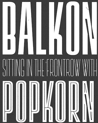 Typocalypse Types was founded in 2009 by two students of communication design from the University of Applied Science in Trier: Kai Merker and Stefan Huebsch (b. 1981, Saarbrucken; Stefan Huebsch lives in Heusweiler / Saarbrücken in Saarland, Germany). Sven Fuchs joined some time later.
 Huebsch's first font, made in 2009, is Black No. 7---it was inspired by the Jack Daniel's Black Label Whiskey logo from 1866. Black No. 7 Vintage (2009) is a grungy version. In 2011, he created Lith, a hand-drawn headline typeface inspired by Alice In Wonderland and the Brothers Grimm fairy tales. In 2014, he published a spectacular 11-style font family, Lichtspiele, that takes inspiration from early 20th century movies, and more specifically, the film noir genre. In this series, Lichtspiele Neon 3D is of particular interest. Lichtspielhaus (2014) is an ultra-condensed version. Lichtspielhaus Handmade (2014) is the handwritten version---it was influenced by the hand-painted signs on cinema facades of the early cinema days. In 2015, we were treated to Lichtspielhaus Slab (ultra-condensed), and in 2016 to Lichtspiele Reklame (the ultra-condensed version). In 2017, Stefan Huebsch and Daniela Spinelli co-designed Konkret (a sharp-edged all-caps secret service sans with some left-leaning Kontra italics). Behance link. Creative Market link. [Google]
[MyFonts]
[More] ⦿
|
Typodermic
[Ray Larabie]

|
 Ray Larabie (b. 1970, Ottawa, Canada) ran Typodermic in Mississauga, ON, which opened in the Fall of 2001. In 2006, it moved to Vancouver, BC, and in 2009 it moved on to Nagoya, Japan. Dafont page. Ray Larabie has been making fonts since 1996, but those early fonts were freeware. His pre 2001 fonts are grouped under the label Larabie Fonts. In 2001, he set up Typodermic. Latest additions.
 The Typodermic fonts: - 2022: Biphoton (a monospaced sans with the same proporions as Letter Gothic 12), Valve (an industrial muffler shop font), Deception (a sub-pixel typeface with ten captivating effects---Deception Array (wide blocks), Deception Bars (text viewed through lenticular glass), Deception Blocks (as in heavy JPEG degradation), Deception Diamonds, Deception Lines (for a grayscale effect), Deception Particles, Deception Plusses, Deception Process (simulates grayscale LCD text or a thermal printer on the fritz), Deception Scanline (television picture tube text rendering), Deception System (1-bit dithering gone haywire)), Monofonto (a monospaced sans), Encercle Draft (permitting users to create numbers in borders), Encercle Sans, Heavy Heap (a groovy psychedelic typeface with a scorching look, reminiscent of 1960s hot-rod culture and die-cast toy vehicles), Ggx89 (a 48-style tightly spaced Swiss style sans family).
- 2021: Quadrillion (a 12-style rounded monoline sci-fi family), Mochon (a wall writing or chalk font based on the lettering of Donald Mochon, dean of the RPI School of Architecture until 1966; the Mochon samples were provided by an ex-student of Mochon, Karl A. Petersen), Steelfish Hammer (a subtly rustic version of Larabie's most popular typeface, Steelfish), Wavetable (sci-fi), Xyzai (an LED emulation font, described by Ray Larabie as a hardcore, Y2K-style techno typeface), Geoparody (a 12-style squarish typeface inspired by a late 1960s font called Anonymous), Typewriter Spool (122 fonts, modeled after the Underwood No. 5 typewriter font).
- 2020: Gravtrac (a 56-style condensed to crushed slab serif family inspired by mid-twentieth century classics like Univers 59 Ultra-Condensed, Helvetica Inserat and Compacta; +Greek, +Cyrillic), Vinque Antique (a rustic handcrafted blackletter in eight styles).
- 2019: Dealerplate (17 license plate styles for various states and provinces in the USA and Canada, current as of 2019; included are California, New York, New Jersey, Ohio, Illinois, Pennsylvania, Florida, Maryland, Michigan, Wisconsin, Massachusetts, Missouri, Washington, North Carolina, Virginia, Quebec, and Ontario), Kenyan Coffee Stencil, Good Timing, Steelfish Rounded, Bitcrusher (a consumer electronics / techno font), Galderglynn 1884 (a nineteenth-century style sans-serif typeface that exp[ands his Galderglynn Esquire).
- 2018: Cybermontage, Crack Man (a pac man font), Propaniac (a 1980s-style postmodern typeface inspired by a Pointer Sisters record sleeve which was designed by Shoot That Tiger Creative Services), Zelega Zenega, Spectrashell.
- 2017: Minicomputer (MICR style), Squirty, PCTL9600, PCTL4800 (retro techno), Ultraproxi (semi-monospaced and influenced by the high speed computer printers from the 1950s to 1970s), Toxigenesis (techno sans), Venus Rising, Vanchrome (a compact sans-serif headliner with chromatic layers), Krait (a layered geometric typeface designed for architectural display), Xylito (a layered font for chromatic or 3d effects).
- 2016: Refuel (octagonal, based on military aircraft markings), Expressway Soft (a sans-serif font family inspired by the U.S. Department of Transportation's FHWA Series of Standard Alphabets, also known as Highway Gothic), Conthrax (squarish, techno), Cornpile (cartoonish), Electric, Evensong (art deco), Fledgling (a very tall typeface), Gymkhana (sans), Remissis (sans), Sunday Evening (a reverse contrast typeface), Meloche (Meloche is a unique grotesque sans-serif typeface influenced by hand-painted French signs of the late nineteenth century. It's available in 7 weights and obliques).
- 2015: Canada 150 (a custom font for the Canadian government; see here, here, this coverage regarding the Inuktitut part of the font, and this reaction by the curmudgeons in Toronto who complain that Ray did this work for free), Autoradiographic (sans family), Built Titling (for compact headlines), Chickweed Titling (cartoon titling font), Cardigan Titling (flared headline face), Bench Grinder Titling, Kleptocracy Titling, Palamecia Titling (rounded black comic book typeface), Quasix Titling, Galderglynn Titling (all caps sans family from hairline to black), Mixolydian Titling, Stormfaze (a sci-fi font started in 1996 and finished in 2015), NK57 Monospace (a 60-style programmer typeface), Gargle, Athabasca (a sans family designed for the rugged Canadian oil patch).
- 2014: Mesmerize (a large free sans family), Kingsbridge (a large slab serif family with sharp points on the A, M, N, V and W), Manbow (a layered geometric art deco display font which includes solid, clear, stripe, polka-dot and screen patterns), Breamcatcher (an all caps art deco font inspired by the piano sheet music for With Every Breath I Take which was featured in the Bing Crosby/Kitty Carlisle musical comedy film, Here is my Heart), Kilsonburg (Dutch deco based on an old Vogue magazine cover), Uchiyama (poster typeface), Goldsaber (art deco design), Vexler Slip (unicase), Rakesly, Dacquoise, Pretender, Rimouski (a rounded geometric font family), Nulshock (techno), Recharge (techno/industrial font), Interrogator Stencil, Strange Alphabets (arts and cratfs font), Angerpoise Lampshade (free).
- 2013: Numbers With Rings, Shookup (funky cartoon font), Pastrami on Rye (cutout comic book style), Chickweed, Built (a condensed headline sans), Fluctuation (a softly rounded elliptical sans family), Astrochemistry (sci-fi, techno with rounded edges), Snasm (sci-fi).
- 2012: Engebrechtre (2000-2012), Die Nasty (1999-2012: free), Strasua (1999-2012), Planet Benson (1997-2012), Husky Stash (1998-2012), Barbatrick (1999-2012: a speed emulation font), Zero Hour (1997-2012), Urkelian (1998-2012: very condensed), Zolasixx (inspired by the video game Zaxxon), Ampacity (neon font), Chromakey (a space deco headline font inspired by box art classic video games including Matrix Marauders and Magical Chase), Disassembler (1980s style bitmap font), Zerbydoo (a dot matrix family), Superego (a geometric-techno font inspired by the cabinet graphics for the 1981 Stargate arcade game), Rukyltronic (a set of dot matrix typefaces), Nerdropol (pixel family), Gulkave (rounded pixel font), Cyclopentane, Palamecia (a fat finger poster face), Gameness (a 1990 retro industrial deco font), Camulogen (headline face), Color Basic (a pixel typeface inspired the by TRS-80 Color Computer), Triac Seventy One (a funky face), Acroyear (retro all-caps headline font), Troll Bait, Strenuous (unicase), Permanence (a retro=futuristic font based on Alvin Toffler's cover of Future Shok, 1970), Clockpunk (octagonal and quaint), Battlemaze (trekkie face), Mixolydian (industrial sans).
- 2011: Ugocranis (a brutalist typeface), Clipwave, Wheaton (MICR-inspired), Mango Scribble, TRS Million (dot matrix face), Ugogranis (constructivist), Gomoku (paper cut face), From The Internet.
- 2010: Cranberry Gin (2010, octagonal), Restore (all caps, geometric sans), From The Stars (an elliptical techno family done with Chikako Larabie), Thrusters (space age face), Dream Orphanage, Dream Orphans (2000-2012), Kengwin (rounded slab serif), Gleaming The Cube (Greek simulation face), Vectipede (a slab serif family), Great Escape (an elliptical sans family), Subrocs (connected script), Hackensack (with Chikako Larabie), Polarband (bilined stackable headline face), Naked Power, Special Forces (a great macho slab serif headline face---watch for awards to roll in), Warugaki (handpainted), Warmer, Honfleur (art deco; with Chikako Larabi), Voivode (a headline typeface done with Chikako Larabie), Hachimitsu (Asian look face, done with Chikako Larabie), Kadeworth (rounded retro look sans, done with Chikako Larabie), Gnuolane Jump (2010, with Chikako Larabie), Markerfield (brush), Board of Directors (Bank Gothic style family, done with Chikako Larabie), GGX88 (a Swiss sans family), Body Goat, Reversal, Gord (techno), Computechnodigitronic (LED, LCD geek-look font), Bench Grinder, Inklea (a bubbly face), Skygirls (retro brush script), Gloss (a paint brush typeface based on Champion, 1957, G.G. Lange), Galderglynn Esquire.
- 2009: Maqui (an industrial headline sans family), Zingende (art deco family: caps only), Misadventures, Gaz (large retro sans family), Acrylic Brush, Enamel Brush (a digitization of Catalina, 1955, Emil J. Klumpp), DDT (neutral sans), Thump (fat, casual), Desperate Glamour, Pricedown (an update of his free 1990s font, patterned after the lettering on The Price Is Right show), Mitigate (monoline and slabbed; has some typewriter styles), Catwing, Walken (slab serif stencil), Silicone (soft rounded sans family), Movatif (sans), Gunplay (a stencil family inspired by the poster for the 1972 Steve McQueen/Ali MacGraw film The Getaway), Fragile Bombers (octagonal), Forgotten Futurist (techno sans, 19 styles), Bullpen (slab serif), Coolvetica (35 styles), Duality, Good Times, Strenuous, Shlop (paint-drip style), Dirty Baker's Dozen (stencil), Junequil (VAG Rounded style), Owned (graffiti), Domyouji, Threefourtysixbvarrel (stencil), Enacti, Uniwars (futuristic, 16 styles).
- 2008: Madawaska (a rugged slab serif), Ebenezer (grunge), Gnuolane Stencil, Raincoat, Report School (avant garde sans), Jesaya, Carouselambra (art nouveau), Debusen (rounded), Barge (military font), Renju (2008, potato or rubber stamp print face), Otoboke (handlettered), Hit (informal hand), R6 D8 (futuristic sans family), Rexlia (an octagonal machinistic family), Hybrea (a display sans with TV screen rounding), Sweater School, Tussilago (2008, a neutral sans family), Presicav (extended sans), Hover Unit, Addlethorpe (grunge), Scheme (rounded sans), Usurp (bouncy poster lettering), Negotiate (technical sans family), Divulge, Sewn, Gnoulane (condensed sans), Moja, Teeshirt (old typewriter face), Pound (art deco marries grunge), Graveblade (heavy metal font), Synthemesc (psychedelic anti-Starbucks font), Chysotile (white on black grunge), Cardigan (sans), Gurkner (balloon style), Reagan (grunge).
- 2007: Tight (a copy of Dean Morris's 1976 Letraset chrome font Quicksilver), Headlight, Meloche (a 3-style grotesk), Octin Spraypaint (grunge stencil), Octin Vintage (grunge), Bouffant (script), Octin Prison (stencil), Octin Sports (octagonal), Octin College (octagonal, for sports jerseys), Octin Stencil (free octagonal font family), Burnaby Stencil (stencil), Superclarendon, Conceal, Ohitashi, Stud (grunge), Bristles (grunge), Skirt, Cotton (grunge), Kelvingrove (a bit of copperplate gothic, rounded and shaved), Augustine, Containment, Snowa, Veriox, Scrubby, Transmute, Sheaff, Injekuta (techno), Rinse (grunge), Polyflec, Domyouji (square sans), Winthorpe (old style), Cutiful (script), Flyswim (grunge), Dirtstorm (spray-painted stencil), Shnixgun (grunge), Neuzon (grunge), Oxeran (old typewriter), PRINTF (grunge all caps monospaced), Akazan (sans), Nyxali (a metal tag face), Nesobrite (25 styles of Bank Gothic lookalikes), Meloriac (a heavy headline sans inspired by Futura), Walnut (graffiti face), Gnuolane (a narrow superelliptical sans), Edifact (a damaged computer font), Darkheart, Stampoo (squarish), Raymond (rough script), Hayate (oriental look), Telephoto. The entire Octin series is free at DaFont.
- 2006: Octynaz (grunge), Paltime (ornamented), Jolie Ecriture Desard (children's hand), Mango (comic book face), Desard (child's hand), Bulltoad, Lerku (eroded serif), Charbroiled (also eroded), Ceroxa (eroded stencil), Nagomi (a chiseled-look Asian font based on calligraphy of Chikako Suzuki from Nagoya), Whiterock, Yellande, Chilopod (a futuristic typeface inspired by the logo from the 1980s videogame, Atari Centipede), Order, Goldburg (based on a typeface by George Bowditch, 1957), Laserjerks (2006, brutalist), Milibus (futuristic), Bonobo (serifed), Ohitashi, Sarasori (TV-tube shaped typeface in the style of Oban), Structia (an octagonal family), Betaphid (octagonal), Gendouki (futuristic stencil), Slugger (athletic lettering), Marianas (a gorgeous art deco face), Lineavec (octagonal), Corzinair (serif family), Buxotic (a great caps face), Cinecav X (for closed caption TV and DVD), Salsbury (comic book face), Lonsdale (loosely based on a font called Parkway Script, which was designed by Emil Hirt in 1964), Alepholon (futuristic), Kwokwi, Mikadan (a tribute to Stephenson Blake's Verona from 1948, which was in turn based on William Dana Orcutt's Humanistic from 1904), Marion (2012: a beautiful transitional family adopted as a standard Mac OS X font), Quasix (hookish), Skraype (grunge stencil), Bleeker (casual lettering), Linefeed (monospaced line printer font), Draculon (a casual typeface inspired by the letterforms of William Orcutt's humanist font from 1904 which was in turn based on an Italian manuscript from 1485), Mahavishnu (a mix between 1970s psychedelics and art nouveau), Doradani (a corporate identity sans family), Korotaki (futuristic).
- 2005: Beat My Guest, Kadonk (a Halloween face), Report (a VAG-Rounded style face), Croteau (a poster face), Heroid (ook face), Barrista (informal script), Wyvern (sans serif), Wubble (like puddles of water), Caryn (casual script), Folder (a rigid sans family), Venacti (a futuristic family), Xenara (a keyboard lettering family), Emory (a destructionist sans family), Ligurino (neat sans&serif family), Biondi (update of Copperplate Gothic; followed in 2010 by Biondi Sans; these copperplate style typefaces are in the style of AT Sackers), Byington (Trajan column lettering), Sayso Chic, Expressway (28 weights, a highway signage family), Algol (pixel type), Meposa (fat display face), Tandelle (condensed), Vigo, Maychurch, Mecheria, Vactic (dot matrix), Zosma, Topstitch, Windpower, Llandru, Soap (a creative extension of Cooper Black, with dingbats), Kleptocracy (1999-2005), Owned, Rimouski (sans), Burnstown Dam (2005, a wooden plank font), Sinzano (sans with opentype ligatures galore; compare, e.g., House Ed Interlock), Zamora.
- 2004: Affluent, Threefortysixbarrel (stencil face), Tank, Telidon (dot matrix face), Funboy, Neuropol X, Neuropol Nova, Mufferaw (comic book face), Larabiefont, Zekton (techno), Strenuous 3D, Silentina (advertised as "a silent movie font"), Amienne (brush script), Fenwick Outline (free), Betsy Flanagan (1998, a keyboard face), Boopee (children's handwriting), Pirulen (in the general Bank Gothic style), Zalderdash.
- 2003: Zupiter, Blue Highway.
- Before 2002: the dot matrix family Telidon, Telidon Ink, Butter Belly, Almonte (1999), the architectural font Jillican (octagonal), Snowgoose, Bomr, Pakenham, Neuropol, Nasalization, Fenwick, Kleptocracy DLX, Sui Generis, Dirty Bakers Dozen (faded stencil), Minya Nouvelle, Asterisp, Chinese Rocks, Jillsville (great artsy Courier), Ulian, Wevli (including Wevli Dingbats), Sappy Mugs (funny mugshots), Sofachrome (1999, inspired by Pontiac car emblems), Eden Mills (1999).
MyFonts interview. Fontspace link. Fontspring link. Catalog of the typefaces in the Larabie Fonts collection. Klingspor link. Catalog of the Typodermic library in decreasing order of popularity. Extensive (large page warning) Typodermic catalog. Font Squirrel link. Creative Fabrica link. Fontsquirrel link. Fontdaily link. [Google]
[MyFonts]
[More] ⦿
|
Typographic Design
[Manuel Viergutz]

|
 Berlin-based FontStruct artist from Stuttgart (b. 1986, Esslingen) who studied at Johannes-Gutenberg-Schule Stuttgart (class of 2007) and studied in 2008 in Esslingen at the European School of Film and Design. He set up Typographic Design. The theme of most of his typefaces is erosion, deconstruction and grunge.
 He made the striped techno fonts heavyLOUDedge, heavyLOUDedge_lineH, heavyLOUDedge_lineV, heavyLOUDedge_quad, heavyLOUDedge_raw in 2009. He also made Fat Cowboy (2009, FontStruct), QRcodeX (2009, like those airline ticket codes), Low Down Cut (2009), WebPixel (2009), ScrFibble (2009), ScriptSERIF (ransom note face), and Back To Heavy Coat Fat Ground (white on black family) in 2009. Typefaces done between 2010 and 2013: SKATEBOaRDbraNds (2010, ransom note face), Gothic Hand Dirty (2010), SansLigraphy, Slice n Dice (2009), Riptape, Riptrash (2010, grunge), BackToHeavyCoatFatGround, Curly Lava Bubble (2010, dotted family), Hand Times (2010, a sketched Times Roman), BlockHead (2010), kiddySans (2010), webpixelbitmap (2010), dirtyDeoHandInk (2011), Modern Hand Fraktur (2011), Elegant Hand Script (2011), Wear Fat T Shirt (2011, squarish), Giraffenhals (2011, hand-printed), Phone Scan (2011), Slanted Italic Shift (2011), Neon Club Music (2011), Raw Delta Hand Street (graffiti), India Snake Pixel Labyrinth Game (2012, labyrinthine). Typefaces from 2013: Hand Retro Sketch Times (layered poster headline family), Dirty Bubble Gum Grunge, Hand Skribble Sketch Rock, Hells Kitchen Devil God, Hand Scribble Sketch Times, Shaky Hand Some Comic, RawStreetWall (Volcano Type: grunge), Tag Hand Graffiti Trash, Viktors Littl Creepy Horror. Still in 2013, these commercial typefaces were published: Rip TRASH, Dirty Deo Hand Ink, Elegant Hand Script, Gothic Hand Dirty, Rip TAPE, MODERN Hand Fraktur, Giraffenhals, Raw Delta Hand Street, WEAR FAT SHIRT, HeavyLOUDedge, Soul Lotion, Webpixel Bitmap, India Snake Pixel Labyrinth Game, Kiddy Sans, MEGA SLANT LINE, NEON CLUB MUSIC, Slanted ITALIC Shift, Block Head, Happy Brain Creepy Thalamus. Typefaces from 2014: Konstructa Humana Stencil, Hand Stamp Play Rough Serif. Typefaces from 2015: Hand Sketch Rough Poster, Hand Stamp Swiss Rough Sans. Typefaces from 2016: Hand Stamp Gothic Rough, Raw Street Wall (Volcano type). Typefaces from 2017: Brush Poster Grotesk (2017, a fun semi grungy typeface designed for the children's exhibition 1,2,3 Kultummel from Labyrinth Kindermuseum Berlin by xplicit, Berlin (Annette Wüsthoff, Alexander Branczyk and Mascha Wansart) and Manuel Viergutz; loaded with glyphs and decorative extras like arrows, dingbats, emojis, symbols, geometric shapes, catchwords and decorative ligatures), Netherlands Dirty Numbers (a hacker style font), Mallorca Dirty Numbers (another hacker font), Hand Stamp Slab Serif Rough. Typefaces from 2018: Hand Print Stamp Rough, Typewriter 1950 Tech Mono (a great old typewriter font family). Typefaces from 2019: Icons Dingbats Symbols Set, Czykago Rough (with Alexander Branczyk). Typefaces from 2020: One United Font (+icons), Hand Stamp Wood, Klein Rough Gemein (with Inga Luft: a font family that includes an icon set and several styles that emulate old German rubber stamps), LED pixel (65 styles), Boom Pang Pow (a cartoon font), TWIGS 4 kids (2020: designed for a garden exhibition for children by Daniela Costa, Julia Stanossek, Alexander Branczyk and Manuel Viergutz), DIY Fantasy Stamp, Euro Icon Kit, Brush Hand Marker, Chalk Hand Marker. Typefaces from 2021: Wood Sans (a 12-style vintage wood type and letterpress emulation family), Pixel Pattern (a 9-style pixel font family), Hand Writing of Janina, Face Type, Hand of Hannah (a fat finger script), Plakat Wood (wood type emulation), Drunken Pixel, GDR Traffic Symbols, Hearts Love Smile (amorous dingbats), Open Tech Neue (Sans Serif, Invert, Outline, Slab Serif, Stretch, Box Puzzle and Icons). Cat Finger (a rough brush font), Kloetzchen (a set of blocky display types based on a 3d (physical) wood type by Peter Eckartz). Dafont link. Alternate URL. MyFonts link for his commercial fonts. Klingspor link. Behance link. Blogspot link. Old MyFonts foundry link. Abstract Fonts link. Volcano Type link. View Manuel Viergutz's typefaces. [Google]
[MyFonts]
[More] ⦿
|
Typotheticals (was: F.O.N.Type)
[Graham Meade]

|
 Typotheticals (F.O.N.Type) (est. 2002) is a supplier of fonts from a number of independent amateur foundries that make up the C.O.I.F.F (Collective of Independent Font Foundries) group. Originally free fonts, the fonts are now commercial and can be bought at MyFonts. It is run by Graham Meade in Melbourne, Australia. Font families for now:
 - From Three Mile Island (Graham Meade): RaveParty, Nightmare in Blend Mode.
- From Tomcat Type: Why Damn It, Deedaceous, Cortilic (nice austere Courier-style letters).
- From Fontological Foundry: Where U @ (a comic book style).
Also: Chyletoon (2021; a cartoon font family in 24 styles), Umerica (2019), Lemonite (2019: sans), Ipscus (2009, after an earlier free font by him, Brassiere), Skuair (2009), Xeilo (2008), Damure (2006), Sweetmix (2006), Norlik (2006, 6 styles), Nok (2006, 18 style sans family; with Daniel Athburton), Koster (2006, swashbuckler family), Whinter (a simple sans family), Carnova, Metasyntal, TN Caluminy, Modcon and Modcon Outline (2007, futuristic family), Tsudoman, Tsudotin, Tsudovac, Delechol, Etched Fractals (Bank Gothical style), Binary Snafu, Meichic, Phollick, Italican Oblique, Czaristane, Hulbert, Frogster, Typothetical 1, Stripwriter, Eutheric, Gyant, Gurnee, Quoral, Freekenfont, Kylemott, Elspeth GM, Worstveld Sling, Cordin (2005), Jains (2005), V-Hand (2005, informal script). This site offers Cordin Freebie (2005). In 2006, Thomas Phinney from Adobe insulted Graham on Typophiles by stating: You make somewhat lower quality and much less expensive retail fonts, and I sought out my job at a company that makes relatively high quality and expensive (when not bundled) fonts. For completeness, Graham Meade's fonts at MyFonts: Alum, Aunchanted Elite, Blound, Caluminy, Capitalus Diabolus (2014, a beveled neon-look typeface based on Lucifer No. 10), Carnova, Cordin, Cyne (2004), Czaristane, Dbased Material, Elspeth GM, Etched Fractals, Etho (2013, +Etho Wide), Eutheric, Flute, Frangle (2013, octagonal), Freekenfont, Frogster, FrownTown, Gurnee, Gyant, Houral Etched, Hulbert, Humper, (2005), Ilbit, Italican Oblique, Italican Script (2004), Jains, Jointed (2008), Koster, Kylemott, Laural Hardy (2011, piano key family), Marjoram (2008), Meichic, Modcon, Nacissism (sic) (2013), Neu Phollick Alpha, Nok (2006, with Daniel Athburton), Norlik, Phollick, Physe (an organic display sans in 16 styles) (2020), Quiffed, Quoral (2003), Ramadesh, Reluxed, Rhomus Omnilots (geometric dingbats), Simiate, Stripwriter, Sweetmix, Thyne (2020: a lachrymal serif in 14 styles), Typothetical 1, Tzaristane (2005), V-Hand (2005), Wastrel (2004), Whinter, Whyst (2020: squarish and monolinear in 28 styles---almost a gas pipe font), Wiki, Worstveld Hand, Worstveld Sling (2005, with ), Worstveld Sting. Klingspor link. Fontspace link. Dafont link. View Graham Meade's typefaces.) [Google]
[MyFonts]
[More] ⦿
|
Vadim Ciocazan
|
Bucharest-based designer of the neon tube typeface Nixie Arc (2013). [Google]
[More] ⦿
|
Vanguard
|
Plymouth, UK-based graphic designer who made the neon light/paperclip typeface Nasius (2010). [Google]
[More] ⦿
|
Vectro Type Foundry (was: Scribble Tone)
[Lizy Gershenzon]
|
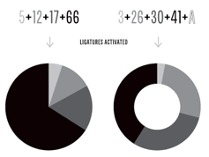 Vectro Type Foundry is a Portland, OR-based type foundry with a curiosity for experimentation and technology. It is the type design branch of Scribble Tone (Portland, OR), which in turn was founded by Lizy Gershenzon and Travis Kochel. Lizy leads marketing and product strategy for Vectro. She is also a founder and owner of Future Fonts. During the last 10 years she has been a partner at Scribble Tone focusing on digital product design and strategy. She also contracts as a digital ux and product designer. Travis leads type design and direction for Vectro. He is also a founder and owner of Future Fonts. During the last 10 years he has been a partner at Scribble Tone focusing on type design and development.
 Warning: When I am on the Vectro site, my computer goes in overdrive and heats up, as if Vectro is an agent for bitcoin mining. I hope that this technical problem can be fixed. Their typefaces at Scribble Tone, Future Fonts and Vectro Type: - Skyward Sans (a free Hylian alphabet featured in Zelda's Skyward Sword).
- Kicker (2012-2018). A layerable neon light font.
- Iso (2018: a monospaced almost typewriter font). They write: It was inspired by old cameras, specifically Leicas and Nikons, which have really warm, slightly goofy, and tactile engraved text all over. Iso was renamed Vctr Mono in 2021.
- The experimental prismatic variable font Whoa (2019).
- Analog (2013, Travis Kochel). iA new take on wide industrial sans serifs.
- Kablammo (2022).
- Wildberry (2021, Travis Kochel). Based on the brushy lettering found on U.S. National Wilderness signage and trailhead signposts.
- Chartwell (2011, Travis Kochel).
[Google]
[More] ⦿
|
Velvetyne Type Foundry Workshops: Font Fonk Fork
|
 Regular workshops held by Velvetyne Type Foundry at La Générale in Paris. These workshops result in a number of hybrid or derived typefaces that are free to use. Download link for all fonts. A list of initial typefaces, all named Coupeur (after the French pronunciation of Cooper in Cooper Hewitt):
 - Alexandre Lescieux, Hadrien Bulliat: Haltère.
- Hugo Dumont: Coupeur Jack (2016).
- Anton Moglia: Coupeur Bricoleur (2014).
- Clément Baudouin: Coupeur de Légumes.
- Anonymous: Coupeur Bold Block (2014).
- Arthur Dinant: Coupeur Skull .
- Aurélia de Azambuja: Coupeur Crise (2016: angular typeface).
- Jeanne Frantz, Vincent Ricard, Camille Rigou-Chemin: Coupeur Carve (2014).
- Antoine Gros, Gil Ndjouwwou: Coupeur Rounded (2016).
- Martin Campillo, Laurie Giraud: Coupeur Monospace (2016, a programming font family).
- Léa Rolland: Coupeur Texte (2016).
- Yohanna My Nguyen: CoupeurDeco (2016, a neon or popart font).
- Domitille Debret, Florian Michelet, Margaux Saulou: Coupeur Reverse (2016).
- Thomas Bouillet: Coupeur Almeida (2014).
- Pauline Pourcelot, Fanny Guilhen, Tibo: Coupeur Ligadom (2016).
- A dingbat font jointly designed by all participants in 2020, Imago Mundi Mei. The glyphs placed side by side (typometry) allows one to draw emotional, conceptual, psychological landscapes (psychogeography). Open Font Library link.
[Google]
[More] ⦿
|
Vermilione (was: Lovoos)
[Lovindha Kintani]
|
Aka Onep99, Lovoos and Sayins. Malang and/or Surabaya, Indonesia-based designer, b. 1997, of the monoline script typeface Exiona (2019)the rounded monoline sans typeface Bunderan (2019), the signature script fonts Alexandria (2019), Morellin (2019), Charllesh (2019), Mansions (2019) and Jellaine (2018), the upright calligraphic font Rose Marline (2019), the brush typefaces Butter&Milk (2019), Senorita (2019), Whisper (2019) and Brush Kencur (2019), the neon font Lumos (2019), and the handcrafted typefaces Juttely (2019), The Sayinistic (2019), Hillary (2019), Alchemisch (2019), Josephine (2019), Santhana (2019), Margareth (2019), Karimun Jawa (2019), Spicy Wings (2019), Swallow Script (2019), Lucky Likey (2018) and Kalila (2018). [Google]
[More] ⦿
|
Vestigial Studio
|
Three seemingly commercial Mac fonts, Budado (neon sign letters), Ravic, Blivvitor. [Google]
[More] ⦿
|
Victor Alonso Laguna
|
 Graphic designer in Burgos, Spain. Creator of the industrial sans typeface Industria (2014), which is a wide geometric grotesk with an extra-large x-height. Behance link. [Google]
[More] ⦿
|
Viktor Konovalov

|
 Designer from Kiev, Ukraine. Behance link. He created the studio k.love in Kiev in 2002. In 2011, he designed the neon lighting / paperclip face XCLV Neon (+XCLV Neon Pro Cyrillic, 2013). MyFonts link. Foundry link. Klingspor link. [Google]
[MyFonts]
[More] ⦿
|
Viktor Nübel

|
 Freelance graphic designer in Berlin, b. 1977. In 2005, he graduated from the Design Akademie Berlin with a thesis entitled Type Attack. His typefaces:
 - The stencil-inspired PTL Attack (2006, Primetype).
- Ostblock (pixelish).
- Modul72. A modular typeface in the spirit of Meek's FontStruct). Modul22 and Ostblock were heavily inspired by events and lettering in former East Germany.
- The decorative Oliva (2009), which has a hint of psychedelica.
- Viktor Nübel and Hendrik Möller created some hand-printed fonts with two glyphs for each letter, to better simulate reality.
- The large PTL Attention sans serif typeface family (2013, Primetype).
- Babetta (2013). An all-caps typeface (with an inline called Babetta Neon) that was inspired by an illuminated vintage shop sign at Karl-Marx-Buchhandlung in Berlin. It has some elements of art deco.
- FF Attribute Mono (2017) and FF Attribute Text (2017). These FontFont typefaces emualte typewriter and programming types.
MyFonts link. Behance link. Viktor Nübel foundry. Klingspor link. Fontspring link. Volcano Type link. Fontshop link. [Google]
[MyFonts]
[More] ⦿
|
Vintage Voyage Design
[Pavel Korzhenko]

|
 Aka P. Rudakov and Pasha Korzhenko, and operating as Vintage Voyage Design. Perm, Russia-based designer of the vintage handcrafted typefaces West End (2015, spurred Western typeface family), Winter Holidays (2015), The Sugar Cane (2015, eroded signage script), Montana (2015), Canyons (2015), Forest Tramp (2015), Heart of Gold (2015, a think inky brush), La Fa Salt (2015, a connected monoline script), Robinson (2015, handcrafted), Rise (2015, rough brush), Stout (2015, +Stout Roughen), Jack's Guitar (2015) and Bough (2015).
 Typefaces from 2016: Chameleon (rough brush), Les Paul (beatnik style), 1994 Fancy, The First Division (an elegant handcrafted Peignotian typeface family), The Aviator, Ocean Beach (weathered athletic lettering font), Fenway Script (baseball script), Fenway Sans, Octanis (display family in Sans, Slab, Serif, and Rounded Sans sub-styles), Compare (a vintage wedge serif typeface inspired by the mafia), Unchained (Western typeface), The Selvedger (signage script), Driver (a retro speed emulation typeface family), Pasternak Script. Typefaces from 2017: The Bartender (a 14-font vintage typeface family with some letterpress styles), Easy Rider (a layered road movie brush script font), The New America (penmanship script), Ace of Spades (grungy), Cavalcade (a layered serif typeface inspired by American and European typography of early 20th century, from movie posters to design of alcohol bottles like Martini, Cinzano and Campari), Old Standard (sans, script), Season Times (Sans+Script), Roadstar (a vintage speed emulation techno font). Typefaces from 2018: VVDS Pacifica (a hand-lettered bold signage script inspired by American branding typography from the end of the 20th century), Le Bonjour (a retro sans), The Voyage Culture (font duo), Afterglow (a didone), VVDS The Bimbo (circus fonts), Two Letter Monogram, Diamond Monogram, Circle Monogram, Circle Frames, Harbour (a free decorative blackletter, +Harbour Decor: 2017-2018), Sandwich (a large 3d beveled typeface family), The Telegraph (transitional newspaper type), Golden Horn (a layered vintage typeface). Typefaces from 2019: VVDS Organum (a decorative typeface for operas and phantasms), The Pretender (a package inspired by vintage American sign painting), VVDS Praliner (an all caps sans for display), Le Bonjour (Peignotian), Kristopher (a fancy serif), Nurnberg (an expressionist, modernized blacletter), The British Telegraph (based on vintage British headline type), Halau (a tiki font), Halau Serif, Sign Painter (a monoline Script, a layerable Sans, and two Decor ornamental styles, all based on Victorian era signs). Typefaces from 2020: The Ruby (a 56-font and icon collection), VVDS Minorica (a handrwritten collection in ten styles), VVDS Rashfield (in the soft serif genre), VVDS London Oatmeal (Sans, Script), VVDS Sunshine Bridge (a creamy brush script), VVDS Benigne Sans (a wide geometric sans), VVDS La Truffe (a bold decorative didone), VVDS Big Tickle (a handcrafted retro family). Typefaces from 2021: VVDS Clementia (a stylish condensed serif), Urbanchrome (an SVG letterpress emulation font), VV Neonica (a 12-style neon font family), Grodsky (a stylish 4-style antiqua), The Country Blues (a throwback to the fifties), Surfbird (a 30-style western family), VVS Nobleman (a stylish serif in four styles). Behance link. Creative Market link. Vintage Voyage Design. You Work For Them link. [Google]
[MyFonts]
[More] ⦿
|
Violetta Aleshkevich
|
Vilnius, Lithuania-based designer of several display typefaces in 2018, including the architecural typeface Visaginas, the neon font Design, a watercolor font and Apricot. [Google]
[More] ⦿
|
Vitor Braz
|
Lisbon, Portugal-based designer of the experimental geometric typeface Agaro (2011), the neon tube typeface Bulb (2011), Punku (2011), and the high-contrast fashion mag caps typeface Esquise (2011). In 2013, he designed the alchemic typeface Lunaria. Cargo collective link. [Google]
[More] ⦿
|
Vladimir Nikolic
|
 Belgrade, Serbia-based designer (b. 1981) of these typefaces:
 - The dingbat fonts Canavarlar (2020: funny men), Haircut (2020: women's hairdos), Ornament Borders (2020), Gourdy (2020: birds), Lizards (2020), Mantra (2020), All Star (2020), Speel (2020), Soavely (horses) (2020), Forma (2020), Hell Beasts (2020), Mistresses (2020), Paraiso (2020), Crow (2020), Traverser (2020: crosses), Cats (2020), Dogs (2020), Negative-Heads (2020), Otu (2020), Wakazi (2020), Risk (2020), Wurm (2020), Beard Man (2020), Hoder (2020), Damen (2018), Damen 2 (2020), Foliga (2020), Solo Drinker (2020), Congress (2020), Farmacy (2020), Elections (2020), Emergency (2020), VN Arrows (2020), Hexagonos (2020), Automobiles (2020), Cars (2020), Emoji Boom (2020), Bestia (2020), Aliens (2020), Insect (2020), Bytost (2020), Monstero (2020), Aveto (2020), Dancing Cat (2020), Atradimas (2020), Womanhood (2020), Figur (2020: an alien insect font), Halfwits (2020), Silly Donkey (2020), Crazy Monkey (2020), Round Masks (2020), The Quick Dog (2020), Flying Birds (2020), Maskid (2020), Monstra (2020), Bull Skulls (2020), War Items (2020), Public Transport (2020), Loomad (2020), Mokhabiso (2020: African patterns), Record (2020), Mulher (2020), Heroez (2020), Bulls (2020), Madarak (2020: birds), Bold People (2020), Munari (2019: a collection of drawings based on Bruno Munari's book "Artista e designer" from 1966), Screws (2019), White Mouse (2019), Schepselen (2019), Glatze (2019), Crosses (2019), Chefs (2019), Diamond Blocks (2019), Hexagons (2019), Maumbo (2019), Circles (2019), Enfeite (2019), Pigs (2019), Mythos (2019), Kreaturen (2019), Baby Alien (2019), Body Moving (2019), Various Boys (2019), Lines and Objects (2019), Mouvman (2019), Watch (2019), Credit Card (2019), Cycles (2019), Devil Emoji (2019), Fare (2019), Mund (2019), Labbra (2019), Circular Ornaments (2019), Cranium (2019), Ugok (2019), Ansigter (2019), Tsim (2019), Schmetterlinge (2019), Jungfrau Maria (2019: religious icons), Knights Helmets (2019), Kinderskizzen (2019), Wolves (2019), Various Cats (2019), Owls (2019), Spiral Object 3D (2019), Zodiac Signs (2019), Cyborg (2019), Duck (2019), Cat 3D (2019), Object 3D (2019), Circle and Line (2019), Various Girls (2019), Dulcet (2019), Erotic Symbols (2019), Frauen (2019), Pierre the Vampire (2019), Robotter (2019), Middle Finger (2019), Claudio The Cat (2019), Medusa (2019), Veggie (2019), Pablo (2019), Fishes (2019), Dream of Picasso (2019), Stam (2019), Animality (2019), Ink Drops (2019), Faces (2019), Bayan (2019), Froggy (2019), Senhoras (2019), Diamondo (2019), Skallen (2019: skulls), Swimmers (2019), Churches (2019), Easter Icons (2019), Lippen (2019), Gullar (2019), Bankwesen (2019), Creatures with Horns (2019), Vehicles (2019), Various Hands (2019), 3D Animals (2019), Abantu (2019), Herr (2019), Menge (2019), Funny Aliens (2019), Mustachos (2019), Kids Drawings (2019), Tierfarm (2019), Troep (2018), Women Heads (2018), Cats and Dogs (2018), Wanita (2018), Eyez (2018), Animales (2018), Peoples (2018), Mobile Icons (2018), Controllers (2018), Womano (2018), Lost in Space (2018), Blumen (2018: flowers), Tetriso (2018), Snowflake (2018), Meine (2018: masks), Horoscopicus (2018), Esoterica (2018), Astrologicus (2018, astrolical symbols), Abbild (2018: African masks), Being (2018: monsters), Gebell (2018), Headed (2018), Falter (2018), Filling (2018), Anichka (2018), Cyclopia (2018), Buggus (2018), Opa (2018), Messe (2017), Head of Idol (2018), Diavolo Nero (2017: funny silhouettes).
- The boxed or encircled alphabets Audience Capitals (2020), Galileo (2020), Compare (2020), Compare-Light (2020), Hexagonas (2020), Select (2020), Before (2020), Before-Dark (2020), Boxes (2020), Boxes-Extravagant (2020), Boxes-Fancy (2020), Calf-Negative (2020), Capital-Relationship (2020), Pyxidas (2020), Capitalica (2020), Tundra (2020), Ordinary Capitals (2020), Broadway Capitals (2020), Browser Capitals (2020), Capitalismo (2019), Schwarzenberg Capitals (2019), Retrospective Capitals (2019), Official Capitals (2020), Impression (2020), Oriental (2020), and Letters in Circles (2018).
- Shadowed caps: Cleopatra (2021), Farmers Market (2021), Erkekler (2021), Assignation (2021), Greek Tragedy (2021), Distorted (2021), Lightshow (2021), Credenza (2021), Ragusa (2021), Comunismo (2021), Scordia (2021), Gazelle (2021), Organ (2021), Strizhi (2021), Umoya (2021), Ninja Justice (2021), Unlimited (2021), Unicorns (2021), Labyrinth (2021), True Artisans (2021), Poker (2021), Donald (2021), Ferrari (2021), Booster (2021), Madness (2021), Favorita (2021), Vitamin (2021), Robot (2021), Robust (2021), Engine (2021), Whether (2021), Nucleus (2021), Trunk (2021), Ombre (2021), Viscosus (2021), Jewelry (2021), Verge (2021), Pursue (2021), Keener (2021), Visor (2021), Korvo (2021), Squash (2021), Scum (2021), Darker (2021), Education (2021), Cimice (2021), Tomb (2021), Bambola (2021), Calla (2021), Rump (2021), Complex (2021), Razor (2021), Driveller (2021), Karambol (2021), Princino (2021), Berger (2021), Adopted (2021), Bugbear (2021), Samara (2021), Talisman (2021), Waterway (2021), Megabus (2021: a marquee font), Roller (2021), Numerica (2020), Bond (2020), Gloom (2020: a marquee font), Chalkboard (2020: sketched), Unboxing (2020: techno), Antennas (2020), Secca (2020), Umfo (2020), Sabbia (2020), Squirrel (2020), Byzan (2020), Debtor (2020), Bridge (2020), Familie (2020), Lake (2020), Roma (2020), Tissue (2020), Bombay (2020), Osteology (2020), Restroom (2020), Speaker (2020), Bebika (2020), Center (2020), Gismo (2020), Fierce (2020), Gambler (2020), Afterparty (2020), Birdbrain (2020), Boner (2020), Divine (2020), Gelatin (2020), Lost (2020), Marshland (2020), Quadri (2020), Shadow (2020), Stairs (2020), Superba (2020), Techno (2020), Underman Book (2020), Wired Capitals (2020), Fineliner (2020), Fictive Kinship (2020), Exotica (2020), Ural (2020), Devianza (2020), Kultur (2020), Unmute (2020), Antiqua (2020), Chains (2020), Scheme (2020), Stumble (2020), Aroma (2020), Beans 2 (2020), Cover (2020), Cronica (2020), Fundament (2020), Horna (2020), Loce (2020), Mademoiselle (2020: art nouveau), Melodia (2020), Penny (2020), Taikun (2020), Assault (2020), Athletica (2020), Baraka (2020), Brassica (2020), Builder (2020), Chancellery (2020), Gwara (2020), Pliez (2020), Recinzione (2020), Right (2020), Rimes (2020), Seal (2020), Service (2020), Scorpions (2020), Terraces (2020: American flag font), Wedding Cabbage (2020), Wild Girl (2020), Tragedy (2020), Indos (2020), Starfish (2020), Vintage (2020), Adriatica (2020), Funeral (with American flag texture) (2020), Voleur (2020), Calzino (2020), Peshkop (2020), Metzger (2020), Asshole (2020), Puppet (2020), Broeksel (2020), Hals (2020), Escort (2020), Vortex (2020), Dades (2020), Boild Hedgehog (2020), Mermer (2020), Grower (2020), Rainbow (sketched) (2020), Baise (2020), Necklace (2020), Angels (2020), Smuggler (2020), Dommage (grungy) (2020), Squalor (2020), Fusto (2020), Course (2020), Fisheye (2020), Baiser (2020), Banda (2020), Cantaloupe (2020), Canto (2020), Begriff (2020), Trapeze (2020), Arabeska (2020), Silver (2020), Wasco (2020), Kosaken (2020), Triangle (2020), Banquet (2020), Demode Capitals (2020), Cultus Capitals (2020), Idiot Capitals (2020), Granary Capitals (2020), Liberta (2020), Montblanc (2020), Granary (2020), Blanket (2020), Tuyaux (2020), Wolf (2020), Comeback (2020), Oliba (2020), Idiot (2020), Trailer (2020), Bricks (2020), Toys (2020), Luxury (2020), Hertz (2020), Signal (2020), Serenada (2020), Kurven (2020), Schnecke (2020), Mona (2020), Sierra (2020), Search (2020), Tranchante (2020), Eccentric (2020), Fast (2020), Mosquito (2020), Speed-of-Light (2020), Thanks (2020), Album (2020), Boyhood (2020), Ending (2020), Trend (2020), Universal-Serial-Bus (2020), Fixed (2020), Kings (2020), Holiday (2020), Range (2020), Numbers (2020), Shipman (2020), Officer (2020), Video (2020), Order (2020), Route (2020), Cosa-Nostra (2020), Clowns (2020), Unique (2020), Voyeur (2020), Shape (2020), Brigadier (2020), Allora (2020), Spartacus (2020), Advisor (2020), Ambis (2020), Cables (2020), Genesa (2020), Horse (2020), Laptop (2020), Pork (2020), Mafioza (2020), Mucho (2020), Athens (2020), Audience (2020), Rotor (2020), Mundo (2020), Olympus (2020), Border (2020), Scale (2020), Survival (2020), Trouble (2020), Turnabout (2020), Catharsis (2020), Parade (2020), Discoteque (2020), Rude (2020), Fame (2020), Safran (2020), Ausweis (2020), Mechanica (2020), Moscowian-Party (2020), Beers (2020), Strengthen (2020), Tempo (2020), Unreal (2020), Poetico (2020), Bach (2020), Bach-Fat (2020), Energy (2020), Alexandra (2020), Basket (2020), Cushion (2020), Model (2020), Organiser (2020), White (2020), Anabela (2020), Cannibal (2020), Casablanca (2020), Castle (2020), Control (2020), Crazy (2020), Crazy-Gradient (2020), Emotion (2020), Honey-Bunny (2020), Knockout (2020), Linearo (2020), Murmure (2020), Polished (2020), Reon (2020), Sparrow (2020), Storms (2020), Street-Stars (2020), Franchise (2020), Pencil (2020), Ruanda (2020), Pepito (2020), Megalomania (2020), Rouleaux (2020), Frozen (2020), Together (2020), Saldo (2020), Museum (2020), Network (2020), Hunk (2020), Cultus (2020), Creator (2020), Flow (2020), Blocchi (2020), Possession (2020), Bad Germans (2020), Discounted (2020), Traversal (2020), Mangalica (2020), Murmansk (2019), Summer Candy (2019), Question (2019), Second Channel (2019), 3D Models (2019), Memory (2019), Computer (2019), Diversity (2019), Elastic Letters (2019), Businessman (2019), Kuchen (2019), Demode (2019), Objective (2019), Medication (2019), Nonsense (2019), Plagiat (2019), Toledo (2019), Tricks (2019), Common (2019: a trompe-l'oeil font), Mafia (2019), Releases (2019), Extradition (2019), Shoot To Kill (2019), Groowing (2019), Enough (2019), President (2019), Silence (2019), Dressed (2019), Already (2019), Hocus Pocus (2019), Password (2019), Ready (2018) and Messages (2017).
- The ornamental caps typefaces Mahal (2021), Stamp (2021), Hell Door (2021), Tangram (2021), Custom (2021), Remake (2021), Studio (2021), Adagio (2021), Oxidizer (2021), Mondial (2021), Paraglide (2021), Tattoo (2021), Developer (2021), Dama (2021), Lobby (2021), Gabaritos (2021), Sence (2021), Ombre (2021), Cresa (2021), Anniversary (2021), Wire (2021), Triton (2021), Lamina 92021), Hangup (2021), Years (2020), Dowry (2020), Sephora (2020), Jewels (2020), Straightforward (2020), Dance (2020), Necklace (2020), Maria (2020), Taxi2 (2020), Outlaw (2020), Combat (2020), Chewed (2020), Fantasy (2020), Observation (2020), Cure (2020), Pioneer (2020), Near (2020), Kleid (2020), Unitas (2020), Tomato (2020), Blader (2020), Canal (2020), Baked Snails (2019), Alcoholic (2019), Bonjour (2019), Zylinder (2019), Phenomenal (2019), Surfaces (2019), Success (2019: as in De Stijl), Retailer (2019: multilined), Havana (2019: multilined), Mechanismo (2019) and Pencil Letters (2019).
- The display typefaces Trader (2020), Oysters (2020), Furious Ride (2020), Portfolio (2019), Pontos (2019), Swordsman (2019), Regular (2019), Andrey (2019), Retrive (2019), Connected (2019), Locator (2018), Tracking (2018), Iceberg (2018: snow-capped letters), New Amsterdam (2018), Ana (2018), Enemy (2018), New Yorkers (2018), Happy Day at School (2018), Focused (2018), Modish (2018), Beholder (2018) and Principality (2017).
- The alphadings Birthdays and Parties (2021), Bahanalia (2020), Icecreams (2020), Brailler (2020), Night Dreams (2020), Flower Capitals (2020), Jingle Bells (2020), Neuron Capitals (2020), Easter Time (2020), Hearts and Arrows (2018), Penguins (2018), Kitties (2018), Doggy (2018), Teddy Bears (2018), International Capitals (2018), Aafia Capitals (2018), Answer Capitals (2018), Beholder Capitals (2018).
- The circuit font Simple Repairs (2021).
- The 3d typefaces Sharp (2021), Edited (2021), Three Dimensions (2020), Rental (2020), Shiny Blocks (2020), Turbulence (2020), Labor (2020), Worship (2020), Fantasy-3D (2020), Zucker (2020: stacked blocks) Perfetto (2020), Rude-3D (2020), Lover (2020), Kasten (2020), 3D Models (2019), Tricks (2019) and Metallic (2019).
- The multiline typefaces Yiphi (2021), Porker (2020), Formula (2020), Laguna (2020), Hypochondria (2020), Majestic (2020), Vibes (2020), Tubes (2020), Yogurt (2020), Turkish (2020), Question (2019), Pancake (2019), Remained (2017), Liquidrom (2018), Second Channel (2019), 3D Models (2019), However (2019), Confarreatio (2018) and Fudged (2018).
- The textured typefaces Incompetent (2021), Autumn (2021), Sangria (2021), Studio (2021), Kino (2021), Elixir (2021), Espace (2020), Mistress (2020), Heritage (2020), Silicone (2020), Hornettio (2018), Ignorant (2018), Americans (2020: the American flag embedded into the glyphs), Pollution (2020), Jakob (2019), Diversity (2019), Townscape (2019), Patriotic (2019: American flag theme), Meshes (2018), Complained (2019), Duration (2018) and its solid counterpart, Duration Book (2018).
- The Slavonic emulation typeface Russian Land (2017) and the Cyrillic emulation typefaces Monarch (2021), Cold War (2021), Beograd (2020), Ukrainian Princess (2019), Territory (2019), Kalinka (2019), Rubles (2018), Maniac (2018), Jurij (2018), Kachusha (2018), Soviet Program (2018), Armenia (2017), Fontograd (2018) and Russian Spring (2017).
- The constructivist typefaces Tokarev (2017), Russiano (2018), Suggested (2018), Hungaria (2018) and Schwachsinn (2018).
- Art deco typefaces: Cavalier (2021), Performer (2021), Angelica (2019), Protocol (2019), Retrospective (2019), Leculier (2018, after an alphabet in Georges Leculier's art deco lettering book from ca. 1930), Better (2018), Critical (2017).
- Art deco caps: Reverse (2020), Bathroom (2019), Idiotism (2019).
- The chess fonts Schach (2020) and Wisdom Chess (2020).
- The weather icon font Weather Symbols (2020).
- The decorative sans typefaces Shock (2021), Energia (2021), Pitviper (2021), Nemesis (2021), Addiction (2021), Nehad (2021), Chewer (2021), Nightfall (2021), Gourmet (2021), Flipside (2021), Layered Letters (2019), Imbecile (2019), Answer (2018), Hours (2018), Abandoned (2018), Sea Gardens (2017), Forvertz (2018), Yeysk (2018) and Closeness (2018).
- Sans: Wollicht (2021), Ministro (2021), Lonely (2021), Noix (2021), Messina (2021), Samara (2021), Rickrack (2021), Broadcaster (2021), Catamaran (2021), Official (2019).
- Comic book fonts: Reset (2021).
- Artsy fonts: Hornstick (2021), Kikundi (2021), Shanghai (2021), Skewed (2021), Company (2021), China (2020).
- The headline sans typefaces Finance (2020), Marija (2020), Fashion (2020), Magazine (2020), Policemen (2020), Impressum (2019), Educated Deers (2019), Hindenburg (2019) and Fixation (2018).
- The rounded organic sans typefaces Hofmann (2020), Adelino (2020), Available (2018) and Biysk (2018).
- The handcrafted typefaces Diana (2020), Flood In London (2019), Milord (2018), Sex and Breakfast (2018), Sweet Handwrite (2018), Industrial Revolution (2018), Oh Maria (2017), Sofija (2017) and Travelling (2017).
- The bubblegum typefaces Roller (2020), Jellies (2020), Designero (2019), Bubblicious (2019) and Icecreamer (2017), and its oily companions Gummy (2018) and Liquid (2018).
- The heavy deco typefaces Guest (2019), Bigger (2018), Hours (2018), Intransitive (2018: Dutch deco), Theatrical (2017) and Consequences (2017).
- The beveled fonts Iron (2020), Rising (2020), Novgorod (2020), Troy (2020), Fake Hope (2019), Diamond Ring (2019), Playback (2018) and Member (2018).
- The starred caps typefaces Farmers Market (2021), Donald (2021), Citizen (2021), Wizard (2021), Adrenaline (2021), Diabolo (2021).
- The stencil fonts Browser (2019), Serbia (2019), Belgrado (2019), Further (2019), Generals (2018), Mayor (2018) and Olga (2018).
- The semi-stencil all caps typefaces Restaurant Menu (2019), Queen Dea (2019), Latest (2019) and Large (2019).
- The fat rounded sans typefaces Guest (2019) and Subscribe (2019).
- The Western fonts Newlywed (2020) , Tombola (2019), Permission (2019), Alexander (2019), Retrosonic (2019), Kasplysk (2019).
- The experimental typeface Typo Layer (2019).
- The German expressionist outline typeface Robert (2018).
- Current Moment (2019): a digitized "Zuccini" plate by Frits Jonker.
- The LED fonts Remaster (2021), Ringing (2022), Gigabytes (2020), Error (2020) and Technology (2018).
- The octagonal athletic lettering fonts Academy (2021), Junk (2020), Barbara (2019), Soccer (2020), and Soccer League (2018) and the outlined athletic font Onderneming (2018).
- Leculier (2018). After an alphabet in Georges Leculier's art deco lettering book from ca. 1930.
- The speed fonts Live News (2020) and Speed Racing (2019).
- Essere (2018).
- The squarish typefaces Archipelago (2021), Haine (2020), Augsburg (2020), Legionary (2020), Cyber Princess (2019), Professor (2019), Layers (2018) and Cataclysmo (2017).
- Driving Around (2018).
- The decorative floral caps typefaces Floral Capitals (2018) and Narcissus (2018).
- Gradientico (2018). A textured didone.
- The Greek simulation font Meteora (2018).
- Griddy Blocks (2018) and Blocky Letters (2018).
- Decorattio (2018).
- Ordinary (2018) and Mina is Gone (2018).
- The trilined typeface Trio (2017).
- The connected handwriting typeface Eric's (2016).
- The military typefaces Login (2018), Commanders (2017) and Hunt (2017, after an alphabet by the Hunt Brothers in their 1930s book Lettering of Today).
- The neon typeface Bubble 3D (2017), and the neon and shadow font family Magia (2019).
- Schaeffer (2017). A revival of the famous multiline typeface Fatima (1933, Karl Hermann Schaefer).
- The grungy typefaces Horizont (2020), Cosmas (2020), Drunk Millionaire (2019), Leave No Fingerprints (2018), Haziness (2017) and Victorious (2017).
- The molecular typeface Neuron (2019).
- The inline caps typefaces Panther (2021), Africa (2021), Look (2019) and Speed (2019).
- The inline typefaces Green (2020), Bernard (2020), and Games (2017).
- The display serif typefaces Kandinsky (2021), Funia (2021), Army Guys (2021), Hoodie (2019).
- The marquee typefaces Squad (2021), Grotto (2021), Megabus (2021), Plagiat (2019), Dropped (2019), Casino (2018) and Chicago (2018).
- The layerable marquee font Rockefeller (2018).
- Movie fonts: Film Letters (2018).
- The outlined typeface Important (2018).
- The white-on-black typeface Circusant (2019).
- The didone typeface Vogue (2018).
- The geometric solid typeface family Ivan (2019).
- The geometric sans typeface Occupied (2017).
- Rise of Kingdom (2017).
- Cartoonish (2017).
- Hesitation (2017). A rounded handcrafted poster font.
- Leben and Leben Shadow (2018).
- Braillenum (2018).
- The condensed grotesks Around (2020), Heinrich (2019) and Schwarzenberg (2019).
- Schreibmaschine (2017). A dusty old typewriter font.
- The vintage initial caps typefaces Nautiica 3d (2018), Fantasy Capitals (2018) and Herne Capitals (2018).
- The Arabic emulation typefaces Bayram (2020) and Sinbad (2018).
- Herne (2018).
- Passage (2018).
- Knotty (2018).
- The Mexican style font Mexicanera (2018), Dilemma (2018: Mexican Calavera skulls), and Mexican Tequila (2018).
- The techno typefaces Flight 21 (2019), Cyber Princess (2019), Passionate Relationship (2019), Neighbor (2018), Bombardment (2018) and Leprosy (2018).
- The avant-garde typeface Typolino (2018).
- Regensburg (2018).
- The ultra-fat typefaces Crime (2020), Owners (2018) and Housebreak (2019).
- The prismatic typefaces Jumble (2020), Boogie Woogie (2019), Running (2019), Bigger Italic (2018; based on Bigger Book), Linerine (2018) and Cosmology (2018).
- Failed (2018).
- The codex typefaces Grille (2020), Compass (2020) and Measurements (2018).
- Damages (2018).
- The circle-themed fonts Sparks (2020) and Condition (2018).
- The textured typefaces Mitesser (2020), Object (a meshed font) (2020), Noisy Walk (2020), Brightness (2020), Mistress (2020), Heritage (2020), Silicone (2020), Hornettio (2018) and Ignorant (2018).
- The oriental simulation fonts Dasvidaniya Book (2020), Pearl Harbor (2020), Chinese Dragon (2019), Sudoku (2019), Hiroshima (2019) and Kamikaze (2018).
- Monograms: Quintete (2020), Formogram (2020), Diamond Monogram (2020), Ribbon-Monogram (2020), Bulged Monogram (2020), Monogramus (2019), Blocky Monogram (2018) and Monograma (2018).
- Blackletter: Bramble Princess (2021), Drunks (2021), Cosmopolite (2020).
- Fists: The-Point (2020).
- Scanbats: Retro-People (2020), Vladimir (2019: Putin scanbats), Portraits de Femmes (2019: scanbats), Notre Dame and Notre Dame de Paris (2019: scanbats), Hollywood Actors (2019: scanbats), European Leaders (2018: scanbats), Trumpolina (2018: Trump scanbats).
- Word fonts: Black-Lives-Matter (2020).
- Plank fonts: Wooden Planks (2020).
- The outlined typefaces Carwash (2020), Hypno (2020), George (2020), 3D Letters (2018), Milk & Chocolate (2018: trilined), Czar (2018), Classica (2018) and Created (2018).
- The glitch fonts Elderberry (2021), Sparkle (2021), Eclairages (2021), Nectar (2021), Check Your Connection (2020), Horizons (2020) and Searching For Signal (2019).
- The glaz krak font Smashed (2018).
- The circus font Amigo (2020).
- The kitchen tile font New Message (2020).
- The 3d dingbats typefaces Basic Objects (2020: geometric shapes) and Jigsaw Puzzles 3D (2018).
- The modular typefaces Orenburg (2018), Broadway (2018) and Assyrian (2018).
- Escher style: Illusion (2019), Vologda (2019).
- Slinky typefaces: Rings (2020), Zylinder (2019), Pipes (2019).
- Lombardic caps: Moher (2020), Dublin (2020), Moderno (2020).
- Ransom note caps: Today (2020).
- Artistic font: Meute (2020).
- Halftone fonts: Tourner (2020), Cinquecento (2020), Devotion (2020), Gulliver (2020), Bamboo (2020).
- Ornaments: Adornos (2020).
- Antique caps: Grandes (2020), Reveler (2020: from Draughtsman's Alphabets (1877) by Hermann Esser)).
- Funny faces: Isitolo (2020).
- Angular caps: Milk (2020), Strike (2020), Worldwide (2020).
- Tall sans caps: Bungler (2020), Shakeout (2020).
- Mecano typefaces: Shakers (2020).
- Titling sans: Steinberg (2020).
- Titling serif: Love (2020).
- Break (2020).
- China (2020).
Creative Fabrica link. [Google]
[More] ⦿
|
Wacaksara Co
[Hamam Jauhari]

|
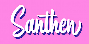 It is unclear whether Wacaksara is run by Hamam Jauhari. Batang, Indonesia-based designer of the brush script typefaces Hastadaya (2016, by Aliv Pandu and Hamam Jauhari), Sailenda (2016), Retorika (2016; renamed Hastadaya because the name is too close to Type-o-Tones' Retorica), Aerokids (2016) and Thillends (2016, by Aliv Pandu and Hamam Jauhari).
 Typefaces from 2017: Underland (a dry brush script by Aliv Pandu), Santhen (a sign painters font by Aliv Pandu and Hamam Jauhari), Sailoria (by Aliv Pandu and Hamam Jauhari), Baksoda (by Aliv Pandu and Hamam Jauhari), Austten (brush script), Mattcool (by Aliv Pandu and Hamam Jauhari), Cosmoball (a signage script by Aliv Pandu and Hamam Jauhari), Anthares (brush script), Charlottes Script (bold brush script). Typefaces from 2018: Everland Script (signage), Play Ground, Sveglia (a dry brush script by Aliv Pandu and Hamam Jauhari), Monopola Script, Delichia (a monoline script by Aliv Pandu and Hamam Jauhari), Rocket Clouds (a neon font done with Aliv Pandu), Southbeach, Machineat (with Aliv Pandu), Playground (sans, script, dingbats). Typefaces from 2019: Houseback, Quadrone (by Aliv Pandu and Hamam Jauhari), Sunkids, Hectonia (a monoline script), Buttercell Script. Typefaces from 2020: Floopy Chart (a baseball script by Aliv Pandu and Hamam Jauhari, with a Sans to complete a font duo), Highpeak (dry brush). Typefaces from 2021: Meritorious Script (a signage script), Qonqueror (a crayon font), Eastgood (a brush script). [Google]
[MyFonts]
[More] ⦿
|
Weknow
[Wino Sutarmin Kadir]

|
 Weknow is the foundry of Indonesian type designer Wino Sutarmin Kadir (b. 1979), who is based in Bogor, Jakarta. Weknow produced a large collection of free fonts from 2009 until 2012. He started making commercial fonts in 2012.
 Creator of the unicase sans typeface Weknow (2009) and the roundish MisstyPoland (2009). From 2010: Helenfont (2010), Dennis Vallera (2010), Kasumichan, Karitza, Mozzie, Wings, Sharon, Noakatz, dearladysandra, arachnidlove, Alexandra, Monica (2010), Natalie, Wayner 8088, Anime Queen (2010, pixelized), Nano (2010, pixel face), Glover (2010, circular face), Frozen Pandaman (geometric), Joenine (circular), Fun Record (geometric), Gembira (circular), Gabrielle, Solgas (circular), lifeforfun (2010), znowwhite (2010), Snowmask (2010), Nine (2010), Znowwhite (2010), Cecile (2010, experiment with triangles), Coreldraw (2010, geometric, monoline), DennisVallera (2010, inspired by the vector art of Canadian Dennis Vallera), Helenfont (2010). Designs from 2011: Michelle (circle-based), Emmilia (circle-based), Raynaliz, Polysoup, Seba, Selfregion (concentric glyphs), Wings of the dragons (octagonal), Spider, The Training Artist, Chewed Kandi, Sandra, Saintfighteraqua (geometric), Alexey (circle-based), Kristina (circle-based), Graphic Dream, Crystalcore (techno), Dominique (fat rounded), Formalart, Henderson (circle-based), Intanputripratiwi (circle-based), Kioshima (geometric), Gitchgitch (geometric), Justta, Dismecha, Self Region (labyrinthine), Alberto (monoline geometric), Abstrasctik (rounded and experimental), Nicole, Robotoc, Laggastic, Masterpanda, Mohr, Maruciel, Gabrielle, Carlos (a circle-based face), Life For Fun (geometric monoline sans), Lois Cesarano (hexagonal), Heather Thomas (circles and lines), Picaee (modular and leafy), Owaikeo (a circle and arc face), Celeste, The World, Future, Lanitta, Earthearth, Basic, Beautiful, Internationalist (monoline rounded sans caps face), Midnight Show, Plastic, Victory, Perfect, Superpower, Katarzyna, Invasion, Block, Wonderfull, Sweetest, Direction, Funrecord, Eternal Flame, Coreldarw, James Glover (circle-based), Superstar, Inside, Parallel, Million, Ocean, Never Ending Maze, Silverbend, Dragon Fly, Whatever You Want, Swinging Swan, Funatic, Soulmate, Superhero, Zetland, Letting The Cable Sleep, Weknow World, Universalisme, Ocean, Smiley Turtle, Family&Friend, Flower in the window, You&Me&Everyone Else, Astonishing, Grass Hopper, Merpati Putih, Extra Hot, Trees of Happiness, Blowing Bubble, Brain Storm, Good Morning, Flower Lover, Honestly, Jaguar, Modern Aristocrat, Pure and Simple Everytime, Ride the lightning, Proffesional (sic), Flight Stewardess, Antique Retro, Natural Technologies, Ethereal Sky, Conversation, Earth Heart. Free typefaces from 2012: Serta Kayu (multiline script), Emerald, Sweater (texture face), Fish Bone, Delicious Ketchup. The Dark Knight, String and Wire, Little Ant, Xtrapower, Standard International, Nice dream come true, Bavaria, Queen of the modern age, Science Fiction, Greatest View, Queen of the Modern Age, Made in earth, Arabian Knight, Emperor of Japan, Bill Gates Windows, Maximum Kilometer, Mineral Oil Resources, Motorcycle (curly caps), Eskimo and Polar Bear, Gladiator Sport, Aero Dynamic, Optical Fiber, High Logic, Generation (a nice all-caps shadow face), My Heart, Play Ground (multiline face), Cartoon Character, Windows in Japan, Quantum Leap (dymo label face), Computer Love, Electric City, and Copper, Valentine In Love, Weknow Windows, Punk, Graphic Design, Billy Jean Style, LMAO (rounded bold sans face), Take and Give, Indonesia Tanah Air, Swimmer Browser, Diamonds are forever (hexagonal and rounded), Tortoise, My Dear, Get Ready, Export Import, Miracle, Digital Ninja, Funtastic Million Moment, Funny and Cute, Samurai in UK, Bookmark, Once Upon A Time, Bird Feather, Respect, Aruna Aira Jasmine, Extra Cheese, Beauty and the beast, Kung Fu Master (oriental simulation typeface), Game Player (art deco), Modern Building, Trade and Mark, Grovy (sic) Kind of Life, King of Font and Typography, ABC (comic book face), Metro City (extended monoline typeface), The Art, Sprout and the bean, Scooter experiment, Sundown Sunrise (a rounded monoline sans), Art Heart, WindowsObject, Authentic Love, Dolphin Ocean Wave, British Pop Music, Master (sci-fi), Sneak Peeks, Like This, Crumble, Zebra Cross, Star Constellation, Water and Gasoline, Autumn, Aviator, So Cute, Crow Chief (bow and arrow font), Beard Rider, Skateboard, Panel, Swallow Sky Night, Hotel Motel (fat finger face), Techno Various, Zooming Track, Robo Cop, Dance Fever, West Java, Ivory Culture, Push The Button (art deco), Highway Patrol (blocked black typeface), Sausage, Little Atom, Mick Jagged, Life Is Final (copperplate), Total Hammer, Cybertooth, Modern Craft, Riding The World, Boarder (counterless), Essential Arrangement, Sensation, Helmet, Smile, Little Think Big Impact, Airplane, Young and Free, The Futurist, Creative Mind, House Builder, Falling in love, My Font (a rounded monoline oblique sans), Proffesional (sic) Edition, Young Forever, Brown Fox, We Know, Prehistoric, Frankenstein Monster, Great Adventure, You Makes Me Happy, The One and Only Me, Wireframe (3d face), Ceramic (3d face), Winner, The Amazing Me, Cycle, Asia Pacific, Written on the hand, Love is blind, Luxurious Sexy, Robotic, Nano (dot matrix face), King Of The World, Roller Blade, Antelope Run, Elemental, Champion Coffee Cup, Bandit, Arcade, Zetland, The Training Artist, Technique, Neon Glow, Fruit Vegetable, Archieve, Experiment Butterfly, French Fries, Remember Memory, Rocksteady, Electro Static Rain, Science Channel (stencil face), Surfing and Play, Umbrella, The Wizard, Great Leader, Bare Knuckle Fight, The Wizard of One Click, Extra Large, Stabilo Spidol, Onion Rings, Strawberry, Lets Do It Again, Modern Script, Amazing Symphony, Psychedelic, Jump Street, The Earth (modular), Brigade Army, Extraordinary, Cobra on Coconut Tree, Natural Beauty, Anything Mean Everything, Smoke on the water, Write A Letter, Everybody, Together, Planting And Seeding, Savior Light Our Way, All Around The World, Think More For Solution, Yesterday, Techno Tech, Prudent, Metamorphosys, Keep quite and simple (sic), India Hair Style, Catalyst, Bamboo Shoot, Global Capitalism, Water Drop, Thunder Jagger, The Science Archaeologist, The Happy Face Smile, Pyramid Inverted, Jailbreak, Game of Life, Fun Raiser, Athletic, Android Robot (sci-fi), Croissant Sandwich, Ocean Free, Thursday, Crochet Pattern, Firework, Futuristic, Pocket (rounded bold sans), Entertainment, Technology (bubblegum face), So This Is It (inline caps face), Everything (circle-based font), Auto Mobile, Futurism, Rhinoceros Break, Enormous (angulat headline face), The Quick (octagonal), Over The Mountain (wavy face), Frame Work, Interplanetary, Antariksa (rounded sans), Airwaves, Strong in the Heart, Pure And Simple Everytime (rounded organic sans), Gitchgitch (rounded organic sans), Monica, The Lazy Dog (grunge), True Self Reliant, Think Techno, Street, Symbol (constructivist), Post Rock, Moon Light (plump and round), Jumping Running, Green Avocado, Bunga Melati Putih, Bizzare, World Word, Little Rainy Day (dot matrix), Animaline (animal dingbats), Smart Watch, At Most Sphere, Sweet Lollipop (curly), Painting The Light, Flattered, Earth Aircraft Universe, Daydreamer, Earth Aircraft Universe, Flattered, Welcome to Planet Earth, People Quark, Friendly Robot, Biological, Splashing, Freezer, Ragatnia Clara (a nice script), The Happy Face Return. Typefaces from 2013: Cat Eyes, Stay True, Where Wolf, The Sound, Royal Jelly, Grumpy Cat, Aku Cinta Kamu, Yellow, Innovation, Invisible Man, Archieve, Electro Magnet, Bamboo Chopsticks, Valentine's Day, True Love, Club Golf, Your Smile, Guitar On Stage, Karate (oriental simulation), Recognition, Sleeping Beauty (plump lettering), Gelombang Radio, Frozen Ice, Sport Center, Reflection, Enjoy The Time, Fillet O Fish (brushed caps), Artistic, Flower Generation (psychedelia), Heart Shaped, Adore You, Jelang (textured typeface), Stargazer, Army Of Me, Xtreme Bike, Atomic, Fancy Curly, Mastermind, Scientist, Brother, Bahasa Indonesia (sans), Cyber, Photography, Super Creative, Black Stallion (script), Cartoon, Exposure (shadow face), The Ticket, Mercury (retro-futuristic), Agriculture (lava lamp typeface), Electronic, Transformation, The Night (gothic typeface), King Cobra, Bionic Heart, Goddess of Fortune, Guitar Acoustic, Magenta Flower, Java Island (lava lamp typeface), Ready Steady Go, Cute Monster, High Speed, Machine Gun, Random Face 1 (dingbats), Dear Diary, Shinobi Ninja, Stranger (octagonal), Discovery, Translation, Japan (oriental simulation), Digital Gothic, Techno, Butterfly (lava lamp typeface), Candlelight (eax drip face), Maverick, Movie Script Ending, Monochrome, Japan, Chunky Bar, The Greatest High (blackboard bold), Featured, Random Thing 1 (cartoon dingbats), Straw Hat, Where Are You, Plant On Lawn, The Innocent Face, Beat of Drum, ASDFA, Creamy Butter, Monster Rock, Plumbing, Mexicano Chili Sauce, Air Show (bubblegum face), This Is True, Fresh Mint, Laser Gun, My Game, Black Mamba, Drako Heart, Children Stories, Play The Game (with a McDonald's M), Let it be, Everlasting Song, Logotype, Blessing Son, Wino Sutarmin Kadir, Bad Boy, Bold and Blue, Quantum (sci-fi face), Oceanography, Elementary, Sailorman, Heart And Love, High Thin Light, Vintage Postcard (spurred), The Bartender (spurred), Inside The Boxes (rhombic type), Herbalism, Happy Home (lava lamp typeface), Wave Zone, Market Leader, The Monkey, Engine Power, Gamer, Story Telling (lava lamp typeface), High Flagship, Back to Nature, The Quick Motorcross (bilined, caps only, with a McDonalds M), Fisherman (lava lamp typeface), Step Forward, King of Pirate (art nouveau caps), Heritage, High in Love, Thin Decorative (spurred typeface), Little Cowboy, What The Fun, Aha Experience, Glitch (pixel face), Portable. Typefaces from 2014: Enjoy The Show (bubblegum font), Right Power, Xerxes, Selamat Hari Raya, Sincere Heart, Thermometer, My Angle (fat script), Restaurant, Life is font, Material Science, Wave Zone, Everything is a test, The kind of feeling, The President, Blue Ocean, Heavy Metal Gaze, Air-Planet, FOREST-THING (a black poster font), Here-Comes-The-Sun, VICE-VERSA, Wajah-mu-Malaikat, The Miracle, Over The Sky, Eternal Love, Under Stand, Lets Get It On, Salute, Please Forgive Me, Forest Jump. Dayak Shield, Golden Bar (piano key stencil face), Life To Find, Make Peace, Rocket Brothers, Space Truckin, Silver Knight, Zeppelin, Banana Split, Funny Sport, Material Science, Cinta Adalah Perhatian, Love is Attention, Philosophy, Swampthing, Something, Great Job, I Love You, Baby Metal, Millenium 3, White Sock, Liberate, Life Is Font, Chasing Tail, Listening, Sghining Pearl, Hall of Fame, The Good Life, Funky Claw, Pretty Clever, Breath, Continue, Eyes Believer, Samurai Sword, About, God is Watching us, Smile at face, Guitar Rumble, Si Cantik, She is Beautiful, Joker Shoes, Welcome to the jungle (brush face), Maximum High Tension, First Love, Great Heart, Computer Robot, Question of Science, Book Shelves, Billy The Kid (Western font), Times New Romance, Techno Capture, Chemistry, City Shine, Samurai and Blade, Hexagonal. Typefaces from 2015: Brigade of Love, Creative Culture, Axe For Warrior (dingbats), Bogor, Teleport Machine, Construction, Architecture, Underground (octagonal), King will be king, Knight of Light (medieval), Barbarian, Every Day, Thumbs Up, Defragmented (pixel face), Garden of Rose, House Music, Giant Universe, Element (a connect-the-dots typeface), Kingdom of Heart, Smart Talk, Take On Me, Symbolism, The Happiness, Dark Empire, Space of Time, Game Robot, Made in Indonesia, Morning Sunshine (art deco), Gravity Relationships, All About Love, City of Rock, Dear Baby, My Pleasure, Dear Lovely, Drea Reality, Charming Prince, Warehouse Project (geometric solids), Stone Rock, Script Machine, Pray Boy, Copy Paste, Baby Cuttie, Treasure Island, Impulse of Heart (fat rounded stencil), Extraordinary Craft, Brand New Colony (connected script), Digital Handmade, Learning, Aero Glass, Rainbow In Love, Catatan Harian, Sky Liner, A Lot of Love, Take Me Home, Shake It Off, Everything More, Qualified Good, We are the Word, Tshirt, Valuable, Weknow, Metal Kingdom, Phytoplankton, Kissing The Rain, Sunset Beach, Jazz Music, Dear Lovely, Dream Reality, My Pleasure, Boarder, Entertaintment-Show, Guardian, Indonesia, This-is-internet, Picture-of-you. Typefaces from 2016: Big Burger, Blues Melody, Kangaroo Punch, Dark, Amazing Day Everyday, Delicious Choice (lava lamp script), Panda Robot, Wijaya Fresh, Megapolitan Jakarta, Chalk Board, Mother Father, Knowledge Power, Singing Bird, Extra Machine (stencil), Airwave (rounded sans), Human Alter Ego (octagonal), Grand Prix, Serat Kayu, Daniel, Greatest Map, Jazz Sound, Amazing Sound, Algorithm (techno), Brother Army (upright connected script), Cannon Ball, Senorita Spain, Billionaire, Most Famous, The Innocent Army, Guitar Electric, Bracelet, Batman, Phenomenon, Arabian Prince, Taring Serigala, Happy Everydays Day, Coffee Time, Revolver (Western style), Space Object, Black Arrow, Candle-Light, Evergreen, Green Tea (foliate typeface), Harley Queen, Masquerade. Typefaces from 2017: Red Light Special, The Brain, Entrance, Auto Bots, Alive in Science Fiction, Harmonic Vibration, Hydraulics System, Mountain Dew, Flying Bird, Next Century (outlined), Read Book (trilined), Just Do Good, Purpose, Kasih Dan Sayang, Tobacco (scratchy typeface), Baby Superhero, Life in Digital Age, Black Star, Start Revolution, Artistic, Army of Me, Anything Mean Everything, Antariksa, Animaline Dingbats, Android Robot, Amazing Symphony, A Lot of Love, All Around The World, All About Love, The Ugly Font, Switch System, Across The Night, I Am A Robot, Polygon Star, The Creation, Amazing Day Everyday, A Lot of Love, Western Eastern (Far West font), Gangsters, Armored, All Around The World, Great Britain, Chintya Awuy, King and Queen, City of Rain, Sub Urban City, Spicy Paprika, King of Everything, Pondok Ratu Intan, Celestial Love, After Party, Underground 2. Typefaces from 2018: Age of Science and Technology, Autopilot, Age of Awakening. Typefaces from 2019: Primitive Heart. Typefaces from 2020: Thefotosintesis. Alternate URL. Behance link. Dafont link. Fontspace link. Klingspor link. Fontm link. Creative Market link. [Google]
[MyFonts]
[More] ⦿
|
Wenqian Lin
|
Queens, NY-based designer of the experimental stencil typeface Neon (2014). [Google]
[More] ⦿
|
Will Y. Schaefer
|
German creator of Neon, a three-dimensional sans-serif alphabet of inline capitals with a deep shadow, designed in 1936 for the C. E. Weber foundry in Germany. Mac McGrew says: [Neon was] copied in the USA by Pittsburgh's National Type Foundry, which later became Neon Type Foundry. Compare Umbra. The left-hand shadow is unusual. [Google]
[More] ⦿
|
Wing's Art Studio
[Christopher King]

|
 Wells, Somerset, England-based designer of the condensed sans typeface Due Credit (2019), which was intended for movie trailers.
 Typefaces from 2020: Comic Sidekick (a heavy cartoon font), Nightmare Street (a horror font), Last Dance, Zombie Punks, WA Flat Brush (a handcrafted bold sans), Long Rider (a very compressed tall font, perhaps for credits in Western movies), Night Light (a neon font family), Legal Obligation Sans Serif, Legal Obligation Serif (a movie credit font), Long Rider (an extra tall font). Typefaces from 2021: Them Bones (glyphs made up of bones), Shock Block (a Halloween font), Hot Pursuit (a speed font), Outright Horror, Street Punks (graffiti scripts in Marker and Paint versions), Endless Sunrise (a wild brush script), Endless Sunrise (a wild brush script), ReRun Stencil (a military stencil family), Fast Rewind (a bold script), Phantom Isles (a textured font). Typefaces from 2022: Disco Rendezvous (a neon script font), Rockabilly Romance (a painted script). [Google]
[MyFonts]
[More] ⦿
|
Wino Sutarmin Kadir
[Weknow]

|
 [MyFonts]
[More] ⦿
|
WLM Fonts
[Wolf Lambert]
|
 Wolf Lambert (WLM Fonts) is the designer in Tielt, Belgium, of these free fonts in 2012: Jason's Bowling, Number 19000, Begin From A, Banana, Exodus Gothic, Fixton Gothic, WLM Boring Old Teletext, WLM Connecto, WLM Poster Type, WLM Sketch Cool, WLM Small Caps, WLM Robbe Sans (octagonal), WLM Future Round, WLM Hello Sans, Display Gothic (a large textured or neon sign family), Fondel, WLM Road Sans, Hook Gothic, Festival (marquee typeface family), Headline Gothic (octagonal), Fontstruct Gothic, WLM 1F (octagonal), King Sans (+Stencil: mechanical), WLM Slab Serif, Wood Block One, 4th Street Sans, Ice Sans, WLM Nova Sans (pixelized), WLM Grid Font, WLM The Quick Brown Fox (a chiseled face), WLM Pixel Party (a set of 22 pixel fonts), WLM The Font Troll, Yent Notes, Kilimanjaro One, WLM Happy Icons, Number 18000, Soft Micro (techno font), Let's Go Digital (an LED typeface), Autocars & Rolling Bikes (sans), Cool Book Sans, Midas Script, WLM Smileyface, Silent Film Frame, WLM Black, WLM Idea, Thomas Sans, and Wolf Sans (rounded sans family), Dolores Cortez (brush font), WLM Exvwreff, WLM Web Iconized.
 Some of his fonts are made with FontStruct. Typefaces made in 2013: Perfect Pixel, Script Test, WLM Groovy, WLM Modern Sans, Simonschrift (fat finger typeface), Moonphase (pixel face), WLM Braille, WLM Stencils, Alien Alphabet, Hyperdigital (octagonal family), Wagon Sans (912 styles), WLM Print Failed, Hyperdigital (heavy octagonal face), WLM Poster Rounded, WLM Building, WLM Carton (mechanical/octagonal), WLM Cloudly (pixel face). Fontspace link. Another Fontspace link. Old URL. FontStruct link. [Google]
[More] ⦿
|
Wolf Lambert
[WLM Fonts]
|
[More] ⦿
|
Wundes
[John B. Wundes]

|
 Graphic designer John B. Wundes (b. 1971, California) established the Wundes foundry in Hayward, CA, in 2005. MyFonts catalog.
 - Ossuary (2005) is a font in which each letter is formed using a uniquely arranged pile of skulls. The font was inspired by images from the Kostnice ossuary in Sedlec, Kutna Hora near Prague.
- Neona (2006) takes inspiration from neon signs.
- Road Stencil (2006) is a font based on painted street markings: The letters are stretched roughly six times their normal height so that when viewed from an angle, the text is seen as proportional.
- In 2007, Wundes published Boilerplate, Broadveau (art nouveau), Sprouts (which he calls bonsai nouveau), Fairybook (ornamental caps face), Caard (credit card text face), Museum Initials (scanned from the engravings of Freeman Delamotte, 1879), and Henry8 (16th century caps font).
View John Wundes's typefaces. [Google]
[MyFonts]
[More] ⦿
|
Xavier Orssaud
|
 French graphic designer who lives and works in Montreal. He created Abu Latia (2012), a hand-drawn poster typeface family for Réseau Santé Étudiant du Québec (RSEQ). In 2012, he also designed a set of 21 animal icons, Toto T'Aime, that were inspired by native totems. In 2014, he created NeoNeon. [Google]
[More] ⦿
|
Xerographer Fonts
[Max Infeld]
|
 Max Infeld (b. 1981, aka Xerographer Fonts) from Chico, CA, makes free fonts and offers a free font-making service. He surged onto the font scene in 2012, and is currently located in Ojai, CA.
 Creations in 2012: Perspect (3d face), Nuevo Stencil, Dingus, Dirty Serif, Skinny Serif, Batt Marber, Hollavetica (2012, grunge), Stick Tickle, Carve Your Table (2012), Stripe Fest (2012, 3d, hand-printed), Craycray For You, Feed The Bears, Yummy Nubs, Yum Nub Extended, Sleeping in Lecture (2012, informal 3d face), Zombie Checklist (2012, hand-printed), Lisas First Class (2012, hand-printed), Stick Four, Two Stick, Spacetime, Drunk Tattoo, Bantum Caps (2012, hand-printed stencil face), Funny Zebra, Sick Future (2012, grungy), Fuzzy Handcuffs, Black Spiral, Happy Caps, Come Party, Hellawood, Chronic Gothic, Ice Cream Party, Grassevent (2012, texture face), Electrical (2012, letters cracked by lightning), Rockster, Strungout, Bubbletea (2012, bubblegum font), Yumernub, Nighthour, Pointy, Simplehand, Linerstencil, Stickchop, Tapetype, Rolling Deep (2012, based on arcs of circles), Pony Rides, Bambu, Stolen Script, Secret Sauce, Eighties, Negative, Turds, Identify (2012, a fingerprint font), Another Party, Mighty Roping, Copy Stand, Cloudstorm, Teardrops, Friends Forever, Delicious Applepie (texture face), Crackvetica, Stormtime (grungified face), Therp (2012: 3d face), Spookies, Freeline (3d engraved face), Super Serious, Robot Shadow (2012: 3d face), Great Arrows, Great Shadow (2012: textured face), Alien Fur, Graffical, Bent Out, Splatish, Seamonster, Thirds Hand (2012: 3d outline face), Particle Physics, Poster Script (2012: rough script), Badazzle (2012, texture face), Serifvetica, Make Impact (2012, a 3d headline typeface), Stenciltration, Naughty Pipe, Qrurl, FunHaus, Flame Time, Steller Script, Summer Festival (2012, grungy caps), Major Earthquake (2012, grungy outline text face), Hot Sweat (2012, texture face), Metal Crime (2012, a cracked marble typeface), Summer Blacktop, Great Farmer, an angular typeface, Lucky Scratcher, Future Moon (textured face), Shatter Web (2012, a glaz krak face), Power Play (2012, another glaz krak face), Magic Crystal (2012, yet another glaz krak typeface), Rough Cut, Rock Harder (2012, texture face), Shred Hard, Clock Work, Major Veins, Paint Scratch, Break Away, Quick Comic, Summer Scriptastic, Absolute Money, Brush Sand, Playhouse, Pleasure Wash, Meat Market (dripping blood font), Paper Folder, Scratchingly, Fresh Sticks, FunTrucks, Quick Rodeo, Poster Bold, Open Bars (horizontal stripes), Outline Twelve, Spot Event (grungy outline face), Final Slash (textured typeface), Munchies, Meltasstic, Some Bubbles, French Sugar (very curly script), Cream Cone, Zap Deal, Crack Snacks, High Method, Crack Bars, Wall Fresh, Star Wonder, CurlyQue, Summer Script, Happy Lines, Just Marker, Solid Marker, Straight Hand, Wurm Fun, Rave Time (sketched face), Graff Caps, Erect Angle (outlined and hand-printed), Circle Caps, Story Time, Upper Side, Lower Side, Tech Haus (sketched), Boneyard, Status Update, Eigth Grade (sic), Table Shank, Serial Lover, Freaky Night (blood drip font), Future Girlfriend, Summer Scare, Faster Stronger, Smoking Cracks (texture face), After School, Cutting Edge, Animal Cracker, Sticky Mad, Comic Chub, Right Way, RockLess, CleanFade, Exploded Capital, Size Matters, EightBite, Extra Dimension, Cap Scratched, FanCom, Optic Nerd, Spooky Stencil, Five Dozen, Great Mix, LowCase, Swirl Insertion, Lube Splash, Organic Vines, Fall Greetings, Plant Type, Fast Brush, Hair Bows, Limo Caps, Bold Shake, Path Check, PopCap, Angle Stroke, Scratch Point, China Town (oriental simulation), Gunky Ick, Super Fade (textured), Practical Script, Delicious Outline, Fourth Dimension, College Scribble (sketch font), Dirty Western, Freeky Typewriter, Creature Builder, Bang Time (a rough brush), Fall Harvest (sketch face), EuroParty, Fire Proof, Eye Scare, Empire Caps, Pleasure Castle (a great barbed face), Scribble Time (sketched font), Star Rising (poster font), Dottline, Euro Horror, Metal Show (metal band font), Fantastic Sunset, Toxic Waste, Alien Waffle (textured face), Rewind Forward, Stitchy Times, Snug Bum, Star Fishy, Ghost Clouds, Epic Slash, Childs Persprective, Thin Fine, Metal Event (chiseled face), Tight Box, Saber Husk, Major Scare, Terminal Event, Pirates Bay, Wicked Cockney, Great Splunk, Diamond Cut, Treehause Horror, Indie hand, Sweet Revenge, Chronical Script, Peaceful Violence, Basic Header, Hand Work, Ninja Turtle, AquaColor, Furry Sack, Mad Style, Alien Dot, Dirty Feature, Wine Basement (connected script), Pen War (scratchy script), Angelina, Skate Around, Wide Thin (brush face), Frisky Vampire, SuperBling, Chronic Harvest, Fur Handcuffs, Darth Fader (textured face), House Rave, Snow Frosting, Post News, Straight Baller (white on black poster face), Heavy Weight, Angry Nerds (brush face), Future Style (hand-printed 3d face), Liner34, Tweak Diner, Frosty Holiday, Zap Control, Kids Outline, Shock Treatment, Flesh Digster, Shredding Harder (grungy scratchy typeface), Metal Chakra (barbed wire face), Childs Funtime, Super Cut, Holy Scriptacular, Tangent Print, Chung Flew, Lucky Money, Oven Bread, Soda crack, Quick Dirty, Victory Cut, College Dropout (athletic lettering), Comic Shadow, Mystery Forest (sketched), Code Danger, Slash King, Phat Rave (sketched), Tiger Tails, Major Rules, Cloud Home, Flower Header (floriated caps), Tiny Friends, Tasty Sundae, Leaking Type, Saturday Evening, Agenda Clash, Tripple Dots, Plain Handline, Cutefold, Gift Exchange, Reaganald Script, Broadway Event (marquee face), Gotfaded (textured face), Disco Rush, Some Lines, Inside Flower, Scratch This, Alien Sweater (stitch font), Fantom Bantum, Stripe Fun, Thrift Store, Legit Outline, Country Gold, Chrome Fancy, Barnyard Massacre (Treefrog style), Holiday Event, Art Times, Flesh Shop, Heart Baller, Free Kittenz, CreamPuff, Outline Around, Quivering Noodle, Rocking Lines, Tugboat, Comic Bubble, Hand Shadow, Sans College, Winter Ice, Cutout Poster, Woodblock Cutter, Handy Stencil, Dirty Cursive. The following typefaces were designed by Matt Barber: Gateway Drug (2013), Crankdeal (2012, a hand-printed poster face), Mad Caps, Third Leg (multiline typeface), Late Nights, Sewn Tight (2012, stitch font), Black Widow (2012). The following typefaces were co-designed with Dylan Tellesen in 2012: Dingleberry (+Solid), Threed, Brushingtons, Excellent Stencil, Handrelief, Partyline, Basic Chrome, Spot Lights, Big Spit, Code Bars, Color Blind, Skullvetica, Diamond Plate, Blambu, Hounds, Knity (texture face), Eightballer, Another Line (a basic straight-edged monoline sans), Rocking Poster, Robotic Revolution, Organic Nature, Underground Event, Surf Shack, Greater Shadow, Razor Slice, Big Print (textured face), Scripty Caps. Typefaces made in 2013: Fresh Maker, Lucky Dogs, Quickly Write, Gourmet King (glaz krak font), Austin Lights, Pony Maker, Crystal House (grunge), Secret Event (textured face), Indian Tiger, Great Camp, Cowboy Would, Western Racing, Stripe Attack (textured font), Art Bang (grunge), Quick Scratch, Cold Brew, Fresh Twist, Nine Eight, Going Fast, Mega Riches, Taste Bomb (textured face), Brighten Days, Supergraf (a brushy graffiti face), Last Hand, Spring Ninja (brush face), Circuit City, Global Village, Yard Gnome, Lite Hand, Metal Block (Zero, Two, Three: scanbats), Indie Rock, Ancient Story, Super Drag, Slight Rocking, Over Scribble, Quickly Caps, Crack Deco, Victory Time (faded formal script), Futuristic Outline, Another Student, More Party, Brush Grunge, Zipper Fries, Diamond Lux, Splatter Funtime, Durh Shapes, Frosty Winter, Whole Space, BlockWood, Soda Water, Magic Scribble, Seaming Stitchy, Thrash Party, Line Fever, Great Bush, Right Price, Tight Carve, American Freedom, Jimbos Print, Quick Cut (faded face), Super Cracks (glaz krak face), More Party, Half Faded (textured face), Charcoal Script, Future Lines, Dot Outline, Half Tones, Shady Walk, Quick Slash, School Notes (sketched face), Block Party, Wonderful Party, Heart Stripe, Heart Beat, Heart Hole, Paint Balls, Golden Lights, Spring Party (texture face), Shockvetica (glaz krak face), Safe Paper, Sword Fighting, Camo Wear (textured face), Disco Night (art deco), Reverse Frick, Scratchy Fun (sketched), Fun Origami, Special Exit, Kid Print, an old typewriter collection (Dirty Olympia, Sterling Keys, SuperKeys, Quiet Type, Hermes Rocket, Double Studio, Light Fingers), Designer Pixels, Beauty Salon (Treefrog script), Headshot, Mega Bone, Fantastic Habits, Fridge Letters (textured), Kids Blocks (scanbats), Theater Event (grunge), Circle Pixels, Taste Bomb, Kite High, Run Away (3d) Dirty Coal (brushy), Dot Sticks, Twerk Fifty, Dance Lights (textured), Steam Rose (textured), Donkey Punch, Fold Line (origami), Tiger Nuts (textured), Fun Bear, Standard Header (letterpress, 3d), Marble Wasteland, Bender Lines, Magical Springtime, Open Hatch (hand-printed), Retro Tastic, Space Zombie (hand-printed), Mad Triangle (textured typeface), Sweaty Party (a fun sketched typeface), Freaky Manor (gothic typeface), Special Brand (texture face), Western Clown, Company Problem, Derp Icons, Pixel Hour (textured face), Basic Scratch, Indie Sellout, Next Level (textured face), Third Rail (grunge), Real Trap (athletic lettering), Bang Party, Title Solution (textured face), Special Third (textured face), Deal Maker (textured typeface), Liquor Bank (3d), Electrical Neue, Eighties Locker (grunge), Visual magnets (textured typeface), Final Relief (textured), Comic Tans, Bright Headline (hand-printed), Tiger Bawl, Cut Away (cutout letters), Kings Castle (textured face), Southern Riots (grunge), Slick Wave (textured face), Smash Break (texture face), Thin Simple, Super Rocket, Kids Game, Eighties Shades, Melt Factory, Pirate Zombie (grunge), Doktor Scratch, Mix Tape (textured face), City Tags, Gotcha (3d face), Wild Scratch (textured), Inter Fade (textured), Urban Labels (textured), Hot Tropics, Quantum Pixel (grungy), Minus Plus, Lower Scratch, Flying High, Broken Mustangs (script), Byte Shades (textured), Bolt Light (textured), Just Quick, Hotrocks, Total Event, Racing Flow, Energy Drink (textured), Inside Box (a wonderful metal-look textured typeface), Heat Wave (a wide poster face), Great Miami (arched typeface), Disco Midnight, Clean Scratch, Vegas Nights (textured and smudgy), Pirate Disco, Swift Chops, Zero Hype, Dot Tricks (grungy), Shaken (glaz krak font), Great Points (textured), High Level (textured), Break Time (textured), Circus Party, Crash Site (glaz krak face), Lower Resolution, Fifty Hours (script), For Sale (script), Broken Fixed (script), Hieroglyph Licks, Think Plan, Fancy Shadow, Forwards Backwards, High Sales, Slash Thirty (blood drip face), Universal Freaky, Event Shark, Bone King, Sharking, Magnetic, Paper Shreads, Summer Watermelon, Bubble Yums, Crazy Eyes, Danger Waffles (textured face), Early Scare, Farm Barns, Freckle Jackson, Greater Sales, Indian Summer, Mixed Thirty, Positive Warp, Reasonable Speculation, School Party, Scratching Matters, Lemonade Summer, High Style (textured face), Biology, Aweseome Style, Box Lines, Cloud Ahead, Going Around, Hot Flash, Major Stripe (sketched face), Pixel Draw, Summer Fire, SuperTack, Sure Real (Treefrog style), Totally Straight, Mega Gothic, Basic Hand, Chief Scare, Plain Slice, Sail Away, Gone Away, Chubby Muffin, Crack King, Dirty Jobs, Paris Label, Phone Home, Kids Party, Zombie Stitch, Moden Post, Rock Bait (Treefrog style script), Tent Sale (brush face), Event Maker, Quantum Ants, Cheap Horror, Extra String, Scratch Times, Snorkel Whisp, Dirty Looks, Bould, Window Crash (glaz krak face), California Harvest, Twerking Nasty, College Movie, Easy Horror, Brush Some, Autumn Two, Season Fourteen, Always Never, Fresh Bone, Scare Camp, Twinkle Fingers, Dirty Bandit, Metal Clash, Simple Folks, Sunrise Disco, Danger Zone, Swift Break, Dusty Salmon (textured face), Urban Poster, Tasty Drips (dripping paint font), HardLine (3d font), Technophilia, Zombie State, Come Inside, Popular Invite, Tough Horror, Wonderful Phonograph, Zombie Scratch, Thunder Crack, Fresh Riot, Metal Atlas, Grunge Shack, Gif Wrap, Punk Inside, Disco Break, Quantum Future, Major Black (textured), Stone Bird, Fantastic Party, Quick Money, Fast Time, Hecka Grunge, Electric Night, Tasty Swirl, Helping Stranger, Radical Llamas, Real Gold, Double Shadow, Space Cats, Space Fight, Furious Racing (textured typeface), Snow Flakes, Solid Event, First Place, Total Shock, Hairy Fun, Cats String, Dragons Breath, Stripe Disco, College Bytes, Late Club, Road Skin (textured), City Heights (textured), Easy Bricks, Insert Fun, Grunge Kids (textured), Solid Brand, Winter Decor (snow crystal font), Doctor Meow, Real Fast, Major Sketchy, Easy Romance, Globtastic, Noses, Strike King, Salty Would, First Contact, Extra Zero, Space Bang, First Avenue, Dirty Shocker, Delicious Candy, Drop Inside. Typefaces from 2014: Divide Conquer, Mad Pic Nic (textured), American Lights (dry brush), Chromest, Absolute Invite, Fancy Sauce (simulates an oriental typeface), Fair House, Gansta Walk (graffiti typeface), Spring Away (script), Heavy Load (fat brush), Amazing Sunshine, Club House, Magic Status, Big Party, Ocean Twelve, Lost Type, Spring Harder (textured), Escape Great, Fine Things, Cut Five, House Boat (textured), Splat Matrix, We Spring (gunge), Great Band (textured), Sky Limit, Four Six, Quick Sales (textured), Vegas Neon, Xero Typique, Ink Special, Bad Luck (glaz krak face), Handing Over, Megaphilia, Late Drank, Atlas Grunge, Right Track (textured), Square Deal, Great Party, Next Wave, Doges Walk, Dirty Locals, Boulder Scare, Clean Easy, Come Around, Fresh Holiday, Half Light (a condensed brush face), Light Curls, Lower Case, Magic Beauty, Much Funky, Plain Lines, Ten Fresh, Simply Fresh, Windy Metro, Play Along, East City (textured), Bernal Heights (grunge), Metalblock Delta (textured), French Disco (textured), City Magic (textured), Thunder Head, Lucky Diamonds, Great Storm, Neon Taste (textured), Night Hawk, Trap Music (a sketched typeface), Close Race, Major Label, Fresh Track (an all-caps brush typeface), Jack Trades, Cut Blox, Metal Block Theta (textured), Fired Bread, Angry Beavers (script face), Get Real, Lost Ray, Slot Machine, Animal Planet, Very Rich, Hawt Would, Above Ground, Grave Pain, Heaven Gate, Countrry Diamonds, Master Strike, Great Ending, Dreaming Pandas, Olden Times, String Tyme, Wrecking Ball, Great Nineties (sketch face), Lightning Blaze, Club Night, Certain Times, Clean Bubbles, Disco Party, Stoned Heights (glaz krak font), Can Opener, Metal Block Tango, Disco Fresca, Static Heights, Chronic Deal, Fire Block, Capital State, Burger Hut, Chicken Waffles, Bro Hugs, Indie Hype, Smoking Pistols, Mega Play, Light Break, Fadevetica, Metal Block Serif, Dream Stencil, String Piano (grunge), Binaty Waters (textured), Soth West, Magic Pens (fat finger font), Mega Bits (dot matrix), Zebra Disco, Luxury Import, Rapid Sloths (Treefrog-style handwriting), Spring Rage, Delicious Mocha (textured), Tropic Disco, Sprung Breakers, Urban Trails, Many Times (textured), Spring Headliner (textured), Party Lights (rounded stencil), Slick Ride (grungy), Burn Side (textured), City Stencil (grungy), Love Joy (textured), Neon Disco, Witches Brew (halftone texture), North Beach (textured), Metal Black Naked, Metal Block Ultra, Wet Razors, Cat Meow (sketchy face), Dance Away, Salty Beach (textured typeface), Great Horizons, American Western, Start Menu (halftone texture typeface), Zip Down, World Peace, Super Round, Spring Fruit, Open Lounge, Magic Kids, Fresh Candy, Four Stars, Gold Ring, Fun Time, Dark Box, Major Clue, Alert Notice, Love Riot, High Boat, Real Hard, Canada Mist (textured), Flavor Maker (textured), Spring Daisy, Great Springtime, Danish Crack (glaz krak), High Rating, Awesome Play, Flash Dance, Super Awesome, Paint Night, Pixel Drip, Ready Start, High Flight, House Music, Alternative Nineties, Technologic, Beaver Scratches, Spring Bump, Fancy Animal, Graph Master, Many Lines, Quality Control, Hot Discovery, Disco Trap, Ripe Dusk, Spring Dance, Electrical Storm, Electro House, North Cowboy, BiteTyme, BubLight, ChronicSales, ColdSpring, DeliciousFrosting, FloweringBuds, FrenchDance (white on black), Frequency, GetAround, GiftCards, LargeCrayon, MadSkilz, MetalShred, PeaceFight, ProximaFour, RightPlace, RockingTimes, ShwedyBawls, ThinkLight, WildThang, Make Out (crayon font), Clean Dirty (another crayon font), Digital River, Jaged Edge (sic), Loathing Fear (a great Treefrog style typeface), Metal Spectacular, Quit Work (crayon font), Special Delivery, Big Crump, High Fence (glaz krak face), Delicious would, Neon Tech, Right Brew, After Work, Pit Stop (textured), Strong Void, Love Scratch, Maiden Voyage, News Worthy, Mint Coin, Hipster Bike, Ready Made, Ten Dimensional, New Highs, Banlieue Disco (textured face), Punk Event, Soup Kitchen, Such Money, The Pulse, Thirdly (3d face), Train Station (a great ultra-fat rounded sans), Goldfinger (script), Neurotick, Hawt Comix, Talking Louder, Mind Storm, Astral Projections, AncientSprawl, BeautifulThangs, BoulderRough, ChronicMethodMB, CleanSimpleDT, DropKickMB, EasyDoughDT, FairBanks, FaultLineDT, FiftyShadowsDT, FrenchPirates, FuelControl, FunMeatsDT, GrandCircleDT, GreatFriendsDT, GreatSails, HawtFriend, JuicyCultureDT, JustWriteDT, LearningMachine, LearningMachineItalic, Marijuana, MegaLife, RedPanda, SecretTickleMB, SlickRoadsDT, SmokingParadise, StarDancing, StringTheory, StrongEventDT, ThinkingAcademicDT, ThugLoveDT, California Delights (connected script), Super Freak (textured), Extra Highs, Slime Bawls, Metal Witch, Grape Soda, Little Spooky, Such Frosting, Monster Slash, Burn Time (textured), Quick Fade (textured), Urban Animal, Prison Escape, Super Fear (dripping blood font), Final Days, Racing Numbers, Pirate Spider, Walking Dead, Hatch (textured), Strawberry Longcake (curly), Mad Zombies, More Dimension (3d), Popular Culture, Princess Cake, Wine Tasting (vampire script), Toxic Powers, Zombie Treats (rough brush), Total Eclipse (brush), Whisky Lickers, Brain Washers, CityVetica, Turn Up, Basic Sharpie, Electronic Voyage, Swingers, Heavy Loading, Solid Waste (textured typeface), Swingers, HighLines (sketched typeface), IceCold (textured), ManyGifts, OpenStore, PlaidEvent (textured), RustyNail, SickDream, WantedPirates, BreakingNews, FantasticSeasons, FantasyMachine, FluShots (rough brush), GreatWinter, HeavenlyWings (sketched), KentuckyBourbon, LoveBombs (rough brush), MicroBrew, Slashtacular, XmasLite, Golden Dabs (grunge), Urban Paints, Making Ideas, Just Brains. Typefaces from 2015: Extra Reaper (horror font), DigitalStream, EightyOne (sketched), GrandStencil, GrandZeroes, LightFuze, LiquidMagic, MetalReason, MiamiShades (shadow font), TakenBlack, TakenBlackItalic, TeaParty, WinterCrops, WonderInk (tattoo font), YoungRanger (connected script), Late Noise, Dark Papers (textured), College Thrash (sic), CrispyBones, DrawingMachine, JusticeWanted, KrampsHandso, PolarBears, SolutionFive, Shock Colours, Washer (textured), Dynamatics (textured font), Flowery Death, Pushing Sticks (dry brush font), Righty Marks (marker pen font), Baked Trains (graffiti font), Chronic Delivery (signage script), Intaglio Plains, Modern Reality (dry brush script), Nuevo Trenta, Rastaerize, World Shocker, Grape Blaster, Slate, Stencil Disco, Technocracy, Yarden Tawns, Flaunts (textured), Ringlead (textured), Freshly Thinking (script font), Plutonium (textured), Space (textured), Boulevard, Nuevo Disco, Stamp Ink, Educated, Krusty Signs, Quagent, Dusty Hotels, Cracked (glaz krak face), Amplitudes (techno sans), Frozen Rita, Beast Mode Suite (an avant garde family; +Disco), Epicenter (athletic lettering), Kitchen Cowboy (modular and spurred), Forest Lakes, Northern Montgomery, Biometric (techno family), Modernism, Higher Pixels, Grandious Vengeance (scratchy script), Second Avenue, Just Perforate, Grave Danger, California Designs, Natural Products, Boxing Chocolates, Beyond Space (textured), Asterisk, Katchy Markers (rough dry brush), Black Ties (sketched), Twenty Singles, Great Shake, Monster Energy (textured), Precious Moments (vampire script), Nuevo York (a vampire script), Faux Antique (another vampire script), Zero College, Fun Sized (drop shadow face), Blueberry Waffle, Stale Marker, 12 ounces, Raw Diet, Megadeal, Blklite (textured), Prison Break, More Candy, Fuel Tanks, Hot Bone, Break Point, Fresh Waters, Lower Haight, Carnal Devices, Juicy Boxes (sketched font), Special Case, Urban Life (dingbats), World Beings (dingbats), Twenty Something (textured), Many Fun, Expensive Solutions (brush), Dopeframes, Fun Lines, This Way (handcrafted arrows), Rinse Wash, Trap House (crayon font), Love Marks (dingbats), Viral Fun (scanbats), Grape Dragon (brush script), Juicy Rags, Pleasure Riot. Typefaces from 2016: Reinebow (a color SVG font), DecoRated (art deco), Recreational (3d, outlined), Tiny Shack (3d, outlined), Sugar Cakes, Regime Change, Treasure Hunt, Taco Fiesta (Mexican simulation font), Crystal Breath, Purple Drank, Denominator, Perceptual (art deco), Realismo (futuristic), Banquetier (a monoline deco typeface), Continents, Asperian, Fonderian, DeadTasty, Distinguished, DraftHouse, FreakyTwenties (white on black poster typeface), LuckyTricks, (outlined) MajorChronic, (outlined) Moulden (outlined), OldeBarnsby, (outlined) Marquez (crayon script), Hand Typist, Fauquier, Blockchain (3d style), Zombie Story, Private Fort, Spiral, Spherism, Swaingarm Yori, Solarium (outlined techno typeface), Tracksion, Hail Stormz (grunge), Paper Scraps, BombingStencil (textured), ExtraSprinkles (textured), MagneticFriends, PerfectChisle, PrizedStudy (sketched), RealPrizesItalic (tattoo script), RealPrizesVeryItalic, SketchyBuilder, Tragic Prequel, Twisty Pixel, Movie Nite, Gaslighter, BeautyScript, BlackSmith, Education (grungy athletic lettering), Kickstop (white on black), LemonadeHustler, PrinceCharming, SurfPoint, Wickers, BigTangle (triangulated), FlavoredCrayons, FreshCandies, RedlightDistrict, SingleOrigin, SnakeBite, SpringRaces (children's script), Valencia (dry brush script), BoldDrink (textured), BrandStruck (sketched), CarteBlanche, DarkStars (sketched), FreightCarts, HipsterFactory (sketched), HugeCrunch (textured), LateVaping, Masquerade, Neturality (white on black), Playgrounds, Prescriptivism, RockSolid, SewModern, SimpleLucky, TotalFreak, Transylvania, WasteFactory, WickedSeventies, WindowMarkers, Boards (sketched), BigSmoke, BrightSigns, ClubSport, DatBox (3d, white-on-black), EasyPeople (signage script), GouldenTreatise, Invertage (white-on-black), SpaceTransit, Above Stars, Band Stand, Market Crash (glaz krak typeface), Opiated Values, Stamped Envelopes, Higher Bounties, Gothic Friends (blackletter tattoo font). Typefaces from 2017: Abraxeous, Schwifty (outlined shadow font), Freaks (scary font), Musky Dawn, Tigerian (tiger-striped letters), Banqued (sketched), Basket of Candy, Bouquet (handcrafted blackboard bold), Percolation, Scrapbuckets, Guangzhou (oriental simulation), Budtender (outlined), Cryptographic, Moleculan (connect-the-dots style), Robustly Brewing, Wonder Age, Graphemic, Simulacre (bilined), Squanch (squarish), Wysterium (a hatched display typeface), Value Stamp, Discover Earth, Dreaming Castle, Metal Shard, Warm Showers, Ripe Apricots, Plenty of Metal, Spackler (dry brush), Falconers, Ephemerian, Brackish Pond, Lemon Shower, Delinquence, Couper Blaque, Pelanquier, Karpow, Graphisme, Martienso, Bacon Request, Corpsey, Cloudier (cloud-themed font), Draft Quick (draftsman font), Forgivable Sin, Manufactured Consent, Comedy Show (shaded), AvailableReservation, CandyDelish, ForgeMelt (textured), FreshSteaks, FunSpace (textured), Gouldage, StuckBrayers, Substrate, SunsetBreak (textured). Typefaces from 2018: Infinity Lights, Prescribe, Huge Party, Fun Play (a 3d shadow font), Clown Shoes, Astronmica (hipster style), Bronium, Mastum, Brisquet (bilined), Mega Dose, Space Melons, Retaillistic (stencil), Algorithma (bilined), Basket Fries (crayon font), Elusive, Splasher, Midcentury, Miswak, Parabolic, Xelita. Typefaces from 2019: Brewski, Trash Fort, Rough Path, Uncertainty, Scrizbels, Psychographia, Caustic, Zipties, Light Roast, Liquor Market, Boublies, Monolithic, Brick Roads, Blokqued, Chonkies, Brushings, Fugly Stick, Fresh Bagel, Scratchers, Fentanyl, Crypto Prices, Chonky, Mucho Fiesta, Leather Jackets (grungy), Peroxide (shattered letters), Postructure (sketched), Lubricants (brushed), Train Yard, Shipment (rough stencil), Action (halftone font), Bathing in Acid. Aka Xerographer. Dafont link. Github link. [Google]
[More] ⦿
|
Yanto Design
[Joko Triwijayanto]
|
Mojokerto, Indonesia-based designer, b. 1986, of these typefaces in 2019: the ink trap sans typeface Wallman Love, Shofia Mind Script, Brushtype Od, Mexican Grape (stencil or neon font), Dark Od Script, Daesy, Badriyatun, Yuniarsih (signature font), Virginia Od (signature font), American Fox, Greepel Grunge, Ngarep DW (sans). [Google]
[More] ⦿
|
Y.B. Oh
|
Y.B. Oh (YB Studio, Los Angeles, CA) designed the rounded sans (stencil) typeface family Neon (2017). [Google]
[More] ⦿
|
Yuet Lin Chan
|
Seri Kembangan, Malaysia-based designer of Jelly Glass Alphabet (2015). [Google]
[More] ⦿
|
Zavier Wright
|
American designer of the outlined all caps typeface Neon Analoge (2018). [Google]
[More] ⦿
|
Zefrar
[Hamid Azzafrar]

|
Moroccan designer of the neon sign font Neon Bar (2020), the bilined Double Geometry (2020), the handcrafted Dough (2020) and the wall painting font Honey Painting (2020). [Google]
[MyFonts]
[More] ⦿
|
Zess Type
|
 Seoul, Korea-based creator (b. 1985) of the modular Hangul typeface Black (2015). Substyles include Neon, Stripe and Meltdown. In 2016, they developed the squarish Hangul typefaces BOM and First Black, as well as Zesstype Grafika (free), Zblack Meltdown and Zblack Neon Sign.
 Typefaces from 2017: Grafika Type 2, 3 and 4 (piano key style). Home page. Dafont link. Behance link. [Google]
[More] ⦿
|
Zuzanna Rogatty

|
 Graphic designer in Warsaw, Poland. During her graphic design studies at Poznan Fine Arts University, she created the brush script typeface Mascarpone (2013) for the Kuchenne Czary Mary iPad app. In 2014, she designed the informal script Language Garden and the rounded black art deco typeface Rudolf, named after her sculptor grandfather, Rudolf Rogatty. Her MA diploma project at the University of Arts in Poznan is Rialto (2016), a monoline neon script typeface, which was promply published at The Designers Foundry.
 In 2016, as part of the Warsaw Types project, she published the free Warsaw graffiti typeface Tagger. [Google]
[MyFonts]
[More] ⦿
|

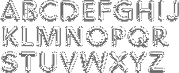
 Aka Kenz, b. 1996. Studio in Singapore, specializing in display fonts. Their work is characterized by the frequent use of special ligatures. In 2020, 177 studio published the handcrafted typefaces Yambag, Good Things Script, Acmedia, Apollo, Autolinker, Medio, Qubely, Rigel Star, The Wave (wavy, zebra-striped), Tornado Night Party, Unique, Bqtrack-Script, Generating-Script, Hotel-Script, Sangi-Serif, Themify-Brush (a dry brush script), Extra Serif, Rhythm Script, Blogger 1983 Brush (dry brush), Bambi (monoline script), Staples Calligraphy, Bimber Brush (dry brush), Stthomas Script, Quotes (a dry brush font), Raghen (a monoline script) and Royal (a brush font). Other typefaces from 2020: Queens Gambit, Fashionable, Allright, Abnes, Ocean Wave (textured), Nuvel (textured caps), Okemo (a decorative serif), Omegle, High Speed, Kingsley, Medio Vintage (heavy caps), Karen, Amigh, Paint Drops, The Barista, Rainy Day.


 [
[ Acmé-Paris is a design studio in Paris run by Élodie Mandray and Caroline Aufort. Creators of New Gothic Textura (2009), Canevas (2010-2012, stitching font), Acme (2013), Tropique (2011, experimental), Minuscule (2012), Tribute (2012, children's hand), Juicy (2010), Eclipse, Thésard, the music-inspired Swing (2010), the heavy monoline sans typeface
  Famous type designer born in 1928 in Unterseen, Switzerland, who died in September 2015. He closely cooperated with Linotype-Hell AG, after having been artistic director at Deberny-Peignot in Paris since 1952. He established his own studio in 1962 with André Gürtler and Bruno Pfaftli. Art director for Editions Hermann, Paris 1957 to 1967. Frutiger lived near Bern, Switzerland, and was very interested in woodcuts. In 2009, Heidrun Osterer and Philipp Stamm coedited
  Italian designer, 1920-1995, who designed most of his typefaces at Nebiolo in Turin. Until 1975, he made about 30 families at Nebiolo, and after 1975, he produced about 70 further families of fonts. With weights included, he created about 300 fonts.
  Italian designer and teacher (b. Turin, 1893, d. Turin, 1959), who spent most of his life designing type at Nebiolo, where he was also art director. He headed Studio Artistico della Nebiolo from 1936-1952.
  Alessandro Colizzi (b. Rome, 1966) is associate professor at Milan's Politecnico, Department of Design, where he teaches graphic design history, typography, and type design. He was professor at the Ecole de design of UQAM (Montreal) from 2005 to 2019, and visiting professor at the Design Academy Eindhoven (2014/15). He holds a PhD from the University of Leiden (with a thesis on Bruno Minari), an MA in Type Design from The Hague's
  Moscow-based artist who created these typefaces in 2016: Buena Onda, Londa (a connected script), Foie Gras (signage script), Fuego, Cama (a thick connected script), Blackthorn,
  [
[ Russian creator of the free chess font
  [
[ [
[ Type designer. Not to be confused with "Walden Font", a commercial foundry run by Oliver Weiss.
  Indonesian designer of the brush script
  Michael Doret is a commercial hand lettering artist in Hollywood, CA, but
  Located in Recife, Brazil, Ana Elisa Ribeiro, a student at UFPE, created
  Andre Toet Design (and before that,
  [
[ [
[ Brazilian creator in Sao Paulo (b. 1989) of
  Andy Clymer grew up in Irvine, CA and studied at San Diego State University in 1998. At that time, he was working on
  Angelica Baini was born in Castiglion Fiorentino, Italy in 1990. During her studies at the New World School of the Arts in Miami, FL, she designed the blackletter typeface
  [
[ Måns Grebäck (Aring Typeface, Örebro, Sweden) is a prolific Swedish designer (b. Lindesberg, Sweden, 1990), who lives in Borlänge, Sweden. Måns Grebäck has a bachelor's degree in graphic design from the University of Dalarna (2012). In 2010, he went commercial, and started selling fonts through
  Bekasi, Indonesia-based designer of the script typefaces
  [
[ Studio in London. In 2016, they designed these typefaces: Opal, Emery Sans, Nova Display, Chopsticks (asian look), Holiday, Game Over (squarish), Pumpkin (Halloween font), Neons Display, Styllo (art deco, fashionable), Lans Sans Serif, Greenvine, Unfinished, Indigo Handcrafted (calligraphic blackletter), Audovera (techno; organic sans).
  George Triantafyllakos was born in Thessaloniki, Greece, in 1980. In 2004, he was a PhD student, Department of Informatics, Aristotle University of Thessaloniki. Founder, with Manolis Pratsinakis, of Backpacker, where one can find free Latin and Greek typefaces: BPLatinNumerals, BPbigHead, BPchildLefty, BPchildFatty, BPchubby, BPchubbyFat, BPdots, BPilialena, BPletterSquares, BPletterSquaresWide, BPmolecules, BPmouse, BPmyhand, BPneon [paperclip face], BPpong [light stencil face], BPsquareHand, BPtall, BP PhD Sans, BP PhD Italic, BP PhD Mono, BP Inktrap, BP Script. These include quite a few handwriting typefaces. Commercial handwriting fonts at
  Designer in 2018 of the script typefaces Lovely (a retro monoline script), Ellisa (font duo), Jolly, Unleash, Dawn and Edmonton, the art deco typeface Empire, the display font duo Wild One, the fashion mag typefaces Lucky and Vienna, the curly serif Erica, the display typeface Abigail, the layerable shadow typeface Peachy, and the sans typefaces Super Basic, Neon, Lumina (Peignotian), Jolly Sans, Unleash Sans, and Tropicana.
  [
[ Foundry created in 2006 by Virginia Beach, VA-based
 Stuttgart-based foundry
  Foundry in Canada, est. 2004 by Rebecca Alaccari in Toronto, and run by her and Patrick Griffin.
  Born in Logroño, Spain, Carlos studied graphic design at ESDIR (Escuela Superior de Diseño de La Rioja), and type design in the Advanced Typography Master class of the Universidad Autónoma de Barcelona (EINA). He was first based in Barcelona, but currently works out of London.
  [
[ [
[ Creative Director for Interbrand Australia. For Melbourne Theatre Company (MTC) he created
  Danish designer (b. 1991), aka CMunk, who used
  [
[ Constellation is a creator and publisher of contemporary typefaces and is run by its two partners, Chester Jenkins (based in New York, born in Montreal) and Tracy Jenkins. They also feature typefaces by Magnus Rakeng, Patrick Giasson, Kris Sowersby, Rick Valicenti, and Jeremy Mickel. Constellation contains the main elements of the previous Village and Thirstype foundries. Typefaces including
  Free fonts by Swedish designer
  Graduate from Cal Arts (1996), who runs
  [
[ [
[ Salzburg, Austria-based creator of these typefaces:
  British lettering artist based in Exeter who specializes in the medieval versal cadel (or cadeau) letter. He created these typefaces:
  Calling himself a design tourist, German designer
  Yogyakarta, Indonesia-based designer (b. 1990) of these script typefaces in 2018: Radicalis (script), Blacktail (layered, spurred, Western), Aniyah (formal calligraphic script),
  [
[ [
[ Brooklyn, NY-based creator (b. 1989) of the ornamental caps typeface
  Graphic designer in Buenos Aires who created the neon light typeface Casanova, the gothic typeface Lady Monster (2014), and the vintage teardrop typeface Parisien (sic) Hooker in 2014. [
 [
[ [
[ Helsinki, Finland-based Erik Bertell graduated from Lahti Institute of Design. His fonts include Neon, Mama and Mama Round. Born in Helsinki in 1980, Erik was at first a type designer for
  [
[ Designer of HandDrawn Cute Funky (2016), Glitch (2016), Glossy Golden Metal (2016), Black Newspaper Letters (2016), Colorful Newspaper Letters (2016, ransom note font), Isometry (2016), Hand-Drawn Dirty Ink Font (2015), Lighting Bulb Pixel (2015) and Retro Type Grunge Font (2015). In 2016, he published Bright Red Neon Letters, Bright Realistic Neon Letters (vector format), Decorative Red Font (EPS format) and Transparent Letters With Long Shadow (vector format).
 Flashfonts is
  Japanese site with original fonts by Kato Masashi (b. 1973), who lives in Takasaki (Gunma prefecture, Japan): Parismatch (2004), SAKUalp (2000, handwriting), Steeltype, Broadband, Hivision, Cinematime, Ultracomic, Ice Cream, Be Happy, Summer Beauty, Flyermix, Cheerscript, Breakstyle, Breakfont, Round, H-Five, Natsucomi, Long Vacation, Lovers, Breakfont (2003, graffiti style), Pokkaman, BeHappy, Natsucomi, Momolcan, Seasons Dings, Electron, Round, Lovers, FlyerMix (fifties style), CheerScript (comic book style), Hi-Five (pixel font), Summer Beauty, SummerDrive, White Day, Long Vacation, Amayadori (high contrast kana font), Fuyucomi, Icecream, Pickett, 321, Pingpong, Frontline, Ginza, Yago (nice free dings), Polaris, 321eng, 321kana, APPLE, CLIQUE, Clover (kitchen tile font, 1998), DIGI, Eneneng, Enenhira, FDalp, FDwhie, Hnoodle,
 During his studies, Schaffhausen, Switzerland-based Fabian Korn (b. Zurich) designed the
  [
[ Russian language site with an archive (specializing in calligraphic and display scripts), some original fonts by Ivan Zeifert of Ivan Zeifert Works, tens of free fonts by Alexandra Gophmann, and links to free and commercial font sites. Commercial scripts nearly all by Zeifert, and nearly all are cyrillicized versions of Latin typefaces. Free scripts: Cansellarist (2003, Ivan Zeifert, cyrillicized version of Cancellaresca Script Plain), ChampagneCyrillic (2005), Copyist (2004, Ivan Zeifert), Drakkar (2004),
  [
[ [
[ Graphic designer in Caracas, Venezuela, who designed the stylish neon stencil typeface Neon (2016). [
 [
[ [
[ [
[ Harold Lohner was born in upstate New York in 1958. He received an MFA in printmaking from the University at Albany and is Professor of Visual Arts at Sage College of Albany. He began making fonts in 1997 and starting distributing them the next year through Harold's Fonts. He lives in Albany, NY, with his partner, Al Martino. Originally, most of his typefaces were freeware or shareware, but gradually, he started selling most on his site or via
  [
[ [
[ Banten or Serang, Indonesia-based designer (b. 1985) of Brookline (2020: sans), Hardome (2020: script), Sketsa Ramadhan (2020: Arabic emulation), Hoffermond (2020: script), Harvey Script (2020: monoline),
  British foundry started in 2009 in Sheffield, but now located in Dronfield. Their fonts include
  Identikal is a UK foundry run by identical twins
  Denpasar, Bali-based designer, b. 1989, of Love Santa (2019), Candy (2019), Hello Kids (2019), Round Light (2019:
  [
[ [
[ This is a
  Art deco is another style that appeals to Jeff Levine. He has created some beauties:
  [
[ Cali, Colombia-based creator of the dot matrix font
  [
[ Lyon, France-based designer (b. 1977) of these typefaces:
  Quezon City or Kyusi (Philippines)-based designer of revivals and opportunistic typefaces, who is quite active on newsgroups like alt.binaries.fonts. His production is impressive:
  Roman Korolev (Kaer, Vologda, Russia) designed the wood stick brush typeface WoodStick in 2016.
  [
[ Commercial typeface foundry in Jakarta, Indonesia, run by "Ian" and "Abdilah". Its first typeface is Muffler (2014), which is inspired by retro brush signage for car races. Lacydes (2014) is a spurred advertizing typeface. Upjohn (2014) is a horror movie poster typeface. Curely (2014) is a
  [
[ [
[ Leftloft is a visual communications studio in Milan, founded in 1997 by graphic designer Andrea Braccaloni (b. Bologna, 1973), Francesco Cavalli, Bruno Genovese and David Pasquali. The studio is mainly engaged in corporate identity, and now also has an office in New York. Andrea Braccaloni teaches visual communication at the III Faculty of Architecture/Design at the Politecnico di Milano. At
  [
[ Bandung, Indonesia-based designer (b. 1982) of Masura (2016, brush style), Space Cake (2016, sci-fi style), Caroline Script (2016), Morning Fever (2016), Binzo (2016), Morning Cloud (2016, handcrafted), Rancha (2016: grungy style), Alkhali (2016), Gath Is A Robot (2015) and Scarlet (2015, textured typeface).
  Yogyakarta, Indonesia-based designer (b. 1994) who started out as
  LGF fonts is the foundry of Manuel Lage Novo, a Galician type designer in La Coruña, b. 1970. He inherited the Richard Gans collection.
  [
[ Lori LeBeau-Walsh (
 [
[ [
[ Odessa (was: Donetsk), Ukraine-based designer of these fonts in 2018: Monte Karlo, Monblank, Manchester, Gabrielle (upright script), California, Casablanca (script and sans duo), Fabiano (rounded sans).
  Mahameru Type is Haidi Shabrina (b. 1992) and/or Nasir Udin, depending upon where you look. Semarang and Bali, Indonesia-based designer of the brush typeface Faito (2017), Faito Rough (2017), the creamy brush script typeface Shabrina (2017) that was inspired by vintage chocolate biscuit packaging. He or she also made Discobaby (2017, a great connected marker pen script), Parisien Night (2017), Sweet November (2017: script), The Flowery Spring (2017, curly script), Nandito (2017: handcrafted), and Ayanna (2017: watercolor brush).
  [
[ [
[ [
[ Mark White (Bournemouth, UK) designed the
  [
[ Born in Gothenburg, Sweden, in 1970, Martin Lexelius (aka Core, aka
  Munich-based designer who created the neon light / paperclip font
  [
[ Graphics cooperative in Philadelphia that sells some fonts. These include:
  [
[
 [
[ [
[ Designer of Transt (2015: 3d lettering), Blue Neon 3D (2015), Blue Neon 2 3D (2015) and Yellow Neon 3D (2015). Grunge Wood (2015), Stone (2015) and Wood (2015) are rough-looking typefaces with 3d effects. All pre 2016 fonts are in vector or PNG format.
  [
[ Matei Nichitescu (Monogram Design, Romania, and now Tønsberg, Norway) created these typefaces in 2014: Dendricula (connect-the-dots), Piper, Typewriter, Thinster, Monogram, Neon, Revolution, Printed Revolution, Halftone Revolution. In 2015, he added Designer, Chalk Bar and the handcrafted typefaces Manufactura (ultra tall) and Olive Oil. [
 Bali-based designer who used to run Mahameru Type. As Nasir Udin, his typefaces include
  Cardiff, Wales-based illustrator and designer. In 2015, he created the trilined typeface Tokyo, which was influenced by the kanji neon sign of that metropolis.
  FontStructor who made many fonts, including the unicase typeface
 [
[ [
[ [
[ [
[ [
[ [
[ Typefaces made by Nick Curtis from 2004, not listed elsewhere on these pages. Bayern Handschrift, De Rigueur NF, Refugio Rustic WBW, Refugio Refined WBW, Ponte Vecchio NF, Brazzaville NF (based on Congo, a 1910 font by Barnhart Brothers \& Spindler),
  Typefaces made by Nick Curtis from 2005, not listed elsewhere on these pages.
  Typefaces made by Nick Curtis from 2006, not listed elsewhere on these pages:
  Typefaces made by Nick Curtis from 2007, not listed elsewhere on these pages:
  Typefaces made by Nick Curtis from 2009, not listed elsewhere on these pages:
  Typefaces made by Nick Curtis from 2010, not listed elsewhere on these pages.
  Typefaces made by Nick Curtis from 2011, not listed elsewhere on these pages:
  Noem9 Studio is an online studio created by Jose A. Garrido, a graphic designer who was born in Alcañiz, Teruel, Spain, in 1987, and lived in Zaragoza. Noem9 is currently based in London.
  Ukrainian graphic and type designer who lives in Kiev.
  Viennese type designer (aka olewood), illustrator and graphic designer who cooperates at Typisch Beton.
  Fonts designed by talented Swedish designer Franko Luin (born in Trieste, Italy in 1941, to Slovenian parents). Luin immigrated to Sweden in 1961. After studying at the Grafiska Institutet during the 1960s, Franko Luin spent two decades as a print designer for Ericsson before becoming independent. In the 1990s he was involved in multimedia and typeface design. In 1996, he founded his own typographic studio, Omnibus Typografi. At some point, he led a course in Web Typography at the Berghs School of Communication in Stockholm. Franko Luin passed away on September 15, 2005, in Tyresö, Sweden.
  Kentucky-based designer of great script, poster and hand-drawn typefaces that are sold via Creative Market. Typefaces from 2014 include Violet Simple, Bren, Keke, Starburst, Stilt, Hadley Script, Gracyn, Heather Small Caps, Eloise, Porter, Milly, Sweetheart, Angelika, Elliot, Praline, Joplin, Rachel, Briar Rose, Emerson, Stanley, Sarah Jane, Alice, Waterbrush, Gypsy, London, Wonderland, Willow, Fink, Bluegrass, Amy Regular & Expanded, Canteen, Oliver, Oliver Light, Oliver Extra Light, Yard Sale, Carry On, Adventure, Loxley, Everly, Werd, Trudy, Farmers Market, Ashlyn, Laurel, Free Spirit, Swan, Layla, Luck - Serif & Sans Serif, Savanna, Indigo, Jaden, Ella.
  Type designer at Canada Type.
  Super-talented Montreal-based illustrator and digital artist.
  [
[ Fine Arts graduate from UCLM (University of Castilla-La Mancha) in Spain, who works as a graphic designer in Cuenca, where he set up the Pisto Casero commercial type foundry in 2013, after a period of free font production. He worked at
  Alexey Popov, or Alex Pop for short (Popskraft Lab, Buchardo, Argentina, and now New York City) designed the children's book / cartoon font family
  Q-BO is the foundry of
  Raihan Nizar (b. 1977) is the Indonesian
  [
[ [
[ Creator of the hand-printed outline font
  Parisian graphic designer and motion type artist, currently based in London. o-founded the Motion Design Studio Panoply in 2015 where he worked for Nike, Louis Vuitton and others.
  [
[ American designer in New York associated with ITC, d. 2015. Creator of these typefaces:
  Kazincbarcika, Hungary-based type designer Roland Hüse (b. 1980) sells his fonts through My Handwritings (Kazincbarcika, Hungary), which was renamed Runes&Fonts. His first font is
  Bing F. Aldiansyah (Hey Bing Type Foundry or Heybing Supply Co, Bandung, Indonesia; b. 1988, Bandung) designed the sans titling typeface Confession (2015, +Serif), the retro brush script Anastasia (2015), the brush signage script Northshire Script (2015, with ink splatters), Glorious Sunday (2015, brush script), Hepburns Type (2015), the retro font Violina (2015), the blackletter typeface The Mariam Story (2015), the pure Victoriana fonts Burton Slab (2015, Tuscan) and Briliants (2015), Hours (2015), the poster typeface Brawls (2015), the Victorian typefaces Dacota (2015, a great layered vintage circus font, with dingbats) and Aseina (2015), the brush scripts Washington (2015) and Hazelnut (2015), the Victorian typefaces Hours (2015) and Warden (2015), the spurred Victorian typefaces Riotic (2015) and Harsh (2015), and the vampire type Furach (2015).
  Creator of the
  [
[ Aliv Pandu is a Yogyakarta, Indonesia-based designer.
  Malang, Indonesia-based designer of display typefaces, b. 1990. The catalog in 2022 showed these fonts: Neonisans (a neon font), Rafaiza (a swashy calligraphic script), Oulina (a formal script), Ramphal (a rhythmic script), Adara (a curly typeface), Beauty Angelin (an upright script). [
 SignDNA is run by Dave Simpson (Winters, CA). Commercial sign and display fonts, including many scripts, often by Dave Simpson himself. Other designers:
  London-based creator of the
  Metal font foundry in Prescott, AZ (was: Kampsville, IL), est. 2004. Run by Schuyler (Sky) Shipley, b. 1954. Shipley collects, restores and operates antique presses. He has been involved with type and letterpress printing since 1962. Check also
  Dover Press sold Oakland's
  [
[ Stolat Studio is a Warsaw-based creative agency founded by Michal Janica, Igor Kubik and Ania WielunDska. Irt specializes in branding, communication design, strategy and typography. Type designer Anna Wielunska (b. 1992) is based in Warsaw, and studied at the Warsaw Academy of Fine Arts. She created Musso (2016), a remarkable brushy vernacular script typeface that is loaded with alternates to emulate real handwriting. Since about 2010, there has been an explosion of brushy typefaces, but even in this crowded field, Musso stands out. Later in 2016, Ania Wielunska and Mateusz Machalski co-designed the weathered typeface family
  Norwegian type designer, b. 1991, who graduated from Westerdals School of Art in Oslo in 2015 and ECAL in 2017. At ECAL in Lausanne, he finished an MA in Art Direction and completed an exhaustive comparative study of the Geometric Sans genre. He joined
  [
[ Mehmet Abaci (b. 1978) is based in Istanbul. In 2014, he established Studio Typo, where one can buy his typefaces. Limited forms of the fonts can be downloaded fpr free from the Dafont site.
  [
[ During his studies at the
 TGIF STD stands for Thanks God I'm Fontmaker Studio. Located in Bandung, Indonesia, this commercial type foundry produced these typefaces in 2016: Sigismund No. 7, Eugiene (monoline script), Aiden, Hodor (inspired by the character Hodor from Game of Thrones), Bengrraas (monoline ans), New Autumn (soft hand-printed), The Arms Race (bilined), Brushcheetah (brush script), Eugiene (poster typeface), Landon (deco), Camille (signage script), Neorah (neon style), December Script, Companion (spurred Victorian style), Boullevard (sic), Adeft (brush face), Vignette Script (calligraphic), Mewton, Castle John (Victorian), Pixelo, Desmodo, Elliot (fun script), Montour (geometric slab serif), Aiden (handcrafted slab serif), Madison (Victorian).
  The Fontry is a Watts, OK, based outfit, est. 1992 by
  [
[ Lars Bergquist is the Swedish type designer (b. 1936) who runs Timberwolf Type in Sollentuna, just outside Stockholm. Bergquist designed numerous successful text families and display typefaces, including the free
  Type designer Thomas Paul Carnase was born in The Bronx, New York City in 1939. He graduated from New York City Community College in 1959. Carnase started making fonts in the photolettering era, and lived through the transition to digital. In the 1960s, he opens the studio Bonder & Carnase Inc. From 1969 until 1979, he is vice-president and partner of the agency Lubalin, Smith, Carnase Inc. In 1979, he founds the Carnase Computer Typography studio. In 1980, Carnase becomes co-founder and president of the World Typeface Center Inc., an independent type design agency. He manages the in-house magazine Ligature published by the World Typeface Center from 1982 to 1987. Besides type design, Carnase has designed graphics for packaging, exhibitions, corporate identities and logos for numerous clients, including ABC, CBS, Coca-Cola, CondéNast Publications, Doubleday Publishing and NBC. He has held teaching positions at the University of Cincinnati in Ohio, the Pratt Institute in New York, the Herron School of Art in Indiana, the Parson's School of Design in New York, the Cleveland Institute of Art in Ohio, the University of Monterrey in Mexico, and the Rochester Institute of Technology in New York, among others.
  [
[ Bilbao-based designer of the experimental typeface
  Tal Leming is a graphic designer, type designer and letterer who lived in Wilmington, DE, but moved his stakes to Baltimore, MD. He graduated from Louisiana State University in 1997. As a Python scripting guru, he worked with Letterror and House Industries on projects using FontLab and Robofab. An avid RoboFog scripter, he joined Erik van Blokland and Just van Rossum to initiate the
 Ray Larabie (b. 1970, Ottawa, Canada) ran Typodermic in Mississauga, ON, which opened in the Fall of 2001. In 2006, it moved to Vancouver, BC, and in 2009 it moved on to Nagoya, Japan.
  Berlin-based

 Regular workshops held by Velvetyne Type Foundry at
  Graphic designer in Burgos, Spain. Creator of the industrial sans typeface Industria (2014), which is a wide geometric grotesk with an extra-large x-height.
  Designer from Kiev, Ukraine.
  Freelance graphic designer in Berlin, b. 1977. In 2005, he graduated from the Design Akademie Berlin with a thesis entitled Type Attack. His typefaces:
  Aka P. Rudakov and Pasha Korzhenko, and operating as Vintage Voyage Design. Perm, Russia-based designer of the vintage handcrafted typefaces West End (2015, spurred Western typeface family), Winter Holidays (2015), The Sugar Cane (2015, eroded signage script), Montana (2015), Canyons (2015), Forest Tramp (2015), Heart of Gold (2015, a think inky brush), La Fa Salt (2015, a connected monoline script), Robinson (2015, handcrafted), Rise (2015, rough brush), Stout (2015, +Stout Roughen), Jack's Guitar (2015) and Bough (2015).
  Belgrade, Serbia-based designer (b. 1981) of these typefaces:
  It is unclear whether Wacaksara is run by Hamam Jauhari. Batang, Indonesia-based designer of the brush script typefaces
  Weknow is the foundry of Indonesian type designer Wino Sutarmin Kadir (b. 1979), who is based in Bogor, Jakarta. Weknow produced a large collection of free fonts from 2009 until 2012. He started making commercial fonts in 2012.
  Wells, Somerset, England-based designer of the condensed sans typeface
  [
[ Graphic designer
  French graphic designer who lives and works in Montreal. He created
  Max Infeld (b. 1981, aka Xerographer Fonts) from Chico, CA, makes free fonts and offers a free font-making service. He surged onto the font scene in 2012, and is currently located in Ojai, CA.
  Seoul, Korea-based creator (b. 1985) of the modular Hangul typeface Black (2015). Substyles include Neon, Stripe and Meltdown. In 2016, they developed the squarish Hangul typefaces BOM and First Black, as well as Zesstype Grafika (
 Graphic designer in Warsaw, Poland. During her graphic design studies at Poznan Fine Arts University, she created the brush script typeface