| | |
4th February
[Sergiy Tkachenko]

|
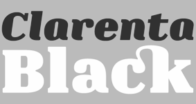 Sergiy Tkachenko (b. 1979, Khrystynivka, Cherkasy region, Ukraine) lives in Kremenchuk, Ukraine, and has been a prolific type designer since 2008. Sergiy graduated from Kremenchuk State Polytechnic University in computer systems and networks in 2007. Various other URLs: Microsoft link, Identifont, 4th February, Behance, Klingspor link, Revision Ru, Russian creators, CPLUV Fontspace, Twitter. Kernest link. Sergey Tkachenko's typefaces:
 - 2008: the techno typefaces Bladi One 4F, Bladi One Slab 4F, Bladi Two 4F, Abia Wide 4F Thin.
- 2009: Wrongo 4F, Zantiqa (an über-serif), Serifiqo (a (free) thin didone fashion mag display face), Codename Coder 4F (monospace programming font), Droporado 4F (using circles only), Tovstun (futuristic, ultra-fat and rounded), Perfocard 4F, Modularico (five modular typefaces based on a logo from Master Kremenchug a company for which Sergiy worked for 4 years), Boldesqo Serif 4F (a splendid informal fat didone, now with Greek support), Tkachenko Sketch, Unicase Slab (a techno slab), Laftatic, Logofontik 4F (techno), PC.DE Stencil (+Italic; custom stencil font), Stenciliqo 4F, Tiap Liap 4F (handwriting), Nut Kit 4F, Rezzzistor 4F, the inline modular face Grand Hotel, and Bijou 4F.
- 2010: Roboo 4F (a bubblegum typeface family), PädIn (a custom typeface for Pädagogische Initiative e.V.: rounded fat informal face), Fat Quad (in the fatty trend), Veselka (a free multiline face), Smeshariki Black (+ Gleams: a bubble gum font made for an animation company), Republica 4F (a fat family), Rodeqa Slab 4F, ComFi (semi-octagonal), Grotesqa 4F, Nowy Geroy 4F, Fabryka 4F (a monospaced typewriter family), Placarto4F-Italic (an ultra fat art deco), Lavina 4F (a hairline sans with lachrymal terminals).
- 2011: Squartica (octagonal), Decomart (free), Model 4F Unicase (a unicase fat didone released in 2013 only), Fontatigo 4F, Kylie 4F (bilined and geometric), Waldemar 4F (a large didone style fat typeface family), Dinesqo (2011, a monoline sans of utter simplicity), Qargotesk (+Cyrillic) [images: i, ii, iii, iv], Neultica 4F (black unicase family), Squartiqa 4F (2011, constructivist), Clarenta 4F Black (after Clarendon---a great family), Designosaur (free sans), Perfopunto (based on perforated circles and squares), OlaScript 4F, Bayadera 4F (a tamed upright monoline script), Febrotesk4FUnicase (squarish unicase family).
- 2012: Targo 4F (rounded typeface with stencil and non-stencil styles), Myra (free font), Myra 4F Caps (free), Cedra (wide monolined sans face), Fontatica 4F (rounded techno grotesk), Akzentica 4F, Ukraintica 4F Wide (a monoline wide-bowled sans family), Laventa 4F, Sports World (free athletic lettering font), Web Serveroff (free computer geek font), Octin Spraypaint Cyrillic (a rough stencil done exclusively for Ninja Theory).
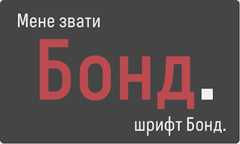 2013: Condesqa (modular sans), Esqadero (an uncomplicated monoline sans), Vanyla 4F Unicase (monoline), Esqadero FF CY (a free wide sans, Cyrillic), Bond (a confident no-frills sans), Attentica (free sans font for Latin and Cyrillic), Cedra 4F Wide Thin. 2013: Condesqa (modular sans), Esqadero (an uncomplicated monoline sans), Vanyla 4F Unicase (monoline), Esqadero FF CY (a free wide sans, Cyrillic), Bond (a confident no-frills sans), Attentica (free sans font for Latin and Cyrillic), Cedra 4F Wide Thin. - Cyrillizations: several typefaces such as Lavoisier (by Alec Julien), Budmo Jiggler (Ray Larabie) and JoAnne Display (Sandy Cerovich), Gnuolane (of a Ray Larabie font), Paranoid Cyrillic (based on Kevin Lo's Paranoid), Movavi Grotesque Black (+Cyrillic; image; numerals), Azoft Sans (made for Azoft, and free here and here).
- Custom fonts: Blue Pill, Sansus Webissimo (since 2011 free at Open Font Library), Minaeff ECT (2011, a free legible family for Latin and Cyrillic, custom-made for and downloadable from WebhostingRating.com), Webhostinggeeks.Com (2011), Web Serveroff, OnlinePharmacyCheck.Com (2011), 1800Flowers.com (2011), DesignStudio.com (2011, free), ArchyStudio.Com (2011, free download, Movavi Grotesque (2011, free), Azoft Sans, PÄd In, Smeshariki, Fat Cow (2010: free condensed sans), ComFi (2010, free), PC.de (2009: free techno family, including a stencil face), League Gothic (2009-2011, The League of Movable Type) Cyrillic, Paranoid Cyrillic, 28 Days Later Cyrillic, Acid Label Cyrillic, Dead Secretary Cyrillic, Rezland Cyrillic, Sweet Leaf Cyrillic, Droid Cyrillic, Jo Anne Display Cyrillic, Gnuolane Free Cyrillic, Bosox Cyrillic, Budmo Jiggler Cyrillic.
- Typefaces from 2014: Laqonic 4F (unicase sans), Cubynets 4F, Blogger Sans (free rounded organic sans), Boncegro (free Western typeface, briefly called Vaquero before a name change), Motor 4F (based on Russian car license plates), Monitorica (a futuristic typeface made for ipHostMonitor.com, free at OFL), Areqo (condensed titling sans), Architect's Daughter Cyrillic (architectural lettering), GetVoIP Grotesque (a free typeface commissioned by GetVoIP), Meeneralca (unicase sans inspired by the logo of the mineral water Borjomi from Georgia), Glasoor (free oil spill or jelly bean font), Robotesqa.
- Typefaces from 2015: Croogla (a circle-based informal sans), Blackentina 4F (free ultra-black squarish typeface), Dart 4F (neo-grotesque), Kent 4F (a layered family for letterpress emulation).
- Typefaces from 2016: Brent 4F (original design going back to 2013), a custom typeface for the labels used in the Ukrainian Armed Forces, Economica Cyrillic Pro (with Vicente Lamonaca).
- Typefaces from 2018: Indi Kazka 4F (Indic simulation).
Abstract Fonts link. Dafont link. Creative Market link. Behance link. Hellofont link. Open Font Library link. View Sergiy Tkachenko's fonts. [Google]
[MyFonts]
[More] ⦿
|
7GUN
|
Design site in Moscow. Creators of the geometric figure (Latin) stencil typeface Caribe Modular (2013), which was created as a project for the British Higher School of Art & Design. Intrnal Hybrid (2013) was also completed at the British Higher School of Art & Design in Moscow. Deriz (2013) is a high-contrast didone titling face. Intrnal Hybrid (2013) is a grungy techno Cyrillic typeface. Vintage and Coupage Font emulates various wood type and letterpress styles. [Google]
[More] ⦿
|
A2 Graphics--SW--HK
[Scott Williams]
|
Scott Willimas is the cofounder (with Henrik Kubel) of A2. Before that, it was called A2 Graphics/SW/HK, a London based design bureau founded in 1999 by Scott Williams and Henrik Kubel. At A2, he designed the elliptical typeface family Cubbit, as well as the pixel typeface game Over and Eyeslies. Williams and Kubel co-designed AF-Klampenborg (1997-1999) and FY-Brush Script Regular. In 2014, Scott Williams and Henrik Kubel (A2 Type) co-designed A23D, a 3d-printed letterpress font. It was fabricated by model making specialists Chalk Studios. The font is presented by New North Press, which specializes in traditional letterpress printing. Adrian Harrison made a short film about the birth of the font, charting its progress from preliminary sketches to first inking and printing at New North Press. A23D won an award in the TDC 2015 Type Design competition. Klingspor link. [Google]
[More] ⦿
|
A2 Type
[Henrik Kubel]

|
 A2-Type (or simply, A2) is a type foundry set up in the autumn of 2010 by the London based design studio A2/SW/HK. The designers are Henrik Kubel and Scott Williams. A2's bespoke type design is mainly the responsibility of Henrik Kubel, though every typeface is developed and approved by both partners. Kubel is self-taught, making his first typefaces while studying at Denmark's Design School from 1992 until 1997. Their typefaces:
 - 4590
- 60 Display.
- Amplify (2013) won an award at TDC 2014.
- Antwerp (2011). A readable text family designed by Kubel during an Expert Type Design Class in 2011 at Plantin Genootschap in Antwerp.
- A2 Archi (2005, Henrik Kubel): an octagonal face.
- A2 Aveny-T (2000, Henrik Kubel): Poster typeface commissioned as aprt of the identity of the Aveny-T theatre in Copenhagen.
- Agriculture.
- Archi.
- Banknote.
- A2 Battersea (1999, Henrik Kubel): inspired by Meta, DIN and Transport Alphabet. Followed in 2012 by Battersea Slab.
- Bauhouse.
- A2 Beckett (2008). A condensed sans family with the masculinity of Impact.
- Boing.
- Copenhagen
- A2 CPH Tram (2009, Henrik Kubel): revival of an odd mini-serifed type found on the exterior of Danish trams, ca. 1920.
- A2 CWM (2008, Henrik Kubel): constructivist type designed for the headlines and cover of Cold War Modern Design 1945-1970. Octagonal.
- Dane.
- A2 Danmark (2008, Henrik Kubel): a display stencil family.
- A2 Ergonomics (2011).
- Flavin Medium. A neon tube font.
- A2 Flowers (2005, Henrik Kubel): arrows, fists, flourishes, ornaments.
- A2 FM: slab serif family.
- Foundation (2018) in Sans (Number 44, Condensed, Wide), Serif, and Serif Didot subfamilies. These are all revivals of skeletal typefaces. Foundation Sans Number 44 was inspired by Circular Gothic No. 44 (1879, Charles E. Heyer, for the Great Western Type Foundry). Foundation Sans Condensed and Foundation Sans Wide are derived from two types described as Caractères pour Marques de Linge (typefaces for marking on linen) in the Signes section of the first volume of Spécimen Général des Fonderies Deberny et Peignot (ca. 1934). Foundation Serif is based on Caractère No. 7, another Caractère pour Marques de Linge in that 1934 Deberny & Peignot specimen book. Kubel's inspiration for Foundation Serif Didot was a sheet of lettering (dated 1939) he discovered in the archive of the influential Danish architect and graphic/industrial designer Gunnar Biilmann Petersen, 1897-1968.
- Grand. A stencil typeface.
- A2 Grot 10 (2009, Henrik Kubel): a take on the Grot Series by Stephenson Blake. Grot 12 followed in 2015.
- A2 Impacto (2005-2011, Henrik Kubel): Impact?
- A2 Klampenborg (1997, Henrik Kubel): industrial style sans.
- Kunstuff.
- London (2010).
- Magna.
- Maximum.
- A2 Mazarin (2017). A2 writes: Originally designed as a Garamond-inspired metal typeface by Robert Girard ca. 1921-1923, and published under the name Astrée by Deberny Peignot, the typeface was soon recut and renamed Mazarin by the English foundry Stephenson Blake in 1926. That single style original has now been expertly restored and reimagined as a contemporary typeface in multiple styles.
- Melissa Script (2010).
- A2 Monday (2003-2016, Henrik Kubel): based on 19th century English vernacular serif signage type.
- Moscow Sans (2014-2015). Award winning custom fonts and pictogram system for Moscow Metro. Art directed and designed by A2 (Scott Williams and Henrik Kubel) with Margaret Calvert as type and pictogram consultant. Cyrillic script designed in collaboration with Ilya Ruderman.
- Naive.
- New Grotesque Square series (2015). A newspaper typeface modeled after a Stephenson Blake typeface. Followed by New Grotesque Round in 2015-2016.
- New Rail Alphabet (2009). A refreshed and expanded version of Margaret Calvert's alphabet from the 1960s which saw nationwide use with British Rail, BAA, and the NHS. Developed in cooperation with Margaret Calvert.
- New Transport (with Margaret Calvert). A digital version of Transport, the Jock Kinnear and Margaret Calvert typeface for the British road signs. New Transport will be commercially released in September 2013.
- Register (2012-2017). A text typeface family inspired by French renaissance types.
- Regular (2012-2016). Think Futura in new clothes. Accompanied by Regular Slab.
- Sans, Slab and Serif typefaces for a redesign of The New York Times Magazine in 2015. The starting point for the Serif font is the Stephenson Blake Garamond-ish metal typeface Mazarin also known as Astrée from French foundry Deberny & Peignot. The slab fonts used for pull quotes and headlines are a continuation of the magazines existing Stymie font but in a condensed format. The sans fonts are linked to the industrial grotesque types, with metal type specimen versions of Futura and Akzidenz fonts as loose models for inspiration.
- Nosferato.
- Ole.
- Outsiders (+Outsiders Light and many other weights). A slab serif family.
- Parsons Green Medium.
- A2 Record Gothic (2019, Henrik Kubel), after Robert H. Middleton's American grotesk, Record Gothic (1027, Ludlow). Kubel writes: In celebration of Record Gothic's eclectic history, we designed four related but independent styles: Slab, Mono, Stencil and Outline.
- Square.
- Staton.
- Tagstyle.
- Test.
- Triumph.
- A2 Typewriter (2000, Henrik Kubel): based on Olivetti Typewriter 22.
- A2 Vogue Floral: a fashion mag modern display face in two styles.
- Vogue Paris. Granshan 09 Type Design Competition. 1st Prize, Display fonts.
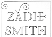
- A2 Zadie (2005, Henrik Kubel): inspired by Edwardian railings surrounding the Royal Army Military College in London. Used on the cover of the Zadie Smith bestseller On Beauty (2005, Penguin Press, NY). Granshan 10 Type Design Competition. 3rd Prize, Display fontt described as an ornamental blackboard bold type.
- In 2014, Scott Williams and Henrik Kubel (A2 Type) co-designed A23D, a 3d-printed letterpress font. It was fabricated by model making specialists Chalk Studios. The font is presented by New North Press, which specializes in traditional letterpress printing. Adrian Harrison made a short film about the birth of the font, charting its progress from preliminary sketches to first inking and printing at New North Press. A23D won an award in the TDC 2015 Type Design competition.
- English 1766 (2017). Kubel's take on Caslon.
- Regular (2017). A sans family inspired by Memphis, Karnak, Stymie and Futura.
- Schwiss (2018). Inspired by Akzidenz Grotesk and Helvetica.
Custom type by them include an alphabet for Qantas Airlines (2017), a masthead for Toronto Life (2010), a custom typeface for Banca Sella (2018), Qualcomm (2017), Arne Jacobsen (2018?), Evening Standard Newspaper (2018: 43 fonts), New York Times Magazine's Olympics issue (2018: a monowidth font for stacking), Eurosport Pyeongchang 2018, Weekendavisen (2007-2010), Design Museum London (2010), Faber&Faber (2009-2010), Afterall Publishing (2006-2010), Faulkner Browns Architects (2007), Penguin Press (2005), and Norrebro Bryghus (2005). At ATypI 2013 in Amsterdam, he spoke about New Transport. Winner of the type design prize at the Tokyo Type Directors Club TDC 2019, with Matt Willey, for the New York Times Magazine Olympic font. [Google]
[MyFonts]
[More] ⦿
|
Aatype
[Ahmet Altun]

|
 Turkish type designer in Izmir (b. 1964) who sells through MyFonts. Ahmet graduated from Hacettepe University in 1989. He founded the commercial type foundry Aatype.
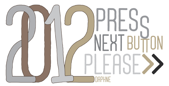
 In 2010, he created Dopamin (a high-contrast display sans), Square Comic, and Nilish (monoline geometric display sans). In 2011, Ahmet created the art deco chic family Turquoise, the techno sans family Altuna Sans, the semi-hand-printed Shirin, and the organic and elliptical monoline sans family Deria Sans. Sterk (2011) is a legible and open masculine sans family. Glode (2011) is a masculine geometric sans family. Calligra (2011) is an elegant almost calligraphic flared sans. Ephesus (+Shadow) is a caps-only titling sans family. Tillom (2011) is an elegant decorative face. Ondule (2011) is a horizontally-striped texture face. Brounde (2011) is a rounded monoline slab family. Eggy (2011) is a monoline sans display typeface with slightly shaky outlines. Uno (2011) is an organic display face. The display sans Veberk (2011) has contrast and style. Typefaces made in 2012: Halis Grotesque, Uneven (a bold poster typeface family), Ferforje (curly all caps face), Daphne (a hand-drawn all caps poster family), Mancho (a stylish caps only sans family), Cillop (elliptical sans), Typonil (elliptical sans), Omar (squarish poster font), Gulyesa Script (a beautiful informally hand-printed poster typeface), Smyrna (hand-printed poster face). Typefaces from 2013: Minik (a great hand-drawn typeface with tall ascenders and descenders), Festivo Letters (a popular hand-made layered font system with 19 fonts numbered No1 through No19; see also Festivo LC, 2014, which has new sketches, shadows and ornaments), Halis Rounded, Troia (a flexible sans family). Typefaces from 2014: Harman (a 7-style hand-drawn collection of retro poster fonts), Akon (hand-drawn poster family), Minimo (a geometric organic minimalist sans family in four weights). Typefaces from 2015: Racon (weathered type, perhaps letterpress emulation), Masif (heavy brush script renamed Pitos after 24 hours, most likely after a complaint from Monotype which markets a Steve Matteson font called Massif---Ahmet should have ignored that request as Monotype itself ignored Jean Joveneaux, who created another font called Massif in 1957, decades before Matteson's font), Deepika (swashy script), Tropen. Typefaces from 2017: Buket (an 18-font collection including Marquee, Roman Shiny, Fat Sketch, Script, Decorative Shiny, Basic Retro, and Prismatic). Typefaces from 2018: Narin. A geometric sans family with rounded corners. Typefaces from 2019: Revello (hand-painted and layered), Festivo Clean, Salve (a monoline script), Urfa (an 18-style sans family). Typefaces from 2020: Izmir (a 44-style geometric sans family), Grand Sword (a decorative all caps typeface). Typefaces from 2021: Urfa Rounded (an 18-style rounded elliptical sans). Typefaces from 2022: Sarmal (a great handlettered interlocking poster typeface), Punkto (an 18-style geometric sans). View Ahmed Altun's typefaces. [Google]
[MyFonts]
[More] ⦿
|
Adam Ladd
[Adam McIntyre]

|
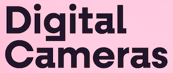 Graphic designer in Cincinnati, OH. FontStructor, who made the octagonal typeface Ladd Block (2011). MyFonts link. His commercial typefaces include Cut Block (2012: white-on-black sketched letters), Tape Back (2012), Inked Balterm (2011, a monoline hand-drawn sans with ball terminals added in) and Inked Classic (2011, blackboard bold).
 Free typefaces from 2015: Poster Cut, Poster Line. Poster Cut Neue followed in 2021. Typefaces from 2016: Oilvare (an 18-style layered font family), Cheddar Gothic (handcrafted letterpress emulation family; followed in 2018 by Cheddar Gothic Rough). Typefaces from 2017: Neato Serif (followed in 2018 by Neato Serif Rough), Highest Praise (brush script), Citrus Gothic, Bakerie (42 hand-drawn typefaces), Trailmade, Farmhand (Farmhand is a textured, hand drawn, condensed font family featuring serif, sans, inline, italic, and extras styles suited for display titling), Garlic Salt, Likely (brush script), Likely Sans, Active (an upright brush script). Typefaces from 2018: Config (a condensed geometric sans; see also Config Condensed and Config Ultra in 2019), Config Rounded, Quiche (in Text, Display, Fine and Stencil substyles, for a total of 52 ball terminal-themed fonts), Quiche Sans (Peignotian), Cheddar Gothic Sans Two, Botany, Braisetto (connected signature font). Typefaces from 2019: Skie (a big gothic sans family with low contrast, small x-height and tall ascenders), Quiche Flare, Magdelin (a 40-style gothic sans), Fractul (a geometric sans characterized by its dramatic squarish "a"), Gopher (a reverse contrast family), Konnect (a geometric sans family). Typefaces from 2020: Lufga (an 18-style low-contrast sans with large x-height and short ascenders and descenders), Gopher Mono (a 16-style reverse stress monospaced sans), Quiche Display, Neulis (a sans typeface with a script lower case "l" and "s"), Zuume (a high impact condensed all-caps sans family), Zuume Rough, Zuume Soft. Typefaces from 2021: Serca (a 40-style sans with some tension), Otterco (a condensed geometric sans in 32 styles). Typefaces from 2022: Zuume Edge (a 32-style high-impact all-caps condensed octagonal typeface), Fromage (a stylish 14-style Peignotian sans). Fontsquirrel link. [Google]
[MyFonts]
[More] ⦿
|
Adam McIntyre
[Adam Ladd]

|
 [MyFonts]
[More] ⦿
|
Adit Saputra
[Alter Deco Type foundry]
|
[More] ⦿
|
Adrian Frutiger
[OCR-B: Adobe]
|
[More] ⦿
|
Aerotype
[Stephen Miggas]

|
 Aerotype is a foundry in Camarillo, CA (formerly in Glendale, CA). It sells the typefaces of Stephen Miggas. Many types were designed around 1998, and most were rejuvenated and updated in 2005. A list of Aerotype's typefaces typefaces:
 - Pixel fonts: Airlock, AirlockWebDings, Fronteer One, Fronteer Two, Microtooth, Microtooth Web Dings, No Biggie One (+Bold), No Biggie Two (+Bold).
- Old typewriter fonts: Obsolete (+Bold, XBold, Light, XLight).
- Handwriting or informal scripts: Fave (2019), Arbordale (2014, calligraphic), Bountiful, BountifulBold, Khaki (2007, fun script), Khaki Alternate, Mission, Sanscripta (+Heavy), Siesta, Southbee, Stay True (2011, tattoo-inspired), Turbinado (2018), Boundless, Chillin, Angeleno, Game Street, Jumpshot.
- Stencil typefaces: Expedition Stencil (+Heavy, +Thin), Hogwild (2010).
- Blackletter: Octoberfest, Kingshead (+Alternate, Alternate Gothic, Alternate Light, Gothic, Light), Ladybat (+Alternate, Alternate Light, Light), Ravenwood One (+Bold, Condensed), Ravenwood Two (+Bold, Condensed), Wilhelmschrift, Ravenwood, Octoberfest (blackletter), Gothicus (2006, after Rudolf Koch's Maximilian), Dractura, Dracena.
- Destructionist: Derailer (2016), Americanus (2016, emulating 1800s newsprint type), Dogjaw (2009), Thunderhouse (2009), Sluicebox (2008), Americanus, Conquistador Medium, Derailer (2006), Fiesta, Indigo Medium, Rebound (+Bold, Light, Super, XLight), Coldsmith, Blackstock, Boilerplate, Geoduck, Ghost train.
- Techno: Durandal (+Black, Flat, FlatBlack, FlatLight, Light, Recycle.
- Octagonal typefaces: Expedition (+Heavy, Thin, Super, StencilSuper), Protocol (+Alternate, Alternate Light, Alternate Bold, Bold, Light).
- Dymo label simulation typefaces: Recycle Alternate, Recycle Alternate Reverse, Recycle Reverse, Recycle Standard), Public Works.
- Display typefaces: Pacifico (2009), Rebound, Roughneck, Fiesta (Mexican style), Mediterano, Pitchfork, Serendipity.
- Western style: Buckboard (2009), Bootstrap (2010, a estern wood-inspired slab serif), Planchette, Protocol, Leadville (Egyptian), Saloon After, Saloon Before, Boxwood, Caboose, Copperjack (2006, Egyptian), Silverton (Egyptian).
- Pre 1999 typefaces that have been discontined or renamed: Clique Serif, Bevel-Broken, CliqueWedge, Vector, Corrode, Looneywood.
- Dingbats: Antique Macabre Ornaments (2007).
- Wood type: Coldsmith (2016), Sluicebox (2016, letterpress style), Applewood (+Alternate, 2009), Blackstock (2015).
- Brush scripts: Zooja (2016).
- Script typefaces: Fave (2019-2020).
- Calligraphic typefaces: Duende (2016), Meritage (2014, a contrast-rich brush face)), Keepsake (2012, also advertised as a tattoo script typeface family), Spindrift (2012).
Creative Market link. View Stephen Miggas's typefaces. [Google]
[MyFonts]
[More] ⦿
|
Ahmet Altun
[Aatype]

|
 [MyFonts]
[More] ⦿
|
AJPT
[Alan Jay Prescott]
|
 Pottstown (Philadelphia)-based designer and PostScript font hacker who ran Prescott Design and now Alan Jay Prescott Typography, but was also involved in other ventures such as the Black Walnut Winery. Originally from Greenfield, MA, he graduated from Saddleback College, and worked for some time as a typesetter in New York. He advertizes himself as a leader in PostScript Open Type Font development specializing in the revival of print-only letterforms into digital typographic materials. He operates as APT and more recently as AJPT. In 2019, he announced that he would stop making typefaces altogether. His work can be partitioned into time periods. For this reason, Prescott's oeuvre is split over several pages:
 - His late period (2017-2019). In these three years, he showcased his work on Facebook, and was mainly involved in reving 19th century typefaces, about half of which were from the Victorian era. The annotations in the list below are quoted from Prescott's pages.
- Absolution Cursive (2017). When I was a typesetter in New York City, I had one of the largest collections of typefaces from CompuGraphic's library available for setting. One of the faces I never used in two decades of work was a rather ungainly decorative font called Abel Cursive. Apparently it was designed by Bernie Abel (perhaps one of CompuGraphic's employees) and I'm not sure it got much use, since I don't recall seeing it anywhere except my type catalog. Before I sold my equipment and closed my business for good, I made a scan of every typeface at 72-point size that I owned for future development, if there ever came a time to work on something crazy like that. Most of those 2,000 scans were lost when I changed computers a long time ago, but Abel Cursive survived and I made a down-and-dirty mow-and-blow font back then. I have recently worked on it extensively to make it usable as a multilingual slightly redesigned font in OTF format. I would classify it is as neo-Victorian medium-contrast decorative italic. It is definitely an oddball and may never see use.
- Algol (2017). Based on a scan from Dan X. Solo, Algol is a vastly expanded character set for Algernon, a typeface that clearly presages Machine and other "octics." I don't have any source material for the original design, but it may have been a Dan Solo original.
- Aloysius and Aloysius Ornamented (2017). This is a digital revival of the original Algonquin, cut by J.F. Cumming in the late 1880s for the Dickinson Type Foundry in Boston. While this was not my most challenging project, it was a doozy.
- Alpenhorn Roman (2017). Another oddball typeface is revived here, renamed from the design called Alpine by Henry Schuenemann for the Cleveland Type Foundry in the 1880s. Buried in the "gingerbread" of this weird face is technically a Latin serif, but otherwise it is an entirely unique letterform for which I had a heart soft enough to revive here in digital form.
- Androgen Roman (2017). I know next to nothing about this ultra-geometric blackletter called Anderson that I found displayed in a Dan X. Solo catalog, but it is another oddball that is attractive and very simple to revive in digital format. It is one of those projects I would recommend to a beginning revivalist who wanted to cut his or her teeth on a moderate challenge after mastering some basic tools in font development software.
- Angolan Text (2017). I found Angular Text in a Solo catalog and revived it as a digital font with diacritics and other characters for expanded typesetting possibilities. It was designed by Herman Ihlenburg in 1884 for MacKellar, Smiths & Jordan, which information I found in a link from Tom Cruz for a fellow named Toto who revived the font as well; he has several glyphs I do not have and I like his showing better. Interesting to see what others have done with the exact same typeface and scan and some research for tantalizing missing glyphs...kudos.
- Antiochia Series (2017). This collection of typefaces represents a revival of several bold slab-serif wood types with the name Antique that are related. Their individual histories will follow at another time, but note that several here are useful derivatives that add to the variety of this letterform's impact.
- Azurine Roman (2017). Azurine is a digital revival of a typeface known as Aztec, drawn by an unknown designer for the Union Type Foundry before 1889.
- Beltane Roman (2017). The very complicated story behind the work on this revival is too long for this space (and perhaps too boring to most), but suffice it to say that this letterform started out in 1886 as drawn by the great Herman Ihlenburg as Artistic and assigned to MacKellar Smiths & Jordan. Dan Solo called this face Belmont but only showed caps and was suspect anyway. I was able to find specimens elsewhere and a motherlode of other interesting things in the Inland Printer. I developed my first full-featured OTF using this typeface and designed Greek and Cyrillic glyphs as well. I also fitted it out with a set of small caps to make a font that now has 4,000 glyphs for nearly every non-Asian language. To top it off, Robert Donona revived the decorative caps for this typeface, an excruciating task that I once considered for myself but was lucky enough to have this other crazy person take up. The number of hours dedicated between Robert and myself in reviving this complete series digitally is probably unprecedented.
- Bernhard Swirl (2019). This is a digital revival of the letterform of the same name. It is equipped only with the upper case, an ampersand, a spacer dingbat and the numerals. The numerals are quirky, not only in design, but the fact that they seem to have been intended as old-style figures with the exception for the 4 and 7. Lucian Bernhard is either the designer of this limited-use typeface or inspired a reworking of his "wobbly" poster typefaces for which he is known as an innovator. I have reworked the scanned samples I had used as templates and drew them with a little more consistency than the originals to improve color on the page.
- Bireme Roman (2017). Below is a digital revival of a typeface called Bijou. As I have come to understand, several people have revived this face already. It is similar to Flirt in many respects. I will update information as I come across it, but I wanted to post my version here for your appreciation.
- Blackguard (2018). This is a digital revival of a typeface known as Black Cap. William E. Loy writes that Black Cap was designed and cut by Charles H. Beeler Jr. for MacKellar, Smiths & Jordan. The earliest-known commercial specimen was advertised in the January 1891 edition of The Inland Printer, so he probably created it in 1890.
- Blackminster (2017). One of the more interesting treatments of blackletter forms in the 19th century is this beauty called Black No. 544 designed by Henry Brehmer in 1889, who assigned the rights to Bruce Type Foundry. Originally I was unable to locate certain key glyphs in this font, but they were graciously supplied by others in our crazy network of type geeks. More information on the people behind these projects will follow in other articles.
- Bleak (2017). Bleak is a series based closely on a typeface called Stark. As with nearly all typeface names, there are several unrelated fonts developed in recent years that bear no resemblance to this gorgeous sans serif.
- Brotherly Roman (2017). Among many "antiqued" letterforms developed in the late 19th century, Ben Franklin was offered by Keystone Type Foundry in Philadelphia. Several glyphs were missing from my best showing of the font, but I was luckily able to find them, as well as logotypes, two ornaments, several alternate characters and some punctuation. There had already been a digital revival of this typeface kicking around as shareware in the 1990s, but it was very poorly drawn and incomplete. I believe it has been rendered nicely and consistently here for posterity.
- Busker Contour (2017). Burlesque was the name given by Solo to a typeface originating through Caslon or Figgins around 1843 and shown in German specimens a couple of years later.
- Cane Gothic (2018). Cane Gothic was designed and cut by Edwin C. Ruthven c.1886; he patented it in March–April 1886 and assigned the rights to David Wolfe Bruce (son of George Bruce, holder of the first design patent in US history). The Bruce catalog number is unknown. The tradename Cane Gothic, an apt description of the caning patterned background, may have been assigned by Dan X. Solo, who had revived the face for his photo-lettering service, but it has previously been considered impossible for digitizing. Although the average character in this font contains something like 3,000 Bézier control points, it turned out to be doable once I figured out the original mathematics that Ruthven must have used to guide his design objectively. It is digitized for posterity and I thank Anna Allen once again for the patent specimen (No. 16,643) indicating, if extremely faintly, five missing glyphs from my otherwise excellent scan. Thus I've generated the border glyphs and a pound Sterling symbol to augment this letterform. As far as I can determine, this character set is complete, and I have generated three fonts in order to accommodate chromatic typesetting with very little effort.
- Cantini Casual (2019). This is a digital revival of the typeface of the same name (or at least that is the name Solo gave it in the type specimen book from which it was scanned). It is a great example of the exuberant fancy characters that came to ascendance during the 1960s and 1970s. It is a medium-weight Latin italic with unusual decorative details in addition to crazy swash choices. I do not have any information on the history of this trippy face, but it is likely it was revived at some time in the recent past. It includes a large number of alternate glyphs as well.
- Capulet (2017). This is a revival of a typeface called Caprice that was patented in 1888 by Arthur M. Barnhart and assigned to Barnhart Bros. & Spindler of Chicago. This letterform is a prime example of the explosion in design ideas occurring before the turn of the century, hundreds of which remain to be translated into digital format.
- Carmenite Roman (2017). This beautiful digital revival covers a letterform drawn by the Bauer Type Foundry of Stuttgart, Germany sometime before 1896. It was originally called Carmen and has been referred to as Carmencita in the Solo books.
- Centrum Text (2017). This is my digital revival of one of the more complex decorated blackletters, among my favorite and most difficult projects to work on and just finished today. It is identified as Celebration Text on p. 18 of Solo's "Gothic and Old English Alphabets." The lowercase for this letterform is also presented for two other typefaces, Testimonial Text and Innsbruck in his larger catalog, presenting some confusion. But I believe all three were drawn by the same designer, although I have no idea how old they are. The lowercase may simply have been used for all three decorated capitals, since they are a very good match. Intentional, who knows? It is a real beauty and I'm going to perhaps revive the other two in this triplet of great examples of decorated capitals.
- Chapterhouse Roman (2017). This is an interesting typeface known as Ecclesiastic from Caslon around 1870. It was also known as Albion and Chapel Text No. 30. Most of those names were applied to completely unrelated designs, adding to the confusion that permeates typographic development and history to this day (and only gets worse over time). There are probably more alternate characters out there, but this is the best showing I could make with the resources I have and it is now available from me as a digital font.
- Chapterhouse Roman (2017). This is an interesting typeface known as Ecclesiastic from Caslon around 1870. It was also known as Albion and Chapel Text No. 30. Most of those names were applied to completely unrelated designs, adding to the confusion that permeates typographic development and history to this day (and only gets worse over time). There are probably more alternate characters out there, but this is the best showing I could make with the resources I have and it is now available from me as a digital font.
- Clarence Roman and Dotted (2017). Clarence Roman is a revival of Clown Alley and Clarence Dotted that of Cooktent (also called No. 515). Wood typeface Cooktent comes from W.H. Page before 1890 and the other looks to be a back-formation from it.
- Commissioner Script (2017). The typeface known as Commercial Script was designed by Morris Fuller Benton in the early twentieth century and enjoyed widespread use for decades. There have been many variations from other foundries, varying mostly in contrast; but as far as I know there was ever only one rather bold weight produced. I have redesigned the letterforms for consistency on the way to producing the ten weights shown here. It is interesting to see the font in lighter weights that accentuate the beauty lurking in this standard, and the heavier weights to see that the design still holds up under even heavier lifting.
- Courtesan Roman (2017). Among the dozens of wood types I have revived digitally is Courier, here called Courtesan. Many of these letterforms have been revived by others, all slightly different in their interpretations. More information on wood types will follow in articles I plan to write in the future on various areas of interest in the field of revival in particular and typography in general.
- Cranston Ornamented (2017). This is one of the most difficult digital revivals I have worked on. It started as Crayon, another masterful design from the prolific Ihlenburg, available at MSJ in 1885. There are sister fonts in an Open and a Solid that differ slightly in design and will be available from me at some point in the future.
- Creekside Playful and Calligrapic (2018). These are two digital casual scripts of my own creation based loosely on hand-drawn types from the 1950's. One is a calligraphic interpretation and the other is a more mono weight design that is a bit more slanted, both available for multi-language setting.
- Criticism (2017). This is a digital revival of Critic, a typeface designed by William F. Capitain in the mid-1880s with rights assigned to Marder, Luse & Co. Several logotypes had been designed for this letterform and many alternate glyphs. I added a few of my own, as well as diacritic marks, for balance to this surprisingly modern face that can be rendered multilingually as well.
- Crosby Roman (2017). This is a digital revival of the typeface known as University Text, designed in 1862 and shown by MacKellar, Smiths & Jordan in 1869 as Crosier. It was also known much later as Morningside. It is a stylized Latin with great charm.
- Crossan Roman (2017). This is digital multilingual OTF revival of a typeface called Cross Gothic, another one of those unique, nearly unusable letterforms I adore. I got a million of 'em.
- Cullane Roman (2017). Cullane is a digital revival of Herman Ihlenburg's Culdee, patented in 1885 and offered through MSJ. Others helped me scour the literature for missing glyphs and no one is sure we've got them all, but this is a wonderful showing of what we think is available until something randomly shows up in the future.
- Currier (2018). J.B. Lieberman, Ph.D. identifies it as Deberny & Peignot Lettres Ombrés Ornés (ornamented shaded letters) and adds that it was originally cut by Gillé in 1820, thus making it one of the oldest typefaces I have revived digitally. It is an exuberantly decorated engraved shadowed heavy-weight Egyptian.
- Danuvius (2017). Danube is the original name for this letterform, again found in a Solo catalog, and its links with medieval letterforms is obvious despite the trends toward modernization at the time it was first produced. I otherwise have no information on this face.
- Devonian Roman (2017). This is a digital revival of a wood typeface known as DeVinne. More information updated later.
- Dorothy Series (2017). The original Doric Chromatic was designed as a wood typeface and made its appearance in the United States in the 1850s, though it probably got its start in France in the 1840s according to Rob Roy Kelly.
- Doughboy Roman (2017). This series of decorative caps is shown as Dodge City in Solo. I am not sure it is very old; it may very well have been a photographically slanted version of an older wood typeface in the Thunderbird category with flourishes added on at the same time. This has been revived before because of its simplicity, but I made my own version a little more consistent and they make attractive drop caps.
- Enclave Roman and Expanded (2017). These two related digital revivals represent Enchorial in two versions. The roman came out of the Caslon Type Foundry in 1884 and was extremely popular (sometimes known as London). Petzendorfer showed the expanded Enchorial around 1903.
- Esteban (2017). Esteban is an original design I developed around 2010, named after the recently deceased Esteban Arriaga, a leading seascape painter in the area of Málaga in Spain. It is a medium-contrast sans serif produced in nine weights plus italics. Currently it is available only for the Macintosh OS, but an OTF cross-platform font is anticipated.
- Euclid, Euclid Initials,Euclastic, Elberon, Astral, and Auroral (2018). Elberon existed by November 1886 from Cleveland Type Foundry in The Inland Printer. Euclid (a lighter version of Elberon with a few different glyphs) is an obvious derivative from Illinois Type Founding Co. in Chicago in August 1890. Euclid appears with several Euclid Initials, a full sample of which appears as "Grant Iniitials" from Minnesota Typographic Co. Auroral (basically a shaded form of Elberon) appears in January 1887 from Central type foundry. Astral, also from Central type foundry, (the almost exact shading concept) whose base form is a condensed, heavier form than Euclid) appears in December 1886. Euclastic is my name for a complete set of weights, from a Hairline at the extreme end of lightness, through Black at the other extreme, using redesigned examples of Euclid and Elberon.
- Farmerboy and Farmergirl (2017). Although these two typefaces have both been called Fargo in the past, they are distinctly not the same letterform despite sharing some characteristics. They are both probably late 1850s, early 1860s and some sources say they are German. In any case, two interesting oddballs with no usage in the last century-and-a-half are revived digitally by AJPT.
- Fastidious Series (2017). The typeface known as Fashion started out in 1876 and was patented by Andrew Little for A.D. Farmer & Son. There are a total of five related typefaces in the same design: the prototype, condensed, ornamented, antique and extra-condensed. It turned out that the samples I had available when I originally revived these two were rather suspect and I have to consider going back to these and try to figure out what the "real" glyphs are. I believe that the Solo ornamental showing was rather a hatchet job on the base font, so I consider these two on hold pending further research, but they are interesting to view how they are so far.
- Flare Serif Striped (2018). This is a digital revival of a face called Ornamented 1,079. This over-the-top candy-cane-with-curls design was created by Henry Brehmer, who patented it in December 1884–January 1885. The application was submitted and approved on the same days as Ornamented No. 1,077 (Hermann Ihlenburg), and the rights to both were assigned to David W. Bruce of the Bruce TF (New York) [USPTO D15748]. It was advertised in The Inland Printer of October 1885. Thanks again to Anna Allen Conroy for the background on Ornamented 1,079 and for the patent samples giving a good idea of the design of glyphs missing from the catalogs. I have produced AE and OE ligatures as well as a decent set of diacritical marks for setting in a few important languages, but it is not at OTF font at the moment and exists only as PostScript for Mac only.
- Flippant Roman (2017). This fun font is a revival of a typeface known as Flirt. Although it has that 1960s feel, like many fonts popular then, I believe it has a much older pedigree. I will supply more information as I come across it. (There is currently an unrelated script font called Flirt on the market now, designed in 2009.)
- Fusion (2017). i developed three weights (including small caps) for the popular typeface Futura, all of them lighter than the Futura Light that is widely available. You can never be too thin.
- Gallantry Roman (2017). The earliest known specimen of the original Gazelle is found in the 1893 catalog of ATF in Cleveland and designed by Henry Schuenemann. This digital revival has multilingual capabilities and is quite unusual, demonstrating again the almost limitless possibilities of type design over the centuries.
- Gamut (2017). The Gamut series of very condensed sans serifs is based on a wide range of typefaces that all began with the letter "G": Galaxy, Gable, Garfield, Giant, Gamma, etc. (Their italics began with the letter "E", perhaps to come at a later time). I produced these typefaces under the same name to keep them all in one place, all ten weights that are floating around somewhere undigitized until now. They are currently available from me as Mac-only fonts, but OTF may be developed over time. They are members of the large "family" of typefaces whose members can be difficult to separate, such as the Helveticas, Trade Gothics, Standard Gothics, etc. I believe this was a well-designed condensed face that has nice nuances.
- Gironde and Gironde Extended (2017). Giraffe is the original name for this digital revival. It has been difficult to find a complete character set for this typeface, as I'm sure whatever existed in the roman also existed for the extended version. I revived what I could find, but it is a rather simple design and other characters can be imagined that are congruent with what is seen here. I'm not sure how much use these two oddball typefaces got in their time, but they were designed by Charles Beeler, Jr. in 1891for MacKellar , Smiths & Jordan.
- Gothic Decorated (2018). This is my temporary name for the digital revival of a typeface once called Ornamented 1,078. In the past couple of weeks, I have revived the "ornamenteds" on either side of this number. I have no information on this other than that it appears in the Inland Printer of October 1885 from George Bruce's Son & Co. TF in New York City.
- Goudy Flare Extra Bold (2019). This is a digital revival of another typeface in the Goudy superfamily, titled originally as simply Goudy Flare. I don't know the provenance of this particular letterform, but it was found in a Solo publication and could very well be one of his own creations, since I have never seen it used in print. It turns out that this is a modification of Goudy Old Style Extra Bold, and so I was able to find a suitable digitized version that matched the base forms very closely and modified the existing characters to accommodate these rather simple swashes. A reader added: "Goudy Flair was created by Mr. Phil Martin of Alphabet Innovations, that is he took Goudy Extra Bold and added swashes to this."
- Goudy Long Fancy (2019). This is a digital revival of the typeface of the same name, again another addition to the large Goudy family. There is a tremendous selection of swashes and alternate characters in this font, especially the upper case. It is an extra bold italic Goudy whose slant is less steep than normal for this family. There are no figures or punctuation provided for this letterform; those provided in the scan from which I worked were incorrect, and possibly back-formations from a different Goudy, so they were not produced for this version.
- Goudy Swash Heavy Italic (2019). This is a digital revival of the typeface of the same name. There are literally hundreds of revivals of letterforms in the Goudy "family" of typefaces. Nearly every foundry has produced its own version of this popular form, with many nuances between them. There are many weights, italics, various alternate characters and swashes galore, but I haven't seen a revival of this particular set of gorgeous swashes and alternates. Thus, I worked on very good printed samples, perhaps from a photolettering catalog half a century ago.
- Goudytype Antique (2019). This is digital revival of a typeface designated as Goudytype in a Solo catalog, with a slight twist. There is no punctuation for this font, but several nice swash alternates, a dollar sign and an ampersand. I decided to draw this as an "antique," because the ink spread in the original lent itself to this sort of treatment. Although a bit tedious, it can be used in the same way as other faces, such as Packard, Benjamin Franklin, Caslon Antique, Papyrus (heaven forbid) and others. Although one would assume this is in the Goudy superfamily, there are some characteristics that set it apart. The stresses and some other features are rather reminiscent of Palatino. And the slant is so slight as to make it unlike both typefaces' italics.
- Gracile (2019). Gracile is based closely on Greyhound Script, but has been expanded and standardized to include weights on either side of the two available in Solo. It is a semi script, since not all characters can be joined, and thus has a more casual feel. It is a strictly monoweight letterform in all six stroke thicknesses, with several alternate glyphs. There are digital versions in two medium strokes available from others, but those I was able to locate are rather poorly realized despite having diacritical marks for foreign languages. They can readily be designed and added to my interpretations, but I have chosen to do this later if anyone requires them.
- Griego Wood Series (2017). Several typefaces classified as Grecian were produced in wood for large sizes. Here I show Full Faced (William Page, 1859); Condensed and X Condensed (Wells & Webb/L. Johnson, 1846); X Condensed Bold (probably handmade, Nebraska, before 1885), and XX Condensed (John Cooley, 1859). I had revived some of these digitally years ago, but I revisited them recently and gave them a real facelift. They have undoubtedly been revived before because of their relative simplicity.
- Grosgrain (2017). This is a revival of a typeface called Grotesque No. 120. The lineage of the most famous typeface in the world, Helvetica (and, sort of, Arial) is evident in the early "grotesques." Although there are distinct differences in many of the characters of this very light typeface designed for mostly display use with alternate flourished glyphs, its resemblance to the later sans serifs of the twentieth century is striking. Marder, Luse & Co. of Chicago shows this face in 1885. Another similar typeface from around the same time called Circular Gothic is even closer to the Helveticas and derivatives of today. The alternate characters are revived from the sister font called Grotesque Fancy.
- Grounded Series (2017). I have revived Abramesque again, this time in congruence with the series from which it originated, thus it is called Grounded Ornamented. The original types started with Gothic Rounded. There was a Roman, an Outline, an Open and an Ornamented. The story behind these beauties is (as usual) too long, but briefly, information from Anna Allen: Old Bowery and Abramesque were originally called Rounded Open and Rounded Ornamented and have led interesting lives. Nicolette Gray identifies them with Caslon c1844. As a teenager, Rounded Open visited the Bruce TF (c1854), where she was called Ornamented No. 1007. After a suspected Bruce facelift as Gothic Round Shaded (≤1869), she was reintroduced by ATF as Old Bowery in 1933. McGrew writes, “Old Bowery is an ATF revival, in 1933 and again in 1949, of Round Shade No. 2, originated by Bruce , one of its predecessor companies, about 1854, as Ornamented No. 1007.“ Only an ornamented version, different from Abramesque and not illustrated by Gray, is shown in Bruce 1856. At a recent Oak Knoll event, Nick Sherman shot a photo of the page in Caslon's 1844 catalog showing Rounded, the solid prototype of these faces (not documented by Gray) and shared it at flickr.com. Albert-Jan Pool (designer of DIN and keen historian of sans-serif faces) observed that the footer is dated “September 1836,” so it was reprinted (probably as a stereotyped page) from an earlier Caslon publication. Until then, the earliest specimen examined by THP is shown in Caslon 1841. All agree that, so far, it is the earliest-known rounded sans-serif face in history—and this pleasingly plump family of three is as appealing today as ever! Of a very similar wood-type face tradenamed Gothic Round, Kelly reports: “First shown by George Nesbitt in his 1838 specimens. … The Nesbitt design was an Outlined or Rimmed Gothic Round. The Caslon Foundry issued several Gothic Round designs, of which an ornamented one (Abramesque), in particular, came into general usage in America around mid-century.” George Nesbittt, a New York printer, distributed wood types produced by Edwin Allen (Windham, CT ). Sherman adds that “Miguel Sousa at Adobe is in the process of making a digital revival of this face (Gothic Round|Old Bowery) for the Hamilton Wood Type Foundry.”
- Heraldry Roman (2017). This is a digital revival of a typeface called Heraldic, patented by John K. Rogers in 1880, an agent of the Boston Type Foundry.
- Hinterland (2017). Attached is a revival of an exuberant, heavy sans serif called Hibernian in Solo's catalogs. I've included alternate glyphs that I know of, but there may be some floating out there somewhere. The origin of this typeface is obscure, but there is some evidence it may have been from Genzsch & Heyse around 1893 according to one knowledgeable source.
- Hopscotch Roman (2017). Hopscotch is a revival of a wood typeface known as Hopkins.
- Jackdaw (+Open) (2017). This is a revival of a wood typeface known as Jackpot in Solo's catalogs, but was originally named Tuscan Shade No. 1. I have also produced a derivative called Jackdaw Open. Otherwise, I have little information on this bizarre beauty.
- Jeffers Contour (2017). Another decorative cap discovered as Jeffrey in a Solo catalog has been digitally revived here.
- Jeremiad (2018). A digital revival of Jenson Old Style, a typeface cut by Hamilton with the permission of American Type Founders in 1906. It has undoubtedly been revived before, as many wood types already have, but this is my interpretation and has been given a measure of consistency without losing its charm. I post this now, but it was produced a couple of years ago and I overlooked posting
- Joshua Contour (2017). I found a rather odd display typeface called Joseph in a Solo catalog, and it seems not to have a history longer than that, so who knows?
- Juvenilia Roman (2018). Juvenilia is a revival of a semiserif medium-weight typeface called Jumbo. Anna Allen's description follows: This slick stylized sans serif was designed and patented by Ernst Lauschke in 1887; he assigned the rights to Arthur M. and Alson E.Barnhart. This letterform is very unusual in having the tops of the characters generally devoid of the expected serif. Overall the design has medium contrast, which would be expected of a serif face. Several characters reflect missal-style influences (e.g. T, M), which was common for the time, but they are sprinkled in with standard types. The ampersand is influenced by wood types of the era. It is a distinctly odd species, another Lauschke innovation and unique.
- Katy Beth (2017). I discovered in the Inland Printer typefaces called Katherine and Elizabeth that were identical to each other and I was able to piece together a complete set of glyphs between the two to make a full digital revival.
- Kodiak (2017). Kodiak is a revival of Komet, an exuberant calligraphic sans serif produced by Roos & Junge Type Foundry around 1902
- Latchkey Roman (2018). This is a digital revival of Lattice, a face designed by Carl/Charles E.Heyer (1841 Berlin–1897 Chicago). He patented it in October–December 1883 and assigned the rights to Arthur M. and Alson E. Barnhart by name (the firm was not yet incorporated). Among other things, his unique hooked C was probably inspired by the hint of a hook in Copley (a sign-painter face dated before or in 1877 and cut by J.F. Cumming in 1881-1884). As Heyer's talent flourished at BBS (Chicago, 1868–1929), he led his new employer from one loathed by traditional TFs for bartering stolen designs for newspaper advertising space to one at the forefront of truly innovative display types. In the history of this TF historically regarded as great, he conceived at least 50% of their designs. Thanks to Anna Allen for the background on Lattice. Thanks to Dan X. Solo for the complete specimen, which although inconsistent and ink-heavy for some characters, was complete as far as I know. I have substantially reworked this typeface to bring a consistency for modern-day typesetting, but it is entirely faithful to the original cutting. Several of the characters are adventurous for their time (the C and ampersand, for example).
- Latin Fancy (2018). The Latin Fancy Engraved Shade version of these three fonts (the two others are derivatives) started life as Ornamented No. 1,077. Thanks again to Anna for the research that follows and for a patent specimen that gave a very rough idea of glyphs that did not appear in the catalog showings. It has ben digitally revived for posterity and is available for now as Mac-only. It appeared in October 1885 in the Inland Printer. Herman Ihlenburg, usually associated with MacKellar, Smiths & Jordan (Philadelphia), designed and cut this sizzling all-caps Latin face for the Bruce TF (New York). The patent application, submitted and approved on the same days as the one for Ornamented No. 1,079 (Brehmer), was likewise assigned to David W. Bruce (New York) [USPTO D15752]. A caveat for purists out there: The "A" has been drawn to compensate for a cutting or design error that appears in all examined versions of the typeface. No alternate has been provided for the misdrawn A.
- Lipo Caps Series (2017). Lipo Caps is a typeface series whose members are related in the sense that they have never existed as digital fonts (as far as I know), they are hand-lettered (probably by the same person), they were unlikely ever to have been developed as typefaces at the time they were drawn, and they were found in the same publication of bizarre letterforms. I have given them consistency without sacrificing the hand-drawn qualities and produced two versions of each one that I found, five fonts altogether (with "undecorated" versions as the lower-case keystrokes in each case). It is interesting to see great drawing technique that nevertheless never resulted into typography until now.
- Livornese Roman (2018). This is a digital revival of Livonia, an art nouveau-inspired typeface for which I have no information. There is a full set of alphanumerics, but no punctuation. It is a monoweight bold condensed sans serif with minimal descenders and an x-height that is at the maximum allowed visual percentage of cap height. This is another example of a face I revived in the 1990s but has been tightened up considerably for consistency and professional typesetting.
- Lubricious (2018). This strictly monoweight rounded sans serif typeface was referred to as Lute Medium in a Dan X. Solo publication, but I otherwise have no information on this letterform. It is influenced by the Art Nouveau movement and I have drawn a plausible Light and Bold as well; it seems that either one or both must have existed if it was referred to as a medium and I have made a rough guess as to the stroke weight. I think this face is quite pretty and has several innovations that are not over the top.
- Luring Series (2017). Luring is a faithful rendition of MacKellar , Smiths & Jordan's Luray and patented by Charles H. Beeler around the mid-1880s. Because the lining work in each was different depending on the point size of the metal type used (in order to achieve the same visual "grayness" when printed), I have developed each of these in such a way that when the same size is selected for each font, the optimal relative size is actually produced. The same technique was used for the equally challenging typeface called Tinted.
- Luscious (2017). This is a revival of a typeface called Lulubelle found in Solo's catalogs. It has been rendered in 7 weights, several of which correspond to known weights of this interesting sans serif condensed Art Deco-influenced letterform.
- Maggie Tried (2018). This is my digital revival (there have been others) of a typeface called Margit. According to sources I believe to be reliable, it was designed in 1969 by Phil Martin. An inquiry from a follower of this page generated a look back at a face I had once revived in the 1990s, but it was not as well-rendered as it could have been. I started from scratch and brought it back to life in a way more congruent with my current skills. It is a lovely example of letterforms developed in the late 1960s and early 1970s.
- Maltic (2018). In the six original sizes advertised and an additional three sizes to fill the gaps: This is a revival of the typeface by the same name, since it may not have been patented or trademarked by anyone until further notice. This typeface may never have been used and certainly is rather odd, but it can be seen that it must be one of the oldest forerunners of typefaces that were built from discrete "pieces" into a dot pattern, presaging the use of pixelation on monitors a hundred years later, as well as many other examples of typefaces built from pixels, dots, rectangles, stars and numerous other doodads and dingbats. In this case, the strict grid is violated for diagonals and many other interesting work-arounds; there are actually three different shapes used to build this geometric sans serif letterform. Information by Anna Allen: "Maltic is an interesting sans-serif face built from geometric motifs, was shown by the Illinois Type Foundry in The Inland Printer edition of December 1886. The specimen is marked patented, but extensive THP research finds no verification of this claim. This typeface is a complete mystery to me, as is the Illinois TF [Chicago, 1872–1892]… Annenberg (who bewails the lack of history details) reports that it was originally a distributor for the BruceTF (New York) and no record exists of any types that were originated by the Illinois Type Foundry. A showing of ornamental borders in the August 1890 edition of The Inland Printer advertises that they were Western Agents for Conner (New York) types as well."
- Margarethe (2017). It is hard to believe, but the original typeface was shown by Eduard Haenel (Berlin) in 1847 and was later adopted by American type houses. Eventually it was called Marble Heart, but most samples show only the upper case. Eventually I was ably to put together a large character set for multilingual setting after a rare, complete lower case specimen was discovered. This digital revival also covers typefaces variously known as Ornamented No. 11, 13 and 33. It is an early forerunner of faces known as grotesques (sans serifs that resemble Helvetica, Standard Gothic, etc.) This is another very difficult drawing exercise, but made all the more enjoyable after valuable sleuthing for missing glyphs by Anna at Type Heritage Project.
- Minster (2018). Minster was yet another style ground-breaker by Herman Ihlenburg, who patented the design in May–June, 1878 with assignment to MacKellar, Smiths & Jordan. This rimmed dual-case ornamented Latin beauty was consistently shown by MSJ and by ATF as late as 1897. It was also distributed by the Franklin TF (Cincinnati) [aka Allison & Smith]. Charles H. Smith, foreman, was the son of Lawrence Johnson's former partner (Johnson & Smith, 1833–1843). It has been digitally revived for posterity and took about two weeks to produce the full set of glyphs. Thanks to J. Choi and Anna Allen for very good specimens of printed materials.
- Molto (Fiorito, Ombreggiato and Nero) (2018). Molto Fiorito is a digital revival of MoléFoliate, whose history below has been researched by Anna Allen. Ombreggiato is a derivative with just the shadow, and Nero is the central characters adapted for separate setting, Bodoni or Didone letterform with high contrast and thin slab serifs. It has been produced in multiple sub-fonts for a wide variety of pin-register multicolor setting. Researching the topic on Fonderie Générale (Paris, 1834–1912) raised some perplexing questions about the history of this famous ornamented Didone. Twentieth-century historians attribute the design to Joseph Moléin c1819. Indeed, the conservative styling is compatible with fonts intended for title pages of scholarly and literary books, mainstay of the publishing industry during this period. The 1835 catalog issued by Tarbé (Molés successor) states that text, titling and display faces are offered therein. Even so, none resembling MoléFoliate is shown by any Molésuccessor in five digital specimen books dated 1835–1896. On the contrary, surface ornamentation is limited almost exclusively to Tuscans and Egyptians. Jaspert et al. (2001) note the then-current letterpress font source as Stephenson Blake & Co. Ltd. (Sheffield). Millington explains that the face was "redrawn by S.L. Hartz from a design by the Parisian typefounder Molé". Sem L. Hartz was associated with the Enschedé TF (Haarlem). SB introduced it in 1958 as "An Exotic Display Type". Did Molétransfer rights to this design before Tarbé's acquisition in 1835? If so: to SB? Enschedé? Another TF in existence at the time? Did Moléhimself design the leafy ornamentation attributed to him today? Or… Did Hartz superimpose his own concept on the surface of a MoléDidone roman? An anonymous developer digitized free revivals of this font and a matching plain one in 1997. They are difficult to find now [and are poorly executed].
- Montrose Roman (2017). Montrose is a display typeface with many interesting features, an example of numerous "banner style" letterforms produced at the time, such as Stephen Ornate and Arboret. It was called Motto (a design claimed by John P. Rogers for the Boston Type Foundry in 1879) and I understand there is still a typesetter who has the original metal matrices. Mine was produced from rather poor scans, so some interpretation was necessary. It came out quite nicely, but not quite exacting enough for some standards. It is definitely of historical interest.
- Moocher Roman and Moocher Open (2018). These digital revivals are based on Moorish and Moorish Open as described below: Moorish was designed, cut and patented by German immigrants Julius Schmohl and Ernst Lauschke, who assigned the rights to Barnhart Brothers & Spindler in April–May 1891. Commercial specimens consistently showed Moorish Open on the same page or in a spread. As advertised, this handsome stylized Latin was meant for multi-color effects.
- Morton Roman (2017). It is plausible for reasons too long to explain here that Ludwig S. Ipsen of Boston designed the typeface known as Mother Hubbard sometime before 1886 when it was offered by Dickinson Type Foundry. There were numerous swashes and alternate characters for this typeface, and I'm certain some will never be discovered. (The unadorned caps of this font bear a close resemblance to Monopol from Petzendorfer in 1903 and I have heard a rumor that a lower case alphabet was designed in modern times. As with many typefaces, the stories behind the letters are sometimes fascinating to those who are interested to know more.)
- Muralla Text (2017). This is a digital revival of Music Hall text. I have no information about it except that it appears in one of Dan X. Solo's publications, but it is quite pretty. Robert Donona added: "This was called Teuton Text, shown in MacKellar, Smiths & Jordan type specimen books, it is also shown in the 1898 book entitled Shriftatlas by Ludwig Pfetzendorfer of German and also shown in some German Printing periodicals entitled Archiv für Buchdruckerkunst by Alexander Waldow, this publication ran from 1864 to the early 20th century."
- Mystica (2019). Mystica was found in a Dan Solo publication on swash alphabets. It consists of the upper and lower case only, but is a very pretty example of a slightly quirky calligraphic letterform that appears to have been hand-drawn. There are several features that I retained when digitizing, and there are others I standardized without sacrificing the overall feel. I'm not sure whether this was ever really a typeface; until now it probably would have been classified as ephemera.
- National Pride (2018). This is a digital revival of a typeface known as National or National Gothic that is surprisingly old, and more surprisingly, not digitized until now despite being a rather obvious project. It was completed a few weeks ago, but it required a little massaging to get a few parameters more in line with afterthoughts I had. Thanks to Anna again for research and some good specimens to go with mine. In his correspondence with William E. Lo , German immigrant Julius Herriet Sr. (then in his 80s, with a life-long career in type design/cutting) recalled producing this face during the few years he worked in Philadelphia. As was customary at the time, his boss, the "hyper-active" Lawrence Johnson, patented it in 1856 [USPTO D760]. Johnson's patent affidavit explains that the design was geared to chromatic separations for printing with blue and red inks with white paper as the third color. What a great idea 150+ years later! Incidentally… It is said that Mr. Johnson [1801-1860] "worked himself to death." In the process, he promoted three of his employees to partners and groomed them to succeed him: Thomas MacKellar, John F. Smith and Richard Smith (sons of his first partner, Johnson & Smith). Together with Peter A. Jordan (the CFO of his time), these men built on Johnson's foundation to become the "largest and most celebrated type foundry in the world."
- New Orange (2017). New Orange is a revival of a typeface called New Orleans but originally called Romantiques No. 3 in catalogs from the 19th century. The Decorated is the original design and the roman is one I created for special interest. Like many of these decorative typefaces from the 19th century, they can be produced as dual fonts for chromatic separations on special request.
- Nile (2017). Nile is an original work based loosely on typefaces called Egyptians, particularly that of VGC. I've greatly expanded the possibilities of this letterform by generating 8 weights with accompanying italics and small caps, suitable for a wide range of languages as well as English, both text and display.
- Nova Sandra Script (2017). Novelty Script has been revived as Nova Sandra. I've produced the typeface as an Extra Light, Light, Roman, Medium, Bold, Extra Bold and Black. (The Bold is a revival of the Novelty Script available from specimens.) The six other weights were added as an extra-special challenge. It is a beautiful connected script that has many unusual quirks unique to this design. There are several alternate characters and I have supplied a full set of “beginning forms” as well. I have also created a reasonable set of punctuation that did not exist in the original. It is a connected script, and therefore, one of the most difficult projects to undertake.
- Octic Latin Drop Shade (2018). This is my digital revival of a typeface that started out life around 1884 at Illinois Type-Founding as Octagon Shaded. Several typefaces over the years have had "Octagon" somewhere in their name, but this is really an octic Latin with distinctive features such as a certain curviness where one would expect linearity, so not a true octagon type, and it in any case has a Latin serif, which was itself applied differently in later Latin designs. It has a wonderful drop shade that gives it great depth. There is no known lowercase for this font and the showing in Inland Printer was nearly complete.
- Octuple (2017). This is a digital revival of a very old wood typeface called Octagon, which seems to have been first shown by George Nesbitt in specimens from 1838, believed to have its origins in France.
- Partisan Ornamented (2017). One of the most challenging projects I've undertaken in the digital preservation of antique letterforms is this remarkable typeface that started off as a reference to "French 1838" and what Figgins showed as Parisian in 1843. Johnson & Smith showed it as Ornamented in 1841, but it was also known elsewhere as Dandy and Ornate No. 6. The principal trouble (beyond the sheer work involved in reviving this monster) lies in assembling anything like a complete character set. Showings in catalogs for nearly all typefaces have been several letters and perhaps a figure or two, but it is often impossible to get enough glyphs from even a dozen showings; Q, X, Z, J are commonly not shown. I revived the letter N to see whether it was even feasible to start the project and estimated it would take two months to complete, even if the missing letters could be found. Beyond my wildest dreams, several people were able to track down every missing letter and even the numerals and the AE and OE ligatures, in varying degrees of resolution from ancient catalogs. I was able to generate this type over many enjoyable, hellish hours.
- Pattycake Condensed (2017). Attached is a digital revival of a lovely monoweight casual serif font called Pastel Condensed. I have seen revivals of this typeface, but I believe mine is a more complete and consistent version, and includes diacritical characters for setting in a wide variety of languages.
- Paymaster Roman (2017). This wood typeface was called Painter's Roman and cut by both Page and Wells, being made available in the 1870s. It was revived a while ago by a major font developer with many glyphs added, but my cut retains some of the quirkiness of the sample I had available from Rob Roy Kelly's masterpiece, American Wood Type 1828–1900. Its numerous specimens are the source of many of my wood type digitizations.
- Pencilings (2018). Pencilings has been digitally revived in three versions known to exist. Pencilings One was originally shown as Paragon Pencilings. Pencilings Two was originally shown as Paragon Pencilings No. 2 and uses the same caps as Pencilings with the lower case characters at 75% the size of No. 1 and with different cuts; both showings have several ligatures and alternates. Pencilings Three is a rendition of Solo's version, which was much heavier and was shown in "Grunge Alphabets" on page 65. The alphabet I scanned for One and Two is shown by Marder, Luse & Co., January 1885 in The Inland Printer. This is a lovely if somewhat inconsistent example of early explorations of typefaces that mimicked handwriting, particularly printing as opposed to calligraphy or penmanship. As such, these irregular examples are sometimes called casuals, a large group that includes brushes and bounces.
- Pisa Semiscript (2017). A seldom-used font available from Bitstream, Piranesi Italic is nevertheless a lovely letterform whose designer I do not know. I have discovered that there was also a bolder version at some time in the past, but have never seen it except in type catalogs existing before digital typography, so quite rare. Despite its being called an italic, there never was a "Piranesi Roman." I have produced nine weights, both lighter and heavier than the original, completely redrawn for consistency and available in OpenType PostScript multilingual cross-platform fonts.
- Precocious (2017). Preciosa was the original name for this little gem and it dates from around 1898 from Bauer & Co. in Stuttgart. It has been fonted before as freeware from Klaus Johansen of Svendborg, Denmark, but did not include lowercase. I'm not quite sure the lowercase I came across is the one designed for that face, as it comes from a Solo catalog, and occasionally he used lowercase alphabets from other faces to accompany his perhaps all-caps blackletter fonts, so who knows? More on that subject later as I revive a couple other drop-cap Gothic beauties whose lowercase characters are the same.
- Protagonist (2018). This series is a digital revival of a face known as Program. Thanks to Anna Allen for the following research as well as a few critical scans from materials I didn't have in my possession: According to William E. Loy, this typewriter-like Egyptian was designed and cut by William F. Capitain [1851–1915]. Carl Müler, an executive of Marder, Luse & Co. (Capitain's employer since November 1874), patented the design in November 1881–April 1882 and assigned the rights to [USPTO D13862]. Contrary to USPTO regulations effective in 1874, he got away with identifying the intended commercial tradename. It was advertised in The Inland Printer of April 1885. In February–May 1885, Capitain himself patented Inclined Program, a dual-case back-slant derivative [USPTO D161054]. Like Program, it was shown in the Marder, Luse catalogs issued in 1889 and 1890. Unlike Müler, he retained the rights.
- Rochelle (2017). This series is intended as an extension of Herb Lubalin's 1970 creation, Ronda. It has always been available in several weights, but I extended the utility of this face to some lighter forms as well as the inclusion of small caps (except in the bold).
- Rose Madder (2017). This is another example of reviving a letterform that may never have been a typeface. It was found unnamed in Carol Belanger Grafton's "Bizarre & Ornamental Alphabets" on pp. 96–97.
- Rosemary Series (2017). Rosemary is a revival of various Roman woods found in "100 Wood Type Alphabets," by Rob Roy Kelly. Ornamented (p. 230) first shown by George F. Nesbitt in 1838 specimens (Shadow and Expanded are derivatives); X Condensed (p. 234) same Nesbitt; Condensed (p. 233) same; Extended (p. 231) same; Roman (p. 232) first shown by Darius Wells 1828.
- Ruinous Titling (2018). This is a digital revival of a face called Parable that appears in one of Dan X. Solo's publications. It would be strange if no one has revived this face, and I do so solely as a demonstration of how it is that people get into doing the sort of work I do, even as an occasional hobby and nothing more. With the right software and a little determination to learn something new, the average person can produce a typeface in a few hours, albeit one this simple and lacking anything more than the capital letters. It whets a lot of folks' appetites for something more challenging, but rarely ending up where I am at a level of astonishing self-inflicted pain! The typeface was less than two hours from turning on the scanner, through drawing and spacing to a usable font.
- Rye Roman (2017). This is a digital revival of a typeface identified as Ryan Jackson on p. 85 of Solo's "Victorian Display Alphabets," but I have found no other reference so far as to its origins before that publication. Technically, it is a moderately decorated low-contrast Latin.
- Saluzzo font (2017)> Giambattista Bodoni, one of the first rockstars of typography and printing, flourished in the latter half of the eighteenth century in Parma, Italy. His fans included Benjamin Franklin, Napoleon and Pope Pius VII. The typeface we know as Bodoni has been developed by numerous foundries, particularly in the late twentieth century, no two of which are identical. It has generally been drawn as a high-contrast serif and was itself based on some of the transitional forms originating in Baskerville's studios at the time Bodoni ran his printing business. I have developed a unique Bodoni myself, slightly lower in contrast to render it more readable at smaller sizes. I have produced the letterform in Open Type PostScript format for cross-platform use in eleven different weights, italics and small caps (in the roman only), for a total of 33 multilingual fonts. Saluzzo is named for Bodoni's birthplace in Italy.
- Santa Claus (2018). This is a self-named digital revival of Santa Claus and Santa Claus Initials, both No. 1 and No. 2. This irresistible pair of fun faces was introduced by Central TF in the December 1885 edition of The Inland Printer. A patent pending notice was displayed in at least one commercial specimen; no such patent exists and none was claimed in the post-ATF catalog issued by the Central /Boston TFs in 1892. According to policies of the US Patent and Trademark Office in effect at the time, Santa Claus was positively new, novel and non-obvious and absolutely worthy of a design patent. No approved applications for design patents were filed by Central executives nor assigned by others after 1886. Apparently this notice was of the "beware of the (non-existent) dog" variety. The designer is unknown. William E. Loy does not account for Santa Claus in his biographies of Gustave F. Schroeder or Nicholas J. Werner, Central's staff type designers/punch-cutters until 1889, when they partnered an independent business. In 1891, Schroeder moved to California; he and Werner continued to contract design commissions from Central and other clients.
- Saprophyte Roman (2018). Saprophyte is a digital revival of a typeface that started out as Ornamented No. 1060. Thanks to Anna Allen for the commentary on its provenance. This Latin gingerbread face was designed and patented by Julius Herriet, Sr. in 1878–1879. He assigned the rights to David Wolfe Bruce , the last family member involved with the Bruce TF. After the USPTO established the trademark division in 1870–1874, the Bruce TF switched from naming its new faces to numbering them. Presumably, this expedient circumvented payment of additional attorney and registration fees. The name Safari may have been dubbed by Dan X. Solo. Those comparing my version with Solo's and the patent specimen will find there to be discrepancies with Solo. The patent specimen was poor but indicated significant changes that occurred by the time Solo had samples. I went as best I could by indications from the patent application of 1878 in regards to overall form and design and had to rely on Solo for only several details. It is my creation based on the information I have available and is nevertheless stunning and unique.
- Shifty Wide (2017). Shifty is a revival of a typeface identified as Shimmer Wide in Solo's "Victorian Display Alphabets," p. 88. I don't otherwise know the origin of this letterform, but because of its regularity I don't believe this was a wood type, or at least the version I'm seeing comes from a metal face that may have been based on a wood design. There is a resemblance to Antique Tuscan No. 1, a wood face from the 1850s.
- Snitch Script (2017). Based squarely on one of the most familiar scripts, Snell Roundhand, my version has several major design changes. Charles Snell developed this letterform many decades ago and it was translated by Matthew Carter into phototype in the mid-1960s with a total of three weights made available. I have developed a total of 12 weights of this very difficult connected script, all the way from a Hairline to an Extra Black, beyond the ranges previously available—keeping in mind that this form has some very different glyphs in place of the originals, and quite a bit of standardizing in ways the original designer would perhaps find offensive. But I love it, so there.
- Solomonic, Cliffhanger and Deerfield (2017). I revived Solar, Climax and Dearborn Initials consecutively, since they had been shown in many catalogs adjacent to one another and were offered by Barnhart Brothers & Spindler in the late 1880s. They are decidedly modern-looking display faces, and as I always say, all of our best ideas were stolen by designers of the past!
- Spiral Swash (2019). This is a digital revival of the typeface of the same name, found in one of Solo's publications. Technically it is a higher-contrast extra-bold, wide, extreme flare-serif with ball swashes. It is reminiscent of the Euclids I revived last year and would work well as drop caps with the entire range of undecorated forms from that revival. It is equipped with a very nice range of alternate characters, but there is no punctuation supplied. I don't know the designer of this face or the time period, but it looks to be something that would have appeared in a photolettering catalog in the late 1960s and early 1970s.
- Springfield Roman (2017). This is a revival of a previously undigitized typeface called Spangle in some catalogs but has been also named Uncle Sam, Carnet de Bal, Ornate No. 3, Ornamented No. 851 and Romantiques No. 1; which demonstrates with one font the tremendous problem in type identification. In any case, it's hard to believe this was designed in the 1830s by Laurent & de Berny of Paris, calling it Ornamented No. 1071.
- Sprinkle Roman (2017). Based on the original typeface called Spring, this is a display letterform that I digitized a few years ago from one of Dan X. Solo's catalogs. It is notable for containing a huge number of alternate characters that make it a lot of fun to work with for a distinctly retro feel. Also called Bonaparte by Photo-Lettering, and Radiant Flair by OptiFont.
- Stakeholder Roman (2017). This wood typeface was called Staccato by Solo, but was originally released as Tuscan Extended by W.H. Page before 1872. I suspect this is another letterform that has been revived by others.
- Stengel Roman (2018). This is a digital revival of Sterling. There have been other unrelated typefaces with the same name, but the history of Sterling follows. Again, thanks to Anna Allen for the sleuthing: A far cry from ATF Sterling (Morris F. Benton, 1917), this suave stylized Latin has just the right slinky curves! The designer, Charles E. Heyer, reprises his trend-setting hooked C and extends the style to the G with a new interpretation for this stunning all-caps alphabet [with two alternates, an E and an L]. His patent application was promptly approved in September–October 1890; rights were assigned to Barnhart Brothers & Spindler, his employer since 1878. It was shown by BBS until at least 1909. A few of my own comments on this letterform follow. For its time, it is certainly a departure from standard interpretations of alphabets. To begin with, we are finding terminals in some of the characters that are unexpected, swashes where we would expect traditional terminals. The A is square with a swash crossbar, echoed in the H, and the H itself is like the M and H in being bandy-legged. The W is practically an inverted M. The J and the U are very wide. All characters are quite a bit wider than usual, in line with Clipper, which it resembles in some respects; but the question mark is super-condensed. The A, B, E, F, H, P and R have compressed upper stories, giving the face a top-heavy look, which became very popular in the Art Nouveau craze. The curves are much thicker than expected, perhaps a bit outside acceptable for good color, so a high contrast in places where you would not expect. The serif is minimal and difficult to discern in my specimens, so I interpolated somewhat. Its modern sort-of-equivalent look is like Newtext, Americana or the modern Copperplates. I worked mostly from the patent specimen, because it was quite different from all the printed materials I examined.
- Stigmata (2018). Only rock-solid project management, determination and a tolerance for tedium will get a typographic revivalist though the gantlet in bringing back to life one of the most complex typefaces ever designed, Stipple. The history of this unique letterform is provided by Anna Allen as follows: The brilliant Herman Ihlenburg completed design of this masterpiece in 1889; in January–February 1890, he patented it and assigned the rights to MacKellar, Smiths & Jordan [USPTO D19660]. Concurrently, he patented a set of related ornaments for line finials and a semi-rectangular frame [USPTO D19659]. The earliest commercial specimen examined was shown in the June 1890 edition of The Inland Printer by Shniedewend & Lee Co., then MSJ's Chicago agent. Widely considered unvectorizable, it was thus a challenge I undertook because the number of good specimens was high enough to consider the challenge. The rest of the story of this revival is too long and technical to relate, so I will describe this is as a maximally decorated modified bold Latin banner typeface. Just one of these characters contains around 2,000 data points, close to the maximum possible to create a font that will not crash. Thanks to all and sundry for a few rare specimens and particularly the US Patent Office for its poor but complete specimen of the 48-point characters; and several others for the serendipitous discovery of a couple important 36-point characters. The bang, question, period, comma and colon were designed by me to make the font more usable. Stipple is now available for the first time in 130 years.
- Sundog (2019). This 9-weight series is a revival of a typeface shown as Sunningdale (in three weights from Dan X. Solo). It is a slab face Egyptian italic with very nice swashes, but there is no punctuation for this letterform. It contains a large range of alternate characters. Although I don't know the origin of this typeface, it is almost certainly the same designer as Whitley Sans, revived most recently by me. The lighter weights in this series are almost strictly monoweight, but there is an increase in contrast from Light through Heavy, as in the original forms.
- Sunnybrook Script (2019). This is a very light monoweight upright semiscript of my own design with a lot of features found in traditional scripts of 150 years ago. The exuberant swash capitals are very loosely based on Flemish Script but have been modified a great deal and standardized across several glyphs. It can be set in a wide variety of languages.
- Superior (2018). This is a digital revival of Superior, whose first showing I have as April 1886 from Great Western Type Foundry in Chicago. It is a slightly decorated extra-light condensed Latin existing only in caps as far as I can tell. There is a full set of numerals and minor punctuation. Superior is a rather simple revival in relative terms and requires only a few hours because of that simplicity and paucity of other glyphs. It has perhaps been revived by other developers, but I am not sure.
- Tanglewood (2017). This revival ranks in the top five of the most difficult projects I've undertaken, not only because of the sheer amount of work involved in drawing the characters but in addition because of the number of glyphs that happened to be available. The name of this face was originally offered as Conner Ornamented No. 43, patented by James M. Conner in 1881. My undying thanks must go to Robert Donona, who supplied an incredibly good specimen from Graphic Compositions, Inc.'s phototype specimen book wherein the typeface is called Tangier. Diacritical marks, superior and inferior characters and basically enough glyphs to complete a large OTF file were evident in the specimen. Specimens of such completeness are rare in the world of typography, but having them available for viewing makes the revival process a time-consuming, if satisfying, venture. It required an absolutely stupid amount of time to finish. Several people have said this is my magnum opus...so far at least!
- Tasty Gothic (2018). This is a digital revival of typefaces variously known as Tasso, Gotham and No. 205). 1890 (Tasso, Gotham), Barnhart Bros. & Spindler; 1895 (No. 205) George Bruce's Son. Some hunting around was necessary to find missing glyphs, but my version appears to contain everything that was originally designed for this very pleasant monoweight gothic.
- Tender Regard (2018). This is a digital revival of a graceful letterform originally known as Tendril. The design for Tendril was patented by Herman Ihlenburg [1843–1905] in 1878. Along with Camelot (Goudy-Phinney/ATF Boston 1900), his application was one of the fastest-approved in 19th-century history. Rights were awarded in less than three weeks during November and assigned to MacKellar, Smiths & Jordan [MSJ ] of Philadelphia.
- Thursday Roman (2017). Attached is my digital revival of Thurston, a letterform appearing in one of Dan Solo's numerous type specimen books. I don't have any information on the source of this form, but like other postings here, this will be updated at some point in the future for the curious. This face is strongly reminiscent of the Peignot types, sans serifs with relatively strong contrast, but in this case with quirky ornamentation.
- Tiberius (2017). Tiberius is a revival of a typeface called Tirolean. This is another strange letterform that has distinct Art Nouveau influences, but I'm not at all sure of the history of this face except that it was found in a Solo catalog.
- Tinting Series (2017). Tinting is a faithful rendition of MacKellar, Smiths & Jordan's Tinted and patented by Charles H. Beeler around 1885. Because the lining work in each was different depending on the point size of the metal type used (in order to achieve the same visual "grayness" when printed), I have developed each of these in such a way that when the same size is selected for each font, the optimal relative size is actually produced. The same technique was used for the equally challenging typeface called Luray.
- Trinitro (2018). This super-sophisticated stylized Latin (known originally as Trinal) was patented by British immigrant William F. Capitain [b1850] of Chicago in September–October 1888. The Marder Luse Type Foundry (a.k.a. Chicago Type Foundry ), his employer since 1874, advertised it in The Inland Printer edition of November 1888. It was shown by ATF until c1900. Trinal has been digitized, containing many of the variously decorated characters that make up a large font. I am not at all sure I found everything, and it took the sleuthing of several other fanatics to find anything like a final set of everything that may have been produced.
- Tunbridge Shadow Ornamented (2017). This is a revival of Tungsten, another oddball ornamented style probably originating in the late 19th century.
- Unitary Roman (2017). Unitary is a revival of a wood type published as Unique. I have no other information as to the provenance of this typeface except that it was taken from a Dan X. Solo publication.
- Valor Shade and Rimmed Shade (2017). These digital revivals started out in 1847 at V & J Figgins and there were several other variants in wood type at the time. Van Horn, Zebra and Tuscan Condensed Shade were other names used over the years, but the latter best describes the letterform. This is a moderately challenging revival that can be made available for chromatic separations, as many of these complicated characters were intended originally.
- Venetian Tulip Wood (2018). The story of this revival is unfolding, but to make it short, this was digitized from a very large point-size specimen of what purports to be wood type from Kelly's collection. But upon further investigation, it is unclear whether this sample was a drawing made from an impression (or printed specimens) or whether it is an actual impression of wood type itself. I suspect the former, but it is indeed a legitimate typeface (and an important early 19th-century face) that existed in several different decorated forms. It is unclear which came first, the metal or the wood letterform. Technically this is an exuberantly decorated drop-shadow concave Tuscan.
- Vicarage Initials (2017). This challenging revival took many hours to complete for digital font use, but well worth it. Vatican Initials was found in a Solo publication and much has been done here to achieve consistency of color and design without sacrificing the nuances of this rare beauty.
- Warpath (2017). Warpath is a revival of a wood typeface called Wampum in Dan Solo's publication; otherwise, I don't know the provenance of this letterform.
- Whitestone Sans (2019). This is a digital revival of a very unusual face called Whitely Sans, found in a Solo publication. It is a medium-weight sans serif italic with very nice swashes and an interesting treatment of shading. There is a wide variety of alternate glyphs, including rare "ending forms," several of which I produced on my own to make it a little more consistent with typefaces supplied with ending forms.
- Wood Types Numbers 154, 500, 506, 508 & 510 (2017). These are five unrelated wood types that were occasionally used in foundries setting metal type because of their availability in large sizes. No. 154 is a modified Tuscan; Nos. 508 and 510 are flared sans serifs; and Nos. 500 and 506 are Latins. Like most wood types, the character availability was usually quite limited.
- The free sans typeface families done in 2003: Clemente, Ultima, Passion Sans (a Peignotian family).
- His 19th century series, all made in 1995 or 1996: APT New Abramesque, APT New Alferata (psychedelic), APT New Armenian, APT New Belmont (Victorian), APT New Brenda, APT New Cabinet, APT New Caprice, APT New Dawson, APT New Euclid, APT New Linden, APT New Madison, APT New Moorish, APT New Mystic, APT New Rollo (Victorian), APT New Slapstick (wooden plank font), APT New Spiral, APT New Stephen Ornate, APT New Teahouse, APT New Viola, APT Novelty Script.
- The wood type collection of Alan Jay Prescott.
- APT Antique Wood Double Outline Shaded 1995, APT Antique Wood Extended 1996
- APT Caslon Wood w: Alts 1996
- APT Clarendon Wood Extended 1996
- APT Columbian Wood w: Alts 1996
- APT Courier Wood 1997
- APT Doric Wood 1995
- APT Gothic Wood (+Alts) 1997
- APT Grecian FullFaced Wood 1996
- APT Jenson Old Style Wood 1996
- APT Kurilian Wood w: Decorated Alts 1997
- APT Modified Gothic Wood Cond 1997
- APT New Venetian Wood 1996
- APT New Woodcut Shaded Initials 1995 (Houtsneeletter)
- APT Roman Wood 1994-1995
- APT Tuscan Antique Wood (+Alts) 1995-1996
- APT Tuscan Concave Wood 1996-1997
- APT Tuscan Contour Wood 1996
- APT Tuscan Gothic 1 Wood 1996, APT Tuscan Gothic 2 Wood Cond w: Alts 1996, APT Tuscan Gothic 3 Wood Cond w: Alts 1997, APT Tuscan Gothic Pointed Wood w: Alts 1997 (Ironwood)
- APT Tuscan Italian Wood 1997
- APT Unique Wood 1995
- APT Wood 1995-1997
- APT Wood No. 501 1996 (orig Wm.H. Page 1887), APT Wood No. 508 1997, APT Wood No. 51 1997, APT Wood No. 510 1997, APT Wood No. 515 1996
- Stencil typefaces designed in 1995 and 1996: APT Crystal Ship (1995), APT New Acapulco Light (1995; after the phototype Acapulco Light VGC), APT New Alpha Midnight (1996; after a typeface from 1969 sold by John Schaedler), APT New Beans w/ Alts (1996, after Beans by Dieter Zembsch, 1973), APT New Checkmate (1995---not a stencil type, really, but rather a modular typeface; after the film type Checkmate), APT New Zephyr (1996).
- Computer fonts designed in 1995 and 1996: APT Bugsy (1995), APT New Quote (1996: bilined).
- Art nouveau typefaces designed in 1995 and 1996: APT New Abbott (1995; after Joseph W. Phinneys' abbott Old Style, 1901), APT New Ambrosia (1995, after Peter Schnorr's 1898 Jugendstil typeface), APT New Baldur (1996; after Baldur by Schelter (1895) and Julius Klinkhardt (1903)), APT New Jagged w/ Alts (1996), APT New Jason (1996), APT New Livonia (1996), APT New Margit w/ Alts (1996), APT New Nightclub (1995), APT New Quaint (1995), APT New Quaint Open (1995).
- Decorative typefaces designed between 1995 and 1997: The Bizarre series (decorative caps), Advertisers Gothic PD (2010: a large family based on Robert Wiebking's ugly original from 1917), APT Antique, Crayon PDS (2013, a decorative Victorian family), APT Caslon 76 (1997, based on a Compugraphics original), APT Feinen Inline (1997, after Henry Mikiewicz, 1983), APT Millais (1995, unknown origin), APT New Abel Cursive (1996, a revival of Bernie Abel's Abel Cursive (Compugraphic, 1974)), APT New Artcraft (1996), APT New LSC Book (1996, after a 1970 original by Lubalin Smith Carnese), APT New Classic Rubber Stamp (1996: based on DeVinne by G.F. Schroeder, 1890; F.W. Goudy 1898), APT New Hearst (1995, based on an original from Inland Type Foundry, 1901, which was famously ripped off from Goudy; the Italic was by Carl Schraubstadter, 1904), APT New Ticonderoga (1995-1996), APT New Woolly West (1995), APT Horizon Initials (1995), APT New Gill Floriated (1995), Old Gothic Initials Plain (1995: Lombardic caps), Pfister Bible Gothic APT Cameo (1997, blackletter caps), APT Saint Nick (1995: snow-themed caps), APT Black Dog (1995), APT Blacksmith Heavy (1995), APT New Airedale (1995, after an original tattoo / poster from the 1930s), APT New Blade Display w/ Alts (1996), APT New Cugat (1995; a wedge serif letterpress emulation typeface), APT New Fieldstone (1995), APT New Static (1995), APT New Trump Gravur (1995; after Georg Trump, 1954), APT New Yagi Bold (1996), APT New Courtier Italic (1996, Vanity Fair), APT New Harlequin (1996), APT New June (1996, after Fournier le Jeune).
- Avant Garde typefaces: APT Avant Garde Alts and Display (1997), APT Lubalin Graph Alts (1997; to be used with BT Lubalin Graph, Ed Benguiat, 1974).
Local download of some of his fonts. [Google]
[More] ⦿
|
Aksa & Nusa Co.
|
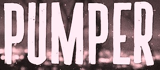 Jakarta-based designer of the vintage typeface Pumper (2016), the Victorian signage typeface Hippia (2016), the script typeface Pat Judge (2016), the brush script Wilder Mood (2016), the signage typefaces Bostly Script (2016) and DBrakes (2016), and the weathered hexagonal typeface Broster (2016).
 Typefaces from 2017: Lebakre (a monoline script), Wilder Mood (brush type). Behance link. [Google]
[More] ⦿
|
Aksel Larsen
|
Graphic designer in Aalborg, Denmark, who created the vintage typefaces Forgeron (2016, spurred) and Blck Smth (2016, in Basic, Outline, Striped, Stamp and Wornout styles). [Google]
[More] ⦿
|
Alan Jay Prescott
[AJPT]
|
 [More] ⦿
|
Albatross (or: Font Deals)
[Jay Hilgert]

|
 Albatross is Jay Hilgert's foundry in Oklahoma City, OK, est. 2008. Before Albatross, Jay Hilgert ran Bittbox (or: BB Free Fonts), a site dedicated to free clipart and vector art.
 Typefaces from 2008 include the informal outline typeface Tire Shop, the informal 3d shadow typeface Blox (2008), the 3-d wood typeface Baja California, the stunning four-style family called BB Petie Boy (which includes an ornamental caps style, a grunge style, a blackboard style and a sketch style), Fusty Saddle, 23rd Street (a graffiti font) and Whiteboard Modern. In 2009, he followed up with Oil Change (3d, hand-drawn). In 2011, he created the futuristic family Naughty Astronaut (+Cowboy), the Western typeface ABTS Gunsmoke, the connected retro script typeface ABTS Milk, ABTS Feather Pen, ABTS Oklahoma (retro deco), ABTS Aviator (2011, art deco caps face), and ABTS Day of the Dead (ornamental skulls, Mexican style), ABTS Crestwing (an inline caps face), Helios Pro. Typefaces from 2013 include Boom (a comic book typeface family, with hand-drawn Boom Symbols). Typefaces from 2014: Signyard (a retro overlay font family that evokes motel signage), Microbrew (letterpress emulation in many increasingly grungy styles, accompanied by Ornaments and Banners), Sparhawk (a 3d layered display font), Castor One (wood and letterpress style), Altus (a hand-drawn elliptical sans, +Altus Extras: ornaments). Typefaces from 2015: Corinth Ornaments, Auburn (brush script), Microbrew Unicase, Corinth (hand-drawn geometric sans with letterpress influences). Typefaces from 2016: Moraine (a weathered letterpress emulation typeface family), Microbrew Soft. Typefaces from 2019: Blakstone (a letterpress emulation family), Hanscum (vintage, handcrafted and letterpress-inspired). Creative Market link. Dafont link. Creative Market link. In 2011, he started Font Deals. [Google]
[MyFonts]
[More] ⦿
|
Aleksandar Veljasevic

|
Serbian type designer. In 2018, he co-designed Hanley Pro with Megan Tamaccio of District 62. This typeface family was influenced by wood block lettering and consists of Script, Slim, Sans and Block subfamilies. Typefaces from 2021: Lincoln Road (a 9-style sans that includes some blackboard bold fonts; by Megan Tamaccio and Aleksandar Veljasevic>). [Google]
[MyFonts]
[More] ⦿
|
Alessandro Colizzi

|
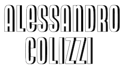 Alessandro Colizzi (b. Rome, 1966) is associate professor at Milan's Politecnico, Department of Design, where he teaches graphic design history, typography, and type design. He was professor at the Ecole de design of UQAM (Montreal) from 2005 to 2019, and visiting professor at the Design Academy Eindhoven (2014/15). He holds a PhD from the University of Leiden (with a thesis on Bruno Minari), an MA in Type Design from The Hague's Koninklijke Academie van Beeldende Kunsten, a postgraduate diploma from the Atelier National de Recherche Typographique (Nancy, France, 2001), and an MLitt in English Literature from the University of Rome La Sapienza (1985-2000). He researches graphic design history, typography, and information design and interned in 1999 with Paul Shaw at Parsons School of Design in New York. He is a member of the Nebiolo History Project and has been a member of the cooperative Italian type foundry CAST since 2019.
 His typefaces include: - Mignonne (2004, aka Mirabelle). This was specially designed for small text setting under modern printing conditions.
- The condensed Offbeat (1998, T-26, with Marco Tancredi).
- Neon Nbl (2019-2020, CAST). Neon Nbl is a display typeface working at its best for headlines, posters and logos. It is the faithful digital redesign of the original geometric monocase sans designed by Giulio da Milano and released by Nebiolo in 1933-1934. The original face had different proportions with varying widths for each type size, ranging from extra narrow (72 pt) to wide (6 pt), while Neon Nbl comes in a coordinated range of weights (Thin to Bold) and proportions (UltraCondensed to Normal). Neon Nbl also comes in a shaded titling version (Ombra) in four styles. Colizzi extended the oroginal character set which now contains 700 glyphs per font.
Speaker at ATypI 2013 in Amsterdam: Forma, Dattilo, Modulo. Nebiolo's last effort to produce a 'universal' typeface. Organizer of ATypI 2017 in Montreal. Speaker at ATypI 2018 in Antwerp. [Google]
[MyFonts]
[More] ⦿
|
Alexander Cooper
|
Alexander Cooper has run the letterpress workshop at what is now London College of Communication since 2004, and lectures in Graphic and Media Design. He is co-author of 6x6: Collaborative Letterpress project with Rose Gridneff and Andrew Haslam. Together Alex and Rose run an independent letterpress workshop. Speaker at ATypI 2014 in Barcelona. [Google]
[More] ⦿
|
Alexander Tarbeev
[TFaces]

|
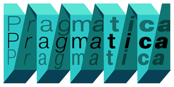 [MyFonts]
[More] ⦿
|
Alphabets Inc (or: Fontsonline.com)
[Peter Fraterdeus]

|
Alphabets Inc was founded by type designer Peter Fraterdeus, who made AI Marlowe, AI Prospera, AI Wood (1992, interpreted from examples shown in Rob Roy Kelly's American Wood Types) and AI Quanta (1994, a multiple master face). Check here. This foundry has some of the nicest typefaces anywhere, including many gorgeous typefaces by Philip Bouwsma (example: Alexia, Juliana, BouwsmaScript, Weissenau). Other designers include Bonnie Barrett (Arbor), Brian Sooy (multiple master fonts AIVeritas and AIVeritasItalic), Ejaz Syed, Inna Gertsberg, John Pugh, Karen Ackoff (check out the Russell handwriting), Kurt Roscoe, Lester Dore, Manfred Klein, Mike Brooks, Peter Fraterdeus (Oberon, Prospera and Quanta (multiple master) families), Randall Jones (the multiple master font AIKochAntiqua), Robert McCamant, Martha Chiplis, Serge Pichii, and Steve Meek. In 2007, Peter Fraterdeus started Exquisite Letterpress for top quality printing. In 2010, he promised to release Quanta Uncial. Dafont link [where one finds the free experimental typeface AI Fragment]. [Google]
[MyFonts]
[More] ⦿
|
Alter Deco Type foundry
[Adit Saputra]
|
Yogyakarta, Indonesia-based designer Adit Saputra set up Alter Deco Type foundry in 2013. He created the spurred Victorian typefaces The Famous Typeface (2013), Midnight Show (2013), Heister (2013), Cardiman Script (2013), Epique (2013), Holden (2013), Long March (2013), Dialog (2013), Big Lodge (2013), Jack Runner (2013, spurred), Shoutest (a Western circus font), Old Opera (2013) and AI Trashed (2013, free download). Other typefaces: Haimdale (2013, Victorian), Hamdall (2013), Chevia (2013), Chevitz (2013, roman caps), Shakehand (2014), Harmonique (2014), Knight Guard (2014), Hydenia (2014), Monopolish (2014), Antiqueen (2014), Samathor (2014), Sea Horse (2014), Phillnesia (2014, spurred), Relative (2014: a multiline custom typeface for Addthisrock Studio), Dubster (2014: a multiline typeface), Orbital (2014: a multiline custom typeface for Addthisrock Studio), Apparecum (2014), Handster (2015), Mermaid (2015: Victorian), Roasted (2015), Run (2015, spurred), Movember (2015), Bhaltazar (2015, eroded medieval font), Arthur (2015, rounded and handcrafted), Aberden (2015), Boulden (2015, rounded spurred typeface family, including letterpress emulation styles), Mouthen (2015). Typefaces from 2016: Strongwill (Victorian), Cyanide, Handland. Dafont link. Creative Market link, where one can buy the fonts. Another Creative Market link. Graphic River link. Behance link. Yet another Behance link. Designs Net link. [Google]
[More] ⦿
|
American Amateur Press Association (AAPA)
[Dave Tribby]
|
Organization with many type pages related to letterpress, and run mostly by Dave Tribby. I quote Tribby: From its formation in 1892 (from the merger of 23 leading foundries) to its demise in the late twentieth century, American Type Founders was the dominant force in foundry type. Throughout its existence, ATF produced some of the most beautiful printing fonts. During its first half century, those typefaces were displayed in a series of substantial catalogs. Chicago's Barnhart Brothers & Spindler foundry chose not to join the ATF combine in the 1890s. It finally became part of ATF in 1911, but continued to operate under its own name until it was closed in 1933. Based upon Mac McGrew's American Metal Typefaces of the Twentieth Century, Maurice Annenberg's Type Foundries of America and their Catalogs, and a review of ATF type catalogs published in 1897, 1899, 1900, 1903, 1906, 1909, 1912, 1923, 1934, 1941, 1960, and 1971 (plus BB&S catalog No. 25), Tribby has compiled a spreadsheet of ATF typefaces, their identification numbers, and which page numbers they appeared on in those catalogs. He put together a similar spreadsheet for BB&S catalogs that were published in 1897, 1909, and 1925. Excel spreadsheet. The following PDF files were prepared from the individual worksheets in the spreadsheet file. [Google]
[More] ⦿
|
American Type Founders (or: ATF)

|
 In 1892, twenty-three type foundries joined together to compete with the new typesetting machine, the Linotype [and later, the Monotype], to form ATF, which consolidated its type manufacturing facilities in a new plant in Jersey City in 1903. They were the dominant foundry in America until 1933, when ATF went bankrupt. Its collection remains intact at the American Type Founders Company Library&Museum at Columbia University in New York. The Smithsonian possesses most of the original type drawings and many of the matrices, and a number of other institutions and private individuals own matrices. Interestingly, despite the bankruptcy, it continued in operation until 1993, when the Elizabeth, NJ plant was finally liquidated. It was Kingsley's bankruptcy in 1993 that forced the final closure of ATF. In the early part of the 20th century, ATF was the dominant American foundry.
 Their specimen books are classics: - Pacific Coast Blue Book (1896).
- Specimens of Printing Types (1897, New York).
- Handy specimen book; specimens of type, borders and ornaments, brass rule, woodtype etc. Catalogue of printing machinery and materials, wood goods, etc (1897).
- American Type Founders. American Line Type Book. Borders, Ornaments. Price List, Printing Material and Machinery (ATF, 1906).
- American Specimen Book of Type Styles (1912, 1352 pages---see also here and here).
- Supplementary catalogue : new type typefaces, borders, ornaments, brass rule (ca. 1917).
- Specimen Book and Catalog (1923, 1148 pages). See also here. In 2013, David Marshall of Sevanti Letterpress in Toronto scanned in and put up for free download high resolution scans of the entire book. The links:
- Book of American Types (1934). Local download.
MyFonts link. A brief history of ATF by Carol Van Houten. Reference books. View the digital typefaces that are based (fully, or in part) on ATF's typefaces. See also here, here, and here. [Google]
[MyFonts]
[More] ⦿
|
Amtypes (was: TypeWolves, Amtypefoundry, or Try and Error)
[Angga Mahardika]
|
 Bandung, Indonesia-based designer of the angular signage typeface Lawson (2014), the Victorian signage typeface Houden HTN (2014), the paint brush typeface Valerie (2014), and the ironwork typeface Pipeburn (2014).
 In 2015, Angga made the hand-painted typeface Hellous, the handcrafted Belion, Haste, Seafool and Teaters, the brush typefaces She Lovely, Stay Bold and Rainfall, the great rough brush typeface Harvest, the calligraphic (wedding script?) Judy, the brush face Tropica Island, and the script typeface Callera. Typefaces from 2016: Badhorse, Burtons Script, Heats, East Coast, Happy Boys, Bird House, Sailor (a vintage rounded letterpress emulation typeface in solid and rough versions), Alloha (brush script). Typefaces from 2017: Cinamon (brush script), Blackships (Victorian), Explode (a fresh all caps sans layered typeface), Black Gate, Cup Cakes, Wildest Script, Buffalo. Typefaces from 2018: Hellios (a signature script), Haste, Sunborn Sans, Sunborn Script, Bright, Sweet Belly, Cortez (octagonal), Silver Stone (a vintage Western font), Sumo Book. Typefaces from 2019: Masquerouge. Behance link. Creative Market link. Cargo Collective link. Behance link for Try and Error Studio. Creative Market link for Amtypefoundry. Creative Market link for Type Wolves. Behance link for Type Wolves. Creative Market link for Amtypes. Graphicriver link. [Google]
[More] ⦿
|
Andika Setiawan
[Dikas Studio]

|
[MyFonts]
[More] ⦿
|
Andrea Tartarelli

|
 Andrea Tartarelli studied at the Academy of Fine Arts of Carrara and worked as a marble sculptor before turning to graphic and type design. He continued his studies at the Plantin Institute at Antwerp, and now teaches type design at IED Florence. He designed Tarif (selected by Fontspring.com among the Best fonts of 2019), Malik (shortlisted for the Communication Arts Typography awards 2021) and has been co-designer on dozens of typefaces at Zetafonts including the award winning Blacker (selected by Myfonts as one of the best new families of 2019), Monterchi (CA typography award 2020, Myfonts hidden gem 2019) and Stinger (CA typography award 2021). He works and lives in Pietrasanta (Tuscany, Italy). His graphic design outfit is called Surface Studio. Tartarelli's typefaces:
 |
Andreas Seidel
[astype.de (or: Astype)]

|
 [MyFonts]
[More] ⦿
|
Andrew Footit
[Arkitype (was: Virtue Creative)]

|
 [MyFonts]
[More] ⦿
|
Andrew H. Leman
[E-phemera (was: HPLHS Prop Fonts, and earlier: Prop Fonts)]

|
 [MyFonts]
[More] ⦿
|
Andrew Haslam
|
Phil Baines and Andrew Haslam wrote Type&Typography (2002) [German version: Lust auf Schrift! Basiswissen Typografie, Verlag Hermann Schmidt Mainz], a crash course in typography that is generally well received. Speaker at ATypI 2007 in Brighton and at ATypI 2014 in Barcelona (talk: 6x6: Collaborative Letterpress Dialogues, with Alexander Cooper and Rose Gridneff). [Google]
[More] ⦿
|
Andrew Hochradel
|
 Riverside, CA-based designer of the grungy letterpress typeface family Calamity (2016), the rounded sans poster typeface Tiny Tim (2016) and the heavy poster typefaces Industrious (2016: Industrious is the font friend that will punch you in the mouth when you need it), Third Rail (2016, inspired by old train signage), Reach Sans (2016, +Inline) and Templeton (2016, wood type influences). Andrew taught design at California Baptist University.
 In 2017, he designed the display sans typeface Quokka. Creative Market link. [Google]
[More] ⦿
|
Andrew Hoyem
|
Californian designer with Linnea Lundquist of a great roman transitional family Aitken commissioned in 2002 for Arion Press. Arion Press writes: Hoyem has taken advantage of twenty-first century technologies in order to revive what is believed to be the first type family cut and cast in America. In 1796 two Scotsmen named Binny and Ronaldson started a type foundry in Philadelphia, the first in the country to endure. By 1800 they had produced a remarkably beautiful and utilitarian type, identified simply as Roman No. 1. It is a Transitional face, between Old Style (as in Caslon) and Modern (as in Bodoni). The type was used by Jane Aitken, daughter of Robert Aitken, the famous printer of the American Revolution, and an accomplished printer herself, for the printing of the first American translation of the Bible, by Charles Thomson, in 1808. It was reintroduced by American Type Founders Company in 1892 under the name Oxford and was used by a succession of fine printers, such as Daniel Berkeley Updike, Bruce Rogers, and the Grabhorn Press. Arion Press has 1,200 pounds of the original type that once belonged to the Grabhorn Press. Oxford was cast for hand composition only and was not adapted for Linotype or Monotype composition. The matrices are now in the collection of the Smithsonian Institution and unavailable for further casting. In 2002, Hoyem worked with type designer Linnea Lundquist, assisted by Andrew Crewdson, to create a digital version of this historic face, which he renamed Aitken. The Memoirs of Benjamin Franklin is its first use for book printing. The Aitken design has been optimized for letterpress printing, allowing for the spread of ink biting into paper just like with the original metal type design cut by Binne&Ronaldson. For this book, the type has been printed from photopolymer plates. [Google]
[More] ⦿
|
Andy Crewdson
|
Graduate from the University of California at Berkeley. Andy Crewdson ran the very interesting and entertaining "Lines And Splines" pages until May 12, 2002. He digitized Monica Lewinsky's handwriting (from notes she wrote for Bill Clinton---Stephen Coles later made the Mac version of Monica). On August 1, 2002, he resurfaced with New Series (dead link), in the tradition of Lines and Splines. But this too ended a short time later. There is a lot of speculation and commentary on the web regarding Crewdson's site and its disappearance---read, e.g., Joe Clark's blog. Andy is responsible for the roman transitional family Aitken commissioned in 2002 for Arion Press. Arion Press writes: Hoyem has taken advantage of twenty-first century technologies in order to revive what is believed to be the first type family cut and cast in America. In 1796 two Scotsmen named Binny and Ronaldson started a type foundry in Philadelphia, the first in the country to endure. By 1800 they had produced a remarkably beautiful and utilitarian type, identified simply as Roman No. 1. It is a Transitional face, between Old Style (as in Caslon) and Modern (as in Bodoni). The type was used by Jane Aitken, daughter of Robert Aitken, the famous printer of the American Revolution, and an accomplished printer herself, for the printing of the first American translation of the Bible, by Charles Thomson, in 1808. It was reintroduced by American Type Founders Company in 1892 under the name Oxford and was used by a succession of fine printers, such as Daniel Berkeley Updike, Bruce Rogers, and the Grabhorn Press. Arion Press has 1,200 pounds of the original type that once belonged to the Grabhorn Press. Oxford was cast for hand composition only and was not adapted for Linotype or Monotype composition. The matrices are now in the collection of the Smithsonian Institution and unavailable for further casting. In 2002, Hoyem worked with type designer Linnea Lundquist, assisted by Andrew Crewdson, to create a digital version of this historic face, which he renamed Aitken. The Memoirs of Benjamin Franklin is its first use for book printing. The Aitken design has been optimized for letterpress printing, allowing for the spread of ink biting into paper just like with the original metal type design cut by Binny&Ronaldson. For this book, the type has been printed from photopolymer plates. [Google]
[More] ⦿
|
Angga Mahardika
[Amtypes (was: TypeWolves, Amtypefoundry, or Try and Error)]
|
 [More] ⦿
|
Angga Suwista
[Sans and Sons (was: Agga Swistblnk)]

|
[MyFonts]
[More] ⦿
|
Ani Petrova

|
 Type designer, b. 1988, Sofia, Bulgaria, who works at Fontfabric, Svetoslav Simov's type foundry. She completed her Bachelor's degree at The National Academy of Art in Sofia. In 2014 she obtained a Master's degree in type design.
 Fontfabric type foundry published the free typeface family Uni Sans Free in 2014: four font weights (with heavy and thin included) set in caps from the best seller font family Uni Sans (2009). Uni Sans Free is designed by Svetoslav Simov (head of Fontfabric), Ani Petrova (Cyrillic alphabet) and Vasil Stanev (font development). Nexa Rust is a set of 83 weathered letterpress emulation fonts that evolved from Nexa and Nexa Slab. This was a project by Radomir Tinkov, Ani Petrova, Svetoslav Simov and Vasil Stanev. Together with Asen Petrov, she designed the extensive handcrafted typeface family PH (2014, Fontfabric). This typeface family is accompanied by a nice set of hand-drawn icons such as PH Icons Food and PH Icons Goodies. In 2015, Ani Petrova, Svetoslav Simov and Radomir Tinkov co-designed the 214-style mammoth font system Intro Rust, a rough version of Fontfabric's Intro. The fonts are partitioned over Intro Rust, Intro Script, Intro Head and Intro Goodies. In 2016, she designed Mixa (FontFabric), a connected script font influenced by grotesques. In 2016, a team of designers at Lettersoup that includes Ani Petrova, Botio Nikoltchev, Adam Twardoch and Andreas Eigendorf designed an 8-style Latin / Greek / Cyrillic stencil typeface, Milka, which is based on an original stencil alphabet from 1979 by Bulgarian artist Milka Peikova. Typefaces from 2017: Attractive (a free sans, done with Botio Nikoltchev), Kardinal (a neo humanistic grotesque published at Lettersoup). Typefaces from 2018: Vocal (Latin and Cyrillic; published by Lettersoup). Vocal has slightly tapered stems and tilted terminals that give the 28-weight typeface family warmth, pizzazz and oomph. Codesigner of Mozer (2019, by Svetoslav Simov, Ani Petrova, Mirela Belova and Nikolay Petrousenko: a condensed headline sans family that covers Latin, Greek and Cyrillic; Mozer SemiBold is free). [Google]
[MyFonts]
[More] ⦿
|
Annette C. Disslin
|
German letterpress and metal type shop located in Waeschenbeuren, Germany, and run by Annette C. Disslin. The shop is called manufaktur Papiergebunden. [Google]
[More] ⦿
|
Antoine Brun
|
Antoine Brun is a French graphic designer based in Paris. After a bachelors in graphic design at LTAA Auguste Renoir Paris (class of 2019), he specialized in identity, editorial graphics and typography. Designer of the phantasmagoric typeface Kaliste (2020) at Lift Type. During a workshop led by Yoann Minet, he designed Liza, which was inspired by Benguiat Caslon, and under the supervision of Julien Priez, he created the letterpress typeface Emily. Commissioned typefaces by Brun include Hic&Nunc (a brush type), and Opie. Finally, he created the modular typeface Module. [Google]
[More] ⦿
|
Anxo Vizcaino
|
Lugo, Spain-based designer of the propaganda poster typeface Hüte Dich (2017), which is based of German war time letterpress with some avant garde elements mixed in. Behance link. [Google]
[More] ⦿
|
Archivio Tipografico
[Gabriele Fumero]
|
Archivio Tipografico is a letterpress printshop in Torino, Italy, which also has a collection of metal typefaces, letterpress machines and type specimens and catalogues. It is maintained and managed by Gabriele Fumero, who graduated from ECAL in Lausanne, class of 2017. At ECAL, he designed the flared typeface Opale (2017). Historically, Archivio Tipografico was the main type design and typography magazine in Italy from 1889 until 1933. Dalmazzo Gianolio (1863-1926), printing department foreman, launched an industry journal, Archivo Tipografico, in 1889 at Nebiolo. Produced regularly until 1933, it included type specimens, advertising, and industry news along with articles on printing arts and technologies. It was printed and directed by Societa Nebiolo under the direction of Dalmazzo Gianolio. [Google]
[More] ⦿
|
Aritra Das
[Nautica Studios]
|
[More] ⦿
|
Arkitype (was: Virtue Creative)
[Andrew Footit]

|
 Andrew Footit (b. 1984) runs his own type foundry in Johannesburg, South Africa. He is also known as Arkitype. Until 2014, his type studio was called Virtue Creative and before that, Virtue84. In 2017, he set up Arkitype. His typefaces:
 - The very simple monoline rounded geometric typeface Modulus (2011). Updated to Modulus Pro in 2019.
- The stunning art deco typeface Vindeco (2011).
- Gigafont (2011): a free bubblegum font.
- FunFair (2012): hand-printed.
- Virtus Sans (2012): a clean 4-style sans family.
- the Western family Westro (2012, +Inline).
- The free rounded sans drafting font Struct (2013).
- The four-style vintage poster typeface The Woods (2013).
- The spurred letterpress typeface family Roper (2014). Roper evolved into the octagonal typeface family Hudson NY (2015) and Hudson NY Pro (2020). Hudson NY Regular, Serif and Slab are athletic lettering / octagonal typeface families.
- Bosk Hand.
- Roves (2016). A camping style set of fonts, including several stencil typefaces.
- Anchor Script (2016). Inspired by classic cursive connected handwriting.
- Navigator (2016). Inspired by the early explorers.
- Bowline Script (2016). A vintage monoline cursive script typeface.
- Saveur Sans (2017) and Saveur Sans Round (2017). A lovely sans typeface family that is inspired by art deco and French cafes.
- Comply Slab (2017). All caps and octagonal, with possible applications in athletic lettering.
- 3 Stripe Type (2017) and Adidas Nemeziz (2017). Prismatic typefaces.
- Technol (2018).
- Statewide (2018). An all caps squarish techno display sans family.
- ESPN Next (2018). An octagonal inline custom typeface. ESPN Heroes (2019) is a six-lined prismatic typeface.
- Poster Compressed (2019). A piano key typeface.
- Neumatic Compressed (2019), Neumatic Gothic Round (2020) and Neumatic Gothic (2019).
- Protrakt Variable (2019). Nine variable width all caps fonts, of different thicknesses.
- Coastal (2020). A twelve-style all caps sans.
- Compose. An 18-style minimalist sans with elliptical curves and quite open counters.
- Storica (2021). A 9-style all caps vintage serif.
Behance link. Creative Market link. Home page. View Andrew Footit's typefaces. Home page. [Google]
[MyFonts]
[More] ⦿
|
Artcoast Design (was: Mankoff)
[Dmitry Mankoff]

|
 Dmitry Mashkin (or Dmitry Mankoff, or Artcoast Design, located in Sochi and/or Krasnodar and/or Moscow, Russia) created the absolutely wonderful restaurant menu deco typeface Montclar (2015, +food icons), the vintage letterpress emulation typeface family Stampbor (2015), the handcrafted Karmina (2015), the brush typeface Hypsletters Script (2015, with Nadi Spasibenko), the vintage letterpress typeface Marktype (2015), and the sans typefaces Albori Sans (2015, rounded and monoline) and Brentwood Sans (2015).
 Since 2016, he operates as Art Coast Studio. His free bilined hipster typeface Brokes (2016) outhipsters even the coolest hipsters. He also created the letterpress emulation typeface Jameson (2016), the appealing (regular and rough) poster typeface Weisshorn (2016), the grungy letterpress font Ovsyanka (2016), and the handcrafted typeface Norquay (2016). Typefaces from 2017: Santens Script (dry brush). Typefaces from 2020: Tipio. Typefaces from 2021: Regolith (an all caps display sans with or without a stripe texture), Roadside Motel (a poster font), Planet Jupiter (a great all caps cartoon font), SA Tampico (mimicking writing on wooden crates), Tampico Symbols, Howard (an ultra-condensed titling font). Typefaces from 2022: SA Woodland Hills (an all caps monolinear rounded sans for Latin and Cyrillic). Old URL. Graphicriver link. [Google]
[MyFonts]
[More] ⦿
|
Ashley Rego
|
With a group of fellow students, Ashley Rego (Tiverton, RI) designed the letterpress emulation typeface Astraea (2016). Behance link. [Google]
[More] ⦿
|
Astigmatic One Eye
[Brian J. Bonislawsky]

|
 Astigmatic One Eye (AOE) has lots of nice original fonts by Brian J. Bonislawsky (b. 1973, Pittsburgh, PA). Many are free, others are not. AOE joined Font Brothers Inc in 2006. Brian Bonislawsky currently lives in Las Vegas, NV.
 Fontsquirrel link. Dafont link. Fontspace link. A partial list of the AOE fonts made in 2011: Engagement (2011, a free brush script at Google Web Fonts), Fascinate (2011, an art deco typeface at Google Web Fonts; +Inline), Original Surfer (2011, a free Google Web Font inspired by a vintage advertisement for the "California Cliffs Caravan Park"), Smokum (2011, a Western / Italian face), Yellowtail (2011, signage face), Redressed (2011), Special Elite (2010, a free old typewriter face), Aclonica (2011). Typefaces from 2008 or before: Horseplay AOE (2008, Western style), Cake and Sodomy AOE (2008), Good Eatin AOE (2008), Paradiso AOE (2008, inspired by logotype of the Paris Resort and Casino in Las Vegas), Montelago AOE (2007, a script inspired by the logotype of the Mirage Resort and Casino in Las Vegas), Jack Chain AOE (2007), Henhouse (2007), Schnitzle (2007), Luxurian AOE (2007, inspired by the logo of the Luxor Hotel&Casino in Las Vegas), Digital Disco AOE (2007), Mighty Tuxedo AOE (2007), Makeshift AOE (2007), Clarity AOE (2007, slab serif headline; + grungy version), Red Pigtails AOE (2007), Run Tron 1983 (2002), Eyeliner AOE (2006, Tekton-like), Mother Hen (2007), Gloversville (2007, comic book style), Mighty Tuxedo AOE (2007, condensed sans), Quick Handle AOE (2007), Surfing Bird (2007), Hydrogen (2004), Hardliner (2004, fifties diner style), Big Ruckus (2004), SS Antique No. 5 (2004), Europa Twin (2003), EuroMachina (2003, techno), Lord Rat (2003: papercut sans), Love Anxiety (2003), BuzzSaw (2003), Skullbearer (2003, skull dingbats), Beatnick Blue (2002), Geisha Boy (2002), Mardi Party (2002), Midcrime (2002), Ocovilla (2002), Ruthless (2002), Saltie Doggie (2002), Whiskers (2002), Royal Gothic, Family, Eggit, Jericho, Wild Monkeys (2002), 5FingeredGothSW, AlienArgonautAOE, AlphaMackAOE, AmphibiPrint, AngiomaAOE, AntiChristSuperstar, AntiChristSuperstarSW, AstigmaSolid, BigLimboAOE, BigLimbodOutAOE, BoneRollAOE, BoneRollAOEBold, BoundAOE, BrailleAOE, BulletBallsAOE, ButterflyChromosome, ButterflyChromosomeAOE, ButtonButton, ButtonButtonAOE, CType, CTypeAOE, CelticLionAOE-Bold, CelticLionAOE-BoldItalic, CelticLionAOE-Italic, CelticLionAOE, CharailleAOE, ChickenScratch, ChickenScratchAOE, ClunkerAOE, ClunkerAOE-Bold, CropBats, CropBatsAOE, CropBatsIIAOE, DarkNightAOE, DeadGrit, DeliveryMatrixAOE, DetourAOE, DigitalDiscoAOE, DigitalDiscoAOEOblique, DingleBerries, DoggyPrintAOE, DraxLumaAOE, DungeonKeeperII, DungeonKeeperIIBold, DungeonKeeperIIItalic, EggItAOE, EggitAOE-Italic, EggitOutlineAOE, ElectricHermes, ElectricHermesAOE, ElectricHermesAOECharge, FearAOE, FilthAOE, FishyPrintAOEOne, FishyPrintOneAOE, FishyPrintTwoAOE, FutharkAOE, FutharkAOEInline, FutharkAOEInline, GateKeeperAOE, Ghoulish Fright AOE (2006), GlagoliticAOE (1999, grungy glagolitic), GorgonCocoonAOE, Gotik, GreyAlienSW, HAL9000AOE, HAL9000AOEBold, HAL9000AOEBoldItalic, HAL9000AOEItalic, HandageAOE, HandageAOEBold, HauntAOE, HybridLCDAOE, IDSupernovaSW, IslanderAOE, JokerWildAOE, KillMeCraig, KillMeCraigAOE, Kinderfeld, KittyPrint, KittyPrintAOE, Kornucopia, KornucopiaAOE, LinusFace, LinusFaceAOE, LinusPlayAOE, LinusPlaySW, Lochen, LovesickAOE, Manson, MasterPlan, Mervale Script Pro (2012: a brushy script based on the 1940's Fawcett Publications Mary Marvel comic), Microbe, MooCowSW, MotherlodeLoadedAOE-Italic, MotherlodeLoadedAOE, MotherlodeStrippedAOE-Italic, MotherlodeStrippedAOE, MysterioSWTrial, NightmareAOE, OrnaMental, Pantera, PapaManoAOE, PenicillinAOE (described as a bacterial stencil typeface), PixelGantryAOE, PixelGantryAOEBold, PixelGantryAOEBoldItalic, PixelGantryAOEHeavy, PixelGantryAOEHeavyItalic, PixelGantryAOEItalic, PixelGantryHiliteAOE, PixelGantryHiliteAOEItalic, PoppyAOE, PoseidonAOE, Prick, QuiltedAOE, QuiltedAOEBlack, QuiltedTrial, RippleCrumb, RippleCrumbUltraCon, ROCKY, ROCKYAOE, RustedMachineSW, SSExpAntiqueAOE, Schizm, Schrill, SchrillAOE, SchrillAOEOblique, Scrawn, ScrawnAOE, ScrawnCyrAOE, ScrawnKOI8AOE, ScrewedAOE, ScrewedAOEOblique, ScrewedSW, SeaweedFireAOE, SenthAOE, ShampooSW, ShottyTransferTrial, SkinnerAOE, SlurCrumb, SpatCrumb, SpikeCrumbGeiger, SpikeCrumbSwizzle, SpikeCrumbSwollen, SteelcapRubbingTrial, StruckSW, StrutterAOE, SunspotsAOE, SurferComicTrial, TRANSHUMANALPHABET10, TRANSHUMANKATAKANA20, TannarinAOE, TannarinAOEOblique, TibetanBeefgardenAOE, TibetanBeefgardenAOE, TouristTrapAOE, TransponderAOE, TransponderGridAOE, UglyStickAOE, VanguardIIIAOE-Bold, VanguardIIIAOE-BoldOblique, VanguardIIIAOE-Oblique, VanguardIIIAOE, Ventilate, VentilateAOE, Y2KPopMuzikAOE, Y2KPopMuzikOutlineAOE, YoungItchAOE, ZeichensSW, ZenoPotionAOE, Zombie, BeatnikBlueAOE, BeatnikBlueFillAOE, GeishaBoyAOE, MardiPartyAOE, MindCrimeAOE, OcovillaAOE, PolynesianTouristAOE, RuthlessAOE, SaltyDoggieAOE, SpruceAOE, WhiskersAOE-Oblique, WhiskersAOE, WhiskersAltCapsAOE-Oblique, WhiskersAltCapsAOE (2002), Habitual, Automatic (techno), Bitrux, Filth (an eerie brush script), Cake&Sodomy, Gulag, Bad Comp, Detour, Alien Argonaut, Dark Night, GateKeeper (Halloween font), Gargamel Smurf, Invocation, Neuntotter, Geisha Boy, Saratoga Slim, Gobe, Stingwire, Lavatype, Tapehead, Islander, Clunker, Digelectric, Gargamel, Krulo-Tag, Krelesanta, SurferComic, Bound, Culture Vulture, Intruder, Cavalier, Anoxia, Synchrounous (IBM logo style lettering), Luna, Data Error, Lunokhod, Jericho. There are many techno and gothic fonts. Kill Me Craig is the first 26 death scene dingbat font (scenes by Craig Dowsett). KittyPrint takes the LinusFace font concept to more realistic cat head dingbats. Krelesanta (not free) is a funky font inspired by the band Kreamy Electric Santa. The free ButtonButton is useful for making buttons. Lovesick AOE is a scrawly, lovelorn typeface, i's dotted with hearts. Strutter AOE is based on the KISS logo. Senth AOR is a runic font. Charaille is one of the many dot matrix fonts. Cavalero is inspired by the logotype of the Chevy Cavalier. At Bitstream in 2001, AOE published Cavalero, Stingwire and Tannarin. And in 2002, he published the comic book font Big Limbo, Euro Machina BT and Islander there. Bio at Bitstream. In 2005, Bonislawsky and Sandler realeased 500 fonts, via Bitstream and MyFonts, under the label Breaking The Norm. In 2006, Astigmatic published their typewriter collection, which includes Military Document, Bank Statement, State Evidence Small Caps, State Evidence, Urgent telegram, Library Report, Overdrawn Account, Customs Paperwork, Incoming Fax and Office Memorandum. From the bio and various pieces of information, one is led to believe that Brian was born in Poland, and now lives in Miami, but that may be wrong. In 2010, he placed a free font at the Google Directory, Syncopate. Along the same lines, we find the derived square serif typeface Stint Ultra Condensed (2011, Google Web Fonts) and Stint Ultra Expanded (2012). In 2011, several other typefaces followed there, like Ultra (fat didone), Maiden Orange, Special Elite (2010, a free old typewriter face), Just Another Hand, Crushed, Luckiest Guy (comic book face), Aclonica, Redressed, Montezuma (a curly connected upright script), Devonshire (brush script), Fondamento (calligraphic lettering), Yellowatil (connected retro script), Righteous (free at Google Web Fonts: inspired by the all capitals letterforms from the deco posters of Hungarian artist Robert Berény for Modiano), Ribeye and Ribeye Marrow> (cartoon and/or tattoo style lettering---free at Google Web Fonts), Spicy Rice (2011, free festive display typeface at Google Web Fonts). Contributions in 2012: Marcellus (2012, Trajan, flared roman, at Google Fonts and CTAN), Eagle Lake (a free calligraphic font at Google Web Fonts), Uncial Antiqua, Jim Nightshade (2012, free at Google web fonts), Dynalight (2012, a retro script inspired by a vintage luggage tag for the Southern Pacific 4449 Daylight steam locomotive), Yesteryear (a retro script loosely based on the title screen from the 1942 film The Palm Beach Story), Parisienne (Google Web Fonts: casual connected script based on a 1960s ad for bras), Shojumaru (Google Web Fonts: an oriental simulation typeface inspired by a poster for the Marlon Brando movie Sayonara), Berkshire Swash (Google Web Fonts), Audiowide (Google Web Fonts), Romanesco (Google Web Fonts: a narrow calligraphic style), Galindo (Google Web Fonts), Oregano (Google Web Fonts: based on cartoon style lettering of calligrapher and logo designer Rand Holub. This style of hand lettering adorned many retro brochures and advertisements of the late 40's through the 1960's), Peralta (Google Web Fonts: an Egyptian comic book face), Eagle Lake (Google Web Fonts: calligraphic), McLaren (Google Web Fonts: comic book style alphabet), Freckle Face, Hanalei Fill, Hanalei [Polynesian bamboo or tiki lettering], Purple Purse, Margarine, Risque, Clicker Script [image], Stalemate [a gracious script, by Jim Lyles for AOE], Mouse Memoirs, Quintessential [Google Web Fonts: chancery hand], Bigelow Rules, Englebert [Google Web Fonts: from the title screen of the 1930's film titled Der blue Engel, starring Marlene Dietrich], Sacramento [Google Web Fonts: connected script]. Typefaces from 2013: Freckle Face (grunge), Grand Hotel, Purple Purse (Purple Purse draws its inspiration from a vintage Ivory Soap ad from the 1950's. Somewhat of a cross between Bodoni and Pixie, this font finds that it never truly takes itself seriously). Stiggy & Sands is the American type foundry of Brian Bonislawsky and Jim Lyles, est. 2013. Their first commercial typefaces, all jointly designed, are Luckiest Guy Pro (a fat comic book font based on vintage 1950s ads) and Marcellus Pro (a flared roman inscriptional typeface with both upper and lower case, originally published in 2012 by Astigmatic). Typefaces from 2014: Franken Jr AOE Pro (inspired by the title screen from the 1966 Hanna Barbera cartoon Frankenstein Jr), Good Eatin Pro AOE (inspired by the title screen from the 1942 Warner Bros. cartoon Dog Tired), Ghostkid AOE Pro (comic letter style). Typefaces from 2015: Shanks Antique 5 AOE (after the newspaper typeface Memorial (1865, Stevens, Shanks & Sons)), Reliquaire AOE (a somber blackletter typeface inspired by Memorial (1881, Boston Type Foundry)). Typefaces from 2016: Mailuna Pro AOE (a gothic sans), Kentish AOE Pro (art deco). Reardon AOE (a digitization of a film typeface called Joyce Black by LetterGraphics), Berkmire AOE (1970s style robot-inspired techno font), Blackheath Pro AOE (this typeface started as a digitization of a film typeface called Roberts Square by LetterGraphics), Delaware Pro AOE (art deco), Rutland AOE (a futuristic font that is a digitization of a film typeface called Maccaro by LetterGraphics). In 2016, Brian J. Bonislawasky and Jim Lyles published the rugged octagonal mega typeface family Tradesman at Grype. In 2017, they added the art deco typeface Cowling Sans AOE (which is based on alphabet from "Lettering for Commercial Purposes" by Wm. Hugh Gordon). In 2018, they published the letterpress emulation typeface Prison Pro, Pink Sangria (50s style movie font), Manic Tambourine, Motenacity (a Martian cartoon font), the old typewriter font Office Memorandum Pro, and the Flintstone font Strongman. Typefaces from 2021: Klutz AOE Pro (a condensed all caps beatnik font), Data Error AOE Pro (based on early dot matrix printers), Customs Paperwork AOE Pro (based on the NuMode Type No. 61 vintage typewriter), Rinzler AOE Pro (a great stencil font that revives LetterGraphics' Caren), Restraining Order AOE Pro (an old typewriter font), Brazarri AOE Pro (an Aztec emulation font based on MacKeller, Smiths and Jordan's Bizarre from 1884). View Astigmatic's typeface library. View the typefaces made by Brian Bonislawsky. Fontsquirrel link. Dafont link. Fontspace link. Creative Market link. [Google]
[MyFonts]
[More] ⦿
|
astype.de (or: Astype)
[Andreas Seidel]

|
 Astype.de is a German foundry started in 2003 by illustrator and type designer Andreas Seidel (b. 1975, bad saarow, near Berlin, Germany). He lives in Cottbus, Germany. In 1998, he obtained a Masters degree in business administration. In 2007, he and Ingo Preuss set up The German Type Foundry. In 2017, he joined the initial crew at Fust & friends. The typefaces:
 - One of his first typefaces was Crayfish (originally a URW font, but withdrawn by Seidel from URW in 2002). Crayfish is a display type originally designed for an American Football club. The Crayfish typefaces are sold as Thunder Bold and Titan Bold.
- Check his nice weather symbols (not a font).
- He finished Ornaments Thanksgiving and the great ASTYPEOrnaments-WineGrape A (2004).
- He is working on 14th century initials (2003).
- He created Sattler (2003): Joseph Kaspar Sattler, one of the great German art nouveau artists created these nice initials in 1897 for the famous royal monumental book project Die Nibelunge for the Reichsdruckerei Berlin. Only 200 exclusive signed masterpieces were printed in four years from 1900 till 1904. Joseph Sattler was the art director, type designer and designer in one person. The Reichsdruckerei showed samples of the unfinished work in 1900 at the world exhibition in Paris to advertise the high craftsmanship of the German presses.
- He made Heraut (2003), an art nouveau lettering typeface based on a 1901 design of Hermann Hoffmann called Herold Reklameschrift.
- He created Sveva AS Versal (2003, art nouveau).
- About Missa Solemnis, he writes: Solemnis was designed by Günter Gerhard Lange and first cut in metal 1953 (this is the date he quotes himself, other sources mention 1950 or 1952). It seems to be one of his earliest typeface designs that he had done as a freelancer for H. Berthold AG in Berlin. [...] Missa Solemnis AS is a new, remastered and extended version of Mr Lange's typeface. The font is available in the OpenType format and comes in two styles: 1953 and 2003. The 1953 style contains all characters of the original metal type, as well as a few additions. [...] The 2003 cut is more delicate and makes extensive use of the OpenType format. It contains over 650 glyphs, covering Roman-based languages of Western and Central Europe. His Solemnis inspired Simeon AS (2003), a 650-glyph uncial style face.
- In 2004, he created Missale Incana, an interpretation of a typeface from Herbert Thannhaueser.
- Still in 2004, he created ASTYPE Ornaments Christmas A2 and ASTYPE Ornaments Christmas A. These were followed in 2005 by ASTYPE Ornaments Christmas B.
- He made Missale Lunea (2004). This has astroligical symbols, moon phases and medieval characters.
- In 2005, the exquisite calligraphic script typeface Gracia was added, consisting of Gracia No. 44, 45, 54 and 55 (graceful calligraphic script), and Gracia Solo.
- Paola is a redesigned, new interpretation of a brush typeface from Carl Rudolf Pohl.
- He made Adana (2005): The roots of Adana going back to the year 1930, to the Berlin-based German graphic designer Wilhelm Berg. His typeface can be interpreted as an answer to Lucian Bernhards Schönschrift. The Initials are nearly close to the original drawings but the Circular typeface was changed dramaticly. Excentric, unusual forms and loops were changed to fit todays needs. Due to the lack of a corresponding Roman letter form, the Regular version was designed including small caps, fitting the contrast and swinging shapes of Adana Circular. Both typefaces play well together in all kinds of adverts, as well with designs like Bodoni or Didot.
- Alea AS Initials (2005) is a floral faced based on the drawings of Maria Ballé.
- Taiko (2006). A revival of Otto Arpke's Arpke Antiqua (1928, copperplate).
- ASTYPE Ornaments Accolades A (2007), and ASTYPE Ornaments Accolades C (2011).
- GTF Toshna Std (2008, German Type Foundry) is a garaldic type family in three optical weights, after a 1955 family called Tschörtner-Antiqua by Hellmuth Tschörtner that was very popular in the DDR.
- Secca (2009, German Type Foundry) is a simple sans family rooted in early German grotesque type designs. See also Secca Soft (2014) and Secca Stencil (2015).
- Nepos (2010) is an experimental modular type kit consisting of ready-made typefaces and a set of special BUILD fonts to build your own letters and ornaments. These BUILD fonts can be used on layers with different colors and overprinting for special effects. The effects like Antiplex can be considered as kitchen tiles. There are also color inversions and stencil types.
- Secca Saloon (2011) is a versatile ornamental Western family.
- Popsil (2011) is a white-on-black hand-printed poster face.
- Ademo (2011) is a classic shaded layered 3d caps face, based on two typefaces designed by Carl Albert Fahrenwaldt that were published in 1931-1932 by Schriftguss AG.
- Wood Bonnet Antique No.7 (2012) is based on real vintage wood type blocks from Switzerland.
- VTG Stencil US No. 4 (2012) is based on plate US No. 4 from New York Stencil Works. This revolving stencil-plate was invented by Eugene L. Tarbox and patented in 1868. The military stencil fonts VTG Stencil US No. 2 (+Ornaments), VTG Stencil US No. 51, VTG Stencil UK No. 76, VTG Stencil Germany No. 101 (2014, modeled after historic blackletter stencil plates from Bavaria), and VTG Stencil US No. 72 followed in 2014. In 2016, he added Vtg Stencil DIN.
- VTG Stencil Germany No. 1 (2013) is a set of nicely executed didone stencil typefaces based on real models used in Germany from 1871-1918 and later. There is a Sketch style.
- Wood Poster Eight (2015) is a free wood type slab serif.
- Alea Initials (2017, floriated caps).
- Wood Bonnet Grotesque No 4 (2017).
- The Vtg Stencil France series (2017) in substyles Vtg Stencil France No1, Vtg Stencil France No3 and No. 5.
- The expressionist typeface Alarm (2017, Fust & Friends), which is based on an old design of Heinz König also called Alarm (1928, at Trennert).
- Presto (2017, Fust & Friends), a revival of a script by Helmut Matheis (1970).
- Vtg Stencil Italy No2 (2018).
- Rocaie (2018). Decorative caps base on antique rococo letters from a gilding workshop.
- Wood Heinz No.4 (2019). Wood Heinz No.4 offers up to four printed look variations of all the Latin base letters and figures. An OpenType letter rotator is programmed into the fonts to emulate the randomness of wood type printing. Also: Wood Heinz No.2 (2019).
- Missale Solis (2019). An uncial typeface that overhauls Missale Lunea (2004).
- Vtg Stencil UK No2 (2019).
- Vtg Stencil Marsh (2020). Based on one inch stencils, cut by a Marsh machine. Marsh was an American stencil machine maker in the 1920s.
- Bonnet Grotesque Narrow (2020). A condensed grotesque family.
Behance link. Creative Market link. Fust & Friends link. Klingspor link. Home page. See also here. View Andreas Seidel's typefaces. [Google]
[MyFonts]
[More] ⦿
|
Attila Zigó
[Bumbayo Font Fabrik]
|
 [More] ⦿
|
ATypI 2015: Letterpress Reloaded
|
 ATypI 2015 was held in Sao Paulo, Brazil, from 14-17 October. As part of the conference, there was a very interesting exhibition of letterpress posters. The exhibition, Letterpress Reloaded, was curated by Paulo Moretto, an architect (1991) with a Masters (2004) in graphic design for which he researched Brazilian posters, studying more than 7,000 pieces made between 1950 and 2000s. Henrique Nardi and Claudio Rocha conceivved the idea, and Henrique helped with the execution and production. [Google]
[More] ⦿
|
Bart Co Design
[Bartosz Wesolek]
|
 Or Bart Wesolek, b. 1986. Nowa Sol / Poznan, Poland-based graphic designer, who published the vintage typeface Rheiborn, the display typeface Onufry (based on lettering on vintage cycling posters), the poster typeface Molheim, the letterpress typeface Darmond, the squarish Garthram, the vintage typeface Martslock, the free squarish typeface Rheiborn Sans, the vintage Apothecary collection (Asplin, Garriger, Hagerman, Kimmell and Seidlitz), and the slabbed display typeface Kinshel in 2017.
 His vintage liqour collection (2017) includes - Arendt: A thin extended serif typeface (clean, rough)
- Groston: A squared sans font (clean, rough)
- Kloster: A lower case blackletter typeface (clean, rough)
- Othon: A bold sans typeface (beveled, clean, rough)
- Rozalyn: A western decorative typeface (clean, rough & free shadow version)
- Theobald: A condensed serif font (rough, rounded & free clean version)
- Wilhelm: A regular sans & slab display font (clean, rough)
Typefaces from 2018: the Print Press collection (Blutzen, Fratley, Garnet, Harold, Stilzkin Sans, Stilzkin Slab), Nimitz (a free retro all caps sans), Bosmark (a vintage sketched typeface), Monkstead (a block display family with several textures), Signist, Hartwood, and the Newsstand collection (which includes Presson, Stammark, Brookset, and Darmond). Typefaces from 2019: Pelagia (text typeface), Moorland (a fat face didone), Keller (an all caps sans), Mosley (a weathered letterpress emulation font), Madchen Sans (a free retro sans), Maurine (a retro script). Typefaces from 2020: Braden Sans, Paschal (serif), Dumont (sans). Typefaces from 2021: Frisco (a retro display serif), Landman (a retro font inspired by Murillo/Aldo Manutio typefaces designed by Schelter & Giesecke in 1897), Devon (art nouveau caps), Omnibus (a free art nouveau font), Urban Serif (a condensed slab serif), Irish Poem, Mesnage Slab Serif, The Moonshine Collection (Bastien (art nouveau), Dalton (squarish), Fribois (a monolinear school script), Guilmot, Liboury (a frilly decorative blackletter)). Typefaces from 2022: Vespucio (a classic serif), Blokhaus (a bold sans). [Google]
[More] ⦿
|
Bartek Nowak
[GRIN3]

|
 [MyFonts]
[More] ⦿
|
Bartosz Wesolek
[Bart Co Design]
|
 [More] ⦿
|
Baseline Fonts
[Nathan Williams]

|
 Foundry in Wichita, KS, founded in 1999 by Nathan Williams (b. Concordia, KS, 1973), formerly from the University of Kansas Art Museum Library. Its motto: The goal of the foundry is to provide uninterpreted revivals of type samples generated through disappearing printing methods, and create new fonts for dissemination in the type community. Order through MyFonts.Com or Union Fonts or Creative Market. FontShop link. Klingspor link.
 Fonts: - The Rodeo family of wood type fonts: 66 Rodeo, 57 Rodeo, 58 Rodeo (2003), Rodeo Rope, Rodeo Rope Superchunk.
- The Tuscan family: Tuscan (2003, a wild west face). To this group we can add the Tuscan typeface Circus KS (2006).
- Egyptians: Grit Gothic (2013), Grit Sans (2013), Heirloom Artcraft (2013), Worn Gothic (2013), Stately GG (2013), Grit Egyptienne (2005, grunge Egyptian family), Rough Egyptienne (2005).
- Grunge typefaces: Antimony (2005, grunge), Dryden (distressed handwritten face).
- Old typewriter fonts: Slab American Regular (old typewriter), Slab American Titling, Slab American Titling Heavy (2002). Slab American has 55 styles.
- Art nouveau typefaces: Old Paris Nouveau (2003).
- Pixelish typefaces: Base PXL7, 80s PXL Bold.
- Display Sans: Maxime (2004, having support for most European languages; Maxime Shadow is available at FontShop), Woodgrit Thin (based on 19th century American letterpress fonts), Woodgrit Medium, Woodgrit Heavy, Pippen (squarish).
- Calligraphic: Roundhand Regular.
- Victorian: Boback.
- The Grit family: Grit History (2003-2004), Grit Primer (2003), Grit Egyptienne, Grit Typesorts (2006, free).
- The Old Times American family (+Italic, +Titling).
- Pia Regular.
- Kandt: the handwriting of legendary designer and art director James Kandt; 4 styles.
- Chitchy.
- AVI Sans.
- Country Fang (2003, with Brian Miller).
- Craft Roman
- Licious Script.
- Luxe (2003, casual).
- Momentum (2002).
- George Gibson (handwriting from mid 1800s).
- Dingbats: Megaflakes 2010 (2010) and Megaflakes 2011 (2011).
- Sketchwriter (2011).
- Dusty Circus (2011) is a five-layer stacking display face designed to be infinitely morphed. It is a prototypical member of that old western circus font genre.
- Bobbi Bee (2013). A connected script.
[Google]
[MyFonts]
[More] ⦿
|
Bdstrd Std
|
 Bandung, Indonesia-based designer of the rough brush fonts Gatsunaga Hand Brushes (2015), Black Rose (2015) and Brother in Crime (2015).
 Typefaces from 2016: Luducudu (a layered typeface inspired by television cartoons), Amira Beauty, Oldstar (beatnik style), Sweetea (script), Supata (letterpress, in 17 styles), The Breaks, Horror Joys (horror movie brush font), Aswatama Rough (ligature-laden letterpress emulation typeface), Boldoa Mat, The Bridges (a modular sans poster typeface family, +Shadow, +Rough), Broken Wings (fat brush font). Typefaces from 2017: The Breaks (monoline script), Aswatama (rounded monoline script). Typefaces from 2018: Bdstrd Floid (a package of 1980s retro fonts). [Google]
[More] ⦿
|
Ben Grib
|
Designer in Cape Town, South Africa, who created the slab typeface Deputy Serif (2012). Behance link. [Google]
[More] ⦿
|
Benoît Santiard
|
Graphic designer in Paris, b. 1980. Teacher at the École d'Architecture de la Ville&des territoires in Marne-la-Vallée. Cofounder, with Guillaume Grall, of Building Paris. Creator of the traffic-like sans typeface capitale (2009) for the signage of a concert hall. Werkman Letterpress (2009) is a font designed from letterpress woodblocks. It was inspired by the first issue of the magazine The Next Call (1923) by Hendrik Nicolaas Werkman. UnkleBenz (2009) is based on his own handwriting. [Google]
[More] ⦿
|
Bethany Armstrong
|
Designer, educator and artist who studied at the University of Wisconsin. She created Lady Killer (custom typeface and logo designed for Lilly Red Studio, Wedding Photography and Invitation Design, Chicago), Stylo Neuf (2009, a contrasted sans done in laser-cut letterpress), and Foundry Type (2008). [Google]
[More] ⦿
|
Bethany Heck
[Heckhouse]
|
[More] ⦿
|
Bethany Heck
[End Grain]
|
[More] ⦿
|
Bill Moran
[Blinc Publishing]

|
[MyFonts]
[More] ⦿
|
Billy Argel
|
 Brazilian graphic designer and prolific creator of free typefaces, which often combine calligraphy, retro signage, and grunge.
 Fonts from 2019: Talk Sing, New Garden Two (a circle-based sans), Hearts Garden, Garden Black, Adalgisa, Mellissa, Mattisse, Universal Sans, Universal Script, The Light, Campesina, Babeface, Soulstice, Movements, Love Empure, No Stress (grungy sans), Flowers (script), Magical Day, North Shore (a weathered slab serif), Theodora, Amandita, Brilhant, Alamoana, Palomita, Superworld, Black Rose, Mistical, Rocks (grungy), Marvelous, Dinasty, Magic Touch, Hot Jacket (brush script), Simplicity (beatnik face), Ibiza Crystal, Mystical Eyes, Allicia, Misterios del Amor, Sugar Kisses, Gonna Getha (weathered sans), Valentine Day, Secretss, Honey Lips, Got to be real, Afternoon in Stereo, Hotel Costes, Wall Paper, Fonts from 2018: Children's Party, Music Magic, Awesome Season, Lavelle, Wonderful Night, Chapter One, Atmospherica, Lost Sunset, Claudina, Run To The Hills, Placid Pool, New Balance, Euphoria, Claudia, Barbecue, Salsa Parrilla, Pilsen Extra, Morphine, Love is the Law, United Forces, Smell a Daisy, Allegratta, Hamburguer, Gingerale, Anette, Marshmallow, Bunch of Flowers, Cinderela, Antonine, Sepetiba, Anastasia Script, Alliance, Mustard, Superstar, Makeup, Flowers of Summer, Honeybe, Mirella, Fantastic (signage script), Inked Skin, Girls Got Rhythm, Dirty Queen, Ipanema, Antidote, Galaxie, Moving Star, Miraflor, Beredith, Allessa, Worldwide, Andorra, Single case, Carpenters, Monster Party (eerie font), Dontchastop, Love Strong, The Hills, Romantica, Attraction, Burning Heart (monoline script), Local Motion, Summer Daisy, Pumpkins, Space Jam, Sweet Movements, California Sun, Body & Soul, Choppers, Magical Waste, Over The Seas, Vegan Yummy, Glamour Girls, Flower Power, Quick Kiss, Star Light, Costa Rica, Nuclear Boots, Amore Mio, Lovely Summer, Roses Everywhere, Love Is The Antidote, Wisdom Words, Limousines, Mysteries of Passion, Moving Pictures, Blackberry Jam, Movie Poster, Beauty Mountains, Bunch Blossoms, Flora, Inked Angels (tattoo font), Loveland, Beautiful Lovers, Belle et Belle, Cherry Blossom, Let It Be, Casual Chance, Caranda, Aromabar, Capable of Loving, Miss Daisy, Mardi Gras, Last Frontier, Nouvelle Vague, Travel Light, Mind Rescue, Bella Fashion, Amarula, Sweet Easy, Indian Strength, Everlast, Megan, Hello Beauty, Vegan Style, Andaluzia, Ambar Pearl, New Era, Candice, Hometown, Sunrise Place, Lemon Jelly, Nature Beauty, Natural Beauty, Black Pearl, Tan Pumpkins, Acid Label II, Thrasher, Inked Babes, Ribbons in the wind, Calligraphy (inky), Amsterdam, Sweet Sixteen, Sunset Beach, Star King, Countryside, Crazy Love, Little Sister, Creature, House Queen, Dr Phibes (beatnik style), Moskitoes, Nirvana (script), Iceland, The Cure, Mr. Fink (beatnik style), Sea Balance, Hot Dog, Blow Up, Blow Me (crayon font), Sunrise, Joes Burguer, Splatted, Moonbeam, Tomatoes, Beautiful People, Hamsters, Vacations in Paradise, Lover Artefacts, School Days, Traffic, Campus (weathered athletics font), Universidad (weathered athletics font), Sundance, Siberian, Rich The Barber, Aurora, Dove of Peace, Clipper, The Quick Fox, Daisy Days, Dieselpower (grungy texture), Progress, Loud and Clear, Generator, Wannabees, Ripmonsters, Shity Chats, Death Before Chocolate, Karmacoma, Clever Couple, Astrovegan, Clarification, Breakfast on the beach, Graceland (signage script), Beauty Bright, Atlantida (letterpress grunge), Cassandra, Gene Loves Jezabel (brush), Great Cities, Crackerdown, Lost Ages, Bite Chocolate (script), Sunflowers (script), Mon Cherry (script), Lovely Day (heart font), Miracle Place, Ebony Eyes, Skywalker, Zabritzkyes, Black (grungy octagonal slab serif). Fonts from 2017: Waiting a Silver Moon, Master of Comics, Millenia, Fantastic Reason (signage script), Varukers (dry brush), Awakening (grunge), Majestic (signage script, Emotional Rescue, Misstral, Elements, Alouette, Cure of Pain (ink splash type), Farenheight (octagonal), Peacemaker (upright retro script), Altavista (creamy script), Ananda (script), Alexandra (script), Paper Rib (script with paper rib outlines), Honeymoon (script), Gotcha (heavy headline type), Christmas Day (signage script), Clarice, Orange (signage script), Indiana (baseball script), Magnificent (blackletter), Sketching Summer (signage), September Five, Cross Town (weathered), Saturday Nights (signage script), Blessed (baseball script), Blobbers (baseball script), Jam Sessions, Moon Walker (dry brush), Drawing Nature, Sketching Stars, Lone Wolf, Cubika Script, Bonneville Co, Walk (wide wood type), Rio Black (counterless), Secret Agent, Trouble (blackletter), Trouble II (blackletter), Living Colours, Crystal, Sepia (letterpress poster font), Rainbow Bridge, Black Diamonds (signage script), Candy Shop, Enthrall (sharp-edged retro signage script), Movie Makers (script), Sunshine Boulevard, Black Napkins (grungy), Brush Stroke, Carolina Mountains, South Gardens, Calling Angels, Cherry Kisses (candy script), Messenger Pigeons (script), Shine, Carolina Hills, Shave The Whales (tattoo script), Diamonde (baseball script), Yananeska, Black Ball, Miss Hanna (signage script). Fonts from 2016: Sweet Sensations, Breeze (brush script), Christmas Time (script), Propaganda Sight, Modern Stencil, Eyes Wide Open, Bella Donna, Safira Shine, Heaven Matters, Electricity (fifties script), Maccrap Asphalt (textured), Blockhead Dude (beatnik style), Weekend Flower Hunters, Sunset Clouds (tattoo script), Bikinis, Chedelparedon (scartchy font), Dattermatter (connected script), Granada-Blues (connected script), Mistery-Curse (connected script), Walking-Stones (calligraphic), Moderata, Spring Time (calligraphic), Desert Queen, Marriage Moment (wedding script), Angel Tears Neue, Germanika (blackletter), Great Day, Sunday Morning, Texas Tango (weathered Western font), Stenciled, Casablanca Noir, Brasileirinha, Carioca, Asphaltic Grain, Asphaltic Scratch, Nova Stamp (grungy), Bananas (brush script), Enjoy, Reminiscent Drive, Bananas (signage script), Mandela Script, Altamonte (baseball script), Landscape, Landscape Land, Old Type, Sedex, Good News, IA Type, Satisfaction (heavy creamy signage script), Sebastiana (baseball script), Urgh Type (grunge), Texas Tango (spurred Western font), Factory (textured), Rio Glamour (sans), Like (Italian style Western font), Heaven Gate (connected script), Colt (Western font). Fonts from 2014: BackStab (metal band blackletter font), Strongbox (concave Western font), Goiabada, Bonesoup, Blanc Chateau (tattoo script), Botas Sujas (grungy letterpress font), Bigbobs (cartoon face), Yukathin N Conte Smile, Sambahollyc, Cherry Jam, Cacha (grunge), Rubber Stamp, Yukafont (hand-printed), Cabriolet (brush script), Sweet Correction Roth (tattoo script). Fonts from 2011: Tabu, Caribbean Tool (roman caps face), Pijamas (hand-printed 3d outline face), Nova Solid (Nova Regular and Bold are from 2014), Chocolate Dealer, Happy Family (dingbats), Save The Mini, Tosca Zero (grunge), Epidemia (grunge), Skt and Destroy (grunge), High on fire, Manabu, Masterplan, Thrashline (multiline), Triumph Rewind, The Dreamer, Why, Uranium Mafia, Blessed Day, Caribbean Tool (floral caps face), Lost Winner, Dove Love (curly valentine's Day font), Safe Iodine (texture face), Easy Trouble, ArgelFont, BUTECO (sketch font), DIAMONDDUST, Dropping, Ink In The Meat (tattoo font), NORMAL, Popcorn (a great grunge hand-drawn Futura Black), POPCORNSKETCHSKETCH (a sketched face), ROCKETAIR, ShitHappens-Cursive. Panhead (grunge Western face). Fonts made in 2010: Thrashline, Dotled (a fuzzy texture face), Refurbished, PUNKBABE, CANDYINC, GreenPillow, DIRTYBAGBOLDTRIAL, LEDLIGHT, MAJORGUILTY, Network Vampires, NEWESTTRIAL (Western face), VATOS, Billy Argel Font (calligraphic), ACIDLABEL, BeyondSky-trial, HURTMOLD, TOSCAZERO, TABU (grunge), EASY TROUBLE, BOMBFONT (puffy letters), BILLYARGELFONT (calligraphic), Soap Store (grunge), ANGELTEARS (calligraphic), BUTOXQUEEN-trial, ELECTRICHANDS (cursive hand), FLOWERFLOW-trial, HAPPYFAMILY-TRIAL, HEARTQUAKE (grunge), MSKITOKILLA (grunge), NIGHTSTALKER-TRIAL (grunge), RAINFOREST (handwriting with rough edges), ROADMOVIE, ROSE TATTOO (an outlined hand-printed beauty), TWINPINES (brush), WANNABEME (sketched), WEDDINGNIGHTMAREStrial (calligraphic), BEERNOTE, GREENMIND (grunge), PORNFASHION, MASTERPLAN (grunge), SNIPERSHOT. Fonts from 2009: COOLECTOR, BODYHUNTER-Bold (grunge), CLUBHAUS-Bold (ultra black, mechanical/octagonal), MAKEMEALPHA (grunge), NewGardenLight, TRIUMPHREWIND (grunge), Nachos and TV, Oxidisaster, Helloween, Lemon Day Semibold (a sketch font), Tosca Zero, Outlaw (Western face), Gangland (scratchy brushy face), B Side (vertical stencil). Fonts from 2008: Plastic Pill (fat art deco face), Bedspread Assassin, A Bite (grunge), Dirty and Classic (grunge calligraphy), Gas Mask (grunge stencil), PANHEAD (grungy Western billboard font), My Turtle, Cubiculo Gallery (created for the Cubiculo Gallery in Sao Paulo), Ginga (grunge calligraphic--think award-winning grunge!!!), Wallrider, TOY_SOLDIERS-Bold (grunge), Abite (grunge), ACIDLABEL, Bulldozer, Cheap Stealer, DONOTEXIST, HANGUP (3-d bouncy letters), HYERBA (Far West font), LAZYDAY (hand-printed outline caps face), LEDLIGHT, Mon Bijoux (ornamental), MANABU (futuristic), PEIXEFRITO, Positiv-A, Killed DJ (multiline grunge), Sniper (grunge), Black Oak (smudged face), ShAnKed, Fonts from 2007: Olho de Boi (a great scratchy handwriting font inspired by the first Brazilian postage stamp which was released on August 1, 1843), Skull TS2 (skull dingbats), REBOARD, Hurtmold (rounded octagonal face), PDRPT (grunge), the Soma family (modern stencil), Caatinga (2006, artsy display face), Santos Dumont (handwriting: free at DaFont). Klingspor link. Dafont link. Abstract Fonts link. [Google]
[More] ⦿
|
Blanka Kvetonova
|
London-based graphic designer. Behance link. Her first font was called Letterpress (2010): it is a grunge typeface with pizzazz. [Google]
[More] ⦿
|
Blazej Ostoja Lniski
[Typoforge]

|
 [MyFonts]
[More] ⦿
|
Blinc Publishing
[Bill Moran]

|
 Bill Moran is Artistic Director of Hamilton Wood Type & Printing Museum in Two Rivers, Wisconsin. He also teaches typography and printing history at the University of Minnesota. Together with his brother Jim, Museum director, they are third generation letterpress printers, presiding over the largest collection of printing equipment and wood type in the U.S.
 At Blinc Publishing (est. 1996, St. Paul, MN) he released Goshen, Gommorah, and Prospect, typefaces that were done together with Darrel Austin at Chank. He also created Gideon (2001, 999USD!!!!!), Bell Martellus (2006, a Carolingian script family commissioned by the James Ford Bell Library at the University of Minnesota; co-designed with Chank Diesel), and Sodom (1999, with Chank). Hamilton Offset (2002, Chank) was based on an alphabet from the Hamilton Wood Type Printing Museum. He also made Flour Sack (2006). He writes: As a youngster in Green Bay, Bill began his career as an apprentice in his father's print shop [Jim Moran]. He honed his graphic design skills at the University Of Wisconsin-Stout and proceeded to work for Norwest Banks, The Artist known as Prince, and 3M before starting his own business. Bill serves as the Artistic Director for the Hamilton Woodtype and Printing Museum. Chank link. Blinc specializes in turn-of-the-century wood and lead type. [Google]
[MyFonts]
[More] ⦿
|
Bodoni: Thierry Bouche
|
 Thierry Bouche's opinion on Bodoni: Digital prepress must have lost something on the road. Personally, the digital didone I prefer is Linotype Didot by Frutiger, although it's somewhat suboptimally spaced, the letter shapes are brilliant (including the italics). It works well for text and has very nice display caps for titling or dropping. Most other didots/bodonis are either draft-horses which correspond to some low contrast unelegant newspaper typefaces, or luxury toys like hoefler's. I liked very much the Oldface concept by Berthold, but never found any use to it: if somebody could point me towards some interesting&effective use of it, I'd be glad.
 He continues: Most of XIXth century books and even newspapers were printed using didones (well, newspapers rapidly evolved towards what blackwell calls transitional mécanes). On some great works by Firmin-Didot (like Racine's complete theater work orginal edition) for which he designed the most excessive and radical didone with hair-thin serifs, the 10 pt text is a pure pleasure to read at length. This required a very smooth paper and careful printing, but it worked. It is strange to see that the digital technology has not found yet the way to this level of quality. Yes, digital didots are hard to use as text typefaces; they're superb at very high res&large point size, but fail to work for text. This is not the design's fault, but technology's (or implementation?). Erich Alb adds about Linotype Didot: I like that one too. The story is, that after the possibility of high resolution on Printers Adrian Frutiger decided together with Linotype, to produce a new Didot. AF [Adrian Frutiger] became from an Antique Book dealer in Pairs an original copy of a Didot Book, (printed letterpress of course) and took the forms from there, but gave a personal note to his new typeface. He wanted to have the greatest contrast as possible in . However, AF knew that it only was possible to set in Display size, he never thought to used in 8 pt. However, the type is still not so much in use. Probably hasn't been discovered enough. [Google]
[More] ⦿
|
Borutta (or: Duce Type)
[Mateusz Machalski]

|
 Borutta (or Duce Type) is the creative studio of über-talented Warsaw-based designer Mateusz Machalski (b. 1989), a graduate of Wydziale Grafiki ASP in 2014, and of Warsaw Academy of Fine Arts. His oeuvre is simply irresistible, charming and a worthy representative of the Polish poster style---witness Alergia (2016), Magiel Pro (2017) and Madiso (2017).
 He is the creator of the blackletter-inspired typeface Raus (2012), which also could pass for a Cyrillic simulation font. It was possibly made with Pawel Wypych. He also made Kebab (2012, a fat caps face), Duce (2012, art deco: withdrawn from MyFonts after Charles Borges complained that it was a rip-off of his own Gloria), Fikus (2012), Woodie (2012, a condensed rough wood type face), Polon (2012), Aurora (2012, a German expressionist poster face), Musli (monoline connected script), HWDP (2012, poster font), Wieczorek Script (2012, hand-printed), Hamlet (2012, a sword and dagger typeface, renamed to Prince), Caryca (2012, Cyrillic simulation, done with Pawel Wypych), Bezerro (2012, poster face), Bitmach (2012, pixel face), Meat Script (2012, a caps only market signage brush script), Krac (2012, a tall poster font), Hermes (2012: Ten Dollar Fonts), Berg (2012, a roughened blackletter face), Buldog (2012), Dudu (2012, tall condensed face). In 2012, Polish designer Wojciech Freudenreich and Mateusz Machalski combined forces to design the techno typeface SYN, which is based on an earlier De Stijl-genre alphabet by Freudenreich. In 2020, they released the free typeface family SYN Nova, which includes additional styles and a variable font. Machalski likes old wood types, which inspired him in 2012 to publish a wood type collection of weathered display typefaces: Condom, Hype, Whore, Banger, Buka. Elo (2012) and Duce (2012) are fat weathered wood types. Typefaces made in 2013: Wood Type Collection 2 (which includes Brie, Kaszti, Mader, Modi, Rena, Roast, Ursus), Zigfrid (headline face), Salute (letterpress style), Benito (a letterpress or geometric wood typeface), Bojo (heavy wood style poster face), Picadilly (heavily inktrapped open counter sans family), GIT (a manly headline sans), Lito (an eroded poster typeface), Haine (vernacular caps), Aneba (an organic sans family, renewed in 2016 as Aneba Neue), Vitali (sans), Korpo Serif (slab serif), Korpo Sans (elliptical family; +Greek, +Cyrillic). Typefaces from 2014: Adagio Slab, Adagio Serif, Adagio Sans (a superfamily not to be confused with the 2006 typeface Adagio Pro by Profonts), Adagio Sans Script, Adagio Serif Script, Adagio Slab Script, Tupperware Pro. Tupper Pro (42 styles) was designed by Mateus Machalski and the RR Donnelley team. Typefaces from 2015: Tupper Serif (again with RR Donnelley: a custom superfamily for pairing Latin, Cyrillic, Hebrew an Greek; for Tupperware), Vitali Neue, Legato Serif, Corpo Serif, Corpo Sans, Zigfrid, Picadilly (a great ink-trapped sans typeface family with an erect g). Typefaces from 2016: Nocturne (just like Magiel, this free typeface was designed as part of the Warsaw Types project: this wedge serif text typeface is inspired by the lettering on stone tablets commemorating the victims of World War II, and prewar Jewish shop signage), Favela (an experimental, geometric sans, for headline and fashion magazine use), Gangrena (a weathered typeface system co-designed with Ania Wielunska), Migrena Grotesque (earlier named Enigma Grotesque but probably in view of a clash with the name Enigma used by Jeremy Tankard changed to the appropriately named Migrena Grotesque), Alergia Grotesk (a take on the classical geometric grotesque style, in 60 weights, for Latin, Greek and Cyrillic), Alergia Remix (a hipster / hacker / Futura take on Alergia Grotesque). Typefaces from 2017: Nocturne Serif, Massimo (copperplate semi-serif influenced by New York; originally called Madison, they were frced to change the name to Massimo), Magiel Pro (a geometric display family influenced by Polish banners from the Russian occupatuon era, 1945-1989; it has a charming Black and a hairline, and covers Cyrillic too). A particularly intriguing project in 2017 was Bona, which set out to revive and extend Andrzej Heidrich's old typeface Bona. Mateusz Machalski contacted him for advice on the revival project. The resulting typeface families were published by and are available from Capitalics. The centerpiece is the warm and wonderful text typeface Bona Nova. It is supplemented by the extreme contrast typeface family Bona Title and the inline typeface family Bona Sforza. Participants in the project also include Leszek Bielski, Ania Wielunska and Michal Jarocinski. Google Fonts link for Bona Nova. Github link for Bona Nova. Typefaces from 2018: Bilbao (an innovative blend of sans, slab and mono genres in 18 styles), Cukier (a logo font family inspired by the vernacular typography from Zanzibar). In 2018, Mateusz Machalski, Borys Kosmynka and Przemek Hoffer co-designed the six-style antiqua typeface family Brygada 1918, which is based on a font designed by Adam Poltawski in 1918. Free download from the Polish president's site. The digitization was made possible after Janusz Tryzno acquired the fonts from Poltawski's estate. The official presentation of the font took place in the Polish Presidential Palace, in presence of the (right wing, ultra-conservative, nationalist, law and order) President of Poland, Andrzej Duda. Calling it a national typeface, the president assured the designers that he would use Brygada 1918 in his office. It will be used for diplomas and various other official forms. In 2021, with Anna Wielunska added to the list of authors, it was added as a variable font covering Latin, Greek and Cyrillic to Google Fonts. Github link. Typefaces from 2019: Gaultier (a sans family that is based on the styles of Claude Garamond, Robert Granjon and Eric Gill---a serifless Garamond and Gill Sans hybrid; includes a fine hairline weight), Aioli (a commissioned type system), Promo (a rounded sans family), Sigmund (the main style is inspired by the Polish road signage typeface designed in 1975 by Marek Sigmund: With the increase of weight, Sigmund turns into a geometric display in the spirit of vernacular typography from the signs of Polish streets; followed in 2022 by Sigmund Pro (15 styles)), Podium Sharp (based on Dudu, this 234-style family is a hybrid between different old Polish modular and geometric woodtypes such as Rex, Blok and Bacarat; note that 234=2x9x13, so fonts are numbered in Univers style from 1,1 (ultra-compressed hairline) to 9,13 (ultra expanded heavy)), Harpagan (an experiment in reverse and unusual stresses). Typefaces from 2020: Tyskie (a custom sans for Tyskie Magazine), Habibi Display (an ultra-fat display typeface inspired by bold Arabic headline typefaces), Podium Soft, Afronaut (an experimental Africa-themed font). In 2020, the team at Capitalics in Warsaw, namely Mateusz Machalski, Borys Kosmynka and Ania Wielunska, revived Adam Poltawski's Antykwa Poltawskiego (1928-1931) as Poltawski Nowy. Typefaces from 2021: Alfabet (a 20-style Swiss-inspired sans with narrow connectors, with support for Latin (+Vietnamese), Greek and Cyrillic scripts, including Ukrainian, Bulgarian and Serbian forms), Change Serif (a 10-style Robert Granjon-genre garalde designed as a part of Mateusz Machalski's PhD project, carried out in 2015-2021; the main goal was to create a typeface allowing for the typesetting of complex humanistic texts, containing many historical letterforms; each font contains 4000 glyphs and covers Latin, Cyrillic and Greek), Engram (a soft geometric sans family in 22 styles; close to his own earlier font, Enigma, 2016). Typefaces from 2022: Yalla (inspired by Arabic headline type). Home page. Behance link. Personal Behance link. Behance link for Duce Type. Another link. Fontsquirrel link. [Google]
[MyFonts]
[More] ⦿
|
Borys Kosmynka
|
 Freelance graphic and type designer in Lodz, Poland. He cooperates with the Book Art Museum (which stores the legacy of Polish typography) to revive the spirit of letterpress printing and digitize old type. Speaker at ATypI 2017 in Montreal.
 In 2018, Mateusz Machalski, Borys Kosmynka and Przemek Hoffer co-designed the six-style antiqua typeface family Brygada 1918, which is based on a font designed by Adam Poltawski in 1918. Free download from the Polish president's site. The digitization was made possible after Janusz Tryzno acquired the fonts from Poltawski's estate. The official presentation of the font took place in the Polish Presidential Palace, in presence of the (right wing, ultra-conservative, nationalist, law and order) President of Poland, Andrzej Duda. Calling it a national typeface, the president assured the designers that he would use Brygada 1918 in his office. It will be used for diplomas and various other official forms. In 2021, with Anna Wielunska added to the list of authors, it was added as a variable font covering Latin, Greek and Cyrillic to Google Fonts. Github link. Graduate of the MATD program at the University of Reading, class of 2019. His graduation typeface, Pactio, is a multi-script typeface family, intended for printing long text passages. It was created with small to medium size printing in mind. The Pactio family consists of six weights each for Latin, Cyrillic, and Arabic. In 2020, the team at Capitalics in Warsaw, namely Mateusz Machalski, Borys Kosmynka and Ania Wielunska, revived Adam Poltawski's Antykwa Poltawskiego (1928-1931) as Poltawski Nowy (2020). [Google]
[More] ⦿
|
Bowery Studio (was: Hipster Font)
[Rachid Aitouaissi]
|
 Art director in New York Mills, NY, and/or Rabat, Morocco, whose web site was called Hipster Font, and is now called Bowery Studio. Designer of Adasmine (2017), Denarrio Script (2017), Arminia Script (2017), Blanca Script (2016, brush script), Amazing (2016), Anatalia Brush (2016), Grace Elegant Script (2016), Daisy Script (2016), Miraluna (2016), Antype Script (2016), Antype Sans (2016), Saser Script (2016), Asmae (2015, brush script), Rinoshare (2014, a sketched font), the octagonal typeface Hipster Grunge One (2014), the poster font Ice Cube (2014), the spurred tattoo font Athena (2014), Bushcraft (2014, free old letterpress emulation typeface), Inside (2014: rounded sans), Handy Vintage Font (2014), So Brush (2014), Picaso Font (2014), Close Hand Made (2014), Stump Font (2014, old letterpress emulation font), and Bear&Loupe (2014).
 Creative Market link for Bowery Studio. Behance link. Yet another Creative Market link. [Google]
[More] ⦿
|
Brian Horsfall
[Startype]
|
[More] ⦿
|
Brian J. Bonislawsky
[Astigmatic One Eye]

|
 [MyFonts]
[More] ⦿
|
Bumbayo Font Fabrik
[Attila Zigó]
|
 Hungarian foundry with commercial and free fonts, est. 2005 by Attila Zigó. On Deviantart, they claim to be from Rwanda. They specialize in grunge type--some of the fonts are quite gorgeous indeed. Has a fontmaking service.
 - Free typefaces: Ruohomatto Sans (2018, what a font with leprosy would look like), Spirit Ginger (2017, grungy), Mentha Rapture (2017), Bad Skizoff (2017), Sad Kropotkin Laugh (2017), Tallierst Grustampa (2017), Baroness Kuffner (2017), FaggottPin Strada (grungy old typewriter), Crnagorszkij Buddah Orkesztar, El Tercer Hombre (2017, grungy letterpress), Burliweh Sans (2017, grunge), Wehryze Copiya (2017, grungy), Night Cola (2016), Slawterhouse Swinggang (2016), Drugstore Waltz (2016), Lost Lubbock Motels (2016, uber-grungy lettering), Amsterdrum Grotesk (2016), Bad Suabia Swing (2015, grunge), Zubajda (2014, grungy), Dioszeghiensis (2014, grungy blackletter), Mahrpedig Sans, Kinizsi Frakturetta (2012, blackletter), Ed Gein Gwilty and Ed Gein Ynnocent (2008), Miguel Sangotisch (2010, blackletter), Kopanyica Strasse (2010, grunge), Third Man (2010, grunge), Pahuenga Cass (2010, grunge), McKoy (2010, grunge), Eordeoghlakat (2010, grunge mechanical face), Santa Gravita (2010, grunge), Fibyngerowa (2010, grunge), Pahuenga Cass (2009, grunge), Liszthius-Alkimista (2008, a lovely 3d-look grunge face), Rueckwarzsalto (2008, grunge), Szorakatenusz (2008), Grymmoire (2008, grungy blackletter), Hrawolam (2008, children's hand), Certto Headline (2008, 3d outline grunge), Kopanyica Strasse (2008), Pokoljaro (2008, medieval look, rough outlines), Fibyngerowa (2008, splatter grunge), Conrad Veidt (2007), Baron Kuffner (2007, grunge inspired by B-movie posters), Karloff (2007), Deutschische (2006, blackletter), Egyptientto2 (2005, slab serif), Bumbayo (2006), Gepetto (2005), Gipsiero (2006, grunge), Lugosi (2005), Matejino (2005), Matejo (2005), McKoy (2005), Tuce (2005), 3rd Man (2007, grunge), Kyselak (2007), Latabár (2007, grunge).
- Commercial: Der Erlkoenig (2007), Otranto (2007), Schkorycza (2006), Dajcsise (2005), Engelfeuer (2005), Gomulka (2005), Haniltom Gothic (2005), Perfuct (2005, a great irregular printed typeface), Osiris Records (2007, grunge), Thelema (2007, medieval hand).
Klingspor link. Dafont link. Devian Tart link. [Google]
[More] ⦿
|
Bunker Type
[Jesus Morentin]
|
Letterpress company in Barcelona run by Jesus Morentin. Morenti studied graphic design at la Escuela d'Arts i Oficis Llotja, at the University of Barcelona and finally at Escola Superior de Disseny, ESDi. Behance link. [Google]
[More] ⦿
|
Burntilldead
[Eric Kurniawan]

|
 Eric Kurniawan (or Burntilldead, b. 1986) is located in Bali, Indonesia. He created the vintage script typeface The Goldsmith Vintage (2015).
 Typefaces from 2016: Lazarus (a brush font), Bestters Supply (signage script), The Wild Hammers, Ramblin Script, Ramblin Sans, Angeline Vintage (brush typeface), Victorian Deco (more Victoriana), Steelworks (letterpress), Angeline (swashy brush script), La Petitenget, Azarus (brush style), Victorian Parlor (Victorian). Typefaces from 2017: Dandeleon, American Whiskey, Vulturemotor (with Gusti Ngurah Widiantara), Sandglow (signage script). Typefaces from 2018: Renaissance Garden (vintage), Victorian Fonts Collection (which consists of King Edward (Edwardian) and Queen Victoria (Victorian)), Billyforges (weathered letterpress style; with Ade Meida and I Gusti Widiantara). Typefaces from 2019: Victorian Decade (18 fonts: +Gradient, +Outline, by Eric Kurniawan and Ade Meiada). Typefaces from 2020: Alocasia (Sans, Script and Serif), Victorian Supremacy (an 11-style ornate Victorian / blackletter typeface family), Galactus (sci-fi), Prestissimo Classy (Serif and Script: the Script features copperplate calligraphy), Historium and Historia (a weathered vintage typeface), Sportage (a squarish sports font). Typefaces from 2021: Mashbro, Barones (a vintage label font), Arterium (a vintage Victorian label font family), Veinline (a vintage script font), Bonitalia (script), Alota (funky and groovy 1970s font), Energize (techno), Metalsmith (a weathered all caps typeface), Bower (an early computer emulation font), Broto, Celestic (a decorative partly psychedelic serif), Dellucion (an art nouveau serif), Glitcher (a great art nouveau typeface), Greta, Lazarus, Racer Boy (a techno family), Silly Kids, The Sitcom (a retro script). Typefaces from 2022: Mooners (a spurred Victorian liqueur font), Morvem (an 18-style psychedelic typeface). [Google]
[MyFonts]
[More] ⦿
|
Calvin Kwok
|
 Type designer from Hong Kong who graduated from the MATD program in Type Design at the University of Reading in 2016. His graduation typeface is Havil, a multiscript (Latin, Arabic and Chinese) typeface family for branding and business documents. This beautifully balanced typeface was inspired by 19th century British and French letterpress poster typefaces.
 In 2016, Kwok worked with the Apple Inc. Type Team where he contributed to the design and development of Latin and East Asian scripts. In 2019, he joined Sharp Type specializing in multilingual type design, lettering, and typography. In 2018, he published the slab serif Urushi at Future Fonts and wrote: Urushi is the first Future Fonts release aiming to support Japanese Kana and Kanji, and Chinese Hanzi. This charming and slabby, reverse contrast is inspired by old Hong Kong movie magazines. His all caps titling typeface Mosses Serif (2018) was designed for the bookstore Mosses. Still in 2018, he was working on the Japanese typeface Tottori. [Google]
[More] ⦿
|
Cameron Humphries
|
Creator in Brisbane, Australia, of Chromatic Typeface (2012), Frances Brush (2020: an SVG font), Jupiter Brush (2020: an SVG font), Oakwood Press (2019), Anticial (2020: script), Workshop Brush (2020: an SVG font), Acid Wash (2021), and Lunar Palms (2021). [Google]
[More] ⦿
|
Candra Hamdani
[Vultype Co]

|
[MyFonts]
[More] ⦿
|
C.C. Stern Type Foundry
[Jeff Shay]
|
The C.C. Stern Type Foundry (Portland, OR) was founded as a working museum and metal type foundry in 2009. The mission of the C.C. Stern Type Foundry is to cultivate a unique connection between industry and the arts in the Pacific Northwest. The organization is one of the few operating type foundries between San Francisco and Vancouver. The organization's ability to make metal type and decorative print elements, and to share that craft with the community, fills a growing need within the Pacific Northwest's network of designers, letterpress printers and book artists. The C.C. Stern Type Foundry honors the memory of C. Christopher Stern, who built and operated the foundry at Stern&Faye, Printers of Sedro-Woolley, Washington. It is run by Jeff Shay (involved in the Museum of Metal Typography), Brian Bagdonas, Rebecca Gilbert, Chris Chen, Connie Blauwkamp and Joseph Green. Jeff Shay is a printer and photographer who has been making fine art for over 20 years. Jeff earned a Bachelor of Fine Arts with Distinction (magna cum laude) in Photography/Fine Art from Art Center College of Design in 1992. Jeff's hands-on printmaking instruction includes lab instruction at Art Center, where he instructed students in and demonstrated photogravure, intaglio etching techniques and lithography. He currently provides private instruction and printing services for artists through his company, Buzzworm Studios. Jeff brings experience in non-profit board positions including past roles as Board Treasurer and Chairman of the Personnel Committee for Food Front Co-operative Grocery in Portland, Oregon. [Google]
[More] ⦿
|
Chank Fonts (or: Chank Store, or: Chank Diesel))
[Charles R. Anderson]

|
 Born in Edmonton in 1969, Chank works out of the north-east corner of Minneapolis. Chank Diesel is a famous and prolific designer, type designer, busy-body and mentor. His Chank Foundry in Minnesota was started in 1992. Free fonts sub-page. Chank Diesel is Charles Andermack in the NY Times and Charles R. Anderson, b. Edmonton, 1970, elsewhere. Chank Fonts was run with Heidi Olmack ("El Mack de los Toros"). Earlier notices in his typefaces refer to CAKE Publications (2401 University Ave. NE, Mpls, MN 55418), Chank Foo, Schmopyright, and Exploding (PO Box 90100, San Diego, CA 92169). Bio by Susan Froyd. See also here or here or here or here. Handwriting font service for 95USD. 95 USD Go font Yourself font service based on filling out a form. Piece on Chank in the MinnPost.
 Chank became a popular and colorful figure who said this about himself: I like to drink a lot, and would like to think I'm known for it. Several of my fonts were inspired by booze, and I like to encourage other people to drink more, too. My best font is called Liquorstore. A partial list of his typefaces: - 200proofmoonshineremix.
- A: Adrianna (2004, a sans family), Anger-Prerelease, Asswipe, AsswipeDeluxxe, AztecPezRegular, Adrianna Extended (2005), Aguas Frescas, Ammonia.
- B: BabOonjaZzbaSsoOn, Ballers Delight (2007, free), Bell Martellus (2006, a Carolongian script family designed with Bill Moran of Blinc Publishing for the James Ford Bell Library at the University of Minnesota: Bell Martellus was derived from a book published in 1475 by Henricus Martellus entitled Liber Insularum), Bastard, Bawdy (T-26), Birthday Girl, Blinkers, Bonehead, Brainhead, Bric-A-Brac BV (2002), Bridie, Brieincarnation, ButtplugTaft, B Complex, Badoni, Boochie&Snoochie (T-26, by by Khai Pham&Chank Diesel), Billsville, Blazedale, BlincType Letterpress Fontpak (2004, commercial: Gideon, Golgotha, Gomorrah, Goshen, Hamilton Offset, Player Piano, Prospect Modern and Sodom), Braingelt (gothic), Brimley, Brubecks Cube (2004), Buckethead.
- C: Carima (2002), Cheesewiddler, Chicken, ChickenBonus, Chrysler Electric (2007, fifties style connected script), Chumley (2002, first grade handwriting), Cleptomania, CrotchlessTeddyRoosevelt, CurbDog (by Matthew Desmond), Cookie Dough (2002), Chaloops (2005, comic book face), Chankbats (2001, +Objects, +Critters, +Flowers, +Flakes), Chauncy (ChauncyDecaf, ChauncyFatty, ChauncyPerkins, ChauncySnowman; this popular series from 1996-1998 is the first font family Chank ever made based on his own handwriting), Chauncy Pro, Chippewa Falls (2005), Chub, Chunder (1996, T-26), Cocaine, Coffeedance, Collateral Damage, Corndog, Coronette (2006, slab serif), Cosmic (1996), Couchlover, Cowboy Rhumbahut (2000, Matt Frost), Crusti, Crusti Wac.
- D: DickwhippedLincoln, DongCasual, Duesenberg (T-26, by Jamie Nazaroff), Dutch-Oven, Dutch-Treat, Darling Nikki, Dekapot (2007), Destructive Decisions (2013, a foggy font), Drunk Cowboy, Dry Cowboy (2006, Tuscan).
- E: Easterbuns (2008, Ascender Corp: a signage face), EatpooChubby, EatpooSkinny, EatpooTall [note: the latter three fonts were renamed Eatwell], Evergreen, Eatwell, El Hombre, Evolve (2015: video game font co-designed with Turtle Rock Studios).
- F: Fatthinfog, Flutterby (2006, free), Fornicator, Fucker, Fastlab (by David Cushman), Fosho (2014), Fridayluck, FriskyFlakes (2004).
- G: The Gemini Type Fontpack (2015: GT-Adrianna DemiBold GT-Adrianna Bold, GT-Adrianna ExtraBold, GT-Fairbanks, GT-Forward Thinking, GT-Hydropower ExtraCondensed, GT-Kegger, GT-Shopaganda, GT-Shopaganda Condensed, GT-Timeless Geometric. These fonts aaare optimized for use as exterior cast-metal signage in bronze or aluminum in collaboration with Gemini, a family-owned industry leader in the wholesale manufacture of dimensional letters, logo and plaques based in Cannon Falls, MN), Girl77, Glovebox, Goshen, Groovies-Normal, GFY Handwriting Fontpak, GFY Handwriting Fontpak 2, Gobbler. The GFY Handwriting Fontpak (2002-2005) is a collection of 21 fresh handwriting fonts in OpenType format for Macintosh or Windows. Contains the following fonts: GFY AuntSusan, GFY Brutus, GFY HeySteve, GFY JacksBluePrint, GFY Jeanna, GFY Josie, GFY Kersti, GFY Kimberly, GFY Loopy, GFY Marcie, GFY Mancini, GFY Michael, GFY Palmer, GFY Peggy, GFY Pollak, GFY Shue, GFY Ralston, GFY Sidney, GFY Sonya, GFY Thornesmith, and GFY Woodward. His DFY Handwriting Fontpak 2 (2008) contains GFY Artie, GFY Bobby, GFY Bobbys Kid, GFY Bracco, GFY Butcher, GFY Carmela, GFY Christopha, GFY Clarice, GFY Erin B, GFY Father Mike, GFY Finn, GFY Furio, GFY Georgio, GFY Janice, GFY Junior, GFY Madre, GFY Meadow, GFY Paulie, GFY Syl, GFY Tina, GFY Tony, GFY Uncle Junior, GFY Vito.
- H: Halebopp, Harvester 3D (2008), HelveticaInaHamper, Hermenaut, HieronymousBoschian, HipstersDelight, HooskerDont, HooskerDoo, Hoover, Hystrix, HystrixHystrax, HystrixHystraxBordex, HystrixHystraxSleestax, HUGS (2005, comic book style), Hilde Sharp.
- I: Imastar, IndustrialSchizophrenic, Isotope, Instructor.
- J: Javatronic (retro), JawboxChanky, Jawbreaker, Jeffersonofabitch, Johnson, Jingles (with Mike Cina), Jawbox.
- K: Kat Walk (geometric sans), Keester Black (2002), Kaiser, KlippyDingbats, Kraftwerk, KraftwerkNarrow, Kroozr, Kwikfont, Kegger (2007, a collegiate lettering face), Kazootie, King George (2003, ransom note font).
- L: Lambretta, Lambrettista, Laundrette, LemonadeSpeedster (retro), Limonata (2016, a display family, co-designed with Nicollazzi Xiong), Liquor 3D, Liquorstore Bold and Bolder (2017: stackable, layerable), Luncheonette, Laundry, Lavaman, Liquorstore (1997, a squarish face; since 2005 also in OT as Liquorstore 3D).
- M: Mars (2007), Marcusia, Metolurgy2typeindexcom, Mikrokoszmo, MisterFrisky, MisterLincoln, Mister Twiggy (woodsy design), Monko-Blocky, MC Auto (2002), McKraken, Mantisboy, Mars (2007, a custom family for Mars Inc), Millesime, Mingler (MinglerNipsy, MinglerRitzy, MinglerTipsy), Miss AmyLynn (2008, based upon the handwriting of the former Miss Kentucky, Amy Lynn Brown), Mister Hand, Moonshine (Moonshine Murky).
- N: NailedToTheCross, NapkinTheModern, Nomadic Egyptian (2005), Nomadic Sketchbook (2005, like Nomadic Egyptian, based on drawings by Kent Aldrich of the Nomadic Press), Newcastle (2005, blackletter typeface designed with Kevin Hayes), Nube, Naughties, Newercastle, Nicotine (+Jazz).
- O: Omnivore, Oooopsie (this 1997 font is just Helvetica with some circles dropped on top of it. The Helvetica trademark and Adobe copyright notices are still in the font!), OooopsieReverse, Ooopsie, Ollivette (2008, old typewriter), Ollivette Elite (2008), Orbital, Orbus (OrbusBjorkus, OrbusMultiserif).
- P: Panefresco (2011, 16 styles---a free sans family), PHreAkKruSty, Panzer, Paregos, PhysicsAlpha, PhysicsBeta, PlasticLasso, Player Piano (old stencil), Poker Party (2003), Polaroid22, Portastat, Prickly, ProletarianBeta, Prospect-Modern, Puckfont, Parkway, Patching Compound, Porkshop (1997, based on immigrant Manhattan signage; +PorkshopGoodluck), Professor Minty (2006-2010: spindly and gothic).
- Q: Quimby Gubernatorial (2007), Quimby Mayoral (2002).
- R: Redherring, RhumbaHut, Ribjoint, Rubble, Ribjoint, Rosemary (2000-2001, T-26, a sign painters font).
- S: Spooooky (2011, a custom typeface design for the 2011 Target Halloween campaign), Saltwater, Schwinger (2003, script face), Schwing Shift (2003), Shadowboxer, Shakopee, SharpieStylie, SaucyMillionaire, SooperCosmic, SpaceKrafty, Spacesuit, StarryFHope, Sundayluck, Swister (2004), GFY Santa Script (2004), Skylab, Shatner, Sunshine (2000-2001, T-26, grunge), SandraOh, Shrub (2007, grunge), Sister Frisky, Skippy Sharp, Snipple, Soccerboy (2012, a hand-drawn multiline typeface), Space Toaster, Spunkflakes (2002), Sunflower (2006, distressed typewriter), Sunshine, Swingdancer (2002, a custom connected script font first made for P. Puff Company).
- T: Tabitha, Tacklebox, TackleboxFive, Transam, Transam03 (2003, commercial version), Thymesans, Trucker (2005), Turman Grotesk.
- U: Ultramagnetic (by Mike Cina), UncleStinky, Urban Circus.
- V: VenerealDisease, Venis Small Caps (2004, T-26), Venis (2000: big text family, T-26: reviewed by Hrant Papazian).
- W: Westsac (2003), Whorn, Wichita, Woodrow, Wordy Diva (1995, based on the handwriting of Lisa Bralts).
- W: Wolves Gothic (2020), Woodrow, Wordy Diva.
- Y: Yearling (2000), Yellabelly.
- Z: ZsaZsa Galore.
At Ascender: the mostly hand-printed typefaces Birthday Girl, Bleacher, Bobby Zee, Chauncy Decaf, Churros, Collateral Damage, Couchlover, Easterbuns, Loopy Fiesta, Mister Marker, Mister Twiggy, Prickly, Snowballs, Space Toaster, Tipsy, Twigdancer, Younger Than Me (2009, grunge). Chank also has a bunch of free fonts such as Yellabelly (handwriting), Fridley, Airboy, SundayLuck, Shadowboxer, Portastat, Fridayluck, Twenty Six Snake Rumba, and Blinkers. Interview by MyFonts in 2011. Dafont link. I Love Typography link. Behance link. Klingspor link. View Chank Diesel's typefaces. [Google]
[MyFonts]
[More] ⦿
|
Charles Gibbons
[Oddsorts]

|
 [MyFonts]
[More] ⦿
|
Charles Leroux
[Grype]

|
 [MyFonts]
[More] ⦿
|
Charles R. Anderson
[Chank Fonts (or: Chank Store, or: Chank Diesel))]

|
[MyFonts]
[More] ⦿
|
Chatnarong Jingsuphatada
[Typesketchbook]

|
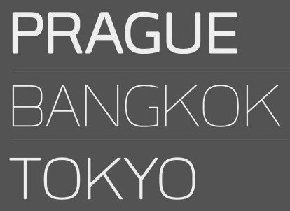 [MyFonts]
[More] ⦿
|
Chauncey H. Griffith

|
 Kentucky-based type designer and printer, 1879-1956. He was a Linotype salesman who directed the growth of the Linotype library from 1915 to 1948, and improved the look of the world's newspapers. He worked to establish Linotype as the composing machine of choice in America. He continued as a consultant to Linotype well into his retirement.
 Claus Eggers Sorensen writes: In 1922 Chauncey H. Griffith was promoted to Vice President of Typographic Development at Mergenthaler Linotype. He immediately started the development of new typefaces to replace the prevailing modern style typefaces. The issue troubling the moderns was their high contrast design. Especially the hairline parts of the cast lines could break of while printing, and counters could clog with ink and pulp. Faster printing meant transferring the cast lines with the stereotype process to a letterpress cylinder for high-speed rotary printing on endless rolls of paper stock. C. H. Griffith's new approach was to engineer new typefaces to the printing method. That meant drawing inspiration from the Egyptienne style as seen in the Clarendon typeface, with its very sturdy lower contrast design, and Theodore Low De Vinne and Linn Boyd Benton's Century Roman, which possessed elegance and legibility. The first product of these efforts was Ionic No. 5. It was an instant success, within eighteen months it was used by more than 3000 newspapers all over the world. C. H. Griffith and Mergenthaler Linotype continued to refine the design in subsequent iterations: Excelsior (1931), Paragon (1935), Opticon (1935), Corona (1941). These became known as the Legibility group. Ionic No. 5, Excelsior and Paragon form the Linotype Legibility Group. He designed or co-designed the following fonts, all at Mergenthaler: - Baskerville (1939, Linotype).
- Bell Gothic (1937-1938). Now available at Bitstream. Font Bureau has its own version, Griffith Gothic (1997-2000, by Tobias Frere-Jones): Of all his work, Chauncey Griffith claimed one type, Bell Gothic, as his own design. Griffith Gothic is a revival of the 1937 Mergenthaler original, redrawn as the house sans for Fast Company. Tobias Frere-Jones drew a six weight series from light and bold, removing linecaster adjustments and retaining the pre-emptive thinning of joints as a salient feature. Mac McGrew: Bell Gothic was developed in 1937 by C. H. Griffith of Mergenthaler Linotype, primarily for use in the New York City telephone directory, but quickly became standard for telephone books nationwide. The aim was to eliminate roman types with objectionably thin serifs and hairlines. Furlong and Market Gothic were specialized adaptations of this typeface for newspaper work, the former with special figures and other characters for setting racetrack results, the latter in 1941 with other special characters for stock market details. The basic Bell Gothic was also cut by Intertype in 1939. Compare No. 11 and No. 12, shown under Numbered Faces, previously used for directory work. Imitations include OPTI Benet (Castcraft). Poster by Jaime Schweitzer. View digital versions of Bell Gothic.
- Bookman (1936, after the 1960 original by Alexander Phemister at Kingsley ATF).
- Corona (1941), a narrow newspaper typeface with large x-height. Corona was designed to meet the rigorous requirements of high-speed printing, and is still the chosen type of many American daily newspapers. Mac McGrew: Corona was drawn and cut by Linotype under the direction of C. H. Griffith in 1941. It is a member of the "Legibility Group" of faces designed for easy reading under newspaper conditions of stereotyping and high-speed printing with inks that could be trapped in close quarters. Royal on Intertype is a 1960 copy of Corona. Digital revivals include C795 Roman (Softmaker), News 705 BT (Bitstream).
- Elegant Garamond (Bitstream). This Granjon design was made by Chauncey H. Griffith based on models by George William Jones, and before that, Robert Granjon.
- The didone-style newspaper typeface Excelsior (1931, Linotype). At Bitstream, this is News 702. URW calls it Excius, and SoftMaker's version is Exemplary. Mac McGrew: Excelsior was cut for Linotype in 1931 under the direction of C. H. Griffith. It is a plain type, but designed for the utmost readability, with only slight variation from thick to thin, and careful fitting that makes the characters flow into easily recognizable words. Long or short descenders are available in certain sizes. Like a number of Linotype typeface intended primarily for newspaper work, Excelsior is available in closely graded sizes, including odd and some half-point multiples.
- Granjon (1928-1930, with George William Jones at Linotype). MyFonts: Claude Garamond's late Texte (16 point) roman was the model used by George W. Jones when he designed this typeface for Linotype&Machinery in 1928. To avoid confusion with the Garamond romans based on Jannon's seventeenth century work, L&M called the typeface Granjon, after the designer of the italic used as a model, thus creating confusion with the typefaces based on Granjon's romans, Plantin and Galliard. Granjon is a little less crisp in cut than either Sabon, Stempel Gararmond or Berthold Garamond, but makes a magnificent and most readable text face, as shown in Reader's Digest since its founding. Mac McGrew: Granjon was designed for Linotype in 1928 by George W. Jones, distinguished English printer, to meet his own exacting requirements for fine book and publication work. It is derived from classic Garamond sources, but with refinements made possible by modern methods of punch cutting. In fact, one critic has called it "the purest form of Garamond." It is named for Robert Granjon, mid-sixteenth-century punch cutter noted in particular for his italics, from which the present Granjon Italic was derived. Granjon Bold, by C. H. Griffith, was added in 1931. Lanston Monotype acquired reproduction rights to the typeface from Mergenthaler.
- Ionic No. 5 (Linotype, 1925). Mac McGrew: Ionic is a general name for a style of typeface which is closely related to the Clarendons (q.v.). Plain, sturdy designs with strong serifs and little contrast, the Ionics were popular in the latter part of the nineteenth century. Although many founders offered them, they were generally gone by early in this century. A few received a new lease on life when they were copied by Monotype, Linotype, or Intertype. Two new Ionics appeared in this century. Ionic No.5 was designed by C. H. Griffith in 1926 for Linotype, as a newspaper text face. It features a large lowercase with short ascenders and descenders, with no fine lines or serifs to break down in stereotyping, and no small openings to fill up with ink. This is one of a few typefaces made in many closely graded sizes: 5-, 51/2-, 6-, 61/2-, 63/4-, 7-, 71/2-, 8-, 9-, 10-, and 12-point. Intertype's Windsor, developed in 1959, is comparable. Ionic Condensed was designed by Griffith in 1927, also for Linotype. It is a refinement of traditional designs, intended for newspaper head- ings, and has most of the general characteristics of the text face. Ionic Extra Condensed is essentially the same, a little narrower and without lowercase, also for newspaper headlines.
- Janson (1932). Mac McGrew: Janson is adapted from types often attributed to Anton Janson, seventeenth-century Dutch letter founder, although researchers have shown that the originals were cut by Nicolas Kis, a Hungarian punchcutter and printer. The Linotype version was done in 1932 under the direction of C. H. Griffith, based on the 14-point size of about 1660. The Monotype version was adapted by Sol Hess in 1936, in collaboration with Bruce Rogers. Both versions are sharp and clear cut, and rather compact. They bear some resemblance to the types of William Caslon, which were based on later, similar Dutch types.
- Memphis (1929): the prototypical Egyptian of Rudolf Wolf. Mac McGrew: Memphis is the Linotype copy of the popular German square-serif typeface known as Memphis or Girder, designed by Rudolf Weiss about 1929, which did much to revive interest in this old style. Memphis Light and Bold were introduced by Linotype in 1933, Italics and Unique Caps in 1934, Medium in 1935, and other variations up to 1938. The Extra Bold versions were designed by C. H. Griffith. Alternate characters are available in some versions to more nearly approximate the appearance of Stymie or Beton (q.v.). The Lining versions are comparable to small caps in the regular versions, being propor- tionately wider and heavier than caps, and have no lowercase; there are several sizes each in 6- and 12-point, permitting various cap-and-small-cap combinations, in the manner of Copperplate Gothic. Also see Ward; compare Cairo, Karnak. Digital versions are everywhere. The Bitstream version is Geometric Slabserif 703.
- Linotype Monticello was designed by Griffith in 1946. Its design is based on James Ronaldson's Roman No.1 and Oxford Typefaces from American Type Founders and was revised by Matthew Carter while he was working at Linotype between 1965-1981. Mac McGrew: Monticello is a Linotype recreation of America's first great typeface, Binny&Ronaldson's Roman No.1, cut about 1796 by Archibald Binny in Philadelphia. His was the first permanent American type foundry. After about 30 years, the Binny typeface fell into disuse. The matrices survived, though, and a few fonts were cast about 1892 and the typeface was renamed Oxford (q. v.). In 1943 Princeton University Press announced plans for publishing a 52-volume edition of The Papers of Thomas Jefferson. As President, Jefferson had personally written to friends in France, introducing a Binny&Ronald- son representative who was seeking a source of antimony to replenish the shortage which threatened the young typefounding industry in this country. Jefferson also referred in this letter to the importance of type to civilization and freedom. In addition, the popularity of this typeface coincided with the most prominent years of Jefferson's life. Therefore Linotype suggested that a recutting of the typeface would be most appropriate for the Jefferson books, and the publisher heartily agreed. C. H. Griffith, Linotype typographic consultant, made a detailed study of Binny's type and redrew it in 1946 for the requirements of Linotype composition and modern printing conditions. It is a vigorous transitional face, somewhat similar to Baskerville but slightly heavier and a little crisper.
- Opticon (1935, Linotype). Mac McGrew: Opticon was designed in 1935 by C. H. Griffith for Linotype. It is a member of what that supplier calls its Legibility Group of typefaces designed primarily for newspaper use. It is essentially the same as Excelsior, but with stems and thick lines weighted slightly, for printing on hard-surfaced paper.
- Paragon (1935, Linotype). Mac McGrew: Paragon was designed by C. H. Griffith for Linotype in 1935. It is a member of that company's Legibility Group of typefaces, planned primarily for sharp and clean printing under the difficult inking and printing conditions of newspaper production, but also useful and popular for other periodical work. This typeface is lighter and airier than most such typefaces; otherwise it is much the same style. Compare Excelsior, Ionic, Opticon, Textype.
- Poster Bodoni (1920). Digital versions of Poster Bodoni or a textured ornamental version of it include Poster Bodoni (Bitstream), Modern 721 (Bitstream), OPTI Poster Bodoni Compressed (Castcraft), Bodoni Poster (Softmaker), Bodnoff (Corel), Poster Bodoni (Tilde), Poster Bodoni WGL4 (Bitstream), Saphir (Linotype), Bodoni Poster (Linotype), Bodoni poster (Adobe; same as the Linotype version), and Bodoni Ornamental (FontMesa).
- Ryerson Condensed was designed by C. H. Griffith in 1940 for Linotype, as a modernization of Globe Gothic Condensed.
- Textype (1929, Linotype). Mac McGrew: Textype was designed in 1929 by C. H. Griffith for Linotype. Although intended as a newspaper face, Textype with its smaller x-height and longer ascenders than most newspaper typefaces also became popular for magazines and other publications, as well as for a certain amount of advertising and general printing. There is an 18-point size in roman with italic, also a bold and bold italic. The 18-point size and the bold italic are both rare in newspaper typefaces. Compare Excelsior, Ionic, Rex, etc.
- Non-Latin typefaces: Porson and Metro Greek; thirteen Arabic designs adaptable for use throughout the Moslem world; Hebrews; the Indian scripts devanagari, Gujarati, and Bengali; Sinhalese for use in Ceylon, Tamil, and Syriac.
Klingspor link. Linotype link. FontShop link. Font Bureau link. Pic. [Google]
[MyFonts]
[More] ⦿
|
Chepi Devosi
|
Jakarta-based designer (b. 1985) of the free poster typeface Spidola (2013) and of the Veneer-style letterpress grunge typefaces Skyfall (2013) and Warpaint (2013, based on Alternate Gothic (1903, Morris Fuller Benton). Behance link. [Google]
[More] ⦿
|
Chitchai Kuandachakupt
|
Ph D researcher at Kyoto Institute of Technology, Japan. At Typography Day 2012 he speaks on Ariyaka, the early typeface leads modern industrialization of letterpress printing in Thailand. [Google]
[More] ⦿
|
Chris Costello

|
Chris Costello (b. 1959, Poughkeepsie, NY) graduated from Northeastern University in Boston. Since 1989, he works as a graphic, web and font designer and illustrator from his base in watertown, MA. From 2002 onwards, he has worked as a creative director and senior graphic designer for Coldwell Banker Residential Brokerage in Woburn, MA. Since 2010, hae also creates artistic designs and renderings for United States coinage and medal programs for the U.S. Department of the Treasury. He runs Costello Art, and is involved in graphic design and handlettering. His typefaces: - The simultaneously gorgeous and overused Papyrus (1983, Letraset). One variant is sold by Elsner&Flake as Papyrus EF Regular, and another is in the Linotype library. The Avatar 2009 movie poster features Papyrus, and many are getting tired of the ubiquity.
- Letterpress Text. An antiqued rough outline family based on Caslon.
- Mirage (2001).
- Blackstone (2001). A medieval (blackletter) typeface. Winner of the Chartpak typeface design competition in 1988.
- Virus (2001).
- In the planning stage: Driftwood (great lettering!), Sheriden's Letters (writing by a 5-year old), Costello (text font).
Klingspor link. Bio. MyFonts entry. Papyrus blog. FontShop link. Linotype link. [Google]
[MyFonts]
[More] ⦿
|
Chris Vile
[Font Monger]
|
[More] ⦿
|
Christian Jung
[Christian Pannicke]
|
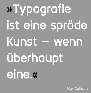 [More] ⦿
|
Christian Pannicke
[Christian Jung]
|
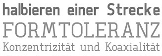 Christian Pannicke (Christian Jung) is a typeface designer and art director based in Berlin. His typefaces:
 - During his communication design studies in Berlin in 2013, Christian Pannicke created three typefaces, Aggi (a great carefully manicured display face), Alir (a modular squarish sans) and Neiga (a noteworthy free monoline Swiss slab serif described by Christian as glasklar und einfach).
- The didone display typeface Agigi (2014), possibly renamed from Aggi.
- The macho geometric sans serif typeface Amok (2014).
- The roundish sans typeface Rodina (2014).
- He designed Neue Cafe Grotesk for a final school project entitled Typography as a cultural embassy in the architecture of Berlin.
- Nora (2014) and Nora Bold (2016): wedge serif magazine titling typefaces.
- The letterpress emulation typeface family Heinrich (2017), which comes with several inline and textured styles.
- The 20-style layerable poster typeface family Faust (2018).
[Google]
[More] ⦿
|
Cindy Kinash
[Cultivated Mind]

|
 [MyFonts]
[More] ⦿
|
Clément Nicolle
[Stereotype (was: Zone Erogene, or Dasklem)]

|
 [MyFonts]
[More] ⦿
|
Conor Muirhead
[Icon Stacks]
|
[More] ⦿
|
Conrad Garner
[Good Gravy Type]

|
 [MyFonts]
[More] ⦿
|
Conrad X. Shinn
|
 Aka Cobb Shinn (b. 1887, Fillmore, IN, d. 1951). His story is told by Jeff Levine, who designed a series of cartoon character dingbat fonts inspired by Cobb shinn: Conrad X. "Cobb" Shinn (Sept. 4, 1887- Jan. 28, 1951) was a Fillmore, Indiana-born post card illustrator who sold a series of successful novelty postcard lines which included (among others) Charlie Chaplin, automobiles and the Dutch culture in the beginning years of the 20th Century. After serving in World War I, Shinn found the market for novelty postcards dwindling, and he also lent his artistic skills to cartoon features and illustrating many children's books [including his own, under the nickname Uncle Cobb] which taught easy step-by-step drawing methods. Some time in the 1920s, he eventually migrated into the field of supplying electrotypes and stereotypes of stock cuts of photos and line art to the printing trade. In the days of letterpress printing, this was the forerunner of paper clip art and its successor, electronic clip art. Purchasing many of his designs from journeyman artists of the time, the diversity of Cobb Shinn's stock cuts library grew with the passing years, reflecting changing times, styles and topics. Some of the illustrators whose signed works were presented in Shinn's CUTalogs [as he called his stock cuts catalogs] include Mary Clemmitt, Louis H. Hippe, E.C. Klinge, Nelson White, Harvey Fuller, Bess Livings, Lois Head, Harvey Peake and Van Tuyl. Upon his passing in 1951, it's not known how long the Indianapolis-based company existed before finally closing its doors. One of the more popular series of cartoons were the line illustrations of men and women affectionately called little big head guys by many modern fans of these cuts because the heads of the characters were drawn somewhat larger than the rest of their bodies. Levine's font that shows these charming charcaters is Shinn Kickers JNL (2014). [Google]
[More] ⦿
|
Copperplate Gothic
[Frederic W. Goudy]
|
 A typeface made by Frederic Goudy in 1903. Mac McGrew: Copperplate Gothic Heavy was designed in 1903 by Frederic W. Goudy, who is much better known for his classic roman typefaces. Other weights and widths were drawn shortly thereafter by Clarence C. Marder of ATF, except the Shaded, designed by Morris F. Benton in 1912. A rather wide, monotone, conventional gothic with the added feature of minute serifs, Copperplate Gothic is imitative of the work of engravers, as suggested by the name. It became ATF's all-time best seller, being used extensively for stationery and form work, especially in the small neighborhood printshops of the letterpress era. It is the typical lining gothic face, featuring four sizes each on 6- and 12-point bodies, and two sizes each of 18- and 24-point in foundry (composing-machine sizes differ somewhat), so that a wide variety of cap-and-small-cap combinations can readily be set. Before Monotype developed its "Plate Gothic arrangement" (see under "Design Limitations" in Introduction) in 1919, permitting the keyboarding of all four sizes of 6- or 12-point at once, that company had made the Copper plate Gothics simply as cap-and-small-cap combinations, typically in 5-, 6-. 8-,10-, and 12-point plus display sizes. Hence most of these gothics have two different series numbers on Monotype, the lower number for display sizes and the obsolete cap-and-small-cap combinations, the other for the four-size combination. Several versions of Steelplate Gothic (q.v.) from BB&S were near duplicates of Copperplate Gothic, although a few characters differed slightly and the extended versions were not quite as wide. Hansen had Engravers Gothic in several versions, differing apparently only in the R as shown in the specimen. Compare Plate Gothic, Whittier; also see Bank Gothic, Blair, Boxhead Gothics. D.J.R. Bruckner lists the date as 1905 and writes: Goudy's recollection was that this hodgepodge was done for American Type Founders. It was made for Marder, Luse and Company and then taken on by ATF and can still be found in old ATF specimen books and their old fonts..
 Digital versions: Copperplate Gothic (Linotype), Copperplate Gothic (Adobe), Copperplate Gothic (Bitstream), Copperplate Gothic Hand (Wiescher Design), Opti Copperplate (Castcraft), Copperplate Gothic, Copperplate New (2019, Martin Cincar), Copperplate CC (2020, Owen Earl). [Google]
[More] ⦿
|
Cosimo Lorenzo Pancini

|
 Born in Firenze in 1969. Cofounder with Francesco Canovaro and Debora Manetti of the Italian design firm in Firenze called Studio Kmzero. He co-designed some typefaces there such as Arsenale White (2009). In 2002, Pancini developed Targa, TargaMS and TargaMSHand (for comic books?), basing his design on the peculiar sans serif monospace typeface with slightly rounded corners and a geometric, condensed skeleton that Italy had been using for its license plates. In 2022, Francesco Canovaro redesigned this font into a versatile multi-weight typeface, Targa Pro, which includes Targa Pro Mono (which keeps the original monospace widths), Targa Pro Roman (with proportional widths), both in five weights plus italics, the handmade version Targa Hand, and Targa Pro Stencil.
 The handwriting of Lord Byron led Pancini to develop the brush script typeface Byron (2013, Zetafonts). MyFonts credits him with the rounded avant garde sans family Antipasto (2007), but elswhere we read that this typeface is made by Matteo di Iorio, so there is some confusion. It was extended in 2017 by Pancini as Antipasto Pro. In 2014, Cosimo Lorenzo Pancini and Francesco Canovaro co-designed Amazing Grotesk (+Ultra). He also designed the calm bold geometric rounded sans typeface Cocogoose (2014; replaced by Cocogoose Pro in 2017) and the stylish deco font Offensive Behaviour. Cocogoose Letterpress is free. Cocogoose is part of the Coco Gothic family, a collection of twelve typefaces each inspired by the fashion mood of every decade of last century, named after fashion icon Coco Chanel. Cocogoose is Coco Gothic for the 1940s. See also Coco Gothic Pro (2021). In 2015, Pancini published the grand family Coco Gothic. This Latin / Greek / Cyrillic typeface family features a small x-height and sligghtly rounded corners to make the avant garde and geometric sans typefaces in vogue in the 1970s come alive again, ready for 21st century fashion magazines. It comes with substyles that recreate many moods, including art nouveau and arts and crafts (Cocotte), Italian propaganda style and Italian deco (Cocosignum), hipster style (CocoBikeR), or Bauhaus (Cocomat). Coco Gothic was initially developed as a corporate font for Lucca Comics & Games Festival 2013. The rounded geometric sans family Cocomat (by Cosimo Lorenzo Pancini, Deborah Manetti and Francesco Canovaro) was inspired by the style of the twenties and the visions of Italian futurists like Fortunato Depero, Giacomo Balla and Antonio Sant'Elia. Updated in 2019 as Cocomat Pro. Still in 2015, Cosimo and Zetafonts published the connected creamy baseball script Bulletto, the grungy handvetica Neue, and the calligraphic wedding typeface Hello Script. In 2015, at Zetafonts, Cosimo Lorenzo Pancini designed CocoBikeR (2015) to celebrate the hipster and bike cultures. CocoBikeR (for Latin, Greek and Cyrillic) is part of the successful Coco Gothic typeface family. In 2017, Pancini designed the 1930s Italian art deco typeface families Cocosignum Maiuscoletto and Cocosignum Corsivo Italico. In 2021, he published the 48-style (+variable) font family Coco Gothic Pro. This is a redrawn and expanded set of fonts: Inspired by a biography of Coco Chanel and trying to capture the quintessential mood of classical fashion elegance, Cosimo Lorenzo Pancini designed Coco Gothic looking for the effect that the first geometric sans typefaces (like Futura, Kabel or the italian eponyms like Semplicita) had when printed on paper. The crisp modernist shapes acquired in printing charme and warmth through a slight rounding of the corners that is translated digitally in the design of Coco Gothic. [...] A distinguishing feature of Coco Gothic Pro is the inclusion of ten alternate historical sets that allow you to use the typeface as a true typographic time machine, selecting period letterforms that range from art deco and nouveau, to modernism and to eighties' minimalism. Equipped with such an array of historical variants, Coco Gothic Pro becomes an encyclopedia of styles from the last century. There is also attention to Darkmode and there is coverage of Cyrillic and Greek. Typefaces from 2016: Adlery (a curly brush script), Kitten (Fat, Swash, Swash Monoline, Slant, Bold: signage script family), Adlibitum (a blackletter typeface by Cosimo Lorenzo Pancini and Francesco Canovaro), Morbodoni (a display didone by Cosimo Lorenzo Pancini and Francesco Canovaro). In 2016, Cosimo Lorenzo Pancini, Andrea Tartarelli, Giulia Ursenna Dorati and Andrea Gaspari co-designed the 1940s vintage brush script typeface Banana Yeti, which is based on an example by Ross George shown in George's Speedball 1947 Textbook Manual. The Zetafonts team extended the original design to six styles and multilingual coverage. The ExtraBold is free. Still in 2016, Pancini designed Calligraphunk, an experimental typeface that mimicks polyrythmic calligraphy, by alternating two sets of lowercase letters to emulate handwriting. In 2016, Cosimo Lorenzo Pancini, Matteo Chiti, Luca Chiti and Andrea Tartarelli co-designed the retro connected brush script font family Advertising Script, which is based on an example from Ross George's Speedball 1947 Textbook Manual. Beatrix Antiqua (2016, by Francesco Canovaro, Cosimo Lorenzo Pancini and Andrea Tartarelli). This humanist sans-serif typeface is part of the Beatrix family (Beatrix Nova, etc.) that takes its inspiration from the classic Roman monumental capital model. Its capitals are directly derived from the stone carvings in Florence's Santa Croce Cathedral. Beatrix keeps a subtle lapidary swelling at the terminals suggesting a glyphic serif, similar to Hermann Zapf's treatment in Optima. Amazing Grotesk (2016) is based on a logo designed by Francesco Canovaro. Studio Gothic (2017, by Francesco Canovaro, Cosimo Lorenzo Pancini and Andrea Tartarelli) is an 8-style geometric sans family based on Alessandro Butti's geometric sans classic, Semplicita. Hello Script and Hello Sans can be used for layering and coloring. The Christmas-themed version is Hello Christmas. Pancini designed the 64-strong typeface family Body Grotesque and Body Text in 2017-2018, together with Andrea Tartarelli. It was conceived as a contemporary alternative to modernist super-families like Univers or Helvetica. In 2017, Cosimo Lorenzo Pancini and Andrea Tartarelli co-designed the sans typeface family Kabrio, which gives users four different corner treatment options. Anaphora (2018). Anaphora is a contemporary serif typeface designed by Francesco Canovaro (roman), Cosimo Lorenzo Pancini (italic) and Andrea Tartarelli. It features a wedge serif design with nine weights from thin to heavy. Its wide counters and low x-height make it pleasant and readable at text sizes while the uncommon shapes make it strong and recognizable when used in display size. Anaphora covers Latin, Greek and Cyrillic. Canovaro's Arista served as a basis for the 29-style monolinear rounded sans typeface family Aristotelica (2018) by Cosimo Lorenzo Pancini and Andrea Tartarelli. See also Aristotelica Pro (2020). In 2018, he designed the italics for Cosimo Lorenzo Pancini's Domotika typeface family. Between 2018 and 2021, Cosimo Lorenzo Pancini and Andrea Tartarelli developed the 8-weight humanist sans typeface Domotika for Latin, Cyrillic and Greek, further into the 18-style Domotika Pro (2021). In 2018, he published Radcliffe, with Andrea Tartarelli, a Clarendon revival with Text and Casual subfamilies. Radcliffe (a Clarendon revival by Cosimo Lorenzo Pancini and Andrea Tartarelli), and added the layerable condensed Cocogoose Narrows to the Cocogoose family. Codec (2018) by Cosimo Lorenzo Pancini, Francesco Canovaro and Andrea Tartarelli is a geometric sans typeface family in which all terminal cuts are horiontal or vertical. See also Codec Pro (2019). His Double Bass (2018) is a jazzy 4-style typeface family that pays tribute to Saul Bass's iconic hand lettering for Otto Preminger's The Man with the Golden Arm film title sequence and other movies, Bass's vibrating, almost brutal cut-out aestethics, and the cartoonish lettering and jazzy graphics of the fifties. In 2018, he published the sharp wedge serif typeface Blacker to pay homage to the 1970s. In 2019, that was followed by Blacker Pro (Cosimo Lorenzo Pancini and Andrea Tartarelli, who write: Blacker Pro is the revised and extended version of the original wedge serif type family designed by Cosimo Lorenzo Pancini and Andrea Tartarelli in 2017. Blacker was developed as a take on the style that Jeremiah Shoaf has defined as the "evil serif" genre: typefaces with high contrast, oldstyle or modern serif proportions and sharp, blade-like triangular serifs). Still in 2018, he designed the swooping polyrhythmic calligraphic typeface Calligraphunk. In 2018, Cosimo Lorenzo Pancini and Andrea Tartarelli designed Holden, a very Latin cursive sans typeface with pointed brush aesthetics and fluid rhythmic lines. In 2019, Cosimo Lorenzo Pancini, Francesco Canovaro and Andrea Tartarelli published the monolinear geometric rounded corner amputated "e" sans typeface family Cocogoose Classic, the sans family Aquawax Pro, and the condensed rounded monoline techno sans typeface family Iconic. In 2019, Cosimo Lorenzo Pancini, Andrea Tartarelli and Maria Chiara Fantini at Zetafonts published a slightly calligraphic Elzevir typeface, Lovelace. In 2019, the lapidary typeface family Beatrix Antiqua (Francesco Canovaro) was reworked by Cosimo Lorenzo Pancini together with Andrea Tartarelli and Maria Chiara Fantini into a 50-style type system called Monterchi that includes Text, Serif and Sans subfamilies. Monterchi is a custom font for an identity project for a famous fresco in Monterchi, developed under the art directorship of Riccardo Falcinelli. Tarif (2019) is a typeface family inspired by the multicultural utopia of convivencia---the peaceful coexistence of Muslims, Christians and Jews in tenth century Andalusia that played an important role in bringing to Europe the classics of Greek philosophy, together with Muslim culture and aesthetics. It is a slab serif typeface with a humanist skeleton and inverted contrast, subtly mixing Latin zest, calligraphic details, extreme inktraps, and postmodern unorthodox reinvention of traditional grotesque letter shapes. The exuberant design, perfect for titling, logo and display use, is complemented by a wide range of seven weights allowing for solid editorial use and great readability in body text. Matching italics have been designed with the help of Maria Chiara Fantini and Cosimo Lorenzo Pancini, while Rania Azmi has collaborated on the design of the arabic version of Tarif, where the humanist shapes and inverted contrast of the Latin letters find a natural connection with modern arabic letterforms. Late in 2019, Cosimo Lorenzo Pancini released the fun typeface family Hagrid at Zetafonts, which writes: Crypto-typography---the passion for unknown, weird and unusual character shapes---is a disease commonly affecting type designers. Cosimo Lorenzo Pancini has celebrated it in this typeface family, aptly named Hagrid after the half-blood giant with a passion for cryptozoology described by R. K. Rowling in her Harry Potter books. Extreme optical corrections, calligraphic counter-spaces, inverted contrast, over-the-top overshoots: all the inventions that abound in vernacular and experimental typography have been lovingly collected in this mongrel sans serif family, carefully balancing quirky solutions and solid grotesque design. In 2020, Pancini released Stinger (2020, a 42-style reverse contrast family by Francesco Canovaro, Cosimo Pancini, Andrea Tartarelli and Maria Chiara Fantini) and Boring Sans (a typeface family designed along two variable axis: weight and weirdness). As part of the free font set Quarantype (2020), Cosimo Lorenzo Pancini designed Quarantype Embrace, Quarantype Hangout, Quarantype Hopscotch, Quarantype Joyride, Quarantype Sackrace, and Quarantype Uplift (with Maria Chiara Fantini). In 2020, Cosimo Lorenzo Pancini and Mario De Libero revived Nebiolo's Carioli (1928) as Cairoli Classic and Cairoli Now at Italian Type / Zetafonts. They extended the original weight and width range and developing both a faithful Classic version and a Now variant. The Cairoli Classic family keeps the original low x-height range, very display-oriented, and normalizes the design while emphasizing the original peculiarities like the hook cuts in curved letters, the high-waisted uppercase R and the squared ovals of the letterforms. Cairoli Now is developed with an higher x-height, more suited for text and digital use, and adds to the original design deeper inktraps and round punctuation, while slightly correcting the curves for a more contemporary look. Cairoli Variable has a weight and width axis. In 2020, Cosimo Lorenzo Pancini and Mariachiara Fantini---with the help of Solenn Bordeau---released Erotique at Zetafonts. Erotique evolved from Lovelace, an earlier Zetafonts typeface. Zetafonts describe this evil serif as follows: it challenges its romantic curves with the glitchy and fluid aestethic of transmodern neo-brutalist typography. Late in 2020, they added Erotique Sans, the sans version of Erotique, also designed by Cosimo Pancini and Maria Chiara Fantini. Late in 2020, he co-designed the 46-style font family Eastman Grotesque together with Francesco Canovaro and Andrea Tartarelli. This monolinear sans with a tall x-height comprises an interesting Eastman Grotesque Alternate subfamily with daring and in-your-face glyphs. The typeface evolved from Zetafonts' earlier Bauhaus-inspired typeface Eastman (2020). Later fonts in this family include Eastman Condensed (2021, by Francesco Canovaro, Cosimo Pancini and Andrea Tartarelli). In 2020, Cosimo Pancini, Andrea Tartarelli and Mario De Libero drew the 60-style Cocogoose Pro Narrows family, which features many compressed typefaces as well as grungy letterpress versions. Sunshine Pro (2020, Zetafonts) was designed by Cosimo Lorenzo Pancini and Solenn Bordeau expanding the original Sunshine design by Francesco Canovaro, part of the Quarantype collection (2020), which in turn was designed as a typeface for good vibes against Covid-19. Sunshine Pro is an experimental Clarendon-style font with variable contrast along the weight axis---contrast is reversed in light weight, minimized in the regular weight and peaks in the bold and heavy weights. Coco Sharp (2021) is a 62-style sans feast, with two variable fonts with variable x-height, by Francesco Canovaro, Cosimo Pancini and Andrea Tartarelli. Co-designer of Heading Now (2021), a 160-strong titling font (+2 variable fonts) by Francesco Canovaro, Cosimo Pancini, Andrea Tartarelli and Mario De Libero that provides an enormous range of widths. Keratine (2021, Cosimo Pancini, Andrea Tartarelli and Mario De Libero). A German expressionist typeface that exists in a space between these two traditions, mixing the proportions of humanistic typefaces with the strong slabs and fractured handwriting of blackletter calligraphy. Pancini, its main designer, writes that it explores the impossible territory between antiqua and blackletter. Geppetto (2021) is a frivolous Tuscan font that started out as a revival of a condensed Tuscan wood type family appearing in the 1903 Tubbs Wood Type catalog and which was probably derived from an 1859 typeface by William Hamilton Page. Pancini built a variable font on top of it and calls it a font for fake news. In 2021, Pancini added Coco Tardis as a variable font with a time travel slider to the Coco Gothic family. Millard Grotesque (2021) is a true "grot" in the Akzidenz Grotesque sense of the word. This typeface family was designed by Cosimo Lorenzo Pancini and Andrea Tartarelli. Pancini's Descript (2021) is a variable script font with two axes, slant and speed of writing. Milligram (2021) is a very tightly set grot by Cosimo Pancini and Andrea Tartarelli. [Google]
[MyFonts]
[More] ⦿
|
Creative Toucan (was: Leo Supply Co)
[Leonard Posavec]

|
 Cakovec, Croatia and Washington Park, WA-based designer (b. 1995) of preponderantly grunge typefaces. In 2013, he created Funny Classic, Lion Pro, Lover, War is in the Air (military stencil), Aussen (squarish), Ensione (outlined), Rangle, Gaon, Momgers, Escapea (athletic lettering), Campus A (athletic lettering), Zebraliner, The Alistaren, Goteros, Collegerion (athletic lettering face), Prestinia Pro (grungy serif face), Fast Ostrich, Funny Trip, Boro, Electric (grungy face), On The Left, Power Balloon, Heavy Bomb (grungy), Kid From Hell, Army Stamp (rough army stencil), Jump Party, Comic Type, Commy, Faster, Fati, Funny me, Hypnotize, Half Half, My Day, Totally Outline, First Day, Funny Kid, Waterline, Piranha, Fish (grunge face), Modern Sketch, Beboline (dymo label grunge), Metalic (sic), Moter (grungy outline face), Privjet, ShadowM (shaded typeface), Old Movie, Strong Boy, Russian Line, Long Leg, Cool Day, Jungle Tree, Funny Teca, End of Era, DeLeo, Buble Muble, Morris, Funky Monkey, Leonards (a scratchy typeface), Dead John (grunge), Square Baby (grunge), Handwriter, Outline Storm, Mejiko (grungy Western font), Bird Fly, Died, Close To (grungy dymo label font).
 Typefaces from 2014: Dabre, Handeer, Bad Land, Thron, 806 Typography (wood style didone), Rypote. Typefaces from 2015: Debeli Bridge (faded, grungy and gorgeous), Rustal, Madalen, Stiquez, Vallyns (grungy, stamped typeface), Falsthan (brush face), Areson, Summeron (brush script), Surpal Lovely (Victorian kitsch), Summer 2, Megeon (+Grunge), Dabre Grunge (textured caps). Typefaces from 2016: Taramda, Endless Script, Riot Ton, Dabre (grungy stamped style), La Tequila (Western font), Originals (painted letters), Originals is out, Avenue Drift, Amoky (sketched), Bastielle Script, Ipsum Script, Baroquey Script, Pomah Type (brush script), Vrown Fox (dry brush), Time Machino (dry brush), The Gohe Go, My Boquet Script, The Sellen, Baley Sun, Brushed Traveler, Salone Strand, Aple Time (brush), Bert Loch (brush), Brushed Car, Last and Chaos (brush), Thin Zeus (brush), Top Light (fat brush typeface), Summer Soul Script, Summter (connected script), Summdraw, Planine Script, Samtak Script, Astel Script, Rostek Old, Megiline, Sally Script, Rolley, Naila Script, Amoky (textured letterpress emulation typeface family), Reeld (dry brush typeface), Stamped Navy (textured). Typefaces from 2017: Musterion (brush script), Wolvos (rough brush), Xenos, Descolorido, Mushroom (an angulara children's book font), California Jackpot, Zondas, Codiac (rough brush), Gullias (signage script), California or California Jackpot (brush font), Rhinos Rocks (brushy), Quick Toy (inky brush script), Italiano (dry brush), Gode (thick brush), Ananas Lips, Kiwano Apple, Cup of Sea, Fly N Walk, Sign 45 (vintage grungy poster style), Jaoy, Gas Rock, Acids. Typefaces from 2018: Storehouse (a vintage all caps copperplate family with small wedge serifs; by Nicolas Massi and Leonard Posavec; it includes a stencil style), San Francisco, Quick Pick (brush), Mick's, Jumper, Alask (brush), Royal Twins, Clas (brush script), Yolloy, Scolarship (sketched). Typefaces from 2019: Planina, Athletica (letterpress style), Costa La Vista (font duo), Springs, Originals 2 (dry brush), Astana. Typefaces from 2020: Myla (a display typeface). Typefaces from 2021: Surfbars (a dry brush font for outdoors usage; also supports Cyrillic). Fontspace link. Creative Market link. Old URL. Another Creative Market link. Dafont link. Fontplanet link. [Google]
[MyFonts]
[More] ⦿
|
Cruzine
[Peter Olexa]
|
 Peter Olexa (Bratislava, Slovakia, b. 1978) created the (typically retro / vintage) mostly commercial typefaces Slow SVG (2020: a brush font), Hurley (2020), Royal (2020: vintage caps), Wagoon (2020), Snow (2020: a 3d color SVG font), Venomous (2020: spurred, grungy), Behofeel (2020), Chasmophile (2020: formal calligraphy), Angelic (2019: dry brush), Boutique Paris (2019), Umbrella (2019), Cellica Bold (2019), Abigaile (2019), Ragtime (2019: a brush font), Ragtime Marker (2019), Futu (2018), Kiko (2018), Pineapple (2018), Urban (2018: inline), Plasma (2018), Evolve (2018: inline), Hallowen (sic; 2018), Phantom (2018), Palam (2018), Alter (2018), Chrome (2018), Rhino (2018), Giant (2018), Valeria (2018), Ruas (2018), Strife (2018), Giant (2018), Atari (2018), Octopus (2018), Green Light (2018), Atlantis (2018), Maroon (2018), Secure 3D (2018), Cube (2018), Billionaire (2018: art deco), Savana (2018: bejeweled), Castile (2018), Starla (2018), Brodo (2018), Nomos (2018), Brisk (2018, art deco), Tron (2018), Jewel (2018), Forest (2018), Noxa (2018), Ama Deust Inline (2018), Goliath Inline Grunge (2017), Arbatosh (2017: Victorian), Momoco (2017), Heyro Fun (2017), Calliope Fun (2017), Steampunk Gears (2017), Ponds (2017: Victorian), Zahra (2017: inline grunge), Green Light (2017: inline grunge), Jordan Bold Grunge (2017: inline), Metalic 3D (2017), Mecha Grunge (2017), Buffalo (2017), Queen (2017), Lacoste Inline (2017), Ollie (2017, sans family), Nomos (2017), Blue North (2017: spurred), Murray (2017), Atlantis (2017), Montana (2017, outlined), Speedhunter Line (2017), Star Black Inline (2017), Gatsby Inline (2017: art deco), Jibril (2016: spurred), Hallowen (sic) (2016), Kiko (2016), Sailor (2016, tattoo font), Annabel (2016), Zalora (2016), Geno (2016), Marin (2016), Starship (2016), Mozza Shadow (2016), Meravin (2016), Venomous (2016), Amora Inline Grunge (2016), Rocket Shadow (2016), Hydrant (2016), Boston Inline Grunge (2016), Skywalker (2016, art deco), Ocela (2016), Columbus (2016), Raven (2016), Nomura Grunge (2016), Stella (2016), Salada (2016), Vultron (2016), Majestic (2016), Napoleon (2016), Temu (2016), Rodeo (2016, Western style family), Brooklyn (2016), Thunder (2016, Victorian label typeface family), Murray Inline Grunge (2016), Opera (2016, Victoriana), Flamingo Shadow (2016), Blue North Inline Grunge (2016), Montana Bold Outline (2016), Monophone Fancy (2016, retro style), Marin Victorian (2016), Westwood (16-style Western font family), Mozza (2016, +Inline, +Shadow, +Grunge), Speed Hunter (2016), Metro Grunge (2016), Annabel (2016, Victorian), La Forest (2016, blackletter), Star (2016, decorative caps, with outlined and inline versions), Phoenix (2016, a spurred typeface), Gatsby (2016), Bureno (2016, a Victorian display typeface), New York (2016, letterpress emulation), Capella (2016), Almanac Italic Grunge (2015), Anabel (2016, roman caps), Regolith (2015), Chocoleta (2015, hand-printed), Sailor (2015), Turmeric (2015), Ultimatum (2015), Heyro (2015, a rough brush font), Calliope (2015, a rough brush), Glass Beads (2015), Red Paprika (2015), Greenkitchen (2015), Artistico (2015, grungy), Brush Shop (2015), Graceful (2015, irregular script), Brush Wall (2015), Nickainley (2015, connected script), Harloft (2015, a warm brush script), Detective Typewriter (2015), Not Perfect (2015), Good Vibes (2015), Cool Story (2014), Get Coffee (2014), Think Happy (2014), Say Less (2014), Let's Do This (2014), Just Be Cool (2014), Brooklyn Coffee (2014, a spurred poster typeface), Bronx Shoes (2014), Nevermind (2014), RockNRoll (2014), Bluegrass (2014), Memento (2014, spurred Victorian face), Melody (2014) and Grazioso (2014). He runs Dealjumbo.
 Creative Market link. Behance link. Dafont link. [Google]
[More] ⦿
|
Cultivated Mind
[Cindy Kinash]

|
 Cindy Kinash is an apparel graphic designer from Canada. She started the Cultivated Mind foundry in 2012, and made a reputation as a script font designer. She published the hand-printed poster typefaces Amour (2012), Happy Cloud (2012), Have a nice day (2012, +Ornaments), Gionni (2012), Dreamy Hand (2012), Taluhla (2012) and Hello I Like You (2012). Requiem (2012) is grungy.
 Cocobella (2012) is a delightful Treefrog-style connected brush script. Luella (2012) is a vintage poster font family. It includes several typefaces with ornaments. Typefaces from 2013: Pacific Northwest (hand-drawn poster typeface), Mimbie (+Kitschy Ornaments, +Spooky Ornaments, +Social Media Icons), Maisy. Typefaces from 2014: Westcoast Letters, the curly typeface Veronia (2014, with Callie Hegstrom), Local Market (with Charles Gibbons), True North (with Charles Gibbons: a set of letterpress emulation and poster typefaces in all caps; +Extras), Ciao Bella (with Charles Gibbons: a hand-drawn copperplate script emulation with four lovely hand-drawn sets of floral ornaments), La Chic (sic) (a poster font family on a didone body, with several sets of frilly frames), Pacific Northwest Letters, Pacifc Northwest Labels, Azaelia (hand-painted; comes with a dingbat font that has handmade frames, page dividers, ribbons and fancy flourishes). Typefaces from 2015: Mulberry Script, Glamour Brush, True North Textures (letterpress emulation; with Charles Gibbons), Wanderlust (watercolor brush script), Wanderlust Collection (including Wanderlust Letters Pro, Decorative, Boho, Chic, Shine, Gold, Caps, and Ornaments). Typefaces from 2016: Viva Beautiful, Garden Grown (brush script; +US B, +US C Caps), Local Brewery (vintage script). Local Brewery evolved in 2020 into Local Brewery Collection, and includes Icons, Extras, a monoline script and a tall all caps monolinear sans. Typefaces from 2017: Northwoods (handcrafted sans). Typefaces from 2018: Beauty Club (a script and a didone text family), City Streetwear, Beauty Style, Bushcraft (a geometric monoline script). Typefaces from 2019: Garden Collection, Viva Beautiful Collection, Northwoods Rough, Eastville Square (signage script). Creative Market link. YWFT link. [Google]
[MyFonts]
[More] ⦿
|
Dan Carr
[Golgonooza Letter Foundry]

|
[MyFonts]
[More] ⦿
|
Dan X. Solo: The Horse and Buggy Printer
[Gene Gable]
|
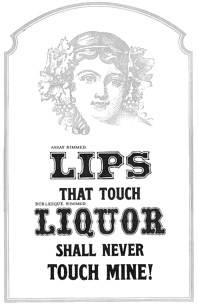 Gene Gable reviews Dan Solo's contributions. He writes: Dan X. Solo spent a lifetime building Solotype, one of the world's most interesting type collections. For three decades he ran his business with unparalleled character and panache. Type designers and graphic artists tend to fall into two categories. You either like ornate old typefaces or hate them. I'm a big fan -- the more ornate and over the top the better. So it was a terrific find when I came across a box of original Solotype catalogs, brochures, and other promotional material. The Solotype shop closed in the early 1990s, leaving a big hole in the availability of unique and unusual type designs. Dan X. Solo, who still lives in Alameda, California, was born in 1928. For his ninth birthday his grandfather gave him a small Kelsey letterpress, and he quickly became a self-described boy printer. He started collecting typefaces in earnest at age 14, and the Solotype collection officially began. After dropping out of high school, Solo became a radio announcer and sometime-actor. In 1949, the 21-year-old put together a magic act and toured the West Coast with some success. Along the way he continued to collect old typefaces, which were plentiful around his native Oakland and the San Francisco Bay area. In 1962, Solo decided to see if he could make a living from his type collection, which by then numbered about 1,000 unique fonts. He printed 4,000 catalogs, sent them to ad agencies around the country, and waited for the orders to come in. This flyer is from 1962 when the Oakland shop opened. The shop took off, as the '60s were a time of design experimentation and there was a keen interest among some designers in ornate and unusual type designs. Solo didn't just offer typesetting. He was a one-man consulting service on the history and appropriate use of his type designs. In 1974 Solo connected with Hayward Cirker, owner of Dover Publications, and a long relationship began that resulted in 30 books showing various type collections, mostly organized by era or theme. The Solotype catalog, reproduced by Dover, reached graphic artists all over the world and inspired a generation of type designers. The type designs weren't the only unusual thing about Solotype. Its business practices and the attitude that Solo fostered were unique. Here are several sections from early Solotype catalogs addressing the way Solo preferred (or insisted) on doing business. Unlike most type shops of the era, which were accustomed to being available to customers on demand, Solotype closed every year for the month of October. During this time, Solo traveled around the country and the world, collecting more type designs and fonts. In the early '90s, Dan X. Solo realized that the digital era was rendering his services obsolete. By that time, he had a collection of more than 13,000 type designs. During that decade he did convert many of his designs to digital format and sold them as collections through Dover, but the type business was changing, and bookstores were not the preferred distribution method for type. Since many of the designs in the Solotype collection are public domain and not associated with any active foundry, they do crop up here and there, mostly in low-priced, generic font collections. But of the thousands of Solotype designs, probably only a few hundred can be had in digital form from any foundry. Perhaps a future resurgence in historic typestyles will make it worthwhile for someone to digitize those that remain. The Solotype collection is an important and historically significant part of type history, even if considered lowbrow by some type purists. Some images scanned by Gables: i, ii, iii, iv, v. [Google]
[More] ⦿
|
Darrel Austin
|
Codesigner with Bill Moran at Blinc Publishing of Goshen, Gommorah (1999), and Prospect. These fonts were published at Chank's Place. [Google]
[More] ⦿
|
Dave Tribby
[American Amateur Press Association (AAPA)]
|
[More] ⦿
|
David Fleming Nalle
[Scriptorium (Ragnarok Press, Fontcraft)]

|
 [MyFonts]
[More] ⦿
|
David S. Rose

|
New York-born founder of the wireless publishing company AirMedia, who designed a character in the September 11 charity font done for FontAid II. CV at MyFonts. Author of An Annotated Bibliography of Typography, Letterpress Printing & Other Arts of the Book (2003, Five Roses Press, New York), of Overviews of Printing Types, and of Introduction to Letterpress Printing. [Google]
[MyFonts]
[More] ⦿
|
David Wolske
[Letterpress Daily]
|
[More] ⦿
|
Denise Bayers

|
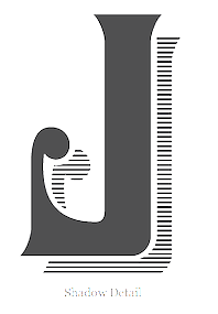 American designer at Letterhead Fonts who specializes in vintage typefaces. Her designs:
 - LHF Durango (2014). A rustic Western typeface, inspired by the opening credits and title of the 1957 version of 3:10 to Yuma.
- LHF Spencer (2014). In the Victorian style.
- The 19th century (Victorian) display typeface LHF Royal Crimson (2014), which can be used for layering.
- Euphoria (2004). A Victorian extravaganza. Followed by LHF Euphoria2 in 2015.
- The Peignot-inspired Charlotte (2004).
- LHF Dark Horse (2014). A blackletter tattoo font.
- Boot Camp. A letterpress emulation.
- Cavalero. A Victorian typeface.
- Fat Daddy. A fat art deco poster typeface, done with Chuck Davis, based on an original by Alf Becker from the 1940s.
- Big Daddy. Like Fat Daddy.
- LHF Shogun (2013). A spurred Victorian typeface.
- The retro dingbat typeface LHF Retro Ricky Doohickies (2015).
- LHF Mercantile (2015).
- The gorgeous compressed art deco typeface LHF Speakeasy (2016).
[Google]
[MyFonts]
[More] ⦿
|
Design Panoply
[John Shaver]
|
 Californian designer of San Luis (2017, brush script), Grembo Duo (2017), the hand-brushed Eiffel (2016, with iconic dingbats such as a kakmadam poodle), the monoline script typeface Cosmodrome (2016), the brush script typeface Maloishes Emellie (2016) and (2016), the whimsical typeface Canterbury (2016), the casual script typeface Wendell (2015), the hand-drawn sans poster typeface Tender (2014), the letterpress emulation typeface Blocklyn (2016), the art deco typeface Nouvelle (2014) and the tall poster typefaces Simplesse (2013) and Hensel (2013). Creative Market link. [Google]
[More] ⦿
|
Dialekt Design (was: Robert Beck Design)
[Robert Beck]

|
Canadian graphic designer and creative director Bob Beck has been living in the Montreal area since 1995. In 1999, he set up Dialekt Design. His typographic oeuvre is extensive: - Learned Behaviour (1996-1997), Manipulator, LaPlaya, 1996, all experimental/exploratory typefaces available from 2Rebels.
- Table Manners, 1997, PsyOps, 2Rebels, Prototype Experimental Foundry (defunct). Beck: Table Manners was born out of the desire for a highly readable text typeface with a subtle graphic edge that would amplify with size. This otherwise simple and geometric type shows its mischief through devilishly spiked-serifs and unexpected curves.
- Loop. 1998. The loop typeface is a pure research project designed by Dialekt in order to investigate the development of simple letterforms through rigid, bold geometric structures and rigorous grid systems.
- RagingBoner, 1999. Custom typeface designed for Burton Snowboards for product packaging and communications materials.
- Hermetique (2001), designed initially for Cascades Paper's exclusive use on paper sample swatchbooks, soon to be released in modified form as a full family.
- Private Press, 2001. This typeface was letterpress printed from an original 1858 10-Line woodtype specimen from the Wells, NY type foundry, and then digitzed in ultra high resolution to retain all the character and wear of this aged alphabet. It is available for purchase as a bitmap TIFF image collection only.
- Asylum, 2005. Asylum is a hand-lettered typeface designed specifically for a snowboard project application for Performance Boardshop in Quebec. It contains 1,313 unique individual glyphs and comes in OpenType format.
- Blaikie, 2006. Blaikie is a custom commission for Canadian Law Office Heenan Blaikie, a national copyright and patent law office. It was developed for proprietary use in all communications materials, as well as signage and wayfinding needs internally for all offices Canada-wide.
Klingspor link. [Google]
[MyFonts]
[More] ⦿
|
Dikas Studio
[Andika Setiawan]

|
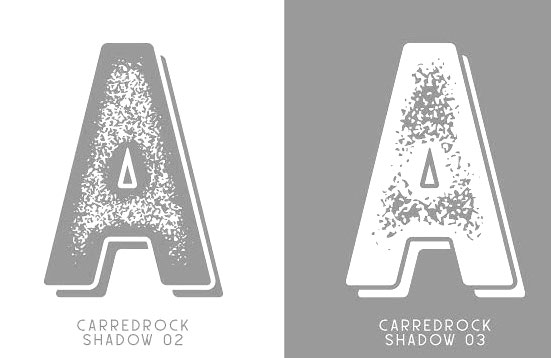 Bogor, Indonesia-based designer (b. 1996) who set up Dikas Studio in 2016 and (with Muthia Fajrijannah) Ludere Studios in 2020. His early fonts at Dikas Studio include the handcrafted display typeface Hantam Mereka (2016), the letterpress emulation font Caredrock (2016, 14 styles), the vintage label font Redvolve (2016), Sunday Quotes (2016), the spurred Victorian typefaces Bohem (2016) and Sadis (2016), Besitoea (2016), a vintage Sunburst collection (2016), the spurred Caringin (2016) and Dramaga (2016) and Sherlock (2016), the sci-fi typeface Space Weel (sic) (2016), the vintage Savaro (2016), the free poster typeface Kalemun (2016), and the mix-and-match poster typeface family Bollo (2016).
 Typefaces from 2017: Stay Wildy, Oldventure, Historycal, Holiday in Monday, Chapter One (grungy), Bohem Press (spurred vintage style), Hillenberg (vintage). Typefaces from 2018: Rajawaley, Outistyle (brush script), Outistyle Brush, Mahoni (an attractive fat script), Wildlast, Wild Ones. Typefaces from 2019: Hot Sauce (a fat brush), Pine Script, Gutter (a hand-drawn all caps sans), Brotherland (vintage, weathered), Gutter Rust (free), Wildy Sign, Wildy Sans, Baby Wildy, Sherlock Press, Pine Forest, Marlies (script). Typefaces from 2020: Liong (a friendly Western or saloon style slab serif), The Sherloks (vintage, spurred), De Floras, Chillow. Typefaces from 2021: Kiti Cuties, Straightler (grungy), American Signer (a baseball script), Great Mammoth (a heavy poster typeface), LD Cherries (a scrapbook font). I am really at a loss here---at Behance, we read that Nuryana Fajartama designed some of these fonts like Sadis and Dramaga. Creative Fabrica link. [Google]
[MyFonts]
[More] ⦿
|
District 62 Studio
[Megan Tamaccio]

|
 Megan Tamaccio (District 62, Miami, FL) designed the Jack & Zoe Font Collection and the LilRebel and Hanley Pro font collections, as well as the free handdrawn typeface Charlie in 2016. In 2017, she published Hanley Rough (letterpress emulation).
 In 2018, she published the connected script typeface Musette and Hanley Block Pro. According to MyFonts, Hanley Pro was co-designed with Aleksandar Veljasevic. Typefaces from 2019: Sonneta (a flowing script). Typefaces from 2021: Lincoln Road (a 9-style sans that includes some blackboard bold fonts; by Megan Tamaccio and Aleksandar Veljasevic>). Fontsquirrel link. [Google]
[MyFonts]
[More] ⦿
|
Dmitry Mankoff
[Artcoast Design (was: Mankoff)]

|
 [MyFonts]
[More] ⦿
|
Doli Harahap
[Tigade Studio]

|
[MyFonts]
[More] ⦿
|
Doug Sheets
|
Doug Sheets (b. 1989) lives in Seattle, WA. He created these typefaces in 2010: the Auctoritas family, Sheets Braille, Humberg, RADARbyDougSheets, Construct (counterless, mechanical), Standard Nib Handwritten (the only free font), Old Letterpress Type, Evie's Hand, and Radius. In 2012, he created Coffee Shop. Dafont link. [Google]
[More] ⦿
|
Doug Wilson
|
Doug Wilson (b. 1982) is a designer, filmmaker, and self-proclaimed font detective. Born and raised in the Midwest, he joined Process Type Foundry (Minneapolis, MN) early in his career. Doug received his BFA in Graphic Design from Missouri State University focusing on typography and letterpress printing. In 2012 Doug released his first documentary, Linotype: The Film, about the Linotype type casting machine. Since 2008, Doug has taught typography, design, and letterpress printing as an adjunct professor at Missouri State University. He has documented vernacular typography all across the United States. [Google]
[More] ⦿
|
Draghia Cornel
|
Romanian creator (b. 1967) in Bucharest of the free fonts DCC Ash (2013, grungy headline face), DCC Manifest (2013, grungy caps), DCC Scisor (2013), DCC Bushido (2013), DCC Bomber (2013, letterpress grungified), DCC Dreamer (2013), DCC Marker Quick (2013), DCC Cloud (2013), DCC Anatolia Strong (2013), DCC Anatolia Classic (2013), DCC Stripes (2012), DCC The Aliens Are Coming (2012), DCC Stained Aliens (2012), DCC Long Nails (2011), DCC Marker Latino (2010) and DCC Sharp Distress Black (2010), and of the blackboard bold style font Cornel (2007). Alternate URL. Home page. Devian tart link to his vector art. Behance link. [Google]
[More] ⦿
|
Dynamite Printworks
[Tim Gibbon]
|
Mal de Ojo (2008) is a dingbat/sans font scanned from letterpressed Mexican religious pamphlets by Tim Gibbon. Home page. Alternate URL. [Google]
[More] ⦿
|
Eddy Biel
[Layerform Magazine]
|
[More] ⦿
|
Edi Gunawan
[Edignwn Type (or: Fitriyawan)]

|
 [MyFonts]
[More] ⦿
|
Edignwn Type (or: Fitriyawan)
[Edi Gunawan]

|
 Magelang, Indonesia-based designer of the signage script typeface Justlyne (2017), the connected scripts Arthurdale (2018), Natalia Rosaline (2018, a font duo at Runsell Studio), Rusted Orlando (2018: monoline), Jaquilane (2018), Soulgates (2018) and Qatar Capital (2018), and the handwriting typeface Morristone (2018). He also designed the vintage typefaces Classic Arkansas (2018), Retro Chalet (2018) and Echomotors (2018).
 Typefaces from 2019: Hemispheres, Acherone, Historical (Script, Sans), Natasha, Windgard (brush signage script), Throttles, Lancaste, Northam Thorne, Josephine (script), Pacific Coast, Jessie Odelya. Typefaces from 2020: Rundeck (a Victorian display serif), Hallen (a decorative serif), Inlander (a vintage label font), Retroica (a vintage display sans). Typefaces from 2021: Homkiges (a connected italic typeface), Higakles (a 9-style family that contains slab serifs and sans versions ranging from Regular to Stamp), Martellas (a vintage font duo, +Dingbats), Duhline (chamfered vintage caps), Neoland (a fat signage script), Polands (a reverse stress western font), Retrokia (a monolinear supermarket script), Monogram Holder, Laquile (a ten-style meaty script), Brocades (vintage and grungy), Bygonest (an old typewriter font), Rustic Printed (letterpress emulation), Menalde (a vintage all caps typeface), Marline (a vintage slab serif display typeface), Hertical (an 8-style vintage caps typeface with sharp serifs), Peacher (an elegant formal script with serious contrast). Edi Gunawan is associated with Runsell Studio and/or Fitriyawan. Typefaces from 2022: Derpache (script, caps and dingbats (script, caps and dingbats)), Plastun (a weathered retro signage script). [Google]
[MyFonts]
[More] ⦿
|
Eduard Wilhelm Tieffenbach
[Officina Serpentis]
|
[More] ⦿
|
Ellen Luff
[Ellen Luff Type Foundry (was: Miss)]

|
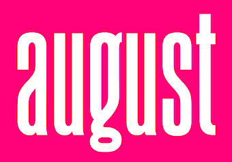 [MyFonts]
[More] ⦿
|
Ellen Luff Type Foundry (was: Miss)
[Ellen Luff]

|
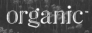 London, UK-based designer (b. 1992) of these typefaces:
 - The partially free condensed sans typeface family August (2017).
- The free bilined titling typeface Leyron (2017).
- Lucy Rose (2017). Co-designed by Tom Anders Watkins and Ellen Luff.
- Kiona (2017). A stylish 4-family all caps fashion sans typeface. Free regular weight.
- Bison (2018). A sans family by Tom Anders Watkins and Ellen Luff. Bison Bold is free.
- The Peignotian fashion mag typeface Athena (2018), which was published in 2019 as Athens. Athena Regular is free.
- Kiona (2019). A modern all caps family by Ellen Luff and Tom Anders Watkins.
- The paint emulation font Hackney SVG (2019).
- The geometric sans family Aventa (2020), which comes with a variable style.
- The condensed sans typeface August (2020).
- Ardela Edge (2020). A 66-font all caps family with a tech feel. It includes two variable fonts.
- Larken (2020). A flared sharp-edged display serif family.
- Jeko (2020). A 20-style (+variable) geometric sans with a large x-height.
- Brixton SVG (2020). A letterpress emulation font.
- Denton (2021). A 14-style expressive sans, with two variable fonts.
- Peckham Press (2021). A letterpress emulation font.
- Sherman Display (2021). A soft-edged wood type all caps font by Ellen Luff and Tom Watkins.
Type Department link. Link to Peregrin Studio, which Ellen Luff and Tom Watkins co-founded in 2021. [Google]
[MyFonts]
[More] ⦿
|
Emanuela Conidi

|
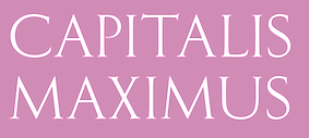 Conidi obtained an MA in typeface design from the University of Reading in 2008, and a PhD from the same university a few years later. Her graduation typeface is Nabil, a hookish serifed typeface that covers Latin and Arabic. It won a bronze medal at the 2009 EDAwards. She also holds a Masters degree in Design and Visual Communication from the Polytechnic University in Milan
 Emanuela joined Fontsmith in 2008: With a background in Graphic Design, experience in hot-metal type hand composition and letterpress printing, she is passionate about typographic history, 19th century typefaces and Arabic typography. In 2009, Mitja Miklavcic, Jason Smith and Emanuela co-designed the slab serif family FS Rufus, which was described by them as benevolent, quirky, peculiar, offbeat, jelly beans and ice cream, a retro eco warrior. She co-designed the legible sans family FS Me with Mitja Miklavic, Phil Garnham, Jason Smith and Fernando Mello (Fontsmith). Designer of FS Albert Arabic, FS Rome (with Mitja Miklavcic: an all caps Trajan typeface) and FS Blake (a sans with some inherent tension) at Fontsmith. Speaker at ATypI 2018 in Antwerp on the topic of Arabic type history. [Google]
[MyFonts]
[More] ⦿
|
Emil Karl Bertell
[Fenotype]

|
 [MyFonts]
[More] ⦿
|
Emil Ruder

|
Swiss typographer (b. Zürich 1914, d. Basel, 1970), and type guru in the 50s and 60s. Ruder taught at the Basel School of Design (Kunstgewerbeschule), and founded the International Center for the Typographic Arts in New York, 1962. Author of Typographie: Ein Gestaltungslehrbuch - A Manual of Design - Un Manuel de Creation (Teufen: Niggli, 1967), and Typographie. Ein Gestaltungslehrbuch. Mit über 500 Beispielen (7th edition in 2001, Niggli). The Road to Basel (Helmut Schmid) is an homage to Emil Ruder by Helmut Schmid, one of Ruder's students, who headed a group of other ex-students and organized their contributions. The former students who participated are Harry Boller, Roy Cole, Heini Fleischhacker, Fritz Gottschalk, André Gürtler, Hans-Jürg Hunziker, Hans-Rudolf Lutz, Fridolin Müller, Marcel Nebel, Åke Nilsson, Bruno Pfäffli, Will van Sambeek, Helmut Schmid, Peter Teubner, Wolfgang Weingart, and Yves Zimmermann. Karl Gerstner and Kurt Hauert also contributed. Paul Shaw reviews this book and Ruder's contributions. Quotes from Shaw's piece: - It is clear that those lucky enough to study under Ruder found him as exciting and demanding as they had expected. With a few exceptions these former students quickly and permanently fell under the sway of the charismatic and ambitious Ruder.
- Ruder promised a new functionalism derived from the Bauhaus. His was a new approach to typography that went beyond the technical fundamentals of metal type composition to embrace modern art (especially that of Paul Klee and Piet Mondrian). Ruder focused on the point, the line, the plane, and the way in which typography activated space. His article Die Flache (the plane or the space), following lessons he had learned from The Book of Tea by Kakuzo Okakura and from modern art, stressed the activation and destruction of space as the goal of typography as well as of art and architecture.
- Ruders typography is defined by asymmetry and an emphasis on counter, shape, and negative space.
- Harry Boller writes that Ruder and his students were Puritans on a mission, serious, humorless. We had been led to a morality, and strong convictions remain. Banality, lack of imagination, and swiping of ideas were all ridiculed, while sincerity of expression was encouraged. Gottschalk says that Ruder taught courtesy, ethics, and modesty as much as he taught typography.
IDEA Mag's special issue #332 entitled Ruder Typography Ruder Philosophy (2009), with articles by Leon Maillet (Tessin), Armin Hofmann (Lucerne), Karl Gerstner (Basel), Kurt Hauert (Basel), Lenz Klotz (Basel), Wim Crouwel (Amsterdam), Adrian Frutiger (Paris), Hans Rudolf Bosshard (Zurich), Andre Gutler (Basel), Juan Arrausi (Barcelona), Ake Nilsson (Uppsala), Fridolin Muller (Stein am Rhein), Harry Boller (Chicago), Maxim Zhukov (New York), Taro Yamamoto (Tokyo), Fjodor Gejko (Düsseldorf), Helmut Schmid (Osaka), and Susanne Ruder-Schwarz (Basel). Article on Ruder by Shane Bzdok, 2008. [Google]
[MyFonts]
[More] ⦿
|
Emily Kay Penn
|
During her studies at Design College Australia, Emily Kay Penn (Brisbane, Australia) created an untitled letterpress emulation typeface (2014). Behance link. [Google]
[More] ⦿
|
End Grain
[Bethany Heck]
|
Bethany Heck's blog on wood type and letterpress. I especially like her efforts to reassemble the mystery wood typeface Grecian in 2010. [Google]
[More] ⦿
|
E-phemera (was: HPLHS Prop Fonts, and earlier: Prop Fonts)
[Andrew H. Leman]

|
 Andrew Leman is a prop designer in Hollywood, CA. The type foundry HPLHS Prop Fonts (was: Ephemera, Prop Fonts) was started by Hollywood's Andrew Leman, and is now located in Pasadena, CA. Some fonts are free, most are commercial.
 Dafont link. Klingspor link. Andrew Leman's fonts: - Cablegram (2001, old typewriter face, T-26).
- Leviathan.
- Garamold (2007, 2 styles).
- Journalistic (2007, a blackletter inspired by the nameplate of a New England newspaper from the 1920s).
- Blackburn (2006, distressed).
- RTemporal (2006, blackletter).
- Fonts in the HPLHS series, dated 2002: HeadlineTwoHPLHS, OldStyle1HPLHS, OldstyleItalicHPLHS, OldstyleSmallCapsHPLHS, Rogo, SlabSerifHPLHS, TelegramHPLHS, WW2BlackletterHPLHS, WW2BlackltrAltHPLHS, HPLHS-Lovecraft Cursive and Block (replica of H. P. Lovecraft's own handwriting), HPLHS-Autograph Lanier (replica of the 1875 handwriting of Sidney Lanier, a 19th century American poet), HPLHS-TextSerif (really Linotype Antique No. 1), HPLHS-TypoScript, HPLHS-TextSerif Oblique, HPLHS-Bulfinch, HPLHS-Colwell, HPLHS-Colwell Italic, HPLHS-Cromwell, HPLHS-National Oldstyle (after Goudy's font by that name), HPLHS-Post Monotone, HPLHS-Atlas Italic, HPLHS-Italic, HPLHS-Victoria (from the 1923 ATF book), HPLHS-Manuscript Caps, HPLHS-Tome Pi, HPLHS-TypoGothic, HPLHS-Copperplate Roman, HPLHS-Gothic520, HPLHS-Times Gothic, HPLHS-Persnickety, HPLHS-Roman Engraved, HPLHS-Mercantile, HPLHS-Mercantile Oblique, HPLHS-Mercantile Card, HPLHS-Headline Modified, HPLHS-ExtraExtra, HPLHS-Extra (wood type), HPLHS-Forsythe, HPLHS-MetroThin, HPLHS-MetroLight, HPLHS-MetroMedium, HPLHS-MetroMedium Italic, HPLHS-MetroBlack, HPLHS-Policy Gothic, HPLHS-Black Gothic, HPLHS-Gothic Compressed, HPLHS-Black Condensed, HPLHS-Black Oblique, HPLHS-Electro Gothic, HPLHS-Blackletter (an irregular hand-drawn textura font based on the lettering of French heraldic engraver Charles Demengeot).
- The E-phemera Font Collection, available from MyFonts, which includes these fonts, with a majority being retro or script typefaces: Policy Gothic (2012, an eroded caps face), Mooseheart (2012), Operapolitan (2012), Fishwrapper (2012), Fred (2007, inspired by a 1930s typeface by Fred G. Cooper), Schreibweise (2007, a pirate-flavored font inspired by a hand-lettered manuscript dating from 1492), Cablegram-Regular, Golden Ticket (2003: Base, Fill, Highlight; a digitization of hand-drawn poster lettering by Otto Heim from 1925), Cablegram-Urgent, Cablegram-Madras, Cablegram-Ottoman, Julius Klinger (2003, based on 1925 fabric lettering by Julius Klinger), Cablegram-Zagreb, DMV Printer, Landry Gothic, Telegrafo, Toronto Gothic (2003: worn wood type or letterpress emulation, close to Condensed Titling Gothic #11), Vogue (pencil-lettered caps), Penitentiary Gothic (+Fill, +Lolite, +Hilite, +Shadow), Chicago House, Compliments (+Upright), Satisfaction (script based on 1930s cigarette ads), Vandal Broke Extra Juicy, Lanier (2004), Impersonal. The Cablegram and DMV series are typewriter fonts. Heck Italic (2010) is based on captions, labels and legends appearing on 19th-century maps and natural history engravings by Johann Georg Heck. Dai Vernon (2010) is based on the handwriting of card magician Dai Vernon.
View Andrew Leman's typefaces. View the E-phemera typeface collection. [Google]
[MyFonts]
[More] ⦿
|
Eric Kurniawan
[Burntilldead]

|
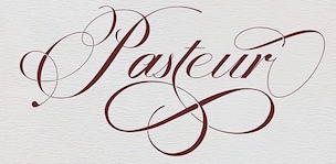 [MyFonts]
[More] ⦿
|
Erica Jung

|
 Brazilian printmaker, graphic artist and illustrator, b. 1975. Her fonts are created together with Ricardo Marcin at Pintassilgo Prints (est. 2009). Pintassilgo relocated to Florianopolis at some point. Her fonts at PintassilgoPrints include Petulante (scratchy caps) (2021), Skaligari (eighties punk) (2021), Slotrip (2021), Soapy (foam-textured caps) (2021), Conversa (2021), Tenacious Brush (2021), Clarks (2021: a modular typeface based on the work of Lygia Clark, one of the giants of Brazilian postwar art), Cachalote (a poster typeface) (2021), Search (an all caps dry brush font) (2020), Grok (2020), Pickles (2020), Pain de Mie (2020), Outside (2020), Altogether (2020: a doodling beauty with eight choices for each glyph), Ars Nova (2019: art nouveau), Pind-O-Rama (2019), Pieches (2019: a linocut font inspired by the powerful political and social posters by Paul Peter Piech), Soundstar (2019), Clafoutis (2019), Pedrita (2018), Transmogrified (2018), Melodia (2018), Minute (2018), Mindset (2018), Salted (2018), Plunct Plact (2017: a children's script), Manihot, Brushtones (2017), Strange Times (2017), Mudstone (2017), Plumcake (2017), Cordelia (2017), Dunkelbunt (2016, inspired by the eccentric artist, architect and designer Friedensreich Hundertwasser), Chronic (2016, influenced by the work of HAP Grieshaber and Willem Sandberg; expanded in 2020 to Anachronic), Unboring (2016), Sunbeat (beatnik style), Hand It (2016, a childish script), Botanique (2016, after Lucian Bernhard's Schmalfette Bernhard Antiqua, 1912), Somehand (2015), Gumdrop, Granz (2015: retro lettering based on a Porgy & Bess album cover by David Stone Martin), Stabile and Stabile Toys (2015, handcrafted), Cluster (2015, a layered letterpress emulation typeface), Stick Around (2014), Marker Aid, Unpack, Felt Noisy (fat brush), Blueshift (2014), Daft Brush (2014, a vernacular brush), Tuesnight (2014, offbeat poster font), Periplus (2013), Marujo (2013: a decorative typeface inspired by paintings of Arthur Bispo do Rosário, a Brazilian artist who lived for 50 years in a psychiatric institution), Brush Up (2013: a rough brush script), Undersong (a stackable script system), Tremendous (2013: a retro poster typeface), Rockinstead (2013), Runcible (2013, +Cleft, its glaz krak version), Mamute (2013: a layered letterpress style type system), Sabotage (2013: squarish poster font inspired by the iconic Vertigo movie poster by Saul Bass), Sheldon (2013, based on posters by the Polish graphic artist Marian Stachurski; +Extras), Dranskof (2013, inspired by a page from a publication for children by Serbian writer, poet and journalist Dusko Radovic), Gentil (2012, an all caps poster font), Sundowners (retro poster face), Kokoschka (2012, based on the lettering on the poster of an expressionist play by Austrian painter, printmaker and writer Oskar Kokoschka in 1909), Monstrinhos (2012, dingbats), YWFT Duncan (2012), Card-o-mat (2012, bird dingbats), Soundtrack (2012), Monstro (2012, fat poster face), Attic (2012).
 Typefaces from 2011: Melkslijter (2011, a stylish art deco typeface based on a brochure by Dutch graphic artist Dirk Hart), Polyspring (2011, a Victorian typeface hand-drawn based on Italia Condensed, Keystone, 1906), Berimbau (2011), Populaire (2011, a hand-drawn poster caps typeface that was inspired by the electrifying posters from May 1968 by Atelier Populaire, and loaded with alternates to give a random effect), Manicuore (2011, a hand-drawn typeface inspired by Italian movie posters by the prolific movie poster artist Symeoni, aka Sandro Simeoni), Smashing (2011, a fat hand-printed poster face), Smashing (2011, a fat hand-printed poster face), Chancellor (2011), the eccentric poster face Polygraph (2011, based on lettering of the Polish poster artist Leszek Zebrowski. Images: i, ii, iii, iv, v, vi, vii, viii, ix, x), the vintage serif typeface Organically (2011), Transitore (2011: Transitore is a lively hand-drawn font with loads of alternates and ligatures which, managed by advanced OpenType features, help create a convincing handcrafted look), the poster display typeface Sforzando (2011; +Alto), the signage typeface Jongleur (2011). Typefaces from 2010: the Cuban poster typeface Transmogrifier (2010, based on lettering by Cuban poster artist Eduardo Muñoz Bachs), the ultra-fat art deco typeface Loudine (), Crocante (2010, comic book face), Love Birds Pattern (2010), Swung Note (2010), Amarelinha (2010, hand-printed), Cuadrifonte (2010, a fat hand-printed family including styles called Pics, Sketch (regular), Fill and Line), Xylo Sans (2010, wooden texture face), Ritornelos (2010, a curly all caps hand-printed face), Roadway (2010, based on wood Clarendons), Bandoliers (2010, an informal hand-printed sketched face, with 3D versions such as Beefy, High and Rocky), Changing (2010), Vitrines (2010, hand-printed), Prokaryotic (2010, a "bacterial attack" face), Football World (2010, soccer silhouettes), Singela (2010), Butterfly Effect (2010), Tonal (2010, ultra-fat with mini-counters), Dynatomic (2010, inspired by the hand-drawn lettering of a 1964 polish movie poster designed by Andrzej Krajewski), Lovebirds (2010, bird silhouettes), Somewhat (2010, hand-drawn), Oyster (2010, hand-drawn dingbats), Grante (2009, a lively poster face), Mondiale (2009), Nanquim (2009, sketched letters), Merceria Antique (2009) and Arca (2009, + Dashed). All have an informal and attractive look, and were co-designed with Ricardo Marcin. The prints of Horst Janssen had a characteristic uneven hand-printed lettering that led Erica Jung and Ricardo Marcin to design the multi-featured opentype typeface Horst (2010). Nova Horst followed in 2012. Creative Market link. Klingspor link. [Google]
[MyFonts]
[More] ⦿
|
Etcetera Type Company (or: ETC; was: Finck Font Co)
[Tyler Finck]

|
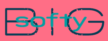 Graphic designer and musician (b. 1982) at the New York studio AWP who grew up in Maine and is currently based in Ithaca, NY. In 2018, he founded Etcetera Type Company, which is based in Spencer, NY.
 His typefaces: - The fat counterless caps typefaces Blackout and Blackout Midnight (2008). Blackout Sunrise (2013) is an outlined face and Blackout 2am is a reversed font. Blackout Noon followed in 2014. Free download of Blackout at the League of Movable Type.
- Ostrich Sans (2011). This typeface comes in many weights, including a beautiful Ostrich Sans Inline and a hairline. In 2016, this was followed by the layered monoline sans typeface family Ostrich Proper (+Inline).
- Knewave (2011, Google Web Fonts). A brush signage face. League of Movable Type link.
- Porter Sans (2013). A large wide headline type family. It has a free inline outline weight. Later additions include Porter Sans Ink (2014) and Porter Rough (2016). Porter FT, which includes new rounded styles, was added in 2017.
- Elm (2013). Hand-printed.
- Lickety Split (2013). A crayon or brush face.
- Almost (2013). A poster typeface.
- Guilder (2011-2013). A free typeface family with an inline thrown in.
- Ithaca Sans (2013).
- Fartlek Sans (2014). A handcrafted poster typeface.
- Katahdin (2014). A free font.
- Upstater (2014). A a classical American gothic with shaded and layered styles.
- Grandstander (2014). A comic book face. Grandstander Classic (2017). In 2020, Grandstander became a free Google font---and a two-axis variable font was added for the occasion.
- Boo City (2014). A pixel face.
- Didactic Display (2014). A grungy typeface.
- Upstater Ink (2014). A grungy typeface.
- Finck32A (2014).
- Saturnight (2014). A heavy brush typeface.
- Typocopia (2014). A letterpress emulation typeface.
- Taurus Mono (2014). An outline font.
- Southpaw (2014). A nice informal hand.
- Chawp (2014). A crayon face.
- Mr. Brunch (2014). A brush face.
- Gluten FT (2014).
- Flabbergast (2015). A didone.
- Korsque (2015). A layered typeface.
- Bico (2015). A rounded condensed organic typeface.
- Ichabod (2016). An antiqued serif typeface.
- Altitude Condensed (2016).
- Imbue (2016). A condensed didone poster typeface (also called a skyline typeface) at Google Fonts. See also Imbue FT (2017). ETC Imbue (2019) is a variable font version of Imbue with a variation in optical size from Text to Display.
- Retrograde (2016). A monoline and monospaced organic sans.
- Plainview (2016). A squarish and fat typeface.
- Nonesuch (2016). A condensed sans.
- Juju (2016). An octagonal layered typeface family.
- Atiga (2017).
- Mr Brunch FT (2017). A children's book font.
- League Mono (2017). A free font.
- ETC Gluten (2018). An organic font family.
- ETC Epilogue (2018). A variable sans font. Github link. Google Fonts link. Prologue (2020) is a reworking of ETC Epilogue.
- ETC Anybody (2018-2020). A 72-style variable font with weight, width and slant axes. Free at Google Fonts. He writes: Anybody is a big family that combines an affinity for Eurostile plus a heavy dose of 90s inspiration. It's flexible enough to adapt to a variety of situations. From UltraCondensed to ExtraExpanded, type set in Anybody can take up a tiny amount of horizontal space or so much space that you'll need several lines. Its high x-height and low cap height help exaggerate extreme widths and weights. Github link.
- Furrow (2018). A grungy sans.
- Cease (2018). A squarish techno typeface.
- ETC Trispace (2019). A variable font with weight and width axes, based on League Mono.
- ETC Tourney (2019). A variable octagonal font, playing on the theme of outline versus inline. Free Google Fonts download (2020-2021). Github link.
- Struthio (2019). A rounded sans.
- Birdo (2020). An inline typeface.
- Gluten (2021). A free script font family at Google Fonts.
Alternate URL, called The League of Movable Type. Typedia link. Kernest link. League of Movable Type link. Creative Market link, Klingspor link. Dafont link. Home page. Creative Market link. Abstract Fonts link. Google Plus link. YWFT link. Old home page. Behance link. Github link. [Google]
[MyFonts]
[More] ⦿
|
Eurotypo
[Olcar Alcaide]

|
 Institute in Benalmadena, Spain (was: Santa Severa), where one can take 4-week courses at 1450 Euros a shot on the Etruscan alphabet, Trajan, Cuadrata and Rustic Roman Capital letters, and related subjects. They also organize lettering tours in Italy and guided tours in various musea. The teachers are Alberto Di Santo (Professor of the visual communication, Tor Vergata University, Rome; Professor of Graphic Design, Istituto Europeo di design, Rome; Professor of editorial design, La Sapienza University, Rome; Professor of Typography, C.F.P. Sinalunga, Siena) and Olcar Alcaide (b. 1952, Argentina, Professor of Graphic and Typography Design, University of Buenos Aires; Professor of Typography, University of Lanús, and Professor of Graphic Design, Marbella Design School, Spain). Type link jump page.
 Eurotypo is also the foundry of Olcar Alcaide. Catalog of Olcar Alcaide's typefaces. In 2010, he published the text family Antium and the warm signage typefaces Mijas Ultra and Lila Pro Heavy. Typefaces from 2011 include Lila pro, Atenea (a humanist sans family), Agerola Script (a fat flowing signage face), Teja (signage face), Zalea (yet another signage face), and Nabu Pro (a connected signage script). Equalis (2011M, with Juan Lavalle) is a monoline slab typeface with a huge x-height and wide open counters. It was followed by Equalis Stencil (2011). Ravel (2011) is a fat signage script face. Atenea Egyptian (2011) is a solid slab serif family. Berta (2011) is a signage brush typeface with connected and unconnected versions. Optic Art (2011) is an ornamental typeface with building blocks that can be used for overlays. Creator of Eurotypo Bodoni Bold (2011). Typefaces from 2012: Cubus (dingbats), Saxo Deco (art deco), Moliere (2012, an elegant didone family with outspoken ball terminals), Melon Script (a fat curvy signage script family), Riky (comic book family), Chipa (a signage and package design script), Heket (an expressive curly script), Lenga (a slab serif typeface family), Mikal (brush script). Duktus is a 1940s style script in the style of Donatello (1935, Wagner & Schmidt), Troubadour (1927, Wagner & Schmidt), Liberty Script (1927, Willard T. Sniffin), Trafton Script (1933, Howard Allen Trafton), and Coronet (1937, R.H. Middleton). Picture. Typefaces from 2013: Dignus (influenced by Bank Gothic and Eurostile), Bague (old Dutch style with little contrast, in the style of Jan Van Krimpen), Lugo (a heavy signage or advertising script), Brittes (copperplate script), Talis (contrast-rich sans family), Fiesole (display family with an awkward back-curled lower case d), C Duflos (after a bâtarde coulée by Claude Duflos, a French engraver who was acitve around 1690). Typefaces from 2014: Talks (creamy signage script), Fiume (calligraphic script), Predy, Daevon (copperplate script), Beily (letterpress style), Ritts (a heavy script-like display family), Ritts Cursive (in the style of the brush signage scripts descending from Robert E. Smith's Brush Script for ATF in 1942). Typefaces from 2015: Valentia (a semi-copperplate calligraphic script followed by Valentia Condensed in 2016), Stabia, Digatte Quill (connected script), Digatte (connected monoline cursive script). Typefaces from 2016: Duero (signage script), Turia (calligraphic script), RRollie (a lapidary typeface based on the roman inscriptions), Valentia Nit (a copperplate typeface enriched with swashes and extensions). Typefaces from 2017: Citix (a great calligraphic / penmanship script), Citix Two Condensed, Alfabetica (humanist sans), Merick. Typefaces from 2018: Fortezza (a stiifened didone), Portoluce, Hotdogger (a cursive brush font family), Hotdogger Extras (dingbats), Favarotta, Vikive (a grotesque family), Aretino (a renaissance text typeface), Mirabella, Lectio. Typefaces from 2019: Palio (a condensed tall didone), Fractus (blackletter), Blackduck (blackletter), Sgraffio (copperplate script). Typefaces from 2020: Eolia A (a 12-style low contrast grotesque typeface), Breda (a 12-style geometric sans), Breda Two (six additional condensed styles), Marcus Traianus (in the Trajan style, with lowercase included as well), Eurotypo Sans, Eurotypo SII, Eurotypo BKL (a Baskerville-inspired family), Cannoli (a retro brush lettered signage script). Typefaces from 2021: Zornale (a 7-style text family inpsired by the Zornale, an original manuscript that contains a daily record of the books acquired by the Venetian bookseller Francesco de Madiis, between 1481 and 1488), Alacant (a 14-style slab serif with elliptical shoulders), Tre Giorni (a carefully designed script in solid and outline styles), Due Giorni (a rhythmic calligraphic script), Sagasti (a text typeface with straight serifs), Calcis (a 10-style sans), Rufolo (an 8-style lapidary typeface influenced by Robert Hunter Middleton's Stellar (1929), William A. Dwiggins' Albertus (1932) and Hermann Zapf's Optima (1952)). Typefaces from 2022: Zornale Title. Creative Market link. Klingspor link. [Google]
[MyFonts]
[More] ⦿
|
Eyal & Myrthe
[Eyal Holtzman]

|
 Eyal Holtzman (Den Haag, The Netherlands) is a graphic and type designer who was born in Haifa, Israel in 1969. He studied at the Royal Academy of Art in The Hague, and teaches typography and graphical arts in various places. He set up Studio Eyal and Myrthe together with Myrthe Stel.
 Eyal Holtzman has designed many corporate and some retail typefaces. typefaces for clients such as The Enschedé Font Foundry and Nationale Nederlanden. His work has been exhibited in many places, including in Museum of the Book---Meermanno in Den Haag. MyFonts writes: In the book Ha, daar gaat er een van mij! (Hey, there goes one of mine!, a chronicle of graphic design in The Hague from 1945 to 2000, 010 Publishers, Rotterdam 2002) he is called "one of the most idiosyncratic letter talents from The Hague" and in Dutch Type (010 Publishers, Rotterdam 2004) expert Jan Middendorp describes his letters as being "among the most original alphabets produced in the Netherlands", (...) "tapping into an idiom that no other type designer working in the Netherlands has ever used". His typefaces: - Normandia. Done during his studies at KABK.
- Joel (Book, Display). Done during his studies at KABK.
- Jerusalem (1996). A Latin / Hebrew font that attempts to harmonize the two scripts. This design was part of Eyal's post-graduate type design project at the KABK in 1996 and was later exhibited in Meermanno.
- Rain Birds. Done during his studies at KABK.
- Dille & Kamille. A handwriting font commissioned by a retail chain.
- Soya. A potato cut font done for a book about artist Allie van Altena.
- Rosart. A collaboration with The Enschedé Font Foundry. A revival of the Two Line English Body Rosart, designed in the 18th century by the Belgian type cutter Jacques François Rosart (1714-1777). This revival, based on original type specimens from the J. Enschedé collection, aimed to interpret the spirit of the original design as faithfully as possible. Irregularities in the design had to be kept.
- Staring. A revival of the unknown font used in the poetry book Gedichten van A. C. W. Staring (published by Nicolaas Beets in Zutphen, undated).
- OD 1 2 3. A typeface commissioned by design and advertising agency OD in Rotterdam. The three fonts have identical spacing and can thus be superimposed. Text set this way emulates adhesive tape.
- Sympatico (2016). A special design for the supermarket chain Jumbo, to replace Jumbo The Sans. That work was commissioned by Niels Alkema. The font is in use by the professional bicycle racing team Lotto NL Jumbo.
- Douche (2006). A rounded monolinear sans done originally for the visual identity of theater festival <>Mooi Weer Spelen in Delft. This font mixes upper and lower case, all basically of the same height.
- Kristal (2015, at Bold Monday). This 8-style book typeface with calligraphic roots was published in 2021. It is accompanied by kaleidoscopic ornaments and open caps that are ideal for monumental lettering.
[Google]
[MyFonts]
[More] ⦿
|
Eyal Holtzman
[Eyal & Myrthe]

|
[MyFonts]
[More] ⦿
|
F37 (or: Face37)
[Rick Banks]

|
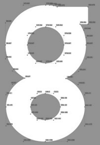 Rick Banks (b. 1985, Manchester, UK) established F37 (Face37) in 2010 in London, UK. His typefaces:
 - F37 Xan (2010). A counterless geometric typeface based on a geometric solid typeface from 1925 by André Vlaanderen.
- F37 Form (2010). A mimimalist circular experimental (Bauhaus?) font. He writes about Form: After looking at Armin Hoffman's Die Gute Form poster and Herbert Bayer's universal typeface I constructed an alphabet based on their letterforms. Inspired by Wim Crouwel's Soft Alphabet, I constructed a grid to create the modular alphabet and programmed very tight letterspacing into the font lending itself to the style of Die Gute Form.
- F37 Bella (2011). An extremely contrasted didone display typeface. He says that he was influenced not only by Didot, but also by Pistilli and by Tschichold's Saskia. F37 Bella won an award at TDC Tokyo 2012. See also F37 Bella Pro (2020), in Text, Hairline, Stencil and Display substyles.
- F37 Ginger (2013). A Swiss geometric sans inspired by the work of Herb Lubalin, Jan Tschichold and Paul Renner. The customized version of F37 Ginger, Boots Sharp (2019), was commissioned by Coley Porter Bell and True Story as part of an extensive rebrand. F37 Ginger Pro was released in 2019.
- F37 Neue Grotesque (2013).
- F37 Stencil Bella (2013).
- F37 Glaser Stencil (2015).
- F37 Bolton (2016). A sans family influenced by the style of Berthold's G.G. Lange.
- F37 Jan (2016). Inspired by Jan Tschichold's geometric sans-serif and Matthew Carter's Bell Centennial font, F37 Jan features pronounced ink traps.
- F37 Jagger (2017). A sans inspired by Edward Johnston's London Underground font.
- F37 Bergman (2017). A Peignotian typeface family that revives a revival Hans Möhring's Florida typeface. The Swedish director Ingmar Bergman consistently used Florida in his films.
- BHF Beats (2018): Working alongside Wolff Olins we were comissioned to create the new font for the British Heart Foundation. The letterforms are based on their iconic logo featuring waves of a heart beat.
- F37 Bobby (2018). A warm text typeface.
- F37 Ping Pong (2018). A 1970s style dot matrix font that was inspired by the 1970s Letraset font Pinball created by Alan Dempsey.
- F37 Factory (2019). Named after Andy Warhol's The Factory in New York City, F37 Factory was inspired by stencil letters etched into marble in what was once a Hovis flour mill in Ramsgate. That building was designed by E. W. Pugin. F37 Factory was originally conceived for a commercial development project for Want Marketing and commissioned by London design studio Bold & Bold.
- F37 Judge (2019). Banks's take on DIN and old wood types.
- F37 Moon (2019). Influenced by Avant Garde and Futura, in 14 styles.
- F37 Flux (2019). Experimental and intestinal.
- F37 Neuro (2019). A Swiss sans family.
- F37 Beckett (2020). A sans based on British road signs from the 1930s. F37 Beckett pays homage to the British Ministry of Transport's 1933 alphabet.
- F37 Stout (2020). An octagonal family base on a letterpress font called Stoutheart.
- F37 Gruffy (2020). A grotesque.
- F37 Hooj (2020). A geometric sans family.
- F37 Wicklow (2020). A 24-style wedge serif inspired by the Gaelic letter carvings by Irish sculptor Michael Biggs in Dublin. It includes a set of stencil fonts as well.
- F37 Snake (2020). an octagonal industrial stencil typeface inspired by John Carpenter's film Escape From New York.
- F37 Caslon (2020). He explains why the world needs another Caslon: F37 Caslon is our personal take on a stone-cold classic. Originally designed by William Caslon in 1726, this old-style serif has fascinated typographers ever since. Over the years, the font has been tweaked, reworked, modernised, pulled, stretched, squashed and embellished, as successive generations have created their own versions of Caslon, particular to their times and tastes. We have taken the best of these seminal Caslon revisions to create our own super family in a huge range of weights and styles. Our cut features a tall x-height, old-style numerals, capital italic swashes, ligatures and discretionary ligatures.
- F37 Grotesc (2021). Inspired by Pica Sans.
- F37 Attila (2021). A sans serif is inspired by Albert Auspurg's Krimhilde (1933).
- F37 Drago (2021). A serif typeface based on Columbus (1892).
- F37 Wyman (2021). F37 Wyman is based on lettering work created by graphic designer Lance Wyman in 1976, which was commissioned as part of the graphic identity marking 200 years of American Independence.
- Corporate typefaces include Dunlop Sans, F37 Selfridges (=F37 Bella), F37 Avid (=F37 Ginger), Pamela (for Foilco), F37 Zip (for the hotel chain), Pizza Pilgrims, Dar Headline (octagonal), Lloyds Bank (icons).
- F37 Lineca (2021). A fifteen-weight geometric sans with a strong emphasis on the horizontal.
- Ocado (2021). A custom sans done for a grocery company.
- Stonewall (2021). A sans font for Stonewall, a cmpany that has championed a world where LGBTQ+ people everywhere are free to be themselves and enjoy life fully.
- F37 Incise (2021). A heavy, experimental display font, inspired by stone cutting.
He also published Type Trumps, a set of playing cards that feature the main typefaces. Behance link. [Google]
[MyFonts]
[More] ⦿
|
FA Studio (or: Fluffy Art Studio)
[Indra Gunawan]
|
Or FA Supply Co. Yogyakarta, Indonesia-based designer (b. 1987) of these typefaces in 2016: Scratch, Jasmine Script, Silent (brush script for horror movies), Morning Sky, Smoothless (brush style), Section (marker pen font), Old Press (letterpress emulation font), Old Peace (signage script). Aka Arsenio Azka. Typefaces from 2017: Need Bullet, Jessica Script, Blackstairs (brush script), The Authentic Script, Wild Style. Typefaces from 2018: Doraemon (fat marker font), The Murder (a horror font), Sempak, Venom, Brooklyn Script, New York, Boomber (graffiti font), The Red Moon (Halloween font), Zebra Cross. [Google]
[More] ⦿
|
Face Type
[Marcus Sterz]

|
 Austrian foundry located in Vienna, est. in 2008 by Marcus Sterz (b. 1971) and Andrej Waldegg. MyFonts link. Unless exlicitly mentioned, all typefaces are by Marcus Sterz. You Work For Them link.
 - Adria Grotesk (2013). This was followed by Adria Slab (2014).
- Aldrans (2009, minimal sans).
- Anymals (2008) is one of my favorites: it has dingbats of imaginary undersea monsters.
- Asimov (2009). What is this?
- Baustelle Thin (2009, hairline sans).
- Bikra (2010, Plain and Stencil).
- Blitzplakat (2009). A poster face, white on black.
- Darjeeling (2010) is a display family inspired by both Optima and Bodoni.
- Doll (2008), Dollbats (2008).
- Flint (2008). A hand-drawn squarish face.
- Gerber (2009, pixel face).
- Grafinc (2009). An ultra fat art deco. See also Grafinc Rounded.
- Hausbau (2009, experimental).
- Idrans Medium (2010). A poster face.
- With Georg Herold-Wildfellner, he created the Victorian family Ivory in 2009.
- Letterpress (2009) is an experimental grungy family in which he mixes glyphs of three classics, Jakob Erbar's Phosphor (Ludwig&Mayer Foundry, ca. 1923), Aurora (1912, Johannes Wagner Foundry) and Permanent Headline or simply Headline (Karlgeorg Hoefer).
- Lignette Script (2011) is an extensive loopy monoline script font.
- Loki (2009). A decorative pixel family.
- The Marlowe family (2010) is pure art deco elegance---a play on geometric forms and elegance. Subfamilies include Marlowe Cocktail and Marlowe Swirl.
- Moki (2011).
- Mono Lisa (2020) by Marcus Sterz, in collaboration with programming experts Andrey Okonetchnikov and Juho Vepsäläinen. A commercial programming font to compete with Fira Code, Source Code, and Jetbrains Mono.
- Motto (2009). An art deco typeface in the style of the Italian Futurismo of the 1920s, designed for using with two colors.
- Mouse (2008-2009, pixel), Mousedings (2008).
- Newcastle (2014).
- Notdef (2009). A strange experiment.
- The handwriting typeface Palma (2008).
- Pinback (2009, techno).
- Plaquette (2018). A collection of retro typefaces ranging from Victorian to Bauhaus to the sixties.
- Publica Sans (2016). A clean geometric sans typeface family. Publica Play (2016) is a playful, and even more organic, sans that exploits many OpenType features. Publica Slab (2017) and Publica Sans Round (2021) complete the collection.
- Scrap Outline (2008).
- Slug (2009). A geometric typeface made for bicoloring.
- Status (2009, super fat art deco).
- Strangelove Next and Strangelove Next Slab (2010). This beautiful typeface was inspired by Stanley Kubrick's movie Dr. Strangelove. The original titles were designed by Pablo Ferro, who is one of the most acclaimed film title designers, especially famous for his hand-drawn lettering. Dr. Strangelove is a hairline face.
- Substance (2013). A sans family.
- Wenzel (2009). Handprinted.
Facetype's typeface library. See also here. View Marcus Sterz's typefaces. Klingspor link. Behance link. Fontspring link. [Google]
[MyFonts]
[More] ⦿
|
Fenotype
[Emil Karl Bertell]

|
 Fenotype, a Finnish type foundry, has the original (often techno) designs of Emil Bertell (b. 1983, Helsinki) and his brother Erik Bertell and wife Kea Bertell. Emil has been studying graphic design at University of Art&Industrial Design in Helsinki since 2004. He designed most of his typefaces during 2001-2004, and works as a freelance illustrator. Behance link.
 Typefaces made in 2002: Disco (prismatic), Lakmus, Valimo, FUTU, Test1, Foton Torpedo, Cheaptype, Personal Computer, Copycut, Unicode 0024, HKI Metro, HKI NightLife, Digital Kauno, Fenotravels (dingbats), Tivoli, Kosmonaut, 10124, JouluFonttiFenotype, Testi, 1laitos, 1120, 0629 (2002, a kitchen tile font), 0927, 0210, FTdingsprevi, Fenotypedings#lego3, Genotype, NeoPangaia, NeoPangaia 2, Nipponblocks, Pectopah, Personalcomputer, Pouttu, Samarin (2002, athletic lettering), Unicode0024, URALphat, URALthin, URAL, URAL3d (all Latin/Cyrillic fonts with incomplete punctuation though), Automania (multiline), Copycut, Halo, 222_2003, Tantor, Letters, Rikos, Lastu, ThreeTheHardWay, Bukkake, Halo. Emil's brother Erik designed Neon (paperclip face), Mama and Mama Round (paperclip typefaces). In private email, he calls himself Carl. The foundry evolved from 2theleft. Fonts made in 2003: Military Dingbats, 08 02 03 Fenotype, Projectsfenotype, Rock-it. Fonts made in 2004: Scandinavian Titan white, Scandinavian Titan, Acid Test 2, Acid Test (texture typefaces), 080203, Letters11, Linja, Projects, Rock it, Simpletype. Commercial typefaces: Sapluuna, Shortcut, Transeuro-Express, Omega-Uros, Fenotype Dings, Military Dingbats, Nippon Noodle. Typefaces made in 2004: Kolari, Kolari Light, FTfaces, Twisted Ontogenesis. Alternate URL. In 2005: RoundAbout, Nihilist Philosophy, Boogie Monster, Chunky Hunk (Western), Diy Typeface (kitchen tile style), Futuretro (stencil-like), 3TheHardWayOverrun, Pedant Dilettante, FT Rosecube, FT Blockbuster, 3TheHardWayRMX, Adios Gringo (Western face), Helsingfurt (3d oil glow face), Cream Soda (liquid), Thashed Paper Bag, Big Medium. In 2006: Rock It Deluxe (grunge), Cassette (dingbats), Kings Garden (Japanese trees as dingbats). MyFonts link, opened in 2009, where one can buy 080203, 3 The Hard Way Overrun, 3 The Hard Way RMX, Adios Gringo, Depth Charge, FT Helsingfurt, FT Roundabout, FT Scandinavian Titan, FT Twisted Ontogenesis, Ice Cream Soda, Kings Garden, Kolari, Nihilist Philosophy, Old Note, Rock It, November Script, and Majestic Mishmash (ransom note caps), Digital Kauno (2002, upright script), 10.12, EB Vintage Future, Fenotype Dingbats, FT Forest, FT Funghis, FT Military Dingbats, FT Weapon of Choice, Motel Xenia, URAL, Valima. Additions in 2010: Linguine (connected script), FT Telegraph (slab serif), FT Brush, FT Industry Machine, FT Giorgio, Killer Elephant (signage), FT Supervisor (ultra-condensed), FT Dead Mans Diary (scribbly), FT Grandpa Script (grunge calligraphy), FT Stamper (angular lettering), FT Tantor (fat, rounded), FT Bronson (fat display typeface with mustache dings thrown in), FT Master of Poster (bi-level display typeface with many ligatures and interlocking letters), FT Hidden Forest (tree dingbats), FT Mammoth (grotesque headline face), Rikos (futuristic), Squarendon Extra Bold (2010, a Clarendon), FT Moonshine Script (a Treefrog style face), Billboard (a hand-printed rounded caps family), EB Bellissimo Display (rounded monoline sans), Malamondo (an all caps display typeface with a large number of interlocking ligatures), Linja (2002 and 2010, a rounded ultra condensed family), Punavuori (2002 and 2010: a monoline sans family), Signor (2010, a rounded all caps family), Mrs. Lolita (connected script), Funghi Mania (mushroom dingbats), Funghi Mania Script, Darlington (very open upright connected script family), Archipelago (+Caps: an upright connected script), Tower (pieces that enable one to modularly construct towers when stacked; created as a school assignment at the University of Industrial Art&Design Helsinki in 2006), Monster (just as Tower but for monsters), Verna (informal face with ball terminals), Verner (2010, a connected script version of Verna), Verner (2010, a connected script version of Verna). Typefaces from 2011: Pepita Script (an upright connected script with small lachrymal terminals), Pepito (its nonconnected version), Barber (upright script family), Banzai Bros (a fat caps-only signage face), Mishka (an upright connected script with tear drop terminals). In 2012, he created Salamander Script, Taiga (connected upright script), Mercury Script (a set of upright connected script typefaces), Slim Tony (a bubblegum retro signage face) and Mercury Ornaments. Typefaces from 2013: No. Seven (a successful brushy signage or baseball script), Alek and Alek Ornaments (an upright signage script), Voyage (a vintage script), Barracuda Script (brushy signage face), Bonbon (signage script), Bonbon Ornaments, Scaramouche (a playful connected script). Typefaces from 2014: Larry (sturdy connected script), Silver (upright connected script), Powder Script, Peaches And Cream (creamy signage or baseball script), In and Out (a connected retro signage script), The Carpenter (a script family in the style of Mercury Script). Typefaces from 2015: HMS Gilbert (a collection of 14 hand-crfated vintage types), Lager (a signage script family with adaptable swashes and other opentype goodies), Vanilla Shot, Journey (a smooth and elegant vintage script family of four weights and a matching ornament set, packed with alternate characters, and, in Bertell's style, perfect connections between glyphs), Tea Biscuit (signage script), Skipper, Skipper (connected script), Frost (a signage typeface that is just right, a sure award winner), Monday (sign apinting typeface). Typefaces from 2016: Jazz Script, Fragola (sign painting font), Syrup (sign painting font), Cosmopolitan (monoline connected script), Bluebell (copperplate calligraphic script), Inkston (vernacular brush script together with the standard handcrafted sans and text styles), Beaujolais (brush script), Black Script (a heavy signage script), Beaujolais (an organic brush script), Cold Brew (signage script), Inkheart (tattoo style). Typefaces from 2017: Camper (monoline script, accompanied by Camper Print), Aether Rain (thin script), Thang, Big Fish, Bolton (Bolton Script and Bolton Script, and the degraded Bolton Print pack), Vodka (Slab, Sans, Pen and Brush), Poster Brush, Fresh Press (signage style), Praktika (grotesk), Praktika Rounded, Blossoms, Kitchen (sign painting brush), Letterpress Studio, Takeaway, Aether Rain, Pitcher (baseball script), Karu (a workhorse sans), Bluebell (calligraphic), Roster (signage script), Dog Days, Catsy, Alfons (in Script, Display, Sans, Serif, Tiki, Extras and Ornaments subfamilies), Cosmopolitan (monoline script and sans pair), Snooker (retro signage script), Salty (a creamy brushed signage typeface). Typefaces from 2018: Aster Script, Audrey (a monoline script and sans duo), Galatea (a 48-style sans family by Erik and Emil Bertell), Double Porter (an 18-style font collection with scripts, sans, and grunge faces thrown in the mix), Matchstick, Fruitos, Corner Deli (a layerable set of fonts in script and sans styles), Bayamo (a brush script done for Monotype), Sidecar (a connected monoline neon sign script, and a matching sans), Ginger John, Brush Marker, Shirataki (monoline soft pen script), Ash (a crayon font), Breakfast Script, Dallas Print Shop (a display family by Teo Tuominen and Emil Karl Bertell), Capital (a sans and serif family by Teo Tuominen, Erik Jarl Bertell and Emil Karl Bertell). Elixir, Maestri (a classical connected scrupt by Teo Tuominen and Emil Karl Bertell), Popcorn (brush script), Cherry (signage script), Goodwater, Signature Script, Kingfisher (a beer botle signage script), Sonder (brush script). Typefaces from 2019: Taurus (an all caps logotype family by Emil Bertell, Erik Bertell and Teo Tuominen), Ex Libris (a high contrast flared serif titling font), Riley (a retro sign painting script), Allison Script, Milky (a sign-painting brush script), Portland (a reverse contrast typeface by Emil Bertell, Erik Bertell and Teo Tuominen), Zeit (a transitional text typeface by Emil Bertell, Erik Bertell and Teo Tuominen), Boardwalk Avenue Rough (a monoline script and a weathered all caps sans), Avion (a sans family by Emil Bertell, Erik Bertell and Teo Tuominen), Yes Script, Gainsborough (script), Florian (a roman typeface with crisp edges and some contrast), Vogue Sans (a haute couture all caps contrast sans), Fabrica (a decorative frilly didone by Emil Bertell, Erik Bertell and Teo Tuominen), Chai (an expressive sans / serif hybrid), Rainmaker Script (monoline), Aequitas (a stylish sharp-edged roman typeface family), Tapas (by Emil Bertell, Erik Bertell and Teo Tuominen: a Serif, Sans, Deco and Script collection), Lawrence (a stylish roman typeface), Kallio Brush (a signage brush script), Morison (a great 32-style wedge serif typeface by Erik and Emil Bertell and Teo Tuominen), Felicity Serif (a juicy bold high-contrast serif), Las Palmas (Brush, Pen, Slab, Condensed), Honey Drops, Explorer, Boardwalk Avenue (a sans/script font duo), Skye (a heavy decorative didone), Leftfield (a retro baseball script), Steak And Cheese, Agile Sans (a humanist sans by Emil Karl Bertell, Erik Jarl Bertell, and Teo Tuominen), Punk Rocker, Silverline, Perfume (Pen, Brush and Sans), Hops And Barley, Allison. Typefaces from 2020: Laurel (by Teo Tuominen, Emil Bertell and Erik Bertell: a 4 style sans with amnay wedge elements), Omnipop (Sans, Brush, Script), Paper Tiger (a Victorian Script accompanied by a condensed flared serif in two weights and a chunky sans serif), Resolve Sans (by Teo Tuominen, Emil Bertell and Erik Bertell: an extensive grotesk super family of 124 fonts: from compressed to extended, thin to black), Gambler (a 14-style display type collection), Rockford Sans (2020: an 8-style geometric sans with large x-height and slightly rounded corners; Emil Bertell, Erik Bertell and Teo Tuominen), Slacker (a brush script), Grand Atlantic (a vintage display package), Magnolia (Brush, Serif), Walden (a heavy rustic serif typeface by Emil Bertell, Erik Bertell and Teo Tuominen), Klik (a geometric sans family with Bauhaus influences, by the dynamic trio of Emil Bertell, Erik Bertell and Teo Tuominen), Rose Garden Deluxe (a font duo), Felicity (a heavyweight display sans). Typefaces from 2021: Alonzo (a 24-style Peignotian sans by Emil Bertell, Erik Bertell and Teo Tuominen), Imagist (a 12-style sharp-edged serif by Emil Bertell, Erik Bertell and Teo Tuominen), Maine (a 12-style modernized book antiqua by Emil Bertell, Erik Bertell and Teo Tuominen), Briston (a bold creamy serif in the Windsor genre), Lagom (a 16-style slab serif with some Clarendon charm; by Emil Bertell, Erik Bertell and Teo Tuominen), Skillet (a chubby Cooper Black-genre typeface full of hedonism and joie de vivre), Kings Valley (a decorative serif), Shaker Script (monolinear), Wonder (a 12-style rounded serif in the style of Windsor; by Emil Bertell, Erik Bertell and Teo Tuominen), Ellie Script (a signature script), Dirty Sundae (a casual font), Grand Cru (a refined serif family with 36 styles; by Emil Bertell, Erik Bertell and Teo Tuominen), Kiosk (a 4-style vintage headline typeface family in Script and Sans versions). Typefaces from 2022: Blood Orange (in the Cooper Black / Windsor / Souvenir genre), Tomato Ketchup (supermarket kitsch in the fat rounded Windsor genre). Dafont link. Behance link. Creative Market link. MyFonts interview. View the Fenotype typeface library. View Emil Bertell's typefaces. [Google]
[MyFonts]
[More] ⦿
|
Fernando Forero
[Fernando Forero Foundry]

|
 [MyFonts]
[More] ⦿
|
Fernando Forero Foundry
[Fernando Forero]

|
 Fernando Forero (b. 1978, Tunja) ran EisartGraphic.com together with Weronika Kwiatkowska, and moved from Bogota to Kalisz, Wielkopolska, Poland, where he started Fernando Forero Foundry. He is now located in Warsaw, where he works as a graphic and type designer and illustrator.
 Designer of Ishia Antiqua (2013, a cursive hand), Urbania (2013, a dusty face), Ilex (2012, hand-printed), Baltan (2012, a calligraphic script), Old Stamps (2011, scanbats), Boys and Girls (2011, dingbats), Aliovha (2011, a monoline elliptical sans), Old Nyleshina or Old Nyleshna (2010, roughened calligraphy), Vexa (2010, grunge), Ornamentus (2010, an interesting modular ornamental face), Melonella (2010, a medieval script), Cioran (2010, aged letters), Ornalia (2010), Selbst (2010, hand-printed caps), Nugg (2010, grungy), Feeda (2010, a curly face), Intuitiva (2010, grungy), Czarnulka (2010, script), Khamus (an earthy calligraphic face) and Últimos Ritos (a hybridization between the forms of the Cyrillic and Roman characters), two typefaces that won awards at Tipos Latinos 2008. He also made the grungy Refaxed (2008) and Efficient Fax Font (2010), and the experimental Aleah (2010) and Ovhol (2010). In 2014, Forero published the grungy letterpress emulation font family Asfalto. Devian tart link. Behance link. Another Behance link. Klingspor link. Old URL. [Google]
[MyFonts]
[More] ⦿
|
Ferry Hadriyan
[FHFont (was: Feydesign)]

|
 [MyFonts]
[More] ⦿
|
FHFont (was: Feydesign)
[Ferry Hadriyan]

|
 Ferry Hadriyan (FHFont and before that, Fey Design, located in Indramayu and/or Cirebon, Indonesia) designed these typefaces in 2015: Milkytwins Modern Wave, Fantasia (a charming curly upright script), King City (calligrapghic signage script), Chocolate Heart Script, Adefebia (calligraphic wedding script font), Sexy Shout, Awesome Display (signage script), Love Mile (curly brush-painted font), Shakila (a vampire script), Hard Brush Ghost, Telena Brush, Slow Motion Script, Heaven Sky, Candy Sugar, Chocolate Heart (curly script), and Hard Brush.
 Typefaces from 2016: Anniversa (wedding script), Point Break, Atlantis Heart (brush font), Hometown (a 15-style vintage letterpress-style family, +Clean, +Rough), Apple Tree (dingbats), Strawberry, Wild Zova (a free brush script), Beauty Heart, Devil East, Sexy Shout, Hometown Script (signage script), Awesome, Hunter Heart (free vintage titling font), Voltury, Wowangle Brush Script, Nightamore (free brush script font), Honeymoon Midnight (calligraphic). Typefaces from 2017: Peace Maker (script), Hunter Skyfar (dry brush), Wonderfebia (wedding script), Chocolate Milky, Soybeanut (upright script), Vertical Brushy, Firefly, Ambergris Script (calligraphic), Arthouse Display Pro (Victorian), Real Stones, Hard Stones Pro, Photograph (a formal calligraphic wedding script font). Typefaces from 2018: Bloomy Script, Strongloves (dry brush), Break Stones. Typefaces from 2019: Esmetralda, Pinkalova (a free brush script), Magentasia, Butter Swany, Butter Luchy, Caramello, Wondertime (dry brush), Mangotea, Simpletune, Pintenium Script (brush script), Pinkalova Script, Pentenium (brush script), Dragtime, Auntekhno Script (handlettered script style), Salute Riches, Shutten Reason, Young Blood Solid. Typefaces from 2020: Festany (a dry brush script), Button Grinder (all caps, dry brush), Marijose (a dry brush script), Astro Jack, Browsa (a modular all caps typeface), Frigtona (a dry brush script), Ankerisey (dry brush script), Southwave, Vinegart (dry brush script), Brightsome, Bitten Amore, Artics Snow, Aimchestar (a brush script), Hello Beauty, Rightside (a dry brush script). Typefaces from 2021: Mount Light (despite the name, a bold script), Standgrow (a fat script). [Google]
[MyFonts]
[More] ⦿
|
Flat-It
[Ryoichi Tsunekawa]

|
 Japanese foundry in Nagoya that offers free and commercial Latin fonts made by Ryoichi Tsunekawa, who also runs Bagel & Co, Dharma Type, HolidayType and Prop-A-Ganda. Most of his work was done at Flat-It. His typefaces:
 - 2021: Best Choice (a monospaced sans), Short Films (an art deco sans in twelve styles), Golden Decades (a 16-style sans that borrows from several sans genres).
- 2019: Mid Century Sans, Tamba Sans, Rama Gothic Rounded, Bio Sans Soft.
- 2018: Fairweather (clean sans), Kaneda Gothic (a basic severe condensed gothic), Vincente (a tall condensed display didone family).
- 2017: Calling Code (monospaced programming font), Commuters Sans (elegant wide sans), Mighty Slab, Rigid Square (octagonal), Taro.
- 2016: Bio Sans, Gomme Sans, Quiet Sans, Siro (sans).
- 2014: Pero (condensed rounded organic sans), Kiro (minimalist organic sans), Graphie (modern geometric sans), Compasse (semi-condensed sans), Como (rounded sans).
- 2013: Spoon (organic, rounded, monoline sans family), Antoinette Monogrammes (based on early 1900s embroideries by Janon Co; with frames), Clonoid (a sci-fi family that pays tribute to arcade game logos in 80s and 90s), All Round Gothic Demi (a sans based on perfect circles), Griffon (copperplate titling face), Antique Spenserian (based on Spencerian Script by Mackellar, Smiths and Jordan).
- 2012: Geom Graphic (a retro sci-fi family that can be considered as a squarish version of Eurostile), Sheepman (modular), House of Cards, Space Colony (a lovely monoline futuristic techno family), Rama Slab (an antiqued wood-style slab serif), Rama Gothic. An antiqued sans serif family that recalls the wood type era), Diamond Ring (an art deco typeface inspired by Japanese cosmetics-packaging designs and posters from the late 19th and early 20th centuries), Controller (techno meets organic in this rounded squaris sans family), Revolution Gothic (an extended version of PAG Revolucion), 2008, which was inspired by retro propaganda posters and wallpainting in Cuba from the 60s to 80s; Revolution Gothic P followed in 2014), Diamond Ring (art deco).
- 2011: Yummo (monoline organic sans), Sheepman (based on the wood type No. 506 of William Page), Onick (2011, an art deco neojaponist fat display face done for Wordshape), Shiva (2011, hairline sans), Mocha Mattari (2011, grunge), Dharma Slab (2011, inspired by 1800s-style wood type), Dharma Gothic (2011, +P), Rama Gothic (2011, also inspired by 1800s-style wood type), Dimensions (2011, squarish), Design System (2011, a large family based on 70s style techno typefaces), Speedometer (2011, condensed piano key face).
- 2010: Stereo Gothic (2010: an extended all caps slightly techno sans family), Behrensmeyer Vigesimals (2010, a pixel format connected script), Civilite Vigesimals (2010, pixelized Civilite), Flat10 Arts and Crafts (2010), Flat20 Hippies, Flat10 Segments (2010), Flat10 Antique (2010), Flat20 Gothic (2010), Flat20 Streamer (2009, pixelized ribbon font), Flat10 Fraktur, Flat10 holy, Flat10 Holly, Flat10 Stencil, Flat20 Headline, Flat10 Artdeco, Word From Radio (2008-2010). Cigarette (2007, Bauhaus/Peignot-style).
- 2009: African Elephant Trunk (2009), Concrete Script, Concrete Stencil (2009, a stencil calligraphic script), Perfect Magic (2009), HT Maison (2009, signage face), HT Farmacia (2009, connected school script), HT Espresso (2008, upright script), HT Cartoleria (2008, connected script), HT Cafe (2009), Sneaker Script (2009).
- 2007-2008: Bistro Mono (2007, an awkward monoline face), Thousands (2007), Balaghat (2008), Garash Script (2008, a Halloween face), Woodstamp (2008), Banana (2008, brush script), Rebel Train Goes (2007, a piano key font), Rouge (2007, an elegant lipstick-on-the-bathroom-mirror pair of typefaces), Yasashii (2007, a great geometric art deco Broadway-style family, famous for being used in Damien Chazelle's La La Land, the 2017 blockbuster movie), Lily Wang (calligraphic script), Nothing (2007), Garash (2007, Arabic simulation), Moon Star Soul (2007, Western saloon font), Grandes Vacances (+ Une, Deux) (2007), Pansy Bo (calligraphic), Dremie (2007, an art deco headline typeface with Open and Fill weights), Grandes Vacances (2007, based on 19th century billboard letters), Xesy (2007, a fantastic "ronde" high-contrast upright connected script), Deluta Black (2007, a soft blackletter), Cotoris (2007, a 4-style family that takes inspiration from Koch Antiqua and the art nouveau movement).
- 2006: Daisy Lau (calligraphic), Agedage Luxeuil (based on a monasteric script from the 8th century), Agedage Cancellaresca, Agedage Beneventan, Agedage Simple Versal (2006, Lombardic caps simplified), Amsterdam Modern (art nouveau influences), Flat10 [Holly, Holy, Stencil, Fraktur] (a set of pixel typefaces), Machiarge (a heavy connected brushed signage script), Chic Hand (connected script), Double Dagger (geometric stencil family), Fault (an art deco striped lettering face), Killernuts (headline serif typeface with brush stroke endings), Underconstructionism! (a rectangular look family with associated dingbats), Machia (decorative script), Kiwi (geometric hairline), Bagel (roundish comic book face), Jaguarundi (distressed), Boycott (distressed), Tokyotrail (futuristic techno family), Coconut (noisy outline face), Coconut Split, Fresh Tomato (LED simulation), El Piedra (letterpress emulation), Dried Tomato (LED simulation), Dutch Style, Mocha Harrar (great stencil face), 103 (experimental, Bank Gothic style), Airhead, ArealBlack, Awkward, BagelNew, BagelOld, Banbino, Bebas (2005, industrial sans), Bebas Kai (2014: free!), Bebas Neue (2010: free!), Bebas Neue Bold, Berlin89, Blackout (redesigned in 2011 as the ulta-narrow Dimensions), Boycott (grunge), Built-1970, Bunyan, Busted, Camera (2007), Canstop, Chiangmai (Thai simulation face), DBLline, Dijkstra, Dutchstyle, Fling, Graphite, Harcomaso, Hiexplosive, Hitech, Honeycomb, Junkmix, Kanatypo, KemikalHi, Machia (a calligraphic family), Meegoreng, Mikrob, Natsupopy, Overwork, Palsu, Plamo, Plasitico, REC001, REC002, REC003, Resistance, SQRT, STdigi (LED font), Shandy, Superstar, Tembaga, Tenaga, Tomodachi, Tragedia, Trucker, VRdigital, VRembroidery, Welcome2M, Workaholic, Zeebraa, plot-A, plot-K, Appendix 3, Gesso (grunge), Pusab (ultra round; one free weight), Sushitaro, Typewrong, Celtics Modern (a Celtic family of fonts). At T-26, he published CRZ (2006), Guppy, Ohana (octagonal), Picnica (2006), and Wearetrippin.
MyFonts link. Fontsquirrel link for their free fonts such as Bebas (2005, industrial sans), Boycott, Gesso, and Pusab. Typefaces from 2022: Senpai Coder, Madromit (a layerable futuristic font inspired by the early computer fonts), Tokyo Olive (art deco), Poipoi (a layerable 3d or bubblegum font). YWFT link. Bagel & Co. link. Klingspor link. Dafont link. Dafont link. Interview. View Ryoichi Tsunekawa's typefaces. Kernest link. Adobe link. [Google]
[MyFonts]
[More] ⦿
|
Font Bundles
|
 London-based font vendor who started in 2015 or 2016, and carries mostly brush script typefaces. They are mainly pushing their own work.
 Typefaces from 2017: Treasure Script, Hastter Sontial script, Dealina (calligraphic script), Red Mist, Queen, Wishing Well, Highlights, Handy Man, Hey Betty, Polar Bear, Realtech, Golly Gosh, Magic Man, Ardina Script (by Ari Fadli), Rusty Bucket (dry brush), Dolly Script (calligraphic wedding script), Handstyles, Bouncy Hunter (spurred), Django (Western), Olivia Script, Questioned, Renegade, One Dance (calligraphic), Mammoth (script), Honey Bee, September Script (calligraphic), Amanda (calligraphic), Sandy Pro, Lilly Mae. Typefaces from 2018: Squishy, Squishy Extras (sea life dingbats), Billie Harley, Origami, Arkinay, Moscow (a Cyrillic emulation typeface), Bindi, Felt Tip, Christina, Park Ranger, Rembulan, Catchy Script, Champagne (brush and ink splatter), Azalea, Loft Yian (script), Love Candy, Wisdom Script, Montage (signage script), Bristol, Stephanie Jane (brush pen font), Glamorous Silhouette (font duo), Sun City (sans), Crackers, Sliders Script, Jaquilane (upright script), Gladis (formal calligraphic script), Wheatbread (monoline sans), Monstera (a stylish serif typeface), Sailor (tattoo font), Comic Boom (cartoon font), Kely Rose, Radical, Granger (brush font), New Type (prismatic), Sugar Script, Aloha Big Man, Magical Unicorn, Chocolove, Gentle, Roseland, Queensland (copperplate calligraphy), Pink Grapefruit, Jingle Boo, Old Press, Michigan (outline slab serif), Boulder Holder, Angelica (a creamy signage script), Anchor, Freshca (upright connected script), Zimbra (zebra-striped, by Alex Etewut), Adele, AlyshiaScript, BackStitch, BirthdayScript, Brat, BringHearte, CherryBlossom, Eastland, ElhammerBrush, Enyssala, Florva, GloomyDay, HappyBirthday, Heavenfield, Herbie, Junitha, Kayleigh, Mirantie, Mountiane, Nattalia, Quance, QuickBrush, Rafifi, Reebiolla, Rockets, SandyBeaches, Springer, Strangelove, TheCharlotte, Valentino, VictorianMonogram, WinterTime, Zebra. Typefaces from 2019: Radicals (signage script), Lovebird, Ridgeway, Lindale, Moscow, Anthem, Blackstar (blackletter), Maskoolin, Tatima, Hands Down, Monday Blues, September Script, Restuner, Mammoth, Hey Betty, Ciscopic, Hatterline, Jaiho Script, Diamonds, Indah Script, Amanda (calligraphic), Molyna, Mellow Line, Sandy, Renegade, Loveya Script, Angelina Script, Heilig, Dealicha, Allana. Typefaces from 2020: Sleeplesson, Nostalgia Script, Fb Super Fun, Fb Lawnmower, Fb Lovehearts, Fb Leonardo, Fb Fancycorgi, Fb Bananasandwich, Fb Doodled, Fb Mighty Spiky, Quirkle, Toasted Cinnamon, Loveya Doodle, Neon Light (a marquee font), Cliche, Zipper, Fb Mainland, Fb Strawberry, Fb Many Mondays, Fb CountryGirls, Fb Caramelong, Sausages (a chunky script). [Google]
[More] ⦿
|
Font Forestry
[Jeremy Vessey]
|
 Font Forestry (Charlottetown, Prince Edward Island, Canada) is yet another venture of Jeremy Vessey, this time in cooperation with his companion, Stephanie Arsenault. I assume that it too is actually based in Montreal. Established in 2017, their initial fonts include Tuesday Night (a free signature script), Mr. Quincy, Harvester (script), Fischer (rounded industrial octagonal sans), Henrik (a free letterpress emulation typeface), Quartz Grotesque, Cymbria (free weathered sans), Waves (a great caps only skyline font) and Seaport (brush script).
 Typefaces from 2018: Monique Script, Maveryk. Typefaces from 2022: Marlowe (all caps serif). Creative Market link. Behance link. Newest Behance link. [Google]
[More] ⦿
|
Font Monger
[Chris Vile]
|
 Chris Vile (Fontmonger, Austin, TX) is a type and graphic designer and web developer, who was briefly located in Chicago. He specializes in horror, graffiti, grunge and brush fonts.
 Creator of Cannibal (2012, scratchy hand), Die Already (grungy caps), The Dead Saloon (2012, Western caps face), the scratchy scary typeface Dead Bitch (2012), the athletic lettering typeface No Honor Roll (2012), the grungy Redux (2012), Konquer (2012), Sandy Ravage (2012), and Digital Anarchy (2012), the blood drip typefaces Spiked (2012) and XSpiked (2012), and the brushed typeface GwizsK (2012). In 2013, he designed The Five One Two (graffiti font), Skidmarked (graffiti font), There Be Monsters, Digital Disorder (a textured typeface), We Are Depraved, The Dead Are Coming (grunge), Barbaric, Welcome To Texas (graffiti font), Chopper City (a spurred constructivist typeface), Maya Rose (a script face), Chaos and Pain (a tattoo font), Abandon (grungy poster face), Virtual Bliss, and Pale Horse (a dagger font), Malevolentz (grungy caps), Shrapnel (grungy caps). In 2014, he created Turnt Up (graffiti font), Grind Mafia, No Hard Evidence (glass scratch typeface), Techno Wanker, Abduco (grunge), Blackhead, Summon The Executioner (grunge), The Grinder (eerie font), Normal Sometimes (rounded sans), November Mornings, One More Day, Waukegan Hustle, Thoughts of Her, All Cracked Out, Redux, Cook County Jailhouse, Ol Skool (graffiti font), Why So Serious (grunge), Never Speak Of, Taco Truck Militia, Reason to see evil, Reaching for heaven, Digital Firebomb, Gas Mask Warriors, Necrotype, The Deadliest Saloon, The Decompozed, Necro Monger, Self Righteousness (grunge face), Rasterized (brush face), Some Devil Faces, Flowers For You, Dirtgrub Graffiti, M Ponderosa (letterpress typeface), Dr. Toboggan, Midnite Hour. Typefaces from 2015: Thoughts of Her, Any Takers, Men of Nihilist, Rise Inside, Ugly Kids, Mya Papaya, The Unknown, Shun Set, Chops Chops, My Funeral, Blood Lust (dripping blood font), Middle Schooler, Hood Rich, Tequila Sunset, Hire a Cowboy, Tequila Sunrise, Cynical Hills (spurred eroded vintage typeface), Make them suffer (grungy letters), Gristled, Dark Waters, Poison Hope, Code Predators (grungy and squarish), Oak Lawn, Sovereign (grungy blackletter), Crucifixion, Sinner Script, Travis County (graffiti font), No Reverence (grunge), Barter With A Gypsy, Vance Jackson (graffiti script), Vary Sharky (brush face by Chris Vile and Roland Huse), Sons of Noah, Knife Fight Ballet, Dingle Huckleberry (grungy blackletter), The Grim Raiders, Tha Kool Kidz, Genesee St, Quaaludes, Quaalude Hulk, Kings Butcher, Gunfighter Academy (grungy and spurred), Buffalo Grove, Children Among Lions, Dedecus Putro, Dedecus. Typefaces from 2016: El Sancho Rancho, Hells Rider Decay (spurred style), Eternity Tomorrow, The Last Call, Our Retaliation (grungy), Zero Athletics, Filth of Icarus (grungy), Texas Slaughter, Black Dahlia, Real Horror, Means of Malice, Mechanization, Valley of Elah, Hells Rider (Tuscan), Black Jacket Boys, Outerspace Militia, Fort Death, The Lost Canyon, The Defiler, Solace for Sadist, Mind Antiks, Tattle and Tales, In Collection, Skinny Jeans (all caps sans), Born Addict, Born a Sinner, Pistol Grip Pump (spurred Western style), Under Authority (grungy), Thrash It, They Perished, Sinthetic, Epitaph (spiky tattoo font), Eternity Now (hipster style), Sniffin Paint, Poker Kings, Virtual Rot, Apex Flunkee. Typefaces from 2017: Urbane Cuisine (sketched), Boots And Spurs, San Antono Charros (spurred), Faxine Sky (hairline), Hooligan (graffiti face), Pack of Wolves (dry brush), Tweaky, Eatn Cake, Who Asks Satan (brush style), The Devil Net, Hallow Grave, Death To Metal, Brake Fluid (tattoo style), Boiled Denim, El Sancho. Typefaces from 2018: Reposed, A Glimpse, The Waiting Room (scratchy typeface), Philophobia, Medium Rare (a Western font; and its grunge version, Soiled Doves), Chased Through The Woods, Blood Thirst, Voices in my Head, The Quick Marker, Watch People Die, Blue Waffle (erasure font), Under Your Bed (all caps grunge), Eater of Children, Burn The Witch (dripping blood blackletter)Side Effects. Typefaces from 2019: Taken (textured), Krazy Hazy, Jackknife, Cowboy Cadaver (Western, spurred), Commanders, Mortem Throne, Among Dead Priest (brush), Smile and Wave, Impact Brutas, Rustic Man. Typefaces from 2020: Covid Contagion, Family Annihilator, Font to a Chainsaw, Paper Planets (squarish), Sad Szn, Bless The Galling, Marshal The Dead, Golfclub Homicide, Malignant (a Halloween font), Mustafar Reloaded, Pathogens (a rough brush font), Space Mavericks, Milwaukee Cannibal, Fit for Murder (a dripping blood font), Horror Type, Happy Face Killer. Typefaces from 2021: LCt50, Bandero, Nerve Agent, Disembowel, Heretic, The Riven, The Rivened, One more Day, Silly Games, Ode To Murder. Home page. Personal home page for Designs By Chris. Dafont link. Fontspace link. [Google]
[More] ⦿
|
Fontfabric
[Svetoslav Simov]

|
 Fontfabric is the foundry of Svetoslav Simov, a visual designer who is located in Sofia, Bulgaria, b. 1984. They design highly innovative typefaces that have lots of style and flair. Most fonts cover both Latin and Cyrillic. Until 2022, their fonts were sold through MyFonts, but gradually they switched to their own independent shop.
 - Typefaces from 2008: Cubic (3d face), Clou (cloud-like letters), Colo (double-lined and geometric), Snail, Blou (very thick and counterless letters).
- Typefaces from 2009: Uni Sans (first called United Sans), Kare (psychedelic), File (fat face), Zag (7-style monoline sans with tear drop terminals; it include Zag Drps and Zag Deco), Clou (cloudy letters), Facet (Black and Ultra: paper fold typefaces), Noveu (psychedelic, art nouveau), Pastel (brush face), Rolka (round ultra-fat and curly lettering), Val (rounded fat), Kvant (severe and octagonal), Duplex (fat techno), Avatar (ultra fat black), Dovde (bubbly, co-designed by Maria Karkova), LOT (fat art deco), MOD (ultra-fat), Oval (rounded sans), Quad (octagonal outline), Portal Strips and Portal Black (hyper-experimental geometric typefaces), Prisma (more ultra-fat experimentation) and Wigan (Wigan Thin and Bold of this paperclip typeface appeared in 2014).
- Creations in 2010: Hero (free sans family), Null (ultra fat, free), Aston (a modern high-contrast rounded display face), DAN (free piano key font; Dan Pro is not free though), Solomon (headline sans family) [Images of Solomon: i, ii, iii, iv, v, vi, vii, viii], Dox (ultra fat geometric poster face), Sudoku (a geometric display family with several biline and triline styles, done with Fontan2), VAL Stencil (a stencil in which repeating letters makes them tilt the other way; free), Code (2010, a fantastic monoline sans family; images: i, ii, iii, iv, v), Dekar (techno), Clipdings Web, Clipdings Travel, Clipdings Graphic Arts, Babydings, Artdings, Reader (Light, Bold: avant garde sans), SAF2010 (comic book/signage: well, Jan Erasms, the designer in 2006 of Menyaka for FIFA WC 2010 is not happy, calling SAF a blatant imitation), Age Free (free fat organic face), GOTA (a free fat finger sans face).
- Typefaces from 2011: Gabriel Sans (grotesk family), La Boheme (signage face), Qero Mite (an organic monoline sans), Code Pro (caps only clean sans headline family), Solomon Sans (a headline monoline sans family).
- Typefaces made in 2012: Nexa (a geometric sans in 16 styles), Nexa, Rex (free octagonal family for Latin and Cyrillic), Hagin (free), Intro (26-style superfamily in the Futura style) and Intro Inline (free Futura-style family for Latin and Cyrillic). Intro Condensed was created in 2014.
- Typefaces from 2013: Nexa Slab, Nexa Slab XBold, Nexa Slab Bold, Nexa Slab Book, Nexa Slab Light. [Recognize the typeface by the a and the g (an 8 with a small piece missing).
- Typefaces from 2014: Nexa Rust (a weathered letterpress emulation family of 83 typefaces by Radomir Tinkov, Ani Petrova, Svetoslav Simov and Vasil Stanev).
- Typefaces from 2015: Bronn Rust, Bronn Script and Bronn Rust Extras is a handcrafted collection of 22 typefaces created on the coat tails of the hugely popular Nexa Rust and other typefaces in the grungy worn letterpress and layering vogue. The roundish tightly set broad-ranged sans typeface family Panton is sure to make waves for years to come---it is the typeface for mobile devices. Sensa (2015, Radomir Tinkov and Svetoslav Simov) is a handcrafted 21-style family divided into the subfamilies Sensa Brush, Sensa Pen, Sensa Wild, Sensa Sans, Sensa Serif and Sensa Goodies.
View Fontfabric's typefaces. In 2015, Ani Petrova, Svetoslav Simov and Radomir Tinkov co-designed the 214-style mammoth font system Intro Rust, a rough version of Fontfabric's Intro. The fonts are partitioned over Intro Rust, Intro Script, Intro Head and Intro Goodies. Still in 2015, we find Nexa Script. In 2017, Plamen Motev and Svetoslav Simov co-designed Uni Neue, a total remake of Fontfabric's earler typeface Uni Sans (2009). Svetoslav Simov, Plamen Motev and the Fontfabric team (Vladislav Jordanov, Stan Partalev, Mirela Belova, Jacklina Jekova, Nikolay Petroussenko) produced Zing Rust, Zing Sans Rust and Zing Script Rust in the same year: it consists of 521 handmade typefaces. In 2018, Mirela Belova and Svetoslav Simov co-designed the 20-style geometric sans typeface family Mont. Svet Simov and Svetlin Balezdrov co-designed the humanist sans family Squad, and Simov published the free all caps flared terminal font Colus in 2018. Gilam was designed in 2018 by Ivan Petrov, Plamen Motev and Svetoslav Simov---it is based on DIN, but is more geometric and has obliquely cut terminals. In 2019, Svet Simov, Radomir Tinkov and Stan Partalev designed the 72-strong Noah family of geometric sans typefaces, which is partitioned into four groups by x-height from small (Noah Grotesque) to medium (Noah and Noah Text) to large (Noah Head). Codesigner of Mozer (2019, by Svetoslav Simov, Ani Petrova, Mirela Belova and Nikolay Petrousenko: a condensed headline sans family that covers Latin, Greek and Cyrillic; Mozer SemiBold is free). In 2021, Svetoslav Simov and Vika Usmanova dusted off the 18-style update of Mont called Mont Blanc. It has very short descenders and medium-sized ascenders, two variable styles, and some redesigned glyphs. Its biggest problem will be the name---surely, the famous Swiss pen maker Mont Blanc will complain sooner or later about its trademark. I am puzzled about MyFonts, which did not catch this problem when they announced the typeface. In 2021, Simov also co-designed Code Next (a 20-style geometric sans by Svetoslav Simov, Mirela Belova and Stan Partalev; it includes two variable fonts). Fontsquirrel link. [Google]
[MyFonts]
[More] ⦿
|
Fontscafe (was: Fonts-Lab)

|
 Fonts Lab was an Italian free font foundry with emphasis on "free", even for commercial use. The first fonts, all made in 2011, included Fonts-lab Gift, Fonts Lab Symphony, Free For Fonts-Lab Subscribers, Lady Jane Old, Five Dollars Matter, Writing Something by Hand, Hint Retro, Hint Retro Grunge, Soul Handwriting (brushy script), Variety, Universal College Draft (2011, a sketched sports jersey alphabet), Handwriting Draft (sketch face), Around 20 (experimental), Adelfy, Old Printing Press (grunge), Frank Handwriting, Sketch Me, Retro Lined Area.
 Fonts Lab became Fontscafe, located in Milan. Production in 2012: Making Lettering Tall, Universal College (grungy athletic letters), Marmellata Jam (connected script), Marmellata Jar 01 and 02 (connected fat signage scripts), Henry Rodeo Circus (Western face), Scrappy-Looking, Contribute Free Version (connected fountain pen script), Basically Serif, I'm Fashionista, Sign Handwriting, Chalk Hand Lettering, Chalk Hand Lettering Shaded, Voluptate (retro connected script), Retroactive (a great connected script face). Around June 2012, something happened---possibly a complaint from the FontLab software people---, and the name changed from Fonts Lab to Fontscafe. In the same year, a commercial foundry was started via MyFonts. Typefaces from 2013: Free Sketching, Hand Printing Press [in ten styles such as Meshed, Scraped, Normal, Stencil, Stamps, and Eroded], Egregio Script (retro script), Hand Shop Typography A20 (an 8-style poster font set that includes shadow and inline typefaces), Hand Shop Typography C30, and many more in the Hand Shop Typography pack, including the frame font Hand Shop Elements. In 2014, we find Hand Christmas Doodle, My Valentines Love (heart dingbat font) and Bold Pressing (vintage letterpress typeface family, with ornaments). Typefaces from 2016: Handwriting Draft (a great sketched font that shouts Leonardo da Vinci), Universal College (a grungy athletic lettering font, updated from an earlier 2011 version). Typefaces from 2017: Hot Varsity Team, Hot National Team, Back To School Elements, Hot Winner Team, Ultimate College Team (athletic lettering), Display of Character. Typefaces from 2018: Publishing Draft Script, Publishing Script, Ottanio Pack, Advertising Master, HandPrinting Press Eroded, Making Lettering, Hot Legend Team. Fontspace link. Dafont link. Abstractfonts link. Behance link. [Google]
[MyFonts]
[More] ⦿
|
Fortunes Co (was: Celcius Design)
[Ramandhani Nugraha]

|
 Cimahi / Bandung, Indonesia-based designer (b. 1986) of the hand-lettered alphabets Awesome (2015), Wonderwall (2015, a splash brush font), Valencia Sweetness (2015, brush script), Basik Rough (2015, brush), Innocents (2015), Againts (2014) (sic) and Leathery (2014).
 Other typefaces: Magenta Latte, Glamour Beauty (2016), Traveler (2016: dry brush style), Electric Vibe (2016: dry brush script), Nouvele Louisela (sic: this 2016 renaissance typeface was influenced by the chancery hand), Valencia Sans (2016, brush script), Burnts Marker (2015, a dry marker script), Celestial (2015, pure Victoriana), Borderland (2015). Typefaces from 2017: Beast (rough brush, SVG format), Mield Script, Fountain, Celestial, Postmark Typewriter (rough and textured), Pinkerton Script, Manhattan (brush script), Brighton (Victorian), Loveable Script, Camp Press, Campground (connected script; free after a complicated immigration procedure; see also Pixel Surplus). Typefaces from 2018: Minted Mood, Modular, Carlsons Script (a vintage lettering family), Milestone (baseball script), Maldina, Signatra, Block. Typefaces from 2019: Milles (an SVG format dry brush script), Miles Handwriting, Wincosin (free art nouveau caps), Hey Fonallia, Liondales. Typefaces from 2020: Futurama (octagonal), Bilestone (a retro signage script), Morning Violetta (a swirly creamy display typeface). Typefaces from 2021: Boldies Slab, Fd Catilde (a decorative serif with severely explicit ink traps), Fd Hallway (a retro signage or baseball script), Cutterlakes Script (a fat finger font). [Google]
[MyFonts]
[More] ⦿
|
Foxys Graphic
|
 Designer of the vector format handcrafted poster typefaces Queendansse (2017) and James Boltt (2017). [Google]
[More] ⦿
|
Francesco Mistico Canovaro
[Zetafonts (or: Studio Kmzero, or: ZeroFont)]

|
 [MyFonts]
[More] ⦿
|
Frederic W. Goudy
[Copperplate Gothic]
|
[More] ⦿
|
Fritz Garner Swanson
|
Fritz Swanson lives in Manchester, Michigan with his wife Sara and his children Oscar and Abigail. He teaches at the University of Michigan, where he runs a letterpress studio, The Manchester Press. He is also director of Wolverine Press. Creator in 2011 of a few grunge style typefaces at iFontMaker: Fritz Old Style, 1776, Fritz Roman, Fritz Roman Nova, Special (K). In 2016, he added the handcrafted typefaces Wolverine, Aldine Lower Case and Talisman Spindler By Hand Open. Twitter link. iFontmaker link. [Google]
[More] ⦿
|
Gabriele Fumero
[Archivio Tipografico]
|
[More] ⦿
|
Galdino Otten
|
 Cartoonist from Recife, Brazil, b. 1966, whose sense of humor and artsistic prowess shine in his dingbat fonts. Dafont link. Fontsy link.
 Creator of the experimental Almost Sanskrit (2009), Zodiac Nice (2009, astrological symbols), Xilo in Zodiac (2009), Xilo-Cordel-Literature (2009, dingbats), Cordel Circo Mambembe (2010), Inside Issue (2009), Stretched Signature Flex (2009), Action of the time (2009, grunge), the dingbat typeface Ugly Cars (2010), the grunge typeface Capitão Galdino (2008), the grunge typeface Saltpeter-N-Fungus (2010), Texture Road (2010, more grunge), BSB DF 50 (2010, grunge), Fine Serif (2009), and the nice dingbat typeface Ochent Silibrina (2009). Fonts made in 2010: Sport 4 Ever (dingbats for Olympic Games), 60sPop (multiline face), DotSpot (dot matrix), IRON H METAL (tattoo, gothic), IngaStoneSigns (stone age glyphs), Ode2PasteUp (hand-printed), WideSquare (pixelish), ActionoftheTimeNewUL, BSBDF50, Haus-Sweet-Haus, INSIGHT-ISSUE-NEW, Movie Filmstrip, SquareChalk, Action Of The Time New (grunge), CordelValentine (dingbats), IngaStoneSigns (petroglyphs), SustainableAmazon, VeryDamaged (grunge), ParkTechCG (letters as in wired circuits), kidSWritten, Iron H MetallLight, LaceNice (knitted look), Ode2PasteUp, TextureRoad (grunge). Fonts from 2011: Booklet Cordel (sketched), Cordel Encarnado, Nuclear Accident (texture face), Noncircular (techno), Old Press (grunge), Old Typography (grunge). Fonts made in 2012: New Press (condensed sans family, +Eroded), Sketch Wall, Comic Gibi, Own Written, Comica BD (comic book shadow font), Cartoon Relief (a 3d cartoon typeface), Riscada Doodle (scratchy hand), Sketch Nice, Needlework Good (a stitching font), Biscuit Made, Just Skinny, Crazy Style, After Cheret (hand-drawn 3d shaded outline face), Spots in the mirror, TNT Xplosion, Escrita Toska (curly script), Cordel Movies (moviemaking dingbats), Fine N Tall, Cordel Groteska, From Street Art (free graffiti font), Sketch College (sketched athletic shirt font), Thin Press (grungy vernacular type), Sketch Serif, Relief BD, Maxxi Serif (very heavily slabbed serif face), Semi Cursive Gut, Sketch Coursive (sketch face), Salt Pet Non Eroded, Advanced Architecture, Very Fine Serif (a monoline Egyptian), Sketch Nothing, Freehand Nothing, Shark Attack (curly), Do Doodle, Maybe Pollock (dust texture face), Xilo Prosa (grunge), Thin Design, Amazon Palafita (hand-drawn 3d outline face), Snow Times, Snow Traces, USSR Army (rough army stencil with a Russian feel), Needlework US (stitch font), Old Scribe (Greek lapidary face), Nickel Bumpy, Soviet Style (stencil face), Top Modern (heavy slab serif), Lettering Set New, Carton East, Not Tuned TV (sketch font), Scar Bleed (scary font), Maxxi Dots (texture face, +Shadows), Dots Land Gotika (grungy blackletter), Stefanie Dots (textured letters), Karamuruh (textured caps), Broken Type (grunge: a glaz krak font), Touppeka (a Kafkaesque, tribal or painter's font), Old Dreams (grungy), Bad King (sketched typeface), False 3D (hand-printed 3d outline typeface), True2D, I Wrote All, Resistance Until The End. Typefaces from 2013: Serifa Comica (comic book slab), Press Style Serif (letterpress style), Press Style Large, Triatlhon In (sic: a Greek simulation face), Go 2 Old Western (grungy wood type), Old Serif Gut, Press Style (letterpress style typeface), Dust Serif, Thing Press, Thin Grotesk Serif, Before Collapse (glaz krak face), Stencil Style New (a military stencil), Damaged Serif, Press Serif Cool, Press Feeling, Sketch Toska, Link Parties, Almost Cartoon, Cartoon Toy, Toy Toy Toon, Fine Style (didone caps), Fine Sans (Peignotian), Beyond Blackboard, Forgotten Junk (grunge). Typefaces from 2014: Simply Rounded, Cartoon 2 Packages, Pain N Bleed, Yummy Lollipop, Hippie Movement, Rotunda Geo, Old Figaro Cursive, Cute Cartoon, Sketch Gothic School (sketched blackletter), Fine College (hatched athletic lettering face), Press Felling Eroded (letterpress emulation), School Book New (sketched), Stencil Cargo Army (military stencil), Fine Eroded, Grunge Poster, Education Is A Way, Cartoon Blocks, Cartoon Bones, Cursive Option, Odd Press (letterpress emulation), Cartoon Tunes, From Cartoon Blocks (3d), Hippie Movement, Yummy Lollipop, Needlework Perfect, Press Gutenberg (blackletter), Unic Calligraphy, Roundfed Eroded, Children's Book (outlined), Neon 2 News, Good Choice (shaded letterpress emulation), Cartoon 2 Us, O 10 Type, Dust West (grungy Western style), Comic Balloon, Caligraf 1435 (pirate era script), No Name Sans, Top Secret Stamp (grungy stencil), Fine Blackboard (blackboard bold, inline), Press Style Extra L (letterpress), Sounds Good (geometric sans), Sounds Eroded (shaded letterpress font), Cartoon Blocks Christmas, Street 2 Art (graffiti font). Typefaces from 2015: Snaps Taste (a grocery store or comic book font), Snaps Taste Christmas, Calligraphy Hand Made, Silly Aliens (dingbats), Sketch Match (3d, sketched), Cartoon 4 Sports (dingbats), Kids Book, Almost Japanese (oriental simulation font, +Comic, +Cartoon), Inga Stone Redesigned, Money Money Plus (engraved money font emulation), Thin Cool, Old N New Media (dingbats), Thinkers World (scanbats of famous intellectuals), Magical Cord, Quick Writing, Eroded 2 Much, Stencil Army WW I (military stencil), Stencil WW II (military stencil), D-Day Stencil (military stencil), Western Bang Bang (weathered Western font), Modern Serif, Modern Serif Eroded, Money Money (handcrafted engraved currency font), Almost Japanese Smooth (oriental simulation typeface), Write Righ, Ease Christmas (dingbats), Sketch Script Cool, Ficticcia College. Typefaces from 2016: Doodle Cafe Scents (dingbats), Christmas Cookies, Coffee Written, Soft Marshmallow, Niagra Faults, Sketch Toronto, Sketch Fine Serif, Sketch Handwriting, Typewriter Press, Typewriter Style, Sketch 3D, Maple 3 Cartoon (snow-covered letters). Typefaces from 2017: Crazy Krabs, Old Barbwire, Gregory Packaging, Ghost Army Stencil, Old Wise Sketch (sketched blackletter), Packaging Funny, Blackboard Restaurant, Kavernosa (bony typeface), Little Kid. Typefaces from 2018: 1927 Epoque, Cartoon Toy Turbo, Old Wise Lord (blackletter), Handmade Memories, Silly Cartoon, Old Press Original, Pet Shop, Cute Script, Dust West College (hatched), New Comic BD. Typefaces from 2019: Eco Bamboo (Cartoon, Fun), Karamuruh Turbo (all caps with a quilted texture), Cordel Junina, Cordel de Mangai (240 dingbats), Cordel Rustika. Typefaces from 2020: Beach Party Cartoon. [Google]
[More] ⦿
|
Garisman Studio
[Risman Ginarwan]

|
 Bandung, Indonesia-based designer (b. 1994) of Patient (squarish) (2021), Wilden (a national park signage font) (2021), Renaise (2021: a letter sign typeface), Farson Family (a weathered vintage label font) (2020), Hookward (condensed and handdrawn) (2020), Retrosey (2020), Holdem (a geometric solid font) (2020), Pylox Street (a fat graffiti font) (2020), Hello Eatery (2020), Highly (2020: an all caps grotesk with some quirks), Chelsea Olivia (a font duo) (2020), Attractype Reborn (2020: a vernacular script), Blocky (2020), Beblock (counterless, handcrafted), Yournotes (2020: a notebook script), Austellia (2020: a dry brush script), Courtland (2020), Lastwinter (2020: a brush script), GR Milesons (2020: art deco), Amoore (2020: all caps, hand-drawn), GR Altosa (2020: a headline sans), Blacks Roobin (2020), Barnett (2020), Highly (2020), Zanaz (2020: a neurotic font), Header Marker (2020), Folkner (2020: emulating stamped letters), Backrush (2020: a dry brush script), Bebrush (2020), Alligator (2020: a death metal font), Nersans (2020: a vintage display sans), GR Read (2020: an all caps headine sans), GR Norch (2020: a sports font), Pintersan (2020), Wattgone (2020), Delight Love (2020), Cattle (2020), Kartoon (2020), Yournotes, Magic Spring, Strong Boyz, Indentia (2020: art deco), Bruzh (2020), Australove (2020), Keypass (2020), Ecriture (2020), Meethlake (2020), Ellouise (2019), Rezpector (2019), Childo (2019: rounded sign painting sans), Elbrush (2019), Jungle Land (2019), Winterbrush (2019), Wintersoul (2019: free), Cordon (2019), Humming (2019), Ouders and Ouders Stencil (2019: rustic), Black Ground (2019: a letterpress font), Hardcore (2019: dry brush), Wattermellon (2019), Attractype Reborn (2019), Real Brush (2019), Wardness (2019), Headson (2019), Signation (2019: signage script), Meranie (2019), Blocky (2019), Destone (2019), Sattersoon (2019), Bassheads (2019; a brush script), Beautiful Heart (2019), Rembank (2019: script), Darkwart Letter (2019), Winsberg (2019), Smackover (2019), Magelove One (2019), Lastwinter (2019), Beattingvile (2019), Sanpaullo (2019), Slovenia (2019), Hellotropica (2019), Molliquam (2019: a brush stroke font), Alinnea (2019: a signature font), Webrush (2019), Starbricks (2019: dry brush), Sacreditty (2019: a free dry brush), Donatellia (2019), Chelsea Olivia (2019: font duo), Austellia (2019: dry brush script), Maxtield (2019: a mural paint or graffiti font), Courtland, Hasthon (2019), Beattingvile (2019), Hardner (2019: monoline retro script), Vector Type (2019), Mighty Brush (2019), Thanose (2019: blackletter), Motowerks (2019: a fat monoline script), Millo (2019), Freudian (2019), Hurson Clean and Rough (2019), Nootdorp (2019), Afterkilly (2019: blackletter), Vintages (2019), Sutter Camp, Westpart (dry brush), Maqueen (2019: sans and script), Easttalia (2019), Meifen (2019: oriental simulation), Chakie (2019: chalk font), Reallova (2019: brush), Theme (2019: a painted texture font), Sunkiss (2019: brush script), Riborn (2019: vintage lettering), Southen (2019), Ultra Brush (2019), Soul Paint (2019: brush), Dirty Brush (2019), Hurson (2019: vintage style), Northen (2019: brush font), Dakwart Letter (2019: brush font), Lolitta (2018), High Xire (2018: dry brush), Hoolegan (2018: grungy), Lesjam (2018: sans), Letter Hellen (2018: a rabbit ear script), Venator (2018: brush script), Sellwyne (2018: a creamy brush script), Kakara (2018), JustJessy (2018), Ellaine (2018) and Adelard (Serif and Scratches) (2018). [Google]
[MyFonts]
[More] ⦿
|
Gatis Cirulis
[RAWTYPE]
|
[More] ⦿
|
Gearwright
[Yusof Mining]
|
 Yusof Mining (Gearwright) specializes in old American typefaces and letterpress. His typefaces:
 - Shrimpse (2016). A grungy descendant of Cheltenham.
- Steelplate Script (2015): A revival of William Jackson's copperplate style script typeface Steelplate script (1888, Central Type Foundry).
- In 2015, he revived Morris Fuller Benton's Gothic as Newston, and added Newston Inked.
- Similarly, Caston (2015) and Caston Inked (2015) revive Card Litho (1917, Morris Fuller Benton, ATF), itself a modification of Litho Roman (1907, Inland).
- Enigton (2015): a revival monogram typeface based on virkotype combination monograms issued by the American Type Founders in 1920's.
- Standard Issue (2015). An octagonal sans that emulates weathered inky prints. He added Standard Issue Clean a bit later in 2015.
- Arpegio Brush Script (2015).
Creative Market link. [Google]
[More] ⦿
|
Geen Bitter
[Thom Janssen]
|
 Geen Bitter (Den Haag, The Netherlands) consists of Thom Janssen (b. 1984, Maastricht), Jorn Henkes and Rogier van der Sluis. All three are graduates of the Graphic Design course at the Royal Academy of Art in The Hague, The Netherlands. Thom Janssen is a graduate of the TypeMedia program at the KABK in The Hague in 2017. The work of Geen Bitter has a strong typographical influence and covers designing typefaces, books, websites and identities, all with a typographic approach. Late in 2014, Geen Bitter disbanded. Thom currently works as a freelance type designer and as a researcher at PXL, Hasselt University, Belgium.
 In 2013, they published Gewone letters Gerrit's early models. The blurb: A couple of years back, while cleaning the letterpress workshop at the KABK in The Hague, we had an amazing find. A package that hasn't been opened for some time. We opened it and found eighteen printing plates in mint condition. The printing plates, we soon found out, were made by Gerrit Noordzij and date back to the late 1960s. They contain a brief lesson about writing with the broad nib and, once familiar with this basis, writing and drawing some different techniques. Since it seemed the plates are never published before, we decided to do so and made a book containing prints from the plates. Next to the plates we asked former students if they still had old work and sketches with comments by Gerrit Noordzij. The result is a collection of sketches and material, together with five writings about the plates, Gerrit Noordzij and his contribution to the field of type and typography. The text has contributions by Albert-Jan Pool, Frank E. Blokland, Aad van Dommelen, Huug Schipper, and Petr van Blokland. It was published in 2013 by Uitgeverij De Buitenkant, Amsterdam. Thom's graduation typeface in 2017 at KABK was Rikhard. He wrote: A variable font project with letter shapes inspired by English letter forms from around the 1780s, mainly Richard Austin, hence the name. With a weight axis for hierarchy in texts and an optical size axis in order to make small and larger text sizes look good. This project is an exploration in variable fonts. The goal was to learn about it, build workflow solutions, and have fun. This project is meant for typography on the screen. Browsers can take advantage of variable fonts, optical size can be automated and with CSS and JavaScript all the styles of the variable font can be accessed. One font, many styles: the future. Their commercial typefaces: - Bex (2013). This sans typeface family is based on Thom Janssen's graduation project.
- Cramp (2012). A casual hand-printed typeface by Rogier van der Sluis.
- Herman (2013, Rogier van der Sluis). An elliptical monospaced signage typeface family with possibilities of layering and shadow effects. It is quite attractive and one of the finest typefaces in its genre.
[Google]
[More] ⦿
|
Gene Gable
[Dan X. Solo: The Horse and Buggy Printer]
|
[More] ⦿
|
George Everet Thompson
[No Bodoni Typography]

|
[MyFonts]
[More] ⦿
|
Gerrit Noordzij

|
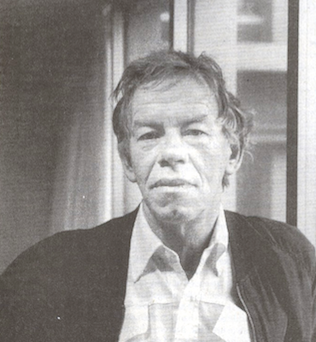 Gerrit Noordzij (b. 1931, Rotterdam; d. 2022) was a Dutch graphic designer, typeface designer, author, teacher, calligrapher, and design artist who made drawings, wood and copper engravings, and postage stamps. From 1960 until 1990 he taught writing and type design at the Royal Academy of Art in The Hague. One of his many students there was Lucas de Groot. Noordzij has worked as graphic designer for various Dutch publishers. Since 1978 he has been the house designer for the publishing company Van Oorschot. His intellectual influence is matched by his physical heritage, in the form of two talented sons in the field of type design, Christoph and Peter Matthias. The Gerrit Noordzij Prize, a prize given to typographers and type designers for extraordinary contributions to the field, is named after him. He was also the first person to receive this prize in 1996. In 2013, Gerrit Noordzij reveived the TDC Medal at the ATypI in Amsterdam.
 The influence he had on Dutch type design is based on a theoretical system he called The stroke of the pen, and his position as the main teacher of type design in the country for three decades. Books on his system include The stroke of the pen: fundamental aspects of western writing (1982), and De Streek: Theorie van het schrift (1985) (translated by Peter Enneson in 2005 at Hyphen Press in London: The Stroke: Theory of Writing). His point in his oeuvre is that letterforms are rooted in handwriting. Other publications: Letterletter (Vancouver, Hartley&Marks Publishers, 2000), De Staart van de Kat (1988,GHM, Leersum), De Handen van de Zeven Zusters (with Willem Dijkhuis: Van Oorschot, Amsterdam, 2001), Das Kind und die Schrift (Typographische Gesellschaft, München, 1985). His typefaces: - Gerrit designed what some consider the perfect font, Ruit, but it is nowhere to be had.
- Dutch Roman (1980).
- Batavian (1980).
- Remer.
- Ruse: a huge text family that started out based on Gerrit's own handwriting, published at TEFF, or The Enschedé Font Foundry. He writes: From 000 to 100 the family is divided into 11 variants of increasing contrast. Each variant contains four different kinds of figures (supplied in four font layouts - HgTb, HgTx, LnTb and LnTx) and a special version for ligatures (Lig). HgTb is a version that has old style figures with identical widths, HgTx has old style figures with individual widths, LnTb has lining figures with identical widths and LnTx has lining figures with individual widths. Any typesetting job for figures, whether it be in tables or plain text, can be carried out easily with Ruse. Each variant is available in roman, italic and small capitals. The complete family consists of 154 fonts.
- The bastarda typeface Burgundica (1983, TEFF). He writes: The design of Burgundica emerged from analyzing the elongated version of the Burgundian Bastarda appearing firstly in manuscripts from the calligraphic workshop of Jacquemart Pilavaine in Bergen (Hainaut) in 1450. The Burgundian bookproduction of the time owed much of its splendor to this elegant script. In Burgundica I followed the shapes of the Burgundian bastarda rather closely. Of course, there was no use for the shapes of the bastarda in the roman and italic fonts of Tret; instead I adapted the spatial proportions of the calligraphic pattern to the shapes of that typeface. (Note: Tret is to be released by TEFF, currently in production). In the last quarter of the 15th century the first bastarda typefaces were cut in Bruges. Many similar typefaces followed that were founded on the typefaces by such predecessors as Caxton, Mansion and Brito. Contrarily Burgundica has its origin in the script itself.
In 2013, Geen Bitter (Thom Janssen, Jorn Henkes and Rogier van der Sluis) copublished Gewone letters Gerrit's early models at Uitgeverij De Buitenkant, Amsterdam. The text has contributions by Albert-Jan Pool, Frank E. Blokland, Aad van Dommelen, Huug Schipper, and Petr van Blokland. The blurb: A couple of years back, while cleaning the letterpress workshop at the KABK in The Hague, we had an amazing find. A package that hasn't been opened for some time. We opened it and found eighteen printing plates in mint condition. The printing plates, we soon found out, were made by Gerrit Noordzij and date back to the late 1960s. They contain a brief lesson about writing with the broad nib and, once familiar with this basis, writing and drawing some different techniques. Since it seemed the plates are never published before, we decided to do so and made a book containing prints from the plates. Next to the plates we asked former students if they still had old work and sketches with comments by Gerrit Noordzij. The result is a collection of sketches and material, together with five writings about the plates, Gerrit Noordzij and his contribution to the field of type and typography. Scan of a 1974 postage stamp by Noordzij. Klingspor link. Letterror link. Flickr group with Noordzij photographs. Interview by Robin Kinross, 2001. The Enschedé Font Foundry link. Video from 2014 by TYPO Berlin. [Google]
[MyFonts]
[More] ⦿
|
Gert Wiescher
[Wiescher Design]

|
 [MyFonts]
[More] ⦿
|
Gha Arizal
[Invasi Studio]

|
[MyFonts]
[More] ⦿
|
Giemons
[Oghie Novianto]
|
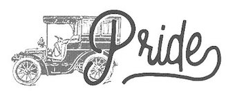 Or Oghi Novianto. Bandung, Indonesia-based designer of the brush typefaces Mons (2015), Eyepic (2015) and Wild Nature (2015).
 In 2016, he designed Spacethink, the grungy letterpress typeface Black Mask, the sketched typeface Baddest, the eroded marker typeface Lonsdale, the excellent poster typeface Brother, and the brush scripts Artur Script, Mars Attack, Flawless, Sekut, Bright Sight, Spacethink, Mighty, Blowing, Faithful and Damn Right, as well as the vintage handcrafted Antebellum. Typefaces from 2017: Burnout, The Elders, Alora, Sisterfields Script, Badger, Brashed, Organic, Martabak, Brownies, Mighty, Beauty Script (watercolor brush), Society Script (monoline script), Feminim Script, Attack Attack (comic book lettering), Nobbler (vintage lettered typeface). Typefaces from 2018: Estoria Script (SVG font), Butter Sweet (a horror brush font), Postcard Script, Silence Good (font duo), Hellprint, Brought, Shining Bright, Boxer (an effective handcrafted fat slab), Southeast, MilkAndShake, Hangover Script (calligraphic), Awakening Script, Macbeth (a free opentype SVG dry brush font). Typefaces from 2019: Be Bold, Paragon SVG, Dextone, Stars & Rabit Script, Fabrique SVG, Toast Bread Coffee. Typefaces from 2020: Rice Bowl (oriental enmulation font), Buster (a chiseled or papercut typeface), Jack Reacher (eerie), Path Black, Hooked. [Google]
[More] ⦿
|
Glasshouse DF
|
Seattle and Tacoma, WA-based design group. Creators of some commercial typefaces that are often weathered, vernacular or emulating letterpress. Typefaces from 2015: Producer. Typefaces from 2014: Legends. Typefaces from 2013: Absolution, Zombie Gothic FS, Foreman. Creative Market link. [Google]
[More] ⦿
|
Golgonooza Letter Foundry
[Dan Carr]

|
Dan Carr (b. Cranston, RI, 1951-2012) was an American poet, type designer, typographer, printer, teacher, punchcutter, environmentalist, human rights activist and New Hampshire State Representative (2008-2010). Carr received his BA at Clark University in Worcester, Massachusetts. In Boston, in 1979 he and his partner Julia Ferrari, started the Golgonooza Letter Foundry & Press, a hot metal Monotype graphic design and composition house, which they moved to Ashuelot, NH, in 1982. Together they created Trois Fontaines Press in 1997, a limited edition fine press. Carr taught typography, and the history of typography at Keene State University in Keene, NH. He died after a struggle with cancer. At Golgonooza they produced high-quality letterpress books for a wide variety of clients. Dan Carr is the designer of the great-looking text fonts Lyons and Cheneau, 1990-1994, as well as Regulus (a metal font created in 1998 that earned him the title of Master Typographic Punchcutter of France in 1999), Philosophie, Genesis Numerals, and Beckett Bodoni, at the Golgonooza Letter Foundry. He won a Bukvaraz 2001 award for Parmenides (a metal type for archaic Greek). His digital typeface "Cheneau" was chosen for a judges' choice award by the Type Directors Club in 2000. Both Dan Carr's Parmenides Greek and Christopher Stinehour's Diogenes Greek were commissioned by the printer Peter Koch for The Fragments of Parmenides. Alternate URL. Klingspor link. Caxton Club link. [Google]
[MyFonts]
[More] ⦿
|
Good Craft Supply Co
[Jared Shofner]
|
Art director in Anderson, IN, involved in branding and lettering. As Good Craft Supply, he designed the vintage display sans typeface Copper Etched (2016) and the letterpress emulation typeface Historical Press (2016). Creative Market link. [Google]
[More] ⦿
|
Good Gravy Type
[Conrad Garner]

|
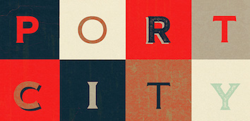 BFA Graphic Design, Boise State University, ID, 2011. Now located in Tampa, FL, Conrad Garner created of the free heavy copperplate sans typeface Idaho (2012) and the copperplate display typeface family Port City (2017, Font Bros; in Press, Sans and Serif sub-styles).
 In 2018, he designed the signage typeface Koozie Script (+Icons), the condensed grotesque Dabronx, and the squarish all caps sans typeface family Cold Cuts (the latter with Dathen Boardman). Typefaces from 2019: Da Bronx Sans (a 12-style condensed grotesque family by Dathan Boardman and Conrad Garner). Home page of Good Gravy Co (not secure). [Google]
[MyFonts]
[More] ⦿
|
Greg Kolodziejzyk
[Image Club Graphics]

|
 [MyFonts]
[More] ⦿
|
GRIN3
[Bartek Nowak]

|
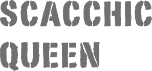 A group of independent designers from Poland, heade by Bartek Nowak, and located in Staromiejska. Nowak has been designing typefaces since ca. 2000. Typefaces:
 Aka Leitmotif. Dafont link. Klingspor link. Fontspace link. GRIN3 link. Old free font URL. Creative Market link. Home page. Showcase of Bartek Nowak's commercial fonts. [Google]
[MyFonts]
[More] ⦿
|
Grype
[Charles Leroux]

|
 Grype was set up by Charles Leroux (b. 1980, Montreal) in Montreal. It was acquired by Astigmatic (Las Vegas, NV) in 2016. He created Rendezvous GRP (2008, a Tuscan typeface inspired by the lettering of Ben Shahn on the cover of the novel Rendezvous with Destiny), Condemned (2008, grungy letterpress style) and Banished GRP (2008, a Western slab serif saloon font inspired by Astro Zombies, the 1968 Cult Cinema Classic).
 Obliterate GRP (2013) is a grungy letterpress typeface. In 2016, Brian J. Bonislawasky and Jim Lyles published the rugged octagonal mega typeface family Tradesman, the rounded sans Tailwind, and the techno typeface Offroad at Grype. In 2017, they added Jukebox Hero (stencil), Lustra (a mechanical sans), Lustra Text, and Sunblock Pro (2017, by Brian J. Bonislawasky and Jim Lyles). Typefaces from 2018: Aspire Narrow SmallCaps, Aspire SmallCaps, Aspire, Aspire Narrow. Typefaces from 2019: Decade (a logotype inspired by an alphabet in Letters and Lettering (1938, Paul Carlyle and Guy Oring)). Typefaces from 2020: Binder (a revival of the ultra-condensed movie credit typeface Binder Style by Joseph Binder for D. Stempel in 1959), Avionic (a 40-style sci-fi family, inspired by aerodynamics and the Air China company logotype). Typefaces from 2022: Midsole SC, Midsole (a 40-style squarish sans with square counters). [Google]
[MyFonts]
[More] ⦿
|
Hamdani Putra
[Refolve Design Studio]
|
[More] ⦿
|
Hannes Famira
[Studio Hannes Famira (or: Famira Fonts)]

|
 [MyFonts]
[More] ⦿
|
Hannes von Döhren
[HVD Fonts]

|
 [MyFonts]
[More] ⦿
|
Harrisson
[Open Source Publishing (or: OSP)]
|
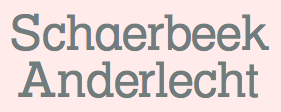 [More] ⦿
|
Heckhouse
[Bethany Heck]
|
Graduate of Auburn University, AL, class of 2020. Multidisciplinary designer and writer who specializes in wood type, letterpress and 19th century type. She assisted David Jonathan Ross in the design of Job Clarendon (2021), and wrote: Job Clarendon is an homage to job printing---display-heavy designs made for posters and flyers in the heyday of letterpress printing. This style of Clarendons was wildly popular in this genre of work, and I've always been interested in how adaptable they were. The style was fattened, squished and stretched to accommodate lines of text both short and long and type foundries across the globe each found their own unique features to contribute to the Clarendon stew. Ross pulled the design to both extremes but had his work cut out as he explains: The chasm between Hairline and Black was far too wide to interpolate across effectively, so I incorporated new drawings in the Extra Light, Regular, and Bold weights to act as additional tentposts to support the design. [Google]
[More] ⦿
|
Hendrik Nicolaas Werkman
|
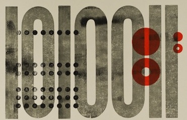 Hendrik Nicolaas Werkman, who is usually referred to as H.N. Werkman, was born in 1882 in Leens, The Netherlands. He died in 1945 in Bakkeveen, The Netherlands. He was a well-known Dutch artist, typographer and printer. In 1908, he founded a printing and publishing house in Groningen. It closed in 1923, but Werkman started anew with a small workshop in the attic of a warehouse. Werkman was a member of the artists' group De Ploeg, for which he printed posters, invitations and catalogues. From 1923 to 1926, he produced his own English-named avant-garde magazine The Next Call, which, like other works of the period, included collage-like experimentation with typefaces, printing blocks and other printers' materials. He also used stenciling and stamping to achieve unique effects.
 Regarding his death, I cite Wikipedia: In May 1940, soon after the German invasion of the Netherlands, Werkman, together with his friend August Henkels and others, began publishing a series of Hassidic stories from the legend of the Baal Shem Tov through their clandestine publishing house De Blauwe Schuit ("The Blue Barge"). Running to forty publications, all designed and illustrated by Werkman, the series was a subtly rebellious commentary on the Nazi occupation and a call for spiritual resistance. On 13 March 1945, the Gestapo arrested Werkman, executing him by firing squad along with nine other prisoners near the village of Bakkeveen on 10 April, three days before Groningen was liberated. Many of his paintings and prints, which the Gestapo had confiscated, were lost in the fire that broke out during the battle between German and Canadian forces over the city. Several typefaces were made that were inspired by Werkman. There are also entire web site and exhibitions dedicated to Werkman---see, e.g., the site of Bunker Type (Jesus Morentin) in Barcelona. A partial list of revival typefaces: Groninger Museum link. [Google]
[More] ⦿
|
Hendry Juanda
[Letterhend Studio (or: Magang Letterhend)]

|
 [MyFonts]
[More] ⦿
|
Henrik Kubel
[A2 Type]

|
 [MyFonts]
[More] ⦿
|
Hermann Berthold

|
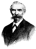 Typographer and entrepreneur, b. Berlin 1831, d. Berlin, 1904. In 1858, he founded his "Institute for Galvano Technology" in Berlin. He discovered a method of producing circular lines from brass instead of lead or zinc. The soldering normally necessary could be dispensed with. The lines were elastic and highly durable, and produced fine results. Most of German's letterpress printers and many printers abroad placed their orders with Berthold. In 1864, he set up H. Berthold Schriftgießerei und Messinglinienfabrik in Berlin. The company specialized initially in new technical processes for printing, such as galvano-type, as described above. Hermann Berthold headed the foundry until 1888. Around 1900, Haus Berthold was one of the largest foundries in the world.
 MyFonts link. Portrait by Arthur William Presser regarding the Akzidenz Grotesk typeface pioneered by Berthold's company. [Google]
[MyFonts]
[More] ⦿
|
HoneyDrax Productions
|
Creator of the free grunge letterpress emulation typeface Disintegration. [Google]
[More] ⦿
|
Hustle Supply Co
[Jeremy Vessey]
|
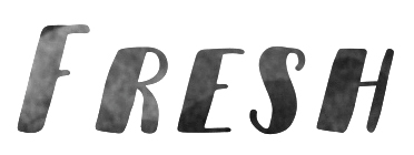 Jeremy Vessey (Hustle Supply Co, Charlottetown and/or Cornwall, PEI, Canada) created these commercial typefaces in 2014: Parlour (a grungy vintage typeface), Native (quaint style), Instapress (letterpress emulation).
 In 2015, he designed the vintage typeface Arbour, the free octagonal caps-only typeface Cast Iron, the handcrafted Yosemite, Wayfarer, American Tradition, Growler Script, Yonder and Longshore. He also made the old whisky label-inspired Höchstadt, and the brush typeface Sitka, which will have to be renamed once Microsoft's lawyers hear about the name, which coincides with MS Sitka (2013, Matthew Carter et al). Typefaces from 2016: Bourbon Grotesque, Holtzberg (a free letterpress emulation font), Bonfire, Belfast (brush style), Buffalo, Gibson Script (vintage label font), Hochstadt (a whiskey-inspired sans serif), The Great Outdoors, Summer Hearts, Oatmeal Stout (a vintage beer label font, with Rough, Hatched and Aged substyles that can be mixed and matched), Whiskey (letterpress emulation), Greenstone, Hochstadt Rounded, Hochstadt Serif, Pathways, Restless Youth, Yorkshire (brush script), Hustle Script (retro connected script done with the help of Scott Byrne). Typefaces from 2017: Ciderhouse, Boathouse (brush script), The National (condensed sans, in 12 styles, including aged, weathered versions), Renegade (dry brush), North Port (dry brush), Rustico (a free dry brush font), Gastro Pub (a 3d layered typeface family), Harper Script, The Brewers Collection, Everyday Script and Sans, Genuine Sans and Script (by Jeremy Vessey and Stephanie Arsenault). Typefaces from 2018: Calibre Super Condensed, Purveyor (vintage all caps), Rothmans (a heavy monoline script), Bolder (an OpenType SVG font), JV Signature (an opentype SVG font for signatures), Köhler (a condensed textured typeface family), Restless (brush script), Secret Society (spurre), Berringer, Portrait (signature script), the Artisan collection (letterpress set: Heinberg, Holtzman, Trade Supply, Barley Script). Typefaces from 2019: Purveyor, Avondale (monoline script), The Great Outdoors (all caps sans), Huscon (vintage label style), HSCO John Hancock (a signature font), Heather Oliver (a signage script), Haroldson (condensed sans), Youthful (dry brush script). Typefaces from 2020: Athletic Dept, Kendrick Serif, Arbour, The Shoreman (vintage, all caps). Typefaces from 2021: Hatchet Arrow (Victorian), Parkshore, The Sterling Bros (+Stencil), National (a 12-style ultra condensed all caps typeface), Artisans Moniker (a signage script), Wayward, Headline (a headline sans), Ashfort Brush Script, Hastington Script, Bohemian Hunter (a vintage wedge serif), Hustle Brush (a dry brush typeface), Birchfield (vintage), Acreage (a decorative serif), The Handwritten Watermark (script), Waves (a condensed all caps didone), Quartz Grotesque, Athletic Dept. Typefaces from 2022: Nolan (a free dry brush SVG font). [Google]
[More] ⦿
|
Huy Fonts
[Juan José Lopez]

|
 Huy Fonts is a foundry in Madrid run by Juan José Lopez. In 2016, he designed the great poster typeface Black Pack, which is inspired by the odd bold plastic shops signs from the 60s and 70s.
 With Inés Atienza, Juanjo designed the multilayered and/or chromatic circus font family Show (2014). Influenced by chromatic letterpress types, it is based on a type family called Concave, a Victorian type launched in 1884 by the foundry Marder, Luse & Co. Inés Atienza and Juanjo López are members of the Familia Plomez association, a small printshop based in Madrid that devote their efforts to promote everything about letterpress printing, calligraphy, and lettering. Lopez made Choriza and Choriza Sans (2013: sausage-inspired type), Adoquin (2013), the informal sketchified family Bodoniez (2011), Chiripa (2011, hand-printed), Hands Up (2011, various hands, including "thumbs up", "a OK", "the finger", and fists), Paquita Pro (2011, informal lettering; this children's book font was remodeled in 2016 as Paquita Next), Ultramarina (2011, a quaint face based on wood type headline examples), and Pichi (2011). Designer of the Scotch modern typeface Schotis Text (2017), the cartoon font family Xunga (2017) and the angular text typeface family Pliego. Earlier, Lopez was a T-shirt designer, who also used the name Juanjo Lopez. Old page of Juanjez Nikis. At Dafont, one could download the headline handwriting font Paquita (2006), a predecessor of Paquita Pro. See alo Fontstore / Fontshare's Paquito (2017). In 2021, he released the 70-strong thick-and-thin poster sans typeface Rotulo, which was inspired by Jano's Spanish movie posters. Later in 2021, he designed Graveur (he writes: Graveur is a Renaissance style text face based in the work of the French punchcutter Robert Granjon (1513-1589). Working on original artifacts kept in Museum Plantin-Moretus in Antwerp, observation of his punches, matrices and printed materials resulted in a extense type family that tries to capture the overall style of Granjon rather than simply being a slavish copy of a particular source. Started as my project at Expert Class in Type Design in Antwerp, Graveur has grown to become a typeface with four optical sizes and seven weights, plus italics and an ornaments font. It also has variable font). Klingspor link. Home page. I Love Typography link. Behance link. View Juanjo Lopez's typefaces. [Google]
[MyFonts]
[More] ⦿
|
HVD Fonts
[Hannes von Döhren]

|
 Hannes von Döhren (b. 1979, Berlin) is a Berlin-based designer (b. 1979). His foundry is HVD Fonts. He started out with free handwriting and grunge fonts such as HVD Comic Serif Pro (2009, an alternative to Comic Sans, according to HVD), The Subway Types (2009, a graffiti family: Shik (New York), Deon (Paris) and Etan (Berlin) came together to show the typical tag styles of their respective metropolitan areas. The fonts were digitized, spaced, kerned and programmed by Hannes von Döhren).
 Later he went commercial, first at T-26, and then under his own label, HVD Fonts. His typefaces: Shelton (2008, T-26), HVD Peace (2008, an army stencil font), HVD Comic Serif (2007, a serifed spoof on Comic Sans), HVD Rowdy (2007), HVDSpencils-Block (2007, stencil), HVDSpencils (2007, stencil), HVD Steinzeit (2005), HVD Edding 780, HVD Rawcut (2005), HVD Age 11 (2006), HVD Shelton (2008, T-26: wood type grunge), HVD Bodedo (2009, potato-Bodoni lettering), Quench Pro (2008, Linotype), HVD Peace (2008), and HVD Poster (2006, grunge). Typefaces made in 2009: Grandma (great hand-printed style---move over, Comic Sans), Christmas Dingbats, ITC Chino (a soft-edged signage and sans family, done with Livius Dietzel), Klint (sans family, +Rounded), Brevia (a soft sans in seven styles), Cowboyslang (a Western slab serif family), Embryo (superblack), Embryo Open, and Opal, a classy old style text family with tall ascenders. Bumper (2009) is an ultra-black sans family in a style related to Impact. Typefaces from 2010: FF Basic Gothic (a grotesk family done with Livius Dietzel), Reklame Script, Shelton (grunge), Blow Up is a fat balloon font. His masterpiece of 2010 and perhaps of his career thus far is the Brandon Grotesque family that relives the 20s and 30s. [A year after I wrote the previous sentence, Brandon Grotesque won an award at TDC2 2011, and all during 2011, it was the most sold typeface at MyFonts. It was followed in 2018 by Brandon Grotesque Condensed.] Livory (2010, with Livius Dietzel) is a rounded serif type family of four fonts influenced by the French Renaissance Antiquas from the 16th century. Production in 2011: Brix Slab (2011, with Livius Dietzel), Brix Slab Condensed (2011, with Livius Dietzel:(24 styles in all), Pluto (16-style semi-scriptish sans family, +Italics), Cheap Pine (a wood type caps family), Supria Sans (free web font family; +Black). Together with Supria Sans Condensed, this 36-style family is a basic sans workhorse. It won an award at TDC2 2011. Typefaces from 2012: Shelton Slab (eroded wood type or dirty letterpress look), Diamonds (geometric caps only family), Pluto Sans, Love Potion No. 10. Typefaces from 2013: Embryo Tiny, Niveau Serif (an engravers / copperplate style typeface), Niveau Grotesk, Mikado (signage family for games, food and advertising with a lot of genetic material from Brandon Grotesque: Mikado Bold Demo is free), Brandon Text (similar to, but with a higher x-height and more rounded corners than Brandon Grotesque, it is more appropriate for long texts and small print), FF Mark (together with Christoph Koeberlin and the FontFont team: this font is marketed as Ze new Germanetric sans; one weight is free). Typefaces from 2014: Brix Sans (2014, created using precisely engineered glyphs for corporate or information design; with Livius Dietzel), Brandon Printed (a caps-only letterpress version of Brandon Grotesque). Typefaces from 2015: Brandon Grotesque Office (screen-optimized; specially designed for Microsoft Office applications, it has 4 styles), Brandon Text Office (also made for Microsoft Office applications), Goodlife (a hand-lettered collection, consisting of Brush, Sans, Script, and Serif styles), Americane Condensed and Americane (based on American wood types). In 2016, Christian Koeberlin designed Fabrikat, which had creative input of Hannes von Döhren. This simple geometric sans serif family is based on the DIN style used in the 20th century by German engineers. It has a plain and precise appearance, and is a textbook example of a compass-and-ruler typeface. The monospaced almost-typewriter version Fabrikat Mono followed in 2017. Typefaces from 2018: Giulia (a creamy cutesy baby shampoo font family). Typefaces from 2020: Brandon Text Condensed (in 12 styles), Bouba Round (a round sans family for small devices and wayfinding), Fabrikat Normal. Typefaces from 2021: Palast (Text, Display, Poster; with Bernd Volmer). Abstract Fonts link. Another URL. Font Squirrel link. I Love Typography link. Fontsy link. View Hannes von Döhren's typefaces. [Google]
[MyFonts]
[More] ⦿
|
Ian Barnard
[Vintage Type Co (or: Vintage Design Co)]

|
 [MyFonts]
[More] ⦿
|
Icon Stacks
[Conor Muirhead]
|
Conor Muirhead shows how to combine icon glyphs to create complex icons using clever CSS programming. [Google]
[More] ⦿
|
Ikea: The flap
|
In 2009, Ikea, which had been using Ikea Sans and Ikea Serif, switched to Verdana for its signs. Freely distributed by Microsoft, the typeface allows Ikea to use the same font in all countries and with many alphabets. An Ikea spokesperson adds: It's more efficient and cost-effective. Plus, it's a simple, modern-looking typeface. But the verdict by typographers is unanimous---this is a bad choice. One person even started a wiki page called Verdanagate. Excerpts from their reactions: - Carolyn Fraser (a letterpress printer in Melbourne, Australia): Verdana was designed for the limitations of the Web - it's dumbed down and overused. It's a bit like using Lego to build a skyscraper, when steel is clearly a superior choice.
- Simon l'Anson (creative director at Made by Many, London): It has open, wide letterforms with lots of space between characters to aid legibility at small sizes on screen. It doesn't exhibit any elegance or visual rhythm when set at large sizes. It's like taking the family sedan off-road. It will sort of work, but ultimately gets bogged down.
- Lise Abend (Time Magazine): The main complaint that online protesters have, though, is that the newly adopted font is plain ugly. Especially when it's enlarged to, say, the size of a catalogue headline. Or worse yet, a billboard.
[Google]
[More] ⦿
|
Image Club Graphics
[Greg Kolodziejzyk]

|
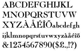 Image Club Graphics was founded by Greg Kolodziejzyk from Calgary, Alberta, in 1985. ICG sold fonts at about 30 dollars per typeface around 1992 and became successful as a font distributor and direct marketer and software developer. They issued new catalogs regularly. The most recent edition of the CD (called Letterpress 7.0) cost $1500 for 890 fonts. They also had a wide variety of artwork. The ITC on Display CDROM cost 3000 dollars for 375 display fonts.
 Greg writes: In 1994 I sold Image Club to Adobe Systems of Mountain View, California. At that time, Image Club was distributing over 10 million software catalogs to it's customers world wide. With sales topping $20 million in 1996, Image Club is very well known in the industry as a successful direct marketer and software developer. [...] The company still operates in Calgary, but has been purchased back from Adobe by the manager who I had hired years ago who changed the name to Eyewire. In 1998, Eyewire was sold to Getty Corporation for a whopping $30 million. The ICG site said at one point that Image Club no longer exists. As a company, it ceased to be sometime between our purchase by Aldus in 1994 and our rebranding as Adobe Studios in 1998. Until recently, the Image Club Typeface Library and Image Club clip art products were available at EyeWire. Eyewire then became Veer. The ICG library can now be bought at MyFonts. List of available ICG fonts. Martin Kotulla states that ICG copied fonts in an aggressive manner, and finds it ironic that this pirate was bought by Adobe. Greg Kolodziejzyk's reply: You should add that all fonts "aggressively copied" by this "pirate" were licensed from the foundries who owned the copyrights to those fonts. I can't tell you how many 100's of thousands of dollars we paid over the years to foundries as licensing fees. This statement is false. Selected typefaces: Eclat (retro signage script), Cariola Script Std (a wide connected script by James West). View the Image Club Graphics typeface library. Greg Kolodziejzyk's present blog about personal fitness. [Google]
[MyFonts]
[More] ⦿
|
imagex
|
 Frenchman (b. 1957) who started making fonts in 2010, after a career in illustration, comics, and video games. In 2010, he created the free fonts BabyJo (pixel face), Bayday, Chrom (beveled face), LaPresse (grunge), Muffaroo, Poppy, Poppydot, Spacecard, Strokewith, Strokeless, ToonLand (comic book lettering), ToonLandBlack, ToonLandShad, TrashToys (grunge), WorldColors (3d face).
 In 2011, he published Francobelge (comic book face), Freepress (grunge), Gamix (Western titling face), Inmyroom (dingbats), Majestrick (calligraphic), Onomatopaf (comic book dings), Outerzone, OuterzoneB, Starz (dingbats), Stenstreet (grunge), Tram, Tramix (texture face), TrashToys02, War-Lettersn, Mixagex, Massive Dynamite (grunge), Not Well (grunge), Actu, Blck, Gling (texture face), HeRioz (silhouettes), Brightoon (cartoonish brush face), Muzo (ink spill face), Sharpy, Space Shop (dingbats), Pulp Dance (hand-printed), Essef (art deco), Retro Sign (grunge), Labo (grunge), Exhausted, Komikoz, Puzzled, Toonimals (dings), Penstriped (sketch face), Cashier (grungy), Dan Hand, Hardwell (grungy caps), Colleged (athletic lettering), Goodjean (jeans texture face), Seaside Things (dingbats), Real Tek (techno), Zou (3d hand-printed caps), Painter, Border Line (grunge), Handout (grunge), Tract (grunge), Pulpatone (grunge), Logos I Love, Pal Antic (chancery hand), Twent (fat rounded display face), DoodFlow (dingbats), Afro Add (texture face), Crump (grunge), Big White, Dark Room (grunge), Manifesto (grunge), Tacketil (a FontStruct font), Otto Land (sketch face), Over (outline face), Under (brush dings), Baskertown (grunge), Nursery Tale, Panic (texture face), BlackNDot (ink spill face), Beyond (striped display face), Advert, Car Crash (grunge), Heartz, Starsteel, Smart Faces, Blackflag (a brushed blackletter), Dock 51 (grungy stencil), Lead (3d face). In November 2011, he created a number of texture typefaces: Hotöcop, Pal Mod, Speedy (sketch face), Thirties Gold, Sunset GP. Further 2011 typefaces: Poptivi, Shadow Mole, Super Modern Black. Faces from 2012: Remanence, Winter Days (dingbats), Nowharehouse (grunge), Snuff (grunge), Cup of Tea (3d shadow face), Talk of the wall. Typefaces from 2012: Egirlz (dingbats), Art Post (white on black poster lettering), Volutes (copperplate calligraphic script), From me 2 you (curly script), PS I Love You, Kolossal (caps only), Kraash, Alexandre (3d engraved headline face), Monstres de poche (dingbats), Alternate (grunge), Warning, Dreams (brush face), Headline Crack, Bump Pad (textured typeface), Carton (grungy white-on-black stencil face), Maybe maybe Not, Frames n Riboons (sic), Blackboard (sketched face), Logotronik (a 3d techno face), Big Bad Dogs (dingbats), Libre Expression (engraved copperplate typeface), Mecagothix (textured blackletter face), Destroy, Destroy Helpers, Buy More, Things we said (curly face), Lost Saloon (Tuscan), Salon de Coiffure (beveled), Brighton Pier (grunge), Motel Vacancy (grunge), Bates Shower (dripping blood typeface), Venus Furs (texture typeface), Showmen, True Men Tattoos (dingbats), Quicker (sketch font), Romanum Est (grungy Trajan face), Also (scratchy letters), Lazy Day (3d font), Pusher, Hard Dumb, The Idiot, Overflowing (grunge), Fast Foont (sketched), Melange (grunge), Jumbo Parade (circus font), Happy Monsters, Zozox (experimental), Magic Sound (packaging typeface), Arena Mascaras (dingbats), Top View (3d face), Flagadoum, Last King Quest, Rhythm n Blacks (textured face), Troll Sketched, Superpoz (a 3d painted typeface of exceptional beauty), HalloCuties (Halloween font), Gothik Steel (circus font), Silvestre Relief (3d titling face), Just Like That (comic book face), Numero 10 (athletic lettering), Tet de Mor (skulls), Facelook, Xmas Dad, Instant Marker, Ragtimer, Punk Dots (textured face), Onomato Vlam (comic book balloons), 8th Cargo (textured mechanical octagonal face), Zu Kabarett (creepy curly German expressionist face), Unusual Day One, Happy New One (party font), Xmas Doods, Xmas Doods 2, Higher, Usual Day One, Team 401 (athletic lettering), Doonga (comic strip letters), Killer's Move. Typefaces from 2013: Them (fat brush), Ghost Code, Tiny Heroes (figurines), Over There (sci-fi), Higher than High, Abandon (sketched face), Broken Hearts, True Stories, A wolf at the door (wood style poster face), Elo Hand, Bots n Droids (dingbats), Toonimals 2 (dingbats), Halftoned Backup (textured face), Novlang (textured poster face), Come With Us, Ptits Pirates (pirate figurines), Board Dudes (skateboard dingbats), Big Bro's Watch (grungy), Doonga Slash (comic book face), Round About, Signz, Lethal League (grungy athletic lettering), Dark Times, Dandy Hat Trick, tardots (textured typeface), Dinoz (dinosaur dingbats), Big Surprise (fat script), Comix Loud, Arlequin, Fanzine Title, Scotch Taped, Phoenix (dingbats), Rock's Death (grunge), Tuamotu (textured), Trees Friends (dingbats), King Arthur Legend (blackletter), Fairy Strange, Flame On, Mystery, Money Go Round (ransom note font), Seven of One, Captain's Talk, Peaches en Regalia (sketch font), Wrong Board (textured or crayon typeface), Subito (comic book face), Extra Sales (signage face), Gimme Danger (grunge stencil), Alphabet City (graffiti font), Raleigh Rock, Rysky Lines, Splash, Good Vibers (comic book figurines), Tequilla Sunrise (3d shadow face), Graphers Blog, Star Waves, Splash, Action Comics, Wild Trails (wood plank typeface), Tiki Club (dingbats), Bad Striped (sketched face), Come With Me (paint drip face), Famous Oldies (textured face), Girly Toons (dingbats), Eshop Advert, Full Pack 2025, Dickson's Tale (a great grungy caps face), Hand Typewriter, Campus Relief (athletic lettering), ZalienZ (dingbats), Manga Style (oriental brush), Journal du Soir (letterpress emulation), Royal Delight (3d sketched face), Gothix Fate, Lettrisme (a letterpress ransom note font), NYC Zone 123 (graffiti face), Tedz (teddy bear dingbats), Merry Xmas, Last Day On Earth (textured typeface). Typefaces from 2014: Dite Alla Giovine (flared cursive script), Heavy Gothik (textured blackletter), Comix Bubbles, King of Scotland (textured), Lazy Sketch, Arabica Export (coffee bag texture), Scream Again, Season of the Witch, Soul Festival, Back Ride 342, Cheap-Potatoes, Nine-Feet-Under (grunge), Remingtoned-Type, Search'n-Destroy, Starz-2, Vanished, On The Roof (or: On The Tops), Mad Groove Blast, Another Brick (textured face), Destination Future, Perversionist, Dex's Jobs (Treefrog-style typeface), Ptit Coeur d'Amour, Mickey's School (athletic lettering), One Way or Another (a hand-drawn poster typeface), Californian Cars (license plates), Building State Empire, Back on Lime (shadow face), Next Ups (graffiti face), PatchFun (textured face), Railway to Hells, Shut'em Down, Misunderstanding, Another Brick (textureface), Perversionist (grunge), Destination Future, Linographer, Polish Posterisation, For Girls Only, Half Price 4 You (sketched typeface), Secret Agency (bad ink grunge), Player One (a grungy baseball Script), Raw Notice, Home Mad Popsters, No Silly Walk There, Bad Coma (lovely grunge), Dark Net Warrior (grunge), Cowboy Movie (Western font), Palm Beach (textured typeface), Search n Destroy (textured), Carnaval de mai, Variations (textured), Black Jeans (weathered font), City of Light, Santa's Air Mail (snow-capped letters), Cheap-Potatoes, Nine-Feet-Under, Remingtoned-Type, Search'n-Destroy, Starz-2, Vanished. Typefaces from 2015: Snake Jacket, Big Campus (athletic lettering), Penball Wizard, When The Eagles Dare, Urban Brush Zone (graffiti font), Wild West Pixel, World Black Shadow, Next Custom, Irresponsible Direction (grunge), Doodle Gum (textured), Posthuman (textured), Red Zone (glaz krak face), Smasher 312 (graffiti font), Columbine (dripping blood font), Tarentula's Web, Just Like This (retro funk), Eastern Brush (oriental brush typeface), Pulp Headlines (grungy typeface), War is Over (letterpress emulation), Thirties Relief, Flowers Power (sic) (floral caps), Direct du Gauche (inky brush), Jackpot (3d, sketched), Numero 10 Clean (athletic lettering), Lace Dreams (textured), Right Chalk (chalky crayon font), Lazy Sketch Black, Golden Age (shaded pixel font), Swamp Death (textured), Astounding News, Heavy Metal Rocking, Fifties Movies, Grunge Strokes 01, Cosmik Orchestra, Paysley Sports (sandy athletic lettering), No Safety Zone (grungy stencil), Quicksands (textured), Break It Down (glaz krak font), Naughty Cartoons, Mad Groove Clean (athletic lettering), Outlaw Stars (grungy Western face), Space Comics, Dirty Bowl 86 (athletic lettering), Cheap Potatoes Black (imitating pototo printing?), ExtraBlur (textured), Backside Air, Megalopolis, Curse of the Zombie, After the Goldrush, Avantgardiste 1934, Easy Fashion (textured), Free Thinking's Murder (textured), Phantom Zone (zombie texture), Snake In The Boot, Checkpoint Charlie (grungy stencil), For Girls Only Bold, Playing In The Mood (piano key face), Intergalactik Airlines, Les Mystères de Paris, Season of the Witch Black (blackletter), Resistance Is Futile (a great textured mechanical typeface), On The Tops Lights (matinee signage), Strawberry Fields, Serif of Nottingham, OnomatoBom (cartoon smaks). Typefaces from 2016: Dynamix (a shaded comic book typeface), Black Santa (snowy letters), Astral Delight, Mr. Headlines (titling sans), Sister Spray, Shaka Pow (cartoon font), Jack in the Box, Glitter Campus (athletic lettering), Ghost Crazy (heavy brush), Prezident, Flowers Kingdom (psychedelic), Galaxy Corps (octagonal stencil), Stitchn School, Brown Shoes, Armagedon (dry brush), Smasher 312 (graffiti style), Bad Stories, Master Droid, Heavy Metal Box (grungy letterpress), Outerspace Shoping (sic), Extros Backstage (squarish), Jelly Crazies (jellybean font), Black and White Banners, Ballad of Dwight Frye (grungy), Crazy Sixties, SciFi Movies, Maximum Strength (athletic lettering), Evanescente (sketched typeface), Urban Ghost, Vif Argent (watercolor brush script), Demolition Crack (textured), How to Disappear, Public Market, Pyjama Party, Magician Rings (modular sans), Pale Blue Eyes (brush script), All The Mad men (sketched), Dixociative (white-on-black), White Flame (octagonal typeface), Asian Delight (oriental brush emulation), Candy Shop, Barb Wire Club, Super Weird, My Socks Line. Typefaces from 2017: Scoubidou Rap, Good Morning (cartoon font), Graphik Arts (textured), Danger Zone Warning, Love The One You're With, Are You Hung Up (textured), Keys of Paradise, Mr Headlines Fancy, Game of Brush, Powerful, Ghost Shadow, Quick Menu Boards, Urban Fresh Air, Cheer Lace Leader (textured), Cracked Code (grunge), Very Simple Chalk, Fluo Gums, Very Popular, Personal Service, Blind Signature (crayon font), Blood n Guts, Quarterback Fight (octagonal athletic lettering), Supersonic Rocketship, Reboot Crush, Strange Path (dry brush font), Heroes Legend, Cache-Tampon, Championship (a great horizontally striped typeface), Silver Age Queens, Strange Tales. Typefaces from 2018: Play With Fire, Scrunched, Megalomaniac Headliners, Craps of Paper (white on black), All Things Must Pass (textured), Presque Normal, Interfearence, Pop of the Tops, Universal Knowledge, Digital College, Cold Turkey (a handcrafted horror font), Strange Magic, Grandissimo, Best Prices (sketched), Magician's Daughter, Children's Theater (textured), Magnifico, Lethal Slime, Pop of the Pops, Slow Death, Folk Festival, Strange Marvel, Strong Impact (octagonal), Heavy Metal Blight, Mango Slice, Are You Jimmy Carl Black, Strange Clowns, Mechanical Animals, Fast Forward, Spanish Castles, Vintage Warehouse, Swamp Black, Pixelmania, Enigma key, Vlump (wooden plank font), Guns n Flash Comix, Black Streamer, East Border (military stencil), Bot Craftshop, Super Quick, Don't You Know?, Return of the Flash, Only The Strong (weathered athletics font), Hands Up, Strange Shadow, White on Black, Ed Wood Movies. Typefaces from 2019: Inner Mounting Flame, Playtimes, Game Commands (white on black), Magic Spots (with a spotted texture), Vanishing (with a halftone effect), State Secret (squarish), All My Stitches (a hospital font), Lightyear Design, Ancient Ad, African Style (textured with African patterns), Secret Planet (sci-fi), Universal Ignorance, Give Peace a Chance, Hard Punk Gothic, Vraoum (speed emulation font), Galaxy Travels, Megapoliscape, Red Signal, Perfect Mystery (dry brush), Many Years Ago (mechanical, octagonal), Vintage Display (textured caps), Space Sport (textured, octagonal), Dancing Days, Steam Punk, Splatch (comic book font), Rear Defender (octagonal, stencil), Ghost Factory, Kids Magazine. Typefaces from 2020: Bright Star (sci-fi), Fiesta Rumba (a matinee font), Sergeant Rock (a stencil typeface), Tricky Hearts (a vampire font), Organic Brand, Campus Riot (grungy), Crazy Love Song, Shiny Signature, Evil Highway, Slightly Eroded, Lightyear Shadow, City Player (graffiti), Night of the Deads (a horror font), Ka Blam (an all caps cartoon font), Unforgettable, Corrupted File (grungy, pixelish), Urban Heroes (a dripping paint font), Victorian Art Magic Remains, Kid Games, Restricted Area (a dripping paint stencil), Dark Poestry, Platinum Sign, Tacos de Tijuana (a Mexican party font), Retro Shine, Lower East Side (a graffiti font), Holidays Homework (a chalk font), Deep Shadow, Finger Printed, Crushed (a glaz krak typeface), Bing Bam Boum, Stars Fighters (a Star Trek font). Typefaces from 2021: Baby Party, Shadow Of The Deads, Big Bad Bugs, Boldfinger (bold caps), Paperback Writer (sketched), Comics Tricks, Charming Sixties, Squarely, Mad King Games, Back to School (a varsity font), Youtube Star (an oily typeface), Silver Medal (beveled), Cosmic Blaster. [Google]
[More] ⦿
|
Indra Gunawan
[FA Studio (or: Fluffy Art Studio)]
|
[More] ⦿
|
Inés Atienza

|
Designer in Madrid (since 2008) who has worked with Alberto Corazon in Madrid (2004-2005) and Massimo Vignelli in New York (2006-2007). She studied at the Sorbonne (1999), Universidad San Pablo CEU in Madrid (2004), Parsons in New York (2007) and Cooper Union (2011). With Juanjo López, she designed the multilayered and/or chromatic circus font family Show (2014). Influenced by chromatic letterpress types, it is based on a type family called Concave, a Victorian type launched in 1884 by the foundry Marder, Luse & Co. Klingspor link. [Google]
[MyFonts]
[More] ⦿
|
Insigne Type Design Studio (was: Dooley Type)
[Jeremy Dooley]

|
 Insigne Type Design Studio (est. 2006) is run by Jeremy Dooley, b. Columbia, SC, 1981, who received a masters in graphic design at Savannah College of Art and Design in 2005. He lived in Atlanta, GA, and is now in Knoxville, TN. From 2004 until 2006, he ran Dooley Type in Greenville, SC. Behance link. Klingspor link. Font squirrel link. Creative Market link. MyFonts interview. His fonts:
 - 44th President (2009, based on Obama's handwriting).
- Aberlyth (2006). An informal script face.
- Ainslie (2014), Ainslie Slab (2014), Ainslie Sans (2014) and Ainslie Contrast (2020: a 42-style sans).
- Antigen (2007) is futuristic.
- Arendahl (2007) is a connected but irregular handwriting font.
- Ashemore (2012). Production assistance for Ashemore was provided by Lucas Azevedo and Marcelo Magalhaes. Followed by Ashemore Softened (2012).
- Avaloc (2006) is an expanded sans.
- The Aviano superfamily. Aviano Wedge (2012), Aviano Slab (2007), Aviano Serif (2008), 2009 Aviano Didone (2009), Aviano Flare (2010), Aviano Sans (2010), Aviano Future (2011), Aviano Contrast (2012), Aviano Gothic (2013), Aviano Sans Layers (2013), Aviano Copper (2018), Aviano Didone (2019). Aviano Titling (2007) is inspired by Trajan. Aviano Silk (2015) is a bilined decorative titling typeface. Aviano Royale followed in 2016.
- Barcis (2013). An organic sans family.
- Beastias (2006). An informal script face.
- Belda (2017). An elegant serif family of fonts that grew from the ancient roman capital. Followed by the 54-style Belda Didone (2020). A 54-style didone family without ball terminals.
- Biortec (2004).
- Biscuit Boodle (2008) is a fun and crazy script from Portland Studios illustrator Justin Gerard. Biscuit Boodle Ornaments (2009, dingbats).
- Blue Goblet (2005) is a Treefrog-style script developed for the pending illustrated childrens book from Portland Studios, The Blue Goblet. It was co-designed by Cory Godbey of Portland Studios and Jeremy Dooley. In 2011, Cory Godbey added Blue Goblet Christmas Ornaments.
- Boncaire Titling (2012) was iInspired by the type elements of 17th century map of Curacao made by Dutch cartographer Gerard Van Keulen.
- Brigette (2007) is an ink-splattered calligraphic script.
- Cabrito (2013). A typeface for children's books. Followed by Cabrito Inverto (2014) for reversed stroke stress---some of its heavier styles have a Western appearance. In 2014, Cabrito Sans was added to the set. Cabrito Semi followed in 2015, the playful Cabrito Didone in 2016, Cabrito Contrast in 2018, and Cabrito Flare and Cabrito Serif in 2019.
- Caridade.
- Carta Marina is a family of medieval map text typefaces and dingbats (2007).
- Cartes (2020). A charming 54-style family with chancery ascenders, and a roaring twenties handcrafted appeal.
- Cavole Slab (2011).
- Celari Titling (2014).
- Chatype is a geometric slab serif typeface family designed in 2012 for the city of Chattanooga, TN, by Robbie de Villiers and Jeremy Dooley.
- Chennai and Chennai Rounded (2007) are playful display sans typefaces. Chennai Slab (2009).
- Chypre (2017). A techno sans family.
- Civane (2017). A flared inscriptional typeface family.
- Coegit (2012). A sans family that offers Compressed, Compact and Condensed subsets.
- Cohort (2010, elliptical sans).
- Coupe (2003).
- Dever (2015) is a 107-style family of rough and weathered letterpress typefaces with industrial octagonal skeletons.
- Dienstag (2008, 8 styles).
- Daito (2018). A welcoming soft slab serif typeface family.
- Donnerstag (2010, extended slab serif).
- Dulcian (2017). A bright open sans family.
- Eigerdals (2010, rounded sans family).
- Enocenta (2013). A penmanship typeface family done with Cecilia Marina Pezoa.
- Enzia (2009, an elegant sans family).
- Evalfey (2021). Formal calligraphic.
- Fizgiger (2006). An informal script face.
- Florencia (2007) is a vintage script.
- Foverdis (2010, a calligraphic family that includes a hairline).
- Gineso (2016). A set of 48 slightly condensded and squarish headline typefaces. Followed by Gineso Titling (2016) and Gineso Soft (2018).
- Grayfel (2015). A 42-style sans typeface family characterized by flush horizontal or vertical terminal endings.
- Grenale (2013). A flashy in-your-face didone family from Thin to Heavy. Grenale #2 (2013) is a curvy sans that is almost a monoline. In 2015, Dooley launched Grenale Slab.
- Haboro (2016). A 54-font strong didone family with wedge serifs replacing the standard rectangular ones. It has no ball terminals. Followed by Haboro Slab (2016), Haboro Soft (2016), Haboro Serif (2016), Haboro Sans (2016), Haboro Contrast (2017), and Haboro Slab Soft (2020).
- Honeydrop (2017). A brush script.
- Insigne Abstractions (2007) and Insigne Fleurons (2008) are dingbats.
- Jon Cary (2004, the handwriting of John Kerry).
- Kairengu (2007) is a comic book family.
- Kasuga (2008) and Kasuga Brush (2009) are fresh new scripts with oriental undertones.
- Kidela (2007) is a sassy scrapbook family. Kidela Sketch (2009).
- Kochi (2015). A 54-font rounded organic sans typeface family.
- Le Havre (2008) is a gorgeous 8-style geometric art deco sans with tall ascenders. In 2010, the Le Havre Sketch family was added. We also have Le Havre Rough (2014, a bit of letterpress feel thrown in), Le Havre Rounded (2009), Le Havre Titling (2012), Le Havre Layers, Le Havre Hand (2015) and Le Havre Width (2017).
- Look (2015). In Sans, Script, and Serif subfamilies, this super-collection blends a bit of vernacular signage with weathered letterpress.
- Lorelei (2007, Insigne) is a bouncy script family.
- Lourdes (2007) is an informal script.
- Madeleine (2007) is a basic handwriting face.
- Madurai (2012). A simple monoline sans superfamily. Madurai Slab (2013) has 54 styles.
- Mahalia (2008) is a retro script.
- Majidah and Majidah Potens (2006) are medieval scripts.
- Mandrel (2017). A typeface with sharp serifs. Followed by Mandrel Didone (2021: a 54-style didone).
- Marintas (2012).
- Maris (2015). A curly script.
- Massif (2008) is an aggressive sans family.
- Metairie (2018). A connected high-contrast script.
- Mirantz (2019). A 54-style text typeface family.
- Mittwoch (2009, organic serif).
- Montag (2007) is a casual rounded sans family in six styles.
- Mr Darcy (2015). A Tuscan all-caps typeface.
- Mynaruse Flare (2018). An update of Mynaruse (2010), which is a roman inscriptional titling family---it is characterized by skinny flared serifs.
- Nanumunga (2007) is a comic book style face.
- Natalya (2007) is a connected calligraphic script. Natalya Monoline (2007). Natalya Swashes (2009, calligraphic).
- Newcomen (2008) is a 4-style roman titling face.
- Obline (2004, sans).
- Oita (2014). An octagonal typeface family.
- Olidia (2008) is calligraphic.
- Orewelia (2004, grunge face).
- Pauline Didone (2011, a curly didone family). Pauline Script (2008) is a monolinear retro script.
- Pershal (2021). A 54-style family, described as an oddball sans.
- Plathorn (2014). Inspired by the Wild West, this generous typeface family uses flaring in a thousand ways to recreate the feel of that era.
- Promethian (2005, futuristic).
- Quarca (2013). A 36-font sans family with a sturdy rounded square look.
- Quatie (2013). A curvaceous family: Quatie draws much of its inspiration from the industrial brawn of the railroad and the unique characteristics of Cherokee letterforms, giving it an atypical form not usually found in an industrial slab (accring to Dooley).
- Questal (2007) is a unicase serif face.
- Qurillian (2006, legible sans).
- Radona (2021). A 54-style geometric sans described as the typeface version of Synthwave.
- Ranelte (2016). A condensed sans series with techno or DIN appeal. The textured versions are collected in Ranelte Deco (2017).
- RendtPhysic (2006).
- Ript Cure (2005).
- Sabler Titling (2016). An all caps typeface family with tapered flared strokes.
- Sancoale (2011, an organic sans family, from Thin to Black). Sancoale Narrow (2011). Sancoale Softened (2012). Sancoale Slab (2012). Sancoale Slab Soft (2013), Sancoale Gothic (2022: 48 styles; a subdued and calming version of Sancoale, with quiet futurism).
- Sangli (2015). A 54-style rounded organic sans typeface family.
- Savigny (2011). Images: Savigny Black Extened, Savigny Regular Condensed.
- Savory Paste (2007). Grunge.
- Schorel (2019). A 54-style Scotch roman.
- Senlot (2018). A 54-strong sans family. In 2019, Senlot Sans and Senlot Serif (2019) were added. Senlot Didone followed in 2021.
- Serofina (2010, a calligraphic face).
- Shrike2003 (2003).
- Sildetas (2010, a high-contrast script typeface with tear drop terminals).
- Sociato (2022). A 54-style baroque text family with didone roots. The typeface was inspired by a declaration published during the French Revolution that extolled the development of a new religion, the cult of the Supreme Being.
- Solitas (2015). A rounded 42-style geometric sans family. Followed by Solitas Slab (2015), Solitas Serif (2017) and Solitas Contrast (2021; a 42-style display sans family described as sensual by Jeremy Dooley).
- The sans family Sommet (2008; see also Sommet Rounded (2008), Sommet Slab, 2010, and Sommet Serif (2011, a wedge serif family)) is futuristic. Sommet Slab Rounded (2011).
- Sophima (2021). A weathered script family.
- Soprani (2020). A 54-font set with considerable flaring and thorny serifs, based on a vintage plaque from the 1920s.
- Sovba (2009, upright italic).
- Steagal (2013). A geometric sans with a 1930s American feel.
- Steam Court (2015). A combination of steam punk and blackletter.
- Stefania (2007) has two calligraphic/chancery styles. Its aged version is called Stefania Antique (2008).
- Stratham (2007) is a medium to black family of legible sans typefaces.
- Terfens (2007) is an informal and quite rounded sans serif with inspiration from chancery scripts like Stefania. Terfens Contrast (2021) is an 48-style sans with calligraphic traits.
- Torcao (2013). An elliptical anthroposophic typeface family.
- Ultine (2016), an utilitarian sans family.
- Valeson (2020). A vintage display typeface with a kneeling art nouveau lower case n.
- Valfieris (2006). Valfieris Aged (2007) imitates medieval printing.
- Varidox (2019). A variable font with a roundish slab serif design.
- Verao (2018) and Verao Ornaments. A calligraphic script.
- Vergils (2021). A 54-style sans that tries to instill the spirit of the eighties and electronic music genres like Synthview.
- Waialua (2019). A script typeface with a variable font option.
- Waimea (2019). A variable script font produced with the help of Lucas Azevedo.
- Winsel (2019). A flared typeface influenced by British nostalgia, vintage signage and typographic ancestors like Edward Johnston and Eric Gill. Perfect for typesetting speeches by Winston Churchill.
- Wreath (2016). A script typeface family.
- Xalapa (2008) is a grunge family.
- Yevida and Yevida Potens (2006, scripts).
- Yorkten (2015): 54-style monoline sans family. See also Yorkten Slab (2017).
- Youngblood (2008, +Youngblood Antique, 2010) is non-connected.
Catalog of their typefaces. View Jeremy Dooley's font library. View Jeremy Dooley's typefaces. Adobe link. [Google]
[MyFonts]
[More] ⦿
|
Intelligent Design (was: Intelligent Foundry)
[Kostas Bartsokas]

|
 Kostas Barstokas is a designer and illustrator in Thessaloniki, Greece, and in Leeds, UK. He set up Intelligent Foundry and later Intelligent Design in Leeds. He graduated from the MATD program in Type Design at the University of Reading in 2016. He worked as a senior typeface designer at URW in Hamburg and offered consultation in Greek script design for other foundries too. In 2021, Kostas Bartsokas, Mohamad Dakak and Pria Ravichandran set up Foundry 5 Limited.
 In 2011, he used FontStruct to make the counterless typeface UglyKost. In 2012, he created Kafalan Serif, a square-serifed typeface, and the accompanying Kafalan Sans, which are both available from Ten Dollar Fonts. Typefaces from 2013: Zona Black (a Latin-Greek geometric sans-serif black display typeface that was inspired by posters from the late 1920s), Zona Black Slab. In 2014, still in the same style, we find Zona Pro in weights from Hairline to Black. Ridewell (2014) is a wood type inspired 1800-glyph typeface with many opentype features including foremost interlocking pairs of characters. It comes with Ridewell Print, which emulates the degradation of letterpress. In 2015, he designed the geometric sans typeface family Averta and Averta Standard. Averta CY won an award at Granshan 2017 in the Cyrillic category. He writes about his University of Reading graduation typeface, Eqil (2016): Eqil is a multiscript type family for extensive texts. It is conceived as a typographic system wise enough to respond to complex publishing challenges. It consists of a range of styles and its quiet personality transforms and gets louder as the intended sizes increase. Eqil identifies as an elegant contemporary take on transitional types. It does not intend to be a showstopper, instead it aspires to be the lever that silently elevates the content. The combination of straights and curves creates a dynamic yet fluid character and the relatively low contrast gives it a slightly dark and warm texture on the page. The four scripts, Latin, Arabic, Cyrillic, and Greek, were designed to work harmoniously together without compromising each scripts historical and individual characteristics. Eqil won an award at Granshan 2016 in the Latin / Cyrillic category. His super-fat free typeface Oi (2017) is described as a Clarendonesque on steroids. Commercial version of Oi!. Oi won an award at TDC Typeface Design 2018. In 2021, it became a free Google font. Github link. His big project in 2019 is the free 4-axis (weight, slant, flair, volume) variable font Commissioner. Google Fonts link. He writes: Commissioner is a low-contrast humanist sans-serif with almost classical proportions, conceived as a variable family. The family consists of three voices. The default style is a grotesque with straight stems. As the flair axis grows the straight grotesque terminals develop a swelling and become almost glyphic serifs and the joints become more idiosyncratic. The volume axis transforms the glyphic serifs to wedge-like ones. It supports Latin, Greek and Cyrillic. For an extension, see Heraclito (2020). Co-designer of Peridot Latin (2022: a 121-strong sans superfamily by Kostas Bartsokas and Pria Ravichandran) and Peridot PE (2022: a 121-style sans superfamily by Kostas Bartsokas and Pria Ravichandran designed for branding, display, corporate use, editorial and advertising; it covers Latin, Greek and Cyrillic). Buy at Ten Dollar Fonts, Hellofont, Creative Market, or MyFonts. Behance link. The Designers Foundry link. Github link. [Google]
[MyFonts]
[More] ⦿
|
Interrobang Letterpress
[Michael Babcock]
|
Michael Babcock's hot metal type collection. He made Bradley Combo Ornaments (2001) by digitizing samples from the Nov. '74 Kingsley/ATF "Fonted Ornaments and Typographic Accessories" sheet. Free. [Google]
[More] ⦿
|
Invasi Studio
[Gha Arizal]

|
 Jakarta, Indonesia-based designer of hand-drawn typefaces. In 2020, he created Coconut Island, Better Season, Creamy Wonder, Fruktosa, The Untold Story, Heavyrust (a brush font), Worthbites (all caps supermarket lettering), Kinethick.
 Typefaces from 2021: Briztle (grungy condensed caps), Crafty Bestie (hand-crafted), Howling Wolf (a brush font), Klop (a bold soft sans) Klorofeel (hand-crafted), Moreganic (for national park signage), Protagonice (a hand-drawn slab serif), Mogathe (a spurred Western font), Courage Union (a weathered athletic lettering font), Overgreed (a rounded blackletter), Hypercrack (type for crack addicts), Flashy (making fun of the loud 1990s), Machine Killer (blackletter), Enjoyable, Harmoneux (an all caps display font), Mighty Rooster (a weathered letterpress emulation typeface), Sacred Musk (a display typeface), Mighty Rooster (a weathered letterpress emulation typeface), Sacred Musk (a display typeface), Amateur Hunter (handdrawn caps), Quiet Backyard (a scrapbook font duo), Funky Gloom (a blackletter), Boredom. Typefaces from 2022: Blastvader (a reverse stress bean font), Hurtmore (a doodled brush script), Youthful Radiance (brush caps), Morphadore (a wide connected script), Foliage Exotica (a hand-crafted serif), Peaceful Island, Local Groceries (a vernacular typeface), Brughler (a vintage label font), Polka Collecta (a casual all caps sans), Constaline Script (a monolinear script), Sirkle (a troubled wedge serif with rhombic tittles). [Google]
[MyFonts]
[More] ⦿
|
Isaac Ballesté Martorell
|
 Catalan graphic designer who lives in Olot and/or Montblanch. He created the sans family Alfa (2012), in which he attempts to offer total neutrality by taking common legible features from all famous sans typefaces.
 Black Flag (2013) is a poster typeface motivated by revolutions. Dans (2013) is a letterpress typeface. [Google]
[More] ⦿
|
Israel Dias de Oliveira
[Rael Dideoli]
|
Sao Paulo, Brazil based joyrnalist and editor. Designer of the ransom note font Fidalga (2019), which was inspired by the lambe lambe letterpress lettering of Grafica Fidalga. [Google]
[More] ⦿
|
Jack W. Stauffacher
|
Jack Stauffacher (b. 1920 or 1921, d. 2017, Tiburon) was a master printer who worked with metal and wood type and printed everything from business cards and tickets to fine art books and museum monographs. Jack was at Carnegie Tech (now Carnegie Mellon) during the early 1960's. He started the Laboratory Press and taught the creative possibilities of letterpress. He left there about 1964. Later he ran the Greenwood Press in San Francisco, and lived in Tiburon. Robert Harlan describes Jack Stauffacher's involvement in Sumner Stone's "Cycles" font. John Berry on Jack Stauffacher and his use of large wooden letters in illustrations. Jack wrote a lot about typography, e.g., Janson, a Definitive Collection (The Greenwood Press, 1954), Hunt Roman: the birth of a type, (1965), and Inscriptions at the Old Public Library of San Francisco (2003, edited by Jack). Hunt Roman is a type designed by Hermann Zapf in the early sixties in collaboration with Jack Stauffacher. [Google]
[More] ⦿
|
Jaduger Design Studio (and: Twodollarshop)
[Mobaric Minhas]

|
 Mobaric Minhas is the Auckland, New Zealand-based designer of the old typewriter typeface families AMTW (2016), Typerighter (2016), Silk Remington Typewriter (2016), Silk Remington Pro (2020) and the vintage typeface Steadfast (2016). In 2016, he created the modular sans typeface Production, the display typefaces Whakatani and Whangarei, the techno sans typeface family Glorifie, the grungy letterpress font Handy, the grungy typeface Brushed, the high-contrast display typeface Manukao and the squarish typeface Manurewah.
 Typefaces from 2017: Ashial Chalky, Mibrush (dry brush script), Malo Script, Egyp (hieroglyphs), Cycle Font (bike scanbats), Tamaki Pro (grungy letterpress emulation typeface), Stone Age, Kabadi (a geometric headline sans), King's Initials, Handwriter (grungy). Typefaces from 2018: Gothink (an ultra-condensed sans family with solid and aged versions of all styles), Kula, Reformer (a tall condensed gothic sans). Typefaces from 2020: Kula (+Shadow: a 4-style poster serif), Typrighter V1. A substore of Jadugar Design Studio is Twodollarshop. MyFonts link. [Google]
[MyFonts]
[More] ⦿
|
Jakob Erbar

|
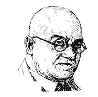 Born in Düsseldorf in 1878, died in Köln, 1935. A teacher at the Köner Werkschule, he designed these typefaces:
 - Candida (Ludwig&Mayer, 1936). Erbar drew the Candida typeface for the Ludwig & Mayer foundry shortly before his death in 1935. The typeface was released posthumously in 1936. An italic designed by Walter Höhnisch was published the following year and a reworked version was produced in 1945. Bold weights followed in 1951. Both Candida and the italic are mediocre modern typefaces. Digital revivals: Candida EF (Elsner+Flake), Candida (URW), Candida (Adobe), Candida (Tilde), Candida SB (Scangraphic Digital Type Collection), Candida SH (Scangraphic Digital Type Collection), Candida (Linotype), Candida (Bitstream) and Candida (2021, Michelle Devlin). See this Candida Antiqua booklet by Ludwig & Mayer, ca. 1960.
- Erbar-Fraktur (1936, Ludwig&Mayer). The Fett was published in 1938.
- Erbar Grotesk (1926-1930, Ludwig&Mayer). The Kräftig and halbfett weights are especially attractive, and contributed to the popularity. Some publications mention the time range 1922-1930. Linotype (London) published two weights of Linotype Erbar, and Mergenthaler Linotype four weights of Erbar Condensed. Digital interpretations: Erbar (Linotype), URW Erbar (2009, URW), Erbar AT (Linotype), dT Jakob (Eduilson Wessler Coan and Gustavo Soares at dooType), Journal Sans (designed at the Polygraphmash type design bureau in 1940-56 (project headed by Anatoly Shchukin) based on Erbar-Grotesk; digital revival in 1994 by Olexa Volochay at ParaType; in 2014 designer Olexiy Volochay made some corrections in original digital data and extended character set; The family was re-released by ParaType in 2014), URW Erbar Neo Mini (2010), Neu5Land (2018, a free font by Uwe Borchert).
- Erbar Initialen (Ludwig & Mayer). Dieter Steffmann revived it as the free font Erbar Initialen. See also Eller Initials (2012, SoftMaker) and Kudos Kaps Five NF (2006, Nick Curtis).
- Erbar-Kanzlei (1913, Ludwig & Mayer).
- Erbar Mediaeval (1913-1914, for Ludwig and Mayer). Erbar Mediaeval Lichtfett (1922) is an inline typeface. Erbar Mediaeval inspired Nick Curtis's Jacopo Mediaeval NF (2012, Nicks Fonts).
- Erbar Unziale and Unziale Halbfett (Ludwig & Mayer).
- Feder-Grotesk (Ludwig&Mayer, 1908, an early sans). Later weights came about between 1909 and 1925. Feder Grotesk inspired Olexa Volochay's free web font Federo (2011). Dick Pape's free version is called Initialen Feder Grotesk (2010).
- Grotesk lichtfett (Ludwig & Mayer). An inline typeface designed before 1923.
- Koloss (Ludwig&Mayer, 1923). The art deco typeface Koloss was digitized by many---check for example Koloss SB (Scangraphic), Koloss EF (Elsner+Flake) and Sonrisa (2011, CastleType).
- Lautsprecher (1931, a script typeface at Ludwig&Mayer).
- Lucina (1926, Ludwig&Mayer).
- Lumina (1928, Ludwig&Mayer).
- Lux (1929, Ludwig&Mayer). An inline art deco typeface. Revived in 2021 by Ralph Unger as RMU Luchs.
- Phosphor (1922-1930, Ludwig&Mayer, a very famous inline typeface. Digital revivals: Phosphate Pro (2010, Steve Jackaman (ITF) and Ashley Muir at Red Rooster Collection), Zamenhof (2011, CastleType), Letterpress Phosphor (2009, Marcus sterz at FaceType), Phosphor (Monotype).
Linotype page. Typedia link. FontShop link. Klingspor link. Catalog of some of his digitized typefaces: they include Canyon (SoftMaker), Humanist Slabserif 671 (Bitstream) and a custom typeface by Reymund Schroeder and Andrej Loll. Various digital versions of Candida. Jakob Erbar typeface showcase. [Google]
[MyFonts]
[More] ⦿
|
Jamie Clarke
[Jamie Clarke Type]

|
 [MyFonts]
[More] ⦿
|
Jamie Clarke Type
[Jamie Clarke]

|
 Jamie Clarke (Bristol and London, UK, and at some point, Sydney, Australia) creates illustrative type and lettering. He ran his own digital agency for ten years, and retrained after that period by studying type design at the University of Reading and letterpress at the St. Bride Foundation in London. His commercial typefaces include Brim Narrow (2015). He writes about this engraved layered typeface: Brim is inspired by antique woodtype and chromatic type from the 1800s. Its various styles stack together creating a variety of decorative combinations. Each layer can be assigned its own colour. The horizontal etching in some styles and subtle shadow effects can give the typeface the appearance of a vintage money font. In 2016, he added Brim Combined.
 His commissioned led him to the Kelmscott Bakehouse K (2016), a decorative letter commissioned by Kelmscott Bakehouse and based based on William Morris's ats and crafts style. Typefaces from 2017: Rig Shaded (a large 3d shaded typeface family---the best such collection available to date). Typefaces from 2018: Shovel Knight Drop Caps (partial woodblock print alphabet), Rig Solid (a superb family of layered 3d fonts). Typefaces from 2020: Span (a 3-style a modern glyphic type family that flaunts its engraved heritage with sweeping serifs and sculptural forms). Typefaces from 2021: Rig Sans (a 16-style geometric sans). Author of the very informative article The Evolution of Chromatic Type (2017). Creative Market link. Behance link. [Google]
[MyFonts]
[More] ⦿
|
Jared Shofner
[Good Craft Supply Co]
|
[More] ⦿
|
Jason Wickersty
[New Blazing Star Press]
|
[More] ⦿
|
Jay Hilgert
[Albatross (or: Font Deals)]

|
 [MyFonts]
[More] ⦿
|
Jeff Jenkins
|
Clearwater, FL-based designer of Chuck Wagon (2017), a hand-drawn slab serif font reminiscent of letterpress typefaces and the wild west. [Google]
[More] ⦿
|
Jeff Levine
[Jeff Levine: Dingbats and Alphadings]

|
 [MyFonts]
[More] ⦿
|
Jeff Levine
[Jeff Levine: Octagonal typefaces]

|
 [MyFonts]
[More] ⦿
|
Jeff Levine: Dingbats and Alphadings
[Jeff Levine]

|
 Before 2006, Jeff Levine was mostly known for his free dingbats, having made over one hundred of them. He keeps making them, but now commercially, and less frequently. The list is long though:
  Dingbats: 50s Yesterdings, Action is the Sequel, ActionIsJL, Alpha Test, Another Dingbat Font JL, Antique Decorations JNL (2012), Antique Embellishments JNL (2009, nice 1800 style dings, including a great fist), Antique Ornaments JNL (2009), Antique Stencils JNL (2013), Apartment-Life-JL, Arrow Callouts JNL (2021: an arrow-themed alphading font), Artsy Parts JL, Attention Getters JNL (2009), Auto-Store-JL, Bachelor Pad, Bank-Visit-JL, Bijou, Boat Decals JNL (2008, squarish), BookshelfTitlesJL, BottomsUp!JL, Buttons-and-Switches-JL, Carnival Days, Cartoon Cavalcade (2014), City-Signs-JL, Classic Clips JNL (2015), Clown Alley JNL (2009, clown typefaces), Cobb-Shinn-Stock-Cuts (7 fonts), Collected-Dings-JL, Columbia Shuttle Memorial Font (2003), CroakersJL, DecoPics, Decorative Arrows JNL (2011), Decorative Elements JL, Dekka Dense, Desk Draswer JNL (2010), Ding Dong Dingbats, Dingdangits JNL, Dingfont100JL, Dingits JNL (2009, flags), DiskettesJL, Doctor's-Dings-JL, Dont Bug Me JNL (2009), Double Nines JNL (2011, a domino tile font), Drug-Store-Items-JL, ElectricalItemsJL, Embossing Seals JNL (2014), Error-MessagesJL, Even More Dings JL, FloorTilePatternsJL, FontCollectingJL (2003), Frantic, FunInTheSunJL, Funny-Faces-JL, Fun Signs JNL (2013: comprises twenty-six humorous signs from a 1930s-era sales list of products manufactured by the Koehler Sign Company of St. Louis, Missouri), Geometric Patterns JNL (2013), GoingPostalJL, Got A Ding For You JL, Graphic Arts JL, Grocery-Items-JL, Handbill JNL, Handy Dandies JNL (2014: fists), Hurricane-Preparations-JL, Ink Spots JNL (2013), It's Your Ding JL, JeffreyPrintJL (8 fonts), JewishCultureJL, Kilroy Was Here JL (very funny), Law-and-Order-JL, Leathercrafter JNL, Letter Delivery JNL (2014), Letterpress Assistants JNL (2015), Letterpress Assortment JNL (2016), Letterpress Cuts JNL (2015), Letterpress Embellishments JNL (2014), Letterpress Illustrations JNL (2015), Letterpressers JNL (2015), Letterpress Extras JNL (2014), Letterpress Helpers (2014), Letterpress Nostalgics JNL (2015), Letterpress Ornamentals JNL (2014), Letterpress Pieces JNL (2015), Letterpress Retro JNL (2015), Letterpress Sorts JNL (2016), Letterpress Stock Cuts JNL (2015), Lifeline, LittleBalerina, Loung-Lizards-Lite-JL, Message Helpers JNL (2014), Messages&Memos JL, Militaria JNL (2014), Miscellany JNL (2012), Mixed Bag O' Dings JL, Monthly Calendar JNL, Mordings JNL (2010: this includes weather dings, snow dingbats, and a beautiful quill), More Antique Stencils JNL (2013), More Printing Helpers JNL (2010, has some fists), Mr.MuellerJL, Old Favorites JNL (2009, fists), Old Labels JNL (2019), One Ding After Another JL, Opz Popz JNL (2019: 52 geometric dingbats), Outer Space JL, OuterSpace, Picnics-&-Parties-JL, Pictora JNL (2009, dings), Point Made JNL (2011, fists and arrows), Point of Sale JNL (2013), Point Taken JNL (2009, fists), Price Tag JNL (2011), Print Art JNL (2013: contains nice fists), Print Assistants JNL (2013), Print Damosel (2013), Print Embellishments JNL (2013), Print Enhancers JNL (2013), Printers Assistants JNL (2015), Printers Decorations JNL (2015), Printers Choice (2014), Printers Dingbats JNL (2015), Printers Drawer JNL (2015), Printers Helpers JNL (2015), Printers Helpmates JNL (2014, with many fists), Printers Impressions (2014), Print Helpers JNL (2013), Printers Leftovers JNL (2013), Printers Lot JNL (2014), Printers Parts JNL (2013), Printers Pictures JNL (2014), Printers Playthings JNL (2014), Printers Playtoys JNL (2014), Print Promoters JNL (2015), Print Sellers JNL (2015), Printers Stock Cuts JNL (2015), Printers Stuff JNL, Print Illustrations JNL (2013), Printing Extras JNL (2009), Printing Press Cuts JNL (2013), Printing Press Designs JLN (2013), Printing Press Elements JNL (2013), Print Marks JNL (2013), Print Oddities JNL (2014), Print Partners JNL (2014), Print Shop Classics JNL (2013), Print Shop Cuts JNL (2015), Print Shop Delights JNL (2015), Print Shop Parts JNL (2012), Print Shop Relics JNL (2014), Print Shop Sorts JNL (2015), Print Shop Treasures JNL (2015), Print Spots (2013), Printy Things JNL (2013), Prismatiq JNL, Rail Line JNL (2014), Ranger Ray's Rocketeers JL, Remnants-JL, Remnant Sorts JNL (2011: contains many nice fists and plumes), Screen Scrawls JL, Sendit Safely JNL (2010), Service Men JNL (2015), Shinn Kickers (2014: after Cobb Shinn's cartoon characters), Shopping Center JL, Sign Helpers JNL (2009, a collection of silhouette images carefully redrawn from two distinct sources, the Webway sogn kits of the Holes-Webway Company of St. Cloud, MN, and the cling vinyl sign kits made in the 1950s and 1960s by the Joseph Struhl Company (now known as Magic Master Industries)), Silhouettes&StuffJL, Silly-Symbology-II, Silly-Symbology-JL, SimplerTimesJL, Sixties Pin Buttons JNL (2018), Sixties Symbols JNL (2009), SmallTalkJL, Son of the Bride of Foo JL, Star Time, Star Time 3 and 4, Star Time Too, Storm-Track-JL, Sunbursts JNL (2013), SunDings, Sundings2JL, SymbologicaJL (2003, has smilies), TaxingMomentsJL, TeeVeeSet, Thataway JNL (2020: arrows), These Foolish Dings JL, Things-Collected-JL, TimePiecesJL, Toddler JNL, Top 40 JL, Trinkets JL, Tune Up JNL (2015: a musical symbol font), Typesetter Helpers JNL (2014), Typesetter Trinkets JNL (2014), Typesetter Treasures JNL (2014), Typesetter Ornaments JNL (2012), Type Toys JNL (2015), Type Warmers JNL (2015), Vintage Stencil Borders JNL (2016), Vintage Stencil Motifs (2014), VitaminShopJL, Voter JNL (2020), Whatzis JNL (2009, question marks), Winner-Take-All-JL. Dingbats: 50s Yesterdings, Action is the Sequel, ActionIsJL, Alpha Test, Another Dingbat Font JL, Antique Decorations JNL (2012), Antique Embellishments JNL (2009, nice 1800 style dings, including a great fist), Antique Ornaments JNL (2009), Antique Stencils JNL (2013), Apartment-Life-JL, Arrow Callouts JNL (2021: an arrow-themed alphading font), Artsy Parts JL, Attention Getters JNL (2009), Auto-Store-JL, Bachelor Pad, Bank-Visit-JL, Bijou, Boat Decals JNL (2008, squarish), BookshelfTitlesJL, BottomsUp!JL, Buttons-and-Switches-JL, Carnival Days, Cartoon Cavalcade (2014), City-Signs-JL, Classic Clips JNL (2015), Clown Alley JNL (2009, clown typefaces), Cobb-Shinn-Stock-Cuts (7 fonts), Collected-Dings-JL, Columbia Shuttle Memorial Font (2003), CroakersJL, DecoPics, Decorative Arrows JNL (2011), Decorative Elements JL, Dekka Dense, Desk Draswer JNL (2010), Ding Dong Dingbats, Dingdangits JNL, Dingfont100JL, Dingits JNL (2009, flags), DiskettesJL, Doctor's-Dings-JL, Dont Bug Me JNL (2009), Double Nines JNL (2011, a domino tile font), Drug-Store-Items-JL, ElectricalItemsJL, Embossing Seals JNL (2014), Error-MessagesJL, Even More Dings JL, FloorTilePatternsJL, FontCollectingJL (2003), Frantic, FunInTheSunJL, Funny-Faces-JL, Fun Signs JNL (2013: comprises twenty-six humorous signs from a 1930s-era sales list of products manufactured by the Koehler Sign Company of St. Louis, Missouri), Geometric Patterns JNL (2013), GoingPostalJL, Got A Ding For You JL, Graphic Arts JL, Grocery-Items-JL, Handbill JNL, Handy Dandies JNL (2014: fists), Hurricane-Preparations-JL, Ink Spots JNL (2013), It's Your Ding JL, JeffreyPrintJL (8 fonts), JewishCultureJL, Kilroy Was Here JL (very funny), Law-and-Order-JL, Leathercrafter JNL, Letter Delivery JNL (2014), Letterpress Assistants JNL (2015), Letterpress Assortment JNL (2016), Letterpress Cuts JNL (2015), Letterpress Embellishments JNL (2014), Letterpress Illustrations JNL (2015), Letterpressers JNL (2015), Letterpress Extras JNL (2014), Letterpress Helpers (2014), Letterpress Nostalgics JNL (2015), Letterpress Ornamentals JNL (2014), Letterpress Pieces JNL (2015), Letterpress Retro JNL (2015), Letterpress Sorts JNL (2016), Letterpress Stock Cuts JNL (2015), Lifeline, LittleBalerina, Loung-Lizards-Lite-JL, Message Helpers JNL (2014), Messages&Memos JL, Militaria JNL (2014), Miscellany JNL (2012), Mixed Bag O' Dings JL, Monthly Calendar JNL, Mordings JNL (2010: this includes weather dings, snow dingbats, and a beautiful quill), More Antique Stencils JNL (2013), More Printing Helpers JNL (2010, has some fists), Mr.MuellerJL, Old Favorites JNL (2009, fists), Old Labels JNL (2019), One Ding After Another JL, Opz Popz JNL (2019: 52 geometric dingbats), Outer Space JL, OuterSpace, Picnics-&-Parties-JL, Pictora JNL (2009, dings), Point Made JNL (2011, fists and arrows), Point of Sale JNL (2013), Point Taken JNL (2009, fists), Price Tag JNL (2011), Print Art JNL (2013: contains nice fists), Print Assistants JNL (2013), Print Damosel (2013), Print Embellishments JNL (2013), Print Enhancers JNL (2013), Printers Assistants JNL (2015), Printers Decorations JNL (2015), Printers Choice (2014), Printers Dingbats JNL (2015), Printers Drawer JNL (2015), Printers Helpers JNL (2015), Printers Helpmates JNL (2014, with many fists), Printers Impressions (2014), Print Helpers JNL (2013), Printers Leftovers JNL (2013), Printers Lot JNL (2014), Printers Parts JNL (2013), Printers Pictures JNL (2014), Printers Playthings JNL (2014), Printers Playtoys JNL (2014), Print Promoters JNL (2015), Print Sellers JNL (2015), Printers Stock Cuts JNL (2015), Printers Stuff JNL, Print Illustrations JNL (2013), Printing Extras JNL (2009), Printing Press Cuts JNL (2013), Printing Press Designs JLN (2013), Printing Press Elements JNL (2013), Print Marks JNL (2013), Print Oddities JNL (2014), Print Partners JNL (2014), Print Shop Classics JNL (2013), Print Shop Cuts JNL (2015), Print Shop Delights JNL (2015), Print Shop Parts JNL (2012), Print Shop Relics JNL (2014), Print Shop Sorts JNL (2015), Print Shop Treasures JNL (2015), Print Spots (2013), Printy Things JNL (2013), Prismatiq JNL, Rail Line JNL (2014), Ranger Ray's Rocketeers JL, Remnants-JL, Remnant Sorts JNL (2011: contains many nice fists and plumes), Screen Scrawls JL, Sendit Safely JNL (2010), Service Men JNL (2015), Shinn Kickers (2014: after Cobb Shinn's cartoon characters), Shopping Center JL, Sign Helpers JNL (2009, a collection of silhouette images carefully redrawn from two distinct sources, the Webway sogn kits of the Holes-Webway Company of St. Cloud, MN, and the cling vinyl sign kits made in the 1950s and 1960s by the Joseph Struhl Company (now known as Magic Master Industries)), Silhouettes&StuffJL, Silly-Symbology-II, Silly-Symbology-JL, SimplerTimesJL, Sixties Pin Buttons JNL (2018), Sixties Symbols JNL (2009), SmallTalkJL, Son of the Bride of Foo JL, Star Time, Star Time 3 and 4, Star Time Too, Storm-Track-JL, Sunbursts JNL (2013), SunDings, Sundings2JL, SymbologicaJL (2003, has smilies), TaxingMomentsJL, TeeVeeSet, Thataway JNL (2020: arrows), These Foolish Dings JL, Things-Collected-JL, TimePiecesJL, Toddler JNL, Top 40 JL, Trinkets JL, Tune Up JNL (2015: a musical symbol font), Typesetter Helpers JNL (2014), Typesetter Trinkets JNL (2014), Typesetter Treasures JNL (2014), Typesetter Ornaments JNL (2012), Type Toys JNL (2015), Type Warmers JNL (2015), Vintage Stencil Borders JNL (2016), Vintage Stencil Motifs (2014), VitaminShopJL, Voter JNL (2020), Whatzis JNL (2009, question marks), Winner-Take-All-JL. - Alphadings: Dentist (2020), Looky Here JNL (2009, alphadings), Love Notes JNL (2011), Sensual Initials JNL (2009, alphadings after his own French Art Initials JNL), Suninitials JNL (2008: alphadings), Eurasian Stenciinitials JNL (2010).
[Google]
[MyFonts]
[More] ⦿
|
Jeff Levine: Octagonal typefaces
[Jeff Levine]

|
 Octagonal typefaces made by Jeff Levine: Air Corps JNL (2014, featuring retro letters and numbers from military aircraft), Amateur Lettering JNL (2018), Arvada JNL (2009), Bike Tag JNL (2013), Borough Hall (2006), Case Lot JNL (2015), Celluloid NL (2010), Chamferwood JNL (2015), Condensed Chamfer JNL (2018), Convicted JNL (2021: a condensed, chamfered sans serif type design inspired by opening credits from the 1940 film Convicted), Diagon JNL (2007), Directory Board JNL (2010), Eckhardt Poster Display JNL (2011), Game Rules JNL (2021: an octagonal typeface based on the opening credits for the 1955 Western film The Man from Bitter Ridge), Ghost Sign JNL (2020: a spurred octagonal typeface based on the faded lettering of an antique brick wall sign for Homer Hardware in Homer, NY), Government Issue (2006), Hayfork JNL (2011, based on wood type sans typefaces from the 1880s), Industrialist JNL (2014), Inventory JNL (2007), KP Duty (2006), Local Druggist JNL (2021), Mailbox Letters Two JNL (2008), Mechanized JNL (2011), Mixed Drinks JNL (2013), Moving Van JNL (2010), New Car Tag JNL (2020: based on the new license plates in Florida, which were introduced in 2018), Oven Plate JNL (2013: Oven Plate JNL solidifies the outline lettering of Stove Plate JNL; based on the logo for Red Star Oil Stoves and found on an old letterpress cut), Poster Chamfer JNL (2012, a condensed octagonal face), Quirkley JNL (2006), School Activities JNL (2020: octagonal), Sentiment JNL (2017), Shopping Basket JNL (2016), Stadium JNL (2011), Staple Remover (2013), Stove Plate JNL (2013), Techno Retro (2015), Transcribed JNL (2015), Wall Sign JNL (2012), Wide Chamfer JNL (2021: a chamfered typeface based on a 1902 sign painting book). [Google]
[MyFonts]
[More] ⦿
|
Jeff Shay
[C.C. Stern Type Foundry]
|
[More] ⦿
|
Jennifer Farrell
|
Together with Richard Kegler (P22 Type Foundry), Jennifer Farrell of Starshaped Press (Chicago, IL) created P22 Blox (2015). They write: In 1944, American Type Founders (ATF) introduced Alpha-Blox, an impressive system of both solid and linear shapes that could be combined to create all manner of typefaces, ornament and pattern in 1- or 2-colors. The design possibilities were endless and limited only to the imagination of the printer/designer. [...] P22 Blox is a set of modular letterpress printing blocks made from space age material... plastic!. All work in the Starhaped Press studio is done with metal and wood type, making Starshaped one of the few presses in the United States producing commercial work while preserving antique type and related print materials. [Google]
[More] ⦿
|
Jeremy Dooley
[Insigne Type Design Studio (was: Dooley Type)]

|
 [MyFonts]
[More] ⦿
|
Jeremy Vessey
[Hustle Supply Co]
|
 [More] ⦿
|
Jeremy Vessey
[Font Forestry]
|
[More] ⦿
|
Jesse Snyder
[Warehouse Design]
|
[More] ⦿
|
Jessica Hische

|
 Jessica Hische was born in Charleston, SC, in 1984. She is a Brooklyn-based hand-letterer and illustrator, who has worked for clients such as Tiffany&Co., Victoria's Secret, American Express, Target, The New York Times, The Boston Globe, Chronicle Books, Random House, and Penguin Books. Blog. She created various calligraphic and hand-lettered scripts such as Valentine Script (2009), Buttermilk (2009, a calligraphic connected script) and New York Times Buzzwords (2009). Creations in 2010: Snowflake, Snowflake ornaments. Typefaces from 2011: Bryan Who (quaint, antique). Fonts made in 2011: Brioche (a dessert menu script face).
 She also has a site called Daily Drop Cap Cap, in which she adds a free drop cap every day (but this lasted four days only). Her drop caps typeface family Minot (2013) and her initals Penguin Drop Caps (2013: a series of twenty-six collectible hardcover editions of fine works of literature, each featuring on its cover a specially commissioned illustrated letter of the alphabet by Jessica in collaboration with Penguin Art Director Paul Buckley) won awards in 2014 at the Communication Arts 4th Typography Competition: 2014. In 2014, Jessica Hische created the script typeface Tilda at Font Bureau for Moonrise Kingdom. Klingspor link. MyFonts link. Behance link. [Google]
[MyFonts]
[More] ⦿
|
Jessica Hoppe

|
In house type designer at Elsner&Flake in Hamburg who designed the grungy letterpress emulation typeface EF Carpe Diem (1996) and the hand-drawn dingbat typeface EF Communication Modern (1997). FontShop link. Klingspor link. [Google]
[MyFonts]
[More] ⦿
|
Jesus Morentin
[Bunker Type]
|
[More] ⦿
|
J.F. Coakley
|
J. F. Coakley is Senior Lecturer in the Department of Near Eastern Languages and Civilizations, and on the staff of Houghton Library, at Harvard University. His private press, the Jericho Press, occasionally makes use of Syriac and other exotic types. In 2006, he wrote The Typography of Syriac: a Historical Catalogue of Printing Types, 1537-1958 (Oak Knoll Press, New Castle, DE). Oak Knoll writes: Syriac, a dialect of the ancient Aramaic language, has a remarkable Christian literature spanning a thousand years from the fourth to the thirteenth century, including important versions of the Bible. It remains the liturgical language of several churches in the Middle East, India, and the West, and 'Modern Syriac' is a vernacular still in use today. It is no wonder that this language has a long and rich printing history. The challenge of conveying the beautiful cursive Syriac script, in one or another of its three varieties, was taken up by many well-known type-designers in the letterpress era, from Robert Granjon in the sixteenth century to the Monotype and Linotype corporations in the twentieth, as well as by many lesser-known ones. This study records and abundantly illustrates no fewer than 129 different Syriac types, using archival documents, type-specimens, and the often scattered evidence of the print itself. The Typography of Syriac will be of interest not only to scholars of Middle Eastern languages and scripts but also to all historians of type and printing. [Google]
[More] ⦿
|
Jim Moran
|
Jim Moran received his apprenticeship from Moran's Quality Print Shop in Green Bay, Wisconsin, while serving as printer's devil, pressman, partner, and owner for 29 years. He became the Director of Hamilton Wood Type & Printing Museum in 2009, where he maintains the collection of wood type, runs and repairs the museum's presses, teaches workshops, archives and restores the museum's collection of 20th-century decorative and advertising plates, and oversees museum operations. Speaker at ATypI 2017 in Montreal and at ATypI 2018 in Antwerp. In Antwerp, his talk, Old Beer New Type, presented together with Fred Smeijers, is concerned with the typographic revival of one of the Plantin Moretus' oldest (17th century) posters, promoting beer. [Google]
[More] ⦿
|
Jim Rimmer

|
 Jim Rimmer (b. Vancouver, 1934, d. 2010) was one of the great contemporary type designers whose creations had a lot of flair, individuality, and charm. Based in New Westminster (near Vancouver, BC), Jim Rimmer was also an illustrator. Obituary in the Globe and Mail, dated April 27, 2010.
 He designed Albertan (Albertan No.977, Albertan No.978 Bold) and Cloister (2000; a roman type family originally done by Morris Fuller Benton) in the Lanston collection. He also designed typefaces like Juliana Oldstyle (1984), Nephi Mediaeval (1986), Kaatskill (1988; a 1929 typeface by Goudy, revived and optimized for Lanston in type one format; the Kaatskill Italic was done by Rimmer based on Goudy's Deepdene), RTF Isabelle (Roman and Italic; 2006. A pair of delicate serif typefaces based on typefaces by Elizabeth Friedlander) and Fellowship (1986). ATypI link. Jim began work as a letterpress compositor in 1950. He entered the field of graphic design in 1963, working as a designer lettering artist and illustrator, and freelanced in this capacity from 1972 to 1999 in the same capacity. In 1960, he began collecting letterpress printing and typefounding equipment, and operated a private press and foundry (Pie Tree Press&Type Foundry). FontShop link. His metal typefaces at Pie Tree Press include: - Juliana Oldstyle (1981; McGrew says 1984): It represents my first attempt at cutting a metal type. I drew my letters completely freehand, hoping to capture a punchcut look. My artwork was then reduced and made into a dry transfer sheet, which I rubbed onto type-high typemetal blanks. I then cut the letters and electroformed copper matrices.
- Nephi Mediaeval (1983, for private use; McGrew gives the date 1986): It was inspired by the Subiaco type of the Ashendene Press and by its inspiration, the type of Sweynheym and Pannartz. My design breaks away from those types slightly in form and is softer in general feeling. In time I will cut other sizes.
- Fellowship (1984; McGrew says 1986). Designed and cut by Jim Rimmer, and cast by him for private use: The design is the result of the feeling of joviality and 'fellowship' I experienced at the meeting (American Typecasting Fellowship in Washington, D.C.). The design was not so much drawn as it was written. The letters were written quickly in a calligraphic manner with an edged pencil and then enlarged and inked to make a dry transfer sheet. As in my two previous designs (see Juliana Oldstyle and Nephi Mediaeval), Fellowship was cut not in steel, but in type metal, and then electroplated to make castable matrices.
- Albertan 16pt, 1985
- Garamont [not entirely sure that this was done in metal]
- Cartier Roman 14pt, 2004
- Cree Syllabic 14pt, 2006
- Duensing Titling 12, 14, 18, 24, 36, 48&60pt, 2004-07. Duensing in use.
- Hannibal Oldstyle 18pt, 2003
- Quill 14pt, 2006
- Stern 16pt, 2008. This was his last completed typeface.
In 1970, Jim made his first film type, Totemic. This sturdy text type was revived in 2015 by Canada Type as Totemic, and contains as an extra a et of stackable totems. Jim has designed and produced a collection of digital types, and over the past 20 years has designed and cut six metal types. He recently completed a Monotype Large Comp type named Hannibal Oldstyle, is currently cutting 14 point matrices for Cartier Roman, and is making drawings for the cutting of a 14 point Western and Eastern Cree. Samples and discussion of his Cree typeface. Jim in action in 2003. According to Gerald Giampa from Lanston, Jim is the most talented type designer alive in 2003. About his typefaces, I quote McGrew: Fellowship was designed and cut by Jim Rimmer in Vancouver in 1986, and cast by him for private use. He says, "The design is the result of the feeling of joviality and 'fellowship' I experienced at the meeting (American Typecasting Fellowship in Washington, D.C.). The design was not so much drawn as it was written. The letters were written quickly in a calligraphic manner with an edged pencil and then enlarged and inked to make a dry transfer sheet. As in my two previous designs (see Juliana Oldstyle and Nephi Mediaeval), Fellowship was cut not in steel, but in type metal, and then electroplated to make castable matrices." Juliana Oldstyle was designed and cut in 1984, as a private type. He says, "It represents my first attempt at cutting a metal type. I drew my letters completely freehand, hoping to capture a punchcut look. My artwork was then reduced and made into a dry transfer sheet, which I rubbed onto type-high typemetal blanks. I then cut the letters and electroformed copper matrices." Nephi Mediaeval was designed and cut in 1986, for private use. He says it "was inspired by the Subiaco type of the Ashendene Press and by its inspiration, the type of Sweynheym and Pannartz. My design breaks away from those types slightly in form and is softer in general feeling. In time I will cut other sizes." In 2012, Rimmer Type Foundry was acquired by Canada Type. The press release: Canada Type, a font development studio based in Toronto, has acquired the Rimmer Type Foundry (RTF) from P22 Type Foundry, Inc. The RTF library contains the complete body of work of Canadian design icon Jim Rimmer (1934-2010), who was an enormous influence on Canadian type design and private press printing, and the subject of Richard Kegler's documentary, Making Faces: Metal Type in the 21st Century. The RTF library contains many popular font families, such as Albertan, Amethyst, Credo, Dokument and Stern, as well as quite a few analog designs that were never produced in digital. Now that Rimmer's work has been repatriated, it will be remastered and expanded by Canada Type, then re-released to the public, starting in the fall of 2012. Jim's analog work will also be produced digitally and available to the public alongside his remastered and expanded work. Once Jim's designs are re-released, part of their sales will be donated to fund the Canada Type Scholarship, an award given annually to design students in Canada. This will be done in coordination with the Society of Graphic Designers of Canada (GDC), the national professional association that awarded Jim Rimmer with the prestigious GDC Fellowship in 2007. Jim Rimmer digitized Elizabeth (+Italic). From 2006 until 2012, the Rimmer Type Foundry collection was offered by P22. It included: - RTF Albertan: A great text family developed between 1982 and 2005. In 2013, it as remastered by Canada Type and reissued as Albertan Pro, calling it a first post-Baskerville-post-Joanna typeface.
- RTF Alexander Quill: An artsy fartsy (in the good sense) and slightly 1920s Czech type family.
- RTF Amethyst: A tall ascender serif family.
- RTF Cadmus: A stone slab or Greek simulation face. P22 writes: Rimmer's re-working of a design done by Robert Foster, a hand lettering artist. Foster's type, named Pericles, is a style that he used for a time in lettering magazines and advertising headings. The design is based closely on early inscriptional Greek, but is less formal than the sans types of Foster's time. Cadmus keeps the proportions of Pericles but is overall less quirky than the Foster design. This was further expanded by Canada Type as Cadmus Pro (2016).
- RTF Cotillion (1999): A tall ascendered Koch inspired sans family. Looks quite like Bernhard Modern.
- RTF Credo: A six-weight sans family.
- RTF Dokument: An extensive sans family: Dokument was my attempt to make a Sans Grotesque in the general weight of News Gothic (for the Dokument regular) but took nothing from News Gothic. I used some of the basic forms of my Credo series, but made many on-screen changes and broke away entirely from Credo on the range of weights. My plan was to make a typeface that will fill the requirements of financial document setting; things like annual reports and other such pieces of design. It is my hope that the large family of weights and variants will suit Dokument to this kind of work. This family was created in 2005 and published in 2006. A reworking by Patrick Griffin at Canada Type eventually led to Dokument Pro (2014).
- RTF Elizabeth: An elegant tall ascender typeface about which Rimmer writes: Elizabeth Roman and its companion Italic were designed as a pair by Elizabeth Friedlander, and cut and cast for decades by the historic Bauer foundry of Germany.
- RTF Fellowship: A standard script.
- RTF Lancelot Titling: A roman titling typeface with Koch-like influences.
- RTF Lapis: A calligraphic serif, inspired by Rudolf Koch.
- RTF Posh Initials: A formal script.
- RTF Poster Paint: A fat irregular poster font inspired by Goudy Stout.
- RTF Zigarre Script: A bouncy brush script with rough outlines.
- RTF Canadian Syllabics (2007): This font was developed as a metal typeface by Jim Rimmer for a special project and is now available in digital form. Containing over 700 glyphs in OpenType format, this font covers most Canadian Aboriginal Languages. RTF Canadian Syllabics is a more calligraphic version of the syllabary developed by Reverend James Evans for the languages of the native tribes of the Canadian provinces in the early 1800s. Jim Rimmer originally designed the characters for the Eastern and Western dialect Cree to be cut as a metal font. The digital version then grew to include all the characters of the Canadian Syllabics Unicode block.
- Nephi Mediaeval (2007), a type heavily reflective of the semi roman of Sweynheim and Pannartz (in Jim's words).
- Stern (2008, RTF) was simultaneously released both digitally and in metal. Named after the late printer Christopher Stern (WA), it is an upright italic intended for poetry. Colin Kahn (P22) has expanded the Pro digital version (originally designed by Jim Rimmer) for a variety of options. The set features Stern Aldine (Small x-height Caps with standard lower case), Regular, Tall Caps (with standard lc)&Small Caps with x-height caps in place of lc). Youtube. David Earls writes: I've heard people say that letterpress gives warmth, but I prefer to think of it as giving humanity. That the types interaction on a page is so dependent on the punch cutter, the caster, the compositor, the printer, the humidity, the papermaker and inkmaker gives it a humanity, not a warmth, and decries the demise of letterpress. In 2013, Canada Type remastered Stern as Stern Pro---this typeface now covers Greek, and is loaded with Opentype features.
- RTF Loxley (2010): The style of Loxley is based on early Roman typefaces, such as the "Subiaco" type of the late 1400s that was also inspirational to Frederick Goudy for his "Franciscan", "Aries" and "Goudy Thirty" type typefaces. Loxley displays some of Jim's particular left handed calligraphy and is in a similar style to his "Fellowship" and "Alexander Quill" typefaces, both of which were made in metal and digital formats. In 2013, Canada Type published a remastered and expanded version simply called Loxley.
FontShop link. Jim Rimmer passed away early on January 8, 2010. His friend Richard Kegler (P22) wrote this obituary the next day: Jim was a multi-talented type designer, graphic artist, bookbinder, printer, letterer, technician and a most generous teacher. He was never glory-seeking and turned down most speaking engagements offered to him, not out of vanity or indifference, but rather thinking that he was not worthy of being given a spotlight. Jim offered free typecasting instruction to anyone who asked and came to visit him in his studio in New Westminster BC. He took as much time as needed and was generous to a fault. Anyone who took him up on this open invitation can attest to the intense and elegant chaos of his studio and work habits. I was fortunate enough to know Jim but for only a few years. What started as a business arrangement grew into a mutual respect and ongoing correspondence that I can only describe as life changing for me. His kindness and generosity were exceptional and his diplomacy even when given the opportunity to speak ill of anyone else was measured and kind. Jim's dedication to the craft of type design and related arts was beyond most if not all contemporaries. After his "retirement" from his professional life as a graphic artist and illustrator, he tirelessly worked on type designs for book projects where all aspects of his skills were applied. His book "Leaves from the Pie Tree" (I encouraged him to change the title from his original plan to call it "Droppings from the Pie Tree"...a truly self-effacing Jim Rimmerism) is the best single tome that summarizes his life and work. He designed the book�s typeface in Ikarus (as he had with the 200+ other type design he created), cut the matrices and cast the type, wrote the text using an autobiographical introduction and continued to explain the process he used to cut pantographic matrices for his metal typefaces. The multi-colored lino cut illustrations, book design, individual tipped in sheets and attention to press work and binding would be impressive for one specialist to complete on each component. The fact that Jim did all of this himself is awe inspiring. A trade edition of this book has been printed by Gaspereau press but does not hint at the grandeur of the beautiful book that is Pie Tree. Jim's follow up of his edition of Mark Twain's Tom Sawyer (set in his Hannibal Oldstyle font designed for and fitted onto on a monotype composition caster) was recently completed and is equally if not more imposing as a fine press book, but with a sympathetic humor and humanity that would knock the stuffing of any other fine press attempt at the same material. Almost two years ago I visited Jim for a week and filmed footage for a documentary on his cutting of the Stern typeface. For various reasons the finishing of the film has been delayed. I truly regret that Jim could not see the finished version. With the film and his Pie Tree book, Jim generously conveys information on making metal type that has otherwise been largely lost and previously limited to a now defunct protective guild system. It was his wish that the information and craft be kept alive. Jim's last email to me was in classic Jim form hinting at his tireless dedication to his work: details of a new type family for a new book. He was one of the great ones. He will be missed. Sumner Stone: Jim's insights into Goudy's typefaces in particular, and his devotion to doing everything in his own shop made me think he was perhaps Fred's reincarnation, but it took me awhile to realize this due to the self-deprecating personality you so accurately describe. His passing is truly a great loss to our craft. Rod McDonald: I would like to relate a telephone conversation I had with Jim last month because I believe it shows his incredible spirit, and wonderful sense of humor. My wife and I visited Jim in November and were delighted to hear that his doctors had pronounced him cancer free. He looked good, just a little tired, but that was to be expected after his recent radiation treatment. Of course he was also anxious to get back to work. Less than two weeks later I received an email from him informing me that they had discovered that the cancer had spread to his lungs and, not only was it inoperable, he now only had six months to live. This sudden turn of affairs was devastating for me and I called him, hoping I think, to hear that it wasn't as bad as it sounded. He said it was bad and apparently nothing could be done. However he felt he would outlive the six months and in fact we even talked of getting together in the fall. The conversation then turned to his latest type family and when I gently asked him how long he thought it it would take to complete he simply said "I've got lots of time, after all I'm only going to be dying during the last fifteen minutes". I knew Jim for thirty-five years and will miss him more than his work, and that's saying a great deal. In 2012, Canada Type, which had purchased Rimmer's designs started publishing some of Jim's lesser known designs. These include Cotillion Pro (2012, a very graceful typeface with high ascenders), Fellowship (2013, calligraphic), Poster Paint (2012, a take on Goudy Stout), Zigarre Script and Zigarre Rough (2012, brush scripts that were actually drawn with a marker), and Alexander Quill (2012, a calligraphic monastic typeface). In 2013, Canada Type remastered several of Rimmer's typefaces, including in particular Isabelle Pro: Isabelle is the closest thing to a metal type revival Jim Rimmer ever did. The original metal typeface was designed and cut in late 1930s Germany, but its propspects were cut short by the arrival of the war. This was one of Jim's favourite typefaces, most likely because of the refined art deco elements that reminded him of his youthful enthusiasm about everything press-related, and the face's intricately thought balance between calligraphy and typography. Not to mention one of the most beautiful italics ever made. Lancelot Pro (2013) is a calligraphic all caps typeface based on Rimmer's digital original from 1999. Pictures: Jim Rimmer casts 48pt ATypI keepsake (by John Hudson), Remembering Jim Rimmer (Facebook group), In his studio, a picture taken by the Globe and Mail. Another pic. Making Faces (trailer) (movie by Richard Kegler). Klingspor link. ContentDM collection. Jim Rimmer at the Fine Press Book Association. Rimmer Type Foundry link. View all typefaces by Jim Rimmer. An alphabetical listing of Jim Rimmer's typefaces. Catalog of Jim Rimmer's typefaces. [Google]
[MyFonts]
[More] ⦿
|
Jimba Osamu
|
Art director in Tokyo, who designed a letterpress typeface family, Neo (2014), which has several styles for layering, and a beveled style. [Google]
[More] ⦿
|
John Bonadies
[Mpress Interactive]

|
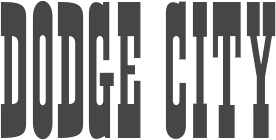 [MyFonts]
[More] ⦿
|
John Gardner
|
UK-based designer of the letterpress emulation typeface McDonalds (2014). [Google]
[More] ⦿
|
John Shaver
[Design Panoply]
|
 [More] ⦿
|
Jordi Manero Pascual
[Woodcutter Manero]
|
 [More] ⦿
|
Jorge dos Reis Tavares
|
Jorge (b. 1971) served as a letterpress typography apprentice at a composing and printing workshop in Cais do Sodré in Portugal. Designer of Via Estreita (for the National Railway Museum), Simplissima Beira (for the Covilha newspaper) and Tintinolho (for the Guarda town hall). From 1997 until 2003, he ran Jorge dos Reis Studio. From 1999 until 2003, he was Lecturer at the Faculdade de Belas-Artes Universidade de Lisboa. Since 2003, he is a research student at the Royal College of Art, UK. Bio. [Google]
[More] ⦿
|
Joshua Langman
[Orbis Typographicus]
|
[More] ⦿
|
Joshua Lurie-Terrell
|
Sacramento-based letterpress printer and typesetter. Obtained a BA in Literature from CSU Sacramento. He works as a graphic designer for the California State Legislature, and runs the successful type blog Typographica with Stephen Coles as well as Hewn and Hammered. He also runs the successful type blog Typographica with three others. Recently, he started Urban Cartography. [Google]
[More] ⦿
|
Juan José Lopez
[Huy Fonts]

|
 [MyFonts]
[More] ⦿
|
Judith Poirier
|
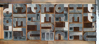 Judith Poirier is professor at UQAM in Montreal. She developed an interesting wood-based modular typeface, Latitude, in 2014 for the inuktitut syllabary.
 In 2013, she produced a typographic short movie, Two Weeks Two Minutes, that won the Canadian Film Institute Award for Best Canadian Animation at the Ottawa International Animation Festival. The idea is very clever---just transfer letterpress directly to 35mm film stock. The hallucinating images remind me of noisy movie fragments used in Hitchcockian thrillers. [Google]
[More] ⦿
|
Juha Korhonen
|
 Juha Korhonen (b. 1966, aka Junkohanhero) is a Finnish artist and type designer, who created these free fonts, mostly in the grunge genre:
 - In 2006: Tasapainoaisti (grunge), Type-Ra (old typewriter), 60 Sekuntia (grunge), Waving My Arms in the Air (dingbats), Cold Night for Alligators (grunge), Shangri-La (handwriting), Horros, How Can I Organize My Garage?, They're coming to take me away, Hullunkruunu (grunge), Liitu (grunge), Snakepit (dings), In My Head (grunge), FCockroach (grunge), 3-2-1 Jungbats (which includes a Deux Chevaux!), Aamunkoi (handwriting), Not now, I have a headache!, Kulminoituva, Kallot (skeleton dingbats), Ummagumma (handwriting), finitimusiungo, jungodingbats, Junkos Typewriter (almost a ransom note font), notakangaroo (handwriting), Minenookenguru, ympyroity.
- In 2007: 215000E, 6000km, Gubben-I-L, Hevonen, Horros, IKHIOOGLA2, IKHIOOGLA3, IKHIOOGLAcow, IKHIOOGLAone, IKHIOOGLAwithout, Postinkantaja-Job (ransom note face), They're-coming-to-take-me-away, Jungobungo (ransom note), Nollapistet (grunge), VieraskirjanPeto (skull dingbats), Maksukehoitus (white on black), Avain (dingbats of keys), Pink Bazooka, Phorssa (ransom note), Bones (pirate font), 215000EURO (ransom note), DINGDONG (dingbats including a 2CV), CKAS (tape dingbats), JoskusEi (grunge), Puoli-ihminen, Zupagargonizer, ZupagargonizerT, Puoli Ihminen (hand-printed), Polla (a great scratchy ink stain lettering font in the style of Treefrog), Wahroonga, Tienpaalla (traffic signs), Typenoksidi (old typewriter), Pozo, Pozotwo, Pozothree, Pozofour (Kafkaesque). He also made the dingbats Avain, Tajunnan-tuolla-puolen (movie dingbats), Vieraskirjan-Peto, Payday (white on black).
- In 2008: Melkein Aito Kopio (tool dingbats), Znort3000 (white on black grungy typewriter), Oravanpyörä (white on black outline face), Ellet Niin (ransom note face), Kuusinollakahdeksan (ransom note font), Jadefedga08, Jadefedgah80, Jadefedgah8002 (all ransom note fonts), Jormadorka (more ransom notes), Maaliskuu (handwriting), PajaRaja, Aikasiirtyma, Bugghet.
- In 2009: Tarkistatiedot, Bugebol, Harmaa Perkele (grungy outline face), Huomenna (grunge outline), Betelgeuse (hand-printed), Merkurius (more grungy outlines), GhundZiliag, Laboratoriokoira (grunge), PolviHumppilasanoo.
- In 2010: Tammikuunkolmas, Kosminentaustasateily (old typewriter), SinisenharmaaPerkele, Osasto329suljettu.
- In 2011: 19000paarmaa, Tunnepinta, Vuosivuodelta (grunge).
- In 2014: Adieresis, Air-Atlas, Appendix (ransom note font), Bactosaurus, Bad-Pizza-wth-Pepperoni, Bad-Pizza, Bakesaurus, Balochisaurus, Bambiraptor, Beast-Of-Burden, Bilbao (a fat rough brush face), Birds-Requiem-Svart, Birds-Requiem, Bug-Report, Burgerbuzz, Buzz-Aloha, BwheroGreeZero, Cactus-Tequila, Charlie Dont Surf, Chryse-Planitia, Culdesac, Cyberpnuk2, DSIODRER, DSIODRER2, Damsterdam, Downleft (3d typeface), Drop!, Existence, Firebug, GogolSimone&Monroe (textured), GROmagnon, Gromagroo, Handful of Nothing (grunge), Hangen-henki, Hangover, Haudankorva, Helleplus 32, Hetkea Myohemmin, Hiekkalasi, huhtikuu, Human Error, Hyeenan-haukotus, Inertia-Creeps, I Wanna Be Your Dog, Jamaica Aroma (grunge), Jazz Zebra, Jockey Full of Bourbon (white on black letters), Jupiter (children's script), Kaktuspiste, Kalmari (blackletter), Keskiyon-Lumisade, Kothika (grungy blackletter), Krakle!, Kulkeuma, Kuumotus, Lasihiekka, Lean on me, Liima,-paperi,-sakset-2 (ransom note font), Llama-Grazy, Llama-Mad, Louis Cypher, Lumenharmaa, Lumihyeena (ransom note font), Lyhyt-Lauantai (children's script), Me-and-your-mother, Mechanical-Machine (old typewriter), Metalbox, Mustasurma, Muurahaiskarhu (weathered calligraphic script), Nasty MSG, Neptunus, Nirhauma, Nopee Torstai, Noppalukemat, Onion-soup, Paltamo 88300, Persona Non Grata (grungy ransom note font), Pintaväre, Plastika-Elektronika, Pyromaani, Quark Zone, Quiet Evening (old typewriter typeface), Quiet Zoo, Red Rabbit, Rho Cassiopeiae, RGMB 6044 Str, Rottapuisto, Ruoste, Rush-Minute, Rust Never Sleeps, Sadannes, Sensory Cortex, Sensuroitu, Siamese-Twins, Singalonga, Singapore, Sitruunahyeena, Skinny Zebra (shaded face), Snapz!, Soul-Sister, Stranger-In-You, Takapiru, Takapiru2, Tempo-Minimo-Bass, Terra, Terraario, Terrieri, Territorio, Terrorisoija, Tomorrow-Comes-Today, Torstai-perjantai, Tricky-Christine (all caps Treefrog style inky script), Trolli, Tulihuuma, Tulikuume, Typetype, Typetys, Typistys, Typpea (old typewriter), Union-soap, Wallowxenon, Whisper in the Dark, White Elk, Wripetyter (old typewriter), Wrong-place-right-time, Wrong-time-right-place, Wrong-time-wrong-place, Xmas Year Zero, Yericho-Punx, ZIGZAGZOEL, Zombie Queen (grungy old typewriter).
- In 2015: 49 Birthdays, A Box For, All Rights Reserved, Almost-like-the-blues, Androidi Pisa, Aurinko, Avojaloin (old typewriter), Boring, Blacklist, Blah-blah-bang, Blank Eye, Burn Out Fade Away, Beyond-These-Things, Can-you-ever-see-a-whole-circle, Children-of-the-revolution, Close-your-eyes, Cut The Crap, Dancing-in-the-dark, Dark-Dream, Dark-was-the-night, Deafening Silence, Destroy-X, Dharma Bum, Dharma Punk, Digi Ziggy, Divisible-Invisible-High, Divisible-Invisible-Low, Drenazmozgow, Dystopia, Eight Days A Week, Endrophenomeua, Ensimmäinen-kevät, Every Little Thing That You Did, Everything is possible, Feeling Babylon (shaded typeface), Fifteen Feet of Pure White Snow, Forty Six, FourFiveSixSevenEight, GalvanizeBurn, Garbage Guerilla, Glingzerminator, Good-And-Evil-Day, Good-And-Evil-Night, Green-Dream, Have-nothing-to-do-with, Hidden Zebra, Holy Cow, Humectez-La-Mouture, Hyvä voittaa pahan, Hugo Z, Ice-cream-for-crow, Ihana-Perkele-Alaston, Ihana-Perkele, I Love You, Instant Karma, Instant-Nirvana, Is That Clear, Is-there-anybody-out-there?, January Threed, Justaword, Kasuaari-kirjastossa, Keveat Sandaalit, Killing Me Softly, Kasuaari-kirjastossa, Kirjainkone (old typewriter), Kirkuvanpunainen kirsikk, Kiss Me My Darling Kiss Me (grunge), Last-living-souls-Dark, Last-living-souls-Dirty, Last-living-souls-Shadow, Last-living-souls, Lauantaiaamu-7:25, Lazy Opossum, Life is so wonderful, Lilith X, Lost in Moments, Lovely Weekend, Lower Atmosphere, Lumi-nauroit, Manamansalo (shaded handcrafted font), Mandelio di Paedre (textured), Metamorphose Requiem (blackletter), Moa, Molienda de Paedra (textured), Moons of Jupiter, Nicotine Love, Nie Zabawne Komik, Nirepnirun-atsum, Nirepnirun-oivuk, Nirepnirun-oknalb, Nollanaama, Onnenmyyra (halftone emulation), Open-your-eyes, Oranssi Hohde (textured), Paljain Jaloin (grunge), Pikku-Julmuri, Pink-T-shirt, Puolelta Toiselle, QWERTYpe (old typewriter), Quicksand-x, Radar Echoes Unclear Atmosphere, Raparperitaivas, Read between the lines, Redhair, Refuse-to-bow-down, Regurgance, Requiem-for-A (blackletter), Rhinoceros (a pretty Treefrog script), Rip-off, Road-to-nowhere, Ronttifontti, Rye Field, Safe-from-harm, Screaming Red, Sekunda, Seven Deadly Sins, Shadow Catcher, Six Feet Under, Slave-only-dreams-to-be-king, Some-Distant-Memory-Dark, Some-Distant-Memory, Something-in-the-air, Something in the Way, Sonic Barrier, Sound of Silence, Syntax Error, Syyskuu-repaleinen, TakeYourClothesOffWhenYouDance, Tango Psychedelia (old typewriter), Tell Us Pangaia, The-Beginning-Of-Memory, Thirteenth Floor 2, This-side-up, Time Goes So Slowly, Toinen Tammikuu, Too-drunk-to-fuck, Uglygoodbad, Uglygoodbaddark, Under the Influence (grungy texture), Unfinished-Sympathy, Universal Mind, Universedge, Universum Invenire, Velvet Queen, Viimeinen-syksy, Villasukat, Walk-with-me-now (letterpress emulation), Waste-of-time, Waveternity, White Elephant, White-funky-rabbit, White-light,-black-line, White Submarine, Windy Indigo, World Without End, Xsdeterminatoer (sic).
- Typefaces from 2015 published in 2016: Dark Monday (ransom note font), Jinzingoer, No More Lies, Cubebroken, Cult-of-the-toucan, Doublpeopl, InvisiblerrorEdge, InvisiblerrorFast, Invisiblerror, Jugglingoose, On-the-horizon, Raccoon, Strawolverine, Wantedo, Edge, Black is not a color, Apocalypse, Disturbo, Black Owl, Spirit Ritual, Woodcut, Animals are like people, Tox Typewriter, I Believe In Life Before Death, Crab, Dieproud, In the deep dark woods, Chic Chak Zubra (Treefrog style), Non Watercolor, April-Fools'-Day-Crazy-vrs, April-Fools'-Day-Silly-vrs, April-Fools'-Day, As-long-as-I-can-hold-my-breath, Floating-tin-can, Head-like-a-hole, Here-Just-Now-Black, Here-Just-Now-Out, Here-Just-Now, Scratch-X-Black, Scratch-X, Shoemaker, Skriik!-Electro-mechanical-mach, Thin-king, Blinded-by-desire, Brake-a-leg, Deja Vu Dive, Greater-than-the-sum-of-its-par, Hell-is-round-the-corner, I-love-the-smell-of-rain, Kopio-639, March-of-the-pigs, Methods-of-escape, Overdose, People-per-square-kilometer, Right-where-it-belongs, The-universe-in-a-nutshell, This-is-nu-jazz, Torture, Trashbox (white on black), Walk-this-way, What-is-this--some-kind-of-joke (white on black), Why-do-we-blink-so-frequently (old typewriter), 2016-Bugs, 3-Times-Recycled-Old-Newspaper, 3TimesRecycledOldNewspaper, Always-Been-Right, Amateur-Dirty, Amateur-Naked, Amateur-Slash, Another-name-for, Brief-Moment-Between, Bubu-Ghost, By-the-way, Contrite-in-spirit, Crash-test-dummy, Dead-end, Dimension-Zero, Dirty-Old-Town, Dreamer-Eternal, Dreamer, Endless-heartache, Feel-the-universe, Found-my-way-out, Grapevine, Grasshopper-Z, GrasshopperZ, Hehku, Here-we-are-now,-entertain-us, Hidden-meanings-Italic, I've-seen-that-face-before, I-Did-It-My-Way, I-tell-you-all-my-secrets, IDidItMyWay, Is-there-time-in-outer-space?, Jokioinen, Kube-Vertiko, KubeVertiko, Lazarus-Oz-Kolsvart, Lazarus-Oz-Moerkt, Lazarus-Oz-Syndfri, Lazarus-Oz, Libertango, More-news-from-nowhere (white-on-black), Now-your-conscience-is-clear, Paradox-Mosaic, Paranoid Orange, Pelkistettya todellisuutta (old typewriter), Piparivahtiperhonen-Itio, Piparivahtiperhonen, Planet-Garbage, Secretly-wishing-for-rain, Send-me-a-postcard, Sun-zoom-spark, Through-the-night (old typewriter), Trash!-More-trash!, Trash-Zydego, Tremolo-Flaw, with-righteous-indignation,-aga, with-righteous-indignation, Dark-Underground, Feelings-On-Off, From-here-to-eternity-too, From-here-to-eternity, Fuga-de-cerebros, Gsubadaslowly, Hell-Finland, Hello-Finland, It-started-here,-again, It-started-here, Lost-in-the-supermarket, Muspi-Merol-Krad, Muspi-Merol-Mirg, Muspi-Merol-Thgil, Razterhunch-Burn (textured typeface), Razterhunch-Shadow, Razterhunch, Sister-Morphine, Syntinen-ihminen-on-kaunis-ihmi, Tropic-of-Cancer, Velvet-Dream, Viiden-pennin-operetti, Auribus-tenere-lupum, Big-Bubu, Completely-Nonsense, Corner-Dark-Distance, Corner-Dark-Just-X, Corner-Dark (white on black font), How-do-you-sleep?, How-low-is-low?, Karmakooma, Long-distance-call, On-aika-soittaa-sinfonia, Pink-Bunny-2, Pink-Bunny, Pink-Chaos, Right-to-remain-silent, Rough-Simple.
Typefaces from 2017: Pink Kangaroo, Punktype, Dog Foz Zebra, Mondmonkey, Quiet Horror Story, Strawobbly, Better Get Ready, Flea Market Finds, Background Noise, Rhythm Vino, Echoes, Music For Empty Apartments, Synonym Blank. Typefaces from 2018: Blockheads (white on black), Blue Sky Blue Grass, Lievidence (a ransom note font), Quick Pangolin, Brillianthre. - Typefaces from 2020: Mugwort Maximum (grunge), Heart Jungle (textured).
- Typefaces from 2021: Nothing Clean, Central European Time, Examples Of Erosion, Overconsumption, Ransom Blanco Zero, Bullfrog, Damage Red, A Good Day To Die, Everything Experience, Ring Singularity, Grey+Red, Memento Griseo Ruber, Think Harder.
Dafont link. Old URL. Additional URL. Font Squirrel link. Fontsy link. Abstract Fonts link. [Google]
[More] ⦿
|
Justin Knopp
[Typoretum]
|
[More] ⦿
|
Justyna Sokolowska

|
 Polish graphic and type designer who started her own type foundry in 2014. Typefaces:
 - The squarish typeface Erazm (2014), which is inspired by Polish books from the 1930s.
- Arbuz (2014) is a grungy typeface that emulates letterpress.
- Avocado (2015) is a brush script.
- Banana and Sun. A handwriting font.
- Woodout (2016). A wooden block font.
Creative Market link. [Google]
[MyFonts]
[More] ⦿
|
K22 Foundry
[Niall Kitching]
|
 Teesside, UK-based graphic designer. Creator of Poster Slab (2011), Stussy Script (2013, hand-printed), Alycidon (2013, condensed wood face), Tulyar, Tulyar Eroded, Meld Bold Extended, Crepello.
 Typefaces from 2014, all inspired by wood type: Ballymoss, Green Howard, Blackwatch, Saint Paddy, Nimbus Condensed, Pinza Bold Condensed, Deltic Catchwords, Koyli Compressed (letterpress emulation). Tulyar (2015) is a Tuscan eroded woodbloack typeface. Typefaces from 2017: CAB Letterpress, Duga Stencil (a Latin / Cyrillic military stencl based on lettering seen in the Chernobyl Exclusion Zone). Dafont link. Old URL Creative Market link. Aka Kitch 22. [Google]
[More] ⦿
|
Kadu Supanik
|
 Kadu Supanik (Joinville, Brazil) created the free hand-printed script typeface Rose (2013). In 2014, he created the free social media icons font family Sozialize, the warm commercial sans typeface family Elisabeth and the ornamental caps typeface Windflower.
 Typefaces from 2015: Vintage Break (letterpress emulation). Behance link. Creative Market link. Gumroad link. [Google]
[More] ⦿
|
Karlgeorg Hoefer

|
 German scribe, type designer and unbelievable calligrapher, b. 1914 in Schlesisch-Drehnow, d. 2000 in Offenbach. Following schooling in Schlesien and Hamburg, he served a four-year typesetting apprenticeship from 1930-1934 in Hamburg and later at the Kunstgewerbeschule (School of Arts and Crafts) in Offenbach am Main. From 1939 until 1945 he was in active military service and became a prisoner of the Russians. After that ordeal, he became a calligraphy teacher at the Werkkunstschule in Offenbach, and developed a universal pen with novel writing and drawing techniques for the company Brause. It is at that point that Hoefer started designing types as well. From 1970 to 1979, Hoefer was a lecturer and later professor at the HfG (School of Design) in Offenbach. From 1981 to 1988, Hoefer ran summer calligraphy workshops in the USA (Los Angeles, San Francisco, Boston, New York, Washington, and other cities). In 1982, Karlgeorg Hoefer founded a calligraphy workshop in Offenbach for everyone, with evening courses and summer school, and in 1987, the registered association "Calligraphy Workshop Klingspor, Offenbach, Supporters of International Calligraphy." From 1987 to 1995, he was the chairman of the association while teaching continuing courses and summer school classes with leading foreign calligraphers. Hoefer has written two books about calligraphy: "Das alles mit einer Feder" (Brause, 1953) and "Kalligraphie, gestaltete Handschrift" (Econ, 1986). Numerous articles about Hoefer's work have appeared in calligraphy journals in Holland, France, the USA, and Japan. In 1989, the book "Schriftkunst/Letterart Karlgeorg Hoefer" was published as part of Calligraphy-Editions Herbert Maring (Die Kalligraphie Edition, Hardheim, Germany, 1989). For his activities as a calligrapher, Hoefer received the Order of Merit of the Federal Republic of Germany in 1993. His typefaces:
 - At Klingspor: Salto (1952), Saltino (1953), Saltarello (1954), Monsun (1954). Salto is a famous and often-copied brush script.
- At D. Stempel: Prima (1957), Zebra (1963-1965, D. Stempel, a script that plays on the simulation of grey and the use of two colors; revived by Colin Kahn in 2007 as P22 Zebra).
- At Ludwig&Mayer: Permanent (1962-1969, a large Grotesk family developed over many years---this was revived by Daylight in 2010 as Permanent Massiv; URW sells Permanent Headline URW D without even a word about the original designer; Softmaker has Plakette Serial and P700 sans; Castcraft has OPTI Permanent and OPTI Pinacle; Marcus Sterz published Letterpress Headline in 2009), Stereo (1963, an outline poster headline script developed between 1957 and 1968; digitally revived in 1993 as Stereo (Tobias Frere-Jones, Font Bureau)), Elegance (1964, a handwriting script, which was the basis for Sincerely (2005, Canada Type)), Big Band (1974, a fat poster script revived in 2007 by Nick Curtis as Baby Cakes NF (2007)), Big Band Terrazzo (1974, a glaz krak face), Headline (1964, a poster typeface that emanated from Permanent).
- Programm-Grotesk (1970): Hoefer's first digital typeface, commissioned by JT Hellas for the Greek telephone books It was first used in the digital machine Digiset of Dr. Ing. Hell in Kiel.
- From 1978 until 1980, Karlgeorg got involved in the development of a German license plate font that could withstand forgery by black marker pens. The typeface, FE Mittelschrift/Engschrift, had also input from other sources.
- Lateinischen Ausgangsschrift (1974): a school script for the Linotype phototypesetter. This led later to VA Schrift (Berthold and Linotype).
- At Linotype: Omnia (1990, a unicase typeface with a Celtic uncial feel), San Marco (1990, round gothic / Rundgotisch), Notre Dame (1991-1993, a full blackletter face), Dominatrix (1994), Sho (1992, an Asian brush script), Beneta (1992, a French bastarda inspired by the Littera beneventana, the script of the Benedictine scribes from the 10th to the 12th century).
Linotype page. FontShop link. View Karlgeorg Hoefer's typefaces. [Google]
[MyFonts]
[More] ⦿
|
Kathryn Podorsky
|
 Calligrapher and letterpress artist Kathryn Podorsky runs Della Carta Studio near Baton Rouge, LA. In 2016, she designed the calligraphic typeface Vena Amoris (Delve Fonts), which is based on a letter written by her great-great-grandfather in response to a request to marry his daughter. Vena Amoris would be a great wedding invitation font. [Google]
[More] ⦿
|
Kay Louise Amert
|
Professor in the School of Journalism and Mass Communication and Director of the Typography Laboratory at the University of Iowa, b, 1947, d. Iowa City, 2008. At ATypI 2003 in Vancouver, she spoke about this fascinating topic: "Both experts on letterforms, Geofroy Tory and Simon de Colines often worked together in the 1520s and 30s, skillfully developing the French Renaissance style. As a punchcutter and printer, Colines worked behind the scenes at the university in Paris, while Tory left the university to write Champ Fleury, a treatise on letterforms, and later assumed the role of King.s printer. This presentation examines the many points of connection between the two men and explores the typographical interplay achieved by their collaboration." She was the first mentor of John Downer, and John's obituary mentions this: Our times in Iowa City were fabulous, as well. We enjoyed visits paid by our mutual friends John Dreyfus, Sebastian Carter, Robert Bringhurst, and other notable writers and typographers whom Kay was able to invite on behalf of the UI. Last year, Kay accepted Professor Emeritus distinction. As a scholar of type and printing, Kay spent summers in research libraries and rare book collections. Her primary interest was The Golden Age of French Printing, and Paris was like a second home to Kay. Her particular focus within that one aspect of 16th-century French typography was on the work of Simon de Colines. She was widely regarded as the world's foremost authority on Colines. Her contributions to our collective knowledge of his work are substantial. The articles she wrote and the papers she presented were but a small taste of what she had in store. Her book on Colines was in progress when she died. [Google]
[More] ⦿
|
Kelly Paris
|
Cheltenham, UK-based creator of the display caps typeface Letterpress (2013). [Google]
[More] ⦿
|
Kimberly Geswein

|
 Born in Missouri in 1979, Kimberly moved first to Texas and later (in 2007) to China, and most recently, to Orlando, FL. She made some free fonts (often handwriting styles), and also ran a personal handwriting font service [those fonts have names that start with KGD]. MyFonts link. FontSquirrel link. Home page. Fontspace link. Dafont link. Fontsy link. Abstract Fonts link. Fontspring link. Klingspor link. Google Web Font Directory link. Creative Market link. Family home page. Her fonts, by year:
 - 2007: The grunge typefaces XiaoGao, More-than-Enough, Eat More Chocolate, JoyfulJuliana (2007, and its Pro version, 2010), LoveYaLikeASister, Colourmepurple, KingcooLKC and You Are Loved (in 2009, Roger S. Nelsson completed it to You Are Loved Pro). She also made the handwriting typefaces Patient Paige, Promised Freedom, Xiao Gao, Complete in Him (made into a commercial Pro version by Roger S. Nelsson), Burst My Bubble (commercialized at CheapProFonts as Burst My Bubble Pro), JustMeAgainDownHere, Surrendered Heart, It Ain't Rocket Science (in 2010, Roger S. Nelsson made a Pro version at CheapProFonts), Sue-Ellen-Francisco, and the curly Jheri Curls and Tuna-and-Hot-Dogs-on-Rye.
- 2008: the handwriting typefaces Come Unto Me and Loved by the King.
- 2009: BattyGirl, Bina Bina, Lollipop, NeverLetGo, Scrogglet, Sunshine In My Soul, YooHaeMool, Celebrate The Day (extended by Roger S. Nelsson in 2009 to Celebrate The Day Pro), Mighty To Save, King Kool KC Pro (kid's hand; done with Roger S. Nelsson, CheapProFonts).
- 2010: Shelter Me (handwriting), Elizajane (handwriting), Written on his hands (handwriting), Contrary Mary (hand-printed), Shining Like Stars (hand-printed), Give You Glory, Nothing You Could Do, Who Needs Consistency, happyhanneke, Zeyada, He Formed My heart, Change Tomorrow Today, Frangipani Rose, Blocked Off, Throw My Hands Up In The Air, Indie Flower, You Wont Bring Me Down, Addis Ababa, Cedarville Pnkfun (1 Cursive, 1 Print), Swanky and Moo Moo, Husband of the Millennium, Soggy Kitten, The Truth of a Thousand Lies, Soli Deo Gloria, Annie Use Your Telescope, Waiting for the Sunrise, La Belle Aurore, Airplanes In The Night Sky Pro, Dawbing of a new day, Shadows into light (+Two), Covered by your grace, Architect's Daughter.
- 2011: A Safe Place to Fall, Shark in the Water, Architects Daughter (architectural lettering), A Year Without Rain, My Hands Are Holding You, Discover Beauty, Lavender Lime, Later Allie-gator, You Found Me, I missed you, Kate The Great, Pizza Is My Favorite, A Hundred Miles, Hanging by a thread, My Lucky Penny, Jar of hearts, Never grow up, My Lucky Penny, Beautiful Every Time, Never Say Never, Swanky and Moo Moo, Over the Rainbow, Sue Ellen San Francisco, Pineapple Delight, Viva La Vida, The Only Exception, Written in the stars, we are broken, The Only Exception, Brick by boring brick, She paints me blue, Beautiful every time, Jar of hearts, Dancing in the Minefields, My Hands are Holding You, You Found Me, Blessings through raindrops, Stars from our eyes, From where you are, Throw my hands up in the air, The great escape, Today I Feel (emoticons), Cedarville Cursive, Coming home, Learning to trust, Viva La Vida, Janda Siesta Sunrise, Janda Curlygirl Chunky, Janda Curlygirl Pop, Janda Sparkle and Shine, Janda Love and Rain, Janda Fabulous, Janda Capslock, Janda Siesta Sunset, Janda Snickerdoodle Serif, Janda Everyday Casual, Janda Curlygirl Serif (hand-printed blackboard bold font), Janda Curlygirl Chunky, Janda Romantic, Janda Scrapgirl Dots, Janda Quick Note, Talking to the moon, Set fire to the rain, KG Shadow of the day, Just realize, Ignite the light, Love ya like a sister, Loved by the king, Give you glory, KG small town southern girl, KG Shadow of the day, Gloria Hallelujah, KG Sunny Afternoon, KG Hope for a cure, Janda Polkadot, Janda Capslock, KG June Bug, KG Fall For You, KG Luck of the Irish, KG Domo Is My Favorite, Gloria Hallelujah, KG Love You Through It (2011), KG Shadow of the Night (2011), KG Keep Your Head Up (2011), KG Dancing on the rooftop (2011), KG Party on the Rooftop (2011), KG Like A Skyscraper, KG Mulally, KG God Gave Me You, KG Les Bouquinistes de Paris (neatly hand-printed), Janda Swirlygirl (curly), Janda Sparkle and Shine, Janda Lova and Rain (curly), The Great Escape, KG Legacy of Virtue, KG Sweet N Sassy, KG Legacy of Virtue, Just Realize, KG Like a skyscraper, Janda Christmas Doodles, Just Realize, Janda Everyday Casual, Janda Snickerdoodle Serif, Love Ya Like A Sister (sketch face), The Only Exception, KG Luck of the Irish, Janda Fabulous, KG God Gave Me You, KG You Wont Bring Me Down, Set Fire To The Rain, KG You Wont Bring Me Down, KG Mercy in the morning, KG Heart Doodles, KG Skinny Latte.
- Typefaces from 2012: Janda Apple Cobbler, Janda Swirly Twirly, Janda Manatee, Janda Polkadot (2012), Shadows Into Light (2012, architectural style: see Google Web Fonts), Never Let Go, Janda Spring Doodles, Beautiful every time, Janda scrapgirl Dots, Written in the stars, Nothing you could say, KG Ray of Sunshine, More than enough, A hundred miles, Waiting for the sunrise, Janda Safe and Sound, Janda Silly Monkey, Janda Quirkygirl (curly font), From where you are (paint brush face), KG Empire of Dirt, KG Strawberry Limeade, KG A Thousand Years, Janda Amazing Grace, Janda Happy Day, Janda Elegant Handwriting (connected script), KG Somebody that I used to know, KG Kiss me slowly (curly), KG Call me maybe, KG Two is better than one, KG Ten Thousand Reasons, KG Beautiful Ending (grunge), KG Payphone (a nice cleanly hand-printed typeface), Janda Shine Your Light On Us, KG Beautiful Ending, KG Ten Thousand Reasons (chalkboard font), KG Only Hope, KG Eyes Wide Open (connected script), KG All Things New (high-contrast script face), KG Change This Heart (monolined and informal), Janda Stylish Script, KG Be Still and Know, KG Seven Sixteen, KG This is not goodbye, Janda Someone Like You, KG One Thing, KG I Like To Move It, KG Makes You Stronger, Janda As Long As You Love Me, KG The Fighter, KG Chasing Pavements (textured typeface), KG Always a Good Time, KG Grace for Today, KG Turning Tables (brush script), KG Falling Slowly, KG One More Night, KG Attack of the Robots, KG Ways to Say Goodbye (an upright script---one of her best typefaces to date), KG Janda Truly Madly Deeply, Janda Closer To Free, Ignite The Light, Janda Cheerful Script, Janda Hide and Seek, Janda Flower Doodles (a very useful dingbat set), Janda Celebration Script (swashy script), KG What the teacher wants, KG True Colors (connect-the-dots font), KG True Colors, Janda Closer to Free (chunky script), KG How Many Times, KG Behind These Hazel Eyes, KG Lego House (monoline rounded sans), KG Covered by your grace, KG Follow you into the world, KG Dark Side, KG Part of Me (neatly printed typeface), KG Begin Again, KG Cold Coffee, KG Something To Believe In (a stamped font).
- Typefaces from 2013: KG The Last Time, KG Feeling 22, Today I Feel (smilies), KG Primary Penmanship (a very clean rounded hand-printed typeface), KG Teacher Helpers (dingbats), KG Fractions (geometric dingbats), KG Flavor and Frames, KG Primary Dots (school font), KG Build A Game, KG Faith Hope and Love, KG As The Deer, KG Just Give Me A Reason, KG Girl on Fire, KG Daylight, KG I Want Crazy, KG Flavor and Flames Two, KG Flavor and Flames Three, KG Flavor and Flames Four, KG Flavor and Flames Five, KG Skinny Love, KG Traditional Fractions, KG Hard Candy, KG Alphabet Regurgitation, KG Second Chances (sketched typeface), KG Math Bar Models, KG Next to You (sketched typeface), KG Next to Me (+Sketched), KG Love Somebody, KG Beneath Your Beautiful, KG Primary Italics (school font, lined and regular), KG Wake Me Up (typewriter type), KG A Little Swag, KG Royals, KG What Does The Fox Say, KG Drops of Jupiter, KG Let Her Go, KG Why You Gotta Be So Mean, KG Tangled Up In You (sketched typeface), KG Chasing Cars, KG Melonheadz, KG Let Her Go (+outline and athletic lettering styles), KG By The Grace of God, KG Counting Stars, KG Christmas Trees, KG Bless Your Heart.
- Typefaces from 2014: KG Summer Sunshine, KG Say Something, KG I and Love and You, KG Corner of the Sky (rounded Comic Sans lookalike), KG All of Me (letterpress emulation), KG Flavor and Frames Six, KG Flavor and Frames Seven, KG Happy, KG First Time In Forever, KG Defying Gravity (white on black letters), KG When Oceans Rise, KG Summer Sunshine (shaded and arched poster lettering), KG Primary Whimsy, Janda Stylish Monogram, KG Modern Monogram, KG Already Home, KG Only Human, KG Miss Kindergarten, KG Arrows, KG No Regrets, KG Broken Vessels Sketch (sketched typeface), KG Manhattan Script, KG I Need A Font, KG Shake It Off, KG All of the Stars, KG-I-Need-A-Heart-Font, KG Red Hands (plump rounded sans), KG Blank Space (a typeface with metallic texture), KG Thank You Stamp, KG Tribeca Stamp, KG Candy Cane Stripe.
Typefaces from 2015: Janda Stylish Script, KG Chelsea Market Script, KG Adipose Unicase, KG Geronimo Blocks, KG Miss Speechy IPA (covers the entire phonetic alphabet), KG Thinking Out Loud, KG Tightrope, Kg Pdx Bridgetown, KG Camden Market Script (watercolor brush), KG Neatly Printed, KG PDX Blocks, KG Summer Storm, KG A Teeny Tiny Font, KG Piece By Piece, KG Sorry Not Sorry. Typefaces from 2016: KG Miss Kindy Collection, KG Satisfied Script, KG Who Tells Your Story, KG Life Is Messy, KG Inimitable Original, KG Eliza Schuyler Script. Typefaces from 2017: KG Compassion, KG Eliza Schuyler Script, KG Inimitable Original, KG She Persisted, KG Rise UP. Typefaces from 2018: KG Crossing a Line, KG Do You Love Me, KG One More Light, KG Laughter Lines. Typefaces from 2019: KG No Matter What (monoline script), KG Love is Love is Love. Typefaces from 2021: KG Ever Since New York. Creative Market link. Google Plus link. Open Font Library link. [Google]
[MyFonts]
[More] ⦿
|
Kostas Bartsokas
[Intelligent Design (was: Intelligent Foundry)]

|
 [MyFonts]
[More] ⦿
|
Krafti Lab
[Onur Cem]
|
Onur Cem Tan is the Istanbul, Turkey-based designer of Square Dot Matrix (2018), Balat Sans (2018), Seven Segment (2018: an LED font), LED Dot Matrix (2018), Grunge Paintbrush (2018), Handwritten Marker (2018), Marker Font (2018), 3D Block Letters (2018), Brush Numbers (2018), Retro 3D Numbers (2018), and Melted Liquid Numbers (2018). Typefaces from 2019: Köhne Makina (a weathered letterpress font), Bitless. Typefaces from 2020: Galata sans (condensed). [Google]
[More] ⦿
|
Layerform Magazine
[Eddy Biel]
|
 Designer Eddy Biel (Stourbridge, UK and before that, Birmingham, UK) created the hand-drawn poster typeface Madeline, the hand-drawn Breezy and the display typeface Pointbreak Sans in 2014. In 2016, he designed the brush script typefaces Honey Bun, Coast 2 Coast, La Brava, Buffalo, Tamaluna (crayon style), Meet Manny and Mcallister Script, and the letterpress typeface Range Sans.
 Typefaces from 2017: Peachy+Pure, Savo Bawdy (monoline script), Sonophone (signage script), Slowbird (brush script). Creative Market link. Graphicriver link. [Google]
[More] ⦿
|
Lazar Dimitrijevic
[Posterizer KG]

|
 [MyFonts]
[More] ⦿
|
Lazydogs: Bitte Setzen
|
Author of Bitte setzen! The Typefaces Of The Letterpress Printshop Fliegenkopf (2013). The blurb: The Fliegenprobe---probably one of the last letterpress specimens---was released in a limited edition, consisting of two volumes and an accompanying box with large format prints. The project was started under the motto "bitte setzen!" in summer 2008 at Munich Designschool in collaboration with the letterpress printshop Fliegenkopf. The ambitious goal was to create a specimen of the approximately 170 different typefaces of the workshop. [Google]
[More] ⦿
|
Leonard Posavec
[Creative Toucan (was: Leo Supply Co)]

|
[MyFonts]
[More] ⦿
|
Leonardo Buggy
[Tipos do aCaso]

|
[MyFonts]
[More] ⦿
|
Letterara Studio
[Thomas Aradea]

|
 Yogyakarta, Indonesia-based psychology student, b. 1988. He designed these typefaces in 2022: Australia Handwritten (a brush script), Easter Risen (a bean font), World Peace (a great graffiti font), Bollifia (a monoline script), Bollifia (a monolinear scrapbook script), Bellanos (a bean font), Asutenan (a dry brush script), Valkids, Light Bearer (a dry brush font).
 Typefaces from 2021: Hello Easteria (a playfil scrapbook font), Blacker Valentine (an inky and wild calligraphic script), Allisabeth (a thick-and-thin script), Christmas Rockstar (a dry brush script), Dreamy Summer (script), Berries (a bold informal signage script), Miss Christine (a brush script), First Love FD (a font duo), Gardening, Chilli Peppers, Black Spartan (a dry brush script), Nijikon Japan (a plump supermarket or food packaging font), Summer Flower (a bold script), Mother Love (script), Earth Days (a textured typeface for ecologists), Good Friday (a heavy script), Natural Handwritten (script), Captain Kangaroo, Leaf Spring (a wild script), Merijola (script), Seruput Kopi (a fat finger font), Black Gladiator (a dry brush font), Baby Girl (a rabbit ear script), Heartberry (a scrapbook script), Princess Kimberli (an inky script), Wedding Dress (wild calligraphy), Harriella (an inky script), Pretty Butterfly (a wild playful script), Dear Darling (a wild script), Spring Sunshine, Still Valentine, Still Valentine. Typefaces from 2020: Bellissa, Declaration Of Love, Endless Love, Bobby Anderson (a dry brush script), Thunder Ragnarok, Our Valentine (an inky script), Shepherd, Snowbound, Romeo Juliet, Sheepfold, Christmas Wonderland (a brush script), Holi Christmas Eve (an upright wild script), Christmas Journey, Mabelle (wild calligraphy), Barbiel (a wild calligraphic script), Michaello (a brush script), Sabastian (a wild inky script), Christmas Lights (a wild script), Merlyn, Snowball Bush, Christmas Magic (a creamy script), Cheerful Day (a wild script), Snowland (an inky Treefrog style script), Rolling Beat (a dry brush script), Batik Worldwide (a great textured font), Creepy Witch (a Halloween font), Angelynn Monogram, Angelynn, Mattera, Sweet Husky, Father Christmas, Hadriel, Alleffra, Olliffia (a great wild calligraphic script), Aguellera (a wild script), Angellolga (a signature script), Higher Jump (a dry brush font), Love Lovely, American Bulldog, Heal The World, Alaskan Malamute, Fergitta, Millena, Love Miracle, Cleanliness Power (a bold script, with our without shadows), Rayya (script), Matthew Woolsen, Heaster, Honnitta, Bluettelli, Good Thinking, Fressia , Easter Sunday, Well Done (swashy), Kobryan, Mileadila, Rutter, Jacksonville, Rockybilly (a brush script), Angelin Love (wild calligraphy), Backstreet, Roberto, Honey Bear (a heavy cartoon font), Horror Metal. Typefaces from 2019: Anderson Silvai (a monoline display typeface), Maithe, The Army of God (a rough brush font), Puppy Love Brush, Beautiful Kisses, Black Note (a cartoon font), Kristabelle, Ramovia (wild calligraphy), Brenda Valentine, Margareta, Fabregas, Darkness of the Night (a brush font), Black Fighter (a dry brush script), Brother Tom (a dry brush script), Antika (a calligraphic script), Gamos, Airora (or Aurora), Keraton, Djoker State, Angel Maleficent, Harleyquin, Boomboyah (dry brush), Seronita, Untitled Artwork (in the "wild calligraphy" genre), Hertina, Reindeer, Right Now (a monoline script), Assinatura (a signature font), Snowby (snow-capped letters), Rosse, Snowky Brush (snowy letters), Black Area, Mariagata, Cubby Brush, Mariosa , Princess Berlianty, Gennie, Bestowens, Haruka, Kanaggawa, katherine, Halloween Story, Only One, Kutharock, Happy Halloween, Art Maria, Knighthood (dry brush script), California Street (script), After Zero (brush), Hong Kong (dry brush script), Alleluya (script), Handpick (a creamy brush script), Yolanda Love Script, Summer Cherry, Black Pink Summer, Johnson Rock, Hobenshaw (a free bold signage script), Eiffel in Love, Galgadot, Andora, Heanffe, Santeria Signature, Jason Statan (free), Brigitta, Peach Queen, Black Pink Signature, Garbera, Flaming Carrot, Seoul Script, Ferrero Rocker (marker pen font), Ferrero Rocher, Stefani, Adventure Dreamer, and Witherscollin. Typefaces from 2021: Amsterdam Kindom (a fat finger script), Ordillon Handwriting (a fat finger script), Vallenta, Bittersoni (an inky script), Christmas Worship, Brigitta Signature (a dry brush script), Limit Breaking (letterpress emulation), Bellarosa (a dynamic inky script), Monster Scratch (a dripping blood font), Spooky Grave (a dripping blood font), Hallo Skull (a skull-and-bones font), Halloween Island, Billys Rock, Zombie Mummy (a textured mummy emulation font), Queenlery (a display serif), Ultimate Battle (dry brush script), Fastest (a speed font), Asgardian (a bold stencil font), Brillianissa (a stylish script), Hello Beach (a heavy script), Summering (a scrapbook font), Aishiteru (oriental emulation), Chilli Peppers, Gardening, Thanks Summer, Clarissa. Fontdaily link. [Google]
[MyFonts]
[More] ⦿
|
Letterhend Studio (or: Magang Letterhend)
[Hendry Juanda]

|
 Hendry Juanda runs Letterhend Studio in Yogyakarta, Indonesia. He designed the signage script typefaces Redoura (2016) and Kadisoka (2016), and the accompanying Redoura Serif (2016) and Kadisoka Monoline (2016). Hendry also designed the handcrafted typefaces Signerella Script (2016, +Sans), Motherline (2016), Motherline Sans (2016), Mukadua (2016: a beatnik serif and a script), Sakra (2016) and Sakra Script (2016).
 Typefaces from 2017: Kaylar Script (formal calligraphy), Keylar Serif, Legion, Hipsterious (signage script), Megattor, Dear Jane (a signature script), Wonder Stark (a rhythmic script), Kingbirds (monoline script), Mandatory (Sans+Script), Modesta Script, Romzul Sans (a fat finger font by Muhammad Romzul Khoir), Kanuda (by Galih Prasetyo), Aamonoline (by Ageng Jatmiko), Fad Script, Ageng Sans (by Ageng Jatmiko), Anisa Sans, Morsel, The Lentigo, Quinible, Storytella, Rose Colored, Swiftone, Antone (letterpress family), Retrology (monoline script), Claytonia, Pipetton (brush Script and Sans), Marttabuck (retro), Gloriant Signature Script, Jouska, Brooklyn (dry brush), Holiday, Take Easy (dry brush), Larizo (brush script), Vanillate (monoline retro script). Typefaces from 2018: Sabatons, Autogate (font duo), Sharon Baker, Blue Phantom Script, Dologan, Bolica, Jaceline, Youther (brush script), The Goldies, Carllosta (curly), Black Space (brush style), Anjani Script, Melania Monoline, Calasans (retro layered), Arlington (spurred, Tuscan), Pastelle (SVG brush font), Diana Webber, Caligor (a vintage headline typeface), Greatly, Belymon Script (a great signage script), Majestika Script (signage script), Nagoya (monoline script), Charlotta Script, Stronger (vintage style), Vanillate (connected monoline script), Pipetton (script), Roseville (calligraphic: by Hendry Juanda and Sarid Ezra), Rupture, Gustolle (a great watercolor brush font in OpenType SVG format), Riverside (monoline script), Bulgaria Script, The Majority (calligraphic script), Blacklite (signage script), Athalia Script, West Hood (Western), Fort Collins (font duo, by Sarid Ezra at Letterhend), Flanders Script (a signage script), Thirdlone (a monoline script), Bigstorm, Melania Script (named after the first golddigger), Motherline, Harsey (a 16-font toolbox of signage scripts and dingbats), Dearday Script, Dearday Sans, Blodders, Callonsky Script, Kulon, Quicken, Reklase, Skizzle, Storytella, Brighter. Typefaces from 2019: Shockbar (a Halloween font), Chanide Script, Girly Moods, Padlock (a great retro script), The Rouged (monoline script), Karatone, Kingdrops, William Letter Signature, Billskates, Dorothy Clark, Chord Brights (a Victorian typeface), Sequents, LS Olive 01 Script, Bargitta (an SVG brush script font by Hendry Juanda and Sarid Ezra), Hellone Script, Sharon Baker (by Hendry Juanda and Sarid Ezra), Daniella Evans (a display serif by Hendry Juanda and Sarid Ezra), Leafstar, Righton (a signage script by Hendry Juanda and Sarid Ezra), Lotustail (by Henry Juanda and Sarid Ezra), Radicals, Seriously (a display sans), Rupture, North Avellion, Majestika Script, Palmbell (a signature font by Hendry Juanda and Sarid Ezra), Fokers (Victorian), Frankest (Script, Serif; with a Victorian feel), Danielle Harris, Callonsky Script, Murphy Script, Lanoline Script, Bittergrace Script (by Hendry Juanda and Sarid Ezra), Bordemile (a copperplate calligraphic script by Henry Juanda and Sarid Ezra), Daybird Script, Amerta Misty, Wonderstory, Kingbirds Rough (monoline), Rupture Stamp (for signage), Gorgone (a one-style didone by Henry Juanda and Sarid Ezra), Stomper, Caligor, Asterone (a wide all caps sans), Venettica Script (a signature script), Hougbon Script, Philomena Script, Cephalonia, Birmingham Script (calligraphic), Hillstown (Sans and Script). Typefaces from 2020: Billrocks (a condensed all caps sans), Greybridge (a fine retro script), Lava Cookies, Just Because, Moraline Script (a baseball signage script), Lemonade Peach, Mayburn (a retro signage script), Fillerglad (a signature script), Breadfast, Della Brian (script), Sailritme (wild, calligraphic), Stacylia, Stacylia, Salty Unicorn (a monolinear marker pen font), Super Giants, Gingerly, Creeplens, Donthank (a fat finger font), The Viperion, Blantika, Maritosca (wild, calligraphic), Thirtylane Script, Winland (a brush script), Ballmarks (wild, calligraphic), Mellodate, Braleno (a shaky font), Siregar, Camie (a wedge serif), Hugiller (a high contrast ball terminal fashion mag serif), Mildistance (a tall calligraphic script), Midgeto (a casual all caps typeface), Crimson Black (a brush typeface), Duke Charming (a decorative serif), Lucky Spark, Blue Jones, Sunshine Valley, Hello Christine (a rough-edged script), Revalina (a wild calligraphic script), Ranshell (a chalky script), Malliandra Script (a wild calligraphic script), Vistaria Notes (a wide flowing calligraphic script), Achiever, Bullgine (blackletter), Billion Reach (a signature script), The Randi (a monoline script), Yorkson (a signage script), Laverty Castaroza (all caps, art nouveau), Kandani (a creamy signage script), Fragtude (a creamy script), Quick Counters, Kaeliwritten, Heaven Wanders (a lively vintage hand-printed typeface), Chillday Script, Redberries, Foretelling Script, The Stegris (a decorative serif), Bayland (a signage script), Darthon, Caligonia, Deluge (a heavy script), Laterlocks (a display typeface), Baille Simpson (a dry brush script), Kanote (an all caps cartoon font), Black Ground, Franceur, The Wanters, Alburgone (an all caps quaint shop front lettering typeface), Annette Bradford, Winstreak (a brush font), Madegra (a decorative serif), Samrose (a dry brush font), Dehors (a Tuscan circus font), Compania (a wild script), Neography (a formal script), Shakuro Brush (oriental brush), Rascals, Wednesdom, Chirpy, Altia (Script, Sans, Slab Serif, Signature, Hand, Brush, Dingbats), Stargation, Buttoni, Radgrows, Linkgray, Monday Bay, Brown Chunkers (a vintage label font), Squiborn (a hand-drawn athletics font), Brilliantly, Holystone, Detroit (a handcrafted slab serif), Spring Note, Bigtown (a heavy hand-lettered slab serif), Naville (a 6-style all caps sans family), The Proactive (script), Wardrum Pro (a wide sans) and Wardrum, Kinderline Script (monoline), Kingdrops, The Kogles Script (retro), Conseration (a condensed sans). Hopkins Angela, Blue Phantom, Gladiolus Script, Calvous (spurred and weatheed), Fort Smith (penmanship calligraphy), Ramdone (a creamy signage script), Devilion (a signage script), Cortair (a vintage typeface), Kingbirds (a monoline script), Purefell Script, Rangkings (serif), The Holloway (Victorian), Roquen (a rustic typeface), Gloriant. Typefaces from 2021: The Riskeys (a tall stylish serif), Brandice (blackletter), Carllosta (a Victorian font), Dountyland (a monoline script), Garten House (Victoriana), Hello Sierra Sans (a child's hand), Marla Griselda (a formal script), Nachinta (script), Winter Rosetta (a curly script), Distoniare (a thin calligraphic script), The Moon Milter (a vintage all caps display font), Asper Crown (a nature park display font), Delgian (script), Astropicks (a marker bpen font), Cerlistine (a fat finger script), Fintbar (a fat all caps display font with an oversized chin), Madre Rose (a stylish unicase typeface), Norvin (vintage caps), Roundkind, Sentra (a wide hand-crafted display font), Stone Masher (script), Beast Party (a Halloween font), Hollow House (a Halloween font), Blowsters (a dry brush mural font), Rumble Born (a bean font), Stano Sans (rounded), Amillia Rochete (a delicate signature script), Shopie Minclair (a fine pencil script), Sign Paintoh (a sign painter's font), Wednesday Island (script), Sinister Mind (a horror font), Divine Stone (a brush font), Pinsmalle (a signage script), Radnick (a plumpish retro font), Wackets, The Royal Chambers (decorative caps, with a hint of art nouveau), Shopie Minclair (a refined script), The Morshine (Victorian), Beauty Culture (an angled calligraphic script), Allarmante (a horror font), Billanta (a retro signage script), Galpike (a 9-style sans with modulated stems), Magnitude (a stylish display sans with large x-height), Romans Story (stylish caps), Stay Strong (a dry brush script), Cardila (a monoline retro signage script), Explore Magic (hand-printed), Kingslayer (a graffiti font), Marina Bullock (a flowing rabbit ear script), Dustland (a retro signage script), Haystack (script), Sakura Town (Japanese brush emulation), Boldistrike (a retro signage script), Maleryan (a delicate formal calligraphic script), Sellina Word (a calligraphic script with irregular line thickness), Servegin (a display serif), Shelbie Roger (Victorian), Stumble (a signage script), Foresight (a vintage script), Cordoba Sans (vintage caps), Badgear (a monoline script), Edellyn Script (tall and elegant), Glorify Sans (an 8-style decorative sans), Wellytonia Package (a scrapbook script), Turesco (a creamy caps typeface), Black Space (a horror brush SVG font), Slime Yogurt (a fat finger font), Black Hymned Script, Pompano (a lively almost vernacular headline sans), California Quotes (brush script), Rosterine (a vintage condensded display font), Between Days (a display serif), Crescent Slim (a stylish display serif), Captivate (script), Flumbery White (a thin tilted script), Modern Prestige, Olive Vine (a lively brush script), Graystera (an elegant script), Morning Glints (a marker pen font), Native Roast (a vintage layered typeface), Menleader (script), Neophyte (a flared vintage typeface), Dankfield (condensed, squarish), Sogate (a bold script), Hollow Sky (a thin script), Boosley (a condensed supermarket script), Killviners (blackletter), Chenile Deluxe (a vernacular supermarket font) Silvestern (a vintage display font), Arnette Script (a calligraphic script), Margoline (an elegant formal calligraphic script), Pinmold (a geometric stencil font), Eligated (all caps, vintage), Garmouth Display (a Victorian era advertizing font), Bugheds (blackletter), Candleton, Riotous, Baverley Astone (script), Belmistate (a fine rhythmic brush script), Hulberk (an all caps slab serif), Mogaster (a monolinear script), Black Rockets (a dry brush script), Glady Script (a bold signage script), Yesternight (a bottom heavy script), Welroseltone (a stylish calligraphic font), Bold Garage (an inky unusually elegant typefacre), Bright Clones (hand-printed) Grand Wilson (a font duo), Merodine (calligraphic), Appears (a decorative serif), Mounties (tall caps with flared terminals), Quatro, Ground Castle (a display serif), Linestay (a signage script), Alessia Harvey (a signature font), Caramel Chestnut, Londers (an upright bold script), Hubstone (a brush font), Oversouth (vintage, hand-drawn), Bright Gesture (a lachrymal font), Center Voyage (an all caps display typeface), Asteria Royalty, Georude (hand-printed), Raksana (a bold upright script), Aesthetic Notes, Broadley (a vintage font duo), Chopader (a vintage font duo), Wimp Stars (a beatnik font), Brown Holmes, Mortina (a vintage font duo), Dustown (a rounded handcrafted sans), Holymore, Lamberds (a rhythmic script), North Mountain (a decorative flared typeface), Butter Slices, Portalica (an all caps italic font with plenty of ball terminals), Evening River (an optimistic and playful script), La Graziela (formal copperplate calligraphy), Metro Capitals, Davenvale, Earthgate (a vintage penmanship font), Vindale (a retro reverse stress script), Better Hobby (a layerable cutout font), Bouldster (a bottom-heavy psychedelic script), Melorist (a display sans), Benorante, Millgrove (a condensed spurred typeface), Asterluck (a fat finger font), Boinger (wide, octagonal), Rimeland (calligraphic), Ansylia, Mantaray. Typefaces from 2022: Arturico (a frivolous art deco font), Calmine Font Duo (a bold vintage script), Foresight, Penster Bross, Mayhome (script), Rivervale (flared hand-crafted caps), Rontage (a late 19th century-style display typeface), Bert Watson (a tall thin upright script), Honnie (Greek emulation), Livemono (6 styles), Caldeisa (a creamy script), Coral Candy Regular Slant (a blocky plump unicase typeface), Hanstone (script), Hintown Slant (arts and crafts era caps), Liviatica (a wavy display serif), Rosie Brown (a font duo), Growline (an all caps display sans), Lion Parade (a vintage apothecary script), Praysire (a sharp-edged display serif), Bashiton (a monolinear script), Crainzel (notched caps), Garetra (a stylish serif), Moon Slayer (a scrapbook brush font), Growlies (a fat finger script), Ridge Cliff (a massive slab srif), The Bristers Sans (a font duo), Augify (a hipsterish display serif), Dustyland (a monoline script), Primore Castle (hand-crafted), Merry Brook (script), Monstroux (a brush font), Blue Carousel (an informal brush script), Bastinson (a thin monoline script), Happy Sparkle (an inky treefrog script), Arinkoln, Backdown (script), Krostenia (a monoline script), The Bardian (script), Black Rocket (hand-printed), Kaglia (script), Cyberion (sci-fi), Groovy Friends (hand-printed), Calfine (a bold condensed poster typeface with small wedge serifs), Fountencil (a blackletter stencil), Logirent (a minimalist logo font), Logirent, Hermush (art nouveau caps). Aka Magang Letterhend. Behance link. Dafont link. Graphicriver link. Dafont link. Creative Market link. Fontesk link. [Google]
[MyFonts]
[More] ⦿
|
Letterpress Daily
[David Wolske]
|
Beautiful letterpress type showcase site by David Wolske, who has taught design, typography, and letterpress printing at Indiana University, Herron School of Art and Design, Columbia College Chicago's Center for Book and Paper Arts, Hamilton Wood Type and Printing Museum, and The University of Utah. [Google]
[More] ⦿
|
Letterpressfonts
|
The name Letter Press (or: Letterpressfonts) makes it sound like this company is steeped in typographic tradition, and completely legit. Most of their 3000 or so fonts are sold for 9.90 US dollars. Most classic fonts are renamed: Mystral became Mystic, and so forth. Now, this Mystic renaming was also done by Jason Hogrefe's Summitsoft Corp, which operated out of Omaha, NE. Maybe this parasitic company is run by the same person. Maybe not. [Google]
[More] ⦿
|
Linnea Lundquist

|
Noted calligrapher, who also designs type. Stigmata won the Silver prize in the Morisawa Type Design Competition in 1999. It is her fantastic interpretation of European Gothic Cursive writing from the Middle Ages and early Renaissance. Linnea is responsible for the roman transitional family Aitken commissioned in 2002 for Arion Press. Arion Press writes: Hoyem has taken advantage of twenty-first century technologies in order to revive what is believed to be the first type family cut and cast in America. In 1796 two Scotsmen named Binny and Ronaldson started a type foundry in Philadelphia, the first in the country to endure. By 1800 they had produced a remarkably beautiful and utilitarian type, identified simply as Roman No. 1. It is a Transitional face, between Old Style (as in Caslon) and Modern (as in Bodoni). The type was used by Jane Aitken, daughter of Robert Aitken, the famous printer of the American Revolution, and an accomplished printer herself, for the printing of the first American translation of the Bible, by Charles Thomson, in 1808. It was reintroduced by American Type Founders Company in 1892 under the name Oxford and was used by a succession of fine printers, such as Daniel Berkeley Updike, Bruce Rogers, and the Grabhorn Press. Arion Press has 1,200 pounds of the original type that once belonged to the Grabhorn Press. Oxford was cast for hand composition only and was not adapted for Linotype or Monotype composition. The matrices are now in the collection of the Smithsonian Institution and unavailable for further casting. In 2002, Hoyem worked with type designer Linnea Lundquist, assisted by Andrew Crewdson, to create a digital version of this historic face, which he renamed Aitken. The Memoirs of Benjamin Franklin is its first use for book printing. The Aitken design has been optimized for letterpress printing, allowing for the spread of ink biting into paper just like with the original metal type design cut by Binny&Ronaldson. For this book, the type has been printed from photopolymer plates. In 2008, she joined Mark van Bronkhorst at Sweet Fonts and designed Sweet Upright Script with him. [Google]
[MyFonts]
[More] ⦿
|
L.L. Daddy
|
 Designer who used FontStruct in 2009 to create Noon (condensed pixel face), Parallea (similar), Mazey, Letterpress (3d face), i-Ching (horizontal stripes), Broaden, Dot Screen, Mazey, Shadowman (3d shadow face) and One Stroke (octagonal paperclip face). In 2010, he added the stitching font Stitchery. [Google]
[More] ⦿
|
Lukas Krakora
[Typewriterfonts.net]
|
 [More] ⦿
|
Lukman Hidayat
[Viaction Design (or: Viaction Type)]

|
[MyFonts]
[More] ⦿
|
Magdalena Boffito
[Mezzo Mezzo]
|
[More] ⦿
|
Make Reasy
|
Make Ready is a journal featuring news and observations on letterpress, book arts, typography, design, and other delectables - slightly caramelized, with a healthy dollop of ephemera. [Google]
[More] ⦿
|
M&H Type (or: Mackenzie&Harris)
|
Metal type foundry (est. 1915) located at 1802 Hays Street, San Francisco, CA 94129. Some of its types are listed here. From their site: The venerable firm of Mackenzie&Harris, established in 1915, is the oldest and largest type foundry for letterpress printers in the United States. Also known as M&H Type, it offers for sale an extensive selection of fonts of type for hand composition and keeps current with printing technology by providing digital typography as well as traditional lead typecasting and Monotype composition. M&H Type is associated with Arion Press, fine printers and publishers of deluxe limited-edition books, and the Grabhorn Institute, which sponsors educational and apprenticeship opportunities. All share the premises of a handsome1928 industrial building in the Presidio national park of San Francisco. Types available from them. [Google]
[More] ⦿
|
Manuel Viergutz
[Typographic Design]

|
 [MyFonts]
[More] ⦿
|
Marc Janet Martinsz
|
 Marc Janet's (mostly free) fonts include a number of pixel typefaces in FON format, and a grungy typeface called Orwell (2008). In 2012, he published the grungy typefaces aRape Softular and aRape Angular, and the mechanical typeface MSU1.
 Metropolische (2012) is a font inspired by the French poster for Fritz Lang's Metropolis. Zentropa (2012) is based on the typography of Lars von Trier's film Europa. Mondo Cane (2012) is a sans typeface inspired by Mondo Cane (A Dog's World, 1962), a documentary written and directed by Italian filmmakers Paolo Cavara, Franco Prosperi and Gualtiero Jacopetti. Big Brother (2013, letterpress style) is inspired by the Big Brother poster typography from Michael Anderson's adaptation of George Orwell's "1984". Dafont link. Born in 1991, Marc Janet lives in Santiago, Chile. [Google]
[More] ⦿
|
Marcus Sterz
[Face Type]

|
 [MyFonts]
[More] ⦿
|
Marie Wagner
[Vintage Foundry Illustrator]
|
[More] ⦿
|
Mario de Libero

|
 Italian type designer whose typefaces include:
 - Cairoli Classic and Cairoli Now (2020, Italian Type). Cairoli was originally cast by Italian foundry Nebiolo in 1928, as a license of a design by Wagner & Schmidt, known as Neue Moderne Grotesk. Its solid grotesque design (later developed as Aurora by Weber and Akzidenz-Grotesk by Haas) was extremely successful---it anticipated the versatility of sans serif superfamilies thanks to its range of weights and widths, while still retaining some eccentricities from end-of the century lead and wood type. In 2020 the Italian Type team directed by Cosimo Lorenzo Pancini and Mario De Libero produced a revival of Cairoli, extending the original weight and width range and developing both a faithful Classic version and a Now variant. The Cairoli Classic family keeps the original low x-height range, very display-oriented, and normalizes the design while emphasizing the original peculiarities like the hook cuts in curved letters, the high-waisted uppercase R and the squared ovals of the letterforms. Cairoli Now is developed with an higher x-height, more suited for text and digital use, and adds to the original design deeper inktraps and round punctuation, while slightly correcting the curves for a more contemporary look. Cairoli Variable has a weight and width axis.
- Etrusco Now (2020, Italian Type, with Cosimo Lorenzo Pancini). Etrusco Now is the revival of the lead typeface Etrusco originally cast by Nebiolo in the early 1920s. Heavily inspired by the design of the medium weight of Schelter & Giesecke's Grotesk, Nebiolo's Etrusco was an early precursor of the modernist grotesque superfamilies: a solid, multi-purpose workhorse typeface family that could solve a wide range of design problems with its range of widths and weights. When designing the new incarnation of Nebiolo's Etrusco, Cosimo Lorenzo Pancini and Mario de Libero decided to extend the original weight and width range. Etrusco Now has 42 styles; the original weights of the typeface have been collected in the Etrusco Classic subfamily. The lighter weights of the normal width have been heavily influenced by the modernist look of Recta, while the heavy condensed and compressed widths refer to the black vertical texture of Aldo Novarese's Metropol.
- In 2020, Cosimo Pancini, Andrea Tartarelli and Mario De Libero drew the 60-style Cocogoose Pro Narrows family, which features many compressed typefaces as well as grungy letterpress versions.
- Amazing Slab (2021). A 20-style typeface family designed by Francesco Canovaro, Mario de Libero (who did the inline versions), Sofia Bandini and Andrea Tartarelli, developed from the Amazing Grotesk family designed by Cosimo Lorenzo Pancini. Characterized by outward-pointing top serifs, this typeface is designed for use in athletic lettering, logos and titling. Zetafonts writes: Mixing an Egyptian serif, low contrast approach with the curved endings and open shapes of humanist sans grotesques, it was developed to embody the energetic and friendly nature of the startup scene---a feeling of innovation, information and energy, with a desire for simplicity and straightforward communication. The basic design shapes for the font come from the strong personality of the extrabold letterforms drawn by Francesco Canovaro for his StartupItalia logo, that informed the display design of the four darkest weights (from medium to black).
- Heading Now (2021). A 160-strong titling font (+2 variable fonts) by Francesco Canovaro, Cosimo Pancini, Andrea Tartarelli and Mario De Libero that provides an enormous range of widths.
- Asgard (2021). A 72-strong experimental display sans superfamily with a 3-axis (weight, width, slant) variable font, designed by Francesco Canovaro, Andrea Tartarelli ans Mario De Libero.
- Swanstone (2021). Influenced by Theophile Beaudoire's Romana (1860), Miller & Richard's Modernised Old Style, and especially Raffaello Bertieri's Raffaello, that De Libero used as the starting point of his research in a contemporary retelling of these exuberant and sexily unsettling letterforms [quote by Zetafonts]. Zetafonts refers to the evil beauty of sharp serifs.
- Keratine (2021, Cosimo Pancini, Andrea Tartarelli and Mario De Libero) is a German expressionist typeface that exists in a space between these two traditions, mixing the proportions of humanistic typefaces with the strong slabs and fractured handwriting of blackletter calligraphy.
[Google]
[MyFonts]
[More] ⦿
|
Markus Schröppel
|
 German designer, b. 1965. Currently, he teaches typography at the University of Lapland in Rovaniemi, Finland, but maintains a home in Wuppertal, Germany. His typefaces:
 - Claus (2019). A typeface with a shaky outline.
- The dingbat typefaces LL Sami Signs (2016) and LL Hullu Poro (2016).
- LL Mystic (2016). A pixel or embroidery typeface.
- LL DCL (2016) and LL Miral (2019). Dot matrix typefaces.
- LL Disco (2016).
- LL Colon (2016).
- LL Mountain (2015). Mountain scene dingbats.
- LL Calligraphy (2014).
- LL Paladin (2014). Medieval calligraphic typeface.
- LL Liberte (2013). a rough stencil typeface based on railway stencils seen in Arles, France.
- LL Lisa (2013). A Cyrillic sans.
- LL Faces (2013).
- LL Rounded (2012).
- LL Charlotte
- LLChina (2009): a grunge stencil face.
- LLTippa (2009): old typewriter.
- LL Pochoir (2007, grunge).
- The dingbats font LL Hulu Poro (verrucktes Renntier) presented at FUSE95.
- LL Faktotum (1995, grunge). Download here.
- LL Humboldt (2012). A grungy signposting or poster face.
- LL Record (2002-2006): music dingbats.
- LL Medien (2004): extra-wide rounded techno face.
- Free typefaces: LL Nitro (2002, grunge), LL Mirai (2018), LL Futur (2013), LL Pearl (2013), LL Pixel, LL Pikseli (2009, dotted face, done with Rovaniemen Yliopisto), LL Rubber Grotesque (grunge, letterpress simulation, and/or rubber stamp font originally done in 1997), LL Regular (grunge), LL Cooper (2009, sketched typeface based on Cooper Black) and LL Alarm (roughened stencil face). LL Rubber Grotesque has been used in the Harry Potter films since 2005: see here.
- The typefaces for the interior of Smart cars (Smart Roadster) and the exterior of the Smart 4-4 and 4-2 (see here).
- LL Textur (2014, a calligraphically constructed Textura face).
- LL Xmas (2012, stitching font) and LL Dot (2012, dot matrix face).
In October 2007, he organized a Type Workshop in Rovaniemi. At that workshop, his students made a number of typefaces: Väinö Klemola, Siru Lämsä, Mika Junna, Merja Lahti, Lena Raeuchle, Kalle-Pekka Alare, Jussi-Pekka Koivisto, Heidi Ettanen, Hanna Piekkola, Hanna Kauppinen, Esa-Pekka Niemi, Elisa Niemelä, Elina Virtanen, Emile Uggla, Antti Huhtala. This was followed by similar workshops in 2008 and 2009. Type glossary. Old download link. Abstract Fonts link. [Google]
[More] ⦿
|
Martha Carothers
|
Martha Carothers is Professor of Art at the University of Delaware where she teaches book arts, foundation design, and visual communications. Carothers’ book arts often highlight text about books, reading, and typography. Her books are letterpress produced, hand-bound, and computer generated under The Post Press. Carothers' graduate graphic design research at Penn State University focused on pop-up and moveable books. She continues to research conceptual design and illustration in children's books. Carothers was a 2011-2012 Fulbright Scholar affiliated with the City University of Hong Kong. Speaker at ATypI 2012 Hong Kong: An Alphabet of 26 Symbols. This talk describes the history and discusses the advantages of unicase fonts. In particular, she contrasts ideasof Bradbury Thompson and Beatrice Warde: - In 1945, Bradbury Thompson, graphic designer and art director, introduced his typographic experiment Monalphabet in the publication Westvaco Inspirations for Printers 152. This experiment suggested the exclusive use of lower-case characters for the 26 letters of the alphabet. To perform the function of capital letters, Thompson prepared large letterforms with altered ascenders and descenders. He implemented these letterforms in a series of typographic experiments. Subsequent to the Monalphabet, Thompson went on to reconsider ascenders and descenders and developed Alphabet 26. This type experiment removed ascender and descender characters and established an alphabet of only 26 symbols for the characters of the alphabet. As such, nineteen characters which varied in appearance between upper- and lower-case were eliminated.
- In 1951, Beatrice Warde, publicity manager for the Monotype Corporation, wrote an essay entitled "The Design of Books". This essay was later published in The Chrystal Goblet, 1956, a compilation of sixteen essays on typography. Warde also probed the utility of upper- and lower-case letters and proposed words "can most efficiently be set forth in the twenty-six simple code-symbols called capitals".
[Google]
[More] ⦿
|
Martin Silvertant
|
 Dutch freelance graphic, logo, type and web designer, b. 1989. He operated as MS Designs. In 2010, he made an extensive comic book / fat finger typeface called Dion which was used in a national Dutch campaign "Zonder Cash ben je nergens" (You're nowhere without Cash). Celente (a transitional typeface) is also from 2010. Modani is an unfinished didone from 2010.
 He writes: I am now working on several typefaces including a modern grotesque typeface called Dagon Sans, an antique humanist/grotesque typeface called Crouton Grotesque, a sturdy transitional typeface with oldstyle elements called Icarus (+ Icarus Sans) and a modern serif called Hagel (+ Hagel Slab). In 2011, he created Icarus (text family), Icarus Sans, Triumviraat (+Display, +Sans, a flared family), Kolibrie (humanist sans), Noorderlicht (after Gerrit Noordzij's Ruse), and Noorderlicht Sans (both were discontinued), Crouton Grotesque, Celcius (his most complete font family yet) and Dagon. Typefaces from 2012: Dion Sans, Crouton Grotesque, Scaenarium Unus (free blackletter / metal band / tattoo font), Hagel (serif family), Hagel Slab and Hafnium (angular typeface), Aghari Sans. In 2013, he published the text typefaces Daser and Santi. Typefaces from 2016: Zilver (a letterpress emulation text typeface based on Fleischmann's work). Dafont link. Deviantart link. Ba'al web site [Ba'al is the name Martin uses for projects for Metal bands]. [Google]
[More] ⦿
|
Mary Faber
|
 Mary Faber (b. 1987) from Hamilton, New Zealand, writes about Mainline, a copperplate creation in 2011: Mainline's style was formed through an amalgamation of two historical typefaces titled Copperplate and Glyptic; research proved these the most popular metal display typefaces in New Zealand letterpress printing during the period of 1880 to 1900. Despite the lack of typeface designers in New Zealand in the late 1800s, this hybrid typeface design could be considered a national reflection of historic typefaces seen in New Zealand during that time. It should be noted that the selected parent typefaces were both Victorian typefaces by Hermann Ihlenburg.
 She also created Marino (2011): Marino is a contemporary typeface design influenced by a period of New Zealand's typographic history. Its letterforms were created based on research into typeface trends within newspaper advertising from 1920 until 1940, reflecting the increasing popularity of geometric modernity, and the peak of typographic Art Deco in 1930. In particular, Marino is based on an ad for Mencken from ca. 1930. Speaker at AtypI 2012 in Hong Kong: New Zealand Type on Display. In this talk, she introduced her typefaces. Dalton Maag, Tom Foley, Mary Faber, Stuart Brown and Hanna Donker won a Granshan 2014 award for Intel Clear Cyrillic. [Google]
[More] ⦿
|
Mary Louise Killen
|
 Mary Louise earned a BFA in graphic design and painting from Louisiana State University. She also earned a MFA from the School of the Art Institute of Chicago in Visual Communications. Now based in Louisiana, she graduated from the type design program at the University of Reading in 2010.
 As a student, she designed the upbeat text typeface Acadie and the Thai typeface Yala. She explains: Acadie regular and italic are drawn with reference to the broad-edged pen. A model of inspiration was Christoph Noordzij's typeface, Collis. It maintains a good performance in long texts with subtle calligraphic fluidity. To enhance liveliness and avoid a static monolinear stroke, Acadie utilizes higher contrast with a tall x-height to show an energetic visual impression on a page. About Yala: Yala regular is also created with reference to the broad-edged pen. Precedents examined are Adobe Thai, Sukothai (Linotype) and other angular typefaces printed in 1930 letterpress editions. The design of Yala creates an even color suitable for long texts and even diacritical positioning. Resisting a monolinear stroke similar to Cordi New (Microsoft), a higher contrast design favorable to a handwritten form is developed. Additional scans of Acadie: i, ii, iii. In 2010, she drew Apartment Type, a set of objects. Behance link. [Google]
[More] ⦿
|
Mateusz Machalski
[Borutta (or: Duce Type)]

|
 [MyFonts]
[More] ⦿
|
Matt Braun
[Wood Type Revival]
|
 [More] ⦿
|
Matt Frost

|
 Matt Frost Type is located in Madison, WI. Matt designed some fonts at Chank's place, including Cowboy Rhumbahaut (2000), a take on a mid 19-th century ornamental face. His home page. In 2011, he set up Matt Frost Foundry.
 His commercial typefaces include - Aegean (2012). A swashy take on roman capitals. The spurred version is Cirque (2012).
- Antler (2014-2016). A spurred woody letterpress vintage family of typefaces Antler has your back for beer bottles, fantasy novels, taco shops, beekeepers, cattle rustlers, tattoo artists, druids, hair bands, and bounty hunters, is how Matt descrives the typeface family. The Western typefaces Antler East, Antler North, Antler West (spurred; in Regular, Wood and 3d) and Antler South (Tuscan) were published in 2016. In 2017, he added Antler.
- Baron of Arizona (2011). A Victorian ornamental face.
- Baboon (2015). A handcrafted poster typeface.
- Cirque (2012).
- Cow Boss (2015). A Tuscan Western typeface.
- Dubliners (2011). A signage script face.
- Escape From Budapest (2011). Art deco, based on a type specimen in the Communist Sculpture graveyard outside of Budapest.
- King Of Prussia (2011). An angular Halloween face.
- Praha Nouveau (2011). Art nouveau. Praha Nouveau is based on a type specimen on the statue of Jan Hus in Prague's Old Town Square. The statue was designed in 1903 by Ladislav Saloun.
- Quijibo (2011). A quaint handmade slab serif.
- Street of Crocodiles (2011). Inspired by the main title of the Quay Brothers film Street of Crocodiles (based on the 1934 Bruno Schultz book).
View Matt Frost's typefaces. [Google]
[MyFonts]
[More] ⦿
|
Matt Griffin
[Rare Letterpress Wood Type]
|
[More] ⦿
|
Matthew Butterick
[MB Type]

|
[MyFonts]
[More] ⦿
|
Matthew Hancock
[Polymath Design]
|
[More] ⦿
|
Matyas Machat

|
 Born in Jablonec and Nisou, Czech Republic, 1992, Matyas Machat created Sandokan in 2014. Sandokan is a brush script font with that conjures up oriental calligraphy, art nouveau and psychedelic flower power.
 In 2017, he designed BC Brief (Briefcase Type). In 2018, Vojtech Riha and Matyas Machat co-designed Slavia and Slavia Press + Repress. The former is a socially awkward 1910-era grotesque, and the latter two typefaces are letterpress style cousins. In 2021, he released the nine-style sans Civil at Superior Type. At Brieface Type, he published BC Eric Machat (Machat's interpretation of Eric Gill's humanist typeface Gill Sans), BC Eric Machat Headline and BC Eric Machat Script (based on Eric Gill's handwriting). [Google]
[MyFonts]
[More] ⦿
|
Max Infeld
[Xerographer Fonts]
|
 [More] ⦿
|
MB Type
[Matthew Butterick]

|
 Matthew Butterick (b. 1970, Michigan) grew up in New Hampshire. He got his B.A. degree from Harvard University in visual&environmental studies, also studying mathematics and letterpress printing. His work is in the permanent collection of the Houghton Library at Harvard. Butterick started his design career at the Font Bureau as a typeface designer and engineer. At the beginning of the Internet era, he moved to San Francisco and founded website design and engineering company Atomic Vision. Atomic Vision was later acquired by open-source software developer Red Hat. More recently, Butterick got a law degree from UCLA and has been practicing civil litigation in Los Angeles, Butterick Law Corporation. He operates a web site called Typography for Lawyers and another one called Butterick's Practical Typography.
 In 2010, he published Typography for Lawyers. MyFonts link. FontShop link. Klingspor link. Font Bureau link. He has some great one-liners, such as The only good Copperplate is a dead Copperplate. Matthew Butterick's creations: - Agitprop: in the FUSE 12 collection.
- Wessex (1993): A family published at Font Bureau in 1993. Font Bureau writes: Initially conceived by Matthew Butterick as a Bulmer revival, Wessex took on characteristics of Baskerville&Caledonia as design proceeded. In 1938, W.A. Dwiggins had taken the hard necessities of the non-kerning line-caster italic duplexed onto the same widths as roman, and turned them into design virtues. Inspired by the surprising beauty of his wide-bodied Caledonia italic, Butterick used it as a model for Wessex.
- Hermes (1995, 2010, Font Bureau). Blurb at Font Bureau: Schriftguss and Wollmer called it Hermes; Berthold called it Block. Hermann Hoffmann's 1908 design inspired FB Hermes, which evokes the German grotesks that were workhorses of factory printing 100 years ago. Blunt corners suggest the wear and tear of rough presswork. Matthew Butterick created the original styles in 1995. In 2010, he added more weights, italics, and alternate glyphs to expand the family's versatility. Currently, the family contains Hermes Classic and Hermes Maia.
- Triplicate. A large family of typewriter fonts that feature both monospacing and proportional spacing.
- HeraldGothic (1993, Font Bureau). A condensed typeface with bevelled, or octagonal, corners.
- Chunk.
- Alix FB (2011, Font Bureau). A monospaced family based on two IBM selectric typewriter face, Prestige Elite and Light Italic.
- Equity (2011) is a readable text family, based on Ehrhardt.
- Berlin Sans (1994). Font Bureau: Berlin Sans is based on a brilliant alphabet from the late twenties, originally released by Bauer with the name Negro, the very first sans that Lucian Bernhard ever designed. Assisted by Matthew Butterick, David Berlow expanded this single font into a series of four weights.
- Advocate and Advocate Slab (2015-2017). A large sans and slab family. Caps only.
- Concourse (2013-2017). A large sans family.
- Valkyrie (2018).
- Century Supra (2018). A modern typeface.
[Google]
[MyFonts]
[More] ⦿
|
Megan Tamaccio
[District 62 Studio]

|
 [MyFonts]
[More] ⦿
|
Melvas Type (was: Mahti)
[Mika Melvas]

|
 Type foundry, est. 2011 by Vantaa, Finland-based Mika Melvas. It was originally called Mahti Type Studio, but was later changed to Mika Melvas. Melvas created the signage typefaces Signalist (2012), Santeli (2012), Delisia (2011), Belinda (2011) and Suti (2011).
 Ringa (2011) is a fun extra bold slab serif face. Alina (2012) is a connected fifties-style signage typeface. Saline (2012) is an angular brush script typeface. Typefaces from 2013: Riona Sans. Typefaces from 2014: Ahkio (fat brush signage typeface accompanied by great manicules (fists)), Sanelma (a brush script inspired by Hot Rod lettering and sign painting), Roihu (a monoline sans typeface family with a large x-height and very open counters; its 16 styles and opentype features make it ideal for scientific publications). Typefaces from 2015: Paintlay (a layered sign painting font), Sivellin (a gracious connected brush script). Typefaces from 2016: Kaleidos Rough (dry brush script), Kaleidos (a brush script), Suti (signage type), Handelson (a 6-style handcrafted typeface family). Typefaces from 2017: Kuunari (simple squarish sans), Kuunari Rounded, Organika (handcrafted typeface family), Magneton (retro brush signage script), Buinton (signage script), Buinton Rough, Boomville (signage script), Ahkio (a retro brush script), Signalist, Authenia (brush script), Boutiera (a retro signage script). Typefaces from 2018: Bakeshop, Fineday (brush signage script), Hangbird. Typefaces from 2019: Monteria (a brush / signage script), Sideroad (a brush script), Baguet Script (a modern brush script), Bluestar (an upright roundhand script; perhaps a baseball or beer bottle script), Lemonado (a fine brush script). Typefaces from 2020: Vadelma (script), Chella (a 16-style creamy display face), Bogue (a 16-style soft serif family), Bogue Slab (an 18-style rounded slab serif), Gladiola (a retro brush script), Mainsail (a dry brush script). Typefaces from 2021: Nietos (a 19-style geometric sans), Steamtown (a 12 style family that mixes industrialism and letterpress), Belinda New (a retro brush script). Klingspor link. Creative Market link. Behance link. View Mike Melvas's typefaces. [Google]
[MyFonts]
[More] ⦿
|
Mezzo Mezzo
[Magdalena Boffito]
|
 Magdalena Boffito (Mezzo Mezzo) studied at the Graphic Arts Department at the Warsaw Academy of Fine Arts, class of 2003. In 2006 she studied at the Turin Academy of Fine Arts.
 At You Work For Them, Magdalena Boffito published the sans typeface Aquilone (2015), and the handcrafted typefaces Favo (2014: grungy), Fungo (2014), Fungo Extras (2015), Grano (2014) and Nevica (2014, Christmas season dingbats). Other typefaces include De Bouffet (2015, handcrafted). Creative Market link. Additional link. [Google]
[More] ⦿
|
Michael Babcock
[Interrobang Letterpress]
|
[More] ⦿
|
Michael Cina
[You Work For Them (or YWFT; formerly Cinahaus or TrueIsTrue)]

|
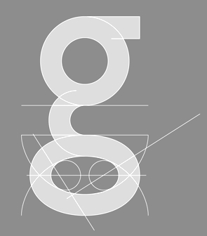 [MyFonts]
[More] ⦿
|
Mika Melvas
[Melvas Type (was: Mahti)]

|
 [MyFonts]
[More] ⦿
|
Mobaric Minhas
[Jaduger Design Studio (and: Twodollarshop)]

|
 [MyFonts]
[More] ⦿
|
Mpress Interactive
[John Bonadies]

|
 Type foundry set up in 2013 in Champaign, IL, by John Bonadies who has an MFA in graphic design from the University of Illinois. In 2011, he set up an iPad application in which one can move wooden letters around as in a letterpress. He says: LetterMpress will be a virtual letterpress environment---released first on the iPad---, that will allow anyone to create authentic-looking letterpress designs and prints.
 The typefaces are based on letterpress and/or vintage wood type, and have names that are prefixed by MPI. In 2013, Mpress Interactive published MPI Roman Condensed (based on a typeface from Showcard Machine Company), MPI Old Style, MPI Bodoni Ultra, MPI Sardis (after Warren Chappell's Lydian from 1938, ATF), MPI Republic Gothic, MPI No. 510 (based on a design by William H. Page, 1887), MPI No. 508 (based on William H. Page, 1890), MPI No. 507 (based on William H. Page, 1890), MPI Headline Modified (also called Modified Gothic by some type manufacturers, it is based on a typeface by Hamilton Manufacturing Company from 1897), MPI Gothic, MPI Aldine Extended (based on a 1872 wood type by William H. Page), MPI Antique (slab serif), MPI French Clarendon (based on wood type from 1865 by William H. Page), MPI French Antique (a typical far West saloon font based on wood type by William H. Page, 1869), MPI Egyptian Ornamented (a western typeface based on a 1870 wood type by William H. Page), MPI Arcadian (based on a 1870 design by William H. Page), MPI Tuscan Extra Condensed (based on William H. Page wood type from 1872), MPI Norwich Aldine Reversed (from a 1872 original), MPI Nouveau, MPI Delittle (based on a wood type by DeLittle), MPI Deco (art deco caps), MPI Atlas (slightly art nouveau typeface based on a font by Day & Collins), MPI Circle Sans (white on black letters). [Google]
[MyFonts]
[More] ⦿
|
Mrs. Eaves
|
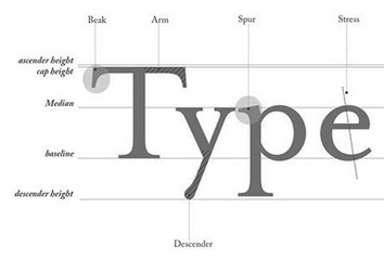 The type and design communities react to Mrs. Eaves, Zuzana Licko's version of Baskerville. Of those comments, Keith Tam's is the winner: " Mrs Eaves was a typeface designed by a graphic design-driven type designer for graphic designers. Yes, it may have been inspired by Baskerville, but I'm afraid it is no Baskerville. This is by no means a demeaning comment. While Baskerville has a calculated, crisp and stately charm to it that evokes neoclassical architecture, Mrs Eaves is soft spoken, warm, low contrast and has a distinct feminine touch to it. This subtle femininity is very rarely seen in contemporary type design, except perhaps some (almost stereotypical) script typefaces. I think Mrs Eaves is probably a typeface for graphic designers rather than typographers, as are many other Émigré fonts. Rebecca wrote that Mrs Eaves is perhaps a 'tolerable' display face, but not for text. I can't make up my mind. Mrs Eaves's distinctive features and small x-height certainly makes it tough to use for continuous text in most cases (not 'invisible' enough); on the other hand the generous spacing, robust serifs and low think-thin contrast make it somewhat unrefined for display use and lend it more towards the league of typefaces for small sizes. Perhaps it is this paradox that makes Mrs Eaves so appealing to graphic designers? I think that's Émigré's mission: to design typefaces that are on the threshold between text and display. Wait, it's the ligatures! They are simply delicious. Who can resist...? The best piece I've ever seen set in Mrs Eaves is their specimen booklet. I've only seen the offset lithographed version, but I imagine the letterpressed one would be quite exquisite. I don't think Mrs Eaves became popular because of trend. For a contemporary seriffed typeface to become a classic, that's quite something. I do think Mrs Eaves have some uniquely distinctive attributes that stand on her own two feet. It really can't be compared with ephemeral typefaces like Template Gothic, though also by Émigré. They are not really in the same league. Overused typefaces by graphic designers are quite different from overused typefaces by general users. The former became overused because of the aesthetics/formal characteristics, while the latter became overused simply because they are widely available. Whether they are inherently good typefaces is another matter. I disagree with the comment that Georgia should only be used for screen. It is an extremely good workhorse typeface for general used, in my opinion, for print, made by a master type designer, Matthew Carter. It should replaced Times New Roman as the default typeface for general office correspondence and documents. It is probably the best free font there is." [Google]
[More] ⦿
|
Muhammad Hasan
[MuSan]

|
 [MyFonts]
[More] ⦿
|
MuSan
[Muhammad Hasan]

|
 Magelang and Jakarta, Indonesia-based designer of the all caps vintage sans typeface Gallicide (2018), Sont O Yolo (2018), Brecelets (2018: script), Brengkel (2018: modular) and Ucu Aned (2018).
 Typefaces from 2019: Natured, Retjeh (an all caps vintage sans), Mesquin (letterpress emulation), Opulent (a display typeface with possible applications in fashion typography), Beatster (a weathered all caps lettepress emulation typeface family; free demo). [Google]
[MyFonts]
[More] ⦿
|
MyFonts: Letterpress simulation typefaces
|
MyFonts: Letterpress simulation typefaces. [Google]
[More] ⦿
|
Natale Varetti
|
Italian designer of Tanagra (1924), which in 1910-1911 won an award sponsored by the Fonderia Augusta. It appeared in 1924 in the publication "Archivio Tipografico", and was produced by Nebiolo in Turin. Varetti was a teacher at the Regio Scuola Tipografica in Turin. In 2022, Leonardo di Lena released a digital revival called Flanker Tanagra. [Google]
[More] ⦿
|
Nathan Williams
[Baseline Fonts]

|
 [MyFonts]
[More] ⦿
|
Nautica Studios
[Aritra Das]
|
Kolkata, India-based creator of the free sans typeface Gauthier (2015), the free caps-only sans typeface Jaden (2015) and the free hipster typeface Paramont (2015). In 2016, he published the letterpress emulation typefaces Roadster, Jonas, and Woodsman, and the sans family NS James. In 2017, he published the sans typeface NS Jude and the free monoline script Mademoiselle. Das is associated with Nautica Studios. Creative Market link for Nautica Studios. [Google]
[More] ⦿
|
Neelakash Kshetrimayum

|
 Indian graduate from the type design program at the University of Reading in 2010 currently based in Goa. He is a partner and cofounder of BrandNewType, an independent type and typography design studio. He studied Graphic Design at the National Institute of Design, India and received a master's degree in typeface design from the University of Reading. He develops typefaces for Indian scripts, working in close collaboration with Fiona Ross and John Hudson.
 He designed Frijky at Reading, which he introduces as follows: A progressive family of Latin and Bengali typefaces. Based on the calligraphic stroke movement, Frijky is fluid yet sturdy. Intended for publications, Frijky gives news extra bite with its aggressive edge. Frijky was used for the logo of the ATypI 2011 meeting in Reykjavik. Neelakash has designed two typefaces---Pakhangba and Sanamahi---for Meetei Mayek, the native script of Manipur. In 2011, Neelakash co-founded Mayek Projects with Anand Naorem, which offers design solutions for type, news and branding. Speaker at ATypI 2011 in Reykjavik and at ATypI 2019 in Tokyo on the revival of Meeti Mayek. He writes: In the beginning of the 18th century, as a result of political and cultural changes, the Bengali script replaced Meetei Mayek---the indigenous script of Manipur (a north-eastern state of India bordering Myanmar). Since then, the people of Manipur have been using the Bengali script for writing Meeteilon, the main spoken language of Manipur. This led to the introduction of new sounds in the Meeteilon from the Bengali script. Hence, during this period some new and modified letterforms were added for these sounds in Meetei Mayek. However after a number of conferences, the scholars have finally concluded that Meetei Mayek consists of 27 letteforms with their supplements. After almost 250 years, in 2005-06, the Government of Manipur officially approved the Meetei Mayek and included in the academic curriculum of Manipur Education. The new generation is learning Meetei Mayek instead of Bengali script to read and write Meeteilon. As the new generation is learning Meetei Mayek and it is slowly replacing the Bengali script, new typefaces will also be required for various forms of communication [...]. At present there are only a few typefaces, of questionable quality. Very limited research has been done on Meetei Mayek from the typographic point of view. Besides, there is a need to develop a system or guideline for designing Meetei Mayek typefaces. [...] This presentation discusses the typographic evolution of Meetei Mayek with examples from inscription, manuscript, letterpress, sign-paintings and digital typefaces. It reflects on the existence of multi-script communication in Manipur and its influence on Meetei Mayek. In 2017, Adobe Type released Myriad Devanagari and Myriad Bengali. Designed by Vaibhav Singh and Neelakash Kshetrimayum, respectively, these typefaces translate the design of Adobe's popular Myriad family (by Carol Twombly and Robert Slimbach) to the most-used writing systems of India. Between 1978 and 1982, Tim Holloway and Fiona Ross designed Linotype Bengali based on Ross's research for her doctoral studies in Indian palaeography. In 2020, Fiona Ross and Neelakash Kshetrimayum were commissioned by Monotype to update that popular typeface, still called Linotype Bengali. Designer of Adobe Bengali (2021; with help from Bengali script expert Fiona Ross). [Google]
[MyFonts]
[More] ⦿
|
New Blazing Star Press
[Jason Wickersty]
|
The New Blazing Star Press (Jason Wickersty, Bayonne, NJ) revives historical fonts, borders, ornaments, rules, and woodcut artwork from the 18th and 19th centuries, copying every letter from original type specimen, business directories, broadsides, and advertisements printed over 150 years ago. The foundry sells 100 fonts under the title Fonts of the Civil War Era (60 fonts in 2012, 40 fonts in 2014). The 40 fonts from 2014: TPTC CW2 AdamsSentinel, TPTC CW2 ArmedAlphabet, TPTC CW2 BoldBeniciaBoy, TPTC CW2 Broderie, TPTC CW2 ComparativeBorder, TPTC CW2 FaceBorder, TPTC CW2 FishermansSongBorder, TPTC CW2 GuttaPercha, TPTC CW2 Jambieres, TPTC CW2 Klegg, TPTC CW2 LincolnsToothpickHollow, TPTC CW2 Lorenz, TPTC CW2 LoungerHashed, TPTC CW2 Lovejoy, TPTC CW2 Massaponax, TPTC CW2 MassaponaxHashed, TPTC CW2 NewRatesofTollBorder, TPTC CW2 NiblosGarden, TPTC CW2 NicodemusHeights, TPTC CW2 NorthStar, TPTC CW2 NutritiveCoffeeBorder, TPTC CW2 OysterHouse, TPTC CW2 SaltJunk, TPTC CW2 Schnepf, TPTC CW2 ShieldofFreedom, TPTC CW2 ShockoeBottomDisplay, TPTC CW2 ShockoeBottomSmall, TPTC CW2 SolilioquoyBorder, TPTC CW2 SpikedLineBorder, TPTC CW2 SquareLineBorder, TPTC CW2 SquarzasPunch, TPTC CW2 SquarzasPunchOutlined, TPTC CW2 St.LouisArsenal, TPTC CW2 TariffBorder, TPTC CW2 TheNorthStar, TPTC CW2 TitlePageLowercase, TPTC CW2 WestWoods, TPTC CW2 Whitworth, TPTC CW2 Zollicoffer, TPTC CW2 Zylobalsamum. Creative Market link. [Google]
[More] ⦿
|
Niall Kitching
[K22 Foundry]
|
[More] ⦿
|
Nirut Krusuansombat
|
Bangkok-based type designer, designer and letterpress specialist, who cofounded the type foundry Behaviour in 1996 with Anuthin Wongsunkakon. He made several typefaces such as the dingbat font Arvayawa. [Google]
[More] ⦿
|
No Bodoni Typography
[George Everet Thompson]

|
 Glenview / Chicago, IL-based foundry run by George E. Thompson (b. 1945, Chicago). George Thompson teaches at the Art&Design Department of Columbia College Chicago since 1986: He has a deep involvement in letterpress printing and co-founded Columbia's private press, the Calhoun Press, named for John Calhoun, the first printer in Chicago. He also founded his own Spurius Press, devoted to publishing matters of typography and named for Spurius Carvillus, the ancient Roman credited with designing the letter G.
 Expensive but high quality typeface families designed by Thompson include Estiennium (quirky humanist sans), Isbellium (a sans serif version of Dick Isbell's Americana type, the last type cut in metal by American Type Founders), Nirvanium (wedge serif), ITC Oldrichium (2011, angular lettering in the style of Oldrich Menhart), Parmatype, Parisette, Marseillette, Lyonette, and Berlinette (2001). MyFonts is selling these fonts now: Claudium NB (2002), Crowbird Pro Bold (2012), Dog Butter (2004, a curly monolinear upright script with small x-height; followed by Dog Butter Pro in 2021), the eerie didone font Floridium NB (2002, based on wood type from the 1800s), Ms Kitty NB (2002, a fun face), Parma Typewriter NB (based on Bodoni), and Tinman Pro (2011). In 2013, George published the dingbat typeface Ovoid Two Zero, ITC Oldrichium. FontShop link. Klingspor link. Behance link. View the No Bodoni typeface library. [Google]
[MyFonts]
[More] ⦿
|
OCR-B: Adobe
[Adrian Frutiger]
|
Adobe's version of OCR-B, which was originally designed by Adrian Frutiger in 1966 for the European Computer Manufacturer's Association. It is rounded and easier to read than the rounded octagonal OCR-A font, which was designed for machine readability. OCR-B is ugly, malformed and quite useless nowadays. Quoting Linotype: Additional acclaim came after Frutiger was approached to come up with a more pleasing design for the optical character recognition typefaces used for computers. The result was OCR-B, which became the worldwide standard in 1973. Quoting Spiekernmann: The work was commissioned by the European Computer Manufacturers Association ECMA in Geneva. They didn't want to adapt OCR A, which was already used in the USA. Frutiger's job was to make a machine-readable type that was acceptable to the human eye as well. He started in 1963 and designed it on a finer grid than OCR A with its 5x9 squares. Apart from the font for machines he also designed a version for letterpress printing that had lower case characters and subtle stroke variations. The original OCR B was monospaced and had round stroke endings. The second version was proportional and had straight stroke endings. [Google]
[More] ⦿
|
Oddsorts
[Charles Gibbons]

|
 Charles Gibbons (b. 1967, Lynn, MA) received an MFA in graphic design from the Rhode Island School of Design. Gibbons spent much of the nineties as a designer for the University of Minnesota in Minneapolis and later as assistant professor of Graphic Design at the University of Wisconsin / Stout where he taught typography and publication design. In 2001, he joined the Library of Congress as the chief designer for the United States Copyright Office. Chuck has partnered with various typefoundries such as Bitstream, Filmotype, Sideshow, Tart Workshop, Device, and Cultivated Mind. The Ciao Bella ornaments he designed with Cultivated Mind's Cindy Kinash represent the first commercially available auto-chromatic fonts: each font can be set in two colors. Working with Stuart Sandler and Crystal Kluge at Tart Workshop, he developed the method by which their Aya Script delivers its characteristic curlicue ribbons. His types grace book covers, greeting cards, film titles, museum façades, and the seal of the United States Copyright Office. At present, he teaches typography and type design at Tufts University in Boston. In 2015, he set up Oddsorts. His typefaces, in more or less chronological order:
 - Aphasia BT (2000, Bitstream). He writes: A meeting of Byzantine and Art Deco forms, Aphasia began as a series of handwritten captions to accompany drawings in the early 1990s.
- At Oddsorts, he published Bradley Wayside and Bradley Chicopee in 2015: Begun in 2000 as a wedding gift for the designer's wife and used privately for years, they're finally available to the public. The fonts were inspired by the masterful art nouveau lettering of Will H. Bradley, whose posters for Ault & Wiborg printing inks and Victor Bicycles continue to draw collectors after more than a century. Wayside and Chicopee expand the twenty-odd characters Bradley drew into a comprehensive multiscript system that includes modern Greek and extended Cyrillic alphabets, ordinals, automatic fractions, and ornaments.
- In 2014, Charles Gibbons and Cindy Kinash co-designed Ciao Bella (first published at Cultivated Mind, and in 2016 at Oddsorts). It features a handcrafted copperplate script style, and several flower ornaments about which they write: The Ciao Bella ornaments he designed with Cultivated Mind's Cindy Kinash represent the first commercially available auto-chromatic fonts: each font can be set in two colors. What's truly innovative about Ciao Bella's ornaments is that most of the characters come in pairs that can be set in multiple colors without any stacking, layering, or aligning. They work in any application that supports kerning---even most word processors.
- Full Moon Suite (2001, Bitstream). Co-designed with Mary Trafton. Includes FM Black Cherry Moon, Alternate, Ligature, and Doubles. FullMoon BT won an award at the TDC2 2003 competition.
- Fleischmann BT Pro (2002). A family heralded by the typophiles as outperforming the DTL Fleischmann.
- Various Filmotype fonts for Stuart Sandler's Filmotype project. In 201, he designed the identical lively freestyle typefaces Filmotype Nemo (original from 1953), Filmotype Niro, and Filmotype Nero. The renaming was done under various scenarios of pressure. In 2011, he also made the signage typeface Filmotype Atlas. In 2012, he created the art deco fat didone typeface Filmotype Rose, and the fine brush letter signage typeface Filmotype Havana. Filmotype Adonis (2012) is a clean hand-drawn typeface. Filmotype Royal (2012) is a transitional typeface family. Typefaces from 2013: Filmotype Orlando (cartoonish), Filmotype Parade (cartoonish), Filmotype Zeal (a formal almost-copperplate script). In 2014, he added Filmotype Western (an italian, or reversed stress, typeface based on a Filmotype design from 1955), and in 2015 Filmotype Wand. Filmotype Maxwell (2019) is a revival of an interlocking Filmotype font from the 1960s.
- Greenleaf (2019).
- Local Market (2014). With Cindy Kinash. A hand-drawn collection of typefaces.
- True North (+Extras, +Textures: a vintage letterpress emulation set of fonts designed for posters and banners), 2014-2015. Done together with Cindy Kinash.
- Winooski (2015) is a fun cartoon typeface.
FontShop link. Oddsorts link. [Google]
[MyFonts]
[More] ⦿
|
Officina Serpentis
[Eduard Wilhelm Tieffenbach]
|
Eduard Wilhelm Tieffenbach was born in Königsberg (1883) and died in Berlin (1948). He ran a private letterpress in Berlin around 1900 called Officina Serpentis. His typeface (now dubbed) Officina Serpentis (1913, digitized by Petra Heidorn under the name SerpentisBlack in 2004; also, see the extension Serpentina (2004) by Manfred Klein) is a gotico-antiqua type reminiscent of the 15th century types. It is in fact based on typeforms by Peter Schoeffer (Mainz, 1462) which in turn were refined a few years later by Creussner and Koberger. [Google]
[More] ⦿
|
Oghie Novianto
[Giemons]
|
 [More] ⦿
|
Olcar Alcaide
[Eurotypo]

|
 [MyFonts]
[More] ⦿
|
Oli Bentley
[Split]

|
[MyFonts]
[More] ⦿
|
Oliver Weiss
[Walden Font]

|
 [MyFonts]
[More] ⦿
|
Onur Cem
[Krafti Lab]
|
[More] ⦿
|
Open Source Publishing (or: OSP)
[Harrisson]
|
 Free software project based in Belgium and run by four people (and I quote from their web page):
 - Harrisson: Graphic designer and typographer, based in Liege and Brussels. Started to use as much Open Source software as possible on his Macintosh, as part of a research project The Tomorrow Book at the Jan van Eyck Academy in Maastricht.
- Pierre Huyghebaert: Exploring for eighteen years several practices around graphic design, he currently drives his own studio Speculoos. Interested to use free sofware to re-learn to work in others way and collaboratively on cartography, type design, web interface, schematic illustration, teaching and book design.
- Nicolas Malevé: Systems- and software developer from Brussels with a long interest in the politics and practice of software. Uses Linux since 1998 and makes publishing- and distribution systems for collaborative work.
- Femke Snelting: Graphic designer and artist based in Brussels. Most of her current work is for the web. Recently switched to Linux after using Apple Macintosh for more than ten years.
Alternate URL. They also describe interesting autotrace software included in Inkscape and UNIX batch tools for good autotracing of images. Designers of free fonts: - Alfphabet (2009). Based on the Belgian road signage system in use from 1945 until 1975. It came from Minneapolis to Brussels with 3M.
- Broodthaers.
- Cimatics (2009). Totally experimental. This font was designed in July 2009, for the graphic identity of Cimatics A\V Platform. It gathers glyphs from FreeSerif, FreeSerifItalic, DejaVuSans, DejaVuSerif, the OSP_frog mascot, the Cimatics two piece heart, a baronchon_palm_tree from Open Clip Art Library and private use dingbats drawn for Cimatics (Cimatics_scare_eye, white_pentagon).
- Crickx. A digital reinterpretation of a set of adhesive letters.
- Distilled Spirit and Whisky Jazz. In September 2009, Harrisson and Jean Baptiste Parre from LPDME remixed URW Gothic (Avant Garde) and published the free fonts Distilled Spirit and Whisky Jazz.
- DLF. DLF stands for Dingbats Liberation Fest.
- Libertinage. In August 2008, Harrisson designed 26 variations on Philipp H. Poll's 2006 font Libertine, and called the new family Libertinage. It covers Greek, Latin and Cyrillic.
- Limousine. This font was made for a poster to support nine people accused of "criminal association for the purposes of terrorist activity". They were arrested the 11th of November 2008, in France. They and others are the victims of a witch-hunt where the word "terrorism" was applied to any idea or practice which challenges the status quo. An international movement is emerging in their support. For the poster, we re-mixed an open font, the Free Sans from Free UCS Outline Fonts. Open Font Library link.
- Logisoso. Logisoso is a reinterpretation of the Delhaize logo lettering.
- NotCourierSans. NotCourierSans is a reinterpretation of Nimbus Mono and was designed in Wroclaw at the occasion of Linux Graphics Meeting (LGM 2008). We took Nimbus as the base of the design. We proceeded to remove the serifs with raw cuts. We did not soften the edges. We are not here to be polite.
- OSP-DIN (2009). The first cut of OSP-DIN was drawn for the festival Cinema du réel.
- Polsku Regula (2010). Polsku Regula is inspired by polish signage, street signs and shop windows lettering.
- Reglo (2011) was used for the new identity of Radio Panik.
- Sans Guilt (2011). The three Sans Guilt fonts have been produced during "Read The Fucking Manual", an OSP workshop at Deparment 21 (Royal College of Art), using Gimp, Fonzie and Fontforge. They are different versions of Gill Sans based on three different sources. Sans Guilt MB: based on a rasterized pdf made with the Monotype Gill Sans delivered with Mac OSX. Sans Guilt DB: Based on early sketches by Eric Gill Sans Guilt LB: Based on lead type from Royal College of Arts letterpress workshop. Open Font Library link.
- Univers Else (2010-2012). A geometric sans, about which they write: Univers Else is an experiment, a first attempt to escape the post ’80 era of geometrical purity that is so typical of Postscript vector based font drawing. The shapes of Univers Else were obtained from scanning printed textpages that were optically composed by cheap phototypesetting machines in the sixties and seventies. Some of Univers Else beautiful features are: round angles, floating baselines, erratic kerning. More precisely in this case, George Maciunas of the Fluxus group used an IBM composer (probably a Selectric typewriter) for most of his own work, and as a former designer, for all Fluxus work. In the 1988 book Fluxus Codex, kindly given to Pierre Huyghebaert by Sylvie Eyberg, the body text is typeset in a charmingly rounded and dancing Univers that seems to smile playfully at its dry swiss creator. Different scans were assembled by Grégoire Vigneron following different grids. These huge bitmaps were processed with appropriate potrace settings by the Fonzie software* through a .ufo font format as a working format, and an OpenType as output. Some testing and fine-tuning was done by Pierre Marchand, Delphine Platteeuw and Pierre Huyghebaert in FontForge and the font was ready, in a finished state enough to typeset the book. The oblique versions was simply slanted on the fly.
- VJ12 (2009).
- W Droge. In 2008, they ran a workshop in Wroclaw, Poland, to design a font in a day with the free tools Inkscape, Gimp and FontForge---called W Droge. It was based on Polish traffic signs. Cooperation with Dave Crossland, Alexandre Prokoudine and Nicolas Spalinger. The designers were Malwina Pukaluk, Marcin Wajda, Anna Bartoszek, Kacper Lenczuk, and Ludivine Loiseau.
- Le Patin Helvète (2011) is a slab typeface derived from Nimbus L. It covers Latin, Greek, Cyrillic and Hebrew: Patin Helvete is a attempt to turn the slick propergol purity of the modernist lines back to the coal dirt of the iron horse by going backward in time and space through little pieces of rail. Designed by Harrisson, Ludi Loiseau and Sebastien Sanfilippo.
- Mill (2012) is an architectural style typeface that has been created for engraving building instructions into the wood of a bench.
- Sans Guilt Wafer (2012) is described by OSP as follows: Gill Sans eats a Gaufrette.
[Google]
[More] ⦿
|
Orbis Typographicus
[Joshua Langman]
|
 Orbis Typographicus is a set of twenty-nine 9x12 letterpress broadsides, designed by Hermann Zapf and printed by Philip Metzger of Crabgrass Press between 1970 and 1980. The broadsides feature quotations on art, science, nature, faith, and the human condition, from authors ancient and contemporary. The text includes poetry, prose, anagrams, and palindromes, in English, German, Spanish, French and Japanese. Hand set by Philip Metzger, the set showcases many of the typefaces of Zapf and his wife, Gudrun Zapf von Hesse.
 In 2013, the web site Orbis Typographicus was set up by Joshua Langman. It features high-resolution scans, available for download, and a complete computer-searchable transcript. The web site also features an essay by Philip A. Metzger, the son of the printer, in which he shares his recollections of his father working on the project. Joshua Langman is a freelance graphic designer and typographer based in New York. [Google]
[More] ⦿
|
Oriol Moret-Vinals
|
Oriol Moret-Viñals (b. 1968, Barcelona) has a Phd in Letterpress Typography and teaches at the Faculty of Fine Arts of the University of Barcelona since 1997. At ATypI 2014 in Barcelona, he spoke about the geminated el (l-l) in the Catalan language. In 2017, he published Romain du Roi: el enredo. [Google]
[More] ⦿
|
P22 Analog
|
P22 Analog is an offshoot of Richard Kegler's P22 Type Foundry, a digital type house founded in 1994 and located in Aurora-on-Cayuga, NY. P22 Analog is dedicated specifically to hand-printing and hand-craft along with research related to printing, letterpress and typographic history. [Google]
[More] ⦿
|
P22 Type Foundry
[Richard Kegler]

|
 Richard Kegler's fun Buffalo-based foundry, which he founded in 1995 together with his wife, Carima El-Behairy. Currently, on staff, we find type designers James Grieshaber and Christina Torre. In 2004, it acquired Lanston Type. P22 has some great unusual, often artsy, fonts.
 The fonts are: Industrial Design (an industrial look font based on letters drawn by Joseph Sinel in the 1920s---this font is free!), LTC Jefferson Gothic Obliquie (2005, free), Sinel (free), P22Snowflakes (free in 2003 and P22 Snowflakes (retail) in 2020, finishedd by Richard Kegler and Terry Wüdenbachs), Acropolis Now (1995, a Greek simulation typeface done with Michael Want), P22 Albers (1995; based on alphabets of Josef Albers made between 1920 and 1933 in the Bauhaus mold), Arts and Crafts (based on lettering of Dard Hunter, early 1900s, as it appeared in Roycroft books), Ambient, Aries (2004, based on Goudy's Aries), Arts and Crafts ornaments, Atomica, Bagaglio (Flat, 3D; in the style of Il Futurismo), P22 Basel Roman (2020, Richard Kegler: an update of a 2015 typeface, P22 Basel, based on a garalde font used by Johannes Herbst (aka Ioannes Oporinus) in 1543 to publish Andreas Vesalius' On the Fabric of the Human Body (De humani corporis fabrica) in Basel), Bauhaus (Bauhaus fonts based on the lettering of Herbert Bayer), Bifur (2004, Richard Kegler, after the 1929 original by Cassandre), Blackout, P22 Brass Script Pro (2009, Richard Kegler; based on an incomplete script fond in a booklet from Dornemann&Co. of Magdeburg Germany, ca. 1910 entitled Messingschriften für Handvergoldung; for years, P22 and MyFonts claimed that Michael Clark co-designed this, but Michael does not want any credit, as he did only about 20 letters), Cage (based on handwriting and sketches of the American experimental composer John Cage), P22 Casual Script (2011, Richard Kegler, a digitization of letters by sign painter B. Boley, shown in Sign of the Times Magazine), Cezanne (Paul Cezanne's handwriting, and some imagery; made for the Philadelphia Museum of Art), Child's Play, Child's Play Animals, Child's Play Blocks, Constructivist (Soviet style lettering emulating the work of Rodchenko and Popova), Constructivist extras, Czech Modernist (based on the design work of Czech artist Vojtech Preissig in the 20s and 30s), Daddy-o (Daddy-o Beatsville was done in 1998 with Peter Reiling), Daddy-o junkie, Da Vinci, Destijl (1995, after the Dutch DeStijl movement, 1917-1931, with Piet Mondrian inspired dingbats; weights include Extras, P22 Monet Impressionist (1999), Regular and Tall), Dinosaur, Eaglefeather, Escher (based on the lettering and artwork of M.C. Escher), P22 FLW Exhibition, P22 FLW Terracotta, Folk Art (based on the work of German settlers in Pennsylvania), Il futurismo (after Italian Futurism, 1908-1943), Woodtype (two Tuscan fonts and two dingbats, 2004), P22 Woodcut (1996, Richard Kegler: based on the lettering carved out in wood by German expressionists such as Heckel and Kirchner), Garamouche (2004, +P22 Garamouche Ornaments; all co-designed with James Grieshaber), GD&T, Hieroglyphic, P22 Infestia (1995), Insectile, Kane, Kells (1996, a totally Celtic family, based on the Book of Kells, 9th century; the P22 Kells Round was designed with David Setlik), Koch Signs (astrological, Christian, medieval and runic iconography from Rudolf Koch's The Book of Signs), P22 Koch Nueland (2000), Larkin (2005, Richard Kegler, 1900-style semi-blackletter), London Underground (Edward Johnston's 1916 typeface, produced in an exclusive arrangement with the London Transport Museum; digitized by Kegler in 1997, and extended to 21 styles in 2007 by Paul D. Hunt as P22 Underground Pro, which includes Cyrillic and Greek and hairline weights), Pan-Am, Parrish, Platten (Richard Kegler; revised in 2008 by Colin Kahn as P22 Platten Neu; based on lettering found in German fountain pen practice books from the 1920s), P22 Preissig (and P22 Preissig Calligraphic, 2019), Prehistoric Pals, Petroglyphs, Rodin / Michelangelo, Stanyan Eros (2003, Richard Kegler), Stanyan Autumn (2004, based on a casual hand lettering text created by Anthony Goldschmidt for the deluxe 1969 edition of the book "...and autumn came" by Rod McKuen; typeface by Richard Kegler), Vienna, Vienna Round, Vincent (based on the work of Vincent Van Gogh), Way out West. Now also Art Nouveau Bistro, Art Nouveau Cafe and the beautiful ornamental font Art Nouveau Extras (all three by Christina Torre, 2001), the handwriting family Hopper (Edward, Josephine, Sketches, based on the handwriting styles of quintessential American artist Edward Hopper and his wife, Josephine Nivison Hopper, and was produced in conjunction with the Whitney Museum of American Art), Basala (by Hajime Kawakami), Cusp (by James Grieshaber), P22 Dearest (calligraphic, by Christina Torre and Miranda Roth), Dwiggins (by Richard Kegler), Dyrynk Roman and Italic (2004, Richard Kegler, after work by Czech book artist Karel Dyrynk), Gothic Gothic (by James Grieshaber), La Danse (by Gábor Kóthay;), Mucha (by Christina Torre), Preissig Lino (by Richard Kegler), P22Typewriter (2001, Richard Kegler, a distressed typewriter font), the William Morris set (Morris Troy, Morris Golden, Morris Ornaments, based up the type used by William Morris in his Kelmscott Press; 2002), Art Deco Extras (2002, Richard Kegler, James Grieshaber and Carima El Behairy), Art Deco Display, the Benjamin Franklin revival font Franklin's Caslon (2006), Dada (2006) and the Art Nouveau font Salon (bu Christina Torre). In 2006, Kegler added Declaration, a font set consisting of a script (after the 1776 declaration of independence), a blackletter, and 56 signatures. Many of the fonts were designed or co-designed by Richard Kegler. International House of Fonts subpage. Lanston subpage (offerings as of 2005: Bodoni Bold, Deepdene, Flash, Fleurons Granjon, Fleurons Garamont, Garamont, Goudy Thirty, Jacobean Initials, Pabst, Spire). Bio and photo. In-house fonts made in 2008 include Circled Caps, the Yule family (Regular, Klein Regular, Light Flurries, Heavy, Klein heavy, Heavy Snow, Inline; all have Neuland influences). Kegler / P22 created a 25-set P22 Civilité family in 2009 based on a 1908 publication from Enshedé, the 1978 English translation by Harry Carter, and a 1926 specimen also from Enshedé. P22 Declaration (Script, Signatures, Blackletter, 2009) is based on the lettering used in the 1776 Declaration of Independence. At ATypI 2004 in Prague, Richard spoke about Vojtech Preissig. Speaker at ATypI 2010 in Dublin, where he presented Making Faces: Metal Type in the 21st Century about which he writes: This film has the dual aim of documenting the almost-lost skill of creating metal fonts and of capturing the personality and work process of the late Canadian graphic artist Jim Rimmer (1931-2010). P22 type foundry commissioned Mr. Rimmer to create a new type design (Stern) that became the first-ever simultaneous release of a digital font and hand-set metal font in 2008. At ATypI 2011 in Reykjavik, he showed Making Faces. Typefaces from 2014: LTC Archive Ornaments (Richard Kegler and Miranda Roth). Typefaces from 2020: Showcard Script (by Terry Wüdenbachs, based on an original of Beaufont at the Hamilton Wood Type Museum, custom designed by the Morgan Sign Machine Company of Chicago). Typefaces from 2021: P22 Glaser Houdini (a layerable family, after Glaser's Houdini from 1964), P22 Glaser Babyteeth. Kegler writes: In 2019, P22 Type Foundry met with Milton Glaser (1929-2020) to initiate the official digital series of typefaces designed by Glaser in the 1960s and 70s. P22 Glaser Babyteeth is the first family released in the series. Milton Glaser's inspiration for his Babyteeth typeface came from a hand painted advertisement for a tailor he saw in Mexico City. He was inspired by that E drawn as only someone unfimilar with the alphabet could have concieved. So he set about inventing a completelly ledgible alphabet consistant with this model. P22 Glaser Babyteeth was based on original drawings and phototype proofs from the Milton Glaser Studios archives. Over the years there have been many typefaces that borrowed heavily from the Glaser designs, but these are the only official Babyteeth fonts approved by Milton Glaser Studio and the Estate of Milton Glaser. The solid and open versions are designed to overlap for two-color font effects and can even be mixed and matched for multi layer chromatic treatments. In 2021, he published the 3d art deco shadow font P22 Glaser Kitchen which is based on Big Kitchen (1976). MyFonts interview. View Richard Kegler's typefaces. View the IHOF / P22 typeface library. [Google]
[MyFonts]
[More] ⦿
|
Pablo Ugerman

|
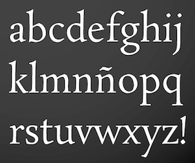 Argentinian type designer who lives in Buenos Aires where he runs UGR Design. Award winner at Tipos Latinos 2010 for his text and IPA typeface Voces (done with Ana Paula de Bragança Megda). The latter typeface appeared in 2012 at Google Web Fonts.
 At Tipos Latinos 2012, he won awards for Sopi (an ornament and border typeface published by Tipo in 2014) and Rosarivo (2011, Google Web Fonts: a typeface designed at FADU-UBA for use in letterpress printing). Google Plus link. [Google]
[MyFonts]
[More] ⦿
|
Paul Alan Grosse
|
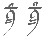 Paul Alan Grosse is a very prolific Gurmukhi type designer (among many other things, often technical things---check out his own computer-generated Sudoku and Kakuro puzzles, for example). He created over 200 free Gurmukhi typefaces:
 - Fonts from 2000: Cut-Out-PG, Jotter-PG, Gas-Plasma-PG (dot matrix), Typewriter-PG, Water-Rocket-PG, Handwritten-PG, MySchoolFont (2001, chalk on blackboard style).
- Gurmukhi: In 2008, he made the Gurmukhi font families Bulara, Magaz (2008), Karmic Sanj (2007: advertized as a Gurmukhi mirror of Cimic Sans MS), Punjabi Typewriter, Gurmukhi Old Letterpress, Gurvetica A, Gurvetica (48 styles---like Helvetica for Gurmukhi), Dekho (2012), Dekho Naveen (2012), Rupe, Lanma (2007, with decorative tails), Choti (stylized script), Raaj (a handwritten style with tails), and Raajaa.
- His Dave font family (2009) takes the Gurmukhi range but outputs Devanagari characters instead. This means that a piece of text written in Gurmukhi (using Unicode) can easily be displayed as Devanagari, simply by changing the font. Iragan does the opposite: it converts Devanagari to Gurmukhi.
- Handwriting typefaces for Gurmukhi: GHW Adhiapak, GHW Dukandar, GHW Penti Akhari, GHW Purani Primer PDL, GHP Full (based on sign-writing). Purani Primer (2013) is a font based on a cursive design from a 100 year-old primer sent to him by Punjab Digital Library.
- Uttar (2012) and Tsheg (2012): Gurmukhi fonts in the style of Tibetan. Tsheg also has Latin and makes a great oriental simulation typeface.
- Gurmukhi fonts made in 2013: DIN 1451 Punjabi, Gubara (a balloon font), Modhera (in the style of Gujarati), Dwarka.
Fontspace link. Old URL. Another site for his Gurmukhi fonts. Paul Grosse's main web site. Behance link. [Google]
[More] ⦿
|
Paul Harpin
|
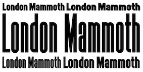 British designer who worked for Condé Nast in the 1980s. Paul Harpin created his first typeface, Laura---a twelve-weight typeface family--in 2014, assisted by Paul Hickson. It is named after his niece Laura, who died of cancer, and has Display, Stencil, Ribbon and Regular styles. In 2017, he co-founded London Type. At London Type he published these typefaces:
 - LDN Mammoth Woodblock and LDN Mammoth (2019), which is based on a hand drawn letterpress style headline typeface by artwork expert Peter Taylor.
- LDN CircleLine (2019), with single, double and triple line typefaces. He writes: LDN CircleLine is an eclectic slab serif in eight overlapping styles [...] to work well on their own or as stackable layers. Paul drew inspiration from several sources; the Post Office Double Line typeface designed by John Miles (Banks & Miles), the simplicity of the London Underground symbol, and by Lance Wyman's designs for the 1968 Olympic Games.
- London Hoxton Square (2019). An extra black, slab serif headline font, where every character is the same width and fits into a square for alignment purposes.
- The high contrast fashion mag typeface Kondon Modern (2019).
- London Mixed (2019). Three styles, from a humanist sans to slab.
- London Grace Roman (2019). A roman inscriptional caps typeface.
- LDN Southbank (2020). A sturdy slab serif inspired by London during the Festival of Britain era. Accompanied by its art school and more experimental cousin LDN Northbank (2020).
- LDN Queenstown (2020). A single weight slightly quirky ultra light monolinear typeface that takes inspiration from a sketch of an early sans by the Victorian calligraphic artist John Vinycomb Esq. Paul writes: Vinycomb was probably about 120 years ahead of the game, and Queenstown faithfully retains some of the charmingly unusual letterforms of JV's early modern sans serif. Characters of note include a gorgeous pince-nez letter g and a long tailed cap Q, one of four Q alternates.
[Google]
[More] ⦿
|
Paul Reis
|
Paul Reis (Covington, KY) created the 3d architectural typeface Pane (2012). Ana (2012) is a bicolored typeface made to be seen with 3d red/cyan glasses. In 2013, he designed Wabeco (a free 6-style art deco typeface family), Brooklyn (+Inline). Free download here and here. Promesh (2013, an athletic lettering font) is also free. Typefaces from 2014: Promesh Two (free), Wafer (3d face: free), Redbud (a free vintage set with a letterpress feel). Typefaces from 2015: Royals (a free mechanical octagonal typeface). [Google]
[More] ⦿
|
Paul van Oijen
[Quill Type Co]
|
[More] ⦿
|
Paula Nazal Selaive

|
 Santiago de Chile-based creator of Selaive (2011, Latinotype), a geometric monoline sans with an extreme hairline weight, a bold, and several curly alternates. She also made the curly swashy script typeface Dulce (2011; Dulce Pro appeared in 2013 at Latinotype). Dulce has slight teardrop terminals.
 In 2012, she and Daniel Hernandez created the Bosque family at Latinotype, which comes with six variants, Normal, Wood, Shadow, Wood Shadow, Dingbats and Shadow One. Julieta is a curly swashy thin monoline typeface family. Romeo (Latinotype) is a swashy curly condensed unicase typeface. In 2013, with Daniel Hernandez, she designed the layered type system Trend, also at Latinotype. See also Trend Rough (2014). In 2014, together with Daniel Hernandez, she created the upright good-spirited coffee shop script Showcase. It is morally supported by a set of Ornaments and a few Sans and Slab styles. Revista (2015, Paula Nazal Selaive, Marcelo Quiroz and Daniel Hernandez, at Latinotype) is a typographic system that brings together all the features to undertake any fashion magazine-oriented project. It has Revista Script (connected style), Revista Stencil, Revista Dingbats, Revista Inline and the didone Revista all caps set of typefaces. Revista won an award at Tipos Latinos 2016. In 2016, she designed the delicate display didone typeface family Camila (Latinotype), for which she was influenced by Coco Chanel. In 2017, Paula Nazal and Daniel Hernandez co-designed Trenda, a geometric sans family based on the uppercase of Trend. The rounded edge version of Trenda is Boston [corrections and review by Alfonso Garcia and Rodrigo Fuenzalida]. In 2018, Paula Nazal and Daniel Hernandez co-designed the monoline connected script font Save The Date. Facundo (2020, Paula Nazal Selaive and Daniel Hernandez, at Latinotype) is a 14-style geometric sans family. [Google]
[MyFonts]
[More] ⦿
|
Paulo Vinicius Lima
|
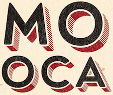 Aka Mr. Pow. Sao Paulo-based designer of a few great lambe lambe posters (2016). Behance link. [Google]
[More] ⦿
|
Pavel Korzhenko
[Vintage Voyage Design]

|
 [MyFonts]
[More] ⦿
|
Pedro Lobo
[Uppertype]
|
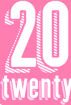 [More] ⦿
|
Pete McCracken
[Plazm Fonts]

|
[MyFonts]
[More] ⦿
|
Peter Fraterdeus
[Alphabets Inc (or: Fontsonline.com)]

|
[MyFonts]
[More] ⦿
|
Peter Olexa
[Cruzine]
|
 [More] ⦿
|
Peter Van Lancker
|
 Flemish web log about the history and mechanics of type, run by Belgian graphic designer Peter Van Lancker (b. Ghent). There is a lot of information on the early printing and typefounding by Joos Lambrecht in Gent, ca. 1539.
 His Flickr page has many nice shots of old presses (lithography, copperplate, etc.). He is working on this octagonal face and a rhythmic broad nib pen. In 2012, Peter published a free pixel typefaces Thirtysix and Six. In 2014, he started work on a gorgeous letterpress style typeface, Ijskelder, which was released in 2020. Dafont link. [Google]
[More] ⦿
|
Phil Baines

|
British graphic designer who was born in 1958 in Kendal, Westmorland, and died in 2024. Baines graduated from St Martin's School of Art in 1985 and the Royal College of Art in 1987. He worked as a freelance graphic designer, was Professor of Typography at Central Saint Martins College of Art&Design (now a university) in London (from 1991 until retiement), ran Phil Baines Studio, maintained Public Lettering (about type found in cities), and was Typographic Advisor to the Central Lettering Record CD-Rom project. He designed FUSE Classic 1, Can You (1989), Ushaw (FUSE 8, FontShop, 1993), Toulon (1994), Horncastle (1994), VereDignum LT Std in Alternate, Decorative and Regular weights (2003, Linotype Taketype 5 collection) and Can You Read Me (FUSE 1, 1991). His pages on public lettering in London. His books include Signs, lettering in the environment (with Catherine Dixon, 2003) and Type&Typography (2002, with Andrew Haslam). Author of Rookledge’s Classic International Typefinder (Christopher Perfect, Gordon Rookledge, Phil Baines). At ATypI 2007 in Brighton, he spoke on From the Motor Car Act to motorways. He has also a good reputation for taking people on typographic city tours, as he did in 2006 at ATypI in Lisbon, and at ATypI 2010 in Dublin. Linotype link. FontShop link. Speaker at ATypI 2010 in Dublin in which he explained how he and Catherine Dixon produced the lettering for the Pozza Palace in Dubrovnik on commission for the Serbian Orthodox Church. Obituary in The Guardian. [Google]
[MyFonts]
[More] ⦿
|
Philip Trautmann
[Shaped Fonts (was: Phitra Design)]
|
[More] ⦿
|
Philip Waschmann
[Studio Vachement]

|
[MyFonts]
[More] ⦿
|
PintassilgoPrints
[Ricardo Marcin]

|
 Brazilian printmaker, graphic artist and illustrator in Vitoria, b. 1973, Rio de Janeiro. His fonts are created together with Erica Jung at PintassilgoPrints (est. 2009). Pintassilgo relocated to Florianopolis at some point. Their typefaces include Petulante (scratchy caps) (2021), Skaligari (eighties punk) (2021), Slotrip (2021), Soapy (foam-textured caps) (2021), Conversa (2021), Tenacious Brush (2021), Clarks (2021: a modular typeface based on the work of Lygia Clark, one of the giants of Brazilian postwar art), Cachalote (a poster typeface) (2021), Search (an all caps dry brush font) (2020), Grok (2020), Pickles (2020), Pain de Mie (2020), Outside (2020), The King (2020), The Spoilers (2020), Altogether (2020: a doodling beauty with eight choices for each glyph), Ars Nova (2019: art nouveau), Pind-O-Rama (2019), Pieches (2019: a linocut font inspired by the powerful political and social posters by Paul Peter Piech), Soundstar, Clafoutis (2019), Pedrita (2018), Transmogrified (2018), Melodia (2018), Minute (2018), Mindset (2018), Salted (2018), Plunct Plact (2017: a children's script), Manihot (2017), Brushtones (2017), Strange Times (2017), Mudstone (2017), Plumcake (2017), Cordelia (2017), Dunkelbunt (2016, inspired by the eccentric artist, architect and designer Friedensreich Hundertwasser), Chronic (2016, influenced by the work of HAP Grieshaber and Willem Sandberg; expanded in 2020 to Anachronic), Unboring (2016), Sunbeat (beatnik style), Hand It (2016, a childish script), Botanique (2016, after Lucian Bernhard's Schmalfette Bernhard Antiqua, 1912), Somehand (2015), Gumdrop, Granz (2015: retro lettering based on a Porgy & Bess album cover by David Stone Martin), Stabile and Stabile Toys (2015, handcrafted), Cluster (2015, a layered letterpress emulation typeface), Stick Around (2014), Marker Aid, Unpack, Felt Noisy (fat brush), Blueshift (2014), Daft Brush (2014, a vernacular brush), Tuesnight (2014, offbeat poster font), Periplus (2013), Marujo (2013: a decorative typeface inspired by paintings of Arthur Bispo do Rosário, a Brazilian artist who lived for 50 years in a psychiatric institution), Brush Up (2013: a rough brush script), Undersong (a stackable script system), Tremendous (2013: a retro poster typeface), Rockinstead (2013), Runcible (2013, +Cleft, its glaz krak version), Mamute (2013: a layered letterpress style type system), Sabotage (2013: squarish poster font inspired by the iconic Vertigo movie poster by Saul Bass), Gentil (2012, an all caps poster font), Card-o-mat (2012, bird dingbats), Kokoschka (2012, based on the lettering on the poster of an expressionist play by Austrian painter, printmaker and writer Oskar Kokoschka in 1909), Sundowners (2012), YWFT Duncan (2012), Rather Jazzy (2012), Rather Loud (2012), Soundtrack (2012), Monstrinhos (2012, dingbats), Monstro (2012, fat poster face), Attic (2012), Melkslijter (2011, a stylish art deco typeface based on a brochure by Dutch graphic artist Dirk Hart), Polyspring (2011, a Victorian typeface hand-drawn based on Italia Condensed, Keystone, 1906), Berimbau (2011), Populaire (2011, a hand-drawn poster caps typeface that was inspired by the electrifying posters from May 1968 by Atelier Populaire, and loaded with alternates to give a random effect), Manicuore (2011, a hand-drawn typeface inspired by Italian movie posters by the prolific movie poster artist Symeoni, aka Sandro Simeoni), Ziclets (2011, a bubblegum typeface), Smashing (2011, a fat hand-printed poster face), Chancellor (2011, a plakatstil style caps face), the eccentric poster face Polygraph (2011, based on lettering of the Polish poster artist Leszek Zebrowski. Images: i, ii, iii, iv, v, vi, vii, viii, ix, x.), the vintage serif typeface Organically (2011), Transitore (2011: Transitore is a lively hand-drawn font with loads of alternates and ligatures which, managed by advanced OpenType features, help create a convincing handcrafted look), the poster display typeface Sforzando (2011; +Alto), the signage typeface Jongleur (2011), the Cuban poster typeface Transmogrifier (2010, based on lettering by Cuban poster artist Eduardo Muñoz Bachs), the ultra-fat art deco typeface Loudine (), Crocante (2010, comic book face), Love Birds Pattern (2010), Swung Note (2010), Amarelinha (2010, hand-printed), Cuadrifonte (2010, a fat hand-printed family including styles called Pics, Sketch (regular), Fill and Line), Xylo Sans (2010, wooden texture face), Ritornelos (2010, a curly all caps hand-printed face), Roadway (2010, based on wood Clarendons), Changing (2010), Vitrines (2010, hand-printed), Prokaryotic (2010, a "bacterial attack" face), Football World (2010, soccer silhouettes), Singela (2010), Bandoliers (2010, an informal hand-printed sketched face, with 3D versions such as Beefy, High and Rocky), Butterfly Effect (2010), Tonal (2010, ultra-fat with mini-counters), Dynatomic (2010, inspired by the hand-drawn lettering of a 1964 polish movie poster designed by Andrzej Krajewski: caps only), Grante (2009, a lively poster face), Somewhat (2010, hand-drawn), Mondiale (2009), Merceria Antique (2009), Nanquim (2009, sketched letters), Lovebirds (2010, bird silhouettes), Oyster (2010, hand-drawn dingbats), and Arca (2009, +Dashed). All have an informal and attractive look, and were co-designed with Erica Jung. Dafont link. He created the grunge typeface Talvezassim (2009) and the fat geometric typefaces Parafuse Ultrablack (2009, +Outline, Shadow) and DeLarge (2009). Monster Boxes (2009) is a dingbat face. Oyster (2010) is hand-printed.
 The prints of Horst Janssen had a characteristic uneven hand-printed lettering that led Erica Jung and Ricardo Marcin to design the multi-featured opentype typeface Horst (2010). Nova Horst was published in 2012. Alternate URL. Open Font Library link. Fontspace link. YWFT link. Creative Fabrica link. Fontsy link. Klingspor link. Creative Market link. Catalog of typefaces. View all of Pintassilgo's typefaces. [Google]
[MyFonts]
[More] ⦿
|
Plazm Fonts
[Pete McCracken]

|
Portland, OR-based company. Its timeline: - Plazm magazine started as a free zine in 1991. The founding partners were Pete McCracken, Joshua Berger and Niko Courtelis.
- Plazm Fonts was founded in 1993 by Pete McCracken and Joshua Berger. McCracken led the effort to create the foundry and is the director and sole type designer there.
- Plazm incorporated into Plazm Media, Inc. in 1995.
- McCracken buys all of the assets of the type design portion of the company in 2006.
- In 2010, the branding and type design business that was Plazmfonts become the Portland Type Co. Plazm continues as a design company not involved in type design, led by creative director Joshua Berger.
The typefaces, by designer: - Marcus Burlile: Stelefont (1993), Widows (1994), Flytrap (1995), GhostTown (1995), Ablefont (1993, of Harry Potter fame), Anvil (1993), Autumnull (1995), Colony (1993), Pilgrim (1993), Reckon (1996), Sillbat (1994), Spiderust (1995), Thistlem (1995), Kitsch (1993), COLONIST.
- Andrew D. Taylor: Avenatha (1995).
- Robert James Foley Jr: Blitso-funk (1995).
- Angus R. Shamal: CensorSans (1994), CensorSerif (1994), Credit (1995), Epilogue.pfa (1995), Humain-Graphica (1995), Humain-Synthetica (1995), Platrica (1994), Roscent (1995).
- Ermin Mededovic: Centrifuga (1996), Board (1995).
- Marty Bee: Cibola (1995), ThreeRivers (1994), WetandWilde (1994).
- Don Synstelien: Derision (1995), NudE (1995), SlickDog (1995).
- Dave Henderleiter: DizzySpell (1995).
- Opulux Fonts (Dave Henderlieter): DoeMan (1995), DogboySplitHome (1995), Pulsitallia (1995).
- Pete McCracken: Erosive (1993), Facsimiled (1994), INKy-black (1994), Mtvpe (1997), NeoDeko (1993), Petescript (1992: based on Pete's handwriting, this font was used on Aerosmith's album Big Ones), PresidentNixon (1994), Altered (1993).
- Jim Marcus: EscalidoGothico (1994), EscalidoStreak (1994).
- Stephen Farrell: Flexure (1993).
- Christian Kusters: Hadrian (1996), Retrospecta (1994), Unzialis (1994), Hybrid (1996), Interface One (1996).
- Garland Lyn: Milk (1994).
- Paul Bissex: Pscruf (1995), Rufnu (1994).
- Robert Selby: Selbezi (1994), NewHamburger (1993).
- Charles Wilkin: Velvet (1995).
- Roland Henss: Capitalis Pirata.
- Riq Mosqueda: Codesigner of Mtvpe (1997)
- Elliott Peter Earls: Subluxation (1994).
- Scott Yoshinaga: Grunge (1994).
- Travis A. Waage: Belch (1994).
- Pablo A. Medina: Vitrina, Cuba.
Other fonts: CarPlatesCarPlates, NorthBergen, PHatFont, Pilgrim, RocketScience-1, Twiggy, Victory (2002-2004, an Avenir-Futura style geometric sans family custom made for Nike. The typographers at Typographicom are blasting this typeface. Marc Oxborrow writes: It seems that the less original the work, the more overblown and pretentious the description.). Write-up at Fontnews. Fonts also sold by Mindcandy. Bio of McCracken by ATypI: Pete McCracken is a type designer, designer, artist, musician and educator in Portland Oregon. He owns and runs Plazm Media with business partner Josh Berger. Current projects include 20+ custom typefaces for Nike, the recently published book "XXX The Power of Sex in Contemporary Design", and an extensive branding project for Pierce Brosnan. He also owns and runs Crack Press producing music and custom artwork using silkscreen and letterpress. Current projects include a 43 color commissioned screen print of the Last Supper; Heavy Grass, a metal bluegrass band; and a cd of various compositions called Crack Tracks. He also teaches in the design programme at PNCA. Plazm link. FontShop link. Klingspor link. [Google]
[MyFonts]
[More] ⦿
|
Polymath Design
[Matthew Hancock]
|
 London-based designer and illustrator. Creator of the letterpress emulation typeface Aurochs (2021). [Google]
[More] ⦿
|
Posterizer KG
[Lazar Dimitrijevic]

|
 Lazar Dimitrijevic, who set up the foundry Posterizer KG, was born in 1981 in Bajina Basta, Serbia, and lives in Kragujevac, Serbia. He obtained a Master of Graphic Design from the Department of Graphic Design, FILUM Kragujevac, Serbia. Presently, he is art director at Design Studio BOX.
 His first font, Art Decor (2009), is a brush typeface in the style of Treefrog. Koma Latin (2009) is a roughly outlined script face. Bajka (2010) is a wonderfully entertaining Baskerville family (Latin, Cyrillic, dingbats, ornamental caps) made for children's fairy tale books. Scarface (2010) is a sublime scratchy hand ideal for torture movies. Kaligraf Latin (2010) is a rough-edged calligraphic face. In 2012, he published Collage BB (hand-drawn didone), the heavy Egyptian typeface Posterizer KG at DizajnDesign. This font was created for Celebration of 5 years anniversary of Design Studio Box from the city of Kragujevac (KG), the industrial city of Serbia. Posterizer KG (+Rounded) contains all the Latin and Cyrillic glyphs. Posterizer KG Inline and Posterizer KG Rough (a letterpress emulation version) were added in 2013. Posterizer KG Sketch followed in 2015. Still in 2012, he designed the ink splatter typeface Oops, and the calligraphic typefaces Cal Humanistic Cursive (a renaming of Cal Humanist Corsiva, posibly under pressure from Monotype), Cal Humanist Minuscule and Cal Humanist Corsiva. He also creates stunning calligraphic works. Cal Roman Capitals (2012) is a Trajan typeface. In the same calligraphic series, we find Cal Rustic Capitals (2012), Cal Square Capitals (2012), and Cal Uncial (2012). Typefaces from 2013: Posterizer KG Sketch, Cal Expressive, Cal Bakerly (calligraphic script in the style of Arthur Baker), Cal Cursive Roman, Cal Rustic Black, Cal Neuland Bold (after the German expressionist typeface Neuland by Rudolf Koch), Cal Gothic Bastard, Cal Gothic Fraktur, Cal Fraktur Modern, Cal Rotunda, Cal Gothic Textura, Cal Carolingian Minuscule, Cal Carolingian Gothic, Cal Insular Minuscule, Cal Insular Majuscule, Cal Beneventan Minuscule. Typefaces from 2014: Cal Neuland Shadow, Mozzart Sketch (a decorative hand-sketched version of Mozzart Sans, a slightly rounded, neo-Grotesque corporate font, that was originally created for the Belgrade-based company Mozzart DDO; followed in 2015 by Mozzart Rough). In 2015, he designed Drina (brush typeface), My Way (a TreeFrog style handwritten face). Typefaces from 2016: Bali Beach (brush script), Omorika (a rustic handcrafted sketched serif typeface). Typefaces from 2017: Workshop Brush (dry brush), Workshop Marker, Workshop Pencil. Typefaces from 2018: Miro (after the lettering in Joan Miro's art), Ernest (based on the hand of Ernest Hemingway), Natron (rounded condensed sans; +Pictograms). Typefaces from 2019: My Tara (a thick brush script), Natron Rough, Kalli Hand, Kalli Sketch. Typefaces from 2020: Panorama KG (based on the principle nothing below the baseline), Hubble (a rhythmic display typeface with thorny serifs), Liceum (a rhythmic calligraphic script for Latin and Cyrillic), Cal Fraktur Brush, Cal Roman Black, Cal Roman Modern, Cal Uncial Rough. Typefaces from 2021: PKG Roman Capitals (Trajan capitals with a hand-drawn finish, for Latin and Cyrillic), Monodia (a slab serif and its glitched version). [Google]
[MyFonts]
[More] ⦿
|
Prio Nurokhim Aji
[Prioritype]

|
[MyFonts]
[More] ⦿
|
Prioritype
[Prio Nurokhim Aji]

|
Kebumen, Indonesia-based designer (b. 1997) of these typefaces in 2020: Arkaedos (a creamy script), Amtera (a fat finger font), Takidos (children's letters), Merilland, Tamword, Terasu Brush (a dry brush script), Chalk Perio (a chalk font), Diltoon (a cartoon font), , Savattera, Pecattes (a very dry brush script), Dhecalovia (a fat finger font), Launsela (a fat finger font), Super Love Christmas, Bevalonia, Butter Spoky, Super Love Christmas, Merilland, The Bonbon, Annila Script, Kagatsun, Frangstton, Sophomore, Reacter, Oliotton, Many Cheeks, Keyrannha (monoline script), Chatalisa, Dhecca House (a monoline script), Ligotra (all caps, Victoriana), Fagetone (a retro signage script), Gangsoka (an angry serif), the script font Meltinghones and the monoline script typefaces Caligendings and Frangstton. Typefaces from 2021: Flower Glory (a counterless kindergarten font), Delichan (a calligraphic script), Smile Darling (a decorative stencil), Fondest (a Peignotian sans with a hipster f), Mintage (a retro serif), Klender (a descendant of Cooper Black), Charming Smile (a plump painted font), Hey Tiny (a fat finger font that emulates a child's hand), Central Display, Street Ruins (a graffiti font), Bruskest (a bold dry brush script), Klemer Display (a flat top display typeface), Nectarine (a plump almost psychedelic font), The Burcey (a casual cutout typeface), Relation De Luxe (a rounded all caps sans characterized by many interlocking pairs), Qochy (a display font with elephant feet serifs), Urban Starblues (a graffiti font duo), Urban Java (a reverse stress Western font), Brugty (a bold display typeface in the Cooper Black / Windsor genre), Organic Peach (a fat finger font), Kosans (all caps), Magilio (in the trendy Windsor / Cooper Black style), Elkoga (an 8-style rounded wedge serif), Onedrips (a dripping paint font), Bilground (script), Dassie (an all caps display font), Sugar Smile, Roti Bakar (a sans with swirls), Dripping Drops (a dripping paint font), Apple Slices (a font duo), Dialog Anila, Goodwin Geraldine, Tropical Blooming (a scrapbook script), Bomb Da Gone (graffiti lettering), Fillings Urban (a plumpish graffiti font), Tratags (graffiti), Johny Palkons (letterpress emulation), Kickcore (a brush font), Lonely Girl (a fat finger font), Malistiona, Bittermoon (a fat finger script), Demilton (a heavy script). Typefaces from 2022: Amila Cuties, Cansetras (a tattoo blackletter), Codigra (a liquid serif), Distant Neighbors, Employed, Favorite Notification (a hipster serif), Getrok, Glemor (font duo), Niblick, Olasthy Script (a loopy script), Peach More, Pink Punk (a death metal font), Red Royale (blackletter), Shining Youth (ornamental caps with flowery texture), Sunday Bloom (a hand-drawn serif), Ditsa Calista (script), Brume Matinale (a sharp-edged display serif). [Google]
[MyFonts]
[More] ⦿
|
Quill Type Co
[Paul van Oijen]
|
 Berlin-based product designer who created these typefaces in 2017: Luzia (text typeface), Cache (letterpress emulation), Stash, the display sans typeface Gerst, Konstanz (industrial age font), the slab serif Wrangell, the great all caps sans typeface Hossa (+Soft) (2017), and the dashing serif typeface Elaris (2017).
 Typefaces from 2018: Meryll (serif), Hanko (sans), Brusco. Elsewhere, he writes that he is based in Maastricht, The Netherlands, and Helsinki, Finland. Creative Market link. Behance link. Newest Creative Market link. [Google]
[More] ⦿
|
Rachid Aitouaissi
[Bowery Studio (was: Hipster Font)]
|
 [More] ⦿
|
Rael Dideoli
[Israel Dias de Oliveira]
|
[More] ⦿
|
Ramandhani Nugraha
[Fortunes Co (was: Celcius Design)]

|
 [MyFonts]
[More] ⦿
|
Rare Letterpress Wood Type
[Matt Griffin]
|
Matt Braun and Matt Griffin (Pittsburgh, PA) are interested in digitizing some old letterpress wood types from original specimen. Their first font, Fatboy Husky (2011), is free. Matt Griffin is one of the founders of the design firm Bearded. He also teaches letterpress printing to young designers at Carnegie Mellon University. Matt Braun is a senior designer at Bearded and letterpress printer. [Google]
[More] ⦿
|
RAWTYPE
[Gatis Cirulis]
|
Gatis Cirulis (Rawtype, Latvia) is a graphic designer and illustrator who does projects for individuals and companies in Central Europe and the USA. He specializes in logos, identity, illustration, publication, drawing, painting, lettering, book arts web design. He was art director at McCann Latvia but is now located in Bloomington, IN, where he was Letterpress Type Shop Graduate Assistant at Indiana University Bloomington. He currently lives in Las Cruces, NM. His typefaces: - The BDSM-inspired all caps alphabet Bound (2009). Example glyphs: A, B, BDSM, C, C, PS. Poster.
- Aker (2010). An erotic all caps alphabet.
- Karo (2010). A free geometric font.
- Frank (2010). A blackletter face.
- Ray Five (2010). A font based on letters that were projected onto the walls of a dark room.
[Google]
[More] ⦿
|
Refolve Design Studio
[Hamdani Putra]
|
 Bandung / Semarang, Indonesia-based designer of the Victorian signage typeface Erudite (2014) and the spurred typeface Trave (2015). In 2016, he designed the monoline connected script typeface Roundless, Favor, Boaedan Script (calligraphic wedding script style, accompanied by great ornaments) and Roundless Script.
 Typefaces from 2017: Fetani (a wonderful handcrafted typeface for bohemian gastronomy), The Jevera (brush script), Floure (letterpress emulation), Clairborne. Typefaces from 2021: Stora (a bold poster typeface). Behance link. Creative Market link. Behance link. Creative Market link for Refolve. [Google]
[More] ⦿
|
R.H. Stevens
[Stevens Shanks & Sons Ltd]

|
[MyFonts]
[More] ⦿
|
Ricardo Marcin
[PintassilgoPrints]

|
 [MyFonts]
[More] ⦿
|
Richard Kegler
[P22 Type Foundry]

|
 [MyFonts]
[More] ⦿
|
Rick Banks
[F37 (or: Face37)]

|
 [MyFonts]
[More] ⦿
|
Rick Poynor
|
London-based founding editor of Eye in 1990. Author of Typographica (2001, Princeton Architectural Press), described by the editor as follows: The magazine Typographica--brainchild of founder, editor, designer, and renowned typographer Herbert Spencer--had a brief life, a total of 32 issues published over nineteen years. But its influence stretched--and stretches--far beyond its modest distribution and print runs of the time. Indeed, for many graphic designers, Typographica is something of an obsession, to be collected if and when found, savored, and poured over for designs and techniques not seen since. Remarkably, Spencer never intended to turn a profit, so no expenses were spared in the making of the magazine. Different papers, letterpress, tip-ins, and more were all employed in the presentation of an eclectic range of subject matter: Braille, locomotive lettering, sex and typography, typewriter typefaces, street lettering, matches, and avant-garde poetry all found their way into the magazine. Rick Poynor, founding editor of Eye, recreates the excitement of Typographica in this carefully researched, accessibly written, and beautifully illustrated book that pays tribute to the man and the magazine that changed the course of graphic design. Author of Typography Now: the Next Wave (1991), and frequent invited speaker at meetings. His other books include The Graphic Edge, Design Without Boundaries, and Obey the Giant. At ATypI 2004 in Prague, he spoke about the crossroads of civilizations. [Google]
[More] ⦿
|
Ricky Hartasni
[Taznix Creative]

|
[MyFonts]
[More] ⦿
|
Riscatype
[Thomas Yendall]
|
British printer and typefounder. British Letterpress writes: In 1878 Thomas Yendall took over a printing business started by John Taylor eight years earlier. The firm became a limited company in 1911. By 1925 type casting had started under the name Riscatype. Ten years later printing stopped and Yendall concentrated on the manufacture of type. In 1984 Yendall and Co. went into voluntary liquidation. The firm had cast type using Monotype machines, housed in a cramped green metal building in Risca, South Wales. Pictures of the 1938 Riscatype Catalogue of the Yendall&Co. of London. I can't detect any original types in that catalog. [Google]
[More] ⦿
|
Risman Ginarwan
[Garisman Studio]

|
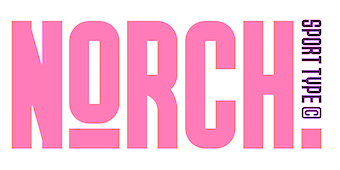 [MyFonts]
[More] ⦿
|
Robert Beck
[Dialekt Design (was: Robert Beck Design)]

|
[MyFonts]
[More] ⦿
|
Robert Grabhorn Collection
|
A collection of over 10,000 volumes focusing on traditional letterpress printing. It has many type specimen books and permits photocopying. It is part of the San Francisco Public Library. [Google]
[More] ⦿
|
Robin Nicholas

|
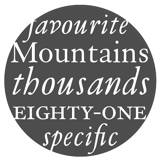 Born in Westerham, KE (1947). He joined the Monotype drawing office in 1965 and moved to the type design department in 1968, where he became manager in 1982. In 2009, he is head of typography at Monotype. Klingspor link. Robin Nicholas's typefaces:
 - With Patricia Saunders and a team of ten, he co-designed the Arial family at Monotype, an outgrowth of a program for low resolution sans typefaces started in 1982. I do not have to add anything here---Arial was made to mimic Helvetica and to adopt the same metrics. No other motivation. No higher artistic ideals. No admission from Nicholas, and no apologies. Arial is a stained 1982 stamp on the rest of Robin Nicholas' life.
- Still at Monotype, he made Nimrod (1980), which was first used by the Leicester Mercury in its year of introduction. Nimrod became a popular newspaper type.
- He created Plantin Headline Condensed (1995).
- He had a hand in the development and revival of Bell, Centaur, Clarion (a newspaper text face), Janson, Van Dijck and Walbaum, all between 1982 and 1989, all at Monotype. A blurb: Nicholas has directed the design of fonts such as the Clarion and Columbus fonts, as well as the digital versions of many Monotype typefaces including the Bell, Centaur, Dante, Monotype Janson, Fournier, Van Dijck, Monotype Walbaum, Bulmer and Pastonchi designs.
- He had a hand in Columbus (1992, Monotype). Ascender writes: Columbus has a fresh and lively hand-drawn feel but works well with today's computer systems and printers. An excellent text face, Columbus can also be used for display in advertising, posters, flyers and headlines, where the true elegance and beauty of the letters can be seen. Columbus was designed by Patricia Saunders and directed by Robin Nicholas in 1992 to celebrate the quincentenary of the voyage from Spanish shores by Christopher Columbus. The regular weight is based on types used in Spain by Jorge Coci circa 1513, and the italic is derived from a font cut by Robert Granjon circa 1543 and used by Bartolome de Najera in 1548 to print a famous manual by the writing master Juan de Yciar.
- He has done custom font projects for British Airways, Scandinavian Airlines, Barclays Bank, Opel automobiles (see Opel Sans; more here on this derivative of Futura; posted here), and Ikea (Ikea Sans is based on Futura and Ikea Serif on New Century Schoolbook).
- In 2003, he published the Felbridge family and Fairbank MT (a chancery hand) at Agfa-Monotype.
- Cambria, Jelle Bosma's 2006 typeface for Ascender and Microsoft, was a joint effort with Steve Matteson and Robin Nicholas.
- In a project started in 2002 at Monotype, and finished in 2005, he created Bembo Book. Monotype's page explains: Originally drawn by Monotype in 1929, Bembo was inspired by the types cut by Francesco Griffo and used by Aldus Manutius in 1495 to print Cardinal Bembo's tract de Aetna. A beautiful design with tall ascending lowercase and elegant letterforms, Bembo has been a favourite for book setting for over 70 years. No italic was used in the Aldine de Aetna work so another source was needed. This was found in a publication by the writing master, Giovantonio Tagliente, produced in Venice circa 1524. Considered by many to be one of Stanley Morisons finest achievements during his tenure as Typographical Advisor to the Monotype Corporation, Bembo has consistently been a best selling typeface, both in its original hot metal form and in todays digital formats. Not intended to be a facsimile of Manutius work, Bembo was drawn to embody the elegance and fine design features of the original but marry them with the consistency of contemporary production methods and to ensure that the typeface would work satisfactorily with high speed printing techniques. The first phototypesetting and digital versions were based on hot metal 9 point drawings. This gave good legibility in small sizes, due to a comparatively large x height, but lacked some of the elegance present in larger hot metal sizes. This new digital version of Bembo, called Bembo Book, has been designed to be more suited to text setting in the size range from 10 point to 18 point. Based on the hot metal 10/18 point drawings, which were used to cut all sizes from 10 point to 24 point, this new typeface has been carefully drawn to produce similar results to those achieved from the hot metal version when letterpress printed. The project started in 2002 when a high quality UK Printing House asked for a digital version of Bembo which would give a similar appearance on the page to the 13 point hot metal they were currently using. Hot metal drawings were digitised and extensive editing was carried out on the resultant outlines to ensure that design features and overall colour from the digital output remained close to that of the letterpress product. The resultant typeface is slightly narrower than existing digital versions of Bembo, it is a little more economical in use and gives excellent colour to continuous pages of text. Ascending lowercase letters are noticeably taller than capitals, giving an elegant, refined look to the text.
- In 2009, he co-designed Ysobel (Monotype; winner of an award at TDC2 2010) with type designers Alice Savoie, also working at Monotype Imaging's UK subsidiary, and Delve Withrington based in the U.S. The sales pitch: According to Nicholas, the idea for the Ysobel typefaces started when he was asked to create a custom, updated version of the classic Century Schoolbook typeface, which was designed to be an extremely readable typeface - one that made its appearance in school textbooks beginning in the early 1900s.. The web version by Linotype in 2013 is called Ysobel eText Pro. It has larger x-height and wider spacing.
View the typefaces made by Robin Nicholas. [Google]
[MyFonts]
[More] ⦿
|
Rod McDonald

|
 Born outside Pince Albert, Saskatchewan, Rod McDonald is perhaps the greatest Canadian type designer ever. First based in Toronto and later in Lake Echo, Nova Scotia, he designed the great Cartier Book family in 2000 based on the work of Carl Dair, who had started Cartier in the sixties, but died in 1968 with his Cartier unfinished. He won an award at the TDC2 2003 competition for his text family Laurentian---a typeface commissioned by Macleans magazine as part of a design project to refresh the 96-year-old publication. McDonald began as a lettering artist in the 1960s, and was a freelance type designer for most of his life, contributing custom creations to Mclean's Magazine, General Motors and Toronto Life magazine. He runs Smashing Type, and Rod McDonald Typographic Design, and he used to run Stylus Lettering&Typography Inc, 131 Bogert St, North York, ON. He was professor of typography at the Ontario College of Art, Toronto, ON, and also taught at NSCAD University in Halifax.
 The Stylus fonts included Bodoni Open Condensed (Rod McDonald, 1993), Fanfare Recu (Louis Oppenheim, 1927, revival by Rod McDonald, 1993; reworked in 2012 by Canada Type as Louis; see also here), Goudy Globe Gothic (revival by Rod McDonald, 1993), Loyalist Condensed (Rod McDonald, 1993), Regency Gothic (Rod McDonald, 1992: in the movie credit genre). He designed ITC Handel Gothic at ITC. In 2004, he designed Smart Sans, a bold, compressed, sans serif design in three weights, suited for setting headlines and display copy) as a tribute to the late Sam Smart, a Canadian type designer (d. 1998) who helped establish the first Type Directors Club in Toronto. In 2007, he became a Design Fellow for Monotype Imaging where he creates new and revived typefaces. In 2006, he created Slate (an 18-style sans family) and in 2008, Egyptian Slate. Both typefaces were released by Monotype. Slate became quite popular and was used in the Blackberry. In 2011, Slate was reissued and given a second life, but now as Gibson, with the help of Patrick Griffin and Kevin King at Canada Type. The Gibson typeface family sells for less than one style of Monotype's Slate. For other digital brothers of Egyptian Slate, we refer to Rockwell, Stafford Serial (Softmaker), Rambault (Softmaker), Roctus (URW), Slate (Bitstream) and Geometric Slabserif 712 (Bitstream). Rod McDonald created the 14-style Classic Grotesque (2011, Linotype) which is based on the older German grotesks, Ideal Grotesk and Venus (1907), and is related to the Monotype Grotesques, ca. 1926 that gave rise to Arial. In 2016, Monotype published the vastly expanded 54-style Classic Grotesque. Metronews Canada tells the story of Classic Grotesque. At a TDC meeting in New York, Patrick Griffin said: One thing he's not saying, because this guy doesn't like to toot his own horn: it's the biggest thing to ever be released by a Canadian. It's the largest and the longest, just in terms of how much time it took. It's the biggest thing to ever come out of Canada in terms of type design. In 2013, Rod McDonald launched Goluska, named to honor the late Canadian typographer Glenn Goluska, whose letterpress collection was acquired by Gaspereau Press in 2012. Glenn Goluska admired Dwiggins's work, and so Goluska was influenced to some extent by Dwiggins's Caledonia. The Goluska typeface was finished in 2021 with production assistance of Patrick Griffin at Canada Type. In 2021, he published Louis at Canada Type. Louis is a faithful digital rendition and expansion of a design called Fanfare, originally drawn by Louis Oppenheim in 1927. It was also expanded into three variations, including a soft-cornered style, and a rough woodcut one. Author of A Glossary of Typographic Terms (2013). Keynote speaker at ATypI 2017 Montreal. Youtube video of that talk entitled "Type Night In Canada". FontShop link. Linotype link. Agfa-Monotype link. Klingspor link. View Rod McDonald's typefaces. [Google]
[MyFonts]
[More] ⦿
|
Ross Frazier
|
Bloomington, IN-based designer of Deco Alphabet (2012). Behance link. He also found and letterpress-printed a Bodoni-style typeface found in the Hamilton Wood Type Museum. [Google]
[More] ⦿
|
Ross MacDonald
|
Canadian illustrator. Letterpress is one of his specialties. [Google]
[More] ⦿
|
Rúben Dias
[Ruben R Dias (was: Item Zero)]

|
 [MyFonts]
[More] ⦿
|
Ruben R Dias (was: Item Zero)
[Rúben Dias]

|
 Portuguese designer Rúben Dias graduated in design from IADE. He ran Item Zero and built his own letterpress studio, where he prints and experiments with both metal and wood type. Since 2012 he has been working on a doctoral degree on Portuguese Royal Printing Office typefaces at the Technical University of Lisbon's School of Architecture (FA-UTL). He teaches typography at ESAD.CR (Escola Superior de Arte e Design) and ESTAL and holds workshops on type and typography all across Portugal. In 2013, Aprígio Morgado, Ricardo Santos and Rúben Dias cofounded the type foundry Tipos da Letras.
 Designer of the promising font Oban (2002), which resulted in the production of a formidable sans family, Oban (2006), in which all straight lines have been replaced by curvatures one could find on TV screens from the 1960s. An elegant display family! It got raving reviews and was compared in style with Mayo (Peter Bruhn), Gregarious (Mike Kohnke), Crank8 Plus/Minus (Henk Elenga), Ectoplasm (T-26) and Armchair Modern (PsyOps). Type designs include Medro (2008), Quarto (2006), Arco (2009), Euro 2012 (2010, a rounded sans). In 2012, he published the elliptical sans family Taca at Fountain Type and republished it in 2015 at his own type foundry. He calls it a squircle---neither square nor circle, and explains: We usually associate the rounded, convex box with the television screens of the 1960s and Aldo Novarese's classic typeface, Eurostile. But whereas Eurostile is cold and machined, Taca is warm and rugged, as if it was molded from clay or carved from stone. It adds a bit of anthroposophic warmth and mystery. Fountain Type link. Home page. [Google]
[MyFonts]
[More] ⦿
|
Russell Maret
|
Russell Maret is a type designer and letterpress printer working in New York City. He is a fellow of the American Academy in Rome and the current North American Chair of the Fine Press Book Association. He has written and lectured widely on the intersection of letter design, technology, and the private press book. In 2012, he used Kickstarter to fund a metal type project for Cancellaresca Milanese and its companion roman, Gremolata. He writes: Cancellaresca Milanese is based on a type that first appeared in Milan in 1541 in the books of Giovanni Antonio Castiglione. The type distinguishes itself in its combination of calligraphic energy with a minimal slope in its lower case and its comparatively small, upright capitals. Generally viewed as a descendent of the typefaces of Ludovico degli Arrighi, Castiglione's type has a darker, rougher quality than Ludovico's---its grace is a forceful one. In the design of Cancellaresca Milanese I have attempted to retain the liveliness of Castiglione's original type by resisting the temptation to "correct" the slightly modulating alignment or homogenize the finial strokes on the ascending and descending characters. The type is outfitted with both corsiva (as in the original) and formata descenders as well as a significant number of compound ligatured characters. He already did digital versions: I first developed the digital predecessor of the type for my book Aethelwold Etc in 2009 and I have used it in a few publications, taking each opportunity to redraw and refine the characters. I designed Gremolata in 2011 as a companion roman for Cancellaresca Milanese to be used in my book Specimens of Diverse Characters. For Gremolata, I designed a slightly larger set of capitals based on those in the Cancellaresca, and paired them with a lower case that is inspired, but not based on, Alpine typefaces of the mid-sixteenth century. [Google]
[More] ⦿
|
Ryan Martinson
[Yellow Design Studio]

|
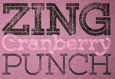 [MyFonts]
[More] ⦿
|
Ryan Molloy
|
 Ryan Molloy is an educator and inter-disciplinary designer having practiced in fields of architecture and graphic design. He is currently a professor of graphic design at Eastern Michigan University in Ypsilanti, Michigan. Graduate of TypeWest, class of 2021. His type designs are experimental and push boundaries. His graduation typeface, Banch (2021), is an extension of [his] interest in exploring how digital fabrication methods, such as cnc-milling, can create novel forms of letterpress wood type. [Google]
[More] ⦿
|
Ryan Prasetya
[Thirteen Studio (or: Lost Volt Type foundry)]
|
 [More] ⦿
|
Ryan Pyae
|
 Graphic designer in Rangoon (Yangon), Burma. In 2014 he created the free hipster typeface Frinco. As in really free, both for personal and commercial work. In 2015, he designed Bernier (a free letterpress emulation font in Regular, Shade and Distressed styles), and Maxwell (free). [Google]
[More] ⦿
|
Ryoichi Tsunekawa
[Flat-It]

|
 [MyFonts]
[More] ⦿
|
Sans and Sons (was: Agga Swistblnk)
[Angga Suwista]

|
 Malang, Indonesia-based designer who also uses the name Agga. Creator of the free fonts Lucker (2013), Blnker (2013, a spurred Victorian typeface), BLNK Taper Lucker (2013) and Sivernake (2013, a spurred typeface).
 Typefaces from 2014, some of which are commercial: Wilder, Rocking Rochoes, Rocking Bones, Brch Handdrawn, Reidfork, Hoverage (letterpress emulation, spurred), Hobric (letterpress emulation), Blnc (vintage, hand-lettered), Garado Blnco (spurred), Bracker (spurred Victorian typeface), Averake (sic) Glam (spurred, Victorian). Typefaces from 2015: Ruffle, Ruffle Beauty, Moabhoers, Neaments (watercolor script: a renamed version of Sortdecai Handmade Script?), Banthers, Bleakerst (free), Monthoers (a free letterpress emulation font), Monthoers Signature, Sortdecai (a fantastic watercolor brush script in sub-styles called Handmade, Handmade Script, Vintage, Script, Display, Cursive Script, Cursive Wild Script, and Brush Script). Typefaces from 2016: the script typeface Missmallove (designed by Lativa), Yellow Dawns (chalky), Coellack, Moalang (tweetware), Duwhoers (tweetware brush script). Typefaces from 2017: Achillers Bant, Bouchers Script 2.0, Smbrn Stencil, Bouchers (vintage layered typeface), Moalang Pro, Salted Monthoers, Bouchers Layered, Garagethers. Typefaces from 2018: Moalang-Melintang, Moalang X, Carters Layered. Typefaces from 2019: Chalmers, Bouchers X1, Scarlett Display, Miss Waited, Buenos Script (brushed). Carphe (Sans, Script), Gourmet Le French (+Script) and Hello Paris (Serif and Script). Typefaces from 2020: Olivia James (a wild script), Bulgari (a fashion mag serif), Peach (a display serif), Hello Paris Sans (an all caps fashion mag course), La Mango (a 6-style fashion font with refined serifs), Hello Branch (a decorative serif defined by its ligatures), Salty Feathers (a great inky signature script), Margot (a fashionable display serif). Typefaces from 2021: Silver Future (a wild script), Fragile Serif (a display serif), Manne (fashion mag caps), Grande (in the Windsor style), Bethany (an inky rabbit ear script), Groovy Fruity (a creamy display serif), Blanch Sage, Frunchy Sage (a decorative serif with bent ascenders and descenders). Typefaces from 2022: Charis (a modernized display serif). Hellofont link. [Google]
[MyFonts]
[More] ⦿
|
Sara Goodnight
|
 Kalamazoo, MI-based designer, who, during her studies at Western Michigan University, created the modular wood block typeface Switch (2016). Her system breaks down letterpress forms into their components, and reattaches pieces using various color codes. Behance link. [Google]
[More] ⦿
|
Scott Williams
[A2 Graphics--SW--HK]
|
[More] ⦿
|
Scriptorium (Ragnarok Press, Fontcraft)
[David Fleming Nalle]

|
 Dave Nalle was born in Beirut in 1959, but lives and works in Texas. He is currently in Manor, TX. From his wiki page: Dave Nalle is a political writer, game author and font designer who was active in the early history of the development of the internet. He is Chairman of the Republican Liberty Caucus, a group that promotes libertarianism within the Republican Party and is Senior Politics Editor at Blogcritics online magazine and is the CEO of Scriptorium Fonts. A creative and prolific designer, he has made hundreds of beautiful (often historic) fonts. His outfit, Scriptorium (based near Austin, TX, est. 1989), also does custom font and logo design. At some points, Scriptorium was also known as Ragnarok Press and Fontcraft. It specializes in artsy and ancient typefaces. Some subset of the fonts is made by Michael Scarpitti. Free font demos.
 Images of his best selling fonts. Special subpages: - Three free fonts: Onuava (a mini-serifed hybrid fixed-width font), Divona (sans), Sirona (based on Lombardic calligraphy).
- Lombardic: Aneirin, Benevento (8th century Lombardic), Cymbeline, Fabliaux, Formidable, Locksley.
- Decorative initials such as the 20th century sign lettering initials set Pencraft Initials (2009), New Saxon Initials (2016, based on work by F.G. Delamotte), Delamotte Initials One (2016), Delamotte Initials Two (2016), Holly Initials (2010, based on Real PenWork (1880s, Knowles and Maxim), Vyones (2010), Vergennes (2001), Cascade (2009), Bergling (2010; based on initials by John M. Bergling).
- Steampunk typefaces: Clockwork, Gearhead, Gears, Verne, Draughtwork, Belgravia, Boetia, Blackthorn, Linthicum, Good-fellow, Necromantic, Mephisto.
- Wild West fonts: Academy, Alcalde, Atkinson Boomtown (2009, after the lettering of Frank Atkinson), Atkinson Eccentric (2009), BigIron, Cibola, Del Norte, Lachesis, Perdido, Plowright, Primer, Riudoso, Niederwald, San Lorenzo (2011, with a Mexican and Tuscan look), Stonehouse, Manquo, Rochambeau, Purcell, Vaquero.
- Arabic simulation fonts: Samaritan is based on the poster lettering of Alphons Mucha from his poster for the play La Samaritan. Serendib and Waziri are based on the hand lettering of René Bull from his edition of the Arabian Nights. Caliph (1993) is derived from Ernst Schneidler's classic Legende font, with variant characters based on his original lettering. Also: Satampra, Jerash, Samarkand, Isfahan.
- Celtic fonts: the fonts include Constance, Durrow (1993, traditional rendering of Insular Minuscule calligraphy), Malvern, Glendower (based on the most common lettering in the Book of Kells), Knotwork (caps based on Celtic knots), Alba Text (modernized text font based on Celtic uncial lettering), Lindisfarne (based on a square uncial style), Stonecross (1997, derived from Celtic cross and gravestone inscriptions), Celtic Spirals (dingbats), Celtic Borders font (lets you combine key strokes to form decorative borders; many frames and borders are original Celtic designs by Arts&Crafts period artists like Evelyn Paul and Louis Rhead), Spiral Initials, Brigida (based on Rudolph Koch's interpretation of a squared uncial), Macteris Uncial, Coverack (heavy non-traditional uncial), Dahaut (modernized uncial), Dunsany, Glendower, Morgow (1999, spiral uncial), Teyrnon (elaborate spurred uncial), Padstow (heavy uncial), Vafthrudnir (2011, uncial), Sualtim and Columba (decorative initials based on characters found in the Book of Kells), Albemarle (2001).
- Oriental simulation fonts: Yoshitoshi (2003, based on the 1900-style writing by Yoshi Toshi.
- Gothic fonts, including Alt Gothic, Koch Gothic, Barnabas (2011), Sternhagen (2014), Montgisard (2010, roman capitals with blackletter lower case), Serenissima, Gelderland, Alcuin, Monumental, Goldwork, Waldeck, Roncesvalles, Montressor (2010, ornamental blackletter capitals), T4C Beaulieux (1998, a free copy here), Bastarda (2011), Burgundian, Cadeaulx, Collins Old English, Courtrai, Descant, Ereshkigal, Faustus, Franconian (1993, a Schwabacher), Froissart (2000), Ghost Gothic, Katisha, Koch Gothic, Ligeia, Magdeburg, Magdelena, Melusine, Pyle Gothic, Rheingold, Sanctum, Stuttgart Gothic (2010), Textura, Theodoric, Yngling (2002).
- German expressionist: Dromon.
- Renaissance fonts: Monumental Gothic, Caswallon (a Caslon family), humanist cursive (Palmieri, Castiglione and Hanes Italic), quirky Italian cursives (Fiorenza and Alleghieri), a Roman style hand-lettered font (Rudolfo and Rudolfo Swash), a Trajan-style Roman lettering (Hadrianus), a classic flourished cursive (Trinculo) and a set of floral intials from the Quattrocento (Fraticelli).
- Modern poster fonts: Ascelon, Bilitis, Cosmic Dude, Dromon, Ducatus Rough, Eglantine (after Central Type Foundry's Quaint Roman), Ekberg (2002, based on Samuel Welo's posters), Fortinbras, Hamilton, Jambon, Oblivion, Posada (2008, based on the poster lettering of Mexican artist José Guadalupe Posada), Squiffy, Suspicion, Magnin (2003).
- Mapmaker fonts: building elements are available in Basilica; Ortelius is a map dingbat font; Queensland (based on lettering by artist and calligrapher Eric Sloane), is bold, hand-drawn and reminiscent of medieval writing on maps. There are also Brandywine, Daresiel, Hesperides, Longhorne, Windlass (1996), and Cityscape. Orford (2008) is based on samples of hand lettering from a 1693 manuscript collected by Lewis Day in his classic book on historical paleography, Alphabets Old and New.
- Calligraphic fonts: Albemarle (2001), Azariel, Moncrief (2011, based on the calligraphy of J.M. Bergling), Pavane, Rasael (2009), Abdiel (2005), Roncesvalles, Gazardiel (2003, connected script), Spoonbill (2003, arts and crafts), Macteris (Roman uncial font), Antioch Uncial (Roman uncial font), Burgundian (Classic black letter font), Franconian (993, a classic black letter font), Castiglione (Attractive Renaissance lettering), Cicero (Roman Rustica font), Formidable (1993, very bold late medieval / Lombardic style), Collins Old English (Classic Old English style gothic), Corbei Uncial (Roman uncial font), Cymbeline (late medieval lettering), Durrow (Standard insular minuscule uncial font), Theodoric (Classic black letter font), Gazardiel, Ghost Gothic (Unusual gothic font), Glendower (Uncial font based on Book of Kells), Gloriana (Interesting hand lettering style), Folkard (from the hand-lettering of Charles Folkard), Offenbach Chancery, Ranegund Merovingian Courthand, Benevento (8th century Lombardic), Hesperides.
- Art deco typefaces: Imperatore (2018: based on a hand lettered design from California art deco master designer Pedro de Lemos in the 1920s), Speakeasy (2018), Gates of the West (2018), Lyceum (2014), Borealis (2009), Criterion (2011), Illuminata, Madding (2009, a bold poster font that grew out of Aventine), Alexandrine (2009), art Deco Stencil (2009, based on samples of Art Deco stencil lettering by Pedro Lemos), Falmouth.
- Art nouveau typefaces: Acadian, Agravain (2009), Amphitryon (2009), Ariosto, Asphodel, Averoigne, Beaumains (2011, based on J.M. Bergling's lettering), Beauvoir, Belgravia (based on J.M. Bergling), Bernhardt (based upon the lettering of the Czech art-nouveau artist Alphonse Mucha), Bentham, Berenicia, Boetia (2003, based on J.M. Bergling's lettering), Bruges, Bucephalus (1993), Burd Ellen (2009), Butterfield (1993; in Alfred Roller's style), Cafe Society (2018), Curetana, Damariscotta, Elsene (2011, based on lettering by early 20th century illustrator Clara Elsene Peck), Elysian, Exotique, Flaubert, Gaheris, Ganelon, Gehenna, Goodfellow, Grammophon (2019: a bold Jugendstil poster font), Harbinger, Huyot (2016, after Georges Auriol's types), Jugendstil Kunsthand (2003), Lysander, Maginot (1993; after Peter Schnorr, 1898), Munich (after the Munchner Jugend magazine), Norumbega, Odeon, Ormandine (2010), Pantagruel, Phaeton, Reggio, Rochmbeau, Rockne (2009), Rudolfo, Setebos, Sprite, Summerisle, Sylphide (2005), Undine, Valentin (2008), Vambrace (2010), Walhal, Wendingen (2016), Wormwood (2018), Zeitschrift (2016, based on the Ver Sacrum magazine).
- Modern poster fonts: Field Day (2003), Ascelon, Bilitis, Cosmic Dude, Dromon, Ducatus Rough, Eglantine (after Central Type Foundry's Quaint Roman), Ekberg (2002, based on Samuel Welo's posters), Fortinbras, Hamilton, Jambon, Oblivion, Squiffy.
- Constructivist fonts: Krasny Mir (2009), Vrubel, Structura (1997).
- Futuristic fonts: Alecto, Angelus, Circuit, Culdrose, Gearhead, Ironclaw, Parika, Sanhedrin, Semiramis (1997), Slither, Structuro, Yazata, Adastra (dings).
- Borders and ornaments. These include New Arets and Crafts Borders (20912, based on The Calendar of Golden Thoughts (Barse and Hopkins Publ, 1911).
- Boneyard fonts: Undertaker (2014), Antrobus (2010), Sepultura (2002), Halloweenies, Dementia, Boneyard, Skull and Bones, Malagua (1999-2013), Paleos (2002, from titling of B movies in the cave girl genre), Carmilla, Abaddon, Black Cow (1998), Valdemar, Cuede, Ligeia, Mayhem, Mephisto, Golgotha, Sanguinary, Ironworks, Moravia, Gehenna, Nosegrind (2005, graffiti), Corpus, Ghostly.
- School fonts: Schoolhand (2010).
- Arts and Crafts movement (late Victorian period, 19th century), based on work and lettering by Walter Crane, William Morris, Charles Rennie Mackintosh and Elbert Hubbard. The Arts&Crafts movement was enormously influential on the works of designers, artists and architects of the 20th century, and inspired the Art Nouveau and Art Deco movements. Fonts include William Morris' Kelmscott (based on Morris' Troy type), and True Golden, fonts from the Glasgow branch of the movement like Chelsea Studio (1997), which is based on Charles Rennie Mackintosh's lettering, fonts from the Roycrofters of New York like Semiramis and Ganelon, fonts based on Walter Crane's work such as Crane Gothic, Pencraft Initials (2009) and Walter Crane, and even fonts from the California Arts&Crafts period of the early 1900s like Coloma. Other typefaces: Jesse M. King (refreshed in 2015, and based on hand lettering from a frontispiece design by Glasgow-based Jessie King who was known for her lavish book covers), Aylward, Palmyra (based on work by the Roycrofters, a design community founded by Elbert Hubbard), Aylward (2010, Victorian), Hyacinth Initials, Spoonbill, Adresack (1996: inspired by the arts and crafts lettering styles of designers like Charles Rennie MacKintosh and Jessie M. King), Brandywine, Changeling (2009, based on lettering by fairy artist Fanny Railton), Goddard, and Advertising Gothic (2003), Valentin, Gaheris, Agravain (2009). Delaguerra (2001-2009) is based on a lettering style originating in the California Arts&Crafts period commonly associated with Mission Style. It is still in common usage in signage at historical sites in California.
- Victorian: Beaumarchais, Berenicia, Bilibin, Brandywine, Brigidis, Curetana, Durendal, Elphinstone, Flaubert, Folkard, Gjallarhorn, Gloriana, Hermia, Ironclaw, Magnus.
- Typewriter: Fontcraft Courier.
- Anthroposophic: Ekberg (2002, based on a sample of poster lettering by Samuel Welo).
- Medieval fonts of Scriptorium, critiqued by Marc Smith, page 65: Batwynge is based on lettre gffe by Geofroy Tory (1529), and not on an illuminated manuscript of the tenth century as claimed by Scriptorium. Perigord (1993) is based on a Carolingian alphabet drawn by Ernst Bentele in 1952. Allencon is a calligraphic font based on an interpretation of 6th century Ostrogothic Italian calligraphy.
Some selected fonts: Finchley (psychedelic), Captain Kidd (2012, an original font design based on the title lettering from the classic pirate movie starring Charles Laughton), Aerobrush (2011), Fondry Ornament (2009), Atkinson Egyptian (2008, after the lettering of Frank Atkinson), Verne (2008: remade in 2020 into Covid19), Goldwork (almost blackletter), BigBlok (2010), LetterpressGothic (2010), Plymouth (2010, in the style of Cooper Bold), Broadley (2008, an architecturally inspired script based on lettering by British architect and designer C.F.A. Voysey), Locksley (2004, medieval lettering), Tuscarora (curly lettering), Fiorenza (Renaissance calligraphy), Hesperides (old colonial calligraphic script), Angelus (beautifully printed monospaced script), Esperanza (1996, connected medieval handwriting), Ithuriel (2002), Alleghieri (2002), Hamilton (2002), Spiral Initials, Zothique (great font, based on hand lettering from a map of Clark Ashton Smith's fantasy world of Zothique), Reynard (semi-Celtic), Daresiel (elegant script), Caliph (1992, Arabic simulation), Bassackwards, Rosalinde (1999, handwriting), Arakne (2000, connected handwriting), Falconis (by Michael Scarpitti), Asrafel (semi-Celtic), Swithin (2004), Tyrfing (Art Nouveau/Fraktur, 1999), Waldeck (2008, blackletter), Woburn Initials, Stampwork, Draughtwork, Roughwork (a codex font derived from Nalle's own True Golden which is based on a=n earlier typeface by arts and crafts master William Morris), Melusine (gothic calligraphy), Corbei (uncial), Niederwald (hand lettering), Gjallarhorn (great uncial), Gaiseric (early medieval uncial), Taranis (1987, an uncial first drawn as a font for the cover of the old Ysgarth roleplaying system), De Bellis (roman era, by Michael Scarpitti), Engravers Gothic, Monimental Initials, Sanhedrin (Enemy of the State font), Vespasiano (roman capitals, by Michael Scarpitti), Bilitis, Hendrix (2002), Collins OE (old English), Samedi, Praitor, Evadare (1993, based on a character set which was hand calligraphed by Rudolf Koch), Koch Fantasie (1993), Black Cow (1998). Zothique, Ruritania, Mariner (2004, based on hand lettering originally done by Willy Pogany), Trinculo (a swinging cursive font), Texas Star (2002), Octavian (antique demi-serif font), Ruffian (antique type font), Ascelon (thin sans serif font), Munich (title lettering from Munchner Jugend magazine), Necromantic (bizarre bold titling font), Titania (romantic decorative lettering font), Oberon (bold romantic font), Knotwork, Guede (1993), Pullman, Purcell (Victorian circus poster style font), Allegheny, Carmilla, Malagua (1999-2013), Ardenwood, Platthand, Buccaneer, Cochin Archaic (2010), Boswell (1994), Guilford (based on lettering by artist and calligrapher Eric Sloane), Death Ray (2012, constructivist), Alecto (futuristic), Candlemas (2003), Bridgeport (2003, based on lettering by artist and calligrapher Eric Sloane), Medieval Tiles (2003), Linthicum (2003), Draughtwork (2003), Yngling (Fraktur, 2003), Rheingold (elaborate Fraktur: Music Hall Text elsewhere; see also Teuton Text, Cincinnati Type Foundry, 1877), Kidd (2003), Belgravia (2004), Peck Shields (2004), Scrawlies (2000, handcrafted), Albrecht Durer Gothic (2004), Orpheus (2004), InduXtrial (2004, a grunge face), Yoshitoshi (2003), Veronique (2004), Veneto (2006), Vidilex (1993, monospaced), Abelarde (2006), John Speed (1993: a mapmaker font), Furbelow (2006), Estoril (2006), Tangle, Aventine (sans), Texas Star (2002), Groningen (Bauhaus design), Nevins Hand, Scrapple (2011, Victorian, ornamental), Leodegar (2011, based on samples of 7th century Frankish hand lettering), Candlemass (2012). Fonts from 2013: Doge (a Venetian font based on a J.M. Bergling revival), Original Django (after the titling font in Quentin Tarantino's movie Django Unchained). Fonts from 2014: Highball, Carillon (based on a typeface by Samuel Welo), Edifice (based on lettering by J.M. Bergling). Fonts from 2015: Gods of Mars (an inline sci-fi typeface), Rykov (based on a 1930s Ukrainian constructivist style; Latin and Cyrillic), Vie Moderne (French art deco), Dahlgren, Grand Concours (art deco), Tantalus, Power Tie (art deco), Marquis Greeking. Fonts from 2016: Ekberg Modern (based on lettering samples by Samuel Welo from poster designs of the 1920s), Knuckleduster, Tzaphkiel, Sarandiel, Primrose Initials, Elizabethan Script (chancery style), Zeitschrift (an art nouveau font based on the Ver Sacrum magazine), Wendingen (Dutch deco), Memento Mori (Tuscan), Rounders (art deco). Fonts from 2017: Buzzmill (wooden plank font), Pumpkin Patch Initials, Talinn, Reliquary, Nopalito, Scattershot (script). Typefaces from 2018: Marionettas (a Mexican horror movie poster font), Fascination, Architextura, Santa Sangre, Glyphos. Typefaces from 2019: Cafe Corso (art nouveau), Comic Classix. Fnts released in 2020: Epigramatic (based on lettering by Dard Hunter for the Roycroft Press in the early 1900s), Cryptos (graffiti). Klingspor link. Abstract Fonts link. Dafont link. View David Nalle's typefaces. Scriptorrium's library. [Google]
[MyFonts]
[More] ⦿
|
Sean Coady
[Vintage Type Co]

|
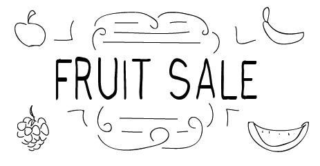 [MyFonts]
[More] ⦿
|
Sebastian Cabaj

|
 Sebastian Cabaj (or: Pan Cabaj) studied graphic design at the Academy of Fine Arts in Warsaw, where he now works as a graphic and type designer, and runs Kometa Studio. In 2012, he set up the Sebastian Cabaj Foundry via MyFonts.
 Creator of the octagonal modular Castania (2012), the squarish display typeface DLG Monospace (2012), the dadaist cut-out typeface Mad Cut (2012), the hand-printed poster typeface Morning Coffee (2012), the Polish antiqua typeface Modena (2012, +Modena Printed), and the blackletter typeface Luft (2012). Typefaces from 2013: USKOK, Bosman (a sketched or tattoo font family), Marina (a tattoo font), Grot, Olech (a layered poster or letterpress simulation face based on Martin Jacoby-Boy's Bravour, 1912), Garda (a layered system with a great inline), Pancake (a signage script), Zapora, Sailors Dream (layered font family). Typefaces from 2014: USKOK, Old Craftsman. Typefaces from 2018: Epsum (a squarish poster or logo typeface family). Behance link. Hellofont link. Creative Market link. [Google]
[MyFonts]
[More] ⦿
|
Sergiy Tkachenko
[4th February]

|
 [MyFonts]
[More] ⦿
|
Shaped Fonts (was: Phitra Design)
[Philip Trautmann]
|
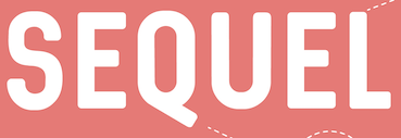 Philip Trautmann (Phitra Design, b. 1996) is the Düsseldorf, Germany-based founder of Phitra Design in 2016. He renamed the foundry Shaped Fonts and was joined by Christoph Dörre and Nora Bruckhoff.
 Creator of the free handcrafted fonts PhitraDesign Handwritten (2013), Cookies+Milk (2016), Inkina (2016), Georgina (2016, a rounded stencil typeface), PhitraDesign Ink (2016), Skybird (2016), Skybird Rough (2016, free), and the sans typefaces Aquino (2016) and Sequel (2016: free). In 2016, Trautmann designed the letterpress emulation typeface Prequel, the informal monoline typeface Kanada and the experimental typeface Artypa. Typefaces from 2017: Grape, Coffee & Tea, Fish & Chips. Typefaces from 2018: Shelta Hand (comic book font). Typefaces from 2019: Snow Hut. Typefaces from 2020: Argio (a rounded all caps sans; +Rough, +Shadow), Honey & Jam. Typefaces from 2021: Magic Owl, Prequel Shadow, Patron (a variable rounded sans font with almost architectural letters), IceBear (art deco caps), Sunshine (script), Fresh Tea (a tall hand-printed font), Lifestyle (a monolinear signature font), Equil (roman caps, plus a stencil set). Typefaces from 2022: Mind The Caps. Behance link for Phitra Design. [Google]
[More] ⦿
|
Shirley-Anne Murdoch
|
Edinburgh, Scotland-based creator of a typographic poster called The Boy Who Wanted To Play The Violin (2013). She explains: Commissioned by Craigmillar Communiversity in conjunction with newly established Small + Crummy Press to work with illustrator Andrew Crummy to develop a special edition book. The launch of this publication was planned to coincide with the opening of the 'Arts: The Catalyst (for social change)' exhibition at Edinburgh's City Art Centre. The book's first edition sold out on the night! [Google]
[More] ⦿
|
Simon Stratford
|
 London-based creator of the free shaded caps font Airbag (2013), which imitates the successful genre of Trend (Latinotype). Before Breakfast (2013) is a free hand-printed typeface. Packt (2013) started out from watercolor lettering. Distractor (2013) is a tweetware grungy slab serif reminiscent of letterpress---it is partially based on Bevan. In Limbo is a free vernacular typeface. Typefaces from 2014: Type Old Writer, Before Breakfast, Hitchcut (paper cutout inspired by Saul Bass's poster for Hitchcock's movie Vertigo), Separator (octagonal), Dirty Slab (letterpress emulation), Enfold (hand-drawn).
 Typefaces from 2015: Neon, Buckley, Buckley Serif, Bold Riley (a handcrafted serif), Balham to Brooklyn (fifties script), Petit Jardin, Gently Script, Troupe (an inline Tuscan typeface), Mr. Blue Sky (an inline typeface), Moorgate (fat brush font), Sunshine, Dogtown (grunge), Gods Own Junkyard (neon sign font, named after Chris Bracey's neon sign store in London), Teardrop (watercolor brush with dripping ink), Western Grit (spurred), In The Wood, Gallow Tree (free brush font), Thirsty Dog (scratchy brush), Dear Prudence. Typefaces from 2016: Get Lucky, Take Me To The River, Lawless (vintage display typeface), Not My Type (old typewriter font), Roadhouse Blues, Just Like Heaven, Resize, Atomic Dustbin, Mind The Gap (stencil family), Munky (a fun children's book typeface), Hunky Dory (a handcrafted children's book typeface), Little Wonder (brush script), Mister Rooster, Whippin Piccadilly (handcrafted), Bangers & Mash, Mr. Chumley. Typefaces from 2017: Hunky Dory, Circus Freak, Fake Empire, Gilly Script, Banoffee (a kooky handcrafted typeface), Tuck Shop (a chalk font), Fake Empire (grunge), Mu-Th-Ur (a free octagonal typeface inspired by the film Prometheus). Typefaces from 2018: Be More Human (for Reebok), Higgs Boson Blues (SVG font), Fierce (dry brush SVG font), Yeah Foil Balloon (color font), Wild Irish Rose (brush script). Typefaces from 2021: Beautiful Freak, Neon. Behance link. Another Behance link. Envato link. [Google]
[More] ⦿
|
Split
[Oli Bentley]

|
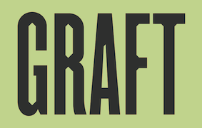 Leeds, U.K.-based designer of Graft (2019), a condensed typeface intended first as a display face for the giant People Powered Press (for letterpress printing). They explain: The letterforms take inspiration from the north's rich industrial heritage, using the shape of the cross section of a steel I-beam as their starting point. [Google]
[MyFonts]
[More] ⦿
|
Startype
[Brian Horsfall]
|
British Letterpress writes: Startype based in Birstall, West Yorkshire used Monotype machines to cast type and advertised that they were contractors to HM Government and Overseas Governments. The casting machines were modified to work at higher temperatures with a different mix of type metal meaning that they could produce type suitable for hot foil work on a composition caster. The firm closed in the late 1980s. Some machines and the expertise continue with Brian Horsfall who casts type under the name Supertype. In 2022, Brian Horsfall stopped his casting operation. His Monotype display mats were taken over by London-based Matt McKenzie. [Google]
[More] ⦿
|
Stawix
[Stawix Ruecha]

|
 In 2012, Stawix was established in Bangkok by Stawix Ruecha (b. 1986, Bangkok). At Stawix, Ruecha published these typefaces:
 - Seravee (2012). A didone family.
- Soin Sans (2012). A beautiful geometric sans family. Followed by Soin Sans Pro (2013) and Soin Sans Neue (2016), an almost perfectly crafted modern geometric typeface family.
- Letra Pro Headline (2012). A manicured and permed didone.
- Chercher (2014). A slab serif.
- Rleud (2014). A neutral sans family which has 160 fonts in four widths, 10 weights, small caps and italics---the works. There are four free demo fonts. This is a useful sans family that is more elliptical in its curvature. Ruecha says that he intended to create the industrial design mood of DIN while importing the humanism of Dax.
- Dalle (2014). A daring and gutsy display sans with very open counters and surprising straight elements in all letters of the word harkman.
- Crique Grotesk (2014). A neohumanist sans.
- Amsi Pro (2015). Inspired by Block Berthold, this rounded sans typeface has extremely short descenders, but works very well in the Narrow and Ultra styles. See also the 48-style Latin / Thai update, Amsi Pro AKS (2020). In 2021, this was followed by Amsi Grotesk (54 styles).
- Sans Beam (2016).
- Goudar HL (2017). A rounded semi-techno sans typeface.
- Brock Pro (2017). I fun 10-style sans family that celebrates Block Berthold and other 19th century wooden letterpress types. Its terminals are consistently vertical or horizontal for a clean uncluttered feel.
- Merlod (2017). Based on Latin American sign painting in substyles called Norme, Autre and Queue.
- Sarun Pro (2018).
- Infoma (2018). An almost organic grotesk family by Stawix Ruecha and Kawisara Vacharaprucks.
- Cobe (2020). An organic monolinear rounded elliptical sans family in 18 styles. Stawix Ruecha calls it an aerodynamic font.
- The 18-style geometric slab serif Chom (2021, at Wundertype).
- Eastlane (2021). An 18-style humanist sans. It includes a variable font.
You Work For Them link. [Google]
[MyFonts]
[More] ⦿
|
Stawix Ruecha
[Stawix]

|
 [MyFonts]
[More] ⦿
|
Stephen Miggas
[Aerotype]

|
 [MyFonts]
[More] ⦿
|
Stephen O. Saxe
|
Letterpress specialist. Author of a fine article in 1983 on wood type. Alastair M. Johnston and Stephen O. Saxe edited the book Nineteenth Century Designers and Engravers of Type (Oak Knoll), which republishes William E. Loy's entire series of articles about America's type designers that had appeared ca. 1896-1900 in The Inland Printer. [Review by James Puckett] [Google]
[More] ⦿
|
Stereotype (was: Zone Erogene, or Dasklem)
[Clément Nicolle]

|
 Stereotype is Clément Nicolle's web outfit. He designed these (free) fonts between 2004-2006: 3grammes5, BagpackDemo (grunge), Base02 and Base05 (grunge; this one dates from 2009 though), FrakturikaDemo, Fleur Aux Dents (happy dingbats, by Damien Raymond), Barrio 30 (degraded stencil face), Heroin07 (2008, grunge), Base 05 (stitching font), Madredeus, MarcelleScript, MarcelleSwashes, MigraineSans, MigraineSerif, Perestroika (Cyrillic font simulation), Petiote, Phonetica, Reclame, Sodium'76. Fleur aux Dents was designed by Damien Raymond. Today (2008) is a connected diner style script. Morgenstern (2008) is a wiry font.
 Dasklem (Zone Erogene) was a French foundry (est. 2002) in Nancy also founded by Clément Nicolle. At Dasklem, he created nice typefaces (with repetitions from the list already mentioned above) such as Frakturika (2004), Phonetica (2003, a semi-phonetic unicase face), C'dans l'air, Irreversible, Migraine Sans (2002), Migraine Serif (2002, unicase), Fleur aux Dents (dingbats by Damien Raymond), 3 Grammes 5 (2002), Arriere Garde (2002), Base 02 (2002), Perestroika (Russian simulation face), Petiote (2003, pixel face), Marcelle (2004, fifties style baseball script), Madredeus, ReclameDingbats, Bagpack (grunge), Barrio 30 (grunge), Morgenstern (electrical circuit font), Today (2008, signage script), Heroin 07 (2008, grunge), Base 05 (2009, grunge). The most recent typefaces: Bugeater (2013, textured typeface), Docktrin (2014, a spurred letterpress-style typeface), Huntress (2015, grungy letterpress style), Wasted (2015, a connected retro script), Bakery (2015, curly script), Bernadette (2016, signage script), Master of Break (2016, free signage script), Magnolia Sky (2016, a wonderfully irregular curly script), Marguerite (2016, signage script), Beyond The Mountains (2016), Mark My Words (2016), Thinking of Betty (2016, retro signage script), Bernadette (2016), Thinking Of Betty (2016, a retro signage script), Bernadette Rough (2017), Work In Progress (2017), Mustardo (2017, signage script), Gloss And Bloom (2017, dry brush), La Guapita (calligraphic), Rose of Baltimore (calligraphic), Broadcast Matter (2017, dry brush script), Mocking Bird (2017, signage script), Hotel de Paris (2017, beveled), Julietta (2017, script based on the lettering of Stéphane Lopes), Meat Buckets (2017, a nervous signage script), Strawberry Blossom (2018: script), Jasmine and Greentea (2018: script), Grand Adventure (2018: script), Silver Charm (2018: script), The Breakdown (2018: script), Rosetta Black (2018: brush style), Rosetta Color (2018: SVG color font), The Perfect Christmas (2018: a starry font), Strawberry Blossom (2019: watercolor brush), Madame (2019: signage script), Mollywood (2019), Badass Moon (2019), Rotten Mangos (2019: made from a fudenosuke brush pen; a renaming of Badass Moon?), Snowballs (2019: Magnolia Sky with snowflakes), Mondaine. Typefaces from 2020: Yellowstone (an inky script), Holly and Berries (a Christmas font), Halloweek (a dripping blood font). Typefaces from 2021: Bergamote (script), Leaves&Ground. Older (dead) URL. Dafont link. The foundry survives as Stereo Type (since about 2005). Another Dafont link. Yet another link. Klingspor link. Abstract Fonts link. Creative Market link. [Google]
[MyFonts]
[More] ⦿
|
Steve Cloutier
|
 Quebec-based designer (b. 1971) in 2010 of the outline face Elégante and of the grunge typefaces Apocalypse Regular, Arbre, Autodestruction, Papineau (hand-printed), de Lorimier, Gardien d'herbe, Elusion (organic), Cataclysme (grunge), Wolfred Nelson (rubber stamp caps), Chénier (grunge), Crack and Bold, Fleur de Lys (dingbats that are useful pour mon pays), Manuscrit, Ancien (grungy inline face), Confusion, Patriote 1837 Regular, Arbre (hand-printed) and Cloutier Script (hand-printed).
 Typefaces created in 2011: Sioux Caps (ornamental caps: a scanbat face), Flower Cap (floriated caps), Damned (a grungy horror movie typeface), Sketch Me (a sketched face). Typefaces from 2012: Dill Francis, I Hate Futur, Fabrics (stitch font), Stucco, Children, Hacking Trashed, Flower (floriated caps), Arbre, Patriotes 1837, Damned Deluxe, Trashed Light (grunge), Leather (ornamental caps), Punk Rock Show, Crack And Bold, Ana Eve (grunge), British Museum 1490 (ornamental caps), Nature Font (grungy caps), Chenier (grunge), Mosaique (a textured typeface), Motor Pieces (commercial), Mixtec Codice (Maya, Aztec or Inca dingbats), Parkinson (grungy outlines), Ludger Duvernay, Monster, Sponge, Napoleon (a nice fat poster face), Negative Film, Nelson Old Newspaper, Fuck Autority (sic), Rene Levesque (hand-printed), First Nation (an Indian scanbat face), Pustule, Emilie (hand-printed caps), Papineau (hand-printed), Sixties, Dali, Midnight (brush face), Fairy Tale (ornamental caps), Tiger Balloon (African-themed), Rafael (fat poster face), Sacred Place (heavy poster family), Pistache Regular (unicase Plakat font), Morning Stress, Hippie Gypsy (ornamental caps), FBI Old Report (old typewriter face), Mitsouskos, Ten O Clock (a multiline hand-printed face), Strawbwrry, Jewels, CF Night of the Damned, CF One Two Trees (tree-themed), Hagadou (bejeweled letters), CF Punk Forever (white on black grunge), CF Anabelle (curly script), CF Samurai Bob, CF Marie-Eve, CF Christmas Shit, CF Pinceau (fat brush face), CF Deco 1492, CF Cracked Stone, CF Metropolis Serif, CF Punky, CF Snowball (snow-capped glyphs), CF Tuques, CF Revolution, CF Fashion, CF Tissus, CF Christmas Letters, CF Diamond (diamond-studded letters), CF Stencil Orama, CF Dallas Stars (stars and stripes face), CF Old Photograph Credit Font, CF Christmas Letters. Typefaces from 2013: CF National Stitches, CF Spaceship, Historia (sans caps), CF WireFrame, CF NaVia, CF Sortilege, CF Spirality, CF Charlie, CF Fredo Style, CF Little Monsters (alphadings), CF Tissus, CF I Love Montreal (fat finger face), CF Jungle, CF Paris (art deco caps), CF Marie Eve Cartoons, CF Circuit Electrique, CF Jack Story, CF Punk Attitude, CF Billabong, CF I Want To Believe Comp (grunge), CF Zombie Party (crayon or lipstick font), CF Life Is Beautiful (paint font), CF Gothika (grungy blackletter), CF Manifesto (painted letters), CF Rise of Nations, CF The Lost Batallion, CF Armageddon, CF Electronic Board, CF Old Typography (letterpress font), CF Modern 165, CF Hockey Players (dingbats published on the day the Montreal Canadians were humiliated, 6-1, by the Ottawa Senators in the Stanley Cup playoffs), CF Nelson Old Caracters (sic), Peru Adventure, CF Montreal High School (athletic lettering), Urban Life (textured font), CF Same Old Story (grunge), CF Plants And Flowers, CF Cant Change The World (clean, hand-printed), CF Jeanne Mance, CF Jeans Collection (textured), CF Alien Abduction, CF Rebelle (brush font), CF Jungle Adventure, CF Never Trust A Hippy, CF Anarchy (ransom note font), CF Life Is A Dream (grunge), CF Farwest, CF Typocraft, CF Politicians Killers (blood drip face), CF Technomania, CF Technorama, CF I Love Ugly Fonts, CF Ribbon, CF Tree Of Life, CF Revenge, CF Back to School, CF Nut And Bolts, CF Final Conflict (brush script), CF Nostalgia (brush face), CF Industrial Fabrics (textured face), CF Font Shading, CF Rock Age, CF Nouvelle France (antiqued alphabet), CF My Bloody Valentine, CF Ceinture Flechee (multilined typeface), CF Disappointed, CF Atlantide, CF Bucherons (texture face), CF Simon Marchessault (hand-printed), CF Haunted House (brush face), Gray Texture, CF Space Cowboy (textured typeface), CF Louis Cyr. Typefaces from 2014: CF Goliath, CF Alone on Earth, Stencil of Rama, Bad News (textured face), CF Xerography, CF Milk, CF Springtime, CF Crayons, CF Dwarf, CF Asshole Politicians, CF Old Milwaukee (spurred typeface), CF Paris Old Style (grungy Peignotian typeface), Creature of Darkness (textured typeface), Quebec Stamp (grungy stencil), Schizophrenia (neurotic typeface), La Belle Helene, CF William Wallace, CF Dots 521, CF LCD 521, CF America, CF Left Behind, CF Jacques Cartier, CF My Best Friend, Flowers of Destiny. Typefaces from 2015: CF Rise of Nation (bold poster typeface), CF Punk (grungy capitals), Baron Rouge, General Tao (oriental simulation font), CF Mother Board (circuit font), CF John Doe (sketched), CF Crayons de Plomb, CF US Army (textured type), CF White Trash (Treefrog style), CF Punk Rock Show, CF Denim Jeans, CF School Handwriting, CF Nuclear War (very grungy caps face), CF Jack Story, CF Civilisation Maya (textured typeface), CF Punk Is Not Dead, CF Calligraphia, CF Life Is A Dream (grungy textured font), CF Blueprint, CF Far West Regular, CF Samuel de Champlain, CF Azteques (Mexican decorative font)., CF Fleurs de Lys (dingbats), CF Chevalier de Lorimier (connected script), CF Bonaparte, CF Expedition, CF Boston Regular (casual script), CF Jacques Parizeau (a grungy font named after a racist and pompous former political figure in Quebec), CF Trash Zone (grungy stencil), CF I Dont Want To Grow Up, CF Metro Parisien (art deco), CF Craig Robinson, CF Paradise City, CF Great Destiny, CF Robert Nelson, CF Grand Nord (a snow-capped design), CF Green Monster (slab serif). Typefaces from 2016: CF Showbizz, CF Halloween (dripping blood font), CF La Sorciere Noire (vampire script), CF Green Corn (white on black), CF Engraved, CF Ghost Stories, CF Legends of the Fall, CF Bad Cops, CF Cherokee (wood block printing emulation), CF School Zone (crayon font), CF Snowboard Project (grunge), CF Oak Island, CF Peterson. Typefaces from 2017: I Robot, Christmas Stitch, Nightmare (dripping blood font), Tangerine (inline typeface), CF Klondike (spurred Western font), CF Letterpress Type, CF Brothers in Arms, CF Etoffe du Pays (a dusty typeface), CF Second Son, CF The Rock (textured), CF Old School, CF Pretty Trees. Typefaces from 2018: CF Le Dernier Empereur (oriental emulation), CF Sacred Planet, CF Glitch City, CF Remington Typewriter, CF Cyborg, CF Punk vs Cyborg, CF The Ocean Song (monoline connected script), CF Wild West (Tuscan), CF Three Dimensions, CF Mexicana. Typefaces from 2019: CF Le Grand Cirque (a circus font), CF Saturn 21, CF World at War (an old typewriter font), CF Night of Terror (a dripping blood font), CF Blackboard (a chlak font), CF Punk Fashion, CF Punk Songwriter. Typefaces from 2020: CF Punk Posters (a ransom note font), CF University of Nowhere (a grungy varsity font), CF Letterpress Type Two, CF Band of Brothers. [Google]
[More] ⦿
|
Stevens Shanks & Sons Ltd
[R.H. Stevens]

|
Stevens, Shanks & Sons Ltd. was an English type foundry formed in 1933 by the merger of the Figgins Foundry with P. M. Shanks (Patent Type Foundry) to form Stevens, Shanks. Sometime after 1971 the foundry ceased operations and all materials (including Figgins's punches and matrices) went to St. Bride's Printing Library. British Letterpress writes: Stevens, Shanks & Sons Ltd was based in Southwark, London SE1. During the 1950s they used Monotype equipment, with a modified heating unit and harder alloy to make their type more hard-wearing. In 1971 they moved from 89 Southwark Street to 22 Coleman Fields where they continued to cast type until the mid-1980s. They revived some very old typefaces, and held some ancient founders matrices. They did not use Monotype Thompson Casters for this work, so must have modified the matrix holders on standard Monotype machines. David McMillan notes: Millington notes that in 1928 P. M. Shanks and Sons Limited [Patent Type Foundry] discussed the sale of their company to Stephenson, Blake. No sale occurred, after four years of discussion. Millington notes that at the end of that discussion P.M.Shanks and Sons Ltd. "amalgamated" with R. H. Stevens Limited [the Figgins foundry]. The new firm was "Stevens, Shanks and Company". Moseley, Howes & Roche (p. 30) identify the date of the merger of R. H. Stevens and P. M. Shanks as 1933. They give the name of the resulting company as "Stevens Shanks & Sons Ltd". They also note that R. H. Stevens (the person) was the grandson of Vincent Figgins I, thus identifying R. H. Stevens Ltd. with the Figgins foundry. Moseley et. al. note that the firm moved in 1971, so it must have been in operation at least until then. Finally, Moseley, Howes & Roche also note that the Stevens Shanks & Sons. Ltd. materials (including Figgins' punches and matrices) went to the St. Bride's Printing Library on the dissolution of the foundry (but give no date for that). According to Jaspert, W. Pincus, W. Turner Berry and A.F. Johnson's The Encyclopedia of Type Faces (Blandford Press Lts.: 1953, 1983), these types were made by Stevens Shanks: - Bessemer (1936, Dennis Morgan)
- Bristol (1925, Gans Type Foundry). For a digital revival, see Bristol (1994, Group Type).
- Clarence Condensed (c. 1910, R.H. Stevens)
- Expanded Antique (c. 1880) originally cast by the Figgins Foundry.
- Extra Onamented 2
- Extended 3. a wide modern typeface with short ascenders and descenders. Close to Card Mercantile by American typefounders.
- iggins Condensed No. 2 (c. 1870) originally cast by the Figgins Foundry.
- Figgins Shaded (1815) originally cast by the Figgins Foundry.
- Gresham (1925) originally cast by the Figgins Foundry (c. 1796).
- Rosart (1925, Gans Type Foundry)
To this list, one can add Memorial (1865), Royal Gothic (1930s), Robur, Antique No. 3 (ca. 1860, taken over from the Figgins Foundry), Antique No. 6 (ca. 1860, taken over from the Figgins Foundry) and Antique Old Style (ca. 1860). [Google]
[MyFonts]
[More] ⦿
|
Studio Hannes Famira (or: Famira Fonts)
[Hannes Famira]

|
 Hannes Famira, who runs Studio Hannes Famira, was born in Buchholz in der Nordheide, Germany in 1966. Hannes Famira studied graphic and typographic design at the Royal Academy of Fine Arts in The Hague in the Netherlands. He worked as a type designer in the Hague and used to work at Buro Petr van Blokland. Hannes started his own design studio Das Kombinat in 1999 and the Kombinat-Typefounders in 2001, and renamed it FamiraFonts in 2016. He taught various typography and typedesign classes at the SfG, School for Design in Basel (CH), at the University of the Arts in Philadelphia, at the New Jersey City University, at the City University of New York, at Rutgers University, at the Hochschule für angewandte Wissenschaft und Kunst Hildesheim/Holzminden/Göttingen (HAWK), at the Kunsthochschule Kassel, at The Cooper Union, and at SVA the School of Visual Arts. He is presently based in Brooklyn, NY.
 Typefaces by Famira include FF Blocker, FF Mutilated, H-Stamp, Tieshy, Bubblejet on Steroids, Plantijn, Humiliated, Kugelkopf Letter, Hernard, MaryPason. He also doescustom font work. At Kombinat Typefounders, he designed InterFamily (Interpol Sans, Interpol Correspondence, and Interpol Serif, 1992: zuinig or thrifty almost condensed typefaces), ScanLine Bundle (which includes the nice display font Mary Pason), H-Stamp, FF Blocker, Sonar Sans (2011, mixing gei=ometric and humanistic elements), JC Corrido (2001, letterpress emulation), JC Tieshy (1993, grunge), JC Bubblejet on Steroids (1992, grunge, based on cardboard box prints), and JC Kugelkopf (1996: an old typewriter font based on the IBM Selectric type ball). The letters JC stand for the Jetsam Collection. He explains the Futura-like Sonar Sans: Sonar is the attempt to marry the rule of geometric, historical form with the forgiving, human expression of early gothic typefaces. In fact, nothing about this typeface is truly symmetrical. The geometric nature of the underlying model merely served as a starting point to find the shapes of a low contrast expansion typeface. Through Sonar it seems that I have finally made peace with the Geometric Sans. Famira on Interpol Sans: it is a robust, low contrast typefaces designed for legibility in low resolution situations. It performs particularly well on media like television and computer screens or in projections and on lightboxes. FontShop link. Adobe link. Type network link. [Google]
[MyFonts]
[More] ⦿
|
Studio Vachement
[Philip Waschmann]

|
Studio Vachement was founded in 2020 by Philip C. Waschmann in Hamburg, Germany. Waschmann has worked as an art director in the gastronomic and hotel industries. His style is influenced by old letterpress printing processes and handcrafting. In 201, he designed Press Grotesk (+Illustrations), a handmade condensed sans serif that takes inspiration from old letterpress printing processes. [Google]
[MyFonts]
[More] ⦿
|
Superior Type
[Vojtech Riha]

|
 Type foundry in Prague, Czechia, est. 2014 by Vojtech Riha (b. 1989), who studied at the Technical School of Ceramics in Karlovy Vary, and at the Studio of Typography of the Academy of Arts, Architecture and Design in Prague.
 His typefaces: - Vegan (2014): a modern, structured sans featuring delicate, humanist elements. Vegan was inspired by Stanislav Marso's distinctive shadow font Vega (1956, Grafotechna). This workhorse family has six styles and six matching italics.
- Kunda Book (2015). This text won a bronze medal at the European Design awards.
- The sans typeface family Hrot (2016). He writes: Grown organically from the soft aesthetics of Swiss and German airline posters, Hrot is a versatile sans-serif family with eighteen distinctive cuts. Works perfectly in elegant headlines and gives perfect impact to any logotype.
- At Briefcase Type, he published BC Dres (partly octagonal), Kakao (hand-drawn: when drawing Kakao, he frequently referenced Bohumil Lanz and Zdenek Nemecek's book Typeface in Advertising (published by Merkur Publishing House, Prague, 1974)), BC Pramen Sans and Slab, BC Motel Sans and Slab and BC Steiner in 2014. Dres reappeared in 2019 at Superior Type.
- In 2018, Vojtech Riha and Matyas Machat co-designed Slavia and Slavia Press + Repress. The former is a socially awkward 1910-era grotesque, and the latter two typefaces are letterpress style cousins.
- In 2020, Riha released the geometric sans typeface family Raptor.
- Lenora (2021). A fashion mag didone that flirts with the fatface in its heavier weights. Covering Latin, Greek and Cyrillic. John Boardley opines: A kind of RuPaul meets Bodoni in this self-assured, sassy and supremely sumptuous new family.
[Google]
[MyFonts]
[More] ⦿
|
Svetoslav Simov
[Fontfabric]

|
 [MyFonts]
[More] ⦿
|
Taznix Creative
[Ricky Hartasni]

|
Semarang / Batang, Indonesia-based designer (b. 2000) of these typefaces in 2020: Aditta, Aihana Handwritten Font, Ankormati, Archeria, Avalla, Bastille Vredeburg (Victorian), Bethaine (formal calligraphic), Bubble Balloon, Buonapati (Victorian), Cyrille, Engkrak, Epines (a signage script), Eternal Ego (a spurred dystopian typeface), Fringilla (spurred), Grano, Jazking (a comic book typeface), Lacqua, Lalapis (a cartoon font), Limpung, Planus (an octagonal stencil typeface), Redpine (letterpress emulation), Silver Shield (a monster truck font), The Heritages Palace, Viennero (spurred, Victorian), Waraxe. Typefaces from 2021: Rothest (a layerable Victorian font with applications to tattoos), Degan (a bold children's book typeface), Shampoerna Betoel (a decorative Victorian typeface), Ankormati (Victorian), Magroe (a layerable vintage label font), Aditta (a monoline script), Novusa (a street art font). [Google]
[MyFonts]
[More] ⦿
|
Ted Staunton

|
 Born in Lincoln, UK, in 1942, Ted Staunton lives in Surrey, BC, and designs type. After serving a five-year apprenticeship as a hand compositor (1958-1963) with the Lincolnshire Publishing Co., he spent three years (1963-1966) at Leicester College of Art&Design, graduating in type design. After spending some time in London working for Penguin, Hamlyn and other book publishing houses, he emigrated to Canada in 1970, working for Mitchell Press and Hemlock Printers in Vancouver before opening his own design business and letterpress printing shop, Sherwood Graphics, in 1984. In 1991 he published a private press book, The Lincolnshire Poacher, illustrated with his own wood-engravings. Some of his fonts were used privately on transfer lettering sheets and cast in metal for hand typesetting at his private press, Sherwood Letterpress. His typefaces are mostly published bi P22:
 - In 2003, P22 launched Staunton's Sherwood Type Collection, a beautiful ensemble of revivals: Afton (2003), Albemarle (2008: connected script), Albion (2003), Albion Italic, Amelia (2003: ornamental caps in the style of William Morris), Aragon (2003: Victorian), Avocet Light (1985: chancery script originally named Avoca), Canterbury (2006, +Caps A, Caps B, Caps C, Pro), Elven (2003), Floriat (2003: floriated ornaments), Founders (2003), Freely (2002), Kaz (2008, between architecture and Comic Sans), Kaz Thin, P22 Kelly Pro (2009, Celtic style uncial), Latimer (2002), Lindum (2000; based on his Lindum Titling from 1967), Mayflower (2002: medieval lettering), Mayflower Italic, Mayflower Smooth (2009), Mercian (2003), Plymouth (2001), Roanoke Script (2002, a rough texture typeface; Albemarle is the smooth version), 1722 roman (2002), 1722 italic, Sherwood (2002), Sparrow (2001), Symphony (1987), Tyndale (2002), and Tyndale Xtras (2002: Arabesque ornaments).
- Typefaces from 2004: Merton, P22 Ruffcut and P22 Spooky (blackletter).
- Typefaces from 2005: the Staunton Script (package P22), which includes handwritten style typefaces that simulate the period spanning between the English Civil War (1640s) and the Victorian Era (1839-1901): Virginian, Royalist, Grosvenor, Grenville, Elizabethan, Broadwindsor, Chatham. Staunton Script was first drawn in 1981.
- Typefaces from 2006: P22 Phantasmagoria (a wedge serif inspired by Viking runes), P22 Regina (calligraphic).
- Typefaces from 2011: Bix, Brigid.
- Typefaces from 2013: the spurred typeface Ridley, which is based on his Avalon Text (2002).
- Typefaces from 2014: P22 Amelia Jayne (which has a classical roman, with several sets of initial caps).
- Typefaces from 2015: P22 Clementine (sans, curly: pure Victoriana), P22 Ringwell (Victorian).
- Typefaces from 2019: P22 Kingsclere. Inspired by a 17th century tombstone inscription in the town of Remedios, Cuba.
- Typefaces from 2020: P22 Ridley (a spurred medieval typeface, named for Nicholas Ridley and similar in style to Staunton's Latimer font), P22 Tuscaloosa (P22: a hybrid Tuscan typeface).
- Typefaces from 2021: P22 Araminta (a Tuscan Victorian font).
- Undated roman: Bentley.
- Undated sans: Witham Light.
- Undated initial caps: Arabella Initials, Florabunda (floriated Lombardic caps).
- Undated blackletter: Luther, Yeoman.
- Undated Victorian typefaces: Arabella.
- Undated scripts: Guildford, Hykeham Swash, Nadine, Saluki.
- Undated text typeface: Crossroad.
Klingspor link. P22 link. View Ted Staunton's typefaces. [Google]
[MyFonts]
[More] ⦿
|
Textism: Baskerville
|
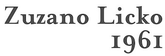 Based on John Baskerville's typefaces (1752), Textism likes George W. Jones' version of this font published as ITC New Baskerville: Compared to the slightly gothic feel of Caslon, Baskerville is purely neo-classical, in it is seen the straight lines and arches of neo-classical architecture. This digital version is ITC Baskerville, which is quite usable but unready for use in long-term reading. Excellent for display use however. See also Mrs Eaves, an interesting experiment in reviving Baskerville, aping the idiosyncratic nature of letterpress text in digital form.
 View digital versions of Baskerville. [Google]
[More] ⦿
|
TFaces
[Alexander Tarbeev]

|
 Alexander Tarbeev is Russian type designer, graphic artist and tutor. He graduated from Moscow Electrotechnical Institute of Communication in 1979 and Moscow Polygraphic Institute in 1988, and worke in the type department of NII Polygrafmash (Institute for Scientific Research of Printing Machinery, Moscow). Between 1989 and 1997, Tarbeev worked as type designer at ParaGraph. He set up the type studio TFaces in Moscow.
 Designer of Cyrillic versions of ITC typefaces like ITC Garamond, ITC Benguiat Gothic, Friz Quadrata and other Cyrillic typefaces. Other typefaces by Alexander Tarbeev include BetinaScript, BigCity, Dagger, DenHaag, Diderot, Gauge, Jakob, Lissitzky, Montblanc, Matterhorn, Pankov, Pollock, Smarty and Tauern. He also designed typefaces for Russian magazines such as Afisha, Bolshoi Gorod, Kak, Smart Money, Ezhenedelny Zhurnal, and (the Russian version of) L'Officiel, and for newspapers such as Vedomosti and Noviye Izvestiya. Alexander Tarbeev is professor and head of type design department at Moscow State University for Printing Arts (currently a branch of Moscow Polytechnic University). He also taught at British Higher School of Art and Design (Moscow), and Moscow State University, Faculty of Journalism.. Showcase of Alexander Tarbeev's typefaces at MyFonts. List of the new designs and the old typefaces designed since 1988 for NPO Poligraphmash, ParaGraph/ParaType and TFaces: Academy, AdverGothic, ITC Anna, ITC Baltica, ITC Benguiat Gothic (1994-1997, ParaGraph; he made the Hebrew typeface Benzion in 1991 based on Benguiat Gothic as well), ITC PT Benzion, FF Beowolf, PT Bernhard, PT BetinaScript (1992, based on the handwriting of the German graphic artist Betina Kuntzsch), PT Bodoni (1989-1997), MathFont 1 (1987, Polygraphmash, based on the math font of Kudryashevskaya Encyclopedicheskaya, 1960-74, a typeface by Nikolai Kudryashev and Zinaida Maslennikova), PT Compact, PT Courier (1997; the original Cyrillic weights were done by Tagir Safayev), PT Crash (1995), PT Dagger (1996), Den Haag, Dots, DoubleClick, PT Drunk (1997), Exposure, PT FixSys (1995, pixel font), ITC Friz Quadrata (1997, ParaGraph, based on the typeface by Ernst Friz for Visual Graphic Corp. in 1965), PT Futuris, ITC Garamond (1993-1995, based on Tony Stan's 1975 version), PT Graffiti (1996, ParaGraph), PT Hermes (1993, ParaGraph), Inform, Izhitsa (1994: he added a shadow syle to Svetlana Yermolaeva's 1988 original), PT Jakob (1994), [kAk), Lazurski, PT Matterhorn (1993), PT MonoCondensed (1990), PT Montblanc (1993), PT Newton (1994, ParaGraph, a phonetic font), PT Pollock (1995), PT Pragmatica (1989), Sketch, PT Star (1995), PT Tauern (1993, extra compressed), Titanic, PT Wind (1995, based on TextBook, 1987, by Emma Zakharova). Honorable Mention at the 3rd International Digital Type Design Contest by Linotype Library for Linotype Den Haag. Free fonts made for fun at FontStruct in 2008: giammba, schlange, squaresans, squaresans_heavy, TFa BCode (extremely condensed), TFa KnightRider. In 2019-2020, he designed the large text, headline and letterpress family Gauge (Type Today). [Google]
[MyFonts]
[More] ⦿
|
The Beauty of Letterpress
|
Web site by paper manufacturer Neenah Paper (Atlanta, GA), dedicated to letterpress. [Google]
[More] ⦿
|
Thirteen Studio (or: Lost Volt Type foundry)
[Ryan Prasetya]
|
 Ryan Prasetya (Republik Digital and Lost Volt Type foundry, Tangerang, Indonesia) created the spurred Victorian signage typefaces Arsemith (2015) and Stonebangs (2014), the tattoo typeface family Maroline (2015), and the art deco typeface Herline (2014).
 In 2015, he created Beautiful Friday (a calligraphic script and about 20 related handcrafted typefaces), Mutiara Vintage (letterpress emulation), the connected Vanessa, the connected script The Flanela, Mutiara (brush script), Nadhin Script (cursive), Nadhin Sans, Lussira Brushscript, Castrina Typescript and Syaquilla, as well as the spurred Victorian typeface Evolution. Typefaces from 2016: Agistha (logotype and script), Novitha Script, Kali Angke (layering typeface), Shella Hera (sans and script), the striped shadow typeface Vhiena and the copperplate typeface Renassance (sic). Typefaces from 2017: Moon & Chips, Vhiena 2.0 (layered), Vayentha Script, Vayentha Sans, The Braggest. Typefaces from 2018: Madeleine (a free signature font), Lineton (sans). Typefaces from 2019: Maryatha (an SVG script font), Panhitra Slab. Typefaces from 2020: Ariston (a comic book font), Retrica (a rounded hand-printed all caps font), Free Love Script. Graphicriver link. Creative Market link. Dafont lnk. Graphicriver link. [Google]
[More] ⦿
|
Thom Janssen
[Geen Bitter]
|
 [More] ⦿
|
Thomas Aradea
[Letterara Studio]

|
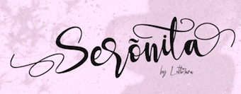 [MyFonts]
[More] ⦿
|
Thomas Stupan
|
German designer (b. 1983) of Onkelz 2014 (2014), a grunge letterpress style typeface created for the German rock group Böhse Onkelz. Chubby Poof (2014) is pure grunge. [Google]
[More] ⦿
|
Thomas White Smith
|
 English typefounder, 1835-1907, who created Old Roman (incl. Italic) in 1895. This typeface was digitally recreated by Patrick Michael Murphy as Old Roman (2002, Mad Irishman Productions). Mac McGrew writes: Old Roman was designed about 1895 by T. W. Smith, manager of the foundry of H. W. Caslon&Company in England, where it was cast in small sizes, and copied by BB&S about 1903 with Caslon's permission. Sizes above 16-point were originated by BB&S. It is a modernized antique letter, with a little more weight than many romans, and became popular for advertising, especially for work that was to be reduced or reproduced photographically, before photolithography or etched letterpress plates had been developed to the point of sharp, accurate reproduction of typefaces. It has somewhat the feeling of Bookman, but serifs are unbracketed and longer with rounded ends, and some characters are less formal. This typeface was called Caslon Old Roman in some BB&S specimens, and copied by Monotype only under that name. Some versions were put on Linotype in 1913. A number of variations of this typeface were drawn by Sidney Gaunt for BB&S in 1907 to 1909, making a substantial and popular family, especially for display advertising. These variations include Old Roman Condensed, Bold, which is about the proportion of Condensed; Bold Condensed, which is much narrower and heavier; Black and Black Italic, which are about the proportion of the original typefaces; and a unique Semitone, which is the Bold with a series of diagonal white lines cut through all strokes without an outline, making a shaded effect. This Semitone is also unusual among shaded typefaces in that the number of white lines is the same for any given letter, regardless of size; thus the shading is coarse in large sizes and fine in small sizes. [Google]
[More] ⦿
|
Thomas Yendall
[Riscatype]
|
[More] ⦿
|
Tigade Studio
[Doli Harahap]

|
Petaling Jaya, Malaysia-based designer of the handcrafted typeface Miqeey The Moose (2019), the weathered brush typeface Dogfight (2019), the script typeface Jameela (2019), and Prestigious Olives (2019). Typefaces from 2020: Paper Plane (outlined, shadowed and 3d), Hello Love (script), Arizona (dry brush), Kisser (a dry brush script), Quincrown, Shaker Rocker (a rough brush font), Giraffella, Trouble Maker, Crafting Island, Thorsley (a modulated display sans), Horror Night, Baby Panda, The Hague (a monoline script), Spiky 016, Randomly Cute, Little Paws (a comic book font), Jom Melaya, Summerbee, Skull Attack (a horror font), Shadow Cat, Brokefold Sans, Crafting Island, Protonema (a race car font), Kasih Putih (script), Laillaland (a fat finger font), Brutal World, Samurai Warrior, Miqeey The Moose, Jeullyta (brush script), Rembow (a soft-edged script), Cinnamon Cookie. Typefaces from 2021: Brotherhood (a bold vernacular typeface), Little Paws (a children's book font), Athena Rustic (an all caps letterpress emulation font), Pirate Jack, Fried Churros, Handletter Signature (a monoline signature script), Alvardo (an upright retro signage script). Creative Fabrica link. Typefaces from 2022: The Sun And Flower (counterless), Thunderspeed (a speed font). [Google]
[MyFonts]
[More] ⦿
|
Tim Gibbon
[Dynamite Printworks]
|
[More] ⦿
|
Tipografia Leone sas
|
Letterpress and type foundry located in Firenze, Italy, est. 1950. At Dafont, and on their home page, they offer the free font Typography Times (2013), which is like Times, but with sharper edges and corners---the dagger and harpoon look. The same harpoon theme returns in the free sans typeface Leo Arrow (2013). Urban Elegance (2013), Typography Ties (2013) and America Faster (2013) are display typefaces. Romanesque Serif (2013) is a copperplate typeface. Carved Rock (2013) is a serifed typeface. Wind Sans Serif (2013) has angled cut terminals. Typefaces from 2014: Downtown Elegance, Paris in Love, Signoria (sans family), Clocker, Christmas Sounds, Dream Love Valentine, Dalmata Dream. They also set up a parallel free font foundry, Jambo Fonts. Dafont link. Fontspace link. Open Font Library link. [Google]
[More] ⦿
|
tipoRenesansa
|
A series of four international workshops run by Tomato Kosir in Slovenia from 2010 until 2012. The fifth was renamed TypeClinic, and that name will be used from 2012 onwards. The first workshop was held from July 25-31, 2010: A first-time international workshop deals with designing typeface for poster size in letterpress technique. That was repeated from August 28 until September 4, 2011 in Ljubljana. The Fourth Workshop took place in Trenta Valley near the beginning of February 2012. [Google]
[More] ⦿
|
Tipos do aCaso
[Leonardo Buggy]

|
In 1998 a group of friends decided to study typography and produce digital types in Pernambuco, Brazil. Two years later they organize an exhibition of their work and established Tipos do aCASO as the first Brazilian Northeast digital type foundry. In the following years they sold and distributed their own types from catalogs, small objects and merchandising stuff. The group gained national prominence participating and being rewarded in competitive design exhibitions like Tipografia Brasilis, Pernambuco Design Conference, Biennial of Design by ADG-Brasil and Biennial Tipos Latinos. Soon the invitations to give lectures and workshops around the country started. The collective turns into a business and developes important dingbat projects for the Pernambuco's Government such as Manguebats and Armoribats. Today, Tipos do aCASO returned to its origins and works as a collective again. Managed by its founder, Buggy (author of the only Brazilian type design book written in Portuguese) the type foundry undertakes researches and promotes educational activities focusing on letterpress, typography and typeface design. Some designers: - Diego Credidio: Cabra-da-peste, Wayana.
- Miguel Sanches: a great experimental font Arqueo, Bolha, Snake, Xilot.
- Rodrigo Pires: Chango, Estuque (grunge), Rano Light (very experimental), Quadrinaits.
- Buggy (Leandro Araújo da Costa): Cordel, the bitmap font Disquete, Oxe, Regua, Ferro de Boi, Palm and Stone. Most of his fonts were made in 1999.
- Alex Carvalho: Rec Block.
- Marcos Buccini: the destructive font Estruturas, Cafeina, Poracaso, Quadra (pixel font).
- Renata Faccenda and Joana Amador: Toinho (children's handwriting).
- Helder Diniz: Grea.
- Marcelo Garcia: Celo Bold.
- Yuri: Yuri Manimals.
- Luciana de Mari: 3x4.
- Damiao: Vincent.
- Priscila Farias.
- André Moraes.
- Antonio.
- Marcia Maia.
Others include Matheus Barbosa, Leopoldo Leal, Bosco, Plínio Uchoa Moreira, Kboco, Gustavo Gusmao, Eduardo Cavalcanti, Marina Pontual, Milena Thé, Joceanny Lima, Daniel Lopes, Maurício Nunes, Luciana Medeiros, Daniel Pinheiro, Nara Rocha, Virgulino Melo, José Fabio, Melissa Trigueiro, Ricardo, George Vinícios, Paula Robalinha, Anderson Kleber, Carlos Santos, Fábio Henrique, Leonardo Rosa Borges. MyFonts link. Leonardo Buggy was born in Brazil in 1976. In 1998, two years before he graduated in design from UFPE, Buggy founded the first digital type foundry in northeastern of his country, Tipos do aCASO. Later, he worked as a graphic designer and art director collaborating and providing services to companies like Ford, Unilever, WalMart and Nannai Beach Resort. Between 2003 and 2006 he was cultural director of the Professional Association of Designers from Pernmabuco, APD-PE, and manager of Visual Arts and Design Centers of Recife City. At the same time he became CEO at Fundicio Design & Technology, member of Pernambuco's IT cluster. Still in 2006 he took a master's degree in Design also at UFPE. One year later, he wrote O MECOTipo, the first book published in Brazilian Portuguese about type design. In January 2008 he founded the Course of Technology in Graphic Design at Barros Melo College in Olinda City. He coordinated this first graphic design course offered in Pernambuco by a private institution until 2009, when he joined the staff of UFPE professors. He also organized and participated actively in conferences, exhibitions and competitions in Brazil and abroad, having been awarded on the 7th and 9th Biennial of Graphic design from ADG-Brasil, the 2004 and 2008 Biennial Tipos Latinos and the 2nd and 3rd Pernambuco Design. Currently, he works on post graduate programs in graphic design around his country and teaches typeface design, history of typography and printing techniques at the Design Center of CAA, UFPE. His most important fonts are Cordel, Disquete, Bitmap, Oxe, Regua, AvantBuggy, Lia and Fatwood. Located in Fortaleza, Brazil, he teaches at UFC. Klingspor link. [Google]
[MyFonts]
[More] ⦿
|
Tom Chalky

|
 Plymouth, UK-based designer of the two-dollar hand-printed typefaces Brixton (2013), Brixton Pro (2015), Brixton Bled (2013), Brixton Outline (2014, a handcrafted blackboard bold typeface), Brixton Sans (2014), Brixton Line (2014), Brixton Roug (2014), Brixton Hand (2015), Brixton Sans Outline (2015), Hayrah Hand Script (2014), Allister (2013), Bobby Jones (2013) and Liberal Hand (2013). Avera (2013) is a serifed typeface. Rivina (2013) is a commercial outline font with handcrafted qualities. Berty Boo (2013) is hand-drawn. Max Rock (2013) is a grungy sans display face.
 Free typefaces includes Graham Hand (2013) and Casper Sans (2013). Typefaces from 2014 include Swindale Sans, Hectra, Liberal Hand, Liberal Hand Sans, Lance Sans, Lance Serif, Lance Serif Rough, Avera Sans, Jimmy (a free hand-drawn typeface in Sans and Serif styles). In 2015, he made Jimmy Sans and Jimmy Script (monoline), Rock Out (brush script), Handy Script, Tallow (with Bogdan Sandu; includes Tallow Sketch Sans, Tallow Sketch Serif, Tallow Rough Sans & Serif, Tallow Oen Sans & Serif, and Tallow Brush Sans & Serif), Rivina Brush (watercolor brush), Rivina Pen, Rivina Dip Pen, Rivina TC Pen, Petal Brush (watercolor brush), Scribbling Tom, Abbie Script and Hectra (free handcrafted typeface). In 2016, he designed Grocery Brush and Whicker (brush script). Typefaces from 2017: Magnite (brush script), Russell (dry brush script), Bouncy Castle (calligraphic). Typefaces from 2018: Bobby Rough (to accompany Bobby Jones), Casual Line Script, Lance Sans, Lance Serif, Bravura (a brush SVG font), Russell Brush, Hamilton (an SVG font in Serif, Sans, Script and Painted substyles), Rustic Gold (a handpainted SVG font), Meraki (SVG format dry brush script), Acrylic Hand (hand-painted SVG fonts), Buckwheat TC (a handpainted SVG font, and a vintage textured typeface family). Typefaces from 2019: Revive 80. Typefaces from 2021: Skribblugh. Behance link. Buy the fonts at Inspiration Hut Marketplace. Creative Market link. Dafont link. Fontspace link. Dribble link. [Google]
[MyFonts]
[More] ⦿
|
Tricia Treacy
|
Tricia Treacy has been running her own letterpress design studio, Pointed Press, creating custom book and print work for commercial clients, international artists, designers and writers since 2000. Using a combination of digital and analog methods, she collaborates on conceptual projects with a range of artists and designers. She has taught graphic design, letterpress and book arts at the University of Pennsylvania, the University of Delaware and the Mason Gross School of the Arts. Tricia is currently an Assistant Professor of Design at Appalachian State University in North Carolina. Speaker at ATypI 2012 Hong Kong: Vista Sans wood type project. [Google]
[More] ⦿
|
Tyler Finck
[Etcetera Type Company (or: ETC; was: Finck Font Co)]

|
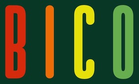 [MyFonts]
[More] ⦿
|
Type Americana 2
|
American type history conference in Seattle, May 4, 2012, followed by workshops on May 5-6. Speakers included Paul Shaw (Oswald Cooper: Attacked by an itch to work with type), Cathleen Baker (Roycrofters to Renaissance: The progression of Dard Hunter's letterforms from arts and crafts to classical), Paul F. Gehl (Ludlow's Mutt and Jeff: Douglas McMurtrie and R. Hunter Middleton), Nancy Sharon Collins (Engraving: The curiously shy stepchild in American type genealogy), Thomas Phinney, Steve Matteson, and Richard Kegler (A second life for vintage American typefaces), and Frank Brannon (Print Your Own Language: The role of letterpress in Cherokee language revitalizationC). [Google]
[More] ⦿
|
Type Navigator
|
The book Type Navigator Typography The Independent Foundries Handbook by Jan Middendorp (2011) contains a CD with fonts. A list of the contents: - Anatoletype: Acuta Thin,DejaRip Demo, Dolce Basic-Thin
- ARS Type: ARS Novelty
- Avoid Red Arrows: Empties Full, FITAL Regular, Nazens, RegionBold, Zuendli Streichholz
- Buro Dunst: Heimat Sans Demo Regular, Novel Pro Demo Regular, Novel Sans Demo Regular. Novel Std Demo Regular
- BuyMyFonts.com: BMF Elettriche Mono Cubetto, BMF Elettriche Mono Cuore
- Emtype Foundry: Periodico Text Light
- Fabrizio Schiavi Design: Siruca Pictograms 1.2
- FaceType: Letterpress Bastard, Lignette Script, Marlowe Swirl
- Fontsmith: FS Blake Heavy, FS Rome, FS Rufus Regular, FS Sally Medium
- Gestalten Fonts: Adhesive Black Ltd, Basic Light Ltd, Capricorn OSF Black Ltd, Engel Light Ltd, Naiv Fat, Nautinger Regular Ltd, Regular Cargo, Treza Regular Ltd
- HVD Fonts: HVD Age 11, HVD Bodedo, HVD Comic Serif Pro, HVD Edding 780, HVD PEACE, HVD POSTER, HVD POSTR Clean, HVD ROWDY, HVD Spencils Block, HVD Spencils Regular, HVD Steinzeit fillin, HVD Steinzeit
- Just Another Foundry: Zalamander Caps Bold, Zalamander Caps Extrabold, Zalamander Caps Extralight, Zalamander Caps Light, Zalamander Caps Regular, Zalamander Caps Semibold
- LucasFonts: JesusLovesYou
- Neutura: Orange Round Regular
- OurType: Alto Condensed Semibold, Alto Pro Mono Condensed Bold, Comb Pro Thin, Eva Standard Light Italic, Fakt Medium, Fakt Condensed Light Italic, Fakt SemiCondensed Semibold, Fayon Standard Extra Black, Fresco Plus Standard Black Italic, Fresco Sans Condensed Light, Lirico Press Semibold, Ludwig Condensed Thin, Meran Condensed Normal Italic, Monitor Condensed Bold Italic, NeueSans Semibold, Parry Semibold, Sansa Condensed Soft Black Italic, Sansa Slab Light, Tiina Medium, Versa Condensed Normal, Versa Sans Condensed Bold Italic
- Playtype: Play Bold, Play Regular
- Storm Type: Aaahoj, Bhang Strong, LidoSTF, LidoSTFBold, Lido S T F Bold Italic, Lido S T F Italic, Lido S T F Condensed, Lido S T F Condensed Bold, Lido S T F Condensed Medium, Lido S T F Medium, Lido S T F Medium Italic, Regula Old Face Italic, Regula Old Face, Rondka Urtyp, Stencilul, Vida 33 Stencil Demo
- Subtype: Cloud, Quart, SWEM
- VetteLetters: VLNL Dream Meal Left, VLNL Dream Meal Right, VLNLDBXLZX-Bold, VLNLDBXLZX-Light, VLNLDBXLZX-Regular
- Volcano Type: Matryoshka Pregnant
[Google]
[More] ⦿
|
Typesketchbook
[Chatnarong Jingsuphatada]

|
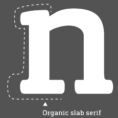 Chatnarong Jingsuphatada is a type designer in Thailand. He set up Typesketchbook in Bangkok. In 2012, Chatnarong made the 4-style plumpish sans family called Gusto and the elegant condensed hand-drawn Olive (2012). Kilo (2012) is a clean sans family of the Eurostile genus. Caffeine (2012) is a hand-printed poster typeface. Gram (2012) is another elliptical sans family.
 Typefaces from 2013: Labrador A and B (a 32-style simple sans family---the B series is a rounded version of the A series), Quan, Quan Slim (32-font organic sans family), and Quan Rounded (a clean sans family covering all weights from Hairline to Black). Typefaces from 2014: Orev (+Hairline: an organic sans), Tolyer (a large letterpress emulation family), Abula and Abula Organic (slab serif family), Klimt (+Organic, a slab serif family). Typefaces from 2015: Noyh (a 72-style geometric sans family with and without rounding; it was extended in 2016 to Noyh A, which has Cafe Press, Bistro, Text and Hand sub-families), Robolt (Machine, Battery (weathered), Vintage (art deco)), Delm (a rounded ink-trapped sans family), Betm (a geometric sans family covering Hairline to Extrablack), Mairy (rounded display sans). Typefaces from 2016: Breul Grotesk (a 32-style Bauhaus-inspired geometric typeface with sharp (A) and rounded (B) subfamilies), Orev Edge (an organic sans), Meltow (Sans, Script and Marker families of hand-drawn typefaces). Typefaces from 2017: Morl Sans and Morl Rounded, Grimpt (handcrafted), Noyh Geometric (with sharp corners), Noyh Geometric Slim, Mates Malty (in Brush, Brush Dry, Marker and Inkpen versions), Vild Scapes (by Chatnarong Jingsuphatada and Kamonjit Lerdsittikul: a handcrafted brush typeface family), Flowy (brush script), Gliny (handcrafted), Betm Rounded. Typefaces from 2018: Grold (a 40-style post-geometric typeface family), Kelpt (rounded sans), Calps Sans, Anteb (an organic sans), Calps. Typefaces from 2019: Prayuth (a 32-style sans), Motiraw (an 28-font bgeometric sans), Germalt (a 32-style geometric sans), Kelpt Sans (32 styles; a corporate version of Kelpt), Tomkin (a 54-style rounded sans), Brilk (a 40-font condensed rounded sans family). Typefaces from 2020: Polate (a condensed grotesk family in 60 styles), Polate Soft, Mula (a basic 80-style sans family with Regular, Slim and Rounded subfamilies), Grold Rounded. Typefaces from 2021: Nordt (a wide serif family in 40 styles), Rohyt (a 32-style rounded sans), Rohyt Geometric. Creative Market link. Behance link. Newest Behance link. [Google]
[MyFonts]
[More] ⦿
|
Typewriterfonts.net
[Lukas Krakora]
|
 Czech designer of the grunge monospace font Urania Czech (2006) and of the didone numbers-only font Stöhr Numbers (2006). In 2009, he made the old typewriter typeface Bohemian Typewriter (based on the Czech Remagg typewriter). In 2010, that was followed by another typewriter font, USIS 1949, which was based on United States Information Service reports from 1949.
 In 2012, he made the old typewriter typeface Albertsthal Typewriter. His typewriter typefaces of 2013 include Lucky Typewriter, Hollywood Starfire and Vera Type. In 2014, he made Hermes 1943 (old typewriter font), Susanne Nouveau, Modern Typewriter and Elegant Typewriter. Typefaces from 2017: Earth 2073 (rounded retro-futuristic), Dearborn Type, Oceanside Typewriter, Dresden Elektronik, 1938 Stempel, 1952 Rheinmetall (another old typewriter font). Typefaces from 2018: Prager Headlines. Typefaces from 2019: Speedwriter (an old typewriter font). Typefaces from 2020: Dogtown Typewriter, Victoria Typewriter, Orange Typewriter, Volkszeitung 21 (letterpress emulation). Typefaces from 2021: Mechonat Ktiva font (primarily a Hebrew typewriter font but it also contains basic Latin character set). Home page. Another link. Fontspace link. Abstract Fonts link. Dafont link. 1001 Fonts link. [Google]
[More] ⦿
|
Typoforge
[Blazej Ostoja Lniski]

|
 Blazej Ostoja Lniski (b. 1974, Czersk, Poland) specializes in painting and lithography. From 1994 until 1999, he studied at the Warsaw Academy of Fine Arts. Currently, he is the Dean of the Faculty of Graphic Arts at he Warsaw Academy of Fine Arts. He founded the type foundry Typoforge.
 Creator of Merlo (2014, inspired by a You And Me Monthly published by National Magazines Publisher RSW Prasa; followed in 2015 by Merlo Round and in 2016 by Merlo Grotesque and Merlo Neue), Cervo (2014, a simple almost heartless sans that was inspired by a You And Me Monthly published by National Magazines Publisher RSW Prasa that appeared from 1960 until 1973 in Poland), Cervo Neue (2016), Toppo (2014, a letterpress emulation family inspired by a You And Me Monthly published by National Magazines Publisher RSW Prasa), Pekora and Pekora Slab (2014: inspired by a You And Me Monthly published by National Magazines Publisher RSW Prasa (Poland) between May 1960 and December 1973), Rospi Clean (2014: inspired by the weekly Tygodnik Ilustrowany from 1933), Rospo Wood (2014: a worn letterpress typeface inspired by the weekly Tygodnik Ilustrowany (1933)), Lupo (2014), Kapra (2014) and Bobbin and Bobbin Cyrillic (2014, letterpress style), which were inspired by You And Me Monthly published by the (Polish) National Magazines Publisher RSW Prasa which was active from 1960 until 1973. Kapra is beautiful---it has some of the masculinity of Impact and the naïveté of wood type. Other typefaces by him in 2014 include Skuul (a desperate cold war font inspired by a Letraset font from 1981), Blezja (inspired by a metal tin dated 1907, Potsdam), Greta (a roman typeface based on a prayer book from 1888), and Kleks (grunge typeface inspired by vernacular typography in Potsdam). Typefaces from 2016: Cozza (a grungy typeface family based on the dry transfer architect set Unitras Letraset from the 1980s). Typefaces from 2017: Merlo Neue Round, Kapra Neue (24 styles). Typefaces from 2018: Gambero (a slab cousin of Kapra with a reversed lower case g), Kapra Neue Pro. Typefaces from 2020: Tylbor (a 14-style monolinear almost DIN-like sans), Cervino (a 54-style sans). Typefaces from 2021: Cervo Neue Condensed (18 styles). You Work For Them link. Creative Market link. Behance link. View Typforge's typeface. [Google]
[MyFonts]
[More] ⦿
|
Typographic Design
[Manuel Viergutz]

|
 Berlin-based FontStruct artist from Stuttgart (b. 1986, Esslingen) who studied at Johannes-Gutenberg-Schule Stuttgart (class of 2007) and studied in 2008 in Esslingen at the European School of Film and Design. He set up Typographic Design. The theme of most of his typefaces is erosion, deconstruction and grunge.
 He made the striped techno fonts heavyLOUDedge, heavyLOUDedge_lineH, heavyLOUDedge_lineV, heavyLOUDedge_quad, heavyLOUDedge_raw in 2009. He also made Fat Cowboy (2009, FontStruct), QRcodeX (2009, like those airline ticket codes), Low Down Cut (2009), WebPixel (2009), ScrFibble (2009), ScriptSERIF (ransom note face), and Back To Heavy Coat Fat Ground (white on black family) in 2009. Typefaces done between 2010 and 2013: SKATEBOaRDbraNds (2010, ransom note face), Gothic Hand Dirty (2010), SansLigraphy, Slice n Dice (2009), Riptape, Riptrash (2010, grunge), BackToHeavyCoatFatGround, Curly Lava Bubble (2010, dotted family), Hand Times (2010, a sketched Times Roman), BlockHead (2010), kiddySans (2010), webpixelbitmap (2010), dirtyDeoHandInk (2011), Modern Hand Fraktur (2011), Elegant Hand Script (2011), Wear Fat T Shirt (2011, squarish), Giraffenhals (2011, hand-printed), Phone Scan (2011), Slanted Italic Shift (2011), Neon Club Music (2011), Raw Delta Hand Street (graffiti), India Snake Pixel Labyrinth Game (2012, labyrinthine). Typefaces from 2013: Hand Retro Sketch Times (layered poster headline family), Dirty Bubble Gum Grunge, Hand Skribble Sketch Rock, Hells Kitchen Devil God, Hand Scribble Sketch Times, Shaky Hand Some Comic, RawStreetWall (Volcano Type: grunge), Tag Hand Graffiti Trash, Viktors Littl Creepy Horror. Still in 2013, these commercial typefaces were published: Rip TRASH, Dirty Deo Hand Ink, Elegant Hand Script, Gothic Hand Dirty, Rip TAPE, MODERN Hand Fraktur, Giraffenhals, Raw Delta Hand Street, WEAR FAT SHIRT, HeavyLOUDedge, Soul Lotion, Webpixel Bitmap, India Snake Pixel Labyrinth Game, Kiddy Sans, MEGA SLANT LINE, NEON CLUB MUSIC, Slanted ITALIC Shift, Block Head, Happy Brain Creepy Thalamus. Typefaces from 2014: Konstructa Humana Stencil, Hand Stamp Play Rough Serif. Typefaces from 2015: Hand Sketch Rough Poster, Hand Stamp Swiss Rough Sans. Typefaces from 2016: Hand Stamp Gothic Rough, Raw Street Wall (Volcano type). Typefaces from 2017: Brush Poster Grotesk (2017, a fun semi grungy typeface designed for the children's exhibition 1,2,3 Kultummel from Labyrinth Kindermuseum Berlin by xplicit, Berlin (Annette Wüsthoff, Alexander Branczyk and Mascha Wansart) and Manuel Viergutz; loaded with glyphs and decorative extras like arrows, dingbats, emojis, symbols, geometric shapes, catchwords and decorative ligatures), Netherlands Dirty Numbers (a hacker style font), Mallorca Dirty Numbers (another hacker font), Hand Stamp Slab Serif Rough. Typefaces from 2018: Hand Print Stamp Rough, Typewriter 1950 Tech Mono (a great old typewriter font family). Typefaces from 2019: Icons Dingbats Symbols Set, Czykago Rough (with Alexander Branczyk). Typefaces from 2020: One United Font (+icons), Hand Stamp Wood, Klein Rough Gemein (with Inga Luft: a font family that includes an icon set and several styles that emulate old German rubber stamps), LED pixel (65 styles), Boom Pang Pow (a cartoon font), TWIGS 4 kids (2020: designed for a garden exhibition for children by Daniela Costa, Julia Stanossek, Alexander Branczyk and Manuel Viergutz), DIY Fantasy Stamp, Euro Icon Kit, Brush Hand Marker, Chalk Hand Marker. Typefaces from 2021: Wood Sans (a 12-style vintage wood type and letterpress emulation family), Pixel Pattern (a 9-style pixel font family), Hand Writing of Janina, Face Type, Hand of Hannah (a fat finger script), Plakat Wood (wood type emulation), Drunken Pixel, GDR Traffic Symbols, Hearts Love Smile (amorous dingbats), Open Tech Neue (Sans Serif, Invert, Outline, Slab Serif, Stretch, Box Puzzle and Icons). Cat Finger (a rough brush font), Kloetzchen (a set of blocky display types based on a 3d (physical) wood type by Peter Eckartz). Dafont link. Alternate URL. MyFonts link for his commercial fonts. Klingspor link. Behance link. Blogspot link. Old MyFonts foundry link. Abstract Fonts link. Volcano Type link. View Manuel Viergutz's typefaces. [Google]
[MyFonts]
[More] ⦿
|
Typography Day 2012
|
Typography Day was organized for the fifth time in 2012 (1st-3rd March) at the Industrial Design Centre (IDC) at the Indian Institute of Technology Bombay (IIT Bombay) with support from India Design Association (InDeAs) and Aksharaya. The event will include an international conference which will be devoted to addressing issues faced by type designers, type users and type educators. The theme for this year's event is Typography in Publication Design. The speakers whose talks touch upon type design include - Evripides Zantides: The use of eye-tracker technology to evaluate typefaces, Greek fonts and publication design for screen
- Mahmood MazaheriTari: Abilities Of Persian Typefaces&Persian Calligraphy In Stencil Type Design
- Mariko Takagi: Typographic Culture of Hong Kong
- Sophia Oduol: Innovative applications of Typography - Ancient African Typographic Symbols in Contemporary Publication Design
- Veronika Burian: Typographic matchmaking
- Ishan Khosla: Typecraft: Creating an Indian Typographic Identity
- Yashodeep Gholap: Designing a Devanagari text font for newspaper use
- Chitchai Kuandachakupt: Ariyaka, the early typeface leads modern industrialization of letterpress printing in Thailand
- Samradhi Katare: All That I Have Learned About Devanagari----Evolution of the Devanagari script and development of letter-form design based on Vox-ATypI classification of type
[Google]
[More] ⦿
|
Typoretum
[Justin Knopp]
|
Justin Knopp graduated with a BA in Graphic Design from Central Saint Martins College of Art&Design in 1994. Now, he runs a letterpress shop in Colchester, UK, and makes beautiful cards (among other things). He also has a blog. [Google]
[More] ⦿
|
Uppertype
[Pedro Lobo]
|
 Portuguese foundry in Guimaraes and Porto, est. 2011 by Pedro Lobo, that sells Yorker (2012, a layered athletic lettering font), Borba (2012, a beautiful inline typeface), Sahara (2012, an antique shadow caps face), Akila (2012, a fashion mag didone), Public (2012, art deco marquee face), Scape (2012), Smart (2012, inline caps face), Desk (2012, shadow caps face), Kleiner (2012), Fabrica, Wannabe (octagonal), Kodhigo (slab serif), Molesk (2011, a free slab display face), Tabbaco (connected retro script) and Jono (2011, art deco).
 Typefaces from 2013: Player (a layered beveled typeface system), Porto (tweetware), Woodstik (a tall gothic wood type layered sans family that plays with texture and letterpress), Darko (alchemic, designed under the motto Uppertype goes hipster), Player (a layered type system), Bonie (organic sans). In 2015, he made the cursive school script font London Script and the vintage handcrafted Vintagefolk. Typefaces from 2016 include Roska (a free stencil type) and Twoface (an Escher-style impossible font). In 2018, he published the layered multiline stencil font family Issue, the multiline typeface The Social, and Borba Neu. [Google]
[More] ⦿
|
Vasil Stanev
[VSF (or: Vasil Stanev Foundry)]

|
 [MyFonts]
[More] ⦿
|
Vasilis Skandalos
|
Athens, Greece-based designer of the free Latin / Greek font Retro Sans (2014), and the free sans display face family Wask (2015). In 2016, he designed the letterpress stamp typeface Stamps. Hellofont link. Behance link. [Google]
[More] ⦿
|
Viaction Design (or: Viaction Type)
[Lukman Hidayat]

|
Yogyakarta, Indonesia-based designer (b. 1990) of the layered vintage typeface Barra (2017), the rounded sans typeface Chalif (2017), the rounded monoline script Saffa Recordminded (2017), and Afifah Script (2017). Typefaces from 2018: Stengkol (an all caps slab serif inspired by the Western era), Hiyagh Ahey (a monoline script), Contender (a stamp font with weathered texture), Routerline (monoline script), Routerline Rough, Morella, Beauty Rains (creamy connected script), Believer (a connected heavy monoline script), Saffa Script Monoline, Rosella Script, Rosella Sans, Bricklane. Typefaces from 2019: Matrole (an all caps display family), Sunmore, Velcro (brush lettering), Basaro, Hansel (letterpress emulation, +Rough), Kindson, Talesian (a signature font), Raventame, Staincool (Tuscan, layered). Typefaces from 2020: Medin (a decorative serif), Medina (a display serif), Epicgant (a bold display serif), Baskar Stencil. Typefaces from 2021: Megar (a flared display typeface), Garlich Grow (a vintage decorative serif), Datons (blackletter), Garlich Grow (a display serif), Antobe (a display serif). Typefaces ftrom 2022: Chiffone (a display serif). Creative Fabrica link. [Google]
[MyFonts]
[More] ⦿
|
Victor Debone
|
Sao Paulo-based founder of Estudio Arnold, b. Sao Paulo. Victor has a degree in industrial design from Mackenzie University. Creator of the letterpress emulation typeface Muinto (2015), named after a Brazilian interior design studio. They explain the design: We thoroughly researched old letterpress studios to find the best combination of wooden typefaces, later printed, selected and digitalized to compose Muinto Display, which uses two different typesets combined to represent the Brazilian plurality and unevenness. Behance link. [Google]
[More] ⦿
|
Victoria Bellavia
|
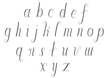 Victoria Bellavia is a letter designer based in New York City. Her portfolio is outstanding. She created the curly typeface Mochina (2012), the letterpress style sans Astor (2013), and the quaint wedge slab serif typeface Marzipan (2013).
 Behance link. Hand Letter Design link. [Google]
[More] ⦿
|
Vintage Foundry Illustrator
[Marie Wagner]
|
 Marie Wagner (Vintage Foundry Illustrator, Munich, Germany) created a vintage Victorian typeface in 2015. In 2014, she designed Ink Collective (2014), a vintage letterpress emulation typeface.
 She originally operated as Mousemade Fonts [dead link]. Behance link. [Google]
[More] ⦿
|
Vintage Type Co
[Sean Coady]

|
 Graphic designer from Summerside and/or Charlottetown, Prince Edward Island, Canada, who was located first in Edmonton, Alberta, and then in Moncton, NB, then in Toronto, and finally in halifax, Nova Scotia. He runs SRC Designs and founded Vintage Type Co in 2015 (not to be confused with Susan Townsend's Vintage Type, a company set up in the 1990s). Creator of the free sans titling typeface family Municipal (2013) and of the hand-printed typeface Fruit Sale (2013).
 In 2014, he created Shifty Sailor (spurred), Hofmann (psychedelic typeface), Kalopsia Slab (a condensed slab serif family with an arts-and-crafts flair). One weight is free---the others can be bought here. He also created free User Interface Icons in 2014. Typefaces from 2015: Jackal Display, Anaheim Gothic, Alehouse (vintage connected script), Dorchester Display (vintage Victorian typeface), Huxley (brush script), Drone Ranger (octagonal dystopian type), Authentico (vintage poster typeface in eight styles), Firefly (free poster font), Highbinder (an eroded vintage typeface), Adventurous Script (watercolor brush), Nomad Icon Font, Arctic Express (handcrafted capitals). Typefaces from 2016: VTC Numeric (free), Grindstone (vintage), Grindstone Script, Grindstone Sans, Midnight Owl, Southbank (free), Planet Rouge, Life Is Jazz Script, Mystery Tour (+Sans) (a layered Americana or circus font), Sugar Boats, Navy Queen (a nice free font influenced by vintage nautical posters). Typefaces from 2017: Virgo Antique, Virgo Display, PressBox (letterpress and Americana emulation), Merchant Street Sans (eight stackable fonts), Old Spirits (spurred Victorian style), Prizefighter (art deco sans), Andre's Diner, Artisans Script (signature script), Milton Grotesque (a free all caps American grotesque), Queen Street (a layerable family). Typefaces from 2018: Grindhaus Sans (geometric), Drone Ranger Pro (octagonal). Typefaces frm 2019: VTC Bloke (a revival of Miller&Richard's Egyptian Expanded, a wide typeface reminiscent of the Egyptian wood types), VTC Horoscope. Typefaces from 2020: VTC Elmwood (a modernized blackletter font family), Fellbaum Grotesk, VTC Fellbaum Grotesk. Typefaces from 2021: Chocolate Chipped (a condensed woodblock emulation typeface family). Vintage Type Co. Dafont link. Behance link. Another Behance link. Creative Market link. Home page. Creative Market link for Vintage Type Co. [Google]
[MyFonts]
[More] ⦿
|
Vintage Type Co (or: Vintage Design Co)
[Ian Barnard]

|
 Crowborough, East Sussex, UK-based designer Ian Barnard (Vintage Design Co) created the curly hand-drawn typeface Warrior in 2014. With Sam Jones, he designed the school script font Path Type (2014).
 In 2015, Ian created the vernacular script Northern Soul, the brush script Enjoy The Ride, the free handcrafted typeface Foxhole, the brush font Sun Kissed, the connected monoline script typeface Smoothy and the letterpress emulation font Saltash. In 2016, he designed the poster typeface Sticky Lollipop, the American Oak series (Script, Serif, Slab, +scratchplate drawings by Emma Lindley), the vintage artisanal display typeface family Sugar Boats, the handcrafted Outbound and Money Penny Script, VTC Symbols, the sans titling typeface Fruitbox, Money Penny Sans, the handcrafted travel poster typeface Cool Britannia (2016), and the connected script font Bloomsbury, which is accompanied by Bloomsbury Sans and Bloomsbury Serif. In his Wood Type series (2016), he emulates old worn wood type and letterpress type---try out the free Condensed Slab Rough. Typefaces from 2017: Simple Things (old typewriter font), Dorchester Display (Victorian), Besties, Montebello (monoline script), Radiant Beauty (brush script), Adrenaline Brush, Foxtrail Script, Bookend (a super-condensed sans). Typefaces from 2018: Lemon Bird (free), Beautiful Grace (Serif, Script). Typefaces from 2019: Bloke (a revival Miller & Richard's classic metal typeface Egyptian Expanded). Typefaces from 2020: Andre's Diner (Peignotian). Creative Market link. Behance link. Home page. [Google]
[MyFonts]
[More] ⦿
|
Vintage Voyage Design
[Pavel Korzhenko]

|
 Aka P. Rudakov and Pasha Korzhenko, and operating as Vintage Voyage Design. Perm, Russia-based designer of the vintage handcrafted typefaces West End (2015, spurred Western typeface family), Winter Holidays (2015), The Sugar Cane (2015, eroded signage script), Montana (2015), Canyons (2015), Forest Tramp (2015), Heart of Gold (2015, a think inky brush), La Fa Salt (2015, a connected monoline script), Robinson (2015, handcrafted), Rise (2015, rough brush), Stout (2015, +Stout Roughen), Jack's Guitar (2015) and Bough (2015).
 Typefaces from 2016: Chameleon (rough brush), Les Paul (beatnik style), 1994 Fancy, The First Division (an elegant handcrafted Peignotian typeface family), The Aviator, Ocean Beach (weathered athletic lettering font), Fenway Script (baseball script), Fenway Sans, Octanis (display family in Sans, Slab, Serif, and Rounded Sans sub-styles), Compare (a vintage wedge serif typeface inspired by the mafia), Unchained (Western typeface), The Selvedger (signage script), Driver (a retro speed emulation typeface family), Pasternak Script. Typefaces from 2017: The Bartender (a 14-font vintage typeface family with some letterpress styles), Easy Rider (a layered road movie brush script font), The New America (penmanship script), Ace of Spades (grungy), Cavalcade (a layered serif typeface inspired by American and European typography of early 20th century, from movie posters to design of alcohol bottles like Martini, Cinzano and Campari), Old Standard (sans, script), Season Times (Sans+Script), Roadstar (a vintage speed emulation techno font). Typefaces from 2018: VVDS Pacifica (a hand-lettered bold signage script inspired by American branding typography from the end of the 20th century), Le Bonjour (a retro sans), The Voyage Culture (font duo), Afterglow (a didone), VVDS The Bimbo (circus fonts), Two Letter Monogram, Diamond Monogram, Circle Monogram, Circle Frames, Harbour (a free decorative blackletter, +Harbour Decor: 2017-2018), Sandwich (a large 3d beveled typeface family), The Telegraph (transitional newspaper type), Golden Horn (a layered vintage typeface). Typefaces from 2019: VVDS Organum (a decorative typeface for operas and phantasms), The Pretender (a package inspired by vintage American sign painting), VVDS Praliner (an all caps sans for display), Le Bonjour (Peignotian), Kristopher (a fancy serif), Nurnberg (an expressionist, modernized blacletter), The British Telegraph (based on vintage British headline type), Halau (a tiki font), Halau Serif, Sign Painter (a monoline Script, a layerable Sans, and two Decor ornamental styles, all based on Victorian era signs). Typefaces from 2020: The Ruby (a 56-font and icon collection), VVDS Minorica (a handrwritten collection in ten styles), VVDS Rashfield (in the soft serif genre), VVDS London Oatmeal (Sans, Script), VVDS Sunshine Bridge (a creamy brush script), VVDS Benigne Sans (a wide geometric sans), VVDS La Truffe (a bold decorative didone), VVDS Big Tickle (a handcrafted retro family). Typefaces from 2021: VVDS Clementia (a stylish condensed serif), Urbanchrome (an SVG letterpress emulation font), VV Neonica (a 12-style neon font family), Grodsky (a stylish 4-style antiqua), The Country Blues (a throwback to the fifties), Surfbird (a 30-style western family), VVS Nobleman (a stylish serif in four styles). Behance link. Creative Market link. Vintage Voyage Design. You Work For Them link. [Google]
[MyFonts]
[More] ⦿
|
Vitaly Glyph
|
 Moscow-based designer of Latin and Cyrillic, or purely Cyrillic, fonts. There is a list of Cyrillizations of existing fonts: Atreyu, LHF Bounce Script, Modeka, Turnpike, PL Barnum, Good Times Regular, Playful JNL (Jeff Levine), Armageda, Showcard Gothic, SF Comic Script, Jolly Good Sans Basic, Enemy (Shaivanalla Perumal), House Slant (House Industries), House Brush (House Industries), Komika Axis (Apostrophic Labs), Snickers (Mark Simonson), Grand Hotel (AOETI), Wisdom Script (Lost Type), Mission Script (Lost Type), Cylburn (Lost Type), House Script (House Industries), House Holiday Gothic (House Industries), LHF Branding Iron (Letterheadfonts), LHF Fancy Full (Letterheadfonts), LHF Firehouse (Letterheadfonts), American West (FontMesa), Champ Ultra (BA Graphics), PL Davison Americana (Monotype), Blenny (Dalton Maag), Bigfish (Floodfonts), Same Same, But Different (Hanoded), Enemy (Lost Type), Special Forces (Typodermic), Serpentine (URW++), Ritts Cursive (Eurotypo), Voga Medium (CD Type), Hermes 1943 (Lukas Krakora), Brand (Lian Types), Tasty (Hubert Jocham), Bullet Regular (House Industries), Filmotype Athens (Filmotype), Signika (Anna Giedrys), Art Department (Jeff Levine), Borg (David Sum, aka titusprod).
 Original fonts made ca. 2015: GF Deathmatch (a super-macho typeface), GF Ram (pixel font), GF Mario (video game font), GF Mario Two, GF Oversize, GF Magnifica, Deadpool, GF Enroll (letterpress emulation), GF Happy Elephant (comic book style), GF Standout (compressed titling sans), Snickers Super (after the logo for Snickers), GF Bitrika (condensed display sans), Skazka (cartoon font), Minnesota (digitized Hamilton wood type), Alumnus (soft blackletter), Terminator Genisys, Comanchero (+Bevel (beveling using four layers)), Viko, Police (octagonal, athletic lettering), Terminator (after the movie), Old Poster font family, Lic Plate RUS, Lic Plate CT, Taurus Gothic, Slant GP (like Zelek), Brick Game (like Tetris), System Message, System Pixel, Digital 16s (LED). Behance link. [Google]
[More] ⦿
|
Vojtech Riha
[Superior Type]

|
 [MyFonts]
[More] ⦿
|
VSF (or: Vasil Stanev Foundry)
[Vasil Stanev]

|
 Typographer and type designer in Sofia, Bulgaria, b. 1982, Sofia, who worked mostly for Svetoslav Simov's type foundry, Fontfabric, before setting up his own shop, VSF (Vasil Stanev Foundry).
 In 2010, he made the ornamental all caps Cyrillic typeface Orthodox. In 2011, he created the ornamental caps typeface Floralis (which was finished by Svetoslav Simov) and the experimental typeface Negativ. In 2012, he made Times New Roman Sans Serif. Nexa Rust is a set of 83 weathered letterpress emulation fonts that evolved from Nexa and Nexa Slab. This was a project by Radomir Tinkov, Ani Petrova, Svetoslav Simov and Vasil Stanev. In 2016 and 2017, he designed the mythological typefaces Bugazoo Letterbat and Etymonster, respectively. Typefaces from 2017: Combax (rounded sans), Tengwar Sindarin Latin and Cyrillic, Hel Grotesk Gothiq Cyr (a cyrillization of Kevin Yuen Kit Lo's Hel Grotesk), Celtic Cyr, Jardin Ornatis (decorated caps). Typefaces from 2018: Crona, Etymonster (a letterbat font), Mistnake (Halloween dingbats), Ergam, Cloch, Ufont (an aliens font), Needlephabet, Ornatis (a floriated caps alphabet for Latin, Cyrillic, Armenian and Hebrew). Typefaces from 2019: TDR (a heavy octagonal / mechanical typeface), Talljob, Moxic, Allebagra, Beejuice, Beltenebros, Pepo The Clown, Plump Fiction, Spartechno. Typefaces from 2020: Coque (a tall extra compressed font family). [Google]
[MyFonts]
[More] ⦿
|
Vultype Co
[Candra Hamdani]

|
Jakarta, Indonesia-based designer of Grahamo (2019: a luxury script), Batisde (2019: a font duo), Haglos (2019: a signage script), Delpina (2019, a vintage monilinear sans; at Vultype), Quefira (2019: monoline script), The Bredan (2019: script), The Bredan Sans (2019), Handler (2019: an interlocking typeface), the monoline script typeface Hesland (2019: free demo) and the letterpress emulation font The Foregen (2019). Typefaces from 2020: Kroast funny, Hadrey (a signage script), Brushter (a brush script), Roullasse, Matt Rostine (a signature script), Dagtton, Mirande (a thin all caps fashion font), Hadrey, The Grenhil (a grungy vintage font), Suttimmos, Dagtton, Aliters, Austin, Battnise, Boldris, Butgone, Goodboom, Magnolia, Rubin Key, Stobils, Willdom, Ragila (a decorative serif), Betmo Romate Hood, Grahm Sans, Sartadi, Goshbe (brush), Aurelig (monoline script), Delfina, Bhortead (vintage, grungy), Hargael (monoline script; a free font duo), Cremona, Nathan (script), Old Bridges, Boilgo, Acelire Rosse, Sregale (brush script), Analisa, Melanox (stencil), Anamortee (free). Typefaces from 2021: Stange (futuristic), Kodaro (an all caps typeface adorned with intestinal curves), Grunberg (letterpress emulation), Kastel Voire (a display serif), Grahm (vintage, all caps). Creative Fabrica link. [Google]
[MyFonts]
[More] ⦿
|
Walden Font
[Oliver Weiss]

|
 Walden Font (est. 1997) sells historical typefaces&clip-art by Oliver Weiss from Winchester, MA. Walden's site includes a brief history of blackletter, as summarized in the PDF document The Gutenberg Press: Five Centuries of German Fraktur (1997). Typefaces by categories:
 - The nice 14-font package called Civil War Press.
- The free art nouveau font Jugend WF (2006).
- Kraftwerk Press (2016-2017), a collection of 25 German industrial fonts emulating the era from 1920-1930:
- WFBorderBergland, WFBorderLineal, WFBorderLorbeer, WFBorderRauhreif, WFBorderRiesel, WFBorderSaftig, WFBorderSandmann, WFBorderSchnuppe, WFBorderWolkig, WFBorderZahnung, WFKraftwerkOrnamente, WFKraftwerkVignettenFett, WFKraftwerkVignettenLicht. Great borders and ornaments that were mainly revived from Neues Schmuckmaterial (Schriftguss AG, formerly Brüder Butte).
- WFFettdruck, WFHochdruck, WFNormdruck: Examples of Reklameschrift originally designed in 1908, 1926 and 1920, respectively.
- WFFetteKrause. Inspired by an advertisement for printing machinery in a 1924 issue of the Hungarian trade magazine Magyar Grafika.
- WFKaracho: Inspired by a bit of hand-lettering from a 1926 issue of the German advertising art periodical Gebrauchsgrafik.
- WFLuftpost. Based on lettering samples for sign painters.
- WFNeueOhioSchrift. Weiss writes: The Brüder Butter foundry in Dresden had a good working relationship with ATF, and thus several American typefaces found their way into the Butter catalog. Among them was Pabst Oldstyle, designed in 1902. Brüder Butter changed the erect peak of Pabst's A to a flaccid one, and distributed the result as Ohio Schrift, starting about 1913. Throughout the 1920s, Brüder Butter marketed the Ohio family through a series of leaflets that put the typeface through its paces in innovative ways. WFNeueOhioKursiv is the Italian companion. In 1922, Brüder Butter added a bold typeface to the Ohio family. This was not an ATF transplant, but a new design by Eduard Lautenbach. It was available with a set of swash capitals, and several curly-cued, lowercase alternates, ideally suited for children's books. Weiss's revival is WFNeueOhioKraft.
- WFNeueWerbeKraft. Based on Arthur Schulze's Werbkraft (1926).
- WF Paletti. Loosely based on the popular monoline silent movie script typeface Tango-Kursiv (1913, Ernst Deutsch).
- WF Vulkan. A loud all caps typeface based on an advertisement in the April 1926 issue of Gebrauchsgraphik.
- Their Renaissance&Handwriting font pack has nine different handwriting fonts from 1450 to 1700.
- The Minuteman Printshop set contains 18 colonial fonts: Ancient Black, Caslon Book, Caslon Book Italic, Caslon Swash Italic, Webster Italic, Webster Roman, English Hand, Rev.War Heroes, Signers of the DoI, Colonial Bullets, Daisy Border, Lily Border, Marigold Border, Needlepoint Border, Pine Cone Border, Quilt Border, Rose Border, Tulip Border.
- Eighteen blackletter fonts, called the Gutenberg Press series: Alte Schwabacher, Breitkopf Fraktur, Coelnisch Current, Fette Haenel Fraktur, Ganz Grobe Gotisch, Grossvater Kurrent, Gutenberg Bibelschrift, Kurrent Kupferstich, Luthersche Fraktur, Maximilian Gotisch, Neue Schwabacher, Peter Schlemihl, Suetterlin, Theuerdank Fraktur, Unger Fraktur, W'bg. Schwabacher, Zentenar Fraktur.
- Wood type, the Wild West Press series (2010, 47 fonts), and related fonts: Sawtooth WF (2002), Acanthus Border, Ashwood Condensed, Ashwood Extra Bold, Asphaltum, Aubrey Landing, Baubles Border, Bear Gulch, Brass Rules, Bullion Extra Condensed, Bullion Italic, Bullion, Cattle Brands, Chalk Bluff, Clifford Eight, Cut and Shoot, Dead Man's Hand, Faywood Extra Condensed, Faywood Italic, Faywood, Fringe Border, Garland Border, Gatlin Bold, Grid Border, Heroes and Villains, Jawbones Condensed, Lace Border, Langtry, Matchwood Bold Italic, Matchwood Bold, Matchwood Italic, Matchwood, Muleshoe, Ophir, Rawhide, Round Mountain, Royal Nonesuch, Sageland, Sawtooth, Seal Border, Shelldrake, Stockton, Thousandsticks, Thunder Mountain, Vine Border, Western Bullets, Whitecross, Wildwash.
- Art nouveau revivals. His Art Nouveau Printshop Vol. 1 (2020) includes these fonts:
- WF Border Edellinien: Based on borders by Schelter & Giesecke, 1901.
- WF Border Eos.
- WF Border Flach: After a specimen seen in a 1915 specimen book at Bauersche Giesserei.
- WF Border Nimbus.
- WF Border Patriz Huber: After a Schelter & Giesecke design from 1906 called Patriz Huber Ornamente, which was named after designer, goldsmith and furniture maker Patriz Huber, 1878-1902.
- WF Border Peacock: Based on borders by Schelter & Giesecke, 1904 (or earlier).
- WF Border Seerosen.
- WF Border Ver Sacrum: Based on borders by Heinz Keune for Schelter & Giesecke, 1901 (or earlier).
- WF Dahlia: Closely based on a draft for F. Schweimann's Wodan, first issued by Stempel & Co in 1902.
- WF Fafner: After a poster typeface by Schelter & Giesecke first seen in 1905. Unknown designer.
- WF Habsburg: After an original by Heinz Keune from 1903 for Schelter & Giesecke.
- WF Jugendstil Ornaments.
- WF Liane Semibold: A condensed Plakatschrift that revives Liane Semibold (1908, Schelter & Giesecke).
- WF Maria Theresia: After Maria-Theresia-Versalien (1903, Heinz Keune for Schelter & Giesecke).
- WF Meierschrift: Based on Meierschrift (1903, C.F. Meier), which was produced by Schelter & Giesecke in 1904.
- WF Ovid: After an original by Heinz Keune from 1903 for Schelter & Giesecke.
- WF Radium: After an original white on black typeface by Schelter & Giesecke (1905).
- WF Rienzi Versalien: After Versalienschrift Rienzi (1901).
- WF Schelter Antiqua: A revival of Schelter Antiqua (1905, Schelter & Giesecke).
- WF Wallenstein: Based on an original by Heinz Keune (1904), who intended it as a heavy weight companion of Habsburg and Wittelsbach,
- WF Wittelsbach: After an original by Heinz Keune from 1903 for Schelter & Giesecke.
- Gnomos is a grungified merovingian typeface [Walden Font claims that it was found in a 16th century house].
- Magick: A series of 11 alchemic and medieval typefaces, including custom creations by Australian calligrapher Mark Calderwood: Astaroth, Bastarda, Batwynge, Gnomos, Luxeuil, Orgeuil, Runor, Salem 1692, Alchemy Symbols, Astrological Symbols.
- Diverse Handes: Nine historically accurate script fonts from the Renaissance era: 10th Century Bookhand WF, Bastarda WF, Copperplate 1672 WF, English Hand WF, German Latin WF, James the Second WF, Spanish Court Hand WF, Uncial WF, William Shakespeare WF.
- A collection of 62 American poster fonts of World War II, heavily influenced by art deco, was created in 2013: Acie WF, Almanzo WF, Balfrey WF, Bellofatto WF, Bleecker WF, Bleecker WFShaded, Bobbin WF, Bullshorn WF, Calt WF, Cassino WF, Cephus WF, Chippett WF, Cutright Bold ItalicWF, Cutright Bold WF, Cutright WF, Dickie WF, Dragoo WF, Elbie WF, Eldon WF, Elmira WF, Enlow WF, Epsom WF, Falaise WF, Fansler WF, Fustian WF, Glancy WF, Golden WF, Graveney WF, Greenlaw WF, Hackett WF, Hardwick WF, Harlie WF, Huntley WF, Irby WF, Iva WF, Jowdy WF, Kilroy WF, Kododa WF, Lacar WF, Maximino WF, Nelda WF, Nuisance WF, Odon WF, Olindo WF, Payson WF, Payson WFBold, Payson WFBold Italic, Payson WFItalic, Perlina WF, Poster Bullets WF, Remely WF, Reny WF, Sharkey WF, Sheffie WF, Telmoss WF, Tilmon WF, Toxie WF, Ula WF, Wallington WF, Wilber WF, Wylie WF, Zipnut WF.
- Other fonts in the collection: 10thCenturyBookhand, AcanthusBorder, Alchemy-Symbols, Alte Schwabacher, AncientBlack, AshwoodCondensed, AshwoodExtraBold, Asphaltum, Astaroth, Astrological-Symbols, AubreyLanding, Bastarda, Batwynge, BaublesBorder, BearGulch, BrassRulesBorder, BreitkopfFraktur, Bullion, BullionExtraCondensed, BullionItalic, BullionRoman, CWP_TypeNo08, CWP_TypeNo09, CaslonBook-Italic, CaslonBook, CaslonSwashItalic, Cattle Brands, ChalkBluff, CliffordEight, CoelnischCurrentFraktur, ColonialBullets, ConfederateSignatures, Copperplate1672, Cut&Shoot, DaisyBorder, Dead Man's Hand, EnglishHand, Faywood, FaywoodExtraCond, FaywoodItalic, FetteHaenelFraktur, FinalFrontierShipside, FringeBorder, GanzGrobeGotisch, GarlandBorder, GatlinBold, GebetbuchFraktur, GermanLatin, Gnomos, GridBorder, GrossvaterKurrent, GutenbergBibelschrift, Heroes & Villains, JamesII, JawbonesCond, Jugend, KurrentKupferstich, LaceBorder, Langtry, LilyBorder, LutherscheFraktur, Luxeuil, MarigoldBorder, Matchwood, MatchwoodBold, MatchwoodBoldItalic, MatchwoodItalic, MaximilianGotisch, Muleshoe, NeedlepointBorder, NeueSchwabacher, OldStateHouse, Ophir, Orgeuil, Pangho, Panghobl, Pangolin, Pangbl, PeterSchlemihl, PineConeBorder, QuiltBorder, Rawhide, RevolutionaryWarHeroes, RoseBorder, RoundMountain, RoyalNonesuch-Bold, Runor, Sageland, Salem1692, Sawtooth, SealBorder, Shelldrake, SignersoftheDOI, SpanishCourtHand, Stockton, Sütterlin, TheuerdankFraktur, Thousandsticks, ThunderMountain, TulipBorder, TypeNo1, TypeNo2, TypeNo3, TypeNo4, TypeNo5, TypeNo6, TypeNo7, TypeNo8, TypeNo9, TypeNo10, TypeNo11, TypeNo12, TypeNo13, TypeNo14, Uncial, UngerFraktur, UnionSignatures, VineBorder, WebsterRoman, Western Bullets, Whitecross, WilliamShakespeare, WittenbergSchwabacher, ZentenarFraktur.
- The New Victorian Printshop collection (56 fonts): Absalom, Adelar, Amaltea, Amilcar, Augur, Banter, Baretto Italic, Baretto Shaded, Baretto, Barettoshaded Italic, Beamish, Blaisdell, Blinov, Braham, Brinton, Brunel Script, Chatelaine, Cupboard, Devough, Dewitt, Ephinol, Gano Extended, Giglio, Gresley, Grubb Script, Hester, Hipolon, Hiram, Inigo, Isherwood, Jasper, Jophet, Klabasto, Lightburn, Medola, Monboddo, Nestor, Oldkirk Italic, Oldkirk, Ormsby, Pennyfarthing, Phectic, Pomeroy, Rebstock, Rudyard, Rungholt, Sedgwick, Steam Border Medium Aztec, Steam Border Medium Bar and Balls, Steam Border Medium Bar and Curls, Steam Border Medium Bar and Leaves, Steam Border Medium Baroque, Steam Border Medium Belgian Lace, Steam Border Medium Dish and Wire, Steam Border Medium Drainfly, Steam Border Medium Flourish, Steam Border Medium Frill, Steam Border Medium Geometric, Steam Border Medium Leaf, Steam Border Medium Loops, Steam Border Medium Picture Frame, Steam Border Medium Quatrefoil, Steam Border Medium Ribbon, Steam Border Medium Shells, Steam Border Medium Spruce, Steam Border Medium Tiles, Steam Border Medium Triangles, Steam Border Medium Woody, Steam Border Thin Brick Bar, Steam Border Thin Cordula, Steam Border Thin Double Wavy, Steam Border Thin Double, Steam Border Thin Fine Dots, Steam Border Thin Forward Wave, Steam Border Thin Oscillations, Steam Border Thin Scallop, Steam Border Thin Straight Rule, Steam Border Thin Tight Oscillations, Steam Border Thin Triple, Steam Border Thin Undulations, Steam Border Wide Arch and Vine, Steam Border Wide Argent Leaf, Steam Border Wide Bar and Acanthus, Steam Border Wide Bower, Steam Border Wide Knots and Weeds, Steam Border Wide Lattice, Steam Border Wide Mephisto, Steam Border Wide Peacock, Steam Border Wide Rebstock, Steam Border Wide Roccoco, Steam Border Wide Shield and Acanthus, Steam Border Wide Shield and Vine, Steam Border Wide Stipple, Steam Border Wide Stone Leaf, Steam Border Wide Vault, Steam Charms, Steam Flourishes, Steam Gems, Steam Logotypes, Steam News Cuts 1, Steam News Cuts 2, Steam News Cuts 3, Swartwood, Tempris, Tilson Initials, Tivadar, Trowbridge, Twiselton, Whitcomb, Whittle, Winan.
Dafont link. [Google]
[MyFonts]
[More] ⦿
|
Warehouse Design
[Jesse Snyder]
|
The Warehouse is a collaborative effort between Brittany Deighton (Kent, Ohio) and Jesse Snyder, who is located in Ohio. We also find a mention of Wilmington, NC, more recently. Typefaces by them include some icon font sets, Stilts (2013, a thin headline typeface), Narwhal (2013, a clean all-caps sans typeface), Miniglyph, Parks and Rec (icons), and Snack Time (icons). Together, they designed the slabby wood type (and letterpress emulation) typeface Ohio, Medical Icons, Survival Icons, Bike Icons and Transit Icons in 2013. In 2015, they published the squarish sans typeface Carolina. Creative Market link. [Google]
[More] ⦿
|
Wiescher Design
[Gert Wiescher]

|
 Gert Wiescher was born in Braunsbach am Kocher, Germany, in 1944. Based in München, Gerd Wiescher designed many classy and classic Bodoni families, as well as New Yorker Type (1985). All of his typefaces are carefully fine-tuned and balanced. Wiescher founded first Munich Type and then Wiescher Design and Autographis. He is known as a hard, fast and prolific worker. His exquisite typefaces can be bought at MyFonts. Catalog of his bestselling typefaces. Interview in 2008. Wikipedia page. Creative Market link. List of typefaces:
 - Scripts: Prima Script (2017: for menus and cookbooks), Marmelade (2015, +Fruits, a set of dingbats), Triana (2014, a thin monoline penmanship script named after a Spanish sailor on the Pinta who in 1492 was the first to see America---in this case the Bahamas), Floral Script (2014, copperplate style script), Sherlock Script (2014: this comes with Sherlock Stuff (fingerprints) and Sherlock Stuff Dots (ink stains)), Felicita (2013, a swashy copperplate script), Vividangelo (2013, after the handwriting of a real person), Dreamline (2013, connected monoline cursive wedding scripts in A, B and C styles), Fiorentina (2012, a renaissance style script with 650 characters), Excelsia Pro (2012), Delicia Pro (2012, a fat brushy signage script), Nono (2011, formal swashy calligraphic family), Dyane (2011), Penn (2011), Lettera (2011, hand-drawn formal face), Tosca (2010, a high-contrast calligraphic typeface with 730 glyphs), Grandcafe (2010), Loulou (2010, curly and of extreme contrast), Schoolblock (2010, hand-printed school font), Grandezza (2010, calligraphic family; +Xtra), Sixtra (2010, a curly didone script), English Script (2010, classic Spencerian calligraphic script), Savage Initials (2009), Morning News (2009), Revolte (2009, a brush script for demonstration signs), Estelle (2009), Scriptofino (2008, 4 calligraphic styles to give Zapfino a run for its money), Exprima (2008), Daiquiri (2008), Lisa Bella, Lisa Fiore and Lisa Piu (2008, connected and calligraphic), Tati (2008), Movie Script (2007), Cake Script (2007), Eddy (2007, grungy calligraphy), Pointino (2007), Bohemio (2007, a great oriental-brush script), Artegio (2007, two calligraphic scripts), Xylo (2006, in the tradition of the 18th-century English calligrapher George Bickham and the 19th-century American calligrapher Platt Rogers Spencer), Tamara (2005, art-deco script based on some initials for Semplicita made in the 1930s by the Nebiolo foundry), Tecon, Ellida (2005, inspired by the elaborate scripts of 18th-century English calligrapher George Bickham, with additional influences from 19th-century American calligrapher Platt Rogers Spencer), Eloise (2009, a high-contrast version of Ellida), Nadine Script (2005, an elegant script inspired by a set of initials the French designer and artist Bernard Naudin drew for Deberny&Peignot in the 1920s), Royal Classic (2005, unbelievable script based on a design that has initially been comissioned by King Ludwig I of Bavaria for in-house-use), DesignerScript, Filzer Script (1995, handwriting), Futuramano-Condensed-Bold, Futuramano-Condensed, Futuramano-Plain, Futuramano-Thin, Giambattista, Scriptissimo-Plain, Scriptissimo-Forte, Scriptissimo-Swirls, Squickt (1989), Konstantin A, B and C (2005), Konstantin Forte (2005), MyScript, GrocersScript, Swanson (2006). Scriptissimo (2004) has versions named Start, Middle and End, tweaked for their position in the word, and there are plenty of ligatures. Check also Bodoni Classic Chancery (2007) and Bodonian Script (2012).
- Sans: Brute Sans (2018), Xpress (2018), Xpress Rounded (2019), Classic Sans (2017, a revival of Theinhardt Grotesk), Classic Sans Rounded (2017), Maxi (2017), Nic (2017), Azur (a large almost geometric sans famly with 1950s Roger Excoffon-style French flavours, called a Medterranean grotesk by Wiescher himself), Royal Sans (2017, after Theinhardt's Royal Grotesk---the forerunner of Akzidenz Grotesk--- from 1880), Docu (2016, a workhorse elliptical sans family), Viata (inspired by Bauhaus), Noticia (2016, in the Bauhaus tradition, with very pointy v and w, and a bipartite k; not to be confused with the 2011 Google Web Font Noticia Text by José Solé; followed in 2019 by Noticia Rounded), Avea (2015), Aramis, Nota Bene (2015: squarish, narrow, technical), Nota (2015, technical and cold: the rounded version, Nota Rounded, followed in 2019), Dylan Condensed (2014), Dylan Copperplate (2014), Supra (2013, grotesk: Supra Thin is free. See also Supra Condensed (2013), Supra Mezzo (2013, between regular and condensed), Supra Extended (2013), Supra Rounded (2015), Supra Classic (2014), and Supra Demiserif (2013, slab serif derived from Supra)), Dylan (geometric sans), Franklin Gothic Raw (2013, like Franklin Gothic but with raw, not rough, outlines, only visible at very large sizes), Blitz (2012, a flared family), Blitz Condensed (2012), Contra Sans (2011, which led to Contra Slab, Contra Condensed and Contra Flare), Vedo (2011, a Bauhaus style family that include a hairline weight), Germania (2011, a useful and beautiful monoline sans family), Geometa (2011, +Rounded, +Rounded Deco, +Deco: all based initially on Renner's Futura), Geometra Rounded (2011, a rounded family based on Futura and "much less boring than DIN"), Bombelli (2010, ultra-wide architect's hand), Bluenote Demi (2010, a grungy Franklin Gothic Condensed), Perfect Sketch (2010, sketched grotesque), Unita (2009), Antea (2009), Eterna (2009, sans with a swing), Pura (2008, an uncomplicated grotesk family), Purissima (2010, a decorated extension of Pura; +Bold), Copperplate Gothic Hand (2009, after a 1901 design by Goudy), Copperplate Alt (2011), Copperplate Wide (2011), FranklinGothicHandDemi (+Shadow), Franklin GothicHandCond (2009), Franklin Gothic Condensed Shadow Hand (2010), and Franklin Gothic Hand Light (2009, a hand-drawn version of Franklin Gothic), Papas (2005, sturdy, slightly curly), Julienne (2005, a condensed sans family; see the new versions Moanin and Julienne Piu, 2017), Cassandra (1996, an art deco style after Adolphe Mouron Cassandre), Futura Classic (2006), Cassandra Plus (2012), Ela Sans (2005, a large family), Mondial-Bold (2004), Mondial-Demi, Mondial-Light, Mondial-Medium, Mondial-Normal, Mondial-XBold, Monem-Bold, Monem-Medium, Monem-Normal, Monem-Roman.
 Serif: Imperia (2011, a Trajan column caps face), Monogramma (2012, a Trajan family for monograms), Imperium (2005, a precursor of Imperia with a Relief shadow style included), Hard Times (2011), Fat Times (2011, retraced Times), Elegia (2011, slightly Victorian family), Breathless (2010, a spiky family, inspired by nouvelle vague movie posters), Bodoni Classic 1, Bodoni Classic 2, Bodoni Classic 3, BodoniClassic-Condensed, BodoniClassic-Handdrawn, BodoniClassic-Swashes, BodoniClassic-Text, Bodoni Classic Deco, Bodoni Classic Swirls (2009), Bodoni Classic Pro (2011), Bodoni Classic Inline (2012), Bodoni Classic Fleurs (2014, ornamental caps), Bodoni Comedia (2010, one of my favorites: a funny "live one day at a time" curly Bodoni cocktail), Bodoni Classic Swing (2010), Bodoni Classic Free Style (2010, curly), Bodoni Classic Ultra (2010), La Bodoni Plain (+Italic, 2008), Take Five (2005, a jazzy take on Bodoni Classic), DonnaBodoniAa, DonnaBodoniBe, and DonnaBodoniCe (three scripts named after Bodoni's wife, Margharita dell'Aglio, who published his complete works, the Manuale Tipografico, in 1818, five years after his death), Edito, Robusta. A great series, some of which were originally published at Fontshop, see, e.g., FFBodoniClassic (1994). MyFonts: When the first of Wiescher’s Bodoni Classic fonts came out in the 1993, there was nothing like it. Up to then, virtually all Bodoni revivals had been given clear-cut forms and square serifs. But Bodoni’s originals from the late 1800s were never as straight and simplistic as is often assumed: they had rounded serifs and slightly concave feet. Wiescher digitized a wide range of Bodoni letterforms, including a wonderful script-like family called Chancery and a nice series of Initials. Having accomplished his mission twelve years later, he began making personal additions to the family, such as the more decorative Bodoni Classic Swashes. Recently a useful little family was added to the clan: LaBodoni is sturdier and less optically delicate than most Bodonis, and therefore more usable as a text face. Wiescher made Metra Serif (2009), Principe (2008) and Paillas (2009). Prince (2009) is a curlified didone. Serif: Imperia (2011, a Trajan column caps face), Monogramma (2012, a Trajan family for monograms), Imperium (2005, a precursor of Imperia with a Relief shadow style included), Hard Times (2011), Fat Times (2011, retraced Times), Elegia (2011, slightly Victorian family), Breathless (2010, a spiky family, inspired by nouvelle vague movie posters), Bodoni Classic 1, Bodoni Classic 2, Bodoni Classic 3, BodoniClassic-Condensed, BodoniClassic-Handdrawn, BodoniClassic-Swashes, BodoniClassic-Text, Bodoni Classic Deco, Bodoni Classic Swirls (2009), Bodoni Classic Pro (2011), Bodoni Classic Inline (2012), Bodoni Classic Fleurs (2014, ornamental caps), Bodoni Comedia (2010, one of my favorites: a funny "live one day at a time" curly Bodoni cocktail), Bodoni Classic Swing (2010), Bodoni Classic Free Style (2010, curly), Bodoni Classic Ultra (2010), La Bodoni Plain (+Italic, 2008), Take Five (2005, a jazzy take on Bodoni Classic), DonnaBodoniAa, DonnaBodoniBe, and DonnaBodoniCe (three scripts named after Bodoni's wife, Margharita dell'Aglio, who published his complete works, the Manuale Tipografico, in 1818, five years after his death), Edito, Robusta. A great series, some of which were originally published at Fontshop, see, e.g., FFBodoniClassic (1994). MyFonts: When the first of Wiescher’s Bodoni Classic fonts came out in the 1993, there was nothing like it. Up to then, virtually all Bodoni revivals had been given clear-cut forms and square serifs. But Bodoni’s originals from the late 1800s were never as straight and simplistic as is often assumed: they had rounded serifs and slightly concave feet. Wiescher digitized a wide range of Bodoni letterforms, including a wonderful script-like family called Chancery and a nice series of Initials. Having accomplished his mission twelve years later, he began making personal additions to the family, such as the more decorative Bodoni Classic Swashes. Recently a useful little family was added to the clan: LaBodoni is sturdier and less optically delicate than most Bodonis, and therefore more usable as a text face. Wiescher made Metra Serif (2009), Principe (2008) and Paillas (2009). Prince (2009) is a curlified didone. - Romain du roi: In 2008, Wiescher designed the two-style Royal Romain, which is based on the Romain du Roi of Philippe Grandjean, which was completed in 1745 after Grandjean's death by Grandjean's successor Jean Alexandre and Louis Luce. Wiescher: The Romain du Roi was for the exclusive use of the Louis XIV. It was never sold or given to any other king or government. The king of Sweden tried to scrounge a set, but the king refused. This font is the basic design for such famous fonts as the Fournier and Bodoni. Just so the Romain du Roi doesn't get lost in the digital turmoil I set out to redesign it in 2004 and finished now in early 2008. I did a lot of research in France's National Library. A good excuse to visit Paris is always welcome!!!
- Engravers: Dylan Copperplate (2014), Cavaliere (2010), Guilloche A (2009), Guilloche B (2013, op-art borders), CopperplateClassic-Plain, CopperplateClassic-Round, CopperplateClassic-Sans, Copperplate Classic Light Floral (2009), Cimiez-Bold, Cimiez-Roman (2004), Ela-Demiserif, Ela-Sans (2004), Eleganza (2008).
- Blackletter/Fraktur: Renais (2011, renaissance initials), Flipflop (2011), Fraktura and Fraktura Plus (2008), Royal Bavarian (2004, based on a typeface commissioned by King Ludwig 1st of Bavaria about 1834), Royal Blossom (2009), Royal Bavarian Fancy (2004), Bold Bavarian (2010, a heavy version of Royal Bavarian), Monkeytails (2008), Fat Fritz (2006, rounded endings), Ayres Royal (2005, blackletter typeface based on drawings of London's calligrapher John Ayres, ca. 1700; to be used with RoyalBavarian; followed in 2010 by BoldAyres).
- Slab serif: Slam Normal (2017), Slam Rounded (2017), Suez (2017: with extra tall ascenders and descenders), Egyptia (2010), Egyptia Rounded (2010).
- Typewriter: Lettera (2014), Lectra (2011), QuickType-Bold, QuickType-Plain, QuickType-Sans.
- Decorative: Tric (2017, art deco), Franklin Gothic Raw Semi Serif (2015), Frank Woods (2013, letterpress simulation based on Franklin Gothic Heavy), Ohio Bold (2012, a rough headline type in the tradition of Louis Oppenheim's Lo-Type from 1913), Viking Initials (2012), Cannonball (2012, a psychedelic typeface derived from a jazz record-sleeve for Cannonball Adderley), Byblos (2011, derived from the logo of St. Tropez's famous Hotel Byblos), Blockprint (2013, early 1900 German expressionist grunge face, renamed Bannertype after 24 hours), Ferrus (2010, inspired by Cassandre's Acier Noir, 1936), Petite Fleur (2009, flowery embellishments and the capitals of his redesigned Royal Romain, which in turn is based on the famous romain du roi), Glass Light (2012, a decoirative art nouveau type family based on Glass Light by Franz Paul Glass, 1912), Penstroxx (2009, 5 fonts that are based on the powerful, expressive Traits de plume (penstrokes) designed in Paris around 1930 by Alfred Latour), Liquoia A, B and C (2008, decorative scripts), Modernista (2008, an art nouveau headline face, based on an 1898 sample by Peter Schnorr), Ornata A, B, C, D, E, F and G (2008-2009: ornaments), Fleuraloha (2008), Floralissimo (2008: flowery ornaments), Frank Flowers (2011), Scrolls A (2010, penman's dingbats), Bacterio (2007), Alpha Bravo, Alpha Charlie, Alpha Echo (2006), Barracuda, Cacao (2005, fifties style), Cassandre Initials (2004, Elsner&Flake, after the 1927 original by Adolphe Mouron Cassandre), Contype, Fleurie (2005), Fleurons Two (2006), Fleurons Three (2006), Fleurons Four (2006), Fleurons Initials (2007), Fleurons Six (2008), Fleuron Labels (2008), HebrewLatino, Julius, Lunix (2006), MyHands, NewYorkerType (1985; extended in 2011 to NewYorker Plus, and in 2020 to New Yorker Type Classic and New Yorker Type Pro; after Rea Irvin's well-known typeface for The NewYorker), Venice Initials (2006, after a 15th century find, but Wiescher added about half of the caps), Ventoux, Vivian (2005), Woody.
- Pixel and/or futuristic: Nexstar (2013: this octagonal typeface is also useful or athletic lettering), Alpha Fox (2007), Alpha Juliet (2010), Alpha Papa (2010), Alpha Square (2010), Alpha Jazz (2010), Alpha Papa (2010, LED meets stencil).
- Stencil typefaces: Dripps (2010, handpainted, perhaps brutalist), Red Tape Plus (2014).
- Comic book fonts or brush fonts: Breezy (2015), Caboom (2014).
- Dingbats: Wayside Ornaments (2012), XX Century Ornaments (2012), Thistle Borders (2012), Greenaway Mignonettes (2012, after Kate Greenaway (1846-1901), author and illustrator of childrens books), Collins Florets (2012), Flourishes A (2010), Jingle Doodles (2010).
- Art deco: Trix (2017), Zelda (2017, named after F. Scott Fitzgerald's wife).
- Commissioned and special typefaces include a version of the logotype for the Munich's newspaper Abendzeitung, Maxi (variable width sans), NIC Grotesk, Tric (art deco), a Cyrillic version of Bodoni Classic for Vogue Moscow, a special Bodoni Classic for Ringier Publishers in Zurich, and Red Tape, a typeface that is on permanent exhibition at the German National Library in Leipzig.
- Typefaces from 2019: Elita (a condensed sqaurish typeface), Artis Sans, Sigma Condensed and Sigma (simplified readable sans families), Cosma (an elegant high-contrast text family with tapered upstrokes and crossbars, but otherwise didone roots), Quincy (a bebop typeface that started from some letterutouts), Phoebe (an elliptical techno family), Phoebe Rounded, Polygon A, Polygon I, Polygon X.
- Typefaces from 2020: Bullets Bannertype, Alpha One (a counterless experiment), Exec (a 14-style sans family), Exec Corners, Exec Demiserif, Penta (a grotesque family with large counters that make the ExtraLight style quite striking), Penta Rounded.
Author of many books, including Zeitschriften & Broschüren (Systhema-Verlag, München, 1990), Schriftdesign (Systhema-Verlag, München, 1991), and Blitzkurs Typografie (Systhema-Verlag, München, 1992). The following text was excerpted from his wikipedia page: At 14 years of age, Wiescher went to Paris to study fine art. He financed his stay by doing portraits on the Place du Tertre on Montmartre. In the sixties Wiescher studied graphic design at the Berlin Academy of Fine Arts. (Since November 2001, Berlin University of the Arts.) He financed his studies by sidewalk painting and drawing portraits. While doing sidewalk paintings, he met the typeface designer Erik Spiekermann, who inspired his love of this branch of design. After two years he quit his studies, and went to Barcelona where he worked at the offices of Harnden & Bombelli, for whom he designed the OECD-Pavilion of the 1970 Osaka World Expo. In 1972 he moved on to Johannesburg working as an art director at Grey and Young advertising . In 1975, he returned to Germany, working first for DFS+R-Dorland, and then for the "Herrwerth & Partner" ad agency. At Herrworth, he was involved in introducing IKEA into the German market. In 1977 he became a creative partner in the Lauenstein & Partner ad agency, creating mainly campaigns for large German retail chains. In 1982 he started his own design office, creating work for editors (Markt & Technik, Systhema and Langen-Müller-Herbig), computer companies (House of Computers, FileNet) and he worked for Apple Computers designing their publications (Apple-Age and Apple-LIVE). View Gert Wiescher's typefaces. Wikipedia link. [Google]
[MyFonts]
[More] ⦿
|
William S. Peterson
|
William S. Peterson is a University of Maryland professor, who had some nice pages on modern fine printing, with interesting contributions on George Allen, William Morris, Charles Ricketts, Henry Stevens, Daniel Berkeley Updike, and Emery Walker. Reservocation publishes an interview regarding his book The Well-Made Book (2003, a collection of Daniel Berkeley Updike Essays). I quote a passage: In the first half of the twentieth century, the best typefaces were almost always produced by Monotype, but that firm unfortunately fumbled the ball when the era of hot metal came to an end. Monotype's digital versions (and, slightly earlier, the versions for phototypesetting) of its own library of typefaces were often embarrassingly bad: Perpetua, Bembo, Bell, and Centaur, for example - all great Monotype triumphs in the days of letterpress printing - seem to me, now essentially unusable in their present forms. The Monotype typefaces that still look good in the twenty-first century are mainly ones that were a bit heavy to begin with, such as Poliphilus, Bulmer and Ehrhardt. [...] Of the typefaces designed since the digital revolution, my favorites for bookwork are Adobe Caslon, Founder's Caslon, Minion, Galliard, and Miller. [Google]
[More] ⦿
|
Wood Type Revival
[Matt Braun]
|
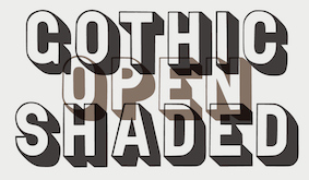 Foundry specializing in digital versions of old wood type. Set up in 2011 by Matt Griffin, all font licenses refer to Bearded, which has offices in Pittsburgh, Pennsylvania and Montpelier, Vermont. Matt Griffin is a designer and co-founder of Bearded, and teaches in the School of Design at Carnegie Mellon University. He also has a great love for letterpress printing, which he acquired while attending Indiana University in Bloomington, Indiana, where he received a BFA in Graphic Design. Bearded writes: Matt Braun and Matt Griffin wanted to collect lost and forgotten old wood type from the 1800s and revive those typefaces as digital fonts for modern designers. Matt Braun is a senior designer at Bearded and letterpress printer. They first operated Rare Letterpress Wood Type as a kickstarter. After some time, they started the foundry Wood Type Revival.
 Their typefaces include - Concave Tuscan (2015). Concave Tuscan was first shown as wood type under the name Gothic Tuscan by William H. Page in James Conner's Sons Typographic Messenger (1866). Almost all the major manufacturers of the 19th century offered a version of Gothic Tuscan.
- Cosmopolitan (2016).
- Delittle Chromatic (2016). DeLittle Chromatic was issued by DeLittle of York around the turn of the century under the name No. 56/54.
- WTR Fat Boy (2011). Fatboy is derived from a widespread (no pun intended) typeface of the 19th century, commonly known as Antique Extended. It was first seen in print as wood type in 1838 in George Nesbitt's First Premium Wood Types Cut by Machinery.
- WTR French Clarendon Ornamented (2011). The original design for French Clarendon Ornamented first appeared in print in the catalogs of the type manufacturer Young&Morgans (who was later purchased by Morgans&Wilcox Mfg Co) between 1876-1880. M&W was later purchased by Hamilton Mfg Co in 1897. Hamilton then offered this typeface under the name No 3026.
- French Octagon (2011). French Octagon was first shown by Morgans & Wilcox Manufacturing Co. in their 1884 Condensed Specimen Book of Wood Type.
- Grecian Light Face (2016). This revives Light Face Grecian by David Knox & Co. in 1858.
- WTR Gothic Open Shaded (2011). Gothic Open Shaded was first seen in George Nesbitt's First Premium Wood Types, Cut by Machinery (1838). This cut of Gothic Open Shaded most closely matches a design first cut by Young&Morgans between 1876-1880. Once Morgans&Wilcox was acquired by Hamilton Manufacturing Co. (1897), they listed the typeface as No. 3238.
- WTR Gothic Outline (2016).
- WTR Roycroft (2011). The arts and crafts typeface Roycroft was originally created by Miller & Richard under the name Teutonic and is shown in their 1909 catalog. It is a hand-carved typeface.
- Planned is Grecian Light Face.
Creative Market link. [Google]
[More] ⦿
|
Woodcutter Manero
[Jordi Manero Pascual]
|
 Prolific Barcelona-based type designer. He started out by creating the counterless hand-printed typefaces Woodcutter Dripping Nightmare (2012) and Woodcutter MMXII (2012).
 In 2013, he created Gothic Winter (snow-capped blackletter), Woodcutter Anonymous (ransom note font; +part2, 2014), The Shining (movie scanbats), Woodcutter Optical Army (op-art), Viking Runes Shields, Fresh Blood, Pig Rules, Pole Dance, Music+Party, Asian Food, Deers (sic), Woodcutter Amor de Madre (curly tattoo font), Tattoo Vieja Escuela 1, 2 and 3, Origami (animal dingbats), Vintage Motorcycle Club (scanbats), Vintage Christmas (dingbats), Terry Richardson World (scanbats), Woodcutter Wire Fence, Woodcutter Points (textured face), Made in Spain 4, I Love 80s (dings), Drugs (drug paraphernalia dings), Barber Shop (dingbats), Woodcutter del Reves, Adventure Time, New York New York (1 and 2), Woodcutter Dripping Classic, Woodcutter Tinta China (ink splatter font), Woodcutter Cross, Nightmare on Social Media, Breaking Bad (scanbats), Fight Club (boxing scanbats), Boligrafo (sketched font), Robots, Luxury Brands, Woodcutter Buena Lettra, Barcelona (scanbats), Devoto (religious dingbats), Joker (dingbats), Woodcutter Typewritter (sic), Banksy (scanbats), Made in Spain 1, 2 and 3 (company logos), Animal City (funny dingbats), LSD Junior (a scary alphading font), Woodcutter Army (army stencil), Woodcutter El Día De Todos Los Santos (Mexican dingbats), Woodcutter Summer Shadows, and the monster dingbat typeface Woodcutter El Dia del Juicio. Still in 2013, he designed Woodcutter Black Square, DaPunk, Woodcutter Pollita Alegre (a penis font), Woodcutter Hungry Pig, and Woodcutter Hand Light. Typefaces from 2014: Hospital Icons, Woodcutter Rare Drawings, Headache, Irresistible (rounded sans), Doctor Garcia (textured), Violence, Hipster Icons, Saint Valentine's Day, Mister Manson, Casino (dingbats), Christian Icons, Christmas Icons, Hermes Manero, Beauty (dingbats), Art Icons & Tools, Clouds Mix, Malamadre (grunge), Offset Punk, Manos de Cerdo, Hotel Oriental, Basic Trip, Popeye (scanbats), Viva la Fiesta (flag alphadings), Street Stencil, Supermarket, Ebola Font, Vintage Halloween, Motel Imperial, Clothes, The Second World War (army stencil), Tahs On A Rope, Penis (dingbats), Regular Show (dingbats), Parkinsonism, The 70 Greatest Directors of All Time (scanbats), Smartphone (alphadings), Dripping, Chaos in Wisconsin, Saturno, Gym (dingbats), Angie, Antique Book, Black Rodeo, Gutierrez+, Matias-Font, Viejo-Oeste, Woodcutter-Prison-Tattoo, old+sailor, Italian Revolution, Kid Nightmare, Anderson (rough stencil), Manero (scratchy script), Tecno-Chaos (dot matrix font), Neverland, Martian Font, Radical Block, Woodcutter Delicada, Bon Appetit, Termica, Kandinsky, Hotel Paradiso, Seven Arts, Street Icons, Militaria (dingbats), Undergramo (poster font), Woodcutter Avispa, Fuego Fatuo, Other Space, Electrica Sals, Woodcutter Dramatica, Cocinitas (cooking dingbats), Bad Mother Fucker, Quentin Tarantino (scanbats), El Extraño, Fine Disorder, Woodcutter BCN Style (dripping blood font), Woodcutter Virus, Efectiva, Mogambo (fat brush), Duck Tape, Warriors, Cutre Glam, Woodcutter Sutill Shadow, Woodcutter Future, Rage, Woodcutter Negative, Manolo, Vegetables, Woodcutter Storm (lightning texture), Woodcutter Rare Drawings, Rustic Heavy Metal, Grass, Virgin Mary (scanbats), Laurus Nobilis (wreaths), Mister Bambu, Woodcutter Barcode, Conquest, Multimedia Icons, Preschool, Cursors, Woodcutter Kaos, Woodcutter Lines, Ukraine (constructivist), Meccano, Woodcutter Simple Font, Crux (crucifixes), Dolores (3d), Eyes, MoneyMoneyMoney, Made in Spain 5, Barcelona Mon Amour, New Society (a 3d shadow face), Federico (a hand-printed shadow typeface), Aranea (spider dings), Fifth Avenue (art deco), Beware of Pitbull, Dictators (scanbats), Woodcutter Vintage Cartoon, The American (textured face), Woodcutter Mixed Icons, Apple Japanese Keyboard, Vintage Classics Disney, Carnage College (blood splatter font), Vintage Porn (scanbats), Woodcutter Fontana (textured caps), Woodcutter Mixed Icons, Woodcutter Jet Set, Woodcutter Gothic Drama (blackletter), Woodcutter Relieve, Mixed Icons Vol. 1, Woodcutter Electric, Woodcutter Cloth, Street Style (graffiti font), Gothic Punk, Human Body Parts, Dirty Harry, Woodcutter Fine Sketch, Woodcutter Invisible, Miley Cyrus (scanbats), Old Guard, Circus and Fair, Comic Cover, Woodcutter Gigantismo, Clockwork Orange (scanbats), Dosmilcatorce, The Walking Dead (scanbats). Typefaces from 2015: Rude High School, Imprenta Gonzales (white on black), Estrategia (textured style), Monkey Business, Venganza (dripping blood font), Woodcutter Executive, Left Hand Comic (textured), Dirty News, Gorilla BCN (a great handcrafted athletic lettering typeface), Neo Protein (bio-grunge), Barrio-Santo (graffiti style), Periodic-Table-of-Elements, TerrorToons, Vanilla-Candy, Baseball-Icons, Boots, Fine-Homage, Jesus-Christ (religious icons), Lock, Meredith (texturted typeface), Neo-Victorian, Old-Europe (soft blackletter), White-Army (military stencil), HeadWear, Oil-Icons, Pollito-Peligroso (white-on-black letters), Taxi, The-Dentist, Planeta Zero (white-on-black letters), Cronenberg, Hell Bar, Horror Poster, Big Gipsy Bro, Peccatum (bloo drip font), Tempus Fugit (grunge), Indiana State (a great shaded titling face), DJ Icons, Gentleman Icons, Dope Crisis (textured), Bad Quality, Love and Hate, Smoking (dingbats), Phantom of the Opera (dripping blood font), Video Games (dingbats), Beauty Initials, Knife, Ciudad Capital, System Error (dot matrix font), Rejilla (gridded font), Punk Survival, Watches, Barrio Chino (grungy typeface), Delayed (dot matrix font), Impertinencia, Ecology, Anchor, Comic Sandchez, Beard, Globe Icons, Jalisco Company (handcrafted 3d typeface), Summer Icons, New Art Deco (textured art nouveau typeface), Gordita Alegre, Banned World, Pixel Chaos, Dirty Grunge, Metal Curvy, Jazz Club, One Percent, Profile, Scoreboard, Sentencia, The Octopus (silhouettes of octopi), New Sailor (tattoo script), Cleaner, Bear Icons, Woodcutter Trama, Manolete (wavy font), Skully (alphadings), Big Designer, Vintage Punk (white on black), Streets of Fire (textured), Nordica, Belle Epoque (art deco), Bakery, The Worlds Best Logos, Special Unit (textured typeface), Manifesto, Shooter, Woodcutter Carnage, Black Rain (sketched), Soft Addiction, Digital Camera Symbols, Surf, Tailoring, Palo Santo, Morbida (rounded athletic letters), Fine Shadows, The Woodcutter (dings), Experimento (textured typeface), Seven Sisters, Senior Citizen (dingbats), Hotel California, Woodcutter Hand 2015, Fire Department (scanbats), Dolor de Muelas [toothache], Hamburger, Vintage Mixed Vol 1 and 2, Torremolinos, Ol Torero (bullfight scanbats), Formula 1 (scanbats), Presidents of the United States of America, Furure Blood (dripping blood typeface), Wild West Icons, Maravillosos, Territorio (textured display face), Forced Flowers, Black Hole, The Death, Extra Fat (comic book font), Cristobal, Cirilico, Fuck Off (a very useful raised middle finger font), Mexican Skull (the best Mexican skull font anywhere), Old Nuremberg, Maria Dolores, China, Street College, Rodriguez, Tourism, Community, Oklahoma (varsity font), Smartphone Icons, Science Icons, Horse, Greek Mythology, Persiana (a Venetian blind font), Alcohol, Whatsap Emoticons, Library (possibly the best library icon font today), Candelita, Remember Me, Flamenco, Universidad 2015 (athletic lettering), Sneakers, Fire, Industrial Worker, Europe, Abstemious, Police, School, Paris, Savage Empire, Nautical (dingbats), Crusader (dingbats), Woodcutter MMXV, Rats, Monster Mash, 5th Avenue Stencil, Baby Icons, New Space, City Icons, Diamonds, Punkland, Temblores, Puttana Antique, Human Anatomy (dingbats), Guerra Santa, Winter Icons, Farm, NeoWriter, Russia. Typefaces from 2016: Woodcutter People Faces, Ear, Codociosa (grungy), Viking Hell, Simple Myopia (textured, halftone style), Bulbs, Emblem, Vegan Icons, Fleur de Lis, Pregnancy, Harley Davidson, Window, Owl, Native American Indians, The Toy Castle, Aristogramos Chernow, Mediogramo (monogram font), Yes Darling, Dilema Emocional (white on black), Original 301 (draftsman style), Emperador Oscuro (scribbly), Vespa (scanbats), Fine-Sheriff, Hard-Western, Olivia-Garcia (brush script), Woodcutter-Rude-Press (a great handcrafted poster typeface), Printing, Disabled Icons, Golf Icons, Electric Guitar Icons, Airport-Icons, Prudencia (pixel style), Rude-Basic, Stencil-Guerrilla, Tramita-club, Drone, Garden Icons, Feminine Hygiene, Psycho Dad, Intransigencia (textured), Fat Food Icons, Torrebruno, Home Appliances, La Pecosa (textured), Gyn Toons, Insect Icons, Bomb, Special Forces, Business, Irish, Female Underwear, Zombie Salad, Isometric Love, Dinastia (textured), Fireworks, Happy Birthday, Snake Mix, US Election, Spectrum, Extreme Simple, Drunk Sailor (tattoo font), Mountain (dingbats), Cafe Madrid (white on black), Celebration, Rabbit, Rude College, Words, Wingding Review, Transilvania (blood drip font), Tattoo Museum, El Arropeiro (dry brush font), TV (scanbats), Western Dead, Star Wuarras, File Types, Industrial Poison (grunge), Future War, Masacre Digital, Senor Domingo (grungy), Workout Routine (dingbats), Gipsy Bar, Finegrams (ornamental caps, monogram font), Diving (dingbats), Extupida, Dictadura, Euro Estilazo, Cul de Sac, Lions, Woodcutter Olla Barrejada, Cocaine, Monogramos, Gobierno (rounded sans), Maldita Comebolsas, Macho (spurred style), Eagle (great eagle-themed dingbats for East European coup d'etats ca. 1880), Fuck Love, Woodcutter Rocks (white on black), England (dingbats), Mechanic (garage mechanic dingbats), Rodaja (script), Le Petit Chaos, Old Deutschland (blackletter), Mister George, Cloud Candy, Ceporro, Old School Toons, Big Drama (fat poster style), Serial Font, Hotel Madriz, Lady Fiesta, Punk Army, Enfermo Rules, The Laguna, Casa Camaron, Mister Muerte (dripping blood font). Typefaces from 2017: Sea Life, Sushi Sushi, Destruccion, The Barrio Caps (blackletter for gangs), Prehistoric Paintings, Sumo, Hot Air Balloons, Woodcutter Self-Portraits, Manero Universe (grune), Digital Dark Sister (LED font), New Watch (LED style), Free Biker (spurred tattoo font), The King, Canada, Super Hero, Target Shooting, Smokeland, Rabia Absoluta, Infringement, Gifts Icons, Sprinkled (textured), Miopia Internacional, Chupapollas, Orientalismus (oriental emulation), Technopollas, Doctor Punk (ransom note font), Global Terror, Bananas Social Club, Wedding, Coffee Icons, Archeology, Graffiti Tags, Maquina de Escribir (old typewriter font), Little Candy Shop, Madre Superiora (script), Territorial, Diogenes, Cyber Tittle, Pain Explosion, Panchito Style, Lightning Bolt, Pixeland, Club Seven Espadas, Chandelier, Computer Mouse, Restroom, Wash Care, Hell Circus, Extraterrestre, Pix Punk, Lamp, Pizza, Pirate Style, Vacaciones, Hecatombe, Fuente Manerismo, La Cucaracha (white on black), Plastic Surgery, Mafia Mix, Dirty Classic Machine (old typewriter), Woodcutter Noise, Cokelines, Simple Cream, Vintage Poison, Lighter Icons, Pacific Break, Maldito Gringo, Bazar Costa, Doctor Satan (dripping blood font), Caja Fuerte (textured stencil typeface), Saint Peter (brush script), Bela-Lisboa, Ear, Future-Socialism (constructivist), Poop, Retro-Toons, Tattoo-Pro-Icons, Victorian-Gang, Woodcutter-Justice, Writing, Amusement-Park, Linoleum, Funny Barber (shaded), Decadence, Victorian Gang, Depalma (spurred sans), Bela Lisboa. Typefaces from 2018: La Gilda, Portugal Vintage, Call to Huesi, Wood Xmas, Black Empire (a fancy blackletter), Benedicto (a textured all caps typeface), Pixel Icons, Hysterical, Cadalso 74 (grunge), Gramitos, Negroni Chaos, Carajillo de Anis, Hail Disney, Pen Icons, Neo Spain (a glitch font), Adolfito, Anesthesia, Don Pasquale, The Imperial, Juanita Banana, Sovereignty, Bloody Winter (dripping blood font), Drunk College, Sunset Boulevard (shadow font), Miss Order (3d effect font), Burning Manero, Dirty War (a grungy military stencil), Press Division (a shadow font), Fight Team 18, Time To Dead (grunge), Woodcutter Clasica, La Nueva Vieja Escuela (a paint drip font), Woodcutter Animal Faces, Crochet (a softly spurred typeface), Marshal Manero, Nou Barris Bcn, Bad Things (a dripping blood font), Biker Vamp, Insuperable, Pain Shop, El Monstruo del Raval, Arabesque Ornaments, Fans, Tarraco City, Woodcutter Basic Viking (rune simulation), The Hurraca Company, Broken Press, Carnage 1974 (a dripping blood font), Manicomio Woodcutter (a very funny comic book style dingbat font), Amor (spurred), Rompetechos, Electric Punk, Happy Square, Bad Signal (a glitch font), Funny Death, Fresh Nieve (paint drip font), Rota en mil Pedazos (a glitch font), Perra Gorda, Goma de Mascar (a bubblegum font), Mister Love, La Deco Klan, Glitchland, Hackerchaos, Vicious Stencil, Hippie (dings), Skate (dingbats), Dinosaur Icons, Mastodontus, Alphaletras, Torito Style (a woven font), Problems in Wisconsin, Alarma Social, Rue Mademoiselle, Tree Icons, Go Go Sports, Rage Against Mom, Hell Kitchen, Black Order, Black Trident, Sale, War Times (dingbats), Ice Cream Icons, Bastardo, Titi Yayo Rules, Jailbreak, Britannia (blackletter), Venenosa (grungy letterpress), The Gallery (3d, sketched), El Puto Amo, Finolis, Lovegramos (monogram font), Smartwatch, Interferencias (glitch font), Hostage (ransom note font), Miss Antonia (grungy caps), Bocadilla de Mortelada, Bitcoin, Car Parts, Celtic Knots, Cock (rooster dingbats), Dubious Reputation, Funny Chaos, Garage Imperio (shaded, vintage), Geometriarquia (archeological stone font), Good Morning, Graphic Design (dings), Hard Core, HoldFast (spurred), MacizoCompany, Milk, New Gang (garage dingbats), Ninja and Samurai, PhayaThai (Thai emulation), Robotic Arm, Rotunda, Social Media Circled, Stone Block, Unicorn, Victorious (Victorian), Gypsyland, Modernist Chaos, Rata Negra, MMA Champ, Love Initials, Doctor Glitch, Mad College, E-Commerce (dingbats), Sheriff (dingbats), Outline Mix, Stencil Icons, Fairy Tales (dingbats), Alfabetizacion, Night Fever Again, Jodido & Noble, Woodcutter Oligarquia, Screwdriver, Baroque Explosion, Seville Kid, Huesitos, Hanging Party, Brave Grams, Tower of London (outlined, Tuscan), Quintanar de la Orden, Punk West, El Forastero, The Enemigo (ink splash font), El Camino, Finisterre (thin sans). Typefaces from 2019: Ho Chi Minh City, Retro Team, Brushland, Stamp Empire, The Drama Army (an irregular military stencil), Space Grunge, Disturbed (a glitch font), Dead Corporation, El Tito Adolfo (textured), Dirty Deco, Mister Black, Grunge Manifesto, Dark College, Indian casino (a striped Far West font), Heil West (Tuscan), Bonesitos (a bone font), Bad Santa Company, Felipe Segundo, Vanity Garden, Rough Blacky, Rough City (textured, weathered caps), California, Canarias, Chernobyl (weathered), Beauty Bee (an inky script), Chain Style (a bike chain font), Spaniard Soldier, The Matadero (a slimey font), Lapicero, The Minima, House Icons, La Distinguida, Fuente Jalisco, Cordoba, Extreme Glitch, Simulacro, Dies Irae Saloon, El Hispano (decorative Tuscan capitals), Senorita Esmeralda (Tuscan; white on black), Easy Listening, Cool Chaos, Guarrilla, Big Dealer (a grungy poster typeface), Lord British (decorative caps), Cantina Jalisco (Tuscan), Disco Paradiso (brush font), Dark Metal Institute, Asteroide, Bloody Office (dripping blood font), Los Chapters, Home Entertainment, Witch, Cemetery King (dripping blood font), Steel Soldier (a military stencil), Estreno (a dot matrix font), Cat Faces, Gears Icons, Flower Icons, Hardcore Poster, Northern Army (a military stencil), Casimiro, Pantano Gipsy (sic), Zodiac Mix, Insane Empire, Break Summer, Wood Hell Company, Merluza Company (a grungy typeface), Metalurgia Sexual, Aztec Icons, Cemetery Picnic, Pantano Thing, Falange Punk, Jupiter Team, Breakdance, Origaminator, Gothic Gotera, Friday 14, Wifi Icons, Parque del Buen Retiro, Bato Todo El Rato (a graffiti font), Neo Nacional (a shadow font), Capitan Morgan (a Tuscan pirate font), Habitacion 37, Santa Monica (a shadow font), Casino Bar (shaded font), El Boxeador, Attack the Block, Sister Ant, Hard Tree, Another Round, Charcuteria, Thor Gonzalez, Crappy Town (grungy), European War (eroded military stencil), Rock of Times (3d), Crazy Saigon (shaded), Diamondgrams (monograms), Humanoide 2014 (a dripping blood font), Cheddar Cheese (weathered type), Alberto ha Vuelto, Sweet Cake, Cortocircuito (a glitch font), Potorro Angular, Hijo Puta Peligroso (a 3d shadow font), Constitution, Mastodonte, Street Reich, Hispania Manero, Pureta, Pandora, Spray Letters, Roca de Escama, Fat Mom Rules, Thespian, Stencil Time, Isometria Club (3d), Meteoritox, Cinema Capitol, Barna Break, Scratch Night Team, The Estampada, Afterhours, B-Team, Caballito, Ampersand, Gothic Manus, Espana (spurred, Western), Circus Manerus (Tuscan circus font), Hood Army Stencil, Negative System, Positive System, Pagan Symbols, Andy Capp, American Sign Language, Tiki Idols, Greek Column, Maze, Euro Western, Speed Grams, Tiki Tako, Burgos City (waethered caps), The Company (inline caps), Waste Money (a striped money font), Speedy Retro (a circus font), La Rapidita (a speed emulation font), Chill-out Gang, Resistance (grunge), Normandy Squad (condensed military stencil), Last Round, Tecno Extrema, Madrid Grunge, Escabetxina, Face To Sun, Sailor Gonzalez (a tattoo font), Times Now (a codex font), Sergi Tete, Orgasm Co. Typefaces from 2020: Pocket Change, Basura Humana, Korean Icons, Construction Icons, Cowboy Manero (handcrafted, Western), National College, Big Junkie Joe, New World Order, Le Club Parisien, Hardcore Attitude (grungy), Orchestra Icons, Soccer Icons, Tennis, Billiard, Startup Icons, The Fortune, Imperator, La Ramera de Barcelona, The North Hell, Soccer Team, Traditional Punk (a ransom note font), Seismo Club (a glitch font), Ugly, Pistolas, Thailand Icons, Renderland (beveled), Traditional Tattoo Parlour, Retro Computer (halftone font), Vintage Glitch, Torquemada in da house, Louisiana Biker Shop, Le Casino Royale (vintage caps, almost Tuscan), Property of Thor, Los Angeles MMXX (a dripping blood blackletter), American Dreamer (a circus font), American Signs, Back To The Fantasy, Badass Draws, Ballooning, Barcelona Streets (a dripping paint font), Battle of Gettysburg, Bisturi Night Club (a marquee font), Born To be Strong (grungy), Bourbon Whiskey, Century Manero (blackletter), Crunch Motel, Decorative Stencil, Drunk Company, Fat Enterprise, Fellini Club, Gameboard, Gorilla Team, Grandma Rules (a stitching font), Grindcore Records (a scratchy font), Hygiene Icons, La Cebadita, Laia the Great Blondie, Latino Heart, Mass Hysteria, Neo Metropolis, Old Celtiberian (blackletter), Oscuro Club (a heavy grungy brush font), Pandemic&co, Poster Queen, Retro Killer (splattered blood font), Saint-Tropez, Sangre y Arena, Se Esta Lianado, Skate Brand (grungy), Spanish Nightmare (a glitch font), The Happy Bear, The Poster King (grungy), Trabello, Trapeze Artist, Western Samurai, City of Brussels, Daddy Ink (a dripping blood font), Conflictive, Albacete Team, Ornaments Salad, Strong Brain, Hand Shadows Icons, Hello Kitty, Bunker Lowercase (a blackletter), LSD Glitch, Rounder Dirty Team, Ole Torrero, Doctor Terror, Hello Chilly (a glitch font), Donuts Icons, Candy Icons, Holy Bible, Old Japanese, Gothic Notausgang, Adventure Magazine, Nordic Thunder, Black Metal, Franco Bros, Saigon Hotel, Piratas, English Bulldog, Mount Olympus (stone cut Greek emulation), Recreativos, Coronavirus, Dirty And Elegant (grungy), 18 Army (an army stencil), Dirty Streets (grungy), Dark Citizen (grungy), Wild Spain, Marbella, Woodcutter People Faces Vol2, Hawaiian Icons, Vietnam, Maps of USA, Comandante Glitch, Planets, Documenta (a shadow font), Ghetto Bros, Charnego (a wooden plank font), Westfalia (a blackletter), Oi!oi!oi! Party (a ransom note font), Bad Gringo (Tuscan), La Formalita, Sabandija Asquerosa, Woman Faces, Dark Tales, Model Woman Silhouettes, Super Impacto, Adolfo's Punk Restuarant, Virginia, Henry McCarty (a grungy western font), Neo Euskal Herria (a Basque font), Heartbreaking, Battery Icons, Space Rangers, Terremoto, La Distorsionada (a glitch font), New York Press (textured ultra fat caps). Typefaces from 2021: Retro Grunge West, The Bandido (spurred), Casino Madrid, Rosita's Dinner, Mom's Gang (a grungy slab serif), Las Brigadas (a military stencil), Typewriter Grunge, Fire Safety Icons, Zodiac Killer Code, Hearts Salad, American Offset (a halftone texture font) Schizoid Personality, Happy Ending (a dripping semen font), María Magdalen, Nuevo Orden Nacional, Future Shit, Carnage Movie Poster (brush), Big Holidays (counterless), San Judas Tadeo, The King Of Wall (a ransom note font), Graffiti City, Spanish College (a sports font), Campo De La Bota, History Icons, Gothic War, Rocking Bunny, White Storm, Police Department, Rebel Hero, Graphic Lady, La Casa Del Cementerio, Picapiedra (a 3d stone font), Barcelona Scared (a dripping blood font), Nightmare On Raval Streets, High Moon, The Lord of War, La Isla Tortuga (a pirate font), Carmen Polo Superstar (script), Napolitana, New Dimension (3d), Heavy Steel, Barna Hardcore, Fine Books (Initial caps), Descompensada (a ransom note font), Rifle Casual, Espana Imperial, Big Titles, La Costa Dorada is Spain, Brasil Icons, Indonesian Icons, Los Guripas (a grungy blackletter). [Google]
[More] ⦿
|
Xerographer Fonts
[Max Infeld]
|
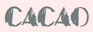 Max Infeld (b. 1981, aka Xerographer Fonts) from Chico, CA, makes free fonts and offers a free font-making service. He surged onto the font scene in 2012, and is currently located in Ojai, CA.
 Creations in 2012: Perspect (3d face), Nuevo Stencil, Dingus, Dirty Serif, Skinny Serif, Batt Marber, Hollavetica (2012, grunge), Stick Tickle, Carve Your Table (2012), Stripe Fest (2012, 3d, hand-printed), Craycray For You, Feed The Bears, Yummy Nubs, Yum Nub Extended, Sleeping in Lecture (2012, informal 3d face), Zombie Checklist (2012, hand-printed), Lisas First Class (2012, hand-printed), Stick Four, Two Stick, Spacetime, Drunk Tattoo, Bantum Caps (2012, hand-printed stencil face), Funny Zebra, Sick Future (2012, grungy), Fuzzy Handcuffs, Black Spiral, Happy Caps, Come Party, Hellawood, Chronic Gothic, Ice Cream Party, Grassevent (2012, texture face), Electrical (2012, letters cracked by lightning), Rockster, Strungout, Bubbletea (2012, bubblegum font), Yumernub, Nighthour, Pointy, Simplehand, Linerstencil, Stickchop, Tapetype, Rolling Deep (2012, based on arcs of circles), Pony Rides, Bambu, Stolen Script, Secret Sauce, Eighties, Negative, Turds, Identify (2012, a fingerprint font), Another Party, Mighty Roping, Copy Stand, Cloudstorm, Teardrops, Friends Forever, Delicious Applepie (texture face), Crackvetica, Stormtime (grungified face), Therp (2012: 3d face), Spookies, Freeline (3d engraved face), Super Serious, Robot Shadow (2012: 3d face), Great Arrows, Great Shadow (2012: textured face), Alien Fur, Graffical, Bent Out, Splatish, Seamonster, Thirds Hand (2012: 3d outline face), Particle Physics, Poster Script (2012: rough script), Badazzle (2012, texture face), Serifvetica, Make Impact (2012, a 3d headline typeface), Stenciltration, Naughty Pipe, Qrurl, FunHaus, Flame Time, Steller Script, Summer Festival (2012, grungy caps), Major Earthquake (2012, grungy outline text face), Hot Sweat (2012, texture face), Metal Crime (2012, a cracked marble typeface), Summer Blacktop, Great Farmer, an angular typeface, Lucky Scratcher, Future Moon (textured face), Shatter Web (2012, a glaz krak face), Power Play (2012, another glaz krak face), Magic Crystal (2012, yet another glaz krak typeface), Rough Cut, Rock Harder (2012, texture face), Shred Hard, Clock Work, Major Veins, Paint Scratch, Break Away, Quick Comic, Summer Scriptastic, Absolute Money, Brush Sand, Playhouse, Pleasure Wash, Meat Market (dripping blood font), Paper Folder, Scratchingly, Fresh Sticks, FunTrucks, Quick Rodeo, Poster Bold, Open Bars (horizontal stripes), Outline Twelve, Spot Event (grungy outline face), Final Slash (textured typeface), Munchies, Meltasstic, Some Bubbles, French Sugar (very curly script), Cream Cone, Zap Deal, Crack Snacks, High Method, Crack Bars, Wall Fresh, Star Wonder, CurlyQue, Summer Script, Happy Lines, Just Marker, Solid Marker, Straight Hand, Wurm Fun, Rave Time (sketched face), Graff Caps, Erect Angle (outlined and hand-printed), Circle Caps, Story Time, Upper Side, Lower Side, Tech Haus (sketched), Boneyard, Status Update, Eigth Grade (sic), Table Shank, Serial Lover, Freaky Night (blood drip font), Future Girlfriend, Summer Scare, Faster Stronger, Smoking Cracks (texture face), After School, Cutting Edge, Animal Cracker, Sticky Mad, Comic Chub, Right Way, RockLess, CleanFade, Exploded Capital, Size Matters, EightBite, Extra Dimension, Cap Scratched, FanCom, Optic Nerd, Spooky Stencil, Five Dozen, Great Mix, LowCase, Swirl Insertion, Lube Splash, Organic Vines, Fall Greetings, Plant Type, Fast Brush, Hair Bows, Limo Caps, Bold Shake, Path Check, PopCap, Angle Stroke, Scratch Point, China Town (oriental simulation), Gunky Ick, Super Fade (textured), Practical Script, Delicious Outline, Fourth Dimension, College Scribble (sketch font), Dirty Western, Freeky Typewriter, Creature Builder, Bang Time (a rough brush), Fall Harvest (sketch face), EuroParty, Fire Proof, Eye Scare, Empire Caps, Pleasure Castle (a great barbed face), Scribble Time (sketched font), Star Rising (poster font), Dottline, Euro Horror, Metal Show (metal band font), Fantastic Sunset, Toxic Waste, Alien Waffle (textured face), Rewind Forward, Stitchy Times, Snug Bum, Star Fishy, Ghost Clouds, Epic Slash, Childs Persprective, Thin Fine, Metal Event (chiseled face), Tight Box, Saber Husk, Major Scare, Terminal Event, Pirates Bay, Wicked Cockney, Great Splunk, Diamond Cut, Treehause Horror, Indie hand, Sweet Revenge, Chronical Script, Peaceful Violence, Basic Header, Hand Work, Ninja Turtle, AquaColor, Furry Sack, Mad Style, Alien Dot, Dirty Feature, Wine Basement (connected script), Pen War (scratchy script), Angelina, Skate Around, Wide Thin (brush face), Frisky Vampire, SuperBling, Chronic Harvest, Fur Handcuffs, Darth Fader (textured face), House Rave, Snow Frosting, Post News, Straight Baller (white on black poster face), Heavy Weight, Angry Nerds (brush face), Future Style (hand-printed 3d face), Liner34, Tweak Diner, Frosty Holiday, Zap Control, Kids Outline, Shock Treatment, Flesh Digster, Shredding Harder (grungy scratchy typeface), Metal Chakra (barbed wire face), Childs Funtime, Super Cut, Holy Scriptacular, Tangent Print, Chung Flew, Lucky Money, Oven Bread, Soda crack, Quick Dirty, Victory Cut, College Dropout (athletic lettering), Comic Shadow, Mystery Forest (sketched), Code Danger, Slash King, Phat Rave (sketched), Tiger Tails, Major Rules, Cloud Home, Flower Header (floriated caps), Tiny Friends, Tasty Sundae, Leaking Type, Saturday Evening, Agenda Clash, Tripple Dots, Plain Handline, Cutefold, Gift Exchange, Reaganald Script, Broadway Event (marquee face), Gotfaded (textured face), Disco Rush, Some Lines, Inside Flower, Scratch This, Alien Sweater (stitch font), Fantom Bantum, Stripe Fun, Thrift Store, Legit Outline, Country Gold, Chrome Fancy, Barnyard Massacre (Treefrog style), Holiday Event, Art Times, Flesh Shop, Heart Baller, Free Kittenz, CreamPuff, Outline Around, Quivering Noodle, Rocking Lines, Tugboat, Comic Bubble, Hand Shadow, Sans College, Winter Ice, Cutout Poster, Woodblock Cutter, Handy Stencil, Dirty Cursive. The following typefaces were designed by Matt Barber: Gateway Drug (2013), Crankdeal (2012, a hand-printed poster face), Mad Caps, Third Leg (multiline typeface), Late Nights, Sewn Tight (2012, stitch font), Black Widow (2012). The following typefaces were co-designed with Dylan Tellesen in 2012: Dingleberry (+Solid), Threed, Brushingtons, Excellent Stencil, Handrelief, Partyline, Basic Chrome, Spot Lights, Big Spit, Code Bars, Color Blind, Skullvetica, Diamond Plate, Blambu, Hounds, Knity (texture face), Eightballer, Another Line (a basic straight-edged monoline sans), Rocking Poster, Robotic Revolution, Organic Nature, Underground Event, Surf Shack, Greater Shadow, Razor Slice, Big Print (textured face), Scripty Caps. Typefaces made in 2013: Fresh Maker, Lucky Dogs, Quickly Write, Gourmet King (glaz krak font), Austin Lights, Pony Maker, Crystal House (grunge), Secret Event (textured face), Indian Tiger, Great Camp, Cowboy Would, Western Racing, Stripe Attack (textured font), Art Bang (grunge), Quick Scratch, Cold Brew, Fresh Twist, Nine Eight, Going Fast, Mega Riches, Taste Bomb (textured face), Brighten Days, Supergraf (a brushy graffiti face), Last Hand, Spring Ninja (brush face), Circuit City, Global Village, Yard Gnome, Lite Hand, Metal Block (Zero, Two, Three: scanbats), Indie Rock, Ancient Story, Super Drag, Slight Rocking, Over Scribble, Quickly Caps, Crack Deco, Victory Time (faded formal script), Futuristic Outline, Another Student, More Party, Brush Grunge, Zipper Fries, Diamond Lux, Splatter Funtime, Durh Shapes, Frosty Winter, Whole Space, BlockWood, Soda Water, Magic Scribble, Seaming Stitchy, Thrash Party, Line Fever, Great Bush, Right Price, Tight Carve, American Freedom, Jimbos Print, Quick Cut (faded face), Super Cracks (glaz krak face), More Party, Half Faded (textured face), Charcoal Script, Future Lines, Dot Outline, Half Tones, Shady Walk, Quick Slash, School Notes (sketched face), Block Party, Wonderful Party, Heart Stripe, Heart Beat, Heart Hole, Paint Balls, Golden Lights, Spring Party (texture face), Shockvetica (glaz krak face), Safe Paper, Sword Fighting, Camo Wear (textured face), Disco Night (art deco), Reverse Frick, Scratchy Fun (sketched), Fun Origami, Special Exit, Kid Print, an old typewriter collection (Dirty Olympia, Sterling Keys, SuperKeys, Quiet Type, Hermes Rocket, Double Studio, Light Fingers), Designer Pixels, Beauty Salon (Treefrog script), Headshot, Mega Bone, Fantastic Habits, Fridge Letters (textured), Kids Blocks (scanbats), Theater Event (grunge), Circle Pixels, Taste Bomb, Kite High, Run Away (3d) Dirty Coal (brushy), Dot Sticks, Twerk Fifty, Dance Lights (textured), Steam Rose (textured), Donkey Punch, Fold Line (origami), Tiger Nuts (textured), Fun Bear, Standard Header (letterpress, 3d), Marble Wasteland, Bender Lines, Magical Springtime, Open Hatch (hand-printed), Retro Tastic, Space Zombie (hand-printed), Mad Triangle (textured typeface), Sweaty Party (a fun sketched typeface), Freaky Manor (gothic typeface), Special Brand (texture face), Western Clown, Company Problem, Derp Icons, Pixel Hour (textured face), Basic Scratch, Indie Sellout, Next Level (textured face), Third Rail (grunge), Real Trap (athletic lettering), Bang Party, Title Solution (textured face), Special Third (textured face), Deal Maker (textured typeface), Liquor Bank (3d), Electrical Neue, Eighties Locker (grunge), Visual magnets (textured typeface), Final Relief (textured), Comic Tans, Bright Headline (hand-printed), Tiger Bawl, Cut Away (cutout letters), Kings Castle (textured face), Southern Riots (grunge), Slick Wave (textured face), Smash Break (texture face), Thin Simple, Super Rocket, Kids Game, Eighties Shades, Melt Factory, Pirate Zombie (grunge), Doktor Scratch, Mix Tape (textured face), City Tags, Gotcha (3d face), Wild Scratch (textured), Inter Fade (textured), Urban Labels (textured), Hot Tropics, Quantum Pixel (grungy), Minus Plus, Lower Scratch, Flying High, Broken Mustangs (script), Byte Shades (textured), Bolt Light (textured), Just Quick, Hotrocks, Total Event, Racing Flow, Energy Drink (textured), Inside Box (a wonderful metal-look textured typeface), Heat Wave (a wide poster face), Great Miami (arched typeface), Disco Midnight, Clean Scratch, Vegas Nights (textured and smudgy), Pirate Disco, Swift Chops, Zero Hype, Dot Tricks (grungy), Shaken (glaz krak font), Great Points (textured), High Level (textured), Break Time (textured), Circus Party, Crash Site (glaz krak face), Lower Resolution, Fifty Hours (script), For Sale (script), Broken Fixed (script), Hieroglyph Licks, Think Plan, Fancy Shadow, Forwards Backwards, High Sales, Slash Thirty (blood drip face), Universal Freaky, Event Shark, Bone King, Sharking, Magnetic, Paper Shreads, Summer Watermelon, Bubble Yums, Crazy Eyes, Danger Waffles (textured face), Early Scare, Farm Barns, Freckle Jackson, Greater Sales, Indian Summer, Mixed Thirty, Positive Warp, Reasonable Speculation, School Party, Scratching Matters, Lemonade Summer, High Style (textured face), Biology, Aweseome Style, Box Lines, Cloud Ahead, Going Around, Hot Flash, Major Stripe (sketched face), Pixel Draw, Summer Fire, SuperTack, Sure Real (Treefrog style), Totally Straight, Mega Gothic, Basic Hand, Chief Scare, Plain Slice, Sail Away, Gone Away, Chubby Muffin, Crack King, Dirty Jobs, Paris Label, Phone Home, Kids Party, Zombie Stitch, Moden Post, Rock Bait (Treefrog style script), Tent Sale (brush face), Event Maker, Quantum Ants, Cheap Horror, Extra String, Scratch Times, Snorkel Whisp, Dirty Looks, Bould, Window Crash (glaz krak face), California Harvest, Twerking Nasty, College Movie, Easy Horror, Brush Some, Autumn Two, Season Fourteen, Always Never, Fresh Bone, Scare Camp, Twinkle Fingers, Dirty Bandit, Metal Clash, Simple Folks, Sunrise Disco, Danger Zone, Swift Break, Dusty Salmon (textured face), Urban Poster, Tasty Drips (dripping paint font), HardLine (3d font), Technophilia, Zombie State, Come Inside, Popular Invite, Tough Horror, Wonderful Phonograph, Zombie Scratch, Thunder Crack, Fresh Riot, Metal Atlas, Grunge Shack, Gif Wrap, Punk Inside, Disco Break, Quantum Future, Major Black (textured), Stone Bird, Fantastic Party, Quick Money, Fast Time, Hecka Grunge, Electric Night, Tasty Swirl, Helping Stranger, Radical Llamas, Real Gold, Double Shadow, Space Cats, Space Fight, Furious Racing (textured typeface), Snow Flakes, Solid Event, First Place, Total Shock, Hairy Fun, Cats String, Dragons Breath, Stripe Disco, College Bytes, Late Club, Road Skin (textured), City Heights (textured), Easy Bricks, Insert Fun, Grunge Kids (textured), Solid Brand, Winter Decor (snow crystal font), Doctor Meow, Real Fast, Major Sketchy, Easy Romance, Globtastic, Noses, Strike King, Salty Would, First Contact, Extra Zero, Space Bang, First Avenue, Dirty Shocker, Delicious Candy, Drop Inside. Typefaces from 2014: Divide Conquer, Mad Pic Nic (textured), American Lights (dry brush), Chromest, Absolute Invite, Fancy Sauce (simulates an oriental typeface), Fair House, Gansta Walk (graffiti typeface), Spring Away (script), Heavy Load (fat brush), Amazing Sunshine, Club House, Magic Status, Big Party, Ocean Twelve, Lost Type, Spring Harder (textured), Escape Great, Fine Things, Cut Five, House Boat (textured), Splat Matrix, We Spring (gunge), Great Band (textured), Sky Limit, Four Six, Quick Sales (textured), Vegas Neon, Xero Typique, Ink Special, Bad Luck (glaz krak face), Handing Over, Megaphilia, Late Drank, Atlas Grunge, Right Track (textured), Square Deal, Great Party, Next Wave, Doges Walk, Dirty Locals, Boulder Scare, Clean Easy, Come Around, Fresh Holiday, Half Light (a condensed brush face), Light Curls, Lower Case, Magic Beauty, Much Funky, Plain Lines, Ten Fresh, Simply Fresh, Windy Metro, Play Along, East City (textured), Bernal Heights (grunge), Metalblock Delta (textured), French Disco (textured), City Magic (textured), Thunder Head, Lucky Diamonds, Great Storm, Neon Taste (textured), Night Hawk, Trap Music (a sketched typeface), Close Race, Major Label, Fresh Track (an all-caps brush typeface), Jack Trades, Cut Blox, Metal Block Theta (textured), Fired Bread, Angry Beavers (script face), Get Real, Lost Ray, Slot Machine, Animal Planet, Very Rich, Hawt Would, Above Ground, Grave Pain, Heaven Gate, Countrry Diamonds, Master Strike, Great Ending, Dreaming Pandas, Olden Times, String Tyme, Wrecking Ball, Great Nineties (sketch face), Lightning Blaze, Club Night, Certain Times, Clean Bubbles, Disco Party, Stoned Heights (glaz krak font), Can Opener, Metal Block Tango, Disco Fresca, Static Heights, Chronic Deal, Fire Block, Capital State, Burger Hut, Chicken Waffles, Bro Hugs, Indie Hype, Smoking Pistols, Mega Play, Light Break, Fadevetica, Metal Block Serif, Dream Stencil, String Piano (grunge), Binaty Waters (textured), Soth West, Magic Pens (fat finger font), Mega Bits (dot matrix), Zebra Disco, Luxury Import, Rapid Sloths (Treefrog-style handwriting), Spring Rage, Delicious Mocha (textured), Tropic Disco, Sprung Breakers, Urban Trails, Many Times (textured), Spring Headliner (textured), Party Lights (rounded stencil), Slick Ride (grungy), Burn Side (textured), City Stencil (grungy), Love Joy (textured), Neon Disco, Witches Brew (halftone texture), North Beach (textured), Metal Black Naked, Metal Block Ultra, Wet Razors, Cat Meow (sketchy face), Dance Away, Salty Beach (textured typeface), Great Horizons, American Western, Start Menu (halftone texture typeface), Zip Down, World Peace, Super Round, Spring Fruit, Open Lounge, Magic Kids, Fresh Candy, Four Stars, Gold Ring, Fun Time, Dark Box, Major Clue, Alert Notice, Love Riot, High Boat, Real Hard, Canada Mist (textured), Flavor Maker (textured), Spring Daisy, Great Springtime, Danish Crack (glaz krak), High Rating, Awesome Play, Flash Dance, Super Awesome, Paint Night, Pixel Drip, Ready Start, High Flight, House Music, Alternative Nineties, Technologic, Beaver Scratches, Spring Bump, Fancy Animal, Graph Master, Many Lines, Quality Control, Hot Discovery, Disco Trap, Ripe Dusk, Spring Dance, Electrical Storm, Electro House, North Cowboy, BiteTyme, BubLight, ChronicSales, ColdSpring, DeliciousFrosting, FloweringBuds, FrenchDance (white on black), Frequency, GetAround, GiftCards, LargeCrayon, MadSkilz, MetalShred, PeaceFight, ProximaFour, RightPlace, RockingTimes, ShwedyBawls, ThinkLight, WildThang, Make Out (crayon font), Clean Dirty (another crayon font), Digital River, Jaged Edge (sic), Loathing Fear (a great Treefrog style typeface), Metal Spectacular, Quit Work (crayon font), Special Delivery, Big Crump, High Fence (glaz krak face), Delicious would, Neon Tech, Right Brew, After Work, Pit Stop (textured), Strong Void, Love Scratch, Maiden Voyage, News Worthy, Mint Coin, Hipster Bike, Ready Made, Ten Dimensional, New Highs, Banlieue Disco (textured face), Punk Event, Soup Kitchen, Such Money, The Pulse, Thirdly (3d face), Train Station (a great ultra-fat rounded sans), Goldfinger (script), Neurotick, Hawt Comix, Talking Louder, Mind Storm, Astral Projections, AncientSprawl, BeautifulThangs, BoulderRough, ChronicMethodMB, CleanSimpleDT, DropKickMB, EasyDoughDT, FairBanks, FaultLineDT, FiftyShadowsDT, FrenchPirates, FuelControl, FunMeatsDT, GrandCircleDT, GreatFriendsDT, GreatSails, HawtFriend, JuicyCultureDT, JustWriteDT, LearningMachine, LearningMachineItalic, Marijuana, MegaLife, RedPanda, SecretTickleMB, SlickRoadsDT, SmokingParadise, StarDancing, StringTheory, StrongEventDT, ThinkingAcademicDT, ThugLoveDT, California Delights (connected script), Super Freak (textured), Extra Highs, Slime Bawls, Metal Witch, Grape Soda, Little Spooky, Such Frosting, Monster Slash, Burn Time (textured), Quick Fade (textured), Urban Animal, Prison Escape, Super Fear (dripping blood font), Final Days, Racing Numbers, Pirate Spider, Walking Dead, Hatch (textured), Strawberry Longcake (curly), Mad Zombies, More Dimension (3d), Popular Culture, Princess Cake, Wine Tasting (vampire script), Toxic Powers, Zombie Treats (rough brush), Total Eclipse (brush), Whisky Lickers, Brain Washers, CityVetica, Turn Up, Basic Sharpie, Electronic Voyage, Swingers, Heavy Loading, Solid Waste (textured typeface), Swingers, HighLines (sketched typeface), IceCold (textured), ManyGifts, OpenStore, PlaidEvent (textured), RustyNail, SickDream, WantedPirates, BreakingNews, FantasticSeasons, FantasyMachine, FluShots (rough brush), GreatWinter, HeavenlyWings (sketched), KentuckyBourbon, LoveBombs (rough brush), MicroBrew, Slashtacular, XmasLite, Golden Dabs (grunge), Urban Paints, Making Ideas, Just Brains. Typefaces from 2015: Extra Reaper (horror font), DigitalStream, EightyOne (sketched), GrandStencil, GrandZeroes, LightFuze, LiquidMagic, MetalReason, MiamiShades (shadow font), TakenBlack, TakenBlackItalic, TeaParty, WinterCrops, WonderInk (tattoo font), YoungRanger (connected script), Late Noise, Dark Papers (textured), College Thrash (sic), CrispyBones, DrawingMachine, JusticeWanted, KrampsHandso, PolarBears, SolutionFive, Shock Colours, Washer (textured), Dynamatics (textured font), Flowery Death, Pushing Sticks (dry brush font), Righty Marks (marker pen font), Baked Trains (graffiti font), Chronic Delivery (signage script), Intaglio Plains, Modern Reality (dry brush script), Nuevo Trenta, Rastaerize, World Shocker, Grape Blaster, Slate, Stencil Disco, Technocracy, Yarden Tawns, Flaunts (textured), Ringlead (textured), Freshly Thinking (script font), Plutonium (textured), Space (textured), Boulevard, Nuevo Disco, Stamp Ink, Educated, Krusty Signs, Quagent, Dusty Hotels, Cracked (glaz krak face), Amplitudes (techno sans), Frozen Rita, Beast Mode Suite (an avant garde family; +Disco), Epicenter (athletic lettering), Kitchen Cowboy (modular and spurred), Forest Lakes, Northern Montgomery, Biometric (techno family), Modernism, Higher Pixels, Grandious Vengeance (scratchy script), Second Avenue, Just Perforate, Grave Danger, California Designs, Natural Products, Boxing Chocolates, Beyond Space (textured), Asterisk, Katchy Markers (rough dry brush), Black Ties (sketched), Twenty Singles, Great Shake, Monster Energy (textured), Precious Moments (vampire script), Nuevo York (a vampire script), Faux Antique (another vampire script), Zero College, Fun Sized (drop shadow face), Blueberry Waffle, Stale Marker, 12 ounces, Raw Diet, Megadeal, Blklite (textured), Prison Break, More Candy, Fuel Tanks, Hot Bone, Break Point, Fresh Waters, Lower Haight, Carnal Devices, Juicy Boxes (sketched font), Special Case, Urban Life (dingbats), World Beings (dingbats), Twenty Something (textured), Many Fun, Expensive Solutions (brush), Dopeframes, Fun Lines, This Way (handcrafted arrows), Rinse Wash, Trap House (crayon font), Love Marks (dingbats), Viral Fun (scanbats), Grape Dragon (brush script), Juicy Rags, Pleasure Riot. Typefaces from 2016: Reinebow (a color SVG font), DecoRated (art deco), Recreational (3d, outlined), Tiny Shack (3d, outlined), Sugar Cakes, Regime Change, Treasure Hunt, Taco Fiesta (Mexican simulation font), Crystal Breath, Purple Drank, Denominator, Perceptual (art deco), Realismo (futuristic), Banquetier (a monoline deco typeface), Continents, Asperian, Fonderian, DeadTasty, Distinguished, DraftHouse, FreakyTwenties (white on black poster typeface), LuckyTricks, (outlined) MajorChronic, (outlined) Moulden (outlined), OldeBarnsby, (outlined) Marquez (crayon script), Hand Typist, Fauquier, Blockchain (3d style), Zombie Story, Private Fort, Spiral, Spherism, Swaingarm Yori, Solarium (outlined techno typeface), Tracksion, Hail Stormz (grunge), Paper Scraps, BombingStencil (textured), ExtraSprinkles (textured), MagneticFriends, PerfectChisle, PrizedStudy (sketched), RealPrizesItalic (tattoo script), RealPrizesVeryItalic, SketchyBuilder, Tragic Prequel, Twisty Pixel, Movie Nite, Gaslighter, BeautyScript, BlackSmith, Education (grungy athletic lettering), Kickstop (white on black), LemonadeHustler, PrinceCharming, SurfPoint, Wickers, BigTangle (triangulated), FlavoredCrayons, FreshCandies, RedlightDistrict, SingleOrigin, SnakeBite, SpringRaces (children's script), Valencia (dry brush script), BoldDrink (textured), BrandStruck (sketched), CarteBlanche, DarkStars (sketched), FreightCarts, HipsterFactory (sketched), HugeCrunch (textured), LateVaping, Masquerade, Neturality (white on black), Playgrounds, Prescriptivism, RockSolid, SewModern, SimpleLucky, TotalFreak, Transylvania, WasteFactory, WickedSeventies, WindowMarkers, Boards (sketched), BigSmoke, BrightSigns, ClubSport, DatBox (3d, white-on-black), EasyPeople (signage script), GouldenTreatise, Invertage (white-on-black), SpaceTransit, Above Stars, Band Stand, Market Crash (glaz krak typeface), Opiated Values, Stamped Envelopes, Higher Bounties, Gothic Friends (blackletter tattoo font). Typefaces from 2017: Abraxeous, Schwifty (outlined shadow font), Freaks (scary font), Musky Dawn, Tigerian (tiger-striped letters), Banqued (sketched), Basket of Candy, Bouquet (handcrafted blackboard bold), Percolation, Scrapbuckets, Guangzhou (oriental simulation), Budtender (outlined), Cryptographic, Moleculan (connect-the-dots style), Robustly Brewing, Wonder Age, Graphemic, Simulacre (bilined), Squanch (squarish), Wysterium (a hatched display typeface), Value Stamp, Discover Earth, Dreaming Castle, Metal Shard, Warm Showers, Ripe Apricots, Plenty of Metal, Spackler (dry brush), Falconers, Ephemerian, Brackish Pond, Lemon Shower, Delinquence, Couper Blaque, Pelanquier, Karpow, Graphisme, Martienso, Bacon Request, Corpsey, Cloudier (cloud-themed font), Draft Quick (draftsman font), Forgivable Sin, Manufactured Consent, Comedy Show (shaded), AvailableReservation, CandyDelish, ForgeMelt (textured), FreshSteaks, FunSpace (textured), Gouldage, StuckBrayers, Substrate, SunsetBreak (textured). Typefaces from 2018: Infinity Lights, Prescribe, Huge Party, Fun Play (a 3d shadow font), Clown Shoes, Astronmica (hipster style), Bronium, Mastum, Brisquet (bilined), Mega Dose, Space Melons, Retaillistic (stencil), Algorithma (bilined), Basket Fries (crayon font), Elusive, Splasher, Midcentury, Miswak, Parabolic, Xelita. Typefaces from 2019: Brewski, Trash Fort, Rough Path, Uncertainty, Scrizbels, Psychographia, Caustic, Zipties, Light Roast, Liquor Market, Boublies, Monolithic, Brick Roads, Blokqued, Chonkies, Brushings, Fugly Stick, Fresh Bagel, Scratchers, Fentanyl, Crypto Prices, Chonky, Mucho Fiesta, Leather Jackets (grungy), Peroxide (shattered letters), Postructure (sketched), Lubricants (brushed), Train Yard, Shipment (rough stencil), Action (halftone font), Bathing in Acid. Aka Xerographer. Dafont link. Github link. [Google]
[More] ⦿
|
Yellow Design Studio
[Ryan Martinson]

|
 Yellow Design Studio is a fine art, graphic design and typography studio based in Sanibel, FL, and before that, in Madison, Wisconsin. The font designer is Ryan Martinson (b. 1972), who is from Chetek, WI. Rena Martinson is the other partner in the venture.
 Via MyFonts, they sell fonts such as Cardium (2021: an almost geometric font family in 54 styles), Draft Natural (2019), Draft (2018: a 144-style sans superfamily, followed by Draft B later in 2018), Lullabies (2016, watercolor brush script), Kiln (2016, an eroded caps only letterpress typeface), Canvas Acrylic Megafamily (2016, by Ryan and Rena Martinson), Sucrose (2015, a letterpress emulation family with eight levels of textured distress), Sant Elia Script (2015), Lulo (2014, a stackable chromatic typeface family), Lulo Clean (2014), Thirsty Soft (2014, a vintage signage script family), Eveleth (2014, a detailed vintage letterpress emulation family), Gist (2014, an inline slab serif; one weight is free), Gist Rough (2014, rough letterpress), Verb (2012, a very open sans family; +Verb Condensed, 2013, +Verb Compressed, 2013 +Verb Extra Condensed, 2013), Thirsty Script (2012, a retro connected signage script, which by his own admission, is based on Jack Edmondson's Wisdom Script, a fact he did not originally mention in the typeface description), Thirsty Script Shadow (2012), Thirsty Rough (2012), Thirst Script Extrabold (2014), Anodyne (2012, grungy caps), Veneer (2012, letterpress style), Veneer Clean (2016), and Veneer Extras (2012, dingbats), Melany Lane (2011, a connected school script), Skitch (2011, sketch / blackboard bold face); +Skitch Shaded, Magesta Script (2010, a grungy calligraphic script), and Wausau (2010, an all caps grunge face). Klingspor link. Creative Market link, Dafont link. [Google]
[MyFonts]
[More] ⦿
|
You Work For Them (or YWFT; formerly Cinahaus or TrueIsTrue)
[Michael Cina]

|
 Michael Cina (Minneapolis) is the cofounder of WeWorkForThem and YouWorkForThem (in 2002), also known as YWFT. Before that, he ran TrueIsTrue, and before that was partner in Test Pilot Collective (which he left in 2001), and before that he ran Cinahaus. YWFT is located in Knoxville, TN and/or Baltimore, MD. The creative director is Michael Paul Young.
 Cina's fonts include the pixel fonts YWFT Caliper (1998), YWFT Bit (1998), 6x7oct (1998) and BlackGold; the handwriting font Cinahand; Blessed (1999, techno), YWFT Cam (1998, a slab serif based on industrial lettering), CommunityService, Crossover (1998, dot matrix with stars instead of dots), Composite (1998, octagonal), Formation (1999, a big octagonal family), Jute (2004, a masculine, military, sans-serif), YWFT Maetl (1999, octagonal, angular family), YWFT Moteur (a technical, retro, machine-like design; it briefly went under the name Alloy---in the early 2000s it was heavily used in the video gaming magazine Playstation), YWFT Novum (2002: a heavy block font that draws inspiration from a typeface originally used by the Swiss graphic designer Siegfried Odermatt), Pakt, Reversion (1997, squarish), Selector, Selek (1998, pixelish), YWFT Blackgold (2000, pixelish), Service (2001-2002, an octagonal family), YWFT Signature (1998), Trisect (1999, three-lined family), Unisect (1999, organic monoline sans), YWFT Ultramagnetic (1996, a popular rounded gothic typeface family), Ultramagnetic2 (1999), YWFT Ultramagnetic Expanded (2011), YWFT Ultramagnetic Rough (1996-2017), Unfinished. Bastard (1998), Kcap6 (with Matt Desmond), Cheese (1998), Novum (2002), Overcross (2002, unfocused letters), Stem (1998), Testacon (with Kral and Desmond, 1999), Praun (2002, pixel typefaces), OneCross (2002, pixelish stitching family), Estenceler (2004, a great stencil family a bit related to Milton Glaser's Glaser Stencil), Graphium (2004, octagonal Western style family), Expos (2004, graffiti or poster face), YWFT Pixacao (2007, after the Brazilian graffiti style), Vox (2007, monoline sans), Militia Sans (2007, like a Russian constructivist stencil), Jupiter (roman), Militia (2007, heavier stencil), Merc (2007, grunge), Guild (2007), Clarendon Text (2007, a complete revival), Jezebel (2007, script), Ambassador Script (2007, a digital revival of Novarese's typeface by that name), Enam (2002, influenced by Crouwel), Enigmatic Hand (2007), Dusty (2007, a Tuscan-eared Western font), YWFT Poplock (2007, experimental), YWFT Pakt (2004, geometric sans), Sudsy (2007), Black Sabbath (2008, ultra black slab serif, by Stefan Kjartansson), YWFT Belle (2008), YWFT Agostina (2008), YWFT Bitwood (2007-2017, pixelish Western typeface), YWFT Mullino (2009, letterpress emulation), Trithart (2008, grunge by Emma Trithart), YWFT Tapscott (2008-2017, informal and nostalgic all caps family, in the style of Rennie Mackintosh), Habano (2008, script), Amorinda (signage script), Retron (2008, connected script), MD01 (medical-themed dingbats), Adelaide (script), Centennial Script (calligraphic), Alexia (calligraphic), Ultramagnetic (experimental), Nash (1997, grunge), Amber (kitchen tile), Fab (3d), 6x7 Oct (1998, pixels and dots), Wool (2009, stencil), YWFT Matter (2009, a wide bold grotesque), YWFT Merriam (2009, a Clarendon-styled slab serif), Agostina Alternate (2011, with Michael Paul Young and Taechit Jiropaskosol), Ramsey (2012), YWFT Dessau (2013, schizograms and capitals like Bauhaus on drugs), YWFT League (2014, inspired by college football jerseys), YWFT Yoke (poster typeface done with Pintassilgo), YWFT Illuminati (2015, abstract capitals). Blog. His lovely g poster (2010). House fonts at YWFT by unknown designers: YWFT Knit (2010: knitting patterns), YWFT Motif (2015), Ramsey Condensed (2015), YWFT Roamer (2016), YWFT Whisky (alchemic), YWFT Psychosis, YWFT Processing (2001-2010: YWFT Processing was developed in 2001 for Casey Reas, the co-creator of the Processing programming language. We created this display face to be sharp, tall, unique and interesting...much like Mr. Reas himself. The font was derived from an original logo that already existed, and we continued the idea into a fully working six-weight font family. YWFT Processing was converted to Opentype format in 2010), YWFT Filbert (2012), YWFT Nim (2012, combining the hipster style with overlays for bevel and shadow effects), Dogma (2012, alchemic), Attic (spooky poster face, in EPS format), YWFT Yoke (textured all-caps), Riblah (2003, dot matrix), YWFT Fraktur (tattoo face), YWFT Burls (2013, fat poster typeface), YWFT Coltrane (2011, handdrawn poster typeface), YWFT Symplify (2013: haute couture snowflakes), YWFT Smoothie, YWFT Chance (2016), YWFT Skipper (2016), YWFT Wheatgrass (2016), YWFT Estee (2002-2017), YWFT Watermelon (2017), YWFT Ink (2017, originally designed in 2008), YWFT QUE, YWFT Burtonian (2017, named after Tim Burton), YWFT Crew (handcrafted), YWFT Maudlin (2017), YWFT Liana (2017; perhaps plumbing dingbats, who knows?), YWFT Victoria (2010: a bonbonnerie type), YWFT Valley (2017: a Memphis movement type), YWFT Wellsworth (2017), YWFT Harmony (2008-2017, a curly calligraphic script), YWFT Edger (2017), YWFT Chateau, YWFT Gummy (2002-2018), YWFT Blender (2018), YWFT Fluctuant (2018: a variable font), YWFT Gavin (a ransom note font) (2021), Ramsey (2021: a 54-style rounded squarish typeface), YWFT Hugo (2021: a child's hand). View Michael Cina's typefaces. Alternate URL. Behance link. Interview. [Google]
[MyFonts]
[More] ⦿
|
Yusof Mining
[Gearwright]
|
 [More] ⦿
|
Zetafonts (or: Studio Kmzero, or: ZeroFont)
[Francesco Mistico Canovaro]

|
 Italian design firm in Firenze consisting of three graphic designers, Francesco Canovaro, Debora Manetti, and Cosimo Lorenzo Pancini. It has evolved into Italy's premier and most prolific type foundry. Canovaro's Behance link. Also called ZeroFont and Zetafonts, this type foundry exhales joy---in every design and presentation, the passion of the designers bubbles to the surface. Blending a delicious sense of humour and a great aesthetic taste, Zetafonts is a typographic delight. Their typefaces:
 - Adlibitum (2018). A textura blackletter typeface family.
- Anaphora (2018). Anaphora is a contemporary serif typeface designed by Francesco Canovaro (roman), Cosimo Lorenzo Pancini (italic) and Andrea Tartarelli. It features a wedge serif design with nine weights from thin to heavy. Its wide counters and low x-height make it pleasant and readable at text sizes while the uncommon shapes make it strong and recognizable when used in display size. Anaphora covers Latin, Greek and Cyrillic.
- Aliens and Cows (2016). An ultra-condensed all aps sans family by Canovaro.
- Arturo (2018), by Francesco Canovaro.
- Atlantica (2017). A signage script family.
- Lightstrike (2016). A thin (and free) brush font by Canovaro.
- Byom (2016). A tweetware organic sans typeface family by Francesco Canovaro.
- Adlery (2016, +Cyrillic). A brush script by Cosimo Lorenzo Pancini.
- Adlibitum (2016). A blackletter typeface by Cosimo Lorenzo Pancini and Francesco Canovaro.
- Morbodoni (2016). A display didone by Cosimo Lorenzo Pancini and Francesco Canovaro.
- Altair (2016). A display sans by by Francesco Canovaro based on Digitalino.
- Aquawax (2015). A sans family by Canovaro and the Zetafonts team. Extended in 2019 to Aquawax Pro by Francesco Canovaro, Cosimo Lorenzo Pancini and Andrea Tartarelli.
- Armonioso (2014). A creamy connected signage script.
- A Day Without Sun (2014, by Cosimo Lorenzo Pancini).
- Another Shabby (2014, a primitive script by Francesco Canovaro).
- Antipasto (2007, by Matteo Di Iorio). A clean elegant sans by Canovaro.
- Arista (2007) and Arista 2.0 (2010). A simple rounded bold sans typeface designed by Francesco Canovaro and Adolfo Monti. In 2017, Francesco Canovaro updated these to Arista Pro.
- Arsenale White and Arsenale Blue (2009). Children's hands, done by Cosimo Lorenzo Pancini, Francesco Canovaro, Andrea Mi, Debora Manetti, Katiuscia Mari, and Jonathan Calugi.
- Beatrix Antiqua (2016, by Francesco Canovaro, Cosimo Lorenzo Pancini and Andrea Tartarelli). This humanist sans-serif typeface is part of the Beatrix family (Beatrix Nova, etc.) that takes its inspiration from the classic Roman monumental capital model. Its capitals are directly derived from the stone carvings in Florence's Santa Croce Cathedral. Beatrix keeps a subtle lapidary swelling at the terminals suggesting a glyphic serif, similar to Hermann Zapf's treatment in Optima. Some weights are free.
- Bimbo >(2018). A child emulation handwriting font developed as an extension and redesign of the original Arsenale White typeface created with italian illustrator Jonathan Calugi.
- Bistecca (2005). A bellissima extra-condensed serif font created for ego[n] 5 and for the cover of ego[n] 4.
- Braciola (2006). Monospaced and octagonal, with stencil styles added.
- Brushstrike (2015). By Canovaro.
- Byron (2006). Handwriting.
- In 2010, Canovaro designed the plumpish bubblegum typefaces Bubblebody Fat and Bubbleboddy Extra Light. These fonts were discontinued in 2016 and replaced by Bubbleboddy Neue.
- Bulletto (2015). A retro baseball script.
- Cibreo. A basic sans typeface by Canovaro and Monti.
- Cinematografica (2017). An ultra condensed small caps movie typeface used in the advertising campaign for Lucca Comics 2017 Festival. This film noir family features eight weights from thin to heavy with open type alternate glyphs and some full word ligatures.
- The rounded geometric sans family Cocomat (2015, Zetafonts, by Cosimo Lorenzo Pancini, Debora Manetti and Francesco Canovaro) was inspired by the style of the twenties and the visions of Italian futurists like Fortunato Depero, Giacomo Balla and Antonio Sant'Elia. Updated in 2019 as Cocomat Pro.
- Cocosignum (2017). Cocosignum Corsivo Italico and Cocosignum Maiuscoletto are both based on Italian art deco styles.
- Codec (2018) by Cosimo Lorenzo Pancini, Francesco Canovaro and Andrea Tartarelli is a geometric sans typeface family in which all terminal cuts are horiontal or vertical. See also Codec Pro (2019).
- Delizioso (2008). Art deco.
- Digitalino (2013).
- Docporn (comic book style).
- Duepuntozero Pro (2006-2008). A condensed rounded sans famly by Adolfo Monti and Francesco Canovaro. The Pro version was released in 2019.
- Filetto (2009). A sans modeled after DIN 1451 done by Canovaro, Debora Manetti and Katiuscia Mari.
- Florentia (2017). An 18-style lapidary typeface family influenced by the renaissance and luxury.
- In 2018, Debora Manetti and Francesco Canovaro designed the brush handwriting font Freehand Brush.
- Handvetica (2005). Arched.
- Happy Frush Zero (2014). A random note font.
- Happy Funghetto (2015). Fifties style lettering.
- Heading Pro (2017). A condensed sans typeface by Francesco Canovaro. Followed in 2018 by Heading Pro Ultra Compressed, Heading Pro Extended, and Heading Pro Text.
- Hello Script (2015). Curly and calligraphic.
- Modulo3 (2008). An artsy beauty.
- New Romantic (curly grunge).
- Panforte (2013) and Panforte Serif (2013): hand-drawn typefaces. Panforte Pro followed in 2017.
- Prozak. Consists of zProzak-Bold, zProzak and zProzakLight (2006). A basic sans typeface by Canovaro and Monti.
- Sala de Fiestas (2005-2006). Free download at OFL.
- Square80 (2009).
- Studio Gothic (2017, by Francesco Canovaro, Cosimo Lorenzo Pancini and Andrea Tartarelli) is an 8-style geometric sans family based on Alessandro Butti's geometric sans classic, Semplicita.
- Sugo (2007). By Canovaro and Monti.
- Taller (2009, ultra-condensed), Taller Evolution (2009), Tallest (2009, ultra-condensed).
- Targa Monospace. Inspired by license plate lettering.
- Targa (2002), TargaMS (2002), TargaMSHand (2002). Cosimo Lorenzo Pancini, who developed Targa in 2002, based his design on the peculiar sans serif monospace typeface with slightly rounded corners and a geometric, condensed skeleton that Italy had been using for its license plates. In 2022, Francesco Canovaro redesigned this font into a versatile multi-weight typeface, Targa Pro, which includes Targa Pro Mono (which keeps the original monospace widths), Targa Pro Roman (with proportional widths), both in five weights plus italics, the handmade version Targa Hand, and Targa Pro Stencil.
- Tutor (2006). Rectangular, pixelish---what I call a piano key font.
- Zerocalcare is a typeface family created for the branding of Lucca Comics & Games Festival 2016. It is based on the digitised handwriting of italian comic artist Zerocalcare, and it uses open type substitutions to mimick the flow of real handwriting. Free at Dafont.
- Double Bass (2018): A jazzy 4-style typeface family that pays tribute to Saul Bass's iconic hand lettering for Otto Preminger's The Man with the Golden Arm film title sequence and other movies, Bass's vibrating, almost brutal cut-out aestethics, and the cartoonish lettering and jazzy graphics of the fifties.
- Another Shabby (2018) is a brush script typeface family designed by Francesco Canovaro for Zetafonts with Cyrillic letters designed by Alina Golovan.
- Sugo Pro (2018, Francesco Canovaro, Andrea Tartarelli). It was designed in 2006 by Francesco Canovaro in two weights (regular and extralight) and later used by Cosimo Lorenzo Pancini as base inspiration for the design of the successful Zetafonts' Cocogoose Pro typeface. In 2018 the family was completely redesigned by Andrea Tartarelli, expanding the original glyph set to include Cyrillic and Greek and adding three extra weights and italics. The restored and revamped version is named Sugo Pro Classic. In 2020, Cosimo Pancini, Andrea Tartarelli and Mario De Libero drew the 60-style Cocogoose Pro Narrows family, which features many compressed typefaces as well as grungy letterpress versions.
- Extenda (2018) is a thin-to-wide grotesque advertising or movie credit family with some of the DNA of Impact or Compacta. By Francesco Canovaro and Andrea Tartarelli.
- In 2019, Blacker Sans (Francesco Canovaro, Andrea Tartarelli) and Blacker Pro (Cosimo Lorenzo Pancini and Andrea Tartarelli) were released. The 63-strong fashion mag powerhouse Blacker Sans Pro (Francesco Canovaro, Andrea Tartarelli) followed in 2020. Zetafonts writes: Blacker Pro is the revised and extended version of the original wedge serif type family designed by Cosimo Lorenzo Pancini and Andrea Tartarelli in 2017. Blacker was developed as a take on the style that Jeremiah Shoaf has defined as the "evil serif" genre: typefaces with high contrast, oldstyle or modern serif proportions and sharp, blade-like triangular serifs.
- The extreme wedge serif and reverse stress typeface family Blackest (2018, Andrea Tartarelli and Francesco Canovaro).
- In 2019, Cosimo Lorenzo Pancini, Francesco Canovaro and Andrea Tartarelli published the monolinear geometric rounded corner amputated "e" sans typeface family Cocogoose Classic and the condensed rounded monoline techno sans typeface family Iconic.
- Klein (2019) is (in their words) Zetafonts' love letter to the grandmother of all geometric sans typefaces, Futura. Starting from a dialogue with Paul Renner's iconic letterforms and proportions, Francesco Canovaro and Andrea Tartarelli decided to depart from its distinctive modernist shapes with slight humanist touches and grotesque solutions---with some design choices evoking the softness of humanist sans serifs like Gill Sans. The end result is a workhorse superfamily of 54 fonts with full coverage of Latin, Cyrillic and Greek. The original display-oriented family, developed in nine weights with matching italics (from the hairline thin to the sturdy black), has been paired with a text version (with slightly higher x-height, better readability and maximum legibility at small point size) and with a condensed version, to be used for space-saving display solutions in editorial and advertising formats. With a name that is both a nod to its humble functionality and an homage to French nouveau realiste artist Yves Klein, this typeface aims to become your next trusted companion in all your adventures in print, digital and motion design.
- Kitsch (2019, Francesco Canovaro, Andrea Tartarelli and Maria Chiara Fantini) mixes angular medieval elements and old style letterforms. Thicker (2020, by Francesco Canovaro and Andrea Tartarelli). They write: A geometric sans typeface on steroids, it was first designed in the muscular extrablack weight with the aesthetics of high-power dynamic typefaces used in sports communication, and then developed in the lighter weights where the shapes show some vintage-inspired proportions and the slightly squared look that nods to Novarese famous Eurostile, eponymous with retro-futurism..
- Stinger (2020, a 42-style reverse contrast family by Francesco Canovaro, Cosimo Pancini, Andrea Tartarelli and Maria Chiara Fantini).
- As part of the free font set Quarantype (2020), Francesco Canovaro designed Quarantype Chillout and Quarantype Sunshine. Sunshine Pro (2020, Zetafonts) was designed by Cosimo Lorenzo Pancini and Solenn Bordeau expanding the original Quarantype Sunshine design by Francesco Canovaro, which in turn was designed as a typeface for good vibes against Covid-19. Sunshine Pro is an experimental Clarendon-style font with variable contrast along the weight axis---contrast is reversed in light weight, minimized in the regular weight and peaks in the bold and heavy weights.
- Eastman (2020, by Francesco Canovaro and Andrea Tartarelli with help from Solenn Bordeau) is a 178-font geometric sans workhorse family with Bauhaus genes developed for maximum versatility both in display and text use, with a wide weight range and a solid monolinear design featuring a tall x-height. It comes with a two axis variable font (weight, italic angle). It was followed by the 46-style font Eastman Grotesque (2020, by Francesco Canovaro, Cosimo Pancini and Andrea Tartarelli), which comprises an interesting Eastman Grotesque Alternate subfamily with daring and in-your-face glyphs, and the 88-style Eastman Condensed (2021, by Francesco Canovaro, Cosimo Pancini and Andrea Tartarelli).
- Garbata (2020). A round typeface loosely based on Windsor and Cooper Black, having a variable type option that offers many weights. Between sans and serif.
- Bogart (2020, Francesco Canovaro and Andrea Tartarelli). An homage to the low-contrast oldstyle fat faces, like Cooper Black (Oswald Bruce Cooper, 1922), Windsor and Goudy Heavy Face (Frederic W. Goudy and Sol Hess, 1925-1932), and more recently, Bookman.
- Stadio Now (2020). A revival by the Zetafonts team of Aldo Novarese's Stadio (1974), a reverse contrast sans that was published only as a rub-on transfer typeface. It comes with a multi-axis variable font that greatly enlarges the design space.
- Amazing Slab (2021). A 20-style typeface family designed by Francesco Canovaro, Mario de Libero (who did the inline versions), Sofia Bandini and Andrea Tartarelli, developed from the Amazing Grotesk family designed by Cosimo Lorenzo Pancini. Characterized by outward-pointing top serifs, this typeface is designed for use in athletic lettering, logos and titling. Zetafonts writes: Mixing an Egyptian serif, low contrast approach with the curved endings and open shapes of humanist sans grotesques, it was developed to embody the energetic and friendly nature of the startup scene---a feeling of innovation, information and energy, with a desire for simplicity and straightforward communication. The basic design shapes for the font come from the strong personality of the extrabold letterforms drawn by Francesco Canovaro for his StartupItalia logo, that informed the display design of the four darkest weights (from medium to black).
- Coco Sharp (2021). A 62-style sans feast, and two variable fonts with variable x-height, by Francesco Canovaro, Cosimo Pancini and Andrea Tartarelli.
- Arsenica (2021). A 43-style decorative serif by Francesco Canovaro for Zetafonts, and developed by a design team that included Mario De Libero, Andrea Tartarelli and Cosimo Lorenzo Pancini. It comprises two variable fonts and subfamilies Display, Text, Alternate and Antiqua.
- Asgard (2021). A 72-strong experimental display sans superfamily with a 3-axis (weight, width, slant) variable font, designed by Francesco Canovaro, Andrea Tartarelli ans Mario De Libero.
- Heading Now (2021). A 160-strong titling font (+2 variable fonts) by Francesco Canovaro, Cosimo Pancini, Andrea Tartarelli and Mario De Libero that provides an enormous range of widths.
- Salad and Salad Interlock (2021-2022). These typefacea are based on vernacular signpainting, extending Debora Manetti's Sala de Fiestas.
- Bakemono (2021). Canovaro writes: the design space of fixed vs. proportional width, mixing the lessons of mechanical typewriter technology with the intuitions of eastern brush calligraphy. The name of the typeface comes from the Japanese shape-shifter monsters that could change their form freely between human and animal, and aptly describes the metamorphic nature of this wide superfamily coming in proportional, monospace and intermediate subfamilies. bakemono supports Latin, Cyrillic, Aarabic and kana, and comes with a variable font option.
Corporate typefaces were designed for Lucca Comics and Games, Digitalic Magazine, Kair, Unicoop, and Istituto Europeo di Design. Behance link. Zetafonts home page. View the Zetafonts library. Abstract Fonts link. I Love Typography link. MyFonts link. Type Department link. [Google]
[MyFonts]
[More] ⦿
|

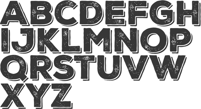


 2013:
2013: 
 Turkish type designer in Izmir (b. 1964) who sells through
  Graphic designer in Cincinnati, OH.
  [
[
 [
[ Pottstown (Philadelphia)-based designer and PostScript font hacker who ran Prescott Design and now Alan Jay Prescott Typography, but was also involved in other ventures such as the Black Walnut Winery. Originally from Greenfield, MA, he graduated from Saddleback College, and worked for some time as a typesetter in New York. He advertizes himself as a leader in PostScript Open Type Font development specializing in the revival of print-only letterforms into digital typographic materials. He operates as APT and more recently as AJPT. In 2019, he announced that he would stop making typefaces altogether. His work can be partitioned into time periods. For this reason, Prescott's oeuvre is split over several pages:
  Jakarta-based designer of the vintage typeface Pumper (2016), the Victorian signage typeface Hippia (2016), the script typeface Pat Judge (2016), the brush script Wilder Mood (2016), the signage typefaces Bostly Script (2016) and DBrakes (2016), and the weathered hexagonal typeface Broster (2016).
  [
[ Albatross is Jay Hilgert's foundry in Oklahoma City, OK, est. 2008. Before Albatross, Jay Hilgert ran
  Alessandro Colizzi (b. Rome, 1966) is associate professor at Milan's Politecnico, Department of Design, where he teaches graphic design history, typography, and type design. He was professor at the Ecole de design of UQAM (Montreal) from 2005 to 2019, and visiting professor at the Design Academy Eindhoven (2014/15). He holds a PhD from the University of Leiden (with a thesis on Bruno Minari), an MA in Type Design from The Hague's
  [
[ In 1892, twenty-three type foundries joined together to compete with the new typesetting machine, the Linotype [and later, the Monotype], to form ATF, which consolidated its type manufacturing facilities in a new plant in Jersey City in 1903. They were the dominant foundry in America until 1933, when ATF went bankrupt. Its collection remains intact at the American Type Founders Company Library&Museum at
  Bandung, Indonesia-based designer of the angular signage typeface Lawson (2014), the Victorian signage typeface Houden HTN (2014), the paint brush typeface Valerie (2014), and the ironwork typeface Pipeburn (2014).
  Andrea Tartarelli studied at the Academy of Fine Arts of Carrara and worked as a marble sculptor before turning to graphic and type design. He continued his studies at the Plantin Institute at Antwerp, and now teaches type design at IED Florence. He designed Tarif (selected by Fontspring.com among the Best fonts of 2019), Malik (shortlisted for the Communication Arts Typography awards 2021) and has been co-designer on dozens of typefaces at Zetafonts including the award winning Blacker (selected by Myfonts as one of the best new families of 2019), Monterchi (CA typography award 2020, Myfonts hidden gem 2019) and Stinger (CA typography award 2021). He works and lives in Pietrasanta (Tuscany, Italy). His graphic design outfit is called Surface Studio. Tartarelli's typefaces:
  [
[ [
[ [
[ Riverside, CA-based designer of the grungy letterpress typeface family Calamity (2016), the rounded sans poster typeface Tiny Tim (2016) and the heavy poster typefaces Industrious (2016: Industrious is the font friend that will punch you in the mouth when you need it), Third Rail (2016, inspired by old train signage), Reach Sans (2016, +Inline) and Templeton (2016, wood type influences). Andrew taught design at California Baptist University.
  [
[ Type designer, b. 1988, Sofia, Bulgaria, who works at Fontfabric, Svetoslav Simov's type foundry. She completed her Bachelor's degree at The National Academy of Art in Sofia. In 2014 she obtained a Master's degree in type design.
  Andrew Footit (b. 1984) runs his own type foundry in Johannesburg, South Africa. He is also known as Arkitype. Until 2014, his type studio was called Virtue Creative and before that, Virtue84. In 2017, he set up
  Dmitry Mashkin (or Dmitry Mankoff, or Artcoast Design, located in Sochi and/or Krasnodar and/or Moscow, Russia) created the absolutely wonderful restaurant menu deco typeface Montclar (2015, +food icons), the vintage letterpress emulation typeface family Stampbor (2015), the handcrafted Karmina (2015), the brush typeface Hypsletters Script (2015, with Nadi Spasibenko), the vintage letterpress typeface Marktype (2015), and the sans typefaces Albori Sans (2015, rounded and monoline) and Brentwood Sans (2015).
 Astype.de is a German foundry started in 2003 by illustrator and type designer Andreas Seidel (b. 1975, bad saarow, near Berlin, Germany). He lives in Cottbus, Germany. In 1998, he obtained a Masters degree in business administration. In 2007, he and Ingo Preuss set up
  [
[ ATypI 2015 was held in Sao Paulo, Brazil, from 14-17 October. As part of the conference, there was a very interesting exhibition of letterpress posters. The exhibition, Letterpress Reloaded, was curated by Paulo Moretto, an architect (1991) with a Masters (2004) in graphic design for which he researched Brazilian posters, studying more than 7,000 pieces made between 1950 and 2000s. Henrique Nardi and Claudio Rocha conceivved the idea, and Henrique helped with the execution and production. [
 Or Bart Wesolek, b. 1986. Nowa Sol / Poznan, Poland-based graphic designer, who published the vintage typeface Rheiborn, the display typeface Onufry (based on lettering on vintage cycling posters), the poster typeface Molheim, the letterpress typeface Darmond, the squarish Garthram, the vintage typeface Martslock, the
  [
[ [
[ Foundry in Wichita, KS, founded in 1999 by Nathan Williams (b. Concordia, KS, 1973), formerly from the University of Kansas Art Museum Library. Its motto: The goal of the foundry is to provide uninterpreted revivals of type samples generated through disappearing printing methods, and create new fonts for dissemination in the type community. Order through
  Bandung, Indonesia-based designer of the rough brush fonts Gatsunaga Hand Brushes (2015), Black Rose (2015) and Brother in Crime (2015).
 [
[ Bill Moran is Artistic Director of Hamilton Wood Type & Printing Museum in Two Rivers, Wisconsin. He also teaches typography and printing history at the University of Minnesota. Together with his brother Jim, Museum director, they are third generation letterpress printers, presiding over the largest collection of printing equipment and wood type in the U.S.
  Thierry Bouche's opinion on Bodoni: Digital prepress must have lost something on the road. Personally, the digital didone I prefer is
  Borutta (or Duce Type) is the creative studio of über-talented Warsaw-based designer Mateusz Machalski (b. 1989), a graduate of Wydziale Grafiki ASP in 2014, and of Warsaw Academy of Fine Arts. His oeuvre is simply irresistible, charming and a worthy representative of the Polish poster style---witness Alergia (2016), Magiel Pro (2017) and Madiso (2017).
  Freelance graphic and type designer in Lodz, Poland. He cooperates with the Book Art Museum (which stores the legacy of Polish typography) to revive the spirit of letterpress printing and digitize old type. Speaker at ATypI 2017 in Montreal.
  Art director in New York Mills, NY, and/or Rabat, Morocco, whose web site was called Hipster Font, and is now called Bowery Studio. Designer of Adasmine (2017), Denarrio Script (2017), Arminia Script (2017), Blanca Script (2016, brush script), Amazing (2016), Anatalia Brush (2016), Grace Elegant Script (2016), Daisy Script (2016), Miraluna (2016), Antype Script (2016), Antype Sans (2016), Saser Script (2016), Asmae (2015, brush script), Rinoshare (2014, a sketched font), the octagonal typeface Hipster Grunge One (2014), the poster font Ice Cube (2014), the spurred tattoo font Athena (2014), Bushcraft (2014,
  [
[ Hungarian foundry with commercial and free fonts, est. 2005 by Attila Zigó. On Deviantart, they claim to be from Rwanda. They specialize in grunge type--some of the fonts are quite gorgeous indeed. Has a fontmaking service.
  Eric Kurniawan (or Burntilldead, b. 1986) is located in Bali, Indonesia. He created the vintage script typeface The Goldsmith Vintage (2015).
  Type designer from Hong Kong who graduated from the
  [
[ [
[ [
[ Kentucky-based type designer and printer, 1879-1956. He was a Linotype salesman who directed the growth of the Linotype library from 1915 to 1948, and improved the look of the world's newspapers. He worked to establish Linotype as the composing machine of choice in America. He continued as a consultant to Linotype well into his retirement.
  [
[ Christian Pannicke (Christian Jung) is a typeface designer and art director based in Berlin. His typefaces:
  [
[ [
[ [
[ Aka Cobb Shinn (b. 1887, Fillmore, IN, d. 1951). His story is told by
  A typeface made by Frederic Goudy in 1903. Mac McGrew: Copperplate Gothic Heavy was designed in 1903 by Frederic W. Goudy, who is much better known for his classic roman typefaces. Other weights and widths were drawn shortly thereafter by Clarence C. Marder of ATF, except the Shaded, designed by Morris F. Benton in 1912. A rather wide, monotone, conventional gothic with the added feature of minute serifs, Copperplate Gothic is imitative of the work of engravers, as suggested by the name. It became ATF's all-time best seller, being used extensively for stationery and form work, especially in the small neighborhood printshops of the letterpress era. It is the typical lining gothic face, featuring four sizes each on 6- and 12-point bodies, and two sizes each of 18- and 24-point in foundry (composing-machine sizes differ somewhat), so that a wide variety of cap-and-small-cap combinations can readily be set. Before Monotype developed its "Plate Gothic arrangement" (see under "Design Limitations" in Introduction) in 1919, permitting the keyboarding of all four sizes of 6- or 12-point at once, that company had made the Copper plate Gothics simply as cap-and-small-cap combinations, typically in 5-, 6-. 8-,10-, and 12-point plus display sizes. Hence most of these gothics have two different series numbers on Monotype, the lower number for display sizes and the obsolete cap-and-small-cap combinations, the other for the four-size combination. Several versions of Steelplate Gothic (q.v.) from BB&S were near duplicates of Copperplate Gothic, although a few characters differed slightly and the extended versions were not quite as wide. Hansen had Engravers Gothic in several versions, differing apparently only in the R as shown in the specimen. Compare Plate Gothic, Whittier; also see Bank Gothic, Blair, Boxhead Gothics. D.J.R. Bruckner lists the date as 1905 and writes: Goudy's recollection was that this hodgepodge was done for American Type Founders. It was made for Marder, Luse and Company and then taken on by ATF and can still be found in old ATF specimen books and their old fonts..
  Born in Firenze in 1969. Cofounder with Francesco Canovaro and Debora Manetti of the Italian design firm in Firenze called Studio Kmzero. He co-designed some typefaces there such as
  Cakovec, Croatia and Washington Park, WA-based designer (b. 1995) of preponderantly grunge typefaces. In 2013, he created Funny Classic, Lion Pro, Lover, War is in the Air (military stencil), Aussen (squarish), Ensione (outlined), Rangle, Gaon, Momgers, Escapea (athletic lettering),
  Peter Olexa (Bratislava, Slovakia, b. 1978) created the (typically retro / vintage) mostly commercial typefaces Slow SVG (2020: a brush font), Hurley (2020), Royal (2020: vintage caps), Wagoon (2020), Snow (2020: a 3d color SVG font), Venomous (2020: spurred, grungy), Behofeel (2020), Chasmophile (2020: formal calligraphy), Angelic (2019: dry brush), Boutique Paris (2019), Umbrella (2019), Cellica Bold (2019), Abigaile (2019), Ragtime (2019: a brush font), Ragtime Marker (2019), Futu (2018), Kiko (2018), Pineapple (2018), Urban (2018: inline), Plasma (2018), Evolve (2018: inline), Hallowen (sic; 2018), Phantom (2018), Palam (2018), Alter (2018), Chrome (2018), Rhino (2018), Giant (2018), Valeria (2018), Ruas (2018), Strife (2018), Giant (2018), Atari (2018), Octopus (2018), Green Light (2018), Atlantis (2018), Maroon (2018), Secure 3D (2018), Cube (2018), Billionaire (2018: art deco), Savana (2018: bejeweled), Castile (2018), Starla (2018), Brodo (2018), Nomos (2018), Brisk (2018, art deco), Tron (2018), Jewel (2018), Forest (2018), Noxa (2018), Ama Deust Inline (2018), Goliath Inline Grunge (2017), Arbatosh (2017: Victorian), Momoco (2017), Heyro Fun (2017), Calliope Fun (2017), Steampunk Gears (2017), Ponds (2017: Victorian), Zahra (2017: inline grunge), Green Light (2017: inline grunge), Jordan Bold Grunge (2017: inline), Metalic 3D (2017), Mecha Grunge (2017), Buffalo (2017), Queen (2017), Lacoste Inline (2017), Ollie (2017, sans family), Nomos (2017), Blue North (2017: spurred), Murray (2017), Atlantis (2017), Montana (2017, outlined), Speedhunter Line (2017), Star Black Inline (2017), Gatsby Inline (2017: art deco), Jibril (2016: spurred), Hallowen (sic) (2016), Kiko (2016), Sailor (2016, tattoo font), Annabel (2016), Zalora (2016), Geno (2016), Marin (2016), Starship (2016), Mozza Shadow (2016), Meravin (2016), Venomous (2016), Amora Inline Grunge (2016), Rocket Shadow (2016), Hydrant (2016), Boston Inline Grunge (2016), Skywalker (2016, art deco), Ocela (2016), Columbus (2016), Raven (2016), Nomura Grunge (2016), Stella (2016), Salada (2016), Vultron (2016), Majestic (2016), Napoleon (2016), Temu (2016), Rodeo (2016, Western style family), Brooklyn (2016), Thunder (2016, Victorian label typeface family), Murray Inline Grunge (2016), Opera (2016, Victoriana), Flamingo Shadow (2016), Blue North Inline Grunge (2016), Montana Bold Outline (2016), Monophone Fancy (2016, retro style), Marin Victorian (2016), Westwood (16-style Western font family), Mozza (2016, +Inline, +Shadow, +Grunge), Speed Hunter (2016), Metro Grunge (2016), Annabel (2016, Victorian), La Forest (2016, blackletter), Star (2016, decorative caps, with outlined and inline versions), Phoenix (2016, a spurred typeface), Gatsby (2016), Bureno (2016, a Victorian display typeface), New York (2016, letterpress emulation), Capella (2016), Almanac Italic Grunge (2015), Anabel (2016, roman caps), Regolith (2015), Chocoleta (2015, hand-printed), Sailor (2015), Turmeric (2015), Ultimatum (2015), Heyro (2015, a rough brush font), Calliope (2015, a rough brush), Glass Beads (2015), Red Paprika (2015), Greenkitchen (2015), Artistico (2015, grungy), Brush Shop (2015), Graceful (2015, irregular script), Brush Wall (2015), Nickainley (2015, connected script), Harloft (2015, a warm brush script), Detective Typewriter (2015), Not Perfect (2015), Good Vibes (2015), Cool Story (2014), Get Coffee (2014), Think Happy (2014), Say Less (2014), Let's Do This (2014), Just Be Cool (2014), Brooklyn Coffee (2014, a spurred poster typeface), Bronx Shoes (2014), Nevermind (2014), RockNRoll (2014), Bluegrass (2014), Memento (2014, spurred Victorian face), Melody (2014) and Grazioso (2014). He runs
  Cindy Kinash is an apparel graphic designer from Canada. She started the Cultivated Mind foundry in 2012, and made a reputation as a script font designer. She published the hand-printed poster typefaces
  Gene Gable reviews Dan Solo's contributions. He writes: Dan X. Solo spent a lifetime building Solotype, one of the world's most interesting type collections. For three decades he ran his business with unparalleled character and panache. Type designers and graphic artists tend to fall into two categories. You either like ornate old typefaces or hate them. I'm a big fan -- the more ornate and over the top the better. So it was a terrific find when I came across a box of original Solotype catalogs, brochures, and other promotional material. The Solotype shop closed in the early 1990s, leaving a big hole in the availability of unique and unusual type designs. Dan X. Solo, who still lives in Alameda, California, was born in 1928. For his ninth birthday his grandfather gave him a small Kelsey letterpress, and he quickly became a self-described boy printer. He started collecting typefaces in earnest at age 14, and the Solotype collection officially began. After dropping out of high school, Solo became a radio announcer and sometime-actor. In 1949, the 21-year-old put together a magic act and toured the West Coast with some success. Along the way he continued to collect old typefaces, which were plentiful around his native Oakland and the San Francisco Bay area. In 1962, Solo decided to see if he could make a living from his type collection, which by then numbered about 1,000 unique fonts. He printed 4,000 catalogs, sent them to ad agencies around the country, and waited for the orders to come in. This flyer is from 1962 when the Oakland shop opened. The shop took off, as the '60s were a time of design experimentation and there was a keen interest among some designers in ornate and unusual type designs. Solo didn't just offer typesetting. He was a one-man consulting service on the history and appropriate use of his type designs. In 1974 Solo connected with Hayward Cirker, owner of Dover Publications, and a long relationship began that resulted in 30 books showing various type collections, mostly organized by era or theme. The Solotype catalog, reproduced by Dover, reached graphic artists all over the world and inspired a generation of type designers. The type designs weren't the only unusual thing about Solotype. Its business practices and the attitude that Solo fostered were unique. Here are several sections from early Solotype catalogs addressing the way Solo preferred (or insisted) on doing business. Unlike most type shops of the era, which were accustomed to being available to customers on demand, Solotype closed every year for the month of October. During this time, Solo traveled around the country and the world, collecting more type designs and fonts. In the early '90s, Dan X. Solo realized that the digital era was rendering his services obsolete. By that time, he had a collection of more than 13,000 type designs. During that decade he did convert many of his designs to digital format and sold them as collections through Dover, but the type business was changing, and bookstores were not the preferred distribution method for type. Since many of the designs in the Solotype collection are public domain and not associated with any active foundry, they do crop up here and there, mostly in low-priced, generic font collections. But of the thousands of Solotype designs, probably only a few hundred can be had in digital form from any foundry. Perhaps a future resurgence in historic typestyles will make it worthwhile for someone to digitize those that remain. The Solotype collection is an important and historically significant part of type history, even if considered lowbrow by some type purists. Some images scanned by Gables:
  [
[ American designer at Letterhead Fonts who specializes in vintage typefaces. Her designs:
  Californian designer of San Luis (2017, brush script), Grembo Duo (2017), the hand-brushed Eiffel (2016, with iconic dingbats such as a kakmadam poodle), the monoline script typeface Cosmodrome (2016), the brush script typeface Maloishes Emellie (2016) and (2016), the whimsical typeface Canterbury (2016), the casual script typeface Wendell (2015), the hand-drawn sans poster typeface Tender (2014), the letterpress emulation typeface Blocklyn (2016), the art deco typeface Nouvelle (2014) and the tall poster typefaces Simplesse (2013) and Hensel (2013).
  Bogor, Indonesia-based designer (b. 1996) who set up Dikas Studio in 2016 and (with Muthia Fajrijannah) Ludere Studios in 2020. His early fonts at Dikas Studio include the handcrafted display typeface Hantam Mereka (2016), the letterpress emulation font Caredrock (2016, 14 styles), the vintage label font Redvolve (2016), Sunday Quotes (2016), the spurred Victorian typefaces Bohem (2016) and Sadis (2016), Besitoea (2016), a vintage Sunburst collection (2016), the spurred Caringin (2016) and Dramaga (2016) and Sherlock (2016), the sci-fi typeface Space Weel (sic) (2016), the vintage Savaro (2016), the free poster typeface Kalemun (2016), and the mix-and-match poster typeface family Bollo (2016).
  Megan Tamaccio (District 62, Miami, FL) designed the Jack & Zoe Font Collection and the LilRebel and
  [
[ [
[ Magelang, Indonesia-based designer of the signage script typeface Justlyne (2017), the connected scripts Arthurdale (2018), Natalia Rosaline (2018, a font duo at Runsell Studio), Rusted Orlando (2018: monoline), Jaquilane (2018), Soulgates (2018) and Qatar Capital (2018), and the handwriting typeface Morristone (2018). He also designed the vintage typefaces Classic Arkansas (2018), Retro Chalet (2018) and Echomotors (2018).
  [
[ London, UK-based designer (b. 1992) of these typefaces:
  Conidi obtained an MA in typeface design from the University of Reading in 2008, and a PhD from the same university a few years later. Her graduation typeface is Nabil, a hookish serifed typeface that covers Latin and Arabic. It won a bronze medal at the 2009 EDAwards. She also holds a Masters degree in Design and Visual Communication from the Polytechnic University in Milan
  [
[ Andrew Leman is a prop designer in Hollywood, CA. The type foundry
  [
[ Brazilian printmaker, graphic artist and illustrator, b. 1975. Her fonts are created together with Ricardo Marcin at
  Graphic designer and musician (b. 1982) at the New York studio AWP who grew up in Maine and is currently based in Ithaca, NY. In 2018, he founded Etcetera Type Company, which is based in Spencer, NY.
  Institute in Benalmadena, Spain (was: Santa Severa), where one can take 4-week courses at 1450 Euros a shot on the Etruscan alphabet, Trajan, Cuadrata and Rustic Roman Capital letters, and related subjects. They also organize lettering tours in Italy and guided tours in various musea. The teachers are Alberto Di Santo (Professor of the visual communication, Tor Vergata University, Rome; Professor of Graphic Design, Istituto Europeo di design, Rome; Professor of editorial design, La Sapienza University, Rome; Professor of Typography, C.F.P. Sinalunga, Siena) and
  Eyal Holtzman (Den Haag, The Netherlands) is a graphic and type designer who was born in Haifa, Israel in 1969. He studied at the Royal Academy of Art in The Hague, and teaches typography and graphical arts in various places. He set up Studio Eyal and Myrthe together with Myrthe Stel.
 Austrian foundry located in Vienna, est. in 2008 by
 [
[ Fernando Forero (b. 1978, Tunja) ran EisartGraphic.com together with Weronika Kwiatkowska, and moved from Bogota to Kalisz, Wielkopolska, Poland, where he
  [
[ Ferry Hadriyan (FHFont and before that, Fey Design, located in Indramayu and/or Cirebon, Indonesia) designed these typefaces in 2015: Milkytwins Modern Wave, Fantasia (a charming curly upright script), King City (calligrapghic signage script), Chocolate Heart Script, Adefebia (calligraphic wedding script font), Sexy Shout, Awesome Display (signage script), Love Mile (curly brush-painted font), Shakila (a vampire script), Hard Brush Ghost, Telena Brush, Slow Motion Script, Heaven Sky, Candy Sugar, Chocolate Heart (curly script), and Hard Brush.
  Japanese foundry in Nagoya that offers free and commercial Latin fonts made by
  London-based font vendor who started in 2015 or 2016, and carries mostly brush script typefaces. They are mainly pushing their own work.
  Font Forestry (Charlottetown, Prince Edward Island, Canada) is yet another venture of Jeremy Vessey, this time in cooperation with his companion, Stephanie Arsenault. I assume that it too is actually based in Montreal. Established in 2017, their initial fonts include Tuesday Night (a
  Chris Vile (Fontmonger, Austin, TX) is a type and graphic designer and web developer, who was briefly located in Chicago. He specializes in horror, graffiti, grunge and brush fonts.

 Cimahi / Bandung, Indonesia-based designer (b. 1986) of the hand-lettered alphabets Awesome (2015), Wonderwall (2015, a splash brush font), Valencia Sweetness (2015, brush script), Basik Rough (2015, brush), Innocents (2015), Againts (2014) (sic) and Leathery (2014).
  Designer of the vector format handcrafted poster typefaces Queendansse (2017) and James Boltt (2017). [
 [
[ Cartoonist from Recife, Brazil, b. 1966, whose sense of humor and artsistic prowess shine in his dingbat fonts.
  Bandung, Indonesia-based designer (b. 1994) of
  Yusof Mining (Gearwright) specializes in old American typefaces and letterpress. His typefaces:
  Geen Bitter (Den Haag, The Netherlands) consists of Thom Janssen (b. 1984, Maastricht),
  Gerrit Noordzij (b. 1931, Rotterdam; d. 2022) was a Dutch graphic designer, typeface designer, author, teacher, calligrapher, and design artist who made drawings, wood and copper engravings, and postage stamps. From 1960 until 1990 he taught writing and type design at the Royal Academy of Art in The Hague. One of his many students there was Lucas de Groot. Noordzij has worked as graphic designer for various Dutch publishers. Since 1978 he has been the house designer for the publishing company Van Oorschot. His intellectual influence is matched by his physical heritage, in the form of two talented sons in the field of type design, Christoph and Peter Matthias. The Gerrit Noordzij Prize, a prize given to typographers and type designers for extraordinary contributions to the field, is named after him. He was also the first person to receive this prize in 1996. In 2013, Gerrit Noordzij reveived the TDC Medal at the ATypI in Amsterdam.
  [
[ Or Oghi Novianto. Bandung, Indonesia-based designer of the brush typefaces Mons (2015), Eyepic (2015) and Wild Nature (2015).
  BFA Graphic Design, Boise State University, ID, 2011. Now located in Tampa, FL, Conrad Garner created of the free heavy copperplate sans typeface
  [
[ A group of independent designers from Poland, heade by Bartek Nowak, and located in Staromiejska. Nowak has been designing typefaces since ca. 2000. Typefaces:
 Grype was set up by
  [
[ [
[ [
[ Hendrik Nicolaas Werkman, who is usually referred to as H.N. Werkman, was born in 1882 in Leens, The Netherlands. He died in 1945 in Bakkeveen, The Netherlands. He was a well-known Dutch artist, typographer and printer. In 1908, he founded a printing and publishing house in Groningen. It closed in 1923, but Werkman started anew with a small workshop in the attic of a warehouse. Werkman was a member of the artists' group De Ploeg, for which he printed posters, invitations and catalogues. From 1923 to 1926, he produced his own English-named avant-garde magazine The Next Call, which, like other works of the period, included collage-like experimentation with typefaces, printing blocks and other printers' materials. He also used stenciling and stamping to achieve unique effects.
  [
[ [
[ Typographer and entrepreneur, b. Berlin 1831, d. Berlin, 1904. In 1858, he founded his "Institute for Galvano Technology" in Berlin. He discovered a method of producing circular lines from brass instead of lead or zinc. The soldering normally necessary could be dispensed with. The lines were elastic and highly durable, and produced fine results. Most of German's letterpress printers and many printers abroad placed their orders with Berthold. In 1864, he set up H. Berthold Schriftgießerei und Messinglinienfabrik in Berlin. The company specialized initially in new technical processes for printing, such as galvano-type, as described above. Hermann Berthold headed the foundry until 1888. Around 1900, Haus Berthold was one of the largest foundries in the world.
  Jeremy Vessey (Hustle Supply Co, Charlottetown and/or Cornwall, PEI, Canada) created these commercial typefaces in 2014: Parlour (a grungy vintage typeface), Native (quaint style), Instapress (letterpress emulation).
  Huy Fonts is a foundry in Madrid run by
 [
[
 Frenchman (b. 1957) who started making fonts in 2010, after a career in illustration, comics, and video games. In 2010, he created the free fonts BabyJo (pixel face), Bayday, Chrom (beveled face), LaPresse (grunge),
  Insigne Type Design Studio (est. 2006) is run by
  Kostas Barstokas is a designer and illustrator in Thessaloniki, Greece, and in Leeds, UK. He set up Intelligent Foundry and later Intelligent Design in Leeds. He graduated from the
  Jakarta, Indonesia-based designer of hand-drawn typefaces. In 2020, he created Coconut Island, Better Season, Creamy Wonder, Fruktosa,
  Catalan graphic designer who lives in Olot and/or Montblanch. He created the sans family
  Mobaric Minhas is the Auckland, New Zealand-based designer of the old typewriter typeface families AMTW (2016), Typerighter (2016), Silk Remington Typewriter (2016),
  Born in Düsseldorf in 1878, died in Köln, 1935. A teacher at the Köner Werkschule, he designed these typefaces:
  [
[ Jamie Clarke (Bristol and London, UK, and at some point, Sydney, Australia) creates illustrative type and lettering. He ran his own digital agency for ten years, and retrained after that period by studying type design at the University of Reading and letterpress at the St. Bride Foundation in London. His commercial typefaces include
  [
[ [
[ [
[ Before 2006, Jeff Levine was mostly known for his free dingbats, having made over one hundred of them. He keeps making them, but now commercially, and less frequently. The list is long though:
  Dingbats: 50s Yesterdings, Action is the Sequel, ActionIsJL, Alpha Test, Another Dingbat Font JL, Antique Decorations JNL (2012),
  Octagonal typefaces made by Jeff Levine:
  [
[ [
[
 Jim Rimmer (b. Vancouver, 1934, d. 2010) was one of the great contemporary type designers whose creations had a lot of flair, individuality, and charm. Based in New Westminster (near Vancouver, BC),
  [
[ [
[ [
[ [
[ Judith Poirier is professor at UQAM in Montreal. She developed an interesting wood-based modular typeface,
  Juha Korhonen (b. 1966, aka Junkohanhero) is a Finnish artist and type designer, who created these
  Polish graphic and type designer who started her own type foundry in 2014. Typefaces:
  Teesside, UK-based graphic designer. Creator of
  Kadu Supanik (Joinville, Brazil) created the
  German scribe, type designer and unbelievable calligrapher, b. 1914 in Schlesisch-Drehnow, d. 2000 in Offenbach. Following schooling in Schlesien and Hamburg, he served a four-year typesetting apprenticeship from 1930-1934 in Hamburg and later at the Kunstgewerbeschule (School of Arts and Crafts) in Offenbach am Main. From 1939 until 1945 he was in active military service and became a prisoner of the Russians. After that ordeal, he became a calligraphy teacher at the Werkkunstschule in Offenbach, and developed a universal pen with novel writing and drawing techniques for the company Brause. It is at that point that Hoefer started designing types as well. From 1970 to 1979, Hoefer was a lecturer and later professor at the HfG (School of Design) in Offenbach. From 1981 to 1988, Hoefer ran summer calligraphy workshops in the USA (Los Angeles, San Francisco, Boston, New York, Washington, and other cities). In 1982, Karlgeorg Hoefer founded a calligraphy workshop in Offenbach for everyone, with evening courses and summer school, and in 1987, the registered association "Calligraphy Workshop Klingspor, Offenbach, Supporters of International Calligraphy." From 1987 to 1995, he was the chairman of the association while teaching continuing courses and summer school classes with leading foreign calligraphers. Hoefer has written two books about calligraphy: "Das alles mit einer Feder" (Brause, 1953) and "Kalligraphie, gestaltete Handschrift" (Econ, 1986). Numerous articles about Hoefer's work have appeared in calligraphy journals in Holland, France, the USA, and Japan. In 1989, the book "Schriftkunst/Letterart Karlgeorg Hoefer" was published as part of Calligraphy-Editions Herbert Maring (Die Kalligraphie Edition, Hardheim, Germany, 1989). For his activities as a calligrapher, Hoefer received the Order of Merit of the Federal Republic of Germany in 1993. His typefaces:
  Calligrapher and letterpress artist Kathryn Podorsky runs
  Born in Missouri in 1979, Kimberly moved first to Texas and later (in 2007) to China, and most recently, to Orlando, FL. She made some free fonts (often handwriting styles), and also ran a personal handwriting font service [those fonts have names that start with KGD].
  [
[ Designer Eddy Biel (Stourbridge, UK and before that, Birmingham, UK) created the hand-drawn poster typeface Madeline, the hand-drawn Breezy and the display typeface Pointbreak Sans in 2014. In 2016, he designed the brush script typefaces Honey Bun, Coast 2 Coast, La Brava, Buffalo, Tamaluna (crayon style), Meet Manny and Mcallister Script, and the letterpress typeface Range Sans.
  [
[ Yogyakarta, Indonesia-based psychology student, b. 1988. He designed these typefaces in 2022:
  Hendry Juanda runs Letterhend Studio in Yogyakarta, Indonesia. He designed the signage script typefaces
  Designer who used FontStruct in 2009 to create Noon (condensed pixel face), Parallea (similar), Mazey, Letterpress (3d face), i-Ching (horizontal stripes), Broaden, Dot Screen, Mazey,
  [
[ [
[ Marc Janet's (mostly free) fonts include a number of pixel typefaces in FON format, and a grungy typeface called
  [
[ Italian type designer whose typefaces include:
  German designer, b. 1965. Currently, he teaches typography at the University of Lapland in Rovaniemi, Finland, but maintains a home in Wuppertal, Germany. His typefaces:
  Dutch freelance graphic, logo, type and web designer, b. 1989. He operated as MS Designs. In 2010, he made an extensive comic book / fat finger typeface called
  Mary Faber (b. 1987) from Hamilton, New Zealand, writes about
  Mary Louise earned a BFA in graphic design and painting from Louisiana State University. She also earned a MFA from the School of the Art Institute of Chicago in Visual Communications. Now based in Louisiana, she graduated from the type design program at the
  [
[ [
[
 Born in Jablonec and Nisou, Czech Republic, 1992, Matyas Machat created
  [
[
 [
[ Type foundry, est. 2011 by Vantaa, Finland-based Mika Melvas. It was originally called Mahti Type Studio, but was later changed to Mika Melvas. Melvas created the signage typefaces
  Magdalena Boffito (Mezzo Mezzo) studied at the Graphic Arts Department at the Warsaw Academy of Fine Arts, class of 2003. In 2006 she studied at the Turin Academy of Fine Arts.
  [
[ [
[ [
[ Type foundry set up in 2013 in Champaign, IL, by
  The type and design communities react to Mrs. Eaves, Zuzana Licko's version of Baskerville. Of those comments, Keith Tam's is the winner: "
  [
[ Magelang and Jakarta, Indonesia-based designer of the all caps vintage sans typeface
  [
[ Indian graduate from the type design program at the
  Glenview / Chicago, IL-based foundry run by
 [
[ [
[ [
[ Free software project based in Belgium and run by four people (and I quote from their web page):
  Orbis Typographicus is a set of twenty-nine 9x12 letterpress broadsides, designed by Hermann Zapf and printed by Philip Metzger of Crabgrass Press between 1970 and 1980. The broadsides feature quotations on art, science, nature, faith, and the human condition, from authors ancient and contemporary. The text includes poetry, prose, anagrams, and palindromes, in English, German, Spanish, French and Japanese. Hand set by Philip Metzger, the set showcases many of the typefaces of Zapf and his wife, Gudrun Zapf von Hesse.
 Argentinian type designer who lives in Buenos Aires where he runs UGR Design. Award winner at Tipos Latinos 2010 for his text and IPA typeface
  Paul Alan Grosse is a very prolific Gurmukhi type designer (among many other things, often technical things---check out his own computer-generated Sudoku and Kakuro puzzles, for example). He created over 200 free Gurmukhi typefaces:
  British designer who worked for Condé Nast in the 1980s. Paul Harpin created his first typeface, Laura---a twelve-weight typeface family--in 2014, assisted by Paul Hickson. It is named after his niece Laura, who died of cancer, and has Display, Stencil, Ribbon and Regular styles. In 2017, he co-founded
  Santiago de Chile-based creator of
  Aka Mr. Pow. Sao Paulo-based designer of a few great lambe lambe posters (2016).
  [
[ [
[ [
[ Flemish web log about the history and mechanics of type, run by Belgian graphic designer Peter Van Lancker (b. Ghent). There is a lot of information on the early printing and typefounding by
  Brazilian printmaker, graphic artist and illustrator in Vitoria, b. 1973, Rio de Janeiro. His fonts are created together with Erica Jung at
  London-based designer and illustrator. Creator of the letterpress emulation typeface Aurochs (2021). [
 Lazar Dimitrijevic, who set up the foundry Posterizer KG, was born in 1981 in Bajina Basta, Serbia, and lives in Kragujevac, Serbia. He obtained a Master of Graphic Design from the Department of Graphic Design, FILUM Kragujevac, Serbia. Presently, he is art director at
  Berlin-based product designer who created these typefaces in 2017: Luzia (text typeface), Cache (letterpress emulation), Stash, the display sans typeface Gerst, Konstanz (industrial age font), the slab serif Wrangell, the great all caps sans typeface Hossa (+Soft) (2017), and the dashing serif typeface Elaris (2017).
  [
[ [
[ Bandung / Semarang, Indonesia-based designer of the Victorian signage typeface Erudite (2014) and the spurred typeface Trave (2015). In 2016, he designed the monoline connected script typeface Roundless, Favor, Boaedan Script (calligraphic wedding script style, accompanied by great ornaments) and Roundless Script.
  [
[ [
[ [
[ [
[ Born in Westerham, KE (1947). He joined the Monotype drawing office in 1965 and moved to the type design department in 1968, where he became manager in 1982. In 2009, he is head of typography at Monotype.
  Born outside Pince Albert, Saskatchewan, Rod McDonald is perhaps the greatest Canadian type designer ever. First based in Toronto and later in Lake Echo, Nova Scotia, he designed the great
  [
[ Portuguese designer Rúben Dias graduated in design from IADE. He ran Item Zero and built his own letterpress studio, where he prints and experiments with both metal and wood type. Since 2012 he has been working on a doctoral degree on Portuguese Royal Printing Office typefaces at the Technical University of Lisbon's School of Architecture (FA-UTL). He teaches typography at ESAD.CR (Escola Superior de Arte e Design) and ESTAL and holds workshops on type and typography all across Portugal. In 2013, Aprígio Morgado, Ricardo Santos and Rúben Dias cofounded the type foundry
  [
[ Ryan Molloy is an educator and inter-disciplinary designer having practiced in fields of architecture and graphic design. He is currently a professor of graphic design at Eastern Michigan University in Ypsilanti, Michigan.
  [
[ Graphic designer in Rangoon (Yangon), Burma. In 2014 he created the
  [
[ Malang, Indonesia-based designer who also uses the name Agga. Creator of the free fonts
  Kalamazoo, MI-based designer, who, during her studies at Western Michigan University, created the modular wood block typeface Switch (2016). Her system breaks down letterpress forms into their components, and reattaches pieces using various color codes.
  Dave Nalle was born in Beirut in 1959, but lives and works in Texas. He is currently in Manor, TX. From his
  [
[ Sebastian Cabaj (or: Pan Cabaj) studied graphic design at the Academy of Fine Arts in Warsaw, where he now works as a graphic and type designer, and runs Kometa Studio. In 2012, he set up the Sebastian Cabaj Foundry via MyFonts.
  [
[ Philip Trautmann (Phitra Design, b. 1996) is the Düsseldorf, Germany-based founder of Phitra Design in 2016. He renamed the foundry Shaped Fonts and was joined by Christoph Dörre and Nora Bruckhoff.
  London-based creator of the
  Leeds, U.K.-based designer of
  In 2012,
  [
[ [
[ Stereotype is Clément Nicolle's web outfit. He designed these (free) fonts between 2004-2006: 3grammes5, BagpackDemo (grunge), Base02 and
  Quebec-based designer (b. 1971) in 2010 of the
  Hannes Famira, who runs Studio Hannes Famira, was born in Buchholz in der Nordheide, Germany in 1966. Hannes Famira studied graphic and typographic design at the Royal Academy of Fine Arts in The Hague in the Netherlands. He worked as a type designer in the Hague and used to work at Buro Petr van Blokland. Hannes started his own design studio Das Kombinat in 1999 and the Kombinat-Typefounders in 2001, and renamed it FamiraFonts in 2016. He taught various typography and typedesign classes at the SfG, School for Design in Basel (CH), at the University of the Arts in Philadelphia, at the New Jersey City University, at the City University of New York, at Rutgers University, at the Hochschule für angewandte Wissenschaft und Kunst Hildesheim/Holzminden/Göttingen (HAWK), at the Kunsthochschule Kassel, at The Cooper Union, and at SVA the School of Visual Arts. He is presently based in Brooklyn, NY.
  Type foundry in Prague, Czechia, est. 2014 by Vojtech Riha (b. 1989), who studied at the Technical School of Ceramics in Karlovy Vary, and at the Studio of Typography of the Academy of Arts, Architecture and Design in Prague.
  [
[ Born in Lincoln, UK, in 1942,
  Based on John Baskerville's typefaces (1752), Textism likes George W. Jones' version of this font published as ITC New Baskerville: Compared to the slightly gothic feel of Caslon, Baskerville is purely neo-classical, in it is seen the straight lines and arches of neo-classical architecture. This digital version is ITC Baskerville, which is quite usable but unready for use in long-term reading. Excellent for display use however. See also
  Alexander Tarbeev is Russian type designer, graphic artist and tutor. He graduated from Moscow Electrotechnical Institute of Communication in 1979 and Moscow Polygraphic Institute in 1988, and worke in the type department of NII Polygrafmash (Institute for Scientific Research of Printing Machinery, Moscow). Between 1989 and 1997, Tarbeev worked as type designer at ParaGraph. He set up the type studio TFaces in Moscow.
  Ryan Prasetya (Republik Digital and Lost Volt Type foundry, Tangerang, Indonesia) created the spurred Victorian signage typefaces Arsemith (2015) and Stonebangs (2014), the tattoo typeface family Maroline (2015), and the art deco typeface Herline (2014).
  [
[ [
[ English typefounder, 1835-1907, who created Old Roman (incl. Italic) in 1895. This typeface was digitally recreated by Patrick Michael Murphy as
  Plymouth, UK-based designer of the two-dollar hand-printed typefaces
  [
[ Chatnarong Jingsuphatada is a type designer in Thailand. He set up Typesketchbook in Bangkok. In 2012, Chatnarong made the 4-style plumpish sans family called
  Czech designer of the grunge monospace font Urania Czech (2006) and of the didone numbers-only font Stöhr Numbers (2006). In 2009, he made the old typewriter typeface
  Blazej Ostoja Lniski (b. 1974, Czersk, Poland) specializes in painting and lithography. From 1994 until 1999, he studied at the Warsaw Academy of Fine Arts. Currently, he is the Dean of the Faculty of Graphic Arts at he Warsaw Academy of Fine Arts. He founded the type foundry Typoforge.
  Berlin-based
  Portuguese foundry in Guimaraes and Porto, est. 2011 by Pedro Lobo, that sells
  Victoria Bellavia is a letter designer based in New York City. Her portfolio is outstanding. She created the curly typeface
  Marie Wagner (Vintage Foundry Illustrator, Munich, Germany) created a vintage Victorian typeface in 2015. In 2014, she designed Ink Collective (2014), a vintage letterpress emulation typeface.
  Graphic designer from Summerside and/or Charlottetown, Prince Edward Island, Canada, who was located first in Edmonton, Alberta, and then in Moncton, NB, then in Toronto, and finally in halifax, Nova Scotia. He runs SRC Designs and founded Vintage Type Co in 2015 (not to be confused with Susan Townsend's Vintage Type, a company set up in the 1990s). Creator of the free sans titling typeface family
  Crowborough, East Sussex, UK-based designer Ian Barnard (Vintage Design Co) created the curly hand-drawn typeface Warrior in 2014. With Sam Jones, he designed the school script font Path Type (2014).
  Aka P. Rudakov and Pasha Korzhenko, and operating as Vintage Voyage Design. Perm, Russia-based designer of the vintage handcrafted typefaces West End (2015, spurred Western typeface family), Winter Holidays (2015), The Sugar Cane (2015, eroded signage script), Montana (2015), Canyons (2015), Forest Tramp (2015), Heart of Gold (2015, a think inky brush), La Fa Salt (2015, a connected monoline script), Robinson (2015, handcrafted), Rise (2015, rough brush), Stout (2015, +Stout Roughen), Jack's Guitar (2015) and Bough (2015).
  Moscow-based designer of Latin and Cyrillic, or purely Cyrillic, fonts. There is a list of Cyrillizations of existing fonts: Atreyu, LHF Bounce Script, Modeka, Turnpike, PL Barnum, Good Times Regular, Playful JNL (Jeff Levine), Armageda, Showcard Gothic, SF Comic Script, Jolly Good Sans Basic, Enemy (Shaivanalla Perumal), House Slant (House Industries), House Brush (House Industries), Komika Axis (Apostrophic Labs), Snickers (Mark Simonson), Grand Hotel (AOETI), Wisdom Script (Lost Type), Mission Script (Lost Type), Cylburn (Lost Type), House Script (House Industries), House Holiday Gothic (House Industries), LHF Branding Iron (Letterheadfonts), LHF Fancy Full (Letterheadfonts), LHF Firehouse (Letterheadfonts), American West (FontMesa), Champ Ultra (BA Graphics), PL Davison Americana (Monotype), Blenny (Dalton Maag), Bigfish (Floodfonts), Same Same, But Different (Hanoded), Enemy (Lost Type), Special Forces (Typodermic), Serpentine (URW++), Ritts Cursive (Eurotypo), Voga Medium (CD Type), Hermes 1943 (Lukas Krakora), Brand (Lian Types), Tasty (Hubert Jocham), Bullet Regular (House Industries), Filmotype Athens (Filmotype), Signika (Anna Giedrys), Art Department (Jeff Levine), Borg (David Sum, aka titusprod).
  [
[ Typographer and type designer in Sofia, Bulgaria, b. 1982, Sofia, who worked mostly for Svetoslav Simov's type foundry, Fontfabric, before setting up his own shop, VSF (Vasil Stanev Foundry).
  Walden Font (est. 1997) sells historical typefaces&clip-art by Oliver Weiss from Winchester, MA. Walden's site includes a
  Gert Wiescher was born in Braunsbach am Kocher, Germany, in 1944. Based in München,
  Serif:
  Foundry specializing in digital versions of old wood type. Set up in 2011 by Matt Griffin, all font licenses refer to
  Prolific Barcelona-based type designer. He started out by creating the counterless hand-printed typefaces Woodcutter Dripping Nightmare (2012) and
  Max Infeld (b. 1981, aka Xerographer Fonts) from Chico, CA, makes free fonts and offers a free font-making service. He surged onto the font scene in 2012, and is currently located in Ojai, CA.
  Yellow Design Studio is a fine art, graphic design and typography studio based in Sanibel, FL, and before that, in Madison, Wisconsin. The font designer is
  Michael Cina (Minneapolis) is the cofounder of WeWorkForThem and
  [
[ Italian design firm in Firenze consisting of three graphic designers,