| | |
Abyme
|
 Abyme is a type foundry founded by Adrien Vasquez and John Morgan. Their typefaces:
 - English Egyptian (2011-2017, by John Morgan and Adrien Vasquez). English Egyptian is an interpretation of William Caslon's Two Lines English Egyptian of 1816, considered by some to be the first sans serif printing type to be sold commercially.
- Nizioleti (2011-2017). An all caps stencil typeface designed by John Morgan and Adrien Vasquez, Nizioleti is named and modeled after the nizioleti, or Venetian street signs. Nizioleti is a typeface consisting of painted letters stencilled within white plaster panels directly onto the city walls, in use since the early 19th century.
- Berthe (2011-2018), designed by Charles Mazé. Berthe is designed after another typeface called Série no. 16, whose first cuts were produced at the end of the nineteenth century by the Parisian type foundry Deberny & Peignot. It was engraved by Constant and Auguste Aubert under the direction of Charles Tuleu, the adoptive son of Alexandre Deberny whose mother, Laure de Berny, had bought from her lover Honoré de Balzac the printing house he didn't manage to transform in a profitable company. Série no. 16 quickly became a popular choice among printers and found its way into many editions of classic and popular texts. Review by Hrant Papazian, who wrote that it presents a congenial evolution of the theatrical Didone style of type. Lower contrast, fluid structures, humane proportions. It is like a Didot or Bodoni taking leave of the catwalk and relaxing among friends..
- Mercure (Charles Mazé, 2010-2021). Mercure is based in part on Beaudoire's Elzévir, and also goes back to the epigraphic origins of Perrin's Augustaux.
[Google]
[More] ⦿
|
A.-H. Bécus
|
Parisian type foundry. In 1882, they published a specimen book, Spécimen des caractères de labeur de l'imprimerie typographique A.-H. Bécus. Scans: Bretonnes, normandes, initiales, initiales allongées, elzevier. [Google]
[More] ⦿
|
amk2000
[Anatole]
|
Russian fonts designed after historical examples. Free downloads. The list: Arkhive, Belukha1, BrokgauzItalic, Brokgauz, Edisson, Elzevir, Figured, Gloria, Heading (2004, by Anatole), Imperial, Italiano, Karmen, Medieval, Redinger, RomanaScr, Round-Italic, Saksonia, ScriptEnglishItalic, ScriptThinPen, Tcheconin41, Tchekhonin2, Venecia (2004, by Anatole), Washington (2004, by Anatole), Zecession, AAlbionicTitulNrSh, Flomast (handwriting), flomaster-Bold (handwriting), Flomaster (handwriting). [Google]
[More] ⦿
|
Anatole
[amk2000]
|
[More] ⦿
|
Andrea Tartarelli

|
 Andrea Tartarelli studied at the Academy of Fine Arts of Carrara and worked as a marble sculptor before turning to graphic and type design. He continued his studies at the Plantin Institute at Antwerp, and now teaches type design at IED Florence. He designed Tarif (selected by Fontspring.com among the Best fonts of 2019), Malik (shortlisted for the Communication Arts Typography awards 2021) and has been co-designer on dozens of typefaces at Zetafonts including the award winning Blacker (selected by Myfonts as one of the best new families of 2019), Monterchi (CA typography award 2020, Myfonts hidden gem 2019) and Stinger (CA typography award 2021). He works and lives in Pietrasanta (Tuscany, Italy). His graphic design outfit is called Surface Studio. Tartarelli's typefaces:
 |
Anonima Impressori: Graziati Antichi
|
Some Italian wood types shown in Catalogo Caratteri in Piombo e Legno by Anonima Impressori (Bologna, Italy). The styles covered here represent graziati antichi: Bodoniano, Claredonia, Elzeviro, Garaldus Corsivo, Graziato, Intestazione elzevire, Raffaello Neretto, Romano Largo. [Google]
[More] ⦿
|
Anyetipo
|
Spanish place in Madrid with commercial fonts for teaching children: Escolar (+Flecha, +Pro, +Cuadricula), Preescolar, Preescolar pro, Infantil, Preainfantil, Junior (+Venezuela), Trazos (tracing fonts), Precalimex, Calimex (used in Mexico), Calimex Pluma, Andina (used in Chile), Caliprico (used in Puerto Rico), Basica, Caliper (used in Peru), Calipro, Calirredo (used in the Domican Republic). Also: Ibarra Antiqua, Pautas, Elzevir, Mates (math symbol fonts), Gregoriano (blackletter). Anyetipo also has a type making service. [Google]
[More] ⦿
|
Barnhart Bros. Spindler Type Founders: Book of Type Specimens, 1907
|
 Trying to fit this 1000-page book into one web page, with discussion of many types. It's impossible, but I tried it. Download link for Book of type specimens: Comprising a large variety of superior copper-mixed types, rules, borders, galleys, printing presses, electric-welded chases, paper and card cutters, wood goods, book binding machinery etc., together with valuable information to the craft. Specimen book no.9. Another download link. [Google]
[More] ⦿
Trying to fit this 1000-page book into one web page, with discussion of many types. It's impossible, but I tried it. Download link for Book of type specimens: Comprising a large variety of superior copper-mixed types, rules, borders, galleys, printing presses, electric-welded chases, paper and card cutters, wood goods, book binding machinery etc., together with valuable information to the craft. Specimen book no.9. Another download link. [Google]
[More] ⦿
|
BBS: Elzevir types
|
Images of Elzevir types in the BBS catalog of 1907. [Google]
[More] ⦿
|
Bill Tchakirides
[UTF Type Foundry]
|
[More] ⦿
|
Carlos Winkow
|
 Carlos Winkow is a version of his original name, Carl Winckow. Winkow (1882-1952) was born in Sömmerda, Germany but worked in Spain from 1909 until 1934 for Richard Gans, in Germany from 1936 until 1939 for Norddeutschen Schriftgiesserei in Berlin, and in Spain again from 1940 onwards at Fundicion Tipografica Nacional in Madrid. His typefaces include
 - Alfrodita (1946). An engraved typeface published by FT Nacional.
- Alcazar (FT Nacional, 1944). An inline 3d titling font.
- Astur (1948, FT Nacional). A wooden plank typeface.
- Belinda (FT Nacional).
- Cursiva Rusinal (FT Nacional). This is identical to Reporter except in the alternates.
- Electra (FT Nacional, early 1940s). An almost avant-garde sans family, which includes the ultra thin Estrecha Fina weight. Romeo (Font Bureau) takes some cues from Electra and says that it is a spectacular art deco sanserif with an unusually fine condensed series. See also Casablanca (1997, Steve Jackaman for ITF, now Red Rooster Collection; a revival of Electra Clara) and Carlos (Jason Castle, CastleType). Klingspor dates Electra Fina in 1942.
- Elzeviriano Ibarra (1931, for Fundicion Tipografica Richard Gans). Lucia Walter revived Winkow's 1931 text typeface Elzeviriano Ibarra in 2011. See also Gans Ibarra (2006, Intellecta Design).
- Gong (1945, Johannes Wagner; Norddeutschen Schriftgiesserei). A chalk script face. Jaspert mentions the date 1951. A standard non-chalk version of Gong was done by J. Wagner in 1967, and was published as Jowa Script (Jowa Schreibschrift), which in turn provided inspiration for Iova Nova (2007, Ralph M. Unger)
- Grotesca Radio (Richard Gans Foundry), at least according to some sources. For a revival and reinterpretation, see Radar (2019) by Marta Sanchez Marco for Type-o-Tones.
- Hispalis (+Cursiva, +Negro, +Titling, +Negro Titling) (1940, FT Nacional).
- Iberica (FT Nacional, 1942). An open shaded inclined 3d lineale. See Roller (1997, Pat Hickson, ITF and Red Rooster Collection).
- Nacional (+Cursiva, +Negra) (1941, Nacional). A calligraphic roman in old medieval Spanish style with Clasico Nacional 1 and Clasico Nacional Negro weights. See Madrid (Steve Jackaman, Red Rooster Collection) for a digital revival.
- Numantina (1940, FT Nacional). Revived by Nick Curtis as Numancia NF (2011, Nicks Fonts).
- Radar (1940, FT Nacional). a brush script.
- The brush script typeface Reporter (1938, the Wagner foundry; Norddeutschen Schriftgiesserei). Digital revivals: Reporter No. 2 (Adobe), Reporter 2 (Linotype).
- Rusinol (1941, FT Nacional).
Linotype page. Klingspor link. FontShop link. View some digital versions of Winkow's typefaces. [Google]
[MyFonts]
[More] ⦿
|
Charles Mazé
|
 Charles Mazé is a graduate of the Type and Media program at KABK, 2009. There, he designed a didone typeface (Bat Font) that has more warmth than classical didones in the hope of making scientific texts set in modern typefaces less boring. He did this by fattening up the italics. After graduation he moved to Brussels but now he is back in Paris.
 In 2009, he started a revival of Mercator, a sanserif typeface by Dick Dooijes and G. W. Ovink designed in 1959 at the Amsterdam Type Foundry. He set up Cataloged in Brussels with Coline Sunier. In 2012, Stéphanie Vilayphiou, Alexandre Leray, Coline Sunier and Charles Mazé co-designed the readable typeface Dauphine Regular, which can be downloaded from Github and Open Font Library. See it in action on the web site of ESAD (Ecole Supérieure d'Art et de Design). Dauphine is a sans-serif font inspired by lettering in late 19th and early 20th century maps. Github link for Dauphine. He works with Coline Sunier since 2009. They were fellows at the French Academy in Rome's Villa Medici in 2014 and 2015, and are now graphic designers in residency at Contemporary Art Center CAC Brétigny. Charles is part of the teaching staff of Atelier National de Recherche Typographique (ANRT) in Nancy, France. At Abyme, he published two typefaces: - Mercure (2010-2021). He writes in 2021: Mercure, designed by Charles Mazé, is the result of an inquiry into Latin epigraphy and the typographic forms associated with that discipline. Epigraphy is the study of écritures exposées (exposed writings), typically ancient or classical inscriptions engraved in stone or metal. The developments in mid-nineteenth century Latin epigraphy required new methods to transcribe classical inscriptions into print, which in turn required and inspired new typefaces. The Caractères Augustaux of 1846, produced by the printer Louis Perrin and the punchcutter Francisque Rey in Lyon, was the first typeface specifically designed for the transcription of the Roman capitalis monumentalis, used for the first time in 1854 in Alphonse de Boissieu's Inscriptions antiques de Lyon. It was soon followed by the Latins épigraphiques of the Imprimerie Nationale (Paris, 1854) and Ferdinand Theinhardt's Monumental (Berlin, 1863). At the same time, in reaction against the use of the prevalent Didot style, some French printers and publishers turned their attention to other typographic sources. While they found suitable models for the lowercase in typefaces produced during the French and Dutch Renaissance, the regain of interest for Roman inscriptions would provide a template for the uppercase. Around 1858, Théophile Beaudoire, sous-directeur of the Fonderie Générale in Paris, published his Elzévir (after the Dutch Renaissance printers Elsevier), one of the first typefaces to define this pattern. Mercure, which is based in part on Beaudoire's Elzevir, also goes back to the epigraphic origins of Perrin's Augustaux. Its Regular and Italic styles are completed by an additional fixed-width style, Transcript, a set of signs and symbols for the transcriptions of Latin inscriptions into print with fragmented, false, broken or missing letters. Mercure Transcript is included with any license of Mercure Regular or Italic. A study of the first three typefaces for Latin epigraphy in France and Germany, written by Charles, will soon be published in the Abyme Revue.
- Berthe (2011-2018). Berthe is designed after another typeface called Série no. 16, whose first cuts were produced at the end of the nineteenth century by the Parisian type foundry Deberny & Peignot. It was engraved by Constant and Auguste Aubert under the direction of Charles Tuleu, the adoptive son of Alexandre Deberny whose mother, Laure de Berny, had bought from her lover Honoré de Balzac the printing house he didn't manage to transform in a profitable company. Série no. 16 quickly became a popular choice among printers and found its way into many editions of classic and popular texts. Review by Hrant Papazian, who wrote that it presents a congenial evolution of the theatrical Didone style of type. Lower contrast, fluid structures, humane proportions. It is like a Didot or Bodoni taking leave of the catwalk and relaxing among friends.. Author of the related article Abîmées (2021).
[Google]
[More] ⦿
|
Christoffel van Dijck
|
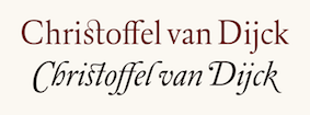 Born in Dexheim, Germany in 1606 or 1608 (some sources say 1601), he died in Amsterdam in 1669. Dutch printer, typefounder, type cutter, and type designer who worked for Elsevier. He had a type foundry in Amsterdam. In texts like Johan Enschedé's Proef vann Letteren (1768), his name is spelled Chistoffel van Dyk. Elsewhere we find the more modern Dutch spellings Dijk and Dijck for his last name. Rudi Geeraerts explains a bit about present day types based on Van Dijck's work. I cite him, interspersed with my own comments and additions:
 - Monotype Van Dijck (1937-1938) is based on a typeface used in 1671 in Herscheppinge (Joost van den Vondel) printed by Daniel Bakkamude. Jan van Krimpen was consultant to Monotype on that project. Most graphic designers were a bit disappointed because it looks skinny when used in normal text sizes. The digital version is due to Robin Nicholas.
- DTL Elzevir (1992, Gerard Daniels) is based on a study of several cuttings from Christoffel Van Dijck. Dutch Type Library mentions that it is mainly based on the Augustijn Romeyn a cut found on a 1682 type specimen issued by Daniel Elsevier's widow (hence the name DTL Elzevir) showing some typefaces from Van Dijck and others. So the DTL Elzevir is not a remake of the Monotype Van Dijck.
- Gerard Unger's Hollander (1983) is based on a study of the typography used in 17th century books using typefaces cut by van Dijck and possible Dirck Voskens. The Hollander is also the base of the well-known Swift. So Unger's Hollander is not a remake of the Monotype Van Dijck.
- OurType's Custodia, designed by Fred Smeijers, is a single-weight roman, with italic and matching small caps, with a seventeenth-century flavour. It was made in 2002 for use in the publications of the Custodia Foundation. Custodia 17 is the first typeface to join the OurType Classics collection. By seventeenth century flavoured we mean the flavour shared by a range of 17th century punch cutters, like Christoffel van Dijck, Dirck Voskens, Johan Michael Smit and Jean Baptiste van Wolschaten. References to and specimens of their typefaces can be found in several archives. One of them is the Plantin-Moretus Museum in Antwerp. The OT Custodia is neither a Van Dijck revival nor a Monotype Van Dijck remake.
- Dutch Textura (1681), in versions called Augusteyn Duyts and Mediaen Duyts.
- He designed a Hebrew typeface for the Hebrew bible of rabbi and typefounder Immanuel Atias (or: Joseph Athias), known as Otiyot Amsterdam (or: Letters from Amsterdam).
Typefaces offered at MyFonts that are rooted in Van Dijck's work include: FontShop link. Klingspor link. Christoffel Van Dijck's digital legacy. [Google]
[MyFonts]
[More] ⦿
|
Cosimo Lorenzo Pancini
|
 Born in Firenze in 1969. Cofounder with Francesco Canovaro and Debora Manetti of the Italian design firm in Firenze called Studio Kmzero. He co-designed some typefaces there such as Arsenale White (2009). In 2002, Pancini developed Targa, TargaMS and TargaMSHand (for comic books?), basing his design on the peculiar sans serif monospace typeface with slightly rounded corners and a geometric, condensed skeleton that Italy had been using for its license plates. In 2022, Francesco Canovaro redesigned this font into a versatile multi-weight typeface, Targa Pro, which includes Targa Pro Mono (which keeps the original monospace widths), Targa Pro Roman (with proportional widths), both in five weights plus italics, the handmade version Targa Hand, and Targa Pro Stencil.
 The handwriting of Lord Byron led Pancini to develop the brush script typeface Byron (2013, Zetafonts). MyFonts credits him with the rounded avant garde sans family Antipasto (2007), but elswhere we read that this typeface is made by Matteo di Iorio, so there is some confusion. It was extended in 2017 by Pancini as Antipasto Pro. In 2014, Cosimo Lorenzo Pancini and Francesco Canovaro co-designed Amazing Grotesk (+Ultra). He also designed the calm bold geometric rounded sans typeface Cocogoose (2014; replaced by Cocogoose Pro in 2017) and the stylish deco font Offensive Behaviour. Cocogoose Letterpress is free. Cocogoose is part of the Coco Gothic family, a collection of twelve typefaces each inspired by the fashion mood of every decade of last century, named after fashion icon Coco Chanel. Cocogoose is Coco Gothic for the 1940s. See also Coco Gothic Pro (2021). In 2015, Pancini published the grand family Coco Gothic. This Latin / Greek / Cyrillic typeface family features a small x-height and sligghtly rounded corners to make the avant garde and geometric sans typefaces in vogue in the 1970s come alive again, ready for 21st century fashion magazines. It comes with substyles that recreate many moods, including art nouveau and arts and crafts (Cocotte), Italian propaganda style and Italian deco (Cocosignum), hipster style (CocoBikeR), or Bauhaus (Cocomat). Coco Gothic was initially developed as a corporate font for Lucca Comics & Games Festival 2013. The rounded geometric sans family Cocomat (by Cosimo Lorenzo Pancini, Deborah Manetti and Francesco Canovaro) was inspired by the style of the twenties and the visions of Italian futurists like Fortunato Depero, Giacomo Balla and Antonio Sant'Elia. Updated in 2019 as Cocomat Pro. Still in 2015, Cosimo and Zetafonts published the connected creamy baseball script Bulletto, the grungy handvetica Neue, and the calligraphic wedding typeface Hello Script. In 2015, at Zetafonts, Cosimo Lorenzo Pancini designed CocoBikeR (2015) to celebrate the hipster and bike cultures. CocoBikeR (for Latin, Greek and Cyrillic) is part of the successful Coco Gothic typeface family. In 2017, Pancini designed the 1930s Italian art deco typeface families Cocosignum Maiuscoletto and Cocosignum Corsivo Italico. In 2021, he published the 48-style (+variable) font family Coco Gothic Pro. This is a redrawn and expanded set of fonts: Inspired by a biography of Coco Chanel and trying to capture the quintessential mood of classical fashion elegance, Cosimo Lorenzo Pancini designed Coco Gothic looking for the effect that the first geometric sans typefaces (like Futura, Kabel or the italian eponyms like Semplicita) had when printed on paper. The crisp modernist shapes acquired in printing charme and warmth through a slight rounding of the corners that is translated digitally in the design of Coco Gothic. [...] A distinguishing feature of Coco Gothic Pro is the inclusion of ten alternate historical sets that allow you to use the typeface as a true typographic time machine, selecting period letterforms that range from art deco and nouveau, to modernism and to eighties' minimalism. Equipped with such an array of historical variants, Coco Gothic Pro becomes an encyclopedia of styles from the last century. There is also attention to Darkmode and there is coverage of Cyrillic and Greek. Typefaces from 2016: Adlery (a curly brush script), Kitten (Fat, Swash, Swash Monoline, Slant, Bold: signage script family), Adlibitum (a blackletter typeface by Cosimo Lorenzo Pancini and Francesco Canovaro), Morbodoni (a display didone by Cosimo Lorenzo Pancini and Francesco Canovaro). In 2016, Cosimo Lorenzo Pancini, Andrea Tartarelli, Giulia Ursenna Dorati and Andrea Gaspari co-designed the 1940s vintage brush script typeface Banana Yeti, which is based on an example by Ross George shown in George's Speedball 1947 Textbook Manual. The Zetafonts team extended the original design to six styles and multilingual coverage. The ExtraBold is free. Still in 2016, Pancini designed Calligraphunk, an experimental typeface that mimicks polyrythmic calligraphy, by alternating two sets of lowercase letters to emulate handwriting. In 2016, Cosimo Lorenzo Pancini, Matteo Chiti, Luca Chiti and Andrea Tartarelli co-designed the retro connected brush script font family Advertising Script, which is based on an example from Ross George's Speedball 1947 Textbook Manual. Beatrix Antiqua (2016, by Francesco Canovaro, Cosimo Lorenzo Pancini and Andrea Tartarelli). This humanist sans-serif typeface is part of the Beatrix family (Beatrix Nova, etc.) that takes its inspiration from the classic Roman monumental capital model. Its capitals are directly derived from the stone carvings in Florence's Santa Croce Cathedral. Beatrix keeps a subtle lapidary swelling at the terminals suggesting a glyphic serif, similar to Hermann Zapf's treatment in Optima. Amazing Grotesk (2016) is based on a logo designed by Francesco Canovaro. Studio Gothic (2017, by Francesco Canovaro, Cosimo Lorenzo Pancini and Andrea Tartarelli) is an 8-style geometric sans family based on Alessandro Butti's geometric sans classic, Semplicita. Hello Script and Hello Sans can be used for layering and coloring. The Christmas-themed version is Hello Christmas. Pancini designed the 64-strong typeface family Body Grotesque and Body Text in 2017-2018, together with Andrea Tartarelli. It was conceived as a contemporary alternative to modernist super-families like Univers or Helvetica. In 2017, Cosimo Lorenzo Pancini and Andrea Tartarelli co-designed the sans typeface family Kabrio, which gives users four different corner treatment options. Anaphora (2018). Anaphora is a contemporary serif typeface designed by Francesco Canovaro (roman), Cosimo Lorenzo Pancini (italic) and Andrea Tartarelli. It features a wedge serif design with nine weights from thin to heavy. Its wide counters and low x-height make it pleasant and readable at text sizes while the uncommon shapes make it strong and recognizable when used in display size. Anaphora covers Latin, Greek and Cyrillic. Canovaro's Arista served as a basis for the 29-style monolinear rounded sans typeface family Aristotelica (2018) by Cosimo Lorenzo Pancini and Andrea Tartarelli. See also Aristotelica Pro (2020). In 2018, he designed the italics for Cosimo Lorenzo Pancini's Domotika typeface family. Between 2018 and 2021, Cosimo Lorenzo Pancini and Andrea Tartarelli developed the 8-weight humanist sans typeface Domotika for Latin, Cyrillic and Greek, further into the 18-style Domotika Pro (2021). In 2018, he published Radcliffe, with Andrea Tartarelli, a Clarendon revival with Text and Casual subfamilies. Radcliffe (a Clarendon revival by Cosimo Lorenzo Pancini and Andrea Tartarelli), and added the layerable condensed Cocogoose Narrows to the Cocogoose family. Codec (2018) by Cosimo Lorenzo Pancini, Francesco Canovaro and Andrea Tartarelli is a geometric sans typeface family in which all terminal cuts are horiontal or vertical. See also Codec Pro (2019). His Double Bass (2018) is a jazzy 4-style typeface family that pays tribute to Saul Bass's iconic hand lettering for Otto Preminger's The Man with the Golden Arm film title sequence and other movies, Bass's vibrating, almost brutal cut-out aestethics, and the cartoonish lettering and jazzy graphics of the fifties. In 2018, he published the sharp wedge serif typeface Blacker to pay homage to the 1970s. In 2019, that was followed by Blacker Pro (Cosimo Lorenzo Pancini and Andrea Tartarelli, who write: Blacker Pro is the revised and extended version of the original wedge serif type family designed by Cosimo Lorenzo Pancini and Andrea Tartarelli in 2017. Blacker was developed as a take on the style that Jeremiah Shoaf has defined as the "evil serif" genre: typefaces with high contrast, oldstyle or modern serif proportions and sharp, blade-like triangular serifs). Still in 2018, he designed the swooping polyrhythmic calligraphic typeface Calligraphunk. In 2018, Cosimo Lorenzo Pancini and Andrea Tartarelli designed Holden, a very Latin cursive sans typeface with pointed brush aesthetics and fluid rhythmic lines. In 2019, Cosimo Lorenzo Pancini, Francesco Canovaro and Andrea Tartarelli published the monolinear geometric rounded corner amputated "e" sans typeface family Cocogoose Classic, the sans family Aquawax Pro, and the condensed rounded monoline techno sans typeface family Iconic. In 2019, Cosimo Lorenzo Pancini, Andrea Tartarelli and Maria Chiara Fantini at Zetafonts published a slightly calligraphic Elzevir typeface, Lovelace. In 2019, the lapidary typeface family Beatrix Antiqua (Francesco Canovaro) was reworked by Cosimo Lorenzo Pancini together with Andrea Tartarelli and Maria Chiara Fantini into a 50-style type system called Monterchi that includes Text, Serif and Sans subfamilies. Monterchi is a custom font for an identity project for a famous fresco in Monterchi, developed under the art directorship of Riccardo Falcinelli. Tarif (2019) is a typeface family inspired by the multicultural utopia of convivencia---the peaceful coexistence of Muslims, Christians and Jews in tenth century Andalusia that played an important role in bringing to Europe the classics of Greek philosophy, together with Muslim culture and aesthetics. It is a slab serif typeface with a humanist skeleton and inverted contrast, subtly mixing Latin zest, calligraphic details, extreme inktraps, and postmodern unorthodox reinvention of traditional grotesque letter shapes. The exuberant design, perfect for titling, logo and display use, is complemented by a wide range of seven weights allowing for solid editorial use and great readability in body text. Matching italics have been designed with the help of Maria Chiara Fantini and Cosimo Lorenzo Pancini, while Rania Azmi has collaborated on the design of the arabic version of Tarif, where the humanist shapes and inverted contrast of the Latin letters find a natural connection with modern arabic letterforms. Late in 2019, Cosimo Lorenzo Pancini released the fun typeface family Hagrid at Zetafonts, which writes: Crypto-typography---the passion for unknown, weird and unusual character shapes---is a disease commonly affecting type designers. Cosimo Lorenzo Pancini has celebrated it in this typeface family, aptly named Hagrid after the half-blood giant with a passion for cryptozoology described by R. K. Rowling in her Harry Potter books. Extreme optical corrections, calligraphic counter-spaces, inverted contrast, over-the-top overshoots: all the inventions that abound in vernacular and experimental typography have been lovingly collected in this mongrel sans serif family, carefully balancing quirky solutions and solid grotesque design. In 2020, Pancini released Stinger (2020, a 42-style reverse contrast family by Francesco Canovaro, Cosimo Pancini, Andrea Tartarelli and Maria Chiara Fantini) and Boring Sans (a typeface family designed along two variable axis: weight and weirdness). As part of the free font set Quarantype (2020), Cosimo Lorenzo Pancini designed Quarantype Embrace, Quarantype Hangout, Quarantype Hopscotch, Quarantype Joyride, Quarantype Sackrace, and Quarantype Uplift (with Maria Chiara Fantini). In 2020, Cosimo Lorenzo Pancini and Mario De Libero revived Nebiolo's Carioli (1928) as Cairoli Classic and Cairoli Now at Italian Type / Zetafonts. They extended the original weight and width range and developing both a faithful Classic version and a Now variant. The Cairoli Classic family keeps the original low x-height range, very display-oriented, and normalizes the design while emphasizing the original peculiarities like the hook cuts in curved letters, the high-waisted uppercase R and the squared ovals of the letterforms. Cairoli Now is developed with an higher x-height, more suited for text and digital use, and adds to the original design deeper inktraps and round punctuation, while slightly correcting the curves for a more contemporary look. Cairoli Variable has a weight and width axis. In 2020, Cosimo Lorenzo Pancini and Mariachiara Fantini---with the help of Solenn Bordeau---released Erotique at Zetafonts. Erotique evolved from Lovelace, an earlier Zetafonts typeface. Zetafonts describe this evil serif as follows: it challenges its romantic curves with the glitchy and fluid aestethic of transmodern neo-brutalist typography. Late in 2020, they added Erotique Sans, the sans version of Erotique, also designed by Cosimo Pancini and Maria Chiara Fantini. Late in 2020, he co-designed the 46-style font family Eastman Grotesque together with Francesco Canovaro and Andrea Tartarelli. This monolinear sans with a tall x-height comprises an interesting Eastman Grotesque Alternate subfamily with daring and in-your-face glyphs. The typeface evolved from Zetafonts' earlier Bauhaus-inspired typeface Eastman (2020). Later fonts in this family include Eastman Condensed (2021, by Francesco Canovaro, Cosimo Pancini and Andrea Tartarelli). In 2020, Cosimo Pancini, Andrea Tartarelli and Mario De Libero drew the 60-style Cocogoose Pro Narrows family, which features many compressed typefaces as well as grungy letterpress versions. Sunshine Pro (2020, Zetafonts) was designed by Cosimo Lorenzo Pancini and Solenn Bordeau expanding the original Sunshine design by Francesco Canovaro, part of the Quarantype collection (2020), which in turn was designed as a typeface for good vibes against Covid-19. Sunshine Pro is an experimental Clarendon-style font with variable contrast along the weight axis---contrast is reversed in light weight, minimized in the regular weight and peaks in the bold and heavy weights. Coco Sharp (2021) is a 62-style sans feast, with two variable fonts with variable x-height, by Francesco Canovaro, Cosimo Pancini and Andrea Tartarelli. Co-designer of Heading Now (2021), a 160-strong titling font (+2 variable fonts) by Francesco Canovaro, Cosimo Pancini, Andrea Tartarelli and Mario De Libero that provides an enormous range of widths. Keratine (2021, Cosimo Pancini, Andrea Tartarelli and Mario De Libero). A German expressionist typeface that exists in a space between these two traditions, mixing the proportions of humanistic typefaces with the strong slabs and fractured handwriting of blackletter calligraphy. Pancini, its main designer, writes that it explores the impossible territory between antiqua and blackletter. Geppetto (2021) is a frivolous Tuscan font that started out as a revival of a condensed Tuscan wood type family appearing in the 1903 Tubbs Wood Type catalog and which was probably derived from an 1859 typeface by William Hamilton Page. Pancini built a variable font on top of it and calls it a font for fake news. In 2021, Pancini added Coco Tardis as a variable font with a time travel slider to the Coco Gothic family. Millard Grotesque (2021) is a true "grot" in the Akzidenz Grotesque sense of the word. This typeface family was designed by Cosimo Lorenzo Pancini and Andrea Tartarelli. Pancini's Descript (2021) is a variable script font with two axes, slant and speed of writing. Milligram (2021) is a very tightly set grot by Cosimo Pancini and Andrea Tartarelli. [Google]
[MyFonts]
[More] ⦿
|
Daniel Benjamin Miller
|
 Daniel Benjamin Miller (b. 2000, New York) is an undergraduate student in philosophy at McGill University. His type design work:
 - BMucicFont (2020). Based on the Steinberg Media music fonts for LilyPond music software.
- Salieri (2020). A revival of Jan Tschichold's Sabon (1964-1967).
- GFS Heraklit. This started out from Zapf's Heraklit Greek (1954). A digital revival was first done by George Matthiopoulos. Later improvements by Antonis Tsolomitis and in 2020 by Daniel Benjamin Miller.
- NX Baskerville Bold Italic (2020). An addition to Libre Baskerville (2012, Rodrigo Fuenzalida and Pablo Impallari).
- He added OpenType support and made some minor adjustments to ET Bembo (2002, Dmitry Krasny / Deka Design), releasing the result as XETBook (2019). In 2020, that font family was extended by Michael Sharpe as ETbb.
- In 2019, he started working on Regis, an original face inspired by the work of Pierre-Simon Fournier and Monotype 178 Barbou.
- RW Garamond (2019) is a freeware Garamond font in OpenType format. RW stands for Rudolf Wolf, the designer who created Stempel's version of Garamond from the Egenolff-Berner specimen. RW Garamond is a modified version of URW Garamond No. 8. and GaramondX, with changes being made to support OpenType (better vertical metrics, added diacritics, better kerning, more mathematical symbols, Greek for mathematics, character variants). Copyrights: 2000, URW++; 2005, Ralf Stubner; 2009, Gaël Varoquaux; 2012-2017, Michael Sharpe; 2019, Daniel Benjamin Miller.
- Domitian (2019). Based on URW's Palladio which in turn is based on Hermann Zapf's Palatino. Domitian is a project to develop a full-featured, free and open-source implementation of Palatino design. "Domitian" refers to the builder of the Flavian Palace, which is located on the Palatine Hill. Miller added true small caps and old style figures to URW's Palladio. The metrics have been adjusted to more closely match Adobe Palatino, and hinting has been improved.
- Garamond Libre (2019). Based on Unicode Fonts for Ancient Scripts (George Douros, 2017). CTAN link. Miller writes: Garamond Libre is a free and open-source old-style font family. It is a "true Garamond," i.e., it is based on the designs of 16th-century French engraver Claude Garamond. The roman design is Garamond's; the italics are from a design by Robert Granjon. The upright Greek font is after a design by Firmin Didot; the "italic" Greek font is after a design by Alexander Wilson. The font family includes support for Latin, Greek (monotonic and polytonic) and Cyrillic scripts, as well as small capitals, old-style figures, superior and inferior figures, historical ligatures, Byzantine musical symbols, the IPA and swash capitals. Miller added a bold italic.
- The STEP fonts (2019), free at CTAN and Github, created to be metrically compatible with Adobe's digitization of Linotype Times. STEP is based on the STIX and XITS fonts, and includes support for OpenType mathematical typesetting, usable with LuaTeX, XeTeX and Microsoft Office. It contains an original STEP Greek (2020) in Elzevir style.
- Courier Ten (2020). This is Courier 10 Pitch BT, made available by Bitstream, offered here in OpenType format as well as Type 1 for use with LaTeX. Package maintained by Daniel Benjamin Miller starting in 2020.
- MLModern (2021). He explains: MLModern is a text and math font family with (LA)TEX support, based on the design of Donald Knuth's Computer Modern and the Latin Modern project [note: 2003-2009, by B. Jackowski and J. M. Nowacki]. Some find the default vector version of Computer Modern used by default in most TEX distributions to be spindly, sometimes making it hard to read on screen as well as on paper; this is in contrast with the older bitmap versions of Computer Modern. MLModern provides a sturdy rendition of the Computer Modern design. [...] A script by Chuanren Wu was used to blacken the fonts before manual adjustment.
Miller is a supporter of free and open-source fonts, as well as free and open-source software. He uses FontForge for design, and releases all his work under free licenses: I really just want people to be able to use my designs, improve them and share them. First, on a pragmatic level, I know that my work will be imperfect, and I'd like others to be able to use their judgment to make adjustments (which I hope they'll also release under a free license). Second, I think that too much material (and not just fonts) is behind barriers of restricted access and artificial scarcity. This kind of thing---useful tools and information---wants to be free, so let it out for everybody to use. Github link. [Google]
[More] ⦿
|
David Charles Randolph Rakowski
|
 Type designer and composer, born in St. Albans, VT, in 1958. He was one of the early free/shareware type designers, well-known for creating revivals of 19th century typefaces. He was the Walter W. Naumburg Professor of Composition at Brandeis University, and has previously taught at Harvard University, Columbia University, and Stanford University.
 List of Rakowski's fonts: 3-DWedgie, Aarcover, AdineKirnberg-Script, Ann-Stone, Beachman, Beffle (1991, after Fry's Ornamented No. 2 from Stephenson Blake), Bizarro, BrailleFont, BunnyEars, ChristensenCaps, Crackling, DaBigKeyCaps, DavysCrappyWriting, DavysDingbats, DavysKeyCaps, DavysNewOther, DavysOtherDingbats, DavysRibbons, DeBalme Initials, DieterCaps, Diner-Fatt, Diner-Obese, Diner-Regular, Diner-Skinny, Dobkin-Script, Dragonwick, Dubiel (1991), Dupuy-Light, DupuyBALloon, Eileen, EileenCaps, EileensMediumZodiac, Elizabeth-Ann, Elzevier, EraserDust, Firecat, Gallaudet (a sign language font), Garton (1993), Gessele-Script, GriffinOne, Harting (an old typewriter font), Headhunter, Holtzschue, Horst, Ian-Bent, Jeff-Nichols, Jumble, Kinigstein, Konanur, KoshgarianLight, Kramer, Lassus (1993), LeeCaps, Lemiesz (a free version of Publicity Gothic, 1916), Lilith-Heavy, Lilith-Initals, Lilith-Light, Lintsec, Logger, LowerEastSide, McGarey-Fractured, Multiform, Nauert, NixonInChina (oriental simulation), ParisMetro, Pixie, Pointage, Polo, Rechtman-Script, ReliefDeco, ReliefInReverse, Reynolds, Rockmaker, Rothman [note: poster by Lauren Buroker], Rounded, Rudelsberg (a Munch Jugendstil style font), Salter, Shotling, Showboat, Shrapnel, Starburst, TejaratchiCaps, TenderleafCaps, ToneAndDebs, Tribeca, Uechi, UpperEastSide (1990), UpperWestSide (lettering from the New Yorker magazine), VarahCaps, Wedgie, Wharmby, WhatA-Relief, Will-Harris, Zaleski, and Zallman-Caps. Some downloads: Uechi, Rothman, Tejaratchi, Eileen Caps and Elzevier Caps, Paris Metro, Davy's Dingbats (see also here). With Klaus Herrmann, of Intecsas in Düsseldorf, he started updating his fonts from 1992-1999. Those fonts can be bought at Will-Harris. Here is an interview with David. Download 120 of his fonts here. And finally, a text file with the names of most of his fonts. Mark Johansson explains the history of Rakowski's fonts. Dafont link. MyFonts page. Abstract Fonts link. Font Squirrel link. Fontspace link. Klingspor link. [Google]
[MyFonts]
[More] ⦿
|
De Vinne Roman
|
An oldstyle typeface designed by Frederic Goudy in 1898. D.J.R. Bruckner: A book face based on the display type designed by Theodore De Vinne and made on the order of Walter Marder of the Central Type Foundry of St. Louis, Missouri. This account by Bruckner is wrong, as De Vinne never designed the types named after himself. The most likely creator is Gustav Schroeder. Mac McGrew: In 1898 Frederic W. Goudy was asked to take the famous display type [DeVinne, by Central Type Foundry] and make a book typeface of it. The resulting DeVinne Roman, Goudy's second type design, was cut the following year by the Central branch of ATF. DeVinne Slope, essentially the same design but sloped rather than a true italic, was cut by the foundry about the same time, perhaps from the same patterns as the roman. Digital versions: [Google]
[More] ⦿
|
De Vinne types
|
Below is a verbatim reproduction of what Mac McGrew writes about the De Vinne types. De Vinne types were designed and named for Theodore L. De Vinne, one of the most prominent American printers of the late nineteenth and early twentieth centuries. His De Vinne Press pioneered in various methods of producing high-quality books and magazines, and De Vinne himself had considerable influence on typeface design as well as printing methods and other aspects of the business, and was the author of several books on the subject; however, he was not the actual designer of these typefaces. DeVinne, as produced by Linotype in 1902, is a legible but plain version of modern roman, with long, thin serifs and considerable contrast. It does not appear in the 1907 book, Types of the DeVinnePress, although there are other very similar types. Other typefaces bearing the De Vinne name, described below, are more distinctive and much better known. They might be considered the first large type family, although they developed helter-skelter from several sources rather than being created as a unified family. DeVinne, the display face, is credited with bringing an end to the period of overly ornate and fanciful display typefaces of the nineteenth century, and with restoring the dignity of plain roman types. It is derived from typefaces generally known as Elzevir or French Oldstyle (q.v.). DeVinne says of it, This typeface is the outcome of correspondence (1888-90) between the senior of the De Vinne Press (meaning himself) and Mr. J. A. St. John of the Central Type Foundry of St. Louis, concerning the need of plainer types of display, to replace the profusely ornamented types in fashion, of which the printers of that time had a surfeit. The DeVinne Press suggested a return to the simplicity of the true old-style character, but with the added features of thicker lines and adjusted proportion in shapes of letters. Mr. St. John approved, but insisted on grotesques to some capital letters in the belief that they would meet a general desire for more quaintness. Mr. Werner of the Central Type Foundry was instructed to draw and cut the proposed typeface in all sizes from 6- to 72-point, which task he executed with great ability. The name given to this typeface by Mr. St. John is purely complimentary, for no member of the DeVinne Press has any claim on the style as inventor or designer. Its merits are largely due to Mr. Werner; its few faults of uncouth capitals show a desire to please eccentric tastes and to conform to old usage. The new typeface found welcome here and abroad; no advertising typeface of recent production had a greater sale. Thus De Vinne himself credits the typeface to Central Type Foundry and its design to Nicholas J. Werner, but Werner says, To correct the general impression that Theodore L. De Vinne was the designer of the typeface named after him, I would state that it was the creation of my partner, Mr. (Gustav) Schroeder. The design was patented under Schroeder's name in 1893. Central was part of the merger that formed American Type Founders Company in 1892, but continued to operate somewhat independently for a few more years. Meanwhile, DeVinne was copied by Dickinson, BB&S, Hansen, and Keystone foundries, and perhaps others-in fact, Keystone advertised that it patented the design in 1893, Connecticut Type Foundry copied it as Saunders, and Linotype as Title No.2. Dickinson called it "a companion series to Howland" (q.v.). When Monotype developed an attachment in 1903 to cast display sizes, DeVinne was the first type shown in their first announcement. Later ATF specimens showed this typeface and several derivatives as DeVinne No.2, probably because of adjustments to conform with standard alignment. DeVinne Italic and DeVinne Condensed were drawn by Werner and produced by Central in 1892 and copied by some other sources. Howland, shown by Dickinson in 1892, is essentially the same as DeVinne Condensed No.3, later shown by Keystone. ATF introduced DeVinne Extended in 1896, while BB&S showed DeVinne Compressed, Extra Compressed, and Rold in 1898-99. Keystone's DeVinne Title is another version of bold, not as wide as that of BB&S. In 1898 Frederic W. Goudy was asked to take the famous display type and make a book typeface of it. The resulting DeVinne Roman, Goudy's second type design, was cut the following year by the Central branch of ATF. DeVinne Slope, essentially the same design but sloped rather than a true italic, was cut by the foundry about the same time, perhaps from the same patterns as the roman. DeVinne Open or Outline and Italic also originated with Central. In the roman and smaller sizes of italic only the heavy strokes are outlined; in larger sizes of italic, certain thin strokes are also outlined. Monotype cut the open typefaces in 1913. DeVinne Shaded is another form of the outline, created by Dickinson in 1893; parts of the outline are much thicker than others. DeVinne Recut and Recut Outline, shown by BB&S, are not true members of this family, but are a revival of Woodward and Woodward Outline, designed by William A. Schraubstadter for Inland Type Foundry in 1894; there were also condensed, extra condensed, and extended versions, all "original" by Inland. DeVinneRecutItalic was a rename of Courts, by Werner about 1900, also from Inland. Compare McNally. [Google]
[More] ⦿
|
Denis Masharov
|
 Born in Moscow in 1973, he emigrated to Israel in 1990 and has a Bachelor of Arts degree from the Bezalel Jerusalem Academy of Arts, 1996. A professional designer since 1996, he designs type and is involved in typographic projects.
 At Google Font Directory, we can download his Latin/Cyrillic poster font Ruslan (or Rusland) Display (2011), the freehand lettering typeface Marck Script (2011, based on the hand of Marck Fogel), and the angular Kelly Slab (2011). Bolster (2011) is a unicase fat Western face. Forum (2011) is a free classical roman face. TeX support. Ruslan Display (2011) was co-designed with Vladimir Rabdu, this decorative typeface is in the poluustav style dating from the 16th century. In 2011, he set up the Denis Masharov foundry at MyFonts. Free fonts published at Google Web Fonts in 2012: Ledger (Ledger was likened to Zapf's Melior by Nick Shinn, but Masharov says that it is closer to Swift), Glass Antiqua. This is a revival of the 1913 typeface Glass Antiqua by Genzsch & Heyse (original by Franz Paul Glass, 1912). Poiret (2012, free at Google Web fonts) is a Latin / Cyrillic geometric grotesque that combines art deco with avant garde. TeX support for Poiret One. Bolster (2012) is a great Italian wood type face. Tenor Sans (2012) is a Peignotian typeface (free at Google Web Fonts). In 2017, Denis Masharov and Roman Shchyukin co-designed the custom squarish sans typeface Match TV for the Russian TV sports channel MachTV. Still in 2017, he designed TNT Sans for the Russian entertainment TV channel TNT (on commission for Elena Shanovich, Shandesign). Denis did the logo and typeface for the bakery brand Volkonsky in 2017. In 2019, he created the Elzevir style titling typeface Matilda Titling for Coronation, а historical TV seriеs by Alexei Uchil. It was inspired by typefaces from Georges Revillon's type foundry, ca. 1860. Klingspor link. Behance link. Fontsquirrel link. Google Plus link. Fontspace link. [Google]
[MyFonts]
[More] ⦿
|
Dieter Steffmann
|
 FontShop was the name of Dieter Steffmann's foundry in Kreuztal, Germany (not to be confused with the FontShop foundry and font vendor). He made about 600 self-proclaimed "old-fashioned" fonts, and among these many Fraktur fonts. His site became too expensive to run, and was for about two decades hosted by Typoasis. His fonts can now de downloaded afrom 1001 Fonts. Alternate URL. Current list of fonts. See also here. New stuff. Fontspace link. A nice essay about Fraktur fonts accompanies the fonts. News. As Dieter puts it: I am not a designer but I add missing letters to public domain fonts in order to get a complete character set and I hint the fonts and create new weights (shadow, inline etc.) His Christbaumkugeln font, and how it was made. The font families:
 - Acorn Initialen (2000), Adine Kirnberg (2000, after David Rakowski's Adine Kirnberg Script, 1991), AI Parsons (1999: a simple conversion to truetype of AI Parsons (1994, Inna Gertsberg ans Susan Everett), which in turn revived Will Ransom's Parsons from the 1920s), Albert Text (2000), Alpine (2000), Altdeutsche Schrift (1998: a rotunda), Alte Caps (2000: white on black), Alte Schwabacher (2000, +Shadow), Ambrosia (2000), American Text (2000: a blackletter), Aneirin (2000: Lombardic), Angel (2000: an ironwork font), Anglican Text (2000: a frilly blackletter), Angular (1999: +Inline, +Shadow), Ann-Stone (2000: boxed art nouveau caps), Antique No. 14 (2000: fuzzy hand-crafted letters), Arabella (2000: script), ArabesqueInitialen (2002), Argos George (1999, an art nouveau font after Georges Lemmen's George-Lemmen-Schrift (1908); Steffmann added Argos Geirge Contour), Aristokrat Zierbuchstaben (2002, after a house font at Ludwig&Mayer, 1911), Ariston Script (2000: a formal calligraphic script), Art Nouveau Initialen (1999), Attic Antique, Augusta (2000: a rotunda; +Shadow).
- Baldur (2000: art nouveau; +Shadow, +RoughSliced; after a schelter typeface from 1895), Ballade Bold (2002, a Schwabacher font based on Ballade Halbfette designed by Paul Renner in 1937; +Contour, +Shadow), Barock Initialen (2002: an incomplete decorative initials typeface), Becker (1999; +Shadow, +Inline), Beckett-Kanzlei (2001), Behrens-Schrift (2002: an art nouveau-inspired blackletter typeface based on an original by Peter Behrens), Belshaw (2000: a Victorian decorative serif), Belwe (2002, after an original by Georg Belwe, 1913; Gotisch, Vignetten), Benjamin Franklin Antique (2000, after a warm wood type designed in 1991 by Walter Kafton-Minkel simply called Benjamin), Berlin Squiggle Condensed, Bernhard Schmalfett, Bier und Wein Vignetten (2002, based on drawings from the Bauersche Giesserei), Billboard, Bizzaro, Black Forest (2000, blackletter; +Text, +ExtraBold), Black Knight (1999: blackletter), Blackletter (2001; +ExtraBold, +Shadow), Blackwood Castle (2000: an almost Lombardic blackletter; +Shadow), Breitkopf Fraktur (2000), Bretagne Gaelic (1999), Brian James Bold (2000, +Contour), Bridgnorth, Broadcast Titling (2000, 3d caps), Broadway Poster, Brock Script (2000: formal calligraphic script).
- Cabaret (2000: all caps, +Contour, +Shadow), Campanile (2000: Victirian), Camp Fire (2000: wooden plank font), Canterbury Old English (2001: blackletter), Cardiff (2000: textured caps), Cardinal (2000: almost Lombardic; +Alternate, +Anglican), Carmen (1998: art nouveau style; +Shadow), Carrick Caps (2000), Caslon Antique, Caslon Fette Gotisch, Cavalier (2000), Celtic Frames (2000), Celtic Hand (2000), Challenge (2000; +Contour, +Shadow), Chelsea (2000: a serif), Chopin Script (2000, a formal penmanship script identical to Polonaise), Christbaumkugeln (1999: art nouveau alphadings consisting of Christmas ornaments), Chursächsische Fraktur, Cimbrian (2001: blackletter), Circus Ornate Caps (2001, a Western or circus font), Cloister Black Light (2001: blackletter), Coaster Black (2001, +Shadow), Coelnische Current Fraktur (2000), Colchester Black (2001: an ornamental blackletter), College, Courtrai (2000: a decorative blackletter), Coventry Garden, Cruickshank (2000: art nouveau caps).
- Damn Noisy Kids (2002: a heavy brush font), Davy's Dingbats, Debussy, Decorated Roman Initials (2003), Deutsch Gotisch (2002: an expressive blackletter font; +Dutesch Gotisch Heavy, +Outline, +Shadow), Deutsche Uncialis (+Shadow) (2000), Deutsche Zierschrift (2002, after Rudolf Koch, 1919-1921), Devinne Swash (2000), Digits (2000), Direction (2000: letters with embedded arrows), Dobkin Script (2000: after David Rakowski, 1992, Domino, Domo Arigato (1999: oriental emulation), Dover, Driftwood Caps (2000: a wooden plank font), Due Date (2000: a grungy stencil typeface), Duerer Gotisch (2001), Duo Dunkel (+Licht), Durwent (2001: a rotunda).
- Easter Bunny (after a 1994 font by Apropos Creations), Easter Egg (2001; after a 1994 font by Apropos Creations), Eckmann Initialen (2002, after the famous art nouveau typeface from 1900 by Otto Eckmann), Eckmann Plakatschrift (2002), Eckmann-Schrift (2002), Eckmann Titelschrift (2002), Eckmann Schmuck (2002), Egyptienne Zierinitialen (2002), Egyptienne Zierversalien (2002), Ehmcke-FrakturInitialen (2002), Ehmcke-Schwabacher Initialen (2002), Eichenlaub Initialen (2000), Eileen Caps (2000; after David Rakowski, 1992), Eisenbahn (2002, based on train vignettes at Bauersche Giesserei), Elzevier Caps (2000; after David Rakowski), Enge Holzschrift (2000; +Shadow), English Towne Medium (2000: a Fraktur), Epoque (1999; an art nouveau typeface; +Shadow, +Inline), Erbar Initialen, Estelle, Evil of Frankenstein, Express (1999).
- Faktos (1998; a rip-off of Cory Maylett's Faktos, 1992; +Striped, +Contour, +Shadow), Fabliaux (2000: Lombardic caps), Fancy Card Text (2000: a textura), Fat Freddie (2000: a fat all caps font; +Shadow, +Outline), Faustus (2000: a Schwabacher), Fenwick Woodtype (blackletter: 2001), Fette Caslon Gotisch (2001), Fette Deutsche Schrift (2002, a revival of a Rudolf Koch font from 1908), Fette Egyptienne, Fette Haenel Fraktur (2000), Fette Kanzlei (2002), Fette Mainzer Fraktur (2001), Fette Steinschrift (2002), Fette Thannhäuser (2002; after Herbert Thannhäuser, 1937-1938; +Schattiert), Fette Trump Deutsch (20002, after Georg Trump, 1936), Firecat, Flaemische Kanzleischrift (2000: calligraphic), Flowers Initials (2000: floriated caps), Forelle (2002: a retro script; +Shadow), Fraenkisch Spitze Buchkursive (2002; after Lorenz Reinhard Spitzenpfeil, 1906), Fraktur Coelnische Current (2000), Fraktur Schmuck (2001: ornaments), Fraktur Shadowed (2001), Fraktur Theuerdank (2000: a Schwabacher), Frederick Text (2001: a blackletter), Futura Script.
- Gabrielle (1999: a retro script), Ganz Grobe Gotisch (2000), Gebetbuch Fraktur (2000: a Schwabacher), Gebetsbuch Initialen (2001), Germania (2001, a revival of the 1903 blackletter typeface by Heinz König called Germania as well), Germania-Versalien, Gille Fils Zierinitialen (2002, after Gillé Fils, ca. 1820), Gingerbread Initials (Victorian initials, after an original from ca. 1890), Globus, Gloucester Initialen (2001), Gorilla Black (2000: rounded elephant feet font), Gotenburg A+B (2002, after Friedrich Heinrichsen), Gothenburg Fraktur (2000), Gotische Initialen (two different sets with the same name, one from 2000 and one from 2002), Gotisch Schmuck (2002, Fraktur), Goudy Initialen (2000), Goudy Medieval (2000), Goudy Thirty (2000), Grange (1999), GrenzschInitials (2001), Grusskarten Gotisch (2001), Gutenberg Textura (2000).
- Haenel Fraktur Fett, Hansa (1999: art nouveau), Hansa Gotisch (2001: a textura), Hansen (1998; +Contour, +Shadow), Happy Easter (1994, by Apropos Creations: art deco caps), Harrowgate (2001: a textura), Hazard Signs (2000), Headline Text (2001: a textura), Hercules (1999: art nouveau), Herkules (2004: art nouveau), Hermann-Gotisch (2002; after an original by Herbert Thannhaeuser, 1934), Herold (2002), Hippy Stamp (2000: after rubber stamps from the 1960s), Hoedown (2000; +Shadow), Holla (2001; after Rudolf Koch), Holidayfont, Holtzschue(2000: a circus font, after David Rakowski, 1992), Honey Script (2000: a retro script), Horror Dingbats (2000; after Letters from the Claw, 1998), Houtsneeletter, Humboldt Fraktur (2002-2005; after a Schwabacher font by Hiero Rhode, 1938; +Zier, +Initialen).
- Iglesia Light (2002), Iron Letters (2000), Isadora Original.
- Jan Brad, Journal Dingbats, Jahreskreis (seasonal dingbats, 2002), JSL Blackletter Antique (2000, by Jeffrey S. Lee), Jugendstil Fraktur (originally designed by Heinz Koenig, 1907-1910), Jugendstil Ornamente (2002, art nouveau ornaments, after Schelter & Giesecke).
- Kabinett Fraktur, Kaiserzeit Gotisch (2001), Kanzle (2001)i, Kanzlei Initialen (2002), Kalenderblatt Grotesk (2000), Kashmir (2001: an arts and crafts typeface), Kinder Vignetten (2002), KingsCross (2001: blackletter), Kinigstein Caps (2000: art nouveau initials after David Rakowski, 1990), Klarissa (2000), Kleist Fraktur + Zierbuchstaben (2002, after Walter Tiemann, 1928), Koch Antiqua (2002), Koch Antiqua Zierbuchstaben (2002), Koch Initialen (2000, after Rudolf Koch, 1922), Koenigsberger Gotisch (2001), Koenig-Type (2002; a Jugendstil Fraktur originally designed by Heinz Koenig, 1907-1910), Kohelet (2001), Koloss, Konanur Kaps (2000, after David Rakowski, 1991), Kramer, Krone Bold.
- La Negrita (2000, +Shadow), Latina (2001: script), Lautenbach (2001, +Zierversalien), Legrand (1999: art nouveau), Lemiesz (2000), Lettres ombrées ornées (2002, based on a typeface by Schriftgiesserei J. Gillé, 1820), Linolschrift (2000, +Heavy, a linocut font as in the Munch paintings), Lintsec (2000, a stencil typeface, after David Rakowski, 1992), Liturgisch + Zierbuchstaben (2002, after Otto Hupp, 1906), Logger (2000, after David Rakowski, 1991), Lohengrin Fraktur (2000), Long Island Antiqua, Louisianne (1998-2000: +Contour, +Shadow; a bold upright connected script), Ludlow Dingbats (2000, after Ludlow, 1930), Luthersche Fraktur (2000).
- Mainzer Fette Fraktur, Marker Felt (2001), Marketing Script (1999, +Shadow, +Inline), Marlboro (2000), Maximilian (2002, a Fraktur font and decorated caps based on Rudolf Koch, 1914; +Zier), Mayflower Antique (2000), Mediaeval Caps (2000), Medici Text (2002: an ornamental blackletter), Menuetto (1994, after K.R. Field), Messing Lettern (2000), Metropolitain (2000, an art nouveau font like the ine used for the Paris metro; +Contour, +Condensed), Middle Saxony Text (2001), Moderne Fraktur (1999), Monats-Vignetten (2002, based on drawings by Franz Franke for Bauersche Giesserei, 1920), Montague (2000), Monument (2002, after Oldrich Menhart, 1952), Mordred (2000), Morgan Twenty-Nine (1999: Victorian caps), Morris Roman Black (2002, after William Morris, 1893), Morris Initialen (2000, after William Morris).
- Napoli Initialen (2000), Neptun Gotisch (1999), Neugotische Initialen (2002, after an original from 1890), North Face (2000), Nougat (2000), Nougat Nouveau Drop Caps (2000), Nubian (after Walter T. Sniffin's font from 1928).
- Olde English, Old English Five (2000: blackletter), Old Town (2000: Western), Old London (2000: blackletter).
- Packard Antique (2000), Paganini Text (2000: blackletter), Pamela (2000: an ornamental blackletter), Paris Metro (1998; +Outline), Parsons Heavy (2000, after Bill Ransom, 1918), Paulus Franck Initialen (2002), Penelope (2000, Victorian), Peter Schlehmil (2002, after Walter Tiemann, 1918-1921), Peter Schlemihl Fraktur, Picture Alphabet (2000; after an original from 1834), Pilsen Plakatschrift (2000), Pinewood (2000, like wooden branches), Pinocchio (based on a psychedelic typeface by Gustav Jaeger, TypeShop, 1994), Plakat-Fraktur (2001), Plakat Antiqua, Plastisch (2002: ornamental caps), Plastische Plakat Antiqua (2002), Plum Script (2000: an upright script)), Pointage (2000; after David Rakowski, 1992), Polonaise (1999: a formal calligraphic script), Polo Semi (2000), Powell Antique (2000), Prince Valiant (1999: blackletter), Printer's Ornaments One (after Blake Haber, 1994), Prisma (2003, a four-line typeface inspired by Rudolf Koch's Prisma), Progressive Text (2001), Puritan (2000, +Swash).
- Quentin Caps (2001: Tuscan).
- Rediviva (2002), Rediviva Zierbuchstaben (2002: a Schwabacher font after a 1905 typeface at Benjamin Krebs designed by Franz Riedinger), Reeperbahn (1999; aka Rope), Regatta Relief, Reiner Script, Relief Grotesk (2003), Revue Decor, Reynold Art Deco (2000: arts and crafts; +Contour), Rheinische Fraktur (1999: after a 1905 Stempel font called Arminius Fraktur and Rheinische Fraktur), Rio Grande, Rockmaker (2000, after David Rakowski, 1992), Roland 92000. +Shadow, +Contour), Rolling No. 1 ExtraBold (2000), Roman Antique (+Italic) (2000), Romantik Initialen (2000), Romantiques (2002: ornamental caps, perhaps a circus font), Rondo, Rosemary Roman (2001: a great calligraphic script based on Rosemary Hall's Rosemary Roman), Roskell (1998: a poster font, +Bold, +Shadow), Roslyn Contour (2000), Rossano (2000, +Shadow), Rothenburg Decorative (2000: a frilly blackletter), Rothenburg Fraktur, Royal Initialen (1999), Roycroft Initials (2000), Rudelsberg (Schrift, Initialen, Schmuck: a typeface family in Munch Jugendstil style, based on Otto Eckmann's Eckmann from 1901).
- Saddlebag Black (2000: Western), Saloon ExtraBold, Saltino, Salto, Sans Plate Caps (2000), San Remo (2000: a Parisian art nouveau typeface), Sans Serif Shaded (2000, after a font by Stephenson Blake), Savings Bond, Schampel Black (2001: a blackletter), Schmalfette Fraktur (2000; +Schattiert), Schluss-Vignetten (2002, also from Bauersche Giesserei), Schmale Anzeigenschrift + Zierbuchstaben (2002, after Rudolf Koch's Deutsche Anzeigenschrift, 1916-1923), Schmuck Initialen (2001), Schwabacher (2002), Sebaldus-Gotisch (2002, a blackletter after H. Berthold's Sebaldus Gotisch from 1926), Sentinel (decorative caps from 2001), Sesame (2000, +Shadow), Shaded (2002, a take on Sans Serif Shaded by Stephenson, Blake & Co. Ltd., Sheffield), Sholom (1999: Hebrew emulation), Showboat Caps (2000), Shrapnel (2000: in the font, we find a reference to David Rakowski, 1992), Siegfried (2001, art nouveau, based on a typeface by Wilhelm Woellmer), Simplex, Sixties, Snowtop Caps (2001), Starburst (2000; after a 1990 font by David Rakowski), Steelplate Textura (2002), Stencil Display, Subway (2001: Black, Shadow), Supermarkt.
- Tanach (2003: Hebrew emulation), Tannenberg (Fette Gotisch, Fett, Umrandet, Schattiert: after Emil Meyer, 1933-1935), Thannhaeuser Fette Fraktur, Thannhäuser Zier (2002; original by Herbert Thannhauser, 1937/38), Theuerdank Fraktur (2000; after Schoensperger's Theuerdank, 1517), Thorne Shaded (2002, a shaded didone based on a Robert Thorne design of 1810), Tierkreiszeichen (2002, zodiac signs, based on drawings by Franz Franke for Bauersche Giesserei), Tintoretto (2000, after a Schelter & Giesecke original), Titania (2001; after Titania by Haas, 1906), Titling Roman Antique, Tobago Poster (2001; +Shadow), Tone And Debs (2002; after a 1991 snow capped font by D. Rakowski; identical to Snowtop Caps in 2001), Tonight (2002: a marquee font), Topic, Toskanische Egyptienne Initialen (2003: after a 1889 font by Schelter & Giesecke), Transport Pictorials, Tribeca (2001, after a David Rakowski original), Trocadero Caps, Trucker Style ExtraBlack, Turtles (2000; an extension of Turtles by Neale Davidson), Typographer Caps (2000), Typographer Fraktur (2002), Typographer Gotisch (2002), Typographer Holidayfont (2002: Christmas dingbats), Typographer Rotunda (2002), Typographer Subway (2011), Typographer Textur (2002, Fraktur), Typographer Uncial Gotisch (2002), Typographer Woodcut Initials (2002), Typographer's Schmuck-Initialen.
- Uechi Gotisch, Uncialis Deutsche, Unger Fraktur Zierbuchstaben (2002; after an ornamental caps typeface by Julius Nitsche done in 1908), Unicorn (2000).
- Vadstena Rundgotisch, Varah Caps, Ventura Bold (2000), Verve (+Shadow, 2000), Victorian Initials (2001), Victorian Text (2001), Viking (2000), Vivian (2000, +Shadow), Vogeler Initialen (2002, aka Vogeler Caps), Volute (1999: art nouveau caps).
- Walbaum Fraktur (after Justus Erich Walbaum, 1800), Wallau Deutsch, Wallau Rundgotisch, Wallau Unzial and Wallau Zierbuchstaben (2002; originals by Rudolf Koch 1925-1930), Walthari Text, Washington Text, Waterloo Relief, Wave, Weiß Initialen (2000), Weiss Lapidar (2002, revival of a typeface by Emil Rudolf Weiss), Weiss Rundgotisch (1998; Bold and Shadow), Werbedeutsch (2002, original by Herbert Thannhaeuser, 1934), Westminster Gotisch (2001: Lombardic), Wharmby (2000, a shadow font), White Bold (2003, a shadow font), Wieynk Fraktur (2002, +Initialen, + Caps Round; after a Schwabacher by Heinrich Wieynck, 1912), Wieynk Fraktur Vignetten (2001), Will-Harris Caps (2002, after David Rakowski, 1992), Woodcut.
- Yellow Submarine (1995; after Stanley Davis's Amelia, 1966), Yentus (2001: Hebrew emulation), Yonkers (2001: a Rundgotisch font), Yorktown (2000: a Western wood type emulation font).
- Zallman Caps (2000, after David Rakowski, 1991), Zentenar Fraktur (2003: after Friedrich Hermann Ernst Schneidler, 1937), Zentenar Zier (2002; after F.H.E. Schneidler, 1937), Zierinitialen 1 (2002, after an original from ca. 1800), Zierinitialen Two (2002; based on Deutsche Zierschrift by Rudolf Koch), Ziffern und Pfeile, Zither Script, Zodiac Pictorials.
A set of TeX service files for many of the decorative caps fonts was published by Maurizio Loreti from the University of Padova. The collection is now also available in OpenType. 1001Fonts link. Fontsquirrel link. Dafont link. Fontspace link. Abstract Fonts link. Home page. [Google]
[More] ⦿
|
Dutch Type Library (or: DTL Studio)
[Frank E. Blokland]
|
 The Dutch Type Library was founded in 1990 by Frank Blokland (b. 1959, Leiden). It is based in 's Hertogenbosch, The Netherlands. Fonts include DTLAlbertina (Chris Brand), DTLArgo (Gerard Unger), DTL Caspari (Gerard Daniels), DTL Documenta (1986) and DTL Documenta Sans (Frank E. Blokland), DTL Dorian (Elmo van Slingerland), DTL Elzevir (1992, Gerard Daniels), DTL Prokyon and DTL Fleischmann (Erhard Kaiser), DTL Flamande (Matthew Carter, 2004, based on a textura by Hendrik van den Keere), DTL Haarlemmer (Jan van Krimpen, revived and extended by Frank Blokland), DTL Nobel (Sjoerd de Roos 1929; revived in 1993 by Andrea Fuchs and Fred Smeijers), DTL Paradox (Gerard Unger), DTLVandenKeere, DTL Unico (Michael Harvey), DTLRosart (Antoon de Vylder), DTL Sheldon (Jan van Krimpen revival), DTL Romulus (Jan van Krimpen revival), DTL Fell (a revival of lettering by John Fell, 1625-1686).
 From their corporate blurb: The Dutch Type Library was commissioned to produce the corporate typeface for the European Union. Further, DTL supplied the company letters to, among others, the New York Stock Exchange, Germany's Phoenix Television Broadcasting Company, Amnesty International USA, Emerson, The Diamond Trading Company, Taylor Nelson Sofres, Finland's most popular newspaper Helsingin Sonamat and banks and museums all over Europe. Besides fonts, the Dutch Type Library also produces sophisticated software for (OpenType) font production: DTL FontMaster, of which a free Light version is available. DTL has claimed all rights to the entire Lettergieterij Amsterdam typeface library obtained in some agreement with Tetterode. [This info may be wrong---I have no way to verify this.] He obtained a PhD from Leiden University and his dissertation was entitled Harmonics, Patterns, and Dynamics in Formal Typographic Representations of the Latin Script. The regularization, standardization, systematization, and unitization of roman and italic type since their Renaissance origins until the Romain du Roi. Klingspor link. Speaker at ATypI 2013 in Amsterdam: The (digitized) calligraphy on HM Queen Beatrix' Abdication Act 2013. [Google]
[MyFonts]
[More] ⦿
|
Edward Everett Bartlett
|
Printer and typographic director at Linotype, 1863-1942. He refined many typefaces, and designed the Benedictine series, Elzevir No.3, Garamond (+Italic), Garamond Bold (+Italic). [Google]
[More] ⦿
|
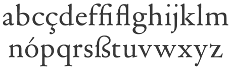
Elzevir family
|
Elzevir is an oldstyle typeface style related to garaldes. Elzevir was also the name of a renowned family of printers in the 16th and early 17th century in Leiden, The Hague, Utrecht, Copenhagen and Amsterdam. The first one, Louis (1540-1617), was the son of a Belgian printer in Leuven and established a print shop in Leiden in 1580. Other members include Isaac Elzevir, Bonaventrura Elzevir, and Abraham I Elzevir. They were operational until 1712. The Elzevir style was promoted by Louis Perrin in Lyon, France, in 1846. In the United States, this style is known as DeVinne. Britannica link. [Google]
[MyFonts]
[More] ⦿
|
Elzevir Gothic
|
A typeface that appeared in the 1897 ATF specimen book. However, this slightly flared typeface has no relationship with Elzevir. It has an unusually large x-height for the epoch. For a digital version, see Nick Curtis's Lodewijk Gothic NF (2014). [Google]
[More] ⦿
|
Elzevir: Mac McGrew
|
Mac McGrew on the Elzevir style: Elzevir types are named for the most prominent family of seventeenth-century Dutch printers, who developed slender types for use in a series of small books which they popularized. The present-day Elzevir types are based on revivals of types brought out in the 1870s by Gustave Mayeur of Paris, and are commonly known also as French Oldstyle (q. v.) or French Cadmus. They were popular in the late nineteenth century and have had some popularity in this century, especially for text use when Elzevir No.3 was revised under the direction of E. Bartlett in 1919 for Linotype. The style is weak for display though. Linotype Elzevir No.2 is entirely different, being a copy of Schaeffer Oldstyle (q.v.), an 1898 ATF design. [Google]
[More] ⦿
|
Elzevir Press
|
The story of Elzevir Press. [Google]
[More] ⦿
|
Emil Gursch
|
 German foundry based in Berlin, active from 1866 until 1917, when it was acquired by H. Berthold AG. Klingspor's file on Gursch. Typefaces published by them include:
 - Accidenz-Versierungen.
- Akademisch.
- Alexandra (<1897).
- Antiqua No. 2 through 9.
- Apollo Grotesque (1897).
- Alt-Gotisch (1899) mager&halbfett. Altgothische initialen.
- Bambus Grotesque (1896).
- Berliner Fraktur (ca. 1897).
- Briefschrift Deutsch (<1899).
- Britannia-Versalien (1902).
- Continental Grotesque.
- Dekorative Vignetten (1899).
- Egyptienne.
- Elzevir, ca. 1899: many weights and styles.
- Eskorial (1909) and Eskorial halbfett (1908) by Eduard Lautenbach, published by Emil Gursch.
- Flächer Ornamente (1899).
- Fraktur 14g (1910), Fraktur 14 halbfett (1915), Fraktur 16 (1916), Fraktur No.4 through No.8. Halbfette and Moderne schmale halbfette Fraktur, Schmale Fette Zeitungs-Fraktur, Fette Fraktur.
- Gloria (1898), Fette Gloria Kursiv (1904), Gloria fett (1902), Gloria schmalfett. Gloria Kuric schmalfett. Digitally revived in 2019 by Ralph M. Unger as RMU Gloria.
- Gothisch (schmale enge, Courante and Accidenz), Renaissance Gothisch (1902: eng, magere and halbfette), Fette Gothisch (neueste and breite). Gothische Federzüge.
- Grandezza I and II (1904) by Hermann Zehnpfundt.
- Grotesque.
- Hermes Grotesque (1897).
- Hortensia (<1902). A digital version of this Victorian script was finished in 2009 as Hortensia by Canada Type: Hortensia was Gursch's most popular typeface, used extensively and prominently in many beautiful type catalogs, and a commonly seen design element in Germany for quite a while after its release.
- Industria (1913, a grotesk designed for ads). Weights include Zart, Halbfett, Fett and Zephyr. By Hermann Zehnpfundt.
- Journal (1912-1913) by Hermann Zehnpfundt. Weights include Antiqua, Kursiv, Antiqua Halbfett.
- Breite Kanzlei, Moderne halbfette Kanzlei, Antike Kanzlei (wow!).
- Kavalier (1910) by Hermann Zehnpfundt.
- Klinger (1919, +Antiqua) by Julius Klinger.
- Koenig-Type (1903-1907, Heinz König), Koenig Schwabacher (1912-1913, Heinz König), Koenig-Fraktur (1910, Heinz König. This is also called Gursch Fraktur),
- Kontinental Grotesk.
- Korona (1905, + Halbfett) by Albert Auspurg.
- Mediaeval, Cursiv, Mediaeval Cursiv.
- Monument (+Halbfett).
- Moderne Schreibschrift.
- Phönix-Cursiv (1897).
- Polygon Undine (1904).
- Roma (ca. 1897).
- Rubens (1905) by Albert Auspurg.
- Rundschrift.
- Saxonia Einfassung (borders).
- Schwabacher, Fette Schwabacher (1899).
- Schwarze Hände, and many great math and astrological sets.
- Senefelder (1908).
- Sirius Ornamente (1908).
- Skulptur (1901): has styles called Halbfett and Licht.
- Sütterlin Unziale (+Halbfett), made in 1905 by Ludwig Sütterlin himself.
- uncial gotisch or Morris Gotisch. For a digital version, see Morris Gotisch by Gerhard Helzel.
- Versierte Italienne.
- Werk Fraktur (fett, halbfett), done before 1907.
- Zierschrift Roma, Zierschrift Apollo, Zierschrift Gloria, Boston Zierschrift.
- Zirkular Kursiv (1913) by F. Müller-Münster.
There were also numerous ornaments and vignettes. Published documents include Industria, eine charaktervolle Reklame-Grotesk (1913), Polygon-Undine. Fette Gloria-Kursiv (1904), Nachtrag zur Handprobe. Neue Erzeugnisse aus den Jahren 1898-1901 (1902), Munster-Sammlung der Schriftgiesserei Emil Gursch, Berlin S., Messinglinien-Fabrik und Gravir-Anstalt (1899). That last book is their main publcation, 112 pages of nicely presented specimens covering all lettertypes and ornaments in detail. A peek into one of Gursch's specimen books. PDF prepared by Klingspor Museum. [Google]
[MyFonts]
[More] ⦿
|
Evgeny Zotov
|
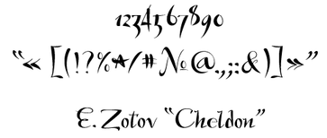 Russian designer of the elegant Latin / Cyrillic script typefaces Elza (2012, a revamping of Elzevir), and Cheldon (2010) and of a cyrillized version of Walbaum. Zotov lives in Krasnoyarsk. In 2014, he designed the signage / packaging font Label Food.
 Behance link. [Google]
[More] ⦿
|
Fatih Hardal
[Typografische (was: Hardal Studio)]
|
 [More] ⦿
|
Feliciano Type Foundry
[Mário Feliciano]
|
 Feliciano Type was established in 2001 by Mario Feliciano. The foundry's main design studio in Lisbon, Portugal, with two additional offices, in Povoa de Varzim, Portugal, and in The Hague, Netherlands. Mário Feliciano (b. 1969, Caldas da Rainha, Portugal). Feliciano studied graphic design at IADE, Lisbon, and began working as a graphic designer at Surf Portugal magazine in 1993, where he stayed as art director until 2000. In 1994 he founded the design studio Secretonix in Lisbon. He has been heavily involved in type design since. In 2005, he joined the type coop Village. John Berry reviews Mario's oeuvre. His gorgeous creations include the following:
 - Escrita ([T-26], a great calligraphic font), Gazz (1997, in Regular, Paint and Stencil styles), MexSans (1997, [T-26]), Aurea Ultra (1997, [T-26]), Bronz (1997, [T-26]), Cepo, Tpac family (1996, [T-26], under the name Mariachi Fontexperience), Strumpf (1994, comic book font family at Adobe), Caligrafia Debula (1997, PsyOps).
- Geronimo (2010, Enschedé; not to be confused with an earlier 2005 font at Canada Type called Geronimo) was started in 1997. He says: Geronimo is a historical revival, a digital interpretation of the types cut by Geronimo Gil in Spain in the eighteenth century. In fact it is not only the first digital version, but as far as I can tell it is also the first typeface family ever designed using Gil's types as a model. Working in Madrid, Geronimo Gil produced an enormous collection of very interesting and idiosyncratic types that can be found in Muestras de los Nuevos Punzones y Matrices para la Letra de Imprenta executados por Orden de S.M. y de su Caudal destinado a la Dotacion de su Real Biblioteca, a specimen from 1787. It shows titling and text typefaces both in italic and roman styles. His typefaces are not only very Spanish but they are also very sophisticated when compared to the ones of contemporaries such as Eudald Pradell and Antonio Espinosa. Geronimo's typefaces have a sense of modernism but they are not modern in a Bodoni or Didot kind of way. Yet they are actually very old style---particularly the lowercase letters--but with reduced contrast and a generous x-height. Even in the bigger cuts, ascenders and descenders are not long but appear to be even shorter than in text sizes. This creates a kind of rolling effect while reading.
- He is working on Espinosa, and Eudaldo (a typeface in the style of and apparently predating the successful Pradell by Andreu Balius Planelles).
- MyFonts sells BsLandscope, BsMonofaked (octagonal), BsKombat (1998), BsLooper (stencil), BsArchae, BsRetchnov (constructivist), BsMandrax (octagonal).
- Stella (2001, a humanist sans family with 26 weights). FTF Stella 2 is a 2005 upgrade of this family.
- The 14-weight Rongel serif family (1998-2004, updated in 2005 as FTF Rongel V2) is his best work. Feliciano states: an interpretation of the types showed in eighteenth century's Spanish catalogue: "Muestras de los Punzones y Matrices de Letra que se funde en el Obrador de la Imprenta Real, Madrid, Ano de 1799", and titled with the name Rongel, whom I suppose, cut them. Another example of these types can be found in "Las Eroticas, y Traduccion de Boecio" by Villegas and printed by António de Sancha in Madrid, 1774.
- Atanasia. Based on a 1771 example by Antinio Espinosa. That same semi-calligraphic example was also used by Carlos Winkow in his famous Elzeviriano Ibarra at Richard Gans's foundry.
- Salustiana. Based on a 1772 type by Antonio Espinosa. Ibarra used that typeface to print Salustio in 1772.
- Monteros (1998-). Based on a 1799 type at Imprenta Real in Madrid.
- In 2003, he won an award for the extensive FTF Morgan family at the TDC2 2003 competition (subfamilies have suffixes Avec, Sans, Sans Condensed, Big, Poster, Poster Avec and Tower). Morgan Sans was originally developed in 2001 with 44 weights. Each version of Morgan has multiple weights as well---for example, Morgan Big (2001) is a 12-weight titling family. Avec denotes Slab Serif.
- FTF Grotzec Headline Condensed (1998, created for Surf Portugal magazine), Grotzec More.
- FTF Merlo (1998-2009): an interpretation of the 18th century Spanish types cut by Ismal Merlo.
- FTF Flama (2002, a neutral sans in 50 styles). Flama is used, along with Greta Text and Sunday Times Modern, by the Sunday Times.
- FTF Garda Titling (1998-2005): an exceptional caps only family with both serifed and sans inscriptional (Trajan) letters.
- Eudald News (1998-2009, Vllg).
- Sueca (2009): a new typeface for the Swedish newspaper Svenska Dagbladet, which writes: Sueca is a family of serif, slab, sans serif, text typeface and typeface for listing. The idea behind Sueca is to be able to talk with the same clear voice but be able to change the tone of voice in different section. During the work with developing Sueca, SvD had help from the design consultants Palmer Watson from Edinburgh, Scotland as the second opinion.
- Villeneuve (2010-2017).
- Marcin Antique and Marcin Typewriter (2017, Vllg). A slightly modulated contrasted, almost Peignotian, pair of typefaces, based on types shown in Gustave Mayeurs's 1894 and 1912 catalogs.
- Mazagan (2019, Vllg). Mazagan gets its inspiration from Marocaines, a novelty type reproduced in the Fonderie Mayeur Type Specimen (Paris, 1912). The face is also featured in other specimen books of the same period, including the FTF (Fonderie Typographique Française) specimens that show a narrower version.
- Crisol (2019). An art deco stencil influenced by Futura Black (1929) and Braggadocio (1930).
- Parnaso (2019), classified as neo-Elzevir.
- Optional (2020-2021). A contemporary elliptical high contrast sans serif available in five weights.
- Hiper Sans (2021). A wide sans in four styles.
- Korrodi (2020). A monolinear version of Otto Weisert's art nouveau typeface Arnold Böcklin (1904), named after Portuguese (Swiss-born) architect Ernesto Korrodi (1870-1944).
- Miletus Grotesk (2021). A contemporary grotesque inspired by Standard Gothic (Keystone Foundry, circa 1906).
- Parafina (2021). An art deco sans remotely inspired by a hand-lettered display-sized alphabet dating back to the mid-20th century by Spanish letterer Miguel Pedraza.
- Penina (2021). A single weight elegant and delicate serifed typeface that is based on some of the work of William Hugh Gordon (1860s-1920). Penina comes in three contrast grades: Small, Medium and High Contrast, plus a variable font.
- Rotep (2020; in Alvor and Bornes versions). A ten-style collection of all-caps typefaces inspired by the lettering used through the ROTEP (Roteiro Turistico e Economico de Portugal) map collection, a mid-century Portuguese map collection of almost 300 maps published for almost two decades.
- Grosa and Grosa Mono (2020-2021). A 12-style modernist sans serif designed originally as the main typeface for Feliciano's website.
- Sebenta (2020-2021). A take on bthe Clarendon genre.
Feliciano designed custom typefaces for the Portuguese weekly newspaper Expresso [a font called Expresso], for the Swedish newspaper Svenska Dagbladet [a font called Sueca], for the Spanish newspaper El Pais [a font called Majrit] and for Banco Espirito Santo [a font called BesSans]. Klingspor link. FontShop link. MyFonts interview. View Mario Feliciano's typefaces. [Google]
[MyFonts]
[More] ⦿
|
Fonderie Deberny&Peignot
|
 The timeline of this French foundry of the 19th century and early 20th century:
 - Gustave Peignot's type foundry was taken over by his son Georges Peignot when Gustave died. Georges's son Charles took it over when Georges and his three brothers were all killed in The Great War.
- 1923: The foundry becomes Deberny&Peignot when the Laurent&Deberny foundry was purchased. Merger with Girard et cie.
- 1923-1960: Charles Peignot directed the creation of a series of original designs.
- Phototype era: Starting in the late fifties, the company prepared the fonts for Lumitype, European Photon. In the sixties, Charles Peignot invested heavily in Lumitype, which used up some of the money to buy control of Deberny&Peignot, and let Charles go.
- Deberny&Peignot closes in 1979 (some say 1972...), at which time the designs passed to the Haas'sche type foundry in Basel/Münchenstein. Haas in turn was merged into D. Stempel AG in 1985, then into Linotype GmbH in 1989, and is now part of Monotype Corporation. Starting in 1925, Deberny & Peignot types were distributed in the United States by Continental Type Founders Association.
Their collection includes typefaces by: - A.M. Cassandre: Acier Noir (1936), Bifur (1928-1929), Peignot (1937), Touraine (1947, with Charles Peignot).
- Bernard Naudin: Naudin (1911-1924). A set of open capitals that complement this typeface were sold in France as Champlevé and in the United States as Sylvan.
- Robert Girard: Astrée (1921). The Stephenson Blake version is Mazarin (1926).
- Georges Auriol: Auriol (1901-1904), Auriol Laberur, Auriol Champlevé, Française allongée, Française légère, Robur Pale (ca. 1912; variations are known as Royal Lining and Claire de Lune).
- Marcel Jacno: Chaillot, Film (1934), Jacno (1950), Scribe (1937).
- Imre Reiner: Contact (1952), Floride (1939).
- Maximilien Vox: Eclair (1935).
- Georges and Charles Peignot: Le Garamont (1912-1928). That is to say, from 1912-1914, they directed the development of this Garamond based on Jean Jannon's roman. The typeface was finished by Henri Parmentier in 1926.
- M. Deberny: Sphinx (1925).
- Henri Bellery-Desfontaines: Bellery-Desfontaines (1910-1912).
- P. Roy and A. Marty: Cochin, Nicolas-Cochin (1912), and Moreau-le-Jeune (later copied by Ludwig & Mayer as Sonderdruck).
- A. Giraldon: Giraldon (1900).
- Eugène Grasset: Grasset (1898).
- Adrian Frutiger: Égyptienne, Méridien (1957), Ondine (1954), Phoebus (1953), Président (1954), Univers (1957).
- Rémy Peignot: Cristal Initiales (1955).
- G. Vidal: Amethyste (1954), Bolide (1954).
They also published Banjo (1930), Baskerville (1916), Calligraphiques Noires (1928, see also Ludwig&Mayer), Compactes Italiques, Cyclopéen, Firmin Didot, (cut from the original punches), Fournier-le-Jeune (1913), La Civilit&eacutye;, Olympic (1937, also known as Slimblack), Pharaon (1933), Polyphème (1926), Romain Ancien (1899, an Elzevir), Série 16, Série 18, Style moderne (ca. 1903, sold today as Fantastic), the garalde typeface Ancien, and the didone typeface Gras Vibert [for a digital version of Gras Vibert, see Vibertus (2007, Latrs Yörnqvist)]. Many specimen books were published by them. For their vignettes, see Spécimen de vignettes typographiques (Paris, Rue Visconti, 17, près le Palais des Beaux-Arts, faubourg Saint-Germain. [1870]) and Vignettes typographiques: attributs mélanges armes, médales (Paris, 1886). Early work is shown in Les créations de la fonderie typographique Deberny et cie depuis 1878 (1889) and in Les nouvelles creations de la fonderie typographique Deberny&cie (1895). Fancy type is shown in Les caractères d'affiches. Extrait du Livret typographique (Paris, 1905). Older fleurons are in Nouvelle série des fleurons de la fonderie de Laurent et Deberny (ca. 1844). Other publications by them include Album de clichés et gravures (1934), Premières épreuves du Caractère Peignot dessiné par A. M. Cassandre (Paris: 1937). Digital revivals include Sonderduck Antiqua (2008, Gerhard Helzel). Sphinx (1925) was revived by Steve Jackaman as Sphinx RR (1925), and by Douglas Olena as FFD Sphinx (1995). Peignot foundry genealogy. View the digital typeface that are descendants of Deberny. FontShop link. References: Wikipedia. History of Peignot, by Georges Peignot's grandson Jean-Luc Froissart. Rochester Institute of Technology: History of Deberny et Peignot [dead link]. And finally, the book L'or, l'âme et les cendres du plomb. L'épopée des Peignot, 1815-1983 (2004, Jean-Luc Froissart: Paris: librairie Tekhnê). [Google]
[MyFonts]
[More] ⦿
|
Fonderie Turlot
|
 Big Paris-based foundry, with an extensive factory. Their work can be found in Caractères de labeurs de la fonderie A. Turlot (rue de Rennes, 128, Paris [ca.1896?]), Filets (Paris, 128, rue de Rennes, [ca.1898?]), Spécimen des caractères anciens de la fonderie Turlot (Paris, 1885; PDF file; see also this PDF file) and Réglure. Fonderie Ch. Derriey, A. Turlot, successeur (rue de Rennes, 142, Paris [1880]). See also "Caractères de labeurs de la fonderie A. Turlot" (1896).
 In 1880, they had acquired the Fonderie Charles Derriey. The major specimen book, Spécimen général de la fonderie Turlot, Henri Chaix, gendre, et cie successeurs (1910, 508 pages) [see also here] seems to indicate that the foundry was sold to Henri Chaix in 1910. The latter book is comprehensive. The "Néo-Didot" series mentions Fonderie J.-V. Éon, Turlot, successeur. Other niceties: "signes mathématiques", signes divers, the "Javanaises" (oriental simulation fonts, p. 103), the gorgeous vignettes (ex.: hibou, Japonaise, Nénuphar, Galvanos Modernes), and the hilarious "silhouettes reclames". This book has many illustrations of the start of the art nouveau style. Finally, in 1914, they published Spécimen Général (1914, Fonderie Turlot, Henri Chaix et cie, Paris: 454 pages). Scan of the caps typeface Lettrines Renaissance. Scans from the 1885 specimen book: Elzevir No. 3, Elzevir No. 3, Filets Elzeviriens, Gothiques blanches, Initiales Elzeviriens. [Google]
[More] ⦿
|
Fonderie Turlot: Spécimen Général
|
Berlintypes published the contents of the 454-page Spécimen Général, Fonderie Turlot (Henri Chaix et cie, Paris, 1914). By chapter: - 2. Elzeviers et Labeurs de Luxe: Elzévier Français, Elzévier Vieux Français, Elzévier Anglais, Elzévier No 3, Elzévier Plantin, Caractères Louis XV, Salammbo.
- 3. Series de Labeurs: Néo-Didot, Néo-Didot Gras. Also: Vieux Style, Bibliophiles, Caractères pour Labeurs.
- 4. Caractères pour Journaux: Examples for newspaper typesetting with references to the types used.
- 5. Caractères Étrangères: Caractères Russes, Caractères Allemands, 1re Série, Caractères Allemands, 2me Série, Caractères Allemands, Gras, Caractères Grecs, Gras, Caractères Grecs, Penchés, Caractères Grecs.
- 6. Caractères pour Affiches.
- 8. Caractères de Fantaisie:
- Antiques serrées grasses, Antiques simples, Antiques noires, Antiques grecques, Antiques serrées maigres, Antiques penchées grasses, Antiques penchées noires.
- Egyptiennes effilées, Egyptiennes Etroites, Egyptiennes condensées, Egyptiennes serrées, Egyptiennes 1re Série, Egyptiennes 3me Série, Egyptiennes 2me Série, Egyptiennes larges, Egyptiennes grasses, Egyptiennes penchées noires.
- Caractères Louis XV.
- Latines larges, Latines noires allongées, Latines noires, Latines noires larges.
- Vignettes Glycine.
- Normandes 1re Serie, Normandes 2me Série, Rouennaises, Normandes larges, Etroites modernes, Allongées demi-grasses, Allongées grasses, Caractères gras allongés, Condensées, Bretonnes.
- Italiennes.
- Athéniennes.
- Métropolitaines.
- Vénitiennes.
- Norvégiennes.
- Elzévir gras éclairé.
- Vignette Légére.
- Elzévir Plantin (Romain, Italique).
- Salammbo.
- Canadiennes.
- Chicago, Chicago Large.
- Lyonnaises.
- Latines penchées.
- Vignette Décorative.
- Excelsior.
- Moscovites.
- Transvaaliennes serrées, Transvaaliennes.
- Péruviennes.
- Phillipines.
- Vignettes Chrysanthème.
- Pittoresques droites, Pittoresques penchées.
- Provençales.
- Ondines.
- Zodiaques maigres, Zodiaques noires.
- Roxanes, Roxanes 4 oeils.
- Caractères d'écriture.
- Caractère Machine à écrire.
- Bâtardes lithographiques.
- Filets-Vignettes.
- La Taille-Douce Azurée droite, La Taille-Douce Azurée penchée.
- Antiques Litho No1, Antiques Litho No2, Antiques Litho No3, Antiques Litho No4.
- Monastiques.
- Vignettes Florale.
- Initiales Elzévir 1re Série, Initiales Elzévir 2me Série, Initiales Elzévir 3me Série.
- Antiques maigres serées, Antiques allongées, Antiques maigres larges.
- Initiales Antiques noires, Initiales Antiques Greques, Initiales Égyptiennes allongées, Initiales Italiennes, Initiales Etroites allongées, Initiales Bretonnes, Initiales Demi-allongées, Initiales Classiques allongées, Initiales Classiques, Initiales Modernes.
- Romaines droites, Romaines penchées.
- Initiales Latines larges, Initiales pour annonces anglaises, Latines éclairées, Latines blanches.
- Romanes.
- Parisiennes.
- Fantaisies diverses (8 designs, numbered).
- Lettrines Renaissance.
- Lettres ornées.
- Monogrammes.
[Google]
[More] ⦿
|
François Thibaudeau
[Thibaudeau's classification]
|
[More] ⦿
|
Frank E. Blokland
[Dutch Type Library (or: DTL Studio)]
|
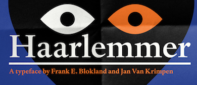 [MyFonts]
[More] ⦿
[MyFonts]
[More] ⦿
|
Frere Jones Type
[Tobias Frere-Jones]
|
 Celebrated type designer, born in 1970 in New York City. Frere-Jones received a BFA in Graphic Design from the Rhode Island School of Design in 1992. He moved to Boston, where he worked at the Font Bureau until 1999. He joined the faculty of the Yale University School of Art in 1996 and has lectured throughout the United States, Europe and Australia. From 1999 until 2014, he worked for and with Jonathan Hoefler in New York. In 2015, he set up his own type foundry, Frere Jones Type. His old Font Bureau typefaces can be bought since 2020 at Frere Jones / Type Network. His work is in the permanent collections of the Victoria & Albert Museum in London and the Museum of Modern Art in New York. In 2006, The Royal Academy of Visual Arts in The Hague (KABK) awarded him the Gerrit Noordzij Prijs, for his contributions to typographic design, writing and education. In 2013 he received the AIGA Medal, in recognition of exceptional achievements in the field of design.
 His Font Bureau typefaces: - Armada (1987-1994). A rigid elliptical sans in many styles. This is a surprisingly beautiful family despite its self-imposed design restrictions. The Compressed Black is a piano key typeface in the style of Wim Crouwel. Font Bureau: An experiment in algorithmic design, Armada follows the verticals and flat arches so often to be found in the architectural geometry of cast iron and brickwork in 19th century American cityscapes.
- Asphalt (1995). Font Bureau: Who hasn't admired the energy of Antique Olive Nord? All other ultrabolds seem sluggish in comparison. Nord exudes Excoffon's animation and Gallic impatience with the rules. Tobias Frere-Jones cross-bred the weight, proportion, and rhythms of Nord with the casual grace of his own Cafeteria, gaining informality and a dancing vitality on the page.
- Benton Sans (1995-2003). Created by Tobias frere-Jones and Cyrus Highsmith, it is a revival of Benton's 1903 family, News Gothic, and one of Font Bureau's bestsellers. It is a very complete family, ranging from regular widths to Condensed, Compressed and ExtraCompressed subfamilies. The Small Caps set is complete as well.
- Benton Modern (1997-2001). Benton Modern was originally undertaken by Tobias Frere-Jones to improve text at The Boston Globe. Widening the text face for the Detroit Free Press, he returned Century's proportions to Morris Fuller Benton's turn-of-the-century ATF Century Expanded, successfully reviving the great news text type. The italic, based on Century Schoolbook Italic, was designed by Richard Lipton and Christian Schwartz, who also added the Bold.
- Cafeteria (1993). Font Bureau about this cartoonish font: The irregularities normally found in script can enliven sans-serif letterforms. In Cafeteria, Tobias Frere-Jones took special care to balance activity with legibility on the paper napkin that served as his sketchpad, drawing a freeform sans-serif that is condensed but in no way stiff.
- Citadel (1995).
- CochinOldstyle (1992), CochinBlack (1991).
- Eldorado (1993-1994).
- Epitaph (1993). Drawn around 1880 at the Boston Type Foundry (the Boston branch of American Type Founders), Epitaph was modeled on a graceful Art Nouveau letterform that was bringing a new vitality to gravestone inscriptions at the time. The energy and life of the Vienna Secession alphabet drew the attention of Tobias Frere-Jones, who digitized the original set of titling capitals and added alternate characters for its Font Bureau release.
- Garage Gothic (1992). In three weights, it is based on parking garage ticket lettering but very reminiscent of license plate characters.
- Grand Central (1998). Grand Central was designed for 212 Associates from late-twenties capitals hand-painted on the walls of Grand Central Station. Font Bureau writes: The design is a distinguished Beaux Arts descendant of the great French Oldstyle originated by Louis Perrin in Lyons in 1846, known across Europe as Elzevir and in the U.S. as De Vinne.
- Griffith Gothic (1997-2000). A revival of Chauncey Griffith's telephone book directory typeface, Bell Gothic (1937-1938).
- Hightower (1994-1996). A Venetian typeface originally done for the Journal of the American Institute of Graphic Arts. Font Bureau: Dissatisfied with others' attempts to bring Nicholas Jenson's 1470 roman up to date, Frere-Jones prepared his version of this calligraphic roman, with his own personal italic.
- Interstate (1993, Font Bureau). Done for the United States Federal Highway Administration, but later released as a type family by Font Bureau. Interstate Mono (done with Christian Schwartz) followed in 2000, also at Font Bureau. The family is a reinterpretation of Highway Gothic, which has been the official typeface for American highway signage for decades. Its design is ultimately based on signage alphabets developed in the late 1940s by Dr. Theodore Forbes, assisted by J.E. Penton and E.E. Radek.
- Miller. A Scotch Roman finished in 1997 together with Matthew Carter and Cyrus Highsmith at Font Bureau.
- Niagara (1994). Almost a skyline typeface. Contains Niagara engraved.
- FB Nobel (1993). An exquisite geometric sans family based on old ideas of De Roos at Amsterdam who explored alternative character sets to enliven basic Futura forms. Frere-Jones views Nobel as Futura cooked in dirty pots and pans. FB Nobel showcased. The Extra Lights were added by Cyrus Highsmith and Dyana Weissman.
- Pilsner (1995). A beer bottle typeface. Font Bureau: Sitting in a Paris cafe with a bottle of beer, Tobias Frere-Jones gave his attention to the label. It was set in a roman design wearing blackletter-like clothes, probably to suggest an origin in Alsace or points to the East. Unable to forget the design, with its blocky, straight line emphasis, Tobias designed Pilsner, an exercise in straight lines in an angle-centered scheme.
- Poynter Old Style (1997, Font Bureau).
- FB Reactor (1996). This was first a FUSE7 font in 1993). Reactor destroys itself as it is put to use.
- Reiner Script (1993). Based on a 1951 brush script by Imre Reiner (ATF).
- Stereo (1993). After a typeface by Karlgeorg Hoefer, 1963 (Font Bureau says 1968).
At FontFont, he designed the children's fonts FF Dolores (1991) and FF Dolores Cyrillic. At FUSE 15, he designed Microphone (1996). At FUSE 10, he published Fibonacci, a font consisting just of lines. His custom work includes WorthGothic (1996), WorthLogo1996 (1995), WorthText (1995), GQGothic (1995), Halifax, Commonwealth (1995), Belizio-TwentySix (Font Bureau), HermanMillerLogo (1999, Font Bureau). Cassandra, Vitriol (1993), Quandry (1992-1994) and Chainletter (1993). Retina Agate (2001, specially made for small-print stock listings at the Wall Street Journal) netted him a Bukvaraz 2001 award and an AIGA 2003 Design Award. From 1999 until 2014, he designed for the Hoefler Type Foundry, which he joined as an equal partner (and the new company became Hoefler & Frere-Jones (in 2004), or H&FJ). He claims that he brought with him to H&FJ a lot of typefaces including Whitney, Whitney Titling, Elzevir, Welo Script, Archipelago (Shell Sans), Type 0, Saugerties, Greasemonkey, Vive, Apiana, and Esprit Clockface. It is not expicitly stated at the H&FJ site which typefaces he had a hand in, but one can safely assume that it must have been nearly every typeface made since he entered into the partnership. In 2014, Tobias sued Jonathan for half of the company in a 20-to-80 million dollar lawsuit since he claims that Hoefler reneged on his promise to give him his half. The typefaces at H&FJ he had a hand in include: Archer (2001, by Jonathan Hoefler and Tobias Frere Jones). A humanist slab serif originally designed for Martha Stewart Living. It has a great range of features, including a classy hairline style. Some say that Archer is just Stymie with some ball terminals. Nevertheless, it became a grand hit, and has been used by Wes Anderson in The Budapest Hotel, and by Wells Fargo for its branding. David Earls on Archer: with its judicious yet brave use of ball terminals, and blending geometry with sexy cursive forms, all brought together with the kind of historical and intellectual rigour you fully expect from this particular foundry, Archer succeeds where others falter. - HTF Retina (2002). For use in the Wall Street Journal.
- Gotham (2001). A sans serif done with the help of Jesse M. Ragan. In fact, the orignal design in 2000 was for GQ magazine. Read about it here. In 2007, he published the rounded version Gotham Round. Gotham was used in 2008 by Obama in his presidential campaign. Joshua Brustein (Business Week): Gotham is one hell of a typeface. Its Os are round, its capital letters sturdy and square, and it has the simplicity of a geometric sans without feeling clinical. The inspiration for Gotham is the lettering on signs at the Port Authority, manly works using "the type of letter that an engineer would make," according to Tobias Frere-Jones, who is widely credited with designing the font for GQ magazine in 2000. Critics have praised Gotham as blue collar, nostalgic yet exquisitely contemporary, and simply self evident. It's also ubiquitous. Gotham has appeared on Netflix (NFLX) envelopes, Coca-Cola (KO) cans, and in the Saturday Night Live logo. It was on display at the Museum of Modern Art from 2011 to 2012 and continues to be part of the museum's permanent collection. It also helped elect a president: In 2008, Barack Obama's team chose Gotham as the official typeface of the campaign and used it to spell out the word HOPE on its iconic posters. Hoefler produced versions in 2016 such as Gotham Office and Gotham Narrow Office.
- Cyclone (2003).
- In 2010, he and Jonathan Hoefler designed the sans family Forza.
- Giant (2003).
- Knoz (2003).
- Topaz (2003).
- Verlag (2006). Developed together with Jonathan Hoefler.
- Whitney (2004). This is an amazing 58-style sans family designed for the Whitney Museum, but now generally avalaible from Hoefler, and touted as a great family for infographics. A derivative, Whitney-K, is the house font of Kodak. Whitney's sales blurb: While American gothics such as News Gothic (1908) have long been a mainstay of editorial settings, and European humanists such as Frutiger (1975) have excelled in signage applications, Whitney bridges this divide in a single design. Its compact forms and broad x-height use space efficiently, and its ample counters and open shapes make it clear under any circumstances.
- With Hoefler, he collaborated on projects for The Wall Street Journal, Martha Stewart Living, Nike, Pentagram, GQ, Esquire, The New Times, Business 2.0, and The New York Times Magazine. In all, he has designed over five hundred typefaces for retail publication, custom clients, and experimental purposes. His clients have included The Boston Globe, The New York Times, The Cooper-Hewitt Museum, The Whitney Museum, The American Institute of Graphic Arts Journal, and Neville Brody. He has lectured at Rhode Island School of Design (from which he graduated with a BFA in 1992), Yale School of Art, Pratt Institute, Royal College of Art, and Universidad de las Americas. His work has been featured in How, ID, Page, and Print, and is included in the permanent collection of the Victoria&Albert Museum, London.
Interview. Interviewed by Dmitri Siegel. He created Estupido Espezial for fun, but it actually made it into an issue of Rollingstone. Catalog of his typefaces at Font Bureau. Keynote speaker at Typecon 2014. View typefaces designed by Tobias frere-Jones. Another page with typefaces created by Tobias Frere-Jones. [Google]
[MyFonts]
[More] ⦿
|
Fritz Helmuth Ehmcke
|
 Born in 1878 in Hohensalza, Ehmcke died in 1965 in Widdersberg. Graphic artist, book and type designer, and professor. From 1893 until 1897, he studied lithography in Berlin, and from 1899-1901 he studied at the Kunstgewerbemuseums Berlin. With Georg Belwe and Friedrich W. Kleukens, he founded the Steglitzer Werkstatt in 1900. He taught from 1903 at the Kunstgewerbeschule Düsseldorf, and from 1913-1938 at the Kunstgewerbeschule München . He ran the Rupprecht Presse in Munich from 1913-1934. Since 1941, he worked for the Bund für Deutsche Schrift, which is partially concerned with blackletter type. Finally, from 1946-1948, he was professor at the Hochschule der bildenden Künste München. He designed these typefaces:
 - Ehmcke Flinsch (1908, Bauersche Giesserei).
- Ehmcke Antiqua (1908-1909, Flinsch). A beautiful Belle Epoque font. Linotype sells the digital version as Carlton, after acquiring ITC and Letraset which had digitized Carlton in 1983, based on a Stephenson Blake typeface from the 1910s. It appears that Ehmcke Antiqua predates that Stephenson Blake face. For another revival, see Antiqua Roman (2015, Yuanchen Jiang).
- Ehmcke Kursiv (1910, Flinsch).
- Ehmcke Fraktur (1910, Offizin W. Drugulin and 1912, at D. Stempel). The halbfett is from 1917. Revived by Dieter Steffmann as Ehmcke-FrakturInitialen (2002).
- Ehmcke Rustika (1914, Stempel).
- Ehmcke Schwabacher (1914, D. Stempel; some mention the dates 1916 and 1920; see also Ehmcke Schwabacher Zierbuchstaben). The halbfett is from 1915. The Delbanco revival is called DS-Ehmcke Schwabacher. Revived by Dieter Steffmann as Ehmcke-Schwabacher Initialen (2002).
- Ehmcke Mediaeval (1922, Stempel). The kursiv is from 1923 and the halbfett from 1924.
- Ehmcke Latein (1925, Ludwig&Mayer).
- Ehmcke Brotschrift (1927, Ruprecht Presse).
- Ehmcke Elzevier (1927, L. Wagner).
FontShop link. Klingspor link. [Google]
[More] ⦿
|
Fundicion Tipografica Richard Gans
[Richard Gans]
|
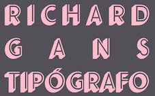 The Richard Gans Foundry is a defunct Spanish foundry which existed from 1888-1975. Richard Gans was the son of a medic from Karlsbad, Austria. He emigrated to Spain in 1874, and died in 1925. Until 1936 the foundry was led by Mauricio Wiesenthal, but in 1936, his children, Ricardo, Manuel and Amalia Gans Gimeno, now adults, took over. Ricardo and Manuel were assassinated during the Civil War. The foundry was used to make ammunition, and after the war, Amalia Gans and then Reinaldo Leger Tittel started anew in run-down buildings. The foundry operated roughly from 1881-1975. Throughout its existence, types were designed by a number of people from within and outside the foundry. Designers included José Ausejo Matute (d. 1998), Antonio Bilbao (who created Escorial in 1960), the son Ricardo Gans, and Carl Winkow. In the post-war era, Reinaldo Leger and Amalia Garcia Gans made typographic decisions on which types to produce, and acted as typographic directors. Richard Gans' grandson, José Antonio Gans García, is still alive today. Manuel Lage informed me in 2017 that he has inherited the Richard Gans collection.
 Six specimen books were published with titles like Fundicion Richard Gans Muestrario Edicion V. The first and second editions, rare books indeed, were published between 1883 and 1903. Editions 3 through 6 appeared in the period 1903-1922. The 1922 edition is here in its entirety (thanks to J.R. Penela). See also here. In 1965, a small catalog was published under the name Tipos Gans. The National Library in Madrid has Muestrario de Richard Gans (Madrid, Richard Gans, 1903, 410 pages) and Catalogo provisional (Madrid, 1950). On the web, the most complete discussion of Richard Gans is in the PDF file Fundicion Tipografica Richard Gans Historia y Actividad 1888-1975 (2004) by Dimas García Moreno and José Ramón Penela. Catalog of font names. Fonts: Until 1925, there were basically no original types. Almost everything in the specimen books of that era is due to German foundries, principally those of Wilhelm Woellmer in Berlin and Edmund Koch in Magdeburg. Some of those typefaces in common with Koch include Grotesca Chupada Redonda, Ronda Universal. Early types in this category also include Escritura Selecta, Escritura Favorita, Escritura Luis XV (it is being digitally revived by Manuel Lage), Gótico Globo (blackletter), Gótico Uncial (blackletter), Nueva Titular Adornada, Tipos de Adorno, Latina Moderna, Grotesca Ancha, Grotesca and Grotesca Chupada. Many, if not most of these, saw the light at the end of the 19th century and survived until 1965. It is fashionable now to revive all the typefaces. Nick Curtis created a few (see below), and Paulo W (Intellecta Design, Brazil) did many more. Intellecta Designs revivals include Gans Tipo Adorno, Gans Lath Modern, Gans Titular Adornada, Gans Ibarra, Gans Antigua, Gans Antigua Manuscrito, Gans Fulgor, Gans Radio Lumina, Gans Carmem Adornada, Gans Animals, Gans Italiana, and Gans Titania. The original Gans types can be categorized as follows: - Aldine.
- Anchas Americanas.
- Antigua El Greco (+Adornada, Cursiva, Negro, Negro Cursiva, Seminegro, Seminegro Cursiva, Titular), aka El Greco Antique. Weights include Antigua El Greco (1924), El Greco Adornado Titular (with Mexican-style sawteeth). Greco was the inspiration for Melina BT (Nick Curtis, 2003). Curtis' Melina Fancy is based on Greco Adornado. For a free version of Adornado, see GrekoDeco (1992, Dave Fabik). Revived as Kifisia Antigua NF in 2005 by Nick Curtis.
- Antigua. See the digital family Gans Antigua (2006, Paulo W). The Antigua series includes weights like Esbelta, Estrecha, Heraldo, Heraldo Cursiva, I, I Cursiva, I Titular, Mercantil, Negra, Prolongada, Universal, Universal Cursiva, Universal Negra, Universal Negra Cursiva, Universal Negra Estrecha, Universal Seminegra, Veneciana, Veneciana Cursiva, Veneciana Cursiva Fantasia.
- Antigua Manuscrito: a semiscript typeface designed by Hermann Delitsch at the Royal Academy of Graphic Arts in Leipzig. Delitsch was Tschichold's teacher. Digitized as a family by Paulo W as Gans Antigua Manuscrito (2006).
- Antigua Progreso (1923) (+Cursiva, Negra): an interesting serif face. A digital version called Bellini was made by A. Pat Hickson, 1992. Linotype sells Greco (DsgnHaus, 1996) which really is Progreso.
- Arabe.
- Atlántida.
- Azures.
- Bodoni and Bodoni Redonda.
- Carmen, Carmen Adornada, Velázquez, Españolas Adornadas, Antigua Adornada, Utopian, Tipos de Adorno, Americanas (Tuscan style), Americanas-Titular, Elzevirianas Adornadas: Late 19-th century style display typefaces. Paulo W (Intellecta Design) created the beautiful digital family Gans Tipo Adorno (2006). He also made the family Gans Titular Adornada (2006).
- Cartel.
- Cursiva Comercial.
- Dalia (or Ibarra Vaciada): a two-line display face. Similar to Delphian Open Titling (Middleton, Ludlow, 1928).
- Decorativa. Digitally revived by Manuel Lage as Decorativa RGf in 2017 and Volvoreta RG LG in 2021.
- Egipcia in weights called Estrecha, Negra and Nueva, ca. 1923; Egipcia Progreso (1923). The serifs are Venetian, heavy and oblique in the lower case. The ascenders and descenders are short and the strokes have almost no contrast, giving the typeface a stocky appearance. The e has a diagonal Venetian stroke, while the tail of the g is open.
- Elzeviriano: Anchas, Adornado, B, B Cursiva, Chupado, Ibarra, Ibarra Cursiva, Ibarra Titular, Negro.
- Escorial: a display typeface with Koch Antiqua influences, designed ca. 1960 by Antonio Bilbao. Additional weights include Cursiva, Seminegra and Titular. It is being digitally revived by Manuel Lage.
- Escritura Juventud (1950, Joan Trochut Blanchard): a great script with lots of identity and swing. Other Escritura styles: Decorativa (Manuel Lage is working on a digital revival), Gloria reformada, Isabel, Luis XV, Selecta.
- Espanolas.
- Etienne Ancha.
- Filetes de Bronce, Filetes de Metal.
- Fulgor (1930): a connected script face.
- Gacela.
- Galeria Coruna. Revived by Manuel Lage in 2008 as Galeria Coruna LG. In 2017 Lage was working on a further refinement of this typeface.
- Gaviota.
- Gloria (already listed above under Escritura), Gloria Reformada (1930): a connected script family. Gloria was revived by Nick Curtis in 2005 as Pismo Clambake NF.
- Gótico Cervantes (1928): blackletter with regular and ornamental caps.
- Gótico Globo: art nouveau style with blackletter influences. Revived by Intellecta Design in 2007.
- Gótico Uncial (blackletter).
- Graciosa (+Gris).
- Griego.
- Grotesca Ancha (+Fina, Negra, Nueva, Vaciada).
- Grotesca Antigua.
- Grotesca Chupada and Grotesca Chupada Redonda: a rounded sans.
- Grotesca Colón.
- Grotesca Compacta.
- Grotesca Cursiva (+Seminegra).
- Grotesca Estrecha Hercules.
- Grotesca Mercantil, Grotesca Mercurio, Grotesca Negra Cursiva.
- Grotesca Ideal (Negra, Fina, Entrelina), Grotesca Favorita, Grotesca Reformada.
- Grotesca Radio: a geometric no-contrast sans. Styles: Editorial, Estrecha Fina, Estrecha Negra, Fina, Fina Cursiva, Negra, Negra Cursiva, Seminegra, Seminegra Cursiva. For a revival and reinterpretation, see Radar (2019) by Marta Sanchez Marco for Type-o-Tones.
- Helenica (+Ancha, Ancha Negra, Ancha Seminegra, Cursiva, Seminegra).
- Ibarra (1931) and Ibarra Cursiva: a tall ascender garalde family. Ibarra Negra, Ibarra Negra estrecha, Ibarra Vaciada, Ibarra Redonda. See also under Elzeviriano above. Iniciales Ibarra.
- Imán: a shadow headline all-caps face. This was digitally revived in an authoritative way by Manuel Lage in 2016 as Iman RG.
- Inglesa Excelsior.
- Italiana (Cursiva, Titular), 1951, a black caps face. Italienne (Chupada, Moderna).
- Luxor (+Cursiva, Negro, Negro Estrecho).
- Manos (manicules, fists).
- Maquina de Escrebir.
- Maruxa. Manuel Lage is working on a digital version of this script type.
- Normanda (Ancha Negra, estrecha Negra).
- Nueva Antigua No. 1 and No. 2. Nuevas Titulares Adornadas.
- Orlas de Linea.
- Preciosa: Showboat-style Western look.
- Primavera: a condensed sans. Paulo W digitized a condensed family called Gans Lath Modern (2006). See also the extension Primavera (2016, Manuel Lage).
- Radio Bicolor: a headline sans family.
- Radio Gris. Scans of the Radio catalog of 1930.
- Radio Lumina: a display sans. Digitized as Gans Radio Lumina (2006) by Paulo W at Intellecta Design.
- Regina (+Estrecha), Helios, Vulcano (1920s): art nouveau style. Ludlow's Vulcan Bold is based on Vulcano.
- Renacimiento Ancha.
- Romana I (+Cursiva, Egipcia, Estrecha, Negra).
- Royalty.
- Senefelder: engraved look all caps.
- Talla Dulce (+Cursiva).
- Tipo Sombreado, Tipos Adornados, Tipos de Texto.
- Titania (1933): an elegant two-line poster face. See the revival (2006, Nick Curtis).
- Veneziana Negra.
showcase-gans/">View the digital revivals of typefaces by Gans. [Google]
[More] ⦿
|
Genzsch&Heyse
|
 Hamburg-based foundry ifounded by Emil Julius Genzsch (1856-1906). It was taken over by Linotype in 1963. Their library included typefaces by these designers:
 - F. Bauer: Fortuna (1930), Genzsch Antiqua (1906), Genzsch Fraktur (1931), Heyse Antiqua (1921), Senats Fraktur (1907).
- K. Klauß: Arkona (1935), Horizontale (1942).
- Heinz Beck: Brahms Gotisch (1937).
- Carl Otto Czeschka: Czeschka Antiqua (1914), Olympia (1929).
- A. Auspurg: Hans Sachs Gotisch (1911), Domina (1929), Souverän (1913).
- O. Hupp: Heraldisch (1910), Neudeutsch (1900), Numismatisch (1900).
- J. Kirn: Oleander (1938).
- H. König: Suberpia (1913).
- Adolf Heimberg: Urdeutsch (1924).
- Helmut Matheis: Verona (1958).
- E. Mollowitz: Anemone (1955).
- E. Ege: Basalt (1926), Ege-Schrift (1921).
- W. Rebhuhn: Fox (1953), Hobby (1955).
- H. Schmidt: Gigant (1926), Monument.
- F. P. Glaß: Glaß Antiqua (1912).
- Eickhoff: Lithograph (1903).
- H. Möhring: Phalanx (1931).
- C. Adam: Rex (1924).
- H. Pauser: Semper Antiqua (1940).
- Eugène Grasset: Römisch Grasset (1913), Grasset Antiqua (1900).
- Albert Anklam: Mönchs-Gotisch (or: Mediaeval-Gotisch) in 1877 (Schnelle says 1881); Neue Schwabacher (normal and halbfett) in 1876.
- J. Göbler: Ballerina (1959, script face).
In addition we find house typefaces such as Adagio (1939, script face), Blockschrift (1897; revived by Nick Curtis in 2015 as Bothas Ruhm NF and by Moritz Zimmer in 2016 as Die Blockschrift), Leibniz-Fraktur (1912; digital versions exist by Klaus Burkhardt, Petra Heidorn (free), Softmaker (Leibniz Fraktur Pro, 2016), and Ralph M. Unger), Nero Kursiv (1913), Alster (1926), Elzevir-Antiqua and Kursiv and Elzevir-Versalien (1925), Rex Versalien (1925), Richard Wagner Fraktur (ca. 1920), Glass Antiqua (1912, Franz Paul Glass: remade in 2011 by Nick Curtis as Half Full NF), Halbfette Hansa Fraktur (1912), Hansa Fraktur (ca. 1915), Hansa Gotisch (digital version by Gerhard Helzel), Plantin Antiqua and Kursiv (1913), Ondosa Ornamente (1912), Preziosa Ornamente (1912), Psalterium (1907, blackletter), Serpentin Ornamente (1912), Hamburger Druckschrift (1909), Nordische Antiqua and Cursiv (1907), Renaissance Ornamente (1901), Römische Antiqua (1899), Sparta (1939), Hauptproben (1910), Negrita, Neugotisch, Neue Pittoresk, Ornamente, Pionier, Renaissance Initialen, Römische Initialen, Römische Kursiv, Venetianische Schreibschrift. Flickr page on Genzsch and Heyse. Proben von Schriften (1902). View the digital legacy of Genzch & Heyse. [Google]
[MyFonts]
[More] ⦿
|
Gerard Daniels
|
 In 1993, Gerard Daniels (Roosendaal, The Netherlands) designed DTL Elzevir for the Dutch Type Library, a revival of a Christoffel van Dijck face. He also designed DTL Caspari and DTL Caspari News (2013, the latter by DTL Studio after its use by Wegener, a Dutch publishing house). [Google]
[MyFonts]
[More] ⦿
In 1993, Gerard Daniels (Roosendaal, The Netherlands) designed DTL Elzevir for the Dutch Type Library, a revival of a Christoffel van Dijck face. He also designed DTL Caspari and DTL Caspari News (2013, the latter by DTL Studio after its use by Wegener, a Dutch publishing house). [Google]
[MyFonts]
[More] ⦿
|
Gilles Le Corre
[GLC --- Gilles Le Corre]
|
 [MyFonts]
[More] ⦿
[MyFonts]
[More] ⦿
|
Girard et Cie
[Robert Girard]
|
 Robert Girard (b. 1883, d. 1955) was a school friend of Charles Tuleu, who had inherited Fonderie Laurent&Deberny in 1881. Tuleu teamed up with Girard in 1914 and they cooperated until 1921, when Tuleu retired and the business passed to Girard under the new name Girard Et Cie. Talks were started with Peignot about a merger. Deberny&Peignot was incorporated on July 1, 1923.
 Girard designed Astrée (Fonderie Deberny&Peignot, 1921-1923), a recut of a baroque Elzevir-style face. There were three styles, Astrée, Astré italique and Astrée noire. Punches were cut by M. Bourreau. Stephenson&Blake's version is called Mazarin (1926). In his 1924 oeuvre, François Thibaudeau clarifies the influence of Peignot's Nicolas Cochin on Astrée. Servane Vignes did a digital revival in 2017. Henrik Kubel (A2) published its own extension, A2 Mazarin, in 2017. [Google]
[More] ⦿
|
GLC --- Gilles Le Corre
[Gilles Le Corre]
|
 French painter born in Nantes in 1950, who lives in Talmont St Hilaire. His fonts include 2010 Cancellaresca Recens (inspired by a chancery type of Francisco Lucas from the late 16th century), 2009 Handymade (comic book style), 2009 Lollipop (chancery style), 2009 GLC Plantin, 2009 Primitive (2009, a rough-edged roman script), 2008 Script 2 (2008), GLC Ornaments One (2008) and 2008 Xmas Fantasy (2008: blackletter). In 2008, he started GLC -- Gilles Le Corre and became commercial. Creative Market link. He is best known for his historic revivals:
 - 161 Vergilius (2010)
- 750 Latin Uncial (2010): inspired by the Latin script used in European monasteries from circa 5th to 8th, before the Carolingian style took over. The uppercases were mainly inspired by a 700's manuscript from Fécamp's abbey in France.
- 799 Insular (2010): inspired by the so-called insular style of Latin script that was used in Celtic monasteries from about 600 until 820.
- 825 Karolus (2009), and 825 Lettrines Karolus (2009).
- 1066 Hastings (2009).
- 1350 Primitive Russian (2012) was inspired by a Russian Cyrillic hand of Russkaja Pravda. It has rough-edged Latin charaters and many old Russian glyphs.
- 1420 Gothic Script (2008).
- 1431 Humane Niccoli (2010), after writings of Florence-based calligrapher Niccolo Niccoli (1364-1437).
- 1456 Gutenberg (2008, based on a scan of an old text). Followed by 1456 Gutenberg B42 Pro, which was based on the so called B42 character set used for the two Gutenberg Latin Bibles (42 and 36 lines).
- 1462 Bamberg (2008).
- 1467 Pannartz Latin (2009): inspired by the edition De Civitate Dei (by Sanctus Augustinus) printed in 1467 in Subiaco by Konrad Sweynheym and Arnold Pannartz, who was the punchcutter.
- 1470 Sorbonne (2010) was inspired by the first French cast font, for the Sorbonne University printing shop. The characters were drawn by Jean Heynlin, rector of the university based on examples by Pannartz. It is likely that the cutter was Adolf Rusch.
- 1470 Jenson-SemiBold (2008).
- 1475 BastardeManual (2008, inspired by the type called Bastarde Flamande, a book entitled Histoire Romaine (by Titus Livius), translated in French by Pierre Bersuire ca. 1475, was the main source for drawing the lower case characters).
- 1479 Caxton Initials (2009): inspired by the two blackletter fonts used by the famous William Caxton in Westminster (UK) in the late 1400s.
- 1483 Rotunda Lyon (2010): inspired by a Venetian rotunda found in a 1483 book called Eneide printed in Lyon by Barthélémy Buatier (from Lyon) and Guillaume Le Roy (from Liège, Belgium).
- 1484 Bastarda Loudeac (2008).
- 1470 Jenson Latin (2009), inspired by the pure Jenson set of fonts used in Venice to print De preparatio evangelica in 1470.
- 1491 Cancellarasca Normal and Formata (2009): inspired by the very well known humanist script called Cancellaresca. This variant, Formata, was used by many calligraphers in the late 1400s, especially by Tagliente, whose work was mainly used for this font.
- 1492 Quadrata (2008).
- 1495 Lombardes (2008): a redrawn set of Lombardic types, which were used in Lyon by printers such as Mathias Huss, Martin Havard or Jean Real, from the end of 14OOs to the middle of 1500s.
- 1495 Bastarde Lyon (2008, based on the font used in the "Conte de Griseldis" by Petrarque).
- 1499 Alde Manuce Pro (2010): inspired by the roman font used by Aldus Manutius in Venice (1499) to print Hypnerotomachia Poliphili, the well-known book attributed to Francesco Colonna. Francesco Griffo was the punchcutter. The Italic style, carved by Francesco Colonna, illustrates the so-called Aldine style.
- 1509 Leyden (2008; a Lombardic typeface inspired by the type used in Leyden by Jan Seversz to print Breviores elegantioresque epistolae).
- 1510 Nancy (2008, decorated initial letters was inspired by those used in 1510 in Nancy (France, Lorraine) for printing of Recueil ou croniques des hystoires des royaulmes d'Austrasie ou France orientale[...] by Symphorien Champion; unknown printer).
- 1512 Initials.
- 1514 Paris Verand (based on initial caps that Barthélémy Verand employed for the printing of Triumphus translatez de langage Tuscan en François.
- 1522 Vicentino (2011). Based on Ludovico Vicentino Arrighi's 1522 typeface published in La Operina.
- GLC 1523 Holbein (2010, after Hans Holbein's Alphabet of Death.
- GLC 1525 Durer Initials (2010). Sample R.
- 1529 Champ Fleury Pro and 1529 Champ Fleury Initials (2010): based on Geofroy Tory's original drawings and text face.
- 1532 Bastarde Lyon (2008, based on work by an anonymous printer in Lyon (France) to print the French popular novel Les Grandes et inestimables Chroniques du grand et enorme geant Gargantua).
- 1533 GLC Augereau Pro: inspired by one of Antoine Augereau's three roman typefaces: the Gros Romain size, used in 1533 to print Le miroir de l'&aciorc;me..., a poetic compilation by Marguerite de Navarre, sister of the French king François I.
- 1534 Fraktur (2009; inspired by the early Fraktur style font used circa 1530 by Jacob Otther, printer in Strasbourg (Alsace-France) for German language printed books).
- 1536 Civilité manual (2011). Based on a handwritten copy of Brief story of the second journey in Canada (1535) by French explorer Jacques Cartier.
- 1538 Schwabacher (2008, based on a font used by Georg Rhan in Wittemberg (Germany) to print Des Babsts Hercules [...], a German pamphlet against roman catholicism written by Johannes Kymeus).
- 1540 Mercator Script was inspired by an alphabet of Gerardus Mercator, who is known for his maps as well as his Literarum Latinarum, quas Italicas cursoriasque vocant, scribendarum ratio (1540).
- 1543 Humane Petreius (2012) was inspired by the typeface used in Nuremberg by Johannes Petreius for De Revolutionibus Orbium Coelestium, the well-known mathematical and astronomical essay by Nicolas Copernicus.
- 1543 German Deluxe (2009): a Schwabacher inspired by the sets of fonts used in 1543 by Michael Isengrin, printer in Basel, to print New Kreüterbuch, which is a book with numerous nice pictures, the masterpiece of Leonhart Fuchs, father of the modern botany.
- 1543 HumaneJenson-Bold (2008, after the typeface used in Vesalius' 1543 book De humani corporis fabrica).
- 1543 HumaneJenson-Normal (2008, same source).
- 1545 Faucheur (2011) is a rough garalde typeface that was inspired by the set of fonts used in Paris by Ponce Rosset, aka Faucheur, to print the story of the second travel to Canada by Jacques Cartier, first edition, printed in 1545.
- 1546 Poliphile (2009), inspired by the French edition of Hypnerotomachie de Poliphile ("The Strife of Love in a Dream") attributed to Francesco Colonna, 1467, and printed in 1546 in Paris by Jacques Kerver.
- 1550 Arabesques (2008, caps).
- 1557 Civilité Granjon (2010).
- 1557 Italique (2008, based on Italic type used by Jean de Tournes in Lyon to print La métamorphose d'Ovide figurée).
- 1565 Renaissance (2010), inspired by French renaissance decorated letters.
- 1565 Venetian Normal (2008, initial decorated letters that are entirely original, but were inspired by Italian renaissance engraver Vespasiano Amphiareo's patterns published in Venice ca. 1568).
- 1584 Rinceau (2008, a set of initial letters is an entirely original creation, inspired by French renaissance patterns used by Bordeaux printers circa 1580-1590).
- 1584 Pragmatica Lima (2011). Based on fonts used in 1584 by Antonio Ricardo to produce the first publication ever printed in Southern America.
- 1585 Flowery (2009): inspired by French renaissance decorated letters.
- 1589 Humane Bordeaux (2008, inspired by the Garamond fonts used by S. Millanges (imprimeur ordinaire du Roy) in Bordeaux ca. 1580-1590. The alphabets were used to reprint L'instruction des curés by Jean Gerson).
- 1590 Humane Warszawa is a rough-edged garalde typeface inspired by a font carved circa 1590 for a Polish editor.
- 1592 GLC Garamond (2008, inspired by the pure Garamond set of fonts used by Egenolff and Berner, German printers in Frankfurt, at the end of sixteen century. Considered the best and most complete set at the time. The italic style is Granjon's).
- 1610 Cancellaresca (2008, inspired by the Cancellaresca moderna type of 1610 by Francesco Periccioli who published it in Sienna).
- 1613 Basilius (2012) was based on the hand-drawn types used by Basilius Besler (Germany) for the carved plates of his botanical manual Hortus eystettensis.
- GLC 1619 Expédiée (2015). A grungy Civilté.
- 1621 GLC Pilgrims (2010).
- 1634 René Descartes (2009), based upon his handwriting in a letter to Mersenne.
- 1638 Civilité Manual (2010). Inspired by a French solicitor's document dated 1638.
- GLC 1648 Chancellerie (2011). Inspired by the hand-written 1648 Munster peace treaty signed by roi Louis XIV and Kaiser Ferdinand II.
- 1651 Alchemy (2010): a compilation created from a Garamond set in use in Paris circa 1651.
- GLC 1669 Elzevir (2011) was inspired by the font typefaces used in Amsterdam by Daniel Elzevir to print Tractatus de corde, the study of earth anatomy by Richard Lower, in 1669. The punchcutter was Kristoffel Van Dijk.
- GLC 1672 Isaac Newton (2012) is based on the hand of Isaac Newton.
- GLC Morden Map (2011). Based on an engraved typeface used on a pack of playing cards published by Sir Robert Morden in 1676.
- 1682 Writhed Hand: very irregular handwriting.
- 1689 GLC Garamond Pro (2010): inspired by Garamond fonts used in an edition of Remarques critiques sur les oeuvres d'Horace by DAEP, published in Paris by Deny Thierry and seprately by Claude Barbin.
- 1689 Almanach (2009): inspired by the eroded and tired fonts used by printers from the sixteenth century to the early years of twentieth for cheap or fleeting works, like almanacs, adverts, gazettes or popular novels.
- 1695 Captain Flynt.
- 16th Arabesques (2008, an exquisite ornamental caps scanfont).
- 1715 Jonathan Swift (2011). An example of the hand of Irish poet and novelist Jonathan Swift (1667-1745). It is a typical exemple of the British quill pen handwriting from about 1650-1720.
- GLC 1726 Real Espanola (2012). Based on the set of typefaces used by Francisco Del Hierro to print the first Spanish language Dictionary from the Spanish Royal Academy (Real Academia Española, Dictionario de Autoridades) in 1726. These transitional styles are said to have been the first set of official typefaces in Spain.
- 1741 Financiere (2009): inspired by the Fournier's font Financière. While it appears handwritten, it was in fact carved in 1741 by Pierre Simon Fournier le jeune and published in his Manuel Typographique in Paris (1764-1766).
- 1742 Frenchcivilite (2008).
- 1751 GLC Copperplate (2009), a 6-style family about which Gilles says: This family was inspired by an engraved plate from Diderot&Dalembert's Encyclopedia (1751), illustrating the chapter devoted to letter engraving techniques. The plate bears two engravers names: "Aubin" (may be one of the four St Aubin brothers?) and "Benard" (whose name is present below all plates of the Encyclopedia printed in Geneva). It seems to be a transitional type, but different from Fournier or Grandjean.
- 1756 Dutch (2011).
- 1776 Independence (inspired mainly from the font used by John Dunlap in the night of 1776 July 4th in Philadelphia to print the first 200 sheets of the Congress' Declaration of Independence establishing the United States of America).
- 1781 La Fayette (2010): a formal bâtarde coulée script with caitals inspired by Fournier (1781).
- 1785 GLC Baskerville (2011). Le Corre explains: The Baskerville's full collection was bought by the French editor and author Pierre-Augustin Caron de Beaumarchais who used it to print---in Switzerland---for the first time the complete work of Voltaire (best known as the Kehl edition, by the "Imprimerie de la société littéraire typographique"). We have used this edition, with exemplaries from 1785, to reconstruct this genuine historical two styles.
- 1786 GLC Fournier (2010), based on several books printed in Paris just before the Didot era set in. The Titling characters are based on hymns printed by Nicolas Chapart.
- 1790 Royal Printing (2009): inspired by various variants of Romain du Roy.
- 1791 Constitution (2011).
- 1792 La Marseillaise (2011). Based on the original manuscript of the French revolutionary song La Marseillaise which later became the French national hymn---it was composed in one night (April 25, 1792) by captain Rouget de Lisle.
- 1805 Austerlitz Script Light: a typical French handwriting style from that period, named after one of the few battles that Napoleon actually won.
- 1805 Jaeck Map (2011). Inspired by the engraved characters of a German map, edited in Berlin at the end of 1700s. The engraver was Carl Jaeck or Jaek (1763-1808).
- 1809 Homer (2011), a grungy typeface named after the "homer" message pigeons.
- 1815 Waterloo (2008): a handwriting typeface originating in Napoleon's government. Why do I feel that GLC is nostalgic for the era of Napoleon? Their own present dwarf-version of Napoleon is not exactly a huge success.
- 1820 Modern (2009) was inspired by a didone font used in Rennes by Cousin-Danelle, printers, for a Brittany travel guide.
- 1822 GLC Caslon (2010): inspired by a Caslon set used by an unknown Flemish printer from Bruges, in the beginning of 1800s, a little before the revival of the Caslon style in the 1840s.
- 1845 Mistress (2009): calligraphic script.
- 1848 Barricades Italic, a quill pen italic.
- 1859 Solferino (2009).
- 1863 Gettysburg (2008; inspired by a lot of autographs, notes and drafts, written by President Abraham Lincoln, mainly the Gettysburg address).
- 1864 GLC Monogram Initials (2011) was inspired by a French portfolio containing about two hundred examples of Chiffres---deux lettres, created for engravers and jewelers in Paris in 1864, and drawn by French engraver C. Demengeot.
- 1871 Victor Hugo (2011). Based on manuscripts from the final part of the life of Victor Hugo (1802-1885).
- 1871 Whitman Script (2008) and 1871 Dreamer Script (2008): inspired by manuscripts by American poet Walt Whitman. See also 1871 Dreamer 2 Pro (2012).
- 1880 Kurrentschrift (2010): German handwriting, based on late medieval cursive. It is also known as "Alte Deutsche schrift" ("Old German script"). This was taught in German schools until 1941.
- 1883 Fraktur (2009): inspired by fonts used by J. H. Geiger, printer in Lahr, Germany.
- 1885 Germinal: based on notes and drafts written by Émile Zola (1840-1902).
- GLC 1886 Romantic Initials (2012).
- 1890 Registers Script (2008): inspired by the French "ronde".
- 1890 Notice (2009): a fat didone family.
- 1902 Loïe Fuller (art nouveau face).
- 1906 Fantasio (2010): inspired by the hatched one used for the inner title and many headlines by the popular French satirical magazine Fantasio (1906-1948).
- 1906 French News: a weathered Clarendon-like family based on the fonts used by Le Petit Journal, a French newspaper that ran from 1863 until 1937.
- 1906 Fantasio Auriol (2010), inspired by the set of well known Auriol fonts used by the French popular satirical magazine Fantasio (1906-1948).
- 1906 Titrage (2009): a didone headline typeface from the same newspaper.
- Underwood 1913 (2007, an old typewriter font, whose commercial version is Typewriter 1913), and 1913 Typewriter Carbon (2008).
- 1920 French Script Pro (2010).
- 1920 My Toy Print Set, 1925 My Toy Print Deluxe Pro (2010): inspired by rubbert stamp toy print boxes called Le petoit imprimeur.
- 1968 GLC Graffiti (2009).
- 1917 Stencil (2009; with rough outlines).
- 2010 Dance of Death (2010): based on Hans Holbein's Alphabet of Death.
- 2009 Primitive (2016).
- 2009 GLC Plantin Pro (2016).
- 2010 Pipo Classic: a grungy typewriter slab serif family.
- 2010 Cancellaresca Recens (2016).
- 2011 Slimtype (2011, +Italic) and 2011 Slimtype Sans (2011): an old typewriter typeface.
Creative Market link. Fontspring link. [Google]
[MyFonts]
[More] ⦿
|
Gustave F. Schroeder
|
 Punchcutter, b. 1861 (Berlin), who made many typefaces. He worked at the Central Type Foundry and then ATF in the late 1800s, and was living in St. Louis, MO, in 1891 and in Mill Valley, CA in 1892. The Inland Printer announced in 1895 that Schroeder had joined the Pacific States Type Foundry in San Francisco. His typefaces straddle the Victorian, arts and crafts and art nouveau eras.
 His typefaces include: - Victorian style typefaces at Central Type foundry, done early in his career: Apollo (1888), Atlanta (1885, based on a design of Andreas V. Haight), Harper (1882, curly), Hogarth (1883), Jeffderson (1890), Jupiter (1888), Lafayette (1885), Morning Glory (1884), Scribner (1883), Victoria (1886, with Nicholas J. Werner), Victoria Italic (1891), Washington (1886). Apollo was revived by Nick Curtis in 2014 as Gloriosus NF.
- At Marder, Luse and Co: French Old Style Extended.
- At Pacific States: Aldus Italic (before 1891), Sierra (before 1897).
- Arts and crafts typefaces at Central Type Foundry: Eccentric (1881, available in digital form at Monotype (Agfa), Solotype, Jeff Levine (2020: called Oddly Nouveau JNL), and Adobe. There is also a free version, Eccentrical, from an unknown designer.
- Art nouveau typefaces done at Central Type Foundry: Art Gothic (1885), Multiform No. 1 through No. 4 (1892).
- Othello (1886, Central Type Foundry). A black condensed rounded typeface that became very successful thanks to its revival (copy?) by Morris Fuller Benton. Digital versions include Bathysphere (2013, by Seymour Caprice) and Nick Curtis's Iago NF (2011).
- Geometric Condensed (1882, Central Type Foundry, with W.W. Jackson). Revived in 2014 under the same name by Robert Donona.
- For Barnhart Bros and Spindler: Era (1891) and Era Condensed No. 5 (1891). These typefaces were done with Nicholas J. Werner. Pastel was originally called Era.
- For ATF: Empire Initials (ca. 1898), McCullagh No. 2 (1897, a remarkable art deco typeface twenty years ahead of its time). Patent application for McCullagh.
- Geometric (+Italic, Condensed, Antique). Done in 1881 at Central Type Foundry. The Condensed and Antique are from 1883. For a digital version, see HWT Geometric (2013) by Hamilton Wood Type / James Grieshaber.
- DeVinne (1890-1896, Central Type Foundry). This design was sold to Stephenson Blake. Digital versions available at Bitstream and Wooden Type Fonts. Bitstream writes about its version: This revival of the Bruce Foundry's No. 11 is typical of the nineteenth century types derived from the work of Didot and Bodoni; the typeface remains popular with lawyers and government printers. In fact, Theodore Low De Vinne opposed this kind of design as hard to print and read; he had Century designed to replace it.
- Other typefaces at Central Type Foundry: Cushing Old Style (1890), Erebus (1889), Hades (1889), Johnston Gothic (1892, with Nicholas J. Werner), Laclede (1897), Novelty Script (ca. 1891), Old Style Bold (1886), Old Style Script (1887), Quaint Roman (1890 or 1895), Royal Script (1887), Typewriter (1884), University (1889). Mac McGrew on Royal Script: Royal Script originated with the Central Type Foundry branch of ATF in St. Louis in 1893. It is much like the later Typo Script, but wider. In spite of that similarity, it appeared in ATF specimen books as late as 1968. In the 24- and 30-point sizes there are normal and small versions of lowercase, caps being the same. Early specimens designated these large and small sizes as No.1 and No.2 respectively, later specimens as No. 551 and No. 552. Hansen's Newton Script is the same design.
- The angled serif font family Romana (1892). Digital versions by Linotype, Elsner & Flake (called EF Romana) and Bitstream. Bitstream puts this didone design in the proper context: The French interest in the revival of suitably edited Oldstyle romans as an alternative to a world of Modern typefaces started in 1846 when Louis Perrin cut the Lyons capitals. About 1860, as Phemister was cutting the Miller & Richard Old Style in Edinburgh, Theophile Beaudoire turned the idea of the Lyons capitals into a complete Oldstyle typeface, with similar overwhelming success; it was generally known as Elzevir in France and Roemisch, Romanisch, Romaans or Romana in Germany, Holland and Switzerland. In 1892, Gustav Schroeder, at the Central Division of ATF, expanded the series, adding a boldface under the name DeVinne. It was promptly copied, initially in Europe by Ludwig & Mayer, and spread rapidly throughout the US and Europe, becoming the best known member of the series. ATF made popular an ornamental form under the name De Vinne Ornamental.
- Patent applications: unnamed face for BBS (1891), another unnamed face (1893), an unnamed art nouveau face and another unnamed serif face (1893, for VJA Rey).
FontShop link. Google patent link. Typefaces by him at MyFonts. [Google]
[MyFonts]
[More] ⦿
|
Heinrich Flinsch
[Schriftgiesserei Flinsch]
|
 [More] ⦿
|
Hermann Ihlenburg
|
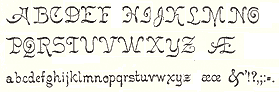 German-American type designer (b. 1843, Berlin) who apprenticed at the Trowitzsch & Son type foundry in Berlin, and then worked as a punchcutter in Dresden and at the G. Haase & Sons foundry in Prague. After positions at the Flinsch foundry in Frankfurt, the Battenburg foundry in Paris, and the Fonderie Haas in Basel, Ihlenburg moved to the United States in 1866 to work for the L. Johnson & Company foundry in Philadelphia, which became MacKellar, Smiths & Jordan some time later. Specializing in ornamental (Victorian) fonts and borders, he designed over eighty typefaces for that Mackellar and a few more for American Type Founders after it purchased MacKellar, Smiths & Jordan in 1901. Ihlenburg became an American citizen in 1874, and died in Philadelphia in 1905. He will be remembered as the prototypical Victorian type designer.
 His typefaces at MacKellar: - American (1876), Angular Text (1884, a Victorian blackletter at MacKellar, Smiths & Jordan; digitally interpreted by Toto in his free font K22 Angular Text (2012) and by Alan Jay Prescott as Angolan Text (2017)), Arboret (1884), Arboret No. 2 (1885), Archaic (1888), Artistic (1886), Attic (1879). Artistic was revived by Alan Jay Prescott in 2017 as Beltane Roman. He wrote: this letterform started out in 1886 as drawn by the great Herman Ihlenburg as Artistic and assigned to MacKellar Smiths & Jordan. Dan Solo called this face Belmont but only showed caps and was suspect anyway. I was able to find specimens elsewhere and a motherlode of other interesting things in the Inland Printer. I developed my first full-featured OTF using this typeface and designed Greek and Cyrillic glyphs as well. I also fitted it out with a set of small caps to make a font that now has 4,000 glyphs for nearly every non-Asian language. To top it off, Robert Donona revived the decorative caps for this typeface, an excruciating task that I once considered for myself but was lucky enough to have this other crazy person take up. The number of hours dedicated between Robert and myself in reviving this complete series digitally is probably unprecedented.
- Bijou (1883: digital copies include Bangle (1990-1991, FontBank), Riccio Display Script by Southern Software (1994, SSi, SSK), Grebe (1994, by an anonymous designer) and Mexacali by Swfte), Black Ornamented (1873), Broadgauge Ornate (1868: a spurred Western typeface at MacKellar Smiths & Jordan; revived by Michael Hagemann), Byzantine (1868).
- Centennial Script (1874, a spectacular high-contrast script digitized in 2007 by Canada Type and in 2011 as a free font called Mortem Stylus by Stylus, and by Intellecta Design as Centennial Script), Chaucer (1883), Childs (1892, revived by R. Beatty, and by Ingo Preuss as Daring), Circular Black (1883), Columbian (1891), Columbus (1890: for metal recuts, see Victor Hugo by Nebiolo and Columbia (1909) by Urania); for digital revivals, see Cristoforo by Thomas Phinney, 2012, Cristoforo (2012) by SoftMaker, F37 Drago (2021, Rick Banks) and Colombo by Ingo Preuss), Columbus No.2, Columbus Outline (1892), Copperplate (1877), Crayon (1886), Culdee (1885).
- Dado (1882), Drapery Border (1876), Dynamo (1891).
- Elliptical Border (1878), Eureka Text (1870, blackletter), Eureka Shaded (1870).
- Ferdinand (1892, now at Dover), Filigree (1878), Fillet (1890), Flourish Ornaments (1884).
- Glyptic, Glyptic No. 2 and Glyptic Shaded (1878), Gothic Ornate (?), Greenback (1871), Grolier (1887), Gutenberg (1888).
- Houghton (ca. 1880). Same as Edison. Revived by Jim Spiece as Edison Swirl SG.
- Illuminated and Illuminated No. 2 (1876), Isabella (1892, a bastarda face; digital version at Agfa, Adobe, and Linotype, 2001), Italic Copperplate (1878).
- Japanesque and Japanesque No. 2 (1877, oriental simulation typefaces), Johnson (1892).
- Lady Text (1884, blackletter), Lippincott (before 1895).
- MediaevalText and Mediaeval Text Ornate (1870, blackletter), Minaret (1868), Minster (1878), Mortised and Mortised No. 2 (1884).
- Newfangle (1892, revived in 2015 by Nick Curtis as Newfangle NF), Nymphic (1889 [Ruffa says 1884], revived by Barmee in Secesja Pro (2013), and by Paul D. Hunt (2004), who published it as Kilkenny (2005, P22)).
- Obelisk (1881), Oxonian (1881). Digital revival of Obelisk in 2014 by Robert Donona.
- Pencraft (1885; digital revival in 2013 by Robert Donona), Pencraft No.2, Phidian (1870, redone by Dan X. Solo), Philadelphian (1867; digital revival by Michael Hagemann as Philadelphian in 2020), Pynson (1887).
- Quenn Bess Script (1882).
- Radiant (1876), Radiant Antique (1876: a money font), Radiated (1871), Relievo (1878), Relievo No. 2 (1879), Rimpled (1895), Ringlet (1882, the prototypical Victorian typeface; Dan X. Solo and George Williams made different digital versions in 1998 which are both also called Ringlet), Romanesque (1874).
- Sansom Script (1888), School Text (1876), Spiral (1890, revived by R. Beatty), Stipple (1890), Stylus and Stylus No. 2 (1883).
- Tendril (1878), Tilted (1886), Treasury (1874), Treasury Open (1875).
- Unique (1874), Unique No. 2 (1875).
- Zinco (1891, revived by Jim Spiece in 2002 as Zinc Italian SG).
At ATF: Taylor Gothic (1894), Schoeffer Old Style (1897: revived and extended by Alfonso Garcia in 2020 as Spirits), Roundhand Series (1902), Post Oldstyle Roman No. 2 (1901---possibly made by E.J. Kitson and/or Guernsey Moore), Post Oldstyle Italic (1901), Ihlenburg Series (1900?), Bradley Series (1895-1897, now at Dover), American Italic (1902). Ludlow offers a digital version of Hannibal. Comments on some typefaces by Mac McGrew: - American Italic is a heavy, novel design by Herman Ihlenburg introduced by ATF in 1902, as a companion to Columbus, which had been designed for ATF's MacKellar Smiths&Jordan branch in 1892. The italic survived its roman mate, being shown by itself in 1906, but was gone by 1912. It is essentially a nineteenth-century design.
- Bradley (or Bradley Text) was designed by Herman Ihlenburg-some sources credit it to Joseph W. Phinney--from lettering by Will H. Bradley for the Christmas cover of an Inland Printer magazine. It was produced by ATF in 1895, with Italic, Extended, and Outline versions appearing about three years later. It is a very heavy form of black-letter, based on ancient manuscripts, but with novel forms of many letters. Bradley and Bradley Outline, which were cut to register for two-color work, have the peculiarity of lower alignment for the caps than for the lowercase and figures, as may be seen in the specimens; Italic and Extended align normally. The same typeface with the addition of German characters (some of which are shown in the specimen of Bradley Extended) was sold as Ihlenburg, regular and Extended. Similar types, based on the same source and issued about the same time, were St. John by Inland Type Foundry, and Abbey Text by A. D. Farmer&Son. They were not as enduring as Bradley, which was resurrected for a while in 1954 by ATF. Also compare Washington Text.
- Round Hand was designed for ATF about 1900, and has been ascribed to Herman Ihlenburg. It has the appearance of handwriting with a broad pen, but letters are not quite connected.
- Schoeffer Old Style [No.2] was designed by Herman Ihlenburg for ATF in 1897. It is typical of a number of typefaces of the day-a plainly lettered roman with small, blunt serifs. Some references list Schoeffer Condensed, cut in 1902; this is probably the typeface shown a little later as Adver Condensed (q.v.). On Linotype, Schaeffer Oldstyle was called Elzevir No.2.
In 2021, Noah Bryant set out to revive many of Ihlenburg's Victorian typefaces. Ihlenburg at the Rochester Institute of Technology's Cary Graphic Arts Collection. [Google]
[MyFonts]
[More] ⦿
|
Imprimerie Edmond Monnoyer
|
French printer, est. Paris, 1618, and in Le Mans in 1751. In 1889, they published Spécimen des caractères de l'imprimerie Edmond Monnoyer (Le Mans) [Other link]. Picture of Edmond Monnoyer. Samples: Anglaise, Cover page, Elzevir, latines lithographiqes, Ronde and écossaise, Ronde and gothique. Antoine Monnoyer was master printer in Paris in 1618, and ran the print shop until 1634, when (his son?) Pierre Monnoyer took over. There is a historical hole after that, until Jean Baptiste Monnoyer (b. 1688, d. 1777, Joinville), who was a printer for the duke of Orleans in Joinville. Charles Monnoyer (b. 1720, joinville, d. 1793, Le Mans) became the printer of the king and the bishop of Le Mans, where he established himself in 1751. He headed the business until 1789. Charles II Monnoyer (b. 1758, Le Mans, d. 1811) was in charge from 1789 until 1811. Charles III Nicolas Monnoyer (b. 1793, Le Mans, d. 1860) headed the firm from 1811 until 1860, and was followed from 1860 until 1889 by Charles IV Edmond Monnoyer (b. 1829, Le Mans, d. 1899). Finally, from 1889 until 1932, the firm was in the hands of Charles V Antoine Monnoyer (b. 1868, Le Mans) and Paul Charles VI Frederic Monnoyer (b. 1903, Le Mans). [Google]
[More] ⦿
|
Intecsas
[Klaus Herrmann]
|
Foundry run by Klaus Herrmann from Düsseldorf, whose fonts are distributed by Precision Type and FontHaus. Fonts include basically all of David Rakowski's old shareware fonts. Through Intecsas, David Rakowski has finally gone commercial. The fonts are often redrawn, and have complete international character sets. The library contains 500 fonts, of which about 90 are based on David's old shareware fonts. Among the newer fonts, DwigginsFortyEight (1999). Mark Johansson explains the history of Rakowski's fonts. Atomic Type distributes their fonts as well. Partial font list: Aaaaaaaargh Caps, Aarcover, Adineski, Adine Kernberg Script, Adriana Davidovsky, Air Supply, Alvin Caps, Aminal Initials, Anderson Script, Anne Stone, Avery Jean, Beffle, Bela Drips, Belgian Casual, Bellagio, Benjamin, Bizarro, Blasius, Braille Font, Brandenburger, Brookfield, Brooks Initials, Buffalo Bill, Cardboard Cutout, Carrick, Chalice, Charlotte Tile, Chinese Menu, Christensen Caps, Command Ment, Constructivist, Corsage, Crackling Fire, Crane Initials, Davys Blocks, Davys Dingbats, Davys Key Caps, Davys Big Key Caps, Davys Other Dingbats, Davys Ribbons, DeBellis, Deco Twenty Two, Dewhurst, Dieter Caps, Dilara Caps, Dinderman, Dorothy Initials, Dragonwick, Drawing Pad, Dubiel, Dupuy, Eileen Caps, Elizabeth Ann, Elzevier, Eraser Dust, Even More Face Cuts, Face Cuts, Fetch Scotty, Flicker, Forest, Frisch Script, Garton, Gessele Script, Gouda Old Style, Grab Bag, Gravestone Rubbing, Green Caps, Griffin Dingbats, Ground Hog, Harting (an old typewriter font), Headhunter, Holtzschue, Horror Show, Horst Caps, Hunan Garden, Ian Bent, Jacobs, Jeff Nichols, Joanna Lee, Judy Finckel, Kastner Casual, KidStuff, Kinigstein Caps, Kioko, Konanur Caps, Korf Caps, Koshgarian Light, Kramer, Lee Caps, Legal Vandal, Lemiesz, Lilith, Logger, Lower East Side, Lucy Script, MalakaLaka-LakaLakaLaka, Man About Town, Mary Monroe, McGarey Fractured, More Face Cuts, Multiform, Munchner Initials, Nauert, Nitemare Caps, No More Face Cuts, Octagon, Paris Metro, Party Down, Pavelle, Phonetic, Pixie Font, Pointage, Polo Semiscript, Randolph, Rechtman Script, Relief, Reynolds Caps, Rhodes Roman, Rounded Relief, Rudelsberg Regular, Rumble, Saint Albans, Scratchy Pen, Showboat, Sjlausmann, Sprecher Initials, Starburst, Still More Face Cuts, Sturbridge Twisted, Taiga, Tejaratchi Caps, Thompson Pond, Toletto, Travis Brush, Trench, Trevor Light, Tucker, Tundra, Upper West Side, Varah Caps, Victoria Casual, Wedgie, Wein Initials, Wharmby, What A Relief, Will Harris, Yasmine, Zaleski, Zallman Caps. At Will-Harris House, we find these fonts by David Rakowski: Cardboard Cutout, Dwiggins 48 (ornamental caps first designed by Dwiggins), Fetch Scotty, Gibbons (a great geometric Bauhaus-style font), Gravestone Rubbing, Greene&Greene (architectral lettering), Davy's Art Nouveau Initials, Gravestone Rubbing, Harting, Handscrifte, Lillith, Lillith Initials, Pointage, Rabbit ears, Rasta Rattin Frattin, Tenderleaf Caps, Tendril, Toletto (toilet paper alphadings), Will-Harris, and Zaleski. [Google]
[More] ⦿
|
Jean-Baptiste Levée
[Production Type]
|
 [More] ⦿
|
Jean-Renaud Cuaz
[Typorium]
|
[MyFonts]
[More] ⦿
|
Jesús Eladio Barrientos Mora
[Talavera Type Workshop]
|
[MyFonts]
[More] ⦿
|
John-Paul Knox
|
Winnipeg, Canada-based designer of Perrin OT (2004), a recreation of the fonts found in the Oeuvres de Descartes series published by J. Vrin in the 1970s. A René Ponot quote: The Éditions des Cendres book was set in the typeface Perrin (fig. 10), thanks to the understanding and benevolence of the Imprimerie Nationale of France, to which it belongs. Used there for the first time, Perrin was recreated from the authentic Augustaux in 1987 by the Atelier National de Création Typographique, under the direction of Ladislas Mandel and José Mendoza. It was digitized in 1995 by designer Franck Jalleau of the Imprimerie. Knox's Perrin OT, after discussion with Hrant Papazian, morphed into and was renamed Marquet (2004-2005), a delicate text family, which he calls les Elzévirs de Théophile Beaudoire. [PDF file of Knox's Marquet.] He also created Adrichom (2005). [Google]
[More] ⦿
|
Julien Wendé
|
 Graduate of the Ecole Estienne in Paris (2012 and 2014), where he specialized in typography and type design. He now works as a graphic and type designer in Paris. His typefaces:
 - Gaillarde (2013). Based on the original by Pierre-Simon Fournier (1762).
- Roma (2014). A sans family in three weights.
- Philis (2014). An Elzevir with lapidary stems.
- Wave (2013). A wavy bespoke typeface for the Philharmonie de Paris.
- Rusko (2014). Rustic and gothic.
- Squarex (2014). A pixel typeface.
- Vanderposter (2014). An ornamental titling typeface based on a type by Fonderie Vanderborght in Brussels.
Behance link. [Google]
[More] ⦿
|
Kelly Batchelor
|
During her type design studies at the University of Reading, UK, in 2013, Kelly Batchelor created a revival of Elzevier. [Google]
[More] ⦿
|
Klaus Herrmann
[Intecsas]
|
[More] ⦿
|
Louis Perrin
|
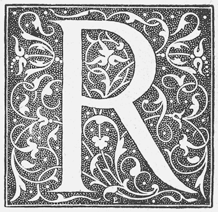 French punchcutter (1795-1865) who lived in Lyon. He designed Lyons Titling (1846, a roman titling font published by Chiswick Press) and Augustaux, about which René Ponot published a book, Louis Perrin: L'Enigme des Augustaux (Editions des Cendres, Paris, 1998). The book contains a history of Perrin as a printer and typographer, with special attention to Perrin's Augustaux type. It contains two fold-out Augustaux type specimens and several examples of Perrin's printing in black-and-white. The preface is by Fernand Baudin, and it is printed in Perrin type redesigned by L'Atelier National de Création Typographique in 1986. See also Etude sur Louis Perrin, Imprimeur Lyonnais (Editions des Cendres, Paris, 1994) by Jean-Baptiste Monfalcon.
 The Elzevir style of typeface originated with Louis Perrin. Hrant Papazian writes: While I was looking for something else I ran into the single most important publication about Perrin that I know of: Audin's book on the 1923 Perrin exhibition in Lyon. It's quite rare - it seems only 61 copies were printed. There's a very extensive text (120 pages), a complete catalog of works, and some great facsimiles (as well as actual prints -like pressmarks- from Perrin's own engravings). The paper is very yellowed though. There are two things in there that will probably interesting you most: A facsimile of Perrin's famous specimen sheet, showing two sizes that are basically Marquet's designs: the 11 and the second 14. Some scans shown below were published by Hrant Papazian. Digital typefaces directly linked to Louis Perrin include the all caps typeface Grand Central by Tobias Frere-Jones (1998, Font Bureau), and the great contemporay revival of Augustaux by Mathieu Cortat simply called Louize (2013, +Display). Aventine (2018, Stephen French) is an oldstyle typeface based on Perrin's Lyons Capitals. FontShop link. Bibliography: Laurent Guillo: Louis-Benoit Perrin et Alfred-Louis Perrin, imprimeure à Lyon 1823-1865-1883 (1986, Mémoire, Ecole Normale Supérieure des Bibliothèques, Villeurbanne). [Google]
[MyFonts]
[More] ⦿
|
Lucia Walter
|
Fine Arts graduate from the University of Barcelona, who also studied at Central Saint Martins College of Art&Design in the UK. She presently works as a graphic designer for Adidas in Nürnberg, Germany. For a school project, Lucia revived a 1931 typeface by Carlos Winkow, called Elzeviriano Ibarra (2009-2010). Behance link. [Google]
[More] ⦿
|
Lyubov Alexeyevna Kuznetsova
|
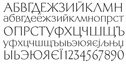 Moscow-based type, graphic and book designer (b. Tula, 1928, d. Moscow, 2008). In 1951, after her graduation from Moscow Printing Institute, she joined the type design team of VNII Polygraphmash, and worked there for forty years as a designer, head of the design department, and chief of the oriental type design unit. From 1992 until her death, she was a staff designer at ParaType, Moscow. Kuznetsova specialized in Arabic type design, but also created many Cyrillic and Latin typefaces. Speaker at ATypI 1998 in Lyon on Arabic type design in Russia. Recipient of many design awards and distinctions such as a citation for design excellence for PT Kufi, at the TDC2 1998. CV at bukvaraz. Russian bio. URW link. Obituary at TDC. Her typefaces:
 - Arabic type, often designed in cooperation with the Persian calligraphers Azarbud and Zarrin Hatt and other calligraphers from Egypt and Lebanon. Her typeface PTMariam (1994) is showcased in Huda Smitshijzen AbiFarès' book "Arabic Typography" (Saqi Books, 2001). Other Arabic typefaces: Cairo (1959-1960), Naskhi Aswani (1960), Naskhi Book (1962), Kuznetsova's Ruqaa (1963), Azarbud Display (1972), Zarrin Hatt (1972), Vostok (1972), Kuznetsova's Abridge (1974), Beyrouth (1977), Grot (1977), PT Mariam (1994), PT Hafiz (1994), PT Naskh Ahmad (1994), PT Basra (1994, based on her own Grot typeface), PT Damascus (1994; based on Beirouth, 1977, of Polygraphmash, also by her), PT Nast'aliq (1995), PT Thuluth (1995), and PT Kufi (1997, ParaType), winner of an award at the Type Directors Club in New York in February 1998.
- Cyrillic typefaces:
- ParaType Academy (1989). Academy was designed near 1910 at the Berthold type foundry (St.-Petersburg) based on the typeface Sorbonna (H. Berthold, Berlin, 1905), which represented the American Typefounders' reworking Cheltenham of 1896 (designers Berthram G. Goodhue, Morris F. Benton) and Russian typefaces of the middle of 18th century. The modern digital version is created in 1989 by Kuznetsova. The decorative style was added in 1997 by A.Tarbeev. Tarbeev link.
- Bannikovskaya (1946-1951) was revived by Kuznetsova as ParaType Bannikova (1999-2001). Designed at Polygraphmash type design bureau in 1946-51 by Galina Bannikova, inspired by Russian Grazhdansky early- and mid-18th century typefaces as well as Roman humanist typefaces of the Renaissance. URW states: With the archaic features of some characters the typeface is well recognized because of unique shapes. It is one of the best original typefaces of the Soviet typography. The typeface is useful in text and display composition, in fiction and art books. The revised, improved and completed digital version was designed at ParaType in 2001 by Lyubov Kuznetsova.
- ParaType Bazhanov (2000). URW writes: "PT Bazhanov TM was designed at Polygraphmash type design bureau in 1961 by Michael Rovensky (1902-1996). Based on the lettering by Moscow book designer Dmitry Bazhanov (1902-1945). Old-fashioned flavor of this design recreates the Soviet hand-lettering style of the 1940s. For use in title and display typography. The digital version was developed for ParaType in 2001 by Lyubov Kuznetsova." Paratype link.
- ParaType Elizabeth (1999). A great modern typeface about which URW writes: "The hand composition typeface was developed at the Ossip Lehmann type foundry (St. Petersburg) in 1904-07 (after designs by Alexander Leo?). It was redeveloped at Polygraphmash in 1960s for slugcasting composition. Named after Russian Empress Elizabeth I (1709-61). Based on typefaces of George Revillon type foundry of the 1840s, though some characters' shapes were redrawn similar to Russian Academy of Sciences typefaces (mid-18th century). Sharp contrast, strong weight Modern Serif with archaic flavor. The typeface is useful in text and display composition, in fiction, historical, and art books, especially connected to the 18th or 19th centuries. It looks great in Russian classical literature such as Pushkin and Gogol works. The revised, improved and completed digital version was designed at ParaType in 2001 by Lyubov Kuznetsova." Paratype link.
- ParaType Kuzanyan (2001). This modern typeface was designed at the Design Studio of Igor Nastenko by Igor Nastenko, and was based on Granit (1966, Pavel Kuzanyan). Digitized at Paratype in 2001.
- ParaType Literaturnaya (1996), after a 1937 original by A. Shchukin and T. Breyev. URW writes about this Elzevir typeface: Designed at NII OGIZ type design bureau circa 1940. Based on Latinskaya (St.-Petersburg, 1901), Cyrillic version of Lateinische. The digital version was developed at ParaType in 1996 by Lyubov Kuznetsova. The favorite text typeface of Soviet typography. Allen Hutt writes in A revolution in Russian typography (Penrose Annual, Volume 61. New York: Hastings House, 1968): The survival of this De Vinne-style type, from the worst design period of old Imperial Germany, in the premier Socialist country in the latter part of the twentieth century, is a typographical phenomenon as unique as it is deplorable.
- ParaType Neva (2002). URW: "Neva Regular with Italic was created by Moscow book and type designer Pavel Kuzanyan (1901-1992) at Polygrafmash in 1970 for slugcasting and display composition. Based on simple strict letterforms of Russian classical typefaces. Neva typeface was rewarded on the Gutenberg international type design contest in 1971 (Leipzig). The typeface is useful in text and display composition, in fiction and art books. The digital version and bold styles were designed for ParaType in 2002 by Lyubov Kuznetsova."
- ParaType New Journal (1997). Antiqua family. URW: "The typeface was designed at the Polygraphmash type design bureau in 1951-53 by Lev Malanov, Elena Tsaregorodtseva et al. Based on Cyrillic version of Excelsior, 1931, of Mergenthaler Linotype, by Chauncey H. Griffith. Excelcior Cyrillic was developed in 1936 in Moscow by Professor Michael Shchelkunov, Nikolay Kudryashev et al. A low-contrast text typeface of the Ionic - "Legibility" group."
- ParaType Quant Antiqua (1989). Antiqua family. URW: The typeface was designed at the Polygraphmash type design bureau in 1989 by Lyubov Kuznetsova. Based on the typeface Literanutnaya (Latinskaya) (Berthold, St.-Petersburg, 1901), a version of Lateinisch typeface (of Berthold in Berlin, 1899. For use in text matter.
- ParaType Svetlana (1996). Antiqua family. URW: "Designed in 1976-81 by Michael Rovensky (1902-1996) as the body text companion of his Bazhanov Display typeface (1961), of Polygraphmash type foundry. Based on the lettering by Moscow book designer Dmitry Bazhanov (1902-1945). With old-fashioned flavor, this design recreates the Soviet hand-lettering style of the 1940s. The digital version was developed at ParaType in 1996 by Lyubov Kuznetsova."
- ParaType Telingater Display (2001). Elegant display family based on Telingater Display, by Solomon Telingater, 1959, Polygraphmash. URW: "The typeface was awarded the Silver Medal at the International Book Art Exhibition (IBA-59) at Leipzig (Germany) in 1959. Light flared sans serif with calligraphic flavor and low contrast between main strokes and hairlines."
- ParaType Xenia (1990). Heavy slab serif. Paratype link.
- ParaType Xenia Western (1992). Condensed version of the Egyptian typeface Xenia.
- She made a Cyrillic version of ITC Bookman (1993).
- Paratype Bachenas (2003), after work by Violdas Bachenas.
FontShop link. Klingspor link. [Google]
[MyFonts]
[More] ⦿
|
Mário Feliciano
[Feliciano Type Foundry]
|
[MyFonts]
[More] ⦿
|
MacFarland, Bradford and Crawford
|
 MacFarland is an antiqua typeface from 1899, a small tweak of Heinz Koenig's Roemische Antiqua (1888, Genzsch&Heyse). Mac McGrew writes: MacFarland was cut in 1899 by Inland Type Foundry, adapted from Romische Antiqua of Genzsch&Heyse in Germany. It is named in honor of Mr. J. Horace MacFarland, prominent printer of Harrisburg, Pennsylvania. At about the same time, the foundry of A. D. Farmer&Son cut essentially the same typeface from the same source, naming it Bradford after the first noted printer of New York; and Hansen issued Crawford, another look-alike. The Inland typefaces, along with Condensed MacFarland designed and cut in 1903 went to ATF when that foundry acquired Inland in 1912. The typefaces have some relationship to Elzevir or French Old Style, but are heavier, though not as heavy as the related De Vinne series. Lacking the eccentricities of some characters of DeVinne, these typefaces became popular for book titles and other work for which DeVinne was considered unsuitable. Keystone's Dickens is very similar but a little lighter; it is known as Classic on Linotype, but 18-point Classic Italic is the equivalent of MacFarland Italic. Compare Lorimer.
 For digital revivals and descendants, see Apparel (2020, Latinotype), a 20-font display serif family inspired by the MacFarland series in the 1912 ATF catalog. Apparel was designed by Daniel Hernandez and Alfonso Garcia. It differs in some details from MacFarland. [Google]
[More] ⦿
|
Maria Chiara Fantini
|
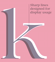 Maria Chiara Fantini is a graphic designer and letterer in Florence, Italy. In 2019, Cosimo Lorenzo Pancini, Andrea Tartarelli and Maria Chiara Fantini at Zetafonts published a slightly calligraphic Elzevir typeface, Lovelace.
 Kitsch (2019, Francesco Canovaro, Andrea Tartarelli and Maria Chiara Fantini) mixes angular medieval elements and old style letterforms. In 2019, the lapidary typeface family Beatrix Antiqua (Francesco Canovaro) was reworked by Cosimo Lorenzo Pancini together with Andrea Tartarelli and Maria Chiara Fantini into a 50-style type system called Monterchi that includes Text, Serif and Sans subfamilies. Monterchi is a custom font for an identity project for a famous fresco in Monterchi, developed under the art directorship of Riccardo Falcinelli. Tarif (2019) is a typeface family inspired by the multicultural utopia of convivencia---the peaceful coexistence of Muslims, Christians and Jews in tenth century Andalusia that played an important role in bringing to Europe the classics of Greek philosophy, together with Muslim culture and aesthetics. It is a slab serif typeface with a humanist skeleton and inverted contrast, subtly mixing latin zest, calligraphic details, extreme inktraps, and postmodern unorthodox reinvention of traditional grotesque letter shapes. The exuberant design, perfect for titling, logo and display use, is complemented by a wide range of seven weights allowing for solid editorial use and great readability in body text. Matching italics have been designed with the help of Maria Chiara Fantini and Cosimo Lorenzo Pancini, while Rania Azmi has collaborated on the design of the arabic version of Tarif, where the humanist shapes and inverted contrast of the Latin letters find a natural connection with modern arabic letterforms. In 2020, she released Quieta at Italian Type. Quieta is a 12-style humanist serif typeface inspired by the aesthetics of Italian Renaissance and by the empowering history of the painter Artemisa Gentileschi, first woman to be admitted to an Academy of Fine Arts in Italy. Fantini used sharp flat-nib calligraphic strokes to make the letters come alive. Still in 2020, she co-designed Stinger (2020, a 42-style reverse contrast family by Francesco Canovaro, Cosimo Pancini, Andrea Tartarelli and Maria Chiara Fantini). As part of the free font set Quarantype (2020), Maria Chiara Fantini designed Quarantype Uplift (with Cosimo Pancini). In 2020, Cosimo Lorenzo Pancini and Mariachiara Fantini---with the help of Solenn Bordeau---released Erotique at Zetafonts. Erotique evolved from Lovelace, an earlier Zetafonts typeface. Zetafonts describe this evil serif as follows: it challenges its romantic curves with the glitchy and fluid aestethic of transmodern neo-brutalist typography. Late in 2020, they added Erotique Sans, the sans version of Erotique, also designed by Cosimo Pancini and Maria Chiara Fantini. In 2021, Maria embarked on a project to create a font based on Antonio Sinibaldi's calligraphic material in Libro d'Ore di Lorenzo de Medici, now in possession of the Biblioteca Medicea Laurenziana di Firenze. Her first rough font was called Antonio. She also studied Raffaello Bertieri's Sinibaldi font done in 1928 at the Nebiolo Type Foundry when she designed her own digital version of Sinibaldi (2021). The latter font was regularized and smoothed in her final typeface in this project, Magnifico (2021). [Google]
[MyFonts]
[More] ⦿
|
Martha Stewart Living Magazine
|
Benton Gothic is a font family developed by Font Bureau for Martha Stewart Living Magazine and Worth Magazine from 1995-1997. Font Bureau also made Welo Script for them in 1998, as well as MSL Elzevir (1994-1995) and the ornate formal script font Lithografia (1998) (Lithographia Script was first released by the Bauer foundry around 1895). [Google]
[More] ⦿
|
Martin Pasquier
|
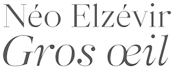 During his studies at ESAD in Amiens, France, Martin Pasquier created Pittoresque (2014, grotesque typeface) and Neo Elzevir Gros Oeil (2015, a revival of a typeface from the Peignot type foundry). His graduation typeface in 2016 is called Sequence. This wedge serif typeface family was designed for use in magazines. Sequence Gros Oeil is inspired by MT Plantin, while Sequence Petit Oeil hearkens back to the Latines on the 1950s. [Google]
[More] ⦿
During his studies at ESAD in Amiens, France, Martin Pasquier created Pittoresque (2014, grotesque typeface) and Neo Elzevir Gros Oeil (2015, a revival of a typeface from the Peignot type foundry). His graduation typeface in 2016 is called Sequence. This wedge serif typeface family was designed for use in magazines. Sequence Gros Oeil is inspired by MT Plantin, while Sequence Petit Oeil hearkens back to the Latines on the 1950s. [Google]
[More] ⦿
|
MyFonts: Elzevir
|
A list of typefaces at MyFonts that are related to the elzevir style. See also here. [Google]
[More] ⦿
|
MyFonts: Elzevir
|
Elzevirian typefaces that can be found at MyFonts. [Google]
[More] ⦿
|
Nicholas Joseph Werner
|
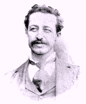 Born in Belleville, IL, in 1858. He died in 1940. Typefounder, author, artist, editor and printer, all in one. Involved at some point with the Inland Type foundry and the Central Type Foundry. His typefaces:
 - Antique No. 6 (ca. 1883, Inland Type Foundry).
- Avil (1904, Inland Type Foundry).
- Becker Series (1899, Inland Type Foundry), blackletter face.
- Bizarre Bold (1895, Inland Type Foundry) oe Edwards (the original name) or Inland Series. This typeface adds many Victorian or steampunk elements to a didone skeleton. McGrew says: It was renamed, most appropriately, by BB&S in 1925 after that foundry took over Inland. A companion typeface called Inland, by the same designer, was produced at the same time using some of the same characters but with even more unusual twists to others. Compare Francis. In 2010, Claude Pelletier made two digital versions, called Bizarre and Bizarrerie. Vivien Gorse (Toulouse, France) revived Inland Series in 2014-2015.
- Brandon (1898, Inland Type Foundry): According to McGrew, "a thick-and-thin title face, similar to Engravers Roman, named for a printer in Nashville, Tennessee. Like a number of other such typefaces, it has no lowercase but was cast in several sizes on each of several bodies so numerous cap-and-small-cap combinations could easily be made. This style was popular for stationery and business forms. Hansen called the typeface Plate Roman. On Linotype and Intertype Bold Face No.9 is essentially the same typeface but a little narrower; typesetters not infrequently call it Engravers Roman. There was also a Brandon Gothic, cut only in two small 6-point sizes, which was similar to Combination Gothic, but with a letterspaced effect."
- Bruce Title / Menu Roman / Skinner: McGrew reports that Menu Roman is the BB&S rename, for the 1925 specimen book, of Skinner, which was shown by Inland Type Foundry about 1885, and ascribed to John K. Rogers as well as to Nicholas J. Werner. Menu Title, formerly Lining Menu, was Inland's Bruce Title, by Werner. Menu Shaded was Acme, designed in 1886 or earlier. The latter has only a very general relationship to the other typefaces which are nearly monotone, with long serifs tapering to sharp points. Compare Paragon.
- Caxton Bold (Marder, Luse). Codesigned with William F. Capitain.
- Central Lining Antique (ca. 1892, Central Type Foundry).
- Corbitt (1900, Inland): McGrew states [...] a heavy, thick-and-thin typeface with tiny serifs [...] Although still showing many of the quaint design details of nineteenth-century types, it is somewhat more mature. Condensed Corbitt was advertised by Inland in 1902 as their "latest addition." Both versions were cast by ATF after Inland merged with that foundry in 1911, but only the Condensed seems to have survived until matrices were inventoried in 1930. Digital revival by Chuck Mountain in 2020 as Murden CF.
- Courts (1900, Inland): later renamed DeVinne Recut Italic.
- De Vinne: McGrew writes about this: DeVinne, the display face, is credited with bringing an end to the period of overly ornate and fanciful display typefaces of the nineteenth century, and with restoring the dignity of plain roman types. It is derived from typefaces generally known as Elzevir or French Oldstyle (q.v.). DeVinne says of it, "This typeface is the outcome of correspondence (1888-90) between the senior of the De Vinne Press (meaning himself) and Mr. J. A. St. John of the Central Type Foundry of St. Louis, concerning the need of plainer types of display, to replace the profusely ornamented types in fashion, of which the printers of that time had a surfeit. The DeVinne Press suggested a return to the simplicity of the true old-style character, but with the added features of thicker lines and adjusted proportion in shapes of letters. Mr. St. John approved, but insisted on grotesques to some capital letters in the belief that they would meet a general desire for more quaintness. Mr. Werner of the Central Type Foundry was instructed to draw and cut the proposed typeface in all sizes from 6- to 72-point, which task he executed with great ability. "The name given to this typeface by Mr. St. John is purely complimentary, for no member of the DeVinne Press has any claim on the style as inventor or designer. Its merits are largely due to Mr. Werner; its few faults of uncouth capitals. ..show a desire to please eccentric tastes and to conform to old usage. The new typeface found welcome here and abroad; no advertising typeface of recent production had a greater sale. Thus De Vinne himself credits the typeface to Central Type Foundry and its design to Nicholas J. Werner, but Werner says, "To correct the general impression that Theodore L. De Vinne was the designer of the typeface named after him, I would state that it was the creation of my partner, Mr. (Gustav) Schroeder." The design was patented under Schroeder's name in 1893. Central was part of the merger that formed American Type Founders Company in 1892, but continued to operate somewhat independently for a few more years. Meanwhile, DeVinne was copied by Dickinson, BB&S, Hansen, and Keystone foundries, and perhaps others-in fact, Keystone advertised that it patented the design in 1893, Connecticut Type Foundry copied it as Saunders, and Linotype as Title No.2. Dickinson called it "a companion series to Howland" (q.v.). When Monotype developed an attachment in 1903 to cast display sizes, DeVinne was the first type shown in their first announcement. Later ATF specimens showed this typeface and several derivatives as DeVinne No.2, probably because of adjustments to conform with standard alignment. DeVinne Italic and DeVinne Condensed were drawn by Werner and produced by Central in 1892 and copied by some other sources. Howland, shown by Dickinson in 1892, is essentially the same as DeVinne Condensed No.3, later shown by Keystone. ATF introduced DeVinne Extended in 1896, while BB&S showed DeVinne Compressed, Extra Compressed, and Rold in 1898-99. Keystone's DeVinne Title is another version of bold, not as wide as that of BB&S. In 1898 Frederic W. Goudy was asked to take the famous display type and make a book typeface of it. The resulting DeVinne Roman, Goudy's second type design, was cut the following year by the Central branch of ATF. DeVinne Slope, essentially the same design but sloped rather than a true italic, was cut by the foundry about the same time, perhaps from the same patterns as the roman. DeVinne Open or Outline and Italic also originated with Central. In the roman and smaller sizes of italic only the heavy strokes are outlined; in larger sizes of italic, certain thin strokes are also outlined. Monotype cut the open typefaces in 1913. DeVinne Shaded is another form of the outline, created by Dickinson in 1893; parts of the outline are much thicker than others. DeVinne Recut and Recut Outline, shown by BB&S, are not true members of this family, but are a revival of Woodward and Woodward Outline, designed by William A. Schraubstadter for Inland Type Foundry in 1894; there were also condensed, extra condensed, and extended versions, all "original" by Inland. DeVinneRecutItalic was a rename of Courts, by Werner about 1900, also from Inland. Compare McNally. There are several modern day interpretations, such as C790 (Softamker), Columbus, Roslindale (2018, David Jonathan Ross) and ITC Bernase (1970, Thomas Paul Carnase).
- Edwards (1895, Inland Type Foundry). Revived and interpreted in digital version by Nick Curtis as Inland Edwards NF.
- Era Condensed No. 5 (with Gustav F. Schroeder) (1891, Barnhart Bros & Spindler).
- Flemish Condensed (1905), a typeface bought by Stephenson Blake from the Inland Type Foundry. Flemish Expanded (1890, Stephenson Blake; co-designed with Eleisha Pechev).
- Gothic No. 8 (1890, Inland Type Foundry).
- Hermes (1887, Central Type Foundry). This pure art nouveau typeface was co-designed with Gustav F. Schroeder.
- Inland (1895, Inland Type Foundry).
- Johnston Gothic (1892, Central Type Foundry). A pre-art nouveau typeface codeveloped with Gustav F. Schroeder.
- Mid-Gothic (1892, Central Type Foundry): According to McGrew, Mid Gothic was designed by Nicholas J. Werner for Central Type Foundry, probably just before that St. Louis foundry joined the merger that formed American Type Founder s in 1892. It is an undistinguished gothic of nineteenth-century style, but is an intere sting example of the way many of the earlier types were modified for Monotype. The original copy of this typeface for machine typesetting (6- to 12-point) was necessarily reproport ioned to meet mechanical requirements; the same patterns were then used for display size s and the result is series 176. Later the foundry design was copied much more exactly, w ith little or no modification, as series 276. Both versions have been shown in Monotype literature as Lining Gothic, Mid-Gothic, or Mid-Gothic No.2 at various times. The No.2 designation was applied to many foundry typefaces around the turn of the century when they were adapted to standard alignment or when other slight changes were made. Hansen copied this typeface as Medium Gothic No. 7, and made an inline version as Boston Gothic (q.v.).
- Multiform No. 1 through No. 4, with Gustav F. Schroeder (1892, Central Type Foundry).
- Novelty Script (ca. 1891, Central Type Foundry). An Arabic simulation typeface co-designed with Gustav F. Schroeder.
- Pastel series: according to McGrew, "Pastel began as Era, designed for BB&S about 1892 by Nicholas J. Werner and Gustav Schroeder. Lightface Era and Era Open were added about 1895, and Era Condensed about 1898. Around the turn of the century the name was changed to Pastel, perhaps when Pastel Bold was added in 1903. Era and Pastel are identical, except that Era had only the characters with extended strokes, shown as Auxiliaries with Pastel, where they were replaced with more conventional characters in regular fonts. Pastel is virtually a monotone design, with tiny, pointed serifs. There are several unusual characters, including the splayed M and the N with the curved diagonal. Pastel was quite popular for subtitles in motion pictures, before the advent of sound. It was recast by ATF in 1954. Intertype's cutting of Pastel is essentially the same as the foundry's Pastel Lightface. Intertype also cut a sloped version as Pastel Italic."
- Quentell (1894, Central Type Foundry): Quentell was drawn for ATF's Central Type Foundry branch in St. Louis; it has been ascribed to N. J. Werner, but a design patent was issued in 1895 to William S. Quentell, advertising manager of Armour&Company of Chicago, for whom the typeface was made. Two years later it was redrawn as Taylor Gothic by Joseph W. Phinney for ATF, and later redesigned as Globe Gothic (q.v.). Meanwhile, the original Quentell was slightly modified as Quentell No.2, and in that form continued to be shown in specimens along with its altered forms. See Pontiac. (McGrew)
- Skinner (1896, Inland Type Foundry).
- Victoria Italic (1891, Central Type Foundry). With Gustav F. Schroeder. Mac McGrew: Victoria Italic is a nineteenth-century design that retained its popularity for many years, and has been made under several names by a number of sources. ATF's Central Type Foundry branch showed it as early as 1893, in usual form without lowercase, but with several sizes on each of several bodies in the manner of Copperplate Gothic. In 1898 the Pacific States Type Foundry in San Francisco showed the typeface with lowercase as Pacific Victoria Italic, and about the same time ATF showed Regal Italic with essentially the same lowercase. Victoria Italic without lowercase has also been shown by Keystone and Hansen, as well as Monotype and Ludlow. It is a wide, monotone design with thin, pointed serifs, and was popular for a time for business forms and stationery as well as general printing. Compare Paragon Plate Italic. Keystone also had Keystone Victoria, a similar upright design, without lowercase.
- Woodward Condensed and Extended (1894) and Woodward Extra Condensed (1901), all published by Inland Type Foundry.
Klingspor link. Read about Werner in The Inland Printer in 1898-1899, in an article by William E. Loy entitled Designers and Engravers of Type. No. XIX, Nicholas Joseph Werner. [Google]
[More] ⦿
|
Nick Nedashkovskiy
[NN Type Foundry (or: NN Studio)]
|
[More] ⦿
|
NN Type Foundry (or: NN Studio)
[Nick Nedashkovskiy]
|
Or Nikolay Nedashkovsky, type designer and font engineer based in Moscow, working at Paratype. He also started an experimental type coop, called Type Improvisation. Designer in 2020 at Paratype of Helsa Display, a slim and eccentric serif typeface for Latin and Cyrillic. Helsa Display is, in Nick's words a free interpretation of the narrow elzevirs of the beginning of XX century for use in titles and short texts. With Ksenia Erulevich and Konstantin Lukyanov, he co-designed the soccer shirt font Russian Premier League (2018, at Art Lebedev). Github link. Art Lebedev Studio link. [Google]
[More] ⦿
|
Production Type
[Jean-Baptiste Levée]
|
 Jean-Baptiste Levée is a French type designer based in Paris. He is a co-founder of the Bureau des Affaires Typographiques, and teaches typeface design at ESAD Amiens (and before that, at the Caen-Cherbourg school of Arts & Media and at the University of Corte). His latest work is mostly published at Production Type which he manages. He designs custom and retail typefaces, and has won multiuple awards for his type designs. Other designers publishing at Production Type include Yoann Minet, Sandra Carrera, Yohanna My Nguyen, Emmanuel Besse, Mathieu Réguer, Quentin Schmerber and Loic Sander. In 2020, the support team included Hugues Gentile, Dorine Sauzet, Suehli Tan and Igino Marini. Levée's typeface portfolio:
 - Vuitton Persona (2007): a family made under the supervision of Porchez for Vuitton's bags.
- Wallpaper corporate typeface (2008): Under the art direction of Meirion Pritchard and Christian Schwartz, this 2-style sans was developed for the architectural magazine Wallpaper. It is a self-confessed blend of Meta and Amplitude.
- Le Monde Courrier (2008): an extension and OpenType completion of the glyph tables of Porchez's LeMonde Courrier (2002).
- Panorama (2004-2008): an elegant full-fledged sans family from hairline to extended bold, and from Extra Condensed to Extra Extended. It can be bought at Production Type.
- Henderson Serif & Sans (2006): This is a Baskerville family conceived by J.-F. Porchez, but extended and perfected by Levée. The Sans is in the style of Arial with large x-height. The Typofonderie page does not mention Levée.
- Retiro (2007): Done with J.-F. Porchez for Madriz Magazine. This is a didone family with juicy and classy alternates. It became a retail font at Typofonderie in 2015.
- Pimkie (2006): a playful feminine display face.
- Seenk Serif and Seenk Sans: a text family done with Christophe Badani in 2005.
- Expert (2009): a unicase typeface done for magazine, ca. 2009.
- Acier BAT (2009-2010, BAT Foundry): an extensive family that builds on Cassandre's 1930 font by the same name.
- Gemeli and Gemeli Mono (by Levée, assisted by Emmanuel Besse and Hugo Marucco). This sans family can be bought at Production Type. For Gemeli Micro (2018), Gemeli's x-height was enlarged, extenders shortened, stance widened, spacing loosened, and forms simplified.
- Synthese.
- Carrefour Origin (2011). A tall thin face. This custom typeface led to the vretail typeface family Origin Super Condensed.
- Cogito Atelier Malte Martin. The sans family Cogito can be bought at Production Type.
- Telerama Dogon. This is a matchstick or campground face.
- Nathan Enfantine (2011) and Enfantine (2015). A simple upright connected (school?) script.
- RMNGP Constellation (2013) is the bespoke dot matrix typeface of Réunion des Musées Nationaux---Grand Palais for their on-site, online and printed communications.
- Vanité for Vanity Fair France (2013).
- Plinc Beaux Arts Didot (2014). A classical didone digitized from the original Photo-Lettering film matrix by Jean-Baptiste Levée for House Industries.
- Countach (2014, Production type). Described as follows by the designers and team, Superscript2, J.-B. Levée, Sandra Carrera and Irina Smirnova: Countach, the tough compact sans supercharged with brawn & brains. Developed for The Crew, a critically acclaimed auto racing video game, Countach evokes the muscular and mechanical dynamics of fast cars and urban adventure.
- Reception Semi (2014). A hybrid corporate typeface for Unibail / Rodamco.
- Renault Carname for Renault cars. This typeface won an award in the TDC Typeface Design competition in 2017.
- Fournier Orchestre de Paris (2014): Fournier ODP is the exclusive corporate typeface of Orchestre de Paris. Named after Pierre-Simon Fournier Le Jeune (1712-1768), punchcutter and typefounder. Famous for his musical founts, the Parisian Pierre-Simon Fournier is considered one of the first French moderns. The typeface borrows from the numerous alphabets produced by Fournier, retaining only the finest cuts and adding its own peculiarities: anachronical ampersand, reversed letters in reverence to poster ephemeras of the times. The Graphiques series are designed to allow for polychromic settings. The Gothic series are a nod to the residues of modernism. Faithful to the tradition of optical sizes, different designs have been assigned to different scales of use. By Jean-Baptiste Levé, who was assisted by Yoann Minet, Mathieu Réguer, Laurent Bourcellier and Roxane Gataud.
- Libé (2015). Rob Mientjes writes about this custom typeface family done for Libération: Libé is a family of a wide array of sans serif fonts and a set of stubborn typewriter fonts with a slightly sloppy underline style. The sans part of the family is a hybrid Excoffon, nineteen-seventies, tight-but-not-touching fever dream. If the spirit of Excoffon is alive, it has possessed Libé Sans. The Typewriter styles are a typographically successful, if unexpected, match.
- Granville (2015). A Peignotian (or modulated) sans published by Production Type.
- Minotaur (2014, with Yoann Minet). Minotaur won an award in the TDC 2015 Type Design competition.
Proto Grotesk (2014). Proto Grotesk won an award in the TDC 2015 Type Design competition. Review by André Mora, who writes: This beast is a strong sans serif with two mean weights. While others were busy breeding show dogs, Proto emerged from the love den of a couple of mutts high as hell. It ain't tame. It'll never be domesticated. Proto Slab and Proto Slab Condensed followed later. - Cobalte (2015, Production Type). A flared lapidary sans serif family.
- Courrèges (2016) for the fashion house.
- Boreal (2016). A sans family.
- Columbia Sans and Columbia Sans Display (2016, Jean-Baptiste Levée). Initially intended as a sans version of Times New Roman, Levée's explorations take him far afield through his flirtation with reverse stress and his back-rotated small o. He writes: Columbia is an unorthodox blend of multiple historical models. It excavates the so-called Elzevir style, an example of permeability between French and Dutch flavours. The type's restrained nature eschews caricature, giving paragraphs a clean texture while retaining the classical touch expected from late Renaissance typefaces. Initially commissioned by science magazine Sciences & Avenir, Columbia strikes a balance between rigorous topics and an approachable, informal tone.
- ARC (2016). A custom multiline typeface for the City of Paris (L'Arc de l'Innovation).
- Spectral (2017). A 7-style sharp-edged book face by Jean-Baptiste Levée related to Mrs. Eaves, and freely available at Google Fonts. Levée describes the influence of the French Elzevir on Spectral. The type experts opine that the spacing is too loose.
- Alpine (2017). A custom sans family for the new Alpine Vision automobile.
- Antique Gothic (2017). A condensed vintage sans with extreme x-height, designed by Jean-Baptiste Levée, with the help of Emmanuel Besse, Yoann Minet, Quentin Schmerber, Hugues Gentile, Pauline Fourest, and Kristina Jandova.
- Cardinal Classic and Cardinal Fruit (2018). A large transitional typeface family by Jean-Baptiste Levée, Yoann Minet and Quentin Schmerber. The tightly set and high impact photojournalism typeface family Cardinal Photo was added in 2020.
- Media Sans (2018). A typeface family with tight spacing and some extra condensed styles to be used in headlines and on posters. It was influenced by Frutiger's Antique Presse (at Deberny & Peignot) and some European typefaces of the 1960s and 1970s, such as the tightly letterspaced Brasilia, the squarish caps of Eurostile, and the oddly contrasted Antique Olive.
- LVMH Air (2018). A knife-edged fashion typeface family custom designed for LVMH (Moet Hennessy & Louis Vuitton), a French multinational luxury goods conglomerate that specializes in snob appeal.
- Duperré Sans (2018). A custom sans by Jean-Baptiste Levée and Quentin Schmerber for École Duperré.
- Acier (2019). A bi-colored revival of Cassandre's Acier (1930, Deberny & Peignot).
- Tesseract (2019). A display typeface with edges as sharp as a bamboo-cutting machete. Stuff for James Bond movies.
Speaker at ATypI 2013 in Amsterdam and ATypI 2014 in Barcelona. Speaker at ATypI 2016 in Warsaw. Behance link. Old URL. Klingspor link. Home page of Jean-Baptiste Levée. [Google]
[More] ⦿
|
René Ponot
|
French type designer (b. La Houssaye, 1917, d. 2003) whose typefaces include Blason (1978), Continent (1959, Optype - Letterphot), Mopon (1965, Moreau - Lettrage Relief), Nil (1978), Psitt (1954, Fonderie Typographique Française), Castellane&Valensole (Fonderie typographique Française), Roncevalles (1955, Fundicíon Tipográfica Nacional), Solide (1958, Optype - Letterphot), Suresnes, Ulysse (1958, Optype - Letterphot), Uncialis (1950, Optype - Letterphot). A quote from him: La typographie est un art précieux parce qu'elle forme le dernier revêtement de la pensée. Author of Louis Perrin et l'Énigme des Augustaux (Editions des Cendres, Paris, 1998). This book has a history of Perrin as a printer and typographer, with special attention to Perrin's Augustaux type. It contains two fold-out Augustaux type specimens and several examples of Perrin's printing in black-and-white, has a preface by Fernand Baudin, and is printed in Perrin type redesigned by L'Atelier National de Création Typographique in 1986. [Google]
[More] ⦿
|
Richard Gans
[Fundicion Tipografica Richard Gans]
|
 [More] ⦿
|
Robert Girard
[Girard et Cie]
|
[More] ⦿
|
Schriftgiesserei Flinsch
[Heinrich Flinsch]
|
 Foundry in Frankfurt am Main. House typefaces include Enge Antiqua (1859), Renaissance Kanzlei (also known as Antike Kanzlei), Verzierte Musirte Gotisch (ca. 1870, digitally revived by Gerhard Henzel), Flinsch-Germanisch (1876, blackletter by Karl Klimsch), Magere Kloster-Gotisch (ca. 1900), Neugotisch (1907), Universal-Gotisch (ca. 1900), Bernhard-Fraktur (1913, plus Extrafette), Dürer-Gotisch (ca. 1900), Flinsch-Fraktur, aka Frankfurter Fraktur (1911), Tages Antiqua (1915), Flinsch-Privat (1919, by Lucian Bernhard), Halbfette Schwabacher-Flinsch (which was used for titling in the Fehsenfeld editions of the Karl-May books; a digital revival at Gerhard Helzel's place), Breite halbfette Roemisch, Elzevier Initialen, Fette Mikado, Franconia, Jenson, Langschrift, Patent reclame, Reclame, Samson, and Victoria.
 For digital revivals, see Edna Text (Reymund Schroeder, 2017) and Litfass (2021, Ralph M. Unger). Their Book of Type Specimens (1904) has 719 pages. An earlier book from 1899, Einundzwanzigstes Fortsetzungs-Heft 1899 has just 70 pages. [Google]
[More] ⦿
|
Talavera Type Workshop
[Jesús Eladio Barrientos Mora]
|
 Talavera Type Workshop is Jesus Barrientos's type foundry in Puebla, Mexico. He has a Masters in Type Design from Estudio Gestalt in Veracruz, class of 2013. Presently he is a professor at Benemerita Universidad Autonoma de Puebla, Mexico.
 Barrientos designed Vecchia Romana (2008), a winner in the Tipos Latinos 2008 competition for best text family. At Tipos Latinos 2012, he won awards in the display type category for Agony, and Ecstasy. Speaker at ATypI 2014 in Barcelona. Speaker at ATypI 2016 in Warsaw. Graduate of the TDi program in 2018 at the University of Reading. In 2012, these commercial fonts were offered via MyFonts: Vecchia (Venetian), Ochenteros (counterless geometric face), Escuadra (squarish), Signorina, Ecstasy (blackletter), Agony (a script). Kyrenia TTW (2014) is a calligraphic script family. In 2014, after heaving studied Elzevir in depth, Jesus published his Leidener typeface family. The actual letters were developed from those found in Constantini Imperiatoris (1611) and Exercitationum Mathematicarum (1657), which were printed by Louis and John Elzevir in their workshop in Leiden. In 2017, he published the pixelish typeface Kader at Letter Inc. In 2018, he designed Malaguenya and the grungy Rapenburg. Typefaces from 2020: Nimbo TTW (kaleidoscopic mandalas). Typefaces from 2021: Keizer (a superb 5-style display serif with Titling, Inline, Openface, Initials and Outline options; Keizer has its roots in early XXth century cartography), Blacken (a blackletter inspired by the gothic-cholo style, Mexican sign painting and some delicious Belgian beer). IT FADU link. Fontown link. View Talavera's typefaces. [Google]
[MyFonts]
[More] ⦿
|
Textism: Elzevir
|
Elzevir is designed by Gerard Daniëls at DTL, based on Christoffel van Dijck (ca. 1660). Textism likes the DTL implementation: DTL Elzevir is a splendid digital interpretation of Baroque designs of the Dutch printer Christoffel van Dijck. Compared to many digital revivals, Elzevir is extremely functional and legible, posessed of exceptional transparent beauty in a range of sizes. View digital versions of Elzevir. [Google]
[More] ⦿
|
The PAP Type foundry
[Theod. Paraskevopoulos]
|
Major Greek type foundry, est. 1956, which reached its peak in the mid 1960s. Part of its 1964 type specimen catalog was republished in Hyphen (vol. 4(1)), 2003. They made 176 different Latin alphabets and even more Greek character sets. It was located in Athens and run by Theod. Paraskevopoulos. There are nice selections of Greek stone-cut style typefaces, script typefaces (Kerkyraika, Olympiaka), modern type (Neukro 1960, Perfekt), Egyptian typefaces, sans typefaces (Korinthiaka, Nettas, Iphigeneias), brush typefaces (Arcadia III), text typefaces (Pelasgika, Elzevir), fun display type (Byzantina, Aiolika Stena, Astoria, Orpheus, Greco 1100B), Western type (Epidaurou), caps display type (Nikes, Olumpic Leuka, Ioulias, Rodiaka, Bersaliana Stena), unicase (Athenaika) and typewriter type (Makedonika Leuka). [Google]
[More] ⦿
|
Théophile Beaudoire
|
Nineteenth century French punchcutter (1833-1903) who designed the transitional text typeface Romana with Gustave F. Schroeder (Kingsley ATF, 1860; now available at Bitstream). Beaudoire was sous-directeur odf the Fonderie Générale in Paris. He also ran his own type foundry, Beaudoire et cie. As director of that foundry, he published Beaudoire & Cie., fonderie générale de caractères français et étrangers (18xx). Local download. typefaces attributed to him, besides Romana, include Old Roman Stephenson Blake (1878) and Elzevir (1858). Elzevir was also known as French Old Style. Berry, Johnson and Jaspert write in 1953: The upper case is derived from Louis Perrin's Lyons Capitals. Note the splayed M and the tail of the R. The type is somewhat condensed and has short ascenders and descenders. In the c and e the thickest parts of the curves are very low; the g has a steeply inclined tail and there is a tall t. The italic has a slight inclination. Linotype (London) Old Style No. 33 is similar. The scans below include Romain Elzevir (1858) and Elzevir (corps) 14 (1863, Fonderie Generale), which is a copy of Perrin's Marquet 14. As for partial revivals or descendants, we refer to Mercure (Charles Mazé at Abyme, 2010-2021). Mercure is based in part on Beaudoire's Elzévir, but also on Perrin's Augustaux. [Google]
[MyFonts]
[More] ⦿
|
Theod. Paraskevopoulos
[The PAP Type foundry]
|
[More] ⦿
|
Thibaudeau's classification
[François Thibaudeau]
|
In 1921, François Thibaudeau (1860-1925), a French typographer, proposed a simple classification system based on serifs: - Triangular serifs are called Elzevir (or antique, as in Jenson and Garamond). When they are geometrically rigorous triangles, the style is called Latin. Heavy Elzevir types are called deVinne types.
- Didot typefaces, now called didones: these are characterized by rectangular serifs.
- Egyptians have rectangular serifs on top and bottom of thickness equal to the stroke width. When the bottom slabs are rounded on the inside, he calls them égyptiennes anglaises (English Egyptians). Another subfamily of the Egyptian types are the Italian types, which have thick slabs and reverse stress.
- "Antiques" (or: lettre baton): sans-serif typefaces such as those drawn by the Greeks and Romans.
- Hellenic types: these have triangular serifs and feature bi-concave strokes.
- Trait de plume types: these often have triangular serifs, but the glyphs are almost drawn by a pen, as in many art nouveau typefaces.
Thibaudeau later added the Script and Display sections to the list above to categorize types used in advertising. Franços Thibaudeau wrote the art nouveau-styled Manuel français de typographie moderne, faisant suite à "La Lettre d'imprimerie"... Cours d'initiation... par la pratique du croquiscalque, ou manuscrit typographique (1924). He also wrote La Fonderie Typographique Française Album d'alphabets pour la pratique du croquis-calque, édité spécialement pour le Manuel français de typographie moderne de F. Thibaudeau (ca. 1920, impr. de G. de Malherbe, Paris). Local download of the latter book in PDF format [15.7MB]. [Google]
[More] ⦿
|
Tobias Frere-Jones
[Frere Jones Type]
|
 [MyFonts]
[More] ⦿
[MyFonts]
[More] ⦿
|
Typeforum's best fonts
|
Typeforum presents the best fonts in the world. Ingo Preuss' list: - Anything from DTL, but in particular DTL Prokyon (Erhard Kaiser), DTL Documenta (Frank E. Blokland), DTL Elzevir (Gerard Daniels), and DTL Albertina (Chris Brand).
- Gentium (Victor Gaultney).
- Finnegan (Jürgen Weltin).
- Swift (Gerard Unger).
- Palatino (Hermann Zapf).
- Optima Nova (Hermann Zapf and Akira Kobayashi).
- Frutiger Next (Linotype).
- Many fonts from Psy/Ops, in particular Perceval (Michel Valois), Raykjavik (Stefan Kjartansson and Rodrigo Xavier Cavazos), Aperto (Paul Veres), Serus (Todd Masui), Leyden (Lars Bergquist), Aquamarine (Gábor Kóthay), and Eidetic Modern and Neo (Rodrigo Xavier Cavazos).
- Mrs. Eaves (Zuzana Licko).
- Democratica (Miles Newlyn).
- Fedra (Peter Bilak).
- FS Albert (Jason Smith, 2002).
Jakob, another reader, adds to this list some basic text fonts: - All fonts from Storm Type Foundry.
- From The Foundry: Foundry Sans, Sterling, Monoline, Gridnik.
- Jigsaw (Typotheque).
- Rayuela (Pampa Type).
- Stainless (Font Bureau).
- Tabula (ITC).
- FF Parango, FF Atma, FF Celeste, Ff Quadraat, FF Scala, FF Kievit.
- Syntax.
- Avenir.
- Rialto dF (DFType).
- From Underware, Dolly, and the upcoming "Stool".
- Today Sans or its clone, Cronos.
The interesting discussion ends with yet another reader adding some sans typefaces (Fago C, Foundry Form Sans, FF DIN, Triplex) and some serif typefaces (Corporate A, Foundry Form Serif), The Antiqua B, Sauna). [Google]
[More] ⦿
|
Typografische (was: Hardal Studio)
[Fatih Hardal]
|
 Istanbul, Turkey-based founder of Hardal Studiuo, and later Typografische. His typefaces include Hardal Serif (2018), the free experimental font Cylinder (2018), and the free experimental typeface Nisantasi (2018, a gothic fraktur).
 In 2018, Fatih Hardal and Mustafa Akülker co-designed the hipster sans typeface Unshaped. At Marmara University, he designed the commercial typeface Hardal Serif (2018). In 2018, Fatih Hardal and Muhittin Gunes set up Bold Type Istanbul. Their joint typefaces at Bold Type include the sans typeface families Bold Type Modern (2018) and Bold Type Grotesk (2018). One of his most remarkable typefaces is the Bauhaus-style fat font Quad (2018). Typefaces from 2019: FH Giselle, FH Fraktur. Typefaces from 2020: FH Cordelia Display (with Japanese brush stroke terminals), FH Oscar (a grotesque family inspired by Breite Grotesk, Akzidenz Grotesk and Monotype Grotesque; some alternate letters follow the hipster trend), FH Phemister (inspired by Phemister Old Style by Alexander Phemister), FH 1089 Display (a severe contrast fashion mag typefaces with a stunning negative 40 degree axis), FH Ronaldson (a sharp-edged typeface family; like FH Phemister, it is inspired by Ronaldson Old Style). Typefaces from 2022: FH Alpha (two styles, loosely based on Hermann Zapf's Optima), FH Ampersand (42 styles, inspired by Elzevir Gothic, 1897, ATF). [Google]
[More] ⦿
|
Typorium
[Jean-Renaud Cuaz]
|
 Frenchman Jean-Renaud Cuaz (b. 1959) is the principal and type designer at Typorium in Highland Park near Chicago, but has moved back to Paris, where he is a freelance graphic and typeface designer. His fonts are available in many places, such as ITC, where he did ITC Cerigo (1993) and another great text face, ITC Ellipse (1996). At Typorium, he published Agenor (1997), Agenor Sans (1997), Belfegor (1998), Fleur-de-Lis (1995), and Lapidia (1997). Since 1998, he has published Augustal (Elzevirian typeface), Augustal Cursiva, Galena (1996, Bayer; this renaissance / old Italian humanist text family extended in 2020 to Galena Pro, Galena Pro Condensed and Galena Pro SC), Peplum, Stancia, and Stancia Lyrica, first at Creative Alliance / Agfa Monotype. All of these fonts are available through Monotype.
 In 2017, he published Deberny (which was influenced by Italian or Veronese styles of the 18th century). Typefaces from 2019: Pagnol (Cuaz's take on Peignot), French Typewriter. Typefaces from 2020: ITC Ellipse Neo and ITC Ellipse Script (both extensions of his 1996 organic and fluid typeface ITC Ellipse), Brassens (a monoline script based on the handwriting of French poet and musician Georges Brassens (1921-1981); + Brassens Vignettes). L'espace culturel showcases his fonts. Bio chez Porchez. Bio at Agfa. Linotype link. FontShop link. [Google]
[MyFonts]
[More] ⦿
|
UTF Type Foundry
[Bill Tchakirides]
|
Fonts designed by Bill Tchakirides (b. 1946) out of Shepherdstown, WV (was Hartford, CT), who writes about himself: Would you believe that this old man in West Virginia was once a Broadway Producer, or a Commercial Food Photographer, or a Justice of the Peace, or a Font Designer, or even a Director of a major non-profit Arts Program on Cape Cod? Well, he was. Now he spends most of his time posting in the blogosphere and looking for things to do (retirement is a bitch). This company (UTF=U-Design Type Foundry) sells display and picture fonts at 45 dollars a shot (30+15 handling): Bill's Hand Chiseled, Bill's Blasting Caps, Bill's Fat Freddy Caps, Bill's Olde Foundry, Bill's 1935 Caps, Bill's Printer Pals (2003), Bill's Light Deco, Bill's DECOrations, Bill's Tropical DECOrations, Bill's Modern Diner, Bill's Barnhart Ornaments (1989), Bill's Victorian Ornaments, Bill's Broadway DECOrations, Bill's Dingbats (1988---his first font), Bill's Universal Symbols, Bill's Century Marks, Bill's Cast O Characters (2003), Bill's New Elzevir (1993), Bill's School Letters (1993), Bill's School Daze (1993), Bill's American Ornaments (1993), Bill's Bertham (after Goudy), Bill's Brushed Broadway (1993, fat art deco face), Bill's Metropolitan (1993, art nouveau), Bill's Peculiars, Bill's Real Rubber Stamps, Bill's Asterisks and Bullets (1993), Bill's FISTory (1993), Bill's Brackets, Bill's Ampersands, Bill's Box Specials. Klingspor link. [Google]
[More] ⦿
|
Warnery Frères
|
 Foundry in Paris that succeeded P. Digney. It was founded in 1857 in Saint-Germain-en-Laye by Digney who used to be director of the Fonderie Générale in Paris. Its work can be found in Spécimen de la Fonderie de caractères et de blancs Warnery frères (Paris, Usine et bureaux: 8, rue Humboldt, maison de vente: 6, rue Des Forges (place du Caire), June 1882 [1884]). A similarly-titled specimen was also published in 1899. More than half of their 1922 catalog consists of vignettes. In 1934, they published Catalogue Général.
 The Musé de l'imprimerie de Lyon lists specimens of these typefaces: Antiques Warnery (1922), Cyrano, Didot, Egyptienne Warnery, Elzévir Warnery, Fantasques Warnery, Gauloises, Goliath, Gras Warnery, Humboldt, Jenson, Machine à Écrire, Mammouth, Mozart, Ophelia (art deco), Papyrus (rounded script), Ronsard, Récamier, Stridon, Universelles Warnery, Vautour, Vignettes Warnery, Vénitiennes, Zéphyr. Among the revivals of these typefaces, a noteworthy contribution was made in 2018 by Juliette Collin at 205TF with her Salmanazar typeface family, which is based on Antiques Warnery No. 1. [Google]
[More] ⦿
|

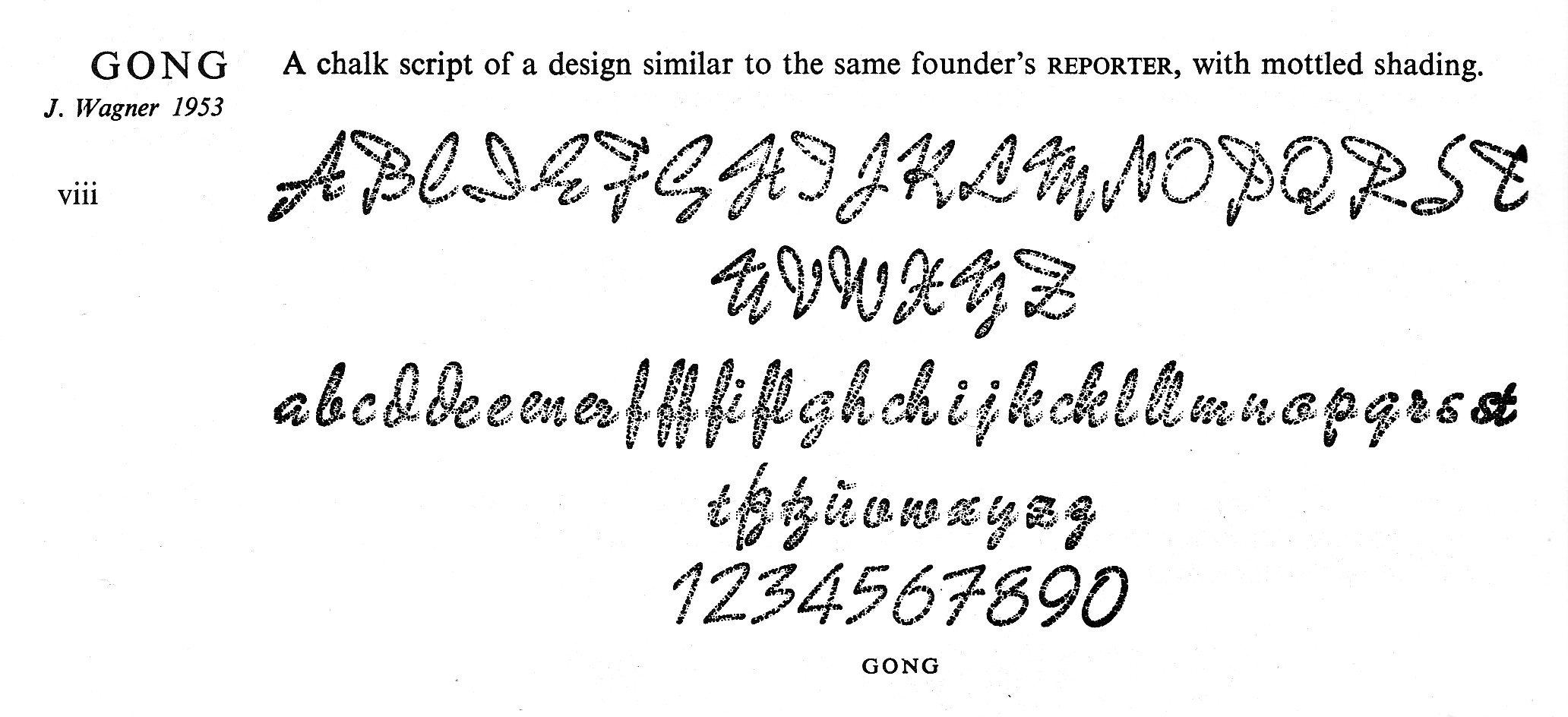
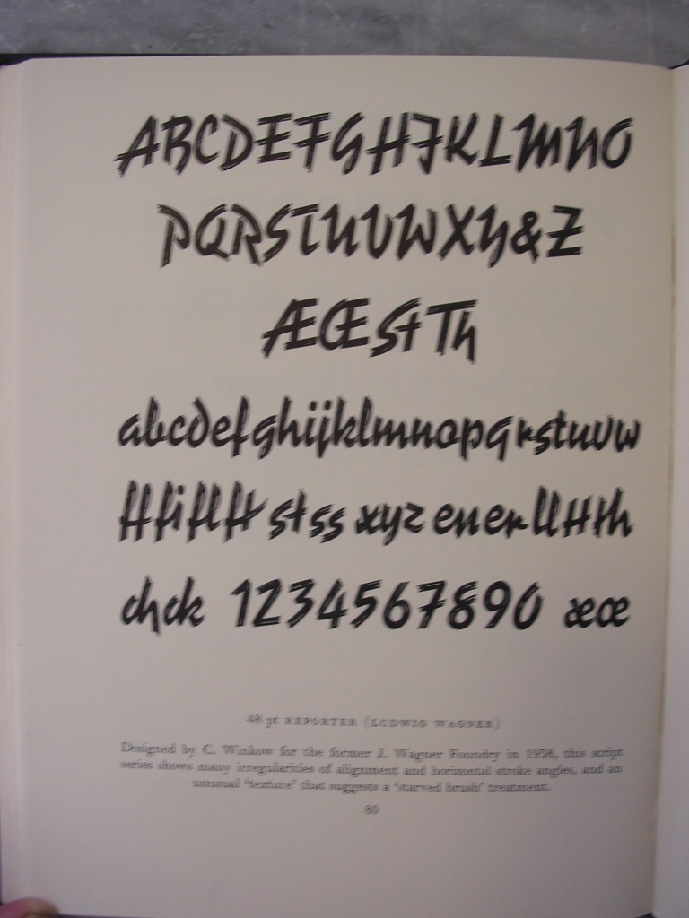
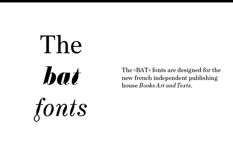
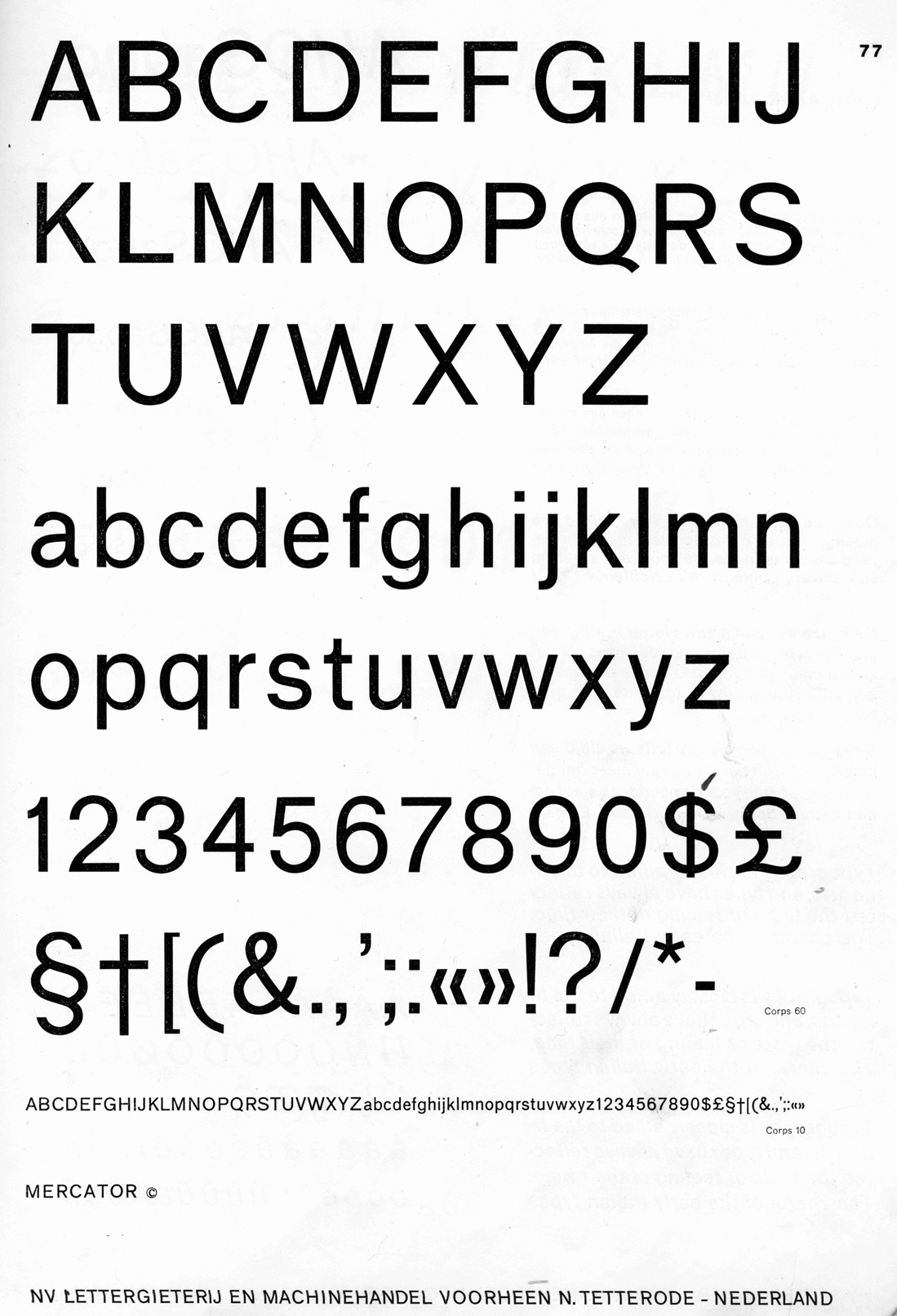
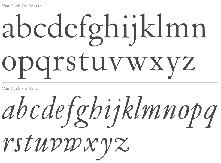
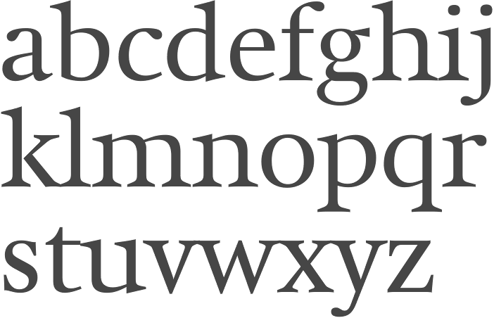
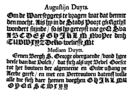
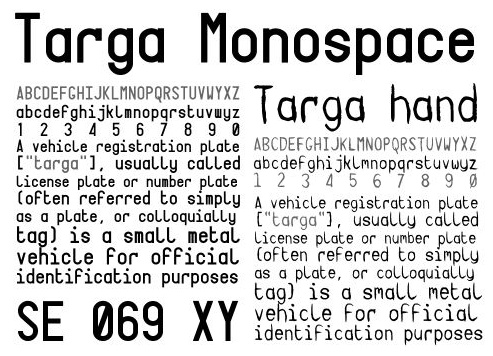
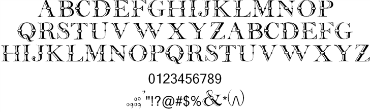
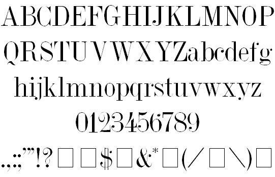
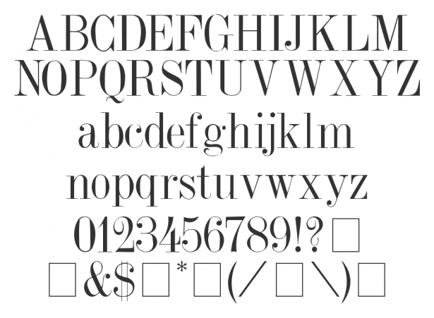
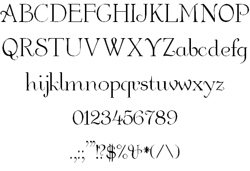
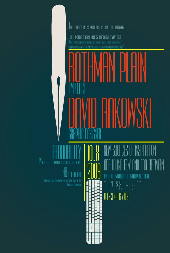
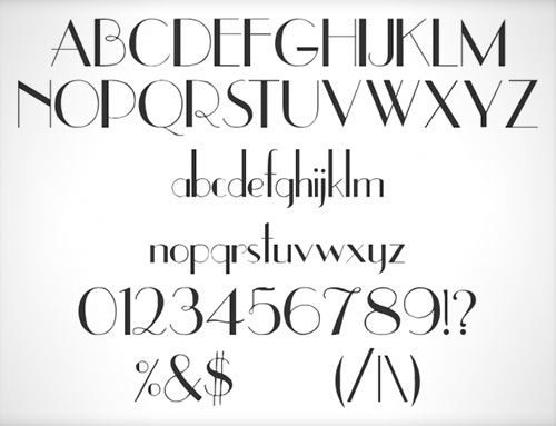
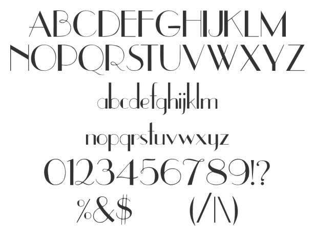
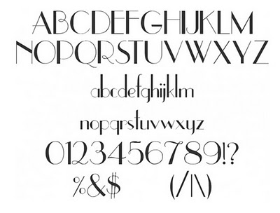
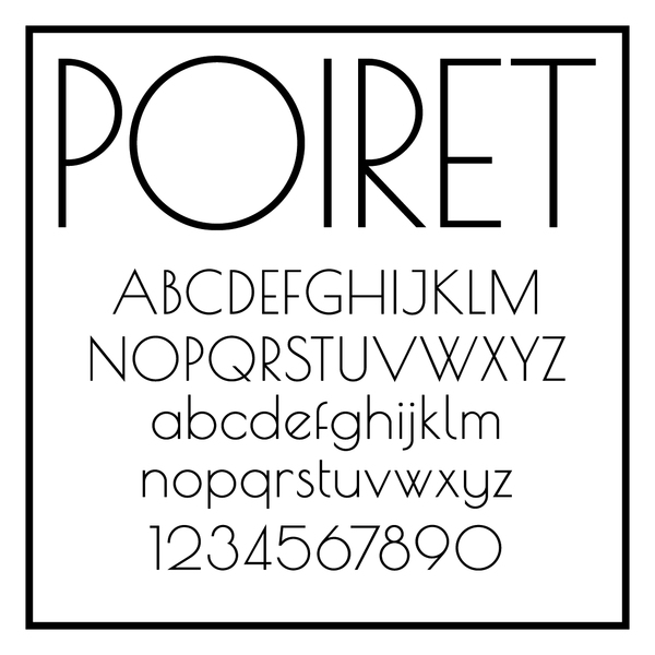
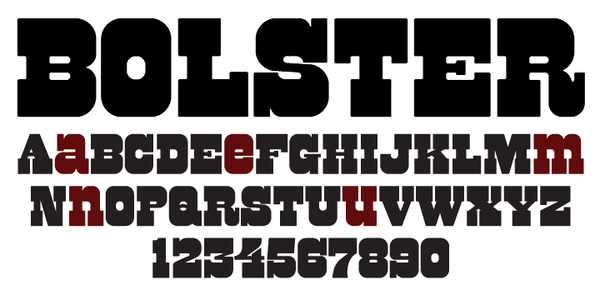
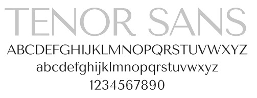
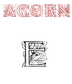
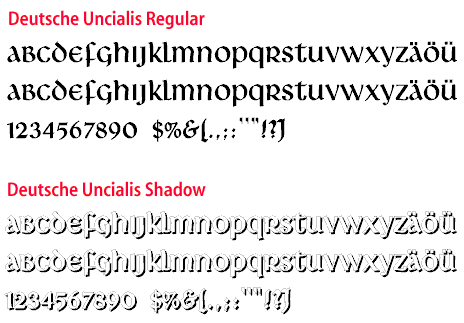
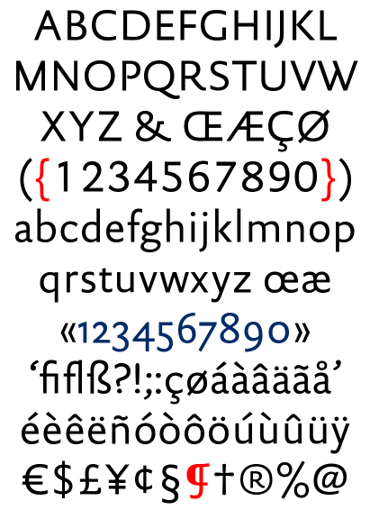
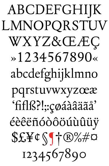
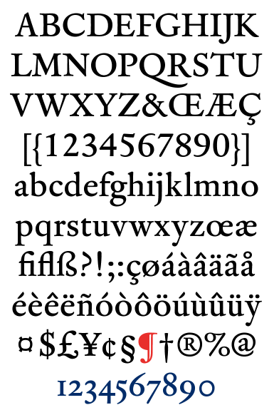
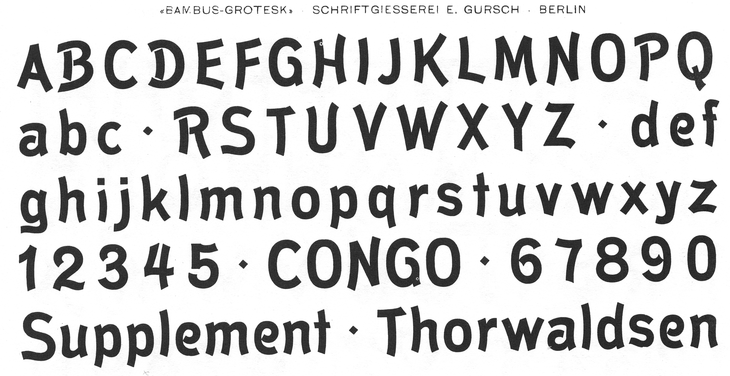
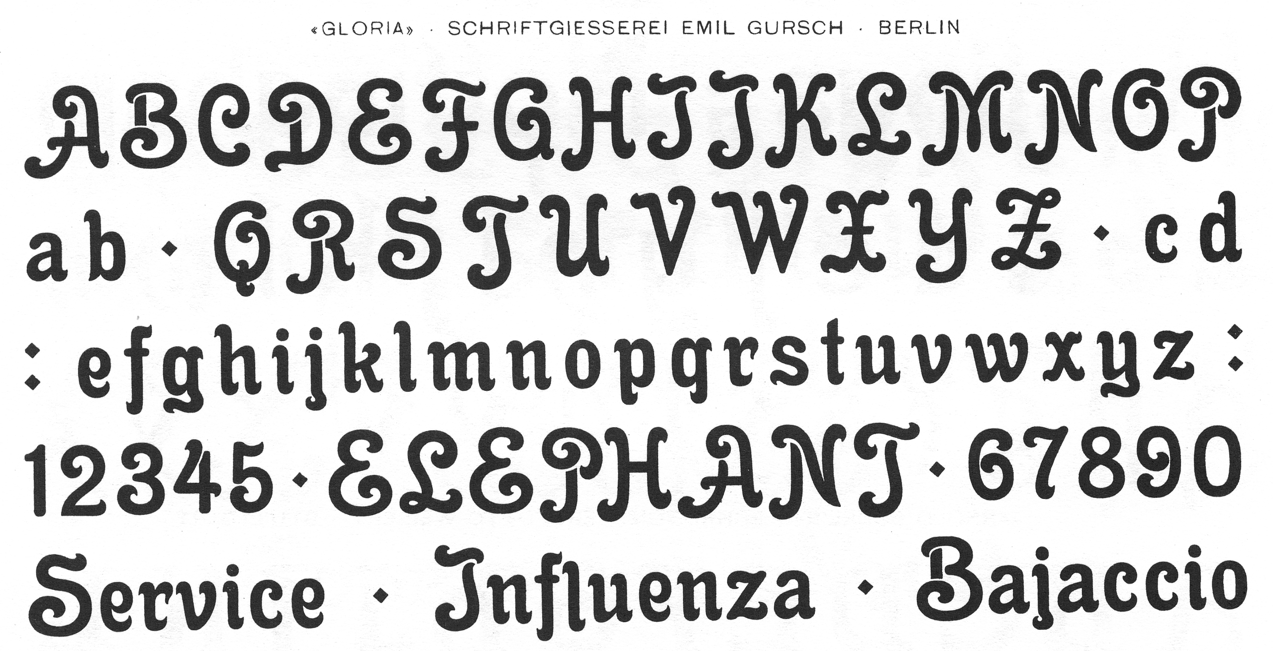
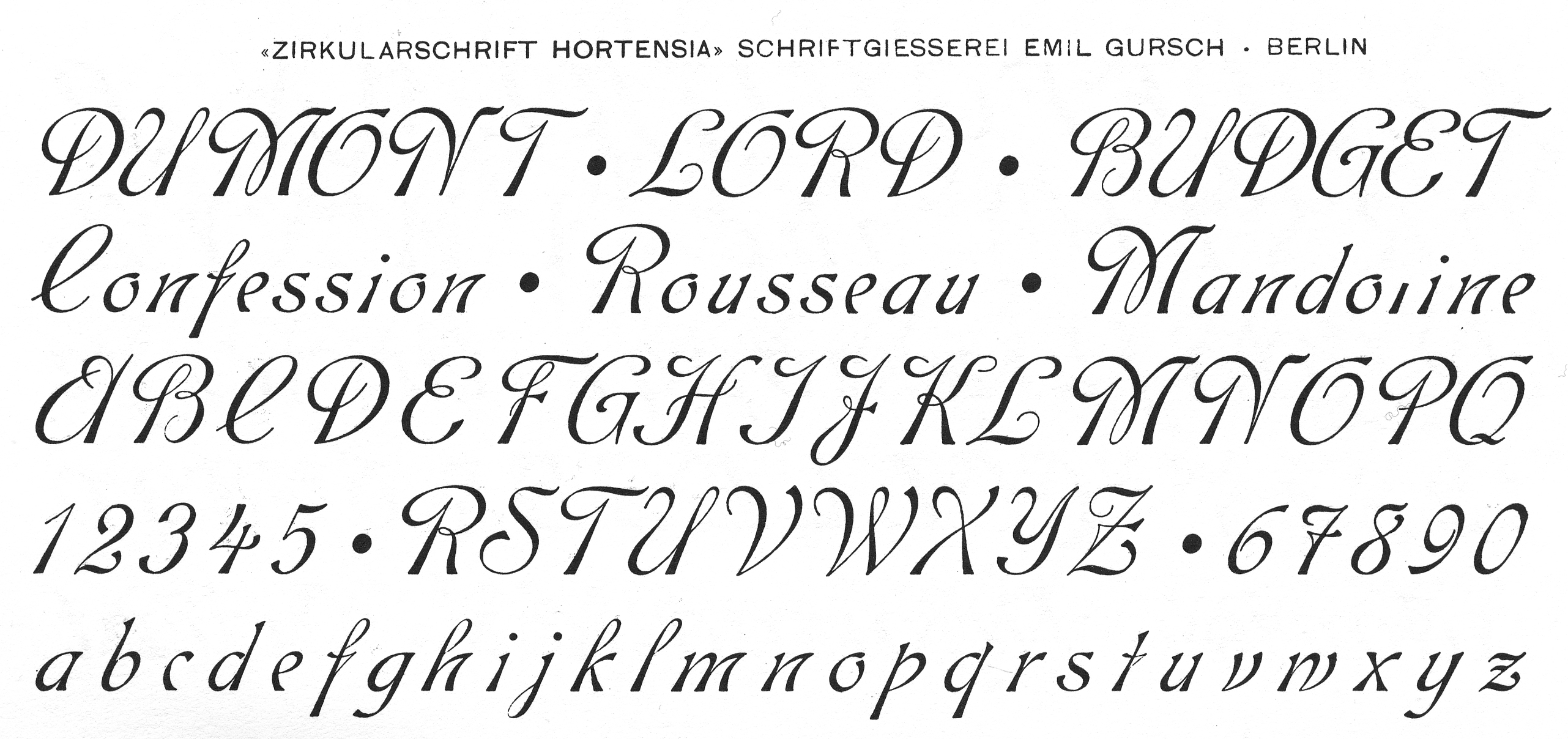
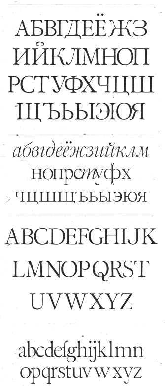
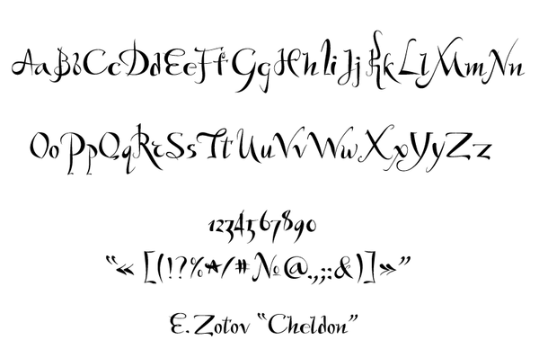
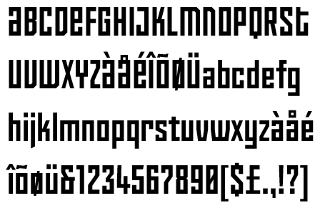
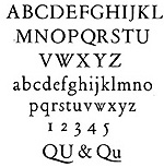
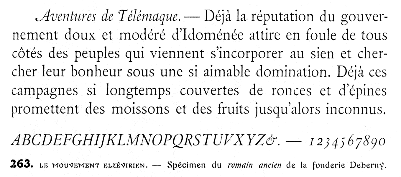
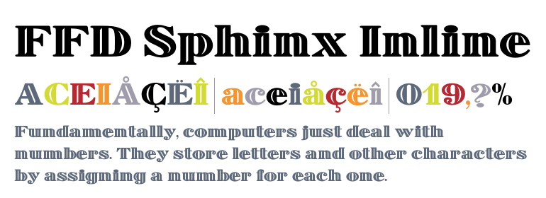
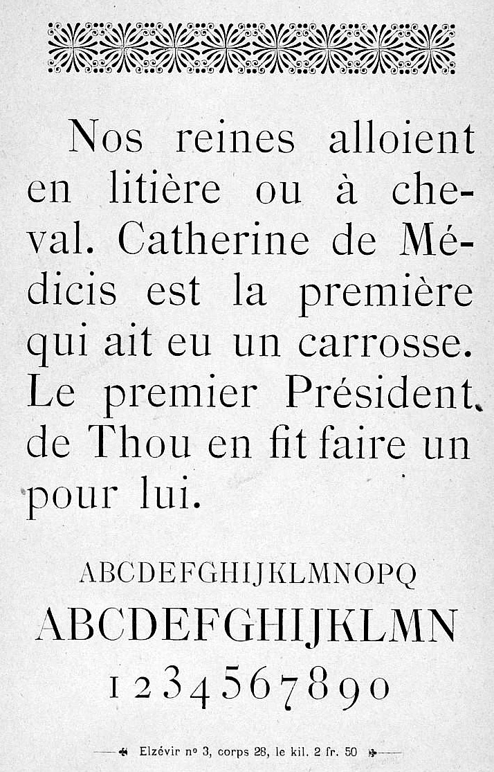
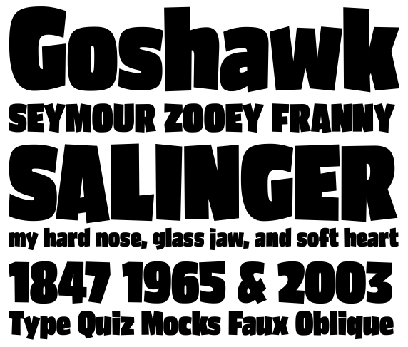
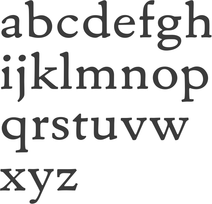
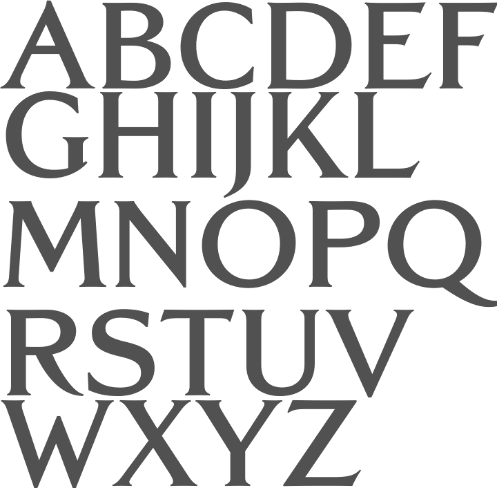
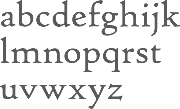
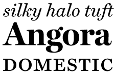
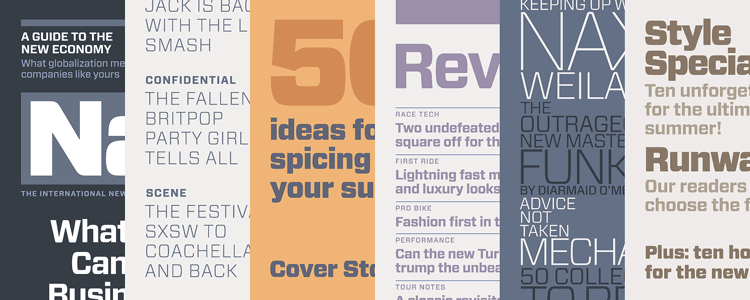
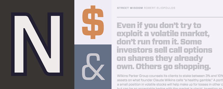
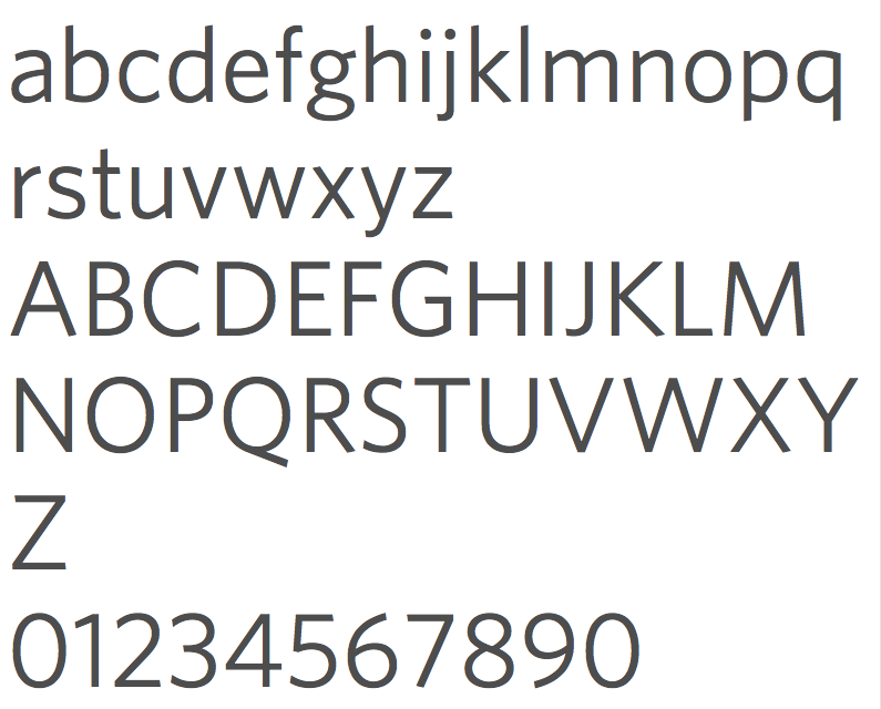
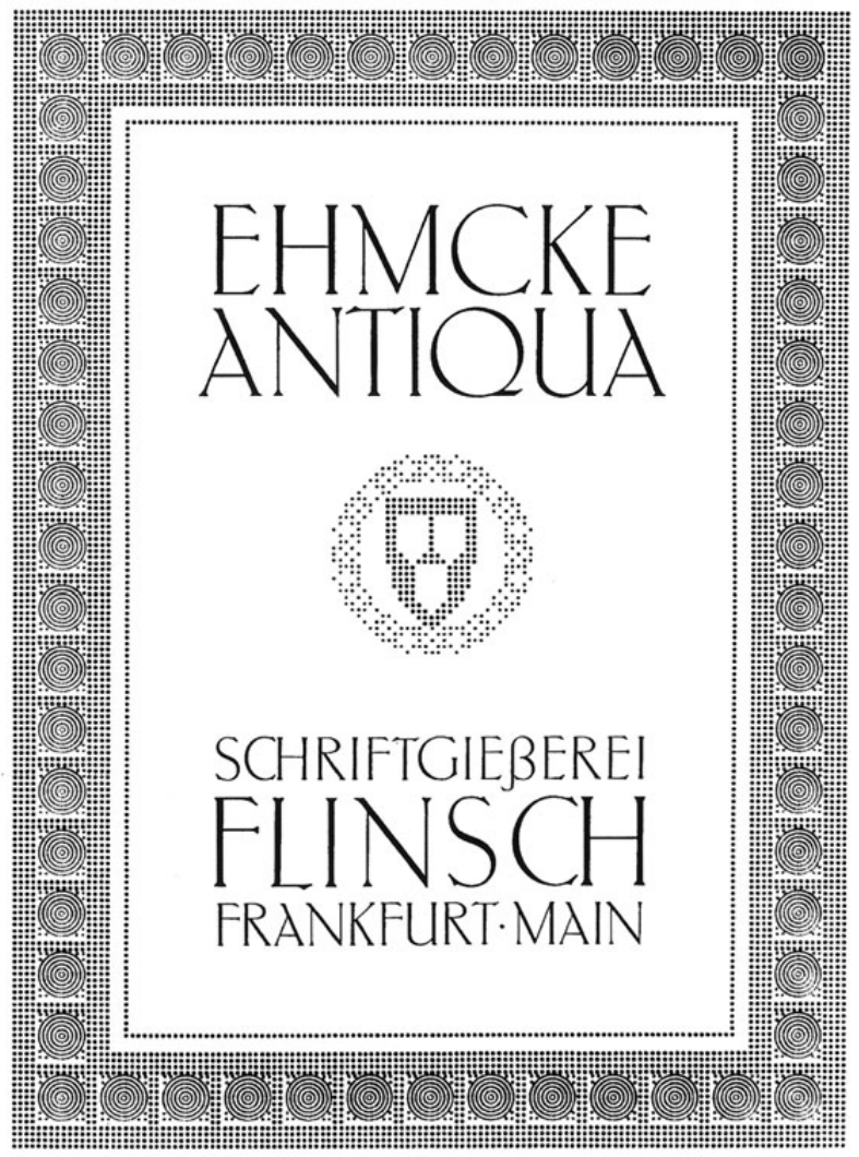
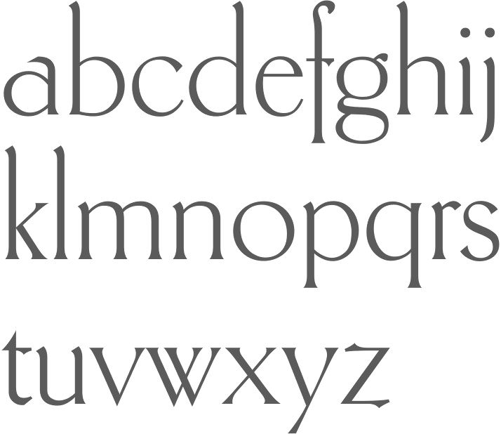
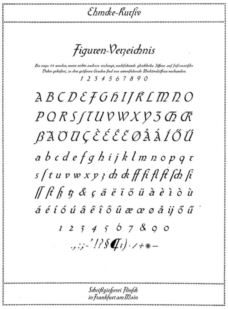
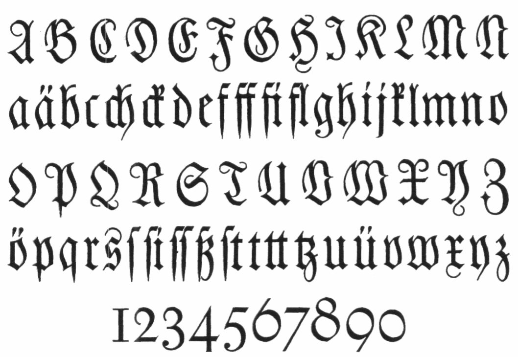
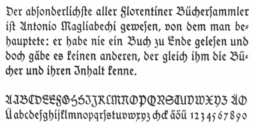
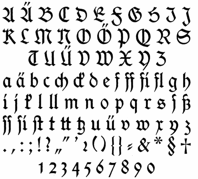
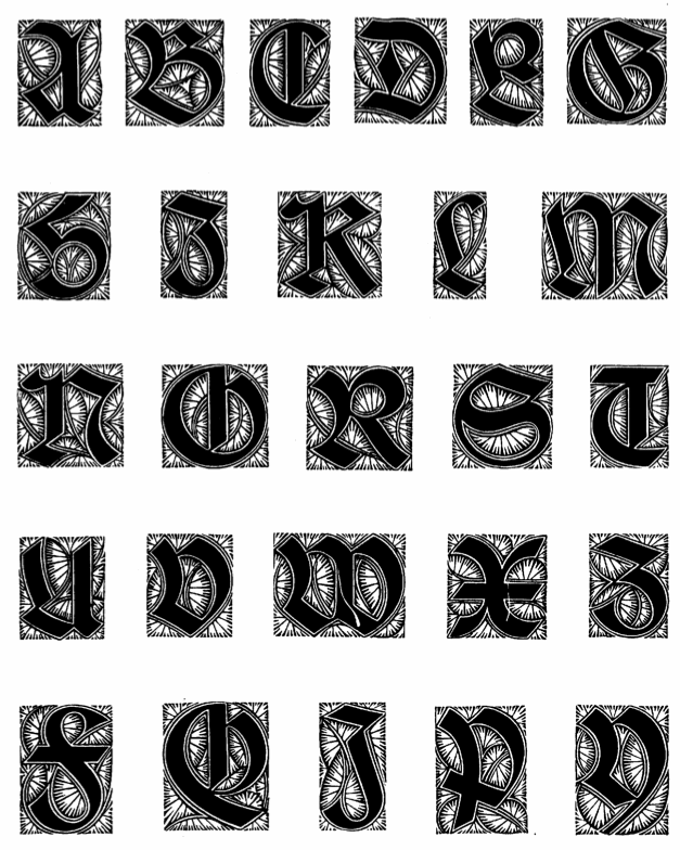
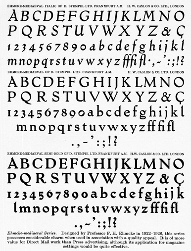
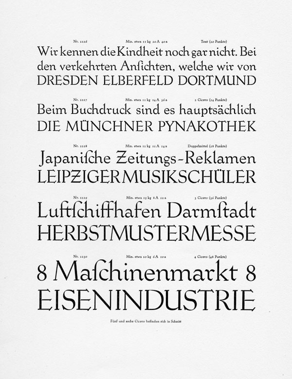
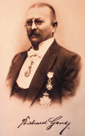
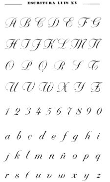
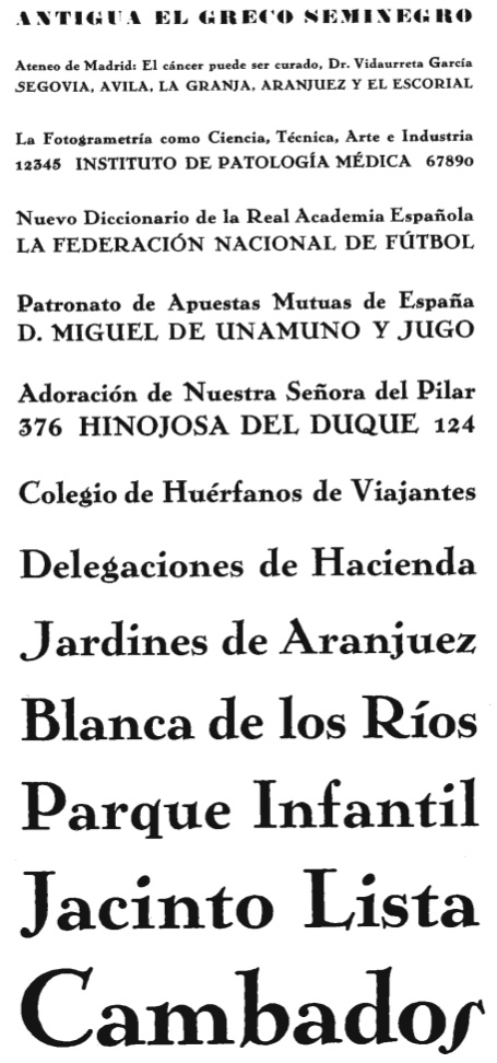
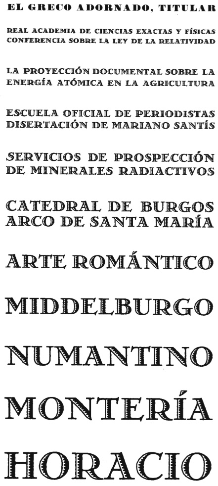
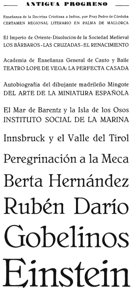
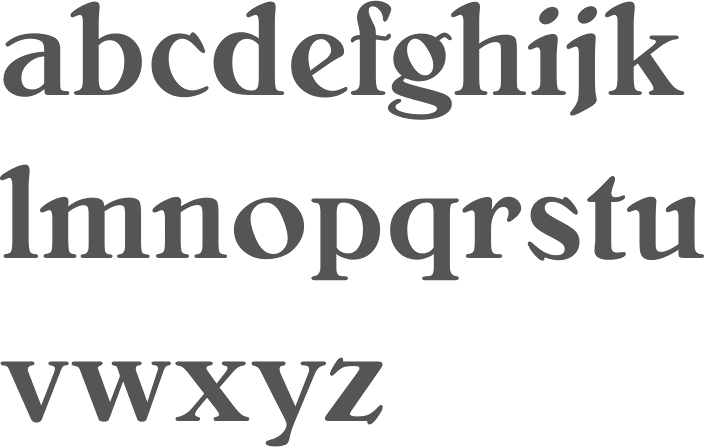
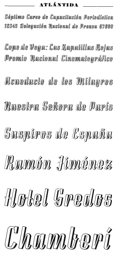
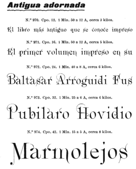
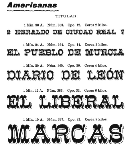
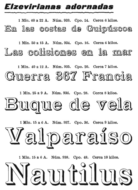
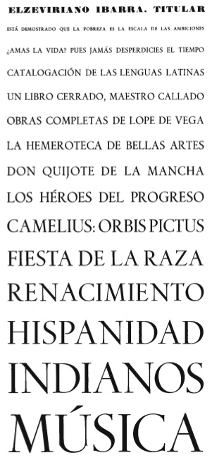
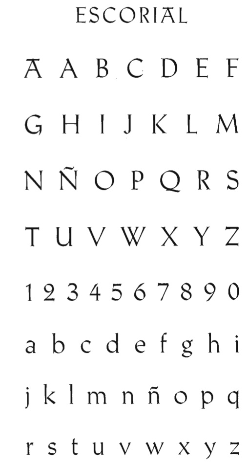
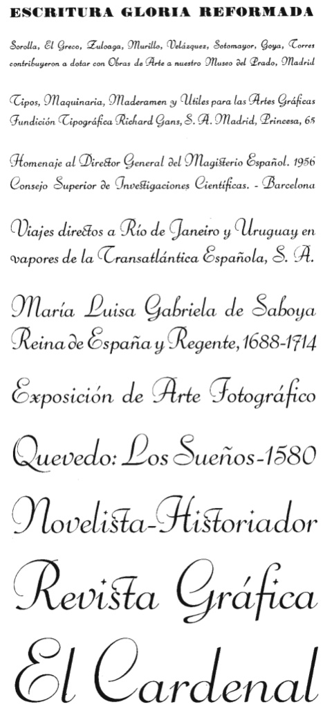
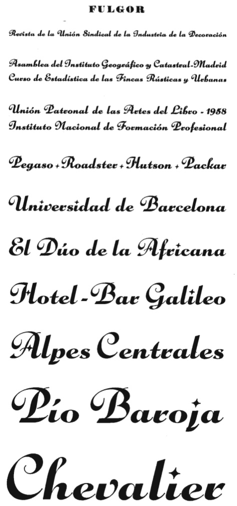
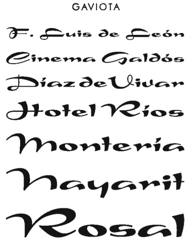
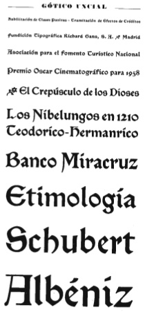
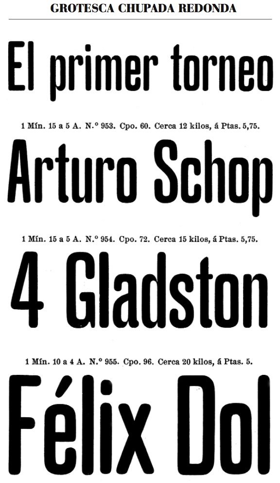
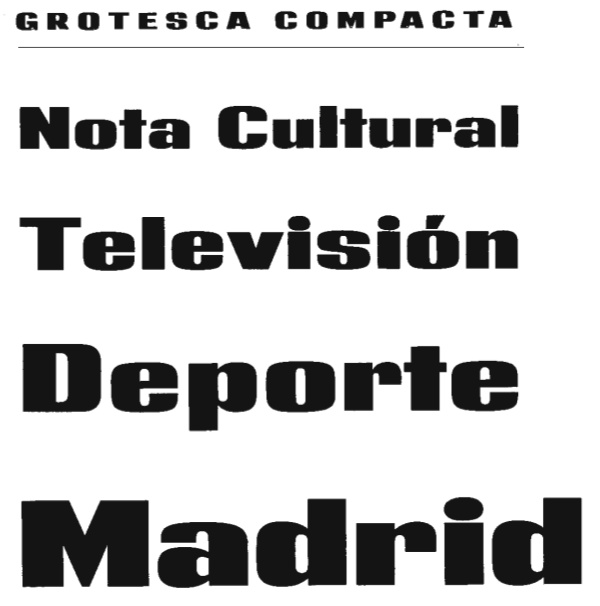
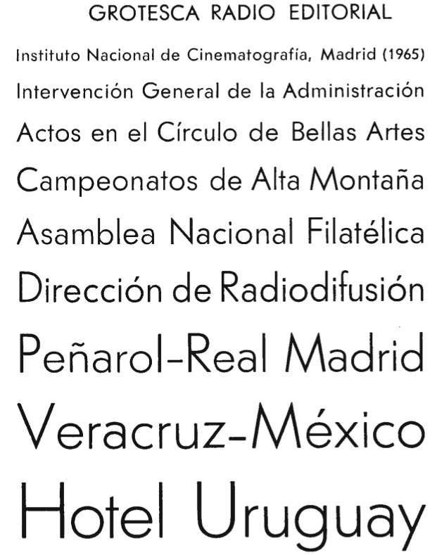
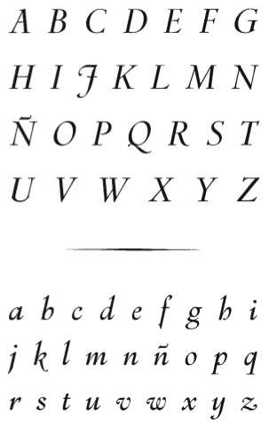
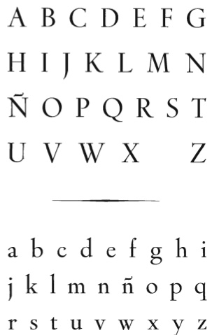
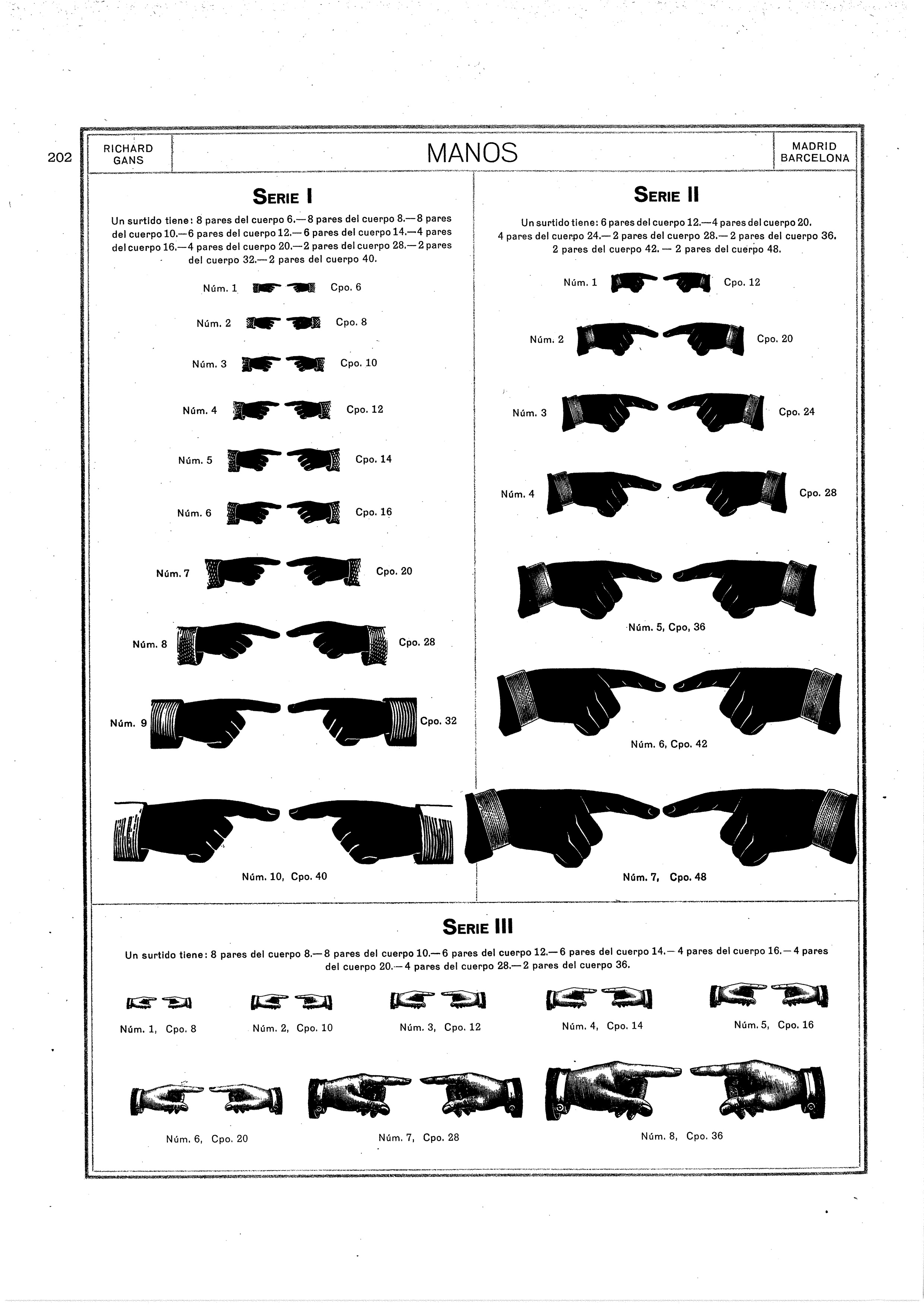
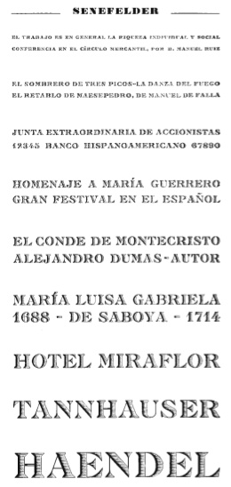
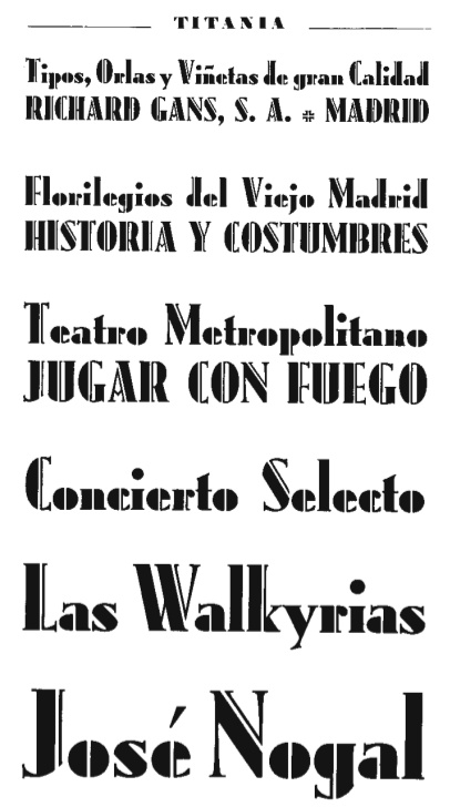
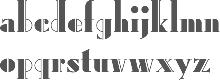
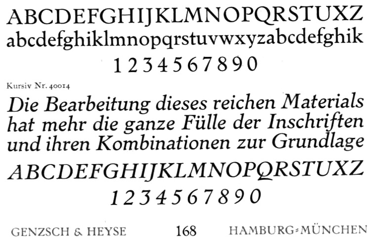
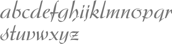
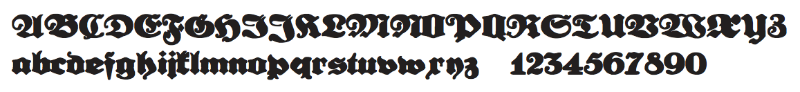
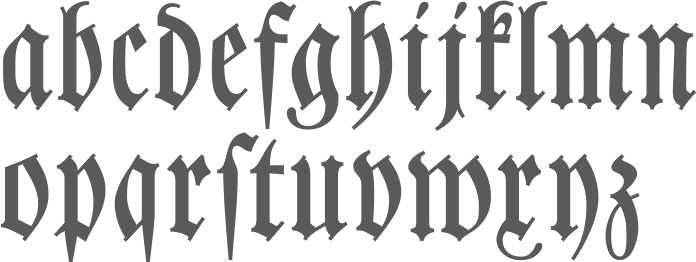
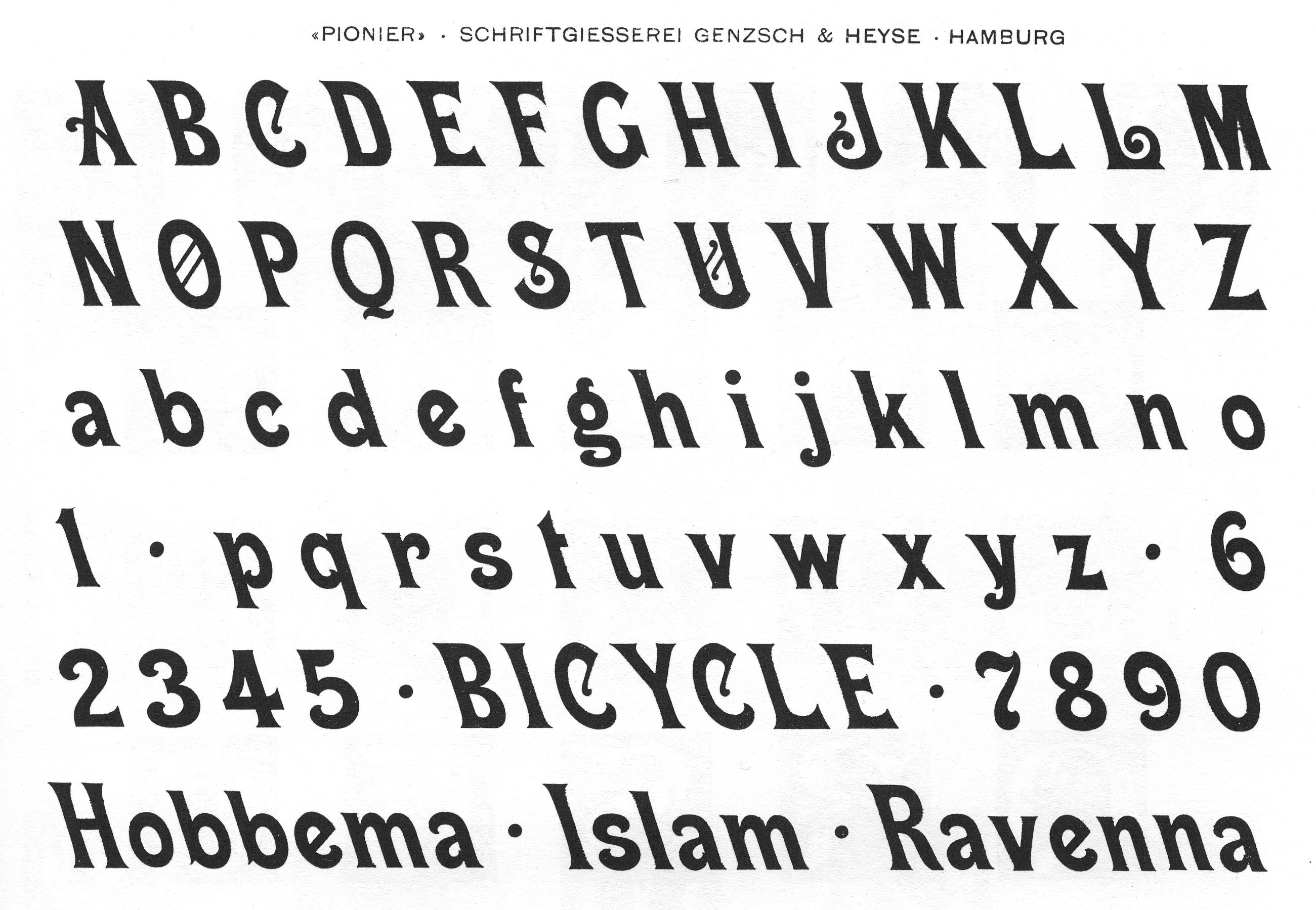
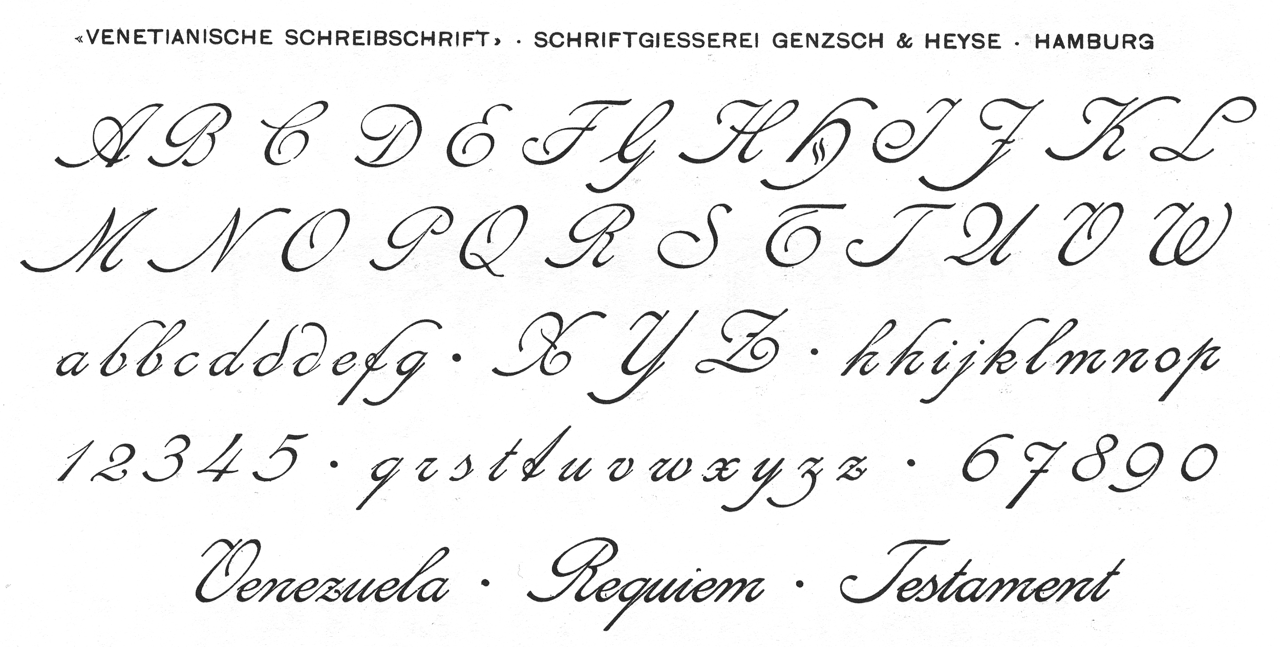
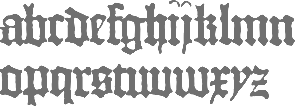
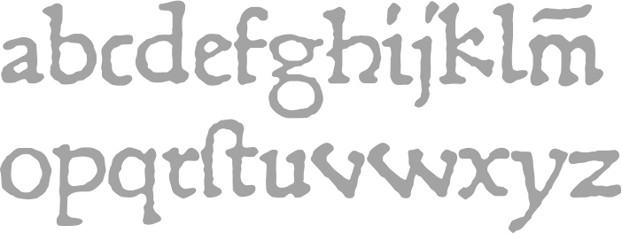
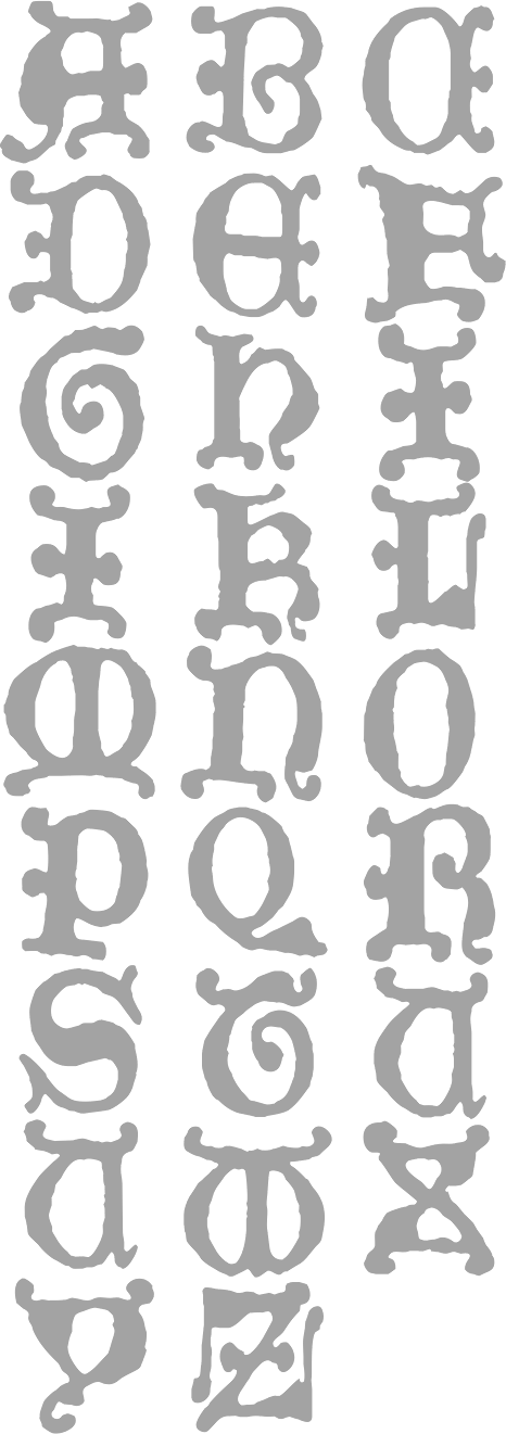
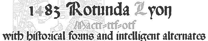
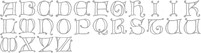
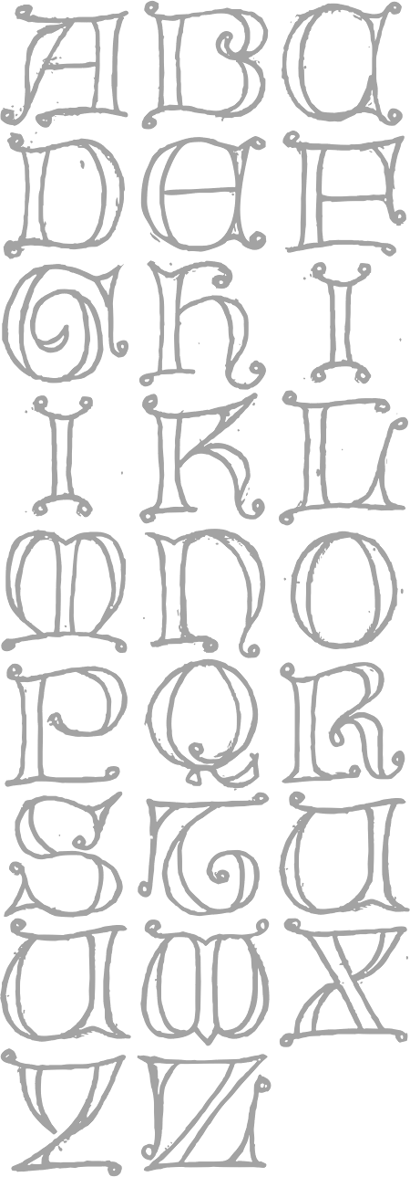
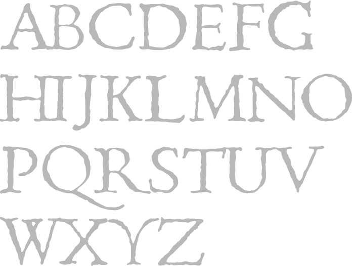
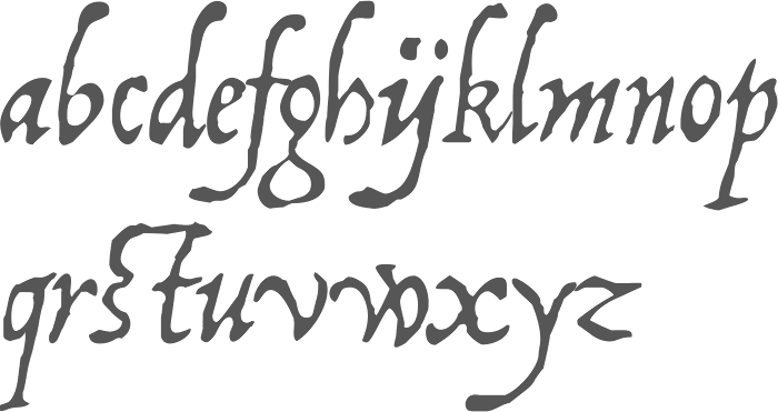
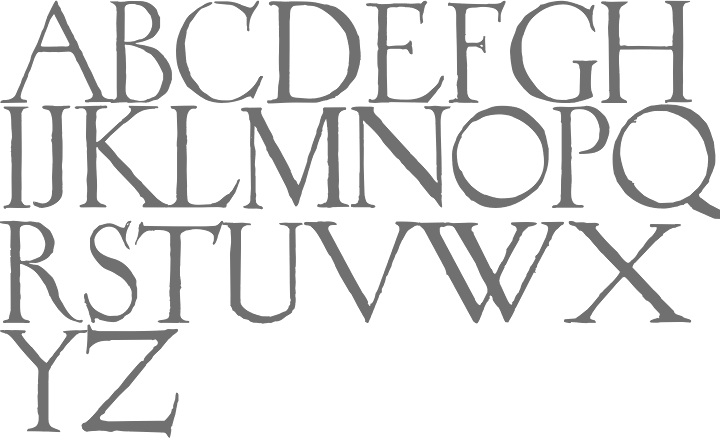
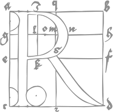
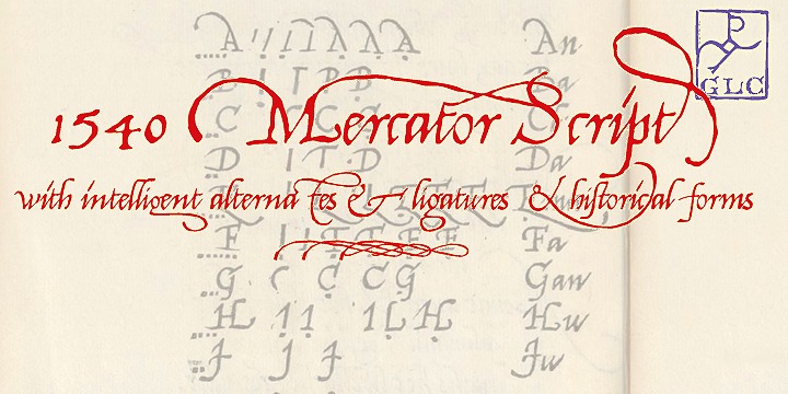
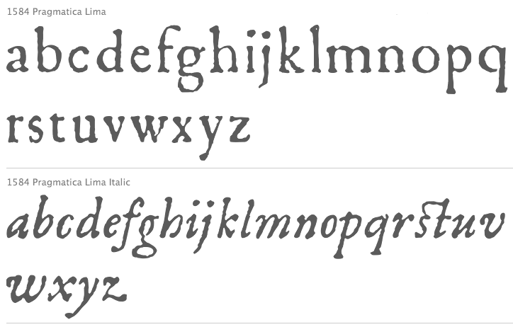
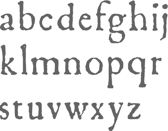
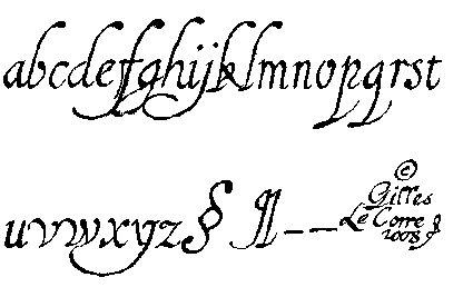
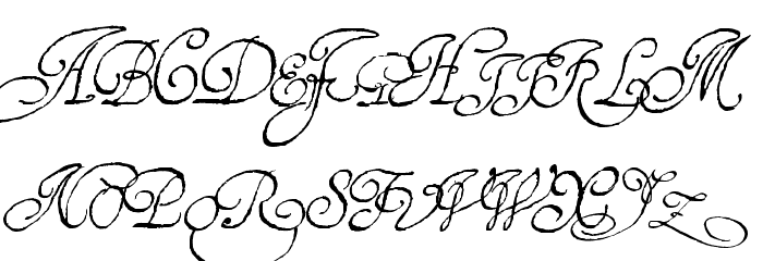
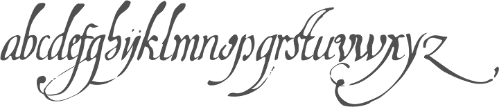
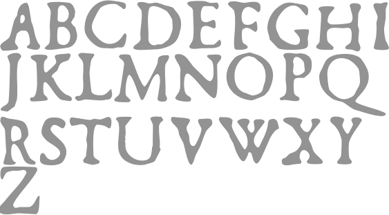
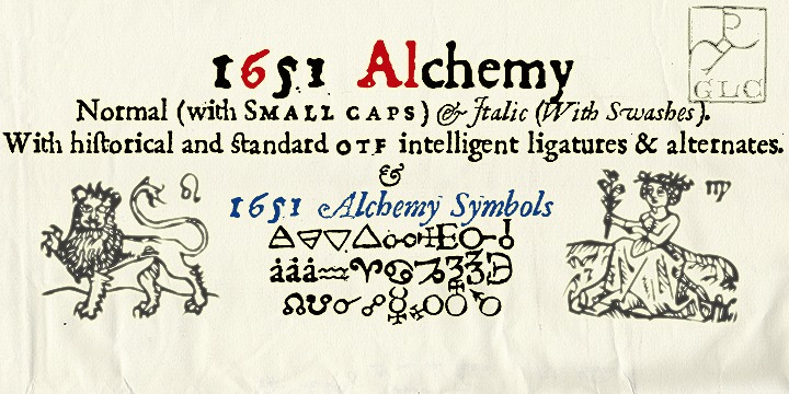
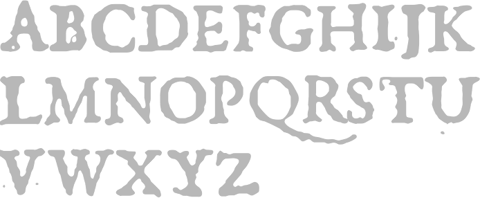
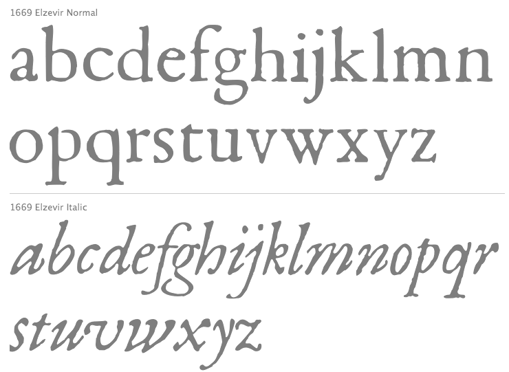
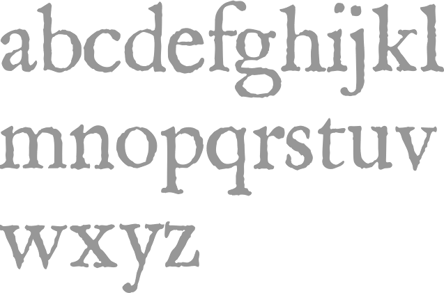
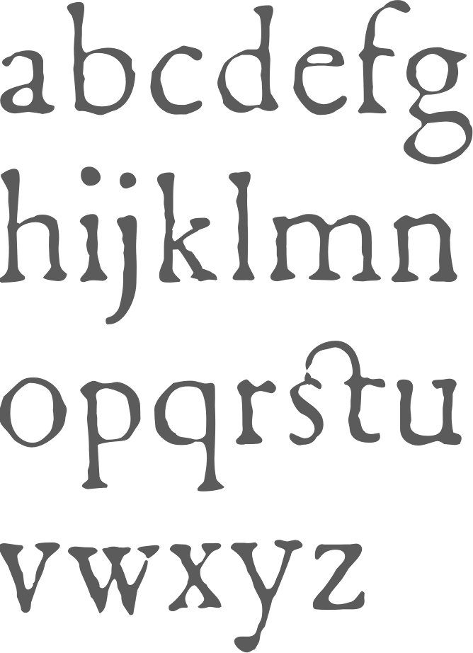
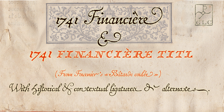
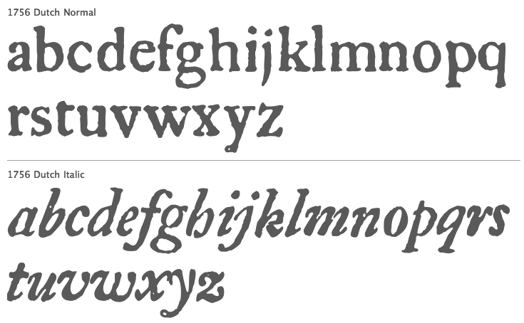
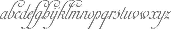
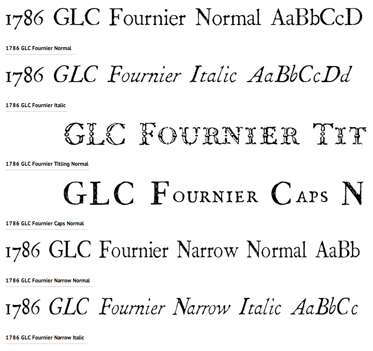
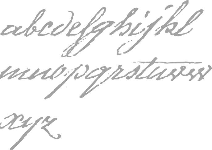
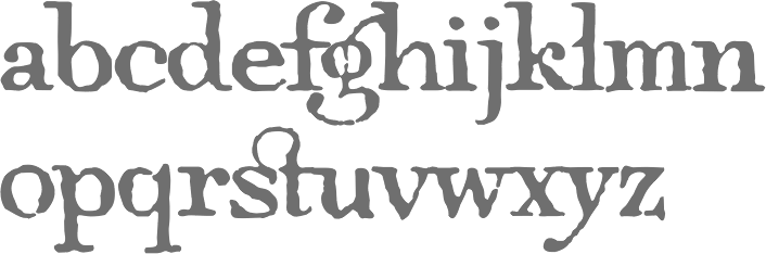
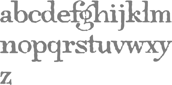
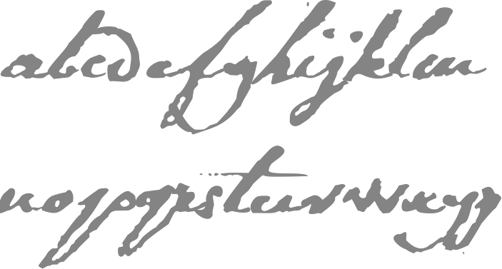
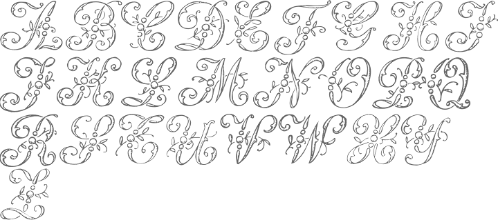
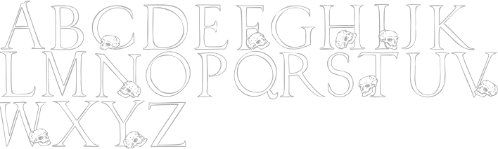
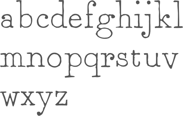
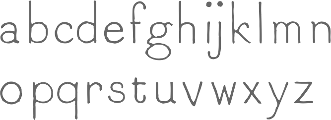
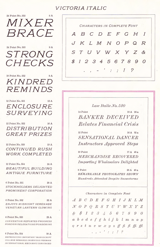
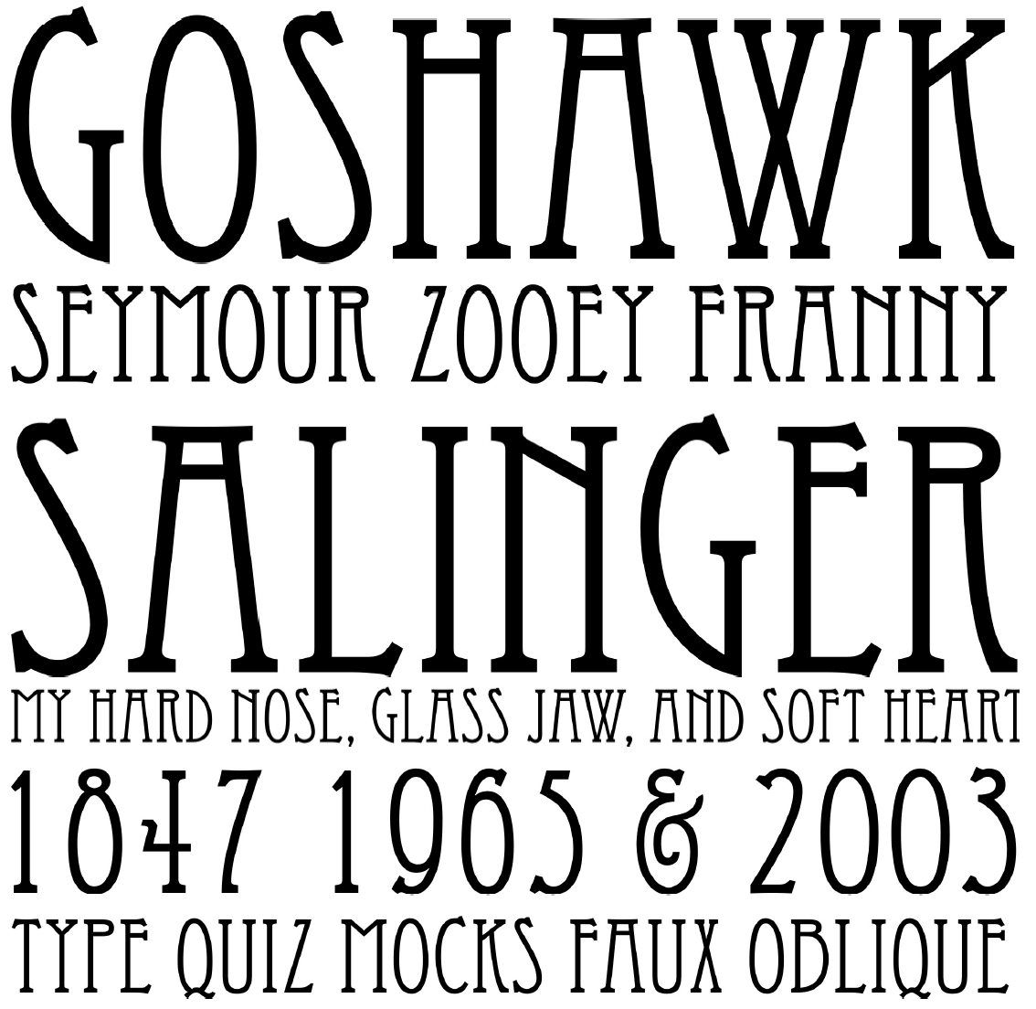
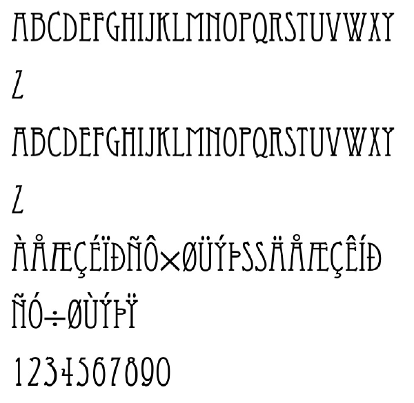
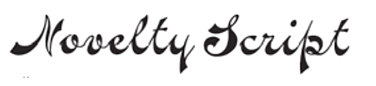
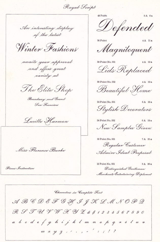
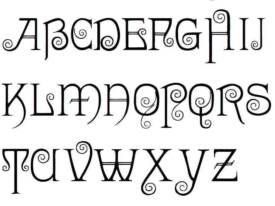
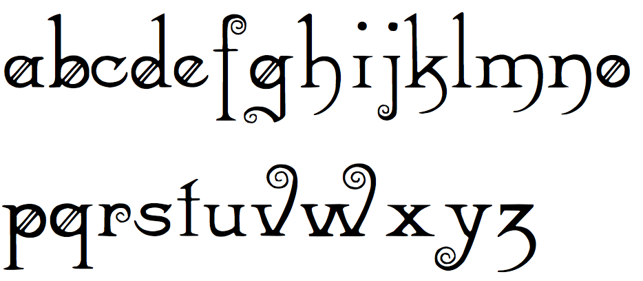
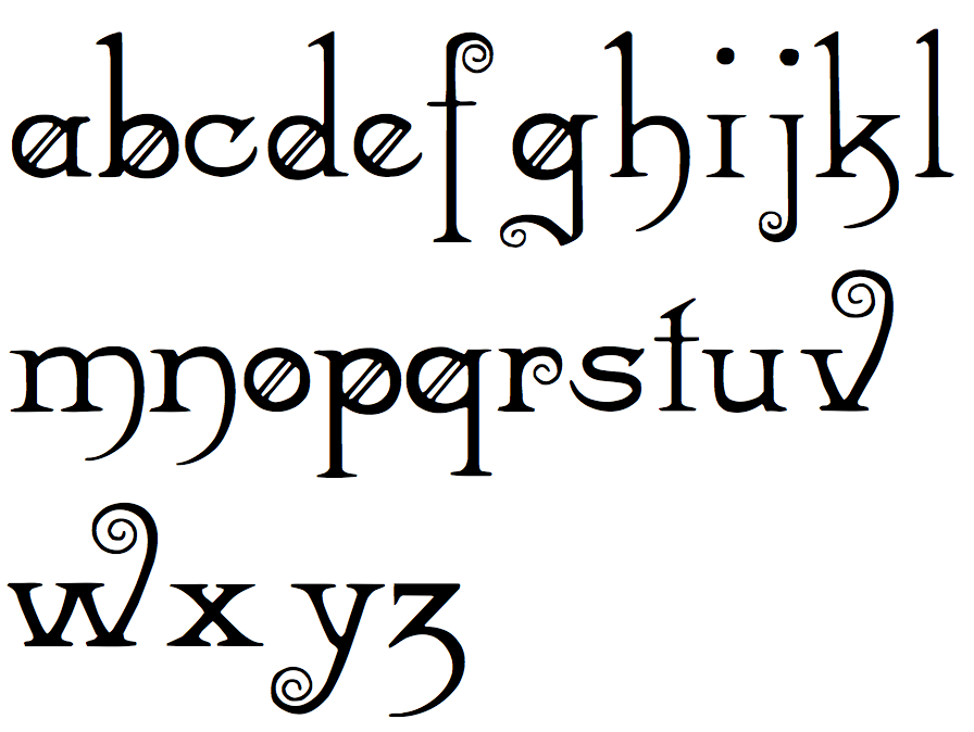
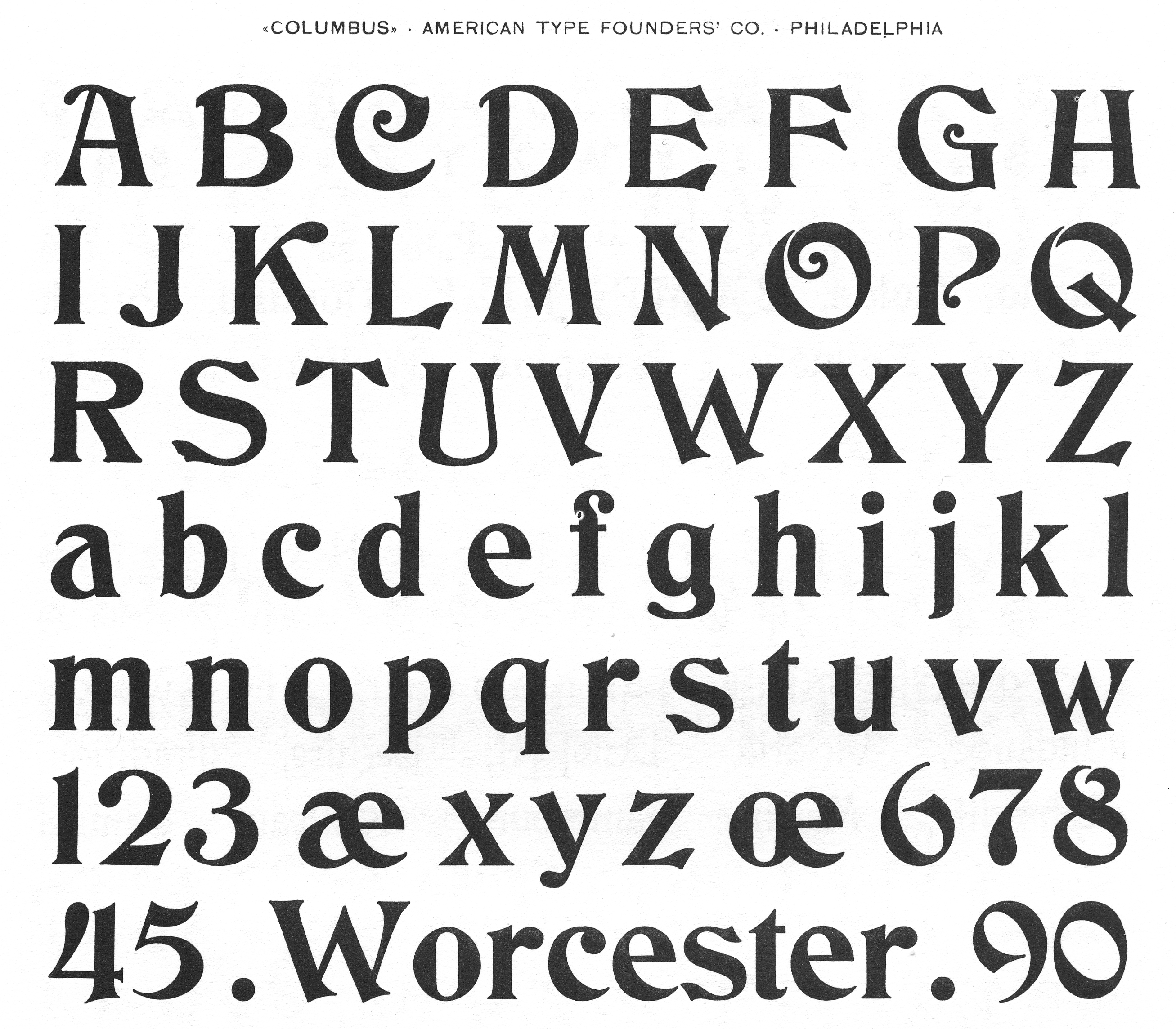
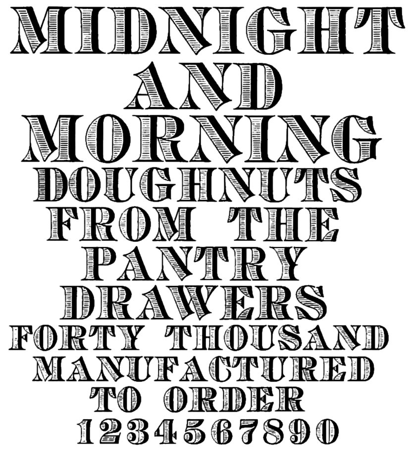
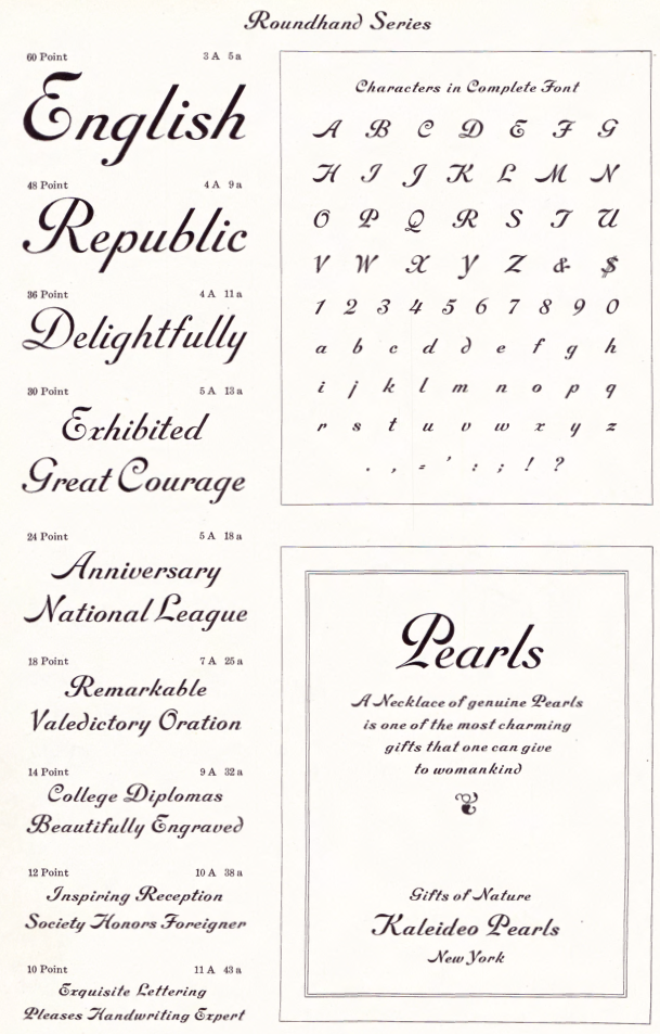
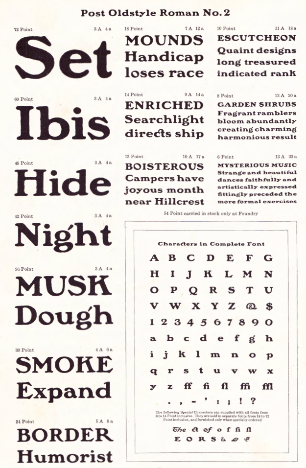
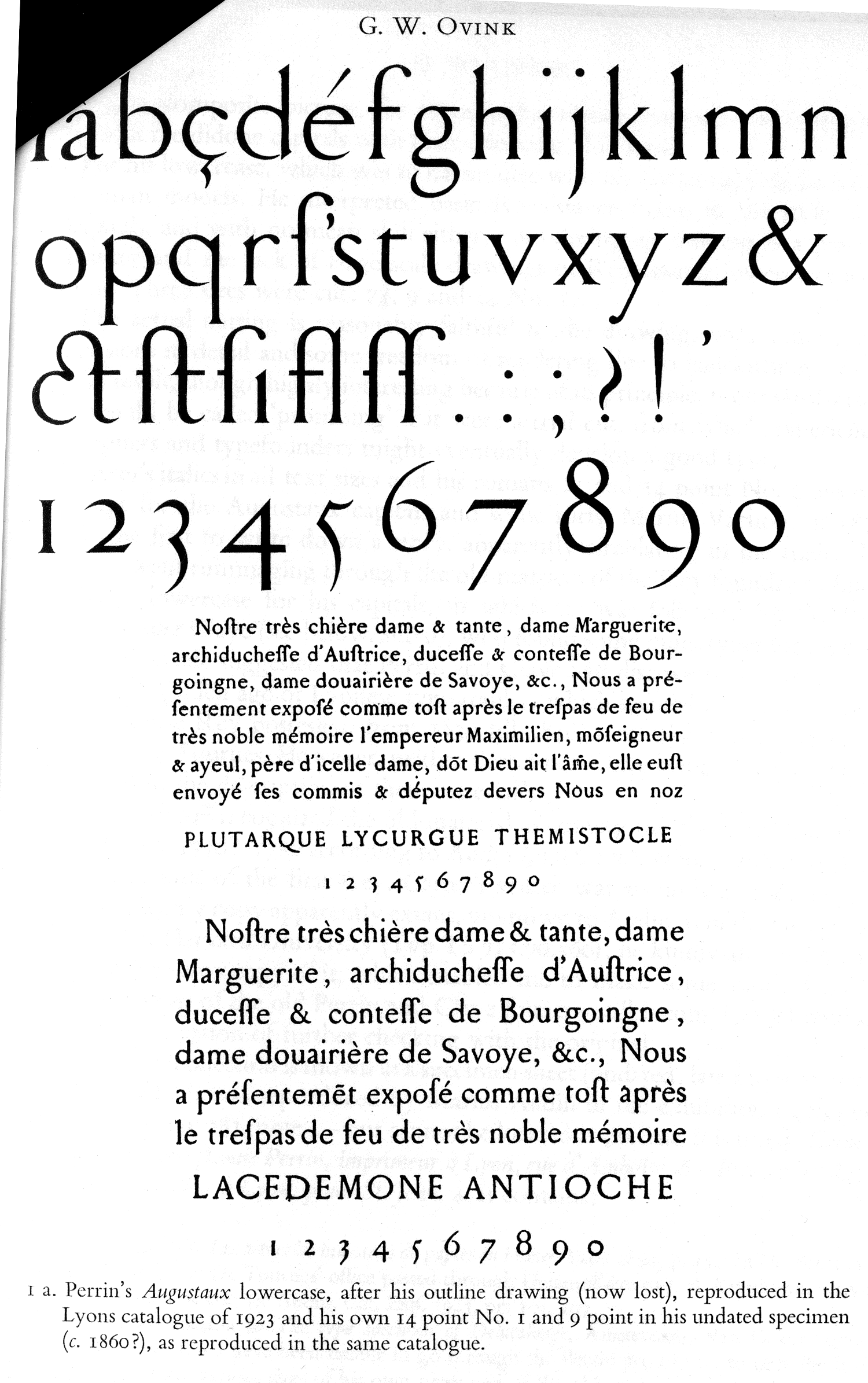
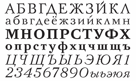
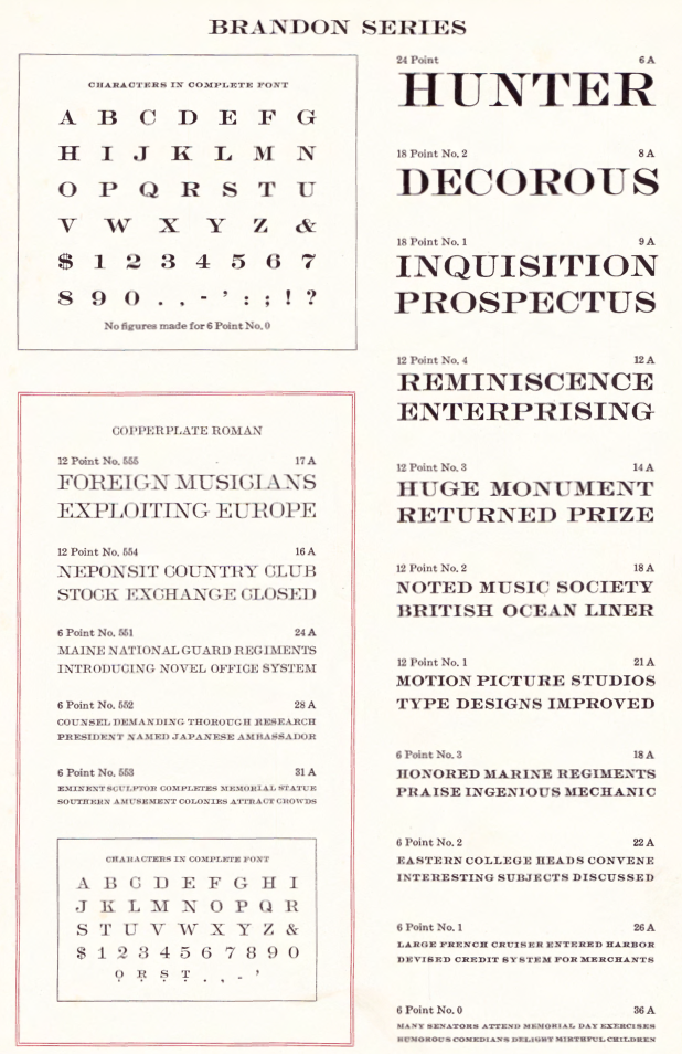
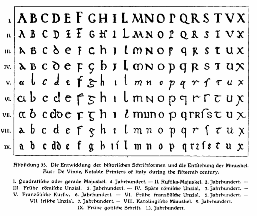
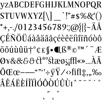
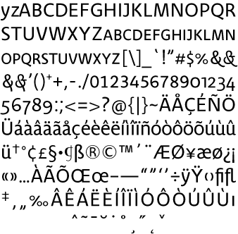
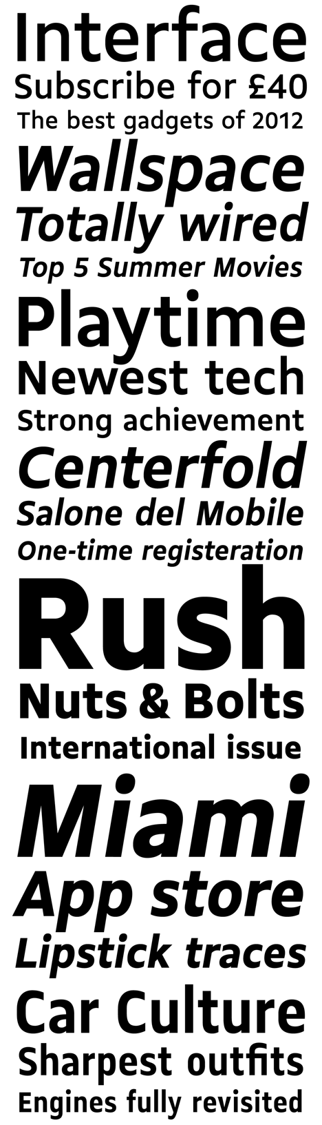
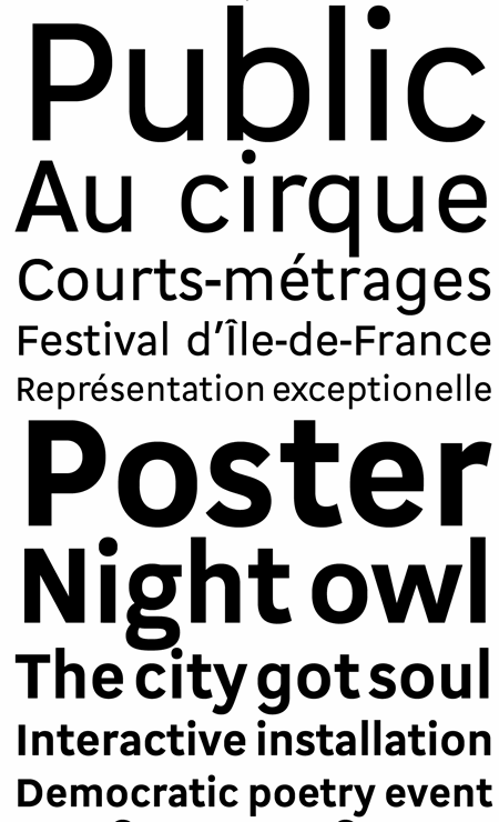
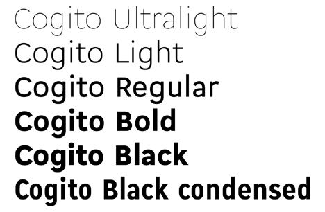
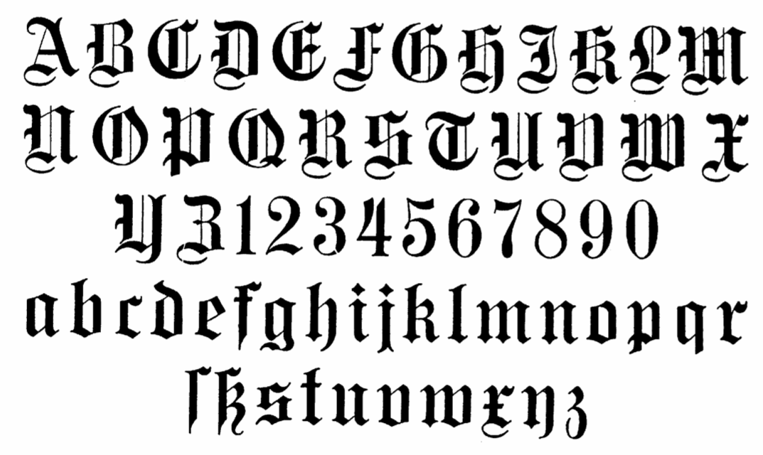
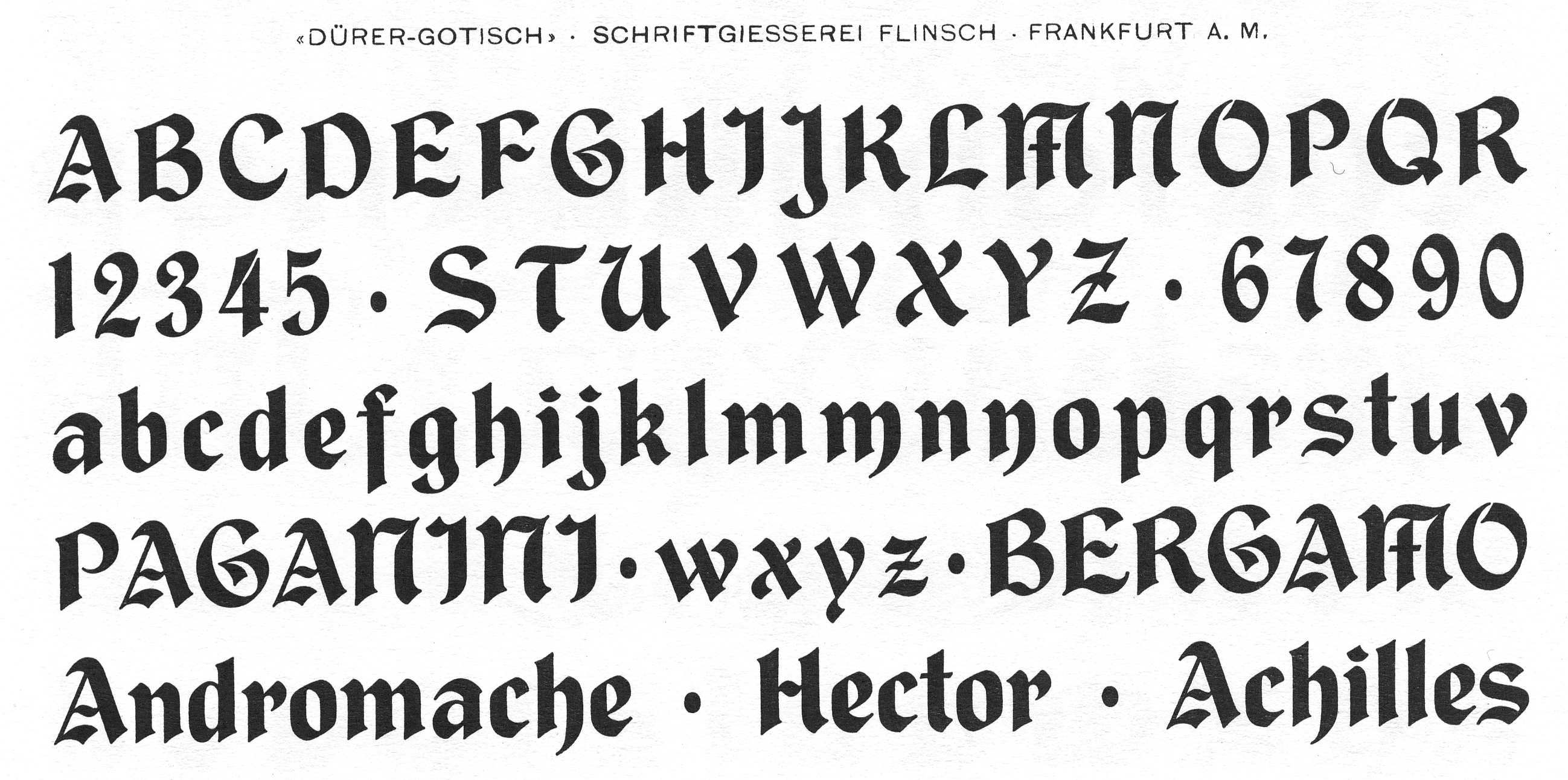
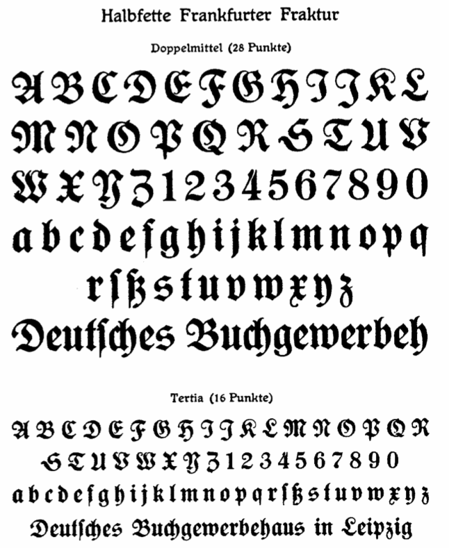
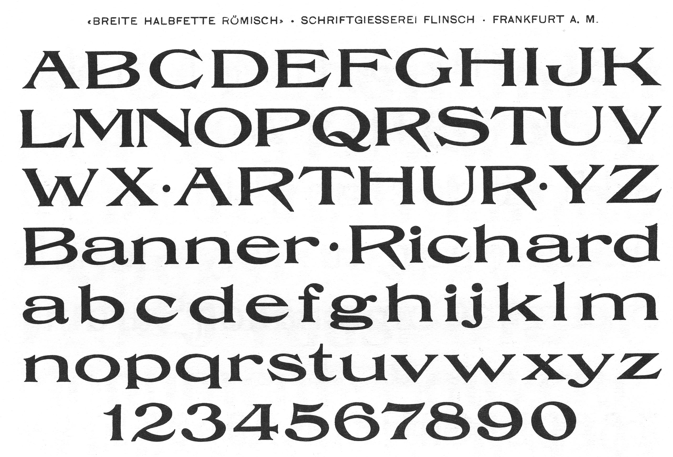
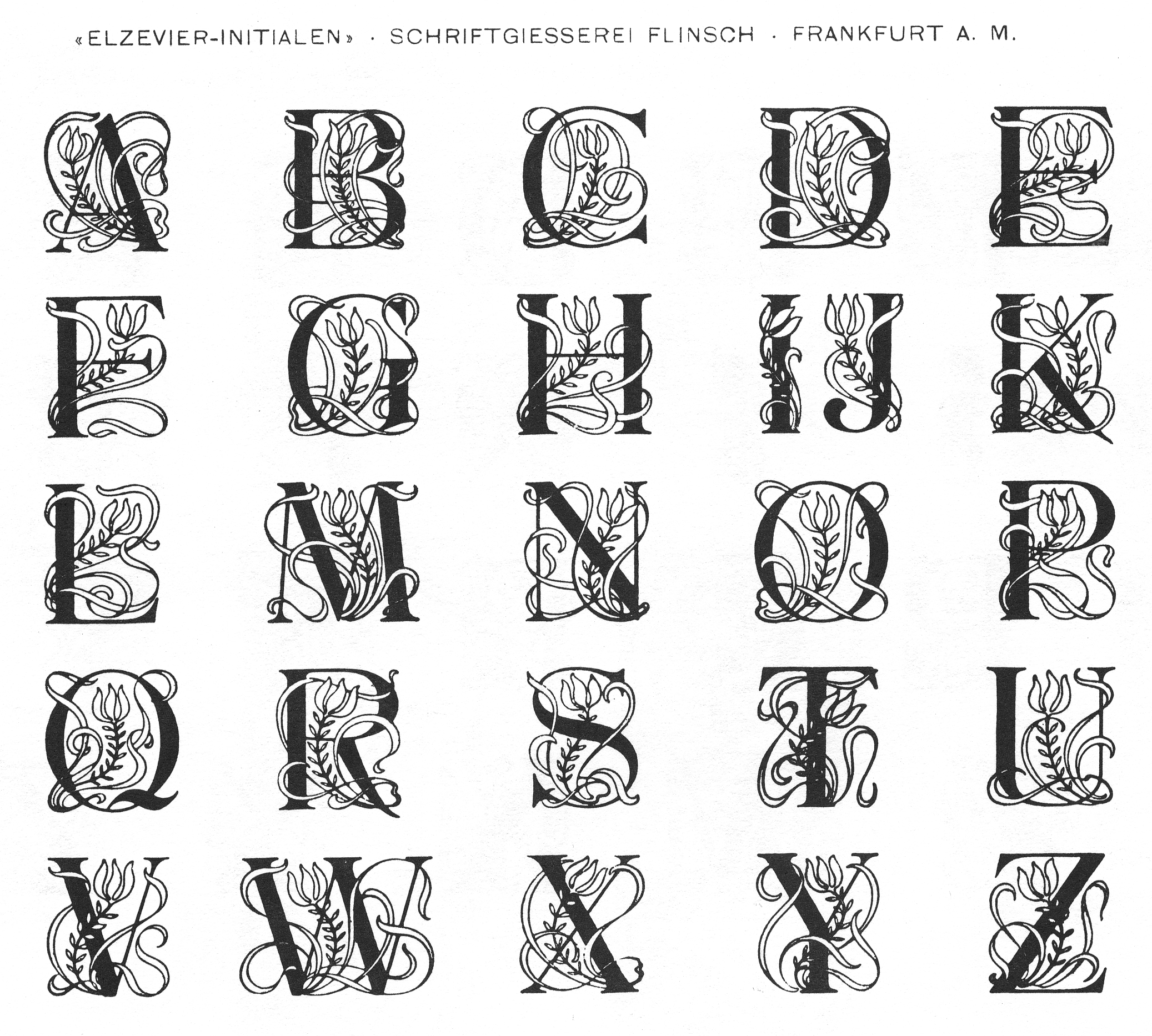
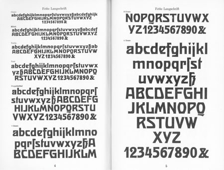
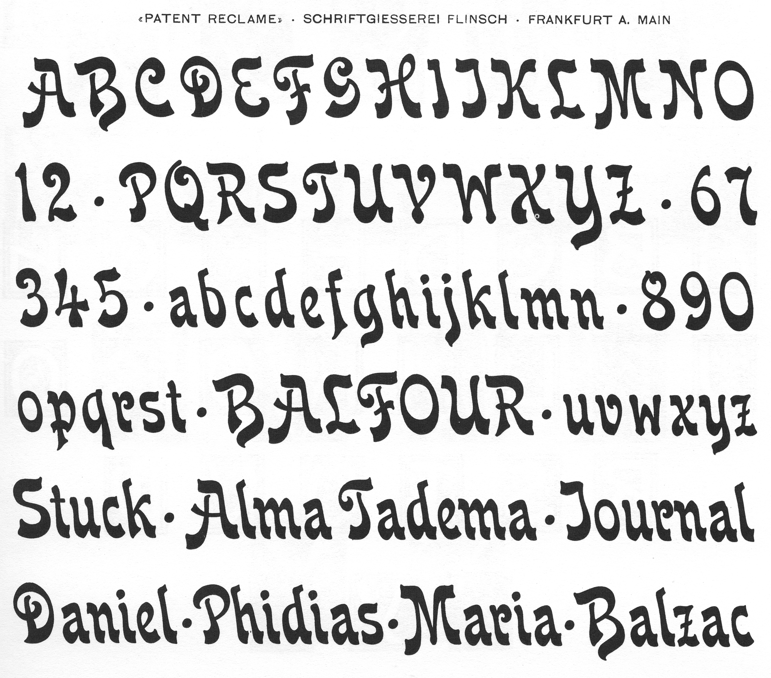
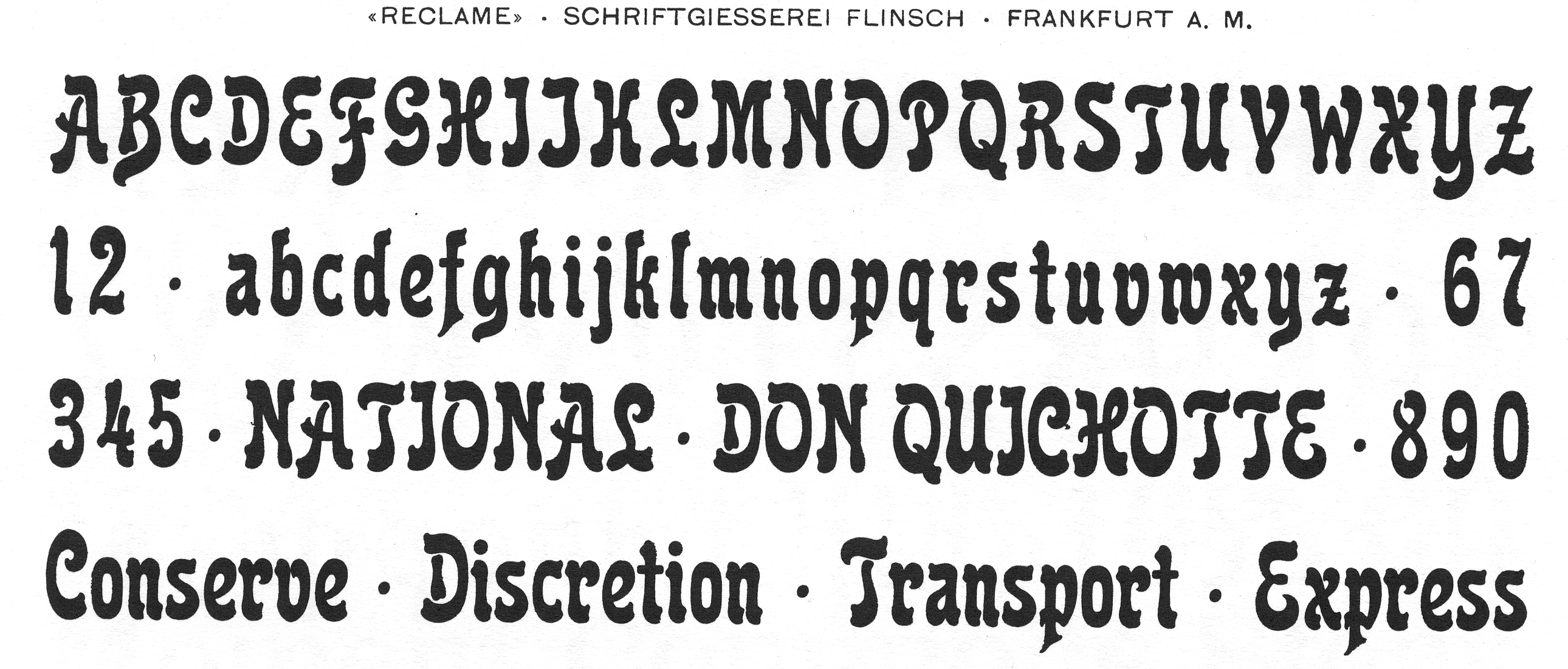
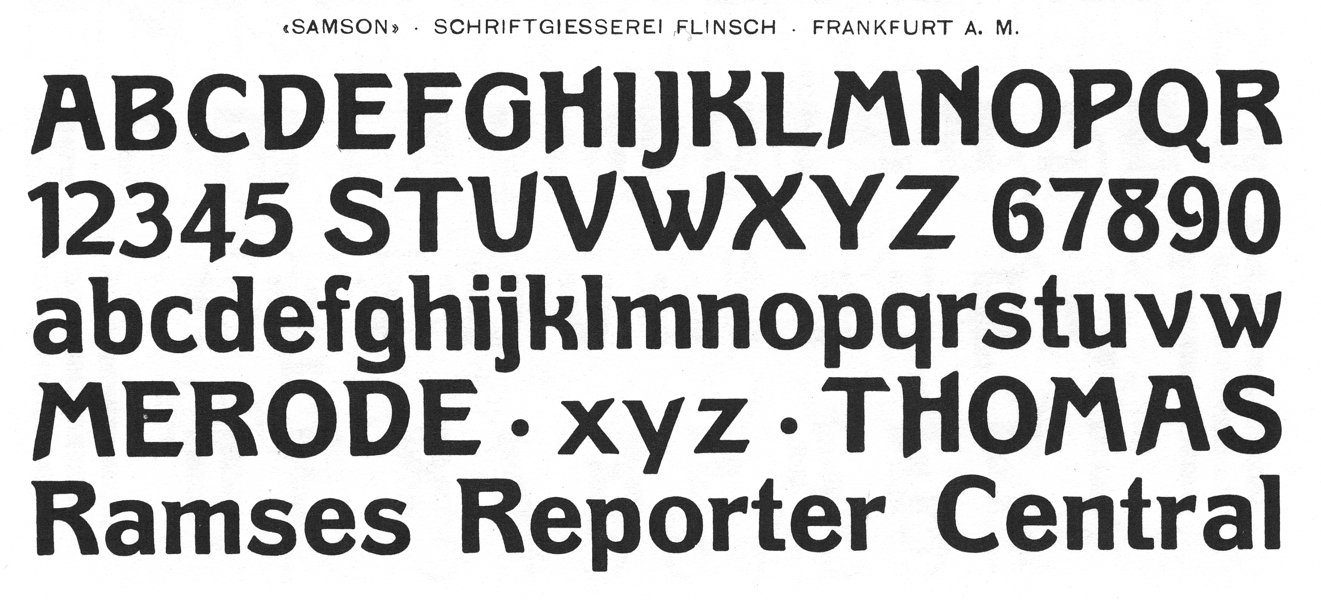
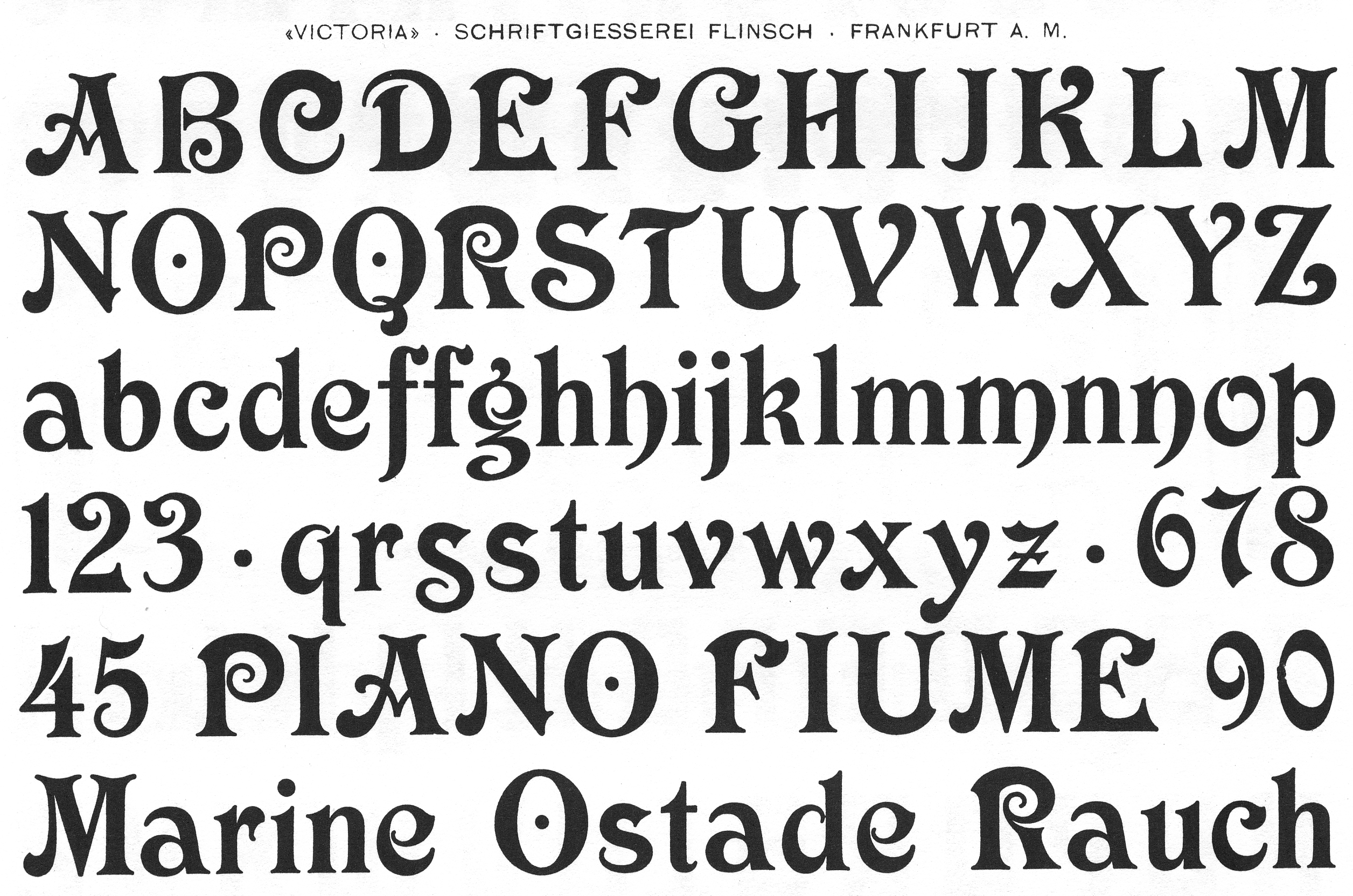
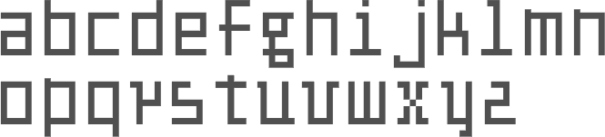
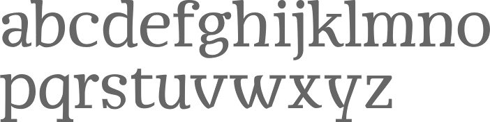
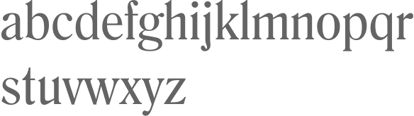
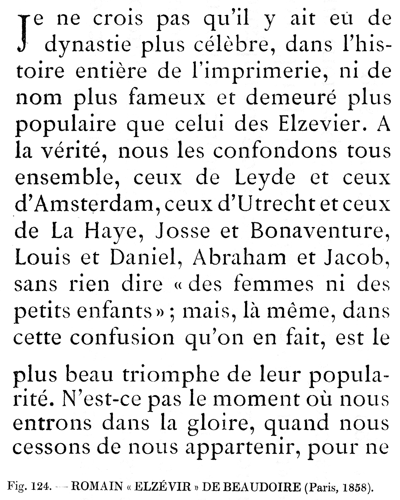
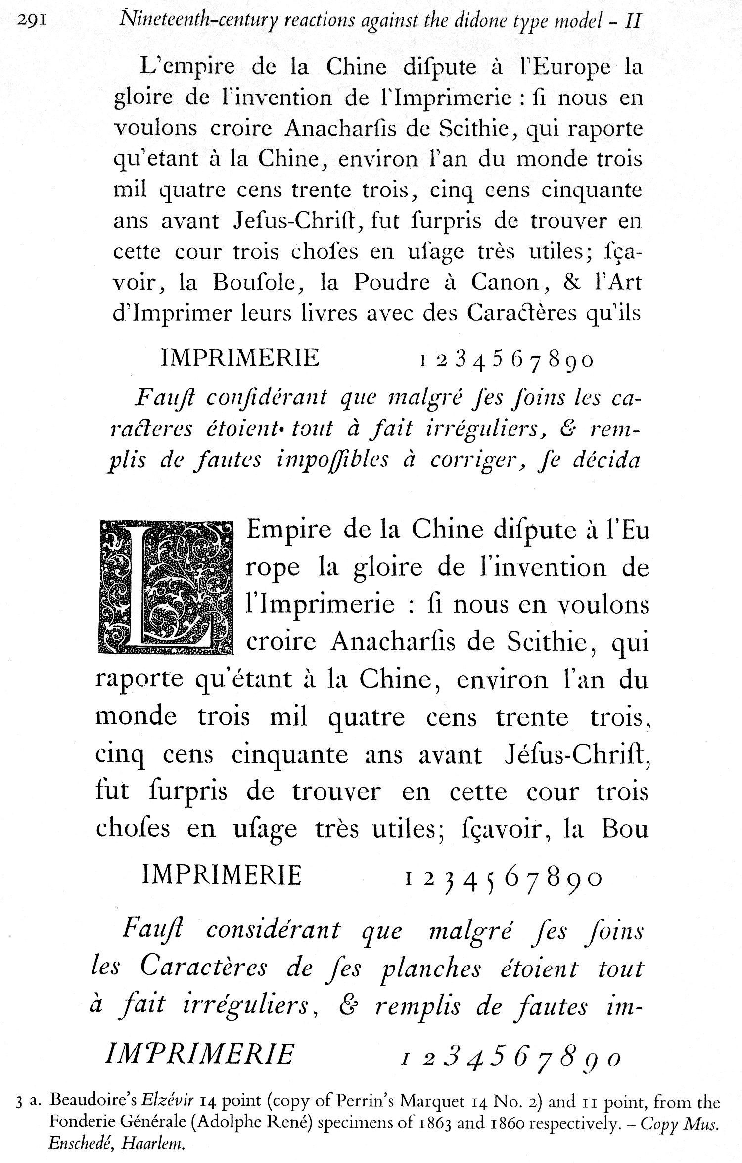
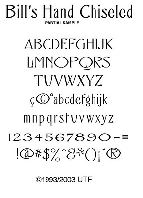
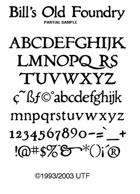
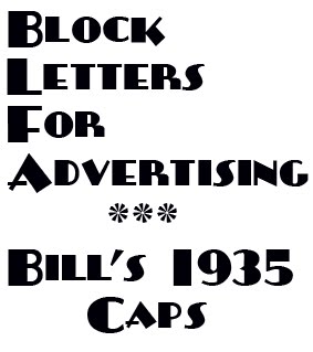
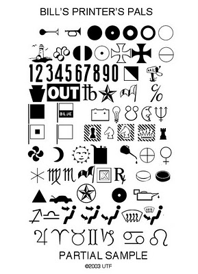
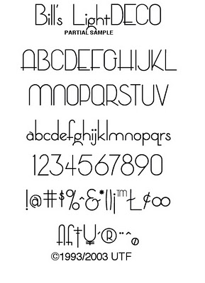
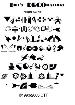
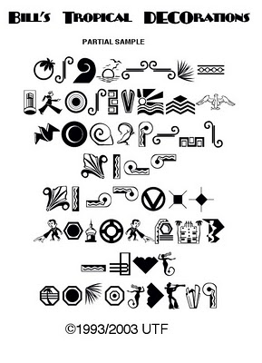
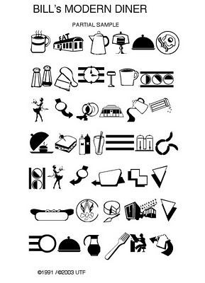
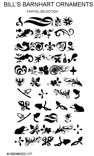
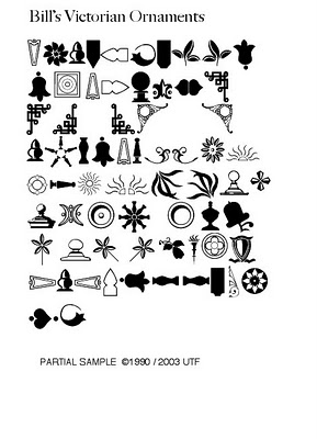
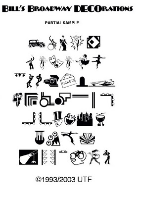
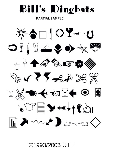
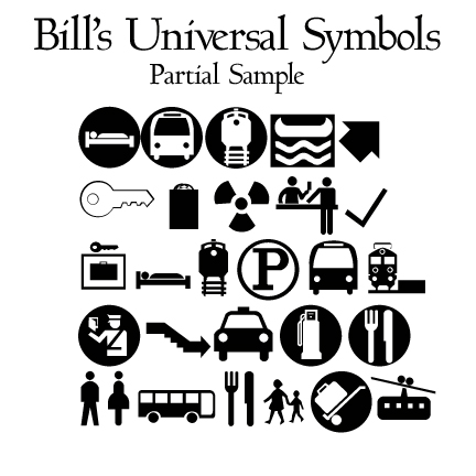
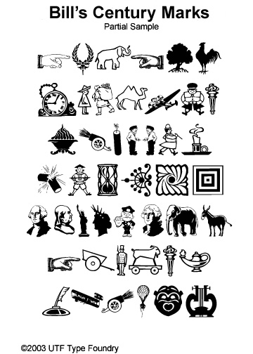
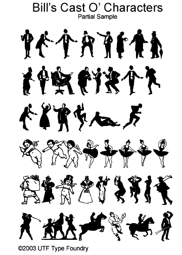
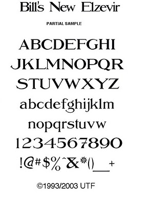
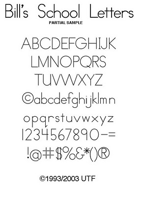
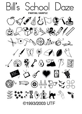
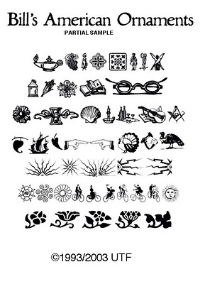
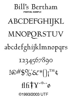
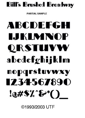
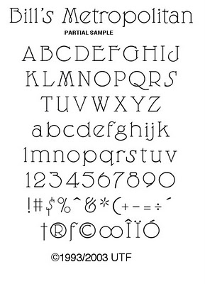
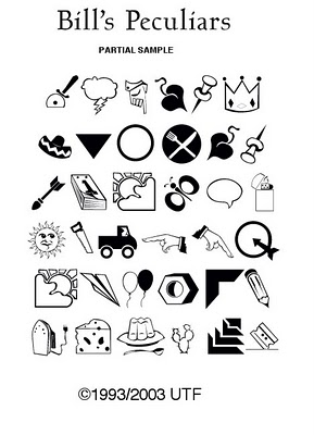
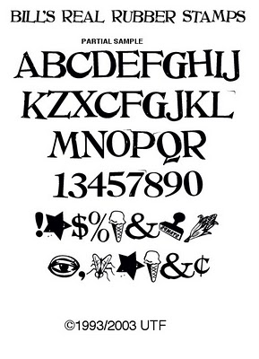
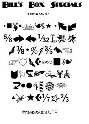