| | |
ACME Fonts (or: CHK Design)
[Christian Küsters]

|
Started in 1996, by Christian Küsters and Andy Long (from South London), ACME Fonts is a London-based foundry, offering fonts by Küsters and these designers: Anthony Burrill, Gérard Paris-Clavel&Johannes Bergerhausen, Jean-Lou Désiré, Paul Farrington, Robert Green, Paul Kehra, Henrik Kubel, Simon Piehl, Alex Rich, Carsten Schwesig, Sandy Suffield, Dirk Wachowiak, Anne Wehebrink and Paul Wilson. Christian Küsters is an ex-student of Matthew Carter at Yale. Born in Germany, he now lives in Oberhausen. Buy the fonts at MyFonts. The company evolved, I guess, into CHK Design. MyFonts link. Interview. Klingspor link. The ACME font list: - By Christian Küsters: AF Angel (1998, based on an old woodblock typeface), AF Satellite, AFWendingen, Cashier 1 AF (1998, dot matrix), AF Champ Fleury (1996, a Codex-like face), AF Hybrid (1996), AF Hadrian Roman (1998, art nouveau), AF Interface One and Two (1998, grotesque sans), AF Retrospecta (1998, exaggerated wedge serif family), AF Track AF One and Two (1998, white on black dot matrix printing), Unzialis (1994), Zip Code AF 30, 40, 50 and 60 (2001, hairline squarish sans family). Christian had a nice connection at Plazm, where he published Hadrian (1996), Retrospecta (1994), Unzialis (1994), Hybrid (1996) and Interface One (1996).
- By Robert Green: AF PAN (1997, octagonal).
- By Henrik Kubel: 4590, AF-Battersea (1999, a grotesque family), AF-CENTERA, AF-Copenhagen, AF-Klampenborg (2000, grotesque sans), CPH-ArabicNumbers, CPH-Medium, Grot-25.
- By Sandy Suffield: CarPlatesCarPlates, AF Carplates (1998, squarish, including Carplates AF Bold Stencil).
- By Paul Wilson: AF Screen (1999).
- By Pete McCracken: INKy-black (1994).
- By Carsten Schwesig: Nicoteen 13 AF (1998, grunge), AF Syrup (1998, slab serif).
- By Paul Farrington: Camberwell AF One (1998, grotesque sans), AF Tasience (1998), Amateur 69 AF (1998, grunge).
- By Dirk Wachowiak: AF Diwa (2002, large squarish sans), AF Generation (2002, huge squarish sans families called A, A2, A2A, Z, and ZaZ).
- By Jean-Lou Désiré: Kub AF (2002, experimental).
- By Johannes Bergerhausen and Gerard Paris-Clavel: LeBuro AF (2003, grunge in weights called Breau, Crade, Louche, Extra Crade, Demi Beau).
- By Sylvia and Daniel Janssen: AF Nitro (2004, techno family in subfamilies called Intro, Riton, Trion).
- By Anne Wehebrink: Oneline AF (1998, squarish sans).
- By Paul Kehra: PostSoviet AF (2001, geometric sans family; with Cyrillic and Latin letters; weights called Culture, Free Latvian, Free Revolution, Ideology, Revolution).
- By Simon Piehl: Spin AF (1998, squarish sans).
- By Anthony Burrill: Video Wall AF (1998).
- By Christian Küsters, based on lettering of H.T. Wijdeveld: AF Wendingen (1998, LED simulation).
- Other: AFConstants (1998), Allen, Indy 500, Interface, AFLogotype (1998).
View ACME's typefaces. Acme's typeface library. Typefaces made by Christian Küsters. MyFonts selection for ACME. [Google]
[MyFonts]
[More] ⦿
|
Adelina Pervanje
|
 Ljubljana, Slovenia-based of a great compass-and-ruler roman caps alpahbet (2014), which was finished during her studies at the Academy of Fine Arts in Ljubljana (ALUO). She also made the display font Pikant (2014). [Google]
[More] ⦿
Ljubljana, Slovenia-based of a great compass-and-ruler roman caps alpahbet (2014), which was finished during her studies at the Academy of Fine Arts in Ljubljana (ALUO). She also made the display font Pikant (2014). [Google]
[More] ⦿
|
Alan Hoenig
|
The Computer Duerer fonts are a metafont family developed by Alan Hoenig (John Jay College, City University of New York). This is a set of roman capitals introduced in a TUGboat article in 1990, entitled A Constructed Dürer Alphabet. Alan extended Duerer's design to generate related fonts in a bold, sans serif, typewriter-like, slanted, and casual style. Hoenig also developed Makor, a Hebrew TeX. The fonts in that package include OmegaSerifHebrew (like David), Ezra, Rashi and Hadassah. Another URL. [Google]
[More] ⦿
|
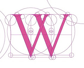
Albrecht Dürer
|
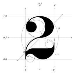
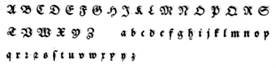
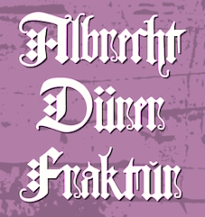 Born and died in Nuremberg, Germany, 1471-1528. Painter, wood carver and copper engraver extraordinaire, famous for many great geometrical and structured capitals and proportioned designs, carried out with compass and ruler. Example from 1524. Another example, ca. 1500. Best known for the books on the geometry of letters, Unterweysung der Messung [A Course on the Art of Measurement] [or: Of the Just Shaping of Letters], published in 1525. See here.
 Images of his work: his famous set of German Renaissance Capitals (1525), Gothic Capitals, German Minuscule, his famous rhinoceros (1515) and his blackletter type Dürerfraktur (1519). Digital typefaces based on Duerer's work: - Terry Wüdenbachs at P22: P22 Durer Caps (2004).
- MichelM at URW++: Hands on Albrecht (2005).
- Amy E. Conger: Duerer (2006).
- SoftMaker: Albrecht Duerer Fraktur Pro (2016). A revival of Duerer's ornamental blackletter.
- Christopher Adams: Just Letters (2012, blackletter). This was based on Albrecht Duerer's Of the Just Shaping of Letters (1525).
- Alan Hoenig: The Computer Duerer fonts (1990). A set of Metafont typefaces.
- Dieter Steffmann: Duerer Gotisch (2001).
- Jeff Jackson: JGJDurerGothic (1997).
- Gilles Le Corre: 1525 Durer Initials (2010).
- David nalle: Albrecht Durer Gothic.
- Martin Lorenz and Joan Pastor: VLNL TpDuro (2019). A blackletter.
- Manfred Klein. The geometrical overlays reminiscent of Duerer are another recurrent theme in Manfred Klein's work. Fonts directly or indirectly related to Duerer's compass-and-ruler constructions made by Manfred Klein include DancingVampyrish, GrafBoldBold, GrafCirculum, GrafCirculumBricks, GrafObliqueItalic, GrafRoundishMedium, GridConcreteDue, GridConcreteLogoable, OldConstructedCaps, RodauButtons, RodauButtonsInverse, RodgauHeads, RodgauerFisheyes, RodgauerOne, RodgauerOneRoundMedium, RodgauerThree, RodgauerThreeRoundedMedium, RodgauerTwo, RodgauerTwoRounded-Medium, RomanGridCaps, SketchesByDuerer-Inverse, SketchesByDuerer, TheRoots, XPCrazy-Light, XPFourTwoContourMedium, XperimentypoFS, XperimentypoFSBlack, XperimentypoFSWhite, XperimentypoFourBRound, XperimentypoFourCRoundInvers, XperimentypoFourRound, XperimentypoNr1, XperimentypoNr1Oblique, XperimentypoStripes-One, XperimentypoStripes-Two, XperimentypoThree-B-Square, XperimentypoThree-C-Square, XperimentypoThree-Crazy, XperimentypoThreeSquares, XperimentypoTwo, XperimentypoTwoCrazy, XperimentypoTwoStripes. Download page. Download all these fonts in onze zip file.
[Google]
[MyFonts]
[More] ⦿
|
Alessandro Pascoli
[Sezione Aurea]
|
[More] ⦿
|
Alexandra Mendes
|
 Since 2003, Alexandra Mendes runs Blank, a Porto, Portugal-based brand identity and graphic design agency.
 Licht Punt (2010) is the geometrically precise custom typeface used in the Sky High project for the Radisson Blu hotel in Hasselt, Belgium. In 2011, she published the art deco family Rosetta, and wrote: Rosetta font was designed by Alexandra Mendes for an upcoming branding project. The typeface design is inspired in all things lovely and luscious of the female intimate universe: lingerie, lace, blush powder, négligé, bustier, lip gloss and other lavish niceties. Should feel as a flirt, the subtle wink of the eye, a roseate glow. Rosetta is a coquette who flirts with life, winking her eyes, batting her lashes, flicking her hair, leaving her scent behind as she passes on the street, turning heads, with her whispering lips and waddling feline walk. Teasing and feigned disinterest to test the reliability of her admirers. Tall slenderizing lines and delicate curves shape the form of Rosetta. The typeface look is minimal and contemporary but reminiscent of a certain "je ne sais quoi" of Art Deco. There's a pure linear geometric symmetry to the font, to create a look of elegant modernity, that exudes a flair for glamour. Rosetta is a font family set composed by the styles: Rosetta, Rosetta Blush, Rosetta Bloom, Rosetta Bud. Images of Rosetta: i, ii, iii, iv, v, vi, vii, viii, ix, x. [Google]
[More] ⦿
|
Alvaro Rubio
|
 During his studies, Logroñ, Spain-based Alvaro Rubio designed the codex-inspired compass-and-ruler typeface Maths (2017). [Google]
[More] ⦿
During his studies, Logroñ, Spain-based Alvaro Rubio designed the codex-inspired compass-and-ruler typeface Maths (2017). [Google]
[More] ⦿
|
Amy E. Conger
[L'Abécédarienne's Original Handlettered Fonts]
|
[More] ⦿
|
Andreas Wikström
|
Swedish designer, who now lives in Kalmar, Sweden. Creator of the thin monoline compass-and-ruler typeface Tall Tower (2011). Behance link. [Google]
[More] ⦿
|
Andy Rich
|
Designer at FontStruct in 2008 of Circles and Circles2. [Google]
[More] ⦿
|
Arquepoetica
|
 Art and type experiments at Universita Autonoma de Mexico, which sets out to prove that the real world is coming to an end and visual reality is taking over. Check out Gramapoetica, which shows many modular letters and typefaces. Flickr page. [Google]
[More] ⦿
Art and type experiments at Universita Autonoma de Mexico, which sets out to prove that the real world is coming to an end and visual reality is taking over. Check out Gramapoetica, which shows many modular letters and typefaces. Flickr page. [Google]
[More] ⦿
|
Arthur Tavares
|
During his graphic design studies at Fortaleza, Brazil, Arthur Tavares created a compass and pen logotype calle O Tipo da Fonte (2012). [Google]
[More] ⦿
|
Autologic
|
Newbury Park, CA-based outfit where Slimbach and Stone worked at one point. Its staff designed (and in some cases, imported, via Autologic SA in Lausanne, Switzerland) some nice typefaces in the mid eighties such as the Champfleury family (1985), Geometrica (1985), Kis-Janson (1985), Media (1976, André Gürtler, Christian Mengelt and Erich Gschwind), Melencolia (1985), Signa (1978, André Gürtler, Christian Mengelt and Erich Gschwind) and Trinité (1981, Bram de Does, part Bobst Graphic, part Autologic). [Google]
[More] ⦿
|
Beta Field
[Michael Leighton Beaman]
|
 Here is what Beta Field is, in their own words: Beta-field is an interdisciplinary design/research office with a multimodal approach to practice. Our work includes buildings, landscapes, environments, installations, exhibitions, texts, design workshops and research projects. With backgrounds in architecture, industrial design, landscape architecture, and exhibition design, along with experience working as researchers, designers, and educators, we developed a view of design practice that operates through various modes of inquiry, development, and production. We focus not only on the built environment, but also on the effects of design on knowledge, technology and culture.
 The principals are Michael Leighton Beaman and Zaneta Hong. Michael holds a Bachelor's degree in Architecture from North Carolina State University and a Master's degree in Architecture from the Harvard University. He teaches at the University of Virginia and is associated with the Rhode Island School of Design. His research covers speculative future of technology in architecture. Zaneta is a professor in landscape archirecture at the University of Virginia, where she teaches courses in information-based digital practices and materials systems and technology. One of Beta Field's projects is the decorative didone typeface Pistilli Mutatio (2017). It is a parametric digitization of John Pistilli's 1964 phototype typeface Pistilli Roman. [Google]
[More] ⦿
|
Blackmagenta
|
Design studio in Sao Paulo. At Behance, one can see the geometric typeface Cirilo Avogados (2010), constructed with the ruler and compass methods of the Romain du roi. [Google]
[More] ⦿
|
Cássio Podgaietsky
|
Graphic designer from Rio do Sul, Brazil. In 2010, he created a geometric alphabet constructed on the basis of a grid, using a compass only. [Google]
[More] ⦿
|
Carlos Dordelly
|
Caracas-based designer of Klak (2013), a typeface that was designed on a grid with compass and ruler. Behance link. Vimeo link. [Google]
[More] ⦿
|
Changbae Seo
|
 Seoul-based graphic designer who spent some time in London. Behance link. As an experiment, he took a standard font, and connected the letters using a certain geometric algorithm to get a special effect. More analytic geometry went into the design of the squarish but rounded display typeface Box (2010). [Google]
[More] ⦿
Seoul-based graphic designer who spent some time in London. Behance link. As an experiment, he took a standard font, and connected the letters using a certain geometric algorithm to get a special effect. More analytic geometry went into the design of the squarish but rounded display typeface Box (2010). [Google]
[More] ⦿
|
Character
[Herbert F. Van Brink]
|
 Prolific Woodland Hills, CA-based typophile and type designer (1937-2013) whose portfolio consisted largely of revivals and who used the alias Character for his typographic work. The Los Angeles Times posted this obituary: Herb passed away after a brief fight against esophageal cancer. He was a 42 year resident of Woodland Hills CA. Son of the late Jean and Mary Van Brink, he was born in Manhattan, graduated from Stuyvesant High School (1952) and Queens College (1956) and always considered himself a New Yorker. He had a long career in Information Technology and retired from Arco. He loved traveling, bowling, genealogy, and was a bridge Life Master among his many interests. He was a trickster and a perfectionist. He leaves his wife, Paula, his son, David Van Brink and DIL Deb Culmer of Santa Cruz CA, his daughter Qarin Van Brink and SIL James Ray of Burien WA, grandchildren Amelia and Wilhelmina Ray Van Brink, brother and sister-in-law Jeffrey and Louise Van Brink of E. Northport NY and nephews Matthew and Jordan Van Brink.
 His typefaces: - Animal dingbat fonts: AbecedarianZoo (2003, created from an alphabet in Art Explosion 200,000), Turf&surf (2005).
- Alphadings: Jennifer's train (2011), ABCPlay (2005), DiddleTheMouse (2005), Silly Set (2005), Stone Carving (2005), Snow Persons (2005), Alaskan Ice (2005), Peppermin Canes (2005), USStarsNStripes (2003, first called USFlags), XmasTree (2002), XmasTree II (2004), Xmas Alpha (2005).
- Erotic alphabets: Flotner (2002, based on a scan of the human character alphabet by Peter Flötner (1534)), SilvestreBodies (2006, based on a figurative alphabet designed by Joseph Balthazar Silvestre in 1834, with engravings made by Girault), ErotiCaps Outline (2007), ErotiCaps Solid (2007), WeygelBodies (2006, adapted from Martin Weygel's 1560 interpretation of Peter Flotner's 1534 figurative alphabet).
- Stained glass themed fonts: ModernStainedGlass (2007), ModernStainedGlass2Tone (2007).
- Capital alphabets: Cameo Antique (2011, after Cameo Antique on page 17 of The Solotype Catalog of 4,147 Display Typefaces---a shaded outline version of the typeface called NightShade, on the same page of Dan Solo's book; the only known digitized fonts of NightShade are "Shadowed Serif" by James Fordyce (1994) and NigelSadeSH, from Soft Horizons (1993)), Modern French Capitals (2010, after a set of capitals drawn by Alphonse Mucha), Mucha French Capitals (2010, similar?), Marcel Caps (2007; based on "Crossroads" by August Will (1891)), WoodLook (2007, an improvement of 101's Wooden Alpha BlockZ), 3DAlphabet (2008, based on an alphabet coloring book designed by Jean Larcher, 1978), RomantiqueInitials (2007, based on work by Aridi), Blistered, BlisteredFramed, BlisteredReverse (2005, based on Marwan Aridi's Blister from the Initial Caps Vol I), ChiseledRound, Contemporary CH (2010), CourierInitials (2005, based on an alphabet by Johan)), Eclectica (2003, party-theme), FeathersInYourCaps (2002), FlowerSketches (2002), LACETRIM (2002), LeafyStencil (2003), QuiltedStippled (2004, based on an embroidery alphabet created by DesignsInStitches), RetroCapsBW (2004), RetroCapsWB (2004), Rope5 (2004, rope font), Rustic Black Shadow (2011. He explains: In the Solotype Catalog of 4,147 typefaces, RUSTIC is shown with a black shadow. RUSTIC WHITESHADOW has a white shadow. However, the Solotype digital font named RUSTIC has no shadow. Similar no-shadow fonts are also available as Pinewood (by Rick Mueller and one by Dieter Steffmann) and as Woody (by DincType). As of October, 2011, no digitized version of Rustic Whiteshadow is known. Character has produced a font named RusticBlackShadow, which matches the font named Rustic in the Solotype Catalog. Dick Pape had created an earlier version named Pepin Press Caps FA204, based on fonts contained in the Pepin Press book Fancy Alphabets. ), THINROPE (2002), VALENTINEHEARTS (2002), Printed Circuit (2005), SportsABC (2005), Feathered Flight (2005), Joe Clement (2007, Western pixel face), Ribbon Shadow (2007).
- Fonts based on scans from Awesome Alphabets (Mike Artell, 1999, Good Year): SketchBoards, SketchBones, SketchClothes, SketchLogs (2005), SketchPencils, SketchPipes, SketchTools, all done in 2005.
- Athletic lettering: Collegiate Heavy Outline (2006), Real Madrid 2011-2012 (2011, an expansion of a font by "Adriano"), The Football League (2011), Adidas Euro 2008 (2011), Puma World Cup 2010 (2010: based on Crepello, a custom-made font by Paul Barnes for Puma, that was used on the jersey of Italy, Switzerland and Uruguay during the 2010 FIFA World Cup), Adidas Unity (2010), LINKEB+Regular (2008) uses the lettering of the Geaux font used by LSU.
- Pixel or dot matrix style fonts: Dash It All (2007, based on Cooper Black), Even Hearted (2007, an improvement of CK More Hearts), Square 9x9 (2007).
- Brush typefaces: Skippingbrush (2006), GraffitiPaintBrush (2008).
- Dingbats: Being Sport Pictograms (2008).
- Scanbats: PilobusSilhouettes (2010) is based upon a human alphabet photographed by John Kane.
- Techno: BultacoDual (2010), Dr Who 42 (2007), London MMXII (2008), ArrowheadLake (2009, +Shadows, +Sunlit; based on the nearly blackletter typeface Arrowhead from the Solotype Catalog and alphabet books).
- Historic typefaces: Driftwood 67 (2011, Driftwood on page 67 of The Solotype Catalog of 4,147 Display Typefaces), ArrowheadLake and ArrowheadLakeShadows (2011, based on Solotype Catalog p.74), Cutin (2011, a simple rounded monoline sans called Cut-in Medium on page 163 of The Solotype Catalog of 4,147 Display Typefaces),Cutin (2011, a simple rounded monoline sans called Cut-in Medium on page 163 of The Solotype Catalog of 4,147 Display Typefaces), Pepin FA288 (2011, based on Matra, or Bifur, on page 54 of The Solotype Catalog of 4,147 Display Typefaces by Dan X. Solo), Varicka (2010, from "Decorative Condensed Alphabets", by Dan Solo, p. 94. It is similar to Red Rooster's Triple Gothic Condensed, but the Solo's font has different features), MaxfieldParrish140 (2007: From an incomplete (no "N") hand-drawn alphabet by Maxfield Parrish. See figure 140 of "Letters&Lettering" by Frank C. Brown, 1921. This is a different source than the P22 Parrish font family.), Ronde Antique (2009, based on page 110 of the Verlag Gerlach 1881 catalog).
- Other: Scramble Mixed (2006, scrabble face), Happy Fourth, Emperor AN (2009: this semi-art nouveau typeface is Emperor on page 42 of The Solotype Catalog of 4,147 Display Typefaces---not the same as Dan Solo's Emperor at MyFonts), Wood Gothic Caps (2011, blackletter), WoodWud (2011), Gallia Two (2010, based on a font found on page 55 of The Solotype Catalog of 4,147 Display Typefaces as Gallia No. 2), Charleston (2010, based on page 46 of The Solotype Catalog of 4,147 Display Typefaces), Azteca Regular (2010: based on Azteca Condensed by Dan X. Solo, page 74 of The Solotype Catalog of 4,147 Display Typefaces), Othello Fill and Solid (2011, derived from Othello on page 155 of The Solotype Catalog of 4,147 Display Typefaces), Sharons Shadows (2010, +Bold), Masked Menace (2012, based on Bodoni Poster).
Fontspace link. Dafont link. Fontspace link. And another one. See also at abfonts. Dafont link. [Google]
[More] ⦿
|
Christian Küsters
[ACME Fonts (or: CHK Design)]
|
[MyFonts]
[More] ⦿
|
Club 21
[Julian Morey]
|
 The founder of and only designer at Club 21 is Julian Morey, a graphic designer and font creator from London who designed Pacific (1999, an octic typeface influenced by American naval lettering), VMR (1999), SignPlate (a stencil font), Sigma OT (2008, a sans based on a Stephenson Blake grotesque), Skye (2001, a stencil font), Skye Outline [note: Skye used to be called Axis], Checkout, Alpine (2000), Brassplate, Greenwich (2001, a stencil font with fine breaks; used to be called Bronxville), Codex, Electro, Ionia, Jakarta (2000, an octagonal sports/stencil font; was called Jersey), Kathode, Octago (an octagonal stencil face), Liquid, Simpson Typewriter, Preset, Roadworks (1992, stencil font), Thompson Monospaced, Spacer (1999), Paintworks, Portfolio.
 FontWorks used to sell their fonts, but now Faces does. FontShop link. [Google]
[More] ⦿
|
Codex-type fonts
|
 A list of fonts based on certain geometric proportions, as first exhibited in drawings by Da Vinci.
 [Google]
[More] ⦿
|
Daniela Arrieta
|
 Valencia, Venezuela-based designer of a codex style roman alphabet in 2019. [Google]
[More] ⦿
Valencia, Venezuela-based designer of a codex style roman alphabet in 2019. [Google]
[More] ⦿
|
David Lance Goines
|
San Francisco-based poster artist and writer, b. 1945, d. 2023. Author of A Constructed Roman Alphabet, a Geometric Analysis of the Greek and Roman Capitals and of the Arabic Numerals (David R. Godine, Boston, 1982). Each character of his roman alphabet is described using compass and ruler in the style of the romain du roi. Wonderful! He also wrote An Introduction to the Elements of Calligraphy (3rd ed. 1968; reprint, Berkeley, California: Saint Heironymous Press, 1975). In 2017, he designed an art nouveau poster based on a 1921 poster by Jugendstil artist Leopold Forstner. Wikipedia page. [Google]
[More] ⦿
|
Dennis Kei Yip Poon
|
Born in Hong Kong in 1968, Dennis Poon was a designer in San Francisco and Stockholm. He currently works at Philips in Singapore. At the Typebox foundry, he designed TxElf (2002, blockish almost-bitmap font), TX Hex (2002) and TX Gitter (2001, a simplified Codex-like face). FontShop link. Klingspor link. [Google]
[MyFonts]
[More] ⦿
|
Dóri Andrésson
|
Icelandic graphic designer in Reykjavik. Asplund's Stockholm public library inspired him to create the geometric compass-and-ruler family Tornado (2010). The New Black (2009) is a very black threatening headline type. Behance link. [Google]
[More] ⦿
|
Dom Hans van der Laan
|
 Dom Hans van der Laan (Leiden, 1904-1991) was a Dutch architect and Benedictine monk. After a few years of architectural studies, van der Laan developed a system of principles for proportions. Using this theory Dom Hans van der Laan designed buildings and even created a typeface, the Alphabet in stone. This typeface is based on the Roman carved stone capitals that were used in the first century AD. Designed using strict 3d rules (which he called the Plastic Number), his lettering can be found at the abbeys of Oosterhout and Mamelis.
 The Alphabet in stone typeface was digitized in 2011. That project can be seen here. Contributors include Willem Noyons, Maarten Dullemeijer and Rob Stolte. The font family can be bought from the Dutch foundry Autobahn. [Google]
[More] ⦿
|
Dong Ha Kim
|
Seoul, Korea-based creator of the free grid-based typeface Freddie Mercury (2012). [Google]
[More] ⦿
|
Elisa Leotti
|
Italian designer who created a great circle and compass-based monogram in 1998-1999 at ISIA Urbino. See here. [Google]
[More] ⦿
|
Emerald City Fontworks
[Steven J. Lundeen]
|
Run by Steven Lundeen from Seattle, ECF does customized handwriting / signature / company logo fonts, for 39 dollars per font. Shareware and freeware fonts, such as Augie, Codex, Decadence, Intimacy, Intimacy Deux, JD (1997, handwriting font), Movieola, Spanky's Bungalow (1997), Syriac, the beautiful handwriting typeface TallPaul (1997), Teen Spirit, Curtain Call, Stillframes, Birds A, Webster. ECF also makes your handwriting into a font. They offer some clipart fonts of the first quality. There are three mollusk fonts, three musical instrument fonts, three insect fonts, three reptile fonts and four mythology fonts, for example! Some of the clipart fonts are free. Handwriting fonts like j.d., Augie, Skeetch and TallPaul are well worth a try. Display freeware fonts include Crowns and Coronets (dingbats), Decadence, Intimacy, Codex and the Spanky family. Many fonts have both T1 and TT versions for both Mac and Windows. The shareware fonts are of the display type, like Moonpie, Puzzleface, Thump, Sputnyk, KingsCourt, Festus, Daddio, Chester Shag, King's Court, the Pookie family, and a knot font. Dafont link. Abstract Fonts link. Fontspace link. [Google]
[MyFonts]
[More] ⦿
|
Evgeniy Beluha
|
 Russian type designer. This scan of a Duerer-style alphabet with compass and ruler was found on a slide prepared by Victor Kharyk for a talk Victor was going to give at ATypI 2009 in Mexico City (but didn't because he could not pass through transit in the USA due to the office of Homeland Insecurity). [Google]
[More] ⦿
Russian type designer. This scan of a Duerer-style alphabet with compass and ruler was found on a slide prepared by Victor Kharyk for a talk Victor was going to give at ATypI 2009 in Mexico City (but didn't because he could not pass through transit in the USA due to the office of Homeland Insecurity). [Google]
[More] ⦿
|
Felice Feliciano
|
Born in Verona, 1433, died in Rome in 1479. Fifteenth century calligrapher, composer of alchemical sonnets, and expert on Roman antiquity, especially inscriptions on stone. Author of a geometrically constructed compass-and-ruler roman capitals alphabet in Alphabetum Romanum (1463). About these letters, he wrote: I, Felice Feliciano, have revived this in the antique manner after ancient marble tablets such as are to be found in Rome and elsewhere. People credit him with the first ruler-and-compass construction of letterforms. Typefaces that are based on his original from 1463 include Monotype's Felix Titling (1934). Berry, Johnson and Jaspert write: A titling based on the inscriptional letters designed by Felice Feliciano of Verona in 1463. The manuscript is in the Vatican Library and was reproduced in the Italian periodical La Bibliofilia in 1935 and in an edition by Dr. Giovanni Mardersteig entitled Alphabetum Romanum published in 1960 at Verona. Note the angle of stress in the O and the open bowl of the P. [Google]
[MyFonts]
[More] ⦿
|
FontAid III
|
Font Aid III is a project launched by a diverse collection of type designers and font foundries, who wish to help the victims of the South Asian Tsunami. SOTA acts as coordinator and ensures that all funds are distributed appropriately. Tamye Riggs heads the undertaking from Alameda, CA. MyFonts site. Fonts include FontAid Durer Caps (P22, 2005), FontAid Cezanne (2005, ex-P22 Cezanne), FontAid Secret Scrypt One and Two (2004, handwriting by Rebecca Alaccari), and FontAid Dominique (2005, based on Dominique by Rebecca Alaccari). Thus far, all donated fonts are from P22 or Canada Type. In 2005, Fleurons of Hope (two ornamental OpenType typefaces) was published. Contributors: Alejandro Paul, Alessio Leonardi, Amondó Szegi, Andrea Emery, Andreas Seidel, Andreu Balius, Annelies Vaneycken, Arnoud van den Heuvel, Artur Frankowski, Ashley Lang, Assi Kootstra, Barbara Klunder, Ben Bos, Ben Weiner, Bennett Holzworth, Bob Aufuldish, Amelia Aufuldish, Emily Aufuldish, Boris Mahovac, Brad Nelson, Brady Baltezore, Brian Bonislawsky, Bruce Alcock, Bruno Oldani, Carol-Anne Ryce-Paul, Chank Diesel, Chris Lozos, Christophe Liekens, Colin Kahn, Dan Reynolds, Daniel Fritz, Daniel Plant, Danny Meirav, Beth Koelker, Dario Muhafara, Dave Bezier, David Benque, David Snider, David Thometz, Dawn Lozzi, Debbie Smirnoff, Denis Dulude, Dereck Johnson, Derek Fenech, Diederik Corvers, Diego Bionda, Diego Mier y Teran, Donald Beekman, Donald Roos, Dung Van Meerbeeck, Ed Fella, Eduardo Manso, Elana Stanger, Elena Albertoni, Elena Nazzaro, Ellie Ngretto, Emma Schmid, Laura Meseguer, Eric Jasso, Eric Olson, Erik Adigard, Patricia McShane, Fabrizio Schiavi, Fanny Garcia, Felix Estrada, Filip Blazek, Folko Nafta Comuni, François Moissette, Frank Jonen, Frank van den Hurk, Frau Jenson, Gabriele Franziska Goetz, Galo Carrion Andrade, Juan Pablo Malo Rob, GM, Goele, Walter Piotrowski, Dima Stefanova, Henk Groenendijk, Ivana Heise, Jack Usine, Jackie Ponwaye, Jacob Vantiger, Jake Cheney, James Grieshaber, James Webb, Jamie Stolarski, Jason Castle, Javier Suzuki, Jeff Fisher, Jeffery Keedy, Jeremy Mac Lynn, Jess Latham, Jim Richardson, Joachim Müller-Lancé, Joe VanDerBos, Joep van der Made, John and Nicky Wright, John Downer, John Hersey, John Malinoski, Jon Abbott, Jona Piehl, Jonathan & Jo Hitchen, Jose Luis Coyotl Mixcoatl, Joshua Darden, Jürgen Weltin, Kapitza, Karl Grandin / Var, Kate Hamilton, Kenn Munk, Khaled Abou Alfa, Kim Fox, Kirsten Mortensen, Ko Sliggers, Krassen Krestev, Lara Alexandra Glueck, Leigh Maclellan, Lies Ros, Loreto Marin, Louis Fox, Lukasz Dziedzic, Magda Frankowska, Marc Gascoigne, Marcus McCallion, Maria Johansson, Mariela Heise, Mark Hatley, Mark van Wageningen, Markus Hanzer, Marta Bernstein, Martijn Oostra, Martin Schumacher, Martin Wenzel, Matias Avila, Matt Desmond, Matthew Carter, Maurizio Chesneau, Maurizio Osti, Mauro Bubbico, Max Araldi, Max Kisman, Melle Hammer, Michael Everson, Mike Kohnke, Miles Newlyn, Moira Church, Federico Zerbinati, Luciano Perondi, Valentina Montagna, Stefan Hattenbach, Nate Johannes, Nathan Matteson, Nathan Thompson, Nathanael Ng, Neubau Berlin, Nic Squirrell, Noah Scalin, Norbert Reiners, Olive O'Donnell, Oliver Helfrich, Pablo Bisoglio, Paul Hunt, Paul Ponwaye, Penelope Dullaghan, PeterBilak, Peter Hill, Peter van den Hoogen, Phil Baines, Piers Le Sueur, Pilla Tsun, Piotr Mlodozeniec, Rachel Baker, Rafael Saraiva, Randy J. Hunt, Raoul Deleo, Rasha Kahil, Ray Cruz, Ressa McCray, Rian Hughes, Ricardo Cordoba, Richard Chang, Richard Hubbard, Richard Kegler, Rikesh Lal, Rita Minjarez, Rizka Septiadi, Robbi Robinson, Robbie de Villiers, Robert Altemus, Roelof Mulder, Roland Scriver, Ruben Ockenfels, Ryan Pescatore Frisk & Catelijne van Middelkoop, Sabiha Basrai, Sean O'Donohue, Silvia, Sonia & Gabriel Freeman, Steve Zafarana, Sue Zafarana, Stuart Sandler, Sumner Stone, Sun Hwang, Susanna Dulkinys, Susanne Keilhack, Swip Stolk, Tanner Boeger, Terry Tolleson, Terry Wudenbachs, Tiffany Powell, Tiffany Wardle, Tijl Akkermans, Till Hopstock, Tim Bones, Tim Daly, Titus Nemeth, Todd Dever, Tomas Camps, Tony de Marco, Typography Class in Graphic Design, Universidad Anahuac, Ty Wilkins, Ulga Marekowa, Verena Gerlach, Victor Gaultney, Vincent Hauzanneau, Will Price, Xavier Dupré, Danny van den Dungen, Marieke Stolk, Erwin Brinkers, Yanek Iontef, Zofia Kulicka. [Google]
[MyFonts]
[More] ⦿
|
Fontomania (or: Fontilizer)
[Omer Agiv]
|
Omer Agiv (Fontomania) made freeware Latin, Hebrew and dingbat fonts such as Amraheb, Electroni, Jumang, Krashim-signs, LironAgiv, Moshe, Outline, Samurai, Samuraiheb, Sunnyday, Transport, Worms, arrow, boards, bw, dotty, goggles, krashim, leaves, nuni, nurit, wood-sticks, Dinorific, omerh. Some fonts are commercial. Personal handwriting font service for 55USD (Latin, Hebrew or Arabic). Personal signature for 10USD. Some commercial fonts at 8 to 12 dollars, such as Smily, Cookie (curly), Orenh (handwriting), Geometry, Tal, Jifa, Sun, Hairy, ABC, Chains, Liner, Chinese, Arak, Parkinson, Papio, Tropical Sickness and IceSticks. The free and commercial Hebrew fonts include the Tapuach package (8 fonts). Fontomania also sells the 13-font 44 USD-"Silver Collection" on CD. Free handwriting font download: Janet Luther. At Elifont, one can download Wood Sticks, Samurai, Liron, Ice Sticks, and Boards. Dafont link. Old URL. [Google]
[More] ⦿
|
Fra Luca Pacioli
|
 Italian letter artist (b. 1445, d. ca. 1514) who constructed his characters geometrically, as early as 1509. He practiced mathematics and was a Franciscan friar. A Franciscan monk, he is mentioned several times in the notebooks of Leonardo da Vinci. His Summa di Arithmetica, Geometria, Proportioni e Proportionalità appeared in 1494. Continuing his work on proportion, he published Divina Proportione in 1509 (Venice: A. Paganius Paganinus).
 Image. His mathematically constructed capitals (1497) were made into a font called Pacioli by Matthew Desmond in 2007. Giovanni Mardersteig also made a font based on Pacioli's caps. Other implementations include LucaPacioliCaps (2004, Manfred Klein), Pacioli (2005, by Alessandro Segalini for Accademia Editoriale in Rome) and Pacioli (1999, a metafont by Peter Wilson). [Google]
[MyFonts]
[More] ⦿
|
Francesco Torniello
|
Italian lettering artist famous for his geometrical constructions. See here. Author of the treatise L'Alfabeto (1517). Pictures of the geometric construction of the capitals are here. Fonts named after him include GFT Torniello by Gio Fuga. [Google]
[More] ⦿
|
Frank Chouteau Brown
|
Author (b. 1876) of Letters&Lettering: A Treatise With 200 Examples (1921, Bates&Guild Co, Boston). This book shows many decorative alphabets. Alternate URL. Yet another URL. Examples from that book: Alphabet after Serlio, An outline caps face, A Roman caps face. The best page on Chouteau Brown, complete with all images from his 1921 book. Some of Chouteau Brown's own lettering from that 1921 book: Incised English Script, 15th Century English Gothic Blackletter, 16thCentury German Blackletter, Capitals adapted from Renaissance era medals, Classic Roman Capitals, English Gothic Letter 15th Century, English Incised Script from a tombstone in Westminster Abbey, 18th Century French Script Capitals, German Blackletter (from brass), Italian Renaissance Capitals from a Marsuppini tomb, Italian Renaissance Capitals from Santa Croce, Florence, Italian Uncial Gothic Capitals from the 14th century, Modern American Letters, Modern American Letters for rapid use, Modern American Lowercase, Modern German blackletter, Modern German capitals, Spanish Script from the latter part of the 17th century, Spanish Script capitals, early 18th century, Uncial Gothic Capitals 13th century, Uncial Gothic Capitals 14th century, Uncial Gothic Initials 12th century, Venetian Gothic Capitals 15th century. The Siamese style in Brown's 1912 book inspired Nick Curtis's digital font Owah Tagu Siam (2007). [Google]
[More] ⦿
|
Fritz Funke
|
Author of Schrift mit Zirkel und Richtscheit (Leipzig, 1955). [Google]
[More] ⦿
|
Fyrisfonts
[Stefan Lundhem]
|
Stefan Lundhem started Fyrisfonts. He is the designer of Garajannon (Garamond family), Spartacus (a Roman, CODEX-like lettering font), Beckhem Gothic, Fournament, Primus, Fyris Fraction, Fyris Fraktur, Krabat, Heltime (mix of Times and Helvetica), Terminator, Bessie (2001, multiline art deco typeface modeled after Marcia Loeb's 1972 alphabet, Rainbow), Billie (2001, art deco titling, modeled after Marcia Loeb's 1972 alphabet, Zig Zag), Jämför abc, Miami Blues and Miami Vice (beautiful, now called Bessie and Billie, respectively). The pages in Swedish contain an in-depth study of Jenson and Adobe Jenson MM, Caslon, Cloister Old Style, Fraktur, Garamond, Minion MM, MultipleMaster fonts, Myriad MM, OpenType, Poynter, RailwayType, Newspaper type, Web fonts, Web typography, and screen typography. [Google]
[More] ⦿
|
GemFonts98
[Graham Meade]
|
Prolific Australian type designer who has made over 300 free fonts to date. Creations: Bonk Fatty, Worstveld Sling (2003), Quastic Kaps (2003), Quadlateral (2003), Junge Burnout (2003), Choktoff (2003), Hall Fetica (2002), Lady Ice Extra (2002), Gizmo (2002), Arggh@$*# (2002), Republika Ego (a huge family made in 2002, as an extension of the large family Republika by Apostrophe), Zillah Modern Offset Outline (2002), Feldicouth (2002, medieval lettering), GM Exp (2002), Pecot, Pecot #2 and Pecot #3 (2002), Wazoo (2002), JamesEightEleven (2002), AnalSatisfaction (2002), GenericFont (2002), PanAm (2002), Border Base Future (2002), Moondog (2001, with Apostrophe), Equine (2001), Street Corner (2001), Mister Belvedere (2001), Freebooter Script (2001), Street (2001, an 31 font sans and slab serif at the Lab), Choda (2001, with Apostrophe), Walkway (2001, see here), Castorgate (2001), Heidorn Hill (2001, a Fraktur font with Apostrophe), Labag (2001, with Apostrophe), 11S01 Black Tuesday (2001, for Life Saving Fonts), Endor (2001; a gothic font with Apostrophe), Dekon (2001), Asenine (2001), Eskargot (2001, with Apostrophe, a "tango" font), Brassier (2001, with Apostrophe), Kandide (2001, with Apostrophe), Labrit (2001, a Fraktur font done with Apostrophe), Control Freak, Gilgongo, Eskargot, LabtopGraphed, PhoenixArise, PrussianBrewSolid, YouthanasiaTexture, Dumbledor, Luciferius, Zebrra, Street, Kronika, PrimaryElector (all at Apostrophic Labs), Scaling the Dragon, Primary Elector, Blacksmith Delight, Birthday Dingbats, Halloween 2, Comicbook Smash, AcidDreamer, Arialic, AvQest, Battered Cooper, Beerglass, Berthside, Bloodgutter 99, Blown Away, Boneribbon, Boneribbon Tall, Bunny Rabbits, Callistroke, Carbonized Timber Chizzler, Deathhead KeltCaps Drummon, Family .., Effluence, Ericott, Erozion, Erthqake, Fanfold, Gemerald, GemFont One, Gorlock, Hungover, Impressed Metal, Inked Weird, Inningham, Isildur High, JaggaPoint, KeltCaps, Kharnorric, Kharnorric Royal, Knights Quest, Knights Quest Callig, Lane Humouresque (2000), Layaway, Linear Beam, Line Etch, Melted Moments, Metal Spagetti, NeoSpacial, Niew CroMagnon, Offset Plain, Old Copperfield, Old Oak, Old Virus, Ooky, Parkvane, Pee's Celtic, Pi in the SciFi, Quilted Indian, Ribbon, Ripplemere, Roughhewn, Rounheads, Rusty Sign, Rykindor, Satan Possessed, Seventy Flares, Simpleman, Skunkline, Slinked, Snail n Ink, SnottMM (multiple master), Solid Ooky, Squashed, Static Charge, StaidMM (multiple master), Steamroller, Stiltedman, Stretch, Tear, Tearoff, Textapoint, Thor version 1.5, Time Pundits (a CODEX-like face), Torcing Away, Trilayered, Ulse Freehand, Uncey, Untidy Skrawl, Vale Shadow, Waif Thin, Warpy Roundhead, Whoosit, Wonkers, Woodbrush, Wormfont, Woven Brick, Woven Outline, Yurine Overflow, Dingbats, Americanic, BirdArt, Cattart, Chyld, Culinary Art, Doggart, Doggon, Drinks - Various, EasterArt, Ein Schwein, Gembats 1, Gembats 2, Helloween, JFC, KidClipart 1, KidClipart 2, Komedy Kritters, Krazy Kritters, Luvya Babe, Moolah, Multicasion, Odds N Sods, Sportzs, Teddyber, Teddyber Too, Vehicular, Whethers, Xmas Clipart 1, Xmas Clipart 2, PenicMasturbata, Aliensatemymum, AustralianSunrise, AustralianSunset, Blockstepped, BoldlyGo, BarredOut, Blockstepped3D, BoldlyGoOut, Daemonesque, Efentine, FuzzyXmas, Gazzarelli, Jhunwest, JhunwestConcaveGM, LickcurlPetite, LupusBlight, MilleniGem, PhilteredPhont, SlicedIron, Stargit, StargitVer2, ZappedSticks, AlphaRomanieG98, BraveNewEraG98, BlobfontG98, BoxingBrophius, CacophonyLoud, ChainzG98, CulinaryArt, DarkBastion, FortuneCity, GorlockBold, HornsofDilemma, LlynfyrchFwyrrdynn, Maranallo, OptimisticPessimist, PositiveNhilism, UniversalShatter, Bonk, Bonk College, Bonk Fatty, Bonk Offset, Bonk Outercut, Bonk Undercut, ChefsSliceNovice, MeteorGM, TreasureMapDeadhand, TechnicallyInsane, Futurex (with Apostrophe), Street, Calan, Lady Copra, Thing, Dexetrine, ChizzMM (multiple master, with Apostrophe, 2001), Charrington (2001), Lady Copra (2001), Likkle (2007), Luteous (with Rich Parks, 2001), Thorazine and Thorazone (last eleven at Apostrophic Labs [dead link]). Interview. In March 2001, Graham's Charming Font (done with Andreas Höfeld) won the 2001 Friday Night Type Fights competition. Alternate URL. Fontfreak link. Other fonts: Choktoff (2003), Etched Fractals, Film Cryptic (2003), Future Sallow, Hardnsharp (2003), Jagged Dreams, Jungle Burnout, Kyiss M'ass (2003), Tall Films (2004), Meichic (2003), Nightmare Blend Revisited, ReducedEfficiency (2003), Wasted in this job, Western Taint (2003), Wytherness, Yuma Sunset (Western style font), and Zone Linear. Klingspor link. Fontspace link. Dafont link. View Graham Meade's typefaces. [Google]
[MyFonts]
[More] ⦿
|
Gen Studios
|
Gen Studios in Quito, Ecuador, designed the modular compass-and-ruler display sans typeface Bohio in 2014. [Google]
[More] ⦿
|
Geofroy Tory
|
 Also Maistre Geofroy Tory de Bourges. Parisian printer, designer and engraver, 1480-1533. As designer and engraver he produced beautiful initials, borders, and illustrations. In Champ-fleury, auquel est contenu l'art et science de la vraie proportion des lettres antiques selon le corps et visage humain (Gilles de Gourmond, Paris, 1529), Geoffroy Tory compared the proportions in letters to proportions in the human body. The books treats the design of roman capitals and is critical of the work of Dürer. It was translated in English by George B. Ives, New York, in 1927. There also exists a facsimile, with introduction by John Jolliffe. East Ardsley, dated 1970. He was rewarded by François I with the title of Imprimeur du Roi in 1531.
 Octavo.com sells a CD of the original book. You can also view the text on-line. Essay in Spanish on his life. Page at Columbia University. A French thesis on Geoffroy Tory. PDF of Champ Fleury. Scans, images: Letter I superimposed on a human face, Lettres Fantastiques (caps made from tools), [continued], Lettres Imperialles et Bullatiques (capitals), [continued], Lettres Tourneures (Lombardian capitals), Construction of an S, Construction of a Z, Construction of an A, his Lettres Latines alphabet, Cadeaulx (blackletter caps), [continued]. There have been rather few attempts at making a typeface based on Tory's drawings from Champ Fleury. Gilles Le Corre (GLC) created 1529 Champ Fleury Initials (2010) for example. The text of that book, which was printed by Gilles de Gourmond in Paris, led Gilles Le Corre to develop the rough typeface 1529 Champ Fleury Pro. Christian Küsters designed AF Champ Fleury (1996). Michael Jacoby based his Vitruvia Titling (2016) on the Champfleury typeface. [Google]
[MyFonts]
[More] ⦿
|
Geometrically Constructed Letterforms
|
Early type designers attempted to find special relationships between the proportions of the letters and the shape and dimension of the human body. Such geometrically constructed letterforms became popular in the 15th and 16th centuries. The main proponents of this movement were Nicollo Niccoli (1420, a Florentine humanist), Geofroy Tory (1529, famous for his "Champs Fleury" publication), Felice Feliciano (1463, a Veronese calligrapher, printer and scholar), Albrecht Dürer (1523), Luca Pacioli (1509), Francesco Torniello (1517), Giovanbattista Palatino (1550), Wolgang Fugger (1553, see his Handwriting Manual), and the French Academics for Louis XIV (1692). [Google]
[More] ⦿
|
Geometry of Type
|
Pages at Columbia University on the Dürer-Tory-Pacioli style of designing letters. [Google]
[More] ⦿
|
Giangiorgio Fuga
[Giò Fuga Type]
|
[More] ⦿
|
Gilles Le Corre
[GLC --- Gilles Le Corre]
|
 [MyFonts]
[More] ⦿
[MyFonts]
[More] ⦿
|
Giò Fuga Type
[Giangiorgio Fuga]
|
 An Italian type foundry by Milan-based type designer Giangiorgio Fuga, ATypI member, teacher of typography at the Istituto Europeo of Milan, Politecnico of Milan, Italy and Unisinos of Porto Alegre, Brasil. His great type blog page takes the pulse of Italian type design. Fuga designed gorgeous text fonts such as these:
 At ATypI in Rome in 2002, he spoke about the corporate types and OpenType features. Type photos. Type blog. The most beautiful NewYear's card ever printed. [Google]
[More] ⦿
|
Giorgia B
|
Roman creator of BBB (2012), a typeface created with compass and ruler. [Google]
[More] ⦿
|
Giovanantonio Tagliente
|
 Or Giovanni Antonio Tagliente. Calligrapher and writing master, born in Venice, 1468-1527. Author of Lo presente libro insegna la vera arte de lo excellente scrivere de diverse varie sorti de litere (1524). Sample images from that penmanship book, which includes scripts for Latin, Hebrew and Greek: i, ii, iii, iv. Also: Chancery, Florentine, Florentine bastarda, Lettera bollatica, Lettera imperiale. Sets of ornamental capitals: Italian gothic Initials and Italian Renaissance Capitals. Picture of Tagliente's title page of his book in 1531. PDF of his work by Toni Pecoraro. Digitizations:
 - A scanfont based on his chancery is 1491 Cancellaresca Formata (2009, GLC).
- Stanley Morison's metal Bembo (1929) is based on Tagliente's letters. Bitstream's Aldine 401 is the first digital take of Bembo, which is attributed jointly to F. Griffo and G. Tagliente. JY Aetna (1994) is Jack Yan's version. Other revivals include Bembo MT (Monotype), Bamberg Serial (Softmaker), Bergamo and Bergamo Osf (Softmaker), Bergamo (Infinitype) and Bergamo (FontSite).
FontShop link. [Google]
[MyFonts]
[More] ⦿
|
GLC --- Gilles Le Corre
[Gilles Le Corre]
|
 French painter born in Nantes in 1950, who lives in Talmont St Hilaire. His fonts include 2010 Cancellaresca Recens (inspired by a chancery type of Francisco Lucas from the late 16th century), 2009 Handymade (comic book style), 2009 Lollipop (chancery style), 2009 GLC Plantin, 2009 Primitive (2009, a rough-edged roman script), 2008 Script 2 (2008), GLC Ornaments One (2008) and 2008 Xmas Fantasy (2008: blackletter). In 2008, he started GLC -- Gilles Le Corre and became commercial. Creative Market link. He is best known for his historic revivals:
 - 161 Vergilius (2010)
- 750 Latin Uncial (2010): inspired by the Latin script used in European monasteries from circa 5th to 8th, before the Carolingian style took over. The uppercases were mainly inspired by a 700's manuscript from Fécamp's abbey in France.
- 799 Insular (2010): inspired by the so-called insular style of Latin script that was used in Celtic monasteries from about 600 until 820.
- 825 Karolus (2009), and 825 Lettrines Karolus (2009).
- 1066 Hastings (2009).
- 1350 Primitive Russian (2012) was inspired by a Russian Cyrillic hand of Russkaja Pravda. It has rough-edged Latin charaters and many old Russian glyphs.
- 1420 Gothic Script (2008).
- 1431 Humane Niccoli (2010), after writings of Florence-based calligrapher Niccolo Niccoli (1364-1437).
- 1456 Gutenberg (2008, based on a scan of an old text). Followed by 1456 Gutenberg B42 Pro, which was based on the so called B42 character set used for the two Gutenberg Latin Bibles (42 and 36 lines).
- 1462 Bamberg (2008).
- 1467 Pannartz Latin (2009): inspired by the edition De Civitate Dei (by Sanctus Augustinus) printed in 1467 in Subiaco by Konrad Sweynheym and Arnold Pannartz, who was the punchcutter.
- 1470 Sorbonne (2010) was inspired by the first French cast font, for the Sorbonne University printing shop. The characters were drawn by Jean Heynlin, rector of the university based on examples by Pannartz. It is likely that the cutter was Adolf Rusch.
- 1470 Jenson-SemiBold (2008).
- 1475 BastardeManual (2008, inspired by the type called Bastarde Flamande, a book entitled Histoire Romaine (by Titus Livius), translated in French by Pierre Bersuire ca. 1475, was the main source for drawing the lower case characters).
- 1479 Caxton Initials (2009): inspired by the two blackletter fonts used by the famous William Caxton in Westminster (UK) in the late 1400s.
- 1483 Rotunda Lyon (2010): inspired by a Venetian rotunda found in a 1483 book called Eneide printed in Lyon by Barthélémy Buatier (from Lyon) and Guillaume Le Roy (from Liège, Belgium).
- 1484 Bastarda Loudeac (2008).
- 1470 Jenson Latin (2009), inspired by the pure Jenson set of fonts used in Venice to print De preparatio evangelica in 1470.
- 1491 Cancellarasca Normal and Formata (2009): inspired by the very well known humanist script called Cancellaresca. This variant, Formata, was used by many calligraphers in the late 1400s, especially by Tagliente, whose work was mainly used for this font.
- 1492 Quadrata (2008).
- 1495 Lombardes (2008): a redrawn set of Lombardic types, which were used in Lyon by printers such as Mathias Huss, Martin Havard or Jean Real, from the end of 14OOs to the middle of 1500s.
- 1495 Bastarde Lyon (2008, based on the font used in the "Conte de Griseldis" by Petrarque).
- 1499 Alde Manuce Pro (2010): inspired by the roman font used by Aldus Manutius in Venice (1499) to print Hypnerotomachia Poliphili, the well-known book attributed to Francesco Colonna. Francesco Griffo was the punchcutter. The Italic style, carved by Francesco Colonna, illustrates the so-called Aldine style.
- 1509 Leyden (2008; a Lombardic typeface inspired by the type used in Leyden by Jan Seversz to print Breviores elegantioresque epistolae).
- 1510 Nancy (2008, decorated initial letters was inspired by those used in 1510 in Nancy (France, Lorraine) for printing of Recueil ou croniques des hystoires des royaulmes d'Austrasie ou France orientale[...] by Symphorien Champion; unknown printer).
- 1512 Initials.
- 1514 Paris Verand (based on initial caps that Barthélémy Verand employed for the printing of Triumphus translatez de langage Tuscan en François.
- 1522 Vicentino (2011). Based on Ludovico Vicentino Arrighi's 1522 typeface published in La Operina.
- GLC 1523 Holbein (2010, after Hans Holbein's Alphabet of Death.
- GLC 1525 Durer Initials (2010). Sample R.
- 1529 Champ Fleury Pro and 1529 Champ Fleury Initials (2010): based on Geofroy Tory's original drawings and text face.
- 1532 Bastarde Lyon (2008, based on work by an anonymous printer in Lyon (France) to print the French popular novel Les Grandes et inestimables Chroniques du grand et enorme geant Gargantua).
- 1533 GLC Augereau Pro: inspired by one of Antoine Augereau's three roman typefaces: the Gros Romain size, used in 1533 to print Le miroir de l'&aciorc;me..., a poetic compilation by Marguerite de Navarre, sister of the French king François I.
- 1534 Fraktur (2009; inspired by the early Fraktur style font used circa 1530 by Jacob Otther, printer in Strasbourg (Alsace-France) for German language printed books).
- 1536 Civilité manual (2011). Based on a handwritten copy of Brief story of the second journey in Canada (1535) by French explorer Jacques Cartier.
- 1538 Schwabacher (2008, based on a font used by Georg Rhan in Wittemberg (Germany) to print Des Babsts Hercules [...], a German pamphlet against roman catholicism written by Johannes Kymeus).
- 1540 Mercator Script was inspired by an alphabet of Gerardus Mercator, who is known for his maps as well as his Literarum Latinarum, quas Italicas cursoriasque vocant, scribendarum ratio (1540).
- 1543 Humane Petreius (2012) was inspired by the typeface used in Nuremberg by Johannes Petreius for De Revolutionibus Orbium Coelestium, the well-known mathematical and astronomical essay by Nicolas Copernicus.
- 1543 German Deluxe (2009): a Schwabacher inspired by the sets of fonts used in 1543 by Michael Isengrin, printer in Basel, to print New Kreüterbuch, which is a book with numerous nice pictures, the masterpiece of Leonhart Fuchs, father of the modern botany.
- 1543 HumaneJenson-Bold (2008, after the typeface used in Vesalius' 1543 book De humani corporis fabrica).
- 1543 HumaneJenson-Normal (2008, same source).
- 1545 Faucheur (2011) is a rough garalde typeface that was inspired by the set of fonts used in Paris by Ponce Rosset, aka Faucheur, to print the story of the second travel to Canada by Jacques Cartier, first edition, printed in 1545.
- 1546 Poliphile (2009), inspired by the French edition of Hypnerotomachie de Poliphile ("The Strife of Love in a Dream") attributed to Francesco Colonna, 1467, and printed in 1546 in Paris by Jacques Kerver.
- 1550 Arabesques (2008, caps).
- 1557 Civilité Granjon (2010).
- 1557 Italique (2008, based on Italic type used by Jean de Tournes in Lyon to print La métamorphose d'Ovide figurée).
- 1565 Renaissance (2010), inspired by French renaissance decorated letters.
- 1565 Venetian Normal (2008, initial decorated letters that are entirely original, but were inspired by Italian renaissance engraver Vespasiano Amphiareo's patterns published in Venice ca. 1568).
- 1584 Rinceau (2008, a set of initial letters is an entirely original creation, inspired by French renaissance patterns used by Bordeaux printers circa 1580-1590).
- 1584 Pragmatica Lima (2011). Based on fonts used in 1584 by Antonio Ricardo to produce the first publication ever printed in Southern America.
- 1585 Flowery (2009): inspired by French renaissance decorated letters.
- 1589 Humane Bordeaux (2008, inspired by the Garamond fonts used by S. Millanges (imprimeur ordinaire du Roy) in Bordeaux ca. 1580-1590. The alphabets were used to reprint L'instruction des curés by Jean Gerson).
- 1590 Humane Warszawa is a rough-edged garalde typeface inspired by a font carved circa 1590 for a Polish editor.
- 1592 GLC Garamond (2008, inspired by the pure Garamond set of fonts used by Egenolff and Berner, German printers in Frankfurt, at the end of sixteen century. Considered the best and most complete set at the time. The italic style is Granjon's).
- 1610 Cancellaresca (2008, inspired by the Cancellaresca moderna type of 1610 by Francesco Periccioli who published it in Sienna).
- 1613 Basilius (2012) was based on the hand-drawn types used by Basilius Besler (Germany) for the carved plates of his botanical manual Hortus eystettensis.
- GLC 1619 Expédiée (2015). A grungy Civilté.
- 1621 GLC Pilgrims (2010).
- 1634 René Descartes (2009), based upon his handwriting in a letter to Mersenne.
- 1638 Civilité Manual (2010). Inspired by a French solicitor's document dated 1638.
- GLC 1648 Chancellerie (2011). Inspired by the hand-written 1648 Munster peace treaty signed by roi Louis XIV and Kaiser Ferdinand II.
- 1651 Alchemy (2010): a compilation created from a Garamond set in use in Paris circa 1651.
- GLC 1669 Elzevir (2011) was inspired by the font typefaces used in Amsterdam by Daniel Elzevir to print Tractatus de corde, the study of earth anatomy by Richard Lower, in 1669. The punchcutter was Kristoffel Van Dijk.
- GLC 1672 Isaac Newton (2012) is based on the hand of Isaac Newton.
- GLC Morden Map (2011). Based on an engraved typeface used on a pack of playing cards published by Sir Robert Morden in 1676.
- 1682 Writhed Hand: very irregular handwriting.
- 1689 GLC Garamond Pro (2010): inspired by Garamond fonts used in an edition of Remarques critiques sur les oeuvres d'Horace by DAEP, published in Paris by Deny Thierry and seprately by Claude Barbin.
- 1689 Almanach (2009): inspired by the eroded and tired fonts used by printers from the sixteenth century to the early years of twentieth for cheap or fleeting works, like almanacs, adverts, gazettes or popular novels.
- 1695 Captain Flynt.
- 16th Arabesques (2008, an exquisite ornamental caps scanfont).
- 1715 Jonathan Swift (2011). An example of the hand of Irish poet and novelist Jonathan Swift (1667-1745). It is a typical exemple of the British quill pen handwriting from about 1650-1720.
- GLC 1726 Real Espanola (2012). Based on the set of typefaces used by Francisco Del Hierro to print the first Spanish language Dictionary from the Spanish Royal Academy (Real Academia Española, Dictionario de Autoridades) in 1726. These transitional styles are said to have been the first set of official typefaces in Spain.
- 1741 Financiere (2009): inspired by the Fournier's font Financière. While it appears handwritten, it was in fact carved in 1741 by Pierre Simon Fournier le jeune and published in his Manuel Typographique in Paris (1764-1766).
- 1742 Frenchcivilite (2008).
- 1751 GLC Copperplate (2009), a 6-style family about which Gilles says: This family was inspired by an engraved plate from Diderot&Dalembert's Encyclopedia (1751), illustrating the chapter devoted to letter engraving techniques. The plate bears two engravers names: "Aubin" (may be one of the four St Aubin brothers?) and "Benard" (whose name is present below all plates of the Encyclopedia printed in Geneva). It seems to be a transitional type, but different from Fournier or Grandjean.
- 1756 Dutch (2011).
- 1776 Independence (inspired mainly from the font used by John Dunlap in the night of 1776 July 4th in Philadelphia to print the first 200 sheets of the Congress' Declaration of Independence establishing the United States of America).
- 1781 La Fayette (2010): a formal bâtarde coulée script with caitals inspired by Fournier (1781).
- 1785 GLC Baskerville (2011). Le Corre explains: The Baskerville's full collection was bought by the French editor and author Pierre-Augustin Caron de Beaumarchais who used it to print---in Switzerland---for the first time the complete work of Voltaire (best known as the Kehl edition, by the "Imprimerie de la société littéraire typographique"). We have used this edition, with exemplaries from 1785, to reconstruct this genuine historical two styles.
- 1786 GLC Fournier (2010), based on several books printed in Paris just before the Didot era set in. The Titling characters are based on hymns printed by Nicolas Chapart.
- 1790 Royal Printing (2009): inspired by various variants of Romain du Roy.
- 1791 Constitution (2011).
- 1792 La Marseillaise (2011). Based on the original manuscript of the French revolutionary song La Marseillaise which later became the French national hymn---it was composed in one night (April 25, 1792) by captain Rouget de Lisle.
- 1805 Austerlitz Script Light: a typical French handwriting style from that period, named after one of the few battles that Napoleon actually won.
- 1805 Jaeck Map (2011). Inspired by the engraved characters of a German map, edited in Berlin at the end of 1700s. The engraver was Carl Jaeck or Jaek (1763-1808).
- 1809 Homer (2011), a grungy typeface named after the "homer" message pigeons.
- 1815 Waterloo (2008): a handwriting typeface originating in Napoleon's government. Why do I feel that GLC is nostalgic for the era of Napoleon? Their own present dwarf-version of Napoleon is not exactly a huge success.
- 1820 Modern (2009) was inspired by a didone font used in Rennes by Cousin-Danelle, printers, for a Brittany travel guide.
- 1822 GLC Caslon (2010): inspired by a Caslon set used by an unknown Flemish printer from Bruges, in the beginning of 1800s, a little before the revival of the Caslon style in the 1840s.
- 1845 Mistress (2009): calligraphic script.
- 1848 Barricades Italic, a quill pen italic.
- 1859 Solferino (2009).
- 1863 Gettysburg (2008; inspired by a lot of autographs, notes and drafts, written by President Abraham Lincoln, mainly the Gettysburg address).
- 1864 GLC Monogram Initials (2011) was inspired by a French portfolio containing about two hundred examples of Chiffres---deux lettres, created for engravers and jewelers in Paris in 1864, and drawn by French engraver C. Demengeot.
- 1871 Victor Hugo (2011). Based on manuscripts from the final part of the life of Victor Hugo (1802-1885).
- 1871 Whitman Script (2008) and 1871 Dreamer Script (2008): inspired by manuscripts by American poet Walt Whitman. See also 1871 Dreamer 2 Pro (2012).
- 1880 Kurrentschrift (2010): German handwriting, based on late medieval cursive. It is also known as "Alte Deutsche schrift" ("Old German script"). This was taught in German schools until 1941.
- 1883 Fraktur (2009): inspired by fonts used by J. H. Geiger, printer in Lahr, Germany.
- 1885 Germinal: based on notes and drafts written by Émile Zola (1840-1902).
- GLC 1886 Romantic Initials (2012).
- 1890 Registers Script (2008): inspired by the French "ronde".
- 1890 Notice (2009): a fat didone family.
- 1902 Loïe Fuller (art nouveau face).
- 1906 Fantasio (2010): inspired by the hatched one used for the inner title and many headlines by the popular French satirical magazine Fantasio (1906-1948).
- 1906 French News: a weathered Clarendon-like family based on the fonts used by Le Petit Journal, a French newspaper that ran from 1863 until 1937.
- 1906 Fantasio Auriol (2010), inspired by the set of well known Auriol fonts used by the French popular satirical magazine Fantasio (1906-1948).
- 1906 Titrage (2009): a didone headline typeface from the same newspaper.
- Underwood 1913 (2007, an old typewriter font, whose commercial version is Typewriter 1913), and 1913 Typewriter Carbon (2008).
- 1920 French Script Pro (2010).
- 1920 My Toy Print Set, 1925 My Toy Print Deluxe Pro (2010): inspired by rubbert stamp toy print boxes called Le petoit imprimeur.
- 1968 GLC Graffiti (2009).
- 1917 Stencil (2009; with rough outlines).
- 2010 Dance of Death (2010): based on Hans Holbein's Alphabet of Death.
- 2009 Primitive (2016).
- 2009 GLC Plantin Pro (2016).
- 2010 Pipo Classic: a grungy typewriter slab serif family.
- 2010 Cancellaresca Recens (2016).
- 2011 Slimtype (2011, +Italic) and 2011 Slimtype Sans (2011): an old typewriter typeface.
Creative Market link. Fontspring link. [Google]
[MyFonts]
[More] ⦿
|
Goh Yam Whee
[Strange Design]
|
[More] ⦿
|
Graham Meade
[GemFonts98]
|
[MyFonts]
[More] ⦿
|
Graphx Edge Fonts
|
Lisa Johns from Orlando, FL, runs Graphx Edge Fonts, a foundry in Altamonte Springs, FL, offering "high quality pictorial fonts". Their 250-odd collection is surely not made from scratch, especially not their body, script and display fonts. One used to be able to find four great free dingbats here: GE Nautica, GE Zoom, GE Zodiac, GE Holiday Sampler. In the Font Services section, they will make custom pictorial, signature (10USD), or logo (20USD) truetype fonts. For 20 USD, get also packages of 20 fonts such as Absolute Fun Fonts, Absolute Dingbats (60 dingbats, 129USD) or Absolute Script Fonts. Now also called ScriptFonts.Com. Alternate site. Deco fonts, a collection of 4 dingbat fonts for 30 USD. Alternate URL. At this archive, you can find the following fonts: GEBanners, GEClipz, GEComedy, GECurviture, GEElegantScript, GEFiestaMarquee, GEFleet, GEFreeForm, GEFrills, GEGlob, GEHandyScript, GEMontage, GENervousTwitch, GERomanesse, GESheerScript. Partial list of dingbats: GEAngels (I to III), GECarouselHorses, GECelticArt, GEChineseArt, GEChristmasJoy, GEComicalChristmas, GECurviture, GEEdibles, GEEgyptianArt, GEElementsofNature (I and II), GEFloralStencils, GEHolidaySampler, GEIttyBittys, GEJapaneseArt, GEMerryChristmas, GENativeAmericanArt, GENautica, GEOutToSea, GEPennsylvaniaDutch (I and II), GESheerScript, GESnowmen, GESpringtime, GEStorybookTales, GEWhimsicalAnimals (I to IV), GEWildKingdom, GEZodiac, GEZoom. Another alias: Megadownloads. Another list of fonts: Fleet, Romanesse, Frills, Free Form and Comedy, Curviture, Elegant Script, Handy Script, Montage and Sheer Script, Fiesta Marquee, Nervous Twitch, Banners, Clipz and Glob. The list of fonts is long: - Dingbats: A Childs World, Angels I, Angels II, Angels III, Art Deco, Art Nouveau, Barnyard, Birds, Bride & Groom, Carousel Horses, Celtic Art, Cherubs, Chinese Art, Clothing, Fun Christmas, Deco Animals, Deco Foods, Deco Music, Deco Traveler, Edibles, Egyptian Art, Elements I, Elements II, Food Basket, Floral Stencils, Grab Bag I, Grab Bag II, Halloween, Holiday Sampler, Itty Bittys, Japanese Art, Motion, Native American, Nautica, Out to Sea, Penn Dutch I, Penn Dutch II, Profiles, Reptibian, Santa Claus, Stylized Foods, Ships Ahoy, Snowmen, Stylized People, Springtime, Storybook Tales, Sweet Tooth, Teddy Bears, Toys, Velveteen, Victorian Art, Wedding, Whimsical I, Whimsical II, Whimsical III, Whimsical IV, Wild Animals I, Wild Animals II, Wild Animals III, Wild Animals IV, Women, Merry Christmas, Christmas Joy, Xmas Silhouettes, Zodiac.
- Body fonts: Booker, Century, Chrome, Civilized, Civilized BI, Drover, Early Gothic, Ergonomic, Expression, Headline, Madhouse, Monograph, Novus Sans, Optical, Palladian, Penguin, Pilfering, Quartz, Rhythms, Romulus, Sultan, Timpani.
- Script fonts: Adina, Afresco, Alluring, Amazonia, Arabesque, Arista, Ballantine, Basalt, Brand, Brush Stroke, Clipper, Coterie, Curviture, Cygnus, Darlah, Elegant, Esmeralda, Flair Brush, Fleurish, Formality, Freelancer, Handsome, Handy Script, Journeyman, Lara Script, Light Stroke, Martine, Memograph, Misty, Mona Lisa, Montage, NanoTech, Park Script, Primus, Quilt, Quintet, Ragged, Sentinel, Sepia, Sheer, Signature, Sonatta, Storybook, Travel, Twil, Twine, Twin Peaks, Vibrant, Vienna, Zebra.
- Decorative fonts: Acorn, Army, Arroyo, Astarte, Bagel, Baliff, Banners, Barter, Dough, Buttress, Cadbury, Cameron, Clipz, Cobble, Comedy, Compo, Cortina, Croatia, Crystal, Decco, Delphin, Dimensions, Dipped, Distort, Enchase, Fiesta, Filigree, Firework, Fleurish, Florist, FlChild, Graffiti, Gravid, Greenway, Hawthorne, Ironwork, Ivy, Khevah, Letter Cut, Lollipop, Marble, Marquee, Meso, Milieu, Money, Nervous, Offshore, Oldwest, Saloon, Scroll, Serpent, Sidestep, Snowtop, Spooks, Spotty, Stone, Sunscreen, Sylvan, Bones, Timber, Time Warp, ToolTime, Tree House, Typography Caps, Vortex, Warped, Watershed Caps, Wedgie, William.
[Google]
[More] ⦿
|
Gray Ng
|
 Kuala Lumpur, Malaysia-based creator of vector format fonts such as RoundCondensed (2014: piano key style), Hue Font (2014: op-art), Foury (2014: kitchen tile font), Trimental (2014: a 3d typeface), Playful Kid (2014), Maze Font (2014), Roundty Condensed (2012), Shape Guide (2014: a compass-and-ruler font), Veuz Italic (2014: poster font), Reel Love Joining Font (2014).
 In 2015, he made the experimental Prime Font and the paleolithic writing style font Paleo (2015). Behance link. [Google]
[More] ⦿
|
Herbert F. Van Brink
[Character]
|
[More] ⦿
|
High Bold
|
High Bold, an information design company in Paris, created several interesting modular typefaces. They married Neo Sans Ultra and Baskerville Italic in Caractère Hybride (2012). Circle (2012) is a modular typeface based solely on circles. Eight Font (2012) is another magnificent modularly designed typeface family. Behance link. [Google]
[More] ⦿
|
Iakov Georgievich Chernikhov
|
A Russian architect and artist, Iakov Chernikhov was born in 1889 in Pavlograd, Yekaterinenskav Gubernia, Ukraine (now Dnepropetrovskay Oblast). He died in 1951 in Moscow. He studied at the Odessa Art School, a branch of the St. Petersburg Academy of Arts. In 1914, having graduated from the Art School, he moved to St. Petersburg and entered the Academy of Arts. In 1916 Chernikhov transferred from the painting faculty to the architecture department and graduated in 1925. He became a successful architect, and taught at the Leningrad Institute of Transportation Engineers (after 1933 LIIZhT) in the school of architecture (1928-45), at the Industrial Academy (NKTP) in the course for factory and plant construction (1930-32), at the Stalin Transportation Academy (NKPC) (1930-32), and at the Institute of Engineers of Water Transportation (1929-31). He published Fundamentals of Modern Architecture (1929-1930), Construction of Architectural and Machine Forms (1931), and Architectural Fantasies. 101 Compositions (1933). These classics are all about architectural fantasies. The last work of Iakov Chernikhov, which remained uncompleted, was the book An Analysis of the Construction of Classical Typeface (written in 1945-1951). It was published in 1958, seven years after his death. Iakov Chernikhov used for construction of the types some principles taken from the theory of architectural forms having much in common with the type forms that obey the same regularities. Some of his work looks like the early attempts at regularization by Duerer and Tory, or as found in the Romain du Roi. In 2009, Dmitry Yakovlevich Chernikhov (editor), Uta Keil (German translation) and Heike Maria Johennig (English translation) published the Russian / German / English text Graphic masterpieces of Yakov Georgievich Chernikhov : the collecton of Dmitry Yakovlevich Chernikhov (DOM Publishers, Berlin). Wiki page. Scans: I, II, III, IV. Image of his Cyrillic Trajan (1945-1951). [Google]
[More] ⦿
|
Jan Pas
|
 Author of Mathematische of wiskundige behandeling der schryfkonst. Behelzende een manier om alle de gemeene letteren van het regt- en schuin romeins; curcyf; italiaansch; nederduitsch; en fractuur ... Opgesteld en geteekend (Amsterdam, 1737). This Dutch text contains some pages in French under the section title Demonstration mathematique de l'art d'écrire. The text shows many letter styles drawn entirely with compass and ruler, and is clearly influenced by the romain du roi. Local download. [Google]
[More] ⦿
Author of Mathematische of wiskundige behandeling der schryfkonst. Behelzende een manier om alle de gemeene letteren van het regt- en schuin romeins; curcyf; italiaansch; nederduitsch; en fractuur ... Opgesteld en geteekend (Amsterdam, 1737). This Dutch text contains some pages in French under the section title Demonstration mathematique de l'art d'écrire. The text shows many letter styles drawn entirely with compass and ruler, and is clearly influenced by the romain du roi. Local download. [Google]
[More] ⦿
|
Johann Neudörffer
|
 German writing master, 1497-1563, aka Johann Neudörffer The Elder, who founded his writing school in Nürnberg, and printed his first plates ca. 1519. His first publication was Fundament in 1519. These prints eventually became the foundation for a new kind of writing education throughout Europe. His writing manual and teachings helped further the development of blackletter. Author of Anweijsung einer gemeiner hanndschrift. Durch Johann Neudoerffer, Burger vnd Rechenmeister zu Nurmberg geordnet und gemacht (Nürnberg, 1538). Some of his methods are still alive in contemporary type design.
 Oliver Linke, an expert on Neudörffer, and Christine Sauer published Zierlich schreiben Der Schreibmeister Johann Neudörffer der Ältere und seine Nachfolger in Nürnberg (2007, Beiträge zur Geschichte und Kultur der Stadt Nürnberg 25, Typographische Gesellschaft München / Stadtbibliothek Nürnberg). Several blackletter type families are named after him, such as Helmutt G. Bomm's Neudoerffer Fraktur (2009, Linotype), Manfred Klein's Neudoerffer (2003; the note in the font says that these codex-style initials are the unaltered original Neudoerffer Initialen from 1660, but this information could be in error) and Neudoerffer Scribble Quality (2003), and Klaus-Peter Schäffel's 1519 Neudoerffer Fraktur (2012). [Google]
[More] ⦿
|
Jon Allen
|
Illustrator and graphic designer in Chicago, IL. In 2012, he designed Hodgepodge SemiSerif, a modular typeface designerd with compass and ruler. [Google]
[More] ⦿
|
Jordi Manero Pascual
[Woodcutter Manero]
|
 [More] ⦿
|
Jorge Teivelis
|
Jorge Teivelis (Bauru, Brazil) designed the squarish typeface Pipe Type (2012) according to a strict grid design. [Google]
[More] ⦿
|
Julian Morey
[Club 21]
|
[More] ⦿
|
Justin Ladia
|
 Based in Winnipeg, Justin Ladia's first entrance into the world of type design was Euckhov (2011---the name is an amalgamation of Euclid and Anton Chekhov), an absolutely stunning typeface designed on an explicit grid. He writes: Euckhov was inspired by old marquee signage from classic American cities like Chicago, and by a Chekhovian attitude towards the idea of the machine. I originally intended to make a no-frills, sturdy and structured three-dimensional typeface until I found that I enjoyed the geometry of the construction lines I used to make the letters better than whatever it was I was attempting.
 Behance link. [Google]
[More] ⦿
|
Kamimura & Co. (was: Studio Antwork, or: Detail Type Foundry)
[Makoto Kamimura]
|
 Kamimura & Co (or Detail Type Foundry, and earlier, Studio Antwork) are Makoto Kamimura's studios in Shibuya, Tokyo. Makoto created the compass-and-ruler roman corporate typeface Delilia (2011), as well as Geometric Light Display (2011).
 In 2017, he released the slightly flared typeface Soma. In 2019, he designed the 40-style neo-humanist sans family Astro. [Google]
[More] ⦿
|
Kate Bushuk
|
 Graphic designer and illustrator based in Minsk, Belarus. Her type design work thus far comprises one fascinating type experiment called No 74 (2009). In it, she uses compass and ruler to create spectacular art deco outlines. In 2019, she published Lettering Games, Just Ritual, Abstract Shapes and Just Monsters, created the fun poster series Just Fontfactory, and updated Just No 74. In 2020, she released Chinese Zodiac New Year Postal Blocks. [Google]
[More] ⦿
Graphic designer and illustrator based in Minsk, Belarus. Her type design work thus far comprises one fascinating type experiment called No 74 (2009). In it, she uses compass and ruler to create spectacular art deco outlines. In 2019, she published Lettering Games, Just Ritual, Abstract Shapes and Just Monsters, created the fun poster series Just Fontfactory, and updated Just No 74. In 2020, she released Chinese Zodiac New Year Postal Blocks. [Google]
[More] ⦿
|
Kornel Faludi
|
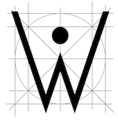 Graphic designer in Budapest, Hungary. Graduate of Loughborough University, class of 2018 (with a bachelor's degree), and Moholy-Nagy University of Art and Design in Budapest in 2021 (with a master's degree). At Loughborough University (UK), Kornel Faludi designed a set of generative typefaces (2016), i.e., typefaces that are very modular and computer-generated to a large extent. His typographic oeuvre is quite experimental. Many of his fonts use just basic geometric structures such as circles, arcs and rectangles.
 In 2019, he published Thin Stroke, Alien, the kitchen tile typeface Blocks, the organic typeface Swan, the blocky typeface Bagur, the prismatic typeface Baton, the rounded stencil typeface Stencil, the experimental typeface Geometric, the piano key typeface Darling, and the techno typeface Aquarius. Creator of these display typefaces between 2015 and 2021: Aquarius, Black (piano key style), Blocky (kitchen tiles), Computer, Futuristic, Geometric (prismatic), Martian, Organic, Sliced, Stencil, Striped, StrokeLine, Thinline. [Google]
[More] ⦿
|
Krisztian Minya
|
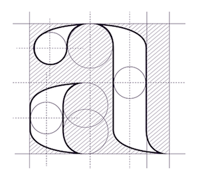 Graphic designer in Budapest, Hungary, who created the experimental compass-and-ruler typeface Abovo in 2015. [Google]
[More] ⦿
Graphic designer in Budapest, Hungary, who created the experimental compass-and-ruler typeface Abovo in 2015. [Google]
[More] ⦿
|
Kyle Sowden
|
Cardiff, Wales-based designer of a codex-style all caps typeface in 2015, during his studies at the University of South Wales. [Google]
[More] ⦿
|
L'Abécédarienne's Original Handlettered Fonts
[Amy E. Conger]
|
Amy Conger's free fonts: Halcyon (handwriting), Splurge (handwriting), Ticket Caps, Thicket (1999), Respess Capitals (2003), Duerer Latin (1995-1997), Cricket (1997, double-stroked hand), Gaudin, Revolving Door, Duerer Everyday Tools. Mostly original, mostly handlettered fonts, plus a gallery of unusual lettering and texts. She teaches type design at the City College of San Francisco. Dafont link. Alternate URL. [Google]
[More] ⦿
|
Levi Halmos
[no image fonts]
|
 [MyFonts]
[More] ⦿
[MyFonts]
[More] ⦿
|
Liz Collini
|
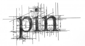 Typographic artist in the UK, whose work includes a series of ruler-and-compass constructions of letters. Images: i, ii, iii, iv, v, vi, vii. [Google]
[More] ⦿
Typographic artist in the UK, whose work includes a series of ruler-and-compass constructions of letters. Images: i, ii, iii, iv, v, vi, vii. [Google]
[More] ⦿
|
Makoto Kamimura
[Kamimura & Co. (was: Studio Antwork, or: Detail Type Foundry)]
|
[More] ⦿
|
Manfred Klein
[Manfred Klein's Fonteria]
|
[MyFonts]
[More] ⦿
|
Manfred Klein
[Manfred Klein: Codex-style fonts]
|
[MyFonts]
[More] ⦿
|
Manfred Klein
[Manfred Klein: Blackletter, Fraktur, Rotunda]
|
 [MyFonts]
[More] ⦿
[MyFonts]
[More] ⦿
|
Manfred Klein: Blackletter, Fraktur, Rotunda
[Manfred Klein]
|
 Manfred's fascination with blackletter and its German roots is apparent from the tens of typefaces he designed that are either revivals of historic typefaces or playful and not so playful extensions. Here we go:
 - ArthritishSpringtime
- BarlosRandom, BarlosRandomRings
- BarlosiusEdged (2007)
- Bastarda-K, BastardaButtonsBeta, BastardaMajuskel1300, BastardusSans
- BauernFraktur (2004, after the 1911 original by Bauersche)
- BayreuthFraktur, Bayreuther-BlaXXL (2005, a variation of Schneidler's Bayreuth)
- BigBroken, BigBrokenTwo
- BigElla
- Brahms-Gotisch (2005, with Petra Heidorn: a revival of Heinz Beck's 1937 typeface at Genzsch&Heyse)
- BrokenAlphabetTradition, BrokenBrainsFrax, BrokenCapsJumperB, BrokenHand-Bold, BrokenHand, BrokenHandLight, BrokenRoman-Bold, BrokenSansCaps, BrokenSansCapsJumper, BrokenWoodtypes, BrokentTraditionRound
- BruchRund
- BruchschriftMK
- Burte-Fraktur
- Burtine (2003: handwritten freestyle version of Burte Fraktur, 1928), Burte-Fraktur, Burtinomatic, Burtinomatic-DemiBold
- Burtinomatic-DemiBold, Burtinomatic
- CancellerescA
- CantaraGotica
- Cantzley Inverse Caps (2007), CantzleyAD1600 (2005)
- CaslonishFraxx
- ClaudiusImperator
- Clausewitz-Fraktur (2005). Designed in memory of Klaus Burkhardt.
- CaslonishFraxx
- ClaudiusImperator
- CowboyCaxton
- Cuxhaven Initials Round (2006), CuxhavenFraktur (2006), CuxhavenInitials (2006), CuxhavenTimes (2002). All named in honor of Petra Heidorn, who is from Cuxhaven.
- DecadentaFrax (2007)
- DirtyThinkwitz (2003). In honor of his good friend Klaus Burkhardt.
- DizzyBrokenWritten
- DolbyFraxCaps (2005)
- DornspitzGrotesk
- DoubleBrokenTextura
- Druckschrift-Initialen
- DrunkenSailor (2006)
- DuerersMinuskeln
- ElectrUnciale (2005)
- ElephantaBlack (2006)
- FatFreeFrax
- FlyingHollander (2005)
- FracturiaSketched, FracturiaSketchedCaps
- FraktKonstruct, FraktSketch, FraktSketchFS, FraktalConPablos, FrakturInRings (2007), FrakturInitials07 (2007), FrakturNitials (2006), FrakturaFonteria, FrakturaFonteriaSlim (2006)
- FrakturCondensedHeadline, FrakturCondensedHeadlineExtra
- FraxBoxes, FraxBricKs, FraxBrix, FraxHandwritten-RoundCaps, FraxHandwritten, FraxHandwrittenXtrem-Medium, FraxInCage, FraxInCageLeftOblique, FraxInCageRightOblique, FraxInitials, FraxMouseSketches, FraxxSketchQuill
- FrungturaFS
- GGothiqueMK
- GermanFatman (2006)
- GingkoFraktur (2006)
- GoldenSwing
- GotenborgFraktur (2007)
- GothicLetters (2007)
- Gotic Caps (2006), GoticaBastard, GotischeMajuskel, GothicMajuscles
- GotikaButtons (2005, after Imre Reiner's Gotika from 1933)
- GutenbergsGhostypes, GutenbergsTraces
- HamletOrNot, HamletTobeornot
- HansFraktur
- HansSachsCaps (2007)
- HansSchoenspergerRandomish
- HappyFrax (2006)
- Haunted-Normal, HauntedBricks
- Heimat
- Holland Gotisch (with Petra Heidorn; a revival of Nederduits by Johann Michael Fleischmann, ca. 1750)
- ImresFraktur, ImresFraxCaps (2007)
- Incunitials
- IronFraktur
- JessicaPlus
- JoeCaxton
- JohannesBricks, JohannesButtons-02, JohannesGDiamonds, JohannesGLastTraces (2007), JohannesTraces
- Jugendstil (2006)
- KaiserRotbartCaps (2007)
- KL1CiviliteEdges
- Kl1RheumaticFraktur
- KleinSchwabach (2005)
- KleinsBrokenGotik (2006)
- KlungerCaps (2006)
- Leibniz-Regular
- LombardPlattfuss, Lombardic
- LookBrokenTypes
- LuFraktorsoBroad
- LudwigHohlwein (2006)
- LufrakturBricks (2006)
- LutherDuemille, LutherMousedrawn-Bold, LutherMousedrawn
- MKBritishWriting
- MK Broken Types (2006)
- MKFraxConstr (2007)
- MKImresTshirtsA
- MKalligFrax, MKalligFrax-MediumItalic
- MKancellerescaCaps (2005)
- MKantzley (2005), MKanzleiCaps-One (2006)
- MKapitalisRusticaMedium
- MKaslonTextura
- MoKsford, MoKsfordBold, MoKsfordDemiBold, MoKsfordExtraLight, MoKsfordLight
- MonAmourCaps (2006), MonAmourFraktur-Broken (2006), MonAmourFrakturRegular
- MonksWriting
- MorbusParcinsonFraxx
- MorscheKnochen
- MountFirtree
- MousefraKtur
- Münchner-Fraktur (2005). A revival of Renaissance Fraktur by Heinz König, 1885, Genzsch&Heyse.
- MyElectronicSchwabach
- NeuGothic-Bold
- Neudoerffer, NeudoerfferScribbleQuality. Both codex style typefaces are from 2003. Manfred writes that Neudoerffer is an unaltered version of the original Neudoerffer Initialen from 1660.
- OKsfordBadFat, OKsfordItalic
- OldTypographicSymphony-Regular, OldTypographicSymphony-Round
- PopFraxFrankfurt (2007), PopFraxFrankfurtCondensed (2007)
- PrinzEugen
- Potsdam (2005, a revival of a 1934 typeface by Robert Golpon)
- Prothesis-Black, Prothesis-Caribiqu, Prothesis-Caripix
- RandomFrax
- ReadableGothic
- RememberReinerFS
- RotundaEspagna
- Schaftstiefel Kaputt (2003)
- SchmaleGotischMK, SchmalfetteGotisch
- SchneidlerSchwabacher, SchneidlerSolitaires, SchneidlerSolitairesRound
- Schwabach, SchwabachDuemille, SchwabachScribbels, SchwabachScribbelsSecond
- ScribbledFrakturX-Heavy (2006)
- SketchedCassiusBroken
- SmallEdgedFrax (2006)
- Snoutlike (2003)
- SpaceWinningFrax (2007)
- TizonaDance
- TshirtsForFrax
- TypoasisBoldGothic (2003)
- VanDoesburgBrokenFS
- VeryBrokenFrax
- WaldarbeiterGotisch
- WeimarInline
- WeissGotischRandom
- Weissgotnitials (2005, based on Weiss's Lichte Initialen, 1935)
- WittewittMajuscles-Flourish, WittewittMajuscles-FlourishBricks
- WrittenFrax (2007)
Download page. Download all these fonts in onze zip file.               
[Google]
[MyFonts]
[More] ⦿
|
Manfred Klein: Codex-style fonts
[Manfred Klein]
|
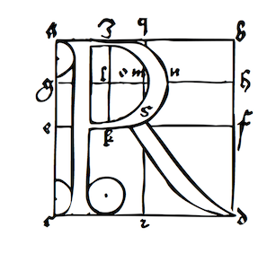 The geometrical overlays reminiscent of Duerer are another recurrent theme in Manfred's work. To wit: DancingVampyrish, GrafBoldBold, GrafCirculum, GrafCirculumBricks, GrafObliqueItalic, GrafRoundishMedium, GridConcreteDue, GridConcreteLogoable, OldConstructedCaps, RodauButtons, RodauButtonsInverse, RodgauHeads, RodgauerFisheyes, RodgauerOne, RodgauerOneRoundMedium, RodgauerThree, RodgauerThreeRoundedMedium, RodgauerTwo, RodgauerTwoRounded-Medium, RomanGridCaps, SketchesByDuerer-Inverse, SketchesByDuerer, TheRoots, XPCrazy-Light, XPFourTwoContourMedium, XperimentypoFS, XperimentypoFSBlack, XperimentypoFSWhite, XperimentypoFourBRound, XperimentypoFourCRoundInvers, XperimentypoFourRound, XperimentypoNr1, XperimentypoNr1Oblique, XperimentypoStripes-One, XperimentypoStripes-Two, XperimentypoThree-B-Square, XperimentypoThree-C-Square, XperimentypoThree-Crazy, XperimentypoThreeSquares, XperimentypoTwo, XperimentypoTwoCrazy, XperimentypoTwoStripes.
 Download page. Download all these fonts in onze zip file.     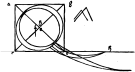       
[Google]
[MyFonts]
[More] ⦿
|
Manfred Klein: Font Hosting
|
 In July 2017, Typoasis / Moorstation shut down. Run by Petra Heidorn out of Hamburg, Germany, it hosted her own fonts, as well as those of the popular and talented type designer and artist Manfred Klein (Frankfurt, Germany). Manfred, who was an active type designer from the late 1990s until about 2007, created over 3600 fonts in that period. Those fonts are now hosted at my site, thanks to Petra Heidorn. Manfred's oeuvre is too large to consume and analyze in one sitting or even one month.
 This zip file contains all his fonts. For those interested in particular styles, please visit this web page for downloads of individual fonts, or fonts grouped by these themes: 3d, Africa, aliens, animals, architecture, arrows, astrology, birds, calligraphy, cave style, codex, Christmas, dada, decorative caps, didone style, dingbats, display style, Egypt, eyes, fists, Fraktur, handcrafted typefaces, Karla, kids, Laurens, masks, medieval styles, Mexico, monsters, native themes, ornaments, painters, peace, people, pixel fonts, runes, Sans, serif, slab, stencil, stone age, typewriter, uncial, wood and woodcuts. [Google]
[More] ⦿
|
Manfred Klein's Fonteria
[Manfred Klein]
|
 Frankfurt-based designer (b. 1932, d. 2018) whose creative output is so large that he deserves a separate web page. His URL at Moorstation from 2000-2007. New page on him by Florian Rochler. Font squirrel link. Dafont link. [Google]
[MyFonts]
[More] ⦿
Frankfurt-based designer (b. 1932, d. 2018) whose creative output is so large that he deserves a separate web page. His URL at Moorstation from 2000-2007. New page on him by Florian Rochler. Font squirrel link. Dafont link. [Google]
[MyFonts]
[More] ⦿
|
Marco Antonio Rossi
|
 Italian calligrapher from the late 16th century, who created several sets of beautiful initials. Geometric construction of roman capitals, from Giardino de Scrittori (Rome, 1598). [Google]
[More] ⦿
Italian calligrapher from the late 16th century, who created several sets of beautiful initials. Geometric construction of roman capitals, from Giardino de Scrittori (Rome, 1598). [Google]
[More] ⦿
|
Matthew Aaron Desmond
[Matthew Desmond]
|
 MADtype (est. 1996) is Matt Desmond's place in the type world. He has had a prolific career that started out with shareware fonts while Matt was at the Minneapolis Technical and Community College. His page back then said A haven for quality shareware type for the Mac. Later, Matt started mattdesmond.com, and co-founded the Test Pilot Collective (est. 1998 with Joseph Kral and Mike Cina). Many of his early typefaces were experimental and/or futuristic. In late 2003, mattdesmond.com disappeared, and MADtype, commercial now, resurfaced at the MyFonts site. Currently, Matt is based in Minnetnka, MN. He has also lived in Atlanta, GA, Fayetteville, GA, Rochester, NY, Redwood City, CA, and San Francisco, CA. His fonts can also be purchased via You Work For Them. He also does commissioned type design. Some fonts are freely available at the Google Font Directory.
 Retail types as of 2011: - Abel (2011, Google Font Directory). Abel Pro was published in 2013.
- Aldrich (2011). A Bank Gothic style face, free at OFL.
- Amber (2000): kitchen tile face.
- American Gothic (1998): squarish.
- Audebaud (2010): a 19-th century style French Clarendon (wood type look). The design was inspired by the work of Constant Audebaud, an engraver of wooden type that was used for posters. Audebaud's work appeared in the 1880s in the Deux-Sèvres département of France.
- Beat (1998): rounded OCR face.
- Brauhaus (2004): Textura face.
- Cagliostro (2011). A free font at Google Web Fonts that is based on the handlettering of Ozwald Cooper.
- Curbdog (1998).
- Desmond Text (1998): a roman that has features of University Roman.
- Distill (2009): a De Stijl font that shouts 1920s.
- Dunelm (1996): emulation of 17th century printing styles.
- Dwiggins Deco (2009): This typeface was originally designed in 1930 by W.A. Dwiggins as the cover for the book "American Alphabets" by Paul Hollister. Only the 26 letters of the alphabet were included on the cover, so the rest of the numbers, punctuation, symbols, and accented characters have been crafted in a matching [art deco] style.
- Findon (2007): stencil.
- Futuristic category: ER9 (1999), KAH (2005, LCD style), Lunarmod (1997), Retron (1997; can be considered as a retro upright connected script as well), Shifty (1998).
- Grunge category: Bulletin (1997), Gothico Antiqua (1999), Rubba (1997), Stomper (1997--a rubber stamp font), Zapatista (1998-2007).
- Handwriting, handprinting category: Casino Hand (2005), Ghouliez (1996), Handegypt (2002---hand-drawn slab serif), Handy Sans (1997, hand-drawn sans), Joppa (1997), Pufficlaude BT (1998).
- Hessian (2009): Tuscan style wood type.
- Hydrochlorica (2004): organic.
- Invoice (1997).
- Ironside Crosses (2004): dingbat face.
- Marble Roman (2004-2009): angular roman all caps type.
- Matterhorn (2013). A 9-style sans family created with Michael Cina for Disney. Not to be confused with the many retail typefaces that are also called Matterhorn, such as Paratype's PT Matterhorn (1993) and Treacyfaces' TF Matterhorn (1990s).
- Pacioli or Luca Pacioli Caps (2007: emulating a mathematically constructed caps font by Pacioli (1509) published in his treatise De divina proportione.
- Pixel category: Basis (1999), Mang (1997).
- Plenti (2004): ultra plump.
- Quantico (2007): octagonal.
- Stencil category: Bandoleer (2009, +Tracer: a couple of stencil fonts with art deco and army influences), Madison (2007, slab serif stencil), Mercado (2005; has a non-stencil Mercado Sans).
- Urbandale (2018). A basic sans family.
- Variable (2004-2010): a sans-serif monoline typeface that includes ultra thin weights.
- Vexed (2005): sketched face.
- Wolfsburg (2007): blackletter stencil.
- Wooddale (1999): wood type emulation.
Free types as of 2010: Marble Roman, Environ regular, Dorkbutt, Europa, Exsect, Inthacity, Liquidy Bulbous, Lustria (2012, Google Web Fonts), Stomper. Commissioned types: 77kids (2007, for the children's brand; the sketched typefaces were done with Justin Thomas Kay), AE Aerie (2005-206, American Eagle Outfitters), AE Newburgh (2005-206, American Eagle Outfitters), AE Summer Fonts (2007, all for American Eagle Outfitters), EEL Futura (2006, for Enjoying Everyday Life), Nike World Cup (2006), Virgin America (2006). Typefaces from 2019: Starfire (2019, a retro geometric sans). Orphaned types that disappeared or were planned but never executed: BrotherMan, Caprice, Convolve, HipstersDelight, Lugubrious, ModestaSmallCaps, Serifity, Skitzoid, Sliver, ThrowupSolid, Auresh (1998, futuristic; Test Pilot Collective), Kcap6 (1998, with Cina; Test Pilot Collective), Epiphany (1997; Test Pilot Collective), Testacon (with Kral and Cina; Test Pilot Collective), Civicstylecom (1999; Test Pilot Collective), Lutix (1998; Test Pilot Collective), Xerian (1997; Test Pilot Collective), Swoon, Furtive (2004, a sans), the display typeface Flathead (2004), the blackletter typeface Bahn (2004), Mesotone BT (2006, Bitstream, a monoline sans), Practical (a monoline connec script, planned in 2007 but not published), Poliphili (planned in 2007, as a revival of an Aldus/Griffo font), Wutupdo (1996, Garage Fonts), GFDesmond (Garage Fonts), Drone, Golden Times (2014, a corporate small caps typeface for the University of Minnesota), Vapiano (2014: hand-printed typeface for Vapiano International). Behance link. View Matt Desmond's typefaces. Fontspring link. Fontsquirrel link. [Google]
[MyFonts]
[More] ⦿
|
Matthew Desmond
[Matthew Aaron Desmond]
|
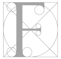 [MyFonts]
[More] ⦿
[MyFonts]
[More] ⦿
|
Meghan Dove
|
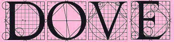 Meghan Dove (Meghan Dove Design, Montreal) created a vectorized version of Geoffroy Tory's Champ Fleuri (2015). Behance link. [Google]
[More] ⦿
Meghan Dove (Meghan Dove Design, Montreal) created a vectorized version of Geoffroy Tory's Champ Fleuri (2015). Behance link. [Google]
[More] ⦿
|
Michael Leighton Beaman
[Beta Field]
|
[More] ⦿
|
Michel M.
|
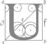 German freelance artist and designer, associated with URW++, b. 1964. He graduated in 1992 from Fachhochschule für visuelle Kommunikation und Design Münster. He created Tricky (2002, stencil face), Keys (2002), Hands on Albrecht (experimental font at URW, 2005, based on Albrecht Dürer's geometrically constructed letters), TrickyTracky, MovingMouse (computer key fonts), Oranda MM and Oranda SC (for NABU Münster), LuxSansBookNumsOsF and LuxSansBookNumsTab (for Mekomnet), CometoMama and CometoDaddy (done for invers-Weihnachts-Typo-Wettbewerb), GooseBump (Farmers, Plants, Desaster, Twinkle: free download!), Playstation (free dingbat font), Radieurorund ascii (free download), Teletron (grunge family done at Volcano Type). In 2010, he set up Fontschmiede with Frank Baranowski, another (ex-)URW++ designer. His fonts there include the techno typefaces Und4 (2008) and Line44 (2009), and the hand-printed typeface Just Deine (2011).
 MyFonts page. Alternate URL. Klingspor link. Volcano Type link. [Google]
[MyFonts]
[More] ⦿
|
Miguel Bernardino
|
 Lisbon, Portugal-based designer of the roman capitalis cmpass-and-ruler font Manoel Display (2016), which covers Latin and Greek. Manoel is named after Manoel de Andrade de Figueiredo (1670-1735), a royal penman and calligrapher who wrote Nova escola para aprender a ler, escrever, e contar (Lisboa Ocidental, 1722). [Google]
[More] ⦿
Lisbon, Portugal-based designer of the roman capitalis cmpass-and-ruler font Manoel Display (2016), which covers Latin and Greek. Manoel is named after Manoel de Andrade de Figueiredo (1670-1735), a royal penman and calligrapher who wrote Nova escola para aprender a ler, escrever, e contar (Lisboa Ocidental, 1722). [Google]
[More] ⦿
|
MyFonts: Dürer-style typefaces
|
Typefaces that are based on Dürer's proportioned style. [Google]
[More] ⦿
|
no image fonts
[Levi Halmos]
|
 Free fonts by Hungarian type and graphic designer Levi Halmos [or: Levente Halmos], made between 1997 and 2001: AlienGhost2, Aliens, Anabolic Spheroid (2001, revived but alas commercialized by Roger S. Nelsson in 2009 as Anabolic Spheroid Pro), Aztec, Baby Universe (2000), Bateman, Bedlam Remix (2001), Bitsumishi (Bitsumishi Pro (2009) appeared at CheapPro Fonts; Bitsumishi Pro v2 followed in 2012), Butch, Byblostie, CHELIVES, Caddy (1996), CelticGaramond, CelticGaramondthe2nd, Chemistry, Coolthreepixels, Crystal Clear, Danube (techno, geometric), DataTransfer, Dredwerkz, ElephantMan, Escape Pod Normal, FUTURE, Faceplant, Finchley (1998), FreakShow, Gagarin (2001, a Cyrillic simulation and constructivist family), GraveDirt, Guevara, Haiku, Helldorado (2001, Western), Hibernate (2000), Iamsimplified, Indochine (2002, oriental letter simulation), IronLeague (2002, a Jonathan Barnbrook style face), Ivanbats, Ivanhoe, KabosGyula, Kalocsai Flowers Pi (2001), Kenzo, KingKikapu, Kozmonauta (2000), Kozmonauta2, Krizia Uomo (1995, art deco; later renamed Krizi Amo Pro in 2011, probably under pressure from Uomo), Leonardo (1996, a constructed face), Lefferts Corner (2001), LicenzPlate, Lousitania (2001, square-serifed), MagyarSerif, MarshGas, MathmosOriginal, Mutter (a stitch font), Niobium [Niobium Pro (2010, with Roger S. Nelsson) is used for signage and wayfinding in the new Mbombela Stadium built for the FIFA World Cup 2010], Nordic (2001; the Pro version appeared in 2010), Nushto (2000), Olympus (Greek simulation face), Peex (dot matrix family), Phatguy, PiratesGold (made commercial in the CheapProFonts collection of Roger S. Nelsson in 2009), Poison Berries (2000), PresidenteTequila (2000), RakettaFromMars (2001, fifties style futurism), Rammstein, RammsteinRemix (2001, constructivist), RedheadGoddess (2000), RedwildoderRotwild, Resurrection, Runningshoe, Sarkozi Line Patterns Pi (2001), Scully (scanbats), ScumoftheEarth (2000), Shazbot, Slither (1998), SmartSexy, SmartandSexy, Snake Venom (2000, Mexican simulation face), SpaceWorm (2000, futuristic), Sporty, Stonebridge, Subatonik, Sulphur (2000, a typeface influenced by gothic cathedrals), Tank Junior (2001), TerraX, Thrust (2000, Star Trek face), TickyFont, Treasure Island (2001, rounded with a semi-Greek look), TrustThisOne, TwoGunJohann (2000), TypeKnight (2001, with hairline serifs), VicePresidente (2001, Mexican simulation face), VoodooDolls, Voodoo Spirits (2001, wiggly hand), WeepingItalic, WhoulNormal, Zombieball.
 Myfonts link. Roger S. Nelsson (Cheapprofonts) and Halmos extended Danube and Celtic Garamond in 2009 as Danube Pro and Celtic Garamond Pro, respectively. Fontspace link. Font Squirrel link. Dafont link. View Levi Halmos's commercial typefaces. [Google]
[MyFonts]
[More] ⦿
|
Octavo Edition
|
Collection of antique printed materials including Giambattista Bodoni's Manuale Tipografico (Parma, 1818), Albrecht Dürer's De Symmetria Partium in Rectis Formis Humanorum Corporum, Libri in Latinum Conversi (proportions of the human form, Nüremberg, 1538), Aldus Manutius's Hypnerotomachia Poliphili, Geoffroy Tory's Champ Fleury (1529). Check out the Alfabeto Figurato (alphabet etching) by Florentine artist Giovanni Battista Braccelli (Naples, 1632), and his wonderfully surprising book Bizzarie di Varie Figure (Livorno, 1624). [Google]
[More] ⦿
|
Omer Agiv
[Fontomania (or: Fontilizer)]
|
[More] ⦿
|
Pacioli
[Peter R. Wilson]
|
Peter R. Wilson's metafont code (1999) for Pacioli. The pacioli package provides fonts designed by Fra Luca de Pacioli in 1497. The font is uppercase letters together with punctuation and some analphabetics; no lowercase or digits. [Google]
[More] ⦿
|
Paolo Palma
|
Italian designer (b. Fermignano, 1973) of the experimental font Elise (2000). He lives in Fermignano. At the School of Graphic Design in Urbino, he wrote a thesis on Wim Crouwel. As a result, his fonts are expertimental and geometric: Zen (2002, looks like lego blocks), Eroi (2001, artistic stencil font), Rainbow Type (2001, dot matrix font), CuboType (2001), Paradise (2001, fonts nailed to the wall), Ale (2000, only circles and lines, a cross between a kitchen tile and a Codex font). [Google]
[More] ⦿
|
Penguin Productions
|
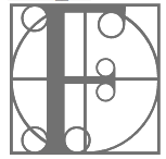 Located in Ronkonkoma, NY, this outfit published Middleton, Rick, Walrodi, and WalrodInitials in 1992. Pick up WalrodInitials here or here. [Google]
[More] ⦿
Located in Ronkonkoma, NY, this outfit published Middleton, Rick, Walrodi, and WalrodInitials in 1992. Pick up WalrodInitials here or here. [Google]
[More] ⦿
|
Peter R. Wilson
[Pacioli]
|
[More] ⦿
|
RUSH Font Project
[Sami Artur Mandelbaum]
|
From the web site: The Rush Font Project is a collaboration between Rush fans who have pooled their resources to compile a library of all available fonts used in the album art of Rush [...] The Rush Font Project is a collaboration between Eric Hansen, Hank Niemczyk and Sami Mandelbaum, whose assistance in creating the Rush fonts has been invaluable. Special thanks to Dave Ward, creator of the "Hemispheres" font. The fonts, mostly dated 2005-2006: AShowofHands, Anatomy, AnatomyFill, AnatomyGuides (a Codex-style typeface), AnatomyGuides, AnatomyOutline, AnatomyOutline, Bravado, CaressofSteel, Chronicles, Counterparts-Italic, Counterparts, DerTrommler-Regular, Dreamline, Exit...StageLeft-Bold, Exit...StageLeft-BoldItalic, Exit...StageLeft-Italic, Exit...StageLeft, FarewellToKings, FeedBack (Arnold Boecklin ripoff?), FlyByNight, GhostRider, GraceUnderPressure, GrandDesigns, GrandDesignsLined, Hemispheres, HoldYourFire, HoldYourFireBlack, JacobsLadder, Kofia, Limbo-Italic, MaskedRider, MomosDanceParty, MovingPictures, MyFavoriteHeadache, OBaterista, OneLittleVictory, PermanentWaves (the text says that this is a Stu's Diner font from 1999), PoweWindows, Presto, R30, R40, Replay-Bold, Replay-Regular, RoadShow, RollTheBones-Bold, RollTheBones, Signals, Snakes&Arrows-Bold, Snakes&Arrows, Snakes&ArrowsLight, SpiritofRadio, Strangiato, SummertimeBlues, Syrinx, TestForEcho-Italic, TestForEcho, VaporTrail, Victor, WorkInProgress-Bold, WorkInProgress-BoldItalic, WorkInProgress-Italic, WorkInProgress, WorkInProgressSwash-RomanItalic, WorkingMan. Mandelbaum made Chronicles and FlyByNight. Unclear who "made" the other fonts. I say "made", because this sure looks like an exercise in renaming commercial fonts. [Google]
[More] ⦿
|
Salman Muavia
|
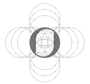 Salman Muavia (Lahore. Pakistan) created the compass-and-ruler Latin typeface Zellige in 2013 at Multan College of Arts. [Google]
[More] ⦿
Salman Muavia (Lahore. Pakistan) created the compass-and-ruler Latin typeface Zellige in 2013 at Multan College of Arts. [Google]
[More] ⦿
|
Sami Artur Mandelbaum
[RUSH Font Project]
|
[More] ⦿
|
Sezione Aurea
[Alessandro Pascoli]
|
Italian design studio in Perugia founded in 2002 by Alessandro Pascoli and Daniele Paoletti. Pascoli created the experimental geometric typeface Riccini Aureo in 2005. It was a brand typeface for Riccini in Perugia to replace Blippo, totally conceived on the basis of geometric patterns as in the days of Dürer. [Google]
[More] ⦿
|
Shaivalini Kumar
|
 New Delhi, India-based designer of the circle-based rounded sans typeface Spry (2016) which was constructed with compass and ruler. Behance link. [Google]
[More] ⦿
New Delhi, India-based designer of the circle-based rounded sans typeface Spry (2016) which was constructed with compass and ruler. Behance link. [Google]
[More] ⦿
|
Sigismondo Fanti
|
Italian mathematician and astronomer from Ferrara. He published Theorica et Practica de modo scribendi fabricandique omnes litterarum species (Venice: Giovanni Rosso, 1514). In 1535, he published the penmanship book Thesauro de scrittori: opera artifisiosa laquale con grandissima arte si per pratica come per geometria insegna a scrivere diversa sorte littere.... Quoting this site: Fanti published this work so that secretaries, copyists, merchants, and artisans could learn techniques of applying geometry to the construction of letterforms. These woodcuts of the capital letters "D" and "E" are examples of how Fanti used geometric patterns in the design of his letters. The circle and the square, the building blocks of classical architecture and the basis for letter designs that appeared in Luca Pacioli's Divina proportione, published in Venice in 1509, provide a starting point for Fanti. He, however, pushed past the limits of Pacioli's theory of proportion by applying principles of geometry to extend the lines of his letterforms beyond the limits imposed by the proportionality of the circle and the square. [Google]
[More] ⦿
|
Sofia Valvi
|
Graphic designer in Athens (Greece) who made some nice posters in 2011 about an imaginary 2018 FIFA World Cup in Tanzania---great lettering too. [Google]
[More] ⦿
|
Stanislas Stezeck
|
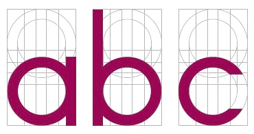 Brighton, UK-based but French designer of the gridded compass-and-ruler fonts Fontastic (2014), Prototype (2014) and Angulstar (2014). Behance link. [Google]
[More] ⦿
Brighton, UK-based but French designer of the gridded compass-and-ruler fonts Fontastic (2014), Prototype (2014) and Angulstar (2014). Behance link. [Google]
[More] ⦿
|
Stefan Lundhem
[Fyrisfonts]
|
[More] ⦿
|
Stefan Penezic
|
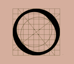 Uzice, Serbia-based designer of the (partial) Trajan typeface Roma (2017), which was finished during his studies at Politehnika Beograd. Behance link. [Google]
[More] ⦿
Uzice, Serbia-based designer of the (partial) Trajan typeface Roma (2017), which was finished during his studies at Politehnika Beograd. Behance link. [Google]
[More] ⦿
|
Steven J. Lundeen
[Emerald City Fontworks]
|
[MyFonts]
[More] ⦿
|
Strange Design
[Goh Yam Whee]
|
Strange Design is Goh Yam Whee in Singapore. Intersections of circles, and only that, was used to create the outlines of the experimental but mathematically precise typeface Fleurmetry (2011) that was created by Goh Yam Whee (Singapore) in 2011. Stac (2013) is a 3d typeface. [Google]
[More] ⦿
|
Streetwise Software
|
This oufit produced BD-International.ttf, ByDesign-Northern.ttf, b BD-Bockloo, BD-Cursif, BD-Davinci, BD-Denver, BD-EastSide, BD-EngravedBlack, BD-EngravedNarrow, BD-EngravedRegular, BD-Garmonde, BD-Graduate, BD-Hanover-Black, BD-Hanover, BD-Journal-Wide, BD-Journal, BD-Jurassic, BD-JurassicBlack, BD-Keyboard, BD-Merced, BD-Miami-Skyline, BD-Miami, BD-ModernArt, BD-Negative, BD-Northern, BD-Norway, BD-Oxford, BD-Poster, BD-Quattra, BD-Renaissance, BD-SantaMonica, BD-Shadow, BD-Springer, BD-WestSide, ByDesign-Borders, ByDesign-Northern (1994). [Google]
[More] ⦿
|
Su Jin Lee
|
 Kangnam, Korea-based designer of the Autumn Wind typeface for Hangul (2015). [Google]
[More] ⦿
Kangnam, Korea-based designer of the Autumn Wind typeface for Hangul (2015). [Google]
[More] ⦿
|
Terry Wüdenbachs
|
 Snowboarder from Liechtenstein, who designs typefaces at P22 and its descendant foundries such as HWT. The list:
 - His first font was the whacky P22 Catalan (2003), which was inspired by Antonio Gaudi, Joán Miro and Salvador Dali.
- In 2004, he created BlancoNeg, Mexican Relics (100 dingbats from pre-Columbian Mexico), Sniplash (a 60s cartoon face) and Durer Caps (after Dü'rer's 1525 original).
- In 2005, he added P22 Mystic (art nouveau).
- The curly P22 Festiva and P22 Huffer Pro (comic book face) followed in 2009.
- In 2010, he designed two revivals of Nebiolo work, P22 Nebiornaments, and P22 Slogan (after the 1957 brush font by the same name by Aldo Novarese).
- In 2012, he created P22 CoDependent, a set of two art deco typefaces that revive of the Independant typeface from 1930 created by Dutch designer Johannes Nicolaas Coenraad Collette along with Jos Dufour from Belgium.
- In 2012, Terry joined forces with Richard Kegler and published the multilayered Western circus font HWT American Chromatic at Hamilton Wood Type. American Chromatic was originally created by Wm. H. Page & Co. circa 1857-59.
- In 2013, he designed HWT Arabesque for Hamilton Wood Type. This art nouveau / psychedelic typeface was originally produced by the Morgans & Wilcox Co. and the Wm. Page Co. as almost identical designs. Both manufacturers were acquired by Hamilton and offered briefly by Hamilton as design #618. William Page Arabesque was first shown in 1872 and after the Page purchase by Hamilton in 1891, it was renamed to No. 618. Similarly, the Morgans & Wilcox Arabesque was first shown in 1884, but after Morgan's purchase by Hamilton, it was renamed to No. 3189.
- HWT Showcard Script (2020). Described as an extended script type that lends itself well to fine fashion, ready-to-wear and all quality merchandise in a marketing blurb that pitched Beaufont by the Morgan Sign Machine Company of Chicago for their Line-O-Scribe sign printing system. This advertising script font was originally manufactured exclusively for Morgan Sign under license by the Hamilton Wood Type Manufacturing Company.
- In 2020, the Bixlers and P22 jointly published the ornamental typeface LTC Bixler Ornaments. The digital version is due to Terry Wudenbachs.
- P22 Snowflakes (2020). By Richard Kegler and Terry Wüdenbachs.
Klingspor link. View Terry Wüdenbachs's typefaces. [Google]
[MyFonts]
[More] ⦿
|
Thibault de Crespin
|
Laval, France-based designer of the grid and compass-based typeface Ox (2014) and the modular typeface Triominos (2014) that uses only triangles as building blocks. [Google]
[More] ⦿
|
Thomas Ewing French
|
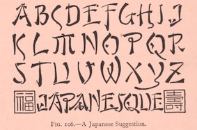 Scientific lettering expert, 1871-1944. His book The Essentials of Lettering (1912, McGraw-Hill, New York), coauthored with Robert Meiklejohn, has many historical examples and takes the reader on a grand tour of lettering. The tease. Local download.
 For a digital revival of some alphabets, see Jeff Levine's New Thin Roman JNL (2019) and Drafting Class JNL (2021). [Google]
[More] ⦿
|
Tiago Silva
|
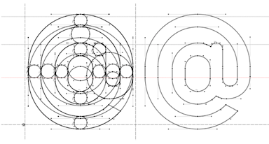 Graphic designer in Curitiba, Brazil. He created the compass and ruler face Curitiba (2011). Before that, he designed Repo (2011), an avant garde monoline sans face. That typeface will soon be available for free download.
 In 2012, he created a free icon set called 24 Things. In 2013, he added the sans typeface Franzina Condensed Hairline. Cargo Collective link. [Google]
[More] ⦿
|
Tri Shiba
|
Ho Chi Minh City, Vietnam-based designer of a codex-style Trajan column-inspired roman capital alphabet in 2017. Behance link. [Google]
[More] ⦿
|
URW FontForum CD
|
The fonts on the URW FontForum CD in 2003: ArgonauticaCloD-Reg, ArgonauticaD-Reg, ArgonauticaOutCloD, ArgonauticaOutD, ArgonauticaSerD, ArgonauticaSimD, BardiT-Bol, BardiT-BolIta, BardiT-Reg, BardiT-RegIta, BardiT-UltBol, BardiT-UltBolIta, BavaroirT-Bol, BavaroirT-Reg, BohemianT-Bol, BohemianT-BolIta, BohemianT-Ita, BohemianT-Reg, BohemianT-UltBol, BohemianT-UltBolIta, BommiCarD, BommiOxyD, BreitkopfFraD-Reg, CSCourthandD, CSFuzzyLogD, CSTakahashiD (oriental simulation font), CrayfishBolAD, DeepSpaBigBalD-Reg, DeepSpaD-Bla, DeepSpaD-Lig, DeepSpaMeaBalD-Reg, DeepSpaSmaBalD-Reg, EstroD-Reg, FunnyNatD, HandsOnAlbD-Reg, KeysD, KeysMACDAlt, KeysMACDReg, KeysMACEAltD, KeysMACEReg, KeysMouse, KeysPCDAlt, KeysPCDReg, KeysPCEAlt, KeysPCEReg, LegendeD-Reg, LuedickitalD-Bol, LuedickitalD-Reg, MaximD-Reg, MovingMouD, OrganiconT-Bol, OrganiconT-BolIta, OrganiconT-Reg, OrganiconT-RegIta, ParametraT-Bol, ParametraT-BolIta, ParametraT-Ita, ParametraT-Reg, PhenotypeT-Bol, PhenotypeT-Dem, PhenotypeT-Reg, PoloD-Reg, ReneFonD, ReneLemD, RobertaD-Reg, SepulturaFonD-Bol, SepulturaFonD-Lig, SepulturaFonD-Reg, SepulturaGraINRD-Reg, SepulturaGraRIPD-Reg, TrickyD-Reg, UngerScrD-Reg. [Google]
[More] ⦿
|
Veronica DF
|
 As a student in Catania, Italy, Veronica DF designed either a revival of or a poster for Trajanus Roman in 2016. [Google]
[More] ⦿
As a student in Catania, Italy, Veronica DF designed either a revival of or a poster for Trajanus Roman in 2016. [Google]
[More] ⦿
|
Vladimir Nikolic
|
 Belgrade, Serbia-based designer (b. 1981) of these typefaces:
 - The dingbat fonts Canavarlar (2020: funny men), Haircut (2020: women's hairdos), Ornament Borders (2020), Gourdy (2020: birds), Lizards (2020), Mantra (2020), All Star (2020), Speel (2020), Soavely (horses) (2020), Forma (2020), Hell Beasts (2020), Mistresses (2020), Paraiso (2020), Crow (2020), Traverser (2020: crosses), Cats (2020), Dogs (2020), Negative-Heads (2020), Otu (2020), Wakazi (2020), Risk (2020), Wurm (2020), Beard Man (2020), Hoder (2020), Damen (2018), Damen 2 (2020), Foliga (2020), Solo Drinker (2020), Congress (2020), Farmacy (2020), Elections (2020), Emergency (2020), VN Arrows (2020), Hexagonos (2020), Automobiles (2020), Cars (2020), Emoji Boom (2020), Bestia (2020), Aliens (2020), Insect (2020), Bytost (2020), Monstero (2020), Aveto (2020), Dancing Cat (2020), Atradimas (2020), Womanhood (2020), Figur (2020: an alien insect font), Halfwits (2020), Silly Donkey (2020), Crazy Monkey (2020), Round Masks (2020), The Quick Dog (2020), Flying Birds (2020), Maskid (2020), Monstra (2020), Bull Skulls (2020), War Items (2020), Public Transport (2020), Loomad (2020), Mokhabiso (2020: African patterns), Record (2020), Mulher (2020), Heroez (2020), Bulls (2020), Madarak (2020: birds), Bold People (2020), Munari (2019: a collection of drawings based on Bruno Munari's book "Artista e designer" from 1966), Screws (2019), White Mouse (2019), Schepselen (2019), Glatze (2019), Crosses (2019), Chefs (2019), Diamond Blocks (2019), Hexagons (2019), Maumbo (2019), Circles (2019), Enfeite (2019), Pigs (2019), Mythos (2019), Kreaturen (2019), Baby Alien (2019), Body Moving (2019), Various Boys (2019), Lines and Objects (2019), Mouvman (2019), Watch (2019), Credit Card (2019), Cycles (2019), Devil Emoji (2019), Fare (2019), Mund (2019), Labbra (2019), Circular Ornaments (2019), Cranium (2019), Ugok (2019), Ansigter (2019), Tsim (2019), Schmetterlinge (2019), Jungfrau Maria (2019: religious icons), Knights Helmets (2019), Kinderskizzen (2019), Wolves (2019), Various Cats (2019), Owls (2019), Spiral Object 3D (2019), Zodiac Signs (2019), Cyborg (2019), Duck (2019), Cat 3D (2019), Object 3D (2019), Circle and Line (2019), Various Girls (2019), Dulcet (2019), Erotic Symbols (2019), Frauen (2019), Pierre the Vampire (2019), Robotter (2019), Middle Finger (2019), Claudio The Cat (2019), Medusa (2019), Veggie (2019), Pablo (2019), Fishes (2019), Dream of Picasso (2019), Stam (2019), Animality (2019), Ink Drops (2019), Faces (2019), Bayan (2019), Froggy (2019), Senhoras (2019), Diamondo (2019), Skallen (2019: skulls), Swimmers (2019), Churches (2019), Easter Icons (2019), Lippen (2019), Gullar (2019), Bankwesen (2019), Creatures with Horns (2019), Vehicles (2019), Various Hands (2019), 3D Animals (2019), Abantu (2019), Herr (2019), Menge (2019), Funny Aliens (2019), Mustachos (2019), Kids Drawings (2019), Tierfarm (2019), Troep (2018), Women Heads (2018), Cats and Dogs (2018), Wanita (2018), Eyez (2018), Animales (2018), Peoples (2018), Mobile Icons (2018), Controllers (2018), Womano (2018), Lost in Space (2018), Blumen (2018: flowers), Tetriso (2018), Snowflake (2018), Meine (2018: masks), Horoscopicus (2018), Esoterica (2018), Astrologicus (2018, astrolical symbols), Abbild (2018: African masks), Being (2018: monsters), Gebell (2018), Headed (2018), Falter (2018), Filling (2018), Anichka (2018), Cyclopia (2018), Buggus (2018), Opa (2018), Messe (2017), Head of Idol (2018), Diavolo Nero (2017: funny silhouettes).
- The boxed or encircled alphabets Audience Capitals (2020), Galileo (2020), Compare (2020), Compare-Light (2020), Hexagonas (2020), Select (2020), Before (2020), Before-Dark (2020), Boxes (2020), Boxes-Extravagant (2020), Boxes-Fancy (2020), Calf-Negative (2020), Capital-Relationship (2020), Pyxidas (2020), Capitalica (2020), Tundra (2020), Ordinary Capitals (2020), Broadway Capitals (2020), Browser Capitals (2020), Capitalismo (2019), Schwarzenberg Capitals (2019), Retrospective Capitals (2019), Official Capitals (2020), Impression (2020), Oriental (2020), and Letters in Circles (2018).
- Shadowed caps: Cleopatra (2021), Farmers Market (2021), Erkekler (2021), Assignation (2021), Greek Tragedy (2021), Distorted (2021), Lightshow (2021), Credenza (2021), Ragusa (2021), Comunismo (2021), Scordia (2021), Gazelle (2021), Organ (2021), Strizhi (2021), Umoya (2021), Ninja Justice (2021), Unlimited (2021), Unicorns (2021), Labyrinth (2021), True Artisans (2021), Poker (2021), Donald (2021), Ferrari (2021), Booster (2021), Madness (2021), Favorita (2021), Vitamin (2021), Robot (2021), Robust (2021), Engine (2021), Whether (2021), Nucleus (2021), Trunk (2021), Ombre (2021), Viscosus (2021), Jewelry (2021), Verge (2021), Pursue (2021), Keener (2021), Visor (2021), Korvo (2021), Squash (2021), Scum (2021), Darker (2021), Education (2021), Cimice (2021), Tomb (2021), Bambola (2021), Calla (2021), Rump (2021), Complex (2021), Razor (2021), Driveller (2021), Karambol (2021), Princino (2021), Berger (2021), Adopted (2021), Bugbear (2021), Samara (2021), Talisman (2021), Waterway (2021), Megabus (2021: a marquee font), Roller (2021), Numerica (2020), Bond (2020), Gloom (2020: a marquee font), Chalkboard (2020: sketched), Unboxing (2020: techno), Antennas (2020), Secca (2020), Umfo (2020), Sabbia (2020), Squirrel (2020), Byzan (2020), Debtor (2020), Bridge (2020), Familie (2020), Lake (2020), Roma (2020), Tissue (2020), Bombay (2020), Osteology (2020), Restroom (2020), Speaker (2020), Bebika (2020), Center (2020), Gismo (2020), Fierce (2020), Gambler (2020), Afterparty (2020), Birdbrain (2020), Boner (2020), Divine (2020), Gelatin (2020), Lost (2020), Marshland (2020), Quadri (2020), Shadow (2020), Stairs (2020), Superba (2020), Techno (2020), Underman Book (2020), Wired Capitals (2020), Fineliner (2020), Fictive Kinship (2020), Exotica (2020), Ural (2020), Devianza (2020), Kultur (2020), Unmute (2020), Antiqua (2020), Chains (2020), Scheme (2020), Stumble (2020), Aroma (2020), Beans 2 (2020), Cover (2020), Cronica (2020), Fundament (2020), Horna (2020), Loce (2020), Mademoiselle (2020: art nouveau), Melodia (2020), Penny (2020), Taikun (2020), Assault (2020), Athletica (2020), Baraka (2020), Brassica (2020), Builder (2020), Chancellery (2020), Gwara (2020), Pliez (2020), Recinzione (2020), Right (2020), Rimes (2020), Seal (2020), Service (2020), Scorpions (2020), Terraces (2020: American flag font), Wedding Cabbage (2020), Wild Girl (2020), Tragedy (2020), Indos (2020), Starfish (2020), Vintage (2020), Adriatica (2020), Funeral (with American flag texture) (2020), Voleur (2020), Calzino (2020), Peshkop (2020), Metzger (2020), Asshole (2020), Puppet (2020), Broeksel (2020), Hals (2020), Escort (2020), Vortex (2020), Dades (2020), Boild Hedgehog (2020), Mermer (2020), Grower (2020), Rainbow (sketched) (2020), Baise (2020), Necklace (2020), Angels (2020), Smuggler (2020), Dommage (grungy) (2020), Squalor (2020), Fusto (2020), Course (2020), Fisheye (2020), Baiser (2020), Banda (2020), Cantaloupe (2020), Canto (2020), Begriff (2020), Trapeze (2020), Arabeska (2020), Silver (2020), Wasco (2020), Kosaken (2020), Triangle (2020), Banquet (2020), Demode Capitals (2020), Cultus Capitals (2020), Idiot Capitals (2020), Granary Capitals (2020), Liberta (2020), Montblanc (2020), Granary (2020), Blanket (2020), Tuyaux (2020), Wolf (2020), Comeback (2020), Oliba (2020), Idiot (2020), Trailer (2020), Bricks (2020), Toys (2020), Luxury (2020), Hertz (2020), Signal (2020), Serenada (2020), Kurven (2020), Schnecke (2020), Mona (2020), Sierra (2020), Search (2020), Tranchante (2020), Eccentric (2020), Fast (2020), Mosquito (2020), Speed-of-Light (2020), Thanks (2020), Album (2020), Boyhood (2020), Ending (2020), Trend (2020), Universal-Serial-Bus (2020), Fixed (2020), Kings (2020), Holiday (2020), Range (2020), Numbers (2020), Shipman (2020), Officer (2020), Video (2020), Order (2020), Route (2020), Cosa-Nostra (2020), Clowns (2020), Unique (2020), Voyeur (2020), Shape (2020), Brigadier (2020), Allora (2020), Spartacus (2020), Advisor (2020), Ambis (2020), Cables (2020), Genesa (2020), Horse (2020), Laptop (2020), Pork (2020), Mafioza (2020), Mucho (2020), Athens (2020), Audience (2020), Rotor (2020), Mundo (2020), Olympus (2020), Border (2020), Scale (2020), Survival (2020), Trouble (2020), Turnabout (2020), Catharsis (2020), Parade (2020), Discoteque (2020), Rude (2020), Fame (2020), Safran (2020), Ausweis (2020), Mechanica (2020), Moscowian-Party (2020), Beers (2020), Strengthen (2020), Tempo (2020), Unreal (2020), Poetico (2020), Bach (2020), Bach-Fat (2020), Energy (2020), Alexandra (2020), Basket (2020), Cushion (2020), Model (2020), Organiser (2020), White (2020), Anabela (2020), Cannibal (2020), Casablanca (2020), Castle (2020), Control (2020), Crazy (2020), Crazy-Gradient (2020), Emotion (2020), Honey-Bunny (2020), Knockout (2020), Linearo (2020), Murmure (2020), Polished (2020), Reon (2020), Sparrow (2020), Storms (2020), Street-Stars (2020), Franchise (2020), Pencil (2020), Ruanda (2020), Pepito (2020), Megalomania (2020), Rouleaux (2020), Frozen (2020), Together (2020), Saldo (2020), Museum (2020), Network (2020), Hunk (2020), Cultus (2020), Creator (2020), Flow (2020), Blocchi (2020), Possession (2020), Bad Germans (2020), Discounted (2020), Traversal (2020), Mangalica (2020), Murmansk (2019), Summer Candy (2019), Question (2019), Second Channel (2019), 3D Models (2019), Memory (2019), Computer (2019), Diversity (2019), Elastic Letters (2019), Businessman (2019), Kuchen (2019), Demode (2019), Objective (2019), Medication (2019), Nonsense (2019), Plagiat (2019), Toledo (2019), Tricks (2019), Common (2019: a trompe-l'oeil font), Mafia (2019), Releases (2019), Extradition (2019), Shoot To Kill (2019), Groowing (2019), Enough (2019), President (2019), Silence (2019), Dressed (2019), Already (2019), Hocus Pocus (2019), Password (2019), Ready (2018) and Messages (2017).
- The ornamental caps typefaces Mahal (2021), Stamp (2021), Hell Door (2021), Tangram (2021), Custom (2021), Remake (2021), Studio (2021), Adagio (2021), Oxidizer (2021), Mondial (2021), Paraglide (2021), Tattoo (2021), Developer (2021), Dama (2021), Lobby (2021), Gabaritos (2021), Sence (2021), Ombre (2021), Cresa (2021), Anniversary (2021), Wire (2021), Triton (2021), Lamina 92021), Hangup (2021), Years (2020), Dowry (2020), Sephora (2020), Jewels (2020), Straightforward (2020), Dance (2020), Necklace (2020), Maria (2020), Taxi2 (2020), Outlaw (2020), Combat (2020), Chewed (2020), Fantasy (2020), Observation (2020), Cure (2020), Pioneer (2020), Near (2020), Kleid (2020), Unitas (2020), Tomato (2020), Blader (2020), Canal (2020), Baked Snails (2019), Alcoholic (2019), Bonjour (2019), Zylinder (2019), Phenomenal (2019), Surfaces (2019), Success (2019: as in De Stijl), Retailer (2019: multilined), Havana (2019: multilined), Mechanismo (2019) and Pencil Letters (2019).
- The display typefaces Trader (2020), Oysters (2020), Furious Ride (2020), Portfolio (2019), Pontos (2019), Swordsman (2019), Regular (2019), Andrey (2019), Retrive (2019), Connected (2019), Locator (2018), Tracking (2018), Iceberg (2018: snow-capped letters), New Amsterdam (2018), Ana (2018), Enemy (2018), New Yorkers (2018), Happy Day at School (2018), Focused (2018), Modish (2018), Beholder (2018) and Principality (2017).
- The alphadings Birthdays and Parties (2021), Bahanalia (2020), Icecreams (2020), Brailler (2020), Night Dreams (2020), Flower Capitals (2020), Jingle Bells (2020), Neuron Capitals (2020), Easter Time (2020), Hearts and Arrows (2018), Penguins (2018), Kitties (2018), Doggy (2018), Teddy Bears (2018), International Capitals (2018), Aafia Capitals (2018), Answer Capitals (2018), Beholder Capitals (2018).
- The circuit font Simple Repairs (2021).
- The 3d typefaces Sharp (2021), Edited (2021), Three Dimensions (2020), Rental (2020), Shiny Blocks (2020), Turbulence (2020), Labor (2020), Worship (2020), Fantasy-3D (2020), Zucker (2020: stacked blocks) Perfetto (2020), Rude-3D (2020), Lover (2020), Kasten (2020), 3D Models (2019), Tricks (2019) and Metallic (2019).
- The multiline typefaces Yiphi (2021), Porker (2020), Formula (2020), Laguna (2020), Hypochondria (2020), Majestic (2020), Vibes (2020), Tubes (2020), Yogurt (2020), Turkish (2020), Question (2019), Pancake (2019), Remained (2017), Liquidrom (2018), Second Channel (2019), 3D Models (2019), However (2019), Confarreatio (2018) and Fudged (2018).
- The textured typefaces Incompetent (2021), Autumn (2021), Sangria (2021), Studio (2021), Kino (2021), Elixir (2021), Espace (2020), Mistress (2020), Heritage (2020), Silicone (2020), Hornettio (2018), Ignorant (2018), Americans (2020: the American flag embedded into the glyphs), Pollution (2020), Jakob (2019), Diversity (2019), Townscape (2019), Patriotic (2019: American flag theme), Meshes (2018), Complained (2019), Duration (2018) and its solid counterpart, Duration Book (2018).
- The Slavonic emulation typeface Russian Land (2017) and the Cyrillic emulation typefaces Monarch (2021), Cold War (2021), Beograd (2020), Ukrainian Princess (2019), Territory (2019), Kalinka (2019), Rubles (2018), Maniac (2018), Jurij (2018), Kachusha (2018), Soviet Program (2018), Armenia (2017), Fontograd (2018) and Russian Spring (2017).
- The constructivist typefaces Tokarev (2017), Russiano (2018), Suggested (2018), Hungaria (2018) and Schwachsinn (2018).
- Art deco typefaces: Cavalier (2021), Performer (2021), Angelica (2019), Protocol (2019), Retrospective (2019), Leculier (2018, after an alphabet in Georges Leculier's art deco lettering book from ca. 1930), Better (2018), Critical (2017).
- Art deco caps: Reverse (2020), Bathroom (2019), Idiotism (2019).
- The chess fonts Schach (2020) and Wisdom Chess (2020).
- The weather icon font Weather Symbols (2020).
- The decorative sans typefaces Shock (2021), Energia (2021), Pitviper (2021), Nemesis (2021), Addiction (2021), Nehad (2021), Chewer (2021), Nightfall (2021), Gourmet (2021), Flipside (2021), Layered Letters (2019), Imbecile (2019), Answer (2018), Hours (2018), Abandoned (2018), Sea Gardens (2017), Forvertz (2018), Yeysk (2018) and Closeness (2018).
- Sans: Wollicht (2021), Ministro (2021), Lonely (2021), Noix (2021), Messina (2021), Samara (2021), Rickrack (2021), Broadcaster (2021), Catamaran (2021), Official (2019).
- Comic book fonts: Reset (2021).
- Artsy fonts: Hornstick (2021), Kikundi (2021), Shanghai (2021), Skewed (2021), Company (2021), China (2020).
- The headline sans typefaces Finance (2020), Marija (2020), Fashion (2020), Magazine (2020), Policemen (2020), Impressum (2019), Educated Deers (2019), Hindenburg (2019) and Fixation (2018).
- The rounded organic sans typefaces Hofmann (2020), Adelino (2020), Available (2018) and Biysk (2018).
- The handcrafted typefaces Diana (2020), Flood In London (2019), Milord (2018), Sex and Breakfast (2018), Sweet Handwrite (2018), Industrial Revolution (2018), Oh Maria (2017), Sofija (2017) and Travelling (2017).
- The bubblegum typefaces Roller (2020), Jellies (2020), Designero (2019), Bubblicious (2019) and Icecreamer (2017), and its oily companions Gummy (2018) and Liquid (2018).
- The heavy deco typefaces Guest (2019), Bigger (2018), Hours (2018), Intransitive (2018: Dutch deco), Theatrical (2017) and Consequences (2017).
- The beveled fonts Iron (2020), Rising (2020), Novgorod (2020), Troy (2020), Fake Hope (2019), Diamond Ring (2019), Playback (2018) and Member (2018).
- The starred caps typefaces Farmers Market (2021), Donald (2021), Citizen (2021), Wizard (2021), Adrenaline (2021), Diabolo (2021).
- The stencil fonts Browser (2019), Serbia (2019), Belgrado (2019), Further (2019), Generals (2018), Mayor (2018) and Olga (2018).
- The semi-stencil all caps typefaces Restaurant Menu (2019), Queen Dea (2019), Latest (2019) and Large (2019).
- The fat rounded sans typefaces Guest (2019) and Subscribe (2019).
- The Western fonts Newlywed (2020) , Tombola (2019), Permission (2019), Alexander (2019), Retrosonic (2019), Kasplysk (2019).
- The experimental typeface Typo Layer (2019).
- The German expressionist outline typeface Robert (2018).
- Current Moment (2019): a digitized "Zuccini" plate by Frits Jonker.
- The LED fonts Remaster (2021), Ringing (2022), Gigabytes (2020), Error (2020) and Technology (2018).
- The octagonal athletic lettering fonts Academy (2021), Junk (2020), Barbara (2019), Soccer (2020), and Soccer League (2018) and the outlined athletic font Onderneming (2018).
- Leculier (2018). After an alphabet in Georges Leculier's art deco lettering book from ca. 1930.
- The speed fonts Live News (2020) and Speed Racing (2019).
- Essere (2018).
- The squarish typefaces Archipelago (2021), Haine (2020), Augsburg (2020), Legionary (2020), Cyber Princess (2019), Professor (2019), Layers (2018) and Cataclysmo (2017).
- Driving Around (2018).
- The decorative floral caps typefaces Floral Capitals (2018) and Narcissus (2018).
- Gradientico (2018). A textured didone.
- The Greek simulation font Meteora (2018).
- Griddy Blocks (2018) and Blocky Letters (2018).
- Decorattio (2018).
- Ordinary (2018) and Mina is Gone (2018).
- The trilined typeface Trio (2017).
- The connected handwriting typeface Eric's (2016).
- The military typefaces Login (2018), Commanders (2017) and Hunt (2017, after an alphabet by the Hunt Brothers in their 1930s book Lettering of Today).
- The neon typeface Bubble 3D (2017), and the neon and shadow font family Magia (2019).
- Schaeffer (2017). A revival of the famous multiline typeface Fatima (1933, Karl Hermann Schaefer).
- The grungy typefaces Horizont (2020), Cosmas (2020), Drunk Millionaire (2019), Leave No Fingerprints (2018), Haziness (2017) and Victorious (2017).
- The molecular typeface Neuron (2019).
- The inline caps typefaces Panther (2021), Africa (2021), Look (2019) and Speed (2019).
- The inline typefaces Green (2020), Bernard (2020), and Games (2017).
- The display serif typefaces Kandinsky (2021), Funia (2021), Army Guys (2021), Hoodie (2019).
- The marquee typefaces Squad (2021), Grotto (2021), Megabus (2021), Plagiat (2019), Dropped (2019), Casino (2018) and Chicago (2018).
- The layerable marquee font Rockefeller (2018).
- Movie fonts: Film Letters (2018).
- The outlined typeface Important (2018).
- The white-on-black typeface Circusant (2019).
- The didone typeface Vogue (2018).
- The geometric solid typeface family Ivan (2019).
- The geometric sans typeface Occupied (2017).
- Rise of Kingdom (2017).
- Cartoonish (2017).
- Hesitation (2017). A rounded handcrafted poster font.
- Leben and Leben Shadow (2018).
- Braillenum (2018).
- The condensed grotesks Around (2020), Heinrich (2019) and Schwarzenberg (2019).
- Schreibmaschine (2017). A dusty old typewriter font.
- The vintage initial caps typefaces Nautiica 3d (2018), Fantasy Capitals (2018) and Herne Capitals (2018).
- The Arabic emulation typefaces Bayram (2020) and Sinbad (2018).
- Herne (2018).
- Passage (2018).
- Knotty (2018).
- The Mexican style font Mexicanera (2018), Dilemma (2018: Mexican Calavera skulls), and Mexican Tequila (2018).
- The techno typefaces Flight 21 (2019), Cyber Princess (2019), Passionate Relationship (2019), Neighbor (2018), Bombardment (2018) and Leprosy (2018).
- The avant-garde typeface Typolino (2018).
- Regensburg (2018).
- The ultra-fat typefaces Crime (2020), Owners (2018) and Housebreak (2019).
- The prismatic typefaces Jumble (2020), Boogie Woogie (2019), Running (2019), Bigger Italic (2018; based on Bigger Book), Linerine (2018) and Cosmology (2018).
- Failed (2018).
- The codex typefaces Grille (2020), Compass (2020) and Measurements (2018).
- Damages (2018).
- The circle-themed fonts Sparks (2020) and Condition (2018).
- The textured typefaces Mitesser (2020), Object (a meshed font) (2020), Noisy Walk (2020), Brightness (2020), Mistress (2020), Heritage (2020), Silicone (2020), Hornettio (2018) and Ignorant (2018).
- The oriental simulation fonts Dasvidaniya Book (2020), Pearl Harbor (2020), Chinese Dragon (2019), Sudoku (2019), Hiroshima (2019) and Kamikaze (2018).
- Monograms: Quintete (2020), Formogram (2020), Diamond Monogram (2020), Ribbon-Monogram (2020), Bulged Monogram (2020), Monogramus (2019), Blocky Monogram (2018) and Monograma (2018).
- Blackletter: Bramble Princess (2021), Drunks (2021), Cosmopolite (2020).
- Fists: The-Point (2020).
- Scanbats: Retro-People (2020), Vladimir (2019: Putin scanbats), Portraits de Femmes (2019: scanbats), Notre Dame and Notre Dame de Paris (2019: scanbats), Hollywood Actors (2019: scanbats), European Leaders (2018: scanbats), Trumpolina (2018: Trump scanbats).
- Word fonts: Black-Lives-Matter (2020).
- Plank fonts: Wooden Planks (2020).
- The outlined typefaces Carwash (2020), Hypno (2020), George (2020), 3D Letters (2018), Milk & Chocolate (2018: trilined), Czar (2018), Classica (2018) and Created (2018).
- The glitch fonts Elderberry (2021), Sparkle (2021), Eclairages (2021), Nectar (2021), Check Your Connection (2020), Horizons (2020) and Searching For Signal (2019).
- The glaz krak font Smashed (2018).
- The circus font Amigo (2020).
- The kitchen tile font New Message (2020).
- The 3d dingbats typefaces Basic Objects (2020: geometric shapes) and Jigsaw Puzzles 3D (2018).
- The modular typefaces Orenburg (2018), Broadway (2018) and Assyrian (2018).
- Escher style: Illusion (2019), Vologda (2019).
- Slinky typefaces: Rings (2020), Zylinder (2019), Pipes (2019).
- Lombardic caps: Moher (2020), Dublin (2020), Moderno (2020).
- Ransom note caps: Today (2020).
- Artistic font: Meute (2020).
- Halftone fonts: Tourner (2020), Cinquecento (2020), Devotion (2020), Gulliver (2020), Bamboo (2020).
- Ornaments: Adornos (2020).
- Antique caps: Grandes (2020), Reveler (2020: from Draughtsman's Alphabets (1877) by Hermann Esser)).
- Funny faces: Isitolo (2020).
- Angular caps: Milk (2020), Strike (2020), Worldwide (2020).
- Tall sans caps: Bungler (2020), Shakeout (2020).
- Mecano typefaces: Shakers (2020).
- Titling sans: Steinberg (2020).
- Titling serif: Love (2020).
- Break (2020).
- China (2020).
Creative Fabrica link. [Google]
[More] ⦿
|
W.M. Tompson
|
 Author of Tompson's Roman Alphabet (1878, publ. F.W. Devoe & Co., New York). In this book, Tompson describes mechanically how to construct the roman capitals. [Google]
[More] ⦿
Author of Tompson's Roman Alphabet (1878, publ. F.W. Devoe & Co., New York). In this book, Tompson describes mechanically how to construct the roman capitals. [Google]
[More] ⦿
|
Wolfgang Schmittel
|
German graphic designer and photographer, b. 1930, Frankfurt, d. 2013, Kronberg im Taunus. Creator of the compass-and-ruler typeface Braun (1952) for the logo of Braun, the company for which he worked from 1952 until 1981. He is considered as the pater familias of corporate design. Author of these books at ABC Verlag, Zurich: - Design, Concept, Realisation (1975).
- Process Visual (1978).
- Corporate Design International (1984).
[Google]
[More] ⦿
|
Woodcutter Manero
[Jordi Manero Pascual]
|
 Prolific Barcelona-based type designer. He started out by creating the counterless hand-printed typefaces Woodcutter Dripping Nightmare (2012) and Woodcutter MMXII (2012).
 In 2013, he created Gothic Winter (snow-capped blackletter), Woodcutter Anonymous (ransom note font; +part2, 2014), The Shining (movie scanbats), Woodcutter Optical Army (op-art), Viking Runes Shields, Fresh Blood, Pig Rules, Pole Dance, Music+Party, Asian Food, Deers (sic), Woodcutter Amor de Madre (curly tattoo font), Tattoo Vieja Escuela 1, 2 and 3, Origami (animal dingbats), Vintage Motorcycle Club (scanbats), Vintage Christmas (dingbats), Terry Richardson World (scanbats), Woodcutter Wire Fence, Woodcutter Points (textured face), Made in Spain 4, I Love 80s (dings), Drugs (drug paraphernalia dings), Barber Shop (dingbats), Woodcutter del Reves, Adventure Time, New York New York (1 and 2), Woodcutter Dripping Classic, Woodcutter Tinta China (ink splatter font), Woodcutter Cross, Nightmare on Social Media, Breaking Bad (scanbats), Fight Club (boxing scanbats), Boligrafo (sketched font), Robots, Luxury Brands, Woodcutter Buena Lettra, Barcelona (scanbats), Devoto (religious dingbats), Joker (dingbats), Woodcutter Typewritter (sic), Banksy (scanbats), Made in Spain 1, 2 and 3 (company logos), Animal City (funny dingbats), LSD Junior (a scary alphading font), Woodcutter Army (army stencil), Woodcutter El Día De Todos Los Santos (Mexican dingbats), Woodcutter Summer Shadows, and the monster dingbat typeface Woodcutter El Dia del Juicio. Still in 2013, he designed Woodcutter Black Square, DaPunk, Woodcutter Pollita Alegre (a penis font), Woodcutter Hungry Pig, and Woodcutter Hand Light. Typefaces from 2014: Hospital Icons, Woodcutter Rare Drawings, Headache, Irresistible (rounded sans), Doctor Garcia (textured), Violence, Hipster Icons, Saint Valentine's Day, Mister Manson, Casino (dingbats), Christian Icons, Christmas Icons, Hermes Manero, Beauty (dingbats), Art Icons & Tools, Clouds Mix, Malamadre (grunge), Offset Punk, Manos de Cerdo, Hotel Oriental, Basic Trip, Popeye (scanbats), Viva la Fiesta (flag alphadings), Street Stencil, Supermarket, Ebola Font, Vintage Halloween, Motel Imperial, Clothes, The Second World War (army stencil), Tahs On A Rope, Penis (dingbats), Regular Show (dingbats), Parkinsonism, The 70 Greatest Directors of All Time (scanbats), Smartphone (alphadings), Dripping, Chaos in Wisconsin, Saturno, Gym (dingbats), Angie, Antique Book, Black Rodeo, Gutierrez+, Matias-Font, Viejo-Oeste, Woodcutter-Prison-Tattoo, old+sailor, Italian Revolution, Kid Nightmare, Anderson (rough stencil), Manero (scratchy script), Tecno-Chaos (dot matrix font), Neverland, Martian Font, Radical Block, Woodcutter Delicada, Bon Appetit, Termica, Kandinsky, Hotel Paradiso, Seven Arts, Street Icons, Militaria (dingbats), Undergramo (poster font), Woodcutter Avispa, Fuego Fatuo, Other Space, Electrica Sals, Woodcutter Dramatica, Cocinitas (cooking dingbats), Bad Mother Fucker, Quentin Tarantino (scanbats), El Extraño, Fine Disorder, Woodcutter BCN Style (dripping blood font), Woodcutter Virus, Efectiva, Mogambo (fat brush), Duck Tape, Warriors, Cutre Glam, Woodcutter Sutill Shadow, Woodcutter Future, Rage, Woodcutter Negative, Manolo, Vegetables, Woodcutter Storm (lightning texture), Woodcutter Rare Drawings, Rustic Heavy Metal, Grass, Virgin Mary (scanbats), Laurus Nobilis (wreaths), Mister Bambu, Woodcutter Barcode, Conquest, Multimedia Icons, Preschool, Cursors, Woodcutter Kaos, Woodcutter Lines, Ukraine (constructivist), Meccano, Woodcutter Simple Font, Crux (crucifixes), Dolores (3d), Eyes, MoneyMoneyMoney, Made in Spain 5, Barcelona Mon Amour, New Society (a 3d shadow face), Federico (a hand-printed shadow typeface), Aranea (spider dings), Fifth Avenue (art deco), Beware of Pitbull, Dictators (scanbats), Woodcutter Vintage Cartoon, The American (textured face), Woodcutter Mixed Icons, Apple Japanese Keyboard, Vintage Classics Disney, Carnage College (blood splatter font), Vintage Porn (scanbats), Woodcutter Fontana (textured caps), Woodcutter Mixed Icons, Woodcutter Jet Set, Woodcutter Gothic Drama (blackletter), Woodcutter Relieve, Mixed Icons Vol. 1, Woodcutter Electric, Woodcutter Cloth, Street Style (graffiti font), Gothic Punk, Human Body Parts, Dirty Harry, Woodcutter Fine Sketch, Woodcutter Invisible, Miley Cyrus (scanbats), Old Guard, Circus and Fair, Comic Cover, Woodcutter Gigantismo, Clockwork Orange (scanbats), Dosmilcatorce, The Walking Dead (scanbats). Typefaces from 2015: Rude High School, Imprenta Gonzales (white on black), Estrategia (textured style), Monkey Business, Venganza (dripping blood font), Woodcutter Executive, Left Hand Comic (textured), Dirty News, Gorilla BCN (a great handcrafted athletic lettering typeface), Neo Protein (bio-grunge), Barrio-Santo (graffiti style), Periodic-Table-of-Elements, TerrorToons, Vanilla-Candy, Baseball-Icons, Boots, Fine-Homage, Jesus-Christ (religious icons), Lock, Meredith (texturted typeface), Neo-Victorian, Old-Europe (soft blackletter), White-Army (military stencil), HeadWear, Oil-Icons, Pollito-Peligroso (white-on-black letters), Taxi, The-Dentist, Planeta Zero (white-on-black letters), Cronenberg, Hell Bar, Horror Poster, Big Gipsy Bro, Peccatum (bloo drip font), Tempus Fugit (grunge), Indiana State (a great shaded titling face), DJ Icons, Gentleman Icons, Dope Crisis (textured), Bad Quality, Love and Hate, Smoking (dingbats), Phantom of the Opera (dripping blood font), Video Games (dingbats), Beauty Initials, Knife, Ciudad Capital, System Error (dot matrix font), Rejilla (gridded font), Punk Survival, Watches, Barrio Chino (grungy typeface), Delayed (dot matrix font), Impertinencia, Ecology, Anchor, Comic Sandchez, Beard, Globe Icons, Jalisco Company (handcrafted 3d typeface), Summer Icons, New Art Deco (textured art nouveau typeface), Gordita Alegre, Banned World, Pixel Chaos, Dirty Grunge, Metal Curvy, Jazz Club, One Percent, Profile, Scoreboard, Sentencia, The Octopus (silhouettes of octopi), New Sailor (tattoo script), Cleaner, Bear Icons, Woodcutter Trama, Manolete (wavy font), Skully (alphadings), Big Designer, Vintage Punk (white on black), Streets of Fire (textured), Nordica, Belle Epoque (art deco), Bakery, The Worlds Best Logos, Special Unit (textured typeface), Manifesto, Shooter, Woodcutter Carnage, Black Rain (sketched), Soft Addiction, Digital Camera Symbols, Surf, Tailoring, Palo Santo, Morbida (rounded athletic letters), Fine Shadows, The Woodcutter (dings), Experimento (textured typeface), Seven Sisters, Senior Citizen (dingbats), Hotel California, Woodcutter Hand 2015, Fire Department (scanbats), Dolor de Muelas [toothache], Hamburger, Vintage Mixed Vol 1 and 2, Torremolinos, Ol Torero (bullfight scanbats), Formula 1 (scanbats), Presidents of the United States of America, Furure Blood (dripping blood typeface), Wild West Icons, Maravillosos, Territorio (textured display face), Forced Flowers, Black Hole, The Death, Extra Fat (comic book font), Cristobal, Cirilico, Fuck Off (a very useful raised middle finger font), Mexican Skull (the best Mexican skull font anywhere), Old Nuremberg, Maria Dolores, China, Street College, Rodriguez, Tourism, Community, Oklahoma (varsity font), Smartphone Icons, Science Icons, Horse, Greek Mythology, Persiana (a Venetian blind font), Alcohol, Whatsap Emoticons, Library (possibly the best library icon font today), Candelita, Remember Me, Flamenco, Universidad 2015 (athletic lettering), Sneakers, Fire, Industrial Worker, Europe, Abstemious, Police, School, Paris, Savage Empire, Nautical (dingbats), Crusader (dingbats), Woodcutter MMXV, Rats, Monster Mash, 5th Avenue Stencil, Baby Icons, New Space, City Icons, Diamonds, Punkland, Temblores, Puttana Antique, Human Anatomy (dingbats), Guerra Santa, Winter Icons, Farm, NeoWriter, Russia. Typefaces from 2016: Woodcutter People Faces, Ear, Codociosa (grungy), Viking Hell, Simple Myopia (textured, halftone style), Bulbs, Emblem, Vegan Icons, Fleur de Lis, Pregnancy, Harley Davidson, Window, Owl, Native American Indians, The Toy Castle, Aristogramos Chernow, Mediogramo (monogram font), Yes Darling, Dilema Emocional (white on black), Original 301 (draftsman style), Emperador Oscuro (scribbly), Vespa (scanbats), Fine-Sheriff, Hard-Western, Olivia-Garcia (brush script), Woodcutter-Rude-Press (a great handcrafted poster typeface), Printing, Disabled Icons, Golf Icons, Electric Guitar Icons, Airport-Icons, Prudencia (pixel style), Rude-Basic, Stencil-Guerrilla, Tramita-club, Drone, Garden Icons, Feminine Hygiene, Psycho Dad, Intransigencia (textured), Fat Food Icons, Torrebruno, Home Appliances, La Pecosa (textured), Gyn Toons, Insect Icons, Bomb, Special Forces, Business, Irish, Female Underwear, Zombie Salad, Isometric Love, Dinastia (textured), Fireworks, Happy Birthday, Snake Mix, US Election, Spectrum, Extreme Simple, Drunk Sailor (tattoo font), Mountain (dingbats), Cafe Madrid (white on black), Celebration, Rabbit, Rude College, Words, Wingding Review, Transilvania (blood drip font), Tattoo Museum, El Arropeiro (dry brush font), TV (scanbats), Western Dead, Star Wuarras, File Types, Industrial Poison (grunge), Future War, Masacre Digital, Senor Domingo (grungy), Workout Routine (dingbats), Gipsy Bar, Finegrams (ornamental caps, monogram font), Diving (dingbats), Extupida, Dictadura, Euro Estilazo, Cul de Sac, Lions, Woodcutter Olla Barrejada, Cocaine, Monogramos, Gobierno (rounded sans), Maldita Comebolsas, Macho (spurred style), Eagle (great eagle-themed dingbats for East European coup d'etats ca. 1880), Fuck Love, Woodcutter Rocks (white on black), England (dingbats), Mechanic (garage mechanic dingbats), Rodaja (script), Le Petit Chaos, Old Deutschland (blackletter), Mister George, Cloud Candy, Ceporro, Old School Toons, Big Drama (fat poster style), Serial Font, Hotel Madriz, Lady Fiesta, Punk Army, Enfermo Rules, The Laguna, Casa Camaron, Mister Muerte (dripping blood font). Typefaces from 2017: Sea Life, Sushi Sushi, Destruccion, The Barrio Caps (blackletter for gangs), Prehistoric Paintings, Sumo, Hot Air Balloons, Woodcutter Self-Portraits, Manero Universe (grune), Digital Dark Sister (LED font), New Watch (LED style), Free Biker (spurred tattoo font), The King, Canada, Super Hero, Target Shooting, Smokeland, Rabia Absoluta, Infringement, Gifts Icons, Sprinkled (textured), Miopia Internacional, Chupapollas, Orientalismus (oriental emulation), Technopollas, Doctor Punk (ransom note font), Global Terror, Bananas Social Club, Wedding, Coffee Icons, Archeology, Graffiti Tags, Maquina de Escribir (old typewriter font), Little Candy Shop, Madre Superiora (script), Territorial, Diogenes, Cyber Tittle, Pain Explosion, Panchito Style, Lightning Bolt, Pixeland, Club Seven Espadas, Chandelier, Computer Mouse, Restroom, Wash Care, Hell Circus, Extraterrestre, Pix Punk, Lamp, Pizza, Pirate Style, Vacaciones, Hecatombe, Fuente Manerismo, La Cucaracha (white on black), Plastic Surgery, Mafia Mix, Dirty Classic Machine (old typewriter), Woodcutter Noise, Cokelines, Simple Cream, Vintage Poison, Lighter Icons, Pacific Break, Maldito Gringo, Bazar Costa, Doctor Satan (dripping blood font), Caja Fuerte (textured stencil typeface), Saint Peter (brush script), Bela-Lisboa, Ear, Future-Socialism (constructivist), Poop, Retro-Toons, Tattoo-Pro-Icons, Victorian-Gang, Woodcutter-Justice, Writing, Amusement-Park, Linoleum, Funny Barber (shaded), Decadence, Victorian Gang, Depalma (spurred sans), Bela Lisboa. Typefaces from 2018: La Gilda, Portugal Vintage, Call to Huesi, Wood Xmas, Black Empire (a fancy blackletter), Benedicto (a textured all caps typeface), Pixel Icons, Hysterical, Cadalso 74 (grunge), Gramitos, Negroni Chaos, Carajillo de Anis, Hail Disney, Pen Icons, Neo Spain (a glitch font), Adolfito, Anesthesia, Don Pasquale, The Imperial, Juanita Banana, Sovereignty, Bloody Winter (dripping blood font), Drunk College, Sunset Boulevard (shadow font), Miss Order (3d effect font), Burning Manero, Dirty War (a grungy military stencil), Press Division (a shadow font), Fight Team 18, Time To Dead (grunge), Woodcutter Clasica, La Nueva Vieja Escuela (a paint drip font), Woodcutter Animal Faces, Crochet (a softly spurred typeface), Marshal Manero, Nou Barris Bcn, Bad Things (a dripping blood font), Biker Vamp, Insuperable, Pain Shop, El Monstruo del Raval, Arabesque Ornaments, Fans, Tarraco City, Woodcutter Basic Viking (rune simulation), The Hurraca Company, Broken Press, Carnage 1974 (a dripping blood font), Manicomio Woodcutter (a very funny comic book style dingbat font), Amor (spurred), Rompetechos, Electric Punk, Happy Square, Bad Signal (a glitch font), Funny Death, Fresh Nieve (paint drip font), Rota en mil Pedazos (a glitch font), Perra Gorda, Goma de Mascar (a bubblegum font), Mister Love, La Deco Klan, Glitchland, Hackerchaos, Vicious Stencil, Hippie (dings), Skate (dingbats), Dinosaur Icons, Mastodontus, Alphaletras, Torito Style (a woven font), Problems in Wisconsin, Alarma Social, Rue Mademoiselle, Tree Icons, Go Go Sports, Rage Against Mom, Hell Kitchen, Black Order, Black Trident, Sale, War Times (dingbats), Ice Cream Icons, Bastardo, Titi Yayo Rules, Jailbreak, Britannia (blackletter), Venenosa (grungy letterpress), The Gallery (3d, sketched), El Puto Amo, Finolis, Lovegramos (monogram font), Smartwatch, Interferencias (glitch font), Hostage (ransom note font), Miss Antonia (grungy caps), Bocadilla de Mortelada, Bitcoin, Car Parts, Celtic Knots, Cock (rooster dingbats), Dubious Reputation, Funny Chaos, Garage Imperio (shaded, vintage), Geometriarquia (archeological stone font), Good Morning, Graphic Design (dings), Hard Core, HoldFast (spurred), MacizoCompany, Milk, New Gang (garage dingbats), Ninja and Samurai, PhayaThai (Thai emulation), Robotic Arm, Rotunda, Social Media Circled, Stone Block, Unicorn, Victorious (Victorian), Gypsyland, Modernist Chaos, Rata Negra, MMA Champ, Love Initials, Doctor Glitch, Mad College, E-Commerce (dingbats), Sheriff (dingbats), Outline Mix, Stencil Icons, Fairy Tales (dingbats), Alfabetizacion, Night Fever Again, Jodido & Noble, Woodcutter Oligarquia, Screwdriver, Baroque Explosion, Seville Kid, Huesitos, Hanging Party, Brave Grams, Tower of London (outlined, Tuscan), Quintanar de la Orden, Punk West, El Forastero, The Enemigo (ink splash font), El Camino, Finisterre (thin sans). Typefaces from 2019: Ho Chi Minh City, Retro Team, Brushland, Stamp Empire, The Drama Army (an irregular military stencil), Space Grunge, Disturbed (a glitch font), Dead Corporation, El Tito Adolfo (textured), Dirty Deco, Mister Black, Grunge Manifesto, Dark College, Indian casino (a striped Far West font), Heil West (Tuscan), Bonesitos (a bone font), Bad Santa Company, Felipe Segundo, Vanity Garden, Rough Blacky, Rough City (textured, weathered caps), California, Canarias, Chernobyl (weathered), Beauty Bee (an inky script), Chain Style (a bike chain font), Spaniard Soldier, The Matadero (a slimey font), Lapicero, The Minima, House Icons, La Distinguida, Fuente Jalisco, Cordoba, Extreme Glitch, Simulacro, Dies Irae Saloon, El Hispano (decorative Tuscan capitals), Senorita Esmeralda (Tuscan; white on black), Easy Listening, Cool Chaos, Guarrilla, Big Dealer (a grungy poster typeface), Lord British (decorative caps), Cantina Jalisco (Tuscan), Disco Paradiso (brush font), Dark Metal Institute, Asteroide, Bloody Office (dripping blood font), Los Chapters, Home Entertainment, Witch, Cemetery King (dripping blood font), Steel Soldier (a military stencil), Estreno (a dot matrix font), Cat Faces, Gears Icons, Flower Icons, Hardcore Poster, Northern Army (a military stencil), Casimiro, Pantano Gipsy (sic), Zodiac Mix, Insane Empire, Break Summer, Wood Hell Company, Merluza Company (a grungy typeface), Metalurgia Sexual, Aztec Icons, Cemetery Picnic, Pantano Thing, Falange Punk, Jupiter Team, Breakdance, Origaminator, Gothic Gotera, Friday 14, Wifi Icons, Parque del Buen Retiro, Bato Todo El Rato (a graffiti font), Neo Nacional (a shadow font), Capitan Morgan (a Tuscan pirate font), Habitacion 37, Santa Monica (a shadow font), Casino Bar (shaded font), El Boxeador, Attack the Block, Sister Ant, Hard Tree, Another Round, Charcuteria, Thor Gonzalez, Crappy Town (grungy), European War (eroded military stencil), Rock of Times (3d), Crazy Saigon (shaded), Diamondgrams (monograms), Humanoide 2014 (a dripping blood font), Cheddar Cheese (weathered type), Alberto ha Vuelto, Sweet Cake, Cortocircuito (a glitch font), Potorro Angular, Hijo Puta Peligroso (a 3d shadow font), Constitution, Mastodonte, Street Reich, Hispania Manero, Pureta, Pandora, Spray Letters, Roca de Escama, Fat Mom Rules, Thespian, Stencil Time, Isometria Club (3d), Meteoritox, Cinema Capitol, Barna Break, Scratch Night Team, The Estampada, Afterhours, B-Team, Caballito, Ampersand, Gothic Manus, Espana (spurred, Western), Circus Manerus (Tuscan circus font), Hood Army Stencil, Negative System, Positive System, Pagan Symbols, Andy Capp, American Sign Language, Tiki Idols, Greek Column, Maze, Euro Western, Speed Grams, Tiki Tako, Burgos City (waethered caps), The Company (inline caps), Waste Money (a striped money font), Speedy Retro (a circus font), La Rapidita (a speed emulation font), Chill-out Gang, Resistance (grunge), Normandy Squad (condensed military stencil), Last Round, Tecno Extrema, Madrid Grunge, Escabetxina, Face To Sun, Sailor Gonzalez (a tattoo font), Times Now (a codex font), Sergi Tete, Orgasm Co. Typefaces from 2020: Pocket Change, Basura Humana, Korean Icons, Construction Icons, Cowboy Manero (handcrafted, Western), National College, Big Junkie Joe, New World Order, Le Club Parisien, Hardcore Attitude (grungy), Orchestra Icons, Soccer Icons, Tennis, Billiard, Startup Icons, The Fortune, Imperator, La Ramera de Barcelona, The North Hell, Soccer Team, Traditional Punk (a ransom note font), Seismo Club (a glitch font), Ugly, Pistolas, Thailand Icons, Renderland (beveled), Traditional Tattoo Parlour, Retro Computer (halftone font), Vintage Glitch, Torquemada in da house, Louisiana Biker Shop, Le Casino Royale (vintage caps, almost Tuscan), Property of Thor, Los Angeles MMXX (a dripping blood blackletter), American Dreamer (a circus font), American Signs, Back To The Fantasy, Badass Draws, Ballooning, Barcelona Streets (a dripping paint font), Battle of Gettysburg, Bisturi Night Club (a marquee font), Born To be Strong (grungy), Bourbon Whiskey, Century Manero (blackletter), Crunch Motel, Decorative Stencil, Drunk Company, Fat Enterprise, Fellini Club, Gameboard, Gorilla Team, Grandma Rules (a stitching font), Grindcore Records (a scratchy font), Hygiene Icons, La Cebadita, Laia the Great Blondie, Latino Heart, Mass Hysteria, Neo Metropolis, Old Celtiberian (blackletter), Oscuro Club (a heavy grungy brush font), Pandemic&co, Poster Queen, Retro Killer (splattered blood font), Saint-Tropez, Sangre y Arena, Se Esta Lianado, Skate Brand (grungy), Spanish Nightmare (a glitch font), The Happy Bear, The Poster King (grungy), Trabello, Trapeze Artist, Western Samurai, City of Brussels, Daddy Ink (a dripping blood font), Conflictive, Albacete Team, Ornaments Salad, Strong Brain, Hand Shadows Icons, Hello Kitty, Bunker Lowercase (a blackletter), LSD Glitch, Rounder Dirty Team, Ole Torrero, Doctor Terror, Hello Chilly (a glitch font), Donuts Icons, Candy Icons, Holy Bible, Old Japanese, Gothic Notausgang, Adventure Magazine, Nordic Thunder, Black Metal, Franco Bros, Saigon Hotel, Piratas, English Bulldog, Mount Olympus (stone cut Greek emulation), Recreativos, Coronavirus, Dirty And Elegant (grungy), 18 Army (an army stencil), Dirty Streets (grungy), Dark Citizen (grungy), Wild Spain, Marbella, Woodcutter People Faces Vol2, Hawaiian Icons, Vietnam, Maps of USA, Comandante Glitch, Planets, Documenta (a shadow font), Ghetto Bros, Charnego (a wooden plank font), Westfalia (a blackletter), Oi!oi!oi! Party (a ransom note font), Bad Gringo (Tuscan), La Formalita, Sabandija Asquerosa, Woman Faces, Dark Tales, Model Woman Silhouettes, Super Impacto, Adolfo's Punk Restuarant, Virginia, Henry McCarty (a grungy western font), Neo Euskal Herria (a Basque font), Heartbreaking, Battery Icons, Space Rangers, Terremoto, La Distorsionada (a glitch font), New York Press (textured ultra fat caps). Typefaces from 2021: Retro Grunge West, The Bandido (spurred), Casino Madrid, Rosita's Dinner, Mom's Gang (a grungy slab serif), Las Brigadas (a military stencil), Typewriter Grunge, Fire Safety Icons, Zodiac Killer Code, Hearts Salad, American Offset (a halftone texture font) Schizoid Personality, Happy Ending (a dripping semen font), María Magdalen, Nuevo Orden Nacional, Future Shit, Carnage Movie Poster (brush), Big Holidays (counterless), San Judas Tadeo, The King Of Wall (a ransom note font), Graffiti City, Spanish College (a sports font), Campo De La Bota, History Icons, Gothic War, Rocking Bunny, White Storm, Police Department, Rebel Hero, Graphic Lady, La Casa Del Cementerio, Picapiedra (a 3d stone font), Barcelona Scared (a dripping blood font), Nightmare On Raval Streets, High Moon, The Lord of War, La Isla Tortuga (a pirate font), Carmen Polo Superstar (script), Napolitana, New Dimension (3d), Heavy Steel, Barna Hardcore, Fine Books (Initial caps), Descompensada (a ransom note font), Rifle Casual, Espana Imperial, Big Titles, La Costa Dorada is Spain, Brasil Icons, Indonesian Icons, Los Guripas (a grungy blackletter). [Google]
[More] ⦿
|

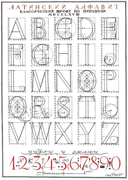
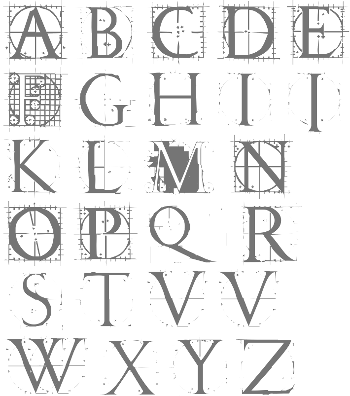
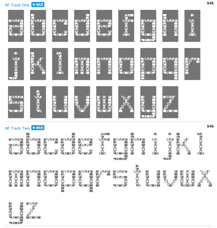
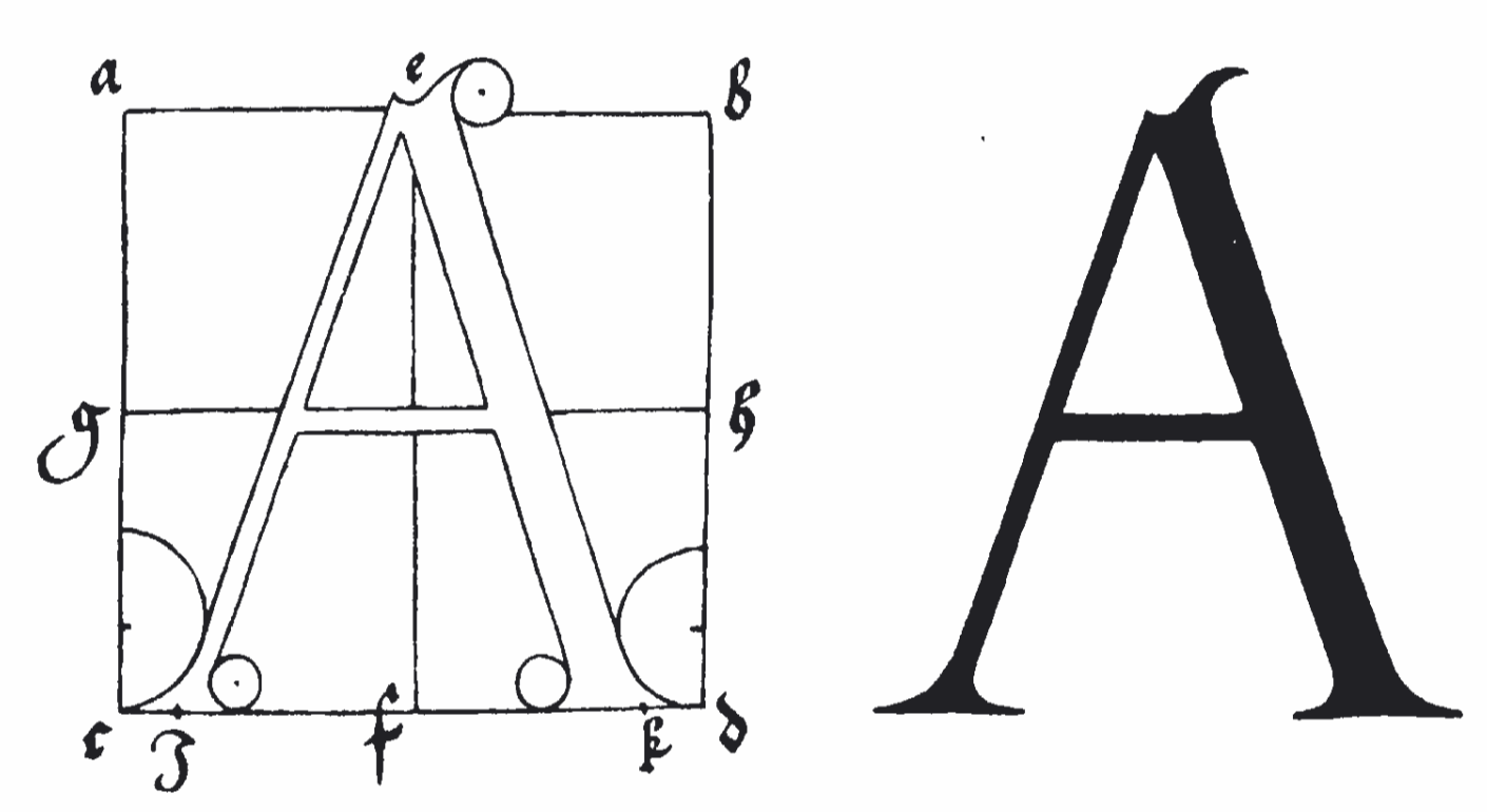
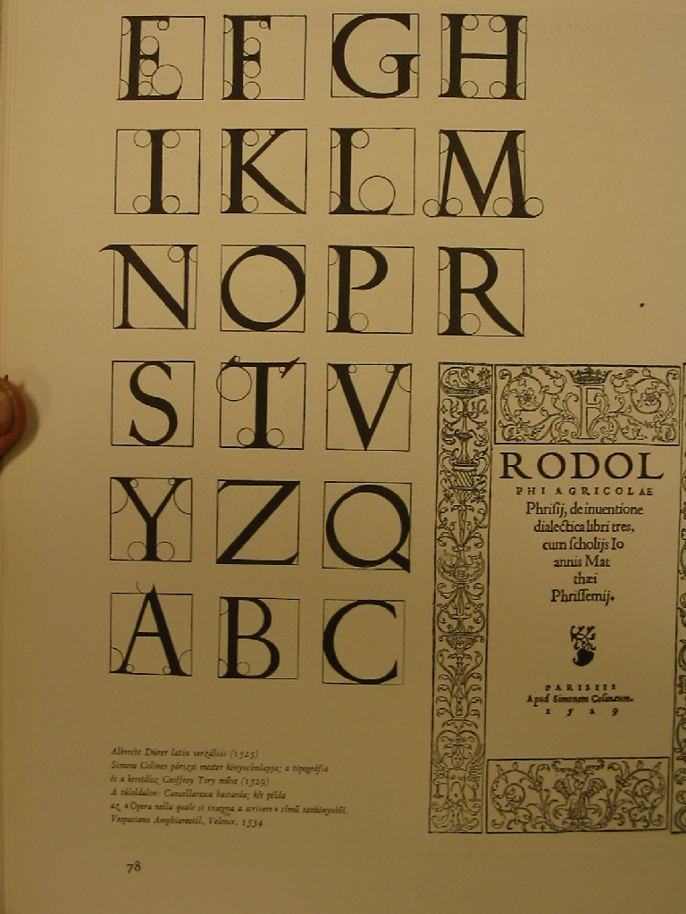
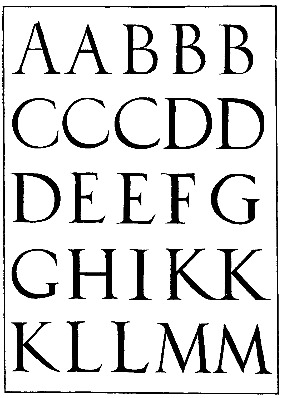
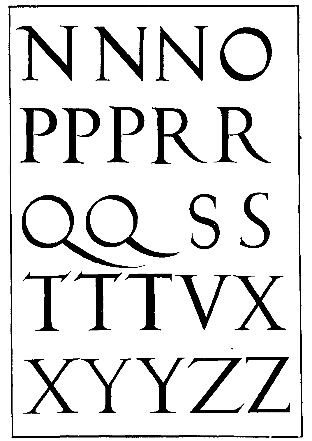
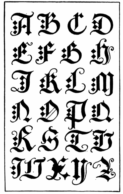
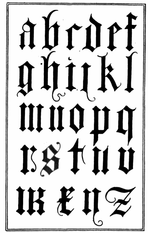
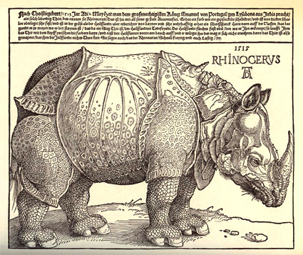
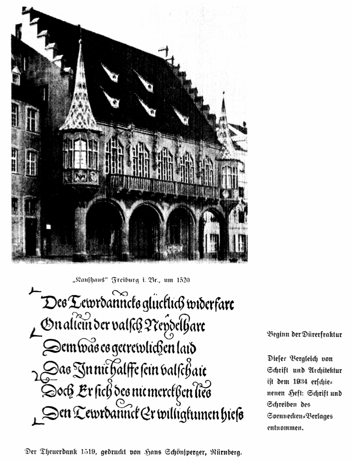
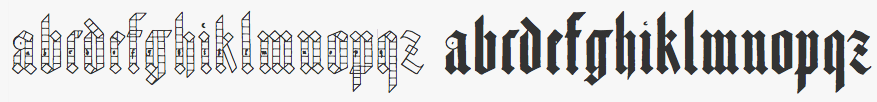
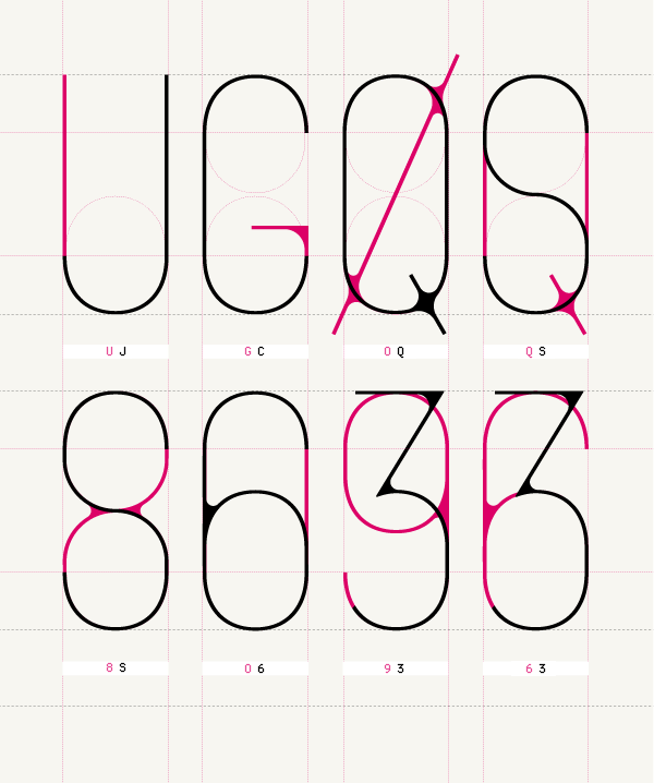
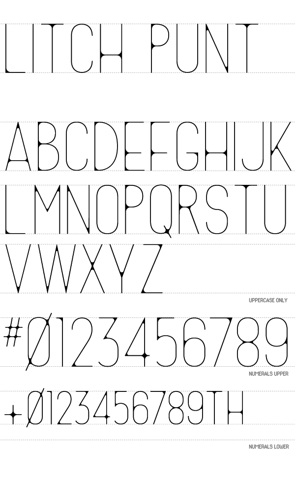
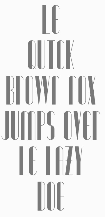
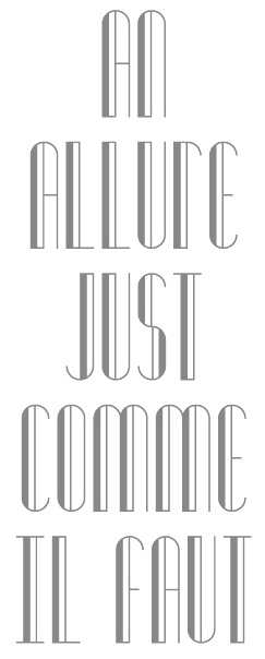
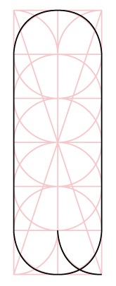
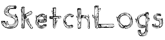
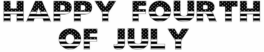
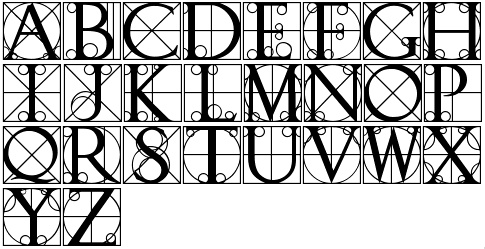
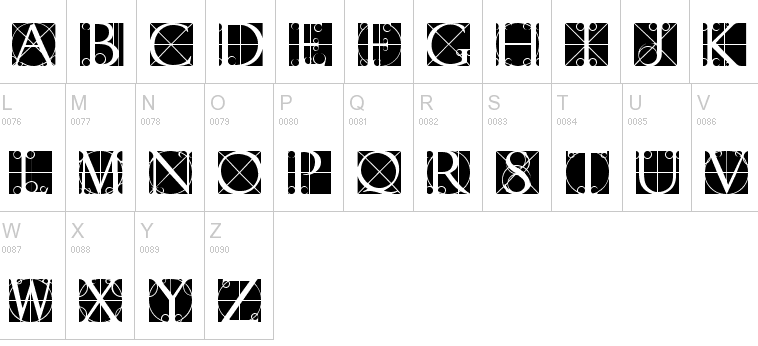
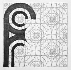
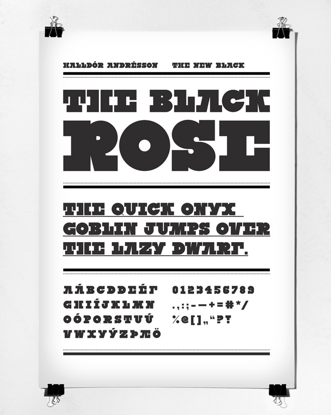
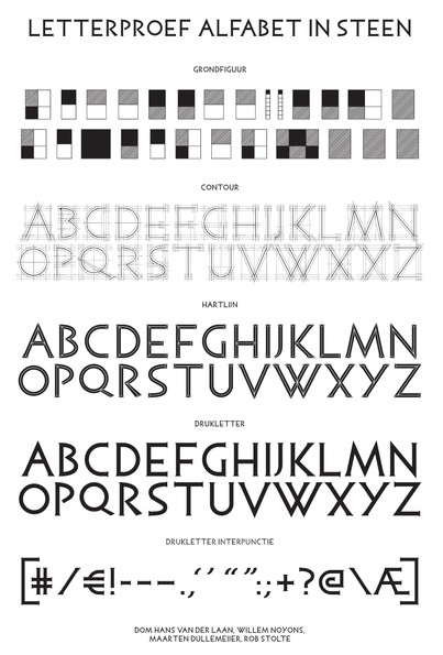
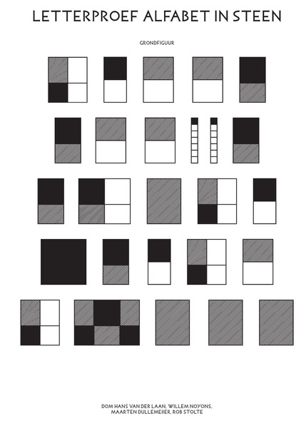
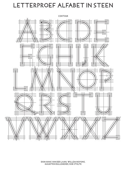
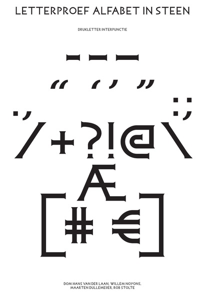
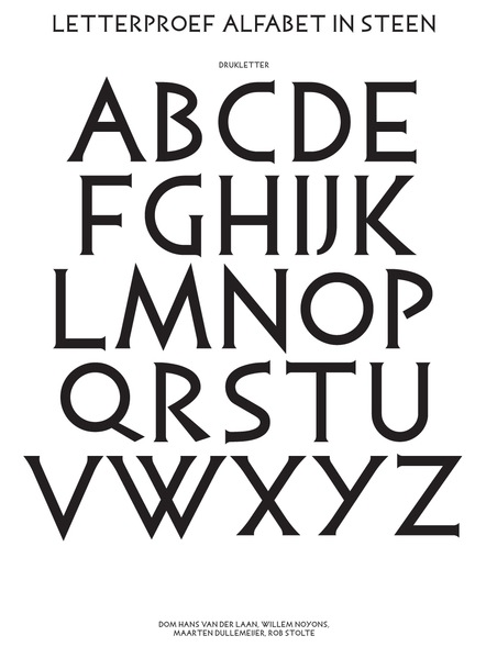
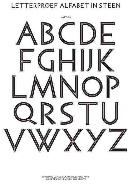
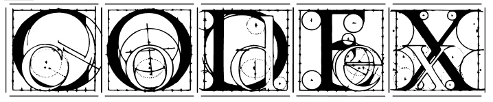
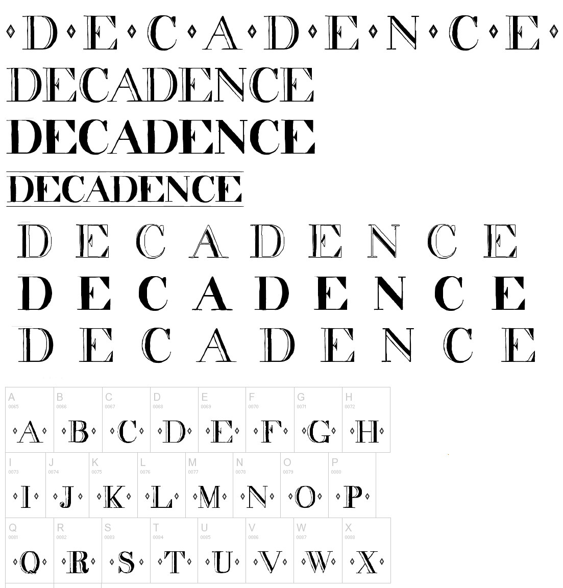
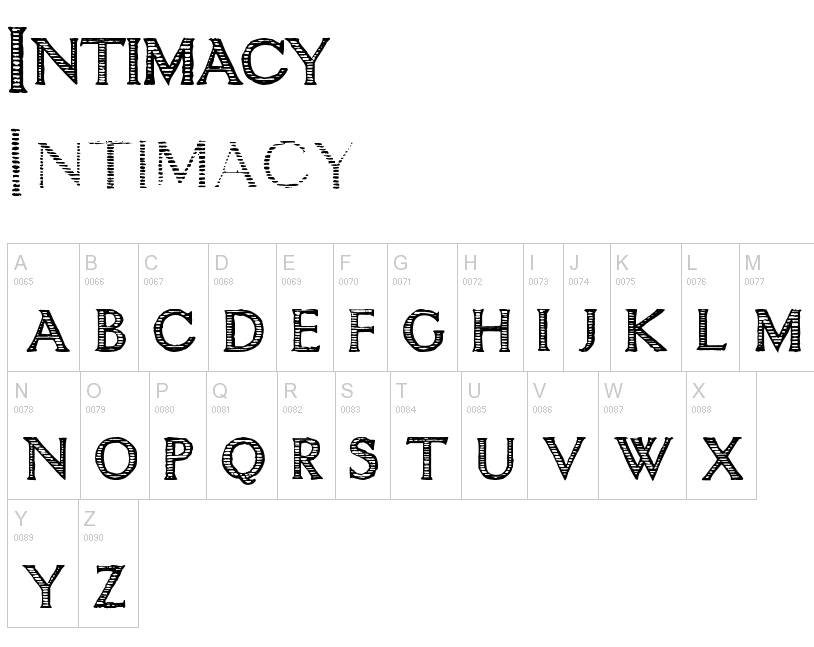
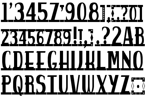
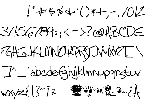
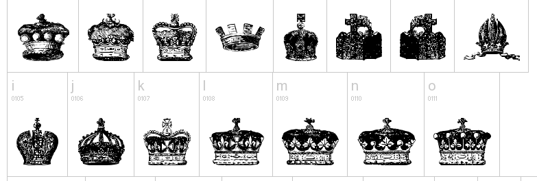
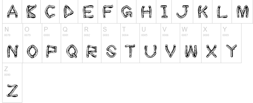
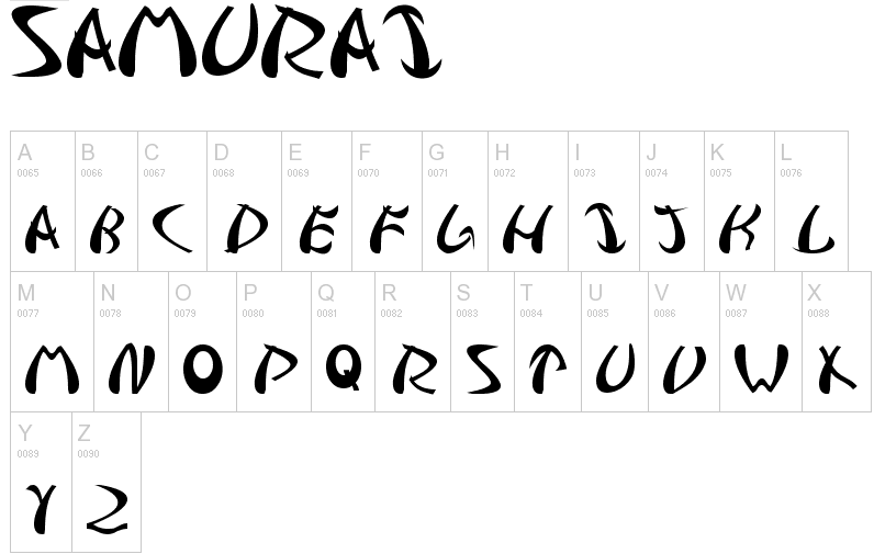
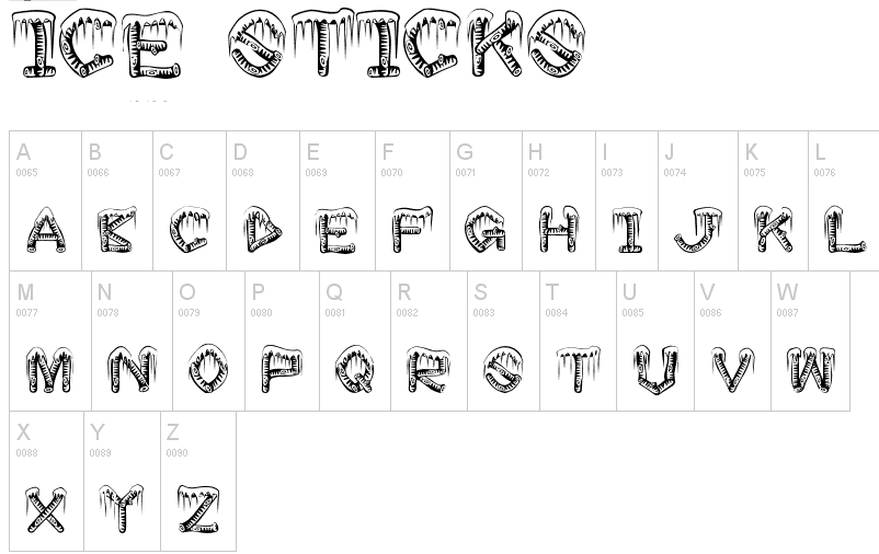
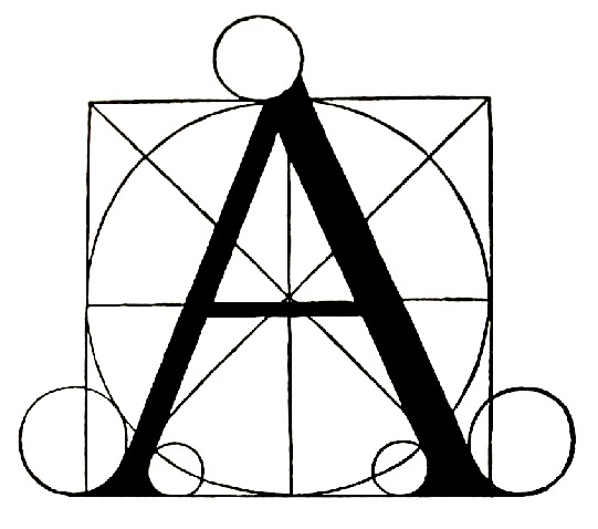
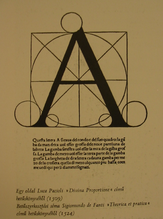
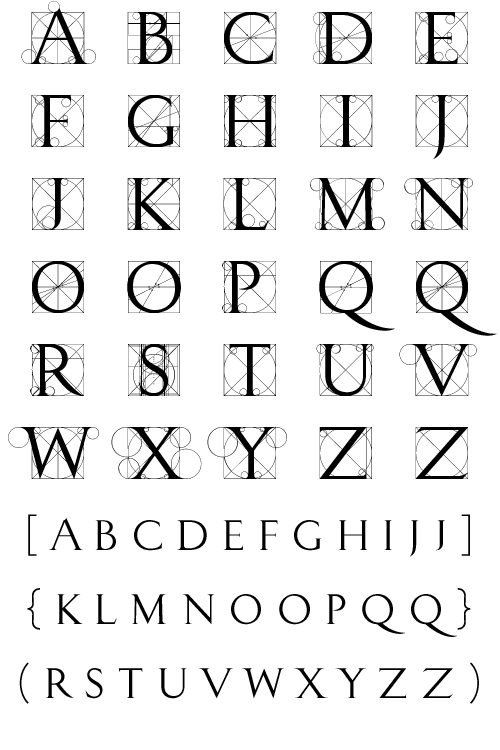
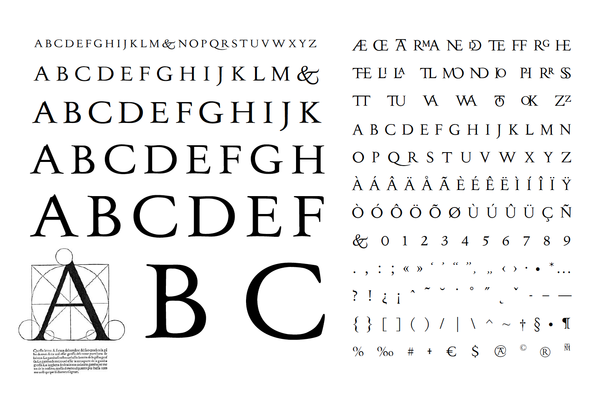
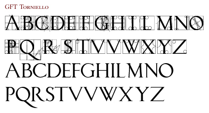
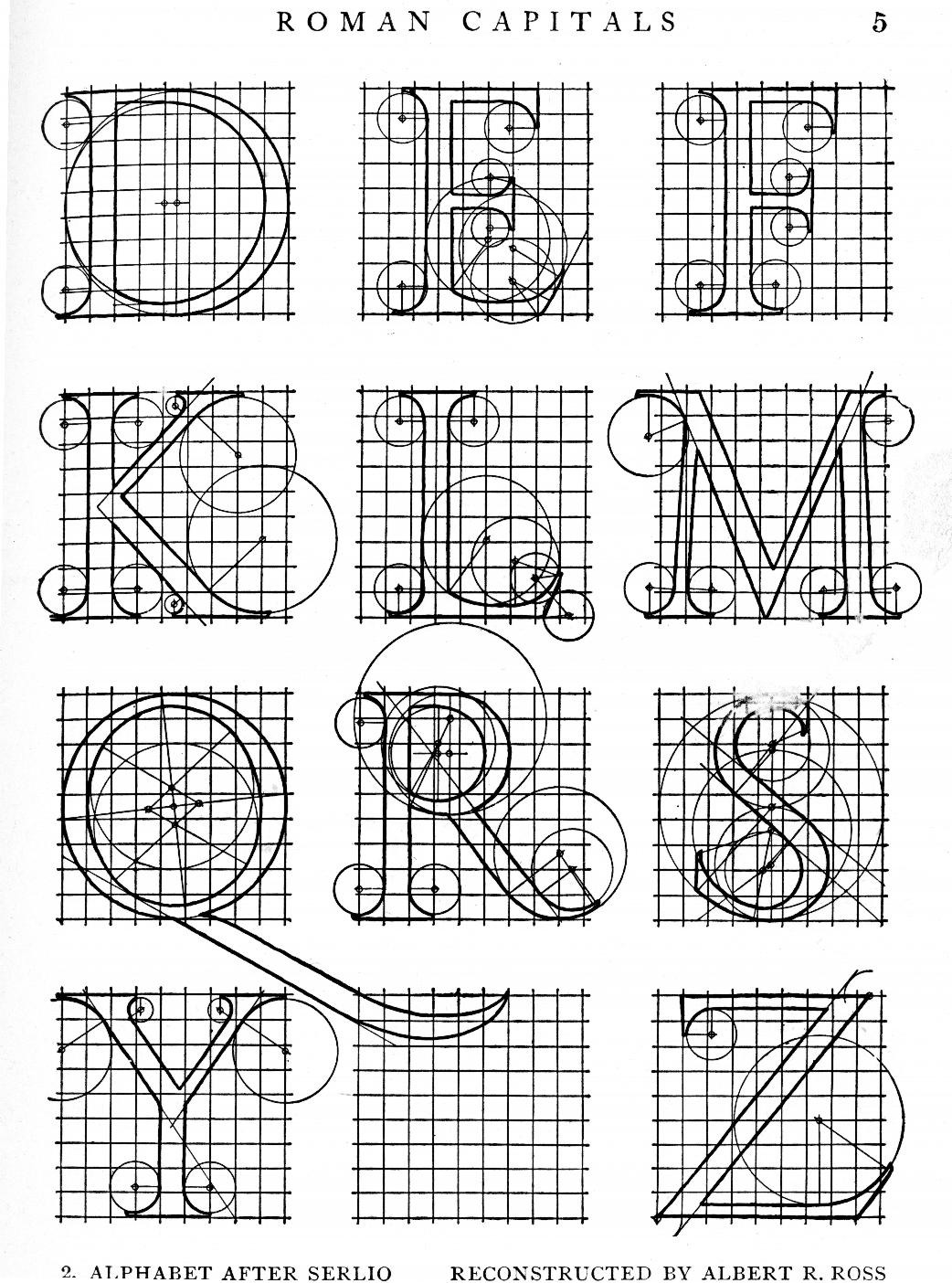
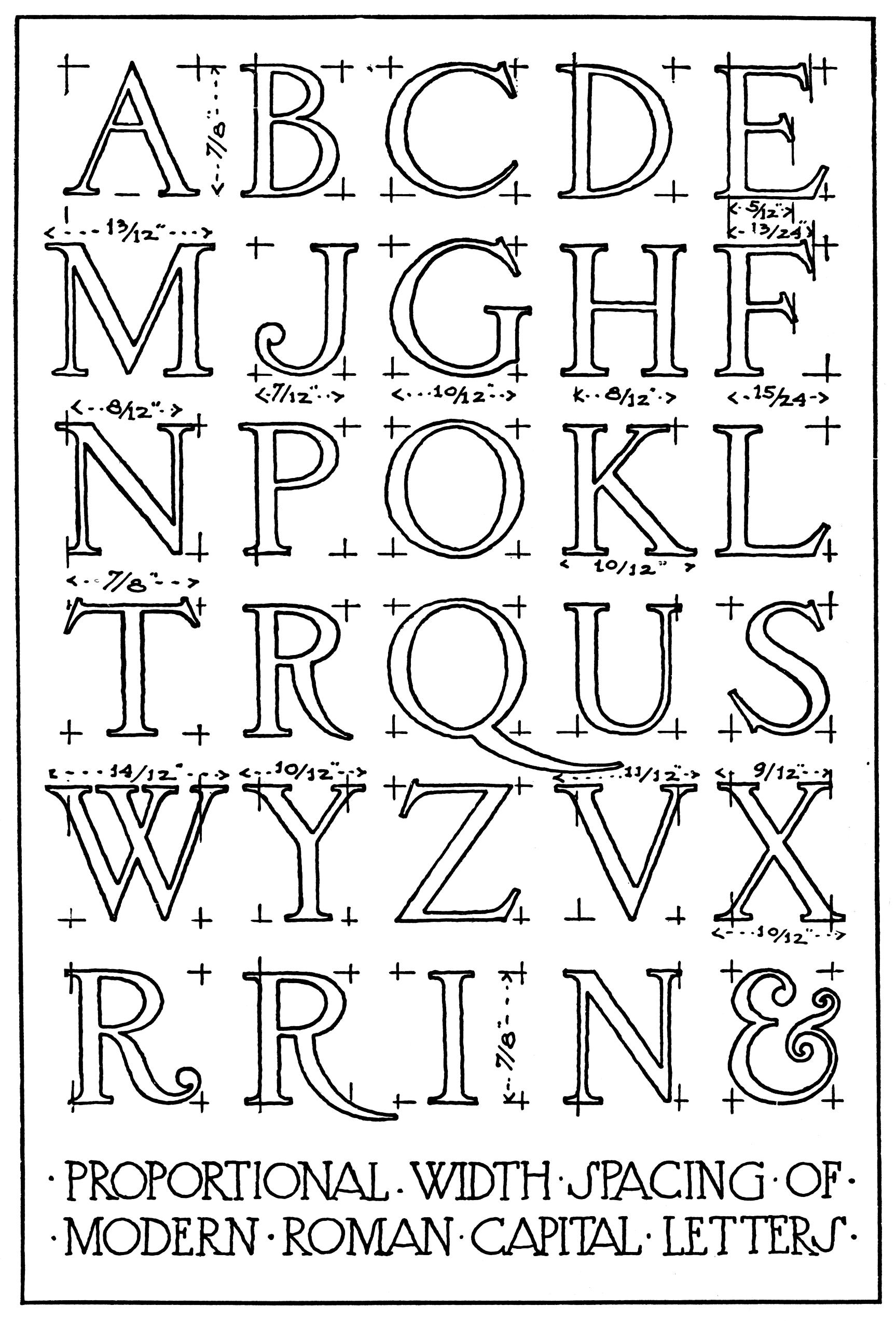
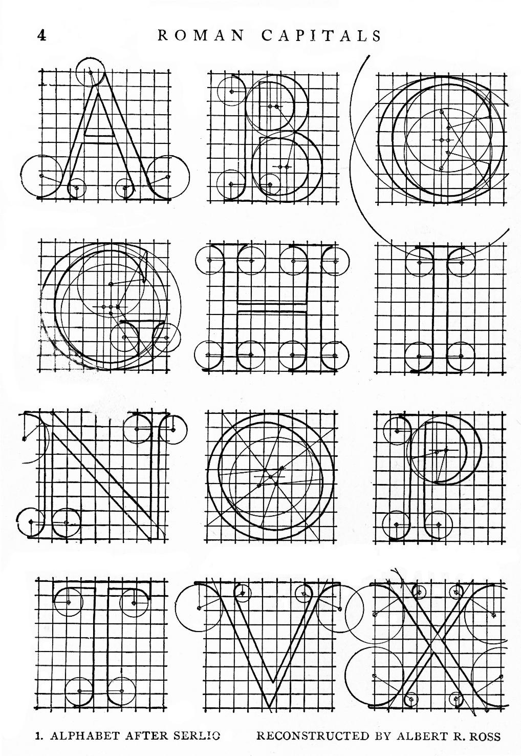
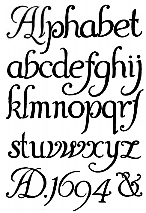
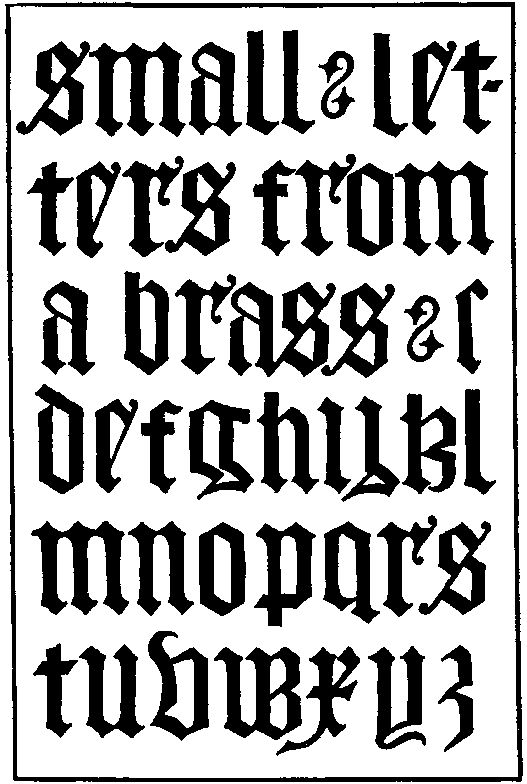
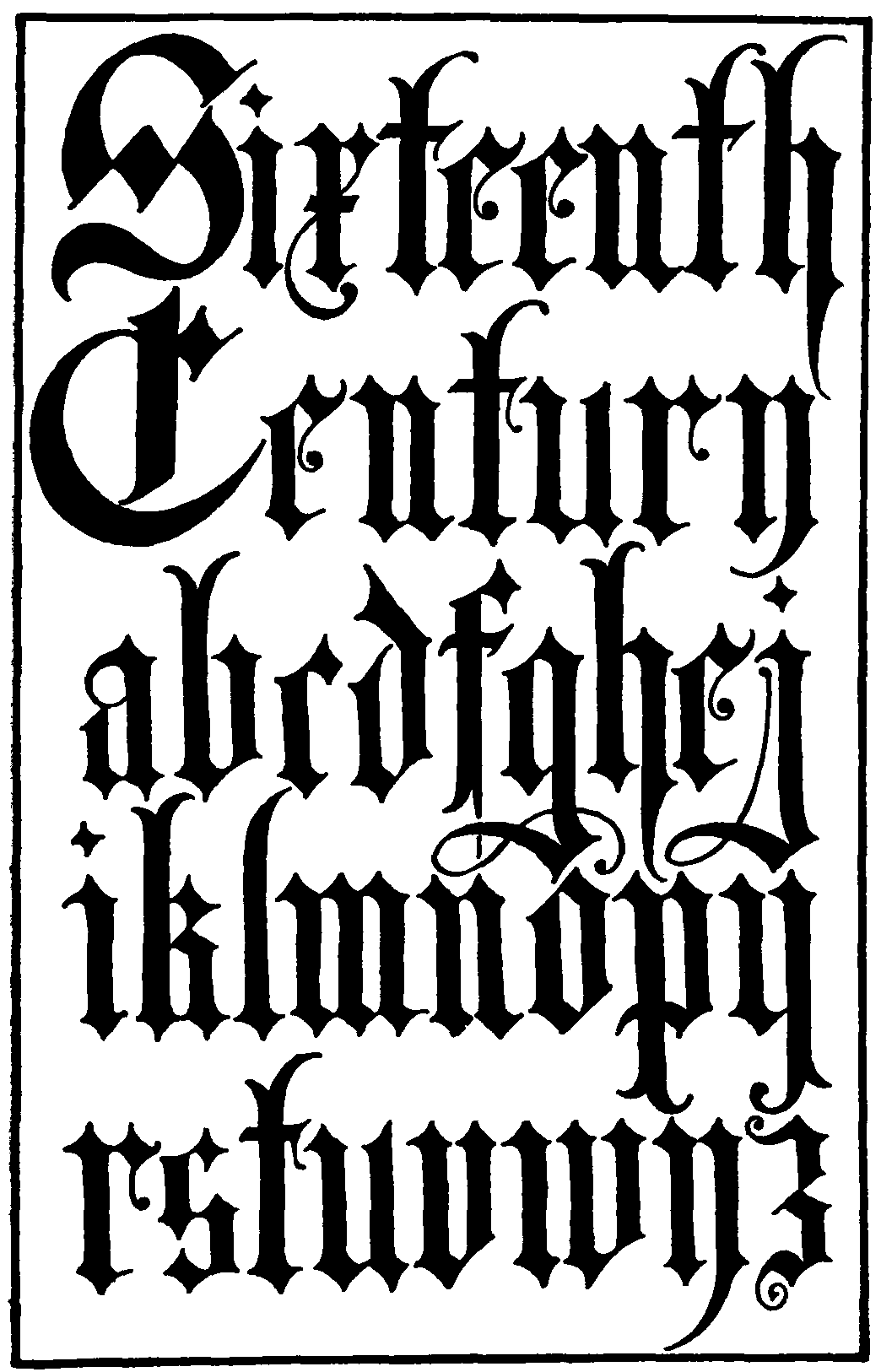
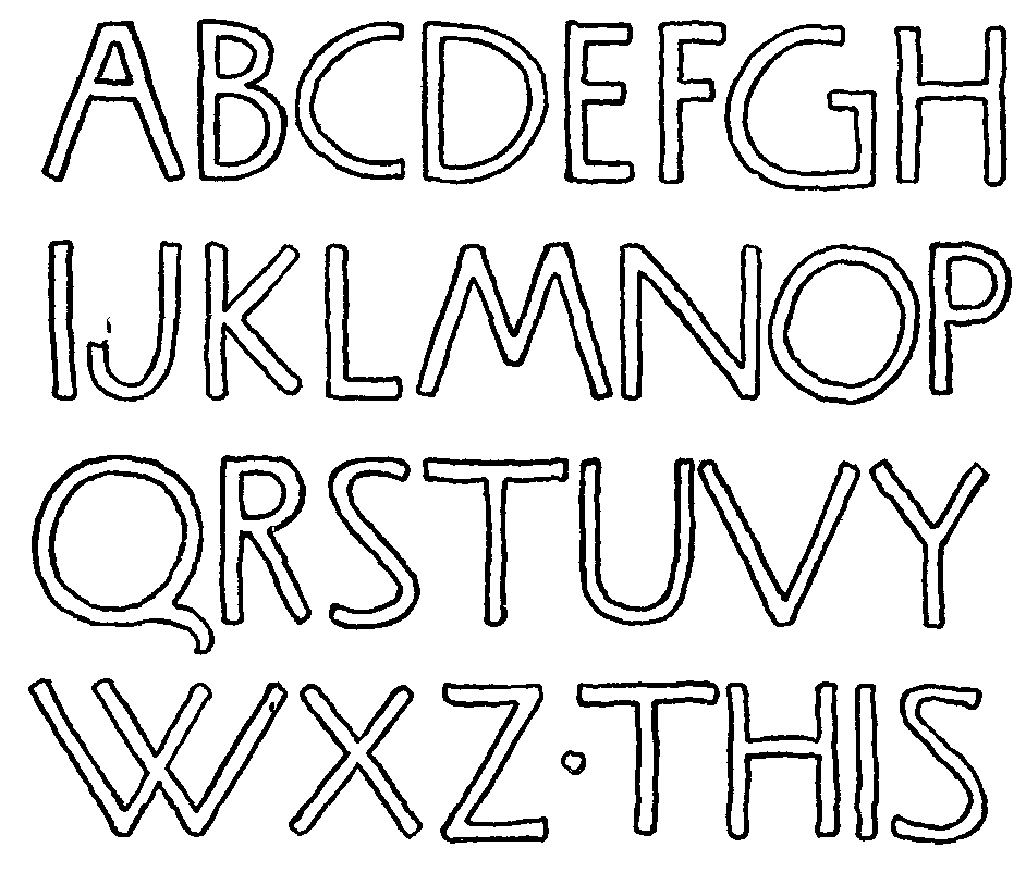
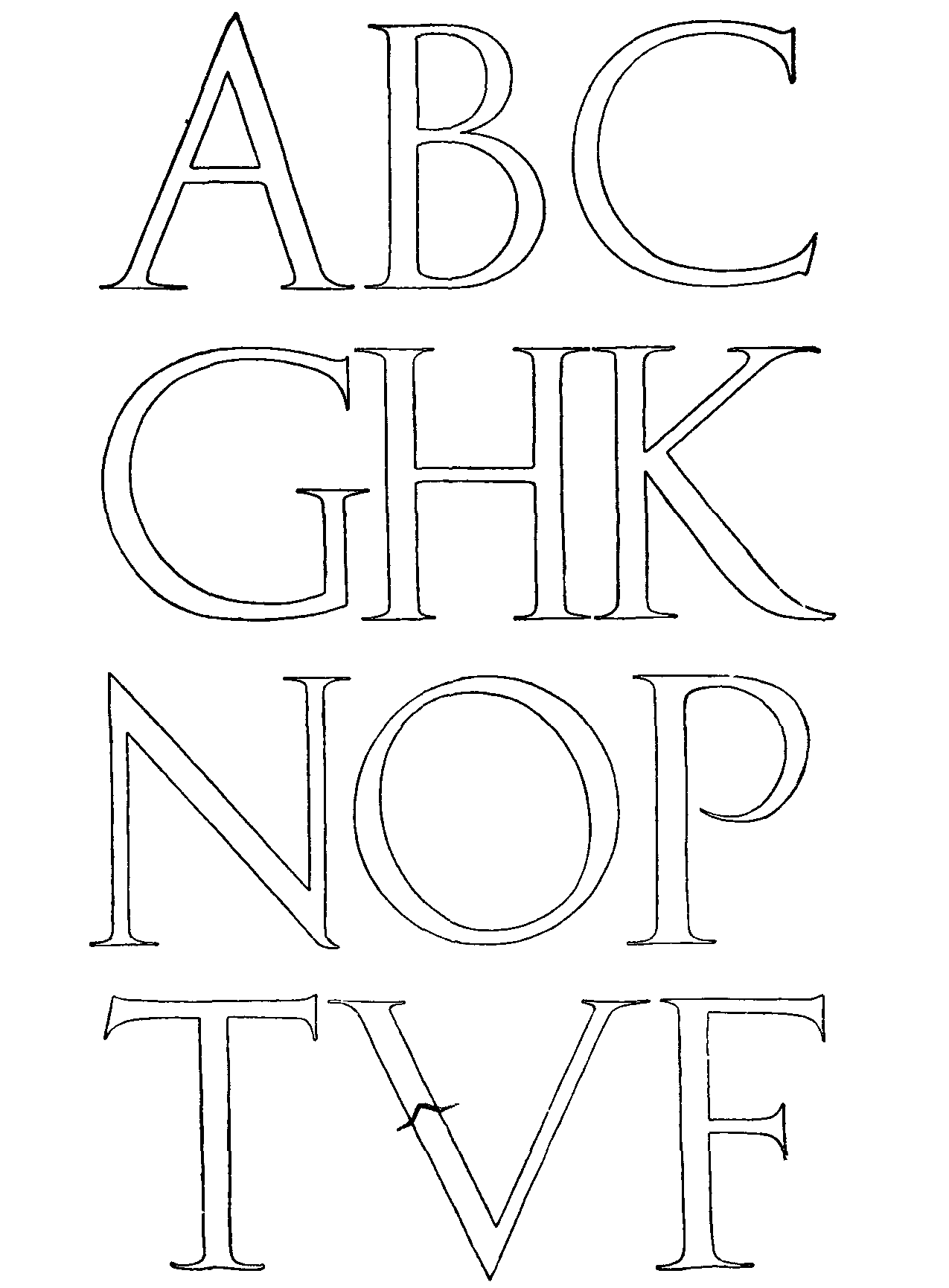
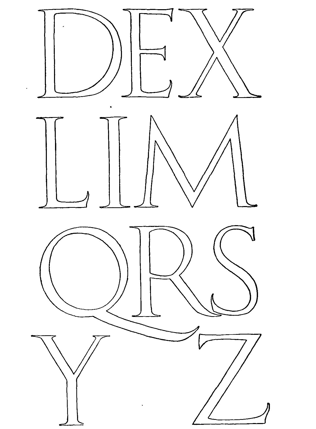
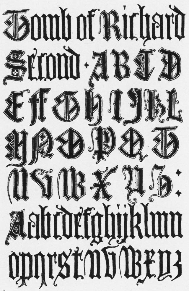
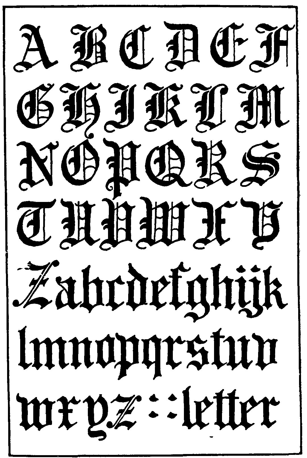
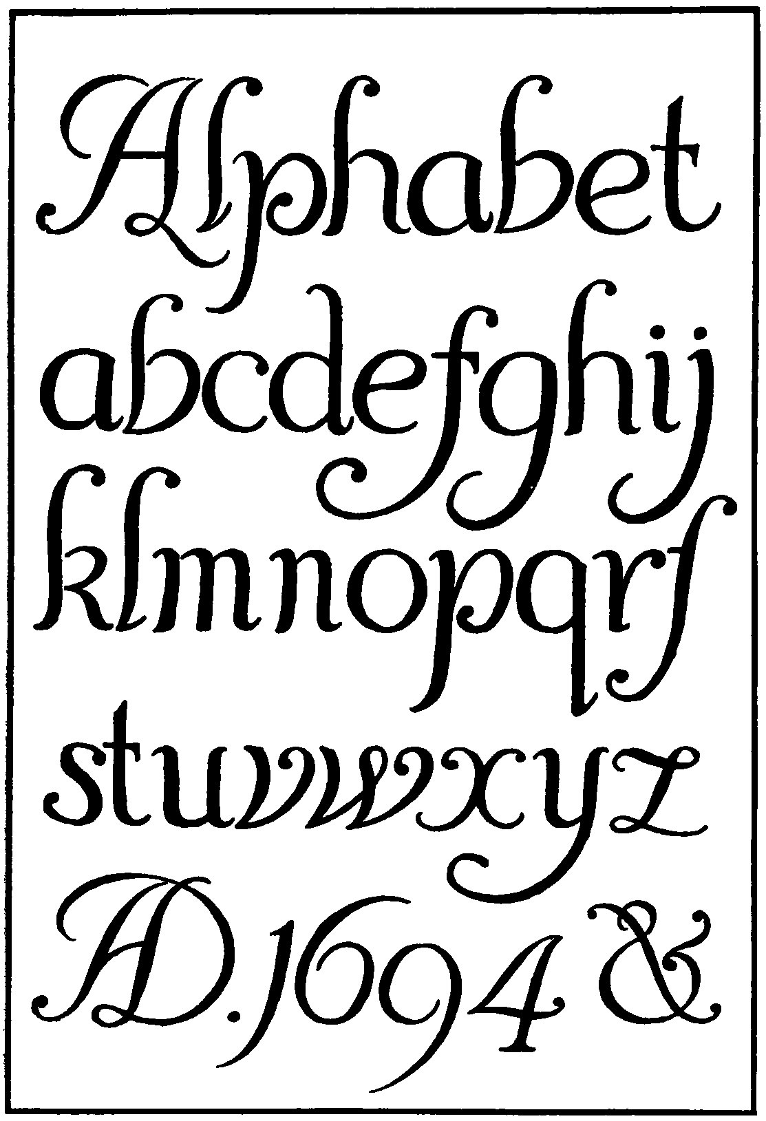
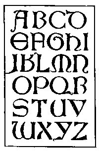
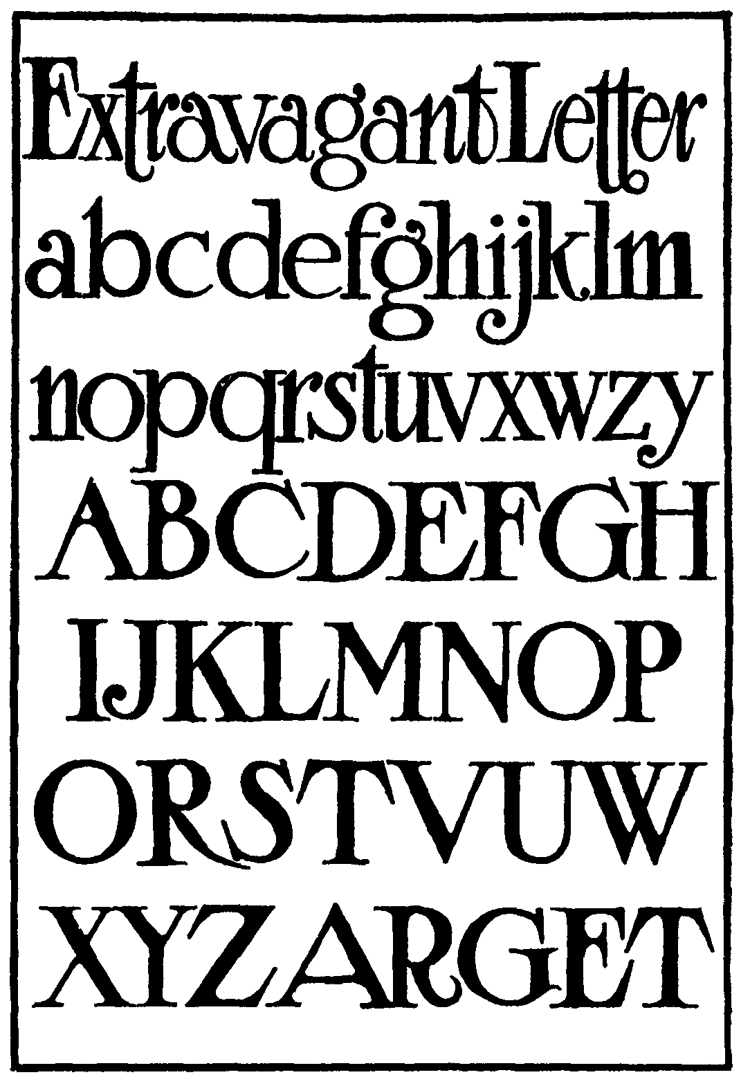
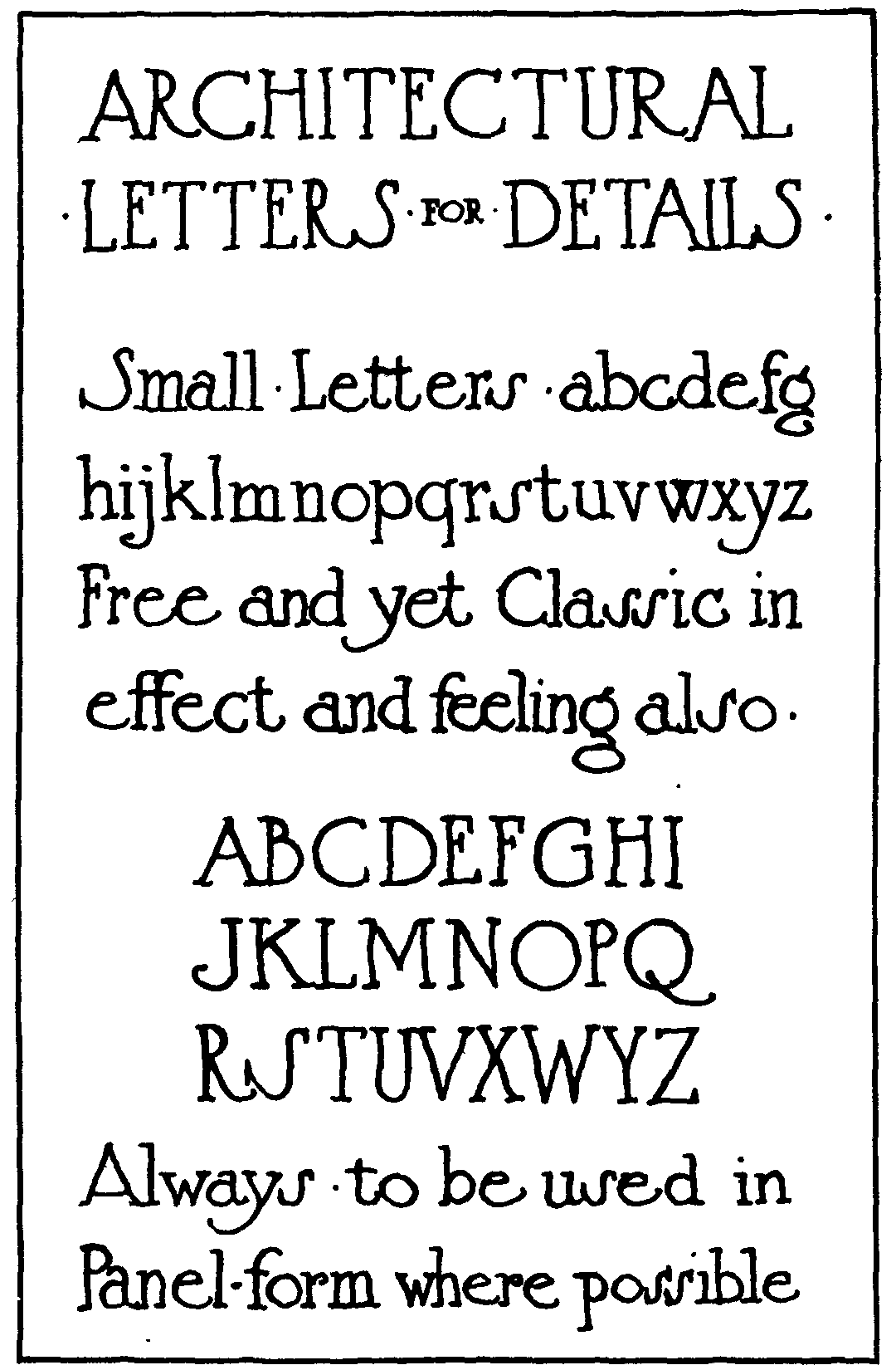
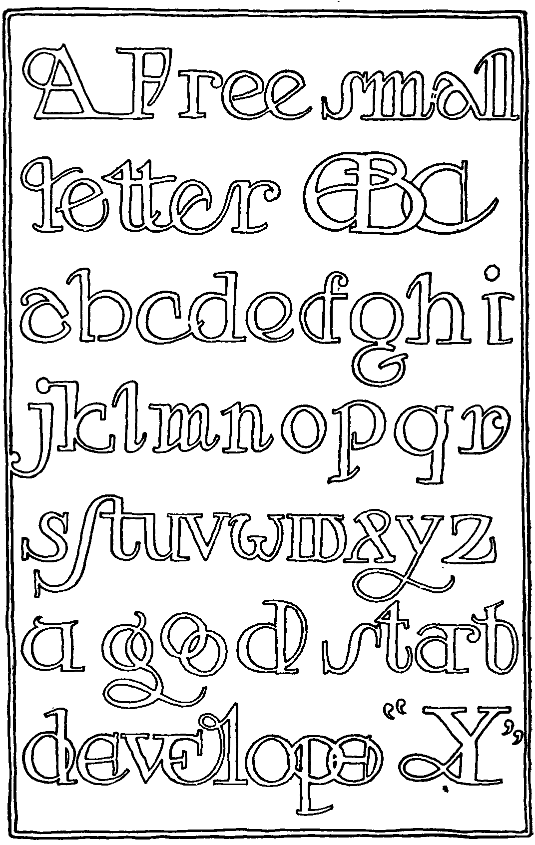
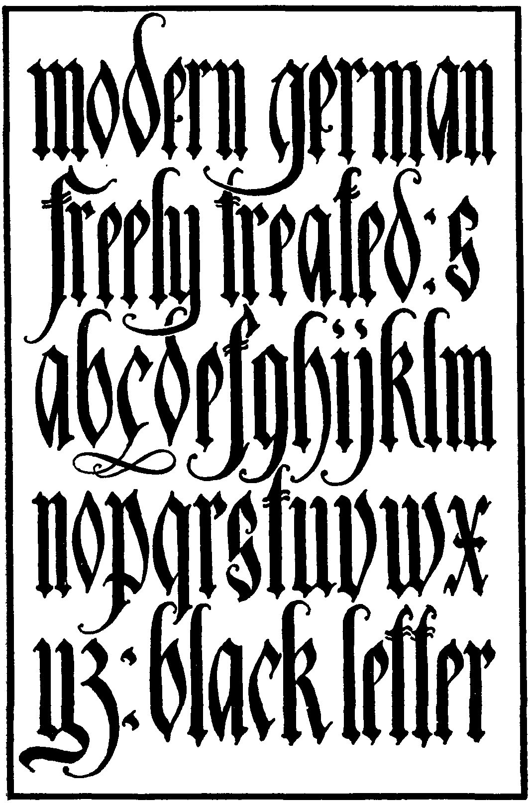
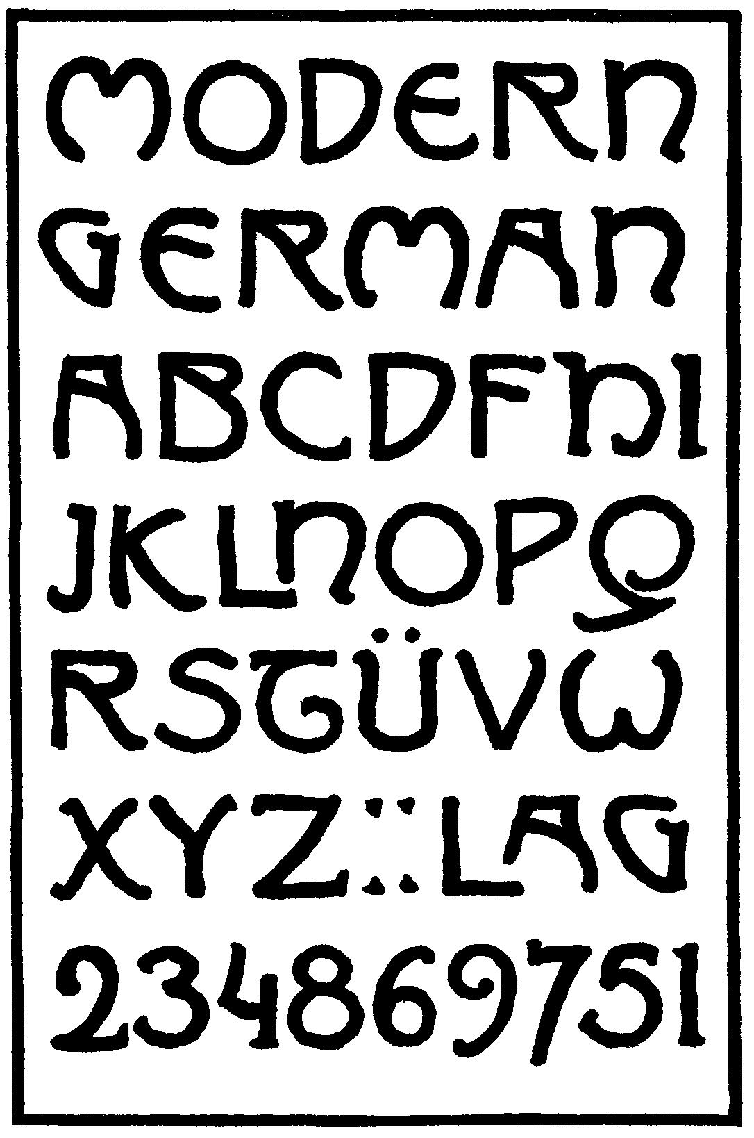
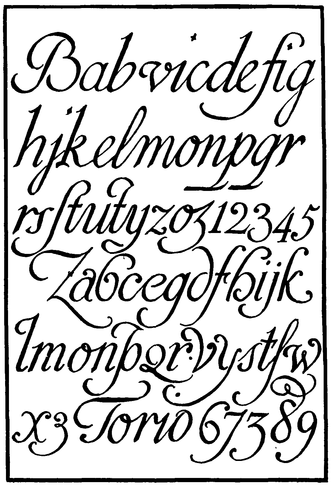
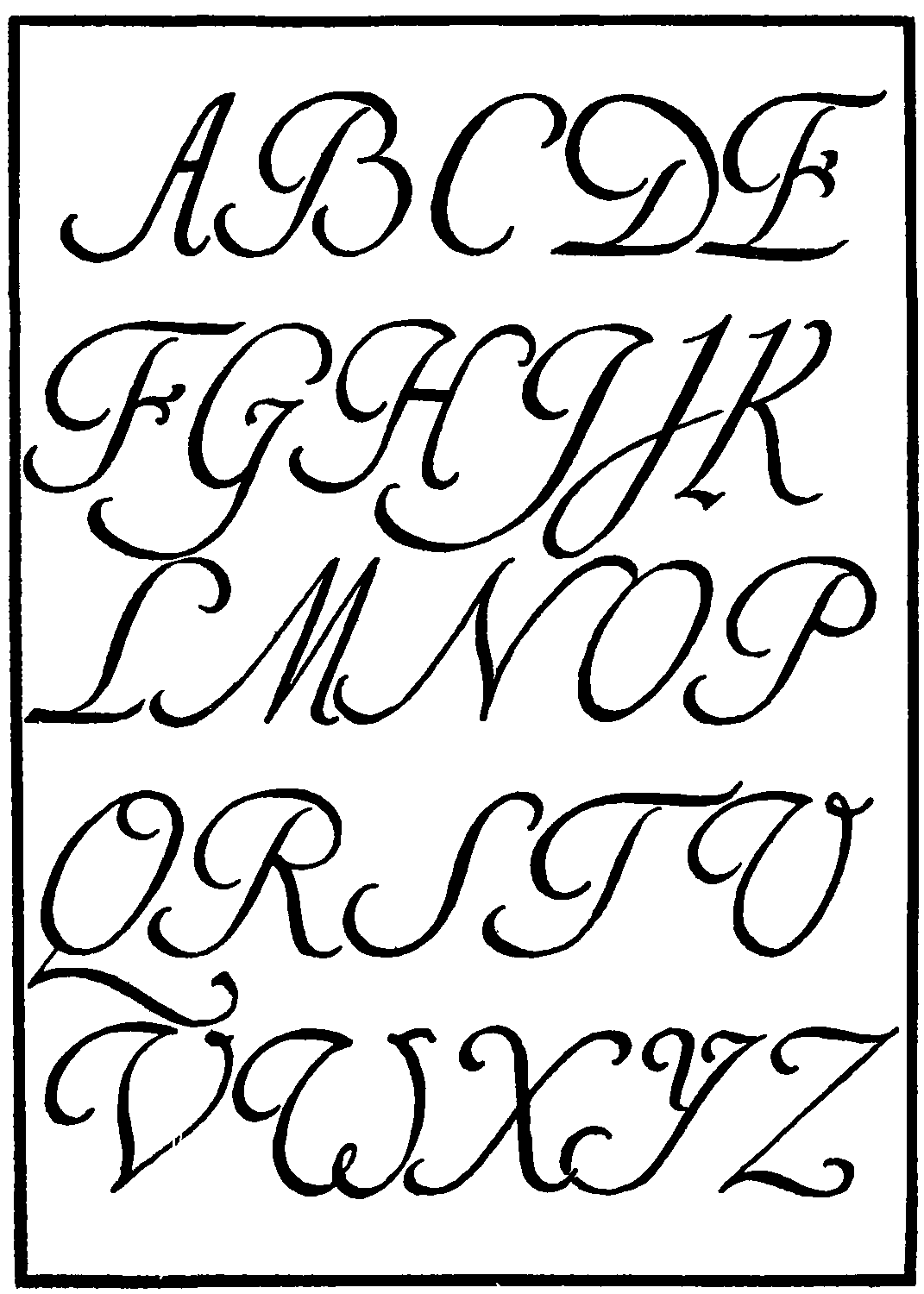
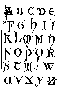
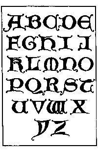
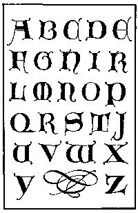
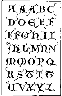
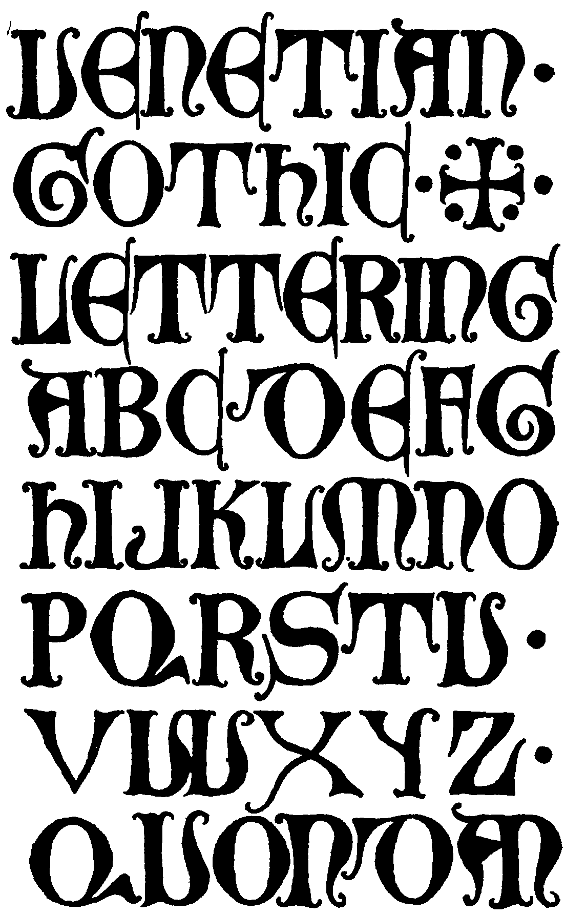
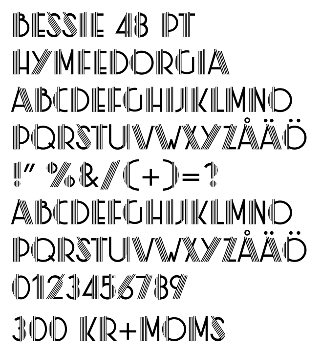
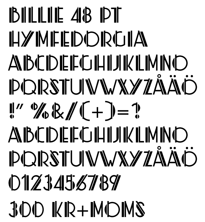
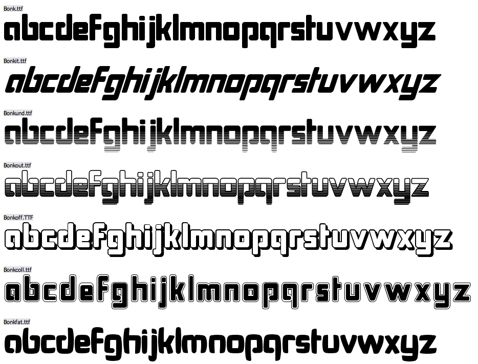
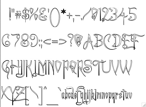
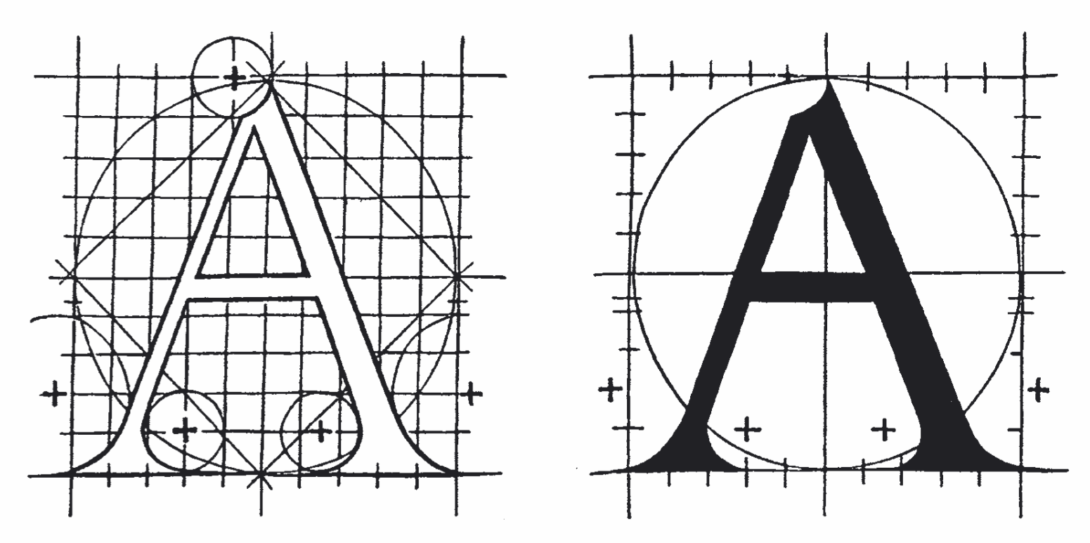
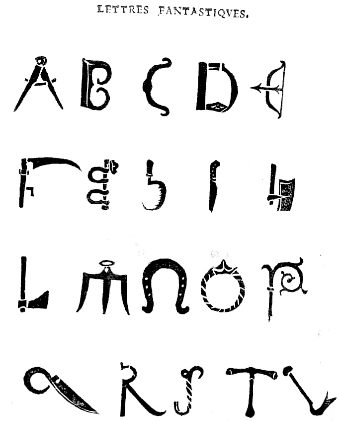
![[continued]](GeoffroyTory1529-LettresFantastiques2.jpg)
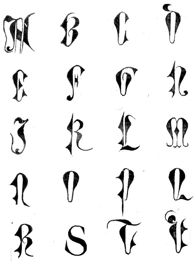
![[continued]](GeoffroyTory1529-LettresImperialles+Bullatiques2.jpg)
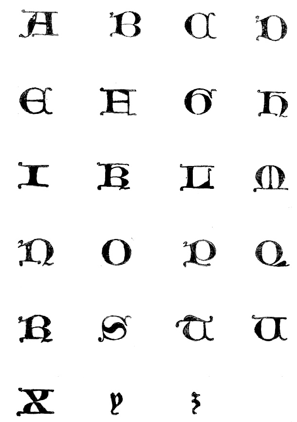
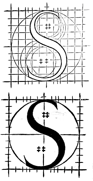
![[continued]](GeoffroyTory1529-cadeaulx2.jpg)
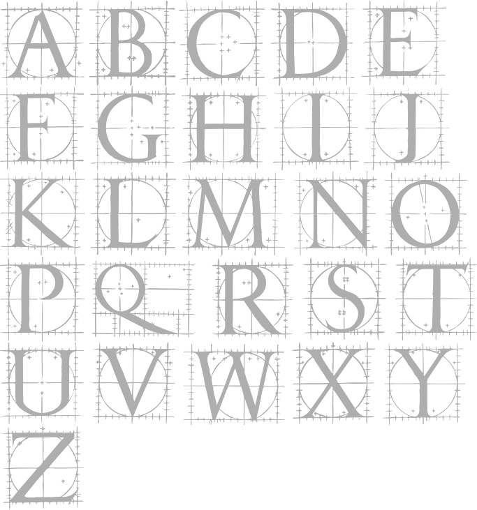
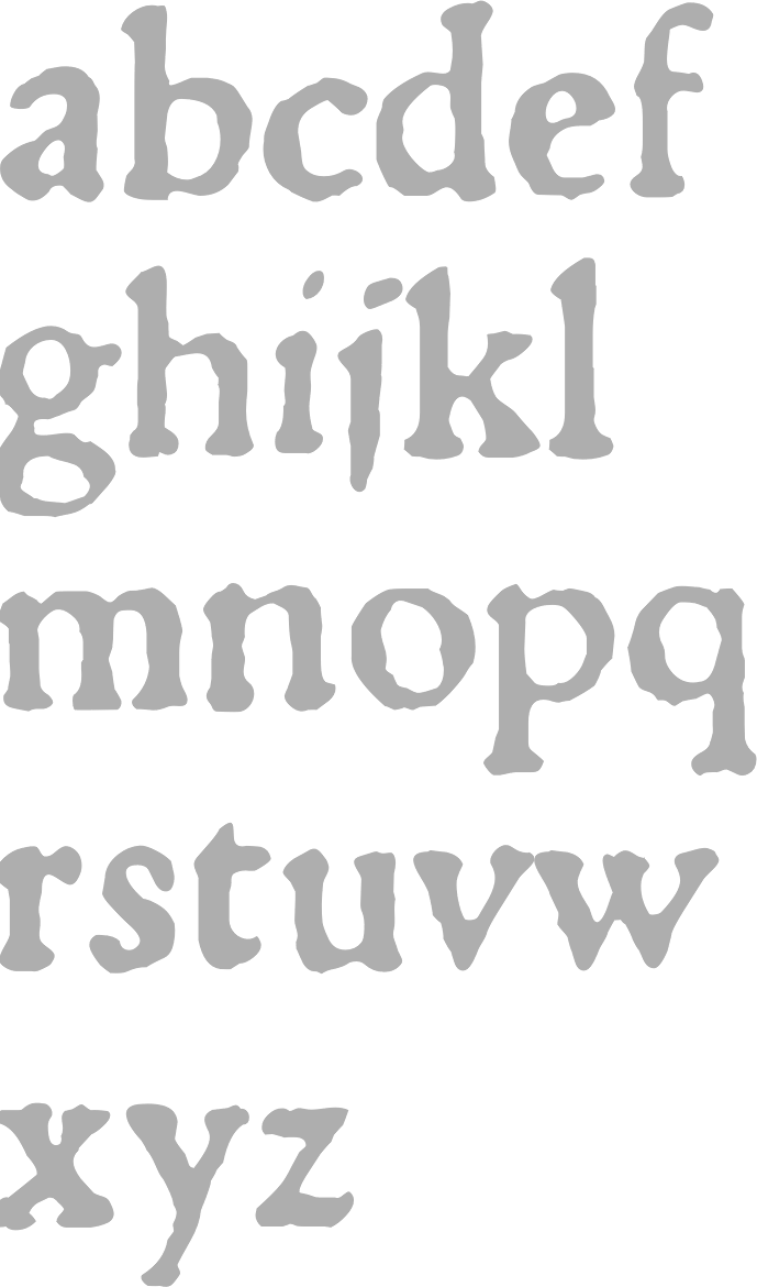
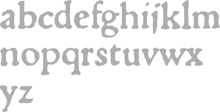
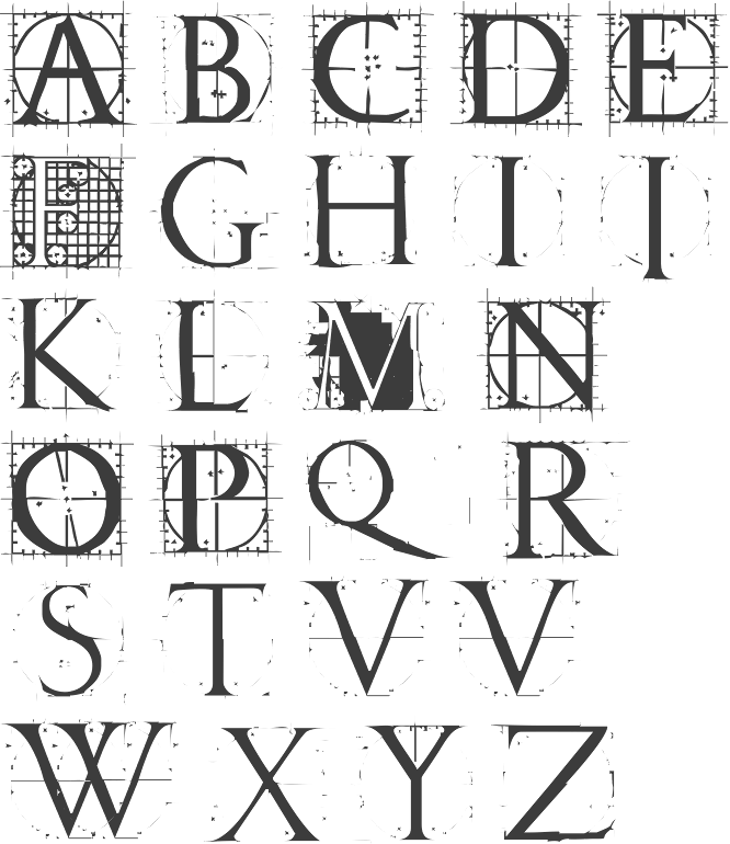
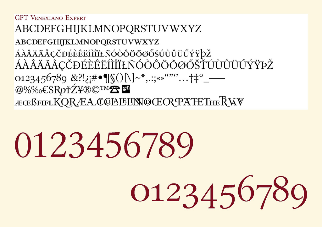
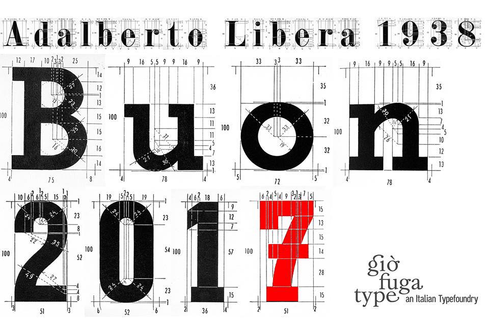
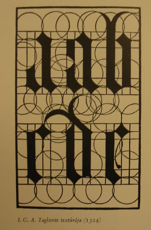
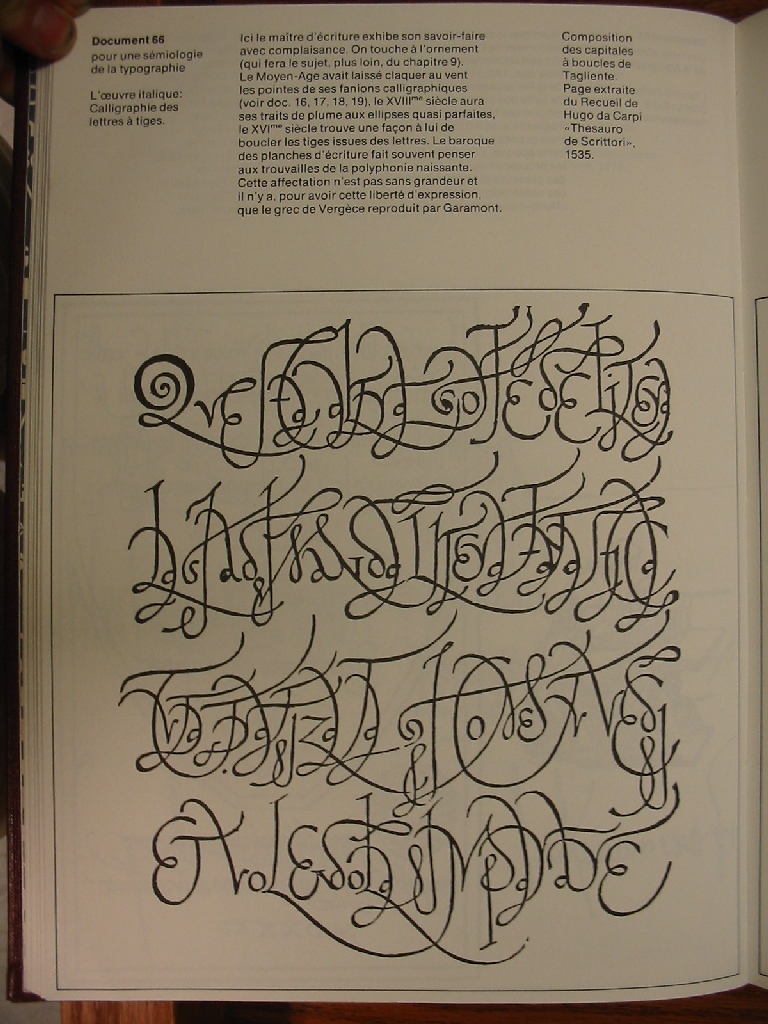
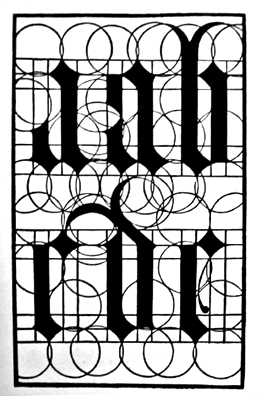
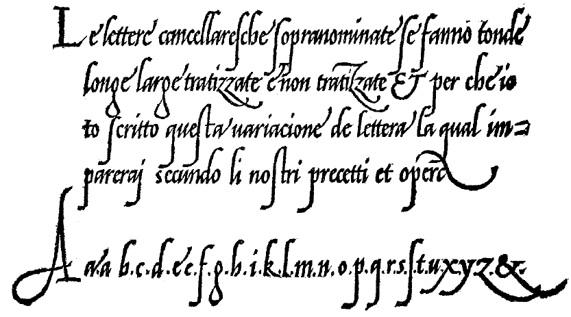
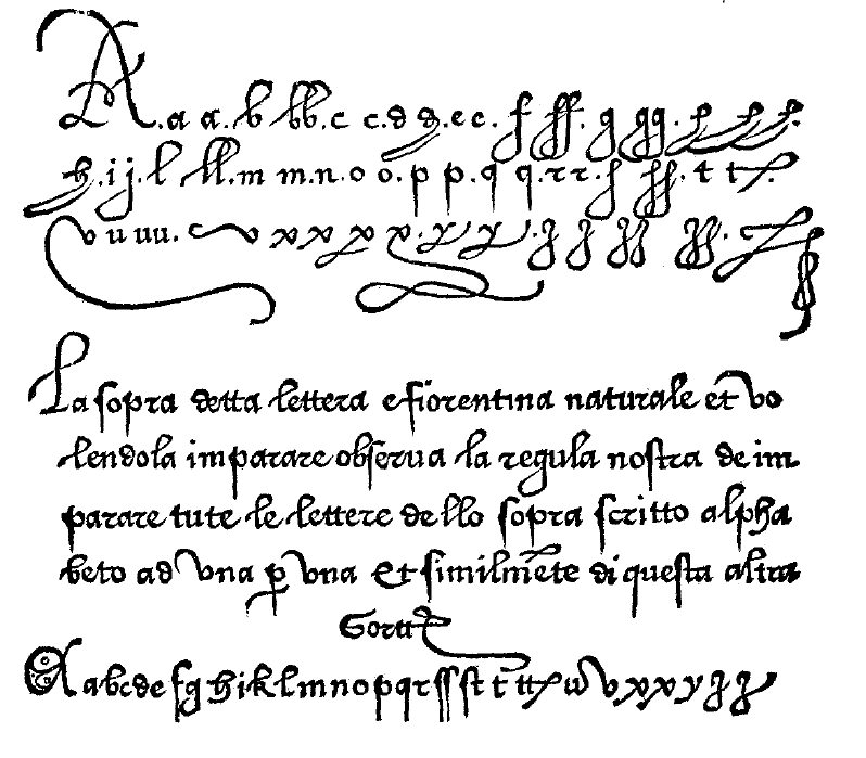
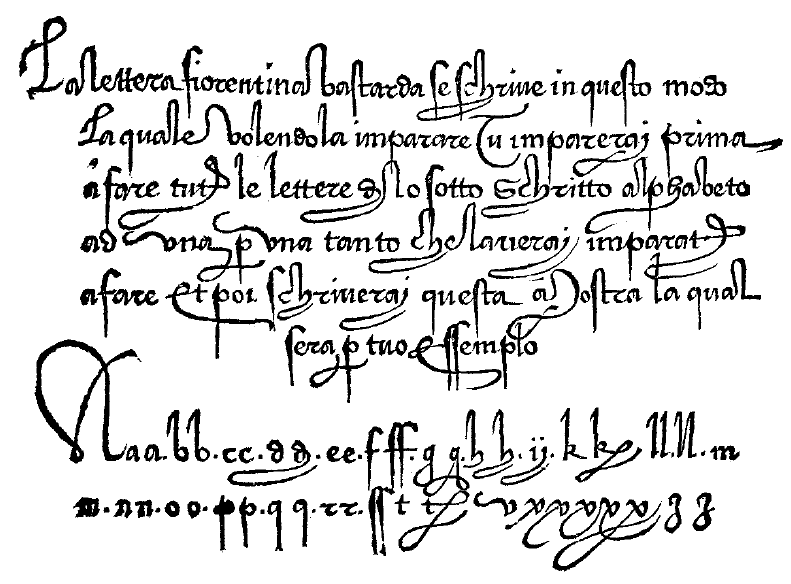
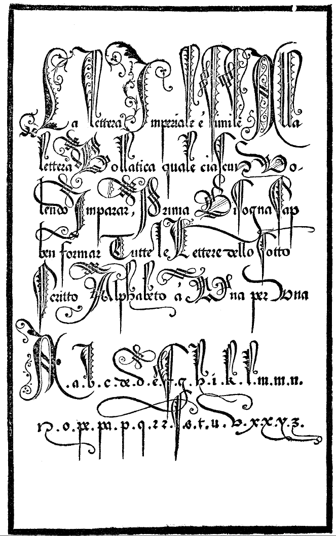
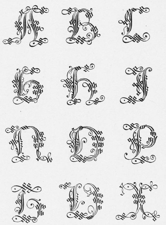
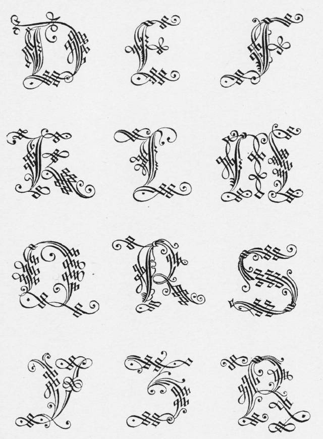
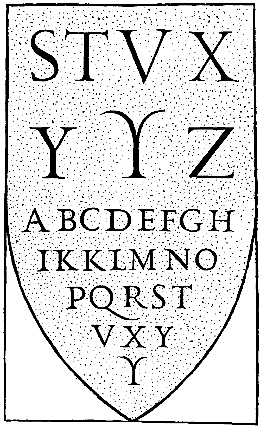
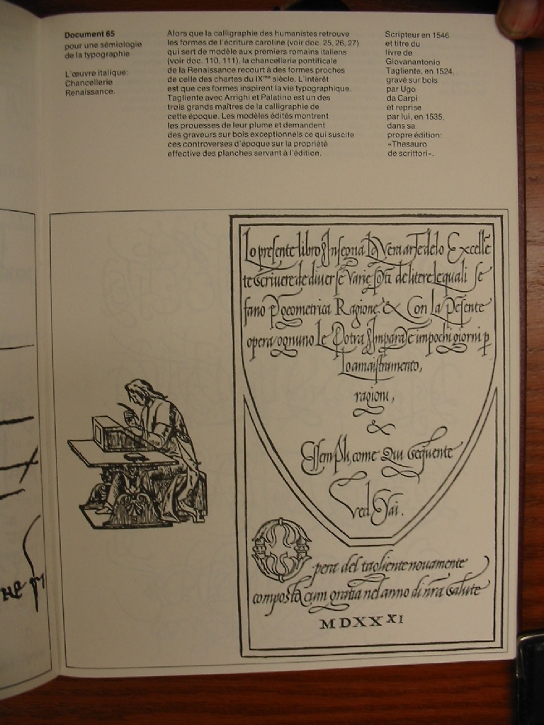
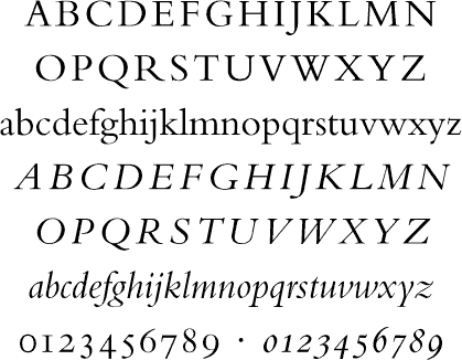
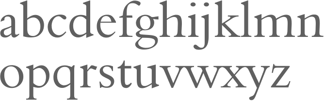
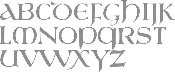
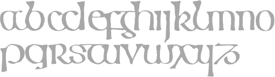
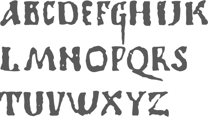
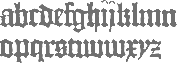
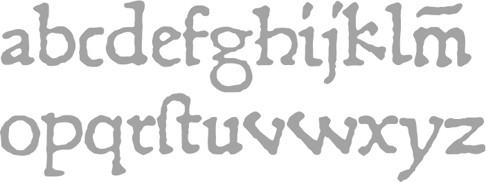
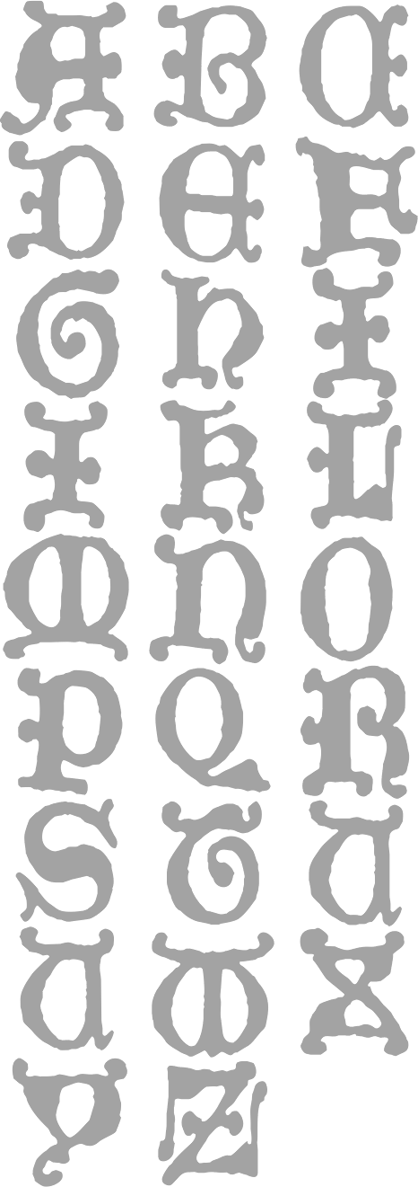
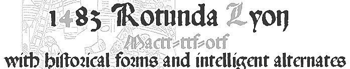
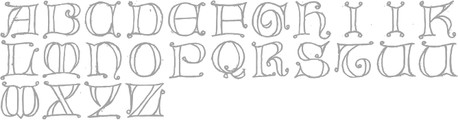
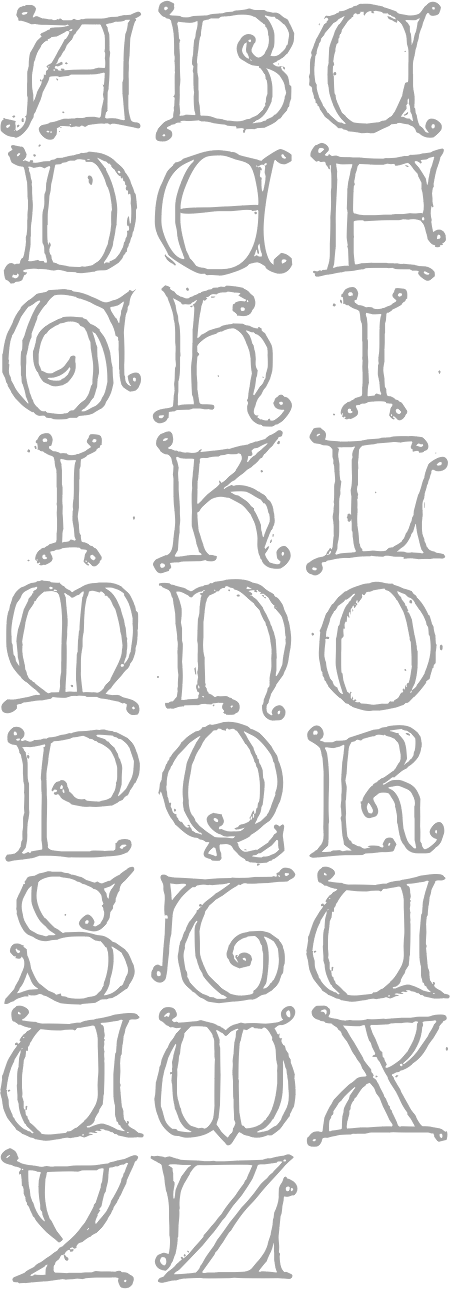
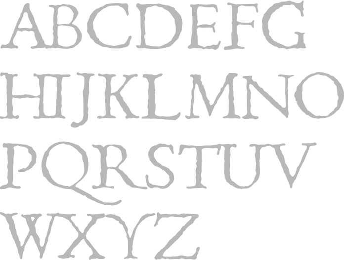
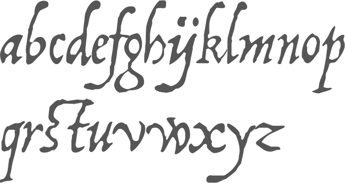
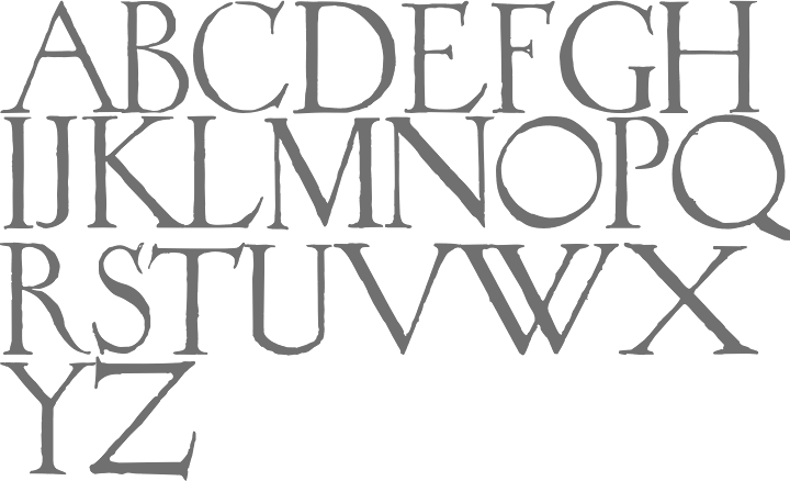
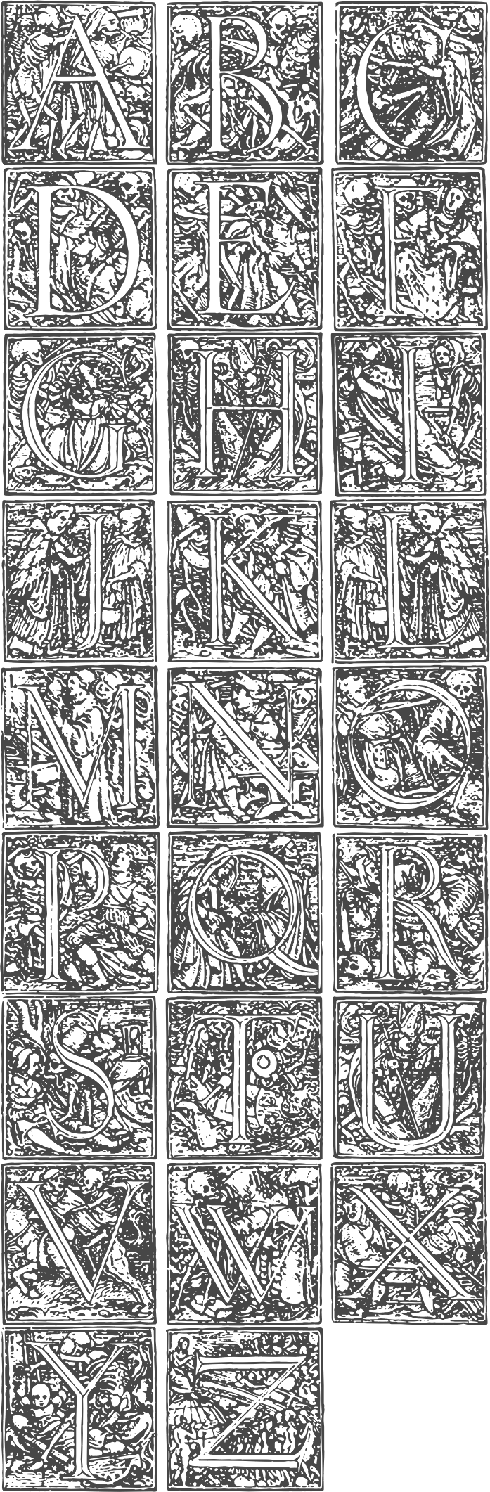
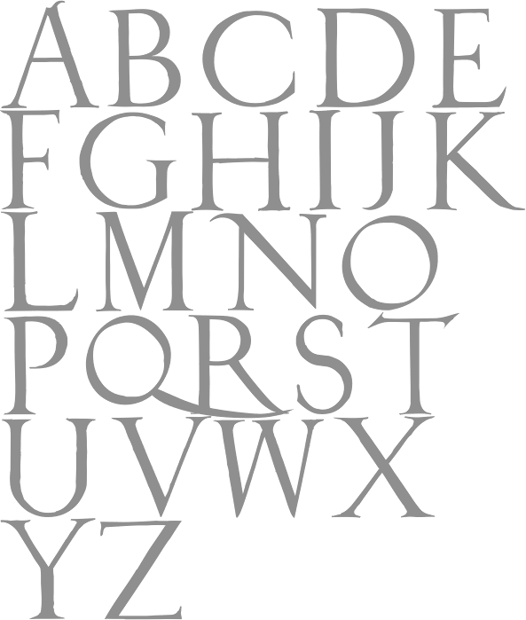
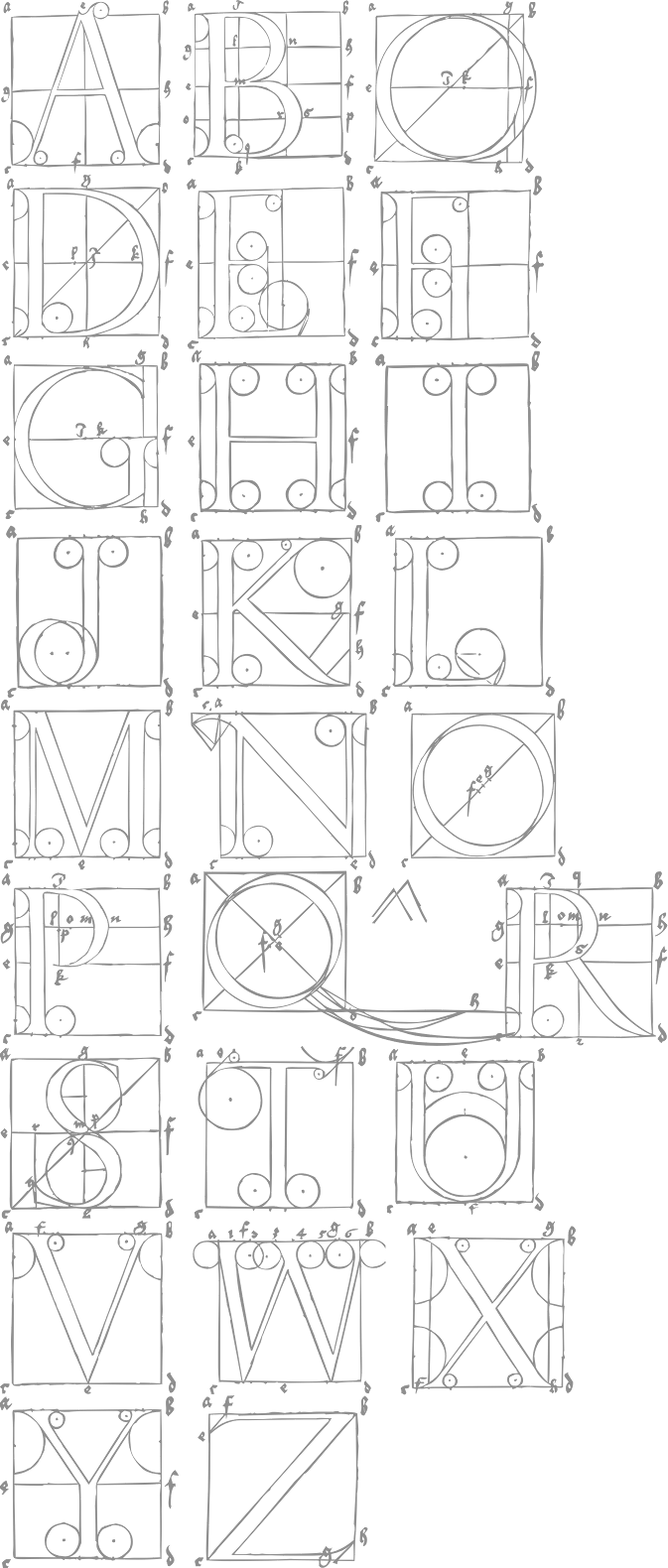
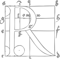
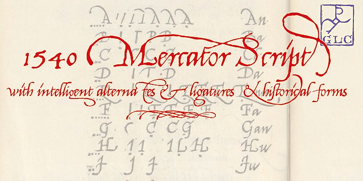
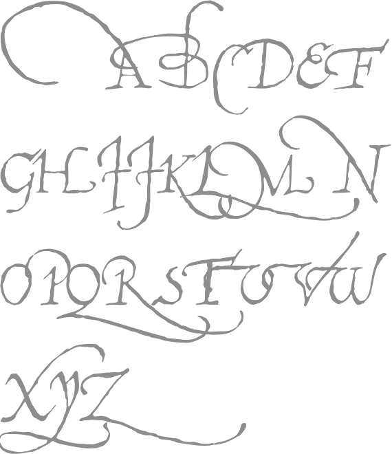
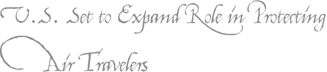
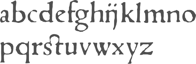
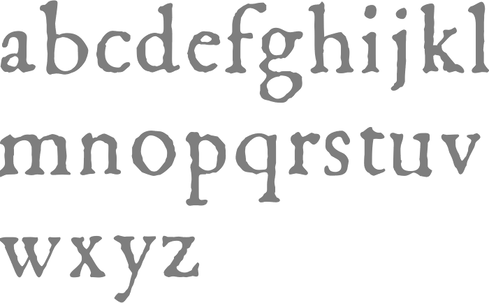
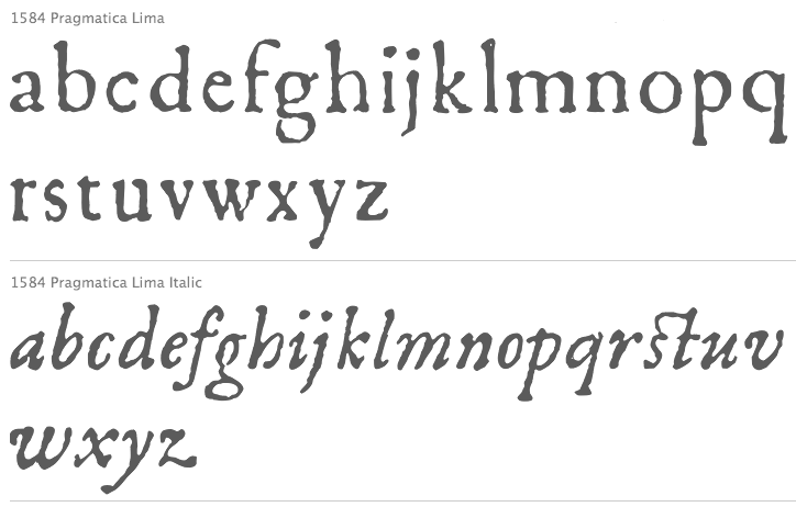
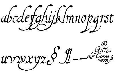
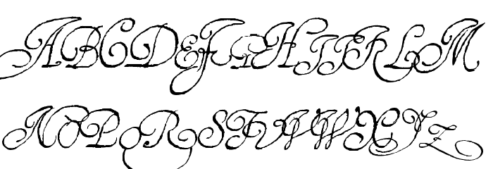
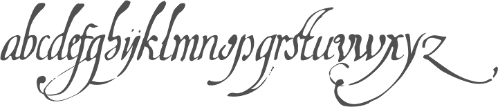
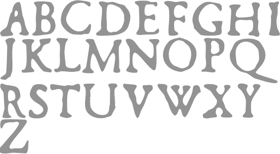
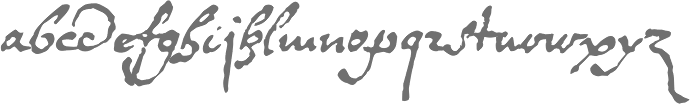
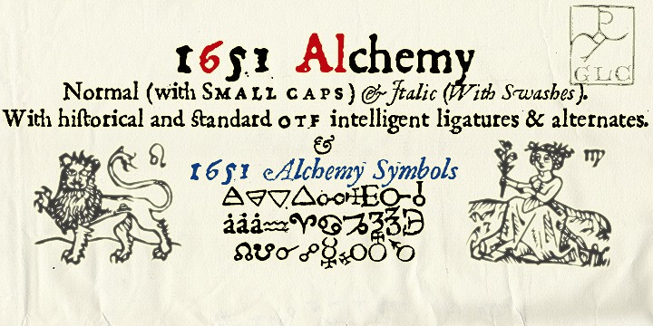
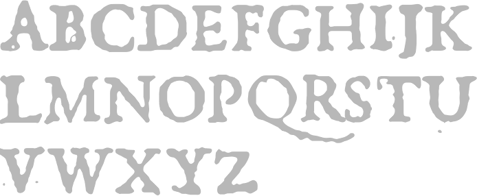
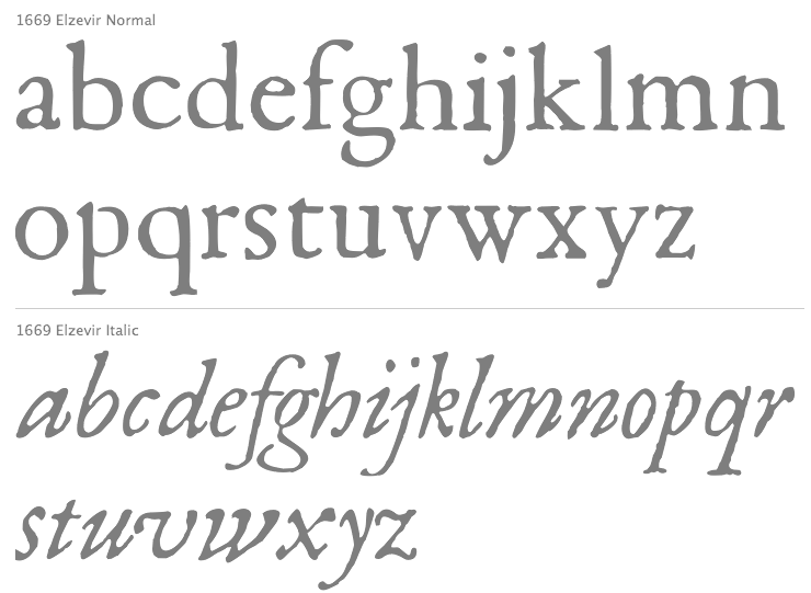
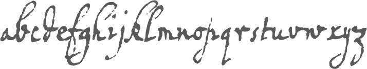
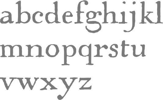
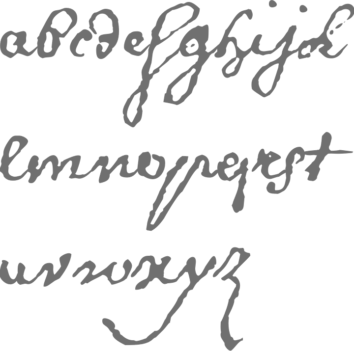
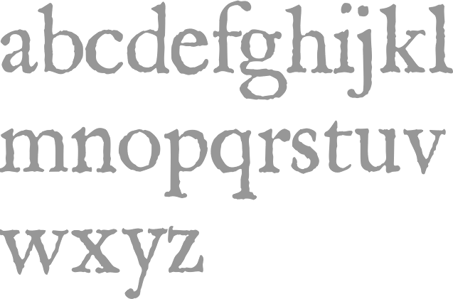
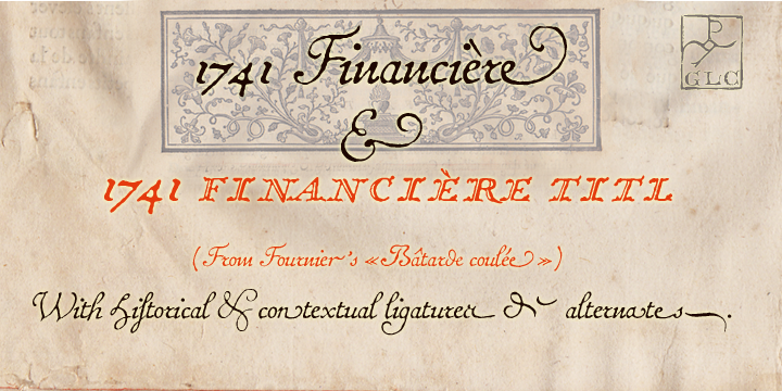
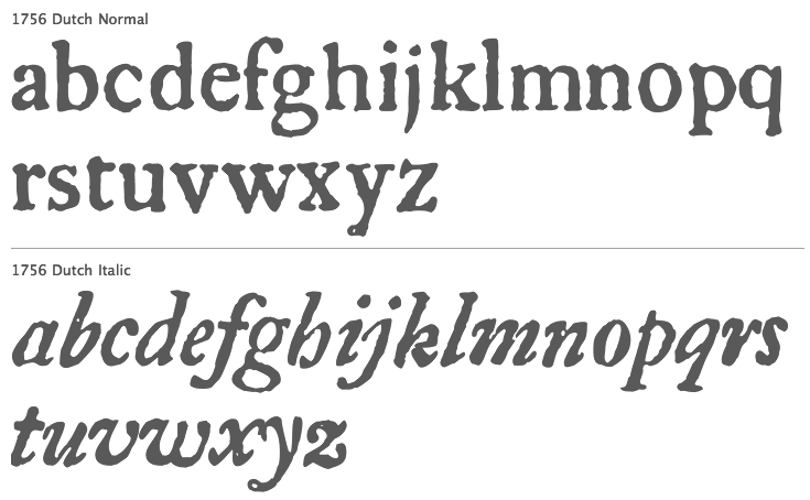
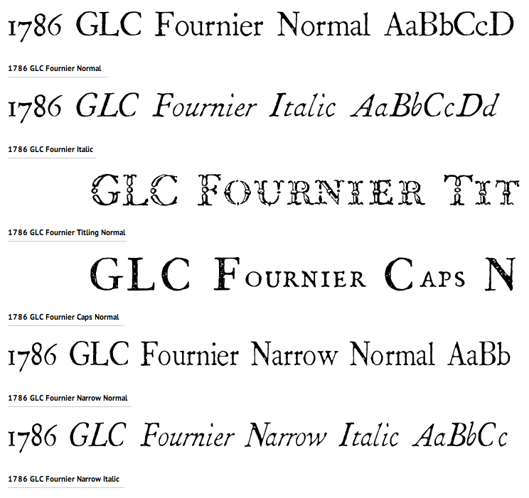
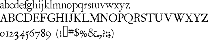
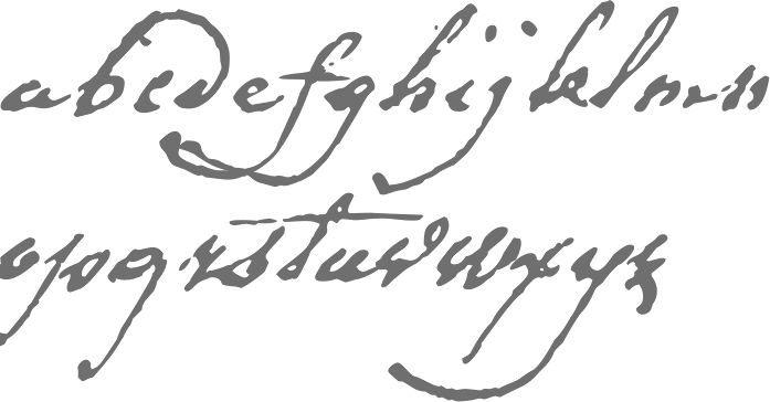
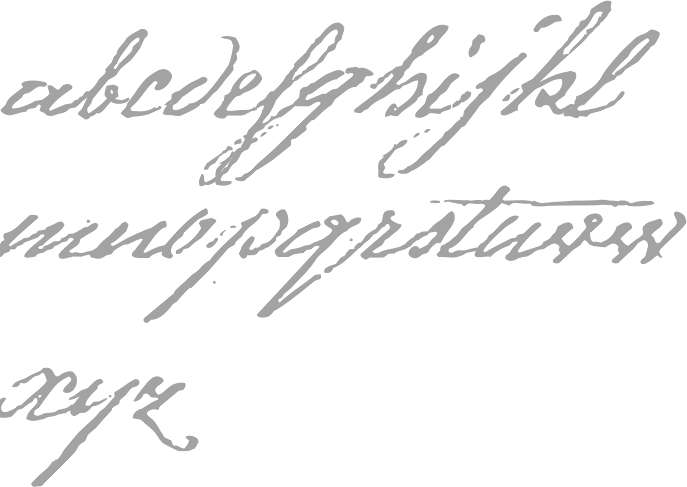
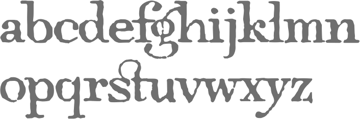
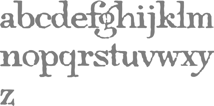
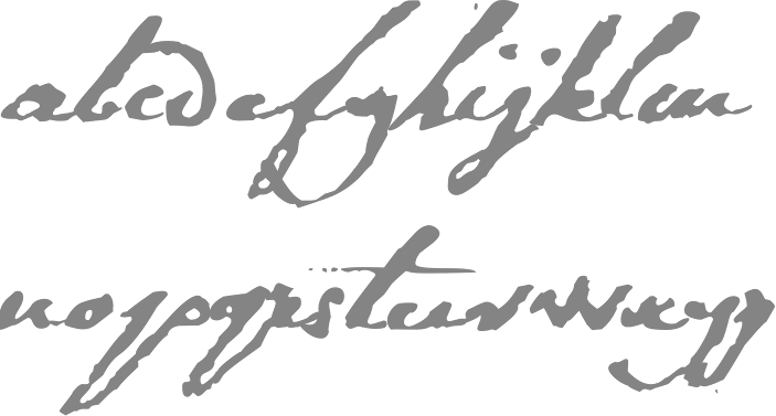
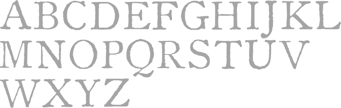
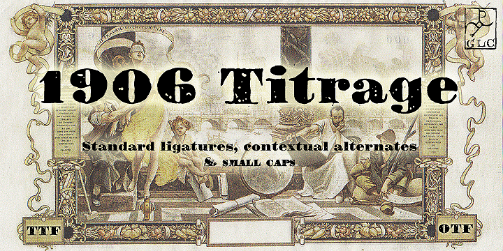
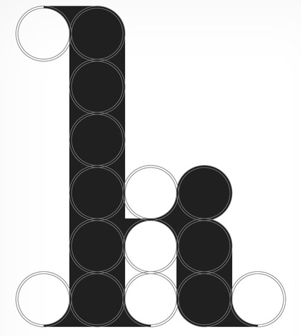
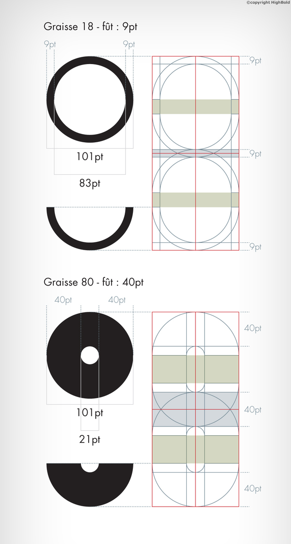
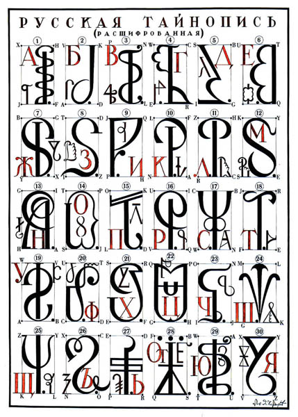
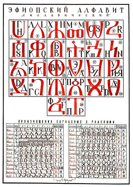
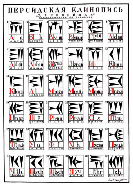
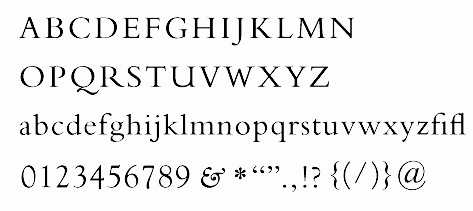
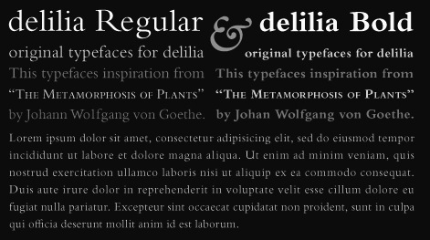
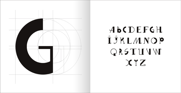
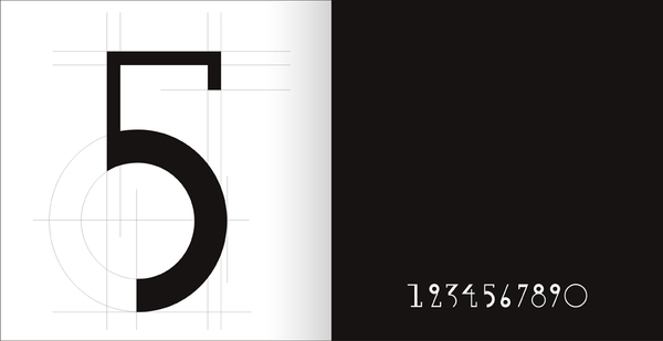
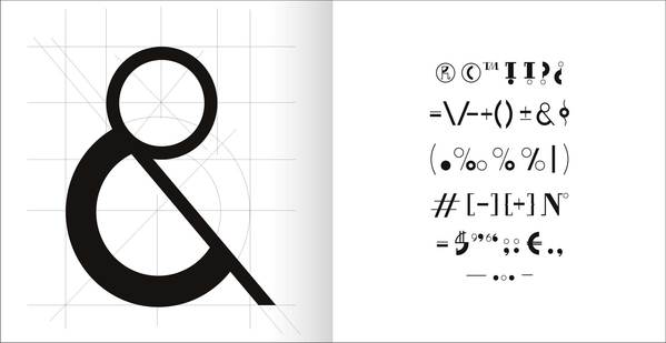
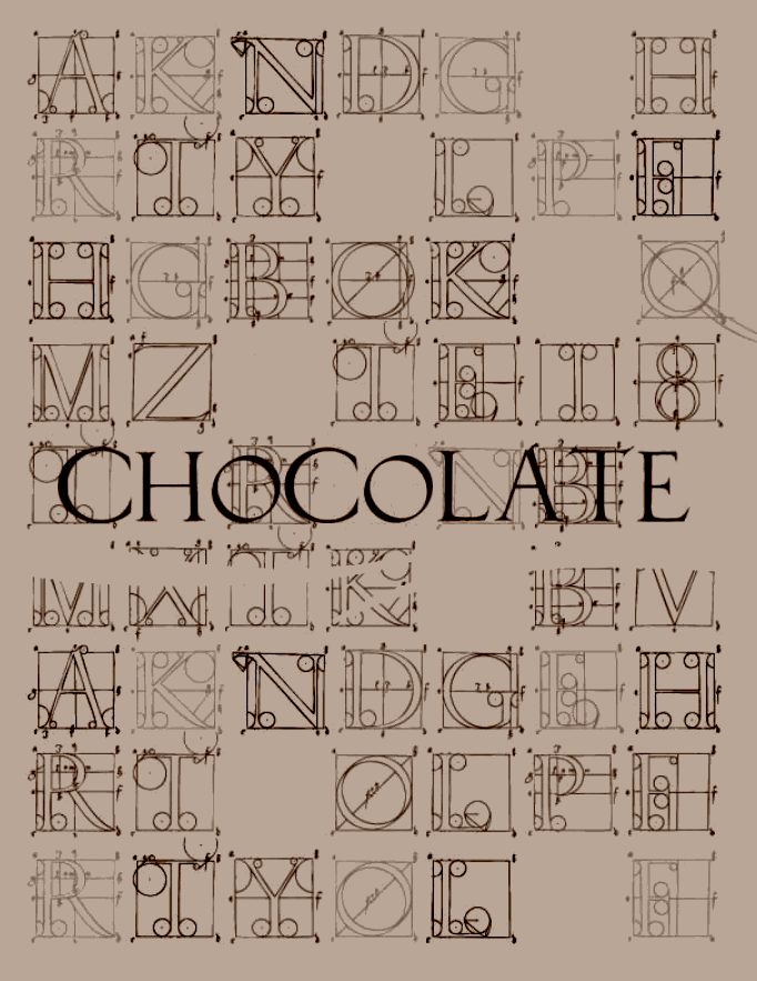
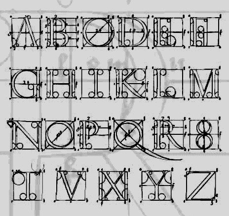
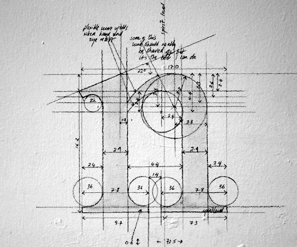
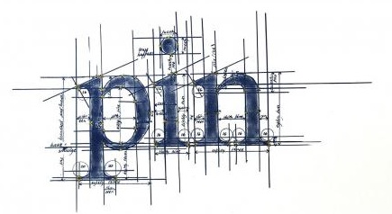
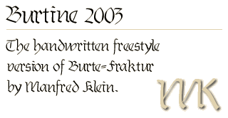
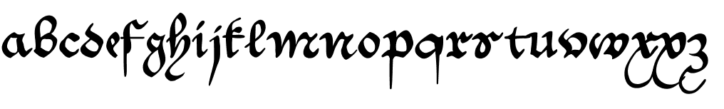
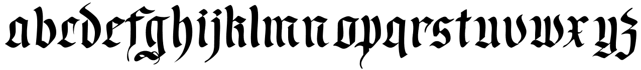
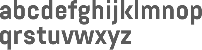
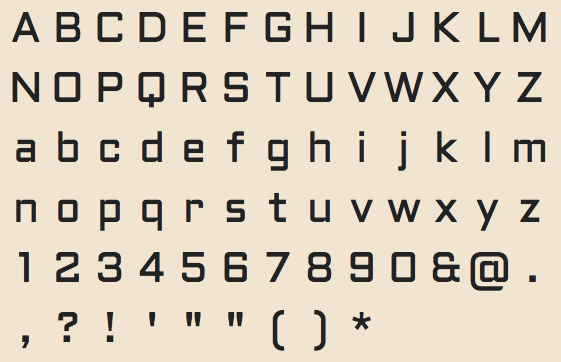
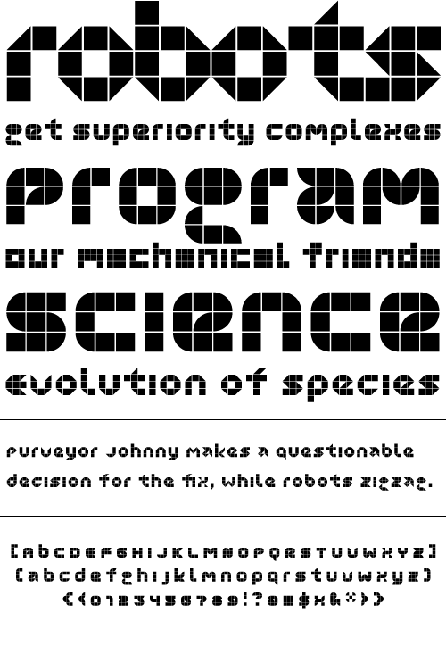
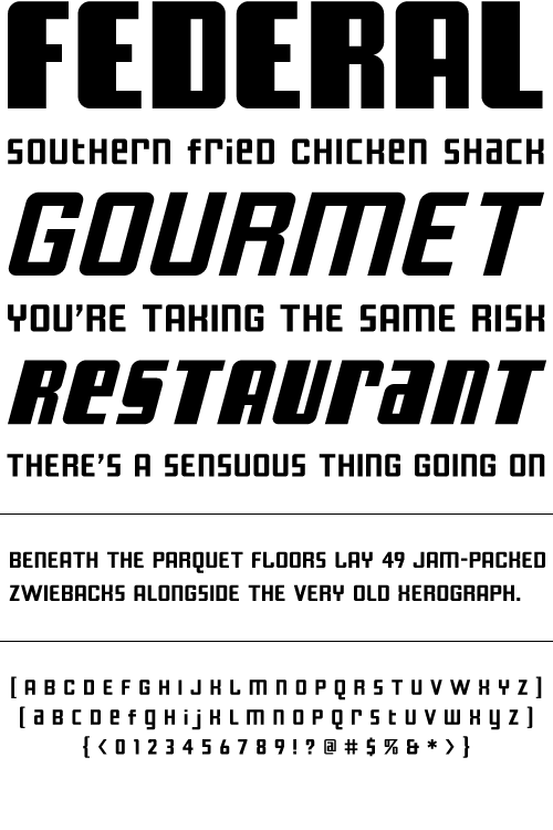
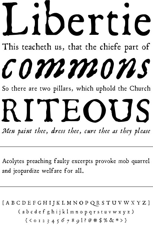
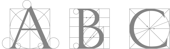
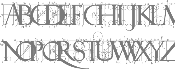
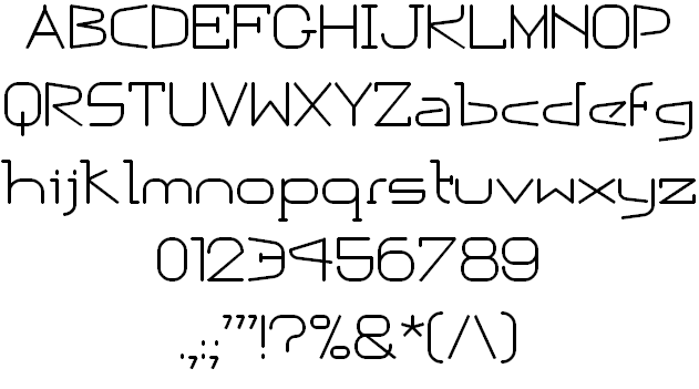
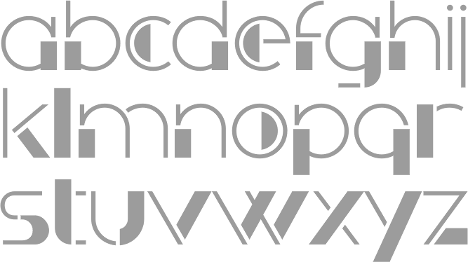
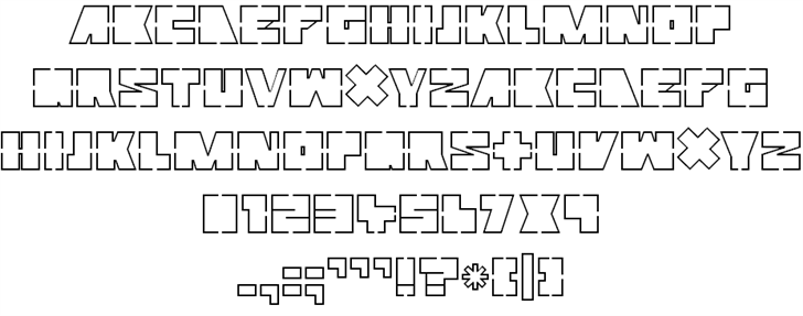
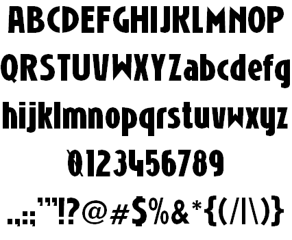
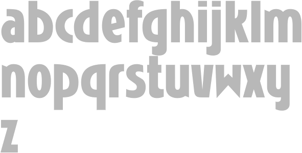
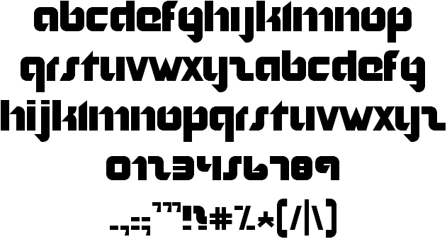
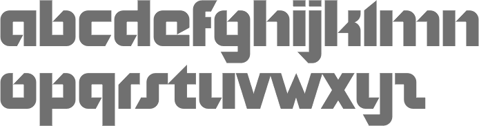
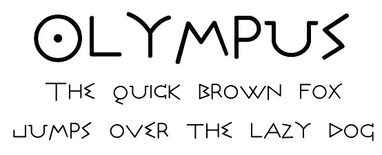
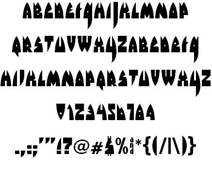
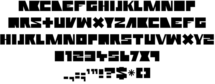
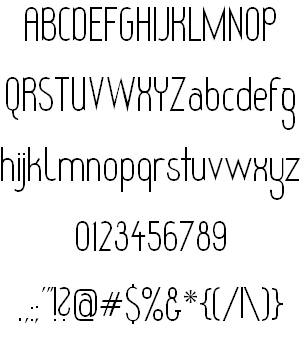
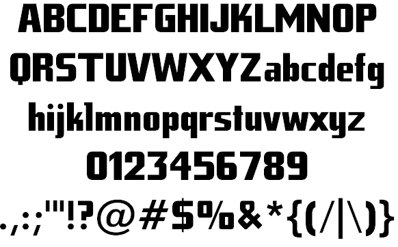
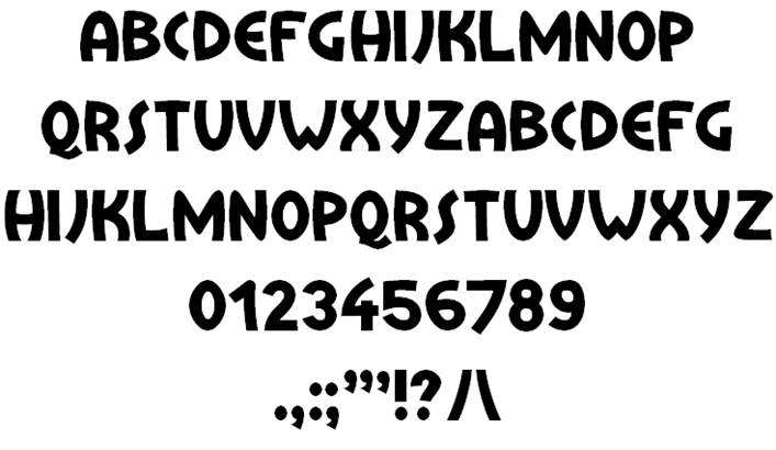
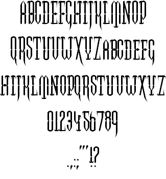
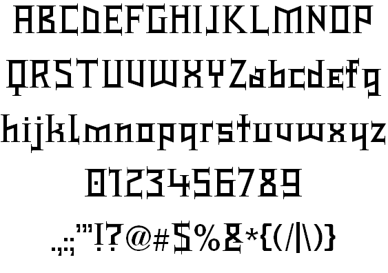
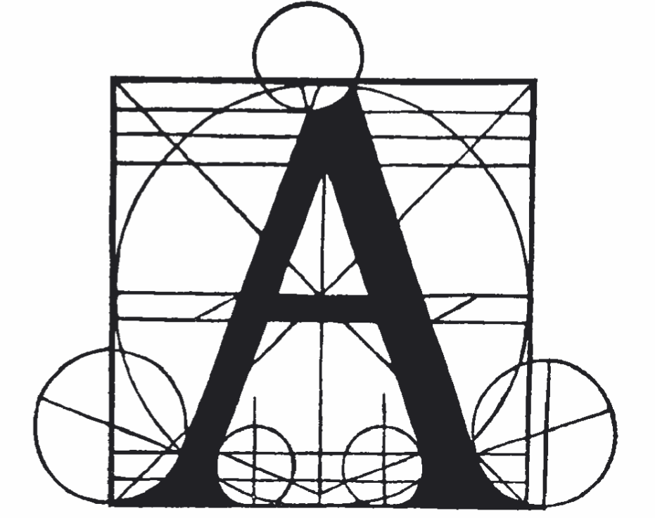
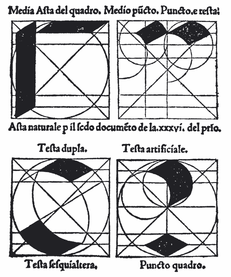
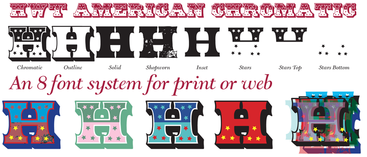
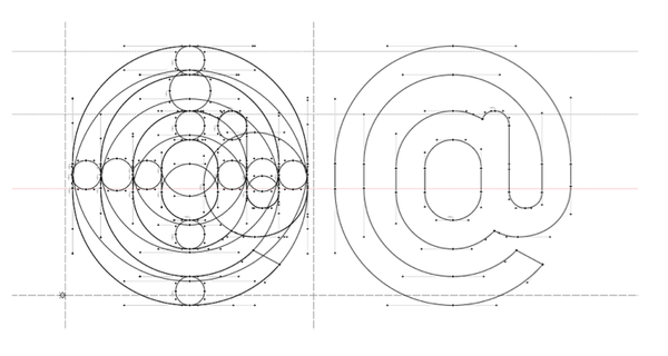
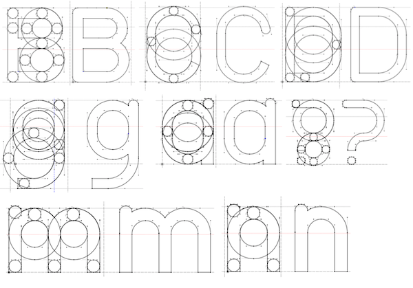
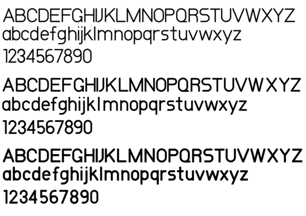
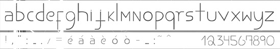
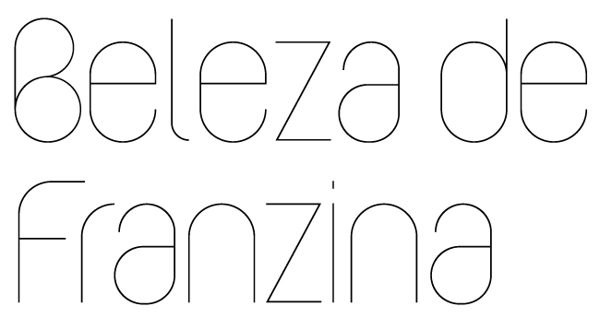