| | |
2-D curve generation
|
Information on Bezier curves by Darren Meyer. Check also the essay by Chris Bentley. [Google]
[More] ⦿
|
A Primer on Bezier Curves
[Pomax]
|
A Primer on Bezier Curves is an on-line book on Bezier curves by Pomax (Vancouver Island, Canada). [Google]
[More] ⦿
|
A Primer on Bezier Curves
[Mike "Pomax" Kamermans]
|
A fantastic on-lie book on Bezier curves, by Mike "Pomax" Kamermans. See also this repository. [Google]
[More] ⦿
|
A Tribute to Pierre Bézier (1910-1999)
[Pierre Bézier]
|
This tribute to Bezier states: At least two mathematicians solved the problem before Bezier: Airplane designer James Ferguson, and engineer Paul de Casteljau who worked for Citroen. The latter's work is mathematically equivalent to Bezier, in fact the formula listed above is De Casteljau's. Unfortunately, their discoveries were closely guarded industrial secrets and were not published until after Bezier. [Google]
[More] ⦿
|
Alex Dumestre
|
Alex explains n-point Bezier curves graphically. [Google]
[More] ⦿
|
Apple: Digitizing Letterforms
|
Apple's page on digitizing letterforms. [Google]
[More] ⦿
|
Barbara Brownie
|
Londoner who created the experimental Bezier-driven Blended Alphabet in 2009. [Google]
[More] ⦿
|
Barsky and Bézier
[Pierre Bézier]
|
 Pierre Bézier (born in Paris on 1 September 1910, died on 25 November 1999) was a friend of Brian Barsky, a famous graphics professor at Berkeley, and an ex-graduate of my own university, McGill. Bézier gave Barsky a wonderful Bézier curve drawing, signed and dated 29 November 1997. This is a thing of beauty. [Google]
[More] ⦿
Pierre Bézier (born in Paris on 1 September 1910, died on 25 November 1999) was a friend of Brian Barsky, a famous graphics professor at Berkeley, and an ex-graduate of my own university, McGill. Bézier gave Barsky a wonderful Bézier curve drawing, signed and dated 29 November 1997. This is a thing of beauty. [Google]
[More] ⦿
|
Bézier
|
Japanese page explaining about the use of Bézier curves in type design. [Google]
[More] ⦿
|
Béziers
[Simon Cozens]
|
Béziers is a vector editor for digitizing lettering, sketches and other artwork. It is designed with lettering artists in mind, with tools to help one trace designs to produce smooth curves. This 2018 app is only available on the App Store for iOS devices, and costs four dollars. By Simon Cozens. [Google]
[More] ⦿
|
Bezier applet
|
[More] ⦿
|
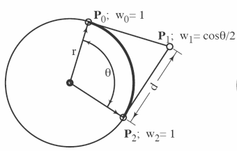
Bezier approximation of a circle arc
|
The solution given once again. [Google]
[More] ⦿
|
Bezier conversions
|
L.S. Ng explains the mathematical aspects of truetype to type 1 Bezier conversions (quadratic to cubic). Conversions from quadratic Beziers (truetype Beziers) to cubic (type 1) Beziers. [Google]
[More] ⦿
|
Bezier curve
|
 A Bézier curve is a parametric curve frequently used in computer graphics and related fields such as type design. Bézier curves are used to model smooth curves that can be scaled indefinitely. The mathematical basis for Bézier curves is the Bernstein polynomial (1912), but its applicability to graphics was understood half a century later. Bézier curves were widely publicized in 1962 by the French engineer Pierre Bézier who used them to design automobile bodies at Renault. The study of these curves was first developed in 1959 by mathematician Paul de Casteljau using de Casteljau's algorithm, a numerically stable method to evaluate Bézier curves, at Citroën, another French automaker.
 TrueType fonts use Bézier splines composed of quadratic Bézier curves. Type 1 or PostScript fonts use cubic Bézier curves. Imaging systems like PostScript, Metafont, and SVG use Bézier splines composed of cubic Bézier curves for drawing curved shapes. OpenType fonts can use either kind, depending on the flavor of the font. [Google]
[More] ⦿
|
Bezier curves tutorial
|
 Tutorial by Richard Kinch. [Google]
[More] ⦿
Tutorial by Richard Kinch. [Google]
[More] ⦿
|
Bezier drawing tool
|
Michael Heinrichs, grad student at SFU. [Google]
[More] ⦿
|
bezierjs
[Mike "Pomax" Kamermans]
|
A library for performing Bezier curve computation and, if you add in your own drawing code (like the HTML canvas), drawing curves in a useful manner. [Google]
[More] ⦿
|
Bill Casselman
|
Bill Casselman on Bezier curves. [Google]
[More] ⦿
|
BubbleKern
[Toshi Omagari]
|
A new kerning method based on Bezier curves first proposed by Toshi Omagari at ATypI 2016 in Warsaw. Space between letters is now explicitly drawn, an iea that saw some use in Microsoft's Cambria math. [Google]
[More] ⦿
|
caryll / shapeops
|
Boolean operations and overlap removal for curves. [Google]
[More] ⦿
|
Converting Bezier Curves to Quadratic Splines
|
Essay by Steven Hollasch on possible conversions. [Google]
[More] ⦿
|
Cornu spiral
|
 Model for curves that some like better than Bezier curves in terms of beauty and smoothness. See the discussion here. Image. [Google]
[More] ⦿
Model for curves that some like better than Bezier curves in terms of beauty and smoothness. See the discussion here. Image. [Google]
[More] ⦿
|
cu2qu
|
Cubic-to-quadratic bezier curve conversion. [Google]
[More] ⦿
|
cubic2quad
|
Aproximates cubic bezier curves with quadratic ones. [Google]
[More] ⦿
|
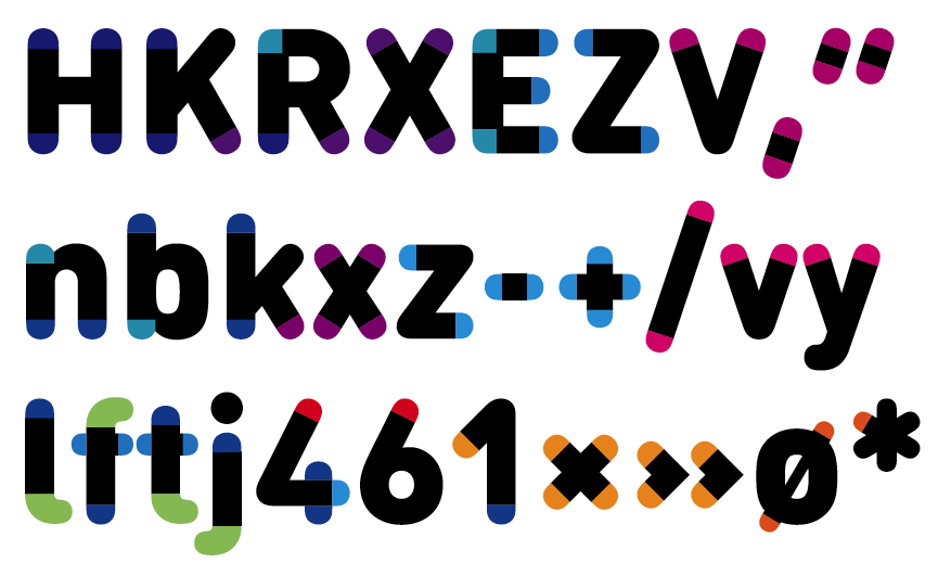
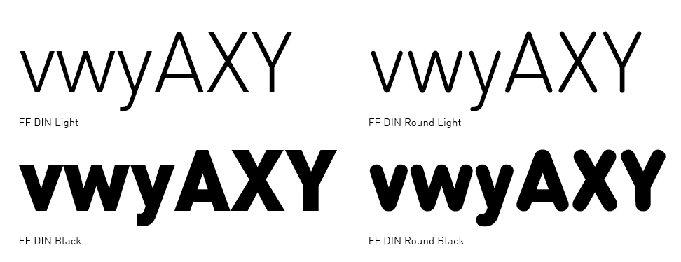
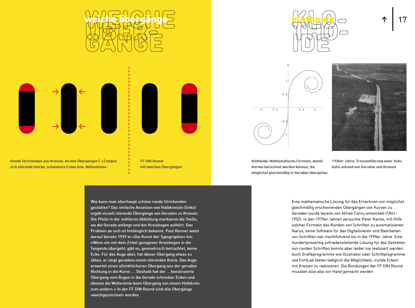
DIN and Klothoids
|
Frenchman Marie Alfred Cornu proposed his famous Cornu spirals in 1874, also known as Klothoids. They have the desirable property that curves can blend smoothly into lines, much more so than Bezier curves can blend into straight lines. Bezier-based outlines thus exhibit the characteristic kinks. To avoid them, one has to resort to design by hand. This has annoyed the designers of FF DIN Round (Albert-Jan Pool, FontShop). Clearly, there is a need to broaden the palette of curves from which type designers can choose. The FF DIN Round designers "simulated" the klothoid by using more Beziers than normal, to trick the eye. However, the designers failed to note a remarkble property of Bezier curves. If one places the first three Bezier points on a line (the start point and two control points), and the last (end) point off the line, then the transition away from the line is "cubic", not "quadratic". Now, a simple math exercise shows that klothoids have precisely this cubic behavior that is so eye-pleasing. Did Pool try this trick? Why was it not used? [Google]
[More] ⦿
|
Drawing circles in Postscript
|
Drawing circles in Postscript is not possible using just Beziers. For best approximations, see G. Adam Stanislav's page. [Google]
[More] ⦿
|
Fitting ellipses to points
|
In the course of making Bezier curves, one wants to fit ellipses to sets of points. A fast and stable method is described in this paper: "Numerically stable direct least squares fitting of ellipses" (Radim Halir (Charles University) and Jan Flusser (Academy of Sciences of the Czech Republic)). [Google]
[More] ⦿
|
Font Mikado: Making a libre typeface and learning a lot
[Simon Peter]
|
An on-line article by Simon Peter in 2020 gives an overview of the libre font tools available in 2020, and illustrates how to remove unnecessary Bezier control points using existing libre software. [Google]
[More] ⦿
|
G. Scott Owen
|
G. Scott Owen's page on Bezier curves, with an applet to boot. [Google]
[More] ⦿
|
Geometric Modelling
[Ken Joy]
|
Ken Joy (University of California at Davis) has lots of didactic on-line material on geometric modelling in general and on Bezier curves in particular. [Google]
[More] ⦿
|
Geometry, Surfaces, Curves, Polyhedra
[Paul Bourke]
|
Wonderful pages on various curves in 2d and 3d by University of Western Australia Professor Paul Bourke. Subpage on Bezier curves. [Google]
[More] ⦿
|
Guru's Lair Cubic Spline and Bezier Curves Library
|
Don Lancaster's great links on Bezier curves. Has a bibliography as well. [Google]
[More] ⦿
|
Harrisson
[Open Source Publishing (or: OSP)]
|
 [More] ⦿
|
Jan Gerner
[Yanone]

|
[MyFonts]
[More] ⦿
|
Jan Gerner
[Speed Punk]
|
[More] ⦿
|
Jim Fitzsimmons
|
Several numerical procedures involving Bezier curves are explained by Jim Fitzsimmons. [Google]
[More] ⦿
|
Ken Joy
[Geometric Modelling]
|
[More] ⦿
|
Marina Lukashenko
|
Graphic designer and illustrator in Kiev, Ukraine. Her remarkable work includes some unnamed experimental Cyrillic typefaces (2014), and a Bezier curvature experiment that is called Coordinate (2014). [Google]
[More] ⦿
|
Mike "Pomax" Kamermans
[bezierjs]
|
[More] ⦿
|
Mike "Pomax" Kamermans
[A Primer on Bezier Curves]
|
[More] ⦿
|
Open Source Publishing (or: OSP)
[Harrisson]
|
 Free software project based in Belgium and run by four people (and I quote from their web page):
 - Harrisson: Graphic designer and typographer, based in Liege and Brussels. Started to use as much Open Source software as possible on his Macintosh, as part of a research project The Tomorrow Book at the Jan van Eyck Academy in Maastricht.
- Pierre Huyghebaert: Exploring for eighteen years several practices around graphic design, he currently drives his own studio Speculoos. Interested to use free sofware to re-learn to work in others way and collaboratively on cartography, type design, web interface, schematic illustration, teaching and book design.
- Nicolas Malevé: Systems- and software developer from Brussels with a long interest in the politics and practice of software. Uses Linux since 1998 and makes publishing- and distribution systems for collaborative work.
- Femke Snelting: Graphic designer and artist based in Brussels. Most of her current work is for the web. Recently switched to Linux after using Apple Macintosh for more than ten years.
Alternate URL. They also describe interesting autotrace software included in Inkscape and UNIX batch tools for good autotracing of images. Designers of free fonts: - Alfphabet (2009). Based on the Belgian road signage system in use from 1945 until 1975. It came from Minneapolis to Brussels with 3M.
- Broodthaers.
- Cimatics (2009). Totally experimental. This font was designed in July 2009, for the graphic identity of Cimatics A\V Platform. It gathers glyphs from FreeSerif, FreeSerifItalic, DejaVuSans, DejaVuSerif, the OSP_frog mascot, the Cimatics two piece heart, a baronchon_palm_tree from Open Clip Art Library and private use dingbats drawn for Cimatics (Cimatics_scare_eye, white_pentagon).
- Crickx. A digital reinterpretation of a set of adhesive letters.
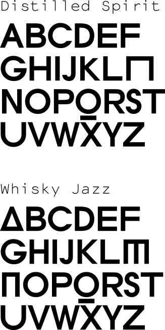
- Distilled Spirit and Whisky Jazz. In September 2009, Harrisson and Jean Baptiste Parre from LPDME remixed URW Gothic (Avant Garde) and published the free fonts Distilled Spirit and Whisky Jazz.
- DLF. DLF stands for Dingbats Liberation Fest.
- Libertinage. In August 2008, Harrisson designed 26 variations on Philipp H. Poll's 2006 font Libertine, and called the new family Libertinage. It covers Greek, Latin and Cyrillic.
- Limousine. This font was made for a poster to support nine people accused of "criminal association for the purposes of terrorist activity". They were arrested the 11th of November 2008, in France. They and others are the victims of a witch-hunt where the word "terrorism" was applied to any idea or practice which challenges the status quo. An international movement is emerging in their support. For the poster, we re-mixed an open font, the Free Sans from Free UCS Outline Fonts. Open Font Library link.
- Logisoso. Logisoso is a reinterpretation of the Delhaize logo lettering.
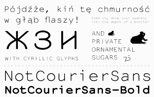
- NotCourierSans. NotCourierSans is a reinterpretation of Nimbus Mono and was designed in Wroclaw at the occasion of Linux Graphics Meeting (LGM 2008). We took Nimbus as the base of the design. We proceeded to remove the serifs with raw cuts. We did not soften the edges. We are not here to be polite.
- OSP-DIN (2009). The first cut of OSP-DIN was drawn for the festival Cinema du réel.
- Polsku Regula (2010). Polsku Regula is inspired by polish signage, street signs and shop windows lettering.
- Reglo (2011) was used for the new identity of Radio Panik.
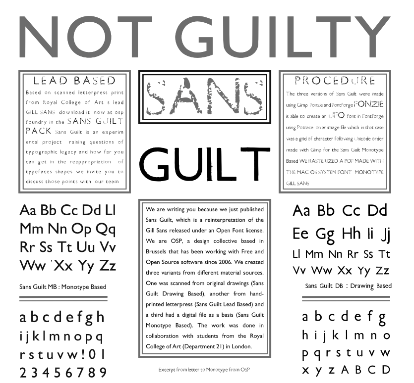
- Sans Guilt (2011). The three Sans Guilt fonts have been produced during "Read The Fucking Manual", an OSP workshop at Deparment 21 (Royal College of Art), using Gimp, Fonzie and Fontforge. They are different versions of Gill Sans based on three different sources. Sans Guilt MB: based on a rasterized pdf made with the Monotype Gill Sans delivered with Mac OSX. Sans Guilt DB: Based on early sketches by Eric Gill Sans Guilt LB: Based on lead type from Royal College of Arts letterpress workshop. Open Font Library link.
- Univers Else (2010-2012). A geometric sans, about which they write: Univers Else is an experiment, a first attempt to escape the post ’80 era of geometrical purity that is so typical of Postscript vector based font drawing. The shapes of Univers Else were obtained from scanning printed textpages that were optically composed by cheap phototypesetting machines in the sixties and seventies. Some of Univers Else beautiful features are: round angles, floating baselines, erratic kerning. More precisely in this case, George Maciunas of the Fluxus group used an IBM composer (probably a Selectric typewriter) for most of his own work, and as a former designer, for all Fluxus work. In the 1988 book Fluxus Codex, kindly given to Pierre Huyghebaert by Sylvie Eyberg, the body text is typeset in a charmingly rounded and dancing Univers that seems to smile playfully at its dry swiss creator. Different scans were assembled by Grégoire Vigneron following different grids. These huge bitmaps were processed with appropriate potrace settings by the Fonzie software* through a .ufo font format as a working format, and an OpenType as output. Some testing and fine-tuning was done by Pierre Marchand, Delphine Platteeuw and Pierre Huyghebaert in FontForge and the font was ready, in a finished state enough to typeset the book. The oblique versions was simply slanted on the fly.
- VJ12 (2009).
- W Droge. In 2008, they ran a workshop in Wroclaw, Poland, to design a font in a day with the free tools Inkscape, Gimp and FontForge---called W Droge. It was based on Polish traffic signs. Cooperation with Dave Crossland, Alexandre Prokoudine and Nicolas Spalinger. The designers were Malwina Pukaluk, Marcin Wajda, Anna Bartoszek, Kacper Lenczuk, and Ludivine Loiseau.
- Le Patin Helvète (2011) is a slab typeface derived from Nimbus L. It covers Latin, Greek, Cyrillic and Hebrew: Patin Helvete is a attempt to turn the slick propergol purity of the modernist lines back to the coal dirt of the iron horse by going backward in time and space through little pieces of rail. Designed by Harrisson, Ludi Loiseau and Sebastien Sanfilippo.
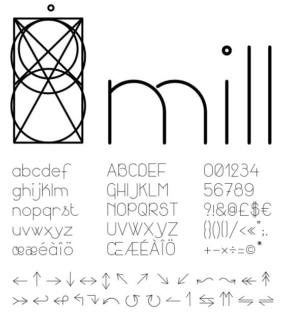
- Mill (2012) is an architectural style typeface that has been created for engraving building instructions into the wood of a bench.
- Sans Guilt Wafer (2012) is described by OSP as follows: Gill Sans eats a Gaufrette.
[Google]
[More] ⦿
|
Paul Bourke
[Geometry, Surfaces, Curves, Polyhedra]
|
[More] ⦿
|
Peter Vollenweider
[Rechenzentrum Universität Zürich]
|
[More] ⦿
|
Pierre Bézier
[A Tribute to Pierre Bézier (1910-1999)]
|
[More] ⦿
|
Pierre Bézier
[Barsky and Bézier]
|
[More] ⦿
|
Pierre Etienne Bézier
|
From Computer-Aided Design, vol. 22, November 1999, an obituary: Pierre Etienne Bézier was born on September 1, 1910 in Paris. Son and grandson of engineers, he chose this profession too and enrolled to study mechanical engineering at the Ecole des Arts et Metiers and received his degree in 1930. In the same year he entered the Ecole Superieure d'Electricite and earnt a second degree in electrical engineering in 1931. In 1977, 46 years later, he received his DSc degree in mathematics from the University of Paris. In 1933, aged 23, Bézier entered Renault and worked for this company for 42 years. He started as Tool Setter, became Tool Designer in 1934 and Head of the Tool Design Office in 1945. In 1948, as Director of Production Engineering he was responsable for the design of the transfer lines producing most of the 4 CV mechanical parts. In 1957, he became Director of Machine Tool Division and was responsable for the automatic assembly of mechanical components, and for the design and production of an NC drilling and milling machine, most probably one of the first machines in Europe. Bézier become managing staff member for technical development in 1960 and held this position until 1975 when he retired. Bézier started his research in CADCAM in 1960 when he devoted a substantial amount of his time working on his UNISURF system. From 1960, his research interest focused on drawing machines, computer control, interactive free-form curve and surface design and 3D milling for manufactoring clay models and masters. His system was launched in 1968 and has been in full use since 1975 supporting about 1500 staff members today. Bézier's academic career began in 1968 when he became Professor of Production Engineering at the Conservatoire National des Arts et Metiers. He held this position until 1979. He wrote four books, numerous papers and received several distinctions including the "Steven Anson Coons" of the Association for Computing Machinery and the "Doctor Honoris Causa" of the Technical University Berlin. He is an honorary member of the American Society of Mechanical Engineers and of the Societe Belge des Mecaniciens, ex-president of the Societe des Ingenieurs et Scientifiques de France, Societe des Ingenieurs Arts et Metiers, and he was one of the first Advisory Editors of "Computer-Aided Design". Wikipedia link. [Google]
[MyFonts]
[More] ⦿
|
Polyline2bezier
[Yuhta Nakajima]
|
An interesting piece of code written in 2015 by Tokyo-based Yuhta Nakajima. It takes as input a set of points that represent a polygonal line and outputs a Bezier approximation. On-line demo. This code was ported from Philip J. Schneider's example implementation which was included in "Graphics Gems", Academic Press, 1990. [Google]
[More] ⦿
|
Pomax
[A Primer on Bezier Curves]
|
[More] ⦿
|
Raph Levien
|
 Type and technology expert and computer scientist presently working for Google in Mountrain View, CA. His blog was totally dedicated to free and open software. Raph Levien is a software engineer and tech lead of Android Text on the Android UI Toolkit team at Google. A well-known software guru, he was a lead developer for Gfonted and Spiro (a font editor), and helped out with Gimp, among many other things. Raph's previous work includes Google Fonts and the open source Ghostscript PostScript/PDF engine. The topic for his PhD in Computer Science from the University of California, Berkeley, is on better techniques for interactively designing curves, and he also used these tools to design Inconsolata, one of the fonts available on the font API (see CTAN).
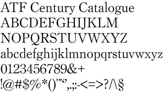
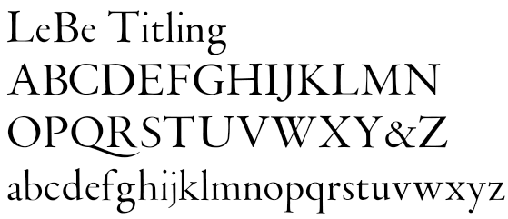
 Inconsolata (2005) became an instant hit as a monospaced programming font. It was modified by Raph Levien and Kyrill Tkachev as late as 2011. Further modifications were done by Michael Sharpe. CTAN link. See also Open Font Library for this relative of Franklin Gothic. Raph is working on a revival of ATF Century Catalogue, and proposes it as a replacement for the skinny Computer Modern fonts used in TeX. Other fonts in the pipeline include Century Catalogue, Bruce Rogers' Centaur types, Museum Caps, LeBe Titling, LeBe Book, ATF Bodoni and ATF Franklin Gothic. Raph's type page, where one can download his didone fonts ghr10 and ghmi10 (2009) and look at Soncino Italic (2009), a lively informal text font. In 2007, he finally published the Museum Fonts package (see also Open Font Library) based on historical metal Centaur fonts, all free. He writes: - Museum Sixty is based on 60 point metal Monotype Centaur. The source for A-Z& is the specimen page opening American Proprietary Typefaces, ed. David Pankow. The primary source for the lowercase is the original Centaur specimen booklet by Lanston Monotype, London, 1929.
- Museum Fourteen is based on 14 point metal Monotype Centaur. The primary source is the text of Americal Proprietary Typefaces.
- Museum Bible is based on 18 point metal Bible Centaur. The source is the booklet, "An Account of the Making of the Oxford Lectern Bible", Lanston Monotype, Philadelphia, 1936.
- Museum Foundry is based on the 14 point original foundry version of Centaur, as cut by Robert Wiebking of Chicago. The source is "Amycus et Célestin", printed at the Museum Press in New York, 1916.
Speaker at ATypI 2011 in Reykjavik and at ATypI 2015 in Sao Paulo. Klingspor link. [Google]
[More] ⦿
|
Rechenzentrum Universität Zürich
[Peter Vollenweider]
|
PostScript information and sample programs at RZU. Site by Peter Vollenweider with a ton of information. There is a crash course on Bezier curves, a type 1 version of Frutiger 47, and a random type 3 font, with line by line explanations. In German. [Google]
[More] ⦿
|
RZU
|
Comparison between truetype and postscript at Zentrum Informatikdienste of the University of Zürich. Essay on Bezier curves as well. [Google]
[More] ⦿
|
Simon Cozens
[Béziers]
|
[More] ⦿
|
Simon Peter
[Font Mikado: Making a libre typeface and learning a lot]
|
[More] ⦿
|
Song Sam Liang
|
An n-point Bezier curve demo. [Google]
[More] ⦿
|
Speed Punk
[Jan Gerner]
|
A learning tool for better understanding Bézier curves, developed in 2011 at KABK by Jan Gerner, aka Yanone. See also his talk at ATypI 2013 in Amsterdam. [Google]
[More] ⦿
|
Spline applet
|
Saltire Software's nice applet showing de Casteljau's construction for computing points on cubic splines (Bezier curves). [Google]
[More] ⦿
|
Thomas W. Sederberg
|
 Professor at Brigham Young University (Utah), who has a beautiful set of course notes on-line for his graduate course on Computer-Aided Geometric Design. It has virtually everything one needs to know about Bezier curves (chapter 2), and deals with PostScript, rational Bezier curves (with which one can make perfect circles), B-splines, and advanced material. [Google]
[More] ⦿
Professor at Brigham Young University (Utah), who has a beautiful set of course notes on-line for his graduate course on Computer-Aided Geometric Design. It has virtually everything one needs to know about Bezier curves (chapter 2), and deals with PostScript, rational Bezier curves (with which one can make perfect circles), B-splines, and advanced material. [Google]
[More] ⦿
|
Tom Dukich
|
Tom Dukich has links on Bezier curves. [Google]
[More] ⦿
|
Tomek Zemla
|
Fun with Bezier curves in Flash. By Tomek Zemla. [Google]
[More] ⦿
|
Toshi Omagari
[BubbleKern]
|
[More] ⦿
|
Typo-L: Bezier Curves
|
Roger Whitlock explains about Bezier curves. [Google]
[More] ⦿
|
Urs Oswald
[Urs Oswald: Bezier Curves]
|
[More] ⦿
|
Urs Oswald: Bezier Curves
[Urs Oswald]
|
URS Oswald explains Bezier curves in a simple and authoritative manner. Includes material on MetaPost. [Google]
[More] ⦿
|
Yanone
[Jan Gerner]
|
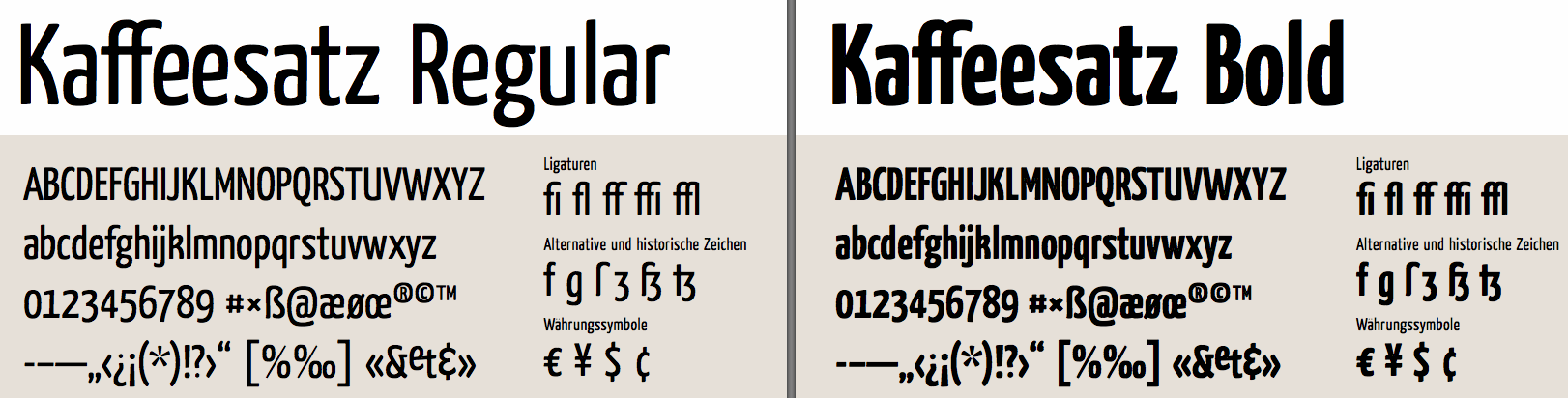
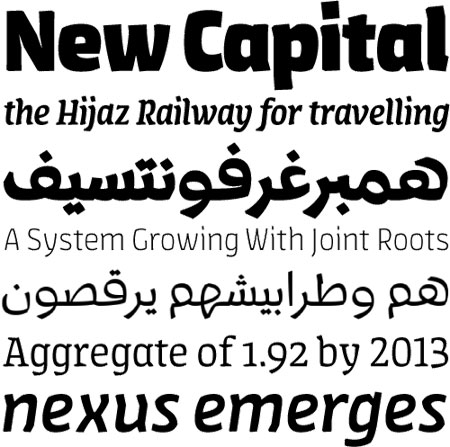
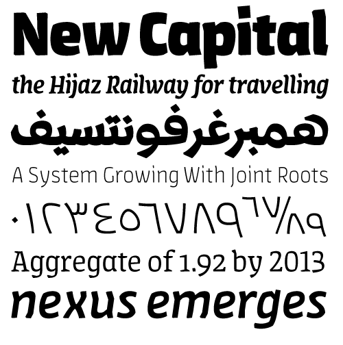
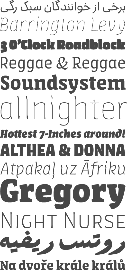
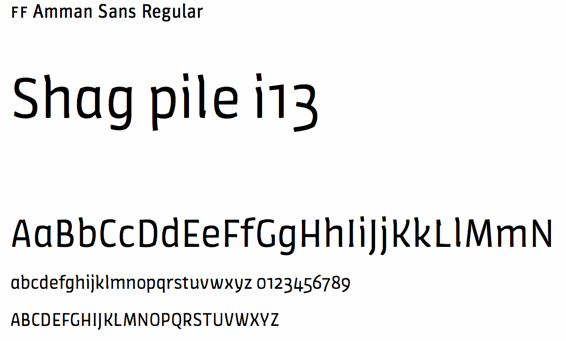
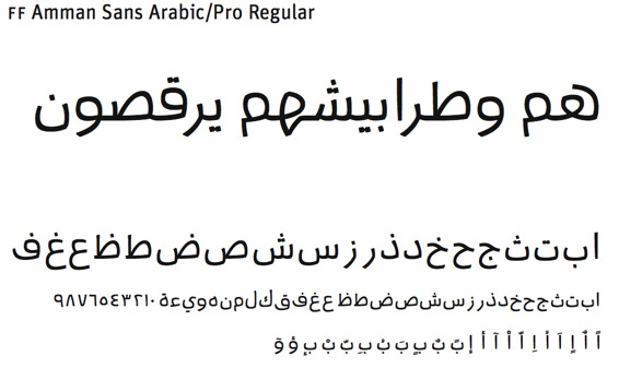
Jan Gerner (b. 1982, Dresden) from Weimar runs Yanone. He grew up in Addis Abbeba. He studied Media at the Bauhaus Universität Weimar in 2003. He still lives and works in Weimar. He designed the (free) informal sans family YanoneKaffeesatz (2005), which is analyzed by Gerrit van Aken. YanoneTagesschrift (2005) is a serif obtained by scanning the felt tip pen traces of a printed serif face--a nice idea! The font is now at Schriftgestaltung. The pixel font Al Abdali 8 was created during his stay with Syntax in Amman/Jordan to match the growing need for joint Arabic/Latin typefaces. In 2006, Yanone started selling some fonts through MyFonts. These include Monospasz (2006, a manually produced monospace typewriter font family in 5 styles), Liebfraumilch (2009, connected hand) and Pochoir (2006, stencil). And in 2009, the popular free Kaffeesatz became a pay font, FF Kava, at FontFont. In 2010, Yanone published FF Amman for Latin and Arabic---a bit too angular for my taste, but it has its uses. In 2011, he obtained a Masters at KABK in the type and media program. His graduation typeface was Antithesis (2011)---it consists of a slab serif, a connected script and a heavy sans. All three have a hand-printed look and should be fine typefaces for signage. Page dedicated to Antithesis. The FontFont version, FF Antithesis, appeared in 2013.Runya (2013) is free Arabic hipster typeface. At ATypI 2013 in Amsterdam, he introduces Speed Punk, a learning tool to better understand the nature of Bézier curves and their curvature. See also here. In 2016, he cooperated with Albert-Jan Pool in the development of FF DIN Arabic, which won an award at Granshan 2016. Font Squirrel link. Dafont link. Klingspor link. MyFonts link for Yanone. [Google]
[MyFonts]
[More] ⦿
|
Yuhta Nakajima
[Polyline2bezier]
|
[More] ⦿
|
