TYPE DESIGN INFORMATION PAGE last updated on Mon May 6 09:16:44 EDT 2024
FONT RECOGNITION VIA FONT MOOSE

|
|
|
|
|
Vietnamese | ||
|
|
|
|

SWITCH TO INDEX FILE
Abu Paka (Center for Cham Studies) fights for the conservation of the Cham language, which is spoken by about 100,000 people in Vietnam, and 200,000 in Cambodia. In 2012, he created a free font for Cham called CJM KH 001. Fontspace link. [Google] [More] ⦿ | |
Paul Rädle's great jump page for foreign fonts and phonetic fonts. [Google] [More] ⦿ | |
Akira Kobayashi
| |
Speaker at ATypI 2012 in Hong Kong: Rounded sans in Japan. View Akiro Kobayashi's typefaces. Klingspor link. FontShop link. Eurostile Next review. Linotype link. Monotype link. MyFonts interview in 2017. [Google] [MyFonts] [More] ⦿ | |
Akira Kobayashi
| |
Ho Chi Minh City, Vietnam-based designer of the free modular display typeface HoiVan (2017), which is inspired by the traditional Vietnamese interior design patten, the HoiVan. Behance link. [Google] [More] ⦿ | |
Password access only. At one point, one could find here a zip file which contained a huge number of Vietnamese fonts by VNI: VNI-Vari, VNI-Allegie, VNI-Aptima-Bold, VNI-Aptima-Bold-Italic, VNI-Aptima-Italic, VNI-Aptima, VNI-Ariston, VNI-Auchon-Bold, VNI-Avo-Bold, VNI-Avo-Bold-Italic, VNI-Avo-Italic, VNI-Avo, VNI-Aztek, VNI-Bandit, VNI-Bodon, VNI-Bodon-Bold, VNI-Bodon-Bold-Italic, VNI-Bodon-Italic, VNI-Bodon-Poster, VNI-Book-Bold, VNI-Book-Bold-Italic, VNI-Book-Italic, VNI-Book, VNI-Broad, VNI-Brush-Italic, VNI-Centur-Bold, VNI-Centur-Bold-Italic, VNI-Centur-Italic, VNI-Centur, VNI-Commerce-Bold-Italic, VNI-Cooper-Heavy, VNI-Coronet-Bold-Italic, VNI-Couri, VNI-Couri-Bold, VNI-Couri-Bold-Italic, VNI-Couri-Italic, VNI-Dom, VNI-Duff, VNI-Dur, VNI-Fato, VNI-Franko, VNI-Free, GatineauBold, GatineauBoldItalic, GatineauItalic, VNI-Garam, VNI-Goudy-Bold, VNI-Goudy-Italic, VNI-Goudy, VNI-Helve-Condense-Bold, VNI-Helve-Condense-Bold-Italic, VNI-Helve-Condense-Italic, VNI-Helve-Condense, VNI-Helve-Bold, VNI-Helve-Bold-Italic, VNI-Helve-Italic, VNI-Helve, VNI-Hobo, Vinhan, VNI-Jamai, VNI-Juni, VNI-Korin, VNI-Korin-Bold, VNI-Korin-Italic, VNI-Kun-Bold, VNI-Kun-Bold-Italic, VNI-Kun, LinusPlain, VNI-Lithos, VNI-Maria, VNI-Meli-Bold, VNI-Meli-Bold-Italic, VNI-Meli-Italic, VNI-Meli, VNI-Murray-Bold, VNI-Murray, VogueBold, VoguePlain, VNI-Palatin-Bold-Italic, VNI-Palatin-Italic, VNI-Palatin-Bold, VNI-Palatin, VNI-Park, VNI-Present, VNI-Revue-Bold, VNI-Script-Italic, VNI-Silver, VNI-Slogan, VNI-Souvir-Bold, VNI-Souvir-Bold-Italic, VNI-Swiss-Condense-Bold, VNI-Swiss-Condense, VNI-Tekon-Italic, VNI-Tekon, VNI-Times-Bold, VNI-Times-Bold-Italic, VNI-Times-Italic, VNI-Times, VNI-Top, VNI-Tubes, VNI-Univer, ViviennePlain, VNI-Zap. [Google] [More] ⦿ | |
| |
Andree Nguyen
| |
Andrey V. Panov
| |
Designer in Ho Chi Minh City, Vietnam, who created a bilined logotype in 2017. [Google] [More] ⦿ | |
Approximate Type
|
Behance link. Home page. [Google] [More] ⦿ |
Ari Rafaeli
| |
ARTypes
|
View the typefaces made by Ari Rafaeli / ARTypes. [Google] [MyFonts] [More] ⦿ |
Free Lao and Vietnamese fonts: Alice0-Lao-Normal, Alice1-Lao-Normal, Alice2-Lao-Normal, Alice3-Lao-Normal, Alice4-Lao-Normal, Alice5-Lao-Normal, Heo-May-1.1, Heo-May-Hoa-1.1, HoangYen-1.1, HoangYenH-1.1, MinhQuan-1.1, MinhQuanH-1.1, PhuongThao-1.1, PhuongThaoH-1.1, ThaHuong-1.1, ThaHuongH-1.1, UHoài-1.1, UHoàiH-1.1, alice_0-Medium, alice_1-Medium, alice_2-Medium, alice_3-Medium, alice_4-Medium, alice_5-Medium, alice_6-Medium, alice_7-Medium, ÁnhMinh-1.1, ÁnhMinhH-1.1. [Google] [More] ⦿ | |
Association for Insight Meditation (or: Aimwell)
|
The present list of fonts, with some older ones removed:
|
Vietnamese designer of the Vietnamese fonts Sanvijjo (serif) and Doilagiang (sans-serif), both in four styles. [Google] [More] ⦿ | |
Bhikkhu Pesala
| |
Notes on how to use VPS (Vietnamese Professional Society) fonts. These fonts are free and come in TrueType format. Check also here. [Google] [More] ⦿ | |
Three Vietnamess truetype fonts by John-Hung P.: U Hoai.ttf, U Hoai Hoa.ttf, Minh Quan.ttf. [Google] [More] ⦿ | |
From Bitstream's web page: "Bitstream Cyberbit is our award-winning international font. Based on one of our most popular and readable type designs (Dutch 801 BT [note: Bitstream's version of Times and Times New Roman]), it includes all the typographic characters for most of the world's major languages. Cyberbit is now available! The product release includes the roman weight of Dutch 801 BT, a "serif" font. (A serif font has small finishing strokes at the end of the main stems, arms, and tails of characters, while a sanserif font does not.) The font is in TrueType format for Windows 95 and Windows NT. Future releases will provide support for "sanserif" typefaces, other platforms, other font formats, and even more languages. Bitstream Cyberbit is a work in progress. Bitstream is now distributing the roman weight of Cyberbit, free of charge, over the Internet! Remember, this release is in TrueType format for Windows 95 and Windows NT". --- Well, Bitstream no longer offers the font. It is still out there however. Try here, here, here, or here. Has these unicode ranges: Basic Latin, Latin-1 Supplement, Latin Extended-A, Latin Extended-B, Spacing Modifier Letters, Greek, Cyrillic, Hebrew Extended (A and B blocks combined), Thai, Latin Extended Additional, General Punctuation, Currency Symbols, Letterlike Symbols, Number Forms, Arrows, Mathematical Operators, Miscellaneous Technical, Box Drawing, Block Elements, Geometric Shapes, Miscellaneous Dingbats, Alphabetic Presentation Forms, Combining Diacritical Marks, Enclosed Alphanumerics, Arabic, Arabic Presentation Forms-A and -B, CJK (Chinese, Japanese, Korean) Symbols and Punctuation, Hiragana, Katakana, Bopomofo, Hangul Compatibility Jamo, Enclosed CJK Letters and Months, CJK Compatibility, Hangul, CJK Unified Ideographs, CJK Compatibility Ideographs, CJK Compatibility Forms, Small Form Variants, and Halfwidth and Fullwidth Forms. [Google] [More] ⦿ | |
Bob Nguyen is a graphic artist in Ho Chi Minh City, Vietnam. Creator of some experimental typefaces in 2013. [Google] [More] ⦿ | |
Three free Vietnamese truetype fonts from the Trichlor Group, called the VISCII fonts: U-Hoai 1.1 (by Cuong Bui), VI Chi Toan and VI Chi Toan Hoa (the latter two by Tuan-Loc Nguyen). [Google] [More] ⦿ | |
UHoai11 (by Cuong Bui, The TriChlor Group), and VIChiToan and VIChiToanH by Tuan-Loc Nguyen. Freeware Vietnamese TrueType fonts. [Google] [More] ⦿ | |
Truetype download: CourierNewPSMT (East-European font by Monotype), HellasCour (Greek font by Pouliadis Associates, 1992), VPS-Courier-Hoa (VPS font: Vietnamese), VPS-Courier (VPS font: Vietnamese). [Google] [More] ⦿ | |
Ho Chi Minh City, Vietnam-based designer of the curly Latin typeface Bahatha (2017), which takes inspiration from both Thai and Bauhaus. [Google] [More] ⦿ | |
Center for Khmer Studies (or: CKS)
|
|
Center for Southeast Asian Studies Northern Illinois University | The Center for Southeast Asian Studies, Northern Illinois University, carries Thai, Vietnames, Burmese and Khmer fonts. Fonts include DBThaiText, IPA_One, MyanTTF, ThaiEng2, ThaiTTF1, VNI-Times. The Khmer fonts are Khmer1 and Khmer2. [Google] [More] ⦿ |
German-based Vietnamese designer of CN Times and CN Arial, free fonts adapted for Vietnamese. [Google] [More] ⦿ | |
| |
Computer Modern Unicode fonts
| Andrey V. Panov developed the Computer Modern Unicode fonts in 2003-2007 by conversions from metafont sources using textrace and fontforge (former pfaedit). He wanted to create free good quality fonts for use in X applications that support many languages. Currently the fonts contain glyphs from Latin1 (Metafont ec, tc), Cyrillic (la, rx) and Greek (cbgreek) code sets. There are 33 fonts in the family: CMUClassicalSerif-Italic, CMUSansSerif-Bold, CMUSansSerif-BoldOblique, CMUSansSerif-Demi-Condensed, CMUSansSerif-Oblique, CMUSansSerif, CMUSerif-Bold-Nonextended, CMUSerif-Bold-Slanted, CMUSerif-Bold, CMUSerif-BoldItalic, CMUSerif-Italic, CMUSerif-Roman-Slanted, CMUSerif-Roman, CMUSerif-Unslanted-Italic, CMUTypewriter-Bold, CMUTypewriter-BoldItalic, CMUTypewriter-Italic, CMUTypewriter-Oblique, CMUTypewriter-Regular, CMUTypewriterVariable-Italic, CMUTypewriterVariable. The fonts come in type 1, OpenType and SFD, the universal spline format used by FontForge. The CMU Bright subfamily was added some time later in 2007. Istok Web (2011) was published at the Google Font Directory. In 2008, he made Heuristica (or Evristika), a serif family that extends Adobe's Utopia (for Latin, Greek and Cyrillic). Heuristica was improved in 2014 by Andreas Nolda as Utopia Nova. Open Font Library link for Heuristica. Download site for Heuristica. Free download. Direct download. Alternate URL. Kernest link. Klingspor link. [Google] [More] ⦿ |
James Do, Vice-President of the Vietnamese Nom Preservation Foundation, writes about efforts towards the computerization of these scripts:
| |
Fonts and dictionary. ComStar makes custom fonts as well. [Google] [More] ⦿ | |
Free Vietnamese fonts by Phan Dinh: LamSonByThPhanDinh, PDTTrungVuongBook, CuuLongGiangByPhanDinh, HaiNhiByThPhanDinh, HaiNhiXLByThPhanDinh, THVUHByPhanDinh, VienKhucByThinPhanDinh, The-Vu-B. Alternate URL. [Google] [More] ⦿ | |
Vietnamese font designer who "created" [ahem, clearing throat] HoangYen, UHoai, PhuongThao11 (1992, brush), and VU Anh Minh (1992). See also here. Some of his fonts say VISCII 1992 - PhuocHung - VietUnicode2002 Phan2004. [Google] [More] ⦿ | |
Hanoi, Vietnam-based designer of the free typeface Edge Mono (2020). [Google] [More] ⦿ | |
Cuong Nguyen
| |
Vietnam-based designer (b. 1987) of the script typeface Overwatch (2021). [Google] [More] ⦿ | |
Cuong Truong Van
| |
Ho Chi Minh City, Vietnam-based designer of the Trajan typeface Achilles (2015). [Google] [More] ⦿ | |
Danh Hong
| |
Dat Trong Do (Blank Creative Lab, Ho Chi Minh City, Vietnam) designed the geometric deco Vietnamese typeface Yen in 2018, and the unicase monoline sans typeface cocoon in 2019. [Google] [More] ⦿ | |
Organized font archive. Many subcategories including Party fonts, Holiday fonts, Balloons, Halloween, Christmas, screen fonts, phonetic fonts, African, Balinese, Bengali, Burmese, Cambodian, Croata-glagolitic, Cyrillic, Ethiopic, Georgian, Greek, Hebrew, Hindi, Hmong, Japanese, Javanese, Khmer, Lao, Malayan, Nepali, Nko, runes, Tamil, Vietnamese. [Google] [More] ⦿ | |
Archive: -JS-Rapee (Thai), ER-Bukinist-1251 (Ukranian), Simsun (Chinese), NUTANU-Regular (Hindi), Times-New-Roman-Greek, VPS-Times (Vietnamese). [Google] [More] ⦿ | |
The Vietnamese VnArial, VnAvant, and VnTime families. [Google] [More] ⦿ | |
Donny Truong
| |
Donny Truong
| |
3MB worth of Vietnamese fonts may be downloaded from this site. [Google] [More] ⦿ | |
Duc is a graphic and type designer based in Ho Chi Minh City, Vietnam. He is also a core member of Luu Chu---a Vietnamese typographic archive project. Graduate of TypeWest, class of 2021. His graduation typeface was called Homecooked. It is a casual sans-serif typeface designed to explore the warmth and expressiveness of the flat brush. [Google] [More] ⦿ | |
Danang, Vietnam-based designer of the decorative typeface Dreamer (2018). [Google] [More] ⦿ | |
His fonts have perfect rhythm, and were published by FontShop in the FontFont collection. View Dung van Meerbeeck's typefaces. [Google] [MyFonts] [More] ⦿ | |
| |
Edward Detyna
| |
Electronic Font Foundry
| The Electronic Font Foundry (EFF) in Ascot, Berkshire, UK, sold most classical fonts at about 15 dollars per weight, and made custom fonts. Established in 1984, the foundry had 1300 fonts by 2012. The font designer and owner was Edward Detyna, who died in March 2014. People are reporting to me that the fonts are in limbo, and that Detyna's family is not replying to requests for information. On July 4, 2002, Apostrophe wrote this: I'm currently having a difficult time trying to predict the past of EFF LondonA, EFF Liz, EFF Eric and EFF Formal, to name a few. I have a feeling that these folks just happen to be twins with entities that are currently across the Atlantic from them, namely Adobe Garamond, Cooper Black, Gill Sans and Copperplate Gothic. A friend of Detyna's writes this: When I met him at least twenty years ago, Edward and his associates had a font design studio based in Ascot, near London. He is a mathematician/statistician turned typographer, and was really on top of type design at the time. There are academic articles published on mathematical subjects on the internet. He's an old man now, but still a very smart guy. When he started, with fonts for Acorn RISC-OS (now defunct, but leading-edge British computer of mid-eighties to -nineties), he had very advanced and sophisticated algorithms for anti-aliasing and hinting, and his hand-hinting is still better than almost any other fonts I have used for screen work. He still sells fonts and adapts to user requirements promptly. I recently asked him to adjust the hinting on a font and he turns it around in a day. Jason Koxvold wrote to me in 2017: I knew Edward back in 1990 or so, when I was 13, and he mentored me to a great degree. For a while I worked an internship of sorts at EFF, and then one day, my mother came to see what I was up to---he gave her the job of office manager. He was a tremendously helpful and meaningful person to me then as a very young man with a passion for typography. Closed captioning fonts for TV, made according to the EIA 708-B specifications, include EFF Sans Serif CC, EFF Serif CC, EFF Sans Serif Mono CC, EFF Serif Mono CC, EFF Casual CC, EFF Script CC, EFF Small Caps CC. EFF also has fonts for Vietnamese, Greek, Hebrew, and Cyrillic. EFF Primary is a large family of educational fonts. EFF Utamaru is an oriental simulation font. [Google] [More] ⦿ |
Ho Chi Minh City, Vietnam-based designer of a decorative capital N in 2016 to represent Nanorobotics. [Google] [More] ⦿ | |
A graphical illustration of VISCII (RFC 1456), by Roman Czyborra. [Google] [More] ⦿ | |
Vietnamese youngster (b. 1992) who created the grunge typefaces Decemberice (2007, nice!), Cutter (2007), La Hotel Viver (2007), Morphina (2007) and pulsesans (2006). He also made the tree-themed Route 3 (2007). Home page. [Google] [More] ⦿ | |
Ho Chi Minh City, Vietnam-born designer who lives in Los Angeles. as a student there, he designed the all caps Sweet Alphabet (2017). [Google] [More] ⦿ | |
Eric Wannin
| |
Vietnamese Unicode font archive: Aachen-Bold, AGOldFace-Outline, Algerian, Allegie-Italic, Amazone, AmericanUnc, Amherst, Arabia, Architecture, Arial-Rounded, Ariston-Italic, Arrus-Black, Arrus, AvantGarde, AvantGarde-Demi, Aztek, Bandit-BoldItalic, BankGothic-Medium, Barmeno-ExtraBold, Bauhaus-Heavy-Bold, Bauhaus-Light, Bauhaus-Medium, Bedrock, Bellevue-Italic, Benguiat, BertholdScript-Italic, Bodoni-BoldCondensed-Bold, Bodoni, Bodoni-ExtraBold-Bold, Bodoni-PosterCompressed-Bold, Bookman, Bookman-Demi, Boton, Boulevard-Italic, Braggadocio, Broad-Bold, BrushScript-BoldItalic, Casablanca, CasperOpenFace, CenturionOld, Chaucer, Chelthm, Clarendon-Bold, ClearfaceGothic, Colonna, Commerce-Condensed-Bold, Commerce, CommercialScript, Compacta, Cooper-Bold, CopperplateGothic, Corporate, Corsiva, Countdown, Courier, Dauphin, Desdemona, Digital, DomCasual, Dur, Elephant, ErasContour-Bold, Erie-Black, Exotic-Bold, FetteFraktur-Bold, Fillmore, FrankfurtGothic-Bold, Frankfurter-Bold, Freeform-Italic, Freehand-Italic, FreeStyle, Frutiger-Light, Frutiger, Fujiyama-LightCondensed, Fujiyama, Futura-Bold, Futura-Black-Bold, Galleria, Garamond, Gatineau, GeoSlab703-Condensed, GeoSlab703-Extra, GeoSlab703-Light, GeoSlab703-Medium, GillSans-Condensed, GillSans, GoudyOld, GoudyText, Harpoon, Harrington, Helvetica-Compressed, Helvetica-Narrow, Hobo, Imago-ExtraBold, Impact, Isadora, Jamai, Joanna, Jupiter, Kaufmann, Kids, Korinna, KunMedium-Italic, LatinWide, LinoScript, Linotext, Lithograph-Bold, LucidaHandwriting, Lydian-Italic, Memorandum, Murray, Mystical, Nebraska-Italic, NewCentury-Narrow, NewsGothic, Nueva, Nueva-BoldExtended, NuptialScript-Italic, OfficinaSerif, OfficinaSans, Onyx, Optima, Oranda, Palatino, ParkAvenue, Pepita, Perpetua, PostAntiqua-Bold, President, Revue-Bold, Rockwell-ExtraBold-Bold, RussellSquare, SalinaDisplay, SansSerif, Scribble, Script-Italic, SerpentineSans-Light, Serpentine-Bold, SerpentineSans, ShelleyAllegro-Italic, Signature-Light-Italic, Slogan, Snell, Souvenir, Staccato, Standout, Stencil-Bold, Stop, SwitzerlandCondensed, Switzerland, Tekton, Tiffany-Heavy-Bold, Tiffany, Times-Narrow, Times, Tubes, Umbra, University, Utopia, Viva, Viva-BoldExtraExtended, Vivienne, Vogue-ExtraBold, Walbaum, Windsor-Bold, WoodType-Demi, ZapfChancery-Medium-Italic. All copyright strings have been erased. [Google] [More] ⦿ | |
Vietnamese site. It has an archive of Vietnamese, Korean, Latin, Chinese and Japanese fonts. [Google] [More] ⦿ | |
Fontworld
| "Quality-crafted multiple language fonts." Based in New York and run by Mark Seldowitz, they sell Arabic, Russian, Greek, Vietnamese, Hebrew, Baltic and Central European typefaces. Mark sold the Hebrew fonts made by his brother Israel Seldowitz, who studied in Israel with Henry Friedlaender, the creator of the Hadassah typeface. [Google] [More] ⦿ |
Spanish language site for various non-Latin language fonts. A sampling: Afus Deg Wfus 2 (for Berber), AlKatib1 (2001, an Arabic typeface by Naseem Amjad), Albanian, Alice_0 (Lao typeface by by Ngakham Southichack), LAOMAY_5 CHAREUNSILP (Lao typeface by by Soupasith Bouahom), Arial AMU (1999, Armenian typeface by Ruben Tarumian), BaltFrutigerLight, BaltHelveticaMedium, BaltNewCenturySchoolbookMedium, BaltOptimaMedium, BaltTiffanyMedium, BaltUniversityMedium, CarloAtor (1997, Arabic family by Timm Erickson, Summer Institute of Linguistics), Caligraf-W, Ciula (1996, a Romanian typeface by Paul Hodor), Cursiv (Romanian), AnlongvillKhek, GabrialAtor (another Arab family by Timm Erickson), Gin, Greek (1993, by Peter J. Gentry&Andrew M. Fountain), HandSign (1993, Sam Wang), HFMassisShantNUnicode (1990-1994, an Armenian unicode typeface by BYTEC Computers and Massis Graphics), HONGKAD (1994, a family by Dr. Hongkad Souvannavong), IsmarBold, IsmarLight, Lakshmi, X000000A (1994, a lao typeface by Sith Bouahom), LAOMAY_2-CHAREUNSILP, Alice3Medium, Alice0Medium, Langagedessignes (1998, by Philippe and François Blondel), NorKirk (1997, a great Armenian typeface by Ruben Tarumian), NovaTempo (for Esperanto), Pazmaveb (for Armenian), ILPRumanianB100 (1996, by Charles J. Coker), Saysettha-Lao, Saysettha-LaoBold, SenzorgaAnhok, Timok, Tribuno, Turn-W, TimesUnicode, ArialAMU, PoliceTypeAPI (for Armenian), Cieszyn-Regular, PoojaNormal, Shibolet (1995, Hebrew), Shree-Ass-0552 (2000, by Modular InfoTech), Tudor-Semi-Lite, Webdunia, TimesNRCzech, TNRLiboriusVII (2001, a fully accented Times typeface by Libor Sztemon), GreatMoravia (2001 Libor Sztemon, Czechia), Johaansi-ye-Peyravi (2001, a full accent blackletter typeface by Libor Sztemon, Czechia), TimesNREuskaraEuransiEsperanto (2001, Libor Sztemon). [Google] [More] ⦿ | |
Gabriel Lam
|
Github link for Gabriel Lam, aka bettergui. Fontsquirrel link. [Google] [More] ⦿ |
Geckodude (or: Sleepy Gecko)
|
|
Gia Bao Lam
| |
Illustrator in Ho Chi Minh City, Vietnam, who created an illustrated decorative alphabet called Easy ESL (2017). Behance link. [Google] [More] ⦿ | |
Giang Nguyen
| |
Four Vietnamese truetype fonts of the Vheve family. [Google] [More] ⦿ | |
Glavy Fonts
| Jason Glavy, who lives in Yokohama, runs Glavy Fonts. He has created some free fonts: JG Lepcha (2001, a South asian language font), JG Chantabouli and JG Sasettha (cleaned up and extended unicode vesions of Sasettha and Chantabouli fonts created by John Durdin), JGAksaraBali, JGBasicLao, JGChamVer2, JGChamCambodia, JGChamVN, JGChantabouliLao, JGHurufJawaSanskrit, JGLaoOldArial, JGLaoOldface, JGLaoTimes, JGSoyombo (Tibetan), WL-LatinIPATimes. He used to have a bunch of Japanese fonts on his web site, including his Jindaimoji series. He also created three fonts for Makassarese/Buginese. At some point, he was associated with Saronix Japan. His Hmong page had JGCwjmemFinalVersion, JGCwjmemSecondVersion, JGCwjmemThirdVersion, JGNaadaasFinalVersion, JGNaadaasSecondVersion, JGNaadaasThirdVersion, JGPahawhFinalVersion, JGPahawhSecondVersion, JGPahawhSourceVersion, JGPahawhThirdVersion, JGPuajTxwm, all made in 2002: of these, the Pahawh series is original, while Cwjmem and Naadaas are improvements of other fonts. West African fonts designed by him: JGBassaVahHandwriting, JGBassaVahPrint, JGBete, JGKpelleA, JGKpelleB, JGNKo, JGVaiA, JGVaiB, JGVaiC. These fonts are well researched, and are based on drawings and findings by Dalby, Dr. Welmer, and Jensen. Some of Glavy's fonts for other languages: JGBasicLao, JGChamCambodia (1998), JGChamVN (1998), JGChantabouliLao, JGHurufJawaSanskrit (2001), JGLaoOldArial, JGLaoOldface, JGLaoTimes, JG Lepcha (2001), JGSoyomb (2001). See also SIL's Mingzat (2019) for the Lepcha language of South asia, wich is based on JG Lepcha. [Google] [More] ⦿ |
Chinese truetype fonts. And 20 MB worth of international bitmap fonts. The fonts at the latter link contain PCF and BDF sources, and some truetype and type 1 fonts. Among the bitmap (BDF) fonts: ISO8859 series 1 through 9 (Latin, Greek, Cyrillic), KOI8 (Cyrillic), Indic, Lao, Tibetan, Thai, Vietnamese, Chinese, Japanese, Korean, Ethiopic, Arabic, IPA, Hebrew. Truetype: Latin-X fonts, Vietnamese (VISCII roman). Type 1: Latin-X fonts, Vietnamese (VISCII roman), Thai (TIS620), Thai National Font. The readme goes: "We greatly appreciate the contribution of Yannis Haralambous and Tereza Tranaka. They made free TrueType and Type1 fonts for Latin-X series, Thai, and Vietnamese. They will eventually make fonts for more character sets." The fonts are called OmegaSerif, and were made in 1999. Also included is the Thai National font Nf3, made by Yannis Haralambous and Virach Sornlertlamvanich in 1999. [Google] [More] ⦿ | |
Type foundry located either in Ho Chi Minh City, Vietnam, or in Indonesia, est. 2020,depending upon the link. The (mostly script) fonts made by Granz Creative by 2021: Abessom, Abigate Desgo Stylish Serif, Acoustica Script, Adorable Script, Adrielle Script, Aftesto Modern Serif, Agatha Putri Signature, Agilia Script, Akila Modern Serif, Alexside Slab, Alika Minimalist Serif, Alisabela Brushley Brush Script, Alisha Gishela, Alishakey, Alishanty Monoline Signature, Alisteria, Allinda Light, Almonade, Almondita Signature, Alpinet Brush, Amallia and Ronaldo Script, Amantaria Beauty, Amarila Script, Amarylli Script, Amattera Million Calligraphy, Amertano, Amigate Endgame Modern Brush, Amigoste, Amorillan Orgendam Signature, Amsterdam Billionaire Signature, Amsterdam Bright Signature, Amsterdam Laviera Brush Script, Amsterdam Morning, Amsterdam Signature, Amsterdam Traveling Modern Script, Andalusia Signature, Andine Serif, Andylante Jhondyle Modern Script, Angelic Matilda Script, Angelinea Script, Angels Cookie Brush, Anthony Hartman Signature, Anthony Hunter Signature, Aprilia Marelo, Arletta Script, Artistica, Astriany Script, Auristtela Patricia Signature Script, Australia Beauty Brush Script, Australia Custom Signature, Austrian Script, Authentic Calisttera Script, Aventurine, Avigea Modern Serif, Baby Shower Quirky, Babycakes, Backhome Brush, Badger Delight, Baguette Brush, Baked Almond Bold YH, Balencia Lattive Modern Script, Balestic Brush, Balistica Modern, Balletica Script, Balloon Dream, Balmonde Monoline, Bartes Malaga Calligraphy, Basstian Signature, Bastian Richardo Calligraphy, Beach Lombok Serif, Bearline Signature, Beatrica Script, Beautica Script, Beautiful Garden Script, Beauty Brand, Beauty Nature, Belac Orlan Modern Brush, Belantica, Belgium Victory Modern Script, Belianty Elesha Elegant Serif, Belistaria Signature Monoline, Bellisha Smith Signature Script, Bentila Signate Signature, Beratone Emadre Brush, Bergante Classy Serif, Berline Spark Quirky, Berlishanty Calligraphy, Beterdam Smith Signature, Beternite Limited Signature, Better Lovely, Better Spine, Bettilda Ristta Wedding Script, Biograf Brush, Birdhave Signature, Birdlove Script, Birdside Script, Birdwatch Script, Black Brush, Blackbone Script, Blackfeast Signature, Blackswan Signature, Blandita, Blankside Script, Blendaria Modern Script, Blendstera Signature, Blinky Season, Bllad Sans Serif, Blondeta, BlueBird Quirky, Bodynote Brush, Boldman Script, Bolinger Minimalist Serif, Bontias Beautiful Serif, Boucik Script, Bouncy Display, Bounties Display, Boutique Signature Script, Bowhead Script, Branding Aliskaje Modern Serif, Brandon Smith Signature, Bratt Graner Brush, Breakbone Display, Bright Candy Calligraphy, Bright Fresh Signature, Bright Orchid YH, Bright Violet Script, Brilliant Castelo Signature, Brilliant Signature Signature, Britany Beautiful, Britany Lovely, Brittanyhustle Signature, Brother Brush, Brotherdam Signature, Brown Volky Stylish Serif, Brownie Buster Brush, Bubble Rainbow, Buckley Brush, Buffalo City Signature Script, Buffalo, Bulandari Calligraphy, Bulgeria Classy Serif, Bullgeria Signature, Butterfly Glorista Script, Butterfly Hellyna Script, Cailyn Boom Script, California, Caligature Hunters Modern Script, Callimba Serif, Calysta Rose Script, Camelleon Script, Camila Raindrop Script, Candy Dino Quirky, Candycane Display, Candyreins Script, Cantika Prilia, Cardrone Brush, Casterdam Belatica Signature, Castilla Script, Castle Begale Luxury Serif, Castlena Script, Casttelo Signature, Catalish Huntera Modern Script, Celosia Golden Script, Chalkier Display, Championa Display, Charming Holiday, Cheese Foodies Quirky, Chelon Classy Serif, Childish Script, Chilhood, Christian Heedlay Signature, Christina Signature Signature, Christopher Signature, Cinderela Brush, Citruslime Signature, Clarlisse Dawson, Classyday Signature, Claytona Script, Collinsaber Brush, Coltisho, Columbian Script, Cothelina Signature, Crafterdam, Creamy Sunset, Cristtina Delmonte, Crystal Angles, Cuningham Singleton Signature Script, Cutie Biscuit Script, Cutie Delina Quirky, Dahlia Regictik Serif, Daily Feather Script, Daily Planet Script, Dailymoon Script, Dancing Candy, Dancingdog Script, Dandelion Script, Danisha, Daretro Mandra Luxury Serif, Dashing Unicorn Display, Dattreon Smith Signature, Daydream Script, Dear Honey Quirky, Delashanty, Deligante Smithasa Signature, Delight Signature, Delighty, Delisha Glande, Delistha Signature Signature Script, Dellisa Roslytta Script, Delmona Script, Delmonte Absolute Signature, Delmonte Hunters Signature Script, Delmonteria Fidmonte Monoline Signature, Delrosa Holiday Quirky, Delynta Signature Script, Deraga Classic Serif, Derlantica Beauty Signature, Devitta Stylish Serif, Diamond Midnight Display, Diamond Sparkling Serif, Digofetto Brush, Dominic Laurence Calligraphy, Dominyte Signate Modern Signature, Double Diamond Script, Doubtless Brush, Drawing Kids Quirky, Dreameyes, Dreamline Monoline, Dreams Hunter Script, Dreams Kuliah, Eastern Hillside Script, Eastwood Script, Eclipse Cinema Script, Elegante Script, Elinga Classy Serif, Ellisha Script, Emely Days Quirky, Emelystta Wedding Script, Energetica Script, Entahlah Signature, Exciting Display, Exotic Necklace, Fadetta Signature Script, Fairy Lavender Monoline, Falinlove, Fallout Script, Fancy Delight Signature, Farmhouse, Farmhouse Morning, Fedattona Brush, Ferguson Hunter Script, Ferttigra Monoline Signature, Fighterland Script, Flash Light Signature, Florania Script, Flourissha Script, Fogsta Modern Serif, Forsty Candy Display Brush, Franky Toys - Display, Freyatina Pelgona Signature, Futerdam Knight Signature, Futuristic Rottesla Brush, Futuristic Signature, Futuristic Signature Signature, Futuristica Signature Script, Gabriel, Gabriela Ragile, Gabuters Brush, Galaksie Script, Galaxion Brush, Galaxy Sprinkle Script, Gallendo Brush Script, Gardenia Summer Signature, Gardenisa Luxury, Gashina Lattiva, Gashina Script, Gelyti Script, Geraldo Island, Get unlimited downloads, Ghisel Honey Bouncy Script, Gingle Snowland Signature, Girlish Brush, Gishella Morely Serif, Gisrida Classy Serif, Glamori Script, Glamour Karlina Beautiful Serif, Glamourn Display, Glittery, Golden Mind, Goldena, Goldie Blanket Script, Goldie Boxing, Goldie Rainbow Script, Goldmind, Goldside Brush, Goldstick Sans Serif, Goldwind Script, Goodvibes, Grand Royal Serif, Granite Script, Grovelane Brush, Guardian Circus Script, Gustavo Eastwood Script, Hageton, Hagona Classy Serif, Halingtone William Modern Script, Halittany Badela Signature, Halymah Script, Handmagic Signature, Handover Signature, Hand Script, Handscript Signature, Handwritten Dreams, Hartman Richard Modern Brush, Hartman Smith, Heatwood Signature, Hedonia, Hello Bird, Hello December Script, Hello Mandela, Hello Masha Script, Hemilton Script, Hendycroft Signature Script, Hercutes Brush, Heritage Script, Heroic Trouble Script, Hestteroid Brilliant Signature, Hiliana Signature, Hochagi Classy Serif, Hodeyday Modern Script, Holiday Connecting Love, Holiday Mantilda Signature, Holistica, Hometown Script, Howling Sinister Script, Hunterland Ontime Signature, Hustle Actlife Serif, Huttan Cerote Script, Icebold Dsiplay YH, Indonesia Ceriwise Script, Jacklin, Jacky Boys Quirky, Jacquelina Script, Janetha Hasley Script, Janji Cinta Signature, Jhollie Elisha Modern, Jhonathan Hartman Signature, Jingle Binder Brush, Joselyna Signature, Joyfield Darling Script, Julietano Calligraphy, Kagemasha Brush, Kailey Latief Calligraphy, Kakuro Classy Serif, Kalindaty Alintaria Wedding Script, Kalingtone Brilliant Script, Kampsite Monoline, Kasta Firald Serif, Kelvingi Rodrige Serif, Keylista Script, Khalasti Serif, Kidsfun Display, Kimberlly Lovely Script, Kissing Love, Kivaera Stylish Serif, Kolgimba Modern Serif, Krakatau Mountain Modern Script, Kristal Signature, Ladyday, Lamberta Signature Script, Lambodia Calligraphy, Lavineta Calligraphy, Lavineta Eisley Script, Laylarita Script, Lebagof Modern Serif, Ledgewood Lettering, Lemon Delight Quirky, Lemonte Buster, Lesley Lovely Script, License, Lightgraph, Lightshoot, Lilybud Calligraphy, Limited Edition Signature Script, Lombok Beach Quirky, Long Wish, Lovely Garden, Lovely Miles, Lovelyday, Lovelyta Monoline Script, Loving Paris, Luckangle Script, Madelief, Maghdela Connecting Love, Magic Clause Hand Brush, Magical Feather Calligraphy, Magicline Display, Magicpie, Magistral Honesty Premium Serif, Magnolin Script, Mahelisa Calligraphy, Majestic Bubble Script, Maledictus Script, Malistera Signature, Malyska Script, Manchaster Signature Script, Mantilda Edition Signature, Mantilda Kristine Signature, Manttilda Brush Signature, Manttulda Philliph Calligraphy, Mariogalo Calligraphy, Mastelo, Masteria Monoline Signature, Mastille Attedro Signature, Masvis Minimalist Serif, Mattiface, Medium Rosebud Script, Megistica Modern Serif, Melinda Amatha, Melinda daily, Melintyca, Melisa Modern Serif, Melisha Putri Script, Meliska Minimalist Serif, Meliska Script, Melisty Patria, Mellisa Disella Script, Melodicstar Script, Memphis River Script, Menttari Sparkle, Michigan Signature, Midletton Blenda Modern Script, Mignola Script, Milcandy Calligraphy, Minoline Script, Miracle Justice Script, Miracle Sunrise Script, Mistical, Misty Black Script, Misty Cloud Script, Misty Cotton Script, Momshine, Monoline Signature, Moonstar, More Categories, Morning, Mountain Brilliant Modern Script, Music, Mustard, Mysans M Sans Serif, Mysteries Monoline Script YH, Namashte Brush, Narifah Modern Serif, Natural Garden Script, Nature Violces Script, Nestone Signature, Nicholia Calligraphy, Nightjump, Noiseland Script, Northrow, Northwood, Nostalgic Script, Oakmint Script, Obladi Script, Oleandro Script, Olympica Brush, One Crayon Brush, Optimistic Signature, Optimistica Dreams Signature, Oriental Dream Script, Orlando Smith Brush Script, Painted Gallery, Palace Calligraphy, Party Rocky Quirky, Patria Vista, Patricia Signature, Patrick Hinton, Patterson Southern Brush, Pattricia Michella, Peachyday, Pelgona Stilman Signature, Perfect Garden Script, Perfect Island Script, Peteroy Brush, Pharllos Signature Script, Phoenix Island Script, Piglets Bold Script, Pixel Craft Display, Plasmatic Signature, Porto Qastelo Modern Sans Serif, Portofolio Brilliant Script, Prigille Hands Serif, Prilista Delrosa, Prilistale, Princes Gabriela, Princeska, Puspita, Qalistha Script, Qayla Script, Qelista Stylish Serif, Rafaela Grante Signature, Rafaella Signature Signature, Rafaesty Wigera Brush, Ragasta Minimalist Serif, Rastedral, Rawles Sans Serif, Rawless Brush, Raymont Qalimba Modern Script, Rebori Modern Serif, Rellathage Rough Monoline, Relliale Serif, Reltinatha Signature, Renathalia Signature, Renatta Signature, Renattha Signate Signature, Rentrick Kentack Modern Script, Restu Bumi Script, Rethaster Modern, Richard Hamilton Signature, Richard Signatera Signature Script, Richardo Flacky Modern Serif, Richardo Kenedy Calligraphy, Richela Script, Rintik Sendu Brush, Rockchild California Script, Rockidate Signature, Rocksider Script, Rocky Brush Brush, Rockystyle Signature, Rocttasil Script, Rodriguesta Signature, Rolasand Script, Rolingone, Romalian Script, Romantic Knight Script, Rosalinda Script, Roseday, Rostera Signature, Rosterdam Signature, Rotherdam Signature, Royal Mansion Calligraphy, Royalbean Display, Ruxtoni Script, Safira Beautiful Serif, Safira Brown, Saint Hilton, Salista Script, Salty Ocean Bold Brush, Sandershon Brush Script, Santa Robin Display, Satisfield Script, Saturday Bright Modern Script, Saylora Script, Scholastica, Seaside, Secretsoul Script, Selyna Avelyn Scrip, Senorita Signature, Seven Day Signature, Shadow Beamer Brush, Shadow Party Script, Silent Caroline Script, Silent Landfield Script, Silver Buttercup, Silver Midnight Script, Silverglow Calligraphy, Silverweed Script, Simphony Brushe Brush, Simplemind, Sisterhood Script, Sisterli Script, Skylake Script, Smilecake Script, Smilewave Script, Smiley Kitten, Snowbreak, Snowyland, Sofia Carolyn Script, Solitude, Sophitta Script, Starbeamer, Stephenson Brandon Script, Sticky Candy, Strongela Delmonte Signature Script, Stylish California Serif, Summer Beach Quirky, Summer Flowers Quirky, Sunday Bridge Script, Sunday Freedom Modern Brush, Sundaytime Monoline Signature, Sweet Lavender Calligraphy, Sweet Sophie Script, Syalitha, Symphony Calligraphy, Tametogde Brush, Tedy Brush Modern Brush, The California Hustle Brush, The Castle Elizah Serif, The Cralington Signature, The Helmunte Serif, The Historical Marliana Classy Serif, The Limited, The Magestica Signature, The Thesla Ohago Serif, Thinker Justice, Tomcat Likely Quirky, Tomihesta Brush Script, Tropical Orange, Tropicale Script, Twinkle Magic Script, Valerina Calligraphy, Ventta Watter, Victoria Script, Victory Gustina, Victory Landera Signature, Vifastev Caledon Modern Script, Violante Script, Violet Twinkle, Violetail Script, Volatile Signature, Warming, Washington Calligraphy, Washington Delmonte Modern Script, Washington Lifestyle Brush, Washington Signature Signature, Washington Yesterday, Whiteland, Wicked Dream Script, William Victory Calligraphy, Winter Candle Display, Winter Sprinkle Bod Script, Winterlady Script, Wonder Jasmine Script, Wonderful Rendola, Wonderline Script, Xandria Script, Xantegrode Signature, Xantorid Brush, Yesterday Delmote Signature, Yorkside Script, Yourladies Script, Zambrota Calligraphy, Zaniola Lavolce Calligraphy. [Google] [More] ⦿ | |
Gydient
| Gydient (Giang Nguyen) is a multidisciplinary designer based in Vietnam and Germany, who studied in Hanoi (2015-2017). In 2017, she co-founded Fustic Studio. In 2019, she started a Bachelor of Arts at Hamburg Department of Design (HAW). Her typefaces:
|
Vietnamese designer of the free 1980s style geometric display typeface Fistura (2016). [Google] [More] ⦿ | |
20 Vietnames fonts: the VnAvant, VnTime, and VnUniverse families. [Google] [More] ⦿ | |
Vietnamese typographer and font expert who helped with the addition of many Vietnamese extensions of the Gyre Fonts in 2006. He also developed PDFTEX all by himself, together with the many tools needed for that software, such as ttf2afm. vnr are his Vietnamese extensions of the Computer Modern family. In 2022, he added Vietnamese language support for the type 1 versions of the URW Classico and URW Garamond No.8 fonts. CTAN download. [Google] [More] ⦿ | |
Han The Thanh
| |
Harmonais Visual (or: Ampersant Studio)
|
In 2020, he designed HV Constantine (roman, decorative), Dear Ivy (a fashion mag didone), the chic one-style font HV Muse, the fashion mag sans HV Clio, the all caps art belle epoque typeface Carlo Monaco and the rounded sans Pinocchio. Typefaces from 2021: HV Florentino (a fragile serif), HV Argentine (a fashion mag font), Preston (a stylish sans), HV Cocktail (a bold display serif in the Windsor genre), HV Olive and Figs (a thorny display serif), HV Harietta (a Peignotian sans), HV Christo (with thorny serifs). [Google] [MyFonts] [More] ⦿ |
Vietnamese font archive. Has the VPS collection: VPS-An-Loc-Thuong, VPS-An-Loc-Hoa, VPS-An-Loc-Hoa-Lignt, VPS-An-Loc-Hoa-Medium, VPS-An-Loc-Light, VPS-An-Loc-Medium, VPS-An-Giang-Hoa, VPS-An-Giang-Thuong, VPS-An-Xuyen-Hoa, VPS-An-Xuyen-Thuong, VPS-Bac-Giang-Hoa, VPS-Bac-Kan, VPS-Bac-Kan-Hoa, VPS-Ba-Ria-Hoa, VPS-Ba-Ria-Thuong, VPS-Bien-Hoa-Hoa, VPS-Bien-Hoa, VPS-Binh-Duong-Hoa, VPS-Binh-Duong, VPS-Binh-Tuy, VPS-Binh-Tuy-Hoa, VPS-Binh-Long-Hoa, VPS-Bac-Lieu-Hoa, VPS-Binh-Long-Thuong, VPS-Bac-Ninh, VPS-Bac-Ninh-Hoa, VPS-Ben-Tre-Hoa, VPS-Ben-Tre-Thuong, VPS-Can-Tho-Hoa, VPS-Can-Tho-Thuong, VPS-Cao-Bang-Thuong, VPS-Cao-Bang-Hoa, VPS-Cu-Chi, VPS-Cu-Chi-Hoa, VPS-Chau-Doc-Hoa, VPS-Chau-Doc-Thuong, VPS-Cho-Lon-Hoa, VPS-Ca-Mau-Hoa, VPS-Ca-Mau-Thuong, VPS-Courier-Hoa, VPS-Courier, VPS-Con-Son, VPS-Con-Son-Bold, VPS-Con-Son-Hoa-Bold, VPS-Con-Son-Bold-Italic, VPS-Con-Son-Hoa-Bold-Italic, VPS-Con-Son-Hoa, VPS-Con-Son-Hoa-Italic, VPS-Con-Son-Italic, VPS-Da-Nang-Hoa, VPS-Dong-Dang-Thuong, VPS-Dong-Dang-Thuong, VPS-Dac-Lac, VPS-Dac-Lac-Hoa, VPS-Dong-Da, VPS-Dong-Da-Thuong, VPS-Dong-Ha-Hoa, VPS-Dong-Ha, VPS-Dong-Hoi-Hoa, VPS-Dong-Hoi-Thuong, VPS-Dong-Nai-Hoa, VPS-Dong-Nai-Thuong, VPS-Go-Cong-Hoa, VPS-Go-Cong-Thuong, VPS-Gia-Dinh-Hoa, VPS-Ha-Dong-Hoa, VPS-Ha-Dong, VPS-Ha-Long-Hoa, VPS-Ha-Long, VPS-Ha-Noi-Medium-Hoa-Italic, VPS-Hai-Ninh, VPS-Hai-Ninh-Hoa, VPS-Ha-Noi-Medium, VPS-Ha-Noi-Medium-Bold, VPS-Ha-Noi-Medium-Hoa, VPS-Ha-Noi-Medium-Italic, VPS-Hai-Phong-Hoa, VPS-Helv-Bold, VPS-Helv-Bold-Italic, VPS-Helv-Hoa-Bold, VPS-Helv-Hoa-Bold-Italic, VPS-Helv-Italic, VPS-Helv-Hoa-Italic, VPS-Helv, VPS-Helv-Hoa, VPS-Ha-Noi-Bold-Italic, VPS-Ha-Noi-Medium-Hoa-Bold, VPS-Ha-Noi-Medium-Hoa-Bold-Italic, VPS-Hoa-Binh-Hoa, VPS-Hoa-Binh-Thuong, VPS-Hoa-Lu-hoa, VPS-Hoa-Lu-Thuong, VPS-Hoang-Sa, VPS-Hoang-Sa-Hoa, VPS-Ha-Tien-Hoa, VPS-Ha-Tien-Thuong, VPS-Hue-Hoa, VPS-Hue-Thuong, VPS-Hung-Yen-Hoa, VPS-Hung-Yen-Thuong, VPS-Kien-An-Hoa, VPS-Kien-An-Thuong, VPS-Kien-Giang, VPS-Kien-Giang-Hoa, VPS-Khanh-Hoa-Hoa, VPS-Khanh-Hoa-Thuong, VPS-KheSanhHoa, VPS-Kontum-Hoa, VPS-Kontum-Thuong, VPS-Lai-Chau-Hoa, VPS-Lao-Kay-Hoa, VPS-Lao-Kay-Thuong, VPS-Long-An-Bold, VPS-Long-An-Hoa-Bold, VPS-Long-An, VPS-Long-An-hoa, VPS-Long-Hai-Hoa, VPS-Long-Hai-Thuong, VPS-Long-Binh-Hoa, VPS-Long-Binh-Thuong, VPS-Long-Khanh-Hoa, VPS-Long-Khanh-Thuong, VPS-Lang-Son, VPS-Lang-Son, VPS-Long-Xuyen-Hoa, VPS-Long-Xuyen-thuong, VPS-My-Tho-Hoa, VPS-My-Tho-Thuong, VPS-Nghe-An-Hoa, VPS-Nghe-An-thuong, VPS-Ninh-Binh-Hoa, VPS-Ninh-Binh-Thuong, VPS-Nam-Dinh-Hoa, VPS-Nam-Dinh-Thuong, VPS-Ninh-Thuan-Hoa, VPS-Pleiku-Bold-Italic-Hoa, VPS-Pleiku-Bold-Italic, VPS-Pleiku-Hoa, VPS-Pleiku-Hoa-Bold, VPS-Phu-Bon-Hoa, VPS-Phong-Dinh-Hoa, VPS-Phong-Dinh, VPS-Phu-Quoc-Hoa, VPS-Phuoc-Thanh-Hoa, VPS-Phu-Yen-Hoa, VPS-Phu-Yen-Thuong, VPS-Pleiku-Italic-Hoa, VPS-Pleiku-Italic, VPS-Phuoc-Long-Hoa, VPS-Pleiku, VPS-Pleiku-Bold, VPS-Phuoc-Thanh-Thuong, VPS-Quang-Duc, VPS-Quang-Duc-Bold, VPS-Quang-Duc-Bold-Italic, VPS-Quang-Duc-Hoa, VPS-Quang-Duc-Hoa-Bold, VPS-Quang-Duc-Hoa-Bold-Italic, VPS-Quang-Duc-Hoa-Italic, VPS-Quang-Duc-Italic, VPS-Quang-Ngai-Hoa, VPS-QuiNhonHoa, VPS-Qui-Nhon, VPS-Quang-Tri-Hoa, VPS-Quang-Tri-Thuong, VPS-Quang-Yen-Hoa, VPS-Sa-Dec, VPS-Sa-Dec-Hoa, VPS-Sai-Gon-hoa, VPS-Sai-Gon-Thuong, VPS-Son-La-Hoa, VPS-Son-Tay-Hoa, VPS-Son-Tay-Thuong, VPS-Soc-Trang-Hoa, VPS-Tay-Ninh-Hoa, VPS-Tay-Ninh-Thuong, VPS-Times-Bold, VPS-Times-Bold-Italic, VPS-Thu-Duc-Hoa, VPS-Thu-Duc-Hoa-Italic, VPS-Thu-Duc, VPS-Thu-Duc-Italic, VPS-Tuyen-Duc-Italic, VPS-Tuyen-Duc-Hoa-Italic, VPS-Times-Hoa-Bold, VPS-Times-Hoa-Bold-Italic, VPS-Thanh-Hoa-Hoa, VPS-Times-Hoa-Italic, VPS-Thai-Nguyen-Hoa, VPS-Thai-Nguyen-Thuong, VPS-Thanh-Hoa-Thuong, VPS-Times-Italic, VPS-Times, VPS-Times-Hoa, VPS-Truong-Sa-Light, VPS-Truong-Sa-Light-Hoa, VPS-Tuyen-Duc, VPS-Tuyen-Duc-Hoa, VPS-Tuyen-Quang-Hoa, VPS-Tuyen-Quang-Thuong, VPS-Tra-Vinh-Hoa, VPS-Vinh-Hoa, VPS-Vinh-Long-Hoa, VPS-Vinh-Long-Thuong, VPS-Vinh-Thuong, VPS-Vung-Tau, VPS-Vung-Tau-Bold, VPS-Vung-Tau-Hoa, VPS-Vung-Tau-Hoa-Bold, VPS-Vung-Tau-Hoa-Italic, VPS-Vung-Tau-Italic, VPS-Vinh-Yen-Hoa, VPS-Vinh-Yen-Thuong, VPS-Yen-Bai-Hoa, VPS-Helv-Bold, VPS-Helv-Bold-Italic, VPS-Helv-Hoa-Bold, VPS-Helv-Hoa-Bold-Italic, VPS-Helv-Italic, VPS-Helv-Hoa-Italic, VPS-Helv, VPS-Helv-Hoa, VPS-Times-Bold, VPS-Times-Bold-Italic, VPS-Times-Hoa-Bold, VPS-Times-Hoa-Bold-Italic, VPS-Times-Hoa-Italic, VPS-Times-Italic, VPS-Times, VPS-Times-Hoa. [Google] [More] ⦿ | |
From Ho Chi Min City, some Vietnamese fonts: VNI Times, VNI Helvetica, vnTime, vnTimeH, SVNHevetica, SVNHelveticaH. [Google] [More] ⦿ | |
Graphic designer in Hanoi, b. 1980. He works as a lecturer at Omega School of Design, in a cooperative program with Wanganui University, NewZealand. Creator of Archy (2009), a display type influenced by Greek arches. [Google] [More] ⦿ | |
Nam Dinh, Vietnam-based designer, b. 1996, of the free experimental grid-based typefaces Bacotu (2018) and Biasachxua (2018), and the free beveled typeface Poppy Flowers (2018). [Google] [More] ⦿ | |
A corporate URW studio sans family published in 2009. The 6-font family sells for over 5000 dollars and covers Turkish, Baltic, Romanian, Cyrillic, Greek, Chinese Simplified, Chinese Traditional, Japanese, Korean, Thai, Arabic, and Hebrew. [Google] [More] ⦿ | |
VU Trichlor (seven free Vietnamese Unicode fonts), VU Times and VU Arial are all by Ho Phuoc Hung, USA. The Trichlor fonts include VU Anh Minh (normal, bold, italic, bolditalic), VU Heo May (normal, bold, italic, bolditalic), VU Hoang Yen (normal, bold, italic, bolditalic), VU Minh Quan (normal, bold, italic, bolditalic), VU Phuong Thao (normal, bold, italic, bolditalic), VU Tha Huong (normal, bold, italic, bolditalic), VU U Hoai (normal, bold, italic, bolditalic). Download page. Also download the Vietnamese-compativble Unicode fonts Georgia-Ref, MS-Reference-Sans-Serif-Bold-Italic, MS-Reference-Sans-Serif-Bold, MS-Reference-Sans-Serif-Italic, MS-Reference-Sans-Serif, MS-Reference-Serif-Bold-Italic, MS-Reference-Serif-Bold, MS-Reference-Serif-Italic, MS-Reference-Serif, TITUS-Cyberbit-Basic, Thryomanes-Italic, Thryomanes-Normal. [Google] [More] ⦿ | |
| |
At the University of Hanoi, Vietnam, Nguyet Hoang designed a hybrid experimental typeface in 2019 by mixing Raleway Dots, Rozha One and Marmelad. [Google] [More] ⦿ | |
Vietnamese designer of the music-inspired typeface Theory Folt (2016). [Google] [More] ⦿ | |
Hung Lan Art Design
|
At the end of 2004, I found these downloadable typefaces: HLButlatre, HLButlong, HLBrush1BK, HLBrush2BK, HLBrush3BK, HLComicBoom, HLComic2, HLFantasy1, HLFantasy2, HLFantasy3, HLFreewrite, HLGiotmuc, HLHoamy, HLNhenhang, HLSlapstickComic, HLDongian, HLThanhcao, HLThuphap1BK, HLThuphap2BK, HLThuphap3BK, HLThuphap4BK, HLVungchac. Many are extensions and Vietnamizations of existing typefaces. His fonts are for dual use in Latin and Vietnamese. Type connoisseurs on a private forum wrote: The 3 Brushes are Ruach, Smudger and Spring. MyFonts (WhatTheFont) didn't give me any match for the other scripts (Butlater, Butlong, Netbutlong and Netco). Nhenhang is Pristina and Thanhcao is Fontdinerdotcom. I didn't find matches for Dongian, Giotmuc and Vungchac. [...] Even Scriptina is in there. In 2018, Hung Lan Nguyen and David Masson Allaire co-designed the free comic book script font Thao Sao. Dafont link. [Google] [More] ⦿ |
Hung Lan Nguyen
| |
During her graphic design student at FPT University in Can Tho, Vietnam, Huong Duong drew Yoga Alphabet (2020). [Google] [More] ⦿ | |
Ho Chi Minh City-based designer of a geometric display typeface in 2014. Behance link. [Google] [More] ⦿ | |
| |
Graphic designer in Hanoi, Vietnam. In 2014, he created an untitled techno typeface. [Google] [More] ⦿ | |
| |
Into the Type
|
Graduate of the Type & Media program at KABK in Den Haag in 2014, where she created Kin, an unconventional serif type family which explores distinctive styles while maintaining consistency. It has phonetic support and a drop-dead gorgeous black. In 2015, the 72-font family Skolar Sans (see also, Skolar Sans PE, 2016), codeveloped by David Brezina and Slava Jevcinova at Rosetta Type Foundry, won a silver medal at the European Design awards. In 2017, Slavka Jevcinova published Avory Latin at Rosetta Type Foundry. Calling it retro-chic, she writes about this sturdy Latin / Greek / Cyrillic sans typeface family: Avory is a gently condensed sans that challenges convention. Tall, with broad shoulders, easily spotted from afar. Inspired by the lettering work of Czech designer Jaroslav Benda. In 2019, she released the fashionable sans typeface Clarette at Future Fonts. Clarette pays special attention to Vietnamese. In 2019, at Rosetta Type, together with William Montrose and David Brezina, she released the variable font Adapter (with three axes, for Latin, Greek and Cyrillic). Typefaces from 2020: Wilmer (a multilayered three-dimensional ornamental Tuscan type family), Polaire (a monoline cursive stencil). Future Fonts link. [Google] [MyFonts] [More] ⦿ |
Israel Seldowitz
| |
iTypeface (or: Exfont)
| Or Binh Ngo Thi, b. 1987. Hanoi, Vietnam, and now Canberra, Australia-based designer. I am not sure if she made all the fonts on her multiple web sites, so take the list below with a grain of salt. Thus, creator (?) of the free connected script font Beacon (2015). In 2016, she created Pateglamt Script (calligraphic), Aring (a gorgeous Treefrog style calligraphic brush script), Akita (avant garde), Akita Air (art deco style), Amery Brush, Dakota, Easy Brush, Purdue Script, Beach Brush Font, and Beautiful (thick brush script). Typefaces from 2017: Traveling, Rebli, Asmae, Cinderella Script, Merthy Script, Bodega Script, Gorgeous Script (watercolor brush), Le Beaune (roman capitals; a free font with a reference to a 2010 typeface by Damien Gautier), Restaurants Script, IT Encore Sans, Brook, Theage (script). In 2021, she released the scripot typeface Overwatch. Dafont link. Behance link. Creative Market link. Dafont link. Another Creative Market link. Newest Behance link. Gumroad link. Defonts link for Exfont. [Google] [More] ⦿ |
Polish type designer in Grudziadz (Stycznia) involved in the restauration of historical Polish type designs. At GUST.org, he created fonts for Polish such as QuasiHelvetica, QuasiCourier, QuasiChancery, QuasiBookman, Antykwa Półtawskiego (based on work by Adam Półtawskiego (1923-1928), constructed by Bogusław Jackowski, Janusz M. Nowacki and Piotr Strzelczyk), Antykwa Toruńska (1995, based on work by Zygfryd Gardzielewski, electronic version by Janusz M. Nowacki). Alternate URL for the latter face. He runs FOTO ALFA. At the latter page, you can find these fonts in which Nowacki participated: Antykwa Torunska, Antykwa Pótawskiego, Rodzina krojów PL, Rodzina fontów LM (Latin Modern), Quasi Palatino, Quasi Times, Quasi Bookman, Quasi Courier, Quasi Swiss, Quasi Chancery. The Quasi series are Polish versions of standard URW and Ghostscript fonts. The Rodzina series are Polish versions of the Computer Modern families. In 2005, he placed these fonts on CTAN: Kurier and Iwona. Kurier is a two-element sans-serif typeface. It was designed for a diploma in typeface design by Malgorzata Budyta (1975) at the Warsaw Academy of Fine Arts under the supervision of Roman Tomaszewski. The result was presented with other Polish typefaces at the ATypI conference in Warsaw in 1975. Kurier was intended for Linotype typesetting of newspapers and similar periodicals. The design goals included resistance to technological processes destructive to the letter shapes. As a result, amongst others, the typeface distinguishes itself through intra- and extra-letter white spaces as well as ink traps at cross-sections of some elements constituting the characters. The PostScript and OpenType family covers Latin, East-European languages, Cyrillic and Vietnamese. Iwona covers all of these too and is Nowacki's alternative to Kurier. Both sans font families have many useful mathematical symbols as well. In 2006, Nowacki and Jackowski published free extensions of the Ghostscript fonts in their TeX Gyre Project: Adventor, Bonum, Cursor, Heros, Pagella, Termes, Schola, Chorus. In 2008, two styles of Cyklop were published. This was a generalization and extension of a historical type. He writes: The Cyclop typeface was designed in the 1920s at the workshop of Warsaw type foundry "Odlewnia Czcionek J. Idzkowski i S-ka". This sans serif typeface has a highly modulated stroke so it has high typographic contrast. The vertical stems are much heavier then horizontal ones. Most characters have thin rectangles as additional counters giving the unique shape of the characters. The lead types of Cyclop typeface were produced in slanted variant at sizes 8-48 pt. It was heavily used for heads in newspapers and accidents prints. Typesetters used Cyclop in the inter-war period, during the occupation in the w underground press. The typeface was used until the beginnings of the offset print and computer typesetting era. Nowadays it is hard to find the metal types of this typeface. | |
Jason Glavy
| |
Student at the University of Colorado at Boulder. Creator of the display typeface Snitch (2012). [Google] [More] ⦿ | |
Ho Chi Minh City, Vietnam-based designer of the free Latin / Vietnamese typeface Saigonese (2015). [Google] [More] ⦿ | |
Designer in 2001 of VangViengUnicode-Bold, VangViengUnicode-Italic, and VangViengUnicode, three free Lao/Latin fonts that can be found here. [Google] [More] ⦿ | |
Jonathan Perez
| |
Vietnamese accents and other diacritics in VHLong, VHLongItalic, VHOldEnglish, VHOldEnglishItalic. [Google] [More] ⦿ | |
Hanoi, Vietnam-based designer of an ornamental caps typeface that is based on Billy Collins' poem Fishing on the Susquehanna in July (2017). [Google] [More] ⦿ | |
Julia Sysmäläinen
| |
Juliasys
|
Julia created these typefaces:
Klingspor link. FontShop link. Behance link. Another Behance link. Art Lebedev link. [Google] [MyFonts] [More] ⦿ |
Hanoi, Vietnam-based designer of the bamboo font Take (2018). [Google] [More] ⦿ | |
Kasper Pyndt Rasmussen
| |
Dr. Ken Lunde is Manager of CJKV Type Development at Adobe Systems Incorporated, San Jose, CA. He holds a Ph.D. (1994) in Linguistics from The University of Wisconsin-Madison. He wrote Understanding Japanese Information Processing (O'Reilly&Associates, 1993), and CJKV Information Processing (O'Reilly&Associates, 1999). He also wrote CJKV Information Processing: Chinese, Japanese, Korean&Vietnamese Computing (O'Reilly). In 2010, Adobe will release the first genuinely proportional Japanese font, Kazuraki (by Japanese type designer Ryoko Nishizuka), which was developed at Adobe in 2009 under his management. Ken managed the Source Han Sans project---these are open source fonts released in 2014 by Adobe and Google for Japanese, Chinese and Korean. He also headed the development of Source Han Serif. In 2018, Ken Lunde and Masataka Hattori co-designed Soukou Mincho (free at Fontsquirrel). In 2019, he created the experimental variable font Width at Adobe. Github link. Speaker at ATypI 2019 in Tokyo on the topic of The History of Japan's Era Name Square Ligatures, and in particular, the two-kanji square ligatures for the five most recent eras, Reiwa (2019), Heisei (1989), Shouwa, Taishou and Meiji. [Google] [More] ⦿ | |
Lam Bao
| |
Québec City-based creator (b. 1952) of the octagonal font Vegesignes (2009, FontStruct). This font also appeared in 2010 at Open Font Library. It consists of almost 7,615 glyphs.As of 2014, 188 languages care covered, inclufing Afrikaans, Arabic, Archaic Greek Letters, Armenian, Baltic, Basic Cyrillic, Basic Greek, Basic Latin, Bengali, Catalan, Central European, Cherokee, Devanagari, Dutch, Euro, Farsi, Georgian, Gujarati, Hanunó'o, Hebrew, Igbo Onwu, IPA, Kannada, Kazakh, Lao, Malayalam, Myanmar, New Tai Lue, N'Ko, Ogham, Oriya, Pashto, Pinyin, Polytonic Greek, Romanian, Runic, Sindhi, Syriac, Tai Le, Tai Tham (Lanna), Telugu, Thaana, Thai, Tibetan, Turkish, Uighur, Unified Canadian Aboriginal Syllabics, Urdu, Vietnamese, Western European. Dafont link. Fontspace link. Aka Leaurend-Lavie-Hyppere (Laval) Chabon and as Joseph Rosaire Laval Frandey Leaurend Lavie Hyper Chabom. [Google] [More] ⦿ | |
In 2012, he made the connected script typeface Simplesnails, the grungy typefaces Humble Wall and HKH Old Glyphs, the facial expression dingbat typeface Simplesymbol, Yore Script, and HKH Spring Buds. Typefaces from 2013: Long Time No See Sam, Jump Burn IP, Old Bookshop HK (grungy script), Can't Write Quickly in Winter (a 504-glyph Latin / Vietnamese connected script). Typefaces from 2014: Stretch Out Your Fingers (crayon font), Seeds of Yesterday, Into The Wild, Erase Old Year, Can't Judge a Book by its Cover, Words are but wind, Quick Pick your Hat, Looking Forward to the week-end, Go Around The Books (+Arrows, +Symbols), HKH Cold Cactus, Mini Smile (smilies), Nunanunong, Long Clam, Trips of Darkness, 24Boughs Different Regular, 24 Bough Regular, Bikinny Demo, When You're Gone (brush face). Typefaces from 2015: Grey World, Overthink, Thank you Drf (script), Many a Little Makes a Mickle (dot matrix font). Typefaces from 2016: Baragaki (barbed wire font), Before I Fall. | |
Hanoi, Vietnam-based designer of the dot matrix font Plano (2013), which is a school project font at Raffles Design Institute in Mumbai. [Google] [More] ⦿ | |
Fontsquirrel link. [Google] [MyFonts] [More] ⦿ | |
Rome-based designer (b. Vietnam) of the thin art deco typeface Mumbai Cinemas Type (2017). Behance link. [Google] [More] ⦿ | |
Bac Giang, Vietnam-based student-designer of the fashion mag typeface Jolly (2017). [Google] [More] ⦿ | |
Lola Hoa
| |
| |
Graphic artist in Hanoi, Vietnam. In 2017, she created the deco typeface Shine. [Google] [More] ⦿ | |
MacCampus
| Europe's largest independent foreign language font developer for the Macintosh, which is directed by Sebastian Kempgen from Germany. Fonts include: Western Languages (CoreFont series), Eastern Europe (CE-Font series), Cyrillic (Professional series: RomanCyrillic Pro, Ladoga Pro etc. (text fonts); DEsign fonts: Faktor, Inessa Cyr etc. (headline, handwriting); Olliffe Fonts: Batumi, Schechtel, Russian Open (display type; example: Mashinka); Scientific Cyrillic (includes old orthography, accents, old characters); Old Church Slavonic (Cyrillic and Glagolitic, Square and Round); Non-Slavic Cyrillic: Roman CyrTurk, Ladoga CyrTurk), Greek (Modern Greek and Classical Greek (Agora and Parmenides)), Icelandic&Faeroese (PolarFont series), Irish&Welsh (Gaelic, Celtic in the CeltoFont series), Romanian (DacoFont series), Turkish (TurkoFont series), BalkanFont series (Hungarian, Romanian, Turkish, Azerbaijani, Maltese), Basque (BaskoFont series), Saami (SamoFont series), Georgian, Armenian, Coptic (such as the Pachomius font), Cuneiform, Sabean, SinoFont series for Vietnamese plus more or Chinese (Pinyin) transliteration, phonetic Fonts (Trubetzkoy&Phonetica), Transliteration Fonts. Some of its fonts (like Campus Ten/Twelve and Magister Book) are now sold through Agfa/Monotype. Names of some fonts: Breitkopf Fraktur, Campus Sans, CampusRoman Pro, CampusSans Block, Dareios, Faktor, Glagol Pro, Inessa, Konkret, Kronstadt, Marib, Method, Moskva Pro, Parmenides, Retrograd, Tafelkreide, Tatlin, Trubetzkoy. [Google] [More] ⦿ |
Hanoi, Vietnam-based designer of the free monoline sans typeface Jack Lane (2017) and the free typeface Robika (2017). In 2018, Mack published the free typeface Lost Vietnam that is based on vernacular signage in Hanoi. [Google] [More] ⦿ | |
Polish type designer who, for her diploma thesis in typeface design at the Warsaw Academy of Fine Arts under the supervision of Roman Tomaszewski, created Kurier (1975). In 2005, Janusz Marian Nowacki digitized the Kurier family, and added an alternative family, Iwona. Kurier was intended for Linotype typesetting of newspapers and similar periodicals. The design goals included resistance to technological processes destructive to the letter shapes. As a result, amongst others, the typeface distinguishes itself through intra- and extra-letter white spaces as well as ink traps at cross-sections of some elements constituting the characters. The PostScript and OpenType family covers Latin, East-European languages, Cyrillic and Vietnamese. Also, both sans families cover the most frequently used mathematical symbols. All type families are freely available from the CTAN archive. Alternate URL. Klingspor link. [Google] [More] ⦿ | |
In their Global Type collection, URW++ has MAN (2012), a private corporate typeface family for the MAN company. There is a limited retail version for the volume at 7,500 Euros. It covers Turkish, Baltic, Romanian, Cyrillic, Greek, Chinese Simplified, Chinese Traditional, Japanese, Korean, Thai, Vietnamese, Arabic, and Hebrew. [Google] [More] ⦿ | |
Government of Vietnam site with six truetype fonts: SVNhelvetica, SVNhelveticaH, VNI-Helve, VnTimeH, VnTime, VNI-Times. [Google] [More] ⦿ | |
Manh Nguyen
| |
Designer of a public domain Unicode font in 2005 called MPH 2B Damase. It can be found here. Created by Mark Williamson, it covers Armenian, Cherokee, Coptic (Bohairic subset), Cypriot Syllabary, Cyrillic (Russian and other Slavic languages), Deseret, Georgian (Asomtavruli and Nuskhuri but no Mkhedruli), Glagolitic, Gothic, Greek (including Coptic characters), Hebrew, Latin, Limbu, Linear B (partial coverage of ideograms and syllabary), Old Italic, Old Persian cuneiform, Osmanya, Phoenician, Shavian, Syloti Nagri (no conjuncts), Tai Le (no combining tone marks), Thaana, Tifinagh, Ugaritic, Vietnamese. See also here. The font is used by the popular Debian Linux software. Mark Williamson also designed a free fonts for Osmanya, Ugaritic and Shavian called Andagii (2003). His Penuturesu covers Linear B. Mark contributed to the GNU Freefont project, which used these ranges:
Dafont link. [Google] [More] ⦿ | |
Spanish Lecturer and Language Lab Director at the University of Tennessee in Chattanooga, TN. During his studies in Auburn, AL, Matthew Stephen Stuckwisch (b. 1985) who was working on an extension of the Berling family of fonts for other scripts, including Homeric Greek (polytonic), Golden Age Spanish, Old Church Slavonic, Anglo-Saxon, Vietnamese, and Armenian. See here. He also made the wonderful high-ascendered lively serif family Coruna (2007) and the accompanying Coruna Fraktur (2007). [Google] [More] ⦿ | |
Max Duy T
| |
Links to the VISCII, VPS, VNI and ABC series fonts. And valuable Vietnamese font installation and usage advice. [Google] [More] ⦿ | |
A corporate URW typeface family published in 2009. The 17-font family sells for nearly 10,000 Euros. There are sans, serif, semi-sans and semi-serif subfamilies. This family started out as a design for the Merck company. URW writes: URW++ is authorized by Merck KGaA to deliver the Merck corporate typeface family for a license fee to external users, i.e. Merck KGaA suppliers such as ad agencies, signmakers and the like. The Merck corporate typefaces are available in four different volumes with correspondingly multi lingual character encoding. All Merck Global Fonts contain approximately over 45,000 glyphs including the complete CJK glyph set (China, Japan and Korea). Besides all Latin, Greek, and Cyrillic glyphs as well as the complete CJK glyph set also cover Japanese Katakana and Hiragana plus Korean Hangual syllables. Furthermore they are supporting Thai and Arabic (including Farsi and Urdu) plus Hebrew and Vietnamese as well. [Google] [More] ⦿ | |
Designer in Ho Chi Minh City, Vietnam, who created various vernacular-inspired typefaces in 2013: Sleepy Sam, Bagg, Wagyu, Classic. [Google] [More] ⦿ | |
Vietnam-born illustrator in Oxford, UK. Minh Chau drew an ornamental caps alphabet called Ballerina (2013). Behance link. [Google] [More] ⦿ | |
Hanoi, Vietnam-based creator of the ornamental caps typeface Typoetry (2014). Behance link. [Google] [More] ⦿ | |
At this Korean site, derived truetype fonts for many languages: BwCyrl, BwEeSs, BwEeTi, Bwgrkl, Bwhebb, BwSymbol, Bwviet. [Google] [More] ⦿ | |
Monotype sells fonts for the following languages: Amharic, Aksara Kaganga, Arabic, Armenian, Balinese, Burmese, Cambodian, Chinese, Coptic, Devanagari (Hindi/Marathi/Nepali), Farsi, Georgian, Glagolitic, Gujerathi, Gurmukhi (Punjabi), Hebrew, Japanese, Javanese, Jawi, Kannada, Korean, Laotian, Lontarak, Malayalam, Old Bulgarian, Oriya, Pushto, Sindhi, Sinhalese, Surat Pustaha, Syriac, Tamil, Telugu, Thai, Urdu, Vietnamese. [Google] [More] ⦿ | |
Asian language services. This used to have Vietnamese fonts, but I can't locate them any more. [Google] [More] ⦿ | |
Nathan Zimet
| |
NCT
|
In 2018, he published NCT Torin, a relaxing sans serif typeface family that also covers Vietnamese, Greek, and Russian. It has one of the thinnest hairlines in the industry. Still in 2018, he finished the text typeface family NCT Larkspur. Typedrawers link. [Google] [MyFonts] [More] ⦿ |
Vietnamese font archive: VnAachenItalic, VnAachenNormal, AltoPlain, AmherstItalic, AmherstPlain, AmyNormal, VnArabia2, ArchitecturePlain, VnAriston2Normal, AvalonBold, AvalonItalic, AvalonPlain, AvalonBoldItalic, BallroomTangoPlain, VnBarmeno2ExtraBold, BassoonBold, VnBauhausNormal, VnBauhausItalic, VnBauhausBold, VnBauhausBoldItalic, VnBellevue2, VnBenguiatItalic, VnBenguiatNormal, VnBenguiatBoldItalic, VnBenguiatBold, VnBlippo2Italic, VnBlippo2Normal, VnBodoniPosterCondensedNormal, VnBodoniBold2Bold, VnBodoniBold2BoldItalic, VnBodoniPosterCondensedItalic, VnBodoniBold2Bold, VnBodoniBold2BoldItalic, BrooklynBold, BrooklynItalic, Brooklyn, BrooklynBoldItalic, VnBrody, BanffPlain, VnCaslonItalic, VnCaslonBold, VnCaslonBoldItalic, VnCastellar2MT, VnCaslonNormal, CastanetPlain, ChalkPlain, VnClarendon2Normal, VnClarendon2Italic, VnCooper2Normal, VnCooper2Italic, CopperPotPlain, VnCoronet2Italic, VnCoronet2Normal, VnCour02Bold, VnCour02BoldItalic, VnCour02Normal, VnCour02Italic, CrescentPlain, DauphinPlain, Desdemona, Vn3D2Italic, Vn3D2Normal, VnDomCasual2Normal, VnDomCasual2Italic, Elephant-Italic, Elephant, EnvisionPlain, VnErieBlackNormal, VnErie2Normal, VnErieBlackBold, EuromodeBold, EuromodeItalic, EuromodePlain, EuromodeBoldItalic, VnExotic2Normal, VnFetteFraktur2Italic, VnFetteFraktur2Normal, FlorenceNormal, VnFreeStyle2Italic, VnFreeStyle2Normal, FranceBold, FrancePlain, VnFuturaCondensedNormal, VnFuturaCondensedItalic, VnFuturaCondensedBold, VnFuturaCondensedBoldItalic, FuturaBold, FuturaOblique, Futura, FuturaBold, GatineauBold, GatineauPlain, Geometric231BT-BoldC, Geometric231BT-LightC, Geometric231BT-RomanC, GoldenOldStyleBold, VnGoldenOldStyle-Italic, Harrington, VnHelvIns2Italic, VnHelvIns2Normal, VnHobo2Normal, VnHobo2Italic, KabanaBoldPlain, VnKaufmannNormal, VnKaufmannBold, KorinthiaItalic, LucidaBright-Italic, VnLetterGothic2Normal, LydianCursiveBT-Regular, VnMagnaCarta, VnNCentury2BoldItalic, VnNCentury2Italic, VnNCentury2Normal, VnNewsGothic2Normal, VnNuptialScript2, OttawaBold, OttawaPlain, OttawaBoldItalic, VnPalatino-Italic, VnParisianNormal, VnPostAntiquaNormal, VnPostAntiquaItalic, VnPresident2Normal, VnRevue2Italic, VnRevue2Normal, VnRockwell2Bold, VnScript2Normal, ShelleyAllegroBT-Regular, ShotgunBT-Regular, VnSouvenir-Italic, SouthernPSMT, VnSouvenir-BoldItalic, VnStencil2Normal, VnStencil2Italic, Stop, SwitzerlandBlackItalic, SwitzerlandBlackPlain, SwitzerlandNarrowBold, SwitzerlandNarrowItalic, SwitzerlandNarrowBoldItalic, SwitzerlandNarrowPlain, SwitzerlandBold, SwitzerlandItalic, VnSwitzerland, SwitzerlandBoldItalic, VnTektonItalic, VnTektonNormal, VNTickerTape, VnTifheavyBold, VnTiffanyNormal, VnTifheavyBoldItalic, VnTiffanyBoldItalic, VnTiffanyBold, VnTiffanyItalic, VnTimes28Bold, VnTimes2BoldItalic, VnTimes28BoldItalic, VnTimes2Italic, VnTimes28Italic, VnTimes2Normal, VnTimes28Normal, VnTimes2Bold, VnUncialNormal, VnUniversityRomanItalic, VnUniversityRomanNormal, VnVAGroundBold, VnVAGroundBoldItalic, VnVAGroundNormal, VnVAGroundItalic, ViviennePlain, VnWindsor2Italic, VnWindsor2Normal, VnZapfChanceryItalic. [Google] [More] ⦿ | |
Vietnamese FTP archive: VnAlto, VnAmherst-Italic, VnAmherst, VnAmy, VnArchitecture, VnAvant-Garde-Bold, VnAvant-Garde-Bold-Italic, VnAvant-Garde-Italic, VnAvant-Garde, VnBallroomTango, VnBrush-Script, VnBassoon-Bold, VNI-Boston-Black-Regular, VnBookman, VnBookman-Bold, VnBookman-Bold-Italic, VnBookman-Italic, VnCastanet, VnChalk, VnCopperPot, VnCrescent, VnDauphin, VnDesdemona, VnElephant-Italic, VnElephant, VnEnvision, VnEuromode-Bold, VnEuromode-Bold-Italic, VnEuromode-Italic, VnEuromode, VNI-Fillmore-Regular, VnFlorence, VnFriz-Quadrata-Bold, VnFriz-Quadrata, VnFutura, VnFutura-Bold, VnFutura-Bold-Italic, VnFutura-Italic, VNI-Garam-Bold, VNI-Garam-Bold-Italic, VNI-Garam-Italic, VnGatineau, VnGeometric-231-Bold, VnGeometric-231-Light-BT, VnGeometric-231-BT, VNI-GlabXb, VnGoldenOldStyle-Bold, Hai-Nhi-by-Th.Phan-Dinh, VNI-Heather-Regular, VnKabanaBold, VnKorinthia-Italic, VNI-Linus, VnLucida-Bright-Italic, VnLydian-Cursive-BT, VnOptima-Bold, VnOptima-Bold-Italic, VnOptima, VNI-ShellaL, VnShelley-Allegro-BT, VnShotgun-BT, VnSouvenir, VnStop, VnSwitzerlandBlack-Italic, VnSwitzerlandBlack, VnSwitzerland-Bold, VnSwitzerland-Bold-Italic, VnSwitzerland-Italic, VnSwitzerlandNarrow-Bold, VnSwitzerlandNarrow-Bold-Italic, VnSwitzerlandNarrow-Italic, VnSwitzerlandNarrow, Thanhoa, VISCII-Sample-Font, VNI-StageCoach-Regular, VNI-Algerian, VNI-Allegie, VNI-Aptima-Bold-Italic, VNI-Aptima-Bold-Italic, VNI-Aptima-Bold, VNI-Aptima-Bold, VNI-Aptima-Italic, VNI-Aptima-Italic, VNI-Aptima, VNI-Aptima, VNI-Arial-Rounded, VNI-Ariston, VNI-Auchon-Bold, VNI-Auchon-Bold, VNI-Avo-Bold-Italic, VNI-Avo-Bold, VNI-Avo-Italic, VNI-Avo, VNI-Awchon-Bold, VNI-Aztek, VNI-Bandit, VNI-Bauhaus, VNI-Bazooka-Regular, VNI-Bodon-Bold-Italic, VNI-Bodon-Bold, VNI-Bodon-Italic, VNI-Bodon-Poster, VNI-Bodon, VNI-Book-Bold-Italic, VNI-Book-Bold, VNI-Book-Italic, VNI-Book, VNI-Bragga, VNI-Broad, VNI-Brush-Italic, VNI-Brush-Italic, VNI-Centur-Bold-Italic, VNI-Centur-Bold-Italic, VNI-Centur-Bold, VNI-Centur-Bold, VNI-Centur-Italic, VNI-Centur-Italic, VNI-Centur, VNI-Centur, VNI-Chaucer-Regular, VNI-Colonna, VNI-Commerce-Bold-Italic, VNI-Cooper-Heavy, VNI-Cooper-Heavy, VNI-Coronet-Bold-Italic, VNI-Couri-Bold-Italic, VNI-Couri-Bold, VNI-Couri-Bold, VNI-Couri-Italic, VNI-Couri-Italic, VNI-Couri, VNI-Couri, VNI-DesdemonaU, VNI-Dom, VNI-Duff, VNI-Dur, VNI-Fato, VNI-Franko, VNI-Free, VNI-Garam, VNI-Goudy-Bold, VNI-Goudy-Italic, VNI-Goudy, VNI-Helve-Bold-Italic, VNI-Helve-Bold-Italic, VNI-Helve-Bold, VNI-Helve-Bold, VNI-Helve-Condense-Bold-Italic, VNI-Helve-Condense-Bold-Italic, VNI-Helve-Condense-Bold, VNI-Helve-Condense-Bold, VNI-Helve-Condense-Italic, VNI-Helve-Condense-Italic, VNI-Helve-Condense, VNI-Helve-Condense, VNI-Helve-Italic, VNI-Helve-Italic, VNI-Helve, VNI-Helve, VNI-Hobo, VNI-Jamai, VNI-Juni, VNI-Korin-Bold, VNI-Korin-Italic, VNI-Korin, VNI-Kun-Bold-Italic, VNI-Kun-Bold, VNI-Kun, VNI-Lithos-Bold, VNI-Lithos, VNI-Lydi, VNI-Maria, VNI-Maria, VNI-Meli-Bold-Italic, VNI-Meli-Bold, VNI-Meli-Italic, VNI-Meli, VNI-Murray-Bold, VNI-Murray, VNI-Palatin-Bold-Italic, VNI-Palatin-Bold, VNI-Palatin-Italic, VNI-Palatin, VNI-Park, VNI-Present, VNI-Revue-Bold, VNI-Revue-Bold, VNI-Scribble-Regular, VNI-Script-Italic, VNI-Script-Italic, VNI-Shadow, VNI-Silver, VNI-Slogan, VNI-Souvir-Bold-Italic, VNI-Souvir-Bold, VNI-Standout-Regular, VNI-StencilU, VNI-Stylus-Regular, VNI-Swiss-Condense-Bold, VNI-Swiss-Condense, VNI-Tekon-Italic, VNI-Tekon, VNI-Tekon, VNI-Times-Bold-Italic, VNI-Times-Bold, VNI-Times-Italic, VNI-Times-Italic, VN-NTimes, VNI-Top, VNI-Tubes, VNI-Univer, VNI-Vari, VNI-Wide-Latin, VNI-Zap, VNI-Harrington, VNTicker-Tape, VNtimes-new-roman, VPS-Ha-Noi-Medium-Hoa-Italic, VnVivienne, VNI-Vivi, Vn3D2-Italic, Vn3D2-Normal, Vn3DH-Normal, VnAachen-Italic, VnAachen-Normal, VnArabia2, VnArabiaH, VnArial, VnArial-Bold, VnArial-Bold-Italic, VnArialH, VnArialH-Bold, VnArialH-Bold-Italic, VnArialH-Italic, VnArial-Italic, VnArial-Narrow, VnArial-Narrow-Bold, VnArial-NarrowH, VnArial-Narrow-Italic, VnAriston2-Normal, VnAristoteH-Medium, VnAristote-Medium, VnAvant, VnAvant-Bold, VnAvant-Bold-Italic, VnAvantH, VnAvantH-Bold, VnAvantH-Bold-Italic, VnAvantH-Italic, VnAvant-Italic, VnBahamasB-Bold, VnBahamasBH-Bold, VnBarmeno2-Extra-Bold, VnBauhaus-Bold, VnBauhaus-Bold-Italic, VnBauhaus-Italic, VnBauhaus-Normal, VnBellevue2, VnBenguiat-Bold, VnBenguiat-Bold-Italic, VnBenguiat-Italic, VnBenguiat-Normal, VnBlack, VnBlackH, VnBlippo2-Italic, VnBlippo2-Normal, VnBodoni, VnBodoniBold2-Bold, VnBodoniBold2-Bold, VnBodoniBold2-Bold-Italic, VnBodoniBold2-Bold-Italic, VnBodoniH, VnBodoni-Poster-Condensed-Italic, VnBodoni-Poster-Condensed-Normal, VnBook-Antiqua, VnBook-Antiqua-Bold, VnBook-AntiquaH, VnBrody, VnCaslon-Bold, VnCaslon-Bold-Italic, VnCaslon-Italic, VnCaslon-Normal, VnCastellar2-MT, VnCentury-Schoolbook, VnCentury-Schoolbook-Bold, VnCentury-Schoolbook-Bold-Italic, VnCentury-SchoolbookH, VnCentury-SchoolbookH-Bold, VnCentury-SchoolbookH-Bold-Italic, VnCentury-SchoolbookH-Italic, VnCentury-Schoolbook-Italic, VnClarendon2-Italic, VnClarendon2-Normal, VnClarendonH-Normal, VnClarendon-Normal, VnCommercial-ScriptH-Italic, VnCommercial-Script-Italic, VnCooper2-Italic, VnCooper2-Normal, VnCooperH, VnCooper-Medium, VnCoronet2-Italic, VnCoronet2-Normal, VnCour02-Bold, VnCour02-Bold-Italic, VnCour02-Italic, VnCour02-Normal, VnCourier-New, VnCourier-New-Bold, VnCourier-New-Bold-Italic, VnCourier-NewH, VnCourier-NewH-Bold, VnCourier-New-Italic, VnCourier-Normal, VnDomCasual2-Italic, VnDomCasual2-Normal, VnErie2-Normal, VnErieBlack-Bold, VnErieBlack-Normal, VnExotic2-Normal, VnExoticH-Normal, VnExotic-Normal, VnFetteFraktur2-Italic, VnFetteFraktur2-Normal, VnFreeH-Medium, VnFree-Medium, VnFreeStyle2-Italic, VnFreeStyle2-Normal, VnFutura-Condensed-Bold, VnFutura-Condensed-Bold-Italic, VnFutura-Condensed-Italic, VnFutura-Condensed-Normal, VnGoldenOldStyle-Italic, VnGothicH-Normal, VnGothic-Normal, VnHelvIns2-Italic, VnHelvIns2-Normal, VnHelvetInsH-Medium, VnHelvetIns-Medium, VnHobo2-Italic, VnHobo2-Normal, VnKaufmann-Bold, VnKaufmann-Normal, VnKoala, VnKoalaH, VnLetterGothic2-Normal, VnLincoln, VnLincolnH, VnLinus, VnLinusH, VnLucida-sans, VnMagnaCarta, VnMemorandum, VnMemorandumH, VnMonotype-corsivaH-Italic, VnMonotype-corsiva-Italic, VnMystical, VnMysticalH, VnNCentury2-Bold-Italic, VnNCentury2-Italic, VnNCentury2-Normal, VnNewsGothic2-Normal, VnNuptialScript2, VnPalatino-Italic, VnParisian-Normal, VnParkH-Medium, VnPark-Medium, VnPostAntiqua-Italic, VnPostAntiqua-Normal, VnPresentH-Medium, VnPresent-Medium, VnPresident2-Normal, VnRevue2-Italic, VnRevue2-Normal, VnRevueH-Medium, VnRevue-Medium, VnRockwell2-Bold, VnScript2-Normal, VnShelley-Allegro, VnSouthern, VnSouthern-Bold, VnSouthern-Bold-Italic, VnSouthernH, VnSouthern-Italic, VnSouvenir-Bold-Italic, VnSouvenir-Italic, VnStamp-Normal, VnStencil2-Italic, VnStencil2-Normal, VnSwitzerland, VnTeknical, VnTekton-Italic, VnTekton-Normal, VnTifani-HeavyH-Normal, VnTifani-Heavy-Normal, VnTiffany-Bold, VnTiffany-Bold-Italic, VnTiffany-Italic, VnTiffany-Normal, VnTifheavy-Bold, VnTifheavy-Bold-Italic, VnTime, VnTime-Bold, VnTime-Bold-Italic, VnTimeH, VnTimeH-Bold, VnTimeH-Bold-Italic, VnTimeH-Italic, VnTime-Italic, VnTimes28-Bold, VnTimes28-Bold-Italic, VnTimes28-Italic, VnTimes28-Normal, VnTimes2-Bold, VnTimes2-Bold-Italic, VnTimes2-Italic, VnTimes2-Normal, VnUncial-Normal, VnUniverseH-Normal, VnUniverse-Normal, VnUniversityRoman-Italic, VnUniversityRoman-Normal, VnVAGround-Bold, VnVAGround-Bold-Italic, VnVAGround-Italic, VnVAGround-Normal, VnVogueH-Medium, VnVogue-Medium, VnWindsor2-Italic, VnWindsor2-Normal, VnZapfChancery-Italic, Vogue-Bold, Vogue. [Google] [More] ⦿ | |
Neue Frutiger
|
In 2019, the Linotype team developed and released the single variable font Neue Frutiger Variable. [Google] [More] ⦿ |
| |
In 2017, Nghia Trung (Hanoi, Vietnam) designed the prismatic racetrack-inspired Latin typeface Athletype. [Google] [More] ⦿ | |
A Ph.D. in linguistics, Ngo Thanh Nhan is involved in the standardization of Quoc Ngu, Nom, an ideographic script used in Vietnam for more than 1000 years, which is facing extinction, and Cham script. He is member of the Vietnamese Nom Preservation Foundation. Now a computational linguist at New York University, who built the Nom font used in the book of Ho Xuan Huong's poetry. He spoke at ATypI in Copenhagen in 2001. [Google] [More] ⦿ | |
Ngoc Huynh
| |
Ho Chi Minh City-based designer of the free Adobe Illustrator format typeface Time (2015). [Google] [More] ⦿ | |
Lang Son, Vietnam-based photorapher. Designer of a hybrid typeface that combines Helvetica, Playfair Display and the blackletter font Acient Medium (2019). [Google] [More] ⦿ | |
Nguyen Type
|
|
Nguyen-Dai Quy
| |
Ho Chi Minh City, Vietnam-based designer of Bauhaus (2017). [Google] [More] ⦿ | |
Ho Chi Minh City, Vietnam-based designer of the round display typeface Cute Typo (2017). [Google] [More] ⦿ | |
The first versions of Nimbus Sans were digitized in the 1980s for the URW Signus sign-making system. The highest precision of all characters (1/100 mm accuracy) were required because the fonts were to be cut in any size in vinyl or other material used for sign-making. During this period three size ranges were created for text (T), display (D) and poster (P). In addition, URW produced the L-version that was compatible with Adobe's PostScript version of Helvetica. Nimbus was also the product name of a URW-proprietary renderer for high quality and fast rasterization of outline fonts. Also in the 1980s, a new improved and expanded version of the Nimbus Sans, Nimbus Sans Novus, was developed with URW's Ikarus system. Nimbus Sans Novus was modified for Nimbus Sans Round in 2015. Nimbus Sans Devanagari was redesigned in 2016. Nimbus Roman Japanese was refurbished in 2014 by URW. Two releases in 2021: Nimbus Roman No. 9 L, Nimbus Sans L. [Google] [More] ⦿ | |
VPS_Hoa_Lu_Thuong (truetype), VPS_Times, HeoMay11 (Cuong T. Nguyen, TriChlor). [Google] [More] ⦿ | |
Vietnamese truetype fonts by Ohan-Dinh Thin (1988-1992): CuuLongGiangByPhanDinh, HaiNhiByThPhanDinh, HaiNhiXLByThPhanDinh, THVUHByPhanDinh, VienKhucByThinPhanDinh, LamSonByThPhanDinh, PDTTrungVuongBook. Plus The-Vu-B. [Google] [More] ⦿ | |
Outfit is the Los Angeles-based husband and wife team of Larry Nguyen and Wendy Tuan (a graduate of the University of California at Berkeley). At Type Department, they published the attention-grabbing eccentric display typeface Buona Display (2021). [Google] [More] ⦿ | |
Pablo Saratxaga's archive with about 20 display fonts, and fonts for Vietnamese, Armenian, Georgian, Thai, Indic and dingbats. Just the Armenian subarchive has these fonts, mostly by Ruben Tarumian, dated 1994: ArTarumianAfrickian, ArTarumianAnpuit, ArTarumianBakhum, ArTarumianBarak-Bold, ArTarumianBarak, ArTarumianErevan, ArTarumianGovazd-Italic, ArTarumianGrig, ArTarumianGrqiNor-Bold-Italik, ArTarumianGrqiNor-Bold, ArTarumianGrqiNor-Italic, ArTarumianGrqiNor, ArTarumianHamagumar, ArTarumianHandes, ArTarumianHeghnar, ArTarumianIshxan, ArTarumianKamar, ArTarumianMHarvats, ArTarumianMatenagir-Bold-Italic, ArTarumianMatenagir-Bold, ArTarumianMatenagir-Italic, ArTarumianMatenagir, ArTarumianNorMatenagir, ArTarumianPastar, ArmNet-Helvetica. [Google] [More] ⦿ | |
Austrian designer of the hand-printed typeface Patrick Hand (2010). Patrick Hand is also available at Google Font Directory. Patrick Hand SC (for Latin and Vietnamese) was published in 2013 at Google Web Fonts. Klingspor link. Fontspace link. Google Plus link. [Google] [More] ⦿ | |
| |
Based in Ho Chi Minh City, Vietnam, Pham Nguyen Thien Phu created an exquisitely ornamented caps typeface called Cricket Adventure (2013). [Google] [More] ⦿ | |
French (Corsican) designer of the semi-calligraphic script typeface Pecita (2009) and of OTFPOC (2012). Home page, which is entirely set in this script, yet is text-searchable and used as a regular font---great example to follow. Pecita also covers Greek, Turkish, Cyrillic, Vietnamese and IPA. In 2014, they published the rounded connected script typeface Aghja at OFL. Fontsquirrel link. Open Font Library link. Kernest link. Fontspace link. Dafont link. Newer OFL link. Google Plus link. [Google] [More] ⦿ | |
Danang, Vietnam-based designer of Origami (2016). [Google] [More] ⦿ | |
During his studies in Hanoi, Vietnam, Quach Dong Duy Anh designed the textured all caps typeface Flowtrail (2016). [Google] [More] ⦿ | |
Quartet Systems
| Eric Wannin's French commercial foundry with PC and Mac fonts for all European languages, most Indic languages, Cyrillic, Vietnamese, Amharic, Inuit, Slavonic, Greek, Tibetan, Thai, Lao, Khmer, Burmese, Cri. Hieroglyphic fonts too. Free font family: EuroQuartet. These fonts have one glyph only, the Euro symbol. It has some bar code fonts too. Multilingual fonts. They cover Braille, East European languages, Turkish, Baltic, Cyrillic, Icelandic and Greek. According to the Google] [More] ⦿ |
Quoc ngu (national script) is the romanized form of the written Vietnamese language, attributed to Alexandre de Rhodes, who published the first Vietnamese-Latin-Portuguese dictionary in 1651. [Google] [More] ⦿ | |
Portuguese designer of the art deco typeface R Shape (2019). [Google] [More] ⦿ | |
RedRiver Studio
| Hanoi, Vietnam-based designer of Structure (2017), Mango Script (2017) and MoonStar (2017). Creative Market link. [Google] [More] ⦿ |
Commercial Khmer font producer. Salika Ltd is located in Tokyo. Their Khmer fonts are named Khm-1 through Khm-4. They also have fonts for Bengali, Burmese, Chinese, Latin, Hindi, Japanese, Korean, Mongolian, Nepali, Cyrillic, Tamil, Thai and Vietnamese. [Google] [More] ⦿ | |
Sayuri Huynh
| Ngoc Huynh or Sayuri Huynh. Vietnamese designer. In 2021, she released the wide modern monolinear sans family Ovalime, and the all caps brush typeface Neosopa. [Google] [MyFonts] [More] ⦿ |
The SEALANG web site is managed by Doug Cooper / Southeast Asian Software Research Center. Documentation (PDF files) and some free fonts. Burmese, devanagari, Jawi, Lao Dhamma, Ramkhamhaeng, Tibetan, Vietnamese, Mudir Thai. [Google] [More] ⦿ | |
Sebastian Kempgen
| |
"The SIL Tai Dam Fonts are regular and bold versions of the traditional Tai Dam script and are closely based on handwritten letters. [...] Over half a million Tai Dam people (also known as Black Tai or Tai Noir) live in northwestern Vietnam and northern Laos. Their language is a member of the Tai-Kadai language family and is closely related to Laotian and Standard Thai. [...] Special thanks are due to Mr. Faah Baccam, whose drawings have served as the basis for the development of these fonts." These fonts, developed by J. Victor Gaultney at the Summer Institute of Linguistics, are free. [Google] [More] ⦿ | |
Hanoi-based graphic designer. He created some stunning typographic posters in 2009. [Google] [More] ⦿ | |
Slavka Jevcinova
| |
During his/her studies in Hanoi, Vietnam, "Smile" designed the prismatic Silver Loop Alphabet (2015) and the labyrinthine Golden Labyrimaze Alphabet (2015). [Google] [More] ⦿ | |
Sony Design
| In 2013-2014, Sony Design and Akira Kobayashi (Monotype) created the SST typeface family for corporate use. It is a sharp-edged universal sans that can be used in 93 languages, including Japanese, Arabic, Thai, Russian and Greek, to name a few. Interesting to see that Chinese is not covered, and that the design of a sharp-cornered typeface comes at a time when just about everybody else is into rounded sans typefaces. Akira Kobayashi, Monotype type director and primary designer on the project, turned to a network of local designers around the world for their individual language expertise. Subfamilies include SST Hebrew (2017), SST Arabic, SST Thai, SST Vietnamese, SST Japanese (which is a cooperation of Kobayashi with Isao Suzuki, Hideyo Ryoken and Saori Ooshima of Type Project). The typophiles complain that the Arabic is out of place and wonder what the utility is of yet another Frutiger. [Google] [More] ⦿ |
Vietnamese and Lao fonts. The Vietnamese fonts are by Cuong Bui of TriChlor. The Laotian Alice family of fonts is by Ngakham Southichack. [Google] [More] ⦿ | |
In the late 1990s, SSi used to sell foreign fonts for Arabic, Urdu, Greek, Hebrew, Armenian, Baltic, Burmese, Cherokee, Cyrillic, Cree, Simplified Chinese, Ethiopian, Inuktitut, Gaelic, IPA, Japanese, Korean, Laotian, Mayan. Farsi, Punjabi, Sanskrit, Syriac, South Arabian, Tamil, Thai, Tibetan, Turkish, Ugaritic, and Vietnamese. Plus musical dingbats. Of course, they did not make a single of these fonts themselves. [Google] [More] ⦿ | |
Steve Harrison
| |
Hanoi, Vietnam-based designer of the display typeface Tytal (2019). [Google] [More] ⦿ | |
South East Asian TrueType font archive, with Thai, Burmese, Buginese, and Vietnamese fonts, for example. At the site of Dr. Vincent Houben, University of Passau in Germany. Can't locate the archive any more! [Google] [More] ⦿ | |
Sun-ExtA and Sun-ExtB are two full free Unicode fonts, covering everything under the sun. Inside, we find information that these fonts were made by Beijing ZhongYi Electronics Co. [Google] [More] ⦿ | |
tcvn
| Nguyen-Dai Quy's family of Vietnamese metafonts. [Google] [More] ⦿ |
Yannis Haralambous and Tereza Tranaka created these truetype and type 1 fonts for the Omega Project in 1999: OmegaSerif8859-1-Bold, OmegaSerif8859-1-BoldItalic, OmegaSerif8859-1-Italic, OmegaSerif8859-1, OmegaSerif8859-2-Bold, OmegaSerif8859-2-BoldItalic, OmegaSerif8859-2-Italic, OmegaSerif8859-2, OmegaSerif8859-3-Bold, OmegaSerif8859-3-BoldItalic, OmegaSerif8859-3-Italic, OmegaSerif8859-3, OmegaSerif8859-4-Bold, OmegaSerif8859-4-BoldItalic, OmegaSerif8859-4-Italic, OmegaSerif8859-4, OmegaSerif8859-5-Bold, OmegaSerif8859-5-BoldItalic, OmegaSerif8859-5-Italic, OmegaSerif8859-5, OmegaSerifThaiIso, OmegaSerifVISCII. [Google] [More] ⦿ | |
Ho Chi Minh City, Vietnam-based designer of the thin monoline script font Afina (2018). [Google] [More] ⦿ | |
Founded by John Balaban in 1999, the foundation is in part concerned with the digitization of Nom Script (which in turn was derived from Chinese). Only 30 people worldwide nowadays can read Nom. Most documents in Nom are in a small library in Hanoi. [Google] [More] ⦿ | |
Artist and author Thi Bui was born in Vietnam and immigrated to the United States as a child. She studied art and legal studies and became a public school teacher. Bui lives in Berkeley, California. The Best We Could Do (2018) was created by Thi Bui who used the font in her graphic novel by the same name. It was published by Chank. [Google] [MyFonts] [More] ⦿ | |
Archive for Vietnamese fonts. This includes Unicode truetype fonts that have Vietnamese support, such as PalatinoLinotype, Tahoma, MicrosoftSansSerif, MSReferenceSerif, MSReferenceSansSerif, and GeorgiaRef. [Google] [More] ⦿ | |
Freelance designer in Ho Chi Minh City, Vietnam, who created Doodle Alphabet in 2014. Behance link. [Google] [More] ⦿ | |
Graphic designer in Ho Chi Minh City, Vietnam. Creator of the modular techno typeface family Ton Bui (2013). [Google] [More] ⦿ | |
In 2021, Lam Bao, Tony Le and Vietanh Nguyen co-designed Be Vietnam Pro, a multi-style neogrotesque typeface family for Latin and Vietnamese. [Google] [More] ⦿ | |
Ho Chi Minh City, Vietnam-based designer of a codex-style Trajan column-inspired roman capital alphabet in 2017. Behance link. [Google] [More] ⦿ | |
Vietnamese VISCII fonts and font links. PostScript, X Windows, metafont and truetype. Non-profit group established in 1992: "TriChlor is a nonprofit group that promotes the development of free Vietnamese VISCII-compliant software and fonts for Dos, Windows, Unix, X-Windows, and Macintosh. ". Great site maintained by Hoc D. Ngo, Hung P. Ho, Cuong Bui and Dung P. Ho! Currently about 70 free TrueType fonts! [Google] [More] ⦿ | |
Graphic designer in Ho Chi Minh City, Vietnam, who created the free typeface Bridge (2013). [Google] [More] ⦿ | |
Hanoi, Vietnam-based designer of the kitchen tile font Union (2019). [Google] [More] ⦿ | |
Hanoi, Vietnam-based designer (as a student at Arena Multimedia School) of the free vector format multiline display typeface DaiViet (2018), together with TungDuong and LeVan. [Google] [More] ⦿ | |
Vietnamese creator of the free font family UTM Times (2013). [Google] [More] ⦿ | |
| |
Ho Chi Minh City-based designer of the ornamental caps typeface One Art (2014). [Google] [More] ⦿ | |
Typographies.fr
|
|
About 80 fonts, mostly shareware. All fonts with "11" in the name are Vietnamese fonts from the VISCII series, or made by Tuan-Loc Nguyen. [Google] [More] ⦿ | |
Vietnamese versions of Arial and Helvetica. [Google] [More] ⦿ | |
Links to free Uncode fonts for Vietnamese. [Google] [More] ⦿ | |
The true type fonts HAN NOM A and HAN NOM B have been developed by Chan Nguyen Do Quoc Bao (Germany), To Minh Tam (USA) and Ni sinh Thien Vien Vien Chieu (Vietnam). Their work got started in 2001, completed in 2003, and publicized in 2005. Unicode compliant and free. [Google] [More] ⦿ | |
Between 2005 and 2020, URW developed first URW Nimbus Sans---their take on max Miedinger's Helvetica---and later URW Nimbus Sans Global that covers all major scripts: Latin, Greek, Cyrillic, Hebrew, Arabic (+Pashtu, +Urdu), Chinese, Japanese, Korean, and Armenian. Each of the seven styles has 65,000 glyphs and costs 2320 Euros (about 2500 dollars) per style. [Google] [More] ⦿ | |
Vietnamese font FAQ by Stephen Jones and Pham Chi Lan. [Google] [More] ⦿ | |
Vanna is a Vietnamese American designer from Bentonville, AR, living in Minneapolis. Graduate of TypeWest, class of 2021. Her typefaces:
| |
Type designer in Ho Chi Minh City. In 2021, he released the latin and Vietnamese font Boi Tu. BoiTu has a strong contrast between bold bars and long sharp hook strokes inspired by pheasant feathers on the hat in Hat Boi costume---Hat Boi is a form of Vietnamese classic opera. [Google] [MyFonts] [More] ⦿ | |
Vietnamese type foundry. Check Printing and typefounding in South Viet Nam: The Vien-Hung Type foundry (Richard L. Hopkins, The Hill & Dale Press, 1970). [Google] [More] ⦿ | |
"Information on using, typing, publishing with Viet fonts and other Viet typographical concerns". About 7MB worth of fonts in the download area. [Google] [More] ⦿ | |
| |
Look for the Nom Proper Table, TCVN 5773:1993 and the Han Nom Table, TCVN 6056:1995. See also here. In the last few years some errors were corrected, the earlier standards were made obsolete and a newer set of unicode standards has been published, VHN 1:1998 and VHN 2:1998. [Google] [More] ⦿ | |
Truetype fonts: VnTime, VHTime, VnArial, VHArial. [Google] [More] ⦿ | |
Lots of free Vietnamese fonts and font utilities. FTP access. [Google] [More] ⦿ | |
Based in San Jose, CA, a society for things Vietnamese. Download the VPS font family. Includes fonts for Windows, X-Windows/UNIX, and Mac. 5MB worth of truetype fonts! List of families: VPS-An-Giang, VPS-An-Loc, VPS-An-Xuyen, VPS-Ba-Ria, VPS-Bac-Giang, VPS-Bac-Kan, VPS-Bac-Lieu, VPS-Bac-Ninh, VPS-Ben-Tre, VPS-Bien, VPS-Binh, VPS-Ca-Mau, VPS-Can-Tho, VPS-Cao-Bang, VPS-Chau-Doc, VPS-Cho-Lon, VPS-Con-Son, VPS-Courier, VPS-Cu-Chi, VPS-Da-Nang, VPS-Dac-Lac, VPS-Dong-Da, VPS-Dong-Ha, VPS-Dong-Hoi, VPS-Dong-Nai, VPS-Gia-Dinh, VPS-Go-Cong, VPS-Ha-Dong, VPS-Ha-Long, VPS-Ha-Noi, VPS-Ha-Tien, VPS-Hai-Ninh, VPS-Hai-Phong, VPS-Helv, VPS-Hoa-Binh, VPS-Hoa-Lu, VPS-Hoang-Sa, VPS-Hue, VPS-Hung-Yen, VPS-Khanh, VPS-KheSanhHoa, VPS-Kien-An, VPS-Kien-Giang, VPS-Kontum, VPS-Lai-Chau, VPS-Lang-Son, VPS-Lao-Kay, VPS-Long-An, VPS-Long-Binh, VPS-Long-Hai, VPS-Long-Khanh, VPS-Long-Xuyen, VPS-My-Tho, VPS-Nghe-An, VPS-Ninh-Thuan, VPS-Phong-Dinh, VPS-Phu-Bon, VPS-Phu-Quoc, VPS-Phu-Yen, VPS-Phuoc-Long, VPS-Phuoc-Thanh, VPS-Pleiku, VPS-Quang-Ngai, VPS-Quang-Tri, VPS-Quang-Yen, VPS-Qui-Nhon, VPS-Sai-Gon, VPS-Soc-Trang, VPS-Son-La, VPS-Son-Tay, VPS-Tay-Ninh, VPS-Thai-Nguyen, VPS-Thanh, VPS-Thu-Duc, VPS-Times, VPS-Tra-Vinh, VPS-Truong-Sa-Light, VPS-Tuyen-Duc, VPS-Tuyen-Quang, VPS-Vinh, VPS-Vinh-Long, VPS-Vinh-Yen, VPS-Vung-Tau, VPS-Yen-Bai. [Google] [More] ⦿ | |
Vietnamese: recommended typefaces
| As part of his on-line book, Vietnamese Typography (2018), Donny Truong lists his favorite typefaces for Vietnamese typesetting. I reproduce his list and his comments verbatim. Please support his on-line book! Donny Truong's list:
|
Type specimen of many popular typefaces for Vietnamese. [Google] [More] ⦿ | |
Vietnamese Typography
| Donny Truong is a designer with a passion for typography and the web. He received his MA in Graphic Design from the George Mason University School of Art (in Fairfax, VA), where he taught advanced web design and usability. Currently, he is director of design and web services at George Mason University's Antonin Scalia Law School. He wrote the on-line text Vietnamese Typography (2016; second edition here, dated 2018) and Professional Web Typography. [Google] [More] ⦿ |
Unicode-compliant Vietnamese fonts: VU-An-Giang, VUAnhDao, VUBachMai, VUBangLang, VUBoDa, VUCamHuong, VUCamThach, VUHaiDuong, VU-Le-Sa, VUMyHa, VUPhongDinh, VUPhuongAnh, VUPhuDung, VUPhuongMai, VU-Phu-Tho, VUVuongQuyen. Direct access. [Google] [More] ⦿ | |
In 2018, Vinh Vuong published Lang Syne. Aka Glory Vuong. [Google] [More] ⦿ | |
Free Vietnamese fonts vnfont1.zip, vnfont2.zip, t1font1x.exe, pdfot1.zip, and so forth. Alternate site. Yet another site. And another site. [Google] [More] ⦿ | |
Designers of VI University. This font seems to have additional multi-accented characters as needed in Vietnamese. Otherwise, it is just University Roman. [Google] [More] ⦿ | |
Russian-Vietnamese outfit that used to make some Cyrillic fonts from 1991-1993: CyrillicBrushMedium, CyrillicChancellor, CyrillicCompressedMedium, CyrillicCooper, CyrillicCooper, CyrillicGaramondItalic, CyrillicGoth, CyrillicGoth, CyrillicHeavy, CyrillicHelvetBold, CyrillicHelvetBoldItalic, CyrillicHelvetMedium, CyrillicHover, CyrillicOld, CyrillicOld, CyrillicRibbon, CyrillicTimesBold, CyrillicTimesBoldItalic, CyrillicTimesMedium. They also sell Vietnamese fonts. Oddly enough, it seems to be located in Laguna Hills, CA, now, and the fonts can no longer be found on their site. [Google] [More] ⦿ | |
Free Vietnamese truetype fonts by Chicago-based outfit: TN-7-Up, TN-Alphabet, TN-NuiDoi, TN-PhaoBinh, TN-So-Thu-Tu, TN-TicTacToe. [Google] [More] ⦿ | |
Vn font series (Truetype): VnTime, VnArial, VnTimeH, VnArialH. [Google] [More] ⦿ | |
vncmr
| vncmr is a Vietnamese extension of the Computer Modern Roman font family. v1.0 was by Cuong Nguyen (1991). v2.0 and up are by By Werner Lemberg. [Google] [More] ⦿ |
Free Vietnamese fonts for Mac and PC: VNI Aptima, VNI Helve, VNI Times, VNI InternetMail. Includes also X-windows fonts. Located in Westminster, CA. [Google] [More] ⦿ | |
VNR provides Vietnamese Fonts for TeX. The fonts are in Metafont and type 1 format. The VNR package is originally written by Han The Thanh and currently maintained by Ky Anh. See also here. [Google] [More] ⦿ | |
vnr
| Vietnamese versions of the Computer Modern fonts developed by The Thanh Han, in mwetafont and type 1 formats. The fonts are accompanied by vntex which lets one handle the T5 encoding used in the fonts. [Google] [More] ⦿ |
Ho Chi Minh City, Vietnam-based designer of the rounded fat color-blended typeface Ombre (2017). Behance link. [Google] [More] ⦿ | |
| |
WorldScript: language utilities for the Mac (free downloads). Includes Turkish, Cherokee, Uralic Cyrillic, Georgian, Icelandic, Maltese, Vietnamese, Celtic, Intuktitut, Greek and Coptic support. Page maintained by Michael Everson. [Google] [More] ⦿ | |
A corporate geometric URW studio sans family published in 2012. The three-font family sells for over 5000 dollars and covers Turkish, Baltic, Romanian, Cyrillic, Greek, Chinese Simplified, Chinese Traditional, Japanese, Korean, Thai, Arabic, and Hebrew. URW++ is authorized by the Adolf Würth GmbH & Co. KG to deliver the new corporate fonts to external service providers of Würth on the basis of royalty payment. Würth covers Turkish, Baltic, Romanian, Cyrillic, Greek, Chinese Simplified, Chinese Traditional, Japanese, Korean, Thai, Arabic, and Hebrew. [Google] [More] ⦿ | |
Tibetan and Vietnamese font page. Download the free VNI font package for UNIX/X-Windows, Mac and PC. Also a free VISCII package for the Mac. [Google] [More] ⦿ | |
Yellow Type Foundry
| Xanh Mono is a monospaced didone typeface for Latin and Vietnamese, designed in 2020 by Lam Bao and Duy Dao. It can be downloaded from Google Fonts. In 2021, Lam Bao, Tony Le and Vietanh Nguyen co-designed Be Vietnam Pro, a multi-style neogrotesque typeface family for Latin and Vietnamese. Github link. Google Fonts link. [Google] [More] ⦿ |
Hanoi-based designer of Bubble Font (2012) and Captalica (2012). [Google] [More] ⦿ | |
Makers of Zawgyi One (2005), a modification of Tahoma to cover Burmese / Latin / Greek / Cyrillic / Vietnamese / Thai. [Google] [More] ⦿ | |
Zin Artwork
|
In 2016, he designed the free art deco sans display typeface Classique Saigon, the free condensed headline typeface Cotdien, and the free vector format hipster typeface Eiforya. In 2017, he designed the free typeface KSHMR (inspired by disk jockey Niles Hollowell-Dhar) and the free sans typeface L'Hanoienne (Hanoi woman). In 2019, he published the fashionable high contrast all caps sans typeface Ao Dai. In 2020, he released the wide sans typeface Drastik (Latin and Cyrillic). Typefaces from 2021: Absintio (an ephemeral decorative serif). [Google] [More] ⦿ |
Hanoi, Vietnam-based designer of the decorative caps typeface Amaki (2015), which was inspired by sushi. [Google] [More] ⦿ |

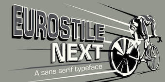 Born in 1960 in Niigata, Japan. Studied at the Musashino Art University in Tokyo. He also studied calligraphy at the London College of Printing. He became a freelance designer in 1997. Akira Kobayashi, who was based in Tokyo prior to his move to the Franfurt area, is an accomplished type designer who has created numerous typefaces for Sha-Ken, Dainippon Screen (where he made the kanji font Hiragino Mincho), TypeBank (from 1993-1997), ITC and Linotype, where he is Type Director since 2001.
  Graduate of Ton Duc Thang University. Ho Chi Minh City, Vietnam-based designer of the illustrated caps typeface Khong Gian Am (2018). [
 Danish graphic and type designer in Copenhagen, who studied at The Royal Danish Academy of Fine Arts, School of Design (2010-2016) and The Royal Academy of Art, The Hague (2014-15). In 2020, he set up Approximate Type. His typefaces:
  [
[ ARTypes is based in Chicago, and is run by Ari Rafaeli.
  Bhikkhu Pesala, a Buddhist monk based in London, designs free fonts. His original we page was called
  [
[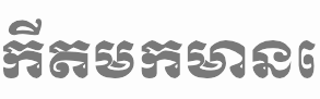 Creators in 1999-2001 of the free Khmer fonts cks-chrieng and
 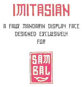 Student at Pratt Institute, class of 2013, who grew up in Singapore and Vietnam. Brooklyn-based creator of a faux Mandarin typeface called
  Vietnamese/Belgian designer (b. Saigon, 1958) who used brushes and pens to create handwritten fonts in 1994 such as DuMathieu,
  In 2017, Duong Le (Hanoi, Vietnam) designed an abstract geometric typeface that was inspired by Wassily Kandinsky's Composition 8. [
 Gabriel (or Gia Bao) Lam is an art director in Toronto. His typefaces:
  Steve "Gecko" Harrison of the Sleepy Gecko Chillout Bar on Cam Nam island off Hoi An, and also Danang, Vietnam, b. 1952, designed these typefaces:
  [
[ Ho Chi Minh City, Vietnam-based designer of the display serif typeface HV Weist Havanah (2019), the rounded sans Pinocchio (2019), the script typeface Autograph (2019), the grungy font Pinewood (2019), the
  Hanoi-based designer of the ornamental caps typeface
  Free fonts by Vietnamese cartoon artist Hung Lan Nguyen (b. 1956, HoChiMin City) include the brush and handwriting typefaces VNI-Comicbook, VNI-Matisse, VNI-BriquetNormal, VNI-Disney-Normal, VNI-Diudang, VNI-Nhatban, VNI-Baybuom-Normal, VNI-Truck, VNI-Yahoo, VNI-Thanhcao, VNI-Thufap2-Normal, VNI-Thufap3, VNI-Thufapfan-Normal, VNI-Viettay-Normal, VNI-Butlong, VNI-HLThuphap (Treefrog style face), VNI-Netbut, VNI-Thufap1, VNI-Whimsy, VNI-OngDoHL. These typefaces include some real beauties, such as
  Graphic designer from Kirksville, MO. Her first fonts were called
  Ho Chi Minh City, Vietnam-based graophic designer who drew a great iconic set of birds in 2018. One set in the collection is called ABC Avian. [
 Or Slava Jevcinova. Designer from Bardejov, Slovakia, now located in Nice, France, whose first degree was an MA from J.E. Purkyne University in Czechia. She interned at Mota Italic in Berlin, and then started working for Fontwerk, a company specicializing in TrueType hinting. Since 2013 she is a freelancer and she regularly collaborates with the Rosetta Type foundry.
  [
[ [
[ Julia Sysmäläinen Carelian (Juliasys) is a Finnish type designer, who studied at Pekka Halosen Akatemia in Tuusula. She runs her own type foundry, Juliasys. Julia presently lives in Berlin, where she works for Edenspiekermann Berlin.
  [
[ Hanoi, Vietnam-based designer (b. 1990) of the clean connected handwriting font
  During her studies at San Jose State University, Linh Nguyen (Vietnam) designed the cursive display typeface Novus (2017), the serene Renaissance-style text typeface family
  Senior designer in Ho Chi Minh City, Vietnam. Creator of two teardrop-themed all-caps vector format typefaces in 2013,
  [
[ American designer of the roman typeface Alive Serif (2016) for Latin and Greek. In 2017, he published
 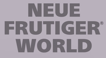 Neue Frutiger was developed by Akira Kobayashi and the Monotype (ex-Linotype) Design Team, in 2018. An outgrowth of Adrian Frutiger's successful Frutiger font, this wayfinding family was split by Monotype into several packages:
  The Linotype Design team released Neue Helvetica World in 2017. It covers the pan-European area (extended Latin alphabet, Cyrillic and Greek) as well as Arabic, Hebrew, Armenian, Georgian, Thai and Vietnamese. Each font has about 1700 glyphs. Back in 1983, D. Stempel AG redesigned Miedinger's Helvetica typeface and created a digital version. Neue Helvetica World has six additional styles including Arabic, Georgian and a specially-designed Hebrew version. For pairing with languages further afield, Monotype / Linotype recommend these typefaces: Saral Devanagari (for devanagari),
  Nguyen Type is a small type foundry founded by Andree Nguyen in Ho Chi Minh City, Vietnam. In 2019, Andree released the display typeface family Iconique Sans, the cross-cultural Latin typeface House of Nguyen (2019) and the fantastic decorated caps typeface Khong Gian Am (2019: inspired by negative things and sins). In 2020, Andree designed Iconique Serif and the experimental typefaces Froot Mono and Seed Mono. [
 In their Global Type collection, URW++ has its Helvetica clone, Nimbus Sans (2005, 5 fonts, 2000 Euros) and Nimbus Roman (2005, 2 fonts, 2000 Euros). The former is based on Helvetica, the latter on Times New Roman. Meant as workhorses, these fonts cover Turkish, Baltic, Romanian, Cyrillic, Greek, Chinese Simplified, Chinese Traditional, Japanese, Korean, Thai, Vietnamese, Arabic, and Hebrew. Of course, Nimbus Sans can be had for free at
  Vietnamese graphic and type designer who is Professor of Typography at the Hanoi Architectural University, Vietnam, since 2011. He studied at ESAD in Amiens, France. His graduation project at ESAD was a Latin / Vietnamese typeface family called
  [
[ [
[ For the identity of the on-line flower store Jan nha co hoa in Vietnam, Tuan Le designed the high-contrast fashion typeface Gypsophila (2019). [
 French foundry, est. 2008, by Jonathan Perez and Laurent Bourcellier. Graduates from the Ecole Estienne in Paris, they have made the following fonts:
  Ho Chi Minh City (Saigon), Vietnam-based designer of the display typefaces Mekong (2017), Practicus (2017: a display stencil), Domdom (2015) and Kitchen (2014, a
  A corporate URW studio sans family published in 2012. The six-font family sells for over 4000 dollars and covers Turkish, Baltic, Romanian, Cyrillic, Greek, Chinese Simplified, Chinese Traditional, Japanese, Korean, Thai, Arabic, and Hebrew. [
 Aka Zin Nguyen. Hanoi, Vietnam-based typographer, type designer and illustrator. Creator of the
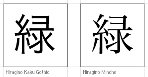
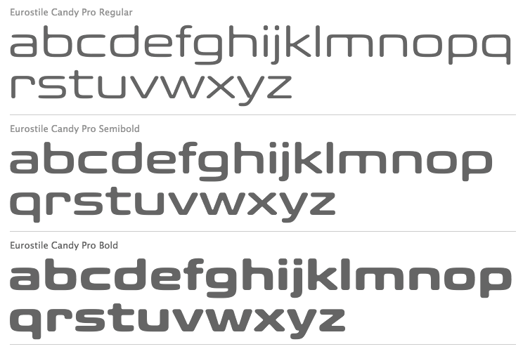
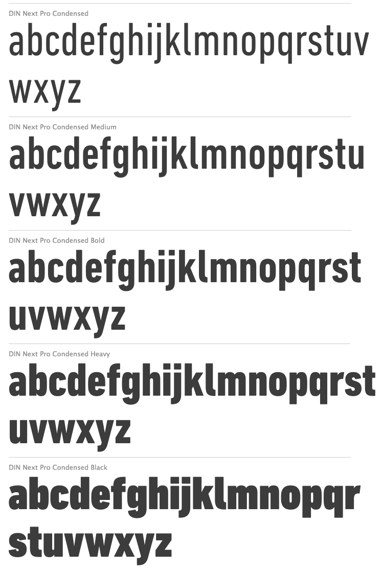
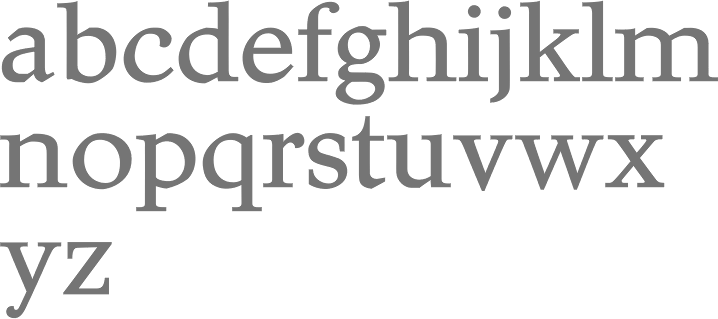
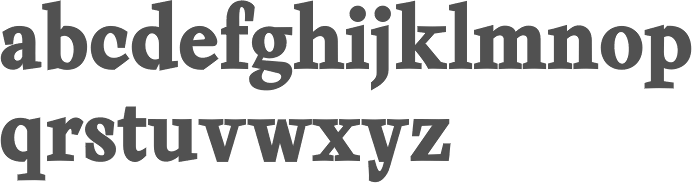
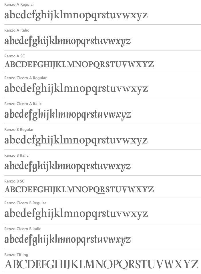
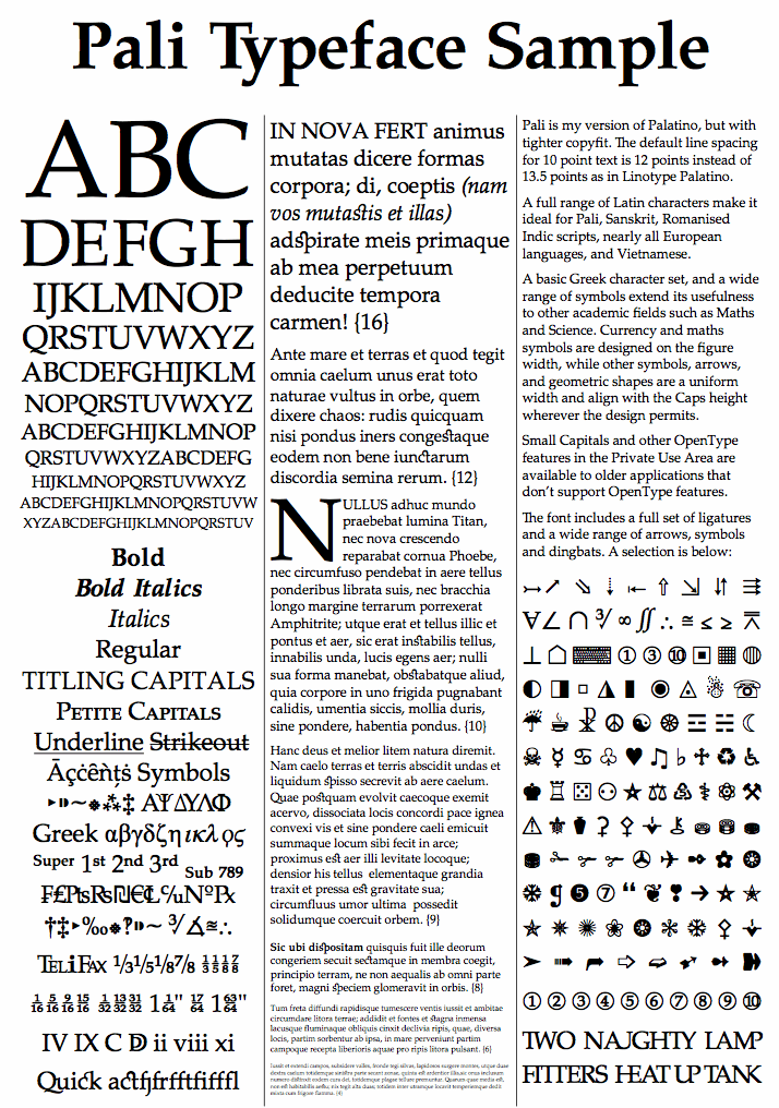
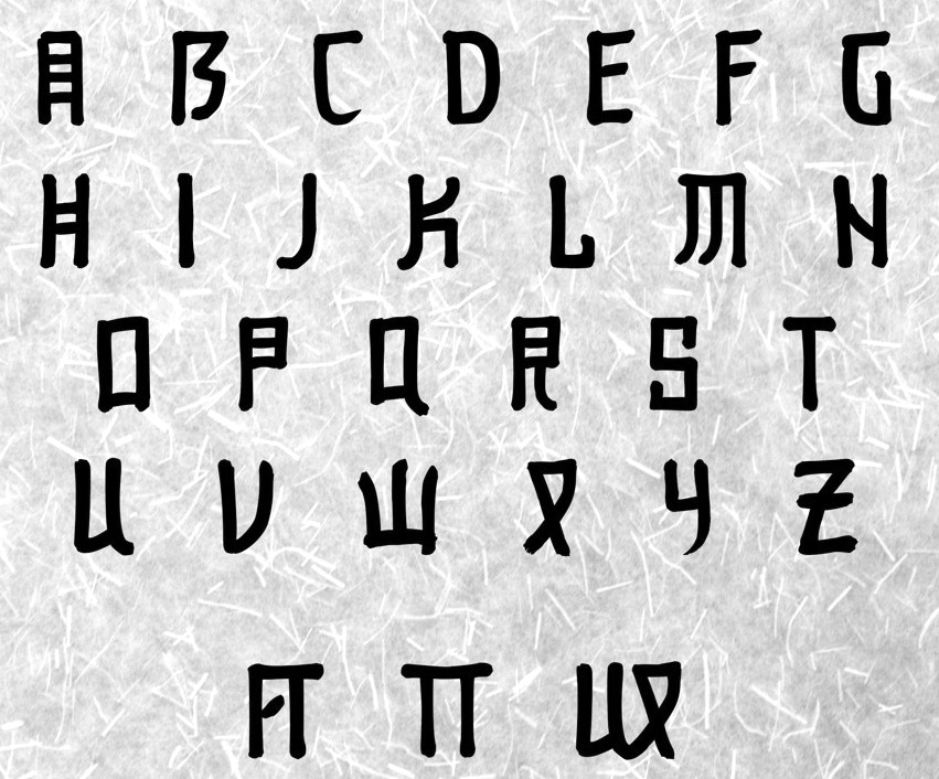
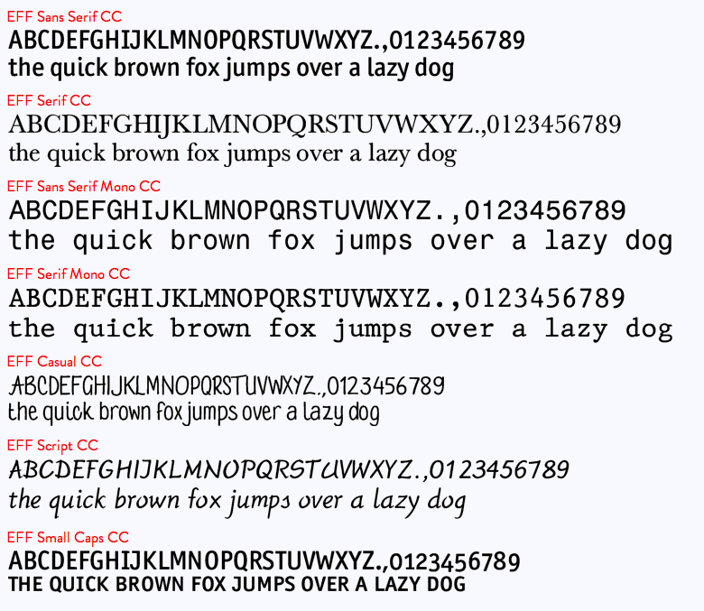
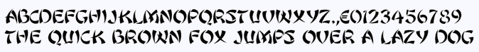
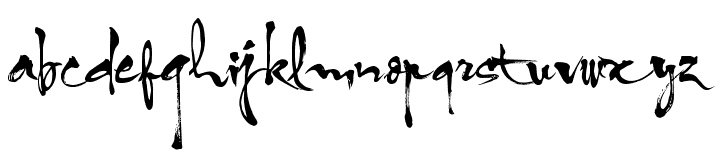
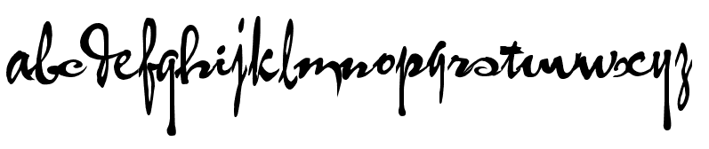
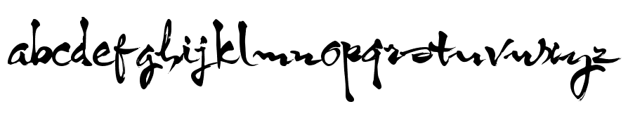
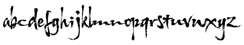
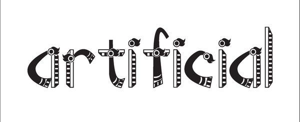
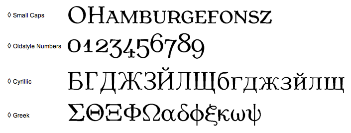
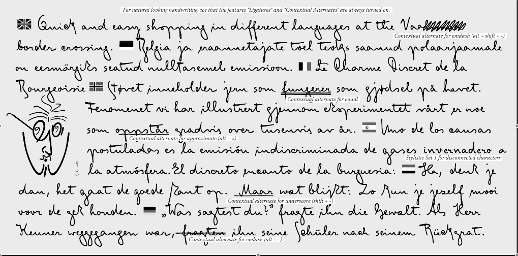
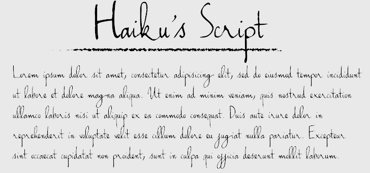
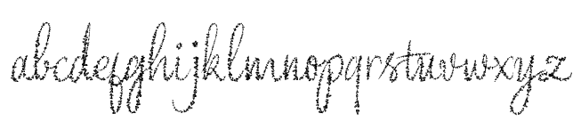
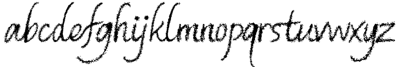
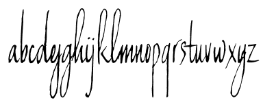
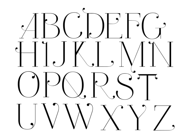
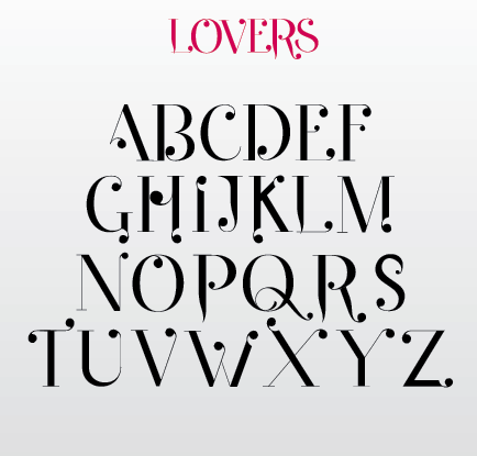
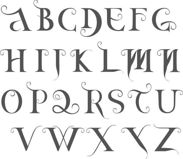
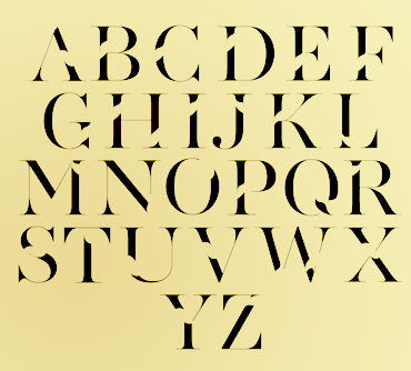
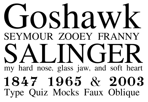
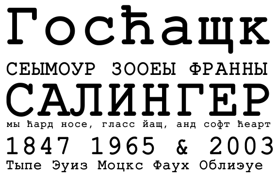
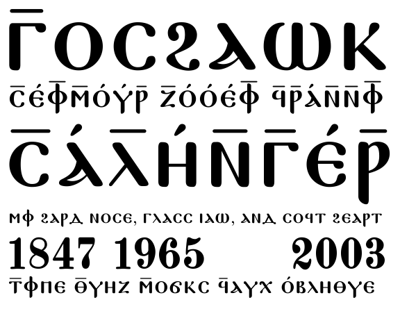
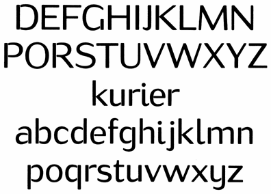
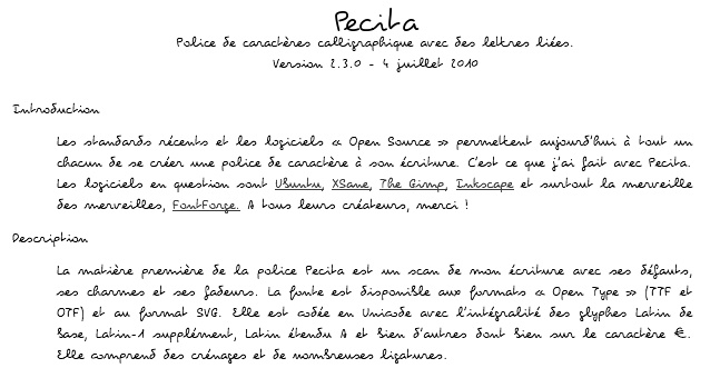
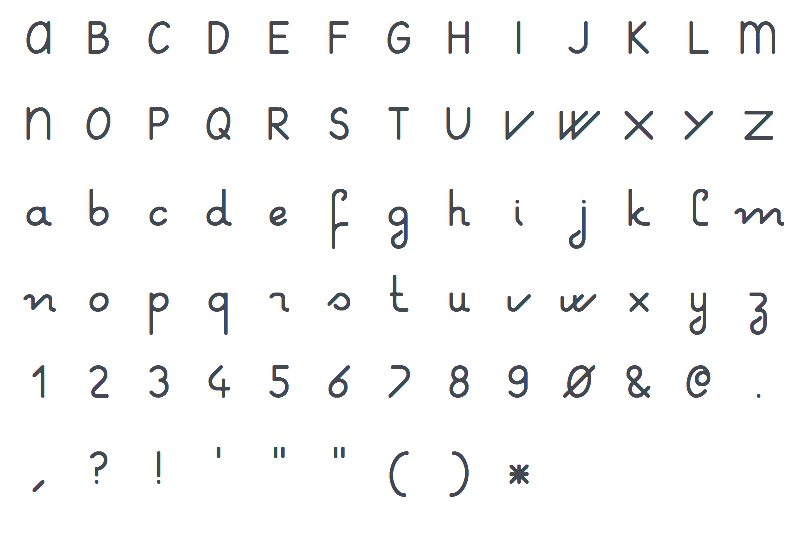
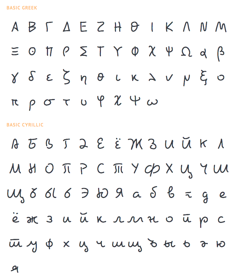
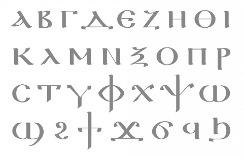
|
|
|
|