TYPE DESIGN INFORMATION PAGE last updated on Mon May 6 08:34:04 EDT 2024
FONT RECOGNITION VIA FONT MOOSE

|
|
|
|
|
Type scene in Hawaii | ||
|
|
|
|

SWITCH TO INDEX FILE
Honolulu, HI-based designer of Forever Script (2018), Sophistic Script (2018) and the brushy Autumn Script (2018). [Google] [More] ⦿ | |
As a student at Brigham Young University Hawaii, Laie, HI-based Anuhea Chen designed the condensed didone typeface My Big Crap (2018). [Google] [More] ⦿ | |
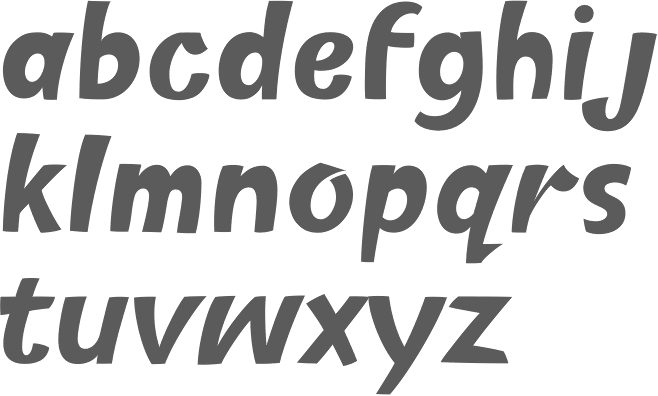
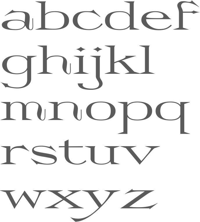
In 2007 he moved to the Netherlands to study type design through the Type and Media Masters course at The Royal Academy of Art in the Hague (KABK). Berton has resided in New York since 2008, and was a staff designer with Commercial Type from 2008 to 2013, when he left to start his own studio. Berton's typefaces have been awarded by the New York and Tokyo Type Directors Club, the ATypI, and the Brno Biennial. In 2012 he was awarded Print magazine's 20 Under 30 Award. Berton currently teaches typography at Parsons and has taught type design at The University of the Arts in Philadelphia and the Type@Cooper Extended Program at The Cooper Union in New York. His typeface Alda was designed to function at very small sizes while remaining expressive. The bold is macho and delicate at the same time. Alda won an award at TDC2 2009. In the same year Alda was also selected by the Tokyo Type Directors Club to be included in its annual publication. It was published by Emigre. At Commercial Type he co-designed the extensive family Stag with Christian Schwartz and Ross Milne. Stag started as a small family of slab serifs commissioned for headlines by the US edition of Esquire magazine and eventually grew into a sprawling multi-part family including a flexible sans companion and two additional special effects display variants. Stag Stencil followed in 2009. In 2010, he published the geometric sans serif family Platform at Commercial Type. It has a gorgeous circle-based hairline. In 2013, he published a 4-family 20-style French Renaissance typeface family called Portrait (+Text, +Inline, +Text), still at Commercial Type: Portrait started out as an experiment in drawing a display typeface that managed to be both beautiful and brutal, and both classical and minimalist. While its lighter weights are quietly elegant, the heavier weights show the influence of chiseled woodcut forms. Portrait draws its primary inspiration from the Two-line Double Pica Roman (equivalent to 32pt in contemporary sizes) cut by French punchcutter Maître Constantin around 1530 for the printer Robert Estienne. Portrait replaces the delicately modeled serif treatments of Constantin's original with simple, triangular Latin serifs, reimagining the Renaissance forms in a contemporary light. Portrait Text resembles the text types attributed by the printing historian Hendrik Vervliet to Constantin and used by the printer Estienne in the 1530s, which had a lighter and more open texture than the text types that preceded them, and marking the move to more elegant type that culminated in the work of Claude Garamont. The stripped-back simplicity of the Latin serifs gives Portrait a cleaner and sharper tone than a typical Renaissance oldstyle-influenced text face, bringing an active personality to text. In 2015, he created the sans headline typeface families Druk, Druk Text, Druk Wide, Druk Condensed and Druk Text Wide: Druk is a study in extremes, featuring the narrowest, widest, and heaviest typefaces in the Commercial Type library to date. Starting from Medium and going up to Super, Druk is uncompromisingly bold. It was meant as a companion of Neue Haas Grotesk. Of the families in the Druk collection, Druk Condensed is the most explicit homage to Willy Fleckhaus. Originally designed for the 2011 Year in Review issue of Bloomberg Businessweek, its flat sides make letters and words snap together in a clean and satisfying way. For MittMedia, he made the corporate sans typeface Duplex (2016). Still in 2016, Berton Hasebe published Styrene at Commercial Type. Their blurb: Styrene, a new sans serif by Berton Hasebe, is his latest exploration of proportion and simplicity in type design. The initial inspiration for the family was a charmingly awkward sans serif shown in an early 20th century Dutch type specimen. However, Styrene has an entirely ahistorical attitude. Its name was inspired by the purposefully synthetic feeling to its curves and geometry. The family is characterized by its proportions: typically narrow characters like f j r and t are hyperextended and flattened, adding openness in unexpected places. Styrene's two widths offer different textures in text: version A is dogmatically geometric, with a stronger overall personality, while version B is narrower for more reasonable copyfit, though not truly condensed. Schnyder (Commercial Type) was designed by Berton Hasebe and Christian Schwartz for the 2013 redesign of T, the New York Times Style Magazine by creative director Patrick Li and his team. Schnyder has the high contrast typical of a fashion typeface and has a large number of alternates. The stem thicknesses in each weight are identical across the widths, an unusual feature that allows the widths to be mixed freely in headlines, even within single words. It features three weights, four widths, and four optical sizes. Production assistance by Hrvoje Zivcic and Miguel Reyes. Schnyder Wide, Condensed and X Condensed were published in 2018. In 2020, he released Review (Condensed, Poster, Regular) at Commercial Type, which writes: Berton Hasebe originally drew Review (née Kippenberger) for T: The New York Times Style Magazine. In 2018, a new editor in chief pushed for a complete reimagining of the magazine. What had primarily been an image-focused publication evolved into a text-driven one, with the squarish, commanding Review doing much of the heavy lifting. To facilitate tight setting both horizontally and vertically, Hasebe sheared off Review's overshoots and blunted its exterior curves, producing a dynamic tension with its round counters. Produkt (2014, Christian Schwartz and Berton Hasebe) is Graphik with slabs added on. Christian Schwartz and Berton Hasebe originally designed Feature for T: The New York Times Style Magazine in 2018, and wrote: Diagonal stress, mismatched contrast between main strokes and serifs, and sharply angled head serifs conspire to give the face tension, dynamism, and immediacy. The collection has been expanded in 2021 for release by Hrvoje Zivcic, who expanded the weight range and drew italics for the entire collection. Feature Collection now includes Feature Text, Feature Display and Feature Deck. Feature [Google] [MyFonts] [More] ⦿ | |
Bigelow&Holmes
|
|
Born and raised in Hawaii, Breehn Sasaki studied at Chapman University, class of 2012. His typeface Fanfare (2013) was inspired by Japanese fans. [Google] [More] ⦿ | |
BTD (or: Big Toe Designs)
| Honolulu-based Mike Brittain (b. 1971) is the designer of Cart-O-Grapher (2002, shopping cart dings) and Btd BeezWax (2006, grungy typewriter face). Alternate URL of his company, Bigtoedesigns. Dafont link. [Google] [More] ⦿ |
| |
Charles Bigelow
| |
Haiku, Maui, HI-based designer of the display typeface Boga (2015) and the free 3d Escher effect font Volume (2015). He also made vector hand icons and a free AT Vecor Symbol Logo font. Typefaces from 2017: the geometric solid typeface Malibu. Creative Market link. Behance link. [Google] [More] ⦿ | |
David Lemon (b. 1953) studied painting at the San Francisco Art Institute. At the California College of Arts and Crafts, he studied graphic design (BFA, 1979). After eight years in the magazine and newspaper sector, he joined the type design staff at Adobe Systems in 1986, where he managed the group which designs and produces Adobe's non-Asian fonts, and presently manages the entire Type Development team. Designer of the Copal font family (1994, Adobe: a fat poster family). He is involved in Adobe's OpenType project. Under his management, support for type 1 fonts and multiple master fonts was halted. He announced his retirement in early 2017, and settled in Lihue, Hawaii. At ATypI meetings he is invariably the tallest participant, and often the only one wearing a cowboy hat. Speaker at ATypI 2013 in Amsterdam. Linotype link. FontShop link. [Google] [MyFonts] [More] ⦿ | |
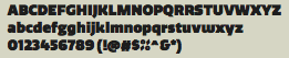
Waimea, HI-based designer of the slabby typeface I'm Just Your Type (2016). [Google] [More] ⦿ | |
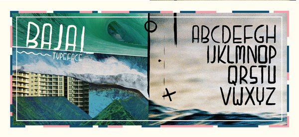
Graphic designer, artist and surf kook, who studies graphic design at California State University Channel Islands. He was born in San Diego and grew up in Hawaii. Behance link. Creator of Bajai (2012), a poster typeface inspired by Bali. [Google] [More] ⦿ | |
Defunct company in Honolulu. Commercial pictofonts included Hawaiian Icons, Oriental Motifs, Hawaiian Motifs, Marine Life, Xmas Font, Petroglyphs, Tapa Type, Hawaiian Gecko, Hawaiian Deco. They also had free fonts such as Hawn University (1997) and Hawn Wedding (1997). [Google] [More] ⦿ | |
Designer of these free Hawaiian font families: HI Kakuhihewa (Courier), HI Manokalanipo (Times), HI Pi'ilani (Palatino), HI Keawe (Helvetica). [Google] [More] ⦿ | |
Hale Kuamoyo
| Foundry making Hawaiian fonts for Mac and PC. Some free fonts here: HIKeaweBold, HIKakuhihewaBold, HIKeawePlain, HIKakuhihewaPlain, HIManokalanipoBold, HIManokalanipoRoman, HIPiilaniBoldItalic, HIPiilaniBold, HIPiilaniItalic, HIPiilaniRoman. Alternate URL. Yet another site. The fonts are made by Keola Donaghy. [Google] [More] ⦿ |
Hawaiian fonts are like Latin fonts except for two additional diacritical marks. The kahako is a macron, a short, horizontal line that appears over some of the vowels when they need to have a long pronunciation. The cokina is the single, open quote that appears frequently before vowels. It indicates a glottal stop, a clean break between vowels. [Google] [More] ⦿ | |
Commercial fonts with Hawaiian diacritics. [Google] [More] ⦿ | |
Graduated of the Art Institute of California in Santa Ana. Jessica Bell (Jessica Bell Designs, Honolulu, HI) created the modular display typeface Crux (2013). Behance link. [Google] [More] ⦿ | |
Honolulu, HI-based creator of Super Raw (2014), The Skinny (2013) and When I Was 10 (2012, hand-printed). Aka Jusebox. Behance link. [Google] [More] ⦿ | |
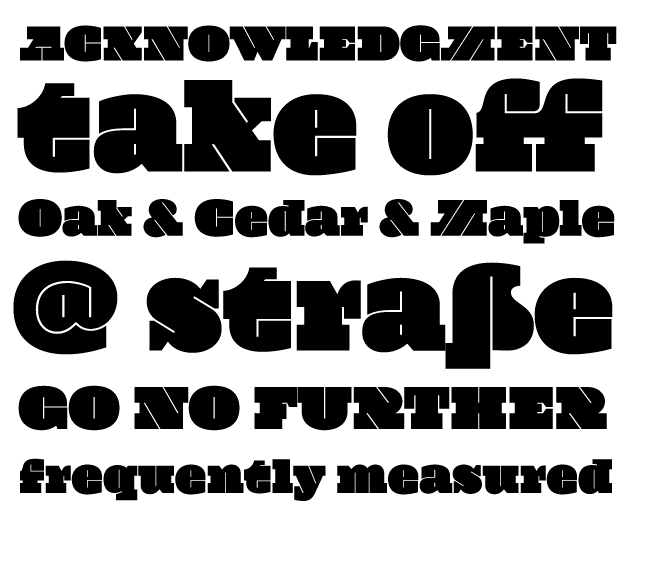
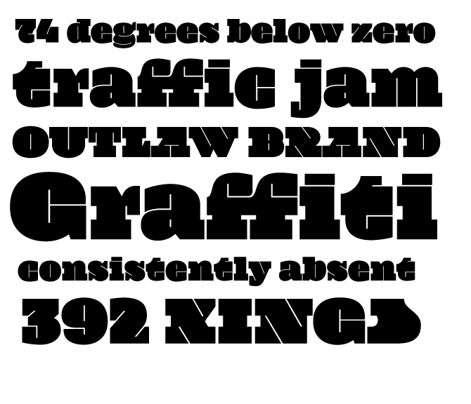
Akupu, HI-based designer of the Victorian typeface Greatest (2018), the fat finger font Digger (2018), the script and sans typeface trio Hasta la Vista (2018), the script typefaces Brougets Script (2018), Jack & Rose (2018), the marker brush typeface Grenade (2018), and the handcrafted typeface Aescudos (2018). [Google] [More] ⦿ | |
Graduate of the University of Oregon, with a B.S. Degree in Digital Art and Minors in Fine Art and Communication Studies. Kelli Urabe currently works as a Graphic Artist at Sign Pro Eugene, OR. Creator of the Hawaii-themed typeface Hawaii Grown (2013). Behance link. [Google] [More] ⦿ | |
Keola Donaghy
| |
Hawaiian font jump site. Has some Hawaiian fonts. Plus explanations of the diacritices needed for Hawaiian: The kahako is a macron, a short, horizontal line that appears over some of the vowels to make them sound longer. The 'okina is the single, open quote that appears frequently before vowels. It indicates a glottal stop, a clean break between vowels. [Google] [More] ⦿ | |
Honolulu, HI-based designer of the blackletter typeface Ngatahi (2016): Ngatahi's forms are influenced by the structure and shapes inherent in 19th century Gothic Revival Architecture; a style that was brought to New Zealand by the early European settlers. The pattern work and koru shaped terminals are a reflection of Maori weaving and Kowhaiwhai patterns that are commonly used in Maori art and architecture. [Google] [More] ⦿ | |
Mark Caneso
| |
Mike Brittain
| |
Murilo S. Bispo (Murilo Design, Sao Paulo, Brazil, b. Jaguaquara) created the lined typeface 7 Linhas in 2013. Behance link. [Google] [More] ⦿ | |
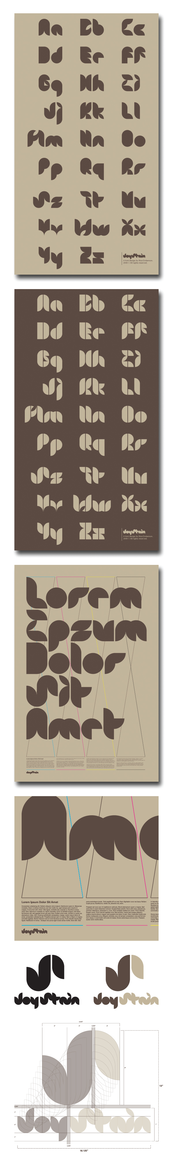
With a bachelors in graphic design from the University of Hawaii, Noa has set up shop in Honolulu. Behance link. Creator of the experimental Joy Stain font in 2009. [Google] [More] ⦿ | |
Outside The Line Fonts
|
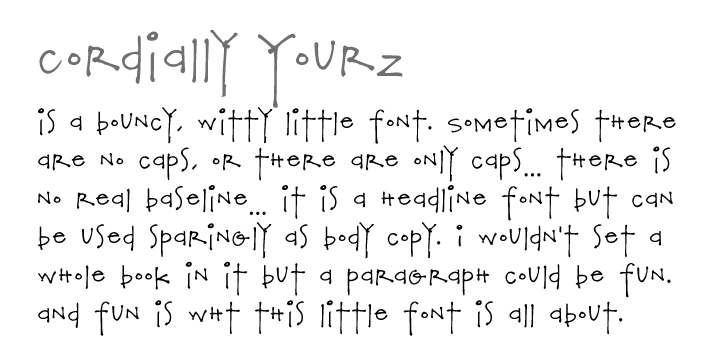
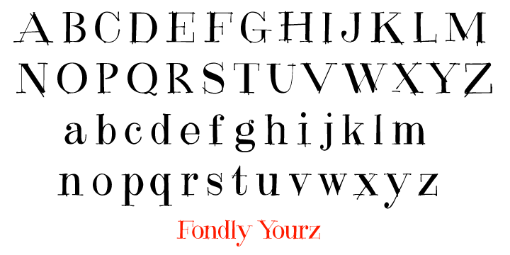
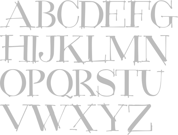
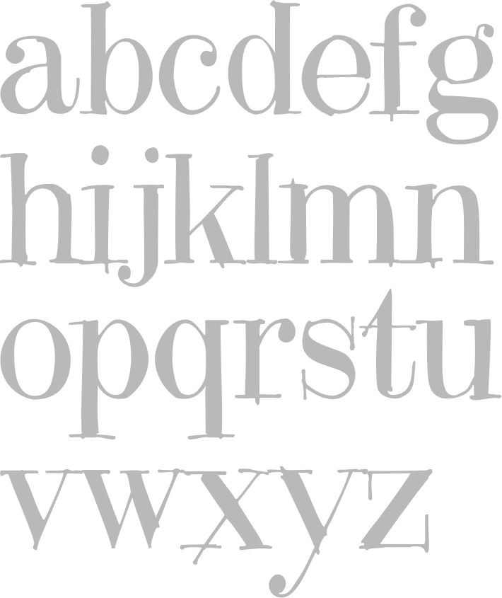
See also here. Agfa/Monotype sells Architectural Lettering, Cross Stitch, CurlyQ, Doodles, DoodlesTheAlphabet, Food Doodles, Holiday Doodles, Office Doodles, Plz Print, Plz Print Brush, Plz Print Bold Condensed, Plz Script, the hand-printed series (Best Regardz, Dearest John, Yourz Truly and Sincerely Yourz, 2009) and Tall Skinny Condensed (1999). MyFonts link. Font Bros link. MyFonts interview. Klingspor link. Creative Market link. |
Poole Foundry
| Wesley Poole's foundry based in Kaneohe, HI, and established in 2006. Wesley Poole (b. California, 1952) was a sign painter and wine label designer in the Napa Valley (his companies were called Oasis Graphics and then Titus&Poole, and Poole Aert&Design) for almost 25 years before moving to Hawaii in 2002 due to multiple sclerosis. Typefaces:
Klingspor link. [Google] [MyFonts] [More] ⦿ |
ps type (was: ppwrkstudio)
|
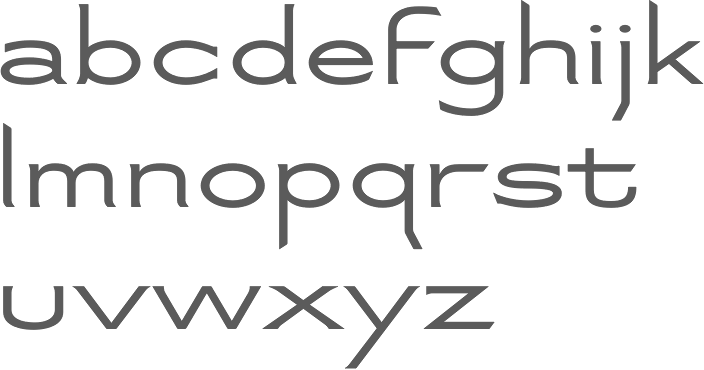
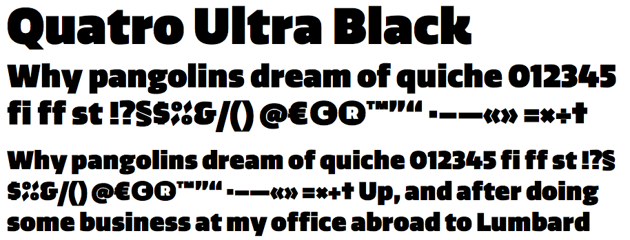
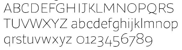
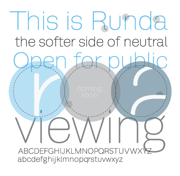
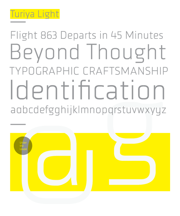
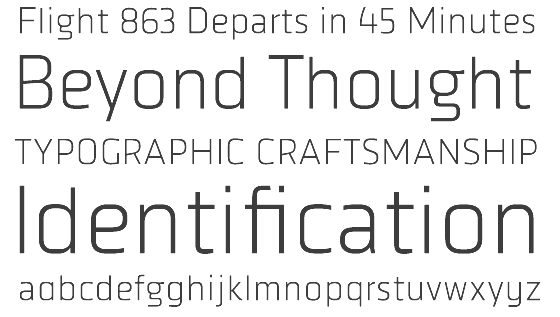
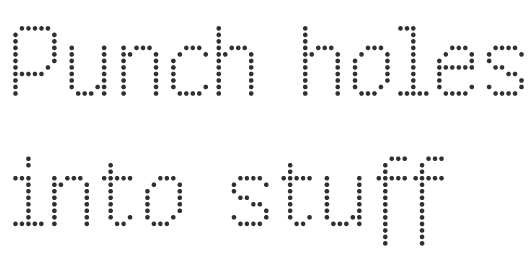
His typefaces include the free sans Quatro and the commercial contemporary sans FB Ratio (2009, Font Bureau, a sans family in 6 styles that grew out of ps Ratio and ps Ratio Headline). In 2009, Quatro became commercial. It was followed by ps Quatro Slab and Quatro Ultra Black in 2010 and Quatro Sans in 2012. Other typefaces include Campaign Grotesk (2015, FontShop), ps Caneso (2010, monoline sans), Runda, ps Untitled, ps Untitled Sans, ps Turiya Light (2009, organic sans), ps Runda (2010, sans), ps Neplus Ultra (2010, ultra thick slab), ps Dot Test (dot matrix face), and ps Fovea (2009, contemporary slab). Also in the works is the dot matrix typeface FF Diode (2009). Typefaces from 2016: Hatch (slab serif, which can be bought here). Typefaces from 2017: Ditch (a great inline typeface), Blue Sky (a sans family for branding). Typefaces from 2019: Pika Ultra (an ultra fat script). Typefaces from 2020: Campaign (Sans, Serif, Slab). Typefaces from 2021: Decoy (a 12-style soft inky serif), Hoss Grotesk (Hoss Sharp and Hoss Round: grotesques), Condenser (a 36-style condensed sans family), Hegante (a fat brush typeface), Naylor Stencil (a custom typeface for Brooklyn-based artist Jason Naylor). |
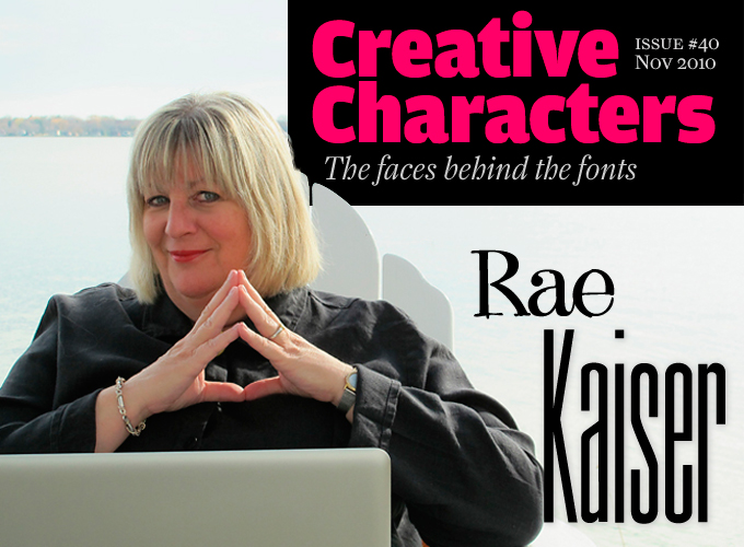
Rae Kaiser
| |
Ravohn Mokiao from Honolulu works as an independent graphic designer in Maricopa, AZ. Creator of the all caps sans typeface CAPS (2014). Behance link. [Google] [More] ⦿ | |
American grpahic designer, b. 1921, Waimea, Hawaii, d. 2010, Greenport, Long Island. He grew up in Honolulu. After high school there, he moved to Los Angeles, where he took classes at the Chouinard Art Institute (now Cal Arts). His studies were cut short in 1942 when, as the child of Japanese immigrants, he was relocated to an internment camp in Wyoming. He created the cover typeface for Mario Puzo's The Godfather (1969, The Manhattan Rare Book Company, New York), with the G and d extending and almost touching to make God. Obituary in the New York Times. [Google] [More] ⦿ | |
Son of Wesley Poole, born in California in 1984. Sam lives and works with his father Wesley in Hawaii, and has cooperated with him on these fonts that were published by Poole Foundry:
| |
Hawaiian designer of the grungy Crud font, 10 dollars shareware. At Plazm, he published Grunge (1994). [Google] [More] ⦿ | |
Todd Masui
| |
Uli Kozok (b. 1959, Hildesheim, Germany) is Professor in Indonesian, Hawaiian and Indo-Pacific Languages and Literatures at the University of Hawai'i at Manoa. Creator of the free font Surak Batak. Kozok writes: The Batak alphabet, or surat batak, is descended ultimately from the from Brahmi script of ancient India by way of the Pallava and Old Kawi scripts. The Batak languages of northern Sumatra - Karo Batak, Toba Batak, Dairi Batak, Simalungun/Timur, Angkola and Mandailing Batak, and occasionally Malay. In most Batak communities, only the datu (priests) are able to read and write the Batak alphabet and they use it mainly for calendars and magical texts. This site has truetype fonts by Kozok for the Battak script: KaroNormal, MandailingNormal, PakpakNormal, SimalungunNormal, TobaNormal, VariantsNormal. | |
Visage Type (Subtle Studios)
| Visage Type (now Subtle Studios) was a small foundry by Hawaiian designer Todd Masui. It made fonts such as Vestige (great handwriting!), Quiver, Rota (1999), Brevier (2000), Monodesic (2000), Steadfast (1998, T26), Alloy (2000, a very clean face!) and Signal. Todd Masui also produced fonts for Nakedface. At Garagefonts, Todd is selling Quiver, Amp (pixel font), Shadowy (children's handwriting), and Vestige. At PsyOps, he published Serus (2000). [Google] [MyFonts] [More] ⦿ |
Wesley Poole
| |
Kailua-Kona, HI-based designer of these script typefaces in 2019: Atlantis, Paperie Creme, xo Babe Stylish Script, Jules, Beach Abode. She also made the brush scripts Wilde & Rad, Luster Brush and Wander Brush, the handcrafted Chaitea and Aloha Paradise and the vintage typefaces Light and Light Italic in 2019. [Google] [More] ⦿ |


 Bigelow&Holmes was founded by Charles Bigelow and Kris Holmes. Charles Bigelow (b. 1945, Detroit) is a type designer and teacher, who runs his own studio, Bigelow&Holmes. Bigelow was a colleague of Donald Knuth at Stanford University when Knuth developed his Computer Modern typeface family for TeX. In mid-2006, Bigelow accepted the Melbert B. Cary Distinguished Professorship at Rochester Institute of Technology's School of Print Media. Before that, he taught at Stanford University, Rhode Island School of Design, and other institutions. Typefaces designed by Bigelow:
  Honolulu, HI-based lettering artist and typographer. C. Lee created
  [
[ [
[ Outside The Line Fonts was founded by
  Mark Caneso is a graphic and type designer who lived in Garden Grove, CA, Kapolei, HI, Beaverton, OR, Austin, TX, and now, Mount Pleasant and/or Charleston, SC. He founded ppwrkstudio (or: ps type) in 2004.
  [
[
|
|
|
|