| | |
30th Tipo Brda: Summer 2016
|
At the 30th Tipo Brda type workshop in Slovenia, these typefaces were designed: - Sava Kosmac: Reklam-Konstruktor
- Michael Wörgötter: Genzsch Antiqua
- Jan Charvát: Normalka
- Eva Ozbot: Tulip
- Anja Svajger: Rhino
- Tina Jeler: Ligenj
- Surya Djalil: Dimensia
- Simon Korenjak: Titillium Knuth
- Rok Hudobivnik: Isontype
- Miha Zajec: Semantica
- Marianna Paszkowska: Medlar
- Krista Likar: Bestija
- Eugenia Tynna: Moti
- Angela Denninger: Kufa
- Ana Praprotnik: Gotana
[Google]
[More] ⦿
|
31st Tipo Brda Winter Workshop Type Days 2017
|
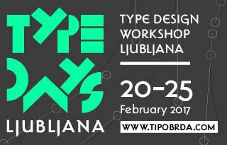 Type workshop to be held in Ljubljana, Slovenia, from 20-25 February, 2017. Tipo Brda link. [Google]
[More] ⦿
Type workshop to be held in Ljubljana, Slovenia, from 20-25 February, 2017. Tipo Brda link. [Google]
[More] ⦿
|
Academy of Fine Arts Ljubljana
|
One can study typography in the Department of Design here. AT TDC47 in 2001, a group of five students (Jure Engelsberger, Martina Gobec, Tomato Kosir, Ziva Moskric and Mina Zabnikar) received a Certificate of Typographic Excellence. [Google]
[More] ⦿
|
Adelina Pervanje
|
 Ljubljana, Slovenia-based of a great compass-and-ruler roman caps alpahbet (2014), which was finished during her studies at the Academy of Fine Arts in Ljubljana (ALUO). She also made the display font Pikant (2014). [Google]
[More] ⦿
Ljubljana, Slovenia-based of a great compass-and-ruler roman caps alpahbet (2014), which was finished during her studies at the Academy of Fine Arts in Ljubljana (ALUO). She also made the display font Pikant (2014). [Google]
[More] ⦿
|
Ajda Bevc
|
Creator of Leprechaun (2011) during TipoBrda 2011, a type design workshop held in Slovenia. [Google]
[More] ⦿
|
Alen Halen
|
Graphic designer and illustrator in Maribor, Slovenia, who created the modular typeface AE in 2014. [Google]
[More] ⦿
|
Alja Herlah

|
 Slovenian type designer, who co-founded Type Salon together with Krista Likar in Ljubljana in 2020. Alja's typefaces:
 - Praz Slab and Praz Italic (2014). Developed during the 2014 Tipobrda workshop mentored by Domen Fras and Lucija Bratus.
- Alica (2015). A cursive slab serif heavily inktrapped typeface designed at TipoBrda 2015.
- Univerza Sans (2020, Type Salon). Univerza is not a take on Frutiger---it is Slovenian for "university". Alja writes: Univerza Sans was developed to mark the hundredth anniversery of University of Ljubljana. The style is influenced by the combination of Slovenian avant-garde with some recognizable forms that are known for Slovenian typography.
- Palsam Pro (2020, Abjad). This rounded sans typeface covers Latin and Arabic and was co-designed by Ali Almasri and Alja Herlah. Regarding the Arabic part, they write: The main highlight for Palsam was the cursive companion. For the first time, the calligraphic Ijaza style was used as a model for designing the Arabic cursive. The Ijaza is a hyper combination of Naskh and Thuluth, which makes it perfect to be a companion for the upright Naskh.
- Spektra (2020, Type salon). A black condensed sans by Krista Likar and Alja Herlah that combines five scripts: Latin, Arabic, Cyrillic, Greek and Hebrew. It also has a variable type with an italic axis.
- In 2021, Krista Likar and Alja Herlah published Plecnik, which is named after Slovenian architect Joze Plecnik. Plecnik is defined by classical elements and shapes, classic proportions, humanist stroke endings and low contast. It has a capital A with an overhang. Plecnik Display is quite different as it features flaring in every stroke.
- In 2021, Alja released Gizela (a dagger-edged all caps typeface), and wrote: Gizela shows her personality with a feminine, sensual, seductive and art deco vibes.
[Google]
[MyFonts]
[More] ⦿
|
Aljaž Vindiš
|
 Graduate of the Academy of Fine Arts and Design in Ljubljana, Slovenia, b. 1987, Slovenia. His typefaces:
 Old URL at Tribuna, where he was on the editorial board from 2009 until 2011. [Google]
[More] ⦿
|
Aljaz Vesel
|
 Type designer in Ljubljana, who coorganizes and mentors the well-known Typeclinic meetings in Trenta, Slovenia, together with Tomato Kosir.
 Creator of the corporate slab serif typeface family Emsley (+Emsley Italic) (2011-2013), developed at the tipoRenesansa 3rd international type design workshop in Ljubljana, Slovenia, and the Typeclinic 6 and 7 in 2013. See also tipoRenesansa 2nd international type design workshop and TipoBrda 2011. [Google]
[More] ⦿
|
Anže Veršnik
|
 Slovenian type designer who runs the design studio Grafikarna since 2011 (with Jure Kozuh). His typefaces:
 - Stajn (2011-2013). This 14-weight slab serif family of large x-height, with over 750 glyphs per weight, was created for Skupina Stajn [the Institute for Development and Research of Urban spaces Stajn in Kamnik]. It was coproduced with Grafikarna and Jure Kozuh. There are plans for Greek and Cyrillic versions. There is a free demo version.
- The serif typeface Skelet, which was designed during the design workshop TipoBrda in 2008.
Participant in four TypeClinic workshops in Slovenia from 2011 until 2012. Behance link. Grafikarna link. Stajn Type link (a web site dedicated to Stajn). About me link. Linkedin link. [Google]
[MyFonts]
[More] ⦿
|
Ana Berden
|
Ljubljana, Slovenia-based designer of the type design version of Monopoly, called Fontopoly (2016). [Google]
[More] ⦿
|
Ana Farkaš
|
Slovenian designer of the curly typeface face Krinoline during the design workshop TipoBrda in 2008. [Google]
[More] ⦿
|
Ana Flaker
|
Slovenian designer (b. 1988) of the art deco typeface slices (2010). Devian Tart link. [Google]
[More] ⦿
|
Ana Logar
|
Designer in Ljubljana, who made the headline typefaces Logana (2012) and Linea (2012). [Google]
[More] ⦿
|
Andraž Sedmak
|
Slovenian painter and illustrator. Designer of the futuristic typeface Apex (2006). [Google]
[More] ⦿
|
Andraž Tarman
|
 Slovenian designer of the hookish text family (serif, italic, sans) Doberdanka during the design workshop TipoBrda in 2008. He had already started that project in 2006. [Google]
[More] ⦿
Slovenian designer of the hookish text family (serif, italic, sans) Doberdanka during the design workshop TipoBrda in 2008. He had already started that project in 2006. [Google]
[More] ⦿
|
Anja Delbello
|
Based in Ljubljana, Anja designed Moose Sans in 2011-2012. Creator of Saga (2011, with Pika Novak) during TipoBrda 2011, a type design workshop held in Slovenia. Saga is an ultra-heavy poster titling face. At Typeclinic 2015 and Typeclinic 11th International Type Design Workshop, also in 2015, she developed Moose Sans some more. [Google]
[More] ⦿
|
Anja Drzanic
|
During her studies at the Academy of Fine art and Design in Ljubljana, Slovenia, Anja Drzanic designed the handcrafted typeface Sweetype (2016). [Google]
[More] ⦿
|
Anja Polh
|
 Velenje, Slovenia-based illustrator / designer of a beautifully lettered poster for Festival Nasedlega Kita in 2012. [Google]
[More] ⦿
Velenje, Slovenia-based illustrator / designer of a beautifully lettered poster for Festival Nasedlega Kita in 2012. [Google]
[More] ⦿
|
Anja Vrhovsek
|
As a student at the Academy of Fine Arts and Design in Ljubljana, Slovenia, Anja Vrhovsek designed the handcrafted typeface Planika (2016). [Google]
[More] ⦿
|
Anna Hawlina
|
At Typeclinic 2015, Slovenian designer Anna Hawlina created the stern sans typeface Dukument (2015). [Google]
[More] ⦿
|
Aparat
[Domen Fras]
|
 Domen Fras completed his masters at London's Central Saint Martin's College of Art & Design in 2000. In 2002 he founded the type & design studio Aparat in Ljubljana, Slovenia. Since 2011 he is a full-time assistant professor at the Faculty of Natural Sciences at the University of Ljubljana. Speaker at ATypI 2014 in Barcelona. His largely experimental work:
 - Brutildo (2006): squarish headline lettering.
- Butalci (1998, a pixel font) is a part of Domen's diploma project at Faculty of Architecture in Ljubljana, supervised by Janez Suhadolc.
- Gyro (1998-2001) is an octagonal monospace font with 3 weights.
- Exlibris (2001-2003) is an experimental face.
- Pozor (1999) is a squarish sans, as for traffic signage.
- Terragni (1998) is an alphabet study based on the floor plan composition analysis of the house 'Casa del Fascio' in Como by the architecta Giuseppe Terragni.
- DinoUnicase (1997) is a variation on DIN Mittelschrift.
- Narod (2003) was made for designing commemorative coins at 60th anniversary of Kocevje Summit.
- JH Luzern (1999) is based on a scan of a hotel room card.
- Pesjan Debu (2011) is a fat angular poster typeface created during TipoBrda 2011.
- Narod Krepak (2010) is an art deco sans titling typeface created during TipoBrda 2010000000
[Google]
[More] ⦿
|
Archive Type
[Matevz Medja]
|
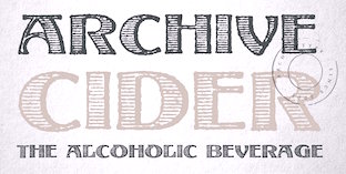
 Slovenian foundry which specializes in old typefaces found in old prints, books and samples. Typefaces are reproduced as they appeared in print. In order to preserve the original feel of typefaces, no additional characters were added to originals therefore most of fonts consist just of basic character set. Upper case letters, lower case letters, numerals and basic punctuation. It was set up in 2000 by Matevz Medja. Engraving style typefaces: Kludsky (2006), Garfield (2005), Copperplate Head (2005), Western Iron (2005), Cider (2005), French Shaded (2005), Tilt (2005). The blackletter typefaces: School Text (2005), Harlem Title (2005), Copperplate Text (2005), Black Title (2005), Chased Black (2005), Tinted (2005), Steeler (2005), Blackcap (2005). Calligraphic typefaces: Petite Script (2005), Autograph Script (2005), French Script (2005), Penman Script (2005), Magnolia Script (2005), Roundface Script (2005), Roundhand Script (2005). Other typefaces: American Shadow (2005), Lightface Extended (2005), Grotesque Shaded (2005), Gothic Ornate (2005), Antique Extra Condensed (2005), Antique Extended (2005), Ironlace (2005), Atlantique (2005), Mann (2005), Old Style Condensed (2005), Ribbon (2005), Salisbury Script (2005), Black Title Text (2005, blackletter), German Text (2005, blackletter), Archive Hands (2006, pointing fingers), Archive Woodchild (2006). Distressed typefaces: Archive Tale (2006), Archive Egipt Compressed (2006). In 2011, he published the Archive Garamond family, which is closer to the unpolished originals. The 2010 catalog has three parts:
 - The Archive 40: Archive Western Iron, Archive American Shadow, Archive Antiqua Extra Cond, Archive Antique Extended, Archive Atlantique (avant garde sans), Archive Autograph Script, Archive Black Title Text, Archive Black Title, Archive Blackcap, Archive Chased Black, Archive Cider (engraved; a vintage money font), Archive Copperplate Head, Archive Copperplate Text, Archive Egipt Compressed, Archive French Script, Archive French Shaded, Archive Garfield (2005), Archive German Text, Archive Gothic Ornate, Archive Grotesque Shaded, Archive Harlem Title, Archive Ironlace, Archive Kludsky, Archive Lightface Extended, Archive Magno Script, Archive Modern II Open, Archive Modern II, Archive Old Style Condensed, Archive Penman Script, Archive Petite Script, Archive Ribbon, Archive Roundface Script, Archive Roundhand Script, Archive Salisbury Script, Archive School Text, Archive Steeler, Archive Tale, Archive Tilt, Archive Tinted.
- Archive Americana: Archive American Shadow, Archive Steeler, Archive Tilt, Archive Grotesque Shaded, Archive Black Title (blackletter), Archive Mann (an industrial 3d typeface), Archive Autograph Script, Archive Tinted, Archive Harlem Title (blackletter).
- Archive Western: Archive Egipt Compressed, Archive French Shaded, Archive Western Iron, Archive Antique Extended, Archive Copperplate Head, Archive Ribbon, Archive Gothic Ornate, Archive Oldstyle Condensed, Archive Lightface Extended, Archive Ironlace.
Creative Market link. View Archive Type / Matevz Medja's typefaces. [Google]
[MyFonts]
[More] ⦿
|
Barbara Borko
|
Slovenian designer of Slap Slab (2013), a slab serif typeface developed during Typeclinic 6 and Typeclinic 7 in 2013. [Google]
[More] ⦿
|
Barbara Kosarkoska Vidinovski
|
Ljubljana, Slovenia-based designer of the sans typeface Basketbalovska (2016). [Google]
[More] ⦿
|
Barbara Sustar
|
Ljubljana, Slovenia-based designer of the sans display typeface Yo Yo (2015). Behance link. [Google]
[More] ⦿
|
Boris Divjak
|
 During the 7th Typeclinic (Trenta, Slovenia, 2013), Boris Divjak developed the friendly round sans typeface Cuddly Sans. [Google]
[More] ⦿
During the 7th Typeclinic (Trenta, Slovenia, 2013), Boris Divjak developed the friendly round sans typeface Cuddly Sans. [Google]
[More] ⦿
|
Claudia Kvar
|
Graphic designer in Maribor, Slovenia, who created Virgin Type (2016). [Google]
[More] ⦿
|
Crt Mate
[Type Fleet]
|
[MyFonts]
[More] ⦿
|
Damijan Kracina
[Proteus Fonts]
|
[More] ⦿
|
Darja Kodric
|
During her studies, Trbovlje, Slovenia-based Darja Kodric designed the modular typeface Latveria (2015). [Google]
[More] ⦿
|
Dejan Cirkvencic Kralj
|
Dejan Cirkvencic Kralj (Re-Format, Ljubljana, Slovenia) created the free high-contrast smooth-edged fashion mag typeface Sundari (2011). [Google]
[More] ⦿
|
Denis Lelic
|
Slovenian designer of the wayfinding typeface Noway (2014), which was developed at Typeclinic in 2014. [Google]
[More] ⦿
|
Domen Fras
[Aparat]
|
[More] ⦿
|
Dorijan Sisko
|
Maribor, Slovenia-based designer of the modular display typeface family Truster (2013) and the octagonal typeface Updat3 (2013). [Google]
[More] ⦿
|
Elizabeta Jevnikar
|
Ljubljana-based creator of Mint (2014, a text font co-designed with Jure Anzicek). [Google]
[More] ⦿
|
Emil Kozole
|
 Emil Kozole (Ljubljana, Slovenia) studied communication design at Central Saint Martins London. His type foundry is called Ljudje. Emil created the slab serif typeface Sarajevo (2012), Icons Night Out (2012), the artsy art deco typeface Typometry (2012, Ten Dollar Fonts) and the information design typeface family Signalia (2012). Free download.
 Attitude (2013) is a 7-style semi-alchemic typeface family. Random (2014) is a large and very pretty ransom note family. In Project Seen (2014), he provides three free typefaces, See Underline, Seen Strikethrough, and Seen Blackout, that make use of Opentype tables to automatically censor words the NSA is looking for in text monitoring programs according to an NSA Prism database of terms originally leaked by Edward Snowden in 2013. In 2015, he designed the monospaced typewriter typeface Resolution at The Designers Foundry. Ten Dollar Fonts link. Cargocollective link. Behance link. [Google]
[MyFonts]
[More] ⦿
|
Ermin Mededovic
[Lettermin Type Foundry (was: Ermin Design)]
|
 [MyFonts]
[More] ⦿
[MyFonts]
[More] ⦿
|
Eva Antoinette
|
Ljubljana, Slovenia-based designer of the pixel typeface Lear (2015). [Google]
[More] ⦿
|
Evita Lukez
|
Slovenian designer of the lettering fonts Arhe and Arhe Metal used for the building of the Faculty of Architecture at the University of Ljubljana. [Google]
[More] ⦿
|
Fleha Type
[Teja Smrekar]
|
 Participant in the TipoRenesansa workshop in Slovenia in 2010, who designed the angular typeface Arkadika (2010). She also made the pixel typeface Piksna (2010). Her first degree in fine arts was from the University of Maribor. She also has a degree from the Academy of Fine Arts and Design in Ljubljana.
 Arkadika was further developed at tipoRenesansa, 2nd international type design workshop in 2011. At tipoRenesansa, 4th international type design workshop (2012), she created the contemporary serif typeface Paradigma. In 2013, Teja received the 2013 Monotype Studentship at the University of Reading. At Reading, her gradaution typeface was Mirna (2014): Mirna is a text typeface for continuos reading with a playful stencil display style. It is suitable for editorial text settings in lifestyle, fashion and health magazines. Display stencil style is suitable for branding and packaging. The typeface is meant to be read on paper printed with high-quality offset printing technology, as well as on high resolution screens and reading devices. Mirna has Greek, Cyrillic and Khmer family extensions. In 2019, she set up Fleha Type and promptly published the handcrafted typeface Katka. In 2020, Fleha Type released the experimental modular script typeface Trico Script by Mitja Miklavcic and the weathered stencil typeface Linoma. In 2022, Teja Smrekar designed Grato Marker at TypeMates. [Google]
[MyFonts]
[More] ⦿
|
Franko Luin
[Omnibus Typographi]
|
[MyFonts]
[More] ⦿
|
Gaja Meznaric Osole
|
Ljubljana-based Slovenian graphic designer with a keen interest in typography. She created the organic family Kiwi during the summer of 2008 at the TipoBrda type design workshop under the mentorship of Tomato Košir and Lucijan Bratuš. In 2014, she cooperated with Mina Arko on the commercial casual hand-printed script Jadran, which was created as an homage to a cult children's magazine named Ciciban. [Google]
[MyFonts]
[More] ⦿
|
Gašper Premože
|
Slovenian designer of the simple sans typeface Mala šola during the design workshop TipoBrda in 2008. [Google]
[More] ⦿
|
GIGO Design
|
GIGO stands for Garbage In Garbage Out. Slovenian design company which created: - Cerdonis - Light, Regular, Bold, Light Italic, Italic, Small Caps, Light Display, Ornaments
- Patetika - Light, Light Italic, Bold, Lines and Borders
- Prasec - Front, Back
- Selfcensorshit II - Regular, Bold, Black
- Republika Sans: A bespoke typeface for Slovenia's public administration.
- Rotor Short - Rotor Regular, Rotor Tall
Buy the fonts here. [Google]
[More] ⦿
|
Gigofonts--Gigodesign
[Matevz Medja]
|
 Gigofonts is a Ljubljana-based foundry run by Matevz Medja (b. 1966, Kranj). He set up design studio Medja & Karlson in 1990 and Gigodesign in 2000. He founded Gigofonts and Archive Type typefoundries.
 Matevz designed Compressor (1997, T-26), Gf Blackmail (2004, ransom note font), Gf Patetica (2004, an elegant renaissance serif with tall ascenders), Gf Scribbles (2005, hand-printed family), Gf Script No 2 (2005), Gf Script No 4, Gf Script No4 Scratch (2004, based on Penman Script), Gf Script No. 5 (2005), Gf SelfcensorShit (2004, T-26, and later at Gigofonts, now simply called Gf Selfcensor---a unicase family), Gf Spacetrash (2004), Gf Special (2005, 22 funky disco fonts, many of which are piano key typefaces), Semafor (1997, dot matrix, at T-26 since 2002), Gf H2O (2005, a humanist sans family done with Mitja Miklavčič). MyFonts link. Creative Market link. Linotype link. Identifont link. Klingspor link. View Matevz Medja's typefaces. [Google]
[MyFonts]
[More] ⦿
|
GNU Freefont (or: Free UCS Outline Fonts)
[Steve White]
|
 The GNU Freefont is continuously being updated to become a large useful Unicode monster. GNU FreeFont is a free family of scalable outline fonts, suitable for general use on computers and for desktop publishing. It is Unicode-encoded for compatability with all modern operating systems. There are serif, Sans and Mono subfamilies. Also called the "Free UCS Outline Fonts", this project is part of the larger Free Software Foundation. The original head honcho was Primoz Peterlin, the coordinator at the Institute of Biophysics of the University of Ljubljana, Slovenia. In 2008, Steve White (aka Stevan White) took over. URW++ Design&Development GmbH. URW++ donated a set of 35 core PostScript Type 1 fonts to the Ghostscript project.
 - Basic Latin (U+0041-U+007A)
- Latin-1 Supplement (U+00C0-U+00FF)
- Latin Extended-A (U+0100-U+017F)
- Spacing Modifier Letters (U+02B0-U+02FF)
- Mathematical Operators (U+2200-U+22FF)
- Block Elements (U+2580-U+259F)
- Dingbats (U+2700-U+27BF)
Yannis Haralambous and John Plaice. Yannis Haralambous and John Plaice are the authors of Omega typesetting system, which is an extension of TeX. Its first release, aims primarily at improving TeX's multilingual abilities. In Omega all characters and pointers into data-structures are 16-bit wide, instead of 8-bit, thereby eliminating many of the trivial limitations of TeX. Omega also allows multiple input and output character sets, and uses programmable filters to translate from one encoding to another, to perform contextual analysis, etc. Internally, Omega uses the universal 16-bit Unicode standard character set, based on ISO-10646. These improvements not only make it a lot easier for TeX users to cope with multiple or complex languages, like Arabic, Indic, Khmer, Chinese, Japanese or Korean, in one document, but will also form the basis for future developments in other areas, such as native color support and hypertext features. ... Fonts for UT1 (omlgc family) and UT2 (omah family) are under development: these fonts are in PostScript format and visually close to Times and Helvetica font families. - Latin Extended-B (U+0180-U+024F)
- IPA Extensions (U+0250-U+02AF)
- Greek (U+0370-U+03FF)
- Armenian (U+0530-U+058F)
- Hebrew (U+0590-U+05FF)
- Arabic (U+0600-U+06FF)
- Currency Symbols (U+20A0-U+20CF)
- Arabic Presentation Forms-A (U+FB50-U+FDFF)
- Arabic Presentation Forms-B (U+FE70-U+FEFF)
Yannis Haralambous and Wellcome Institute. In 1994, The Wellcome Library The Wellcome Institute for the History of Medicine 183 Euston Road, London NW1 2BE, England, commissioned Mr. Haralambous to produce a Sinhalese font for them. We have received 03/09 official notice from Robert Kiley, Head of e-Strategy for the Wellcome Library, that Yannis' font could be included in GNU FreeFont under its GNU license: Sinhala (U+0D80-U+0DFF). Young U. Ryu at the University of Texas at Dallas is the author of Txfonts, a set of mathematical symbols designed to accompany text typeset in Times or its variants. In the documentation, Young adresses the design of mathematical symbols: "The Adobe Times fonts are thicker than the CM fonts. Designing math fonts for Times based on the rule thickness of Times =,, +, /, <, etc. would result in too thick math symbols, in my opinion. In the TX fonts, these glyphs are thinner than those of original Times fonts. That is, the rule thickness of these glyphs is around 85% of that of the Times fonts, but still thicker than that of the CM fonts." Ranges: Arrows (U+2190-U+21FF), Mathematical Symbols (U+2200-U+22FF). Valek Filippov added Cyrillic glyphs and composite Latin Extended A to the whole set of the abovementioned URW set of 35 PostScript core fonts, Ranges: Latin Extended-A (U+0100-U+017F), Cyrillic (U+0400-U+04FF). Wadalab Kanji Comittee. Between April 1990 and March 1992, Wadalab Kanji Comittee put together a series of scalable font files with Japanese scripts, in four forms: Sai Micho, Chu Mincho, Cho Kaku and Saimaru. The font files were written in custom file format, while tools for conversion into Metafont and PostScript Type 1 were also supplied. The Wadalab Kanji Comittee has later been dismissed, and the resulting files can be now found on the FTP server of the Depertment of Mathematical Engineering and Information Physics, Faculty of Engineering, University of Tokyo: Hiragana (U+3040-U+309F), Katakana (U+30A0-U+30FF). Note that some time around 2009, the hiragana and katakana ranges were deleted. Angelo Haritsis has compiled a set of Greek type 1 fonts. The glyphs from this source has been used to compose Greek glyphs in FreeSans and FreeMono. Greek (U+0370-U+03FF). Yannis Haralambous and Virach Sornlertlamvanich. In 1999, Yannis Haralambous and Virach Sornlertlamvanich made a set of glyphs covering the Thai national standard Nf3, in both upright and slanted shape. Range: Thai (U+0E00-U+0E7F). Shaheed Haque has developed a basic set of basic Bengali glyphs (without ligatures), using ISO10646 encoding. Range: Bengali (U+0980-U+09FF). Sam Stepanyan created a set of Armenian sans serif glyphs visually compatible with Helvetica or Arial. Range: Armenian (U+0530-U+058F). Mohamed Ishan has started a Thaana Unicode Project. Range: Thaana (U+0780-U+07BF). Sushant Kumar Dash has created a font in his mother tongue, Oriya: Oriya (U+0B00-U+0B7F). But Freefont has dropped Oriya because of the absence of font features neccessary for display of text in Oriya. Harsh Kumar has started BharatBhasha for these ranges: - Devanagari (U+0900-U+097F)
- Bengali (U+0980-U+09FF)
- Gurmukhi (U+0A00-U+0A7F)
- Gujarati (U+0A80-U+0AFF)
Prasad A. Chodavarapu created Tikkana, a Telugu font family: Telugu (U+0C00-U+0C7F). It was originally included in GNU Freefont, but supoort for Telugu was later dropped altogether from the GNU Freefont project. Frans Velthuis and Anshuman Pandey. In 1991, Frans Velthuis from the Groningen University, The Netherlands, released a Devanagari font as Metafont source, available under the terms of GNU GPL. Later, Anshuman Pandey from Washington University in Seattle, took over the maintenance of font. Fonts can be found on CTAN. This font was converted the font to Type 1 format using Peter Szabo's TeXtrace and removed some redundant control points with PfaEdit. Range: Devanagari (U+0900-U+097F). Hardip Singh Pannu. In 1991, Hardip Singh Pannu has created a free Gurmukhi TrueType font, available as regular, bold, oblique and bold oblique form. Range: Gurmukhi (U+0A00-U+0A7F). Jeroen Hellingman (The Netherlands) created a set of Malayalam metafonts in 1994, and a set of Oriya metafonts in 1996. Malayalam fonts were created as uniform stroke only, while Oriya metafonts exist in both uniform and modulated stroke. From private communication: "It is my intention to release the fonts under GPL, but not all copies around have this notice on them." Metafonts can be found here and here. Ranges: Oriya (U+0B00-U+0B7F), Malayalam (U+0D00-U+0D7F). Oriya was subsequently dropped from the Freefont project. Thomas Ridgeway, then at the Humanities And Arts Computing Center, Washington University, Seattle, USA, (now defunct), created a Tamil metafont in 1990. Anshuman Pandey from the same university took over the maintenance of font. Fonts can be found at CTAN and cover Tamil (U+0B80-U+0BFF). Berhanu Beyene, Prof. Dr. Manfred Kudlek, Olaf Kummer, and Jochen Metzinger from the Theoretical Foundations of Computer Science, University of Hamburg, prepared a set of Ethiopic metafonts. They also maintain the home page on the Ethiopic font project. Someone converted the fonts to Type 1 format using TeXtrace, and removed some redundant control points with PfaEdit. Range: Ethiopic (U+1200-U+137F). Maxim Iorsh. In 2002, Maxim Iorsh started the Culmus project, aiming at providing Hebrew-speaking Linux and Unix community with a basic collection of Hebrew fonts for X Windows. The fonts are visually compatible with URW++ Century Schoolbook L, URW++ Nimbus Sans L and URW++ Nimbus Mono L families, respectively. Range: Hebrew (U+0590-U+05FF). Vyacheslav Dikonov made a Braille unicode font that could be merged with the UCS fonts to fill the 2800-28FF range completely (uniform scaling is possible to adapt it to any cell size). He also contributed a free Syriac font, whose glyphs (about half of them) are borrowed from the free Carlo Ator font. Vyacheslav also filled in a few missing spots in the U+2000-U+27FF area, e.g., the box drawing section, sets of subscript and superscript digits and capital Roman numbers. Ranges: Syriac (U+0700-U+074A), Box Drawing (U+2500-U+257F), Braille (U+2800-U+28FF). Panayotis Katsaloulis helped fixing Greek accents in the Greek Extended area: (U+1F00-U+1FFF). M.S. Sridhar. M/S Cyberscape Multimedia Limited, Mumbai, developers of Akruti Software for Indian Languages (http://www.akruti.com/), have released a set of TTF fonts for nine Indian scripts (Devanagari, Gujarati, Telugu, Tamil, Malayalam, Kannada, Bengali, Oriya, and Gurumukhi) under the GNU General Public License (GPL). You can download the fonts from the Free Software Foundation of India WWW site. Their original contributions to Freefont were - Devanagari (U+0900-U+097F)
- Bengali (U+0980-U+09FF)
- Gurmukhi (U+0A00-U+0A7F)
- Gujarati (U+0A80-U+0AFF)
- Oriya (U+0B00-U+0B7F)
- Tamil (U+0B80-U+0BFF)
- Telugu (U+0C00-U+0C7F)
- Kannada (U+0C80-U+0CFF)
- Malayalam (U+0D00-U+0D7F)
Oriya, Kannada and Telugu were dropped from the GNU Freefont project. DMS Electronics, The Sri Lanka Tipitaka Project, and Noah Levitt. Noah Levitt found out that the Sinhalese fonts available on the site metta.lk are released under GNU GPL. These glyphs were later replaced by those from the LKLUG font. Finally the range was completely replaced by glyphs from the sinh TeX font, with much help and advice from Harshula Jayasuriya. Range: Sinhala (U+0D80-U+0DFF). Daniel Shurovich Chirkov. Dan Chirkov updated the FreeSerif font with the missing Cyrillic glyphs needed for conformance to Unicode 3.2. The effort is part of the Slavjanskij package for Mac OS X. range: Cyrillic (U+0400-U+04FF). Abbas Izad. Responsible for Arabic (U+0600-U+06FF), Arabic Presentation Forms-A, (U+FB50-U+FDFF), Arabic Presentation Forms-B (U+FE70-U+FEFF). Denis Jacquerye added new glyphs and corrected existing ones in the Latin Extended-B (U+0180-U+024F) and IPA Extensions (U+0250-U+02AF) ranges. K.H. Hussain and R. Chitrajan. Rachana in Malayalam means to write, to create. Rachana Akshara Vedi, a team of socially committed information technology professionals and philologists, has applied developments in computer technology and desktop publishing to resurrect the Malayalam language from the disorder, fragmentation and degeneration it had suffered since the attempt to adapt the Malayalam script for using with a regular mechanical typewriter, which took place in 1967-69. K.H. Hussein at the Kerala Forest Research Institute has released "Rachana Normal" fonts with approximately 900 glyphs required to typeset traditional Malayalam. R. Chitrajan apparently encoded the glyphs in the OpenType table. In 2008, the Malayalam ranges in FreeSerif were updated under the advise and supervision of Hiran Venugopalan of Swathanthra Malayalam Computing, to reflect the revised edition Rachana_04. Range: Malayalam (U+0D00-U+0D7F). Solaiman Karim filled in Bengali (U+0980-U+09FF). Solaiman Karim has developed several OpenType Bangla fonts and released them under GNU GPL. Sonali Sonania and Monika Shah covered Devanagari (U+0900-U+097F) and Gujarati (U+0A80-U+0AFF). Glyphs were drawn by Cyberscape Multimedia Ltd., #101, Mahalakshmi Mansion 21st Main 22nd "A" Cross Banashankari 2nd stage Banglore 560070, India. Converted to OTF by IndicTrans Team, Powai, Mumbai, lead by Prof. Jitendra Shah. Maintained by Monika Shah and Sonali Sonania of janabhaaratii Team, C-DAC, Mumbai. This font is released under GPL by Dr. Alka Irani and Prof Jitendra Shah, janabhaaratii Team, C-DAC, Mumabi. janabhaaratii is localisation project at C-DAC Mumbai (formerly National Centre for Software Technology); funded by TDIL, Govt. of India. Pravin Satpute, Bageshri Salvi, Rahul Bhalerao and Sandeep Shedmake added these Indic language cranges: - Devanagari (U+0900-U+097F)
- Gujarati (U+0A80-U+0AFF)
- Oriya (U+0B00-U+0B7F)
- Malayalam (U+0D00-U+0D7F)
- Tamil (U+0B80-U+0BFF)
In December 2005 the team at www.gnowledge.org released a set of two Unicode pan-Indic fonts: "Samyak" and "Samyak Sans". "Samyak" font belongs to serif style and is an original work of the team; "Samyak Sans" font belongs to sans serif style and is actually a compilation of already released Indic fonts (Gargi, Padma, Mukti, Utkal, Akruti and ThendralUni). Both fonts are based on Unicode standard. You can download the font files separately. Note that Oriya was dropped from the Freefont project. Kulbir Singh Thind added Gurmukhi (U+0A00-U+0A7F). Dr. Kulbir Singh Thind designed a set of Gurmukhi Unicode fonts, AnmolUni and AnmolUni-Bold, which are available under the terms of GNU license from the Punjabu Computing Resource Center. Gia Shervashidze added Georgian (U+10A0-U+10FF). Starting in mid-1990s, Gia Shervashidze designed many Unicode-compliant Georgian fonts: Times New Roman Georgian, Arial Georgian, Courier New Georgian. Daniel Johnson. Created by hand a Cherokee range specially for FreeFont to be "in line with the classic Cherokee typefaces used in 19th century printing", but also to fit well with ranges previously in FreeFont. Then he made Unified Canadian Syllabics in Sans, and a Cherokee and Kayah Li in Mono! And never to be outdone by himself, then did UCAS Extended and Osmanya.... What next? - Armenian (serif) (U+0530-U+058F)
- Cherokee (U+13A0-U+13FF)
- Unified Canadian Aboriginal Syllabics (U+1400-U+167F)
- UCAS Extended (U+18B0-U+18F5)
- Kayah Li (U+A900-U+A92F)
- Tifinagh (U+2D30-U+2D7F)
- Vai (U+A500-U+A62B)
- Latin Extended-D (Mayanist letters) (U+A720-U+A7FF)
- Osmanya (U+10480-U+104a7)
George Douros, the creator of several fonts focusing on ancient scripts and symbols. Many of the glyphs are created by making outlines from scanned images of ancient sources. - Aegean: Phoenecian (U+10900-U+1091F).
- Analecta: Gothic (U+10330-U+1034F)
- Musical: Byzantine (U+1D000-U+1D0FF)&Western (U+1D100-U+1D1DF)
- Unicode: many miscellaneous symbols, miscellaneous technical, supplemental symbols, and mathematical alphanumeric symbols (U+1D400-U+1D7FF), Mah Jong (U+1F000-U+1F02B), and the outline of the domino (U+1F030-U+1F093).
Steve White filled in a lot of missing characters, got some font features working, left fingerprints almost everywhere, and is responsible for these blocks: Glagolitic (U+2C00-U+2C5F), Coptic (U+2C80-U+2CFF). Pavel Skrylev is responsible for Cyrillic Extended-A (U+2DEO-U+2DFF) as well as many of the additions to Cyrillic Extended-B (U+A640-U+A65F). Mark Williamson made the MPH 2 Damase font, from which these ranges were taken: - Hanunóo (U+1720-U+173F)
- Buginese (U+1A00-U+1A1F)
- Tai Le (U+1950-U+197F)
- Ugaritic (U+10380-U+1039F)
- Old Persian (U+103A0-U+103DF)
Primoz Peterlin filled in missing glyphs here and there (e.g., Latin Extended-B and IPA Extensions ranges in the FreeMono family), and created the following UCS blocks: - Latin Extended-B (U+0180-U+024F)
- IPA Extensions (U+0250-U+02AF)
- Arrows (U+2190-U+21FF)
- Box Drawing (U+2500-U+257F)
- Block Elements (U+2580-U+259F)
- Geometrical Shapes (U+25A0-U+25FF)
Jacob Poon submitted a very thorough survey of glyph problems and other suggestions. Alexey Kryukov made the TemporaLCGUni fonts, based on the URW++ fonts, from which at one point FreeSerif Cyrillic, and some of the Greek, was drawn. He also provided valuable direction about Cyrillic and Greek typesetting. The Sinhala font project has taken the glyphs from Yannis Haralambous' Sinhala font, to produce a Unicode TrueType font, LKLUG. These glyphs were for a while included in FreeFont: Sinhala (U+0D80-U+0DFF). Fontspace link. Crosswire link for Free Monospaced, Free Serif and Free Sans. Download link. [Google]
[More] ⦿
|
Grafikarna
|
Grafikarna is a graphic design studio focused on producing innovative and effective visual communications. Located in Ljubljana, Slovenia, the team comprises Jure Kozuh and Anže Veršnik. Behance link. Anže Veršnik created Stajn and Stajn Italic (2011-2013). This 14-weight slab serif family of large x-height was created for Skupina Stajn [the Institute for Development and Research of Urban spaces Stajn in Kamnik]. Jure Kozuh designed the sans display typeface Gospodar (2008). [Google]
[More] ⦿
|
Helena Bozic
|
Freelance designer in Ljubljana, Slovenia, who created the Metropolitana typeface in 2013 together with Metka Bacar. During her studies, she created Burja Sans (2014). Behance link. [Google]
[More] ⦿
|
Igor Stumberger
|
Maribor, Slovenia-based designer of Sadwitch (2013), a typeface developed during Typeclinic 6 in 2013 for editorial use. Behance link. [Google]
[More] ⦿
|
ISO 8859-2 resources
|
ISO 8859-2 character set is a part of ISO 8859 series of 8-bit character sets for writing in Western alphabetic languages (i.e. Latin, Cyrillic, Arabic, Hebrew and Greek). Primoz Peterlin provides many links to font resources for this set of characters. [Google]
[More] ⦿
|
izvir
|
Archive with the Monotype families Courier New CE, Times New Roman CE, Arial CE. Also, Lucida Sans, and a Swiss family (type 1), adapted by Tefik Becirovic, Zagreb, for use in East-European languages. Link went dead. [Google]
[More] ⦿
|
Jack Yan
[Jack Yan and Associates (or: JY&A Fonts)]
|
[MyFonts]
[More] ⦿
|
Jack Yan and Associates (or: JY&A Fonts)
[Jack Yan]
|
Jack Yan (b. 1972, Hong-Kong) now lives in Wellington, New Zealand, where he founded Jack Yan and Associates (JY&A) in 1987, the first kiwi digital type foundry. He designed over 100 typefaces, which mostly share calligraphic roots---his lower case f is like a signature Yan glyph. In 2013, he turned to politics and is running to become mayor of wellington. He designed the extensive family Aetna, digitized based upon 16th century work by Francesco Griffo and Giovanni Antonio Tagliente. It is Yan's version of Bembo. His other font families include Decennie Express Pro (2011, a sans companion for JY Décennie), Decennie JY Titling, Integrity JY (2002), Pinnacle JY (1995-1996, +Bold), Ray JY, Rebeca JY (1993), Tranquility (1994-1995), Artemis JY, and Yan Series 333 (1987-1993). JY Koliba (by Jure Stojan, 2001) is a sans serif typeface family based on Slovenian architects' lettering of the 1940s. Other typefaces include Circles JY, Dandy JY (2012: Originally created for a theatre project at Massey University, Dandy is reminiscent of Pablo Ferro's hand-lettering; created by Danielle Smith), Comic Pro JY (1999, by Antonio Gonzalez de Santiago for Jack Yan), Novalis JY (2008, an anthroposophic family), Boomerang JY (by Greg Bastin), Boum-Boum (2002) and Alia JY (2008-2009, an aldine serif family). JY Pressly (2012, a serif family) was originally designed for Lucire, and destined for web and print use. Arts and Crafts alphabet by JY&A. Personal and political web site. Interview. Klingspor link. [Google]
[MyFonts]
[More] ⦿
|
Jaka Music
|
As a student in Ljubljana, Slovenia, Jaka Music created a sans typeface in 2015, just called The Font. [Google]
[More] ⦿
|
Jakob Jugovic
|
Slovenian designer of the experimental typeface Aanima and the graffiti typeface Mazaccio during the design workshop TipoBrda in 2007. Participant in the TipoRenesansa workshop in Slovenia in 2010, who designed Crepaldi (2010). [Google]
[More] ⦿
|
Jan Lavtar
|
Ljubljana, Slovenia-based designer of the experimental typeface Triangular (2017). [Google]
[More] ⦿
|
Janja Baznik
[Pencil Twist]
|
[More] ⦿
|
Jože Carli
|
Slovenian designer of the artsy sans typeface Aktor during the design workshop TipoBrda in 2007. [Google]
[More] ⦿
|
Josef Poklukar
|
The first Slovenian type designer. [Google]
[More] ⦿
|
Junik Studio
|
 Celje, Slovenia-based designer of Little Mandy (2016: free), Little Brushy (2016), the free sans typeface Little Creator (2016), the free curly brush script typeface Little Cutie (2016) and the free handcrafted typeface Little Wizzy (2016).
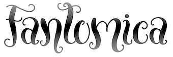
 Typefaces from 2017: Strawberry, Little Mandy, Emona, Stracciatella, Fantomica (a curly genie font), Capris (handcrafted), Poetovio (script), Celeia (monoline), Alannah (well---I thought that this was by Russian designer Pixel Buddha). Behance link. Creative Market link. [Google]
[MyFonts]
[More] ⦿
|
Jure Anzicek
|
Ljubljana-based creator of Football Shirt Font (2015) and Mint (2014, a text font co-designed with Elizabeta Jevnikar). [Google]
[More] ⦿
|
Jure Kožuh
|
 Slovenian designer (b. 1984, Ljubljana) of the sans display typeface Gospodar during the design workshop TipoBrda in 2008. He writes about Gospodar: This typeface was first published in the Newspaper of Slovenian Museums, ARGO ([53/1], 2010). Authors of the newspapers design are Ziga Testen and Ajdin Basic. For the work on the project, they were awarded 1st prize in category Magazines and newspapers, at the 4th Biennial of Slovene Visual Communications (Brumen Fundation) in 2009.
 At TipoBrda 2007, he created Neo Gothic. Stat (2011, an information design sans face) was developed at tipoRenesansa, 2nd international type design workshop. Commercial typefaces: Cookogram (2011, dings), Master (2012, black sans headline face). In 2013, he published the information design sans families Stat Display Pro and Stat Text Pro. Another URL. Behance link. [Google]
[MyFonts]
[More] ⦿
|
Jure Legac
|
Slovenian designer of the grungy Kafkaesque typeface Tank during the design workshop TipoBrda in 2007. [Google]
[More] ⦿
|
Jure Martinec
|
Student at the Köln International School of Design, but based in Ljubljana, Slovenia. Creator of Drugstore Screen Regular (2011), developed at the tipoRenesansa 3rd international type design workshop in Ljubljana, Slovenia. This is an attractive and bouncy papercut display face. Participant in the TipoRenesansa workshop in Slovenia in 2010, who designed La Farmacia (2010). This was further developed at tipoRenesansa, 2nd international type design workshop in 2011. [Google]
[More] ⦿
|
Jure Stojan
|
Slovenian Jure Stojan designed the sans serif family JY Koliba in 2000 at Jack Yan and Associates. Check out that wacky "g", and the great hairline style. Also at Jack Yan, he published Raj JY (2001-2011), KlinJY (2003; first done for a student magazine in Ljubljana) and JY Shapa (2014, a calligraphic serif typeface family). In 2017, designed published Saj JY, a heavily modulated sans with some exaggerated characters, which was published by Jack Yan. [Google]
[MyFonts]
[More] ⦿
|
Karmen Cesnovar
|
Graphic designer in Ljubljana, Slovenia, who published the typeface Steampunk in 2019. [Google]
[More] ⦿
|
Katarina Jeraj
|
Ljubljana, Slovenia-based visual communication student (b. 1992) who created a partial typeface called Sibirski Mraz (Siberian cold) in 2013 during her studies. Behance link. [Google]
[More] ⦿
|
Katarina Medic
|
Participant in the TipoRenesansa workshop in Slovenia in 2010, who designed Trezulja (2010). Sofia (2011, a soft-über-humanist sans) was designed at tipoRenesansa, 2nd international type design workshop and tipoRenesansa, 4th international type design workshop (2012). [Google]
[More] ⦿
|
Kisla
[Tanja Gawish]
|
 Slovenian designer of the all caps comic book typeface family Kisik (2020), which is based on her own handwriting. [Google]
[MyFonts]
[More] ⦿
Slovenian designer of the all caps comic book typeface family Kisik (2020), which is based on her own handwriting. [Google]
[MyFonts]
[More] ⦿
|
Klemen Vodopivec
|
Ljubljana, Slovenia-based designer of the text typeface Cankerif (2018), which is named after Ivan Cankar. [Google]
[More] ⦿
|
Klementina Mozina
|
A PhD from the Faculty of Arts at the University of Ljubljana, 2001, where she is presently assistant professor. Her research is related to the history and usability of type. At ATypI 2007 in Brighton, she spoke on Typeface Praetoria: from v-cut to digital media (with Tanja Medved). This font is based on an old inscription on the Praetorian palace in Koper. Old chiselled letters from the 17th century formed the basis for the creation of the new font. The Praetoria font is now used as a corporate identity at the Koper Museum. [Google]
[More] ⦿
|
Krista Likar
|
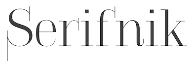 During her studies, Ljubljana, Slovenia-based Krista Likar created the exaggerated serif typeface Serifnik (2015) and the gorgeous sans display typeface Kros (2015).
 In 2016, she designed the slab serif typeface Josephine. In 2020, she released Sopran through Type Salon, an independent type design studio based in Ljubljana, Slovenia, founded by Alja Herlah and Krista Likar. Sopran is an attractive didone display style in which the traditional ball terminals have been replaced by vertical hairline serifs. Co-designer with Alja Herlah of Spektra (2020, Type salon), a black condensed sans that combines five scripts: Latin, Arabic, Cyrillic, Greek and Hebrew. It also has a variable typeface with an italic axis. In 2021, Krista Likar and Alja Herlah published Plecnik, which is named after Slovenian architect Joze Plecnik. Plecnik is defined by classical elements and shapes, classic proportions, humanist stroke endings and low contast. It has a capital A with an overhang. Plecnik Display is quite different as it features flaring in every stroke. [Google]
[MyFonts]
[More] ⦿
|
Kristijan Kirac
|
During his studies in Ljubljana, Slovenia, Kristijan Kirac created Bianoux (2015) and Webo (2015, a sans for web use). In 2018, he published the sans typeface Kiro as part of his thesis at the University of Ljubljana. [Google]
[More] ⦿
|
Lara Dolinsek
|
Ljubljana, Slovenia-based designer of the dispalay sans typeface Lefeater (2017). [Google]
[More] ⦿
|
Laura Bogovic
|
Ljubljana, Slovenia-based graphic designer, who published Nukleta in 2019. [Google]
[More] ⦿
|
Lea Jelenko
[Lea Noir]
|
[More] ⦿
|
Lea Noir
[Lea Jelenko]
|
 Slovenian graphic designer Lea Jelenko (Ljubljana) creates art, including typefaces, under the appropriate alias, Lea Noir---all is in indeed black and white (and esthetically magnificent). Her work includes some pictograms (called Garderoba, 2012), as well as a typeface called Pulp (2012). [Google]
[More] ⦿
Slovenian graphic designer Lea Jelenko (Ljubljana) creates art, including typefaces, under the appropriate alias, Lea Noir---all is in indeed black and white (and esthetically magnificent). Her work includes some pictograms (called Garderoba, 2012), as well as a typeface called Pulp (2012). [Google]
[More] ⦿
|
Lea Zupancic
|
Ljubljana, Slovenia-based designer of the text typeface family General (2015). Behance link. [Google]
[More] ⦿
|
Lettermin Type Foundry (was: Ermin Design)
[Ermin Mededovic]
|
 Croatian designer who lives in Ljubljana. He is owner and type designer at Lettermin (since 2012) and design director at Delo Publishing House. Creator of fonts such as Board, Counter (dot matrix), DeeDot, Dirty Karlson, Dope, EnfontTerrible (grunge), Exer, Fractual (Fraktur), Frizider (connected 50s style lettering), Gliberto, Jogurt Pi, Kelih, Latirilica, Malomorgen (Fraktur), Manifestina, Ministry of Defense, NoBodyType, Omar Sans and Omar Sans Plus (1999, Typohteque), Pope-Regular, PopeInline, Siscia, Sugestica, Tune, Telekom Pi, Video-Flat.
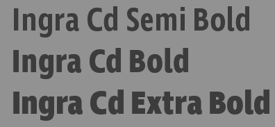
 At Plazm he published Centrifuga (1996), Board (1995). In 2005, he finished the design of a 40-style a typeface family for Delo, one of the leading Slovenian daily newspapers. In 2014, he created Lipa Agate (Type Together), a workhorse sans serif for use in very small type sizes. Similarly, Ingra (2015) is a 30-style sans family designed for use in magazines, with weights ranging from hairline to extra bold. In 2016, Ermin published Fino, Fino Sans and Fino Stencil at Type Together, which advertizes is as a dramatic, contemporary family that scales beyond the world of looks by tapping into archetypes. It amplifies the most theatrical aspects of the Didone, while bringing an uncommon flexibility of style and variation to any type palette. Tall and stately, this is a caps-only typeface system. In 2019, Omar sans was retired by Typotheque and Mededovic rejuvenated this octagonal design as Edge Sans. In 2021, he added Edge Slab. [Google]
[MyFonts]
[More] ⦿
|
Lucijan Bratuš
|
 Slovenian painter and artist (b. Vipava, 1949). Designer of Rokus and Rokus Script (2002) for schoolbooks published by Rokus Publishing House. Professor of type design. Creator of the calligraphic typeface Kanela (2006). Cofounder of the TipoBrda type design conferences, held annually since 2006 in Slovenia. TipoBrda 2006. Designer of the art deco typeface Čiginj during the design workshop TipoBrda in 2008.
 At TipoBrda 2007, he showed Kanela. At TipoBrda 2011, he created the geometric sans family Makalonca. At Tipo Brda 2010, he designed the Slova OT family of old Slavonic typefaces. That family includes one gorgeous Latin typeface that simulates old Slavonic. [Google]
[More] ⦿
|
Luka Paragi
|
Ljubljana, Slovenia-based designer of the rounded modular display typeface Malina (2013). [Google]
[More] ⦿
|
Marin Santic
|
 Ljubljana, Slovenia-based designer who set up his own Marin Santic type foundry and later started publishing his fonts at Type Fleet.
 Designer of the tweetware font Prince Pro typeface (2013), which according to Marin was influened by Meta, Profile and Benton Sans. Prince Pro has a very large x-height. In 2014, Marin designed Snow Math (free snowman font co-designed with Tanja Semion), and Rusulica Script. Later in 2014, he set up the commercial type foundry Marin Santic. In 2015, he published Rusulica Script Antique and Submariner (wayfinding sans family). In 2016, he added Rail (a slab serif designed to provide great comfort and reduce any possible friction for your eyes) and Submariner R24. In 2017, he designed the uncial typeface Diocletian. Typefaces from 2019: Bovid (a great primitive curvy sans with lumberjack charm). Typefaces from 2020: Verge (an 18-style slab serif with a techno vibe). Behance link. You Work For Them link. [Google]
[MyFonts]
[More] ⦿
|
Marion Robinson
|
Creator of Marcelle (2011, a text face), developed at the tipoRenesansa 3rd international type design workshop in Ljubljana, Slovenia. [Google]
[More] ⦿
|
Marjan Bozic
|
Slovenian designer, at Apostrophic Laboratory, of the R-rated dingbat font Hard Talk. [Google]
[More] ⦿
|
Martin Fujan
|
Creator of Talschrift (2010, blackletter) during TipoBrda 2010, a type design workshop held in Ljubljana, Slovenia. [Google]
[More] ⦿
|
Martina Grdic
|
Martina Grdic (Ljubljana, Slovenia) created Circola (2013). [Google]
[More] ⦿
|
Marusa Racic
|
Ljubljana-based creator of the artsy Treefrog-style hand-printed Ink Blowing Alphabet (2013). [Google]
[More] ⦿
|
Masa Majce
|
Creator of Mashonique (2011) during TipoBrda 2011, a type design workshop held in Slovenia. [Google]
[More] ⦿
|
Masha Mazi
|
As a graphic design student in Ljubljana, Slovenia, Masha Mazi created the sturdy display typeface Borneo (2016). [Google]
[More] ⦿
|
Matevz Medja
[Gigofonts--Gigodesign]
|
 [MyFonts]
[More] ⦿
[MyFonts]
[More] ⦿
|
Matevz Medja
[Archive Type]
|
 [MyFonts]
[More] ⦿
[MyFonts]
[More] ⦿
|
Matic Leban
|
Tolmin, Slovenia-based creator of Rozmarin (2011, +Unicase) during TipoBrda 2011, a type design workshop held in Slovenia. [Google]
[More] ⦿
|
Matjaz Tomazic
|
Ljubljana, Slovenia-based designer of a Bauhaus/DIN style font (2003). [Google]
[More] ⦿
|
Matjaz Tozon
|
Graphic designer in Ljubljana, Slovenia, who created the hairline avant-garde typeface Tozonsky in 2014. Behance link. [Google]
[More] ⦿
|
Max Gets
|
Izola, Slovenia-based designer of the cursive script typeface Nautica (2017). [Google]
[More] ⦿
|
Metka Bacar
|
Ljubljana-based designer of the display typeface Decklina (2015) and experimental typeface Poba (2015). [Google]
[More] ⦿
|
Miha Košmač
|
Slovenian designer of the graffiti typeface Fasada (2006) during TipoBrda 2006. Creator of the condensed serif typeface Chainsaw during the design workshop TipoBrda in 2008. [Google]
[More] ⦿
|
Miha Zajec
|
Creator of Puding (2011) during TipoBrda 2011, a type design workshop held in Slovenia. [Google]
[More] ⦿
|
Milos Radosavljevic
|
Krsko-based Slovenian graphic designer, who created the grunge typeface MCK Mono (2005, Garcia Fonts). [Google]
[More] ⦿
|
Mina Arko
|
Slovenian designer (Ljubljana, b. 1983) of the futuristic monoline sans family Nouvelle during the design workshop TipoBrda in 2008. It was perfected and started selling at MyFonts in 2011. In 2009, she created Afrikana, an alphabet with a decidedly African theme. During TipoBrda 2010 in Ljubljana, she designed the didone numbering typeface Kampula. In 2014, she cooperated with Gaja Meznaric Osole on the commercial casual hand-printed script Jadran, which was created as an homage to a cult children's magazine named Ciciban. [Google]
[MyFonts]
[More] ⦿
|
Mitja Miklavčič
|
 Slovenian designer who lives in Postojna. His typefaces:
 - He created Gf H2O Sans in 2005 font at Gigofonts. This is a humanist sans done with Matevz Medja.
- Tisa is a slab-serif inspired text family that won an award at TDC2 2007. It has useful features such as ink traps and uiformized math symbol and number widths across all styles in the family. In fact, the Latin/Cyrillic type family Tisa was his project at the University of Reading, where he graduated in 2006. He wrote a nice essay on the history of Clarendon (2006). In 2008, he published Tisa as FF Tisa at FontFont. Tisa won a TDC award. In 2012, he added the superfamily FF Tisa Sans (FontFont).
- Mitja worked full-time at Fontsmith and now continues to collaborate with the team on some type design projects. His Fontsmith cooperation led to these typefaces:
- FS Rufus (2009). A slab serif by Mitja Miklavcic, Jason Smith and Emanuela Conidi. Described by them as benevolent, quirky, peculiar, offbeat, jelly beans and ice cream, a retro eco warrior.
- FS Me (2009). A sans family designed for readers with a learning disability. It was co-designed by Mitja Miklavcic, Jason Smith, Emanuela Conidi, Fernando Mello and Phil Garnham. FS Me was researched and developed in conjunction with---and endorsed by---Mencap, the UK's leading charity and voice for those with learning disability. Mencap receives a donation for each font licence purchased.
- FS Albert (2002). A soft-edged sans family by Jason Smith, Mitja Miklavcic and Phil Garnham. FS Albert supports 60 languages, including Greek, Cyrillic and Latin.
- FS Rome (Mitja Miklavcic and Emanuela Conidi). An all caps Trajan typeface.
- At House Industries, Jess Collins and Mitja Miklavic revived Ed Benguiat's great fat face didone typeface (Benguiat) Montage in 2018. In 2014, House Industries, Christian Schwartz, Mitja Miklavcic and Ben Kiel co-designed Velo Serif Text and Velo Serif Display. In 2017, he revived Dave west's 1960s classic at PhotoLettering Inc, Banjo, as Plinc Banjo. Still at House Industries, Christian Schwartz, Mitja Miklavcic and Ben Kiel co-developed Yorklyn Stencil.
- In 2020, he published the experimental modular typeface Trico Script at Fleha Type.
- Davison Spencerian (at House Industries, by Mitja Miklavcic, Ben Barber and Ken Kiel). A digital revival of Dave Davison's 1946 Spenerian script Davison Spencerian.
[Google]
[MyFonts]
[More] ⦿
|
Nace Pusnik
|
Assistant Professor and a researcher at the Department of Textiles, Graphic Arts and Design in Slovenia, where he teaches Integration of Design & Technology, Creative Typography, Information Design and Typeface Design. In 2016 Nace defended his PhD thesis on the use of typography in connection with colour combinations in different aspects of communication design. His research work employs eye-tracking technology. [Google]
[More] ⦿
|
Nejc Bocaj
|
During his studies in Ljubljana, Slovenia, Nejc Bocaj designed Velviroba (2018). [Google]
[More] ⦿
|
Nejc Romih
|
Sevnica, Slovenia-based designer of the vintage text typeface Autodidact (2017). [Google]
[More] ⦿
|
Nika Uhan
|
During her studies in Ljubljana, Nika Uhan designed the sans typeface Sapramouse (2016, With Lara Zupancic). [Google]
[More] ⦿
|
Nikos Georgopoulos
|
Creator of Koumpa (2010, a Greek headline face) during TipoBrda 2010, a type design workshop held in Ljubljana, Slovenia. [Google]
[More] ⦿
|
Omnibus Typographi
[Franko Luin]
|
 Fonts designed by talented Swedish designer Franko Luin (born in Trieste, Italy in 1941, to Slovenian parents). Luin immigrated to Sweden in 1961. After studying at the Grafiska Institutet during the 1960s, Franko Luin spent two decades as a print designer for Ericsson before becoming independent. In the 1990s he was involved in multimedia and typeface design. In 1996, he founded his own typographic studio, Omnibus Typografi. At some point, he led a course in Web Typography at the Berghs School of Communication in Stockholm. Franko Luin passed away on September 15, 2005, in Tyresö, Sweden. Autobiography. Obituary by Dan Reynolds. Linotype pages on Luin.
 His typefaces, all at Linotype: View Franko Luin's typefaces. [Google]
[MyFonts]
[More] ⦿
|
Pencil Twist
[Janja Baznik]
|
 Talented illustrator and occasional type designer based in Kostanjevica na Krki, Slovenia. Her illustrations include zodiac sets and collections of animals. Her typefaces:
 - Logogriph (2021). A 44-style all caps family that has some stencil styles, various bilined forms, a papercliop style, and other fonts useful for logos.
- Manca (2019). A display sans.
- Nektarina (2020). A casual display sans.
- Nonfiction (2019). An old typewriter font.
[Google]
[More] ⦿
|
Peter Stupica
|
During the 7th Typeclinic (Trenta, Slovenia, 2013), Peter Stupica (Slovenia) created the italic typeface Gotiva, which took inspiration from Greek minuscules. [Google]
[More] ⦿
|
Petra Cerne Oven
|
 This Slovenian researcher in languages and typography obtained her Ph.D. at the Department of Typography and Graphic Communication from the University of Reading, UK, in 2004 on the topic of the development of special characters in Slavonic languages. She won a typographic excellence award from the Type Directors Club of New York in 1999. In 2008 she won an invited tender for visual identity of Ljubljana---World Book Capital 2010, and was recipient of The most beautiful Slovene book award in 2011. She is the ATypI delegate for Slovenia and was a graphic designer and teacher in Ljubljana. In 2008 she started to teach at the Academy of Fine Arts & Design at the University of Ljubljana, where sh is presently Associate Professor.
 At ATypI 2004 in Prague, she spoke about "The development of diacritical marks". With Paul Stiff, she emabarked upon a project called The optimism of modernity. It aims to tell the story of an incomplete and now almost forgotten project: that of modernity in British typography. This is envisaged as a matter not of style but of design as a visible form of social philosophy and as an optimistic claim on enlightenment. They wrote: The modern typographers included professional practitioners and academics; their reasoning was channelled into unpaid work in study groups and expert panels, working parties, and internally circulated policy papers. (Examples: in 1965 the Typographers' Computer Working Group, TCWG, was constituted; and 1966 saw the first meeting of the Working Party on Typographic Teaching, WPTT.) Some of their work emerged in British Standards on publishing and printing, in professional periodicals, in academic journals and monographs. But most of their invisible work has lain dormant since completion or suspension. This work is largely undocumented. Many of the principal participants are dead: Anthony Froshaug, Maurice Goldring, Ernest Hoch, Jock Kinneir, Herbert Spencer. We will interview surviving participants and establish facts about the existence and accessibility of documents. We hope for access to the papers of some British Standards panels; we will interview participants in the work of the WPTT and the TCWG, and other groups. We will establish registers of documents, chronologies of events, and network diagrams of participants. This work will lead to the writing and publication of an account of this brief enlightenment in British typography. Speaker at ATypI 2016 in Warsaw on Designing young readers through typography. Link at Reading, where she is a Research Fellow. LinkedIn link. Ljubljana university link with a full bio. Facebook link. Another URL. [Google]
[More] ⦿
|
Picons
|
Commercial pictogram vendor. All pictograms are designed by Morphix Design Studio, which is based in Slovenia. Formats include AI, EPS, PDF, PNG, PSD. The icon sets are Picons Basic (1, 2, and 3), Picons Weather, Picons Ultimate+, and Picons Social (free). [Google]
[More] ⦿
|
Pika Novak
|
Creator of Saga (2011, with Anja Delbello) during TipoBrda 2011, a type design workshop held in Slovenia. Saga is an ultra-heavy poster titling face. [Google]
[More] ⦿
|
Pink Coffie
|
Slovenian designer of Lush Blue (2017, a dry brush typeface), Loveline Script (2017), Soulmates (2016, brush script) and Mademoiselle Script (2016). In 2018, she designed Midnight Bloom (watercolor brush script), Blush Collective (a crayon font), Boston Marker (font duo), and Hearthshore. Typefaces from 2019: Blanche (a tall sans), Isadora (calligraphic), Balayage (signature script). Typefaces from 2020: Willow Avenue (rustic and grungy). Typefaces from 2021 (mostly calligraphic): Jasmine Clarke, Frances, Aristea, August + Ivy, Porto Bianco, Wild Peonies, Style Ray, Earth And Soul, Astoria, Rose Moon. [Google]
[More] ⦿
|
Primoz Peterlin
|
Slovenian font and font software specialist, who works at the Institute of Biophysics of the University of Ljubljana, Slovenia. Early on, he created type 1 outlines for the Devanagari fonts of Frans Velthuis, which dated back to ca. 1990. But his main project was the Free UCS Outline Fonts project, which was part of the Free Software Foundation. It morphed into the GNU Freefont project that set out to provide three monster fonts, FreeMono, FreeSerif and FreeSans, to cover many Unicode blocks. Primoz himself filled in missing glyphs here and there (e.g., Latin Extended-B and IPA Extensions ranges in the FreeMono family), and created the following UCS blocks: - Latin Extended-B (U+0180-U+024F)
- IPA Extensions (U+0250-U+02AF)
- Arrows (U+2190-U+21FF)
- Box Drawing (U+2500-U+257F)
- Block Elements (U+2580-U+259F)
- Geometrical Shapes (U+25A0-U+25FF)
In 2008, he ceded the command of that project to Steve White. [Google]
[More] ⦿
|
Proteus Fonts
[Damijan Kracina]
|
Proteus Fonts (Damijan Kracina, Slovenia) offers some original creations such as Vulgata (ca. 2003), a typeface with letters made up of a rare salamander. [Google]
[More] ⦿
|
Robert Koritnik
|
Slovenian designer from Muljava. He created the sans family Inovares (2007). [Google]
[More] ⦿
|
Rok Klemenčič
|
Slovenian designer of the art nouveau typeface Secirnica during the design workshop TipoBrda in 2008. [Google]
[More] ⦿
|
Roman Peklaj
|
Illustrator Roman Peklaj (Magnifax, Ljubljana, Slovenia) created the handcrafted ink-splattered connect-the-dots typeface Inkoteka Light Script in 2015. Creative Market link. Behance link. [Google]
[More] ⦿
|
Sabina
|
Slovenian designer of Simple Kindergarden (2014, a handcrafted typeface). [Google]
[More] ⦿
|
Samo Ačko
|
 Ljubljana, Slovenia-based creator of CE Star (2006, a highway font for Eastern Europe), and Grill Serif Extra Bold Wide Latin Lover Case during the design workshop TipoBrda in 2008. In 2011, he designed Morgana, a daring wedge-serif medieval fortress face, while participating at the tipoRenesansa 3rd international type design workshop in Ljubljana. In 2014, he created the great headline and poster font Bad News Sans Extreme.
 Codesigner, with Diana Ovezea, of the typefaces Passenger Display and Passenger (2017, Indian Type Foundry). Passenger Display is a high-contrast didone-style font family. It is intended for use in headlines, signs, or posters. Passenger Serif (released in 2019) on the other hand is a Clarendon. In 2019, Diana Ovezea and Samo Acko added Passenger Sans, which is characterized by horizontal and vertical terminal strokes and small apertures, and delivers a relaxing read in long texts. Facebook link. [Google]
[MyFonts]
[More] ⦿
|
Sanja Radakovic
|
Sanja Radakovic (Ljubljana, Slovenia) is a Master student of graphic and interactive designat Designskolen Kolding in Denmark. In 2009, she created the text typeface Font Sanes. In 2011, she designed a corporate organic sans typeface for Telia Sonera called Sonera. [Google]
[More] ⦿
|
Sara Vrbinc
|
BA student at University of Ljubljana: Academy of Fine arts and Design, Department of Visual Communication Design, 2010-2013. In 2012, she is an exchange student at Aalto University: School of Arts, Design and Architecture in Helsinki. Creator of the experimental typeface Hemifission (2012) and of Kutsu (2012). Behance link. Cargo Collective link. [Google]
[More] ⦿
|
Silina Pintar
|
Ljubljana, Slovenia-based designer of the sci-fi typeface Star Wars (2018). [Google]
[More] ⦿
|
Silverstixx
|
Slovenian designer of Resurrected (2009). [Google]
[More] ⦿
|
Steve White
[GNU Freefont (or: Free UCS Outline Fonts)]
|
[More] ⦿
|
Taja Polovsak
|
During her studies in Ljubljana, Slovenia, Taja Polovsak designed the art deco typeface Horizon (2013). [Google]
[More] ⦿
|
Tanja Gawish
[Kisla]
|
[MyFonts]
[More] ⦿
|
Tanja Medved
|
MA student in typography at the University of Ljubljana, Slovenia. At ATypI 2007 in Brighton, she spoke on Typeface Praetoria: from v-cut to digital media (with Klementina Mozina). This font is based on an old inscription on the Praetorian palace in Koper. Old chiselled letters from the 17th century formed the basis for the creation of the new font. The Praetoria font is now used as a corporate identity at the Koper Museum. Designer of the serif text typeface Valentin during the design workshop TipoBrda in 2008. Earlier, she created Nonsense (2006). At TipoBrda 2007, she created the text typeface Metelchica. [Google]
[More] ⦿
|
Tanja Semion
|
 Slovenian designer of the condensed modern typeface Benjamin during the design workshop TipoBrda in 2008. At TipoBrda 2007, she created the comic book typeface Damn. [Google]
[More] ⦿
Slovenian designer of the condensed modern typeface Benjamin during the design workshop TipoBrda in 2008. At TipoBrda 2007, she created the comic book typeface Damn. [Google]
[More] ⦿
|
Tea Bazon
[To Be Thea]
|
[MyFonts]
[More] ⦿
|
Tea Bazon
|
Tea Bazon studied in Ljubljana, Slovenia, and works in Koper / Capodistria, Slovenia. Designer of the display typeface Morning Rain (2017). [Google]
[More] ⦿
|
Teja Smrekar
[Fleha Type]
|
 [MyFonts]
[More] ⦿
[MyFonts]
[More] ⦿
|
The Miha Artnak
|
 Slovenian graphic designer who graduated from the Academy of Fine Arts and Design in Ljubljana. He created some great icons in 2010. He also did some type design experiments such as Analphabet Y (2008). Behance link. [Google]
[More] ⦿
Slovenian graphic designer who graduated from the Academy of Fine Arts and Design in Ljubljana. He created some great icons in 2010. He also did some type design experiments such as Analphabet Y (2008). Behance link. [Google]
[More] ⦿
|
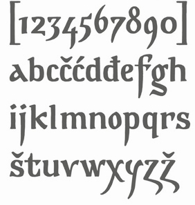
Tina Jeler
|
Trbovlje, Slovenia-based creator of Squcut (2013, counrterless and squarish, created with Fontstruct) and Fly High (2013, a sans typeface co-designed with Franci Judez). In 2014, she published the decorative caps typeface Tendril. Behance link. [Google]
[More] ⦿
|
Tipo Brda 06
|
Type meeting held in Kaverljag, in the Slovenian part of Istria region, from July 29-August 6, 2006. It took place in the house of Ales Sedmak, a Slovenian painter and illustrator. Tipo Brda was launched in 1997, in Ssmartno, located in the Brda wine region near the Italian border, hence the name of the workshop (Type Hills). Back then, the gathering was organized by Lucijan Bratuš, professor of typography at ALU and several of his students. Tipo Brda grew in to a non-profit organization and a specific cultural institution. [Google]
[More] ⦿
|
TipoBrda
|
Type designing workshop, organized during the first week of February in Trenta, Italy, and during the first week of August in Grintovec/Kaverljag under the leadership of Slovenian type design professors Tomato Košir and Lucijan Bratuš. Summer design workshops have been held annually since 2006. 2007 workshop. 2008 workshop. [Google]
[More] ⦿
|
tipoRenesansa
|
A series of four international workshops run by Tomato Kosir in Slovenia from 2010 until 2012. The fifth was renamed TypeClinic, and that name will be used from 2012 onwards. The first workshop was held from July 25-31, 2010: A first-time international workshop deals with designing typeface for poster size in letterpress technique. That was repeated from August 28 until September 4, 2011 in Ljubljana. The Fourth Workshop took place in Trenta Valley near the beginning of February 2012. [Google]
[More] ⦿
|
TipoRenesansa 2010
|
Type design workshop held in Slovenia in 2010 under the leadership of Tomato Kosir. Typefaces designed by the group include these: - Aljaz Vindis: Tribunal.
- Anze Versnik: StajnBoldItalic.
- Jakob Jugovic: Crepaldi.
- Jure Martinec: La Farmacia.
- Katarina Medic: Trezulja (Sofijas alter ego).
- Petra Bukovinski: Rina.
- Teja Smrekar: Arkadika.
- Tomato Kosir: Spacioneza.
Home page. [Google]
[More] ⦿
|
Tjasa Krivec
|
 Domzale, Slovenia-based designer of Lilo (2014, a script typeface) and Ophion (2014, an ink-trapped beauty). [Google]
[More] ⦿
Domzale, Slovenia-based designer of Lilo (2014, a script typeface) and Ophion (2014, an ink-trapped beauty). [Google]
[More] ⦿
|
To Be Thea
[Tea Bazon]
|
Slovenian designer of Morning Rain Dot (2018). [Google]
[MyFonts]
[More] ⦿
|
Tomato Košir
|
 Prolific Slovenian graphic designer (b. 1978, Kranju) who made the typefaces Geotip (1998, geometric experiment), Grotesca (1998), Russia (1999, Cyrillic simulation font), Stisca (1999), Walbotomy (2000, Walbaum letters rotated to make other letters), Circularum (2000), Quadra (2000, a squarish font), QuadraII, Mikona (2000) and J477 (2000, underbelt and uppercut, left and right versions of minimalist ideas). He is designing the corporate identity of the Ministry of Culture of the Republic of Slovenia. Designer of the sans typeface Finting (2006).
 Cofounder of the TipoBrda type design conferences, held annually since 2006 in Slovenia. From 2010 until 2012, he organized four type design workshops in Slovenia called tipoRenesansa. From 2012 onwards, these events were renamed TypeClinic. They are typically held in February and August of every year. Creator of the futuristic experimental typeface Laufr during the design workshop TipoBrda in 2008. From 2011 until 2013, he designed the didone family Rastignac (+Italic). Rastignac Bold appeared in 2014 and the excellentissimo didone fashion mag beauty Rastignac Black in 2015. He finished his master's degree in 2007 at the Department for Design, Academy of Fine Arts and Design in Ljubljana. In 2010 he became Assistant Professor at Academy of Fine Arts and Design in Ljubljana. In the same year, he created Spacioneza. Other typefaces, designed ca. 2016: Mikona, Quadra, QuadraII, Stiska, Walbotomy, Circularum, Geotip, Grotesca, Russia (constructivist, or Cyrillic simulation font). . Behance link. Lolita Band poster (2010). [Google]
[More] ⦿
|
Tomato Kosir
[TypeClinic]
|
[More] ⦿
|
Tomaz Hrastar
|
Ljubljana, Slovenia-based designer of the free font Qontra (2015). [Google]
[More] ⦿
|
Tomaz Leskovec
|
 Koper, Slovenia-based designer of the free art deco sans typeface Manifesto (2015), which was inspired by the Italian rationalist movement. [Google]
[More] ⦿
Koper, Slovenia-based designer of the free art deco sans typeface Manifesto (2015), which was inspired by the Italian rationalist movement. [Google]
[More] ⦿
|
Type Fleet
[Crt Mate]
|
 Type Fleet is a Slovenian type cooperative in Ljubljana that includes type designers such as Martin Santic. Crt Mate is the Slovenian designer of Wieldy (2018), a Victorian typeface that is influenced by the Central European Arts and Crafts movement. [Google]
[MyFonts]
[More] ⦿
Type Fleet is a Slovenian type cooperative in Ljubljana that includes type designers such as Martin Santic. Crt Mate is the Slovenian designer of Wieldy (2018), a Victorian typeface that is influenced by the Central European Arts and Crafts movement. [Google]
[MyFonts]
[More] ⦿
|
Type Salon
|
Type Salon is an independent type design studio based in Ljubljana, Slovenia, founded by Alja Herlah and Krista Likar. I Love Typography link. [Google]
[MyFonts]
[More] ⦿
|
TypeClinic
[Tomato Kosir]
|
 An annual or biannual type design workshop typically held in Trenta, Slovenia, under the mentorship of Tomato Kosir. The current schedule has meetings in February and August. TypeClinic is a continuation of tipoRenesansa. The 15th edition took place from 2 to 9 Sepember 2017. [Google]
[More] ⦿
An annual or biannual type design workshop typically held in Trenta, Slovenia, under the mentorship of Tomato Kosir. The current schedule has meetings in February and August. TypeClinic is a continuation of tipoRenesansa. The 15th edition took place from 2 to 9 Sepember 2017. [Google]
[More] ⦿
|
Typeclinic 10th International Type Design Workshop
|
Type design workshop held in Trenta, Slovenia from 15-22 February 2015. The following typefaces were fully or partially developed at the workshop under the mentorship of Tomato Kosir and Aljaz Vesel: - Anna Hawlina: Dukument.
- Clara Wildberger: Kigeling Italic.
- Dominika Langosz: Tilia italic.
- Dedi Cohen: Bray.
- Ewa Kucharska: Brootal.
- Jan Janecek: Skvär.
- Katarzyna Wolny: Nonsens.
- Kurt Glaenzer: Rosa Text Italic.
- Magdalena Wisniewska: Opera.
- Marija Veteroska: Basna.
- Anja Delbello: Moose Sans.
[Google]
[More] ⦿
|
Typeclinic 11th International Type Design Workshop
|
Type design workshop held in Trenta, Slovenia from August 30, 2015 until September 6, 2015, under the mentorship of Tomato Kosir and Aljaz Vesel: - Alberto Romanos: StretchCaps.
- Anja Delbello: Moose Sans.
- Christine Hager: Normalisia.
- Cristina Pellicano: Salvatore Serif.
- Dominika Langosz: Tilia.
- Jan Janecek: Queen (+Cyrillic, +Greek).
- Lasko Dzurovski: Elegant Sans.
- Marie Musilova: Tulsia.
- Marija Veteroska: Basna.
- Tamara Pilz: Hildegard.
- Thom Niessink: Bw Helder.
- Tomato Kosir: Rastignac Black.
- Ute Kleim: Kaethe.
[Google]
[More] ⦿
|
Typeclinic 12th International Type Design Workshop
|
 Type design workshop held in Trenta, Slovenia from 21-28 February 2016. The following typefaces were fully or partially developed at the workshop under the mentorship of Tomato Kosir and Aljaz Vesel:
 - Old Lady (Christine Hager).
- Toucan (Damian Antolak).
- Tilia (Dominika Langosz).
- Canterel (Ewa Glowacka).
- Soberlin (Igor Petrovic).
- Rosa (Kurt Glänzer).
- Boban (Magdalena Wisniewska).
- Round Trip (Marta Sieczkowska).
- Bjoern (Matz Gasser).
- Grimmig (Tamara Pilz).
- Czytanka (Zuzanna Waligorska).
[Google]
[More] ⦿
|
Typeclinic 13th International Type Design Workshop
|
Type design workshop held in Trenta, Slovenia from 28 August-4 September 2016. Behance page. Participants and their typefaces (designed during this workshop): Ada Krawczak (Easy-a), Adrian Sowinski (Anna), Anna Kacka (Triglav), Dominika Langosz (Juno and Tilia), Irena Muhar (Muha), Kurt Glänzer (Rosa), Marta Sieczkowska (Round-Trip), Matz Gasser (Kanela), Max Dunin (Boshi), Sarah Newitt (Noa), Tobias Banning (Aurel), Zuzanna Waligorska (Czytanka). The mentors were Franziska Weitgruber, Aljaz Vesel and Tomato Kosir. [Google]
[More] ⦿
|
Typeclinic 14th International Type Design Workshop
|
Type design workshop held in Trenta, Slovenia from 18-25 February 2017. [Google]
[More] ⦿
|
Typeclinic 15th International Type Design Workshop
|
Type design workshop held in Trenta, Slovenia from 2-9 September 2017. [Google]
[More] ⦿
|
Typeclinic 5th International Type design Workshop
|
Type design workshop held in Trenta, Slovenia, from August 19-26, 2012, which used to be called Tipo Renesansa in previous versions. The following typefaces were fully or partially developed at the workshop under the mentorship of Tomato Kosir: - Anja Schwendenwein: Oachakatzerl. This is an angular serif typeface inspired by linguistic contrasts, in particular the sharpness and softness of the German language as spoken in Austria.
- Diana Ovezea: Paige Italic. This body text typeface is based on a previous display typeface.
- Kevin van Reenen: Ishumi Nanye. This sans serif typeface was created for the road sign system of South Africa. It uses the triangular shape of the South African flag for huge ink-traps.
- Marianne Riegelnegg: Janis Book.
- Marija Rnjak: Prouge. This is described as a soft didone that is best for titling, but can be successfully used also in smaller sizes down to 12 pt.
- Marijana Orsolic: Nioki. This humanist sans comes in several weights.
- Theresa Radlingmaier: Poldi. Poldi is a modern typeface with a calligraphic character.
- Verena Manyet: Pandora. This work is a continuation of a slightly rounded sans serif typeface she started earlier. This titling typeface offers art nouveau, Bauhaus and avant-garde style capital letters.
[Google]
[More] ⦿
|
Typeclinic 6th International Type design Workshop
|
Type design workshop held in Trenta, Slovenia, from February 10-17, 2013. The following typefaces were fully or partially developed at the workshop under the mentorship of Tomato Kosir and Aljaz Vesel: - Theresa Radlingmaier: Poldi. Poldi is a modern typeface with a calligraphic character.
- Verena Manyet: Pandora. This work is a continuation of a slightly rounded sans serif typeface she started earlier. This titling typeface offers art nouveau, Bauhaus and avant-garde style capital letters.
- Aljaz Vesel: Emsley. A slab serif.
- Barbara Borko: Slap Slab.
- Christin Bacher: Spoon.
- Clara Wildberger: Kigeling. A typeface for use on photographs.
- Dominika Langosz: Broken Stamps: An angular typeface.
- Tomato Kosir: Rastignac Italic.
- Monika Marek: Angd B.
- Maria Ramos: Calada.
- Jan Janecek: Skvär. A serifed typeface.
- Igor Stumberger: Sadwitch. A sans serif for editorial use.
- Dedi Cohen: Kita. A serif typeface modeled after Hebrew.
[Google]
[More] ⦿
|
Typeclinic 7th International Type Design Workshop
|
Type design workshop held in Trenta, Slovenia, from September 1-8, 2013. Organized by Tomato Kosir. [Google]
[More] ⦿
|
Typeclinic 9th International Type Design Workshop
|
Type design workshop held in Trenta, Slovenia in the summer of 2014. The following typefaces were fully or partially developed at the workshop under the mentorship of Tomato Kosir and Aljaz Vesel: - Chris Campe: Altona.
- Ewa Kucharska: Brootal. Designed for small print.
- Franziska Weitgruber: Sphera Serif.
- Joe Leadbeater: Madison.
- John-Daniel Harrington: Ardagh Sans.
- Katja Zerko: Mucek.
- Kurt Glaenzer: Rosa Text.
- Mugur Mihai: Alpska.
- Nikola Giacintova: Yield.
- Tamara Pilz: Hildegard.
- Tomato Kosir: Rastignac.
- Zdenka Giacintova: Johana. A didone typeface.
- Aljaz Vesel: Emsley Numbers.
- Clara Wildberger: Kigeling. A typeface for use on photographs.
- Dominika Langosz: Tilia.
- Jan Janecek: Skvär. A serifed typeface.
[Google]
[More] ⦿
|
Typeclinic's 8th International Type Design Workshop
|
Type design workshop held in Trenta, Slovenia, from February 9 to February 16, 2014. Organized by Tomato Kosir and mentored by Aljaz Vesel and Diana Ovezea. Behance link. [Google]
[More] ⦿
|
Typo Brda 2010 Summer Typedesign Workshop
|
This is one in a regular series of type design workshops held in Slovenia since ca. 2007. Typefaces were created by these participants in Ljubljana: Martin Fujan (Talschrift), Uros de Gleria (Not yet pro), Domen Fras (Narod Krepak), Mina Arko (Kampula), Eleni Beveratou (Untitled), Nikos Georgopoulos (Koumpa), Lucijan Bratus (Slova OT 1, 2 and 3). [Google]
[More] ⦿
|
Typo Brda 2011 Winter Typedesign Workshop
|
This is one in a regular series of type design workshops held in Slovenia since ca. 2007. Typefaces were created by these participants: Ajda Bevc (Leprechaun), Aljaz Vesel (Emsley), Anja Delbello&Pika Novak (Saga), Lucijan Bratus (Makalonca), Masa Majce (Mashonique), Matic Leban (Rozmarin), Miha Zajec (Puding), Nejc Prah (Meg), Urska Alic (Gunabrez), Domen Fras (Pesjan Debu). [Google]
[More] ⦿
|
Urh Kocevar
|
Graphic designer in Ljubljana, Slovenia. Creator of BauSans (2014). [Google]
[More] ⦿
|
Uros de Gleria
|
Creator of Not yet pro (2010) during TipoBrda 2010, a type design workshop held in Ljubljana, Slovenia. [Google]
[More] ⦿
|
Urska Alic
|
Creator of Gunabrez (2011) during TipoBrda 2011, a type design workshop held in Slovenia. [Google]
[More] ⦿
|
Valerija Jovanovski
|
Ljubljana, Slovenia-based designer of the teardrop terminal typeface Grenouille JBV (2018). [Google]
[More] ⦿
|
Vladimir&Vladimir
|
Foundry in Ljubljana, Slovenia, est. 2011. Vladimir & Vladimir soes art direction at Modna, the main Slovenian fashion magazine. Based in Lubljana, Vladimir & Vladimir designed the fat finger font Krink in 2013. Earlier, he (they?) created the free Tape Font (2011, dadaist). [Google]
[MyFonts]
[More] ⦿
|
Ziga Artnak
|
Žiga Artnak is the Slovenian designer of the semi-blackletter typeface Yellow Snow during the design workshop TipoBrda in 2007. Designer of Crack Whore (2006). [Google]
[More] ⦿
|
Ziga Drnovscek
|
 Student of graphic design at Academy of Design in Ljubljana, Slovenia. In 2010, Ziga created the Latin / Cyrillic semi-squarish sans typeface called Simple Typeface. [Google]
[More] ⦿
Student of graphic design at Academy of Design in Ljubljana, Slovenia. In 2010, Ziga created the Latin / Cyrillic semi-squarish sans typeface called Simple Typeface. [Google]
[More] ⦿
|
Ziga Testen
|
Ljubljana-based designer of this roman headline face (2006) and this roman caps face (2006). [Google]
[More] ⦿
|
Zineta Milak
|
 Slovenian graphic designer. ZMA or Zineta Milak Airport is a mock typeface designed in 2012 for airport signage systems. It comes with appropriate dingbats. [Google]
[More] ⦿
Slovenian graphic designer. ZMA or Zineta Milak Airport is a mock typeface designed in 2012 for airport signage systems. It comes with appropriate dingbats. [Google]
[More] ⦿
|

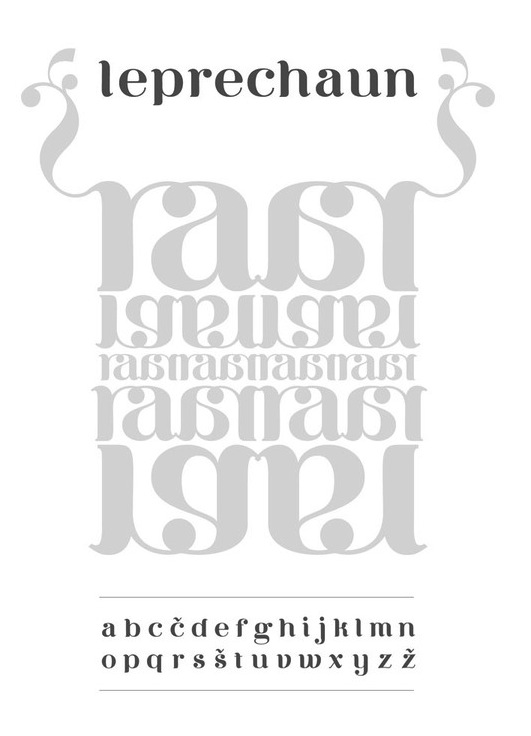
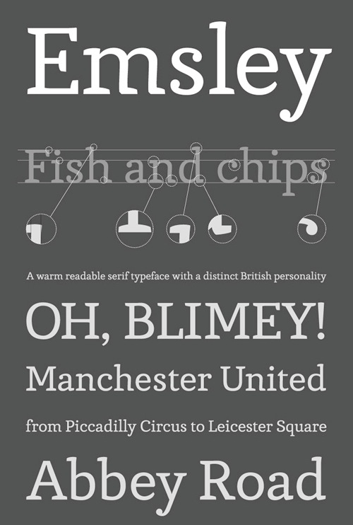
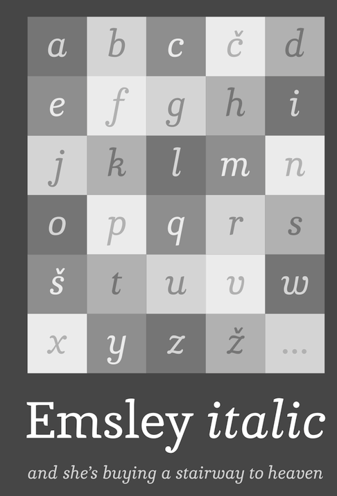
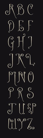
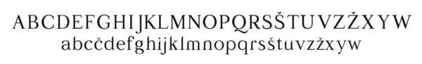
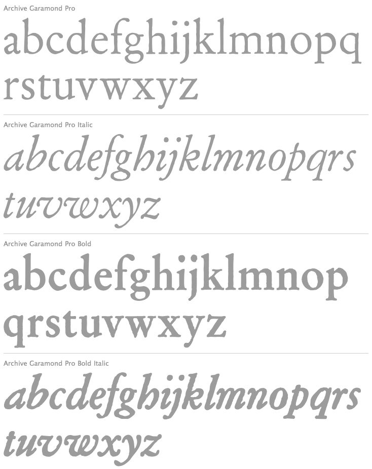
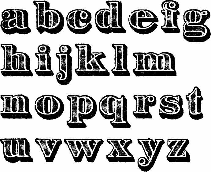
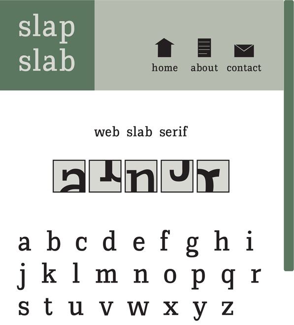
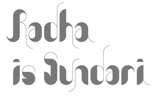
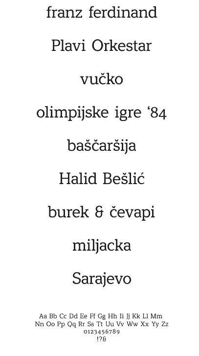
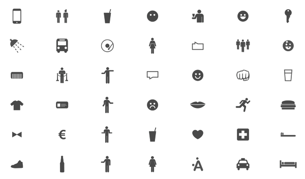
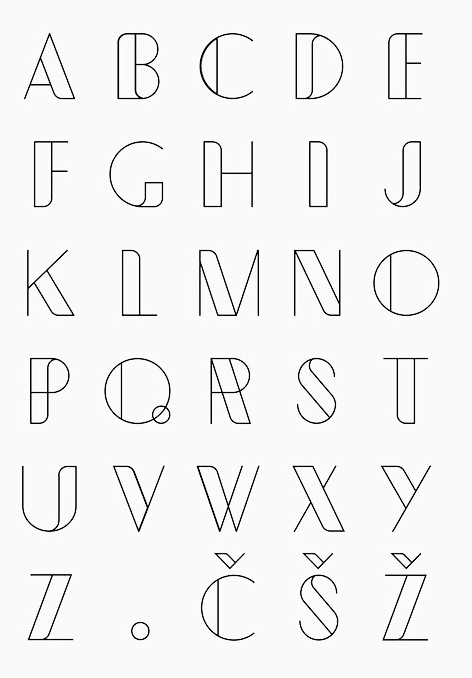
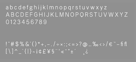
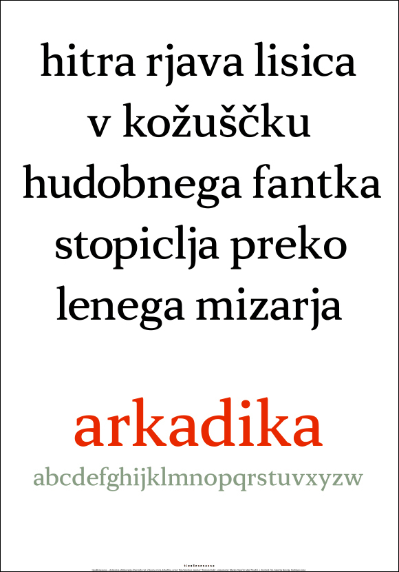
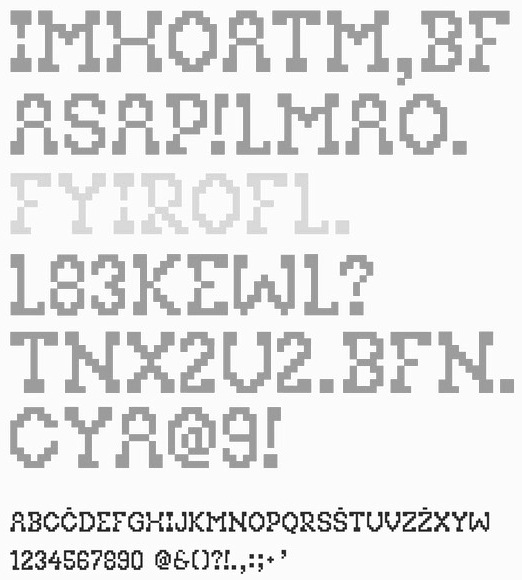
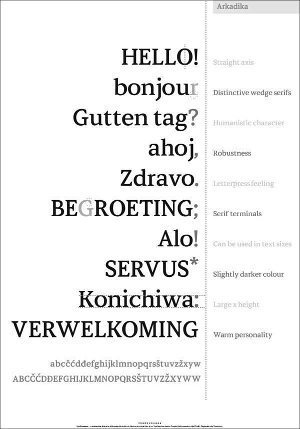
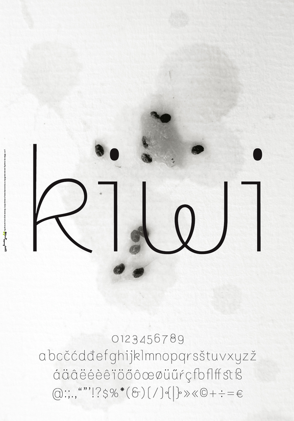
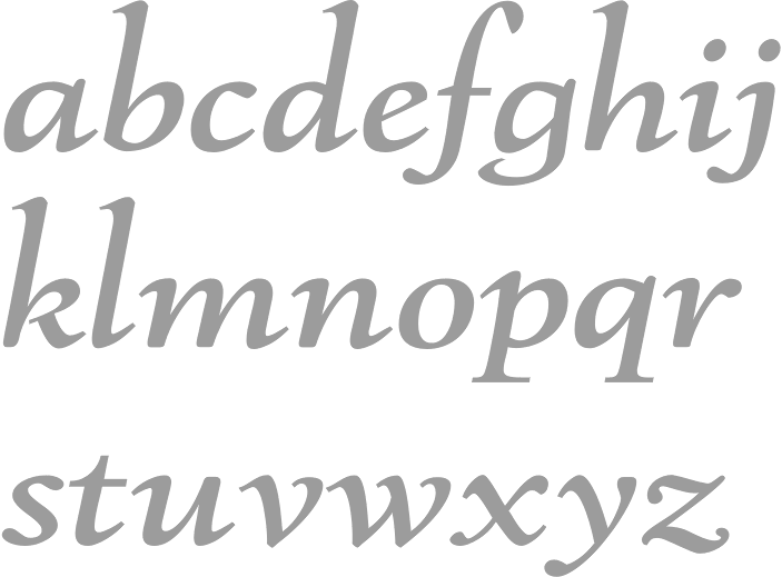
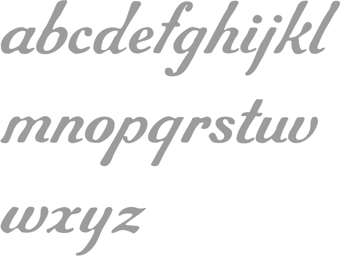
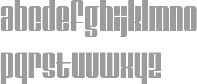
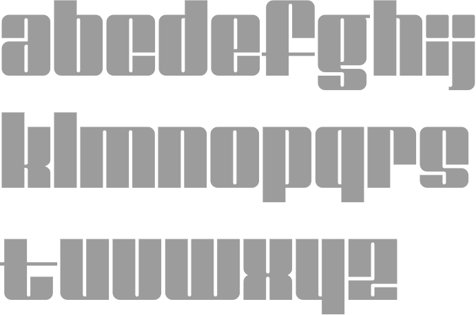
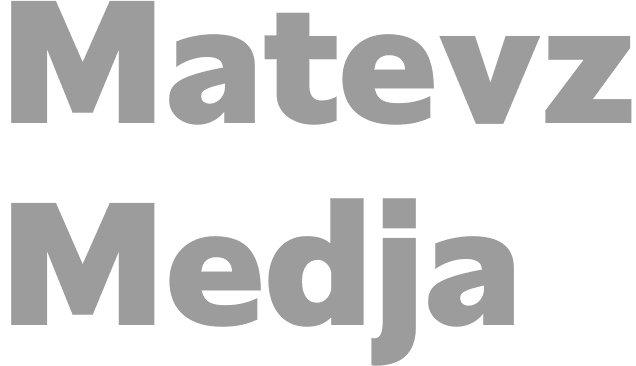
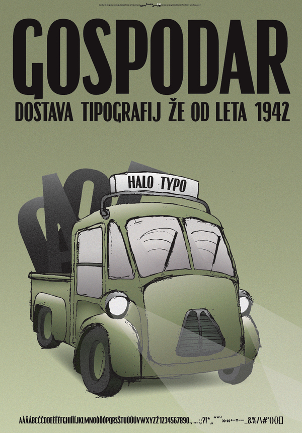
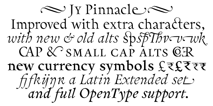
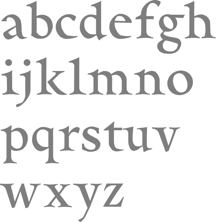
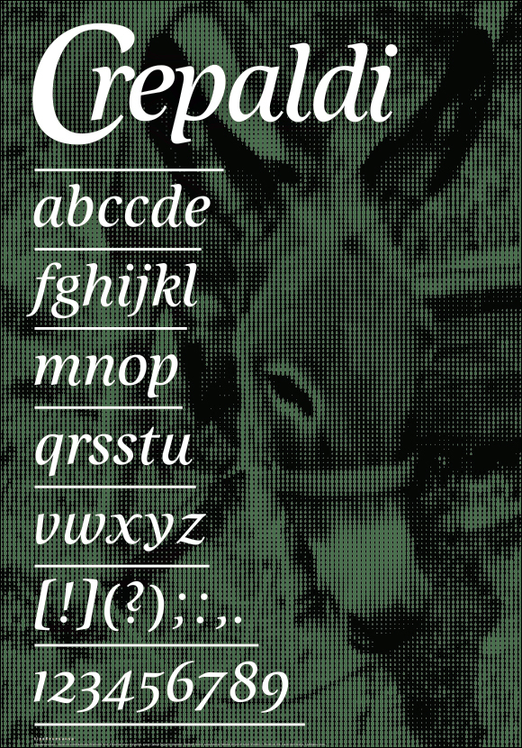
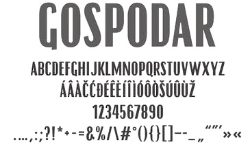
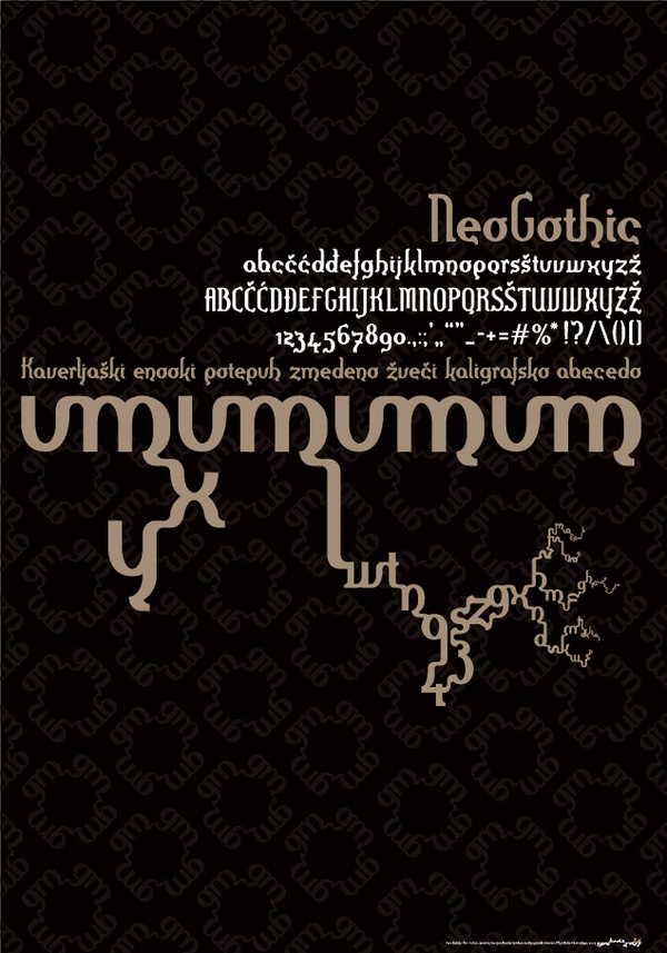
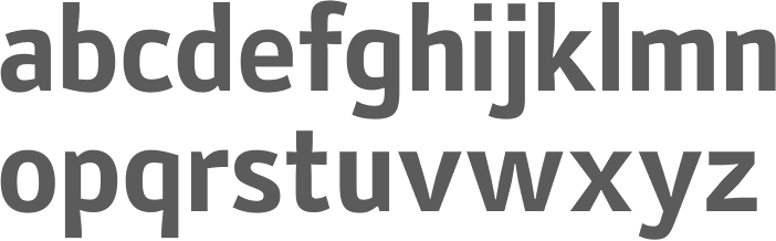
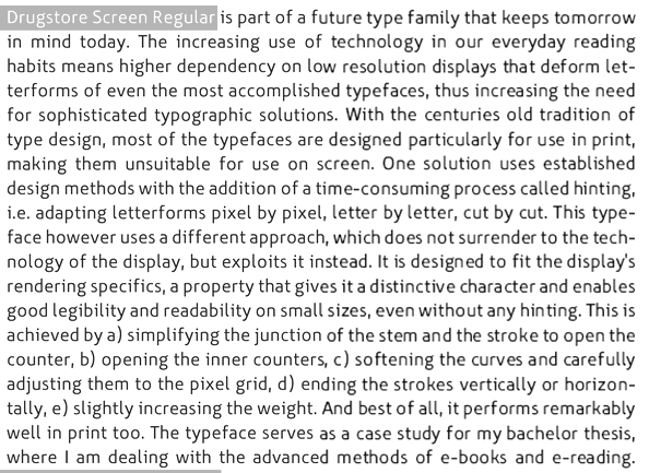
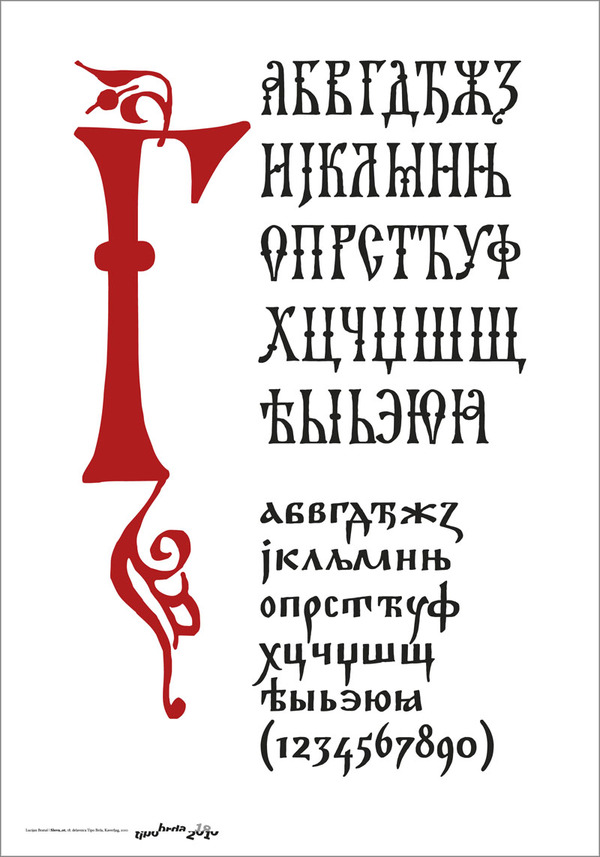
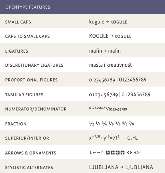
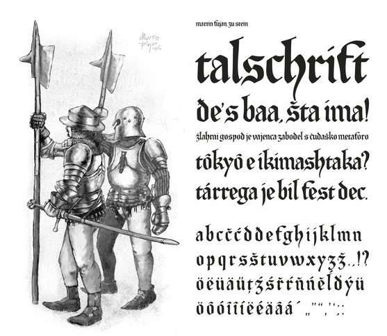
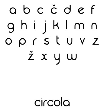
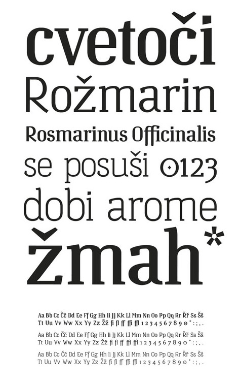
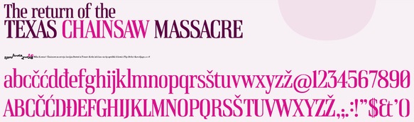
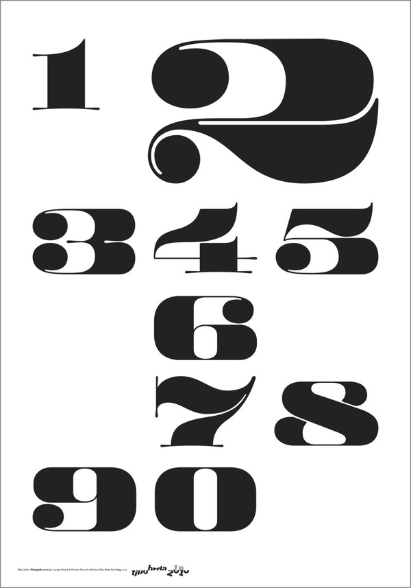
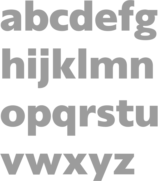
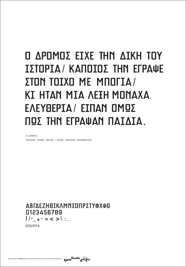
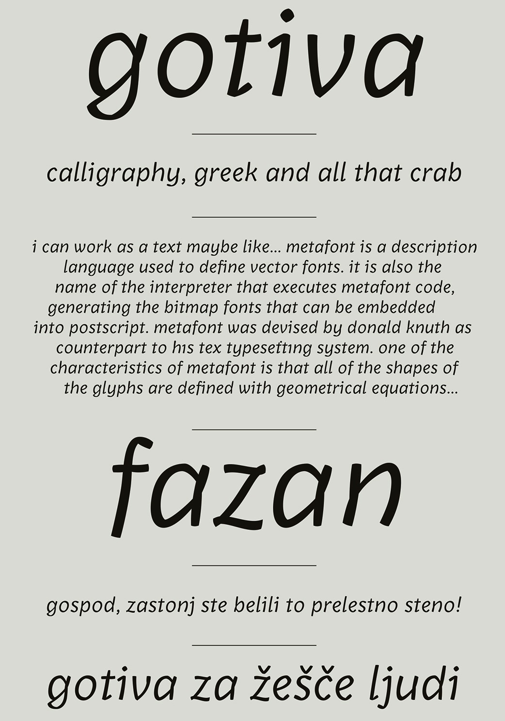
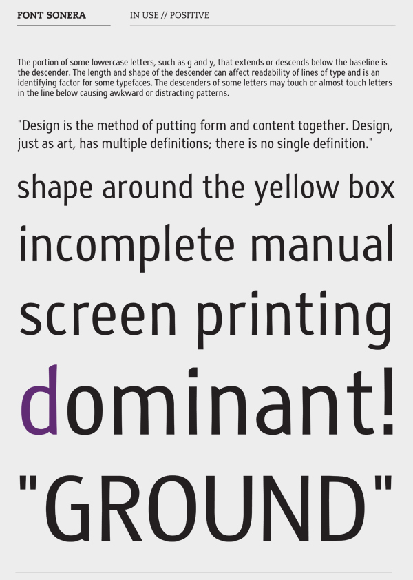
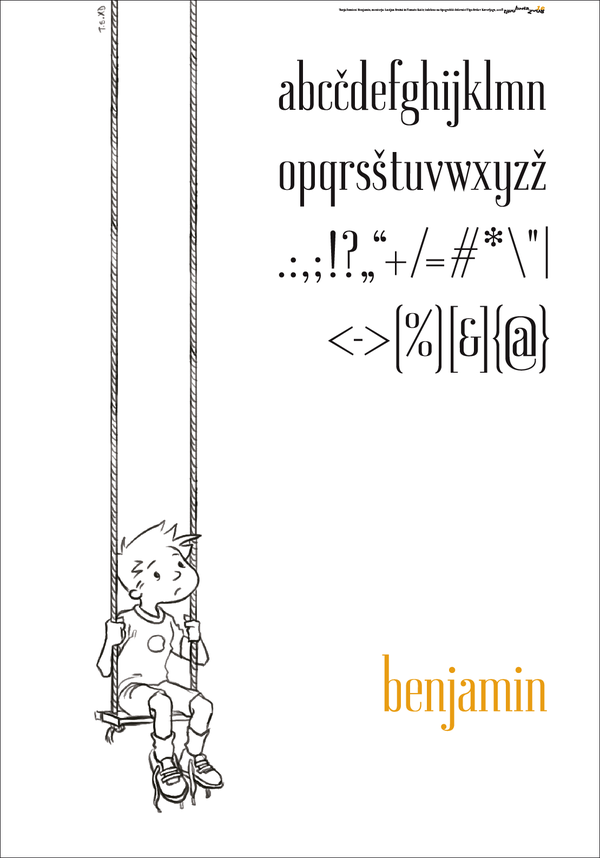
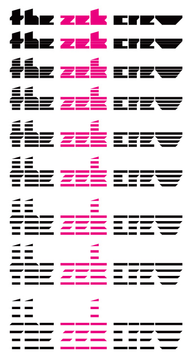
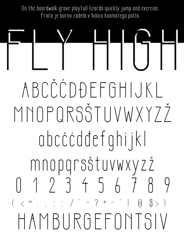
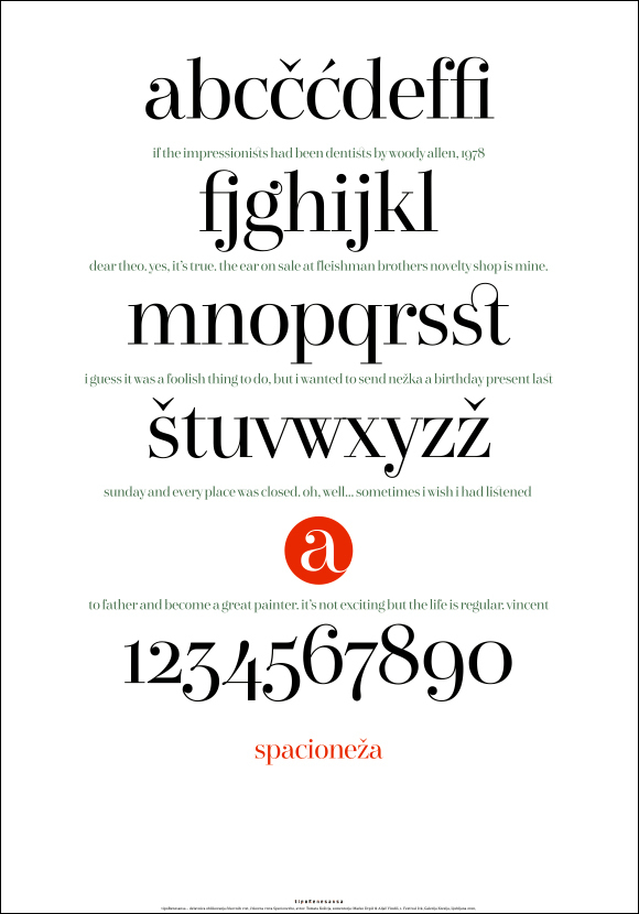
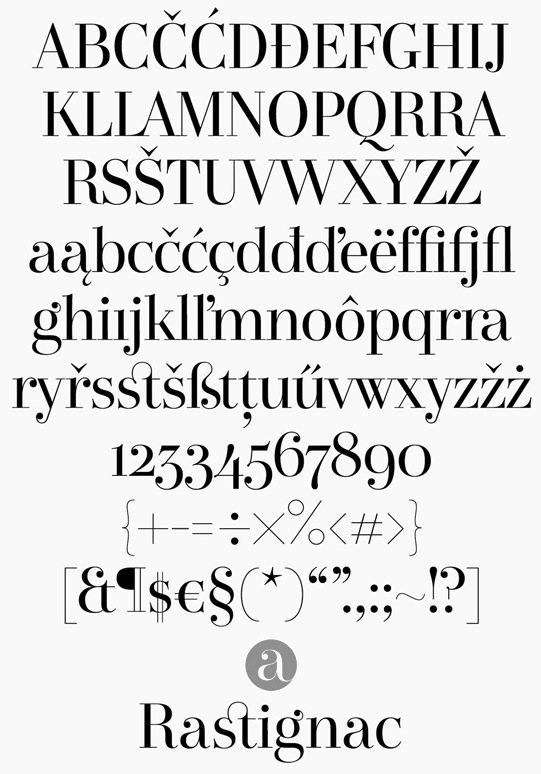
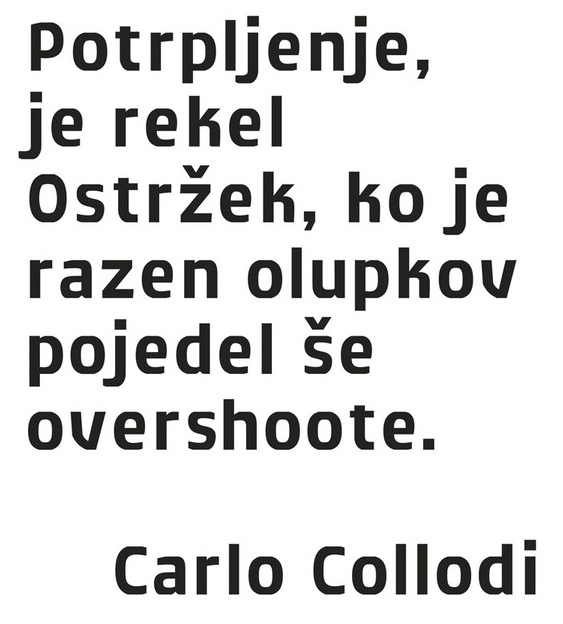
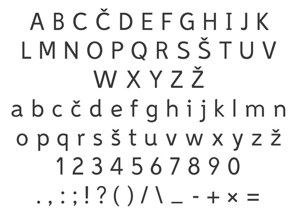
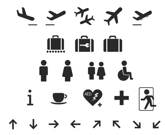