TYPE DESIGN INFORMATION PAGE last updated on Mon May 6 08:49:36 EDT 2024
FONT RECOGNITION VIA FONT MOOSE

|
|
|
|
|
Type measurements | ||
|
|
|
|

SWITCH TO INDEX FILE
Essay on points, ciceros, picas, em-quad, x-height and word space. By Rex Butler. [Google] [More] ⦿ | |||||||||||||||||||||||||||||||||||||
Alex Vakulenko explains the differences in this table:
| |||||||||||||||||||||||||||||||||||||
Small page on Anglo-American point, Didot point, Pica and Cicero. [Google] [More] ⦿ | |||||||||||||||||||||||||||||||||||||
Donald P. Goodman III is a practicing attorney in the Commonwealth of Virginia, a graduate of the William and Mary School of Law and of Christendom College with a degree in history and a minor in classical languages. He has contributed several TeX packages for setting religious texts such as catechis (for catechisms) and liturg (for Catholic liturgical texts). In that context, he has designed the DRM font package in 2014. The DRM (Don's Revised Modern) family of fonts are in Metafont format (for use with TeX). It has many optical sizes and comes in roman, italic and small caps styles. In addition, it has many ornaments, and symbols. Although written in Metafont, the author also provides a set of 103 (!!!) Opentype fonts. The opticals include 5pt (pearl), 7pt (minion), 8pt (brevier), 9pt (bourgeois), 10pt (long primer), 12pt (pica), 14pt (english), 16pt (great primer), 20pt (paragon) and 24pt (double pica). The table below gives a fuller optical size naming picture and its relationship with traditional American and British ways of listing type sizes. There are also Greek fonts. At the publication date, September 2014, the author was still working on the kerning---expect an improved package soon. The DRM fonts are wedge-serifed, and incorporate an odd mix of style elements---some terminals are didone, but other elements are more transitional or Caslonesque. Free download of the 6MB package. Designer of Dozenal (2008), a metafont package for typesetting documents in base twelve. It includes a macro by David Kastrup for converting positive whole numbers to dozenal from decimal (base ten). It also includes a few other macros, redefines all the standard counters to produce dozenal output, and provides Metafont characters, in Roman, italic, slanted, and boldface versions of each, for ten and eleven (the Pitman characters preferred by the Dozenal Society of Great Britain). These characters were designed to blend well with the Computer Modern fonts. [Google] [More] ⦿ | |||||||||||||||||||||||||||||||||||||
In digital fonts, one works with a grid (2048x2048 for truetype and normally 1000x1000 for type 1). A cell in this grid is a unit, or Font Unit, or FUnit. The grid of cells is called the em square. The font size is both the horizontal and vertical size of the em square, and is typically reported in points. It is also called an em. If the grid is of size x times x, then we say that the font has x units per em, or that its UPM value is x. [Google] [More] ⦿ | |||||||||||||||||||||||||||||||||||||
emdpi
| Richard Mason gives definitions and discussion of em square, dpi, ppi, font size, font height, and many related notions. [Google] [More] ⦿ | ||||||||||||||||||||||||||||||||||||
Older son of the Didot printing business founder, François Didot, 1730-1804, Paris. François-Ambroise Didot inherited the work of his father François. Appointed printer to the clergy in 1788. He published "Artois" (Recueil de romans français, 64 volumes), "Dauphin" (a collection of French classics in 32 volumes, edited by order of Louis XVI), and a bible. More importantly, he invented a new printing-press, improved typefounding, and was the first to print on vellum paper. About 1780 François-Ambroise Didot adapted the point syste for sizing typefaces by width, using units of 1/72 of the pre-metric French inch. His "point", later named the didot after him, became the prevailing unit of type measurement throughout continental Europe and its former colonies, including Latin America. In 1973 it was metrically standardized at 0.375 mm for the European Union. Meanwhile, the English-speaking world adopted a "point" based on 1/72 of the smaller English inch. [Google] [MyFonts] [More] ⦿ | |||||||||||||||||||||||||||||||||||||
Goetz Morgenschweis
| |||||||||||||||||||||||||||||||||||||
Jacques André
| |||||||||||||||||||||||||||||||||||||
Jan Roland Eriksson
| |||||||||||||||||||||||||||||||||||||
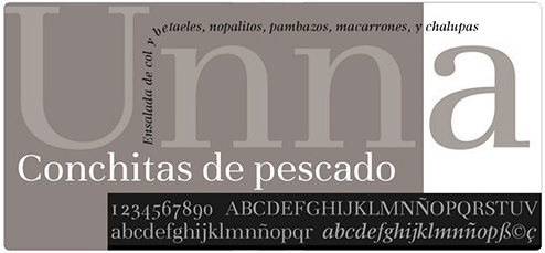
Jorge de Buen (b. 1956, Mexico City) studied Graphic Design in Mexico City. In 1994 he moved to Tijuana to work in marketing and communication projects for the Agua Caliente race and sports books. He has conducted several workshops and conferences at many important Latin American institutions. The second edition of his book Manual de diseno editorial (Santillana, 2000) is published in 2003, and the third edition in 2009. He spoke at ATypI 2003 in Vancouver on a new approach to typometry, and at ATypI 2009 in Mexico City on quotation marks (las comillas), where he pointed out that the <<...>> used in Spanish were just a natural evolution of the standard quotation marks (66...99). He designed Unna Romana (2003), Unna (2004, serif family, done at Imprimatur) and Bardahlkia (1994). He often shows up in LA for type activities. He moved to Querétaro in 2009 and is graphic designer there---his studio is called Imprimatvr. The first typeface published at Imprimatvr is Caliente (2012). In 2011, he placed Unna up for free download at the Google Font Directory, and started cooperating with Hector Gatti and Pablo Cosgaya at Omnibus Type. At Tipos Latinos 2012, Jorge won an award in the text category for Unna regular. Klingspor link. [Google] [MyFonts] [More] ⦿ | |||||||||||||||||||||||||||||||||||||
Markus Kuhn writes about typographic units and font metrics. [Google] [More] ⦿ | |||||||||||||||||||||||||||||||||||||
Mom (or: MOM)
| Mom is the foundry of Pedro Mascarenhas, a type designer from Lisbon (b. 1967, Lisbon). Creator of Art Deco Neue (2011, a hacker font). In 2013, he published the poster / fashion mag display sans typefaces Eliane Ultra Light and Eliane Bold, and the double view experimental typeface Mirror Display. In 2017, he published Align Vertical Mono. Author of TyMS Typefaces Measure System (2021), a document that explains weights in typefaces, including nomenclature and best practices. In particular, he gives this ranking:
HypeForType link. [Google] [MyFonts] [More] ⦿ | ||||||||||||||||||||||||||||||||||||
Pedro Mascarenhas
| |||||||||||||||||||||||||||||||||||||
A point size explanation, gleaned from "RSD99"'s posting.
| |||||||||||||||||||||||||||||||||||||
I quote from a web page that is gone: The point measurement was developed as a standard in the 19th century by Pierre Simon Fournier and F(irmin) Didot. Known as the Didot Point System, 12 points equal one cicero. The British/American version (proposed by Nelson Hawks in 1878) is based on the pica - which is also 12 points, or 4.233 millimetres, but is actually slightly smaller that a Didot Point. The point size is determined by measuring the distance from the ascent line (top of the capitals) to the descent line (bottom-most descender). To confuse matters, many European countries measure type in millimetres (1mm equals 2.85pt). [Google] [More] ⦿ | |||||||||||||||||||||||||||||||||||||
On-line px to em conversion page by Brian Cray. Basically, 10px is 8pt, is 0.625em. And 1em is 16px or 12pt. And 10pt is 13px, is 0.813em. Of course, these are only approximations. [Google] [More] ⦿ | |||||||||||||||||||||||||||||||||||||
Richard Mason
| |||||||||||||||||||||||||||||||||||||
Séamas Ó Brógáin
| |||||||||||||||||||||||||||||||||||||
Seirbhísí Leabhar
|
| ||||||||||||||||||||||||||||||||||||
Nicholas Fabian on the American point system. [Google] [More] ⦿ | |||||||||||||||||||||||||||||||||||||
Croatian introduction to typography and fonts. [Google] [More] ⦿ | |||||||||||||||||||||||||||||||||||||
Truchet and Types
| A great article by Jacques André and Denis Girou on the lettering of father Sébastien Truchet, 1657-1729. Their thesis: the Romain du Roi font (ca. 1702) is the first digital font, as it has the notion of outlines by arcs of circles, grids as in bitmaps and dpi measurements, and even notions of italic transformations and hinting. PDF file of "Father Truchet, the typographic point, the Romain du roi, and tilings", TUGBoat, vol. 20, pp. 8-14, 1999. [Google] [More] ⦿ | ||||||||||||||||||||||||||||||||||||
Type Goemo
| German language type site. Has a glossatry, type classification information, type measurement information, type history, type design information, the works. Link died. [Google] [More] ⦿ | ||||||||||||||||||||||||||||||||||||
Type sizes (approximately) in the anglo world, since Caxton:
| |||||||||||||||||||||||||||||||||||||
German page by Birgit Neumann on type classification and type measurements. [Google] [More] ⦿ | |||||||||||||||||||||||||||||||||||||
Dutch page with all typographic measurements. Also, many punctuation and other symbols are explained. Carefully prepared by Oscar van Vlijmen. [Google] [More] ⦿ | |||||||||||||||||||||||||||||||||||||
Typographical measurement systems
| Jan Roland Eriksson explains the various measurements in typesetting. [Google] [More] ⦿ | ||||||||||||||||||||||||||||||||||||
Wolfgang Beinert's German page on various point systems. From his page: 1 Punkt (Didot-Punkt) = 0,376 mm 1 Point (Pica-Punkt) = 0,351 mm 1 Pica = 4,216 mm 1 Inch = 25,399 mm 1 Cicero = 12 Didot-Punkte = 4,404 mm 1 mm = 2,66 Punkt 1 mm = 0,237 Pica 1 mm = 2,846 Points 1 mm = 0,0394 Inches 03 Punkt = Billant 04 Punkt = Diamant 05 Punkt = Perl 06 Punkt = Nonpareille 07 Punkt = Kolonel 08 Punkt = Petit 09 Punkt = Borgis, Bourgeois 10 Punkt = Korpus, Garmond 11 Punkt = Rheinländer 12 Punkt = Cicero [ab 12 pt. auch Schaugröße genannt] 14 Punkt = Mittel 16 Punkt = Tertia 18 Punkt = Paragon 20 Punkt = Text 24 Punkt = 2 Cicero, Doppelcicero 28 Punkt = Doppelmittel 32 Punkt = Doppeltertia 36 Punkt = 3 Cicero, Doppeltertia 48 Punkt = 4 Cicero, Kanon 72 Punkt = 6 Cicero, Kleine Sabon 84 Punkt = 7 Cicero, Grobe Sabon 96 Punkt = 8 Cicero [Google] [More] ⦿ | |||||||||||||||||||||||||||||||||||||
Wolfgang Beinert's German page on various point systems. [Google] [More] ⦿ | |||||||||||||||||||||||||||||||||||||
Norman Walsh on the definition of point size. [Google] [More] ⦿ |

 Séamas Ó Brógáin (Seirbhísí Leabhar) is an Irish type specialist based in Dublin. He has a page on type measurements, with a proposal for reform. His typefaces are all free:
|
|
|
|