| | |
Adnan Tabassum
|
Lahore, Pakistan-based designer of the linocut emulation typeface Brushlaker (2018). [Google]
[More] ⦿
|
Adriana Esteve Hernandez
[Adriprints]

|
 [MyFonts]
[More] ⦿
[MyFonts]
[More] ⦿
|
Adriprints
[Adriana Esteve Hernandez]
|
 Adriana Hernandez (b. Miami, FL) established Adriprints in 2008. She is located in Munich, Germany.
 Her fonts include Kicks (2012, a fun hand-printed typeface for children's books), Stitching Kit (2010, dings), Fiddleshticks (2009, linocut), Sorbet and Sorbet Wide (2009, like architectural letters), Fancypants (2010, curly lettering), Stitchin Crochet (2009, dingbats), Trellis (2009, hand-printed), and Draft Punk (2009, comic book style). Font Squirrel link. Klingspor link. [Google]
[MyFonts]
[More] ⦿
|
Aeolien
[J. Fürst Gardiner]
|
 Creator at FontStruct of Aeolien (2011, alphadings), Gazebo Line Aeo (2012), Chateau d'Air (2013, castles), Like Fabergé (2013, oval), Fold Line (2013, a sewing font), Toothache (2013), Linoleum (2013), Sandor Basic Stripes (2013), Compass Norden (2013, a dot matrix font), Sambuccus (2013), Abneuroniques (2013, neurotic typeface), Zebra (2013, horizontally striped), Amazed (2013, maze font), Card Reading (2013), 3paths (2013), Raidho (2013), Floraeolien (2013, flower dings), the Art of Square series (2013), and Ostara Egg Box (2013, ornamental caps for Easter).
 Typefaces from 2014: Ceques (op-art), Indentional, The Tunnels of Tralyoxx, ClickPop Beads, Blue Moon, Nurdal's Walk (LED font), Dumultix (techno, in De Stijl fashion, based on Mondrian), Wever Ding, My Unintended, Haltero, Linuta, Murexa, Abfahrt, Arrivee Mercredi, Mabon (vintage slab serif, art nouveau), Treat or Trick, Aerix Stencil Serify, Noba M, Plaque Emaille (white-on-black), Gleiteri, Strega nona, Kubetus (artsy), Kubetuffo, Pixiel, Werner, Free Masonry, Airy Brickwork, Aerix Stencil Sans, Sim Card, Kerbe, Fool's Beans, Gift Tag (alphadings), Tag Letters, Varsity Outline UC. Typefaces from 2015: 3Fino, S-chablo Sans (stencil), August, Shifted (op-art), Arroed, Apprentice Quill, Spitze, Melusine. Aka Jutta Gi. FontStruct link. [Google]
[More] ⦿
|
Affenprinz Belmondo
[Büro Sequenz]
|
[More] ⦿
|
Amber Cross
|
Illustrator Amber June Cross (Sarasota, FL) designed the brushy The Scream-style typeface Sorry For The Pentagram (2015) during her studies at Ringling College of Art & Design. In 2017, she designed the runic emulation typeface Runic, and the curly Heffner. Behance link. [Google]
[More] ⦿
|
Anya Danilova
|
 Anya Danilova is a type designer from Moscow, currently based in The Hague. She studied at Moscow State University of Printing Arts and worked as a graphic designer at Labs Studio and as a type designer at Bureau Gorbunov. She now works on type-related projects and is always open to new collaborations. Graduate of the Type Media program at KABK in Den Haag, The Netherlands, class of 2019. Her angular graduation typeface, Rezak, refers to the Die Brücke movement and linocuts.
 In 2021, she contributed GT Maru Emoji (+Color) to Thierry Blancpain's rounded sans typeface superfamily, GT Maru. [Google]
[More] ⦿
|
Art nouveau typefaces by Nick Curtis
[Nick Curtis]
|
 Art nouveau revivals by Nick Curtis include the following free typefaces.
 - Bala Cynwyd NF (2001, 2007) is an Arts&Crafts style poster typeface inspired by lettering of Dard Hunter.
- MadisonSquareIncised, MadisonSquareNF (2001, 2007).
- MunchausenNF (2003, 2007). Based on a poster for an exhibition by Ludwig Heinrich Jungnickel (1911). This is inbetween art deco and art nouveau.
- RivannaNF (2002, arts and crafts style): Rivanna NF revives Max Joseph Gradl's Gradl Zierschriften, an art nouveau typeface from 1903. Rivanna NF Pro was done in 2010 by CheapProFonts.
- Runy-Tunes, RunyTunesRevisited (1999, 2001, 2007).
- SmorgasbordNF (2003, 2007). Based on this poster by André C. de Takacs (1912).
- TobaccoRoadNF (2002, 2007). This is based on a poster for an art exhibition, designed by Eva Volkel in 1912. It is typical of style of the Austrian Secession school---combining medieval forms with late art nouveau styles.
- ValleyGrrrlNF (2003, 2007). ValleyGrrrlNF (Nick Curtis) is based on Johann Cissarz's poster lettering in Erste Hoehenluft Radfahr-Bahn (1897).
There are also commercial art nouveau typefaces: - Abbey Road NF. After Joseph W. Phinney's Abbey Old Stytle (1901).
- Aint Baroque NF (2009). An art nouveau/psychedelic-style variation on Milton Glaser's Baby Teeth Baroque from 1968.
- Deukalion NF (2006). A fun art nouveau headline face.
- Elefantasia NF (2012) is based on Elefanta, a font by the Karl Brendler & Söhne foundry in Vienna.
- Foxcroft and Foxcroft Shaded (2005). An art nouveau family based on Vassar (1887, Farmer, Little&Co).
- Graphic Stylin NF (2006). A script stencil typeface with an art nouveau feel.
- Half Full NF (2011). A bold weight of Glass Antiqua (Franz Paul Glass, 1912, Genzsch&Heyse).
- Hupp Antiqua NF (2006). A gorgeous display typeface pair first done in 1909 by Otto Hupp for Klingspor. This one has a Basque A.
- Inglenook Corner NF (2005). Based on the lettering of Laurence Schall, as presented in Lewis F. Day's 1910 classic, Alphabets Old and New.
- Jugendstil Borders NF (2011).
- Millrich Moravian NF (2010). A revival of Bohemian (1918, a jugendstil typeface by Miller&Richard). Millrich Olivian NF (2014) revives Olivian.
- One Good Urn NF (2005). Based on the art nouveau lettering of J. M. Bergling in Art Alphabets and Lettering (1914).
- Petrushka NF (2012): based on the art nouveau typeface Petrarka (1900, Schelter & Giesecke).
- Rough Cut NF (2006, linocut). A grunged up version of the art nouveau typeface Daphne.
- Schweimann Moderne NF (2014).
[Google]
[MyFonts]
[More] ⦿
|
BA Graphics
[Robert Alonso]
|
 Bob Alonso (b. Bronx, NY, 1946, d.2007), the founder of BA Graphics in 1994, was a prolific American type designer. With 33 years of experience at NewYork's Photo Lettering, he specialized in calligraphic script typefaces, but not exclusively so. BA Graphics was located in Chester, NY, and later in Toms River, NJ, and now sells its fonts through MyFonts. Many of its fonts published after Alonso's death in 2007 were completed by John Bomparte.
 John Bomparte wrote this obituary: Throughout his career at the legendary Photo-Lettering, Inc. (one that spanned four decades), Bob created original typefaces and tailored type by modifying, revising and filling out families, fashioning pieces of type for hand-lettered jobs, as well as being involved with the updating of a number of well-known logotypes. Bob was blessed with natural teaching abilities; and those in social and professional circles who had the good fortune to know him considered him not just a type designer but a mentor and a friend. As one such person close to him put it, he was a graphic technician [...] back when computers were not even in site for graphic arts, he would take on any intricate&complex graphic project that others would shy away from and come up with a solution that achieved a masterpiece. I'll always remember someone saying "this can't be done" and Bob saying let me see it and a short time later, there it was---done&perfect. I would like to think that attitude rubbed off on me. Along with this gift for teaching and explaining the complex, Bob exhibited a level of professionalism that was unsurpassed. A number of years ago when the need came to make the transition from the traditional to digital way of creating fonts, he rose to the challenge admirably. Towards the last few years of Photo-Lettering, Bob played a vital role in the conversion to digital, of many of the typefaces within the collection, notably those fonts that carry the prefix PL. More recently, Bob Alonso released several fonts through ITC, Adobe and his independent foundry, BA Graphics. Bob was on the cutting edge of his best work, and in the circumstance of his untimely passing, left a measure of unfinished designs. However, the spirit of his typographic talents and his fine sense of humor lives on through the many much-loved, and popular fonts he has left us: fonts such as Cookie Dough, Equate, Elephant Bells and Pink Mouse, to name a few. Alonso created these typefaces: FontShop link. Klingspor link. View Bob Alonso's typefaces. View the BA Graphics typeface collection. An alphabetic listing of Alonso's typefaces. [Google]
[MyFonts]
[More] ⦿
|
Bob Anderton
|
 British designer of these typefaces:
 Linotype link. FontShop link. Klingspor link. [Google]
[MyFonts]
[More] ⦿
|
Büro Sequenz
[Affenprinz Belmondo]
|
 Sankt Gallen, Switzerland-based studio with seven participants: Anna Furrer, Andrea Nolli, Moni Rimensberger, Joa Schmied, Sascha Tittmann, Jürg Waidelich, Amanda Züst. Designers of these free typefaces: Lietz Block (2008, heavy poster sans), Hedge Flow (2008, floriated), Nordstern (2004, a simple organic sans family in Hell, Normal and Dunkel, designed by Rolf Benjamin Fleischmann), Marsmonster (2005, rounded techno style by Affenprinz Belmondo).
 In 2008, they published the hairy multiline typeface Mink and the linocut emulation typeface Linostate. They also designed the blackletter typeface Heinrich. [Google]
[More] ⦿
|
Christoph Zeugswetter
[WRKSTT Graphicstudio (or: Xtoph)]
|
 [MyFonts]
[More] ⦿
[MyFonts]
[More] ⦿
|
David Westwood
|
 Born in the UK in 1949. He trained in the UK, worked for EMI Records and Saatchi&Saatchi and later moved to Southern California, where he started his own illustration studio, the David Westwood Studio for lettering (brush style, wood style). Designer of the lino-cut effect font Westwood (Letraset, 1991).
 FontShop link. Klingspor link. [Google]
[MyFonts]
[More] ⦿
|
Egon Swaels
|
During his studies at ECV, Egon Swaels (Lille, France) created the fat finger font Charleston (2015). Designer of the free linocut typeface Printito (2019). [Google]
[More] ⦿
|
Ellie Ewart
|
Graduate of Swansea Metropolitan Undiversity. Swansea, UK-based creator of Linocut Typeface (2012), which was developed during her design studies. Behance link. [Google]
[More] ⦿
|
Fahrizal Tawakkal
[Fontdation (was: Twicolabs Design)]
|
 [MyFonts]
[More] ⦿
[MyFonts]
[More] ⦿
|
Felippe Cavalcanti
|
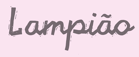 Recife, Brazil-based designer of the linocut / xylographic typeface Lampiao (2018). [Google]
[More] ⦿
Recife, Brazil-based designer of the linocut / xylographic typeface Lampiao (2018). [Google]
[More] ⦿
|
Fontdation (was: Twicolabs Design)
[Fahrizal Tawakkal]
|
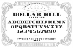 Fahrizal Tawakkal (Twicolabs Design, Malang, Indonesia, b. 1986) markets his fonts via Twicolabs Design and Fontdation.
 In 2013, he created Colin, Dollar Bill, Coleen (Victorian signage face), Nurjan (free sans titling face), Trigger (Victorian typeface), Athenry (heavy block vintage typeface), Sly (Victorian typeface), Gauntlet (spurred typeface), Rooters (a spurred tattoo typeface), Incognito (spurred tattoo font), Incognite (like Incognito), Chuck Noon (a copperplate signage font available from Creative Market), Debute and Black Velvet (a Victorian advertizing typeface, followed by Black Velvet 2 in 2014). Typefaces from 2014: Facile Pro (geometric sans), Deadhead Rough, Armament, Black Velvet, Facile Sans (free), Lifer (spurred, Victorian), Dublin (spurred), Dollar Bill 2, Carlingford (a spurred beer bottle typeface), Akura Popo (copperplate; free), TM Stanley (a spurred beer label font), Deadhead Script (signage script). Typefaces from 2015: Greenore, Armament Stencil, Avondale (handcrafted all caps typeface), Deadhead Classic, Deadhead Brush, Patronia Script. Typefaces from 2016: Westmeath (free art deco style), Kite Script, Armament, Premier Sans, Premier Script. Typefaces from 2017: Haarlem Serif, Haarlem Sans (Dutch deco), Haarlem Deco (Dutch deco), Signatra (signage script), Chuck Noon 2 (copperplate caps). Typefaces from 2018: Lansdowne (vintage all caps, copperplate), Lifer (spurred), Neue Stanley (spurred), Rebute, Pittsbrook Sans (octagonal), Pittsbrook Serif (octagonal, with small wedge serifs), Highwind, Nufced, Jalisco (monoline script), Linoleo Script, Slainte Script (monoline). Typefaces from 2019: TF Handwriting, Tequila Sunrise, Chuck Noon Script (for signage), Tawakkal Sans (for headlines), Obsypac (Victorian), Baisteach, Pioggia (a text typeface with several didone elements such as ball terminals), Ferghaus Sans, Vallely, Cairlinn. Typefaces from 2020: Mullingar (a sharp-edged display typeface), Killarney (a flared display font), Kinsale Display. Typefaces from 2021: Athlone. Fontspace link. Creative Market link, where one can buy the fonts. Hellofont link. [Google]
[MyFonts]
[More] ⦿
|
Henry Cohn
|
 UK-based FontStructor who made these typefaces in 2014: Stencil Class, Stencil Funk, Formal Dragon, Casual Dragon, Gothic Hand (blackletter), Slice, Font, Cheap Spaceship, Dickson, Katholikes (Greek simulation), Grotesque Italic, Clunky Gadget, Hirschfeld (ultra-condensed, based on the signature of one of cartoonist Al Hirschfeld), Strange Square, Traianus Scvlpta, Odd Oval, Traianvs, Canary, Canary Demi, Double Trouble, Metropolis (constructivist: based on Boris Bilinsky's poster for the 1927 film Metropolis), Albrecht, Fittin Justice (+Bold), Serif Ultra, Confessions of a Sinner (Cohn writes: A replica of the lettering I carved into a linocut book cover that I made for my favourite book: The Private Memoirs and Confessions of a Justified Sinner by James Hogg), Fake Kitsch, 1 Brick Letters, Gainst The Wind, Top Serif, Suggestion (+Bold: art deco).
 In 2015, Cohn created Stencil Funk (psychedelic style). Typefaces from 2016: Fittin Justice Bold (letters fit together through the middle), Seeing Double. Dafont link. Creative Market link. [Google]
[More] ⦿
|
Ikiiko Type (was: wep)
[Wahyu Eka Prasetya]
|
Madiun/ Surabaya, Indonesia-based designer (b. 1982) of the script typefaces A Auto Signature (2019), A Apollo (2019), A Autoeyes Closely (2019), A Black Crown (2019) and A Baster Rules (2019). Script typefaces from 2020: a Apotik (a signature script), a Alam Raya, a Assassin Ninja (a brush script), a Berlari, Agen Giveaway, a Andai Kata (brush), a Ancen (brush), A Alley Garden, A Adistro, A Amazing Mother, A Ambyar Sobat, A Antara Distance, a Ahlan Wasahlan (Arabic emulation), Annyeong Haseyo, a Bators Growth. Non-script typefaces from 2020: a Asian Ninja (oriental emulation), a Barbeque Grill, a Big Deal (a heavy sans titling typeface), a Autobus Omnibus, a Aksi Mosi (brush), a Art Paper (a paper cutout typeface), a Ambang Resesi, a Among You, a Augustus Merdeka (painted), A Anggaran Dasar (an ornamental blackletter), A Black Lives, A Area Stencil, A Atmospheric, A Arush Shiny (a brush font), aAidilfitri (Arabic emulation), A Aha Wow, A Ablasco, Plat Nomor, A Annyeong Haseyo (Korean emulation), a Anterobot, A Abrushow, A Alloy Ink (a bubblegum font), a Attack Graffiti, A Arigatou Gozaimasu (oriental emulation), A Awal Ramadhan (Arabic simulation), a Arbei Berry, a Anti Corona, A Absolute Empire, A Asian Hiro (oriental emulation), a Abrigy Think, a Always Smile (a dry brush script), a Area Kilometer 50 (sans), A Atomic Md (sans), A Anggota, A Adelfa (a watercolor brush script), A Adulsa Script, A Acorn Squash, A Awake Hearts, A Ahay Hore, A Ape Mount (painted), A Arang (painted), A Bapakmu, A Aja Males, A Ampun Bang, A Akuilah, A Buster Down, A Atos (a brush font), A Anekdot (a dry brush font), A Aksentuasi, A Amne Sans, A Akar Rumput (a dry brush font), A Applicant Signature, A Agreement Signature, A Affirmation, A Aneka Satwa, A Alonia (a dry brush script), A Angkanya Sebelas, A Anak Cute Bonus, A Anak Cute, A Asalkan, A Aihao (painted), A Ai Love (painted), a Acakadut, a Semongko, A Alangkah, A Awanipun, a Abstract Groovy (oily), A Angkatan Bersenjata (stencil), a Artinya, a Sumpah Masih Muda, A Anoman Obong, A Api Nyala, A Another Tag. Typefaces from 2021: A Arena Graffiti, A Arus Balik, A Amaryllis Flower, A Astaga Dragon, A Apa Bedone 11 12, A Aromanis (a textured shadow font), A Amenity Kits, A Authorized Signature, A Andragogy, A Arrange Signature, A Amylase Script, A Artlazies, A Ahead Lettering, A Advice Quotes, a Accountant Signature, A Avocado Taco (textured), A Abrasion (grungy caps), A Agressive Winter (sketched caps). Typefaces shown at Ikiiko Type in 2021, with a trend away from script fonts and towards display type: Arka, Afrocultures, Bachroque, Beach Sound, Brooklyn Pirates (a baseball script), Brownie Fox, Cameo (a display sans), Eleanore, Felicidade, Fielke, Hellofolks (a monoline script), Kaivalya, Kooltura, Le Cirque, Lebron Slab, Maxmillion, Nevermine, New Kids Crew (graffiti), Newaves, Silvercrush, Southern Clan, The Archies, The Rascals, Tjoekil Kajoe (linocut), vernacular, Tropicalismo (script), Wolfgang Krauss (blackletter). Creative Fabrica link. Google]
[More] ⦿
|
Inky Deals (was: Design TNT)
|
 Bucharest, Romania-based creator in 2015 of Barberino, CarloMarlo, Coupcake, Klangdam, Linolino, Mandarina, Red Cloud, Rolo, Skinny and Them Bones. These mostly handcrafted typefaces can be bought here.
 As Inky Deals, they created Abelia, Adrastia, Amara, Aria, Arpeggio, Augustino, Barberino, Bernice, Blok Party, Carlomarlo, Chaliels Poem, ClassyPirate, Corque, CoupCake, Crayonello, Curlee, Dervish, Doodley, Eggplant, Fantonello, Franz, Fresh-juice, Goodjacket, Gustav, Inkscapade, Kapow, Klangdam, Laydon, LeBourgeois, Linolino, Litteratum, Mandarina, Mustachelle, Petunia, RedCloud, Retronica, Ribbonada, Robotika, Rolo, Rotunda Extended, Rotunda, Skinny, Stripped, Tall Kiddo, Tall Ball, Tall marker, Them Bones, Wilde Side, Wilhelmina, Woodward, Wuggle. Several of these typefaces are multi-font families. They include various sketch fonts and layerable designs. Design TNT link. Behance link. [Google]
[More] ⦿
|
J. Fürst Gardiner
[Aeolien]
|
[More] ⦿
|
Jeff Levine
[Jeff Levine: Additional typefaces]
|
 [MyFonts]
[More] ⦿
[MyFonts]
[More] ⦿
|
Jeff Levine: Additional typefaces
[Jeff Levine]
|
 This is a list of fonts by Jeff Levine not categorized anywhere else on my pages.
 - A: Adelanto JNL (2009), Adhesive Letters JNL (2011), Adhesive Serif Letters JNL (2015), Adventure Film JNL (2021: a casual sans based on the titles and credits for Texas Across the River, 1966), Afternoon Edition JNL (2015), Air Circus JNL, Aisle Seats JNL (2006, based on letters cut by the Redikut Letter Company of Hawthorne, CA), Album Cover JNL (2008), Alleway JNL (2012, a condensed sans), Allograph JNL (2007), Alphacal JNL (2008, outlined, and like Juneway JNL, based on water-applied decals once made by the Duro Decal Company (now Duro Art Industries) of Chicago), Alton JNL (2010: a bold display sans), Amateur Printer JNL (2007, grunge), Ampersorts JNL (2011: ampersands), And So Forth JNL (2011), Anecdote JNL (2009), Announcement Board JNL (2018: white-on-black), Antique Packaging JNL (2019: Victorian), Antique Price Tags JNL (2019), Arcaro JNL (2013, a calligraphic typeface based on the movie credits of the ABC TV series Naked City, 1958-1963, starring detective Frank Arcaro), Antique Show Card JNL (2018: based on an alphabet from the first Speedball Lettering Book in 1915), Arch Creek JNL (2010, an all caps revival of Beton), Ardball (2006), Arrevederci JNL (2018), Arrow Callouts JNL (2021: an arrow-themed alphading font), Art Deco Monograms JNL (2015), Arte Critique JNL (2009), Artist Colony JNL (2009), Arts District JNL (2014), Art Student JNL (2010), Art Techno JNL (2017), Astrospy JNL (2008: techno), Awkward Gothic JNL (2008), Axelby JNL (2013).
- B: Backpage Article JNL (2010), Bal Harbour JNL (2008), Balcony Seats JNL (2007, narrow retro sans), Ball Game JNL (2018), Bandmaster JNL (2021: based on the opening movie titles from the 1940 musical comedy Strike up the Band starring Judy Garland and Mickey Rooney), Barricade (2011, a great shadowed caps face), Bayview JNL (2008, based on Inland Type Foundry's Studley), Best Bet JNL (2014, a slab serif redesign of Beton), Bike Decals JNL (2008), Billing and Shipping JNL (2010), Bingo Player JNL (2010), Birch Beer JNL (2008), Bitmap Typewriter JNL (2017), Bit Part JNL (2017: extra condensed), Bit Player JNL (extra-condensed tall poster font) (2015), Bloktor Mosaik JNL (2007), Blue Parrot (2006), Bluesman JNL (2014: based on the lettering of the blues album "I'm Jimmy Reed" released on the legendary Vee-Jay label out of Chicago), Bold Display Sans JNL (2016: based on an imge in a Speedball book), Bonehead JNL (2013, bones), Bookkeeper JNL (2019: based on R. Hunter Middleton's slab serif, Karnak), Bookkeeping JNL (2019, like an extra bold version of R. Hunter Middleton's slab serif Karnak (1936)), Boss Jock JNL (2021: an informal font based on the title and credits from the 1965 film Strange Bedfellows), Box Lunch JNL, Brass Rail JNL (2015), Brazil Nut JNL (2015), British Cinema JNL (2021, based on the hand lettered titles and credits from the 1945 British film The Way to the Stars), British Vehicle JNL (2020; based on the UK license plate font created by Charles Wright in 1935; with Ahmed Eraqi), Broadcast JNL (2015), Broadletter JNL (2009), Brochure Sans JNL (2022: based on Sans Serif No.7 from the 1921 Miller & Richard type specimen book), Brogado (2006), Brookside JNL (2016), Brushmark JNL (2011), Brush Off JNL (2017), Bulk Weight JNL (2017), Bum Steer JNL (2015), Burger Joint (2006), Burger Royale JNL (2007), Burlesk Queen JNL (2020: blocked letters), Business Helpers JNL (2014), Business Letter JNL (2021: based on the squarish typeface Geometric in the 1894 catalog of the John Ryan Foundry in Baltimore, MD).
- C: Calendar Blocks JNL (2009), Calling Card JNL (2010), Callouts JNL (2011, in Circle and Square styles; white letters on black background), Canby (2006, a squarish caps face), Candle Wax JNL (2014, based on the movie poster for Bell, Book and Candle starring James Stewart), Cast And Crew JNL (2015, condensed monoline), Cast Shadow JNL (2010), Casual Lunch JNL (2009), Casual Friday JNL (2008, roman lettering), Casual Tune JNL (2015), Catalog Serif JNL (2015), Catalog Sheet JNL (2022: based on an extra condensed serif typeface from the 1892 MacKellar, Smiths & Jordan type foundry specimen book), Catch Words JNL (2009), Channel Tuning JNL (1999), Channel Surfing JNL (2010), Charlies Bar BQ JNL (2008, heavy slab serif), Charmer JNL (2014), Chive Turkey JNL (2007), Chunky Nouveau JNL (2020), Circuletter JNL (2016), Ciribiribin JNL (2014), Classification JNL (2015), Classroom JNL (2009), Cling Vinyl JNL (2009), Coal Train (2004), Cocktail Hour JNL (2016, a beatnik typeface based on the opening title for the 1962 Blake Edwards film Days of Wine and Roses starring Jack Lemmon and Lee Remick), Coffee Bar JNL (2021: a squarish typeface), Coldfield JNL (2008), College Nouveau JNL (2018), Colmar JNL (2018), Columnist JNL (2020, after Morris Fuller Benton's News Gothic, 1908, ATF), Commentary JNL (2010, almost typewriter type---easy on the eye), Composer JNL (2017), Concierge JNL (2014), Conscription JNL (2017), Corkboard JNL (2010: a rounded all caps family), Cornfield JNL (2008), Crepe Paper JNL (2018), Criminal Intent JNL (2018: based on the trailer of the 1942 movie Mr. and Mrs. North), Crown Heights JNL (2007, slab serif caps), Cruise Director JNL (2021: an inline typeface based on a hand-lettered title on the poster for the 1933 musical comedy film Melody Cruise), Courtship JNL (2018), Cover Letter JNL (2019), Curtain Up JNL (2018), Cyberglass (2010, techno), Cybrox JNL (2012, grunge).
- D: Dance Hall JNL (2011), Dance Lesson JNL (2015, a wedge serif in the style of Latin Wide), Rotisserie Menu JNL (2021: based on a 1928 menu for the restaurant Rotisserie Du Cardinal), Dangits JNL (2009), Danish Script Initials JNL (2019, based on letters designed by Copenhagen-born industrial artist and letterer Gustav Boerge Jensen (1898-1954), Date Book JNL (2021; based on the credits of the movie The Awful Truth, 1937), Decal (2006), Decalcomania JNL (2017), Deco Of Tomorrow JNL (2014), Deconstructed JNL (2012), Decorative Panels JNL (2009), Deco Template JNL (2018: squarish), Deerfield JNL (2006, Bank Gothic style), Department Store JNL (2019), Desk Jockey JNL (2008), Deskplate JNL (2011: an all caps copperplate font), Desk Job JNL (2018), Detective Client JNL (2021: based on the cast credits of the 1941 film, The Maltese Falcon), Detention JNL (2007, hand-printed), Diamond Callouts JNL (2019, letters in triangles), Diamond Jim (2010), Diamondwood JNL (2015, rhombic), Dip Pen JNL (2017, rounded, handcrafted), Disclaimer JNL (2010, condensed thin headline face), Display Board JNL (2020: based on Paul Renner's Futura Display from 1932), Display Inline JNL (2009), Displayced (2006, LED font), Display Roman JNL (2014), Doggone It JNL (2019: based on the movie posters for the 1962 film, Mono Cane), Do It Yourself JNL (2008), Doo Wop Initials JNL (2007), Doowop (2006), Dormitory Decals JNL (2009), Double Take JNL (2008), Drafting Class JNL (2021: based on an all caps alphabet in The Essentials of Lettering by Thomas E. French and Robert Meiklejohn (circa 1912)), Dreamy JNL (2017), Dual Line Roman JNL (2021: an inline titling typeface), Duonor JNL (2010), Durable JNL (2016, based on a 1940s cover of a catalog for the Duro Decal Company of Chicago).
- E: Eastport JNL (2019: an interpretation of Morris Fuller Benton's 1931 classic, Stymie Extra Bold), Eat More Fruit JNL (2016), Eccentric Sans JNL (2018), Edessa JNL (2009: chiseled stone look, faux Greek), Editorial Comment JNL (2009, grotesk caps-only headline face), Edits and Credits JNL (2008), Egg Farm JNL (2021: based on the opening titles and credits of the 1947 film comedy The Egg and I), Electric Newspaper JNL (2021: a dot matrix font based on the moving message board electric newspaper from 1931 installed by the Los Angeles Times---in partnership with the Richfield Oil Company---on its building), Electrostatic JNL (2017, textured), Elite Resort JNL (2017, slab serif), Elsinor (2006), Endless Journey JNL (2009), Ensemble Inline JNL (2014), Entitled JNL (2007, squarish as in Bank Gothic), Evening Edition JNL (2009), Evening Event JNL (2021; based on hand lettering from the title credits for the 1950 film All about Eve), Evening Paper JNL (2015), Evening Walk JNL (2018), Expressions (smilies).
- F: Factual JNL (2010,headline face), Fairgrounds (2006), Fancy Free JNL (2016: decorative caps), Fancy Show Card JNL (2021), Farragut JNL (2008, hairline geometric), Fastenating JNL (2012, paper clip font), Federal Agent JNL (2021: a condensed typeface based on the opening title of the 1959 premiere season of The Untouchables), Feltboard JNL (2008), Fence Post JNL (2012), Festival Nights (fancy letters), File Clerk JNL (2020, Jeff Levine: based on Cushing (1897)), File Folder JNL (2010, Bank Gothic style family), Film Crew JNL (2009), Fincastle JNL (2011, all caps sans titling face), First Responder JNL (2017: a left-slanted version of Catalog JNL), Flagstaff JNL (2010), Flatbush Beanery (2006), Flipboard JNL (2011), Flivver (2006, a slab-serif display font), Floor Tiles JNL (2009), Florida (2006, retro), Food Vendor JNL (2011), Fordham JNL (2011, all caps slab serif), Formal Invite JNL (2021: thin, condensed serif lettering found in a 1937 magazine ad for Chris Craft boats), Formal Notice JNL (2020: a revival of an alphabet by Samuel Welo in Studio Handbook for Artists and Advertisers), Frankly Plain JNL and Franky Ornate JNL (2010, all caps typefaces after Franklin Gothic), Frantic Pace JNL (2016, a bouncy retro party font), Free Form Retro JNL (2021: an all caps sans based on the titles and credits from the 1960 French film Le Passage Du Rhin), French Calligraphic JNL (2019), French Cinema JNL, French Serif Moderne JNL (2009), French Slab Serif JNL (2018: based on the 1934 French lettering instruction book L'Art du Tracé Rationnel de la Lettre), French Song JNL (2021: a whimsical typeface based on the titles and credits of the 1952 British comedy Song of Paris), Freunlaven JNL (2006, psychedelic), Front Row JNL (2017: a tall condensed typeface that reinterprets Morris Fuller Benton's Empire from 1937), Fruit Juice JNL (2020), Fun and Games (2011, a casual retro typeface redrawn from the lettering found on the cover of a 1935 Speedball Lettering Pen book).
- G: Gene Condensed JNL (2014), Generic Sans JNL (2022: modeled after Condensed Blair from the 1907 specimen book of the Inland Type Foundry), Generic Gothic JNL (2013: an interpretation of Franklin Gothic Condensed), Genesee JNL (2010), Gift List JNL (2016), Gift Wrap JNL (2014), Gilbert JNL (2011, after Eric Gill's sans), Go Home JNL (2017), Good Sport JNL (2019), Goose Creek JNL (2021: based on hand lettered credits from the 1942 British film comedy The Goose Steps Out), Go To Town JNL (casual inline type style) (2015), Gothic Grotesk JNL (2020; a revival of Royal Gothic (1930s, Stevens, Shanks & Sons), which in turn was based on Charter Oak (1899, Keystone Foundry)), Greenwich Village JNL (2014), Groovy 3D Caps JNL, Groovy Happening JNL (2005, psychedelic, in the style of Action Is), Groovy Summer (2006, a casual sans), Guadalajara JNL (2014, a Mexican party font), GummedAlphabet JNL (2011), Gummed Letters JNL (2010).
- H: Halavah Twist JNL (2007; see also its extension Zydeco JNL in 2009), Hallandale (2006), Halliday JNL (2013: an outlined typeface based on Beton Open Condensed), Handbills And Posters JNL (2015), Handmade Caslon JNL (2015), Handmade Dropshadow JNL (2010), Handmade Gothic JNL (2011, inspired by lettering samples in a 1941 Speedball Lettering Pen instructional booklet), Handmade Headline JNL (2018: a 1940s style typeface), Handmade Roman JNL (2011), Hand Stamped JNL (2006, rubber stamp look), Hanford (2010, a sans headline family), Hash and Beans JNL (2007), Headstone Roman JNL (2015), Hectonoid JL (2008), Heller Sans JNL (2019: after an experimental alphabet by Steven Heller), Highbrow Cafetorium JNL (2009), Hippie Comics JNL (2021: based on poster lettering in the 1920 edition of How to Paint Signs and Sho Cards by E. C. Matthews), Home Address JNL (2019), Home Economics JNL (2018), Home Room JNL (2009), Horse Puckey JNL (2008), Hotel Suite JNL (2017), Hoxie JNL (2008).
- I-J: Impecunious JNL (2017), Impressionable JNL (2012, based on a rubber stamp set), Incarceration JNL (2020), Industriality JNL (2015), Informational Gothic (2013: The Wood-Regan Instruments Company (Wrico) of New Jersey manufactured for decades a line of lettering kits called the Wrico Sign Maker. With only special ink pens, plastic templates and a template guide anyone could letter clean, clear signs, posters and notices. This typeface is based on one of those kits), Informational Sans JNL (2021: squarish, caps only), Initial Seals JNL (2012), Inkpad Letters JNL (2011), Inline Lettering JNL (2011, inspired by the opening title of a classic 1940s horror film, The Invisible Man's Revenge), Inlet JNL (2017), Inline Square JNL (2017), Innerspring JNL (2015), Intermediate JNL (2019: based on a home movie titling kit from circa the 1950s or 1960s called the Magna Tech Titler Number 312, modeled after Futura Bold), Interoffice Memo (2011), Intrigue JNL (2014, based on the hand-lettered movie titles from one of the William Powell / Myrna Loy Thin Man series of films), Island Time JNL (2015), Jalopy (2014), Jive Jump (2006), Jobseeker JNL (2011: hand-printed), Juneway (2006, modeled after a set of water-applied decals made by the Duro Decal Company of Chicago), Jungle Drums JNL (2017, African theme), Junior Printer JNL (2015), Just Great JNL (2016: angular display typeface).
- K-L: Katydid JNL (2015, a connect-the-dots typeface), Katz Pajamas JNL (2017), Keyden Drop Caps JNL (2021: a set of slab serif framed capitals based on John Alden Initials, shown in the 1906 edition of the Keystone Type Foundry specimen book), Key Largo JNL (2011, all caps slab serif), Lakeland JNL (2013), Kiddie Blokz JNL (2010), Kids Activities JNL (2017, handcrafted), Lamp Post JNL (2012, an interpretation of Post Old Style, ca. 1901), Last Date JNL (2018), Lasting Impression JNL (2008), Late Breaking News JNL (2016, headline sans), Late Hours JNL (2021: inspired by the hand lettered titles for the 1961 film The Children's Hour), Lecture Hall JNL (2012), Lefferts (2006, squarish display face), Legal Brief JNL (2021), Legal Eagle JNL (2017, with engraved lines), Les Folies JNL (2009, Victorian), Lettering Lesson JNL (2021: a bold serif typeface based on the 1922 instructional booklet from the St. Louis Show Card School), Lettering Pen JNL (2015, handcrafted), Library Book Initials JNL (2018: Library Book Initials JNL was modeled from examples of Sidney Gaunt's Publicity Initials; originally sold in metal type by Barnhart Brothers and Spindler as a companion to the Publicity Gothic typeface), Liebestraum JNL (2014, a decorative caps font), Limited Appeal JNL (2016), Linem Up (2010), Lobby Card JNL (2010), Local News JNL (2021: a condensed sans based on the hand lettered title for the 1954 film Power of the Press), Location JNL (2017), Longbranch Initials (2006, for decorative monograms), Longacre JNL (2013, fat rounded sans), Long And Thin Initials JNL (2015), Loose Leaf JNL (2010), Love Notes JNL (2011: alphadings), Luminum JNL (2007).
- M: Made in Japan (2014), Mailbox Letters JNL (2008), Main Feature JNL (2017, a marquee sans), Mainline JNL (2014), Manual Typewriter JNL (2017: allegedly after a 1933 example by Morris Fuller Benton), Manufactory JNL (2019, a wedge serif not unlike the ones used in advertizing in the late 19th century), Manufacturer JNL (2020: a reinterpretation of the Extra Bold Extended weight of Bauersche's Venus Grotesk (ca. 1907)), Marble Cutter JNL (2015, based on dies used for stamping text into marble headstones or other monuments manufactured by The Vermont Marble Company (Vermarco), which operated from the 1880s until 1976), Marching Band JNL (2019), Margate JNL (2013, based on water-applied decals manufactured in 1962 by the American Decalcomania Company for Goodyear), Marketing Strategy JNL (2017), Marking Device JNL (2014), Maryland JNL (2014), Matchbook JNL (2014: based on lettering on a matchbook from the Carrousel Restaurant in Miami Beach), Mayville JNL (2009), McCadden JNL (2013, inspired by the hand-lettered credits for the George Burns and Gracie Allen Show [1950-1958]), Meal Ticket JNL (2008, squarish), Merchandiser JNL (2010), Merchandising JNL (2014, brush signage script), Merchant Trade JNL (2020, after the Matthews Series by Inland Type Foundry, 1901), Merrymakers JNL (2020), Midnite Movie JNL (2017, inspired by the hand lettered title credits from the 1961 Hammer Pictures film Curse of the Werewolf), Millport (2006, squarish display face), Mimeograph Template JNL (2019: based on a plastic lettering guide manufactured by the Albert Blake Dick Company of Chicago), Misdirection JNL (2009), Mixed Messages JNL (2007, ransom note), Mocombo JNL (2010, an African look typeface that is a slightly modified version of one of the numerous alphabets created by the late Alf R. Becker for Signs of the Times Magazine during the period of the 1930s through the 1950s), Model Railroad JNL (2015), Moderator JNL (2013), Modern Appliances JNL (2014), Monoline Rounded JNL (2014), Monster Movies JNL (2018: a Halloween font), Monthly Meeting JNL (2013), Monthly Newsletter JNL (2011), Monthly Statement JNL (2018: based on the 1934 French lettering instruction book L'Art du Tracé Rationnel de la Lettre), Morning Edition JNL (2021), Morning Paper JNL (2015), Morningside Heights JNL (2015), Morningstar JNL (2012, named after Jeff's friend, Estella Dawn Roberts of Stella Roberts Fonts), Movieland JNL (2008), Movie Night JNL (2011), Movie Set JNL (2021: an all caps wedge serif based on a 1911 movie poster for the film How Bella Was Won), Movie Show JNL (2021: an all caps wedge serif based on a 1911 movie poster for the film How Bella Was Won), Moving Message JNL (2015, dot matrix typeface), Musical Arrangements JNL (2014), Musical Comedy JNL (2021: hand-printed), Musical Score JNL (2015), Music Course (2019), Mystery Show JNL (2018: modeled after the hand lettered titles found on various early episodes of the 1950s TV suspense program Alfred Hitchcock Presents).
- N: Naroid Initials JNL (2010, one of the most ultra-compressed sets of initials available in digital type), Narrow Minded JNL (2014), National Spirit JNL (2009), Newark JNL (2014: a strong slab serif), New Car Tag JNL (2020: based on the new license plates in Florida, which were introduced in 2018), Newsbreak JNL (2008), Newsbreaker JNL (2016; a vintage newspaper titling typeface), News Crew JNL (2017), Newshawk JNL (2007, a condensed sans), Newspaper Publisher JNL (2021: based on a headline in the 1917 edition of Logansport, Indiana Pharos-Observer), Newsprint JNL (2011), Newsreel Caps JNL (2014), Newsreel Text JNL (2021), News Ticker JNL (2021: based on the New York Times Square ticker operational in the 1930s), Newsworthy JNL (2011: a condensed headline sans), New Thin Roman JNL (2019, based on an alphabet called Compressed Roman in Essentials of Lettering, 1912), Nightcap JNL (2011), Nighthawk JNL (2009, a retro headline sans), No Entry JNL (2021: a bold blocky slab serif based on the hand lettered titles and credits from the 1958 war film The Young Lions), Nondescript JNL (2012), Nouveau Date JNL (2021: arts and crafts style), Nouveau Fashion JNL (2018), Nouveau Spur JNL (2019: neither art nouveau nor spurred), Nouveau Standard JNL (2018), Nouveau Handlettered JNL (2017), Nouveau Lettering JNL (2019, based on a 1916 slab serif alphabet by Thomas Wood Stevens), Nouveau Romance JNL (2017), Nouveau Roundcorner JNL (2015), Nouveau Square JNL (2017, squarish), Nouveau Standard JNL (2018), Nouveau Work JNL (2018), Nouveau Years JNL (2019), Nouveau Yorke JNL (2015), Novelty Nouveau JNL (2021), Now Playing JNL (2010).
- O: Oblogram JNL (2008, techno), Occidental Tourist JNL (2009), Odditype JNL (2006, computer simulation), Off Duty JNL (2021: based on the hand lettering from the titles and credits of the 1964 French film comedy Le Gendarme de Saint-Tropez), Office Staff JNL (2021: a version [with serifs added] of Popularity JNL---a condensed art deco design based on a popular typeface known as Radiant), Office Space JNL (2021: based on Condensed Edina from the 1921 Miller & Richard type specimen book), Office Work JNL (2021: a squarish typeface based on the title and credits of the 1965 film Mirage), Off The Wall JNL (2008). Old Bodoni Wide JNL (2016), Old Songs JNL (2018), Old Tijuana JNL (2018: in the serape style of pseudo-Mexican lettering found on ad designs of the 1930s and 1940s), Order Form JNL (2021: after MacKellar, Smiths & Jordan's Lining Gothic Extended from their 1892 catalog), Ordinary Gothic JNL (2017: gaspipe style), Outline Sans JNL (2018), Overnight JNL (2017), Oversimplified JNL (2019), Overton JNL (2017, based on early letter designs of Rudolf Wolf).
- P-Q: Pacific Atoll JNL (2021: a stylized slab serif type design based on the movie title lettering for the 1942 wartime film Pacific Rendezvous), Pacific Island JNL (2017: a tiki font based on the sheet music cover for the title song from the 1957 Marlon Brando movie Sayonara), Packaged Cookies JNL (2021; based on the first Oreo Sandwich package from 1923), Packaged Goods JNL (2016), Park Slope JNL (2014), Parfum de Paris JNL (2014), Paint Store JNL (2006), Parking Lot Sale JNL (2021: a flag font), Parkitechture (2006), Part and Parcel JNL (2009), Partial Eclipse JNL (2012), Patriotica JNL (2011, American flag face), Pavement JNL (2010, based on the extra-condensed lettering used on roadway information signs as revised by the U.S. Government in 2000), Pendraw Roman (2006), Pen Elegant JNL (2018, after an alphabet from a 1918 lettering instruction book by William Hugh Gordon), Pen Gothic JNL (2017: a rounded sans), Penmanshift JNL (2006, ronde style), Pen Nib Square JNL (2019), Penny Wise JNL (2017), Pen Sans Rounded (2019: based on a Speedball book from 1940), People Talk JNL (2021; a squarish all caps typeface based on a title card with cast credits for the 1935 movie The Whole Town Talking starring Edward G. Robinson and Jean Arthur), Performer JNL (2014, re-drawn from condensed hand lettering found on a piece of vintage sheet music), Personal Invitation JNL, Personalization (2019: a squarish typeface), Personal Note JNL (2011), Photo Developer JNL (2021), Picz JNL (2009), Pillow Puff JNL (2008, fluffy and cloud-like lettering), Pistol Twelve JNL (2008), Pitkin JNL (2006, a hand-lettered sans), Plastic Display JNL (2010, sketched from photo examples in an old sales promotion sheet for the Movitex Do-It-Yourself Plastic Sign Kit by Pryor Marking Products of Chicago), Plastic Template JNL (2011), Pleasantville JNL (2012, a condensed slab serif), Pocket Initials JNL (2008), Podunk JNL (2007), Political Poster JNL (2021: a condensed casual sans inspired by the hand lettering on a 1940 campaign poster for Franklin Delano Roosevelt), Pool Deck JNL (2015), Popstix JNL (2013), Pop Tune JNL (2014), Popularity JNL (2014, after Radiant), Port Of Call JNL (2015), Postal JNL (2009, white on black, as on stamps), Poster Contoured JNL (2018), Poster Pen JNL (2017), Poster Inline JNL (2014), Poster Plain JNL (2012), Poster Project JNL (2020), Post Production JNL (2021: a slab serif modeled after title card of the 1950 Humphrey Bogart and Gloria Grahame drama In a Lonely Place), Prehysteric JNL (2010), Presentation JNL (2011, a slabby family), Press Run JNL (2015, a reinterpretation of the classic typeface Cheltenham Condensed), Pricing Labels JNL (2010), Printed Letters (2006, made from stamped impressions made by a 1940s childrens sign making set), Printing Set JNL (2006, based on a rubber stamp alphabet), Printing Sorts JNL (2009), Prismatiq JNL (2009, shadow face), Privilege Sign JNL (2021: based on above-the-store signage for many newspaper stands, soda shops, candy stores, luncheonettes and pharmacies of the 1950s and early 1960s), Privilege Sign Two JNL (2021: based on decorative signage for many drive-ins, motels, food stores and other businesses of the 1940s), Promotional Copy JNL (2012), Proofreader JNL (2011, a rounded slab serif face), Prospect Heights JNL (2015), Public Notice JNL (2009), Public Transportation JNL (2008), Public Utility JNL (2012), Public Works JNL (2007: emulates the hand-cut lettering silk screened onto metal), Publication JNL (2010, a revival of DeVinne, 1890), Punch Tape JNL (2016, dot matrix font), Quick Meal (2019: a hand lettered interpretation of Morris Fuller Benton's 1905 design Miehle Extra Condensed Title), Quick Poster JNL (2019), Quick Response JNL (2015, based on QR codes), Quick Titling JNL (2019), Quorfid JNL (2010).
- R: Raccoon Coat JNL (2014), Radio Interference (2019: grungy), Radio Show JNL (2019: based on a logo from the TV show Car 54 Where Are You?), Rail Bum JNL (2016, basically Morris Fuller Benton's Hobo with slab serifs added), Railway Station (2019: a spurred wedge serif), Recording Artist JNL (2019), Record Jacket JNL, Recreation JNL (2013, outlined shadow face), Red Border Labels JNL (2015), Rendering (2011, architectural draftman's lettering), Reprint JNL (2013), Restaurant And Lounge JNL (2015, handcrafted), Retail Merchant (2006), Retail Monoline JNL (2021: a stylish thin headline typeface), Retail Packaging JNL (2019), Recruitment JNL, Retail Price JNL (2021, +Inline; for catchy price cards), Retail Shop JNL (2018: based on vintage New York City neon signage), Retirement JNL (2021: a flared headline typeface based on the hand lettered film credits for the 1937 movie Make Way for Tomorrow), Retro Packaging JNL (2018), Retro Resort JNL (2011), Reveler JNL (2019), Reverberation JNL (2011, horizontally striped face), Reverse Calendar Blocks JNL (2011), Rhineland Roman JNL (2017), Ritz Slab Serif JNL (2018), Road Picture JNL (2021: modeled after the hand lettered title and credits for the 1940 Bob Hope-Bing Crosby semi-musical comedy Road to Singapore), Roadside Diner JNL (2021: a signpainting font in the style of pre-war Miami), Rockaway JNL (2006, titling sans), Rock Concert JNL (2021; an all caps curly Victorian typeface inspired by the opening title and credits for the 1964 motion picture comedy Send Me No Flowers starring Rock Hudson, Doris Day, and Tony Randall), Roma Initial Caps JNL (2009), Rotisserie Menu JNL (2021: based on a 1928 menu for the restaurant Rotisserie Du Cardinal), Rough Print JNL (2012, rubber stamp lettering), Roundpoint Pen JNL (2011, based on instructional lettering found in an old Speedball Pen textbook), Roughshod (2006), Running Board JNL (2017, monoline, pen-lettered), Rural Route JNL (2010), Rustic Inn JNL (2014).
- S: Salad Bar JNL (2013), Sales Convention JNL (2021: a squarish typeface based on a menu printed in 1937 for the Starlight Room of the Waldorf-Astoria in New York City), Sales Pitch JNL (2014), Sales Slip JNL (2013), Sandcastle JNL (2011), Sans Poster Bold + 3D, Savings And Loan JNL (2014), Scandals JNL (2017), School Project JNL (2015, based on self-adhesive poster board letters once made by the E-Z Letter Stencil Company and sold under the name Quik Stik), Schoolroom JNL (2020: a school font based on the type style used for the Superior Sign and Chart Printer No. 929), School Age (2019: based on Trixy Toy Educator, a 1930s-era set of letters and numbers for teaching children, manufactured by the Durrel Company of Gardner, MA), Schoolyard Blues JNL (2018), Sea Cruise JNL (2015), Scoreboard JNL (2014: dot matrix typeface), Screentext JNL (2010, pixel), Screenwriter JNL (2021; based on the all caps hand lettered credits from the 1950 Humphrey Bogart film In a Lonely Place), Second Guess JNL (2017), Second Impression JNL (2008), Sennetarium JNL (2008, after lettering in a Charlie Chaplin movie), Semi Calligraphic JNL (2018), Sentzoff Coupon (2006, stitched), Series A Signage JNL (2018: this is based on Highway Gothic, also known as FHWA, by the United States Federal Highway Administration; the widths varied from A (condensed) to F (wide), but A was discontinued, hence the motivation to create Series A Signage), Serif Callouts JNL (2017), Sew What JNL (2010, stitching face), Shareholder JNL (2015), Shelf Numbers JNL (2008), Shelf Tags JNL (2017), Shicken Zoop JNL (2008, Hebrew), Shipping Carton JNL (2012), Sign and Poster JNL (2009, die-cut letters), Sign and Display JNL (2019: a companion of Sign and Poster), Shopkeeper JNL (2010, after a a vintage rubber stamp sign and chart printing set), Shopping Guide (2019), Short Subject JNL (2016, based on some hand-lettered title cards from various vintage Columbia Pictures two-reel comedies), Show Card Freehand JNL 2021; based on the title and credits for the 1951 Dick Powell and Rhonda Fleming film Cry Danger), Show Card Pen JNL (2021: based on an alphabet in the 1920 edition of How to Paint Signs and Sho Cards by E. C. Matthews), Show Card Sans JNL (2021: based on an alphabet in the 1922 book Modern Show Card Writing), Showmanship JNL (2017), Show Poster JNL (2021: A vernacular typeface based on a design from the 1960 edition of Samuel Welo's Studio Handbook for Artists and Advertisers), Shutterbug JNL (2021: a blocky typeface based on the signage of Jerry Lewis's Camera Exchange on Vine Street in Hollywood in 1950), Sightseeing Boat JNL (2021: based on the titles and credits for the 1966 romantic comedy The Glass Bottom Boat), Sign Expert JNL (2021: based on an alphabet in The Expert Sign Painter, 1922), Sign Studio JNL (2019: a multiline typeface modeled after an alphabet found in Martin Meijer's Album de Lettres Arti (1949)), Sign Template JNL (2015, based on one of the many plastic lettering guides manufactured by the now-defunct Wright-Regan Instrument Company also known as Wrico), Silent Film JNL (2021: a display slab serif used by the Uptown Theater in Wichita, Kansas, in 1928), Silent Movies JNL (2021; a rounded monolinear sans of the interbellum period), Silly Behavior (2019: a shaded bouncy letter font that revives a 1930 alphabet from 100 Alphabets Publicitaires dessinés par M. Moullet), Simplicity JNL (2014), Simply Grotesk JNL (2012, Peignotian), Simply Nouveau JNL (2017), Slab Compact JNL (2019), Sleuth JNL (2013, after the trailer for the 1936 movie After The Thin Man), Slim Chance JNL (2015, an ultra-narrow font based on an image of vintage packaging for Aquapruf Ear Drum Protectors), Slim Nouveau JNL (2017), Snack Shop JNL (2007, the retro diner look in a bold outline face), Snorkel JNL (2014), Snow Job JNL (2017, inspired by the hand-lettered titles for the 1964 Rankin-Bass animated holiday classic Rudolph the Red Nosed Reindeer), Socialite JNL (2009), Soda Fountain JNL (2015, bilined), Solid Serif JNL (2014), Songbook JNL (2014), Song Composer JNL (2017), Song Merchant JNL (2017), Song Plugger JNL (2014), Song Publisher JNL (2015), Song Stylist JNL (2016), Song Vendor JNL (2017), So Unusual JNL (2021: based on the hand lettered credits for the 1942 film comedy I Married a Witch), Southwest Serenade JNL (2015), Special Edition JNL (2021: based on a newspaper headline font used in 1924), Specimen Book JNL (2020: based on Lining Antique (1889. Illinois Type Foundry) and Central Lining Antique (1892, Central Type Foundry)), SplintersJL (2004), Sporting Event JNL (2021: a slab serif based on the title and credits of a British boxing film from 1953 called The Square Ring), Sportsboard JNL (2020: a flipboard font), Sport Shaded JNL (2009), Spring Fashion JNL (2010), Spring Season JNL (2020: textured caps), Spur Handlettered JNL (2008), Squarity JNL (2008), Stage Production JNL (2020), Stage Show JNL (2021: based on the movie credits for 9 Garcons...Un Coeur starring Edith Piaf), Stamp of Approval JNL (2007), Stamped Metal JNL (2012, beveled), Starlight Sans, Stationer JNL (2018), Stellator JNL (2006, a high-tech modular font), Stenographer JNL (2021: close to Bank Gothic Condensed), Stickball JNL (2017), Stonecut JNL (2014), Store Clerk JNL (2020: outlined), Store Tags JNL (2011), Streetcar JNL (2019: a vintage railroad wagon lettering font), Streeter JNL (2013, based on Beton Bold Condensed), Stylish Title JNL (2021: based on the cover title of the July 1935 issue of Harper's Bazaar), Subscription JNL (2018), Summer Holiday JNL (2021; based on the hand lettered production credits for the 1930 film Holiday), Summertime Breeze JNL (2021: based on the opening title sequence for the 1958 film The Long, Hot Summer), Sunlight JNL, Sunny South JNL (2015), Sunshine Susie JNL (2018), Supporting Cast JNL (2011), Surf Bum (2019), Swing Band JNL (2013: inspired by the title lettering from "Hi-De-Ho", a 1930s all-black cast film starring legendary bandleader Cab Calloway), Swing Vote JNL (2020: a beatnik font).
- T: Tabloid Edition JNL (2021: based on a headline newspaper font from UK's Daily Mail in 1918), Tabloid News (2019: an all caps condensed slab serif), Tabloid Press JNL (2015), Take Charge JNL (2016, based on the opening title card for the 1936 film The Charge of the Light Brigade starring Errol Flynn, Olivia de Havilland, Donald Crisp and David Niven), Tallahassee Chassis JNL (2007, modeled from a toy rubber stamp set imported from Japan), Tall And Narrow JNL (2015), Tamiami JNL (2009, Victorian, known as "Cuba"), Tea Bag JNL (2013), Tea Time JNL (2014), Technerd JNL (2011, a thin technical/mechanical face), Technopen JNL (2013: a rounded techno sans from a 1929 instructional booklet for the Esterbrook Drawlet Pens), Teenagers JNL (2021: a beatnik font that was inspired by the hand lettered opening credits for The Many Loves of Dobie Gillis, a teen-oriented television comedy that ran from 1959 to 1963 on CBS), Teen Years JNL (2021: a blocky sans inspired by the hand lettered name for the Joyce Records label (circa 1956)), Template Basic JNL (2021: a simple sans), Template Sans (2019: based on a lettering template by the Wright-Regan Instrument Company (Wrico)), Template Shadow (2019), Tenement JNL (2020: based on a Cooper Black style alphabet by Harry Lawrence Gage that was shown in Thomas Woods Stevens's book Lettering (1916)), Terrace JNL (2015), Terror JNL, That Stuff JNL (2009), Theater Lights JNL (2014), Theater Tickets JNL (2021: Based on the marquee signage for Detroit's Majestic Theater built in 1934), Theatrics JNL (2009, 3d face), Thin Mint JNL (2011), Thinly Disguised JNL (2016), Three Day Pass JNL (2009), Tiler JNL (2012, a gridded face), Title Block Sans JNL (2011, an avant-garde titling face), Too Much Information JNL (2007), Top Billing JNL (2008, dot matrix), Top Forty (2019: handcrafted), Topographic Sans JNL (2018: a mapmaking sans featured in a U.S. Army Corps of Engineers topographic drafting manual), Toucan Tango JNL (2007, multiline face), Tough Guy (2006, shaded titling face), Tough Stuff JNL (2008), Toy Decals JNL (2018), Toy Letters JNL (2018: based on die-cut letters and number by Village Toys (circa 1930s or 1940s)), Toyprint JNL (2009, grunge), Trade Journal JNL (2010), Trade Printer JNL (2007, Victorian-era sans emulation), Train Car JNL (2021: based on the hand-lettered opening credits of Alfred Hitchcock's Strangers on a Train (1951)), Transactive JNL (2007, dot matrix), Transcendental JNL (2017), Tribal Council JNL (2011, jungle lettering with a linocut look), Trilium JNL (2010, triline face), Tropicano JNL (2013, a wavy typeface), Tunesmith JNL (2014, Victorian), Twelve Oaks (2006), Two Cents Plain JNL (2012), Two Reeler JNL (2006; see also its follow-up typeface Positive Vibe JNL, 2007, both modeled after title cards of an early Charlie Chaplin movie), Two Step Nouveau JNL (2018), Type Catalog (2011, bilined all caps face), Typemonger JNL (2022: based on Two Line Sans Serif from the British type specimen book of Vincent Figgins (circa 1860)), Typesetter JNL (2011), Type Vendor JNL (2012), Typewriter Sans JNL (2015), Type Wronger JNL (2013, old typewriter typeface).
- U-V: Unpretentious JNL (2014), Urmeba JNL (2012, named after amoebas and co-designed with Ray Larabie; a barf font), Used Cars (2012), Utica JNL (2010, squarish all caps face), Vacation Resort JNL (2021: based on the hand lettered cast and production credits for the 1942 musicl comedy Holiday Inn starring Bing Crosby and Fred Astaire), Vaudevillian JNL (2017), Utility Signage JNL (2017), Vehicle JNL (2010, a condensed block font as for car plates), Vendor JNL (2010, Victorian era ribbon face), Vertical Roundpoint JNL (2011, found in a 1941 edition of the Speedball Lettering Pen instruction book and re-drawn digitally by Jeff Levine), Victorian Typewriter JNL (2020), Vintage Designs JNL (2009, dingbat which has some fists), Vintage Price Tags JNL (2015), Vododeo JNL (2014).
- W: Washington Heights JNL (2016), Wavely (2010), Weekend Date JNL (2020), Weeneez JNL (2011, wiener-shaped glyhs), Welcome Home JNL (2009), Werble JNL (2010), What A Night JNL (2018), Whoosh JNL (2007), Wild About Myself JNL (2015), Willoughby JNL (2006, based on 1950s toothpaste lettering), Window Sign JNL (2013), Wine Cellar JNL (2014), Winery JNL (2012: a soft-serifed caps face), Winkle Picker JNL (2021: a cut paper font based on the 1963 movie poster for an Italian documentary called Sexy Nudo), Winter Garden JNL (2017), Wireline JNL (2021: a paperclip font), Wire Mesh JNL (2009), Work Force JNL (2011), Wynwood JNL (2009).
- X-Y: Yankee Doodle Boy JNL (2017), Yard Sale JNL (2013), Yargo JNL (2009, hand-printed), Yayazout JNL (2008, fun titling face), Yorso Square JNL (2007).
- Z: Zera JNL (2007, intersecting rings), Zodor JNL (2010), Zoning Department JNL (2012), Zydeco JNL (2009).
[Google]
[MyFonts]
[More] ⦿
|
Jim Rimmer
|
 Jim Rimmer (b. Vancouver, 1934, d. 2010) was one of the great contemporary type designers whose creations had a lot of flair, individuality, and charm. Based in New Westminster (near Vancouver, BC), Jim Rimmer was also an illustrator. Obituary in the Globe and Mail, dated April 27, 2010.
 He designed Albertan (Albertan No.977, Albertan No.978 Bold) and Cloister (2000; a roman type family originally done by Morris Fuller Benton) in the Lanston collection. He also designed typefaces like Juliana Oldstyle (1984), Nephi Mediaeval (1986), Kaatskill (1988; a 1929 typeface by Goudy, revived and optimized for Lanston in type one format; the Kaatskill Italic was done by Rimmer based on Goudy's Deepdene), RTF Isabelle (Roman and Italic; 2006. A pair of delicate serif typefaces based on typefaces by Elizabeth Friedlander) and Fellowship (1986). ATypI link. Jim began work as a letterpress compositor in 1950. He entered the field of graphic design in 1963, working as a designer lettering artist and illustrator, and freelanced in this capacity from 1972 to 1999 in the same capacity. In 1960, he began collecting letterpress printing and typefounding equipment, and operated a private press and foundry (Pie Tree Press&Type Foundry). FontShop link. His metal typefaces at Pie Tree Press include: - Juliana Oldstyle (1981; McGrew says 1984): It represents my first attempt at cutting a metal type. I drew my letters completely freehand, hoping to capture a punchcut look. My artwork was then reduced and made into a dry transfer sheet, which I rubbed onto type-high typemetal blanks. I then cut the letters and electroformed copper matrices.
- Nephi Mediaeval (1983, for private use; McGrew gives the date 1986): It was inspired by the Subiaco type of the Ashendene Press and by its inspiration, the type of Sweynheym and Pannartz. My design breaks away from those types slightly in form and is softer in general feeling. In time I will cut other sizes.
- Fellowship (1984; McGrew says 1986). Designed and cut by Jim Rimmer, and cast by him for private use: The design is the result of the feeling of joviality and 'fellowship' I experienced at the meeting (American Typecasting Fellowship in Washington, D.C.). The design was not so much drawn as it was written. The letters were written quickly in a calligraphic manner with an edged pencil and then enlarged and inked to make a dry transfer sheet. As in my two previous designs (see Juliana Oldstyle and Nephi Mediaeval), Fellowship was cut not in steel, but in type metal, and then electroplated to make castable matrices.
- Albertan 16pt, 1985
- Garamont [not entirely sure that this was done in metal]
- Cartier Roman 14pt, 2004
- Cree Syllabic 14pt, 2006
- Duensing Titling 12, 14, 18, 24, 36, 48&60pt, 2004-07. Duensing in use.
- Hannibal Oldstyle 18pt, 2003
- Quill 14pt, 2006
- Stern 16pt, 2008. This was his last completed typeface.
In 1970, Jim made his first film type, Totemic. This sturdy text type was revived in 2015 by Canada Type as Totemic, and contains as an extra a et of stackable totems. Jim has designed and produced a collection of digital types, and over the past 20 years has designed and cut six metal types. He recently completed a Monotype Large Comp type named Hannibal Oldstyle, is currently cutting 14 point matrices for Cartier Roman, and is making drawings for the cutting of a 14 point Western and Eastern Cree. Samples and discussion of his Cree typeface. Jim in action in 2003. According to Gerald Giampa from Lanston, Jim is the most talented type designer alive in 2003. About his typefaces, I quote McGrew: Fellowship was designed and cut by Jim Rimmer in Vancouver in 1986, and cast by him for private use. He says, "The design is the result of the feeling of joviality and 'fellowship' I experienced at the meeting (American Typecasting Fellowship in Washington, D.C.). The design was not so much drawn as it was written. The letters were written quickly in a calligraphic manner with an edged pencil and then enlarged and inked to make a dry transfer sheet. As in my two previous designs (see Juliana Oldstyle and Nephi Mediaeval), Fellowship was cut not in steel, but in type metal, and then electroplated to make castable matrices." Juliana Oldstyle was designed and cut in 1984, as a private type. He says, "It represents my first attempt at cutting a metal type. I drew my letters completely freehand, hoping to capture a punchcut look. My artwork was then reduced and made into a dry transfer sheet, which I rubbed onto type-high typemetal blanks. I then cut the letters and electroformed copper matrices." Nephi Mediaeval was designed and cut in 1986, for private use. He says it "was inspired by the Subiaco type of the Ashendene Press and by its inspiration, the type of Sweynheym and Pannartz. My design breaks away from those types slightly in form and is softer in general feeling. In time I will cut other sizes." In 2012, Rimmer Type Foundry was acquired by Canada Type. The press release: Canada Type, a font development studio based in Toronto, has acquired the Rimmer Type Foundry (RTF) from P22 Type Foundry, Inc. The RTF library contains the complete body of work of Canadian design icon Jim Rimmer (1934-2010), who was an enormous influence on Canadian type design and private press printing, and the subject of Richard Kegler's documentary, Making Faces: Metal Type in the 21st Century. The RTF library contains many popular font families, such as Albertan, Amethyst, Credo, Dokument and Stern, as well as quite a few analog designs that were never produced in digital. Now that Rimmer's work has been repatriated, it will be remastered and expanded by Canada Type, then re-released to the public, starting in the fall of 2012. Jim's analog work will also be produced digitally and available to the public alongside his remastered and expanded work. Once Jim's designs are re-released, part of their sales will be donated to fund the Canada Type Scholarship, an award given annually to design students in Canada. This will be done in coordination with the Society of Graphic Designers of Canada (GDC), the national professional association that awarded Jim Rimmer with the prestigious GDC Fellowship in 2007. Jim Rimmer digitized Elizabeth (+Italic). From 2006 until 2012, the Rimmer Type Foundry collection was offered by P22. It included: - RTF Albertan: A great text family developed between 1982 and 2005. In 2013, it as remastered by Canada Type and reissued as Albertan Pro, calling it a first post-Baskerville-post-Joanna typeface.
- RTF Alexander Quill: An artsy fartsy (in the good sense) and slightly 1920s Czech type family.
- RTF Amethyst: A tall ascender serif family.
- RTF Cadmus: A stone slab or Greek simulation face. P22 writes: Rimmer's re-working of a design done by Robert Foster, a hand lettering artist. Foster's type, named Pericles, is a style that he used for a time in lettering magazines and advertising headings. The design is based closely on early inscriptional Greek, but is less formal than the sans types of Foster's time. Cadmus keeps the proportions of Pericles but is overall less quirky than the Foster design. This was further expanded by Canada Type as Cadmus Pro (2016).
- RTF Cotillion (1999): A tall ascendered Koch inspired sans family. Looks quite like Bernhard Modern.
- RTF Credo: A six-weight sans family.
- RTF Dokument: An extensive sans family: Dokument was my attempt to make a Sans Grotesque in the general weight of News Gothic (for the Dokument regular) but took nothing from News Gothic. I used some of the basic forms of my Credo series, but made many on-screen changes and broke away entirely from Credo on the range of weights. My plan was to make a typeface that will fill the requirements of financial document setting; things like annual reports and other such pieces of design. It is my hope that the large family of weights and variants will suit Dokument to this kind of work. This family was created in 2005 and published in 2006. A reworking by Patrick Griffin at Canada Type eventually led to Dokument Pro (2014).
- RTF Elizabeth: An elegant tall ascender typeface about which Rimmer writes: Elizabeth Roman and its companion Italic were designed as a pair by Elizabeth Friedlander, and cut and cast for decades by the historic Bauer foundry of Germany.
- RTF Fellowship: A standard script.
- RTF Lancelot Titling: A roman titling typeface with Koch-like influences.
- RTF Lapis: A calligraphic serif, inspired by Rudolf Koch.
- RTF Posh Initials: A formal script.
- RTF Poster Paint: A fat irregular poster font inspired by Goudy Stout.
- RTF Zigarre Script: A bouncy brush script with rough outlines.
- RTF Canadian Syllabics (2007): This font was developed as a metal typeface by Jim Rimmer for a special project and is now available in digital form. Containing over 700 glyphs in OpenType format, this font covers most Canadian Aboriginal Languages. RTF Canadian Syllabics is a more calligraphic version of the syllabary developed by Reverend James Evans for the languages of the native tribes of the Canadian provinces in the early 1800s. Jim Rimmer originally designed the characters for the Eastern and Western dialect Cree to be cut as a metal font. The digital version then grew to include all the characters of the Canadian Syllabics Unicode block.
- Nephi Mediaeval (2007), a type heavily reflective of the semi roman of Sweynheim and Pannartz (in Jim's words).
- Stern (2008, RTF) was simultaneously released both digitally and in metal. Named after the late printer Christopher Stern (WA), it is an upright italic intended for poetry. Colin Kahn (P22) has expanded the Pro digital version (originally designed by Jim Rimmer) for a variety of options. The set features Stern Aldine (Small x-height Caps with standard lower case), Regular, Tall Caps (with standard lc)&Small Caps with x-height caps in place of lc). Youtube. David Earls writes: I've heard people say that letterpress gives warmth, but I prefer to think of it as giving humanity. That the types interaction on a page is so dependent on the punch cutter, the caster, the compositor, the printer, the humidity, the papermaker and inkmaker gives it a humanity, not a warmth, and decries the demise of letterpress. In 2013, Canada Type remastered Stern as Stern Pro---this typeface now covers Greek, and is loaded with Opentype features.
- RTF Loxley (2010): The style of Loxley is based on early Roman typefaces, such as the "Subiaco" type of the late 1400s that was also inspirational to Frederick Goudy for his "Franciscan", "Aries" and "Goudy Thirty" type typefaces. Loxley displays some of Jim's particular left handed calligraphy and is in a similar style to his "Fellowship" and "Alexander Quill" typefaces, both of which were made in metal and digital formats. In 2013, Canada Type published a remastered and expanded version simply called Loxley.
FontShop link. Jim Rimmer passed away early on January 8, 2010. His friend Richard Kegler (P22) wrote this obituary the next day: Jim was a multi-talented type designer, graphic artist, bookbinder, printer, letterer, technician and a most generous teacher. He was never glory-seeking and turned down most speaking engagements offered to him, not out of vanity or indifference, but rather thinking that he was not worthy of being given a spotlight. Jim offered free typecasting instruction to anyone who asked and came to visit him in his studio in New Westminster BC. He took as much time as needed and was generous to a fault. Anyone who took him up on this open invitation can attest to the intense and elegant chaos of his studio and work habits. I was fortunate enough to know Jim but for only a few years. What started as a business arrangement grew into a mutual respect and ongoing correspondence that I can only describe as life changing for me. His kindness and generosity were exceptional and his diplomacy even when given the opportunity to speak ill of anyone else was measured and kind. Jim's dedication to the craft of type design and related arts was beyond most if not all contemporaries. After his "retirement" from his professional life as a graphic artist and illustrator, he tirelessly worked on type designs for book projects where all aspects of his skills were applied. His book "Leaves from the Pie Tree" (I encouraged him to change the title from his original plan to call it "Droppings from the Pie Tree"...a truly self-effacing Jim Rimmerism) is the best single tome that summarizes his life and work. He designed the book�s typeface in Ikarus (as he had with the 200+ other type design he created), cut the matrices and cast the type, wrote the text using an autobiographical introduction and continued to explain the process he used to cut pantographic matrices for his metal typefaces. The multi-colored lino cut illustrations, book design, individual tipped in sheets and attention to press work and binding would be impressive for one specialist to complete on each component. The fact that Jim did all of this himself is awe inspiring. A trade edition of this book has been printed by Gaspereau press but does not hint at the grandeur of the beautiful book that is Pie Tree. Jim's follow up of his edition of Mark Twain's Tom Sawyer (set in his Hannibal Oldstyle font designed for and fitted onto on a monotype composition caster) was recently completed and is equally if not more imposing as a fine press book, but with a sympathetic humor and humanity that would knock the stuffing of any other fine press attempt at the same material. Almost two years ago I visited Jim for a week and filmed footage for a documentary on his cutting of the Stern typeface. For various reasons the finishing of the film has been delayed. I truly regret that Jim could not see the finished version. With the film and his Pie Tree book, Jim generously conveys information on making metal type that has otherwise been largely lost and previously limited to a now defunct protective guild system. It was his wish that the information and craft be kept alive. Jim's last email to me was in classic Jim form hinting at his tireless dedication to his work: details of a new type family for a new book. He was one of the great ones. He will be missed. Sumner Stone: Jim's insights into Goudy's typefaces in particular, and his devotion to doing everything in his own shop made me think he was perhaps Fred's reincarnation, but it took me awhile to realize this due to the self-deprecating personality you so accurately describe. His passing is truly a great loss to our craft. Rod McDonald: I would like to relate a telephone conversation I had with Jim last month because I believe it shows his incredible spirit, and wonderful sense of humor. My wife and I visited Jim in November and were delighted to hear that his doctors had pronounced him cancer free. He looked good, just a little tired, but that was to be expected after his recent radiation treatment. Of course he was also anxious to get back to work. Less than two weeks later I received an email from him informing me that they had discovered that the cancer had spread to his lungs and, not only was it inoperable, he now only had six months to live. This sudden turn of affairs was devastating for me and I called him, hoping I think, to hear that it wasn't as bad as it sounded. He said it was bad and apparently nothing could be done. However he felt he would outlive the six months and in fact we even talked of getting together in the fall. The conversation then turned to his latest type family and when I gently asked him how long he thought it it would take to complete he simply said "I've got lots of time, after all I'm only going to be dying during the last fifteen minutes". I knew Jim for thirty-five years and will miss him more than his work, and that's saying a great deal. In 2012, Canada Type, which had purchased Rimmer's designs started publishing some of Jim's lesser known designs. These include Cotillion Pro (2012, a very graceful typeface with high ascenders), Fellowship (2013, calligraphic), Poster Paint (2012, a take on Goudy Stout), Zigarre Script and Zigarre Rough (2012, brush scripts that were actually drawn with a marker), and Alexander Quill (2012, a calligraphic monastic typeface). In 2013, Canada Type remastered several of Rimmer's typefaces, including in particular Isabelle Pro: Isabelle is the closest thing to a metal type revival Jim Rimmer ever did. The original metal typeface was designed and cut in late 1930s Germany, but its propspects were cut short by the arrival of the war. This was one of Jim's favourite typefaces, most likely because of the refined art deco elements that reminded him of his youthful enthusiasm about everything press-related, and the face's intricately thought balance between calligraphy and typography. Not to mention one of the most beautiful italics ever made. Lancelot Pro (2013) is a calligraphic all caps typeface based on Rimmer's digital original from 1999. Pictures: Jim Rimmer casts 48pt ATypI keepsake (by John Hudson), Remembering Jim Rimmer (Facebook group), In his studio, a picture taken by the Globe and Mail. Another pic. Making Faces (trailer) (movie by Richard Kegler). Klingspor link. ContentDM collection. Jim Rimmer at the Fine Press Book Association. Rimmer Type Foundry link. View all typefaces by Jim Rimmer. An alphabetical listing of Jim Rimmer's typefaces. Catalog of Jim Rimmer's typefaces. [Google]
[MyFonts]
[More] ⦿
|
Joe vanderHam
[Joebob Graphics]
|
 [MyFonts]
[More] ⦿
[MyFonts]
[More] ⦿
|
Joebob Graphics
[Joe vanderHam]
|
 Dutchman Jeroen van der Ham ("joebob"), who is based in s'Hertogenbosch, designed mostly handwriting fonts: Lingua (a fat finger font) (2021), Quarantinus (2020), Epistula (2020), Old Letterhand (2020), dearJoe 7 (2019), Black Hand (2018), Caput (2018: a crayon font),Manus Smooth (2017), Four Hand (2017), Maneo (2017), Tater Todd (2016), Creta (2016, crayon font), Hillbelly (2016, rough brush script), Hesster Mofet (2016, brush script, renamed from Hesster Moffett), Coalhand Luke (2014, crayon or chalk script), Dear Joe 6 (2014), Dextera (2014, by Geert Dijkers), Stone Hand Saul (2014, a scribbly hand), Manus (2014), Dear Joe Hannes (2013), Winston Nero (2013, a hipster cartoon font), Serious Sally (2012), Inkydoo (2012, +Serif), Serial Sue (2012), Calligra Phillip (2012), Mixtape Mike (2012, a fat finger face), Dear Joe 3 (2010), Brushtip and Brushtip Travis (2010, two of his nicest typefaces, with a calligraphic and rough-edged touch), Vince Hand II (2010), Crossword Belle (2009), BrushtipTerrence (2009), Brushtip Texe (2009), OnetrickTony (2009), Christel Line (2009, +Black), Etch A Sketch (2009, grunge), DearJoe 5 Casual (2008), PencilPete (2008, handwriting).
 Fonts added in 2007: Curly Joe, Sinister Sam (calligraphic), VincHand (handwriting of Vincent Haenen), DearJoe5, Moan Hand, FancyPens (a calligraphic pen). Fonts added in 2006: FlutSaus (hand-printed; done with Hilde Rikken), Amorrisline, Hilde Caps (based on the handwriting of 9-year old Hilde Rikken), C rial, Hildinia Donut, BrunoBook, BuffaloStance, Stam Pete (grunge), CrosswordBill, DearJoe 1, JoeHand 2, Kali Graff, Bearer Fond. His oldest fonts: BillieBarred (multiple-lined handwriting), BillieBob (a great poster typeface), BillieBoldHand, BillieKid (nice stencil font), BobTag, CalamityJoe, CrappyJoe, DearJoeItalic, DearJoe II, DearJoe IV (antique handwriting, 2005), DoctorBob, FruscianteHand, FuturexBob, JoeBobstraight, JoeHand, MarkerMoeII, MoanLisa (2001, linocut style), Onepunch Jim Outline, Detour Dork (2002). His fonts are available from MyFonts. Fontspace link. Font Squirrel link. Fontsy link. Alternate URL. Dafont link. Typoasis link. Abstract Fonts link. Klingspor link. Another Fontspace link. View Joe Vander Ham's typefaces. Abstract Fonts link. [Google]
[MyFonts]
[More] ⦿
|
Jordi Manero Pascual
[Woodcutter Manero]
|
 [More] ⦿
|
José de Mendoza y Almeida
|
 Influential French type designer, born in Sèvres in 1926, d. 2018. He worked with Maximilien Vox in the early 1950s. From 1954 to 1959 he was the assistant of Roger Excoffon at the Fonderie Olive, Marseille. From 1985 until 1990, he was a professor at the Imprimerie Nationale, Paris, where his students included Thierry Puyfoulhoux, Frank Jalleau, and Poul Søgren. Neufville republished many of his fonts.
 Books about his work: - Thesis on Mendoza by Lucie Jullian for her graduation from Estienne in 2008.
- In 2010, Martin Majoor and Sébastien Morlighem published José de Mendoza y Almeida (Bibliothèque Typographique).
List of his fonts: - Brennus (1980, Socotep).
- Convention (1990, Imprimerie Nationale).
- Ergo (1971, Hollenstein Phototypo).
- Fidelio ND (1980, Mecanorma and Neufville Digital).
- Full (1954-1955, Graphorel).
- Mendoza (1975, CCT - Typogabor - Letraset), ITC Mendoza (1991, ITC): a legible text family. Links to digital versions: ITC Mendoza Roman (ITC), ITC Mendoza Roman (Adobe), ITC Mendoza Roman (Monotype).
- Narval (1956, Gérard Blanchard - Courrier Graphique).
- Ogan (1954-1955, Graphorel).
- Pascal ND (1959, Fonderie Amsterdam; see also Neufville Digital for a digital version). Ile de France (1960, Enric Crous-Vidal, Fonderie Typographique Française) is similar.
- Père Castor (1975, CCT - Typogabor). It is a cursive almost school script created for Flammarion. A free digital version was created by Thierry Puyfoulhoux.
- Photina (Monotype). This gracious book typeface is perhaps Mendoza's most famous face. Some drawings of Photina. Links to digital versions: Photina (Monotype), Photina MT (Adobe).
- Sèvres (1954-1955, Cenpa).
- Sully Jonquieres ND (Neufville Digital; originally Socotep&Mecanorma, 1980).
- Yerma (1970, Hollenstein Phototypo).
FontShop link. Linotype link. FontShop link. Wikipedia link. Showcase of Mendoza's typefaces. [Google]
[MyFonts]
[More] ⦿
|
Larabie Fonts
[Ray Larabie]
|
 Well over 500 original designs by Ray Larabie formerly from from Port Credit/Mississauga, Ontario, but now in Nagoya, Japan. Fontspace link. Dafont link. Abstract Fonts link. Another URL. Another URL. Fontsy link.
 Ray Larabie's fonts were originally free. The site was discontinued in the summer of 2001. Ray Larabie started a second life in his new commercial foundry, Typodermic, which opened in the Autumn of 2001. The following fonts are free: Blue Highway (1996-2011, based on American road signs, +Linocut), Strenuous, Shlop (2001, blood drip font), Tofu, Electoral Blue, Embargo, Lunaurora, MarqueeMoon, President Gas (nice stencil font), Motorcade, Overload, Baltar (2010), Dignity of Labour (1999), DirtyBakersDozen (1998, military stencil), Mufferaw (2000), Kimberley (2002), Typodermic, Mexcellent (2000, a great triline and 3D face), Minya (old typewriter font), PulseState, Quinquefoliate, Yadou, Para-Aminobenzoic, Hydrogen Whiskey, Metal Lord (an Iron Maiden font made in 1996), Golden Girdle, DazzleShips, Kredit, Minisystem, Boron, RiotAct, GlazKrak (1996), SoRunDown (1997; visions of Detroit in 2010), YellowPills, Fake Receipt, Tinsnips, Lucky Ape, Bailey's Car, Icicle Country, Home Sweet Home, Let's Eat, Giant Tigers, RoboKoz, Snidely, Xtra-Flexi-Disc, Fluoride Beings, Field Day Filter, Bramalea Beauty (1998), Braeside Lumberboy (stencil font), Oliver's Barney, Rothwell, Fragile Bombers, Yawnovision, Superheterodyne, Massive Retaliation, Instant Tunes, Neurochrome, Xenowort, Balcony Angels, Neuropol Deluxe, Quadaptor, Deftone Stylus, Lady Starlight, LetterSet, Map of You, First Blind, Larabiefont (monospaced, 1999), Monofonto (monospaced, 1999), Orange kid, Thiamine (1999), Green Fuzz, Gunplay (stencil font), Mail Ray Stuff, Walshes Outline, Mississauga, Union city blue, Carbon Phyber (1999-2009), Carbon Block (1999), Plain Cred, First Blind, Walshes, Credit river, Dendritic Voltage, Neuropolitical, Poke, Port Credit, Lesser Concern, Kustom Kar, Mold Papa, Kleptocracy, Blue Highway D, Hots, Coolvetica, Holy Smokes, Chinese Rocks, sudbury Basin, Lilliput steps, Hurontario, Participants, Adriator (1999-2014), Airmole (2000), Airmole Antique (2000), Ethnocentric, Biting My Nails, Biting Outline, Dyspepsia, Vanilla Whale, Libel Suit, Effloresce, DreamOrphans, EffloresceAntique, EnnobledPet, Euphorigenic, EyeRhyme, GotNoHeart, Hamma Mamma Jamma (1998), Octoville, PlainCred1978, Plasmatic, RadiosinMotionHard, Densmore (a modern stencil font), RadiosinMotion (a morse font), Sexsmith, ShouldveKnown, ShouldveKnownShaded, 20thCenturyFontItalic, Counterscraps, Cretino, Crystal Radio Kit, Duality, Echelon (1999, + Italic), Effloresce, Fabian, KenyanCoffee, MinyaNouvelle, OliversBarney, Oil Crisis (2002, car dingbats), SybilGreen (2000), Tork (2000), Degrassi (2001-2014: graffiti fonts), Vibrocentric, Rafika (stencil font), Berylium, Pakenham, Steelfish (see also here and here; Steelfish Rounded followed in 2019), Bullpen, Almonte Woodgrain, Sandoval, Sappy Mugs (2002, mugshots), Colourbars, Unispace, Urkelian (1998), Subpear, Stasmic, StreetCred (1998), Zekton Dots, Vademecum, Vectroid (2000), Zeroes One (1999). The early commercial fonts at Typodermic included Amienne (2004, brush script), Asterisp (named Aplha through Iota, asterisks, 2000), Bomr (2002), Jillican, Tank (2004, an octagonal face), Telidon Ink and Wyvern. Rare Larabie fonts. Mass download. Direct access to some fonts. Noteworthy is that Neuropol is the font in the official logo of the 2006 Olympic Winter Games. Roxio's new Easy Media Creator 7 includes 36 updated Ray Larabie freeware fonts with expanded character sets, kerning, Euro symbol and installable embedding: Arnprior, Baveuse, Berylium, Berylium Bold Italic, Blue Highway (based on the US highway series E font), Blue Highway Condensed, Blue Highway D Type, Blue Highway Bold, Blue Highway Linocut, Burnstown Dam, Carbon Block, Credit Valley (+ B, I,&BI), Earwig Factory, Hurry Up, Kredit, Krystoid, Minya Nouvelle (+ B, I,&BI), Neuropol, Planet Benson 2, Pupcat (unicase), Stereofidelic, Sybil Green (2000, girlish font), Teen (+ B, I, BI, Light, and Light Italic)), Velvenda Cooler, Velvenda MegablackWaker. Fonts made in 2004-2005: Stentiga (free), Boopee, Zalderdash, First Blind 2, Fenwick Outline, Amienne, Induction, Huxtable, Good Times, Euphorigenic, Neuropolitical, Effloresce, Squealer, Axaxax, Coolvetica, Cretino, Heroid (comic book). Catalog of the typefaces in the Larabie Fonts collection. Klingspor link. [Google]
[MyFonts]
[More] ⦿
|
Letters&Numbers (or: Seagull Hut).
[Ursula Hitz]
|
 Ursula Hitz (Letters&Numbers) is located in Shoreham-by-Sea (Brighton), UK, and/or London, where she is a freelance designer. Originally a free font designer, she became commercial in 2010 via MyFonts. She also sells her fonts via her own web site, Seagull Hut.
 She is the creator of Ursula Handschrift (2009) and Habana Vieja (a 3d font inspired by street lettering in Havana). In 2010, she made Ursula Capitals (2010, a vertically striped sketch face), Doodle Pen, Paint Hand, Brush Stroke, Pastel Crayon, Universketch, Unisketch (which appears to be the same as Universketch) and Sketch Script. In 2011, she made Lino Stamp (linocut, grunge). In 2012, Ursula created Kind Type (brushy watercolor painted typeface). Typefaces from 2013: Olivier (fattish brush script). Behance link. Her blog is called Seagull's Eye. Typefaces from 2014: Allen Keys. Typefaces from 2015: Lilly (an artsy poster typeface) soon renamed Lilycat. Typefaces from 2016: Crayon Hand. Typefaces from 2017: Fabric Shapes. Klingspor link. Behance link. Abstract Fonts link. Dafont link. Blogspot link. View Ursula Hitz's typefaces. [Google]
[MyFonts]
[More] ⦿
|
Manfred Klein
[Manfred Klein's Fonteria]
|
[MyFonts]
[More] ⦿
|
Manfred Klein: Display typefaces
|
 Manfred Klein's display typefaces: ABCLogosXYZ-Bold, ABCLogosXYZCrazy-Oblique, AIFragment, AZFusioneTwo, AbcariCircleKursivItalic, AbcariCircleWide, AbcariFond, AdonisGreekSquares, AeroGapBricks, AftermathB, AftermathManhattan, AgainstRules, AidaOops, AidaOopsXtra, Amputata, Amputation, AnarchoSquares, AntiKwa-Bold, AntikAlphaBeta-Bold, AntikWaCom, AntiquaInGrid, AntiquaInGridBalloons, AreHalfsEnough, AxeBlack, BabelfishContour, BabelfishDancing, BabelfishZebral, BalloonDigits, Balloons, BarMKode-Inverse, BauAHaus-Black, BauHouse, BerloosComix, BigCheese, BlackMailK, BlaxBloxx, BlaxxConPersona, BlaxxOnGrid, BlaxxerifaBeta, Blowing, Bloxxy, Bloxxy, BorisBlackBloxx, BorisBlackBloxxDirty, Bredda, BreddaFS-Medium, BreezeAntipodes, BreezeDangerous-Italic, BreezeStarboards, BreezeStarboardsStormy-Medium, BreezesBatsMK, BrixRoundMK, BrixRoundMKPositive, BullerBuPapercut-BoldOblique, BullerBuPapercut, CactusBlossom, Chiseled, CircleSigns-Medium, CircusBoldSquares, CircusBoldSquaresInvers, CircusFour-Normal, CircusFourNormal, CircusKlein, CircusOne-Normal, CircusOneNormal, CircusStars, CircusThree-Normal, CircusThreeNormal, CircusTwo-Normal, ComicNumerals, ConstrxiaBlackInline, CorrosClassicClimbers, Crass, CrazyNessWide-Medium, Creepy, Cuban, Cuneate, CyclopsBlax4Dirk, DancingVampyrish, Segmentation fault (core dumped), Segmentation fault (core dumped), Segmentation fault (core dumped), Declared, Decollagena, DeconStruct-Black, DeconStruct-BlackOblique, DeconStruct-LightOblique, DeconStruct, DeconstructaWide-ExpandedUltra, Desastra-Bold, DigitalisHistory, DistroyA, DoodlesWritten, DornspitzGrotesk, Draculas, DreideeSketches, DreiDreiDrei-Black, DymoFontInvers, Dyonisius, EagleKonfetti, EatMyHat, EgyptianFreehand, EleFontissimo, ElefontitisXtreme, Emmenthaler-Normal, EmmenthalerNormal, Erpressung-Normal, ErpressungNormal, EveryLetterTellsAStory, FSFunkturm, FamousPix-Circles, FamousPix, FatFineFree, FiftyTwoLetters, FishHooks, FolksCircleNegative, FolksCirclePositive, FolksInCube, FolksShades, FolksTwins, FragmentAZ, FragmentBO4, FragmentF, Fragmenta, FragmentuM, FrancofortePunk, FrancoforteSerifus, Frankophil-Bold, FreeBradbury, FreeBradburySansMedium, FriendlyFire, FriendlyFireBullets, FriendlyFireDust, FriendlyFireMagic, FriendlyFirePower, FromageCondOblique, Gastronom, Gearing-ZahnradABC, GersansItalic, GlyptographsMedium, GridRiding, HalfEnough-Bold, HalfsAreEnoughLatin, HandsAndFeet-Two, Haunted-Normal, HauntedBricks, HeidEcker, HerdeckeSans, ILikeOffenbach, ILikeOffenbachXtra, IllustratedAlphabet, ImresDiscs, IntourisTiqua, Italienne, JamboRound, JessieMKingDemo, JoaoImprovisations, JohannesGLastTraces, JonasFragmentsRound, JonasMajuscles-Bold2007, JonasMinuscles, JonasSplint-Normal, JuliusCaesarDisks, JuniusIrish, KL1BinAerfabet, KL1MonoCase-Krux, KleidosChaplina, KleinBricksNegative, KleinsAmazon, KleinsFirstBricksBold, KleinsHeraldryBox, KleinsThreeFS, KleinsTypesoup, KletterABC, KlillMonograms, KochsRootsFat, LatinChina, LetterSoupMainz, Letterbeings, Lettersoup, LinoleuMK, LogoHalfnHalf, Logomatique, LogomatiqueBold, LogomatiqueShadow, LuziFer, MAntiKwa, MCapitals, MKCuer, MKFTiler, MKFraktConstruct, MKGreco-Bold, MKGreco-ExtraBold, MKLogoSketches, MKSzene, MKUltra, MKUltraCondensedItalicSWFTE, MKUltraCondensedRegularSWFTE, MKUltraItalicSWFTE, MKUltraOutlineItalicSWFTE, MKUltraOutlineRegularSWFTE, MKUltraRegularSWFTE, MKaputt-Expanded, MKidge, MendelsohnsTochter, MicroTypes, MirrorKleinShadowBold, MirrorKleinShadows, MirrorblacK, MirrorblacKOutline, MonogramsToolbox, Monument-Normal, MonumentA, MotherAndChild, MovingLetters, Multistrokes, MutantA-MediumOblique, MyNippon, MyNipponContur, NearAldus, NeoPanButtons, NeoPanRings, NewCountry, Newspaper, NightHawk, NipponToonItalic, Nippontoon, Nonsensiqua, NonsensiquaTwo, Odoaker, OggiAngular, OldAntique, OldRomanKlein, OnKochsRoots, PalatinosTypeSoup, ParmaPetit-HeavySwinging, ParmaPetit-Italic, ParmaPetit-Normal, ParmaPetitOutline, ParmaPetitSCItalic, PetitSan, Petitscript-Italic, Petitscript, PittoresqJugendstil, PixelNonsens-Medium, Pixfabet, Planless, PlantsLetters, Pointersisters-Bold, Pointout-Normal, PompejiMK, Primeval, QuakeRoman, QuasiModoButtons, RainyDay, RainyNightMedium, ReadingRailroad, ReadingRailroad3D, Reclamare, Reduce2Max, Reduce2MaxItalic, Reduce2MaxShadowItalic, ReinersImOval, RememberScribbledInvers, Renaiss-Italic, RoaringTwentiesTwo-Oblique, RoaringTwentiesTwo, RococoCoquete, RootsKochThree, RottenScriptTight, RoundAbout, RupturedSans, Russian, SMoKeScreen, SaiGon, SatanicAlphabet, Schonan-Black, SegmentaSans, Serena, SharkJockey, SigismundoDiFanti, SketchCameosInversA, SketchCameosRound-Bold, SketchRoundPositive, SketchiquaA, SketchiquaC, SktchBatsInversTwo, Smoke-Black-Black, Smoke-Contour-Italic, Smoke-Disturbed-Light, Smoke-Rasterized-Medium, Smoke-ScreenObl-Italic, SmokeShadow-Medium, SomeBrixMK, SpikyBrush, StageGlyphs, StageGlyphsTwo, Stampede, SteinAntik-Bold, SteinAntik-Light, SteinAntik, StoerungDisturbance, StonageStamp-Normal, StonageStampNormal, Stoneage-Normal, Stoneage, StormyStarboards, StripedSansBlack, SuddenFall, SuperSansMKringel, SuperSansStrange, SzeneInFrames, TechnoMK, TechnoOSix, Tequila, TiefeDepthVertigo, Toscanienne-Bold, TotalKrass, TreeLike, TwilightDisks, TypoDisturbances, TypoTracesOne, TypomaniacsSpecial, Typotraces-Four, Typotraces-Three, Typotraces-Zwo, UltraCondensedSansSerif, UnderlineMonospace, ValentineFlies, VampyrishABC-Oblique, VampyrsMK, VanDoesburgBrokenFS, VenetianBlind, VenetianBlindInverse, Venezia, VeryOblique, VisionMKG, WalNuss, WeekdaysRomanSlant, WhatsHappened, WhatsHappened, WhyMar, WirewalkersVertigo, WoodPecker, WoodTypesMK, WrongTypesShadows, ZagzagGoosePimples, Zebraesq, ZebralSketched, ZeitGeisterbahn, ZigzagDisplays, Zwiebelfisch.
 Download page. Download all these fonts in onze zip file. [Google]
[More] ⦿
|
Manfred Klein's Fonteria
[Manfred Klein]
|
Prolific Frankfurt-based designer, born in Berlin in 1932, who studied typesetting at the Kurier in Berlin, later in Typografische AG (a work-group). His teacher was Berthold's G. G. Lange. He worked as a Creative Director and then as a freelancer for several companies, including Stempel and Monotype. Since 1990, prolific font creator, with fonts appearing at Fontshop, Fonthaus, Elsner and Flake, Alphabets Inc, Apply Design Group, and Medienwerkstatt Muehlacker (school fonts). His fonts are partly commercial and partly freeware. They are invariably stylish, original, and often funny. He looks at type as an essential part of visual communication, and that theme unifies his work, giving his typefaces a unique cachet. Manfred Klein died on November 17, 2018. MyFonts page. MyFonts catalog. List of his commercial typefaces. His fonts can be found here: - Alphabets Inc: AlphaKid, AlphaZeta, AppleWine, BadTimes, Before The Alphabet-I, BeforeTheAlphabet II, BradOgilvy, BritishWriting, CaligulaNero, ChaoTiqua, ClassicalBPlus, ClassicCaps, ClassicIngenus, DancingEgypt, Dino, DinoSaurier, Flighty, Fragment, FraktKonstruct (1994), FraktScript, FranklySpoken, FruechtOne, Fusion, Half, Head to Heads, HeSheIt, Ideograph, JessicaPlus, JustPicts, KleinsSerif, Laufendes, MarsMen, MirrorKleinShadows (2000), NeptuneSerif, OlisEckige, Online, ParmaPetit, Quasimodo, SomeDrawings, StopperRosetten, Szene, Toskana, ToursandTravels, Uncitroncia, EthnoFont, WhyNot, Witches and Venezia.
- At Fontshop: FF Carolus Magnus (uncial), FF Double Digits, FF JohannesG (blackletter), FF Koberger (blackletter), FF Quill, FF Schoensperger (blackletter), FF Spontan, FF Witches.
- Fonthaus:
- Elsner&Flake: EF Aliens (great tribal masks), EF BeforeTheAlphabets (primitive dings), EF Birds (1992), EF Bloxx, EF Brushable, EF BuchZeichen, EF DeconStruct, EF Ethno Font, EF Flying Objects, EF Flying OpArt, EF Gois, EF Gutenbergs Traces, EF KLTypeFaces, EF Kleins Sketch (1995), EF More Kaputt, EF PoetConcrete, EF Remember Irme R (1995), EF StarsN Spirals, EF Suetterlin, EF Tokay (1992, after an idea of Imre Reiner), EF WhyNot (a lovely crazy handwritten character font, oozing originality and style), EF Witches Brood.
- Apply Design.
- Linotype: SketchCameoInvers (free).
- Medienwerkstatt Muehlacker: KreuzWort, Norddruck, Sdfett, Vahalb, Veraus, Verfett.
- His first animal-inspired font, Font Zoo (1990).
- Tons of experimental typefaces, such as MoKsford Fraktur (based roughly on a bitmap font that came with the early Macs), Unciale Experimental, Jahn Caps Round (named after Klein's friend Joachim Jahn, who studied type with him in the fifties under G. G. Lange), Moksford BetaTest and Moksford Stencil.
- Kopffuessler: heads and feet font, free. This is a hilarious face.
- Fonteria CD (2001, from his own foundry): Aliens2000 (masks), Artist, BodoniTwinsCaps, Caslonia, CircusOne through CircusFour, Clown, CrazyTimes, Emmenthaler, Ermir, Erpressung, FloRaTialen, GaraNitials, GaraSans, Imre, Jockey, Jonas, KL1GridZebra, KL1MonoSansInvers, KL1MonocaseSerif, Kl1RheumaticFraktur (2001), KleinsDancingSlapzerif-Light, Laurens, LernschrittABC, Mighty, MightySpecial, MirrorKleinShadows, MonoAlphabet, MonoAlphabetSerif, Monument, Mutoni, PfeileOne through PfeileThree, Pointout, RootsOfMatisse, SMHand, SaltoOne, SaltoTwo, SonnCar, Steamdecor, StonageStamp, Stoneage, WalNuss, Zoography-Normal.
- Progothics (a Fraktur web site run by Steffmann and Cybapee; free downloads): Broken Brains, Frax Initials, MKaslon Textura, Civilité Edges, Very Broken Frax, Fraxx Sketch Quill (inspired by the work of Imre Reiner), Cowboy Caxton, TShirts for Frax.
- Manfred Klein @ typOasis (free creations). The first batch of free fonts: Aftermath Manhattan, Aida Oops, Airdried Parma Font, Aliens, Amazon, AnthroPosoph, Architypo, Bullets 1+2, Casual Stencil, Cats, Circle Initials Freestyle, ClassiCaps, Claudius Imperator, Creepy, DisProporz, Dizzy, Eagle Konfetti, Feathered, First TypoManiacs, Flying Carpets, Furioso, Glitter, Glyptographs, Grid Exercise, Grid Scribbles, Headbirth (a great font with caricatures of men composed of deformed letters only), Headfeeter, Headfeeter 3, Hello Mr Pharao, IntourisTiqua, Kenzotiqua, Kidge&KidgeBoxes, Kleins BinAerfabet, Kleins First Bricks, Kleins Moons, Kleins Pharao I+II, Kleins Round Fragments, Kleins Sausages, Kleinsan (Japanese letterform simulation), Klill For Typesetters, Linoleu, Mannes Heads, MK Bats, MKonstrukTshirts, MutanTrios, My Nippon, Neu Gothic, Old Roman Klein, Oli Klein Bats (drawing by Manfred's son, 2001), Papercuts, Petra Font, Pointilism, Pompeji, Rainy Day, Remember Manhattan, Remember Scribbled Type?, Roots Koch Three, Rosett Klung, Sailing Strong Breeze, Sanstencil, Scribbled Astrobats, ScribbleDoni, SternenHimmel, Total Floral, Uncial Virtual, Uncitron Swinging Bold, Xmas Gingerbread, Grid Zebra, RuniK100-Bold, RuniKleinFreeform (2001, great simulated runes), Brix Round, AZ-Fusione, ClassiCaps Xmas, AngloSaxon, Betonia, Was A Screenfont, Kleins First Script, PetriFree, Aida Serif, Roaring Twenties, RoaringTwenties 2, TypeWriters Substitute, Free Bradbury, Twiggy, Arrowbix, Solunciale, Dada's Traces, AppleWine, Sumo Heavy, Petit San, Sketch Cameos Round, NipponToon (2001), CrazyTimes (2001), Give Euro A Face (2001), Kids Kas (2001), DymoFontInvers (2001), K-Neptuns (2001), Smile And Train (2001), Free Bradbury Sans, Funny Faces, PointerSisters (2001), Kritzel One (2001), Quick Greek (2001), Kleins Heraldry Box (2001), Mercato Light+Bold (2001), Silhous (2001), Vertigo (2001), CircleSigns (2001), Warum 2001 (2001), MKlammeraffen (2001), Dillefanten (2001), Hallelujah (2001), OhRosetta (2001), Backgrounders (2001), Cave AB (2001), Broken ABC (2001), XPFourTwoContour Medium, Karlas 1st Font (2001), Frogs And Men, Pixel Nonsens (2001), Latin Lovers Runes, Roundheads (2001), Wacbats (2001), CalliPsoGrafia, Typeface Eggs (2001), Gourmet Icons, Hacke It!, Square Heads, FroxXMedium, FirstBricksMirored, Sportive, WacbatsItalic (2001), MKartuhns (2001), Typos (2001), Free People, OliJo Sans Italic (2001), FlyingSwimming (2001), Clone Products (2001), OliJo (2001), Gutenbergs Traces (2001), Bauhouse (2002), ClassiCaps Xmas 2002 (2002), GGothique MK (2002), Lombardic (2002), Mouse Traces (2002), Music Elements (2002), DreiDreiDreiBlack (2002), Griffo's Font (2002), Noisy Buttons (2002), Hamlet ToBeOrNot, Oszillo Caps (2002), Cave Paintings (2002), Rodgauer (2002), Prinz Eugen (medieval font, 2002), DreiDee Sketches, Typo Cubes (2002), AustralBats, RoundMouseBats (2002), Torynitialen, Wood Cutted (2002), FlowerPower, Graf Typo, Solitaire (2002), Breeze, Eyes, Lead Types Heap, Petit Fleur (2002), ABCari, Floralalpha (2002), Karlas ABC-Start, OliJo Bold (2002), Athena Handwritten, The BroadWay (2002), MK Squares (2002), Incunitials (2002), Luc's Plants (2002), Monte Petito (2002), Before Alphabets 4, Threedimensional (2002), Blind Reading, Zebral Caps (2002), Before Alphabets 3, Braille Latin, Tangoasis (2002), Katrins (handwriting of Katrin Dillmann, Manfred's daughter), Laurens Erste (handwriting of Laurens Dillmann, Manfred's grandson), Tangodoni (2002), Typesetters TV, Unscreen (2002), Caps MKS (2002), Haunted, Mouse Scribbles (2002), RunishMK (2002), Fatsans (2002), Rotten Script, Stormy, Strong Dots (2002), Caro Mio, Reduce 2 Max (2002), Pudels Kerning (2002), Cheerio, Gersans (2002), ArabDances (2002, Arabic simulation font, with Cybapee), Slab Serif Written (2002), Shalom (2002, Hebrew simulation), Bloxx Serif, Kara Ben Nemsi, Remember Cassandre, Wieynk Caps Round (2002), Fragment Caps, Golden Swing, Tango Macabre (a gorgeous font in which letters are made with skeletons: 2002), Eye Beings, Frax Handwritten (2002), HotsBlots, Latin China (2002, oriental lettering), Dinos Fragments, HotchPotch (2002), SketchBats (2002), AmorE (2002), Chinawestern (2002, oriental simulation), Valentine Flies (2002), AmorEatPersia, AmorEmoticons (2002), Artfacts, The Kiddies (2002), ConstrAccident, Kochs Roots (2002), AnimSilhous (2002), Framed Frax Caps, K-Arrows (2002), GridEx Gallery, K-Arrows B, Swinging Petidoni (2002), Big Swinging SlabS, Relief Caps, Shapes 1-3 (2002), Petitscript, Shapes Four (2002), Fullsize Sans, Petitscript Italic, Shapes A 1-3 (2002), Imperium Serif (2002), Big Broken, Semaphore (2002), MKalligFrax, Pix Caps (2002), Slabsoft, Windy City (2002), Slabsoft, Windy City (2002), Timeless (2002), Against Rules, Berolina (2002), FabCreatures (2002), CookinDada (2002), FoodnDrinks One, HabSpass-HaveFun (2002), Mighty (2002), Klammeraffen Italic (2002), Elefontitis Xtreme (2002), Cairotiqua Freestyle, Eastereggs (2002), Cave People, RandoMiKa (2002), Big Ella, Hands Subversive 1+2 (2002), Build Your Own People (2002), Antroposofia, EasterChicken, GridRiding (2002), rish Sketches, KidPicts, MatrixbuK (2002), Dornspitz Grotesk, PeaceBats (2002), Arte FS, Eagles Buttons (2002), BlowinInWind, Cave Popart, Karla 1B (2002), Crosses, SharkJockey, Toscanienne (2002).
[Google]
[MyFonts]
[More] ⦿
|
Marisol Ortega
|
Designer and illustrator living in Seattle, WA, who created a linocut alphabet in 2016. [Google]
[More] ⦿
|
Martina Balke
|
 Designer of Stempel LT Std 1 and 2 (2002) in the Linotype Taketype 5 collection. Stempel Std2 (2002) is a white on black informally hand-printed caps set, perhaps emulating linocut.
 MyFonts link. Klingspor link. [Google]
[MyFonts]
[More] ⦿
|
Masterfont (or: Studio Rosenberg)
[Zvika Rosenberg]
|
 Zvika Rosenberg (b. 1949, a graduate from Bezalel Academy of Design in Jerusalem) designs the Hebrew fonts at Tel-Aviv's Masterfont (est. 1986; was: Studio Rosenberg, est. 1975, his own design studio). Commercial Hebrew, Arab, Latin and barcode fonts for Mac and PC. The font design is managed by Zvika Rosenberg, while the marketing department is headed by Psika Rosenberg. Included in the 1300+ font library are Akvarel (oriental simulation), Evyatar, Eventov, Elizov, Aspeset, Nisha, Rahav, Ego, Edgar, Muly, Adam, Aharony, Autograph, Hugo, Alexandra, Grafity, Hafgana, Ura, Rahat, Oron, Iguana, Eyal, Junior, Ayalon, Internet, Interes, Litam, Stempa, Copyfax, Ishit, Panda, Arava, Dror, Algom, Elegant, Erela, Aristo, Eshkol, Golda, Pola, Azmaout, Diploma, Gnuzot, Midbar, Mizrahi, Margaliot, Azmaout, Partom, Papaya (Bukvaraz 2001 award), Universe, Mekorot, Koren, Shmuel, Frankruhl, Gilboa, David, Narkis, Ada, Abetka, Hadassa, Yarden, Meteor, Miriam, Naama, Skitza, Petite, Cola, Yalon, Rosenberg, Tamrurim, Agada, Efrat, Arbel, Arsenal, Beresheet, Bruto, Bat Sheva, Greifer, Hut, Hatzvi, Zorea, Hermon, Architekt, Junior, Klilit, Rubin, Chocolade, Handwriting, Marhaba, Poster, Inbal, Media, KtivaTama, Jeep, Asam, Ecology, Dalia, Johnni Lasso, Hiroshima, Harakiri, Lahmaniot, Sapir, Haim. A signature font at 45 USD. Logo font service as well. Vendor of the Boutros Arabic fonts.
 MyFonts page. Designers at Masterfont include Zvi Narkiss, Yaakov Agam, Asher Oron, Pini Hemo, Asher Gat, Yigal Feurstein, Ada Yardeni and many others. Zvika Rosenberg himself designed these typefaces: Abirim MF, Agada MF, Agudal MF, Aharoni Polished MF, Alilon MF (2009, hand-printed), Almenat MF (2008), Balonim MF (2005), Etzada MF (2005), Ribuim MF (2009), Selihot MF, Tachsheet MF (2008), Aluma MF, Autograph, Ayalon MF, Azmaout, Balora MF, Banim MF, Bat Sheva MF, Braun MF, Broadway, Brosh MF, Brutto MF, Butterfly MF, Capital MF, Chilli MF, Chips, Circle Numbers MF, Comics MF (1997), Copy Fax, Corelle MF (1998), Darbuka MF, David MF, Dimdumim, Emda MF, Enzoagada MF, Esheet MF, Eyal, Fantazia MF (a house font---I am not sure Rosenberg did this himself), Finish MF, Garinim Shehorim MF, Graffiti (1993), Greifer MF, Hafgana, Haim Arukeem MF, Haim MF, Havazelet MF, Interes MF, Jeans, Katava MF, Kilshon MF, Klaf MF, Klemantina MF, Ktiva MF, LeBe MF, Linoleum MF, Lippa MF, Litam MF, Lueeza MF, Magazine MF, Marhaba, Marker, Mechola, Melach Haaretz MF, Mishpatim, Molecule MF, Ovech MF, Panda MF, Papaya MF, Parmezan MF, Pergula MF, Petit MF, Pigama MF, Pitka MF, Poema MF, Portal MF, Pronto MF, Protocol MF, MF Ramot (1993), Remington, Rimon, Rosenberg, Rosenberg Naot Square MF, Rosenberg Promo MF, Rosenberg Ski MF, Rosenberg Solo MF, Rosenberg-Naot MF, Rosenberg Textile MF (2010), Shablona, Shanti MF, Shavit MF, Shiboota MF, Shmulik Yael MF (2010, hand-printed), Shmulik Three Egozim MF (2010), Shmulik Kibutz MF (2010), Shmulik Katz MF (2010), Shmulik Hasamba MF (2010, painted letters), Shmulik Dorit MF (2010, signage face), Shmulik Diralehaskir MF (2010), Shooma MF, Shopping MF, Skitsa, Square Numbers MF, Stempa MF, Sucariot, Sweeta MF, Tapuz MF, Tambour MF (2010), Taxi MF, Terminal MF, Tiltan MF, Turmus MF, Unplugged MF, Zeebra MF, Zlafim, Zoola MF. PDF file showing these 2009 fonts: MFTVilna-Bold, Vilna MF (2003, Zvika Rosenberg), MFTDavid-Bold, MFTDavid, MFTNarkisClassic-Bold, MFTNarkisClassic, MFTNarkisClassicLight, MFTNarkisClassicMedium, MFTNewLivorno-Bold, MFTNewLivorno. These fonts feature Nikud, justification alternates and cantillation marks (in Hebrew, Teamim or Teamey Hamiqra), which are used with Biblical texts as notes for reading the text in public. In 2013, he designed the Hebrew typefaces Alphon MF and Aplikazia MF. Other typefaces from around 2013 include Celeb MF (2014), Chalifa MF (2013), Chalifa Serif MF (2013), Couponim MF (2020), Documentary MF (2012), Einsfor MF (2012), Faculta MF (2013), Gizbarut MF (2013), Gizbarut Serif MF (2013), Gulanash MF (2013), Hardal MF (2013), Hardal MF (2020), High Techist MF (2012), Intelect MF (2012), Kafri MF (2012), Kolorabi MF (2012), Kesem MF (2014), Kvisa MF (2012), Lakreeut MF (2014), Malmala MF (2014), Mitkatevet MF (2013), Muskamot MF (2014), Prozdor MF (2013), Revoluzia MF (2012), Rokach MF (2012), Rosenberg Textile Square MF (2012), Rugatka MF (2012), Salame MF (2014: for engraving and signage), Salame MF (2020: a revival of the earlier Salame font), Shoshanim MF (2012), Simania MF (2013), Sveder MF (2013), Teoria MF (2012), Vatik MF (2014), Zrima MF (2013). Besof Hakaitz MF (2014) is a Hebrew typeface that emulates the techno disco style of the 1980s. In 2016, he published the dingbat font Sucariot Menta MF. In 2020, he released Alifut MF (rounded, monolinear), Krakow MF (inspired by old engraving and tombstones in the synagogue in the Jewish quarter in Krakow, Poland), Tmura MF, Vetrena MF, which is based on old hand-painted signs in Tel Aviv. Typefaces from 2021: MF Shtetl (a traditional Biblical font). View Zvika Rosenberg's typefaces. [Google]
[MyFonts]
[More] ⦿
|
Michael Scarpitti
|
 Mike graduated from Ohio State University with a degree in philosophy. Prolific Columbus, OH-based designer (b. Columbus, OH) whose fonts are mainly available through Scriptorium. Many of his fonts were influenced by roman inscriptional or Trajan types. These include Caesario (1993, a Trajan column font based on Goudy's drawings from 1936), Minerva (1993), Falconis and Vespasiano. Other typefaces with ancient origins include DeBellis, Pomponianus, Praitor, Jerash (1993, with Nalle), Macteris Uncial (1993), Antioch (1993), and Corbei Uncial.
 He prepared a set of fonts based on a medieval Latin British manuscript (Pontifica, 1999) and another one called Orlock (1993), a linocut style typeface based on the lettering in a poster for the German German expressionist silent film Nosferatu. Pontifica was redesigned in 2009 based on the source manuscripts from the Papal Archive. He writes: Pontifica is an example of protogothic calligraphy, a style developed at the monestery of St. Gall in the 12th century to replace Carolingian minuscule with a more efficient and compact system of lettering. Ultimately it became the progenitor of the gothic lettering styles of the late Medieval period. View Michael Scarpitti's typefaces. [Google]
[MyFonts]
[More] ⦿
|
Miloš Ćirić
|
Serbian book illustrator, graphic arts teacher and phototype, woodtype and linocut letter type designer, b. Despotovo, 1931, d. Belgrade, 1999. His sons Rastko and Vukan write about both aspects of his life. His CV: he graduated in 1954 from the Academy of Applied Arts, Belgrade and took his Masters Degree in 1959, under Professor Mihailo S. Petrov. He was professor at the Faculty of Applied Arts, University of Arts, Belgrade from 1964 until 1997. He was Head of the Graphic Department from 1974 to 1975. His publications include Graphic identification 1961-1981 (SKZ, Belgrade, 1982), Graphic communications 1954-1984 (Vajat, Belgrade, 1986), Heraldry 1 (University of Arts, Belgrade, 1983) and Coat-of-Arms of Belgrade, Heraldry 2 (Cicero, Belgrade, 1991). Most of Ćirić's types were for Cyrillic, while some have Latin alphabets as well. Many would be classified today as poster types, type to accompany illustrations. The list of his typefaces: - Rastko, Latin, 1955: It is a versal typeface made in only one weight. Rastko himself thinks it was devised as light, almost linear and it was a part of his character.
- Vukan, Latin, 1960: Named after his second son, Vukan, this is a sharply cut orthogonal typeface.
- Galerija Grafiki kolektiv, Cyrillic, 1962 (Graphic Collective Gallery): A beautiful Cyrillic display face. This was the first of his typefaces transformed in a computer font.
- Triptihon, Cyrillic, 1962 (Triptych): Another cut face, but this time really taken from the sample made in linocut. The prototypical Cyrillic poster face.
- Akademija, Cyrillic, 1966 (Academy): This typeface was made for the University and Academy where he worked. It was designed so that it can be used equally well on the paper, metal plates, seals, plaques and everything else Academy needed. He used similar typefaces on book covers and charters, in solemn situations. Rastko: Although one may think it is an ordinary serif face, it contains Cira's specific typographic handwriting. The shapes are almost geometrically reduced thus providing a decorative effect, legibility and possibility to be transferred in all materials..
- Bolsko, Latin, 1966/67/68: Bol is a small place on the island Brač. This simple condensed headline typeface was designed for pedagogical purposes made to be used for lectures at the Faculty of Applied Arts abd in its graphic identity.
- Devojačko, Cyrillic, Latin, 1969 (Maiden): A curly affectionate face.
- Ćirićica, Cyrillic, 1970/72: This typeface was designed as a result of the first research on transforming Serbian handwritten Cyrillic into constructive letterforms. The raw model was the manuscript of the Fourth Gospel (John's Gospel) written at time of Despot Djurdje Barnković (1428) created then by by a Inok from Dalša. The result was a letterform of optimal proportions. The study was made on the occasion of the opening of the new building of the National Library, Republic of Serbia.
- Vojničko, Cyrillic, 1975 (Soldiers): When designing this typeface Ćirić consulted the book Blue Line of Life (Plava linija života) by Branko V. Radičević, a book about monuments and tombstones posted along roads. It is a sentimental ornamental headline face.
- Face VMA, Latin, 1976/77: A big project for the Military Medical Academy (abbreviated VMA) in which the letters had to be constructed on grids using rulers and compass only. The result is a Bank Gothic look.
- Bogradsko, Cyrillic, Latin, 1982: This typeface was used for designing the covers and title of his second book of graphic communications.
- Duklja, Cyrillic, Latin, 1984: In this case the typeface makes basis of graphic identification. As a model for designing the typeface of Montenegrin Lexicographic Institute was a text from leader seal of Petar, Prince of Duklja. Ira wrote that he enlarged and systematize the letters from the drawing which was made in time when the seal was in good condition and that he wanted to preserve the freshness of irregularities and that there were several weights in each letter while their height is only optically the same. It seems that save for that irregularity which inspired and provocative vagueness this model could not offer many clear stylistic characteristics. But what ira could read from those forms is the language of their linocuts and cut symbols. Thus his personal style naturally added to all that was missing to finish the face. In compromise between typeface with serifs and sanserifs in combination of legibility and universal applicability he saw practical solution for many tasks.
- Iva's typeface, Cyrillic and Latin, 1986: Rastko: My brother's daughter, Iva, was the first child that joined our family of applied artists. Ćirić immediately awarded himself with the title of granddad, opened the door of his studio and showed her all those games and toys from the world of the applied and other arts. Apart from the crazy games, obligatory signum and many other things Iva got many picture books which her grandpa made from time to time. The picture books contained poems, drawings, pictures and of, course letters. On one of those picture books entitled Grandpa' Stories I have found, so far, the only place where the typeface was used. It is a type of typeface imitating relief forms.
- Vukov bukvar, Cyrillic, 1987 (Vuk's Abecedary): One of the rare typefaces with lower case letters, this typeface is dignified and named after Vuk Kardžić.
- Sava's face, Cyrillic, 1987: A gorgeous old slavonic style typeface with upper and lower case.
- Epitaf, Cyrillic (Epitaph, my name, unknown year): An unpublished typeface found by his sons in the files. Ćirić used it to write names of births and deaths of friends and family members in a notebook. It could be seen as a prototype for tombstones.
[Google]
[More] ⦿
|
MyFonts: Lino cut typefaces
|
A small collection of commercial lino cut or woodcut typefaces. [Google]
[More] ⦿
|
MyFonts: Linocut typefaces
|
Commercial linocut typefaces include [Google]
[More] ⦿
|
Nick Curtis
[Art nouveau typefaces by Nick Curtis]
|
 [MyFonts]
[More] ⦿
[MyFonts]
[More] ⦿
|
Nika Nekrasova
|
 Type designer born in 1986 in Lviv, Ukraine. She created the Kafkaesque woodcut face Messy Linocut 2D (2011, 2D Typo).
 Klingspor link. [Google]
[MyFonts]
[More] ⦿
|
Paul Peter Piech
|
 Paul Peter Piech (b. Brooklyn, NY, 1920, d. 1996) was a poster and linocut artist who spent most of his professional career in Britain. He produced a large number of original prints on social, political and literary themes over five decades, combining innovative lettering with original artwork and bold colours in a unique style. Concerned with social and racial injustice and annoyed by some political classes and Richard Nixon in particular, he is known for a print of Nixon with the word dicktator inscribed above.
 Typefaces influenced by his lettering: - Peich (2018, Robert Young). A free linocut style font.
- Pieches (2019, Erica Jung and Ricardo Marcin). A commercial typeface that also emulates the linocut style of Piech.
[Google]
[More] ⦿
|
Ray Larabie
[Larabie Fonts]
|
 [MyFonts]
[More] ⦿
[MyFonts]
[More] ⦿
|
Robert Alonso
[BA Graphics]
|
 [MyFonts]
[More] ⦿
[MyFonts]
[More] ⦿
|
Robert Young
|
 Designer in Montreal who studied at UQAM (class of 1997) and created the circle-and-arc typeface Trois Ponts (2011) and the experimental alphabets Octogone (2011) and Paralysis (2011).
 In 2013, he added the modular typeface Katoe and the 3d futuristic outline typeface Space. In 2018, he published the free linocut typeface Peter Peich in honor of Paul Peter Piech (b. 1920, Brooklyn, NY, d. 1996, Portcawl), printer and linocut artist. [Google]
[More] ⦿
|
Ursula Hitz
[Letters&Numbers (or: Seagull Hut).]
|
 [MyFonts]
[More] ⦿
[MyFonts]
[More] ⦿
|
Veronica Comin
|
As a student at Les Gobelins in Paris, Veronica Comin designed the Scream-inspired typeface Chido (2017). Behance link. [Google]
[More] ⦿
|
Wahyu Eka Prasetya
[Ikiiko Type (was: wep)]
|
[More] ⦿
|
Woodcutter Manero
[Jordi Manero Pascual]
|
 Prolific Barcelona-based type designer. He started out by creating the counterless hand-printed typefaces Woodcutter Dripping Nightmare (2012) and Woodcutter MMXII (2012).
 In 2013, he created Gothic Winter (snow-capped blackletter), Woodcutter Anonymous (ransom note font; +part2, 2014), The Shining (movie scanbats), Woodcutter Optical Army (op-art), Viking Runes Shields, Fresh Blood, Pig Rules, Pole Dance, Music+Party, Asian Food, Deers (sic), Woodcutter Amor de Madre (curly tattoo font), Tattoo Vieja Escuela 1, 2 and 3, Origami (animal dingbats), Vintage Motorcycle Club (scanbats), Vintage Christmas (dingbats), Terry Richardson World (scanbats), Woodcutter Wire Fence, Woodcutter Points (textured face), Made in Spain 4, I Love 80s (dings), Drugs (drug paraphernalia dings), Barber Shop (dingbats), Woodcutter del Reves, Adventure Time, New York New York (1 and 2), Woodcutter Dripping Classic, Woodcutter Tinta China (ink splatter font), Woodcutter Cross, Nightmare on Social Media, Breaking Bad (scanbats), Fight Club (boxing scanbats), Boligrafo (sketched font), Robots, Luxury Brands, Woodcutter Buena Lettra, Barcelona (scanbats), Devoto (religious dingbats), Joker (dingbats), Woodcutter Typewritter (sic), Banksy (scanbats), Made in Spain 1, 2 and 3 (company logos), Animal City (funny dingbats), LSD Junior (a scary alphading font), Woodcutter Army (army stencil), Woodcutter El Día De Todos Los Santos (Mexican dingbats), Woodcutter Summer Shadows, and the monster dingbat typeface Woodcutter El Dia del Juicio. Still in 2013, he designed Woodcutter Black Square, DaPunk, Woodcutter Pollita Alegre (a penis font), Woodcutter Hungry Pig, and Woodcutter Hand Light. Typefaces from 2014: Hospital Icons, Woodcutter Rare Drawings, Headache, Irresistible (rounded sans), Doctor Garcia (textured), Violence, Hipster Icons, Saint Valentine's Day, Mister Manson, Casino (dingbats), Christian Icons, Christmas Icons, Hermes Manero, Beauty (dingbats), Art Icons & Tools, Clouds Mix, Malamadre (grunge), Offset Punk, Manos de Cerdo, Hotel Oriental, Basic Trip, Popeye (scanbats), Viva la Fiesta (flag alphadings), Street Stencil, Supermarket, Ebola Font, Vintage Halloween, Motel Imperial, Clothes, The Second World War (army stencil), Tahs On A Rope, Penis (dingbats), Regular Show (dingbats), Parkinsonism, The 70 Greatest Directors of All Time (scanbats), Smartphone (alphadings), Dripping, Chaos in Wisconsin, Saturno, Gym (dingbats), Angie, Antique Book, Black Rodeo, Gutierrez+, Matias-Font, Viejo-Oeste, Woodcutter-Prison-Tattoo, old+sailor, Italian Revolution, Kid Nightmare, Anderson (rough stencil), Manero (scratchy script), Tecno-Chaos (dot matrix font), Neverland, Martian Font, Radical Block, Woodcutter Delicada, Bon Appetit, Termica, Kandinsky, Hotel Paradiso, Seven Arts, Street Icons, Militaria (dingbats), Undergramo (poster font), Woodcutter Avispa, Fuego Fatuo, Other Space, Electrica Sals, Woodcutter Dramatica, Cocinitas (cooking dingbats), Bad Mother Fucker, Quentin Tarantino (scanbats), El Extraño, Fine Disorder, Woodcutter BCN Style (dripping blood font), Woodcutter Virus, Efectiva, Mogambo (fat brush), Duck Tape, Warriors, Cutre Glam, Woodcutter Sutill Shadow, Woodcutter Future, Rage, Woodcutter Negative, Manolo, Vegetables, Woodcutter Storm (lightning texture), Woodcutter Rare Drawings, Rustic Heavy Metal, Grass, Virgin Mary (scanbats), Laurus Nobilis (wreaths), Mister Bambu, Woodcutter Barcode, Conquest, Multimedia Icons, Preschool, Cursors, Woodcutter Kaos, Woodcutter Lines, Ukraine (constructivist), Meccano, Woodcutter Simple Font, Crux (crucifixes), Dolores (3d), Eyes, MoneyMoneyMoney, Made in Spain 5, Barcelona Mon Amour, New Society (a 3d shadow face), Federico (a hand-printed shadow typeface), Aranea (spider dings), Fifth Avenue (art deco), Beware of Pitbull, Dictators (scanbats), Woodcutter Vintage Cartoon, The American (textured face), Woodcutter Mixed Icons, Apple Japanese Keyboard, Vintage Classics Disney, Carnage College (blood splatter font), Vintage Porn (scanbats), Woodcutter Fontana (textured caps), Woodcutter Mixed Icons, Woodcutter Jet Set, Woodcutter Gothic Drama (blackletter), Woodcutter Relieve, Mixed Icons Vol. 1, Woodcutter Electric, Woodcutter Cloth, Street Style (graffiti font), Gothic Punk, Human Body Parts, Dirty Harry, Woodcutter Fine Sketch, Woodcutter Invisible, Miley Cyrus (scanbats), Old Guard, Circus and Fair, Comic Cover, Woodcutter Gigantismo, Clockwork Orange (scanbats), Dosmilcatorce, The Walking Dead (scanbats). Typefaces from 2015: Rude High School, Imprenta Gonzales (white on black), Estrategia (textured style), Monkey Business, Venganza (dripping blood font), Woodcutter Executive, Left Hand Comic (textured), Dirty News, Gorilla BCN (a great handcrafted athletic lettering typeface), Neo Protein (bio-grunge), Barrio-Santo (graffiti style), Periodic-Table-of-Elements, TerrorToons, Vanilla-Candy, Baseball-Icons, Boots, Fine-Homage, Jesus-Christ (religious icons), Lock, Meredith (texturted typeface), Neo-Victorian, Old-Europe (soft blackletter), White-Army (military stencil), HeadWear, Oil-Icons, Pollito-Peligroso (white-on-black letters), Taxi, The-Dentist, Planeta Zero (white-on-black letters), Cronenberg, Hell Bar, Horror Poster, Big Gipsy Bro, Peccatum (bloo drip font), Tempus Fugit (grunge), Indiana State (a great shaded titling face), DJ Icons, Gentleman Icons, Dope Crisis (textured), Bad Quality, Love and Hate, Smoking (dingbats), Phantom of the Opera (dripping blood font), Video Games (dingbats), Beauty Initials, Knife, Ciudad Capital, System Error (dot matrix font), Rejilla (gridded font), Punk Survival, Watches, Barrio Chino (grungy typeface), Delayed (dot matrix font), Impertinencia, Ecology, Anchor, Comic Sandchez, Beard, Globe Icons, Jalisco Company (handcrafted 3d typeface), Summer Icons, New Art Deco (textured art nouveau typeface), Gordita Alegre, Banned World, Pixel Chaos, Dirty Grunge, Metal Curvy, Jazz Club, One Percent, Profile, Scoreboard, Sentencia, The Octopus (silhouettes of octopi), New Sailor (tattoo script), Cleaner, Bear Icons, Woodcutter Trama, Manolete (wavy font), Skully (alphadings), Big Designer, Vintage Punk (white on black), Streets of Fire (textured), Nordica, Belle Epoque (art deco), Bakery, The Worlds Best Logos, Special Unit (textured typeface), Manifesto, Shooter, Woodcutter Carnage, Black Rain (sketched), Soft Addiction, Digital Camera Symbols, Surf, Tailoring, Palo Santo, Morbida (rounded athletic letters), Fine Shadows, The Woodcutter (dings), Experimento (textured typeface), Seven Sisters, Senior Citizen (dingbats), Hotel California, Woodcutter Hand 2015, Fire Department (scanbats), Dolor de Muelas [toothache], Hamburger, Vintage Mixed Vol 1 and 2, Torremolinos, Ol Torero (bullfight scanbats), Formula 1 (scanbats), Presidents of the United States of America, Furure Blood (dripping blood typeface), Wild West Icons, Maravillosos, Territorio (textured display face), Forced Flowers, Black Hole, The Death, Extra Fat (comic book font), Cristobal, Cirilico, Fuck Off (a very useful raised middle finger font), Mexican Skull (the best Mexican skull font anywhere), Old Nuremberg, Maria Dolores, China, Street College, Rodriguez, Tourism, Community, Oklahoma (varsity font), Smartphone Icons, Science Icons, Horse, Greek Mythology, Persiana (a Venetian blind font), Alcohol, Whatsap Emoticons, Library (possibly the best library icon font today), Candelita, Remember Me, Flamenco, Universidad 2015 (athletic lettering), Sneakers, Fire, Industrial Worker, Europe, Abstemious, Police, School, Paris, Savage Empire, Nautical (dingbats), Crusader (dingbats), Woodcutter MMXV, Rats, Monster Mash, 5th Avenue Stencil, Baby Icons, New Space, City Icons, Diamonds, Punkland, Temblores, Puttana Antique, Human Anatomy (dingbats), Guerra Santa, Winter Icons, Farm, NeoWriter, Russia. Typefaces from 2016: Woodcutter People Faces, Ear, Codociosa (grungy), Viking Hell, Simple Myopia (textured, halftone style), Bulbs, Emblem, Vegan Icons, Fleur de Lis, Pregnancy, Harley Davidson, Window, Owl, Native American Indians, The Toy Castle, Aristogramos Chernow, Mediogramo (monogram font), Yes Darling, Dilema Emocional (white on black), Original 301 (draftsman style), Emperador Oscuro (scribbly), Vespa (scanbats), Fine-Sheriff, Hard-Western, Olivia-Garcia (brush script), Woodcutter-Rude-Press (a great handcrafted poster typeface), Printing, Disabled Icons, Golf Icons, Electric Guitar Icons, Airport-Icons, Prudencia (pixel style), Rude-Basic, Stencil-Guerrilla, Tramita-club, Drone, Garden Icons, Feminine Hygiene, Psycho Dad, Intransigencia (textured), Fat Food Icons, Torrebruno, Home Appliances, La Pecosa (textured), Gyn Toons, Insect Icons, Bomb, Special Forces, Business, Irish, Female Underwear, Zombie Salad, Isometric Love, Dinastia (textured), Fireworks, Happy Birthday, Snake Mix, US Election, Spectrum, Extreme Simple, Drunk Sailor (tattoo font), Mountain (dingbats), Cafe Madrid (white on black), Celebration, Rabbit, Rude College, Words, Wingding Review, Transilvania (blood drip font), Tattoo Museum, El Arropeiro (dry brush font), TV (scanbats), Western Dead, Star Wuarras, File Types, Industrial Poison (grunge), Future War, Masacre Digital, Senor Domingo (grungy), Workout Routine (dingbats), Gipsy Bar, Finegrams (ornamental caps, monogram font), Diving (dingbats), Extupida, Dictadura, Euro Estilazo, Cul de Sac, Lions, Woodcutter Olla Barrejada, Cocaine, Monogramos, Gobierno (rounded sans), Maldita Comebolsas, Macho (spurred style), Eagle (great eagle-themed dingbats for East European coup d'etats ca. 1880), Fuck Love, Woodcutter Rocks (white on black), England (dingbats), Mechanic (garage mechanic dingbats), Rodaja (script), Le Petit Chaos, Old Deutschland (blackletter), Mister George, Cloud Candy, Ceporro, Old School Toons, Big Drama (fat poster style), Serial Font, Hotel Madriz, Lady Fiesta, Punk Army, Enfermo Rules, The Laguna, Casa Camaron, Mister Muerte (dripping blood font). Typefaces from 2017: Sea Life, Sushi Sushi, Destruccion, The Barrio Caps (blackletter for gangs), Prehistoric Paintings, Sumo, Hot Air Balloons, Woodcutter Self-Portraits, Manero Universe (grune), Digital Dark Sister (LED font), New Watch (LED style), Free Biker (spurred tattoo font), The King, Canada, Super Hero, Target Shooting, Smokeland, Rabia Absoluta, Infringement, Gifts Icons, Sprinkled (textured), Miopia Internacional, Chupapollas, Orientalismus (oriental emulation), Technopollas, Doctor Punk (ransom note font), Global Terror, Bananas Social Club, Wedding, Coffee Icons, Archeology, Graffiti Tags, Maquina de Escribir (old typewriter font), Little Candy Shop, Madre Superiora (script), Territorial, Diogenes, Cyber Tittle, Pain Explosion, Panchito Style, Lightning Bolt, Pixeland, Club Seven Espadas, Chandelier, Computer Mouse, Restroom, Wash Care, Hell Circus, Extraterrestre, Pix Punk, Lamp, Pizza, Pirate Style, Vacaciones, Hecatombe, Fuente Manerismo, La Cucaracha (white on black), Plastic Surgery, Mafia Mix, Dirty Classic Machine (old typewriter), Woodcutter Noise, Cokelines, Simple Cream, Vintage Poison, Lighter Icons, Pacific Break, Maldito Gringo, Bazar Costa, Doctor Satan (dripping blood font), Caja Fuerte (textured stencil typeface), Saint Peter (brush script), Bela-Lisboa, Ear, Future-Socialism (constructivist), Poop, Retro-Toons, Tattoo-Pro-Icons, Victorian-Gang, Woodcutter-Justice, Writing, Amusement-Park, Linoleum, Funny Barber (shaded), Decadence, Victorian Gang, Depalma (spurred sans), Bela Lisboa. Typefaces from 2018: La Gilda, Portugal Vintage, Call to Huesi, Wood Xmas, Black Empire (a fancy blackletter), Benedicto (a textured all caps typeface), Pixel Icons, Hysterical, Cadalso 74 (grunge), Gramitos, Negroni Chaos, Carajillo de Anis, Hail Disney, Pen Icons, Neo Spain (a glitch font), Adolfito, Anesthesia, Don Pasquale, The Imperial, Juanita Banana, Sovereignty, Bloody Winter (dripping blood font), Drunk College, Sunset Boulevard (shadow font), Miss Order (3d effect font), Burning Manero, Dirty War (a grungy military stencil), Press Division (a shadow font), Fight Team 18, Time To Dead (grunge), Woodcutter Clasica, La Nueva Vieja Escuela (a paint drip font), Woodcutter Animal Faces, Crochet (a softly spurred typeface), Marshal Manero, Nou Barris Bcn, Bad Things (a dripping blood font), Biker Vamp, Insuperable, Pain Shop, El Monstruo del Raval, Arabesque Ornaments, Fans, Tarraco City, Woodcutter Basic Viking (rune simulation), The Hurraca Company, Broken Press, Carnage 1974 (a dripping blood font), Manicomio Woodcutter (a very funny comic book style dingbat font), Amor (spurred), Rompetechos, Electric Punk, Happy Square, Bad Signal (a glitch font), Funny Death, Fresh Nieve (paint drip font), Rota en mil Pedazos (a glitch font), Perra Gorda, Goma de Mascar (a bubblegum font), Mister Love, La Deco Klan, Glitchland, Hackerchaos, Vicious Stencil, Hippie (dings), Skate (dingbats), Dinosaur Icons, Mastodontus, Alphaletras, Torito Style (a woven font), Problems in Wisconsin, Alarma Social, Rue Mademoiselle, Tree Icons, Go Go Sports, Rage Against Mom, Hell Kitchen, Black Order, Black Trident, Sale, War Times (dingbats), Ice Cream Icons, Bastardo, Titi Yayo Rules, Jailbreak, Britannia (blackletter), Venenosa (grungy letterpress), The Gallery (3d, sketched), El Puto Amo, Finolis, Lovegramos (monogram font), Smartwatch, Interferencias (glitch font), Hostage (ransom note font), Miss Antonia (grungy caps), Bocadilla de Mortelada, Bitcoin, Car Parts, Celtic Knots, Cock (rooster dingbats), Dubious Reputation, Funny Chaos, Garage Imperio (shaded, vintage), Geometriarquia (archeological stone font), Good Morning, Graphic Design (dings), Hard Core, HoldFast (spurred), MacizoCompany, Milk, New Gang (garage dingbats), Ninja and Samurai, PhayaThai (Thai emulation), Robotic Arm, Rotunda, Social Media Circled, Stone Block, Unicorn, Victorious (Victorian), Gypsyland, Modernist Chaos, Rata Negra, MMA Champ, Love Initials, Doctor Glitch, Mad College, E-Commerce (dingbats), Sheriff (dingbats), Outline Mix, Stencil Icons, Fairy Tales (dingbats), Alfabetizacion, Night Fever Again, Jodido & Noble, Woodcutter Oligarquia, Screwdriver, Baroque Explosion, Seville Kid, Huesitos, Hanging Party, Brave Grams, Tower of London (outlined, Tuscan), Quintanar de la Orden, Punk West, El Forastero, The Enemigo (ink splash font), El Camino, Finisterre (thin sans). Typefaces from 2019: Ho Chi Minh City, Retro Team, Brushland, Stamp Empire, The Drama Army (an irregular military stencil), Space Grunge, Disturbed (a glitch font), Dead Corporation, El Tito Adolfo (textured), Dirty Deco, Mister Black, Grunge Manifesto, Dark College, Indian casino (a striped Far West font), Heil West (Tuscan), Bonesitos (a bone font), Bad Santa Company, Felipe Segundo, Vanity Garden, Rough Blacky, Rough City (textured, weathered caps), California, Canarias, Chernobyl (weathered), Beauty Bee (an inky script), Chain Style (a bike chain font), Spaniard Soldier, The Matadero (a slimey font), Lapicero, The Minima, House Icons, La Distinguida, Fuente Jalisco, Cordoba, Extreme Glitch, Simulacro, Dies Irae Saloon, El Hispano (decorative Tuscan capitals), Senorita Esmeralda (Tuscan; white on black), Easy Listening, Cool Chaos, Guarrilla, Big Dealer (a grungy poster typeface), Lord British (decorative caps), Cantina Jalisco (Tuscan), Disco Paradiso (brush font), Dark Metal Institute, Asteroide, Bloody Office (dripping blood font), Los Chapters, Home Entertainment, Witch, Cemetery King (dripping blood font), Steel Soldier (a military stencil), Estreno (a dot matrix font), Cat Faces, Gears Icons, Flower Icons, Hardcore Poster, Northern Army (a military stencil), Casimiro, Pantano Gipsy (sic), Zodiac Mix, Insane Empire, Break Summer, Wood Hell Company, Merluza Company (a grungy typeface), Metalurgia Sexual, Aztec Icons, Cemetery Picnic, Pantano Thing, Falange Punk, Jupiter Team, Breakdance, Origaminator, Gothic Gotera, Friday 14, Wifi Icons, Parque del Buen Retiro, Bato Todo El Rato (a graffiti font), Neo Nacional (a shadow font), Capitan Morgan (a Tuscan pirate font), Habitacion 37, Santa Monica (a shadow font), Casino Bar (shaded font), El Boxeador, Attack the Block, Sister Ant, Hard Tree, Another Round, Charcuteria, Thor Gonzalez, Crappy Town (grungy), European War (eroded military stencil), Rock of Times (3d), Crazy Saigon (shaded), Diamondgrams (monograms), Humanoide 2014 (a dripping blood font), Cheddar Cheese (weathered type), Alberto ha Vuelto, Sweet Cake, Cortocircuito (a glitch font), Potorro Angular, Hijo Puta Peligroso (a 3d shadow font), Constitution, Mastodonte, Street Reich, Hispania Manero, Pureta, Pandora, Spray Letters, Roca de Escama, Fat Mom Rules, Thespian, Stencil Time, Isometria Club (3d), Meteoritox, Cinema Capitol, Barna Break, Scratch Night Team, The Estampada, Afterhours, B-Team, Caballito, Ampersand, Gothic Manus, Espana (spurred, Western), Circus Manerus (Tuscan circus font), Hood Army Stencil, Negative System, Positive System, Pagan Symbols, Andy Capp, American Sign Language, Tiki Idols, Greek Column, Maze, Euro Western, Speed Grams, Tiki Tako, Burgos City (waethered caps), The Company (inline caps), Waste Money (a striped money font), Speedy Retro (a circus font), La Rapidita (a speed emulation font), Chill-out Gang, Resistance (grunge), Normandy Squad (condensed military stencil), Last Round, Tecno Extrema, Madrid Grunge, Escabetxina, Face To Sun, Sailor Gonzalez (a tattoo font), Times Now (a codex font), Sergi Tete, Orgasm Co. Typefaces from 2020: Pocket Change, Basura Humana, Korean Icons, Construction Icons, Cowboy Manero (handcrafted, Western), National College, Big Junkie Joe, New World Order, Le Club Parisien, Hardcore Attitude (grungy), Orchestra Icons, Soccer Icons, Tennis, Billiard, Startup Icons, The Fortune, Imperator, La Ramera de Barcelona, The North Hell, Soccer Team, Traditional Punk (a ransom note font), Seismo Club (a glitch font), Ugly, Pistolas, Thailand Icons, Renderland (beveled), Traditional Tattoo Parlour, Retro Computer (halftone font), Vintage Glitch, Torquemada in da house, Louisiana Biker Shop, Le Casino Royale (vintage caps, almost Tuscan), Property of Thor, Los Angeles MMXX (a dripping blood blackletter), American Dreamer (a circus font), American Signs, Back To The Fantasy, Badass Draws, Ballooning, Barcelona Streets (a dripping paint font), Battle of Gettysburg, Bisturi Night Club (a marquee font), Born To be Strong (grungy), Bourbon Whiskey, Century Manero (blackletter), Crunch Motel, Decorative Stencil, Drunk Company, Fat Enterprise, Fellini Club, Gameboard, Gorilla Team, Grandma Rules (a stitching font), Grindcore Records (a scratchy font), Hygiene Icons, La Cebadita, Laia the Great Blondie, Latino Heart, Mass Hysteria, Neo Metropolis, Old Celtiberian (blackletter), Oscuro Club (a heavy grungy brush font), Pandemic&co, Poster Queen, Retro Killer (splattered blood font), Saint-Tropez, Sangre y Arena, Se Esta Lianado, Skate Brand (grungy), Spanish Nightmare (a glitch font), The Happy Bear, The Poster King (grungy), Trabello, Trapeze Artist, Western Samurai, City of Brussels, Daddy Ink (a dripping blood font), Conflictive, Albacete Team, Ornaments Salad, Strong Brain, Hand Shadows Icons, Hello Kitty, Bunker Lowercase (a blackletter), LSD Glitch, Rounder Dirty Team, Ole Torrero, Doctor Terror, Hello Chilly (a glitch font), Donuts Icons, Candy Icons, Holy Bible, Old Japanese, Gothic Notausgang, Adventure Magazine, Nordic Thunder, Black Metal, Franco Bros, Saigon Hotel, Piratas, English Bulldog, Mount Olympus (stone cut Greek emulation), Recreativos, Coronavirus, Dirty And Elegant (grungy), 18 Army (an army stencil), Dirty Streets (grungy), Dark Citizen (grungy), Wild Spain, Marbella, Woodcutter People Faces Vol2, Hawaiian Icons, Vietnam, Maps of USA, Comandante Glitch, Planets, Documenta (a shadow font), Ghetto Bros, Charnego (a wooden plank font), Westfalia (a blackletter), Oi!oi!oi! Party (a ransom note font), Bad Gringo (Tuscan), La Formalita, Sabandija Asquerosa, Woman Faces, Dark Tales, Model Woman Silhouettes, Super Impacto, Adolfo's Punk Restuarant, Virginia, Henry McCarty (a grungy western font), Neo Euskal Herria (a Basque font), Heartbreaking, Battery Icons, Space Rangers, Terremoto, La Distorsionada (a glitch font), New York Press (textured ultra fat caps). Typefaces from 2021: Retro Grunge West, The Bandido (spurred), Casino Madrid, Rosita's Dinner, Mom's Gang (a grungy slab serif), Las Brigadas (a military stencil), Typewriter Grunge, Fire Safety Icons, Zodiac Killer Code, Hearts Salad, American Offset (a halftone texture font) Schizoid Personality, Happy Ending (a dripping semen font), María Magdalen, Nuevo Orden Nacional, Future Shit, Carnage Movie Poster (brush), Big Holidays (counterless), San Judas Tadeo, The King Of Wall (a ransom note font), Graffiti City, Spanish College (a sports font), Campo De La Bota, History Icons, Gothic War, Rocking Bunny, White Storm, Police Department, Rebel Hero, Graphic Lady, La Casa Del Cementerio, Picapiedra (a 3d stone font), Barcelona Scared (a dripping blood font), Nightmare On Raval Streets, High Moon, The Lord of War, La Isla Tortuga (a pirate font), Carmen Polo Superstar (script), Napolitana, New Dimension (3d), Heavy Steel, Barna Hardcore, Fine Books (Initial caps), Descompensada (a ransom note font), Rifle Casual, Espana Imperial, Big Titles, La Costa Dorada is Spain, Brasil Icons, Indonesian Icons, Los Guripas (a grungy blackletter). [Google]
[More] ⦿
|
WRKSTT Graphicstudio (or: Xtoph)
[Christoph Zeugswetter]
|
 Graphic designer in Vienna, Austria, aka xtoph and Chris Toph. His typefaces:
 - Altwien (2014). A blackletter typeface derived from street signs in Salzburg and Vienna.
- The 30-style headline grotesque typeface family Chairdrobe (2017).
- The dry brush font Rough Marker (2020).
- Vienna Woodtype (2021). A font in clean and rough styles that is based on real linocut prints.
- Tokio Marker (2022). A painted dry brush font in SVG format.
Old URL. Old link for WRKSTT Graphicstudio. [Google]
[MyFonts]
[More] ⦿
|
Yuriy Skomorokhov
|
During his studies in Moscow, Yuriy Skomorokhov created a blackletter and an Old Slavonic typeface. [Google]
[More] ⦿
|
Zvika Rosenberg
[Masterfont (or: Studio Rosenberg)]
|
[MyFonts]
[More] ⦿
|

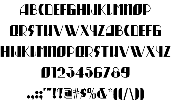
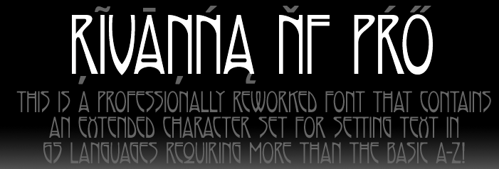
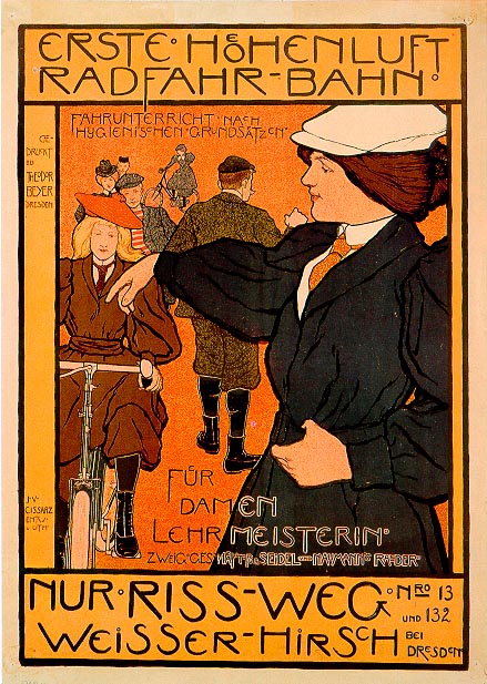
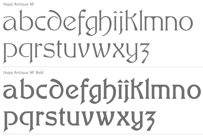
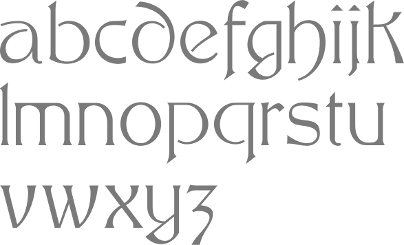
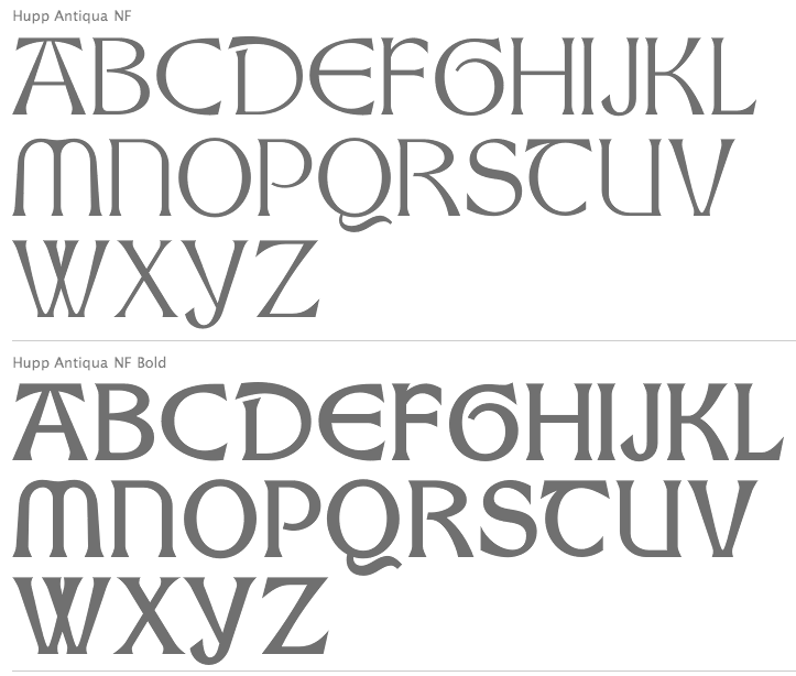
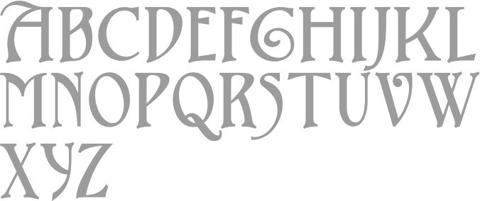
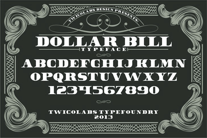
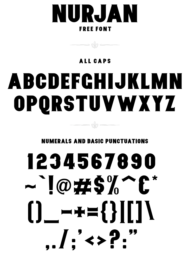
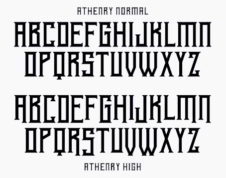
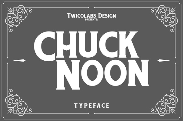
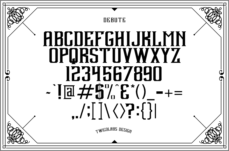
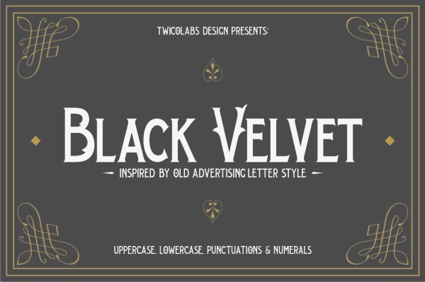
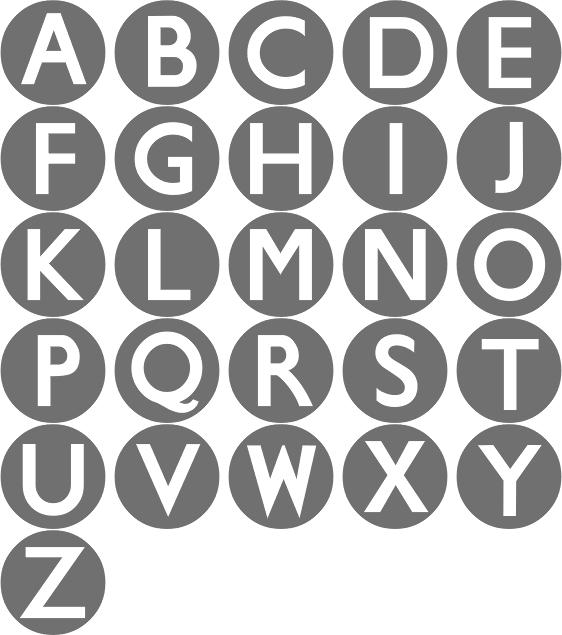
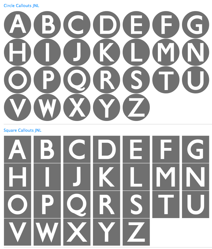
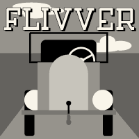
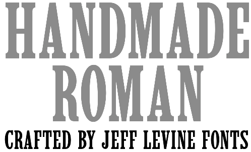
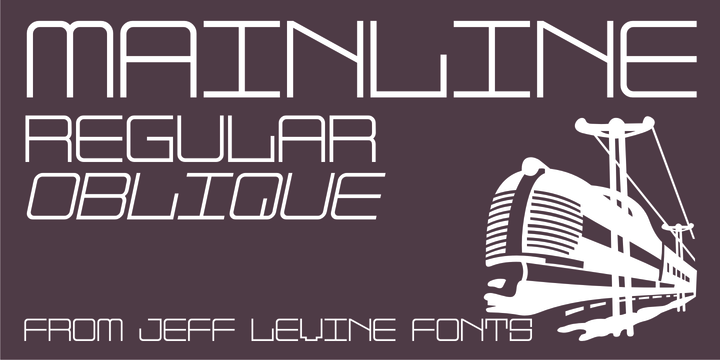
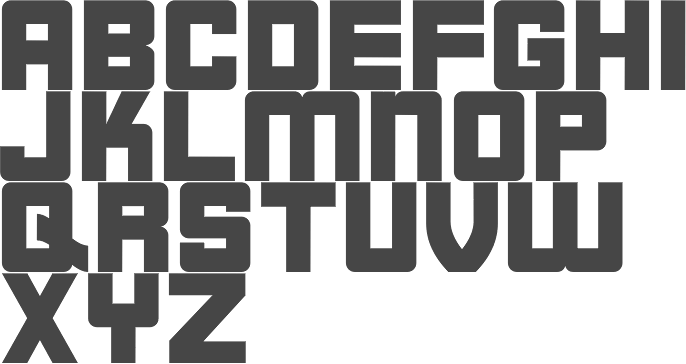
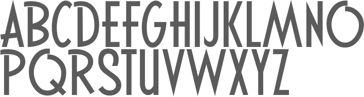
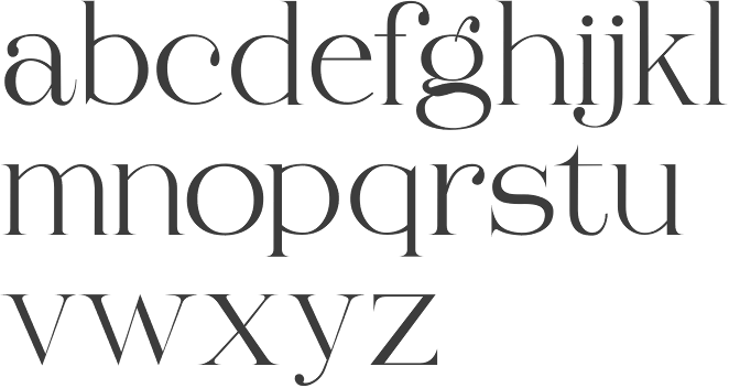
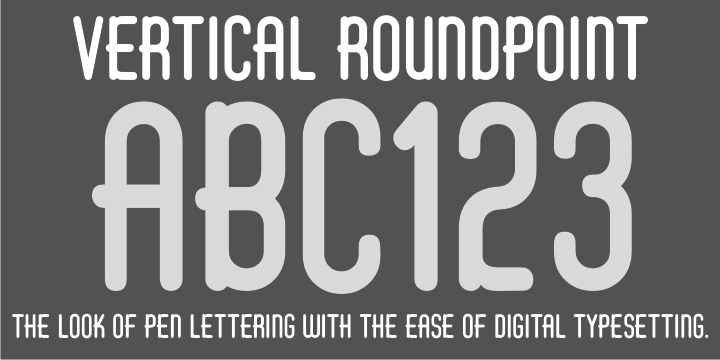
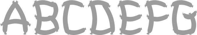
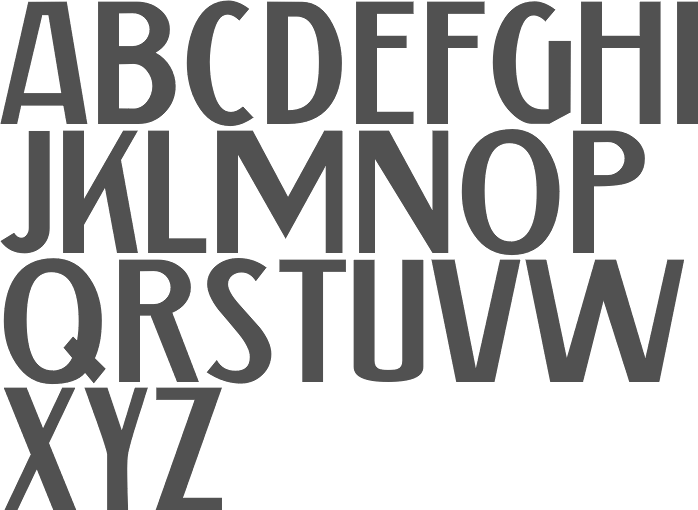
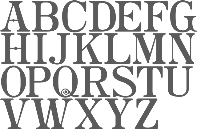
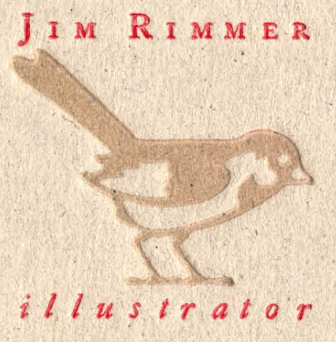
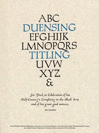
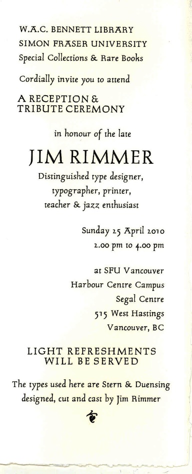
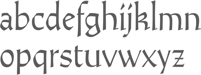
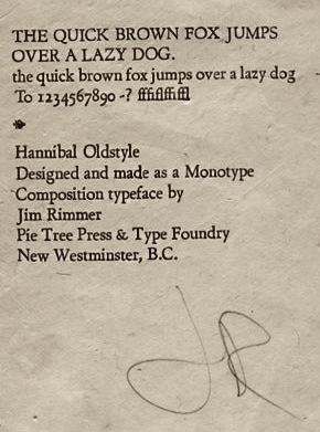
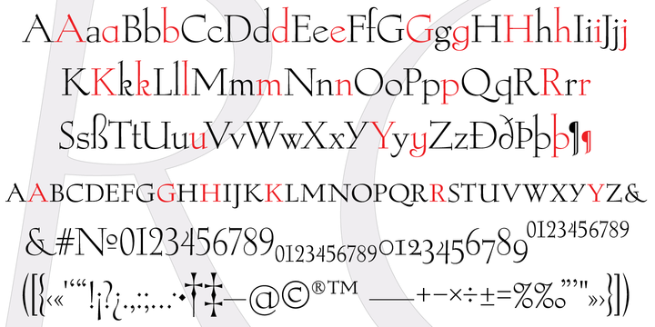
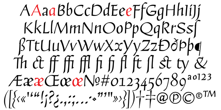
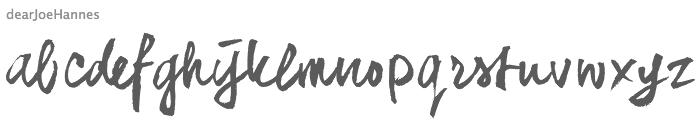
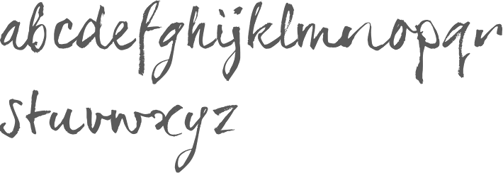
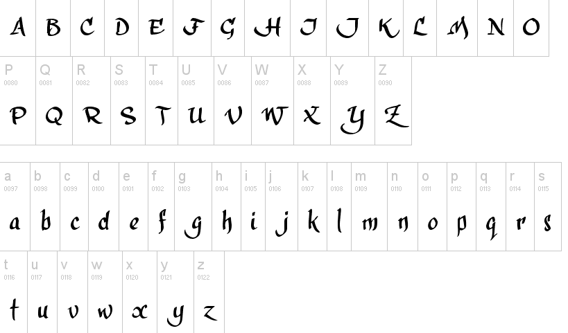
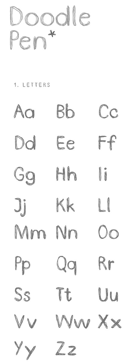
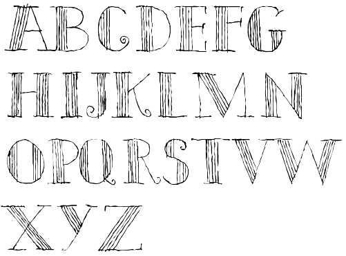
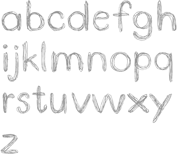
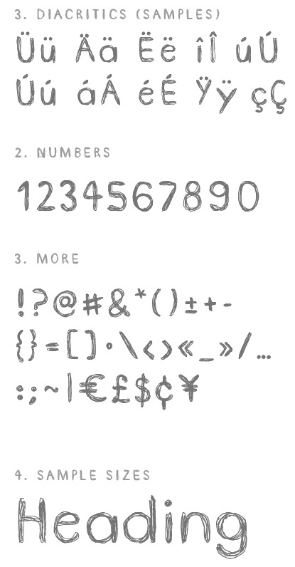
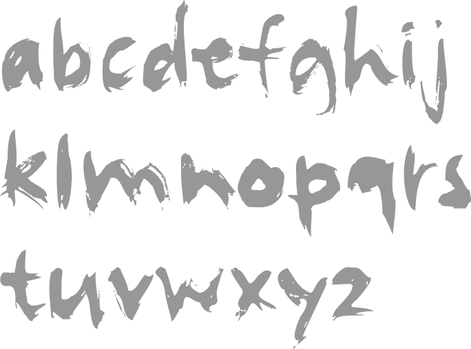
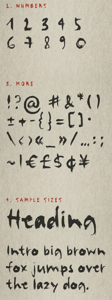
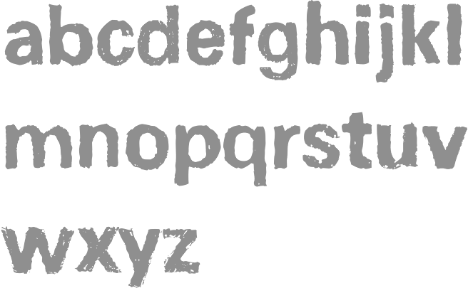
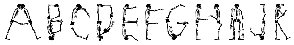