TYPE DESIGN INFORMATION PAGE last updated on Mon Apr 15 04:53:21 EDT 2024
FONT RECOGNITION VIA FONT MOOSE
|
|
|
|
|
Handwriting fonts | ||
|
|
|
|
SWITCH TO INDEX FILE
066.FONT
| 066.FONT is Piotr Wozniak's Polish foundry based in Konskie with some commercial fonts (Linotype Kropki (1997), Dr066, Kfontz) and some free fonts (DNA, Zawijasy, Mieszkanie9 (a halftone curly hand), Plaq, Plaq 108). Kfontz and Dr066 are old typewriter fonts, and Kropki is a dot matrix font. The free fonts are for handwriting. Some fonts at MyFonts.com, such as Pokrak (2009, grunge family), Longinus Pro (2008, a 9-style family of medieval roughly outlined alphabets), Old Stefan (2008, five styles of grungy typewriter), Kra Kra (2008, grunge), Poldi (2007, 3d hand-printed), Poldi No 2 (2008), Bloor (2008), Crazy David No 1 and 2 (2006, grunge), Karacan Pro (2005, eroded look), Polish Dirty News (2005, grunge), Nieanana (2005), Jackcake (2005), Mada693, Nonpress (2006, grunge), Plaq (2005, halftone simulation face), Dr066, KfontZ, Zawijasy (1997, a curly hand, now commercial), Punx (2006, grunge), 066 Army (2006, grunge), Kulfonus No. 1 and 2 (2007, grunge), Duck Duck (2006), Finito (2008, grunge script), Wopi Script (2005), Pimpus (2009, grungy script) and Wopi Script No. 2 (2005) and No. 3 (2007). The designer is Piotr Wozniak in Krakow (b. Konskie, Poland, 1980). Typefaces at MyFonts: 066 Army (066.FONT), Bloor (066.FONT), Chigliak (066.FONT), Crazy David No 1 (066.FONT), Crazy David No 2 (066.FONT), Dr066 (066.FONT), Duck Duck (066.FONT), Finito (066.FONT), Jackcake (066.FONT), Karacan Pro (066.FONT), KfontZ (066.FONT), Kra Kra (066.FONT), Kulfonus No 1 (066.FONT), Kulfonus No 2 (066.FONT), Linotype Kropki (Linotype), Longinus Pro (066.FONT), Mada693 (066.FONT), Nieanana (066.FONT), Nonpress (066.FONT), Old Stefan (066.FONT), Pimpus (066.FONT), Plaq (066.FONT), Pokrak (066.FONT), Poldi No 2 (066.FONT), Poldi (066.FONT), Polish Dirty News (066.FONT), Punx (066.FONT), Vladicek (2022: grungy; emulating wall writing), Wopi Script No 2 (066.FONT), Wopi Script No 3 (066.FONT), Wopi Script (066.FONT), Zawijasy (066.FONT). Polish link. Dafont link. Linotype page. FontShop link. Klingspor link. [Google] [MyFonts] [More] ⦿ |
Durham, UK-based creator of the bouncy hand-printed Paisy (2007). [Google] [More] ⦿ | |
1001freefonts
| Good-sized archive by Jason Nolan. Lots of bells and whistles. It gets hairy when he asks 10USD for a 2000-font download, and 20 USD for a 10,000-font download, charging for freeware and shareware fonts made by others. He writes in 2011: 1001 Free Fonts first opened its doors in December 1998 and has since grown to become the most popular free fonts archive online. We receive more than 50,000 visitors daily and have received 150,000,000 visitors since 1998. Over 3,000,000,000 free fonts have been downloaded since 1998. Creator of Pray for Paris (2015), Aerobus Dotty (2014, a halftone texture font), Dirty Old Town (2014), Ghost of the Wild West (2014), Fresco Stamp (2014), My type Of Font (2009, typewriter) and Emma Sophia (2009, hand-printed). Dafont link. It is interesting, but not surprising, that Monotype (+ITC) is a "partner site". [Google] [More] ⦿ |
Commercial outfit (est. 2004) that has produced its own fonts: Bastian Sans, Bastian Sans CD, Zulan Rounded Black, Zulan, Sonic (futuristic), Sonic Shadow Light, Lotus (artsy handwriting), Lotus Condensed Italic, Okopia Mt (another Treefrog-like hand), Okopia Mt Roman, Fidente Md Shadow XT, Fidente Md. [Google] [More] ⦿ | |
13pt
|
FontShop link. [Google] [MyFonts] [More] ⦿ |
Creator of the free script font Taylor Script (2013). [Google] [More] ⦿ | |
Creator of the hand-printed typeface Meet Me In Montauk (2012). Fontspace link. [Google] [More] ⦿ | |
This small company created a Walt Disney font in 2014 called 20th Century Font. It can be bought at Creative Market. The company is based in Islamabad, Pakistan. Behance link. [Google] [More] ⦿ | |
23SE
|
|
Creator of the grungy hand-printed Elvifrance (2008) and of Naive Pixel (2012). [Google] [More] ⦿ | |
Designer of grungy or hand-printed typefaces in 2014: Pepperoni Pizza, French Fries Apocalypse, Motherland (a grungy Cyrillic simulation typeface), Silent Broadcast (grunge), Undertaker, Soldier of the Dark, Oh My Oh La La yeah, One Two Mustard, Destroy the Enemy. In 2015, he made Against Modern Football, Walter Goes to America, The Day is My Enemy (tape font), Bring Me The Gummy Bears (ransom note font). In 2017, he/she designed Naughty Scratch. Home page. Dafont link. [Google] [More] ⦿ | |
A defunct Montreal foundry run by Denis Dulude and cofounded by him and Fabrizio Gilardino in 1995. Denis Dulude closed shop in 2011 and returned all rights of fonts to their creators. [I wish everyone would be so generous...]. Most fonts can now be found in the FontHaus collection. The designers included Annie Bastien (Sofa, Scratch), Robert Beck (Table Manners), Christine Côté (the handwritten Nacht), Denis Dulude (Razzia), Patrick Giasson (Proton 102), Fabrizio Gilardino (Babbio), Marie Laberge-Milot (funny dingbats Fred Family), Anna Morelli (Quattr'Occhi), Serge Pichii (Thais Light), Clotilde Olyff (Douff: geometry in action), Martijn Oostra (Mold Family), Marc Tassell (Pilgrim Family), and Michel Valois (Perceval Family). MyFonts link. View the typefaces made by FontHaus / 2 Rebels. [Google] [MyFonts] [More] ⦿ | |
4th February
|
Abstract Fonts link. Dafont link. Creative Market link. Behance link. Hellofont link. Open Font Library link. |
7N Types
|
Typefaces from 2013: Hurufo+Numero (sans family), Yaahowu (a rounded sans family), Gobold, Bryana Aningsih Shara (upright script), Gpkn (circle-based monoline sans). Typefaces from 2014: Smoolthan (monoline organic sans), Remponk (multilined), Playsir (comic book typeface), Defonarts, Tulisan Tangan 74, Fortheenas_01, Evogria (bold and mechanical), Anysome, Blackplotan, Dotcirful (dot matrix typeface), Handgley, Brokeren (techno sans), Headsome&Modif. Typefaces from 2015: Manophiser (sans), Theodista Decally (upright connected script), Upbolters (a macho sans caps typeface). Typefaces from 2016: Cutrims (a polygonal typeface), Xacose. Typefaces from 2017: Blessing in Disguise, Chirota (handcrafted), Hastoler, Merysha-Italic, Merysha (serif), SHAOutline, ShareHappinessAround (rounded sans), SomethingLooksNatural, Tentram-Italic, Tentram, Reitam (sans), Myfrida, Ribeat (smooth brush), Etchas, Goeslim, JulySeventh, Justtellmewhat, Offerings, Prohandy, Reprineato, Steagisler, Stea, Miss Nealy, Hastro, Dialoegue, Kisah Ceritra, Chesan, Boxise, Creword, Breetty, Anydore (calligraphic), Brushaff, Budiyaya (brush), Brotherina (connected script), Chosence (sans family), Handycheera, Aulyars (calligraphic script), Molleat. Typefaces from 2018: Freshness, Christed, Xyling, Youthing October Fourteen, Kayskew October Eleven, Hoty, Friday October Twelve, Codian October Nine (art deco), Caboge, Stripe October Seven, Nesdate October Ten, Codian October Eight, Odian October Nine, Stripe Shadow October Seven, Clambake October Six, Lovina October Five, Grande October Four, Grande October Three, The October Two, The October One, Favoner One, Homade McRacken, Besta Baru, Srows, Sanson, Bestar, Kathen, Byby, Charilla, CuteBeSpecial, FriendlySchoolmates-Italic, FriendlySchoolmates, GirlsMarks, HeartWarming, HeartWarmingExtra, Kaylonick, LearnShareColaborate-Bold, Mergic, MOGrhythm, OpenMinded, OpenMindedInside, PassiontoAction, PassiontoActionSlant, TeamWork-Italic, TeamWork, Yessy, Feltarigo, Motira, Adelio Darmanto, Troche, Nicolera, Mantul, Yukikato, Gebrina, Veni, Onadio, Aliena, Gabelisa, Still Loving, Shink, Sottee, Milyone, Kelidya, Yuliya, Hestina, Masbro, Goday, Milgun, Togetha, Thisay, Dhitha, Charline, Briany, Candire, Arinda, Anglena, Abilya, Story of Super Boys, Richela Kids, Seelyn, Pulen, Podo Moro, Sri Muliyo, Neigfriste, Hardino (monoline script), Purple River, Yoshephin, Theola Kids, All Season, All Season Ornaments, Hello Teman, Attracted Monday, Cirquesa, Hopeitissed (signage script), Hettas, Certhas, Fattana, Qeiza, Having Fun, Flotta, Soe, Misses, Siry, Mommy's Kitchen, Thany, Mother's Touches, Create Something Today, Well Bred, Cheria, Beatific Margella, Hidea, Gobold Blocky, Riztteen, Stika, Bintar, Ginta, Menscho, Hilona, Dehasta Momentos, Mungkin, Shartoll Light, Robaga Rounded, Ingat, Ascota, Klapjo. Typefaces from 2019: Homazing, Pre (script), Millythea, Rough Rough, The Friday Stroke (brush script), Anu, Dearly Loved One, Khalifa, Vesetia, Blending Attraction, Lova Valove, Quotable, The Simple One, Matchinger, Touch Over Next, Waiting For, Being Love, Lova Valove Serif, Clawster, Hopia, Sanson, Being Love Sans, Back To Ancient Time, Protector, Mystag, Oreta, Dearly Loved Slab One, Yep, Nuaz (a stitching font), Bronice, Nesdate October Ten. Typefaces from 2020: Sheroo (beatnik style), Thank You So Much, Styla, Racy Mango, Josy Wine (spurred), Lonely Melody, Alegra, Alenor, Conformable, Sweet Hansan, River Script, Kevin Aprilio, Jorby, Maines, Say Yes, Fish Grill, Flash on Saturday Night, Literally Natural, Lady Nature, Joyful Story, Brush Hours, Daily Walker, Free Monday, Mila Bright, Marchone, Githo Love, Fondacy, Jumat, Brastagi, Christiany, Feltarigo, Gabelisa, Gibran, Baligle, Do It With Love (a Valentine's Day font), Vecoly, Delightious, Ataro, Anticed, Cherrythea, Merrycle, Twolank, Atozimple (a monoline sans), Bikito (a curly script), Tyfanie, Hilya, Lonnie. Dafont link. Web site. Creative Market link. Creative Fabrica link. Another Creative Fabrica link. And another Creative Fabrica link. [Google] [More] ⦿ |
Tia Olga (2000) is a free handwriting font by A. Karr (Freemesmo) from Sao Paulo, Brasil. [Google] [More] ⦿ | |
A New Machine
|
In 2012, he made Quarry (an outlined hand-drawn shadow font), Holt Sans (a Peignotian family), Unstable Slab, Mitosis (using bubbly dots), Radial (prismatic), and Airwave (techno). Typefaces from 2013: Benthic (decorative geometric caps), Tubbs (a beefy poster face), Dot To Dot (a dotted and lined pair of school fonts), Emjay (sketched blackboard bold typeface). Typefaces from 2014: Art Party (a festive hand-drawn typeface co-designed with with Erin Solomon), Carawan (a rounded sans family), Back and Forth, Fat Nib (splatter brush face), Smoot (whimsical typeface). Typefaces from 2015: El Guapo (a handcrafted typeface co-designed with Erin Solomon), Nervy, Current (thin connected script). Typefaces from 2016: Etymon (Skyline style), Big Trees (Victorian, Western), Igor (a beatnik style font). Typefaces from 2017: Down With The King (a great techno headline typeface). Typefaces from 2018: Thickness (hand-drawn), Chisel Brush, Dot to Dot, Dot To Dot Cursive (dotted line font, perhaps for teaching children in school). Typefaces from 2019: Artie Deco, Marie Jeanne. Klingspor link. [Google] [MyFonts] [More] ⦿ |
A&A Productions Inc
| Stin Hilly (A&A Productions Inc) made Austin Hillyard (2011, hand-printed), Pig Pen Cipher (2011, huh?), and Mixed Alpha (2011). [Google] [More] ⦿ |
Typefaces from 2017: Time Exactly (just type in the four numbers of any time from 0000 to 2359 and it will give you that clock face, in one of 60 styles of your choice), Rebista, Magg (a corroded condensed sans typeface family), Sanstone. Typefaces from 2018: Hypersans (12 weights), Martian Tiles, Dominoes (a domino tile font). Typefaces from 2020: Yafferbuddle (a cartoon font). View the Aah Yes typeface library. [Google] [MyFonts] [More] ⦿ | |
Aaron Glass was raised in Hamilton, NJ. Creator of the free hand-printed typeface Glass Hand (2014). Dafont link. [Google] [More] ⦿ | |
During his studies at the University of Missouri St. Louis, Aaron Mann created the hand-drawn typeface Quartz (2014). [Google] [More] ⦿ | |
Aaron Patrick Ryan
| |
Aatype
|
In 2010, he created Dopamin (a high-contrast display sans), Square Comic, and Nilish (monoline geometric display sans). In 2011, Ahmet created the art deco chic family Turquoise, the techno sans family Altuna Sans, the semi-hand-printed Shirin, and the organic and elliptical monoline sans family Deria Sans. Sterk (2011) is a legible and open masculine sans family. Glode (2011) is a masculine geometric sans family. Calligra (2011) is an elegant almost calligraphic flared sans. Ephesus (+Shadow) is a caps-only titling sans family. Tillom (2011) is an elegant decorative face. Ondule (2011) is a horizontally-striped texture face. Brounde (2011) is a rounded monoline slab family. Eggy (2011) is a monoline sans display typeface with slightly shaky outlines. Uno (2011) is an organic display face. The display sans Veberk (2011) has contrast and style. Typefaces made in 2012: Halis Grotesque, Uneven (a bold poster typeface family), Ferforje (curly all caps face), Daphne (a hand-drawn all caps poster family), Mancho (a stylish caps only sans family), Cillop (elliptical sans), Typonil (elliptical sans), Omar (squarish poster font), Gulyesa Script (a beautiful informally hand-printed poster typeface), Smyrna (hand-printed poster face). Typefaces from 2013: Minik (a great hand-drawn typeface with tall ascenders and descenders), Festivo Letters (a popular hand-made layered font system with 19 fonts numbered No1 through No19; see also Festivo LC, 2014, which has new sketches, shadows and ornaments), Halis Rounded, Troia (a flexible sans family). Typefaces from 2014: Harman (a 7-style hand-drawn collection of retro poster fonts), Akon (hand-drawn poster family), Minimo (a geometric organic minimalist sans family in four weights). Typefaces from 2015: Racon (weathered type, perhaps letterpress emulation), Masif (heavy brush script renamed Pitos after 24 hours, most likely after a complaint from Monotype which markets a Steve Matteson font called Massif---Ahmet should have ignored that request as Monotype itself ignored Jean Joveneaux, who created another font called Massif in 1957, decades before Matteson's font), Deepika (swashy script), Tropen. Typefaces from 2017: Buket (an 18-font collection including Marquee, Roman Shiny, Fat Sketch, Script, Decorative Shiny, Basic Retro, and Prismatic). Typefaces from 2018: Narin. A geometric sans family with rounded corners. Typefaces from 2019: Revello (hand-painted and layered), Festivo Clean, Salve (a monoline script), Urfa (an 18-style sans family). Typefaces from 2020: Izmir (a 44-style geometric sans family), Grand Sword (a decorative all caps typeface). Typefaces from 2021: Urfa Rounded (an 18-style rounded elliptical sans). Typefaces from 2022: Sarmal (a great handlettered interlocking poster typeface), Punkto (an 18-style geometric sans). |
Designer of the script or handcrafted typefaces The Brodolly (2020), Rolling Go (2020), Bellaty (2020), Gentong (2020), Sejenak (2020), Reborn (2020), Growth (2020: dry brush), Fire Brathers (2020: brush), Master Black (2020), Serenity (2020), Emejing (2020), Paggi (2020), Allegra (2020), Belfica (2020) and Average (2020). [Google] [More] ⦿ | |
Free Mac fonts, A-Kagen (handwriting) and Tenuki Gothic. [Google] [More] ⦿ | |
Abbie Bess Meson
| |
Abel Marquez
| |
Cordoba, Spain-based designer of the handwriting typeface Curro Rumbao (2016). [Google] [More] ⦿ | |
Hyderabad, India-based creator of Softhand (2010, hand-printed), which can be bought here. [Google] [More] ⦿ | |
Abraham Beltran
| |
Creator of the fat finger typeface Aka Acid GR Chubby (2011). [Google] [More] ⦿ | |
Ace Fonts
| Defunct Duluth, MN-based foundry, specializing in grunge, display and handwriting typefaces. Fonts made in 2000 by Ray Dittmeier: Analgesics (handwriting), NoProblem, ReadyForMyCloseUp, 01-01-00, After-Hours, De-Futura, I-Did-This!, Hacknslash, Illumination, Scottie-and-Judy, Ugly-Rumor, Persona, Fat-Free, Fat-Free-Solid, Filthy-Habits, Flip-the-Switch, The-Forbidden-Font-of-Death, Later-On, Mac-and-Sidney, Red-Lightning, Sad-Jane, Sheer-Terror, Thud, Trust-Us, Analgesics, Dr.Nerve, Rivalry, Runoff. All is archived by CybaPee at Typoasis. Dafont link. Fontspace link. [Google] [More] ⦿ |
Creator of Musicos Variant Comics (2012, hand-printed, intended for comics) and Achille Nzoda (2012, hand-printed). Handwriting font service. [Google] [More] ⦿ | |
Achmad Hanif Ulinuha
| |
Adam Greasley
| |
During his studies at the University of Salford, Huddersfield, UK-based Adam Hesling designed a hand-printed poster face and a piano key face (2012). [Google] [More] ⦿ | |
Adam Nerland
| |
Children's book illustrator in Farmington, UT. He created the hand-printed look family King Bill (2010). [Google] [More] ⦿ | |
British designer of the hand-printed typeface Adams (2013). [Google] [More] ⦿ | |
Adam Turman is a Minneapolis-poster poster artist and bicycle enthusiast. At Chank's place, he designed the bicycle dingbat typeface B Complex (2012: The best things in life begin with a B. Bikes, Burgers, Beers, Babes.) and the fat finger typeface Turman Grotesk (2012). [Google] [MyFonts] [More] ⦿ | |
Adam Vandenberg
| |
Chengdu, China-based designer of Zcool Addict Italic (2016), Addict Old Style Gothic One (2016, blackletter), Addict Script One (2016), Addict Handwriting (2016) and Addict Round (2016, sans). Behance link. [Google] [More] ⦿ | |
French creator (b. 1993) of the primitive hand-printed typeface Adenote (2012). Dafont link. [Google] [More] ⦿ | |
Typefaces from 2010, mostly made with FontStruct: the pixel typeface Benci Malaysia, the hand-printed Nyonya Gendut, the squarish typeface Hutan and the irrgularly sized Madura Regular. He also made the texture / knitting typeface Batik, FoOleD bY GaYUs, Probolinggo (organic), Smasasinema (display face), the texture typeface Serangkaian Pattern, Indo-Malay Confrontation (pixelish), Koruptor and the Bitches (gothic), Qurban Feast, and the curly native pattern typeface Mlungker. In 2011, he made Kabupaten (a sketch font), Social Monster, Buka Pusa Bersama, Ceria Lebaran, Pajarakan Studs, Batik Gangster, Maharani (hand-printed), Lovely Eunike Hans (hand-printed), the texture typeface Kawung Textile, Wildan Izzur Gunarta, Genius Jempolan Royal (scanbats), Pray For Japan, Quantum of Bali, X-Code from East (Javanese script), Hangeul (Korean simulation face), Halidians Blockserif, Moanday Earn Bored, the paper cut typeface Malingsia, Awesome Java, Mesin Hitung (an LCD face), Eenvoudige Batik (stitching face), Antique Paleoindonesia (patterned face), Kebencian (scratchy face), Kemasyuran Jawa (a display face with an Indonesian look), Probolinggo Sans, Londo Chino, Urban (paper cut face), Bikang Struck, Chana Remedy, Indonesian Woman (pixel dings), People Diverse (pixel dings), DBA Muslim (pixel dings), Turk and Nusa (ball terminal face), Jakarta Recycle (paper fold octagonal face), Halida Sans (a swirly version of Ubuntu), Buka Puasa Bersama (Arabic simulation face), Social Monster (grunge), Ceria Lebaran Normal (lava lamp typeface), Dukungan, Dukungan, Sanjaya Epoch, and Jakarta Sunken (angular face). In 2012, he created Halidians Blockserif, Penakut, Agoestoesan, Siti Maesaroh (Arabic simulation face), Turk and Nusa, Rest in Phuket (Thai simulation typeface), Chana Remedy, Bunaken Underwater, New Madura, Moro Seneng, Endutt Normal, Antibalon, Hayyu Kaget, Damai Kpk Polri, Damai Pelajar, Jangan Bersedih (hand-printed), Ikan Besar, Senyum (hand-printed), Catatan Perjalanan (fat finger face), Wizzta, and Quick Argani. Typefaces from 2013: Emilio 19 (athletic lettering font), Bangkit, Faishal Bakeries, Soerjaputera (avant-garde), Soerjaputera Doea (art deco), Sang Fatchurrohmah (lava lamp face), Aceh Darusalam (Arabic simulation face), Revolusi Timur Tengah (Arabic simulation face), Nurkholis (Arabic simulation), Kopleng (alchemic), Menjelajah Halmahera (a ronde font), Jakarta Highends, Smasasinema, Sanjaya Epoch, Mlungker, Dukungan, Thohir Ke Badreah (all caps sans face), Serangkaian Pattern, Endutt (fat finger face), Boutiques of Merauke (a curly typeface), Balinese Family, Zamrud & Khatulistiwa (curly font), Awesome South Korea (great oriental-look font), Freeport Go Away (poster font), Senang Banyol, Don Aquarel, Jawadwipa Adisastra, Si Kancil (fat finger font), Wortellina, Don Butique (hand-printed), Did You See That, Bimasakti. Typefaces from 2014: Rampung, Prabowo, Larasukma (an abstract shape font), Tafakur (Arabic simulation typeface), Syawal Khidmat (Arabic simulation face), Kurnia (curly script), Kota Surabaya (dingbats of buildings), Hutan Lestari, Kobarapi (spurred typeface), Mukadimah (Arabic simulation, based on ae Cortoba by Arabeyes), Huruf Maranti (upright connected script), Emilio 20 (athletic lettering). Typefaces from 2015: Gurindam (Dutch art deco), Upakarti, Tyree Friendly Face (rounded sans), Berantas Korupsi, Kanisah (Hebrew simulation font). Typefaces from 2016: Belacu, Cemong, Bungasai, Semringah, Binarung (masks), Surabanglus (beatnik style). Typefaces from 2019: Kembang (dingbats). Fontspace link. Home page at Fontastic Indonesia. Devian Tart link. Klingspor link. Dafont link. Behance link. [Google] [More] ⦿ | |
Creator of the simple hand-printed font Mobiles (2010). [Google] [More] ⦿ | |
Spanish creator of the hand-printed Agafont (2008). [Google] [More] ⦿ | |
Adreson Vilson Vita de Sá
| |
Rosario, Argentina-based designer (b. 1992) of the vertically striped techno font System (2009) and of Scratch Basic (2009), Smoothtasticness (2011, fat counterless), Acid cain (2011, grungy), and Crime Scene (2011, grunge suggesting blood splatter). [Google] [More] ⦿ | |
Newsense (2013) is an art deco typeface that extends Milton Glaser's Film Sense (1968). Romaji Mincho (2013) is a free Asian simulation font based on the style of the Mincho typeface. Rhyder (2013) is a great (free) geometric 1930s style sans typeface. Martell (2013) is a free general purpose slab serif family. AC Big Serif (2013) is a free rounded wedge serif typeface. AC Thermes (2013) is a sans display typeface. Typefaces from 2014: AC Wanita (hand-drawn). Typefaces from 2019: AC Guanche (a font based on the ancient scripts used by the Guanches, the aboriginal inhabitants of the Canary Islands). [Google] [More] ⦿ | |
Romanian designer in 2011 of Sharpener (hand-printed), Bored Learner (hand-printed) and Monstriska. [Google] [More] ⦿ | |
Mexican designer of the handwriting font ABC Melo (2007). [Google] [More] ⦿ | |
Adriana Esteve Hernandez
| |
Adriel Almirol
| |
French designer (b. 1990), aka Neo Keitaro, of Graphic Trash (2006, scribbly hand). [Google] [More] ⦿ | |
Adrien Zammit
| |
Adriprints
|
Her fonts include Kicks (2012, a fun hand-printed typeface for children's books), Stitching Kit (2010, dings), Fiddleshticks (2009, linocut), Sorbet and Sorbet Wide (2009, like architectural letters), Fancypants (2010, curly lettering), Stitchin Crochet (2009, dingbats), Trellis (2009, hand-printed), and Draft Punk (2009, comic book style). Font Squirrel link. Klingspor link. [Google] [MyFonts] [More] ⦿ |
Adult Human Male
|
The commercial Alex created the grunge stencil typeface Butterworth (2011), the hand-drawn Teksi (2011), the monoline squarish family Ebdus (2011), Valis (2011, futuristic), and the thin avant garde monoline typeface New Slang (2011). Gordito (2011) is a graffiti style bubble font that says Smurf. In 2012, Alex published the poster caps typeface Areaman, Stink Lines (multilined typeface) and Penang (art deco signage typeface seen on Penang by the creator). Straights Light is a beautiful pair of bilined all caps typefaces. Dale Kids is a children's book typeface. Hokkien (2012) is an art deco typeface with Chinese influences. Mister Mustard is a chubby rounded art deco typeface. Barkley (2012) is a textured caps typeface with a chalk board feel. Liner Notes (2012) is a bilined hand-drawn typeface. Bartleby (2012) is a hand-drawn all caps display font. The free font foundry Squack has the hand-printed typefaces Barker Allcaps (2012), Scrapist (2012, sketched), Billy Boy (2011, 3d), Quito Chicken (2011, 3d), Fred Wild West (2011, a grungy western face), Coolock Black (2011), Zapftig (2011), Ringworm (2011), Suicide Draft (2011), National Granite (2011, a 3d stone chisel face), Whiskey Fingers (2010), Wank Hands (2010) and Middle Man (2010), and the irregular typefaces Zapftig (2011), Shock Corridor, Pollo Asado, Middle Woman, Ghost Words, Late Puberty, Parrannoyed (2010, ransom note face), the hairline typeface Rexic (2011), Black Grapes (2012), Chump (2012, hand-printed capitals), Areman OT (2012), and the grungy Skidmarks (2012). Typefaces from 2013: Salas (a chunky cartoon face), Rabid (a crayon font), Strokin (a great brush face---part charcoal part paint strokes), Bevel Hands, Bunk (a layered beveled type system absed on a monoline fat rounded sans, Bunk Base 2), Spengler (inline face), Vastra (Bauhaus style, organic), Swingers (curly and cartoonish), Chump Change, Treves Sans (crayon face), Quincey (2017). We read that the fonts are designed by EircomTest. Aka Squack, MiddleMan and Alex H. Dafont link. Creative Market link. Twitter link. Behance link. [Google] [MyFonts] [More] ⦿ |
Adult Ramblings
|
Alternate URL. There are also free handwriting fonts: AEZ-American-Woman, AEZ-country-girl, AEZLeighHW, AEZ-Traci's-Handwriting, AEZ-Jon's-Handwriting. Fontmaking tutorial [dead link]. The font pages seem to have disappeared. Dafont link. Klingspor link. [Google] [More] ⦿ |
Indonesian designer of the script typefaces Brastagi, Vitalia Sesha, Jotilla, Kelya, Qiyoshi, and Noela Sherly in 2018. [Google] [More] ⦿ | |
Aerotype
|
Creative Market link. View Stephen Miggas's typefaces. [Google] [MyFonts] [More] ⦿ |
Designers of Barbaric (2005, a brabed wire font), Evanescence (2003) and Gothika (2004, eerie handwriting). Fontspace link. Dafont link. [Google] [More] ⦿ | |
afterglowtype
| About five original fonts are available here. The designer is Peter Smith. Names: Fuck, Schleterian, Birdhaus (great!!!), Sooper, Elmico and Erika, mostly handwriting. Foundry disappeared but is revived at typOasis. Alternate site. Jennifur (1998) is here. Fontspace link. [Google] [More] ⦿ |
In 2011, she designed Grand Duchess (script face), Rosette110621 (kaleidoscopic dingbats), Brasserie (connected script), Marker Script, Skarpa LT (an avant-garde hairline face), Skarpa Regular, Skarpa Bold, Auld Magick (blackletter), Two Am, and Fantasy Dingbats. Typefaces from 2013: Monmica (an upright copperplate script), Skarpa 2.0, Trufla (English round hand, copperplate script), Trufla Words (calligraphic), Calissa (copperplate script), Calissa Words. Typefaces from 2014: Mavblis, Lavenda (a connected copperplate script), Roicamonta (connected script). Typefaces from 2015: Skarpa Round, Nistiver (calligraphic script), Lavenda (calligraphic script). Typefaces from 2016: Lidaxid (connected script), Hinzatis (calligraphic script), Roicamonta Basic (an upright connected calligraphic script), Monmica Fancy, Bisalir (heavy script), Piambis (thick signage script), Piambis Round, Piambis Sharp. Typefaces from 2020: Skarpa (a revised version of her 2011 typeface), Skarpa Condensed. Typefaces from 2021: Timernis (a 9-style humanist sans based on 1940 stone engraving commemorative plaque). [Google] [MyFonts] [More] ⦿ | |
Spanish creator of the graffiti font Vandalo (2009). Possibly called Arturo Garcia. [Google] [More] ⦿ | |
Agathe Richard
| |
FontStructor who made these typefaces in 2010: Tessa (an über fat face), Pomegranate, Archipelago Serif, QQQQQ. In 2011, these typefaces were created: Barnhaus (+Lite), Not My Font (clone of zalamera eYeFS by Antonio J. Morata), Mission Design Sans, Soundproof, Naturally Blonde, Sector12 (an army stencil face), Industrial Sans Better, Elegantite, Grey Hand (texture face), Ubnshufr II Hellllp, Havoc, Havoc Thin (scratchy face), Pixels Redefined (texture face), Capitas Lite (texture face), Capitals Woodcut, Adl Capitals (hand-printed), Useful Sans, Spirit (tattoo/blackletter face), Wanted 2.0, Detaile, fs Greener Grass (grotesk headline face), Bean (pixelish), Small Sans, Doundproof. In 2012, Agent Demonic Ladybug made these typefaces: Mechans (upright connected script), Tessa Revived, Minimalist No. 2 (piano key face), Laceys (dot matrix typeface), Roundsclean, Squareup, Barnhaus 2012, Mission Design Sans, Barnhaus (+Lite, +Mono; named after Bauhaus), iFontStruct, Squishypixel, Moredetailes, Who Needs Nonconformity (heavy octagonal), Stuckinneurone Error, Stuckingranite, 220a, Boldish (piano key face), Strategy Bold. [Google] [More] ⦿ | |
Agenturtschi
| Ralf Turtschi's Swiss site that specializes in type publications. A must-buy book for type classification: Schrift vergleichen, Schrift auswählen, Schrift erkennen, Schrift finden (Verlag Hermann Schmidt, Mainz, 1991): 430 pages! Author of TypoTuning (2006) and of Praktische Typografie (1999, Verlag Niggli AG). In 2004, Anatina Blaser made a handwritten style font called Rooster (after Peter Rooster's handwriting), which can be had for free with any order over 59 dollars. [Google] [More] ⦿ |
Designer at Parachute in Athens, Greece, of the Latin / Greek / Cyrillic signage typeface PF Scandal Pro (2007-2012). Behance link. Klingspor link. Parachute link. [Google] [MyFonts] [More] ⦿ | |
Agnes McWatson
| Creator of the simple hand-printed typeface Phonepad Two (2008). Under her posings, we also find Golden Pig (date unknown, by KyungBae Lee, Goodfont Inc) and the fat finger typeface Lucky Cat (2012). [Google] [More] ⦿ |
Agnese Pagliano
| |
Polish designer and illustrator. Behance link. Creator of a crazy poster typeface called Loft (2012). She also uses a fun hand-printed poster style in most of her illustrations. [Google] [More] ⦿ | |
Designer of the hand-printed typeface Andy (2012). [Google] [More] ⦿ | |
Agung Syaifudin
| |
Agus Muhammad
| |
Agus Riyanto
| |
Argentinian youngster, b. 1989, who made the handwriting font AguzBadHandwriting (2009). [Google] [More] ⦿ | |
Agustín Luis Bou
| |
Spanish designer of Agustina (2005, scratched handwriting). [Google] [More] ⦿ | |
Agustina Lonetti
| |
Alex (Ahage16) lives in Western New York. He created the rough hand-printed typeface dkjasbnlkjfsa (2010). [Google] [More] ⦿ | |
Ahmad Priabudiman is an Indonesian graphic artist based in Kuala Lumpur, Malaysia. Designer of the free hand-printed typeface Abandonation (2014). Dafont link. Behance link. [Google] [More] ⦿ | |
Cairo, Egypt-based creator of the free 16-style hand-drawn typeface family Noni (2014). [Google] [More] ⦿ | |
Ahmet Altun
| |
Madrid-based designer of the hand-printed typefaces as Aida Garmo (2013), AS Melanie Handwriting (2011), Aida Scrap Rounded (2011) and Aida Scrap Small Size (2011). Dafont link. [Google] [More] ⦿ | |
Art director in New York City. Creator of Aileen Handwriting (2011). [Google] [More] ⦿ | |
UK-based designer of Azu (2005, handwriting). [Google] [More] ⦿ | |
Ainezunouzu
| Akira Hayashi (Ainezunouzu) is the Japanese designer of the experimental Latin fonts UzuAutotwo, UzuBalloonO, UzuBalloon, UzuBiscuit, UzuBmp01_06 (pixel), UzuCheeseO, UzuCheese, UzuCracker and UzuRenga. He also made the handwritten kanji fonts UzuPen, UzuPencil, UzuKaku, UzuMaru, UzuFace, UzuOfTsuchiyaB, UzuOfTsuchiya, UzuFude. [Google] [More] ⦿ |
Aioku Fonts (was: Kung-Fu fonts, or: Superfunk.com)
| Free fonts for PC and Mac made by Mike Lecky from Charlottetown, PEI, Canada. Mike Lecky's (mostly grunge) fonts: ATeam, Brad (glaz krak face), Bruce, BuddySystem, Class_of_74 (pixel font), Desi, DickSoup, EverCrash (extra thin LED font), Font, Funboy, Fruitsalad (pixel face), Jobats, Leck, Jet_Plane, Kevin Seconds, Losers, Mike_s_BigDay, Misfit, Rusty, WatchBreaker, Mark, Decline of the Western Civilization, Roadkill, x5, Brody (geometric font by Guilherme Capile!), Mark (grunge), Lou (handwriting), Kevin (handwriting). Dafont link. [Google] [More] ⦿ |
A.J. Palmer
| |
A.J. Palmer fonts
|
Fontspace link. Dafont link. [Google] [More] ⦿ |
Chartered accountant. Designer (b. 1993, Kerala, India) of Orust (2010, "rusty" grungy face), AjiHand (2011), Ugran (2013), Ambambo (2013, brushy caps), Aesthetica (2013, prismatic), Dingy Bird (2013, a great grungy brushy script), and Chisel Script (2010), Rough Treatment (2014). Old URL. Dafont link. Aka Ajith Rindia. | |
A free handcrafted typeface made by JWC in 2002. [Google] [More] ⦿ | |
Aka Acid (or: Cybertronical Design)
| UI mobile and web designer in Athens, Greece. Myrto made these free pixel typefaces between 2007 and 2013: Aka-AcidGR-4B, Aka-AcidGR-4B20, Aka-AcidGR-5X5, Aka-AcidGR-ArialPixel, Aka-AcidGR-BoredRe, Aka-AcidGR-Elektr, Aka-AcidGR-Everyday, Aka-AcidGR-Kairee, Aka-AcidGR-Mazew, Aka-AcidGR-Micro, Aka-AcidGR-Necplus, Aka-AcidGR-Neustyle, Aka-AcidGR-Pixel, Aka-AcidGR-Starmap, Aka-AcidGR-Stunt, Aka-AcidGR-SystemTronical, Aka-AcidGR-SystemsAnalysis, Aka-AcidGR-Web, Aka-AcidGR-Zephyrea, Aka-AcidGRAccessN12. The pore-2007 typefaces include Aka-AcidGR-4B, Aka-AcidGR-4B20, Aka-AcidGR-ArialPixel, Aka-AcidGR-Compacta, Aka-AcidGR-Elektr, Aka-AcidGR-Everyday, Aka-AcidGR-Kairee, Aka-AcidGR-Mazew, Aka-AcidGR-Micro, Aka-AcidGR-Mutlu, Aka-AcidGR-Necplus, Aka-AcidGR-Neustyle, Aka-AcidGR-Starmap, Aka-AcidGR-SuperG, Aka-AcidGR-SystemTronical, Aka-AcidGR-SystemsAnalysis, Aka-AcidGR-Web, Aka-AcidGR-Zephyrea, Aka-AcidGRAccessN12. The following text and script fonts and dingbats were made from 2007 until 2013: AC-Hollow_unicode, Aka-Acid-Animaux, Aka-Acid-Bots, Aka-Acid-Mockups, Aka-AcidGR-AfterDiet, Aka-AcidGR-AlmostGothic, Aka-AcidGR-AngryJoe, Aka-AcidGR-Around, Aka-AcidGR-Atomic, Aka-AcidGR-BadFont, Aka-AcidGR-BadKitty, Aka-AcidGR-BigInJapan, Aka-AcidGR-BriefEncounter, Aka-AcidGR-Calligram, Aka-AcidGR-Chubby, Aka-AcidGR-Collage, Aka-AcidGR-Compacta, Aka-AcidGR-CompactaScript, Aka-AcidGR-Composition, Aka-AcidGR-ContencedScript, Aka-AcidGR-Cord, Aka-AcidGR-Creepy, Aka-AcidGR-Curly, Aka-AcidGR-CurlyEarly, Aka-AcidGR-CuttingEdge, Aka-AcidGR-Cyberella, Aka-AcidGR-DiaryGirl, Aka-AcidGR-Dingme, Aka-AcidGR-Disturbed, Aka-AcidGR-DisturbingCookie, Aka-AcidGR-Dot, Aka-AcidGR-Dotted, Aka-AcidGR-FatCondensed, Aka-AcidGR-FatItalic, Aka-AcidGR-FatMarker, Aka-AcidGR-Fatbamboo, Aka-AcidGR-FifiTheCat, Aka-AcidGR-Fifindrel, Aka-AcidGR-FifisHand, Aka-AcidGR-Freefeel, Aka-AcidGR-FrenchToast, Aka-AcidGR-Fristgrade, Aka-AcidGR-Froglusly, Aka-AcidGR-GhostStory, Aka-AcidGR-Gorgi, Aka-AcidGR-Graduate, Aka-AcidGR-GreekPharmacist, Aka-AcidGR-Grudge, Aka-AcidGR-HappyPuppy, Aka-AcidGR-HiSchool, Aka-AcidGR-Hurry, Aka-AcidGR-ImpressingTeacher, Aka-AcidGR-Inky, Aka-AcidGR-Kiki, Aka-AcidGR-Liberate, Aka-AcidGR-Lightinjapan, Aka-AcidGR-Limbo, Aka-AcidGR-Linky, Aka-AcidGR-LivingSword, Aka-AcidGR-Loving, Aka-AcidGR-Lundi, Aka-AcidGR-Lycee, Aka-AcidGR-MC, Aka-AcidGR-MakingMonsters, Aka-AcidGR-MediumInJapan, Aka-AcidGR-Mutlu, Aka-AcidGR-Pasta, Aka-AcidGR-RealAdult, Aka-AcidGR-RomanScript, Aka-AcidGR-RoundUp, Aka-AcidGR-Safe, Aka-AcidGR-Sagging, Aka-AcidGR-Sausages, Aka-AcidGR-Schoolgirl, Aka-AcidGR-ScrachThis, Aka-AcidGR-ScriptCondenced, Aka-AcidGR-Serif, Aka-AcidGR-Slimthin, Aka-AcidGR-SocialRage, Aka-AcidGR-StretchUp, Aka-AcidGR-StrokingLines, Aka-AcidGR-SuperG, Aka-AcidGR-ThickStick, Aka-AcidGR-ThinBlackboard, Aka-AcidGR-TinyCondenced, Aka-AcidGR-TotallyPlain, Aka-AcidGR-Tremor, Aka-AcidGR-Vectroid, Aka-AcidGR-WideMe, Aka-AcidGR-Wurly, Aka-AcidGR-Xtend, Aka-AcidGR5yearsold, Aka-AcidGRBuzzed, Aka-AcidGRFatCord, Aka-AcidGRFreakedOut, Aka-AcidGROpen, Aka-AcidGRPathetic, Aka-AcidGRSpagetti, Aka-Acid_Knickknack, AkaAcidQuickPad. |
Italian designer in Trieste of the hand-printed typeface Akina (2011). Her name is Elena. [Google] [More] ⦿ | |
Akiko Naito
| |
Akira Hayashi
| |
AKOFAType
| Located in Powder Springs, GA, AKOFAType has published the following dingbats with symbology from Ghana: Adinkra Calabash, Adinkra FineFine, Adinkra WantaWanta (2007). The designer is Kwesi A. Amuti (b. East Lansing, MI, 1974). He is working on Steady Rockin (a display face) and Fat Head. In 2013, he published Ehmbeecee, a typeface with frames. In 2014, he made the elliptical sans typeface Cabeza Grossa and the snowflake typeface Flurry. Creative Market link. Typedia link. Klingspor link. [Google] [MyFonts] [More] ⦿ |
Designer of the rough hand-printed typeface handwriting (2010). Aka arader. [Google] [More] ⦿ | |
Original fonts for Mac and PC, mostly Latin letters, but also a few kana typefaces: AKAkubit12H, AKElephant3, AKMyPrince (2004), AKOsaruH, AKOsaruR, AK-Keroyon (2003, alphadings), Akubin (handwriting), AKAppriqueBlack, AKANGEL, AKAppliqueWhite, AKUNCIAL, AKCalligraphy, 09Keroyon (2004), AK Jelly Beans (2004), AK-Piyoko (2004, egg dingbats), AK woopaa, AK Roopaa, AK-Halloween (2004, dings), AK Sweet Prison (2004, Fraktur), AK-BlackCastle (blackletter, 2004), AK-WinterYawns (2004, winter dings). AK-Shanghai 1930 (2005), AK-Japonesque (2005), AK-My Baby (2005, child dingbats), KS Lovers (2007, handwritten Latin and kana). In 2008, they stopped offering free fonts. [Google] [More] ⦿ | |
AL
| Buenos Aires-based designer (b. 1984) of the outlined 3d lettering font Aguzlo (2006) and the handcrafted Felixsalotto (2012). [Google] [More] ⦿ |
| |
Designer of the free handwriting typeface Breip (2008) and Definitely Not Retro (2009, hand-printed outline typeface made with Fontifier). [Google] [More] ⦿ | |
Creator of the bouncy hand-printed slab serif Alan Print (2010). [Google] [More] ⦿ | |
Creator of Zoe (2014, irregular hand) and Bubblegum Baby (2014). [Google] [More] ⦿ | |
Israeli type designer who created these Hebrew typefaces at Masterfont: Nitsan MF (2002, handwriting), Uri Rounded MF. [Google] [MyFonts] [More] ⦿ | |
French creator of the scratchy hand-printed typeface Alban (2011). [Google] [More] ⦿ | |
Catalan creator of the free hand-printed font Zrylux (2012). [Google] [More] ⦿ | |
Albertine Nerevan
| |
Albertine's Fonts
|
Devian tart link. Fontsy link. Klingspor link. Dafont link. Abstract Fonts link. [Google] [More] ⦿ |
Creator of the iFontMaker font DeArmas Comic (2010, hand-printed). [Google] [More] ⦿ | |
Designer of Herzogscript (2014), a typeface based on the handwriting of acclaimed German director Werner Herzog. [Google] [More] ⦿ | |
Madrid, Spain-based designer of the rounded handcrafted typeface Natural (2017), the sans typeface Acatisia (2018), and the free icon set Summer Bold. [Google] [More] ⦿ | |
Born in 1995, aldo Dattoli created the simple hand-printed typeface Aldo Dattoli (2012). In 2013, he created the all-caps rounded monoline stencil typeface Kiss & Tell. [Google] [More] ⦿ | |
Alec Julien
| |
Alejandro Paul
| |
Cofounder of Sudtipos (2003), where he does custom work and creates new typefaces. His work there includes Tierra (a titling face), Latinaires (2003-2018: originally called Latina Sans), Reflex, Downtempo (2003), Stardust and Mosaico (1999, pixel face). Still at Sudtipos, he digitized the beautiful handwriting/calligraphic typefaces by Angel Koziupa called Alma (2005), Murga, Habano and Tiza, which together with his script typeface Argenta (2004), Oxida (2005), the medieval script typeface Mama Script (2004, designed with Alfredo Graziani), Divina (2004, with Alfredo Graziani), and the sans family Kautiva (2004) can be bought via Umbrella Type. For children's orthography, he developed Estrada Hand, on commission for Editorial Estrada. He was working on the serif family Libertina (2004). Herencia (2004, a handwriting typeface done with Diego Giaccone), Grover (2004, slab serif), Milk Script (2004, with Alfredo Graziani), Mama Script (2004, with Alfredo Graziani), Politica (2004, a techno typeface with a very thin Thin weight) are at Sudtipos. The Bluemlein Scripts (2004-2005, Umbrella and Veer) are based on the calligraphic renderings of Charles Bluemlein, shown in a 1943 ink catalog: Miss Le Gatees, Mr Rafkin, Mr Keningbeck, Mr Lackboughs, Lady Dawn, Mrs Von Eckley, Mr Sheppards, Mr Dafoe, Mr Canfields, Mr Stalwart, Mr Sandsfort, Mr Leopolde, Mr DeHaviland, Mr Blaketon, Miss Stanfort, Miss Packgope, Miss Fajardose, Mrs Saint-Delafield, Mrs Blackfort, Mr Sopkin, Mr Sheffield, Miss Lankfort, Herr Von Muellerhoff, Dr Sugiyama, Dr Carbfred. (Note: Soft Horizon's Lainie Day (1993) is an earlier free font in the style of Lady Dawn and Mr Lackboughs). In 2011, that series was made available at Google Web Fonts. Sudestada (2005, Sudtipos) is a handwriting script developed with Diego Giaccone. Cuisine (2005, Umbrella Type) is an informal bold script. Mousse Script (2005, Sudtipos) is based on Glenmoy, a 1932 Stephenson Blake typeface. Suave Script (2005) is a 4am jazz bar script. Ministry (2005) is related in style but less funky, Chocolate (2005) is for sales ads, and Cenizas (2005, with Angel Koziupa) is straight from an old manuscript. Whomp (2006, Umbrella) was based on a partial sign-painting font by Alf Becker (1930s), and so was Buffet Script (2006, Sudtipos). Affair (2006, Umbrella) is swashy and calligraphic, while Candy Script (2007) and its italic version Sugar Pie (2011) are based on Argentina's market lettering. Galgo Script (2007) is a brush calligraphic font based on a design of Angel Koziupa. Burgues Script (2007) is an ornate calligraphic script based on the lettering of calligraphy teacher Louis Madarasz (1859-1910) (award at TDC2 2008). Burgues Script, Adios Script (2008: it won an award at TDC2 2009), Feel Script and Sugar Pie all won awards at Tipos Latinos 2008. Sinfonieta (2006) and Buffet Script are fifties style connected scripts. Feel Script (2007) is based on lettering that calligrapher and logo designer Rand Holub created in 1950 and that was subsequently captured in Intertype's typeface Monterey (1958). Some letterforms were redrawn from vintage American magazine ads (some by Holub himself), Cuisine (2008, food advertising script), Pronto (2008, comic book style, by Alejandro Paul and Angel Koziupa), Grover (2004, rounded sans family), Grover Slab (2004). Burgues Script, Adios Script, Feel Script and Sugar Pie all won awards at Tipos Latinos 2008. Calgary Script (2008, Umbrella) is a pure signpainting job. Accolades from all typophiles for his calligraphic wunderkind, Compendium (2008). The 2009 haul: Sugar Pie (signage font), Bravissima Script, Theorem (upright semi-script). Speaker at ATypI 2009 in Mexico City. The year 2010 starts off with a bang, five awards at Tipos Latinos 2010: a grand prize for Brownstone Sans, and four standard awards, for Semilla, Kewl Script (for food packaging and store windows), Calgary Script, and for Business Penmanship. Typefaces from 2010 include the baseball lettering typeface Fan Script and the tattoo script face Piel Script (piel=skin), which was influenced by Burgues Script and more remotely by showcard lettering by B. Boley (1930s, Sign of the Times Magazine). Piel Script won an award at Tipos Latinos 2012. In 2011, he and Koziupa made the fat signage typeface Aventura and Viento (a grunge version of their earlier 2004 face, Brisa). He added one retro connected signage font to the Filmotype collection in 2012, called Filmotype Kitten (original from 1955). Filmotype Zephyr (2012) is an italic roman formal script. Filmotype Yukon (2012) is inspired by the classic Palmer style of penmanship. Storefront (2012) is a swashy signage typeface based on an incomplete alphabet by Alf Becker. His signage script typeface Hipster Script won an award in the TDC 2012 competition and at Tipos Latinos 2012. Typefaces from 2013: Rolling Pen (a connected script that recalls the business penmanship genre), Bellissima Script (based on a copperplate calligraphic alphabet from Bellezas de la Caligrafía by Ramón Stirling, 1844). In 2014, he helped Panco Sassano, a lettering artist and illustrator from Mar del Plata, who designed the wide connected semi-calligraphic handwriting typeface Horizontes Script (Horizontes subsequently won an award at Tipos Latinos 2016). Still in 2014, he published the fat packaging or signage script Bowling Script, which is based on Freely Drawn Italic, a non-font alphabet by Ernst Bentele (1953). In 2015, Alejandro Paul, Yani Arabena and Guille Vizzari combined forces in the signage script typeface Quotes (Script+Caps) (2015, Sudtipos). Merengue Script (2015, with Panco Sassone) is a fun creamy script, ideal for pastry shops, tea rooms or supermarkets. Steak (2016) is a connected vintage signage script based on an Alf Becker design. Envelove (2017) is a script typeface family consisting of Script, Icons, and Caps, designed at Sudtipos by Yani Arabena, Guille Vizzari, and Alejandro Paul. Winner at Tipos Latinos 2018 of a type design award for Envelove. Still in 2017, Guille Vizzari and Alejandro Paul co-designed the great Moleskine notebook-inspired typeface family Proprietor. Proprietor comes in Script, Icon, Deco, Wide, Open and Roman styles. It won an award at Tipos Latinos 2018. Rigatoni (2017): A skyline didone based on mid-20th century example by Eugen Nerdinger. Bibliophile Script (2017). A pair of copperplate calligraphic typefaces. Fixture (2018: a 72-font grotesk family published by Sudtipos). Newbery Sans Pro (2018). A simple workhorse sans typeface family that is inspired by German industrial design and the lettering of Eugen Nerdinger. Winner at Tipos Latinos 2018 of a type design award for Tennis Set, Bibliophile Script, French Bulldog, Envelove, La Taqueria, and Speakeasy Set (a collection of (copperplate) script, sans, modern, flare and gothic substyles). From 2019: Hot Salsa (a retro brush script; with Ximena Jimenez), Old Letterhand, Clockmaker (arts and crafts style), Steak Script (inspired by an old alphabet by Alf Becker), Address Sans Pro (a sans family inspired by Butti and Novarese). In 2019, Alejandro Freitez and Claire Menager, under the art directoship of Alejandro Paul, designed the multistyle wood type look / Western / Victorian / reverse stress / hyper-decorative Presley Slab. Typefaces from 2020: Apothicaire (a wonderful quaint serif family in the frivolous didone genre; three variable fonts, 16 styles in all), Inglesa (a penmanship script), Dilemma, Dilemma Serif (Dilemma is a sans/serif type system with 42 styles; it is inspired by the anonymous Polyphème, Cyclopéen and Extra Condensé designs from the early 1900s at the Peignot Fonderie; two variable fonts are included), Sporty Pro (a large sports / athletics font family). Typefaces from 2021: Plethora (an 18-style family and two variable fonts that build on Julius Herriet's Old Style Ornamented for Bruce Type Foundry; Alejandro added various frills, ligatures, weights, exaggerating in true Victorian spirit), Magari (a fat face or Normande; Alejandro likens it to Italian classics of the 19th century though), Regional (27 styles, plus variable styles). Typefaces from 2022: Wienerin (a revival and expansion of Olympia (1929) by Carl Otto Czeschka, one of the members of The Wiener Werkstätte). [Google] [MyFonts] [More] ⦿ | |
Aleksandra Debniak
| |
He created these typefaces:
At ICTVC 2007, he spoke about 20th century Bodonians. Typophile link. Alessandro's page with hundreds of useful links. Behance link. Klingspor link. Home page. PDF file with samples of his fonts. [Google] [MyFonts] [More] ⦿ | |
Italian graphic designer. Creator (aka Vic) of the iFontMaker font Schizofrenia (2010, scratchy hand-printed face). [Google] [More] ⦿ | |
American designer of Cutull (2004, a dirtied version of the Google font) and My silly handwriting (2005). [Google] [More] ⦿ | |
Creator of the free hand-printed typefaces Wicked Pissah (2014), Solve (2014), and Alex Handwriting (2013). [Google] [More] ⦿ | |
British creator of the hand-printed typeface Amelia Lily KT (2013). [Google] [More] ⦿ | |
Illustrator and digital artist in Cluj-Napoca, Romania. He created a script face in 2010. [Google] [More] ⦿ | |
In 2016, Saint Petersburg, Russia-based Alex Cotton and Stepan Lyaptsev co-designed the free handcrafted Cyrillic typeface Alcotton. Behance link for Stepan Lyaptsev. [Google] [More] ⦿ | |
Australian designer, aka Busalonium, of Thor's Thunderfont (2010, hand-printed), which was created for his web comic, Thor's Thundershack. [Google] [More] ⦿ | |
Typefaces from 2017: Curator (a curvy decorative didone), Gluck (a rounded monoline sans family with outlined and double outlined styles), Laser Dots, Zarathustra (a soft blackletter typeface family), Pedrera and Pedrera Script, Hooley (advertized as a party font), Forma (free counterless typeface), Fuego (calligraphic script), Arc Boutant (a vintage ballpoint-laden text typeface), Moloko (script), Etalon (a 33-style organic sans family), Molodos All Caps, Click (Stripes, Black), Geometry Pair, Venzel (an interesting experimental deco typeface), Batllo (inspired by Gaudi), Pluma (handwriting). Typefaces from 2018: Pistoletto (a jelly or toothpaste script inspired by the work of Roy Lichtenstein and Michelangelo Pistoletto), Lento (a monoline script family), Rajomon (a dry brush typeface), Solomonk (an inky script), Ma Tilda, Warka, Abudabi (connected script), Lunar, Tilda (a monoline sans with character), Jeunes (connected script), Danken (a textured all caps typeface family), Salud (a hand-drawn slab serif, with some interesting sketched and arched styles), Hoochie, Brutto (stencil with alyering and coloring potential), Hvala, Mafond (slab serif), Tadaam, Liberal (a simple monoline sans). Typefaces from 2019: Etewut Serif, Etewut Sans, New Lobster (sigange script). Typefaces from 2020: Vulgary (a glistening oily font family), Spiro 2020 (a rounded sans), Chakra (script), Baker ST (spurred, all caps), Geraldica (a monoline script). Typefaces from 2021: Domosed (sci-fi), Riley Wow (a round oily font for emulating glows). As Etewut Graphics in Florence Italy, he published Pronto (2018, a monoline sans) and Allora (2018). Typefaces from 2022: Domosed Slab Serif. [Google] [MyFonts] [More] ⦿ | |
Illustrator from Los Angeles. Designer at You Work For Them who made the hand-lettered typeface Por Vida (2008). [Google] [More] ⦿ | |
Alex Hy
| |
Alex O. Kaczun
| |
Designer from Nashville, TN, who created the hand-printed typeface APD (2011, iFontMaker). Dafont link. [Google] [More] ⦿ | |
Born in 1917 in Brooklyn, NY, Steinweiss became famous for his music album covers and the lettering used on them. Designer in 1939 of the curly hand-printed Steinweiss Scrawl, which was purchased by Photolettering Inc in the 1950s. It was revived in 1993 by Christian Schwartz as Hairspray (in Blonde, Redhead and brunette weights). Nick Curtis's 2005 font, Whirled Peas NF, revives Whitestone Crawl by Steinweiss. Michael Doret, with the help of Patrick Griffin, made a 2200-glyph curly script typeface called Steinweiss Script (2010), which captures a lot of the spirit of Steinweiss's album covers. Klingspor link. [Google] [MyFonts] [More] ⦿ | |
Alex van Galen
| |
Designer of the handwriting font Sütalin (1994) while a student at the University of Kaiserslautern. He also made Star Fonts v2.0 (1993-1996): Star-Cinema-Fett-Kursiv, Star-Cinema-Fett, Star-Cinema-Kursiv, Star-Cinema, Star-Down-V1.1, Star-Light, Star-Patrol, Star-Series, Star-Signs, Star-Vader, Next Star, Next-Star-Kursiv. And the Valentine Day font LoveLetters. [Google] [More] ⦿ | |
Canadian art student (b. 1988) who lives in Mississauga. As "Crimson Designs", he made the handwriting font Alexander Hosking Handwriting (2008). [Google] [More] ⦿ | |
Freelance web developer in Bulgaria. With the help of Maria Borissova, he made the neatly hand-printed typeface Knicks n Knacks in 2012. Only free tools were used such as Inkscape and Fontforge. Devian tart link. [Google] [More] ⦿ | |
Creator of the fat finger font Skulking (2011, iFontMaker). [Google] [More] ⦿ | |
| |
Grand Rapids, MI-based designer of the hand-printed typeface Love Letters (2013). [Google] [More] ⦿ | |
Norwegian designer of the hand-printed typeface Alexis (2013). [Google] [More] ⦿ | |
| |
Alexander Tarbeev
| |
Alexander Tiunov
| |
Alexander Walter
| |
Alexander Walter Handwriting
| Alexander Walter (Middletwon, NJ) makes your custom handwriting font for $99. The fonts and/or signatures are slightly randomized. [Google] [More] ⦿ |
Brazilian creator of the fat finger typeface Giesbrecht (2011, iFontMaker). [Google] [More] ⦿ | |
Barcelona-based creator of the simple handprinting typeface called Alexis (1997, Garcia Fonts). [Google] [More] ⦿ | |
Aka Logo Labs. Tangerang, Indonesia-based designer of the signage typeface Ready For Fashion (2016), the handwriting font Marseille (2018), Swag Marker (2017), and the futuristic / techno typeface Hermes (2017). In 2018, he designed the free script typeface Billie Harley and the signature font family Sam & Sally. Typefaces from 2020: Marmoreal (calligraphic), Herschel (font duo), Gorga, Diandra (a signature font), Fringland (calligraphic), Chasmophile (calligraphic), Behofeel (calligraphic), Candelion (calligraphic), Avital, Bandakala (script), Andamar (sans), Andamar Script (a signage script), Anaximander (a display serif), Almerian (a monoline script), Jansky (a signage script), Raya (vintage), Milestone (a signage script), Malbrouck (a penmanship script). [Google] [More] ⦿ | |
Born in Buenos Aires, and a resident designer in Barcelona, Alfredo Graziani is the codesigner with Alejandro Paul at Umbrella Type of the medieval script Mama Script (2004). At Sudtipos, he created the script typeface Milk Script (2004, with Alejandro Paul: based on lettering seen in a 1923 Speedball manual), as well as Divina. Typedia link. Klingspor link. [Google] [MyFonts] [More] ⦿ | |
UK-based art student (b. 1988) who created the handwriting font Ali (2006). [Google] [More] ⦿ | |
Designer at ScrapNFonts/Creating Keepsakes of K Whit, CK Thickness, CK Stilts, CK Silly Simon Filled, CK Silly Simon, CK Scribbles, CK Printer, CK Peace Out Filled, CK Peace Out, CK Painterly, CK Little Al, CK Ladder, CK Happy Circles, CK Good Day, CK Frames, CK Fluid, CK Dots and Dashes, CK Dirty, CK Circle Time, CK Circle Dingbats, CK Big Al, CK Alpha Swirl, CK Ali Doodle, CK Ali Circles. [Google] [More] ⦿ | |
Istanbul-based conceptual artist, b. 1982. He created Isimisiz (2007), almost like lettering used by architects, and the handwriting font AlirizaSacanHand (2006). [Google] [More] ⦿ | |
Mexican designer (b. 1990) of the hand-printed typeface Killer Instinct (2012). [Google] [More] ⦿ | |
Ali Yasar Isgoren
| |
Using iFontMaker, Ali Zendaki created Ali's Hand (2011). [Google] [More] ⦿ | |
Designer of the free handwriting typeface Effergenicks (2005). [Google] [More] ⦿ | |
Alice Savoie
| |
Alice Savoie, Frenchtype
|
Between 2008 and 2010 Alice joined Monotype as an in-house type designer, working mainly on custom type designs for international clients (The Times, Turner Broadcasting, Ogilvy, etc.). She has also contributed to the design of new typefaces for the Monotype library, such as the Ysobel type family (in collaboration with Robin Nicholas), and Rotis II Sans. Her type family Capucine is distributed by Process Type Foundry. In 2012 she collaborated with John Hudson/Tiro Typeworks over the development of the Brill typeface family for the Dutch publisher Brill. Since September 2013 she teaches typeface design at the Atelier National de Recherche Typographique in Nancy, and at ESAD Amiens (France). Her type foundry is called French Type. She holds an MA and a PhD from the University of Reading (UK). She collaborates with design studios and type foundries on the design of multi-script typeface families. In 2018 she released the typeface family Faune, commissioned by the Centre national des arts plastiques (CNAP) in partnership with the Groupe Imprimerie Nationale. Alice teaches and supervises research projects at ANRT Nancy and ENSBA Lyon (FR). She is the principal Post-doctoral Researcher on the Leverhulme-funded project Women in Type under the supervision of Fiona Ross at the University of Reading. Her typefaces:
Typecache link. Klingspor link. At ATypI 2014 in Barcelona she spoke about phototypesetting. Speaker at ATypI 2016 in Warsaw on Typefaces for telephone directories, a talk in which she and Dorine Sauzet describe Ladislas Mandel's oeuvre. Speaker at ATypI 2018 in Antwerp. Behance link. Estienne link. Reading link. Another link for the University of Reading. Fontsquirel link. [Google] [MyFonts] [More] ⦿ |
Salvador-based Brazilian designer of the handwriting typeface Dez Real (2004). She runs a graphic design and corporate identity studio, Papaya Design. [Google] [More] ⦿ | |
Creator of the hand-printed typeface Laurel (2013). [Google] [More] ⦿ | |
Chicago, IL-based graphic design student. Creator of a hand-printed typeface in 2012. [Google] [More] ⦿ | |
Alief Syahru
| |
Alif Devan
| |
Alireza Amiri
| |
Australian designer who created the handwriting typeface Nifty (2007). [Google] [More] ⦿ | |
Alisson Depizol created the mock Trebuchet typeface Tocsuchet (2013, OFL). [Google] [More] ⦿ | |
Izmir-based art director in Turkey. His type designs include Dantelmax (2007), Divani (2007), Dantelmin (2007) and Giftsirme (2007). They are mostly hand-printed. No downloads. Home page. [Google] [More] ⦿ | |
All Star Krew
| All Star Productions is a cartoon website run by Noir Amador out of Elk Grove, CA. If you click on Misc, you will find some original free fonts: Drewtype (1999, handscribbling, by Andrew Bargeron), U.F.P.O.L.T. or Uniforms for People of limited Taste (2001, comic book lettering by Phillip Cavette, inspired by the lettering of Dan Piraro), Gimetzcobats (2001, some letters made up from bricks, and some dingbats, by Andrew Bargeron, founder of Gimetzco.com, showing artwork from 1996-2001), NOIR (2001, handlettering), 4990810 (1999, Phillip Cavette, a grunge font), AIRBORNE (1999, Phillip Cavette, a grunge font), Ce208 (1999, Phillip Cavette, a primitive handwriting font), FOXYMORONV2 (2002, handlettering by Travis Fox), OneReceipt (1999, Phillip Cavette), RedCometFivetoMars (1999, Phillip Cavette), TwoReceipt (1999, Phillip Cavette). [Google] [More] ⦿ |
Vancouver-based creator of Allens Mess (2012, hand-printed). [Google] [More] ⦿ | |
Allen Vincent Hershey
| |
Ally Times is an on-line mag in Uruguay. At Dafont, we van download her hand-drawn typefaces May Handwrite (2012). [Google] [More] ⦿ | |
During her graphic design studies in Lawrence, KS, Allie Fields created a few handlettered alphabets (2014). [Google] [More] ⦿ | |
Free handwritten fonts by Allie Hoopes, made in 2008: ABC's-with-Aunt-CaitiLinda, AMH-Outlines, Abby, Allie-Marie, Amy, Ashley-K., Becki, Bradyn-Age-6, Brandy-Fat, Brandy-Slim, Bryony, Caitlin, Times-New-Roman, Cindy, Cindy-Loo-Who, Crys, Curly-Cupcakes, Dibble-Dabbles-1, Dibble-Dabbles-2, Dustin, Dylan-Ariel, Elizabeth, Elizabeth-Skinny, Emily, Fabulously-Famous, Hanna-Banana-Age-11, Heather-Marie, Inni, Jacki, Jacob-Age-7, Jaime, Janey-Girl, Jenna-Girl, Joan-Remund, John-Print, Just-As-Fast-As-You-Can, Kendra, Kittie, Kolbi-One-Kanobi, Lesli, Lesli-Curve, Lesli-Thick-Not-Fat, Lily-March-2008, Lily-Paige, Lori-Ann, Lydia, McPhatty, McSlice, Meagan-Age-10, Melissa, MichelleDurheim, Michelle-in-Etown, Michelle-with-a-marker, MicsHandwritingPortuguese, Mikkel-Paige-1, Mikkel-Paige-2, My-Third-Grade-Teacher, Nanda's-Handwriting, Natalie, POcustomerBarcode, Patricia, Patricia-Z, QT-PIE, Ruth, Samantha, Sandee-Script, Sara-Mae, Sara-Mae-2, Sassy-Frassy, Scott-Albert, Shopping-List, Sophia-A, T, TammyD, Tania, Tanya-Print, Tanya-Script, Taylor-Rebecca, Terese, Timothy-Age-8, Tracey40, Val-Gal, Wendy-Sue, Zoey-Age-5, clouu, delly. [Google] [More] ⦿ | |
Allison B. Williams
| |
Creator (b. 1994, Alabama) of the free hand-printed typeface Pudding Script (2012). [Google] [More] ⦿ | |
Allmo Studio
|
Typefaces from 2019: Vignettic (a heavy retro signage script), Basuki Script, Agradian (script), Adonessia (wild calligraphy), Black Hummer (brush script, identical to Bellarsky), Ethiopia, Starlight (script), Giorello (a signature script), Ducky Manly, Mohica (a license plate font), Realistica (a brushed signage font), Mondella (a ronde script), Bellarsky, Thunder, Thunder Rough. Typefaces from 2020: Pottery Crafting (a brush script), Manhattan (a dry brush script), Retrophilia, Castlefire (a circus font), Ebullience, Humanely, Resemhary. Typefaces from 2021: Vignettic (a wonderful creamy retro signage script), Mohan (a decorative serif). Typefaces from 2022: Rattani (a hyper-inktrapped display typeface). [Google] [MyFonts] [More] ⦿ |
Australian designer who created the handwriting font Nifty (2007). [Google] [More] ⦿ | |
Ally Heart
| |
Free orphaned hand-printed font (2012). [Google] [More] ⦿ | |
Typefaces from 2016: Dorae Script, Agile Script, Happly Script (connected), Quick Script. Typefaces from 2017: Notetail Script, BrushWork, Alisa Serif (swashy), Wedding Script, Jasmine Script, Signature. [Google] [More] ⦿ | |
Alphabet Zoo
| Allison B. Williams (Alphabet Zoo) is Hilton Head Island, SC-based type and graphic designer. In 2010, she made the alphading font Christmas Spirit (+Christmas Spirit 2), and the architectural writing font Handwriting Absolute. In 2011, this was followed by Quick Notation (hand-printed). Klingspor link. [Google] [MyFonts] [More] ⦿ |
Alphabet&Type
|
He also has an interest in Startrekkery because he designed the typefaces Transformers Movie (2009) and Star Trek Future (2009). All these typefaces are free at Dafont and/or Fontspace. Alternate URL. In 2010, he did the free brush typeface Fronte del Porto, which is based on the Elia Kazan movie with Marlon Brando entitled On The Waterfront. There is also a commercial side of Alphabet&Type: In 2010, they published the angular family Antares, the bold organic typeface Minardi (+Collage), and the curly family Vannucci Antico. Metropolis (2010) is an angular typeface based on the titling of Fritz Lang's movie Capolavoro. Sabrina (2010) is taken directly from the Best movie by Billy Wilder, with Audrey Hepburn and Humphrey Bogart. An American in Paris (2010, or: UnAmericanoAParigi) is based on the font used in the movie by Vincente Minnelly, with Gene Kelly and Leslie Caron. Cleopatra (2011) is a chisel font with a Greek look, based on Cleopatra, the movie by Joseph L. Mankiewkz, starring Liz Taylor and Richard Burton. Il Grinta (2011) is the wedge serif titling font of True Grit, Henry Hathaway's movie starring John Wayne. The beautiful inline typeface Singapore (2011) after the titling in John Brahm's movie featuring Ava Gardner. Strade di Fuoco (2011) is based on the movie Streets of Fire by Walter Hill, with Diane Lane. Flash Gordon (2011) is based on the famous movie by Mike Hodges, starring Max Von Sydow. Amazing Spider Man (2011) is based on the Spiderman movie by Marc Web which featured Andrew Garfield. Captain America (2011) is based on the movie by Joe Johnston, with Chris Evans. Twilight New Moon (2009) is based on the Twilight movie. Electric Dreams (2011) is based on steve Barron's movie. Tintin (2011) is a comic book typeface based on Steven Spielberg's 2011 movie. Fantastic Four (2011) is a StarTrek style family that is based on the Tim Story movie. Faelorehn (2011) is a vampire script. Creations from 2012: Sherlock Holmes, Watson (based on Guy Ritchie's movie), Lucky Luke (after the successful Western comic book series by Morris and Goscinny), Danger Diabolik, Ghost Rider (based on the movie by Mark Steven Johnson, starring Nicolas Cage), Notorious (a brush font based on Notorious, a movie by Hitchcock starring Cary Grant and Ingrid Bergman), Cullen, Flower Header, Dorian Gray (from the movie by Oliver Parker starring Ben Barnes), Snow White (from Rupert Sanders's movie Snow White and The Huntsman). Typefaces made in 2013: Beastly (based on the David Barnz movie featuring Vanessa Hudgens), Top Gun (an octagonal typeface based on the movie with Tom Cruise), Manhattan (from Woody Allen's movie), Assassin (based on a Ubisoft video game). Typefaces from 2014: Dylan Dog (based on Kevin Munroe's movie starring Brandon Routh). [Google] [MyFonts] [More] ⦿ |
Alphabytes
|
In 2003, he found an outlet for his work through P22 and published P22Corinthia, P22ImperialScript, P22OhLey [simulating Mexican writing], P22Petemoss and P22Ruthie. He also made RUSerius (2007, curly handwriting), Alex Brush (2003), Cherish Font (2003), ChildrenPlay ROB (2003), Ephesis (1988), Inspiration (2003), JackieO (2003), Licorice (2003), OoohBabyROB (2004), TheNautiGal (2006), Gideon (2009, roman), Corinthia (2009, calligraphic), Puppies Play (2009), Monte Carlo (2011). Rob Leuschke's bio. Klingspor PDF. MyFonts interview. [Google] [MyFonts] [More] ⦿ |
Alteran X
| Nick Polyarush (Alteran-X on DeviantArt, aka Nic Shackle) from Moldova created Forerunner Covenant (2006), a font from the Halo video game series. He also made the Dead Space "Unitology Script" font after the Dead Space video game series (2008). Furthermore, he designed Vulcan Script based on the Vulcan Ancient style Script from the Star Trek series (2011) and a Dead Space Title font as it appears in the title screen for the game and on box cover art (2011). Blockhead was designed in 2011 as well. In 2012, he created the sci-fi typeface Astera and the experimental typeface Nox (as it appeared in Stargate SG-1 on Heliopolis (Season 1, Episode 10)). In 2015, he designed the handcrafted typefaces Biscuits and Nic. Dafont link. Another Dafont link. Yet another Dafont link. [Google] [More] ⦿ |
Freeware calligraphic and handwriting fonts, with some Fraktur influences. Font names: ShambhalaInitialsPlain, FrodoBold, FrodoClose, FrodoItalic, FrodoNormal, FrodoOrnate, Alternika-Millenium, Calis-in-Puppetland, Dragongirl-Meander, Elite-Monogram-(Alternika-Fonts) [Fraktur numbers], Fred-is-Alive, Jungles-Severly-Crappy-Font, Lilian-Scheaffer-Gothic-Adorned, Lilian-Scheaffer-Gothic, Tate-Divine-(alternika-courthand), Way-Out-Beyond-Of-by-Maz, Spudly in the Sky with Demons, ALTelite3. Direct downloads. [Google] [More] ⦿ | |
Alvaro Thomáz Oliveira
| |
Alvo Type (or: ATF, or: Alvaro Thomaz Fonts)
|
Typefaces made in 2012: Flex Display (a free thin sans), Meva (geometric sans), Duase Light (a thin rounded avant-garde geometric sans), Tenue Sans (a distinguished sans---tuxedo required), Cridigo Sans, Cogga (a display sans face), Homizio (a free 6-style geometric sans family), Aliquam, Regencie, Blouding (from blood samples?), Quinfo (avant garde family), Frugal Sans, Agnele Modern (a didone titling face), Salutino, Bondoluo (geometric avant-garde sans, +Light, +Display), Duase (rounded monoline sans). Typefaces from 2013: Panjo (humanist titling sans inspired by Eric Gill), Grieff (a DIN-like sans), Burne (a geometric all caps sans with elements of Futura and Avant Garde), Suicca (hairline sans), Datidi (custom slab face). Typefaces from 2014: Homizio Nova (sans), Amper. Typefaces from 2015: Savass Sans. Typefaces from 2016: Cerko (a gemoetric circle-based futuristic typeface). Typefaces from 2017: Beaga (a slab serif named after Belo Horizonte). Typefaces from 2019: Antropil (a rounded sans), Finis Grotesk (inspired by the Bauhaus movement), Finis Text, Finis Text Soft. Typefaces from 2020: Dumont (a 27-style structural geometric sans named after Brazilian aviation pioneer Alberto Santos dumont), Hauslan (a sans family). Home page. Fontspace link, where he is known as authimie. Another Fontspace link. About me page. Behance link. Another Behance link. About Me link. Dafont link. Aka Alvaro Ovelha. Creative Market link. Future URL. Home page of Alvaro Thomaz. [Google] [MyFonts] [More] ⦿ |
Moscow-based type and graphic designer who was born in 1991 in Ardatov. Creator of Alya Hand (2010, a curly typeface based on her handwriting, which was done with Konstantin Boldovskiy of the Russian foundry Konst.ru. [Google] [MyFonts] [More] ⦿ | |
Designer of the free font Taylor Swift Handwriting (2018). [Google] [More] ⦿ | |
Creator of the free Peignotian typeface Sprangled Eggs (2013). She also designed the hand-printed Clean Hand (2013). [Google] [More] ⦿ | |
Alzbeta Capkova (Squished Lizzard) is the New York-based designer (b. 1986) of Squished Lizzard Scrawl (2005, handwriting). Alternate URL. [Google] [More] ⦿ | |
Creator of the free hand-printed typeface Panda Paws (2013). Aka Point Park University. [Google] [More] ⦿ | |
Amanda Ariel
| |
Kindergarten teacher in Florida. Creator of the free hand-printed typefaces manders and Manders Tick Tock (2012). In 2013, she added Homegirl Stuffed, HomegirlSharpie, HomegirlHolidaze, HomegirlHarvest, HomegirlGetLow, HomegirlBelieves, HomegirlSweetBarista, HomegirlQuirks, HomegirlParkCloser, HomegirlFalsies, HomegirlBaristaWroteIt, Homegirl Check You Out, Homegirl Shape Up, Homegirl Get On My Level, Homegirl Get At Me, Homegirl Freshly Squeezed, Homegirl Fiesta, Homegirl Curl Up, Homegirl Wrote It, Homegirl Frap, Homegirl Chai Tea, Homegirl Cake Poppin, Homegirl Secure, Homegirl Mia, Homegirl Kneed Stitches, Homegirl Green Tea, Homegirl Dot, Homegirl Quick Note, Homegirl Mosquito, Homegirl Fifty Shades, Homegirl Whut, Homegirl Unfinished, Homegirl Pinched Me, Homegirl Bouncy, Homegirl Jailbird, Homegirl Leveled Reader, Homegirl Open Minded, Homegirl Beginnings, Homegirl Whoa, Homegirl Stix N Stonez, Homegirl Totally Schooled, Homegirl Schooled, Homegirl Kiddo Print, Homegirl Kiddo, Homegirl Hug It Out, Homegirl Heartbeat, Homegirl Marnie Homegirl Jessa, Homegirl Shoshanna, Homegirl Hannah, and Homegirl Fool To Cry, some of which based, I assume, on the handwriting of her pupils or children. [Google] [More] ⦿ | |
Amanda Green Bottoms
| |
iFontMaker who created the scratchy hand-printed face Line Art (2011). [Google] [More] ⦿ | |
Amanda's Scrapbooking Fonts
|
In 2007, they added Tequila Mockingbird and Pea Heather (handwriting). In 2009, we see Monster Paparazzi, Elephants in Cherry Trees. In 2010, they made Stinkerella&Stinkzilla. Alternate URL. Yet another URL. And another URL. [Google] [More] ⦿ |
Designer of the hand-drawn typeface Amatullah Reg S21014 (2014)) [Google] [More] ⦿ | |
Amber Kuivenhoven
| |
Australian designer of the monoline geometric sans typeface Atlantic Neue (2017) and the large multilayered font family Oblivium (2018). Typefaces from 2019: Wassailing (script), Dragonfly Soup (script), Candy Pop (script), Apple Cart (script), Faraway (an errie font), Cinnamon Bun, Buttercream Dream, Lolly Gosh, Baby Pineapples, Macaron Moment, Zombie Dance, Blamo (a cartoon font), Cinnamon Sticks (script). Typefaces from 2020: Cheeky Bite Shine, Bake Sale, Mr. Biscuits, Saturday Morning Breakfast, Cuppy Cake, Freaky Tiki. [Google] [More] ⦿ | |
Amber Phillips (b. 1983, Hanoverpark, IL) is a young graphic designer/typographer about to graduate from Columbia College in Chicago. Her foundry, Amber Phillips, is located in Cary, IL. She made the scratchy handwriting font Ambie Skratch (2006). [Google] [MyFonts] [More] ⦿ | |
UK-based FontStructor (student at Bristol UWE) who created the hand-printed typeface Teenage Kicks (2009). [Google] [More] ⦿ | |
American designer of a hand-printed typeface in 2015. [Google] [More] ⦿ | |
South American designer of the rough handwriting font Bispo. [Google] [More] ⦿ | |
| |
amk2000
| Russian fonts designed after historical examples. Free downloads. The list: Arkhive, Belukha1, BrokgauzItalic, Brokgauz, Edisson, Elzevir, Figured, Gloria, Heading (2004, by Anatole), Imperial, Italiano, Karmen, Medieval, Redinger, RomanaScr, Round-Italic, Saksonia, ScriptEnglishItalic, ScriptThinPen, Tcheconin41, Tchekhonin2, Venecia (2004, by Anatole), Washington (2004, by Anatole), Zecession, AAlbionicTitulNrSh, Flomast (handwriting), flomaster-Bold (handwriting), Flomaster (handwriting). [Google] [More] ⦿ |
Australian, b. 1987, aka Ego Box. Creator in 2010 of four free handwritten fonts, Nibble Diary, Like Giselle, Scratch It, Sweetie Pie and Behind Lines. Behind Lines (2010) is a dotted font, while Fragile Decay (2010) is grungy. In 2008, she made Ammys Handwriting. Dafont link. [Google] [More] ⦿ | |
Amy Bradley (b. 1984) lives in Sudbury, Ontario. At Devian Tart, she designed the scribbly handwriting font Jagged Thoughts (2001). [Google] [More] ⦿ | |
At Atlantic Fonts, she designed the hand-printed typefaces Kinglet (2012, curly), Honey Bee (2011), Once (2010) and Clue (2010). In 2013, Amy published the playful poster typefaces Trail Map (2013) and Merci. Farmstand (2013) is a hand-printed typeface that is accompanied by the dingbat font Farmstand Goodies. Wheat (2013) is a stylish rough-edged script face. Eeeek (2013) is a Halloween dingbat typeface. Solstice (2013) is hand-printed. Typefaces from 2014: Shoebox, Reading (bouncy typeface), Lion (an African-themed typeface), Suntea (a children's book script), Fini (cartoon font), Fini Things (girly dingbats), Catbird (whimsical). Typefaces from 2015: Goby (a great children's book font with fun sea life dingbats called Goby Graphic), Laughing Gull (a fun cartoonish font), Digby (Atlantic Fonts). Typefaces from 2016: Sanderling(children's script), Dinghy (beatnik style) and Dinghybats, Storyboard (a primitve painter's font), Quince (a handcrafted typeface), Kiwi (a juice bar font accompanied by the dingbat font Kiwi Fruits). Typefaces from 2017: Meow (a children's script), Answer (handcrafted, unicase), Peapod (a textured patterned all caps typeface). Typefaces from 2018: Junglegym, Turmeric. Typefaces from 2019: Pattycake (a children's book font), Espadrille (a mixed case monoline display sans), Galavant (a cartoon font with interlocking letters), Seaglass. Typefaces from 2020: Darcy (a wonderful beatnik typeface), Parula (hand-drawn with lots of oomph due to its energetic line variations). Typefaces from 2021: MollyO (a scrapbook script), Rabbet (a fat finger font). Old URL under the name Amy Dietrich Russell. [Google] [MyFonts] [More] ⦿ | |
Amy E. Conger
| |
Amy Ellks
| |
Creator of the hand-printed typeface Miss AmyLynn (2005), which was digitized by Chank Diesel, who explains: Amy is co-owner of Chowgirls, an up-and-coming catering company that she started with Chank’s business manager. With the ambition to publish a cookbook, she created special characters that are essential for recipes, such as tsp, tbl and oz. Miss AmyLynn is the Southern scrawl of Former Miss Kentucky, Amy Lynn Brown. [Google] [MyFonts] [More] ⦿ | |
Creator of the iFontMaker font Amy Lynne (2010, curly, hand-printed). [Google] [More] ⦿ | |
Designer of the grunge typefaces Kira Lynn (2005) and Potato Press (2005, potato printing). She also make the gorgeous scratchy handwriting font Brankovic (2007). [Google] [More] ⦿ | |
| |
Campinas, Brazil-based designer of the vernacular typeface Baiano (2013), which was a school project. [Google] [More] ⦿ | |
Brazilian designer from Curitiba, b. 1988. Creator of the free upright script typeface Callani (2008). Dafont link. [Google] [More] ⦿ | |
In 2012, she designed the curly typeface Glyphy. [Google] [More] ⦿ | |
| |
Ana Marin (t-grafica) is the Ciudad Real, Spain-based designer of Hand Slab (2013), Gala Script (2013), Black Brush (2013, a brush blackletter), Grafica Sans (2013), a sans typeface that is partly grotesk. Dafont link. Behance link. [Google] [More] ⦿ | |
Brazilian designer who created the hand-drawn typeface William Morris (2012). [Google] [More] ⦿ | |
Croatian designer of Ugly R (2011) and Ana Sparavec (2011, hand-printed). [Google] [More] ⦿ | |
Osijek, Croatia-based designer, b. 1995. During her studies at the University of Zagreb, Croatia, she created the handwriting typeface Aspades (2017). Dafont link. [Google] [More] ⦿ | |
Anass Qara
| |
Anastacia E. Zittel
| |
Russian poet who designed the handwriting fonts 47 (2008) and Denistina (2007). Aka X-tina and as Christina-S. Dafont link, where the designer is called Chrissette. [Google] [More] ⦿ | |
Typefaces from 2018: White Marble, Beauty Youth, La La Lapland (a Christmas font), Rock n Roll Baby, Vongoforte Script, Bellontze, Summer Rock, Zimbabwe (gorgeous script), Bohemian Heart (font duo), Chase The Sun, Million Dreams (signature font). Typefaces from 2019: Bomtrys, Winter Time, Amulet, Xmas Garland, Xmas script, Xmas Ornament, Breathe Me, Martin Script, Garnet Night (font duo), Belem (font duo), Montenegro (a wild calligraphic brush script). Typefaces from 2020: Boho Signature, Black Cabaret (wild calligraphy). She operates as Call Me Stasya. [Google] [More] ⦿ | |
Anatole
| |
Anchor Fonts
| Eric Mueller (Anchor Fonts, Aurora, IL) designed the free hand-printed typefaces Shabby Ball Point (2011) and Strong Hand Caps (2011) and of Ornamental (2011, Christmas tree ball alphading face). Progress (2011) is a pixel face. Hungry Ghosts (2011) and Anchorless Echo (2012, old typewriter face) are grunge typefaces. Dafont link. [Google] [More] ⦿ |
Andeh Pinkard
| |
Andi Aw Masry
| |
Andi Darnell
| |
Aka Red Velvet Fonts. Creator of the fat finger typeface Andie (2012), the sketched typeface Homewrecker (2013) and the poster font Skinandbone (2013). [Google] [More] ⦿ | |
Andika Fez
| |
Andinistas
|
Among their typefaces: Nikona, Magola (2008, puffy script), Angelita, Pepelepu, Zerotipo, Skuke, Retro, Radio Bemba, Pumarosa, Pr1, Oficia, Nativa, Mongol (free), Lirrot, Leroy (1999-2008, computer screen stripes), Leroy Dingbats (1998-2008), Hiroformica, Hibrida, Guerilla, Guerilla Outline, Gruada, Gancho Petare, Escuedra, Esbelta, DSNett, dia-D, Download, Denego, Cristal, Codiga, Codiga Icon, Codiga Destroy, Codiga Codec, Chacao Petare, Cazon Gothic, Boa, Biol, Ave-cedario, Anaira. Cazon (2007, Camargo Guerrero) is a family of calligraphic origin consisting of 7 styles: Gris, Negra, Uno, Dos, Tres, Dingbats A and B and is based on the paintbrush letters found in the popular markets of La Guaira, Caracas. This family won an award in the experimental typeface category at Tipos Latinos 2008. Lirrot (2007) is a 6-style grunge handwriting typeface bordering on the psychotic, and comes with Lirrot Dingbats. It too won an award at Tipos Latinos 2008. PP Lepu (1998-2008) is pixel grunge. Josefina (+Dingbats1) is a curly script also made in 2008. Navaja (2008) and Diad are collections of grunge fonts with grungy dingbats. Lucrecia 1 through 3 (2008) is a fat connected script family ranging from clean to splattered. Telesforo (2008) radiates anger from its brushy grungy limbs. Telesforo Black won an award at Tiupos Latinos 2012. Ninja 1 and Ninja 2 (2008) are script fonts, and are accompanied by Ninja Dingbats (2008). Dsnet (2008) is a 6-style bare-bones rounded squarish family. Flaminia and Flaminia Dingbats (2008) are useful for food-related signage. Modelia (2008) is thick, informal, and looks like it was brushdrawn. Modelia won an award at Tipos Latinos 2010. Filomena (2008) is a brush family with a goth theme and an accompanying goth dingbats. Obdulia (2008) and Floro (2008) are extreme mural grunge fonts. Marimonda (2009) is grunge calligraphy. Typefaces from 2012: Demetria (a hellish script), Ciclope (army stencil), Meteora (a sturdy weathered family), Kamuy (a grunge typeface, with dingbats, that links to Asian comic style lettering, and Japan in the Pacific War), Naturalia (an informal sans family). In 2013, he made Gluten (a poster typeface family), Bengala Script (a distant relative of Mistral), Chef Script (a large signage script influenced by Ross F. George's Speedball lettering manual (1957)), Chef Script Dingbats (hilarious restaurant dings and fists), Sumergible Script. Typefaces from 2014: Citronela (cartoon or Caribbean hotel signage font family), Bemol (a set of script fonts in craftsman style), Nemocon (creamy script), Acustica (a calligraphic Acustica Script, with didone Acustica Caps, and a decorative Acustica Dingbats), Cereal (+ Script (a vampire script), Skin and Dingbats). Typefaces from 2015: Draw (which includes a gorgeous calligraphic Draw Script), Coffee Break (signage script family, +dingbats), Solar (a set of seven handcrafted styles). Typefaces from 2016: Enjoy (Script, Caps). Typefaces from 2017: Warhol (irregular scripts), Makeup (a crayon font by Carlos Guerrero and Carolina Suarez). Typefaces from 2018: Bechamel (a delicious curly brush script), Bechamel Roman (based on the unicase letterings of the movie Willy Wonka and the chocolate factory), Stevia (script). Typefaces from 2019: Bleak (an experimental layerable font inspired by wood type, Piet Zwart, Lissitzky and van Doesburg), Nutcake CatchWords. Sonora won an award at Tipos Latinos 2014. Combine Script and Combine Caps (layerable colorable fonts), and Nemocon, won awards at Tipos Latinos 2016. Winner at Tipos Latinos 2018 for Clothing, a titling typeface published at Andinistas by Camilo Zamora and Carlos Fabian Camargo. Typefaces from 2020: Cherrypie (a food packaging script), Rapsodia (a decorative all-caps family with curl, spurs, Victorian details, and decadent frills). Typefaces from 2021: Visible (an inky script family), Caribe (Script, Caps, Shields). View the typefaces designed by Andinistas. Klingspor link. Dafont link. Behance link. [Google] [MyFonts] [More] ⦿ |
Caracas-based digital artist (b. 1985) of drearetro (2007), a nice grungy sans. [Google] [More] ⦿ | |
Kiwi designer (b. 1983) of the handwriting typeface AndreWriting (2005). [Google] [More] ⦿ | |
Creator of the fat finger font Two Peas (2012). Aka Second Grade on Parade. [Google] [More] ⦿ | |
Creator (b. 1999, Alaska) of the hand-printed typeface Andrea Unedited (2013) and the grungy font Bubbleubble Kicks Some Ass (2013). In 2014, she created Annie Max. Aka Andrea Vandever, Andrea Angst and Andrea Cumberbatch. Home page. [Google] [More] ⦿ | |
Budapest-based creator of the free hand-printed typeface Fast In My Car (2013). Behance link. [Google] [More] ⦿ | |
Aka Andrea Rmz. Graphic designer in Monterrey, Mexico, who created a hand-printed typeface (2011). In 2012, she designed Mostacho (a tall hand-printed face). [Google] [More] ⦿ | |
Graphic designer in Santiago, Chile. In 2015, she created the handcrafted typeface Roux. Behance link. [Google] [More] ⦿ | |
Coauthor with André Gürtler of Die Handschrift, Comedia, edition 02-4, 2002. [Google] [More] ⦿ | |
Andrea Stuart
| |
André Zottolo
| |
Brodat (2013) is an 8-bit style blackletter typeface inspired by cross stitch patterns. See also the updated Brodat Nou (2018). Vera (2013) is an upright fat didone with extreme contrast. In 2021, he released the display sans typeface AB Ticena. Behance link. Cargocollective link. [Google] [MyFonts] [More] ⦿ | |
Creator of the iFontMaker font Bergius (2010, hand-printed). [Google] [More] ⦿ | |
Andreas Brunelius
| |
Creator of the iFontMaker font Spageti (2010, hand-printed, multiline). Still at iFontMaker, he made Buljavi (2011), Srakopis (2011, fat finger face), and Voda (a wavy face). [Google] [More] ⦿ | |
Andreas Gustavsson
| |
Andreas Johansson
| |
| |
Andreas Stötzner
| |
Andrei Olaru
| |
Spanish designer of the hand-printed typefaces Charanga (2013) and Inocua (2013). [Google] [More] ⦿ | |
Andreu Balius Planelles
| |
Balius won a Bukvaraz 2001 award for Pradell. Pradell also won an award at the TDC2 Type Directors Club's Type Design Competition 2002. SuperVeloz (codesigned with Alex Trochut) won an award at the TDC2 2005 type competition. At ATypI 2005 in Helsinki, he spoke on Pradell and Super-Veloz. Speaker at ATypI 2006 in Lisbon. At ATypI 2009 in Mexico City, he spoke about the Imprenta Real. Coorganizer of ATypI 2014 in Barcelona. Author of Type at work. The use of Type in Editorial Design, published in English by BIS (Amsterdam, 2003). FontFont link. Linotype link. Behance link. His production:
| |
| |
Andrew Ashton
| |
Andrew Bargeron
| |
American designer in Columbus, OH, of the hand-printed Pooch Scrawl (2009, FontCapture). [Google] [More] ⦿ | |
Andrew Footit
| |
British designer (b. 1976, Bedford) of Mister Loopy (2009). He went commercial in 2009: via MyFonts, one can now buy Spud AF (2009, a potato cut font), Peepz AF (2011, a collection of typefaces of boys), and the hand-printed Scribbles AF family (2011, +Biro, +Felt Tip, +Marker). MyFonts link. Klingspor link. Dafont link. [Google] [MyFonts] [More] ⦿ | |
Andrew Galarza
| |
Andrew Galarza Foundry (was: Chance Type Co, and Krayon Ink, and before that, Jedi Serpent Fonts)
| Chance Type Co evolved out of Krayon Ink (ex- Jedi Serpent). It has commercial fonts by American designer Andrew Galarza who lives in Miami, who started making type in 2001. These used to be shareware when the place was called Jedi Serpent Fonts. Galarza's early typefaces: Jeannette (2002), Display Swash, KY and an Urge, 65 Swash, Melfina, Redheads in Transit (beautiful handwriting), Butterfly Collection (dingbats), 5 Am Summer, Transit One, Superchalmers, Like Wind in The Summer, Delithium, Fane Serane, 5am Andrew (2005, handwriting), 5am Chance No 01, 5am Transit (handwriting), 5am Gender, Grey (2005), Melfina (2002, inspired by Emigre's Council), 5 AM Chance No. 1 (which used to be called Vespers), Vespers (2001, based on lettering for a Bjork album), NewTimesRomanHyper and CourierStrange (reworked Monotype fonts: the latter one has letters in brackets), 90Days, Blistel, Cancer, Freeware, Futura, Lode, Love-Quickie, Image Times, Stylus (modified Monotype font), Jenice, Element, Prozac Child, Codeca, Ginger, Ginger2, Boredom, Awitched, Mastillo, Mastillo2, PaperChase2blockedinside (reworked BadFilms by Ray Larabie), Screwupsuprock, Arialbullets39mmwideclear and Arialbullets4VerbRicochet (reworked Monotype Arial-Plain: letters in and on balls), Dots, VanishingBoy (modified Ray Larabie font; the best in the series I think), 1979 (fantastic avant-garde font), Agent 508 (equally great display font), Aloin, Bionic, Backspace, ChemicalTest, Click, Dragon, Eggman, Feelings, Flowery Text, Gallows, Gigayoda, Impression, Lavero, Lorent Roman, LoveJoy, Melody Metrics, Never, Noose, Numbers (hacker font), Opagan, Opus-sc, Panama, Poison Pill, Potheads, Rainy, RoamJapan, Room, Butterfly, Thinker, Veronica, Western Flick, Reterik, MisbehaviorTake23, Thinker, Paperchase2blockedinside, Children's Television Workshop (letters based on the Sesame Street TV show, 2002), KY and Urge, 65 Swash, Redheads in Transit, and I Love My Momma. On my last visit, there were just a few shareware fonts left (in OpenType format): 5AMButtercup, 5AMButterflyCollection, 5AMDelithium, 5AMLikeWindInTheSummer, 5AMSuperchalmersItalic, 5AMSuperchalmers. MyFonts sells some of his fonts: 5 AM Buttercup (Andrew Galarza), Grey (Andrew Galarza), 5 AM Gender (Andrew Galarza), 5 AM Chance No 01 (Andrew Galarza), 5 AM Andrew (Andrew Galarza), 5 AM Transit (Andrew Galarza), 5 AM Summer (Andrew Galarza), Melfina (Andrew Galarza), Childrens Television Workshop (Andrew Galarza), Vespers (Andrew Galarza). Jedi Serpent evolved into 510 ink and then Krayon Ink. In 2005, Krayon Ink was renamed Chance Type Co. Home page. Old MyFonts link. [Google] [MyFonts] [More] ⦿ |
Andrew H. Leman
| |
His own fonts include Gothickella (2017, blackletter), Sailorette Tattoo (2015), Elkwood (2014, sans), Snowinter (2014, sans), Rebel Pixy (2014, tattoo script), Pride of the Young (2014, hipster style), Scribblet (2014), Tall & Slim (2014, a great tall-legged poster typeface), Tribal Threat (2014), Boldenstein (2014), Fireflies (2014), Rio Frescata (2014, curly), Alpaca Scarlett (2014), Alpaca Solidify (2014), Vanity Script (2014: a vampire script), SC Gretchin and Timmy (2013), Fun In The Jungle (2013), Pixelic War (2013), A Glitch In Time (2013), Giraffe And Co (2013, an African-themed typeface), Chameleon Dreams (2013: a fantastic wacky party typeface), Angelic Serif (2012), Angelic Peace (2012), Pyrite Script (2012), Pyrite Crypt (2012), Body Piercing And Chains (2012), Love til Killed (2012), Hollywood Capital (2012), Donaldo Regrecka (2012), Deadly Black Chain (2012), Dirt2 Copperbolt (2012, grungy copperplate), Truskey (2011, grunge), Sick Capital Kingston (2011), Full Moon On (2011), Grafitik Riot (2011, graffiti face), Electric Panda (2011), Last Draft (2011, grunge typewriter), CaliforniabyDirt2 (2010), JusticebyDirt2 (2010), SC Gum Kids (2010), SC Tinas Baby Shower (2010), Little Ryan (2010, handwriting), Sick Capital Vice (2010), Star Avenue (2009), Cute Tattoo (2009), DuerTWO (2009), Dirt2Stickler (2009), Ithornët (2009, grungy blackletter), NoXWay (2009, graffiti grunge), Skulls and Splatters (2009), Hacjiuza (2009, hand-drawn blackletter; +Dirty), Popstar Autograph (2009, comic book style script), The Quickest Shift (2009, curly script), DuerTwoo (2009, bloody horror font), Malgecito (2009, grunge), Ithornët (2009, grungy medieval pirate font), Little Bliss (2009), Loyal Fame (2009, curly script), Angelic War (2009, grunge), Soulstalker (2009, grungy blackletter), Kings of Pacifica (2009, ransom note font), GanixApec (2009), GoodPeace (2009), KatyBerry (2009), OffTheDrugs (2009), ThinFranq (2009), WILDAFRICA (2009, African-theme multiline face), St. Andrew (2009, a spray type font), Hawaii Lover (2009, grunge calligraphic script), Aristotle Punk (2009, grunge), Juicy Hunt (2009, grunge), Dead Hardy (2009, Victorian), Kate Perry (2009, fifties script), Kate Berry (2009, fifties script), Vloderstone (2009, hairline slab serif), Good Peace, Off The Drugs, Thin Franq (2009, hairline), Ganix Apec (2009, sans), Jailbox1 (2009, grunge), Blast Beat (2008), Ghosttown-BC (2008, Western style), Dead Secretary (2008, grunge), DIRT2-DEATH (2008, grunge), Robot Head (2008), Alpaca 54 (2007, grunge), Hawaii Killer (2007, Coca Cola grunge), Splinter2 (2007, grunge based on Franklin Gothic), Everyday Ghost (2007, grunge), Plague Death (2006, grunge), SEXtalk69 (2007), Screamz1 (2007). [Google] [More] ⦿ | |
Andrew Hunt
| |
In 2012, he published the pay-what-you-want typeface Soap (2012, Practice Foundry). Quillon (2012) is a typeface with minimal glyphs that draws inspiration from simplistic sword design. Hands (2012) is based on his own handwriting, and has its roots in street art. [Google] [More] ⦿ | |
Born in 1984. Lives in Melbourne, Australia. Designer of the handwriting font Harrison (2004), which can be found here (2004). [Google] [More] ⦿ | |
Andrew Martin
| |
Andrew McMillan
| |
London-based and Australia-born designer of Doodlebug (Letraset, a nice scratchy handwriting face), Jokerman (1995, Esselte), Retro Bold (1992, a slab serif done with Colin Brignall), Scratch (1995), Smudger (1994), Chiller (1995, Esselte), the frivolous curly font Laughin (FontHaus, since 2006 also at Group Type: sample, another sample, and another one), Doubler Script (FontHaus), Chipper (1995), and Faxsimile (at 2Rebels, 1998). Creator of Barbed Wire AS (1998). Goo Goo Gjoob (Letraset Fontek) was inspired by the hand-writing and drawings of John Lennon (see also John Lennon (2008, a free font by Analia Wainer). Potato Cut (Fontek) is a comic book face. Klingspor link. FontShop link. View Andrew P. Smith's typefaces. [Google] [MyFonts] [More] ⦿ | |
London-based creator of the hand-printed outline typeface Poynterism (2011). [Google] [More] ⦿ | |
Andrew S. Fuller
| |
Andrew Weber (Azzurro 360) is the designer of Andrew's Handwriting (2007, handwriting). Born in 1987, he lives in Indiana and Ohio. [Google] [More] ⦿ | |
Andrew Zhao
| |
Russian designer (b. 1975, Moscow) who won an award at Bukvaraz 2001 for Handmade (hand sign font), and for Rouble, a minimalist Latin/Cyrillic font made in 1999-2001. He received a TypeArt 05 award for the dingbat family Astra. Other typefaces include Lenta, Moloko and Svoboda. He graduated from Moscow State University of Art (named after S. Stroganov in 2001). The astronomical signs font Astera was published by Paratype in 2008. Other Paratype fonts by him include Brusque (2008, renamed Rouble), Cliche (2008, stencil face), FastFingers (2008, remake of Handmade), Powerview (2010, with Yana Kutyina), Chetwerg (2014, which won an award at Modern Cyrillic 2014), and Vataga (2008, a human typefaces dingbat font co-designed with Yana Kutyina). [Google] [MyFonts] [More] ⦿ | |
Designer of the handcrafted and sometimes swashy calligraphic typefaces in 2018: Dhitha, Charline, Thisay, Yuliya, Abilya, Arinda, Goday, Seelyn, Motira, Ginta, Stika, Binar, Hilona, Mungkin, Dahasta, Ingat, Klapjo. Ascota. Some of his typefaces are published at Situjuh Nazara's 7NTypes: Motira (2018), Veni (2018), Still Loving (2018), Milgun (2018), Anglena (2018), Briany (2018), Candire (2018). [Google] [More] ⦿ | |
Andrij Shevchenko
| |
Andrij Type
|
In 2012, he started Ukrainian Type.
Showcase of Andrij Shevchenko's typefaces at MyFonts. [Google] [MyFonts] [More] ⦿ |
Lithuanian digital photographer, b. 1984. Creator of a simple irregular handwriting font realistic(feniksas4) (2007). [Google] [More] ⦿ | |
Russian co-designer with Jovanny Lemonad of Flow (2010, a free pair of Latin hand-printed typefaces). [Google] [More] ⦿ | |
Andrzej Koston
| |
British graphic designer who lives in Stoke-on-Trent. Behance link. His type experiments include a handwriting typeface and a piano key face, both made in 2008. No downloads. [Google] [More] ⦿ | |
Graduate from the University of California at Berkeley. Andy Crewdson ran the very interesting and entertaining "Lines And Splines" pages until May 12, 2002. He digitized Monica Lewinsky's handwriting (from notes she wrote for Bill Clinton---Stephen Coles later made the Mac version of Monica). On August 1, 2002, he resurfaced with New Series (dead link), in the tradition of Lines and Splines. But this too ended a short time later. There is a lot of speculation and commentary on the web regarding Crewdson's site and its disappearance---read, e.g., Joe Clark's blog. Andy is responsible for the roman transitional family Aitken commissioned in 2002 for Arion Press. Arion Press writes: Hoyem has taken advantage of twenty-first century technologies in order to revive what is believed to be the first type family cut and cast in America. In 1796 two Scotsmen named Binny and Ronaldson started a type foundry in Philadelphia, the first in the country to endure. By 1800 they had produced a remarkably beautiful and utilitarian type, identified simply as Roman No. 1. It is a Transitional face, between Old Style (as in Caslon) and Modern (as in Bodoni). The type was used by Jane Aitken, daughter of Robert Aitken, the famous printer of the American Revolution, and an accomplished printer herself, for the printing of the first American translation of the Bible, by Charles Thomson, in 1808. It was reintroduced by American Type Founders Company in 1892 under the name Oxford and was used by a succession of fine printers, such as Daniel Berkeley Updike, Bruce Rogers, and the Grabhorn Press. Arion Press has 1,200 pounds of the original type that once belonged to the Grabhorn Press. Oxford was cast for hand composition only and was not adapted for Linotype or Monotype composition. The matrices are now in the collection of the Smithsonian Institution and unavailable for further casting. In 2002, Hoyem worked with type designer Linnea Lundquist, assisted by Andrew Crewdson, to create a digital version of this historic face, which he renamed Aitken. The Memoirs of Benjamin Franklin is its first use for book printing. The Aitken design has been optimized for letterpress printing, allowing for the spread of ink biting into paper just like with the original metal type design cut by Binny&Ronaldson. For this book, the type has been printed from photopolymer plates. [Google] [More] ⦿ | |
Andy Cruz
| |
Andy Hinomiya
| A student at Caltech who created the fat finger font PuchiMono in 2013. Wonderful blurb too: PuchiMono is a handwritten coding font that emphasizes readability and style. No other font can compare. [Google] [More] ⦿ |
Andy Krahling
| |
Angel Garcia Rubio
| |
Greek designer of the free hand-drawn Greek font Greek Classics (2014). [Google] [More] ⦿ | |
Koziupa designed a number of alphabets in cooperation with Alejandro Paul of Sudtipos, who created digital typefaces out of them. His typefaces include Jugo Script (2014), Avellana Pro (2012), Bayoneta Pro (2012, an angular typeface), Machete Pro (2012, related to Bayoneta Pro), Aventura (2011), Coche (2011, a signage face), Aguafina Script (2009, free at Google Web Fonts and at OFL), Primavera (2008, a signage face), Angelus (2008), Felipe (2009), Amarinda (2004, Sudtipos), Argenta (2004), Biographer (2009, an upright almost connected script), Bravissima Script (2009), Bubblegum Sans Pro (2011), Cenizas (2008), Chocolate (2008, a market sign family in weights called Amargo, Caliente and Dulce), Condiment (free at Google Web Fonts), Cupcake (2010, a food signage face), Murga (2003), Tiza (2003), Galgo Script (2007, rough-edged calligraphic script), Kilo (2010, signage face), Koziupack (2008), Kozmetica Script (2011, a delicate wedding script or make-up brand script), HabanoST (2003), Argenta (2003), Malbeck (2003), Alma (2005), MobleySans (2003), Malambo, Oxida (2005), Inoxida (2009), Piedra (2010, grunge; free at Google Web Fonts), Pinguino (2005, condensed brush face), Platinus Script Pro (2012, a wedding font), Ricotta Script (2011, a true signage face), Romy (2007, graffiti script), Voyeur (2011), Almond Script (2007), Candombe (2007, a brushy script with an African theme---the Pro version is from 2013), Amorinda (2007), Cafelatte (2006, signage face), Matogrosso Script (2009), Uplink (2009, upright connected script), Aladin (2009, an art nouveau-meets-Arabic face; free at Google Web Fonts and at OFL), Delight Script (2011: a 1950s signage face, which won an award at Tipos Latinos 2012), Diplomatic (2009) and MobleySerif (2003) were created by Alejandro Paul based on his letters. They can be purchased at Umbrella Type. Also at Umbrella, Paul and Koziupa made the casual script typeface Brisa (2004; its grungified version is Viento, 2011), and the script typefaces Chocolate Caliente, Amargo and Dulce (2005), Felipe (2005), Cooked (2006, rough-edged), Chicle ST (2007, bubble gum wrapper type, free at Google Web Fonts), Lombriz (2005), Bakery Script (2006, for signs in stores), and the frizzy Cenizas (2005). Bilined deco scripts such as Festival Script Pro (2013: a winner at Tipos Latinos 2014), Tanguera (2007), Aranjuez (2012), Bellas Artes (2007, doubly-lined script), Heraldica Script (2013), and Evergreen (2014, a leafy script). Klingspor link. [Google] [MyFonts] [More] ⦿ | |
German-Swiss typographer. With Julien Saurin, she published the classic avant-gardist hand-drawn typeface Paris (2012, La Goupil). It comes with art nouveau ornaments called Paris Serif Ornaments. [Google] [More] ⦿ | |
Angela George
| |
Angela Jones
| |
Angela Neubauer
| |
Auckland, New Zealand-based creator (b. 1989) of the hand-printed typeface AngieStyle (2009). [Google] [More] ⦿ | |
| |
Creator of the fat finger font Handwriting 4 by CA (2013). [Google] [More] ⦿ | |
Filipino designer. She is the creator of created Geline (2008, handwriting). [Google] [More] ⦿ | |
Angeline Clara Chintia
| |
Angelyn Littmann (Studio Gidde, Michigan) created GiddeHand (2011, hand-printed). Dafont link. [Google] [More] ⦿ | |
Angie Baldelomar
| |
Angie Makes (was: Fonted House)
|
In 2013, she published the connected script typeface Matchmaker (Fonted House), the hand-printed Southern Belle, and the ampersand font Quirky Sands. Typefaces from 2014, now published under her own label, Angie Makes, include Graciela (hand-printed), Hollyhock (sribbly script), Milkmaid. In 2015, she made the script typefaces Flatland, Lovefern, Frolicky, Malarkey, Bellwethers, Snowberry (watercolor emulation) and Fetching. Typefaces from 2016: Halfback, Foxglow, Heathrow (a great connected script), Duckbite (a script). Still in 2016, she published the Font Bundle of Glory, which contains these handcrafted typefaces: Blacksheep, Claphands, Dahlia Darling, Fandangle, Fineday, Funfetti, Helsinki, Hola Bonita, Hoodwink, Ladyfinger, Okey Doke, Rockaby, Seafair, Shippey. Typefaces from 2017: Hartley (textured brush script). Dafont link. Creative Market link. Another Creative Market link. Aka Angie Makes. [Google] [MyFonts] [More] ⦿ |
Angie lives in Garfield, NJ, and sells her handwriting fonts Nooks and Coppy for 50 USD each. [Google] [More] ⦿ | |
Designer of the handcrafted typeface Flunkie (2017). [Google] [More] ⦿ | |
Angryblue
| Justin Kamerer (Angryblue) is the Louisville, KY-based creator (b. 1980) of the handwriting fonts Angryblue Controlled (2002) and Angryblue Crazy (2002). Alternate URL. Fontspace link. [Google] [More] ⦿ |
Creator of the hand-printed You Know It (2011). Student at NADC TAFE (Australia). [Google] [More] ⦿ | |
Angus R. Shamal
| |
Ania Archer
| |
The free handwritten kana font "Cinema" is here. [Google] [More] ⦿ | |
Istanbul-based designer of the nice connected calligraphic / signature typeface Sharpen Script (2016) and the handcrafted Charming Sans (2016), Charming (2016), and Ladybug (2016). [Google] [More] ⦿ | |
Anita Jürgeleit
| |
In 2015, Fontfont finally published the full family FF Real, in 13 weights each for FF Real Head and FF Real Text. The typeface family is influenced by the German grotesques from ca. 1900 by foundries such as Theinhardt and H. Berthold AG. In 2017-2018, that family was extended to 52 styles in all thanks to a new set of italics. The designers are listed as Erik Spiekermann, Ralph du Carrois and Anja Meiners. They write: The design of FF Real is rooted in early static grotesques from the turn of the century. Several German type foundries---among them the Berlin-based foundries Theinhardt and H. Berthold AG---released such designs between 1898 and 1908. The semi-bold weight of a poster-size typeface that was lighter than most of the according semi-bolds in metal type at the time, gave the impetus to FF Real's regular weight. In the words of Spiekermann, the historical example is "the real, non-fake version, as it were, the royal sans serif face", thus giving his new typeface the name Real (which is also in keeping with his four-letter names, i.e. FF Meta, FF Unit). FF Real is a convincing re-interpretation of the German grotesque style, but with much more warmth and improved legibility. With a hint towards the warmer American grotesques, Spiekermann added those typical Anglo-American features such as a three-story g and an 8 with a more defined loop. To better distinguish characters in small text sizes, FF Real Text comes in old style figures, f and t are wider, the capital I is equipped with serifs, as is the lowercase l. What's more, i-dots and all punctuation are round. In 2022, Erik Spiekermann, Anja Meiners, and Ralph du Carrois published the neo-grotesque superfamily Case at Fontwerk. It includes Micro and Text subfamilies. [Google] [More] ⦿ | |
Anke Arnold
| |
Anke Art
|
English page. For 10DM (5 USD), Anke will make your handwriting into a font! Alternate URL. Dafont link. Another link. Open Font Library link. [Google] [More] ⦿ |
Graphic designer in Darmstadt, Germany, who created the display typeface Kleiner Font (2014). [Google] [More] ⦿ | |
Anke van der Meer
| |
Ann Westland
| |
Ann Wroe
| |
German creator of Anna's Handschrift (2012). [Google] [More] ⦿ | |
German designer (b. 1990) who created the handwriting typeface AnnasSchrift (2008). [Google] [More] ⦿ | |
Florence-based Anna Bulycheva designed Deconstruction in 2015 for a school project. She took inspiration from Mondrian's paintings. For another school project she created the doctor's handwriting typeface Lefty (2015). [Google] [More] ⦿ | |
Polish designer with Tomasz Kaftal of the informal script typeface Stellina (2004). [Google] [More] ⦿ | |
Arendele, USA-based designer (b. 1982) of the free typefaces Punk Rock Handwriting (2019), Shine Star Curls (2016), Full Hole (2015), Elegantly Simple (2015), Outside Inside Outline (2014), Scribbled (2014) and Fairy Wings (2014). [Google] [More] ⦿ | |
Anna Safitri
| |
Anna Tsuranova
| |
During her studies in Birmingham, UK, Anna Zoladz designed the hand-drawn typeface Slink (2013). [Google] [More] ⦿ | |
Designer of the hand-printed typeface Rooster (2004, Agenturtschi, Switzerland), which can be had for free with any order over 59 dollars from Agenturtschi. [Google] [More] ⦿ | |
Anne Hoang
| |
Creator of Quick Cursive (2009, handprinting), Dinosaur, Hearts Love. [Google] [More] ⦿ | |
Annie Crossland
| |
Dead link. This was a Philippine site with original fonts by Annie de la Vega [the site used to be called MadCaps]: Annifont, Alcohole, Sira (1998, handwriting), Addict, Chibrush (oriental simulation face), Durian Republik, Happy, Illustrator, Balotro, Book-Illustrator'sHandwriting, Dooling-Bold, Marilen, MiddleEarthNF-Medium, Sira, Stinkin-BoopFont, UppenArmsNF-Medium, Walang-K, Jeepney and Teenick. Anni will make your handwriting into a font for a "minimal" fee. Dafont link. Abstract Fonts link. Fontspace link. [Google] [More] ⦿ | |
Annie Lang
| |
Annie Things Possible
| Creator in 2003 of AnniesBees, AnniesBirchCaps, AnniesBitFancy, AnniesBubbles, AnniesClouds, AnniesCurlyQ, AnniesFunStars, AnniesGrass, AnniesGrids, AnniesHearts, AnniesJagged, AnniesLadyBugs, AnniesLoops, AnniesPatchStripes, AnniesPeepers, AnniesPlainPrint, AnniesRagTags, AnniesScript, AnniesShadow, AnniesSpooked, AnniesStitches, AnniesTwinklers, AnniesWiggleDots, AnniesWindy-Semi-expanded, AnniesZigZag. Most of these fonts are so-called alphadings, such as letters with twinkling stars added, letters with holes, and so forth. Creative Market link. [Google] [More] ⦿ |
Annika Neudecker
| |
Annsley G. Flood
| |
Vargas, Venezuela-based designer of Rupees (2013), which is based on the lettering used in the Legend of Zelda game. [Google] [More] ⦿ | |
Anthony Bowe
| |
Creator of the curly hand-printed typeface Anthony's Font (2011, iFontMaker). [Google] [More] ⦿ | |
Leeds, UK-based designer of an unnamed hand-printed typeface in 2012. [Google] [More] ⦿ | |
Argentinian creator of the free hand-printed typeface Antipirina Handscript (2014). [Google] [More] ⦿ | |
Antipixel
|
Julia created Circoex (2008) and the hand-printed Culia (2008). Additions in 2011: Culita (hand-printed), Presa (techno, +UltraLight), the Savia family (hand-drawn typefaces, including a 3d Shadow style), PGY. Creations from 2012: Aracne, Iso (hexagonal), Belta (hand-printed), Nue (monoline display sans). Typefaces from 2013: Eneas Expanded (wide poster lettering), Aracne Condensed, Aracne Ultra Condensed (hand-printed caps face, +Light). Typefaces from 2014: Enyo (hand-drawn poster font), Enyo Serif (2014), Italo (hand-drawn), Lamia (hand-printed, renamed Lamiar after a week). Typefaces from 2015: LeOsler. Typefaces from 2016: Austral Slab (layered textured typeface family), Austral Sans (free for personal use), Austral Sans Stamp. Typefaces from 2017: Escalope (a handcrafted layered font, +icons). Typefaces from 2018: Fuse V.2 Printed (with Salvador Rodriguez at W Foundry). Typefaces from 2019: Pasto (an experimental unicase). Typefaces from 2020: Dingos (a joyful extra bold handcrafted display typeface). Typefaces from 2021: Equinox. Abstract Fonts link. [Google] [MyFonts] [More] ⦿ |
Creator of Broken Homes (2009, Yourfonts), a handwriting font. [Google] [More] ⦿ | |
Antje Driemeyer
| |
Anto Ginanto
| |
Graphic designer in Sao Paulo, Brazil, who made the hand-printed Quixeramobim in 2009. Dafont link. [Google] [More] ⦿ | |
Berlin, Germany (was: Jamtland, Sweden)-based designer (b. 1988) of Rub My Soap (2015, a free animated font), Runkmuskel (2011, hand-printed), Woodwarrior (2013, a hipster typeface with runic influences), tweetware hipster typeface), Wasteland (2014, a tweetware brush typeface advertized as post-apocalyptic), and PXLPLZ (2012, pixel face). Dafont link. Behance link. Open Font Library link. [Google] [More] ⦿ | |
Anton Scholtz
| |
Creator of the hand-printed 3d outline typeface Turtleneck (2013). [Google] [More] ⦿ | |
Polish designer (b. 1989) who created Balls (2006), Ross (2006, handwriting), MPL (2006, handwriting), Dominos (2006, handwriting), Qlfones (2006, handwriting), Melsy (2006, handwriting) and New Age (2007, handwriting). Home page. [Google] [More] ⦿ | |
Antonio Garcia
| |
Antonio Lechuga
|
With the Latinotype team, he designed the high-contrast fashion mag headline typeface family Gabriela Stencil (2016), which was inspired by 19th century didones. Gabriela Stencil won an award at Tipos Latinos 2018. In 2018, Antonio Mejia Lechuja designed the handwriting typeface Handasa (programming by Ivan Moreno, Veracruz, Mexico). Handasa imitates the handwriting of architect Pedro Pablo Velasco Ochoa in his thesis Handasa: La epica en la arquitectura. In 2019, he added Gabriela (Latinotype) and Trust Sans (Latinotype Mexico: for corporate branding). Typefaces from 2021: Planetazul (a corporate font for Planeta Azul), Bruna (a 16-style sans family named after Dutch children's book illustrator Dick Bruna (1927-2017)). In 2021, he designed Gatopardo Display for the Mexican magazine Gatopardo, as well as Mestiza (a 12-style serif with sharp terminals). Typefaces from 2022: Mestiza Sans (a 12-style flared lapidary sans). [Google] [MyFonts] [More] ⦿ |
Antonio Mejia Lechuga
| |
Antraxja Fonts (or: Atrax)
| Antraxja Fonts (or: Atrax) is a (now defunct) Polish foundry which offered these free fonts made by Rafa Brzezinski in 2004: ARTUR, Antraxja Goth 1938 (blackletter), Art (art nouveau), Battlefield (war lettering face), BananaShow-Medium, CrashTest, CrashTestItalic, CrashTestShadow, Cybernetyka (futuristic family), CybernetykaItalic, CybernetykaNormal, CybernetykaOutline, DarkPalladin, History Brush, Kreskwka-Italic, Kreskwka (handwriting), Monster, MonsterShadow, Mortis, Orchidee, Reforma, Returntocastle (gothic), Speed+, Speed+2, Techno, Medusa (blocky lettering), Weronika, Bajareczka, Camilla, Cherif, Top Secret (stencil). Alternate URL. Fontspace link. [Google] [More] ⦿ |
Creator of the iFontMaker font Punktone Northern Lights (2010, a hand-printed outline face). [Google] [More] ⦿ | |
Anugrah Pasau
| |
Fonts from 2010: Full Deck (playing card font), Scrollboard, Power Up (piano key face), Groovy Fu, Formality, Union New (+Sans, +Flat), Angle Tutorial, Aurora Light (elliptical monoline sans), Pushpins, Aurora Light, Scrawl (marker face), Evity (a grotesk face), Altipen (upright script). Fonts from 2011: Obleak (oblique techno face), Likea (a heavy mechanical sans), Uptake (elliptical). Fonts from 2012: Omit (a bilined stencil face). Fonts from 2013: Emblazoned. Typefaces from 2014: Game Over, Aurora Light, Flowidity, Oxquad (textured, octagonal). [Google] [More] ⦿ | |
Apostrophic Laboratory
|
|
Dutch or Flemish designer of the handwriting font Emizfont (2003). [Google] [More] ⦿ | |
Apply Design Group
| German foundry (est. 1989) based in Hannover and run by Thomas Sokolowski, selling mainly display fonts. Thomas made standard ransom note fonts such as Mystery EF Mixed (1990). He also designed about ten clean old typewriter fonts such as Old Typewriter EF Regular, 1990. Other fonts include the ultra-thin Spirit EF, Imprimeur Classique (1989, a computer modern face), Scripture (1990, handwriting). Sokolowski founded Apply Design Group in Hanover, Germany, in 1989. Apply Design Typeface Library. Overview. Fonts and designers: DNA (by Steven Boss), CasaSeraSera (by Yanek Iontef), Nurse Ratchet (by Don Synstelien), Thordis, Amoebia (by Jens Gehlhaar), Aspera (by Harald Oehlerking), Bastard (1995, Ansgar Knipschild), BigDots (1993, Andreas Klimek-Falke), Birds (Manfred Klein), Blindfish (1992, Jens Gehlhaar), BodoniRough (1998, Thomas Sokolowski), FuturRough, GaramondRough (1997, Christian Terbeck), Rohrfeder-Rough (1997, Christian Terbeck), Bumpers, Casc Seta, Coltrane, Concept One, Concept Two, Cornwall, DamnedDingbats, DeconStruct, Electrobazar, Elside, EthnoFont, Fuzzy (1998, Jonas Gonell), Gagamond (1993, Jens Gehlhaar), Grind (1994, Ansgar Knipschild), Hansel (Catinka Keul, children's handwriting), Homeboyz (1994, Oliver Hoffmann), ImprimeurClassique (a didone font, 1993, Thomas Sokolowski), Indian Summer, Las Bonitas (1992, Thomas Sokolowski), MarieLuise (1994, Dietmar Schmidt), MedLed, Merz (1993, Thomas Sokolowski: not clear idf this is supposed to be a dada typeface), Monterrey (1993, Thomas Sokolowski), MoreKaputt, Mex (1992, Thomas Sokolowski), Mystery (1992, Thomas Sokolowski), Old Typewriter (1992, Thomas Sokolowski), Tierfreund, Thing (1993, Mathias Maassen-Pohlen), Paccer, Rio (1994, Alfred Smeets), Scripture, Spirit, Steelplate, Truck, Uhura (1993, Ansgar Knipschild), Xtronic (1995, Thomas Sokolowski), Tokay, ScreamHot, scanneZ, Fanatique, Euredice, and WhyNot. Great web presentation, and complete character sets. In grunge, Concept is as good as they come, for example. The company also sells a CD with erotic icons. CD ROM called "typografica" with high quality display fonts in PostScript. List of fonts. Fonts sold by Faces. Other type designers: Manfred Klein, Alexander Koch, Carlo Krüger, Antje Wolf. FontHaus link. Klingspor link. [Google] [More] ⦿ |
New Jersey-based designer (b. 1990) of the scratchy handwriting font Ionkno (2007) and of Jaggy Fries (2007, outline French frie-shaped glyphs). Dafont link. [Google] [More] ⦿ | |
Creator of the hand-printed typefaces Kempshott 2 (2011, iFontMaker) and Kempshott (2011, iFontMaker). [Google] [More] ⦿ | |
Granada, Spain-based creator of Handabit (2010, hand-printed), which can be bought here. [Google] [More] ⦿ | |
ARC Fonts
| Danish designer, b. 1998. Aske created Aske's Handwriting (2012). Dafont link. [Google] [More] ⦿ |
Aka Panda Ryuji. Born in Rome in 1995, Arcangelo created the simple hand-printed typeface Arcangelo's Words (2012). Dafont link. [Google] [More] ⦿ | |
Area Type (was: GType)
|
Designer of the Victorian typefaces Broser (2015), Romant (2015) and Moyers (2014). In 2015, he made the connected script typefaces Madelina Script, Smoothline Script (calligraphic), Adediala and Adamenya, the poster typeface Wolder, the connected brush script Sannie, and the hand-lettered typefaces Alastrina and Quintessa. Typefaces from 2016: Sheraton Script (calligraphic), Mahogany Script (calligraphic), Monisa (calligraphic script), Strongman Script, Natalia Script, Agustine (script), Amberland (calligraphic script), Mallicot Script (calligraphic), Sifrand Script (brush), Chamelia Script, Moodnight Script, Flowerroom Script (curly script), Ismelda Script (calligraphic script), Charissa Script (brush script), Shartica Script, Morenthya Script, Aintzane (connected script). Typefaces from 2017: Wasatch Brush (dry brush), Shanti Script, Hottemp Brush, Darling Harbour, Matterhon Script, Blishfully, Motisan Script, Anindita Script, Authentic Script, Sentosha Script (a great wild calligraphic (wedding) script), Heritage Script, Strengthen Script (calligraphic), Redheads Script. Typefaces from 2019: Anthony Script, Lucinda Script (calligraphic). Typefaces from 2020: Charissa Script, Sifrand Script (a dry brush script), Salbatora Script, Natalia Script, Platipus Script, Moodnight Script (a dry pen script), Electrophorus (script), Amelina Script, Hilsa (a great dry brush script), Bignay (wild calligraphy), Motherly Script, Black Line, Chaliya Script, Highland Script, Darling Harbour (a dry brush script). Typefaces from 2021: Majors (a stylish serif with wind-swept ascenders and descenders), Maroon And Black (a swinging display typeface), Morissa (a delightful display serif with a didone skeleton), Mitogen Display (a display serif), Bigbone, Flower Rose (a brush script), Mustang Script, Marsya Script. [Google] [MyFonts] [More] ⦿ |
Pakistan-based creator of the primitive hand-drawn typefaces Bolden (2013), Thunderstorm (2013), Kachoo (2013), Boldilocks (2013), Slimmer (2013), Gloomy (2013), Typewriter (2013), Capitals (2013), Hearts (2013), Crazy Writing (2013) and A (2013). Her name is Anna. [Google] [More] ⦿ | |
Creator with Fontcapture in 2009 of ARG219am (scratchy handwriting). [Google] [More] ⦿ | |
Graphic designer at Wickliffe in Christchurch, New Zealand. Creator of a hand-drawn typeface in 2014. [Google] [More] ⦿ | |
Arief Setyo Wahyudi
| |
Designer in Cordoba, Argentina, b. 1984, who drew the free fonts Dropping Tears Sans (2012), Black Mary (2012) and Caligrafica Arito (2012). Dafont link. [Google] [More] ⦿ | |
Creator (b. 1998) of the hand-drawn typeface Ariel Rose Jonas (2013). [Google] [More] ⦿ | |
Aring Typeface
|
View Mans Grebäck's typefaces. Abstract Fonts link. Fontspace link. MyFonts link. Another URL. Dafont link. Klingspor link. Buy fonts directly from Måns Grebäck. Old URL. [Google] [MyFonts] [More] ⦿ |
FontStructor who made Thunderstruck (2009, like cracked marble) and Rushing It (2010, scratchy hand). [Google] [More] ⦿ | |
Chihuahua, Mexico-based creator (b. 1984) of the dingbat typeface 360 (2008) and the handwriting typeface My Mom's Font (2010). I have no idea what these glyphs represent. [Google] [More] ⦿ | |
Arkitype (was: Virtue Creative)
|
Behance link. Creative Market link. Home page. View Andrew Footit's typefaces. Home page. [Google] [MyFonts] [More] ⦿ |
Designer of the hand-printed typeface Arially. [Google] [More] ⦿ | |
Aka Baville, Artman Ay is based in Gothenburg, Sweden, and studies dentistry at the Medical University of Lublin, Poland. Creator of the hand-printed typeface Irregularis (2013). Created with Font Creator, it is useful for casual text, or blackboard emulation. Wikipedia link. Fontspace link. [Google] [More] ⦿ | |
Creator of the hand-drawn bilined script typeface Polisse Palisse (2013). He also made the grungy My Sketch Font (2013) and the hand-printed Je ne t'oublierai jamais (2013), Le Futur Attendra (2013), Les Jours Heureux (2013), Pataques (2013, +Pataques Brush), Caligstroy (2013). Typefaces from 2014 include 24 Janvier. In 2015, he made Quand tu dors. [Google] [More] ⦿ | |
ARS Type (was ARS Design)
|
The fonts: AudioVisual1, Code, Kamp, Kamp Serif, Retro City, OCRU, Toycube, Mortal, Maquette (1999-2000), Angelring, ARS Bembo, Contrast, Dandy, EcologyModern, Hartu (handwriting), Temper, ARS Novelty (2011, a free hybrid style face), ARS Polythene (pixel font family), Misanthry, Syntax (OsF format sans serif), CensorSans (1994), CensorSerif (1994), Credit (1995), Epilogue.pfa (1995), Exert (T-26), Humain-Graphica (1995), Humain-Synthetica (1995), Platrica (1994), Roscent (1995), ARSFortune (2000, futuristic), ARS Region (2002, Bauhaus sans), District (experimental), Descendiaan (1998), Zero Rate (futuristic), Tegel (1998, stencil, kitchen tile), Twenty (octagonal, techno), Trio (dot matrix fonts), Maquette (1999), Region, Product (2007, sans typefaces), Mr Archi, Prime (display), Deviata (unicase face), Forum I-AR (after Forum I, a 1948 font by Georg Trump), Freie Initialen-AR (2007, after a 1928 set of caps for Stempel Garamond), Fry's Ornamented (2007; a revival of Ornamented No. 2 which was cut by Richard Austin for Dr. Edmund Fry in 1796), Graphique-AR (2007; a shaded typeface based on a 1946 design by Eidenbenz for Haas), Gravur-AR (2007; a digital version of a type designed by Georg Trump and issued as Trump-Gravur by Weber in 1960), Initiales Grecques (after a Firmin Didot design, ca. 1800), Lutetia Open (2007; based on Jan Van Krimpen's Lutetia), Old Face Open (2007; a digitization of Fry's Shaded, an open all caps Baskerville cut by Isaac Moore for Fry, ca. 1788), Open Capitals (2007, after Jan Van Krimpen's 1928 typeface for Enschedé called Open Kapitalen), Romulus Capitals (2007; after the caps series by Jan Van Krimpen, 1931), Romulus Open (2007; after the Open series by Jan Van Krimpen, 1936), Rosart 811 (2007; open caps after Enschedé no. 811 by Rosart), Zentenar Initialen (2007; based on blackletter initials of F.H.E. Schneidler, ca. 1937). Fontshop link. Designer link at FontShop. [Google] [MyFonts] [More] ⦿ |
Had Art's windsurfing dingbats and his own handwriting font. Link died. [Google] [More] ⦿ | |
Art City
|
In 2018, he published Baobab. Typefaces from 2022: Handcraft (a scrapbook script). Dafont link. Creative Market link. Behance link. [Google] [MyFonts] [More] ⦿ |
Art Serrano
| Cecelia "Cecy" Rodriguez ("Art Serrano", Tampico, Mexico) designed the techno typeface Electric Feel (2010), Chilly (2009, hand-printed, hairline) and Crazy Diamond (2009, black typeface with small holes). Fontsy link Behance link. Dafont link. [Google] [More] ⦿ |
Josh and/or Philippe is the Canadian designer (b. 1982) of grungy handwriting typefaces such as Sao Paulo (2007), Walk the Walk (2006), and Ugly Karen Slut (2007). Dafont link. [Google] [More] ⦿ | |
Artery Design
|
Dafont link. [Google] [More] ⦿ |
Graphic designer in Blumenau, Brazil, and/or London, UK, who created these typefaces:
| |
Artill (or Artill Typs)
|
Commercial typefaces include Luco Sans (2009), Sketch Block (2009) and the octagonal family Wombat (2009). Yaa (2010) is a hand-sketched headline font. Dock 11 (2011) is a (free) heavy art deco headline face. Sketch Gothic (2011) is a sketched Franklin Gothic. Typefaces from 2012: Zwodrei, Kurt (a hand-printed typeface), Artill Weather Icons (free). In 2014, together with Sascha Timplan at Stereotypes, he created the athletic lettering typeface family Atletico. See also here. In 2016, Sascha Timplan and Lukas Bischoff published the handsome sans typeface family Golden Sans. In 2016, Fargus Meiser and Lukas Bischoff co-designed Paul Grotesk and Paul Soft. In 2018, they added Paul Slab and Paul Slab Soft. In 2021, they released Paul Grotesk Stencil. Behance link. Blog. Old URL. Klingspor link. Abstract Fonts link. Dafont link. Behance link. [Google] [MyFonts] [More] ⦿ |
Artist of Design
|
His earliest fonts were free. They included Alpha, Barracuda, Collem, Cornelia, Declan, Funtime, Roughfart, Tiki, MessyGirl. Typefaces from 2011: AZ Union is a Western face. AZ Text and AZ Dramamine are grungy hand-printed typefaces. AZ Sailor Tattoo is an outline tattoo face. AZ Hello Brushed is a brush typeface inspired by auto repair signs. AZ Rough Fart is a squarish mural brush face. AZ Wings is Victorian. AZ Placid is an eroded outline face. Type designs from 2012: AZ Mavericks (based on a skateboard logo), AZ Barista (inspired by Leonetto Cappiello's poster art from the 1920s), AZ Indian (signage script), AZ Harpers July (inspired by Edward Penfield's poster art from ca. 1900), AZ Plug Italic (inspired by the poster art of Edward Penfield and Franz Hazenplug, ca. 1900), AZ Audiotape, AZ Kiss (sketched type), AZ Varsity (athletic lettering), AZ Varsity Brush (textured version), AZ Claire (fat signage script). Typefaces from 2013: AZ Watercolor, AZ Brand (connect-the=dots script), AZ Hobie (signage script), AZ Storm (Western look), AZ Declan (scratchy typeface), AZ Clouds (spurred). Typefaces from 2014: AZ Scorch (a worn headline font family), AZ Black (didone engraved currency font), AZ Ultra, AZ Retro, AZ Postcard 3D. Typefaces from 2015: AZ Yoyo. Typefaces from 2016: AZ Cruisin. Klingspor link. Creative Market link. Fontspring link. View the typeface library of Artist of Design. [Google] [MyFonts] [More] ⦿ |
Artsy Fartsy (was: McFontsy)
| Artsy Fartsy (earlier: McFontsy) is Michelle Conley's place on the web. Free fonts: x-spiralmental (spiral dingbats), SloppyMe (hand-printed), New Toy (kid's writing), Corner Table (dingbats). Dafont link. [Google] [More] ⦿ |
Arturo Treviño, a design student in Monterrey, Mexico, created the hand-drawn typeface Compass (2012). [Google] [More] ⦿ | |
arukidz.fl
|
Typefaces from 2020: Baby Marker, Sakura kei, Snow Kei 2, Bold Kei (sans), Caferesto, Lovely Coffee, Sun Brush (script), Lovely Kei (a Valentine's Day font), 2020 Outline Kei, 2020 Outline Fortune Kei, [Google] [MyFonts] [More] ⦿ |
Indonesian creator of the hand-printed typeface Skoy Arwah Tuyul (2013). Fontspace link. [Google] [More] ⦿ | |
| |
Arkansas-based designer (b. 1986) who created the handwriting font O Ashy (2006). Dafont link. [Google] [More] ⦿ | |
Greensboro, NC-based designer (b. 1987) who runs Dirty Little Cards. Creator of Dirty Little Secrets (2011), Poisoned Apples (2011), and Little Sparrow (2011, thin handwriting). [Google] [More] ⦿ | |
Designer who used FontStruct in 2009 to make Dance (dancing dudes making the Latin capitals), Signature (handwriting), Flex and Slab. Aka Adne Wall, he is located in the UK. [Google] [More] ⦿ | |
British type designer (1903-1973), who made Ashley Crawford (1930, a heavy caps typeface at Monotype with a vey recognizable inline style; digital version from Monotype), and Ashley Script (1955; metal number 574 at Monotype, a brush script based on her own handwriting; now digitally available at Monotype). Ashley Havinden was director and art director at W. S. Crawford, an advertising agency in London. The typeface Ashley Crawford (1930) was the resuklt of a request by Stanley Morison of Monotype to make a typeface based on Crawford's Chrysler advertizing campaign. Xavier (1992, Jason Castle) is an art deco family based on Ashley Crawford. Linotype link. FontShop link. Klingspor link. [Google] [MyFonts] [More] ⦿ | |
Voltage writes: Ashley Mackay is a disarmingly quirky and eclectic freelance graphic designer and illustrator based in Salt Lake City, Utah. Her portfolio has everything from illustrations for Martha Stewart Magazine and HarperCollins to hand lettering for her mother, exemplifying Mackay's unaffected and openhearted style--just what you'd expect from an Idaho farm girl with a fondness for bikes and kittens. In 2012, she created the hanmd-printed typefaces Penny Loafer Sharp and Penny Loafer Round. [Google] [MyFonts] [More] ⦿ | |
Designer of Ashley Marie (2009) and Ashley's Handwriting (2009). Ashley (b. 1994) is from New York. [Google] [More] ⦿ | |
Ashton
| Ashton is the Southend, Essex, UK-based foundry of Andrew Ashton, est. 2008. Born in 1971, Andrew Ashton is a book designer and illustrator. He won the British Book Industry Award for Design and Production (Nibbie) 2007 for The Dangerous Book for Boys. He created Bowen Script (2008), a font from the lettering of some Caribbean maps. In 2013, he published the handwriting typeface Maree. [Google] [MyFonts] [More] ⦿ |
Aske Ching
| |
El Progreso, Honduras-based designer of the geometric sans fonts Aviddyn (2012) and Aviel (2012). Asley also made Godus (2013, a sans face), Zeoruz (2012, techno), Zamsley (2012, hand-printed) and Aszami (2012, hand-printed). In 2013, Asley designed the 5-style sans family Fineness (free download). Dafont link. Behance link. [Google] [More] ⦿ | |
Atavistic
| Edward Blake's foundry located in Chicago. Blake was born in 1978 in Chicago. He created the hand-printed typeface Ten Till (2011). [Google] [MyFonts] [More] ⦿ |
Consortium of French type designer in Strasbourg (see also here for font downloads). Web site disappeared. Designers include
Dafont link. [Google] [More] ⦿ | |
Atelier Vonau
| Mosbach, Germany-based designer of Mibelle (2015), Edmond Bold (2015), Brad Bold (2015, brush font), Josia (2015, handcrafted by a child), Palm Script (2015, curly font), Sarayon (2015, fat crayon script based on daughter Sarah's handwriting), Friday Script (2014), Vector Font No 5 (2015), Jekyde Bold (2015, fat brush font), Inkje Italic (2015, brush),Bbambink (2015) and Bambist Condensed (2015, hand-made with bamboo pen and ink). Typefaces from 2016: Miller Mini, Palim (grungy curly script), Mondeen, Mondeen Condensed. Typefaces from 2017: JuliMoon. Creative Market link. [Google] [More] ⦿ |
Typefaces from 2016: Circuits (tweetware). Behance link. [Google] [More] ⦿ | |
Atjcloth Studio (or: Nimbalagi Studio)
| Banda Aceh, Indonesia-based designer (b. 1986) of Classical (2016, connected script), Boldpress (2016), Real Tech (2016), Sencillo (2016), Certainly Style (2016, connected monoline script), Adfonture (2016), Jasridar (2015), Ellys (2016: handcrafted), Maxwox (2016: display), Scrap Brush (2016), Simple Tech (2016), Sangkalaen (2016), Duntget (2016) and Limpoke (2016). Typefaces from 2017: Junkies (brush), Manksa, Hello Tropical (brush script), Manttes, Andecha (a dry brush script), Missaki, Xelo, Xelo Outline, Xelo Shadow, Hunter (brush script), Firdaus (brush script), Hello Cute. Typefaces from 2018: Emilly Stories, My Notes, Master Brush, Follback, Sencillo Handdrawn, Longhair, Brush Stroke, Mister Fast (brush type), Comic Type. Typefaces from 2019: Anteiku, All Caps, Emilly Stories Swash (brush swashes), Swirly Kids, Magnetto, Random Brush, Enforce Justice. Typefaces from 2020: Break Types, Love Beti, Modis, Mustango, Random Brush, Mister Fast, Sandria, The Amstrong, Twist Star. Graphicriver link. Creative Market link for Nimbalagi Studio. At Dafont, he is also known as Miswar Miswar. [Google] [More] ⦿ |
Atlantic Fonts
|
Typefaces from 2013: Rowboat, Judlebug (a children's book script). Typefaces from 2014: Atlantic Doodles, Began (elliptical futuristic wide sans), Steamboat (semi-calligraphic ribbon style script). Typefaces from 2015: Hightide (hand-lettered script). Klingspor link. [Google] [MyFonts] [More] ⦿ |
Type foundry in Cheltenham, UK. In 2014, they published a collection of 300 handwriting fonts with names like Abigail's Hand, Yank's Hand, and so forth. The full list: AcaciasHand, AdamsHand, AlainasHand, AlexsHand, AlinasHand, AlisonsHand, AllensHand, AlvinsHand, AmandasHand, AmbersHand, AngelasHand, AnniesHand, ArchiesHand, ArdleysHand, ArronsHand, AshtonsHand, AstersHand, AubreysHand, AudreysHand, AustinsHand, AverysHand, BabcocksHand, BarrysHand, BartsHand, BerniesHand, BerrysHand, BerylsHand, BethanysHand, BettysHand, BinghamsHand, BobbiesHand, BrandysHand, BrendasHand, BrendensHand, BrettsHand, BrodysHand, BrooksHand, BrucesHand, BudsHand, BurkesHand, BurtonsHand, CalvinsHand, CamdensHand, CandysHand, CarlysHand, CarolinesHand, CartersHand, CathysHand, CattsHand, ChasesHand, ChelsiesHand, CherylsHand, ChicksHand, ChristinesHand, CidsHand, ClaytonsHand, CodysHand, ColemansHand, CoreysHand, CormicksHand, CrosbysHand, CrystalsHand, CutiesHand, DarbysHand, DarinsHand, DarlenesHand, DavesHand, DeannasHand, DebbiesHand, DentonsHand, DereksHand, DianasHand, DonaldsHand, DonnysHand, DorothysHand, DunleysHand, DunnsHand, EddiesHand, EdgertonsHand, EdmondsHand, ElliesHand, ElliottsHand, EmilysHand, EmmettsHand, EricasHand, EricsHand, ErinsHand, EvansHand, EvelynsHand, EverlysHand, EwingsHand, FannysHand, FarinasHand, FarrahsHand, FentonsHand, FiniansHand, FletchersHand, FlintsHand, FlorasHand, ForrestsHand, FostersHand, FranklinsHand, FranksHand, FrasiersHand, FrostysHand, FultonsHand, GailsHand, GarthsHand, GarysHand, GavinsHand, GemmasHand, GeorgesHand, GiffordsHand, GinasHand, GinnysHand, GinosHand, GlennsHand, GradysHand, GrantsHand, GreersHand, HaleysHand, HanfordsHand, HanksHand, HansonsHand, HarmonsHand, HenrysHand, HerricksHand, HershelsHand, HigginsHand, HodgesHand, HuntersHand, IrvingsHand, IvysHand, JackiesHand, JacksHand, JamesHand, JanicesHand, JasonsHand, JeffreysHand, JeninesHand, JenkinsHand, JeremysHand, JessiesHand, JilliansHand, JodysHand, JohnsHand, JolenesHand, JoshsHand, JulianasHand, JuliesHand, JustinsHand, KanesHand, KarensHand, KarinsHand, KarlsHand, KaspersHand, KathrynsHand, KeithsHand, KellysHand, KelseysHand, KennethsHand, KianasHand, KimballsHand, KimsHand, KingsHand, KirbysHand, KitsHand, KorasHand, KramersHand, KylesHand, LannysHand, LarkinsHand, LarriesHand, LaurensHand, LauriesHand, LawfordsHand, LeesHand, LeonardsHand, LeroysHand, LesleysHand, LestersHand, LibertysHand, LinfordsHand, LisasHand, LloydsHand, LuanasHand, LydiasHand, MandysHand, MannysHand, MarcelsHand, MarciesHand, MarcosHand, MargosHand, MarionsHand, MattsHand, MerylsHand, MichaelsHand, MiriamsHand, MonicasHand, MontysHand, MorgansHand, MyrasHand, NancysHand, NappysHand, NatsHand, NedsHand, NellysHand, NettiesHand, NewellsHand, NicholesHand, NickysHand, NicolasHand, NolansHand, NortonsHand, NoviasHand, OlliesHand, OpalsHand, OrsonsHand, OscarsHand, ParkersHand, PatriciasHand, PaulasHand, PennysHand, PerkinsHand, PerrysHand, PetersHand, PrincesHand, QueeniesHand, QuentinsHand, QuestsHand, QuinnsHand, RachelsHand, RalphsHand, RamseysHand, RaysHand, ReardonsHand, ReedsHand, RickysHand, RobinsHand, RogersHand, RonaldsHand, RonniesHand, RoscoesHand, RoslinsHand, RossysHand, RoydensHand, RubysHand, RustysHand, RyansHand, SaffronsHand, SammysHand, SandysHand, SashasHand, SawyersHand, ScottsHand, SeftonsHand, SergesHand, SherylsHand, SkylersHand, StacysHand, StanleysHand, StewartsHand, SusansHand, TanyasHand, TashasHand, TaylorsHand, TerrysHand, ThelmasHand, TobysHand, ToddsHand, TracysHand, TrasksHand, TriciasHand, TrixiesHand, TullysHand, TylersHand, UrsasHand, ValeriesHand, VanessasHand, VansHand, VeronicasHand, VictorsHand, VincentsHand, WalkersHand, WallysHand, WangleysHand, WaynesHand, WebstersHand, WeldonsHand, WendysHand, WillysHand, WilsonsHand, WiltonsHand, WinstonsHand, YancysHand, YanksHand, YoungsHand, ZacksHand, ZonkersHand. View the Atomic Type typeface library. [Google] [MyFonts] [More] ⦿ | |
Creator of the fat finger font Prizma Fine (2018). [Google] [More] ⦿ | |
Attila Zigó
| |
California-based designer of AudraHearts (2005, hearts on letters), AudraLovesDennis (2004, handwriting), Audra'sCuteStuff (2004, cutsie dingbats). Home page and blog. [Google] [More] ⦿ | |
Creator of the hand-drawn typefaces Miss Melancholy (2013) and Bridges (2013). [Google] [More] ⦿ | |
Mexican designer (b. 1989) of the curly font Letras Locas (2009), the informal One Leash (2009), the outline typeface White Squared (2009) and the hand-printed MyWord (2009). [Google] [More] ⦿ | |
Aulia Al Farabi
| |
Designer of the cat-themed handcrafted typeface Woah Melon (2017). [Google] [More] ⦿ | |
Aurelio J. Foerster Filho
| |
Austin Signs
|
Typefaces from 2019: Shopping (a signatue font), Le Havre City, Rocket Wildness (techno), Nicest Women (script and sans). Typefaces from 2020: Coconote (handdrawn), Greatney Script (monolinear), Antrian Script (monolinear), Lexa (a bean font), Black Rio (a bean font), Quote Line, Cyberpunk, Necks (a free dry brush font), Black Trio (brush), Summer Fun (free, interlocking), Lexa Display (brush), Kansas Retro (retro signage script), Pro Human (octagonal), Bean (a brush font duo), Suntime (an inky script font), Toress (a brush script), Crush (a brush font), Marinford (a variable width sans), Autumn Mood (Script, Sans), Little Mount (a comic book font), Guidelovely (an outlined script), Berlin Sans, Berlin Signature, Hello Galleria (Sans, Script). Typefaces from 2021: Home Rock, Grey Bear, Lyrics (handdrawn), Guide Lovely (script), Ramadhan Fest (faux Arabic), Le Havre City (a casual rounded sans). [Google] [More] ⦿ |
Australian Type Foundry (ATF)
| The Australian Type Foundry was launched in January 2002 by Wayne Thompson (b. 1967), who is art director at an ad agency in Newcastle, NSW, and is located in Merewether. He holds a Masters of Type Design from the University of Reading, UK. Commercial fonts at this ex-signpainter's site include Arum Sans (2009, an elegant humanst sans family), Halvorsen (2006), Fuse Box (2005), Architect (handprinting, now at T-26), Axiom, ATF Bosin (2003, casual hand script; see also Bosin Nova, 2021), Barkpipe, ATF Iperion (2003), McNeilBlok (2003), Not Sassure, Spud (handprinting), Wobbly Boot (2007, boozy script), Zoobie (2007, handprinting), Virus, Otis and Otis Condensed (since 2007 at T-26), Ogre, Fresh, ATF Euron (2003). ITC fonts by Wayne Thompson: ITC Panic (grunge), ITC Dont Panic (2000, grunge font), ITC Django (handprinting). [T-26] fonts by him include many of the above, plus also DallasPlain (1998, handwriting). Free font page: pick up a free font (was Spud Italic, currently is the grunge font Virus). Another free font by them is Mallee Wooden (Western typeface). At Phat Phonts, Wayne Thompson created Jungle Bones (2005) and Ratbag (2005). Stuart Brown designed the Neutraliser family, a versatile collection of geometric-based fonts with 24 styles. Artist Paul McNeil has designed the McNeil family of blocky display typefaces. He has previously produced designs for Mambo and currently works in Sydney. Another designer working for them, out of Indonesia, is Mendiola B. Wiryawan. Custom typefaces by ATF include Django Modified, Honda Prototype (2012), OBrien Glass (2012), Travel Bats (for Sensis) and JWT Vodafone (grunge). The retail fonts at the start of 2012: ArumSans, Halvorsen Pro, ITC Django, Grimsby Hand, Bosin, Carbon Credit, Carbon Tax, Chowdahead, Decon, Demented Avenger, ITC Don't Panic, Equaliser, Equaliser Stencil, Euron, Fresh, Fuse Box, Guttersnipe, Iperion, Barkpipe, ITC Panic, Not Sassure, Ogre, Otis Condensed, Pontoon, Ratbag, Spud, Stakeout, Tully, Virus, Wobbly Boot, Zoobie. In 2013, Thompson created the custom sans typeface Tonsley and participated in the Canberra Centennial Typeface Competition. In 2014, he designed the brush script typeface Quencher, and the custom sans typeface O'Brien Glass. In 2015, ATF created Maccas (+Inline) for McDonalds Australia, via their agency DDB Sydney, by modifying, with permission, Cindy Kinash's True North typeface family. For a South East Asian nation's law enforcement agency, he custom-designed Personaliyty (2015). He designed ABC Sans (2016-2018) for Australia's media conglomerate. Typefaces from 2020: Deka (a logical rounded sans family). Typefaces from 2021: Lurline (a reverse stress display typeface), Mandy Hand. Behance link. I Love Typography link. MyFonts site. Linotype link. View Wayne Thompson's typefaces. View the typefaces made by the Australian Type Foundry. [Google] [MyFonts] [More] ⦿ |
Authentic
| German foundry, est. 2009 by Julius Wiescher (b. 1991), who is the youngest son of famous type designer Gert Wiescher. His font Thin Pen (2009) is based on an ancestor of the German DIN-Schrift. The font was traced with a plastic template on transparent paper, scanned and worked over carefully to keep the handmade, authentic touch. Other fonts by him: DonJulio and Donna Julia (2008, Autographis, calligraphic script fonts made with Gert), Flatpen (2008, Autographis, with Gert), Norm Pen (2011, based on an ancestor of DIN Schrift), Bold Pen (2011, bold version of Norm Pen), Groucho (2011, a high-contrast flowing script), Authentic (2011, a connected copperplate script), Oldhand (2011, shaky handwriting), Holz Caps (2011, an irregular wood type simulation face), Poing (2011, a flowing calligraphic script), Cri Cri (2011, slab serif comic book face). Klingspor link. [Google] [MyFonts] [More] ⦿ |
Creator of the hand-printed typeface Sugar Lite (2013). [Google] [More] ⦿ | |
Autumn Lane Paperie
|
Typefaces from 2022: Tiramisu Sans (a scrapbook font), Delvey Modern Serif Font (a boudoir font). Typefaces from 2020: Duchess Script, Moxie, Sanibel, Bitte, Brioche. Typefaces from 2019: Angeleno Brush Script, Tropical Trail Script, Waterssong Brush Script, Key Larrgo (brush script), Homebrewer, Wild Children, River Road, Dear Journal, Catalunya Script, Sassfras, Azusa sans, Fall Ember (wild calligraphy), Blossomberry, Souls Wuld (font duo), Inverness, Beach Say Script, Bolabos Script, Wyldling Script, Unbridled Script, Delish, Reynolds Square, Jamjar Script, Globetrotter (signature script), Mardi Gras, La Boheme Script, The Glen Brush (a Treefrog script), Boogie Down, Fete Casual Script, Resfeber Script, Salt and Sea, Barcelona Nights, Farmhouse Country, Friday Vibes Script, Katiekate Font Duo, Ethanol Sans, Kirsteny Sans, Lilykins Sans. Typefaces from 2018: You Are Capable of Amaz, Sweet Tea Always, Welcome to our Home, Gypsy Soul, Salt and Sea, Be a Pineapple, May Your Coffee Be Strong, Adventure Awaits, Seas The Day, Ocean Child, Beach Daze, Sunday Funday, Barcelona Nights, Save Water Drink Wine, Sasshole, Keep Calm and Craft On, Flipflops and Tanlines, Salty Hair Don't Care, Cardio is Hardio, On wednesdays We Drink, All You Need Is Love And tacos, Sunshine and Tanlines, Beach Hair Don't Care, Farmhouse Country, As For Me and My House, I Run on Vitamin Sea, Cruise Hair Don't Care, Sunrise Sunburn Sunset, Flipflop Tribe Handlett, She's Whieskey in a Teacup, The Snark is Strong with this one, Friday Vibes, The Sass is Strong With This One, Shady Beach SVG, Resting Beach Face Hand, Remember Who You are, Home is Where the Heart is, Fresh from the farm SVG, Motivated Handlettered, Bride, I Need a Hug, Ethanol Sans, The hangover is Strong, Slay, Good Vibes Only, Momboss, Wildflowers, Pinot, Ink-Credible, Mother of Girls, You Had Me At Merlot, Love Herat, Whiskey Makes Me Frisky, Team Mom, Need More Tattoos, Maybe Swearing, Y'All, This Girl, Queen of Caffeine, Island Girl, Watch Me Sip Chardonnay, Sugar Spice Cocktail, Namastay, Sassy Handlettered SVG, Made with Love, That Wife Life, Socially Awkward, Katiekate Inline, Auttie, Ampersand Mania, Sugar Love, Party dress, Dream, Springbreak, Whiskey Girl Script, Irton Inline+Solid, Patisserie Script. Earlier typefaces: Warmth (2017), The Island Sans (2018), Parkchester Script (2017), Backyard Garden (2017), Just Daring Hearts (2017), Lush sans (2017), Conquistador Serif (2017), Oh Savannah (2017: signature font), Plumeria Brush Script (2017), Orange Grove (2017), Cherokee Rose (2017: calligraphic script), Sweet Jasmine (2017: calligraphic), Florida Girl (2017), Florida Girl Sans (2017), Magnolia Plantation (2017), Breakwater (2017), Miami Vibes (2017), Coquina Clam (2017), Sugar Dumplin Sans (2017), Sea Breeze (2017), Chicken & Waffles (2017), Da Beach (2017), She Sells Seashells (2017), Bless Your Heart (2017), Buttermilk Biscuit Sans (2017), Lovely Nirvana (2017), Just Darling (2017), Croissant (2017), Summer Market (2017), Rose Bud (2017), Spring Market (2017), Amazeballz Brush (2015), Auttie Girl Hand (2015), Stabby Penguin (2015, dry brush script), Giraffy (2015), Smirk (2014), AJ Normal (2014, children's hand emulation) and Beck Callig (2014). Creative Market link. Creative Market link for Bourbon Lettering. Creative Market link for Beck McCormick. Creative Fabrica link. [Google] [More] ⦿ |
Creator of the hand-printed typeface Syrislly (2013). [Google] [More] ⦿ | |
Guatemalan designer of Kids Future (2014), a typeface designed for a children's charity. [Google] [More] ⦿ | |
Designer of the Latin/kana handwriting font ayaFONT01. Alternate URL. [Google] [More] ⦿ | |
Aydee (b. 1989) designed the handwriting typefaces Cazzy (2004), Starz (2004) and Aydee (2004), as well as the dripping blood font Wannabe monsters (2004) and the scribbly Freetype (2004). [Google] [More] ⦿ | |
Ayumu
| |
Dafont link. [Google] [More] ⦿ | |
BA Graphics
|
John Bomparte wrote this obituary: Throughout his career at the legendary Photo-Lettering, Inc. (one that spanned four decades), Bob created original typefaces and tailored type by modifying, revising and filling out families, fashioning pieces of type for hand-lettered jobs, as well as being involved with the updating of a number of well-known logotypes. Bob was blessed with natural teaching abilities; and those in social and professional circles who had the good fortune to know him considered him not just a type designer but a mentor and a friend. As one such person close to him put it, he was a graphic technician [...] back when computers were not even in site for graphic arts, he would take on any intricate&complex graphic project that others would shy away from and come up with a solution that achieved a masterpiece. I'll always remember someone saying "this can't be done" and Bob saying let me see it and a short time later, there it was---done&perfect. I would like to think that attitude rubbed off on me. Along with this gift for teaching and explaining the complex, Bob exhibited a level of professionalism that was unsurpassed. A number of years ago when the need came to make the transition from the traditional to digital way of creating fonts, he rose to the challenge admirably. Towards the last few years of Photo-Lettering, Bob played a vital role in the conversion to digital, of many of the typefaces within the collection, notably those fonts that carry the prefix PL. More recently, Bob Alonso released several fonts through ITC, Adobe and his independent foundry, BA Graphics. Bob was on the cutting edge of his best work, and in the circumstance of his untimely passing, left a measure of unfinished designs. However, the spirit of his typographic talents and his fine sense of humor lives on through the many much-loved, and popular fonts he has left us: fonts such as Cookie Dough, Equate, Elephant Bells and Pink Mouse, to name a few. Alonso created these typefaces:
FontShop link. Klingspor link. View Bob Alonso's typefaces. View the BA Graphics typeface collection. An alphabetic listing of Alonso's typefaces. [Google] [MyFonts] [More] ⦿ |
Bálint Koczman
| |
Backpacker
|
He set up the independent foundry Atypical. Designer of TapeBold (2015, iFontMaker). In 2016, he released the free all caps sans typeface Hellenica for Latin, Greek and Cyrillic. In 2017 he participated in the team of designers who won the competition for the design of the new visual identity of the National Library of Greece (George D. Matthiopoulos, Dimitris Papazoglou, George Triantafyllakos and Axel Peemöller). Fontsquirrel link. Kernest link. iFontMaker link. Cannibal Fonts link. [Google] [More] ⦿ |
Badi Ibad
| |
Bagarmossens Scoutkår
| Typefaces at the Swedish scouting group Bagarmossens Scoutkår, all made by Björn Jonsson in 1998: BrädgårdHandskriven, Brädågrd, ScoutikvadratHandskriven (handwriting). [Google] [More] ⦿ |
Creator of the hand-printed all-caps typeface Odum Odum (2013). [Google] [More] ⦿ | |
Canadian creator (b. 1990) of Strawberry Pink Child (2013, hand-printed), Bold Bronzyne (2013, a free fat finger typeface). [Google] [More] ⦿ | |
Creator of the hand-printed typefaces Hanobot (2012) and Emobot (2012). [Google] [More] ⦿ | |
Designer of the script typefaces BW Superlicious (2007), BW Doodle Ding Tiles (2007), BW Doodle Ding Hearts (2007). [Google] [More] ⦿ | |
Bannigan Artworks
|
Home page on Celtic Art. Agfa/Monotype sells Hallock, Celtic-BA and Celtic Knots. At MyFonts, we find the Keltic caps typeface Medieval Caps BA (2006), Left Hand BA (2007) and Art Nouveau 2 BA (2007). Archibald BA (2009) is inspired by the art nouveau lettering of Archibald Knox (1864-1933), a designer for Liberty&Co. from the Isle of Man. In 2014, he created Arts and Crafts Sans BA. In 2015, Todd published Circle BA. |
Creator of Paramore (2013, hand-printed). Fontreactor link. [Google] [More] ⦿ | |
American designer of these hand-printed typefaces in 2014, all made using iFontMaker: Ani Randy, Ani Ditalini, Ani Shoulder, Ani Beatrice Cursive, Ani Happy Days, Ani Lazy Day, Ani Typewriter, Ani Lindley, Ani Petite Hotel (sic). Typefaces from 2016 include Ani Pandora, Ani Nightshift, Ani Lindley, Ani Arts and Crafts, Ani Gilmore. iFontMaker link. [Google] [More] ⦿ | |
Barbara Lukasik
| |
Barnbrook (was: VirusFonts, Virus Foundry, Studio 12)
|
MyFonts interview. Creative Pro interview. Bio at Emigre. In 2007, Mathieu Réguer wrote a thesis at Estienne on Barnbrook. Barnbrook designed these typefaces:
Fontworks link. MyFonts link. FontShop link. Showcase of Jonathan Barnbrook's typefaces. [Google] [MyFonts] [More] ⦿ |
Barrakuda designed the grunge/graffiti font Coulon Liquor (1998). Barrakuda also designed the scratchy typeface Barrakuda'z-FontZamba. Fontspace link. [Google] [More] ⦿ | |
Texas-based designer (b. 1981) of the grunge typefaces Rosebud (2010), Caged Prisoner (2010), Patriot Anthem (2010), Andalusian Trial (2009), Street Blues (2009), The New Metropolitan (2008), American Bravado (2008), Chicago House (2008), Perrymint (2008), Gridlock'd (2008), and Ascent 2 Stardom (2007-2008). He also made Doux Papaya (2010, a dessert menu face), Brig Maven (2010, organic), Stealth Magnum (2010), Dutch&Harley (2010), Cafe Lounge 19 (2008), Beauregard (2010, +Hollow), and Mighty Gizmo (2009, outline face). He sometimes uses the aliases The Original 19 and BGizzle Fonts. Blog. Alternate URL. [Google] [More] ⦿ | |
Ossendrecht-based Dutchman. He made several typefaces in 2010. Examples of his fonts: i, ii, iii, iv, v, vi, vii. [Google] [More] ⦿ | |
Dutch creator of the free script typeface Bart Handschrift (2012). Fontspace link. [Google] [More] ⦿ | |
Bartek Nowak
| |
Bartek Szczepanski (Koszalin, Poland) made a simple geometric sans typeface called Culinar (2011) and a basic hand-printed face, Milosz (2011). Behance link. [Google] [More] ⦿ | |
BaseLAB
|
|
Baseline Fonts
|
Fonts:
|
Bata Barata (or: Brandbusters)
|
Graphic River link. Brandbusters link. Behance link. [Google]
[More] ⦿
|
Bayo Suti XV
| Imran Nasution [Bayo Suti XV] is the Medan, Indonesia-based designer (b. 1997) of the dingbat typeface Masjid Al Imran (2014), which consists of silhouettes of mosques. Other typefaces from 2014: Semaphore Pramuka, Kingsland Timur (2014, caps), Lake Toba (textured capitals), Ali Air (cursive script), Gang of Sipirok (outlined typeface). In 2015, he designed INF Simpang Ampek (a simple script) and Alphabet SNK (a hacker font). Dafont link. [Google] [More] ⦿ |
Jessica (aka Be Some Bunny) designed the handcrafted typefaces Believe and Create in 2017. [Google] [More] ⦿ | |
Bec Ralec
| |
Creator of the iFontMaker font Beca Font (2010, hand-printed fat finger font). [Google] [More] ⦿ | |
East Troy, WI-based designer (b. 1990). She designed the simple handwriting font Believe (2008). [Google] [More] ⦿ | |
Aka Becca M. Creator of these free typefaces in 2014: Bec's Hand, Swirls and Curls, Tieoff The Ends, and Square Curves. [Google] [More] ⦿ | |
Australian designer who created Becksfirstfont (2007, hand-printed). [Google] [More] ⦿ | |
Beck McCormick
| |
Designer at ScrapNFonts/Creating Keepsakes of CK Winter (handwriting), CK Whirl, CK Voluptuous, CK Typeset, CK Twigs, CK Twiggy, CK Tulips, CK Toddler, CK Teacher's Pet, CK Tall Type, CK Tall Trees, CK Sunshine, CK Summer, CK Strips, CK Stars&Stripes, CK Stitches, CK Stacks, CK Stars, CK Arrows, CK Artisan, CK Balloons, CK Bouquet, CK Checks, CK Chick, CK Child's Play, CK Choppy Block, CK Chunky Block, CK Circle Serif, CK Classic, CK Concave, CK Contemporary Capitals, CK Cracked, CK Crayons, CK Crooked Classic, CK Cute, CK Daydream, CK Delight, CK Designer, CK Eclectic, CK Fairytale, CK Fiesta, CK Flair, CK Flourish, CK Flower Garden, CK Flower Power, CK Fortune, CK Fraternity, CKFun, CK Funky Wave, CK Gala, CK Geometric, CK Happy Kids, CK Hearts, CK Higgins Handprint, CK Holly & Berries, CK Hopscotch, CK Italic, CK Jot, CK Keystroke, CK Lazy Days, CK Leafy Capitals, CK Letter Home, CK Logs, CK Marker, CK Nostalgia, CK Pencils, CK Plain Jane, CK Posies, CK Pretty, CK Primary, CK Pumpkin Patch, CK Quake, CK Quick, CK Quilt Squares, CK Rocket Ships, CK Roses, CK Signature, CK Simple, CK Sketch, CK Skinny Serif, CK Slice, CK Sloppy, CK Southwest, CK Spiky Block, CK Spiky Classic, CK Split Box, CK Sports Balls, CK Stacatto, CK Windsong, and CK Zig Zag. [Google] [More] ⦿ | |
Bedoodle
|
Additions in 2009: Barack, Mrs. Obama, Malia (upright connected script), Violette (female script), Abbatia (ornaments), Frame Ups (frames), Sasha (didactic font with lines). [Google] [MyFonts] [More] ⦿ |
Bee used iFontmaker in 2011 to create Rivkah, a thin hand-printed face. [Google] [More] ⦿ | |
Designer who used FontStruct in 2009 to make Foofy (handwriting). [Google] [More] ⦿ | |
Designer of the fat finger font Fat Cheeks (2021). [Google] [More] ⦿ | |
During her studies at Curtin University of Technology in Bentley, Western Australia, Belinda Bonomelli (Perth, Australia) created the handcrafted typeface Seaswirls (2014). [Google] [More] ⦿ | |
American youngster (b. 1991) who created the hand-printed typeface Anarchy From The USA (2010). [Google] [More] ⦿ | |
Ben Balvanz
| |
Ben Jones
| |
Ben McGehee
| |
Ben Mecke-Burford
| |
Ben Nathan
| |
| |
Bew Swift (Cogilium) made the hand-printed typeface Skulduggery (2010). He is from West Sussex, UK. His main typeface is the clean sans family Intra (2010). A preliminary free version can be had. [Google] [More] ⦿ | |
UK-based creator of the clean free hand-printed typeface Byrow (2014). Dafont link. [Google] [More] ⦿ | |
French creator of Hand of Ben (2013), a free hand-prnted typeface. [Google] [More] ⦿ | |
At Fontyou, Benjamin Lieb, Gia Tran and Julien Priez co-designed the hand-drawn typeface Brixton FY (2013). Not to be confused with two earlier typefaces called Brixton, one by Tom Chalky, and one by Luke Ferrand. Since two of the three Brixtons are commercial, I expect FontYou to change the name imminently. With Jeremie Hornus and Alisa Nowak, he designed the slab serif typeface Lean-O FY (2013) and Lean O Sans FY (2014). In 2014, still at FontYou, Benjamin Lieb and Gia Tran co-designed the 4-style retro display family Belleville FY. [Google] [MyFonts] [More] ⦿ | |
Benjamin Müller (b. 1997, Chile) created the following free typefaces in 2013: Müller (hand-printed), Hernan Heise (straight-edged and with contrast). [Google] [More] ⦿ | |
Using iFontMaker, Benjamin Sehl created Helvetihand (2011). [Google] [More] ⦿ | |
Designer of the free fonts handfont (2005), handfontshadow (2005) and TribalBenji (2005). [Google] [More] ⦿ | |
Bangladeshi-American designer of the scribbly typeface ben (2003). [Google] [More] ⦿ | |
Creator of the hand-printed typeface Meine Handschrift (2010, iFontMaker). [Google] [More] ⦿ | |
| |
Graphic designer in Paris, b. 1980. Teacher at the École d'Architecture de la Ville&des territoires in Marne-la-Vallée. Cofounder, with Guillaume Grall, of Building Paris. Creator of the traffic-like sans typeface capitale (2009) for the signage of a concert hall. Werkman Letterpress (2009) is a font designed from letterpress woodblocks. It was inspired by the first issue of the magazine The Next Call (1923) by Hendrik Nicolaas Werkman. UnkleBenz (2009) is based on his own handwriting. [Google] [More] ⦿ | |
Benoit Desprez
| |
Beraka Fonts
| Chilean designer (b. 1985) who lives in Tamuco. His typefaces:
About Me page. Devian tart link. Gumroad link. [Google] [More] ⦿ |
Aka bieke55. Creator of Space Font (2011, sci-fi) and Indifferente (2011, a spindly hand). [Google] [More] ⦿ | |
German creator of the iFontMaker font Wennsrockt (2010, a squarish hand-printed face). [Google] [More] ⦿ | |
Bernd Vonau
| |
German teacher and typographer who created the calligraphic metafont Suetterlin, which can be found here. This font can be used for writing in the so-called Schwell style. [Google] [More] ⦿ | |
Dutch designer of New Sans (2004), Intercity (2003), Night Rider (2004), Roos (2003), Stilo Sans (2003), Fresh Light (2003), Comic Tip (2003), Frutto (2003), Peppchi (2003), Dibbel (2003), Grumna, Grumna Outline, Fountain Pen, Lettertiep, Fuder, Fuder Bold, and Grassi. Most of his fonts involve handwriting. In 2006, his fonts were removed from the web. [Google] [More] ⦿ | |
Graduate of the Parsons School of Design. Designer and illustrator in Portland, OR. Behance link. For the Osh Kosh company, he created a hand-printed corporate family in 2011. [Google] [More] ⦿ | |
Codesigner of Kaili FY (2013: an exotic typeface with crazy ligatures, inspired by Indian scripts, by Gregori Vincens, Bertrand Reguron, Gia Tran and Alisa Nowak) at Fontyou. The EPS format display typeface Alice FY (2013) was co-designed by Alisa Nowak, Micaela Neustadt, Gia Tran, Bertrand Reguron and Valentine Proust at Fontyou. It was inspired by Adrien Genevard's lettering. Sub-themes are Alice in Wonderland and playing cards. The EPS format frilly script typeface Lullaby FY (2013) was co-designed by Alisa Nowak, Micaela Neustadt, Gia Tran, Bertrand Reguron and Valentine Proust at Fontyou. It too was inspired by Adrien Genevard's lettering. Exquise FY (2013) is a fashion mag didone co-designed by Bertrand Reguron, Alisa Nowak, Valentine Proust, Elvire Volk and Gia Tran at Fontyou. Gia Tran, Alisa Novak, Micaela Neustadt, Bertrand Reguron and Grégori Vincens co-designed the curvy stressed elliptical sans typeface Bruum FY (2013). In 2013, Denis Moulin, Bertrand Reguron, Valentine Proust and Laurène Girbal co-designed the hipster typeface Theory FY (2013, alchemic). In 2014, Gia Tran and Bertrand Reguron co-designed the zombie script Vidok FY (free at Dafont). The punchy poster typeface Kraaken FY (2014) was designed by the FontYou team of Bertrand Reguron, Alice Resseguier, Valentine Proust, Julien Priez, Gia Tran, Jérémie Hornus, and Alisa Nowak. Bertrand Reguron, Alice Resseguier and Gia Tran co-designed the retro signage script typeface Coco FY (2014). [Google] [MyFonts] [More] ⦿ | |
Bess Rebel
| Arizona-based designer (b. 1987) of the hand-printed typefaces The Struggle Is Real (2016), Dribble (2014), Mitchell Park (2014), Avia (2014) and Laura Claire (2014), and of Nearly Dignified (2014), New School Class (2014), Furngilly (2014), Hambone (2014), Old School Class (2014), Dingbash (2014, puppy dingbats), and Lumiere (2014). Aka Bess Asher Rebel. Fontspace link. [Google] [More] ⦿ |
Besttypeco
|
Typefaces from 2018: Rasty King, Stone Soul, Beauty Script, Quake Love, Mashroom, Kansai, Monstermash, Freedom, Wire, Enjoy, Transmitter, Claster, Camsay, Stronger, Parabellum, Jiguliny, Youthful, Lucky Station (monoline script), Solitary (signature script), Salt Lake, No Limits, Amber Rose, Batallion, Best Choice, BlackLabel, Blitz, Brighton Beach, Buttery, Candyman, Ceremony, Cinthia, Coliseum, Crimson Thunder, Desert Strike, Fresh Bakery, Friendship, Glam Rock, Great Wall, Hardwired, Health, High Way, Holy Cow, My Darling, Hey Kent, Instance, Jennifer, Lazer, Master of Horror, Mengano, Muggle, New Wave, Power of Love, Prince Charming, Pure Love, Quake Love, Rock Star, Sanctuary, Santy Fergason, Satori, Special Blend, Stereotype, Sun Light, Amsterdam, The Love, Malorry, Sterling, Venture, Welcome to the Jungle, Wondery, Zero Style, Berzeker, Equestrain, William, Salto, Solitude, Satirically, The Strokes, Home Sweet Home, Wondery (Treefrog style), Special Blend, Black Label, Felicita, Heart of Stone (Treefrog style), Golden Palace, Silvia One Love, Mr. Jester (signature script), Handsome Devil, Twilight Zone, Mature, Stay Clean, Paranoid (slab serif), Dogmatic (signage script), Stayer, The Mercury, Maranta, Scary Stories. Typefaces from 2019: Velomo CB, Bounty, Dreaming (a dry brush font), The Queen (a free calligraphic script), The Sangria, Islanders, Impulse, Raconteurs, The Black Hawk, Scream Team, Bon Voyage, Bryan Herman, Sanitary, Last Factory, Solited, Wimmer, Beauty, Showtime, Moorland Lovely Star. Typefaces from 2020: Predators, Gilbery (an old typewriter font). [Google] [MyFonts] [More] ⦿ |
Betatype
|
While at Brigham Young University, he designed Alexandre (2004, a roman influenced by blackletter), Blackletter No.36, Uncial New (2004, an uncial with a unicase feel), Aloe (2003), Betatype No. 28 (2003, a semiserif), Ulysses (2003), Pill Aberration, Raisin Nut, Pill Gothic (2001, a sans family published in 2004 at Umbrella Type/Veer), Beezer Sans, Uncial Slab, Sketch No. 26, Sketch No. 25, Dear Sarah (2004, a contextual handwriting typeface done with great care, available from Umbrella Type), and Factory. Betatype published these fonts:
Google Plus link. [Google] [MyFonts] [More] ⦿ |
British creator of the fat hand-printed typefaces Firefly (2015), Handwriting (2013) and Bananananananana (2013). Dafont link. [Google] [More] ⦿ | |
Designer at ScrapNFonts/Creating Keepsakes of CK Coquette (curly handwriting) and CK Modern Girl (dingbats). [Google] [More] ⦿ | |
Betterfear.us (or: XXII Fonts, Or Doubletwo Studios)
|
Typefaces: XXII Sinoz DSP (2010-2011, elliptical face), XXII Gory Bastard (2011), XXII BLACKMETAL WARRIOR (2010), XXII Menga (2010, a technical sans family), XXIIARMY (2007, stencil), XXIIDECONSTRUCTION-DESTRUCTION-AREA (2007, grunge), XXIIDONT-MESS-WITH-VIKINGS-HARDCORE (2007, octagonal), XXIISTRAIGHT-ARMY, Army Dirty (grunge stencil), XXIIUltimate-Black-Metal (2007, cracked metal look), XXII Scratch (2007, scratchy face), XXII DEVILS-RIGHT-HAND (hand-printed), XXII BLACK-BLOCK (grunge), XXII MISANTHROPIA (2008, a rigid geometric sans family), XXII Arabian Onenightstand (2008: Arabic or Indic simulation face), XXII Urban Cutouts (2009, grunge), and XXII Static (2007, futuristic). His web site has a threatening nazi sort of look, but the fonts are (were) free. Betterfear.us claims to be located in St. Pauli, Hamburg, and is also known on MyFonts, where some of its fonts can be bought, as Doubletwo Studios. These include XXII Yonia (rounded script family loaded with opentype features), XXII Goregrinder, XXII Grober Bleistift (2013, marker font), XXII Centar (a sans family with a free regular style), XXII Totenkult (2012), XXII Blackened Wood (2013), XXII Candylove (heavy signage or packaging script), XXII Centars Sans (2012), XXII Daemon Runes (2012), XXII Total Death (2012), XXII HandTypewriter (2012), XXII Daemon (2012), XXII Marker (2011), XXII BLACK BLOCK SERIFA (2008), XXII Mescaline (2009 Western style), XXII Misanthropia (2010, geometric sans), XXII Marker (2011), XXII Blasphema (2011) and XXII STREITKRAFT (2008, a stencil family with grungy versions added). Older list of fonts: Devils Right Hand (blackboard script), Black Block (grunge), Static (techno), Ultimate Blackmetal, Scratch, Don't Mess With Vikings, Army Dirty (grunge stencil), Army Straight, Black Block Eroded. Typefaces from 2014: XXII YeahScript (signage script). Typefaces from 2015: XXII Geom (a geometric sans typeface family), XXII Awesome Script (for signage). Typefaces from 2016: XXII Neue Norm (techno sans), XXII Cool Script, XXII Geom (a geometric sans typeface family), XXII Grober Pinsel (brush typeface). Typefaces from 2017: XXII Neue Norm Rounded, XXII InAshes (grungy blackletter). Typefaces from 2018: XXII Geom Slab. Klingspor link. Alternate URL. Behance link. Dafont link. Another Behance link. Old URL. Another Dafont link Yet another Behance link. And a final Behance link. [Google] [MyFonts] [More] ⦿ |
Beyond Design
| Ola Björling (Beyond Design) is the designer of Advent (dot font), HybridBold (1999), HybridOutline (1998), JuliaEngstrmBold (based on the handwriting of Julia Engström), Muttprutt, Omicron (a beautiful futuristic face), Randi (1998), Slidfis, Slidfiskittlande (1997, athletic lettering), Slidfissaftig, Starlightseedcitysightseeing, Technoidone. Some of his fonts are under the (Swedish) TarmSaft label, and some under Beyond Design. All were made around 1997. He also made Agaro to Sagaru and Serial Killer, both techno fonts as well. |
Bharatic
| Free original fonts by Tamon Yahagi: Bharatic (Latin, all formats), Devanagarish (Indic simulation), Ananda (handwriting), Ame, Apparappa-House (2003, handwriting), Hiran-Kanan (kana). Dafont link. [Google] [More] ⦿ |
Gorizia, Italy-based designer of Furious (2015), a typeface based on the handwritten book Orlando Furioso by Ludovico Ariosto. Behance link. [Google] [More] ⦿ | |
French designer (b. 1982, Paris) of Mossy (2011, hand-printed): as skinny as Kate. In 2014, he/she created Thin Fingers (hand-printed). Dafont link. iFontmaker link. [Google] [More] ⦿ | |
Designer of the hand-printed font Maca (2020). [Google] [More] ⦿ | |
Original handwriting fonts: Chicken Scratch, Liquid, String Bean. Mac only. Web page went dead? [Google] [More] ⦿ | |
Free Windows TTF's: BigMisterC, CabeenCrappy, ChubbiezNormal, DoubleEspresso, Foamy, LattNormal, OhBrother, StupidStar, UnderDuress. And one payware font, Pyke (handwriting, 25USD). [Google] [More] ⦿ | |
American illustrator. For The Princess and the Pea (2013; the original is an an old Swedish tale, rewritten and published by Hans Christian Andersen in 1835), she created a fairytale hand-drawn typeface. Behance link. [Google] [More] ⦿ | |
Bill Crittenden
| |
New York-based creator (b. 1986) of the freescratchy fonts Screw This (2009) and Ink Bleed (2009), the fat finger font Lednar (2011), and the wood cut typeface Wood Is Good (2012). [Google] [More] ⦿ | |
Bill's handwriting font (BillSW) is free. He also offers to create custom fonts from your handwriting for 15 USD. Link died. [Google] [More] ⦿ | |
Indonesian designer of the free hand-printed typefaces Rix Star & Me (2013) and Cute Cat by Adnin (2013). Well, that is the claim. I doubt very much that these are originals. [Google] [More] ⦿ | |
American designer of the handcrafted typeface Billy Milly (2016). [Google] [More] ⦿ | |
Fonts from 2019: Talk Sing, New Garden Two (a circle-based sans), Hearts Garden, Garden Black, Adalgisa, Mellissa, Mattisse, Universal Sans, Universal Script, The Light, Campesina, Babeface, Soulstice, Movements, Love Empure, No Stress (grungy sans), Flowers (script), Magical Day, North Shore (a weathered slab serif), Theodora, Amandita, Brilhant, Alamoana, Palomita, Superworld, Black Rose, Mistical, Rocks (grungy), Marvelous, Dinasty, Magic Touch, Hot Jacket (brush script), Simplicity (beatnik face), Ibiza Crystal, Mystical Eyes, Allicia, Misterios del Amor, Sugar Kisses, Gonna Getha (weathered sans), Valentine Day, Secretss, Honey Lips, Got to be real, Afternoon in Stereo, Hotel Costes, Wall Paper, Fonts from 2018: Children's Party, Music Magic, Awesome Season, Lavelle, Wonderful Night, Chapter One, Atmospherica, Lost Sunset, Claudina, Run To The Hills, Placid Pool, New Balance, Euphoria, Claudia, Barbecue, Salsa Parrilla, Pilsen Extra, Morphine, Love is the Law, United Forces, Smell a Daisy, Allegratta, Hamburguer, Gingerale, Anette, Marshmallow, Bunch of Flowers, Cinderela, Antonine, Sepetiba, Anastasia Script, Alliance, Mustard, Superstar, Makeup, Flowers of Summer, Honeybe, Mirella, Fantastic (signage script), Inked Skin, Girls Got Rhythm, Dirty Queen, Ipanema, Antidote, Galaxie, Moving Star, Miraflor, Beredith, Allessa, Worldwide, Andorra, Single case, Carpenters, Monster Party (eerie font), Dontchastop, Love Strong, The Hills, Romantica, Attraction, Burning Heart (monoline script), Local Motion, Summer Daisy, Pumpkins, Space Jam, Sweet Movements, California Sun, Body & Soul, Choppers, Magical Waste, Over The Seas, Vegan Yummy, Glamour Girls, Flower Power, Quick Kiss, Star Light, Costa Rica, Nuclear Boots, Amore Mio, Lovely Summer, Roses Everywhere, Love Is The Antidote, Wisdom Words, Limousines, Mysteries of Passion, Moving Pictures, Blackberry Jam, Movie Poster, Beauty Mountains, Bunch Blossoms, Flora, Inked Angels (tattoo font), Loveland, Beautiful Lovers, Belle et Belle, Cherry Blossom, Let It Be, Casual Chance, Caranda, Aromabar, Capable of Loving, Miss Daisy, Mardi Gras, Last Frontier, Nouvelle Vague, Travel Light, Mind Rescue, Bella Fashion, Amarula, Sweet Easy, Indian Strength, Everlast, Megan, Hello Beauty, Vegan Style, Andaluzia, Ambar Pearl, New Era, Candice, Hometown, Sunrise Place, Lemon Jelly, Nature Beauty, Natural Beauty, Black Pearl, Tan Pumpkins, Acid Label II, Thrasher, Inked Babes, Ribbons in the wind, Calligraphy (inky), Amsterdam, Sweet Sixteen, Sunset Beach, Star King, Countryside, Crazy Love, Little Sister, Creature, House Queen, Dr Phibes (beatnik style), Moskitoes, Nirvana (script), Iceland, The Cure, Mr. Fink (beatnik style), Sea Balance, Hot Dog, Blow Up, Blow Me (crayon font), Sunrise, Joes Burguer, Splatted, Moonbeam, Tomatoes, Beautiful People, Hamsters, Vacations in Paradise, Lover Artefacts, School Days, Traffic, Campus (weathered athletics font), Universidad (weathered athletics font), Sundance, Siberian, Rich The Barber, Aurora, Dove of Peace, Clipper, The Quick Fox, Daisy Days, Dieselpower (grungy texture), Progress, Loud and Clear, Generator, Wannabees, Ripmonsters, Shity Chats, Death Before Chocolate, Karmacoma, Clever Couple, Astrovegan, Clarification, Breakfast on the beach, Graceland (signage script), Beauty Bright, Atlantida (letterpress grunge), Cassandra, Gene Loves Jezabel (brush), Great Cities, Crackerdown, Lost Ages, Bite Chocolate (script), Sunflowers (script), Mon Cherry (script), Lovely Day (heart font), Miracle Place, Ebony Eyes, Skywalker, Zabritzkyes, Black (grungy octagonal slab serif). Fonts from 2017: Waiting a Silver Moon, Master of Comics, Millenia, Fantastic Reason (signage script), Varukers (dry brush), Awakening (grunge), Majestic (signage script, Emotional Rescue, Misstral, Elements, Alouette, Cure of Pain (ink splash type), Farenheight (octagonal), Peacemaker (upright retro script), Altavista (creamy script), Ananda (script), Alexandra (script), Paper Rib (script with paper rib outlines), Honeymoon (script), Gotcha (heavy headline type), Christmas Day (signage script), Clarice, Orange (signage script), Indiana (baseball script), Magnificent (blackletter), Sketching Summer (signage), September Five, Cross Town (weathered), Saturday Nights (signage script), Blessed (baseball script), Blobbers (baseball script), Jam Sessions, Moon Walker (dry brush), Drawing Nature, Sketching Stars, Lone Wolf, Cubika Script, Bonneville Co, Walk (wide wood type), Rio Black (counterless), Secret Agent, Trouble (blackletter), Trouble II (blackletter), Living Colours, Crystal, Sepia (letterpress poster font), Rainbow Bridge, Black Diamonds (signage script), Candy Shop, Enthrall (sharp-edged retro signage script), Movie Makers (script), Sunshine Boulevard, Black Napkins (grungy), Brush Stroke, Carolina Mountains, South Gardens, Calling Angels, Cherry Kisses (candy script), Messenger Pigeons (script), Shine, Carolina Hills, Shave The Whales (tattoo script), Diamonde (baseball script), Yananeska, Black Ball, Miss Hanna (signage script). Fonts from 2016: Sweet Sensations, Breeze (brush script), Christmas Time (script), Propaganda Sight, Modern Stencil, Eyes Wide Open, Bella Donna, Safira Shine, Heaven Matters, Electricity (fifties script), Maccrap Asphalt (textured), Blockhead Dude (beatnik style), Weekend Flower Hunters, Sunset Clouds (tattoo script), Bikinis, Chedelparedon (scartchy font), Dattermatter (connected script), Granada-Blues (connected script), Mistery-Curse (connected script), Walking-Stones (calligraphic), Moderata, Spring Time (calligraphic), Desert Queen, Marriage Moment (wedding script), Angel Tears Neue, Germanika (blackletter), Great Day, Sunday Morning, Texas Tango (weathered Western font), Stenciled, Casablanca Noir, Brasileirinha, Carioca, Asphaltic Grain, Asphaltic Scratch, Nova Stamp (grungy), Bananas (brush script), Enjoy, Reminiscent Drive, Bananas (signage script), Mandela Script, Altamonte (baseball script), Landscape, Landscape Land, Old Type, Sedex, Good News, IA Type, Satisfaction (heavy creamy signage script), Sebastiana (baseball script), Urgh Type (grunge), Texas Tango (spurred Western font), Factory (textured), Rio Glamour (sans), Like (Italian style Western font), Heaven Gate (connected script), Colt (Western font). Fonts from 2014: BackStab (metal band blackletter font), Strongbox (concave Western font), Goiabada, Bonesoup, Blanc Chateau (tattoo script), Botas Sujas (grungy letterpress font), Bigbobs (cartoon face), Yukathin N Conte Smile, Sambahollyc, Cherry Jam, Cacha (grunge), Rubber Stamp, Yukafont (hand-printed), Cabriolet (brush script), Sweet Correction Roth (tattoo script). Fonts from 2011: Tabu, Caribbean Tool (roman caps face), Pijamas (hand-printed 3d outline face), Nova Solid (Nova Regular and Bold are from 2014), Chocolate Dealer, Happy Family (dingbats), Save The Mini, Tosca Zero (grunge), Epidemia (grunge), Skt and Destroy (grunge), High on fire, Manabu, Masterplan, Thrashline (multiline), Triumph Rewind, The Dreamer, Why, Uranium Mafia, Blessed Day, Caribbean Tool (floral caps face), Lost Winner, Dove Love (curly valentine's Day font), Safe Iodine (texture face), Easy Trouble, ArgelFont, BUTECO (sketch font), DIAMONDDUST, Dropping, Ink In The Meat (tattoo font), NORMAL, Popcorn (a great grunge hand-drawn Futura Black), POPCORNSKETCHSKETCH (a sketched face), ROCKETAIR, ShitHappens-Cursive. Panhead (grunge Western face). Fonts made in 2010: Thrashline, Dotled (a fuzzy texture face), Refurbished, PUNKBABE, CANDYINC, GreenPillow, DIRTYBAGBOLDTRIAL, LEDLIGHT, MAJORGUILTY, Network Vampires, NEWESTTRIAL (Western face), VATOS, Billy Argel Font (calligraphic), ACIDLABEL, BeyondSky-trial, HURTMOLD, TOSCAZERO, TABU (grunge), EASY TROUBLE, BOMBFONT (puffy letters), BILLYARGELFONT (calligraphic), Soap Store (grunge), ANGELTEARS (calligraphic), BUTOXQUEEN-trial, ELECTRICHANDS (cursive hand), FLOWERFLOW-trial, HAPPYFAMILY-TRIAL, HEARTQUAKE (grunge), MSKITOKILLA (grunge), NIGHTSTALKER-TRIAL (grunge), RAINFOREST (handwriting with rough edges), ROADMOVIE, ROSE TATTOO (an outlined hand-printed beauty), TWINPINES (brush), WANNABEME (sketched), WEDDINGNIGHTMAREStrial (calligraphic), BEERNOTE, GREENMIND (grunge), PORNFASHION, MASTERPLAN (grunge), SNIPERSHOT. Fonts from 2009: COOLECTOR, BODYHUNTER-Bold (grunge), CLUBHAUS-Bold (ultra black, mechanical/octagonal), MAKEMEALPHA (grunge), NewGardenLight, TRIUMPHREWIND (grunge), Nachos and TV, Oxidisaster, Helloween, Lemon Day Semibold (a sketch font), Tosca Zero, Outlaw (Western face), Gangland (scratchy brushy face), B Side (vertical stencil). Fonts from 2008: Plastic Pill (fat art deco face), Bedspread Assassin, A Bite (grunge), Dirty and Classic (grunge calligraphy), Gas Mask (grunge stencil), PANHEAD (grungy Western billboard font), My Turtle, Cubiculo Gallery (created for the Cubiculo Gallery in Sao Paulo), Ginga (grunge calligraphic--think award-winning grunge!!!), Wallrider, TOY_SOLDIERS-Bold (grunge), Abite (grunge), ACIDLABEL, Bulldozer, Cheap Stealer, DONOTEXIST, HANGUP (3-d bouncy letters), HYERBA (Far West font), LAZYDAY (hand-printed outline caps face), LEDLIGHT, Mon Bijoux (ornamental), MANABU (futuristic), PEIXEFRITO, Positiv-A, Killed DJ (multiline grunge), Sniper (grunge), Black Oak (smudged face), ShAnKed, Fonts from 2007: Olho de Boi (a great scratchy handwriting font inspired by the first Brazilian postage stamp which was released on August 1, 1843), Skull TS2 (skull dingbats), REBOARD, Hurtmold (rounded octagonal face), PDRPT (grunge), the Soma family (modern stencil), Caatinga (2006, artsy display face), Santos Dumont (handwriting: free at DaFont). Klingspor link. Dafont link. Abstract Fonts link. [Google] [More] ⦿ | |
Creator of the hand-printed typeface Awesome Font (2013). Aka "mythings". [Google] [More] ⦿ | |
Atlanta, GA-based creator (b. 1992) of Futura Handwritten (2013), designed for use in web comics. Other fonts from 2013 include the hand-drawn typefaces Libby Hand and HelvetiHand. In 2015, he made Drunken Serif. Dafont link. [Google] [More] ⦿ | |
Bird Brain Factory
|
Typefaces from 2016: Space Fox (a trekkie font). Instagram link. Behance link. Creative Market link. Dafont link. [Google] [More] ⦿ |
Estonian graphic designer, mostly interested in typography, who studied at the Estonian Academy of Arts from 2008 until 2011. She created the free handwriting font Kristi (2010, Google Fonts). Fontsquirrel link. Klingspor link. [Google] [More] ⦿ | |
Bjarne Henning Kvaale
| |
Creator of the iFontMaker fonts Brad Fancy and Brad Fancy Italic (2010, a hand-printed face). [Google] [More] ⦿ | |
Designer of the fat finger font Cousin (2014). [Google] [More] ⦿ | |
Fonts related to Björk or her albums include Björk (1998, Startrek style), BjörkHandwriting (1997, made by Sandro Cerri), Rotis Semi Sans (1990), Pagan Poetry (2001, Paul Barnes under exclusive license to Show Studio). [Google] [More] ⦿ | |
Swedish graphic design student at Konstfack in Stockholm, b. Landskrona, 1983. His portfolio includes the refreshing caps designs he calls Typeface Anatomy (2008). He also made a skectch for Handwritten (2008). D, O, R. [Google] [More] ⦿ | |
Björn Jonsson
| |
German designer of the free hand-printed font Typooo (2012). [Google] [More] ⦿ | |
Italian designer of the primitive hand-printed typeface BKappa93. [Google] [More] ⦿ | |
Creator of the hand-printed typeface Dream daddy (2013). [Google] [More] ⦿ | |
Blackboard Etiquette
| Australia's self-proclaimed number one chalkart studio, which offers free fonts designed by Peter Stanton, all done ca. 1998. Handwriting and display designs include the curly Bitchin, Bitch Cakes (handwriting), Marilyn Monroe Dingbats, Focaccia, Watertank, Cat Krap, Saphire, Chalkie, Rhiannon, Slobbo, Graveyard Shift (grunge), Caffe Latte (curly), Angelica (1998, curly), handwriting fonts such as Angelica, Hankee Pankee and Jungle Juice, and Reactivare, Maximillion, Knick O Teen and Mr Fixby. Dafont link. Fontspace link. [Google] [More] ⦿ |
Blackmoon Foundry (was: La Letteria, or: Anatole Type Foundry)
|
At the Rencontres de Lure 2005, she spoke about OpenType and Latin characters. Her typefaces:
Alternate URL. MyFonts link. Behance link. Klingspor link. Google Plus link. [Google] [MyFonts] [More] ⦿ |
Blaise Sumerah Kal
| |
Blaise Sumerah Kal (was: 4Logoz)
| Blaise Kal (who used to call her web presence 4Logoz) is the Dutch designer of Blzee v1.03 (2003, handwriting), BlaiseHand (2001), Blaise (experimental, 2001), Crashed Scoreboard, Amsterdam (2001, pixel imitation), and Blame My Parents. Home page. [Google] [More] ⦿ |
Another URL. Behance link. [Google] [More] ⦿ | |
Blambot!
|
Dafont link. Klingspor link. Fontspace link. View the Blambot typeface liubrary. [Google] [MyFonts] [More] ⦿ |
French graphic designer who has a BA from La Cambre in Brussels, and an MA from the Royal College of Art, London, 2012. Her MA project involved the development of seven handwriting typefaces (called Blanche) to be used in email. This was done together with Stina Gromark. She also created an experimental typeface called Typemotif (2012). Unrelated to type design, Blanche is responsible for a fun verbalized text utility called Ohhhhhhhhh. [Google] [More] ⦿ | |
bleed3r is the American designer of the handwriting font DrewType (2002). Home page. [Google] [More] ⦿ | |
Bandung, Indonesia-based designer of the brush typefaces Flow Oil Paint (2017, OpenType SVG format), Thinks (2017, OpenType SVG format), Heady Rough (2017, dry brush, SVG), Matthew Rough (2017), Velowley (2017), and Discovar (2017), the sans typeface Carbon (2017), Salvathore (2017, pure Victoriana), the handcrafted poster typeface Majestic (2017) and the calligraphic typefaces Nuvaticia (2017) and Olwas (2017). Typefaces from 2018 include Charles Swarel, Floatwod (Victorian), Scarletto, Harbour, Jamsuit, Macquina, Bouquet (flowery caps), Phelovetica, Beverley (a signage script), Phelovetica (a feminine script), and Nuvaticia (script). [Google] [More] ⦿ | |
Blue Sky
| Michelle Johnson (Blue Sky, or New England Art) created the free hand-printed typefaces Skinny Chick, Duxbury Beach, Elisana, and Elle Ami in 2013. In 2014, she created Thin Skinned, and Old Towne Vermont. In 2015, she made the grungy Cranberry Bog and BSD Nantucket. In 2016, she created BSD Cambridge and I Believe In Love. Creative Market link. [Google] [More] ⦿ |
Blue Vinyl
|
The early typefaces (before 2003): Grumble (1999, grunge), Hot Fudge (2003), Dia De Los Muertos BV (2003, Halloween-style dingbats), Delorita BV (2003), Dance Craze (2002), Redford (2002, black display font), CharmsBV (2002, dingbats), LearningCurve BV (for children), HornyDevils, Princess (girls stuff dings), TurnTable (2001), Vinyl Smooth (2001), StereoLab, 60sChic, Airwave, Cafe Noire, Lucky Charms, Punk Rock, Chains, Slasher, Blue Melody, Sugar Coma (1999, junk food dingbats), Metal on Metal, Hearts, Crushed Out Girl, Nuwave, Deco Cafe, Screen, Rock Star (dingbats), Gothic Ultra Trendy, Film Star, Mary Jane, Turning Japanese, Lushus, Rockabilly, (my favorite thick display letters) Moma Grape, Modular 2000, Cyber Phonic, Comic Zine (3d), Grrlz Stuff, Retro Bats, Terrible Nervz, Pop Up, Moonbow, Tropicana (Luau dingbats), Tiki Tooka, That 70's Ding, Karaoke Superstar, Pippi, Pocket Calculator, Kool Ding, Kool Ding 2, LittleTroubleGirl, Grumble, SeeingStars, AllStarBV, Awesome80sBV, HellcatsBV, HotRodGangBV, Stereolab, SweetHeartsBV, BumbleBeeBV, CandyStoreBV, CHAINSColorFill, ComicZine, CHAINS, EeronautsBV, Charms, Film-Star, JimmyDoodles, LooseCruseBold, LooseCruse, MODULAR, MonkeyWrench, OneTrickPony, PubertyStrike, PUNKROCKColorFill, PUNKROCK, Plexifont (see-through letters), SeeingStars, SooperDooper, TerribleNerves, Pandamonium BV, TrickorTreatBV, WebstarBV, Sonic Reverb (2003), Jacks (2003), Rodeo Girl BV (2003, handwriting), Jacks BV (2003, free), Majorette, Albedo, Retroclassics (two dingbat fonts), Westmore BV, KnockOut, Spellbound (2000), Speedway, Chocolate Mint Surprise, Pinky, Sparky, Glamorous, Bohemian Garden Party (1999), Fashionista (brush), Pink Martini, ValentinesBV, Macrame BV One (2002, single, double and triple-lined commercial font), Macrame Super Triline (2002), Redford BV (2002), Charms, Wedding Wishes (2002, dingbats), Bric A Brac BV (2002), Meringue BV (2002, handprinting), Retro Classics 3BV (2002, dingbats), Roller Baby BV (2003). 2004: Swan Song (calligraphic), Shimmer (connected cursive handwriting), Spin Cycle, Rock Star 2.0 (dings), Gros Marqueur (marker pen typeface). 2005: MyScars, My Bleeding Scars, Azuki (Japanese brush simulation), Taroca, Taroca Extras. 2006: BV Sans (2006), PrintClearly (2006, children's orthographics). 2007: Save Her (ecological dingbats), Confection (fancy script), Parsley Script, Pointed Brush. 2008: Synthetique (dot matrix), Lavender Script (calligraphic), Giant Head (ultra fat signage face), Synthetique (thin dot matrix), Print Clearly, Dashed and Bold (simple sans), Disko (comic book style). 2010: Darlena (a swashy didone), Italian Hand (a connected script), Love Romance (Valentine's day dingbats), Patchouli Display (2009-2010), Secret Admirer (connected script). 2011: Fancier Script (signage face), Garden Brush (a flowing brush script). 2013: Blue Vinyl (signage script). Barmbrack (a decorative, almost sign-painted typeface). 2014-2015: Felt That (connected marker script). 2016: Relation (connected retro brush script). 2017: Head Turn (handwriting), Said In Script (handwritten cursive script). 2018: Enticing Script. 2020: Fudge Sauce. Fontspace link. Font Squirrel link. Dafont link. Klingspor link. View the typefaces made by Blue Vinyl. [Google] [MyFonts] [More] ⦿ |
Designer of the fat finger font Cesar (2020). [Google] [More] ⦿ | |
Bluefonts.com (was: theblueratsfontsarchives, or les rats bleus)
| The Blue Rats Fonts Archives is a French font archive, maintained and nicely presented by Lyon-based cartoonist Benoit Desprez. Many free fonts, and a few commercial fonts sold by [T-26] such as BlueBrush, BlueCentury, BlueGlobal (2001) and BlueType. Some really nice irregular or graffiti fonts in the bluefonts collection: BlueAkkrobat, BlueApplet, BlueArsenal, BlueBond, BlueBurnt, BlueCake, BlueCalcium, BlueCarnage, BlueExpeditt, BlueLacke, BlueLittleHorn, BlueNorma, BluePax, BluePugg, BlueSkin (my favorite Treefrog-like font), BlueStorm, BlueStuff, BlueTone, BlueJussi, BlueTrash, BlueVelvet, BlueCake Full, BlueFaxSimili, BlueFlag, BlueNylon, BlueSandBlast, BlueSmolt, BlueSpent, BlueVibes. Commercial: BlueBrush, BlueCentury, BlueType, BlueKayack, BlueCookie, BlueKompakt, BlueVertue, BlueCopy, TestFrogRemix, BlueFish Sans (2005, Comic Sans competition?), BluePlanet, BluePadd, BlueScript, BlueMecca, BlueAlpha, BlueGribouille, Camille, BlueLustic, BlueLiner, BlueBeard, BlueLimace, BlueDingbats Heads. [Google] [MyFonts] [More] ⦿ |
Designer of Nizzys Fonty (2011, hand-printed). [Google] [More] ⦿ | |
American designer (b. 1988) of Blobpen (2009, handwriting). [Google] [More] ⦿ | |
bluetoaster
| Bobby Nenadovic is the designer at bluetoaster of the free handwriting/comic book fonts Redhorse (2000) and Fuse (2000). [Google] [More] ⦿ |
BluHead Studio LLC
|
BluHead Studio LLC was founded in 2005 by a group of type designers, including Steve Zafarana, who founded Tail Spin Studio in 1999, also in Norwood, MA. Steve Zafarana was senior type designer at Bitstream from 2006-2012 and at Monotype from 2012 onwards. BluHead Studio was filling out the character sets and digitizing the font designs of New Zealand designer Joseph Churchward. These include the psychedelic Ta Tiki CW (2006) and Conserif CW, Design CW (2006, geometric). Creations by Tallulah Bluhead include Soylent Blu BH (2006: a bouncy cartoony wedge serif)) and Conference Call BH (2006). Roy Preston published the Prenton RP humanist sans family in 2006 and the comic book style families Comixed RP and Roy Hand RP in 2007. Between 2006 and 2008, several hand-printed typefaces were published. These include Barbara Script BH (2007, after the hand of Barbara Bemiss), Ciof Script BH (2008, a felt tip pen font after Susan Ciofolo Antico), Sally Script BH (2006, after Sally Muspratt), and Joanne Script BH (2007, by Joanne Paul). Sparkle Bluff BH (2007) is a ball and stick font for children. Notebook BH (2008) is a block letter face. In 2007, BluHead started publishing fonts by Joseph Churchward: Churchward Asia, Churchward Brush, Churchward Chinatype, Churchward Heading, Churchward Lorina (2014---the original by Churchward goes back to 1996), Churchward Maori, Churchward Maricia, Churchward Ta Tiki, Churchward Conserif, Churchward Design Lines, Churchward Freedom, Churchward Isabella (2015, a sans), Churchward Marianna (bubblegum face), Churchward Montezuma (2012, based on an Aztec-inspired design), Churchward Newstype (2008), Churchward Samoa, Churchward Supascript, Churchward Typestyle (2022; a 12-style sans). FontShop link. Creative Market link. Klingspor link. View the BluHead typeface library. [Google] [MyFonts] [More] ⦿ |
Blushbutter
|
Their fonts include Blushbutter Fairy Floss (2007, curly caps), Blushbutter Whimsy (2007, more curly caps), and Blushbutter Fae (2007, pixie dingbats). Alternate URL. MyFonts site. Klingspor link. [Google] [MyFonts] [More] ⦿ |
Creator of the fat finger typeface Rebeccas Handwiting (2013). [Google] [More] ⦿ | |
Bob Zormeir
| |
Bobby Nenadovic
| |
Boboonski
| Derats Sachere (Boboonski) created the multiline hand-printed typeface Curved (2012) and the fat finger typeface AndyScript (2012). [Google] [More] ⦿ |
Bob's Bit Bucket
| Original fonts by Bob Zormeir: Bill's fonts (handwriting), Barcode 39, KeyTopz (1995), TecBold. [Google] [More] ⦿ |
In 2012, he published the wonderful (!!!) free informal typeface Kotyhoroshko (Latin and Cyrillic). In 2015, he designed the vintage text typeface Vernyhora (inspired by graphic designers Georgiy Narbut and Fedir Krychevskyi), and in 2016, he added the free handcrafted typeface Innerspace, and the monoline sans typeface Rukotvory Sans (Latin and Ukrainian, part of a Ukrainian folk art project). Typefaces from 2017: Rukotvory (the serif companion of Rukotvory Sans), Old Kharkiv (Latin and Cyrillic: inspired by the first half of the 20th century photo with a signage on the building of the Ivan Kotlyarevsky Kharkiv National University of Arts). Behance link. [Google] [MyFonts] [More] ⦿ | |
Bandung, Indonesia-based designer of these hand-drawn typefaces in 2014: Basqi, Skinny, Lugosi, Karloff (a horror font), Elora. [Google] [More] ⦿ | |
Bold Version
| Victor Coreas (Bold Version, Long Island, NY) designed these typefaces: Slim Kid (2015), Wild Pitch (2015: a free handcrafted baseball font), Donuts (2014), Cut Out The Jams (2014: free paper cut typeface), Cut Out Jams 2 (2013), and Version (2013, free hand-drawn poster typeface, Empire One Studios, VCAD), Version Type Pro (2016). Behance link. Creative Market link. Home page. [Google] [More] ⦿ |
Full list, at the end of 2008: AngstRidden (angst-ridden handwriting, dated 2002 under the label Mahoney Fine Arts), Bolt-Cutter-Light, Bolt-Cutter-Nasty, Bolt-Cutter, CSAR-Italic, CSARVESTMENT (illuminated caps), Bloody Irish Bastard or Congeal (2001), Deborah (Western), DeborahCondensed, DeborahExtrasOrnaments, DeborahFancyDress, Dominatrix, EutemiaI-Italic, EutemiaII-BoldItalic, EutemiaIII-BoldItalic, EutemiaOrnaments, GeneticEngine, GideonPlexus, KREMLINMINISTRY-DemiBoldItalic, Kremlin-Advisor-Display-Kaps-Bold, Kremlin-Samovar-Extra-Bold, Kremlin-Samovar, Kremlin-Soviet-Italic, Kremlin-Tsaritsa-Italic, Kremlin, KremlinAdviser, KremlinAlexander-Bold, KremlinBolshevik-Bold, KremlinComrade, KremlinCzar, KremlinDuma-Bold, KremlinEmperor-Bold, KremlinEmpire, KremlinGeorgianI3D, KremlinGrandDuke, KremlinImperial, KremlinKiev, KremlinKommisar, KremlinKourier-II, KremlinKourierII-Bold, KremlinMenshevik-Bold, KremlinMenshevik-BoldItalic, KremlinMinister-Black, KremlinMinister-Bold, KremlinMinister, KremlinMinisterBlack3D-Bold, KremlinOrthodoxChurch, KremlinPravda-Italic, KremlinPravda, KremlinPremier, KremlinStarets, KremlinSynod, MarquisDeSade, MarquisDeSadeAlternates, MarquisDeSadeOrnaments, Kremlin Chairman, Metal-Macabre, NewSymbolFont, ODINS-SPEAR-HOLLOW (2002, runes), ODINS-SPEAR (runic), OurSacredRights-Bold, PhatGrunge-Bold, Precious (calligraphic), StarmanCrusader, TEK-HED-AGGRESIVE (the TEK (techno) series is from 2003), tEK-HED-ANGRY, TEK-HED-BOLIMIC, TEK-HED-LAZY, TekHedRegular, ThorsHammerCarved (2008, chiseled look), csar, csarparadedress. Fonts from 2009: Vlad tepes II (creepy). Fonts from 2010: Sarcophagus. Fonts from 2012: Baris Cerin (a bastardized Garamond caps face). Fonts from 2013: Precious (connected formal script). Fontspace link. Open Font Library link for Tyler Schnitzlein. [Google] [More] ⦿ | |
Bomparte's Fonts
|
John designed the art deco sans typeface Hamptons BF, and another art deco headline face, Take Two BF. In 2006, he published the 12-style family Blackletter Sans and the exquisite poster semi-Greek simulation art deco typeface Abstrak BF (modeled after a 1931 ATF font by Robert Foster called Abstract). In 2007, he surprises with the 1920s poster font Michelle BF, the hand-printed Brandy BF, its follow-up Johnny Script BF (2008), the quirky Freaky Frog BF, the dot matrix halftone effect font Subliminal BF, the frizzy Glow Gothic BF (2007), and the gorgeous swashy 3-style blackletter family Black Swan BF (2007). His 2008 typefaces: Jacky Sue BF (based on the hand of Jackie Geerlings), SoHo Nights BF, Hamburger Font BF (a rounded fat face), and the art deco sans serif typefaces Sidewalk Cafe BF (2008) and Hamptons BF (2 weights). Emerge BF (2009) is a flare serif inspired by Admiral, c.1900, from the Keystone Type Foundry. Freedom Writer BF (2009) is a connected handwriting script face. Danielle BF (2010) is hand-printed, based on the hand of Danielle Paradis. Factor BF (2010) is an electronic / futuristic / techno face. FingerSpeller BF (1994) is an American sign language typeface. Retroscript BF (2010) and Capistrano BF (2010) are beautiful connected scripts. In 2011, he added the fat felt tip pen typeface Sherbet BF and the funky rounded display typeface Dragonfly BF. In that same year, he published the stunted black wood type typeface Squat (BA Graphics, based on earlier work of or with Bob Alonso). Typefaces from 2012: Rockport BF (a gaspipe font inspired by 19th century wood types), Wilmington Script BF (an upright loopy connected script). In 2014, Seagrass BF, a connected script, and My Write Hand BF were published. Footloose (2015, BA Graphics) is a dynamic script typeface that was unfinished when Bob Alonso died. John Bomparte finished it. Typefaces from 2016: Shandy BF (a playful connected script). Typefaces from 2018: Petals BF. A flourished curvaceous ornamental didone. Typefaces from 2021: Between The Lines BF (a display typeface with some Super Veloz vibe). Klingspor link. Catalog of some of his commercial fonts. [Google] [MyFonts] [More] ⦿ |
Creator of the iFontMaker font Bondan's Handwriting (2010, hand-printed). [Google] [More] ⦿ | |
Bonez Designz
|
In 2012, Fiona added Bonez, A Gothique Time (grungy blackletter). Typefaces from 2013: Bernadette, Inky (heavy brush), Nebula, Harsh Hand. Typefaces from 2014: Mary (art deco), Bernadette. In 2015, she made Gothic Scribble (inky script), Sun & Rain, Apotheque, Bernadette Display, Bitter Sweet (a blackletter tattoo font) and Mary Outline. Typefaces from 2016: Sun + Rain, Anti, Anti Display. Typefaces from 2017: Farbe (dry brush script), Nineteen43 (a decorative didone pushed to extreme contrast), Maeve (art deco influenced by the didone style). Typefaces from 2018: Night Braille. Typefaces from 2020: Nineteen43 (a decorastive didone pushed to extreme contrast), Dias de Follaje (a floral sans). Dafont link. Devian Tart link. Behance link. Another Behance link. Dafont link [Google] [MyFonts] [More] ⦿ |
American designer of the handcrafted typeface Goldenbee (2017). [Google] [More] ⦿ | |
Bonneville Electronics
| Scott Smith (Bonneville Electronics) is the codesigner at T26 with Carlos Segura of Boxspring&Mattress (1994). Scotty (1993, T-26) is a scrawly script face. FontShop link. [Google] [MyFonts] [More] ⦿ |
Japanese designer (b. 1988) who made these free grunge, pixel or handwriting fonts for Latin and/or kana in 2008: def_puni2, def_rabbit, def_summer, def_summer2, hand, loveletter, toller_Ba-Ba-Banbi, toller_By-the-way, toller_Chelsea, toller_Don't-miss-it, toller_OCEAN, toller_amenimomakezu, toller_cassis, toller_crazy, toller_emoji, toller_fruit, toller_mocomoco, toller_mocomoco2, toller_no-name, toller_prettypuppy, toller_sarah, toller_shake, toller_sunshine, toller_vitamin. [Google] [More] ⦿ | |
Boogie Jack
| |
Boogie Jack's Free Fonts
| Boogie Jack's free fonts from 1999: Cratch (handwriting), Spazoid, Smiles (dingbats). Fontspace link. Dafont link. [Google] [More] ⦿ |
Borges Lettering (was: CBdO Fonts Foundry)
|
He also sells through Font Bros and Letterhead. Klingspor link. View the typeface library of Charles Borges. Fontspring link. Interview in 2013. View Charles Borges's typefaces. Adobe link. [Google] [MyFonts] [More] ⦿ |
Boris Borisogljepski
| |
Born in 1975 in Schwäbisch Gmünd, Kahl graduated in 2001 from the Hochschule für Gestaltung in Pforzheim. Boris Kahl is Art Director of the German advertising agency MAGMA (Büro für Gestaltung) since 2001. He cofounded the German type and design weblog Slanted. His type designs are published at Volcano Type (Karlsruhe):
free fonts at Dafont include Filou Medium (2010, calligraphic). Klingspor link. Dafont link. Volcano Type link. [Google] [MyFonts] [More] ⦿ | |
Split-based Croatian designer (b. 1978) of Fast Magic Marker (2007). [Google] [More] ⦿ | |
Graduate of Escuela Superior de Diseño de la Rioja. Graphic designer in Logroño, Spain. Creator of the hand-drawn typeface Amanuense (2013) and of the pixelized typeface Pixelada (2013). [Google] [More] ⦿ | |
Borutta (or: Duce Type)
|
He is the creator of the blackletter-inspired typeface Raus (2012), which also could pass for a Cyrillic simulation font. It was possibly made with Pawel Wypych. He also made Kebab (2012, a fat caps face), Duce (2012, art deco: withdrawn from MyFonts after Charles Borges complained that it was a rip-off of his own Gloria), Fikus (2012), Woodie (2012, a condensed rough wood type face), Polon (2012), Aurora (2012, a German expressionist poster face), Musli (monoline connected script), HWDP (2012, poster font), Wieczorek Script (2012, hand-printed), Hamlet (2012, a sword and dagger typeface, renamed to Prince), Caryca (2012, Cyrillic simulation, done with Pawel Wypych), Bezerro (2012, poster face), Bitmach (2012, pixel face), Meat Script (2012, a caps only market signage brush script), Krac (2012, a tall poster font), Hermes (2012: Ten Dollar Fonts), Berg (2012, a roughened blackletter face), Buldog (2012), Dudu (2012, tall condensed face). In 2012, Polish designer Wojciech Freudenreich and Mateusz Machalski combined forces to design the techno typeface SYN, which is based on an earlier De Stijl-genre alphabet by Freudenreich. In 2020, they released the free typeface family SYN Nova, which includes additional styles and a variable font. Machalski likes old wood types, which inspired him in 2012 to publish a wood type collection of weathered display typefaces: Condom, Hype, Whore, Banger, Buka. Elo (2012) and Duce (2012) are fat weathered wood types. Typefaces made in 2013: Wood Type Collection 2 (which includes Brie, Kaszti, Mader, Modi, Rena, Roast, Ursus), Zigfrid (headline face), Salute (letterpress style), Benito (a letterpress or geometric wood typeface), Bojo (heavy wood style poster face), Picadilly (heavily inktrapped open counter sans family), GIT (a manly headline sans), Lito (an eroded poster typeface), Haine (vernacular caps), Aneba (an organic sans family, renewed in 2016 as Aneba Neue), Vitali (sans), Korpo Serif (slab serif), Korpo Sans (elliptical family; +Greek, +Cyrillic). Typefaces from 2014: Adagio Slab, Adagio Serif, Adagio Sans (a superfamily not to be confused with the 2006 typeface Adagio Pro by Profonts), Adagio Sans Script, Adagio Serif Script, Adagio Slab Script, Tupperware Pro. Tupper Pro (42 styles) was designed by Mateus Machalski and the RR Donnelley team. Typefaces from 2015: Tupper Serif (again with RR Donnelley: a custom superfamily for pairing Latin, Cyrillic, Hebrew an Greek; for Tupperware), Vitali Neue, Legato Serif, Corpo Serif, Corpo Sans, Zigfrid, Picadilly (a great ink-trapped sans typeface family with an erect g). Typefaces from 2016: Nocturne (just like Magiel, this free typeface was designed as part of the Warsaw Types project: this wedge serif text typeface is inspired by the lettering on stone tablets commemorating the victims of World War II, and prewar Jewish shop signage), Favela (an experimental, geometric sans, for headline and fashion magazine use), Gangrena (a weathered typeface system co-designed with Ania Wielunska), Migrena Grotesque (earlier named Enigma Grotesque but probably in view of a clash with the name Enigma used by Jeremy Tankard changed to the appropriately named Migrena Grotesque), Alergia Grotesk (a take on the classical geometric grotesque style, in 60 weights, for Latin, Greek and Cyrillic), Alergia Remix (a hipster / hacker / Futura take on Alergia Grotesque). Typefaces from 2017: Nocturne Serif, Massimo (copperplate semi-serif influenced by New York; originally called Madison, they were frced to change the name to Massimo), Magiel Pro (a geometric display family influenced by Polish banners from the Russian occupatuon era, 1945-1989; it has a charming Black and a hairline, and covers Cyrillic too). A particularly intriguing project in 2017 was Bona, which set out to revive and extend Andrzej Heidrich's old typeface Bona. Mateusz Machalski contacted him for advice on the revival project. The resulting typeface families were published by and are available from Capitalics. The centerpiece is the warm and wonderful text typeface Bona Nova. It is supplemented by the extreme contrast typeface family Bona Title and the inline typeface family Bona Sforza. Participants in the project also include Leszek Bielski, Ania Wielunska and Michal Jarocinski. Google Fonts link for Bona Nova. Github link for Bona Nova. Typefaces from 2018: Bilbao (an innovative blend of sans, slab and mono genres in 18 styles), Cukier (a logo font family inspired by the vernacular typography from Zanzibar). In 2018, Mateusz Machalski, Borys Kosmynka and Przemek Hoffer co-designed the six-style antiqua typeface family Brygada 1918, which is based on a font designed by Adam Poltawski in 1918. Free download from the Polish president's site. The digitization was made possible after Janusz Tryzno acquired the fonts from Poltawski's estate. The official presentation of the font took place in the Polish Presidential Palace, in presence of the (right wing, ultra-conservative, nationalist, law and order) President of Poland, Andrzej Duda. Calling it a national typeface, the president assured the designers that he would use Brygada 1918 in his office. It will be used for diplomas and various other official forms. In 2021, with Anna Wielunska added to the list of authors, it was added as a variable font covering Latin, Greek and Cyrillic to Google Fonts. Github link. Typefaces from 2019: Gaultier (a sans family that is based on the styles of Claude Garamond, Robert Granjon and Eric Gill---a serifless Garamond and Gill Sans hybrid; includes a fine hairline weight), Aioli (a commissioned type system), Promo (a rounded sans family), Sigmund (the main style is inspired by the Polish road signage typeface designed in 1975 by Marek Sigmund: With the increase of weight, Sigmund turns into a geometric display in the spirit of vernacular typography from the signs of Polish streets; followed in 2022 by Sigmund Pro (15 styles)), Podium Sharp (based on Dudu, this 234-style family is a hybrid between different old Polish modular and geometric woodtypes such as Rex, Blok and Bacarat; note that 234=2x9x13, so fonts are numbered in Univers style from 1,1 (ultra-compressed hairline) to 9,13 (ultra expanded heavy)), Harpagan (an experiment in reverse and unusual stresses). Typefaces from 2020: Tyskie (a custom sans for Tyskie Magazine), Habibi Display (an ultra-fat display typeface inspired by bold Arabic headline typefaces), Podium Soft, Afronaut (an experimental Africa-themed font). In 2020, the team at Capitalics in Warsaw, namely Mateusz Machalski, Borys Kosmynka and Ania Wielunska, revived Adam Poltawski's Antykwa Poltawskiego (1928-1931) as Poltawski Nowy. Typefaces from 2021: Alfabet (a 20-style Swiss-inspired sans with narrow connectors, with support for Latin (+Vietnamese), Greek and Cyrillic scripts, including Ukrainian, Bulgarian and Serbian forms), Change Serif (a 10-style Robert Granjon-genre garalde designed as a part of Mateusz Machalski's PhD project, carried out in 2015-2021; the main goal was to create a typeface allowing for the typesetting of complex humanistic texts, containing many historical letterforms; each font contains 4000 glyphs and covers Latin, Cyrillic and Greek), Engram (a soft geometric sans family in 22 styles; close to his own earlier font, Enigma, 2016). Typefaces from 2022: Yalla (inspired by Arabic headline type). Home page. Behance link. Personal Behance link. Behance link for Duce Type. Another link. Fontsquirrel link. [Google] [MyFonts] [More] ⦿ |
Swiss type designer from Interlaken who offers one beautiful free script font of his own hand, Excellentia (2005), and, earlier, of Excellentia in Excelsis (2000). For 100 Swiss Francs, he will make your handwriting into a font. Dafont link. [Google] [More] ⦿ | |
Botond Bokor
| |
Bou Fonts
| Hailing from Rosario, Argentina, this designer (b. 1992) created the free athletic lettering typefaces Bou Collegiate (2008) and Bou College (2008), the hand-printed Bou Handwriting (2009) and Handform (2009), the dot matrix typeface Score Board (2009), Squarefont (2011), Movie Letters (2011), and BOU Western (2011). [Google] [More] ⦿ |
Bouma Type Foundry
| George Russell (Bouma type Foundry) is a British web portfolio designer. Creator of these fonts with iFontMaker: 130MinuteFont, 230minuteFontBold, 30MinuteFont, 3HandwrittenScript, 4FiveMinuteFont, 5NurseryDingbat, 6Reeves, 7ScribblySerif, 8ReevesBold. [Google] [More] ⦿ |
Bowery Studio (was: Hipster Font)
|
Creative Market link for Bowery Studio. Behance link. Yet another Creative Market link. [Google] [More] ⦿ |
BR Type
|
He created Deriva (2012, based on the scibbles of a homeless person in Sao Paulo), Folha Seca (2012, images of dry leaves), Jalo (2011, hand-printed), Tremida (2010, a shaky handwriting set), Pimba (2010, a splashy face), Arbusto (2009, floral dings), Broxa (2009, a roman brush face), Montada (2008, grunge; followed in 2011 by Montada Clean), Borboleta (2008, butterfly dingbats), Boqueta (2006, a modular sans), Adrenalina SP (2004, based on graffiti tags in Sao Paulo, or pixacaos), Elegante (2006), Sampa (2008, Sao Paulo-themed dingbats) and Flozo (2007, flower dings). Dafont link. He went commercial in 2007. Based on a concept by Danilo Siqueira and Fred Sekkel, the grungy Times To Go was designed in 2009 by Danilo Siqueira and Gustavo Lassala at BrType. Free download. View the typefaces made by BR Type. [Google] [MyFonts] [More] ⦿ |
Creator of the free hand-printed typeface Dashley (2013, OFL). [Google] [More] ⦿ | |
Des Moines, IA-based creator (b. 1985) of Bradford (2009, handwriting). Love Studios Design. [Google] [More] ⦿ | |
Brain Fonts
| Based in Jackson, MI, Jay (Jonathan) Mann (b. 1994) created the free poster typeface Yes (2013), the childish hand Justgirlytext (2013), and the fat finger typeface Big Black And Beautiful (2013). Fontspace link. [Google] [More] ⦿ |
Brain Stew Fonts
| Brainstew flourished around 1999, but has died around 2000. Mike Clayton's free original TrueType designs: Barbed Type, the grunge font Toothache, the grungy Brain Stew, the squarish Blockhead, the computer font Digitalema, Barricades, Lizzie, the handwriting Linda's Lament, Seperated, Shredder, WideGlide, Precision, the double-focused Astigama Tizm, and Competitor. Alternate (inactive) URL. Some fonts are here. Fontspace link. Fontspace link. Dafont link. [Google] [More] ⦿ |
Bran (or: Fractal Eye)
|
The list of fonts, all made between 2006 and 2008: Tulip, Fragments of Eter (2007, upright connected paperclip script), Next Level (display sans), Ironbeauty, Esquizofrenia (grunge), Nü, Yellow Move (a great art deco sans), The King and Queen (2007, grunge medieval calligraphy), Foelia (dot matrix), Ank (2007, grungy sketch face), Nü Creactivo 2008 (spurred Western face), Further, One and Four, Quiñók (2007, experimental), Defekto (2007, gothic), Mondula (more calligraphic grunge). Alternate URL. [Google] [More] ⦿ |
Brand X
| Two free scribbly typefaces by Antonio Garcia (Brand X): Skitch-a-keian-HandScrawl (2003, with Doug Fritz), Puddle-Oozing (2003). See also here. He also made the futuristic typeface Kryptonian (2006). [Google] [More] ⦿ |
This North-Carolinian made Screwwy Jubilee Font (2010) and ChunkyMunky (2010), two hand-printed typefaces. [Google] [More] ⦿ | |
Brandi Ashton
| |
Based in Cayucos, CA, Brandi Stansbury (b. 1978) designed the hand-printed typeface Brandeez (2013). [Google] [More] ⦿ | |
Creator of Brandon's Hand Pencil (2008, a Fontifier font). [Google] [More] ⦿ | |
Brandon Burkeen is a web application developer, designer, investor and entrepreneur. He resides in Hot Springs, AR. Creator of the hand-printed typefaces Portland (2011) and Grundy (2011). Fontspace link. [Google] [More] ⦿ | |
Brandon Duffany (from Southington, CT) studied Computer science at Cornell University, and is now based in Mountain View, CA. Creator of the hand-printed Sharp Curve (2009). [Google] [More] ⦿ | |
Brandon Schoepf
| |
Born in Georgia in 1995, Brandon Sweeney created Woah That's Bold (2013) and Brandon's Handwriting (2013). Tumblr link. [Google] [More] ⦿ | |
Creator of the iFontMaker font Brannon (2010, a hand-printed face). [Google] [More] ⦿ | |
Breauhare Fonts
|
MyFonts sells Cooper Goodtime (2007, inspired by the lettering used on the CBS-TV variety series The Glen Campbell Goodtime Hour (1969-1972)), Happy Trails (2007, based on the lettering (all upper case) that was used on most Trailways buses from 1936 through the very early 1960s), Jesus Saves (2008), Jesus Heals (2010), Neon Bugler (2008, a neon-light or paperclip font; digital help by John Bomparte; +Neon Bugler Squared), Future Bugler (2008), Future Bugler Upright (2010), Future Bugler Soft (2015, digitized by John Bomparte), Handmade Bugler (2009, digitized by John Bomparte), Southern Nights (2009, disconnected script), Scan (2010, a barcode-themed font), My Left Hand (2011), Minnesota Plaid (2011, a gaspipe family digitized by John Bomparte), Bauhaus Bugler (2013, digitized by John Bomparte: monoline Bauhaus style sans; compare with Qero Nite), Bauhaus Bugler Soft (2015), Fast Food (2014), Daddys Hand (based on Harry Warren's father's hand; digitized by John Bomparte), Chili Beans (2021: a Bauhaus-inspired wide grotesque with oval shoulders), and Dime Store (2007). Showcase of Harry Warren's typefaces at MyFonts. [Google] [MyFonts] [More] ⦿ |
| |
Brenton Schäoffel
| |
Brett Alton from Peterborough, ON, is a graduate in computer science from Trent University. He created the Open Font Library handwriting font Brett Font (2007). [Google] [More] ⦿ | |
Chicago-based designer of the informal handwriting typeface Rebirth (2004). [Google] [More] ⦿ | |
Brian Clores
| |
American painter (b. 1983) based in Beltsville, MD. Designer of Mage Scribble (2006, handwriting). [Google] [More] ⦿ | |
Arbutus, MD-based graphic designer who created these fonts in 2011: Almost Dead (squarish), Am I Purdy?, The Biscuit Man, Scabble Babble (hand-printed), and Bubbly Boop. [Google] [More] ⦿ | |
Brian McCall
| |
Brian Willson
| |
Graphic designer in Woodbridge, VA. Her typeface Alice (2013) is inspired by Alice in Wonderland. [Google] [More] ⦿ | |
FontShop link. [Google] [MyFonts] [More] ⦿ | |
Canadian creator of the free hand-drawn typefaces BD Calais, BD Grenoble, BD Avignon, BD Rouen, BD Toulouse, BD Paris and BD Marseille (connected script). Dafont link. [Google] [More] ⦿ | |
Creator(s?) in 2013 of the free fonts Sanders Hand and Brittanblock (a brushy poster face). [Google] [More] ⦿ | |
Creator of My Very Own Handwriting (2013). [Google] [More] ⦿ | |
Easthampton, MA-based designer of the hand-drawn Tea (2013), which is based on the handwriting of her aunt. [Google] [More] ⦿ | |
Brittany Coxon (aka Britt7094) is the Newcastle, UK-based designer of Randomness (2005). Home page. [Google] [More] ⦿ | |
Her typefaces: Ambition + Ink (a hand-printed font), Aerwyna (2021: a fairytale font), Shirebourn (2021), Crickhollow (2021), Farmhouse Rooster (2020), Airbender (2020), The Old Forest (sketched, eerie) (2020), Lingonberry Marmalade (2020), Little Miracles (2020), Brandybuck (2020), Poundcake (2020), Haunted Woods (2019: +Corroded, +Inline), Moonbright (2019, +Inline), Wildemount (2019), Farm to Market (2019, +Fancy), Hodgepodgery 3D (2019), Love Monster ketched (2019), Love Monster Skinny (2019), Heartwrecked (2019: brush font), Bang Whack Pow Outline (2019: cartoon font), Fishfingers Outline, Cuddlebugs Outline (2019), Hodgepodgery Outline (2019), Aberforth Outline (2019), Melisande Sharp (2019), Wildemount Rough (2019), Perfectly Scrathy (sic) (2019: a sketched font), Dusty Velvet (2019), Aberforth (2019: unicase), Aberforth Tiles (2019: white on black), Aberforth Rough (2019), Sugar + Spice (2018, +HandSans), Beautiful Things (2018), Christmas Sprouts (2018), Hodgepodgery (2018), The Road Ahead (2018), Submarine Beach (2018), The Brooklyn Smooth (2018), Skydancer (2018), Wildemount (2018), Just Alice (2018), Uptown Market (2018), Raspberry Moonshine (2018), Avacado & Lime (2018), Ambition & Ink (2017), The Brooklyn (2017, sans), Shorthalt (2017), Alphabetized Cassette Tapes (2017), Geektastic (2017), Letters for Learners (2017), Asparagus Sprouts (2017), Lovegood (2017), Georgina (2017, script), Meatloaf (2017, 3d), Honeyquick (2017), Market Fresh (2016), Beautiful Mess (2016), Another Birdhouse (2016), Velvet Heart (2016), Unrulyness (2016), Meadowbrook (2016), Simple Joys (2016), Yellow Umbrella (2016, beatnik style), Charbroil (2016), Perfectly Amicable (2016: a sans), Hickory Jack (2016: a connected script), Small Town Skyline (2016), Brilliant (2015), Morningtype (2015, sans), September Mornings (2015), Sassy Molassy (2015), Peas & Carrots (2015), Notepaper Airplanes (2015), Gingersnaps (2015: a curly font), Retrofitted (2015), When It Rains (2015), Love Monster (2015), Cashew Apple Ale (2015, +Bold), Tinue Road (2015), Generally Speaking (2015, hand-printed), Wedding Chardonnay (2015, a ronde), Huffleclaw (2015), Sandbox Melodrama (2015, children's hand), Faerytale Woods (2015), Dandelion (2015), Hazelnut Water (anthroposophic), McKenna (2015), Whatever It Takes (2015), Something Blue (2015), Blueberry Oatmeal (2015), Always Forever (2014), Where Stars Shine the Brightest (2014), A Song For Jennifer (2014, sketched typeface), Cuddlebugs (2014), Sweetly Broken (2014), Hazel Grace (2014, a wonderful curly script), Hazelnut Water (2014, +Lite), Jasmine Reminiscentse (sic) (2014: a connected script), Virginia Sky (2014), Something Blue (2014), Cheddar Jack (2014), Sandbox Melodrama (2014), Ingrained (2013, textured typeface), Garden Fresh Tomatoes (2013), Something In Your Eyes (2013), Faerytale Woods (2013), Dark Roast (2013, a connected script), Jennifer Lynne (2013), Retrofitted (2013), Whiz Bang (2013), Fish Fingers (2013), Something in your eyes (2013), Enough For Me (2013), Organic Fridays (2013, funky; +Lined, +Italic), Orange Juice (2013, hand-printed shadow face), Apple Cider Daydreams (2012), McKenna (2012, hand-printed), Just Kidding (2012, outlined and hand-printed), My Grandpa's Farm (2012), Café And Brewery (2012, thin sans), Whatever It takes (2012, hand-printed), Albatross (2012, grungy), Deus Etched Machina (2012: a sketched typeface), Gingersnaps (2012, curlified text), Kyne Morgan (2012), A song for Jennifer (2011), Night of the fireflies (2011), Cinnamon Cake (2011), One Starry Night (2011, curly letters), Dandelion in the Spring (2011), Simply Glamorous (2011, script), Second Breakfast (2011, hand-printed), Skinny Jeans (2011), Sweet Home Oklahoma (2011), Sweetly Broken (2011), Light Up The World (2011), Of Wildflowers and Wings (2011), Joy Like Sunshine Through My Windowpane (2011), When It Rains (2011, grunge), Peyton Jennifer (2011, an informal hand-printed sans), Appleberry (2011, sketch font), Irish Spaghetti (2011, hand-printed), Alphabetized Cassette Tapes (2011), The Beautiful Ones (2011, grungy), Contempo Jungle Minuet (2011), The Unseen (2011), Sophomore Yearbook (2011, hand-printed), Jelly Bean Sandwich (2010), English Essay (2010), Jazz Essay (2010, connected hand), A Sensible Armadillo (2010), Double Scratch (2009, Fontcapture), Writing Stuff (2009, Fontcapture) and Just Act Casual (2009, Fontcapture), Yesterday Again (2011), Illuminate (2011, a sketch font), Vanilla Twilight (2011), Where Stars Shine The Brightest (2011), Attack of the Cucumbers (2010), Awakening (2010). Fontspace link. Dafont link. Creative Market link. Abstract Fonts link. [Google] [MyFonts] [More] ⦿ | |
Creator of the rough counterless hand-printed Hello Brock (2009). Wild Arrows (2009, Fontcapture) is experimental. [Google] [More] ⦿ | |
Bruce Ripple
| |
Bruder Graphik
| Based in Dearborn Heights, MI, Bruder Graphik specializes in hand-drawn fonts. One of its first products is Graph Paper (2008). Randall Charles Bruder (b. Dearborn, MI) runs Bruder Graphik. [Google] [MyFonts] [More] ⦿ |
Toulouse, France-based creator of the graffiti typeface Billybop Maj Tag (2011) and the tall hand-printed typeface Billybop Miniskuli (2011). Dafont link. [Google] [More] ⦿ | |
Born in 1973, Bruno lives in Pernambuco, Brazil. He created Intuitive (2011, hand-printed, OFL) and Peleja (2013, a poster typeface, OFL). Known at Flickr as Kyle Satori. Open Font Library link. [Google] [More] ⦿ | |
| |
Brazilian, b. 1987. He created the fat hand-printed typeface Muringa (2008). [Google] [More] ⦿ | |
Typophiles list their favorite brush scripts.
| |
Creator of the child's handwriting typeface Bryoney fawn (2012) and of the hand-printed BF Stencil (2012). [Google] [More] ⦿ | |
Bryan Levay
| |
Bumbayo Font Fabrik
|
Klingspor link. Dafont link. Devian Tart link. [Google] [More] ⦿ |
Turkish designer. Behance link. Creator of the hand-drawn text and dingbat font My Little Fellas (2012). [Google] [More] ⦿ | |
Burghal Design
|
A partial list of her fonts: Vamp Trilogy, PsychoVamp, Monkeywrench, Vamp (great!), Stemplate, Prick, BabyDoll (curly letters), Fauntleroy (2007, based on BabyDoll), Crania (2003, the ultimate skulls dingbat font), Graffiti Alphabet Letters (with Leslie Cabarga, based on letters found on New York City's walls), Peace (2003, peace symbol embedded in the letters; an anti-Iraq war tribute; see also here), SissyBoy (curly letters), Neutrinos, Hemingway's Shotgun (1999, hand-printed), Huevo Loco (neat!), Crosshair (1999, phenomenal idea), Burgbats, Burghal Babies, SissyBoy (2001, Bitstream), Stemplate (2001, Burghal, a stencil font), Smarty Pants (+ Bold, Super Bold, Doodles, Snowflakes, made in 2004). FontShop link. Klingspor link. [Google] [MyFonts] [More] ⦿ |
Buro 128
| Buro 129 (Neil Johnston, Prague, Czechia) created the hand-drawn typeface Pferda in 2013 together with Jan Dvorak. [Google] [More] ⦿ |
Brazilian foundry. Crazy handwriting fonts such as Jurubeba, Bizarre, and Maloca. Other fonts: Moscafonta, República, Auasca, Piercing, Jingalinga (sketches of heads), Cucamonga, Candango. Unclear who the people are there. Jimmy Leroy, Rafael Lain and Júlio Dui used to work there. The company works mainly for corporate clients. [Google] [More] ⦿ | |
B.W.P. Inc
| The handwriting fonts Alix2 (handwriting) and Brenton Scrawl (old typewriter) were created by Brenton Schäoffel. Dafont link. Fontspace link. [Google] [More] ⦿ |
Bysiu Pysiu
| Maciej Ostañski is the Polish designer of Bip (2006, hand-printed) and Sweeet (2008, ice cream shop script). [Google] [More] ⦿ |
A hand-printed face made in 2011 with iFontMaker by an unknown designer. [Google] [More] ⦿ | |
Cade
| Christopher Diehm (Cade) (b. 1985) is the Australian/Russian designer of the Latin handwriting font Arthritical (2003). Alternate URL. He lives in Northern Queensland. [Google] [More] ⦿ |
Arkansas-based creator of the free hand-printed typeface Shaved Ice (2012). [Google] [More] ⦿ | |
Student at DeVry University, Bakersfield, CA. Creator of the hand-printed typeface Eric Thin (2011). [Google] [More] ⦿ | |
Creator of the hand-printed typeface Cj Font1 (2013). [Google] [More] ⦿ | |
Cajjmere Wray
| |
Cajjmere's Playground
| Cajjmere Wray is the Toronto-based designer of Deeegruvy, Deeeluvly, and GoodbyeHorses, posted in May 2000 on abf. His (truetype) fonts consist of artsy handwritten and often curly letters. Fun to play with. [Google] [More] ⦿ |
Canadian creator of the fat finger typeface Hipster (2012). Aka Georgia D. [Google] [More] ⦿ | |
Cake Type
|
FontShop link. Klingspor link. [Google] [MyFonts] [More] ⦿ |
Calamar Art (or: Calamar Studio)
|
Typefaces from 2018, mostly calligraphic: Creamy, Ambrose, Saint Amour (calligraphic script), Montpellier (a signature font), Galanthia (a great thin script), Giselle Script (calligraphic), Laster, Better Letter, Roselyn Script, Amelie Script, Stream, Bubbles, Dessetum (brush style). Typefaces from 2019: Euphoria, La Roche. Typefaces from 2020: Modernist (calligraphic), Wildflower (hand-printed), Crystal Noir (art deco caps), Solange (a decorative serif), Olivie Font Duo, Edith (elegantly flared), Le Major (a fashionable all caps typeface), Ms Claudy (formal calligraphy), Jadore Vous, Modern Symphony (a connected script), Desert Song (a wild script), Wonder Garden, Le Grand (a fashionable serif), Monologues. Typefaces from 2021: Saint Viet (calligraphic, for Latin and Cyrillic). [Google] [MyFonts] [More] ⦿ |
Cale Burr
| |
Stockholm, Sweden-based hcreator (b. 1990) of the handwriting typeface Egg's Handwriting (2009). [Google] [More] ⦿ | |
BradleyHandITC, FreestyleScript-Regular and the Vizier family (handwriting family, Bay Animation, 1995). [Google] [More] ⦿ | |
Creator of the arched font Un-finished (2009). [Google] [More] ⦿ | |
Cameron Sweeney
| |
Designer of The Bibble Letters (2010), Bubblii (2007), Spiiikey (2007), Striiikerr (2007). The fonts also have the copyright "Ursuline". [Google] [More] ⦿ | |
Camilla Styrström
| |
Or Camille Laurent-Dánielfy. During her studies at École Supérieure d'Arts et Médias de Caen, France, Camille Laurent designed Blanchardscript (2014), which is based on the handwriting of type designer and typographer Gérard Blanchard. This typeface was developed together with Julie Patat (École Estienne) and Sara Frigault (ESAM Caen) in a workshop led by Franck Jalleau at l'Institut Mémoires et Édition Contemporaine. Together with Marie Dubois, she created the suggestive typeface Pigalle (2015). [Google] [More] ⦿ | |
Lille, France-based designer of the connected script typeface Hippolyte (2014), which was a school project at ECV Lille Europe. Behance link. [Google] [More] ⦿ | |
Professor at the University of Bologna (b. Bologna, 1550) since 1576. Camillo Baldi wrote about How, from a "missive" letter, we can know the nature and quality of the writer (1622: Trattato como de una lettera missiva si conoscano la natura, e qualita dello scrittore). The link shows writing samples from the period of 1522 to 1650. Camillo's own handwriting. He died in 1637. [Google] [More] ⦿ | |
Campotype
| Campotype is an Indonesian foundry run by Andi Aw Masry (b. 1970, Makassar), a civil engineer and type designer from Makassar (b. 1970) who lives in Jakarta. Masry made the connected script typeface FmiringCampotypeOne (2008), the Lontara Bugis script typeface OgieCappo Campotype (2008) and the angry typefaces Rambat Campotype (2008) and Creator Campotype Smcp (2008). In 2011, he went commercial at MyFonts. His first commercial font was the angular italic typeface Slantblaze Pro (2011). This was followed by the fat finger typeface Geegantic Black (2011) and the tattoo font Creator Campotype (2011). In 2012, he made Coomeec (advertised as a calligraphic comic book face) and Garuda (angular). In 2013, he designed Timesquare (based on Helvetica signage on a subway escalator in Time Square), Fruitygreen (Linotype) and Column Sans. Abstract Fonts link. Dafont link. Fontsy link. Klingspor link. [Google] [MyFonts] [More] ⦿ |
Creator of the iFontMaker font Camron Hand Small (2010, an all caps hand-printed face). [Google] [More] ⦿ | |
Canada Type
|
Typefaces made in 2005: Jazz Gothic (Patrick Griffin), Showboat, Hunter (a revival of Imre Reiner's brush script Mustang, 1956), Quanta (stencil), Quiller (a script typeface based on J.J. Sierke's 1964 typeface Privat), Rhino (revival of Mobil, a 1960 typeface by Helmut Matheis for Ludwig&Mayer), Dominique (donated to FontAid), Secret Scrypt (donated to FontAid), Jackpot (2005, Western typeface remotely based on Cooper Playbill which in turn is related to Cooper Black, but it also has hippy 1968 influences), Sincerely (handwriting typeface based on Karlgeorg Hoefer's 1968 Elegance), Fontella (a digitization of Novarese's calligraphic script Elite), Boondock (digitization of Imre Reiner's Bazaar from 1956), Gumball (digitization of Papageno, a 1958 bubblegum font by Richard Weber for Bauer), Runway, Gamer, Dominique (OpenType handwriting face), Sterling Script (2005, by Alaccari and Griffin: a 7-weight digitization and extension of Stephenson Blake's 1952 clean copperplate script Youthline Script), Vox (2007, a 24-style monoline sans family done with Patrick Griffin), Vox Round (2013, a softer version), Swan Song (2006: a calligraphic typeface based on the hand of Alexander Nesbitt. A later document states that it is based on work by British artist Rachel Yallop from 1986), Evolver (2006, a 9-style futuristic family), Ambassador Script (2007, an Alaccari-Griffin revival of the angle-reduced calligraphic script Juliet by Nebiolo, 1955). In 2005, Philip Bouwsma joined Canada Type, and designed a great calligraphic blackletter-inspired family, Torquemada. He designed many other typefaces for Canada Type in subsequent years. VIP (2007, Rebeca Alaccari) is a humanist sans serif uppercase (and figures) combined with a freshly redrawn revival of the classic VGC Constanze initials originally designed by Harry Brodjian in 1970, and even further back, the Constanze Initials by Joachim Romann (1954-1956, Stempel). Chopper (2007, by Rebecca Alaccari) is a revival of Venture (a 1972 typeface for VGC by Harry Villhardt). Walter (2007, Rebecca Alaccari) is a digitization of Heritage (1952, ATF, a calligraphic script by Walter H. McKay). Celebrity (2007, Rebecca Alaccari) revives and extends the retro/techno typeface Latus (Willy Wirtz, 1971). Sympathique (2008, Alaccari) is an ultra-thin and ultra-tall typeface in the mold of Bernhard Fashion and other era poster or film typefaces (they say that it is rooted in the film typefaces Hairstreak and Mossman). Mullen Hand (2008) is a revival of Repro Script (1953, Jerry Mullen, ATF). Filmotype Giant (2011, a condensed sans) and its italic counterpart, Filmotype Escort (2011) were both co-designed with Patrick Griffin. In 2020, they released the variable informal sans typeface Bananas: Bananas was sourced from multiple American film era faces, all from 1950s and 1960s, when the casual sans genre was at its popular peak. Headliners' Catalina and its very similar cousin, Letter Graphics' Carmel, served as initial study points. Klingspor link. [Google] [MyFonts] [More] ⦿ |
Creator of Canidae Hand (2009, Fontcapture). [Google] [More] ⦿ | |
Creator of the free font Adistillers (2004). Dafont link. Abstract Fonts link. [Google] [More] ⦿ | |
Cao Fila (was: Amatraca Design Grafico)
| Cao Fila was set up in Sao Paulo, Brazil, by Marcelo Sodré, who earlier ran Amatraca Design Grafico. Originally, he designed free fonts, such as Ju Gulart (2012, thin curly face), Tia Marcia (2009, upright script; almost a ronde), FSM Sans (2005), Zoi Mao (2005, handwriting), Mix Serif Condense (2012, pixel font), Fonte Mundo (2014, upright connected script) and Amatraca Grotesque (2014). His commercial fonts include Setter (2020), a strong slightly rounded casual sans family with large x-height. [Google] [MyFonts] [More] ⦿ |
Kansas City, MO-based student, who created the minimalist handwriting font Curtail (2003). [Google] [More] ⦿ | |
During her graphic design studies at Boise State University (Boise, ID), Cara Van Valkenburg created a hand-drawn typeface called Air Trails (2014). [Google] [More] ⦿ | |
Free original Latin and kana fonts by "Charlie": cute bit club band (pixel), 59th-street-bridge-song (2002, pixels), atarax-p-white, atarax-p, cute-bit-club-band (2002, pixels), copike-kana, kimidori-mugcup (2002, grid font), musekinin-katakana, musekinin (2002, handwritten), orange-phone, tomato_coffee (2002, elegant white on black dot matrix font). Another URL. Dafont link. [Google] [More] ⦿ | |
Kycka (2011) is a hand-printed slab serif family designed for children's books. Karty (2011, Eurotypo) is a blackboard bold pair of typefaces inspired by Baskerville. Marilyn (2011, Eurotypo) is an informal bouncy heavy sans face. Natalie (2011) is a condensed slab serif face. In 2012, she published the connected script family Gilda, the informal cursive typefaces Zanya, Miss Seshat (Eurotypo) and Belha, the script typeface Lirio (Eurotypo), the hand-printed Pimpin, and the fat finger family Souffle. Typefaces from 2013: Aleka (a vampire script in the style of Bombshell Pro), Mots (a light feminine script), Vernaccia, Eydis (connected script), Bonna (a successful calligraphic family), Rocha (funky cartoon style), Mussa (a curly children's book font), Onna (multiline script), Blondy (curly signage script), Gemma (connected script), Gemmadonati (another connected script), Lavinia (signage script), Ameglia (seductive upright flourished vernacular script). Typefaces from 2014: Juliette, Urbis (curly script), Tansy (a charming connected script), Flamenca (connected script), Mde Sade (flowing wedding script), Nubila, Gardeny (script), Eroli (connected calligraphic script), Andria (script), Kumma (script), Tout, Tout Web Icons, Tout Restaurant Icons. Typefaces from 2015: Parisi (calligraphic script), Scintillae Script, Santa Rita (signage script), Kira (brushy font), Amorino, Aprilis (signage script), Redbird (brush script), Muscari (connected script), Ambar (connected script with a roman caps set called Ambar Serif). Typefaces from 2016: Lyllo, Redmoon Basic, Sond (brush script), Nuit (an informal typeface based on hand-printing), Wildly (brush type), Bloem (Script and Sans), Brun (brush typeface), Joias, Scriptum (brush script). Typefaces from 2017: Halley, Brighten (brush script), Decize (an ornamental didone), Tapa (a sharp-serifed text family), Serenus, Pasteque, Galia, Mikha, Mikha Sans, Junius. Typefaces from 2018: Anemos (a powerful retro signage script), Bernyck (retro script), Mathylda Script (a calligraphic signature font), Cinefile, Stanffords (a brush script paired with Stanffords Sans), Clauques Script and Sans (a signature script), Jacine (Sans+Script), Pial, Mont Rose (based on examples published in Script Lettering (1957, M. Meijer)), Barcares, MyBella (a casual calligraphic script), Skyr Pro (handcrafted), Gageac (a decorative didone), Atmosfera (a glamour sans based on didone contrast), Waylom (script). Typefaces from 2019: Novata, Violant (a medieval script), Manises (inspired by a text written on a 16th century tile), Mostaza (a signage script), Trauville (calligraphic), Magie, Magie Slim, Beauville Script (a retro script), Bovary (a calligraphic script). Typefaces from 2020: Turer (all caps, in the Tekton or Koch Antiqua genre), Indalo (a casual script), Rhodes (a calligraphic typeface), Calinda, Aulas (a decorative serif), Raspail (copperplate calligraphy), Calagio (a casual script), Clichy (a casual sans), Colomby (copperplate round English handwriting), Rembord (an inclined script), Montigny (emulating an 18th century roundhand script). Typefaces from 2021: Verbum (a casual bold script), Grao (a casual script), Tarnese (a calligraphic script), Real Blues (script), Brabon (a heavy signage script), Escaut (a wide inky script). Typefaces from 2022: Cockcrow (a connected sans), Castagna (a calligraphic script). [Google] [MyFonts] [More] ⦿ | |
Carl Crossgrove
| |
| |
Akron, OH- based designer (b. 1980) of Slag Version One (2006, grunge) and Meatpie (2006, grunge). [Google] [More] ⦿ | |
Designer in Buenos Aires, who created the script typeface family Pen's Dance (2014) during her studies at Universidad de Palermo. [Google] [More] ⦿ | |
| |
Creator of the hand-printed typeface CMC (2012). [Google] [More] ⦿ | |
| |
Bogota, Colombia-based designer (b. 1978) of the modular sans typeface Distrito (2015). [Google] [More] ⦿ | |
Mexican creator (b. 1983) of Cockhand (2007, handwriting) and Gallinero (2008, brush face). [Google] [More] ⦿ | |
Colombian art student, b. 1987. Designer of the hand-printed font Karu (2009). [Google] [More] ⦿ | |
Carlos Fabián Camargo Guerrero
| |
Venezuelan graphic and type designer (b. San Cristóbal, Estado Táchira, Venezuela, 1977). He studied Graphic Design between 1995 and 1998 in the Instituto Universitario de Tecnología Antonio José de Sucre (IUTAJS) Extensión Mérida, Venezuela. He runs the design studio Andinistas in Bogotá, Colombia, which he set up in 1998 with a few others. Creator of the beautiful typeface Cazon (1999-2007, a grunge script in 7 styles that includes Gris, Negra, Uno, Dos, Tres, Dingbats A and B) and of Escuadra (2003), Biologia (2003), Denedo (2003; the discussion by typophiles centers around how interesting this 3d font is experimentally---a bit like the type version of M.C. Escher's drawings, full of impossibilities), Modelia (2006), Nikona and Nikona Dual (2006, octagonal, with Rafael Rincón), Avecedario, Btamax (1999-2008, comic book style and grunge), Día D, Nativa, Codiga Icons (dingbats), Codiga (1999-2007, an 8-style octagonal family including Codiga Stencil and Codiga Dingbats), Codiga Pura (octagonal face), Pepelepu, Gancho petare, Guerrilla, and Hirofórmica (grunge). His calligraphic script family Panamericana (2007) comes in many grungy and experimental flavors: Blanca, Gris, Negra, Uno, Dos, Tres, Cuatro, Cinco, Seis and Dingbats. With María Angélica Estrada Cano, he designed the hand-drawn font families Makika (2007) and Lita (2007; in five styles---Gris, Negra, Humo, Molis, and Dingbats). His blog. In the area of combat-ready explosion-inspired letters and dingbats, check his eight-weight family Hiroformica (2007, Andinistas; for a free version, see DaFont). In 2007, he created the calligraphic grunge family Rosadelia, and the grunge lettering and crow dingbats family Gancho Petare. In 2008, he published Heleodora (beautiful scratchy hand), Magola (Negra, Supra Negra and Stencil), Navaja 1 through 4 (a collection of grunge fonts with grungy dingbats), Lucrecia 1 through 3 (a fat connected script family ranging from clean to splattered), Pomarosa (irregular hand) and Pomarosa Dingbats, Bochalema (+Dingbats, a comic book family), and Alcira 1 through 3 (nice scribbly grunge scripts). In 2020, he designed Man Ray (a wild and weathered calligraphic font, and a pirate era weathered caps typeface). [Google] [MyFonts] [More] ⦿ | |
Carlos Silva (Bernay, France) runs Lusi Design in Paris. He made the techno typeface Flight Maybe (2012), the outlined hand-printed children's book font Alpha Street (2010), and the grunge typeface Immoral Pact (2010). Behance link. [Google] [More] ⦿ | |
Carly (b. 1982) lives in Sydney, Australia. At Devian Tart, she designed the handwriting fonts Forkrash (2002) and Esh (2001), as well as Scratchbase (2002). [Google] [More] ⦿ | |
| |
American designer (b. 1986) of the anthroposophic hand-drawn typeface Rotund (2013). [Google] [More] ⦿ | |
During her graphic design studies in Sao Paulo, Carolina Fernandez created Gothic Fernandez (2013, a hand-printed typeface). She also designed Shopping pictograms in 2013. [Google] [More] ⦿ | |
Carolina Laudon
| |
In 2015, Carolina Marando and Alejandro Paul co-designed the informal handwriting font Blog Script. In 2016, they co-designed Scrapbooker (Sudtipos) and La Taqueria. In 2017, they co-published French Bulldog (brush script). In 2020, they released the Geminian typeface family. Winner at Tipos Latinos 2018 of a type design award for French Bulldog and La Taqueria. Behance link. Fontshop link. [Google] [MyFonts] [More] ⦿ | |
At iFontMaker, she created the hand-printed typefaces Enjoy (2012, stencilish), Oats Bold (2012) and Oats. She started selling her own fonts in 2013. Commercial, mostly hand-drawn, typefaces from 2014 include Grilled Font, Roman Classic, Kimble, Doggie Bold, Doggie, Yuju, First Step, Farmer, Nigel, Lola, Barrel and Enjoy. Typefaces from 2013: Freelast, Heats Dingbats, Fresh Regular, Chispa, Freshitalic, Cristian, Chains Condensed, Melisa, Chains, Paty, Slim, Miranda, Tiny Script, Snow, Second Chance, Simplecaps. Typefaces from 2015: Afinity (brushed typeface), Quakes, Dalina Script, Bonita, Caro Thin, Great Font, Fini Font, Grilled Ornaments, Finetrace (architectural style alphabet). Fontspace link. Dafont link. Creative Market link. [Google] [More] ⦿ | |
Caroline Mercil
| |
Creator of the iFontMaker font The Mind of Me (2010, hand-printed). [Google] [More] ⦿ | |
iFontMaker who created the hand-printed typeface Carolinda Hand. [Google] [More] ⦿ | |
During her studies at UCSD, Carolyn L created the hand-printed typeface Caro (2013). [Google] [More] ⦿ | |
At P22, Carolyn Porter published P22 Marcel Script in 2014. This stylish fountain pen script comes with a story: The font Marcel is named in honor of Marcel Heuzé, a Frenchman who was conscripted into labor during World War II. During the months Marcel was in Germany, he wrote letters to his beloved wife and daughters back home in rural France. Marcel's letters contain rare first-person testimony of day-to-day survival within a labor camp, along with the most beautiful expressions of love imaginable. The letters---stained and scarred with censor marks---were the original source documents used by designer Carolyn Porter to create a script font that retains the expressive character of Marcel Heuzé's original handwriting. The letters were found in an antique shop in Stillwater, Minnesota, and the 1300-glyph font was developed from 2011 until 2014. It comes with a set of filets and calligraphic ornaments, P22 Marcel Ornaments, and a set of capitals, P22 Marcel Caps. Marcel Script won an award at TDC 2014. Speaker at ATypI 2017 Montreal. The story of Marcel Heuzé is captured in her award-winning book Marcel's Letters: A Font and the Search for One Man's fate. [Google] [MyFonts] [More] ⦿ | |
German digital photographer who lives near Kassel, Germany. Creator of Corbach (2006, hand-printed style). Alternate URL. [Google] [More] ⦿ | |
Minnesota-based creator (b. 1995) of Sketchy (2009, Fontcapture). Alternate URL. [Google] [More] ⦿ | |
Youngster (b. 1997) who made the simple hand-printed typeface Teching (2010). [Google] [More] ⦿ | |
British designer. Creator of Citybloxx (2008), a shaded handwriting font. [Google] [More] ⦿ | |
UK-based artist (b. 1985) who created My Untidy Handwriting (2005). [Google] [More] ⦿ | |
Aka Geoffrey Pjs. Creator of the hand-printed typeface CassidyFont (2012). [Google] [More] ⦿ | |
CAT Design Wolgast
|
Dafont link. One more URL. Fontspace link. Yet another URL. Font Squirrel link. Fontsy link. The list of his truetype and opentype typefaces as of 2011: 18thCenturyInitials, 18thCenturyKurrentStart, 18thCenturyKurrentText, Alfabilder, AlteDIN1451Mittelschrift, AlteDIN1451Mittelschriftgepraegt, AmptmannScript, ApolloASM, Avocado, Barnroof, BerlinEmail, BerlinEmail2, BerlinEmailBold, BerlinEmailBold, BerlinEmailHeavy, BerlinEmailHeavy, BerlinEmailOutline, BerlinEmailOutline, BerlinEmailSchaddow, BerlinEmailSchaddow, BerlinEmailSemibold-Bold, BerlinEmailSemibold-Bold, BerlinEmailSerif, BerlinEmailSerif, BerlinEmailSerifSemibold, BerlinEmailSerifSemibold, BerlinEmailSerifShadow, BerlinEmailWideSemibold, BerlinEmailWideSemibold, Beroga, Beroga, BerogaFettig-Bold, BerogaFettig-Bold, BertholdMainzerFrakturUNZ1A-Italic, BertholdMainzerFrakturUNZ1A, BertholdrMainzerFraktur, Blankenburg-Regular, BlankenburgUNZ1A-Italic, BlankenburgUNZ1A, CasaSans-Regular, CasaSans, CasaSansFettig-Bold, CatShop, CentreClaws, CentreClawsBeam1, CentreClawsSlant, ChunkFiveEx, CntgenKanzley-Regular, CntgenKanzleyAufrecht, DIN1451fetteBreitschrift1936-Regular, DiscipuliBritannica, DiscipuliBritannicaBold, Doergon-Regular, DoergonBackshift, DoergonShift, DoergonWave-Regular, Elb-Tunnel, Elb-TunnelSchatten, Elbaris, ElbarisOutline, ElficCaslin, EricaType-Bold, EricaType-BoldItalic, EricaType-Italic, EricaType-Regular, ErikaOrmig, Eureka, FibelNord-Bold, FibelNord-BoldItalic, FibelNord-Italic, FibelNord, FibelNordKontur, FibelSued-Bold, FibelSued-BoldItalic, FibelSued-Italic, FibelSued, FibelSuedKontur, GoeschenFraktur, GoeschenFrakturUNZ1A-Italic, GoeschenFrakturUNZ1A, Gondrin, GreifswalderTengwar-Regular, GreifswalerDeutscheSchrift, GruenewaldVA-Regular, GruenewaldVA1.Klasse, GruenewaldVA3.Klasse, H1N1, HelvetiaVerbundene, KochFetteDeutscheSchrift, KochFetteDeutscheSchriftUNZ1A-Italic, KochFetteDeutscheSchriftUNZ1A, LeipzigFrakturBold, LeipzigFrakturHeavy-ExtraBold, LeipzigFrakturLF-Bold, LeipzigFrakturLF-Normal, LeipzigFrakturNormal, LeipzigFrakturUNZ1A-Bold, LeipzigFrakturUNZ1A-BoldItalic, LeipzigFrakturUNZ1A-Italic, LeipzigFrakturUNZ1A, Luxembourg1910, Luxembourg1910Contur, Luxembourg1910Ombre, MMX2010-Regular, Maassslicer3D, Maassslicer3D, MaassslicerItalic, MaassslicerItalic, Makushka, MakushkaKontura, MakushkaQuadriga, MakushkaSecunda, MeyneTextur, MeyneTexturUNZ1A-Italic, MeyneTexturUNZ1A, Midroba-Regular, MidrobaSchatten, Moderne3DSchwabacher, ModerneFetteSchwabacher, ModerneFetteSchwabacherUNZ1A-Italic, ModerneFetteSchwabacherUNZ1A, ModerneGekippteSchwabacher, MoradoFelt-Regular, MoradoMarker, MoradoNib, MoradoSharp-Regular, Murrx, Nathan-CondensedRegular, Nathan-ExpandedRegular, Nathan-Semi-expandedRegular, Nathan, NathanAlternates-CondensedRegular, NathanAlternates-ExpandedRegular, NathanAlternates-Semi-expandedRegular, NathanAlternates, Nomitais, Nomitais, Numikki, Numukki-Italic, Numukki-Italic, Numukki, Powerweld, PreussischeIV44Ausgabe3, PreussischeIV44Ausgabe3, PreussischeVI9, PreussischeVI9Linie, PreussischeVI9Schatten-Linie, PreussischeVI9Schatten, Proletarsk, Prsent60, Quimbie, Quimbie3D, QuimbieShaddow, QuimbieUH, Quirkus-Bold, Quirkus-BoldItalic, Quirkus-Italic, Quirkus, QuirkusOut, QuirkusUpsideDown, RostockKaligraph, RotundaPommerania, RotundaPommeraniaUNZ1A-Italic, RotundaPommeraniaUNZ1A, Rudelskopfdeutsch-Aufrecht, SchatternvonPreussischeVI9, Schulfibel-Nord-Linie-2, SchwabenAlt-Bold, SchwabenAltUNZ1A-Italic, SchwabenAltUNZ1A, Stage, StrassburgFraktur-Regular, TGL0-16, TGL0-17, TGL0-17Alt, TGL31034-1, TGL31034-1, TGL31034-2, TGL31034-2, Tank, TengwarOptime, TengwarOptimeDiagon, TitilliumMaps29L-1wt, TitilliumMaps29L-400wt, TitilliumMaps29L-800wt, TitilliumMaps29L-999wt, TitilliumText22L-1wt, TitilliumText22L-250wt, TitilliumText22L-400wt, TitilliumText22L-600wt, TitilliumText22L-800wt, TitilliumText22L-999wt, TitilliumTitle20, UtusiStar-Bold, UtusiStar, VarietScala, Varietee, VarieteeArtist, VarieteeCabaret, VarieteeCascadeur, VarieteeCasino, VarieteeCirque, VarieteeColege, VarieteeConferencier, VarieteeFolies, VarieteeIkarier, VarieteeJongleur, VarieteeMirage, VarieteeRevue, VarieteeTheatre, Via-A-Vis, Vrng, Waschkueche, Waschkueche, WaschkuecheGrob-Ultra, WaschkuecheGrob-Ultra, WiegelKurrent, WiegelKurrent, WiegelKurrentMedium, WiegelKurrentMedium, WiegelLatein, WiegelLateinMedium, WolgastScript, WolgastScript, WolgastTwo, WolgastTwo, WolgastTwoBold, WolgastTwoBold, XAyax, XAyax, XAyaxOutline, XAyaxOutline, YiggivooUnicode-Italic, YiggivooUnicode-Italic, YiggivooUnicode, YiggivooUnicode, YiggivooUnicode3D-Italic, YiggivooUnicode3D-Italic, YiggivooUnicode3D, YiggivooUnicode3D, ZeichenDreihundert-Regular, ZeichenDreihundertAlt, ZeichenHundert-Regular, ZeichenHundertAlt, ZeichenVierhundert-Regular, ZeichenZweihundert-Regular, ZeichenZweihundertAlt, cbe-Bold, cbe-BoldItalic, cbe-Italic, cbe, kaufhalle, kaufhalle, kaufhalleblech, kaufhalleblech, moebius. His type 1 fonts as of 2011: Avocado, BerlinEmail, BerlinEmail2, BerlinEmailBold, BerlinEmailHeavy, BerlinEmailOutline, BerlinEmailSchaddow, BerlinEmailSemibold-Bold, BerlinEmailSerif, BerlinEmailSerifSemibold, BerlinEmailSerifShadow, BerlinEmailWideSemibold, Beroga, BerogaFettig-Bold, CasaSans, Elb-Tunnel, Elb-TunnelSchatten, Maassslicer3D, MaassslicerItalic, Numukki-Italic, Numukki, Powerweld, PreussischeIV44Ausgabe3, Quimbie, QuimbieUH, RostockKaligraph, TGL31034-1, TGL31034-2, UtusiStar-Bold, UtusiStar, Waschkueche, WaschkuecheGrob-Ultra, WolgastScript, WolgastTwo, WolgastTwoBold, YiggivooUnicode-Italic, YiggivooUnicode, YiggivooUnicode3D-Italic, YiggivooUnicode3D, cbe-Bold, cbe-BoldItalic, cbe-Italic, cbe, kaufhalle, kaufhalleblech. A list of typefaces in alphabetical order, with descriptive comments provided by Reynir Heidberg Stefansson from Iceland: 18th Century Kurrent (Kurrent-style handwriting, Wiegel-coded), Alfabilder (Alphabetic picture font for the German alphabet), Amptmann Script (Partly-connected, upright writing, used on Prussian Railways pattern drawings), ApolloASM (Jugendstil, vaguely resembling an ornate Bocklin), Avocado (Handwriting, broad-nib pen-style), Berlin Email (Narrow sans-serif, based on emailled signage; Wiegel-coded), Berlin Email Serif (Narrow serif, based on emailled signage; Wiegel-coded), Beroga (All-minuscule, rounded marker-style sans-serif with ca. 8° slope), Berthold Mainzer Fraktur (Fraktur in Wiegel (Regular only) and UNZ1(A) coding), Blankenburg (Semicondensed Tannenberg in Wiegel (Regular only) and UNZ1(A) coding), Casa Sans (Squarish, broad-nib pen-style block writing), CatShop (Serif, soft of an acid-washed didone), cbe Normal (Sans-serif, narrow, somewhat cuneiform), Centre Claws (Sans-serif, Art Deco display, a bit like Broadway), Cöntgen Kanzlei (Cöntgen Kanzley) (Fraktur-based calligraphy by Heinrich Hugo Cöntgen, Wiegel coding), DiffiKult (Sans-serif, display, no horizontal lines), DIN 1451 fette Breitschrift 1936 (The now-withdrawn Wide version of DIN 1451 traffic font), Discipuli Britannica (UK school handwriting), Doergon (Slab-serif, narrow-ish, all majuscule), CAT Eckmann, Elabris (Elbaris) (Sans-serif, caps/smallcaps, shades of DIN1451 Engschrift), Elb-Tunnel (Sans-serif, based on signage in the old Elbe tunnel in Hamburg), Elbic Caslon (Elfic Caslon, Elfic Caslin) (a Caslon for the Queen Galadriel), Erika Type (Erica Type) (Slab-serif, typewriter, comes from Wiegel's old Erika typewriter), Eureka (Serif, caps/smallcaps, Art Deco/Jugendstil), Fibel Nord (2009, sans-serif, based on German school primer), Fibel Sued (2009, sans-serif, based on German school primer), Fibel Vienna (Sans-serif, based on Austrian school primer), Fundamental Brigade (Sans-serif, geometric, some UNZ1 ligatures), Göschen Fraktur (Goeschen Fraktur) (Fraktur with a biblical feel, Wiegel (Rg only) and UNZ1 coding), Gondrini (Gondrin) (Sans-serif, geometric, display, shaded outlines, cookie-cutter), Greifswalder Deutsche Schrift (Handwriting, based on Rudolf Koch's Offenbacher Kurrent, Wiegel coding), Greifswalder Tengwar (Tengwar handwriting in Offenbach style), Gruenewald VA (Latin-style schoolhand, Wiegel coding), H1N1 (Heavy display typeface made of parallel wavetrains), Hardman (Heavy, wide, squarish logotype with connecting letters), Helvetia Verbundene (Swiss handwriting), Immermann (Display, resembles a seriffed Radio/Rundfunk, UNZ1 coding), Kaufhalle (Display, recreation of HO Kaufhalle logotype), Koch Fette Deutsche Schrift (Very plain fraktur, Wiegel (Rg only) and UNZ1 coding), Leipzig Fraktur (Fraktur for bread text, Wiegel coding), Leipzig Fraktur UNZ1A (Fraktur for bread text), Luxembourg 1910 (Sans-serif, Jugendstil display typeface from old spice drawers), Maass Slicer (Maassslicer) (Sans-serif, oblique display face, orig. logotype), Makushka (Sort-of an Elabris with minuscules, looks overlayable), Men Nefer (Slab-serif, geometric, UNZ1 coding), Midroba (Spur-serif, display, all-majuscule, heavy, octal), MMX2010 (Sans-serif, display, caps/smallcaps, TV game machine feel), Moderne Schwabacher (Heavily reworked, Wiegel coding), Moderne Fette Schwabacher UNZ1A (Heavily reworked, Wiegel coding), Möbius (moebius) (Sans-serif, display, bicolour (u/c = non-spacing fills, l/c = spacing outlines)), Morado (Connected handwriting with nib or marker pen), Murrx (Heavy display typeface made from ellipsoids on NE-SW axis), Mutter Krause (Serif, slanting, Jugendstil-feel), CAT Neuzeit and CAT Neuzeit Schatten (2012-2014), Nathan (Slab-serif, hand-drawn.), Nomatais (Nomitais) (Elabris with multiple levels of outlines), Numukki (Conlang, knotted-line, good for separators and scenebreaks), Powerweld (Sans-serif, Bauhaus style, all-minuscule), Präsent 60 (PI font with various East German logos), Preussische IV 44 (PreussischeIV44Ausgabe3) (Repro of Prussian Railways pattern type IV 44 version 3), Preussische VI 9 (Repro of Prussian Railways pattern type VI 9 version 2), Proletarsk (Sans-serif, monoline, doubled-up questionmark), Quast (Brush type, all-majuscule, very rough outline), Quimbie (Sans-serif, all-majuscule, resembles Amelia), Quirkus (Sans-serif), Ring Matrix (LED matrix with ring LEDs, solid LEDs and ring LEDs with shadow), Rostock Kaligraph (Very round calligraphy, resembles rotunda), Rotunda Pommerania (Rotunda style, Wiegel-code (Regular only) or UNZ1-coded), Rudelskopf deutsch (Sans-serif, based on Kurrent-style letterforms), Schwaben Alt (Schwabacher in Wiegel- (Rg only) or UNZ1-coding.), Stage (Sans-serif, narrow, Art Deco, fleeting taste of Broadway), Strassburg Fraktur (Handwritten fraktur, ornate majuscules, Wiegel-coding), Tank (PI font with (gas/petrol) tank station logos), TengwarOptime (Optima for Tengwar), TGL 0-16/0-17 (East German versions of DIN 16 and DIN 17 blueprint types), TGL 31034-1, TGL 31034-2 (East German versions of DIN 6776 / DIN EN ISO 3098 blueprint types), Utusi Star (Sans-serif, slight resemblance with Rundfunk), Varieté (Sans-serif, all-majuscule or caps/smallcaps), Vis-A-Vis (Serif, all-majuscule, split in middle), Volk Redis (Kurrent handwriting, anno 1930-1941), Vrångö (LED matrix type like Ring Matrix), Waschküche (Serif, resembles Antykwa Torunska), Wiegel Kurrent (Kurrent-style handwriting), Wiegel Latein (Latin-style handwriting), Wolgast Script (Sloppy-looking handwriting with a broad-nib pen), Wolgast Two (Latin/Cyrillic handwriting), XAyax (Serif, Jugendstil, narrow, all-majuscule), Yiggivoo Unicode (Sans-serif, wide, tall x, board game packaging feel), Youbilee (PI font with various jubilee laurels), Verkehrszeichen (Zeichen) (PI fonts with traffic signs (in layers)), Verkehrszeichen alt (Zeichen Alt) (PI fonts with old traffic signs (in layers)). Abstract Fonts link. Dafont link. Kernest link. Klingspor link. CAT Fonts link. Fontesk link. [Google] [More] ⦿ |
Greek designer of the free font Pumped Up Kicks (2011, hand-printed). Dafont link. [Google] [More] ⦿ | |
Australian designer (b. 1988) of InsertRandomness (2005). She also created the handwriting fonts i-hearts (2009, curly) and Yes Miss (2009), and the blackboard bold font Narnean (2009). [Google] [More] ⦿ | |
Born in Edison, NJ, 1993. Designer of this handwriting face (2006). No downloads. [Google] [More] ⦿ | |
Catrina
| Designer of the handwriting typeface Monika (2004), available here, as well as Kickedin (2003), Partskinesiska (2003), Tunntungis (2003), American Bush Shame (2003), HimmeloPannkaka (2003), Juan Miro (2003), Notorious. The designer is possibly Sara Ludwig. Fontspace link. [Google] [More] ⦿ |
Catscape
| Medium-sized archive. It is run by Greg Wolkins, who designed the handwriting font Damali. Based in Carrollton, GA. [Google] [More] ⦿ |
Creator of the free handcrafted typeface Le Dante's Super Special Font (2016). [Google] [More] ⦿ | |
Creator of the fat finger typeface Celi (2012). [Google] [More] ⦿ | |
cD Design
| Cristian Dina (cD Design, Berlin, Germany) created the free fonts Cristian Handwrite (2014) and Alisco (2014, a sans). Behance link. [Google] [More] ⦿ |
10 Euro handwriting font service, not unlike Fontifier. Download a form (PC only), scan it as a gif, and email it back. Your truetype font will be emailed back. [Google] [More] ⦿ | |
César Puertas
| |
Cecilia Ann Harris
| |
Creator of the free fonts Cecil8 (2012), Cecil 34 (2012), and Cecill (2012, hand-printed). [Google] [More] ⦿ | |
Cecilia Rodríguez
| |
Cecilia Vizan
| |
Cedar Publishing
| Type designer, b. Hillsboro, OR, 1957, who got interested in fonts while working as a typesetter on a Linotype typesetting machine at a small newspaper in San Diego in the late 1970s. He recently began designing fonts working from old galleys to resurrect some of the old fonts he used to use, and has decided to make these fonts available to the public. Fonts made by Luke Owens (Cedar Publishing): Owens (1994), Endorse (1995), Same-Sex Marriage Script LDO (2004: script face), Broadsheet LDO (2002: Regular, Bold, Italic, Bold Italic), Oregon LDO (an extensive sans family, 2004: Regular, Bold, Black, Oblique, Bold Oblique, Black Oblique), Portland LDO (Regular, Bold, Italic, Bold Italic, 2004: based on Palatino), Snail Mail LDO (2004), Oregon LDO Condensed (Regular, Bold, Black, Oblique, Bold Oblique, Black Oblique), Oregon LDO Extended (Regular, Bold, Black, Oblique, Bold Oblique, Black Oblique), Oregon LDO Vanishing (Regular, Bold, Oblique, Bold Oblique), Waukegan LDO (2004, another sans family: Regular, Bold, Black, Oblique, Bold Oblique, Black Oblique: based on Eurostile) and Waukegan LDO Extended (Regular, Bold, Black, Oblique, Bold Oblique, Black Oblique), and the family 1066 Calligraphy (1999). Pic. Fontspace link. [Google] [MyFonts] [More] ⦿ |
Celebrity Fontz
|
In 2009, they added Tough Dude (childish handwriting), Western Americana (famous signatures), and Coulant Classique (calligraphic). In 2010, he created a mix of calligraphy and brush in Classic Cool, as well as an ordinary hand-printed Wet Pussycat, and the all caps typefaces Snowflake Drop Caps, Crumpled Parchment (grunge), Mauro Poggi Ornamental Caps, and Flowery Drop Caps. Lil'Punk (2010) is a grungy hand-printed face. 20th Century German (2010), Maurice Dufrene Initials (2010, art nouveau) and Sassa Mixed (2010, inspired by Swiss art from 1939) are ornamental caps typefaces. First Ladies (2011) consists of signatures of first ladies. Parisian Ornamentals (2011) is an ornamental shadow caps typeface modeled after an alleged 1810 design by J. Gillé [ahem, Gillé died in 1789...]. Other 2011 designs: Landscape Alphabet, Hollywood Stars (signatures), American Revolution (signatures), American Authors. In 2012, he published Cartoon Characters Vol. 1, Medieval Times (illuminated caps), Pretzel Dough, Cats (alphadings), Bellflower (Victorian caps), Florid Renaissance (floriated caps), Victorian Ornamentals, Griffith Initials, Mother's Hand, Art Deco Flowery Initials (which are Victorian or art nouveau, and not really art deco in my view), Santerini Initials (inspired by Italian hand-etched designs dating back to 1839), 19th Century American Initials (art nouveau ornamental caps), Godfrey Sykes Initials (inspired by the decorations of Godfrey Sykes, whose work was greatly influenced by that of Raphael and Michelangelo), Alphabet of Death (a series of Northern-Renaissance-style woodcut letters based on the work of Hans Holbein the Younger), Lombardia Illuminata (Lombardic ornamental capitals), Straight Angles, Body Art (silhouettes), Italian Gothic (a full set of decorative initials inspired by 16th-century Italian calligrapher Giovanni Battista Palatino), Letters And Lace (ornamental caps), 26 Flowers (floriated drop caps), Brushwork (oriental brush face), Sfondo Fiorito (flourished caps). Typefaces from 2013: English Monarchs (signatures of British monarchs), Kitchen Utensils (ornamental caps), Devilish, Papillon Woodcuts (a digital revival of an ornate alphabet by French engraver Jean-Michel Papillon dating back to 1760). Typefaces from 2015: Kids at Play (ornamental caps). Klingspor link. [Google] [MyFonts] [More] ⦿ |
Designer from Sydney, b. 1985. Creator of Cynny (2009, handwriting). [Google] [More] ⦿ | |
During her studies at Universidade Federal de Pelotas in Pelotas, Brazil, Celina Lemos created the curly hand-drawn typeface Dolphin Type (2014). [Google] [More] ⦿ | |
Celiolith Vento
| Loni Dennis (Celiolith Vento) is the Branford, FL-based designer (b. 1987) of Celiolith Hand (2005). Alternate URL. [Google] [More] ⦿ |
In 2012, they made Manuscrita XVI. [Google] [MyFonts] [More] ⦿ | |
Creator of these typefaces in 2012: Afro, Stitches (stitch font), Pop Jazz, Galah Panjang, Bunga Cengkih, Senandung Malam (Victorian all caps family), Kunang Kunang, Raja Drama (hairline avant garde sans), Piring Hitam (Peignotian sans), Dayang Senandung (hairline caps), Kaberet (a squarish outlined typeface), Kata Bidalan (hairline sans), Halusinasi (hallucination), Pak Pandir, Primadona, Mohsuri, Badang (a strong sans), Si LuNcai (monoline geometric sans), Kata Bidalon (a hairline avant garde sans), ContenG (grungy), Chempaka, Retak Seribu, Batik Indo (a textured typeface), Berus Rambut Kuda, Usang (sketched face), Songket (textured caps), Ugly Hand Writing, Dedaun (floriated), The Garden (ornamental caps), Seni Pop (a textured typeface), Modern Kerawang (ornamental caps), Cakar Ayam (scratchy hand), Sticky Notes, and Kerawang (ornamental caps). Typefaces from 2013: Selari (bilined), Haru Biru (bilined). Behance link. [Google] [More] ⦿ | |
Youngster from Quebec City, b. 1989. Designer of Noises Pop (2007, a futuristic face). No downloads. [Google] [More] ⦿ | |
Cerebral Art Lab
| Cale Burr (b. 1970, Longview, WA) is a graphic artist from Bellingham, WA, who runs Cerebral Art Lab there since 1994. Ten dollars a shot for mostly handwriting fonts. Stevesto is a free Mac font. Other fonts: Beloved Anne, Blackie Stan, Devin Strap, Fresh Retread, Initial Expression, Prosser Dot Com, Rough Night, Steve's World, Foam Protection, Stress Related, Zoink (comic book face). [Google] [More] ⦿ |
Hungarian creator of the handwriting typeface Chabinho2008v2.0 (2008). [Google] [More] ⦿ | |
Student at Chandrakasem Rajabhat University (Faculty of Visual Communication Arts), Thailand, in 2012-2013. Creator of the free fonts CRU Chaipot MyMoon (2012) and CRU Chaipot Handwritten (2012). Fontspace link. [Google] [More] ⦿ | |
Chalmers Home Diary
| The personal handwriting font Ricky (1999), made by Ricky Chalmers. [Google] [More] ⦿ |
Designer in 2008 at FontStruct of Lala (pixelish script), Sunday (great vertical-stripe stencil), Radiotic (rounded), Blabla (experimental). [Google] [More] ⦿ | |
Chank (aka Darrion) Særs
| |
Chank Fonts (or: Chank Store, or: Chank Diesel))
|
Chank became a popular and colorful figure who said this about himself: I like to drink a lot, and would like to think I'm known for it. Several of my fonts were inspired by booze, and I like to encourage other people to drink more, too. My best font is called Liquorstore. A partial list of his typefaces:
At Ascender: the mostly hand-printed typefaces Birthday Girl, Bleacher, Bobby Zee, Chauncy Decaf, Churros, Collateral Damage, Couchlover, Easterbuns, Loopy Fiesta, Mister Marker, Mister Twiggy, Prickly, Snowballs, Space Toaster, Tipsy, Twigdancer, Younger Than Me (2009, grunge). Chank also has a bunch of free fonts such as Yellabelly (handwriting), Fridley, Airboy, SundayLuck, Shadowboxer, Portastat, Fridayluck, Twenty Six Snake Rumba, and Blinkers. Dafont link. I Love Typography link. Behance link. Klingspor link. |
The Chank Company's page, with lots of free fonts. All designs are nicely commented and the designers properly identified. Examples: the nice handwriting font apapa by Andreas Lindkvist (The Bright Side), Starry F Hope by Diane DiPiazza (dincType), the gorgeous handwriting font Panzer by Farookh Bulzara, Ass Backwards by Farookh Bulzara as well, Bastard by Mike Cina, and the delightful lower case font Puckfont by Khai Pham. Add Portastat, Klippy (by Pat Broderick of Rotodesign), Ima-Star, Physics, Bitbet (by Derek Powazek), Marcusia and FridayLuck. [Google] [More] ⦿ | |
He has been designing fonts for several years, while experimenting with his students. PF Libera (2001-2006, handwriting) was his first and most successful design. Other typefaces include PFBeatnick, PFAmateur (2002), PFRadikale, PFBerkeley Blue, PFMacsimile. All were published at Parachute. Most of his typefaces cover Latin, Greek and Cyrillic. Klingspor link. [Google] [More] ⦿ | |
Thai creator of the hand-printed Latin typefaces Charleeboots (2018), Charlees In A Hurry (2013), Charlee Doodles (2013), Charleesinluvv (2013), Lye Mue Look Kreung (2012). [Google] [More] ⦿ | |
Kiwi designer of the handwriting font Fiddlesticks (2004). [Google] [More] ⦿ | |
Charles Borges de Oliveira
| |
Charles Ephraim Burchfield (b. 1893, Salem, Ohio-d. 1967, Gardenville, NY) was an American painter and semi-surrealist artist, known for his watercolors of nature scenes and townscapes. The largest collection of Burchfield's paintings, archives and journals are in the collection of the Burchfield Penney Art Center in Buffalo, New York, the city he moved to in 1921 and lived in for the rest of his life. In 2013, Richard Kegler (P22 Type Foundry) was commissioned by the Burchfield Penney to create the Charles E. Burchfield font to honor the artist. It is based on handwriting samples from the extensive archives. Kegler tried to imitate ther irregular style of the painter in his P22 Burchfield font, which was published in 2015. [Google] [More] ⦿ | |
Creator of the iFontMaker font Makanmachine (2010, hand-printed and slightly stenciled). [Google] [More] ⦿ | |
Modern revivals of his scripts include
Credits: Several of the images below, as well as some biographical information, are courtesy of Charles's grandson, David Musgrave. [Google] [MyFonts] [More] ⦿ | |
Charles R. Anderson
| |
Charles S. Hazlett of Boone, IA, and John West, of Chicago, co-designed a script typeface for BBS in 1890. [Google] [More] ⦿ | |
Charles S. Kuzmanovic
| |
Author of Luthy's Scientific Handwriting: Being an Analysis of Roman Script Form and Execution (1918, C.T. Luthy). See also here. C.T. Luthy was based in Peoria, IL. [Google] [More] ⦿ | |
Seattle-based creator (b. 1976) of the hand-printed UCU Charles Script (2011). Dafont link. Portrait. [Google] [More] ⦿ | |
British youngster (b. 1992) who created a typeface out of her own handwriting. It is called Charlieface (2008). [Google] [More] ⦿ | |
Associated with Chandrakasem Rajabhat University in Thailand, Chatchanin Chanyeam designed the free pen-drawn typeface CRU-Chatchanin (2009). Home page. [Google] [More] ⦿ | |
Designers of the handwritten typeface Les Suppos. Dafont link. [Google] [More] ⦿ | |
Cheapfontgenerator
| There are two parts to this site which is associated with Miley Cyrus from Des Moines, IA. The first one deals with a 5 USD per font handwriting service based on templates. The other one is a free font foundry with about 80 original fonts. There is also a blog. [Google] [More] ⦿ |
CheapProfonts
|
Designer at FontStruct in 2008 of cowboy_hippie and Syndrome X (DNA-look typeface inspired by Syndrome BRK by Brian Kent). Nelsson's fonts are Classic Trash BRK Pro, Dynamic BRK Pro, Galapogos BRK Pro, Genotype BRK Pro, King Cool KC Pro (kid's hand; done with Kimberly Geswein), Lamebrain BRK Pro, Matrise Pro and Matrise Text Pro (dot matrix), Phorfeit BRK Pro, Syndrome BRK Pro, Technique BRK Pro, Vigilance BRK Pro, Grapple BRK Pro. The "BRK" refers to Brian Kent, the original free font designer. In 2009, he added a number of fonts that were done by Nick Curtis some years before that (hence the "NF"): Boogie Nights NF Pro (art deco face), Copasetic NF Pro, Coventry Garden NF Pro, Pro, Fontleroy NF Pro, Hamburger Heaven NF Pro, Monterey Popsicle NF Pro, and Wooden Nickel NF Pro. Trypewriter Pro (2009) is based on Kevin King's Trypewriter. Helldorado Pro (2009) is a Tuscan wood type style typeface based on a font by Levente Halmos. Designer of Isbit Pro (2012, a magnificent melting ice cube-shaped superlliptical typeface family), Familiar Pro (2011, designed with the same metric as Helvetica but "better than Arial"), Bloco Pro (2010, fat counterless face), Trump Town Pro (2009, athletic lettering slab serif), Geometric Soft Pro (2009), Geometry Script Pro (2010, upright connected script), DIN Fun Pro (2011), Infantometric Pro (2012), Foobar Pro (2012) and Cheap Pro Fonts Serif (2009). Typefaces from 2013: Adultometric Pro (narrow monoline sans). Dafont. Fontspace link. Fontsquirrel link. Catalog of Nelsson's bestselling typefaces. [Google] [MyFonts] [More] ⦿ |
Cheapskate Fonts (was: Dfonts)
| Cheapskate Fonts has original fonts and font links, all by Dustin Norlander. His fonts fall under the general GNU public license. List: Domestic Manners (2003, handwriting), El Abogado Loco (2003), Dustismo (2002, sans), Dustismo-Roman (2003), Balker (2000), Incarnate (2000), Itwasn'tme (2001, stencil), Markedfool (2000), Swift (2000), Wargames (2001, kitchen tiles), Flatline (2000), Progenisis (2001), WinksFilled (2000), yourdadsmells (2000), Junkyard (2000), WinksOutline (1998), Hexadonald, pillsaregood, PenguinAttack (2003). Alternate URL. Alternate URL. Direct download. Font Squirrel link. [Google] [More] ⦿ |
Chelsea Muchantef is a New Media and Web Designer living in Vancouver, BC. She specializes in website design, brand identity, and print media such as business cards, fliers, banners, and posters. She graduated from British Columbia's Institute of Technology. Creator of the hand-printed chicken scratch scribbles typeface Horror Scribbles (2012), Girly (2012, hand-printed) and School Work (2015, handcrafted). Dafont link. [Google] [More] ⦿ | |
Creator of the fat finger typeface Ohhay (2011). [Google] [More] ⦿ | |
Cherith Walsh (Cherith Brooke) is a graphic designer in London, Ontario. She made the fat finger typeface Pourquoi (2010). Dafont link. Behance link. [Google] [More] ⦿ | |
American designer of the fat finger font Cherryberry (2021). [Google] [More] ⦿ | |
| |
Chiara Samperi
| |
Italian creator of the pixel script typeface Graphicavita (2010). Chiara lives in Venice. [Google] [More] ⦿ | |
Chiara's Fontopia
| Chiara Samperi (Chiara's Fontopia) designed the curly typeface Full of Hearts (2012), Full of Swirls (2012), and Shopping List (2012). [Google] [More] ⦿ |
Chicken
| British outfit located in London. MyFonts sells the double-stroked and African-themed comic book style family Picklepie (2008), the curly Galerie Simpson (2011), the playful Message of the Birds (2009), Lemon Flower (2010), No Liming (2009), Out Back (2009) and Pigeonpie (2009), made jointly by Tim Barnes (b. 1967, London) and his six-year old daughter Lydia Barnes (b. 2001, London). In 2013, Tim Barnes published the hand-printed caps family Pegasus, Lobo (an interlocking letter typeface), Barb (angular poster face), Ply, and the crazy mixed-glyph typeface Coo Coo I Coo Coo For You Too. [Google] [MyFonts] [More] ⦿ |
Handwritten Japanese fonts. Need a user ID to download them. [Google] [More] ⦿ | |
Designer of the fat finger font Chimchu (2021). [Google] [More] ⦿ | |
Born in 1989, this Hungarian created the handwriting typefaces Chloe (2010) and Chloe's Handwriting (2010). Dafont link. Devian tart link. [Google] [More] ⦿ | |
Sarasota, FL-based designer of Font In An Hour (2013, hand-printed). [Google] [More] ⦿ | |
Chloe Withers (b. 2000, USA) created the sketched typeface Carnival Block in 2013. In 2014, she created Sugar Candy (hand-drawn). [Google] [More] ⦿ | |
Chocolat Font
| Free Japanese and Latin fonts designed by Ayumu in 2006: biz-hiragana (Hiragana pixel font), Choco-oiwai (Latin, kana and kanji handwriting), biz_alp (Latin pixel font), biz_pencil (hiragana), Biz-Utatane (Latin and Cyrillic handwriting), biz-chocolat (curly lettering, Latin only). Alternate URL where we find the handwriting fonts Banana Chips (2008) and Burst Chocolate (2008). The designer is called Akira there, and another URL is given as well. [Google] [More] ⦿ |
Choly Knight
| |
Choz Cunningham
| |
Canadian designer of the hand-printed typeface Canadian Penguin (2011). [Google] [More] ⦿ | |
Chris James
| |
Truro, UK-based designer of the hand-drawn typeface family Idlewild (2014). Behance link. [Google] [More] ⦿ | |
Chris Losinger's truetype creations: Marker, Nora (handwriting), CLFlat (Bank Gothic lookalike). [Google] [More] ⦿ | |
Bountiful, UT-based foundry of Chris Metcalfe, a graphic designer and illustrator, born in 1983 in Utah. His illustration skills shine through his hand-drawn type designs, Conjur, Dotface, Trappers And Traders, which can be bought through MyFonts. [Google] [MyFonts] [More] ⦿ | |
Internet entrepreneur and the founder of Lockergnome.com. Also famous for running a nice blog. Designer of the dingbat font Maulbats (1999) when he was involved in phantommenace.com. On his current page, you will find these handwriting fonts: Tony Steidler-Dennison (2002), Jake Ludington (2001), Chris Pirillo (1999, made by Philippe and François Blondel), Randy Nieland (2001). Creator of the Halloween fonts Skellingtonbats (2005) and Jack Skellingtonbats (1999). Dafont link. [Google] [More] ⦿ | |
Chris Vile
| |
Brighton, UK-based designer of Vintly's Hand (2009). [Google] [More] ⦿ | |
Christa Röhrich (Oskar Lernt Englisch, Germany, b. 1987) created the hand-printed typeface OskarFont (2013). This is a commercial hook. Fontspace link. [Google] [More] ⦿ | |
New York-based creator of the hand-printed CD Writing (2009, Fontcapture) and The Kool Font (2009, Fontcapture). [Google] [More] ⦿ | |
Software and TeX specialist at the University of Bayreuth, Germany, who designed AuriocusKalligraphicus (2004), a calligraphic type 1 handwriting font. In 2006, these fonts were added: Lukas Svatba (originally called AmiciLogo for the group Amici Musicae Antiquae in September 2004, this was changed, after adding Czech and Slovak diacritics for the wedding of Lukas Palatinus and Ludmila Nyvltova in the Spring of 2005), Jana Skrivana. Alternate URL. From the readme file: Each font features oldstyle digits and (machine-generated) boldface and slanted versions. Lukas Svatba is provided in a variant with a long s with the same input convention as in fraktur.sty by Matthias Mühlich. [Google] [More] ⦿ | |
Christian Künzer
| |
| |
| |
Christian Plourde
| |
Christian Robertson
| |
Christian Urff (Lernsoftware Mathematik, Friedrichshafen, Germany) created the free informal school script typeface Grundschrift (2013, OFL). [Google] [More] ⦿ | |
Frenchman Christian Verchery has been making school fonts, with and without lines for elementary school education in France. Some reported to me that Christian Verchery died in 2000. His fonts include the Plum (PlumBAE, PlumBAL, PlumBDE, PlumBDL, PlumNAE, PlumNAL, plumNDE, plumNDL), Seyes (SeyesBDE, SeyesBDL, SeyesNDE, SeyesNDL) and Crayon (CrayonE, CrayonL) series, some with lines as for first graders. Alternate URL. Yet another URL. Dafont link. Another link. [Google] [More] ⦿ | |
Christie Podioti
| |
Christina Alejandro, or calej d'art, is located in Quezon City on the Philippines. Creator of Bimbam (2012), Conner (2008, a hand-printed blackboard bold typeface), Dotted Line (2012), Serifadow (2012, a shaded outlined sketched typeface), Scription (2012), Stripes Forever (2012), Square Hair (2012), Loverly (2012), Scripterina (2012), Sesaw (2012), Fair View (2012), Reach (2012), Bright Future (2012), Amidst (2012, children's handwriting), Jewels (2012), Christiana (2012), and Shaded Letters (2012). Typefaces from 2015: Doodlizing, Patterns (artsy dingbats). In 2016, she made the dingbat typeface Owlmazing, and in 2018 Outlyne. Dafont link. [Google] [More] ⦿ | |
Christina Minopoli (Philadelphia, PA) is a graduate of Philadelphia University. She created the dusty script typeface Swarm (2013). [Google] [More] ⦿ | |
New Jersey-based designer (b. 1990) who designed Calamity (2008, an elegant display face), Christine's Handwriting (2006) and Pixie (2008, pixel face, FontStruct). [Google] [More] ⦿ | |
In 2012, Christine DiChiara (Scranton, PA) will graduate from York College of Pennsylvania with a BA degree in graphic design. She created the hand-printed typeface Jane (2011, FontStruct). [Google] [More] ⦿ | |
Fontshop link. [Google] [MyFonts] [More] ⦿ | |
Creator (b. 1984) of the handwriting fonts Daubed (2008), Freihand (2008) and Kaunitz (2008). He also made the dingbat Ugly Faces (2008), linear-edged Koecki (2008) and the pixel typeface Koecki Pixel (2008). Christoph Köckerling lives in Köln, Germany. Link at fontsy. Link at Dafont. [Google] [More] ⦿ | |
Christoph Scheiblhofer
| |
Drawn with a feather, Deadman (and Deadman Blotting and Deadman Squirting) is a gorgeous wild handwriting typeface reminiscent of the handwriting of British illustrator Ralph Steadman, and of Treefrog. It was published at Volcano in 2006 and has this wonderful motivation: The font family DEADman is mostly inspired by the weird style of the British illustrator Ralph Steadman. He had a long partnership with the American journalist Hunter S. Thompson, drawing pictures for several of his articles and books such as Fear and Loathing in Las Vegas. Volcano Type link. [Google] [MyFonts] [More] ⦿ | |
Christophe Badani
| |
Christophe Féray
| |
Christopher Diehm
| |
Chris Hunt's great handscribbled splatter font Collateral Damage (1998) is distributed by Chank, and was done with Andrea McKay. It was inspired by the gonzo art of Ralph Steadman. See also here. He is based in Yellowknife. [Google] [MyFonts] [More] ⦿ | |
| |
Download the (free) Acorn handwriting font. Also, instructions on improving handwriting. JarFont, also free, is not a font but a simulation of the Christopher Jarman cursive handwriting as seen in the handwriting scheme for schools, see e.g., "The Development of Handwriting Skills" by Christopher Jarman now published by Stanley Thornes Ltd, Cheltenham, UK. Now four PC fonts made in 1998: Jarman, Jardotty, Jumper (by Christopher Jarman), Jarsphere. See also here. Fontspace link. [Google] [More] ⦿ | |
Christopher Young
| |
Christos Chiotis
| |
Russian designer of the marker pen font Romarker (2017). [Google] [More] ⦿ | |
Savannah, GA-based designer of this brush face (2005). [Google] [More] ⦿ | |
Chungyen Chang (b. 1990!!) is the Kentucky-based creator of the irregular handwriting fonts Spoopy Squirrels Deluxe (2002) and BeezaroAbstract (2000). [Google] [More] ⦿ | |
During his studies at SDublin City University, Galway, Ireland-based Cian Hogan designed Meadow (2013) and Falling Star (2013, hand-printed). Behance link. [Google] [More] ⦿ | |
Creator of the free hand-printed typefaces RixLovefoolBB, High Font II (2012: inside this font, there is a copyright notice to Inspire Graphics), Lilly (2012: inside the font, we find a copyright notice to Apostrophe and Dana Rice). [Google] [More] ⦿ | |
Creator of the free hand-printed typeface Onions (2013). [Google] [More] ⦿ | |
Cindy Kinash
| |
Cindy Thomason
| |
Indonesian designer of the clean hand-printed typeface Cindyyo (2012) and of A Swirl Velvet (2012), Sponge Meets Vanilla (2012), Miss Disorder (2012), Elic Loves Biscuit (2012, children's hand), La Elique (2012, children's scrawl), Moms Hand (2012), Grundlegende (2012), Doppia Linea (2012), Einfach (2012), We Love Cute Things (2012) and Hands of Mumu (2012). [Google] [More] ⦿ | |
Designer of the script typeface Cintaku (2021). [Google] [More] ⦿ | |
Aka Adazing. Creator of the free fonts Elegant Ink (2013, hand-printed) and Antique Book Cover (2013). Dafont link. [Google] [More] ⦿ | |
| |
Creator of the hand-printed typeface Any Average Day (2012, iFontMaker). [Google] [More] ⦿ | |
Graphic design student at University College Falmouth, UK, who created the hand-printed typeface Eyre Script (2012). [Google] [More] ⦿ | |
During her studies in Southampton, UK, Claire Joines created the free hand-drawn typeface Billy (2014). See also here. Behance link. [Google] [More] ⦿ | |
Claire Simpson (Esoterik Designs) from south Wales created the slightly scary gothic hand-printed typeface Neo Folk Gothic Modern (2010). Before that, she made Fairytale Scribbles (2010). [Google] [More] ⦿ | |
Creator (b. 1989, Italy) of Claire's Hand (2012) and Claire's Hand 3 (2012). [Google] [More] ⦿ | |
Wisconsin-based designer (b. 1987) of Love You Long Time, BLINGladash, Clare's-Special-Sauce, Could-Be-Infected, Got-Ballz, Retro-Stylee, Scrapbooking-Special, Sooper-Cool and stellar-handwriting, all handwriting fonts made in 2007. She also made the western look font WANTED-Dead-Or-Alive! (2007) and the script font Love You Long Time (2007). [Google] [More] ⦿ | |
Kenosha, WI-based creator of the counterless hand-printed typeface Steamroller (2011). She also designed some beautiful ornamental caps in her Earth Day Poster (2011). Home page. [Google] [More] ⦿ | |
Designer of the simple hand-printed typefaces Clarkie and Clarkie 2 (2010). [Google] [More] ⦿ | |
Claude Reuter (from Hunsdorf, Luxembourg) made the handwriting font Claude in 1999. [Google] [More] ⦿ | |
French designer of Ayla (2008, geometric sans), NoblaCS (white on black sans), and Ideocs (scribbly hand). Fontsy link. graphicCS (2006) contains graphical dingbats. [Google] [More] ⦿ | |
Designer in 2010 of free hand-printed typefaces Graffito, Phat, be-my-valentine, curly-Claudia, mnm, schools-Back, slightly-different. [Google] [More] ⦿ | |
Claudio Reston
| |
American vector artist (b. 1988) who runs Vector Tea and lives in Midland, TX. Creator of the handwriting typeface Certain Tea (2005). [Google] [More] ⦿ | |
Clément Lefevre
| |
Designer in 2010 of free hand-printed typeface 123. [Google] [More] ⦿ | |
Foundry was acquired by Broderbund. The web is flooded with old Clickart fonts though. Clickart Handwritten Fonts, Click Art Fonts 15,000 (Encore Software). [Google] [More] ⦿ | |
ClickArt is a trademark that was acquired by Broderbund Software. ClickArt was the name used on many cheap font CDs sold during the mid nineties, such as ClickArt Personality Fonts (a handwriting font collection). See also here for the ClickArt Fonts 2 CD with over 10,000 truetype fonts for 20 USD. [Google] [More] ⦿ | |
American creator of the free hand-printed typeface DJS Slant Serif (2012). [Google] [More] ⦿ | |
Several commercial fonts have been cloned recently. Examples include: 3IP's Treefrog has a clone called BushToad from Three Mile Island. Corel's Cupertino has a brother, Cuper Teeno (AnonyFonts). Emigre's Democratica and Tarzana have sisters, Democratia Bold (Egrimmy) and JungleJane (Migraine Type). Page seems to have been reduced to zero. [Google] [More] ⦿ | |
Designer of abcmoseries1 (2006, hand-printed) and teketekeorange (dingbats for children). [Google] [More] ⦿ | |
Codesign (or: Aviation Partners, or AVP)
|
Showcase of Nicholas Garner's typefaces. [Google] [MyFonts] [More] ⦿ |
AAmerican artist and type designer, who lives in British Columbia. He created the casual hand-printed family Cody (2009, Delve Fonts). [Google] [MyFonts] [More] ⦿ | |
Coert De Decker
| |
Dutch designer of Coert Schrift (2008). Home page. Creator of Coert Schrift Dik and Coert Schrift Romaans (2008, handwriting). [Google] [More] ⦿ | |
Californian creator (b. 1988) of the unicase fat finger typeface Just Cole (2012). Other creations include Just Coles Block (2012, outlined face) and Just Coles Cursive (2012). Dafont link. [Google] [More] ⦿ | |
Creator of the iFontMaker font Fasthand (2010, hand-printed). [Google] [More] ⦿ | |
Designer of the handcrafted all caps font Skinny (2017). [Google] [More] ⦿ | |
Colorful Typhoon (or: Kitsch Labo)
| Between 2000 and 2004, Futaba (Colorful Typhoon) designed BeeMarkerInk, Chocolatesyrup, MARUCHIBI, MyBrushwriting, MyMousewriting, MySimplewriting, NANTEN, Sunshine-normal, Sunshine-smart, ChimaChima7, Baby-blocks, DOSUKOI (pixel face), Kuchibue (pixel script), Mukokuseki Kitchen (nice brush face), Mrs-Kichinto (pixel face), Square-rough, homework-normal (handwriting), homework-smart, Baby-blocks, ChimaChima7, DOSUKOI, Go-Go-Go, HARIGANE-RETRO, HARIGANE, Have-a-break, Kuchibue. Fontspace link. Old URL. [Google] [More] ⦿ |
COM4t (or: Communicate by Four Typeface; was: Font Factory Field)
| COM4t (which was FFF or Font Factory Field) has some nice free fonts in all formats, by Hideki Katayama: COM4t Ascripta (2008, connected upright script), COM4t Ongac Script (2008, connected), COM4t Nuvu Regular (2008, upright script), COM4t Fine (2006), Melton (2005), EXCEEDMediumOblique (2002), EXCEEDMedium, EXCEEDNormalOblique, EXCEEDNormal, FamilianElderOblique, Elder (2003), FamilianElder, Familian (2001), FamilianOblique, Familian Son Oblique, Familian Son (2002), MaximumLine Speeder (2002), OLDNEW, Axis (2002, slab serif), OLDNEWSlider, QuillineScriptThin (2004, calligraphic handwriting), Spirequal Light (2003), COM4tSansMedium (2005). See also here. [Google] [More] ⦿ |
Creator of the free hand-drawn typeface Anneke (2014). [Google] [More] ⦿ | |
George Thomson is developing slightly randomized handwriting fonts. He has taught calligraphy and has a beautiful gallery of examples. [Google] [More] ⦿ | |
We have a battery of 12 fonts containing over 1400 characters, pairs and triples that can be fit together in interesting ways to simulate real handwriting. Shown is the "st" pair in the font Herpes. All were obtained with a magnetic pen and converted by a type 3 PostScript generator in which Bezier splines were calculated using Hobby's algorithm. Here is the triple "She" from the font PhthiriusPubis. [Google] [More] ⦿ | |
Connie Myers
| |
Constantin Groß (aka Connum) (b. Karlsruhe, Germany, 1987), who lives in Karlsruhe, designed the handwriting typefaces TSS Scrubs Logo (2006) and TSS Scrubs (2006). Alternate URL. [Google] [More] ⦿ | |
On the automatic choice of single characters, pairs and triples in handwriting simulation. Part of the project done with the help of Mike McDougall. [Google] [More] ⦿ | |
Fungus is a font family consisting of about 15 fonts with over 1600 glyphs representing single characters, pairs, triples, end-characters, end-pairs, end-triples, start-characters, start-pairs and start-triples. Words are broken up into collections of glyphs, and optimization of the break-up is done by a mechanism of rewards and penalties. Glyphs are strip-kerned on the fly and put together. The sample shows the constituent glyphs in various shades. The software was developed by Luc Devroye and Mike McDougall. [Google] [More] ⦿ | |
Cool Fonts Online
| Cool Fonts in Long Beach, CA, was created in 1995 by Todd Dever (b. 1962, USA). It offers Todd Dever's funky and sometimes grungy font creations. Very incomplete trial version fonts are downloadable for inspection. List of fonts: Block Dog (1996), Black Dog (2009, 3d-hand-drawn), Jean Splice (1999), Freak, Smash (old typewriter), Overexposed, RingOfFire, Zapped, Z-Rex, BlackDog, Poozer (2006), Truncheon (2006), Yaroslav (avant-garde, art deco), Twiddly Bitz (pixel font), Tritto (handwriting), Skribler, KillerAnts, Goombah, Bokonon (haunted style). Full versions sold at Philsfonts and MyFonts sells BlackDog, Bokonon, Cowboy Burt, Freak, Goombah, Jean Splice, Killer Ants, Newt Juice, Okra Cubo, Overexposed, Poozer, Ring O Fire, Skribler, Smash, Snoofer, Tritto, Truncheon, Twiddlybitz, Yaroslav, Z-Rex, Zapped. Creative Market link. [Google] [MyFonts] [More] ⦿ |
Designer in 2010 at FontStruct of Lolwood (art deco billboard style), Small 2 Big (dot matrix), Strech, Tower (condensed), Loss Goth (blackletter), Wild West, Linchmob, Lycept, Decaration, Quadromanticeacominafosticamer (blackletter), Hand Writing and Grand Theft Auto. [Google] [More] ⦿ | |
Creator of the free hand-printed typeface Sanctuary (2012). [Google] [More] ⦿ | |
Designer in Barcelona who created Xilora (2010, grunge) and COR (2010, hand-printed). [Google] [More] ⦿ | |
CORE.NU Fonts
|
|
Corey Godbey
| |
Graphic designer, b. 1990, who lives in Sacramento, CA. Creator of the free fonts Lazy (2007) and Sketchathon (2008) that can be downloaded from Dafont. [Google] [More] ⦿ | |
Corien Bennink
| |
Corien's Handwritingfonts
| Corien Bennink (Corien's Handwritingfonts) is a Dutch portrait photographer and pencil artist, b. 1980. She lives in Diever. Corien has been making custom handwriting fonts since 2005. Creator of the comic book / chalk board font Whiteboard (2007). She is the designer of Heroes Font (2006, hand-printed, made based on screenshots of the Heroes TV series; see also here) and House Whiteboard Font (2006). Commercial fonts include Spidery Elegance (2008), Dausby (2012, based on a secretary's hand from the 1850s), Ashby (2015, a Spencerian script), Concinnitas (2015, a neat upright handcrafted typeface), Deveren (2017, based on goosefeather writings from the late 1600s), Notetaker (2019) and Yarker (2019, a business hand of the late 19th century). She also offers a commercial handwriting font service (40 USD), and has some free handwriting demo fonts from 2005 and 2006: Angela, Bob-H., Escribiente, Heroes-font, Kendall-j, Krusoe, Nongtung, R.-Bruce, Whiteboard, richie. Alternate URL. Yet another URL. [Google] [MyFonts] [More] ⦿ |
Zug, Switzerland-based designer of the handwriting typeface Epa (2014). Behancve link. [Google] [More] ⦿ | |
Corisco Design Grafico
|
She also made 1RialCT (2006, hand-printed), Pontes, Silicone, 1rial CT, Capoeira Light and Capoeira Black (by Damiao Santana), but I do not know how to download them. The company is run by Damiao Santana (a photographer and visual artist) and Fátima Finizola. They make type as part of visual identity projects. Free font downloads: Pontes, Capoeira (light and black), Silicone, 1rial. Fátima Finizola & Damiâo Santana won an award at Tipos Latinos 2014 for Dingbat Carroceria. Klingspor link. [Google] [MyFonts] [More] ⦿ |
Cornelius (aka Samurai Lincoln) is the New Orleans-based designer of Slacker (2004, handwriting). Home page. [Google] [More] ⦿ | |
Cornelius Veith
| |
Corradine Fonts
|
Fonts from 2007: Kidwriting (a family which includes Kidwriting Dingbats 1 and 2), Garabata (a fantastic handwriting face), Garabata Dingbats, Hexagona Digital, Quadrat (grunge), Quadrat Old (grunge), Quadrat Dirty (grunge), Quadrat Broken, Quadrat Ugly, Neogot (experimental, 8 styles). Fonts from 2008: Mucura (handwriting), Prissa (handwriting), Salpicon (a script), Cuento Serif (a bouncy hand-printed family), Memoria (brush script), Charco, Happy Day (comic book family with Happy Day Dingbats), Espectro (a swinging script with swashes and a Dingbats style), Furia (handwriting), Candelaria (based on house signs in the La Candelaria neighborhood of Bogotá), Old Village (1600's style), Old Village Ornaments, Rapidda (a successful simulation of quick handwriting), Hueca (an outline children's script), Antigua (an old swashbuckler family), Colegial (a great-looking hand script), Pincel (a fantastic paint brush family with accompanying splatter dingbats), Trazo (Corradine's handwriting), Arcos (a techno family), Caveman (a primitive stone-look type family), Rumba (two styles; an elegant flowing brush script), Parche (graffiti family), Elegance Monoline (a greeting card script typeface that won an award at Tipos Latinos 2008), Abuelito (script). Fonts from 2009: Helga (flowing script), Mussica (+Swash, +Antiqued: a delicate Victorian typeface; followed in 2017 by Mussica Italic), Guarapo (hand-printed), Toxic (futuristic stencil), Emotion (comic book face), Bloque 3D, Rock and Cola, Betco's Hand, Telefante (comic book family), Nancy's Hand (more comic book hand-printing), Alambre (multiline/paperclip), Sensual (calligraphic hand), Zape (in the style of Tekton), Antrax Tech (grunge), Masato (handwriting), Hu Kou (oriental simulation). Fonts fgrom 2010: Miel (a curly script), Oferta (a signage script), Corradine Handwriting (and Corradine Handwriting Italic, 2015), Alberto (connected hand), Changua (hand-printed). Fonts from 2011: Plebeya (2011, connected hand), Mimi's Hand Connected, Legendaria (an extensive connected calligraphic family). Fonts from 2012: Tecna (a techno family co-designed with Sergio Ramirez), Neuron (a fantastic 16-style rounded elliptical sans family created together with Sergio Ramirez), Bucanera Soft (blackletter), Bucanera Antiqued (grungy blackletter), Official (a simple monoline sans family), Almibar (a connected calligraphic Spencerian script), Eterea (a roman all-caps family), Eterea LC (the lower case set), Canciller (an italic roman, done with Sergio Ramirez), Quarzo (2012, a formal copperplate script done with Sergio Ramirez). Typefaces from 2013: Neuron Angled (still with Sergio Ramirez), Alianza Slab (a great-looking slab family), Alianza Italic and Alianza Script (a packaging font), all made jointly by Manuel Eduardo Corradine and Sergio Ramirez. Typefaces from 2014: Whisky (a large blackletter family with inlines and fills for layering co-designed with Sergio Ramirez; related to German expressionism, it won an award at Tipos Latinos 2016), Whisky Italics, Beauty Script (with Juan Sebastian Rincon), Emblema and Emblema Headline (tall-legged art deco sans family by Duvan Cardenas), Wild Pen (a 1200-glyph set of typefaces that can be used to simulate handwriting thanks to smart replacements in Opentype), Sinffonia (a thin informal typeface with oodles of choices for swashes). Typefaces from 2015: Be Creative (a vintage display typeface), Typnic (a varied handcrafted layered and script typeface family; rhymes with picnic), Typnic Headline Slab. Typefaces from 2016: Naugles (thick display face based on the Naugles logo), Scrans (a modern signage script), Bloque (heavy slab family), Bloque Italic. Typefaces from 2017: Cristal (layered, triangulated and beveled font family, including exquisite Cristal Dingbats and Cristal Frames), Almibar Pro (connected calligraphic script). Typefaces from 2018: Tierra Script, Pueblito (rustic style). Typefaces from 2019: Austera Text (a comfortable workhorse serif). Typefaces from 2020: Kidwriting Pro. Klingspor link. Behance link. Creative Market link. MyFonts link. Fontspring link. Font Squirrel link. View Corradine's typefaces. [Google] [MyFonts] [More] ⦿ |
Cort9.com
|
|
Aka Jason Terrific. Creator (b. 1985, based in Worcester, UK) of these hand-printed typefaces: Dead Ends Lettering (2011), Mayin's Hand (2020), Rich Eatin (2020). | |
Italian graphic designer. Alternate URL. Creator of the simple hand-printed font Student F3 (2007) and the informal caps typeface cippo xc (2008). [Google] [More] ⦿ | |
Designer at RGB107,6 of Cosima's Erdbeeren (handwriting). [Google] [More] ⦿ | |
The handwriting of Lord Byron led Pancini to develop the brush script typeface Byron (2013, Zetafonts). MyFonts credits him with the rounded avant garde sans family Antipasto (2007), but elswhere we read that this typeface is made by Matteo di Iorio, so there is some confusion. It was extended in 2017 by Pancini as Antipasto Pro. In 2014, Cosimo Lorenzo Pancini and Francesco Canovaro co-designed Amazing Grotesk (+Ultra). He also designed the calm bold geometric rounded sans typeface Cocogoose (2014; replaced by Cocogoose Pro in 2017) and the stylish deco font Offensive Behaviour. Cocogoose Letterpress is free. Cocogoose is part of the Coco Gothic family, a collection of twelve typefaces each inspired by the fashion mood of every decade of last century, named after fashion icon Coco Chanel. Cocogoose is Coco Gothic for the 1940s. See also Coco Gothic Pro (2021). In 2015, Pancini published the grand family Coco Gothic. This Latin / Greek / Cyrillic typeface family features a small x-height and sligghtly rounded corners to make the avant garde and geometric sans typefaces in vogue in the 1970s come alive again, ready for 21st century fashion magazines. It comes with substyles that recreate many moods, including art nouveau and arts and crafts (Cocotte), Italian propaganda style and Italian deco (Cocosignum), hipster style (CocoBikeR), or Bauhaus (Cocomat). Coco Gothic was initially developed as a corporate font for Lucca Comics & Games Festival 2013. The rounded geometric sans family Cocomat (by Cosimo Lorenzo Pancini, Deborah Manetti and Francesco Canovaro) was inspired by the style of the twenties and the visions of Italian futurists like Fortunato Depero, Giacomo Balla and Antonio Sant'Elia. Updated in 2019 as Cocomat Pro. Still in 2015, Cosimo and Zetafonts published the connected creamy baseball script Bulletto, the grungy handvetica Neue, and the calligraphic wedding typeface Hello Script. In 2015, at Zetafonts, Cosimo Lorenzo Pancini designed CocoBikeR (2015) to celebrate the hipster and bike cultures. CocoBikeR (for Latin, Greek and Cyrillic) is part of the successful Coco Gothic typeface family. In 2017, Pancini designed the 1930s Italian art deco typeface families Cocosignum Maiuscoletto and Cocosignum Corsivo Italico. In 2021, he published the 48-style (+variable) font family Coco Gothic Pro. This is a redrawn and expanded set of fonts: Inspired by a biography of Coco Chanel and trying to capture the quintessential mood of classical fashion elegance, Cosimo Lorenzo Pancini designed Coco Gothic looking for the effect that the first geometric sans typefaces (like Futura, Kabel or the italian eponyms like Semplicita) had when printed on paper. The crisp modernist shapes acquired in printing charme and warmth through a slight rounding of the corners that is translated digitally in the design of Coco Gothic. [...] A distinguishing feature of Coco Gothic Pro is the inclusion of ten alternate historical sets that allow you to use the typeface as a true typographic time machine, selecting period letterforms that range from art deco and nouveau, to modernism and to eighties' minimalism. Equipped with such an array of historical variants, Coco Gothic Pro becomes an encyclopedia of styles from the last century. There is also attention to Darkmode and there is coverage of Cyrillic and Greek. Typefaces from 2016: Adlery (a curly brush script), Kitten (Fat, Swash, Swash Monoline, Slant, Bold: signage script family), Adlibitum (a blackletter typeface by Cosimo Lorenzo Pancini and Francesco Canovaro), Morbodoni (a display didone by Cosimo Lorenzo Pancini and Francesco Canovaro). In 2016, Cosimo Lorenzo Pancini, Andrea Tartarelli, Giulia Ursenna Dorati and Andrea Gaspari co-designed the 1940s vintage brush script typeface Banana Yeti, which is based on an example by Ross George shown in George's Speedball 1947 Textbook Manual. The Zetafonts team extended the original design to six styles and multilingual coverage. The ExtraBold is free. Still in 2016, Pancini designed Calligraphunk, an experimental typeface that mimicks polyrythmic calligraphy, by alternating two sets of lowercase letters to emulate handwriting. In 2016, Cosimo Lorenzo Pancini, Matteo Chiti, Luca Chiti and Andrea Tartarelli co-designed the retro connected brush script font family Advertising Script, which is based on an example from Ross George's Speedball 1947 Textbook Manual. Beatrix Antiqua (2016, by Francesco Canovaro, Cosimo Lorenzo Pancini and Andrea Tartarelli). This humanist sans-serif typeface is part of the Beatrix family (Beatrix Nova, etc.) that takes its inspiration from the classic Roman monumental capital model. Its capitals are directly derived from the stone carvings in Florence's Santa Croce Cathedral. Beatrix keeps a subtle lapidary swelling at the terminals suggesting a glyphic serif, similar to Hermann Zapf's treatment in Optima. Amazing Grotesk (2016) is based on a logo designed by Francesco Canovaro. Studio Gothic (2017, by Francesco Canovaro, Cosimo Lorenzo Pancini and Andrea Tartarelli) is an 8-style geometric sans family based on Alessandro Butti's geometric sans classic, Semplicita. Hello Script and Hello Sans can be used for layering and coloring. The Christmas-themed version is Hello Christmas. Pancini designed the 64-strong typeface family Body Grotesque and Body Text in 2017-2018, together with Andrea Tartarelli. It was conceived as a contemporary alternative to modernist super-families like Univers or Helvetica. In 2017, Cosimo Lorenzo Pancini and Andrea Tartarelli co-designed the sans typeface family Kabrio, which gives users four different corner treatment options. Anaphora (2018). Anaphora is a contemporary serif typeface designed by Francesco Canovaro (roman), Cosimo Lorenzo Pancini (italic) and Andrea Tartarelli. It features a wedge serif design with nine weights from thin to heavy. Its wide counters and low x-height make it pleasant and readable at text sizes while the uncommon shapes make it strong and recognizable when used in display size. Anaphora covers Latin, Greek and Cyrillic. Canovaro's Arista served as a basis for the 29-style monolinear rounded sans typeface family Aristotelica (2018) by Cosimo Lorenzo Pancini and Andrea Tartarelli. See also Aristotelica Pro (2020). In 2018, he designed the italics for Cosimo Lorenzo Pancini's Domotika typeface family. Between 2018 and 2021, Cosimo Lorenzo Pancini and Andrea Tartarelli developed the 8-weight humanist sans typeface Domotika for Latin, Cyrillic and Greek, further into the 18-style Domotika Pro (2021). In 2018, he published Radcliffe, with Andrea Tartarelli, a Clarendon revival with Text and Casual subfamilies. Radcliffe (a Clarendon revival by Cosimo Lorenzo Pancini and Andrea Tartarelli), and added the layerable condensed Cocogoose Narrows to the Cocogoose family. Codec (2018) by Cosimo Lorenzo Pancini, Francesco Canovaro and Andrea Tartarelli is a geometric sans typeface family in which all terminal cuts are horiontal or vertical. See also Codec Pro (2019). His Double Bass (2018) is a jazzy 4-style typeface family that pays tribute to Saul Bass's iconic hand lettering for Otto Preminger's The Man with the Golden Arm film title sequence and other movies, Bass's vibrating, almost brutal cut-out aestethics, and the cartoonish lettering and jazzy graphics of the fifties. In 2018, he published the sharp wedge serif typeface Blacker to pay homage to the 1970s. In 2019, that was followed by Blacker Pro (Cosimo Lorenzo Pancini and Andrea Tartarelli, who write: Blacker Pro is the revised and extended version of the original wedge serif type family designed by Cosimo Lorenzo Pancini and Andrea Tartarelli in 2017. Blacker was developed as a take on the style that Jeremiah Shoaf has defined as the "evil serif" genre: typefaces with high contrast, oldstyle or modern serif proportions and sharp, blade-like triangular serifs). Still in 2018, he designed the swooping polyrhythmic calligraphic typeface Calligraphunk. In 2018, Cosimo Lorenzo Pancini and Andrea Tartarelli designed Holden, a very Latin cursive sans typeface with pointed brush aesthetics and fluid rhythmic lines. In 2019, Cosimo Lorenzo Pancini, Francesco Canovaro and Andrea Tartarelli published the monolinear geometric rounded corner amputated "e" sans typeface family Cocogoose Classic, the sans family Aquawax Pro, and the condensed rounded monoline techno sans typeface family Iconic. In 2019, Cosimo Lorenzo Pancini, Andrea Tartarelli and Maria Chiara Fantini at Zetafonts published a slightly calligraphic Elzevir typeface, Lovelace. In 2019, the lapidary typeface family Beatrix Antiqua (Francesco Canovaro) was reworked by Cosimo Lorenzo Pancini together with Andrea Tartarelli and Maria Chiara Fantini into a 50-style type system called Monterchi that includes Text, Serif and Sans subfamilies. Monterchi is a custom font for an identity project for a famous fresco in Monterchi, developed under the art directorship of Riccardo Falcinelli. Tarif (2019) is a typeface family inspired by the multicultural utopia of convivencia---the peaceful coexistence of Muslims, Christians and Jews in tenth century Andalusia that played an important role in bringing to Europe the classics of Greek philosophy, together with Muslim culture and aesthetics. It is a slab serif typeface with a humanist skeleton and inverted contrast, subtly mixing Latin zest, calligraphic details, extreme inktraps, and postmodern unorthodox reinvention of traditional grotesque letter shapes. The exuberant design, perfect for titling, logo and display use, is complemented by a wide range of seven weights allowing for solid editorial use and great readability in body text. Matching italics have been designed with the help of Maria Chiara Fantini and Cosimo Lorenzo Pancini, while Rania Azmi has collaborated on the design of the arabic version of Tarif, where the humanist shapes and inverted contrast of the Latin letters find a natural connection with modern arabic letterforms. Late in 2019, Cosimo Lorenzo Pancini released the fun typeface family Hagrid at Zetafonts, which writes: Crypto-typography---the passion for unknown, weird and unusual character shapes---is a disease commonly affecting type designers. Cosimo Lorenzo Pancini has celebrated it in this typeface family, aptly named Hagrid after the half-blood giant with a passion for cryptozoology described by R. K. Rowling in her Harry Potter books. Extreme optical corrections, calligraphic counter-spaces, inverted contrast, over-the-top overshoots: all the inventions that abound in vernacular and experimental typography have been lovingly collected in this mongrel sans serif family, carefully balancing quirky solutions and solid grotesque design. In 2020, Pancini released Stinger (2020, a 42-style reverse contrast family by Francesco Canovaro, Cosimo Pancini, Andrea Tartarelli and Maria Chiara Fantini) and Boring Sans (a typeface family designed along two variable axis: weight and weirdness). As part of the free font set Quarantype (2020), Cosimo Lorenzo Pancini designed Quarantype Embrace, Quarantype Hangout, Quarantype Hopscotch, Quarantype Joyride, Quarantype Sackrace, and Quarantype Uplift (with Maria Chiara Fantini). In 2020, Cosimo Lorenzo Pancini and Mario De Libero revived Nebiolo's Carioli (1928) as Cairoli Classic and Cairoli Now at Italian Type / Zetafonts. They extended the original weight and width range and developing both a faithful Classic version and a Now variant. The Cairoli Classic family keeps the original low x-height range, very display-oriented, and normalizes the design while emphasizing the original peculiarities like the hook cuts in curved letters, the high-waisted uppercase R and the squared ovals of the letterforms. Cairoli Now is developed with an higher x-height, more suited for text and digital use, and adds to the original design deeper inktraps and round punctuation, while slightly correcting the curves for a more contemporary look. Cairoli Variable has a weight and width axis. In 2020, Cosimo Lorenzo Pancini and Mariachiara Fantini---with the help of Solenn Bordeau---released Erotique at Zetafonts. Erotique evolved from Lovelace, an earlier Zetafonts typeface. Zetafonts describe this evil serif as follows: it challenges its romantic curves with the glitchy and fluid aestethic of transmodern neo-brutalist typography. Late in 2020, they added Erotique Sans, the sans version of Erotique, also designed by Cosimo Pancini and Maria Chiara Fantini. Late in 2020, he co-designed the 46-style font family Eastman Grotesque together with Francesco Canovaro and Andrea Tartarelli. This monolinear sans with a tall x-height comprises an interesting Eastman Grotesque Alternate subfamily with daring and in-your-face glyphs. The typeface evolved from Zetafonts' earlier Bauhaus-inspired typeface Eastman (2020). Later fonts in this family include Eastman Condensed (2021, by Francesco Canovaro, Cosimo Pancini and Andrea Tartarelli). In 2020, Cosimo Pancini, Andrea Tartarelli and Mario De Libero drew the 60-style Cocogoose Pro Narrows family, which features many compressed typefaces as well as grungy letterpress versions. Sunshine Pro (2020, Zetafonts) was designed by Cosimo Lorenzo Pancini and Solenn Bordeau expanding the original Sunshine design by Francesco Canovaro, part of the Quarantype collection (2020), which in turn was designed as a typeface for good vibes against Covid-19. Sunshine Pro is an experimental Clarendon-style font with variable contrast along the weight axis---contrast is reversed in light weight, minimized in the regular weight and peaks in the bold and heavy weights. Coco Sharp (2021) is a 62-style sans feast, with two variable fonts with variable x-height, by Francesco Canovaro, Cosimo Pancini and Andrea Tartarelli. Co-designer of Heading Now (2021), a 160-strong titling font (+2 variable fonts) by Francesco Canovaro, Cosimo Pancini, Andrea Tartarelli and Mario De Libero that provides an enormous range of widths. Keratine (2021, Cosimo Pancini, Andrea Tartarelli and Mario De Libero). A German expressionist typeface that exists in a space between these two traditions, mixing the proportions of humanistic typefaces with the strong slabs and fractured handwriting of blackletter calligraphy. Pancini, its main designer, writes that it explores the impossible territory between antiqua and blackletter. Geppetto (2021) is a frivolous Tuscan font that started out as a revival of a condensed Tuscan wood type family appearing in the 1903 Tubbs Wood Type catalog and which was probably derived from an 1859 typeface by William Hamilton Page. Pancini built a variable font on top of it and calls it a font for fake news. In 2021, Pancini added Coco Tardis as a variable font with a time travel slider to the Coco Gothic family. Millard Grotesque (2021) is a true "grot" in the Akzidenz Grotesque sense of the word. This typeface family was designed by Cosimo Lorenzo Pancini and Andrea Tartarelli. Pancini's Descript (2021) is a variable script font with two axes, slant and speed of writing. Milligram (2021) is a very tightly set grot by Cosimo Pancini and Andrea Tartarelli. [Google] [MyFonts] [More] ⦿ | |
Designer of the handcrafted typefaces Diode (2017), Bunny Cookies (2017), Bunny Cookies AllCaps (2017). [Google] [More] ⦿ | |
German creator (b. 1989) of the hand-printed font Fairy Cosmo (2009). [Google] [More] ⦿ | |
Counterpoint Type Studio
|
In 2014, he added Swashington. In 2015, he designed Plectrum CP (a Peignotian sans typeface family with very large x-height). Later in 2015, he set up Jukebox Collection. Typefaces from 2016: Schmalfette CP. He writes: SchmalfetteCP is the result of another collaboration between designers Jason Walcott and Rob King. King suggested that Walcott revive this wonderful and somewhat forgotten sans serif typeface from the mid 1950s. Originally designed by Walter Haettenschweiler in 1954, Schmalfette Grotesk was used for many years in the German magazine Twen. The typeface was notoriously hard to acquire at the time and graphic designers in the USA often resorted to cutting letters from the Twen magazines and reusing them in their own designs. Later, when digital type came along several typefaces very similar were created that claimed to be digital revivals of Schmalfette Grotesk. However, they are actually only loosely based on the original. The proportions are different and in some cases a lower case was added. The original font was all caps. [Google] [MyFonts] [More] ⦿ |
Creator of the simple hand-printed font Franciie (2010). [Google] [More] ⦿ | |
| |
Catherine (aka Coy Dreamer, b. 1992) lives in Quebec and made the handwriting font Thirteen Candles (2008). She also runs a small script archive where one can find ALCharisma, ALHeavenly, AmazoneBT-Regular, AmbianceBTSwash-Regular, Annabelle, AriosoNormal, BrockScript, CACChampagne, CACLaskoCondensed, CACPinafore, Cheeseburger, Cheri, Cookies, DiscoMonkey, DreamLover, Elegant, Fontana, GoodGirl, GoodVibrationsScript, HappyBirthday, HoneyLight, JackieO, KristenITC-Regular, LainieDaySH, Laurell, MarketingScript, MeaCulpa, NadineScriptExtra, PassionsConflictROB, Qwigley, RivaLetPlain, Ronita, ScriptMTBold, Shimmer, SloopScriptTwoLessSlant, StereoHifi, TheNautiGalROB, Thursdoo, TwinkleStarROB, UpDock, WendyMedium, WendyMedium, akaDylanPlain. Alternate URL. [Google] [More] ⦿ | |
Cozy Fonts Foundry
|
Creator of the Arabic simulation typeface Aladdin (2012), Skratchbook (2012), Toms Finger (2013, hand-printed cartoon typeface, +Toms Pinky, +Toms Thumb), Noodlerz (2013), Posterface (2014, +Sans; modular poster font family), Speener (hand-printed), Victory Script (2015), Archiva (2016: a useful rounded yet squarish condensed typeface family, +Stencil, +Dropline), Slenderz (2016: a handcrafted sans family), and Ds Hand (2016, based on the hand of Danielle Nikosey). Typefaces from 2017: Civic Sans (a 13-style sans family for billboards). Typefaces from 2018: Irongate. Typefaces from 2019: Flintlock. Typefaces from 2020: Planetype (futuristic, modular), Slatz (an ultra-condensed sans and serif family). Typefaces from 2021: CF Cozyscript (a monolinear retro school script), CF Nixt (a seven-style simple monolinear geometric sans in the mid-century American and Swiss traditions, perhaps leaning closest to Avenir). Typefaces from 2022: Neuliner (a 7-style metro-retro font). [Google] [MyFonts] [More] ⦿ |
Dutch designer in Ede of Le Font (2013, hand-printed), Strepper (2013, a blackboard bold font), Notey (2013, a hand-printed typeface) and Curia (2013, a calligraphic font). Behance link. [Google] [More] ⦿ | |
Craft Graphic (was: Thrift and Thistle)
| British free font foundry located in London run by Matt Hull (or Matt Rowan), a graphic designer, web designer and illustrator based in Surrey, UK. Behance link. Creative Market link, where Matt started selling his fonts. Matt's typefaces:
|
| |
Western Australian creator (b. 1989) of the grunge handwriting typeface Twisted (2006). He also made DysfunctionComic (2005) and Otherman (2006, ransom note face). [Google] [More] ⦿ | |
Sydney-based creator of Weedface (2019), Sydney Mop Style (2019), Stylewriting (2019: a graffiti script), Skinny Style (2019), Sikz Tm Burner (2019: graffiti), 2Loco In Crime (2015, graffiti), Mr. Skae (2014), First Font Lower Fat (2014), Bling (2014), Shoelace (2014), Calli Chizel (2014), NY Fat (2014), Mare 007 (2013, graffiti font), Mop Top (2013, fat finger typeface), Keep Out (2013, a textured typeface), Gangland Style (2013, graffiti font), Skratchie (2013), Sydney Style (2013, graffiti face), Mista Big (2013), Spew (2013, outline font) and the fat finger typefaces Craze One (2013) and Calligrafiti (2013). Dafont link. [Google] [More] ⦿ | |
Crazigyrl
| |
Creation Cafe
| Louisville, KY-based designer of the free Snow Day Marker (2018) and Dubtastic (2018). Home page. [Google] [More] ⦿ |
Canadian or French company. Designer(s) of the hand-drawn typefaces Caramellist (2016, brush script), Delikassy (2016), Fat Foot (2016), Caffe Bistro (2016), Jørn (2016), Old Tavern Serif (2016), Nancy (2016), Suppa Medium (2015), Hers (2015), Slabby Joe (2014), Kampon (2014), Hands Down 3 (2014), Big Tracy (2014, bilined), and Sugar Free (2014, a script). Creative Market link. [Google] [More] ⦿ | |
Creative Chaos
| Kymm (Creative Chaos) is the creator in 2009 of free hand-printed typefaces, such as Chaos, Swooshy, Jer, Kinda In Love (Valentine's Day font), Another Handwriting Font, Chicken Scrtach, Connect The Dots, Wishful thinking, and Nana Hand (+Outline), all free. Commercial: Expired (2009), Tallboy family (2009), School Hand Font Family, in the style of teachers in school---6 styles. Annoying downloads. [Google] [More] ⦿ |
Creative Toucan (was: Leo Supply Co)
|
Typefaces from 2014: Dabre, Handeer, Bad Land, Thron, 806 Typography (wood style didone), Rypote. Typefaces from 2015: Debeli Bridge (faded, grungy and gorgeous), Rustal, Madalen, Stiquez, Vallyns (grungy, stamped typeface), Falsthan (brush face), Areson, Summeron (brush script), Surpal Lovely (Victorian kitsch), Summer 2, Megeon (+Grunge), Dabre Grunge (textured caps). Typefaces from 2016: Taramda, Endless Script, Riot Ton, Dabre (grungy stamped style), La Tequila (Western font), Originals (painted letters), Originals is out, Avenue Drift, Amoky (sketched), Bastielle Script, Ipsum Script, Baroquey Script, Pomah Type (brush script), Vrown Fox (dry brush), Time Machino (dry brush), The Gohe Go, My Boquet Script, The Sellen, Baley Sun, Brushed Traveler, Salone Strand, Aple Time (brush), Bert Loch (brush), Brushed Car, Last and Chaos (brush), Thin Zeus (brush), Top Light (fat brush typeface), Summer Soul Script, Summter (connected script), Summdraw, Planine Script, Samtak Script, Astel Script, Rostek Old, Megiline, Sally Script, Rolley, Naila Script, Amoky (textured letterpress emulation typeface family), Reeld (dry brush typeface), Stamped Navy (textured). Typefaces from 2017: Musterion (brush script), Wolvos (rough brush), Xenos, Descolorido, Mushroom (an angulara children's book font), California Jackpot, Zondas, Codiac (rough brush), Gullias (signage script), California or California Jackpot (brush font), Rhinos Rocks (brushy), Quick Toy (inky brush script), Italiano (dry brush), Gode (thick brush), Ananas Lips, Kiwano Apple, Cup of Sea, Fly N Walk, Sign 45 (vintage grungy poster style), Jaoy, Gas Rock, Acids. Typefaces from 2018: Storehouse (a vintage all caps copperplate family with small wedge serifs; by Nicolas Massi and Leonard Posavec; it includes a stencil style), San Francisco, Quick Pick (brush), Mick's, Jumper, Alask (brush), Royal Twins, Clas (brush script), Yolloy, Scolarship (sketched). Typefaces from 2019: Planina, Athletica (letterpress style), Costa La Vista (font duo), Springs, Originals 2 (dry brush), Astana. Typefaces from 2020: Myla (a display typeface). Typefaces from 2021: Surfbars (a dry brush font for outdoors usage; also supports Cyrillic). Fontspace link. Creative Market link. Old URL. Another Creative Market link. Dafont link. Fontplanet link. [Google] [MyFonts] [More] ⦿ |
Creator of On The Move (2013, hand-drawn font). [Google] [More] ⦿ | |
Free truetype handwriting font Claude (1999). [Google] [More] ⦿ | |
Chilean designers of the sans typeface Zap. [Google] [More] ⦿ | |
Cristian Dina
| |
Venezuelan designer of the scribbly handwriting typeface Sismov. Based in Caracas. [Google] [More] ⦿ | |
Gorgeous web page. UK-based designer of the free fonts Fely (2007, script), Opalo (2007, artsy), Camomile (2007, orthogonal cut) and Unruly (2007). Dafont link. She also made the artsy sans family Lua (2007). Alternate URL. Fontsy link. [Google] [More] ⦿ | |
Art director in Santiago, Chile, who created the hand-printed typeface FeaFont (2014). [Google] [More] ⦿ | |
Cristóbal Henestrosa
| |
Critzler
| Young Berlin-based type designer who made the Chemo family, Bionic Dynamic, Localizer, Localizer Clones and FF Magda Clean (1997, together with Henning Krause), a monospaced typewriter font related to Cornel Windlin's Magda, all at FontFont. His company is called Critzler Font Investigation. He created the fun Linotype typefaces Linotype Down Town, Linotype Go Tekk and Linotype Mindline in 1997. Before 1990, he was an East-German sign painter. He recently founded Pfadfinderei, an "all-round" agency for visual communication, where he designed the futuristic techno display type family FF TradeMarker (2007), Flomaster (1998, graffiti, done with Jayone), Vinataba Solid (2002), Nicola Zucka (2002, connected cursive script), Franz Jäger (2000, ultra fat, mini-slabbed), and Neo (2002, geometric as in the logo of the Neo car). [Google] [MyFonts] [More] ⦿ |
British designer of the fat finger font Saturnscript Handwritten (2015). [Google] [More] ⦿ | |
Crystal Kluge
| |
San Diego-based designer (b. 1983) of Handwritten Crystal (2008). Dafont link. [Google] [More] ⦿ | |
Chase (b. 1988) designed the free handwriting font Console Fu (2011). [Google] [More] ⦿ | |
Cubo
|
In 2008, Florent started selling fonts at Myfonts: Cyclo (which used to be free), Cortex (2010, monoline sans), Maline (2008, an upright script), Phylactere (2008, a technical, almost architectural, script), Mercurio, Delicate (2009, connected script typeface renamed Delikaat some time later). In 2009, Florent added Chaman (Tibetan influences) and Pixo (named after the graffiti style in Sao Paulo, pixação). The 3d interlocking character font family Volume was designed in 2011. In 2012, Florent Courtaigne and Grégoire Pierre co-designed the Leonardian typeface family. Courtaigne created Liliming (2012), a slab serif family that was orginally designed for Liliming, a famous Shanghainese feminine fashion brand. Typefaces from 2013: Crealab (an organic techno font family originally designed for CREALAB, a company in Shanghai). In 2014, Courtaigne made the circuit font poster Hack Yizu. Typefaces from 2022: Fluid (a fluid, liquid typeface). Klingspor link. Dafont link. Behance link. Old URL for Cubo. View all typefaces by Cubo Type / Florent Courtaigne. [Google] [MyFonts] [More] ⦿ |
Canadian creator of the ultra-compressed hand-printed typeface Forest Fire (2013). Dafont link. Fontspace link. [Google] [More] ⦿ | |
Cuda Wianki
|
In 2011, they made the grunge typefaces Paciak, Fs Ornaments, Ony, Printed Claude and Xylograph (grunge). Totem (2011) is an octagonal face. Too Sweet To Eat (2011) is a 3d hand-drawn family. Typefaces created in 2012: Crystal (a layered font system), Pisak (hand-printed), Makata (decorative), Lectores (based on 18th century chronicles of Benedictine monastery manuscript), Lalalo (a monoline sans overlay system) and Lalalo Frames. Typefaces from 2013: Triat (a layered octagonal system), Hola (a lively connected script). Typefaces from 2020: Basquiat Irregular (inspired by graffitti and children's writing). [Google] [MyFonts] [More] ⦿ |
Cuernomuerto (2011) is an orphaned hand-printed all caps face. [Google] [More] ⦿ | |
Cultivated Mind
|
Cocobella (2012) is a delightful Treefrog-style connected brush script. Luella (2012) is a vintage poster font family. It includes several typefaces with ornaments. Typefaces from 2013: Pacific Northwest (hand-drawn poster typeface), Mimbie (+Kitschy Ornaments, +Spooky Ornaments, +Social Media Icons), Maisy. Typefaces from 2014: Westcoast Letters, the curly typeface Veronia (2014, with Callie Hegstrom), Local Market (with Charles Gibbons), True North (with Charles Gibbons: a set of letterpress emulation and poster typefaces in all caps; +Extras), Ciao Bella (with Charles Gibbons: a hand-drawn copperplate script emulation with four lovely hand-drawn sets of floral ornaments), La Chic (sic) (a poster font family on a didone body, with several sets of frilly frames), Pacific Northwest Letters, Pacifc Northwest Labels, Azaelia (hand-painted; comes with a dingbat font that has handmade frames, page dividers, ribbons and fancy flourishes). Typefaces from 2015: Mulberry Script, Glamour Brush, True North Textures (letterpress emulation; with Charles Gibbons), Wanderlust (watercolor brush script), Wanderlust Collection (including Wanderlust Letters Pro, Decorative, Boho, Chic, Shine, Gold, Caps, and Ornaments). Typefaces from 2016: Viva Beautiful, Garden Grown (brush script; +US B, +US C Caps), Local Brewery (vintage script). Local Brewery evolved in 2020 into Local Brewery Collection, and includes Icons, Extras, a monoline script and a tall all caps monolinear sans. Typefaces from 2017: Northwoods (handcrafted sans). Typefaces from 2018: Beauty Club (a script and a didone text family), City Streetwear, Beauty Style, Bushcraft (a geometric monoline script). Typefaces from 2019: Garden Collection, Viva Beautiful Collection, Northwoods Rough, Eastville Square (signage script). Creative Market link. YWFT link. [Google] [MyFonts] [More] ⦿ |
Cumberland Fontworks
|
Fontspace link. Dafont link. Klingspor link. Abstract Fonts link. Wikipedia link. [Google] [More] ⦿ |
Cuttlefish Fonts
| Cuttlefish Fonts offers free original fonts by Cupertino, CA-based graphic designer Jason Pagura, such as Rutaban (2001), Bernur (1996, sans), Gemelli (handwriting), Gohan (fat finger comic book lettering, updated into ShinGohanSix in 2007), Bolonewt (2003), Antherton Cloister (2003, based on insect antennae. Discussed here) and Rutager (2001). He was working on Palormak (2006, futuristic). Between 2006 and 2010, he published Agamemnon, a large and warm transitional slab serif typeface with wood type influences that covers Latin, Cherokee, Cyrillic and Greek. Later typefaces include Cartmeign and Posterony (2007, anthroposophic). Dafont link. 1001fonts link. [Google] [More] ⦿ |
15-font archive includes the handwriting font ArcadeAmerica. See also here [Google] [More] ⦿ | |
Designer of New Dr. Yoshiabibi (2005, handwriting face). Home page. [Google] [More] ⦿ | |
Cyn Fonts
|
He cut the serifs and ends off Times Roman to create the sans typeface RighOn, the extended rounded display sans typeface Pagkrati, and the slab serif typeface Calimera in 2013. Free downloads. In 2014, he created the free font Gearus, the free handwriting font Singing, and the free thin sans display typeface Actual Free Font (2014, Latin and Greek). In 2015, he published Cyn Filos (free rough brush font), Covalt, the curly typeface Medelsan, the stencil typeface Quaummerce, the interesting 10-weight Latin / Greek sans family Pinaxi (commercial). Its very open forms and organic feel make this ideal for mobile devices. He also made a proposal for a drachma symbol at the height of the Greek Euro crisis in June 2015. Still in 2015, he designed the grunge fonts Studiomast and Typink, the free handwriting font Cyn Goodinside, the calligraphic nibbed typeface Erasty, the nibbed typeface Achieve, the commercial vintage poster typeface Palko, Delyte, Bortrait, Porta, Maternity, The Loom, the handcrafted Tasy and Innosend, the nibbed typefaces Nicky, Relevancy and Applauds, the amoebic Locker, the octagonal Powergo, the inky script typeface Trip, and the monospaced organic sans typeface Bot (Latin and Greek). Typefaces from 2016: PVF NeuTymes, PVF Clothing, PVF Over, PVF Newtown, PVF Mazzy, PVF Saved, PVF Seventy, PVF Solon (Greek simulation font), PVF Springs, PVF Climax, PVF Tropo, PVF Riding, PVF Spice, PVF Cash, PVF Chock, PVF Presence, PVF Codesk, PVF Saved, PVF Pop, Stroma, Ally, Hutch (tattoo script), Treesign. Behance link. Blogspot link. Home page. Blogger link. [Google] [More] ⦿ |
Cyndi Howells's great list of links related to handwriting and handwriting history. [Google] [More] ⦿ | |
Indonesian creator of the simple hand-printed typefaces Barn Love, Kitty Sweety and Crazy Love in 2013. In 2014, she made Delicious Apple. [Google] [More] ⦿ | |
Chinese American creator of MoguFont (2012), a fat finger hand-printed typeface. Aka Kittenmogu, she will attend RISD starting in the Fall of 2012. Dafont link. [Google] [More] ⦿ | |
Born in 1979, this designer from Idaho created an original display typeface called Orbital String (2009). In 2012, Hand of Diesel (hand-printed) followed. [Google] [More] ⦿ | |
Surabaya, Indonesia-based designer, b. 1987, of these typefaces in 2017: Clone Line, Blitz, Genio Script, Rhythm Script, Luzhniki, Cendana, Wow, Single, Mantra, Lovable, Eruption, Finger Dance, Never Old, Bravo, Funday, Lexa Sans, Supernova, Ventura sans, Lol Signature, Frysca, Granite, Signsation, Addictive, Magic Wave, Vallent (sans), Signora, Magic Wave, Signature Talk, Alexis, Prologue, Bullet, Red Blood, Talkin Talk, Tsamina, Jealous Boy, Almost Soul Mate, Romantic Story, Alayhome Dirty, Angle Silence, Wave of Love, Sleeping Child, Move On, Hompimpa, Cheap Road, Cheerful, Stay Close, Wholess Script, Morning Painters, Slow Down Script, Empty Family, Jumping Pack, Signaspies (signature font), Private Emotion, Cubby Cheeks, Lonely, Cat Cute, Thin Man, Sheep Horn, Angelie, Aza (brush script), Wrong Way, Solid, Swirling, Slash, Child Write, Ink Scratches, Stalk, Being Lazy, Longitudinal End, Unchained, Curbside, Naura, Lay, Elastic, and Ladies Sky. Typefaces from 2018: Dilan Signature, Syndrom, Ground (rounded sans), Glass, Flowrish (floriated), Aline (multiline), Salting (script), Sellow, Marion, Melting, Move Closer, Reflection, Cavalry, Sway Script, Chenthini, Vero, Inner, City, Break, Bat Hill. Typefaces from 2019: Pring, Racheto (bilined), Alusans, Tooth (Tuscan), Apache, Analyst (stencil), Amblas (geometric monoline sans), Nona (oriental look), Pieces, Black Forest (textured caps), Drops. Typefaces from 2020: Barella, Bound, Fillet, Gigs, Greysia, Playon, Rindang, Squad, Tuman, Ampera, Asolola, Britania, Coobra, Focus, Force, Gopoh, Rumput, Black Boxes, Canthink, Garage, Ledre, Pashion, Vonari, Ambyar, Bendoyo, Bergomi, Buroq, Cydro, Gresix, Langgam, Laron, Risole, Super Fans, Trailer. [Google] [More] ⦿ | |
Young Argentinian, b. 1995, whose first font is the hand-printed "You're not a graphic designer" (2009). Creator of the children's handwriting typeface hiyou! (2010). [Google] [More] ⦿ | |
Chilean designer of Bahia Chica (2009, Tipos de Cartagua), a free rounded hand-printed face. [Google] [More] ⦿ | |
Australian designer of the hand-printed typeface Daisies (2013). [Google] [More] ⦿ | |
Dundas, Ontario-based designer (b. 1984) of Dain's Handwriting (2005). Alternate URL. [Google] [More] ⦿ | |
Daisuke Monma
| |
Daisuke Nagatani
| |
Creator of Dakinizazi (2013), a (free) bold hand-printed poster typeface (2013). [Google] [More] ⦿ | |
Black Hills, SD-based designer of the marker pen font Farmer With Perm Marker (2015). Creative Market link. [Google] [More] ⦿ | |
Dale Harris
| |
Dale Sattler
| |
| |
Designer and art director (b. Riobamba, Ecuador, 1986) whose studio is Disaikner in Barcelona. He created several free vernacular typefaces in 2013 that are based on wall writing and hand-drawn signs found in the city. These include Trueno, Mecanica, Garaje and Tiner. Behance link. [Google] [More] ⦿ | |
Parisian designer (b. 1981) of PixArrows (2010, pixelized arrows), BeijingWigoWhat (2005, Indic simulation face), Coin Locker Datura (2005), Fucked Plate (2005, grunge typeface entirely based on old license plates), Destroyed License Plate (2005), BonesBummer (2005, scratchy handwriting), VerArmy (2005, stencil), Knife Fight (2005), Veru Serif (2005), Belgian Army (2005, no longer offered), Bnko (2005, no longer offered), Abuse (2005, handwriting) and Sweeep (2005, typewriter simulation), PoscaMadThrasherz (2009, graffiti), Rififi Serif (2010, pixel face), Sorcery 6128 (video game font) and Satan 1981 (2018). Typefaces from 2020: Boulder Dash 6128 (a pixel font), 8Bit Arcade (a video game font), Popincourt 1981 (a condensed squarish sans), Blackletter 97, Turfu 97, Peng Chau Nights (squarish), Eighty Nine 75020, Discomobile 1972 (Western), Lavomatic 2000. Alternate URL. [Google] [More] ⦿ | |
Creator of the fat finger typeface Damon (2011, iFontMaker). [Google] [More] ⦿ | |
Columbus, OH-based creator of the hand-printed poster typeface Nomad (2013). [Google] [More] ⦿ | |
UK-based designer of Deebee (2010, hand-printed font made with iFontMaker). Aka Binary Dental. [Google] [More] ⦿ | |
Dan M. Zadorozny
| |
Dan Meyer
| |
Dan Mitro
| |
Dan Mitro's Free Fonts
| As a student at Goucher College near Baltimore, Dan Mitro made two free handwriting fonts, Nreh (1998) and Iglook (1998). Dan now works as a digital imaging specialist at an internet marketing firm in Cleveland. [Google] [More] ⦿ |
Designer of the handwriting font DANimal (1998). However, at his site, you can only get Super Mario Brothers by The Liquid Plumber (2000), and Foo by Ray Larabie (1996). [Google] [More] ⦿ | |
Dana Bobana is from New Jersey. In 2010, she made the handwriting font Yourfont available for free. [Google] [More] ⦿ | |
Vineyard Haven MA-based designer of the free scratchy hand-printed typeface Sixty Four Dollar Question (2012). In 2012, she set up her own commercial foundry, Dana Jacobs. [Google] [MyFonts] [More] ⦿ | |
Designer at Apostrophic Laboratory, of Desyrel (handwriting font) and Lilly in 2000. Born in Québec, she now lives in Los Angeles. Obsolete URL. [Google] [More] ⦿ | |
Austrian designer who created the handwriting font Dani (2006). [Google] [More] ⦿ | |
Indonesian designer of the script typeface Funnis (2018), the calligraphic typeface Chalisa Oktavia (2018), the hand-crfated typeface Care Around (2018, +Dingbats), and the monogram typeface Monorow One and Two (2018). [Google] [More] ⦿ | |
Curitiba, Brazil-based designer, b. 1985. Alternate URL. Creator of Dalledone (2008, her own handwriting) and Gill Sonos (2008, a take on Gill Sans). [Google] [More] ⦿ | |
Danie Type
|
Typefaces from 2021: Jullina (handwriting), Halston (script), Bristow. [Google] [MyFonts] [More] ⦿ |
Daniel Bak
| |
Creator of the irregular brush script Daniel Eurofan Light Your Fire (2013). [Google] [More] ⦿ | |
German creator of the free hand-printed typefaces Brush Strokes (2010), Sloppy Fingerwriting (2010), Picture Book Smooth (2010), and Picture Book Serif (2010). [Google] [More] ⦿ | |
Designer of the hand-printed families Frau Becker (2011) and Linda (2011), together with Volker Schnebel at Profonts. [Google] [MyFonts] [More] ⦿ | |
Daniel Maciel Costa da Silva is the Belo Horizonte, Brazil-based designer of Magrilinha (2009, hand-printed, all caps), Atomico (2009, bold hand-printed face) and of the hand-drawn 3d headline typeface Esquisito (2009). Fontsy link. Fontspace link. Dafont link. Abstract Fonts link. [Google] [More] ⦿ | |
Photographer in Chenhassen, MN, who made a pixel typeface and Five Day Font (hand-printed: overlay of his handwriting over five consecutive days) in 2012. Personal web site. Trailhead (2012) is a pseudofont made from sticks and ropes. [Google] [More] ⦿ | |
Designer of Paint Letters (2009, family), 8-bit (2009, pixel), Sweet Cool (2009, squarish). Born in 1996, he lives in the United States. [Google] [More] ⦿ | |
Daniel Midgley
| |
Sacramento, California-based designer of Vertigo (2014), a hobbly sans typeface that was inspired by Hitchcock's movie. Vertigo and a few hand-drawn fonts can be bought at Simmons's site. He also designed the hand-drawn poster typeface Strongman (2014). Behance link. [Google] [More] ⦿ | |
Designer in 2000 at Fontmonster of 10ptChaos, Bionique (blackletter), BrokenSounds, Euphoria, ImpactPeople, MMCutout, Quel (a tech font), and Timeface. Later he designed MIR, Jab Outline, MIR Research, Double Extra, Truck Stop Puncture, MIR Station, Venue, Time Face (great idea of a stick font!), Rammdisk, Mort, Lacer, Kasper, Lefthand, Felt Script, Frik, Genome TF, Impact Peeps (dingbats), Dieter Con, Egyptian, Etc, Deeter, Crinkle, Control, Broken, 12s6d, 10pt chaos, Crumbs, MortUnicaseBold, MortUnicaseIncised, MortUnicaseThin. [Google] [More] ⦿ | |
Daniel Poeira was Daniel Leal Werneck. Researcher at midia@rte - Multimedia Lab at the School of Fine Arts / UFMG (Brazil). Visual artist who lives in Belo Horizonte, b. 1979. Designer of the handwriting typefaces Dwerneck (2005) and Alex Toth (2010), of Papercuts (2007), of Sonic Comics (2009, comic book face), of Monteiro Lobato (2007, grunge), of Metropolitan Regular (2010, grunge), of Glagolitsa (2008, runic), of Brecht (2008, squarish), and of Psicopatologia de la Vida Cotidiana (2005). Alternate URL. Alternate URL. Alternate URL. FADU-UBA link. [Google] [More] ⦿ | |
Britrish creator of the inky hand-printed typeface Experimental Seex (2013). [Google] [More] ⦿ | |
Brazilian art director unrelated to the real DSK. Creator of the hand-drawn poster font Two Colorideas Sans (2011). [Google] [More] ⦿ | |
Daniel Viberg
| |
Canadian artist who studied at Ryerson University in Toronto. Designer of Kirkita (2005; coauthored with Kirk Dyer, it is also here), Skratchy the Spook (2004), Skratchy v1 (2006, with Jacob Kobold) and Skratchy v2 (2004; also with Jacob Kobold). Alternate URL. Yet another URL. [Google] [More] ⦿ | |
Designer of the script typeface Dani (2017). [Google] [More] ⦿ | |
Danielle Edwards
| |
Designer of the hand-printed typeface Danielle BF (2010, with John Bomparte at Bomparte's Fonts). [Google] [MyFonts] [More] ⦿ | |
Graphic design student at the University of Kansas in Lawrence. She created the thin hand-printed caps typeface Delta (2012). [Google] [More] ⦿ | |
Italian creator (b. 1984) of the hand-printed typeface Dani's handwriting (2013). Dafont link. [Google] [More] ⦿ | |
Danny Schweers (Schweers Typesetting) sells his own creations: Empire Caps (art deco), Broesche Venezia (roughed up version of the art nouveau font Venezia, based on work by Randy Broesche), Second Hand (Broesche's handwriting was the basis for this), and ST Dingbats (including many dingbats drawn by Laura Latimer; this font is free). [Google] [More] ⦿ | |
Kiwi designer (b. Auckland, 1985) of Handwriting (2005). [Google] [More] ⦿ | |
Darcy Baldwin
| |
Typographer and designer from Sydney in Western Nebraska. She created the curly hand-printed typeface Persuasion (2011). Behance link. [Google] [More] ⦿ | |
Serbian designer who made the hand-drawn Latin and Cyrillic typeface family Mexico (2012). [Google] [More] ⦿ | |
German designer at iFontMaker of A Type Goldrichtig (2011), a neatly printed face. Darius Gondor and Matthias Tratz co-designed the 3d typeface KIM (2014) and Protest Neue (2014). [Google] [More] ⦿ | |
Darklight Systems
| Eoweniel (aka Lady Dark Bane, and aka Darklight Systems) is the British designer of the African theme font DreamWalker (2001) and of the handwriting font Stray Cat (2007). [Google] [More] ⦿ |
Darkmind (Darkbase) is the Finnish designer of the handwriting typeface Freeform0001 (2003). Alternate URL. [Google] [More] ⦿ | |
DarkSunMoonProductions
| Two free handwriting fonts posted on abf in February 2003, made by Caroline Mercil (DarkSunMoonProductions): KayZHandwrittingMedium and KayZHandwrittingNormal (2003). [Google] [More] ⦿ |
Parisian illustrator and designer. Creator of JPO (2012), a squarish typeface named after the event it was created for, les Journées Portes Ouvertes des Gobelins. He also made Irregular (2012, a paper cutout face), History (2012), an experimental typeface that uses various layers of overlays. Tribu (2012) is hand-drawn. [Google] [More] ⦿ | |
Das Nest der Qualle
| Ren Kiryu is the Japanese creator in 2007 of RN-DawnRaid (hand-printed), RN-Digitalian (LED simulation), RN-EasyCirclet-OL, RN-EasyCirclet-WL, RN-EasyCirclet, RN-Fraktur1 (blackletter), RN-Gothic1 (blackletter), RN-HoneyBlade, RN-Italic1, RN-Laboratory, RN-Lagopus, RN-LovelyBaby, RN-MilkCafe, RN-RibbonSweets (curly), RN-RoughhewnRomancer, RN-SealingClub, RN-SugarRuskHoney, RN-SwingingJohn, RN-UncialHalfUncial1, RN-disStrayedGhost. Free downloads. [Google] [More] ⦿ |
British font service company located in London. They have barcodes, a handwriting and signature font service, and sell all famous font families. As an example, from 1992 until 1994, they made Garamond-No-100-Bold, Garamond-No-100-Italic, Garamond-No-100, Garamond-No-49-Bold-Italic, Garamond-No-49-Bold, Garamond-No-49-Italic, Garamond-No-49. One source claims that this Garamond family was made by Compugraphic and that Datascan merely changed the name in the font information field. Maybe that is the way its collection grew so mysteriously and quickly to thousands of fonts. And here is the beauty: each font is priced at 320 US dollars for a single user. There are 30,000 fonts listed. Their collection, on paper, can be had for 9.6 million US dollars. For five users, cost doubles. [Google] [More] ⦿ | |
Dathan Boardman
| |
Davalign LLC (was: Connecticut Web Design, or: DB Elements Web Design)
| Dave Panfili (Davalign LLC, and before that, Connecticut Web Design, and before that, DB Elements Web Design) is the Fairfield County, CT-based creator of the futuristic typefaces DBE-Rigil Kentaurus (2009, hand-printed), DBE-Rigel (2010, hand-printed), DBE Nitrogen, DBE Hydrogen (2009, futuristic), DBE Lithium (2009, squarish), Gridshift (2010), DBE Oxygen (2010, grunge), and DBE Fluorine. DBE Beryllium (2009, splattered paint font), DBE Canopus, DBE-Sirius, DBE-Vega, and DBE-Arcturus are all hand-printed typefaces. Dafont link. Fontspace link. Fontspace link for Davalign LLC. Devian tart link. [Google] [More] ⦿ |
Dave Adamson
| |
Designer at iFontMaker of Draftio (2011, hand-printed). [Google] [More] ⦿ | |
Dave Panfili
| |
Dave Simpson
| |
Dave Ward is the designer of Diovol, a Mac font posted on abf in December 1999. And of the freeware Mucha family, posted on abf on Nov 12, 2000. He writes: The Mucha font is based on a pencil study Mucha drew in 1901 for the portfolio "Documents Decoratifs." The study, which includes a complete lowercase alphabet and numerals can be found in a number of books, including "Drawings of Mucha: 70 Works by Alphonse Maria Mucha", Dover Publications Inc, New York, 1978. His Hemispheres handwriting font (2001) can be downloaded here. [Google] [More] ⦿ | |
Bleching, Wompfordshire-based designer (b. 1991) of the fat finger typeface Daveys Doodleface (2013). [Google] [More] ⦿ | |
Designer of BeachType (1995, hand-printed). Fontspace link Dafont link. Abstract Fonts link. [Google] [More] ⦿ | |
David Buck
| |
In 2010, as Wisconsin-based Sideshow, he placed a number of free fonts at the Google Directory, all mostly hand-drawn typefaces: Walter Turncoat, Unkempt, Sunshiney, Slackey, Kranky (blackboard bold), Irish Growler (comic book style), Irish Grover, Chewy (bubblegum face), Rock Salt. Faces from 2011 at Sideshow: Rancho Deluxe (with Stuart Sandler), Creepster Pro (with Stuart Sandler), Permanent Marker Pro, Rochester (a Victorian upright connected script). In 2012, David Cohen and Stuart Sandler published these typefaces at Neapolitan: Irish Grover Pro (2010, a bouncy face), Satisfy Pro (2011, a connected retro script face), and Slackey Pro (2010, a paper cut out style face). Typefaces made in 2012: Mystery Quest (a curly Victorian and/or psychedelic typeface that is free at Google Web Fonts), Seaweed Script (Google Web Fonts), Griffy (spooky face, Google Web Fonts), Skranji (Google Web Fonts). Typefaces made in 2013: Impala Script (retro script; with Stuart Sandler), Fuzzbox (a funky typeface; with Stuart Sandler), Ramparts (funky font, with Stuart Sandler), Seaweed Script Pro, Griffy Pro, Blinky (chalky, hand-drawn). Typefaces from 2014: Tradewinds Pro (with Stuart Sandler), Flavors Pro (with Stuart Sandler), Flavors Pro Spicy (with Stuart Sandler), Oyster Shore, Rumpus Room Filled (with Stuart Sandler), Rumpus Room (with Stuart Sandler). Typefaces from 2015: Mystery Quest Pro (wacky, wobbly, funky, offbeat and groovy), Frijoles (with Stuart Sandler, at Neapolitan), Snackbar (an 18-style fifties diner script family by David Cohen and Stuart Sandler). Typefaces from 2019: Grannys Greenhouse (a beatnik font by David Cohen and Dathan Boardman). Klingspor link. Fontspace link for some free fonts. [Google] [MyFonts] [More] ⦿ | |
David E. Luzardo (b. 1987, aka Akam) from Colorado designed the handwriting typeface Akam Handwriting Basic (2004). Alternate URL. [Google] [More] ⦿ | |
Creator of the irregular brush script David Eurofan Eurovision (2013). [Google] [More] ⦿ | |
David Fernando Espinosa Martínez
| |
David Fleming Nalle
| |
David Hubner
| |
Creator of the free LED typefaces Taxi Meter (2014), Alarm Clock (2014) and Patopian 1986 (2014). He also created the script typeface Patoskript (2014). [Google] [More] ⦿ | |
David James met Gareth Hague in 1990, and worked together designing record sleeves for bands such as Soul II Soul (Club Classics Volume 1), Neneh Cherry (Buffalo Stance) and Boy George (Tense Nervous Headache). Increasingly their designs featured custom designed typefaces and logos (System 7, Wynton Marsalis, One Dove). Projects for independent magazines Road and A Be Sea also combined art directed photography and custom type design. They formed Alias in 1996 to design and market their typefaces. Alias also undertakes commissions for custom typeface and logotype design, services include designing custom type and digitising and amending existing typefaces. With Garrett Hague, [T-26] co-designer of AES, August. At Alias (a company he founded with Garrett Hague in London), he made Enabler (1995), also available from [T-26], which later evolved into Progress (2003). Designer of FatZZHandwriting (2002, his own free handwriting font). Identifont link. Klingspor link. [Google] [MyFonts] [More] ⦿ | |
Student at the University of Tennessee at Knoxville (b. 1982) who created the handwriting font Notebook (2003) [no downloads]. [Google] [More] ⦿ | |
Israeli type designer at MasterFonts. In 2004, he created the hand-printed typeface Dudek MF. [Google] [MyFonts] [More] ⦿ | |
David Kerkhoff
| |
David M. Cushman
| |
David Martin
| |
In 2009, he added Hexastruct, Curvy, Genero (fat face), Plagiacotti (Western saloon font, based on Manicotti, 2007, by David Jonathan Ross), Rasterman (+Bold) (gray effect fonts), Krummbein, Cohen, Mister N (handwriting), Monobono (shadow face), Letter Case, Mikado (3d-stroke font), Boulder (ultra-fat), Night Shift (semi-stencil), Tuvalua, Ripper (fat, counterless), Poff, Blackstruct (blackletter), Borders and Borders2 (outlines of countries). Typefaces from 2010: Squeeze, Puncture (dot matrix outlined), Yobbo (condensed, counterless). Typefaces from 2012: Thunderdome. [Google] [More] ⦿ | |
South Carloinian (b. 1984) who created the hand-printed font DavidFont (2008). [Google] [More] ⦿ | |
David Pustansky (was: 24hourbauer.co.uk)
|
Creator of the picture-derived typefaces Eye Spy (2006), Batman The Dark Knight (2006, scanbats), Simpsons Mmmm...Font (2006), Pokemon Pixels (2006), Silent Hill Nightmares (2006), Mario and Luigi (2006), Final Fantasy Elements (2006), Lara Croft Tombraider (2006), Superman Last Son of Krypton (2005), The Ultimate Lance Hoyt font (2005), Harry Potter and the Dingbats (2005), TNA Bound for Glory (2005), tna wrestling (2005), Doctor Who 2006 (2005), Futurama Dingbats (2005), Red Dwarf Characters (2005), Evil Characters (2005), and 24hourbauer (2005, scanbats), Simpsons Treehouse of Horror (2007), Split Splat Splodge (2006, ink slpatter), Splish Splash Splosh (commercial), TNA Lockdown (2007), Splis (2007), Donkey Kong World (2006), SonicMegaFont (2006), Doodlebears (2006), Tetris Blocks (2006), twentyfour, WWE, residentevilcharacters, wrestlinglogos. In 2014, he created Garfield Hates Mondays Loves Fonts (scanbats), the retro typeface Shakespeare First Folio (after the lettering in the 1623 collection of Shakespeare's plays), Brush Stroke of Genius, Wilson (after the baseball in the movie), Eye Am Confused Optical Illusions, Game Logos, Retro Hasbro WWF Figures, Doom and Gloom, Nato Phonetic Alphabet, Shakespeare To Be Or Not To Be (ornamental caps), Super Street Fighter Hyper Fonting (scanbats)m), An Apple A Day Fruit Font, Secret Diary (hand-printed), Balls Balls and more Balls (scanbats), Legend of Zelda TriFont (scanbats), Crushed Candy (scanbats), A Work of Art (scanbats), Console Wars Console Yourself, Futurama All Hail the Hypnotoad, Family Guy Giggity (cartoon character font), and American Dad Good Morning USA (cartoon dingbats). In 2018, he designed the shaky handcrafted Jack The Ripper Dear Boss (inspired by the original "Dear Boss" letter sent to the police at Scotland Yard by Jack the Ripper). In 2019, he added the caricature font Guess Who at the scanbat typeface Metal Gear Solid The Phantom Font. Abstract Fonts link. Home page of David Pustansky. Fontspace link. [Google] [More] ⦿ |
Austrian designer of a few signature / handwriting fonts of famous people. These include Franz Kafka (2009, handwriting; made with Fontcapture) and Hillary (2015, after Hillary Clinton). Home page. Dafont link. [Google] [More] ⦿ | |
Swiss creator of the fat finger typeface Dave Ulm (2013). [Google] [More] ⦿ | |
Ypsilanti, MI-based creator of Indie Comic (2014, hand-printed). David was born in Woodhaven, MI, and studied at Eastern Michigan University. [Google] [More] ⦿ | |
Italian creator of Davide China (2011, iFontMaker), a scratchy hand-printed face. [Google] [More] ⦿ | |
Davide Di Mattina
| |
Italian designer of the handwriting fonts Rusty Battersea (2005, based on AF Battersea), mmfh30 (2004), Malamela (2003), Malamela's Old Typewriter no12004, based upon an old Olivetti), Photocopied Futura (2005), Stamped Palatino (2005), and Malamela Freehand 3.0 (2004). [Google] [More] ⦿ | |
San Marino-based designer (b. 1981) of the hand-drawn caps typeface Damagrafik Script (2013) and the modular octagonal typeface Moduldama (2013). Dafont link. [Google] [More] ⦿ | |
Dawnland
|
He created the Chaos font series, which comprises Paradox (1999, trembling hand face; +Paradox X, 2011, +Paradox Runa, 2011), Lamenta (1999, scratchy face), Lamenta X (2011), Lilith (2000, initials made with human figures), Nihil (2011, grungy) and Dissonus (2004, a nihilist grunge typeface inspired by the type treatments of Dave McKean as well as the Manson Anti Christ Superstar-artwork). Other typefaces include Victualia (brushy), Aeterna (2011, grunge), Haakke (2011, a children's hand), Awe (hand-printed), Victualia X (2011, a hand-drawn brush font), Chaos 1996 (2011, pen illustrations), Massiva GrotesQ (2012), Lore (2012, blackletter), Nokturnia, Nekromantea, Pandemonia, Meep (2013), Blck Phnx (2013, a lava lamp font), Auntie Lee (2013, hand-printed), Uncle Lee (2013, hand-printed), Ponderous (2013, a poster titling face), Cirque De La Lune (2013, poster lettering), Dulcet (2014, vintage script), Left Hand path (2015, hand-printed), Lost + Forlorn (2017, a punk/horror typeface), Wounds (2018: a scribbly horror font), Murk (2020: an all caps typeface with 26 ghastly creatures). Behance link. Creative Market link. Klingspor link. Dafont link. [Google] [MyFonts] [More] ⦿ |
Daze Fonts
| Free handwriting fonts by Jason Daze from Los Angeles: Shumway, Battled, Vesty Mess, Angrydragon, Pahants. [Google] [More] ⦿ |
DC Fonts (was: Aught Five)
|
Typefaces from 2017: Milk&Honey, Sweet&Silly, Barb&Cally, Chirp, Crackalackin, Mojave Script, Bottega, Beachwood, Truant, Totally Tubular, Marimba (rounded script in Wide, Sans, Slab and Doodles styles), Summertime (brush script), Waliroo (a creamy interlocking poster typeface), Hello Spring, Highflier, Strawberry Dreams, Childish Reverie (a great playful font). Typefaces from 2018: Forever Grateful, Acres, Shriek (a Halloween font), Too Cool for School, Sketchy Story, Jokers, Cottage+Farmhouse, One in a Melon, Thin Stanley, Stacked, Labeck, Mother Nature, Kristof (for children's books), Anything Goes (another children's book font). Typefaces from 2019: Skiba, BellaNotte, Mighty Mountain, Childlike, Lemon Slice, Spring Showers (font and umbrella doodles), Twinkle The Star, Better Be Lovely, Blanket of Snow. Aka Aught Five, and as Denilchan. Creative Market link. Home page for Aught Five. Homer page for Denise Chandler. [Google] [More] ⦿ |
Dead Image Design
| Greg Jacobson is a print designer and poster artist in Los Angeles. He founded Dead Image Design and does custom font design (besides many other things). He made Millesime (2008), an old style typeface with weathered outlines. It can be downloaded at Chank's place. Other fonts (without downloads): DID Alexius Script (connected, calligraphic), DID Crunk Deco, DID The Skinny, Jascha Hand, Gadoosh (hand-printed), Marquee Slop, Garbanceras. [Google] [More] ⦿ |
British creator of the scratchy typeface Light Scribe (2012) and the rectangular strip typeface Ripstone (2013). Dafont link. [Google] [More] ⦿ | |
UK-based designer of the handwriting font Dean's Hand (2002-2004). Alternate URL. [Google] [More] ⦿ | |
Calgary-based designer in 1995 of the hand-printed font Litterbox ICG, the irregular hand-printed font Stanton (1995, Image Club Graphics) and Smile (1995). [Google] [More] ⦿ | |
Taumarunui, New Zealand-based designer of a number of hand-printed and grunge typefaces in 2012: Yay 14, Yay 17 (my favorite in the bunch), Deb Mixed Fancy, Deb Jagged, Deb Handwriting, Deb Fuzzy (ink splatter face). [Google] [More] ⦿ | |
Designer of the script typeface Dollyland (2018). [Google] [More] ⦿ | |
Arsenale White and ArsenaleBlue (2009) are children's hands, done by Cosimo Lorenzo Pancini, Francesco Canovaro, Andrea Mi, Debora Manetti, Katiuscia Mari and Jonathan Calugi. At Kmzero and Zetafonts, she designed the hand-printed Panforte family in 2011. Panforte Serif is free at Dafont. The rounded geometric sans family Cocomat (2015, Zetafonts, by Cosimo Lorenzo Pancini, Debora Manetti and Francesco Canovaro) was inspired by the style of the twenties and the visions of Italian futurists like Fortunato Depero, Giacomo Balla and Antonio Sant'Elia. Updated in 2019 as Cocomat Pro. She also co-designed the successful Cocogoose and Coco Gothic typefaces in 2015. Designer of Jamscript (2015). In 2018, Debora Manetti and Francesco Canovaro designed the brush handwriting font Freehand Brush. Behance link. Studio Kmzero link. Dafont link for downloading some of her fonts. [Google] [More] ⦿ | |
| |
Debris Designs
| Free fonts by Anne Hoang (Debris Designs): Gingerbread, Hidden-Beauty (2001, handprinting), Me-ow! (dingbats based on Josie and the Pussycats), Sugar-Chica (2001, handwriting). Other names she uses: Anne Thelin (for Sugar Chica) and S. Craddock (for Hidden Beauty, 2001). [Google] [More] ⦿ |
Designer of the free typefaces Thick Side (2014), December Dear (2014) and December Deco (2014). [Google] [More] ⦿ | |
Deemeff is a timid handwriting font by Kiwi Media, 1994. [Google] [More] ⦿ | |
Dutch designer (b. 1990) of Collapse Smooth (2006), Standard Galactic Alphabet (2006), DeepHand (2006, his handwriting), Collapse Blocks (2006), and Slouch (2006, handwriting). [Google] [More] ⦿ | |
New Delhi-based creator (b. 1983) ofathe hand-printed typeface Lalithabai (2013). Dafont link. [Google] [More] ⦿ | |
Deerhead Studio (was: Micromove Design)
| Studio in Denpasar (Bali) and Jakarta, Indonesia, run by Alif Devan (b. 1996, Jakarta). Alif created the signage typefaces Venetian Regular (2016), Vendetta (2016) and Venture Script (2016), the rough brush fonts Alaska Handstylish (2016) and Sidekick (2016), the brush script Moksha (2016), and the handcrafted typefaces Valentia (2016), Kudeta (2016) and Salient (2016). Typefaces from 2017: Westland, Vandella, Vandals, Ornacle (hexagonal, hipster), Carnicus (blackboard bold), Elmore (brush), Troophs, The Sinatra, Thousand Lake (rounded all caps sans), Vaughan Handstylish, Goldiana, Vagabond, Monseur (hipster style), Paraoh (an alchemic font), Brush Pen, The Risk (brush font), Vendetta, Extraordinary, Tayledic (script), Vincentia, Veronica, Verbena (brush script), Vienna (handcrafted), Vattican (sic) (brush script). Typefaces from 2018: Vontage (a monoline script), Vaughan (brush script). Creative Market link. Sellfy link. Behance link. A more recent Behance link. Creative Market link for Deerhead. [Google] [More] ⦿ |
A free grunge typeface by an unknown designer. [Google] [More] ⦿ | |
Delarge
| Free marker font Delarge (2003), created by Paul Burgess. Dafont link. [Google] [More] ⦿ |
Deleterious Design
| Born in Dayton, OH, in 1991, Frederick Awich founded the Deleterious Design foundry in North Brunswick, New Jersey, in 2010. His first fonts were Infringe (display sans) and UndercoverLovahh (hand-printed face). Old URL. Klingspor link. [Google] [MyFonts] [More] ⦿ |
| |
American designer of the fat finger font Delilah (2014). [Google] [More] ⦿ | |
Delve Fonts (was: Delve Media Arts)
|
Adobe link. [Google] [MyFonts] [More] ⦿ |
Delve Withrington
| |
DeMeyere Design Incorporated
| Ross DeMeyere's handwriting font. There are free fonts for Shavian called Androcles and Ghoti. [Google] [More] ⦿ |
Denenchofu Design
| Original kana and Latin fonts by Shuichi Ono, often of the comic book type. Fonts: Paranoia (2003), DD PARANOiA-MAX (2003, kana), November, DDDynamiteRave-N (2001), Poppers, Miracle Moon, Allnight, PetitCapsule, Dynamite Rave, Boys, DDboomboomkana, DDboomboom, DDbwonderland, DDheroBold, DDheroItalic, DDheroNormal, DDMiracleHiragana, DDMiracleNormal, DDwonderful, DDwWonderland, DDmerrowBold, DDmerrow, DDboomboomkadakana, DDMiracleKadakana, SacchiHiragana, Paranoia, Brilliant2U (circled letters), Lucky Love (pixel font), PetitLove (pixel font for kana), Kaorin (irregular handprinting). The latter fonts are not free. [Google] [More] ⦿ |
Creator of the free experimental typeface Abuela Grillo (2009), and of Denis Handwriting (2012). [Google] [More] ⦿ | |
In 2012, he created the shadow typeface ShowLetters, Pullstar (fat signage script family), Pullstar Holinight (2012), Tracker (hand-printed), Medley Script, Rose Heart, Spear Mint, Brick Wall (a texture face), Crispy, Crisp, Armand Chief (connected script), Mystic Arm, Back of Times, Back of Shadow, Fairland (blackletter), Armand Cocktail, and Thorn Heart. In 2013, he published Jess Font and Jessy Heart. Dafont link. [Google] [More] ⦿ | |
Graphic designer in Cheboksary, Russia. He has designed some alphabets in 2001. [Google] [More] ⦿ | |
German designer of the free handwiting typeface Denise Handwriting (2010). Dafont link. [Google] [More] ⦿ | |
Hong-Kong-based designer of Aerofoil (2007, calligraphic script), Ampersand (2005, hand-printed) and Cataclysmic (2005, handwriting). Alternate URL. Yet another URL. She used Fontifier to create a handwriting face, Skribble (2004). See also here. Alternate URL. Klingspor link. Dafont link. [Google] [More] ⦿ | |
Denise Chandler
| |
Home page. Dafont link. Fontsy link. Klingspor link. Abstract Fonts link. Devian tart link. Behance link. Tumblr link. [Google] [More] ⦿ | |
Designer of the dingbat font and scratchy lettering Bear Paw. Check also at Utopia. Alternate URL. [Google] [More] ⦿ | |
Creator of the scratchy typeface Kugelschreiber (2011, iFontmaker). [Google] [More] ⦿ | |
Dennis Ludlow
| |
German creator of the hand-printed typeface Dennis (2010). [Google] [More] ⦿ | |
Derats Sachere
| |
| |
Creator of the free hand-printed typeface Derrick Script (2013). [Google] [More] ⦿ | |
d[esign] (Domenicos Design)
|
Dafont link. Klingspor link. [Google] [MyFonts] [More] ⦿ |
Creator of Sunshine Blues (2014: hand-printed typeface). [Google] [More] ⦿ | |
Destro
| |
Creator of the iFontMaker font Dewfather (2010, hand-printed). [Google] [More] ⦿ | |
Israeli type designer who created these typefaces at Masterfont: Dganit MF (2002, handwritten Hebrew), Paz MF. Klingspor link [Google] [MyFonts] [More] ⦿ | |
Dhan Ghete
| |
| |
Diai is a great Russian foundry, with about 100 free original fonts, Cyrillic adaptations of Latin fonts. Also known under the name Diai JS Font Collection, most fonts have been made in the 1995-1997 period. They include ArbatDi, BinnerDi, MicraDi and Rodeo95. They have a separtae page on script fonts, which includes the good-looking Kursiv95. [Google] [More] ⦿ | |
Diana Craft
| |
Trier-based designer of the typefaces Olivia (2013, retro script) and Frieda (2013, hand-drawn poster font). [Google] [More] ⦿ | |
Graphic designer in Trier, Germany. Creator of Olivia Regular (2013, a retro script), Font Attic (2013, experimental typeface), Timeline (2013) and Frieda (2013, a hand-printed typeface). [Google] [More] ⦿ | |
| |
Creator of the hairline hand-printed typeface Clowning Around (2012). [Google] [More] ⦿ | |
Designer of the handcrafted typeface Latian (2016). [Google] [More] ⦿ | |
Dick Pape
| |
Indonesian creator of the free hand-printed typeface Dickhop (2012). [Google] [More] ⦿ | |
Free orphaned handwriting font made in 2014. [Google] [More] ⦿ | |
View Diego Giaccone's retail typefaces. [Google] [MyFonts] [More] ⦿ | |
As a student in Florianopolos, Brazil, Diego Godinho designed the graceful handwriting font Saramago Script (2016) which is named after author José Saramago (1922-2010). [Google] [More] ⦿ | |
Designer in Guatemala City. Creator of Manual Script (2014). [Google] [More] ⦿ | |
German designer of the handwriting fonts Linotype Sketch (1997) and Linotype Matthias (1994), a winner in Linotype's 1st Type Design Contest. Linotype link. Klingspor link. Fontshop link. [Google] [MyFonts] [More] ⦿ | |
American designer who made Wtf (2004), a font of her own handwriting. Alternate URL. [Google] [More] ⦿ | |
Japanese site with free original Mac fonts: Drop, Dodgem, Garage, Doodle, R1999, PeachMelba, Nicoyan. The designer is called "Mao". [Google] [More] ⦿ | |
Free handwriting fonts made in 2003: PR8-Bowl-of-Lard, PR8-Charade, PR8-Larry-Kraft-Tome-Reader, PR8-London-Ads, PR8-Payless, PR8-See-Through-Tee, PR8-Shadow-Cat, PR8-Skinny-Dale, PR8-Tangled-Hair. Dafont link. Most fonts have the warning: Outlines borrowed from somewhere out there. [Google] [More] ⦿ | |
Web site of Kent Hertzog. It resets the page size though to fill the screen. Designer of the free pixel fonts Haysom (2002), Hearst (2004), Hayes (2004) and Cafe 405 (2003). He also created the handwriting typeface Jack's Mannequi (2005) and the blackletter typeface Queen of Pain (2002). [Google] [More] ⦿ | |
Graphic designer in Ankara, Turkey, b. 1989. She graduated from TED Ankara College in 2006, and obtained a BFA degree in Graphic Design from Bilkent University in 2010. Currently she works for Kraf & Co. In 2015, she designed the (commercial) rounded comic book sans typeface Sugar Yes Please. In 2014, she created the thin hand-printed poster font Dilem (free download), the bilined sketched Blaze & Radley, and the poster typeface Skip Leg Day. Dafont link. Behance link. [Google] [More] ⦿ | |
Dilworth Typographics Inc
|
He co-designed Iskola (2002, T-26) with Amondó Szegi. In 2005, he set up Dilworth Typographics Inc, where his own creations include Bridge (his version of Bank Gothic), Cooter, Dilworth (a sans family), Everafter, Lump, Midinote (futuristic), Oberon (heavy Bank Gothic-style typeface with great body), Soren, Trauen, Vandermark and Yesterday. His collaborative typefaces are Diego, Fatty (stencil/headline family, designed together with Chris May), Rickety (outline face, done with Chris May), Alphaben (comic book style), Elidel, Majestos Wide, and Sansarah (commissioned handwriting for Columbia College Chicago, based on the hand of Sarah Faust). At The Type Trust, which he helped set up in 2005 with Neil Summerour, we find Diego, Fatty, Cooter, Cooter Deuce (stylish art deco pair of typefaces, Regular and Plugged), Cooter Slim (like the other Cooters, this makes me think of Pacman), Facebuster (2008, fat slab serif, typeTrust), Vandermark, Everafter, Reservation Wide (2006), Lump, and Rickety. In 2007, he added Breuer Text, Condensed and Breuer Headline (corporate geometric sans families) to The Type Trust. This was followed in 2008 by the 16-weight sans family Heroic Condensed. MyFonts catalog. [Google] [MyFonts] [More] ⦿ |
Moscow-based designer of the Russian church style typeface Russian Texture (2013), the Latin piano key typeface Crude (2013), and the Latin font Diorius (2013). In 2014, he created the hand-drawn Cyrillic typeface DM Sans, and the octagonal typeface DropFont. In 2015, he designed the Star Trek font Omega. [Google] [More] ⦿ | |
Graphic designer in Athens, who was born and raised in Johannesburg. Home page. Creator of the iFontMaker font African Edges (2010, hand-printed). [Google] [More] ⦿ | |
Dimitri Jakovlev
| |
| |
Graphic designer in Athens, Greece, who designed the beautiful calligraphic Greek Wild Pirate Font in 2016. This comes close to emulating true handwriting. [Google] [More] ⦿ | |
Swedish handwriting font service. Has PC and Mac truetype handwriting font examples: Karin-Josephson, Lisa-Heine, Mikael-GustavssonRegular. [Google] [More] ⦿ | |
Dira Chaira
| |
Dira Studio
| Dira Kuntum Chaira (Dira Studio, Banda Aceh, Indonesia), b. 1999, created Attention (2016, a confident upright script), Penmanship (2016), the brush typeface Direction (2016) and the connected Hammock (2016), Lavender (2016), Hailey (2016), Photograph Script (2016) and Beloved Script (2016). Typefaces from 2017: King And Queen (connected script), Bianca Script, Number One. Typefaces from 2018: Seafaring, Something Sweet, Thelma (a broad script). [Google] [More] ⦿ |
Dirtfonts
| Part of the Chank Army, Dirtfonts (part of Dirt Magazine, also called Form://subtance) has produced some grunge/grunge fonts for the Mac such as df_unitype (2001), Blip (2001), Chunky (2001), Fader (2001), Fatslab (2001; see also here), Faxt (2001), M-smcaps (2001), Matrix (2001), Receipt (2001), Scrawl (2001), Scribble (2001), ShadowGrotesque (2001), Shift (2001), Solidsubstance (2001), Substance (2001), Stampkit (2002), Hyperbole (2002, a handwriting font), Basic (2002). The designer is David M. Cushman out of Harwinton, CT. [Google] [More] ⦿ |
Creator of the free hand-printed font Willis (2013). [Google] [More] ⦿ | |
Dismantle Destroy
|
Creator of Arrivals and Departures (2011, sans display face), Ask My Flashlight (2011, a bold and bouncy comic book style face), Quiet the Thief (2011, spurred face), Raila Skies (2011, a hand-printed typeface done with Ralia Staggs), Hello Arson (2011, grunge), and Badcap (2011, grunge). Typefaces from 2012: Monster Monster. Typefaces from 2013: Meet The Submarine, Coin Operated (sketch font), I know a ghost, Weathervanes, As You Wish (hand-printed), Hoods and Capers (piano key face), Everglow, Brave Mountains (hand-drawn 3d poster face), Biloxi, Savage Kids (Treefrog-like script), Sleeping Forest, Right as Rain, That's Just Gross, Silent Seas. Dafont link. The free typefaces at Dafont included the grunge typeface Devotion and Desire (2005), and Something Dangerous, and the hand-printed typeface Meet The Submarine (2011). Many more were added to the free list in 2013. In 2014, he made Hashi, Daruma (chubby poster typeface), Amely, Crybaby, Handguns, Real Friends, Solid Ground, Skag, Kazoku, Piano Fingers, Vagabond, Wolves at Night (brush font), Write This Down, Polar Bread, Hiroba (sci-fi), Hungry Hobo, Wakari, Suncrusher, Captain Chunk, Tegami (based on the handwriting of Kaori Onoda), Surfaced. [Google] [MyFonts] [More] ⦿ |
District 62 Studio
|
In 2018, she published the connected script typeface Musette and Hanley Block Pro. According to MyFonts, Hanley Pro was co-designed with Aleksandar Veljasevic. Typefaces from 2019: Sonneta (a flowing script). Typefaces from 2021: Lincoln Road (a 9-style sans that includes some blackboard bold fonts; by Megan Tamaccio and Aleksandar Veljasevic>). Fontsquirrel link. [Google] [MyFonts] [More] ⦿ |
Disturbed Type
| Active in the glory days of grunge type, Matthew Austin Petty from Nashville, TN, designed these fonts: AmarettoSour, Chigger (handwriting), CountryHam, Damit, DevonisTrashed, Dingo, DisturbedBatsYo, Feta, Fishalicious (handwriting), Goddess (handwriting by Mary Katherine Brooks), Janis, MattfontOblique, MattfontSquishedBlack, MontezumasRevenge, Muzzle, Nashville (a Western font), Pistolgrip (2002), Regork, Rockelectric, ScumbagPornking (dedicated to Larry Flynt), Serpents, ShowgirlErin, Shrooms, SoupRunny, Spittoontaxidermistjr, Tangerine, Taxidermist, Teachers (handwriting), Tetanus (2002), Trash. Abstract Fonts link. [Google] [MyFonts] [More] ⦿ |
Divide by Zero (or: DBZ Fonts)
| Divide by Zero (or: DBZ Fonts) has about 100 fun freeware TrueType fonts by Tom Murphy from Hamden, CT. Direct downloads. All the fonts in one zip. The fonts, made between 1993 and 2005: 32768NO, 7hours, ActionJackson, Angstrom, AntelopeH, AntimonyBlue, BoringBoron, CODON, ColophonDBZ, ConventionalWisdom, CosineKatie, Davis, Dissonant-Fractured, DoctorAzul, Donner, DouglasAdamsHand, Dysprosium, Epilog, Faraday, Fresnel, GaussJordan, Geodesic, Germs, GreenwichMeanTime, GuildofProfessionalActors, HockeyisLif, HockeyisLif, HydrogenScore, Initial, Isuckatgolf, Levity, Lexographer, Linear, MayQueen, MelanieGirly, MetaLanguage, MusicDBZ, NaturalLog, NonBlockingSocket, NullPointer, OPTICBOT, OneConstant, PROGBOT, Pinball-Data, PotassiumScandal, Prefix, Proteron, Ransom, RealBttsoief, Resurgence, RobotTeacher, Secret-Labs, SignalToNoise, Snootorgpixel10, Submerged, Technetium, Tetanus, ThisBoringParty, Toast, Tom's-Handwriting, Tom's-NewRoman, Tombats-One, Tombats6, Tombats7, TombatsFour, TombatsSmilies, TombatsThree, Tombots, TommysFirstAlphabet, TomsHeadache, Tuesday, Two-TurtleDoves, Valium, WolvesLower, Yikatu, ZincBoomerang. Fontspace link. Dafont link. [Google] [More] ⦿ |
Dixon Fish
| |
Diyos
|
Creative Market link. [Google] [More] ⦿ |
DjanCook Studio
| Bogor, Indonesia-based designer (b. 1993) of the marker font Go Hand (2019) and the handwriting fonts Unforgotten (2019) and Homin Fun (2018). [Google] [More] ⦿ |
DJBFontography
|
In 2011, she made DJB C Lyle Run, DJB Blueprint, DJB Crazy Goofy Cool, and DJB Cassandra. Typefaces designed in 2012: DJB Play Misty For Me (made in conjunction with Misty Cato), Bean Pole, DJB Liz, DJB Worn at the knees, DJB Cris Script, DJB Doodle Beans, DJB Squirly Q, DJB Jacked Up Kinda Luv, DJB Lena, DJB Pookiedoo, DJB Geeks Who Wear Glasses, DJB Brewhaus Special, DJB Emily's Garden (curly alphabet, co-designed with Lauren Grier), DJB Room Mother Script, Lucy Lu. In 2013, Darcy published the outline typeface Just an Outty (made together with Lauren Grier), the curly swirly DJB Swirl Me Around (made in conjunction with Shawna Clingerman), and the hand-printed DJB Boyfriend Jeans. In 2014, she made DJB Tweenybopper, DJB Holly Serif, DJB Chalk It Up, DJB Angel Baby, Upstairs at the Abbey (blackboard bold), Scruffy Angel, This Font Is Empty, All Cool Chicks, DJB Me and My Office, DJB Holly Serif, DJB Tweenybopper, DJB Angel Baby, DJB Holly Jolly, DJB All The Cool Chicks, DJB Doodle Beans, DJB Bad Stamp Job, DJB 2 Cute 4 U, DJB A Bit if Flaire, DJB I'm No Wizard, DJB Annalise The Bold, DJB This is my life, DJB This Font is Bold, DJB Holly Berry Wonderland, DJB Baby Bump, DJB Upstairs Downstairs, DJB Coffee Shoppe (Venti, Buzzed, Espresso), DJB Holly Enchanted, DJB Dear St. Nick, DJB Color Me Chic, DJB Coffee Shoppe Buzzed, DJB A Bit of Flaire, DJB Sarah Prints, DJB Monkey Scratches (scratched, sketched typeface), DJB This Font Is Worn, DJB Vintage Find Stamped (with Jennifer Barrette), DJB This Font Is Bold, DJB This Font Is Stressed, DJB This Font Is Empty, DJB Werecow of Danville, DJB Geordie Girl, DJB Fancy Nancy, DJB Fizza Wizza Wowza, DJB What A Babe, DJB Chubby Muffins, DJB Rubia's Tiny Print, DJB Chicken Scratchez, DJB High Zombie, DJB Holly Enchanted, DJB Coffeeshoppeespresso, DJBHeatherG, DJBZoraPrints, DJB Belly Button Outtie, DJB Skritch Skratch, DJB It's Full of Stars, DJB It's Full of Dots, DJB Doodle E Doo, DJB Mess in My Head, DJB Miss Liz, DJB About A Boy, DJB This Moment, DJB Danielle 2.0, DJB Merry, DJB BellyButton-Innie, DJB I Love A Ginger, Hand Stitched, Hand Penned, Baby Bump, Rubia Tuesday, DJB Bailey, DJB Emphatic, DJB You make Me Blush, DJB Doodled Bits, DJB Hunky Chunk, DJB Bad Stamp Job 1 (2), DJB In Such A Rush, DJB Sheldon's Girlfriend, DJB Uncertain Tense, DJB Holly Jolly B'Golly (a great poster typeface), DJB Lemon Head (hand-drawn), My Boyfriend's Handwriting, Sugar Shock. Typefaces from 2015: DJB On The Spot, DJB The Generic, DJB Nouveau (beatnik typeface), DJB Nouveau Straight, DJB Monogram Font, DJB Ransom Note Clipped, DJB-Another-Mandy, DJB-Dear-Mr-Claus, DJB-Eggsellent-Wobbly, DJB-Eggsellent, DJB-Got-No-Time-For-That, DJB-Lemon-Head-Dots, DJB-Speak-the-Truth-Bold, DJB-Speak-the-Truth-Boldly, DJB The Generic Kinda Funky All Caps, DJB It's Our Choices, DJB Mr. Claus, DJB Sunflowers for Vincent, DJB Standardized Test (+Oval), DJB Up on the Scoreboard (dot matrix font), DJB Friday Night Lights (dot matrix font), DJB My Last Amen, DJB The Cheerleader, DJB Drives Me Dotty, DJB This Font is Bold, DJB This Font is Empty, DJB On The Spot, DJB Don't Call Me Crazy, DJB Sticky Tape, DJB Messy Amanda Goes Bold, DJB Pokey Dots Font, DJB Friday Night Lights, DJB Up On The Scoreboard (dot matrix font), DJB Starry Starry, DJB Linus Pumpkin, DJB Number 2 Pencil, DJB In A Hurry, DJB Gonna Share My Story, DJB Stinky Marker, DJB Get Digital (LED font), DJB My Last Amen (sans), DJB Standardized Tests, DJB Number 2 Pencil (in the style of Comic Sans), DJB Sticky Tape Labels, DJB Speak Softly, DJB Ransom Note, DJB Meet Me At My Locker, DJB Ransom Note, DJB Lemon Head Dots, DJB Messy Amanda Goes bold (handwriting font), DJB Jenna, DJB Speak Up, DJB Sandra Dee, DJB Speak Out (outlined sans), DJB Pinky Swear, DJB Oh Suzannah, DJB Gimme Space, DJB My Mood Ring Says Blah, DJB Elliephont, DJB Fan Girl, DJB Sissy, JB I'm No Wizard, DJB Writes A Lot, DJB Letter Game Tiles (scrabble font), DJB Just An Outty, DJB Speak Up, DJB Poppyseed, DJB Lemon Head, DJB Miss Molly Brown, Holly Typed, Speak Out, DJB Writes A Lot, DJB On The Lighter Side, This Font Is Stressed, DJB Straight Up Now, DJB See Spot Run, DJB Jacked Up Kinda Luv, DJB I Love Me Some Brook, DJB This is me, DJB I Love Me Some Aly, DJB This Is Me, DJB Speak The Truth Boldly, DJB Me and My Shadow, DJB Rubia's Tiny Script, DJB Fresh Start, DJB Poppyseed, DJB Tootsie Wootsie, DJB Tootsie Wootsie Bold, DJB Downstairs at the Abbey, DJB Holly Typed Too Much, DJB Heart Attack, DJB That Font I Saw On TV, DJB Constance Beauregard (architectural lettering font), DJB I Love Me Some Aly, DJB Annalise, DJB Carly Sue Got Married, DJB Miss Molly Brown, DJB This Font is Worn, DJB Almost Perfect, DJB Holly Typed, DJB What A Babe, DJB How Cute Am I, DJB Brit's Thick Pen, DJB Brit's Thin Pen, DJB Scruffy Angel, DJB Sand Shoes and a Fez. Typefaces from 2016: DJB Hunky Chunk, DJB Ornamental (alphadings in Christmas balls), DJB Shape Up Stars (alphadings), DJB Candy Corn, DJB File Folder Labels, DJB File Folder Tabs, DJB About A Boy, DJB It's My Birthday, DJB Happily Ever After (curly font), DJB Journaling, DJB Yard Sale Marker, DJB Gonna Share My Story, DJB Smarty Pants, DJB This Font Is (Bold, Stressed, Worn, Empty), DJB Elliephont, DJB Nouveau, Cutouts, Drives Me Dotty, It's Our Choices. Typefaces from 2017: DJB Shape Up Hearts, DJB Another Mandy, DJB Almost Perfect. Typefaces from 2018: DJB Miss Jinkie Van Pelt, DJB Holly Jolly, Snarky Bess, Mia Script. Dafont link. Creative Market link. Fontspace link. Klingspor link. [Google] [More] ⦿ |
Dlvastf Typesupply
| Jepara, Indonesia-based designer, b. 1980, of Khaira (2015, a bold rounded monolline sans), DS Maret 12 (2015, a mechanical octagonal typeface family), DS Macuzione (2012, hand-printed), Dylovastuff (2010), Dylov4Stuff (2010), and Raysha (2010, techno face). Fontspace link. Devian Tart link. Creative Market link. Dafont link. Behance link. [Google] [More] ⦿ |
Creator of the hand-drawn typeface Rimalik (2012). [Google] [More] ⦿ | |
Creator of these fonts with iFontMaker: Lothrum (hand-printed), Parystic (hand-printed). [Google] [More] ⦿ | |
Vector artist in St. Petersburg, Russia. Creator of the hand-printed (Latin) outline typeface Mirvoshar Stroked (2010). Dafont link. [Google] [More] ⦿ | |
He received a TypeArt 05 award for the display family DR Galushki (and DR Galushki Hole, 2011), which was designed for children's books. Other creations: LQ Wow and LQ Anisett (2010, for women's magazine LQ), LQ Didot (2011, also for LQ), Dekapot (grunge), Gomorrah (2013), Usquaebach (2013), Kinescope (2013), Goshen (2013), Rhode Black (2014), UT Magazine (2014), Madmix (2014, for Esquire), Variety Square (2015, for the nmagazine Variety), DR Agu (comic book face), DR Agu Sans (2013), DR Agu Script (2016), DR Trafaret (army stencil face), DR Vixi, DR UkrGotika Sans, DR UkrGotika Serif, Tsar Peter, Pelican (for Esquire magazine), Fugue. In 2014, Gayaneh Bagdasaryan and Dmitry Rastvortsev created the Latin / Cyrillic sans typeface family Brutal Type (Brownfox) that is genetically linked to DIN. His funny DR Krokodila won an award at Paratype K2009. In 2014, Dmitry Rastvortsev, Lukyan Turetsky, and Henadij Zarechnjuk cooperated on the design of the free Latin / Cyrillic handwriting typeface Kobzar KS, which is based on the handwriting of Taras Shnvchenko, a famous Ukrainian poet, artist and philosopher. In 2016, he designed the op-art typeface family DR Lineart. In 2017, he published the military stencil font DR Zhek. In 2018, he designed DR Ukrainka, which is inspired by the lettering works of these Ukrainian artists of the 1920s: Vasyl Yermilov, Vasyl Krychevscky, Heorhiy Narbut. He also designed Sumy for the branding type for the city of Sumy, Ukraine. Rastvortsev won an award in the kanji category at the 22nd Morisawa Type Design competition in 2019 for DR Kruk Single. In 2019, on commission for Banda for the National Art Museum of Ukraine, Dmitry Rastvortsev designed the Cyrillic (and Latin) family Namu, which has substyles according to various eras, from 1400 until today. On commission for Vinnytsia, he designed the free typeface family Vinnytsia ((a lapidary) Serif, Sans, City). He finished 2019 with the free sans-serif-display superfamily Kyiv Type, which consists of KyivType Variable, KyivType Sans, KyivType Serif, and KyivType Titling. Typefaces from 2020: DR Krapka Rhombus, DR Krapka Round, DR Krapka Square (a set of dot matrix typefaces). Behance link. Klingspor link. [Google] [MyFonts] [More] ⦿ | |
D'ni Fonts
| Dnifont (1998): free but strange script rune font by Leon (or: Lee) Lanthier (Cyan Inc). Lanthier also designed Flamboyant Handwriting (1999). [Google] [More] ⦿ |
Creator of the fat finger typeface Cipollinaaaa (2013). [Google] [More] ⦿ | |
Doghead Studio
|
|
DogStar Fonts
| DogStar (Gavin Lawson, UK) offers shareware handwritten and comic book fonts in 1998-1999: Chinacat, ChinacatThin, Dupree, DupreeLight, Fennario, FennarioLight, Hooteroll, HooterollJam, HooterollLight, Mcgannahan. |
Designer of the hand-printed typeface Domigorgon (2014). [Google] [More] ⦿ | |
Aka D128 design. Italian creator (b. 1996) of the scratchy pencil font Domenico 128 (2012) and of Warrior's Destiny (2012), Splash 180 (2012, grunge), Heart (2012), Art4 Symbian Handwriting (2012), Breaking Time (2012, a glaz krak face), Triangular HD (2012) and No Name (2012, graffiti font). In 2018, he designed the upright script Stefania and the logo typeface Vaporwave. Fontspace link. [Google] [More] ⦿ | |
Domenico Mazza
| |
Hruza runs Dominik Hruza studio in Vienna, Austria. Designer of the old typewriter font Lettera32 (2002), a simulation of Olivetti Pica. He also made Behrens Neue Capitals (2004), the graffiti font Tag.Do (2003), Courier Sans Stencil (2007) and Miinnora (2003), a font in the style of Amelia. Dafont link. [Google] [More] ⦿ | |
French creator (b. 1981) of Naive (2013, hand-printed) and Comic Neue Sans ID (2013, a parody of Comic Sans, done with iFontMakerM). Dafont link. [Google] [More] ⦿ | |
Dondon Nillo
| |
| |
Creator of the free scratchy hand typeface Gurunge (2012). [Google] [More] ⦿ | |
Original handwriting font here: Font-NANA. [Google] [More] ⦿ | |
Typefaces from 2017: carabus, Anorexia, Bad Student, andMercedes 1937 (old typewriter), about which Dorian writes: There is an interesting story about this vintage professional Mercedes typewriter. My grandfather, who was a Yugoslavian partisan during the WWII captured it from a Wehrmacht command building during an attack, and he kept it in a perfect shape for so many years. After I inherited it, I wanted to share its uniqueness (as well as its story). I have intentionally kept it in its original condition - I haven't replaced the ribbon that was some 34 years old (or more) before sampling the font, and it turned out really nice. Creative Market link. Aka Creative Different. [Google] [More] ⦿ | |
Israeli type designer. At Masterfont, he designed the Hebrew typefaces Abirut MF, Amper MF, BARBOOR MF, Bombay MF, Bursa MF, Chaplin MF (2003), Coconut MF, Context MF, Daniella Small MF, Daniellas MF, Deep Space MF, Dunya MF, Efroni MF, Elvis MF, Gadush MF, Georgia MF, Hamburger MF, Henri MF, Henrietta MF, Ibis MF, Madagaskar MF, Mega Babe MF (handwritten), Missy MF, Morpheus MF, Octane MF, Pitball MF, Sophia MF, Super Block MF, Super Narrow MF, Super Wide MF, Suzana MF (nice scribbly handwriting), Theodore MF, Toleranti MF. [Google] [MyFonts] [More] ⦿ | |
Dotspot Graphics
| Yves Latscha's Dutch site, located in Gennep, The Netherlands, is called Dotspot Graphics. At this defunct Dafont link, one could download his free grunge face, Gekrazze, the grunge typefaces 50's Headline DSG (2006), OldPress DSG (2006), Overprint DSG (2006), Smeared DSG (2005), OverRide DSG (2006), the handwriting typeface LongTimeAgo DSG (2006), and the sketchy caps font Skizzed DSG (2006), as well as Dingbatz Formz DSG (2006), Marvelouz DSG (2006), Hangbord DSG (2006), Screw DSG (2006), Stamped DSG (2006). [Google] [More] ⦿ |
Oplinter is created from a sample of handwriting in which each glyph was stroked twice. The Bezier outlines were again produced by Sandro's program. The Bezier control points on the contour show how well Sandro's tracing program works on characters with many intersecting strokes. The character #. [Google] [More] ⦿ | |
Doug Larson
| |
Doug Sheets (b. 1989) lives in Seattle, WA. He created these typefaces in 2010: the Auctoritas family, Sheets Braille, Humberg, RADARbyDougSheets, Construct (counterless, mechanical), Standard Nib Handwritten (the only free font), Old Letterpress Type, Evie's Hand, and Radius. In 2012, he created Coffee Shop. Dafont link. [Google] [More] ⦿ | |
Creator of the fat finger font Drm Handwritten (2018). [Google] [More] ⦿ | |
American designer of the free fonts Jack Ripper Hand (2013), Systema Encephale (2013: inspired by Tool's album Lateralus), Douglas Hand (2005, a fat finger typeface), VAST Naked (2004) and Ridicode (2009, a mirrored face). Home page: Typo969. Dafont link. [Google] [More] ⦿ | |
Douglas Lyle McCue Jr
| |
Douglas Peters
| |
Typefaces from 2020: VTKS Beleza Pura (calligraphic script), Classical Hit, Lovecure, VTKS Smile (modular), VTKS Blocketo (a pixel font). Typefaces from 2019: VTKS Dracena (a dirty brush script), VTKS HyperBoldi (all caps, grungy), VTKS Amplexus (dancing letters), VTKS Dynamic (grunge), VTKS Unamour. Typefaces from 2018: Vtks Rockino v2, Vtks Bela Vista (a treefrog script), Vtks Core Reason, Vtks Hand Made, Vtks Blacqui Letter (a decorative inline blackletter), Vtks La Prensitcha, Vtks Brilhante, Vtks Beautizinea, Vtks The Dark, Vtks Lettering, Vtks Urbanizart, Vtks Textones, Vtks Autorized, Vtks BoldCool, Vtks Sportage, Vtks Relpius, Vtks Escape, Vtks Demolition (grunge), Vtks Challenge (weathered), Vtks Propriedade, Vtks Cafezito (coffee klatsch font), Vtks Propaganda (grunge), Vtks Lightness, Vtks Success. Typefaces from 2017: Carbo 753 (grunge), RokiyoSan, BlowUp (splashy brush), Madalena, Mural, Heavy Duty (grunge), Krueza, Azeitona, Mindfulness, Carruagem, VTKS Sal Grosso, VTKS Realm (grunge), Mercado, Dreamland 223, Dreamland 777. Typefaces from 2016: Vtks Colored Soul, Vtks Lombriga, Vtks Karmapolis, Vtks Katiassa, Peacemakers (art nouveau), Vtks Gran Moda (brush), Vtks Obscena (curly font), Vtks Zamioyn (childen's script), Vtks Long Time (painted letters), Vtks Solaris (hand-drawn), Vtks Zuadinha, Vtks Peace and Love, VTKS Shine (brush script), VTKS Kacilds (children's script), VTKS Friaka, VTKS MockUp, VTKS Amarelli, VTKS Perereca, VTKS Raladeira, VTKS Rough Col, VTKS Integral, VTKS Voluntario (brush script), Vtks Burning (curly and bewitched), Vtks Simplex Beauty (ornamental caps), Vtks Raladeira, VTKS Black Hair (a fun irregular brush script), VTKS Felicidade (script). Typefaces from 2015: VTKS Love U, VTKS Mockup, VTKS Academy, Family, Poster (grunge caps), Hunt, VTKS Articles (Treefrog-style script), VTKS Sonho (Treefrog), Lounge Set, Vacancy, Red Line, Old Mobile, Raining, Happiness Always, Good Day, Nicely, Desgaste (spurred), Basic Lines, Water Lily. Typefaces from 2014: VTKS Painel (brush), VTKS Motor (handcrafted), VTKS Super Funny, VTKS Tender Love (vampire script), Limpeza (signage script), Delicious, VTKS Hotel, Propolis (brushy script), VTKS Rash (irregular hand), Pedra Azul (vampire script), MRD 67 VTKS (grunge), VTKS Samanbaia (Treefrog-style script), VTKS Channels, VTKS Dreamer, VTKS Money, VTKS Belinha (inky script), VTKS University (striped typeface), VTKS Classicuda, VTKS Authentic, VTKS Burning, VTKS Modern Look, VTKS Beta, VTKS Bandoleones, VTKS Pedra Bruta (rough brush script), VTKS Recover MB 1, VTKS Simplex Beauty, VTKS Dirty Letters. Typefaces made in 2013: VTKS Rust, VTKS Easy Work, VTKS New One, VTKS Old Tee, VTKS Free Soul (Victorian), VTKS Have A Nice Day (grunge), VTKS University, VTKS Piscina, VTKS Divertida, VTKS Modern, VTKS Lovely, VTKS Back To Basics, VTKS Sujinha, VTKS Inked, VTKS Grungy, VTKS Thanks You, VTKS Love Is Everything (curly font), VTKS Dura 3D (showboat Western), VTKS Youth Spirit, VTKS Lightness, VTKS Premium, VTKS Authentic (a calligraphic brush script), VTKS Rafia, VTKS Have A Nice Day, VTKS Classical Hit, VTKS Lumina, VTKS Dirty 2, VTKS Good Day (Treefrog-style hand), VTKS Boutique, VTKS Storm 2 (grunge). Typefaces made in 2012: VTKS Street Vision (graffiti font), VTKS Show, VTKS Lounge Set, VTKS Total Flux Disturbed, VTKS Total Flex Clean, VTKS Love Love, VTKS Ballerina, VTKS Contrast, VTKS Friendly, VTKS Orbital, VTKS Exame (dirty stencil face), VTKS Future (stencil face), VTKS Fresh, VTKS Laundry, VTKS Curumin, VTKS Citrino (a spurred inline face), Vtks Squizita (grunge), Vtks Blank, VTKS Broadband, VTKS Logic (grungy texture typeface), VTKS Expert (grunge), VTKS Worker, VTKS Chalk 79 (chalk font), VTKS Vinte e Cinco, Good Vibration, VTKS Bagacao, VTKS Message, VTKS Keystorm (texture face), VTKS Scratch, VTKS Minus, VTKS Fail, VTKS Busseta (dymo label font), VTKS Assign, VTKS Carrier (grunge), VTKS Lovers Italic, VTKS Good Vibration 2, VTKS Encounter (grunge), VTKS Natural, VTKS Seven. Typefaces made in 2011: VTKS Message (grunge), VTKS Lovers (frilly), VTKS Carrier (grunge), VTKS Contact (texture typewriter face). Designs from 2010 include VTKSSIGNOFTIMES, VTKSSIGNOFTIMESbold, VTKS Unidade, VTKS Scream, VTKS Personal, VTKS Noise (texture face), VTKS Mint, VTKS Legal (Treefrog-style hand), VTKS Fresh Mint, VTKS Ink, VTKS Study (a sketch face), VTKS Morning Rain (+3D, +Bold), VTKSEMBROIDERY, VTKSLowRider, VTKSLowRiderBox, VTKSREVERSO, VTKSREVERSOOPTIONB, VTKSURBANTIME, VTKSURBANTIME3d, VTKSURBANTIMEbold, VtksBeautifulDreams, VtksVictory, vtksRudeMetalshadow, vtksarmy, vtksarmy3d, vtksshow, vtkssolution, vtkssolution3d, vtkssolutionbold, vtkssuper, vtkswhitepage3d, VTKSCOMIC, VTKSHIGHLIGHT (2010, a sketched face), VTKSHIGHLIGHT2, VTKSHIGHLIGHT3, VTKSXtra, vtkscrazytime, vtksmorningrain, vtksmorningrain3D, vtksmorningrainBOLD, VTKS Trunkset, VTKS Control, VTKSCURVE, VTKSDOWNTOWN (chalk or brush face), VTKSLOVEANDPEACE, VTKSSOLUOCRIATIVA, VTKSSOLUOCRIATIVADOIS. In 2009 he designed vtks Water cristals, vtksControl, vtkskeystorm, vtkstrunkset, VTKS Distress (grunge), VTKS Deja Vu, VTKS Giz, VTKS Sunny Day, VTKS Mercearia, VTKSRASURADA (grunge), VTKSSABONETE (grunge), Vtksespinhuda (grungy), and vtkssbadodechuva (grungy). In 2008, he created VTKSSKULLS, VTKS Focus (curly letters), vtksRascunhoErrado (hand-printed), vtksanimal2 (brush/paint), VTKSFLOWERSINOURSOUL, VtksRelaxingBlaze (double script), Quadrada e Gordinha, VTKS Velhos Tempos (great scratchy script face), Squizita, Mural, VTKS Revolt, VTKS General Use, VTKS Good Luck For You, VTKS-BEAUTY, VTKS-CHIP-SET, VTKS-CHOICE, VTKS-CORE, VTKS-No-Name, VTKS-SKULLZ-ME, VTKS-SummerLAnd, Vtks-Blank, Vtks-FININHA, Vtks-Hardness, Vtks-Noba, vtks-alcalina, vtks-caveirada, vtks-squares, vtks-syndicate, VtksCapsLoco (all caps), VtksEntulho (grunge), VtksSonho (elegant scratchy script), vtksalcalina, vtkscaveirada (grunge), vtkstrutagem (grunge), VTKS Encantar (grunge). In 2007, he designed VtksDesgaste, VtksWineLabel, VtksWineLabelTwo, VTKSBlackLabelNormal, VTKSBlackLabelNormalFilete, VtksBlack, VtksBlackLabel, VTKS Untitled (grunge), VTKS-News-Label, VTKS-ROCK-GARAGE-BAND, VTKS-SCRUBBED, vtks-REPORT-erRoR, VTKS Clean, VTKS Easy Way (informal outline lettering), VTKS Hardness (grunge), VTKS Mural (scratchy script), VTKS Alpes, VTKS No Name (ornamental caps), VTKS Beauty (ornamental caps), VTKS Refused (grunge), VTKS Gore, VTKS Estilosa, VTKS Bandana, VITKS Furious, VITK Colagem, VTKS36, VTKSDearLove (curly lettering), vtks38 (double-lined hand), vtksLemonDrop (comic book face). Fonts made in 2005 include D_OLD_MODERN, D_OLD_MODERN2, Scretch (scratchy face), Busseta, D Old Miner, Assign (handwriting), Fail (grunge) and Minus (scratchy face). Pay fonts include Beautiful Dreams, Black, Black Label, Bronze Age, Desgaste, Design Pencil, Embroidery, Funny Lines, Good Vibrations, Keep Your Mind Clean, Low Rider, Mixed Job, Natural Style, Number Zero, power Age, Sexy Lines, Shadow, Urban art, Victory, VTKS V2, Warrior, Wine Label, Xtra. FADU-UBA link. Fontspace link. Fontsy link. Dafont link. Abstract Fonts link. Old URL. Font Squirrel link. [Google] [More] ⦿ | |
Israeli type designer who created these typefaces at Masterfont: Eizik MF (2003, handwritten Hebrew), Paz MF, Eizik MF. Klingspor link. [Google] [MyFonts] [More] ⦿ | |
Creator of the free hand-printed typeface Daze Buna (2013). [Google] [More] ⦿ | |
Romanian creator (b. 1967) in Bucharest of the free fonts DCC Ash (2013, grungy headline face), DCC Manifest (2013, grungy caps), DCC Scisor (2013), DCC Bushido (2013), DCC Bomber (2013, letterpress grungified), DCC Dreamer (2013), DCC Marker Quick (2013), DCC Cloud (2013), DCC Anatolia Strong (2013), DCC Anatolia Classic (2013), DCC Stripes (2012), DCC The Aliens Are Coming (2012), DCC Stained Aliens (2012), DCC Long Nails (2011), DCC Marker Latino (2010) and DCC Sharp Distress Black (2010), and of the blackboard bold style font Cornel (2007). Alternate URL. Home page. Devian tart link to his vector art. Behance link. [Google] [More] ⦿ | |
Drawperfect
| Paul Ijsendoorn (Drawperfect) is a designer in Den Bosch, The Netherlands, b. 1976. He designed Blacknote Hand (2017), Forced Square (2014), Post-it Penscript (2009) and Fineliner Script (2010). Dafont link. [Google] [More] ⦿ |
Designer of Handdrawn (2010), which can be bought here. [Google] [More] ⦿ | |
Creator of Drew Hand 1 (2009, Fontcapture). Complicated home page. [Google] [More] ⦿ | |
Driemeyer Design
|
Creator of Halvan (2012) and Henny (2012, hand-printed). In 2013, Antje designed the remarkable rounded blueprint sans family Herrmann, which comes in ten styles. Near the end of 2013, she published the avant garde architectural sans family Bauhans. Hanami (2015) is a set of kaleidoscopic ornaments. Frieda (2015) is a thin calligraphic typeface. [Google] [MyFonts] [More] ⦿ |
Drukland
| Alex van Galen (Drukland) is the Dutch creator of the free upright connectred script font Blackboard Ultra (2013). Fontspace link. Dafont link. [Google] [More] ⦿ |
FontStructor who made the pixelish outline typeface Maniac (2012) and of D Sheep Handwriting (2012). [Google] [More] ⦿ | |
DTP Types Limited
|
In the Headline Font Collection (50 fonts), we find reworked and extended designs (Apollo, New Bodoni (1996-2002), Camile, Engravers, and so forth), as well as fresh typefaces (Hellene handwriting, Finalia Condensed, Birac, Delargo Black, Delargo DT Rounded (comic book family), Dawn Calligraphy). In the Elite Typeface Library, there are type 1 and truetype typefaces for Western and East-European languages. For example, Elisar DT (1996, see also Elisar DT Infant) is a humanist sans family made by Malcolm and Lisa Wooden. Fuller Sans DT (1996) is a grotesk family by Malcolm Wooden. Greek and Cyrillic included. Other typefaces: Garamond 96, Pen Tip (Tekton-like). Fonts distributed by ITF and MyFonts.com: Berstrom DT, Beverley Sans DT (2007, comic book style face), Birac DT, Century Schoolbook DT, Convex DT, Delargo DTInformal, Delargo DT Infant, Engravers DT (1990), Finalia DT Condensed, Garamond DT, Garamond Nine Six DT, Goudy Old Style DT, Graphicus DT (1992, a 24-style geometric sans family), Kabel DTCondensed, Leiden DT (1992: after Dick Dooijes's Lectura), Macarena DT, Modus DT (2007), New Bodoni DT (1992), Newhouse DT (1992, a large neo-grotesque family), Office Script DT (1994, copperplate script), Pelham DT (1992), Pen Tip DT, Pen Tip DT Infant, Pretorian DT (a revival of an old Edwardian font by P.M. Shanks done by Ron Carpenter and Malcolm Wooden in 1992; for a free version, see Vivian by Dieter Steffman), Solaire DT, Triest DT, Vigor DT (2000---a slab serif family). Discussion: Something I don't get is that Vecta DT (2006) is based on Vecta (2005, Wilton Foundry)---same name, same sans family, what gives? Duet DT (2006, a calligraphic script) is by Robbie de Villiers of Wilton, based on his own Duet (2004). MyFonts page. The typophiles reserve harsh judgment: I recognize these designs by their original names. Slightly manipulating Times Roman, Optima, Icone, Franklin Gothic, Sabon, Tekton, does not make them new or original. Many of the designs are identical to the originals they're derived from (Carl Crossgrove), The DTP Types outfit sells the usual rip-off fonts under new and old names (e.g. Century Schoolbook DT, Engravers DT, Goudy Old Style DT, Kabel DT, etc.) (Uli Stiehl). In 2008, DTP announced a new newspaper and magazine text family, Arbesco DT (PDF), based on a 1980s photolettering family (see also here), and a simple 24-style architectural sans family called Sentico Sans DT (elliptical). They also published the marker family Pen Tip DT Lefty in 2008. In 2009, the calligraphic Trissino DT was published: it was named after Gian Giorgio Trissino (1478-1550) the Italian Renaissance humanist, poet, dramatist, diplomat and grammarian who was the first to explicitly distinguish I and J as seperate letter sounds. In 2020, he released Hastrico DT (a 13-style grotesque family), Hastrico DT Condensed. View the DTP Types typeface library. [Google] [MyFonts] [More] ⦿ |
du2
| Davide Di Mattina (b. 1980) lives in Milan and runs du2 design. He created the fat hand-printed outline font called Dudufont (2008). [Google] [More] ⦿ |
During her studies in Leon, Mexico, Dulce Aguilar created Mctypo (2016), Craft Sticks (2014, a hand-drawn typeface), and Creatures (2014, hand-drawn monster dingbats). [Google] [More] ⦿ | |
Behance link. MyFonts link. His most popular typefaces showcased. Fontspring link. Klingspor link. View Dusan Jelesijevic's typefaces. [Google] [MyFonts] [More] ⦿ | |
Kragujevac, Serbia-based designer of the hand-printed typeface Danko Skript (2013). [Google] [More] ⦿ | |
Dustin Norlander
| |
Washington-based creator (b. 1996) of Ninjy's Handwriting (2013). [Google] [More] ⦿ | |
Dutchfonts.com
|
Typefaces from 2013: DF Riga (grungy pixel face), DF Abit (another grungy pixel face), DF Dudok (a grungy pixel face). Typefaces from 2015: DF Charlie Go (free typeface designed immediately after the Charlie Hebdo attack in Paris), DF Park (experimental font started in 2013, originally made to dress up the facades of a food exhibition). |
Japanese company that produced the dingbat fonts KamonJTCC, KamonLTCC in 2001. Other fonts are mostly kana fonts: FKG5, Gdmc5, Ioa5, Ss5, Ufo5 (kana). Hkf is Latin connected handwriting. Gdks is a partially full kanji font. Alternate URL. [Google] [More] ⦿ | |
dykotomy free fonts
| Free fonts by Ann Westland: Butch Crew, Butch in the Street, Caught in the Act, Mystery Date, Scurvy Curvy, A Little Buzzed, SloppyDresser and Slightly Warped. Mostly handwriting and grunge fonts. [Google] [More] ⦿ |
Hamilton, New Zealand-based designer of the handcrafted typefaces Johnny Long (2016), Dylan Comic (2016) and Dylan (2016). In 2019, he added Sigali. [Google] [More] ⦿ | |
E-BethFonts
| Creator of Elizabeth Handwriting (2014) and Burst Bubble (2014). [Google] [More] ⦿ |
Istanbul-based illustrator. Behance link. She created an extra skinny typeface provocatively called OMGSHITFUCK (2012). [Google] [More] ⦿ | |
| |
Ed Creative
| Aceh, Indonesia-based designer (b. 1994) of these mostly script typefaces in 2018: Melloe, Speedes, Avisto, Melliana, Dara, Opera Brush, Epiq, Little Garden (floriated font), Ramoon, Patraovila (font duo), Estadia, Ecuador, Dellia Script, Mystery, Sintiya. Typefaces designed in 2019:
Typefaces from 2020: Ufaira (a brush font), Black Heart (didone), Dolittle (didone), Morelia (grungy), Massey, Astrakhan. Typefaces from 2021: Bortolotto (a condensed monolinear display sans), Venesia (an all caps sans with tribal texture). This place used to be called fontsme. [Google] [MyFonts] [More] ⦿ |
Skopje, Macedonia, and Prizren, Kosovo-based designer of Ollio and Stanlio (2019: a delightfully irregular silent movie font named after Stan and Ollie), Handwriting Font (2019), and Graffiti Font (2019). [Google] [More] ⦿ | |
Israeli type designer at MasterFonts. He designed the Hebrew typefaces Hazilim MF (20094, hand-printed) and Roni89 MF. Klingspor link. [Google] [MyFonts] [More] ⦿ | |
Eddie Baret
| |
Eddie Colton
| |
Eddy Biel
| |
Eddy Glyn Lucas (b. 1988, The Philippines) created the free hand-printed typefaces This Way Up (2013) and Geo Upside Down (2013). [Google] [More] ⦿ | |
Edgar Eliud
| Edgar Eliud (Edgar Rios, Chicago, IL, b. 1994) created the Kafkaesque black-on white poster typeface Pimper (2008) and the handwriting typefaces riosedgxrNo (2009), Edgar Da Cool (2008) and Cursive Edgar (2008). Behance link. [Google] [More] ⦿ |
Edgar Rios
| |
Edi Gunawan
| |
Edignwn Type (or: Fitriyawan)
|
Typefaces from 2019: Hemispheres, Acherone, Historical (Script, Sans), Natasha, Windgard (brush signage script), Throttles, Lancaste, Northam Thorne, Josephine (script), Pacific Coast, Jessie Odelya. Typefaces from 2020: Rundeck (a Victorian display serif), Hallen (a decorative serif), Inlander (a vintage label font), Retroica (a vintage display sans). Typefaces from 2021: Homkiges (a connected italic typeface), Higakles (a 9-style family that contains slab serifs and sans versions ranging from Regular to Stamp), Martellas (a vintage font duo, +Dingbats), Duhline (chamfered vintage caps), Neoland (a fat signage script), Polands (a reverse stress western font), Retrokia (a monolinear supermarket script), Monogram Holder, Laquile (a ten-style meaty script), Brocades (vintage and grungy), Bygonest (an old typewriter font), Rustic Printed (letterpress emulation), Menalde (a vintage all caps typeface), Marline (a vintage slab serif display typeface), Hertical (an 8-style vintage caps typeface with sharp serifs), Peacher (an elegant formal script with serious contrast). Edi Gunawan is associated with Runsell Studio and/or Fitriyawan. Typefaces from 2022: Derpache (script, caps and dingbats (script, caps and dingbats)), Plastun (a weathered retro signage script). [Google] [MyFonts] [More] ⦿ |
Edin Abdiu
| |
Edin's Art Studio
| Linz, Austria-based designer of these handcrafted (mostly brush) typefaces in 2018: Berlin Lives (dry brush), Steyr, Reid, Lynn, Jorik, Jora (dry brush), Hayes, Ened, Danata, Aidana, Neilella, Hyllus, Dionisia, Davis, Correia, Momina, Ryder, Norene, Maxene, Leilani, Hailee, Dory, Calista, Genus, Correia, Davis. Aka Edin Ab. Typefaces from 2019: Simone, Ramina, Barbara, Andronika, Elisenda, Valentina, Saturnia, Hanna, Francisca, Dominik, Aubrielle, Samantha, Farrand, Castianiera. [Google] [More] ⦿ |
Creator of the iFontMaker font Reverie (2010, hand-printed). [Google] [More] ⦿ | |
Creator of the iFontMaker font Edoch Script (2010, hand-printed). [Google] [More] ⦿ | |
Indonesian located in Bogor. Designer of Acacia23 (2008, double stroked handwriting), Edoms Handwritting (sic) (2006) and Buitenzorg (2006, handwriting). [Google] [More] ⦿ | |
Eduardo Higareda
| |
Eduardo Recife
| |
Chilean designer (b. 1994), aka adderou, who created the hand-printed typeface Dudu Calligraphy (2013). Dafont link. [Google] [More] ⦿ | |
| |
Edward Blake
| |
Italian designer of the nice scratch font Psychotika (2007). Dafont link. [Google] [More] ⦿ | |
Designer in San Salvador of the spilled ink cartoon typeface Cartoon 80 (2011) and of Macbet (2011, primitive hand). [Google] [More] ⦿ | |
Edy Suryadi
| |
Creator of these cleanly hand-printed fonts with iFontMaker: dastard, hatbox, italicious, jerk, kalimac. [Google] [More] ⦿ | |
Israeli type designer who created these Hebrew typefaces at Masterfont: Symphony MF (2002, handwriting). [Google] [MyFonts] [More] ⦿ | |
During his studies at ECV, Egon Swaels (Lille, France) created the fat finger font Charleston (2015). Designer of the free linocut typeface Printito (2019). [Google] [More] ⦿ | |
American creator of Slowpoke Scribbles (2009, Fontcapture). [Google] [More] ⦿ | |
Designer who created the artificial language typeface Dreyconicean (2004) and the handwriting typeface WhateverHand (2004). Alternate URL. [Google] [More] ⦿ | |
Eiji Nishidai
| |
Ein Vorstadt Produkt
|
|
Creator of the free fonts Eka's Handwriting (2013) and Eka's Android Handwriting (2013). In 2014, he made the sketched typeface Striped Edges, which was created using Google Play Store's app, InstaFont Maker. [Google] [More] ⦿ | |
Ekloff Design (was: Liquid Parallax)
| Ekloff Design by Joseph Ekloff (aka F. Folke) grew out of Liquid Parallax. It has free and commercial fonts created by Joey, who has a BFA in Visual Communications with a Marketing minor from the University of Arizona. He is based in Seattle. His fonts: Times New Rhombus (2005, handwriting), Jupiter Jellypop and Jupiter Jellyrock (2005, grunge), Dinosaur Skin (2005), Abdomentality, Cactus Milk, Derivia (based on a public domain serif font called Livia Medium by S.G. Moye, 1992), Remodula (gridded, kitchen tile face, FontStruct), Electric Pencil (hand), Lower Optic Fibercase, Qualymer Beanpole, Qualymer Husky, Hopskotch (monoline sans with long swashes), Prevek, Rooty Voutee. In 2013, he designed the commercial typeface Fervent Sans. In 2014, he created White Label (hand-printed) and Remejug (hand-printed). Typefaces from 2015: Hudso (handcrafted multiline typeface), Haywire, Baystyle. Typefaces from 2016: Fullford (a warm handcrafted poster typeface family), Aweswell (handcrafted). Dafont link. Fontspace link. Behance link. Creative Market link. [Google] [More] ⦿ |
Luis Misa's pages on typography (in Spanish), with a bit of history, lots of quotes and wisdom, and a bit of calligraphy thrown in as well. History of handwriting. Links. [Google] [More] ⦿ | |
UK-based designer of the rough hand-printed typefaces Scribulous Scrawlin (2009) and Spaceman Spiff (2009). [Google] [More] ⦿ | |
Austria-based designer of Christopher Hand (2007, handwriting) and VonFont (2007, a pirate-themed font based on the classic VonDutch logo). Alternate URL. [Google] [More] ⦿ | |
Finnish designer of the handwriting fonts Pwnisher1, Pwnisher2 and Pwnisher3 (2010). [Google] [More] ⦿ | |
Lancaster, PA-based designer of Kiddie Sampler (2011) and Elaine (2006, curly hand-printed face). In 2012, she went commercial via Creative Market. Her fonts there include Kiddie Things Dingbats and Victoriana Caps (2012). Fontspace link. [Google] [More] ⦿ | |
Israeli type designer who created Elamar MF (1995, Hebrew handwriting face, Masterfont). Klingspor link. [Google] [MyFonts] [More] ⦿ | |
Eldelentes
| During his graphic design studies in Monterrey, Mexico, Eduardo Higareda (Eldelentes) created the alchemic typefaces Multiphorm (2013) and Jacinto (2013), the experimental typeface Gariola (2013), and the geometric sans Isabel (2013). In 2015, he made the handcrafted all caps poster typeface Huge, the free squarish sans typeface family Ranger, and Carmesi Script. |
Electric Typographer
| Judith Sutcliffe (Audubon, IA) is the Electric Typographer (est. 1986, Santa Barbara, CA). She has made absolutely exquisite highly original typefaces, which are sold by many foundries and vendors, including Will-Harris. Her typefaces: Abelard (1988, mediaeval), LeonardoHand (Da Vinci's handwriting--greeeeaaaat), Lutahline (clean hand-printed family), ArabiaFelix, Petroglyph (nice dingbat series), AuntJudy, BlockParty, PetroglyphHawaii, ItalianAElectric, TaglienteInitials (another great calligraphic font), TommysType (letters on a clothesline), Kiilani, and Troubador (1988-1989, mediaeval) and Troubador Initials (1989). Atomic Type sells her fonts. Other fonts: Petroglyph Hawaii (1993), Daylilies, Greene, GreeneGreene, Insecta, Leaves, OldstyleChewed, Finfont, Flourish, Hawaii Set, Maskerade, Santa Barbara Electric (1989, a Lombardic / uncial face; + Barbara Svelte, + Barbara Plump), Schampel, Electric Stamps, Daly Hand, Kiilani, Mesopotamia (1992). Emodigi site. At Will-Harris House, we find these fonts by Judith Sutcliffe: Catastrophe, Tommy, Daly Hand and Daly Text (based on the casual calligraphy of Pacific Northwest artist George Daly), Finfont (fish), Daylilies, Leaves, Flourish (calligraphic family), Greene&Greene (architectral lettering), a Hawaiian set consisting of Kiilani, Hibiscus (alphadings), and RockArt dingbats, Insecta (dings), Oldstyle Chewed, Leonardo (neat handwriting of DaVinci simulated), Petroglyphs, Schampel (blackletter), Serpent, Maskerade (masks), Tagliente (nice old-fashioned lettering and caps). FontShop link. Another FontShop link. Klingspor link. [Google] [MyFonts] [More] ⦿ |
Elena Albertoni
| |
Russian designer of Sapiens, a handcrafted typeface that won an award at Modern Cyrillic 2014. [Google] [More] ⦿ | |
Designer of a hand-printed typeface in 2012 during her studies at the Pratt Institute in New York City. [Google] [More] ⦿ | |
Creator of the iFontMaker font Quaderno (2010, hand-printed). [Google] [More] ⦿ | |
Tijuana, Mexico-based youngster (b. 1984) who uses the alias Sex Magnet. Creator of the splashy hand-printed font Angeleobardo (2008). [Google] [More] ⦿ | |
Eli Isis
| |
Designer of the handcrafted typeface Leaving Notes (2016). [Google] [More] ⦿ | |
Elias Hanzer
| |
Graphic designer (b. 1985) from Santiago in the Dominican Republic. Creator of the handwriting typeface Elisa (2007). [Google] [More] ⦿ | |
Elizabeth Escott
| |
| |
Ellen X
| |
Editor of The Scope, an alternative magazine in St. John's, Newfoundland, Canada. Creator of Full Dece Sans (2011, comic book style), Scootch over Sans (2011), Middle Cove Beach Rocks (2011, a stone emalation face) and Half Cut Gothic (2011). Typefaces from 2013: Ukulele, Blockhead, Doublespeak (multiline typeface), Arm Fight. Dafont link. Fontspace link. Old URL. [Google] [More] ⦿ | |
Ellinor Maria Rapp
| |
Guernsey, UK-based designer of the constructivist typeface Bigntall (2010, iFontMaker). He also made the hand-printed Notebook Scribble (2010) and SoozieQS (2011). Homepage. He also created this font with iFontMaker on the iPad: Elliotts Comic Gill (2010). In 2010, he started the commercial foundry Mariess, where one can now buy Notebook Scribble. That must be the first iFontMaker font that hits the market. [Google] [MyFonts] [More] ⦿ | |
American type designer, b. 1984, Baku, Azerbaijan. She earned a degree in International Law from Western University in Baku, Azerbaijan and paralegal certificate from the National Paralegal College in Arizona. In 2010, she created the ink-stained handprinting font Jeyran together with Michael Jason Browers. [Google] [MyFonts] [More] ⦿ | |
Designer at Typolis in Antwerpen, Belgium, where she designed the experimental handwriting font Somethingels, an interesting overlap of thick and thin strokes. She also made Elsans. Els lives in Bornem. [Google] [More] ⦿ | |
Designer of CK Smile (multiline font), CK High Energy Doodles, CK Squares&Arrows, CK Circles&Swirls, CK Credit Card, CK Jr. High Girl, CK Elsie, CK Funky, CK Neat Freak, CK Bohemian, CK Evie. Most of these are handwriting fonts. [Google] [More] ⦿ | |
Additions in 2005 include the dingbat typefaces Beautilities EF Alpha, Ornamental Rules EF, Diavolo Rules EF, Squares EF (Alpha, Beta and Gamma), Topographicals EF Alpha, Typoflorals EF Alpha, Typographicals EF Alpha, Typomix EF Alpha, Typosigns EF Alpha, Typospecs EF Alpha and Beta (which have several fists), Typostuff EF Alpha, Diavolo EF, Schablone EF, Gigant EF, Maloni EF, OCRA EF, EF Unovis (a 16-weight family inspired by Quadrat). In the hand-printed category, let us mention Filzerhand. Their blackletter collection includes some bastardas (Alte Schwabacher, Lucida Blackletter), some frakturs (Fraktur, Fette Fraktur EF, Justus Fraktur, NeueLutherscheFraktur, Walbaum-Fraktur), some rotundas (Weiss-Rundgotisch), and some texturas (Gotisch, Old English). Commissioned fonts include Castrol Sans (2007). Selected additional typefaces: Garamond Rough Pro (2018), Bluset Now Mono (2018), Newspoint (2017, based on Morris Fuller Benton's News Gothic), Meier Kapitalis (2013, a lapidary typeface based on a 1994 sketch by Hans Eduard Meier in his book Die Schriftentwicklung), Gillies Gothic EF (after William S. Gillies's 1935 original), EF Medieva, Bank Sans Caps EF, Metropolitain (1985) (after a 1905 art nouveau typeface by Fonderie Berthier). Fonts4ever link (2008). Listing at Fontworks. Future events schedule. New fonts. Catalog of their typefaces [large web page warning]. See also here. [Google] [MyFonts] [More] ⦿ | |
Elsner&Flake: Manfred Klein sub-collection
|
|
Elwin Berlips
| |
Visual designer who is studying at FH Vorarlberg in Dornbirn, Austria. Behance link. He created the informal hand-printed typeface Curva (2011---a competitor for Comic sans?) while visiting the University of Monterrey, Mexico. Jochum does not speak Polish. [Google] [More] ⦿ | |
Dubai-based creator of the octagonal paper fold typeface Yumm Sans (2011) and Idunno (2013, a hand-printed typeface). [Google] [More] ⦿ | |
Emerald City Fontworks
| Run by Steven Lundeen from Seattle, ECF does customized handwriting / signature / company logo fonts, for 39 dollars per font. Shareware and freeware fonts, such as Augie, Codex, Decadence, Intimacy, Intimacy Deux, JD (1997, handwriting font), Movieola, Spanky's Bungalow (1997), Syriac, the beautiful handwriting typeface TallPaul (1997), Teen Spirit, Curtain Call, Stillframes, Birds A, Webster. ECF also makes your handwriting into a font. They offer some clipart fonts of the first quality. There are three mollusk fonts, three musical instrument fonts, three insect fonts, three reptile fonts and four mythology fonts, for example! Some of the clipart fonts are free. Handwriting fonts like j.d., Augie, Skeetch and TallPaul are well worth a try. Display freeware fonts include Crowns and Coronets (dingbats), Decadence, Intimacy, Codex and the Spanky family. Many fonts have both T1 and TT versions for both Mac and Windows. The shareware fonts are of the display type, like Moonpie, Puzzleface, Thump, Sputnyk, KingsCourt, Festus, Daddio, Chester Shag, King's Court, the Pookie family, and a knot font. Dafont link. Abstract Fonts link. Fontspace link. [Google] [MyFonts] [More] ⦿ |
Jakarta, Indonesia-based designer. She created the hand-printed family Dinski Casual (2008) and the art deco typeface Two Tones (2008). Home page. [Google] [More] ⦿ | |
Creator of Elvebet (2011, iFontMaker), a hand-printed typeface with floriated initial caps. [Google] [More] ⦿ | |
Emil Bonsaksen
| |
Emil Karl Bertell
| |
During her studies in San Francisco, Emilee Serafine created Kip Script (2014). Behance link. [Google] [More] ⦿ | |
Kiwi designer of Emili's Messy Handwriting (2009). [Google] [More] ⦿ | |
During her studies at FADU / UBA in Buenos Aires, Emilia Ferraresso created Guki (2012), a condensed display typeface. [Google] [More] ⦿ | |
Spanish software developer. He created the handwriting font Asfhy_Font_1 (2008). [Google] [More] ⦿ | |
Emily Conners
| |
Designer and illustrator at YouWorkForThem in Minneapolis, MN. Her typefaces, made ca. 2008, include Polygons, Speakeasy (handwriting), and Adelaide (script). [Google] [More] ⦿ | |
Emily Lime Design
|
Old home page. Some fonts or subsets of fonts can be had for free at Fontspace and Dafont. MyFonts interview in June 2012, with this introductory paragraph: We've seen a few meteoric careers on MyFonts before, but the dazzling feats accomplished by the one-woman foundry called Emily Lime has left us seriously in awe. Based in Greenville, SC, this brand new font company managed to score one best-seller after another these past six months. The energetic Southern Belle in charge of the operation has made fonts in a range of styles, but capricious scripts are what she does best. Her peacefully named Bombshell Pro is at the top of our Hot New Fonts list as we speak. And while her alphabets are nonchalant and untamed, the underlying font technology is smart and nifty. Meet Emily Conners, a newcomer with a punch. [Google] [MyFonts] [More] ⦿ |
Emily Spadoni
|
Typefaces from 2015: Storybook, Fashionista Black, Sophia (brush script, free), Ke Aloha (Hawaiian vibe script), Fashionista (calligraphic connected script), Annabella Calligraphy Script (a great calligraphic curly wedding script typeface family), So Lovely, Velvet Berries (curly script), Butterfly Waltz Script (curly script), Secret Garden Script, Lettres Douces, Starstruck, Berrylicious, Portabello Script, Smoothie Shoppe (free), Sweet Peony, Margherite, Mirabella Script, Lilly Belle, Sweet Pea, Ballerina Script (curly script), Tippy Toes, Doodle Dings 2 Retro Flowers, Ralphie Brown (curly script), Because I Am Happy (hairline script), Give Me Some Sugar (a lovely boudoir-curly typeface), Dandelion Soup, Noteworthy (a connected signature script), Gardenia (+flower ornaments), Country Chic, Clementine, Daydreamer, Tickled Pink (very curly), Sugar Plums Script, Abigail Brush, Hello Sunshine Script, Ink Blossoms Script, Carried Away, and Beautiful Day. Typefaces from 2016: Lemons Mangos Sunshine (a swashy feature-laden script), Smoothie Shoppe (free), Romantic Script, Clementine Script. Typefaces from 2017: Dandelion Soup, Peony Blooms. Typefaces from 2018: Roseroot Cottage (a 22-style font collection). |
Emily Spadoni
| |
Emma Bowey is the Manchester, UK-based designer (b. 1990, London) of Mancitecture (2015, an experimental font influenced by the architecture of Manchester), the spindly handwriting typeface Alphasplat (2012, Treefrog style) and of Mancitecture (2013), Chippy Handwriting (2012), Bond Me (2012, a piano key face), Sponge (2012, a fat poster font), and Tickle Me Elmo (2012). Aka Girl with the AWOL muse. University of Salford link, where she participates in Salford Type Foundry. Fontspace link. Dafont link. Behance link. Aka Chippy Bowey. [Google] [More] ⦿ | |
Graduate of the Minneapolis College of Art and Design. Saint Paul, MN-based designer at YouWorkForThem. She created several interesting hand-drawn typefaces in 2008 such as Girlyque (curly), Faux Bois (wood type simulation), Mr. Hyde (2012), Dodoots, and Trithart (YWFT). In 2010, she added the YWFT font Trihart (hand-printed). In 2013, he designed the custom hand-drawn typeface Caribou Coffee. Behance link. Home page. Klingspor link. [Google] [More] ⦿ | |
| |
Designer of these hand-printed typefaces in 2010: Peace, Messy, Emma Handwriting, Sammyfont, Squarebubbly, Symbolsarecool, lkfont. Followed in 2011 by Imperfect Heart. [Google] [More] ⦿ | |
Pittsburgh, PA-based creator of a few hand-printed poster typefaces in 2014. [Google] [More] ⦿ | |
University link. [Google] [More] ⦿ | |
| |
¡eM pleH (sic) is the designer of the free fonts Mayonaise (1998) and Mayo (1998), which can be found here. These are handwriting fonts designed to look like the handwriting on the Smashing Pumpkins album Siamese Dream. [Google] [More] ⦿ | |
Creator of Pen of Truth (2008, handwriting) and the fancy Splatoon (2015, inspired by some fonts in the Nintendo game Splatoon). [Google] [More] ⦿ | |
Endie
| Endie (Michal Lewkowicz) is the Polish designer of Bojivojova-12 (1999---this blackboard bold typeface is his best), Dafxter, Drapu Drap (1999, white on black), Dziewaty Final, Endiesonix, Inna, Jeff-Kovalsky, Kszywometrja, Lifeline (1999), Mike Brychkowsky, Nowa Arial Style, Lenka Krajniak, Subway-Sign, Tahalm-pl, Teknik-14, in or before 2001. In 2002, he designed Ich Bin Endie, Milan Krajniak, Io, Joke Prod, Lomax, Marika Anna Tarnofsky, Splywaj (dripping paint face), Mike Brychovsky, Throniser, JoseAndreas, StreetSoul (graffiti face). Older URL. Fontspace link. Dafont link. [Google] [More] ⦿ |
Enrich Design
| Enrich Design was founded by Richard Hubbard (b. Torrington, Connecticut, 1971), the designer at Bitstream of RichType, Ingrid (hand-printed), Ruly, StarsStripesRH (free face), Richfont, Upperclass (1995, an informal family), Lifeguard (2004, athletic lettering), Solfont (hand-printed), Cell Block 6 (2002, a gridded typeface by Jeff Solak), and Rich Dingbats&Bursts. He started his own on-line design business, Enrich Design, which offers his fonts as well. Richard holds a BFA in Art&Design from Pratt Institute (1993) and does freelance graphic design. In 2012, he created Anne's Hand for The National Eating Disorders Association (NEDA), a non-profit organization dedicated to supporting individuals and families affected by eating disorders. He writes: Anne's Hand is a custom handwriting font of Anne Hubbard, who tragically lost her battle with anorexia nervosa this past January. Anne loved to write, so her brother Richard designed a custom font of her handwriting as a tribute to her memory. FontShop link. Klingspor link. [Google] [MyFonts] [More] ⦿ |
Student in Tirana, Albania, who created the hand-drawn typeface Heavy Metal Lover (2012). Another URL. [Google] [More] ⦿ | |
Enway Studio
| Banda Aceh, Indonesia-based designer of the script typefaces Humaniora (2019), Dizzert (2019), Rhannie (2019) and Anggraini (2019), Lunox Sans (2019), and the octagonal typeface Groock (2019). Creative Fabrica link. [Google] [More] ⦿ |
Eny Enway
| |
Slovak scientist (b. 1988) who lives in Prague. Creator of the handwriting typefaces Enyon Handwrite (2008) and Naramel (2008). Home page. [Google] [More] ⦿ | |
E-phemera (was: HPLHS Prop Fonts, and earlier: Prop Fonts)
|
View Andrew Leman's typefaces. View the E-phemera typeface collection. [Google] [MyFonts] [More] ⦿ |
London, UK-based creator of the free fat finger typefaces Erays Writing (2013) and Little Envy (2013). Eray also designed Karabey (2013). Dafont link. Behance link. [Google] [More] ⦿ | |
Designer at You Work For Them who created Victrola, Metal Face, NYMN, DropBit Rnd, DropBit Hrzn, DropBit 50, HLLVTKA (a grungified Helvetica: see here), HLLVTKA Round, Connery, OffHand, Adderley, Offhand Round (simple handwriting), OffHand Sharp, and OffHand Script, ca. 2007-2008. [Google] [More] ⦿ | |
He also made typefaces at ITC. These include ITC Octone (1998, a great flared lapidary typeface family), ITC Octone Expert (1998), ITC Berranger Hand and ITC Oldbook. Typefaces at Agfa / Monotype / Linotype include the Mosquito family (Agfa, 2001; Mosquito Formal appeared in 2003), Maxime (garalde family), and Koala. Other typefaces include Yesselair (1998, La Fonderie), Hamely, Klory, Kolinear (2009, angular), Merlin, Collos (hexagonal), Pack Trash (another name for Yesselair?), NLE2B210, EricMainDroite, June (an elegant garalde / antiqua /Venetian crossbreed). With Stéphane Gambini, he started La Fonderie. He does visual identity stuff for companies in France, most notably, the logo and logo font for Renault (2004). In 2005, he revived a 1972 didone of Hollenstein Studio as Natalie (no sales or downloads). In 2006, he created a 6-weight legible sans family for the STIP (Brussels transport society) called Brusseline. In 2007, he created the bold gothic headline typeface LFP Bold for the Ligue de Football Professionnel. In 2008, he published the stunning connected script Hermès Scripte used by the fragrance company by that name, and Martini (for the aperitif brand). Klingspor link. FontShop link. View Eric de Berranger's retail typefaces. [Google] [MyFonts] [More] ⦿ | |
Creator of the hand-printed typeface Fat Finger (2010, iFontMaker). [Google] [More] ⦿ | |
Creator of the hand-printed typeface Casual Tweet (2010, iFontMaker). [Google] [More] ⦿ | |
Eric Mueller
| |
Eric Oehler
| |
Creator of the hand-printed Sam Dam (2011). [Google] [More] ⦿ | |
From the University of Delaware, Eric Stafford designed a broken experimental typeface and Mushu (a flowing script face), both in 2010. [Google] [More] ⦿ | |
Eric Stevens
| |
Eric VanDycke
| |
Eric Wiryanata
| |
Typefaces from 2011: Melkslijter (2011, a stylish art deco typeface based on a brochure by Dutch graphic artist Dirk Hart), Polyspring (2011, a Victorian typeface hand-drawn based on Italia Condensed, Keystone, 1906), Berimbau (2011), Populaire (2011, a hand-drawn poster caps typeface that was inspired by the electrifying posters from May 1968 by Atelier Populaire, and loaded with alternates to give a random effect), Manicuore (2011, a hand-drawn typeface inspired by Italian movie posters by the prolific movie poster artist Symeoni, aka Sandro Simeoni), Smashing (2011, a fat hand-printed poster face), Smashing (2011, a fat hand-printed poster face), Chancellor (2011), the eccentric poster face Polygraph (2011, based on lettering of the Polish poster artist Leszek Zebrowski. Images: i, ii, iii, iv, v, vi, vii, viii, ix, x), the vintage serif typeface Organically (2011), Transitore (2011: Transitore is a lively hand-drawn font with loads of alternates and ligatures which, managed by advanced OpenType features, help create a convincing handcrafted look), the poster display typeface Sforzando (2011; +Alto), the signage typeface Jongleur (2011). Typefaces from 2010: the Cuban poster typeface Transmogrifier (2010, based on lettering by Cuban poster artist Eduardo Muñoz Bachs), the ultra-fat art deco typeface Loudine (), Crocante (2010, comic book face), Love Birds Pattern (2010), Swung Note (2010), Amarelinha (2010, hand-printed), Cuadrifonte (2010, a fat hand-printed family including styles called Pics, Sketch (regular), Fill and Line), Xylo Sans (2010, wooden texture face), Ritornelos (2010, a curly all caps hand-printed face), Roadway (2010, based on wood Clarendons), Bandoliers (2010, an informal hand-printed sketched face, with 3D versions such as Beefy, High and Rocky), Changing (2010), Vitrines (2010, hand-printed), Prokaryotic (2010, a "bacterial attack" face), Football World (2010, soccer silhouettes), Singela (2010), Butterfly Effect (2010), Tonal (2010, ultra-fat with mini-counters), Dynatomic (2010, inspired by the hand-drawn lettering of a 1964 polish movie poster designed by Andrzej Krajewski), Lovebirds (2010, bird silhouettes), Somewhat (2010, hand-drawn), Oyster (2010, hand-drawn dingbats), Grante (2009, a lively poster face), Mondiale (2009), Nanquim (2009, sketched letters), Merceria Antique (2009) and Arca (2009, + Dashed). All have an informal and attractive look, and were co-designed with Ricardo Marcin. The prints of Horst Janssen had a characteristic uneven hand-printed lettering that led Erica Jung and Ricardo Marcin to design the multi-featured opentype typeface Horst (2010). Nova Horst followed in 2012. Creative Market link. Klingspor link. [Google] [MyFonts] [More] ⦿ | |
Erik Jacob Jeddere-Fisher (b. 1988) is based in Oslo. He created the free comic book caps-only font Totally Oilsome (2010), and The Efish Hand (2005). Home page. Another home page. Devian Tart link. Dafont link. [Google] [More] ⦿ | |
| |
Erik van Blokland
| |
Designer of Jdingbats, Josiah (Hebrew), Magilla&Magilla Reverse (Hebrew), ACS (Greek simulation), Handheld, and Attenuator (hand-printed). No downloads. [Google] [More] ⦿ | |
Filipino designer of Erika Golez (2012), a children's hand. [Google] [More] ⦿ | |
Pittsburgh-based singer and songwriter who via Chank's place produced her own handwriting as a (free) font, called GFY Erin Burkett (2004, at Chank's). [Google] [More] ⦿ | |
American designer active at Adobe, where he participated in Adobe Handwriting (based on the handwriting of Frank Grießhammer, Ernest March and Tiffany de Sousa Wardle). [Google] [MyFonts] [More] ⦿ | |
Mexican designer. Dafont link. Creator of the pencil font Coraje Leve (2012). [Google] [More] ⦿ | |
Erry Nugraha
| |
Apeldoorn, The Netherlands-based designer, b. 1975. Designer of Vandiana Platin (2007, display sans family with many weights). Before that, as Ersenak, Ersenak Production, and Laztemel Font Design Studio, he made the 99 Euro techno family Sevil alias Esra (2004). One free weight is here. He also made the techno font family Kubra (a bit in the style of Bank Gothic), and 4Deniz_alias_Kubra (2003). In 2014, he made the outine font Mixed Feelings. Mental Type [old URL]. Dafont link. [Google] [More] ⦿ | |
Erwin Denissen
| |
Erwin Denissen
| |
Erwin Denissen
| |
Aka Airswinger, b. 1972. Dutch creator of the free fonts Appendix Normal (2006), Erwin Plain (2006, hand-printed) and Airswing Headline (2011). [Google] [More] ⦿ | |
Dutch designer of the handwriting typeface Erwin (2006) and the grunge typefaces Appendix (2006) and Airswinger (2006). In 2011, he made Airswing Headline (2011, futuristic). He also uses the names Airswinger and Erwin Vader. [Google] [More] ⦿ | |
Naples, Italy-based designer of the handwriting typeface Egon (2016), which is inspired by the signature of the Viennese expressionist painter Egon Schiele. [Google] [More] ⦿ | |
Smeralda Soto (b. 1988) lives in Baja, Mexico. Alternate URL. Creator of the chalky blackboard typeface Ermanita (2008). Fontsy link. [Google] [More] ⦿ | |
Norwegian designer (b. 1984) who lives in Bergen. Creator of nittenaattifire (2007, sans), Temanotica (2006, futuristic sans), Asphyxiate (2006, handwriting), Analfabet (2010, hand-printed), Gladatur Rum (2006), Bob-Filled (2001), Parallello (2008, a gorgeous futuristic typewriter serif), Fregne Myriad (2002, childish hand), Looksky-Font (2001, pixel face), unborneditrion (2005, pixel face), Finder (2005), Unintended (2005, dot matrix face). [Google] [More] ⦿ | |
Estranho Tipo (was: Adreson 74)
| Adreson V.V. de Sa (b. Ilha Solteira, SP, Brazil, 1974, aka Adreson74, or: Capa da Cyberjapa) is a Brazilian designer who lives in Porto Alegre. Creator of the free experimental fonts Quadradinho (2004), Aline II (2007, sans), Garrancho (2001, handwriting), Juliana (2002), Julifesta (2002), Bebete (2007, old typewriter), Rita (2007, fuzzy dots; caps only), and Drek (2002). In 2007, he went commercial and started Estranho Tipo (also at MyFonts). His first type family there was the condensed tall sans family Aline II (2007). This was followed by Bebete (2007, old typewriter face). Future MyFonts font: Possessa (2008-?). Alternate URL. Dafont link. Blog. Alternate URL. Blog (in Portuguese). Behance link. [Google] [MyFonts] [More] ⦿ |
Estudio Cao
|
Behance link. Home Page. Behance link. [Google] [More] ⦿ |
Estudio CH
|
Designer of Espinosa, mentioned here. Author of Espinosa. Rescate de una tipografía novohispana (México, Designio, 2005), a book about Antonio de Espinosa, a 16th century Mexican typographer, who in all likelihood cut the Espinosa type. The commissioned text family Fondo (2007) won an award in the TDC2 2008 competition and at Tipos Latinos 2008 (for extensive type family). Creator of the angry hand-printed typeface Prejidenjia (2008, with Luis Novoa). Speaker at ATypI 2009 in Mexico City, where he introduced the work of 16th century printer Antonio de Espinosa to the world. Espinosa Nova (2009) won an award at TDC2 2010 and a grand prize at Tipos Latinos 2010. Guaca Rock (2009) is a stone chisel typeface based on the logotype of the rock band Botellita de Jerez. Gandhi (jointly designed with Raul Plancarte) won an award at Tipos Latinos 2012. Soberana Sans (Raúl Plancarte and Cristóbal Henestrosa), made for the Mexican Government in 2012-2013, won an award at Tipos Latinos 2014. Ayotzinapa (2015, by Raul Plancarte and Cristobal Henestrosa) won an award at Tipos Latinos 2016. His titling typeface Royal Charter won an award at Tipos Latinos 2018. This is a digital revival by Cristobal Henestrosa based on an experimental typeface named Charter, designed yet never fully finished by William Addison Dwiggins. It is an upright italic, unconnected script typeface, whose main features are a pronounced contrast, condensed forms and exaggerated ascenders. While Dwiggins worked on this project from 1937 to 1955, he only completed the lowercase and a few other characters. However, it was used to set a specimen in 1942 and a short novel in 1946. The sources that Cristobal used for Royal Charter (and later, Mon Nicolette) were the original sketches by WAD as well as printing trails kept at the Boston Public Library, and a copy of the 1946 edition of The Song-Story of Aucassin and Nicolette. This gorgeous typeface can be used successfully in headlines, subheads and short passages of text from 12 points onwards. It was published in 2020 as Mon Nicolette at Sudtipos, where the help of Oscar Yanez was acknowledged. Fontsy link. Mon Nicolette also comes in a variable format with weight and optical size axes. Dafont link. Klingspor link. [Google] [MyFonts] [More] ⦿ |
Etcetera Type Company (or: ETC; was: Finck Font Co)
|
His typefaces:
Alternate URL, called The League of Movable Type. Typedia link. Kernest link. League of Movable Type link. Creative Market link, Klingspor link. Dafont link. Home page. Creative Market link. Abstract Fonts link. Google Plus link. YWFT link. Old home page. Behance link. Github link. [Google] [MyFonts] [More] ⦿ |
In 2013, he added fs Slyte, fs Kingsletter (blackletter), fs Gardenia, fs Accordion, fs Badminton (+Mono), fs Lollipop Script, fs Monopixel (Serif, Regular), fs Sphinx, fs Quotable, fs Recalibur, fs Informe 04, FS Typewriter (a huge font that covers Latin and Cyrillic), FS Uno (monospaced), Menora, Excalibur, Cirplex (a circular font), 5x5 Monopixel, Medievia, fs Tahoma 8px, Standard Serif, Zapphire Round (kitchen tile face), fs Smilies, fs Gridded (+lc), fs Midnight Gambler, fs Semiserif Mono, fs Almostencil, fs Glass (textured face), fs Will I Am Not, fs Magnifique (a connected script), fs Karmina, fs Kursiv, fs Handwritten, fs Markitaraz, fs Neon, fs Himali (a connect-the-dots typeface), fs Fontstruct, fs Phille (kitchen tile font), fs Phoneta, fs Curves, fs Wizdom, fs Handwritten, fs Sly Small, fs Quark, Williomnot, fs Sanstruct, fs Direction (arrowed letters). Typefaces from 2014: FS Score 3D, FS Vincent, FS Vandyx, FS Wizdom, FS Dot Serif, FS Handwritten, FS Lost (a labyrinthine font for Latin and Cyrillic that won an award in the 2014 FontStruct InLine Font Competition). Other typefaces from 2014 include FS Cookie, FS Cookie Clean, FS Pentagale, FS Gardenia, FS Monopixel Regular, FS Shattern (glaz krak face), FS Zeblin, FS Intrepid (labyrinthine). Typefaces from 2015: FS Pentagale (a marker pen font). [Google] [More] ⦿ | |
Ethan Paul Dunham
| |
American creator (b. 1994) of the hand-printed typeface Outrheagous (2013) (sic). [Google] [More] ⦿ | |
Etna Santacreu (aka Fluna Daiyunel) is a designer in Barcelona (b. 1990) who created the hand-printed Fluna's Handwriting (2009, FontCapture). [Google] [More] ⦿ | |
E-Typography (or: Fontz)
| E-Typography specializes in symbol fonts, such as Haz Chem, Calendar 2000, Flags, Pirate Flags, Union Jack, US Army Badges, Medi Badge. Free demo fonts. Signature font service: from 60USD per signature, logos from 100USD, portrait font from 100USD. An earlier version of these pages had another freebie, the picture font Motorbikez. Everything else cost 255 USD per font. Helen J. Hunt made four handwriting fonts, Scribble Black, HJH Curled, Cabra and Cabra 2, that are not different from the hundreds that flood the internet. Her Xanon2 is slightly better. Another designer, "Mike", was working on Ace, Tankz, and Titanic. [Google] [More] ⦿ |
Delano, CA-based designer of Yujkore Handwriting (2009), which was made with Fontifier. All his fonts in one zip file. Direct access to YUJKORE0.eot and to yujkorehandwriting.ttf. This file contains Mac-specific versions of the font. [Google] [More] ⦿ | |
Eurotypo
|
Eurotypo is also the foundry of Olcar Alcaide. Catalog of Olcar Alcaide's typefaces. In 2010, he published the text family Antium and the warm signage typefaces Mijas Ultra and Lila Pro Heavy. Typefaces from 2011 include Lila pro, Atenea (a humanist sans family), Agerola Script (a fat flowing signage face), Teja (signage face), Zalea (yet another signage face), and Nabu Pro (a connected signage script). Equalis (2011M, with Juan Lavalle) is a monoline slab typeface with a huge x-height and wide open counters. It was followed by Equalis Stencil (2011). Ravel (2011) is a fat signage script face. Atenea Egyptian (2011) is a solid slab serif family. Berta (2011) is a signage brush typeface with connected and unconnected versions. Optic Art (2011) is an ornamental typeface with building blocks that can be used for overlays. Creator of Eurotypo Bodoni Bold (2011). Typefaces from 2012: Cubus (dingbats), Saxo Deco (art deco), Moliere (2012, an elegant didone family with outspoken ball terminals), Melon Script (a fat curvy signage script family), Riky (comic book family), Chipa (a signage and package design script), Heket (an expressive curly script), Lenga (a slab serif typeface family), Mikal (brush script). Duktus is a 1940s style script in the style of Donatello (1935, Wagner & Schmidt), Troubadour (1927, Wagner & Schmidt), Liberty Script (1927, Willard T. Sniffin), Trafton Script (1933, Howard Allen Trafton), and Coronet (1937, R.H. Middleton). Typefaces from 2013: Dignus (influenced by Bank Gothic and Eurostile), Bague (old Dutch style with little contrast, in the style of Jan Van Krimpen), Lugo (a heavy signage or advertising script), Brittes (copperplate script), Talis (contrast-rich sans family), Fiesole (display family with an awkward back-curled lower case d), C Duflos (after a bâtarde coulée by Claude Duflos, a French engraver who was acitve around 1690). Typefaces from 2014: Talks (creamy signage script), Fiume (calligraphic script), Predy, Daevon (copperplate script), Beily (letterpress style), Ritts (a heavy script-like display family), Ritts Cursive (in the style of the brush signage scripts descending from Robert E. Smith's Brush Script for ATF in 1942). Typefaces from 2015: Valentia (a semi-copperplate calligraphic script followed by Valentia Condensed in 2016), Stabia, Digatte Quill (connected script), Digatte (connected monoline cursive script). Typefaces from 2016: Duero (signage script), Turia (calligraphic script), RRollie (a lapidary typeface based on the roman inscriptions), Valentia Nit (a copperplate typeface enriched with swashes and extensions). Typefaces from 2017: Citix (a great calligraphic / penmanship script), Citix Two Condensed, Alfabetica (humanist sans), Merick. Typefaces from 2018: Fortezza (a stiifened didone), Portoluce, Hotdogger (a cursive brush font family), Hotdogger Extras (dingbats), Favarotta, Vikive (a grotesque family), Aretino (a renaissance text typeface), Mirabella, Lectio. Typefaces from 2019: Palio (a condensed tall didone), Fractus (blackletter), Blackduck (blackletter), Sgraffio (copperplate script). Typefaces from 2020: Eolia A (a 12-style low contrast grotesque typeface), Breda (a 12-style geometric sans), Breda Two (six additional condensed styles), Marcus Traianus (in the Trajan style, with lowercase included as well), Eurotypo Sans, Eurotypo SII, Eurotypo BKL (a Baskerville-inspired family), Cannoli (a retro brush lettered signage script). Typefaces from 2021: Zornale (a 7-style text family inpsired by the Zornale, an original manuscript that contains a daily record of the books acquired by the Venetian bookseller Francesco de Madiis, between 1481 and 1488), Alacant (a 14-style slab serif with elliptical shoulders), Tre Giorni (a carefully designed script in solid and outline styles), Due Giorni (a rhythmic calligraphic script), Sagasti (a text typeface with straight serifs), Calcis (a 10-style sans), Rufolo (an 8-style lapidary typeface influenced by Robert Hunter Middleton's Stellar (1929), William A. Dwiggins' Albertus (1932) and Hermann Zapf's Optima (1952)). Typefaces from 2022: Zornale Title. Creative Market link. Klingspor link. [Google] [MyFonts] [More] ⦿ |
British creator of the curly hand-printed typeface Angelova (2012). [Google] [More] ⦿ | |
Creator of the handwriting typefaces Bottomland (2017) and Charleston (2017). [Google] [More] ⦿ | |
While studying graphic design in Salvador, Brazil, Everton de Souza designed the modular typeface Modele Pro (2013) and the sans typeface Lothus (2013). LDC Pro Type (2013) is hand-printed. [Google] [More] ⦿ | |
Evertype (was: Everson Typography)
| Michael Everson's (b. Norristown, PA, 1963) brilliant pages on Celtic and other languages and on font standards, featuring the following sub-pages:
Elsewhere, one can find rare Everson creations such as Musgrave (1994). MyFonts sells these typefaces:
His bio, in his own words: Michael Everson, based in Westport, Co. Mayo, is an expert in the writing systems of the world. He is active in supporting minority-language communities, especially in the fields of character standardization and internationalization. He is one of the co-authors of the Unicode Standard, and is a Contributing Editor and Irish National Representative to ISO/IEC JTC1/SC2/WG2, the committee responsible for the development and maintenance of the Universal Character Set. He is a linguist, typesetter, and font designer who has contributed to the encoding in of many scripts and characters. In 2005 and 2006 his work to encode the Balinese and N'Ko scripts was supported by UNESCO's Initiative B@bel programme. Michael received the Unicode "Bulldog" Award in 2000 for his technical contributions to the development and promotion of the Unicode Standard. Active in the area of practical implementations, Michael has created locale and language information for many languages, from support for Irish and the other Celtic langauges to the minority languages of Finland. In 2003 he was commissioned by the United Nations Development Programme to prepare a report on the computer locale requirements for Afghanistan, which was endorsed by the Ministry of Communications of the Afghan Transitional Islamic Administration. He prepared a number of fonts and keyboard layouts for Mac OS X 10.3 (Panther). Michael moved to Tucson, Arizona at the age of 12. He studied German, Spanish, and French for his B.A. at the University of Arizona (1985), and the History of Religions and Indo-European Linguistics for his M.A. at the University of California, Los Angeles (1988). He moved to Ireland in 1989, and was a Fulbright Scholar in the Faculty of Celtic Studies, University College Dublin (1991). In 2010, he made Timenhor, a Latin-script font whose glyphs are based on the uncial letterforms of Coptic manuscripts. Speaker at ATypI 2010 in Dublin. Speaker at ATypI 2011 in Reykjavik. Dafont link. View Michel Everson's commercial typefaces. [Google] [MyFonts] [More] ⦿ |
Evolutionzone
| Norwegian type designer Marius Watz created the very nice pixel fonts Protozoan square (1996; well, this is really a squarish organic face) and Amoeba_FivePX (1996). He is part of the Norwegian group "Function", together with Halvor Bodin and Kim Hiorthøy. With the latter two, he designed F Shinjuku in 1997 in the experimental FUSE series, based on Tokyo graffiti and inspired by the hip-hop culture. In the same series, he did F Where the Dog is Buried (octagonal, with Norwegian style dingbats), also in FUSE 17 in 1997. I-Ching (1997) is a three-font dingbat series consisting of Classic, Batman and Kogu. Psychoboy (1997) is a scratchy script. [Google] [More] ⦿ |
Ewen Prigent
| |
Hebrew truetype font archive: AlexandraH (handwriting, by Sullivan), Amaricainline Antigona (by Meir Sadan, 1999), Betzefer-Regular (by Meir Sadan, 1998), Cafe-Regular (by Meir Sadan, 1998), CarboletMFA (Studio Rosenberg, 1996), Choco-Black (Meir Sadan, 1999), ComicsH (handwriting, by Sullivan), Dybbuk-Regular (Meir Sadan, 1998), EdenMec, Electroni, Fistuk--Aviad, Fistuk--Shag-me, Fistuk-Krembo, Fistuk-Shalom-Regular, Fistuk-Steps (all by Fistuk), Salami (Meir Sadan, 1999), Tml-bar, Tml-blood, Tml-bomb, Tml-bone, Tml-box, Tml-candy, Tml-cat, Tml-clip, Tml-cocoa, Tml-cold, Tml-cool, Tml-dot, Tml-fat, Tml-fire, Tml-gogo (all by Tammy, 1997-1998), bezalelinline, bnaiaMed, eden, ktorahalul. [Google] [More] ⦿ | |
Exclamachine Type Foundry
| Choz Cunningham (b. 1975, Santa Cruz, CA) is a Las Vegas and more recently, Nashville, TN-based designer and artist, who set up Exclamachine in 2005. Until 2012, exclamachine published free fonts. In 2012, it went commercial via MyFonts. Designer of Whiskey Songs (2007), Crass Roots, Crass Roots Alt (2016), and Crass Roots OFL (2007, stencil), Misqot (2006), The Troubles (2006), Limberjack (2006, an ornate wood titling font), this blackletter-inspired serif face (2006), Futurelic (2006, futuristic), Zugzwang (2006), Sketchy Times Bold (2005, grunge), Sketchy Times (2005, grunge), Basket of Hammers (2005, a nice wallpainting/graffiti font). His company, also called Exclamachine Foundry, where these fonts can be downloaded: The Black Bloc (2006, blackletter-inspired), MISQOT (2006), Kutura Frontalis (2006), PaulMaul (2006), Zugzwang (2006), Sketchy Times (2006), Carlos Caffeinated (2006), Basket of Hammers (2006), Disc Inferno (2006, LED simulation), Rosda Laevigata)2007, handprinting), and this heavy metal band font (2006). In 2012, Choz published the commercial typefaces MISQOT (scratchy) and Paul Maul XT (irregular hand-printed face). Typefaces from 2013: FinFang (comic book style caps), Lestatic Slashed (+Condensed), Lestatic Obsidian Outline (grungy), Lestatic Lashed (Arabic simulation face), Lestatic Celerite, Lestatic Carved, Lestatic CSS, Lestatic Withered Condensed, Lestatic Withered, Lestatic Sliced. Dafont link. Open Font Library link. Home page. Fontspace link. [Google] [MyFonts] [More] ⦿ |
Sells a 2000 font (TT and T1) CD called Fantastic Fonts for 13USD. Plus 300 truetype handwriting fonts for 13USD. And 300 funky fonts for 13USD. Font Magician (13USD) lets you create special effects. Kid's Fonts (300 truetype fonts) for 13USD. Based in Rockland, DE. Footnote: Expert Software is one of the world's largest font cloners. I doubt that they ever made an original font. For example, under the label Ly's Media, they renamed all the WSI "Hand-Plain" series LEHN001 through LEHN283, and sold them once again. It is a real mess. Download that collection here. [Google] [More] ⦿ | |
Indonesian creator (b. 1987) of the gothic typeface Extrakrebel 1987 (2011). In 2012, she made Rebel Power, Stay Punx, Al Kisah (hand-printed), The Modern Pirates, Extrakrebel 1987 (a daggered typeface), Black Kids (fat finger face), and Aurilia Nurlazikana (a spurred adventure movie typeface). Home page. Dafont link. [Google] [More] ⦿ | |
Designer of this great scratchy script (2005). [Google] [More] ⦿ | |
F is for Fonts
|
Typefaces from 2017: F Kerala (dry brush), F Oxford (painted style), F Saint Tropez. Dafont link. Behance link. [Google] [More] ⦿ |
Brazilian designer (b. 1977) of the hand-printed font Fafers (2002), of Fafers Ireegular Serif (2010), and of the architectural typeface Fafers Technical (2010). Dafont link. [Google] [More] ⦿ | |
Fátima Finizola
| |
| |
Fabien Aubert (aka Fabien Graphiste) is a graphic designer in Aix en Provence and Marseille, France. Creator of the fantastic font Aniikla (2010) and of Natural Writing (2012) and Elegance (2012). [Google] [More] ⦿ | |
Dafont link. Aka The Wondermaker. Dividing time between Paris and Montreal. Old URL. [Google] [More] ⦿ | |
Fabrice Ducouret
| |
Designed the handwriting font Visible (1997) and the grunge typeface Garage (1997) at Garcia fonts. Lives and works as a graphic designer in Saint-Germain les Corbeil near Paris. [Google] [More] ⦿ | |
fabulous farookhian free fonts
| Three beautiful free handwriting fonts by Farookh Bulzara: the gorgeous handwriting font Panzer, as well as Kwikfont and AssBackwards. He also co-designed Ammonia with Chank Diesel in 1996. His site went pornographic some time in 2001, so I am linking back to Chank's place, which offers Panzer (free). [Google] [More] ⦿ |
Fabulous Rice Fonts
| Fabrice Ducouret (Fabulous Rice, b. 1981) was a Paris-based film maker and designer. He uses the funny pseudoname Subarashi Sakana. His home town is Chatenay-Malabry but he currently lives in Berkeley, CA. Fabrice created Kwaliteit (2007, dymo label font), Message in a bottle (a simple hand-printed face), Scrawling, Smoothie (primitive hand), Diskoboll (2002), Colcothar (2008, African bold sans), April 16 (2008, child's script), Fly Leg (another children's hand), No Futur (2008, grunge), GeoffDarrow (3d hand-printed outline face), Fabrice Handwriting, and Anthracite (2003, shaded metal surface simulation). In 2010, he went commercial. His commercial typefaces include Tar Teen (2010, an art deco all caps family). In 2012, he published commercial versions of these fonts: Smoothie (hand-printed), Peau Lisse (ornamental caps), Open Hype (hand-printed), Kwaliteit (grunge), Herod (grunge), Fontaine (hand-printed), Ferric (hand-printed caps), Fabrice (hand-printed), Dumb Thick (hand-printed), Deadly Thin (hand-printed), Darrow (outlined 3d face), Colcothar (a great hand-drawn poster face: based on a calligraphic alphabet I often use for my comic books, my film title sequences, or my notebooks), Bold Mine (hand-printed), Ask for Damage (hand-printed), April 16 (child's hand), Anthracite, 3X3 (dot matrix). Sworded (2015) and Metal Cry (2015) are great layerable typeface families. View Fabrice Ducouret's typefaces. Dead Dafont link. Behance link. Klingspor link. [Google] [MyFonts] [More] ⦿ |
Face Type
|
Facetype's typeface library. See also here. View Marcus Sterz's typefaces. Klingspor link. Behance link. Fontspring link. [Google] [MyFonts] [More] ⦿ |
Australian creator of the scanned handwriting font fontez (2003). [Google] [More] ⦿ | |
In 2016, he designed the warm woolly rounded Latin /Arabic typeface Hekaya, the monoline Latin / Arabic script typeface Sacramento Arabic (which extends Brian Bonislawsky's Sacramento to Arabic), the Latin / Arabic script typeface La Belle Aurore, the kufi Arabic typeface FF Khallab (free), and the Latin / Arabic handwriting font Hamish. In 2017, he designed the free Latin / Arabic grunge typeface FF Taweel. In 2018, he designed the comic book typeface Musally for Arabic, the free font FF Dusha Arabic (to accompany Ducha by DS Type Foundry designed for the FIFA World Cup 2018), Mshabbak, and the Latin and the Arabic super-family Shamel. Typefaces from 2019: Wahm (a scribbly Latin / Arabic script), Mufreh (a marker pen font). [Google] [More] ⦿ | |
Fairytaled
| Canadian who designed free handwriting fonts such as Fairytaled Handwriting (2008), Karma (2008) and Scratch (2008). The artist is Ellen X. Alternate URL. [Google] [More] ⦿ |
Fajar Gunawan
| |
Fajrin Ilhamy
| |
Art student from Maine, b. 1988. Creator of the star-enhanced handwriting font Virginia's Stars (2007). Home page and blog. [Google] [More] ⦿ | |
Falling Angel Studio
| Falling Angel Studio in Partile, Gothenburg, Sweden, was established in 2009 by Alireza Amiri (b. 1986, Teheran). Their first fonts include Circ (pixelish), Ki Moa Triangle Park (2011, with Mohsen Khaki), Sandikza (scribbly hand), Smart (rounded hand-printed face), Smart Maximus, Entoferno, Kakeroon (2010), Scatterbrain, XMadness (dot matrix face), Smart Wix (2010), Mazigh (2010, hand-printed), Jebrill (2010), Khoft (2010, grungy stencil), Kanta Cube (2010, block letters), Smart Maximus (2010), and Smart Toxonic. The following alphading pages were published in 2012: Ghab Star David, Ghab Star Clipart, Ghab Star Bahai, Ghab Star, Ghab Leaf Plane, Ghab Leaf Lucky, Ghab Leaf, Ghab Heart Triple, Ghab Heart, Ghab Gravestone, Ghab Cloud, Ghab Bubble Speech Black, Ghab Bubble Speech 2, Ghab Bubble Speech, Ghab Bottle, Ghab Atom. They were created jointly by Alireza Amiri and Sevin Shiva. Kokab (2012, with Sevin Shiva) and Azad (2012, with Sevin Shiva) are elegant black extended display typefaces. Bisheh (2012, with Sevin Shiva) is a condensed sans display family. Vierw Alireza Amiri's typefaces. [Google] [MyFonts] [More] ⦿ |
Typefaces from 2014: Pontiac Inline (by Fanny Coulez and Julien Saurin---a classy almost art deco inline caps font with layering and shadow and other effects). Typefaces from 2015: Pontiac (also with Julien Saurin). Typefaces from 2016: Naive Line Sans, Naive Line. A great all caps handcrafted sans serif font designed by Fanny Coulez and Julien Saurin. Followed in 2017 by Naive Sans and Naive Deco Sans. Typefaces from 2018: Papercute Inline, Colette (an inky script). Typefaces from 2021: Almarose (an 18-style geometric sans). Typefaces from 2022: The Hand Wide (hand-printed). [Google] [MyFonts] [More] ⦿ | |
Fargoboy
| Fargoboy is the foundry of Paul Wilde L'Heureux, who is based in New Brighton, MN. He studied at Savannah College of Art and design from 2004 until 2009. His creations include Pablo Skinny (2004), a lively condensed printed hand. Pablo Skinny was inspired by the film title work of Pablo Ferro. Alternate URL. Home page. [Google] [More] ⦿ |
Fargun Studio
| Banda Aceh, Indonesia-based designer of The Overleys (2016, brush script), Ringtown (2016), Janesville Script (2016), Marcellina Script (2016, calligraphic), Granville Script (2016, calligraphic), Black Hawk (2016, connected script), Olivia Script (2016), Alexandria Script (2016), Nazhifa Script (2016) and Shameera Script (2016). Typefaces from 2017: Invictus (a wild brush script), Hellobello (a marker pen or comic book font), Victoria (script), Butterflies Script, Monalisa Script, Heathens Script, Heathens Sans. Typefaces from 2018: Hanthem Script, Batrisyia Script (calligraphic), Monstterday Script, Camelia Script, Summertime Script, Quantum (brush script), Faradisa Script. Typefaces from 2019: Quinton Script, Bridgers (a dry brush font), Angela Love Sans, Angela Love Script, Black Ocean (dry brush script), Invictus (a brush script), Mustafa Script, Scarlette Script, Betterday Script, Liontin, Hello Diandra, The Overleys (a signature script), Bellanaisa (a formal wedding script). Typefaces from 2020: Joseph Sophia (script), Winter Glows, Winterflows (dry brush script), Hokagata Brush (dry brush script), Monotage (a monoline script), Quicken, Kembara Cinta Outline, Kembara Cinta, Summertime, Quantum, Historia Script (a signage script), Bethaney Script. Typefaces from 2021: Sweet Dreams (a scrapbook script), Violette Brush (script), Cautions Brush (a scrapbook script), Rockless (script), Wulkie (a bold hand-crafted typeface), Better Rouge, Squeamish (script), Catchy Bellonia (script), Michel Elisha Script, Lovely Flowers (a signature script). [Google] [MyFonts] [More] ⦿ |
Yogyakarta, Indonesia-based designer (b. 1987) of the script typefaces Snow Peak (2018), Brides Story (2018), Timeline (2018), Austria (2018), Munich (2018), and Signature London (2018). In 2018, he also designed the all caps monoline marker font Bazooka. [Google] [More] ⦿ | |
Farookh Bulzara
| |
Fat Cat Fonts (was: MintCure)
|
She also made the commercial handwriting typeface Luna Bar (2001-2004), F/Stop, Inkling, Sanford, Sweeney, Icing Sugar, and Orgy. |
Fatoni Nurman
| |
Creator of the iFontMaker font Hard Lines (2010). [Google] [More] ⦿ | |
Creator of the hand-printed pixel typeface Ngathia (2010, FontStruct). [Google] [More] ⦿ | |
Fazendo Nas Coxas
| |
Creator of the hand-printed typefaces Listen Yo Your tears (2012), Nevermind (2012), Everything Has Changed (2012), The fault in our stars (2012) and You've been hazed (2012). [Google] [More] ⦿ | |
Barcelona-based creator of the hand-printed typeface Federal (2013), Snob Handscript (2013) and the sketched typeface Haityfont (2013). Dafont link. [Google] [More] ⦿ | |
Italian architect, b. 1979, Oristano. Creator of the hand-printed typefaces Taccuino (2011, iFontMaker), Pivas (2011, iFontMaker), and Sardine (2011, iFontMaker). [Google] [More] ⦿ | |
Felicia Akira
| |
| |
Chilean creator of the inky hand-printed Pipe Font 2 (2013) and of the garffiti font Metalero80 (2015). Dafont link. [Google] [More] ⦿ | |
Brazilian illustrator and designer, who graduated in Multimedia Design from the Panamericana School of Art and Design, and is currently studying graphic design with emphasis on typography at the University Anhembi Morumbi. Designer of Worm (2010, a hand-printed display face). Home page. [Google] [More] ⦿ | |
German designer (b. 1988) who made Felix Hand (2009) and Across The Stars (2009, hairline sans). [Google] [More] ⦿ | |
Dutch artist. Designer of the handwriting fonts FemkeKlaver and Emiz (2008). Alternate URL. [Google] [More] ⦿ | |
Fenotype
|
Typefaces made in 2002: Disco (prismatic), Lakmus, Valimo, FUTU, Test1, Foton Torpedo, Cheaptype, Personal Computer, Copycut, Unicode 0024, HKI Metro, HKI NightLife, Digital Kauno, Fenotravels (dingbats), Tivoli, Kosmonaut, 10124, JouluFonttiFenotype, Testi, 1laitos, 1120, 0629 (2002, a kitchen tile font), 0927, 0210, FTdingsprevi, Fenotypedings#lego3, Genotype, NeoPangaia, NeoPangaia 2, Nipponblocks, Pectopah, Personalcomputer, Pouttu, Samarin (2002, athletic lettering), Unicode0024, URALphat, URALthin, URAL, URAL3d (all Latin/Cyrillic fonts with incomplete punctuation though), Automania (multiline), Copycut, Halo, 222_2003, Tantor, Letters, Rikos, Lastu, ThreeTheHardWay, Bukkake, Halo. Emil's brother Erik designed Neon (paperclip face), Mama and Mama Round (paperclip typefaces). In private email, he calls himself Carl. The foundry evolved from 2theleft. Fonts made in 2003: Military Dingbats, 08 02 03 Fenotype, Projectsfenotype, Rock-it. Fonts made in 2004: Scandinavian Titan white, Scandinavian Titan, Acid Test 2, Acid Test (texture typefaces), 080203, Letters11, Linja, Projects, Rock it, Simpletype. Commercial typefaces: Sapluuna, Shortcut, Transeuro-Express, Omega-Uros, Fenotype Dings, Military Dingbats, Nippon Noodle. Typefaces made in 2004: Kolari, Kolari Light, FTfaces, Twisted Ontogenesis. Alternate URL. In 2005: RoundAbout, Nihilist Philosophy, Boogie Monster, Chunky Hunk (Western), Diy Typeface (kitchen tile style), Futuretro (stencil-like), 3TheHardWayOverrun, Pedant Dilettante, FT Rosecube, FT Blockbuster, 3TheHardWayRMX, Adios Gringo (Western face), Helsingfurt (3d oil glow face), Cream Soda (liquid), Thashed Paper Bag, Big Medium. In 2006: Rock It Deluxe (grunge), Cassette (dingbats), Kings Garden (Japanese trees as dingbats). MyFonts link, opened in 2009, where one can buy 080203, 3 The Hard Way Overrun, 3 The Hard Way RMX, Adios Gringo, Depth Charge, FT Helsingfurt, FT Roundabout, FT Scandinavian Titan, FT Twisted Ontogenesis, Ice Cream Soda, Kings Garden, Kolari, Nihilist Philosophy, Old Note, Rock It, November Script, and Majestic Mishmash (ransom note caps), Digital Kauno (2002, upright script), 10.12, EB Vintage Future, Fenotype Dingbats, FT Forest, FT Funghis, FT Military Dingbats, FT Weapon of Choice, Motel Xenia, URAL, Valima. Additions in 2010: Linguine (connected script), FT Telegraph (slab serif), FT Brush, FT Industry Machine, FT Giorgio, Killer Elephant (signage), FT Supervisor (ultra-condensed), FT Dead Mans Diary (scribbly), FT Grandpa Script (grunge calligraphy), FT Stamper (angular lettering), FT Tantor (fat, rounded), FT Bronson (fat display typeface with mustache dings thrown in), FT Master of Poster (bi-level display typeface with many ligatures and interlocking letters), FT Hidden Forest (tree dingbats), FT Mammoth (grotesque headline face), Rikos (futuristic), Squarendon Extra Bold (2010, a Clarendon), FT Moonshine Script (a Treefrog style face), Billboard (a hand-printed rounded caps family), EB Bellissimo Display (rounded monoline sans), Malamondo (an all caps display typeface with a large number of interlocking ligatures), Linja (2002 and 2010, a rounded ultra condensed family), Punavuori (2002 and 2010: a monoline sans family), Signor (2010, a rounded all caps family), Mrs. Lolita (connected script), Funghi Mania (mushroom dingbats), Funghi Mania Script, Darlington (very open upright connected script family), Archipelago (+Caps: an upright connected script), Tower (pieces that enable one to modularly construct towers when stacked; created as a school assignment at the University of Industrial Art&Design Helsinki in 2006), Monster (just as Tower but for monsters), Verna (informal face with ball terminals), Verner (2010, a connected script version of Verna), Verner (2010, a connected script version of Verna). Typefaces from 2011: Pepita Script (an upright connected script with small lachrymal terminals), Pepito (its nonconnected version), Barber (upright script family), Banzai Bros (a fat caps-only signage face), Mishka (an upright connected script with tear drop terminals). In 2012, he created Salamander Script, Taiga (connected upright script), Mercury Script (a set of upright connected script typefaces), Slim Tony (a bubblegum retro signage face) and Mercury Ornaments. Typefaces from 2013: No. Seven (a successful brushy signage or baseball script), Alek and Alek Ornaments (an upright signage script), Voyage (a vintage script), Barracuda Script (brushy signage face), Bonbon (signage script), Bonbon Ornaments, Scaramouche (a playful connected script). Typefaces from 2014: Larry (sturdy connected script), Silver (upright connected script), Powder Script, Peaches And Cream (creamy signage or baseball script), In and Out (a connected retro signage script), The Carpenter (a script family in the style of Mercury Script). Typefaces from 2015: HMS Gilbert (a collection of 14 hand-crfated vintage types), Lager (a signage script family with adaptable swashes and other opentype goodies), Vanilla Shot, Journey (a smooth and elegant vintage script family of four weights and a matching ornament set, packed with alternate characters, and, in Bertell's style, perfect connections between glyphs), Tea Biscuit (signage script), Skipper, Skipper (connected script), Frost (a signage typeface that is just right, a sure award winner), Monday (sign apinting typeface). Typefaces from 2016: Jazz Script, Fragola (sign painting font), Syrup (sign painting font), Cosmopolitan (monoline connected script), Bluebell (copperplate calligraphic script), Inkston (vernacular brush script together with the standard handcrafted sans and text styles), Beaujolais (brush script), Black Script (a heavy signage script), Beaujolais (an organic brush script), Cold Brew (signage script), Inkheart (tattoo style). Typefaces from 2017: Camper (monoline script, accompanied by Camper Print), Aether Rain (thin script), Thang, Big Fish, Bolton (Bolton Script and Bolton Script, and the degraded Bolton Print pack), Vodka (Slab, Sans, Pen and Brush), Poster Brush, Fresh Press (signage style), Praktika (grotesk), Praktika Rounded, Blossoms, Kitchen (sign painting brush), Letterpress Studio, Takeaway, Aether Rain, Pitcher (baseball script), Karu (a workhorse sans), Bluebell (calligraphic), Roster (signage script), Dog Days, Catsy, Alfons (in Script, Display, Sans, Serif, Tiki, Extras and Ornaments subfamilies), Cosmopolitan (monoline script and sans pair), Snooker (retro signage script), Salty (a creamy brushed signage typeface). Typefaces from 2018: Aster Script, Audrey (a monoline script and sans duo), Galatea (a 48-style sans family by Erik and Emil Bertell), Double Porter (an 18-style font collection with scripts, sans, and grunge faces thrown in the mix), Matchstick, Fruitos, Corner Deli (a layerable set of fonts in script and sans styles), Bayamo (a brush script done for Monotype), Sidecar (a connected monoline neon sign script, and a matching sans), Ginger John, Brush Marker, Shirataki (monoline soft pen script), Ash (a crayon font), Breakfast Script, Dallas Print Shop (a display family by Teo Tuominen and Emil Karl Bertell), Capital (a sans and serif family by Teo Tuominen, Erik Jarl Bertell and Emil Karl Bertell). Elixir, Maestri (a classical connected scrupt by Teo Tuominen and Emil Karl Bertell), Popcorn (brush script), Cherry (signage script), Goodwater, Signature Script, Kingfisher (a beer botle signage script), Sonder (brush script). Typefaces from 2019: Taurus (an all caps logotype family by Emil Bertell, Erik Bertell and Teo Tuominen), Ex Libris (a high contrast flared serif titling font), Riley (a retro sign painting script), Allison Script, Milky (a sign-painting brush script), Portland (a reverse contrast typeface by Emil Bertell, Erik Bertell and Teo Tuominen), Zeit (a transitional text typeface by Emil Bertell, Erik Bertell and Teo Tuominen), Boardwalk Avenue Rough (a monoline script and a weathered all caps sans), Avion (a sans family by Emil Bertell, Erik Bertell and Teo Tuominen), Yes Script, Gainsborough (script), Florian (a roman typeface with crisp edges and some contrast), Vogue Sans (a haute couture all caps contrast sans), Fabrica (a decorative frilly didone by Emil Bertell, Erik Bertell and Teo Tuominen), Chai (an expressive sans / serif hybrid), Rainmaker Script (monoline), Aequitas (a stylish sharp-edged roman typeface family), Tapas (by Emil Bertell, Erik Bertell and Teo Tuominen: a Serif, Sans, Deco and Script collection), Lawrence (a stylish roman typeface), Kallio Brush (a signage brush script), Morison (a great 32-style wedge serif typeface by Erik and Emil Bertell and Teo Tuominen), Felicity Serif (a juicy bold high-contrast serif), Las Palmas (Brush, Pen, Slab, Condensed), Honey Drops, Explorer, Boardwalk Avenue (a sans/script font duo), Skye (a heavy decorative didone), Leftfield (a retro baseball script), Steak And Cheese, Agile Sans (a humanist sans by Emil Karl Bertell, Erik Jarl Bertell, and Teo Tuominen), Punk Rocker, Silverline, Perfume (Pen, Brush and Sans), Hops And Barley, Allison. Typefaces from 2020: Laurel (by Teo Tuominen, Emil Bertell and Erik Bertell: a 4 style sans with amnay wedge elements), Omnipop (Sans, Brush, Script), Paper Tiger (a Victorian Script accompanied by a condensed flared serif in two weights and a chunky sans serif), Resolve Sans (by Teo Tuominen, Emil Bertell and Erik Bertell: an extensive grotesk super family of 124 fonts: from compressed to extended, thin to black), Gambler (a 14-style display type collection), Rockford Sans (2020: an 8-style geometric sans with large x-height and slightly rounded corners; Emil Bertell, Erik Bertell and Teo Tuominen), Slacker (a brush script), Grand Atlantic (a vintage display package), Magnolia (Brush, Serif), Walden (a heavy rustic serif typeface by Emil Bertell, Erik Bertell and Teo Tuominen), Klik (a geometric sans family with Bauhaus influences, by the dynamic trio of Emil Bertell, Erik Bertell and Teo Tuominen), Rose Garden Deluxe (a font duo), Felicity (a heavyweight display sans). Typefaces from 2021: Alonzo (a 24-style Peignotian sans by Emil Bertell, Erik Bertell and Teo Tuominen), Imagist (a 12-style sharp-edged serif by Emil Bertell, Erik Bertell and Teo Tuominen), Maine (a 12-style modernized book antiqua by Emil Bertell, Erik Bertell and Teo Tuominen), Briston (a bold creamy serif in the Windsor genre), Lagom (a 16-style slab serif with some Clarendon charm; by Emil Bertell, Erik Bertell and Teo Tuominen), Skillet (a chubby Cooper Black-genre typeface full of hedonism and joie de vivre), Kings Valley (a decorative serif), Shaker Script (monolinear), Wonder (a 12-style rounded serif in the style of Windsor; by Emil Bertell, Erik Bertell and Teo Tuominen), Ellie Script (a signature script), Dirty Sundae (a casual font), Grand Cru (a refined serif family with 36 styles; by Emil Bertell, Erik Bertell and Teo Tuominen), Kiosk (a 4-style vintage headline typeface family in Script and Sans versions). Typefaces from 2022: Blood Orange (in the Cooper Black / Windsor / Souvenir genre), Tomato Ketchup (supermarket kitsch in the fat rounded Windsor genre). Dafont link. Behance link. Creative Market link. MyFonts interview. |
Ferdie Balderas
| |
Brazilian designer with Paulo W of Kurrent Kupferstich (2006), a medieval handwriting revival. Alternate URL. [Google] [MyFonts] [More] ⦿ | |
Fernando Forero
| |
Fernando Forero Foundry
|
Designer of Ishia Antiqua (2013, a cursive hand), Urbania (2013, a dusty face), Ilex (2012, hand-printed), Baltan (2012, a calligraphic script), Old Stamps (2011, scanbats), Boys and Girls (2011, dingbats), Aliovha (2011, a monoline elliptical sans), Old Nyleshina or Old Nyleshna (2010, roughened calligraphy), Vexa (2010, grunge), Ornamentus (2010, an interesting modular ornamental face), Melonella (2010, a medieval script), Cioran (2010, aged letters), Ornalia (2010), Selbst (2010, hand-printed caps), Nugg (2010, grungy), Feeda (2010, a curly face), Intuitiva (2010, grungy), Czarnulka (2010, script), Khamus (an earthy calligraphic face) and Últimos Ritos (a hybridization between the forms of the Cyrillic and Roman characters), two typefaces that won awards at Tipos Latinos 2008. He also made the grungy Refaxed (2008) and Efficient Fax Font (2010), and the experimental Aleah (2010) and Ovhol (2010). In 2014, Forero published the grungy letterpress emulation font family Asfalto. Devian tart link. Behance link. Another Behance link. Klingspor link. Old URL. [Google] [MyFonts] [More] ⦿ |
Fernando Henrique de Sousa
| |
Art director in Sao Paulo, Brazil. Creator of the free hand-printed typeface Being Jorge (2011). [Google] [More] ⦿ | |
Spanish designer of Markus Ink (2009), a hand-printed font. Dafont link. Another URL. Fontspace link. [Google] [More] ⦿ | |
Fictionalhead (was: Smashmethod)
| Fictionalhead is the outfit of Dan Meyer (Michigan, b. 1982), who before that had a web site (now obsolete) called Smashmethod. His Smashmethod fonts have names that start with SM: SM_contextisM (2003, octagonal), SMPixelism (2005), SM Pianoism (2004), SM Perceptionism (2004), SM ContextisM (2004), SM ReversisM (2003, techno), Sugar Water, Glue, Wide Angle, Mad Flava, SMballerisM (2003, circle dingbats), SMpletzisM, SMshenisM (2003, sans), SMreversisM (2004), SMsuggestivisM (2003, erotic outline font), SMvinylisM (2004), SMscriptisM (2004, handwriting), SMcrystalisM (2004), SMwaterisM (2004), SM_middlisM-Bold (2005), SM_middlisM (2005), SM_obscenisM-Bold (2005), SM_obscenisM (2005), SM_scriptisM (2004), SMbluisM (2003), SMbournisM-Bold (2006), SMbournisM (2006), SMhollyisM (2006), SM_coarsisM (2006), SM_euphorisM (2006), SM_inkisM (2006), SM_ownisM (2006), SM_phantisM (2006), SM_pigisM (2006), SM_recussionisMCaps (2006), SM_recussionisMRegular (2006). His Fictionalhead fonts have names that start with Fh and are all dated 2007: Fh_Euphoria, Fh_Ink (sketch font), Fh_Letter, Fh_Nicole, Fh_Obscene, Fh_Reverse, Fh_Scribble, Fh_Script, Fh_Space, Fh_Ugly, Fh_Sheena, Fh_Perception, Fh_Owned, Fh_Join, Fh_Holly, Fh_Faith, Fh_Blue, Fh_Annie. Additions in 2009: Fh Lentil, Fh_Allisa. These are mostly handwritring and techno fonts. In 2012, he added FH Hyperbole. Typefaces from 2013: FH Sneaky. Devian tart link. Home page. Dafont link. Another Dafont link. Klingspor link. [Google] [More] ⦿ |
Creator of Burton Scratch (2012, gothic scratchy hand). [Google] [More] ⦿ | |
Book illustrator. Dutch Creative Alliance designer of Amadeo (handwriting, 1999, with Julius de Goede). See also at Agfa. Van der Veen runs Studio van der Veen in Haarlem. [Google] [More] ⦿ | |
Field's Colour
| Souka designed these mostly hand-printed Latin and/or kanji fonts: FC-Wind, FC-Earth, FC-Flower, FC-Grass, FC-Stone, FC-Sun, FC-Water. [Google] [More] ⦿ |
Filia Ika Syilviani
| |
Graphic designer in Leiria, Portugal, who designed Cally Type (2014). [Google] [More] ⦿ | |
Filipe Aryel
| |
Filiz Sahin is an American interactive designer, originally from Istanbul. Her work includes Geogram (2012, an octagonal typeface), Wave Me In (2012, a free wavy EPS-format font), Knit Type (2012, a free stitching font), Stitching Font (2012), Ant Type (2012, another stitching font), Drop Type (2012, a free EPS format ornamental caps face), Spider Type (2012, a modified Helvetica Bold), and a hand-drawn all ornamental caps face (2009). Muscle Type (2012) is a free EPS-format font inspired by bundles of muscles. Sablon (2012) is an organic all-caps type family. Hair Type (2012) consists of strands of hair. Dooooodle Type (2012) are doodled ornamental caps. El Yazi (2012) is a 2d and 3d school script font on EPS format. Cosmo Path (2012) is a free spaceship-inspired EPS vector font. Che's Bone (2012) is a bone-themed typeface. Mood Type (2012, free) is a beautiful EPS-format font that takes inspiration from modern Swedish furniture. Doodleista (2012) is a condensed poster face. Typefaces from 2013: Look Up (a hand-drawn arrowed poster typeface). Typefaces from 2014: Mink (free hand-printed font). Typefaces from 2018: Tonton (a children's book font), Tonton Green (crocodile skin texture). Cargo Collective link. [Google] [More] ⦿ | |
Filmhimmel
|
He also created Hannibal Lecter, about which we learn this: Officially, Hannibal Lecter font does not exist because it is an exact copy of P22 Cezanne (that font is expensive). Some time ago, Mr. Ziehn had a legal issue with the designer who created Cezanne. After that, he had to remove HL from his site. But since HL was once claimed as free and there are no terms of use in the font file, it appears here and there for download until they get a warning from the P22 foundry. The website of Jens R. Ziehn seems to not exist anymore either. BTW, LD Fierro is also very similar to P22 Cezanne, but it is not a 100% copy and you can obtain it legal way. Dafont link. Alternate URL. Another URL. Still another URL. And another one. Old (dead) URL. Abstract Fonts link. [Google] [More] ⦿ |
In 2006, the Filmotype collection was bought by Font Diner. In 2007, Font Diner started publishing digitizations of the collection: Glenlake (condensed Bank Gothic, by Mark Simonson), MacBeth (script), Alice (casual script), Zanzibar (calligraphic), La Salle (brush writing originally by Ray Baker in the 1950s, named after Chicago's LaSalle Street), Quiet, Ginger (Mark Simonson; masculine headline typeface genetically linked to Futura), Austin (paintbrush), Brooklyn (hand-printed), Honey (handlettered script), Jessy (handwriting), Modern (i), Vanity. In 2010, Stuart Sandler published a book entitled Filmotype by the Letter, in which he details the company's history. He also set up Filmotype as a foundry in Eau Claire, WI. Additions to the Filmotype collection in that year include the signage typefaces Filmotype Kentucky, Filmotype Kingston, Filmotype Harmony and Filmotype Hamlet, and the geometric sans Filmotype Fashion (orig. 1953). The signage typefaces were originally made by Ray Baker for Filmotype in the 1950s, and were digitized by Patrick Griffin and Rebecca Alaccari. Activity in 2011. Patrick Griffin and Rebecca Alaccari revived the condensed sans typeface Filmotype Giant (2011) and its italic counterpart, Filmotype Escort (2011), as well as Filmotype Prima (a sho-card face from 1955). Neil Summerour contributed Filmotype Horizon after an original signage typeface from 1954. Mark Simonson created Filmotype Gay, a tall monoline sans originally from 1953. Filmotype Ford (2011) and Filmotype Jamboree (2012, an informal script based on a 1965 original) are due to Stuart Sandler. Filmotype Quartz is an inline face. Activity in 2012. Alejandro Paul contributed two scripts, Filmotype Yukon (based on Palmer style penmanship) and Filmotype Zephyr (formal italic roman). Later in 2012-2014, the production took off, with many contributions by Patrick Griffin and Charles Gibbons (who created Filmotype Zeal in 2013 for example). Typefaces from 2021: Filmotype Kinzie (by Lily Feinberg), Filmotype Andrew (by Patrick Griffin; a bold and wide extension of the retro casual script font Filmotype Athens). [Google] [MyFonts] [More] ⦿ | |
Find Atlantis
| Sarah Thompson (Find Atlantis) made her own handwriting font, Fluff (2001), as well as the acidic letter typefaces Hinoeuma and Hinoeuma Bold (2003). [Google] [More] ⦿ |
Blandford, Dorset, UK-based photographer, b. 1991, aka Finn Margrie. Creator of the simple handwriting font Finn's Script (2006). [Google] [More] ⦿ | |
Fiona Clarke
| |
Firman Syah
| |
Designer of the free font Fish Sausages (2012, hand-printed). [Google] [More] ⦿ | |
A handwriting font by an unknown designer. [Google] [More] ⦿ | |
Canadian creator of the free grunge font Dirty Joe (2008) and the free hand-printed outline typeface Outlined (2011) and the hand-printed Dear Diary (2011). [Google] [More] ⦿ | |
Flangy Fonts (was: POST Micrographics)
|
Dafont link. [Google] [More] ⦿ |
Designer of Caty's Handcrafted (2000), a free scribbly handwriting font at the FontLab page. [Google] [More] ⦿ | |
Flavia's school project in Campina, Brazil, involved the development of a vernacular typeface. Her Jabaquara typeface (2013) is based on a sign found on the Jabaquara beach, in Ilhabela-SP. [Google] [More] ⦿ | |
Creator of the hand-printed typeface Fletcher (2012). [Google] [More] ⦿ | |
Flop Design
|
In 1999, he published the AMI screen pixel font series in Digitalogue's DPI72 package. Other commercial fonts: Pine Apple, the WM family, Cutie Girl, Astratic, PictPlasma, Minivan, Frontbit 7, Ginza, Zoological. Free fonts as of 2007: Aiko, a 4-weight rounded sans with support for Latin and kana (see also here). Fonts made in 2007-2008: MobileDisco, AbbeyRoad-Alternative, HighwayStar, Kompakt, AbbeyRoad, Prefuse, Readymade (didone inspired by Corvinus and Giorgio). Additions in 2009: Kanna W4, Sweet Doughnuts (rounded sans). Fonts made between 1998 and 2008: 321, AirExpress, AirTickt, AMAYADORI, AMIFONT, APPLE, ASTRA, AYANO, BeHappy, bitneon, BORDER7, BREAKFONT, BroadBand, BUNNY, CALENDER, CheerScript, CinemaTime, CLIQUE, CLOVER, CutieGirl, Departure, DIGIT, ELECTRON, FlyerMix, FolkDance, FOLKDANCE2, FrontBit, FRONTLINE, FRONTLINE01, FUYUCOMI, GINZA, HANKO, HappyEnd, hiFive, HumanBuild, IceCream, ICHIGO, JAPON2, KAKIZOME, KEYMODE, LabLife, LongVacation, LoversMINIMONO, MKCUTTER, MOMOKAN, MooFont, MusicNet, NATSUCOMI, Nenga, Noodele, OnePiece, oneBox, Origami, ParisMatch, Pers, Pickett, PICTdings, PictPlasma, PineApple, PingPong, pokkaman, Polaris, PopStar, Puzzle, Recoya, REGO, ROUND, SAKURA, SAMACAN, Seazons, Shopping, SIDE5, SIDE51byte, SIDE6, SIDE61byte, SIDE7, SPEED, STAMPER, SteelType, SummerBeauty, SummerDrive, SuperCar, Template5, TenTen, Ticket2, UltraComic, WHITEday, Yabako, Yago, Yakitori (handwriting of Mayumi Kakegawa), Yothic, Zoological, Nippondings, Caredings, TraficSignsWLD, TraficSigns, JPN, Kamondings, Kamondings2, Kurashidings, Okonomi, FunnyFace, Hotsuma, Toyokuni, Constellation, SunnyDay, BOXdings, Machinedings, CLICKdings, Berrys, Container Box, Twinkleline, Minivan, Akachan. Dingbats: Kurashidings, IchigoC, TraficsignsWLD, TraficsignJPN, Nenga, Kamondings2, Kamondings, Breakstyle, Pictdings, Zoological, Caredings, Clickdings, Funnyface, seasons, Pictplasma, Humanbuilding, Nippondings, Yago, Boxdings, Toyokuni, Constellation (astrological symbols), Machinedings, Hotsuma, Folkdance, Calender. Japanaese handwriting fonts: Aiko, Haruka, Syuntaro, YUKI, Ryunosuke. Futuristic/ geometric fonts: MobileDisco, AbbeyRoad-Alternative, HighwayStar, Kompakt, AbbeyRoad, Prefuse. "Funny" fonts: IchigoR, Ultracomic, Amayadori, Parismatch, hanko, LongVacation, Cinamatime, Natsucomi, Okonomi, IceCream, Yakitori, Cutiegirl, Monokan Wa, Shopping, Lovers, Fuyucomi, Berrys, Akachan, Bunny, Clover, Pokkaman, Pickett, Electron. Cool fonts: Sunnyday, HiVision AirTicket, Lablife, Flyermix, Popstar, AirExpress, Broadband, Recording, Breakfont, Frontline, Ami, Minivan, Side5, Side6, Summerdrive, Digit, Supercar, Frontline00, BeHappy, Steeltype, Onepiece, Puzzle, Astlatic, Stamper. Download page of their free silhouette dingbat images. In 2014, they created the free art deco typeface Jazzkissa. In 2018, they published the full CJK font Soukou Mincho (by Ken Lunde and Masataka Hattori) at Fontsquirrel for free download. Dafont link. Abstract Fonts link. Fontspace link. Direct access. Alternate URL for free stuff. And another URL. Klingspor link. Fontsquirrel link. [Google] [More] ⦿ |
Buenos Aires-based designer of the great unconnected art nouveau handwriting typeface Postina (2015). [Google] [More] ⦿ | |
Florent Courtaigne
| |
French creator of the hand-printed outline font Ice Age (2009). [Google] [More] ⦿ | |
Principal and founder of Fangohr LLC in Brooklyn, NY. iFontMaker who created Handvetica (2011). [Google] [More] ⦿ | |
French designer, aka Mseek, (b. 1988) of the pirate fonts Caribbean (2006), Caribbean Island (2008) and Caribbean's Treasure (2006), and the headline font Fleet Street (2008; "borrowed" from Larabie?) inspired by the movie Sweeney Todd. Alternate Dafont link. He writes about Caribbean Island, a Times Roman clone: This remarkable typeface first appeared in 1932 in The Times of London newspaper, for which it was designed. It has subsequently become one of the worlds most successful type creations. The original drawings were made under Stanley Morison's direction by Victor Lardent at The Times. It then went through an extensive iterative process involving further work in Monotype's Type Drawing Office. Based on experiments Morison had conducted using Perpetua and Plantin, it has many old style characteristics but was adapted to give excellent legibility coupled with good economy. Widely used in books and magazines, for reports, office documents and also for display and advertising. [Google] [More] ⦿ | |
Designer of the fat finger font Lazy Bone (2020). [Google] [More] ⦿ | |
fluffybanana101
| Aka fluffybanana101 and Font Fabulous. Tokyo-based creator (b. 1990) of the primitive hand-printed typefaces Primrose (2013), Picture This (2013), Tree Hugger (2013), Confetti Falling (2013), Proper Princess (2013), Sugar Lemonade (2013), Cream Donut (2013), Study Notes (2013), Love Struck (2013), Bacon Farm (2013), Doodles (2013), Daydreamer (2013), Love Me Again (2013, +Two), Mary Kate (2013), Lovestruck (2013), Miss Terious (2013), Pretty Pastel (2014). Dafont link. Fontspace link. [Google] [More] ⦿ |
Creator of the primitive hand-printed typeface Eat My Eggrolls (2012). [Google] [More] ⦿ | |
Foam Train Font Foundry
| Free truetype fonts (PC, Mac) by Andrew Fuller from Portland, OR (was: Lincoln, NE), at his Foam Train Font Foundry: MMMCarbony, Buddy, Derez, Derez Hitek, Deltoid, Gloopy, Hobbit Tattoo-Brush, Hobbit Tattoo-Sloppy, Reeeally Quik Hand, RoundyButt, Unserif, DryToastCaps, Iron Filings, Eeewww Messy Boy, Thirty Months of Victory (2002, handwriting), LeakyPen (2002), Early Western Greek, Samaritan 300BC (2002), Face Eater, Fingerpaint Sans, Ingloriouser (grunge), Rat Brain, Tory Gothic Caps, Lumpin, Wendus, and InsideOut Cow. Commercial fonts include Blackburn Hand, Salted Slug, Satavahana 200AD (2003), Face Eater, Fingerpaint Sans, Gloopy, MMM Carbony, Rat Brain, Reeeeally Quik Hand. This site has a great glossary as well as subpages on type history, classification, and anatomy. Dafont link. Old URL. [Google] [More] ⦿ |
Font 42
| Very funny fonts by Jere Chandler: I Hate Spunk, Carson-Daly-is-Evil, Hanging-Chad, I-Used-to-Have-a-Crush-On-You (with Candra K. Gill), Janet-Reno-Lapdance, Jerefont, KILL-THE-HIPPIES, LAST-OF-THE-RETRO-FONTS, Sam-Brown-is-My-Hero (handwriting and some stick figure dingbats), Britney (2001). At iFontMaker in 2012, he created Jere 4. Dafont link. [Google] [More] ⦿ |
Font Cabinet
| Minna Kim Mazza used to give away her own creations. The fonts were mostly of the handwriting kind, like Valia Truelight, Droptear, Onestroke, Celadyr, Conlon, Finlas, Freya, Wab, LeDot and Newport. Sadly, the site has closed. The fonts were hosted by CybaPee at typOasis/moorstation roughly between 2001 and 2017. [Google] [More] ⦿ |
Font Creator / High Logic
| At High Logic in the Netherlands, Erwin Denissen (who is based in Bilthoven near Utrecht) has developed a font editor called Font Creator. No type 1 support. Windows only. At some point, Font Creator switched from shareware to payware. It also added Scanahand, a Windows tool for making handwriting into a font. Erwin Denissen started his career as an employee at ICT Automatisering, mainly working with Delphi. About two years later he switched to Bolesian were he made a move to Java software development. When Bolesian was eaten by it's big sister Capgemini in 2001, Erwin Denissen continued to work with Java. After several successful projects, and moving from software engineer to software designer to project leader, he decided to quit his job and fully focus on his own company High-Logic, he started back in 1997 as a graduate project (at Fontys University in Eindhoven). He wrote: As an independent software vendor, Erwin Denissen strives to continue developing new and innovative products for the world-wide typography market. Right now High-Logic has three products, a font editor, a font manager and a font generator. In March 2008 Erwin Denissen acquired MyTools.com, including 8 products. In July 2008 yourfonts.com was launched as an online font generation service. In 2021, he added: The upcoming FontCreator 14 will fully support variable fonts, as Erwin strongly believes they will soon become mainstream. [Google] [More] ⦿ |
Font Empire Font Studio
| Graphic designer, b. Kdz. Eregli, Turkey, 1978. Graduate of the D.E.U. Fine Arts Institute who lectures in Yasar University. He set up the Font Empire Font Studio. Creator of the (free) grungy hand-printed typeface Etasilicon (2013). Dafont link. [Google] [More] ⦿ |
Font Environment
|
The fonts: 10LilGhosts, 20Facesttf, BalkanPeninsulaBraille, Banner, BlackBox, BoxFont, BoxFontNegative, BoxinaBox, Caterpillar, CheVivaBanana, Circleblackwhite, Confetti, CrayonKids1, CrayonKids2, Dominoes, Fantastique Cars (2001), Fingerprints Inside (2011), Grungees 23, Headlong, HomagetoWillEisner, Leonardos Mirrorwriting, Leonardos MirrorwritingBold, LittleBigMan, Maja's Flowers (2001), MissEllen, MoMoney, NaturalSigns, Noah's Ark (2001), NoFear, Planks, PuzzlePieces, PuzzlePiecesOutlined, SamsDingbatsNo1, SamsDingbatsNo2, SamsHandwriting, SisterR, Song ABC (2012), TPFClaudia, TPFClaudiaBold, TPFClaudiaOutlined, TPFGaiety, TPFGaietyOutlined, TPFKrikkelKrakkel, TPFPolkaYourEyesOut, TPFSenselessStrokes, TPFUbiquitous, TPFVacuous, TPFVacuousNegative, TPFYolk, TPFYolkBold, TPFYolkCondensed, TPFYolkCondensedBold, TPFYolkLight, TattooNo1, TattooNo2, Tribal (2011), WinBugs, WinPets1, WinPets2. [Google] [More] ⦿ |
Font Fridays
| Nabina Ghosh's blog in which he displays his fonts. These include Traffic Police (2008, a stencil typeface based on signage outside a Kolkata police station), BharatLotus (2008, ornamental), English (2008, Indic simulation), Travels (2008), Service (2008), BeanBags (2008, handwriting), Thane (2008, based on taxi stickers in Navi Mumbai), HornPlease2 (2008, signage font), Don'tTouch (2008, hand-printed), Stop Signal (2008, display), Horn OK (2008) and CargoLab (2008, stencil). All fonts are on Indian themes. Free downloads after registration. [Google] [More] ⦿ |
Font God
| Australian signature font service for 15USD, and handwriting font service for 40 to 50USD. One font made with this software is Grrlyfont (2002). Free fonts here include Jane Doe, John Doe and Scruffy. Other services include FontGrinder (14.95 USD font making service based on a template), and Bingdat (dingbat making service, also based on a template). [Google] [More] ⦿ |
Font Monger
|
Creator of Cannibal (2012, scratchy hand), Die Already (grungy caps), The Dead Saloon (2012, Western caps face), the scratchy scary typeface Dead Bitch (2012), the athletic lettering typeface No Honor Roll (2012), the grungy Redux (2012), Konquer (2012), Sandy Ravage (2012), and Digital Anarchy (2012), the blood drip typefaces Spiked (2012) and XSpiked (2012), and the brushed typeface GwizsK (2012). In 2013, he designed The Five One Two (graffiti font), Skidmarked (graffiti font), There Be Monsters, Digital Disorder (a textured typeface), We Are Depraved, The Dead Are Coming (grunge), Barbaric, Welcome To Texas (graffiti font), Chopper City (a spurred constructivist typeface), Maya Rose (a script face), Chaos and Pain (a tattoo font), Abandon (grungy poster face), Virtual Bliss, and Pale Horse (a dagger font), Malevolentz (grungy caps), Shrapnel (grungy caps). In 2014, he created Turnt Up (graffiti font), Grind Mafia, No Hard Evidence (glass scratch typeface), Techno Wanker, Abduco (grunge), Blackhead, Summon The Executioner (grunge), The Grinder (eerie font), Normal Sometimes (rounded sans), November Mornings, One More Day, Waukegan Hustle, Thoughts of Her, All Cracked Out, Redux, Cook County Jailhouse, Ol Skool (graffiti font), Why So Serious (grunge), Never Speak Of, Taco Truck Militia, Reason to see evil, Reaching for heaven, Digital Firebomb, Gas Mask Warriors, Necrotype, The Deadliest Saloon, The Decompozed, Necro Monger, Self Righteousness (grunge face), Rasterized (brush face), Some Devil Faces, Flowers For You, Dirtgrub Graffiti, M Ponderosa (letterpress typeface), Dr. Toboggan, Midnite Hour. Typefaces from 2015: Thoughts of Her, Any Takers, Men of Nihilist, Rise Inside, Ugly Kids, Mya Papaya, The Unknown, Shun Set, Chops Chops, My Funeral, Blood Lust (dripping blood font), Middle Schooler, Hood Rich, Tequila Sunset, Hire a Cowboy, Tequila Sunrise, Cynical Hills (spurred eroded vintage typeface), Make them suffer (grungy letters), Gristled, Dark Waters, Poison Hope, Code Predators (grungy and squarish), Oak Lawn, Sovereign (grungy blackletter), Crucifixion, Sinner Script, Travis County (graffiti font), No Reverence (grunge), Barter With A Gypsy, Vance Jackson (graffiti script), Vary Sharky (brush face by Chris Vile and Roland Huse), Sons of Noah, Knife Fight Ballet, Dingle Huckleberry (grungy blackletter), The Grim Raiders, Tha Kool Kidz, Genesee St, Quaaludes, Quaalude Hulk, Kings Butcher, Gunfighter Academy (grungy and spurred), Buffalo Grove, Children Among Lions, Dedecus Putro, Dedecus. Typefaces from 2016: El Sancho Rancho, Hells Rider Decay (spurred style), Eternity Tomorrow, The Last Call, Our Retaliation (grungy), Zero Athletics, Filth of Icarus (grungy), Texas Slaughter, Black Dahlia, Real Horror, Means of Malice, Mechanization, Valley of Elah, Hells Rider (Tuscan), Black Jacket Boys, Outerspace Militia, Fort Death, The Lost Canyon, The Defiler, Solace for Sadist, Mind Antiks, Tattle and Tales, In Collection, Skinny Jeans (all caps sans), Born Addict, Born a Sinner, Pistol Grip Pump (spurred Western style), Under Authority (grungy), Thrash It, They Perished, Sinthetic, Epitaph (spiky tattoo font), Eternity Now (hipster style), Sniffin Paint, Poker Kings, Virtual Rot, Apex Flunkee. Typefaces from 2017: Urbane Cuisine (sketched), Boots And Spurs, San Antono Charros (spurred), Faxine Sky (hairline), Hooligan (graffiti face), Pack of Wolves (dry brush), Tweaky, Eatn Cake, Who Asks Satan (brush style), The Devil Net, Hallow Grave, Death To Metal, Brake Fluid (tattoo style), Boiled Denim, El Sancho. Typefaces from 2018: Reposed, A Glimpse, The Waiting Room (scratchy typeface), Philophobia, Medium Rare (a Western font; and its grunge version, Soiled Doves), Chased Through The Woods, Blood Thirst, Voices in my Head, The Quick Marker, Watch People Die, Blue Waffle (erasure font), Under Your Bed (all caps grunge), Eater of Children, Burn The Witch (dripping blood blackletter)Side Effects. Typefaces from 2019: Taken (textured), Krazy Hazy, Jackknife, Cowboy Cadaver (Western, spurred), Commanders, Mortem Throne, Among Dead Priest (brush), Smile and Wave, Impact Brutas, Rustic Man. Typefaces from 2020: Covid Contagion, Family Annihilator, Font to a Chainsaw, Paper Planets (squarish), Sad Szn, Bless The Galling, Marshal The Dead, Golfclub Homicide, Malignant (a Halloween font), Mustafar Reloaded, Pathogens (a rough brush font), Space Mavericks, Milwaukee Cannibal, Fit for Murder (a dripping blood font), Horror Type, Happy Face Killer. Typefaces from 2021: LCt50, Bandero, Nerve Agent, Disembowel, Heretic, The Riven, The Rivened, One more Day, Silly Games, Ode To Murder. Home page. Personal home page for Designs By Chris. Dafont link. Fontspace link. [Google] [More] ⦿ |
Font Monkey
| Font Monkey (P.D. Magnus) offers these free fonts: 4fun_lib (LED font), 4fun_str, Fearth, Gomo (oriental look), HSRunesAlethic, HSRunesSimple, Ambages (Mayan look lettering), DecoCard, Memo2Self (handwriting). Alternate URL. [Google] [More] ⦿ |
Font My Face
| Thomas Holman (Font My Face) is the creator of the hand-printed typeface Thomic Sans (2010, iFontMaker). [Google] [More] ⦿ |
Fontage Canada
| Joanna Briggs' nice original fonts such as Leger Light (1998), and the handwriting font Menrath Antiqua (1998). Commercial fonts: Cancon (Canadian flag in the a and o!), Medwin Sans and Regular, Acoustic, Krovelblad, Accacciatura, Airport Carpet. Fontspace link. [Google] [More] ⦿ |
Font Aid III is a project launched by a diverse collection of type designers and font foundries, who wish to help the victims of the South Asian Tsunami. SOTA acts as coordinator and ensures that all funds are distributed appropriately. Tamye Riggs heads the undertaking from Alameda, CA. MyFonts site. Fonts include FontAid Durer Caps (P22, 2005), FontAid Cezanne (2005, ex-P22 Cezanne), FontAid Secret Scrypt One and Two (2004, handwriting by Rebecca Alaccari), and FontAid Dominique (2005, based on Dominique by Rebecca Alaccari). Thus far, all donated fonts are from P22 or Canada Type. In 2005, Fleurons of Hope (two ornamental OpenType typefaces) was published. Contributors: Alejandro Paul, Alessio Leonardi, Amondó Szegi, Andrea Emery, Andreas Seidel, Andreu Balius, Annelies Vaneycken, Arnoud van den Heuvel, Artur Frankowski, Ashley Lang, Assi Kootstra, Barbara Klunder, Ben Bos, Ben Weiner, Bennett Holzworth, Bob Aufuldish, Amelia Aufuldish, Emily Aufuldish, Boris Mahovac, Brad Nelson, Brady Baltezore, Brian Bonislawsky, Bruce Alcock, Bruno Oldani, Carol-Anne Ryce-Paul, Chank Diesel, Chris Lozos, Christophe Liekens, Colin Kahn, Dan Reynolds, Daniel Fritz, Daniel Plant, Danny Meirav, Beth Koelker, Dario Muhafara, Dave Bezier, David Benque, David Snider, David Thometz, Dawn Lozzi, Debbie Smirnoff, Denis Dulude, Dereck Johnson, Derek Fenech, Diederik Corvers, Diego Bionda, Diego Mier y Teran, Donald Beekman, Donald Roos, Dung Van Meerbeeck, Ed Fella, Eduardo Manso, Elana Stanger, Elena Albertoni, Elena Nazzaro, Ellie Ngretto, Emma Schmid, Laura Meseguer, Eric Jasso, Eric Olson, Erik Adigard, Patricia McShane, Fabrizio Schiavi, Fanny Garcia, Felix Estrada, Filip Blazek, Folko Nafta Comuni, François Moissette, Frank Jonen, Frank van den Hurk, Frau Jenson, Gabriele Franziska Goetz, Galo Carrion Andrade, Juan Pablo Malo Rob, GM, Goele, Walter Piotrowski, Dima Stefanova, Henk Groenendijk, Ivana Heise, Jack Usine, Jackie Ponwaye, Jacob Vantiger, Jake Cheney, James Grieshaber, James Webb, Jamie Stolarski, Jason Castle, Javier Suzuki, Jeff Fisher, Jeffery Keedy, Jeremy Mac Lynn, Jess Latham, Jim Richardson, Joachim Müller-Lancé, Joe VanDerBos, Joep van der Made, John and Nicky Wright, John Downer, John Hersey, John Malinoski, Jon Abbott, Jona Piehl, Jonathan & Jo Hitchen, Jose Luis Coyotl Mixcoatl, Joshua Darden, Jürgen Weltin, Kapitza, Karl Grandin / Var, Kate Hamilton, Kenn Munk, Khaled Abou Alfa, Kim Fox, Kirsten Mortensen, Ko Sliggers, Krassen Krestev, Lara Alexandra Glueck, Leigh Maclellan, Lies Ros, Loreto Marin, Louis Fox, Lukasz Dziedzic, Magda Frankowska, Marc Gascoigne, Marcus McCallion, Maria Johansson, Mariela Heise, Mark Hatley, Mark van Wageningen, Markus Hanzer, Marta Bernstein, Martijn Oostra, Martin Schumacher, Martin Wenzel, Matias Avila, Matt Desmond, Matthew Carter, Maurizio Chesneau, Maurizio Osti, Mauro Bubbico, Max Araldi, Max Kisman, Melle Hammer, Michael Everson, Mike Kohnke, Miles Newlyn, Moira Church, Federico Zerbinati, Luciano Perondi, Valentina Montagna, Stefan Hattenbach, Nate Johannes, Nathan Matteson, Nathan Thompson, Nathanael Ng, Neubau Berlin, Nic Squirrell, Noah Scalin, Norbert Reiners, Olive O'Donnell, Oliver Helfrich, Pablo Bisoglio, Paul Hunt, Paul Ponwaye, Penelope Dullaghan, PeterBilak, Peter Hill, Peter van den Hoogen, Phil Baines, Piers Le Sueur, Pilla Tsun, Piotr Mlodozeniec, Rachel Baker, Rafael Saraiva, Randy J. Hunt, Raoul Deleo, Rasha Kahil, Ray Cruz, Ressa McCray, Rian Hughes, Ricardo Cordoba, Richard Chang, Richard Hubbard, Richard Kegler, Rikesh Lal, Rita Minjarez, Rizka Septiadi, Robbi Robinson, Robbie de Villiers, Robert Altemus, Roelof Mulder, Roland Scriver, Ruben Ockenfels, Ryan Pescatore Frisk & Catelijne van Middelkoop, Sabiha Basrai, Sean O'Donohue, Silvia, Sonia & Gabriel Freeman, Steve Zafarana, Sue Zafarana, Stuart Sandler, Sumner Stone, Sun Hwang, Susanna Dulkinys, Susanne Keilhack, Swip Stolk, Tanner Boeger, Terry Tolleson, Terry Wudenbachs, Tiffany Powell, Tiffany Wardle, Tijl Akkermans, Till Hopstock, Tim Bones, Tim Daly, Titus Nemeth, Todd Dever, Tomas Camps, Tony de Marco, Typography Class in Graphic Design, Universidad Anahuac, Ty Wilkins, Ulga Marekowa, Verena Gerlach, Victor Gaultney, Vincent Hauzanneau, Will Price, Xavier Dupré, Danny van den Dungen, Marieke Stolk, Erwin Brinkers, Yanek Iontef, Zofia Kulicka. [Google] [MyFonts] [More] ⦿ | |
Fontalicious
|
At T-26: Marshmallow (2001, rounded monoline geometric face), Superfly (2002, a Western font), Thursdoo (2002), Pacfont Good (2002), Thug (2002), Dokyo (2002, a free competitor of Futura Extra Black and Folio Extra Bold), Supreme (2002), Fresh (2002, at Chank's place), Juice (2002), Pinball (2002, not free), RunTron1983 (2002), Pixel Pirate (2002), Odysseus (2002). Rascal Miniatures, Wonderkid, Smilage Regular, Milk with Peanut Butter and Barnaby Candy machine are 2009 comic book style creations. Other 2009 fonts include Gringo Enchilada, Brute Strength, Blonk and Sparkle, Cheri Liney, Metroflex, Weltron (techno family), Sanka, Rolloglide (multiline), Pussycat, Poppycock, Pasteris, Moog Schmoog, Moog Synthesizer, Magnum, Krupke, Joinks, Jabbie, Hustle, Hungrumlat, Gravity, Fresh, FineOMite, Dunebug 45mph, Coney Island, Blackjack, Atomic, Air Regular, Shatner, Pixel Pirate, Munkeyshine, Thursdoo, Swinkydad, Surf Safari, Supreme, Stoney Billy, Speed Freaks, Bike Riding Chopper (Tuscan), Popcorn Loaded (ultra fat), Malibu Oceanside, Snafurter (Sinaloa?), Der Weiner Stentzel (stencil), Wordworth Byte, Blingo Diamond and Tiger Roams Jungle (art deco chic). Fonts from 2014: Blonk, Kangaroo, Giant, Jingles, Rascal, Coopman, Sinafurter (Sinaloa meets Frankfurter), Supergum (bubblegum font), Tiger, Popcorn, Der Weiner Stentzel (rounded stencil), Milk, Plague (scary font), Wonder (popart), Globitron (art deco), Death Squad (brush face), Spring Break, Tigra (stencil),Tigra (stencil), Fantastic, Parker (signage script) and the vector sets Mid Century Patterns, Banners (01, 02, 03, 05), Campus (01, 02, 03, 04: athletic lettering), Chickabiddles, Holiday 03, Jewelry, Lip Service 03, Optical Illusions, Seals, On The Radio, Viva, Hipster, Geometric Patters (+02). Interview. Alternate URL. Dafont link. Yet another URL. And another one. Many fonts sold since 2007 by Font Bros (see here for the announcement). URL from 2005-2007. Behance link. [Google] [MyFonts] [More] ⦿ |
Michal Kvasnihka's Czech site with Czech versions of the Computer Modern fonts, CS Concrete, and a handwriting font called Slabikar. [Google] [More] ⦿ | |
FontaZY
|
He created the blockish font Quasimode at Studio Dezygn. At Art Lebedev, he made ALS Ekibastuz (2006-2007, a sans family), Zwoelf (2008, with Oleg Pashchenko and Irina Smirnova), ALS Tongyin (2006, an oriental simulation face) and ALS Story (2008, together with Taisiya Lushenko). He also made the Latin/Cyrillic sans family SansSay (2007) and MainStormZ, Harry Plotter New (Paratype), the angular Guenter (2001-2009, ParaType: inspired by East German calligrapher Guenter Gnauck), the script typefaces Rondo Script, Treasure (as in signatures), the hand-printed typefaces Art Brush, Art Pencil, Auktyon Z (2001, ParaType, hand-printed), Auktyon Dot Z, Kapelka (2005, ParaType, connected brush lettering), KvadratZ (2001, ParaType: fun sharp-edged typeface; includes dingbats), KvadratWoodZ, KvadratPictZ, the futuristic typefaces Astra, Avangard, the display typefaces MainStormZ, Harry Plotter (2003, ParaType), Elektro_Mech, Elektro_DC, Elektro_AC, the slab typeface Egypt, the comic book typeface Comicz, and the delicate sans typeface Solovets (2008). In 2014, Zakhar created the fat paper cutout typeface New Year Poster, Korobok Soft, and Korobok Edgy. In 2015, he made the creamy signage script typeface Kapelka New (Paratype). Typefaces from 2016: Barberry (script for Latin and Cyrillic). Typefaces from 2017: Armavir (a full suite of grunge fonts), Mojito (a vibrant bold script; some additional styles were created by Alexander Lubovenko). Typefaces from 2018: Lorna (an upright connected script). Typefaces from 2020: Allamare (vbrush script). Alternate URL. Behance link. Home page. Art Lebedev link. [Google] [MyFonts] [More] ⦿ |
Fontcapture
|
Update in May 2010: Amazingly, Fontcapture is now being redirected to Yourfonts (where one has to pay 10 dollars for the same service). Maybe Fontcapture became too popular. But the redirection makes me think that Bertheussen could be bought after all. So here is an opportunity for hackers: imitate the Fontcapture experiment, offer a free service for a year, and then cash in. [Google] [More] ⦿ |
Fonteam International
| Marin Darmonkow is the designer at Fonteam International of Refugee (2002), K-Taj (2002), Jaxon (2002), Inahurry (2002), Fontone (2002). He used to be located in St. Johns, New Foundland. Alternate URL. List of fonts at the site: Aga, Bordy, Clichet (stencil), Darmonkow, Dotmap, Fontone, GiaMagdalena, Grozen, Inahurry, Jaxon, Kitaj, Liveon, Moden A, Newold, Orthodox, Orthodox 2 (cyrillic simulation typefaces), Ossie 02, Pechat, Refugee, Repenton (gothic), Squaremap (pixel face), Sunny Samuel, Tutiin, Valerie ZD, Vetren Sans (elegant high contrast sans family), Vlast. [Google] [More] ⦿ |
Fontforecast
|
Her greatest work to date is the 16-font Chameleon family (2013). It includes Chameleon Basic (a calligraphic script that can be used for layering), Chameleon Pen, and Chameleon Sketch. This combination of poster styles was also seen in Laura Worthington's Charcuterie a few months earlier, so a trend seems to be developing. Santa's Pen (2013) is derived from Chameleon. Typefaces from 2014: Wingman Brush and Wingman serif, Wallet, Perron (hand-drawn contrasting designs for use on posters). Typefaces from 2015: Bambusa Pro (a great bamboo pen script collection), Mucho Sans (a 12-style geometric sans), Stylist Pro (a great dip pen connected calligraphic typeface), Salt & Spices Pro (a script family). Typefaces from 2016: Dragonflight Pro (brush script, +Sans), Salt + Spices Mono (the monoline version of Salt & Spices Pro), Kinfolk Pro (brush script accompanied by many ornamental fonts containing arrows and flowers). Typefaces from 2017: Somersault (a brush script duo), Delish Pro (brush script), Les Tulipes Pro (a layered calligraphic typeface family). Typefaces from 2018: Sabbatical. You Work For Them link. Creative Market link. [Google] [MyFonts] [More] ⦿ |
FontFuel (formerly PhotoshopIsland, and Ridpath Creative Partners)
| Roger Ridpath (b. 1964, Wichita, KS, and located in Kansas City, Missouri) is a photography expert who designed the hand-printed Designer Notes (2009) and Leaves Symbol Font (2013). At MyFonts, one can buy Iron Grunge (2010), PSI Leaves (2010, dingbats), Angie Lou (2010, grunge), Designer Notes Pro (2012, hand-printed), and Grungy Old Typewriter. Home page. Klingspor link. Dafont link. Creative Market link. [Google] [MyFonts] [More] ⦿ |
Fonthead Design
|
Fonts created in 1999: AppleSeed, Caterpillar, Chinchilla, ChinchillaBlack, ChinchillaDots, CrowBeak, CrowBeakLight, CyberMonkey, DanceParty, DingleHopper, FourScore, FourScoreTitling, Hopscotch, HopscotchPlain, Ladybug, Leaflet-Regular, LeafletBold, LeafletLight, ReadOut, ReadOutSuper, Smoothie, Swizzle, TwoByFour, VeryMerry. Made in 2001: ButterFinger, ButterFingerSerif, CatScratch, Catnip, FighterPilot, FrenchRoast, Handheld, HandheldItalic, HandheldRaised, HandheldRaisedItalic, HandheldRound, HandheldRoundItalic, Kingdom, OldGlory, Quadric, QuadricSlant. MyFonts page. In 2006, several dingbats fonts were added, such as the ClickBits Arrow series and the ClickBits Icon series. In 2008, he created InfoBits Things and InfoBits Symbols, Abigail, Assembler, Click Clack, Drawzing (children's font, crayon or chalk style), El Franco (grunge), Good Dog New (hand-printed), Helion (futuristic), Lead Paint (brush), Schema (architectural lettering), Skizzors (paper cut font), Tachyon (2008, techno, futuristic). Free font download. This place has Allise, Americratika, AppleSeed, AsimovSans, Asterix-Blink-Italic, Asterix-Blink, Asterix-Italic, Asterix-Light-Italic, Asterix-Light, Asterix, BadDog, BattleStation, Beckett, Bessie, BlackBeard, Blearex, BlueMoon, Bonkers, BraveWorld, Brolga, BrownCow, Carnation, CatScratch, Caterpillar, Chinchilla, ChinchillaBlack, ChinchillaDots, CircusDog, CornDog (2004), Croissant, CrowBeak, CrowBeakLight, CyberMonkey, DanceParty, Dandelion, Dannette-Outline, Dannette, DayDream, Democratika, Diesel, DingleHopper, DoomsDay, DraftHand, Flowerpot, Font-Heads, FourScore, FourScoreTitling, FunkyWestern, Goliath, GoodDog-Bones, GoodDog-Cool, GoodKitty, Greyhound, Grimmy, Gritzpop, GritzpopGrunge, Gurnsey20, HandskriptOne, Holstein-Bold, Holstein, HolyCow, Hopscotch, HopscotchPlain, HotCoffeeFont, HotTamale, Isepik, JohnDoe, JollyJack, Keener, Klondike-Bold, Klondike, Ladybug, Leaflet-Regular, LeafletBold, LeafletLight, LillaFunk, Log Jam (+Inline), MargoGothic, MarvelScript, MatrixDot-Condensed, MatrixDot, Mekanek, Merlin, Millennia, Mondo-Loose, MotherGoose, Navel, Network, Noel, NoelBlack, Oatmeal, Orion, Pesto, Randisious, ReadOut, ReadOutSuper, RedFive, Rochester, Samurai, Scarecrow, Scrawl, ShoeString, ShoeStringRound, SlackScript, SloppyJoe, SmithPremier, Smock, Smoothie, SororityHack, SpaceCowboy, SpillMilk, Sputnikk, StanLee-Bold, StanLee-BoldItalic, StanLee-Regular, Stiltskin, Submarine, Swizzle, TekStencil, Teknobe, Torcho, ToucanGrunge, TwoByFour, Tycho, Typewriter2, TypewriterOldstyle, VeryMerry, Vladimir, WashMe, Watertown-Alternate, Watertown-Black, Watertown-Bold, Watertown, ZipSonik-Italic, ZipSonik, ZipSonikSketch-Italic, ZipSonikSketch. Font Squirrel carries ElliotSix (simple handwriting), GoodDog (children's hand) and Millennia (squarish). In fact, in 2009-2010, Ethan Dunham became a very active web font persona, offering a commercial web font service, Fontspring, and a free font service, Fontsquirrel. Klingspor link. Creative Market link. [Google] [MyFonts] [More] ⦿ |
Fontifier is a 9USD handwriting font service (was free for its first month only) by David Johnson-Davies, who runs Human-Computer Interface Ltd in Cambridge, UK. One submits a GIF-format scan of a properly filled out template. Fontifier then analyzes a sample of each letter of the GIF version of the template, and constructs a character outline. The result is a standard truetype font. Comments at Typographica. Heinrich Lipschka reports that it made a grunge font from Noga. It sure looks like the low dpi requested (75 to 100) leads to jaggies and a severe loss of information. List of fonts made with this software. Fontifier tips. [Google] [More] ⦿ | |
FontMart
| Todd Adkins' fonts: Shatterfont, Chaotix, AortalHard, CaniptionFit (1996, alternative for Treefrog), LeprocyFace (1996), Mercurial and SuessFont (1996) are free. Mac and PC. They also sell font packages in all formats. [Google] [More] ⦿ |
Fontmaster
| Creator of the free hand-printed typefaces Baby Disney 3 by Natsu (2012), Quirlycues (2013---copyright string points to Joanne Taylor, 2009), James Almacen (2013, copyright string points to James Fajardo, 2007), and Girly (2013). Fontspace link. [Google] [More] ⦿ |
FontMeister
|
In his first life, he ran a free font site called 11th Floor, where he made these free typefaces in 1999: Civilization (octagonal), Plastik-Film (grungy semi-stencil), Raw (grunge), Rocket-Fuel, Timeline, Greenlight (dot matrix), Interstatic (futuristic), Handsolo, Optimum, Roswell (handwritten), Jean-Pierre (handwriting), 11th Floor (gridded). At FontMeister, he published
In a third life, now as Elmigo at Dafont, he published the circle-based font Modern Ringflash (2012). View Font Meister Elwin Berlips's typefaces. [Google] [MyFonts] [More] ⦿ |
Fontmenu.com
| Michel Bujardet (a Frenchman living in West Hollywood, CA) runs Matchfonts, and started Fontmenu.com in August 2001. Commercial fonts, and free demos in all formats. A partial list of fonts:
Alternate URL for his shareware typefaces. MyFonts link for his commercial typefaces. Alternate MyFonts link. Fontspace link. Dafont link. [Google] [MyFonts] [More] ⦿ |
Fontmunkások
|
Dafont link. FontShop link. [Google] [More] ⦿ |
Makers of InstaFontMaker, a free font tool: With easy finger draws and just a few taps, you can quickly get your fonts and instantly share your life in your very own handwriting on Facebook, Instagram, Google+, and Twitter, right from your Android phone. [Google] [More] ⦿ | |
Company located in Washington State. Scrapbooking font style company with commercial curly handwriting and doodling fonts by Bannerwoman, Blushbutter, Carrie Stephens, Dianne Rigdon, Meredith Fenwick, Mindy Terasawa, Miss Tiina, Sara Carling, Sausan Designs, Scrappy Cats Designs, and Shabby Princess. Free Fontologie fonts: mtf_sketchie (2007, Miss Tiina), Taylor_Mackenzie (2007, Kristie Matthews), SVD_WilderThings (2007, Stephanie Victoria Designs), SVD JoyFilled (2007, Stephanie Victoria Designs), Doodle Dance (2008), Messy Bessy (2008), Free Refill (2008), Printing Primer (2008), Wiggle Worm (2008), Weathered (2008), Vintage Press (2008), Uptown Girl (2008), Textura (2008), PS I Love You (2008), Howie's Stamps (2008), Giggles and Giggles Small Caps (2008), Empty Wrapper (2008), Dippity Dots (2008), YS Frakleberry (2008), TS Traci (2008), TS Webchyk (2008), TS Wendy (2008), Antique (2008), MF Funkalicious (2008), Hallway Graffiti (2008), Journal Away (2008) and Jacki's Hand (2007, Jacki Steinkamp). All are hand-printed. Font making service: 35 dollars for a full font. All fonts sold since November 2007 at The Shabby Shoppe. These include the grunge typefaces Howie's Stamps, Wiggle Worm, Empty Wrapper and Vintage Press. Another URL. [Google] [More] ⦿ | |
Fontomania (or: Fontilizer)
| Omer Agiv (Fontomania) made freeware Latin, Hebrew and dingbat fonts such as Amraheb, Electroni, Jumang, Krashim-signs, LironAgiv, Moshe, Outline, Samurai, Samuraiheb, Sunnyday, Transport, Worms, arrow, boards, bw, dotty, goggles, krashim, leaves, nuni, nurit, wood-sticks, Dinorific, omerh. Some fonts are commercial. Personal handwriting font service for 55USD (Latin, Hebrew or Arabic). Personal signature for 10USD. Some commercial fonts at 8 to 12 dollars, such as Smily, Cookie (curly), Orenh (handwriting), Geometry, Tal, Jifa, Sun, Hairy, ABC, Chains, Liner, Chinese, Arak, Parkinson, Papio, Tropical Sickness and IceSticks. The free and commercial Hebrew fonts include the Tapuach package (8 fonts). Fontomania also sells the 13-font 44 USD-"Silver Collection" on CD. Free handwriting font download: Janet Luther. At Elifont, one can download Wood Sticks, Samurai, Liron, Ice Sticks, and Boards. Dafont link. Old URL. [Google] [More] ⦿ |
Fontomen (was: Tabbar&Typer)
| Nice free fonts made by Jenny Barck, who sometimes uses the name Joakim Kihlström. The fonts include AsaRocks, BabyBazonga, BabeBamboo, BatBen (batman font), Beam, BrandNewHeavies, Ceasar, DayOfTheTentacle, Diodos (1997), Djellibejbi (hearts), ElasticWrath (curly), Eller, Flame, HailMary, HarryPotter, Holywood, Heffaklump, Jagular, Jamiro, Komhjlp, Korv, KabanossNormal, Magnumpi, ManaMana, Modinskan, Megafon, Merde, Monday, Rambo, RamboKiller, Reddordedd, Runar, Salamander, Serru, SugarRay, Swabba, Tigger, Walter (2001, a Disney font), XFiles, Zeppelin. Dafont link. Fontspace link. Abstract Fonts link. [Google] [More] ⦿ |
At this German site, one can download a number of handwriting or hand-printed fonts made in 2009: Sahara, ohm8, Tacker, Lisa Kleinkind (for children), Kajan, Schmuddel, Right Round. Creator of Ruban (rough painted face), and Aircloud (rough brush face). Dafont link. The designer is a guy called Jens H. Anoter URL. [Google] [More] ⦿ | |
Fontopo
| Free fonts made in Japan from 2006 until 2007 by Yoshihisa Nakai: FontopoBREEZE, FontopoELEPOP, FontopoFONTOPO, FontopoHATOPOPPO, FontopoNEUTRAL, FontopoNIKUKYU, FontopoORIENTAL, FontopoSOLID, FontopoSUBWAY, FontopoYANWARI. Mostly typographical experiments with incomplete character sets. Some handwriting fonts. Kana and Latin. Other designs: Synapse (2007), Planet to Planet (2007), Retro Paradise (2007), Fontopo Sunny Day, Planetarium, Dancers, Hannari, Kodomo Light, Kodomo. Old URL. Dafont link. Another link. Link at Typingart. [Google] [More] ⦿ |
Fontor (was: Daniel's Page of Fontery)
| Fonts by Daniel Midgley, a computational linguistics student at the University of Western Australia. Handwriting fonts such as Wolven Script, Soozle, Lobbo, Mastalock, Kiddna, Wolven Script, and Daniel. Plus Holly Sans, Du Bellay (old typewriter), Perspective Sans, Banksia, Yataghan, Petrol and Cueva. Planned fonts: Octane, ReverieTruetype for Mac and PC. Dafont link. [Google] [More] ⦿ |
Fontourist
| Fontourist is the Norwegian foundry of Oslo-based Hans Gerhard Meier (b. 1972). The fonts there include Boycott Israel (2003, dingbats), Deathmix (1999, gothic), Stencil or Die (2007, paint drip stencil), Streetart Tribute (2006, dingbats), Yalla, Metoo Pixzi (2001, pixel font), Journal (1999, handwriting and dings), Stencile or Die (2017), Mr. Otis (2017), NYC ABC (2014, ransom note style), and HubaHuba (1998, a hubcap dingbat font also known as GF HubaHuba at Garagefonts). Dafont link. FontShop link. Font Squirrel link. [Google] [More] ⦿ |
FontPanda
| FontPanda (Los Angeles, CA) offers a free font making service via scans of templates. There is a subpage of fonts made by them. This service started in July 2012. The fonts are on the web site for a few days. Typefaces from 2014: Suzanna, Learn to Spell, Extra Grotesque, Lost and Found, Jolly Beggar, Chicken Scratch, Travis Sans MS, Teenishly Beautiful, White Bear Lake, Supernova, BigHonk Handwriting, Dave The Eagle, Chips & Salsa, Treat Yo Self, Light of the world, Stretchy Pants, Hermes Epoca, Torpedo Empire (old typewriter font), Ripper, Bailey Bowers. Typefaces from 2013: Happy Pappy, I am Seventeen, Jason Sharpie, Serif Sketch, Asdf, QJae, Kimmun, Everything Rhymes with Orange, Jennilyn's Everyday, Tickets to Elton John, Simply Lin, Black Jack (fat finger font), I Eat Crayons, Wrtty, Sajid, Weaselbee Beans, Hammer, Jimmy Flashcard, Stampede, Spooky Spiders, Scrawl, Lavalamp, Pizza by Alfredo, Marmelade Toast, Morning Coffee, Zack and Sarah, Pinky Promise, Shipwreck, Indigo Unicor (hand-printed), Madman (fat finger font), Soft Script (an elegant über-curly script), Sugarpie, West Coast, Jenny Penny, Ordinary Day, Little Miss Wonderful, No Other Name, Swagmasta, Marivi Handwriting, Black beauty, Circular Quay, Stamping Nico, Loose Typewriter, Minneapolis, Perpetua Evenity, Mockup, Dizzy Does It, Heina's Hurry, Inkyflutterby. The typefaces from 2012 include: Pen2, Alice Oranges, Daydreamer, Sparkly Lights, Rags to Riches, Lauvik, Lighthouse, Slippery Dip, Chicken Scratch, Straight and Narrow, Christmas Gift, Light at the end, Upcycled Mama, Violety Crumble, Minnie Mousse, The Toadfrog, Enchanted Castle, Chase's Sketch, Bee Burts, Think Thick, Kristen always not so normal, Elmo, Dina's Handwriting, Fall is still like summer, Lemonjuice, I Still Believe, Iced Latte, Snow White, McEnneking, Lara Prints Bold, Lara Prints, Laura's Letters, Casual Perfectionist, Capitol Chase, Jeans Font, Paresh, Skitser Swift, B-McE, Top of the world, Skitser Square, Santa Barbara, Zay, Skitser Cartoon, Skitser Marker, Skitster Fineliner, Charlotte, Yafont, Fancy Nancy, Swan, Beehives are sticky, Little Bird, Ginjah Ninjah, Aye Bay Bay, The Joynt, Afromatic, Allen, Typo (old typewriter), Innocent, DH Hand Scribblies, Crae, Kiki, Distinctly Dan, Jorgieporgiepuddinpie, Megaink, The Hand of Tes, Rithondinmin, Alain Perso, Slim Jim, Wisdom is better, Betsilicious, My Derp Handwriting, Love You Heaps, College RA, Rich's Riting, AaaaaalRock, Joshie, Lo Style, Ishwar, Straight Up Zody, Calli Girl, Josie1, AllieO, FunkyPunky, Mariposa, Nic's Handwriting, Mari's Handwriting, Hanna Handwriting, KSA Font. Dafont link. [Google] [More] ⦿ |
FontPunk
| Free on-line tool for applying effects such as 3d, morphing and outlining to any truetype or opentype font. Developed by Swiss software engineer Tobias Reinhardt. These are the same people who created Paintfont. The internal engine uses Fontforge. I tried it on a sketched font. The 3d effect had errors (see attached file). The outline feature also gave suboptimal results. [Google] [More] ⦿ |
Fonts
| P. Stone's interesting page with a gorgeous custom-built Mac handwriting font (not for sale). [Google] [More] ⦿ |
Move over Fontifier. This site offers a free handwriting font service based on a JPG image of the letters. Fonts that are finished are mailed back and/or put in a downloadable library. Right now, these handwriting fonts can be downloaded: PeaJamie*B*WakeUpFishy!, PeaJamie, PeaJane, PeaJaneInAHurry, PeaJanelle, PeaJannda, PeaJay, PeaJean, PeaJeanScript, PeaJeannieScript, PeaJenna, PeaJennifer, PeaJenny, PeaJennyRoman, PeaJennyScript, PeaJess, PeaJessi, PeaJessica, PeaJo, PeaJoanikeHandschrift, PeaJohanna, PeaJohannaScript, PeaJohannaScript, PeaJoraanstad, PeaJordan, PeaJulie, PeaK*Rayn, PeaKareen, PeaKaren'sDoodles, PeaKaren'sPrint, PeaKaren'sScript, PeaKari, PeaKarlee, PeaKarynsig, PeaKassidy, PeaKate, PeaKathryn, PeaKathy, PeaKatie, PeaKatieH, PeaKatieJo, PeaKatieShea, PeaKawai, PeaKel'sBelles, PeaKelly, PeaKellyJelly, PeaKellyThin, PeaKenny, PeaKerstin, PeaKikiDoodles, PeaKiley, PeaKim, PeaKimberly, PeaKristen, PeaKristin, PeaKristinA, PeaKristy, PeaKyKy, PeaKylie, PeaLacy, PeaLacyChunky, PeaLadybug, PeaLaura, PeaLauryn, PeaLazyLlama, PeaLeanna, PeaLeighLeigh, PeaLian, PeaLianScript, PeaLillindy, PeaLindsey, PeaLindseyUnicase, PeaLis, PeaLisa, PeaLissa, PeaLittle-Ducky, PeaLiz, PeaLouWho, PeaLuv-2-Scrapbook, PeaLuvHollyWood, PeaLuzel, PeaLyndal, PeaMEllybO0, PeaMadsen, PeaMakana, PeaMandy, PeaMarcie'sSkinnyPrint, PeaMarcie'sSkinnyScript, PeaMarcie, PeaMarcieScript, PeaMariella, PeaMartha, PeaMary-Katie, PeaMary-KatieSkinny, PeaMary, PeaMegan, PeaMegeletto, PeaMelanie, PeaMeli, PeaMelissa, PeaMichelle, PeaMimi, PeaMinna, PeaMique, PeaMiqueBold, PeaMissMary, PeaMissy, PeaMissyCursive, PeaMissywithaMarker, PeaMonica, PeaMoreThanThis, PeaMuggy'sGirl, PeaMurphy, PeaMushi, PeaMystie, PeaMystieCaps, PeaMystieUnicase, PeaNancy, PeaNatalie, PeaNatosha, PeaNeek, PeaNeffer, PeaNic, PeaNicScript, PeaNicki, PeaNicole, PeaNinh, PeaNoa, PeaNoodles, PeaOlson, PeaPatti, PeaPaula, PeaPaulaPepin, PeaPayton, PeaPitts, PeaPosey, PeaProchazka, PeaProtani, PeaQuinn, PeaRachael, PeaRain, PeaRanda, PeaRatchette, PeaRebecca, PeaReese, PeaRenee, PeaRighton, PeaRigsby, PeaRiley, PeaRobotStrong, PeaRoniScript, PeaRosie, PeaSadie, PeaSam, PeaSara, PeaSaraPrint, PeaSaraScript, PeaSarahCute, PeaSarahLynne, PeaSarahQuick, PeaSarahloo, PeaScrapBrandy, PeaScrapBrandyThin, PeaSean, PeaSeelekish, PeaShannon, PeaShelley, PeaShelleyThin, PeaShirley, PeaSimone, PeaSoLovely, PeaSoniablu, PeaSqueaker, PeaStacy'sDoodleScript, PeaStacy'sDoodles, PeaStacy'sNewDoodles, PeaStacy, PeaStacyElizabeth, PeaStacyFancy, PeaStacyTunibug, PeaStarStar, PeaSteele, PeaStefanieva, PeaSteph, PeaSteve, PeaSue'sPrint, PeaSummerFunkyness, PeaSummerSweetness, PeaSuperamy, PeaSusan, PeaSusela, PeaSusieTrees, PeaSwimmy, PeaSwimmyScript, PeaTammi, PeaTammy, PeaTana, PeaTangee, PeaTara, PeaTawni, PeaTequilaMockingbird, PeaTheresa, PeaTimesNewCamileon, PeaTiphanie, PeaTisha'sDoodles, PeaTisha, PeaTonya, PeaTraci, PeaTracy, PeaValerie, PeaWalker, PeaWeenie, PeaWhinney, PeaWhinneySkinney, PeaXOXOfromKaren, PeaYarYar, PeaZobrist, Peacammi-pea, PeakevinandamandaFunky, PeakevinandamandaHandwriting, Peasdflenner, kevinandamanda.com. Alternate URL. [Google] [More] ⦿ | |
Fonts R Us
| Angela George (Fonts R Us) created the hand-printed display typefaces Certified Retard (2012), Round Bound (2012), Idiot Was Here (2012) and Oppa Gela Style (2012). [Google] [More] ⦿ |
Typefaces from 2016: Forever 7eventy (textured disco typeface), Daily, Matildas Grade School Hand (children's script), Dream American Diner (retro script), Gasoline (grungy), Nice Love The Simple Font, Manual (a grungy dymo label font), Charming Normal (script). Typefaces from 2017: Merry Christmas (dingbats), Freaky Halloween (dingbats), Carpe Diem Mark (an inline typeface), carpe Diem Middle. Typefaces from 2018: Carpe Diem Luxury (textured), Happy Valentine's Day, Happy Easter. Typefaces from 2019: Matildas Back to School, Nice Picture (dingbats). Typefaces from 2020: Comic Boom (Bubble, Elements). [Google] [More] ⦿ | |
Fonts Lab became Fontscafe, located in Milan. Production in 2012: Making Lettering Tall, Universal College (grungy athletic letters), Marmellata Jam (connected script), Marmellata Jar 01 and 02 (connected fat signage scripts), Henry Rodeo Circus (Western face), Scrappy-Looking, Contribute Free Version (connected fountain pen script), Basically Serif, I'm Fashionista, Sign Handwriting, Chalk Hand Lettering, Chalk Hand Lettering Shaded, Voluptate (retro connected script), Retroactive (a great connected script face). Around June 2012, something happened---possibly a complaint from the FontLab software people---, and the name changed from Fonts Lab to Fontscafe. In the same year, a commercial foundry was started via MyFonts. Typefaces from 2013: Free Sketching, Hand Printing Press [in ten styles such as Meshed, Scraped, Normal, Stencil, Stamps, and Eroded], Egregio Script (retro script), Hand Shop Typography A20 (an 8-style poster font set that includes shadow and inline typefaces), Hand Shop Typography C30, and many more in the Hand Shop Typography pack, including the frame font Hand Shop Elements. In 2014, we find Hand Christmas Doodle, My Valentines Love (heart dingbat font) and Bold Pressing (vintage letterpress typeface family, with ornaments). Typefaces from 2016: Handwriting Draft (a great sketched font that shouts Leonardo da Vinci), Universal College (a grungy athletic lettering font, updated from an earlier 2011 version). Typefaces from 2017: Hot Varsity Team, Hot National Team, Back To School Elements, Hot Winner Team, Ultimate College Team (athletic lettering), Display of Character. Typefaces from 2018: Publishing Draft Script, Publishing Script, Ottanio Pack, Advertising Master, HandPrinting Press Eroded, Making Lettering, Hot Legend Team. Fontspace link. Dafont link. Abstractfonts link. Behance link. [Google] [MyFonts] [More] ⦿ | |
Fontshop free fonts: Interoffice (dingbats), Dingbests, Xcreen (pixel font), René Louis (Richard Beatty), Arsis (a condensed didone font by Elsner&Flake), Moved (Garage), Digi Antiqua (Linotype), DigiGrotesk (Linotype), Pushkin (handwriting, Paratype). Plus free versions of ATM Light 4.61 for Macintosh and ATM Light 4.1 for Windows 95/98/ME/NT4. [Google] [More] ⦿ | |
Fonts.org.ua
|
In 2010, he created the art deco typeface New Hotinok 2D (2D Typo), together with Viktor Kharyk, as well as the nice calligraphic typeface Ukrainian Barokko 2D. Khomenkivska (done with Viktor Kharyk) is based on a 1965 design by Basil Khomenko (1912-1984). Baumans (2011, Google Web Fonts) is a geometric typeface for headlines. Its letterforms are inspired by Bauhaus typefaces and preconstructivist forms. In 2014, Dmitry Rastvortsev, Lukyan Turetsky, and Henadij Zarechnjuk cooperated on the design of the free Latin / Cyrillic handwriting typeface Kobzar KS, which is based on the handwriting of Taras Shevchenko, a famous Ukrainian poet, artist and philosopher. In 2016, Henadij Zarechnjuk and Viktor Kharyk designed Dnipro for Apostrof. The Cyrillic version of this font follows Ukrainian decorative traditions, initiaited by Georgy Narbut and Mark Kirnarsky in the 1920s and continued until the 1980s. The Latin part has an uncial character. Homenko (2020) by Viktor Kharyk, Henadij Zarechnjuk and Konstantin Golovchenko is an update and extension of Vasyl Homenko's metal Ukrainian typeface from 1963-1967. Open Font Library link. Old URL. [Google] [MyFonts] [More] ⦿ |
Finnish upstart foundry, which possibly ceased to exist. About five free Mac truetype fonts: Pisara (outlined handwriting--nice!), Digitaali, Japestyle, Treedee, Nohata. [Google] [More] ⦿ | |
Fontula
|
|
Foodonthewall
| Laura Barone (aka Foodonthewall) is the creator of the free hand-printed typefaces Cupcake (2013), Wine By The Glass (2013), You and me coffee (2013), Apothecary (2013), The queen is having fun (2013), The London (2013), The Francesca Font (2013), Skinny Vanilla Latte (2013), Paris by daylight (2013), Minty Fresh Gelato (2013), Figs in the summer (2013), Everyday typo (2013, typewriter typeface), Ciao ciao friends (2013), Squiggly Little Wiggly (2013) and A Simple Life (2013). She also made The Unknown Side (2013). Dafont link. [Google] [More] ⦿ |
Footnote Fonts (FNF)
| Florida-based Eddie Colton's creations: The Young Ones (2003-2007, a ranom note font based on the second season credits from The Young Ones TV series, which in turn was based on a Sex Pistols cover), Nebulus (2001, handwriting), Thorne (2000), Future Rot (2000), Metron (great geometric font), GoCrazy, Manglo (Asian simulation font), Protract, Don't Panic, Nightlife, Rocky Horror Picture Show, Werner, Killing Joke (hacker font), Electronic, Bjorkfont (see also here), NewOrder-Movement, NewOrder-Village 586, WildMoodSwings, Wishbats, Curiosity, Whispers (changed Hansa), TheTop. And a number of band fonts by other designers. Cure--Curiosity, Cure--Picture-Show, Cure--Wild-Mood-Swings, Cure--Wish and cure-play-out, all dated 1999-2002, can be downloaded here. Home page. Dafont link. [Google] [More] ⦿ |
Formes Vives
| Adrien Zammit is one of three politically active and utopian graphic designers that collectively form Formes Vives. The others are Nicolas Filloque and Geoffroy Pilon (Nantes). It is located between Brest, Nantes and Marseille. Their typefaces, all designed between 2009 and 2013, include: 2RuedArcueil (2009), 36QuaiDesOrfevres (2011, muscular titling sans), 40RueBarbes (2009, a hipster font by Nicolas Filloque), 44RueDesGravilliers (2011, an art deco beauty based on the font used on the posters of Spanish anarchists in the Civil War), 86PalatineRoad (2011, hipster), Brest (2011, hipster style), Dalby (2013, handcrafted), Estaque, Fontblanche (2012), Gahard (2012, a grotesque family), Keredern (2011, a squarish sans), Metropolis (2010), Montilla (2011, based on the calligraphic work of Leonor Canales), PetiteSiouville (2012), PlaceLazareGoujon, PlaceVoltaire, Plogoff (2012, handcrafted), QuatreMoulins (2013, handcrafted by Nicolas Filloque), QuatreChemins, RueBruat (2012, a titling sans), RueErnestRenan (2012, handcrafted), RueFranciscoFerrer (2012, by Geoffroy Pilon), RueJacquesCoeur (2012, by Geoffroy Pilon), RueLatouche (2011, handcrafted), RueVauban (2011: a grotesque), RuedelaBaclerie (2012, a Comic Sans lookalike), RuedelaManutention (2012, hand-drawn font by Geoffroy Pilon), SaintRenan (2009, absed on the hand of Nicolas Filloque), SainteBaume (2011, art deco), Totnes (a condensed monospace). [Google] [More] ⦿ |
Formlos (was: Folio)
| Formlos is an independent design bureau, brand consultancy and type foundry, founded in 1999 and originally located in Hellmonsoedt/Vienna, Austria. It seems to be in Berlin right now. David Hubner (b. 1981, Wels, Austria) is the Austrian designer (based in Hellmonsoedt and Malta) of
Lukas Kerecz created Monocrane (2013) while studying in Berlin. Link to his studio Dav Marken Design. Alternate URL (2003), where you can find his custom typography. Still another URL, called Folio (2003), where you can find his custom typography. Another URL, where Ventisei can be downloaded. Dafont link. Behance link. [Google] [More] ⦿ |
Creator of Carla Outline (2009, hand-printed). [Google] [More] ⦿ | |
Foxy Fonts (or Foxy Font Factory)
| Foxyfonts does not seem to exist any longer. Its Foxjump type family designed by ozzie Phil Campbell, as well as Foxgrunge, Wildfox, Foxwild, and Ourier (sic). Alternate URL. With Harold Lohner, he designed the handwriting fonts Synch and Synchronous (2000), based on Syncopated Script, inspired by the work of the artist Stuart Davis. Recently, only demo versions can be downloaded for free. New fonts: Corina, Avocado. Dafont link. Fontspace link. Abstract Fonts link. [Google] [More] ⦿ |
Graphic designer from the UK who made the hand-printed typeface Jitter (2009). [Google] [More] ⦿ | |
Designers of the free handcrafted typeface Happy Fox (2015). Cargo Collective link. [Google] [More] ⦿ | |
Fran Board
| |
Italian designer in Naples of Fran's Handwriting (2011). Aka Pupazzoso. [Google] [More] ⦿ | |
Designer of the ultra-condensed thin hand-printed typeface Paki (2014) and the fuzzy typeface Barber Shop (2014). [Google] [More] ⦿ | |
Francesco Mistico Canovaro
| |
Creator of these fonts with iFontMaker: Olio, Patrizia, Patty, Binkly (2011, glyphs are graphs). [Google] [More] ⦿ | |
Not sure what Franciful means---full of Francis, or "in awe of Frenchmen" come to mind---, but Franciful designed the hand-printed typeface Spaced out (2012). [Google] [More] ⦿ | |
Designer of the hand-printed typeface Pancho (2014). [Google] [More] ⦿ | |
FontShop link. Linotype link. Klingspor link. [Google] [MyFonts] [More] ⦿ | |
Franco Viglino (Buenos Aires) created the hand-printed poster font Funtasy Type in 2012. [Google] [More] ⦿ | |
Dutch creator of the scratchy typeface FYOU (2013), of the brush typeface Worst Paint Job Ever (2013), of the ransom note font Just Some Random Doodles (2013), of Splash Blobs n Dots (2013), of AbracadabraHocusSpokuz (2013) and of the primitive hand-printed typefaces A Little Scribble in My Book (2013), A Butterfly on a Daffodil (2013), Mysterious Oriental Nights (2013), Happy Monks Medieval Looking Script (2013), Some Illiterate Wrote This (2013) and Secret Love Letters (2013). Sink Holes (2013) is an experimental typeface. [Google] [More] ⦿ | |
Frank Baranowski
| |
During his computer science studies at the University of Hamburg, Frank Bruder, a supporter of open source code software, designed several typefaces. Creator of the Open Font Library fonts Tomson Talks (2008, comic lettering), Block Stencil (2008), Far Side (2008, sci-fi) and Futhaark hnias (2008, runes), Tomson Talks (2010, hand-printed). Aka Skotan. Dark End is a hand-coded SVG font---check the source code to see what can be done with so little! Devian tart link. [Google] [More] ⦿ | |
Creator of the simple hand-printed font Lefty Monster (2010). Maybe we should let it out of its misery and make it a member of the Tea Party? [Google] [More] ⦿ | |
Frank E. Bailey
| |
Alexandria, LA-based designer of the Zydeco family (lunatic handwriting, Thirstype). Helso designed Stroke (a great handwriting family, Thirstype), Other designs may be found at T-26 (such as TECHNOIRE-Fuse), Plazm, Thirstype, Prototype Experimental Foundry. At FORDESIGN, his own company, he made LovingTheAlien (1996). At Prototype Experimental Foundry, he published Ghetto Prince (calligraphic grunge) and Spumoni. Note: Spumoni is a trademark of Letterperfect Design (it is the name of a 1990 font by Garrett Boge), so Randy Ford might be violating a trademark here. [Google] [MyFonts] [More] ⦿ | |
Frank Heine
| |
German type designer Frank K. Lüdicke designed Ramses, letters in the shape of hieroglyphs. He studied with Karlgeorg Hoefer (who would write with anything) and with Kurt Wolff (in Düsseldorf), and later learned Japanese calligraphic art. Ramses is now available from Elsner&Flake. At URW++, he designed the commercial dingbat font FunnyNature (1999) and the handwriting fonts Yoriko (2019: oriental brush emulation), Liaison (2015), FontForum Katie (2008) and Lüdickital (2002). Klingspor link. FontShop link. [Google] [MyFonts] [More] ⦿ | |
Lynnwood, WA-based designer of a truetype font, Morrissey (1997), based on Morrissey's handwriting. Alternate URL. See also here and here. [Google] [More] ⦿ | |
Frans Font (was: Siren Fonts)
| Frans Font (or: Siren Fonts) is a foundry, est. in 2009 in Cheltenham, Gloucestershire, United Kingdom, by British designer Fran Board. Their fonts include Rounded Two (2009), Manic (2009, grunge), Rooky Hand (2009, irregular hand), and Mesh Stitch (2009, a stitching font). All are free for personal use and pay fonts for commercial use. In an earlier life at Dafont, one could download the hand-printed 3d font Decade 3d (2008), the stitching typeface Mesh Stitch (2009), the thin sans faceRound (2009), RoundNormal (2009, an avant garde face), Bloc Regular (2009, pixel face), Pixel Regular (2009), Zuben (2009, classy sans), Manic (2009, an angular face), Rounded Two (2009) and the squarish Blablabla (2009, FontStruct). Another URL. [Google] [MyFonts] [More] ⦿ |
Franz Kafka (1883-1924) is one of the most influential fiction writers of the early 20th century; a novelist and writer of short stories whose works, only after his death, came to be regarded as one of the major achievements of 20th century literature. He was born to middle class German-speaking Jewish parents in Prague, Bohemia [now capital of the Czech Republic, but then part of the Austro-Hungarian Empire]. Kafka's work-the novels The Trial (1925), The Castle (1926) and Amerika (1927), as well as short stories including The Metamorphosis (1915) and In the Penal Colony (1914)-is now collectively considered to be among the most original bodies of work in modern Western literature. Much of his work, unfinished at the time of his death, was published posthumously. He has nothing to do with type design, except for the fact that I use the term Kafkaesque to describe a gloomy, dark and/or illogical style of lettering. Well, not totally true---some people have tried to digitize his handwriting, most notably Julia Sysmalainen in her typefaces Josef K Paneuropean (2015) and Mister K (2008). [Google] [More] ⦿ | |
Creator of the hand-printed typeface Chicken Scratch (2013). [Google] [More] ⦿ | |
Puerto Rican artist from Jayuya, b. 1991. Designer of DJ Gross (2001; the credits of this all caps handwriting font are to SD Fonts, a Finnish foundry, so I am confused as to the origins). Alternate URL. [Google] [More] ⦿ | |
Freaky Fonts
| Freeware fonts by German type designer Christian Künzer (aka "ck") and/or Thomas Schostok. These include many game fonts. Interruptrequested, Gamegirl, Emulogic, Plasmafusion, Bordersprite, Runstop Restore, Scienide, Adore64, AmigaForever, AmigaForeverPro, AmigaForeverPro2, Arkanoid, ArkanoidSolid, ChuckyMendoza-Drunken, ChuckyMendoza, CosmicAlien, DanceFloorEXit, Devilinside, DynamicRecompilation, Fairlight, Formulatoocomplex.2, Frankieghost, Handwerk (handwriting), Harmonica, LastNinja (oriental simulation), LiquidKidz, LiquidKidzspazeout, PixelTechnology+, PixelTechnology, Plasmafuzion, Razor1911, Razor1911Retro, SyntaxError, SyntaxTerror, TexasFuneral, Triad, TriadXS, 1st Sortie. Windows system fonts (.fon format): Atopaz, C, C64, Camels, Defjam, Dynamic, Fairlight, Future, Heretic II, Kung Fu, Shylock, Noname, Qu, Quake II, Star, Trek. Free truetype creations: Knighthawks (nice outline font), Taito All Stars (bitmap typefaces), VectorBattle. Many fonts here are designed for screen legibility at small point sizes. See also here and here. The game fonts by Künzer (with repetitions from above) include Camels /ck!, Half-Life 1, Half-Life 2, Heretic II, Last Ninja, Last Ninja 3, Last Ninja 3 (8x8), Pirates, Quake1, Quake2, SIN, Stealth. Dafont link. Abstract Fonts link. Fontspace link. [Google] [More] ⦿ |
Aka Fred Africkian. Yerevan, Armenia-based architect, letterer and type designer who wrote The Art of Letter-Type by Fred Africkian. 120 Tables of Armenian decorative types (1984). See also here. Taboo (Canada Type) is a Latin typeface inspired by lettering from Africkian's book. Patrick Griffin of Canada Type writes: Virtually unknown in the West, Africkian was one of the most talented eastern block artists. Though mainly a calligrapher working with traditional tools, he embraced geometry on multiple occasions for the sake of drawing simple modern Armenian and Cyrillic alphabets. Though he normally tried to maintain in his work a certain homage to Mesrop Mashtots (5th century Armenian monk who invented the Armenian alphabet), his late 1970s experiments made use of so many modern elements that the results were hailed as "real art mingled with science." [Google] [More] ⦿ | |
Frenchman based in Nice. Creator of Hand of Cre (2012, caps-only and hand-printed), Muscle Cre (2013, grunge face), Brushy Cre (2013), Papercutcre (2013), Dirty Hand of Cre (2013), Lighty Cre (2013), Vintage Cre (2013), Another Hand of Cre (2013), Cutty Cre (2013), and Inky Cre (2013). Typefaces from 2014: Handbrush Cre, Waterbase Cre, Marker Cre, Vanity Cre (brush script), Hand Left Cre. Typefaces from 2015: Bloody Cre (horror movie font), Bio Hand, Tag Cre (graffiti font). Typefaces from 2017: Minus Cre, One Finger, Zero Cre, Black Water. Typefaces from 2018: Game Over Cre (a video game pixel font). Typefaces from 2019: Bitcre, Dopecre, Yellow Cre. Typefaces from 2020: How High Cre (a shadow font), Easy Cre, Survee Cre, Pixiiecre. [Google] [More] ⦿ | |
Brazilian creator of Peoplefreak (2009, dingbat font with typefaces) and Amareleta (2009, hand-printed). [Google] [More] ⦿ | |
Media designer in Forchheim, Germany. In 2013, he created the condensed poster typeface Golden Rules. Behance link. [Google] [More] ⦿ | |
Frederick Awich
| |
Fredrick M. Nader
| |
Mostly handwriting fonts by Fred, such as Gunterite. Except for Gunterite, all fonts are about 3 dollars a shot. Related to Arts&Letters and BOSS Fonts. [Google] [More] ⦿ | |
Free scrapbook fonts made in 2005: Auburn, BabyBowser, BoringShowers, Carrington, Charlie, ChewyStewy, DoodolonomyFred, DreamedAboutYou, EightFifteen, Elise, Goombella, Grace, Greer, HelloSark, Hiccups, Hobbes, HoneyBunches, HouseSitter'sClub, Hyrule, I'mBored, ILoveDerwin, IanJude, Impervious, JustOneMorePicture, Kwekel, Landie, LimaBean, MarkustheCow, Milk&Cereal, Mr.Wade, MyNerd, Peabody, PrissyFratBoy, PurpleBoxers, PutAnotherOneIn, RibbonHappy, Sandals, SmittenKitten, Snowshoe, SouthernAccentBelch, Susie'sHand, Teacher'sPet, TheBuns, ThinkingofYou, ThreeDates, OneNight, TooManySecrets, TooMuchPaper!, Tootlebug, UnnamedMelody, WantYouBack, Waterfalls, fontastic, rhinodino, theBlueCabin. [Google] [More] ⦿ | |
In 2010, freefontfan created Dilbert, a free font modeled after the comic by Scott Adams. The font seems to suggest that this is a PDF extract. Dafont link. [Google] [More] ⦿ | |
| |
| |
Designer of Senorita (2019) and Cheerful (2019). [Google] [More] ⦿ | |
Creator of the free hand-drawn typeface Da Silvano (2011). [Google] [More] ⦿ | |
Friedrich Groegel
| |
German creator (b. 1986) of the hand-printed typeface Photocad (2013). This is a commercial hook. Fontspace link. [Google] [More] ⦿ | |
Fritz Grögel
| Fritz Grögel (b. Wassertrüdingen, Germany, 1974) studied graphic design and typography at the University of Applied Sciences in Potsdam, Germany. In his graduation work French Délice, he explored the history of French letterpainting. After several years of work as a corporate designer, he attended the TypeMedia master course of KABK The Hague where he researched the German letterpainting tradition. Together with Elena Albertoni, he founded the studio LetterinBerlin in 2011. The following year he conducted extensive research at Berlin's Kunstbibliothek on the history of German lettering which is the subject of his talk at ATypI 2013 in Amsterdam. That talk is based on the content of the book Karbid From lettering to type design (2013) by Verena Gerlach and Fritz Grögel published by Ypsilon Éditeurs and released on the occasion of the Amsterdam conference. His project for the Masters in type design program at KABK in 2010 led to the signage family Hinterland (2010), and to Builderdyke (2010), a revival project with Paul van der Laan: a digital reinterpretation of Johann Michael Fleischmann's Mediaan Romein. Other typefaces by him include Glupsisch (2010, is a round piano key typeface created with the help of Typecooker), Fritzskript (a flowing connected script that was done at the Ecole supérieure Estienne, Paris), and Estelita (a calligraphic hand that was inspired by the titles of a French art deco silent movie by Marcel L'Herbier called L'Inhumaine). Flickr page. Old URL for Fritz Grögel. [Google] [More] ⦿ |
Frode Bo Helland
| |
In 2013, Jennifer Lind designed these free fonts for Frontiers: Frontiers-CleanHandwriting, Frontiers-MusicNotation, Frontiers-PrintingPress, Frontiers-SloppyHandwriting, Frontiers-VerySloppyHandwriting. [Google] [More] ⦿ | |
Frosty Fonts
| A 50-font archive, and one original handwriting font, Luscious (1998), made by Monica Reyes. [Google] [More] ⦿ |
funfontshop
| Anke van der Meer (Heerlen, The Netherlands, b. 1981), aka Ankepanke, is an illustrator and graphic designer. She sells her typefaces under the label funfntshop. In 2013, she created some free hand-drawn typefaces such as I Love Snailmail, Lieve Letters, and Stripe 3D. In 2015, many of her typefaces became commercial. The initial offering from 2015 includes Read A Book, Crystals (octagonal font), Measuring Tape, Merry Christmas, Building Blocks Font, Old Knitting Lady, Side View (3d typeface), Noodles, Wonderland, Bead Necklace, Snailmail Mag (fat finger font), Delightful, Seeing Double (bilined), Cherry Pie, Pretty Random I and II (ransom note fonts), Polkadots I and II, Morse Code, High Altitude, Fold It (origami), Cubes I and II, Crazy Cat Lady, Build It, Blocks, Skipping Ropes, Deco Borders, Drop Out Handmade, I Heart Snailmail, Sweet Letters, Skinny Chips, Picnic Handmade, Earn Your Stripes, Stripe 3D Handmade, Cut It Out, Teqniq, Tell Me About It, Sweet Pancakes, Strike A Pose, Papercut, Monkey Tails, Little Friends, Lets Go To Paris, Halfway, Full Of It, Daydreas, Creppy, Connect It, Basic Fun, Backstage. Dafont link. Creative Market link. Creative Market link for funfontshop. [Google] [More] ⦿ |
Turkish creator of the hand-printed typeface Furro Script (2012). Dafont link. [Google] [More] ⦿ | |
Designer at FontStruct in 2008 of the scratchy handwriting typeface Clown Prince of Crime. [Google] [More] ⦿ | |
Futaba
| |
Future Fonts
| Future Fonts is a Liverpool-based company run by Jonathan Edwards, the UK-based designer of GF Cappuccino (1999, at GarageFonts), Nemesis (2003, brushy handwriting), Nemesis Shareware, CherryCoke (a dadaist face) and Expresso (2000, Linotype). Other commercial fonts: Ameticana (handwriting), Bjork (a 2000 update of a 1998 font by Animus), Dragon, Nightingale, Scrooge. Free fonts: Aftermath, Cherry Coke, Da Bomb, OverExpose, Tribal Funk. They used to have Oberon, Broken, Coca Kola, Willo the Wisp, Not-so-free fonts Santa-Claus, Bitched, and the beautiful Ginseng. Alternate URL. FontShop link. [Google] [MyFonts] [More] ⦿ |
Future Funk (was: Fonts on Crack)
| Fonts made by Jason Siedzik: Jerkoff (handwriting), ThirdGradeTechno, Scrape Infected, Flesh Wound, Cueue Cheesy, Pillbox. |
Future Millennium
| Zdenek Gromnica is a Czech type designer (b. 1989, Olomouc). He set up Future Millennium. Creator of Ignis et Glacies -Sharp- (2006, a futuristic sans caps face), Infrared (2006), Xaligraphy, XaligraphyBold, XaligraphyBoldItalic, XaligraphyItalic, XaligraphyThin, XaligraphyThinItalic (2006, semi-calligraphic family), InfraRed (2006), FutureMillennium (2006, sans---caps only), Elemental End (2010, sans), Memoria Vestri (2010, hand-printed), Not Just Groovy (2011), Jolana (2012), Pixel Millennium (2012, pixel face), Dominik (2012, sans), and Groovy Fast (2009, sans headline face). Devian tart link. Dafont link. Klingspor link. Fontspace link. [Google] [MyFonts] [More] ⦿ |
FYI Handwriting Fonts
| Dead link. Ilene Strivzer introduced ITC's handwriting fonts. This is not an article, but just advertising. The fonts: Zemke Hand, Cyberkugel, Berranger Hand, Weber Hand, Etruscan, Trackpad, Django, Deelirious, Grimshaw Hand, Bradley Hand, Kristen, Pablo, Smack, Viner Hand, Samuel. [Google] [More] ⦿ |
G. Alex Gonzalez
| |
Creator of the modular display typeface Gigi Capri (2013, FontStruct). Aka gzocco. [Google] [More] ⦿ | |
Gábor Kóthay
| |
Creator of Gabee The Gomba (2013, a free fat finger typeface). Born in Los Angeles in 1997. Dafont link. [Google] [More] ⦿ | |
Designer of the fat finger font Gabi Estudies (2020). [Google] [More] ⦿ | |
Graduate of Masaryk University in Brno, Czechia, class of 2013. Brno-based graphic artist who created a blackletter typeface in 2011 at Masaryk University that is based on lettering in the Krems Bible (1333/1334, Austria). In 2015, he published the splendid handwriting font Linkingabo. Behance link. [Google] [More] ⦿ | |
Gabriel Beatty
| |
Gabriel deVue
| |
Graphic designer in Hollywood, FL, who made the hand-printed typeface Bail Regular (2013) based on the handwriting of a bail bondsman. Behance link. [Google] [More] ⦿ | |
Swiss creator of the hand-printed Gabriel Weiss' Friends Font (2002). [Google] [More] ⦿ | |
Gabrielarts.de
| German creator of the hand-printed outline typeface Barbera Twisted (2012), which has three styles including one featuring a shaded 3d effect. Dafont link. [Google] [More] ⦿ |
Gabrielle Gaither
| |
Gab's Graphics
| Gabrielle Gaither designs mainly dingbat fonts. She ran Gab's Graphics, then JustKissMe.com, and finally turned her shareware collection into a commercial collection at RAH Creative. She lives in Springfield, VA. Some of her fonts: BasicButton, BasicStars, Keagan (1998, handwriting), Renaissance Scrools. Shareware: Butterflips, Flakey, Kitchen Tile, Luv n kisses, Quilter's delight, Running in Circles (1998), Seperates, Sun n moon (1998), Whirlygigs, Scrollworks, To and from, Boxed in, Basicbutton, CompuPhont, Hooters, Jewelerskit1, SoenSquares, YouThere. Commercial fonts: Geared Up, Interfacer (demo font here), Capsulated, Paisley, Bauble (I through IV), Jewelers Kit 1 through 4 (1999), Petey Rone, eShopper, Swish, To and From, Interfacer, Web Kit Dividers, Web Kit Buttons, Web Kit Menus, Web Kit Borders, Web Kit Backgrounds, Web Kit Bundle, Be My Guest (1998-1999), Spirograph. Her web page. Dafont link. Klingspor link. Dafont link. [Google] [MyFonts] [More] ⦿ |
Typefaces from 2016: Ginumber1. Typefaces from 2015: Happy New Year 2016, School, Gaelle Star, Oeillet (connect-the-dots typeface), Gifont, Happy New Year. Typefaces from 2014: GaelleAbc (iFontmaker), GaelleDEF (iFontmaker), Gaelle Majuscule, Gaelle Number (+1, +2, +3, +4, +5, +6, +7, +8, +9), Clock, Gaelle 001, Enjoy, Gael 427, Gaelle. Typefaces from 2013: the hand-printed typefaces October, Ellega, Gaelling Pates, Gaelle Fine, Manuscrite, Gaelle 2002, Gaelle 307, Plaque, Gaelle 2000, Gaellefont 403, Gaelle 203, Gaelleings Letter, Ecriture, MJ Letter (outlined), MJ Letter2, Funny, AZ (outlined caps), April, Lettre Classique, Relier Les Points (connect-the-dots), Plume, Shiver For You, Galfont, Sur Un Trait, Frissons, I Love You Forever, Stop Please, Pinceau, Collage, Once Upon A Time, Japanese Letter, Shiver For You, Trouverlecode, Brush, Contour de Lettres, Dessin 123, Elegantegaelle, Fleche, Frissons, Highlight, Les Lettres d'Adam, Paille, Pointcarre, Pointgaelle (dot matrix), More Letters, Numero1, Cupidon, Saint Valentin (letters in hearts), Je suis doublée, Lettre Etoile, Les Dunes, Filament (multiline face), Ameno (calligraphic face), Petite Boule, Helveti (fat finger font), Ecolier (children's hand), Cfun, Miss, Vague, Happy New Year 2013, Highlight, Bubblefont. In 2012, Gaelleing created Trait Lettre (vertical striping), Beautiful, I Love You, Once Upon A Time, It's Beautiful, Papoune, Tournicoti (super-curly face), Double, Versaille, Love, Lettre Gaelle (fat finger font), Chouchou, Boule Noel (alphadings with Christmas balls), Inclined Letter, Elganoel, Gaelleing and Gaelleing2. [Google] [More] ⦿ | |
GagaFonts (or: Gaga Design)
| Jens Gehlhaar is a filmmmaker and type designer. He has directed commercials for Nissan, Apple, Emirates Airlines and Microsoft. As a creative director, Gehlhaar has worked on a broad range of projects for Coca-Cola, MTV, EPSN, Volkswagen and more. His foundry, Gaga Design (or GagaFonts) is/was based in Bad Ems, Germany. Gehlhaar also hangs his pyjamas in California. At GagaFonts he released the JensHand family (1995), Amoebia and AmoebiaRain (1993, organic family), Cornwall (1993, sans), Blindfish (1992), Capricorn (1994, free at Die Gestalten), Copycat (1994), GagaSingles (Amati, Lettuce and Somnolence, 1993), RemGothic, MoveYourHead, SophiesDream, Westpark and Gagamond (1993). All are available through DsgnHaus and Apply Design. Many aree also available via Radar Design at Faces. In 2019, FontFont released Gehlhaar's FF Neuwelt in 33 styles. He writes: FF Neuwelt is open, inviting, highly legible, and strikingly handsome. Combining the straightforward clarity of a geometric sans with a welcoming warmth, FF Neuwelt's eight display and text weights, vast range of alternates and extended character set, make for a family with few limitations. [Google] [MyFonts] [More] ⦿ |
Free fonts by the Japanese group called Gaia: Teigay, DaiChalk (handwriting), TimeTrek (blocky MICR font), the handwriting Gaiasian (2001), FudenM, Floydian (scratchy, Treefrog style), the hiragana font REO, the display fonts Daipop, Daiblur, DaiheadB, and the geometric experiment Kackin-01. Virtually no punctuation. Unclear who the designers are: Masako Ibayashi, Daisuke Katayama, Masako Tsuda or Naoki Matsui. Site not updated since 2001. Dafont link. [Google] [More] ⦿ | |
Gais Zaelani
| |
Ljubljana-based Slovenian graphic designer with a keen interest in typography. She created the organic family Kiwi during the summer of 2008 at the TipoBrda type design workshop under the mentorship of Tomato Košir and Lucijan Bratuš. In 2014, she cooperated with Mina Arko on the commercial casual hand-printed script Jadran, which was created as an homage to a cult children's magazine named Ciciban. [Google] [MyFonts] [More] ⦿ | |
Creator of the experimental Almost Sanskrit (2009), Zodiac Nice (2009, astrological symbols), Xilo in Zodiac (2009), Xilo-Cordel-Literature (2009, dingbats), Cordel Circo Mambembe (2010), Inside Issue (2009), Stretched Signature Flex (2009), Action of the time (2009, grunge), the dingbat typeface Ugly Cars (2010), the grunge typeface Capitão Galdino (2008), the grunge typeface Saltpeter-N-Fungus (2010), Texture Road (2010, more grunge), BSB DF 50 (2010, grunge), Fine Serif (2009), and the nice dingbat typeface Ochent Silibrina (2009). Fonts made in 2010: Sport 4 Ever (dingbats for Olympic Games), 60sPop (multiline face), DotSpot (dot matrix), IRON H METAL (tattoo, gothic), IngaStoneSigns (stone age glyphs), Ode2PasteUp (hand-printed), WideSquare (pixelish), ActionoftheTimeNewUL, BSBDF50, Haus-Sweet-Haus, INSIGHT-ISSUE-NEW, Movie Filmstrip, SquareChalk, Action Of The Time New (grunge), CordelValentine (dingbats), IngaStoneSigns (petroglyphs), SustainableAmazon, VeryDamaged (grunge), ParkTechCG (letters as in wired circuits), kidSWritten, Iron H MetallLight, LaceNice (knitted look), Ode2PasteUp, TextureRoad (grunge). Fonts from 2011: Booklet Cordel (sketched), Cordel Encarnado, Nuclear Accident (texture face), Noncircular (techno), Old Press (grunge), Old Typography (grunge). Fonts made in 2012: New Press (condensed sans family, +Eroded), Sketch Wall, Comic Gibi, Own Written, Comica BD (comic book shadow font), Cartoon Relief (a 3d cartoon typeface), Riscada Doodle (scratchy hand), Sketch Nice, Needlework Good (a stitching font), Biscuit Made, Just Skinny, Crazy Style, After Cheret (hand-drawn 3d shaded outline face), Spots in the mirror, TNT Xplosion, Escrita Toska (curly script), Cordel Movies (moviemaking dingbats), Fine N Tall, Cordel Groteska, From Street Art (free graffiti font), Sketch College (sketched athletic shirt font), Thin Press (grungy vernacular type), Sketch Serif, Relief BD, Maxxi Serif (very heavily slabbed serif face), Semi Cursive Gut, Sketch Coursive (sketch face), Salt Pet Non Eroded, Advanced Architecture, Very Fine Serif (a monoline Egyptian), Sketch Nothing, Freehand Nothing, Shark Attack (curly), Do Doodle, Maybe Pollock (dust texture face), Xilo Prosa (grunge), Thin Design, Amazon Palafita (hand-drawn 3d outline face), Snow Times, Snow Traces, USSR Army (rough army stencil with a Russian feel), Needlework US (stitch font), Old Scribe (Greek lapidary face), Nickel Bumpy, Soviet Style (stencil face), Top Modern (heavy slab serif), Lettering Set New, Carton East, Not Tuned TV (sketch font), Scar Bleed (scary font), Maxxi Dots (texture face, +Shadows), Dots Land Gotika (grungy blackletter), Stefanie Dots (textured letters), Karamuruh (textured caps), Broken Type (grunge: a glaz krak font), Touppeka (a Kafkaesque, tribal or painter's font), Old Dreams (grungy), Bad King (sketched typeface), False 3D (hand-printed 3d outline typeface), True2D, I Wrote All, Resistance Until The End. Typefaces from 2013: Serifa Comica (comic book slab), Press Style Serif (letterpress style), Press Style Large, Triatlhon In (sic: a Greek simulation face), Go 2 Old Western (grungy wood type), Old Serif Gut, Press Style (letterpress style typeface), Dust Serif, Thing Press, Thin Grotesk Serif, Before Collapse (glaz krak face), Stencil Style New (a military stencil), Damaged Serif, Press Serif Cool, Press Feeling, Sketch Toska, Link Parties, Almost Cartoon, Cartoon Toy, Toy Toy Toon, Fine Style (didone caps), Fine Sans (Peignotian), Beyond Blackboard, Forgotten Junk (grunge). Typefaces from 2014: Simply Rounded, Cartoon 2 Packages, Pain N Bleed, Yummy Lollipop, Hippie Movement, Rotunda Geo, Old Figaro Cursive, Cute Cartoon, Sketch Gothic School (sketched blackletter), Fine College (hatched athletic lettering face), Press Felling Eroded (letterpress emulation), School Book New (sketched), Stencil Cargo Army (military stencil), Fine Eroded, Grunge Poster, Education Is A Way, Cartoon Blocks, Cartoon Bones, Cursive Option, Odd Press (letterpress emulation), Cartoon Tunes, From Cartoon Blocks (3d), Hippie Movement, Yummy Lollipop, Needlework Perfect, Press Gutenberg (blackletter), Unic Calligraphy, Roundfed Eroded, Children's Book (outlined), Neon 2 News, Good Choice (shaded letterpress emulation), Cartoon 2 Us, O 10 Type, Dust West (grungy Western style), Comic Balloon, Caligraf 1435 (pirate era script), No Name Sans, Top Secret Stamp (grungy stencil), Fine Blackboard (blackboard bold, inline), Press Style Extra L (letterpress), Sounds Good (geometric sans), Sounds Eroded (shaded letterpress font), Cartoon Blocks Christmas, Street 2 Art (graffiti font). Typefaces from 2015: Snaps Taste (a grocery store or comic book font), Snaps Taste Christmas, Calligraphy Hand Made, Silly Aliens (dingbats), Sketch Match (3d, sketched), Cartoon 4 Sports (dingbats), Kids Book, Almost Japanese (oriental simulation font, +Comic, +Cartoon), Inga Stone Redesigned, Money Money Plus (engraved money font emulation), Thin Cool, Old N New Media (dingbats), Thinkers World (scanbats of famous intellectuals), Magical Cord, Quick Writing, Eroded 2 Much, Stencil Army WW I (military stencil), Stencil WW II (military stencil), D-Day Stencil (military stencil), Western Bang Bang (weathered Western font), Modern Serif, Modern Serif Eroded, Money Money (handcrafted engraved currency font), Almost Japanese Smooth (oriental simulation typeface), Write Righ, Ease Christmas (dingbats), Sketch Script Cool, Ficticcia College. Typefaces from 2016: Doodle Cafe Scents (dingbats), Christmas Cookies, Coffee Written, Soft Marshmallow, Niagra Faults, Sketch Toronto, Sketch Fine Serif, Sketch Handwriting, Typewriter Press, Typewriter Style, Sketch 3D, Maple 3 Cartoon (snow-covered letters). Typefaces from 2017: Crazy Krabs, Old Barbwire, Gregory Packaging, Ghost Army Stencil, Old Wise Sketch (sketched blackletter), Packaging Funny, Blackboard Restaurant, Kavernosa (bony typeface), Little Kid. Typefaces from 2018: 1927 Epoque, Cartoon Toy Turbo, Old Wise Lord (blackletter), Handmade Memories, Silly Cartoon, Old Press Original, Pet Shop, Cute Script, Dust West College (hatched), New Comic BD. Typefaces from 2019: Eco Bamboo (Cartoon, Fun), Karamuruh Turbo (all caps with a quilted texture), Cordel Junina, Cordel de Mangai (240 dingbats), Cordel Rustika. | |
Kalamazoo, MI-based designer of some hand-printed typefaces (2012). Behance link. [Google] [More] ⦿ | |
GalloFonts (was: Graphics by Gallo)
|
Typefaces from 2022: Flashie (technio caps), Illustrious (chamfered caps), Sturdie (condensed, squarish), Jubilant (squarish), Noteworthy, Sensuous (art deco), Loftie (chamfered caps), Pudgie, Brilliante (squarish), Fervent (an all caps condensed slab serif), Bevelle (a beveled chamfered slab serif), Lankie (a gas pipe font), Rotunde (a blocky sans), Rigide (a 6-style squarish sans). |
Graphic designer in Auckland, New Zealand, who created the display sans typeface Fireworks (2013) and the hand-printed typefaces Untitled (2013) and School Enrolments (2013), a chalky cursive typeface based on Snell Roundhand. Behance link. [Google] [More] ⦿ | |
Michael is the UK-based designer of My_Handwriting_by_Ganey (2008). [Google] [More] ⦿ | |
Garcia Fonts&Co
| Experimental foundry, est. 1993 in Barcelona by Andreu Balius who lives in Santa Maria de Martorelles near Barcelona. It existed for a few years and evolved into Typerware. Garcia/Typerware offered about 50 fonts, including some very artsy typefaces, such as Garcia Bitmap (1993), Playtext (Andreu Balius, 1995), Matilde Script (Andreu Balius, 1994: an embroidery face), Helvetica Fondue (1993-1994), Futuda (1993), Ozo Type (1994), Tiparracus (1994, dingbats), (Mi mama) Me soba Script (1994), Parkinson (1994), Garcia Bodoni (1995), Garcia snack's (1993-1995), and Vizente Fuster (1995), all by Andreu Balius and Joancarles Casasin, 1993-1995. The list of typefaces as of 2007: Afligidos deudos (1996, grunge typeface by Adi&arave; Gual), Alexis (1997, handwriting typeface by Alexis Rom), Alfallufat, (1998, fun display family by Saíz), Alquimia (1995, grunge typeface by Estudi Xarop), Ariadna (1988-1989, pixel typeface by Andreu Balius), Braille (1999, by "Txarly Brown", a Braille simulation face), Bubbles (1996, dot matrix typeface by Franco Bonaventura), BuckShot (1994, total grunge by Malcolm Webb), Bunghole (1996, grungy pixel typeface by Michael G. Kippenhan), Calypso (1997, Txarly Brown), Cartolina (2000, poster stencil typeface by Jordi Fosch), Cero (2001, sans typeface by Miguel M. Velacoracho), Dinamo (1993, Andreu Balius), Dr. Zaius (1997, André Nossek), Euroface 80mph ad 100mph (1996, Peter Bilak: a joke typeface that reads more easily as one speeds up on a highway), Fabrique (1993, Andreu Balius), Floridax (1997, a stunning stencil typeface by Txarly Brown), Freddie Frog (1996, Malcolm Webb), Funny (2001, caps for kids, by Jordi Fosch), Futuda (1993, grunge by Balius and Perez Casasin), Game (2002, by Miguel M. Velacoracho), Garage (1997, grunge by Fabrice Trovato), Garcia Bitmap (1993, Balius), Garcia Bodoni (1995, an experimental Bodoni by Balius and Perez Casasin), Garcia Snack's (1993-1995, snack bar lettering by Balius and Perez Casasin), Helvetica Fondue (1993-1994, Helvetica with cheese holes; by Balius and Perez Casasin), Hispana (1996, by José M. Ribagorda), Hokvo (1994, pixel style typeface by Perez Casasin), Inercia (1996, a rounded sans by Inigo Jerez), Inmaculatta (1997, grunge by Roberto Saenz Maguregui), Jam Jamie (1996, painted letter simulation typeface by Malcolm Webb), Janson (1997, grunge by Harald Weber), Juan Castillo Script (1995, by Balius and Perez Casasin, based on the handwriting of an old man in Albacete), Joroña (2001, Kafkaesque caps by Jordi Fosch), Kentucky (1997, grune by André Nossek), Loop Ultra (1996, Franco Bonaventura), Loreakop (1995, irregular hand by Txarly Brown), Martí Hand Script (1998, Saíz), Matilde Script (1993-1994, Balius), MCK mono (2005, pixel typeface by Milos Radosavljevic), Mi Mama Me Soba Script (1994, grunge script by Balius and Perez Casasin), Network (1996, Alex Gifreu), Ninja type (1995, kana-lookalike by Txarly Brown), Ozó Type (1994, an overprinted type by Balius and Perez Casasin), Pantacas (1998, grunge by Nicolas Gallardo), Panxo Pinxo (1996, David Molins), Parkinson (1994, grunge typeface by Balius and Perez Casasin), Playtext (1993-1996, Balius), Popular (1997, Sergi Ibañez), Proceso Sans (1996, only crosses, by Pablo Cosgaya), Rocky (1997, grunge by Harald Weber), Route 66 (1997, Francesc Vidal), Sablon (2005, a stencil typeface by Marcus Schreiter), Simple (2001, experimental typeface by Romulo Fernandez), Skupitajo (1998, graffiti letters by Nicolas Gallardo), SoundFiles (1998, totally off-the-wall experimental typeface by Reto Brunner), Surface (2001, grunge by Jordi Fosch), Temble (1993, Balius), Tiparracus (1994, dingbats by Balius and Perez Casasin), Trash (1996, grunge typeface by Matthias Rawald), Vertigo (1996, a Kafkaesque typeface by Txarly Brown), Visible (handwriting by Fabrice Trovato, 1997), Vizente Fuster (1995, handwriting by Balius and Perez Casasin based on scripts seen in the Sant Antoni market), Water Knife (1995, a medieval calligraphic script revival by Laudelino L.Q), Weird (1996, an experimental typeface by Mladen Balog). [Google] [MyFonts] [More] ⦿ |
After a fontmaking hiatus, he released these fonts in 2020:
FontShop link. Bestselling typefaces at MyFonts. Klingspor link. | |
Young Australian designer (b. 1993) of the simple hand-printed font Locomotion (2009). [Google] [More] ⦿ | |
Gary Munch
| |
Gatonegro (was: Bajo La Luna Producciones, or: Gatoenlaluna, or: Ekkiicat Design Studio)
| Graphic designer (b. 1987). Creator of Narnia BLL (2006, after the Narnia Chronicles), SL Panzer Kardinal (2005, named after Pope Joseph Ratzinger, whose nickname after WW II was the "tank cardinal"), SL Drops of Moonlight (2005), SL Runaway Girl (2005, a cute handwriting face), Backslash (2005), Crawl (2005), Brawl (2005, futuristic), Dreaming of Lilian (2005), Emophonic (2005, futuristic), and SL Thank You For The Venom (2005). Alternate URL (not operational right now). And another URL. Fontspace link. Devian Tart link. [Google] [More] ⦿ |
GautFonts
|
Interview. Fontspace link. Dafont link. Klingspor link. [Google] [More] ⦿ |
Gavin Lawson
| |
| |
Geen Bitter
|
In 2013, they published Gewone letters Gerrit's early models. The blurb: A couple of years back, while cleaning the letterpress workshop at the KABK in The Hague, we had an amazing find. A package that hasn't been opened for some time. We opened it and found eighteen printing plates in mint condition. The printing plates, we soon found out, were made by Gerrit Noordzij and date back to the late 1960s. They contain a brief lesson about writing with the broad nib and, once familiar with this basis, writing and drawing some different techniques. Since it seemed the plates are never published before, we decided to do so and made a book containing prints from the plates. Next to the plates we asked former students if they still had old work and sketches with comments by Gerrit Noordzij. The result is a collection of sketches and material, together with five writings about the plates, Gerrit Noordzij and his contribution to the field of type and typography. The text has contributions by Albert-Jan Pool, Frank E. Blokland, Aad van Dommelen, Huug Schipper, and Petr van Blokland. It was published in 2013 by Uitgeverij De Buitenkant, Amsterdam. Thom's graduation typeface in 2017 at KABK was Rikhard. He wrote: A variable font project with letter shapes inspired by English letter forms from around the 1780s, mainly Richard Austin, hence the name. With a weight axis for hierarchy in texts and an optical size axis in order to make small and larger text sizes look good. This project is an exploration in variable fonts. The goal was to learn about it, build workflow solutions, and have fun. This project is meant for typography on the screen. Browsers can take advantage of variable fonts, optical size can be automated and with CSS and JavaScript all the styles of the variable font can be accessed. One font, many styles: the future. Their commercial typefaces:
|
Dutch designer of the bold script brush typeface Origo (2014, Joebob Graphics) and the felt tip typeface Manus (2014, Joebob Graphics). In 2016, he published the handcrafted typeface Quintus at Joebob Graphics. In 2017, he designed the felt tip typeface Manus Smooth and the bush script Maneo. In 2020, he added the script typeface Epistula. [Google] [MyFonts] [More] ⦿ | |
Geiger Artwork
| Shareware fonts by Jürgen Geiger in Sint Odilienberg, The Netherlands: GeigerBloc (2002), GeigerFree, GeigerInfo, GeigerSerif, the handwriting family GeigerScript, the script font family Script3 (2000), and the ZapfDingbats-like GeigerDingbats. See also here. See also here. Dafont link. [Google] [More] ⦿ |
Genadij Zarechnjuk
| |
Telegraph, designed for ParaType in 2003 by Gennady Fridman, is based on the type of CTA-M-67 telegraph lettersetting machine widely used in the USSR from 1960-1980. The character set corresponds to Rules for Telegraph Connection Service of the Russian Federation. FontShop link. ParaType link. Klingspor link. View Gennady Fridman's typefaces. [Google] [MyFonts] [More] ⦿ | |
Gene Gable
| |
Gene Gilmore
| |
Creator of the hand-printed typeface Cylls Handwriting (2013). [Google] [More] ⦿ | |
During her studies at Ohio State University, Genie designed the hand-printed typeface GeeKnee (2013). [Google] [More] ⦿ | |
While studying at the University of Montana, Genna Boyer created the fat finger typeface Lemonade Stand (2013). [Google] [More] ⦿ | |
Gennaro Palmieri is a 3d mechanical designer who lives in Canada. He created some hand-printed and fat finger typefaces in 2013 such as Gennaro Palmieri HP Pencil (crayon font), Gennaro Palmieri Niagara 3D, Gennaro Palmieri Hectic 3D, Gennaro Palmieri Formal 3D, Gennaro Palmieri Thorny 3D, Gennaro Palmieri Draftsman 3D, Gennaro Palmieri Cursive 3D, Gennaro Palmieri Dots 3D, Gennaro Palmieri Bold Black, Gennaro Palmieri Formal, Gennaro Palmieri Thorny, GennaroPalmieri Cursive, GennaroPalmieri Hectic, GennaroPalmieri, GennaroPalmieri Dots 2012, Olivia Palmieri, Anthoiny Palmieri, and Pal Gen. [Google] [More] ⦿ | |
Typefaces from 2014: Baddit (bilined), Cobac (shadow face). [Google] [More] ⦿ | |
Supernett (2019) and Supernett CN (2013, Facetype) are huge font families based on hand-drawn versions of Helvetica. They have 4700 glyphs and many opentype features. In 2014, he created the hand-lettered poster series Pinto. In 2015, Georg published the Opentype-feature-laden 2600+-character Mila Script Pro at FaceType. Typefaces from 2017: Pinto No 2 (hand-drawn), Sofa Sans Hand. Typefaces from 2019: Sofa Serif Hand. Klingspor link. Creative Market link. [Google] [MyFonts] [More] ⦿ | |
Georg Seifert
| |
Graduate of Salford University, UK, b. 1991, now working in Manchester. At Salford, Dunkley designed Alpine (2012, a narrow font), Showtime (2012, a circus font) and Upgrade (2012, a dot matrix font based on the display of the Philips BDP3000 DVD player). Commercial typefaces by him include Georgey (2014, hand-printed). Creative Market link. [Google] [More] ⦿ | |
Creator of the iFontMaker font Glyn 3D Graf (2010, hand-printed 3d outline face). [Google] [More] ⦿ | |
George Inc
| Timothy George (George Inc) created the hand-printed display typefaces Izzy Leo, Untitled, The Krammer and Grannie Terrill (semi-connected script) in 2012. [Google] [More] ⦿ |
Graphic designer in Larissa, Greece, b. 1973, specializing in display typefaces. He created the free Nikolaidis Hand in 2015 for Latin and Greek. In 2016, he designed the bilined tattoo-style Halfstripe Font, Scrap Font, and the modular typeface GNF Empire. In 2018, he designed GNF Title Nation, the condensed all caps font GNF Tallone, and GNF Olympian. In 2019, he designed GNF Uneven, the all caps squarish GNF Monotype, the ultra fat poster typeface GNF Boolean and the variable width font GNF Menu. [Google] [More] ⦿ | |
American designer of the free hand-printed typeface Anarchy Sans (2011) and of the thin geometric Keenton (2011, Open Font Library). [Google] [More] ⦿ | |
British creator of the hand-printed typeface Georges Notes (2012). Fontspace link. Dafont link. [Google] [More] ⦿ | |
George Russell
| |
| |
George Triantafyllakos
| |
George Valmas is from Thessaloniki, Greece. He made the hand-printed Freehand (2010), which is not free. In 2013, he designed Atena (a Greek simulation face) and Freedo Tall (Ten Dollar Fonts). Behance link. Old URL. [Google] [More] ⦿ | |
Gerald Gallo
| |
Creator of these free hand-printed typefaces in 2013: GJ Amorcito Corazon, GJ Mirame Guapo, GJ Loquita Por Ti, GJ No Culpes A La Playa. All these fonts were made with InstaFontMaker. [Google] [More] ⦿ | |
Gerd Sebastian Jakob
| |
Budapest-based illustrator and graphic designer (b. 1980) who made Puma (2012), a bold hand-printed typeface for children's books. Gergely was born in 1980 in debrecen, Hungary, and graduated from the Buda Art School in Budapest. He works as a freelance graphic designer in Dunakeszi, Hungary. In 2012, he designed the fat finger poster typeface Black Puma. [Google] [MyFonts] [More] ⦿ | |
Regensburg, Germany-based designer (b. 1983) of the free fonts Handserif (2008) and PixAntiqua (2008). He studied at Fachhochschule Ansbach. Dafont link. Home page. Fontspace link. [Google] [More] ⦿ | |
Germán Olaya
| |
Geronimo Fonts (or: Paradox Fontworks, or: Typewire Studios)
|
In 2014, Anthony designed these typefaces: The Ambrosia Society, The American (stencil), Clockwork (rounded and octagonal), Basico 1983, Crash Test, Christmas Sweater (textured, knitted), Dysfunctinal, Winter Sans, Tazorblade, Origami, Kingsbury, Mike, Secret Stencil, Braillefont, Encrypted, Spacecraft, Retro Serif, Something Blue, Lakeside, Amelia Pond, Kindergarten, Superpowers, Homeboys, Dispensations, Neutron (sans), Chrome, Mandarin, Battlecry (stencil), Spacebar, Starlight, Square Deal, Timeline, Simpetico, Guardians (octagonal), Pixel Rocks, Snakeway, The Spaceman, Paint Brush, Series Slab, Simple Life, Warehouse, Flappy Birdy, Brushmark, Hammers and Strings, I Do Not Trust You, My Dad Drives Me Crazy, Scriptfont, Widehand, Bastille, Destruction, Remember, Handlebars, Marksman, Animated, Chubby Gothic, Highlight, Lighthead, Random Type, Readable, Archibald, Stenciles, Andersans, Gondola (monoline geometric sans), Sundance Neue, Jangotype, Limousine, Crayon Kids, Packing Tape, Cartoon Adventures, Telescope, Little Shrimp, Destiny (FontStruct), Al Dente, Copper Four (piano key font), Digit LCD, Dimension (horizontally striped), Highway Block Sans, Integration, Overload (LED font), Scoreboard LED, The Distance LCD, Ace Gaffigan, Grean, The Distance (FontStruct), Reason to Believe, Quincy Egbert, Oklahoma, Anonymous, Amaretto, Espionage (horizontally striped), Waffleboy, Angular, Equalizer, Spangled, Freewind, Ancient Grease, Black Pine Trees, Etra Preview, Fun Fragment, Multilingual hand, Red Velvet, The Fragile Wind, Lightweight Serif, Instant Access, Black Pixel, Rapid Mental Thursday, Blue Chucks, Hand Power, Royalty Waffles, Anger Management, Pocket, Effective, Florida, Pencil Sharp, Silence Will Fall (a prison say counter font), Chuck, Caged, Diamond, Uncle Salsa, Zebru, Sun, Stafona, Questions, Fancy, Sunwave, Doodle Digit, Einstein Grand, Lollipop, Lemon Rose, Gentleman, Jukebox, Fuzzy, Monster Taxi, Popsicle, Ripleys, Fragment, Crashy, Ravioli, Little Picnic, Strobelight, Cool, Cheddar (hand-printed) and Comic Fade (a dot matrix font done at FontStruct), Schnoodle, Ice Cubed (pixel face), GF Albert, Garfield, Black Friday, National Industry, Warlox, Moneto, Troublemaers, Sundrop, Magnitude, Break The Chain, Black Fire, Ralph, Hexoto, Flubber, Crazy Smile, Angel, Cheapskate, Flatboard, Stitcher, Black Shadow (20143, a dripping blood font), Probably Yes, True Love, Charlie, George, Alpine Script, Aztec Kingdom, Megafont, LCD Expanded, Generation, Arcadia, Cosmo, Jokerface, Deco Future (a blackboard bold typeface, +Inline). Many of the typefaces were made with FontStruct. Typefaces from 2016: Inklings (textured), Scorpion (squarish), Vincentio (text typeface), University (varsity font), Gameplay, Barbershop (squarish blackboard bold style), Elevation (sans), Revolution Script, New Chinese (oriental simulation), Underground, The Neverlanders. Typefaces from 2017: Snowball, War of 1930, Superguns, High School, Destructive (octagonal stencil font), American Grunge, French Fries (shaded). Typefaces from 2018: Oldies Cartoon, Showtunes, Topline (squarish sans), Grunge Band, The Friendly Indians. Typefaces from 2019: Land+Mine (spurred), Jersey Slim. Typefaces from 2020: Meatloaf (pixelish), Space Galaxy, Ouitfield Pro (heavy sans caps), Alkine (circled letters), Flower Girl (alphadings), Lightzone (a dot matrix font), Gameplay 1987 (a pixel font). [Google] [More] ⦿ |
He started selling his fonts in 2012 through his company, Creative Market. These include Peruse, Terra Stamp, Nimble Pen, Lamson Marker, Prova, Hand Block, Notch, Jaywalk and Hand Slab. Typefaces from 2014: Zoetic (hand-drawn poster family), Solder (multiline hand-drawn family), Hand Deco (hand-drawn layered deco family), and Bangarang (layered poster typeface family). Typefaces from 2015: Ate Bit (pixel font). Typefaces from 2016: Goulash (handcrafted poster typeface family), Prova. Home page. Creative Market link. Design Moo link. Behance link. [Google] [More] ⦿ | |
The influence he had on Dutch type design is based on a theoretical system he called The stroke of the pen, and his position as the main teacher of type design in the country for three decades. Books on his system include The stroke of the pen: fundamental aspects of western writing (1982), and De Streek: Theorie van het schrift (1985) (translated by Peter Enneson in 2005 at Hyphen Press in London: The Stroke: Theory of Writing). His point in his oeuvre is that letterforms are rooted in handwriting. Other publications: Letterletter (Vancouver, Hartley&Marks Publishers, 2000), De Staart van de Kat (1988,GHM, Leersum), De Handen van de Zeven Zusters (with Willem Dijkhuis: Van Oorschot, Amsterdam, 2001), Das Kind und die Schrift (Typographische Gesellschaft, München, 1985). His typefaces:
In 2013, Geen Bitter (Thom Janssen, Jorn Henkes and Rogier van der Sluis) copublished Gewone letters Gerrit's early models at Uitgeverij De Buitenkant, Amsterdam. The text has contributions by Albert-Jan Pool, Frank E. Blokland, Aad van Dommelen, Huug Schipper, and Petr van Blokland. The blurb: A couple of years back, while cleaning the letterpress workshop at the KABK in The Hague, we had an amazing find. A package that hasn't been opened for some time. We opened it and found eighteen printing plates in mint condition. The printing plates, we soon found out, were made by Gerrit Noordzij and date back to the late 1960s. They contain a brief lesson about writing with the broad nib and, once familiar with this basis, writing and drawing some different techniques. Since it seemed the plates are never published before, we decided to do so and made a book containing prints from the plates. Next to the plates we asked former students if they still had old work and sketches with comments by Gerrit Noordzij. The result is a collection of sketches and material, together with five writings about the plates, Gerrit Noordzij and his contribution to the field of type and typography. Scan of a 1974 postage stamp by Noordzij. Klingspor link. Letterror link. Flickr group with Noordzij photographs. Interview by Robin Kinross, 2001. The Enschedé Font Foundry link. Video from 2014 by TYPO Berlin. [Google] [MyFonts] [More] ⦿ | |
Gerrit van Aaken
| |
Gert Wiescher
| |
Dutch designer who created the hand-printed caps typeface Angela in 2012. Dafont link. [Google] [More] ⦿ | |
GF Fonts
| Free original fonts and an occasional commercial font by Austria's Lorenz Goldnagl: old typewriter font family GF Halda, labeler family GF Ordner, and the sans serif headliner font GF Vienna. Classy-looking fonts. Recent additions: GF Becker (thick round letters), GF Hubert Caps, GF Gesetz (scanned Fraktur font), GF Krater, GF Fuffiger (modern Gothic font), GF Matilda (handwriting). Alternate URL. Yet another URL. [Google] [More] ⦿ |
Dutch designer (b. 1992) of the scratchy handwriting font Dubble (2009, Fontcapture). In 2012, she made So Thin (2012), A Vida Nova (2012, grunge), Nobody's Perfect (2012, brush face), and Garden (3d outline face). Devian tart link. [Google] [More] ⦿ | |
Ghost Workshop
| Toshimichi Aoki (Ghost Workshop) is the designer of the OpenType font AokiTegaki (2002, handwriting). This also exists in type 3 format. [Google] [More] ⦿ |
Under the cover of Type Lovers and/or Fontyou in Paris, Gia Tran created the medieval typeface Court Hand (2012) and the blackletter typeface Gothic Fraktur (2012). He also did some great calligraphic pieces. In 2013, together with Gregori Vincens, Alisa Nowak, Valentine Proust, and Elvire Volk at FontYou, Gia Tran created the monoline geometric sans typeface Younion FY. Younion One FY is free at Dafont. With Franck Montfermé, he co-designed the ball terminal beauty Squirrel FY. The letters of this ultra-fat didone reveal audacious geometric smoothness at large sizes. Codesigner of Kaili FY (2013: an exotic typeface with crazy ligatures, inspired by Indian scripts, by Gregori Vincens, Bertrand Reguron, Gia Tran and Alisa Nowak) at Fontyou. The EPS format display typeface Alice FY (2013) was co-designed by Alisa Nowak, Micaela Neustadt, Gia Tran, Bertrand Reguron and Valentine Proust at Fontyou. It was inspired by Adrien Genevard's lettering. Sub-themes are Alice in Wonderland and playing cards. The EPS format frilly script typeface Lullaby FY (2013) was co-designed by Alisa Nowak, Micaela Neustadt, Gia Tran, Bertrand Reguron and Valentine Proust at Fontyou. It too was inspired by Adrien Genevard's lettering. Exquise FY (2013) is a fashion mag didone co-designed by Bertrand Reguron, Alisa Nowak, Valentine Proust, Elvire Volk and Gia Tran at Fontyou. Gia Tran and Jason Vandenberg created the decorative typeface Ella FY (2013, Fontyou). Gia Tran, Alisa Novak, Micaela Neustadt, Bertrand Reguron and Grégori Vincens co-designed the curvy stressed elliptical sans typeface Bruum FY (2013). Beaurencourt FY (2013) is a 19th centery secretary's hand co-designed with Jeremie Hornus. Gregori Vincens, Gia Tran, J&eacxute;rémie Hornus and Alisa Nowak co-designed the humanist sans typeface Klaus FY (2013). At Fontyou, Benjamin Lieb, Gia Tran and Julien Priez co-designed the hand-drawn typeface Brixton FY (2013). Not to be confused with two earlier typefaces called Brixton, one by Tom Chalky, and one by Luke Ferrand. Since two of the three Brixtons are commercial, I expect FontYou to change the name imminently. In 2014, Gia Tran and Bertrand Reguron co-designed the zombie script Vidok FY (free at Dafont). Together, Elliott Amblard (France) and Gia Tran created the bold signage / retro baseball script typeface Paname FY at FontYou in 2014. Minuit FY (2014, by Jason Vandenberg and Gia Tran) is a beautiful angular angry calligraphic display typeface. The punchy poster typeface Kraaken FY (2014) was designed by the FontYou team of Bertrand Reguron, Alice Resseguier, Valentine Proust, Julien Priez, Gia Tran, Jérémie Hornus, and Alisa Nowak. Bertrand Reguron, Alice Resseguier and Gia Tran co-designed the retro signage script typeface Coco FY (2014). Alice Resseguier and Gia Tran co-designed the girly script typeface Lola Lola FY (2014). This typeface was forcibly renamed Chelly FY a few days after its first appearance, possibly because there already was a typeface called Lola by Laura Messeguer. Codesigner with illustrator Quentin Vijoux of the hand-printed typeface Léon FY (2014). In 2014, he published the modular kitchen tile typeface Dorum FY with Julien Thébault. Benjamin Lieb and Gia Tran co-designed the 4-style retro display family Belleville FY (2014). With Evgeny Tkhorzhevsky, he designed the creamy signage script typefaces Maio FY (2014) and Kumiz FY [Maio renamed]. Hansom Slab FY (2014, Gia Tran, Jeremie Hornus and Alisa Nowak). Another URL. Behance link. Dafont link. [Google] [MyFonts] [More] ⦿ | |
Gigofonts--Gigodesign
|
Matevz designed Compressor (1997, T-26), Gf Blackmail (2004, ransom note font), Gf Patetica (2004, an elegant renaissance serif with tall ascenders), Gf Scribbles (2005, hand-printed family), Gf Script No 2 (2005), Gf Script No 4, Gf Script No4 Scratch (2004, based on Penman Script), Gf Script No. 5 (2005), Gf SelfcensorShit (2004, T-26, and later at Gigofonts, now simply called Gf Selfcensor---a unicase family), Gf Spacetrash (2004), Gf Special (2005, 22 funky disco fonts, many of which are piano key typefaces), Semafor (1997, dot matrix, at T-26 since 2002), Gf H2O (2005, a humanist sans family done with Mitja Miklavčič). MyFonts link. Creative Market link. Linotype link. Identifont link. Klingspor link. |
Creator of the iFontMaker fonts Giladiator, Giladism, GiladismNationalFont, GiladsFon and KungFu (2010, hand-printed). [Google] [More] ⦿ | |
UK-based designer who designed a nice handwriting font called Giles (1999). [Google] [More] ⦿ | |
Gillett Langston
| |
Gilmore Gallery
| Oil painter and wall muralist Gene Gilmore (b. 1955), who lives in Spring Hill, FL, created the free display typeface Ampad (2013), which comes in Script, Brush, 3D, Solid, 3D2 and Regular. The web page seems to be hijacked by some adult entertainment interest group. Fontspace link. Dafont link. [Google] [More] ⦿ |
Creator of the hand-printed caps typeface Elon Community (2012). [Google] [More] ⦿ | |
Ginch created the handwriting typefaces Thick N Ginch (2009, Fontcapture font) and GinchTest (2009, Fontcapture font). [Google] [More] ⦿ | |
Graphic designer in Tampico, Mexico. Behance link. Creator of Ginny Brush (2012, hand-printed). [Google] [More] ⦿ | |
Graphic designer in Buenos Aires, who created several hand-drawn typefaces in 2013: Prim, ContPrim, Red, ContRed. Behance link. [Google] [More] ⦿ | |
Gittype
| Yogyakarta, Indonesia-based designer of these typefaces in 2018, both free and commercial: Sail Tortuga (script), Revilo San, Andora Ardelion (wild calligraphy), The Standing Still, Picablo Fentier, Laila Ali (signature font), Oliver Quin (signature style), Rio de Janeiro (childish fat finger font), Alfa Delta, Tapagasmo, Gozber, Gozmer, Casey Neistat. In 2015, he designed the handcrafted brush typeface Folk (2015). Typefaces from 2019: Oliver Quin (a signature script), Alfath (a connected monoline script), Alire (a creamy script), Royal Muffin, Morgan (blackletter). Typefaces from 2020: Cofley, Redro (blackletter), Callidar (calligraphic script). Typefaces from 2021: Tisk (blackletter). [Google] [MyFonts] [More] ⦿ |
During her studies at Universidade de Caxias do Sul (UCS), Brazil, Giulia Andreazza created the hand-drawn typeface Youngtype (2015). [Google] [More] ⦿ | |
Creator of the hand-drawn typefaces Ordinario Super and Chloe (2014) and of the rounded monoline organic sans typeface Mode G (2014). Typefaces from 2015: Pennellino (brush script), Wilmina (sans). In 2016, Cosimo Lorenzo Pancini, Andrea Tartarelli, Giulia Ursenna Dorati and Andrea Gaspari co-designed the 1940s vintage brush script typeface Banana Yeti, which is based on an example by Ross George shown in George's Speedball 1947 Textbook Manual. The Zetafonts team extended the original design to six styles and multilingual coverage. The ExtraBold is free. Other fonts from 2016 by her include Glitchy, Scrivimi (for love letters) and Whitewasher (brush typeface). Typefaces from 2018: Fletcher. Typefaces from 2019: Radcliffe Hand (with Cosimo Lorenzo Pancini). [Google] [MyFonts] [More] ⦿ | |
| |
Italian designer of the handwriting font Amyie (2000). [Google] [More] ⦿ | |
Giuseppe Salerno
| |
Turkish graphic designer in Dubai. She created the hand-drawn typeface Gizem's Sketch in 2013 using iFontmaker. Dafont link. [Google] [More] ⦿ | |
GL Fonts
| Gillett Langston (GL Fonts), aka Potato Farmer, created GL Scratchy (2009) and the hand-printed typeface Potato Farmer (2009). [Google] [More] ⦿ |
American designer from Washington, DC. Creator of Salma Hand (2006) and Space Cadet Glow (2006). [Google] [More] ⦿ | |
Creator of the iFontMaker font Hipster (2010, hand-printed poster family, +Thin, +UltraThin). [Google] [More] ⦿ | |
Glitschka Studios (was: Pixel Monkey)
| Von R. Glitschka's fonts, including PixelvilleLowRes (2000, available from T26), a phenomenal pixel font with interesting typefaces. At T26 he designed Spazorific and Whatevur (2000). He also designed the nice grunge font Frazzle in 1996 at Utopiafonts. In 2001, he started Pixel Monkey Studios, but that site disappeared in 2002. In 2002, Von started Glitschka Studios in Salem, OR, where he lives. In 2003, he created the dingbat font Dark Morsels at Union Fonts. In 2011, he experimented with iFontMaker, and created the 3d hand-printed face Kerfuffle. Klingspor link. [Google] [MyFonts] [More] ⦿ |
Gloomnshloom
| From the UK, Annsley G. Flood's free fonts: Between my Ears (dingbats), Do I Lie? (dingbat), Water (handwriting), WhatWasTheCooking Show (handwriting), HappyOffspringOfPlankton (dingbat), I am nervous, Unusual suspects (dingbats). Dafont link. [Google] [More] ⦿ |
Pencil artist from Norman, OK (b. 1984) who designed the curly typeface GloriaNumberOne (2004), the hand-printed typeface March Nouveau (2006), Descenders (2006, art nouveau face), April Nouveau (2006), Jaws of Life (2006, artsy billboard face), Konnectors (2006), Rebubbled (2006), Eggheadz (2006), Untitled Comic Font (2006, contains Cyrillic characters), Hexangular (2006), Gloriental (2006, oriental simulation), ApplePear (2009) and Gloria's Hand 1 (2005). Alternate URL. [Google] [More] ⦿ | |
Glyphobet (was: mattt's fonts)
|
Check out his Alphabet Soup Project, which randomly mixes glyphs from several languages. Ljubljana in particular (2007), with its Greek, Cyrillic and Latin glyphs, is stunning. In 2010, he set up shop at MyFonts as Glyphobet. His fonts there include the bewitched Zenith (2010), Ljubljana (2010), Haylurker (2010), and the experimental Breuckelen (2010). Anadolu (2010) was inspired by the distinct style of sign lettering in rural Turkey. Home page. Alternate URL. Dafont link. Klingspor link. Abstract Fonts link. [Google] [MyFonts] [More] ⦿ |
Creator of the free fat finger font OPM (2012). [Google] [More] ⦿ | |
Designers of the handwriting font RynWrite (1998). [Google] [More] ⦿ | |
Goatee Style
| Free fonts by Ryan M. Wickstrand at Syracuse University: Medulla Oblongata (handwriting), Maryellen, Ryn Write, Blockquote and Tarpits. Ryan is also a creative director at BrainStormDesigns. Unfortunately, the new web page is a jungle. I can't find the fonts any longer. [Google] [More] ⦿ |
Goddess Expressions
| Goddess Expressions is the type foundry of Jennifer L. Myers in Rocky Mount, VA. She specializes in handwriting fonts: Brigantia (2012), Diana (2012), Persephone (2012). [Google] [MyFonts] [More] ⦿ |
Goddess Nadia (or: Bleedsopretty)
| Goddess Nadia (or Nadia K, or Nadia Z, or Nadia Zois, or Scarlet Tragedy) is the Washington, DC-based designer (b. 1981) of the irregular handwriting fonts Virmeen t'Kirrrl (2006), Crunchy Cheese (2006, blocky), Dead of Night (2006), Bleed So Pretty (2001), hallowedground-HallowedGround (2001), Mutilate (2003), bleed, muNkiEz kAn flY, Enjoythesilence, Eyesinyourradio1 (2005), hallowedground-HallowedGround, LovethievezMedium, AluminumJesus (2006, pixel face), Biscuitsandheroin (2006, pixel face), Notearsnosympathy (2006, pixel face), Deathwish (2006, pixel face), and eyes in your radio 1 (2001). She also designed Condemnation (2006, grunge), The Hydrogen Prophecy (2006, stencil), Endlink (2006), Carbon Lullaby (2006), Blasphemous Rumors (2006, old typewriter face), Comatose Almost (2006), Carbon Lullaby (2006), Condemnation (2006, grunge), Crunchy Cheese (2006), Aluminum Jesus (2007, outline pixel font), and Silence Process (2006). Dafont link. [Google] [More] ⦿ |
Gomarice Font (or: Goma Shin)
|
Dafont link. [Google] [More] ⦿ |
Creator of these fonts with iFontMaker: Goomba Faces (hand-printed party face). [Google] [More] ⦿ | |
Hamburg-based creator of the hand-printed typeface families ThereYuGo (sic) (2012, +Dingbats) and Bitclap (2013). [Google] [More] ⦿ | |
British designer of the handwriting font Handwrought (2009). [Google] [More] ⦿ | |
Gothi
| |
| |
Grafemas
| Abel Marquez (aka Abeloko) runs Grafemas, where he posts his typefaces, most of which are hand-printed. He is a professor at Universidad de Montemorelos, Mexico. He describes himself: Visual artist and designer, university professor, prosumer, mountain biker and minister. Associate Communication Director, Seventh-Day Adventist Church, Inter-American Division. Creator of the outlined hand-printed typeface Cuadratica (2011, iFontMaker). Caracoleado (2011, iFontMaker) is a neat outlined hand-printed face. Other downloadable fonts at Grafemas, all made in 2011: Hilo, HiloBold, Lomo, Moles1, Espalda, Estufa, and condedo (2010, hand-printed). iFontMaker link. [Google] [More] ⦿ |
An empirical study of two stylus-based text entry techniques, Graffiti and Unistrokes, by York University (Toronto) researchers Steven J. Castellucci and I. Scott MacKenzie. Itvwas published in 2008 in Proceedings of the ACM Conference on Human Factors in Computing Systems. [Google] [More] ⦿ | |
Graficki Fakultet
| Creator of the grungy Karolina Dizajn (2011) and the handwriting typeface Karolina Tkalcevic (2011). [Google] [More] ⦿ |
Designer of the hand-printed typeface Fulmer Hand (2013). Graham lives in Minneapolis, MN. [Google] [More] ⦿ | |
Graham Jupp
| |
Arizona-based designer (b. 1987) of Sharpie Caps Madness (2005, handwriting), also called MyHandwriting. [Google] [More] ⦿ | |
Aussie hand lettering artist who made Chirico Light (2004, a sans). [Google] [More] ⦿ | |
Graham Meade
| |
Graham savage designed free handwriting fonts FeltPen Monospaced and Gragsie (truetype). [Google] [More] ⦿ | |
Graphiceyhun
| Turkish design studio. Yazi Kucuk designed several grungy or playful display typefaces in 2012, all free. One font is called Dubbele Lijn. Behance link. [Google] [More] ⦿ |
Graticle
|
Typefaces from 2016: TwentyFive Hill, Dustin Acres (handcrafted), Ford City (cartoon font), Folsom Prison (comic book font), Nation (heavy octagonal propaganda typeface), Cousin Bob (hand-printed). Typefaces from 2017: Fear Nothing (dry brush). Creative Market link. [Google] [More] ⦿ |
Gravity Switch - Art
| Custom type designers based in Northampton, MA. Charityware fonts at this site (Mac, PC): Gravity Switch mascot dingbats "GravityGuyFont" (disappeared), Old Typewriter font (their OldTypewriter family is here or here), Loony Font, Scratchy Mess Font. Its designer is Jason Mark. [Google] [More] ⦿ |
A free sample from San Gabriel Custom Fontologists: Ashleigh-1994 is based on Gray D. McCord's daughter's handwriting. McCord also made Babcock. [Google] [More] ⦿ | |
Great Lakes Lettering
|
In 2013, they designed the script typefaces Asterism (Asterism Clean, Asterism Clean Bold and Asterism Monoline in 2015), Kailey Force (signage script in three styles, The Bold, The Brave, The Beautiful), Icing and Saint Agnes. Typefaces from 2014: Brushy Mini, Helsing (a quirky serif inspired by Bram Stoker's Dracula (1897) and Edward Gorey's rendition of that story), Icing Blizzard, Frosted Blizzard. Typefaces from 2015: Backlash (Molly Jacques Erickson, Dathan Boardman: the next step in gonzo splatter lettering scripts). Typefaces from 2016: Kota Mini (brush), Butterskotch, Mon Voir (by Dathan Boardman, based on the calligraphic script of illustrator Jenna Rainey). Typefaces from 2017: Tarot (beatnik style), Calla Script (with Dathan Boardman), Raindrop (a flirty handcrafted typeface family for editorial illustration). Typefaces from 2018: Bon Voyage (based on the handwriting of Taryn Sutherland of Twinkle and Toast). Creative Market link. Newest Creative Market link. [Google] [MyFonts] [More] ⦿ |
Creator of these handcrafted typefaces in 2018: Eurotrophya, Datten, Red Satanic (blood stain font), Secondmod, Michel Flow, Lorreine, Blade Cold (swashy calligraphic), Hellsici, Sun Surf, Highlove, Lostmytalk, London Road. Creative Fabrica link. [Google] [More] ⦿ | |
Greek House of Fonts
| Sebastian Riessen is the San Diego-based creator of the rounded fat typeface Greek House Fat (2006-2009, caps only). Dafont link. Free fonts: Greek House Basic, Krakt and Symbolized. Pay fonts: Greek Curlz, Greek Collegiate, Greek Ole English, Greek Script, Greekhouse 70s, Greek Applique, Applique Outlined, Greek Ancient, Greekhouse Heavy, Greek Junior High, Collegiate Outline, Wicked Olde English, English Skript, Greek HouseSymbolized (2012), Greek Fathouse, Greek Marker Bold, Greek Freight Tag, Greekhouse Scribbled, Greekhouse Studz, Greekhouse Stitched. Fontspace link. Klingspor link. [Google] [More] ⦿ |
American designer of the fat finger typefaces Ketamine Nightmares (2013) and Mint Greenlaces (2013). Dafont link. [Google] [More] ⦿ | |
Indonesian designer of these handcrafted typefaces in 2019: Melinda, Shintia, Dilema, Brintale, Loving You, Cheya, Mettani. [Google] [More] ⦿ | |
Greg Meronek
| |
Greg Severi
| |
Greg Shum
| |
Greg Smith
| |
Greg Wolkins
| |
Canadian designer of Gregs Hand (2010) and Bradley Hand (2010). [Google] [More] ⦿ | |
Gregory La Vardera made fonts for Handcraftedfonts, including HfSecede (1994, inspired by the architectural drawings of Otto Wagner), HfModularStencil (1994, interpreted from LeCorbusier Stencils), HfLaVardera (1994, own handwriting). His fonts are no longer part of Handcrafted fonts, which has now turned into Adcrobatics. Presently, Gregory is an architect and principal of Lami Design. [Google] [More] ⦿ | |
Gregory W. Jacobson
| |
Gregoryfonts
| Californian Greg Meronek's creations: the freeware fonts Roller Coaster, Cutted, PissOffTheProfessor, Radioactive Roman, and Woodring Bold. Also, some fonts by Jason Fasi: Night Sky, The Floopi Family and Hozenozzle Thin. Greg also made Cyn Regular, Charcoal First (1997), Cetus, Again and Again, A La Carte (by Gavin Kalinthia?), Gregorio, Greg Sans, Jasona Davina, Mondo Techno, Moron, Mopey Lady, Mashnote, OoLaLa, PooPoo, Peoni, Oldendays, OldDogsNewTricks Caps. Find also Naz Grunge, Roller Coaster, and Woodring Bold. His commercial fonts include the nice artsy Bluff, Bubba Enbloque (Garagefonts), Greg Sans, Gregorio, Harumph, HOZENOZZLE, HOZENOZZLE New, Hozenozzle Thin, Jasona Davina, Mashnote, Mondo Techno, Mopey LADY, Moron, Old Dog New Tricks Caps, Oldendays, Oldendays 2, Ooo la la, Pensmooth, Peon, Piss Off The Professor, PooPoo, Ugly Face, and Woodring Bold. Dafont link. [Google] [More] ⦿ |
Grewfont Studio
| Indonesia-based type design studio. Their fonts from 2020: Cracks (a comic book font), The Talkshow (a signage script), Darkfather (script). Esporta, Crackers, Sketchen, Bassetta Pollina, Angkoh (a monoline script), Streetwall (rebellious, graffiti-style), Teargas (same as Streetwall), Signaturia, Quivera (sci-fi style). [Google] [MyFonts] [More] ⦿ |
GrilledCheese.com
| Terrence Curran is a prolific grunge type designer who lets you download some of his creations and order other ones: Political Graft Lite, 711 Slurpie, Absurdly Complex Rad, Aerosol Menace, Basic Grunge, Batman Beat The Hell Outta Me, Basehead, Black Lipstick, Bridie, Mr. Calcium (handwriting), Complex Rad, Critter is Rad, Dancehall Superstar, Drug Problem, Fishnet Girl, Freeble, Future Man, Gankit, Giggapop, Goffick, Hale Bopp, Hash Smash, Hubba Piegon, MetroPass, Mod Boss, Mod Freak, Ophake, Oscifer, Pantaloons, Political Graft, Ransom Threat, Rude Merker, Skydoor, Skydoor Conservative, Simple Rad, Skeemat, Stalker, Tin Omen, Mod Killiah, Mod Puffy, Rad Face Absurd, Rad Face Complex, Rad Face Simple, Rad Face Not Simple. Terrence also uses the name TeA Curran, and the site had various other names such as TeA Calcium and Xone Zero. The font list in 2012: 711 Slurpee, Aerosol Shadow, Aerosol Solid, Basehead, Basic Grunge, Batman Beat The Hell Outta Me, Black Lipstick, Bridie, Critter Is Rad, DanceHall Superstar, Drug Problem, Fishnet Girl, Freeble, Future man, Gankit, Giggapop, Goffick, Hale Bopp, Hash Smash, Hubba Piegon, Merker, Metro Pass, Mod Boss, Mod Killiah, Mr. Calcium, Ophake, Pantaloons, Political Graft, Rad Face Absurd, Rad Face Complex, Rad Face Not Simple, Rad Face Simple, Ransom Threat, Raver Kids, Rude Merker, Skeemat, SkyDoor, Tin Omen. [Google] [More] ⦿ |
GRIN3
|
Aka Leitmotif. Dafont link. Klingspor link. Fontspace link. GRIN3 link. Old free font URL. Creative Market link. Home page. Showcase of Bartek Nowak's commercial fonts. [Google] [MyFonts] [More] ⦿ |
Gringo
| Gringo is the personal foundry of illustrator / typographer Henrique Lima (b. 1984, Belo Horizonte), who lives in Sao Paulo. He created the hand-printed typefaces Betta (2010, free), Woolt (2010), Magrela (2011) and West of Here (2010). Behance link. Klingspor link. [Google] [MyFonts] [More] ⦿ |
Ground Control (was: Penny Font Foundry, or: Pennyzine)
| As part of the (ex-) Chank Army, Jason Ramirez (b. 1978, Wisconsin) offers free and commercial fonts. He started out as Pennyzine or Penny Fonts, or Penny Font Foundry, with free fonts that were typically made with the Data Becker software program. Later, his fonts became commercial, and the new site changed its name to Ground Control. The list of their free fonts, which are mostly in the grunge style that was in vogue ca. 2000: Locals Only (2011), Cocaine Nosejob (2008), Made (2004, grunge blackletter), Strip Club Motion Sickness (2003), One Fell Swoop (2003, scratchy calligraphic), Fear of a Punk Planet (2005), Futon Revolutionist (2002), Bill Hicks (2002, grungy blackletter), Elliot Swonger (2002), Elliots Bad Day (grunge), Don Giovonni (2006, grungy typewriter), Don Giovonni Makin Enemies (2006), Gumuski (2002), DUMMY (1999), Acid Reflux Baby (2002), Avenge Me (2004, multiline, octagonal), Times-New-Omen (1999), punk rock rummage sale (2001), Thatluvinfeelin1 (2001, a sexual positions font), cut-n-paste (1999), Maydogg (1999-2002, handwriting), My-wife-sucks (1999), Stamped-out (1999), Stank (1999), StankII (1999), uncle-tom (1999), uno (1999), Coopdeville (2002), Dirtysocks, FourMoreYears (2003), Punkrockrummagesale (2001), Theregoestheneighborhood (2003), Thiskettle (2002, handwriting), Mr. Rogers (2003), Regime Change (2004), Hotel Coral Essex (2006, grunge), Limp Noodle (2006). Commercial fonts: Sparkle House (2011), Chompsky Fancy (2011), Redneck Superstar (2002, Chank's). Dafont link. Yet another URL. Fontspace link. Abstract Fonts link. Alternate URL. Direct downloads. Alternate direct download path. Ground Control web site. [Google] [More] ⦿ |
Group Type
|
View the Group Type typeface libary. [Google] [MyFonts] [More] ⦿ |
Indonesian creator in Surabaya (b. 1977) of the scratchy hand-printed typeface Klepto Opera Grunge (2013). Dafont link. [Google] [More] ⦿ | |
G-Type
|
Klingspor link. Behance link. View all typefaces by Nick Cooke (G-Type). View Nick Cooke's typefaces. Font Squirrel link. [Google] [MyFonts] [More] ⦿ |
Sao Paulo-based designer of the hand-printed typeface Desert Way (2013). [Google] [More] ⦿ | |
| |
Toulouse, France-based design student who created the informal hand-printed typeface Dependence ASP (2012). Behance link. [Google] [More] ⦿ | |
Creator of Guillermonkey (2013, OFL), a free fat finger typeface. [Google] [More] ⦿ | |
Creator (b. 1989) of Strange Headache (2009, handwriting font, Fontcapture). [Google] [More] ⦿ | |
Based in Montevideo and born in 1989, Guillernina's first typeface is the hand-printed Nieve (2013). [Google] [More] ⦿ | |
| |
British creator of Sandcastle (2013, hand-printed). Dafont link. [Google] [More] ⦿ | |
Gunnlaugur S.E. Briem
| |
Gustav & Brun
|
View Andreas Brunelius's typefaces. Creative Market link. View all their typefaces. [Google] [MyFonts] [More] ⦿ |
Gustav & Brun (was: Jagjavi)
|
Creator of the simple hand-printed typeface Kohicle 25 (2009). See also his waxy letter studies from 2010. At his commercial foundry, he published Pushups (2012, hand-printed 3d face), Itchy Handwriting (2012), Docklan (2012, textured face), Herbarium (2012, plants dingbats) and Old Earthy (2012, a hand-drawn font inspired by the mid 19th-century art movement with William Morris and the Pre-Raphaelite Brotherhood). Typefaces from 2013: Sweeper, Paper Cuts, Nanu and Nanu Simple Ornaments (hand-drawn poster font), Macro (fat headline or poster face), Macro Print (the eroded version of Macro), Karl and Karl Black (blackboard bold typeface family). Typefaces from 2014: Caitiff (a fun poster typeface), Albus (comic book font), Expedition One (bichromatic geometric solid typeface), Sweeper Slanted (brush typeface). Home page. Behance link. Another home page. Fontspace link. Dafont link. View all their typefaces. [Google] [MyFonts] [More] ⦿ |
Art director and designer in Buenos Aires. He created the hand-drawn all caps typeface Weird Week (2010). [Google] [More] ⦿ | |
| |
Argentinian creator of the scary font Bats and Dragons (2007), and the handwriting typefaces The Left-Handed Regular (2011), The Left-Handed Cursiva (2011) and Pappo's Blues Band (2008). [Google] [More] ⦿ | |
Gustavo Lassala
| |
Gweeble.com (was: Liquid Nite, and before that: Zogoz Design) | Zogoz made these fonts: Canoga, Kendaia, Sahetu, all handwriting fonts, Banausia (old typewriter font), Soft Mad Children, Ambient Soul, Never Acid Again, Paradox Now, Misfit of Sorts, Mikroprepeia, Liquid Nite (my favorite), Gweeble, Dagar the Great, Alphecca, Banausia (an old typewriter font). His (mostly scanned handwriting fonts) were offered for free download at now defunct sites such as Gweeble, Liquid Nite, Zogoz and Kosubai.deviantart. [Google] [More] ⦿ |
Gyom (Guillaume) Séguin
| |
Mumbai-based creator of the decorative Latin party typeface Bad Boy (2013). Habib writes: Dua Me Yaad Rakhna. He also made the ornamental textured typeface 99% Ornament (2013) and 99% Line Scratch (2013). He also created 99% Handwritting (sic) (2013). [Google] [More] ⦿ | |
Designer of the handwriting typeface Evan (2003). [Google] [More] ⦿ | |
Ha-Fontia Shel Ben (was: Bensfonts.com)
|
Hebrew truetype fonts. Direct access to the fonts. Originally, there were many Latin fonts as well, but they are now mostly at TypOasis. His Hebrew fonts: BN88Fingers, BNAmnesia, BNAnnaBold, BNAnna, BNBarvaz, BNBilbo, BNBoxiBold, BNBoxi, BNBulletItalic, BNBulletTall, BNBullet, BNButtercupX, BNButtercup, BNCalculator, BNCapuccino, BNChandeliers, BNCloud, BNDamagia, BNDog, BNElhananBold, BNElhanan, BNElkana3D, BNElkana, BNFlorida, BNGlida, BNGolani, BNGrafity, BNGremlinsBlack, BNGremlins, BNKaramelBold, BNKaramel, BNKolavim, BNLithium, BNMadregotBold, BNMadregotThin, BNMadregot, BNMazlega, BNMichal, BNMiriBlack, BNMiriBold, BNMiri, BNMusic, BNNautilus, BNNextGenartion, BNOldTimes, BNOriaBold, BNOriaThin, BNOria, BNPakistan, BNPinkyBold, BNPinky, BNPixeliom, BNQuadrat, BNRobocop, BNShirly, BNSlayer, BNSleepwalker, BNTorrensBold, BNTorrensThin, BNTorrens, BNTraktor, BNVardaBold, BNVarda, BNZarbobim, BNZikaron. A partial list of his earlier Hebrew/Latin work: BN-ArNoN, BN-BlurryDay, BN-Buzz!, BN-C(Baby), BN-DBenWitchPro, BN-Dragon (techno face), BN-FishEye, BN-Gangsters, BN-Gillian, BN-Hackers, BN-HebrewMonster, BN-JanSpot, BN-Maxi, BN-NoFear, BN-OldFashion, BN-OuterLine, BN-Rock, BN-Smash, BN-Snake, BN-Thenzer, BN-ThugLuv, BN-Willson, BN-Yair, BN-Yiftach, BN-YiftachRough, BN-ZigZag, BN-Zooner, BN3thPlace, BNAmit, BNAmitBlack, BNAohadim, BNBenWitchProject (grungy), BNBlade, BNBoyfriEnd (2000), BNButterfly, BNCalculator, BNConcept, BNCosmicGirl (1999, techno), BNDefect, BNDigitalBomb, BNDog, BNDrank, BNEgyptFixed, BNElements, BNEmulator, BNExpoo, BNEyalZilberberg, BNFontBoy, BNFontBoy3D, BNGolani, BNGrafity, BNHalomotBehakizith, BNHandwrite, BNHanuka, BNInformation, BNIntaglios, BNInternet, BNJNCO, BNKuktus, BNMTAN, BNMachine (octagonal/mechanical), BNMansonNights, BNMansonNightsHebrew, BNMillennium, BNMoogBoy.ttf BNMouse, BNMurman, BNNextGenartion, BNNiv5000, BNOldTimes, BNPassover, BNPay, BNPolice, BNPopBoys, BNSameach, BNShadow, BNShirly, BNSpaceChick, BNStileProject, BNSuckMyBalls, BNSundayKid, BNSvita, BNTamuz, BNWar, BNYear2000, BNZevel, BNZevelBold, BNZrikaRough. At Masterfont, he published BNHazerot MF. In 2006, these fonts were still free: BNElhananBold, BNElhanan, BNChandeliers, BN88Fingers, BNAmnesia, BNAnnaBold, BNAnna, BNBarvaz, BNBegilophim, BNBilbo, BNBoxiBold, BNBoxi, BNBulletItalic, BNBulletTall, BNBullet, BNButtercupX, BNButtercup, BNCalculator, BNCapuccino, BNCloud, BNDamagia, BNDog, BNElkana3D, BNElkana, BNFlorida, BNGlida, BNGolani, BNGrafity, BNGremlinsBlack, BNGremlins, BNKaramelBold, BNKaramel, BNKolavimBold, BNKolavim, BNLithium, BNMadregotBold, BNMadregotThin, BNMadregot, BNMazlega, BNMichal, BNMiriBlack, BNMiriBold, BNMiri, BNMusic, BNNautilus, BNNextGenartion, BNOldTimes, BNOriaBold, BNOriaThin, BNOria, BNPakistan, BNPinkyBold, BNPinky, BNPixeliom, BNQuadrat, BNRobocop, BNShalechet, BNShirly, BNSlayer, BNSleepwalker, BNTorrensBold, BNTorrensThin, BNTorrens, BNTraktor, BNVardaBold, BNVarda, BNZarbobim, BNZika, BNZikaron. At Google Fonts, he extended Vernon Adams's Amatic SC to the Hebrew Amatica SC (2016). Github link. Another Google font is Assistant (2015), a sans for Hebrew to complement Paul Hunt's Latin Source Sans Pro. Github link. In 2021, he released the Latin / Hebrew typefaces Cooperative (a straight up typeface based on a printed example of a vintage handmade wood type from the 1950s) and Leon. At TDC 2013, he won an award for Days and Nights, a custom design for the Bezalel Academy of Art and Design, Jerusalem. Dafont link. Abstract Fonts link. Klingspor link. Fontspace link. Fontsquirrel link. [Google] [MyFonts] [More] ⦿ |
Haiku Monkey
|
Free fonts: Lavoisier (2009, sans), Skritch (2008, handwriting), Geekium (2008, a math symbols font based on Gentium), 36 Dots (dot matrix face), Teacher Sez (2007, blackboard script). Devian Tart carries these free fonts/demos: Skritch, Rany, Teacher Sez, Steel Jalopy (2008, based on Steel Sedan), Insolent (2009), I Am A Bird (2009, slab serif family), Myrna (2009). Lavoisier (2009) is a free monoline font, later cyrillicized by Sergey Tkachenko. Working on Modus (2009). Additions in 2010: Lockwood (a strong all-caps sans display face), m7 (a slab serif typewriter face), Blues Vity (condensed display face), m13 (fat slab serif), Mineola, Hunk (fat all-caps display face). Creations from 2011: Zurdo (hand-printed). Typefaces from 2012: Shockproof (a tall display face). Typefaces from 2013: Arcation (techno). In 2014, Alec Julien published the skyline typeface family Lexave. Typefaces from 2015: Gilmour (a sturdy slab serif, +Cyrillic). Typefaces from 2016: Gama (octagonally cut Star Trek font). Typefaces from 2018: Syd, Sid. Interview by Seven Days. Fontsquirrel link. Klingspor link. Kernest link. |
Designer of the handwriting/comic book fonts Bandelero, Fright, Letterer. Also did Haile Dredd. [Google] [More] ⦿ | |
Student in Louisiana, b. 1996. Creator of the fat finger typeface Maybe But Not Always (2011) and of the hand-printed Paper Girl (2013). Dafont link. [Google] [More] ⦿ | |
Designer of the free handwriting typeface Hakee 2 (2007). Alternate URL. And another one. Empty home page. [Google] [More] ⦿ | |
Shreveport, LA-based designer (b. 1990) of Cheeto-ese (2006, handwriting). [Google] [More] ⦿ | |
Creator of Stocking Stitch (2011, hand-printed). [Google] [More] ⦿ | |
In 2008, careful hackers found these fonts in the flash files of Hallmark and posted them on alt.binaries.fonts: AngelinaHMK, AnnouncementRomanHMK, CoronaSansHMK, CrownRomanHMK, DuneHMK (2008), InkberryCondensedBoldHMK, KarasHMK, KingsHatBoldHMK, MizquitoHMK, PatriciaHMK, PoobyrdHMK, ZincHMK-Regular. One hacker points out that AnnouncementRomanHMK is a rework of Castcraft's AnnouncementRoman, adding the Euro, so Hallmark seems to have its hands in the cookie jar, unless there is an intestinal link to Castcraft (but I am not aware of any). In 2010, some people extracted fonts from Hallmark e-cards with these names: BetaCrownRomanBFA, BetaMars, BluesOnePKA, DoverA1, EdPS-Script, EvereadyOnePKA, GriegoOnePKA, InkberryCondensedBoldA1, KingsHatSansTextBoldPKA-Regular, KingsHatSansTextBoldPKA, KreamyPKA, Minion-HMK, PSOneBoldPKA, PahtooieOneSolidPKA, PahtooieTwoSolidPKA, PeanutsA1-Regular, QubitTwoBoldPKA, SlashKA, StoryBookPKA. In 2010, Ascender started selling the Hallmark fonts. The first set includes Bix Antique Script HMK, Cluff HMK, Forget Me Not HMK, Fultoon HMK, Geeoh HMK, Hasty HMK, Havix HMK, Jewels HMK, Kat Tail HMK, McBoo HMK, Okrien HMK, Ottum HMK, Starbabe HMK, Succotash HMK and Wallow HMK. The second set, published in 2011, has BoogieWoogie HMK, Calcium HMK (2010, skeletal font), Gweet HMK, Karrot HMK, Pan HMK, Slash HMK, Splint HMK, Tuf Medium HMK (2011), Twizot HMK (1999). But then Ascender was gobbled up by Monotype, so who knows what will happen? In 2012, we find a file with 107 free fonts on the Hallmark site as a support file for Hallmark Card Studio 2012. That collection: AliceFrancesHmk, BaaBookHmk, BaaBookHmkBold, BernhardFasD, BernhardFashionHmk, BernhardMordern, BethsCuteHmk, BethsCuteHmkBold, BixAntiqueScriptHmk (2009, a copperplate script), BixAntiqueScriptHmkBold, BoogieWoogieHmk, BoogieWoogieHmkBold, CallieHmk, CandyBuzzBTN, CandyBuzzBTNBold, CapriHMK, CarmineTango, CaslonAntT, CaslonNo540SwaD-Ital, ChrisHmk, ChrisHmkBold, CluffHmk, CluffHmkBold, CopperplateT-Bold, CopperplateT-Ligh, CopperplateT-Medi, DesertDogHmk (2008), DomCasualBT-Regular, DomCasualD-Regu, ForgetMeNotHMK, FrancineHmk, FrancineHmkBold, FultoonHmk (2010, a great painter's script), FuturaBT-Medium, Garamond, GaramondBold, GaramondBoldItalic, GaramondItalic, GeeohHmk (2009), GeeohHmkBold, GilliesGotD-Ligh, GrilledCheeseBTNCn, GweetHmk, GweetHmkBold, HankBT-Roman, HastyHMK (2006), HavixHmk (1998, calligraphic), HavixHmkBold, Humanist531BT-RomanA, JanieHmk (2008), JanieHmkBold, JewelsHmk (2008), KatTailBoldHMK, KatTailHMK (2009), LamboHmk, LamboHmkBold, LiorahBT-Regular, MaritaTextBookHMK, MaritaTextMediumHMK, McBooHmk (2009), MelanieBT-Roman, MissyBT-Roman, NimbusRomD-Regu, NimbusRomdBold, NimbusRomdItalic, NimbusSanT-Regu, NimbusSanT-ReguCond, NimbusSanTConBold, NokieBrushBoldHMK, NokieBrushHMK (2009), NotnorvalHmk, NotnorvalHmkBold, OkrienHmk (1999, camp site script), OkrienHmkBold, OttumHmk (2010, formal connected script), OttumHmkBold, PamHMK (2009), ParkAveD, PegsannaHMK, RegisterSansBTN, RegisterSansBTNBold, RyanBT-Heavy, SandyTextHmk (1997, formal script), SandyTextHmkBold, Shannon-Book, ShannonExtraBold, SlashHmk, SlashHmkBold, SplintHmk (2008), SplintHmkBold, StarbabeHmk (2009), StarbabeHmkBold, SuccotashHmk (1999, technical memo script), SuccotashHmkBlack, SuccotashHmkBold, Symphony, SymphonyBlack, TwizotHmk (1999), URWAlcuinT-Regu, URWImperialT-Regu, WackyActionBTN, WackyActionBTNBold, WallowHmk (1999), WallowHmkBold, WritetyperHmk, YearbookSolid. Hallmark's SMC animations font download site has the free fonts Hmk Handjive, Handshake, Handlebar, Handstand, Handspring, Handsome, all made in 2010. Additional fonts not mentioned above include Butch HMK (2008), Amberger Sans One, Angelina, Announcement Roman HMK, Constanze Mono One Med, Corona Sans, Crocka Doodle One, Crown Roman (regular, italic), Drummer Man, Dune, Inkberry Cond Bold, Karas, Kings Hat (bold, italic), Mizdemeanor One, Mizfit, Mizquito, Patricia Medium, Poobyrd, Zinc. As of the early 2010's, Hallmark had two full-time font designers in its department, Terry Lee and Josh Scruggs, and could still count on Myron McVay, who officially retired from Hallmark a few years ago and died in 2013. The type department was headed by Rick Cusick. More recently, Hallmark started to work exclusively on proprietary font designs, including fonts for various Hallmark subsidiaries. By 2016, Rick Cusick and Terry Lee also retired, leaving Hallmark with just two full-time designers: Josh Scruggs and Lila Symons. To read about type design at Hallmark, consult What Our Lettering Needs The Contribution of Hermann Zapf to Calligraphy & Type Design at Hallmark Cards by Rick Cusick. [Google] [MyFonts] [More] ⦿ | |
Handgrenade 98
| Downloadable original designs include the handwriting Panama, InHisHands, FreakedArial (grunge), the beautiful JamboTango, Cerebral Pares, Montana 2001, the wonderfully geometric Bouncer, Else (pixel font), NoHarmonyLeftSideCut, 14Minutes (a font made in 14 minutes), Thirtyeight, and Headache. The designers are MrChips and Robert Carbello. Latest creations: Incarnation (great affiche font), Foob. Direct access. Alternate URL at eksten.com. Dafont link. [Google] [More] ⦿ |
Handpainted Type
| Hanif Kureshi is an Art Director/ Graphic Designer who has graduated from Faculty of Fine Art, Baroda. He has worked with Ogilvy&Mather in both New Delhi and Mumbai before moving back to New Delhi to join Wieden+Kennedy. Speaker at ATypI 2011 in Reykjavik on Painter Kureshi: Painter Kureshi is a presentation that charts this ubiquitous phenomenon and seeks to preserve and digitize the rich but dying art form of hand painted type that became the cultural motif of India. The project involves inviting street painters to create all characters of the roman alphabet in their own styles, digitizing them and making them available on Handpaintedtype.com, where a short film on the current scenario is also on show. The presentation explains the process with examples and recent results of the typefaces created by a number of street painters across India. Several of these (mostly Latin) typefaces can be freely downloaded. A list: Painter Umesh, Painter Kafeel, Charan Art, Painter Vasant, Painter Vaghela, Painter Bindra, Painter Shakeel. [Google] [More] ⦿ |
Handwriting: An Elegy
| A wonderful article by Ann Wroe in the November 2011 issue of Intelligent Life. She celebrates the dying art of writing. The first two paragraphs set the tone: Take a sheet of paper. Better still, take a whole sheaf; writing prospers with comfort and cushioning. The paper may be deliciously thick, with ragged edges and a surface capillaried with tiny fibres of the rags that made it. It may be thin, blank, industrial A4, one of a thousand in a cut-price pack from Staples. It may be wove paper, vellum-smooth and shiny, or a bit of scrap, torn not quite straight, with a palimpsest of typed meeting-minutes showing through. But write. The instrument matters but, for the moment, seize anything. The old fountain pen, so familiar that it nestles like a warm fifth finger in the crook of the thumb, its clip slightly shaky with over-use; the pencil, its lead half-blunt and not quite steady in that smooth cone of wood; the ultra-fine felt tip from the office cupboard, with its no-nonsense simplicity, or the ancient mapping pen, nibbed like a bird's claw, which surely writes only in copperplate, scratching fiercely as it goes. Seize even a ball-point, though its line is mean and thin, and though teachers will tell you that nothing ruins writing faster. Dip, fill or shake vigorously; and write. [Google] [More] ⦿ |
TrueType handwriting demo font from San Gabriel Fontologists, downloadable at this PC World site. Dead link. [Google] [More] ⦿ | |
Handwritten Fonts CD from R&R Wholesale for 7.50 USD. Has 300 truetype fonts. [Google] [More] ⦿ | |
| |
Designer of the free fat finger font That Nogo Font Casual (2016). [Google] [More] ⦿ | |
Hanief Farandi
| |
Hanif Kureshi
| |
Hanif Syahputra
| |
Bandung, Indonesia-based designer (b. 1987) of Jagged (2011), Whatever (2011, hand-printed), Statix (2011, squarish pixelish face), Tape The Font (2010) and Brush That Font (2011). Devian Tart link. Fontspace link. Another Devian Tart link. [Google] [More] ⦿ | |
UK-based designer (b. 1987) of the handwriting typeface Hannah's Hand (2004). Alternate URL. [Google] [More] ⦿ | |
Hanneke Classen
| |
Hannes Siengalewicz
| |
Hannes Siengalewicz
| |
Hannes von Döhren
| |
Monterrey, Mexico-based creator (b. 1994) of the free curly hand-printed typefaces HSF Cuarto Menguante (2013) and HSF Honey Wind (2013). HSF Skinny Towers (2013) is an upright hand-printed typeface. HSF Lazy Strokes (2013) is hairlined. Behance link. [Google] [More] ⦿ | |
Hanoded
|
In 2011, he went partially commercial via MyFonts. His typefaces became more diversified and are quite stunning at times:
|
Hanpen
| Japanese studio of Daisuke Nagatani and Ranna Sakai. Creators of the iFontMaker font Bontan (2010, hand-printed alphadings). [Google] [More] ⦿ |
Catalog. FontShop link. Klingspor link. [Google] [MyFonts] [More] ⦿ | |
Hans Gerhard Meier
| |
Köln-based designer whose web page has several pages related to calligraphy and Rechtschreibreform as well as calligraphy and handwriting education in schools. His (free) typefaces:
Dafont link. Klingspor link. [Google] [More] ⦿ | |
German propose of the Volksschrift for use in schools in Bavaria in 1933. [Google] [More] ⦿ | |
| |
German designer (b. 1950) of some Linotype fonts. Among his creations, which are mostly handwriting or rough fonts:
Showcase of Ellenberger's fonts. [Google] [MyFonts] [More] ⦿ | |
Hanzer Liccini
|
Liccini is also involved in Studio Manuel Raeder. [Google] [More] ⦿ |
His typefaces from 2010: Ciseaux Matisse (a counterless hand-printed all-caps typeface which is based on paper cut-outs), Zebramatic (a striped caps face), Sevigny (an experimental face based on threads), Speech Bubbles, and the fun poster typeface Whimsical Musical. Fonts made in 2011 include Cute Letters (curly, hand-printed Valentine's Day pair of typefaces: Hearted and Heartless), Prince Charming, Princess Charming (doodly Valentine's Day face), Conversation Hearts (alphading face), Capital Love (an alphading typeface with hearts), and Unchain My Heart (Valentine's Day alphading typeface). In 2012, he created the calligraphic connected script typeface Conspired Lovers and the seven-font set Light Hearted (which was inspired by a recording of Jean Baudrillard entitled Die Macht der Verführung (2006). His largest type project in 2013 was Sigmund Freud Typeface, which was developed with the help of PDF file. That font was published in 2017 as Albert Einstein. Still in 2017, he published Electric Cable (together with Julieta Ulanovsky) and had a Kickstarter project called Martin Luther. In 2018, he teamed up with Sumbo Pinheiro to develop the fun typeface Excited Alphabets, which is based on Sumbo's illustrations. Home page. Behance link. MyFonts link. Klingspor link. [Google] [MyFonts] [More] ⦿ | |
Håkon Bertheussen
| |
Designer (b. 1913) at American Typefounders of the informal brush script font Brody (1953), a mediocre fifties typeface later released as BrodyEF at Elsner&Flake. Corel imitated this in Briquet, ClickArt Fonts in Brisk, Softmaker in Bryce, and Agfa / Compugraphic / Monotype in Brophy Script (by Carolyn Gibbs). MyFonts spells his name Broderson, as does Linotype. Mac McGrew: Brody was designed by Harold Broderson for ATF about 1953, as part of that company's effort to replace its delicate old connecting scripts with contemporary lettering styles. This rather heavy, vertical design has the appearance of being rapidly lettered with a brush. It is the most informal of several typefaces produced in that program, but makes a very attractive appearance where informality is desired. Compare Kaufmann, Brush, and Repro Script. Linotype link. [Google] [MyFonts] [More] ⦿ | |
Harold Lohner
| |
Creator of the hand-printed typeface IPA Base Symbols (2011, iFontMaker). [Google] [More] ⦿ | |
Harold's Fonts
|
|
Harried Type
| Portland, OR-based designer of the hand-printed typeface Granite Letter (2013), the experimental typeface Moonblock (2015), the pixel typeface Protovision (2015), the techno typeface Anchorage (2015), the crayon typeface Autumn Pixels (2015), Barcode Decol (2015), and the hairline squarish typeface Granite Mode (2015). Typefaces from 2016 include Granite Postmodern and the squarish Turntable Aux (2016). Typefaces from 2017: Fuzzface, Graytype, Ventures. Typefaces from 2018: Microchip (an LED or MICR font), Aroundabout (circle-themed), Blakeman Hand, June 5. Dafont link. Old personal URL. [Google] [More] ⦿ |
UK-based creator of these free hand-printed typefaces in 2014: Sapling, Signature, Half Glass, The Quick Brown Fox, Slavonian Casablancas (sketched look). She also made the hand-drawn 3d typeface Monday (2014). [Google] [More] ⦿ | |
Harry G. Blakeman
| |
Harry M. Troeger
| |
British youngster, b. 1997, who created the hand-printed Wizzo (2011) and Scawly Wawly (2012). Dafont link. [Google] [More] ⦿ | |
Harry Warren
| |
Harrys Design (was: Harry's Font Page)
| Harry Troeger (or Harald Tröger, Harrys Design, b. 1963, Germany) is the creator of many typefaces. He was originally from Marktredwitz, Germany, but moved to Cascade Locks, OR, where he still lives. Harald Tröger's own designs include Jack the Hipper, Dr. Schiwago (grunge), Alex (hand-printed), Prinz Regular, Mariposa, Kehl New (a custom font for a German company), Harry (hand-printed), Pastohombre (dymo label font), Thumb, Blubb and New Captain Nemo. Generally handwriting or grunge type. |
Designer based in Torrelavega, Spain, b. 1974 or 1975. His fonts include Harukaze74 symbols (2005), Harukaze74 Handwritten (2005, also called "drit") and these pixel fonts (2006): BlackCrabDrunkenPoint, BlackCrabPoint, Blackcrab, Blackcrabdrunken, Blackcrabdrunkenline, Blackcrabouttheline. Alternate URL. Yet another URL. And one more URL. [Google] [More] ⦿ | |
Izmir, Turkey-based designer of the dot matrix typeface Folt (2014) and the hand-printed typeface Nodül (2014). [Google] [More] ⦿ | |
American lettering artist in the 1930s, b. 1879. Dundee Castle NF (2007, Nick Curtis) is a retro script based on his lettering done in 1930 for American Aplhabets. [Google] [More] ⦿ | |
Born in 1998, Harvey Williams designed the fat finger typeface Harvey Font (2013). [Google] [More] ⦿ | |
Hate Machine
| Stef Harry (Hate Machine) is the creator of the brush typeface Alphahate (2012), of the grungy typeface Determined (2012), and of the gothic typeface Threatened (2012). In 2013, he made Gasrux, Jelek (a hand-draw poster typeface) and Cihuy. Dafont link. [Google] [More] ⦿ |
Hatf Type
| Indonesian designer of the script typefaces Jakarta Night, Matsuyama (2020: brush style), Summer Vacation (2020), Senopathi (2020: wild calligraphy), Safetread (2020). Typefaces from 2021: Fast Drift (a cartoon font), Night Action (bold informal caps), Ohayou Christmas (a comic book font), Nosy Ghost (bouncy caps), Santa On Duty (bouncy caps), Christmas Candy (textured), Classic Christmas (a bean font), Family Prosperity (script), Christmas Dream (textured for Christmas), Furious Night (a horror font), Loli Pop (bouncy capital letters), Santa Day (beatnik caps0, Xmas Bells. Typefaces from 2022: Ghost Place (a Halloween font), Valentine Street (a Valentine's day graffiti font), Hell Plants (a hellish typeface), Arts Glory (a graffiti font), Happy Sunshine (groovy, psychedelic), Missing Soul (a grungy font), Monster Inside (eerie), Parkour King (a graffiti font), Heart Memory (with heart-themed texture), Blank Idea (dancing caps), Funky Hype (a graffiti or Flintstone font), Love Live (a display typeface with heart-themed texture), New Year Page (dancing letters). [Google] [MyFonts] [More] ⦿ |
Have Fun Fonts (was: Sobredosis)
| Have Fun Fonts (was: Sobredosis) is the free font foundry of Pablo Mateu (Mexico). Pablo created HFF Young Wanna (2012, a Western pair of typefaces based on Juanita from page 35 of The Solotype Catalog of 4,147 Display Typefaces), HFF Air Apparent (2012), Recto (2012, a hand-printed poster typeface), HFF Hunts Deco (2012, based on an alphabet designed by the Hunt Brothers in "Lettering of Today" published in 1935 and revised in 1941), Mala (2012, a Halloween font), A Mano Boldensada (2012, hand-printed), Masking Type (2012) and Test Font HF (2012). In 2013, he designed the hand-drawn typefaces HFF Low Sun, A Mano Blaxtendida (fat finger style) and A Mano Regulold, and the art deco typeface HFF Zeldom Zen. Fontspace link. Dafont link. Another Fontspace link. [Google] [More] ⦿ |
Creator of these fonts with iFontMaker: Hazuijunpei 1 and 2, round and calligraphic hand-printed typefaces. [Google] [More] ⦿ | |
HD Pro
| Cirebon, Indonesia-based designer (b. 1982) of the marker pen typeface Fango (2019), the foliate typeface Cavalery (2019), the shadow typeface Aveela (2019) and the monoline script typeface Sonata (2019). [Google] [More] ⦿ |
Designer of these free hand-styled fonts in 2014: Neutrino, Radium, Radium Bold, Erlenmeyer Flask, Neodymium, Sharpie Hand, Kapooka Marker. [Google] [More] ⦿ | |
Head:Line Typedesign
|
150 UK pound custom font making service. In 2005, he reorganized things, and his catalog is as follows. Freeware fonts include Blotto, Incised, Chunk, JustFiveMins, all destructionist typefaces. Shareware typefaces: Shrivel, Shrapnel, Mello (stencil), Rabid. Commercial typefaces:
FontShop link. Klingspor link. [Google] [MyFonts] [More] ⦿ |
Design student in Sarasota, FL, who created Driftwood (2012), a free typeface based on driftwood. Behance link. [Google] [More] ⦿ | |
American experimental photographer from Clayton, NC. Designer of Lined Lines (2009, hand-printed) and Handwritten Heather (2009). [Google] [More] ⦿ | |
Student at the University of Montana. Creator of the hand-printed typeface Heather Shibahn (2012). [Google] [More] ⦿ | |
In 2013, she published the mixed glyph caps typeface Bits N Bobs, Sqwash, Fire Within (letters in circles), and Castal Street (curly script). Typefaces from 2014: Captain A. | |
Venezuelan creator of the hand-printed typeface Castillo (2012). [Google] [More] ⦿ | |
Heikki is a Sydney University Master of Multimedia (hons.) graduate and has also studied a Master of Arts degree in filmmaking at the University of Art and Design Helsinki, Finland. Currently, Heikki is employed at SeaLink Travel Group in Adelaide as Design Lead. He is the creator of the scratchy hand-printed typeface Else Type (2011, iFontMaker) and of the hand-printed typeface Hessutxt (2011, iFontMaker). [Google] [More] ⦿ | |
Hein Mevissen (aka John Doe Amsterdam) is the Dutch creator of the hand-printed Hein Writing (2010). [Google] [More] ⦿ | |
During his studies in Porto Alegre, Brazil, Heitor Latosinski created Golden Sans (2013, squarish typeface) and Fail Font (2013, hand-printed typeface). [Google] [More] ⦿ | |
Based in Queensland, Australia (b. 1989), Helen designed ABC Chunky (2006, irregular handwriting). [Google] [More] ⦿ | |
Helen J. Hunt
| |
Designer of the free fonts Helena'sHand (handwriting), and Scrapbook-Chinese (Chinese characters). Helena grew up in Ohio and graduated from Brigham Young University. [Google] [More] ⦿ | |
Norwegian designer, with Jacob Øvergaard, of Synnøve (2003, a connected script). An example is here. [Google] [More] ⦿ | |
Heleno Alberto created the manicured script typeface Heleno Script (2014). [Google] [More] ⦿ | |
Hello Creative (or Hello Mart, or Hello Media)
| Saint Petersburg, FL-based web designer. Creator of the following commercial typefaces:
Her companies are called Hellomart and Hello Creative Co. You Work For Them link. [Google] [More] ⦿ |
Robecchetto-based Italian graphic designer (b. 1986), who created Zodiac (2007), Old Skull Hellron (2007, skulls), Thorn (2007), Hellphabet (2007, hand-printed), and Dazed and Confused (2007, grunge face). Dafont link. [Google] [More] ⦿ | |
hell.type
| Commercial fonts by Destro and Harsh Patel. Fonts include Reactor Reactor, Angsty Girly Music (free; grunge), House Anthem, Brown Paper, Monch Gothic, Five Hundred Fourty, Gamera-Gamera, Burton Italic, Burton Alternate, Aurora, Girlfriend Script, Gravity Cam, Sponge, Pigeons, HP Logos, Western Ways, Chocoloate Engraving. Many grunge and handwriting fonts. [Google] [More] ⦿ |
Graphic and type designer Helmut Ness was born 1972 in Frankfurt, Germany and lives and works in Berlin. He co-founded Fuenfwerken, which is based in Wiesbaden and Berlin. He and his team worked on several information design projects for the Munich Transport Authority including metro and tram maps, and timetables. Designer of Linotype Russisch Brot (1997, with Markus Remscheid). In 1988, Werner Schneider made "Euro Type" for the German Federal Transportation Ministry in order to optimize the legibility of and standardize transportation typefaces. In 2002, Helmut Ness cooperated with him and produced the 22-weight and 14-dingbat family Linotype Vialog, which is now used in the subway of Munich and on some products of Pfizer. Since 2006, it is also the corporate font of RENFE, the Spanish train authority. The dingbats (which have many arrows) are called Vialog Signs. Creator of the iFontMaker font TouchHel (2010, hand-printed). Linotype page. FontShop link. Klingspor link. [Google] [MyFonts] [More] ⦿ | |
Designer of the hand-printed typeface Stolle (2011, iFontmaker). [Google] [More] ⦿ | |
Swedish designer of his own handwriting font, Henke (1998). [Google] [More] ⦿ | |
Henrik Sonnergård (Gothenburg, Sweden, b. 1992) created the hand-printed Sonnergard (2009, Fontcapture font). [Google] [More] ⦿ | |
Brazilian designer (with Viváine Rebouças of Belo Horizonte) of Cafe e cha (2009, handwriting font). [Google] [More] ⦿ | |
Henrique Lima
| |
Heriberto Noguera
| |
Hermawan Hermawan
| |
Designer at RGB107,6 of the handwriting font LaCuisinette. [Google] [More] ⦿ | |
Hershey fonts
| The Hershey Fonts are stroke-based fonts that were created in 1967 by naval scientist Dr. A.V. Hershey who worked at the U. S. National Bureau of Standards. They were described in Hershey's report Calligraphy for Computers (1967). Alternate link. The description of the strokes is done according to a scheme invented by Hershey. Free download of the English and Japanese font sets. In 2019, Elias Hanzer and Lucas Liccini based their experimental font Vincent on Hershey Script 1. For a more complete digital revival, see Luuse's Hershey Noailles (2020). [Google] [More] ⦿ |
Polish designer of the script typeface Nopra (2013), the fat marker typeface Kmurka (2013), the dot matrix font Lilas (2013), Lalek (2013), the rope font Robalek (2013), the composed typeface Pikia (2013), Bianca (2013, hand-drawn) and Domik (2013, domino tiles). Ditica (2013) is another domino tile font. Typefaces from 2014: Lift Me Up, Skygge, Lalex Hex (textured and hexagonal), Bistort, Szionka (pixelish), Karora (textured triangulated all caps typeface), 4K&A, Unek, Afterglow, Linka (textured), With The Waves. Typeface from 2015: Skontt. Typefaces from 2018: Plegusq, Qlka (textured), Cuksa (textured), Lalek Hex Q (textured). Dafont link. [Google] [More] ⦿ | |
Venezuelan creator of the free curly typeface Zou 70s (2012) and the spiny typeface Espinas (2012). [Google] [More] ⦿ | |
Venezuelan creator of the free curly typeface Zou 70s (2012) and the lava lamp typeface Marina (2012). [Google] [More] ⦿ | |
Roubaix, France-based designer of HB Script (2019) and Font Sales Bold (2019: a textured typeface). [Google] [More] ⦿ | |
Heyheydecay
|
|
Designer of the hand-printed typeface Apple Ocean (2015). [Google] [More] ⦿ | |
Hidekazu Sakakibara
| |
Hideki Katayama
| |
Designer of the Latin/Cyrillic/Greek/Kana/Kanji handwriting font Zatuji. [Google] [More] ⦿ | |
Creator of the free rounded sans typefaces Chills318 (2013) and Cills To Go 361 (2013). They also made Order Pizza (2013), based on the Pizza Hut logo. [Google] [More] ⦿ | |
HiH (Hand in Hand)
|
View Tom Wallace's fonts. View the typefaces designed by Tom Wallace. MyFonts link. [Google] [MyFonts] [More] ⦿ |
Hilde's handwriting font made by Hilde Skjölberg (Norway) and Chank Diesel: Hilde Sharpie (1996), now available from T-26 and Chank. It is called Hilde Sharp (2009) at MyFonts. [Google] [MyFonts] [More] ⦿ | |
Free fonts: Aldeania-font, BookmanOldStyle, HippsScript, NewFont, Ovaline, Attitude, Starred. These fonts have very few characters, and often still have copyright notices from other places. Alternate URL. [Google] [More] ⦿ | |
Engineering student (Bachelor of Technology degree from Vidya Academy of Science and Technology, University of Calicut) and free software advocate who has had a hand in setting up PLUS, FSUGTSR, GNU Labs, FCI, moving republic and Swathanthra Malayalam Computing. Creator of the free handwriting font Rufscript (2007), entirely made with open source tools: GIMP, Inkscape, Font Forge, and GEdit. The letters are based on the hand of Lithu K. Kumar. Kernest links: Lithu K Kumar, Hiran Venugopalan. He is working on Dyuthi, an ornamental Malayalam Unicode font, and on Perizia, a non-symmetric ornamental typographic Unicode font. [Google] [More] ⦿ | |
Hiscott Foundry
| Located in Ithaca, NY, the Hiscott Foundry started producing fonts in 2008: Piano (2008, inspired by piano keys), Asimov (2008, handwriting), Kopa (2008, hand-printed). Additions in 2009: Vapor (curly hand). [Google] [MyFonts] [More] ⦿ |
French designer of the handwriting fonts Sfontaneus (2006) and Sfontaneus Large (2006). Alternate URL. [Google] [More] ⦿ | |
HJSmylski-OwlskiMHenry-2012.png
| |
Indonesian creator (b. 1992, Bogor) of Holiday Earlier (2012), a fat finger typeface. [Google] [More] ⦿ | |
Holitter Studios
| Aurelio J. Foerster Filho, aka Biffe Holitter (Holitter Studios), is the Brazilian designer (b. 1983) of these free fonts at Open Font Library, all dated 2008-2009: Biffe's-Calligraphy, GDS_Infinity, Holitter-Block, Holitter-Forge, Holitter-Gothic, Holitter-Lines, Holitter-Spike, Holitter_Tittanium, Pointened, SoulCalibuR, Soul of Holitter (+Alternative). He also made Xenogears (2009, futuristic face), Cabal (2011), Dragon Force (2013, tattoo font), Holitter Halfimp (2013, art deco), Holitter Titan (2013). Alternate URL. Another URL. Fontspace link. Dafont link. Abstract Fonts link. Possible second Dafont link. Home page. [Google] [More] ⦿ |
Hollie Tudor (b. 1999) created the hand-printed typefaces Pastel Block (2013: a 3d outline face) and Indie Queen (2013). [Google] [More] ⦿ | |
British creator of the fat finger font Holly Sharpie (2013). Dafont link. [Google] [More] ⦿ | |
Graduate of Point Park University in Pittsburgh, who works as a photographer. Creator of the hand-printed typeface Cordelia (2013). Fontspace link. [Google] [More] ⦿ | |
Creator in 2009 at FontStruct of the hand-printed look font Scribbles. [Google] [More] ⦿ | |
The first set of typefaces from 2014 includes Guillermo, Francisco, Gemma, Luis Serra, and Loraine. In 2015, they added Salvador and Juan Carlos. [Google] [MyFonts] [More] ⦿ | |
Designer of the illegible typeface Highschool Runes (2017). [Google] [More] ⦿ | |
Designer of the free fonts Regnad Kcin (handwriting), Curses (connected orthographic handwriting), HoneyLaura (handwriting), Newt (handwriting), Eggplant (dingbats), Treats (alphading font with ghosts). [Google] [More] ⦿ | |
Honey Design
| Rina Miele (Honey Design, Sleepy Hollow, NY) is a web designer and art director. She created Pug (2010, free here), Razor Blade (2010, futuristic), Untitled Fat Font (2010), Honey Hand (2010), and Honeyfit 250 (2010, octagonal). She also made the iFontmaker font Cloud Doodle (2010). She sells through I am a design whore. [Google] [More] ⦿ |
Honya
| Free handwritten kanji fonts by Rufu Suzuki: Nikukyu, HONYA-JI-F, HONYA-JI. He also made the free Latin pixel font series called PITIJI. [Google] [More] ⦿ |
Designer of the children's font Tpage (2021). [Google] [More] ⦿ | |
| |
Graphic designer in Malmo, Sweden. His typefaces include Typo 1 (2012, graffiti), and Typo 2 (2012, hand-printed). Buller (2013) is a pixel typeface. Behance link. [Google] [More] ⦿ | |
Houkama Design
| Mark Carter (Houkama Design) (b. 1985) is the Indiana-based designer of the scratchy handwriting typeface HXC (2004). Alternate URL. [Google] [More] ⦿ |
House Industries
|
Type designers: Andy Cruz (Warehouse, Roughouse), Allen Mercer, Ken Barber, Jeremy Dean, Kristen Faulkner, Nicole Michels, David Coulson, Tal Leming, Ben Kiel. The early typefaces by House include United Sans (octagonal and stencil), Neutra (2002, a 30-weight stylish architectural sans family named after architect Richard Neutra), Global Font (renamed to Bullet), the Chalet Milan, Cologne, Hong Kong, Los Angeles, Paris, New York, London and Tokyo font families (in versions called 60s, 70s and 80s), Chalet Silhouettes, the Simian font collection (2001: OrangUtan, Chimpanzee, Gorilla, Sacred Scroll). In 2003, they released the Shag Collection, which includes Shagbats, Exotica, Mystery and Lounge. Andy Cruz designed Roughouse (1993) and Printhouse (1994), and co-designed Spookhouse and HauntedHouse in 1996 with David Coulson. House published House (2004, Gestalten Verlag), a 240-page specimen book. Also in 2004, they released five typefaces based on the lettering of Ed Benguiat: Ed Interlock (1400 ligatures), Ed Roman (animated bounce), Ed Script, Ed Gothic andi Bengbats. In 2005, they started digitizing the PhotoLettering collection, which they had acquired in 2003. This was done in partnership with Christian Schwartz and Erik van Blokland. They published Holiday Gothic, Holiday Sans and Holiday Script in the same year. In 2006, the 105-font family United was published. The six-weight Luxury family, also done in 2006, contains three serif text weights called Luxury Text, as well as three display typefaces, called Platinum (art deco), Gold, and Diamond (all caps with triangular serifs). They were designed by Christian Schwartz and Dino Sanchez. In 2007, we welcome Burbank, a large casual and quirky sans family, and Blaktur, a blackletter typeface which an award for display typeface at TDC2 2008. The lively signpainting typefaces Studio Lettering Sable, Studio Lettering Slant and Studio Lettering Swing also won awards in that competition. Show and Tell is their blog. In 2009, the low-to-zero contrast Alexander Girard family was published. It consists of Girard Sky, Girard Script, Girard Display, Girard Sansusie and Girard Slab in many weights and styles. It was created by Laura Meseguer based on the lettering used to announce the textile designs that Alexander Girard did for Herman Miller in 1955. Additions in 2010 include Eames Century Modern (+Poster Numerals, Cover Numerals, Thin, Ornaments, Stencil, +Black Stencil), a 26-style family of medium-to-low contrast modern typefaces in the Clarendon mode that feature nifty tricks on the ligature side---jointly developed by Erik van Blokland and House Industries type designers Andy Cruz and Ken Barber. Blacktur is a blackletter family. In 2012, House Industries was busy digitizing typefaces from the Photo-Lettering collection. Some of the typefaces in that collection have the prefix Plinc or PLINC in the name. This included typefaces such as Worthe Numerals (fat didone numbers) and Norton Tape (by Kimberly Winder; based on the stencil paperfold typeface Norton Tape by S.E. Norton). Among typefaces added in 2013 and 2014, we note Velo Serif designed by House Industries, Christian Schwartz, Mitja Miklavcic and Ben Kiel. At MyFonts: Velo Serif Text and Velo Serif Display. In 2016, they published Municipal Cast. Municipal (a font family inspired by the beefy iron letterforms on manhole covers; by Ken Barber, Quentin Schmerber of Production Type, Teja Smrekar, and Ben Kiel), which was released in 2020. In 2021, House Industries started selling its fonts through MyFonts. [Google] [MyFonts] [More] ⦿ |
Texan designer of the fat finger font Elementary (2013). . Behance link. [Google]
[More] ⦿
| |
Designer of the fat finger font Bellas Handwriting (2020). [Google] [More] ⦿ | |
French designer (b. 1979) who has a very original web site. He created the free handwriting typefaces Sedna (2010), àKa (2007) and hubbubhum-font (2005), a scratchy script. I like he sense of humour in his "cv": HUBBUB = brouhaha, rumeur, tohu-bohu, tumulte, HUM = bruire, chantonner, fredonner, bourdonnement, grognement, grondement, ronflement, ronronnement, rumeur, vrombissement, saperlipopette. Based in Caen, he can also be found at La Sauce aux Arts and DaFont. [Google] [More] ⦿ | |
Polish designer of the hand-printed typeface Szarpany (2004). [Google] [More] ⦿ | |
| |
During his studies in Campinas, Brazil, Hudson Souza created the vernacular hand-drawn typeface Kilimanjaro (2013). [Google] [More] ⦿ | |
Dafont link. [Google] [More] ⦿ | |
Hui designed these free Japanese handwriting fonts in 2004: HuiFont, HuiFontP. In 2005-2006, OhisamaFont and MakibaFont were added in 2008. [Google] [More] ⦿ | |
Hung Lan Art Design
|
At the end of 2004, I found these downloadable typefaces: HLButlatre, HLButlong, HLBrush1BK, HLBrush2BK, HLBrush3BK, HLComicBoom, HLComic2, HLFantasy1, HLFantasy2, HLFantasy3, HLFreewrite, HLGiotmuc, HLHoamy, HLNhenhang, HLSlapstickComic, HLDongian, HLThanhcao, HLThuphap1BK, HLThuphap2BK, HLThuphap3BK, HLThuphap4BK, HLVungchac. Many are extensions and Vietnamizations of existing typefaces. His fonts are for dual use in Latin and Vietnamese. Type connoisseurs on a private forum wrote: The 3 Brushes are Ruach, Smudger and Spring. MyFonts (WhatTheFont) didn't give me any match for the other scripts (Butlater, Butlong, Netbutlong and Netco). Nhenhang is Pristina and Thanhcao is Fontdinerdotcom. I didn't find matches for Dongian, Giotmuc and Vungchac. [...] Even Scriptina is in there. In 2018, Hung Lan Nguyen and David Masson Allaire co-designed the free comic book script font Thao Sao. Dafont link. [Google] [More] ⦿ |
Hung Lan Nguyen
| |
A hand-printed face made in 2011 with iFontMaker by an unknown designer. [Google] [More] ⦿ | |
Huy Fonts
|
With Inés Atienza, Juanjo designed the multilayered and/or chromatic circus font family Show (2014). Influenced by chromatic letterpress types, it is based on a type family called Concave, a Victorian type launched in 1884 by the foundry Marder, Luse & Co. Inés Atienza and Juanjo López are members of the Familia Plomez association, a small printshop based in Madrid that devote their efforts to promote everything about letterpress printing, calligraphy, and lettering. Lopez made Choriza and Choriza Sans (2013: sausage-inspired type), Adoquin (2013), the informal sketchified family Bodoniez (2011), Chiripa (2011, hand-printed), Hands Up (2011, various hands, including "thumbs up", "a OK", "the finger", and fists), Paquita Pro (2011, informal lettering; this children's book font was remodeled in 2016 as Paquita Next), Ultramarina (2011, a quaint face based on wood type headline examples), and Pichi (2011). Designer of the Scotch modern typeface Schotis Text (2017), the cartoon font family Xunga (2017) and the angular text typeface family Pliego. Earlier, Lopez was a T-shirt designer, who also used the name Juanjo Lopez. Old page of Juanjez Nikis. At Dafont, one could download the headline handwriting font Paquita (2006), a predecessor of Paquita Pro. See alo Fontstore / Fontshare's Paquito (2017). In 2021, he released the 70-strong thick-and-thin poster sans typeface Rotulo, which was inspired by Jano's Spanish movie posters. Later in 2021, he designed Graveur (he writes: Graveur is a Renaissance style text face based in the work of the French punchcutter Robert Granjon (1513-1589). Working on original artifacts kept in Museum Plantin-Moretus in Antwerp, observation of his punches, matrices and printed materials resulted in a extense type family that tries to capture the overall style of Granjon rather than simply being a slavish copy of a particular source. Started as my project at Expert Class in Type Design in Antwerp, Graveur has grown to become a typeface with four optical sizes and seven weights, plus italics and an ornaments font. It also has variable font). Klingspor link. Home page. I Love Typography link. Behance link. |
HVD Fonts
|
Later he went commercial, first at T-26, and then under his own label, HVD Fonts. His typefaces: Shelton (2008, T-26), HVD Peace (2008, an army stencil font), HVD Comic Serif (2007, a serifed spoof on Comic Sans), HVD Rowdy (2007), HVDSpencils-Block (2007, stencil), HVDSpencils (2007, stencil), HVD Steinzeit (2005), HVD Edding 780, HVD Rawcut (2005), HVD Age 11 (2006), HVD Shelton (2008, T-26: wood type grunge), HVD Bodedo (2009, potato-Bodoni lettering), Quench Pro (2008, Linotype), HVD Peace (2008), and HVD Poster (2006, grunge). Typefaces made in 2009: Grandma (great hand-printed style---move over, Comic Sans), Christmas Dingbats, ITC Chino (a soft-edged signage and sans family, done with Livius Dietzel), Klint (sans family, +Rounded), Brevia (a soft sans in seven styles), Cowboyslang (a Western slab serif family), Embryo (superblack), Embryo Open, and Opal, a classy old style text family with tall ascenders. Bumper (2009) is an ultra-black sans family in a style related to Impact. Typefaces from 2010: FF Basic Gothic (a grotesk family done with Livius Dietzel), Reklame Script, Shelton (grunge), Blow Up is a fat balloon font. His masterpiece of 2010 and perhaps of his career thus far is the Brandon Grotesque family that relives the 20s and 30s. [A year after I wrote the previous sentence, Brandon Grotesque won an award at TDC2 2011, and all during 2011, it was the most sold typeface at MyFonts. It was followed in 2018 by Brandon Grotesque Condensed.] Livory (2010, with Livius Dietzel) is a rounded serif type family of four fonts influenced by the French Renaissance Antiquas from the 16th century. Production in 2011: Brix Slab (2011, with Livius Dietzel), Brix Slab Condensed (2011, with Livius Dietzel:(24 styles in all), Pluto (16-style semi-scriptish sans family, +Italics), Cheap Pine (a wood type caps family), Supria Sans (free web font family; +Black). Together with Supria Sans Condensed, this 36-style family is a basic sans workhorse. It won an award at TDC2 2011. Typefaces from 2012: Shelton Slab (eroded wood type or dirty letterpress look), Diamonds (geometric caps only family), Pluto Sans, Love Potion No. 10. Typefaces from 2013: Embryo Tiny, Niveau Serif (an engravers / copperplate style typeface), Niveau Grotesk, Mikado (signage family for games, food and advertising with a lot of genetic material from Brandon Grotesque: Mikado Bold Demo is free), Brandon Text (similar to, but with a higher x-height and more rounded corners than Brandon Grotesque, it is more appropriate for long texts and small print), FF Mark (together with Christoph Koeberlin and the FontFont team: this font is marketed as Ze new Germanetric sans; one weight is free). Typefaces from 2014: Brix Sans (2014, created using precisely engineered glyphs for corporate or information design; with Livius Dietzel), Brandon Printed (a caps-only letterpress version of Brandon Grotesque). Typefaces from 2015: Brandon Grotesque Office (screen-optimized; specially designed for Microsoft Office applications, it has 4 styles), Brandon Text Office (also made for Microsoft Office applications), Goodlife (a hand-lettered collection, consisting of Brush, Sans, Script, and Serif styles), Americane Condensed and Americane (based on American wood types). In 2016, Christian Koeberlin designed Fabrikat, which had creative input of Hannes von Döhren. This simple geometric sans serif family is based on the DIN style used in the 20th century by German engineers. It has a plain and precise appearance, and is a textbook example of a compass-and-ruler typeface. The monospaced almost-typewriter version Fabrikat Mono followed in 2017. Typefaces from 2018: Giulia (a creamy cutesy baby shampoo font family). Typefaces from 2020: Brandon Text Condensed (in 12 styles), Bouba Round (a round sans family for small devices and wayfinding), Fabrikat Normal. Typefaces from 2021: Palast (Text, Display, Poster; with Bernd Volmer). Abstract Fonts link. Another URL. Font Squirrel link. I Love Typography link. Fontsy link. View Hannes von Döhren's typefaces. [Google] [MyFonts] [More] ⦿ |
Hybrid Space
| Kees Gajentaan designed the freeware fonts Kiloton, ill oMen, Xenotron, Xenotron Broadstroke (trekky font), Xenotron RadioEdit, EctoBlaster, iLL oCtoBer (+ill October 98, dingbats for Halloween), the handwritten Coldbringer, Megalomaniax KG, Moonpebble KG, Y2k Subterran Express KG, AntiMatter KG (1999) and Bored Robots. Dafont link. [Google] [More] ⦿ |
Hypoetical
| Designer (b. 1979, San José, CA) who made the graffiti typeface Hypografic (2010) and the fingerpainted typeface Fingerlinger (2012). Fontspace link. Dafont link. [Google] [More] ⦿ |
In 2013, Hyun-Seung Lee, Dae-Hoon Hahm and Min-Joo Ham jointly designed the layered type system Core Circus---as a reaction to the hugely successful Trend typeface by Latinotype, I guess. The slab version is Core Magic (2014). Core Slab M (2013) is a 31-style companion of Core Sans M---it is a soft rounded slab with some seriffy tails mixed in with standard slab terminals. Core Mellow (2013) is a condensed organic rounded sans family that comes in 21 weights. In 2014, Hyun-Seung Lee, Dae-Hoon Hahm and Min-Joo Ham co-designed Core Sans D, Core Sans A, Core Rhino, Core Narae Pro (a Comic Sans alternative) and Core Deco (a 14-style art deco family). Core Escher (A and B) (2014) is a typeface family with impossible optical illusions, created by Hyun-Seung Lee and Dae-Hoon Hahm. Core Paint (2014) is a grungy paint-splatter typeface family by Dong-Kwan Kim, Hyun-Seung Lee and Dae-Hoon Hahm. In 2015, Hyun-Seung Lee, Dae-Hoon Hahm and Dong-Kwan Kim co-designed the grotesque typeface family Core Sans E. The rounded versions of the Core Sans E, D and G families were designed in 2015 by Hyun-Seung Lee, Dae-Hoon Hahm and Dong-Kwan Kim under the names Core Sans ES, Core Sans DS, and Core Sans GS. Still in 2015, Hyun-Seung Lee, Dae-Hoon Hahm and Dong-Kwan Kim added the soft and rounded Core Sans R and Core Sans B to the S-Core Sans series. In 2016, they added the rounded small x-height family Core Sans BR and the geometric sans family Core Sans C. The rounded version of Core Sans A, called Core Sans AR was designed in 2016 by Hyun-Seung Lee and Dae-Hoon Hahm. The rounded version of Care Sans C, called Core Sans CR, was designed in 2016 by Hyun-Seung Lee, Dae-Hoon Hahm, and Dong-Kwan Kim. The neutral Core Serif N was added in 2016 by Hyun-Seung Lee, Dae-Hoon Hahm and Dong-Kwan Kim. In 2017, Hyun-Seung Lee published the Hangul / Latin font Core Gothic D, the great 9-weight sans workhorse family Core Gothic E, the 72-style modern sans serif typeface family Artico, Artico Soft, Behance link. Typefaces from 2017: Core Gothic N (a large Korean / Latin workhorse sans), Crepes (25 fonts for layering and textures), Geon Soft, Geon (an organic sans family with 54 fonts), Segaon, Segaon Soft, Caros (a clean geometric sans), Caros Soft, Coben (futuristic, rounded). Typefaces from 2018: Jiho (an organic monoline sans), Jiho Soft. Typefaces from 2020: At Rojotype, Hyunseung Lee released William Sans, an eight-weight sans serif family. | |
Creator of the iFontMaker font AnnieBi (2010, hand-printed capitals). [Google] [More] ⦿ | |
I Can Be Your Type
|
|
A hand-printed face made in 2011 with iFontMaker by an unknown designer. [Google] [More] ⦿ | |
iAi-jp (was Fontage and Kivart)
|
Dafont link. Behance link. Klingspor link. [Google] [MyFonts] [More] ⦿ |
Designer of the scratchy handwriting font Sickness (1999), and of Highguard and Highguard New (2002) based on the title art of Gene Roddenberry's syndicated television show Andromeda. [Google] [More] ⦿ | |
Creator of the iFontMaker font 3n Sketch Condensed (2010, a hand-printed face). [Google] [More] ⦿ | |
Ian Lord from Princeton, NJ, designed Caligrapher (2001) [updated here (2003)], and the handwriting font The I Font (2001) at Devian Tart. He updated the latter font to Scrawl (2002) and ScrawlHeavy (2002). [Google] [More] ⦿ | |
Icestar Software or IS Software are the Canadian designers of Child Handwriting (2003) and IPA Font (2003). [Google] [More] ⦿ | |
Designers in 1991 of fonts such as HandwriteInkblot. [Google] [More] ⦿ | |
Iconian Fonts
|
|
Ideal Fonts
|
Dafont link. Abstract Fonts link. Fontspace link. [Google] [More] ⦿ |
Ideas and Apps
| Spanish creator of the fat finger font Ideas and Apps (2015), the scissor cut (or tape) font Hammer & Nails (2015), the hand-printed Caballar (2015), and the connected script font Little Lara (2015, free at Open Font Library). Typefaces from 2016: Ideas and Apps Faces (dingbats, with Elena Esteban), Elena Shine (sans). [Google] [More] ⦿ |
During her studies at Baskent University in Ankara, Turkey, Idil Keysan (Izmir, Turkey) created the hand-drawn typeface Le Parisien (2014, iFontmaker) and the registerware hand-printed typefaces Take It Or Leave It (2014) and Thin Tall (2014). Behance link. Dafont link. Creative Market link. [Google] [More] ⦿ | |
ifont
| Advertised as the internet's one stop resource for free fonts, typography, commercial fonts, and links. For now, we find Taber Buhl's commercial fonts BDFQ (dot matrix font, 2001), Biochem Yearbook, Boxxon, Capsized Gamut, Internal Calibrator, Jean Template (Bauhaus style, 2001), Kolkom, Licon, Mechno, Plasmatronix, Shark Scrote, Smelly Gazebo, Steel Crate, TB2 (pixel font), Thirty 9 (screen font), Zeichen LCD (LCD font), Bootyscratch (free) and Dirty Clutch (free). Taber Buhl was at Syracuse University and ran at that time The tabertype font foundry (useless link), which does not seem to exist any longer. At that place, he had one commercial font, Sarey, and many free fonts: Smelly Gazebo, Steel Crate, Sephus, the handwritten Taberhand, a grungy CrapSerif, BootyScratch, Dirty Clutch, PinkBlah, and a square Shitfont. In production: Sargon, Busport. [Google] [More] ⦿ |
iFontMaker
|
Born in 1984, Tomonaga studied in Kyoto and is an artist and self-taught programmer. A gallery of free fonts made with the software:
Looking for an author? Replace the %s string in this URL by the name. Showcase. [Google] [More] ⦿ |
Well-known Uruguayan artist. In his honor, Sanfrancisco Estudio (Montevideo) created the hand-printed Iturria typeface in 2013 based on the artist's hand. It also created the identity of the Fundacion Iturria. [Google] [More] ⦿ | |
| |
Designer of the Latin/Cyrillic art deco typeface Oster-Poster (2009), which was part of his diploma work at the Moscow Department of Higher British Design School. He is currently living in Moscow and working as a freelancer in graphic design, lettering and type design. At Art Lebedev, he created the curly handwritten typeface ALS Neuch (2009). He also designed Zifferblatt (2009, old watch figures) and Now Grotesk (2010, a retro-futuristic unicase). At Hot Russian Pancakes, he made Juan (2011), Ivan (2011, slightly constructivist) and Now Grotesk (2011). [Google] [MyFonts] [More] ⦿ | |
Russian type and book designer, and graphic artist. He worked for VNII Polygraphmash as a staff type designer. He is the creator of Zhikharev (1953), a slanted monoline script, based on his own handwriting. The digital version was developed in 1989 by Gennady Baryshnikov, with the assistance of Vladimir Yefimov. FontShop link. [Google] [MyFonts] [More] ⦿ | |
iGraphicz-Fonts
| Free and commercial fonts by Ilse Siengalewicz from Kitzbühel, Austria: 2daysinVienna, Arco, BabyBird4, Bucco, CoPunto3b, H.Fielding, Incognito, Kappa, SnowFont, The-Crash, Tosay, ArtofNoise, aSena [a beautiful free handwriting font, 2001], AskYourself, Carneval, Crollo, CrossOver, Dicko, Draht, Fly2, Font03, Fractal [free!], FullMoon, Gap, GenFood, Giovedi [free!], GoodMorning, Font, Justgetit [free!], KnowHim, Laxx, LittleFont, Lonesome, Lo!, Nobodyneeds, Oftwundereichmich, Outofcontrol, PaperCut, Patago, PinkMarker, Points, RugDug, ShortDay, SnowFont [free!], SoFar, Stopit!, ThreeLines, TwoBoxes, Xmas special, Y2K. 5 or 10 USD per font. Some absolutely magnificent typefaces here, such as FullMoon, StopIt, and ArtOfNoise, all mostly based on experimental handwriting. Warning: tons of pop-ups and jack-in-the-boxes. [Google] [More] ⦿ |
Three free truetype fonts by IHLISOFT: Rondo (1994), Deutsch (1994, handwriting), Unisize (2000). [Google] [More] ⦿ | |
Ihsan Hasanudin
| |
Designer of the Open Font Library handwriting font Tracer RS (2008). [Google] [More] ⦿ | |
Graphic designer in Buenos Aires. I am not sure if the painted script Handy (2010) is actually a font, as claimed at Behance. [Google] [More] ⦿ | |
Ilene Strivzer
| |
Brazilian makers of the free fonts Caligrafia (handwriting) and OPS (futuristic). [Google] [More] ⦿ | |
OCAD Candidate Bachelor of Design 2011 in Toronto. She created several hand-printed typefaces in 2010. [Google] [More] ⦿ | |
Moscow-based designer who published the following playful Cyrillic fonts at Letterhead: Strelochnik (1996, irregular hand, Paratype), Probbarius (1996), Monte Summa (1997). He is also part of Letterhead with Yuri Gordon, where he published in addition Rahit (1998, kid's handwriting), Rough (2000, blotchy hand), Simpel (kid's hand), St. Valentin (2001), Accept (1998), Kartofel (2000, irregular handwriting), LangobardR (1999), Ospa (1997, funky handwriting), pLatinum (1999, informal script). [Google] [More] ⦿ | |
Illustration Ink (was: Lettering Delights)
|
Images of some fonts made in 2010: LD Chaplin, LD Confucius, LD Cursive, LD Cursive Flourish, LD Eleanor Ray, LD Elegance, LD Gettysburg, LD Newborn Vampire, LD Twilight, LD Werewolf. The list of typefaces at Creative Fabrica at the end of 2018: Abomination, Americana Preserves, Aphrodisiac, Apple Crisp, Arachno Horror, Bane Existence, Batabulous, Beddie Bye, Belly Laughs, Bigshot Jitter, Blackbird Pie, Bomb Diggity, Boogieman, Bough Breaks, Bounce Print, Brainpop, Bread and Sugar, Build Me Up, Bunny Hop, Buttermilk, Canoodling, Carbohydrate, Catawampus, Chocolate Candies, Cilantro Leaf, Clacker Jax, Cookie King, Cranky, Cupcake Face, Destination Wedding, Deutschland, Doohickey, Dream Catcher, Earthlings Obey, Eat Your Vegetables, Enthusiasm Serif, Evil Olivia, Farmhouse, Fidgety, Finnegan, Finnegan Fine, Firefly, Frankenfont, Frapple, Gelato, Ghostwriter, Gingerbread Cake, Gladstick Thick, Gooey Gumdrops, Gooey Gumdrops Gorey, Gooey Gumdrops Script, Goose Pimples, Graham Cracking, Grumble, Half Baked, Halloween Bean, Halloween Elegance, Happy Haunted Holidays, Hatch It Inline, Hatch-it-all, Housewife, Hummingbird, Hustle Time, Imaginary Cherry Juice, Incandescent Bulb, Invitation Only, Jack Sprat, Jelly Doughnut, Just Hatched, Kick the Can Serif, Kicks and Giggles, LD Lost and Found, Ladyfinger, Laundry Night, Long Island, Long Island Independence, Lucky Star, Mabel Rose, Macaroni Salad, Magenta, Magnolia, Maunaloa, Megabite, Megajoule, Migelson, Millionaire Bachelor, Millionaire Bleeds, Mingle, Monkey Potluck, Moshing, Mother May I, Mousetrap, Mr. Brown Goes To Town, Necrophobia, Nether Lights, Newfangled, Night Fox, Nightliter, Oh My Gourd, Oogety Hand, PN Alphabet Soup, PN Banana Split, PN Banana Split Script, PN Breakfast Burrito, PN Juneberry, PN Neighborhood, PN Octopus Socks, PN Phat Script Sheen Duo, PN Shenanigan, PN Ski-Doozy and Ski-Dazy Font Duo, PN South Carolina, PN Epoisses de Bourgogne, Peach Mango, Peach Preserves, Peanut Butter and Honey, Peppermint, Playmate, Popsicle Dream, Positively, Pumpkin Patch, Pumpkin Pie, Radioactive, Radioactive Decay, Ragamuffin, Razzle Berry, Rejuvenation, Saddlesore, Said No One, Sand and Sea Drool, Saturday Duo, Say What, Scamper, Seagully, Sharky Pants, Sharkypants Pow, Shoofly, Shugarpie Honeybunch, Singleton, Smarty Pants, Spicy Margarita, Spiegel, Spine Chilling, Spooksville, Spotlight, Stars & Swirls Monogram Banner, Stinkbug, Storybrooke, Storybrooke Script, Sugar Britches, Sugar Cookie, Sugar Rush, Sugarcane, Sundance, Supercilious, Superlunacy, Sweater Weather Serif, Sweeter Dreams, Sweetie Face, The Dead Walk, Threadcount, Thurday's Child, Toastie, Tomatoes, Tombstone, Triassic Dinosaurs, Type Right, Unfortunate News Ooze, Unicorn Script Jitter, Whisk It, Yahoolagism, Yoga Master, ZP Beastly Gorgioso, ZP Bookaholic, ZP Frozen Lemonade, ZP Glue Stick, ZP Jack and Diane, ZP Jack and the Beanstalk, ZP Prehistoric Age, ZP Raisin Cookie, ZP Schnugguns, ZP Seaside, Zucchini Bread, Zweetie Curliecue. Typefaces from 2019: DB Lucky Sunshine. Typefaces from 2020: PN Sharkypants. Creative Fabrica link. View Doug Larson's typefaces. [Google] [MyFonts] [More] ⦿ |
| |
Ilse Siengalewicz
| |
In 2011, he published Francobelge (comic book face), Freepress (grunge), Gamix (Western titling face), Inmyroom (dingbats), Majestrick (calligraphic), Onomatopaf (comic book dings), Outerzone, OuterzoneB, Starz (dingbats), Stenstreet (grunge), Tram, Tramix (texture face), TrashToys02, War-Lettersn, Mixagex, Massive Dynamite (grunge), Not Well (grunge), Actu, Blck, Gling (texture face), HeRioz (silhouettes), Brightoon (cartoonish brush face), Muzo (ink spill face), Sharpy, Space Shop (dingbats), Pulp Dance (hand-printed), Essef (art deco), Retro Sign (grunge), Labo (grunge), Exhausted, Komikoz, Puzzled, Toonimals (dings), Penstriped (sketch face), Cashier (grungy), Dan Hand, Hardwell (grungy caps), Colleged (athletic lettering), Goodjean (jeans texture face), Seaside Things (dingbats), Real Tek (techno), Zou (3d hand-printed caps), Painter, Border Line (grunge), Handout (grunge), Tract (grunge), Pulpatone (grunge), Logos I Love, Pal Antic (chancery hand), Twent (fat rounded display face), DoodFlow (dingbats), Afro Add (texture face), Crump (grunge), Big White, Dark Room (grunge), Manifesto (grunge), Tacketil (a FontStruct font), Otto Land (sketch face), Over (outline face), Under (brush dings), Baskertown (grunge), Nursery Tale, Panic (texture face), BlackNDot (ink spill face), Beyond (striped display face), Advert, Car Crash (grunge), Heartz, Starsteel, Smart Faces, Blackflag (a brushed blackletter), Dock 51 (grungy stencil), Lead (3d face). In November 2011, he created a number of texture typefaces: Hotöcop, Pal Mod, Speedy (sketch face), Thirties Gold, Sunset GP. Further 2011 typefaces: Poptivi, Shadow Mole, Super Modern Black. Faces from 2012: Remanence, Winter Days (dingbats), Nowharehouse (grunge), Snuff (grunge), Cup of Tea (3d shadow face), Talk of the wall. Typefaces from 2012: Egirlz (dingbats), Art Post (white on black poster lettering), Volutes (copperplate calligraphic script), From me 2 you (curly script), PS I Love You, Kolossal (caps only), Kraash, Alexandre (3d engraved headline face), Monstres de poche (dingbats), Alternate (grunge), Warning, Dreams (brush face), Headline Crack, Bump Pad (textured typeface), Carton (grungy white-on-black stencil face), Maybe maybe Not, Frames n Riboons (sic), Blackboard (sketched face), Logotronik (a 3d techno face), Big Bad Dogs (dingbats), Libre Expression (engraved copperplate typeface), Mecagothix (textured blackletter face), Destroy, Destroy Helpers, Buy More, Things we said (curly face), Lost Saloon (Tuscan), Salon de Coiffure (beveled), Brighton Pier (grunge), Motel Vacancy (grunge), Bates Shower (dripping blood typeface), Venus Furs (texture typeface), Showmen, True Men Tattoos (dingbats), Quicker (sketch font), Romanum Est (grungy Trajan face), Also (scratchy letters), Lazy Day (3d font), Pusher, Hard Dumb, The Idiot, Overflowing (grunge), Fast Foont (sketched), Melange (grunge), Jumbo Parade (circus font), Happy Monsters, Zozox (experimental), Magic Sound (packaging typeface), Arena Mascaras (dingbats), Top View (3d face), Flagadoum, Last King Quest, Rhythm n Blacks (textured face), Troll Sketched, Superpoz (a 3d painted typeface of exceptional beauty), HalloCuties (Halloween font), Gothik Steel (circus font), Silvestre Relief (3d titling face), Just Like That (comic book face), Numero 10 (athletic lettering), Tet de Mor (skulls), Facelook, Xmas Dad, Instant Marker, Ragtimer, Punk Dots (textured face), Onomato Vlam (comic book balloons), 8th Cargo (textured mechanical octagonal face), Zu Kabarett (creepy curly German expressionist face), Unusual Day One, Happy New One (party font), Xmas Doods, Xmas Doods 2, Higher, Usual Day One, Team 401 (athletic lettering), Doonga (comic strip letters), Killer's Move. Typefaces from 2013: Them (fat brush), Ghost Code, Tiny Heroes (figurines), Over There (sci-fi), Higher than High, Abandon (sketched face), Broken Hearts, True Stories, A wolf at the door (wood style poster face), Elo Hand, Bots n Droids (dingbats), Toonimals 2 (dingbats), Halftoned Backup (textured face), Novlang (textured poster face), Come With Us, Ptits Pirates (pirate figurines), Board Dudes (skateboard dingbats), Big Bro's Watch (grungy), Doonga Slash (comic book face), Round About, Signz, Lethal League (grungy athletic lettering), Dark Times, Dandy Hat Trick, tardots (textured typeface), Dinoz (dinosaur dingbats), Big Surprise (fat script), Comix Loud, Arlequin, Fanzine Title, Scotch Taped, Phoenix (dingbats), Rock's Death (grunge), Tuamotu (textured), Trees Friends (dingbats), King Arthur Legend (blackletter), Fairy Strange, Flame On, Mystery, Money Go Round (ransom note font), Seven of One, Captain's Talk, Peaches en Regalia (sketch font), Wrong Board (textured or crayon typeface), Subito (comic book face), Extra Sales (signage face), Gimme Danger (grunge stencil), Alphabet City (graffiti font), Raleigh Rock, Rysky Lines, Splash, Good Vibers (comic book figurines), Tequilla Sunrise (3d shadow face), Graphers Blog, Star Waves, Splash, Action Comics, Wild Trails (wood plank typeface), Tiki Club (dingbats), Bad Striped (sketched face), Come With Me (paint drip face), Famous Oldies (textured face), Girly Toons (dingbats), Eshop Advert, Full Pack 2025, Dickson's Tale (a great grungy caps face), Hand Typewriter, Campus Relief (athletic lettering), ZalienZ (dingbats), Manga Style (oriental brush), Journal du Soir (letterpress emulation), Royal Delight (3d sketched face), Gothix Fate, Lettrisme (a letterpress ransom note font), NYC Zone 123 (graffiti face), Tedz (teddy bear dingbats), Merry Xmas, Last Day On Earth (textured typeface). Typefaces from 2014: Dite Alla Giovine (flared cursive script), Heavy Gothik (textured blackletter), Comix Bubbles, King of Scotland (textured), Lazy Sketch, Arabica Export (coffee bag texture), Scream Again, Season of the Witch, Soul Festival, Back Ride 342, Cheap-Potatoes, Nine-Feet-Under (grunge), Remingtoned-Type, Search'n-Destroy, Starz-2, Vanished, On The Roof (or: On The Tops), Mad Groove Blast, Another Brick (textured face), Destination Future, Perversionist, Dex's Jobs (Treefrog-style typeface), Ptit Coeur d'Amour, Mickey's School (athletic lettering), One Way or Another (a hand-drawn poster typeface), Californian Cars (license plates), Building State Empire, Back on Lime (shadow face), Next Ups (graffiti face), PatchFun (textured face), Railway to Hells, Shut'em Down, Misunderstanding, Another Brick (textureface), Perversionist (grunge), Destination Future, Linographer, Polish Posterisation, For Girls Only, Half Price 4 You (sketched typeface), Secret Agency (bad ink grunge), Player One (a grungy baseball Script), Raw Notice, Home Mad Popsters, No Silly Walk There, Bad Coma (lovely grunge), Dark Net Warrior (grunge), Cowboy Movie (Western font), Palm Beach (textured typeface), Search n Destroy (textured), Carnaval de mai, Variations (textured), Black Jeans (weathered font), City of Light, Santa's Air Mail (snow-capped letters), Cheap-Potatoes, Nine-Feet-Under, Remingtoned-Type, Search'n-Destroy, Starz-2, Vanished. Typefaces from 2015: Snake Jacket, Big Campus (athletic lettering), Penball Wizard, When The Eagles Dare, Urban Brush Zone (graffiti font), Wild West Pixel, World Black Shadow, Next Custom, Irresponsible Direction (grunge), Doodle Gum (textured), Posthuman (textured), Red Zone (glaz krak face), Smasher 312 (graffiti font), Columbine (dripping blood font), Tarentula's Web, Just Like This (retro funk), Eastern Brush (oriental brush typeface), Pulp Headlines (grungy typeface), War is Over (letterpress emulation), Thirties Relief, Flowers Power (sic) (floral caps), Direct du Gauche (inky brush), Jackpot (3d, sketched), Numero 10 Clean (athletic lettering), Lace Dreams (textured), Right Chalk (chalky crayon font), Lazy Sketch Black, Golden Age (shaded pixel font), Swamp Death (textured), Astounding News, Heavy Metal Rocking, Fifties Movies, Grunge Strokes 01, Cosmik Orchestra, Paysley Sports (sandy athletic lettering), No Safety Zone (grungy stencil), Quicksands (textured), Break It Down (glaz krak font), Naughty Cartoons, Mad Groove Clean (athletic lettering), Outlaw Stars (grungy Western face), Space Comics, Dirty Bowl 86 (athletic lettering), Cheap Potatoes Black (imitating pototo printing?), ExtraBlur (textured), Backside Air, Megalopolis, Curse of the Zombie, After the Goldrush, Avantgardiste 1934, Easy Fashion (textured), Free Thinking's Murder (textured), Phantom Zone (zombie texture), Snake In The Boot, Checkpoint Charlie (grungy stencil), For Girls Only Bold, Playing In The Mood (piano key face), Intergalactik Airlines, Les Mystères de Paris, Season of the Witch Black (blackletter), Resistance Is Futile (a great textured mechanical typeface), On The Tops Lights (matinee signage), Strawberry Fields, Serif of Nottingham, OnomatoBom (cartoon smaks). Typefaces from 2016: Dynamix (a shaded comic book typeface), Black Santa (snowy letters), Astral Delight, Mr. Headlines (titling sans), Sister Spray, Shaka Pow (cartoon font), Jack in the Box, Glitter Campus (athletic lettering), Ghost Crazy (heavy brush), Prezident, Flowers Kingdom (psychedelic), Galaxy Corps (octagonal stencil), Stitchn School, Brown Shoes, Armagedon (dry brush), Smasher 312 (graffiti style), Bad Stories, Master Droid, Heavy Metal Box (grungy letterpress), Outerspace Shoping (sic), Extros Backstage (squarish), Jelly Crazies (jellybean font), Black and White Banners, Ballad of Dwight Frye (grungy), Crazy Sixties, SciFi Movies, Maximum Strength (athletic lettering), Evanescente (sketched typeface), Urban Ghost, Vif Argent (watercolor brush script), Demolition Crack (textured), How to Disappear, Public Market, Pyjama Party, Magician Rings (modular sans), Pale Blue Eyes (brush script), All The Mad men (sketched), Dixociative (white-on-black), White Flame (octagonal typeface), Asian Delight (oriental brush emulation), Candy Shop, Barb Wire Club, Super Weird, My Socks Line. Typefaces from 2017: Scoubidou Rap, Good Morning (cartoon font), Graphik Arts (textured), Danger Zone Warning, Love The One You're With, Are You Hung Up (textured), Keys of Paradise, Mr Headlines Fancy, Game of Brush, Powerful, Ghost Shadow, Quick Menu Boards, Urban Fresh Air, Cheer Lace Leader (textured), Cracked Code (grunge), Very Simple Chalk, Fluo Gums, Very Popular, Personal Service, Blind Signature (crayon font), Blood n Guts, Quarterback Fight (octagonal athletic lettering), Supersonic Rocketship, Reboot Crush, Strange Path (dry brush font), Heroes Legend, Cache-Tampon, Championship (a great horizontally striped typeface), Silver Age Queens, Strange Tales. Typefaces from 2018: Play With Fire, Scrunched, Megalomaniac Headliners, Craps of Paper (white on black), All Things Must Pass (textured), Presque Normal, Interfearence, Pop of the Tops, Universal Knowledge, Digital College, Cold Turkey (a handcrafted horror font), Strange Magic, Grandissimo, Best Prices (sketched), Magician's Daughter, Children's Theater (textured), Magnifico, Lethal Slime, Pop of the Pops, Slow Death, Folk Festival, Strange Marvel, Strong Impact (octagonal), Heavy Metal Blight, Mango Slice, Are You Jimmy Carl Black, Strange Clowns, Mechanical Animals, Fast Forward, Spanish Castles, Vintage Warehouse, Swamp Black, Pixelmania, Enigma key, Vlump (wooden plank font), Guns n Flash Comix, Black Streamer, East Border (military stencil), Bot Craftshop, Super Quick, Don't You Know?, Return of the Flash, Only The Strong (weathered athletics font), Hands Up, Strange Shadow, White on Black, Ed Wood Movies. Typefaces from 2019: Inner Mounting Flame, Playtimes, Game Commands (white on black), Magic Spots (with a spotted texture), Vanishing (with a halftone effect), State Secret (squarish), All My Stitches (a hospital font), Lightyear Design, Ancient Ad, African Style (textured with African patterns), Secret Planet (sci-fi), Universal Ignorance, Give Peace a Chance, Hard Punk Gothic, Vraoum (speed emulation font), Galaxy Travels, Megapoliscape, Red Signal, Perfect Mystery (dry brush), Many Years Ago (mechanical, octagonal), Vintage Display (textured caps), Space Sport (textured, octagonal), Dancing Days, Steam Punk, Splatch (comic book font), Rear Defender (octagonal, stencil), Ghost Factory, Kids Magazine. Typefaces from 2020: Bright Star (sci-fi), Fiesta Rumba (a matinee font), Sergeant Rock (a stencil typeface), Tricky Hearts (a vampire font), Organic Brand, Campus Riot (grungy), Crazy Love Song, Shiny Signature, Evil Highway, Slightly Eroded, Lightyear Shadow, City Player (graffiti), Night of the Deads (a horror font), Ka Blam (an all caps cartoon font), Unforgettable, Corrupted File (grungy, pixelish), Urban Heroes (a dripping paint font), Victorian Art Magic Remains, Kid Games, Restricted Area (a dripping paint stencil), Dark Poestry, Platinum Sign, Tacos de Tijuana (a Mexican party font), Retro Shine, Lower East Side (a graffiti font), Holidays Homework (a chalk font), Deep Shadow, Finger Printed, Crushed (a glaz krak typeface), Bing Bam Boum, Stars Fighters (a Star Trek font). Typefaces from 2021: Baby Party, Shadow Of The Deads, Big Bad Bugs, Boldfinger (bold caps), Paperback Writer (sketched), Comics Tricks, Charming Sixties, Squarely, Mad King Games, Back to School (a varsity font), Youtube Star (an oily typeface), Silver Medal (beveled), Cosmic Blaster. [Google] [More] ⦿ | |
Imran Nasution
| |
Designer of these calligraphic script typefaces in 2019 and 2020: Amelia, Angelonia, Batista, Fathani, Geurute, Kallina, Lantakaju, Lantana, Loveline, Mahligai, Malmyna Script, Moonttella, Panther, Razeer (well---this is not a script typeface), Sammalado, Shintia, Southamton, Squalia, The Bagenda, Wootter. [Google] [More] ⦿ | |
In The Midnight Hour
| Lauren Harrison (In the Midnight Hour) is the Leeds, UK-based designer (b. 1992) of the brush typeface The Hungry Ghost (2009, also called Lauren's font, and of the hand-printed decorative caps typeface Plaisantin (2010). Other typefaces include Skeleton Sketched (2010), Retro Lights (hand-printed outline), HighLight (2010), Dirty (2010), Electro (2008), Hair Line (2010), Retro Italics (2010), Dirty (chalk face), Hyperbole (2010), Bellatrix (2011), Mono (2010) and Tinga (2009, child's hand), Wednesday Printed (2012, grunge). Devian Tart link. Old URL called joycrusher. Abstract Fonts link. [Google] [More] ⦿ |
Incools Design Studio (or: Aol Scrachtzo)
|
Typefaces from 2016: Jenny Simol (a signature typeface), Ipanema, Esse (brush script), Shaggie (script), Inkotsi (a rough sans serif). Typefaces from 2018: Vladiviqo, Apple Peach, Sanango (script), Bamboo, Original Sin, Manchuria (wavy prismatic caps). [Google] [More] ⦿ |
New Delhi-based designer of the hand-drawn outline font Indernik Gold (2014) and the grungy script Indernik Charcoal (2014). Behance link. Dafont link. [Google] [More] ⦿ | |
Creator of the hand-printed typefaces Radiohead (2012) and Gurrrl (2012). [Google] [More] ⦿ | |
American type foundry, est. 2014, that specializes in handwritten typefaces. In 2014, they published Haneda, and Rise and Shine. In 2015, they created Espresso Beans and Haneda (handcrafted). Creative Market link. [Google] [MyFonts] [More] ⦿ | |
Indieferdie
| Mexico City-based designer of the multilingual Le Hand hand-printed typeface, the sans display typeface Axima (2013, tweetware), the hand-printed typeface Engine, the hand-printed tweetware font L'Engineer, and the cartoonish futuristic font Neo Genesis in 2013. Typefaces from 2014: Silici (a tweetware marker pen font for Latn, Greek and Cyrillic). Behance link. Fontspring link. Devian Tart link. [Google] [More] ⦿ |
Ingo Preuss
| |
Ingo Zimmermann
| |
Ingofonts
|
|
American designer (b. 1993) of the hand-printed Rosalie (2009). [Google] [More] ⦿ | |
Inky Type (or: Inky Otter Design; was: Rokus Media)
| Creator of the free handwriting typeface Nini Font (2007-2008), the handcrafted SnapHand (2015) and the cartoon typeface Riffic (2015). Fontspring link. [Google] [More] ⦿ |
Croatian designer (b. 1987) of the childish handwriting typeface Madness (2008), also called Kai's Hangover Truetype Font. [Google] [More] ⦿ | |
Insane Machina
|
In 2014, he created Julia Black (blackletter typeface) and Lemurika. In 2016, he designed the handcrafted Teacher Notes. Dafont link. . [Google] [More] ⦿ |
Insanitytype!
| Adam Nerland made the free fonts BradyBunch (1998, comic book typeface named after the TV series), Brady Bunch Remastered (1998, a cartoon font), ShoeStore (2001), Kool Beans, InterNut, InterNutRound, Infinite Justice, and Insaniburger (heavy rounded sans). Fontspace link. Dafont link. [Google] [More] ⦿ |
Insigne Type Design Studio (was: Dooley Type)
|
Catalog of their typefaces. View Jeremy Dooley's font library. View Jeremy Dooley's typefaces. Adobe link. [Google] [MyFonts] [More] ⦿ |
| |
Sister outfit of LetteringDelights.com. Fonts include ScrapColorMe6, ScrapColorMe7, ScrapMommy, ScrapPlaid, ScrapRound, ScrapStates, ScrapSweetness, ScrapTwiggy, LDBeehive, LDMixed, LDNotePad, CKTools, DoodleSuperFat, LDAmore, LDAntler, LDApple, LDBatBall, LDBeach, LDBeehive, LDCalligraphix, LDCamping, LDCeltic, LDChalk, LDCharming, LDChristmasBulbs, LDChristmasLights, LDCityScape, LDClover, LDCostumes, LDCritters, LDCupid, LDCuteCurls, LDDainty, LDDelightful, LDDerby, LDDoodles, LDDoubleLine, LDEasterBasket, LDEasterEggs, LDFallingLeaves, LDFillIn, LDFlyfish, LDGhosts, LDGingerbread, LDGreeting, LDHeartThrob, LDIrish, LDItalic, LDLaundry, LDLeaves, LDLoveStruck, LDLuvnLace, LDMixed, LDNativity, LDNotePad, LDNotebook, LDOwie, LDPlank, LDPlumbing, LDPookie, LDPotoGold, LDPresents, LDPretty, LDRiverRun, LDRoses, LDSandCastle, LDScouter, LDScratch, LDShadow, LDShamrock, LDShellyPrint, LDShellyScript, LDSign, LDSketch, LDSmiles, LDSmokey, LDSnowman, LDSpooks, LDSquiggle, LDStars, LDStencil, LDSunflower, LDSunshine, LDTwitterpated, LDWeb, LDWitchy, LDWormy, LDWroughtIron, ScrapAmor, ScrapBaby, ScrapBlocks, ScrapBones, ScrapBooks, ScrapBrother, ScrapBubbles, ScrapCactus, ScrapCalligraphy, ScrapCandy, ScrapCaps, ScrapCasual, ScrapCelebrate, ScrapCircles, ScrapColorMe4, ScrapColorMe5, ScrapColorMe8, ScrapCrayon, ScrapCursive, ScrapDaddy, ScrapFancy, ScrapFestive, ScrapFiesta, ScrapFlower, ScrapFood, ScrapFormal, ScrapGarden, ScrapGingerbread, ScrapHapnen, ScrapHearts, ScrapHugs, ScrapKatie, ScrapKids, ScrapLoop, ScrapMap, ScrapMarker, ScrapOutline, ScrapOval, ScrapPicnic, ScrapRhapsody, ScrapRollerCoaster, ScrapSamurai, ScrapSchool, ScrapScript, ScrapSerif, ScrapShadow, ScrapSilly, ScrapSimple, ScrapSister, ScrapSloppy, ScrapSnow, ScrapSombrero, ScrapSpangled, ScrapSplash, ScrapStitches, ScrapSwirl, ScrapSwoop, ScrapTools, ScrapTubby, ScrapTumble, ScrapWood. A subseries is called DoodleBats (2007): DBArkAnimals-Normal, DBBabyofMine-Normal, DBBabyofMine-Normal, DBBoxySpring-Normal, DBBuggin-Normal, DBButterflies, DBCutesieDoodles-Normal, DBCutesieDoodles-Normal, DBEasterMorning-Normal, DBEggBat-Normal, DBFallFrolic-Normal, DBFleuries-Normal, DBFleuries-Normal, DBFloragraphy-Normal, DBFlowerPower-Normal, DBHallo-weee!-Normal, DBInsects, DBKanjiWordsA-G-Normal, DBKanjiWordsBlackA-G-Normal, DBKanjiWordsBlackH-R-Normal, DBKanjiWordsBlackS-Z1-10-Normal, DBKanjiWordsH-R-Normal, DBKanjiWordsS-Z1-10-Normal, DBLovePastries-Normal, DBLoveTalk-Normal, DBMonsterEmotions-Normal, DBPartyAnimals-Normal, DBPartySketch-Normal, DBPetFun-Normal, DBPicnicParty-Normal, DBRobotFriends-Normal, DBSeashells-Normal, DBSillyFaces-Normal, DBSophomoreDoodles-Normal, DBSpringFling-Normal, DBSwirlyStars-Normal, DBToyLand-Normal, DBVintageObjects-Normal, DBWeddingWords-Normal, DBZoobies-Normal. [Google] [More] ⦿ | |
Inspired Vizions
| Inspired Vizions offers commercial dingbats by Brandi Ashton. I must say that her frames and partitions are refreshing and very original, a real find. Her fonts are are available through Fontitude.com. She made two free handwriting fonts at Kiss My Pixels: Bonnie (2003), Clyde (2003). [Google] [More] ⦿ |
Intellecta Design (or: Monocracy Types)
|
Dafont link. MyFonts. MyFonts link. Abstract Fonts link. YWFT link. Behance link. Blog. Home page. Fonthaus. Monotype. Eshops. Facebook. Flickr. Klingspor link. Wordpress. Devian tart. T26. Linkedin. Identifont. Linotype. ITC. Faces.co. His typefaces:
|
Norwegian designer of the handwriting font Intens Writings (2006). [Google] [More] ⦿ | |
Interant Media is a small design and development company in Holland. Creators of the hand-printed pay font Pencil (2011). [Google] [More] ⦿ | |
International J. Fonts
| Julien Marie (International J. Fonts) is the French designer of the grunge font IJF0400-Crunched (2002) and the handwriting fonts IJF0100 through IJF03000. [Google] [More] ⦿ |
Intype
| Indonesian designer of the script typefaces Young Signature (2019), Monggolah (2019), Qonita Signature (2019), Bocil (2019) and Mango Sign (2019). Typefaces from 2020: Drawing, Lightbrush, Retro Jump, Japan Brush, Jameelas, Yellow Bounce, Toopen. [Google] [More] ⦿ |
Bicaz, Romania-based student, b. 1989. Creator of the irregular handwriting fonts Interes (2007) and Eradicate (2007). Dafont link. [Google] [More] ⦿ | |
Graduate of the Design Department of the National University of Art in Bucharest, Romania. Illustration designer in Savannah, GA. Creator of the hand-drawn Bella Hand type family (2011): Bella Hand Decorative, Bella Hand Outline and Bella Hand Simple were created for Bella Italia, through McCann Erickson London. [Google] [More] ⦿ | |
Graphic designer in Forest, WA, who created the hand-drawn typeface family Absently (2014). Behance link. [Google] [More] ⦿ | |
Irfan Mahmudin
| |
Iryna Trigubova
| |
Creator (b. 1997) of the fat finger typeface My Messy Handwriting (2012) and of My School Handwriting (2012). [Google] [More] ⦿ | |
Swiss designer. Third prize at the 3rd International Digital Type Design Contest by Linotype Library for Linotype Belle (1999), a casual script typeface. Linotype link. FontShop link. Klingspor link. [Google] [MyFonts] [More] ⦿ | |
Isabelle Trolio
| |
Isis' Fonts
| Many original free fonts by Isis Eli, typically scanned handwriting: Kevinitte, Bones2, Brenda, BrooklynKid, Carolina'sFont-Cursiva, Carolina'sFont-Imprenta, Fingertips, Garfield-By-ISIS, Hello, IsisCursiva. And a 50-font archive including EwieD and Eclipse. [Google] [More] ⦿ |
Aka I Love Your Handshake and as French Giggle Fonts. Australian creator of the primitive hand-printed typefaces IYS Vintage Dresses (2013), IYS Just The Other day, IYS Joke We Made, IYS Vintage Dresses, MQS Sketchy (2013, brushy font), RQS Thinny and Thicky (2013), MQS Magic (2013), IYS Joke We Made (2013), IYS Dead End Street (2013), and IYS Nobodys Perfect (2013). | |
Istvan Fazekas
| |
During her studies in Queretaro, Mexico, Itzel C created the hand-printed typeface Gala (2013). [Google] [More] ⦿ | |
Russian creator of Chalkboard Typeface (2015) and Great Party 52 (2016, a triled deco typeface). He also made the handcrafted Kidzoo (2016) and London 52 Rus Condensed (2016). [Google] [More] ⦿ | |
Graduate of the University of Zagreb, class of 2013. She created an unnamed hand-drawn typeface in 2013. [Google] [More] ⦿ | |
Designer of the primitive blackboard font ZZZ (2007). [Google] [More] ⦿ | |
"Ryo" is the Japanese designer in 2006 of mixed Latin/hiragana handwriting fonts: AP-hiragana, APJapanesefontBLUEt, APJapanesefontBLUE. The latter two also have handwritten kanji letters. Free downloads. [Google] [More] ⦿ | |
Creator of Robo (2012, hand-printed) and Ivys Printing (2012, fat finger face). [Google] [More] ⦿ | |
Turkish designer of the simple hand-printed typeface Iwfxv02 (2013). [Google] [More] ⦿ | |
Izabela de Lima ("Elfa do PhotoScape", b. 1993) is the Brazilian creator of the hand-printed typefaces Bella J =K A Better Place (2012), Bella K Don't Blink (2012), Bella K Brackets (2012), Bella K. Hopeless (2012), and Bella K. Mad (2012). Fonts from 2013: Bella K. Dings are Cool, Bella K. Hopeless (script font). Fontspace link. Dafont link. [Google] [More] ⦿ | |
Designer of Bob Joeface (2010, hand-printed). [Google] [More] ⦿ | |
Creator of Izzi Hand (2013, a hand-printed typeface) and aries (2014, hand-drawn). [Google] [More] ⦿ | |
Izzy Horan
| |
Israeli type designer who created these Hebrew typefaces at Masterfont: Shir MF (2002, handwriting). His calligraphy. [Google] [MyFonts] [More] ⦿ | |
Canadian designer of the fat finger typeface Izzy Lol (2014). [Google] [More] ⦿ | |
Creator of the fat finger typeface Isabelle (2012). [Google] [More] ⦿ | |
Creator of the iFontMaker font My Hand (2010, hand-printed). [Google] [More] ⦿ | |
J. Marquez
| |
Creator of the iFontMaker fonts JPatten Scribble and JPatten Bubble (2010, hand-printed, outlined). [Google] [More] ⦿ | |
J. Randall Harris
| |
Creator of Ghetto Dot Alphahira (2010, FontStruct), a dot matrix typeface for Latin and hiragana. Funki Fuji (2010, FontStruct) is a starred outline typeface for Latin and hiragana. Kool Korean (2011, FontStruct) mixes Latin and Korean. Ukikusa (2013) is a hand-drawn hiragan font. In 2014, he published Pirate Power (a grungy blackletter typeface). In 2015, he added Rnd Symbz (dingbats) and Sloppy Koetsu (handwriting). In 2017, he designed DeGerm LoCase (an irregular blackletter), Tracedots, CmpHand, Gizagiza and Lindbergh Baby (ransom note font). In 2020, he added Oddballz. [Google] [More] ⦿ | |
Jaap Nauta (Bureau Nauta) is a Dutch designer, b. 1967. He created the hand-printed typeface Jaap (2012), and the stitching typeface Embroid (2012). In 2014, he designed the counterless typeface Kroeskop, which is attributed to Yvonne Kroese. Dafont link. [Google] [More] ⦿ | |
Jacci Howard Bear's own free creations: JacciBigBlock, JacciCharcoalPrint-Regular, JacciPrintOne, Circular-Building-Blocks-1, SpaceyJHB. Free Spacey (aliens) font by Jacci Howard Bear (JHB). See also here. [Google] [More] ⦿ | |
Designer of Warmonger (2007, a hand-printed stencil). No downloads. [Google] [More] ⦿ | |
Creator of the iFontMaker font Real Handwriting (2010, hand-printed). [Google] [More] ⦿ | |
Designer of the primitive hand Best Font Ever (2010). [Google] [More] ⦿ | |
Designer from Lebanon, OR (b. 1986), who created Funkified (2002) and Jack's Handwriting (2004). [Google] [More] ⦿ | |
Jack Lam is from Quarry Bay, Hong Kong. He created the Itchy Curvy typeface in 2013 while studying at SCAD in Savannah, GA. [Google] [More] ⦿ | |
Designer of the hand-printed typefaces Jackie K and Jackie K Cursive (2013). [Google] [More] ⦿ | |
Las Vegas, NV-based designer of the monoline connected script typeface Korsive (2017). [Google] [More] ⦿ | |
| |
Dutch designer who used iFontmaker in 2011 to create Jac's Font. [Google] [More] ⦿ | |
As a student at ESPM-SUL in Porto Alegre, Bazil, Jacques Palermo designed Kill Me Please (2012, a scratchy hand-printed typeface) and Memorial (2012). [Google] [More] ⦿ | |
Melbourne-born designer at the Australian foundry Prototype Font Design of the scratchy handwriting fonts Monster and Zuni. Prototype Font Design went out of business some time before 2004. [Google] [More] ⦿ | |
London-based graphic designer and illustrator. Behance link. Creator of the hand-printed ransom note letter fonts Handdrawn and Indecisive in 2010. She also made the irregularly shaped hand-printed alphabets Eyes Closed and No Rules in 2010. [Google] [More] ⦿ | |
Creator of Diamond Script (2013) and Banner Script (2013). [Google] [More] ⦿ | |
Californian creator of Jaime Merz (a Fontifier font). Download broken. [Google] [More] ⦿ | |
Mexican designer of the hand-printed script typeface Curve (2012). [Google] [More] ⦿ | |
Jake Luedecke
| |
Brentwood, CA-based designer of the hand-printed typeface Craft Script (2014). [Google] [More] ⦿ | |
Jakob Fischer
| |
This designer from Greenland (b. 1989) created the simple hand-printed typeface JMMJ (2011). [Google] [More] ⦿ | |
Jakob Runge
| |
Jakovlev Type Foundry
| Dimitri Jakovlev's Moscow-based type foundry which produces mixed Cyrillc/Latin typefaces of high quality. Included are: JTF Studium Sans, JTF Nikolaeff Script, JTF Jakovlev Pixel, JTF Gnosis. [Google] [More] ⦿ |
Polish designer (b. 1975) of the handwriting typeface Kuba Reczny (2000 and 2013), the hand-printed typeface Kuba Reczny 2005 (2005, followed by Kuba Reczny Neue in 2016), Pepsi (2000-2007) and Jamiroquai (2007). | |
Jakub Vrána
| |
Jakub Vrána - Grafika
| The Jakubovo_psac_ handwriting font created by Jakub Vrána has many East-European accents. Part of the letters only (up to M). [Google] [More] ⦿ |
James A. Lebbad
| |
Creator at Ohio State University of the handwriting font Sribble Normal (sic). [Google] [More] ⦿ | |
Canadian creator (b. 1994) of Smudge (2009). [Google] [More] ⦿ | |
James Fajardo (was: Yakap.com)
|
Fajardo's fonts include James Fajardo (2003, handwriting), Alanis Hand (2003, handwriting of Alanis Morrisette), Suwa (2003), Jempol, IBAYO, Sulatko, TheMoment, Yakap, Sixdaggers, AlbummeSmooth (2003), Ibayo (2003), Jempolfreak (2003), Gyllenhaal (pixel font for 8pt). In 2007, he set up the commercial Fajardo Font Foundry, where he published the script typefaces James Paul (2007) and Nanette (2008). 1001 Fonts link. [Google] [MyFonts] [More] ⦿ |
James' Font Page
| James Shields is an Irish type designer who designed AceCrickey (1998), Armageddon (1998), ChubbyCheeks (1998), HesDeadJim (1998), Fuzzed (1998), GreenScreen (1998), HoneyIStoleYourJumper (handwriting, 1998), Ragamuffin (handwriting, 1999), Slaine (1999, a modern angular Gaelic font). See also here. Dafont link. Fontspace link for Clan Maclarens. Fontspace link. Abstract Fonts link. [Google] [More] ⦿ |
James Grieshaber
| |
James Hamelton Jr (Keokuk, IA, b. 1988) created the hand-printed typefaces Fombre (2013), Jaymse (2013), Prelude (2013), Clara Lee Cursive (2013), HM Hamelton Hand (2013) and HM Keokuk (2013). Dafont link. [Google] [More] ⦿ | |
James Helps
| |
Kiwi creator of the fat finger hand-printed typefaces JJ Web (2011) and JJ Web 2 (2011). [Google] [More] ⦿ | |
James Kilfiger
| |
Typefaces from 2016 include the handcrafted Kindling. In 2017, he made 56th Street (free at Pixel Surplus). Typefaces from 2019: Ignite (a condensed squarish all caps typeface). [Google] [More] ⦿ | |
Creator of the iFontMaker font Zanmushi (2010, hand-printed). [Google] [More] ⦿ | |
James Paul Fajardo
| |
FontStructor who made the hand-printed typeface Dibdapdooops (2011). [Google] [More] ⦿ | |
James Shields
| |
Free handwriting font Jamihand made by Philippe Blondel based on Jami's handwriting. [Google] [More] ⦿ | |
Jan Gerner
| |
Bremen-based German type designer of the hand-printed typefaces FF Friday, FF Saturday, FF Sunday (1998). FontShop link. [Google] [MyFonts] [More] ⦿ | |
Jan Willem Wennekes
| |
Pensacola, FL-based creator of the hand-printed caps typefaces 003 Engineer's Hand (2012), 003 Mikey (2013, a fun script face), 003 Anna Caps (2012) and 003 Katie Caps (2012), and of Block Code (2012). [Google] [More] ⦿ | |
Brazilian designer of Janepix Handwriting (2011). [Google] [More] ⦿ | |
Janet Ellis Valdez
| |
Designer of the hand-drawn paperclip typeface Eder (2013). [Google] [More] ⦿ | |
Nicholas Loke (Singapore) and Janice Chua (Singapore) co-designed the free hand-drawn typeface Squelch (2013). Behance link. [Google] [More] ⦿ | |
Upstart Australian typographer. Her first attempt is the quirky Underthebed (2002). Her second font is "If I was your girl" (2003), an exceedingly elegant and tall-legged handwriting font. [Google] [More] ⦿ | |
Canadian designer of Janice Hand (2012, +Bold, +Ink). Dafont link. [Google] [More] ⦿ | |
Janice Wong (Run Comrade, Chicago, IL) is studying at the Illinois Institute of Technology (IIT) in Chicago, working towards her Masters of Design and MBA (2013). She created some custom handlettered typefaces called Custom POP Fonts in 2010 for the POP Montreal festival. [Google] [More] ⦿ | |
Czech designer of Jannafont (2013, hand-printed). Dafiont link. [Google] [More] ⦿ | |
Finnish creator of the fat finger typeface James Jeans (2012) and the textured typeface Dotted Newspaper (2012). In 2013, she made Mia's Greetings. [Google] [More] ⦿ | |
Slovakian designer of the Treefrog-like handwriting font Jano (2008). [Google] [More] ⦿ | |
Associated with Chandrakasem Rajabhat University in Thailand, Janon designed the free pen-drawn typefaces CRU-Janonkas (2009) and CRU-Janon (2009). Fontspace link. [Google] [More] ⦿ | |
Janos Pach is one of the finest minds on this earth. A disciple of Paul Erdos, Janos makes the hardest things seem easy. And he explains his insights in a thick fountain pen. He left a sample at McGill, which we converted with Sandro's software in an admittedly imperfect font. Boris Aronov was going to send me suggestions for corrections, but he has not done so thus far. We obtained a sample written with a thick fountain pen when he gave a talk here at McGill, scanned it, and created a type 1 font by Sandro Mazzucato's software. The letter H shown here may not be the prettiest glyph, but one gets a good feeling for the smooth outlines that Sandro's oultline-optimization software leaves behind. [Google] [More] ⦿ | |
Janworx
| Janworx is the American type foundry of Janet Ellis Valdez. Creator of the steampunk art typeface Gears (2012), JWX Memo (2012, hand-printed), and JWX Zebra (2012, striped letters). In 2013, she created JWX Twisted Star (starred letters appropriate, perhaps, as lettering on basketball shoes) and JWX Western (in Melodrama, Honky Tonk, and Old West styles). [Google] [MyFonts] [More] ⦿ |
Student at Chandrakasem Rajabhat University (Faculty of Visual Communication Arts), Thailand, in 2012-2013. Creator of the free fonts CRU Jariya (2012) and CRU Jariya Handwritten (2012). Fontspace link. [Google] [More] ⦿ | |
Kiev-based designer of several hand-printed Cyrillic typefaces. [Google] [More] ⦿ | |
Designer of the free hand-printed typeface Malcolm's Handwriting (2014). [Google] [More] ⦿ | |
Adelaide, Australia-based designer of the inky hand-printed typeface Inky (2014). [Google] [More] ⦿ | |
Jason Anthony Walcott
| |
Kiwi creator of DaRKnesS (2009), a handwriting face. [Google] [More] ⦿ | |
Jason Daze
| |
Jason Fagone
| |
Jason Hogrefe
| |
Jason Huebsch
| |
Toronto-based designer of Brownhand (2005). [Google] [MyFonts] [More] ⦿ | |
Jason L. Arthur
| |
Jason Mark
| |
Jason Morrison
| |
Jason Nolan
| |
Jason Pagura
| |
Jason Ramirez
| |
Jason Scheirer
| |
Jason Siedzik
| |
British designer of the script font Lazy Writer (2015). [Google] [More] ⦿ | |
Hamburg-based designer (b. 1984) of J-Attack"Z fontZ v.1 (2002), a handwriting font. He also made JAttack"Z fontZ v.1 Thin and TimesNewdirtyRomanNormal (2003). [Google] [More] ⦿ | |
Madrid-based designer of Felipe Script (2014; based on the handwriting of Felipe VI in 1981). Dafont link. [Google] [More] ⦿ | |
Designer in Lima, Peru, b. 1988. Creator of SSF4 Abuket (2010, a brush face). [Google] [More] ⦿ | |
Designer of the irregular handwriting/ransom note font SanesGonAc (2007). [Google] [More] ⦿ | |
Graduate of the Universidad Complutense de Madrid, b. 1988, Madrid. Creator of the primitive hand-printed typefaces acadian runes (2014), Bed and Breakfast (2013) and Neocat (2012), and the fat finger typeface Comic Book Fun (2012). Dafont link. [Google] [More] ⦿ | |
Designer at Pastaza Type in Ecuador of the angular scribbly typeface Punkstoric (2010). [Google] [More] ⦿ | |
Jay is a Canadian designer (b. 1992) who created JAY (2007) and Jack (2009), hand-printed fonts. [Google] [More] ⦿ | |
Dafont link. Old URL. [Google] [More] ⦿ | |
Jayvee D. Enaguas
| Jayvee lives in Al-Khobar, Saudi Arabia, and was born in 1996. Known as Grand Chaos, he also calls himself Nippon Central Fontmaster, NipCen Hacks Incorporated, and SMWCNC, and uses the abbreviation NC in some of his fonts. Recently, he started posting as Moad Jameel from Jeddah, Saudi Arabia. Home page. Dafont link. Devian tart link. Another Devian Tart link. And yet another Devian Tart link. FontStruct link. In 2009, he made Reality Pursuit NC and Pixel Operator (2009-2018). In 2010, he created the hand-printed typefaces Retrieve NC, NipCen's Print, NipCen's Handwriting, CartoonicMassive, CartoonicMassive3D, CartoonicMassiveCollage, CartoonicMassiveWacky, Cartonsix NC, and Basic Comical (a take on Comic Sans). Other 2010 typefaces include Retroville NC (pixel), Matthan Sans (mechanical sans), Monkirta Pursuit NC (squarish face), AeromaticsSmallCapsNC (techno), DynoNC (octagonal, techno), MatrixComplex3DNC (dot matrix face), MatrixComplexNC, MatrixComplexWaveNC, SpotlightTypewriterNC, SuplexmentaryComicNC, Coyotris (hand-printed), SMWTextNC (pixel family), and AeromaticsNC (angular face). In 2011, he made Neon Teocho NC (a techno face), Burbin Casual (2011, a casual sans face), Curse Casual (2011), Squaren Daren NC (2011, constructivisit), Hauracherell NC (2011, a movie lettering font based on "Senorella and the Haurache", 1961), Burvetica (2011, grungy), Allegre Sans (2011), 8bitoperator JVE (2011, pixel typeface done at FontStruct), The 2K12 (2011, dot matrix face, FontStruct), and Big Bimbo (2011, hand-printed). Typefaces from 2012: Minercraftory, New Era Casual (based on Dom Casual, 1951), Splendid Plan 9 (headline all-caps sans face), Aeromatics (inspired by Plan 9 from Outer Space), Destroyed Aero, Aeromatics Stencil, That's Font Folks (after the famous That's All Folks of Looney Tunes fame, 1930s), Dyno Sans, Stanberry (hand-printed), Pixisma (techno), Ander Hedge (octagonal), Jengle Jungallery, Freedom, Freeroad, Receiptional Receipt (dot matrix), Dimbo, Capital Daren, Tepeno Sans, Kemco Smooth, Kemco Pixel, Slabby Pices (an Egyptian), Mattelit (pixel typeface based on a Mattel game font from 1979), Barthowheel (comic book font), Minecraftory (pixel face). Typefaces from 2013: Moder DOS 437 (pixel face), Telespania (pixel face: Telespania is a monospaced pixel font, based from Teletext 1.5 for TVE (Television Espanola) in Spain or other services in Austria, Germany and Portugal), Sanidana (squarish), Santitechtro (a sans), Sanitrixie, Soniano Sans (octagonal), Magzetician, Grand9K Pixel (pixel face), Deluxe16 (pixel face), Polentical Neon (octagonal), Nechao Sharp (octagonal face), Magzetician (alien writing simulation), Saniretro. Typefaces from 2014: Reality Hyper (octagonal). Typefaces from 2017: Strow (free). Typefaces from 2018: Generic Mobole System (a pixel font). Typefaces from 2019: Half Eighties (a pixel font), Aire Exterior (a geometric sans serif typeface based on the title screen of the 1959 film Plan 9 from Outer Space). [Google] [More] ⦿ |
JB Foundry
|
Typefaces made after 2007: Simple Ronde (2011, upright connected script), JB Etude (2007), JB Script (2010), JB Haut>, JB Lames (2008), JB Elegant (2008), JB Cursive, JBStyle (2008), JB Fil Std (2009) and JB Calli (2008). Commercial typefaces: JB Davayé (2010, connected upright script), Belladone (2010, a graceful display family), Maceriam (2010, +Nova, +Putri, +Lapide: letters cemented into walls---a great idea). From 2011: Old French School Bold (upright connected script), Filature (a monoline connected upright script). Typefaces from 2012: Only One Dollar (a shaky script), JB Cursive 3, Purple Line, Purple Deco, Suilly La Tour, Typha Latifolia, Bouclettes (a curly upright typeface). Typefaces from 2013: Friandise (a decorative typeface reserved for chocolate enthusiasts), Capucine (a chocolate store pair of typefaces), Cuivrerie (a flared interlocking typeface based on lapidary inscriptions found in Bourgogne), Suilly La Tour (calligraphic script), Gaston (a large script family), Typha, Centaurea (a beautifully executed layered type system based on a didone with curved serifs), Toubib (hand-printed). Typefaces from 2014: Hirondelle (connected script), Lecteur Heureux (connected upright loopy script), Happy Reader (connected script), Hopeful Giraffe (a very tall and thin upright script). Typefaces from 2015: HopefulGrasshopper (a fun printed script), Henri Modeste (an experimental didone typeface), Gaston (upright connected ronde script), R+C (the ultimate explicit ruler-and-compass technical drawing typeface with filled, outlined and sketched substyles). Typefaces from 2016: Belle Allure (connected upright school script). Typefaces from 2017: Badinerie (flowery semi-connected connected script), Badinerie Love (with hearts added), badinerie Christmas. Fontsy link. Klingspor link. Dafont link. [Google] [MyFonts] [More] ⦿ |
| |
Portuguese designer of the outline handwriting font Bigacho. [Google] [More] ⦿ | |
Creator of the iFontMaker font Crunch Italic (2010, hand-printed face). [Google] [More] ⦿ | |
J.C. Nguyen
| Three truetype fonts: the handwriting font Something On (Brian McCall, 1998), and two old typewriter fonts by Jeff Rentsch called Royal Pain (1994). [Google] [More] ⦿ |
Creator of the hand-printed typeface jcgr61. [Google] [More] ⦿ | |
J.D. Beltran
| |
Jean Boyault
| |
Jean hails from South Carolina and studied art history at Queens College in Charlotte, NC. Designer of Dizzy (1995), Elli (1993) and Rats (1997, with the help of Jill Pichotta) at Font Bureau. These are grunge handwriting fonts, except for the great calligraphic font Elli, originally commissioned in 1989 by the Houghton Library of Harvard University, in honor of Eleanor Garvey, curator emerita of the library's Department of Printing and Graphic Arts. Rats was based on the handwriting of children's book illustrator Scott Nash: Its small body height and tall ascenders support an oldstyle spirit drawn from early second-century Roman cursive scripts. Dizzy was made for an artist's book about Dizzy Gillespie. Creative Alliance's font Hatmaker (1996) consists of two all caps typefaces, one of which was inspired by Ben Shahn's hand-constructed alphabet. FontShop link. Klingspor link. [Google] [MyFonts] [More] ⦿ | |
Jean-Jacques Morello is a French digital craftsman. He has been working in the print and web industry in France and Burkina Faso since 1994 as a graphic designer. Creator of Easy Speech (2012, a free hand-printed typeface) and Grumph (2012, a retro typeface). Home page. In 2012, he set up his own commercial foundry in Pierrevert. [Google] [MyFonts] [More] ⦿ | |
Dutch film producer based in Maastricht, The Netherlands. In 1992, his handwriting was made into a font. Much later, René Verkaart refined it and published it in his foundry, Characters, as Maestricht. [Google] [More] ⦿ | |
Italian company which offers a free 500-set font package, of which five were made by Lecce, Italy-based Jecko (b. 1990), according to their web site: Jecko Legacy, JD LCD Rounded, JD Familla, JD Stars, JD Rings. FontStructor who designed the dot matrix typeface JD LCD Rounded (2011). Fontspace has several fonts made in 2011: JD LED 3 (dot matrix face), JD Scarabeo (white on black face for Scrabble tiles, +Light), JD Erica Regular (octagonal), Jecko Legacy, JD Jessica Regular (dot matrix face), JD Garden Regular (octagonal outline face), JD LCD Rounded, JD Eugeni (octagonal, white-on-black), JD Gina Regular, JD Star Regular, JD Rings Regular, and JD Nadia Regular, JD Brush, JD Stefania, JD Jerk, JD Hands, JD LED3 (dot matrix face), JD Familla, JD Treasure (hand-printed), JD Rossella (hand-printed), JD Fabiola (hand-printed), JD Techno (hand-printed), JD Teresa (hand-printed), JD Lecce (octagonal), JD Eugenia (white on black), JD Code (octagonal), JD Stars. Fonts from 2012: JD Lucrezia, JD Digital Regular. Fonts made in 2013: JD Melted, JD Carnival, JD Royal, JD Tuline (bilined), JD Digisquare (textured typeface), JD Glare, JD Pictura, JD Talk (a multiline typeface), JD Rosaria, JD LED 7, JD Vega, JD Teresa, JD Stefania, JD Gina (octagonal), JD Arrow Up, JD drip, JD LED 5, JD Wave, JD Fynx, JD Tyr, JD Fantasy (stitched font), JD Neos (octagonal). Typefaces from 2014: JD Belt, JD Gems (FontStruct), JD Lovers (FontStruct), JD Bagues, JD Cloverleaf (dot matrix style), JD RevLED, JD Irregutype, JD Quadz, JD Cereus, JD Stripex, JD Din (scribbly hand), JD Alessandra (curly script), JD Sophara, JD Equinox, JD Estrellas. Typefaces from 2015: JD Sketched, JD Vortex (dot matrix), JD Persegi (dot matrix), JD Raw Script, JD Ducky (curly script). Abstract Fonts link. Fontspace link. Dafont link. FontStruct link. [Google] [More] ⦿ | |
American creator of the hand-printed typeface Zombie Cat (2012). [Google] [More] ⦿ | |
Jeff Bortniker
| |
| |
New Jersey-based designer (b. 1980) of the handwriting typeface Jean is Dead (2006). Homepage. [Google] [More] ⦿ | |
Jeff George
| |
An interview. Alternate URL. Yet another URL with his early free fonts. My pages on him. Dafont link. Abstract Fonts link. MyFonts link. Klingspor link. [Google] [MyFonts] [More] ⦿ | |
Creator of the iFontMaker font Blart Attack (2010, hand-printed face). [Google] [More] ⦿ | |
Jeff Ong
| |
Jefferson Cortinove
| |
Jefferson Cortinove
| |
Jeff Vorzimmer is the New York-based designer of Vassallo (1993, handwriting), and the dymo font Plastique (1993, free). He writes about Vassallo: Vassallo was created from the handwriting of the girl who wrote the specials at the restaurant America on 18th Street (near 5th Ave.) in NYC. I thought her handwriting was very distinctive and I asked her if I could make a computer font of it. She seemed flattered by my asking. The font is named however for a girl was is an artist on the island of Malta. | |
Graphic designer based in Colorado but originally from Philadelphia. Creator of the iFontMaker font Handvelica (2010, hand-printed). [Google] [More] ⦿ | |
Jehzeel Laurente
| |
Jehzlau
| Manila-based designer of the quickly scribbled handwriting typeface Jehzlau Concepts (2010). Home page. [Google] [More] ⦿ |
Belgrade, Serbia-based designer of Earscoop Font (2013, hand-drawn Latin and Cyrillic typeface; with Maja Maksimovic). [Google] [More] ⦿ | |
Jellyka (was: Cutty Frutty)
|
Dafont link. Other names used by her: Jey d'Edvikhan and Jellyka Nerevan. Another URL. Yet another URL. Fontsy link. Klingspor link. Abstract Fonts link. [Google] [More] ⦿ |
Jelm Design (was: temperament form)
| Free original fonts by Niclas Hjelm: phentype (old typewriter), etch-a-sketch, jaggernaut, gimp (cardboard cutouts), basmati (letters made with rice), prayh, salcin, lazy (handwriting), Phentype, Veranda. [Google] [More] ⦿ |
Alternate URL. Jem is the Kiwi designer of Jems Handwriting (2005), Voo Doo Dolly (2005), Jems Pen Writing (2005), and Kates Handwriting (2005). [Google] [More] ⦿ | |
She studied at The Art Institute of California in LA, and obtained a Bachelors of Science in Graphic Design in 2008. She created the curly hand-printed typeface Much Ado (2011). [Google] [More] ⦿ | |
Jeni Pleskow
| |
Jeni's Fonts (was Rude Lizard Graphics)
|
|
Designer of the script typefaces Cratti (2019) and Xandrella (2019). [Google] [More] ⦿ | |
Jennifer Dickert
| |
Jennifer Gay (Yuki Mizuno) was born in 1990 and lives in Alabama. Home page. Creator of the scribbly handwriting typeface MyHandwritting (2008). [Google] [More] ⦿ | |
Jennifer Heinicke
| |
Jennifer L. Myers
| |
Creator of the cleanly hand-printed Jenny (2009, Fontcapture). [Google] [More] ⦿ | |
Jenny Barck
| |
This designer used iFontmaker in 2011 to create Doodle, a hand-printed inline face. [Google] [More] ⦿ | |
Creator of the free hand-printed typefaces Jenny Hand (2013), Jenny Doodles (2013) and The One That Jenny Made (2013). [Google] [More] ⦿ | |
Jens Gehlhaar
| |
Jens R. Ziehn
| |
Jere Chandler
| |
Jerek Dain
| |
Jerek Dain (was: DeadPete.com)
| Jerek Dain (Dead Pete) is the designer of the free fonts DPCarved, DPCrystalDecay, DPScript, DPQuake (gothic). Old URL. Dafont link. [Google] [More] ⦿ |
Jeremiah Morris
| |
Designer and illustrator in Louisville, KY. Creator of Goon (2013), a hand-drawn typeface custom designed for an app called Goon. Lucent (2013) is a blackboard bold typeface. [Google] [More] ⦿ | |
Jeremy Dooley
| |
His typographic posters are quite original, and pack lots of humour. See, e.g., Brixx Bar and Grill (2011) and Four-Fingered Fisherman (2011). In 2015, he created Augustus (2015), a rounded textured typeface inspired by his dachshund Augustus, and Luis, a counterless display face inspired by his chihuahua, Luis. Yus (2015) is a rough handcrafted typeface, Uncle Jer (2015) is hand-printed and designed to compete with Comic Sans, while Mia (2015) and Zord (2015) are tall thin titling fonts. Typefaces from 2016: Westerish (Tuscan style). Behance link. Old URL. Creative Market link. [Google] [More] ⦿ | |
Jeremy Sinon (b. 1977) from Minneapolis, MN, is a creative director at Omnera Interactive. He designed the primitive dingbat font Blockobats (2001) at Devian Tart. He also made the handwriting fonts Dirty Uncle (2002, free at Chank) and Sinon (2001). Blockobats and DirtyUncle (2003) are available from Chank. Alternate URL. [Google] [More] ⦿ | |
West Virginia-based designer of the handwriting typefaces Thoughtless and So Bold (2009). [Google] [More] ⦿ | |
| |
Jerry Mullen's connected Repro Script from 1953-1954 (ATF)---in my view, a mediocre representative of the fifties scripts---was revived/interpreted by:
Mac McGrew writes: Repro Script was designed for ATF in 1953 by Jerry Mullen. It is a continuous script except for a few letter combinations, nearly monotone in weight, and narrow. It is informal, but not as much so as Brody, which is another of the foundry's attempts to replace its delicate old traditional scripts with contemporary typefaces. Steve Watts says it was designed to work with News Gothic Condensed and other plain sans serifs, but the connection is not apparent. Compare Brody, Brush, Kaufmann Script.. Klingspor link. [Google] [MyFonts] [More] ⦿ | |
Jess Latham
| |
Nature photographer from Townsville, Australia. Creator of the hand-printed Dots by J (2010). [Google] [More] ⦿ | |
Aussie designer (b. Melbourne) of the weird typeface Extreme Leet (2007). Why? He also made Scratchnessism (2007), Sound Board (2008), Lions Den and Starring (2008, kid's hands), Casual Script (2008, another child's handwriting font), and Guava Juice (2008). Alternate URL. In 2008, he went commercial and started selling his types at MyFonts. See also here. The typefaces there include the African theme/chiseled look font Rockband (2008), the 3d hand-printed typeface Tusk (2008), the 3-d outline family Alabaster (2009), the fat counterless typeface Overdrive (2010), the pixel typeface Milko (2011), and the hand-printed outline typeface Blubber (2008). Klingspor link. [Google] [MyFonts] [More] ⦿ | |
Portland, OR-based creator of the free hand-printed typefaces Brains (2013) and Bray (2011). Aka The Art Institute of Portland. Dafont link. Home page. Fontspace link. [Google] [More] ⦿ | |
New Jersey-based designer of the hand-printed typeface Jessica Print (2012). [Google] [More] ⦿ | |
American designer of the free hand-printed typefaces Humble Beginnings (2013) and Seriously Delirious (2013). Groovy Baby (2013) is a throwback to the psychedelic sixties. Wide Open Spaces (2013) is a tattoo script. Fontspace link. [Google] [More] ⦿ | |
Student at Saginaw Valley State University (MI). Designer of Scribble Scratch (2012). [Google] [More] ⦿ | |
Graphic design student at UW-Stout in Menomonie, WI, who designed the display font Nostalgia (2003), as well as the handwriting typeface Intimacy (2003) and Urgency (2003). [Google] [More] ⦿ | |
Jessica McCarty
| |
Jessica McCarty
| |
In 2015, Jessica Reis (Maranhao, Brazil), Emerson Muniz, Maria Cecilia de Freitas and Milena Carvalho co-designed a handcrafted vernacular typeface for a school project. [Google] [More] ⦿ | |
Graphic designer in Olinda, Brazil, who created the venacular font Jessie in 2015. [Google] [More] ⦿ | |
Jessica Slater
| |
This designer used iFontmaker in 2011 to create Jessies Scribbles, a scratchy hand-printed face. [Google] [More] ⦿ | |
As a student at Auckland University of Technology in Auckland, New Zealand, Jessie Marsh created a handwriting typeface (2015) that is absed on the hand of Natalie Bray. [Google] [More] ⦿ | |
Creator in 2009 of the 3d hand-printed outline typeface Mathematics Boredom (2009) and Just Jessie (2009). [Google] [More] ⦿ | |
Jessie Riley (Upland, IN) made the hand-printed typeface Parnassus in 2011. This typeface was inspired by the German expressionists. [Google] [More] ⦿ | |
Jestyle Portfolio
| Hannes Siengalewicz (Jes) is the designer of the squarish typeface Kasikorn Metacide (2003), CreatininPAP (2002), Hanshand (2003, handwriting), Manastirkapunjeno (2003), DinarjevRepublika (2004), UnionAgrochemCharkrapetch (2003). Goes also under the name Polenimschaufenster Productions. [Google] [More] ⦿ |
Spanish designer (b. 1976) of the hand-printed Gorri Sans (2009). Dafont link. [Google] [More] ⦿ | |
Japanese foundry that produced the free fonts Cube (white on black), omochi (futuristic font), torn (dot matrix font), WAGAYA (incomplete handwriting font). [Google] [More] ⦿ | |
Jevan Vaughn
| |
Jey Stevens
| |
Creator of the iFontMaker font Hot News (2010, hand-printed, outlined and 3d). [Google] [More] ⦿ | |
J.F.Y. Daniel Gauthier
| |
JH3 Software
| John H. Hedges (JH3 Software) created these free fonts: FegmaniaCaps (based on the handwriting of Robyn Hitchcock, musician, performer, author), JH3Bammerscript, JH3Euroblower, JH3Handpainted, JH3Squarebuttle, SandburgerCarved (based on the carved letters found on the concrete landmark at the entrance of Carl Sandburg College in Galesburg, IL). [Google] [More] ⦿ |
JibbaJabba Fonts
| American designer (b. 1975) located in St. Albans, WV. Home page. Creator of Rough Typewriter (2008) in three styles. He also made Shake And Bake (2008, an angular comic book style face), Clementine (2008, comic book style family), JaysFX, Tooney Loons (2009), Jibbajabba (2008, a hand-printed comic book style family) and Fatcat (2008, virile Bank Gothic style family). In 2009, under the name JibbaJabba Fonts, all fonts were given a new opentype dress, so at that point, we have: Clementine (comic book style family), JaySFX, Rough_Typewriter, ShakeAndBake, TooneyLoons, jibbajabba. Typefaces from 2013: Blockem Sockem (athletic lettering), Bloody Impact (grungified Impact), Blocktastic, Zhukov Zippo. Dafont link. Fontsy link. Another Fontsy link. [Google] [More] ⦿ |
Jill Bell
| |
Jill Bells's Cyberstudio
| A graduate of UCLA and Otis/Parsons, Los Angeles-based Jill Bell has worked as a graphic artist, primarily creating letter forms, logotypes, signage, calligraphic elements, icons, and handwriting pieces, starting ca. 1980. At one point, she worked as sign painter in a shop and as a production artist for Saul Bass. Original fonts and artwork by Jill Bell include It's A Breeze, ITC Clover (1997), ITC Gigi (1995), ITC Hollyweird (1995), ITC Carumba (1995), ITC Caribbean (1996), ITC Smack (1995, ink-stain typeface), ITC Stranger (1997), Jill's Miro, Bruno (handwriting font), Swank (2000, Agfa: a fuzzy-edged calligraphic font). At TypeCon 2016 in Seattle, she had a timely talk: The Best of Clients at the Craziest Time: Hand-lettering & Font Design for the Trump Hotels. The abstract: It began with creating a logotype for The Spa by Ivanka Trump. The lettering was so well received by Ivanka, their ad agency and others running the Trump hotel empire that Bell's lettering quickly became the de facto style for their current advertising and branding: from hand-lettered headlines to a font to be used throughout the Trump hotels. Autobiography. FontShop link. [Google] [MyFonts] [More] ⦿ |
MFA candidate at Savannah College of Art and Design in Savannah, GA. She is working on the handwriting typeface Scarlet (2006) for a school project. [Google] [More] ⦿ | |
Creator of the iFontMaker font Infantino 921 (2010, hand-printed). [Google] [More] ⦿ | |
| |
Jim Richardson
| |
| |
J.K. Dodd
| |
Designer of the free typefaces Clink Clank (2008, mechanical caps) and Skrawl (2008). [Google] [More] ⦿ | |
| |
Typefaces from 2013: Vengeance (calligraphic), Calligraserif, Heavy Equipment (sans caps), ViaFont (art deco sans based on the Viacom logo), Bromine (a typeface that started out in iFontmaker), Topeka, Printed Circuit Board (based on the Hewlett-Packard logo), Fondue, Northampton, World Tour (ransom note font), Aquifer (an antiqued Garamond), Floppy Disk. Typefaces from 2014: Scratched Letters, Airbrush, Broken Glass (glaz krak font), Byzantine Empire, Office Junk (ransom note font). Dafont link. Old Fontspace link. Blogspot link. Google Plus link. Fontspace link. [Google] [More] ⦿ | |
Designers of the hand-printed Pants (2010). [Google] [More] ⦿ | |
Joachim Frank
| |
Joan A. Alegret
| |
In 2013, Joan Barjau published the cartoonish typeface family Sniff, which he first created in 1995. He writes: Joan Barjau used the pseudonym Sniff while working as a cartoonist for the Spanish satirical magazine El Papus, and Sniff is also the typeface based on the style of lettering he used for the balloons. FontShop link. MyFonts link. Klingspor link. [Google] [MyFonts] [More] ⦿ | |
Joan Marti Mas
| |
Joan Ramon Pastor Rovira
| |
Joana Maria Correia da Silva
| |
Joancarles P. Casasín
| |
Joanna Briggs
| |
Creator (b. 1991, The Philippines) of the outlined hand-drawn typeface Chickfactor (2013), as well as Ham And Eggs (2013), Bookends (2013), Bookends with Accents (2014), Font5 (2013) and Whiplash Girl Child (2013). Typefaces from 2014: Basic Space, Hypersober (textured shadow face), Hypersober Clean. In 2015, she designed the avant garde sans typeface Morning Crescent. In 2016, she published the handcrafted typeface Summer Fling. Dafont link. Fontspace link. Home page. [Google] [More] ⦿ | |
Manila-based designer of the handcrafted or fat finger fonts Mistress (2015), Joanne's Freehand (2015), Joanne Candy (2014), Matcha (2014), Orbicularis (2014), Mikee (2014), Joanne's Handwriting (2013), Joanne Papercut (2013), Joanne Marker Serif (2013), Joanne Deoxyribose (2013) and Joanne Enzyme Kinetics (2013). She also made the hand-drawn 3d typeface Joanne Tic Tac (2013). Dafont link. [Google] [More] ⦿ | |
| |
Joanne Hewitt
| |
Joanne Marie
|
Typeface from 2016: Benedict, Mistress Benedict, Birthday (calligraphic script font), Significant (calligraphic), Just Write, Featherly Handlettered, Heavenfield, Heavenfield Typewriter, City Lights Marker Font, Lucky Dip (consisting of Alright, Annabelle, Caitlin, Debbie, Dramatic, Famed, Felicity, Fernando, Gladys, Inspirations, Jacob, Jennifer, Joseph, Lucky Dip, Ribbon, Tristan), Happy Girl (watercolor brush), Sunset Hill (watercolor brush), Stephanie Jane, Humble Hearts (connected monoline script). Typefaces from 2018: I Heart It, The Overthinkers (hand-lettered script). Typefaces from 2019: Stylefinder, Soft Whisperings Calligraphic. Typefaces from 2020: Forever Loved, Mistress Benedict Brush (dry brush script), Rebellious Brush, Hop Serif Hand Lettering, Use Your Words, Winterfalls (a perky upright script). Typefaces from 2021: Halesbridge, (56=7x4x2 styles: Halesbridge is a soft sans serif font family consisting of 7 weights (from hairline to black), 4 widths (regular to super wide) and roman/italic versions), Stepford (a 6-style bold upright script), Patternistic (a set of patterned caps). [Google] [MyFonts] [More] ⦿ |
Designer in 2009 of Qarmic Sans, Qirkus Qaps (almost Tuscan), Qranklestein, Qlippitek, Qixstix, QutnTorn Caps, and the hand-printed fonts Qirlycues and Qokijo. In 2011, she created Qokipops, Qik Edges (2011, dingbats and borders), Qut+Torn (papercut face), Qrypton (2011, sci-fi), Qumbazonki (2011, African look face), Qwagga (2011, another African face), Qixbox (2011, hand-printed 3d face), Qongasushi (2011, poster face), Qarkitech, and Qlinickle. Typefaces from 2012 include Qarolina, Qreepy, Qrackerjax, Qubism, Qoncrete, Qrubby, Questoz, Quinky (brush face), Qumberland Slab, Qinkgo, Qrayola, Qudos, Qubism (inspired by Picasso), Qimiko, Qhorah, Qratchee (scratchy typeface). In 2013, she designed Qrankenstein, Qaxton, Quota (a heavy titling face), Qlub Jozi (art deco), Qlarendon (a 7-style Clarendon family), Qarmic Sans Pro, Qanoodle (handwriting), Qorker (art deco, after The New Yorker?), Qlaire (clean sans), Qwinkwell, Quota (fat poster face), Qarross, Qontreaux, Qut+Paste (paper cut font), Qwacko, Qizulu (African-themed font), Qokeynote. Typefaces from 2014: Qlunky Brush, Qarrotface, QikiconsRealEstate, QrackStreet, Quiglet (a very rounded sans), Quota-Bold, Qutntorn, Qwinkwell, Quikhand (chalk / blackboard typeface), Qirlycues. Typefaces from 2015: African Elegance, Embroidery Running Stitch, Embroidery Chainstitch, Embroidery Backstitch, Leaderbord. Typefaces from 2016: Scrabblish (scrabble font). Typefaces from 2017: Qanterberry, Geeky Periodic Table Font. Devian Tart link. Behance link. Graphic River link. Fontspace link. Dafont link. Creative Market link. [Google] [More] ⦿ | |
Portuguese designer (b. 1980) of the gorgeous writing typeface Dry Ink (2004), of the script typeface arpadhw (2004), of the sans typefaces PB (2008) and Often (2007), and of the squarish display typeface MinaR (2003). He is working on the stencil typeface Maple (2007). Based in Lisbon. Old link (dead). Behance link. [Google] [More] ⦿ | |
Brazilian designer in Rio de Janeiro (b. 1985) who graduated from ESPM-RJ. Designer of Bar Dot (2010), Faraco Hand (2009), and Phyllon (2010, piano key face). Home page. Fontsy link. Behance link. Another home page. [Google] [More] ⦿ | |
Sao Paulo-based Brazilian designer in 2007 of the hookish hand-printed typeface Original Olinda Style, and of Lego System (dingbats). FADU-UBA link. Dafont link. Klingspor link. [Google] [More] ⦿ | |
Joe Simpson (UK) created This Is My Handwriting (2009, Fontcapture font). [Google] [More] ⦿ | |
Joe Strosnider
| |
Joe vanderHam
| |
Joebob Graphics
|
Fonts added in 2007: Curly Joe, Sinister Sam (calligraphic), VincHand (handwriting of Vincent Haenen), DearJoe5, Moan Hand, FancyPens (a calligraphic pen). Fonts added in 2006: FlutSaus (hand-printed; done with Hilde Rikken), Amorrisline, Hilde Caps (based on the handwriting of 9-year old Hilde Rikken), C rial, Hildinia Donut, BrunoBook, BuffaloStance, Stam Pete (grunge), CrosswordBill, DearJoe 1, JoeHand 2, Kali Graff, Bearer Fond. His oldest fonts: BillieBarred (multiple-lined handwriting), BillieBob (a great poster typeface), BillieBoldHand, BillieKid (nice stencil font), BobTag, CalamityJoe, CrappyJoe, DearJoeItalic, DearJoe II, DearJoe IV (antique handwriting, 2005), DoctorBob, FruscianteHand, FuturexBob, JoeBobstraight, JoeHand, MarkerMoeII, MoanLisa (2001, linocut style), Onepunch Jim Outline, Detour Dork (2002). His fonts are available from MyFonts. Fontspace link. Font Squirrel link. Fontsy link. Alternate URL. Dafont link. Typoasis link. Abstract Fonts link. Klingspor link. Another Fontspace link. View Joe Vander Ham's typefaces. Abstract Fonts link. [Google] [MyFonts] [More] ⦿ |
Australian animator. Designer of Poo (2005, ugly handwriting). [Google] [More] ⦿ | |
Joel Brogniart from the University of Lyon created the connected school handwriting font Cursiv JB based on Cursif by Christophe Beaumale. [Google] [More] ⦿ | |
French designer of the free fat finger typeface Cigogneau (2013), which was meant for use in comic strips. Other fonts by Joel include Helvetica Grosse Bit (pixelish) and Foie Canape (hand-printed). Dafont link. [Google] [More] ⦿ | |
Canadian designer of Ordinary Artichoke (2013, hand-printed). [Google] [More] ⦿ | |
Using iFontMaker, Joey Baker created Mobile's Font (2011). [Google] [More] ⦿ | |
Bacolod, The Philippines-based creator (b. 1988) of the irregular handwriting font joeytisoy (2007). [Google] [More] ⦿ | |
Swedish blogger (b. 1972) who created the hand-printed typefaces JBM Flimsy (2012) and JBM Galligrad (2012). Dafont link. [Google] [More] ⦿ | |
Graphic design student from the Estonian Academy of Arts, whose particular interests lie in web design and typography. His free font Vibur (2010) is a script typeface based on handwriting. In 2012, Johan Kallas and Mihkel Virkus designed Ewert, a slab serif wood type inspired by and loosely based on the collection of cultural infographic maps by Estonian graphic artist Olev Soans. Free at Google Web Fonts. They added Revalia later in 2012---see here. Meie Script (2012, John Kallas and Mihkel Virkus, free at Google Web Fonts) is described as follows: Meie Script is a typeface, which is based on the original 1910 Estonian handwriting standard. It is less flamboyant then its Western European contemporaries. Estonian handwriting has been influenced greatly by German and Russian handwriting styles and Meie Script embodies a mixture of those two styles. | |
Johan Widegren
| |
Urban explorer and graphic artist located in Chicago who received a BFA from Columbia College Chicago in May 2009. His typeface Nire (2012) is hand-printed and very readable. Behance link. [Google] [More] ⦿ | |
| |
Johannes Krenner
| |
Johannes Krenner JoKer Design
|
In 2018, Kreener published Cristal Ttris and the LED fonts Cristal True and Cristal Text. Typefaces from 2019: Cristal Crumble, Cristal Stitches. [Google] [MyFonts] [More] ⦿ |
Johannes Lang
| |
Designer of the hand-printed outline typeface Kalligedoens (2011, iFontmaker). [Google] [More] ⦿ | |
Creator (b. 1984, Greece) of the hand-drawn typeface Ancient Hellenic (2013). | |
Vernon, BC-based creator of Sandy (2012, hand-printed), Simply Delicious (2012, hand-printed) and Viande Funée (2012, hand-drawn). Dafont link. Aka Tuna Fish. [Google] [More] ⦿ | |
John Bomparte
| |
Creator of the hand-printed typeface JobBoof (2013) and of the brush typeface Job Boof Kwast (2013). [Google] [More] ⦿ | |
Free handwriting fonts made in 1996 by John David Banks from Tucson, AZ (b. 1953) such as BudHand (Regular, Bold, Angular), BethHand (Angular, based on the hand of Beth E.LK. Banks), and fonts such as BudEasy, BudNull, and BudBird. Dafont link. Fontspace link. [Google] [More] ⦿ | |
Australian type designer who set up John Doorley & Associates Pty. Ltd. Via MyFonts, Doorley markets his fonts. These include Doorley Hand (2012, a hand-printed typeface). [Google] [MyFonts] [More] ⦿ | |
Creator of the hand-printed typeface SG Funny Face (2010, iFontMaker). [Google] [More] ⦿ | |
John H. Hedges III
| |
John Nahmias
| |
Tattoo artist in Florida, b. 1969, whose business is Vicious Ink. He posted 21 free fonts in 2011 at Dafont all at once. Many of these have calligraphic or Celtic influences. There are of course several blackletter and illuminated caps typefaces, as one would expect in a tattoo parlor. The fonts were all made in 2010: Pauls3-DTribal, PaulsBloodSweat&Tears, PaulsCelticFont1, PaulsCelticFont2, PaulsCelticFont3, PaulsCircusFont (Lombardic), PaulsEstherFont (tattoo style), PaulsFancyScript, PaulsGothicCurls, PaulsGraffitti, PaulsHeartlessFont, PaulsIlluminatedCelticFont, PaulsKanjiFont-Bold (oriental simulation), PaulsPoisonFont-Italic, PaulsRansomNoteFont, PaulsRealCelticRuneFont, PaulsSUPERFont, PaulsSinnerFont, PaulsSouthPacific, PaulsSwirlyGothicFont, PaulsWhimsyFont, Paul's Bloody, Paul's Weight, Paul's California (a fun script). Klingspor link. [Google] [More] ⦿ | |
British type designer, b. 1917 Hilton, d. 1989 Hilton (by suicide). Designer of Angelus (Monotype, 1954, a 4 1/2 point type typeface for Bible composition), Castellar (an open caps face, Monotype, 1954? or 1957), Fleet Titling (1967, Monotype Series 632), and Traveller (1964, a Monotype font done for the British Railways). MyFonts incorrectly attributes ITC Peters Miro to him---that font was made in 1997 by american designer John Peter, ten years after John Peters' death. [Google] [MyFonts] [More] ⦿ | |
John Romero IV is the British designer of the handwriting font Roddy (2002, based on the handwriting of Elizabeth Garber). Home page. [Google] [More] ⦿ | |
Provo, UT-based designer of the experimental uncial font Pseudo Sachsen (2003) and of the handwriting font Hand Me Down (2003). [Google] [More] ⦿ | |
Creator of the handwriting font Johnstyn (2009, Royal Pink Productions). [Google] [More] ⦿ | |
In 2012, Dick Pape created the digital typefaces LFD Thin French 208 and LFD 14th C Italian 75, based on Vinycomb's drawings shown in Alphabets Old And New For The Use Of Craftsmen (1910, Lewis Foreman Day). In 2020, Paul Harpin released LDN Queenstown at London Type. This is a single weight slightly quirky ultra light typeface that takes inspiration from a sketch of an early sans by John Vinycomb. Paul writes: Vinycomb was probably about 120 years ahead of the game, and Queenstown faithfully retains some of the charmingly unusual letterforms of JV's early modern sans serif. Characters of note include a gorgeous pince-nez letter g and a long tailed cap Q, one of four Q alternates. Photo in 1910. [Google] [More] ⦿ | |
John Vorwald used iFontmaker in 2011 to create Dachshund Spiral. [Google] [More] ⦿ | |
Designer of the grunge typeface Carbonated Gothic, and the disorderly hand of Notescrawl. Territorial Enterprise and Clean Shave are also refreshing. His fonts used to sell at 5 USD, but can now be found on various archives. [Google] [More] ⦿ | |
In 1885, he patented another typeface. John west became manager of the small Chicago-based typefoundry, Indestructibe Type Co towards the end of the century. [Google] [MyFonts] [More] ⦿ | |
Johnny Martz
| |
| |
Jon Jennings
| |
Jon Sperry (b. 1981, USA) is also known as Ominous Cat at Dafont. He created the hand-printed brush typeface Sewer Rat (2008). [Google] [More] ⦿ | |
Jonah Fonts
|
|
German 3D modeler from Owerpfalz, b. 1991, who made an exquisite and very tilted handwriting font, Just Nate (2009). [Google] [More] ⦿ | |
Jonas Stoltz
| |
Jonathan Barnbrook
| |
Jonathan Corum
| |
Klingspor link. FontShop link. [Google] [MyFonts] [More] ⦿ | |
Jonathan Edwards
| |
Jonathan Hiscott
| |
Jonathan Mann
| |
He writes about French Grotesque: French Grotesque is roughly based on a series described simply as "lettres grotesques" (grotesque letters) shown in a specimen sheet issued by the Deberny foundry in Paris in 1910. Deberny produced the series as outline and fill fonts for two-colour printing in 18 pt., 24 pt. and 36 pt. sizes. A hollow version, similar to the outline but with no fill, was available in 10, 12, 18, 24 and 36 points. Jonathan completed and refined this art nouveau design. All fonts are freeware or shareware. Abstract Fonts link. [Google] [More] ⦿ | |
Quebec-based designer (b. 1988) who created Westfalia Sans (2010), the grungy Black Metal Sans (2009) and the handwritten Jon Sans (2009). [Google] [More] ⦿ | |
Designer of the ascii-inspired font System Hatch (2006) and the nice hand-printed Deviant (2006). Home page. Alternate URL. Home page. [Google] [More] ⦿ | |
Jonathan Sleeman
| |
Valley Stream, NY-based designer of the handprinting font Notepad. [Google] [More] ⦿ | |
Jonathan Stephen Harris
| |
Chilean type designer (b. 1984) who graduated from Universidad Tecnológica Metropolitana de Santiago de Chile. At Esos tipos de la UTEM, one can download The Go Font (2008), an ultra fat credit card typeface with hints of art deco. He also made Bleeding Heart (2009, handpainted). Abstract Fonts link. [Google] [More] ⦿ | |
Creator of the iFontMaker font Jonny's Handwriting (2010, a hand-printed face). [Google] [More] ⦿ | |
American designer of the scratchy hand-printed typeface Emily Kindschey Sans (2010). [Google] [More] ⦿ | |
York, UK-based designer (b. 1987) of JonoStyle (2005, handwriting face). [Google] [More] ⦿ | |
Designer at iFontMaker of Jordanistan (2011, hand-printed). [Google] [More] ⦿ | |
American designer of the bold techno typeface Hunger Games (2011) and of the fat finger typeface Sorority Lane (2011)---this includes the necessary Greek capitals, in a desperate attempt to convince many sorority girls of his cause. Dafont link. [Google] [More] ⦿ | |
Jordi Manero Pascual
| |
Jorgen Dahlqvist
| |
Joris De Raedt is a Belgian conservation photographer, scientific illustrator and graphic artist in Antwerp, Belgium. He created the hand-drawn dragonfly-inspired typeface Libel (2013). Behance link. [Google] [More] ⦿ | |
Dutch designer of the handwriting fonts Josschrift and JosschriftSerif (2005-2009), Dolly Dots (2009, dot matrix face), and the Western all caps billboard font Simson (2009). He also made Scratch Bold (2009) and Brands Kidnapped (2009, ransom note font). He based his font Margaretha (2016) on the handwriting of Margaretha Turnor (1680). Klingspor link. [Google] [More] ⦿ | |
Los Angeles-based creator of the hand-printed typeface Caldera (2014). [Google] [More] ⦿ | |
Santiago, Chile-based designer (b. 1991) of the handwriting fonts Jose Fernandez (2008) and Tomas Massu (2008). [Google] [More] ⦿ | |
Jose Jimenez
| |
Puerto Rican designer of Poor Man's Comic Font (2009, hand-printed). [Google] [More] ⦿ | |
José Alberto Big Beraka Lobos
| |
José Marques
|
In 2009, he made Corrida (multilined; +Evolved), Drible (+Drible 2.0), Lastico (octagonal), PixelSoulScript2X, DoneBefore, Ficha Serif, Ficha Sans, Sloppy, StrikeOver, Bad Point (dotted line upright script), Osoyotoyo (octagonal), Redundant, Solstice1X (pixel script), CuttingOldEdge, KickBack, MarkMyWork, Styl=0 (dotted line font), Bad Point (dotted line font), Eyelash, Garfield, Comitto, trapish, Nullam, Minipix (pixel script), Coppa, Chunky (octagonal), Douchebag Regular (as a favor for Melissa Hunt), Foxtrot, Torsion, Serifeito (slab serif), Comitto (rounded octagonal), Torsion Alt. In 2010, he made the dotted line typeface Redonda and the blackletter stencil BlindFold, as well as Lump (fat counterless), Taller, Dribble, Rumble, TheItalicJob SportsComp (techno), CryBaby, Crystallized (dotted), Hiatus (stencil blackletter). In 2011, he made the grotesk typeface Geomyk, Fonstiv (polygonal), Drible 2.0, Candy, Gibberish. Fontstructions from 2012: Lombada, Cape, Tentative, Sloppy, Cephalopod. [Google] [More] ⦿ |
Creator of the free hand-printed typefaces O ilove (2013), ABC 3D (2013) and I Love You (2013). [Google] [More] ⦿ | |
German software specialist who is providing TeX support for free fonts from Softmaker, such as Stone Handwriting (June 2009) and Henderson (July 2009). Alternate URL. [Google] [More] ⦿ | |
Malta-based designer, b. 1988, who created the handwriting series MaltFriendsPro (2010) and JosefXuerebsFriends (2010). [Google] [More] ⦿ | |
Brazilian creator of the hand-printed typeface Fonte (2013) and the grungy Pragana's (2013). Behance link. Fontspace link. [Google] [More] ⦿ | |
Josep Pep Patau i Bellart
| |
Brooklyn, NY-based designer of Stanloon (2014, a hand-printed typeface). [Google] [More] ⦿ | |
Joseph Ekloff
| |
Aka The Italian Stallion, Joseph Manno (Pittsburgh, PA) designed the handwriting typeface Manno (2005). Alternate URL for downloading. [Google] [More] ⦿ | |
| |
American designer of Devious-sketchy (2006). [Google] [More] ⦿ | |
Freelance illustrator in Stoke-on-Trent, UK. Creator of Identity (2013, a fingerprint font) and Inky Typeface (2013). [Google] [More] ⦿ | |
Creator of Josh Handwriting (2009, Fontcapture). [Google] [More] ⦿ | |
Josh Conley (Canada) designed the skinny hand-printed typeface Wirey (2010). [Google] [MyFonts] [More] ⦿ | |
| |
Joshua Thompson
| |
German designer of the handwriting font Linotype Ego (1999). He uses both names Jörn Rings and Jörn Lehnhoff. [Google] [MyFonts] [More] ⦿ | |
Journey's End
| Based in Glen Allen, VA, Journey's End produced Grandhappy (2009, simple connected script), Leaf Filled and Leaf (2005, Cindy Thomason), an elegant hand-printed look face. Linden (2006) is a quaint countryside inn sign font. [Google] [MyFonts] [More] ⦿ |
Zrenjanin-based Yugoslav designer (b. 1986) of Milkman Conspiracy (2006, brush script), Anime Eyes (2006) and A Lolita Scorned (2006). Home page. Dafont link. [Google] [More] ⦿ | |
American designer (b. 1987) of Joyce (2007), her own handwriting font. [Google] [More] ⦿ | |
J.P. Dias (Travanca City, Portugal) created Phoenix (2009, handwriting). [Google] [More] ⦿ | |
Jprint Studio
| Karawang, Indonesia-based designer (b. 1994) of the monoline script typefaces JprintStudio-Sweet Gracia-2020 (2020), Jathafa (2020) and Emalia (2020), the display typeface Malkana (2020) and the script typefaces Natadon (2020), Hello Cattia (2020), Yolissa (2020: a heavy rounded monolinear sans), Nozomi Handwriting Script (2020), Uttarha Handwriting (2020) and Walahard (2020). Typefaces from 2021: Marslow (a speed font), Scary Dance (a brush typeface). [Google] [MyFonts] [More] ⦿ |
Jpt Design Studio
| Joshua Thompson (Jpt Design Studio) created the free counterless font Hard Questions (2010), the experimental Jpt Bubbles (2011) and the hand-printed Rose DiFont (2010). Dafont link. [Google] [More] ⦿ |
JR Design (was: Pixip Icons, or: Pixip Design)
| Juan Ignacio Alfonso Laso (Pixip Icons or JR Design, Badajoz, Spain) created Ramone Script (a wide connected retro script) and Handtypo in 2014. In 2015, he published the 24-font Phantôme family, a competitor for Comic Sans. The script typeface Valentina and the free handcrafted Primitiva Slab (by J.L. Muñoz) followed later in 2015. Aka Jose Luis and as Jose Luis Muñoz. Another URL. Behance link. Dafont link. Another Behance link. [Google] [More] ⦿ |
American designer (b. 1992) of the hand-printed typeface Bloom (2014). [Google] [More] ⦿ | |
JTHZ.com software productions
|
|
Designer (b. Los Angeles, 1968, aka "Dibujado") of KLONP (2003), ProdottoInCina (2005), Lethality (2003), Cullit (2003), Cmon Near (2003), Smite (2003), Ciao (2003), WOH (2003), Yeh (2003), Unocide (2003), Pizarron (2003), Peels (2003), daBoss (2003), TheShaker (2003), Nusaliver (2003), Arbust (2003), RobustA (2003), Mousey (2001), Faces Plain (2003), OilBats-Basic (2003), 5x5-Basic (2003, pixel font), Peacechild (2003), PeaceNow-Basic (2003), blunt (2003), PineLintGerm Mousey 2.0 (2003), ClubDia (2003, grunge font), ARashNaziBlurb 1.0 (2003, grunge font), Blunter (2003, handwriting). Alternate URL. Yet another URL. [Google] [More] ⦿ | |
Creator of these typefaces:
Behance link. Devian tart link. Home page. Dafont link. Old home page. Fontspace link. Abstract Fonts link. Creative Market link. [Google] [More] ⦿ | |
Juan Ignacio Alfonso Laso
| |
Juan José Lopez
| |
Juan Pablo del Peral
| |
Juan-José Marcos
| |
Designer of the fat finger fone Edito mi hijo (2015). [Google] [More] ⦿ | |
Lyon, France-based creator of the modular octagonal blackletter typeface Enigma (2014), the script typeface Je (2014) and the art deco typeface Ballroom (2014). Enigma can be bought at Ten Dollar Fonts. Typefaces from 2019: Villa Douce (art deco), Novelist (script). [Google] [More] ⦿ | |
Judith Sutcliffe
| |
Dafont link. Old URL. Additional URL. Font Squirrel link. Fontsy link. Abstract Fonts link. [Google] [More] ⦿ | |
Julesart
| Original truetype handwriting fonts by Julianne Pearce from Urgent Artworks, Christchurch, New Zealand: Julesdaisy, FelicityAged10, FelicityAged10pics, julesdingz, Juleswriting, julesgirltalk, Jules P.C. Wimmin, JulesLove (2000: free). More of her fonts in the same scrapbooking style: JulesToReo, Jules Weeheart, Felicity Aged 12, Julesscratchy, Jules-Nicegirl. Alternate URL. Fontspace link. Art Mama link. Storefront. Fontcubes link. [Google] [More] ⦿ |
In 2010, she made Kafka, a font based on the handwriting of Franz Kafka. Edvard (2012) is based on the handwriting of Norwegian painter Edvard Munch. In 2014, she designed the hand-printed poster typeface Walpurga. In 2015, she designed the expressive poster typeface Bassanova and the connected script typeface Luba Luft. Klingspor link. Creative Market link. Behance link. [Google] [MyFonts] [More] ⦿ | |
Aka Julia Booth. Filipino creator of the free fat finger typefaces Hold Me Close, Will You Call My name (2013), Walk on Fire (2013), JG Trails Bolder, JG Script On, JG Hope On Us, Miss Kat Laurente (2012), Julia G. Booth (2012), and Julia Booth (2012). In 2013, she designed the hand-drawn typeface family Allusion, and the hand-printed Boziene. Fontspace link. [Google] [More] ⦿ | |
Julia Kafri (Montreal, Quebec) created Continuum (2013, a hand-printed caps typeface). [Google] [More] ⦿ | |
Swedish designer. She created a hand-printed typeface in 2012. In 2013, she published thev artsy hand-printed typeface Hyltia. [Google] [More] ⦿ | |
Julia Martínez Diana
| |
Voltage writes: Born and raised in NYC, Julia has created illustrations for the New York Times, Urban Outfitters, Target, and Victoria's Secret, to name just a few. In contrast to her firm city roots, she wrote and illustrated Farm Anatomy, a beautiful and all-inclusive look at agricultural life. Julia enjoys going on walks with her terrier Rudy, playing Boggle on the iPhone and rating Bloody Marys on a scale of 1-10. Creator of the hand-printed typeface Juker (2012). [Google] [MyFonts] [More] ⦿ | |
Julia Sysmäläinen
| |
American graphic designer. Creator of Juji (2009, handwriting), TheTymes (2009, blackletter), Kewl (2009, geometric), and Gothic Scratch (2008, hand-printed). Alternate URL. Was called Lorwynne Pheer. [Google] [More] ⦿ | |
German creator of LoddyFont (2007, handwriting). [Google] [More] ⦿ | |
Argentinian creator of the flared script facer Julee Regular (2011). Google Directory link for Julee. [Google] [More] ⦿ | |
Designer from Rio de Janeiro (b. 1987) who designed Refrigerator Notes (2008, handwriting) and Allura Script (handwriting). Dafont link. [Google] [More] ⦿ | |
Julianne E. Pearce
| |
Juliasys
|
Julia created these typefaces:
Klingspor link. FontShop link. Behance link. Another Behance link. Art Lebedev link. [Google] [MyFonts] [More] ⦿ |
Newfoundland-based illustrator and designer Julie Lewis (b. 1979, aka Sassy Tuna) created the scratchy typeface Phont Van Ulden (2008). [Google] [More] ⦿ | |
Indonesian designer of these typefaces in 2019: Jack's adventure (curly script), Smoothie Shoppe (chocolate store script), Royals (heavy octagonal), Moon (sans), Aligathor (calligraphic script), Ventigladie Script, Ramanda (sans) and Soule (a thin script). [Google] [More] ⦿ | |
French designer (b. 1977) of Djuice Writing (2011, hanprinted). Dafont link. [Google] [More] ⦿ | |
Julien Marie
| |
Julien Protière
| |
Julien Sarton
| |
Julien Saurin
| |
French web developer and designer. Creator of the hand-printed typeface Princesse Muffin (2012). Dafont link. [Google] [More] ⦿ | |
Lambaré, Paraguay-based creator of the scribbly typeface Jopea 302 (2011) and its simplification Jopea 302 Simple (2011). He also made the grunge typeface Now You See Me Now You Don't (2011), and the funny hand-drawn dingbat "face" Memes (2011). Aka Jopea 302. In 2012, Julio created the outlined hand-printed typeface On The Wagon. | |
Julius B. Thyssen
| |
Linotype link. FontShop link. Klingspor link. [Google] [MyFonts] [More] ⦿ | |
Julius Wiescher
| |
Julliversum
| Angela Neubauer (aka Julliversum) is a German freelance graphic designer, b. Bergisch Gladbach, 1985. Angela created the free hand-printed typefaces Delicious Curls and Julliscriptum (+Reloaded) in 2012. Dafont link. [Google] [More] ⦿ |
Designer in Johannesburg who made a custom hand-printed typeface for the Juicy Lucy bar in 2012. [Google] [More] ⦿ | |
Brazilian creative director who was born in Campinas in 1977. Creator of the vernacular hand-drawn typeface Nao (2013). Behance link. [Google] [More] ⦿ | |
Pic. Myfonts link. Creative Market link. Klingspor link. Fontspring link. Behance link. Showcase of Juraj Chrastina's typefaces at MyFonts. Behance link. View Juraj Chrastina's typefaces. Showcase of Juraj Chrastina's typefaces at MyFonts. [Google] [MyFonts] [More] ⦿ | |
Just My Type
|
Typefaces from 2012: Happenstance (a lovely retro-futuristic script), Illuminations Woodcut, Yule Love It (Christmas time dingbats), Gawain (based on the hand of Gawain Douglas), Oaxaca (a Mexican look face), Boxy Code, Channel B (a rounded monoline sans), Curves, Puzzle, Dempsey (based on the writing of Tucson film teacher, media artist and programmer, Vikki Dempsey), Chilespice, Strata, Deco Donut, Jiminy (a comic book face), Invites (a roundish upright script that intends to recreate the 1920s spirit), Hunky Chunky (an obese poster face), the hand-printed typeface Carissa, Got Milk, Cutting Corners, Astro (retro-futurustic), Dix (2012: a slabby wood style typeface inspired by the poster for the 1929 film Redskin, and a desire to create a black Edwardian font with an offbeat serif), and the monoline rounded stripped-down sans typeface family Laszlo (2012: the name is an homage to Laszlo Moholy-Nagy of Bauhaus fame). Kolega (2012) is a constructivist typeface family that consists of Kolega, Kolega Tall, and Kolega Podrobska (fake comrade). Steampipe (2012) is an ironwork, Jules Verne, wrought iron and time machine font. Los Muertos (2012) is a Halloween font. Typefaces from 2013: Megatropolis (a stackable deco font system). In 2014, he created the art deco typeface HG Welles, which was originally designed for a privately-published luxury edition of The Time Machine. Behance link. J Randall Harris Design link. Home page. [Google] [MyFonts] [More] ⦿ |
Justin Kamerer
| |
London-based graphic and web designer, who created the outline typeface Limitations Digitized (2010) and Allen Key (2010, rough handprinting). Type anatomy poster. [Google] [More] ⦿ | |
Creative Market link. [Google] [MyFonts] [More] ⦿ | |
Jü Dzign
| Julien Sarton (Jü Dzign, Paris) created the hand-drawn font Main Levée and the spurred Victorian typefaces Western Square and Type Western in 2014. His fonts are free. Typefaces from 2016: Black Sheeep, Type Western 2 Lawson (free), Type Western 3. Dafont link. Behance link. [Google] [More] ⦿ |
| |
Jürgen Gedeon
| |
Jürgen Geiger
| |
JW Type
| Johan Widegren (JW Type) is the designer of the comic book typefaces MR FUGLESANG REMIX, MR FUGLESANG CLEAN and MR FUGLESANG OUTLINE (2006). He also made the handwriting typefaces aaaiight (2006) and aaaiight fat (2006). [Google] [More] ⦿ |
Letterer from the last part of the 19th century. Examples of his alphabets (taken from the 1910 book by Lewis Foreman Day entitled Alphabets Old and New) include Modern Roman, another Modern Roman, and Modern Roman Block (sans serif). Crane Titling NF (2006, Nick Curtis) is a digital typeface with medieval-inspired uppercase letters drawn by famed book illustrator Walter Crane. The charming quirky lowercase letters are from alphabets in that 1910 book drawn by J. W. Weekes. [Google] [More] ⦿ | |
K22 Foundry
|
Typefaces from 2014, all inspired by wood type: Ballymoss, Green Howard, Blackwatch, Saint Paddy, Nimbus Condensed, Pinza Bold Condensed, Deltic Catchwords, Koyli Compressed (letterpress emulation). Tulyar (2015) is a Tuscan eroded woodbloack typeface. Typefaces from 2017: CAB Letterpress, Duga Stencil (a Latin / Cyrillic military stencl based on lettering seen in the Chernobyl Exclusion Zone). Dafont link. Old URL Creative Market link. Aka Kitch 22. [Google] [More] ⦿ |
Creator of the hand-drawn typeface katieish (2014). [Google] [More] ⦿ | |
Creator of the hand-printed typeface Klaine (2012). [Google] [More] ⦿ | |
KA Designs
| KA Designs is Kaitlynn Albani's shop on the web. She created these handcrafted typefaces in 2018: Earthy, Beautiful Awakening, Gingerbread Cookies, Mink Beach (SVG font), Grateful, Chic, Jellyfish, Haunted House, Cozy, Harvest, Winter Wonderland, Literally, Jingle Bells, Iced Coffee, November, Animal Crackers, All the Thangs, Country Market, Scarecrow, Hayride, Superstitious, Sweet Dreams, Pinecone, Autumn Sky, Cake Batter, Birthday Cake, Sprinkled Donut, Handwritten Monogram, lackout, Mimosa, Safari, Frosting, Timeless, Creep it Real, Sloth Life, Halloween, Fragments, Sky, Starfish, Blueberry Lemonade, Snicker, Mademoiselle, Effortless, Seashore, Beach Shop, apple Cider, You Gon Learn, Apple Pie, Pumpkin Season, Winter Wishes, Little Bird, Sunshine, Oatmeal, Kandi, North Pole (a doodle font), Bamk (a cartoon font), Fall Fun, Sassy, Country Farmhouse, Skipjack, Sidewalk, Boardwalk (textured, almost tattoo style), Chalkboard, Maryland, Mishap, Kashing, Adventure (doodles), Pink Flamingos, Charming, Skeleton, Cloudy, Kiwi Smoothie, Whaley Fun, Lemondrop, Ghost Tales, Karrilee, Ladybug, Saturday, Honeydew, Floaties, Dream (floral caps), Cookie Monster, Nora, Sailboat, Bearly, Fall Breeze, Ocean, BlueberryShake, Calm, Wishful, Summertime, Fairytale, Dotty, Spring, The Park, Farm House, Going Camping, Bright Lights, Vanilla Cupcake, The Bakery, Cheesecake, Kate Johnson (signature script), Foxtrot, Dotty, Dairytale, Wishful, Bonfire, Calm, Cats+Dogs, Spring Sunshine, Mason, Water Park, Lumineuse (a nice art deco typeface), Raspberry, Forest Friends, Alpine Forest, Everlasting, One Teaspoon, Bonfire, Blushed, Farmhouse, Twigs, Summer Break, Fanactus (cacti), Sophisticated Outfit, Koalifications, Whimsy, Cookie Jar, Unicorn Wishes, Lots of Love, Believe, Tropical (dingbats), Alpaca My Lunch, Very Berry Smoothie, Valentine (dingbats), Tuesday, Spring Fling (doodle font), Gingerbread, Calm, Baked Goods, Park, Bearly Awake, Moonwake, Grateful, Blooming, Friday, Lakehouse, Beautiful Awakening, Sophisticated, SaltWater, Serendipity, All the Things (doodles), Monday Blues, Sunday Morning (fat finger font), Silence, Pink Lemonade, Lemonade, Hoptrot, Blueberry Shake, Lynchburg, Alpenglow, Darlington Park, The Lighthouse, Extraordinary, In Lust. Typefaces from 2019: Absolutely, Amsterdam, Arrows, Asteroid, Beautiful Disaster, Believe, Birthday Cake, Black Kitten, Bloomy, Builder, Bunny Ears, Butterflies, Cinnamon, Cloud Nine, Dandy Dandelions, Day Dreamer, Fairytales, Fancactus, Friendship (comic book font), Grapefruit, Guilty, Guilty, Handwritten Font Bundle Harvie, Hey Style, Hi Valentine, Island Tea, Joy & Hugs, La Vie (dry brush), La Vie, Little Bear, Little Kitty, Little Reindeer, Logan Ann, Lovebirds, Lucky Charm, Marvelous, Melon, Merry and Bright, Mintsy, Molly & Elroy, One Wish, Pink Polka, Pink, Sassy, Saturday, Sky, Snickerdoodle, Starburst, Sugar Cupcake, Sugar and Nutmeg, Sweet Dreamer, Sweetheart, The Scarlett, The Shaker, Things (dingbats), Ultimately, Unlikely Friends, Valencia Font, Valentine's Day Font, Walking on Mars, Washington, Wildflowers, Wink (cartoon font), Wonderful (cartoon font). Typefaces from 2020: Silverway. Typefaces from 2021: Harlots (a thin monoline script and sans font duo), Magic Charm. Typefaces from 2022: The California (decorative serif), Like Totally (psychedelic), Limited Edition (psychedelic), Moonstone Style (script), Alysar (calligraphic), Barley (a scrapbook script), Moonshire (a scrapbook script), Wild Mango (a modern display serif). [Google] [More] ⦿ |
Kaboom Creative
| Amanda Ariel (Kaboom Kreaticve) is the Australian creator of the hand-printed typeface Peak (2012) and the comic book typeface Quickstyle (2012). [Google] [More] ⦿ |
British creator of Kai's Handwriting (2010). [Google] [More] ⦿ | |
American designer of the simple handwriting fonts Deiquo (2009), Eclectic (2009) and Preptastic (2009). [Google] [More] ⦿ | |
Designer of the brush font Ophelia (2019) and the fat finger fonts Wave Blocks (2017) and Messy Smiling Cactus (2017). Other typefaces, all handcrafted, include Silly Gal, Paislee, Ebony, Coat Hanger, Wave Brush, Hopscotch, and Poppy Seed. . [Google] [More] ⦿ | |
East Lansing, MI-based designer of a hand-printed typeface in 2013, during her studies at Michigan State University. [Google] [More] ⦿ | |
Graphic design student at Minnesota State University Moorhead. She created the handwprinted ut structured family Malley (2011). [Google] [More] ⦿ | |
Kaitlynn Albani
| |
Kak
|
|
Kalidoscopio
|
Creator of the novel sans family Kalidoscopio (2006). Award winner at Tipos Latinos 2010 for Parque Chas (done with Sol Matas) and for Kalidoscopio. See also here and here. He joined Huerta Tipográfica, where he published Kalidoscopio HT, Alegreya HT (serif family), and Parque Chas HT. Alegreya is free and available, with TeX support, at CTAN. At Google Font Directory, he published the free fat finger typeface Gochi Hand (2011) and Alegreya Sans (2013) and Alegreya Sans SC (2013), both humanist sans versions of Alegreya. The open source version of Alegreya is Akiza Sans (2015, Huerta Tipografics). At Tipos Latinos 2012, he won the grand prize for Alegreya ht Pro. Alegraya also won an award at Tipos Latinos 2014. Juan Pablo also won awards for the flared typeface Acme (display type category). Acme is free at OFL and Huerta Tipografica. Further typefaces from 2014 include Rozel Cut Cut, a free OFL stencil version of Alegreya created by Johan Morgane, published by Huerta Tipografica. Sahitya (2015, Google Web Fonts) is a Devanagari typeface family based on the Latin Alegreya fonts. Juan Pablo del Peral designed the Latin, and led the design of the Devanagari with Sol Matas. His free text typeface family Piazzolla won an award at Tipos Latinos 2018. Google Fonts link. Github link. Fontsquirrel link. Google Plus link. [Google] [MyFonts] [More] ⦿ |
Creator of the iFontMaker font JKligraphy (2010, hand-printed). [Google] [More] ⦿ | |
Student at Chandrakasem Rajabhat University (Faculty of Visual Communication Arts), Thailand, in 2012-2013. Creator of the free fonts CRU Kanda (2012) and CRU Kanda Handwritten (2012, a curly face). [Google] [More] ⦿ | |
FontStructor who made the art deco typefaces RE Take II and Rectilinear Certainty in 2010. Other cfaces include a pixelized Devanagari face, Devanagari Phonetic (2010), Handwritten Semi-Cursive (2010) and Kandryve (2010). [Google] [More] ⦿ | |
Associated with Chandrakasem Rajabhat University in Thailand, Kantima designed the free pen-drawn typefaces CRU-Kantima (2009). [Google] [More] ⦿ | |
Akupu, HI-based designer of the Victorian typeface Greatest (2018), the fat finger font Digger (2018), the script and sans typeface trio Hasta la Vista (2018), the script typefaces Brougets Script (2018), Jack & Rose (2018), the marker brush typeface Grenade (2018), and the handcrafted typeface Aescudos (2018). [Google] [More] ⦿ | |
Designer (aka Karz, and as Karen Boland) of the handwriting fonts Karz 001 (2009, made with Scanahand), Chloe (2010) and Holmes 001 (2005). Karen (b. 1982) lives in Ramsgate, South Africa. [Google] [More] ⦿ | |
Israeli type designer at MasterFonts who created the handwriting Hebrew font Oron Yad MF (2007). [Google] [MyFonts] [More] ⦿ | |
Graphic designer in Toronto, who made several hand-printed and brush typefaces in 2012, including a typeface family called Bonfire. She also made the ornamental caps typeface Architecture Type (2012). [Google] [More] ⦿ | |
Karen Smith
| |
Aussie creator in 2012 of the hand-printed typefaces Saying Goodbye (iFontMaker), Vincent Street (iFontMaker), Lewis Blues (iFontMaker), Completely Scripted, Saying Hello (2012, iFontMaker), Type Me, and Type Me Two (iFontMaker). Aka Kazadoodle. Home page. [Google] [More] ⦿ | |
Karine Provençal-Leblanc
| |
In-house type designer at ElseWare Corporation in Seattle, which existed from 1990-1995. Codesigner of the hand-printed typeface Segoe Print (2006, Ascender), part of the Segoe font family at Microsoft. The other designers are Brian Allen, Carl Crossgrove, and James Grieshaber. In 2017, Karl Leuthold, Juan Villanueva and Carl Crossgrove co-designed the breezy script typeface Sagrantino (Monotype) in Regular, Highlight and Shadow substyles. [Google] [MyFonts] [More] ⦿ | |
Swiss designer at RGB107,6 of the handwriting font Omen. [Google] [More] ⦿ | |
Waterford, Ireland-based designer of a few handcrafted typefaces in 2014. [Google] [More] ⦿ | |
Australian creator of the hand-printed typeface KarmaK2. [Google] [More] ⦿ | |
Karolina Tkalcevic
| |
Graphic designer in Poznan, Poland, who created the hand-drawn typefaces Eco (2014) and Kantagraf (2014). [Google] [More] ⦿ | |
Belgian designer of Katz (2005, handwriting), Katz (same name) (2005, handwriting), GewoonFont (2005), Krobb (2005, handwriting), and Love Font (2005, handwriting). [Google] [More] ⦿ | |
Typefaces from 2012: Mano Danielli (children's hand), Hard Shadow, Hercule (a curly hand-printed typeface that was inspired by the moustache of Hercule Poirot), Something Fishy (dingbats). In 2014, she published the dingbat typeface Tea and Crumpets and the handwriting typeface Altra Mano. Klingspor link. Behance link. [Google] [MyFonts] [More] ⦿ | |
This Russian graphic designer created a hand-printed Latin typeface in 2011. [Google] [More] ⦿ | |
Perth, Australia-based designer of the hand-drawn student project typeface Acoustic Vibes (2014). [Google] [More] ⦿ | |
Savannah, GA-based student who designed this handwriting face (2005). [Google] [More] ⦿ | |
Kate Peters
| |
Katerina Kozhukhova
| |
Katie Dexter (Type Design Inc) made the connected handwriting font Mezzanine (2009). She is a graphic designer and illustrator in Chattanooga, TN. [Google] [More] ⦿ | |
Mobile, AL-based designer of the hand-drawn typeface Katydid (2014). [Google] [More] ⦿ | |
During her studies, Katie Klasmeier (Brooklyn, NY) designed the hand-drawn typeface Birthday (2013). [Google] [More] ⦿ | |
Katie Orenstein, an art history graduate of UCLA, started KO Design in Los Angeles in 2010. Creator of the iFontMaker font KO Fancy Pants (2010, a hand-printed face). [Google] [More] ⦿ | |
Kato Masashi
| |
British youngster (b. 1993) who calls herself Mrs. Rainey. She created fonts like Funky Pirates and Funky Pirate v. 2 in 2007. No downloads. She also made the handwriting font Katy Handwriting (2007). [Google] [More] ⦿ | |
American designer of a frivolous curly typeface in 2019. [Google] [More] ⦿ | |
Creator of the fat finger typefaces SK Summer Love (2012), Happy Free Coinfused (2012) and Reluctant (2012). [Google] [More] ⦿ | |
Designer of the free handcrafted typefaces K26 Loremipsum (2016), K26 Speech Bubble (2016, comic book style), KB3 Candy Stripes (2016), K26 Toy Blocks 123 (2016), K26 Sidewalk Chalk (2016), K26 Lavendula Gray (2016), K26 Swashbuckle (2016), K26 Robot Rumble (2016), K26 Clippity Snippity (beatnik style), K26 Scribble Scrawl (2016), K26 Chicory Bean, K26 Alpha Casual, K26 Primrose Peach (2016), KB3 Zebra Patch, KB3 Etchings in Zinc (2016), K26 Argento (2016), K26 Dewdrop Daisies (2016), KB3 We Have Your Chocolate (2016, ransom note font), KB3 Spider Path (2016, textured), K26 Casual Comic (2016), K26 Lilac Mist (2016), and Sugarplum Swirls (2016). Typefaces from 2017: Rambunctious. Home page. Typefaces from 2018: K26 Comic Kats, K26 Castle Rose, K26 Bon Voyage. [Google] [More] ⦿ | |
KC Fonts
|
Commercial typefaces: Pewter (2012), Varsity Playbook (2012, sketched), Subway Novella (2012). Typefaces made in 2012: This Line-Up (grungy), None Shall Pass (grungy stencil), Black Asylum (horror movie grunge), Jonze (rubber stamp grunge), Main Event (grunge), Pewter, Black Asylum (grunge), Transit Diplay (noisy), Muddy Tractor, Load up on guns (grunge), Tragic Vision (grunge), Closure, Rocky Shore (grunge), Kraft Nine, Hooverville (copperplate/engraved typeface), Misery Loves Company, All Ages (grunge), By The Throat (scribbly, fat), Faded Memory, Varsity Playbook, Headliner No. 45 (a heavy poster face), Dro (another poster face), The Biz (grunge), Scorched Earth, Gunslinger (grungy wood type), Friday Night Lights (athletic lettering), Noises in the Attic (grunge), Jonze and Jonzing (grungy poster typeface in the style of Veneer). Typefaces made in 2013: Misdemeanor (grungy stencil), Intaglio (grunge), Outliner No 45. Typefaces from 2017: Type Xero (grungy and texrtured). Dafont link. Home page. Fontspace link. [Google] [MyFonts] [More] ⦿ |
Free orphaned fat finger typeface made in 2012. [Google] [More] ⦿ | |
Designer of the handcrafted typeface Keen Incisions (2015). [Google] [More] ⦿ | |
Kees Gajentaan
| |
Born in 1972 and located in New York City, Keith Alan Morris created the handwriting font lucygooseyblack (2009). Home at Brand Architecture Inc. [Google] [More] ⦿ | |
Keith Bates
| |
Colorado-based designer of the girlish hand-printed typeface truckle (2009). She also practices calligraphy. [Google] [More] ⦿ | |
American designer of the hand-printed Gracie (2012). Dafont link. [Google] [More] ⦿ | |
Kelly Johnson
| |
Kelly Reed
| |
Indonesian creator of the scrawly Kellys Note Font (2013). [Google] [More] ⦿ | |
Designer at Liberty University in central Virginia of the hand-printed Rare Blair (2012). [Google] [More] ⦿ | |
Kelsey Gallan (Kelsey Ann's Art, a painting studio in Boston) is the American creator (b. 1994) of these free hand-printed typefaces in 2012: Traveling Through, Delicieux, Vite, Striped Sunshine, Mince, Demoi, Cantreach, Ann Brush, Chiifon & Bows, I Drawed This (sic) (children's hand), Thin Minty, Ann Marker. In 2013, she made Karroo Smallcaps, Askeses, Quirking, Alphabet Soup, Rocky Creer, Kicking Gravel, Swing High Low, Always Right, Oh My Gouache, Karma Cycle, Wildfire, Lemonade Lazy Days, Jumping Jacks, Over The Moon, Spaghetti Strap, Coming kiddo?, Get Down, and Scribbles and Giggles (scratchy face). Dafont link. [Google] [More] ⦿ | |
American designer (b. 1990) of Kelvin Print (2012, hand-printed). [Google] [More] ⦿ | |
Kelvin Ma
| |
Kemie Guaida
| |
Setimo (2015) was co-designed by Fernando Caro, Ken Gitschier, Fabio Haag and Lukas Paltram at Dalton Maag in Brazil, and won an award at Tipos Latinos 2016. [Google] [MyFonts] [More] ⦿ | |
Ken Russell
| |
During his fgraphic design studies at SUNY Buffalo, Kenneth Cruz created a great natural handcrafted typeface, Ascending (2014). [Google] [More] ⦿ | |
Las Vegas-based designer of the hand-drawn typeface Kit Type (2012, +Extra, +Thin). Dafont link. [Google] [More] ⦿ | |
Student at City College of San Francisco who created this handwriting font. [Google] [More] ⦿ | |
Designer of Castro (2000, has a hammer and sickle dingbat), Eclipse (2000, letters in black balls), Negatori (2000, chiseled look). Alternate URL. [Google] [More] ⦿ | |
Student at the University of Northern Iowa in Cedar Falls, IA creator of the hand-printed Bettina Script (2012). [Google] [More] ⦿ | |
Original Mac fonts: Copy, F4nad, H@appy, Poland, Square, Fude. Downloads are broken. [Google] [More] ⦿ | |
Kent Swecker
| |
Creator of the handwriting font Kenzou (2009). [Google] [More] ⦿ | |
Creator (b. 1990, UK) of the fat finger fonts Wub Dub (2013) and Easy as ABC (2013). [Google] [More] ⦿ | |
Kerrie Carbary
| |
Kerry Gunn
| |
Kerry Gunn Designs (or: Kerry Colpus Designs)
| Kerry Gunn is a graphic designer in Hornchurch, UK. In 2012, she created the grungy ransom note font Recycled and the Japanese simulation typeface Katsuji. In 2013, she created the fuzzy hand-printed typeface Cack-handed. [Google] [MyFonts] [More] ⦿ |
Kerry O'Connor
| |
UK-based programmer, b. 1992. He made the handwriting font ThunderPunk (2007). See also here. [Google] [More] ⦿ | |
British designer of the handwriting typeface Hello Earthling (2008). [Google] [More] ⦿ | |
Argentinian designer of the hand-printed typeface Kevin (2009). [Google] [More] ⦿ | |
Kevin Christopher
| |
Kevin was born in 1979 in Winnipeg MB but grew up on the east coat of Canada in Fredericton NB. In 1998 he attended the Nova Scotia College of Art and Design in Halifax NS, eventually earning a Bachelor of Fine Arts and the 2001 Xerox Canada digital arts scholarship. After Relocating to his current home of St John's NL Kevin has been re-energized toward art making and recently received a grant to develop an art exhibition through the Newfoundland Labrador Arts Council. Creator of Skretchy (2011). Dafont link. [Google] [More] ⦿ | |
Kevin King
| |
American designer (b. 1975) of the handwriting fonts Righter (2009), Rudiment (2009), Otto (2009), Little Boxes (2009), Scrawler (2009), Jean Sun Ho (2008), khand (2008), Charlie (2008), Toony (2008, comic book style), Like Cockatoos (2008, curly shaky hand, straight from an Agatha Christie murder novel), Absinthe (2010), Sematary (2010, grotesk), Negative Space (2008), Oh My Goth (2008), Sable (2008), Skinny Drip (2008), Spitter (2008), which can be found at Acidfonts. Fontspace link, where one can download BrownBagLunch, Charlie, Daubmark, Diskontented, JeanSunHo, JeanSunHoBold, LikeCockatoos, LikeCockatoosBold, LikeCockatoosCondensed, LikeCockatoosItalic, Mostly Mono, NegativeSpace, OhMyGoth, RattyTatty, Righter, RobGraves, Sable, Scrawler, Snake, Spitter, Toony, TypeO, ZippitteyBold, ZippitteyItalic, ZippitteyRegular, khand. Typefaces made in 2010: Highlight (a sketched face), Absinthe, Sematary (grotesk), West England (pixel), Dotty, Peterbuilt (script). Another URL. Another URL. Fontsy link. [Google] [More] ⦿ | |
American designer of the free signature typeface Kevin Wild (2009). [Google] [More] ⦿ | |
An orphaned handcrafted typeface made in 2009 via Fontcapture. [Google] [More] ⦿ | |
Aka Khrys Kreations. Kindergarten teacher (b. 1988) in Florida, who made many hand-printed typefaces that appeal to children. Her typeface list as of 2012: KBBlockParty, KBChubby, KBDabble, KBDinoMite, KBDottyDot, KBFancyMe, KBKinderWrite, KBNeat, KBPeppy, KBRoundUp, KBSketch, KBSpacingOut, KBStripedPajamas, KBSubtle, KBSunshine. Many of these fonts were made with FontMaker and/or MyScriptFont. Typefaces from 2013: KB Up In Smoke, KB True Believer, KB Sneaky Walrus, KB Radio Wizard, KB Jumping Jellybeans, KB Fun House, KB Brght and Merry, KB Tiny Red Whale, KB The End Is Broken, KB Pancake Party, KB Googley Eyes, KB Funky Glasses, KB Brainy Skeleton, KBanAvoxlost, KB Zipa Dee Doo Dah, KB Seriously Into Her, KB Miso Soup, KB Hear Me Play, KB Earthquake, KB Camera Shy, KB And It Slips My Mind, KB Witching Hour, KB Pay The Lady, KB Reindeer Games, KB Gobble Day, KB Stick, KB Lucky Clover, KB Dunk Tank, KB Dark Hour, KB Planet Earth, KB Lace Nightgown, KB The Silent Night, KB Nosy Neighbor, KB Bubblegum, KB Freezer Burn, KB Hold the Phone, KB Jellybean, KB Jukebox, KB Starlight, KB Broken Apart, KB Push Over, KB Sandy Shorts, KB Love It Down, KB Pink Lipgloss, KB When Pigs Fly, KB Crazy Town, KB Her Highness, KB Lola Loves Me, KB Scared Straight, KB Write It On A Post It, KB Wiggle Worm, KB Saucey Lady, KB RiceaRoni, KB Pasta For Two, KB Ninja Power, KB Moonlight Falls, KB Maker Factory, KB Hot Tamale, KB Fancy Footwork, KB Cheetah Rita, KB Stylographic, KB Snowballin, KB Shot In The Dark, KB All Aboard, KB Troubled Soul, KB Delicate Soul, KB ABC Doodles, KB Grandeur, KB Turning Gears, KB Queeny Me, KB A Stitchin Time, KB Pop The Bubbly, KB Quipster, KB Cloudy Day, KB Noodle Monster, KB Out Of Towner, KB Ribbons and Bows, KB Skittled, KB You've Been Spotted, KB You're Just My Type, KB Bonjour Sweetheart, KB Curious Soul, KB Framework, KB Push, KB Washi, KB Camp Out, KB Chatter Box, KB Lime Light, KB Kinder Write Bold, KB Ruffled Feathers, KB So Thinteresting (+Bold), KB Sunshine Bold, KB Swirl N Twirl. Typefaces from 2014: KBCallMe, KBNeiledIt, KBNowWalkItOut, KBRacecars, KBReallyDnealie, KBTheFlowerFarm, KBTwoLovers, KBHabitsCanBeBroken, KBInterestingZebra, KBLikePinkStars, KBOneBigScrape, KBQuietStories, KBRadioWatcher, KBSecretPassage, KBSourdoughBread, KBSquishyBlanket, KBStickToThePlan, KBTropicalVACATION, KBWalkingontheTable, KBWanderAround, KGSummerSunshineBlackout, KGSummerSunshineShadow, KGSummerSunshine. Typefaces from 2016: KB Balloon Animal, KB Bus Stop, KB Caterpillar, KB Darling MG, KB Expansive, KB Mommy Dearest, KB Mosaic, KB Play Date, KB Swifty, KB The Little Fella, KB Warm Her Up. Dafont link. [Google] [More] ⦿ | |
Designer of the blackboard math style typeface Kega (2005). [Google] [More] ⦿ | |
Kid Letters
| Kid Letters is a set of eleven instructional style truetype fonts designed in 2005-2006 by Juan José Marcos, a professor of classical languages in Plasencia, Spain. 60 Euros for the set: KidLetters-Bold, KidLetters, KidLettersArrows, KidLettersDotted, KidLettersDottedGuided1, KidLettersDottedGuided2, KidLettersDottedSquared, KidLettersGuided1, KidLettersGuided2, KidLettersMajuscules, KidLettersSquared (2006). This font family is specifically designed for teaching kids how to write, using aids such as dotted glyphs, lined letters, directional arrows and a combination of these. Letters do link to each other in a natural fashion. These manuscript fonts contain all the common signs, as well as accented characters - acute accent, grave accent, circumflex, tilde, diaeresis or umlaut mark, ring, cedilla, ae and oe ligatures, o slash and German double s - for Western European languages (Spanish, French, Portuguese, Italian, German, Dutch, Danish, Norvegian, Swedish and Icelandic, among others) and current symbols. [Google] [More] ⦿ |
Indonesian creator (b. 2000, Pasuruan) of the fat finger font Wind Blows (2013). [Google] [More] ⦿ | |
Asheboro, NC-based designer (b. 1989) who created the handwriting font For Shem:D (2005). Home page. [Google] [More] ⦿ | |
Killer Fonts
| Fonts by L. Theodore Ollier, named after famous killers, dead presidents, dictators, brainiacs, cowboys and notables. About 10 dollars a piece, the mostly handwriting fonts are designed by L. Theodore Ollier. TrueType or PostScript, Mac or PC. Partial list of font names: ButchCassidy, DaVincian, DahmerBits, DillingerConcise, Jeffersonian, OswaldConspiracy, PoeNevermore, RipperScript, ZodiacCleartext, ZodiacCryptik. Fonts are named after Lizzie Borden, Jeffery Dahmer, John Dillinger, Charles Manson, Lee Harvey Oswald, Gainsville Ripper, Jack The Ripper, Sirhan Sirhan, Zodiac Killer, Ben Franklin, Thomas Jefferson, Abe Lincoln, George Washington, Napoleon, Genghis Kahn, Beethoven, Leonardo Da Vinci, Herman Melville, Edgar Allan Poe, Michaelangelo, Buffalo Bill, Butch Cassidy, Jesse James, Billy The Kid, Columbus, Helen Keller, Blood Type AB, Blood Type Serum, Angouleme, Angoulema-Decora, Dr. Not, Ellipsis, Esarti, Linia, Sanserio, Serima, Slide Rule, Stop Gap. L. Theodore Ollier used to run The Pensword Type Foundry in Austin, TX. [Google] [More] ⦿ |
Killertofu.org
| Sara at Killertofu.org is a South-Carolina-based designer (b. 1991) who in 2006 and 2007 designed a number of children's handwriting fonts, as well as a few hand-printed fonts: Amusement, Amy, Ashley, Bobby-McGee, Creak-in-the-Night, CryingShame, DawnsABreakin, Dibble, FishinintheDark, Soakin-it-in-kerosene, Logical-Explanation, Melissa, Please-Explain, PrincessSparkle, Sylvia, tributetowilliam, Pop-the-Trunk, Twoshakesofalambstail, Ashley2, Ulin Hand, Lai's Hand, Nicole's Handwriting. Alternate URL. [Google] [More] ⦿ |
Designer of the dingbat font KimsToons (Omega Font Labs, 1998) and the handwriting font Kims Handwriting (Omega Font Labs, 1998). [Google] [More] ⦿ | |
During her studies at North Park University in Chicago, Kim Reitzel designed a hand-printed typeface simply called Penmanship (2013). [Google] [More] ⦿ | |
Jeonju, South Korea-based creator of The Match (2011), The Tongs (2011), A Needle and Thread (2011; images: i, ii), The Clip (2011), The Fan (2011, a hairline script face---images: i, ii), The Clip (2011, paperclip face), The Safety Pin (2011) and The Straw (2011). Aka Kim baby. [Google] [More] ⦿ | |
| |
Designer from Garland, TX (b. 1990), who created the handwriting font Kiminims (2006). Alternate URL. [Google] [More] ⦿ | |
Creator of the squarish hand-printed typeface Kimchiiii (2011, iFontmaker). [Google] [More] ⦿ | |
Kimmy Design
|
Kimmy created a gracious curly calligraphic script face, Madeleine (2010), which is based on a logo she designed for Hotel Le Sirenuse. At Dafont, one can download Kuppel (a hairline display sans) and Hammer Head, both done in 2010 as well. Phase two of Kimmy's career started late in 2010 as Kimmy Design, where one now has to pay for Madeleine (2010) and Katelyn (2011). Addison (2011) is a wood type Western circus poster font in two styles, West and Circus. In 2012, Kimmy created the counterless art deco typeface Chelsnuts, the worn wood type typeface Cpl Kirkwood, Elizabeth Script, and Paper Cutout Pro. In 2013, Kimmy published Lunchbox Slab, the grungy Appareo, the condensed minimalist sans family Maxwell Sans, its companion Maxwell Slab, the scriptish typeface Lunch Box, and the bold headline family Station (inspired by old train station typography). Typefaces from 2014: Catalina (hand-drawn typeface family with sub-styles called Anacapa, Avalon, Clemente Script, Typewriter and Extras, ideal for hand-drawn menus, table cards, chalkboards, and wall quotes), Amorie (a skinny hand-drawn family, with styles called Modella, Nova, SC and Extras). Typefaces from 2015: Avaline Script, Baker Street (vintage hand-drawn typeface family), Burford (a 16-style vintage layered family), Burford Rustic (layered font family). Typefaces from 2016: Bourton (a layered font for vintage yacht club or whiskey bar logos; it is the sans version of Burford; sufamilies include Drop, Lines and Outlines), Rainier (handcrafted). Typefaces from 2017: Evanston Alehouse (octagonal, beer bottle style, slightly copperplate), Bourton Hand. Typefaces from 2018: Clifton (his MATD graduation typeface): Clifton is a modern type family with many weights and contrast styles. It supports Latin scripts as well as Greek, Cyrillic and Arabic. Originally intended as a book typeface, it was designed so that all the weights and styles would work together as a cohesive family. Typefaces from 2019: Refinery (an 85-style octagonal family based in early 20th century signage), Evanston Tavern (Evanston Tavern is a square typeface and the sans-serif version to Evanston Alehouse. Inspired by the years that prefaced the ratification of the American Prohibition, this typeface mimics the signage commonly seen outside of saloons, taverns and alehouses during that time.), Winslow Book (a playful modern Scotch). Typefaces from 2020: Roadhouse (a layering typeface family that is part of the greater Evanston type collection, which is inspired by American typefaces commonly used at the turn of the century leading up to prohibition), Winslow Title (a decorative didone family), Winslow Title Script (monoline), Hawkes (Sans, Script, Variable Width Sans). Typefaces from 2021: Madley (a 12-style soft slab serif). Typefaces from 2022: Bourton Text (an elliptical sans in 42 styles). [Google] [MyFonts] [More] ⦿ |
Kimmy Kirkwood
| |
Kinema Moon Graphics
| Kinema Moon Graphics has Yuichi Nakagawa's fonts. Some free fonts: Betulehem, Fude (2008, handwriting), Fushi, Fuu, GolgothaObliqueE, GolgothaObliqueJ, Golgotha, HOSHI, Hane, InKanji, In, Ishi, Ito, KADOkaku, KADOmaru, Kakato, KATACHI, Kodama, Koto, Looper, Mizu, Moleculemodel, Namida, OTOchouha, OTOtanpa, Sakura, Shiziku, Sinobi, Sora, Sputnik (1998), Take, TenRegularE, Tsuno (gothic), Tsuta, V2, Yoru. Commercial fonts: Toge (2007-2008, gothic), Yari (2008, a pointy blackletter), Some of its commercial fonts are sold through Font Pavilion. Check here for the very nice medieval Spanish-look font Ibara (Roman and Japanese versions). In Font Pavilion 12 (2000), we find SORA-RegularE and SORA-RegularJ. [Google] [More] ⦿ |
Kingthings
|
|
American designer of the handwriting typeface Gothicish Text (2005). Web page. [Google] [More] ⦿ | |
Dafont link. Fontsy link. Designmoo link. Abstract Fonts link. [Google] [More] ⦿ | |
Austin, TX-based designer of the handcrafted typefaces Firecracker (2015), Tangerine (2015) and Lollipop (2014). Her company is called Clouded by Design. Creative Market link. [Google] [More] ⦿ | |
Japanese foundry, est. 2003, which made the (incomplete) kana/Latin display font Doraemoji, the Hankyu Station font, 55font*, DOUTOR (stencil), The-Font-of-DRUAGA-, guruhude (curly kana), HABBO, KAIJI-no-"ZAWA", Laundry, PSX! (2003, futuristic design), Quintetto, UNAO-JAPON-PRO (handwritten kanji face), UNAO-JAPON, UO-FONT, womusubikun, Strawberry (2004), Goonies (2004), Siusendo (2004, handwritten kanji face), Hentaikana (2004), Osushi (2004, sushi ding font), Strawberry, Ozen (2004, sushi ding font). Alternate URL. Font names: 70:nine-round, Akou-47, 70:ARAHABIKA, 70:BIKKORO, 70:D-FONT, DORAEMOJI, 70:DOTTY-SQUARE, 70:DOUToU, 70:The-Font-of-DRUAGA, 70:GOOONIES, GuruguruFudemoji, 70:HABOBO, 70:Hankyu-Station, HenTaiKana, 70:O-DE-N, 70:O-SU-SHI, 70:PSPS, 70:Quintetto, 70:reclining-chair, Siusen-Do-Font, Siusen-Do-Font, 70:SPOOK, 70:-STRAWBERRY-, 70:Sakura-Valuation-Stamp, 70:Syouwa-Nostalgie, 70:TIROLING, 70:TOYBOX, UNAO-JAPON-pro--new--, UNAO-JAPON-PRO, UNAO-JAPON, 70:UO-FONT, 70:womusubikun, 70:Wonta, 70:ZAWA-ZAWA, 70:Laundry, 70:Mushroom-Land, 70:M*O*O*N*G*L*O*W (moon phases). [Google] [More] ⦿ | |
Free fonts by Brandi Ashton (Kiss My Pixels): Bonnie (2003, handwriting), Clyde (2003, handwriting). She also offers dingbat fonts at her other site, Inspired Vizions. [Google] [More] ⦿ | |
Kist
| Fazendo Nas Coxas (aka Kist) is the creator of free the liquid imitation typeface Nas Coxas (2013). Dafont link. [Google] [More] ⦿ |
A Brendel Informatik cleanly printed script face, 1994. [Google] [More] ⦿ | |
Kittiphat Sukamolson
| |
Kiwi Media (Eric Oehler)
| Fonts by Eric Oehler from Middleton, WI:
Dafont link. Klingspor link. Fontspace link. [Google] [More] ⦿ |
A free Japanese (kana/Latin/kanji) hand-printed font, Rufuji. [Google] [More] ⦿ | |
Creator of the free script typeface Ruf in den Wind (2011-2012). Dafont link. [Google] [More] ⦿ | |
Typefaces from 2016: Paris 1920 Script, Paris 1920 Sans, Sarah Loewe, Butterscotch Popcorn (rough brush), Carissa Wellington, Every Summer (brush style), Oatmeal Jack, Patricia Dorothy (a watercolor brush script), Nicoline, Old Emma, Emilia Baker (a great watercolor brush script), Herbert Lemuel (Victorian)l, Edeline (watercolor brush script), Ilana Bloom (brush script), Patrick Pie (Script and Sans), Harper Moe, Brandine (connected brush script), Hannah Abbot, Ornette (brush face that emulates a sans), Briella (a great watercolor brush script), Margot and Margery, August, Astrud Miller (described as a feminine brush type font), Jane Bugg (watercolor brush), Emilia Baker (watercolor brush script). Typefaces from 2017: Anita Liana Script, Hannah Abbot (+Sans), Leah Gaviota (casual typeface family), Jenna Jenkins (a messy script that approaches handwriting), Paula Paulina (Script+Sans). Typefaces from 2018: Figuerola (font duo), Daisies of our Lives, La Pimienta, Bronze & Copper, Carlagata, Anita Liana Script. Graphicriver link. [Google] [More] ⦿ | |
Klaus Nielsen
| |
Using iFontMaker, Klaus Terbeck (or KTFONT) created Dodo (2011, fat finger face). [Google] [More] ⦿ | |
Klaus-Peter Schaeffel
| |
Designer of the hand-printed typeface Pink Fizz (2020). [Google] [More] ⦿ | |
KLoNK
| Free fonts made by Philippe Dallaire: Aylmer, Greghor II, Happy Customer, Eniloracgty, Kalysterine, Snobjury, Chupa10 (1999, a font in the style of Treefrog made by Dallaire and Konstandina Kalogeridis). Alternate URL. [Google] [More] ⦿ |
American designer of Rachel's Handwriting (2006). [Google] [More] ⦿ | |
Ko Sliggers
| |
| |
Koma Amok
|
|
Codesigner wqith Philippe Dallaire at Klonk of the nice handwriting font Chupa10 (1999). [Google] [More] ⦿ | |
Graphic designer, and student at Ural State Academy of Architect and Arts. Creator of the iFontMaker font BK Handy Cyr (2010, hand-printed). [Google] [More] ⦿ | |
Konstantin Boldovskiy
| |
Typefaces from 2015: Marthas, Risoless Script, Elska (a thick warm watercolor brush script), The Chalker (crayon font), The Bride, The Groom (brush script), Wanderlove (brush script), Rumbell (handcrafted poster typeface). Typefaces from 2016: Easy Lullabye (Swash, Sans), Wiggle (brush script). Typefaces from 2017: Fathers (a vintage packaging script), Ride Slow (a handcrafted set of motorcycle culture fonts), Delight, Kehlin (retro poster style), Butter Love (dry brush), Fathers Script (vintage), Fili & Kyla (thin script), Husky Giggle (casual hand stroked brush font), Ruffle (dashing brush script), Dollyn Script, Halloween Rock, Love Hurts (ballpoint pen font), Moneyroll, Trakster, Trakster Serif, Noswatt, Noswatt Serif (copperplate style), Notstar, Rodenda, Hammet, Hastagirl (watercolor brush), Arzeti Script (informal monoline wedding script), Sicero (vintage display typeface by Abdilah), Sign Panthers Brush Script, Magle Sans, Magle Script. Typefaces from 2018: Millerstone (connected calligraphic script), Bad Taste, Conserta (Victorian), Grestal Script, Beclave, Double Aunofa (Script and Serif), Summer Classico, Ahoy Amigo (font duo), Aunofa Serif, Aunofa Script, Delphin Spring, Delight Lettering Script, Tropical Asian, Vedacity (calligraphic), Rothe (vintage), Bigger Love (script), First Choice (calligraphic), Love Hurts, Hall Of Fun, Casual Font Bundle (which includes Easy Monoline Script, Subber Sans, Sintix, Rebel Four, and Grotes Sans), Hemera II (a vintage Victorian matchbox typeface), Asian Skyline, Queen Waffle, Rosse, Harvest Barn (script), Oh Samantha, Simple Monologue (calligraphic), Sweet Getaway (handwriting). Typefaces from 2019: Vango (a sci-fi or speed font), Aghony (script), Conserta Royal (Victorian), Roast Serif, Mister Quenos (a fast food store signage font), Calisatt (an SVG brush font), Redstock Script, Suspiria Vampira (a Halloween font set), Hoffers (a children's book font), Closer (a Swiss sans), Hoffers (a marker pen font), Mackle (Script, Serif), Blante (Sans + Script), Millerstone, Kimball, Henave (flared sans), Valsday (Sans, Script). Typefaces from 2020: Destrokes, Kremato (+Script, +Short, +Tall), Krasher (a painted brush SVG font), Rebelton (a 12-style all caps sans), Koutura (a fashion mag font), Kalleco (a free hand-printed typeface), Citypop (1990s Japanese retro pop style, with subfamilies Main Display, Neon, Screen, Digital and Automotive), Urban Shock (ultra-condensed), Renin (a Western super-heavy slab serif), Jaksel (a bold squarish sans typeface), Alkaria (a retro display typeface). Typefaces from 2021: Kingsad (a 5-style wide flared display family), Ahoy Amigo (a type duo), Harvest Barn (script), Simple Monologue (a calligraphic script), Magle (a script typeface), The Sign Painters, Makalo (an African tribal font), Discopia (neo-futurist), Daguin (a fashionable display typeface inspired by the Middle Ages), Tropical Asian (a painted font), Fosty Blue, Kofje (a daring decorative serif). Typefaces from 2022: Vogatron (sci-fi), Hwaiting Handwriting (emulating Korean), Hwaiting Serif, Hwaiting Sans (an experimental Korean vibe font), Walanor (a pop art font). Tumblr link. Graphicriver link. Fontspace link. [Google] [MyFonts] [More] ⦿ | |
Konst.ru
| Moscow-based Russian foundry of Konstantin Boldovskiy (b, 1966, Pereyaslavka, Russia). He graduated in 1988 as an architect from the Khabarovsk Polytechnic Institute. Typefaces:
Personal Behance link. Behance link. Home page. [Google] [MyFonts] [More] ⦿ |
Italian designers of the handwriting typefaces KoRnNet.too.it (2003) and Sick Font (2004). Alternate URL. [Google] [More] ⦿ | |
Kosal Sen
| |
Koston Type Design
| Painter-artist-type designer Andrzej Koston offered a collection of free (mostly) grungy fonts, starting in 1999: Block (shadow typeface), Brandy, Cartoon, Caligari, NussCrips, Gully, Chroma (3D effect), Kundrum (grunge), Kamil (handwriting), Gongo Pongo, Petersilie, Takatuka, and Hot.Pot (scanbats). In June 2001, these fonts were published: Crumb (old typewriter), Furma, Glass, Harmless, Papua, Poppy, Quarry (ransom note font), Reaktor-B (rough stencil), Reaktor-C, Robinson, Splinter, Taboo. Page disappeared. [Google] [More] ⦿ |
Kosuke Yamada
| |
KPS Fonts
|
His early commercial collection: KPS Anglaise (calligraphic script), KPS Antiqua (+Kapitälchen), KPS Capitalis (classic Trajan caps), KPS Cicero, KPS Epona (calligraphic), KPS Fein (hand-printed), KPS Hand (calligraphic), KPS Horaz (calligraphic), KPS Iris (calligraphic), KPS Petit (calligraphic), KPS Plinius, KPS Spitzfelder, KPS Vitruv (calligraphy), PAL Bastarda, PAL Cancellaresca, PAL Carolina, PAL Gotisch, PAL Humanistica, PAL Lombarden, PAL Quadrata, PAL Rotunda, PAL Rustica, PAL Textura, PAL Uncialis, PAL Uncialis Roemisch, Weissranken Initialen, Ranken Initialen (Celtic capitals). Since September 2013, all of his fonts are free. They were renamed and have conveniently the date of original creation in the font name. The fonts dated in the 1990s and 2000s are new typefaces or creative revivals by Klaus-Peter. The list of revivals: 0100DeBellisMacedonicis [Pre-uncial letters from the fragment "de bellis macedonicis", ca. 1st century], 0300Petros [Greek hand from the oldest surviving copies of St. Peter's epistles, dated 3th / 4th century], 0362Vitalis [Roman Minuscule Cursive from the so called Vitalis letter, written before 362 on papyrus (Strasburg)], 0480VergiliusRomanus [Capitalis Rustica from the Vergilius Romanus written in Rome, ca. 480], 0500VergiliusSangallensis [Capitalis Quadrata from the Vergil fragments in Stiftsbibliothek St.Gallen], 0512Dioskurides [Greek Uncials from the Vienna Dioskurides (about 512)], 0746Beda [from Beda Venerabilis: Historia ecclesiastica gentis Anglorum, Northumbria, dated 746], 0800Kells [Half Uncials from the Book of Kells], 0800Remedius [So called "Lombardic-Raetic Minuscule" from Codex 348 of the Stiftsbibliothek St. Gallen], 0800 Theophanes [Greek Hand after a 9th century Theophanes manuscript], 0850CarolinaTours [Carolingian Minuscule], 0850Carolinaundulata [Carolingian Minuscule from the Scriptorium of Tours], 0864Folchart [St. Gall Carolingian from the Folachart Psalter], 1012Otto [Late Carolingian Minuscule from the Perikopes of Heinrich II, written at the Reichenau, donated to the dome of Bamberg in 1012], 1258FridericusII [Gothic Rotunda from the falcon book of Emperor Friedrich II, Southern Italy 1258-1266], 1400Wenzel [Bohemian Textura from Vienna], 1450Sebastos [Humanistic Greek hand from Homer, Ilias, Vatican Library], 1455GutenbergB42 [Gothic Textura types from the 42 line Gutenberg Bible], 1458GutenbergB36 [Gothic Textura types from the 36 line Gutenberg Bible], 1470Jenson [an antiqua by Nicolas Jenson], 1475HumanisticaCursiva [Humanistic Cursive of the kind Bartolomeo Sanvito of Padua wrote, after Cod. Pal. Lat. 1508], 1480Humanistica [Humanistic Book Hand from Valerius Maximus: Facta et dicta memorabilia, ca. 1480-1485. The calligraphy is attributed to Antonio Sinibaldi from Florence and the titling capitals to Bartolomeo Sanvito from Padua], 1483Koberger [Incunabula type from the Koberger Bible, printed in Nuremberg in 1483], 1485Grueninger [Incunabula type from the Grueninger Bible, printed in Strasburg in 148], 1493SchedelRotunda [Incunabula type from the Latin edition of Hartmann Schedel's World Chronicles, printed by Koberger at Nuremberg in 1493], 1501Manutius [First printed Italic Antiqua by Aldus Manutius (Venice 1501)], 1513Gebetbuch [Fraktur from Emperor Maximilian's Prayer Book, printed in Augsburg in 1513], 1517Gilgengart [Fraktur type from Emperor Maximilian's 1517 private print "Gilgengart"], 1517Teuerdank [Fraktur type from Emperor Maximilian's "Teuerdank", printed at Augsburg in 1517], 1519NeudoerfferFraktur [Fraktur alphabet from a woodblock model in Johann Neudoerffer the Elder's Calligraphy book "Fundament", Nuremberg 1519], 1739Bickham [Copperplate or running hand after models from "The Universal Penman" by George Bickham, printed in London 1743], 1741Bickham [Bickham's round hand from Universal Penman], 1782Thurneysen [Baroque Antiqua Type of J. Jacques Thourneysen fils, Basel 1782]. Original versions by Schaeffel, with date of design in the font name: 1999Anglaise1, 1999Anglaise2, 1999Cancellaresca, 1999Carolina (Carolingian minuscule), 1999Livius, 1999LiviusBold, 1999LiviusItalic, 1999LiviusSmC, 1999LiviusTitel, 1999Ovidius, 1999Stylus, 1999Textualis, 2000Bastarda, 2000Cicero, 2000Humanistica, 2000Plinius, 2000PliniusItalic, 2000Seneca-Italic, 2000Seneca, 2000TextualisFormata, 2000Uncialis, 2001RotundaFormata, 2002Cato, 2002Horatius, 2002Vitruvius, 2003Epona, 2003Lombarden, 2004CapitalisQuadrata, 2004CapitalisRustica, 2004Iris, 2004UncialisQuadrata, 2004UncialisRomana, 2008-Noeuds-1 [for making Celtic knots], 2008-Noeuds-2, 2008-Noeuds-3, 2009Xenophon, 2010Filigrane, 2010Gouttes, 2010Labyrinthe [squarish], 2010Pointu [a calligraphic blackletter], 2010Vergilius [a great calligraphic face]. |
Kreativ Font
| Andrei Olaru (Kreativ Font, Bucharest, Romania, b. 1979) created the simplistic hand-printed typefaces Ultra, Ga Goo (a spermatozoid connect-the-dots face), Maria, Andrei and Oceania in 2013. Gross (2013) emulates a stone age look. Toranaga is an Asian bamboo stick typeface that was inspired by James Clavell's Shogun. Other typefaces include Handa (2014), Oceania and Andrei Pro (2014), which are all hand-printed. Kreativ Font is also a free font download site. Dafont link. Behance link. Creative Market link. [Google] [More] ⦿ |
Kreative Korporation (was: Relay Fonts, or: Kreative Software)
| Relay Fonts (Rebecca Bettencourt, aka Beckie RGB, and also known as Kreative Korporation and Kreative Software) offers a number of free fonts.
Dafont link. Fontspace link. Abstract Fonts link. Klingspor link. Open Font Library link. [Google] [More] ⦿ |
KreaXion Design
| Christian Plourde (KreaXion Design) is the Montreal-based designer of the grunge font Stcum (2003). He states: "Font done with scans of the Montreal's subway and bus tickets." He also made the destructionist font Krunchy (2004), Sketch (2004), Fast, Tuyau, Values (2004), CP (2004, handwriting), Special Blend (2004, a grunge face), Grind (2004, a grunge face) and Fishy (2004, a gorgeous typeface with letter shapes made up from various fish). [Google] [More] ⦿ |
| |
Creator of the iFontMaker font Krishnapriya (2010, hand-printed). [Google] [More] ⦿ | |
Creator of the fat finger fonts SharpK (2013), LovelyK (2013), and Kristas (2013). [Google] [More] ⦿ | |
Filipino creator (b. 1991) of Ancience (2009, hand-printed). [Google] [More] ⦿ | |
Davidsonville, MD-based designer of Chocolate Script (2006). [Google] [More] ⦿ | |
Oslo-based designer of the fat finger font Jlee (2011). Dafont link. [Google] [More] ⦿ | |
Kristians Sics
| |
German graphic designer based in Trier. Behance link. She created the left-leaning script typeface Gschaftlhuberin (2012) and the hand-printed typeface Deborah (2012). [Google] [More] ⦿ | |
Aka Kristina Litwinowa, b. 1990, Ostagan, Kazakhstan. She emigrated in 1998 to Germany. Graphic design student in Nuremberg, Germany. She created the simple hand-printed typeface Kiiwniwa (2011). Behance link. [Google] [More] ⦿ | |
During her studies at the National Academy of Art in Sofia, Bulgaria, Kristina Kostova designed the Cyrillic display typefaces Blgari (2013) and Hunting (2013). In 2014, she created the Cyrillic hand-printed typeface Maluk and the display typeface Free Time and the Latin / Cyrillic pixel typeface Aprior. In 2015, she created the informal rounded monoline sans typeface Bavanti Sans (Latin and Cyrillic). | |
Student at Ringling College of Art and Design in Sarasota, FL, class of 2015. She created the hand-printed outline typeface Hybrid (2013). [Google] [More] ⦿ | |
Graphic designer in Newport, RI. She made the clean hand-printed typefaces Jinian (2011) and Jinian Annoyed (2011). [Google] [More] ⦿ | |
Zedelgem, Belgium-based designer (b. 1984) of the hand-printed typefaces Geschrift (2012) and Pleej (2012). Dafont link. [Google] [More] ⦿ | |
Jen (Krupted Designs) is the American designer (b. 1986) of the artsy handwriting font Skrewe (2003), Paxilized (2004, pixel face) and of Bleach Stains (2004). Alternate URL. Jen, who studies at Community College in St. Louis, also runs Liquid Fantasme (est. 2003). [Google] [More] ⦿ | |
Krużyńska
| |
New York-based designer of the hand-printed typefaces Swagger (2012), and Pick and Roll (2012). [Google] [More] ⦿ | |
Moscovite graphic designer and illustrator. Creator of the curly hand-printed typeface My First Type (2011). [Google] [More] ⦿ | |
Minsk, Belarus-based designer who created the hand-printed Cyrillic typeface The Black Cat Font (2011). [Google] [More] ⦿ | |
K-Type
|
Commercial typefaces:
His free fonts:
Custom / corporate typefaces: With Liverpool-based art director Liz Harry, Bates created a personalized font, loosely based on Coco Sumner's handwritten capitals, for the band I Blame Coco. Medium and Semibold weights of Gill New Antique were commissioned by LPK Design Agency. Stepping Hill Hospital and Bates created Dials, a pictorial font to help hospital managers input data about improvements. A custom font was designed for Bolton Strategic Economic Partnership. Abstract Fonts link. View Keith Bates's typefaces. Dafont link. Yet another URL. Fontspace link. Fontsy link. Behance link. [Google] [MyFonts] [More] ⦿ |
The Vonnegut Font (Paulo W, 2013) is a left-leaning script that may be based on Vonnegut's handwriting. [Google] [More] ⦿ | |
Kustomtype
|
Coert started his career as an assistant type cutter and stone carver in 1983, and founded the Kustomtype foundry in 2011. In 2013, he published the frame family Label Pro XL, the stencil typeface family Bomber TV and the stencil typeface Crate Pro. The Far West poster style and circus font styles are recalled in the 19th century wood type revivals Wood Factory, Buffalo Western and Buffalo Circus. Typefaces from 2014: Atlantic Cruise (avant garde), Copperhead (a titling all-caps typeface influenced by Goudy's Copperplate), Biscuit Pro (monoline sans), Medoc (a didone titling face). Typefaces from 2015: Starbounder (stencil), Integra Chic, Chic Chalk, Romantico, Annexxus, Beatboy. Typefaces from 2018: Fontwax (inspired by 1960s sign painting), Luckystrikes (a heavy comic book style typeface that was inspired by 1950-style advertising of these well-known American cigarettes), America Line (based on posters from the 1930s for the Holland-America Line made by Dutch graphic designer Wim ten Broe), New York Line (based on the Holland America Line inscription at Hotel New York in Rotterdam), Comicblast (based on the style of several Belgian comic book artists), Steampunk (a slab serif inspired on sixties hand-lettered French movie poster of Charles Bronson). Typefaces from 2019: Newbeats (based on a poster of the film A Hard Day's Night starring the Beatles), Burlesk (Regular and Inline; based on the paper cutout letters in a 1950s Bollywood movie poster), Soundboy (a beatnik typeface that pays homage to Elvis Presley: it was drawn by hand from a number of images from Elvis's Blue Hawaii film), Poppin (a beatnik family), Sunbeam (a branding sans), Stonetype (an all caps for stonemasons, by an ex-stonemason), Initials BB (a hand-printed typefaces; BB stands for Brigitte Bardot). Typefaces from 2020: Doggybag, Strak (a squarish typeface family that celebrates the tight, precise lines in the work of Belgian comic strip artist Eddy Vermeulen), Deaffont (an experimental font specially designed for a music video and album concept by the metal band Deafcon), Mars Model (futuristic, sci-fi). [Google] [MyFonts] [More] ⦿ |
Typefaces from 2017: Wesley Gothic (free). Dafont link. Behance link. Hellofont link. [Google] [More] ⦿ | |
Designer of the fat finger fonts Rastha (2020) and Philosophy (2020). [Google] [More] ⦿ | |
Kween Fonts
| Dick Pape created the created these digital typefaces in 2010, based upon a source called Kween Fonts: Kween's Hand, Kween's Kerls. Not a Kween font, but related to Kween's Hand anyway, is the bouncy script typeface Vince Hand (2010). Download here. [Google] [More] ⦿ |
Kwesi A. Amuti
| |
In 2020, he released the sans / slab serif hand-painted sign pair of typefaces, Dotties Banilla and Dotties Chocolate, at Lost Type. [Google] [More] ⦿ | |
Dallas, TX-based designer of the free display typeface Clumsy (2010) and of the vector format font called Steed Font (2009) and of the hand-printed Funktion (2011). Designmoo link. Alternate URL. In 2012, Kyle started selling his Steedicons font and vector format icons. [Google] [More] ⦿ | |
Graphic designer from Hartwell, GA. Creator of the hand-printed typeface ytchknstrut (2007) and of Emanate (2007, a simple sans). [Google] [More] ⦿ | |
Kymm
| |
Kyri Kyprianou
| |
Norwegian designer of Criminal Security (2006), an all-caps printed hand. [Google] [More] ⦿ | |
Creator of the hand-printed typeface Kyrres Skrift (2011, iFontMaker). [Google] [More] ⦿ | |
KyungBae Lee
| |
L' Atelier
| L'Atelier is run by Pierre Corbucci since 2001. He designed the free Mac fonts Fraktur, Pierre (handwriting), Meeting and Eloim. Some of these fonts are also available at Typograsfree. Alternate URL. [Google] [More] ⦿ |
L. Theodore Ollier
| |
La Boîte Graphique
|
Creator of the counterless octagonal fat typeface Bunker (2008), and the organic typeface Ibiscus (2008). In 2009, he created the informal all-caps families Fanfarone, Gram, Quinto, Rondi and Trouble, and the monoline Ficus (2009). In 2010, he added the gothic Rosa. In 2011, he published the informal paper cut family Brams, the hand-printed poster font Nivel, the comic book family Gaspa, the brush typefaces Zoé and Street, and the hand-printed typeface Behance. In 2012, he created Adonide, the beautiful hand-printed outline typeface Prune, the poster typeface Myosotis, the modular typeface Tulipe, and the thorny caps typeface Cactus. Typefaces from 2013 include Kermel (hand-printed caps: followed in 2014 by Kermel Serif), Borden (rounded hand-printed caps), and the wonderful poster typeface Festo. Typefaces from 2014: Regato (gorgeous poster typeface), Kikster (poster typeface), Water (fat finger font), Kermel Serif, Waves, Horror (brush face), Horror Ornaments. Typefaces from 2015: Fringe, Bear (handcrafted poster font). Typefaces from 2016: Poquito (vernacular signage style), Mediafont (a squarish constructivist titling font to add Russian testosterone to a document). Typefaces from 2018: Anel (a great handcrafted titling typeface, ideal for annotating photographs). Typefaces from 2019: Brosha (handcrafted), Tanuki (handcrafted), Shaking (handcrafted). Typefaces from 2020: Makel (a monoline script), Darek (a fat finger font). Klingspor link. Creative Market link. Dafont link. Behance link. [Google] [MyFonts] [More] ⦿ |
French studio run by Alexis Godais and Julien Mession. Designers of the handwriting typeface laCartoonerie. Dafont link. [Google] [More] ⦿ | |
Font list: ITC Berranger Hand, Collos, Garaline, Hamely, Hector, Helwissa, Jandoni (a nice Bodoni titling face), June (a Garamond/Jenson like serif family), Koala, Malcom, Maxime, Mosquito, Nle2b210 (old typewriter font by de Berranger and Nicolas Leduc, 1997), ITC Octone, Oldbook, PackTrash or Ysselair (old typewriter/dymo font inspired by FF Dynamo, 1998), Troiminut. [Google] [More] ⦿ | |
Italian designer of the handwriting typeface LaSuSiNaCLaSSiC (2008). [Google] [More] ⦿ | |
L'Abécédarienne's Original Handlettered Fonts
| Amy Conger's free fonts: Halcyon (handwriting), Splurge (handwriting), Ticket Caps, Thicket (1999), Respess Capitals (2003), Duerer Latin (1995-1997), Cricket (1997, double-stroked hand), Gaudin, Revolving Door, Duerer Everyday Tools. Mostly original, mostly handlettered fonts, plus a gallery of unusual lettering and texts. She teaches type design at the City College of San Francisco. Dafont link. Alternate URL. [Google] [More] ⦿ |
Lady Dark Bane
| |
Lady Mona Lisa
| Siti Nur Aleena Che (Lady Mona Lisa) is the Malaysian creator of the interesting fly-in-letter font Fly Away (2002) [no downloads]. [Google] [More] ⦿ |
Lafontype (pr: tardiexwas: Pixifield, Elementype, Fontliner Studio)
| Makassar, Indonesia-based designer (b. 1995) of Botdoh Script (2016), Hallelujah (2016, brush script), Zephan (2016, calligraphic font), Antebras (2016, a brush script with over 1000 glyphs and ligatures) and Fundamental Script (2016). Typefaces from 2017: Kindentosca (handwriting), Welinedion (brush script), Bethadyn, Bawakaraeng, Bidaq, Bidaq Brush, BisQuid (signage script), Nestle (retro script), Quixo (a didone not to be confused with Griesshammer's 2010 typeface FF Quixo), Hallelujah, Demotia, Look. Typefaces from 2018: Antebas (script), Aksara (a sans type). Typefaces from 2019: Mithella (rounded sans), Antebas (a sans for Latin, Greek and Cyrillic), Belista (font duo), Herbit (a handcrafted sans family), Cabrion (a sans family), Malino (a low contrast humanist sans family with very open counters). Typefaces from 2020: Scaffold (a condensed grotesk), Aretha (a 14-style sans), Celliad (a monoline script), Saltines, Hindia (a rounded heavy script), Pelita (a humanist sans family). Typefaces from 2021: Protofo (a 16-style geometric sans), Cedora (a 14-style sans). Creative Market link. Dafont link. Behance link. Graphicriver link. Creative Market link for Pixifield. [Google] [MyFonts] [More] ⦿ |
Lagalga
| Heriberto Noguera (Mostoles, Spain) designed LG Janfri (2010, bilined), LG Taladra (2010, a geometric typeface with bullet holes), Monodespaced (2010, hand-printed), JICA (2009, poster font), Tocco (2009, heavy sans), Barjola (2009, blackletter), Garjola (2009, pixelish blackletter), Nada Ultralight (2009), Mika Medium (2009), Grapafont (2007), Mika (2005, techno), Pelos (2006), FuckSans Joder (2006, pornographic symbols), Graphia (2005, script), Floja Script (2005, nice and scratchy) and Nada (2005, a futuristic face). Home page of Heriberto. Dafont link. Behance link. [Google] [More] ⦿ |
Lamatas un Slazdi
|
Klingspor link. [Google] [MyFonts] [More] ⦿ |
Creator of Hollow Hills (2012, hand-printed). [Google] [More] ⦿ | |
Leandra Fernandez (Rosario, Argentina) based her typeface Doctor Font (2013) on the handwriting of a medical doctor. [Google] [More] ⦿ | |
Langustefonts
|
In 2013, Johannes Lang and Stefan Ellmer co-designed the free display typeface Brevier Viennese. It is based on a Victorian typeface called Viennese by the Fann Street Foundry from 1874. In 2014, Johannes Lang and Stefan Ellmer revived the frilly Victorian typeface Stencil Gothic [MyFonts link] originally designed by John West in 1885. In 2014, Stefan Ellmer and Johannes Lang cofounded Ellmer Stefan & Johannes Lang. Alternate URL. [Google] [MyFonts] [More] ⦿ |
Larina Type Co
| Designer of mostly script typefaces. In 2018, she designed Adrenaline, Aeriform, Alaska, Amplifier, Andrea, Arrivals, Balwest, Bambino, Belorian, Beverly Hills, Bird house, Blue Moon, Buldery, Cambridge, Candy Land, Casamia, Cashmere, Chik Pik, Christmas Mystery, Christmas Story, Crystal, Culting, Daintily script, Dandelion, Darling Romanse, Dilation, Fairytale, Famous, Fantasy, Forestage, Fun Play Day, Garleriny, Gulliver, Habital, Hadron, Handriks, Hantery, Helardy, Highest, Honied, Hurly, Inside, Jackson, Jalsony, Jasmine, Joyful, Juliet, Jumbo, Kemuri, Kurtis, Laperla, Largus Typeface, Lemon Blast, Loituma, Loredany, Lucky Fortune, Macbarel, Magdolena, Magnatec, Malibu, Marine, Marylowe, Merchant typeface, Miracle Roved, Mirages, Modern Talking, Modesty, Natalia, Paeonia script, Papadise, Peach blush, Phaeton, Planet Earth, Playful, Rainfed, Ramson, Relang, Rhonely, Richard, Road Crew, Rosemary, Royal Voyage, Rusarian, Sambina, Seaward, Selrany, Selvia, Shaimus Font Collection, Shanky, Sheraton, Showing, Silona, Simple Game, Skyline, Smashing, Solar, Sophia, Space Jam, Stephany, Sun island, Taste of Desires , Tiny Love, Vanilla Cream, Virginal, White Horse, White Nights, Winter Miracle. [Google] [More] ⦿ |
Creator of the free hand-printed typeface Cute Strwaberry (2012). [Google] [More] ⦿ | |
Swede, b.1981. Initially into graffiti writing, he says this about himslef: I am currently teaching Art and Game development at LBS Lund, doing my best to make sure our next generation game devs will bring some kick-ass to the industry. Fontspace link. Getting Up (2011) and Stylewars 2011 (2011) are halfway between handwriting and graffiti. Dafont link. [Google] [More] ⦿ | |
Lars Harmsen
| |
Doetinchem, NL-based graphic designer designer (b. 1988, Hengelo) of Johanneke (2010, counterless and outlined family), Sammies Sans (2010, grunge), Chinese-troops-waiting-at-the-border (2009, graffiti), KingjolA (2009, grungy blackletter), Efontlution (2009), sleeperzzzz (2009, grunge), Jersey Stories (2009, script), Unchanged Thoughts (2009), Hey Mom Hey Dad (2009), Shutdown (2009, 3d comic book style face), Hey Boy Hey Girl (2009), Jo wrote a love song (2009, scratchy hand), False Advertising (2009, grunge), Old English Hearts (2009, grunge blackletter), Stone Era Pixels (2009), Waste of Paint (2009, grunge), Baby Eskimo Kisses (2009, outline), Opa Puk (2009, brushy), Bedtime Stories (2009, flowing script), Manenschijn 02 (2009), Create a cartoon (2009), Release Me (2009). Fonts made in 2012: Holland Blocks (counterless fat squared glyphs). IN 2015, he made the handcrafted typeface Retro Bagels. Home page. Alternate URL. Fontsy link. Klingspor link. Dafont link. Abstract Fonts link. [Google] [More] ⦿ | |
Lars Pryds
| |
Last Soundtrack
|
Home page. Dafont page. Another URL. And another URL. And another one. And another one. In 2010, he went commercial at MyFonts under his real name, Guillaume Séguin. MyFonts link for Last Soundtrack. [Google] [MyFonts] [More] ⦿ |
Naqsh is a free OpenType font by Lateef Sagar Shaikh with tons of diacritics for a handwritten Mistral-like character set, as well as a full Arabic character set with appropriate opentype tables for the Nastalique way of writing context-sensitive Arabic. The Latin part was designed by Umar Rashid. The font is compliant with many Unicode tables. See also here and here. [Google] [More] ⦿ | |
Pathumthani, Thailand-based creator (b. 1992) of the handwriting typeface LATUSZATE W2R :D (2009) and the pixel typeface LATUSXELA2FEEL (2009). [Google] [More] ⦿ | |
Thai creator (b. 1993) of LATUSZATE W2R :D (2009, hand-printed) and LATUSXELA2FEEL (2010, pixel face). [Google] [More] ⦿ | |
Laudon Type
|
Her work includes some of the most used corporate typefaces in Sweden, like Monopol (for Systembolaget, the booze monopoly in Sweden), and DN Bodoni and DN Grotesk (2000-2002, together with Örjan Nordling, Pangea Design, for the Swedish daily morning paper Dagens Nyheter). Other clients include Volvo AB, Arla, White Architects, Insurance company If and design agency F&B Happy and Identity Works as well as ad agency F&B. Her other typefaces include Endure (grungy sans), LTD Vichy (octagonal face), Laudon Stockholm Sans (unfinished), LTD Pamskrift (Victorian), LTD Handskrift (2001, a script font for the Scandinavian insurance company Försäkringsbolaget IF), LTD Shake, LTD Sthlm Sans, LTD Cartoon, White Dark (a shaded typeface for White Architects (2002)), LTD Cut (a 3d face), John Rounded (a fat marker font), Derome Sans, Gamlestadsstencil, and Länsförsäkringar Rubik. Graduate of the TDi program at the University of Reading, UK, 2017. In 2020, Carolina became president of ATypI. Her term lasts until 2022. [Google] [More] ⦿ |
Laura Barone
| |
Laura Bolter
| |
Laura Bolter Designs
| Graphic designer in Lenexa, KS, who created these commercial hand-drawn typefaces in 2014: LBBrushy, LBSweetieBold, LBSweetie. In 2015, she designed Anne with an E (handcrafted), and LB Pie (curly script). In 2017, she created Bonjour Mon Ami (calligraphic brush font) and Little Princess. Creative Market link. Behance link. [Google] [More] ⦿ |
Illustrator (b. 1990, Mallorca, Spain) who now lives and works in Berlin. She created the tweetware hand-printed typeface Happy Fox Condensed in 2013 together with Fran Llull. Aka Lauryn Green. Behance link. [Google] [More] ⦿ | |
Laura Condouris
| |
Graphic designer in Santa Margarida de Montbui, Catalunya. Created of the hand-drawn typeface Ura Lala (2015). [Google] [More] ⦿ | |
Paterson, NJ-based designer of a nice threaded handwriting font in 2016. [Google] [More] ⦿ | |
Interview by MyFonts in 2010. I Love Typography link. FontBros link. Creative Market link. Klingspor link. Behance link. Fontspring link. Picture. View Laura Worthington's typefaces. Images of her typefaces. [Google] [MyFonts] [More] ⦿ | |
| |
Lauren Ashpole
| |
Lauren C. Brown
| |
Lauren Harrison
| |
| |
Lauren Thompson
| |
British designer, b. 1975. He created the scratchy wall-writing font No Running in the Halls (2009) and Black Chop (2009). [Google] [More] ⦿ | |
French school teacher who created Laurene Script in 2015. [Google] [More] ⦿ | |
Brussels-based Belgian art student. Creator of the modular font Eko (2005) (no downloads, just a jpg). [Google] [More] ⦿ | |
Parisian designer of the lively hand-printed typeface Lolo2 (2013). Dafont link. [Google] [More] ⦿ | |
French artist (b. 1981) from Donzère who created the Little Emma script family (2008), Nightmare Hero v1.0 (2008), a scary font. Other typefaces: Sorry Luthi (2008), LaurentHW (2008, his handwriting), Dream Builder (2009, condensed hand), Waterdrop07 (2007), Gloutix (2009, a fun hand-printed font). At DaFont under the name "n3o", he published the grunge font Mis (2006). Alternate URL. [Google] [More] ⦿ | |
Faces from 2011: Monotaure, Shady Lane (3d, hand-printed), The Quick Monkey (ransom note face), Cool Hand PK, Figure Writing (Treefrog-style hand), Black Cobra (fat brush face), PK Cobra (chalk font). Creations from 2012: PK Shaman (bilined font), Trout (a circle-based typeface), Cruel Sun, Dragonfly, Manta Ray (grunge). Typefaces from 2013: PK Captain (a wonderful rough army stencil), Burnout (grunge), Fake Smiths, Yo Lobi (hand-printed), Viperine (circle-based sans), Cyclope, Elephant, No Color (counterless), Out of Tune (sketched face), For Winter (speckled grunge font). Typefaces from 2014: Konstructa Humana Stencil, Crystal Lake, Caligula, Bad Caligula (grunge version). Typefaces from 2017: Silure. Typefaces from 2018: 3 Snopes, Major Snopes, PK Like Guston, Deluge (a script on drugs), Albertine. Typefaces from 2019: Print Ogresse. Dafont link. Fontsy link. Fontspace link. Paint Black Editions. Blogspot link. [Google] [More] ⦿ | |
Designer from Texas (b. 1990) who created the handwriting font Lauri (2008). [Google] [More] ⦿ | |
Finnish graphic and identity designer. Creator of the (free) handwriting font My Hand Fights (2005). Dafont link. Another URL. [Google] [More] ⦿ | |
Creator of the iFontMaker font Table Scraps (2010, hand-printed). [Google] [More] ⦿ | |
Young French graphic designer who graduated in 2006 from Ecole Estienne. She lives temporarily in Vancouver. Typefaces by her include Personal (handwriting) and Funambule (experimental). Her thesis at Estienne was entitled Baskerville: rupture ou continuité? [Google] [More] ⦿ | |
Creator of the iFontMaker font Simply Put (2010, hand-printed). [Google] [More] ⦿ | |
Kansas City, MO-based creator of the hand-printed blackboard bold typeface Captain Cook Tattoo Font (2011). I somehow feel that I have seen this typeface somewhere else recently. In 2013, he made Scout Felt Tip. [Google] [More] ⦿ | |
Lavos Design
| Luiz Lavos (Lavos Design) (b. 1980) lives in Sao Paulo, Brazil. Designer of the hand-printed typeface Lavos Handy (2009). Dafont link. [Google] [More] ⦿ |
Layerform Magazine
|
Typefaces from 2017: Peachy+Pure, Savo Bawdy (monoline script), Sonophone (signage script), Slowbird (brush script). Creative Market link. Graphicriver link. [Google] [More] ⦿ |
Lazar Dimitrijevic
| |
Lazy Crazy
| Free original Latin/Cyrillic handwriting fonts: Floydian Cyr, LC Construct, LCBagira, LCChalk, LCBody, LCBlowzy, 2000year, LC Fence, LazyCrazy. (Click on "Things".) LC Embroidery. Fonts by Vadim Yakunchikov. [Google] [More] ⦿ |
Lazydogs Type foundry
| Lazydogs Type foundry is a German foundry located in München (and before that, Augsburg), est. 2005, by Oliver Linke, Robert Strauch and Kai Büschl. Strauch left in 2014. They do custom and retail type work. Oliver Linke (b. 1971, Odenwald, Germany) studied graphic design at the University of Applied Sciences Augsburg, Germany and the University of Missouri, Kansas City (19931-1998). He continued his studies in art history, art education and philosophy (2000-2005) at the University of Augsburg. He teaches type design and typography at the Designschule München (and before that, at the Blocherer Schule) and Augsburg. By 2017, Lazydogs was run by just two of its founders, Oliver Linke and Kai Büschl. Lazydogs published some commercial typefaces, such as Fabiol (2005, a garalde by Robert Strauch), a winner at the TDC 2005 type competition. Oliver Linke created the Lazydogs Finn family (2006, a gorgeous delicate sans). At ATypI 2007 in Brighton, he spoke about Masterpieces of Johann Neudörffer the Elder (1497-1563). In 2007, Oliver Linke and Christine Sauer published Zierlich schreiben Der Schreibmeister Johann Neudörffer der Ältere und seine Nachfolger in Nürnberg (Beiträge zur Geschichte und Kultur der Stadt Nürnberg 25, Typographische Gesellschaft München / Stadtbibliothek Nürnberg). Other typefaces: Pandera (2008, Robert Strauch), Vela (2010, a text typeface), North (2008, Trine Rask), Alena (2012-2017, Roland Stieger). Typefaces from 2013: Streets of London (a complete lapidary font family out of a capital alphabet designed by the British stone cutter and type designer David Kindersley (1915-1995), a former apprentice of Eric Gill). Typefaces from 2018: the didone families LD Moderne Antiqua (+Fat) and LD Moderne Slab by Kai Büschl. Typefaces from 2019: LD Grotesk (Regular, Condensed, Wide), LD Fabiol Pro. Typefaces from 2020: LD Elsnac (a roman typeface family), LD Genzsch Antiqua (by Michael Wörgötter: a revival of Genzsch Antiqua (or Nordische Antiqua)). Typefaces from 2021: LinkeHand Pro. [Google] [MyFonts] [More] ⦿ |
LCD666Media
| Victor Freriks is a multimedia student in Utrecht, The Netherlands. He designed DemigoD Oldschool (2001) and the handwriting font Victor Handwrite (2000). Alternate URL. [Google] [More] ⦿ |
Chilean type designer. In 2011, he cofounded Los Andes Type, and published the grungy script typeface Pantano there. [Google] [MyFonts] [More] ⦿ | |
In 2012, he made the connected script typeface Simplesnails, the grungy typefaces Humble Wall and HKH Old Glyphs, the facial expression dingbat typeface Simplesymbol, Yore Script, and HKH Spring Buds. Typefaces from 2013: Long Time No See Sam, Jump Burn IP, Old Bookshop HK (grungy script), Can't Write Quickly in Winter (a 504-glyph Latin / Vietnamese connected script). Typefaces from 2014: Stretch Out Your Fingers (crayon font), Seeds of Yesterday, Into The Wild, Erase Old Year, Can't Judge a Book by its Cover, Words are but wind, Quick Pick your Hat, Looking Forward to the week-end, Go Around The Books (+Arrows, +Symbols), HKH Cold Cactus, Mini Smile (smilies), Nunanunong, Long Clam, Trips of Darkness, 24Boughs Different Regular, 24 Bough Regular, Bikinny Demo, When You're Gone (brush face). Typefaces from 2015: Grey World, Overthink, Thank you Drf (script), Many a Little Makes a Mickle (dot matrix font). Typefaces from 2016: Baragaki (barbed wire font), Before I Fall. | |
Graduate of LISAA Strasbourg, class of 2016. Strasbourg, France-based designer of the heavy handcrafted typeface Bertha (2017), Pictograms (2015), and the hexagonal Hexalea (2015). [Google] [More] ⦿ | |
Brazilian creator of Prof Jorge (2013, hand-printed), CO2 (2011) and No Perfect People Dingbats (2011, scanbats). Dafont link. [Google] [More] ⦿ | |
Léon Hulst
| |
This small foundry in Madison, WI, was selling these fonts: Beavis (handwriting), VeryRoman, Broken and FreakShow. [Google] [More] ⦿ | |
Designer of the hand-printed typeface 1 Cara Hearts (2010). [Google] [More] ⦿ | |
Minnapolis, MN-based graphic designer, who created the hand-printed Display Typeface (2012). [Google] [More] ⦿ | |
Canadian designer of the hand-printed typefaces Georgina's Hand and Celine's Hand (2011). Dafont link. [Google] [More] ⦿ | |
Dutch kid (b. 1994) who created the handwriting fonts HBFONT (2009) and Leandra's Font (2007). [Google] [More] ⦿ | |
Leandro Nogueira
| |
Graphic designer in Popayan, Colombia. He created the free hand-drawn typeface Pitter (2014) during his studies at Universidad del Cauca. [Google] [More] ⦿ | |
Dutch creator of Celine Dion Handwriting (2009). [Google] [More] ⦿ | |
Lebbadesign (or: Lebbad Design)
| Lebbadesign (Stockton, NJ) is where James Lebbad (b. 1955, Newark, NJ) publishes his work, mostly logotype and lettering. Jim graduated from Kutztown University in 1977. He is a winner of an award at the TDC2 Type Directors Club's Type Design Competition 2002, with Globetrotter, a fine hand-printed font. Other fonts: Penske, Campbell Soup, Echo, Takhomasak, Lebbad Roman, Ellen, Janelle. MyFonts sells Alie (2008, a rough-edged script), Antman (2008, reto futuristic face), Bunky (2008), Ellen (2008, a display serif face), Kerb (2008, an elliptical sans), Pastina (2008, a Victorian serif), Nicole (2008, a graceful condensed face), Zoomba (2009, a script), Lebbad Script (2011, retro signage face), Juliana Joy (2012, a sharp-edged serif face), Minnie (2016, a curly upright script), Minnie Brush (2016), Leo Slab (2016), Krone (2018: a bold semi-serif), Oliver Serif (2020). View the typefaces designed by James Lebbad. [Google] [MyFonts] [More] ⦿ |
Lecter Johnson
| |
Maine-based photo editor, designer, and web guy. Creator of the upright connected (school) script font Fifth Grade Cursive (2011), Smotth Papyrus (a smooth version of papyrus), the cleanly hand-printed Mathilde (2012) and Popcorn Mountain (2012). In 2013, he created Frosting For Breakfast (script face), Turkeyface, Mathilde (script face), Que Rompa (an extreme-contrast poster face: the full family is commercial), Pretty City Kitties, Mousedrawn, and the gorgeous technical handwriting typeface #1 Ichiro. Dafont link. [Google] [More] ⦿ | |
Lee Gibson
| |
UK-based designer of the hand-printed typeface Lee Hodges (2013). [Google] [More] ⦿ | |
Graphic designer based in Bangkok, Thailand. Creator of the hand-printed font Annike (2010). [Google] [More] ⦿ | |
Aussie designer of Gimp Scribble (2010). Dafont link. [Google] [More] ⦿ | |
Czech creator of Lenka Stabilo (2012, OFL: hand-printed). Dafont link. Home page. [Google] [More] ⦿ | |
Heemskerk, The Netherlands-based designer (b. 1974) of the handwriting font Livy's Life (2015). Dafont link. [Google] [More] ⦿ | |
German designer (b. 1959, Frankfurt am Main). She studied at Hochschule für Gestaltung in Offenbach. Since 1989, she has worked as a freelance illustrator, designer, and cartoonist. Together with Sine Bergmann, she created the handwriting typeface Giacometti Letter (2008, Linotype). Klingspor link. Linotype link. [Google] [More] ⦿ | |
Leon Lanthier
| |
Dafont link. [Google] [More] ⦿ | |
Designer at the Australian foundry Prototype Font Design of the handwriting font Amish. Prototype Font Design went out of business some time before 2004. [Google] [More] ⦿ | |
Leonard Posavec
| |
Bologna, Italy-based creator of a clean hand-printed typeface in 2013. [Google] [More] ⦿ | |
Creator of the iFontMaker font Mirte (2010, hand-printed, tall). [Google] [More] ⦿ | |
Indonesian creator of the fat finger typeface Sketcha (2014) and the brushy typeface Niere (2014). [Google] [More] ⦿ | |
Brazilian designer who made a few typefaces in 2010, including an art deco face. He created Handin (2010, hand-printed) and Mimography (2010, hand-printed, co-designed with Aline Monaris). [Google] [More] ⦿ | |
Also called Leeroi Stock, and The Metronomad. Berlin-based creator of Palawenyo-Bold, Palawenyo, Palawenyo-Inline (2008, scribbly handwriting), Plantae-Dings (2008, plant dingbats), birds (2007, bird dingbats), metronome (2007, pixelish font). Home page. [Google] [More] ⦿ | |
Illustrator and calligrapher in New York City, who won an award in 2014 for her experimental alphabet Planter (2013) at the Communication Arts 4th Typography Competition: 2014. Other alphabets by her include the hand-drawn Cloudy Day (2013) and Funny Together (2013). Behance link. [Google] [More] ⦿ | |
Designer active on the High Logic / Font Creator site. His fonts posted there include Arcana (2011, a symbol font), Martha (2011), Cheriton Hand (2011), Corieltauvi (2016). [Google] [More] ⦿ | |
Denver, CO-based community builder for Creative Market, where one can buy the hand-printed typefaces Sprout Serif (2012) and Sprout Script (2012). In 2013, Lesley added Sprout Bit, Fancy Sprout, and Skinny Sprout. In 2014, he created Sprout Writer (typewriter). [Google] [More] ⦿ | |
Creator of the brush typeface Harlem Clown (2008), and the handwriting typeface Hajduczek (2008). [Google] [More] ⦿ | |
Letraspace was created by Trotsiglinda (Linda Âslund), Grafi (Magdalena Lindelöw) and Dawnland (Daniel Viberg), in Sweden, in 2013. Every week they make new word using lettering and calligraphy. Letraspace also organizes events. On this sub-page, one can download several free fonts. These fonts are based on the handwriting of LetraSpace workshop attendants, processed by the online service from PaintFont.com and refined by Daniel Viberg as part of the LetraSpace workshop, LitterArt Gästabud, Sweden, in 2014. They include Dayweed (David Wiberg), Gagfi (Gabriella Axelsson), Humafi (Magdalena Lindelöw), Kickart (Christina Forsbom), Miranda (Miranda Viberg), Nettlebladt, Tyra (a children's hand by Tyra Viberg). Some fonts are sold commercially via Creative Market. These include Left Hand Path (2014). Behance link. [Google] [More] ⦿ | |
Letrizmo (was: Karakta Fonts)
| Commercial foundry with sometimes a free font, all by Victor Yb Delgado (b. 1967, Mexico City), located in Mexico City. In its life as Karakta, we found Nimale Bats (animal dingbats), Tariacuri, ExboyKF (futuristic), Zarza (marker tip), Kofika (casual handwriting), Moneyca, Xirivella KF (handwriting), Negroni (2003, handwriting), Boetticher (Western font), Incalli, Globose (futuristic). Before Karakta, Delgado founded and ran Roxy Fonts (defunct) where he was involved in calligraphy, corporate type, logos, personal types, and type in general. There was also talk there of a font called Polara, and a free font, Weirdiac. See also here. At Letrizmo, starting in 2007, we find Negroni, Nimali (animal shapes) and Toisy (a gorgeous art deco face). Klingspor link. [Google] [MyFonts] [More] ⦿ |
Indonesian designer of these typefaces in 2020: Night House (spooky), Spooky Nightmare, Hey Kidstoon (a children's book or cartoon font), Koofinee (a rabbit ear script), Pottoray (a signature font), Passquina (script), Skybrush, Allysia (a monoline script). [Google] [More] ⦿ | |
Letter Muzara
| Russian designer of Qisharon (2019: a stylish sans for Latin, Greek, Cyrillic, Hebrew and Arabic), Omorphia (2019: influenced by the squarish Hebrew Sephardic style; covering Latin, Greek and Curillic) and Cursivica (2019) for Latin and Cyrillic. Typefaces from 2020: Ribuah Sans (a sans serif font with high contrast, inspired by Bodoni and brutalism). [Google] [MyFonts] [More] ⦿ |
Letterhead Studio YG
|
Author of the acclaimed 384-page book Book of Letters From to ” (2007, Art. Lebedev Studio). Behance link. Art by Yuri. Issuu link. Klingspor link. Behance link for Yuri Gordon. Art Lebedev link. |
Letterpunch
|
Typefaces from 2013: Liberty Sans, Maritime Tropical Neue (monoline informal script). Typefaces from 2014: Free Monogram, Rainbow Mansion, Sugarcubes. Typefaces from 2015: In Screaming Color (script face). Behance link. Dafont link. [Google] [More] ⦿ |
LettError
|
Erik van Blokland is a graduate of the Royal Academy of Art in The Hague (KABK), class of 1989. He develops niche tools for type design and font production and has been involved with Tal Leming in the development of the UFO (for font sources) and WOFF (for font binaries) formats. Since 1999, he is a senior lecturer at the TypeMedia master at the Royal Academy of Arts in Den Haag. Erik developed many type software tools such as the acclaimed type interpolation tools MutatorMath and Superpolator, and the teaching tool TypeCooker. Their typefaces:
Erik speaks often about his work. At ATypI 2004 in Prague, LettEror spoke about education in type design, and the RoboFab toolkit. Speaker at ATypI 2013 in Amsterdam and at ATypI 2014 in Barcelona [on interpolations with Superpolator3]. Klingspor link. FontShop link. Wired interview. Shop. FontFont link. [Google] [MyFonts] [More] ⦿ |
Letters by Wordsworth
| Cecilia Ann Harris is a type designer from Bonne Terre, Missouri, b. 1958, BonneTerre. She created Dog Heaven (2011, hand-printed), CroMagnon (2010), an informal face, and the bouncy titling typeface Fribble (2010). Mile High (2011) is a Victorian family. Hayden Creek (2011) is a great informal script face. Her foundry, Letters by Wordsworth, is located in Colorado. [Google] [MyFonts] [More] ⦿ |
Letters&Numbers (or: Seagull Hut).
|
She is the creator of Ursula Handschrift (2009) and Habana Vieja (a 3d font inspired by street lettering in Havana). In 2010, she made Ursula Capitals (2010, a vertically striped sketch face), Doodle Pen, Paint Hand, Brush Stroke, Pastel Crayon, Universketch, Unisketch (which appears to be the same as Universketch) and Sketch Script. In 2011, she made Lino Stamp (linocut, grunge). In 2012, Ursula created Kind Type (brushy watercolor painted typeface). Typefaces from 2013: Olivier (fattish brush script). Behance link. Her blog is called Seagull's Eye. Typefaces from 2014: Allen Keys. Typefaces from 2015: Lilly (an artsy poster typeface) soon renamed Lilycat. Typefaces from 2016: Crayon Hand. Typefaces from 2017: Fabric Shapes. Klingspor link. Behance link. Abstract Fonts link. Dafont link. Blogspot link. |
Lettres Vagabondes (or: Fonts by Holyrose)
| Agathe Richard (Lettres Vagabondes) is a French calligrapher from Lyon (b. 1986) who made Holyrose Sale (2005, painted letters) and who has a gallery with breathtaking calligraphy. Alternate URL. Yet another URL. Direct link to her fonts: Midnight Tea (2006, blackletter), Bonbon Gothique (2005, blackletter), holyrose-font-midnightea (2006), Script Gribouillon (2005), BonbonBleu (2006, calligraphic gothic face). Under "grenier" (attic), check out her illuminated caps. [Google] [More] ⦿ |
Wisconsin-based designer (b. 1991) of the hand-printed Evil Spork Girl (2010). Dafont link. [Google] [More] ⦿ | |
Ukrainian designer, with Dmitry Rastvortsev, of the hand-printed typeface Leon Kinder (2014). [Google] [More] ⦿ | |
Creator of the iFontMaker fonts Flagship Script (2011), Filler, FAQuix and Grafibly (2010, hand-printed). [Google] [More] ⦿ | |
In 2013, he made Pxl, Pxll and Pxlxxl Cond. In 2014, he published the stencil typeface Rubber and the condensed roundish sans typeface Ruler. In 2015 he made HermanoMayor, HighVoltage-Rough, HighVoltage, Ruler-Modern. Typefaces from 2016: Ruler Stencil, Loveletter No. 9, Ruler Volume, Hermano Alto Chisel (octagonal), Fashion Fetish, Gotcha Gothic, Hermano Alto, Supercaligrafilisticexpialidoc, Cry Brush, Loveletter No. 9, Post Scriptum. Typefaces from 2017: Sugar & Vinegar (a rounded art nouveau typeface), Fat Flamingo 5 (didone fat face), Hermanoalto Unicase, Ogonek (a great sans family), Ogonek Unicase, Golden Age. Typefaces from 2019: Windows Outline, Windows Dots, Pxlxxl, Virgula Vulgaris (a text typeface). Dafont link. Home page. Old URL. Behance link. [Google] [More] ⦿ | |
Creator of these fonts with iFontMaker: LewisTypeface (hand-printed). [Google] [More] ⦿ | |
The (free) Lewis Carroll font (2000, "Jaz") is based on Lewis Carroll's handwriting from Alice's Adventures under Ground. There is also a Lewis Carroll dingbat font. Link disappeared. [Google] [More] ⦿ | |
He created numerous pen-drawn alphabets. I am using the descriptive names he used in his own book, Alphabets Old and New: Modern Brush Letters, Blunt Brushwork, Blunt Twisted Brushwork, Japanese Brushwork, Modern Capitals for engraving on metal, Modern Capitals, more Modern Capitals, and yet more Modern Capitals, Modern early Gothic Capitals for engraving on metal, Modern Early Spanish Letters, Modern Foliated Capitals, Modern Gothic Capitals, Modern Minuscule Gothic, Modern Roman Capitals, Modern Roman Italics, Modern Twisted Letters, Numerals (set 1), Numerals (set 2), and Numerals (set 3). In 2012, Dick Pape created a number of typefaces based on alphabets found in Alphabets Old And New For The Use Of Craftsmen (1910). These include LFD14thCItalian75 (drawn by J. Vinycomb), LFD15thCFrenchRelief91, LFDAlphabetUndOrnamente216 (after roman capitals by Otto Hupp), LFDAsianStencilling205 (an art nouveau stencil based on an original by E. Grasset and M. Verneil), LFDBlockCapitals213 (based an alphabet by Walter John Pearce), LFDEngravingonSilver196 (a Foreman Day original designed for engraving on silver), LFDFreehand170 (based on an alphabet by Bailey Scott Murphy, architect), LFDFrenchPrintedType189 (based on a type by E. Grasset), LFDFrenchType209 (a caps typeface by Lewis Foreman Day), LFDIncisedinWood114 (a Foreman Day original Elizabethan lettering aklphabet based on an inscription incised in wood at North Walsham, Norfolk), LFDMetalEngraving187 (another original by Foreman Day, for engraving on metal), LFDModernCaps210 (an original), LFDPainted148 (a sketched typeface that was painted in 1727 on the wooden drug-drawers of an old apothecary's shop and kept in the Germanisches Museum, Nuremberg), LFDPenAlphabet222 (an art nouveau alphabet by Foreman Day), LFDPenwork160 (after an original monstrosity by Walter Crane), LFDPenwork181 (based on an alphabet of Roland W. Paul), LFDPenwork206 (based on lettering by Franz Stuck), LFDQuasiJapanese203 (an oriental art nouveau design by Foreman Day), LFDRomanCapitals224 (based on lettering by Franz Stuck), LFDScriptStencil219 (an oriental art nouveau design by Foreman Day), LFDSquareCut202 (an original pixelish typeface by Foreman Day), LFDThinFrench208 (based on an alphabet by John Vinycomb). [Google] [More] ⦿ | |
Aussie designer of BreakfastCereal (2001, handwriting) and AfterRain (eroded font, 2002). [Google] [More] ⦿ | |
Creator of the handwriting typeface Prime Minister of Canada (2008). It is not said which Prime Minister's hand this is---I would guess that its writer is at about grade three level, and thus it can only be Steven Harper's hand. Upon closer scrutiny, I discovered that the font was made by Ray Larabie in 1998, so Liam is a fake. But then again, so is Steven Harper. [Google] [More] ⦿ | |
Cardiff-based British designer (b. 1989) of the charcoal font UNLtd (2008), and of Lewis Hand (2008). [Google] [More] ⦿ | |
Scottish digital artist who designed the handwriting font Loveable Scruff (2007, Papertank). Devian tart link. [Google] [More] ⦿ | |
Tasmanian designer of the free hand-drawn draftsman typefaces ArchiStud (2013) and Dribble Guts (2013), and of Libby's Hand (2013). [Google] [More] ⦿ | |
Creator of a gun dingbat and stencil font, Browning (2003), and a handwriting font, Calvin (2003). I can't seem to be able to download Calvin any longer. Old link. [Google] [More] ⦿ | |
American designer of the handcrafted typefaces Jupiter Serif (2017), HalfTones Serif (2017), Jupiter Hand (2017), Script Decorate (2017), Mercury Decorate (2016). [Google] [More] ⦿ | |
Liebefonts
|
Behance link. Klingspor link. MyFonts interview. [Google] [MyFonts] [More] ⦿ |
Born in 1989 in Treviso, Italy. Creator of Lilith Script (2012, hand-printed). Aka Fatum Path. Dafont link. [Google] [More] ⦿ | |
Norwegian designer of the handwriting typeface Ir (2005). [Google] [More] ⦿ | |
New York-based graphic designer. She created the curly hairline script typeface DogDays (2012) and the display typeface Botanica (2012). [Google] [More] ⦿ | |
San Francisco-based designer of this bouncy hand-printed typeface (2007). [Google] [More] ⦿ | |
Using iFontMaker, Linda Parsley created the hand-printed typeface Linda's handwriting (2011), and the scratchy Mobile's Bubba (2011). [Google] [More] ⦿ | |
Lindon Parker
| |
In 2011, Lindsay graduated from the University of Louisville with a BFA in Communication Art&Design. She created the readable hand-printed typeface Kaburnet (2011). Home page. [Google] [More] ⦿ | |
Designer of the script typeface Daelo (2018). [Google] [More] ⦿ | |
Creator of the handwriting font Miu Script (2015) which uses inking effects of Notes Plus. [Google] [More] ⦿ | |
Designer (b. 1993) of Sharpie Hearts (2007, handwriting). [Google] [More] ⦿ | |
Creator of the iFontMaker font Winternet Hand (2010, hand-printed). [Google] [More] ⦿ | |
Graduate of Université Paris Diderot who works as a consultant in digital marketing in Paris. Born in 1980, he created the free hand-printed typefaces Carnet de Voyage (2016) and Lionel of Paris (2011). Typefaces from 2020: PMO Dashboard (emojis), Sticks+Spots, Sans Couture, N8ghtmare, Contre-Poincon (handcrafted). [Google] [More] ⦿ | |
Liquid Fantasme
| Missouri-based Maria Leif, aka Liquid Fantasme (b. 1986), is the designer of the handwriting font Skrewe (2003). Alternate URL. [Google] [More] ⦿ |
Swedish-German Lis Bokt started Tysk Tysk in 2002. She made these free handwriting fonts in 2003: AdreaJolynNormal, Ajani, Artilleria, FlscherNormal, GwaHoThin, Huvudroll, Kikare, Kunstherz, KyldiskNormal, LiesandaScriptMedium, Mndalein, Schosszeit1, Solskriven, StridslystenMedium. In 2004, she added Kulterin Maskpan and Gfaalit. From 2005: more handwriting typefaces such as Miss Lolly, Skrivande, Schneller and Stryka. From 2006: Regellos. Dafont link. [Google] [More] ⦿ | |
German designer, b. 1990, who created the handwriting font MY First Font (2008). [Google] [More] ⦿ | |
During her studies at ENSAAMA in Paris, Lisa Bonnion designed the counterless typeface Verybold (2014), the artistic poster typeface Ivresse (2014), the extreme contrast fashion mag typeface Vulpine (2015), Wing Chun stick figure icons (2014), Scan Font (2015), and the fat finger font Dans Ta Face (2014) Behance link. [Google] [More] ⦿ | |
Lisa Bradbury (Adelaide, Australia) created the hand-printed typeface Slipghtly Loopy in 2014. [Google] [More] ⦿ | |
Lisa Buckalew
| |
Lisa Campbell
| It is unclear whether Ally Heart or Lisa Campbell is her real name. Art director in Johannesburg, South Africa, who created these typefaces in 2017: Chalk (sketched, hatched letters), Hollandaise Script (formal calligraphy), Brave Butterfly (informal writing style). Behance link. Creative Market link. [Google] [More] ⦿ |
UK-based creator of the free fat finger typeface Cut Sans (2012). [Google] [More] ⦿ | |
Codesigner with Patrick Griffin (Canada Type) of Sobeys Merchant Script (2014), a hand-drawn custom typeface for Sobey's. [Google] [More] ⦿ | |
New Hope, PA-based artist, writer, musician, and consultant, known for her handmade Cause Pins. She is also an illustrator and photographer. In 2008, LisaBeth was selected by the office of Congressman Patrick Murphy to create an ornament for the White House Christmas Tree. Designer of the hand-printed typeface ITC Weber Hand in 1999. FontShop link. Linotype link. [Google] [MyFonts] [More] ⦿ | |
Parisian fashion designer. She created a beautiful hand-printed typeface Guma (2011) which takes its roots in bubblegum. [Google] [More] ⦿ | |
Little Asshole
| Berlin-based designer of the mostly free fonts Little Cut (2010), Little Retro (2011), Little Hand (2011, hand-printed), Little Wave (2011), Little Space (2011, octagonal), Little Line (2011), Little Techno (2011: fat and counterless), Little Brush (2011), Little Flower (2011, floriated), Little Future (2011), and the techno typefaces LA Type 01 (2011), LA Type 02 (2011), LA Type 03 (2011), LA Type 04 and LA Type 05 (2011) and LA Type 06 (2011). In 2016, she published the display font series Future, Little Retro (free), Little Flower (free), Cut, Mellow, Blurred and Retro. Handmade Font link. Klingspor link. Behance link. [Google] [More] ⦿ |
Little Miss Font
| Rhon Silhouette Gamba is Miss Little Font. Her hand-printed typefaces include RS Honey Pie (2012) and RS Ms Cutie (2012). [Google] [More] ⦿ |
UK-based studio. Using only wire and ink, they created the Jet Blot typeface in 2013. [Google] [More] ⦿ | |
Designer of the hand-printed typefaces Perfect, Fill in the blanks, Jap Cally, Bubbly Limit, Blocks, Scary Fontt, Mineee Lol, Curly Wurly, Blocks Extra, Back in the newer days, Caps all over and Magnesac in 2011. [Google] [More] ⦿ | |
Creator in Dallas, TX, of It's Not Monday (2013), Take Me Tuesday (2013), Work That Wednesday (2013), Thumper Thursday (2013), Forgetful Friday (2013), Kollection Bitmap (2013, pixel face), Pixeliza 20 (2013, pixel face), and WordBits (2013, pixel face). Dafont link. [Google] [More] ⦿ | |
Brookline, MA-based designer of the hand-printed typeface Enders (2013). Freec download at IFont. [Google] [More] ⦿ | |
Lizard Sharkragon
|
Brazilian designer (b. 1988) of Crash-a-Like (2010), SharkFormalFunnyness (2010), Shark Party (2010, comic book face), SharkMadeInJapan (2010, hand-printed), Shark Army (2010, stencil), SharkHandWrittenABC (2010), Shark Random Funnyness 2 (2009), Shark Claw Damage (2009), Shark Trouble (2009), Shark Claw Damage (2009, hand-printed), Super Mario Bros Alphabet (2009), Shark Got Your Hand (2009), Shark Soft Bites (2009), SharkCrash (2009, comic book style), FOP Title Style (2009, comic book face), Onomato Shark (2009, comic book style), FOP Title Style (2009, comic book face), Shark Super Hand (2009), FairlyOddFont (2008, comic book style), Shark Supah FX (2008, comic book style), Shark Heavy ABC (2008), Shark Hands (2008, comic book outline face), SharkRandomFunnyness (2008, comic book style) and the pixel typefaces SMWHudNameFont (2008) and SMWTextFont (2008), used in the Super Mario games. He also made Shark Scratching (2008). FairlyOddFont (2008) is based on a font shown in the cartoon Fairly Oddparents, by Butch Hartman. |
During her design studies at Chapman University in Orange, CA, Lizz Bacon created the hand-drawn typeface Split Ends (2014). [Google] [More] ⦿ | |
American creator (b. 1990) of the fat finger font Washed Purple. Dafont link. [Google] [More] ⦿ | |
LJ Design
|
Typefaces from 2016: Zilap Urban (hipster style), First Christmas (snowy font), Shadows of Security, Hellion (textured), Blade, This Is Who We Are (grungy sans), GE Body (a sharp-edged sans), IS (unfortunately named, IS stands for Independent Style; it is a techno sans), Start With Today, The Sound of Truth, Zilap Geometrik, Silver Forte Grunge, Leal (monoline sans), The Frontman (free), The Frontman 2 (free), Primera (caps only sans), Zilap Oriental (oriental simulation typeface). Typefaces from 2017: Robusta (dry brush font), Dulkanyca, Factory LJDS, Murderess, Zilap Monograma, Zilap Black Storm, Red Out Reloaded, Zilap Sleep, Melibrush, Ligera Rouden. Typefaces from 2018: Geobin, Striker Eureka (stencil), The Darkest Night, Demon Killer. Typefaces from 2019: Daily Reading (a text typeface). Behance link. Fontspace link. Blogspot link. Dafont link. Newest Behance link. [Google] [More] ⦿ |
| |
Lluís Bartra
| |
Argentinian illstrator and graphic designer. Dafont link. Creator of the handwriting script Cuqueta (2010). [Google] [More] ⦿ | |
| |
LogoVend (was: James Helps, or Kludo Studios)
| Several free fonts made by James Helps at LogoVend (previously The Logo Factory, and before that, Kludo Studios), mostly in 1998 and 1999: DevGothic, EricssonGA628 (pixel face), GeekSpeek, John315 (stitch font), MingusRoman, NorthernBookSale, NuSchoolMilitia, NuSchoolMunitions (1998, a stencil font), OverprintBlack, PeriodMu, PeriodX, Ronnie, Scribblicious, ShoppingList, Slushfaux, SnagMag, Zamyatin, Looking Glass (1996), Slushfaux Union (1996), SnagMag, Zamyatin (original sans serif!). Styles include techno, screenfont emulation, handwriting, and sans serif. Dafont link. [Google] [More] ⦿ |
Madrid-based designer of the grungy hand-printed typeface Relampago (2012). [Google] [More] ⦿ | |
London Stokes
| |
London's Letters (was: Kitten's Korner)
|
Fontspace link. Dafont link. [Google] [More] ⦿ |
Loni Dennis
| |
Lonnie Taylor (patgroove) is the Canadian designer (Calgary, b. 1981) of LonniesHand and LonniesHandInProgress (2003) [no downloads]. Alternate URL. [Google] [More] ⦿ | |
American scientist who created Carl Barks Comic (2007). [Google] [More] ⦿ | |
Lorenz Goldnagl
| |
Creator of the psychotic hand-printed German expressionist typeface Dr. Caligari (2009). [Google] [More] ⦿ | |
Louis Dorman grew up in Missouri and lives in Nashville, TN. In 2014, he created the scratchy typeface Ozarks. In 2016, he published the interesting sketched typeface family Ocie. Dafont link. [Google] [More] ⦿ | |
Louis Lam, a student in Tin Shui Wai, created the hand-printed Louis Lam Font (2009, Fontcapture font). [Google] [More] ⦿ | |
Louise Ross
| |
French codesigner (b. 1986), with Julien Saurin, of the free graffiti font Vandalism (2007). Dafont link. In 2009, Emmanuel Blanc and Julien Saurin set out to sell their fonts under the name La Goupil (based in Paris). At La Goupil, they co-designed the scratchy hand-printed typeface Carving (2010). MyFonts link. Alternate MyFonts link. Klingspor link. [Google] [MyFonts] [More] ⦿ | |
Graphic designer in Buenos Aires, who made a nice DIN poster (2010) and is working on a script face (2010). [Google] [More] ⦿ | |
American designer of the fat finger fonts Lazy Dog (2015) and Tough Dog (2015). In 2016, she designed Fishticks 01 (sic) and Square Box. Dafont link. Aka Romantist. [Google] [More] ⦿ | |
Designer (b. 1990) of Radhi4 (2012, hand-printed). [Google] [More] ⦿ | |
Lovely Bird Digital
| Amber Kuivenhoven (b. 1993; aka Lovely Bird Digital or Amber Does Freelancing, Alphen aan den Rijn, The Netherlands) created these handcrafted typefaces in 2015: the sketch font Its a Sketch, the handcrafted font Patrick, the water bubble font Retro Bubble, the pointilist typeface Sophia Hearts, Catalina, Tessa (floriated) Fairy, Lets Call Her Tally, Jessica Pearson, Jamy, Sophia Hearts, Patrick, Revival, Shakira, Lucy, Santiago 9 - 9, Hey Bas + Hey Bas Uncrossed, Thinly Armored, Itsa Sketch, Ennis, Brienel, Prickly Bush, Starry Night, Retro Bubbles, Budgie Dingbat, Coffee Shop Icons. In 2018, she published the bird dingbat typeface Budgies. Home page. [Google] [More] ⦿ |
Designer of the handcrafted typefaces Bubbly (2020), Blossomy (2020), College Star (2020) and BigBoy (2020). [Google] [More] ⦿ | |
| |
Located in Milan, Luca Ferrario designed the fat finger typeface Supergrass (2013) which is based on the Supergrass Festival logotype. Free download. Patricia Fraktur (2013) is based on the logo of the Uruguayan Patricia beer. Behance link. Hellofont link. [Google] [More] ⦿ | |
Italian designer of the hand-printed typeface AndNow Hand (2013). Dafont link. [Google] [More] ⦿ | |
Or Lucas Alcaide De Wandeleer. Spanish archiect who studied at the University of Alcala in Madrid. Designer of the hand-printed typeface Aylan (2013, Eurotypo), the script typeface Idea (2014), and the signage script typeface Globie (2016, Eurotypo). Behance link. [Google] [MyFonts] [More] ⦿ | |
Lucas Cobb
| |
Lucas Cobb Designs
| Lucas Cobb (b. 1980) lives in Niagara Falls, New York. A designer and photographer, he made a few [still incomplete] fonts, including Blur (2009, hand-printed) and Jacked (2009, an art deco Broadway face). [Google] [MyFonts] [More] ⦿ |
Lucaz Mathias
| |
In 2002, she founded a signage agency, Tous les anges. Trashhand became Naturehand in 2008 when it became the house font of The Body Shop. The Greek and Cyrillic extensions will be done jointly by Luce Avérous and Dalton Maag. Over at Dalton Maag, she designed the technical handwriting typefaces Verveine (2009) and Verveine Corp (2009), which covers Greek as well. I believe that Verveine and Trashhand are identical. Behance link. Dafont link. Klingspor link. [Google] [MyFonts] [More] ⦿ | |
Lucia (aka lulu1121k) created the fat finger typeface Lulus Font (2013). [Google] [More] ⦿ | |
Creator of the hand-printed caps typeface OK Coral (2012) (sic). [Google] [More] ⦿ | |
Born in 1994, this designer from Rio is present on Devian Tart, and has her own web site called Starguides. She created the hand-printed outline font Starguides (2009, hand-printed look), and Whatever (2009, basic hand-printed look). Alternate URL. [Google] [More] ⦿ | |
Brazilian creator of the iFontMaker fonts Autalinha (outline, hand-printed), Garrancho, Setetres. [Google] [More] ⦿ | |
Lucky Bugs Scrapbooking
| Medium-sized archive with subpages on Aenigma, Catharsis, Fonts for Peas, Fontsnthings, Tom7, and WC Fonts. Original fonts by Lucky Bugs' Bill Crittenden, 2006, based on hand-drawn glyphs by Jan, Heidi and Shelly Walczak: Luckybug-Bill, Luckybug-Deco, Luckybug-Grammy-Shelly-Print, Luckybug-Kitty-Paws-Print, Luckybug-Kitty-Paws-Script, Luckybug-Shapes, Luckybug-Swirls. [Google] [More] ⦿ |
Belo Horizonte, Brazil-based designer of the vernacular hand-drawn typeface Algodão Doce (2014) and of the hand-drawn typeface Cute Fruit (2014). [Google] [More] ⦿ | |
Born in Besançon, France, in 1983, Ludivine graduated from Ecole Estienne in Paris in 2006 and now lives and works in Brussels as a freelance graphic artist and illustrator for the Speculoos agency. Font creations include the handwritten Alphajet (2005) and the Ethiopian/Latin/Turkish/Hebrew mixed experimental font Kassidy. In 2008, she made NotCourier Sans (Open Font Library, a free typewriter family based on Nimbus Mono; Cyrillic glyphs added by Valek Filippov). Kernest link. [Google] [More] ⦿ | |
Ludlow
|
Ludlow house typefaces revived by Steve Jackaman include Caslon RR Extra Condensed, Chamfer Gothic (the original being from ca. 1898), and Gothic Medium Condensed. A renewed Ludlow was established in 2001 and is run from the UK. Current (2002) catalog: Admiral Script (Robert H. Middleton's formal script, 1953: see the digital revival by Ralph Unger in 2005), Adrian VGC (2003), Annonce Grotesque (Wagner&Schmidt, 1914), Delphian Open Title (Robert H. Middleton), Flair (connected writing, 40-50s style), Franklin Gothic ExCnd Title, Founders Garamond (based on the Berner type specimen of 1592), Lotther Text (blackletter based on an alphabet of Melchior Lotther, 1535), Ludlow Ornaments (2001), Ludlow Stygian (art deco, which inspired Nick Curtis' 2009 font Kharon Ultra NF), Maxim (Peter Schneidler, hand-printed font from 1955), Orplid (Hans Bohn), Samson (Robert H. Middleton), Speedball Roman, Ludlow Stencil (1937, Robert H. Middleton; a digital revival includes Jeff Levine's Favorite Stencil JNL (2015)), Tempo MedCond (Robert H. Middleton), Theda Bara (great titling type), Vulcan Shaded (based on the design of the Richard Gans Foundry in Madrid), Karnak Black (Egyptian slab serif originally designed by Robert Hunter Middleton in 1930), Oriana (blackletter font based on a design of the Imprimerie Nationale, Paris), Ludlow Square Gothic (revival/modernization of a 1920s font by Robert Wiebking for Ludlow), The Hardy Arcade (like Umbra), Ogre, Vulcan Bold (a display font inspired by a 1925 design of the Richard Gans Foundry, Madrid), Walbaum. Crestwood (2006, Ascender) is an updated version of an elegant semi-formal script typeface originally released by the Ludlow Type Foundry in 1937. References: Ludlow Typefaces A Supplement, November 1933, Ludlow Typefaces Typefaces Recently Produced, April 1936, Ludlow Typefaces [Edition D] (between 1940 and 1956). View a list of digital typefaces derived from the metal typefaces at Ludlow. Ludlow Foundry: List of some digital fonts. [Google] [MyFonts] [More] ⦿ |
Luedecke Design Font Co (was: LDF Fonts)
|
Fontspace link. Dafont link. Old URL. Behance link. Old URL. Creative Market link. Another Fontspace link. [Google] [More] ⦿ |
Lughdailh
| Catalan designer of Arepas y Queso (2006, irregular hand), Belisa Plumilla Regular (2006), Lughdailh Regular (2006) and Mariana Peluso (2006, great curly handwriting). Dafont link. Fontsy link. [Google] [More] ⦿ |
Mexican creator (b. 1988) of the scratchy hand-printed typeface Bichochos (2009), the 3d mechanical typeface Pandimencional (2010), the blackletter grunge BichOGothic (2009), Bicho (2009), (((o))) brushhhh (2009), (((o))) O Basic (2009, hairline geometric sans), and Bicho Plumon (2009). Blog. Behance link. Dafont link. [Google] [More] ⦿ | |
Brazilian designer (b. 1983) who lives in Santa Rita do Sapucaí, Minas Gerais. Home page. Creator of the curly handwriting font Dirty Lady (2005), which can be found on Dafont. [Google] [More] ⦿ | |
Mexican designer (b. 1979, Tonala) of the hand-printed typeface Luis Augusto Durango (2014). [Google] [More] ⦿ | |
Luis Boisvert (b. 1986) is the Canadian designer of Luis Boisvert Handwriting (2009, Fontcapture font). [Google] [More] ⦿ | |
Ecuadorian type designer. Award winner at Tipos Latinos 2010 for his experimental typeface Chacana. At Pixilate, he published the hand-printed typeface Lu Px with Kemie Guiada in 2004. It is based on an architect's hand. [Google] [MyFonts] [More] ⦿ | |
Designer of the monoline script typeface Fespi Palmer (2020). [Google] [More] ⦿ | |
Mexican designer of Curzab (2012, hand-printed), Zalight (2012), Groov G (2012), Fonuzzle (2012), Zabdilus (2012), Bagally (2012, fat finger face), Memos Hand (2012) and Luis Candara (2012, calligraphic). Aka Pixeluigi. Luis was born in 1992 in Tampico. [Google] [More] ⦿ | |
Luis Huacuja García
| |
Luis Jaramillo
| |
Mexican co-designer with Cristóbal Henestrosa of the angry hand-printed typeface Prejidenjia. [Google] [More] ⦿ | |
Luiz Lavos
| |
Brazilian designer (b. 1985) of Thereza (2006, a beautiful hand-printed display face) while she was at PUC in Rio. Alternate URL. [Google] [More] ⦿ | |
Lukas Bischoff
| |
Zug, Switzerland-based designer of the brush typeface Blemished (2008), the ornamental caps typeface Polar Shift (2010), the didone stencil typeface Femoralis (2010), the hand-printed typeface Camille Javal (2012, named after Brigitte Bardot in Le Mépris by Jean-Luc Godard), and the athletic lettering typeface Limbus (2015). Fontsy link. Home page for his illustrations and graphic design. Dafont link. Behance link. [Google] [More] ⦿ | |
Finnish designer of the handwriting font Luxorian Adv (2006). [Google] [More] ⦿ | |
Luke D. Owens
| |
Minnesota-based designer (b. 1989) of Boxcar Writing (2004, bold hand-printed face), Wiffle Bat (2004) and dOuble Expresso (2004). Home page. [Google] [More] ⦿ | |
Luke Gattuso
| |
Luke William Turvey
| |
Kuala Terengganu, Malaysia-based graphic designer. Creator of an inky hand-drawn typeface in 2014. [Google] [More] ⦿ | |
| |
Buenos Aires-based creator of some unnamed hand-drawn typefaces in 2013. [Google] [More] ⦿ | |
Amy G (Lulu575) is the U.K.-based creator of the small screen font NewUnicodeFont (2000). [Google] [More] ⦿ | |
Lust (Amsterdam, The Netherlands), or SML Designs, designed SimLLHP (2003), Simbats (2003), Inverted-ArialMT, Inverted-Courier, Inverted-Times, Jason's-Inverted-Tahoma, Jason's-Reversed-Arial, Jason's-Reversed-Courier, Jason's-Reversed-Tahoma, Jason's-Reversed-Times, and the free brush font Fat Marker (2007). Dafont link. [Google] [More] ⦿ | |
Luzi Gantenbein
| |
Luzi Type
|
Luzi made the sans typeface Cadiz in 2013. Cadiz Italic was finished in 2014. Livorno (2013) is a sturdy round-serifed text typeface. In 2014, she created the masculine wedge serif typeface Beirut. In 2015 she finished the titling sans typeface Faro which has two sub-versions, Lucky and Sad. She also published Faro (a typeface that by virtue of stroke curvature emulates sadness or hapiness), Messina Modern, Messina Sans (+Mono), and Messina Serif. Typefaces from 2016: Assembly (a symbol archive for the globalized world), Lynstone (sans), Nantes (transitional text typeface), Koper (a rough woodcut typeface with polygonal outlines that were inspired by Vojtech Preissig). Typefaces from 2018: Recife (an editorial typeface inspired by Times and Plantin). Typefaces from 2019: Spezia (sans). Typefaces from 2021: Portonovo (a Garamond / Caslon style font based on the typeface used in the Martyrologium Romanum; a book printed by the Plantin Press in 1690), Termoli (a Scotch roman inspired by Linn Boyd Benton's Century Roman). Klingspor link. Behance link. Home page. Behance link for Luzi Type. Fontdeck link. Volcano Type link. [Google] [MyFonts] [More] ⦿ |
Creator of the iFontMaker font Gina Kora Joan (2011, cleanly hand-printed). [Google] [More] ⦿ | |
Dutch designer (b. 1991) of Curly (2008) and Lydeke Handwriting (2008). [Google] [More] ⦿ | |
Creator of the handwriting font Al-seana (2008). [Google] [More] ⦿ | |
UK-based designer. Home page. Fontspace link. Creator of iukj (2011, hand-printed). [Google] [More] ⦿ | |
Ly's Media has 283 handwriting fonts for download, caled LEHN001 through LEHN283, but they are nothing more than renamed versions of the original Expert Software handwriting font collection (also: WSI handwriting fonts) made in 1996. These fonts, with the suffix "Hand-Plain" omitted: Acacias, Adams, Alainas, Alexs, Alinas, Alisons, Allens, Alvins, Amandas, Ambers, Angelas, Annies, Archies, Ardleys, Arrons, Ashtons, Asters, Aubreys, Audreys, Austins, Averys, Babcocks, Barrys, Barts, Bernies, Berrys, Beryls, Bethanys, Bettys, Binghams, Bobbies, Brandys, Brendas, Brendens, Bretts, Brodys, Brooks, Bruces, Buds, Burkes, Burtons, Calvins, Camdens, Candys, Carlys, Carolines, Carters, Cathys, Catts, Chases, Chelsies, Cheryls, Chicks, Christines, Cids, Claytons, Codys, Colemans, Coreys, Cormicks, Crosbys, Crystals, Cuties, Darbys, Darins, Darlenes, Daves, Deannas, Debbies, Dentons, Dereks, Dianas, Donalds, Donnys, Dorothys, Dunleys, Dunns, Eddies, Edgertons, Edmonds, Eliotts, Ellies, Emilys, Emmetts, Ericas, Erics, Erins, Evans, Evelyns, Everlys, Ewings, Fannys, Farinas, Farrahs, Fentons, Finians, Fletchers, Flints, Floras, Forrests, Fosters, Franklins, Franks, Frasiers, Frostys, Fultons, Gails, Garths, Gavins, Gemmas, Georges, Giffords, Ginas, Ginnys, Ginos, Glenns, Gradys, Grants, Greers, Haleys, Hanfords, Hanks, Hansons, Harmons, Henrys, Herricks, Hershels, Higgins, Hodges, Hunters, Irvings, Ivys, Jackies, Jacks, James, Janices, Jasons, Jeffreys, Jenines, Jenkins, Jeremys, Jessies, Jillians, Jodys, Johns, Jolenes, Joshs, Julianas, Julies, Justins, Kanes, Karens, Karins, Karins5063, Karls, Kaspers, Kathryns, Keiths, Kellys, Kelseys, Kenneths, Kianas, Kimballs, Kims, Kings, Kirbys, Kits, Koras, Kramers, Kyles, Lannys, Larkins, Larries, Laurens, Lauries, Lawfords, Lees, Leonards, Leroys, Lesleys, Lesters, Libertys, Linfords, Lloyds, Luanas, Lydias, Marcels, Marcies, Marcos, Margos, Marions, Matts, Meryls, Michaels, Miriams, Monicas, Montys, Morgans, Myras, Nancys, Nappys, Nats, Neds, Nellys, Netties, Newells, Nicholes, Nickys, Nicolas, Nolans, Nortons, Novias, Ollies, Opals, Orsons, Oscars, Parkers, Patricias, Paulas, Pennys, Perkins, Perrys, Peters, Princes, Queenies, Quentins, Quests, Quinns, Rachels, Ralphs, Ramseys, Rays, Reardons, Reeds, Rickys, Robins, Rogers, Ronalds, Ronnies, Roscoes, Roslins, Rossys, Roydens, Rubys, Rustys, Ryans, Saffrons, Sammys, Sandys, Sashas, Sawyers, Scotts, Seftons, Serges, Sheryls, Skylers, Stacys, Stanleys, Stewarts, Susans, Ursas, Valeries, Vanessas, Veronicas, Victors, Vincents, Walkers, Wallys, Wangleys, Waynes, Weldons, Wendys, Willys, Wilsons, Wiltons, Winstons. [Google] [More] ⦿ | |
Designer of the fat finger font MH (2015). [Google] [More] ⦿ | |
M. Rizki Lakuse (Donggala, Indonesia; b. 1989) created the free hand-printed typeface Klepon Scone (2013). [Google] [More] ⦿ | |
M U R
| MUR is a design collective with backgrounds and formal education that include fine art, graffiti, graphic design, web design, illustration, and architecture. They offer some commercial typefaces va MyFonts. M U R is located in Portland, OR. Type designers include Julia Moore, Richard Moore, and Ian Williams. Richard Moore (b. Ogden, UT, 1977) runs m u r Font Foundry, and made the children's handwriting font First Grade (2008) and the graffiti fonts REPTILE (2008) and DEJA SADK (2008). Myfonts link. m u r also sells the children's font Wee Ian (2008) by Ian Williams. Other fonts include Julia Spiky (2011, a spindly children's hand), Kids Crayon (2010), Graffiti Drips (2009), Blockbuster (2008, broken concrete slkab look), Putty Peeps (2008, letters shaped as putty-shaped people), Murmur (2011), Skinny Walrus (2013), Old School Tattoo (2013), Rich Handwriting (2013), and Top Heavy (2008). [Google] [MyFonts] [More] ⦿ |
Designer in 2009 of Calculator Digits (LED face), Blocks (pixel face), Dael, Calligraphy and Cursors (arrows). [Google] [More] ⦿ | |
| |
Mabak, b. 1990, is the Californian designer of the handwriting font Rankaze's Handwriting (2007). Home page. [Google] [More] ⦿ | |
Designer and illustrator in Beirut. Creator of a script font in 2013. [Google] [More] ⦿ | |
Argentinian designer of macarroni (2005, handwriting). [Google] [More] ⦿ | |
MacCampus
| Europe's largest independent foreign language font developer for the Macintosh, which is directed by Sebastian Kempgen from Germany. Fonts include: Western Languages (CoreFont series), Eastern Europe (CE-Font series), Cyrillic (Professional series: RomanCyrillic Pro, Ladoga Pro etc. (text fonts); DEsign fonts: Faktor, Inessa Cyr etc. (headline, handwriting); Olliffe Fonts: Batumi, Schechtel, Russian Open (display type; example: Mashinka); Scientific Cyrillic (includes old orthography, accents, old characters); Old Church Slavonic (Cyrillic and Glagolitic, Square and Round); Non-Slavic Cyrillic: Roman CyrTurk, Ladoga CyrTurk), Greek (Modern Greek and Classical Greek (Agora and Parmenides)), Icelandic&Faeroese (PolarFont series), Irish&Welsh (Gaelic, Celtic in the CeltoFont series), Romanian (DacoFont series), Turkish (TurkoFont series), BalkanFont series (Hungarian, Romanian, Turkish, Azerbaijani, Maltese), Basque (BaskoFont series), Saami (SamoFont series), Georgian, Armenian, Coptic (such as the Pachomius font), Cuneiform, Sabean, SinoFont series for Vietnamese plus more or Chinese (Pinyin) transliteration, phonetic Fonts (Trubetzkoy&Phonetica), Transliteration Fonts. Some of its fonts (like Campus Ten/Twelve and Magister Book) are now sold through Agfa/Monotype. Names of some fonts: Breitkopf Fraktur, Campus Sans, CampusRoman Pro, CampusSans Block, Dareios, Faktor, Glagol Pro, Inessa, Konkret, Kronstadt, Marib, Method, Moskva Pro, Parmenides, Retrograd, Tafelkreide, Tatlin, Trubetzkoy. [Google] [More] ⦿ |
MaccoMac
| Makiko Kawahara's (b. 1973) original Mac truetype fonts at Maccomac: Cinnamon (2003), Vanilla, PEN (1999), FLY (2000), Bearz (1999), MaccoMac01 (a futuristic font, 1998), Mighty99 (1999). Mostly handwriting. [Google] [More] ⦿ |
Maciej Ostañski
| |
In 2013, he made Brandiegames Icons. In 2014, he started his own commercial type foundry. Primiterus (2014) is a hipster typeface. Teutura (2015) is an expressionist blackletter typeface. Devian tart link. Fontspace link. Behance link. Aka Sergeant Swierq. Old URL. Old link. [Google] [MyFonts] [More] ⦿ | |
Student at Pacific Northwest College of Art in Portland, OR. Behance link. She created a bouncy alphabet in 2010. [Google] [More] ⦿ | |
Mad Hatter
| Kelly Johnson ("Mad Hatter") is the American creator of the handwriting fonts Etched in a Desk (2008) and Leaky Closet (2008) and of Cydonia Sand Scribbles, aka Son't Read My Journal (2008). He also made Banana Spider (2008, stone chiseled look), Juneau (2008, 3d tin can box look), Cymptum (2005, ink run font). Kelly runs Mad Hatter Designs. Another URL. Dafont link. I do not know if this is the same designer, but this Kelly Johnson is a student at Anderson University who hails from from Greenville, SC. She created Goslon, which is a combination of Hoefler & Frere Jones's Gotham and William Caslon's Caslon. Her blog. [Google] [More] ⦿ |
Designer of ArtDecoBlock (2003), Jason Bunetta Hand (2002), DooHickiesOneNormal, DooHickiesTwoNormal (fleurons!), JasonBunettaTwoNormal, LineArtDooHickiesOne, LineArtDooHickiesTwo (useful paragraph separators), MaxineNormal, ShadowLandNormal, SimplePrintNormal, all in 2002. In 2003, she made Connect the Dots. [Google] [More] ⦿ | |
Graphic designer in Mexico, b. 1991. She created the pixel typefaces eme (2010) and oneovertwo (2010) and the hand-printed Larala (2010). Aka Maddiesh. In 2010, she created these pixel fonts: bitxie, nanana, tridixie. She also made Julio's-Handwriting (2010). [Google] [More] ⦿ | |
| |
| |
American creator of My Handwriting (2010). [Google] [More] ⦿ | |
Madhaline Studio
| Wonosobo, Indonesia-based type designer who specializes in script typefaces. Typefaces from 2022: Anthanista (a thin upright script), Ballonest (an elegant wild inky script), Chaletliness (a dry brush script), Dalton White, Granny's Flower (a signature script), Jastland (a dry brush script), Shasta Daily, Wisteria. [Google] [MyFonts] [More] ⦿ |
After studying the illustrations, cartographies, and penmanship of Lord of the Rings author, J.R.R. Tolkien, Chicago-based Madison Apple (b. Whitefish, Montana) created a detailed script font based on his handwriting called Legendiarum (2015). It was developed during his studies at Columbia College Chicago. [Google] [More] ⦿ | |
Young Canadian designer of Soundtrack Howl (2009), a hand-printed font patterned after the font used as Soundtrack Howl's logo. [Google] [More] ⦿ | |
French creator of MadnessFont (2005, handwriting). [Google] [More] ⦿ | |
Designer of the handwriting typeface Sweenage (2003), made for Mel Sweeney. He also designed the handwriting typeface Depressing Tomorrow (2003). [Google] [More] ⦿ | |
Maelle Keita
|
Typefaces from 2017: Adventure of the Old Giant, The Curious Incident, The Fabulous Orchestra, The Butcher factory, Dancing in the Moonlight. Typefaces from 2016: La Bataille du Sanctuaire, The Quest of Discoveries, Sentimental Beach, October Quotes, Hercule vs Goliath, Band of Reality, Street Gathering, Alicia on the Enchanted Highlands, Adventures on the Mountains, League of Giant, Richard True Crime, Dragons and Chickens, The Elves And The Secret Garden, Pokerface, Gentleman on the Rainbow, La Pantoufle en Or (tattoo font), Bulles de Chocolats, Atlantide Starlight, The Golden Flower, Mr Fisherman and the Shoemaker, Catherine de Beaumont. In 2015, Maelle made Gravity of Love (white on black letters), Incredible Angel (beatnik style), The Red Horse, The Spaghetti Movie (Western font), The Hundred King, The King of Lost Towel, les Soeurs Samurai, Mr. Jackson Rankenstein, Mathilde Castleland (calligraphic script), Question and Love (calligraphic script), Chateaux des Olives (calligraphic script), Le Cachalot du Grand Nord (a hilarious funky font), Le Grimoire du Bonheur, The Constellation of Heracles, The Citizens, Secret of the Octopus, Fabulous Vikings, King Arthur (ribbon font), Mademoiselle Catherine, Alfred La Moule, Jackie Talks to You, Les Carottes Sont Fraiches, Claudette aime le Chocolat (connected dessert script), LA-CHAMBRE-77, LACHAMBRE67, LE BAL DES COCHONNES, LE BAL DES COCHONS, LE CABARET DES FOUS, LE SILENCE DES CAFARDS, La Tortue, Le-Jardin-de-Calista (strong brush typeface), ONLY IN THIS CASE, Stink on the Death (signage script). Before 2015, Maelle designed Black December (2014), Une Grenouille Le Soir (2014), La Kame A Leon (2014, heavy brush), The Best Things In Life Are Free (2014), Caviar De Lapin Blanc (2014), La Truite à Papa (2014), Mougatine (2014, a needle thread script), Chicken Chorizo (2014), Ventilla Stone (2014), Mademoiselle Camille (2014, swashy), Authentic Hilton (2014), Olympic Branding (2014), Le Laboratoire du Docteur Steak (2014), The Chicken Love Story (2014), Les Sorcières de la Lune Noire (2014), La Compagnie des Ombres (2014), Les Sensations de Cerise (2014), La Chatte à Maman (2014, a creamy script), Aligot de Mirabelle (2014, a great delicate calligraphic script), L'Antre du Corniche (2014, thin script), Caviar de Diane (2014, thin script), Karine Aime Les Chocolats (2014: a connected script), Death in the Shadow (2014: brush script), Akhenaton (2014: brush script), Mayumi Gumi (2014), Font For Children Indo (2014: dingbats), Anabelle Script (2014, a heavy brush script), Mademoiselle K (2014, a cursive typeface), Anacondas (2014, an upright connected script), Walker on the Moon (2014, connected script), Angelique ma douce Colombe (2014), Pomerole (2014), Paper For Your Ass (2014), Paper Towel (2014), Wolf in the City (2014), Dragon is Coming (2014), J'aime bien le dimanche (2014), Camelia (2014, grungy signage script), Kosmo Cat (2014, a stone age script), Ophelia Script (2014), Monkey Snake (2014), Ventilla Script (2014), Slow Motion (2014), Ail et Fines Herbes (2014: hairline script), Mister Fish : upright curly script (2014), Elephant (2014), Nemo One (2014), Royal Chicken (2014, signage script), Nenuphar of Venus (2013), There Can Only Be One Breaver Im It (2013: flourishes), Ruskof (2013, grunbgy Cyrillic simulation face), Kawaii Food Font (2013, dingbats), Chouette Alors (2013, owls), Eglantine (2013, upright script), Zentai Itacha (2013), Magnolia (2013), God Bless America (2013), Jack And The Beanstalk (2013, upright connected script), Halloween Trick (2013, dingbats), Noyeux Joel (2013, Christmas dings), Angel of Blood (2013), Matriochkas (2013), My Princess Likes A Frog (2013), Skate or Die (2013, dingbats), Chouette Alors (2013, owls), Sleep on the moon (2013), Animox (2013, teddy bear dingbats), It Was A Good Day (2013, ornaments and filets), Ordre de Depart (dot matrix face), Diane de France (2013, calligraphic), Serval (2013, script), Chicago Eskimo (2013, fat outlined signage face), Quality Street (2013, vintage signage script), From The Moment (2013, frames), Arabia (2013, upright connected script), Hector Le Dragon (2013), Fantom Better (2013), Mont Royal, Coccinelle, Ponctuation, Miel & Abeille, La Petite Puce, Yo te amo pero en secreto, Conjecture (a sketch font), Coloscobik (2013, a marquee face), Ejaculator, This Is Not A Font, Tell Me A Secret (2013), Chocolate Cake (2013, plump outline face), Eglantine (2013), Ornamind (2013, floral dingbats), La Grosse Cochonne (2013), Toyzareux (2013, bubblegum font), Oliver Tue Les Fourmis (2013), Two Fingers King (2013, an ornamental blackletter), Piragniac (2013), Marguerite (upright connected script), Gulliver, Arakphobia (2013, a spiderweb font), Gelatina Elemente (connected script), Zenzai Itacha (oriental simulation), Atlas Eternal 78 (2013), Serial MKV 1 (2013), The Black Manba (2013), Gang Bang Crime (2013, a dripping paint font), La Grenouille Verte Qui Devient Toute Rouge (2013), Aracme Waround (2013), Zoa Elephantesque (2013), Estrela Fulguria 1748 (2013, calligraphic), Cirus Quantum Solace (2013), Paint All Time (2013), Jumbo Burn (2013), Allo t'as pas de shampoing, Helene Queen K (2013, script), Not Only The Quake (2013, script), One Day Before Rain (2013), Bullet Campus (2013), Eternal Call (2013, swashy calligraphic font), Kill The Panda (2013, a textured blackletter face), Trash Butterfly (2013, ornamental caps) and In Secret I Love You (2013, hand-printed), A Sweet Melody My Lady (a circular font), Lady Solarus Queen 1789. Fontspace link. Dafont link. [Google] [More] ⦿ |
Chilean designer (b. 1989) who created the beautiful Avant-Garde style geometric sans typeface Caprichosa WIP (2007) as well as Magdalena_Handwritting (2006). [Google] [More] ⦿ | |
Magic Fonts
| Waterford, Ireland-based designer Aaron Patrick Ryan (b. 1988) set up Magic Fonts in 2013. Creator of the shaky hand typeface Aaron Sans (2013) and the hand-printed typefaces Love Me Tender (2013), Aw Jaysus (2013), Living Dead Girl (2013), When Love And Hate Collide (2013), Shoulda Known Better (2013), How Dumb Was I (2013), Meant To Be (2013), Blurred Lines (2013), You're Still The One (2013), I Tried But Failed (2013), Babylove (2013), Tammy (2013), Kiss From A Rose (2013), Beneath Your Beautiful (2013), Always On My Mind (2013), Soulmate (2013), Impossible (2013), Words In My Heart (2013), Autumn (2013), Aaron's Handwriting (2013), I Miss You (2013), Emerald Isle (2013), Written in my Heart College Upd (2013), Written in my Heart Shadow (2013), Feel This Moment (2013), Scrambles (2013), Not Broken Just Bent (2013), Blocks (2013), Stars (2013), Astral (2013), Static (2013), Bubbly (2013), Cheesy (2013), Irish Comic (2013), Move It (2013), Classy (2013), Stylez (2013), Misti (2013), Misti2 (2013), Forky (2013), So In Love With Misti (2013), Deadly (2013), Flying Without Wings (2013), The Power of Love (2013), My Special Angel (2013), Goodbye My Lover (2013), I Want You (2013), South (2013), Magic Christmas (2013), Ups Downs Highs + Lows (2013), Love Me For A Reason (2013), Baby You're A Star (2013), and Melting (2013). |
Magical Graphic Salon
| Creator of the 3d pixelish typeface Like Ever (2012, FontStruct), as well as Izzys Handwriting (2013), Love Juliet (2013, hearts), 13 Now (2013, fat finger typeface), SmallandSircular (2013, fat finger face). Another Fontspace link. Izzy Horan operates as Izzy's Fonts. [Google] [More] ⦿ |
Magique Fonts (was: Cpr. Sparhelt)
|
Catalog as of 2011: i, ii, iii. Dafont link for Magique Fonts. Klingspor link. Abstract Fonts link. [Google] [MyFonts] [More] ⦿ |
Designer of the handwriting typeface Magnus Handswriting (2005). Home page. Dafont link. [Google] [More] ⦿ | |
Swedish creator of the grunge handwritring font Parne (2000). Dafont link. Alternate URL. [Google] [More] ⦿ | |
MaGo Fonts
|
In 2016, we find her in San Rafael, Argentina. That year, she designed Bernal Sans and the romantic serif typeface Gorni. Typefaces from 2017: Bernal Drop Caps (a color font), New Ayres. Typefaces from 2018: Bolonqui (brushed). Typefaces from 2019: Niceto (a layerable humanist sans for logos). Dafont link. Behance link. Hellofont link. Wordpress link. Creative Market link. Tumblr link. [Google] [MyFonts] [More] ⦿ |
Magpie Paper Works
|
The following fonts were released in 2012: Vermandois (a great irregular vintage penman's hand, accompanied by Vermandois Splatter), Saltpetre (grungy medieval outline face), Plinth (architectural typeface), Mignonette, Jacob Riley (a vintage 18th century printers' specimen revival, hand-illustrated with calligraphy nibs dipped in walnut ink), Ghouligoo, Cerise (curly hand), Sullivan, Saissant (Treefrog style), Campland. In 2013, she made the upright calligraphic script typeface Ahra and the children's script typeface Mirabelle (not to be confused wit an earlier typeface called Mirabelle by Alessandro Colizzi, or the 1926 Mirabelle typeface by Wagner&Schmidt). Ondise (2013) and Dasha (2013) are other decorative scripts in the mould of Emily Lime's Bombshell Pro. Typefaces from 2014: Woolen (a hand-inked & italicized serif, based upon a 17th century type specimen by Jean Jannon. Many of the capital letters are decorated with subtle sprigs and leaves, while the lowercase letters remain classically styled). Typefaces from 2015: Quimbly, Rivea Twist, Rivea Upright: two calligraphic scripts. Typefaces from 2017: Liesel (a watercolor brush typeface family consisting of Regular, Brush, Pencil, Shadow, Printed, Icons). Typefaces from 2019: RF Marshall. Behance link. Creative Market link. View Jessica McCarty's typefaces. [Google] [MyFonts] [More] ⦿ |
Designer of script and hand-crafted typefaces. In 2021, the catalog showed Aciem Guanteng, Adinda, Agatha Setyna, Aiden, Alatheen, Aliantyara Signature, Allcania, Allger, Allyntha, Anastasya vella, Angelina, Anindya, Arfas Tan, Athelred Script, Atlantha, Avellyn's, Barel, Bidadari Syurga, Blankenship, Bocha Chilick, Castila Signature, Chedillla, Chikachips Boolohoy, Chilax (horror font), Chris Oliver, Chutarie Ghost, Dandellion, Dannieffa Stefania, Dloothe Ridle, Dylema, El Cantika, El Jhuan, Ethan, Fahira, False Note, Fanfare, Fantasia, Feel Special, Feelix, Foolgan, Gaseda, Gelatik, Genaru, Giglle Diglle, Gilberto, Haer Script, Halima, Happy Jelly, Hella Fella, Herind Arabic, James Theodore, Januworry, Jelitha, Jhackyson, Jihan Meta, John Tone, Julliane, Kyroon, Lagath, Layla, Little Theory, Marlina Script, Marshynha Lovelytta (formal calligraphy), Moran, Morning Sunday, Mugoth, Oxos, Paboya, Petter sans, Quasia, Rain fall, Ramsay, Rayline Swift, Reillytta Sheilabe, Rhisa, Robins Aisha, Robinson Yilow, Romans Line, Roronoa, Rossy Script, Sahida, Sajak Senja, Samanta, Sattint, Serenade, Serendipity, Settarlla, Shaa Shaa, Sharon Minari, Sherapym, Sitqia, Squirl Quiin, Sweet Talker, The Chelasi, The Joejeita, The Latte, The Meddley, Thin Think, Thought, Tulilut, Van Gall, Veronica, Washington Angharad and Wonderfull Obelia. [Google] [More] ⦿ | |
Mexican designer, b. 1980. She designed the free hand-printed typeface Memento Mori (2012). [Google] [More] ⦿ | |
Belgrade, Serbia-based designer of Earscoop Font (2013, hand-drawn Latin and Cyrillic typeface; with Jelena Lugonja). [Google] [More] ⦿ | |
Makiko Kawahara
| |
Russian designer of Garnitura Hand, a readable hand-printed set of Latin and Cyrillic characters. [Google] [More] ⦿ | |
Illustrator and designer in Baranavichy, Belarus. Behance link. Creator of the hand-printed comic book typeface Ridendus Optimus (2011). [Google] [More] ⦿ | |
Malcolm Wooden
| |
Sarasota, FL-based designer who created the teardrop script typeface Unicorn Penmanship in 2012 for a typography course. [Google] [More] ⦿ | |
Ontario-based creator of Mallory Maloney's Handwriting (2009, Fontcapture). Her Home page. [Google] [More] ⦿ | |
Dutch designer of Correspond (graduation typeface at KABK, 2005-2006) and Saranna (after Stefan Schlesinger's unfinished typeface from just before WWII). In 2005, Malou did a revival of Jan van Krimpen's Spectrum (1952). Favela Exposed is a hand-drawn poster typeface inspired by the mosaic stairway in Santa Theresa, Rio de Janeiro. Typecache link. [Google] [More] ⦿ | |
Mam Hums
| Yuko (Uco) Miyauchi's fonts: Spilted (sic) Honey, Kinokko, Bee's Track (handwriting font available through Font Pavilion). See also here. [Google] [More] ⦿ |
Codesigner, ca. 2007, with Masayuki Sato (Maniackers Design) of Detroit Type City-AL, Foood-AL, KT, Pokupoku-AL, KT, HR, Ball2-AL, Box2-AL, Button2-AL, Xtal-AL, KT, HR, Ikaho-AL, KT, MD Radiogram-KT, HR, Nepon-AL. By herself, still at Maniackers, the following fonts were designed: Ikaho-HR, TypeCantabile-KT, Kotodama-KT, Sandy-AL / 2Type, Yonimofushigina-AL, KT, Cloooud-AL, Yonimofushigina-HR, Timber-AL,KT, HR, Sunday-AL / 3Weight, Hyonnakotokara-AL, KT, HR. In 2009, Mami designed the pen scratch typeface Dandro AI. [Google] [More] ⦿ | |
Mandy Levine
| |
Swedish creator of the hand-printed typeface Amanda (2011). [Google] [More] ⦿ | |
Mandy used iFontmaker in 2011 to create Something New, a fat frilly hand-printed face. [Google] [More] ⦿ | |
Manfred Klein
| |
Manfred Klein
| |
Download page. Download all these fonts in onze zip file. [Google] [More] ⦿ | |
This zip file contains all his fonts. For those interested in particular styles, please visit this web page for downloads of individual fonts, or fonts grouped by these themes: 3d, Africa, aliens, animals, architecture, arrows, astrology, birds, calligraphy, cave style, codex, Christmas, dada, decorative caps, didone style, dingbats, display style, Egypt, eyes, fists, Fraktur, handcrafted typefaces, Karla, kids, Laurens, masks, medieval styles, Mexico, monsters, native themes, ornaments, painters, peace, people, pixel fonts, runes, Sans, serif, slab, stencil, stone age, typewriter, uncial, wood and woodcuts. [Google] [More] ⦿ | |
Manfred Klein's Fonteria
|
|
Creator of the curly hand-printed typeface Cutie Queues (2012) and of Bendy Rulers (2012). [Google] [More] ⦿ | |
Maniackers Design (or: MKS)
|
|
manofonts (was: MillaN)
|
Dafont link. [Google] [More] ⦿ |
Manuel Eduardo Corradine
| |
| |
Manuel Palafox
| |
Manuel Viergutz
| |
In house type designer at Elsner&Flake in Hamburg. She is credited with Fritz Dittert (1997, with Uwe Melichar and Fritz Dittert). FontShop link. [Google] [More] ⦿ | |
Manxz Fonts
| Manxz Fonts is the Oscar Hernandez foundry. And Oscar Manxz is American designer Oscar Hernandez. In 2010, he created the hand-printed typeface su.under. [Google] [MyFonts] [More] ⦿ |
Belgian-born Paris-based designer and painter whose fonts may be bought from 2Rebels in Montreal. Some creations: LeScript, Manosk (1995, irregular hand), Marker, Maria's Font, Napoléon, Vintage Gothic. His work for Swatch. [Google] [MyFonts] [More] ⦿ | |
| |
Bern, Switzerland-based creator (b. 1983) of the free typeface Schuboise Handwrite (2013). Aka Harry Schendler. Dafont link. [Google] [More] ⦿ | |
French dada artist, 1887-1968. Several fonts were made that were inspired by his writing, most notably FF DuDuchamp (Dung Van Meerbeeck). Interestingly, Richard Kegler, the founding partner of P22 type foundry in 1994, mentioned that P22 was an outgrowth of his Master's thesis project on Marcel Duchamp. P22 has had its trouble with the Duchamp font of Kegler, which was designed in 1994. As P22 puts it [text by them]:
Footnote: It appears that P22 also designed a set of ornaments called Readymades in the original collection, together with P22 Duchamp and P22 Duchamp Bold. [Google] [More] ⦿ | |
Illustrator and web designer at Kaus Media in Rio de Janeiro. Creator of the hand-printed typeface Kaus Tripa (2012). Behance link. Dafont link. [Google] [More] ⦿ | |
Marcelo Sodré
| |
Caracas, Venezuela-based designer of Chavez Pro (2014), which is based on the handwriting of (ex)-President Hugo Chavez. As is appropriate for such an exercise, Chavez Pro is free. Behance link. [Google] [More] ⦿ | |
Marcin Leskow
| |
Creator in Colima, Mexico, of Aprim (2011, hand-printed) and Secondo (2012, fat finger face). [Google] [More] ⦿ | |
Creator of the iFontMaker fonts MabBig, MabCalligraphic, MabFantasy, MabHard, and MabSimplicitas (2010, hand-printed typefaces). [Google] [More] ⦿ | |
Italian designer in Torino (b. 1984) who studied at Universita del Piemonte Orientale (class of 2010) and Universita di Torino (with a Masters degree, in 2012). Co-founder in 2014 of Pop Com, he is based in Torino, Italy. Designer of the free handcrafted typeface Johnson Script (2014), the sans typeface Hasta Grotesk (2015), the rounded geometric sans typeface Menulis (2015), the hand-printed typeface Wicked Child (2014) and of Antraste (2015, a rounded geometric all caps sans), Vulpes (2015, a bold geometric sans), Easy Skyline (2015, dingbats), Danae (2015) and Bellerophon (2015, a rounded slab serif). In 2016, he designed the sketchy handcrafted typeface Houndville, the sans typefaces Voras and Gotu, and the free brush typeface Remisso. In 2017, he designed the free text typefaces Novar and Bludhaven, and the vernacular typeface Potatoes And Peas. In 2018, he added the fat finger font Johnson Script. Dafont link. Behance link. [Google] [More] ⦿ | |
Creator of the scratchy hand typeface Marc Georg (2011, iFontMaker). [Google] [More] ⦿ | |
Located in Orlando, FL, Burnette (b. 1984) created the hand-printed typefaces MB Chicken Scratch (2010) and MB Burnette (2008). In 2012, he added MB Fun Script, MB Scribbles and MB Hatch (a sketch font). In 2013, he designed MB Block Type. Dafont link. [Google] [More] ⦿ | |
Marcus Sterz
| |
Design student from Düsseldorf (Germany) who is into photography and fashion. She lives in Viersen. Designer of the handwriting typeface Mareen's Print (2003). URL for downloads. Fontspace link. [Google] [More] ⦿ | |
Marg Turley used iFontmaker in 2011 to create Marg, a fat finger hand-printed face. [Google] [More] ⦿ | |
Margaret Harding Penney
| |
Designer of the free handwriting typeface Ma Sexy (2004). In 2003, she made the handwriting fonts MABrownietOO, MAFishy, MAFlirtyBLOCKED, MA-Flirty, MAKulot, MAQuaddie, MASexy, MASimplePleasure. They can be downloaded here. Bio. Dafont link. Abstract Fonts link. [Google] [More] ⦿ | |
Creator of these fonts with iFontMaker: FirstFont. [Google] [More] ⦿ | |
Boston, MA-based designer of the hand-printed typeface Popsicle (2014). [Google] [More] ⦿ | |
Coimbra, Portugal-based creator of the curly hand-printed typeface Caracoleta (2011). [Google] [More] ⦿ | |
Maria Danilova
| |
Designer of the free hand-printed typefaces Stretching Up High and Maria Elisas Hand (2010). [Google] [More] ⦿ | |
Creator of Take Me Out (2012), You Know The Movie Song (2012), I d Write It All (2012), 365 Letters (2012), 21st Century Juliet (2012), The Last Something That Meant Anything (2012, iFontMaker), a free hand-printed typeface, and The Stars That Shine Above (2012). [Google] [More] ⦿ | |
Italian designer of the hand-printed typeface Effe (2012, +New Version). Dafont link. [Google] [More] ⦿ | |
Maria Leif
| |
Mexican designer (b. 1989) of Se Cortó (2011, experimental display face), El rastro del pintalabios (2011, handorinted) and Cuadro Cuadro Cuadro (2011, texture face). Behance link. [Google] [More] ⦿ | |
Maria Sofia Arango used iFontMaker to create Sofia's (2011), a curly hand-printed face. [Google] [More] ⦿ | |
| |
María Angélica Estrada Cano
| |
Mexico City-based designer of the hairline hand-printed typeface Flow Prou (2010). Elsewhere, she calls this font Miletra. Behance link. [Google] [More] ⦿ | |
Mariaes
| Bogotá, Colombia-based foundry, est. 2009, by María Angélica Estrada Cano, who is a Colombian design director, b. Bogotá, 1979. She studied architecture between 1998 and 2004 in Javeriana University, Bogotá, Colombia. Her fonts include Bolita 1 and 2 (2009, playful), Bolita Dingbats (2009, mostly ghosts), Margara (2009, rounded hand-printed comic book style) and Makika (2006-2007, a brush handwriting typeface by Maria Angelica Estrada Cano and Fabian Camargo Guerrero that includes Makika Gris, Negra and Super Negra as well as some dingbats). Lita (2006-2009) is another brushy signage typeface co-designed by Maria Angelica Estrada Cano and Fabian Camargo Guerrero. View María Angélica Estrada Cano's typefaces. [Google] [MyFonts] [More] ⦿ |
Chilean creator in 2010 of the hand-printed SweetFont_KeepOnRockiing (2010). [Google] [More] ⦿ | |
Argentinian designer of Faustina (2012, a thin poster face), Little Principessa (2012, hand-printed condensed poster typeface), Wrong Perspective (2012, 3d), Just For Today (2012, an angular typeface) and Friday (2012, hand-printed). [Google] [More] ⦿ | |
Marianfonts (or: MarianFudge Design, or MFD)
| Marianfudge Design 99. Free fonts by 1-year old Tommy Cary (Hight Point, NC). The fonts: 15teen, Apocalypse, ArmyofGawd, Astra, Averen, AvoidLongLines1, BackupGeneration1, BayouCowboy, BeirutSugar3, BigLog, Binary, Bodenhand (neat handwriting), Brian Cary, CaptainLethargic, CheapPizza, Chi, ConNinguna, ConspiracyMeadows, CorneliusMaurits, DarkEmpire, Discussion, DjCourageous, Eli50b1, Fargas, FatCyan, Fayettenam, FifteenStories, Grasko, Gunther, Heliosphere, HugYourIntern1, Hydrophonic, IamMonomer, IamMonotonous1, Idiot, InnieOuttie, Invalid, JanglyBounce, LosDelQueso, Marianfudge, Mondo, Morelife, Mr. Doodely Doo, NyakSquared1, OrphanageRiot1, Oscilloscope4, Primagrosa, Rascal, Relieftechnik1, RoboticMonkey1, Routine, Royal, SalinasMotionClerk1, SkippyGreeny, Stereophonic1, TapeLoop, TawattypeBloch, TawattypeII1, TelemarketingSuperstar, TelemarketingSuperstarItalic, TexasLED, TheWorldsFieryDemise, ThebGL, TributetoNova, Victor, Warren1, Backadelica, MethaneDwarf, StereoSaturn. Direct access. |
Uppsala, Sweden-based creator of the fat finger font Sebran (2012). Dafont link. [Google] [More] ⦿ | |
Mariel Gornati
| |
Creator of the Cyrillic typeface Vuk (2012), which is named after and based on the handwriting of Vuk Stefanovic Karadzic, a Serbian philologist and linguist who was the major reformer of the Serbian language. In 2015, Vedran Erakovic and Marija Rnjak finally published Vuk at LatterPalette. Thanks to some OpenType features, this typeface does a good job at emulating real handwriting. In 2016, Marija designed the didone typeface Nocturno BG (Latin and Cyrillic) at Tipometar. [Google] [More] ⦿ | |
Chilean designer of Menú (2009, hand-printed; Tipos de Cartagua). [Google] [More] ⦿ | |
[T-26] designer of the handwriting font Divine (with Frank Heine). [Google] [MyFonts] [More] ⦿ | |
Chicago-based designer. In 1995, Frank Heine and Marilyn Frank co-designed the hand-printed typeface Divine. In 1997, they designed Kaiju, but never released it for distribution. Kaiju's design is based on wood type from the 1800's---it was first used on the CD package design for the Reggae album Holy Mount Zion by CocoTea. [Google] [More] ⦿ | |
Marin Darmonkow
| |
| |
Marina G. Santos (Sao Paulo, Brazil) created the hand-printed typeface Tapas ES (2013) during her studies at Senac. Behance link. [Google] [More] ⦿ | |
| |
Marina Jurado (Cordoba, Spain) designed the wonderful notebook font Dreamy in 2014 and an untitled 3d typeface in 2013. [Google] [More] ⦿ | |
Vitebsk / Minsk, Belarus-based designer of the handwritten Cantus Arcticus (2018) and the pixacao font Virocco (2018) for Latin and Cyrillic. [Google] [More] ⦿ | |
Måns Grebäck
| |
Dutch youngster (b. 1992, Gelderland) who created the scratchy handwriting typeface Crazysk8 (2006). [Google] [More] ⦿ | |
Aka Mario Ernesto and Mario Ariaz. El Salvador-based designer (b. 1988) of the pixelish typeface Cube (2011) and the hand-printed typeface Stylo (2011). Dafont link. [Google] [More] ⦿ | |
Klingspor link. Dafont link. Fontspace link. [Google] [MyFonts] [More] ⦿ | |
Creator of the iFontMaker fonts MarissaFont, MarissaLerersHand and MarissaLovesFonts (2010). [Google] [More] ⦿ | |
Marius Watz
| |
Mark Astle
| |
Mark Burrough
| |
Australian type designer, b. 1974, UK. He lives in Sidney. Behance link. Creator of Claire Hand (2011). Home page. [Google] [MyFonts] [More] ⦿ | |
Mark Carter
| |
Valley Springs, SD-based designer (b. 1966) of the handwriting font Artskyd Hand (2007). [Google] [More] ⦿ | |
Mark Herd
| |
Brazilian designer of the simple hand-printed typeface Billy (2010). Born in 19078, he lives in Sao Paulo. Home page. [Google] [More] ⦿ | |
Mark Orion (aka Hyrax) (b. 1985) in Ontario, Canada. At Devian Tart, he designed the handwriting font CanControl. See also here. He also made the FON format bitmap fonts 6p Killer (2001) and Chip (2001). [Google] [More] ⦿ | |
Zillmere (Brisbane), Queensland, Australia-based designer of the hand-drawn typefaces Evergreen (2016, free), Wolfpack (2015), Bellfield (2014), Westlake (2014, a grungy brushy typeface) and Phalanx (2014, free). In 2016, he designed the hand-styled poster typefaces Cobblestone Road, Mahalo, Strux, Intrepid and Regress, and the dry brush font Bradi. Typefaces from 2017: Badge Crafter, Chaos (wavy), Shapeshifter. Behance link. Creative Market link. [Google] [More] ⦿ | |
Mark Simonson
| |
Mark Simonson Studio
|
Links to his typefaces, in decreasing order of popularity: Proxima Nova, Bookmania, Mostra Nuova, Proxima Nova Soft, Coquette, Refrigerator Deluxe, Felt Tip Roman, Grad, Changeling Neo, Goldenbook, Lakeside, Kinescope, Metallophile Sp8, Blakely, Felt Tip Woman, Snicker, Felt Tip Senior, Kandal, Sharktooth, Anonymous, Raster Bank, Raster Gothic. FontShop link. Fontspace link. MyFonts interview. View all typefaces designed by Mark Simonson. Fontspring link. Google Plus link. Klingspor link. Abstract Fonts link. Kernest link. I Love Typography link. Font Squirrel link. [Google] [MyFonts] [More] ⦿ |
Mark Solsburg
| |
Mark van Bronkhorst
| |
| |
Co-founder in 2008 of Avoid Red Arrows in Karlsruhe, Germany. Designer of the matchstick typeface Zuendli (2009, Avoid Red Arrows). Quitt (2008) is an architectural blackboard face. Markos Hand (2008) is his own handwriting. Fital (2008) is experimental. Empties (2008) is a dotted line face. Dirn (2009) is a fat bouncy face. Klingspor link. [Google] [More] ⦿ | |
Marko Vuxan, an art director in Belgrade, created the hand-drawn script typeface Zeamays in 2013. [Google] [More] ⦿ | |
The modern art of Jean Michel Basquiat inspired Ribeirao Preto, Brazil-based Marlon Trovao to create the hand-drawn typeface Basquiat (2014). [Google] [More] ⦿ | |
Marocos Fonts
| Free fonts by Maroko Sawano (Maroco): MarocosMondayMedium, Marosho, Poodlegirl, Poodletoy. All are made in 2003, and are handwriting fonts. The last three have no punctuation. [Google] [More] ⦿ |
Maroko Sawano
| |
Graphic design student at the University of Kansas in Lawrence. She created the Piper typeface (2012) during her studies. [Google] [More] ⦿ | |
Marsnev
|
Typefaces from 2013: Roadshow IAIC 2013 (hand-printed), Gycentium Popwell (named after the slab typeface Rockwell), and Gycentium Goes Pop (a grunge version of the previous font). In 2014, Ariq designed the hand-printed typefaces Hello Goodbye, Marsneveneksk, Untuk Ibu and A Day In September, as well as the all caps geometric sans typeface Lemon Milk. For an extension, see Lemon Milk Pro (2020). In 2015, Ariq published the octagonal slab serif Mars&Twist, the octagonal High Jakarta, the geometric sans typeface Engcarnation, the sans typeface Aku&Kamu, the comic book typeface Engcomica, the inline typeface Dopest, and the handcrafted Mala's Handwriting. Typefaces from 2017: Festival Budaya 31. Typefaces from 2020: Nyata (a 19-style clean sans family with tall ascenders and long descenders; includes a nice hairline). [Google] [MyFonts] [More] ⦿ |
Spanish designer of the hand-drawn heart-themed typefaces Loveisintheair (2014) and Shalakadulah (2014). Fontspace link. [Google] [More] ⦿ | |
Marta Waniek
| |
Sabadell-based creator of the fun display family called Alfallufat (1998, Garcia Fonts) and the handprinting typeface Martí Hand (1998). [Google] [More] ⦿ | |
Swedish creator of the fat finger iFontMaker font Kidkie Two (2011) and of Bla Bla Bla Regular (2011). [Google] [More] ⦿ | |
Martin Fredrikson Core
| |
PROTO.type is a German foundry run by Martin Kitz and Ulf LOOKAlike Stein. Fonts include Banana.strip (Martin Kitz, 1996), POTATO.cut (Ulf Stein), MONS.ter (Martin Kitz), CHIC.go (Jacqueline Lehmann), SCREAM.hot (Martin Kitz), PUNCH.tape (Ulf Stein), INK.blow (Martin Kitz), DYS.opia (Ulf Stein), NOOD.less (Martin Kitz), DOC.Snyder (Martin Kitz), CHRISCHI.writes (Ulf Stein based on handwriting of Christian Roth), PYRO.mania (Ulf Stein), FLITCH.it (Martin Kitz). Martin Kitz co-designed ScreamHot at Apply Design with Ulf C. Stein. At Elsner&Flake he designed EF BANANA.strip (1996), EF DOC.sneider, EF Ink.blow, EF Mon.ster (1996), EF Nood.less and the LED font EF SCREAM.hot. FontShop link. [Google] [MyFonts] [More] ⦿ | |
Martin Kotulla
| |
Martin Leśków
|
Klingspor link. [Google] [More] ⦿ |
| |
Martin P. Pfeiffer
| |
He writes: I am now working on several typefaces including a modern grotesque typeface called Dagon Sans, an antique humanist/grotesque typeface called Crouton Grotesque, a sturdy transitional typeface with oldstyle elements called Icarus (+ Icarus Sans) and a modern serif called Hagel (+ Hagel Slab). In 2011, he created Icarus (text family), Icarus Sans, Triumviraat (+Display, +Sans, a flared family), Kolibrie (humanist sans), Noorderlicht (after Gerrit Noordzij's Ruse), and Noorderlicht Sans (both were discontinued), Crouton Grotesque, Celcius (his most complete font family yet) and Dagon. Typefaces from 2012: Dion Sans, Crouton Grotesque, Scaenarium Unus (free blackletter / metal band / tattoo font), Hagel (serif family), Hagel Slab and Hafnium (angular typeface), Aghari Sans. In 2013, he published the text typefaces Daser and Santi. Typefaces from 2016: Zilver (a letterpress emulation text typeface based on Fleischmann's work). Dafont link. Deviantart link. Ba'al web site [Ba'al is the name Martin uses for projects for Metal bands]. [Google] [More] ⦿ | |
Martin Sørensen
| |
Martin Svampen
| Martin Sørensen (Martin Svampen) is the Copenhagen-based designer (b. 1989) of Svampen's Handwriting (2013) and Vanlose Handwritten (2013), Arcade Future (2014: circle-based sans), Vanlose Simple Type (2014), and Vanlose Book Type (2014, a sans for books). Dafont link. [Google] [More] ⦿ |
Martin Wenzel
| |
German type designer, b. Berlin, 1903, d. Berlin, 1993. He studied at Unterrichtsanstalt des Staatlichen Kunstgewerbemuseums Berlin in 1921. In 1923, he was hired by Atelier Wilhelm Deffke and later became an independent graphic designer. His typefaces include many scripts:
Klingspor file. FontShop link. Linotype link. Catalog of some of his digital descendancy. [Google] [MyFonts] [More] ⦿ | |
Italian designer of the curly hand-printed Romantic Font (2007). [Google] [More] ⦿ | |
Author of The Golden Secrets of Lettering (Princeton Architectural Press and Thames & Hudson, 2017). Cofounder of the online competition Lettering versus calligraphy. At KABK, she created the script family Supernova (2010) for packaging and signage. Supernova can be bought at Typotheque. Read about it here. Her other lettering work is special too---I particularly appreciate her wedding cards for Mariana and Nacho. She did a revival of Berthold's Augustea in 2009, while still at KABK. At her own foundry, in 2014, she published the connected handwriting font family Wonderhand (2014)---it has three axes of parameters, thickness, width and slope (0, 20 or 40 degrees). In 2018, Martina Flor and Neil Summerour (Positype) published the layerable Tuscan typeface family Decorata. In 2019, the same duo released Ribbons at Positype. Typecache link. Behance link. Home page. Speaker at ATypI 2014 in Barcelona. Speaker at ATypI 2016 in Warsaw on Telling good from bad Lettering. Keynote speaker at TypeCon 2017 in Boston. [Google] [MyFonts] [More] ⦿ | |
MartinPlusFonts
|
|
British cartoonist (b. 1988). Designer of the irregular handwriting font Face (2007). He lives in Whitchurch, Hampshire. [Google] [More] ⦿ | |
Polish designer of the free fat finger font Martyy (2013). [Google] [More] ⦿ | |
French designer of the fat finger font Twister Fusion (2018). It is a revival of the font used in the video game Asterix & Obelix in 2003. The original developers of that font and the game are Etranges Libellules. They ceased all operations in 2012. [Google] [More] ⦿ | |
Ljubljana-based creator of the artsy Treefrog-style hand-printed Ink Blowing Alphabet (2013). [Google] [More] ⦿ | |
American designer of the handwriting font luvnjack (2009). [Google] [More] ⦿ | |
Mary Trafton lives in Montpelier, Vermont, where she creates marketing, promotional, and website graphics for the Hunger Mountain Co-op. She received a BA in Italian at Smith College, an MA in Design and MFA in Drawing at the University of Iowa. She also studied at the Boston Museum School with fellow student, Charles Gibbons. Designer at Bitstream of Full Moon BT (with Charles Gibbons). This hand-printed family won an award at the TDC2 2003 competition. It includes FM Black Cherry Moon, Alternate, Ligature, and Doubles (all with Charles Gibbons). FontShop link. [Google] [MyFonts] [More] ⦿ | |
Italian designer of the hand-printed Seth New (2001), Max Andersson (2002), Ponchione (2007) and Clowes (2001). [Google] [More] ⦿ | |
Indonesian designer of the hand-printed typeface Macopah (2014). Dafont link. [Google] [More] ⦿ | |
Masayuki Sato
| |
American creator of his handwriting font Grant's Font (2005). [Google] [More] ⦿ | |
Masyafi Studio (or: Letterayu, Sasqia Creative, Ayyu, Sri Rahayu)
|
|
Match Fonts
|
Interesting typefaces: Boulon (letters with bolts), Bujardet Freres (French restaurant type), Calebasse (1997, semi-psychedelic), Chinoiseries (Chinese look-alike), Cristolikid (LCD), Diodes Light, Grecques, Halloween, Malabars, Metroplitain (art nouveau), Monogram, Octogone, Osselets (bones), Parador, Ruban Dis-Moi, SilBooettes, TSF et Compagnie, Venitienne, Yiddilatin, Zebrues, and the dingbats Dinosotype, Alphabetzier, Nahkt Hieroglyphics, Norman Prince (children's handwriting), Angelots, Sceaux, Seraphiques, Talismans, La Main Guided, La Main Solid (both children's tracing fonts), Bordini, Bordofixed, BoumBoum, ChapClerk, Dactylographe (nice!), Halotique (sans serif), Tortillon (2001, art deco), Normographe (great too!), Normafixed, Oloron, Parlante (serif family), Presse (typewriter), Technicien. Plus handwriting fonts Skrypta, Skryptaag (upright and connected), Willegha. a Morse Code font. The Halloween pack includes Coulures, Halloween, Osselets and SilBooettes. Fixed width fonts include Dactylographe, Oloron, Bordo, Norma. Direct access. Interview and photo. Alternate URL (in French), with many more fonts, such as the handwritten Pierre, Mariette. MICR E13 B font. Fontspace link. [Google] [MyFonts] [More] ⦿ |
Mateusz Machalski
| |
Matevz Medja
| |
Creator of the iFontMaker font Bubbles (2010, outlined and hand-printed). [Google] [More] ⦿ | |
Danish creator in aarhus (b. 1988) of the hand-printed typeface Lotte by Rue (2012). Dafont link. [Google] [More] ⦿ | |
Matias D'Alessandro
| |
Son of Alejandro Paul of Sudtipos fame, b. 1996. He drew the characters of Mati (2007), which his proud father made into a real life font. [Google] [MyFonts] [More] ⦿ | |
Typefaces from 2018: Marielle Franco. This typeface was politically motivated as it pays homage to Marielle Franco (b. 1979 as Marielle Francisco da Silva, d. 2018), a Brazilian politician, feminist, and human rights activist. After earning a master's degree in public administration from the Fluminense Federal University, she served as a city councillor of the Municipal Chamber of Rio de Janeiro for the Socialism and Liberty Party (PSOL) from January 2017 until her death. On 14 March 2018, while in a car after delivering a speech, Franco and her driver were shot multiple times and killed by two murderers in another vehicle, in Northern Rio de Janeiro. Franco had been an outspoken critic of police brutality and extrajudicial killings, as well as the February 2018 federal intervention by Brazilian president Michel Temer in the state of Rio de Janeiro which resulted in the deployment of the army in police operations. Typefaces from 2016: Aleijadinho, Aiuruoca. Typefaces from 2015: Elis (inspired by a dream about singer Elis Regina). Typefaces made in 2014: Cassiopea, Ignoto, Minguarana (a display sans). Typefaces from 2013: Neroli, Jailed Celts, Demodée (art deco). Typefaces made in 2012: Endora (gothic), Nix, Sampa Midnight (a spurred typeface), Olho de Peixe, Peixes e subpeixes, Rita Mouse. Creations from 2011: Gotham Lullaby (2011, a blackletter tattoo face), Lizard (2011), Glix (2011), Linea (2011, a squarish face), ClassIndicativa (2011), Atomium (2011), Maquina Pneumatica (2011), Futurafrica (2011), Amorphica (2011). Typefaces made before 2011: Vieira (2010), Hobo Signs (2010), Knights Who Say Ni (2010), Antibios (2010, slab serif), Oleo (2010, wedge serif face), Jet Black Night (2009), King Pineapple (2009), Glove (2009, avant garde sans), Quanta (2009), Arcoverde (2009, display face), Wax (2009), Crazy Circles (2005, hand-printed) and Xylogravura (2009, inspired by crude woodcut typography printing practiced in northeastern Brazil). Home page. Fontspace link. Creative allies link. Flickr pages. Devian tart link. Morguefile link. Multimedia stock page. Twitter page. [Google] [More] ⦿ | |
Lanus, Argentina-based designer of Gayacos Primaria Bastarda (2002), Tapi (2006, monoline octagonal), Negada (2006, handwriting), Cementeria (2006), Chingolo Pro (2006), Letrograda (2006, bad typewriter), Bloqueada (2006), Alsina (2006), Reienhardt (2006, scratchy handwriting), Cholo Sperry Rand R20 (2006, old typewriter), Daft (2006, handwriting), Kill All Fonts (2006, experimental stencil), Venerada (2002, shadow face), Thapkie MG (2002, pixel face). [Google] [More] ⦿ | |
Web and graphic designer in Canberra, Australia. Creator of the iFontMaker font Squat (2010, squarish hand-printed face). [Google] [More] ⦿ | |
Lasalle, Ontario-based designer (b. 1988) of Matt's Handwriting (2004, handwriting). Home page. [Google] [More] ⦿ | |
Matt Chisholm
| |
Creator of the iFontMaker font Ditton-01 (2010, hand-printed). [Google] [More] ⦿ | |
He created the dingbat face Social Networking Icons (2011) and the counterless geometric typeface Grobsidian (2011). Other typefaces: Debunk (2012, a grunge family), Kranx (2012), Bloq (2012), Beehive (2012), Echo Gothic (monolinear and minimalist/geometric), Hanson, Interlocked, Pixter (dot matrix face), Scrawlster (hand-printed), Tubular Type, Unnamed. He set up the Matt Grey type foundry in 2011 in Southampton. In 2017, he designed the octagonal and rounded octagonal typefaces Kunst, Kunst Imprint and Kunst Rounded. In 2020, he published the pixel family Pixter. Catalog of his typefaces. [Google] [MyFonts] [More] ⦿ | |
Matt Hull
| |
Matt Kammersell
| |
| |
| |
Matteo Federico Bologna
| |
Matthew Aaron Desmond
|
Free types as of 2010: Marble Roman, Environ regular, Dorkbutt, Europa, Exsect, Inthacity, Liquidy Bulbous, Lustria (2012, Google Web Fonts), Stomper. Commissioned types: 77kids (2007, for the children's brand; the sketched typefaces were done with Justin Thomas Kay), AE Aerie (2005-206, American Eagle Outfitters), AE Newburgh (2005-206, American Eagle Outfitters), AE Summer Fonts (2007, all for American Eagle Outfitters), EEL Futura (2006, for Enjoying Everyday Life), Nike World Cup (2006), Virgin America (2006). Typefaces from 2019: Starfire (2019, a retro geometric sans). Orphaned types that disappeared or were planned but never executed: BrotherMan, Caprice, Convolve, HipstersDelight, Lugubrious, ModestaSmallCaps, Serifity, Skitzoid, Sliver, ThrowupSolid, Auresh (1998, futuristic; Test Pilot Collective), Kcap6 (1998, with Cina; Test Pilot Collective), Epiphany (1997; Test Pilot Collective), Testacon (with Kral and Cina; Test Pilot Collective), Civicstylecom (1999; Test Pilot Collective), Lutix (1998; Test Pilot Collective), Xerian (1997; Test Pilot Collective), Swoon, Furtive (2004, a sans), the display typeface Flathead (2004), the blackletter typeface Bahn (2004), Mesotone BT (2006, Bitstream, a monoline sans), Practical (a monoline connec script, planned in 2007 but not published), Poliphili (planned in 2007, as a revival of an Aldus/Griffo font), Wutupdo (1996, Garage Fonts), GFDesmond (Garage Fonts), Drone, Golden Times (2014, a corporate small caps typeface for the University of Minnesota), Vapiano (2014: hand-printed typeface for Vapiano International). Behance link. View Matt Desmond's typefaces. Fontspring link. Fontsquirrel link. [Google] [MyFonts] [More] ⦿ |
Matthew Austin Petty
| |
Chester, VA-based illustrator, aka Karbacca, b. 1985. He created the handwriting typeface Rusty's Handwriting (2009). Bartlett Photography and Design. [Google] [More] ⦿ | |
Matthew Beattie (Q3 Designs, Spain) created the handwriting typeface Matt Serif (2006) and the hand-drawn fat display typeface Beluga Script (2007). Alternate URL. [Google] [More] ⦿ | |
Designer in 2006 at Bedoodle, a foundry located in Dayton, OH, of the handwriting fonts Funnies, Grimble Castle, Paparazzi, Scratch Pad, Selvin, and Wavy Gravy. [Google] [MyFonts] [More] ⦿ | |
Matthew Desmond
| |
British creator (b. 1990) of CIL (2010, squarish), Rownd (2009), DST (2009), Rational (2009, sans), Gadolinium (2009, techno) and Gadolinium Script (2009, handwriting), Resolute (2010, octagonal). Klingspor link. Abstract Fonts link. [Google] [More] ⦿ | |
Cooperstown, NY-based designer of Tabor Handwriting (2007). [Google] [More] ⦿ | |
Matthew Krupitsky (Brooklyn, NY) created the hand-printed Process Display Typeface (2013) at the Pratt Institute. Mathhew hails from Orlando, FL. Behance link. [Google] [More] ⦿ | |
Matthew Stork
| |
Matthew Tyndall
| |
Matthew Weller is the American designer of these fonts:
| |
Swedish photographer, b. 1976. Creator of the hand-printed typeface Alve (2013). Dafont link. [Google] [More] ⦿ | |
Later typefaces: Typewriter BasiX (2011, old typewriter), Take Some Notes (2011, notebook face), Skribblex (2011, scribbly face), Typewriter Revo (2011), Lisa's Hand (2012), Look At Me (2012, +Outline: cartoonish), 19th Century Retro (2012, blackletter), 14 Segment LED Display (2013), Bunny Mambo (2014), Paintbrushdd (2015), Blitzeffekt (octagonal), Scratch That (a sketched 16-style font family), Zombie Apocalypse (2016), Typewriter DirtY. | |
Designer from Freiburg, Germany, who is working on the display typeface Benderline Medium (2004) and the experimental typeface Flotto (2004). Handwriting and display typefaces he is working on. [Google] [More] ⦿ | |
Creator of the iFontMaker font Prinzenburg (2010, a hand-printed face). [Google] [More] ⦿ | |
Computer and software specialist, b. 1986, France. Designer of Jetmix (2005), a handwriting typeface with a 3d oily look thanks to reflected light. He also made the grunge typeface Hucris (2014). Dafont link. [Google] [More] ⦿ | |
Mattia Marchi
| |
Mattias Josephson
| |
Creator of the free font Celestia Medium Redux (2011), a font used by Gameloft. It is modeled after Generation B (by Harold Lohner), which in turen is based on lettering by T. Hee, Bill Justice and Xavier Atencio. Discussion by Typophile who are making a fuss about nothing. [Google] [More] ⦿ | |
During her studies at ECV Nord Europe in Lille, France, Maureen Caron designed the connected script typeface Nébuleuse (2015). In 2017, she designed the handcrafted typeface Luzatu. Behance link. [Google] [More] ⦿ | |
Designer in Sao Paulo. During his studies at SENAC in 2011, he created a hand-printed typeface called Messtype for subtitles of a children's magazine. [Google] [More] ⦿ | |
Mauricio Vico
| |
Argentinian creator of the handprinted typeface Mauro Grossi (2011). [Google] [More] ⦿ | |
Maury McCown
| |
Maury McCown Foundry (was: Railhead Design)
| Maury and Karen McCown from Bedford, TX, met at Howard Payne University and ran a nice small type foundry. Born and raised in Texas, Maury has been making fonts since 1992, but stopped at some point stating I am no longer making fonts, and I don't want any "font advertisement". Nevertheless, in 2010, Maury went commercial as Maury McCown Foundry. Karen McCown (1976-2014) died in a motorcycle accident in Cambodia. Maury's early fonts were free, under the label RAILhead Design: handwriting fonts Karen Sue, Stingray, PutterDo, Farkas, FunnyFace, grunge fonts Poltergeist and Doggie Doodie, and the dingbats HeadsAndFaces. Plus AbuseLite, Cheeka, Faerie, Flinker, Fluvii, Kitty, Mister, MrMcCown, NuGothic, TilterLite, WraithLite. Skitz And Amy are no longer there (they used to be at the now defunct mFONTS). $$ fonts at RAILhead: Chop Block (nice fat letters), Dead Font, Fomas Tart, Nugget, O-Negative, Phast Phont, Phatty, Sharpie, Simpleton, SloMo (nice tall hand-printed letters), Stingray, Twin Slime, Crash Test. He made the tall-legged Scrawny in 2010. [Google] [MyFonts] [More] ⦿ |
Max Infeld
| |
| |
Donetsk, Ukraine-based designer of the elliptical avant garde (Latin) typeface Megapolis Round (2015) and the handcrafted Pen Poster (2015). [Google] [More] ⦿ | |
Israeli creator of MDs Crappy Handwriting and Spikey, both made in 2009. Fontspace link. [Google] [More] ⦿ | |
Maxime Savary
| |
| |
Aka Maya TD. Creator of the hand-drawn straight-edged typefaces Over Obsessed Girlfriend. [Google] [More] ⦿ | |
M-B Creative
|
Typefaces made in 2013 include MB Noir (an art deco sans), the experimental minimalist MB Negative Space, the piano key typeface MB Sixtythree, the gorgeous art deco/avant garde titling typeface MB Deco, and the circle-based monoline typeface MB Geometrixa. In 2014, he published MB Vintage (sic: an art deco sans family), MB Empire (a sans that goes back to Gill Sans), MB Narrow (a compressed sans family), MB Edwardsson (handwriting font) and MB Picture House (an all caps art deco typeface family). Typefaces from 2020: Faustian (medieval, blackletterish), Nuovo Deco (an improvement of MB Deco), Loopkin (a playful fashion mag didone). [Google] [MyFonts] [More] ⦿ |
This French outfit specializes in beautiful handwriting fonts, often calligraphic or with an old look. Prices vary from 50 to 200USD per font: Calligraphie Parchemin, Calligraphie Princesse, Ambassador, Karen, Charlotte, Sebastian are some of the fonts. Your personal handwriting font for 360USD. For a few extra dollars, you can have alternate characters made as well, such as dingbats, math, bold characters, signatures, or special accents. They also sell the handwriting fonts of famous people: Delacroix, Rousseau, Van Gogh, Voltaire, Gauguin, Chateaubriand, Monet, Mme de Sévigné, Georges Sand, François Rabelais, Victor Hugo, Rimbaud, Georges Washington, Nostradamus, Léonard de Vinci. For 600 dollars, you can get an 8-font set of your handwriting which, under Word, will make the letters change as you write. Finally, they offer a collection of orthographic fonts for kids (for connected handwriting): abcCP3Lignes, abcCP2Lignes, abcCEMLignes and abcCPEM, the former three being lined. Recent link for purchasing the fonts. [Google] [More] ⦿ | |
Designer of the hand-printed typeface Posey Blossom (2014) and the hand-drawn blackboard bold typeface Aster Bloom (2014). [Google] [More] ⦿ | |
Creator of Pea Meaghan (2013, hand-printed), Williams Hand (+Neat), Pea Rachel, Pea Meaghan Messy, MW Bubbly, MW Curly, MW Heart. Dafont link. [Google] [More] ⦿ | |
Yogyakarta, Indionesia-based designer of the script typefaces Blue Water, Freeliving, Dellicioust, Holla Summer (a fat monoline script) and Morning Art in 2021. [Google] [More] ⦿ | |
Meg
| |
Irish creator (b. 1992) of Megs Hand (2013). [Google] [More] ⦿ | |
Megaart Design
|
In 2014, he designed the ultra-geometric fat typeface Paulistana Maraba. Paulistana 1922 is based on the catalog by Di Cavalcanti for the Week of Modern in the Municipal Theater of Sao Paulo in February 1922. All his fonts are free. His company is Mega Arte Design [old URL]. Fontspace link. [Google] [More] ⦿ |
North Dartmouth, MA-based designer of Willow Script (2015). Creative Market link. [Google] [More] ⦿ | |
Megan Tamaccio
| |
Californian designer (b. 1991) who, with the help of Fontcapture, created the mostly hand-printed typefaces Quirk, CutiePop (2009), Cloudy (2012), Fourth Grader (2012), MeganBats and MeganHand (2009). Sweetie Hand was drawn in 2013. Dafont link. Devian Tart link. [Google] [More] ⦿ | |
Singaporean designer of Megfont (2008, irregular handwriting). [Google] [More] ⦿ | |
Meir Sadan
| |
Creator of some handwriting fonts based on Font Creator. [Google] [More] ⦿ | |
Melanie J. Cook
| |
Student in Singapore in 2014 who created the hand-painted typeface Oiseau (2014). [Google] [More] ⦿ | |
Graphic and web designer in Athens, Greece, where she is at Paprika Design. She made the squarish typeface Symbiology (2010) and the hanprinted Lettair (2010). Octopus logo (2010). [Google] [More] ⦿ | |
Creator of the fat finger font Melapalooza (2014). [Google] [More] ⦿ | |
Melissa Baxter
| |
Creator of the free hand-drawn typefaces Blackbird (2013), Spotful (2013, connect-the-dots) and Great Idea (2013). [Google] [More] ⦿ | |
| |
Creator of the iFontMaker font Doodle Woodle (2010, scratchy hand-printed). [Google] [More] ⦿ | |
Author of the hand-printed typeface Mellocco (2020). [Google] [More] ⦿ | |
Mellow Design Lab
|
In 2016, Kelly designed Alivia (a calligraphic script), Henrylistica, Moonlight (dry brush typeface), Hitchhiker (brush script), Fur Banhart Script, Hello Neighbor Script, Flowers in December, Sorilena (script), Spelling Night, Spirit of Montana, Artistic Friend, Josefina, Belfortello Script, Ewelvian Script, Just Believe, Ambassador, Off The Wall (rough brush), Carlshamn (upright brush script), Magnolia, Secret of Julia, Montreal Script, Sail Whale, Bostion, Catfish Blues, Ink Fortune, Jeniffer Script, Bamboo Tree, Good Times, Yellow Lime (calligraphic), Air Wooster Script, Amber Light (watercolor brush), Marseline (calligraphic script), Smitten (script), Brilliant (calligraphic script), Bristol (connected brush script), Starina Script (connected script), Rochesten (brush font) and Aliresi. Typefaces from 2017: Heartful Monday, Gamla Stan (a fantastic signature font), Romantic Script, Henrylistica Script, Yorkshire, Patersson, Finn&Lohna (calligraphic), Torshavn Script (brush script), Little Moose Script, Smoothie, Justine, Family Bloom (fat script), Malina, Hey Friend, Melody, Power, Ferilistica Script, Kelmi Script, Smiths, Galimo, Pineapple Script, Miller (dry brush), Salt (dry brush), Manstarw (brush script), Moperly Script (inky pen script), Geffry Script, Sader Time (dry brush script), Melodysta Script, Zambia Script, Northway Script, Galapagos Script, Montana Script, Millioner, Aliviero Script, Countryside, Montyray, Macchiato, Mustache, Hooper, Carmensita, Rimbaud Script, Pendelton Script (brush style), Night In White Satin (textured script), Pineapple (dry brush font), Litle Seahorse. Typefaces from 2018: Leaf & Twig, Antwerpen, Jolimer, Bonnie & Lary (brush script). Typefaces from 2019: Alivia Script, Bambino, Blast SVG Font, Bonnie & Lary Script, Certified, Cherries Tree Script, Hake Brush SVG Script, Harmony Script, Hey Oulu, Holiday Script, Home Paris, Hosiery, House of Mouse Script, Juliet Kind Font DUO, Lavender Script, Lemon Grass Script, Lovely Day Script, Mint Salt Script, Mon Juliet, Movelistica, New York SVG, Ostinel SVG Font, Pistachio Script, Shine Yolk, Solution Script, Some Think Script, Talisman Script, Time Land Font, Tomas and Lilie Script, Yard Miles Script (for signatures). Interestingly, on Behance, Kelly operates as River Port out of Murmansk, Russia. Newest Creative Market link. [Google] [More] ⦿ |
Born in 1993, Melody Moreno (aka) designed Melly Boo (2008), Typing Dazedd (2009, Fontcapture) and Pea Weenie (2008), simple handwriting typefaces. Another URL. [Google] [More] ⦿ | |
York, UK-based designer (b. 1987) of JonoStyle (2005, handwriting face). [Google] [More] ⦿ | |
Finnish creator of Scrrrabbble (2007). Alternate URL. [Google] [More] ⦿ | |
Behance link. Fontspace link. Dafont link. [Google] [More] ⦿ | |
Designer of MK Funkalicious (2007), Hallway Graffiti (2007) and Antique (2008) at Fontologie. Alternate URL. [Google] [More] ⦿ | |
Merijn C. Mulder
| |
Singapore-based designer of the hand-drawn Silent Typography (2012). Behance link. [Google] [More] ⦿ | |
Californian creator of the fat finger typeface Mosaical (2012). Dafont link. [Google] [More] ⦿ | |
Metalhead Studios
| Brian Clores (Metalhead Studios) is the American designer (b. 1981) of the handwriting typefaces Empty Trash (2006) and Savage (2006). Aka Alec Baldwin. [Google] [More] ⦿ |
MGM Designs (was RavenClaw--Eclipse Designs)
| Mattia Marchi is a designer from Nacka, Sweden. Free fonts by him, all designed in 1998, include "123 and" (a nice handwriting font, see also here), Blind, PunkAssBitch, Hardcore, Stockholm Graffiti (or: STHLMGraffiti, 1998, see also here), Karelia, pUNKASSBLEED, STUCK, Swallow and Torgny. Mostly grunge styles. Another URL. [Google] [More] ⦿ |
| |
Mic Rogers (Philadelphia, PA) graduated in 2016 from Atlanta's Georgia State University with a degree in Art. He created these typefaces in 2014: Zerone (techno typeface), Bastic 4.5 (hand-printed), Prime Cru (thin techno stencil), and Marathon (LED emulation). Behance link. [Google] [More] ⦿ | |
Designer of the primitive hand-printed typeface Micaronian (2013). [Google] [More] ⦿ | |
Michael Cina
| |
Michael Clark
| |
Michael Everson
| |
Denver, CO-based creator (b. 1991) of the free hand-printed typeface Figge Hand Style (2012). | |
MyFonts page. Alternate URL at MyFonts. View Michael Jason Browers's typefaces. [Google] [MyFonts] [More] ⦿ | |
Graphic design student at Columbia College Chicago. Designer of the handwriting family Kreep (2006). [Google] [More] ⦿ | |
Michael Nelson
| |
Michael Nelson's Free Fonts
| Michael Nelson made two free fonts, ShatteredSiliconWafers (grunge type) and a handwriting font, MichaelJamesNelson. [Google] [More] ⦿ |
Author of Hand Job A Catalog of Type (Princeton Architectural Press, New York, 2007). This lovely book, entirely done by hand, has many hand-drawn alphabets by a number of lettering artists. Some of these were sketches for fonts, and others, no doubt, will be imitated by font designers in the future. [Google] [More] ⦿ | |
Michael Piercey
| |
Free font designer in Germany. His production, which is divided over two foundries, one called Akut, and one called Typism, is as follows: Arthur-Regular, Attila-Regular, Attila-ShadowRegular, Ernst-Regular (old typewriter), Ernst-RegularBackg, Gustav-Black, Heiko-Normal (futuristic), Hektor-Bold, Hektor-Light, Hektor-Regular, Ilse-Normal (irregular hand), Kolja-Black, Ringo-Heavy, Ronny-Normal, Sancho-Bold, Sancho-Regular, Typos-Regular (dingbats), Ute-Regular. Dafont link. [Google] [More] ⦿ | |
Californian graphic designer who made Caramel (2009, handwriting), Scribble (2009, based on his own hand), Slevdog (2009, based on his own hand) and Dora (2009, outlined and hand-drawn), mostly with Fontcapture. Dafont link. [Google] [More] ⦿ | |
German designer of the bold hand-printed Simple Life (2006). [Google] [More] ⦿ | |
German artist. Designer of the handprinting font Linotype Salamander in 1997. FontShop link. Klingspor link. [Google] [MyFonts] [More] ⦿ | |
Michael Tension (b. 1973) run Tension Type in Victoria, BC. He went commercial in 2012. Creator of the grunge typeface Caslame (2008), the old typewriter typeface My Underwood (2008), the handwriting typeface Prophecy Script (2008), the hand-printed 2Dumb (2009), 3Dumb (2009) and Chinese Ruler (2008), and the dymo white on black label typeface Impact Label (2008). In 2009, he made Sans I Am (sans), Fuck Beans (hand-printed; +Bold, +Italic), Key Tab Metal (outline) and the western typeface Heffer. Additions in 2010: Bottle Depot, Leander, Kyboshed (ball terminal face), Sears Tower (old typewriter), Helveticrap, DINK (grunge). Fonts from 2011: J.P. Kasperville (hand-printed). Fonts made in 2012: Deadspace. Fonts from 2015: Overspray (stencil). Fonts from 2017: Neutrina (hexagonal sci-ffont), She Said (comic book style, created for a transmedia project called Amplify Her, a motion picture and graphic novel), Note to Selfie. Typefaces from 2018: Nuetrina (round octagonal). Font Squirrel link. Fontsy link. Fontspace link. Kernest link. Font Squirrel link. Abstract Fonts link. [Google] [MyFonts] [More] ⦿ | |
Michael Wallner
| |
| |
Israeli type designer who created these Hebrew typefaces at Masterfont: Michal MF (2002, handwriting). [Google] [MyFonts] [More] ⦿ | |
Michal Lewkowicz
| |
Israeli type designer at MasterFonts. He created the hand-printed Hebrew typefaces Pheonicy MF and Morell MF (2008). [Google] [MyFonts] [More] ⦿ | |
Michal Vydareny
| |
Michel Bujardet
| |
Michel Bujardet
| |
Michel Lun
| |
French designer (b. 1985) of the lively but incomplete comic book typeface Clovis Cheury (2008) and the hand-printed Alyssa Martinel (2011). His blog. [Google] [More] ⦿ | |
Creator of this font with iFontMaker: Michele (nice handprinting). [Google] [More] ⦿ | |
Denver, CO-based designer of Laurence Hand (2009, Yourfonts). [Google] [More] ⦿ | |
Illinois-based "designer" of English Gothic (2007, blackletter), which she is actually selling. She also made Johnny B (2007, handwriting), Think Pink Alphabet (2007) and Damaged Alphabet (2007). Alternate URL. Yet another URL. [Google] [More] ⦿ | |
Michelle Conley
| |
Indonesian designer (b. 1996) of Michelle Handwritting (sic) (2013), Michelle Digital Handwritten (2013) and Michelle Lazy Hand (2013). [Google] [More] ⦿ | |
Michelle Johnson
| |
Houston, TX-based creator (b. 1989) of Syera Inline (2012, pen-drawn), WW Digital (2011, LED style) and WW Pencil (2011, pen-drawn). Home page at WebWorks in Houston, TX. Aka MJP WebWorks USA. [Google] [More] ⦿ | |
Creator of the free fat finger font Micho Mucho Macho (2013). [Google] [More] ⦿ | |
Mick Sylvestre
| |
Free handwriting and dingbat fonts: BIRTHDAY33, FatBlackSnake, frayed, frayedthin, GreenSharpie, mauser1, mylivingroom, nita1, nitaface, nitaface2. All fonts made by the Data Becker program. [Google] [More] ⦿ | |
Argentinian designer. She created Pashiz's Font (2010, handwriting; Fontcapture). [Google] [More] ⦿ | |
Miffin Fonts
| Misti Hammers (b. 1990, Saint Ignace, MI) created the fat finger typefaces Darlin Pop (a Valentine's Day font family), Shooting Stars (curly font), We Are In Love, Northern Lights, and MiffinsHandwriting in 2013. Misti, who lives in Texas now, also started Misti's Fonts. Dafont link. Other URL. Devian Tart link. [Google] [More] ⦿ |
Designer of the scratchy hand Secret Stick (2011). [Google] [More] ⦿ | |
Miguel Rios, for short. Mexican graphic designer, b. 1988, who lives in Monterrey. Web site. He created the handwriting typefaces GoBoom (2008, hand-printed) and Brook 23 (2009, hand-printed). He also made Full Circle (2010, counterless). Devian Tart link. Fontspace link. Dafont link. [Google] [More] ⦿ | |
Dutch designer of some fonts at fontomas.com, such as Basm font (handwriting). [Google] [More] ⦿ | |
German illustrator. Designer of the handwriting fonts Migs Font 1 (2006) and Migs Font 2 (2006). Alternate URL. Yet another URL. [Google] [More] ⦿ | |
Creator of One Miguel (2010), an almost sketched font, and TicTacToe (2010), a hand-printed outline face, and Smile (2010), another great dirty hand. Born in 1996, he lives in The Philippines. [Google] [More] ⦿ | |
Miguel Plasencia
| |
Croatian designer of the hand-printed typeface Mihaela Borak (2011). [Google] [More] ⦿ | |
Lahti, Finland-based graphic designer who studied package&graphic design at Lahti University of Applied Sciences in 2010. Creator of the fat finger typeface MKHarakanvarpaat (2011). [Google] [More] ⦿ | |
Swedish creator of the hand-printed typeface Inga Gill (2010, iFontMaker). [Google] [More] ⦿ | |
Mike Charness
| |
Mike Clayton
| |
In 2010, Mike Gaines made a font with iFontMaker entitled Mike Gaines Handwriting. [Google] [More] ⦿ | |
Mike Hind
| |
Mike Langlie
| |
Mike Lecky
| |
Mike McDougall
| |
Nova Scotian who works at GrammaTech in Ithaca, NY. Mike McDougall (ex-University of Pennsylvania Ph.D. student) created a random type 3 font called Tekla (1994) as an undergraduate student at McGill University, under the supervision of Luc Devroye. He used several handwritten samples as parents to create random offspring. A companion article entitled Random Fonts for the Simulation of Handwriting has appeared in "Electronic Publishing" in 1995. See also here. [Google] [More] ⦿ | |
Mike Rohde
| |
Leeds, UK-based graphic designer assiciated with SLUG Graphics. He created the grungy hand-printed typeface Ink Sans Regular (2012) and the caps typeface Watery Type (2012). Behance link. [Google] [More] ⦿ | |
Designer at Bowfin Printworks of Bowfin (1994), imitated by Marions Hand (WSI). [Google] [More] ⦿ | |
Original handwriting type designer: Mikiyu-Font--OneLove- (2003), Mikiyu-Font-Alphabet (2002), Mikiyu-Font-Crayon (2004), Mikiyu-Font-Hiragana1 (2001), Mikiyu-Font--Honey-Candy-, Mikiyu-Font--PENJI--P, Mikiyu-Font-Mouhitsu, mikiyufont-crayon2. [Google] [More] ⦿ | |
Chicago-based designer. Creator of the counterless geometric typefaces Circa (2010) and Acute (2010), and of the scratchy hand Extrafine (2010). [Google] [More] ⦿ | |
Polish designer of the futuristic typefaces Deltafonte (2004), Ryszard (2004). He also made the handwriting typefaces Gleitpfad (2004) and Glidepath (2004), the informal printing typeface Mikolajf (2004), and the kitchen tile typeface Hopscotch (2004). [Google] [More] ⦿ | |
| |
Milan de Jong
| |
Polish designer of the hand-printed typeface Milczar22 (2004). [Google] [More] ⦿ | |
Original screen and handwriting fonts: mildfontNo3, milds-E, bit-font-#2, bit-font_J, mild-font-S, marine-font-S, mildfont1, mild_whispoer, mildfont1, mildfont2, bit-font, marine-font. [Google] [More] ⦿ | |
Typefaces from 2016: Miodrag (handwriting script), Brona (brush type), Genoise (a brush splatter font), Mustachelle (handcrafted blackboard bold typeface), Norweg (a rune simulation font). | |
Miley Cyrus
| |
Miller Type Foundry
|
Creator in 2009 of the sans and headline sans family Mr. Jones. The Richard Miller all caps sans family (2009) is testosterone-powered. It was followed by the softer Richard Miller Rounded (2009), the rounded signage typeface Kalico (2010), Manwriting (2010), Nikaia (2010, a contemporary sans family), Nikaia Script (2010), Swagg (2011, humanist sans family with one slab serif "r" thrown in to make a statement), Westin Black (2011, a take on Cooper Black), Gilman (2011, a text family), Gilman Sans (2011, to accompany Gilman Serif for large bodies of text), and Project Fairfax (2009, stencil). In 2014, Miller published the multi-width geometric typeface Uniform. That was followed in 2015 by Uniform Rounded and Uniform Italic. In 2016, he published the large techno typeface family Tactic Sans: Tactic Sans was created to be as versatile as a special forces operator. Tactic Round is its rounded cousin. Towards the end of 2016, he finished the geometric sans typeface family Mercenary. Typefaces from 2017: Veronica Script and Caps, Blunt. Typefaces from 2018: Intervogue (a revival of Vogue (1929, Stephenson Blake) and Intertype Vogue, competitors of Kabel and Futura in the 1930s), Intervogue Soft. Typefaces from 2019: American Auto (a retro monoline script family). Typefaces from 2020: Uniform Pro (a 42-style geometric sans). Fontsquirrel link. Behance link. Another Behance link. [Google] [MyFonts] [More] ⦿ |
Czech creator of the old typewriter font Psacstroj (2011), Rifle 1 (2012, a wooden plank typeface), Willy 2 (2011, hand-printed), Ozzy 2 (2011, grunge blackletter face), and Mucha (2011, art nouveau). In 2013, the dot matrix typeface family PlDvl was created. | |
Alexandria, VA-based designer of the clean sans typeface Extraclear (2013) for a final project in a lettering and typography class taught by Bruce Willen and Nolen Strals at MICA. In 2016, she designed the free sans typeface Minee Sans. Behance link. Old Behance link. [Google] [More] ⦿ | |
Minhocossauro Emporium (was: Minhocossauro Tipografia)
|
Typefaces from 2016: Cinema Novo (handcrafted). Typefaces from 2017: Disco Voador (stencil). In 2018, he designed the handcrafted Party Popper, the deco typeface family Mystax and the stencil typeface Farofa. Typefaces from 2020: Pipoca (a great rounded stencil typeface), Milchkaffee (handcrafted), Delirante (squarish and stylish). Fontspring link. Behance link. Graphicriver link. [Google] [More] ⦿ |
Spanish creator of the free fat rounded heart-filled typeface sweet Love (2013) and of the fat finger font Daisy (2013). Princess Dings (2013) is a hand-drawn dingbats font. Aka Miranda. [Google] [More] ⦿ | |
Minimart
| American designer of Minimart (2007), her own handwriting font. [Google] [More] ⦿ |
Minna Kim Mazza
| |
Designers of the free kanji/Latin/kana handwriting typeface New Reikofont. [Google] [More] ⦿ | |
French creator of Kerbrat (2011, hand-printed). [Google] [More] ⦿ | |
| |
| |
Misha Panfilov
| |
Misprinted Type
|
Earlier versions of this site could be found at TypOasis (dead link) and Dafont. Many of his fonts are also here and here. Klingspor link. Creative Market link. Fontspace link. Dafont link. [Google] [MyFonts] [More] ⦿ |
American creator of the handwriting typeface Miss Diikae (2009). [Google] [More] ⦿ | |
Australian designer who created Bored (2005, own handwriting). Alternate URL. [Google] [More] ⦿ | |
Miss Tiina
| Tina E.J. Raparanta (Miss Tiina, Miss Tiina Fonts, or MTF) owns MissTiina.com. Mostly, her fonts are free. Tina is of mixed Finnish and French origins and lives in Ontario. Designer of the ornamental dingbats typeface Miss Tiina (2007), as well as MTFBase (2009), MTFBaseOutline (2009), MTFUnderYourSkin (2009, curly), MTFBaseDashLeafy (2007), MTFBaseOutline (2007), MTFChunkie (2007), MTFRever (2007), MTFScribblie (2007), MTF_CHUNKIEDOODLE (2007), Mtf_sketchie (2007, childish handwriting), MTF Doodle (2008, dingbats) and MTF Heart Doodle (2008, dingbats). Commercial handwriting fonts, for a small fee: Megan, XOXO Vo2, XOXO Vo1, Christopher, Hunnie, Sweetie, Frozen Solid, Base, Girlie, Lexi, Oopsie Daisie, Chunkie Doodle (dingbats), Quirkie, Chunkie, Funk Fusion (dingbats), Cutie Patootie, Scribblie, Dreamie, Messy. With repetitions, the fonts at Fontspace are: MTF-Chunkie-Doodle, MTF-Funk-Fusion, MTF-Girlie, MTFBase, MTFBaseLeafy, MTFBaseOutline, MTFBecki, MTFCaMaura, MTFChubb, MTFChunkie, MTFCindy, MTFColleenCursive, MTFColleenPrint, MTFCoolKid, MTFCupcake, MTFCutiePatootie, MTFDearSanta, MTFDonna, MTFDoodle, MTFDoodlewhats, MTFDreamie, MTFElegance, MTFEpic, MTFEvasHand, MTFFlowerDoodles, MTFFlowrites, MTFFrozenSolid, MTFGavin, MTFGridie, MTFHeartDoodle, MTFHelloAgain, MTFHooRah, MTFHootyCoo, MTFHunnie, MTFIttyBittyBaby, MTFJanaG (2012), MTFJotted, MTFJude, MTFJumpin'Jack, MTFKatrina, MTFKim, MTFKrystyna, MTFLexi, MTFLoli'sHandwriting, MTFLynds, MTFMagicalMarilyn, MTFMegan, MTFMelissa, MTFMemory, MTFMessy, MTFMikayla, MTFMikaylaPrint, MTFNotebook, MTFOliveYou, MTFOopsie, MTFOopsieDaisie, MTFPeachCobbler, MTFPlaytime, MTFPorkChop, MTFQueenOfSketchyland, MTFRever, MTFRhesa, MTFSaxy, MTFScribblie, MTFSkinnyJeans, MTFStampinRachel, MTFSweetCheeks, MTFSweetDings, MTFSweetHalloweenDings, MTFSweetNatureDings, MTFSweetSkyDings, MTFSweetie, MTFTamarasHusband, MTFToast, MTFUnderYourSkin, MTFVecbatVo1, MTFWhacko, MTFWhimsy, MTFWildflower, MTFWulan, MTFXOXOVo.1, MTFXOXOVo.2, MTFakhn, MTFdrgnldy, MTFiheartSketches. Typefaces from 2018: MTF 100 Dings, MTF100, MTF183, MTF30Something, MTFBeMine, MTFBirthdayBash, MTFBirthdayBashDoodles. Klingspor link. Fontspace link. Dafont link. [Google] [More] ⦿ |
Phoenix, AZ-based illustrator, type designer and cat lady, aka Geek Missy. Typefaces from 2021: Sleepy Bear (a scrapbook font). Typefaces from 2020: Witch Hazel, Pickled Limes, Spring Herbs. Typefaces from 2019: Frogurt, Boisterous Fun (a fat finger font), Tropical Punch, Muggsy Sketch, Dear Agatha (a monoline hairline script), Alimentary, Delbert Sketch (free), Piggy Bank, Orchid Key (spurred), Argyle Socks (influenced by Saul Bass's movie posters). Typefaces from 2018: Raisin Rage, Berryfield, Muggsy, Juicy Gossip, Barn Party, Tippy Tappy Type (typewriter font), Breaking Bread, Breakfast Pastry, Allegory (curly script), Boisterous, Loquat (brush script in SVG style), Cheesy Grits, Puckery Tart, Blorp (comic book style). Typefaces made in 2017: Mystical Woods, Uncle Grump, Bloomdings, Kookyheads, Barn Dance, Mr. Stretch, Mr. Stout, Terrapin, Saboteur, Garrulous, Sportsball, Scott Slaughter (a free horror script font), Ankle Biter, Buddy Mac, Taxpayer (hand-printed), Chaotic Neutral, Trillian, Garlic Butter, Benji (monospaced rounded sans), Pickle Biscuit (children's script), United Scripts (all names of states), Succulent, MacGuffin (children's book or comic book typeface family), Limetta (brush script), Gray Skies, Scamper, Lallsey, Meddling Kids, Crispin (marker font), Fatty Cakes, Mossy Rock, Jumbuck, Candlepin (rounded and monospaced), Intruding Cat, Allspice, Skrawk Serif (a free sketched font), Starch Raw (a free sans typeface). Typefaces made in 2016: Starch, Showpony Sans (free), Pinsetter, Quintsy (+Sans, +Deco, +Casual, +SansRounded, +Slab), Virga Script (a wide connected script), Virga Sans, Virga Casual, Undulant (curly marker script), Tallsy, Breezy Beach, Kidlit, Missyhand, Cherry Cordial (brush script), Big Sweetie (a textured handcrafted heart-filled typeface), Big Freeze (snow-filled letters), Big Frost, Morning Sunset (smooth brush script), Rough Puff (fat brush style), Race Coarse (dry brush), Zooky Squash (curly script), Bobbles (a curvy monoline script), Skellyman (a free marker pen Halloween font for Latin and Cyrillic), Tingler, the free brush script typeface King Basil, the free font Gumption, the free hand-drawn Twenty Minutes, the brush script typeface Spiffy McGee, the free beatnik typeface Gallimaufry, free brush script typeface Sprightly Two, the free sketched typeface Skrawk Serif, the free watercolor brush font Brizzush, free brush font Ludicrous, the free marker pen font family HoliDoodles, the free handcrafted Tragic Marker, free brush script font Sprightly, and the free hand-printed typefaces Cavorting, Boldly Missy (comic book style) and Trawll. [Google] [MyFonts] [More] ⦿ | |
Designer of the handwriting Harry Potter font "Hagrid2" (2002). Mark Simonson makes a stink about this typeface, as he claims that it is an imitation of his Felt Tip Roman, a commercial face. I think that is an exaggeration, as the letters are quite differently shaped and positioned (examples: t, R, p, and so on). [Google] [More] ⦿ | |
Misti Hammers
| |
Misti Hammers
| |
Misti's Fonts
|
Typefaces from 2021: Vazeelia (script), Bee Dotty (textured), Muirgen (blackboard bold), Blodwen, Magnilda, Be My Glittertine, Cute Little Sheep. Her typefaces from 2020: Dragon Wings, Bright Azure, I Love Glittermas, So Much Glitter, Sizable Quantity, Unicorn Confetti, Vampire Bite, Kind Handwriting, Nyckelpiga, Magier Schrift, Make Summer Fun, Make Anything, Bee Leave, Validity Script (by Mans Greback and Misti Hammers), Better Sweet, Yay Babe, Great Answer (brush script), And This Happened, Texas Twilight (rough script), MF 26 Banners (ribbons), Lipstick Rage (a crayon font), MF Heart Stuff (a Valentine's day font), XOXO Misti (lips). In 2019, she designed Very You, Winter Wunsch, Winter Twilight, Chasing Snowflakes, Qtie Script, Mistis Destruction (calligraphic), Eleganta (with Mans Greback), Familiar Taste of Poison, Self Deception, Never Ever, Magical Night, Dillon the Cat, My Last Breath, Ridin Dirty, MF Star Dings, Lightning Crashes, Misti Nicole, Drop the Game, Pretty Summer, Reality Shift, Wake The Warrior (script), June Calligraphy, Fairies in the Forest, Marienkaefer, Flower Shop, Smol Kitty Boi, My Yellow Car, By Me, Keep The Faith, Rebellious Af, Okay Again, Going Forward, Living Selflessly, Quite Colorful (outlined and shadowed), My Best Shot, The Heart Chakra, Sugar Addiction, Bringing on the Heartbreak, 26 More Kisses, MF Love Dings 2, Pique My Interest, Flame Fetish, So Damn Beautiful (script). In 2018, she designed Warm Winter Kiss, Forgiven Script, Quite Good, Dream Her, Rainbow Colors, My Happy Ending, Quite Magical, Clouds Smile Too, Whale I Tried, Haunted Moon, Fall is Coming, Good Unicorn, Losing Grip, The Haunted Maze, Love Like This, Bad Unicorn, Ready For It, Liebe Finden, I Heart Summer, Lucy The Cat, Queen Xylophia (upright script), Summer's Victory over Spring, I Heart Coloring, Cloud Calligraphy, Let's Bake Muffins, Blak and Bitter Coffee, Springtime in April, Springtime Sunshine, Unicorn Giggles, Make Magic Happen, Spring Is Coming, March Calligraphy, Your Star, Jakob's Handwriting, Color Your World, Supermassive Black Hole, Liar Script, I Found My Valentine, Lovers in February, Kiss Kiss (dingbats of lips), Snowflake Calligraphy, Behind Violet Eyes, Behind Brown Eyes, Chasing Stars, Einhorn Schrift, Unicorn Sparkles, January Handwriting, Simple Signature, and Winter in January. In 2017, she designed December Calligraphy, Summer in December, My December, December Sky, Behind Green Eyes, Unicorn Calligraphy, Everything You Want, Autumn Moon, Haunted Eyes, Spooky Halloween, Midnight in October, October Moon, Vampire Calligraphy, Please Dont Take My Man, You're So Cool, A Perfect Place, I Heart You Always, Behind Blue Eyes, The Illusion of Beauty (monoline connected script), Basically Yes, Give You What You Like, Affectionately Yours, I Miss Your Kiss, Guys My Age, Oh My It's July, Kiss Me Or Not, Color Time, Congrats Calligraphy, Congrats Script, Galaxy Boy, It's Definitely Possible, Waiting For You, Let That Be Enough, If Only, Let That Be Enough (tall, hand-printed), That I Love You, Otterly Adorable (monoline marker script), Love and Sunshine, Youth and Beauty, Unicorns Are Awesome, April Flowers, Sunny Spring Day, Oh Whale, March Into Spring, Lie To Me, Marshmallows & Chocolate, Chasing Hearts, White Chocolate Mint, Winter Calligraphy. In 2016, she designed Bold Stylish Calligraphy, Coffee With Sugar, I Love Christmas, Autumn in November (a connected script font), October Twilight (dancing script), Queen of Heaven, Requited Script, Watermelon Script (free), Better Together, Apples Script (curly calligraphic style), Stylish Calligraphy, Back to Black (signage script), The Heart of Everything (calligraphic), Hugs and Kisses (calligraphic script), Elephant Ears (fat marker font), The Happy Giraffe (thick roundish handcrafted sans), Dutch Tulips (a clean hand-printed typeface), Cupcake Party, Too Freakin Cute, My Epic Selfie, My Big Heart, Vampire Kiss, Lazy Spring Day, Coffee at Midnight, The Heart Maze, Strawberry Muffins, Texas Woman, Pretty Girls Script (connected and curly). In 2015 she made Miss Issippi, Ladybug Love, Mf Sippin on Sunshine (sketched font), Mf Vampire Heart (connected script), Feel My Heart (connected script), July Sky (a textured headline typeface), Mf Kazincbarcika (a comic book style fat finger script), Yellow Butterflies, I Love Glitter, Break The Rules (heavy brush script), Texas Spring, Love Song, Love is Awesome (Valentine;s Day font). Earlier typefaces include Mf Wedding Bells (2014, wedding script), Really Awesome (2014), Air Balloon (2014), Be Yourself (2014, fat finger font), Autumn breze (2014), Mf Summertime (2014), Mf Kings & Queens (2014), Mf Still Kanda Ridiculous, Mf Houston Paris Budapest (2014, calligraphic), Mf Kind & Witty (2014), Delicate Little Flower (2014), I Like It Bold (2014), Mf Queen Leela (2014, connected), Killing Loneliness (2014), Scribble Script (2014), Rusty (2014, comic book font), Young and Beautiful (2014: connected script), Foxes in Love (2014), End of the dream (2014), My Love Dings (2014, mostly hearts), Love & Trust (2014), Quirky & Messy (2014), Hey Pretty Girl (2014), Fill Me With Color (2013), Hug Me Tight (2013), This Is Ridiculous (2013), Hello Heartache (2013), Girls Have many Secrets (2013), Even More Mixed Up (2013), A Little Mixed Up (2013), Are You Freakin Serious (2013), Borders Divide But Hearts Shall Conquer (2013), Just Sayin (2013), For A Pessimist Im Pretty Op (2013), Technically But Not Actually (2013), My Oh My (2013), Simply Complicated (2013), The Lonely Ones (2013), What's My Age Again (2013), MF Dings 3 (2013: dingbats with hearts), Love Is A Many Complicated Thing (2013), Fool For Love (2013), Fine Again (2013), Rebel Chick (2013), I Love You Monkey (2013), Happy Birthday Baby (2013), MF Dings (2013), MF Dings 2 (2013), Honeybee (2013), My Font Addiction (2013), Fight For Our Love (2013) and Ships In The Night (2013). She also designed Sex & Candy (2013), Simply Complicated, Head Versus Heart (2013, outlined typeface), Kill The Lights (2013, sans), Soul Merets Body (2013, sans), MF Dings (2013), Curious Cat (2013) and Bright Like A Diamond (2013). Fontspace link. Dafont link. Old URL. Behance link. [Google] [MyFonts] [More] ⦿ |
Creator of Mitch Hand (2010, hand-printed). [Google] [More] ⦿ | |
Czech site with several free fonts developed in a mathematically precise manner:
| |
Designers of the ugly handwriting font "It's Not Ayne's Fault, Really!" (2002). [Google] [More] ⦿ | |
French creator (b. 1990) of the handwriting font Plastic (2008). [Google] [More] ⦿ | |
Miyuki
| |
M.J. Bailey (GD Fonts) is a student at Saginaw Valley State University (MI). In 2011, he created the grungy hand-printed typefaces Loose Ends and Sea Turtle. [Google] [More] ⦿ | |
MJB Letters (was: Artspace Design)
|
Typefaces from 2019: Atlane, Sheyla, Keysha, Klamber Satisfaction (font duo), Southen (a brush script), Amstella (calligraphic), Himalaya (a monoline signature script), Maldives (dry brush), Ballimore, Kastella, Cambridge (a tall upright script), Geishela, Heaternia, Sayidah, Sehaty, Space Outside (a dry brush script), Maryhand, Salty Malthy, Midnight Signature, Adhellita, Sathyn (calligraphic), Hilburg Script, Brightside (a brush font), Angeline, Alymhela, Afnolyca, Nalytha, Soulter, The Rottary, Romantice (roman), Nayshilla, Tinny Hurry, Cattelyna (upright script). Typefaces from 2020: Naturallus (a monolinear script), Photomark Signature, Millano Script, Mirallove Restimond (an inky upright script), Capetown Signature (a monoline script), Rightland (script), Rolanstine (wild calligraphy), Sophia Morgant (wild calligraphy), Shutle Mind, Southand, Rightland (signage script), Valent Lovey, Capetown Signature, Beloving, Southland, Sweeter Sandwich, Cute Molly (a shaky script), Belinda Carolyne (a rabbit ear script). Typefaces from 2021: Harttiney (a fine script), Arabellia Signature, Historina (script), Pretty Berelly (script), Herlianty (script), Golden Moment (wild writing), Stright Brush (a dry brush script), La Beauties (a casual inky script). Typefaces from 2022: Hustony Extrude (a signage script), Golden Partline (emulating handwriting). [Google] [MyFonts] [More] ⦿ |
Filipino creator (b. 1950) of the hand-printed A Nona-mous Font (2009). [Google] [More] ⦿ | |
Moad Jameel
| |
Mobibi Art Fonts (was: Noetic Art Fonts)
| Tony Martin's free fonts at Noetic Arts Fonts, now Mobibi Art Fonts: Wooster (1998, handwriting), Rictus (blocky), Frenetic (shaky). [Google] [More] ⦿ |
Mohammed Shohail Bhuian
| |
Pakistan-based designer (b. 1985) of M's Hand (2013). [Google] [More] ⦿ | |
Designer of the hand-printed fonts The Cool, Moll Script, Sers, Molldogger at Midnight Hour, Eye Stryke Baq, Alligator Fantastic, Molldogger Forever, Jackcatter, Coopes, Molls Writing 3, Clarky's Present, and Molldogger in 2010. [Google] [More] ⦿ | |
Kansas City, MO-based student, who created the sketchbook lettering font Sketchbook Text (2003). [Google] [More] ⦿ | |
Molly Jacques Erickson
| |
Salamanca, Spain-based designer of Arquitecto (2015), a handcrafted typeface. Behance link. [Google] [More] ⦿ | |
Monica Reyes
| |
Polish designer of the hand-drawn blackboard bold typeface PFS Pastel Feather (2013). Her company is called Pastel Feather Studio. Dafont link. [Google] [More] ⦿ | |
Hamburg, Germany-based designer of the typeface Skribble Schrift (2014), Chair Design Alphabet (2016), and the free geometric solid color font Geometric (2017). [Google] [More] ⦿ | |
Monkeymike
| Original fonts (Mac truetype only), typically scribbly handwriting by Canadian Michael Piercey, aka Monkey Mike: Krackle (2002), WeKickYourAss (2002), Kesone (2002), Bullfighter (2002), Grangband (2002), Molly Pangular (2002), Motone (2002), Pencillio (2002), (2002), Thirsty (2002), Saladbar (2002), Benew (2001), Fivestyle, (2001), KesoneOutline, (2001), Kowloon (2001), Dixel (2001), MollyParker (2001), Sandra Oh (2002, originally free), Althea (2001), Paolo, Schuble, Sranda, Nervous, Aire, Giraffe, King Tubby, Smooth Peanut Butter, Kickyourassspanktacular (2001), Dogbone (2001), Superthirsty (2001), Mena (2001). Nixon (2001) is a dirty scanned font. Part of the Chank Army, where you can buy Nube (2002). Some PC versions here. [Google] [More] ⦿ |
Mono2
| Oliver Gries runs the Mono2 blog. He is the Ingolstadt-based German creator (b. 1977) of Mono2Poser (2006) and Mono2Schlitzer (2005, a scratchy handwriting font also called drlads). Dafont link. [Google] [More] ⦿ |
Monokrom
|
In December 2012, he set up his own type foundry together with Sindre Bremnes and Hans Ivar, Monokrom, and started with five type families:
Typecache link. Personal page of Frode Bo Helland. Fontshop link. [Google] [MyFonts] [More] ⦿ |
Designer of the handwriting font Papaya (2003). [Google] [More] ⦿ | |
At the Intendencia Municipal de Montevideo (Uruguay), we found a free font, Montevideo JTG (2002), inspired by the handwriting of Uruguayan artist Joaquin Torres Garcia (2003). There was also a dingbat font, Montevideo JTG Symbol (2002). The original link died. [Google] [More] ⦿ | |
Moonbase Press (or: Dionaea)
| Free fonts made by Svein Kåre Gunnarson from Norway. The handwritten Crazee is my favorite; there is also a dot matrix font. List: blok, HiBlok, Crazee, Neistil, DotMatrix. Type 1 and truetype. Dafont link. [Google] [More] ⦿ |
Morel Type Studio (or: Moreltype, or: Morel Graphic)
| Bantul and/or Yogyakarta, Indonesia-based designer of the script typefaces Lotterdam (2019) and Corollo (2019), the brush typeface Dioxsida (2019) and the fat finger font Dinosans (2019). In 2020, Morel Graphic published Delfis (script), Gislake (a monoline marker pen font), Rosta (a handcrafted pirate map font), Oito, Leorio (a typewriter font), Alfia, Samoell, The Boardy, Quillaja North (a display serif), Dogie (sans), Black Voice (serif), Pariston (a decorative serif), Demon (a sports font), the wedge serif typeface Qylen and the free slab serif Bardyne. [Google] [More] ⦿ |
Japanese designers of these Latin fonts: NAPOLI, NORI WRITING, HAGIA SOFIA, ANTICO DUE, USCITA, ANTICO, JASPER, MICHEL, FUTURA JET, HOTEL FORTE, TASTO, WASAVI, BARILE, SBARRA, GNOLOLO. [Google] [More] ⦿ | |
Mexican designer of the fat hand-printed typefaces Littera (2013) and Porcupine (2009). She also made the hand-printed 3d typeface Wuwu Perspectiva (2012). Dafont link. [Google] [More] ⦿ | |
Motoki Higa
| |
French youngster (b. 1989) who lives in Saint-Gaudens. He created Mouk Script (2008) and MK Chinese Brush (2008). [Google] [More] ⦿ | |
Mozyen Studio
| Sleman, Indonesia-based designer (b. 1992) of these script typefaces in 2018: Sabareh, Besok Lusa, Masrodi, Larissa, Buffalo Herder, Satriya Maya Hanwriting, Semayane Handwriting, Asmarandana, Samarasa Handwriting, Brekele, Nglengkuwerr (a curly font), Credibility. Typefaces from 2019: Strakle (script), Harjuna, Saharia (script), Dirandra (a signature script), Samiruk, Batullistiwa, Palleto, Nemetric, Angellida, Fastfood, Make Peace, Brajandala, Peacelove (a wide signature script), Prettigel, Fastfood, Fellicita, Pellittora, Bandem, Guwatel, Copalanga, Kluban (monoline script), Samarasa, Mendowan, Gulali (a monoline marker font), Gandul Matheng, Sigaharu. Typefaces from 2020: Dot Zero, Samureix, Lestyam Yonitta Signature, Hot Nice, Leluhur, Shorter, Gelowing, Sinawane, Medicali (a monoline script), Sellia, MalvineW, Sufhia (Arabic script emulation), Kambia, Terecia (a signature script), Mbokmenawa (a signature script), The Bright Road, Droph, Prewedding, Ramsella. Typefaces from 2021: Naturaliste. Home page. [Google] [More] ⦿ |
Canadian designer of the shaky finger-painted font Neige (2015). [Google] [More] ⦿ | |
Creator of MS Scratch (2011, scratchy hand). [Google] [More] ⦿ | |
Mr. Ginanto (or: Mangga Design)
| Anto Ginanto is the Indonesian designer of AN Fun (2016), the handcrafted typefaces Iwedonesia (2016) and Chileup (2016), the stencil typeface Wongdewek (2016), the handwriting font Ceker (2016), the wide connected script typeface Gonaabae (2016), the lava lamp typeface Callisugan (2015), the brush script typeface Rusli (2016, oriental brush), Ginanto (2016), Dewiku (2016, a luxury motif font), and the splashy paint font Tlepax (2016). Typefaces from 2017: Scribble Bae, Esdawete (brush script). Typefaces from 2018: Dugal, Didno (a free fat finger font). Creative Market link. Another Creative Market link. [Google] [More] ⦿ |
| |
MRI Studio (was: kdesignhous)
|
Typefaces from 2015: Fashion Font, Drawvetica, Dispersion, Crystall. Typefaces from 2016: Rong Tule, Christmas Font, Ninja Font, Brand Name Font. Typefaces from 2017: Comb, Watercolor Alphabet (vector format), Tricky (inky brush font), Digital Sign, Crazy Marker, Leda, Torsion, Timer (LED watch font), Instigate (brush script), Sign Pen (brush typeface), Owl, Delight, Orbed, Pall. Typefaces from 2018: Sprig, Static, Melted, Bunquet, Script Elegant. Graphicriver link, where one can buy his fonts. Creative Market link. Home page. [Google] [More] ⦿ |
Mucca Design (or: Mucca Typo)
|
His typefaces include Food Mucca, Hair Updown, Littoria, Filo Mucca, Mirra Mucca (gorgeous lettering), Mongo Mucca, Rigid Mucca, Rubens Mucca, Vox Mucca, Egizio Mucca, Latina Mucca, Joung Mucca and Pravda (cyrillic simulation font). Free fonts: Geo Mucca, Fax Mucca, Melt Mucca, Updown Mucca, Pepina Mucca (curly lettering). Mucca Design custom-designed Balazs, Decora, Moranda Serif and Grotesque, One Atlantic (a slabbed Garamond done by Joshua Darden), Faux Cyrillic (done for Manhattan's Pravda restaurant), Victoria's Secret Logotype. At iFontMaker, he did ItalianoAMano, and ItalianoAManoPieno. In 2015, he created the industrial squarish vernacular typeface NoExit. Originally designed for the Chicago Athletic Association Hotel, its inspiration was an old sign that said STAIRWAY found the hotel's old building. In 2017, Mucca Design (via Schriftlabor) created the custom typeface Sephora (Sans, Serif). [Google] [More] ⦿ |
Creator of the fun hand-printed typeface Mucho Fresco (2011). [Google] [More] ⦿ | |
Muhamad Ali Hasan
| |
Muhamad Yusron Billah
| |
Muhammad Ariq Syauqi
| |
Muhammad Jauhar Azmi
| |
Muhammad Mujibulloh
| |
Muhammad Nur Alamsyah
| |
Muhammad Yafinuha
| |
Creator of some handwriting fonts based on Scanahand. His Nush family (2009) is his best. [Google] [More] ⦿ | |
MunchFonts
|
Klingspor link. FontShop link. Linotype link. Old home page. |
Turkish creator of the readable hand-printed typeface McMuratti (2011) and the squarish typeface McAlberto (2011). He also made the upright connected school script typeface McLeonardo (2011), McLeona (2012), the cratchy hand-printed McVincenzo (2011) and the spiky typeface McAlbertina (2011). In 2012, he made a tall-ascendered version of Garamond, called Garamond Tall. In 2016, he designed Dolomites Extra and Redhead. All his typefaces are free. Home page. Dafont link. [Google] [More] ⦿ | |
Mussett Letterworks
| Neil Mussett (b. 1975, Denver, CO) is a computer programmer located in Amherst, NY. He created Debug (2007), a monospaced hand-printed typeface. In 2010, he added the flared display typeface Mickey Mono. [Google] [MyFonts] [More] ⦿ |
Belgrade-based creator of Tesla (2006), a flowing handwriting font. [Google] [More] ⦿ | |
MvB Design
|
In the list below, unless explicitly mentioned, Mark van Bronkhorst is the designer: GryphiusMVB (2003), MVB Solano Gothic (2007-2009, six Bank Gothic lookalikes done for the city of Albany, CA), MVB Celestia Antiqua One and Two (1993-1996, a rustic font family in the Caslon Antique genre; it contains zodiac signs), MVB Greymantle (1993, Kanna Aoki), MvB Magnesium (1992-2003, Adobe: a hefty, contrasted, all-caps sans serif with angled terminals that pays homage to American sign lettering), Magnolia MvB (1997), Airedale (1992), BovinePoster or MVB Bovine (1993), DickAndJane (1994), MildewRoman (1994), QuercusRegular (1993), PFAnimals (1993), PFCommerceCommunication (1992), PFFoodDrink (1992), PFHolidaysCelebrations (1992), PFHouseholdItems (1993), PFTransportTravel (1992), QuercusHard (1993), MVB Emmascript (1996, Kanna Aoki), MVB Café Mimi (1996-2003, Kanna Aoki), MVB Pedestria (2002, a sans family by Akemi Aoki), MVB Pedestria Pict (2002, dingbats by Akemi Aoki), MVB Verdigris (2003-2011, a garalde close to Sabon), MVB Fantabular and MVB Fantabular Sans (2002, Akemi Aoki, monospaced, typewriter-style), MVB Grenadine One and Two (2003, sans families by Akemi Aoki), MVB Peccadillo (2002, by Holly Goldsmith and Alan Greene), MVB BossaNova (Holly Goldsmith, 1997), BatmanForever1 (1994, Maseeh Rafani/Warner Bros and Mark van Bronkhorst), Breakdown (1996), HornyDave (1995, based on illustrations of Georgia Panagiotopoulos), HypnoclipsLogoFont (1997), Ovidius (1993), Subterfuge (1995), ZedGothicMvB (1996), HotsyTotsy, MVB Sirenne Six, MVB Sirenne Text, MVB Sirenne Display (2002, display serif family by by MvB and Alan Greene), Veriris Pro Text (2003-2011). MVB Sacre Bleu (2007) is an award-winning handwriting typeface about which Joshua Lurie-Terrell writes: Sacre Bleu is the most flexible and accessible informal script of 2007, and rivals some of the best typefaces in this vein from the past decade. He compares it with Christian Robertson's Dear Sarah, Dave Farey's Lettres Eclatees, Letterror's Salmiak and Nick Cooke's Olicana, another very successful face. In 2008, Mark set up Sweet Fonts, where he and Linnea Lundquist designed Sweet Upright Script (2008), and Mark published the quintuple line blackboard board family Sweet Titling No. 22 (2010), Sweet Square (2011---in the style of Bank Gothic), Sweet Sans Pro (2011, a sans family from Hairline, Sweet Gothic to Heavy. He says: The family is based on antique engraver's lettering templates called masterplates. Professional stationers use a pantograph to manually transfer letters from these masterplates to a piece of copper or steel that is then etched to serve as a plate or die. This demanding technique is rare today given that most engravers now use a photographic process to make plates, where just about any font will do. But the lettering styles engravers popularized during the first half of the twentieth century---especially the engraver's sans---are still quite familiar and appealing. It is in the style of Burin Sans and Sackers Gothic. And Embarcadero MVB (2010, a near-grotesque superfamily). In 2012, van Bronkhorst released MvB Mascot (a signage script). In 2013, MVB published the utilitarian sans family MVB Solitaire. For Whole Foods Market, he created the corporate typefaces Grace's Hand and Molly Text in 2014. In 2015, Mark van Bronkhorst set up TypoBrand LLC in Berkeley, CA. As part of TypoBrand, he published several typefaces that are modern digital reinterpretations of ATF typefaces. The collection is published by TypoBrand LLC under the names ATF Type or American Type Founders Collection. At ATF Type foundry, they co-designed, sometimes with others, classics such as ATF Alternate Gothic (2015), ATF Brush (2015), ATF Egyptian Antique (an expansion of Schraubstadter's Rockwell Antique by Mark van Bronkhorst, Igino Marini, and Ben Kiel), ATF Garamond (2015), ATF Headline Gothic (2015), ATF Livermore Script (by Mark van Bronkhorst, Igino Marini, and Ben Kiel), ATF Poster Gothic (2015), ATF Railroad Gothic (2016), and ATF Wedding Gothic (2015). In 2017, he designed the plastic template font family MVB Diazo. Type Network link. Linotype link. FontShop link. Alternate URL. Klingspor link. View Mark van Bronkhorst's typefaces. [Google] [MyFonts] [More] ⦿ |
The handwriting fonts Parade (Font Company) and Jolt (Bay Animation). [Google] [More] ⦿ | |
Free handwriting creation utility for Windows, created in 2004 by Philip Lanier, of Washington, DC. Fonts created with the software are posted here. Direct download. Commentary. [Google] [More] ⦿ | |
HeverleeOSF (1996) is my own handwriting when I am calm and serene (which is almost never). The type 3 font was obtained via the magnetic pen program of François Belair. Many characters were redrawn until I was pleased with the results. The letters OSF refer to the fact that this is an old style figures font. As with all the type 3 fonts I made, each typeface consists of Regular, Bold, Thin, and Black weights, a Small Caps collection, an Italic collection, and often an OSF collection. The sample was obtained by a special effect written directly in PostScript. [Google] [More] ⦿ | |
mycandythemes
|
In 2015, Filia made the rough brush scripts JudgePat and Charisma, the free brush font Justin Road, the pretty connected paint brush script typeface Aishart, the wildly calligraphic Los Spiro, the scribbly Prestige Script, the brush typefaces Paris Light and Stylish Brush (formerly called Sunshine), Saturday (Hitz style calligraphic script), Blissful (script), Aura Blue (brush script), Tasty Two (a wild script), Donita Script (watercolor brush script), the script typefaces Mrs Glows and Crafty Script, and the brush font Away. Typefaces from 2016: Fabs and Stylish (calligraphic), Miss Daisy, Sofy, Spectra, Spectra Sans, Mrs. Stylish (a lively calligraphic typeface), Miss Mighty, Skylar, Say Gotcha (brush script), Fashion Crush (brush script), Dality (brush script), Birby (a great calligraphic script), Prestige Script, Modesty (connected brush script). Typefaces from 2017: C'est La Isabelly (script). Typefaces from 2018: Sugar Creates (nice script), Dearly Script, Jet Quinn (calligraphic script), Myst Apah (signature font), Gardenia (flower dings). Typefaces from 2019: Supernova, Craftylover. Typefaces from 2020: The Paris (script), The Paris Supernova (a display serif). Fontdaily link. [Google] [More] ⦿ |
MyChristie (was: Christie Font Foundry)
| Foundry in London, est. 2009 by Christie Podioti. Her fonts include Podioti (child's hand), Noisetoy (hyper-contrast art deco), and Chrysa (hand-printed), all made in 2009. Klingspor link. [Google] [MyFonts] [More] ⦿ |
Commercial typefaces that simulate writing with crayons. [Google] [More] ⦿ | |
A list of impressionist typefaces that are associated with impressionism. These include P22 Gauguin, P22 Cezanne, P22 Monet and others. [Google] [More] ⦿ | |
Commercial typefaces that simulate writing with a marker pen. [Google] [More] ⦿ | |
A list of vintage handwriting typefaces that can be licensed via MyFonts. [Google] [More] ⦿ | |
Creator of the hand-printed typeface Lula (2011). [Google] [MyFonts] [More] ⦿ | |
Free software for the generation of truetype fonts from handwriting using a tablet for PC. Developed by Philip Lanier from Washington. Example of a font made with this software. [Google] [More] ⦿ | |
Myrto Orfanoudaki Simic
| |
MyScriptFont
| Maybe the third try is the good one. Fontifier and Fontcapture were two free font services in which scanned alphabets could be converted instantly into truetype fonts. Both went commercial after a short trial period. Now, in October 2010, we have another taker, MyScriptFont, which was developed by T. Reinhardt in Switzerland. It uses Fontforge for part of the work. I tried it out, and it first failed for me, returning an empty file. Then it worked but cut off some letters and had problems with letter spacing. I guess one can train oneself to make this tool useful. [Google] [More] ⦿ |
Examples of fonts made with the free font service MyScriptFont in 2010: AntlerAliased (by Polly Aplin, Cardiff, Wales), Bearby (by Cate Leslie, Canada), Boygenius32 (by Connor H, USA). [Google] [More] ⦿ | |
Mystical Modality (was: LwayzSmiln, and before that: Lisa Marie Dingfonts)
| Lisa Marie Dingfonts, then LwayzSmiln, and now Mystical Modality offers mainly dingbat fonts by Lisa Marie (Lisa Buckalew): LMAnimalToons (2000), LMCapsItalic (2000), LMCapsThin (2000), LMCaps (2000), LMCupids (2000), LMDesignerDingsII (2000), LMDesignerDingsIII (2000), LMDesignerDings (2000), LMFathersDay (2000), LMFloralBorders (2000), LMFrames (2000), LMHolidayToons (2000), LMKidFrames (2000), LMMiscBordersandClips (2000), LMMothersDay (2000), LMNatureBorders (2000), LMOrnaments (2000), LMPhilsPhlorals (2000), LMRomantix (2000), LMSportToons (2000), LMSportsFrames (2000), LMValentines1 (2000), LMWhimsicalFrames (2000), LMWomenBorders (slightly erotic, 2000). Alternate URL. Dafont link. Fontspace link. [Google] [More] ⦿ |
Japanese creator (b. 1991) of the comic book/hand-printed typeface Raven Text (2008). [Google] [More] ⦿ | |
mytruetype
| This was an English truetype handwriting font service run from Norrkoping, Sweden by Mattias Josephson. Free fonts here included Karin Josephson (1999), Lisa Heine (1999) and Mikael Gustavsson. Link died and was removed. [Google] [More] ⦿ |
Naomi (N Fonts) designed the hand-printed typefaces Bean Beany (2013) and Naomi (2013). [Google] [More] ⦿ | |
Nabina Ghosh
| |
Nadia Zois
| |
Graphic designer in Puebla, Mexico, who created the lively hand-printed typeface Texia (2013). [Google] [More] ⦿ | |
Nan Jay Barchowsky
| |
Fontspace link. Dafont link. Klingspor link. [Google] [More] ⦿ | |
Naok Art
| Miguel Plasencia (Naok Art, Barcelona) is a graphic designer and art director. In 2010, he created the handlettered font Tipo Traper. [Google] [More] ⦿ |
Born in Singapore in 1999, Narshaa Lee designed the fat inger font Ugly Handwriting (2013). Dafont link. [Google] [More] ⦿ | |
Puerto Rican creator (b. 1997) of the hand-printed typeface Woah (2013). [Google] [More] ⦿ | |
American designer of the hand-drawn typeface Daily Natalie (2014). [Google] [More] ⦿ | |
Russian designer of Polka Dot Font (2015) and Hilarious (2015, handcrafted). [Google] [More] ⦿ | |
Natali Larina
| |
Natalia Ferguson created the scratchy Natalia2009 (2009, Fontcapture font). [Google] [More] ⦿ | |
Chilean designer, b. 1989, Santiago de Chile, who is studying at the University of Chile. Creator of Michagua (2009, hand-printed; Tipos de Cartagua). Another URL. [Google] [More] ⦿ | |
Michigan-based designer of the handprinting font Led2112 (2003). [Google] [More] ⦿ | |
Creator of Turtle Chunky (2011, iFontMaker), a hand-printed face. She made a few more typefaces using iFontMaker, including Turtle Handwriting. [Google] [More] ⦿ | |
| |
Barcelona-based designer (b. Poland) of the hand-printed typefaces Quote (2015) and Aloha (2014). Between 2004 and 2010, she studied at the Nikolaus Kopernikus University (Torun, Poland), the University Of Ljubljana, and the Academy Of Fine Arts In Krakow, Poland. Behance link. [Google] [More] ⦿ | |
Nate Piekos
| |
Creator of the iFontMaker font Nathalie Cursive (2010, hand-printed). [Google] [More] ⦿ | |
Brazilian creator (b. 1990) of Alliewriting (2009, handwriting). [Google] [More] ⦿ | |
Creator of the iFontMaker fonts Flowery NC and Mainlevee NC (2010, hand-printed). [Google] [More] ⦿ | |
Nathan Brown
| |
Nathan Hauenstein (b. 1985) is an artist living and working in New York. He created a hand-drawn typeface, Dewey Library Hand Font (2013), and wrote: Following the instructions of Melvil Dewey in his 1887 publication "Library Notes: Improved Methods and Labor-Savers for Librarians, Readers and Writers," Craycroft practiced her library hand handwriting while Hauenstein transformed each written letter into a typeable digital font. [Google] [More] ⦿ | |
Nathan Towle (Titan Vex) (b. 1992, USA) created the outlined handcrafted cartoon typeface Lightning (2015), the avant garde sans typeface family Origin (2012; includes a hairline weight), and the hand-ptinted typeface Hashtag (2013). Dafont link. [Google] [More] ⦿ | |
Nathan Williams
| |
Nathaniel Daught (USA, b. 1985) made Nathaniel's Handwriting Sucks (2009, Fontcapture font). [Google] [More] ⦿ | |
She created the high school handwriting fonts Geisha Holiday (2008) and Exchange Student (2008, Okaycat), and the dingbat fonts Little Japan (2008, exquisite Japanese dingbats) and Trees of Africa (2008, Okaycat). Hand Cursive and Stitch Cursive (2009) are upright connected scripts. Ribbon Cursive (2009) was developed from Mercator's Italic Hand. 3D Blocky (2009) is a hand-drawn 3-D font done with Luke William Turvey at Okaycat. Art of Japanese Calligraphy (2009, Okaycat) is a kanji font with calligraphic glyphs developed in cooperation with calligrapher Shigeru Nomura. With Luke William Turvey, she did Rustic Stamp (2009, grungy). List of fonts as of the end of 2009: 3D Blocky, Art Of Japanese Calligraphy, Brush Writing OC, Courier Coco, Exchange Student, Geisha Holiday, Grunge Decay, Hand Cursive, Hand Writing OC, Japanese Brush Master, Japoneh, Little Japan (2008, dingbats), Porto, Ribbon Cursive, Rustic Stamp, Stitch Cursive, Trees Of Africa. Fonts made in 2010: Flower Sketch (dingbats; see Flower Sketch Neue in 2014), The Inlines, The Inlines No Inlines, Kanji OC (a Latin font with a brushed Kanji character in place of each letter), Super Hand, Country Charm (dingbats), Rocktopus, Asian Scroll (kanji face). Fonts from 2011: Okay Marker, Script Love (connected script), Muju (Asian brush script), Joopica (a grungy casual typeface done with Luke William Turvey), Okay Berry (connected script), Orchids (flower dingbats), Seashells (dingbats), Sumi (2011, a beautifully raw brush face), Mushrooms (2011), Azsitra (2011, handwriting), Right Hand (2011). Fonts made in 2012: Ferns (dingbats), Arco Web (hand-printed, with Luke William Turvey), Oracle Bone (based on ancient Chinese glyphs), Arco Dot (think "Dalmatian"), Azola (hand-lettered caps), Azsion (a sketch font), Flowertype (a pair of floriated typefaces), Azoe (hand-drawn all caps poster face), Christmas Cards (greetings and ornaments). Fonts from 2013: Swallowtail Butterflies, Flows, Flows Stencil, Komela (a curvy thin poster font), Arco Star (done with Luke William Turvey), Star Cursive, Cosmos Cursive, 3D Cocoro, Cocoro (a sketched handlettered display typeface done with Luke William Turvey), Anika (curly, scratchy hand-printed typeface), Birds (hairline drawings of birds), Azebra (textured script), 3D Cursive. Typefaces from 2014: Macchiato, Maple Lane Cursive, Forest Cursive (connected script), Azola (an elegant connected letter cursive script), Cat Talk (outlined font), Maple Lane, Maple Street (with Luke William Turvey), Shaqa (inline), Hiew (ball terminal-laden display typeface). Typefaces from 2015: Flaticons, Lawson (retro script). Typefaces from 2016: Cosmic Pattern (a connect-the-dots typeface), Canadian Animals, Lawson Vintage. Typefaces from 2017: Easy Hand. Klingspor link. [Google] [MyFonts] [More] ⦿ | |
Nauan Gustavo (or Darkkinder) is a Brazilian youngster (b. 1991), who created a few nice free typefaces, such as Engine (2007, an all-caps display face), WitchCraft (2007, gothic), Scribble (2007), Robotization (2006, futuristic), Alienable Halloween (2006, scary), TheMachine (2006), Alien Earth (2006, scary futuristic) and Future Font (2006, also eerie in style). [Google] [More] ⦿ | |
Swedish design site. The owners made some interesting free fonts: New Begindings, Fubbick (based on fraudulent signatures), Bintje Bold (potato print face), and New Handwriting (2007, based on a unsuccessful handwriting reform that the Swedish head council of education attempted to implement during the mid 70s). [Google] [More] ⦿ | |
American type foundry which appeared at MyFonts in 2012. Its designers include Stuart Sandler, David Cohen and Crystal Kluge. The initial set of fonts, all in the style of Sandler's Font Diner fonts, include Irish Grover Pro (2010, a bouncy typeface by Cohen and Sandler), Satisfy Pro (2011, a connected retro script typeface by Cohen and Sandler), Crafty Girls Pro (2010, a children's party script by Crystal Kluge and Stuart Sandler), and Slackey Pro (2010, a paper cut out style typeface made by Cohen and Sandler). Codystar (2012, a dot matrix typeface by Crystal Kluge) is free at Google Web Fonts. Sunshiney Pro (2012, hand-printed), Unkempt Pro (2012, +Bold), Neapolitan (2012) and Walter Turncoat Pro (2012) were co-designed by Stuart Sandler and David Cohen. Homemade Apple Pro (2012) is a hand-printed typeface by Stuart Sandler. The teenage script typefaces Princess Sofia Royale (2012), Butterfly Kids Pro (2012) and Emily's Candy Pro (2012) and the bohemian typefaces Chelsea Marketplace (2012) and Chelsea Market Open (2012) are due to Crystal Kluge and Stuart Sandler. Fredericka the Greatest (2011-2012) is a beautiful sketch face. Typefaces from 2013 by Stuart Sandler include Skranji Pro (angular display face), Griffy Pro (with David Cohen), Seaweed Script Pro (with David Cohen) and Rochester Pro (with Gillian Fisher). In 2017, Stuart Sandler designed Sausage Jubilee. View the typefaces published by Neapolitan. Creative Market link. [Google] [MyFonts] [More] ⦿ | |
Malaysian designer of Nee (2012, hand-printed). [Google] [More] ⦿ | |
Neil Johnston
| |
American designer (b. 1993 aka LuigiFreak101) of the octagonal typeface Mario Luigi 2 (2007) and the handwriting typefaces Scoder Hand (2008) and Scoder Refined (2011). Alternate URL. The designer lives in Los Angeles. [Google] [More] ⦿ | |
Neil Mussett
| |
Neil Summerour
| |
Berlin-based architect and designer, b. 1977, who created the handwriting font NekoKoNeko (2009). Dafont link. [Google] [More] ⦿ | |
Spanish designer (b. 1983) who made NeNe_WeNo Width HandWrite (2009), NeNe_WeNoReliev (2009, 3d face) and NeNe_WeNoShadowHandWrite (2009, a 3d grunge face). Blog. [Google] [More] ⦿ | |
Neoglyph Studio
| Tom Raaijmakers (b. 1982) is based in Eindhoven, The Netherlands. Creator of the marker fonts Twin Marker (2008) and TJC 82 Marker (2008), and the handwriting fonts Fist Writing (2009), Smudged Alphabet (2009) and Paul PC (2006), and the hand-printed Son of a Snitch (2009). In 2009, he created the dingbat typeface Artefekt. German Beauty (2010) is a comic book face. In 2011, he added Pin Me Needles. In 2021, he designed Batcave (a thorny-edged criminal cyberpunk typeface). Myspace link. Abstract Fonts link. [Google] [MyFonts] [More] ⦿ |
Nerdboy (was: Funky Fonts)
| Nice archive, specializing in graffiti, girlie and handwriting fonts. Original fonts made by Nerdboy include Duped, Tupac Hand (2000), Thirteen Hundred (dingbats), Freckles (handwriting), Scoop, and Brass Monkey (graffiti font). [Google] [More] ⦿ |
American creator of these free fonts in 2014: Pinstripe Bitmap (FontStruct), Yes Siree Bob, Doorknob Daydreams, Crappy, Knock Knock, Cool Balloons, Happy Day, Pop, Chuckles, Nerd Plus Dork (sketched), Modica, Orange, Erased Pencil, The Illusion of Jester, Danger Zone, Dorky Deluxe, Sweet Candy trees, Lamp Post, Mango Flavored Jello, American Star (dot matrix face). [Google] [More] ⦿ | |
During his studies in Campinas, Brazil, Neto Andrade created the hand-drawn typeface Salamandra (2013). [Google] [More] ⦿ | |
Neudecker Fonts
| Creator of the free hand-printed font Writes Like A Boy (2013). [Google] [More] ⦿ |
"Neurotic Elf" created the simple handwriting typeface Valium (2010). [Google] [More] ⦿ | |
New Typography
|
He developed Mako (2007), a type family for text and image in magazines. Earlier, he created AutoPacHousehold. Nobile (2010) is part of the Google font directory. Through the Open Font Library, one can get the source Fontforge code for this open source sans family. About Mako, he writes that he submitted the font to Fontsmith, which sat on it for a while and rejected it, only to publish a few weeks later Lurpak, which according to Vernon is too similar to his rejected design. Free fonts at Google Code by Vernon, as of the end of 2010 include Coda (a heavy elliptical face), Nobile (mentioned above), Corben (a curvy bold typeface in the style of Cooper Black), and Gruppo (a thin sans). In 2011, he added Coustard (a slab serif family), Damion (connected signage script), Smythe (Victorian), Radley (display face), Oswald (a reworking of the Alternate Gothic style: see this dedicated page; Oswald was updated continually by Vernon Adams until 2014. Vernon added Light and Bold weights, support for more Latin languages, tightened the spacing and kerning and made many glyph refinements throughout the family based on hundreds of users' feedback. In 2016 the family was updated by Kalapi Gajjar and Alexei Vanyashin to complete the work started by Vernon, and support languages that use the Cyrillic script), Candal (sans), Pacifico (connected signage face), Bangers (comic book face), Anton (heavy sans), Bevan (a reworking of Beton, a traditional slab serif display typeface created by Heinrich Jost in the 1930s), Six Caps (a condensed headline face), Meddon (a display font created from the handwritten script of an Eighteenth century legal document), Rokkitt (an Egyptian), Paytone One (headline face), Holtwood One SC (wood block simulation face), Monofett (white on black), Carter One (casual face), Francois One (gothic sans), Sigmar One (think mid twentieth century pulp magazine advertising), Bigshot One, Metrophobic, Mako, Francois One, Nunito (rounded; CTAN link), Shanti, Sigmar, Muli (minimalist sans), Kameron (an Egyptian), Stardos Stencil, Bowlby One, Bowlby One SC (fat poster face), Tienne (serif), Monoton (a multiline face in the style of Koch's Prisma, 1931), Sancreek (emulating an ornamental wood font), Amatic SC (hand-printed poster family), Sancreek (a Tuscan face), Oswald (in the old Alternate Gothic tradition of sans typefaces---a free Google font; CTAN link), Rammetto (based on the Stephenson Blake uppercase display font Basuto, released in 1926), and Michroma (modeled after Microgramma). Typefaces made in 2012 include Bench Nine (Google Web Fonts: based on old Stephenson Blake typefaces), Oxygen (a sans typeface available from Google Web Fonts; forked in 2016 at Open Font Library as Comme and in 2017 as Oxygen Sans, with two new oblique styles), Oxygen Mono (Google Web Fonts), Norican (free script font at Google Web Fonts based in part on Stephenson Blake's Glenmoy from the 1920s), Cutive (free at Google Web Fonts, based on the IBM typewriter typefaces Executive and Smith-Premier), Pontano Sans (Google Web Fonts: a light basic sans), Trocchi (Google Web Fonts: derived from Nebiolo's Egiziano, and Caslon & Co's Antique No.4 and Ionic No.2), Seymour One (Google Web Fonts: derived from Sigma One), Anaheim (sans, Google Web Fonts), Cutive and Cutive Mono (Google Web Fonts: based on the typewriter typefaces of IBM's Executive and the older Smith-Premier). Typefaces from 2013: Mondo (sans), Anton (grotesque). In 2016, Jacques Le Bailly extended Nunito to a full set of weights, and an accompanying regular non-rounded terminal version, Nunito Sans. Another extension of Nunito is Iunito (2019, unknown designer). In 2020, Jacques Le Bailly, Cereal and Vernon Adams (posthumously) released the sans typeface family Mulish at Google Fonts. Mulish is a minimalist sans, designed for both display and text typography. It was initially drawn in 2011 by Vernon Adams under the name Muli and then refined until 2014. In 2017 the family was updated by Jacques Le Bailly to complete the work started by Vernon after he passed away, in collaboration with his wife Allison, an artist who holds the trademark on the typeface family name. In August 2019, it was updated with a variable font weight axis. Donations to Vernon's family. Memorial. Fontspace link. Dafont link. Google Plus link. Fontsquirrel link. Klingspor link. Github link. Fontsquirrel link. [Google] [More] ⦿ |
American designer (b. 1985) of the squarish experimental typeface Square Limit MCE (2004) and the scribbly handwriting typeface Visual Purple (2004). [Google] [More] ⦿ | |
Designer of the handcrafted typeface Niagichi (2020). [Google] [More] ⦿ | |
Niall Kitching
| |
Nic
| |
Nicholas Garner
| |
Nicolas Gotch (aka TheLostMayan) from Avoca, PA, created Slippery Joe (1999), a handprinting font. He also made the horned letter font Hellbound (2001). Both are free. [Google] [More] ⦿ | |
Nicholas Loke (Singapore) and Janice Chua (Singapore) co-designed the free hand-drawn typeface Squelch (2013). [Google] [More] ⦿ | |
British designer. Behance link. Creator of the free typeface Smoke and Mirrors (2010, hand-printed). Download page. [Google] [More] ⦿ | |
Creator of the iFontMaker font Chicken Scratch (2010, scratchy). [Google] [More] ⦿ | |
Nick Cooke
| |
Nick Curtis (b. Chicago, 1948) lived in Texas from 1952-1997, and lives since 1997 in Gaithersburg, MD and Alexandria, MD. From ca. 1990 onwards, he has been designing fonts, first for free, and then commercially. He had a great reputation as a "revivalist" type designer, with a particular interest in retro fonts and art deco types. In 2003, his site had become too popular and too expensive to maintain, and thus he went commercial as Nick's Fonts. In 2013, he stopped making fonts, and donated his collection of rare books and type material to the University of Virginia. Interview. Complete list of names and other info, maintained by Sander de Voogt. Interview in which we learn about his fondness for Corel Draw as a type design tool. Near the end of 2012, he posted this comment on his web site: Fifteen years ago, I embarked on a wonderful voyage of discovery, when I created my very first font with Fontographer 3.15. My maiden voyages were, frankly, rather clunky and amateurish, but I have been told that they showed promise. Well, sure enough, thanks to the diligent (and patient) efforts of Ilene Strizver, I polished up my craft enough to sell my humble efforts---first as a sideline business and, since 2006, as my full-time job. In total, I have produced over eleven hundred fonts---almost five hundred of them freeware fonts, which I conservatively estimate have been downloaded and enjoyed by over three million people worldwide. Unfortunately, this past year has brought a series of unanticipated setbacks, culminating in the loss of my wife's beautiful mind and soul to the scourge of alcoholism. In an effort to generate extra income to cover the expenses for her long-term care, I have proposed a number of, I believe, innovative ways to revamp the online font business; unfortunately, those efforts have fallen flat, primarily due to the professional font community's abject fear of crossing the $165 million Elephant in the Room. I even offered a special discount rate of 75% off retail price for full-time students of Typohile Forum. To date, there have been zero takers. Hell: even the webfont kit of one of my own fonts which I purchased from myfonts.com turned out to be an empty folder. Talk about a run of bad luck. Which leaves my with you, dear readers. If you or someone you know has had fun or made a buck from my humble efforts throughout the years, please donate whatever you can---even a lousy dollar would help---to help me out. I would greatly appreciate it. Home page. Dafont link. FontShop link. Klingspor link. Abstract Fonts link. View the typefaces designed by Nick Curtis. [Google] [MyFonts] [More] ⦿ | |
Nick Curtis
| |
Nick Curtis
| |
Nick Curtis: Commercial typefaces
| Nick Curtis (b. Chicago, 1948) lived in Texas from 1952-1997. Since 1997, he is in Gaithersburg, MD and Alexandria, MD. Since the 1990s, he has been designing fonts, first for free, and then commercially. He had a great reputation as a "revivalist" type designer, with a particular interest in retro fonts and art deco types. In 2003, his site had become too popular and too expensive to maintain, and thus he went commercial as Nick's Fonts. Interview. Free downloads at TypOasis. Complete list of names and other info, maintained by Sander de Voogt. Interview in which we learn about his fondness for Corel Draw as a type design tool. Home page. His free fonts are listed elsewhere. On MyFonts, he says this about himself: Nick's Fonts is a modest little foundry dedicated to the preservation of our rich typographic heritage. Most of the foundry's designs are based on authentic historical sources, gleaned from the massive collections of the Library of Congress. If you are looking for a font that captures the essence of the Wild West, the Gay Nineties or the Jazz Age, look here first: if it is not in the catalog, it will be soon. [Google] [MyFonts] [More] ⦿ |
Nick Curtis: further free typefaces
|
|
Creator of the classic Germanic blackletter hand simply called Blackletter Hand (2014). It has elements of Suetterlin. Creator of Cyanotype (2014) and EngineerHand (2014), both engineering or architect draftsman scripts. In 2014, he created an irregular handwriting font, Saucy Jack, and wrote: A true Victorian handwriting font. Don't use the Jane Austen font to emulate Victorian or later handwriting; by the Victorian era, the pen had been invented and people no longer used quills like Miss Austen did. This was very obviously written with an actual pen rather than with a dipper, quill or biro; it comes from a letter purportedly written by the famous Englishman, Mr John D. Rypper. It is suited to any period ranging from the invention of the pen (1830) to the popularity of the biro (1965). Ron's Font (2014, in a style not unlike hat of Jack Kerouac or Hunter Thompson) and Nick's Font (2014) emulate irregular handwriting as well. Station (2014) is an all-caps sans typeface based on the font used in Toronto's subway stations. DN Titling (2014) is an ultra-compressed font based on the titling used in the pop-psychology textbook Dianetics: The Modern Science of Mental Health. He designed the following Greek / Coptic fonts in 2014: Antonios-B, Antonios-D, Athanasius-B, Athanasius-D, Copt-A, Copt-B, Copt-D, Coptic-A, Coptic-B, Mina-A, Mina-B, Shenouda-A, Shenouda-D. In 2015, he published Draughtsman, an internationally standardized typeface for Latin, Greek and Curillic for labelling architectural and engineering blueprints, as found in the GOST standard 2.304-81. Open Font Library link. Fontspace link. Open Font Library link. [Google] [More] ⦿ | |
Creator of Boldded Nick (2012), a realy primitive hand-printed face. [Google] [More] ⦿ | |
British designer of the handwriting font Kindy (2001). See also here. [Google] [More] ⦿ | |
Grand Rapids. MI-based designer of the hand-printed typeface Norteaa Tall Hand (2013). Dafont link. [Google] [More] ⦿ | |
Nick Polifroni
| |
Nick Polyarush
| |
Dallas, TX (was: San Diego, CA)-based designer (b. 1983) who specializes in typefaces and tattoo designs. Creator of the free spurred font FT Anchor Yard (2012), the squarish typeface Jetpacks (2018), the tattoo fonts Last Forever, Mag Lines and Round Liner, the rounded spurred typeface Heck Yes (2018), and the hand-drawn typefaces Space Slant (2018) and Leatherwork (2013). In 2019, he released the display typefaces Fresh Flowers and Welcome to Texas. In 2020, he released the Western reverse contrast font Texicali, the squarish typeface House+Home, the black metal font Degenerate, and the handcrafted typefaces Motel, Paerland, Nick Q Hand and Show Poster. [Google] [More] ⦿ | |
Nick Shinn
| |
Nicki Throndsen
| |
In 2015, Nicki created more script typefaces: Hello Sunshine (hand brushed), Stone Harbour (dry brush typeface), Pleasures Script, Bonjour, Heart & Soul, Butterscotch. She also created a handcrafted system, called The Typographers Fonts, that includes these fonts: Bacon Sandwich, Fish And Chips, Fox And Bear, Gingerbuck, Habaneros, Handsome Hand Slanted, Handsome Hand, Heartstrings, Hunterswood, Lemon Squeeze, Mustache, Rembrandt, Shopaholics, Stalemates, Stringbeans, Sugarbush Slanted, Sugarbush, Zanjeros. Typefaces from 2016: Just Lovely, Bloomishly Brush, Saturday Script (dry brush script), Tanglewoods, La Fiesta (calligraphic script with watercolour edges), Maraschino Script (calligraphic script with a bouncy baseline, Little Anchor (Wobbly hand-painted script), Blushing Bride (a flirty hand-lettered script), Lemonshino, Strawberry Frosting (plump and cheerful), Happy Days, Bear Hugs, Vanilla Sprinkles (messy calligraphy with watercolour edging), Mustard Mustache (an uppercase marker font), Island Style, Lucky Fellas (brush script), Indigo Blue, Miss Couture (pencil brush script), Forever Soulmates, Blooming Elegant (Sans, Hand and Monoline), Hello Lucky (a dry marker font), Biscuit Base Script, Boathouse Script, Deliciously Script, Gojiberries, Harelybuck Script, Jeronimo Typeface, Jolly Sailor, Loveluck Script, Lemonade Stand, Maraschino Typeface, Masquerade, Novascotia, Peaches & Pistachio, Shoestrings. Typefaces from 2017: Just Heavenly (dry brush script), South Route, Pringle+Tweed, Poppit+Finch, Ernest + Emily, Gotcha (marker font), Indigo Summer, Serendipity, Styled Up, Hello Pretty (brushed typeface), Born Ready (brush script). Typefaces from 2018: Electric Dreams (font duo), Instalove (SVG dry brush), InstaLove Smooth, Lovestory (watercolor SVG font), Summer Loving (SVG brush), Stay Classy Font Duo, Signature Collection, White Oleander, Belluga, Simply Sweet, Signature Collection, Chin Up Buttercup. Typefaces from 2019: White Alchemy (a wild script), Supa Mega Fantastic, Pink Lemonade, Picasso in Paradise, California Dreams (+SVG, +Marker, +Watercolor), Bon Vivant Family (font duo), Gatsby Modern, Nicolette Script (by Nico Inosanto and Nicky Laatz), Serenity Font Duo, Joules et Jaques (script and serif), Kokomo Breeze. Typefaces from 2020: Wicked Awesome, The Perfect Match, Fishfingers & Chips, Juniper and Sage, South Pacific, Marshmallow Hot Chocolate, Glamour Absolute (a fashion mag display typeface). Typefaces from 2021: Isabella Grand, Nightingale Script (an antique watercolor script), Idealist Serif (a hipster serif), Magic Ramen, (a reverse contrast script). Typefaces from 2022: Kilimanjaro (a heavy 18-style sans that recalls Lubalin in the late 70s). [Google] [MyFonts] [More] ⦿ | |
Niclas Hjelm
| |
Nicola Ivec (Australia) created mainly children's handwriting fots. These include A Fat Child (2010), A little bit fanc-aaay (2010), Just That Neat (2010), Sticks and Stones (2010), You are just an idiot (2010), Hearts and Smarts (2010), Nicola (2010) and English Boredom (2010). Other typefaces from 2010: Schools and Rules, Capital Fun, Dotty Spotty, Slightly Covered Up, Stencil Pencil, Little Miss Script, Scri-Bubble, Fatso D, Bored in Science, Niki Chunkiee, Emily Smyth, Bayley Moroney, Back to School, Dunno tell me then, and Celine Ingram, Light it up like it's dynamite, Blocks, In The Stars, Just while he's speaking, Curly Twirly, To Love You, Holly Meier, Lego Blocks, Vous devez telecharger, I think your beautiful too. Creations in 2011: Goodbye 4 now, Goodbye 4 Good, I Like You Stay In My Life, Pokemon, J'aime le poisson, Cupid's gonna get ya, What the fudgesticks. Typefaces from 2013: Procrastinating. Another Fontspace link. And another one. Tumblr link. [Google] [More] ⦿ | |
Italian creator of the free hand-printed typeface Pittorifamosi (2013). Fontspace link. [Google] [More] ⦿ | |
Nicolas Damiens
| |
Soeborg-based Danish designer of the hand-printed typeface Phoenix Print (2005). Alternate URL. [Google] [More] ⦿ | |
Parisian designer (b. 1982) of the hand-printed typeface Amiable (2011). Aka Iskoan. [Google] [More] ⦿ | |
Codesigner with Chank of the handwriting font Darling Nikki (2006). Nicole Blackman is a New York City-born performance artist, poet, author, vocalist, teacher, and former music industry publicist. She is also a top voice-over artist for television and radio. [Google] [MyFonts] [More] ⦿ | |
Designer of the 3-d hand-printed look font Walk Around The Block (2008, Fontifier). [Google] [More] ⦿ | |
Nicole Denton (Melbourne, Australia) created two hand-drawn alphabets in 2012. [Google] [More] ⦿ | |
Guatemala City-based designer of various display and hand-printed typefaces, including Niloca (2014), Cursi (2014) and Nicolle (2014). [Google] [More] ⦿ | |
Dutch creator, b. 1994, of the flowery hand Nieknique (2010). [Google] [More] ⦿ | |
Danish designer of amor, blogs, boring, dogma, elektra (Greek simulation), fatboy, kromozone (grunge), mainstreet, micro, mousecrap, oilhand, onakite, raw, rec, risk, roundabout, starbeam (grunge), strike, Improvised (a pixel font). Niels lives in Copenhagen. Dafont link. At FontStruct in 2008, he created Dub Chuck, Structor, Work In Progess, and Monkey Wok. [Google] [More] ⦿ | |
Artist in Den Bosch, The Netherlands, who created the free font Salventius Hand (2015). Behance link. [Google] [More] ⦿ | |
Turkish designer of Nihat (2010, hand-printed). [Google] [More] ⦿ | |
Nihilschiz Fonts
| Mandy Levine (Nihilschiz Fonts, or Nihilist Schizoid Fonts) is the American designer (b. 1988) of the blood-dripping font HoMicIDE EFfeCt (2006) and Nihilschiz Handwriting (2006). She also created Ganz Egal (2007, rubbed out Times), Faith Collapsing (2007, grungy blackletter), Raubtier (2007, blackletter), Voodoo Needles (2007, hand-printed), Homicide Effect (2006, gory font), Staubiges Vergnügen (2006), Thirsty-for-Souls (2006, grunge), AABK (which stands for Aggressive Angry Baby Killer, 2006, grunge), Pyramidhead (2004, destructive face). Home page (which makes my browser crash). Alternate URL. Yet another URL. And another URL. Fontspace link. [Google] [More] ⦿ |
Nihilstorguk
|
|
Nik Titanik used iFontmaker in 2011 to create NikDraw, a scratchy hand-printed face. [Google] [More] ⦿ | |
Nikki Rodriguez Lima (Tegucigalpa, Honduras) is the creator of the hand-printed typefaces Fickle (2013), Nova (2013, an alchemic typeface), Arccos (2013: triangular typeface), Asswipe (2013), Tickle Shits (2012) and Shithead (2012). Fontspace link. Behance link. FontM link. [Google] [More] ⦿ | |
Niko Design Works (was: 643 Double Play Combi)
| Shiroishi Tetsuya is the main type designer at Niko Design Works (which was 643 Double Play Combi): he created these free Latin and kana fonts: Niko Stamp (2008), Doremi, Hokuo, Treering (2006, multiline display face), Peeton, HanaHana (2006, a simple sans), SampleFont, Tenderheart (sans), Loop (2-line sans), Ger (2004, stencil), Tette Bitmap (2004, pixel face), Tomoro (2004), Hankul (2003), Caramel (2005), Oioi (2005), Panda (2005, multiline sans), Orecle DB (2004, techno, not free), Heart (2004), Glasses (2004, scratchy handwriting), Score (2004, pixel face), Sweeeet (2004, liquid), Ipop (2004, simple sans), Tette (2004, Bank Gothic lookalike), Disco (2005, condensed sans display family), Mamichan (2005, children's handwriting), Smile Smile (2005), ShinAkitsu Salon (2005), Zansin (2005), Clover (2005), Miscellaneous Good (2004, clean sans), Spacewalk (2005, futuristic), Air (2005, artsy). This site also has free typefaces by
|
Nikola Klimova (Rajec-Jestrebi, Czechia) set up the Nikola Klimova Type foundry in Prague in 2014. Slurm (2014) is a set of hand-printed typefaces: Slurm is a hand-drawn fun font that is ideal for use in headlines, descriptions and logotypes used in product design and similar applications. [Google] [MyFonts] [More] ⦿ | |
| |
Creator of the iFontMaker font Nils Handschrift. [Google] [More] ⦿ | |
German designer of Hype (2012), Timea (2012), Truebo (2012, sans), Truebo Serif (2012), Jette (2011, hand-printed), Gausshaus (2011, sans) and Ruff (2011, grunge). [Google] [More] ⦿ | |
German creator of the free hand-drawn typefaces Just Symbols And Stuff (2014), Double Line (2014), Never Ending (2014), Step on Step (2014), Nils (2014) and Cookies (2014). [Google] [More] ⦿ | |
Polish graphic designer who is based in Krakow. Nina is exploring geometric concepts such as in her Alfabetczi White (2012), My Republic, Teleport (2011, monoline hexagonal), in her Stripes typeface (2010), in Do Not Cut (2011), in CLN 3000 ID (2011), in the multiline typeface Pink Twist Alphabet (2011), in the hand-printed poster typeface Bambi Letters (2011), and in Garaz (2011). Ksavery (2011) is an architectural typeface designed for the logo of the Krakow School of Art and Fashion Design's blog. In 2012, she created the alchemic typeface Keep Going. Fruits of the Forest (2013) is an alchemic typeface family. Classic Geometry (2013) also uses geometric patterns. In 2014, she created the geometric display typeface Baltazar, the multilined typeface Wake Up, and the avant-garde Proste Wnetrze (for the interior design studio by that name). In 2015, Nina designed the free EPS format polygonal typeface Kendrick. Home page. Home page. Hellofont link. Behance link. [Google] [More] ⦿ | |
Saint Petersburg, Russia-based designer of a useful free hand-printed Latin / Cyrillic typeface called Novito Nova (2014). [Google] [More] ⦿ | |
Nini Prower
| |
Graduate of the Regional Institute of Visual Art of Martinique. Parisian designer of Torcii (2012, scratchy hand) and of Clodo Note (2012, grungy). [Google] [More] ⦿ | |
Niram Factory
| Niram Factory is run by Tharique Azeez, the London, UK and Sri Lanka-based designer of the commercial (originally, free) hand-drawn outline font Verumai (2014), the hand-drawn Solvanam (2014), the handcrafted Melampus (2014), the hand-drawn slab serif Amutham (2014), Aaram (2014, a monoline circle-based sans family), Rain & Neer (2014), the hand-drawn Ecstatic (2014), Nimiran (2014), Neythal (2014, free), Neythal Tamil (2014, free), Padagu (2014, a poster font), Besty (2014, a display typeface family), and the shaky hand font Rise Star Hand (2014). In 2011-2013, Kosala Senevirathne, Siva Puranthara, Lasantha Premarathna and Tharique Azeez co-designed the free stencil typeface family Post No Bills (Fontsquirrel link). Typefaces from 2015: Chaseera (a display sans with pizzazz), Neythal (free Comic Sans style Latin / Tamil typeface), Marziona (a gorgeous heavy brush font), Silgoumy (connected monoline script), Goldes, Tamil Didot. Typefaces from 2016: Icings (a free handcrafted typeface), Pavanam (a free Google Font for Latin (based on Vernon Adams's Pontano Sans) and Tamil; Github link), Kavinavar (a free Google Font for Latin and Tamil, whose slanted letterforms for Tamil are inspired by a manuscript by Kavivanar M. A. Azeez (1948-2002), a Tamil poet and educator who lived in Sri Lanka). Typefaces from 2017: Sofeeda (a free handcrafted typeface). Typefaces from 2021: Stick No Bills (a Latin / Sinhala font by Kosala Senevirathne, Siva Puranthara, Lasantha Premarathna and Tharique Azeez, Google Fonts, Mooniak). Dafont link. Fontspace link. Creative Market link [for buying his typefaces]. Behance link. Open Font Library link. Home page. Fontsquirrel link. [Google] [More] ⦿ |
During her studies in Leeds, UK, Nisha Gandhi published the tweetware font Nisha Gandhi Handwriting (2013). [Google] [More] ⦿ | |
Original fonts: SpookShowUndead (1998, handwriting), DragonSpikesBlack (1998, blackletter), NoteFromHomeMedium (1998, handwriting), UnitySemiBold (1998), WormTrailsinaCoffinLidXtraDead (1998, handwriting). Dafont link. [Google] [More] ⦿ | |
No Ponies
| Graphic and type designer from Hamilton, New Zealand, whose company there was called Eolian. Now based in Tauranga, New Zealand, he was offering some free fonts on his site such as Snow-Bit (2004: a pixel font) and Handdrawn (2004: a handwritten block type). Creator of the rigid display typeface Levin (2006) (see also here). Designer of the free modular typeface Matamata (2017), the free rounded handcrafted typeface Daycare (2017) and the free paper cut-out dada typeface Cut It Out (2017). In 2018, he designed the free sans serif Kulim Park (see Google Fonts), the blocky Four By Four, the monoline geometric sans typeface Sulphur Point (at Google Fonts) and the free octagonal typeface Turret, which was released in 2019 at Google Fonts. . Github link. [Google] [More] ⦿ |
Tel Aviv, Israel-based designer (b. 1982) who created the Latin handwriting font Noa (2007). [Google] [More] ⦿ | |
Baltimore, Maryland-based designer of Frimbo (2004) and Frimbo Serif (2004). He also made the wonderful Preissig-Antikva influenced NsfBook, the sans typeface Nisamuel Sans (2005), KisbefeSans (2005), FineGold (2005), Kisbefe2 (2005) and the handwriting typeface ASLetters (2005). [Google] [More] ⦿ | |
Noah Rothschild
| |
New Foundland-based creator of MyHandwriting (2009). Blog. [Google] [More] ⦿ | |
Creator of the free thin chisel font New Theory (2012), of the stick font SixSixSix (2013), and of the hand-drawn Dollar Lemonade (2013, yours for two dollars), Anke Sans (2014: a free geometric sans), Beeeer (2014, tweetware poster font), Giant (2014), California (2014), My Hand (2014), Raw Font (2014), and Composition (2014). In 2015, he made the watercolor brush script typefaces Arrows, Hawaii, Cafune Script, Karla Script, Michelle (free), Love Letter, Matilda, Natalie, Palapa, Heather and Wendy. Other typefaces from 2015 include Beeeer (poster type), Compass, Rustic (consisting of Things, Paper, Margot, Monsters, and Welcome Home), Akuma (heavy brush), Composition (hand-printed), Saints (a stick, or rune emulation font), Lorem Serif, Helena (watercolor brush script), Dakota (script), Convoy (handcrafted), Tomahawk (hand-drawn), Holga Script, and Emily (hand-drawn). Typefaces from 2016: Rapture (rough brush), Mono (futuristic), Big Sur (thin sans), Piedra & Stone, Tigers, Tiburon, Colorado, Super Normal, Brown Fox Script, Reading This, Frank, Nudos (script), Penny Handmade, Lula (brush style), Jamaica Script (brush font). Typefaces from 2017: Wild (dadaist), OK Regular, Ugo. Typefaces from 2018: Weekend, Destroyer (brush). Creative Market link. Behance link. Dafont link. Open Font Library link. [Google] [More] ⦿ | |
Noinfonts
| Noinfonts is the foundry of Brazilian type designer and teacher Leandro Nogueira, who is based in Sao Paulo. He studied graphic design at UNESP Baura from 1996-2001. Leandro designed these fonts:
|
Noisecore Type (was Guerilla Type)
| Artsy free fonts for Windows (TTF and type 1): the out of focus Optik, HandW, the HackD series, MinaD, Flud, RustD and WeatherD. By Yuri Jossa from East Setauket, NY. Now also Yuri's Handwriting. [Google] [More] ⦿ |
nonDairy Fonts
| A small foundry offering some free and some commercial fonts by Raven Hanna: OgdredWeary (1996: free, based on a typeface in one of Edward Gorey's books, The Curious Sofa; note that Ogdred Weary is a permutation of Edward Gorey), Xerkle, Dali (with melting clocks), Ravenous, Fredfont (free), and Fred-Chunky. Raven was helped by Jesse Reklaw from New Haven, CT. Fontspace link. [Google] [More] ⦿ |
Student at Chandrakasem Rajabhat University (Faculty of Visual Communication Arts), Thailand, in 2012-2013. Creator of the free fonts CRU Nonthawat Hand Written (2012), and CRU-Nonthawat (2012). Fontspace link. [Google] [More] ⦿ | |
Riyadh, saudi-Arabia-based designer of the free brush script typeface Brushed (2015), the free handcrafted Latin typeface Uno (2014)and the free handcrafted typeface Editor (2015). Behance link. Dafont link. [Google] [More] ⦿ | |
Jambi, Indonesia-based graphic designer. Creator of these typefaces in 2015, all handcrafted: Moizture (water brush), Chewing Gum Script Font, Sangkuriang (curly script), Gabbarra. In addition, Nopi designed the circle-based typeface Onde Onde (2015, inspired by a traditional Indonesian rice cake). [Google] [More] ⦿ | |
Nor Eddine Bahha
| |
Creator of the iFontMaker font Facil (2010, fat finger hand-printed face). [Google] [More] ⦿ | |
Dutch designer (b. 1988) who made the hand-printed typefaces Nb Obese and Nb Strange in 2008. Home page at Skeedio. [Google] [More] ⦿ | |
Norfok Incredible Font Design (or NFI; was: The Horror Movie Font Dungeon, and also: The Font Dungeon)
|
Dafont link. [Google] [More] ⦿ |
NorFonts (was: NorMusic)
|
In 2007, he released the BopMusic font family for Sibelius and Finale. This is a third party set of music symbol fonts which can be used with Sibelius to produce handwritten music in a style similar to that of many jazz charts, including a complete script font for text, chord symbols, and hundreds of symbols for jazz and commercial music. The fonts set includes BopMusic, BopMusic Script, BopMusic Chords, BopMusic Text, BopMusic Special, BopMusic Metronome and BopMusic Time. All the fonts are commercial. BopMusic Script and NorText are two handwritten fonts that are sold separately. NorScript Fonts v2 (2009) contains seven new handwrittren text fonts similar to JazzText with different effects: NorScript Bold Font v2, NorScript Cased Oblique Font v2, NorScript Cased Font v2, NorScript Italic Font v2, NorScript Font v2, NorScript Shadow Font v2 and NorScript Title Font v2. In 2011, he designed RealScore Jazz Font Set for Sibelius and Finale. This is a third party music symbols font which can be used with Sibelius to produce handwritten music in a style similar to that of many jazz charts, including a complete script font for text, chord symbols, and hundreds of symbols for jazz and commercial music. The fonts set includes seven accompanying fonts to help transform the overall appearance of the music and titles. RealScore Sibelius includes these fonts: RealScore, RealScore Script, RealScore Extended, RealScore Oblique, RealScore Chords, RealScore Text, RealScore Special, RealScore Metronome, RealScore Time, RealScore Title. In 2020, he released the architectural lettering font family NorB Architect, NorB Architect CF, NorB Architect Pencil Condensed, NorB Architect Line and NorB Architect Pencil, Jazz Copyist (an informal comic book font), NorB Type Writer Roughen, NorB Croquis, Ricks Cafe, NorB Bop, NorB Cobalt, NorB TypeWriter, NorB Sans, NorB Sans Expanded, NorB Scribe, NorB Casual, NorB Chalk, NorB Pen, NorB Pen Cased, NorB Sketch, NorPen Script, NorB Comic (a comic book font), NorB Note, NorB Felt Tip, NorB Marker, NorB Felt Marker, and LeadSheet Pen. [Google] [MyFonts] [More] ⦿ |
Creator of the hand-printed Life Is Good (2011), Skinny (2011: view this poster by Dimitris Ladopoulos), My Awesomated Handwriting (2011) and Middle School Sucks (2011). [Google] [More] ⦿ | |
Studio in Metz, France, that designed crate-and-barrel stencil numbers for the wine label Closerie des Moussis (2014). They also designed the typefaces Titine (2014: developed for the comic book writer Yan Lindingre, from his handwriting) and Messine (2013: a serif typeface designed and developed with a group of students under the direction of Alejandro Lo Celso and Jérôme Knebusch for the magazine of the Ecole Supérieure d'Art de Lorraine-Metz: Le Salon). Behance link. [Google] [More] ⦿ | |
Nova Type Foundry
|
In 2010, under the supervision of Dino dos Santos at ESAD, Joana designed an unnamed bastarda / chancery typeface that is based on originals by Francisco Lucas. Creator of the script typeface Violet (2011). Artigo (2011) is an angular type family for Latin, Hindi and Greek that was created during her studies at Reading. Artigo won Second Prize for Greek typefaces at Granshan 2011. It also won an award at TDC Typeface Design 2018. In 2017, Ndiscovered published Artigo Global and Artigo Pro. Artigo Display followed in 2018. In 2020, Nova Type Foundry republished Artigo, Artigo Display. In 2012, she published the didone text typeface Cantata One at Google Web Fonts. Quando (Google Web Fonts) is a serifed text typeface inspired by brushy handwritten letters seen on an Italian poster from the second world war. In 2013, at MSTF Partners, a Portuguese consultancy, she created Writers Font (2013). This is a script typeface by Joana Correia that combines the handwriting of famous Portuguese authors. For example the A is by José Luis Peixoto, the B by José Saramago and the C by António Lobo Antunes. Link with the story. Still in 2013, she showed an unnamed unicase sans typeface and participated in the Canberra typeface competition. In 2014, she made the round connected script typeface Jasmina FY (Fontyou), the Google Web Font Karma (for Latin and Devanagari: Karma is an Open Source multi-script typeface supporting both the Devanagari and the Latin script. It was published by the Indian Type Foundry; see also Open Font Library), and Canberra FY (at Fontyou: a short-serifed typeface family). In 2015, Adrien Midzic and Joana Correia co-designed Saya Serif FY. Still in 2015, she published the humanist sans typeface family Vyoma at Indian Type Foundry. Amulya (2015-2021) is another humanist sans, now in 8 styles with two variable fonts, published by Correia at Indian Type Foundry's Fontshare. In 2016, Joana Correia and Natanael Gama co-designed the Latin / Tamil typeface Arima Madurai (free at Google Fonts). Their Arima Koshi (2016) covers Tamil, Malayalam and Latin. In 2016, Joana Correia and Natanael Gama co-designed the connected typeface Tidy Script at Indian Type Foundry. In 2017, Joana published Laca Pro: Laca is a semi-sans serif inspired by retro Portuguese packaging of soaps. Laca is the Portuguese word for hairspray. Free download. Laca Text (2018) is a sans serif version of Laca. For Nova Type versions, see Laca (2019) and Laca Pro (2020). The latter versions cover Greek and Cyrillic as well. In 2018, Joana published the soft script typeface Lemongrass: It was inspired by brush lettering and the sea and the strong winds that exist in Porto. At Future Fonts, she released the didone typeface Alga (2019), in which ball terminals are replaced by genuflections. She was the principal designer of the sans family Varta (2019, Sorkin Type), which is available from Google Fonts and Github. Assistance of Viktoriya Grabowska and Eben Sorkin. Typefaces from 2020: Loretta (with Abel Martins; see also Future Fonts; Loretta is a low contrast text typeface that comes in 12 styles), Loretta (Future Fonts: a low contrast text typeface in 12 styles; by Joana Correia and Abel Martins). Interview in 2021. Behance link. Another Behance link. Old home page. Joana Correia link at Behance. Future Fonts link. Type Department link. Speaker at ATypI 2018 in Antwerp. [Google] [MyFonts] [More] ⦿ |
Korean studio. They used iFontmaker in 2011 to make the hand-printed typeface Dimanche (2011). [Google] [More] ⦿ | |
Nymfont (was: Nymphont)
|
Nymph's handwriting (2009) followed a bit later. LT White Fang (2009) is an outline blackletter face. LT Sweet Nothings (+ Dingbats), Cupi de Locke and Damask Dings were added in 2009. Champagne&Limousine (2009) is an elegant geometric sans family. Caviar Dreams (2009) and LT Anomaly (2009) are sans families. Happy Phantom (2009, +Demi) is a typewriter-style slab serif. Pinstripe Limo (2010) is bilined. Sachiko (2010) is an upright connected script. Jolly (2010) is a monoline sans family with four weights. Lemondrop (2012) is an art deco family. Tellural (2012) is a monoline sans typeface family. The 4-style serif typeface Aver (2012) is quite useful. In 2013, she published Merveille (a ronde script), Xiomara (connected curly script), Connie (a late Victorian or early art nouveau typeface), Whipsmart (a clean flared sans), the classic ornamental font Dingleberries, Margot (a quaint almost art nouveau alphabet), and the informal Tuscan typeface Robinne Truecase. Typefaces from 2016: Rolande (handcrafted), Knud (yummy script). Devian Tart link. Abstract Fonts link. Fontspace link. Nymfont home page, which has a type design blog. Klingspor link. [Google] [More] ⦿ |
Designer of the handwriting fonts Scripted Genesis (2009), Oblivion Shattered (2009), Elvira's Touch (2009) and Markie's Fault (2009, marker pen font). The designer, Eva (b. 1990, New Jersey) is an illustrator. Dafont link. [Google] [More] ⦿ | |
Bogor, Indonesia-based creators of Dancing Shark (2015, handcrafted typeface) and Sweet Memory (2015, a script typeface). Behance link. [Google] [More] ⦿ | |
Indonesian designer of a few free hand-printed fonts in 2013: Cute Cup by UniqueShopaholic, SJLoveLove, RixLovefool BB_by_El, GF_SnowDeco Free, RixJjimjilbangsonyu M, PhonepadTwo, Adidas By Katrina, Pea Stitchasaurus Rex, GF_007GoldenPig, HUDoran152, Bell by Octaviani, Pea Shelley Belley's Doodles, Pea Tip Top Tap. [Google] [More] ⦿ | |
Octavio Soares
| |
Octopi
|
Typefaces from 2017: Egypt Rose (floral decorative caps based on old woodcut font). Typefaces from 2018: Comtype (octagonal). Typefaces from 2020: Luben (a 5-style quirky serif with long fingernails). [Google] [MyFonts] [More] ⦿ |
Creator of the free gridded typeface Laughin Like A Seagull (2011, FontStruct) and the hand-printed Farewell My Black Balloon (2011). Aka veggiegirl. [Google] [More] ⦿ | |
Offixine Livingstoone
| Font archive with about 150 fonts. Has an interesting selection with many converted typefaces. A sampling: Monitor (Tilde Press, 1995), Donree's Claws (Chad Savage, 1999), Halvar (Mattias Jakobsson, 1997), Lovesexy (Kurt Knopp, 1996), NockerCranky (Brian Powers, 1998), Octavio (handwriting by Octavio Soares, 1998, digitized by Utopia), Shredded (P. Reid, 1997). [Google] [More] ⦿ |
offset media
| Kyri Kyprianou (Offset Media, UK) is the London-based designer of the free hand-printed Kyri Kaps (2009) and and the free sans family Hero (2010). Envy (2010) is a free comic book font. Another URL. Another Dafont link. [Google] [More] ⦿ |
Israeli type designer at MasterFonts who made the handwriting typeface Tehelet MF (2008). Klingspor link. [Google] [MyFonts] [More] ⦿ | |
OkayAnnnie Designs
| In 2018, Annie Crossland designed Paris Je T'Aime (a font duo with Paris Script, Paris Rough and Paris Smooth), SaltRock (script), Bohemia (script) and Country Road (a rustic grungy typeface). [Google] [More] ⦿ |
Okaycat
| Takamatsu, Japan-based design division of The LOLO, a content creation company, which was established in 2006. Luke William Turvey (b. London, Ontario, 1978) who lives in Japan started out with street murals but is doing digital work now. His early fonts include Giacinta Ornate (2008, a lovely bastarda), Parabrite (2008, techno), Stefani EHYO Sans Rounded (2008, a clean geometric sans), Antikka (2008, art deco), Calisso (2008, experimental), LOLO Dingcats (2008), Clementine (2008: artsy serif), Okaytext (2008, a fashionable geometric sans in the style of Bernhard Fashion), Okay Cursive (2008, an upright connected script), Okay Crayon (2008), Okay Paint (2008), Japanese Brush Master (2008), Tag Banger (2008, graffiti font), Bapalopa (2008, more graffiti), Hive Mind (2008, nuts and bolts look), Trees of Africa (2008, dings), 3D Fantablock Beveled (2008), Shababa (2008, shadow font), LOLO Animals (2008), LOLO City (2008, inner city dingbat face), LOLO Cursive (2008, curly handwriting), Japoneh (2008, a great oriental-look drippy paintbrush font). In 2009, Okaycat published Arco Crayon (blackboard writing, but also a lipstick font), 3D Blocky (with Natsuko Hayashida), Carbon Neutral, Hand Writing OC, Okay Cotton, Hand Cursive, Stitch Cursive, Antique Dubplate, Porto (rough calligraphic), Brush Writing OC, Nouveau Rock (engraved), Shababa, 3D Techno, Stefani EHYO (4-style geocratic sans), Japanese calligraphy poster. With Natsuko Hayashida, he did Rustic Stamp (grungy). Fonts from 2010: Uncertainty (grunge), CASU Aerospatiale (an etched 3d font family), Geodot (a dot matrix face), Zampichi (a video game font family), Country Charm (Natsuko Hayashida: a dingbat face), The Inlines No Inlines (Natsuko Hayashida: a black rounded minimalist sans), CC Angular (Turvey: an octagonal typeface that comes with an outlined and shaded style), Pentastic (hand-printed), Candy Cursive (a monoline connected script). Typefaces made in 2011: Okay-A (this font lets one make 3D letters that look to be fastened down with screws), Teselka (a 3d outlined shadow face), Joopica (a casual typeface created together with Natsuko Hayashida). Typefaces made in 2012: Meksa (techno). In 2013, he created Pixapp Inter (a pixel face). Typefaces from 2014: Maple Street (a vintage wood type emulation typeface done with Natsuko Hayashida), Nunooska (a medium-heavy rounded sans). View Luke William Turvey's typefaces. View the Okaycat typeface collection. [Google] [MyFonts] [More] ⦿ |
Oksana Petrenko
| |
Ola Björling
| |
Olcar Alcaide
| |
Fort Lauderdale, FL-based designer of y Ole Handscript (2010). [Google] [More] ⦿ | |
Oleg Macujev
| |
Olexs Studio (was: Rabbit Type, Mr. Rabbit, and Olex Studio)
|
Typefaces from 2016: Himdath (script), Fighter (brush script), Mothica Script, Like Bandits Ink Script, Risthi Script, Redlight (dry brush script), Suthejo, Fredly, Flitte Script (connected and calligraphic), Nightgirls Script (brush script), Romero Script, Love Time Script, Seilotta (brush script), Angellight Beauty Script, Amylight, V Agnes, Valentine Agnes, Allita Script, Hello Bethy (brush script). Typefaces from 2017: Monttassic, Madrid Castilla (brush script), Stealing Heart, Mahligai Script (calligraphic), Southside (signage script), Klibeuth Script, Hangtuah Script, Comichate, New Aprillia Script, Bigtedy Script, Raditya, Raditya Comic. Typefaces from 2018: Winter Frost (SVG font), Lisa Angel (a great comic book font), Ray Signature, Light Shutter (SVG brush font), The Magnitude, Outside, Natsuki, Nettizen (dry brush), Beatles Culture. Typefaces from 2019: Keith, Magliette (signage script), Bad Cats (script), Mallica Fairytale (a free beatnik font), Pristyne (a heavy script). Typefaces from 2020: Renda (a warm serif), Stay Home Script, Rastell. Typefaces from 2022: Rodentia (a scrapbook script), Abine (a spurred script (a spurred script), Gastone (a dry pen script), Monest (in the Windsor genre), Montells (a children's book font), Rojallie (a bold monolinear script). [Google] [MyFonts] [More] ⦿ |
| |
Kiev-based creator of the chair-inspired display typeface Stool Cyrillic (2013) and of a set of hand-drawn Cyrillic typefaces called Maidan (2015). [Google] [More] ⦿ | |
Graduate of the Moscow State University of Printing Art, and of the TypeMedia program at the Royal Academy of Art (KABK) in Den Haag, The Netherlands, class of 2020. Moscow-based designer of the free font Tagesschrift (2005, Yanone, done together with Jan Gerner, A. Korolkova and V. Yefimov). Fontdeck link, where she is credited with the Paratype typeface PT Sans (2010). PT Sans can also be downloaded at Alex Barakin's site, at Fontspace, at Github, and at CTAN. Open Font Library link. The companion family PT Serif is also at CTAN. The full family, co-designed with Alexandra Korolkova and Vladimir Yefimov, will set you back over 1000 dollars however. Federico (2007) is based on the handwriting of Spanish poet and playwright Federico Garcia Lorca (1898-1936). Pragmatica Slab (2011, Paratype, Olga Umpeleva and Vladimir Yefimov) was designed as a complement to the popular type family Pragmatica by Vladimir Yefimov and Isabella Chaeva (1989-2004) by the addition of square slab serifs. Paratype writes: Pragmatica Slabserif was designed as a complement to the popular type family Pragmatica by Vladimir Yefimov and Isabella Chaeva (1989-2004) by addition of square serifs. Inspired by Helserif (Phil Martin, 1978 [note from Luc to self: I think Paratype errs here, since Ed Kelton made Helserif in 1976]) which was formed in the same way by addition of square serifs to Helvetica (Eduard Hoffman and Max Miedinger, 1957). First sketches of Pragmatica Slabserif were created by Vladimir Yefimov in 1988 during development of Pragmatica. Olga Umpeleva designed the whole slabserif type family of six weights basing on that sketches. She also did an upright connected educational script in 2011 at Paratype: Little Cecily (based on a Russian calligraphy sample book for primary schools, Propisi pryamogo pisma (Moscow, 1914)). Such scripts were implemented in school programs at the end of the 19th and the beginning of the 20th century. In 2012, Olga published the curly upright script typeface Sevillana (Google Web Fonts, Brownfox Foundry) and the playful decorative typeface Henny Penny (Google Web Fonts and Brownfox). Typefaces from 2013: M.Video (a corporate typeface done with Ksenia Erulevich at Art Lebedev Studio), ALS Schlange Sans (Art Lebedev Studio: a rich sans family with rounded terminals, and a toolbox "f"), ALS Schlange Slab. Typefaces from 2015: Kudryashev Display (2015, Isabella Chaeva, Alexandra Korolkova and Olga Umpeleva). Kudryashev Display is a set of light and high-contrast typefaces based on Kudryashev text typeface. In addition to Kudryashev Display and Kudryashev Headline typefaces, the type family includes also two Peignotian sans-serif typefaces of the same weight and contrast, with some alternates. The serif styles were designed by Olga Umpeleva in 2011, the sans styles were created by Isabella Chaeva in 2015 with the participation of Alexandra Korolkova. The typeface was released by ParaType in 2015. Still in 2015, she designed Federico (a typeface based on the handwriting of Spanish poet and playwright Federico Garcia Lorca (1898-1936)). Typefaces from 2017: Fado (a formal broad nib calligraphic beauty). Typefaces from 2018: Kelpie (an inky and a monoline pair of scripts). Typefaces from 2020: Noordenwind (her graduation typeface at KABK). Typefaces from 2021: Westenwind (an experimental font that on purpose exaggerates the number and sizes of the serifs). Kernest link. MyFonts link. Google link. Klingspor link. Fontspace link. Behance link. Future Fonts link. [Google] [MyFonts] [More] ⦿ | |
Russian designer of the handcrafted typefaces New Doodle Font (2015), Mon Ami (2015, curly font) and Stranger (2015, brush typeface). [Google] [More] ⦿ | |
Oli Frappe is an illustrator based in London. Hand-drawn type features heavily in his practice and is integral to his style and approach. His hand-drawn Welco (2012) is available from The Type Foundry. [Google] [More] ⦿ | |
Oliver Burger
| |
Oliver Gries
| |
Oliver Linke
| |
Swedish youngster, b. 1993. He created the neat scratchy handwriting typeface Bite Me (2008). [Google] [More] ⦿ | |
Creator of the iFontMaker font Ollimatic (2010, hand-printed). [Google] [More] ⦿ | |
Digital artist from Nova Scotia, Canada (b. 1978). Designer of the artificial language pixel font Galactic Mini (2006) and the handwriting font OhdeeSee (2007). Alternate URL. Home page. [Google] [More] ⦿ | |
Colombian designer (b. 1983) of Cartoonero (2015, comic book font), Chum-Chum (2015, fat rounded poster typeface), Rhino (2015, handcrafted), Funnier (2015), Alagunna (2015, connected script), Creepy Circus (2014), Bad Luck (2014, paper cut font), Gonza (2014, fat finger font), Chanda Feliz (2014, caps only comic book typeface), Sin Gracia (2014), Caricaturista (2014, a comic book font), Oh January (2014, hand-printed), Mr Mogollon (2013, hand-drawn) and Digital Kid (2013, dadaist). Dafont link. Twitter link. Link to Alagunna, his cartoon site. [Google] [More] ⦿ | |
Creator of several free fonts also called Open Public Network Fonts (or OPN fonts) in 2008: OPN Malatashito (grunge), OPN-8-Bit-Ape (pixel), OPN-Ay-Haja (informal), OPN-BitFUUL (pixel dingbats), OPN-Cleagh-E (brush), OPN-EEckL-T (hand-printed), OPN-HeeYaHee (irregular hand), OPN-StunFillaWenkay (informal), OPN-T-Complana-Z (hand-printed). Dafont link. Yet another URL. [Google] [More] ⦿ | |
Omega Font Labs
|
Typefaces: OmegaSwirls (a neat collection of spirals and swashes), Curbature (an earthy outline font), SpahrtyGirl (1998, a great curly typeface), Shamantics (music-inspired), Doodle Dudes of Doom (funny dingbats), BirthdayBats, Big Ham, Black Shirt Slime Trail, Bazzomba, Big Blocko, Androganamous, 52 Spheroids, Vadim'sHand, Tom'sWriting (nice), Kim'sHandwriting, Jennifer'sHand, Fanny's Treehouse, Chris's Handwriting, Armageddon, Awl Scrawl, Kim'sToons, Max's Handwriting, Frog Mess 1 (by Froggie), and Frog Dings 1 (by Froggie), Halloween Boosta, Blottooo, Border Bats, Death Valley, Runes of Omega, Retrobats, Pittoresk, Runes of the Dragon, Cthulhu Runes, the fantastic DocNimbusBats, SpaceWooziesExtraz, Oriental Patterns, OldTimeAdDings, MonsterMasher (to make a monster font), Monsters of Stone, Garden Dings, DaFunkBrothers, Cultural Icons, Celtic Patterns, Celtic Frames, Cerbature, Callallied, Callaxis, Asian Dings, 52 Sphereoids (very original), gothic hijinx (phenomenal!), Spazzz Caps, Oogie Boogies, XRayTid, XXonXXoff, SwampType, Speedy12, SlapHappy, Kaptain Kurk (OK font!), jaunty, GrungePuddles, Frankendork, Evil Signature, Elevator Buttons, Chewed Straw, Chilly Moe, 4 Star typeface Font, Amosis Technik, Space Woozies, Schizoid Trout, Halloween Border Bats, Bloody Stump (dripping blood face), BubblyFrog, Cathzulu (+Hollow, +Extraz), Chunk-o-Muffin, Kallamar, Lyarith (curlies!), PsiBorgZ, Purple Burple, and Quasidipitous. Archive at Font-A-Sea. Archive at Mouser Fonts. Alternate URL. And another one. Fontspace link. Dafont link. [Google] [More] ⦿ |
Omega Type Foundry
|
His graduation typeface Marco (<2011), which is named after Marco Polo, covers Latin, Mongolian, Greek, and Cyrillic, and has sans and serif versions. Inspiration for Marco goes back to Italian humanist typography such as those of Nicholas Jenson or Aldus Manutius, and general influences from calligraphy. Marco is a true superfamily, with wide utility and superb legibility---not surprisingly, it won an award at Modern Cyrillic 2014. The text styles were professionally produced in 2015 by Type Together in 2015---each style has over 1900 glyphs. His chancery hand typeface Tangerine (2010) is part of the Google font directory (for free web fonts). Typefaces from 2013: Metro Nova (Linotype: a sans family with a strangely circumcised lower case f). Metro Nova won an award at TDC 2014. Typefaces from 2014: Neue Haas Unica and Neue Haas Unica Pan European. A digital update of the Helvetica alternative Haas Unica, which was originally released in 1980 by the Haas Type Foundry for phototypesetting. In 2015, he made Cowhand (Monotype: a Western typeface). All words typed in Cowhand are of equal width, whether they contain one character or twenty (the maximum the font allows). For Monotype, he made the custom typeface Quentin Blake (2016) that emulates the irregular handwriting of Sir Quentin Blake, acclaimed illustrator of Roald Dahl's novels. In 2017, Toshi Omagari designed the Wolpe Collection for Monotype, all based on Berthold Wolpe's distinctive typefaces: Wolpe Pegasus, Wolpe Tempest, Wolpe Fanfare, Sachsenwald (blackletter: a revival of Berthold Wolpe's Sachsenwald from 1936), Albertus Nova. In 2018, Linda Hintz and Toshi Omagari published the large geometric sans typeface family Neue Plak that revives and extends Paul Renner's Plak (1928). Nadine Chahine and Toshi Omagari collaborated with Akira Kobayashi and Monotype Studio on Avenir Next Arabic (2021). At his own foundry, Omega Type, he released these typefaces in 2021: Klaket (a bold and monolinear Arabic display typeface that was inspired by classic Egyptian film posters in a free form Ruqah style), Platia (a modern revival of the 19th century font Hellenic Wide). At ATypI 2011 in Reykjavik, he spoke about Mongolian scripts. At ATypI 2015 in Sao Paulo, he revealed his research on the Siddham (post-Brahmian). Speaker at ATypI 2016 in Warsaw on BubbleKern (a new kerning algorithm). Speaker at ATypI 2017 Montreal on Sini: Arabic calligraphic styles from the Far East. Fontsquirrel link. Dafont link. Klingspor link. I Love Typography link. Google Plus link. Interview by MyFonts in 2022. [Google] [MyFonts] [More] ⦿ |
Omer Agiv
| |
Israeli type designer. At Masterfont, he published Adva Patuah MF, Adva Sagur MF, Andrelamusia MF, Bacchus MF, Bank MF, Eshed MF, Extaza MF (handwriting), Gal-galim MF, Hofesh MF, Lehavot MF, Maslul MF, Masoua MF, Nachshol MF, Or Halevana MF, Orient MF, Sixtees MF, Spirala MF, Sticks MF, Tiftuf MF. [Google] [MyFonts] [More] ⦿ | |
UK-based designer of Didrik (2004, handwriting). [Google] [More] ⦿ | |
Creator of the scratchy hand-printed typeface Abstract Classic. Dafont link. [Google] [More] ⦿ | |
Creator of the fat finger font Riley (2014). [Google] [More] ⦿ | |
Designer of the fat finger font Riley (2014). [Google] [More] ⦿ | |
Omtype
|
Typeface catalog. Behance link. [Google] [MyFonts] [More] ⦿ |
One Fonty Day
|
Aka Tokobi. Behance link. Dafont link. Creative Market link. [Google] [MyFonts] [More] ⦿ |
One Way Out (or: Church Art Fonts)
| One Way Out (or: Church Art Fonts) sells about 100 display fonts. Eleven collections of seven fonts at about 95 USD per collection. By Dave Adamson. Some font names: Beat Street, Blitzkrieg, Day Three, El Nino, Erratic, Espresso, Frazzle, JiveTalk, Knucklehead, Lost Tribe, Lunatic, Protoplazm, Ragamuffin, Slackhappy, Squidly, Thud, Twitch, Toxic, Toxic Waste, Astro Boy, HunkyDory, Hybrid, Jolly Roger, Shameless, Surf City, Swanky, Armageddon Medium, Mystery 2, Raw, Neo-Human Outline, Cattitudes (cats), Epidemic, Dimentia, Dimentia Wide, Damage Light, Thus Thin, chronicle, Hoopla, Wisecrack, Dimentia Thin, Yoo-Hoo, Why Kee Kee, AlterEgo, Damage, Havva Nice Day, reactor, Slade, Aspire, Scooter, Squidly Bold, Shogun (oriental simulation), NeroHuman, Euphoria (handwriting), Army Surplus (stencil), Armageddon Bold, Chop Top. Most fonts distributed by T-26 and copyright of "One Way Out". Please will someone explain to me who designed what for whom? Earlier, Adamson designed for FontHaus, see, e.g., Bristol Adornado Regular (1994). [Google] [More] ⦿ |
Designer of Lucrethia (2019), Djakarta (2019) and Frogress Calligraphy Script (2019). [Google] [More] ⦿ | |
ONGdesign
| Downloadable fonts, pigs and coffee. Free handwriting font, Ambro-Normal. Plus dot fonts like Ongo-Solid, Ongo-Round and Ongo-Spaced. [Google] [More] ⦿ |
Onyx Font Foundry
|
Typefaces from 2014: Sufrimeda (techno style), Signarita Chloe (sic: an unconnected calligraphic script), Dancing Juice, Dancing Juice&Salabat, Signarita Zhai (a great connected cursive script). Typefaces from 2015: Signarita Anne (formal calligraphic script). Typefaces from 2018: Andor, Makayla (trilined), Katkat Scrambled (children's font), Signarita Louisse (sic) (signature font). Devian Tart link. Dafont link. Creative Fabrica link. [Google] [More] ⦿ |
Belgian designer (b. 1992). She created the handwriting font Kat (2006). [Google] [More] ⦿ | |
Open Window
|
Fontspace link. Klingspor link. Fontsquirrel link. Google Plus link. His typefaces:
Great Lakes Lettering in Eau Claire, WI, showcases the type designs of Dathan Boardman and Molly Jacques Erickson. They jointly designed the illustrative handwriting font Frosted in 2012. In 2013, they co-designed the hand-drawn typefaces Saint Agnes and Icing, and the script typeface Kailey (2013). View Dathan Boardman's typefaces. Dafont link. Creative Market link. [Google] [MyFonts] [More] ⦿ |
One free truetype font, Jason (handwriting). [Google] [More] ⦿ | |
Optimism
| Jason Scheirer (who runs the Optimism site) made these four (free) fonts: ElJaymixmixBold (2000) ElJayshandwriting (2000) PicnicGeneratorHeavy (2000) RedCassiusDemiBold (1999). [Google] [More] ⦿ |
OPXWork
| Indonesian designer (b. 1993) of Aftershocks (2020), Shape Shift (2020) and Ainsley (2020: thin script). [Google] [More] ⦿ |
In 2010, Orakeldel created the cleanly hand-printed (and free) typeface Vavont. Dafont link. Home page. [Google] [More] ⦿ | |
Based in Bacvaro, The Dominican Republic, Oranisz Illustrations created the hand-printed typeface Abruti Serif (2014). Free download. Behance link. [Google] [More] ⦿ | |
Ordina Industry
| T. Osada (Ordina Type) is the Japanese designer of DuckyFont (alphadings), O-HandWrite (handwriting), ORDINA-TYPE-Hybrid (techno), ORDINA-TYPE-Regular, ORDINA-TYPE-Wide. Alternate URL. [Google] [More] ⦿ |
Oren Tyler is an Australian student, aka Ozza88. He made the hand-printed Oren Script (2010). [Google] [More] ⦿ | |
Oscar Hernandez
| |
Graduate of the Digital Design School, Instituto Infnet, Rio de Janeiro, and freelance designer since 2009. Based in Rio de Janeiro, Oscar Machado created the hand-printed typefaces Nataly and Nataly Brush in 2013. Behance link. [Google] [More] ⦿ | |
Linotype link. FontShop link. [Google] [MyFonts] [More] ⦿ | |
In 2015, surrealist illustrator Otto Lerma (Machaca Corp, Monterrey, Mexico) designed the modular circle-based typeface Mex76, which pays tribute to the Olympic Games of 1976. He also created the free communist propaganda font Propaganda Black (2014, Latin and Cyrillic). Other typefaces include Lithium (2016, a neon font), Puro Chile (2015, spurred), Cucha (2015), Clove (2015, Asian style emulation), Bitter (2015), the free font Guapinsky (2015), the free handcrafted typeface Kiddo Soup (2015), La Dominguera (2015, upright rounded script), and Ombligo (2015, rounded decorative sans). Dafont link. Behance link. [Google] [More] ⦿ | |
Otto Maurer
| |
Otto Maurer (was: Tattoofont)
|
Otto Maurer (Tattoofont) created Ipoint (2008, a 15-style fun-filled Bauhaus-inspired family), Black and Beauty (2007, blackletter family), Big Rain (2007), Blood (2007, dripping blood type), Preussen (2007, a 4-style blackletter family), Otto Bismarck Italic (2007), an italic blackletter face, and its parent, Otto Bismarck (2007). Designer of the free curly font Corps Script (2006) and Corps Script Shadow (2006). Creator with Sabrina of the free handwriting fonts Sabsis Handwriting Version 3 (2007) and Sabsis Handwriting (2007). Home page. Dafont link. Yet another URL. In 2007, he went partially commercial and set up shop at MyFonts. His fonts there include the artsy Sailors Tattoo (2006), SailorsTattoo-waves (2007), Sailors Tattoo Pro Xmas (2007), Sick Skull (2007, scary), Tribal Maori (2007), MauBo Flatline (2007, experimental), Tribal Dingbats (2007), Tribaltypo (2007: quite interesting), MauBo (2007, mechanical look), Hotrod (2007), Blood (2007, scary), MauBo Flatline (2007, white on black) and Corpse Fairy (2007), Mrs. Sabo (2007, calligraphic and grunge hand), Tribal King (2007), Pierced (2007), Big Rain (2007), Detective Maurice (2007, a typeface with fingerprints on the alphabet), Cutdown Maurice (2007), Digital Maurice (2007), Good Old Fifties (2007, 11 styles), Tribal Dingbats II (2008, a tattoo font), Tribal tattoos III (2010), Hot Flames (2008), Drago (2008, a blackletter and alphading family), Party Night (2009), Tattoo Girl (2008). Typefaces from 2009: Yuma (2009, Western saloon font), Freiheit (2009, blackletter), Lycaner (2009, blackletter), Sud France (2009, script), Psychbilly (2009, fat brush), Love Mom (2009), Vampire (2009), Animal Zoo (2009), Turtle (2009), Grunge (2009, cracked marble family), Crate (2009). Typefaces from 2010: Big Mom (2010, a family that includes a blackboard bold style), Haike (2010). Typefaces from 2011: Tinka Babe (2011, a gangster or tattoo script), Poisoni Pro (2011, tall art nouveau style brush face, with Shadow and College sub-styles), Lanzelott (2011, a very elegant retro display family, followed in 2017 by New Lanzelott), Stencilla (2011, a heavy stencil face), Guilin (2007, brushy), Darkwood (2011), Rock n Roll Typo (2011), Loreen (2011: an elegant display family that includes a hairline and a shadow style). In 2012, he made the pointy Psychomonster typeface. In 2013, Otto Maurer published the gangster tattoo font Bibiana as a companion for Tinka Babe. Typefaces from 2014: Cupcakes Winterwonder (snowy font), Soul Winterwonder, Loreen Hollywood (art deco), Soul Material Design Dingbatz, Soul Love (Valentine's Day font), AZ Cupcakes, Soul (a sans family with some flaring), Christe Wagner (a great set of curly Victorian music sheet-inspired typefaces), Spider Type, Marie Lyn, Mariedean (a Victorian titling set, including decorative caps), Peachy (+ Shadow: a slab serif). Typefaces from 2015: Maori New Zeeland, Chika Tattoo (12-style tattoo script), Chino Tattoo, Big Yukon (Wild West font), Bonecracker, Freibeuter NR (Western Tuscan family), Sailor Marie (tattoo font family), Baby Lyns ABC (children's book alphabet). Typefaces from 2017: Anchorage (a sailor's tattoo font), Friedrichsfeld (blackletter). Typefaces from 2018: Lettre Damour (handwriting font), Cryptolucre (started in 2014, Cryptolucre is a font specifically for all crypto currencies like Bitcoins, Litecoins, Ethereum, Ark, Siacoin and Golem--the icon version includes some existing currency logos and newly invented currency logos), Haike, Soul Leo (textured), Soul Skull, Tattooflash Fingers, Tattooflash Marie. Typefaces from 2019: Stencilla. Showcase of Otto Maurer's fonts. View the typefaces made by Otto Maurer. [Google] [MyFonts] [More] ⦿ |
Outside The Line Fonts
|
See also here. Agfa/Monotype sells Architectural Lettering, Cross Stitch, CurlyQ, Doodles, DoodlesTheAlphabet, Food Doodles, Holiday Doodles, Office Doodles, Plz Print, Plz Print Brush, Plz Print Bold Condensed, Plz Script, the hand-printed series (Best Regardz, Dearest John, Yourz Truly and Sincerely Yourz, 2009) and Tall Skinny Condensed (1999). MyFonts link. Font Bros link. MyFonts interview. Klingspor link. Creative Market link. |
Designer who used FontStruct in 2009 to make Bodotty (didone dot matrix face). [Google] [More] ⦿ | |
Designer of the irregular handwriting font Scurville (2003), the artsy and futuristic Solange (2004), the fantastic art deco family Krome (2004; this includes Krome Pipe, Krome Solid and Krome Tubular as special subfamilies), the fat display typeface Direktor (2004, Cyrillic simulation), and Prima09 (2009, squarish, painted face). DaFont site. Alternate URL. Catalog. [Google] [More] ⦿ | |
OwlskiMHenry
| A script typeface made in 2012 by a Canadian designer. [Google] [More] ⦿ |
Creator of the free hand-printed typeface Travelers Misty (2012). [Google] [More] ⦿ | |
Eskisehir, Turkey-based designer of the handcrafted typeface La Vive (2017). [Google] [More] ⦿ | |
Creator of the fat finger typeface Patrice's Handwriting (2013) and the grunge font PM Small Crew (2013). [Google] [More] ⦿ | |
P. Stone
| |
P22 Type Foundry
|
The fonts are: Industrial Design (an industrial look font based on letters drawn by Joseph Sinel in the 1920s---this font is free!), LTC Jefferson Gothic Obliquie (2005, free), Sinel (free), P22Snowflakes (free in 2003 and P22 Snowflakes (retail) in 2020, finishedd by Richard Kegler and Terry Wüdenbachs), Acropolis Now (1995, a Greek simulation typeface done with Michael Want), P22 Albers (1995; based on alphabets of Josef Albers made between 1920 and 1933 in the Bauhaus mold), Arts and Crafts (based on lettering of Dard Hunter, early 1900s, as it appeared in Roycroft books), Ambient, Aries (2004, based on Goudy's Aries), Arts and Crafts ornaments, Atomica, Bagaglio (Flat, 3D; in the style of Il Futurismo), P22 Basel Roman (2020, Richard Kegler: an update of a 2015 typeface, P22 Basel, based on a garalde font used by Johannes Herbst (aka Ioannes Oporinus) in 1543 to publish Andreas Vesalius' On the Fabric of the Human Body (De humani corporis fabrica) in Basel), Bauhaus (Bauhaus fonts based on the lettering of Herbert Bayer), Bifur (2004, Richard Kegler, after the 1929 original by Cassandre), Blackout, P22 Brass Script Pro (2009, Richard Kegler; based on an incomplete script fond in a booklet from Dornemann&Co. of Magdeburg Germany, ca. 1910 entitled Messingschriften für Handvergoldung; for years, P22 and MyFonts claimed that Michael Clark co-designed this, but Michael does not want any credit, as he did only about 20 letters), Cage (based on handwriting and sketches of the American experimental composer John Cage), P22 Casual Script (2011, Richard Kegler, a digitization of letters by sign painter B. Boley, shown in Sign of the Times Magazine), Cezanne (Paul Cezanne's handwriting, and some imagery; made for the Philadelphia Museum of Art), Child's Play, Child's Play Animals, Child's Play Blocks, Constructivist (Soviet style lettering emulating the work of Rodchenko and Popova), Constructivist extras, Czech Modernist (based on the design work of Czech artist Vojtech Preissig in the 20s and 30s), Daddy-o (Daddy-o Beatsville was done in 1998 with Peter Reiling), Daddy-o junkie, Da Vinci, Destijl (1995, after the Dutch DeStijl movement, 1917-1931, with Piet Mondrian inspired dingbats; weights include Extras, P22 Monet Impressionist (1999), Regular and Tall), Dinosaur, Eaglefeather, Escher (based on the lettering and artwork of M.C. Escher), P22 FLW Exhibition, P22 FLW Terracotta, Folk Art (based on the work of German settlers in Pennsylvania), Il futurismo (after Italian Futurism, 1908-1943), Woodtype (two Tuscan fonts and two dingbats, 2004), P22 Woodcut (1996, Richard Kegler: based on the lettering carved out in wood by German expressionists such as Heckel and Kirchner), Garamouche (2004, +P22 Garamouche Ornaments; all co-designed with James Grieshaber), GD&T, Hieroglyphic, P22 Infestia (1995), Insectile, Kane, Kells (1996, a totally Celtic family, based on the Book of Kells, 9th century; the P22 Kells Round was designed with David Setlik), Koch Signs (astrological, Christian, medieval and runic iconography from Rudolf Koch's The Book of Signs), P22 Koch Nueland (2000), Larkin (2005, Richard Kegler, 1900-style semi-blackletter), London Underground (Edward Johnston's 1916 typeface, produced in an exclusive arrangement with the London Transport Museum; digitized by Kegler in 1997, and extended to 21 styles in 2007 by Paul D. Hunt as P22 Underground Pro, which includes Cyrillic and Greek and hairline weights), Pan-Am, Parrish, Platten (Richard Kegler; revised in 2008 by Colin Kahn as P22 Platten Neu; based on lettering found in German fountain pen practice books from the 1920s), P22 Preissig (and P22 Preissig Calligraphic, 2019), Prehistoric Pals, Petroglyphs, Rodin / Michelangelo, Stanyan Eros (2003, Richard Kegler), Stanyan Autumn (2004, based on a casual hand lettering text created by Anthony Goldschmidt for the deluxe 1969 edition of the book "...and autumn came" by Rod McKuen; typeface by Richard Kegler), Vienna, Vienna Round, Vincent (based on the work of Vincent Van Gogh), Way out West. Now also Art Nouveau Bistro, Art Nouveau Cafe and the beautiful ornamental font Art Nouveau Extras (all three by Christina Torre, 2001), the handwriting family Hopper (Edward, Josephine, Sketches, based on the handwriting styles of quintessential American artist Edward Hopper and his wife, Josephine Nivison Hopper, and was produced in conjunction with the Whitney Museum of American Art), Basala (by Hajime Kawakami), Cusp (by James Grieshaber), P22 Dearest (calligraphic, by Christina Torre and Miranda Roth), Dwiggins (by Richard Kegler), Dyrynk Roman and Italic (2004, Richard Kegler, after work by Czech book artist Karel Dyrynk), Gothic Gothic (by James Grieshaber), La Danse (by Gábor Kóthay;), Mucha (by Christina Torre), Preissig Lino (by Richard Kegler), P22Typewriter (2001, Richard Kegler, a distressed typewriter font), the William Morris set (Morris Troy, Morris Golden, Morris Ornaments, based up the type used by William Morris in his Kelmscott Press; 2002), Art Deco Extras (2002, Richard Kegler, James Grieshaber and Carima El Behairy), Art Deco Display, the Benjamin Franklin revival font Franklin's Caslon (2006), Dada (2006) and the Art Nouveau font Salon (bu Christina Torre). In 2006, Kegler added Declaration, a font set consisting of a script (after the 1776 declaration of independence), a blackletter, and 56 signatures. Many of the fonts were designed or co-designed by Richard Kegler. International House of Fonts subpage. Lanston subpage (offerings as of 2005: Bodoni Bold, Deepdene, Flash, Fleurons Granjon, Fleurons Garamont, Garamont, Goudy Thirty, Jacobean Initials, Pabst, Spire). In-house fonts made in 2008 include Circled Caps, the Yule family (Regular, Klein Regular, Light Flurries, Heavy, Klein heavy, Heavy Snow, Inline; all have Neuland influences). Kegler / P22 created a 25-set P22 Civilité family in 2009 based on a 1908 publication from Enshedé, the 1978 English translation by Harry Carter, and a 1926 specimen also from Enshedé. P22 Declaration (Script, Signatures, Blackletter, 2009) is based on the lettering used in the 1776 Declaration of Independence. At ATypI 2004 in Prague, Richard spoke about Vojtech Preissig. Speaker at ATypI 2010 in Dublin, where he presented Making Faces: Metal Type in the 21st Century about which he writes: This film has the dual aim of documenting the almost-lost skill of creating metal fonts and of capturing the personality and work process of the late Canadian graphic artist Jim Rimmer (1931-2010). P22 type foundry commissioned Mr. Rimmer to create a new type design (Stern) that became the first-ever simultaneous release of a digital font and hand-set metal font in 2008. At ATypI 2011 in Reykjavik, he showed Making Faces. Typefaces from 2014: LTC Archive Ornaments (Richard Kegler and Miranda Roth). Typefaces from 2020: Showcard Script (by Terry Wüdenbachs, based on an original of Beaufont at the Hamilton Wood Type Museum, custom designed by the Morgan Sign Machine Company of Chicago). Typefaces from 2021: P22 Glaser Houdini (a layerable family, after Glaser's Houdini from 1964), P22 Glaser Babyteeth. Kegler writes: In 2019, P22 Type Foundry met with Milton Glaser (1929-2020) to initiate the official digital series of typefaces designed by Glaser in the 1960s and 70s. P22 Glaser Babyteeth is the first family released in the series. Milton Glaser's inspiration for his Babyteeth typeface came from a hand painted advertisement for a tailor he saw in Mexico City. He was inspired by that E drawn as only someone unfimilar with the alphabet could have concieved. So he set about inventing a completelly ledgible alphabet consistant with this model. P22 Glaser Babyteeth was based on original drawings and phototype proofs from the Milton Glaser Studios archives. Over the years there have been many typefaces that borrowed heavily from the Glaser designs, but these are the only official Babyteeth fonts approved by Milton Glaser Studio and the Estate of Milton Glaser. The solid and open versions are designed to overlap for two-color font effects and can even be mixed and matched for multi layer chromatic treatments. In 2021, he published the 3d art deco shadow font P22 Glaser Kitchen which is based on Big Kitchen (1976). View Richard Kegler's typefaces. View the IHOF / P22 typeface library. [Google] [MyFonts] [More] ⦿ |
Chilean designer (b. 1984) of the hand-printed Fontbardeo (2009). Fontsy link. [Google] [More] ⦿ | |
Graphic designer in Guatemala City who created the hand-printed typeface Sik in 2014. [Google] [More] ⦿ | |
Pablo Mateu
| |
Santiago, Chile-based designer of the free hand-drawn typeface Antifont (2014), which is based on the handwriting of Chilean poet Nicanor Parra. [Google] [More] ⦿ | |
| |
Designer of the handcrafted typeface Flamingo54 (2016). [Google] [More] ⦿ | |
Paintfont.com
| Free font generation service based on a template that must be submitted on-line. The service itself is convenient and fast. Paintfont's software uses Fontforge as an engine. Developed by Swiss software engineer Tobias Reinhardt. I tried it on a 60-second sketched font, called Eric Garner to support a good cause. The results were fine, given the limitations of the medium. [Google] [More] ⦿ |
Palafotz
| Manuel Palafox (aka Palafotz, and Palafonts) is the Mexican creator (b. 1992) of the hand-printed typefaces Carpe Diem (2012), Marker Palafotz (2012) and Palafotz (2011). He is studying architecture. Dafont link. [Google] [More] ⦿ |
Original techno fonts made in 2002: i9-ari-font_alpha (handwriting), i9-ari-font_hira, i9-ari-font_kana, i9-KAKUatom, i9-KAKUatom-15-degrees, i9-KAKUatom-a, i9-KAKUatom-h, i9-Beating (futuristic stencil font), i9-cooking-school, i9-DDRfont-re, i9-gikogurumi (dingbats), i9-kitchen-school, i9-kitchen-school-yellow-news, i9-+-hagesikuninja-+ (dingbats), i9-hyu-poket, i9-to-hu, yeti-square. [Google] [More] ⦿ | |
Designer of Commotion Business (2007, handwriting). Dafont link. [Google] [More] ⦿ | |
Budapest-based designer of the hand-drawn typeface Moricka (2014). Home page. [Google] [More] ⦿ | |
Panos Vassiliou
| |
Paolo Vannucci
| |
This music group has a free handwriting font, Papa's Special Mini-CD Font (2002). [Google] [More] ⦿ | |
Paper Heart
| Shuichi Kataoka made the free fonts Karuji (Japanese), HetaDasa (Japanese), B Zenmai Clock, W Zenmai Clock (dingbat), Seventeen (2002, Latin), Marker (2002, hand-printed, Latin) and Modern Boy (2002, hand-printed). Home page. [Google] [More] ⦿ |
Papertank
| British digital artist. In 2007, she made the hand-printed fonts Sour Eyes and Pumpkin Head. Home page. Alternate URL. Others at Papertank include Liam Rutherford (who made Loveable Scruff in 2007, another handwriting font), and Chris Baldie. [Google] [More] ⦿ |
Parachute
|
Other type designers at Parachute include Kanella Arapoglou, Alexandros Papalexis, Dimitris Foussekis, Aggeliki Skandalelli, Helen Gabara, Babis Touglis, Vangelis Karageorgos, George Toumbalis, Eva Karapidaki, Charis Tsevis, Pavlos Levendellis, Panos Vassiliou, and George Lygas. At Granshan 2010, Vassiliou won Second Prize in the Greek text typeface category for PF Encore Sans POro, and First and Second Prizes in the display typeface category for PF Regal Pro and PF Champion Script Pro, respectively. Typefaces:
Their type blog is called Upscale typography. Catalog. View all typefaces designed by Parachute. Klingspor link. MyFonts interview. [Google] [MyFonts] [More] ⦿ |
Designer of the ballpoint pen font Stylograph (1994). [Google] [More] ⦿ | |
Products include FastFont, a simple TrueType builder, ParaNoise, a builder for PostScript fonts with random contours, FontLab, a universal font editor and ScanFont, a font editor with scanning module. Random, customized fonts. Multilingual fonts including, Latin, Cyrillic, Arabic, Greek, Georgian and Hebrew fonts for Macintosh and Windows. Catalog. Designers. Alternate URL. Famous typefaces by Paratype include Academy, Pragmatica, Newton, Courier, Futura, Petersburg, Jakob, Kuenstler 480, ITC Studio Script, ITC Zapf Chancery, Amore CTT (2004, Fridman), Karolla, Inform, Hafiz (Arabic), Kolheti (Georgian), Benzion (Hebrew). The PT Sans (Open Font Library link), PT Serif and PT Mono families (2009-2012) are free. PT stands for Public Type. Another download site. PT Sans, for example, consists of PTSans-Bold, PTSans-BoldItalic, PTSans-Caption, PTSans-CaptionBold, PTSans-Italic, PTSans-Narrow, PTSans-NarrowBold, PTSans-Regular. Other free ParaType fonts include Courier Cyrillic, Pushkin (2005, handwriting font), and a complete font set for Cyrillic. Type designers include Vladimir Yefimov, Tagir Safayev, Lyubov Kuznetsova, Manvel Schmavonyan and Alexander Tarbeev. They give this description of the 370+ library: The Russian constructivist and avant garde movements of the early 20th century inspired many ParaType typefaces, including Rodchenko, Quadrat Grotesk, Ariergard, Unovis, Tauern, Dublon and Stroganov. The ParaType library also includes many excellent book and newspaper typefaces such as Octava, Lazurski, Bannikova, Neva or Petersburg. On the other hand, if you need a pretty typeface to knock your clients dead, meet the ParaType girls: Tatiana, Betina, Hortensia, Irina, Liana, Nataliscript, Nina, Olga and Vesna (also check Zhikharev who is not a girl but still very pretty). ParaType also excels in adding Cyrillic characters to existing Latin typefaces -- if your company is ever going to do business with Eastern Europe, you should make them part of your corporate identity! ParaType created CE and Cyrillic versions of popular typefaces licensed from other foundries, including Bell Gothic, Caslon, English 157, Futura, Original Garamond, Gothic 725, Humanist 531, Kis, Raleigh, and Zapf Elliptical 711. Finally, ParaType offers a handwriting font service out of its office in Saratoga, CA: 120 dollars a shot. View the ParaType typeface library. Another view of the ParaType typeface collection. [Google] [MyFonts] [More] ⦿ | |
"ParaType Scripts - a collection of 12 handwritten fonts carefully selected to represent various styles of writing. Designed by world-renowned type foundry ParaType, Inc., these fonts are expanding your design capabilities by adding a personal touch to your computer typography." All twelve TrueType fonts are shareware. [Google] [More] ⦿ | |
Graphic designer in London. Behance link. Creator of a number of hand-printed alphabets and fonts in 2010. [Google] [More] ⦿ | |
Creator of the iFontMaker font Mishunery (2010, hand-printed). [Google] [More] ⦿ | |
Pat Design
| Patrick Dehen (b. 1979) is the German designer of the scratchy handwriting font People Are People (2003), and of Denial (2008) for denial Music. He runs Pat Design out of Dortmund. Dafont link. Link at Abstractfonts. His graphic design studio. [Google] [More] ⦿ |
Creator of the hand-drawn Dant Spezial (2011, iFontMaker). [Google] [More] ⦿ | |
Patchpo Graphics
|
Dafont link. Creative Market link. MyFonts link. [Google] [MyFonts] [More] ⦿ |
Patric King
| |
Technical architect in Barcelona, who created the hand-drawn typeface Hello (2014). Behance link. [Google] [More] ⦿ | |
Buenos Aires-based designer (b. 1983) of the happy market font Verduleira (2012). Aka Okeyduck. Dafont link. [Google] [More] ⦿ | |
Art director at Espirales Group in Santiago, Chile. Creator of the hand-printed typeface Silencio Mierda (2014). [Google] [More] ⦿ | |
Designer (b. 1981, Chile) of Dreadlock (2011), 25000 (2011, hand-printed), Donanfer (2010, hand-printed) and Etiketafont (2011). [Google] [More] ⦿ | |
Patrick Broderick
| |
Patrick Dehen
| |
Born in 1986 in Bruchsal, Germany, and a graduate in 2009 in visual communication from HS Pforzheim Fakultät für Gestaltung. Designer in 2008 at the German foundry Volcano of Machtwerk Slanted, a gloomy angular type family. Still at Volcano, he added the hand-printed families Handjob and Handsome in 2009. This was followed by Drei D, TT Youth, Vier Module, Zwoelf Ton, and Zwoelf Ton B (octagonal). In 2010, he made the blackletter family Die Fette Hubbuch (at Volcano). In 2011, he added Die Monospaced Hubbuch typeface family (Volcano). Volcano Type link. Klingspor link. [Google] [MyFonts] [More] ⦿ | |
Austrian designer of the hand-printed typeface Patrick Hand (2010). Patrick Hand is also available at Google Font Directory. Patrick Hand SC (for Latin and Vietnamese) was published in 2013 at Google Web Fonts. Klingspor link. Fontspace link. Google Plus link. [Google] [More] ⦿ | |
Californian graphic and type designer who claimed to be influenced by the impressionists. Patty King died in 2002, just after submitting ITC Bette. Check ITC's Women in Type. Her mostly calligraphic typefaces:
ITC wrote this after her death, about her last font, ITC Bette: Known to her friends as Patty and her family as Trisha, King grew up in northern California. Though she displayed artistic inclinations at an early age, it wasn't until her mid-twenties that she decided to pursue her talent and returned to college to study graphic design. Patty gravitated easily to calligraphy, lettering, and then typeface design. Over the succeeding years, a diverse list of clients commissioned her services. Sadly, this is the last typeface design ITC will license from Patty King. She succumbed to a prolonged illness just prior to completing the design. At her request, all royalties from the sale of this---and all her other ITC fonts---will be donated to the charity she identified before her passing. FontShop link. Klingspor link. Patty King at MyFonts. View Patty King's typefaces. [Google] [MyFonts] [More] ⦿ | |
Founded in September 2006, Patty Whack Fonts is an independent American type foundry. Fonts include Tattletale PW (2008, kid's script), Funky Fat Jiggly (2006), Fatty Fatty Bombalatty (2009), Farmer's Market PW (2009), Cutesy Wootsy PW (2006) and Mademoiselle Magnifique PW (2007), schoolgirl handwriting typefaces. They also made Abracadabra PW (2006), in a free-flowing greeting card style, and Les Bonbon Boutique (2007). Poodle Tails PW (2008) is extremely curly. In 2012, Tangled and Sweet Tea (a tall all-caps poster face) were published. View the Patty Whack typeface library. [Google] [MyFonts] [More] ⦿ | |
Creator of the iFontMaker font Paul with Pen (2010). If I did not know better, I could swear that this is the hand of a famous French statistician whose first name is also Paul. But it's not him, because he will never buy an iPad, or any other gizmo. [Google] [More] ⦿ | |
Paul Burgess
| |
Paul Hill (aka Pabhstock) is the UK-based designer of disenfranchide fightthepower (2007, grunge), Scrumplestiltskin scrumpled (2007, grunge), Infekt (2006, grunge), Antisocial (2006, grunge), Infektcellwall (2006), Scrumplestiltskin (2006, grunge), Handy (2006, grunge handwriting), Minima Chopped (2006), Anti-social (2006, grunge), SquircleCirquarequbiqreg, SquircleCirquarequbiqregitalic, SquircleCirquaresemiserifbold, SquircleCirquaresemiserifbolditalic, SquircleCirquaresemiserifregular, SquircleCirquaresemiserifregularitalic, SquircleCirquaresemiserifthin, SquircleCirquaresemiserifthinitalic, SquircleCirquareTopHeavyTitler, SquircleCirquareTiltTopHeavyTitler (2006, a pixel family). Alternate URL. Dafont link. And another URL. [Google] [More] ⦿ | |
| |
Paul Ijsendoorn
| |
Knoxville, TN-based creator of Ignite Me (2012, hand-printed). Dafont link. [Google] [More] ⦿ | |
| |
Creator of HandBag (2013, hand-printed) and Forte (2013) during his graphic design studies in Lexington, IL. In 2016, he designed the pixel typeface Lunch Break and the art deco typeface Late. Behance link. Dafont link. Creative market link. [Google] [More] ⦿ | |
UK-based designer of the handwriting font Lazy Dog. Home page. [Google] [More] ⦿ | |
Type designer from the UK, b. 1966. He created the humanist sans typeface Silkstone Sans (2011), the script typeface Frazzle (2011), Swash (2011, a signage script face), Jester Script (2011), and the angular typeface Hotspur (2011). Mosaic (2011) and Bloated (2011) are hand-printed. MyFonts link for Paul O'Connell Typographics. In an interesting twist, Erik Spiekermann showed that Silkstone is a rip-off of his own ITC Officina, obtained by an automatic procedure. Silkstone was subsequently removed from MyFonts. [Google] [MyFonts] [More] ⦿ | |
On Ocober 15, 2018, he was attacked in New York City and severly injured. There is a GoFundMe site to help him pay his extensive medical bills. Designer of the Kolo LP art nouveau family (with Garrett Boge) in 1996 at Letterperfect Design. He was inspired by the lettering of Koloman Moser, Gustav Klimt, Alfred Roller, and other members of the Secession, Vienna's turn-of-the-century Art Nouveau movement, in the design of Kolo. Garrett Boge and Paul Shaw made the fun handwriting font Bermuda LP in 1996. At LetterPerfect (which he started with Garrett Boge in 1996), he co-designed Kolo (1996), Tomboy, Beata, Donatello, Ghiberti, Pietra, Pontif (roman capitals), Cresci (roman capitals), Old Claude LP and Uppsala LP (1998) with Garrett Boge. At Agfa/Monotype, you can buy his calligraphic fonts Göteborg LP (1998), Stockholm LP (1998, with Garrett Boge), and Uppsala. His books:
At ATypI in Rome in 2002, he spoke about the revival of the roman capital in the 15th century, and lettering in fascist Italy. At ATypI 2017 in Montreal, he spoke on the evolution of Dwiggins's Electra. Paul Shaw has been honored with the 2019 SOTA Typography Award. FontShop link. [Google] [MyFonts] [More] ⦿ | |
Paul Smith
| |
Berkeley, CA-based designer of a handcrafted dada style font, a color font of corporate logos of the Fortune 500, and the handwriting font Old School in 2018. [Google] [More] ⦿ | |
Paul Wilde L'Heureux
| |
At Acme Fonts, Paul Wilson published AFScreen (1999). He also made the Mark E Smith font, a free handwritten font. Klingspor link. [Google] [MyFonts] [More] ⦿ | |
Creator of the free hand-printed typeface MLD Russis (2013). [Google] [More] ⦿ | |
New Maiden, UK-based designer of a hand-drawn typeface (2014). [Google] [More] ⦿ | |
Epsom, UK-based graphic designer. Creator of a thin hand-printed typeface in 2012. [Google] [More] ⦿ | |
Digital photographer and graphic designer from Gijon, Spain, who made the 2 pi R typeface (2011, hand-printed). Behance link. [Google] [More] ⦿ | |
In 2012, she and Daniel Hernandez created the Bosque family at Latinotype, which comes with six variants, Normal, Wood, Shadow, Wood Shadow, Dingbats and Shadow One. Julieta is a curly swashy thin monoline typeface family. Romeo (Latinotype) is a swashy curly condensed unicase typeface. In 2013, with Daniel Hernandez, she designed the layered type system Trend, also at Latinotype. See also Trend Rough (2014). In 2014, together with Daniel Hernandez, she created the upright good-spirited coffee shop script Showcase. It is morally supported by a set of Ornaments and a few Sans and Slab styles. Revista (2015, Paula Nazal Selaive, Marcelo Quiroz and Daniel Hernandez, at Latinotype) is a typographic system that brings together all the features to undertake any fashion magazine-oriented project. It has Revista Script (connected style), Revista Stencil, Revista Dingbats, Revista Inline and the didone Revista all caps set of typefaces. Revista won an award at Tipos Latinos 2016. In 2016, she designed the delicate display didone typeface family Camila (Latinotype), for which she was influenced by Coco Chanel. In 2017, Paula Nazal and Daniel Hernandez co-designed Trenda, a geometric sans family based on the uppercase of Trend. The rounded edge version of Trenda is Boston [corrections and review by Alfonso Garcia and Rodrigo Fuenzalida]. In 2018, Paula Nazal and Daniel Hernandez co-designed the monoline connected script font Save The Date. Facundo (2020, Paula Nazal Selaive and Daniel Hernandez, at Latinotype) is a 14-style geometric sans family. [Google] [MyFonts] [More] ⦿ | |
| |
Artistic director who runs Polmo Corp in Paris. Creator of these typefaces: Raja (2016: an exclusive stencil typeface designed for RAJA, a large packaging supplier, and based on the company's logotype), Polmo Corp (Bold Serif, Regular Sans Serif), My Handwriting (Regular, Alternate), Thin Square, Round Square, Black Dog (blackletter), MyPixel, Propaganda (constructivist), Room 314 (lava lamp font), Deco, XTrem (trekkie font), The First One, Circuit. In 2013, he published La Belle Vie, and the custom typeface Raspoutine. Behance link. [Google] [More] ⦿ | |
Paulo Caparica Junior
| |
Brazilian designer of Moloko (2005, hand-printed), Parla (2005), Broken (2005, scratchy), Chinela Brush (2005, oriental brush face) and Freakomix (2005, cereal box face). Dafont link. [Google] [More] ⦿ | |
Brazilian creator of Angeloid Runes (2011), a hand-printed font based on the Enochian script. [Google] [More] ⦿ | |
Typefaces from 2013: Rhino Luz, Erasaur, Always Together, Aspergit (avant-garde sans family), Science Fair, Our First Kiss (upright monoline connected script), Marchesa, Marte (hairline avant-garde font), New Spirit (2013), Max And The Dust, Essence Sans (avant-garde sans), Moondance, Dalmais (Peignotian fashion mag face), Mers (circular arc font), Camieis (squarish face), Cliche 21 (avant-garde hairline sans), Old Cave (brush face), Aspargo (hand-printed), The Rainmaker (outlined 3d face), Skandar. Typefaces from 2014: Oxymorons, I Never Learn, Realize My Passion, Stark (geometric sans), Pistara (thin avant garde sans), Maloire, Arenq (bilined). Dafont link. Fontspace link. [Google] [More] ⦿ | |
Paulo W
| |
Polish creator of the free fat finger font Pavfont (2013). [Google] [More] ⦿ | |
Pawel Konkol is the Polish designer of the handwriting fonts Smolna and Rybnik. [Google] [More] ⦿ | |
Pazu Guy is a South Californian youngster, b. 1994. She created the handwriting font Michie! (2008). [Google] [More] ⦿ | |
P.D. Magnus
| |
Peax Web Design
| French creator of mostly (free) hand-printed fonts. Typefaces from 2019: PW Halloween. Typefaces from 2018: PW Christmas Stars, PW Christmas Time, PW Cartoonist (marker pen font for cartoons), PW Stixs, PW Hairz, PW Foodblog (dingbats), PW Haunted, PW Balloon. Typefaces from 2017: PW Skriptt. Typefaces from 2016: PW Xtra Thin, PW Line Font, Sharp Brush, PW Straight, PW June 16, W Feb16. Typefaces from 2015: PW cartoon marker, PW Fine, PW Xmas 2015, PW Beardfont (sketched), PW Strokes, PW June Font, PW Irregular, PW Irregular 2, PW Kool, PW Mambo, PW Stripes, PW Big Blocks, PW 2015, PW Jazzy. Typefaces from 2014: Gingerbread, Dolphins, Christmas Candles, Tinsel Letters, PW Handy Social Icons, PW Christmas Tinsel, PW Alabama, PW Rectangular, PW Odissey, PW Rounded Scratch (iFontmaker), PW Roughs, PW August, PW Barbecue, PW June Script, PW Bella, PW Another Script, PW Curves and Dots, PW Rounded Script, PW April, PW Ghost (brush face), PW Brusheez, PW Fairy Tales, PW Shaded (3d and shaded), PW Perspective, PW Infinity, PW Dotted, PW Scared, PW Tribe, PW Icons, PW Cactus, PW Filament, PW Opened, PW Toonz (cartoon dingbats), PW Rectangle, PW Squared, PW School Script. Typefaces from 2013: PW Smokey, PW Very Scratchy, PW Oblique, PW Foodicons, PW Scratchy, PW Simple Handwriting, PW Curly Regular Script, PW Loops, PW Twirly, PW Hachures, PW Script 09, PW Narrow (clean hand-printed typeface), PW Stretched, PW Noodle Thing, PW Left Hand, PW01 Script, PW New Arrows, PW Manuel Free, PW Brush Me, PW Arrow Font, PW Signature Two, PW Patchworks, PW Bold Script, PW Small Icons, PW Fatscratch, PW 403, PW Scritch, PW Gothic Style, PW Quick Write, PW Chalk (scratchy face), PW Cinderblox (collage font), PW Little Hearts, PW Scriptease, PW Cool Font, PW Peax Valentine Love, PW Tornado, Peax Drawnicons, PW Verticalized, Peax Webdesign Free Icons, PW Bubbles, PW Broderie, PW Schools Out, PW Scolarpaper, PW Back to School (lined school font), PW Groovy, PW Marker, PW Patchy Work, PW Scratched (sketched face), PW Fly Me To The Moon, PW Dolmen, PW Survival, PW Handscript, PW Script, PW Ornaments, PW Freshpaintings. Typefaces designed in 2012: PW Savane, PW Brush Script, PW Whoops, PW Happy New Year (party font), PW Children, PW Simple Script, PW Double Script, PW She's Amazing, PW Happy Christmas, PW Graffiti, PW Comics, PW Christmas Gifts, PW Circle, PW Worlds End 2112, Peax Webdesign Circles, PW Signature, PW Christmas, Five Years Old, PW Signatures, PW Yummy Donuts, PW Chains, PW Lettres Barres, PW Slimy, PW Windy, PW Zigzag, PW Ficelles, PW Trombone (paperclip style), Sketch Icons, Handylined, PW Fluidhand, PW Serif Scratch (sketched face), Simple Rounded (puffy cloud face), Stripped Rounded, Peax Handwriting, Animaletters (alphadings), Peax Webdesign Arrows, UI Mockup, Friday Free Dots, Sunday Script, Gel Stripped, Cheveux d'ange, Mywriting (fat finger font), Xperience Pasta, Decomposition Phase 1. Fontspace link. Dafont link. Peax Web Design link. [Google] [More] ⦿ |
Pedro González Jorquera
| |
Brazilian creator (b. 1982) of PH Rocha Scrypt and PHR Scrypt II (2009, handwriting). He lives in Anápolis. [Google] [More] ⦿ | |
| |
Pedro Moura
| |
Pedro Reis is a designer from Belo Horizonte, Brazil. His typefaces, all co-designed with Marina Cote, and freely downloadable:
| |
PeGGO
|
Calligraphic works include L'Ecole d'Fine Arts (2009), Latinisiert Fraktur Neue (2014), Paradise Duck, Eclesiastes (based on "La Rueda" of Sheila Waters, 1981). Creative Market link. Behance link. MyFonts foundry link. Klingspor link. [Google] [MyFonts] [More] ⦿ |
Pentacom
| Japanese foundry and software producer which offers a free dingbat font called Webicons (2002). Usagi is a rabbit ears alphading truetype font made in 1998 by Eiji Nishidai and Yuko Washizu. See also here. Names of designers and typefaces (ca. 1100 as of November 2006). At iFontMaker, in which he is also involved, he made a number of typefaces, ca. 2010: EijisFont, EijisFont5, EijisFontheavy3, Heavyyyyy2, tunagari. [Google] [More] ⦿ |
Creator of the free hand-printed typefaces Petra Diszajn (2011) and Petra Bakija (2011). [Google] [More] ⦿ | |
Spanish designer (b. Valencia, 1951) of the handwriting font Warhol, with slight calligraphic influences (possibly based on the handwriting of Andy Warhol's mother, Julia Warhol). It won an award at the TDC2 2001 competition (Type Directors Club). He also designed the curly FF Pepe family (2002). Since 1987 he has worked on a free-lance basis specialising in graphic communication, corporate identity, signposting and publication design. He has taught graphic design at the C. E. U. San Pablo University, Valencia. Author of Cali Typography (2002, La Imprenta-Comunicación Gráfica). Behance link. Bio at FontFont. FontShop link. Klingspor link. [Google] [MyFonts] [More] ⦿ | |
Pere Esquerra
| |
Perla Janeth from Mexico (b. 1993) created the hand-printed typeface CoffeeSweet16 (2010). [Google] [More] ⦿ | |
Papua-based partner of Letterena Studios in Indonesia. In 2021, their catalog showed these free (mostly script or signature) fonts: AlishaGishela, AllindaLight, amalianurse, AmantariaBeauty, AmorillanOrgendam, AmsterdamLaviera, AmsterdamSignature, AndyttaSelya, ApriliaMarelo, Aprilisa, AulliaBeauty, AuthenticCalisttera, BabyShower, BalenciaLattive, BALLOONDREAMS, BastianRichardo, BelacOrlan, BelindaHeylove, BeratoneEmadre, BerlineSpark, BeterniteLimited, BetterLovely, BlueBird, BrilliantSignature, BuffaloCity, BulgariaEmilton, Bullgeria, ButterflyGlorista, ButterflyHellyna, ButterflyHoliday, CandyDino, Cardrone, CastteloSignature, ChameliaBlinkar, CharlottePharly, cheesefoodies, ClaraSherly, ClarlisseDawson, Collinsaber, CutieDelina, DandelionPelangi, Darinella, DEARHONEY, Deirma, DeliaMonogram, DelrosaHoliday, DerlinataSpace, Derllina, DettinaLaura, DominicLaurence-Italic, DrawingKids, DreamsKuliah, EmelyDays, Emelylove, FarmhouseMorning, Ferttigra, FuturisticCaligraph, FuturisticSignature, Hafizah, HandoverSignature, HandwrittenDreams, happyfloral, Hercutes, herlitta, HestteroidBrilliant, Hiratheria, HirestariLove, HolidayMantilda, HumairaMonogram, HuttanCerote, IndonesiaCeriwise, JackyBoys, JanjiCinta, Kagemasha, KalingtoneBrilliant, LambertaSignature, LemonDelight, LemonteBuster, Lightshoot, LolyttaRenda, LombokBeach, loveerlia, LovelyBeralyna, LovingParis, MariraBinttang, MarlytaLovely, MenttariSparkle, MichiganCustom, Namashte, NotedParty, PartyRocky, PatrickHinton, PattersonSouthern-Italic, PIXELCRAFT, PortofolioBrilliant, Prilistale, PrincesGabriela, RafaelaMonogram, RafaestyWigera, RaflesttaElisha, Rallystta, RichardoKenedy, RoslittaAganta, RosteraSignature, RotherdamSignature, Rubie, Sandershon, sarahbetty, SepiaLove, SilvanaBright, Simphonitta, StephensonBrandon, SummerBeach, SummerFlowers, SummerLovely, SweetCake, Syahrinelove, SymphonyCalligraphy, Tametogde, TheCaliforniaHustle, TheCralingtonSignature, TheLimited, TheSundayLovely, TomcatLikely, Tomihesta, TwinkleSpark, venttawatter, VictoryGustina, VierastiMonogram, WashingtonCalligraphy-Italic, WashingtonLifestyle, WashingtonSignature, WonderfulRendola, YumeiraMonogram, ZiviliamMonogram. The 2021 catalog at Creative Market contains Amattera Million, Amsterdam Billionaire, Amsterdam Lentteria, Anatasya Lenttera, Anthony Hunter, Auristtela Patricia, Barbara Lattvia, Barfield Lady, Bastian Richardo, Belinda Heylove, Belistaria, Bentila Signate, Better Lovely, Brittanyhustle, Calistta Mentali, Catalish Huntera, Cathrina Belisha, Cattya Brown, Christopher, Delisha Glande, Dominic Laurence, Ferttigra, Frederick Alexander, Futuristic Rottesla, Gabriela Ragile, Harietta Bulmer, Jamesttedy, Manttulda Philliph, Masteria, Mountain, Muttiara Pagi, Patricia, Patterson Southern, Pattricia Michella, Rafaela Salitha, Raflestta Elisha, Renatta, Richard Signatera, Richardo Kenedy, Richards Frederick, Rosalinda Berlinata, Rostera Signature, Simphony Brushe, Strongela Delmonte, Victory Gustina, Washington, William Victory. [Google] [More] ⦿ | |
Dafont link. Behance link. Old URL. Creative Market link. [Google] [More] ⦿ | |
Pete McCracken
| |
Creations by "Pete Boy" (Petri Salmela) from Sweden: Pete-Boysfirst, PBValhall, Grass, PBHandofErkki, PBHandofMinna, PBHandofPete-Boy, PBHandofSinikka, PBHandofTez, ClimbingPlant, PBVikings. Many of the fonts have handwriting. Alternate URL. [Google] [More] ⦿ | |
Swedish designer (b. 1965) of the comic book font Steelhand, and the handwriting font Peba. [Google] [More] ⦿ | |
| |
In 1991, Peter Jensen designed Ashley (hand-printed), Boroway Bold, Caraway Bold, SchwarzWald and LC. [Google] [More] ⦿ | |
| |
Modesto, CA-based creator of the hand-printed Dry Erase DFCG (2009). [Google] [More] ⦿ | |
Creator of the iFontMaker fonts PeteScript and PeterMorganLT (2010, fat finger fonts). [Google] [More] ⦿ | |
Swiss designer of the hand-printed typeface Retep Relleum (2013, OFL). [Google] [More] ⦿ | |
San Francisco poster artist (b. 1968), whose hand-lettered alphabets are in the art nouveau tradition. His alphabets are being digitized by Scriptorium. Fonts there include NevinsHand, Nevins Avant and Exotique (the latter font looks like lettering of Alphonse Mucha). [Google] [MyFonts] [More] ⦿ | |
British designer of several Letraset typefaces: Crillee Bold Italic (1986, a techno face; Crillee Italic (1980-1988) is jointly due to Dick Jones, Vince Whitlock and Peter O'Donnell), Letraset Axis Bold (inspired by the handwriting style of the late Jimi Hendrix), Demian Bold (2000, after the original Demian by Jan van Dijk, 1984-1987), Odessa (1988, a multiline face), and Van Dijk Bold (1986, non-connected handwriting). Peter O´Donnell at Linotype. FontShop link. Klingspor link. You Work For Them link. Another Klingspor link. MyFonts link. [Google] [MyFonts] [More] ⦿ | |
American designer who won an award at Bukvaraz 2001 for P22 Daddy-O Beatsville (1998), a hippie time dingbat font he co-designed with the P22 owner, Richard Kegler. P22 Vincent is a brushy connected handwriting font by Michael Want. The dingbats that go with it, P22 Vincent Extras, were co-designed by Michael Want, Peter Reiling and Richard Kegler in 1998. [Google] [More] ⦿ | |
Peter (Nasenbaer) Schwanemann, aka Drehatlas, is the German designer of these free fonts in the Open Font Library, all dated 2005-2007: Time For Orion (Sci Fi font), Warender Bibliothek (scratchy and gory), Widelands (gothic, medieval), Xaporho (scary). [Google] [More] ⦿ | |
Peter Smith
| |
Designer who created the pixel grid typeface z001-rom (2008), Katerina (2010, almost LED face), Kinryu (2010), Kinryu No. 14 (2009), z001-rom_v10.4, Normal (2009, pixel face), Elektrogothic (2008, futuristic), Laurier Test (2009, serifed), Laurier No. 7 (2009, an extensive Unicode typeface that covers Latin, Greek, Cyrillic, most Indic languages, Thai, Hebrew, Lao, Tibetan, runic, Khmer, and mathematical, chess and other symbols), Kinryu No. 8 Regular (2009, an extension of Laurier towards Japanese), Clucky Duck (2008, rounded), and the double-scratch handwriting typeface Wild Freak (2008). [Google] [More] ⦿ | |
Peter Stanton
| |
Peter Vanroose (University of Leuven, Belgium) made a metafont program that produces simulated handwriting. The font is called "Script" (1992). We also learn that he made the copperplate calligraphic typeface Calligra15 (1992, metafont), with modifications by S. Dachian in 1999. In 2011, this font was released in type 1 format at CTAN. [Google] [More] ⦿ | |
Peter Wiegel
| |
Peter Zak
| |
Russian type and logotype designer. His fonts include EmpPix (2008) and Zhizn (2012, hand-printed). Dafont link. [Google] [More] ⦿ | |
Hosszuheteny, Hungary-based graphic designer. Creator of a handwriting typeface (2016) based on Maria Horvath's calligraphic writing used in the Hungarian Folk Tales cartoon series. Behance link. [Google] [More] ⦿ | |
Petit Boys
| Kosuke Yamada (Petit Boys) is the designer of PB006 URBAN STREETS (2003), PB007 TRANSPORT (2003), PB1103BACKSTREETS (2002, comic book font), PB1101HIGHWAYSTAR (2002), PB5104SEOULSOULOblique, PB5104SEOULSOUL (2002, Hangul simulation font), PB5202Pumpkin Ghosts (commercial), PB009FUNKYHOUSEOblique, PB009FUNKYHOUSE, PB008HIGHWAYSTAR2003, PB010TRANSPORTXBoldOblique, PB010TRANSPORTXBold, PB010TRANSPORTXLightOblique, PB010TRANSPORTXLight, PB010TRANSPORTXOblique, PB010TRANSPORTX, PB1305PETIT3Bold, PB1305PETIT3, PY501FASHIONNOW. [Google] [More] ⦿ |
FontShop link. MyFonts link. [Google] [MyFonts] [More] ⦿ | |
Petros Vasiadis
| |
Pennsylvanian creator (b. 1989) of the artificial language font Hylian (2009) and of A Petty Font (2009, handwriting). [Google] [More] ⦿ | |
Petty Wage Fonts
| Jason Huebsch (b. 1979) lives in Alaska. At Devian Tart, he designed Eatrocks (1999, avant-garde), Whatever (1999, handwriting), Dick Lucas (handwriting). [Google] [More] ⦿ |
P-Font Dispenser (was: Yuji-3001)
| Free original fonts by Yuji Adachi: Nice Age, Arcade (pixel font family that includes a horizontally-striped style, 1998), Bop Gun, No Problem, Dymos, One Nation, Atari 80, Bad Matrix and Lavalite, Dimension (kids' orthographic font, 1999), UHF (baseball shirt lettering, 1999), LogoSystem (1998), Bangalore (Stephen Coles says that this is still the world's best small pixel script), Radio Dept, Ole Segments, Code3X (barcode font, 1999), Neo Dymos, Major Kong (handprinting, 1999), Ohio Player. Font Pavilion sells his Dymos (katakana), One Nation, Bop Gun, Logo System. In Digitalogue's DPI72 package, he published the screen pixel fonts CODE14X (1999), DryBones7 (1999), Tempo9 (1999). Promised fonts: Wax, Problems, Bad Matrix, Atari80, Neo Dymos, No Problem, Ole Segments. Fontspace link. Dafont link. [Google] [More] ⦿ |
Phantom Power (was: Phantomphonts)
|
In 2021, he designed CA Edwald (a 10-style serif in the Cooper Black and Windsor genre; with Thomas Schostok), CA Slalom Compressed, CA Slalom Condensed, and CA Slalom (an all-purpose 12-style grotesk for Latin and Cyrillic). In 2020, he released CA Mechano (an octagonal mechanical typeface family). Typefaces from 2019: CA Saygon Text (a grotesque family) and CA Saygon (with Thomas Schostok: a formidable experimental sans that evokes an internal clash between 90-degree angles and smooth arcs). Earlier typefaces: CA Rough Rider (2015, weathered typeface), CA Rusty Nail (2015, handcrafted vintage style), CA Segundo (2014), Yalta Sans (2013: Yalta Sans Pro was published by Linotype), Buenos Aires, Strong Man, Phantom, Play (Real, Roman, Wild, Script, Gothique Superfat (2009) and Dynamic, all at Cape Arcona), Cape Rock (a fat Clarendon, Umbrella Type; with Schostok), Cosmo-Pluto and Cosmo Saturn (2002, at Cape Arcona), CA Normal (2010, grotesque), CA Normal Serif (2011), CA Plushy (2007, a nice brush script at Cape Arcona), Styroscript (at fontomas.com), Caseprintitalic, Caseconected, Malermeister, CA Oskar (2012, originally a custom typeface for the international Traumzeit music festiva), CA Postal (2013), PhantomItalic, Product (stencil font), Untitled1, Pizzeria Hamburg, Dekoria (2006, a saloon font), CA Subbacultcha and CA Zaracusa (2006, a sans family at Cape Arcona), Minimal Punctuation, Futile extraoutitalic, Kalish-Normal, Malermeister (2001, white oblack stencil), PhantomItalic (2001, techno), Product (2001, a rough handpainted stencil), Melancholie4, Low (2001), CA Texteron (2010, an award-winning text font family), Koenigsbrueck (2002, handwriting). Stefan was at one point part of the Chank Army, where you can buy his ultra-thin font Sensuell Thin (2002, a gorgeous fashion mag hairline face, also at Cape Arcona). Designer of Dekoria (2004, Fountain). Designer of Melancholie at Fontomas. Designer at Volcano Type of Hermaphrodite (a sans with serif genes). Interview. FontShop link. Dafont link. Klingspor link. Fountain Type link. Linotype link. Linotype interview. [Google] [MyFonts] [More] ⦿ |
Designers in 2010-2011 of the free hand-printed typefaces 1925 (very grungy), The Laboratory, Feebleminded, Of Mr Valent, What Planet Are You From, Speckled with stars, I am more bored than you, Eroded Strikethrough, All Hearts (dings), MiniCapitals, I Have No Insides, Bygbv, And You Say You're Lazy, Fluffy Clouds, Heart Attack, Winged, Messed-up Bubble, Blood-Scratch, Burnt-Scratches, Creative-A's, Dots-to-Write, Messed-Up-Bubble, My-awesomness-handwriting, I am an actual train, Just For Fun, Is Life Really That Complicated, Because I Say So, Apple Crumble and Custard, Sandwiches Fall From The Sky, Yet Again, Fat Squiggles, Six year Old Rushed, Drawn Old English (hand-drawn blackletter), Ciel Phantomhive loves you, Kind of bitmap font, Let loose or else, Neatly Tubby, We dance to a different disco, One more week of school, Floating in the sky, Written during an exam, Left handed writing looks weird, The power on my laptop's about, SASUnaru, Meltdown, A plainer font, You are my princess (scratchy), Rachel Rabbit's Lawn, A Skeleton In Your Closet (skeletal glyphs), I Have Gone Crazy, Cobwebbed, If Only Life Was Simple (hand-printed), LJPTihain, Still 6 but almost 7, Orange Juice, The Octopus (grunge). [Google] [More] ⦿ | |
Student at Chandrakasem Rajabhat University (Faculty of Visual Communication Arts), Thailand, in 2012-2013. Creator of the free font CRU-Pharit-Hand-Written (2012). [Google] [More] ⦿ | |
Phat Phonts
| Phat Phonts is an Aussie foundry run by Wayne Thompson. Their fonts:
|
Phil Campbell
| |
Philatype
|
Kosal was embroiled in a minor controversy. He claimed that Wilton's commercial font Shallow (2005) was based on Kosal Says Hi. Wilton subsequently removed it from its site. Also called Typophilesal Ko, and Koleslaw. 1001 Fonts link. Klingspor link. Behance link. Dafont link. Behance link. Fontspring link. Alternate URL. Creative Market link. [Google] [MyFonts] [More] ⦿ |
View Philip Bouwsma's typefaces. [Google] [MyFonts] [More] ⦿ | |
Swedish designer (b. 1986) of Frutugira-Heavy, Frutugira-Sphere, Frutugira (2002), Photon (2001, dingbats and pictures), The1 Hand (2000), The1 Scribbles (2000, dingbats), Ytha (2003, a sans based on Edward Johnston's London Underground type designed for London Transport in 1915). Alternate URL. [Google] [More] ⦿ | |
| |
Aka Phipman, Philip Schlenoff (b. 1992, resident of Tallhassee, FL) created the chiseled-look handwriting typeface PhillyFont (2007). [Google] [More] ⦿ | |
French (Corsican) designer of the semi-calligraphic script typeface Pecita (2009) and of OTFPOC (2012). Home page, which is entirely set in this script, yet is text-searchable and used as a regular font---great example to follow. Pecita also covers Greek, Turkish, Cyrillic, Vietnamese and IPA. In 2014, they published the rounded connected script typeface Aghja at OFL. Fontsquirrel link. Open Font Library link. Kernest link. Fontspace link. Dafont link. Newer OFL link. Google Plus link. [Google] [More] ⦿ | |
Philippe Dallaire
| |
Philippe et François Blondel
| |
UK-based illustrator who created Mediaevaround (2005) and Handscrawler (2005). [Google] [More] ⦿ | |
Klingspor link. FontShop link. View Phill Grimshaw's typefaces. [Google] [MyFonts] [More] ⦿ | |
Phillip Cavette
| |
Phontphreak (The Netherlands) posted his handwriting font on abf on July 9, 2003: PhontPhreak's Handwriting. This was beautified a day later by Andreas Hoefeld. Wendy Mupke (2011, FontStruct) is a starry dot matrix face. Dafont link. [Google] [More] ⦿ | |
Phospho
|
In 2007, he created Eltaus, an art nouveau font. Hörmann created the free brushy blackletter grunge typeface Adhesive Nr. Seven (2008), and the connected fifties style script typeface Luxus Brut (2009), and the simple handwriting family Neonoir (2010). In 2011, he published the graffiti typeface Whatka. In 2012, Roland Hörmann and Felix Auer co-designed the refined didone fashion mag display typeface Aquus (+the outline version, Aquus Linearis). In 2014, Roland completely reworked Luxus Brut and published Luxus Brut Sparkling, a luxurious high-contrast calligraphic script typeface. In 2015, he continued in the tradition of outstanding and striking display types by publishing Gloss Drop in the Treefrog genre. He writes: This is not a Barbie Script dolled up for the next beauty contest. It is imperfection and naivety dripping from every letter that makes this font stand out. An enviable choice for magazine headers, book covers or record covers. Works also well as a companion to hand-drawn or painted illustrations. Gloss Drop can even rock your wedding designs if they are seeking for something that makes a difference. Typefaces from 2018: Antipol (a reverse stress sans typeface family). [Google] [MyFonts] [More] ⦿ |
Creator in 2003 of the handwriting font Digna (Open Font Library). Fontspace link. [Google] [More] ⦿ | |
Phunk Studio
| Designer at Lasalle College of the Arts in Singapore. Creator of BloodyValentine (1997, at Garagefonts), Bollocks (1996, at Garagefonts), McGurr Script (2005, hand-printed) and Inhumane Sans (2011, a severe angry sans). [Google] [More] ⦿ |
Omaha, NE-based creator of the hand-printed typeface Lanklin (2013). Behance link. [Google] [More] ⦿ | |
Creator of Misu Kim (2005), Earth Kid (2005, grunge), and the handwriting fonts Asian Guy (2005, oriental simulation face), Asian Girl (2008) and Alien Strawberry (2008, double strokes) and the ransom note typeface Black Casper (2009). In 2009, he created the paint drop typeface Clarisse, the outlined grunge typeface University High, and the grungy typefaces Make Juice, James Han and Northwood High. Celeste Hand (2009) is a handwriting face, while Gordon Heights (2009) is a soft sans. SCRATCH (2009), Irvine High (2010), Lexington High (2010) and INFECTED (2009) are grungy. Gothical (2009) is a grunge version of Fette Fraktur. White Tie Affair and Valerie Hand date from 2005. Creations from 2010: Rocketshop Town (eroded futuristic face), Lemons Can Fly (children's hand). In 2012, he started work on a didone called Serina. Devian Tart link. Font Squirrel link. Another link. [Google] [More] ⦿ | |
Swedish creator of the nicely paced hand-printed typefaces FP Third Hand (2011) and FP Second Hand (2011). Home page. [Google] [More] ⦿ | |
Creator of the iFontMaker font Pien's Handschrift (2010, hand-printed). [Google] [More] ⦿ | |
Pierre Corbucci
| |
| |
French designer of a font for the role play game SimulacreS: CasusBats (1999) [see also here]. He also designed a font based on the handwriting of the comic book artist Enki Bilal. It is unknown where this font can be found, but Jef Tombeur assured me that it exists! [Google] [More] ⦿ | |
Dutch designer based in Rotterdam. Creator of Moeflon (2012, scribbly typeface), Spijker 08 (2008, script), Moeflon Italic (2007, scratchy script), Zebra (2007), Giraffe (2007), Mosquito (2007, a fantastic scribbly hand), Ramon (2007, an equally ingenious informal outline face), Rare Kwast (2007, brush face) and Fil Sans (2007, grunge hand). Dafont link. [Google] [More] ⦿ | |
Pieter van Rosmalen
| |
| |
Israeli type designer at MasterFonts who created the hand-printed Hebrew typeface Piki MF (2008). As the spouse of MasterFont's Zvika Rosenberg, she deals with the business/legal side of things. [Google] [MyFonts] [More] ⦿ | |
Student at Chandrakasem Rajabhat University (Faculty of Visual Communication Arts), Thailand, in 2012-2013. Creator of the free font CRU Pimpavee Handwritten (2012). Fontspace link. [Google] [More] ⦿ | |
Slovenian designer of Lush Blue (2017, a dry brush typeface), Loveline Script (2017), Soulmates (2016, brush script) and Mademoiselle Script (2016). In 2018, she designed Midnight Bloom (watercolor brush script), Blush Collective (a crayon font), Boston Marker (font duo), and Hearthshore. Typefaces from 2019: Blanche (a tall sans), Isadora (calligraphic), Balayage (signature script). Typefaces from 2020: Willow Avenue (rustic and grungy). Typefaces from 2021 (mostly calligraphic): Jasmine Clarke, Frances, Aristea, August + Ivy, Porto Bianco, Wild Peonies, Style Ray, Earth And Soul, Astoria, Rose Moon. [Google] [More] ⦿ | |
American creator (b. 1992) of Alexis (2007), Blahh (2007, handwriting) and Meow (2007, handwriting). [Google] [More] ⦿ | |
PintassilgoPrints
|
The prints of Horst Janssen had a characteristic uneven hand-printed lettering that led Erica Jung and Ricardo Marcin to design the multi-featured opentype typeface Horst (2010). Nova Horst was published in 2012. Alternate URL. Open Font Library link. Fontspace link. YWFT link. Creative Fabrica link. Fontsy link. Klingspor link. Creative Market link. View all of Pintassilgo's typefaces. [Google] [MyFonts] [More] ⦿ |
Pio Pio
|
|
Polish designer of Lucek (2012, a clean hand-printed typeface). [Google] [More] ⦿ | |
Polish designer of the hand-printed typeface PieterReczny (2004). [Google] [More] ⦿ | |
Piotr Wozniak
| |
Pipirisnais is a studio run by two Mexican designers. Dafont link. Creators of the hand-printed shadow outline typeface La Boldyta (2011). Zopenco (2011) is a commercial hand-printed poster face. Graphicriver link. [Google] [More] ⦿ | |
Kiwi designer of kid handwriting fonts Falling Honey (2009), Pippies Doodle (2009), Neat Print (2009, kid's writing), Lefty (2010), Free-Fall (2010), Bigger (2010), Kiddy Writing (2009) and Handwriting of a Dirty Child (2009). She also made the hand-printed Tip Calligraphy (2009). [Google] [More] ⦿ | |
Surbiton, London-based designer of the hand-printed family Roughly Write (2010). [Google] [More] ⦿ | |
PiS (was: Polenimschaufenster)
|
In 2008, Polenimschaufenster went commercial and became PiS (sic). The PiS fonts from before 2013 include PiS Lietz Lindham (2008, poster propaganda face, earlier called Lietz Lindau Hamburg (2006)), PiS Neo Print M319 (2008), PiS VinoZupa (2008, Wild West font based on a logo found on an old Slovenian bottle of brandy), PiS Hansch (2008, after graveyard lettering), PIS Coffee and Ghosts (2008, Halloween lettering based on the credit titles from the 1960s Edgar Wallace movie Der grüne Bogenschütze.), PiS Coffins and Ghosts (2008), and PiS Wallride (2008, grunge, brush). Typefaces from 2013: PiS Hans Hand Pro (hand-printed), PiS Lietz Berlham, PiS Lietz Parilon (heavy blackletter), PiS Creatinin Pro, PiS Lietz Germion (a rounded script in the style of Viennese Jugendstil---Hannes writes: Kolo Moser is dancing an absinthe infused poster-polka! You should too!), PiS Lietz Rathoga (a font for space hero comics). Typefaces from 2014: PiS Coalfield (scruffy scribbled typeface inspired by the expressive handwriting on various posters by Sister Corita Kent, an influential pop artist experimenting with serigraphs in the 60s), PiS Malefiz (inspired by the hand-drawn type on the package of the German 1960s version boardgame Malefiz, also known as Barricade or Barricata), PiS Penny Serenade (an all caps high-contrast Peignotian sans), PiS Wanderlust (a condensed sans headline typeface inspired by Die Schriften des Malers (1950), and by vintage hand painted signposts and guides found on hikes on the outskirts of Vienna). Typefaces from 2018: PiS Konzert (a bulky quirky all caps headline sans, inspired by letters found on a hand drawn polish poster from the 1960s), PiS Koernig (PiS Koernig is inspired by handwritten alphabets from Max Körner's book Das Neue Schriftenbuch (1949) which features bold and decorative retro style display type for use in sign painting and advertising. [Google] [MyFonts] [More] ⦿ |
Pixel Colours (or: pixelbypixel)
| Designer of Apothecary Serif (2022: a vintage weathered typeface family), A Little of Love (a monoline script) (2021), Clean and Glam (a hairline script) (2021), Fox Cat (hand-printed) (2021), Apothecary (a signature script) (2020), Rational Mood (2020), So Beautiful (2020: a script font), Oregano and Mint (2020: a font duo), Botanical Garden (2020), La Pequena (2020), Lazy Fox (2020), My Recipes, My Friend (2019), Hapynes (2019), Artsy and Raw (2019), Sage + Pink (2019), Cupcakie (2019), Lazy Font (2017), Gallantry (2017, dry marker font), Fox Cat (2017), Rawr (2017: children's book sans), The Beach (2017), So Foxy (2017), Flywheel (2017), Rose Gold (2016), Breezy (2016), Paris Handwritten (2016), Lazy Fox (2016), Rainy Day (2016, a thick script), Poem (2016, a plump hand-painted typeface), Realities (2016, a connected brush script), Glamorous (2016, a dry brush font), Amore Mio (2016, brush script), Intertwined Monograms (2016), the free script typeface Hapynes (sic) (2016) and the handcrafted typefaces Lazyfox (2015), New Art Plot (2015) and Little Morning (2015). [Google] [MyFonts] [More] ⦿ |
Pixelogical (was: Unicorg)
|
|
Montreal-based designer (b. 1990) of Pixie Dust (2009, handwriting). [Google] [More] ⦿ | |
Pixilate Designs
|
In 2013, Kemie published an ornamented low-contrast sans typeface called Bellota (based on Gesine Todt's Snippet) and the hand-printed Pocket Px, Pocket Swash, and Pocket Serif Px. Bellota and Bellota Text are now downloadable from Google Fonts and Github. In 2014, Kemie published a warm replacement family for Comic Sans, called Jolly Good Sans. It was expanded in subsequent years and seems especially suited for children's books. Typefaces from 2015: JollyGood Proper, Pocket Swash Px. Typefaces from 2016: Raski, JollyGood Sans Condensed, JollyGood Proper Unicase. Typefaces from 2017: Jolly Good Proper Condensed, Amike (an architectural handwriting font family). Typefaces from 2018: JollyGood Serif. Typefaces from 2019: Bookbag (a rounded sans font family for teaching children to read and write), Skriva (a comic book or blueprint script). Typefaces from 2020: Jolly Good Proper Serif. |
Mexican creator of the iFontMaker font Callijoules (2010, hand-printed). [Google] [More] ⦿ | |
PizzaDude
|
View Jakob Fischer's typefaces. View Pizzadude's typefaces. [Google] [MyFonts] [More] ⦿ |
Designer of MollyMFont (2011, hand-printed). [Google] [More] ⦿ | |
Marcel (Plaggy Artz) designed the free font Cobain (2010), a handwriting font based on samples from Kurt Cobain. [Google] [More] ⦿ | |
Plan Nine Design
| Free fonts by Andrew McMillan (Plan Nine Design): Cowboy Clips (1998, dings), Eva 16, November 16th, Happy Halloween Michelle (1998). I assume that Andrew is Canadian. [Google] [More] ⦿ |
Planet'Art
| Roger Cote makes your TTF signature for free. He also makes TTF handwriting fonts. Free fonts include Barber Pole, BlackOut, Carnivale and Brussels. Page is gone. [Google] [More] ⦿ |
Pojo (b. 1986) is in the UK. Creator of the neat and clean hand-printed phawkenone (2010). [Google] [More] ⦿ | |
Polices True-Type Manuscrites
| Original truetype fonts by Philippe and François Blondel 9France): New Bernard (2013), CNC Vector (2012, hairline sans), Braille 1998, Braille 1998 3d version, Braille (2012), Accords (for guitar), Langage des signes (ASL), Signes, Phonetique. He also designed many handwriting fonts: Michelle, Ginette, Sophie, Amandine, Virginie, MissClaude, LalexBigBadaboum, Karine. All these fonts are free. For font services: 40 USD for a handwriting font, 70 for a connected handwriting font, 10 USD for a logo font, 8USD to add the Euro symbol to any font, 50 USD for any on-demand truetype font based on your drawings. Handwriting type designer Philippe Blondel offers some of his handwriting fonts (such as BrandysHand, PatriciasHand, JaninesHand, LisasHand, LaurensHand, FarrahsHand, CarolinesHand, RandysHand, BrooksHand, Philing (1998-2009), Jean-Claude'sHand and Jimmy-Hand) regularly for free. Send in your handwriting on the form he provides: each week, he'll make one of the samples into a TrueType font (for free). Additional fonts include 7LED (2010, LED face), Philippe, Bernard, Adelyne, Georges, Brigitte, Barguzin, Breeze, Fog, Lightning, Monsoon, Stream, Valerie, Jami, and Zephyr. Typefaces from 2014: Shade of Adelyne. Fontspace link. Dafont link. Abstract Fonts link. Alternate URL. Yet another URL. Another Fontspace link. [Google] [More] ⦿ |
Polish Your Art (was: Marta Van Eck Designs)
| Marta Waniek (Marta Van Eck Designs, Poland and Germany) made the free old typewriter typeface SENTA Schreibmaschine (2011), the curly script Midnight Reverie (2012), the spindly script Vintage Marta Van Eck (2012), and Burned Letters (2012, recovered from burnt newspapers). In 2013, she published the grungy typeface Rubber Stamp, the children's hand font Melchior, and the scratchy chalky Chalkboard. Typefaces from 2014: Steampunk (grungy), Mischief Circus, Comic Block (3d, shaded). Typefaces from 2015: Clasica Striped (an etched money font). Typefaces from 2016: Sketched 3D. Fontspace link. Dafont link. Home page. [Google] [More] ⦿ |
| |
Polyester Dress
| Angela Jones (Poyester Dress) is the American creator of the free hand-printed typefaces Darjeeling (2012) and Top Heavy (2012). Home page. [Google] [More] ⦿ |
UK-based artist (b. 1991) who created Scratchy Handwriting V.1 (2005). [Google] [More] ⦿ | |
Portland Studios
|
|
Portland Type Co
|
Gallery of Pete's design and custom type work. Personal web site. Pete lectures at Pacific Northwest College of Art (or PNCA). His articles at PNCA include an interview with Jonathan Barnbrook and a discussion of web fonts. Speaker at TypeCon 2013 on How to Become a Rich and Famous Type Designer. Bloggers are praising his presentation. FontShop link. Klingspor link. [Google] [MyFonts] [More] ⦿ |
Positype
|
Swash & Kern is the bespoke lettering and typeface design alter ego of Neil Summerour. In 2001, Neil published his first two type designs with [T-26] Digital Type Foundry in Chicago, IL. Since then, he has released tens of font families including hiragana and katakana fonts. Positype fonts are sold by Myfonts.com and [T-26]. Klingspor link. Facebook link. Blog. Behance link. Union Fonts link.
His life in hiw own words: Neil Summerour is a type designer, lettering artist, calligrapher and designer based in Georgia, USA with one foot in Takamatsu, Japan. After graduating from The University of Georgia Lamar Dodd School of Art with a BFA in Graphic Design, he soon found himself opening his own studio to deal with the flow of freelance work. [...] Neil opened his personal type foundry, Positype, in 2000 to feed his ever-growing desire for type design. He later co-founded TypeTrust (2002) with Silas Dilworth as his addiction to type and lettering grew. [...] He was an adjunct art professor at The University of Georgia in graphic design and taught graphic design at the Governor's School for the Arts. [...] As a typeface designer, he has published over 60 typeface families and produced numerous custom typefaces for clients worldwide. [...] He has won the Type Directors Club Certificate of Excellence in Type Design in 2010 and 2011 for Fugu and Nori, respectively. Showcase of Neil Summerour's fonts. [Google] [MyFonts] [More] ⦿ |
Posterizer KG
|
His first font, Art Decor (2009), is a brush typeface in the style of Treefrog. Koma Latin (2009) is a roughly outlined script face. Bajka (2010) is a wonderfully entertaining Baskerville family (Latin, Cyrillic, dingbats, ornamental caps) made for children's fairy tale books. Scarface (2010) is a sublime scratchy hand ideal for torture movies. Kaligraf Latin (2010) is a rough-edged calligraphic face. In 2012, he published Collage BB (hand-drawn didone), the heavy Egyptian typeface Posterizer KG at DizajnDesign. This font was created for Celebration of 5 years anniversary of Design Studio Box from the city of Kragujevac (KG), the industrial city of Serbia. Posterizer KG (+Rounded) contains all the Latin and Cyrillic glyphs. Posterizer KG Inline and Posterizer KG Rough (a letterpress emulation version) were added in 2013. Posterizer KG Sketch followed in 2015. Still in 2012, he designed the ink splatter typeface Oops, and the calligraphic typefaces Cal Humanistic Cursive (a renaming of Cal Humanist Corsiva, posibly under pressure from Monotype), Cal Humanist Minuscule and Cal Humanist Corsiva. He also creates stunning calligraphic works. Cal Roman Capitals (2012) is a Trajan typeface. In the same calligraphic series, we find Cal Rustic Capitals (2012), Cal Square Capitals (2012), and Cal Uncial (2012). Typefaces from 2013: Posterizer KG Sketch, Cal Expressive, Cal Bakerly (calligraphic script in the style of Arthur Baker), Cal Cursive Roman, Cal Rustic Black, Cal Neuland Bold (after the German expressionist typeface Neuland by Rudolf Koch), Cal Gothic Bastard, Cal Gothic Fraktur, Cal Fraktur Modern, Cal Rotunda, Cal Gothic Textura, Cal Carolingian Minuscule, Cal Carolingian Gothic, Cal Insular Minuscule, Cal Insular Majuscule, Cal Beneventan Minuscule. Typefaces from 2014: Cal Neuland Shadow, Mozzart Sketch (a decorative hand-sketched version of Mozzart Sans, a slightly rounded, neo-Grotesque corporate font, that was originally created for the Belgrade-based company Mozzart DDO; followed in 2015 by Mozzart Rough). In 2015, he designed Drina (brush typeface), My Way (a TreeFrog style handwritten face). Typefaces from 2016: Bali Beach (brush script), Omorika (a rustic handcrafted sketched serif typeface). Typefaces from 2017: Workshop Brush (dry brush), Workshop Marker, Workshop Pencil. Typefaces from 2018: Miro (after the lettering in Joan Miro's art), Ernest (based on the hand of Ernest Hemingway), Natron (rounded condensed sans; +Pictograms). Typefaces from 2019: My Tara (a thick brush script), Natron Rough, Kalli Hand, Kalli Sketch. Typefaces from 2020: Panorama KG (based on the principle nothing below the baseline), Hubble (a rhythmic display typeface with thorny serifs), Liceum (a rhythmic calligraphic script for Latin and Cyrillic), Cal Fraktur Brush, Cal Roman Black, Cal Roman Modern, Cal Uncial Rough. Typefaces from 2021: PKG Roman Capitals (Trajan capitals with a hand-drawn finish, for Latin and Cyrillic), Monodia (a slab serif and its glitched version). [Google] [MyFonts] [More] ⦿ |
Postmark Type
|
Behance link. Dafont link. Aka melita4832. [Google] [More] ⦿ |
Postmodern Village (was: Fonts-A-Go-Go)
| Jennifer Heinicke's free fonts. She designed the following typefaces: Crackwhore, HeartacheTeenCrush, Neomarkerism, New-Romantics, Mechanical-Rorschach, Starry-EyedTeenCrush, BoringSquared, DaisyMae, ForeignFaction, Basically Functional, Heartless-Valiumwhore, Jenny's-Handwriting, Star-CrossedLovers, SweetJanet, YardSale. See also here. Dafont link. Direct access. Fontspace link. [Google] [More] ⦿ |
A small very selective but interesting archive. It has SPADORE by Sebastian Boschert (1998, a Novella lookalike), PS Bluegum Forest by Tris Nguyen for Postsadness, 1998: better than Burton's Nightmare, and very close to Solotype's Glorietta), Mayonaise by ¡eM pleH (1998), InfiniteDingbats by Shaun Kardinal (1998), SantasSleigh (a Novella lookalike), and Mayonaise (1998) and Mayo (1998) by ¡eM pleH (1998). Smashing Pumpkins fonts are archived here as well: pick up Graceful Swans by Shaun Kardinal, based on Constructivist from P22, Bank Gothic, BatmanForever, Intimacy, Graphis, LatinExtraCondensed, ElectraCondensed (a Font Bureau Romeo Medium Condensed lookalike also known as FZ Basic---of course, Electra itself is Winkow's original on which Romeo was based), Tonite (Cochin Italic lookalike), Infinit Dingbats (1998) and VI University. [Google] [More] ⦿ | |
American web designer from Naperville, IL (b. 1988). Creator of the hand-printed Weilie's Type (2009) and Sawanese (2009). [Google] [More] ⦿ | |
Designer of the fat finger font Wei (2015). [Google] [More] ⦿ | |
Praegnanz.de
| Gerrit van Aaken's essays on and dissections of some free fonts. In German. Gerrit also designed the free experimental typeface Gerrystyle (2005, 26plus-zeichen), by extreme manipulation and alteration of Aldo Novarese's Eurostile Bold (1962). At iFontMaker, Gerrit made the hand-printed Gerry Sans (2010). [Google] [More] ⦿ |
Prask
| Michal Vydareny (aka Prask) is the Slovakian creator (b. 1986, Bratislava) of the double-printed handwriting typeface Pencil Grid (2008), of the art deco condensed Zemiakovy Salat CE (2009), of the artsy Font Penetration (2004), of Wooo (2009) and of NewFacebook (2009). In 2012, he made the water bubble typeface Viktoria and the squarish Skew It. Dafont link. [Google] [More] ⦿ |
Premiere Graphics
| Filipino designer (b. 1998) of the handcrafted typefaces Samantha (2017), Beauty (2017), Candlelight (2017), Travel Goals (2017), Jaime Blues (2017), Fraulein Revival (2017, monoline script), Miss Beautiful (2017), Sundaes on Mondays (2017), Millennial Solstice (2017, a monolinear connected script), Eduardo & Aurelia (2017), Troupers (2017), Jumper (2017, grunge), Wild Flower Script (2017), Travel Goals (2017), Candlelight (2017), Beauty (2017), The Ambience (2017) and Calm Waters (2017). In 2018, he designed Harmony (script), Poems & Pens, Shooken, Francisco (script) and Stone Hearts (brush script). Typefaces from 2019: Supremo (a heavy brush font), Laquatsa (display sans), Biradal, Australia (script), Watercolor (brush, SVG font). Typefaces from 2020: Josefina (dry brush), Love Olivia, Apocalypse Grunge, Good Vibrations, Eleanor Rigby (a monoline script), Riverside (+Outline, +Texture). Creative Market link. Home page. Sellfy link. Creative Fabrica link. [Google] [More] ⦿ |
Press Gang Studios (was: Shonenpunk, or: Andeh Fonts, or: Teabeer Studios)
| Press Gang Studios is the latest name of Andeh Pinkard's place on the web, Before that, it was called Shonenpunk, and before that, Andeh Fonts, and before that, Teabeer Studios. Andeh Pinkard (b. 1980) is the Whittier, CA-based comic artist and designer (b. 1979) of these free (and often, comic book) fonts:
Links: Devian Tart link. Dafont link. Another Devian Tart link. At FontStruct, he made pinkee_1. Fontspace link. Another Devian Tart link. 1001 Fonts link. Klingspor link. [Google] [More] ⦿ |
Preston Graphics
|
His Prentis won the gold prize in the 1999 Morisawa Awards International Typeface Design Competition. (Some Dutch are saying that it is too close to DTF Lexicon, but I disagree.) Other typefaces: Prescipio, Preference, Petal, Thorn, Quantum. Roy Preston published the Prenton RP humanist sans family in 2006 and the comic book style families Comixed RPO (2012) and Roy Hand RP (2007) at BluHead Studio. His masterpiece is the angular wedge serif family Krete, published by BluHead in 2012. In 2020, he released the foliate typeface family and the monoline script Samarquand Flowers at BluHead. |
Agency in Strasbourg, France, that with the help of Pierre Roesch has adapted the handwriting of Uderzo and made it into a multi-accented central European font. Contact: Bernard Maufras. [Google] [More] ⦿ | |
preussTYPE
|
FontShop link. View Ingo Preuss's typeface library. [Google] [MyFonts] [More] ⦿ |
Scrapbooking company related to the brand Creating Keepsakes (or: CK), which in turn is run by Tracy White. Creating Keepsakes made fonts which lead to the web site Scrap N Fonts. They are selling over 1,000 fonts whose names all start with CK or LDJ. They are of the playful kind. The older fonts: CKAnythingGoes, CKArrows, CKArtisan, CKAshleyAlpha, CKBabyBottle, CKBalloons, CKBamboo, CKBarbedWire, CKBeachcomber, CKBella, CKBlackTie, CKBlock, CKBlockRose, CKBouquet, CKBreeze, CKBroadPen, CKBubbles, CKButterfly, CKBuzz, CKCalligraphy, CKCalligraphy, CKCalligraphy, CKCamp, CKCandles, CKCandyCorn, CKCatsDogs, CKCelebration, CKChecks, CKChemistry, CKChick, CKChildsPlay, CKChoppyBlock, CKChristmasBerries, CKChristmasMemories, CKChunky, CKChunkyBlock, CKClassic, CKColumn, CKConcave, CKConstitution, CKContemporaryCapitals, CKContemporaryCapitals, CKCorners, CKCorral, CKCracked, CKCrayons, CKCrescent, CKCrookedClassic, CKCurly, CKCursive, CKCute, CKDaydream, CKDelight, CKDiva, CKDoodles, CKEasyGoin, CKEclectic, CKElegant, CKElusive, CKEvolution, CKExpedition, CKExtra, CKFairytale, CKFanClub, CKFantasy, CKFiesta, CKFillIn, CKFishBones, CKFishingPole, CKFlair, CKFlourish, CKFlowerGarden, CKFlowerPower, CKFootnote, CKFortune, CKFrankenstein, CKFraternity, CKFrayed, CKFreedom, CKFreestyle, CKFreezing, CKFresh, CKFriend, CKFrosting, CKFun, CKFunBoxes, CKFunkieFun, CKFunkyWave, CKGala, CKGameNight, CKGardenVariety, CKGeometric, CKGifts, CKGirl, CKGlyph, CKGrandstand, CKGrandstand, CKGrapevine, CKGroovy, CKGutenberg, CKHandprint, CKHandprint, CKHappyCamper, CKHappyKids, CKHarvest, CKHearts, CKHigginsHandprint, CKHollyBerries, CKHopscotch, CKHunting, CKHustle, CKIndigo, CKInky, CKItalic, CKJot, CKJournaling, CKJuneBugs, CKJustPlainWide, CKKeystroke, CKKiddo, CKKinder, CKKittyScratch, CKLala, CKLazyDays, CKLeafyCapitals, CKLeftyLisa, CKLetterHome, CKLogs, CKLongLanky, CKLoveLife, CKLumpy, CKMansPrint, CKMarker, CKMonogram, CKMuddy, CKMystery, CKNewsprint, CKNoah, CKNostalgia, CKOffRoad, CKOrnament, CKOuch, CKOverall, CKPaintbrush, CKPeekingPosies, CKPencils, CKPenman, CKPicketFence, CKPillow, CKPink, CKPlainJane, CKPlayBall, CKPopsicle, CKPorridge, CKPosies, CKPretty, CKPrimary, CKPrint, CKPumpkin, CKPumpkinPatch, CKQuake, CKQuick, CKQuickStitch, CKQuiltSquares, CKQuirky, CKRanch, CKRansom, CKRocketShips, CKRoses, CKRubberPencil, CKRugged, CKSassy, CKScript, CKScript, CKShadowedBlock, CKShearMadness, CKShiver, CKSignature, CKSimple, CKSimplicity, CKSimplicity, CKSingleSerif, CKSinkOrSwim, CKSketch, CKSkinnySerif, CKSlice, CKSlime, CKSloppy, CKSmokey, CKSmoothRock, CKSnow, CKSnowman, CKSouthwest, CKSpikyBlock, CKSpikyClassic, CKSpirit, CKSplitBox, CKSportsBalls, CKSportsBasketball, CKSportsBowling, CKSportsFootball, CKSportsGolf, CKSportsHockey, CKSportsPlain, CKSportsSoccer, CKSportsTennis, CKSportsVolleyball, CKSpringtime, CKSpringtime, CKSquiggle, CKStacks, CKStalk, CKStenography, CKStitches, CKStoneAge, CKStorybook, CKStrips, CKSugarCookie, CKSummerDays, CKSunshine, CKSweetBows, CKSweetDreams, CKSwirl, CKTags, CKTakeaHike, CKTallTrees1, CKTallType, CKTeachersPet, CKTemplate, CKTies, CKTimeless, CKTipsy, CKToDoList, CKToddler, CKToggle, CKTools, CKTrellis, CKTulips, CKTwiggy, CKTwigs, CKTwilight, CKTypeset, CKTypewriter, CKUrban, CKVogue, CKVoluptuous, CKVoluptuous, CKWanted, CKWavey, CKWedding, CKWeddingRose, CKWendy, CKWhereItsAt, CKWhirl, CKWildnCrazy, CKWildnCrazy, CKWindsong, CKWinter, CKWired, CKWrangler, CKWreaths, CKZigZag, CkBlockhead, CkCircleSerif, CkStars, CkStarsStripes, Frankieghost, LDSpecs, ck_jewels. Their designers: Ali Edwards, Allison Kimball, Andie Smith, Ashley Bennett, Becky Higgins, Beth Opel, Candice Stringer, Candice Stringham, Cherie Mask, Cindy Knowles, Deb Anderson, Deb Perry, Elizabeth Cass, Elsie Flannigan, Emily Magleby, Francesca Saccarola, Jennifer Antoini, Jillustratin, Jillustration, Kim Crothers, Kim Hughes, Kim Shields, Leora Sanford, Lettering Delights, Jillustration, Lisa Botte, Lori Buehrig, Maegan Jenn, Marna Hill, Monica Moss, Peay Carter, Rebecca Sjonger, Renee Senchenya, Sara Winnick, Shannon Zickel, Simple Scrapbooks, Stacy McFadden, Stephanie Ford, Susan Cyrus, Talia Audenart, Tammy Moore, TexType, Tiffany Tillman, Tracey Odachowski, TXT Type, TxType, Wendy Groff. [Google] [More] ⦿ | |
Company in New York City, that created the handcrafted typefaces Squiggle (2016), Suzette (2016), Sugar Cake (2016), Candelabra (2016), Fresh Berry (2016), Glimmer (2016), and Olivia (2016). [Google] [More] ⦿ | |
Font pages organized by "Webmistress Jo", with handwriting fonts like Danielwaferbaby, Halcyon, HeatherChamp, JeffreyZeldman, LanceArthur, LittleLeafont, MizKitty, Powazek, SAM Bold, ThomasBrodahl, VickiWong. Mac and PC. Alternate URL. [Google] [More] ⦿ | |
Protimient.com
|
His typefaces:
View Ben Jones's typefaces. [Google] [MyFonts] [More] ⦿ |
Prototype Font Design
| Australian foundry started by Terence Bergagna in 1992, which came out of a larger commercial studio called CasaForte. It folded some time between 2001 and 2004. The fonts included many handwriting, grunge, futuristic and dingbat fonts. It had some very original dingbats such as Mugshots. [Google] [More] ⦿ |
Designers in 1993 of Second Road, a 50's style handwriting font. [Google] [More] ⦿ | |
Polish programmer. Creator (b. 1988) of the runic artificial language font Vojnic Rounded (2009, FontStruct) and of Vojnic (2010). [Google] [More] ⦿ | |
During her graphic design studies at Camberwell College of Arts in London, Puifon Luong created the vernacular hand-printed typeface Peckham (2013). Behance link. [Google] [More] ⦿ | |
Puji Selawe
| |
Qaratype
| Moroccan type designer. His typefaces from 2021: Neon LED V2, Fansthome (a fine upright rabbit-eared calligraphic script), Floukista (a 6-style sans), Chorasign (script), Koolvexa (a 4-style display serif looking for its own identity), Basta Sweet, Love Heart Script (a scrapbook script), Bakiya (a brush script), Neon Love, and Riwayat (a bold brush script). Typefaces from 2022: Migontama (a stylish serif), Lostgun Plus (a fashion mag typeface), Metablue (a 16-style geometric sans), Lostgun (a display serif with many ligatures), Sofimaria (a display sans in six styles). [Google] [MyFonts] [More] ⦿ |
Qréalib
| Graphic designer in Veauche, Loire, France. Creator of the free typefaces Aqualib (2012), Rastalib (2012), Erolib (2012, white on black), Ginolib (2012), Qréalib (2012, monoline avant-garde unicase sans), Airlib (2012, grunge), Angelib (2012, fat finger face), and Tramlib (2012, grungy). [Google] [More] ⦿ |
qtype (or: Project Q)
| Original free fonts include BitchSlap, Schizophrenia G, Schizophrenia Queue, Schizophrenia 2, Scratchy Queue, Spanky and Stinky, all handwritten typefaces. The fonts can also be picked up at typOasis, thanks to CybaPee. One less click. Are the fonts made by Matt Kammersell? Dafont link. [Google] [More] ⦿ |
Quantum Enterprises
| Run by Andrew Hunt. Handwriting font service in Somerset, UK, at 16USD a shot. Free sample truetype fonts made in 2003: QEAndySully2, QEAshleySmith-1, QEDawnKing, QEHandSerif, QESteveColes. Other typefaces that can be found on the web include JF_Arc_De_Triomphe, JF_Butterfly_1, JF_Liberty, JF_Playing_Cards, JF_Tower_Of_Westminster, all made in 2004. In 2006, there was a more extensive list of free handwriting fonts, dated 2004-2006: QEAmyDrake, QEAndyHamment, QEAndySully2, QEAshleighLowery, QEAshleySmith-1, QEBenjaminMerritt, QEBobGellatly, QECarlMorris, QECarolRobertson, QECaroleHall, QEChristopherTodd, QECliveCounsell, QEConnorGilmore, QEDSFont, QEDanaJOliver, QEDawnKing, QEDenisWilson, QEDonaldRoss, QEDotWilliams, QEDrewAngell, QEDunk, QEGerryHughes, QEGrahamGrover, QEHandSerif, QEJANMackenzie, QEJGS, QEJerryJohns, QEJessicurl, QEJohnCaplin, QEJohnChivers, QEJohnMoir, QEJonasVasey, QEJonathanTucker, QEJulietteCule, QEKraid1, QELisaHuntPU, QELocalGirlUneven, QELoriWollmann, QEMamasAndPapas, QEMarciaBein, QEMarekHill, QEMarionMitchell, QEMichaelBourne, QENormanMorgan, QEPamelaPeake, QEPattiButche, QEPeteLister, QERicoRomano, QERobFeltner, QERobertaLapointe, QERogerBrown, QERogerKilner, QERogerLaw, QERoseMcCullagh, QESaraWiseman, QESteveColes, QEStuartDurrant, QESusanHunting, QESusanZelie, QEValerieMorris-Cook, QEVernKits, QEWillows, QEgeeKzoid. Jig Font turns any image sent to them into a "jig font" which you can use in a word processor to reconstruct the image as a jigsaw puzzle. A free JF Liberty font, as well as JF Arc de Triomphe, JF Playing Cards, JOF Butterfly and JF Tower of Westminster are freely provided as examples. In 2007, a custom logo font service was added. [Google] [More] ⦿ |
This small archive contains AvQuest (1998, Graham Meade), inspired by Exocet, the handwriting font Bloomington by M. Libby (1997), Desiree's-CoolDots (Desiree, 1999), LucidaHandwriting-Italic, and about ten other truetype fonts. [Google] [More] ⦿ | |
Typefaces from 2016: Paradise (dry brush), Dreamlight Script, Magicstone (brush type), Sprightful (hand-painted font), Festivale Script (brushed calligraphy), DeHangster (brush type), Falling Slowly (connected handwriting), Montagne, Perrota (pen script), Pennello (brush script), Stefhanie (script), Brightside (script), Brillia Script (brush style). Typefaces from 2017: Evelyne Script, Allessa Script, Dellisha Script, Ladylove Script (calligraphic), Archstone Script, Stardust Script, Bigbang, Crasher Script (painter's script). Typefaces from 2019: Sphinxes, Magicline, Boldey, Broken Dark, Strawline, Dreamlight. Creative Market link. Creative Fabrica link. [Google] [More] ⦿ | |
Queensland Schoolfonts
| Greg Shum sells his Queensland School Fonts (handwriting) series here. [Google] [More] ⦿ |
| |
Quick Brown Fox Fonts (was: Starlight Fonts)
| Lauren C. Brown designed the free fonts John's-1000-Hurts, BenBrown, By-Starlight, Dreamwish, Gastro-Intestinal, GastroIntestinalConfluent, Jed-the-Humanoid, LaurenCBrown, Randy-Described-Eternity, Regurgitation in 2001. Mainly handwriting fonts. In 2016, she designed Spiders & Sparrows, and Dancing Pam. Alternate URL. See also here. Dafont link. [Google] [More] ⦿ |
Portuguese designer. He created the cleanly hand-printed typefaces Kahand (2011) and Rohand (2011) using iFontMaker software. Graphicriver link. [Google] [More] ⦿ | |
British architect and designer, who made the handwriting font Gonzo. Alternate URL [Google] [More] ⦿ | |
RA
|
|
Buenos Aires, Argentina-based designer (b. 1997) of the hand-printed typeface Rab (2017). [Google] [More] ⦿ | |
Designer of the scribbly font First Handwritten (2016). [Google] [More] ⦿ | |
Rabatho Laka (Johannesburg, South Africa) created a vernacular typeface called Urban in 2013 during his studies at the University of Johannesburg. Behance link [Google] [More] ⦿ | |
| |
Fontspace link. Dafont link. [Google] [More] ⦿ | |
Provo, UT-based creator of the hand-printed typeface Broomstick (2014). [Google] [More] ⦿ | |
Creator of the free hand-printed typeface WTTW Messy (2012). [WTTW stands for What The Teacher Wants]. [Google] [More] ⦿ | |
Rachid Aitouaissi
| |
Radar Five Media
| Charles S. Kuzmanovic (Radar Five Media) (b. 1973) lives near Munich, Germany. He created the fine scratchy typeface Radar.One (2008), and the paper cut-out typeface Radar Two (2010). Dafont link. [Google] [More] ⦿ |
Belgrade-based designer of the typefaces Deep Sleep (2014, hand-drawn) and Tui Tui (2014, experimental). [Google] [More] ⦿ | |
Designer of the handcrafted typeface Reeses (2017). [Google] [More] ⦿ | |
Rae Kaiser
| |
Rae McKinley
| |
Born in 1985, this designer in Rio de Janeiro created the hand-printed typeface Rodrix (2011, iFontMaker), as well as Gothira (2011, iFontMaker), Sparatrap (2012), Harakiri (2012, oriental simulation face), Dotnation (2012), Blocknation (2012, iFontMaker), Typeotape (2012), Albion (2012) and the texture typeface Sublev (2011). Typefaces from 2013: Taping Your Hand (straight-edged face). [Google] [More] ⦿ | |
Artist and designer in Sao Paulo, Brazil. Creator of the emotional hand-drawn lettering alphabet Leite de Onça (2009). Pinterest link. Facebook link. Cargo Collective link. Behance link. [Google] [More] ⦿ | |
Rafael Ferreira Design
| Rafael Ferreira (Campinas, Nrazil) designed the great handwriting font Falhado. Alternate download site. [Google] [More] ⦿ |
Rio Claro, Brazil-based designer of the hand-printed Soft Gates Type (2013). [Google] [More] ⦿ | |
Rafael Peixoto Ferreira
| |
Rafal Brzezinski
| |
Web designer and illustrator in Sandomierz, Poland. In 2009, he created the wonderful hand-printed typefaces Akvilon and Vanishing Point. He is working on the sans typeface OffDaHook (2009). [Google] [More] ⦿ | |
RAH Creative used to be ROBYNA.COM, and before that, Robyn's Fonts. The owner is Robyn Harton (b. 1964, North Carolina). She has a Bachelor of Fine Arts from Virginia Commonwealth University. Based in Richmond, VA, Robyn Harton's commercial dingbat creations and borders include RA Lotus (for Mandalas), RA Holiday (Xmas font), RA Lotus2, RA Seichim Hand, RA Seichim Regular, RA Protection, RA Mandalas, RA Eye Frames (free sampler font), RA Hand, RA Crystals, RA Ganesh, RA Egypt Web Sites, RA Eye Menus, RA Geo Borders, RA Geo Menus, RA Geo Buttons, RA Sea Life, RA Reiki-Seichim Plus Hand, Butterflips (great butterflies!!), Capsulated, EShopper, LuvNKisses, Paisley, Quilter's Delight, RunningNcircles, Seperates, SunNMoon, ToAndFrom, Bauble (I through IV), Interfacer, Kitchen Tile, Scrollworks, Whirlygigs, RA AllSmiles, RA Aten, RA Cats, RA Happy Things, RA Unknown Symbols, RA WebFrExtras, RA Fatima, RA India Borders, RA Masks, Flakey, Geared Up, Petey Rone, RA Web Frames, Amenti RA (2001). The fonts can also be purchased at MyFonts.com. Catalog of some typefaces. [Google] [MyFonts] [More] ⦿ | |
Rahul A. Kumar
| |
Typefaces from 2012: Dequatrion (fat stencil face), Konnekto (electrical circuit font), Devoltas, Forsid (cubist painting font), Etnis (squarish), Electro (counterless and octagonal), Mr. Ken (very fat face), Squadlest (squarish), Neonize (dot matrix face), Simplicity (kitchen tile face), Sound System (squarish), High Volume, Bajaj Sans (gaspipe sans), Bulat (fat counterless typeface), Elektro (blocky, counterless), Elektro Forest, The Slabbers (Egyptian), Kotakisme (counterless and geometric), Bhekhathe (thin geometric typeface), Insomnia, Siliko (metal band logo font), Motakku (labyrinthine, op-art). Typefaces from 2013: Yamko Rambe Yamko (alchemic typeface), Farmhand Script (poster script), Luikeza, The Ugly Script, Gerobak (fat, counterless). Aka cablecomputer. Fontspace link. FontStruct link. [Google] [More] ⦿ | |
Designer in Warsaw who made the tall condensed hand-printed typeface called Children's Alphabet (2012). [Google] [More] ⦿ | |
Dutch creator (b. 1998) of Rainbow Bitch (2013, curly hand). [Google] [More] ⦿ | |
Rainer Will
| |
Raisa Abramova
| |
UK-based graphic design student Raj Mohanial created Mind Your Step (2010, hand-printed), Tempered Pixels (2010, pixel face) and Nincompoop (2009, hand-printed informal outline face). [Google] [More] ⦿ | |
Ralf Turtschi
| |
Ralph Michael Unger
| |
| |
Ramiro Espinoza
| |
Designer at the Argentinian outfit SantoTipo of the hand-printed typeface Rogamos. [Google] [More] ⦿ | |
Dafont link. Autoportrait. Calls himself Pepe Legba. [Google] [More] ⦿ | |
Randall Charles Bruder
| |
Aussie creator of Charlotte (2006, handwriting). Alternate URL. [Google] [More] ⦿ | |
Random fonts
| Mike McDougall (ex-University of Pennsylvania Ph.D. student) created a random type 3 font called Tekla (1994) as an undergraduate student at McGill University, under the supervision of Luc Devroye. Tekla uses several handwritten samples as parents to create random offspring. Tekla's letters vary every time a character is needed. A type 3 font of unique versatility, Tekla may be used to simulate drunkenness, and, as the sample shows, varying degrees of instability on one page. His font has a "craziness" parameter, by which we could actually extrapolate beyond the convex polyhedron determined by the master fonts. It should prove useful in testing character recognition software. A companion article entitled Random Fonts for the Simulation of Handwriting has appeared in "Electronic Publishing" in 1995. See also here. Additional URL. [Google] [More] ⦿ |
Hamilton, Canada-based designer (b. 1973) of the handwriting typefaces Unibrow (2003) and Sharpie (2003, for sale), and the pixel typefaces Intellivision2002 (2003, for sale) and Untitled (2003, for sale). [Google] [More] ⦿ | |
Type designer and artist at Lettering Delights who made these fonts: Baby Toys, Doodlescrap, Fall Frolic, Fearful Fiends, Gobble Gobble, JDA Frosty, JDA Kris Kringle, JDA Passion Posies, Party Hoopla, Rock n Roll, Sightsee, Travel On, Wedding Tags, Western Ware, Fall Flourish, Whack-A-Doo Blue, Whack-a-Doo Pink, Carnival Treats, Country Carnival, Fashionista, Haute Couture, Sightsee, Travel On, Believe, Princess Ballerina, Craft Queen, Darn and Yarn, In the Kitchen, Recipe Book, Below Freezing, No Peeking, Ski Bunny, Fall Frolic, First Thanksgiving, Gobble Gobble, Alien Alarm, Boogie Monsters, Fearful Fiends, Animal Rock, Band Practice, Rock n Roll, Spotlight, Arrr!, Fishies, Ocean Floor, Sea Maids, At the Ranch, Hoedown, Rodeo Heroes, Western Ware, Bride and Groom, Wedding Day, Wedding Doves, Wedding Tags, Baby Tags, Baby Toys, My Baby Boy - Dark Skin Tone, My Baby Boy - Light Skin Tone, My Baby Boy - Medium Skin Tone, My Baby Girl - Dark Skin Tone, My Baby Girl - Light Skin Tone, My Baby Girl - Medium Skin Tone, Mariachi, Matadors, Mexican Folk Animals, Señoritas, Fairy Princess, Flying Fairies, Gnomes, Knights, Party Hoopla, Party Kids - Boys, Party Kids - Girls, Party Tags, Chinese New Year, Geisha, Koi, Panda, Couple Claus, Santa Mice, Santa's Workshop, Vacation Santa, Heart Queen, Mad Tea Party, Talking Flowers, Wonderland Friends, Boo at the Zoo, Creepy Ghoulies, Haunted Houses, Mummy Spiders, Diva Tags, Dude Tags, Skaterboy, Spirit Squad, Teeny Boppers, Top Jock, JDA Cinderella, JDA Frog Prince, JDA Jack and the Beanstalk, JDA Little Mermaid, JDA Puss n Boots, JDA Thumbelina. [Google] [More] ⦿ | |
Greek creator of Comic City (2008), a hand-printed typeface. [Google] [More] ⦿ | |
Rare Bird Font Foundry
| Seattle, WA-based foundry, est. 2017, that is dedicated to releasing only the highest quality hand-lettered fonts on the market. The co-founders are Jessica McCarty (of Magpie Paper Works) and "Tristan and Michelle" of Besotted Co. Their typefaces are calligraphic and hand-lettered based on samples of well-known calligraphers. The list:
|
| |
Rashadul Islam Khokon
| |
Oslo-based designer who made the hand-printed Rev (2009) and Festival Jomfruer (2010, all caps). Aka huskmelk. Blog. Alternate URL. Fontspace link. Home page. [Google] [More] ⦿ | |
| |
Born in the UK in 1980. Creator of StuVetica2 (2013) and Heavenvetica (2013). Dafont link. [Google] [More] ⦿ | |
Spanish designer (b. 1986) of Egido Val Marker Font (2016) and Egido Val Handstyle (2015). Dafont link. [Google] [More] ⦿ | |
Raven Hanna
| |
Ray Dittmeier
| |
Designer from Northfield, IL, who created a flowing script face in 1955, and a brush script face in 1954. [Google] [More] ⦿ | |
Creator of the hand-printed Product Design (2011). [Google] [More] ⦿ | |
Turkish creator of the handwriting font rchrdskjmr's handwriting (2010). [Google] [More] ⦿ | |
Makers of the free handwriting font Arthritical (2002-2003). [Google] [More] ⦿ | |
Creator of I'm so gay (2012, hand-printed typeface). [Google] [More] ⦿ | |
In 2011, she made StraightLines (cut out, dada style), New Age, Nintey Degrees (sic), Disco, Untitled, Gothic Regular and Futuristica (dada style). [Google] [More] ⦿ | |
Rebecca Alaccari
| |
Rebecca Bettencourt
| |
During her studies in Sydney, Australia, Rebecca Enya Lourey designed Sanskrit Spiderlegs (2013). [Google] [More] ⦿ | |
UK-based creator of the fat finger font Beccasfont (2013). [Google] [More] ⦿ | |
British designer (b. 1990) of the hand-printed Rushed (2009, FontCapture). [Google] [More] ⦿ | |
Texas-based creator of the hand-printed typeface Rebecca (2011). [Google] [More] ⦿ | |
Designer in Singapore, who designed the hand-printed Latin typeface After 12 (2013) and the display typeface Genius (2013). [Google] [More] ⦿ | |
Creator of the simple hand-printed Loatmart (2008). [Google] [More] ⦿ | |
Red Ink
|
Typefaces from 2018: Paper Snow (a paper cutout font), Hunter House, Pop Art (including SVG fonts), Rivendell (uncial), Morning Tea, First Kisses (crayon SVG font), First Kiss (display sans), Summer Jelly (font duo), Fiesta (font duo: Script and Serif), Solomiya (tribal script for Latin and Cyrillic), Friday Feelings (font duo), Nightingale (calligraphy), Monogram (a set of five decorative caps fonts), Red Tomato (script), Alter Ego, Beloved. Typefaces from 2019: White Feather, English Channel (an elegant calligraphic font duo), Letter Home, Lettering Box, Rain Soul (SVG style), Rose Petals, Miracles (font duo), Tahiti Sand (a painted brush font in SVG format), Good Feeling, Little Girl, Stonehill, Broadway Lights (font duo), Love is Love (font duo), Summer Cat, Aztec Soul (a tribal / Aztec font). Typefaces from 2020: Just Imagine (blackletter). Creative Fabrica link. YWFT link. [Google] [More] ⦿ |
Designer in 2021 of Player Sans Mono (an open source pixel font), Armoire (an art deco sans), Rufous Grotesque, Ritualist, Megabold (a very bulky poster typeface family), Space Mode and Gargano. At Typewknd 2021, he spoke about fonts for video games and stressed their importance in this 180 billion dollar industry. Github link. [Google] [MyFonts] [More] ⦿ | |
Creator of the hand-printed typeface Amanda Reed's Font (2012). [Google] [More] ⦿ | |
Hyderabad, India-based designer (b. 1990) in 2013 of the hand-printed typefaces What The Fish, Its Dripping (gothic), Me Likey, My Dream, Scrobbly, Skinny but cute, and Plumpy but cute. In 2014, Reema created Chunky Blocks, Living The Dream, In Your Face Joffrey, Up in the Air, Pushing Up Daisies, Make My Day, Bite The Bullet, Lollipop and Spill The Beans. Facebook page. [Google] [More] ⦿ | |
Reghardt
| Reghardt is the foundry in Pretoria (and now East London), South Africa, that was founded in 2010 by Reghardt Grobbelaar. Its fonts include the children's handwriting typeface Hegel (2010), which was designed for Hegel Toys. Hegel Pro is an update from 2015. In 2013, Reghardt designed Cake Sans. In 2015, he added the rounded sans typeface Polly Rounded. In 2016, he published the sans typeface Thommy and the non-rounded version of Polly. Behance link. Creative Market link. A second Behance link. [Google] [MyFonts] [More] ⦿ |
Reghardt Grobbelaar
| |
Author (b. 1915) of A Manual of Script Typefaces (New York, Hastings House, 1965: see cover page). For pictures from this book, and a listing of script typefaces, go here. Text with the full list of script typefaces mentioned by Hutchings. He also wrote A Manual of Decorated Typefaces (New York, Hastings House, 1965). [Google] [More] ⦿ | |
Creator of the fat finger font Reiner Standard (2014). [Google] [More] ⦿ | |
Remedy 667
|
Grunge and display fonts from 2018: Screature (a horror font), Instant Sinner, Vampliers (a horror font), Zine Time, Hamburger Hop. In 2020, he released Drakoala, Hell Builder, Indurske, Skate Bait, Franklinstein, Scrungy, Afraid of the Dark, Leach, Printing Black 95, Burger Witch, Union Street, Boiler Room, Birthday Massacre, Poesan Ghost, Odictums, Radio Fake, and Flying Sausage. Typefaces from 2022: Barth (a wavy horror font), Barth. Creative Fabrica link. [Google] [MyFonts] [More] ⦿ |
Remote Inc (or: StayPretty)
|
These fonts can be bought at MyFonts: SP Isis (minimalist font), SP Jean (a Bank Gothic exaggeration), SP Reka (more minimalism), SP Don Mills, SP Tanya (experimental), SP Taraville (2002; its dingbats are by Tara Rose Guild). [Google] [MyFonts] [More] ⦿ |
Ren Kiryu
| |
Ren Lin Font
| Indonesian creator of the following free fonts, all hand-printed: ACCumi, ACCutePoop1, ACGarfield1, ACGarfield2, ACKagamineLenwithGuitar, ACLOVE, ACLoveTomatoby@RenLinFont, ACLuckyCat, ACMegurineLuka, ACNarutoChibi, ACNyankoKitty, ACRilakkumaChicken, ACRilakkumaDuck, ACRilakkumaHead, ACRilakkumaIceCream, ACRilakkumaSheepCostume, ACRilakkumaSleeping, ACSakuraChibi, ACStarby@RenLinFont, ACValentineBalloon, ACValentineCupid, ACmeme_troll, ACwowNyo, HIGHFONTBYOUBYC, RixJjimjilbangsonyuM. Upon closer inspection, one notices that most fonts were ripped off from others---even the copyright info has not been changed. Examples: AC meme_troll is Kimberly Geswein's "Set Fire to the Rain". AC Rilakkuma Chicken is GF_CutePero (by KyungBea Lee, Goodfont Inc). Other fonts are copied from C. Larsen, Lauren Thompson and Brittney Murphy. Dafont link. [Google] [More] ⦿ |
Brazilian designer at AOA Design. Creator of the (free) handwriting font Denise Sans. Dafont link. [Google] [More] ⦿ | |
Rendi Rochimah
| |
Designer of the fat finger font Mega Marker (2019). [Google] [More] ⦿ | |
Resident
|
The connecxted script series Mina was published in 2013. It contains a subfamily called Mina Calligraphic. Klingspor link. [Google] [MyFonts] [More] ⦿ |
Resistenza
|
In 2010, he made the circular multiline face Afrobeat (+Light), the fat counterless typeface Vito Sans (2010), Wonderwall (2010, like a skeletal construction), the high-contrast art deco typeface Zaza (2010), and the pure Italian vintage art deco face Luxx (futurism). Other work: an art deco poster. Direct links to his fonts: Zaza, Afrobeat, Vito Sans, Luxx, Wonder Wall, Afrobeat Light. Creations from 2011: Ratatan, Bodoni At Home (a handpainted Bodoni), Arcanotype (2011, delicate caps, individually drawn using Chinese ink on Japanese calligraphy paper), Babushka (2011), Dolce Caffe (2011), Adelaida (hand-printed poster face), Monella (octagonal). Production in 2012: Ampersanders (a font with many ampersands), BLAQ (an ornamental blackletter caps typeface inspired by Henry W. Troy), The Bay (hand-printed all caps poster face), Bratislove (an artsy hand-drawn typeface), Modernissimo (decorative modern art-inspired caps), Clementina (hand-printed caps), Afrobeat Gothic (angular multiline face). Typefaces from 2013: Glob (bubblegum face), Archivio (slab serif family with very open counters), Mina (connected script), Monster Hand (brush script), Berliner Fraktur (a flat brush fraktur inspired by Rudolf Koch), The Luxx (a redesign of the 2010 art deco sans typeface Luxx---a comparable typeface is Mostra Nuova by Mark Simonson), Starburst (calligraphic gestural light script), Caramello Script, Copperlove (copperplate script), Yma Italic (retro script), Sonica Brush. Typefaces from 2014: Stencil Creek, Elastica (handcrafted typeface family), Elastica (hand-drawn poster family), Nautica (copperplate script, extended in 2018 to Nautica Sottile and the monoline version Nautica Line), Ingles (copperplate script), Peperoncino Sans (a decorative sans serif font system designed with a marker), Attica RSZ (inspired by Caslon Italian and Novarese's Estro), Montana (poster family, +Icona), Superb (a yummy creamy script, co-designed with Paco Gonzalez), Dolce Caffe 3D, Coming Home (a hairline curly script based on a childish handwriting), Rachele (a monoline connected script with a large x-height), The Crashed Fonts (a glaz krak family), Newland (inspired by Rudolf Koch's Neuland), Two Fingers (a funky hand-drawn family that includes, e.g., Two Fingers Bodoni, Two Fingers Courier, Two Fingers Poster [blackboard bold] and Two Fingers Script). Typefaces from 2015: Modern Love (brush script), Mela (a gorgeous pointed brush / walnut ink typeface), Turquoise (a calligraphic serif type influenced by capitalis romana; not to be confused with Ahmet Altun's Turquoise typeface from 2011; co-designed with Paco Gonzalez, it was extended in 2019 in Turquoise Inline, and a new version was added in 2021, Turquoise Tuscan), Mina Chic (a wide connected calligraphic fashion mag script), Natura (connected fountain pen script, with accompanying Notebook, Icons and Stamps (initial caps) styles), Stencil Creek (inspired by Akzidenz Grotesk and influenced by street signs of the North West Pacific), Quaderno (monoline upright signage script). Typefaces from 2016: Xmas Wishes, Gianduja (2016, a chocolate box script typeface family co-designed with Andrea Tardivo and Paco Gonzalez). Apero (a handcrafted emulation of sans and slab styles; the sans serif was inspired by vintage local liquor labels), Respect (a brush script sign painting typeface), Mentha (a calligraphic connected script typeface). Typefaces from 2017: Peperoncino Vintage, Shabby Chic (wide signature script), Merendina (rounded sans family), Adore You (dry brush script), Quaderno Slanted (monolinear connected script), Love Wins (a collection of signage type phrases), Beach Please (watercolor brush), Timberline (dry brush script), Orbita (stencil shadow), Modern Love Slanted (brush style), Gessetto (a chalk lettering family). Typefaces from 2018: Pesto Fresco (a wonderful 28-font layerable font family for use in hand-lettered posters), Instamood (a casual script), Auster (an unconventional flared and reverse contrast sans; followed in 2019 by Auster Rounded by Paco Gonzalez and Giuseppe Salerno, and in 2020 by Auster Variable), Smoothy (brush script), Voguing (a multiline typeface inspired by the movement and glamour of the 80�s and New York ballrooms scene), Beach Please Vintage, La Bodeguita (calligraphic), Contigo (with Paco Gonzalez; see also Contigo Vintage ), Story Tales (folklore style, with many choices of textures and possibility of layering), DreamTeam (multilined). Typefaces from 2019 co-designed by Paco Gonzalez and Giuseppe Salerno: the brush typefaces Pando Script and Parkour, the Tuscan family Royale, the chalk font Dolce Caffe Chalk, the brush script Batticuore, the bry brush script typeface Blue Jeans, the layered handcrafted sans typeface Dolcissimo, and the font duo Sunday Morning. Typefaces from 2019 by Giuseppe Salerno: SmoothyPro (with Paco Gonzalez), Auster Slab (a reverse stress slab). Typefaces from 2020: Vermouth (a layerable font based on Italian signs from the 1960s), Big Mamma (a hand-printed slab serif by Giuseppe Salerno and Paco Gonzalez), Suerte (a reverse contrast display type, inspired by Aldo Novarese's Estro; with Paco Gonzalez), Norman (a fashion mag typeface by Paco Gonzalez and Giuseppe Salerno), Royale Italic (Tuscan; with Paco Gonzalez), Groupie (a psychedelic delight), Hello Fresh (with Paco Gonzalez), Nostalgia and Nostalgia Flowers (with Paco Gonzalez), Tresor (a romantic flared sans; with Paco Gonzalez), Pesto Fresco Italic (with Paco Gonzalez). Typefaces from 2021: Industria Serif (54 styles; by Giuseppe Salerno and Paco Gonzalez), Guess What (hand-printed), Little Boxes (a fat finger font), Notes (a notebook script family), Annuario (an 48-style sans initially created for a calendar), Norman Stencil, Norman Variable, Videomusic (script), Norman Fat (a decorative high-contrast razor-sharp serif). Typefaces from 2022: Oddity (a stylish calligraphic script). His type blog is called It's Not My Type. Behance link. Creative Market link. Klingspor link. Creattica link. [Google] [MyFonts] [More] ⦿ |
Re-Type
|
MyFonts interview in 2012. Speaker at ATypI 2018 in Antwerp. Fontspace link. Dafont link. Behance link. Type Network link. [Google] [MyFonts] [More] ⦿ |
Revival Games
| Creator of the free hand-printed typeface Ripple Font (2012). [Google] [More] ⦿ |
Designer from Surabaya, Indonesia, b. 1990. Blog. Creator of the basic hand-printed Comodorepapers (sic) (2009). Fontsy link. [Google] [More] ⦿ | |
RGB is Radio Galibasel. The site carried DIE GUTE FUER ALLE font collection by Fidel Peugeot (Vienna), Karl Rottweiler (Basel), Peggy Boon, Robi Watt, Hermine Demoriane, Quentin Magnus, Christian Anders, Betti Sauter, Feit F. Stauffer, Nadja Z, Cosima v. Gestern and the RGB107,6 crew (Vienna-based outfit): nice handwriting fonts for general use. It seemed like it was a free collection, but the download page was not operational. All this is moot now, as the original font site disappeared. The list of typefaces: Omen (Karl Rottweiler) is great, Gabel (by Fidel Peugeot) is a grunge font, Stukkie (by Peggy Boon) is normal handwriting, Ling (by Fidel Peugeot) is curly handwriting, Cuisinette (by Hermine Demoriane) is childish handwriting, Kanguruh (by Robi Watt) is hurried, HerrKlee (by Fidel Peugeot) is for graffiti, Mokka (by Fidel Peugeot) is for 8-year olds, the Waldmeister family (by Veit F. Stauffer) is for writing with chalk on trees, Sticker (by Christian Anders) is a disaster, Quentin Magnus der Wilde (by Fidel Peugeot) is so-so, Pirona (by Babette) is open and inviting hand-titling, BettisHand (by Betti Sauter) and Dr. R (by Dr. R) are regular handwriting fonts, Erdbeere (by Cosima von Gestern) is a doodling food-based dingbat font, Nadja's Trolle is so-so, and Trompete is Fidel Peugeot's Trumpet dingbat font. [Google] [More] ⦿ | |
Rhon Silhouette Gomba
| |
In 2013, he published Pacaembu, an extraordinary multilined typeface family inspired by graphic patterns of Brazilian indians. Carona (2013) is a vernacular typeface based on wall writing. Lock Type (2013) is a heavy rounded techno sans typeface family. In 2014, he published the dadaist paper-cut typeface Pulso, the octagonal typeface Louco, and the plump bubblegum typeface Burle Marx, which shares the roundness of the official Olympics 2016 typeface. The vernacular typeface Copa (2014) was designed to honor the world cup in 2014 in Brazil. It is based on street painting. This project was supported by illustrations made by Henrique Mamede. Hincha (2015) is a paper tape font used for soccer posters. Block (2015) and United Squad (2015) are soccer lettering fonts. Behance link. Another Behance link. Dafont link. [Google] [More] ⦿ | |
| |
Ricardo Marcin
| |
| |
Creator of Dick's handwriting (2009, Fontcapture). [Google] [More] ⦿ | |
Richard Diaz Granados
| |
Richard Hubbard
| |
Richard Kegler
| |
Freelance web designer and digital creative director in Market Harborough, UK (b. 1973). His free fonts include McCoy-HelloLori (2007, outline face), McCoyCheakyCharlie (2007), McCoyDingbatKarate (dingbats), McCoyDyslexia (2003, handwriting), McCoyPage13 (2004, old typewriter). Dafont link. [Google] [More] ⦿ | |
Richard Miller
| |
Richard Moore
| |
Abstract Fonts link. Klingspor link. Dafont link. Fontspace link. [Google] [More] ⦿ | |
Free fonts at this Japanese foundry: Denji (2004, brush script for Latin and kana), Bonji (2004, old kana writing). Download here and view here. [Google] [More] ⦿ | |
Rick Morton (ImagiMedia, Newbury Park, CA) designed the hand-printed typeface Tickyric (2010). [Google] [More] ⦿ | |
Ricky Chalmers
| |
Indonesian designer of these script typefaces in 2018: Mega Jaya, Bestina, Merryah, Stephia, A Calling, Barnacle Boy, Kepo Coffee, Royum Bread, Like Snacking, Habede, Freshness, Metultah, Mantul, Sottee, Neigfriste, Sri Muliyo, Milyone, Shink, Masbro, Aliena, Pulen, Podo Moro, Hettas, Certhas, Fattana, Qeiza, Having Fun. [Google] [More] ⦿ | |
American anime artist, b. 1991. Creator of the interesting handwriting font Bella Swan (2008). [Google] [More] ⦿ | |
Argentinian designer (b. 1994) of Churli Cute (2010). Devian Tart link. Dafont link. [Google] [More] ⦿ | |
Rina Miele
| |
Rio Suzandy (Depok, Indonesia, b. 1979) is the designer (b. 1979) of the octagonal typeface TUPS 000 (2010) and of Eazy (2014), Brokencalk (2011), Lazy Day (2012, scratchy hand), Rambut Kusut (2013), Tups 13 (2013), and Rustyfatty (2011). Aka Rheeo79. Dafont link. Home page. [Google] [More] ⦿ | |
Ripe Type
| Australian outfit that offers some free fonts and some commercial fonts, all made by Cameron Sweeney (b. Hobart, Australia, 1983). After graduating in 2004, Cameron began his career working for a number of leading I.T. companies in Hobart and Melbourne as a senior graphic designer. In 2009, Cameron he decided to take the freelance plunge and founded Ripe Type. The font list:
|
Risque.nu (or: HEARTS.NU)
| Free handwriting fonts by UK-based Sarah Oliver (b. 1986) at Risque.nu: Pookie (2007), A Letter From Home (2007), Funny Valentine (2007), Hello Daniel (2008, hand-printed). She also has a gothic and a minimalist sans font archive. Alternate URL. [Google] [More] ⦿ |
Ritchie Ned Hansel
| |
Ritchtype (or: artkelso)
| Jakarta, Indonesia-based designer of Typewriter Rustic RNH (2019), Gascoigne (2019: handwritten by Alvi Gascoigne, digitized by Ritchie Ned Hansel), AI Liftled (2004, LED simulation), the Al Kelso family City (2006, dingbats and techno typefaces), AI-hellvertigo (2004), AI-pointe (2004, dot matrix), AI-stapler (2007), AIx Darbotzcumi (2008, a quilted typeface designed by Darbotz, known as grafiti artist from Jakarta, Indonesia). Alternate URL. Future URL. [Google] [More] ⦿ |
Indian creator (b. 1997) of the free hand-printed typefaces Ritviks (2013) and Ritviks Handwriting (2013). Dafont link. [Google] [More] ⦿ | |
Riverside Cafe (or: Font Cafe)
| Free Mac type 1 and Windows TTF fonts that are mostly of the handwriting kind. Names: Caface, Cattype, Dogfon, Kaerubody, MscripBold, MscripLigh, MscripNormal, MscriptwoBoldOblique, MscriptwoBold, MscriptwoDemiBoldOblique, MscriptwoDemiBold, MscriptwoLighOblique, MscriptwoLigh, MscriptwoOblique, Mscriptwo. Fonts by Miyuki. Some animal dingbats and a few handwriting fonts. [Google] [More] ⦿ |
Canadian designer of the hand-printed typeface Lazy Riza (2013). [Google] [More] ⦿ | |
Aka Nasrun. Payakumbuh or Jambi, Indonesia-based designer of the script typefaces Cleverlands (2019) and Readfaster (2019). [Google] [More] ⦿ | |
At the Institut Kesenian Jakarta, Bogor, Indonesia-based Rizki Pasadana desiged the free modular display typeface Be Late (2016) and the handcrafted Gaze (2016). Behance link. [Google] [More] ⦿ | |
American designer of the hand-printed font SinX (2009). [Google] [More] ⦿ | |
Letterer from the last part of the 19th century. Examples of his alphabets include Modern Gothic Capitals, Modern Italic Penwork, Modern Penwork. These pictures appeared in the 1910 book by Lewis Foreman Day entitled Alphabets Old and New. [Google] [More] ⦿ | |
Creator at Open Font Library (OFL) of HomeiHand (2009, handwriting). No downloads. [Google] [More] ⦿ | |
RMU (Ralph Michael Unger Typedesign)
|
Ralph made some typefaces outside URW/Profonts and RMU, such as Stripes (2014, a prismatic typeface puvlished by Thinkdust). View Ralph M. Unger's typefaces. [Google] [MyFonts] [More] ⦿ |
Creator of the free school fonts Kiwi School Handwriting (2013) and Kiwi School Handwriting with Guides (2013), both based on the style described in the New Zealand Ministry of Education 'Teaching Handwriting' manual. [Google] [More] ⦿ | |
Illustrator in Glasgow. Creator (b. 1981) of the hand-printed outline typefaces Running on Empty (2010), Twenty Twenty (2009, Fontcapture), and Biscuit Thin (2009, Fontcapture) Located in Glasgow. Dafont link. [Google] [More] ⦿ | |
Free handwriting fonts Callahan (1996) and Ludwig LooseBraids (1996, based on the handwriting of Robin Campbell) by Rob Callahan. Doctoral student at Philadelphia's Temple University. [Google] [More] ⦿ | |
Rob Leuschke
| |
Belgian designer in Bruges. He created the shaky hand typeface Inky (2009) with Fontforge. Blog. [Google] [More] ⦿ | |
Robbie de Villiers
| |
Robert Alonso
| |
Chicago-based designer (b. 1983) of the hand-printed typeface Bacon (2011). Dafont link. [Google] [More] ⦿ | |
Krakow, Poland-based created of a hand-drawn alphabet, Usterka (2013), which was done for a TV program. Behance link. [Google] [More] ⦿ | |
Robert Carbello
| |
Robert used iFontmaker in 2011 to create Robbie D3, a fat hand-printed face. [Google] [More] ⦿ | |
Robert E. Leuschke
| |
Robert Hunter Middleton
| |
Robert J. Howell
| |
Robert J Howell Productions (RJH Productions)
| Robert J. Howell at RJH Productions made the following fonts:
Robert Howell works in the TV and movie industries: As creative director of Paramount Digital Design, Robert created title sequences for film and television and designed and directed live-action spots for Mattel, Star Trek Voyager, Instant Replay Sports and Komu Japan. At H Design, Robert designed main titles for MTV and art directed the 2002 broadcast graphics package for National Geographic Channel International. For the CBS show CSI: Crime Scene Investigation, he designed episodes of enhanced television which were nominated for an Interactive Emmy Award. He recently completed the broadcast package for Fox's surf/skate television show 54321. Klingspor link. [Google] [MyFonts] [More] ⦿ |
UK-based graphic designer. Fontspace link. Creator of My Chemical Romance (2011, a scratchy hand). [Google] [More] ⦿ | |
Polish designer of the hand-printed typeface Galileo (2004). [Google] [More] ⦿ | |
Robert Petrick (was: rwpstudio)
|
His creations include Boink (a comic book typeface done at Letraset, 1994, and later ITC), Africana (2011, fat family), Boink Rounded (2012), Boink Dropshadow (2012, a variation on ITC Boink), Boink Scratchy Outline (2013), Gargoyle, Rhino, Streets, Tusk, Tutti Frutti, Blowfish (2012), Blowfish Inline (2013), Facade Caps, Angelica, Mirror (2011, +Mirror Two, 2012). Typefaces from 2012: Pepino (loosely based on the classic font Hobo), Cherry Hill (an art deco era sans typeface), Blurt (hand-printed), Big Country, Bloop (hand-printed), Tagline (based on New York City graffiti). In 2013, he published the display typefaces Invertigo and Candyman. Grendel (2014) is a plumpish food signage typeface. Typefaces from 2017: Meme (squarish). Typefaces from 2018: SweetiePie (a monoline script that he calls casual faux antique). Typefaces from 2021: Petrick Boink (a loony cartoon font based on his own ITC Boink from 1990). FontShop link. Klingspor link. View Robert Petrick's typefaces. [Google] [MyFonts] [More] ⦿ |
Robert W. Petrick
| |
San Salvador-based graphic designer (b. 1985) who created the 3d sketch font Elli Noise (2008) and the refreshing jungle font Adry of Hanabi (2009). Abstract Fonts link. Yet another URL. [Google] [More] ⦿ | |
Roberto F
| |
Creator of the iFontMaker font Yokota Script (2010, hand-printed, fat-fingered). [Google] [More] ⦿ | |
Creator of the handcrafted typeface Robinhood (2015). [Google] [More] ⦿ | |
Robot Johnny (was: Robotic Attack Fonts)
|
Dafont link. Klingspor link. Abstract Fonts link. [Google] [More] ⦿ |
| |
Canadian designer of the hand-printed typefaces Retro Rocket (2014), Bubble Bath (2013), Ice Cream (2013) and of the fat finger font Rocco Handwriting (2013). [Google] [More] ⦿ | |
Rocyl is from Vancouver, BC, b. 1993. She made RL Print (2009) and RunawayLies (2009) from her own handwriting. [Google] [More] ⦿ | |
Creator of the hand-printed typefaces Sistah Ysse (2016, a wild Treefrog style script), Yen Gee (2016), Chichiz (2014), Rolina (2010), Rodi de Asis (2010), Allan Rooster (2014, brush face), Cecile (2014), Kaeden (2015, a cartoon font) and Romer (2015, a rope font). Aka Kurdz, and operating as VV Bluezz Design. Dafont link. [Google] [More] ⦿ | |
Rodrigo Araya Salas
| |
Brazilian type designer from Recife (b. 1976) who works at Tipos do aCaso. His fonts include Chango (grungy brush hand), Estuque (scratchy hand), Quadrinaits and Rano Light (very experimental). He runs Studio Setemeia. Fontsy link. [Google] [More] ⦿ | |
Rodrigo Typo (was: RAS Design)
|
Rodrigo Typo link. RAS Design link. Dafont link. Dafont linkNewer Dafont link. Behance link. Fontspace link. Fontsy link. Abstract Fonts link. Old URL. Creator of many hand-drawn free fonts. His typefaces from 2008 and 2009: Super (2009, for signage), Snow (2009), Mari (2009), El Cubano (2009, dingbats of typefaces), Mental Freak (2009, outline), Freak Animals (2009), Brigada Ramona Parra (2009, dingbats), Happie (2009, dingbats), Santiago Icono (2009), Icono Skate Dingbat (2009), 78 Skate (2009), The Sorden (2009), Estilo Urbano (2009, stencil), Tetris (2009), Techno (2009), Kona (2009, childish hand), Parody Logoskate (2009, dingbats), Fat Love (2009), La Rata Bizarra (2008), Tabla (2008), A Mano Alza (2009), Maribel (2009, handwriting), Stencil (2009), Rayando (2008, chalky writing), Klam, Loco TV, Monos Frekis (2008, funny dingbats), Tabla (2008), Happie (2009, more funny dingbats), Funny Icons (2009), Kiltro (2008, dog dingbats), Pokemona (dingbats), Maniatico (scratchy outlined hand), Bizarro 1 (outline hand), Chile (dingbats), Freaky (2008, dingbats), Esquiso (outlined handwriting), Crazy Ras (outlined and hand-printed), Skatelove (2008, dingbats), Los de Abajo (2008, dingbats), Logoskate (2008), David (2008, flowing ultra fat face), Destruccion (2008, grungy), Skateboarding (2008, ransom note face), Mike Valley (2008, skateboard dingbats), Rodney Mullen King (2009, skateboard dingbats), El Chavo del 8 (2008, scanbats), Grande Maradona (2008, scanbats), Saintfont (2009, hand-printed), New Tetris (2009), September 11 Icon (2009, a powerful set of dingbats), Icono BMX (2009, bike dingbats). Typefaces from 2010: Commando X (2010, a pixel dingbat typeface for computer games), Raya Irregular, Mari+David, Depressive Icon, Esquiso, Ego (2010), El Cubano (dingbats with typefaces), Barras Bravas (almost graffiti face), Globe Face (award winner at Tipos Latinos 2010). Fonts done in 2011: Logo Font, Buen Dia (ransom note face), Drugstore (blackletter), Condorita (dingbats), KingKöng (a nice fat letter comic book face), Rolo (fat letter face), Logo, Comando X (a pixelized dingbat typeface based on video games), Catbox (2011, fat and rounded), Joia (a thin octagonal face), Plop (a "hip hop font"). Typefaces from 2012: Designio (rounded sans family), Nollie, Rocka (triangulated), Mosku (paint or blood drip face), Gigio Italia Bizarre (dingbats), Conny Rocket, Retro Hand Type (stitched), Wood (wood type simulation), Tritona, Nollie, Zdravo Maria (children's hand), Bordados (stitched typeface). Typefaces from 2013: Mexe, Polly, Pintanina (+Pro) (comic book caps face; the Pro version appeared in 2015), Giger Free (inspired by the paintings of H.R. Giger), Rango (fat hand-printed face), Smile (fat signage face), Pequena (a fat finger typeface for children's books; in Latin, Greek and Cyrillic), Children One, Lollapalooza, BRP (dingbats), Koni Black, Cusco, Rorschach, Children One (poster font), Varial Hellflip, Marty (hand-drawn poster font for Latin and Cyrillic), Barricada [not to be confused with the Barricada font by Sudtipos]. Typefaces from 2014: Marty Spring, Munky Negra (a creamy signage typeface by Rodrigo Araya Salas and Raphael Rodriguez), Tobogan (ultra-black poster face), Lilirun, Peral, Zurita (brush face), Ruba, Street Animals (dingbats), NegritaPro (funky), Ruda (brush face), Muro (thick brush type), Cucho (signage typeface), BRC (hand-printed), Konga (a chocolaty creamy signage script originally from 2012), Pony, Guakala, Alboroto, Loyola (a cartoon script started in 2013, which won an award at Tipos Latinos 2018), Froh (an informal fat stencil), Paihuen Pro (Mapuche-inspired letters), Helenita (perhaps useful for children's books; see also Helenita Dos in 2017), Macabro (a great hand-lettered and weathered typeface family), Box10, Ria, Bototo. Typefaces from 2015: Mari+David, Good Friend (a primitive script), Galpon (a great vernacular signage and/or comic book typeface for Latin, Greek and Cyrillic; extended in 2020, with Bruno Jara Ahumada, to Galpon Pro), Smile Pro (a fat multi-style handcrafted poster family of exceptional beauty; together with Andrey Kudryavtsev), Ardilla Small (a rounded organic sans by Rodrigo Araya and Andrey Kudryavtsev), Konga Pro (based on his own creamy script, Konga, from 2012), Mari & David (poster typeface), Forest Puyehue, Skatista (handcrafted script and skateboard dingbats), Ruba Style, Janmeid, Forma (experimental, robotic), Australia Skate (vernacular type), Tobi Black (for comic books and children's books, +Greek, +Cyrillic), Tobi Dirt, Basural (experimental). Typefaces from 2016: Bowl, Aliengo (a fun Martian font family done with Andrey Kudryavtsev), Marty Two (a lovely handcrafted typeface, ideal for children's books), Minnie Play (a children's book typeface by Rodrigo Araya and Andrey Kudryavtsev), Camo (a layered typeface family by Rodrigo Araya and Andrey Kudryavtsev), Camo Dirt, Clarence World (with Andrey Kudryavtsev: a rounded cartoon font inspired by the logo of the Cartoon Network series Clarence; followed in 2017 by Clarence Two), Pequena Pro (+Cyrillic) (with Andrey Kudryavtsev), La Mona Kids, Konga Rock, Movskate (a skateboarding culture font by Rodrigo Araya, Juan Sepulveda and Patricio Gonzalez), La Mona Pro (72 styles: A feast of textures!). Typefaces from 2017: Hatter Display (a Halloween font), Hatter Display Pro (+extensive dingbats), Hatter Cyrillic Display, Macabro Danger (wall paint style), Checkin Script (with four sets of travel dingbats), Caleuche (a bold weathered typeface, with Andrey Kudryavtsev; but that coauthorship was altered in 2021 to Franco Jonas Hernandez), Pequena Neo, Bike Park, Bike Park Two, Kawaii RT, Clarence Two, Portena, Mi Cocina (restaurant icons and dingbats), Big Foot Forest, Clarence Cyrillic (by Rodrigo Araya and Andrey Kudryavtsev), Galpon Spring, Spike Bot (by Rodrigo Araya and Andrey Kudryavtsev), Forest Two. In 2018, Rodrigo Typo published these typefaces: Ding (a great fattish cartoon font, co-designed with Andrey Kudryavtsev and Franco Jonas; see also its extensions, Ding Pro (2019) and Ding Extra (2019)), Squick (a comic book / children's font family by Franco Jonas, Andrey Kudryavtsev and Rodrigo Araya), La Pica Pro (by Rodrigo Araya and Andrey Kudryavtsev), Catshape (dingbats by Rodrigo Araya), Tobi Pro (by Franco Jonas, Rodrigo Araya Salas, and Andrey Kudryavtsev), Spiro (a retro almost psychedelic lettering font based on the series The Boatniks; by Rodrigo Araya Salas and Andrey Kudryavtsev), La KonyBlack (by Rodrigo Araya and Andrey Kudryavtsev), Ruda Two, Nuby (Franco Jonas, Rodrigo Araya Salas and Andrey Kudryavtsev), Garita, Alquitran (based on pixacao), Alquitran Stencil and Alquitran Rust (by Francisco Paez, Rodrigo Araya Salas and Andrey Kudryavtsev), Rague Pro (a stone-cut font by Rodrigo Araya Salas and Andrey Kudryavtsev, which won an award at Tipos Latinos 2018). Typefaces from 2019: Hatter Halloween, Clarence Alt (a an almost bubblegum children's book sans by Franco Jonas, Rodrigo Araya Salas and Andrey Kudryavtsev), Nacho Rough, Naguel, Lolapeluza Two, Nacho (a Mexican party font by Rodrigo Araya and Franco Jonas). Typefaces from 2020: Minado Rough, Toretto, Diablito One (a two-font and four dingbat-font package by Rodrigo Araya Salas and Bruno Jara Ahumada), Clarence Inline (a plump informal typeface family by Rodrigo Araya Salas and Franco Jonas Hernandez), La Pica Bonus (a vernacular or supermarket style font and dingbat family by Andrey Kudryavtsev and Rodrigo Araya Salas), Ancoa Slanted (an angular display family in 15 styles; by Andrey Kudryavtsev, Rodrigo Araya Salas and Franco Jonas Hernandez), Ruina One (rough, distressed), fj Trance (a reverse contrast Egyptian by Rodrigo Araya Salas, Franco Jonas, Valentina Faundes and Jorge Morales Salas), Tunning (an all caps speed font), Skippie (a comic book family by Andrey Kudryavtsev, Rodrigo Araya Salas, Bruno Jara Ahumada and Franco Jonas, and four sets of dingbats including Skippie Monster Lucha Libre and Skippie Monster Halloween), Ancoa (an angular 19-style layerable typeface by Andrey Kudryavtsev, Rodrigo Araya Salas and Franco Jonas Hernandez). Typefaces from 2021: Rinno (a rounded geometric display family by Rodrigo Araya Salas and Franco Jonas Hernandez), Ripster, Elah (a children's book or supermarket font; with Andrey Kudryavtsev), Loyola Next (a 14-style sans by Rodrigo Araya Salas and Bruno Jara Ahumada), Clarence Pro (a vernacular supermarket font by Rodrigo Araya Salas and Franco Jonas Hernandez), Meche Pro (a 12-style ligature-rich poster typeface), Rambi, Willner (a 5-style display sans by Rodrigo Araya and Franco Jonas), Picaflor (a titling or children's book typeface by Rodrigo Araya Salas and Bruno Jara Ahumada), Picaflor Hand (by Rodrigo Araya), Picaflor Soft (a fine national park or children's book family of organic sans fonts by Rodrigo Araya Salas and Bruno Jara Ahumada). Vectorlove won an award at Tipos Latinos 2012. Mona won an award at Tipos Latinos 2014. View Rodrigo Typo's typefaces. [Google] [MyFonts] [More] ⦿ |
Roger Cote
| |
Books about him:
Visual hommage by Peter Gabor. Picture. Signature. Some drawings by him: i, ii, iii. His typefaces include
Linotype link. Article by John Dreyfus: The Speed and Grace of Roger Excoffon. FontShop link. View Excoffon's typefaces. View Roger Excoffon's type designs and all digital revivals. Subpage with many digital versions of Mistral. [Google] [MyFonts] [More] ⦿ | |
Roger Hartley
| |
Roger Ridpath
| |
Roger S. Nelsson
| |
Dutch illustrator, b. 1990, who also uses the alias Akira Shimada. Designer of Digital Handwriting (2005, graffiti face) and foo (2004). [Google] [More] ⦿ | |
| |
Roh Design
|
|
Home page. Typedia page. Fontspace link. Abstractfonts link. Behance link. [Google] [MyFonts] [More] ⦿ | |
Roland Hörmann
| |
Roland Hüse
| |
German advertising professional. Designer of the hand-printed typeface AdPro (2004, Linotype) and of the display family Advance (2006, URW). Klingspor link. Linotype link. [Google] [MyFonts] [More] ⦿ | |
Roman Shchyukin
| |
Argentinian graphic designer, b. 1981, located in Buenos Aires. Creator of the hand-printed typefaces Escuela (2008) and Capsies (2008). Dafont link. [Google] [More] ⦿ | |
Creator (b. 1984) of RonDRs Script (2012, a fat finger face). Ronald lives in Las Vegas. [Google] [More] ⦿ | |
Ronja Melcker (b. 1993, Falköping, Sweden) created the condensed hand-printed typeface Cutiepie (2013), the thin typeface Pancake (2013), Ronjam (2013), and the thin octagonal typeface Zicizac (2013). Dafont link. Blogg.se link. [Google] [More] ⦿ | |
Ronna Penner
| |
| |
German designer who made Wiesbaden Swing Dingbats and the neat handwriting Wiesbaden Swing in 1992. In 1993, together with Michael Rau, she published Schreibschriften (Bruckmann, München), a collection of 500 calligraphic or script alphabets. Linotype link. FontShop link. Klingspor link. Home page. [Google] [MyFonts] [More] ⦿ | |
Lowestoft, UK_based creator (b. 1995) of the handwriting typeface Ponellas (2012). Dafont link. [Google] [More] ⦿ | |
Sydney, Australia-based designer of the hand-drawn sans caps typeface Jelly (2013) and the hand-printed typeface Dinosaur (2013). In 2014, she designed Scuffle. Dafont link. [Google] [More] ⦿ | |
Ross DeMeyere
| |
Rotodesign
| Santa Cruz, CA-based Patrick Broderick's fonts at Rotodesign: Anhedonia, Blurb!, Bootleg, Castaway, Conundrum, Creature, Crunky, DamagedGoods, HorrorHotel, Jinky, KlippyDingbats, Maynard, Moto, MotorheadGrotesk, Omnivore, Papercut, Potrzebie, RotodesignDingbats, Salaryman, Squaresville, UtilityBoldCondensed, Whiffy, Zombie (a very fat brush face). See also here. |
In 2011-2012, Dick Pape digitized all 32 fonts from that booklet. They can be downloaded here. Pape's 32 fonts are FAModerne0369, FAModerne0562a, FAModerne0562b, FAModerne0946aBold, FAModerne0946bBold, FAModerne1367a, FAModerne1367b, FAModerne2021a, FAModerne2021b, FAModerne2491a, FAModerne2491b, FAModerne2491c, FAModerne2491d, FAModerne4441, FAModerne5204, FAModerne5204a, FAModerne5204b, FAModerne5204c, FAModerne6183a, FAModerne6183b, FAModerne6518a, FAModerne6518b, FAModerne6518c, FAModerne6518d, FAModerne7287a, FAModerne7287b, FAModerne7666, FAModerne7798, FAModerne9002a, FAModerne9002b, FAModerne9321a, FAModerne9321b. [Google] [More] ⦿ | |
Polish creator of the hand-printed font Cute (2010). [Google] [More] ⦿ | |
LA-based creator of Pea Missive Cursive (2007, handwriting). [Google] [More] ⦿ | |
Dafont link. [Google] [More] ⦿ | |
Creator of the free hand-printed typeface Roy Bimp (2009, Fontcapture). [Google] [More] ⦿ | |
San Jose, Costa Rica-based designer of the handwriting typeface Royfont (2005), the rune font Odisea Astral (2007) and the psychedelic typeface Hurt Me (2007). Behance link. Dafont link. [Google] [More] ⦿ | |
Roy Preston
| |
Royalty Font Foundry
| Specializing in handwritten typefaces, free fonts here include Gribouille1, NoMoreDiet and RoyalHand. Fonts by Maxime Savary (Ecole d'actuariat, Laval University, Québec). [Google] [More] ⦿ |
Dutch designer of the hand-printed typeface Ruben Koops (2013). [Google] [More] ⦿ | |
Rufu Suzuki
| |
Creator of Ruji's Handwriting Font (2013, +v2). Fontspace link. [Google] [More] ⦿ | |
Runes & Fonts (or: My Handwritings)
|
Typefaces from 2013: November Sky (art deco sans), Windy Wood, Cool Weekdays, Yellow Peas Light (clean thin monoline sans; free), Back To The Future 4, Yellow Peas Demo (hairline sans), Yellow Peas Bold, Pagan Winter (bilined), Beer Money (brush face), Poor Weekdays (+Serif), Hun Legion (inspired by ancient Hungarian runes), Freehand Roman, Esthajnal (inspired by ancient Hungarian runes), Buffalo Chicken (a connected script), Telihold. Typefaces from 2014: Sunny Winter (thin script), Sunny Merry Christmas (dingbats), Fox in the snow (connected hand), Dersu Uzala Brush (Asian brush), Good Karma (connected script), Stitch Warrior, Chickpeas, Jaspers Handwriting, Margarita in August, Wheatland, Slim Extreme (a gorgeous geometric hairline sans), Sparkler (a clean geometric sans), Factory Worker, Brushido (Japanese simulation font), Mojito in June, Mesa Grande, Altering The Future, Black Olives (thin calligraphic script), Hangyaboly (comic book font), Fecske (Peignotian sans), Windy Rain, Rainy Wind (calligraphic script), Comic Roman, Wizard of the Moon, Urban Stone (grunge version of Urban Tour), Urban Tour (avant garde sans), Wacky Sushi (hiragana emulation), Constrocktion (multilined typeface). Typefaces from 2015: She Always Walk Alone (handcrafted), Transatlantic Cruise (an outline script), Csemege (upright connected script), Milano Traffic (sketched typeface), Undergrunge Tornado (a great brush font, +Cyrillic, +Hiragana, +Katakana), Dirt Road, Kikelet, Kikelet Brush, Have A Great Day (rough brush script), Sorsod Borsod, City Birds (script), Loonaria, Texas Grunge (brush script), Solaria (minimalist techno), Biloxi Script, Chicken Fried Steak, Texas Grunge (brush face), Sharky Spot, Autumn Chant (connected script). Typefaces from 2016: Tribal Case (decorative caps), Shopping Script, Biloxi Calligraphy, Tribal Case (tattoo font), Ting Tang, Alaska Script, Take It Easy (fat finger font), Mi Amor (wide monoline handwriting), Spring Script, Fox in the Snow (connected school script), Kazincbarcika Script (a gorgeous calligraphic script). Typefaces from 2017: Interconnected, Bar Hoppers, Ciao Baby (retro signage script), De Rotterdam, Abigail Script. Typefaces from 2018: Christmas Wish Calligraphy, Christmas Wish Monoline, Chicago Moonshine (art deco), Poker in October (a layered color typeface), Personalitype (connected monoline script), Yellow Peas (sans), The Laughing Wolf (script), Italian Breakfast, Saturday Champagne, Teach (by Moataz Ahmed), Long Night (signature script), Relapse (rough brush script), Just Be (brush script), Air in Space (stencil), Beach Script, Interconnected, Beaumaris (slab serif). Typefaces from 2019: Christmas Wish (calligraphic script), Brachetto (a formal calligraphic typeface developed together with lettering artist Leah Chong), Mulled Wine Season, Colder Weather (spurred), Unlocking Your Dreams (brush script), Gold Under The Mud (a fine scratchy brush script), The Mumbai Sticker (script). Typefaces from 2020: Delugional, Roberts Script, Alone Together Script (a swashy tattoo script), Shopping Script (a signature font), Shape Variable Script (a variable script font that can be programmedi to react to music), Jam Session (blackboard bold), Un Jour Merveilleux (a script), Stars + Love. Typefaces from 2021: Long Story Short (a monolinear signature script), The Racoon Quest (a condensed all caps typeface), Delugional (Greek emulation), Neon Love (a monolinear neon sign script font released at Schriftlabor). Fontspace link. Dafont link. Creative Market link, Old URL. Home page. Another Fontspace link. Creative Fabrica link. [Google] [MyFonts] [More] ⦿ |
Runsell Type (or: Runsell Studio, Studio Runsell)
| Magelang and/or Temanggung, Indonesia-based designer of Stayhend (2016, brush script), Shanthans (2016, brush script), Menulis (2016), Revalina (2016, grunge), Asbak, Rollingline (2016, brush script), the creamy script typeface Qisah (2016), the display typefaces Mishall (2016) and Stangbunder (2016), and the handcrafted display typefaces Smanca (2016), Beliung (2016), Sathas (2016) and Rolade (2016). Typefaces from 2017: Homeland, Standley, Seact, Hollybear, Vertica, Robusta. Typefaces from 2018: Royal Stamford, Fairyland, Lancaste, Britania Letter (a signature font), Northam Thorne, Throttles, Amanda Santiago, Red Brick, Rusted Orlando, Lightstone, Echomotors (+Script), Jumping Frog, Soulgates, Qatar Capital, Arthurdale, Jessy Odelya, Robusta, Robusta Sans, Tosca Beauty, Pacific Coast, Eudora, Housemate, Shilkmen Sans, Morristone Script, Macrone, Belle Hamilton, Justlyne, Hockley, Natalia Roseline, Woodystone, Artista, Arucard, Adelline, Brush Wayne. Typefaces from 2019: Windgard, Historical, Robusta II (Sans, Script), Lancaste Sans, Lancaste Serif, Hemispheres (Sans, Bold Sans, Script), Eudora, Salveation (vintage script, serif and slab serif family), Glorial (font duo), Schramberg (script + sans), Josephine (script). Typefaces from 2020: Burma (a vintage label font), Historical (calligraphic), Goldenside (script), Regint (a display serif), Wildstreet (a dry brush script), Retroica (a vintage display sans by Fitriyawan), Greatwall (dry brush), Romance Story (Sans, Script), Sweet Rosetia (an informal wedding script), Batrider (a vintage bottom-heavy signage script), Retrorelic (Script, Serif, Slab Serif), Neville (a vintage label script). Typefaces from 2021: Naira (a smooth display typeface with many ink traps). We have both Fitriyawan Runsell and Anna Safitri associated with Studio Runsell---maybe they are aliases of the same person? [Google] [MyFonts] [More] ⦿ |
Russell Bean
| |
Russian Fonts
|
In 2016, he designed the Latin / Cyrillic display typeface Ogonyok, the Latin / Cyrillic typeface Gora (+Stencil) and the free constructivist / art nouveau / pre-Petrine Latin / Cyrillic typeface Dobrozrachniy (with Aleksander Moskovskin). Typefaces from 2017: RF Rostin (monospaced, ideal for programming), RF Rufo (condensed sans), Krabuler (a fun free children's book or comic book font; free; by Cyril Mikhailov and Misha Panfilov), RF Barbariska (handcrafted and friendly). Typefaces from 2018: RF Tone (a geometric sans with short descenders), RF Dewi. Typefaces from 2019: RF Takt (a geometric sans). Behance link. Home page. Creative Market link. Behance link for Russian Fonts. [Google] [MyFonts] [More] ⦿ |
Rutmer Zijlstra (b. 1981), who runs Rutmer Design in Groningen, The Netherlands, created Rutmer Hand (2010). Fontspace link. Dafont link. [Google] [More] ⦿ | |
Norfolk, UK-based designer (b. 1983) of the handwriting typeface I have problems (2005), of the clipped Arial typeface CD Player (2005), of the tall-ascendered Doctor Fox Classic (2006) and of FishNChips (2005). Web page. [Google] [More] ⦿ | |
Ryan M. Peters
| |
Ryan M. Wickstrand
| |
Ryan Peters Fonts (was: starboi)
| Ryan Peters offers his own fonts for free, all in trueType for Windows: Car55 (handwriting), Drone Troxology, Chew Martha, Elektrify, Shungle (cartoonie), Charles Edward Smithsworth (grunge), Cheeseturkey, Credits (irregular grunge), CrossEye, DeLaStar (letters with specks), Elbert Treble (what is this?), High Fructose, IceCreamTruck, Iraq (fat Pacman-like caps), Jelly Donut (handwriting), Jacko Lurker (outline grunge), Low Fructose, Mykal, Nopaliogato (handwriting), Output DR, Phasari3006 (handwriting, but file not found), SpiceGrrl, Splursh, Staplerman, Sunburn Central and ThisOldMan. PC TrueType. Now also Pobo Wicked and M-GarchK. [Google] [More] ⦿ |
Designer born in Laguna Beach, CA. He used iFontmaker in 2011 to create Akzidenz-Grotesk Ultralight Hand. [Google] [More] ⦿ | |
Ryan Wesley Brown is a New York City-based actor. He studied at Muhlenberg College in Allentown, PA. He graduated in 2009 with a BA in Theatre, Dance, and Russian Studies. He created Passé Simple (2011, iFontMaker), a condensed hand-printed typeface. [Google] [More] ⦿ | |
Creator of Cell 63 (2008). He writes: It's based on the hand-lettered credit and title cards in the movie Forbidden Zone (1980). The lettering was done by animator John Muto. In creating this font, I tried to make a clean and readable typeface, but still retain the quirkiness and charm of Muto's hand lettering. [Google] [More] ⦿ | |
Ryn Riel Pojas
| |
Slovenian designer of Simple Kindergarden (2014, a handcrafted typeface). [Google] [More] ⦿ | |
Swiss designer from Aarau (b. 1986) who used Fontifier to make Sasu's Handwriting (2009), and Scanahand to make FatoftheLand (2009), Initialized (2009, children's hand), Outlines (2009), and Blurry Handwritting (sic) (2009). Outlines (2009) was made with Scanahand. Home page. Dafont link. Alternate URL. Aka Sasu. [Google] [More] ⦿ | |
Designer of the hand-printed typeface Enjoy (2011). [Google] [More] ⦿ | |
In 2014, she developed a fat didone typeface characterized by a Q with a ball terminal tail, and a handwriting typeface, Blanchard, that is based on manuscipts by typographer Gérard Blanchard (1927-1998). Still in 2014, Sabrina designed the manicured sans typeface family Helado (with Simon Becker and Benjamin Campana) and the free VAG Rounded-Fette Fraktur hybrid called Vagtur (with Simon Becker). Typefaces from 2015: Paco (a falred display type), Bagnino (an elongated typeface family created for the Bains Douches municipaux de Paris), Berliner (blackletter). https://www.behance.net/Ekeciksabrina">Behance link. Home page. [Google] [More] ⦿ | |
Designer of the children's hand Sabrina4 (2010) and Hi (2010). Sabrina also made the dingbat typeface Cheerleader (2010). [Google] [More] ⦿ | |
American fantasy writer (b. 1994?) who created the hand-printed Verdok Foundation in 2008 for the manga called Verdok. [Google] [More] ⦿ | |
Sadandotcom (was: Sadantype and before that, Life white on blue)
| Beautiful designs by Meir Sadan (Sadandotcom) of the life-at-the-edge style, like Dalila (pixel font), Samson (checkbook font), Trilok (handwriting), Baklava, Shockheaded, Lovitz, Serena, Quincy, Phank, Carlie, Tfutfu, Pink, Blockquote, Penny, Goola, Chaiee, Freemason, Meiry, Geeker. There also used to be Coola Blah, Plutonite Blah, Turklebutter Blah. Hebrew fonts: Shlili, Zaam and Betzefer. In 2000, he made a bitmap Hebrew font for the Israeli "Concept" magazine, inspired by Bruhn's Sevenet and Gillespie's Mini7. That font is being reworked. |
New York City-based designer. Creator of a hand-printed typeface called I Love New York Too (2013) and Sadi Tekin Script (2013). Behance link. Dafont link. [Google] [More] ⦿ | |
Saffatin & Edy (was: Saffatin Sweettype, Saffatin Co, Siwox Studios, Siwox Smoke, DSiwoX)
|
Typefaces from 2016: Rottarity (connected script), Better Step (brush font), Justmine Modern Script, Patricia (calligraphic brush), Sleeplesson (a swashy calligraphic beauty), Srikandy Script (calligraphic), Philosophy (connected script), Paragraph Script (calligraphic), Prologue Script (calligraphic), Monica Script (connected), Paduka Script, Donita Handscript (calligraphic), Darlian Script, Legacy Brush Script, The Good News. Typefaces from 2017: Bettilafea (font duo), Lovely Dramatis (script), Crushine Wet Brush, Hillary Script, Modista Script, Dectari (a great calligraphic brush script), Beutary Script, Rottarity Feminine, Jack Frost Brush. Typefaces from 2018: Barbeque Script, Bonsay, Lemans Pen Script, Jendral Writing Pro, Estafet Letter Script, Donita Handscript, Cochocib Script Latin Pro, Antums (brush style), Tanktop (brush SVG), Atoucher (brush font), Kaizoku Brush, Delliathin, Sail Smith, Canvas Pointed Script. Typefaces from 2019: Coldays Memories Brush, Lumpia Brush Script, Quintal Script, Seluas Handmade, Crushine Brush, The Quiz Script, Vistol, Delizius Script Latin Pro. Typefaces from 2020: Testimoney, Estafet Letter Script, Notulen Serif Display, Kastiya (a wonderful wild script, Mischa Script, Hujen (a heavy script). Typefaces from 2021: Hot Road Brush, Mapinter Brush (a dry brush script), Afjat Trends (a display typeface with a sickle-shaped lower case f), Onethink (script), Serabut Brush (a dry brush SVG format script), Kisyah Loved (a Valentine's Day script). [Google] [MyFonts] [More] ⦿ |
Wroclaw, Poland-based designer (b. 1991) who created Sahara Handwriting (2008) and Mouse Handwriting (2012). Dafont link. [Google] [More] ⦿ | |
Fontspace link. Another link. [Google] [More] ⦿ | |
Sajid Saiyed
| |
Sakura Hatsuki
| |
Designer of the school project experimental font Energytye (2013), which started out by images of batteries. Urbanstone (2013) is an octagonal typeface that reflects on urban decay. Salih was based in Morphou, Cyprus, and is now in Izmir, Turkey. Hagia Sophia (2013) is a display typeface that is based on the architecture of the church/mosque Hagia Sophia in Istanbul. Snakes (2014) is a paperclip typeface. Kistype (2014) is based on Seher Kis's handwriting. [Google] [More] ⦿ | |
Creator of the iFontMaker font Salil Raina (2010, hand-printed). [Google] [More] ⦿ | |
Designer of Salkin Elegant (2017) and Salkin Handschrift (2017). [Google] [More] ⦿ | |
Keira M (Salt & Pepper, Sydney, Australia) created the handcrafted typeface Prowling in 2015. Creative Market link. [Google] [More] ⦿ | |
Bogotá, Colombia-based designer (b. 1990) of the hand-printed Billie (2009). [Google] [More] ⦿ | |
Designer of the hand-printed typefaces Sanarchy (2011) and Dear Kelly (2011) and the pixel typeface Renew (2011, FontStruct). In 2015, he designed Thintel (FontStruct). Aka skeddles. [Google] [More] ⦿ | |
Sam Parrett
| |
| |
Creator of Scoop (2013, a script typeface based on the 1956 board game Scoop) and Ryder (2013, Victorian caps). [Google] [More] ⦿ | |
Young designer of the crudely hand-printed Sloppy LeftOvers (2009, Fontcapture). As Brokenvain-Stock, she made Sloppy Curls (2011). [Google] [More] ⦿ | |
Creator of the fat finger fonts Sebastian (2013) and Sam Evans (2013). [Google] [More] ⦿ | |
London-based creator (b. 1995) of the handwriting font Samie (2007). [Google] [More] ⦿ | |
UK-based designer of CMonkee (2012, thin, hand-printed). [Google] [More] ⦿ | |
Designer in Buenos Aires who created an unnamed hand-drawn typeface in 2013. [Google] [More] ⦿ | |
Samson Tennela (b. 1982) lives in Hyderabad, India. He created the hand-printed Latin typeface Sam T (2013), Blooy (2014, brush face), Freemind (2013, hand-printed), Rounded Brush (2013, grungy), Ink Pen (2013) and Slant Geo (2013, techno). Dafont link. Behance link. [Google] [More] ⦿ | |
Samuel John Ross
| |
Samuel Marcius
| |
Samuel Park
| |
French creator of the fat finger font Musocos Variant Comics (2013). Dafont link. [Google] [More] ⦿ | |
San Francisco Art Institute
| Students at the San Francisco Art Institute got together to create the hand-printed typeface Kuchar (2012). These include Cory Bates, Tyler Cross, Michael Figge, Erin Hall, Elise Inferrera, Antonia Kimatian, Roman Koval, Joey Kuo, Riho Kurematsu, Noell Nelson, Kelly Nettles, Kegan Snyder, Dayna Rochelle Stanley, and San Francisco Art Institute professor J.D. Beltran. Kuchar is based on the handwriting of filmmaker George Kuchar, as found on the labels of his VHS and mini-DV tapes. Dafont link. [Google] [More] ⦿ |
From Georgetown, TX: supplier of custom Truetype and Type 1 handwriting and logo fonts. Beware: a custom block letter handwriting font at 100 dollars plus shipping. For a cursive handwriting font, 300 dollars and up! [Google] [More] ⦿ | |
Creator of Sander's Scribble (2009, Fontcapture). [Google] [More] ⦿ | |
Sander Wolf
| |
Sander's Conspiracy
| Based in Plano, TX, Sander Wolf (b. 1972), who runs Sander's Conspiracy, created these fonts: Messy Annie, Silly Annie, Sticky Annie (1997), Lonely Annie (1997), all handwriting fonts. MyFonts site. [Google] [MyFonts] [More] ⦿ |
Designer of the free slab serif typeface Gesla (2019). [Google] [More] ⦿ | |
| |
Danish creator (b. 1980) of Ugly Betty (2009, hand-printed, done with Yourfonts). Home page. [Google] [More] ⦿ | |
Creator of the iFontMaker font Sandrine's Hand (2010, hand-printed face). [Google] [More] ⦿ | |
The abstract of the paper: We present a method for creating a PostScript type one Bezier outline font from a scanned bitmap of all characters. The number and positions of the Bezier sections are found by a random search method in which the search parameters are learned on-line. The criterion we use in the minimization takes into account the curvature, an error for deviating from the original pixel bitmap, and a penalty for the number of Bezier sections. The output consists of a type one PostScript font file and corresponding afm and tfm files with full sets of kerning pairs. The process is virtually fully automatic. [Google] [More] ⦿ | |
South Korean artist who created the free Latin hand-printed typeface Cyan Egg in 2012. [Google] [More] ⦿ | |
Fairfield, CT-based designer of the handwriting font Scott (2003, named after Scott Warren), created with FontCreator. [Google] [More] ⦿ | |
Sanz d'Cloudz
| Ihsan Hasanudin (b. 1996, aka Sanz d'Cloudz) is the Cianjur, Indonesia-based designer of I Love Arrow (2015), Cute Enung (2015), Blee Guys (2015), Siliwangi Engineering (2015, a sharp-edged sans), One Day in Malangbong (2015, handcrafted), Sanz Query (2015), Sahidz Script (2014, fat finger font), Biru Htam Biru (2014, a lava lamp typeface), Beela (2014), Ganeez (2014), Digital Ruins (2014), Cisca Note (2014), Kodak (2014, a heavy sans), Pulang dari Paris (2014, heavy pen calligraphy), Sharpz (2014), Message From the East (2014, oriental simulation typeface), Clownz (2014, connect-the-dots font), the logo dingbat typeface Logoz Librariez (2014), the rounded slab serif typeface Cookie (2014), the cut-out lettering typeface Noveey (2014), and the hand-printed typefaces Child Writing (2014), Newbie Serif (2014), Beautiful Horror (2014), Ghost Everywhere (2014), and SemingguDiKotaCianjur (2014). Fontspace link. Dafont link. [Google] [More] ⦿ |
Sara
| |
Portland, OR-based designer (b. 1986) of the hand-printed typeface Sara Scribbles (2014). Dafont link. [Google] [More] ⦿ | |
Sara Ludwig
| |
Designer of these free fonts in 2013: Outline, Sloppy Hand (calligraphic style), Weird (curly script), Scriptish. [Google] [More] ⦿ | |
Designer from Naples, b. 1988, who created the hand-printed typefaces New Comic Age (2012) and Calligrafia Sara (2012). | |
Texas-based designer (b. 1985) of Rini Darklight (2004, handwriting). [Google] [More] ⦿ | |
Ipswich, UK-based designer (b. 1984) of a letter from home (2007, handwriting) and Pookie Caps (2006, hand-printed). [Google] [More] ⦿ | |
Missoula, MT-based designer (b. 1979) of CrimsonVermillionHandwriting (2008) and Wicked Witch (2008). [Google] [More] ⦿ | |
| |
As a student at ENSAD in Paris, she designed Scripte (2002), a font based on her own handwriting. [Google] [More] ⦿ | |
Swindon, UK-based designer of the hairline handcrafted typeface Line and Sand (2015) and of Palin Sailing (2015, condensed poster font) and Grand (2015, handcrafted). Behance link. [Google] [More] ⦿ | |
Sarah Oliver
| |
Sarah Takasugi used iFontMaker to create Sarah Ashton (2011). [Google] [More] ⦿ | |
Sarah Thompson
| |
Designer of the primitive hand-drawn typefaces Sarah Script (2014) and Curly Girl (2014). [Google] [More] ⦿ | |
German designer (b. 1983). She created the handwriting fonts Goron (2009), Gerudo (2009), Zoran (2009) and Hylian (2009). [Google] [More] ⦿ | |
Designer of the attractive connected script typefaces Gallendo (2017), Marceline Script (2017, dry brush), Corets Script (2017) and Martha Script (2017). [Google] [More] ⦿ | |
Sarwo Edi
| |
Croatian, b. 1986, who made the handwriting font Tena (2005). [Google] [More] ⦿ | |
Freelance designer in Heidelberg, Germany. Creator of Helvetia Handwriting (2013, free download). Behance link. [Google] [More] ⦿ | |
Sasuri-vibs
| Sasuri-vibs sells its fonts through Font Pavilion. Its main designer is Daisuke Monma, who designed Seinen Japon (Japanese hand-drawn characters), and the Kyosen family: Tukaenai Bakemono, Takuenai TaiGun, Takuenai SeinenNihon, mostly dingbats and/or handwriting. Motion Vib3. [Google] [More] ⦿ |
Romanian creator of the hand-printed outline shadow typeface Doodle (2011) and the hand-printed Satyr Revenge Freehand (2011). [Google] [More] ⦿ | |
Designer of the handwriting fonts SD Valentino, SD Striped, and SD Sing Spring. Alternate URL. [Google] [More] ⦿ | |
Designer in Sheffield, UK, who created Hybrid Typeface (2013), a superposition of two hand-printed styles, one from each of her parents. [Google] [More] ⦿ | |
During her design studies in Manila, The Philippines, Sayyeda Shah created the free hand-printed typeface Shah (2013). Fontspace link. [Google] [More] ⦿ | |
SBA Factory
| Yumi Manabe (SBA Factory) is the Japanese designer of Usuality (2011, sans), Plaid (2011, texture face), Shibuya Now (2011, silhouettes), For Buttons (2011, dingbats), Peacerful Day (2011, hand-printed) and Good Bye Lullaby (2011). In 2012, she made Simple Direction Arrows and Oozing. Dafont link. [Google] [More] ⦿ |
S&C Type Paris (was: La Goupil Paris)
|
Graffiti fonts: Ruelles (2009), Vandalism Alternate (2008). The original Vandalism (2007, co-designed by Saurin and Blanc) was free at Dafont. The scratchy Carving (2010) is commercial, however. In 2011, Saurin made the pure geometric art deco face Haussmann. With Angela Bolliger, Julien Saurin published the classic avant-gardist hand-drawn typeface Paris (2012, La Goupil). It comes with art nouveau ornaments called Paris Serif Ornaments. Typefaces from 2012: Paper Cute (a paper cut face), Adrenaline (hand-printed), Montmartre (a soft hand-printed typeface family, now retired from the line-up). Typefaces by Julien Saurin in 2013: The Serif Hand (with Fanny Coulez), The Hand (a hand-printed caps typeface done with Fanny Coulez), Naive (a curly hand-printed serif typeface done with Fanny Coulez), Insolente (a connected script done with Fanny Coulez), Neo Phoenician (a straight-edged rune simulation font done with Fanny Coulez). Typefaces from 2014: Pontiac Inline (by Fanny Coulez and Julien Saurin---a classy almost art deco inline caps font with layering and shadow and other effects). Typefaces from 2015: Pontiac (with Fanny Coulez), Insolente (by Julien Saurin and Fanny Coulez), Carving (scratchy hand). Typefaces from 2016: Naive Deco Sans, Naive Line Sans. A great all caps handcrafted sans serif font designed by Fanny Coulez and Julien Saurin. Typefaces from 2017: Majorelle (signage script). Typefaces from 2018: Papercute Inline (with Fanny Coulez), Colette (an inky script). Typefaces from 2022: The Hand Wide (hand-printed). Creative Market link. Fontspring link. MyFonts link. Klingspor link. Behance link for S&C Type Paris. Creative Market link for S&C Type Paris. [Google] [MyFonts] [More] ⦿ |
Scanahand
| Commercial Windows font software that turns scanned handwritten letters into a font. By Erwin Denissen, the author of FontCreator. Free demo. [Google] [More] ⦿ |
Scarlett N
| |
Scholtz Fonts
|
Scholtz sells a fine selection of display types that ooze African themes. An alphabetical list:
View the typefaces designed by Anton Scholtz. [Google] [MyFonts] [More] ⦿ |
Schriftgestaltung
|
At ATypI 2009 in Mexico City, he introduced his (free) font editor Glyphs to the world. Speaker at ATypI 2013 in Amsterdam. Speaker at ATypI 2016 in Warsaw. Klingspor link. Behance link. Older German URL. [Google] [MyFonts] [More] ⦿ |
Scooter Graphics (Fonts by Marty Pfeiffer)
| Public domain fonts designed by Marty Pfeiffer (Vancouver) include some gorgeous fonts such as the experimental font Simga or Moris Script. The full list includes Epsy Serif, Epps Evans, Nu Sans, Epsy Sans-Tight, Midnight, Pfeiffer Tall, Jubal Sans, Virtue (based on Apple's Chicago and Charcoal fonts), Especial Kay, Marty Bold, Moris Script, Nu Casual, Calypso Boy (1996, after Excoffon's Calypso, 1958), Electrode, Freak, Ground Slither, Scooter Boy, Simga, Nu Sans Monospaced, Lower, Nu Serif. Also commercial fonts such as the cash-register lookalike font Receipt 1.0. Dafont link. [Google] [More] ⦿ |
Scott Carslake
| |
Born in 1986 in Grand Junction, CP and educated in art&graphic design at Western State College of Colorado, Scott now works as a freelance designer in Wichita, KS. Creator of the handwriting font Scotosaurus (2011) and the blackletter typeface Cartographer (2011). Ellephont (2011) is hand-printed. Dafont link. Klingspor link. [Google] [More] ⦿ | |
Designer of Gypsy Eyes (2009, a scratchy hand). Scott is a recent graduate of the BFA Graphic Design Program at San Jose State University now living in Berkeley, CA. [Google] [More] ⦿ | |
Scott Smith
| |
American designer at OFL in 2009 of the grunge fonts Layne Serif, Layne Lighthouse, Layne Thicket, Layne Space Age, Layne Moonflower, Layne Hansom, Layne Rook, and Layne Thornpatch. Aka Phaistos Disk. At FontStruct, he made many typefaces in 2009, such as the Poe Leroux family, the Retro Future series, the Claudette family, King Crab, Kentuckian, Sophisticate (bilined), Retro Egypt, Tranquil, Lewis Romanesque, Roxton Romanesque, Ovenbird, Devario, and the condensed Cincinnati Slim. At FontStruct, he made these typefaces in 2010: Brittany, Poitou (horizontally striped), South Venusian. He is also known as Burgundy Baron. Klingspor link. [Google] [More] ⦿ | |
Designer of these handcrafted typefaces in 2018: June Apple, Elsie Mae, Sugar Heart, Violl, Lillian Rose, Moondust. [Google] [More] ⦿ | |
Scrage
| Hungarian creator of Scrages Handwrite (2010). at The Type Department, he released the techno display typeface Sonic in 2020. [Google] [More] ⦿ |
Scrappinfun Fonts
| Shellie Hubbartt (Scrappinfun Fonts) designed the following hand-printed typefaces between 2002 and 2004: Bathingcap, Becks, Beedey, Betsystype, Books, Copycat, Dazzle, Denasprint, Farrah, Fatcat, Girlygirl, Holiday_Serif, Janelleshand, Jills-jills, Joanneshand, Jodis-hand, Julies, Juliesfancypants, Laurieshand, Loverly, Marcishand, Marjorieshand, Michele, Moseley, Oopie's-Ma, Pops2, Printly, SF-Alexa, SA-Boston-Blvd, SA-Boxed-in, SA-Caustic, SA-Eroded-Heart, SA-Flutter, SA-Heart-Strings, SA-Krazy4Scraps, SA-Painted, SA-Serif, SA-Apricots, SA-Cinta, SA-Dots, SA-Inkspot, SA-Patrotic, SA_Cacti, SA_Fussy, SA_Kiss, SF-Barbara, SF-Bobbi2, SF-Cecilys, SF-Happiness, SF-Heather, SF-JWoodbury, SF-Jojo2, SF-Karens, SF-Karens-Cali, SF-Kats, SF-Lea, SF-Mike, SF-notebook, SF-Snapdragon, S-Uneven, Sandyshand, Serafina, shells, Sherlon, Straight_up, Straight_up_wide, TeacherKim, Terentino, Typeset, Wishes, carolynsprint, cathy, danas-font, funfont, funkyfun, janellescript, lauralinda, mimi, prehistoric, quotes-varies, rsfont, sharonshand, shellie, sloppy, stringbean. Older fonts that are no longer there: AnythingGoes, Ice Caps, IDOS_spidery, Ipolani, Leaves, Shellstall, anythinggoeswild, bhfrilly, bhplayful, crafty, meathead, spider, Uneven, Snowfall, Prehistoric, Elegant, Pumpkin. Dafont link. Some of the typefaces were made by Shellie Hubbartt. Dafont link. Fontspace link. [Google] [More] ⦿ |
Designer of the handwriting typeface Scrappy Cats Wiggle Butt (2007). [Google] [More] ⦿ | |
Screaming Fonts (was: screaming meemies)
| Free truetype fonts made by Biloxi, MS-based Andi Darnell in 1999: Hurry Up (handwriting), Myopia, Out of Ink, Pickled Pansies, Lethargic, Andi's critters (dingbats), Hectic (handwriting), Gargoyles, Heart Attack (heart alphadings), Serpico (nice brush font), Whitemouse (handwriting). Site in limbo. Alternate URL. Dafont link. Old URL. [Google] [More] ⦿ |
Mike Yanega's useful text list of script fonts, with dates and sources. Useful for type historians. [Google] [More] ⦿ | |
List of script fonts that can be bought from Agfa-Monotype. [Google] [More] ⦿ | |
Scriptorium (Ragnarok Press, Fontcraft)
|
Images of his best selling fonts. Special subpages:
Fonts from 2013: Doge (a Venetian font based on a J.M. Bergling revival), Original Django (after the titling font in Quentin Tarantino's movie Django Unchained). Fonts from 2014: Highball, Carillon (based on a typeface by Samuel Welo), Edifice (based on lettering by J.M. Bergling). Fonts from 2015: Gods of Mars (an inline sci-fi typeface), Rykov (based on a 1930s Ukrainian constructivist style; Latin and Cyrillic), Vie Moderne (French art deco), Dahlgren, Grand Concours (art deco), Tantalus, Power Tie (art deco), Marquis Greeking. Fonts from 2016: Ekberg Modern (based on lettering samples by Samuel Welo from poster designs of the 1920s), Knuckleduster, Tzaphkiel, Sarandiel, Primrose Initials, Elizabethan Script (chancery style), Zeitschrift (an art nouveau font based on the Ver Sacrum magazine), Wendingen (Dutch deco), Memento Mori (Tuscan), Rounders (art deco). Fonts from 2017: Buzzmill (wooden plank font), Pumpkin Patch Initials, Talinn, Reliquary, Nopalito, Scattershot (script). Typefaces from 2018: Marionettas (a Mexican horror movie poster font), Fascination, Architextura, Santa Sangre, Glyphos. Typefaces from 2019: Cafe Corso (art nouveau), Comic Classix. Fnts released in 2020: Epigramatic (based on lettering by Dard Hunter for the Roycroft Press in the early 1900s), Cryptos (graffiti). Klingspor link. Abstract Fonts link. Dafont link. View David Nalle's typefaces. Scriptorrium's library. [Google] [MyFonts] [More] ⦿ |
Sea Types
|
Typefaces from 2014: Nautikka, Metric Navy (a thin monoline architectural lettering font, followed in 2015 by Metric Navcy Pro), Cambirela (a 12-style superelliptical typeface family for Latin and Cyrillic). Typefaces from 2015: Buozzi (a text typeface inspired by sketches and notes by Sao Paulo-based printer Walter Buozzi), Add (circle-based decorative typeface). Typefaces from 2016: Kareemah (humanist sans typeface family), Hercilio (inspired by the architectural forms of the Hercilio Luz Bridge in Florianopolis). Typefaces from 2017: DiGrado (after the book cover lettering in the 1960s by Brazilian designer Vicente Di Grado). Typefaces from 2018: Ballarih (humanist sans), Agake (a comic book or cartoon font), Selma. Behance link. Dafont link. Another Dafont link. Another Behance link. [Google] [MyFonts] [More] ⦿ |
Creator of Flabby Bums Handwriting (2009). Fontsy link. [Google] [More] ⦿ | |
Peterborough, UK-based web and graphic designer, b. 1970. Creator of Hand of Sean (2008), Hand of Sean Pro (2013), Seans Other Hand (a fat finger font) (2010), and Tidy Hand. His commercial typefaces include the futuristic hipster font Digital Therapy (2014). | |
Free software, anti-cyber spying, UNIX philosophy and open source guru and speaker who studied at the University of Connecticut in Storrs (class of 2008) and is Asst. Director for Technology, Office of International Students & Scholars at Tale University in New Haven, CT, since 2013. At Open Font Library, where he published as Sean Diggity O'Brien, Sean created the cartoonish handwriting font Diggity (2015). [Google] [More] ⦿ | |
Sean Rees
| |
Sebastian Kempgen
| |
German creator of the fat finger typeface Lappe 1 (2011, iFontMaker). [Google] [More] ⦿ | |
Sebastian Riessen
| |
Illustrator (b. 1980) in Paris who does quite a bit of lettering and typographic work. At Behance, one can check some of his typefaces: Tag Me (2010, graffiti-inspired), Big Up (2010, fat brush face), and Sketches (2010, hand-printed). [Google] [More] ⦿ | |
Bandung, Indonesia-based designer of the signature / connected handwriting font Scripture (2017) and Blank Yard (2017), the brush script typeface Brushing (2017), the monoline script typeface Burline (2017), Think & Joy (2017), the signage script typeface Hersley (2017), and the display typeface Thorky (2017). In 2018, he designed Smithers (a signature font), Ampihan Script (monoline script), Blackwood and Blackwood Script. Graphicriver link. [Google] [More] ⦿ | |
Seemly Fonts (or: Fancy Fonts, Instagram Fonts, Comely Designs, or: Seemly Designs)
| Names associated with Seemly Designs and Comely Designs and Fancy Fonts and Seemly Fonts include Jamel E. Robin and Mohammed Shohail Bhuian. Bangladesh-based creator (b. 1984 or 1985) of Merry Christmas Go (2014, Christmas dingbats), Delphinium (2014, modular typeface), Calla (2014, ornamental letters; called Brush Moon inside the font), Christmas Go (2014, Christmas icons), Artindo (2014, rounded hand-printed sans) and Gerbera (2014, an experimental outline typeface). Typefaces from 2016: Crocus, Formiane (handcrafted), Xiovus (a rough brush face), Brown Foxy (a brush typeface), Burly Stain, Brown Crow, Funtos, Borsta (thick brush), Handwritten Artem, Burly, Goajubia, the handcrafted typefaces handwritten Artem and Vimofee, the grungy Grungoe, the outlined typeface Yarrow, the brush face Renbion, the sans typeface Carefaq. Typefaces from 2017: Shurjota, Admixes, Darkling, Daichi, Deadway (gothic), Dorathy, Funbox, Getrox, Kadence, Quinni, Radburn, Red Runner, Rishima Tint, Rishima (monoline hand-printed), Brave Rocker, Mantre, Marlys Wilson, Bixens, Anxious, Plucky, Terbium, Fraxinus, Leilani (sans), Gresan (signage), Isrety, Sinewy (rounded sans), Foglia, Josen, Meriana (hand-printed), Landis (dry brush), Radburn, Deadway, Bince Triex (rounded sans), Celibe (sans), Rodless, Axile, Bexirow, Jacsony (dry brush), Rantox, Dream Booker, Saburio, Nioxra, Waking Dreamer, Faegan (sans), Quenby, Jugsar (fat brush), Priopa, Tenure (grungy), Hardy Street, Noisette, Disjunct (grungy), Nigella, Xioxca (grungy), Goajubia Next, Rocky Here, Grand Dreamer (sans), Speedwell (text typeface), Scabiosa, Celosia, Gaillardia, Matthiola, Clarkia (dry brush), Jaxcos (prismatic), Jacsony (drybrush), Nelumbo. Typefaces from 2019: Sebqor, Sombir, Cherish Today, Rosbed, Bookish, Bonrin, Dokrak, Moorish Nonary, Notice Things, Single Step, Musicality, Axile, Funbox, Spring Season, Journey Planner, Rockwork, Notice Things, Finder, Caroos, Our Goal, Single Step, Rekobip, Mobstex, Bogwood. Typefaces from 2020: Leman, Valentine Dream, Thrive Xmas, Christmas Respite, Good Mood, Our Santa, Christmas Love, Supposition, Stay Happy, Christmas Tree, Nest, Mother Wonder, Autumn Arbor, Keep Smiling, Be Honest, Spread Beauty, Spread Joy, Happy Dreamer, Delighted Panda, Christmas Eve, Derivation, Be Kind, Dream Arranger, Enjoy Summer, Fallen Dreamer, Father, Follow Through, Hello Brilliant, Hello Christmas, Hello Halloween, Mermaid, My Father, Natural, Obsessed Halloween, Shadowy, Spooky Haunt, Spooky Regime, Summer Garden, Syncopator, Target (textured caps), Travel, Vacation Planner, Veritas Christmas, Welcome Everyday, Sweet Summer, Halloween Occurrence, Bomka, Floweret, Keqima, Mando, Qiko, Runner, Demure Dogma, Epoch (Bold/Light/Regular), Floret, Goodenia, Grand, Hello Brilliant, Jacsony, Plight (Bold/Light/Regular), Queenship, Scabiosa, Sombir, Mamma, Mammy, Momcare, Mother, Mother Special, Mother Wonder, Valentine Things, Autumn Happiness and Valentine Monster. Typefaces from 2021: Strong Passion (a scrapbook font), Striking Rainbow, Food Zone (a round vernacular caps font), Remind Him (hand-crafted), Monteya (a bold display serif), Our Happy Holiday, Sweet Daydream (hand-printed), Eerie House (a Halloween brush font), Scary Hours, Big Dreamer, Christmas Preference (hand-printed), Wake Up Now (a scrapbook font), Connect Christmas, Merry With Dream, Dark Misery, Spooky Sphere, Creepy Night (a brushed horror font), Happy Moment (all caps, handcrafted), Summer Motion, Inquisitive (handdrawn caps), Aim High, Hold On (an all caps brush font), Aim High, Positive Attitude, Take Chances, Hardy Mind, Pretty Magnolia, Summer Ink, Tidy Mom (a chalk font), Think Big, Precious Way, Just Believe (a marker pen font), Generous Monarch (a tall condensed dry brush typeface), Our Goodwill (hand-printed), Keep Me, Intense Emotion, Majestic Valentine (hand-drawn), Wow Darling (handcrafted), Love Taking, Love Radiate. Typefaces from 2022: Easter Discover (condensed, hand-printed), Instinct Question (a condensed all caps brush font), Summer Fable (handprinted), Cute Rabbit (a fat finger children's book font), How Lovely (hand-printed), Summer Splendor (casual, hand-crafted), Individual Thinking, See You Again (handprinted caps), Juicy Fruit. Some fonts are free at Dafont. Creative Market link for Jamel E. Robin. Fontspace link. Sellfy link. [Google] [MyFonts] [More] ⦿ |
Digital artist in Moscow who made the Cyrillic hand-printed typeface Princeska (2011). [Google] [More] ⦿ | |
Designer (b. 1995, Damnoensaduak, Ratchaburi, Thailand) of the basic monoline sans typeface NTS Akkhara (2011) and the hand-printed Latin typeface SNTS Mouse Laak TP (2013). [Google] [More] ⦿ | |
Creator of the hand-printed typeface Selenas Handwriting (2012). [Google] [More] ⦿ | |
Minnesota-based designer (b. 1985) of Weazel Hand (2005, own handwriting). [Google] [More] ⦿ | |
Selvia Cahya
| |
Selvia Design
| Indonesian designer of script fonts, which include Malitha (2021) and Lottie (2021). [Google] [More] ⦿ |
Creator of the iFontMaker font Sera's Font (2010, hand-printed). [Google] [More] ⦿ | |
Teacher at IHECS and at ESA Saint-Luc in Brussels, b. 1963. Home page. Designer of the handwriting typeface Selus (2008) and of the informal commercial typeface Poli (2013). See also Selus Reboot (2018). [Google] [More] ⦿ | |
Type designer from Münster, Germany, who was born in 1981 in Münster. Creator of the simple hand-printed typeface Mateur (2011). [Google] [MyFonts] [More] ⦿ | |
Sergio Salgado
| |
Sergiy Tkachenko
| |
Seruput (or: Barokah, or: Graptail)
|
In 2014, they created Kahitna, Stand By Slab, Laskar (signage script), Aleandra (a flowing script), Gemulay Script (signage script family), Monday (script face), Transmetal and Bringin (a free connected script). Typefaces from 2015: Apashi, Anthem Script (a ronde style connected script), Honeymoon Script, Devious, Dankita Script (brush script), Ringdena (connected calligraphic script), DorayakiScript, Realist, Hillda Script, Angelline Script, Karmela Script, Lemonade. Typefaces from 2016: Pathout Script (for signage), Manisly Script, Kaitlyn Script, Trapline, Regaled Script. Typefaces from 2017: Antigena, Duffish (a heavy upright script), Sarcastic (+Inline; Victorian; published in 2019 as Sarkastic), Pathout Script, Young Coconut Script (signage brush script), Blastrick (Tuscan / Victorian), Smooth Boy, Bringin, Delitha. Typefaces from 2018: Dropslide (Victorian), Laskar Script, Aerohate (Victorian), Jailetter (spurred), Grantmouth, Monday Script, Karmela Script, Apashy, Ropstone (Victorian). Typefaces from 2019: Arastin (Serif+Script), Herina, Grantmouth Vol. 2 (art nouveau), Crotila. Typefaces from 2020: Rodest (a decorative serif), Histories Family (a fairy book display serif), Boheld (a vintage collection with Sans, Serif, Bold, Condensed, and Inline styles), Morthern (a decorative Victorian typeface). Typefaces from 2021: Sarcastic Nova (Victorian caps), Ringift (a decorative serif), Norteam (a 9-style vintage all caps collection), Lorida (a compressed display serif), Sernes (an 18-style condensed all caps display serif), Bunga Pro (a stylish curly romantic serif), Koling (a romantic cursive font), Klipan Black, Rhinegold (a heavy display serif with diamond-shaped tittles). Dafont link. Behance link. Graptail link. Another Creative Market link. Graphicriver link. Type Department link. [Google] [MyFonts] [More] ⦿ |
Set Sail Studios
|
Typefaces from 2016: Bayshore, Tooth + Nail (dry brush), Echo Soul, Northwell (brush script; followed in 2020 by Northwell Clean), Hyper Drive (thick brush type), November Starlight, Blackhawk (brush type), Violetta, Black Diamond, Totally Terrific, Crystal Sky (monoline script), Violent Desire, Uberfriends (free), Lunar Blossom (brush script). Typefaces from 2017: Spirited Script, Golden Youth Font Duo, Avallon (an SVG dry brush font), Super Sabretooth (brush), Silverwood (free), Stay Bold, Backlash, The Wayfaring Font, Hyperwave (marker font), Superfly Brush, Scrumptious, Misguided (brush), Candyhouse, Wild Spirit (brush), Better Times (brush script). Typefaces from 2018: The Amoret Collection (font duo), Starlit Drive, Bird + Thorn, Stay Dreaming SVG, Crush SVG (dry brush), Havana Sunset (an SVG font), Opulent (an SVG OpenType brush font), Ivory Heart (a free SVG OpenType brush font), Distinct Style (font duo), Silver South (script and serif). Typefaces from 2019: La Luxes, Checkpoint, Boston Skyline (a dry brush script), Checkmark (a wild script), Coral Blush (font duo), South Coast (brush), Portfield, Medina Script, Hot Mess (an SVG brush font), Ultra System (Script, Sans), Sebastian Bobby (handwriting). Typefaces from 2020: September Spirit, Two Sugars (a monoline script), Mellow Morning, Glory Culture (an SVG format brush script), Resplendent, Wicked Hearts, Hot Rush, Goldney. Typefaces from 2021: Fallen Angels (a swashy condensed all caps typeface), Rose Avenue (a serif in the Windsor and Cooper Black genre), Lovebright (script), Wild Star (a blackletter font), Primed (a fat finger script), Lacuna, Foxglove (a brush font), Simple Serenity (a decorative all caps serif). Typefaces from 2022: Little Delights (a fat finger script), Neo Retro (a graffiti font), Hot Mess (a brush font), The Acres (a wide railroad car serif and Sans pair). [Google] [MyFonts] [More] ⦿ |
Free fonts at this Japanese foundry: Shippo, TEN-KEY, Rockatei-chocolat, Marble-Days, orange-peko, protonar, ROCKATEI. [Google] [More] ⦿ | |
Seven Seas Design Co
|
Typefaces from 2016: Alouette. Creative Market link. Dafont link. [Google] [More] ⦿ |
Designer of the hand-printed party font Sezza (2003-2010). Last name Gales? [Google] [More] ⦿ | |
Designer of the curly handwriting typefaces SP Totally Doodle, SP French Countryside and SP Double Doodle (2007). [Google] [More] ⦿ | |
Creator of hand-printed dingbat typeface Mahalia Cute (2012, iFontMaker). She also made Shai's Script (2012) and Shai's Fancy Font (2012). [Google] [More] ⦿ | |
Brooklyn-based creator (b. 1993) of the handwriting font Dorkified Distortion (2009). Fontsy link. [Google] [More] ⦿ | |
Nusajaya, Johor, Malaysia-based designer (b. 1995) of the hairline hand-printed typeface Sweet Life (2013). [Google] [More] ⦿ | |
San Rafael, CA-based designer of a curly typeface in 2012, possibly called Sweet Pea and/or Shan Serif. [Google] [More] ⦿ | |
Creative and art director from Tiburon, CA. He has made many typefaces: Hamburg (modular, as in train stations), Xorben (sans family, soon to be free), Dani (grunge), Antiquity (rough outlined-serif), Ledgement (chancery hand), Ridalin (modern sans with a stunning hairline weight), Statement (dot matrix), Xerak-024 (dot matrix), Rivec, Colorspace (dot matrix). Behance link. [Google] [More] ⦿ | |
Aka Patchharris. Aussie designer at iFontMaker of Patch's Hand (2011, hand-printed), PatchsFont (2014), and The Outline (2014). [Google] [More] ⦿ | |
Creator of the simplistic handwriting typeface Road Crossed (1999). [Google] [More] ⦿ | |
UK-based designer (b. 1995) of the hand-printed typefaces Quick Note (2011) and Fat Fairy (2011), and of the dot matrix typeface Disco Never Dies (2011). [Google] [More] ⦿ | |
Chinese designer who died in 2021 in a car accident. He was best known for his handwritten type. Shang Wei has created fonts for the titles and subtitles of many classic film and television productions such as "The Legend of Wukong", "Happy Camp", "Army League", "Nezha" and "I'm Not the God of Medicine". [Google] [More] ⦿ | |
Behance link. [Google] [More] ⦿ | |
Creator of the simple hand-printed font Shannn (2010). [Google] [More] ⦿ | |
Shannyn Creates
| American creator of the iFontMaker font Shannyn Handwriting (2010, hand-printed) and Stargazer (2019). [Google] [MyFonts] [More] ⦿ |
Shannyn Palmer
| |
American creator of these free typefaces: ArizonaTumbleweed, ArizonaTumbleweedBold, Bendy Straw, CameronSans, CameronSansBold, CameronSansLight, CatCafe, DelicateSans, DelicateSansBold, GelDotica (connect-the-dots typeface), GelDoticaHeavy, GelDoticaLight, GelDoticaThick, GelPenSerif, GelPenSerifHeavy, GelPenSerifLight, GelPenUpright, GelPenUprightHeavy, GelPenUprightLight, KaoriGel, KaoriGelBold, Lemon Cookie (+Sans, +Bold), Midnight Constellations, Olives, Olives Sans Pimiento, Paper Snowflakes, Psilly, Quaky, QuakyLight, QuickStaffMeeting, ReallyQuickStaffMeeting, Smudge Stick, SpiroFace (ornaments), Spork, StaffMeeting. Typefaces from 2017: Prinsesstårta. Fontspace link. Dafont link. [Google] [More] ⦿ | |
During her studies at Virginia Commonwealth University (Richmond, VA), Shari Davis created the free hand-printed typeface Short (2013) and the alphading typeface Time to Party (2013). [Google] [More] ⦿ | |
Sharkshock
|
His early typefaces include Hot Pizza (2001), Hawaiian Punk, Royal Acidbath, Little Caesar, Subway, Holiday India, Mobsters, Dallas Cowboys (Western look, 2004), Dark Crystal, Queen of Camelot (2015), Green Eggs and Spam (2015), Ludlow Strong Ale (2015, German beer label font), Space Angel (2014), Electrox, Cowboys, Dolphins, Viking Stencil, Lexust (2002), Padaloma (2002), Fujita Ray (2002), Willy Wonka, Hursheys, Grinched (a Halloween or beatnik font), Honda, Busch Gardenz, Holiday India (2000), Simpsons, Blockbusted, IHOP, Chicken Fool A, Playtoy (2000: like the masthead of Playboy), Cowboys (2001), Dreamscar (2001, has a Cyrillic version), Mr. Goodbaur, Dr. Peppers, Oreos, Air Millhouse, Fruitopia, Raiders, TGI Friday, Jolly-Raunchy, Mouser, Pirate-Keg, Fujita Ray (2015), Modeccio (2015, art deco), Wendyville (2015, Western), Vonique 64 (2015, avant-garde style), Your Royal Majesty (2015, a unique blackletter-inspired vampire script), Hackney Block (2015), Thunder Lord (2015, an outlined variant of Raiderfont), Republica Minor (2015), News of the World (2015: a news headline font), TH3 Machine (2015), Funkrocker (2015, inky, grungy), Tiki Tropic (2015: a tiki font), TypoGraphica (2015, a strong geometric sans), Vonique 92 (2015, circle-based fashion sans), Reisenberg (2015, a black titling sans; v2.0 dates from 2018). There is also a medium-sized categorized archive, with subsections such as cartoon fonts and movie fonts. Typefaces from 2016: Twiddlestix, Konigsberg (rounded sans), Wicked Mouse (looney tunes typeface), Heathergreen (a tall condensed sans), Wonderbar (psychedelic), College Block (athletic lettering), Death Star, Ring of Kerry (uncial style), Blockletter (octagonal), Café Françoise, Cronus (round monoline sans), Suissnord (a wide sans display typeface), Grinched 2.0 (an update of Grinched), Red Seven (futuristic), Enchanted Land (derived from the blackletter genre), Freakshow (ornamental ransom note font), Deutschlander (a condensed sans for movie credits and similar applications). Typefaces from 2017: Lemonade Stand, Dark & Black, Hennigar (a heavy compact sans in the spirit of Impact), Durango Western, Banbury (a heavy display didone), United Kingdom (techno), Goldoni, Kingsmen. Typefaces from 2018: Bloomsburg (a 6-style organic sans; +Cyrillic), Stupid Meeting (an all caps display typeface), Medusa Gothic, Carson (tall grotesque), Collegeblock 2 (an octagonal varsity font), Medusa Gothic, Royal Crescent (sans), Praetoria, Papaya Sunrise, Helmswald Post (blackletter). Typefaces from 2019: Deutschlander 2.0 (an organic monoline sans, with coverage of Cyrillic and Greek), Zanzabar (a genie lamp or Arabic emulation typeface), Vonique 43 (an organic fashion mag sans), Delacorso Outlines (tall decorative caps), Kwixter Sketch (for Latin and Cyrillic). Typefaces from 2020: Stupid Meeting (an all caps sans with a comic book feel, appropriately named to describe most COVID era Zoom work sessions), Toyster (a plumpish typeface), Wonderbar 2 (psychedelic, all caps), Boldstrom (a tightly spaced heavy industrial sans), Reisenberg, Snicker Snack, Crosshatcher (a sketched font), Czesko (a skyline font), Storybook Ending (a mix of uncial and Tuscan), Toyster (a bubblegum font). Typefaces from 2021: Kamryn (a display serif), Mouser (an organic geometric sans in six styles), Dottingham (a Victorian typeface), Tempestua (a sharp bold display sans), Lemonade Stand, Brontoburger (a vernacular typeface). Typefaces from 2022: Jumbalo (a bubblegum font). Abstract Fonts link. Creative Fabrica link. [Google] [MyFonts] [More] ⦿ |
Creator at Liberty University (in central Virginia) of Quik marker (2010). [Google] [More] ⦿ | |
British designer of Shaun Hand (2013). Fontspace link. [Google] [More] ⦿ | |
Shawn Hooghkirk
| |
Female American cartoonist. Designer of Kila's Handwriting (2007). [Google] [More] ⦿ | |
Creator of these fonts with iFontMaker: ShebDoodles (2011), ShebsWriting. [Google] [More] ⦿ | |
Shellie Hubbartt
| |
Illustrator Shelly Laslo (Draw Baby Draw Designs) created the handcrafted poster typefaces Provence, Story, Allegro, Barber Shop, Awkward, Net WT, Crocodilia, The Editor, Oliver and Aperture in 2014. In 2015, she created Wildfox (brush script), Fressh and Bohemienne Brush Script. Typefaces from 2016: Magic Soul, Sea Salt. Typefaces from 2017: Hey Baby, La Parisienne (brush script). [Google] [More] ⦿ | |
Designer of the hand-printed typeface Sherlox (2013). [Google] [More] ⦿ | |
Spanish designer of Shey (2010), a fat finger hand font. [Google] [More] ⦿ | |
Born in 1989 in Japan, Shichiro Yokomizo designed the hand-printed typefaces Zeohand (2011), Yokomizo (2011) and Bold Loud (2011), the grungy Unknown (2011), Oak Hill (2013), MRF Boom (2013), Unscriptedness (2013). A second identity used is that of Nick, or Grim, b. 1989, UK. Dafont link. Old URL. [Google] [More] ⦿ | |
Shifty from Colorado (b. 1977) designed Shiftyhand (2001) at Devian Tart. [Google] [More] ⦿ | |
Shinn Type
|
Shinn Type fonts at MyFonts. Behance link. He is the designer of Fontesque (a wild family of curly glyphs), the monospaced font Monkey Mono, Artefact (1999), Beaufort (a sharply serifed family done in 1999; in 2008, he published a 10-style extension called Beaufort Pro), Bodoni Egyptian (1999), Alphaville (2000, techno typeface with straight mono-width strokes), Brown, Brown Gothic, Duffy Script (2008, in 4 styles: an interpretation of the lettering of contemporary illustrator Amanda Duffy, aka Losergirl), Handsome (1999, cursive handwriting family, since 2005 available in OpenType), Merlin, Oneleigh (1999, masterful!!), Paradigm (1995, updated in 2008, inspired by 15th century letterforms), Shinn, Walburn (1996) [note: Walburn and Brown were originally commissioned for the 2000 redesign of the Globe and Mail. Walburn is an adaptation of a didone typeface by Erich Walbaum, c.1800], Worldwide (1999). In 2001, he designed the Richler font in honour of the memory of Mordecai Richler. The Richler font was only available to the Giller Prize, Random House and the Richler family until its public release in May 2013 at MyFonts, where Richler (+Cyrillic, +Greek) is advertised as a 21st century antiqua book face. In 2002, he published Goodchild (a Jenson revival; see also Goodchild Pro (2017). Goodchild is a Venetian with clean (not antiqued!) outlines and a larger-than-Jensonian x-height. It comes in 4 styles and is targeted at sophisticated academic typography) and the liquid lettering family Morphica, exclusively at Veer. In 2003, he released the absolutely gorgeous "modern" sans Eunoia (which has a unicase weight), and the quirky sans family Preface (2003; Preface Thin is a hairline weight; Preface Light is free at FontShop). In 2003, he also published the mmonowidth unicase family Panoptica (2003), which includes styles called Regular, Sans, Egyptian, Doesburg and Octagonal, to name a few. In 2004, he released Nicholas, a Jensonian serif family, which is the headline version of Goodchild. Additions in 2006 include Softmachine (VAG Rounded/comic book style family). Sexy type from Toronto is an article by Erin Kobayashi about Shinn's work published in the Toronto Star on April 15, 2007. Nick Shinn designed the type for the redesign of The Globe and Mail in April 2007: Globe and Mail Text [look at the f], Globe and Mail Sans (or GM Sans), Globe and Mail News (or GM News). In 2008, these typefaces went retail. One typeface is called Pratt, named after David Pratt, the design director at The Globe and Mail who commissioned the typeface for his redesign of the paper. The companion typeface will be called Pratt Sans. Additions in 2008: Figgins Sans (4 styles), Scotch Modern (a 5 style didone family that revives the typeface used in New York State Cabinet of Natural History), Scotch Micro. Paul Shaw writes: Scotch Roman, beloved by D.B. Updike and W.A. Dwiggins, was a standard in the typographic repertoire of pre-World War II printers but fell out of favor after the war, supplanted by Bodoni. Nick Shinn of Shinntype has made a bid to resurrect this oft-maligned typeface with Scotch Modern. Scotch Modern is not a revival of the familiar Scotch Roman of Linotype and Monotype, but of a more modern design attributed to George Bruce, the great 19th-century New York punchcutter. Shinn used a sample of the typeface from the New York State Cabinet of Natural History's 23rd Annual Report for the Year 1869 (printed in 1873) as a model. He drew it by eye, aided by a sharp loupe: no photographic enlargements, no scans, no tracing. The ends of the strokes are slightly rounded, to capture the effect of metal type being impressed into soft paper. Shinn contends that the 19th-century Scotch types were "eminently readable" and a factor in the rise of modern literacy. His rendition, an OpenType font, aims for readability in all situations with display, regular, and microtype versions. The display roman includes a unicase font-a nod to Bradbury Thompson's Alphabet 26 experiment-and the italic has elegant swash caps. Scotch Roman has never been a typeface for those seeking eternal beauty or anyone desperate for typographic kicks. Dwiggins gave it a 10 for legibility (where 10 was "reasonable human perfection") but only 4 for grace and 0 for novelty. Shinn's Scotch Modern, with its many OpenType extras, scores well on all three counts. It's a typeface for those who prefer a mature single malt: simple at first, but more complex as it is savored. Photograph. At ATypI 2008 in St. Petersburg, his talk was entitled Scotch Modern. Several catalogs have been published by Shinntype. Particularly noteworthy is The Modern Suite (2008, Nick Shinn, Coach House Press, Toronto), which showcases Figgins Sans and Scotch Modern. Sample of some Scotch Modern dingbats. Production in 2010: Sensibility (a humanist sans superfamily), Sense (a modernist sans superfamily), Bodoni Egyptian Pro (a monoline slab Bodoni experiment---the Pro version of a 1999 family by him). In 2011, he created Checker, an all caps 3d black and white-tiled typeface, and Parity (a roman unicase pair). Naiad (2013) is a didone, or neoclassical, typeface with Victorian curlicues thrown in to create a Victorian look. Pratt Nova (2014) is a 17-style large x-height typeface family that attempts to achieve visual and semantic opulence, equipping the typographer with a comprehensive array of harmonized fonts, all rigorously drawn, superbly fitted iterations of a single, profoundly original design. Neology (2014) is a 15-style sans family subdivieded into Deco, Grotesque and plain sans subfamilies. Brown Pro (2016) is a classic grotesque, distinguished by its semi-condensed proportions and slight flaring of the edges and some ink traps. Figgins Standard (2016) is a take on the low-contrast original sans typefaces designed in the 1830s in industrial London. Gambado (2016). This is a collection of shaken typefaces with bouncing letters. Particular fonts include Gambado Sans and Gambado Scotch. Dair (2017) is a revival of Canada's first home-grown typeface, Cartier, which was completed by Carl Dair in 1967 and named after 16th century explorer Jacques Cartier, who mapped the Gulf of St. Lawrence in the 1530s. Dair 67 and Dair 67 Italic are facsimiles of the original fonts. Dair and Dair Italic are fully-featured 21st century fonts. In 2018, Nick Shinn published Phiz, a diverse suite of 27 decorative fonts based on Figgins Sans Extra Bold. Designer of Boxley (2016), a superelliptical sans typeface family. At the end of 2020, he published the 14-style condensed rounded sans typeface family Aptly. o Typefaces from 2021: Buslingthorpe (a tall-necked typeface in which the x-height is only 29% of the ascender height, beating classic tall fonts such as Rudolf Koch's Koch Antiqua, and Lucian Bernhard's Lucian and Bernhard Modern). Speaker at ATypI 2017 Montreal. MyFonts interview. I Love Typography link. FontShop link. Klingspor link. View Nick Shinn's typeface library. [Google] [MyFonts] [More] ⦿ |
Shintarou Nakayama
| |
Chiangmai, Thailand-based graphic designer (b. 1991). Creator of Shioon (2009, hand-printed). [Google] [More] ⦿ | |
Shiroishi Tetsuya
| |
Shori Ameshiko
| Orlando, FL-based designer, artist, writer and seamstress (b. 1985). Creator of Hello Kitty (2007, curly handwriting) and Little Twin Stars (2006, a free artsy font). Home page. [Google] [More] ⦿ |
Californian designer (b. 1993) of the hand-printed CarolletteisaButterfly (2009). [Google] [More] ⦿ | |
Three original handwriting/gothic fonts made in 2000: Flaming-Tears, Frigid, Panophobia. Alternate URL. [Google] [More] ⦿ | |
Creator of the hand-printed typeface Shuei First J (2010, iFontMaker). [Google] [More] ⦿ | |
Shuichi Kataoka
| |
Shuichi Ono
| |
Shuji Kikuchi
| |
SIAS (or: Signographical Institute Andreas Stötzner)
|
He created Andron Scriptor (2004, free), with original ideas for Greek and Cyrillic alphabets. The Andron project intends to extend this Venetian text typeface in many directions: right now, it covers Latin, Greek, Coptic, Gothic, runes, Cyrillic, Etruscan and Irish scripts, musical symbols, astronomical and meteorological symbols, and many dingbats. The Andron MC Corpus series (2012) contains Uncial, Mediaeval and Capital styles. He also created Andron 1 Monetary (2014), Andron 1 Alchemical and Andron 2 ABC (2014, for children's literature). On or before 2006, he created a few typefaces for Elsner & Flake. These include EF Beautilities, EF Ornamental Rules, EF Squares, EF Topographicals, EF Typoflorals, EF Typographicals, EF Typomix, EF Typosigns, EF Typospecs, EF Typostuff. Fonts from 2007-2010: Gramma (2007, three dingbats with basic geometric forms), Andron Corpus Publix (2007, dingbats including one called Transport), SIAS Freefont (2007, more dingbats), SIAS Lineaturen (2007, geometric dingbats) SIAS Symbols (2009), Andron Freefont (2009, text font), Andron 1 Latin Corpus (2009), Andron 1 Greek Corpus (2009), Andron Kyrillisch (2009, consisting of Andron 1 CYR, Andron 2 CYR and Andron 2 SRB where SRB stands for Serbian), Andron 2 English Corpus (2010, blackletter-inspired alphabet), Andron 2 Deutsch Corpus (2010), Andron Ornamente (2012), Reinstaedt (2009, blackletter family), Crisis (2009, economic sans). Lapidaria (2010) is an elegant art deco sans family that includes an uncial style and covers Greek. Hibernica (2010) is a Celtic variant of Lapidaria. Symbojet Bold (2010) is a combination of a Latin and Greek sans typeface with 400 pictograms. Rosenbaum (2012) is a festive blackletter face, obtained by mixing in didone elements. In 2013, he published Arthur Cabinet, a six-style inline art deco caps collection of typefaces, with accompanying Arthur Ornaments and Arthur Sans. Meanwhile, Andron Mega grew to 14,700 unicode glyphs in 2013. Typefaces from 2014: Behrens Ornaments (art nouveau ornaments based on Behrens Schuck by Peter Behrens, 1914), Fehlian (an open capitals typeface family with Plain, Gravur and Precious styles), Happy Maggie (a hand-drawn script based on Maggie's sketches when she was 13 years old), Abendschroth (for lullabies, girl's literature, murder poems, short stories and Christmas gift books), Abendschroth Scriptive, Albyona English No. 1 (as Andreas writes, suitable for children's books, fantasy literature, crime novels, natural food packaging and poison labeling, for infancy memories, vanitas kitsch items, dungeon museum bar menu cards, introductions to herbalism and witchcraft manuals), Lindau (a Venetian Jensonian typeface with considerable flaring in the ascenders), Grund (based on the 1924 art deco signage in Leipzig's Untergrundmesshalle Markt whose architect was Otto Droge), Leipziger Ornamente (based on variopus buildings in Gohlis, Leipzig, dating from the 1920s-1950s), Kaukasia Albanisch (ancient writing system of the Caucasus region, allegedly created by Mesrop Mashtots who also invented the Armenian alphabet in 405). Commissioned fonts include Runes (commission by Ludwig Maximilian University Munich), Lapidaria Menotec, Old Albanian, Dania (a special notation for Danish dialectology. Font extension of Latin Modern Italic (Open source), commissioned by the Arnamagnanean Institute, Copenhagen Universit). Typefaces from 2015: Andron 2 EIR Corpus (uncial, Gaeli), Artemis Sans (Greek version of Arthur Sans), Ardagh (a Gaelic / Irish version of Arthur Sans). Don Sans (a sturdy sans). Typefaces from 2016: Popelka (an uncial fairy tale font modeled after the opening sequence of the 1973 movie Drei Haselnüsse für Aschenbrödel). MyFonts. Behance link. Abstract Fonts link. Klingspor link. Showcase of Andreas Stötzner's typefaces at MyFonts. View the SIAS typeface library. [Google] [MyFonts] [More] ⦿ |
Owner of the graphic design company Sieb Design, Dutchman Sieb Boxmeer created the hand-printed Bottenbreker TV (2008), named after a TV program in The Netherlands, Brute Bottenbreker. [Google] [More] ⦿ | |
Polish designer (b. 1981). Creator of Bazgroly (2006, handwriting font). [Google] [More] ⦿ | |
Sigit Nur Wicaksono
| |
The handwriting font SigLisa (1995). Unclear if this font was made by James Landay, the site owner at the University of Berkeley. [Google] [More] ⦿ | |
Sign DNA
|
Note: Nick Curtis: Dave Simpson purchased the rights to [Nick Curtis's] Creampuff for $167, and has been selling it for the past 11 years or so as Waldo. [Google] [More] ⦿ |
Silas Dilworth
| |
Silver Graphics
| Company run by Roger Hartley, Pennington Gap, VA. The link went dead--its parent is The Design Center / DT&G. Some of the fonts are shown here: the Western fonts Hoedown and Laredo, the blackletter fonts Showcard, Water Lily, the caps font Penelope, the medieval script font Hemingway, the athletic lettering font Yorktown, and display typefaces Wellington (round hand calligraphy), Rumrunner, Rathskeller, Norseman, Almanac, Apothecary, Applegate, Archer, Archer Shadow, Carrie Lane, Dutch Master, Emporia, Flavius, Gigabyte and Hapsburg. All these are on their 60 USD CD called "The Great American Font Works", which has (had!) 132 nice decorative display fonts in all. In the old days, the font Jaclyn could be downloaded for free. The list of fonts, all made in the period 1992-1995: AceReporter-Bold, AceReporter-BoldItalic, AceReporter-Italic, AceReporter-Normal, Alchemy-Black, Alchemy-Bold, Alchemy-Light, Alchemy-Normal, Almanac, Antigone, Apothecary, Applegate, Archer, ArcherShadow, Aztek, Bandit, BaroniPoster, Bastion-Bold, Bastion-BoldItalic, Bastion-Italic, Bastion-Normal, Bebop, BerniesJukeJoint, BrightSky, CarrieLane, Chiaroscuro, Compute, Delphi, Derby, Duffy, DuffyInline, Durham, DutchMaster, Emporia, Entendre, Enterprise, EuroBold, Fairlane, Fatso, Figment, Flavius-Wide, Flynn, FlynnHollow, FriarTuck, Galaxy, Gigabyte, Gorky, GravureText, GuildSans-Bold, GuildSans-BoldItalic, GuildSans-Italic, GuildSans-Normal, Hapsburg, Hemingway, Hoedown, IBeam-Extruded, Inagodda, Ivanna-Mediaeval-Bold, Ivanna-Mediaeval-BoldItalic, Ivanna-Mediaeval-Italic, Ivanna-Mediaeval, Jaclyn, Jalopy, Jamaica, Jitterbug-Bold, Jitterbug-BoldItalic, Jitterbug-Italic, Jitterbug-Normal, Jitterbug, JitterbugB, JitterbugBO, JitterbugO, Kapanti, Kashmir, Kasparov, KeyWest, Keyclick, Krypton3, LED, Laredo, Layla, MardiGras, Marilyn, Matinee (their name for Busorama), Metro, Monica, NewWorldText, Norseman, Obsidian, Parade, Peacenik, Penelope, Phoebe, Pompeii, PompeiiB, PompeiiBold, Projectile, Publisher, Quasar, Radical, Rathskellar, Rathskeller, Recycler, RibaldEncounter-Bold, RibaldEncounter-Normal, Roundup, Rumrunner, Sailing-Freehand, Sanford, Satchmo, Scratch, Secret, Serenade, ShowBiz, Showcard, Sigmond, SilverDollar, SkinnyDip, Sophocles (Greekish stone-cut writing), Sport, StCroix, Sunshine-Bold, Sunshine, SunshineB, Superbowl, Taiwan, ThisEndUp, Toons, Tophat, TophatEngraved, TraciJo, TwinTubes, Twizzler, VanRose, WaterLily, Wellington, Westchester, Westside, Yorktown. [Google] [More] ⦿ |
Silvia Porcu
| |
Simetris (was: Hanief Studio, or: Hanzel Studio, or: Hanzel Space)
|
Typefaces from 2020: Gisellya (a dry brush script), Heritage (brush script), Sechillia Ruster, Rafelya Carrotin (a signature script), William Costinave, Renitta, Southnis (script), Bellisya (script), Royal Kevino, Britonia Sevagus (a decorative serif), Rosellinda Alyamore, Andellia Davilton, Softness, Stink (a wedge serif display typeface), Regoza, Trellis (a great wedge serif for display), Flamingo, Willow (a bold rounde serif), Croc (a fat display wedge serif), Brovile (a display serif), Refita (a striking wedge serif), Gilden (a Caslon), Selvina (a stylish sans), Silmastin (script), Briktail (a typeface with flared art nouveau terminals). Catalog in 2022: Amabillis, Andellia Davilton, Angler, Argiss, Arthines, Brogetta, Ballerick, Bellarinde, Bellisya, Berdiolla, Black Lunatic, Blingstone, Breattogis, Brigan, Briktail, Bringlandes, Britonia Sevagus, Brittish Shorthair Script, Brovile, Collin Weather Script, Croc, Gisellya, Heritage Brush, Hightlight, Historis Script, Janetta Silloam, Jeasland Script, Jellovy Switch, Just Squash, Magnolia Grande (a monolinear script), Margadeth (dry brush), Mathilda, Next, Osike, Rafelya Carrotin, Refita, Regoza (a slim serif), Rellington, Renitta, Road Blast, Roasting Script, Rosellinda Alyamore, Royal Kevino, Saltacrus, Sambosa, Sechillia Ruster, Selvina, Sienthas, Silmastin, Sinethar, Sonic Blow, Southland, Southnis, Stink, Storm Gust, Stringless, The Atlantic, The Roughly Handwritten, Trellis, White Smith, William Costinavel, Zafir, Zafrilus (a bold signature script). Creative Market link for Hanief Studio. Home page. Creative Fabrica link. [Google] [More] ⦿ |
Polish designer of the hand-printed typeface Applause (2014). [Google] [More] ⦿ | |
Simon Kobayashi (Simonkoba) is a Parisian video maker. Creator of the fat finger font Big Ballpen (2013). [Google] [MyFonts] [More] ⦿ | |
German creator of the hand-printed typeface Lukefont (2012). [Google] [More] ⦿ | |
Simon Saavedra (SimonchoDesign, Spain) created the scratchy hand-printed typeface Slender (2013). [Google] [More] ⦿ | |
Software expert in Malta, b. 1990. Designer of the handwriting typefaces Skoi Solid (2009), Skoi Swerve (2009) and Skoi Scribble (2008). [Google] [More] ⦿ | |
Typefaces from 2015: Neon, Buckley, Buckley Serif, Bold Riley (a handcrafted serif), Balham to Brooklyn (fifties script), Petit Jardin, Gently Script, Troupe (an inline Tuscan typeface), Mr. Blue Sky (an inline typeface), Moorgate (fat brush font), Sunshine, Dogtown (grunge), Gods Own Junkyard (neon sign font, named after Chris Bracey's neon sign store in London), Teardrop (watercolor brush with dripping ink), Western Grit (spurred), In The Wood, Gallow Tree (free brush font), Thirsty Dog (scratchy brush), Dear Prudence. Typefaces from 2016: Get Lucky, Take Me To The River, Lawless (vintage display typeface), Not My Type (old typewriter font), Roadhouse Blues, Just Like Heaven, Resize, Atomic Dustbin, Mind The Gap (stencil family), Munky (a fun children's book typeface), Hunky Dory (a handcrafted children's book typeface), Little Wonder (brush script), Mister Rooster, Whippin Piccadilly (handcrafted), Bangers & Mash, Mr. Chumley. Typefaces from 2017: Hunky Dory, Circus Freak, Fake Empire, Gilly Script, Banoffee (a kooky handcrafted typeface), Tuck Shop (a chalk font), Fake Empire (grunge), Mu-Th-Ur (a free octagonal typeface inspired by the film Prometheus). Typefaces from 2018: Be More Human (for Reebok), Higgs Boson Blues (SVG font), Fierce (dry brush SVG font), Yeah Foil Balloon (color font), Wild Irish Rose (brush script). Typefaces from 2021: Beautiful Freak, Neon. Behance link. Another Behance link. Envato link. [Google] [More] ⦿ | |
German designer who created the hand-printed typeface Cyan Cherry (2012). [Google] [More] ⦿ | |
Italian creator of Vipera Cattiva (2011, iFontMaker), a hand-printed face. She also made the curly typeface Vipera Buona (2011, iFontMaker). [Google] [More] ⦿ | |
| |
Carate Brianza, Italy-based scientist who was born in 1978 and graduated from the University of Milan. Creator of Simon's Marker (2011, iFontMaker), a hand-printed face. [Google] [More] ⦿ | |
Simone May (b. 1962, Wuppertal, Germany) studied type design, typography/book design and free illustration in Wuppertal and Essen. She has been working independently as a freelancer for various design agencies and a publishing house since 1990. She has published a number of typefaces at FontShop International and other typefoundries. Creator of fun fonts such as BB BadBlocks EF (1994), BB Candy EF (1995), BB Comanche EF (1995), BB Mao-Mao EF (1994), BB Miro EF (1995, her best font, of which Joan would have been proud), BB Ninive EF (1995), BB Sioux EF (1995), BB Stayawhile EF (1994), BB Truck EF (1994), BB Xabbie EF (1994), Luzie (spooky), A Lazy Day (FontFont), Littles (FontFont). It is a bit of a mystery why FontShop calls her Simone May. Also, FontShop says that she designed Beasty Bodies, while MyFonts credits this 1993 design to Günther Flake and Gisela Will. | |
FontShop link. Klingspor link. [Google] [MyFonts] [More] ⦿ | |
Siti Nur Aleena Che
| |
Associated with Chandrakasem Rajabhat University in Thailand, Sittirong designed the free pen-drawn typefaces CRU-Sittirong (2009). Fontspace link. [Google] [More] ⦿ | |
Situjuh Nazara
| |
Art director in Den Haag, The Netherlands, who created the ballpen script Bic Regular (2014). [Google] [More] ⦿ | |
Designer of the free hand-printed font Sketch Art (2021). [Google] [More] ⦿ | |
Skiiller Studio
| Indonesian designer of these handcrafted typefaces in 2019: Brazillian, Syembhara, Syahara, Hustyle (a curly font), Juliet, Selfila, Gillithig. Typefaces from 2020: Angelyta, Moonthy. Typefaces from 2021: Heroes (a condensed casual sans), Throll (a casual sans). [Google] [MyFonts] [More] ⦿ |
Skizzers Type Foundry
| Jeff George (aka "Inpheaux") is the Skizzers Type Foundry. He has a number of free truetype fonts, all of which are handwriting fonts except where indicated: FSO8bitrevival (2001, pixel font), FSOahorridmistake (2001), FSOalmostregular (2001), FSOarchon (2001), FSObakakisama (2001), FSOchaaaane (2001), FSOclack (2001), FSOdrivingmesane (2001), FSOentwined (2001), FSOextemporaneous (2001), FSOincompetentapprentice (2002), FSOkibblesnblix (2001, pixel font), FSOlefty (2001), FSOmalloc (2002), FSOmooh (2001), FSOmucronate (2001), FSOnearlyrealblud (2001), FSOnevernamed (2001), FSOobliterate (2001), FSOrevengeofzany (2001), FSOscrambledergs (2001), FSOsecretherb (2001), FSOsilvernotes (2001), FSOskifyreextranormal (2001), FSOsquarebracket (2001), FSOsweetoblvion (2001), FSOskifyrerefracted (2001). Home page. DaFont link. [Google] [More] ⦿ |
In 2012, he designed the hand-printed typefaces Scrappy Le Doot, On Kayak, The Low Down, Lunar Oatmeal, Datamost, Retro Supermarket, Konata, Luna Graph, Clark Summit, Real Toyz, Nocturne, The Snails, StPauls, Arking (graffiti style), Conspiracy, Skeluna, Lava Lamp, Summertime Lovin (outlined signage typeface), and Nonsense. Wub Machine and Spikes are playful typefaces. Penn Avenue and The Enemy Gene are fattish poster fonts. Get The Fuck Up and Des Pot) are outlined comic book typefaces, while Nammy Sans is a comic book typeface designed for balloons. Centipede is a squiggly typeface. Mega Sans and Ursa Cape) are outlined shaded typefaces. Ursa Minor is a sci-fi typeface. Retro Gamer is a horizontally-striped geometric typeface. Raditad) is a horizontally-striped sketch face. Iron Furnaces) is ultra-condensed. Nite Owl) is an avant-garde typeface. Red Fish) is a grunge typeface based on napkin writing. Ded End) is a grungy typewriter typeface. In Metro Caves is a grungy textured typeface. Super Rad) is a geometric sans typeface. Further typefaces from 2012 include Red Snapper, Metro Skies, Belle West, The Moon, Fisher, Alisky, Enjoy The Alien, Whisperings, The Real World, Swift Death, Tall Trees, Windsor Hand, Distort Me, Split The Atom, Ursa Drop, Klondike7, Belle West, Nammy Sans, Pixel This, Summertime Lovin (comic book lettering), Spikes, Monday Morning, Where My Keys, Firefly Navigator, Coconut Point, Clarks Summit Panic (blood drip typeface), First Impressions (hand-printed), Ocean City Park (hand-printed), Limit Break, Space Game, Sky Metropolis (hand-printed), California Rad (poster face), Yellowjackets (hand-printed), Organic Fear (scary typeface), Frenzy (ornamental caps), Green Surf, Sky Fanci, Killin It, Fix You (outlined face), Punkin Pie (3d outline font), Alligator Sky (hand-printed), Freaking Strange (grunge), Oh God Why (sketched face), In The Know (condensed and hand-printed), Kamikaze (brush face), Wintered Debts, Overhead (alchemic), Wintermint, Festivala, Freaking Strange, Whale Watching, Everything's Fine, Goodnight Freak, Twilight Ozone, Distort Me, Snow Fox, Bouncing on the walls, Sleeping on a cloud, Sketchbook Nasty, On the edge, Outta Da Box, Bold Universe, Splendid Stencil, First Impressions, Strange Rituals (an avant-garde geometric sans), Regular Font (hand-printed outline and shadow font), Shanty Hand, Strawberry Avalanche, Take Warning (blood drip face), Playtitle, Hairliner, Over Atlantic City (tall hand-drawn poster font), Skyliner (tall poster font), Retroland, Owl Creek (a campground font), Insanity, Lake Script, Lakeshore Drive (poster font), Gorilla Comix, Bamboo Brisk, Scranton Fancy, Ruby Glow, Happy Dreams Med Mono, Lost in the Sound (chalk font), Ice Cream Sandwich, Art Center, Shark Fighter, Minds Alike, Supersonic Love, Brushie Brushie, Rainy Day (thin poster font), Maggie Moo (comic book font), Kinda Messy, Midsummer Circus, Ocean Coastlines, Hillside Vista, Fox Connection, Cheap Frames, Problems, Rustik (grungy), Tribal Type, Songbird, Angry Mob, New Visions, Parachutes, Loud and Clear (scratchy typeface), From The Woods. Typefaces designed in 2013: Brinetext Black (a poster font), The Grand Staircase, Windsor, Spacecraft, Nevermore, Paper Airplanes, Whipped Scream, Paper Airplanes, Sing Out, Bright and Beautiful, Into The Vortex, Embxz, Awkward, Summer Jams (outlined face), Sombody (sic) to Love, Tekno Trance, Spinning Around, Up with the Birds, Campground, Linemaster (outline face). Typefaces from 2014: Supersonik, Whirly Birdie, The Ramble, Lazy Summer, Red Moon Rising (alchemic font), The Perfect Wave, Realistik (upright script), Brinetext Pattern (textured typeface). Typefaces from 2015: Wednesday Lettering Practice, Roundmarker, Dragon Night, Sinister Black (heavy brush), February 11 2015, February 10 2015. Typefaces from 2018: Spindle Refined, Moonrise (a geometric mulilayered hipster font), Clam Shack, Nicholson Gothic, Lake Giles, Anitype Journal (a fat finger font), Anitype Redwood, Wednesday Lettering Practice, Sinister Black, Garden (lapidary vintage caps, aka Lake Giles 26). Creative Market link. Old URL for Skyhaven Fonts. Dafont link. Fontspace link. [Google] [More] ⦿ | |
Slip Studios
| Slip Studios is Stephen Farrell's outfit in Chicago. He designed these display typefaces: |
Slobodan Jelesijevic
| |
Sluggo Design
| Cletus (G. Alex Gonzalez of Long Beach, CA) made three free fonts: ElHombre (1999), OlKelly, and the handwriting font Arnett. Handwriting and signature font service as well. Hombre at Chank. At MyFonts, one can buy Orange Whip (2005), a multiline caps face, and El Hombre. [Google] [MyFonts] [More] ⦿ |
An orphaned hand-printed typeface made in 2012. [Google] [More] ⦿ | |
Smart Designs
| Designer and restaurant chef in Sant Joan de les Abadesses, Catalunya, b. 1977, who specializes in beer label design. Creator of the liquid lettering typeface Kikuri Script (2015), children's script typeface Lukid (2015), the ultra heavy brush typeface Sekula (2015), the ivied Climbing (2015), the free handcrafted typeface ZeFont (2015). In 2015, he published the commercial handcrafted beer label typefaces Beer Script and Free Markfreer. Other typefaces include Jackfont Script (2015), Fabian (2015, brush font), Bloody (2015, free dripping blood font), Vincent (2015, a heavy handcrafted poster font), Wallgate (2015), Honey Bunny (2015), Woys Script (2015), Lluc Script (2015, brush script), Fabian (2015), Jody (2015), My Name is Jody (2015), In Wonder (2015, brush script), Wolf Script (2015), Pumpkin Script (2015), the poster typefaces Captain Koons (2015), Tottem (2015), Script Calm (2015) and Hannding (2015), the handcrafted Hannah (2015) and Pubinie Script (2015) and Buffy (2015), and the script typeface Mocka (2015). Typefaces from 2016: The Clouds (a handcrafted weathered fat sans), Mamma Mia (free), Martha (brush font), Big Eddie, Harmony, Witold, Hilton, Mr. Duff, The Stopped Brush, Hunk (thick brush), Howie, Free Marvin, Markos Brush, Maddox Brush, The Amish (brush script), Bimba, Bumpy, Mikelin (brush typeface), Quentin, Latin Brush, Sheena, Wooby Script (vampire script), El Zorro Script, Hey Buddy, Punks and Skins, Frederik. Behance link. Another Behance link. Another URL. Creative Market link. Dafont link. [Google] [More] ⦿ |
Smile Studio
| Japanese design studio with about ten wonderful free and original fonts by Tohru Fukushima: Butthole Surfers (curly), Pavement (papyrus type), Taitoh Katakana (square katakana), Fresh Young Fellows (handwriting), BMX Bandits, Dinosaur Jr (grunge), KC (ink run), Michael's Type (grunge typewriter face), Onsoku-Seinen (grunge), 3Code (not free), Garbage- Garbage-Version2, Ministry, Pavement-Alternative (old typewriter), SummerCamp (4 font-family, including katakana), Views, Taitoh (not free), RapidEyeMovement, MichaelsType-Life Rich Pageant, and MinistrySansSerif. The fonts have an SS prefix. At Font Pavilion, you can buy SS Views, and the 3-Code family (romaji, katakana, hiragana). Alternate URL. He also designed Arakawa (1997), BSurfersPlane (1997). At Dafont, we find these free fonts, all made ca. 1998: BSurfersPlane (curly script around the theme of buttholes), DaidohRemixRound, DaidohRemixRoundIalic, DaidohRemixRoundJka, DaidohRemixRoundJkaSha, DinosaurJrPlane (hand-printed), SUMMERCAMP (futuristic), SUMMERCAMPIalic, SUMMERCAMPKa, SUMMERCAMPKaSha. Alternate URL. [Google] [More] ⦿ |
Creator of the fat finger font SmiSmi (2015). [Google] [More] ⦿ | |
Designer of the thin script font Stylish Charm (2018). [Google] [More] ⦿ | |
German designer (b. 1982) whose real first name is Jessica. She created Snuggels Mouse Left Hand (2008). [Google] [More] ⦿ | |
Swedish creator of the simple hand-printed typefaces Bonbon (2013), Sofie (2012). Aka Junity. [Google] [More] ⦿ | |
SoftMaker Software GmBH (or: freefont.de)
|
In 2008, SoftMaker started selling fonts on MyFonts: fonts there include the 28-style Suetterlin family (2008), based on the handwriting taught in German schools in the first half of the 20th century, Harald Handwriting (2009), Agilo Handwriting (2009), Wally Handwriting (2009), Vittorio Handwriting (2009), Turandot Handwriting (2009), Tommi Handwriting (2009), Veneto Handwriting (2009), Tolomeo Handwriting (2009), Sarx Handwriting (2009), Salew Handwriting (2009), Roxana Handwriting (2009), Renate Handwriting (2009), PizPaz Handwriting (2009, Mexican style), Schneid Handwriting (2009), Pietro Handwriting, Phil Handwriting, Nadine Handwriting, Kuno Handwriting, Larissa Handwriting, Lizzy Handwriting, Juri Handwriting, Jeff Handwriting (2009), Josh Handwriting (2009), Jelena Handwriting (2009), Jaro Handwriting (2009), Jacques Handwriting (2009), Hilly Handwriting (2009), Harico Handwriting (2009), Hakon Handwriting (2009), Stone Handwriting (2009), Federico Handwriting (2009), Fabio Handwriting (2009), Emmi Handwriting (2009), Davio Handwriting (2009), Alec Handwriting (2009), Brian Handwriting (2009), Armand Handwriting (2009), Claude Handwriting (2010), Cathy Handwriting (2010), Clay Handwriting (2010), Danielle Handwriting (2010), Feliks Handwriting (2010), Foster Handwriting (2010), Giorgio Handwriting (2010), Giovanna Handwriting (2010), Guga Handwriting (2010), Giuliano Hanriting (2010), Carlo Handwriting (2009), Brouet Handwriting (2010), Bjarne Handwriting (2009), Fuego (2015: a retro script, after Letraset's Flamenco), Agnieszka Handwriting (2009) and Thery Handwriting (2009).
The typefaces remastered in 2012 include Chandler Pro (this is Rofer Excoffon's 1955 brush typeface Choc; see also Staccato 555 by Bitstream and Chalk by Corel), Cheltenham Pro, Cleargothic Pro (after Morris Fuller Benton's flared version of Clearface, Clearface Gothic, 1907), Cooper Black Pro (+Stencil), Bristol Pro, Tioga Script Pro (after Georg Trump's 1956 script by that name, but aka Time Script). Free download: Huntington-Bold [-> Handel Gothic], Huntington-Light, ImperialStd-Bold [-> URW Imperial] ImperialStd-BoldItalic, ImperialStd-Heavy, ImperialStd-HeavyItalic, ImperialStd-Italic, ImperialStd-Medium, ImperialStd-MediumItalic, ImperialStd-Regular, ImperialStd-Xbold, ImperialStd-XboldItalic, KremlinScript-Bold [-> Kuenstler Script], RaleighSerial-Bold, RaleighSerial-Heavy, RaleighSerial-Regular, Scott [-> Stop], TiogaScript-Bold [-> Time Script], TiogaScript-Light, TiogaScript-Medium. Handwriting fonts shown at MyFonts in 2013: Allan Handwriting, Andrew Handwriting, Eleanor Handwriting, Enrico Handwriting, Estelle Handwriting, Jay Handwriting, Jaz Handwriting, Jesco Handwriting, Justine Handwriting, Kris Handwriting, Laszlo Handwriting, Lennart Handwriting, Luitpold Handwriting, Manolo Handwriting, Marbo Handwriting, Marcello Handwriting, Murielle Handwriting, Pablo Handwriting, Paolo Handwriting, Pascal Handwriting, Picto Handwriting, Rainer Handwriting, Reyno Handwriting, Ronaldo Handwriting, Teje Handwriting, Theo Handwriting, Valerian Handwriting, Vincent Handwriting, Vogel Handwriting, Volker Handwriting, Wilma Handwriting. The blackletter collection published in 2016 by SoftMaker includes these typefaces: Albrecht Duerer Fraktur Pro, Barock 1720, Breitkopf Fraktur Pro, Coburg No1, Coburg No2, Coelnische Current Pro, Diamant Gotisch Pro, Fleischmann Gotisch Pro, Fraktur No2 Pro, Fraktur No3 Pro. Later in 2016, SoftMaker published its revival collection, which includes Alternate Gothic Pro, Amsterdamer Garamont Pro, Antiqua Pro, Balloon Pro (brush), Caslon Antique Pro, Century Old Style Pro, Elmore Pro (architectural hand), Falcon Pro (retro brush), Cheltenham ExtraCondensed Pro Bold, Casual Pro (a copy of Thomas Nevison's Casual Pro from 1935), Garamond Nova Pro, Giulio Pro (a copy of Gillies Gothic), Josephs Brush Pro (a copy of Joseph Churchward's Churchward Brush), Malaga Pro (a copy of Roger Excoffon's Mistral), Melville Pro (after Murray Hill), Pedro Pro (a revival of the brush script Dom Casual by Peter Dombrezian, 1950-1953, at ATF), Salmon Pro (a revival of François Boltana's Stilla from 1973), Soledad Pro (based on Helmut Matheis's Slogan (1959, Ludwig & Mayer)), Somerset Pro (a revival of the Letraset font Shamrock designed in 1978 by Alan Withers), Sterling Pro (based on Stentor, designed in 1964 by Heinz Schumann at Typoart), Violin Script Pro (based on Vladimir Script by Vladimir Andrich, 1978). Typefaces from 2019: American Text (after an original condensed textura by Morris Fuller Benton), Angelo (after a Victorian typeface called Anglo by Barnhart Brothers ans Spindler, ca. 1895), Balloon No2 (just like SoftMaker's Balloon, based on Max Kaufmann's Balloon from 1939 at ATF), Balzac (after Johannes Boehland's Balzac from 1951), Amber (after Amelia by Stanley Davis, 1964), Karin Pro (a revival of OttoWeisert's art nouveau script Kalligraphia), Beale Charming (2019, after an art deco typeface by Collis Clements, ca. 1974), Bernhard Condensed No2, Bluff No2 (2012-2019, after Julius Kirn's brush script Bison, 1938), Boss (2012, after the sci-fi typeface ITC Bolt (1970, Tom Carnase and Ronne Bonder)), Broadway No2 (2012), Cavalier (2012), Century Schoolbook Pro (2019: after Morris Fuller Benton's typeface from 1919), Century PS Pro (2019: after New Century Schoolbook), Commercial Script No2 (2012, after Morris Fuller Benton's Spencerian script), Cristoforo (2012: after Columbus, a Victorian typeface by Hermann Ihlenburg), Dillon No2 (2012, after Jan Van Dijk's Demian), Disco (2012), Dom (2012; after Peter Dombrezian's Dom, 1952), Durango No2 (2012; after K. Sommer's Dynamo, 1930), Egyptian Wide (2012, after walter H. McKay's Egyptienne from 1952), Eller Initials (2012), Entebbe (2012: after F. Scott Garland's Enviro, 1982), Estelle (2012, based on Vince Whitlock's Equinox from 1988), Florentine (2012, after Ludvig S. Ipsen's ATF Florentine Old Style (1896)), Fraktur No2 (2012, after Johann Christian Bauer's Fette Fraktur, 1850), Frenzy (2012), Giulio No2 (2012, after William S. Gillies's Gillies Gothic, 1935), Greyhound (2012), Harlekin (2012, after Colin Brignall's retro script Harlow Solid (1977)), Hobo No2 (2012, after Morris Fuller Benton's Hobo, 1910), Hubert (2012, after Jan van Dijk's Van Dijk from 1982), Hudson (2012, a brush script), Ingrid (2012), Inverserif (2012), Japanette (2012, an oriental simulation face modeled after Barnhart Brothers and Spindler's 1893 font, Wedge Gothic ML, aka Japanet), Kalligraphia (2012, after Otto Weisert's art nouveau script, Kalligraphia, from 1902), Legend Script (2012, after F.H. Ernst Schneidler's faux Arabic simulation font Legende from 1937), Looking Glass (2012, after Phil Martin's Introspect, 1971), Messing (2012, after W. Schwerdtner's Metropolis from 1928), Metallic Sky (2012, after Mekanik, a Letraset typeface from 1988 by David Quay), Mister Big (2012, after Juergen Riebling's Mr. Big from 1972), Openface No2 (2012, after Augustea Open done in 1951 by Alessandro Butti and Aldo Novarese), Organ Grinder (2019, based on Franz Heigemeir's Organda from 1972), Paladin (2012, a blackletter, also called P650 Blackletter and Excalibur), Pergamon (2012, a deco hairline sans modeled after Premier Lightline (1969, Colin Brignall for Letraset)), Pinocchio (2012, based on a psychedelic typeface by Gustav Jaeger from 1973; earlier called P732 Deco by SoftMaker), Pretoria (2012, earlier called P820 deco by SoftMaker; a revival of the Edwardian typeface Pretorian by P.M. Shanks and Sons, ca. 1880s), Publicity Gothic (2012, based on Sidney Gaun's 1916 typeface for BBS), Quartz (2012, after Alan Birch's LCD from 1981), Reflex (2012, based on Refracta, made in 1988 by Martin Wait), Regency Script (2012: was R690 Script), Rosa (2019, after Herb Lubalin's ITC Ronda, 1970), Rough Script (2012, based on Imre Reiner's Reiner Black, 1955), Rovinj (2012, after a font by Phil Martin), Shotgun (2019, based on a film font from 972 by J. Looney for VGC), Siegfried (2012, art nouveau style), Slager (2012, based on Flash by Edwin Shaar, 1937), Sprint (2012, after Aldo Novarese's Sprint from 1974), Station Script (2012, after a 1946 typeface pair, Studio and Flambard, by Adolf Overbeek), Status (2012, after Michael Neugebauer's Squire from 1980-1987), Tico (2019), Unziale (2012), Yorkshire (2019, formal calligraphy), Zanzibar (2019, after a 1950s Filmotype font), Zephyr (2019; after Rofger Excoffon's Mistral, 1953). View the Softmaker library of typefaces. See also here. [Google] [MyFonts] [More] ⦿ |
Creator of the primitive hand-printed typefaces Sols Hand (2012) and Cute Tumblr (2012). [Google] [More] ⦿ | |
Solar Sister
| Isabelle Trolio from Mount Lawley, West Australia, made a ton of interesting fonts: Asha family (eroded Times-Roman), Box Top, Worm, Chunk Norris, HourlyDaily, Kriesler (nice!), Martini Olive, Chang and Eng (semi-Chinese), Ginko, Kirby, Soss and Wibble (Arial reworked), Solar Celtic, Lipstick Traces, Floozy, JuniorStar, Big Mister C (handwriting), Chubb, Curly Coryphaeus, HourlyDaily, Izza, Jump Start, Stinko, Curly's Curls, Stanky, Wira. Get her fonts also from Typearound. Fontspace link. [Google] [More] ⦿ |
German designer of Shinys Font (2009, hand-printed) and Headshot (2009). [Google] [More] ⦿ | |
Booooooohh!!! I am trying to find out who/where Duane Nason's Solotech is, but I know this for sure: some of their fonts (if not all) are exact unaltered copies of other people's fonts. For example, LovelyHand is identical to Brian Wilson's 3IP font Treefrog. And, to top it off, the copyright line reads: Copyright \251 1995 Solotech Design. All Rights Reserved. Read Don Synstelien's account of what can be found on the Solotech 299USD CD, where many freeware or shareware fonts are misrepresented as being original. And Duane Nason is making money off them! This company is at the bottom of the barrel. Chris MacGregor's opinion of Solotech: watch out though--if you email Solotech, a copy of that email goes to Chris. [Google] [More] ⦿ | |
Australian designer of the hand-printed typeface Light Font (2011). [Google] [More] ⦿ | |
Designer of the ink splatter typeface Could Be Bloody (2020) and the handcrafted typeface Double Neat (2020). [Google] [More] ⦿ | |
Songwriters Fonts
| Art director in Long Island City, NY. In 2017, with French graphic designer Julie Sens, he co-designed a fonts collection based on original handwritten letters and notes from songwriters Serge Gainsbourg, John Lennon, David Bowie, Kurt Cobain and Leonard Cohen. Songwriters Fonts is a dedicated site where one can download the fonts. [Google] [More] ⦿ |
New York-based youngster, b. 1994, who created Nowai (2006), a paper-cut simulation font. He also made SonicChao Handwriting -CAPS (2006). [Google] [More] ⦿ | |
American comic artist from Massassuchetts. Creator of Pen of Truth (2008, handwriting). [Google] [More] ⦿ | |
London, UK-based creator of a hand-printed Cyrillic typeface for a show called Milk Kitchen. She works as an illustrator. [Google] [More] ⦿ | |
Souka
| |
Floridian designer of Neo-Punk Handwriting (2010). [Google] [More] ⦿ | |
Florifian designer of Neo Punk Handwrite (2011). [Google] [More] ⦿ | |
Soup.Type
| Now defunct foundry. It had free fonts by Jason Fagone of Penn State University. They include Monko (handwriting), Monko Blocky, Pianissimo, Blade, Young Zaphod, Velour, Velodrome, Electric Circus, Trapped Family, Font4TheDumped, Torpedo, BachelorPad, 4Decibels and Falling (handwriting of Andy Wagner). [Google] [More] ⦿ |
Designer of the fat finger typeface QaO (2016). [Google] [More] ⦿ | |
For 95 Swiss francs, they will make you a handwriting font. Free sample fonts: Mario02 (1999), Rolando02 (1999), Rolando (1999). [Google] [More] ⦿ | |
Grunge handwriting fonts by "Spade": Deaf-As-A-Post (2001), Don'tMixYerDrinks (2001), Skiver (2001), TheTruthWillOut (2001). Alternate URL. [Google] [More] ⦿ | |
Spade (Spadefonts) designed the handwriting font Don'tMixYerDrinks (2001). [Google] [More] ⦿ | |
Spark Creative
| Type foundry in Birmingham, UK, est. 2011. Its type designer is Mark Astle, b. 1971, a graduate of Birmingham City University. Creator of the marker font Scamps (2011) and the distressed rubber stamp font Stampact (2012). Klingspor link. [Google] [MyFonts] [More] ⦿ |
Creator of the free font Back To Cool (2013). [Google] [More] ⦿ | |
Sparky Type (or: Sparky Malarkey)
| From Wellington, New Zealand, David Buck's creations at SparkyType: Blankey (2002, OpenType, free), Kiwi (2001), Goose, Billy (1998), Charmy (2001), Panhandler (2004, hand-inked look), Pants, Munch Corn, Tarnation (2000, with Craig Duffney), Yakitty, Paste, Sheriff, Rubic (2001), Chicken (2000), ChickenBonus (2000). All fonts have a hand-printed look. Some fonts are sold at Chankstore: Cuba3D, Thri (2001, three-lined glyphs), Rubble, Timberlake, Stacker (2002), Chicken, McKracken (2001), Munter. In addition, Chankstore offered these free fonts by David Buck: Lowery Auto (2001), SpaceToaster, and PolarBear (2001). David worked from 2001-2002 at Chank Fonts in Minneapolis. Since 2003, his typefaces can also be bought at MyFonts: Amoeba (2007, computer look), Antelope (2007, futuristic), Milford (2007, art deco black without holes), Skyler (2007, almost architectural lettering family), Billy, Tarnation, Munter (2001), Rubic, Thri, Chickens, McKracken, Rubble, Lodge, Nisswa (2003, Western slab serif), Nine Thousand (2010), Fancy, Jolene (2003), Farmer (2003), Messcara (2004, handwriting), Ruby (2005, comic book face), Licenz (2006, license plate font), Sudsy (2007, comic book style), Milford (2007, art deco), Sundae (2005, informal script at YouWorkForThem), Billy Serif (2006), David Propane (2005). In 2003, David started DavidBuck.Com. You Work For Them link. Klingspor link. View David Buck's typefaces. [Google] [MyFonts] [More] ⦿ |
Spectrum Designs (was: Connie Starsongs)
| Web page design and scanning services. Free Truetype (PC, Mac) fonts designed by Connie Myers from Charlotte, NC such as the nice handwriting font Connie's Print. [Google] [More] ⦿ |
Spray on dog
| Aussie designer of some hand-printed typefaces in 2011, freely downloadable via Fontspace, where she is known as Spray on dog. These include Creeping on a cornflake, Elephant Downtime, Inbetween, Olivia's Writing, Bubbly Aussie, Lucid, Knives and Pens, Discombobulated Sketchancholy, Fatty, Sticks, Les Fleurs, A Letter From a Friend, Funny Fellini, Leronah, Phat, Sarah Likes Curls, Re-Donk-U-Less, Fascination, Flying Colours Don't Run, Table in a bear suit, Invisible Horizons, Put it in the box, Chimpanzee Website Report. Dafont link. [Google] [More] ⦿ |
Squiggy (or Kwanvero) is the Australian designer of the free hand-printed typeface Kriss (2011, for Latin and Thai). [Google] [More] ⦿ | |
Designer from Singapore who created the child's handwriting typefaces Squishy Playground (2008) and squishymellows_handwriting (2008). She also made Dear Diary (2008, handwriting). [Google] [More] ⦿ | |
Serb designer of the handwriting typeface Basquiat (2019), which is inspired by Jean-Michel Basquiat's handwritten letters from his paintings an drawings. His Brutalism typeface (2019) refers to the brutalist movement. [Google] [More] ⦿ | |
Designer of the handcrafted typeface Simplicito (2017). [Google] [More] ⦿ | |
Designer in Bangalore, India. In 2014, she made he handwriting into a font, Srishti's Hand. In 2016, she designed the brush script typeface Steve. Creative Market link. Home page. Home page. Newest Creative Market link. [Google] [More] ⦿ | |
Sron Studio
|
Typefaces from 2021: Walkout (script), Just Overthink (a scrapbook script), Always Lovely (hand-printed), Tropical Country (an inky script), Daniela Charming (script_, Magical Spring (script), Spring Plum (bold and hand-printed), Romland (a brush script), Gasthony Signature, Hastery Signature, Magista Brush (a dry brush script), Rustling Sound (an inky script), Maghony (Peignotian caps), Romantic Lovely (a wild calligraphic script), Magical Snow (a fat finger font), Mistery Heart (calligraphic), Merciful Heart, The Snowday (a fat finger font). Typefaces from 2020: Wintersing, Delight Coffee, Cold Outside (script), Snow Bright, Winterhome, Winter Song, Sunday Snow, Secret Winter (a wild script), October Story, Raffaello (a wild inky script), Pumpkin Story, Sunday Smoothie, Koe Benson, Barlista (an inky wide calligraphic script), Lovely Sister, Sandy House, Magistone, Delight Cookies, Baby Pumpkin, Warmesty (a creamy high contrast script), Nice Dream, Margenta (a wild calligraphic font), Pashmina (a wild inky script), Almond Whisp (a rabbit ear script), Milkhouse, Pretty Animal, Pretty Smile, Scary Vampire, September Twilight (a rabbit ear script), Fresh Cocktails, White Bowling, Homeday, Krispy Panda, East Watch, Hippotamia, Light In Brush, Kabut Hitam, Paris Tonight, Gilmour. Typefaces from 2019: the handcrafted typefaces Winter Festival, Big Points, Handsnow, Light Brighter (dry brush script), Hasting, Singletone, Walkout, The Plumber, Signeritta, Scatter Ink, Sheridan, The Sopher, Darmogo, Aisha Blush, Vista La Diva, Shelma&Hugie (Sans, Script), Synthia, Month Glade, Anastacy, Ragland, Capappa, (a Treefrog style script), Tantinotes (a scrapbook script), Amourist, Handita, Ramland, Hugos (a dry brush typeface), Displatter, Kaileigh, Handsel, Oliver Notes, Sunday Vibes, Saturday Vibes, Friday Vibes, Monday Vibes (brush script), Tuesday Vibes, Wednesday Vibes, Thursday Vibes, Bombinate, Gallatone (a great inky script), Aliquest, Watercoral, The Brittany. Typefaces from 2018: The Brittany (a script with irregular stress, accompanied by sans and serif styles), Better Caramel (a font trio), Appocalypse (a great signature font), Millano, Lilypaly, Baltimore (a signature font), Dalmatins (for signatures), Martinesse, Blesson (a signature font), Bluebell (calligraphic), The Grateful, a monoline script), Black Butter, The Consultant, Violette, Hiroshima (a monoline handwriting font), Bellatrix, Rahayu (a signature font), Chiko, Kingsley (formal calligraphy), and Lillylucky. Creative Fabrica link. [Google] [MyFonts] [More] ⦿ |
American designer of the handcrafted typeface Mud Bug (2017). [Google] [More] ⦿ | |
Tampere, Finland-based designer, b. 1978. Home page. Creator of the irregular handwriting typefaces Stane Round, Stane Fast and Stane One (2005). [Google] [More] ⦿ | |
Star Plus Multiply
| Thai designer (b. 1980) of the alien-look font We Are Alien (2006), the grunge typeface What The Hell (2005) and the multiline prismatic caps typefaces Talie (2007). He also made the handwriting typefaces Beamba (2004), kittyhandwrite01 (2004), Kob (2004), Numwaan (2004), TAZ (2007), Jabjai (2009, hand-printed and 3d), and Voodoodoll (2004). Aka Mr. Oak, his company is called Star Plus Multiply. All his designs are free and open source. Dafont link. Klingspor link. [Google] [More] ⦿ |
Pennsylvania-based young man (b. 1990) who published his own handwriting as MyHandwriting (2005). [Google] [More] ⦿ | |
Statica Productions (or: House of TypoTaboo)
| Jonas Stoltz at Statica Productions (or: House of TypoTaboo) in Denver, CO, designed FreersBadLuck, 7YearsBadLuck, Achten, AlienScript, AnarchistBible, AnarchistBible, Apokalypto, BingBangBoom, BoogieOogieShoes, BrokenSpinalColumn, Brute, BuddahBaby, CandyKisses, ClownCollegeDropoutNotSoFunny, CookieMouth, CrackheadWrestlingFederation, CrypticFunkadelia, DJ4Skin, DasSpaceFiend, Deterioratus, Detoxify, EspionageMustacheKit1, Essendon, FashionablyNumb, FlatmanHeavy, FlatmanNormal, FlatmanThin, GloomyGus, GradeSchoolSissy, HairDingbats, IchBins, JerryBold, Kilaver, LiveEQStraightUp, Longmuire, MadnessIndeed, Mayaku, MightyChickenScratch, MondoMessoFonto2, MondoMessoFontoBold, MondoMessoFontoItalic, Morlandic, Nebullium, NewMozak, PharyngoCracked, PickAhhShow, PoisonDots, Psychye, RealHorrorShow, Riquoth, Rockbox, RomanAcid, RoundedGenius, RubberWalls, ScreenwritersNightmare, ScreenwritersNightmareBold, ShockShock, SirSmoothy, SkySkunk, SmokinFatties, Smoolie, SomebodyDied, SpeedDemon, SpikeyMikey, Spooknic, Steokes, StrangeBrew, SurfPunx, SurfPunxHeavy, SurfPunxItalic, SurfPunxLight, TheDoghouse, TheoryofCremation, ThoughtTrain, TooDamnDrunk, TribalRed1, VOpen, Vipertuism, WideEyeFucker, WiseRabbitSays, Xomic, Yakabuza. Some fonts are also carried at Flash Kit. Logo font at 20 USD, fully custom font from 300 to 1000 USD. The fonts were designed in 1999-2001. Most have no punctuation, and half have no lower case. Only the futuristic Nebullium is semi-useful. Another URL. Direct downloads. Most of the original links are gone, and Statica got out of font production in 2005. Dafont link. [Google] [More] ⦿ |
French designer of the hand-printed typeface Boluge (2007). [Google] [More] ⦿ | |
Creator of Steelghosts Handwriting (2013). [Google] [More] ⦿ | |
Stef Harry
| |
In 2019, he released the Viennese Secession typeface Mendelson, and wrote: Mendelson is an art nouveau-inspired typeface which is based on a design by Paul Lang (1877-1937). Originally the typeface was named Langschrift (meaning long type) and was released by the Flinsch foundry in Frankfurt am Main in 1905. With its rigorous verticals and squarish shapes Mendelson works best as a display typeface. Low contrasts and balanced proportions make this typeface both bold and elegant. It is best used when centered in symmetrical settings. | |
Stefan Claudius
| |
Romanian designer of these free fonts in 2007: Antique roman (2 styles), Artistic swash, Caslon Swash, Cioroianu font (handwriting), Collage anonymous (ransom note), Fraktur, Human letters (scanbat face: an old erotic capitals face), Lapidary roman, Title page 1600 (scanbats). In 2008, he made the "aged" didone typeface 1600 and Century Modern Italic. In 2010, he created Century Modern TT Regular, Century Modern Shadow, and Ornament Borders. Another Fontspace link. A third Fontspace link. [Google] [More] ⦿ | |
Cofounder (b. 1975, Bueckeburg) and type designer at Typonauten, a Bremen-based commercial font foundry started in 1998. Creator of SingapurFlash, SingapurHeavy, SingapurHeavyColor, SingapurLight, SingapurLightExpert, SingapurWords in 2003, a collection of dingbats and fun tattoo scripts that evoke Asia. Codesigner in 2005 with Ingo Krepinsky of Toon Town (2005, a comic book face). Creator of the grotesk family Sheffield (2003) and of the Cyrillic simulation font Dimitri (2001). In 2006, he added the Witchfinder family (2006), which has handwritten scripts, and fonts for alchemy, astrology, icons, demons, and necronomicons. In 2007, he co-designed the brush font series BMovie Retro with Ingo Krepinsky and Florian Schick. Creator (with Gunnar Link and Ingo Krepinsky) of Royal Oak Decor (Victorian ornaments), Royal Oak Sans (2009, Edwardian headline sans) and Royal Oak Serif (Western headline face). Klingspor link. [Google] [MyFonts] [More] ⦿ | |
Canadian designer of Stefanie (2009, hand-printed using Fontcapture). Devian tart link. [Google] [More] ⦿ | |
South African designer (b. 1983) of FGFontfull (2012, hand-printed). [Google] [More] ⦿ | |
Peruvian creator of the hand-printed typeface Cuvile (2013). [Google] [More] ⦿ | |
Stella Roberts
| |
Stella Roberts Foundry
|
View the typefaces at Stella Roberts Foundry. [Google] [MyFonts] [More] ⦿ |
Creator of the fat finger typeface Ella's Font (2011, iFontMaker). [Google] [More] ⦿ | |
| |
Australian designer of the hand-printed typeface Jocelyn (2011). [Google] [More] ⦿ | |
Original fonts for the Mac: BigBlackDirty (1996), Deefect (1995), Nonstylo (1996), Substance (1997). Mostly grunge and handwriting fonts. [Google] [More] ⦿ | |
His fonts can be obtained at Lineto and FontFont. These include: Aveugle (Braille font, 1995), Berlin-Schnefeld and Berlin-TegelSmallSizes (1995), Parking, FF Gateway (1997 a triangulated font family done with Cornel Windlin), and Grid (1996), FF Chernobyl (1998, from stenciled letters on the Chernobyl plant), Paragon, Batarde Coulee, Shuttle, FE Mittelschrift and FE Engschrift (1997, modeled after the impossible-to-counterfeit German license plate font), 104 (nice geometric font), FF Container, Bitmap-Condensed and Bitmap-Regular (1998), Regular (2004, Lineto, a typewriter family), SMonoHand (2009, a handwritten monospaced Latin font with support for German). FF Screen Matrix (1995) was done with Cornel Windlin. In 2003, he released the LL Numberplate series at Lineto, which covers Austria, Belgium, Finland, France, Germany, Italy, Luxemburg, and Switzerland. Other Lineto fonts include LL Office (1999: an Eurostile-like monospaced font), LL Excellent (2004), LL Freundschaft (2001: a dystiopian / constructivist typeface) and LL Valentine (2002: a typewriter typeface based on the Olivetti Valentine machine from 1969 designed by Ettore Sottsass and Perry A. King). Open Font Library link. View Stephan Mueller's typefaces. [Google] [MyFonts] [More] ⦿ | |
French designer (b. 1975) of the free Mac fonts Panzani Soup V3 (handprinting), Push Tab (based on Heineken beer bottle lettering). In the works are Neolt (based on drawings with Rotring pens) and Dinan. [Google] [More] ⦿ | |
American designer from San Francisco (b. 1986) who created this frilly hand-printed font (2008). [Google] [More] ⦿ | |
Brazilian creator of the hand-printed typeface Orpheus (2010. [Google] [More] ⦿ | |
Dutch designer, b. 1974, Utrecht. She created the hand-printed typeface Sweet Steeffie (2011, at hanoded) and Babysitter (2011, at Hanoded). [Google] [MyFonts] [More] ⦿ | |
Stephen Bird
| |
New Mexican (b. 1952) who made a font based on his own handwriting, Harrowprint (2008). Alternate URL. [Google] [More] ⦿ | |
Author of The Anatomy of Type: A Graphic Guide to 100 Typefaces (2012, Harper Design) and The Geometry of Type: The Anatomy of 100 Essential Typefaces (2013, Thames & Hudson, UK). Amazon link. Speaker at ATypI 2017 Montreal. His typefaces:
| |
Stephen Farrell
| |
Stephen McBride (b. 1967) is based in Kansas City, MO, and before that in Edwardsville, KS and Earle, AR. He is the man behind the SWMCA Catalogs (est. 2012). An ex-signpainter, he is now turning his typefaces into digital fonts. Creator of the free hand-printed font Tribal (2012). The explanation is interesting: Tribal was first drawn in 1979 as Indian. For many years it was one of the most popular SWMCA fonts. Shortly there after there was a heavy movement among Native American tribes about being called "Indians". They'd constantly complain that they weren't from India or an Arabic nation. In response, SWMCA changed the name to Typeface (later Typefont) of Native American Honor. It was redrawn in 2012 and sent to Font Panda to be digitalized and came back more "liquidity" and much more playful than the original. Tribal was followed by Tribal Schoolhouse (2012). In 2013, he designed the hand-printed typeface families Fun Euro Schoolhouse, 2013 SWMCA Demo, Watermelon Stand, 2013 Demo of Cadaver's Script (eerie), Midtown Roman, Hexagonal Delight (angular script), Ol West Rustik, Disco Grudge and 12 Steps. Typefaces from 2014: Pupil Light, Kansas City Gothic Caps (blackletter), Kabbalah, Area 51 UFO (+Apocalypse, a glazkrak typeface). In 2015, he designed the free brush typeface 99% Occupy in support of the Occupy Movement. Dafont link. Home page. Dafont link. Fontspace link. [Google] [More] ⦿ | |
Stephen Miggas
| |
See also here. MyFonts link. Klingspor link. Behance link. Creative Market link. [Google] [MyFonts] [More] ⦿ | |
| |
Stereo Type Haus
|
At FontStruct in 2009, he made the Victorian family Cartelle (+Inline), the pixel family Microdot, and Chico. Granados spends his time between New York City and Austin, Texas. View Richard Granados's typefaces. [Google] [MyFonts] [More] ⦿ |
Creator of the iFontMaker font Caplin Hand (2010, fat finger face). [Google] [More] ⦿ | |
Typefaces created in 2011: Sioux Caps (ornamental caps: a scanbat face), Flower Cap (floriated caps), Damned (a grungy horror movie typeface), Sketch Me (a sketched face). Typefaces from 2012: Dill Francis, I Hate Futur, Fabrics (stitch font), Stucco, Children, Hacking Trashed, Flower (floriated caps), Arbre, Patriotes 1837, Damned Deluxe, Trashed Light (grunge), Leather (ornamental caps), Punk Rock Show, Crack And Bold, Ana Eve (grunge), British Museum 1490 (ornamental caps), Nature Font (grungy caps), Chenier (grunge), Mosaique (a textured typeface), Motor Pieces (commercial), Mixtec Codice (Maya, Aztec or Inca dingbats), Parkinson (grungy outlines), Ludger Duvernay, Monster, Sponge, Napoleon (a nice fat poster face), Negative Film, Nelson Old Newspaper, Fuck Autority (sic), Rene Levesque (hand-printed), First Nation (an Indian scanbat face), Pustule, Emilie (hand-printed caps), Papineau (hand-printed), Sixties, Dali, Midnight (brush face), Fairy Tale (ornamental caps), Tiger Balloon (African-themed), Rafael (fat poster face), Sacred Place (heavy poster family), Pistache Regular (unicase Plakat font), Morning Stress, Hippie Gypsy (ornamental caps), FBI Old Report (old typewriter face), Mitsouskos, Ten O Clock (a multiline hand-printed face), Strawbwrry, Jewels, CF Night of the Damned, CF One Two Trees (tree-themed), Hagadou (bejeweled letters), CF Punk Forever (white on black grunge), CF Anabelle (curly script), CF Samurai Bob, CF Marie-Eve, CF Christmas Shit, CF Pinceau (fat brush face), CF Deco 1492, CF Cracked Stone, CF Metropolis Serif, CF Punky, CF Snowball (snow-capped glyphs), CF Tuques, CF Revolution, CF Fashion, CF Tissus, CF Christmas Letters, CF Diamond (diamond-studded letters), CF Stencil Orama, CF Dallas Stars (stars and stripes face), CF Old Photograph Credit Font, CF Christmas Letters. Typefaces from 2013: CF National Stitches, CF Spaceship, Historia (sans caps), CF WireFrame, CF NaVia, CF Sortilege, CF Spirality, CF Charlie, CF Fredo Style, CF Little Monsters (alphadings), CF Tissus, CF I Love Montreal (fat finger face), CF Jungle, CF Paris (art deco caps), CF Marie Eve Cartoons, CF Circuit Electrique, CF Jack Story, CF Punk Attitude, CF Billabong, CF I Want To Believe Comp (grunge), CF Zombie Party (crayon or lipstick font), CF Life Is Beautiful (paint font), CF Gothika (grungy blackletter), CF Manifesto (painted letters), CF Rise of Nations, CF The Lost Batallion, CF Armageddon, CF Electronic Board, CF Old Typography (letterpress font), CF Modern 165, CF Hockey Players (dingbats published on the day the Montreal Canadians were humiliated, 6-1, by the Ottawa Senators in the Stanley Cup playoffs), CF Nelson Old Caracters (sic), Peru Adventure, CF Montreal High School (athletic lettering), Urban Life (textured font), CF Same Old Story (grunge), CF Plants And Flowers, CF Cant Change The World (clean, hand-printed), CF Jeanne Mance, CF Jeans Collection (textured), CF Alien Abduction, CF Rebelle (brush font), CF Jungle Adventure, CF Never Trust A Hippy, CF Anarchy (ransom note font), CF Life Is A Dream (grunge), CF Farwest, CF Typocraft, CF Politicians Killers (blood drip face), CF Technomania, CF Technorama, CF I Love Ugly Fonts, CF Ribbon, CF Tree Of Life, CF Revenge, CF Back to School, CF Nut And Bolts, CF Final Conflict (brush script), CF Nostalgia (brush face), CF Industrial Fabrics (textured face), CF Font Shading, CF Rock Age, CF Nouvelle France (antiqued alphabet), CF My Bloody Valentine, CF Ceinture Flechee (multilined typeface), CF Disappointed, CF Atlantide, CF Bucherons (texture face), CF Simon Marchessault (hand-printed), CF Haunted House (brush face), Gray Texture, CF Space Cowboy (textured typeface), CF Louis Cyr. Typefaces from 2014: CF Goliath, CF Alone on Earth, Stencil of Rama, Bad News (textured face), CF Xerography, CF Milk, CF Springtime, CF Crayons, CF Dwarf, CF Asshole Politicians, CF Old Milwaukee (spurred typeface), CF Paris Old Style (grungy Peignotian typeface), Creature of Darkness (textured typeface), Quebec Stamp (grungy stencil), Schizophrenia (neurotic typeface), La Belle Helene, CF William Wallace, CF Dots 521, CF LCD 521, CF America, CF Left Behind, CF Jacques Cartier, CF My Best Friend, Flowers of Destiny. Typefaces from 2015: CF Rise of Nation (bold poster typeface), CF Punk (grungy capitals), Baron Rouge, General Tao (oriental simulation font), CF Mother Board (circuit font), CF John Doe (sketched), CF Crayons de Plomb, CF US Army (textured type), CF White Trash (Treefrog style), CF Punk Rock Show, CF Denim Jeans, CF School Handwriting, CF Nuclear War (very grungy caps face), CF Jack Story, CF Civilisation Maya (textured typeface), CF Punk Is Not Dead, CF Calligraphia, CF Life Is A Dream (grungy textured font), CF Blueprint, CF Far West Regular, CF Samuel de Champlain, CF Azteques (Mexican decorative font)., CF Fleurs de Lys (dingbats), CF Chevalier de Lorimier (connected script), CF Bonaparte, CF Expedition, CF Boston Regular (casual script), CF Jacques Parizeau (a grungy font named after a racist and pompous former political figure in Quebec), CF Trash Zone (grungy stencil), CF I Dont Want To Grow Up, CF Metro Parisien (art deco), CF Craig Robinson, CF Paradise City, CF Great Destiny, CF Robert Nelson, CF Grand Nord (a snow-capped design), CF Green Monster (slab serif). Typefaces from 2016: CF Showbizz, CF Halloween (dripping blood font), CF La Sorciere Noire (vampire script), CF Green Corn (white on black), CF Engraved, CF Ghost Stories, CF Legends of the Fall, CF Bad Cops, CF Cherokee (wood block printing emulation), CF School Zone (crayon font), CF Snowboard Project (grunge), CF Oak Island, CF Peterson. Typefaces from 2017: I Robot, Christmas Stitch, Nightmare (dripping blood font), Tangerine (inline typeface), CF Klondike (spurred Western font), CF Letterpress Type, CF Brothers in Arms, CF Etoffe du Pays (a dusty typeface), CF Second Son, CF The Rock (textured), CF Old School, CF Pretty Trees. Typefaces from 2018: CF Le Dernier Empereur (oriental emulation), CF Sacred Planet, CF Glitch City, CF Remington Typewriter, CF Cyborg, CF Punk vs Cyborg, CF The Ocean Song (monoline connected script), CF Wild West (Tuscan), CF Three Dimensions, CF Mexicana. Typefaces from 2019: CF Le Grand Cirque (a circus font), CF Saturn 21, CF World at War (an old typewriter font), CF Night of Terror (a dripping blood font), CF Blackboard (a chlak font), CF Punk Fashion, CF Punk Songwriter. Typefaces from 2020: CF Punk Posters (a ransom note font), CF University of Nowhere (a grungy varsity font), CF Letterpress Type Two, CF Band of Brothers. [Google] [More] ⦿ | |
Steve Cooley (from Silicon Valley) used iFontMaker in 2010 to create a number of hand-drawn dingbats and fonts: CooleyAloha, CooleyCasual, CooleyCats, CooleyChunk, CooleyDraftsmanship, CooleyGreetingCardSans, CooleyGreetingCardSerif, CooleyInconsistentDouble, CooleyInverted, CooleyQuestionableSans, CooleySlowball, CooleyUrbanScrawl, Rawr, RobotArms. At FontStruct in 2008, he created Pew Pew Pew (futuristic), Netlabel Round, and Redneck Astronaut (ray and laser gun dingbats). Blog. [Google] [More] ⦿ | |
CBC interview in 2012. Fontspace link. FontShop link. At ATypI 2011 in Reykjavik, he spoke on typefaces for Android OS. His typefaces:
Klingspor link. Fontspace link. View Steve Matteson's typefaces. [Google] [MyFonts] [More] ⦿ | |
British architect and designer, who made the handwriting font Steve. Alternate URL [Google] [More] ⦿ | |
Graphic designer in Hollywood, CA. He created the handwriting typeface Wookieebyte (2010). [Google] [More] ⦿ | |
Steve Zafarana
| |
Authors of the non-commercial font specimen book Free Fonts Freeware&Shareware Font Directory (Début Publications, 2006). TRhe web page compares several handwriting fonts. [Google] [More] ⦿ | |
Designer of the handcrafted typeface Es Kelapa Muda (2015), which was inspired by Losari Beach. [Google] [More] ⦿ | |
Steven J. Lundeen
| |
MSDWT Manuscript is a slant print truetype children's handwriting font for both Macintosh and Windows. Shareware by Steven L. Wood at the Light of the World Ministries, Inc, Indianapolis. Comment: well, as Steven says, this font is far from finished. It has a Courier-Italic look, but needs major work still. See also here. Runs Math Dittos. Another URL. [Google] [More] ⦿ | |
British designer (b. 1996) of the handwriting font LawsonHandwriting (2008). Home page unrelated to type. [Google] [More] ⦿ | |
Stickfonts
| Stickfonts is Mike Hind's Bermudan foundry. Its free fonts: Magic, Techno Teapot, Fatty Bombatty (my favorite in this collection), Chunky Times, Space Up Yer Life, Grrrrrr, Hoptical, Slamming, Curly Cue, PalmPilot, ComicTalk, Titwillow, PoopieDoopie, Winkie (1998, handwriting), and Koo Rear. Dafont link. [Google] [More] ⦿ |
Design bureau in Wiesbaden, Germany. As iFontMaker, it created the hand-printed typeface Hucktizzle (2011). [Google] [More] ⦿ | |
Stin Hilly
| |
Designer of Stina (2012). Together with Blanche de Lasa, she created a set of seven handwriting typefaces called Blanche (2012). [Google] [More] ⦿ | |
Stipline Studios (was: Fittingline Type Supply, or: Apon Bahrainy)
|
Typefaces from 2017: Story of Butterfly (rough brush script), Fabitha Script (elegant and upright), Jet Seat Script (hairline), Saythis Script (formal calligraphy), Nafigat Script (calligraphic), Staylish Script (upright calligraphic script). Typefaces from 2018: Milestone (a signature font). Typefaces from 2019: Anna Marseinta (calligraphic script), Aidercy (script). Typefaces from 2020: Ahsan Sinta (a wild calligraphic script), Notulen Serif Display [inside the font, we learn that the designer is in fact Sarwo Edi], Timphan Brush (a wonderful rough brush script), Mabista Script (a calligraphic script). Typefaces from 2021: Nurbaya Script (calligraphic), Kalimat Script (a painted script). Behance link for Teuku Bahraini. [Google] [MyFonts] [More] ⦿ |
Creator of the hand-printed typeface Stormys (2012, +Narrow). [Google] [More] ⦿ | |
Strosnider WWW (was: Alecom Fonts)
| Free truetype fonts by Joe Strosnider: Stross handwriting, Hoar Standard (more handwriting), Axal and Dot Matrix. [Google] [More] ⦿ |
Creator of the iFontMaker font Stu's Handwriting (2010, hand-printed). [Google] [More] ⦿ | |
StuArt
| Designer located in Los Banos, Laguna, the Philippines, b. Manila, 1973. Creator of Andrea's Handwriting (2008), Andrea II Script (2010, eight styles), Andrea II Print (2010, eight styles in the spirit of Comic Sans), Stu Print (2009) and Stu Script (2009). In 2020, she released the script typeface Eloisa and Swash Monogram. [Google] [MyFonts] [More] ⦿ |
Creator of the hand-printed typeface Stuart's Font (2010, iFontMaker). [Google] [More] ⦿ | |
Shino made several Japanese kanji handwriting fonts, including Moon-font-PRO, Moonfont, S2G-love, S2Gmemo, Sea-font-pro, Sea-font, moon-font-PRO, moon-font, nagurigaki-P, nagurigaki, seafont, uni-font-PRO, uni-font. The uni-font series is quite remarkable as it covers most of the Unicode spectrum (besides Japanese, also Cyrillic, Greek, many dingbats, astrological symbols, chess symbols, the works). Alternate URL. Alternate URL. [Google] [More] ⦿ | |
Studio 37
| Dutch creator of Mulder's Handwriting (2004). He runs Studio 37 in Den Haag. Dafont link. Yet another URL. [Google] [More] ⦿ |
Studio Digitalys
| Graphic design studio in Montreal headed by Karine Provençal-Leblanc. Alternate URL. Designers of the handwriting font Carnage (2006, no downloads) and the grunge typeface Sission (2006, no downloads). [Google] [More] ⦿ |
Studio Filigran
|
In 2013, it published the hand-printed typeface Janusz, the unconventional slab serif Kurws, the angry angular Gang, the upright script Hashtag, and the dingbat typeface OJ. [Google] [MyFonts] [More] ⦿ |
Designer of the hand-printed typeface Lettertype Mies (2017), Lettertype-Mies-Crazy Icons (2017) and Lettertype-Mies-Christmas Icons (2017). [Google] [More] ⦿ | |
Free fonts made in Japan, dated 1998-2007: 1000000voltKanaOblique, 1000000voltKana, 1000000voltOblique, 1000000volt, 120000voltKanaOblique, 120000voltKana, 120000voltOblique, 120000volt, 21, 21KanaOblique, 21Kana, 21Oblique, Bhoochoo, FlookeKana, Flooke, Fuuka, HellbetikaBold, MassimoBoldOblique, MassimoBold, MassimoOblique, Massimo, NyoooBoldOblique, NyoooBold, NyoooOblique, OsakashiBoldKana, StensEr, SublimationLight, SublimationMedium, TimuzRoman. These fonts cover Latin or kana, and generally fall in the category of grunge or techno fonts. [Google] [More] ⦿ | |
Behance link. Dafont link. [Google] [More] ⦿ | |
Designer in 2010 of the first free Unicode fonts for the Odia (Oriya) language, eOdissaBOX, eOdissaBOXUni, eOdissaKaanthaUni, eOdissa-Majhi-Uni (the last one is handwritten). Zip file with eOdissaBOXUni. Dafont link. He also created the Latin hand-printed typeface Im weird (2010), as well as Baby Potato (2010) and Pretty Tomato (2010). Direct download link. Fontspace link. [Google] [More] ⦿ | |
Sudtipos
|
Sudtipos has made a reputation as the place to go to for script and signage type. Faces include Brownstone Sans (2010), Brownstone Slab (2013), Politica (2008, an architectural lettering superfamily, used, e.g., by Discovery Channel), Domingo (by Ariel Garófalo), Plumero (connected handwriting font by Diego Giaccone, which is also in the Umbrella Type collection), Murga (display font by Alejandro Paul based on lettering of Angel Koziupa, 2003), and these typefaces by Alejandro Paul: Tierra, Latinaires (2003-2018), Reflex (unicase), Downtempo, and Stardust. Free fonts: Mosaico (2003, pixel typeface by Alejandro Paul), Mabella (2001, Ramiro Espinoza), Rolinga (Carlos Carpintero). Divina (2004) is a Latinized digitization of Kurrent (designed by Rudolph Koch in 1927 and cut in 1935). Myfonts link. Pictures of their fonts in use. YouWorkForThem link. Blog / Facebook group. Additions in 2010: Business Penmanship (which is based on models of American business education penmanship, ca. 1900). Poem Script is another Spencerian face---it won an award at TDC2 2011 and at Tipos Latinos 2012. Fonts from 2011: Calgary Script (brush signage face), Viento (a lively version of Brisa, 2004, another font done with Angel Koziupa), Semilla (2011, a retro script based on an alphabet drawn by Ernst Bentele in 1953). Fonts from 2012 include the angular pair Bayoneta Pro and Machete Pro, both co-designed by Alejandro Paul and Angel Koziupa. Platinus Script Pro (done with Angel Koziupa) is a wedding font. His Hipster Script won an award in the TDC 2012 competition and at Tipos Latinos 2012. In 2013, he created Seashore Script (described as a feminine script, it has horizontal stress and is backslanted; some may consider it an Arabic simulation typeface). At Tipos Latinos 2014, Alejandro Paul cleaned up, winning awards for Bellissima Script, Seashore Script, Auberge Script (a penmanship font in the style of the French bâtarde and coulée), and Bayoneta. Typefaces from 2014: Jugo Script (a supermarket script, done with Angel Koziupa), Courtesy Script (a connected Zanerian script based on a model from 1876). Typefaces from 2015: Blog Script (an informal handwriting font, with Carolina Marando), Auberge Script (which was started in 2014). Typefaces from 2016: Wink (a connected script font co-designed with Joluvian), Henderson Slab and Henderson Sans (a large slab serif family loosely based on an alphabet drawn in 1906 by Albert Du Bois for the Henderson Sign Painter Book), Prangs (a thinly connected italic didone named after Prussian-American printer and lithographer Louis Prang (1824-1909)). Typefaces from 2017: In 2017, Tropical (with Joluvian: this package contains a bold, wet-looking display script, an inky, textured brush script, and hand-penned capitals with a felt-tip look). Typefaces from 2018: Fixture (a 72-font grotesk family published by Sudtipos). Typefaces from 2019: Replete Sans (a seven-style mainly art deco typeface inspired by early 20th century lettering on metropolitan buildings all over the world), Tafel Sans (a contemporary take on early- to mid-century geometric fonts). Typefaces from 2020: Antica (a wedge serif based on Latin poster and billboard typefaces from the 19th century). Typefaces from 2021: Statement Sans (an 18-style neo-humanist sans with an exquisite Black weight, by the Sudtipos team; it includes a variable font). View Alejandro Paul's typefaces. Adobe link. [Google] [MyFonts] [More] ⦿ |
Sue Lang ("Zillah", "Moon in Aquarius") died on December 28, 2008. Under the alias Zillah, she made many free fonts at her now defunct Moon in Aquarius site, mostly made between 2001 and 2003: Zahstro Two, Zahstrology (handwriting; with astrological symbols), Zill O Wisp, Zill-O-Zynth, Zill Spills, ZillahModern (+Thin, Outline, Narrow, Expanded), Zillah Zoodles, Zillaroonies (runes and polyhedra), Zillgothex, Zilluncial. Her dingbat fonts were based on drawings by Last Horse (2003): Z-Most Critter, Z-Most Critter 2, Z-Most Devil, Z-Most Diva, Z-Most Eye 1, Z-Most Eye 2, Z-Most Foot, Z-Most Kachina 1, Z-Most Kachina 2, Z-Most Kachina 3, Z-Most Trickster, Z-Most Zimple. Postscriptum: I found a Sue Lang at the Zillah Library in Zillah, WA. Could that have been her? Can anyone help? Fontspace link. [Google] [More] ⦿ | |
| |
Sugargliderz
|
Free fonts: Frail (2011, a 6-style grungified didone family), Cuneiform (2006-2008, this is a cuneiform simulation font), Fragment Core, Proto Uncertain (handwriting), Shears, Unnamed. Commercial fonts: Puchiflit (2020: a typewriter slab serif that according to Kikuchi is a felt tip pen font), Pinch Remix (2020: hand-printed), Oddlini (2019: a 360-style basic grotesk family that covers all widths; it has obliques instead of italics), Oddlini 2 (2019), Knock Type (2017, a kana-Latin-Braille transcription font), Du (2016, a hand-printed font), Magendfret (2016, a warm typewriter family), Artlessness (2015), Bush (2014), Nora Pen (2014, a didone influenced by Walbaum), Uncertain Felttip (2008), the Palindrome family (2006, experimental), Pinch (2007, hand-printed), ScratchWithTheCoin (2007, grunge), Bagworm (2007, four styles, influenced by Tekton), Decay (2008, grunge), Beg Before (2008, grunge), Beg After (2008, grunge), Phoebus Palast (2008), Kropotkin (2008, 24 styles of a sturdy early 20th century grotesk), Rebuild-Square (2009, totally square family), Ponytail (2009, rounded), Violadabraccio (2009, serif), Lettera, Bush, Long Haul Trucker (2009, alphading/logo font), Michel (2009, didone). |
Student at Chandrakasem Rajabhat University (Faculty of Visual Communication Arts), Thailand, in 2012-2013. Creator of the free font CRU Sukkawitt (2012). Fontspace link. [Google] [More] ⦿ | |
Summit Type (or: macware Inc, or: Summitsoft Corporation)
|
Further investigation reveals that this is the old Macxware company about which I have been writing for almost ten years. From another place on my web site, I quote [note that this was written ca. 2004]: A CD with 1000 truetype fonts for Mac OS/X sold for 30USD and advertised by Creative Pro. This PDF file shows that most fonts are by Ray Larabie, Aenigma and other shareware foundries. I wonder if Ray and Aenigma know about this. For an extra 30USD, you can get an additional 750 fonts on the MoreMacFonts CD. That second CD, whose fonts can be viewed here consists of nothing but renamed stuff from elsewhere. The dubious company, called macXware, is run by Ishan Amin out of Omaha, NE. People on Typophile complained that most are freeware/shareware fonts by people such as Ray Larabie, Tom Murphy and Brian Kent (Aenigma). Amin said he obtained permissions. I do not believe that. And a big booh to Creative Pro. On September 4, 2004, 5 months after my original complaint, Creative Pro was still at it advertising this work. Typophile thread. Finally, on September 21, 2004, macXware withdrew its font collections from the market. Well, it seems they have been resurrected as Summit Type and convinced MyFonts to accept their business. The continuing saga in 2011. MacUpdate bundles free fonts with their software---see here and here. The fonts were made by SummitType---this PDF shows all the fonts. The FontPack Pro 2015 edition contains 7640 fonts. See also here, 4000 Fonts (Amazon), here, and here. Again, nothing but renamed fonts---Mistral is Mystic, Vogue is Vogel, and so forth. Compilation of all font names in the Master Pro collection. List of the 1577 names in the Premium Fonts collection of 128bit Technologies. [Google] [MyFonts] [More] ⦿ |
SUMO Design (or: Hello Fonts)
| Jim Richardson studied graphic design in Dundee, Scotland. In 1999, he started fontmonster.org (Fontmonster [dead link!] offered fonts such as Armadillo, Torn, Ringpull (handwriting), Akei (LCD font), Bad Lobster and VELCRO). SUMO Design was founded in 2000 in Newcastle, UK. In 2003, he set up Hello Fonts as an outlet for his own fonts such as Golden Bus Co, Chello, Hello Sans and Cassidy. In 2003, he started Union Fonts, and he is working on new typefaces such as Richmond Sans (2003), the hip and cheerful Chello (2004), Cassidy (2004, an ultra thin techno font), Zonso (2004), and Golden Bus Co (2003). [Google] [More] ⦿ |
Digital artist in Philadelphia, PA, and/or New York City, whose web sie is in Denmark. He created the modular geometric typeface Pictobob (2010) and the hand-printed Pops (2013). Dafont link. Behance link. [Google] [More] ⦿ | |
In 2014, Sunny published the scratchy typeface Bristle, the multilined typefaces Echo and Have A Nice Day, Denim, Broken (glaz krak), Creator, Euclidean, Medieval, Revelation, Supreme, Bravado, Origami, Grand Hand, Typeart, Redled, Techfont, Metallic, Because, Elegantia, Author, Rejoice, Mazematics, Serenity, Fruity, Inspired, Inbox, Stonehenge, Intense, the sharp-edged sans typeface Pleasant, the graceful script typeface Sprinter and the flowing script typeface Charcoal. Typefaces from 2015: Brave (futuristic), Increment, New Direction, Devils Hand, Oxygen, Cozy Sans, January, Ascent, Geometric, Fontana. Typefaces from 2016: Regards (connected handwriting font). Typefaces from 2017: Black Road, Select, Concept (connected retro diner script), Dependable (a great hand-printed script), Ready (signature font), Fresh Air, Mark (brush font), Gray River. Typefaces from 2018: Mustang (signature font), Horizontal (a signature or architectural lettering font), Keep On Shining. Purchase his fonts at Graphic River. [Google] [More] ⦿ | |
Sunshine Inspired Designs
| Ania Archer (Sunshine Inspired Designs, USA) created a number of hand-drawn fonts in 2015, simple numbered #1 and up. She also made snowflakes and decorative elements. [Google] [More] ⦿ |
American creator of simple hand-printed typefaces like Fatpen (2012), Cupcake (2012), Secret Love (2011) and Cee's Hand (2011). Alternate URL. [Google] [More] ⦿ | |
Sunwalk Designs
| The type design work of Manchester, NH's Andy Krahling, features handwriting fonts and grungy typefaces. Free typefaces include Elementric, AndyHand, Matta, Bobcat, MrHanky, Ruffian Outline, Ruffian Bold, Pointed, PointedOut, FatLefty, Jinx, Strait, Cyprian, Primer, Schooldaze, CrudHeads, Squish, Skimpus, Schooldaze, Simpleton, Squish, Sigmund, Bobcat, Dot2Dot, Kilroy Was Here, Matt9, Scrawllege, Simpleton, Lockjaw, Zag, Stockquote, Type Block (2012), HesitantShadow, Bloated, Jailbird and NotsoSkimpus. Andy also makes handwriting and signature fonts. Logo fonts custom-made at about 100USD a font. Commercial fonts at 10USD a shot include Britta Regular, Class Bold, Class, Cowpoker, Fred Regular, Jerko Bold, Jerko Outline, Jerko Regular, Joe, Lockjaw Bold, Marko Heavy, Marko Regular, Maryhand, Minerva Bold, Minerva, Norm Write Bold, Norm Write Left, Norm Write, Scripto Hand Bold, Scripto Hand, Tape, Wallaby. Dafont link. Abstract Fonts link. Catalog. Abstract Fonts link. [Google] [More] ⦿ |
Suomi Type Foundry
|
View Tomi Haaparanta's typefaces. [Google] [MyFonts] [More] ⦿ |
Superior Type
|
His typefaces:
|
American designer of the simple handwriting font superkusokao (2009). [Google] [More] ⦿ | |
Designer of the raw hand typeface Conrad (2017). Dafont link. [Google] [More] ⦿ | |
Susan Derrick
| |
Susanna Cumming, a professor of linguistics at UCSB, makes two free handwriting fonts available: SusannaBold, Susanna. [Google] [More] ⦿ | |
Creator of the iFontMaker font Susannetic (2010, hand-printed). [Google] [More] ⦿ | |
Student at Chandrakasem Rajabhat University (Faculty of Visual Communication Arts), Thailand, in 2012-2013. Creator of the free font CRU Sutthichai Handwritten (2012). Fontspace link. [Google] [More] ⦿ | |
Page in French about the history of handwriting. [Google] [More] ⦿ | |
Handwriting font service by Suzanne C. Walker, at 49 dollars a pop. She also offers retail handwriting fonts, mostly dated between 2006 and 2009: DSP Amanda, DSP Blockhead, DSP CurlyQ, DSP Dang Apostrophe, DSP Dotty, DSP Heather, DSP Kristen, DSP Sincerely Yours, DSP Stamped Kasbah, DSP Suzanne, DSP Abby, DSP Adorable, DSP Amber G, DSP Bethy, DSP Box, DSP Can You Hear Me Now, DSP CandyLouu, DSP Celebrate, DSP Cheesburger In Paradise, DSP Chefs Mom, DSP Christmas Doodles, DSP Christmas Tags, DSP Curls & Whirls, DSP Curly Q Solid, DSP Cybergram, DSP Dash, DSP Dotty Irregular, DSP Eight Belles, DSP Eileen, DSP Fandango, DSP Fantastic Four Doodles, DSP Fiona, DSP Frumpy, DSP Goey Banister, DSP GoGo Girl, DSP Grandmom's Hand, DSP Jamie, DSP Jena, DSP Jenn, DSP Jewel, DSP Josie, DSP Kassandra, DSP Keep The Kid, DSP Lark, DSP Lemon Meringue, DSP Lilly, DSP Logan, DSP Long Tall Drink, DSP Lynette, DSP Maggie Mackenzie, DSP ModernMillie, DSP Moog 25, DSP Old General Store, DSP Pat, DSP PepperoniPizza, DSP Pointers, DSP Pollyanna, DSP Pumpkin, DSP Radical Rodents, DSP RoughRed, DSP Sarah, DSP Scrappy Pants, DSP Shindig, DSP Slacker Princess, DSP Stamped Kasbah, DSP Sticky Keyboard, DSP Sunny Day, DSP Sunny, DSP Suzi, DSP Tiffany, DSP Tina, DSP Toe Jam, DSP Warm and Fuzzy, DSP WillJenni. [Google] [More] ⦿ | |
Svein Kåre Gunnarson
| |
| |
Swansbury
| Educator Nan Jay Barchowsky from Aberdeen, MD, designed many fine handwriting fonts. She wrote BFH, a Manual for Fluent Handwriting (Aberdeen, MD, 1997) and runs Swansbury Inc. Her connected and didactical fonts are part of a commercial package, BFH. In 2002, John Butler made a connected OpenType version of Barchowsky Fluent Hand. MyFonts sells Barchowsky Dot and Barchowsky Fluent Hand. [Google] [MyFonts] [More] ⦿ |
American creator of Scribbles (2008, handwriting). [Google] [More] ⦿ | |
Canadian digital artist. Creator of the hand-printed and flowy SwingScript2 (2009). [Google] [More] ⦿ | |
Indonesian designer of the hand-printed typefaces Polite Arif (2013), Arif Marin (2013), Arif Marin 4 (2013), Syahertian (2013), Learn English with Arif (2013) and Arif (2013). [Google] [More] ⦿ | |
Sylemnia House
| Designer of a beautiful handwriting font, Amethyst Zucchini, and three other fonts, Industria, OfTheFleshLady and Red Pen Society. All fonts were designed in or just before 1999. [Google] [More] ⦿ |
Sylvestre Studios
|
Additions in 2009: the handwriting typefaces Caramella, Fantillo, Shaelynn, Manta, Seussian, and the LED-meets-art deco font Katzenklo. In 2015, Sylvestre designed the carnival font Rodinia (Latin and Cyrillic) and the curly kitschy typeface Garish. View Mick Sylvestre's typefaces. [Google] [MyFonts] [More] ⦿ |
Symbiotic Design
| Douglas Peters (Symbiotic Design, Sioux Falls, SD) created the free hand-printed typeface Milton Serif Bled (2013). Behance link. His other free fonts, mostly made with FontStruct, can be downloaded at Font Journal: Struck, Pursuede, Base, Broadbill, Uset, Struckshur, Wester Breeze, Kindegraf, State (athletic lettering), Goforit, Get Even, 70sStyle Overlap 3D, Tonder, Base 10, Scurry. Typefaces from 2014 include Cebrosys, Pursuite, Mothership (arts and crafts style), Smush, 70s Style Overlap 3D Extended, Avenura, Sketchy. Particulated, Exsample Trimmed Reverse. Typefaces from 2018: Blown Out (stencil). Typefaces from 2019: Jonarun, Tirrel (stencil). Typefaces from 2020: Shadow Nose (a squarish multiline typeface). Font Journal is a font archive site run by him. Behance link for his company, Symbiotic Design. FontStruct link. [Google] [More] ⦿ |
Designer of the informal hand-printed typeface Your Highschool Crush (2021). [Google] [More] ⦿ | |
Hungarian designer of the handcrafted typeface Laron (2016). Creative Market link. [Google] [More] ⦿ | |
Polish designer of the hand-printed typefaces My Own Script PL (2011) and dagita (2011). [Google] [More] ⦿ | |
T. Harvey
| |
T. Osada
| |
Creator of the fat finger font Handwriting (2015). [Google] [More] ⦿ | |
T1
| Gothi (or: T1) is the Japanese designer of T_No1, a kana/kanji/Latin handwriting typeface. Alternate URL. Yet another URL. Yet another URL. Latest URL. [Google] [More] ⦿ |
Indonesian designer of the handwriting typeface fontez (2003). [Google] [More] ⦿ | |
Taber Buhl
| |
Tabo (Gustavo) Garcia (alternate URL) is based in New York. He designed these fonts:
| |
Pennsylvanian designer (b. 1980) of Hairpiece (2006, curly handwriting). Alternate URL. [Google] [More] ⦿ | |
| |
During her graphic design studies at the Instituto Federal de Pernambuco in Olinda, Brazil, Taissa Vasconcelos designed the experimental typeface Missing Pieces (2013) and the vernacular hand-printed typeface Namidairo (2013). [Google] [More] ⦿ | |
Designer of the handprinting font by Takayuki Ota: Takachan. Fontspace link. [Google] [More] ⦿ | |
Japanese foundry whose web page crashes my browser. Dafont link. Designers of 01tama (handwriting), 02Tama (sans) and the pixel typefaces tama-mini01, tama-mini02, tama-ss01, tama-ss01b. Also, alphadings such as Hamu, Nyanko, KumaFont2, Cube, CubeVol2, T-Clip, T-Wan, T-Piyo, T-Kuma, T-Kuma2, Moon, Star, USA-USA, PiyoPiyo. Furthermore, several hiragana typefaces such as Hira2Tama, HiraTama, TamaHira, TamaHiraKaku, TamaHiraM, TamaHiraFlower, HamuHira, HiraCube, HiraTClip. [Google] [More] ⦿ | |
TamaCide
| Bandung, Indonesia-based designer of the monoline script typeface Leitona (2019), the free script typeface Bagilatte (2019), the piano key typeface O Line (2019), and the script typefaces Always Saturday (2019) and Wild Flannel (2019). [Google] [More] ⦿ |
Graphic designer in Buarcos, Figueira da Foz, Portugal, b. 1992. During her studies at Instituto Politécnico de Coimbra, Tamara Barros created Perola (2013, an angular hand-drawn typeface). [Google] [More] ⦿ | |
Tamon Yahagi
| |
Selangor, Malaysia-based designer of the hand-printed school project typeface Cai Hand (2013). Aka Tank AhCai. [Google] [More] ⦿ | |
Typefaces from 2016: Santral (geometric sans), Antre (free handcrafted monoline connected script typeface). Typefaces from 2020: Antikor (a monoline sans for programming and play). Typefaces from 2021: Planc (a 20-style geometric sans). Alternate URL. Creative Market link. Home page. [Google] [MyFonts] [More] ⦿ | |
Indian designer, b. 1997. She created the hand-printed typeface Tanvis Hand 3 (2012). [Google] [More] ⦿ | |
Tanya Blaeser (Johannesburg, South Africa) created Urban Typeface in 2013. [Google] [More] ⦿ | |
Designer who used Yourfonts to make the handwriting typeface Sharbels in 2009. [Google] [More] ⦿ | |
A free Roman and kana handwriting font, Shiroyagi freehand (Mac only). Home page. [Google] [More] ⦿ | |
Tart Workshop
|
In 2007, she made Silverstein and Seasoned Hostess. In 2008, she added Henparty Sans and Serif (casual curly scripts), and Darling Monograms. The calligraphic Nelly Script (copperplate script) and Nelly Script Flourish followed in 2009. Carrotflower (2009, hand-printed) comes with Carrotflower Christmas Icons, Carrotflower Invitation Icons, and Carrotflower Celebration Icons. Her designs in 2010 include Barocca (a monogram font, done with Stuart Sandler) and Nelly Frames. In 2011, she published the quaint teahouse typefaces Bookeyed Jack and Bookeyed Suzanne. At Google Web Fonts, we find Chelsea Market (2012), Butterfly Kids (2012, a curly script) and Princess Sofia (2012, a tipsy script). Crystal Kluge and Stuart Sandler made the children's party font Crafty Girls Pro (2010, with Stuart Sandler at Neapolitan). Typefaces from 2012: Emily's Candy (a curlified didone: free at Google Web Fonts), Madelinette (connected script). Codystar (a dot matrix face) is free at Google Web Fonts. Sugarplum (with Stuart Sandler) is a cheerful casual typeface. Aya Script (with Stuart Sandler) is a script with adjustable ribbons at front and rear of the letters. San Rafael is an upbeat curly script. Bookeyed Nelson is a tall caps only poster typeface. The teenage script typefaces Princess Sofia Royale Pro, Butterfly Kids Pro and Emily's Candy Pro and the bohemian typefaces Chelsea Marketplace Pro and Chelsea Market Open Pro were published by Crystal Kluge and Stuart Sandler at Neapolitan. Typefaces from 2013: Bookeyed Sadie (a quaint curly ball terminal typeface). Typefaces from 2014: Amoretta (a curly font family, co-designed with Stuart Sandler), Bookeyed Martin (another vintage curly script, with Stuart Sandler). Typefaces from 2016: Cherripops (by Crystal Kluge and Stuart Sandler). Typefaces from 2019: Madelinette Grande (by Stuart Sandler and Crystal Kluge: created by hand with traditional pointed pen, it includes calligraphic penmanship and rustic styles), Bella Monograms. Typefaces from 2021: Bon Marche (a curly vernaculat script by Stuart Sandler and Crystal Kluge), Los Angelino (a script by Stuart Sandler and Crystal Kluge), La Bohemienne deLuxe (a calligraphic script by Stuart Sandler and Crystal Kluge), Epicursive Pro (a script by Stuart Sandler and Crystal Kluge), Hey Eloise (hand-crafted). View Crystal kluge's typefaces. Google Plus link. Creative Market link. [Google] [MyFonts] [More] ⦿ |
Australian designer of the fat finger fonts FT Fat Skeleton (2018), Aision (2018) and Smile Libre (2018), the pixel font 8-bit Fortress (2018), the brushed typeface Loving Memories (2018), and the monoline sans typeface Modern Sans (2018). In 2020, he designed the squarish typeface Robot. [Google] [More] ⦿ | |
Canadian youngster, b. 1991. Creator of the hand-printed fonts Tchy (2009) and Ozul Script (2009). [Google] [More] ⦿ | |
Tattoo Woo (or: JSH Creates, or: Smokewire)
|
In 2011, he created the curly gothic tattoo typefaces Hot Chocolate Latte, League of Ages, Royal Inferno, Tribal Times and Tribal Dragon, and the spiky typeface Quasari (2011). He also made Jelly Swirls (curly), Highway to hell, What a mess (grunge), Pixie Moon, Sword Thrasher, Starship XXXII (Star Trek face), Christmas Snow (art nouveau snowcapped glyphs), and Jazzy Caveman (a stone age face). Typefaces created in 2012: Bright Star Tonight, Harristoon, a crayon series (Crimes Times Six, Colored Crayns, XXX Dirty Jokes XXX, Harris Wear, Black Crayon), Alien Mutations Begin, Vineyard Magazines, Forbidden Land (scratchy face), Way Gardens (flowery script), Pencil Shading, Cartoon Shadow, Heart Shapes, Sassy Stark, Back to School, Black Eye Peas, Silly People, Street Art (a great ink splatter font), Heartbroken, Jen Luves Ben Forever, Heart Broken, Catalina, Anywhere but home, Holly Christmas, Kringley Christmas (dingbats), Seasons Greetings, Cheese Cake, Abraham Heights, Call me maybe (sketch font), Lydia Puente (calligraphic script), Tribal Script, The Daily Bread (a beautiful ronde), Naughty Nights, a set of four Asian brush style typefaces (Japanese Style, All Yoko, Chinese Asian Style, Chinese Takeaway), Hey Cutie, Zing Easy (brush), Kids Play, Keep It Simple (loopy script), Standing Tall (anguished Kafkaesque typeface), The Abandoned Treasure (brushy caps face), The Mocking Bird, Nighty Nights, Road Trip, Been Hanging Around, Divided Nations, Dodger Gear, The Best Night (brush), Stencil Brush (brush), Quite Chocolatey, Round About (stitch font), Physics Teacher, Madman Howling, Love Sequel, Cross Out, My Mistake, Colours of Autumn, Da Streets (graffiti face), Hard Fox (stencil brush), You Are Precious (curly script), The Blue Oasis, Dysfunctional Family (brush face), Lovely Excuse (brush family), No Fear (brush face), Dead End, The Art Show (brush face), Comical Smash, The Quick, The Lost Paintings, Stone Age, Eyeliner Tattoo, Sketch Pad, Art Class (spilled paint face), Ink Studio, Stay Holy Okay, Water Park (bubblegum face), Urban Jungle, Geez Seriously (curly typeface), Crazy Weekend, Slimeball, Real People, A Brush No, Beware of the Hogs (blood drip typeface), Definitely Maybe, Draw Freehand, Bloodthirsty (blood drip font), Zombie Slayer (blood drip font), Your Bloody Choice (blood drip font), Barn Animals, Comic Strip, Scribble Fun (textured face), Boom Shanker, Girly Punk, Pucky, Spray Break, Font Insane, Fairground, Last Breath (2012), Follow Your dreams, Together Again, Drawing Guides, Death Branch, Panda Spots, Fuzzy Bear, Threadz Needle, Homeboy, Hairs Dens Bag, Primitive Alien, Bonney Lass, Cake Nom (3d and shaded), Headshop (psychedelic), Tribal Butterflies (dings), Tribal Dragons Tattoo Designs, Tribal Animals Tattoo Designs, Abstract Alien Symbols, Jewelry Design Shapes, Wander Ball, Love Hue, The Fat Store, Chooka Zoon (bubblegum face), Happy Roxy, Hearts and Stars, Arcade Book, Teaspoon Display (swashy calligraphic face), Ready Black (another swashy calligraphic face), The Lodger Rang (gothic script), Sketch Book, Sketchline, Drafting, Last Breath (tattoo font), Drawing Pad, Child's Play, Design Bubble, A Stitch Plus Nine, Ming in Bling (comic book shadow face), You Are Something (curly script), Hot Pink, How To Do Something (comic book face), I Love What You Do, Get Wet. Typefaces from 2013: Seaside Heights, Falling Rain, Ace Records, Today People, Night Adder, Squicky (curly font), No Messin (scratchy brush), Wrong Tracks, Postcard From Mars, Aluminum Trucks (script), Life Azures, The Waddys, The Angels, Oliver Richards (brush face), Arabic Magic, Messenger, Anxiety Management, Basterds, Beep Beep, Suburban Legends, Street Wild, Abreviater, Snowmania, Yak Shamash, Booday, Everyday Mayhem, Mega Team, Beaty Pagent (sic), Monster Unleashed, Hopeless Place, Alley Cat, The Lovers, Crazy Rascals, Golden Star, Gimme Your Love, Every Freakin Night (a sketched poster face), Big Top, Hopeless Place, The Lovers, Alley Cat, Queenie Beebie, Swirly Shirley (curly script), Dark World (scratchy face), Fun House (sketched face), Ultimate Chaos, Wake Me Up, Find A Way, Fat Tats (signage script), Big Winks, Nothing To Lose (blood drip typeface), Art Brewery (brush font), Holiday Blues (scratchy brush), Punked Out, The Jolly Rancher, Quite Mighty, Smudgie Crayon, Squiggley Brown, Morning Star (brush face), No Talking Allowed, Butter Finger (scratchy typeface), Mad Beef (thin script), Dinosaur, Reed of Love (a textured script face), First Grader, School Holiday (brush script), Spin Head (sketched face), Russian Roulette, Blah (brush face), Eating You Alive (brush face), Christians United (brush face, same as Blah), Beginning of Summer (brush face), Something Strange (blood drip font), Messy Script, Broken Ink, Car Wash, Head Case (a very curly script), Barn Owl, Ruff Ruff, Shadow Jumper, Barn Oil, Phantom Ghost, Tardy Kid, Scrapbooking, Fiesta Time, Science Project, Oh No Not Again, Oh Shit (brushy), Teaser Houses, Eternal Fascination (connected script), Shades of Black, Bingo Bangos (brushy script), Street Fighter, Marker Pen (brush), Home and Away (brush), Spring Cleaning, Scribble Table, Sound Heart, Imagination Station (a heavy brush face), Teddy Bear, Good Day, Easy Rider (retro script), Silent Reaction, Today is the Oldest and Youngest (tall condensed script), Brush Strokes, Texas (brush), Messing About (scratchy hand), Kindergarten (hand-printed), Oh No (dusty typeface), Art Studio, Crazy Horse (great grungy brush), Time Machine, Strings and Things (sketched typeface), Twisted Brother, Big Easy, Egyptian Nights, Demolished, Lazy Girls, Angels Message (pixie dust script), Medieval Queen, Kings and Queens (swashy script), Admiration Pains, Confetti Stream, Hill Billies (signage face), Sweet Heart, Manhunter, Beware of the dog, Kiss Me Quick (Valentine's Day script), Atomic Number (a chalky dusty typeface), Potted Balls, The Boatman (graffiti font), Dead Island (brush face), Age to Age (swashy brush), Sticky Things (brush face), Lasting Love, Beware of the Zombies, Skyscraper, Coffee House, Rough Rider (fat brush face), The Green Life, National Cartoon (sketched 3d face), True Lies (brush face), Heron's Nest (sketched), Freaky Friday, Be There Soon, Praying Angel, Leap of Faith (graffiti brush), Beginning Yoga (brush script), Tims Grocery Store, Biogalaxy, Funga Donga Binge, Sketchbook Challenge, Arsonist, Say No to Drugs, Frizzled Planet, Decayed in Sixty Seconds. Typefaces from 2014: Believer Fever (tattoo script), Millennium (sketched font), Everything Holiday (tattoo script), Angel Warriors, Ghetto Master, Going Rogue (3d, hand-printed), Times Are Hard (brush), Oliver Twist (fat brush), Story Book (brush face), Rockers, Berty Script, Broken Promise (textured all caps typeface), Paranoid Freak (a great scratchy typeface), Nitya HK (or: Drawing Practice: a sketch font), Early Bird, British Quest, Crazy Thoughts (fat brushy script), Teenage Dreams, Renegades (hairy, grungy), The Pits (crayon font), Always Beside You (tattoo script), Greed (fat brush), Sea Reef, Sandy Bay, Fun Crayon, Mother in Law (caryon brush), Asylum Mansion (fat brush), Taking Notice, Basquiat, The Beach, Open Hours, Paranoia (brush typeface), Beast of Avalon, Motives, The Hit, Air Heads, Painted Lady (brush script), Born Wild (fat brush), Rebel Beat, Across the Road (script), Zentaiges (script), Fearing Madness (tattoo font), Rags to Riches (a great brush face). Typefaces from 2015: Merry Christmas Tree, Christmas Trees Celebration, Fun Christmas Trees, Ocean Rotation, Street Sound (thick brush), Without Notice (thick brush font), Slowed Down (brush font), Girlfriend (sketched shaded beauty), The Others Are Here (scary brush font), Government Torment (brush font), Love Rock, Skid (charcoal brush), Redrum (grungy brush), Charcoal, Home School (textured), Mona Shark (textured 3d typeface), Cookie Dough, Minimum Loss, Moonstreet, Friday Lovers, Broken Dreams, Cutie Pie, Freedom Fighters, Cooperation Nest, Magic Pies (rough brush script), Rain Tax. Typefaces from 2016: Loads of Love, Personal Delinquent, The Right Thing, Devastated (scratchy style), Broken Ground, Slimed, Cartoon Madness (sketched), Anything For You, Sketchy Script, Beautiful Vampires (scratchy), Think Nothing, Barn House (paint or blood drip typeface), Thready Bear, Get Richer, Bedrock, Chocolate Smoothie, Running Scared, Truly Yours, Coffee Mocha, Abrahams Wish, Dicey Slices, Forbid Nothing, Cartoon Freak, The Oyster Bar, Nowadays, Rough Script, Messy Artist, Fun Things, Bubble Bash (grungy), Yeti Fety (dry brush script), Kahuna Island (a tropical island font), Dancing on the Beach, Consistency Measures, Dead Wood (dry brush), Regent Way, Last Feast, Steppers, Oily. Typefaces from 2017: Wishing Well, Darkside of the Morning, From Nowhere, Wreak Havoc, Rocky Bottoms, Shock Horror, Signatures, Elyse, Stew Tuesdays (brush script), Majestic Mansion, Chasing Magnolia. Typefaces from 2018: Queens Perfume, Shiny Pimple, Belly Queens, Martian Vacation, School's Out (sketch font), Brush Pains (dry brush), Death Valley (dry brush), Steady Rain (crayon font), Blinkets, Trap Beats, Chicken Fajitas, Knackers, Regal Eagle. Typefaces from 2019: Sketchy Night (a dry brush font), Royal Riot (dry brush), Questionary (a chalk font), Holly Hood, Squiggles, Pirate Scripts, Mutation Patient, Futures Past, Monster Reading (sketched), Metal Head, Ghosting, Wear and Tear, Rain Shower (textured), Ring Master, Yellow Rose, Splat Attack, Crazy Hearts (dingbats), Margarita, Black Brush, Ghost Story, Chalk Stick, Spiritual Ritual (textured), Farty Breath, When in Rome (brush), Crazy Metro, Swirly Tops (curly). Typefaces from 2021: Crimes Times Six (a dry brush font), Sticky Pops. Fontspace link. Dafont link. Abstract Fonts link. Fontspace link for Smokewire. Link to Smokewire. Fontspace link for Jonathan harris. [Google] [MyFonts] [More] ⦿ |
Taufik Tri Ariyanto
| |
Creator of the hand-printed typefaces Sleepless City, SK Sunset, SK Fire, SK Hipsters, SK Blonde Curls, Fortune And Fame, SK Lost Upstate, SK Perfect Rhyme, SK Freedom, LoveLetters and Diamonds in the sky (2012). In 2013, she created Anniemalistic, SK Beautiful Things, SK Elementary, SK Martha, Boatfont. | |
An orphaned handwriting font designed in 2016. [Google] [More] ⦿ | |
Graphic designer in Sarasota, FL. Behance link. He used a bamboo calligraphy pen to create the hand-drawn typeface Steep (2012). [Google] [More] ⦿ | |
Team Dalmation Design
| Greg Severi (Team Dalmatian Design) offers his own shareware fonts: Ashworth, AshworthBold, AshworthExtraBold, Blahh, BobAbbyNormal, NashTuckerBlue, SeveriNormal, SeveriSkinny, SeveriSuperThick, SeveriThick, all made in 1995. Severi is a handwriting family. NashTuckerBlue consists of spotted capitals. Dafont link. [Google] [More] ⦿ |
Team Scope
| Sydney-based design group that includes Mark Burrough. Behance link. Creators of the free font Claire Hand (2011). [Google] [More] ⦿ |
Free handwriting fonts: Teco Funny ABC (3 weights). [Google] [More] ⦿ | |
Student at Chandrakasem Rajabhat University (Faculty of Visual Communication Arts), Thailand, in 2012-2013. Creator of the free font CRU Teerapong (2012, grungy) and CRU Teerapong Handwritten (2012). Fontspace link. [Google] [More] ⦿ | |
Creator of the free font Inkworms (2012, hand-printed). [Google] [More] ⦿ | |
Portsmouth, UK-based youngster (b. 1986), who created Lemon Poo (2006, designed as a sign font for lemonade vendors) and Tehste (2006, handwriting). Future home page. [Google] [More] ⦿ | |
Telegraphics Type
| Telegraphics Type has handwriting fonts by Aussie Toby Thain. The Telegraph family has 11 subfamilies (Black, Cursive, Diary, Giornale, Lazy, Scratch, Sketch, Skinny, Slack, Thread, Tipsy). Two are free. Klingspor link. [Google] [More] ⦿ |
Tepid Monkey Fonts
| Free original fonts by Brandon Schoepf at Tepid Monkey. The foundry closed its doors in July 2002, to be continued by The Typover Foundry, starting July 15, 2002. That site too seemed to have problems, so Typoasis took over in 2005. The list of typefaces: Abscissa, AbscissaBold, AbscissaBoldItalic, AbscissaItalic, AccidentalPresidency, Bedizen, Benegraphic (a handwritten Fraktur, 2001), CadmiumEgg, Caduceus, Charybdis, Dadhand, Discognate, DiscognateLight, Dotimatrix3, Dotimatrix5, Dotimatrix7, Dulethia (Greek simulation face), EagerNaturalist, EightyPercent, EightyPercentCaps, EightyPercentCapsOutline, EightyPercentOutline, ElectedOffice, ElectedOfficeOutline, ElectedOfficeOutline18118, FifteenOkay, FifteenOkaySlanted, Galaxy Monkey, Hipchick, Hoffmanhand, Jrhand, KetchupSpaghetti, LockedWindow, Medrano, Monoglyceride, MonoglycerideBold, MonoglycerideDemiBold, MonoglycerideExtraBold, Nauvoo, NegativeTuning, November (2001, pixel font), Opossum, Origami Mommy (2002, square outline font), Ponderosa, Ptarmigan, PtarmiganCondensed, PtarmiganCondensedItalic, PtarmiganItalic, Qhytsdakx (2001), RationalInteger (checkbook font), RepetitionScrolling, Scott, Stockstill (stencil font), Sujeta, Sujeta3D, SujetaBold, SujetaBoldItalic, SujetaItalic, SujetaOutline, Survivant, Transuranium (2001), Updike, VerticalTuning, Zig. Dafont link. Kernest mentions the name Brandon Schoech. [Google] [More] ⦿ |
Terence Bergagna
| |
Designer of the fat finger font Wheeing (2020). [Google] [More] ⦿ | |
His early typefaces include TW Geo Slab (2007), Dux (2007, ornamental Victorian type), Wingman (2006, handwriting) and Weinzierl Slab (2006, see also here). He joined Ascender and created there the stencil blackletter typeface Stenblak (2010), informal script typeface Rebus Script (2009, with Steve Matteson) and Romany (2009), a non-connecting script which was originally designed by A.R. Bosco and released by American Type Founders in 1934. In 2012, he created Feldman Engraver and JMC Engraver. Fonts from 2015: Kairos (Monotype: an octagonal typeface based on 19th century Grecian wood type). In 2015, Monotype set out to remaster, expand and revitalize Eric Gill's body of work, with more weights, more characters and more languages to meet a wide range of design requirements. As part of that project, Terrance Weinzierl designed Joanna Sans Nova (2015: sixteen fonts, loosely based on Gill's slab serif, Joanna, so technically, this is not a Gill revival, but a Gill extension. A well-balanced family with a medium-to-large x-height. But the italic g is disturbing). Fonts from 2016: Terry Junior Basic (free), Kairos Sans (which accompanies his 2015 typeface Kairos; both cover Latin and Greek). The octagonal typeface Kairos Sans became Monotype's first variable font---it is free at GitHub. Also in 2016, he added some Greek, Cyrillic, weights and widths to Kobayashi's Eurostile Next, for a grand total of 50 styles in this popular Linotype font family. Pizza Press (2013) won an award at TDC 2014. In 2017, Jeong-Sook Lee, John Pompa, Terrance Weinzierl and the Monotype team won a Red Dot award for the 72-style typeface family 72 designed for SAP Fiori. Fonts from 2018: Terry Junior (Monotype; a brush script perhaps with uses for children's books). Typefaces from 2019: Monarda (Monotype), Terrance Weinzierl's take on the loud and splashy brush scripts of the 1950s. Typefaces from 2020: Futura Now (a 107-style family by Steve Matteson, Terrance Weinzierl, Monotype Studio and Juan Villanueva, that includes variable fonts as well as subfamilies called Text, Display, Headline, Inline, Outline, Shadow and Script). Typefaces from 2021: Tellumo (a 12-style humanist geometric sans with a tidy look and large x-height) and Tellumo Variable. Klingspor link. Linotype link. [Google] [MyFonts] [More] ⦿ | |
Terrence Curran
| |
Terrestrial Design
|
Other fonts by Crossgrove include Othello (2002, with Steve Matteson), Wakerobin (based on hand-painted billboards, posters and signage lettering of the mid-19th century), Scripsit (which was named Judges' Choice in Serif Magazine's 1996 type design competition), Tarantella Script, Ranunculus, Penmark, Curlz MT (1995, Monotype; with Steve Matteson). Beorcana (2006) is a 28-part serifless roman in the style of Optima or typefaces like Albertus, Stellar, Tiepolo, Barbedor, Lydian and Amira. In the making since 1992, this flared calligraphic book typeface was released by Monotype in 2006. Stephen Coles states: Beorcana is Crossgrove's best and most complete design yet. I can declare from personal experience that it is beautifully drawn and sets very well, small or large, thanks to three optical size masters. It will be a hit with fans of calligraphic sans serifs like Optima. It won an award at TDC2 2007 and was one of the best types of 2007. Florian Hardwig writes: The typeface has no serifs, yet its the opposite of a grotesque. It exhibits the rhythmic contrast and the humanist proportions of a renaissance roman. Its letters please with vividly dancing forms in every detail. However, this obvious calligraphic derivation never seems inappropriately fancy even the spruce swash italics are down-to-earth in a convenient way. The Thin isn't anemic and the Ultra isn't heavy-handed. Crossgrove really knows his stuff. Beorcana Pro (2006-2013) comes in Regular, Display and Micro styles. Nebulon (2008) is an organic typeface that won an award at TDC2 2009. This retro-futuristic, soft superelliptical display sans-serif design was renamed Biome a year later. With Rod McDonald, he created Egyptian Slate (2009, Monotype). Linotype published ITC Galliard Etext in 2013, after the 1978 garalde typeface by Matthew Carter called ITC Galliard. It lists Carl Crossgrove as its designer. In 2014, Crossgrove published the Burlingame typeface family at Monotype. He calls this sans collection sturdy, muscular and decisive. From 2003 until 2014, he designed the OEM Monotype font Halesworth Etext. In 2017, he published the comic book typeface family Cavolini at Monotype. Still in 2017, Karl Leuthold, Juan Villanueva and Carl Crossgrove co-designed the breezy script typeface Sagrantino (Monotype) in Regular, Highlight and Shadow substyles. In 2018, Monotype's Carl Crossgrove, Charles Nix, Juan Villanueva and Lynne Yun co-designed Walbaum, a reimagined superfamily with 69 total fonts, in five optical sizes. Monotype writes: Walbaum was meticulously crafted by Monotype's Carl Crossgrove, Charles Nix, and Juan Villanueva to bring Justus Erich Walbaum's high contrast didone style masterpiece to the 21st century. Walbaum has over 600 glyphs with OpenType typographic features like small capitals, old style and lining figures, proportional and tabular figures, fractions and ligatures. Also included in the family are three decorative and ornament fonts. At the end of 2018, he published the rough-edged calligraphic typeface Amarone at Monotype. Typefaces from 2019: Mundo Serif (Monotype). Linotype page. Adobe's page. MyFonts page. FontShop link. Klingspor link. View Carl Crossgrove's typefaces. [Google] [MyFonts] [More] ⦿ |
Teuku Deky Firnanda
| |
Teuku Fahruddin
| |
Teuku Marjan Bahrainy
| |
Type designer and artist at Lettering Delights who made these fonts: TXT Abrasive font, TXT Altius font, TXT Annesia font, TXT Antique Italic font, TXT Antique Poster font, TXT Brush Script font, TXT Delicate Script font, TXT Fancy Caps font, TXT Fat Hatch font, TXT Groovy Smooth font, TXT Hoopla font, TXT Hunkaspunk font, TXT Jubulation font, TXT Long Hand font, TXT Menu Item font, TXT Monique font, TXT Monkeyshine font, TXT Nuptials font, TXT Old English font, TXT Personality font, TXT Romanesque font, TXT Rough Button font, TXT SantaFont font, TXT Scribbletti font, TXT Seasonal font, TXT Sloppy Script font, TXT Small World font, TXT Soda Shoppe font, TXT Stonewashed font, TXT Tough Love font. Most of these are hand-drawn or grungy. [Google] [More] ⦿ | |
TFaces
|
Designer of Cyrillic versions of ITC typefaces like ITC Garamond, ITC Benguiat Gothic, Friz Quadrata and other Cyrillic typefaces. Other typefaces by Alexander Tarbeev include BetinaScript, BigCity, Dagger, DenHaag, Diderot, Gauge, Jakob, Lissitzky, Montblanc, Matterhorn, Pankov, Pollock, Smarty and Tauern. He also designed typefaces for Russian magazines such as Afisha, Bolshoi Gorod, Kak, Smart Money, Ezhenedelny Zhurnal, and (the Russian version of) L'Officiel, and for newspapers such as Vedomosti and Noviye Izvestiya. Alexander Tarbeev is professor and head of type design department at Moscow State University for Printing Arts (currently a branch of Moscow Polytechnic University). He also taught at British Higher School of Art and Design (Moscow), and Moscow State University, Faculty of Journalism.. Showcase of Alexander Tarbeev's typefaces at MyFonts. List of the new designs and the old typefaces designed since 1988 for NPO Poligraphmash, ParaGraph/ParaType and TFaces: Academy, AdverGothic, ITC Anna, ITC Baltica, ITC Benguiat Gothic (1994-1997, ParaGraph; he made the Hebrew typeface Benzion in 1991 based on Benguiat Gothic as well), ITC PT Benzion, FF Beowolf, PT Bernhard, PT BetinaScript (1992, based on the handwriting of the German graphic artist Betina Kuntzsch), PT Bodoni (1989-1997), MathFont 1 (1987, Polygraphmash, based on the math font of Kudryashevskaya Encyclopedicheskaya, 1960-74, a typeface by Nikolai Kudryashev and Zinaida Maslennikova), PT Compact, PT Courier (1997; the original Cyrillic weights were done by Tagir Safayev), PT Crash (1995), PT Dagger (1996), Den Haag, Dots, DoubleClick, PT Drunk (1997), Exposure, PT FixSys (1995, pixel font), ITC Friz Quadrata (1997, ParaGraph, based on the typeface by Ernst Friz for Visual Graphic Corp. in 1965), PT Futuris, ITC Garamond (1993-1995, based on Tony Stan's 1975 version), PT Graffiti (1996, ParaGraph), PT Hermes (1993, ParaGraph), Inform, Izhitsa (1994: he added a shadow syle to Svetlana Yermolaeva's 1988 original), PT Jakob (1994), [kAk), Lazurski, PT Matterhorn (1993), PT MonoCondensed (1990), PT Montblanc (1993), PT Newton (1994, ParaGraph, a phonetic font), PT Pollock (1995), PT Pragmatica (1989), Sketch, PT Star (1995), PT Tauern (1993, extra compressed), Titanic, PT Wind (1995, based on TextBook, 1987, by Emma Zakharova). Honorable Mention at the 3rd International Digital Type Design Contest by Linotype Library for Linotype Den Haag. Free fonts made for fun at FontStruct in 2008: giammba, schlange, squaresans, squaresans_heavy, TFa BCode (extremely condensed), TFa KnightRider. In 2019-2020, he designed the large text, headline and letterpress family Gauge (Type Today). [Google] [MyFonts] [More] ⦿ |
Thaddeus Ted Szumilas
| |
Thaddeus Typographic Center
|
Klingspor link. [Google] [MyFonts] [More] ⦿ |
Brazilian graphic designer in Sao Paulo who made the boozy curly Fat Vodka typeface in 2010, as well as Licking Drops (2010, a sweet script face). In 2013, she created Discreet (a sans typeface). For her Masters in Graphic Design in 2014 at the Universidade do Porto, she created the serifed typeface Fronte. Alternate URL. Devian Tart link. Dafont link. [Google] [More] ⦿ | |
Tharique Azeez
| |
Designer of the handcrafted typeface That There Paul (2015). Dafont link. [Google] [More] ⦿ | |
During her studies in Florian´polis, Brazil, Thayse Cristina Reboledo designed the handcrafted typeface Kanjitte (2015). [Google] [More] ⦿ | |
The Autumn Rabbit
| American designer Louise Ross (The Autumn Rabbit) created the free hand-printed typefaces Loulous Scribble, Pound Cake 69, Frank Drebon, Whimsy Wischy, Another Try, and Louises Hand in 2012. In 2013, Louise made Wischy Stylus (a curly typeface), TAR Im Tired (fat finger font), TAR Its A Good Day. Typefaces from 2014: TAR Just A Monday. Dafont link. [Google] [More] ⦿ |
The Best Type Book with No Typesetting
| Gene Gable scanned many pages of Studio Handbook Letter&Design for Artists and Advertisers (1927, Samuel Welo). This book has 233 pages and is entirely hand-lettered! [Google] [More] ⦿ |
| |
The Difficult Type
|
In 2013, he designed the free monospaced typeface Quinze Narrow. Link at the Open Font Library. Aka Zeimusu. [Google] [More] ⦿ |
The Dixon Fish Ranch
| Free handwriting TT font Superstar. Also, Clam-Dip. " Free-range fonts for the cowboy in everyone". [Google] [More] ⦿ |
Free original designs. For now, there are just five fonts by Pat: Kcirtap and Skitzo are handwriting fonts, and Bird, Grudge and Punker are grunge fonts. The download page is broken. [Google] [More] ⦿ | |
British creator of Geefium Serif (2009, ornamental, hand-printed) and Aldorath Serif (2009, similar). [Google] [More] ⦿ | |
The Icelandic Method
| A free instruction booklet by Gunnlaugur S.E. Briem written in 1985, and concerned with handwriting education for Icelandic children. Nan Jay Barchowsky, who published it in her series called Cursive Italic News says: The Ministry of Education in Iceland is introducing italic handwriting in schools. That is the result of pressure from teachers who were dissatisfied with the style they had, a copperplate-based business hand. A group of Icelandic teachers who are interested in experimental teaching of italic formed a working party last year, They were interested in the method and asked Briem to put together instructions that could be used with children by teachers who had little or no experience with italic. The members of the working party initially paid for the printing out of their own pockets. Dr. Gunnlaugur S.E. Briem donated his work. The scheme has been very well received. Letters of support have come in from handwriting experts in many parts of the world, Education authorities in other countries have suggested collaboration. The PDF showcases three font families by Briem himself, Italiuskrift05 (his casual handwriting for instructions, dated 1985), BriemAnvil06 (serif family) and BriemAnvilSans07 (sans family). [Google] [More] ⦿ |
Designer of the free handwriting font Dizzy'sHandwriting2 (2007). [Google] [More] ⦿ | |
The inkpot fonts
| The Inkpot is Maria Danilova's Russian foundry. Many Western pages on type are translated here in Russian. Her fonts at D-Studio include Shirley (2003), Intersidereal, Single Girl, Classmate (2003, handwriting). Link site. She also made Goedemorgen (2004, hand-printed), TheQuest (2004), Olivia (2004), Special Labwels (2004, dingbats) and PunchScript (2004, comic book face), Birds (2004, dingbats). Alternate URL. [Google] [More] ⦿ |
Creator of the free fat finger typeface The Kings of the House. [Google] [More] ⦿ | |
The Living End
|
In 2011, she went commercial at MyFonts as Lauren Ashpole Foundry, located in Brooklyn, NY. Her fonts there include Starry Night (1998), Sewing Patterns (2010, silhouettes of women), Sewing Patterns 2 (2012), Origami Bats (2010), Horseshoes And Lemonade (1998), Forgotten Playbill (2011), Bikes (2011, dingbats), Paper Hearts (2012, a Valentine's Day font), and Candy Randy (1998). Typefaces from 2014: Hellmuth (2014, based on the Tuscan writing on the Hellmuth Building) . Typefaces from 2015: Herbaceous Border (2015, floral caps). Typefaces from 2016: Bar Book (dingbats), Parallel Lines. Typefaces from 2017: Sewing Patterns 3. Typefaces from 2018: Roundabout (a display type with circus font textures), Mistletoe (a color SVG font). Typefaces from 2019: Thornback (sketched). Typefaces from 2020: Sacremende (a chunky, slightly messy display font inspired by the retro California aesthetic and, in particular, old surf rock posters). Typefaces from 2021: Space Time (a starry stackable shadow font). Abstract Fonts link. [Google] [MyFonts] [More] ⦿ |
The Mad Castle
| Parisian creator of the free handwriting font Maï-Linh (2013), the free PSD-format Woody Type (81MB), and the free grungy brush typeface Ink Type (2015). Behance link. Dafont link. Aka Here Is Jonas. [Google] [More] ⦿ |
The Pen & Brush
|
|
American creator of the hand-printed typefaces Eidolon (2016), Moonbeams Like Rain (2013), Lights from the airplane (2012), and Blurred Watercolor (2012). [Google] [More] ⦿ | |
The Shaft
| Phillip Cavette presents his (free) fonts. His masterpiece is Midnight Junk Yard. Other, mostly handwriting, fonts include BlueCard, Indigo Joker, Cokla, Olopus, Sam is My Name, ChainCrank, ClubFluffy, POS3000, Palimpus and Damned Architect. Unfinished are Pinoy Caps, Doctor Morse Caps and Mr Spontaneous Caps. Beautiful web page. Page has gone dead but the fonts are available at typOasis, thanks to CybaPee. Phillip Cavette has resurfaced at phc (ex: All Star Krew), where he made U.F.P.O.L.T. (2001, a comic book font based on lettering of Dan Piraro). Newest typefaces: Absorbatron (2002), Voltage67, Transient Bus, Tember (2002), Gigante (2002), Severed Mannerism, Tithon, Big Boy, Thank You Happy Holidays (2002), Tember Alternates, Guhfaw (2002), the handwriting fonts Agreda, Vergariana, Girl Throw, Grand Poobah, Uylus, Redcomet, 4990810. Dafont link. [Google] [More] ⦿ |
The Thrill of Design
| Dallas / Richardson, TX-based designer of the inky handwriting font family Legault (1998, Adobe). This typeface was revised in 2016. In 2016, she also published the script typeface Coquette and the handcrafted typeface family Becky. Coquette was renamed Lalonde. [Google] [MyFonts] [More] ⦿ |
The Tree Is Green
| British commercial font design company run out of London by Jonathan Sleeman (b. Plymouth, 1973). He designed Road Art (2008), a grunge typeface simulating writing on pavement after an accident. Bitmap Sketch (2013) is a layered hand-drawn pixel font family. [Google] [MyFonts] [More] ⦿ |
The Type Fetish
|
His typefaces include Pushki Pro (2011, a slabby poster typeface based on some hand lettering found on a Russian poster), Lard Pro (2011, very fat and high-contrast typeface; +Greek, +Cyrillic), Brogue (2009), Casualties Pro (2009, grunge), Kari Sans (alyered typeface family), Fabricate (2007, fururistic), Idiot Boy (2010, grunge), Numbskul (2007, grunge), Parcel (2007, grunge), Reverend Jim (2007, handwriting; with Jim Laitinen), Recreant (1998, grunge), Used (2002, grunge), Calligraphy-Unicase (2007), Commuter (2008, gridded letters), Fabricate-Inline, Fabricate-Regular, Fabricate-Thin (2009, techno family), Grimm (2008, a German expressionist blackletter), Fucsimile (2009---no idea what this is), S4QUFX (2009, dot matrix face), Amrep 026, Borough Pro (2010, random width squarish sans set), Broken Vows, Casualties, Cheapo, Cubage, Dimentia, Discharge (grunge), DIY-One (2002), DIY-Two (2002), Dimerit, Filth, Fucsimile (degraded fax or old typewriter), Insurgent (2009, grunge), Kaaos (2005, eroded stencil), Maim, Nascent, Quadrate, Refuse (2009, grunge), Sabotage, Squarish, Straphanger (2009, dot matrix face), The Crew (stencil font), Universally Corrupt, Whore, Xiphoid and Zen Arcade. Michael did not publish any fonts between 2011 and 2018. In 2018, he returned with a mammoth 50-font layerable typeface family, Apnea, which are based on old painted signs. MyFonts.Com is selling the fonts. The free font Sabotage (2002) can be downloaded here. Dafont link. Klingspor link. Behance link. Hellofont link. Home page. [Google] [MyFonts] [More] ⦿ |
The Weasel Boxing Company
| Free original fonts Lucas2, Big Lumps, Crapola, Sloppy Classic, Sloppy Classic Filled, all more or less handwriting fonts by Luke Gattuso. Alternate URL. [Google] [More] ⦿ |
The Worst Truetype Font
| This very original free handwriting font is simply called "The Worst", but in my view, a better name is "The Best". Its author is Roberto F (b. Torino, Italy, 1967). [Google] [More] ⦿ |
British designers of some pixel typefaces in 2008: Pixel Round, Pixel Perfect, Pixel Handwriting, Pixel Perfect Stretch. Home page. [Google] [More] ⦿ | |
Themes of a scorched earth
| Site run by Milan de Jong, and purported to have "Smashing Pumpkins" fonts. de Jong was at some point affiliated with the University of Twente, The Netherlands. Designers of the TSP series fonts: Tsp19791, Tsp19792, Tsp331, Tspadore1, Tspadore10, Tspadore2, Tspadore3, Tspadore4, Tspadore4Alt, Tspadore5, Tspadore6, Tspadore7ligatures, Tspadore8, Tspadore9, Tsparising1, Tspcherubrock1, Tspdingbats1, Tspfaeomm1Italic, Tspfaeomm1, Tspgreatesthits1, Tspgreatesthits1Bold, Tspgreatesthits1Italic, Tspiofthemourning1, Tspmachina1capsItalic, Tspmachina1capsNormal, Tspmachina1Italic, Tspmachina1Normal, Tspmachina2, Tspmachina3, Tspmcis1, Tspmcis2, Tsppi1, Tsppi2, Tspsd1, Tsptafh1, Tspteitbite1, Tspteitbite2, Tsptonight1, Tspzero1. These are probably renamed or slightly tweaked. The TSP Dingbats font was created by Starseed, Shaun Kardinal, Brian Barbour and Eric Agnew. [Google] [More] ⦿ |
Thesvrl
| Graphic designer Lee Gibson ("Thesvrl", located in Wutown, Wellington, New Zealand) created Handvetica (2009, hand-traced Helvetica, fed to Fontcapture), and ywks (2009, handwriting, created with YourFonts), both freely downloadable. Dafont link. [Google] [More] ⦿ |
| |
Rotterdam-based graphic designer. In 2009, he made TJGO Crappy (hand-printed face). He also made a beautiful DIN poster in 2009. Behance link. [Google] [More] ⦿ | |
Third Entertainment
| Third Entertainment (Tsuyoshi Nagae) designed Picolon (2003, a futuristic face), HoneyAlphabet (handwriting typeface done with Masayuki Sato at Maniackers Design), Afternoon (avant-garde, not free), Water Fresh (liquid letters: Latin and kana), Pony (handprinting), Dacks, Third Extended (2004), Pony Katakana (2005), Pony Hiragana, Pony Bold, Mitsubato (2005), Funny katakana and regular (2005), Home Party (2004, clean handprinting), Dachs (2004), Third Extended Bold&Light (2004). Most fonts are free. With Masayuki Sato at Maniackers Design, he created the MinnanoUta family (AL, HR, KT) in 2008. [Google] [More] ⦿ |
Thom Janssen
| |
Thomas Bierschenk
| |
Thomas Boucherie
| |
Thomas Carrias
| |
Aussie designer of a handwriting style comic book font, Tom's Font (2009). [Google] [More] ⦿ | |
For a digital revival of some alphabets, see Jeff Levine's New Thin Roman JNL (2019) and Drafting Class JNL (2021). [Google] [More] ⦿ | |
Linotype link. FontShop link. Klingspor link. [Google] [MyFonts] [More] ⦿ | |
Thomas Holman
| |
Type designer from Detroit, MI. Creator (b. 1938) of Nevison Casual Script (1965, VGC), which now exists in many digital forms: Nevison Casual (URW++), Nevison Casual (Linotype), Nevison Casual EF (Elsner+Flake), Casual Pro (SoftMaker), Nevison Casual SB (Scangraphic Digital Type Collection), Nevison Casual SH (Scangraphic Digital Type Collection). Some call the typeface Nevision. FontShop link. Klingspor link. Linotype link. Compare several digital versions of Nevison Casual. [Google] [MyFonts] [More] ⦿ | |
Illustrator in the San Francisco area, b. 1970. Dafont link. Creator of the signage typeface Tom Bombadill (2009), Bone Hymie (2009), Tioem Handwriting (2009), Tioem Open (2009), Tioem Black Distressed (2009), Dullard (2010, 3d, sketched), Flim-Flam (2009). He also made the lined didactic font Life Lessons (2009), the multilined scratchy typefaces The Spaz (2010) and Scrum Bucket (2009), the grungy Rock Biter (2009), Truffle Shuffle (2009, Kafkaesque), Metal Up Your Ear (2009), Griswold (2009), Seismacrap (2009), Snarky's Machine (2009, 3d shadow face), and Grog-Binge (2009, hand-printed). Creations in 2010: ChickenButt (textured comic book face), Janky, SailorLarry-ExtraFancy (ornamental caps), SailorLarry-Fade, SailorLarry-Fancy, SailorLarry. [Google] [More] ⦿ | |
Dafont link. Dafont link. Klingspor link. [Google] [More] ⦿ | |
In 2006, at Volcano Type, he designed Copy, a sans family consisting of Copy Regular, Copy Bold, Copy Italic, CopyCut Regular, CopyCut Bold, CopyCut Italic, CopySemiGrotesk Regular, CopySemiGrotesk Bold, CopySemiGrotesk Italic. This family has the look and feel of typewriter types. In 2007, he decided to quit type and graphic design and went into music. FontShop link. Klingspor link. Volcano Type link. Linotype link. FontShop link. [Google] [MyFonts] [More] ⦿ | |
Thomas Oldfield
| |
Thomas Sokolowski
| |
Designer at Open Font library of Riordon Fancy (2008, based upon the lovely unsteady hand of ten-year old Riordon Turner) and Leoque (2008, handwritten Shavian). Dafont link. Home page. Another URL. Yet another URL. [Google] [More] ⦿ | |
Thomas W. Otto
| |
Thousand Type Works
| Thousand Type Works is the Nashville, TN-based foundry of Bryan Levay. Their fonts, dated ca. 2011, include Equa (squarish family), Astral (art nouveau flavors), Alebin (large x-height text face), and Kilo (informal handprinting). [Google] [MyFonts] [More] ⦿ |
Three Islands Press (was: The Type Quarry)
|
Alternate URL. MyFonts link. Alternate URL. alternate site. Agfa-Monotype page. Fonts sold by Mindcandy. Creative Market link. FontShop link. Klingspor link. |
| |
Throndsen
| Throndsen is the commercial foundry of Nicki (or Nichole) Throndsen in Lakeland, MN. Designer of And Then (2012), Phat Brush (2012), Top Banana (2012), Kandy Kane (2012), Katyfaith (2012, curly letters), Thrond Sans (2012), Sam Pro (2012), Jaded Rock Stars (2012, faded dymo label font), Dandy Candy (2012), Anglier (2012, brush), Nicki (2012, inky hand), Sketchy Biz (2012, sketch font), Mock Chalk (2012), Modern Slim (2012), Bloomies (2012, flower dingbats), and Mod Blaq (2012, a rounded caps typeface). Earlier, Throndsen created free fonts such as Baxter Dash (2012), Victorias Sister (2012), Jaded (2012, dymo label font), Circus Circus (2012), Victoria (2012), Stitch It (2012) and Britty Rock (2012, ornamental caps). Typefaces from 2013: Crazy Christmas Trees, Vintage Vixen (a snowflake font), Polka Dotti, Wild Child, Flakes of Crystalline (snowflakes), Christmas Charm (2013, dingbats), Flakes & Trees (for Christmas), Best Cellar (a great roundish sans), Amino 33 (2014, a sci-fi font). Typefaces from 2018: Christmas Flakes, Throndsen, Nichole Jean, Penlovely, Deco Pro, Sloppy Joes, Stengel (sans). Typefaces from 2019: Brown Cow, Moscovium (a sci-fi typeface), Chicken Butt, Cow Pie, College Grad (athletic lettering slab serif), Hello Sunday (a rounded sans), Consilio (an elegant flattened wide squarish typeface). Defunct Dafont link. [Google] [MyFonts] [More] ⦿ |
Thumbnail Designs
|
Behance link. Devian tart link. Dafont link. Aka Smudge and Scribble. [Google] [More] ⦿ |
Thunder Panda Dings
| Bandung, Jakarta-based designer (b. 1982) of fearless Coyne (2011), Booblr (2010), ROBOCADAVER-1982 (2010), Barlow (2010, outlined and hand-printed), Tweedie (3d hand-printed family), Darah (2008, dripping blood font), Kick Ass Bob (2008), Banhart Black (2008), Banhart Hollow (2008), Banhart Skinny (2008, grunge), Banhart Drip (2008, paint drip grunge), thunderpanda_dings_erc_2008_ (2008), Thurston (2008, sketched letters), citrus2008ericwiryanata (2008, informal), BRANDON (2008, Kafkaesque lettering), BRANDON-02 (2008, grunge), Paranoid Rabbit (2008, grunge), Barnes_erc (2008), MetroSlum (2007), Thurston (2007, paintbrush simulation), Violent Alligator (2007, pixel), Djakarta 13210 (2007), Killer Panda (2007, hand-printed), Pixel Noise (2007), Killer Panda (2006), Nemesis (2006-2007, pixelized face), Woomble (2006: see here for Woomble Version 2), Snorg-reuploadfont (2006), Snorg ver002 (2006), The Stilts (2006), Djakarta13210-future city font (2006, techno), Spaceworms (2006, almost a paperclip style font), Spaceworm ver 2 (2006), Tartarsauce (2006), THURSTON_erc (2002), Correy (2006, tall-ascendered hand), Rilo (2006, happy lettering face), Karen (2006, cool scratchy hand), The newest fashion (2006), Gibbard (2005), Tweedy Erc 01 (2005), Chocolate Muffin Font (2005), Malkmus, Folds (2006), Death Futurist (2006), Narcoleptic Dance (2006, a nice bouncy display caps face) and GambarnyaWiryanata (2005). Dafont link. Devian Tart link. Fontsy link. [Google] [More] ⦿ |
Site has commercial Tibetan fonts of the highest quality. Director and font developer is Tony Duff, Kathmandu. Many of the fonts have a handwritten look. The fonts: Machine, Calligraphic, Newsprint, Dzongkha Calligraphic, Chosgyal Classic, Amdris. [Google] [More] ⦿ | |
Now Tiffany de Sousa Wardle. She obtained a Bachelors of Fine Arts with an emphasis in Graphic Design from Brigham Young University, worked in magazine design in New York City, and returned to her native Utah to teach as an adjunct professor in Graphic Design at BYU while based in Pleasant Grove, UT. At Reading (UK), she obtained a Master of Arts in the Theory and History of Typography and Graphic Communication. Presently, she is based in San Jose, CA. She manages a great web page on type books and is involved in many typographic projects: Interrobang (A SOTA Publication), Indie Fonts III (a type book), TypeCulture (another type book), the Society of Typographic Aficionados (as a board member), the Association Typographique Internationale, Typophile (as a moderator). She designed a Bauhaus-style rounded font not available for public consumption. She also made the gorgeous font Affiché (2002), which is inspired by turn-of-the-century posters of Charles Loupot. At Adobe, she participated in Adobe Handwriting (based on the handwriting of Frank Grießhammer, Ernest March and Tiffany de Sousa Wardle). [Google] [MyFonts] [More] ⦿ | |
German type designer of the handprinting font family Linotype Mega (1997). [Google] [MyFonts] [More] ⦿ | |
Tim Barnes
| |
Designer of SketchBook (2004, handwriting font). He runs Tim3D.tk. [Google] [More] ⦿ | |
Tim Drabandt
| |
Australian stock photographer. Creator of Handwriting 6t4 (2008). [Google] [More] ⦿ | |
During his studies at Flagler College, Saint Augustine, FL, Tim Webster (Palm City, FL) created the ball terminal typeface Sixth Sense (2014). It was inspired by the sculptures of Richard Serra. Other typefaces from 2014 include Phoenix (hand-printed). Behance link. [Google] [More] ⦿ | |
American creator in Las Vegas (b. 1993) who made the hand-printed typeface Scribbles (2009). [Google] [More] ⦿ | |
Dutch designer of Malora (2010, handprinting), Marlora Inky (2010, hand-printed), Shit Thizz (2009, grunge) and AeroGodSz (2009, grunge). Chrushed Designs INC. Home page. Another URL. And another one. [Google] [More] ⦿ | |
Creator of the handwriting font Timotheos (2008). Aka Blooguer. [Google] [More] ⦿ | |
Timothy Gao
| |
Timothy George
| |
Tina E.J. Raparanta
| |
Tinet Elmgren
| |
Tipo Pepel (was: Antaviana Typeface Division, or: Astramat)
|
Additional links: Dafont. MyFonts page. Alternate URL. Fontspace link. Fontfreak page. Patau Bellart is also involved in the type information site Unos Tipos Duros. Klingspor link. Abstract Fonts link. Interview by Unostiposduros. Fontspring link. [Google] [MyFonts] [More] ⦿ |
Tipograficos
| Tipograficos is the Argentinian site of a group of friend that graduated from UNLP. One of the participants is Matias d'Alessandro, who designed the free handwriting font MT Matto Script (2005). [Google] [More] ⦿ |
Tipomnatica (was: La Tipomatika)
| Joan A. Alegret (Tipomatica; formerly "La Tipomàtika") is a Barcelona-based Catalan designer (b. 1987) who studied graphic communication at Escola Massana in Barcelona. Creator of the free geometric sans families Candela (2009), Cicle (2007) and Newcicle (2007), and the absolutely rectangular sans family Simply Mono (2007). Joan's first commercial typeface is the didone fat typeface Bendita (2011), done for Bonart magazine. Muro (2013) is a heavy sans face. Chispa (2013) aand Verano (2013) are free hand-printed typefaces. Dafont link. Font Squirrel link. Fontsy link. Kernest link. Klingspor link. Creative Market link. Behance link. Old URL. Dafont link. [Google] [MyFonts] [More] ⦿ |
Tipopotamo Fontes
| Tipopotamo Fontes is a Brazilian foundry in Rio de Janeiro (also called Elesbao e Haroldinho) offering 27 free fonts. Designers: Claudio Reston, José Bessa, Fabio Eis. Their fonts: AlmanaqueItalic, AlmanaqueNormal, AlmanaqueOutlineItalic, AlmanaqueOutline, AMassaFalida1, AMassaFalida2, AngularMedium, BacanaMesmoMedium, BacanaMedium, BlendadaNormal, BrailleSerif, BrasilisBold, Buchada (handwriting), Cadela (handwriting), CassulaDingbats (little men), CassulaTypeface (handwriting), Cistema (pixel font), EmboliaLunar (curly letters), LatrinaBlack, MobralMedium, NervosaNormal (handwriting), OdaraSemiBold (geometric experimental), SambambersBold, Supersonica, Surraundi (squarish letters), TechnocrataItalic, TechnocrataNormal. All fonts made in 1999-2001. Behance link. [Google] [More] ⦿ |
Tipos de Cartagua
| Free font cooperative in Chile related to the 2009 type design class of Mauricio Vico at the University of Chile in Santiago. Another URL. We find these fonts, classified per designer:
|
Tipos Populares do Brasil
| Brazilian fonts that are inspired by daily life in Brazil in general and in Salvador in particular. Pedro Moura (Niteroi, Brazil) manages the site. Original link. Free downloads:
|
TipoV (was: Tipografia Artesanal Urbana)
| Tipografia Artesanal Urbana was a Brazilian free font foundry run by Vinicius Guimaraes, a designer who graduated from UFRJ in Rio. His fonts, all made in 2007: TAUcabea (hand-printed headline face), TAUcontexto, TAUfilezin, TAUx-tudo (dingbats). In 2014, he set up the commercial Vinicius Guimaraes type foundry, which was renamed TipoV after a short period. His commercial typefaces include Grand Pix (2014, pixel font). [Google] [MyFonts] [More] ⦿ |
Tish used Fontcapture to make the all caps hand-printed Steven Block (2009, Fontcapture font). [Google] [More] ⦿ | |
Designer of the script typeface Wahyucakra (2020). [Google] [More] ⦿ | |
Frenchman, b. 1992. He created the graffiti fonts Loose Gangster and Death Friends in 2008 and the scribbly kid's typeface Fractrish (2009) and the inkstain handwriting font The Haine Au carré (2009). In 2010, he made the hand-printed Le bain au milieu de la fin d'après-midi vers 17:49. Dafont has a home page URL for him, but clicking on it may bring a virus or spyware to your computer. This guy is bad news all around. Fontsy link. [Google] [More] ⦿ | |
Swiss type designer (b. Papua New Guinea) who created the vernacular typeface Geli (2010, Volcano). Behance link. Tobias Gutmann designed the font in 2009-2010 at the Typoclub, which is part of the Hochschule der Künste Bern. Volcano Type link. [Google] [MyFonts] [More] ⦿ | |
Tobias Reinhardt
| |
Tobias Reinhardt
| |
Tobias Reinhardt
| |
Toby Thain
| |
Todd Adkins
| |
Todd Dever
| |
Todd M. Hallock
| |
Todd Masui
| |
Tohru Fukushima
| |
Toko Press
| Designer of commercial display typefaces. Typefaces from 2021: Avenida (art deco), Beach Vibe, Big Jano (a children's book font), Bozart, Burges, Casa Pinada, Caveman (a stone cut font), Claire Story, Comication (a children's book font), Corduroy (retro), Creampuff, Dudley, Girls Story, Hood Rulez (a graffiti font), Kinderplay, Larman, Mark Squad (a graffiti font), Marmalede (sic) (art deco), Mars Landing (futuristic), Maximum Profit, Morton (a techno / space font), Musandam (Arabic emulation), Overfield, Paint on the Wall, Paleo Kids (a children's book font), Planet 37 (sci-fi), Quick Blast (a graffiti font), Quickstarter, Raiden King, Rebelious (a graffiti font), Sheriff Bounce (a natural park font), Sound of Nature, Space Explorer, (sci-fi) Travel Journal, Victorius. [Google] [More] ⦿ |
American designer of the hand-printed typefaces Amusement (2011), Bobby McGee (2011), Ashley (2011) and Amy (2011). [Google] [More] ⦿ | |
Tolstrup Pryds Graphics
| Tolstrup Pryds Graphics is a Brabrand, Denmark-based graphic design studio run by Lars Pryds (b. Kolding, Denmark, 1962) and Lisbeth Tolstrup. Lars is the designer of a character in the September 11 charity font done for FontAid II. He also made the beautiful handwriting font family Tolle One (2001, available from MyFonts) and TPGFaceFont and TPGDontBlurry, a grunge font. TPG Katalog (2011) is a grungy stencil face. Typefaces from 2012: TPG Squarespace (monospaced and squarish), TPG PrydsPensel (a brushy painter's typeface). [Google] [MyFonts] [More] ⦿ |
Creator of the iFontMaker font Tom (2010, hand-printed, fat-fingered). [Google] [More] ⦿ | |
Frankfurt-based photographer, b. 1973. Creator of the free font Toms Handwritten. In 2008, this font was commercialized as Toms Handwritten (URW++). MyFonts link. FontShop link. Dafont link. Klingspor link. [Google] [MyFonts] [More] ⦿ | |
Free typefaces includes Graham Hand (2013) and Casper Sans (2013). Typefaces from 2014 include Swindale Sans, Hectra, Liberal Hand, Liberal Hand Sans, Lance Sans, Lance Serif, Lance Serif Rough, Avera Sans, Jimmy (a free hand-drawn typeface in Sans and Serif styles). In 2015, he made Jimmy Sans and Jimmy Script (monoline), Rock Out (brush script), Handy Script, Tallow (with Bogdan Sandu; includes Tallow Sketch Sans, Tallow Sketch Serif, Tallow Rough Sans & Serif, Tallow Oen Sans & Serif, and Tallow Brush Sans & Serif), Rivina Brush (watercolor brush), Rivina Pen, Rivina Dip Pen, Rivina TC Pen, Petal Brush (watercolor brush), Scribbling Tom, Abbie Script and Hectra (free handcrafted typeface). In 2016, he designed Grocery Brush and Whicker (brush script). Typefaces from 2017: Magnite (brush script), Russell (dry brush script), Bouncy Castle (calligraphic). Typefaces from 2018: Bobby Rough (to accompany Bobby Jones), Casual Line Script, Lance Sans, Lance Serif, Bravura (a brush SVG font), Russell Brush, Hamilton (an SVG font in Serif, Sans, Script and Painted substyles), Rustic Gold (a handpainted SVG font), Meraki (SVG format dry brush script), Acrylic Hand (hand-painted SVG fonts), Buckwheat TC (a handpainted SVG font, and a vintage textured typeface family). Typefaces from 2019: Revive 80. Typefaces from 2021: Skribblugh. Behance link. Buy the fonts at Inspiration Hut Marketplace. Creative Market link. Dafont link. Fontspace link. Dribble link. [Google] [MyFonts] [More] ⦿ | |
Australia-based Tom Chiu is working hard on Chinese and Korean truetype fonts. Some are almost finished, and all are free: check out Ming Li, Kai, Hei and FangSong. He designed FingerNumber (each digit from 0-8 is represented by fingers, Hong Kong Style), MimosaRat (rat-related characters) and TomScript (his handwriting). The Chinese fonts are temporarily unavailable. He also has software to view Chinese characters. [Google] [More] ⦿ | |
Creator of the iFontMaker font Imelda is a Chump (2010, hand-printed). [Google] [More] ⦿ | |
| |
Tom J.C. Raaijmakers
| |
Creator of TomKaulitz'sHandwriting (2009). [Google] [More] ⦿ | |
Tom Murphy
| |
Dutch photographer. Designer of the double-scripted typeface Currently Living (2007). Home page. [Google] [More] ⦿ | |
Tom Nikosey
| |
Tom Wallace
| |
Zakopane, Poland-based designer (b. 1975) who created these typefaces:
| |
Tomi Haaparanta
| |
Tommy Cary
| |
Designer of the handwritten Latin/Greek/kana/kanji font Tomouse (2003). [Google] [More] ⦿ | |
Tomonaga Tokuyama
| |
Toni Mous (or: Toni Mouse)
| Indonesian designer (b. 1995) of Bangore (2019: a tattoo font), Dellon (2019: a flowing script), Magic Butter (2019: a calligraphic rabbit ear script), and Caritta (2019: a script). In 2020, he released Bellanie, Belakonte, Amertha, Beaty Lova, Childspon (a children's book typeface), Faletina, Butter Mollen, Montari, Babyola (curly), The Tweelie, Childspon and Faletina. [Google] [More] ⦿ |
Tony Evreniadis
| |
Tony Martin
| |
A free handwriting font named "White horses are still in bed" (1998) in truetype and "Tori Amos" in PostScript. Made by "Th.P." based on singer Tori Amos's handwritten lyrics from the Winter single. [Google] [More] ⦿ | |
Toro Elmar from Jakarta, Indonesia, b. 1988, created Elmar's Scratch Type (2010) and Elmar's Hairy Typeface (2012). Home page. Devian tart link. [Google] [More] ⦿ | |
Toshi Omagari
| |
Toshimichi Aoki
| |
Free fonts by Sarah from Baden-Württemberg, b. 1985 (in the fonts, it says Catty): Pixelshit (2005), First (2005, handwriting), Mediaeval (2006), Dirty little secret (2005, grunge), Devil's Snare (2005, gothic), Twist of Fate (2005), Screwed (2005), Reality Sucks (2005), Drive Shaft (2005), Just Chalking (2005), Ginny (2005), Love is like Dirt (2005), Black Catty (2005, a blackboard math face), Just Brittled (2005, grunge), Highschool memories (2005, superfat outline font---not bad!!!), Save Me (2005, scratchy handwriting), Iron Brew (2005), Scared (2006, gothic), Treebeard (2006, gothic), Esprit (2006, stencil based on the fashion brand), Bored Now (2006), Whatever (2006), Crazy (2006), Oscar (2005, Oscar show-themed), Mommy (2005, handwriting), Supernatural (2007), Human Alphabet (2008), Alien (2005), paulchen (2008, handwriting), Cartoon Me (2009), curly Whurly (2010). Alternate URL. [Google] [More] ⦿ | |
Tour de Force Font Foundry
|
In 2009, he designed ITC Nova Lineta (chiseled look font), ITC Pino (a bouncy light-hearted typeface designed for a children's magazine), Belco (a sans and slab serif by Slobodan Jelesijevic), Punkerro Crust (a delicious scratchy type by Dusan Jelesijevic), Qiltray (handwriting for long texts), Horrorama (rough brush signpainting face), Oblik and Oblik Serif (by Slobodan), Rough the Type (2009, hand-printed), and Znak Symbols. Typefaces from 2010: Demis (a decorative typeface by Slobodan), Oblik Classic (by Slobodan--an organic sans family), Oblik Bold, Trubadur (a triangularly serifed typeface by Slobodan). In 2012, he made Kvadra (a slabbed family), Vezus (a flared sans family characterized by a capricious w) and Prored (an elegant sans family). In 2013, he published Vezus Serif, which was followed in 2014 by Vezus Serif Texture. In 2014, Slobodan finished the sans typeface family Galeb and Galeb Texture. Typefaces from 2015: Jeles (a rounded didone typeface family with large x-height). Typefaces from 2016: Galeb Stencil, Galeb Stencil Texture. Typefaces from 2018 by Slobodan: Dopis (a neo-grotesque). Typefaces from 2019 by Slobodan: Artartika (Sans, Slab: high-waisted). Typefaces from 2020: Jumbox (a 5-style ragtag poster typeface family). MyFonts link. Klingspor link. Agfa/Monotype link. Fontspring link. Catalog in 2010. [Google] [MyFonts] [More] ⦿ |
Tower of Babel
|
Designer of the following typefaces:
View the typefaces of Eric Stevens. [Google] [MyFonts] [More] ⦿ |
Trailhead Design (was: Graphic Monkee, or: We Graphics)
|
Commercial fonts from 2015: North Western (nature trail signage font set, + dingbats). Commercial typefaces from 2016: Varsity Scratched, Time To Run (inky grungy style), Alamosa (script). In 2016, he also designed Little Fox, Junior High Blocky Notebook Font and Trailhead. Typefaces from 2017: Tangerine Outlined (blackboard bold), Goliad, Runaway. Typefaces from 2018: Spindrift (signature font). Graphic Monkee home page. Creative Market link. Behance link. Creative Market link for Trailhead Design. [Google] [More] ⦿ |
Transkrypt
|
Latest creations: Karoline (2005), New Telegraph (2007, slab serif), Funtype (2009, hand-printed), Monumental (2009, a fat typeface made for stacking), Dodgy Ultra (2009, fat face). He has a page on "Typen mit Schwung". He also designed many elaborate initial caps typefaces, such as Tookatooth Initialen, Schnabel, Alien Initials, Siamesisches Alphabet (Thai simulation face), Banderol Initialen. In 2010, he started Fontschmiede with Michel M, where further fonts, commercial and free, can be found: Mrs Beasley, Sputnik, Superia, Tambourine, Destroya, Alphabutts and Elemenz are free. In 2011, he published New Telegraph Arrows at Fontschmiede. In 2012, he created Journal 74 (Fontschmiede), a retro font family. MyFonts site. Linotype page. View the transkrypt typeface library. [Google] [MyFonts] [More] ⦿ |
Typefaces from 2012: Valley (a ball and stick display face), Basel (Basel is a heavy sans serif font that began as a revival of the metal type Spartan Black, an American copy of Futura developed in 1936, but ultimately took on a character of its own during the process). Behance link. Klingspor link. [Google] [More] ⦿ | |
TrendGFX Design Studios
| Trend GFX Design Studios is the commercial type foundry in Karnataka, India, of type designer Rahul A. Kumar. Kumar's creations include Crescent (2012, a scratchy script face), Eclypse (2012, an ornamental caps typeface), Ravan (2012, an irregular hand), and Cuba (2012, an irregular typeface). [Google] [MyFonts] [More] ⦿ |
| |
Trial by Cupcakes
|
In 2017, she designed Quickbrush (dry brush style). |
Tripwire Magazine's recommended handwritten fonts. [Google] [More] ⦿ | |
Creator of the shaky font Seths Handwriting (2014). [Google] [More] ⦿ | |
Graphic design company. They made the Hebrew typefaces PostTI (2009; the Latin version is PostEnglishTI), Tsadock-Nue (2008), Tsadock-Japan (2008), Tsadock-Yad (2008), Tsadock-Lord (2008), and the Latin brush typeface Roughbrush TI (2009), Coffee TI (2009, experimental) and the Latin typeface FreehandTI (2009). [Google] [More] ⦿ | |
Tsuyoshi Nagae
| |
British designer (b. 1993) of Hand of TT (2013). [Google] [More] ⦿ | |
TTEdit is a free truetype font editor for Windows. Page in Japanese. From the same people, Handfont (for handwriting generation), OTEdit (OpenType font editor for Windows), and font utilities. Alternate URL. [Google] [More] ⦿ | |
Romanian designer of Tudy 1311 (handcrafted typeface) and Dacian Donarium in 2014. In 2015, he created CyberGothic (almost piano key style), Thi and Darkwoman (handcrafted). Other fonts include Ud and the prismatic / Memphis style typeface Hipstravaganza. [Google] [More] ⦿ | |
TungusFonts
| Berlin-based outfit of Tinet Elmgren (from Sweden). Designer of the free hand-printed / comic book typeface Tinet (2008). Dafont link. [Google] [More] ⦿ |
Dutch designer from Groningen, b. 1960. At Dafont, one can download his creations: Evil Empire (2019: a semi-constructivist typeface), Curvilingus (2019: a sensual typeface), Zowieyoe (2018), Hokjesgeest (2018: bilined and monospaced, all caps), Hokjesgeest Cube (2018), Kwajong (2018: modular), Brewsky (2011, inline poster face), Alpenkreuzer (2011), Gladifilthefte (2009), Effortless (2009, rounded black face), AaarghNormal (2004, clean sans), BlokHeavy (2004), FETTECKE (2004), FORQUE (2009, strong sans display), Farckenzlabb (2004, Frankenstein style), Gobbledegook (2000), GreenbeansThin (2000, hand-printed), Milkmoustachio (2011, curly handwriting), Quickie (2000, hand-printed outline face), Remarcle (2000, connected diners script), RemarcleLeft, RemarcleRight, Snickles (2009, comic book). I have to hand it to Tup---that is one of the funniest home pages I have ever seen. Alternate URL. Font Squirrel link. Fontspace link. FontM link. [Google] [More] ⦿ | |
Turtle Arts Fonts
|
View the Turtle Arts typeface collection. [Google] [MyFonts] [More] ⦿ |
Thomas Weinmann's connected handwriting font in metafont format. [Google] [More] ⦿ | |
Tweektype
| Graphic design place, often involved in custom type design. Typefaces by Peter Zak of Tweektype in Toronto include Julie Script and a script typeface for the Humber Institute of Technology. They write: We have lectured on type related issues at York University, Humber Polytechnic and George Brown College in Toronto, Canada. [Google] [More] ⦿ |
| |
Two Moon Media (or: Type-O-Space)
| Lindon Parker (TwoMoon Media, Australia) offers free original designs: Fanzine, Big Red Day, TM Pedestal (great display font with oriental undertones), TM DDC, TM Beguiled, TM FirstFleet (stringy flowy handwriting), TMParamount, TM Pedestal, TM Move Aside (nice display font!), TM SprintVeloche, TM Tramway, TM ThatWay, TM Tail Lights, Big Daddy (many weights). All in Windows TrueType. Great taste! Dead link. [Google] [More] ⦿ |
Twopeas
| Commercial fonts by Melissa Baxter (2002): Blocks (Baseball, Canada, Circles, Creativity, Little Words, Road Trip, Spring, Actions, Birthday, Cooking, Happy, Music, NYC, Ocean, Pets, Pretty, Zoo, Americana, Basketball, College, Hockey, Home, Love, Picnic, Thanksgiving, Valentine, Calendar, Cards1, Cards2, Character1, Character2, ChristmasCards, Colors, Fishing, Football, Golf, Halloween, Memories, Baby, Boys, Christmas, Emotions, Fall, Family, Girly, Heartfelt, School, Summer, SweetBaby, Travel), Cookie Dough, Gas Station, Haunted House, Rocky Road, Sophisticated, Sunflowers, Vegetable Soup, Wonderful, Wrought Iron, Beautiful, Cherub, Fairy Princess, Falling Leaves, Fudge Brownies, Nevermind, Rock Star, Spread Sunshine, Artsy, Beach Balls, Block Party, Distorted, Distressed, Just Plain Little, Proud Papa, Ribbons, Rustic, Stonewashed, Sunshine, Angel, Bleached Blonde, Dreams, PackedInASuitcase, IceCubes, Picnic Basket, FlipFlops, Pancakes, Jilted Bride, Little Ladybug, Moonbeams, Piano Recital, Tuxedo, Unforgettable, Wedding Day, Chestnuts, Evergreen, Hot Chocolate, Jack Frost, Sleigh Ride, Sugarplums, Composition, White Sale, Crate, Aloha, BadAttitude, Cindy, Rain, Morgan, Short Blonde Hair, Slide, Katherine Ann, Samantha, 2Peas-Amazing, 2Peas-Bad-Hair-Day, 2Peas-Commercial-Break, 2Peas-Couch-Potato, 2Peas-Dainty, 2Peas-Downtown, 2Peas-Drama-Queen, 2Peas-Drip, 2Peas-Giggle, 2Peas-Grandpa, 2Peas-Little-Buddy, 2Peas-Megablock, 2Peas-Melissa, 2Peas-Miss-Priss, 2Peas-Paintbrush, 2Peas-Plain-Jane, 2Peas-Remote-Control, 2Peas-Ringlet, 2Peas-Silly-Fill-In, 2Peas-Silly, 2Peas-Sitcom, 2Peas-Spotty-Dotty, 2Peas-Stand-Tall, 2Peas-Talk-Show, 2Peas-Think-Small, 2Peas-Vintage, 2Peas-Wide-Load. All these fonts represent handwriting or hand printing. 2USD per font. In 2005-2007, she made MB-Candy-Corn, MB-Caramel-Apples, MB-Domino, MB-Dot-Com, MB-Hobgoblins, MB-Jack-O'Lantern, MB-Pigment, MB-Salsa, MB-Scream, MB-Sunflower, MB-Taffy, MB-Wicked, MB-Wildflower, MB-Yeah. [Google] [More] ⦿ |
Tyler Finck
| |
Typadelic
|
Fonts from 2011: Pink Lemonade (child's hand), Little Sunshine (Open, Solid: slightly Victorian letters), Gaffer, Ruff N Ready, Elisabeth (rough-edged antiqua), Miss Demeanor (based on 1930s script), Wee Todd (2011, kid's hand), Crush (grunge). FontShop link. Fontspace link. Font Squirrel link. Klingspor link. Dafont link. [Google] [MyFonts] [More] ⦿ |
Type Associates
|
In the early seventies, he designed a five-weight Avant-gardish family named Virginia (now also digitized). He then worked for the Los Angeles studio of Lettergraphics International in charge of lettering, logo design and converting type designs to film fonts. It was at this time (1973) that the Washington Family was completed. Upon his return to Australia that year, he teamed up with a long time colleague to form a design and art group in Sydney. Russell has been responsible for the creation of many Australian icons, including the Qantas logo. Russell Bean has served on the executive committees of The Australian Type Directors' Club and Australian Graphic Design Association. Typefaces available from MyFonts include Bougainville (1994-2005, a condensed sans family), Bougainville Neo (2021: 16 styles), Fremantle (1994), Beanwood Script (1997, a calligraphic script co-designed with David Wood), Craigie Halpen, Eumundi Sans [also available in the Agfa Creative Alliance], Eumundi Serif, Linear, Melissa, Rhodamine Blue, Sanguine (2004, handwriting), Semaphone (brush writing), Washington (1973, art deco family--really nice geometric letterforms with at least one hairline weight), and Xaltier. He designed ITC Christoph's Quill (2004), Billabong (2006, 1950s handlettering), Charleston Caps (2007, art deco) and the comic book lettering typeface Rhapsodie (2006). In 2007, he added the Threepoints East, North and West sans typefaces. About the Avant-Garde-style geometric sans family Virginia (2008), Bean writes: she was the most popular headline typeface around, at least in my home town in the year of her release circa 1970. That was the year my five-weight design won the inaugural (and only) Lettergraphics International Alphabet design competition and shut out 5000 competitors. Alas, Lettergraphics ceased to trade from its LA studios after the mid-80s and Virginia's two-inch film fonts were left to collect dust on the cutting room floor. The Koomerang family and Karmel (flare-legged retro display) were added in 2008. In 2009, Bean created Comp Sans 226, Argyle Rough, Empirical (12-style DIN-like sans family), Dotmap (pixel family) and Macquarie Heavy. In 2010, he made the poster signage typeface Hangtime. In 2013, he published the hand-printed typeface famiy Progeny. He is associated with Keith Morris in the type foundry Bean & Morris. In 2015, Russell created Macaroni Sans. In 2017, he added the calligraphic script typeface My Pimp. Typefaces from 2019: Aodaliya (an ultra-condensed typeface family). FontShop link. Klingspor link. [Google] [MyFonts] [More] ⦿ |
Type Innovations
|
His early typefaces include Axion (2012, a futuristic, techno-looking type family; +RND, +SSF, +SER, +RX14, +STN (a stencil version)), BottleKaps (1992) at Linotype. Also at Linotype, he worked on the Fairfield family, designed in 1939 by Rudolf Ruzicka, completing the job in 1991. He also made outlines for Bell Centennial based on Matthew Carter's bitmaps. He runs Type Innovations. He designed the following fonts at Galapagos: Beatnik (1997), Android (2010, beveled techno family), Big Boy (2010, a heavy wood type), CaltexNovaSans (Galapagos), Contax (1997, Galapagos: Alex says about this family: Contax is the new Univers for the 21st century), Contax Sans (2011---this typeface is Peignotian in its light weights, and has subtle and not-so-subtle stem variations), Eclipse (1997, shadow beveled face), Extreme SDans (1997), Innovage (1997, a new Helvetica for the 21st century, in his own words), New Renaissance (1997, a true roman face), Shockwave (1997), Golum (1997), Swordtail (Galapagos, 1997, a hip hand-printed font), New Age (Galapagos, 2002), Extreme Sans (Galapagos, 2002). Other typefcaes: Kaczun Oldstyle Bold (2010), Doc Holliday (2010, a Western face), Hippyfreak (2010), Mister Twiggs and Misses Twiggs (2010), Geomatrix (2010, geometric stencil face), Oronteus Finaeus (2010, like lettering from a map dated 1531), Piccadilly Circus (2010, a Western face), Switched On and Off (Galapagos, 1997), Racetrack (2010: an octagonal multiline display face), Mandelia (2010: a wedge-serif display face). Typefaces from 2011: New Age Gothic (a kind of 21st century copperplate), Scion (wide techno logo family), Dexter (2011, an artsy grotesque), Metalica (2011, a pointy cult type family). Typefaces from 2012: Edgar No. 9 (heavy baroque slab serif in the style of 19th century wood type), Langston (outlined and octagonal), Ekeras V2 (inline face), Mecanica, Mariamne (a spurred typeface based on Contax), Axion SER (a triangle-serifed typeface), Beatnik Barbie (a beatnik font influenced by Jack Kerouac), Nadia (a modern stencil interpretation of Granjon Oldstyle). Typefaces from 2013: Directors Cut Pro (this geometric antique font was a second prize winner at the Canberra Typeface Competition), Ambriel (a curly didone that mixes in Victorian frillies), Sansational (or Sensational sans: an ultra-condensed sans family), My Darling (a bastardized didone fashion mag face), Envisage (grotesk). Typefaces from 2014: Renovatio Deco (a spurred stencil), Crypton (sci-fi face). Typefaces from 2015: Nadia (a stencil version of Granjon Oldstyle). Typefaces from 2017: Gothica (stencil), Decrypt H1, Decrypt He2 (hipster style), Decrypt 02, Decrypt 01 (this geometric sans with hipster capitals evolved from Contax Pro in 1997 and was finally published in 2017). Typefaces from 2018: Grande Sans (stylized caps with sharp triangular corners). Showcase of Alex Kaczun's typefaces. [Google] [MyFonts] [More] ⦿ |
Type Machine
|
|
Type Sailor
|
He designed these typefaces:
He says that his inspiration comes from the female form, which always has been associated with classic typography. Dafont link. Iphoneruler link. FontM link. Facebook link. Issuu link. Behance link. [Google] [More] ⦿ |
Type This Studio
|
Co-designer with Michael Hoffmann of the stamped font URW Urban (2013). She also made the strong-willed handwriting typeface Quendel (2013, URW++; extended in 2015 to include the textured Quendel Wood and the eroded Quendel Crayon) and Hangulatin (2014, URW++). Hangulatin applies the principles of Hangul to make letter combinations in Latin. See also Hangulatin EN (2016). In 2015 she created the slim vintage / steampunk typeface Nitaah One (URW++) and the handsome super-tall 1970s cocktail lounge sans Allioideae (URW++, Latin and Cyrillic). In 2018, she set up her own type foundry, and published Umba Sans, a 30-style family that exudes joy and is useful for display applications. It is accompanied by Umba Soft (2018) and Umba Slab (2019). Typefaces from 2019: Cosima (a low contrast workhorse sans), Captura (a simplified geometric sans), Famosa (+the pearl-studded Famosa Diara), Diara (a colorable wedding font package including ornaments), Crossfit (an elliptical sans family), Hyper (a wonderful packaging font). Typefaces from 2020: Orangina (a creamy supermarket typeface), Mireille (a decorative serif) , Marilka (a snappy 4-style modern text typeface characterized by the vertical terminals atop a, c, f, s and z), Lovebeat (a Valentine's Day font). Typefaces from 2021: Every Core (an 8-style serif), Headlines (a 12-style + 2 variable font headline sans), Every (a 24-style serif). Typefaces from 2022: Crossfit Core (a 5-style rounded technical sans), Horizona (a 9-style harlequin typeface), Cosima Core Edition (an 8-style sans), Famosa Core Edition (a fashion mag family with hints of Victoriana), [Google] [MyFonts] [More] ⦿ |
Indonesian vendor of these handcrafted typefaces, all made in 2016: NouVelle (brush font), Elekthrill, Aragorn, Richardine (script), Pine Brick (dry brush font), Blanchefleur (connected script), Tagliatelle, Amecas, Artur (brush font), Astrad Jingga (free), Torunn, Gothica (heavy blackletter), Scratchbook, The An Omali. [Google] [More] ⦿ | |
Typeco
|
Klingspor link. Google Plus link. Behance link. Fontsquirrel link. [Google] [MyFonts] [More] ⦿ |
TypeFaith Fonts
|
Commercial fonts: ReadMyHand (1994, brush), Bombin, Fix, Cubi, Berkhout (handwriting), Miguel (sans family), Salamanca Caps, Ponsi Rounded (2011). Free fonts at TypeFaith, his place on the web, all made ca. 2008: AlbaJulia-ExpandedBold (techno), AlbaJulia-ExpandedBoldItalic, AlbaJulia-ExpandedRegular, AlbaJulia-ExpandedRegularItalic, Dilys-Bold (organic), Dilys-BoldItalic, Edding-Italic, Edding (brush), FixFlat-Italic, FixFlat, Flowmotion-Heavy (2010), LowFile-Bold (grunge), LowFile-BoldItalic, LowFile-WidthOblique, Mellow-Italic, Mellow (comic book family), PaloAlto-Italic, PaloAlto (sans), Per4m (dot matrix face), StitchCross. Creations from 2012: Ponsi Rounded Slab (the regular weight is free), Danze Script, Salamanca TF, Moonface Script (an elegant display serif typeface family). Typefaces from 2013: Lev Serif, Lev Black Distressed (2015, free). Typefaces from 2014: Picastro (retro signage script), Desierto, Frye Caps, Birchwood (hand-printed), Fix Fat Black, Seren Script, Planjer (art deco), Planjer Distressed. Typefaces from 2015: Jason Capitals (a revival of a woodblack capitals alphabet), Bakersville (Full, Line: hand-drawn, sketched), Lev Serif Grunge, Blackflower (brush face), Inkredible, Goldpicker (a layered Western typeface), Goldpicker Line (bilined; blackboard bold). Typefaces from 2016: Amilly Script (a heavy nibbed pen script), Rozy Cursive (based on Ella Cursief/Handels-Cursief by Sjoerd de Roos for Lettergieterij Amsterdam in 1915), Jason Distressed, Toxa Ink, Donker Caps (wood type emulation). Typefaces from 2017: Organa (a futuristic typeface family). Typefaces from 2018: Solente (art nouveau-inspired with Victorian decorations). Typefaces from 2019: Chaumin (hand-printed). Typefaces from 2020: Pinkhoff Caps (in Dutch deco style). Typefaces from 2022: Thirty Nine Stencil. Klingspor link. FontShop link. Behance link. Known as Misha at iFontMaker, he drew the outlined hand-printed Miff (2011). [Google] [MyFonts] [More] ⦿ |
Typehill
|
Typefaces from 2019: Fantasia Script, Austin Script, The Fraga Script (a semi-curly retro signage script), Forestry Script, One Day, Graphitel (a formal calligraphic script), Marysha Script, Lemons, Floural Script, Warrior Script. Typefaces from 2020: Straight Script (a calligraphic font duo, with penmanship ornaments), Malaka Script. Typefaces from 2021: Lovey Dovey (an upright script), Sweet Love Script. [Google] [MyFonts] [More] ⦿ |
Typemefonts (was: 26plus zeichen)
|
His early typefaces include the free condensed octagonal typeface Fracmetrica (2009). Other typefaces of Runge's designed in 2009 and 2010---all at 26plus-zeichen---include Singula, Edelsans (a geometric sans), Sinews (a manly sans which he compares with Klavika and Corpid), JJ Realis (a Swiss sans), Ugl-y (2010), Cojonna (2010; curly--an exercise on ball terminals), Capitalis Nova (2010, dot matrix family), Graphit (2010), Devion (2010, semi-angular serif face), Textrusion (2010, Escher-style trompe l'oeuil), Frgmt (2010, experimental), Samblone (2011, an Asian-look stencil face), TJ Evolette A (2011, with Timo Titzmann---a fashionable geometric grotesque caps family). In 2014, Jakob Runge set up Typemefonts in München, Germany, to market his own typefaces, starting with the slab serif typeface Muriza (dedicated site), FF Franziska (2014: an offshoot of his graduation typeface), Mem (experimental geometric face), and the geometric sans FF Cera. Runge began work on FF Franziska in 2012 as part of a Masters thesis at Muthesius Academy of Fine Arts and Design in Kiel under the guidance of Albert-Jan Pool and André Heers. Hamburg-based information designers Christian Hruschka and Stefan Semrau used FF Franziska for the new Bündner Tagblatt. The modern, fresh layout won the European Newspaper Award 2013 in the category of Typography. Dedicated web site. In 2015, he created Cera PRO, Cera Stencil, Cera CY, Cera Stencil CY, Cera GR, Cera Stencil GR, Cera, and Cera Stencil Std (an extensive sans and stencil family for Latin, Greek and Cyrillic). In 2016, he added Cera Brush (in cooperation with Max Kostopoulos). In 2017, Jakob Runge teamed up with Lisa Fischbach for Cera Round Pro, an absolutely wonderful geometric rounded sans typeface family that covers Latin, Greek and Cyrillic. In 2018, Jakob added Cera Condensed + Compact Pro. Jakob Runge, with the help of Lisa Fischbach, designed Harrison Serif Pro (a slab serif) in 2017 at Typemates. In 2016, Jakob Runge and Lisa Fischbach co-designed the bespoke sans typeface family SAM Text and SAM Headline at TypeMates for the food company S:A:M. Jakob Runge finished Urby and Urby Soft. In 2018, Runge published the techno/industrial sans typeface family Sinews Sans Pro at TypeMates. In 2019, Jakob Runge, Nils Thomsen and Lisa Fischbach released Halvar and wrote: Halvar, a German engineered type system that extends to extremes. With bulky proportions and constructed forms, Halvar is a pragmatic grotesk with the raw charm of an engineer. A type system ready to explore, Halvar has 81 styles, wide to condensed, hairline to black, roman to oblique and then to superslanted, structured into three subfamilies: the wide Breitschrift, regular Mittelschrift and condensed Engschrift. Halvar Stencil, which was released simultaneously, is a German engineering stencil font family. In 2021, Mona Franz and Jakob Runge published the sans families Gratimo Grotesk, Gratimo Classic, Grato Grotesk and Grato Classic at Typemates. Consulting on Cyrillic by Ilya Ruderman and Yury Ostromentsky. They write: Grato and Gratimo are a system of typefaces joined by geometry but differing in genre and function. Grato's geometric core is shared by two designs with different terminals and different uppercase proportions to make a Grotesk and a Classic. And, for greater function and economy, both were redrawn for text and interface: Gratimo Grotesk and Gratimo Classic. [...] Grato is a family of two typefaces, modernist Grotesk and the humanist voice of the Geometric Suite Classic. A timeless typeface, it combines a pure, present voice with idiosyncrasy and luxury. Ignoring most calligraphic conventions, Grato is shaped by pure forms, low stroke modulation and square dots that contrast with almost perfect circles. Grato Classic pursues the classical proportions of early British geometric typefaces, while Grotesk inherits the industrial logic of early German ones. The result is a family of quirks and clarity, a substantial family for identity and editorial work. Grato includes a spectrum of nine weights, from fine hairlines to super heavy blacks. Runge's corporate custom typefaces include Lenbach Grotesk (2014). Klingspor link. Dafont link. Behance link for Runge. (old) link to 26pus zeichen. Jakob Runge's home page. Behance link for Typemefonts. [Google] [MyFonts] [More] ⦿ |
TypePhases (was: vigital tipografia)
|
Commercial fonts: Merry Mob (2020), Genteta I, II and III, Absurdies (mad men dingbats), The Joy of Reading (2001), Fontorio (handwriting), Simpa (handwriting), Entestats (2004, dingbats of heads), Incipials 1, Deaf Crab, Racana, Emplomada, Phalopha, Feedback, DaMarka, Bizarries, Brrrush, Threedee, Capsbats 1,2&3 (very original: human heads with things in them), Manualita (handwriting), Ombres 2&3. He (note: Joan is a man's name in Catalonia) also has a sub-page on font creation and typography. [Google] [MyFonts] [More] ⦿ |
Typerror
|
Gofundme page in 2021 to help Michael with his medical bill to treat his Parkinson's disease. More examples of his work. MyFonts page. An old URL. Klingspor link. FontShop link. [Google] [MyFonts] [More] ⦿ |
TypeSETit
|
Ambiance BT (Bitstream) was Rob's first typeface. Also, early on, he created the free emoticon font AairChat (1995). An incomplete list of his creations: AlexBrush, Cherish, Ephesis, Inspiration, Jackie-O, Licorice, Kolker Brush (2004, Western version of Japanese calligraphy), Love, Neanderthaw, Ruge Boogie (2004), Saliere, Updock, Whisper, TheNautiGal (2006, connected script), Water Brush, Love Light, Passions Conflict (2004), Mea Culpa, Beau Rivage (2004: calligraphic; Github link), Good Vibrations (the commercial version of his free font Great Vibes), Lovers Quarrel, Grechen Fuemen (2003-2021), Moon Dance (2004), MsMadi (a monolinear script), Bonheur Royale (2005), Fuzzy Bubbles, LA Heat (2005), Qwigley ROB (2005), Vujah Day, he added Kings Honor (2006), Kings Quest (2006), Kings Dominion (2006), RUSerius (2007, curly handwriting), QwitcherBychen (2007, calligraphic), Arizonia (2007, calligraphic, based on lettering seen on a truck), Road Rage ROB (2008, grunge), Grey Qo (2008, calligraphic), FleurDeLeah (2008, flowery calligraphic), My Soul (2008), MooLahLah (2008, cow-spotted letters). MyFonts sells Alex Brush, Allison (an inky script that is free at Google Fonts), Ambiance BT, ITC Arid (1997), Arizonia, Babylonica (2008, a great connected brushy script), Bilbo, Bilbo Swash Caps (2011, Google Web Fonts), Bonheur Royale, Caramel (Crunch, Candy, Nuggets), Carattere, Cherish, ITC Chivalry, Corinthia (calligraphic but with slope errors on some connections such as between "o" and "r"), Ephesis, FleurDeLeah, Fuzzy Bubbles (free at Google Fonts), Good Vibrations (2003), Grapenuts, Great Vibes (2012, Google Web Fonts), Gwendolyn (free at Google Fonts), Holiday Font, Hurricane (brush script), Imperial Script (2008), (2018-2022, Google Fonts), Inspiration (2004), Jackie O, Kings (script), Kolker Brush (2004), LA Heat, (2018-2022, Google Fonts), Licorice (2004), Love Light (2003), Lovers Quarrel (since 2012 at Google Web Fonts), Mea Culpa (2003-2021), MooLahLah (2003-2021), Moon Dance (2004), Ms Madi, MySoulOne, Neonderthaw, Oh Ley, Ole (2008), Oooh Baby (2004-2021), Passions Conflict, Petemoss, Puppies Play (2009-2021: a curly script), Qwigley, QwitcherBychen, Qwitcher Grypen (2007-2021), RoadRage, Roelandt BT (2002), RUSerius, Ruthie (2003), Saliere, SassyFrass ROB (2008-2021: calligraphic), (2018, Google Fonts), Shalimar (a great calligraphic script, 2004-2021), Square Peg, Tapestry, TheNautiGal (2013-2021), Twinkle Star (2003), Updock (classical calligraphy), VujahDay (2003), Water Brush, Waterfall (2011) and Whisper. Fonts released in 2009 at P22: Babylonica, RobsPickles, RoadRage, QwitcherBychen, the Caramel family (including Crunch, Candy, Nuggets). In 2009, he also published Italianno ROB. Typefaces made in 2010: Allura (see Google Web Fonts), Estonia Nouveau (based on calligraphy by Villu Toots), Estonia Regular, Estonia Swash, Island Moments, Neon Derthaw (neon light face). Typefaces from 2011: Robs Pickles, Waterfall, Monte Carlo (a free formal calligraphic script at Google Fonts), Genos (anthroposophic; includes Cherokee; in 2021, a variable font pair was added), Bilbo (free at Google Web Fonts), Playball (free connected signage or baseball script face at Google Web Fonts). Designs from 2012: Fuggles, Explora (a delicate calligraphic script face). Typefaces from 2013: Style Script (an upright retro script; free at Google Fonts). Typefaces from 2014: Praise Pro (signage script), Ise Sport (flared font). Typefaces from 2015: Festive, Luxurious (free at Google Fonts), Luxury script, Comforter, Comforter Brush, WindSong (a connected script, not to be confused with the famous calligraphic script Windsong (1998, Bright Ideas); also at Google Fonts), Alumni Sans (an organic sans family with large x-height; +Collegiate, +Inline; free at Google Fonts). Typefaces from 2016: Glory (an organic sans family, free at Google Fonts, and a pay font at MyFonts), Hurricane (connected script family). Typefaces from 2017: Splash (ink splatter script), American Calligraphic, Smooch (a brush scriptthat is free at Google Fonts), Smooch Sans. Typefaces from 2018: Angeletta (at Monotype), Meow Script. In August 2018, he published his Smorgasbord series: Grape Nuts, (Google Fonts), (2022, Google Fonts), Kings Honor, Kings Quest, Kings Dominion, Moon Dance One, Moon Dance Two, Ms Madi, My Soul, Pickles, RUSerius, (2018, Google Fonts), Vujahday Plain, Vujahday Script, Vujahday Flourish. Typefaces from 2019: Birthstone. Typefaces from 2021 (including updates of earlier fonts), all published by Google Fonts: Are You Serious, Birthstone, Birthstone Bounce, Bonheur Royale, Caramel, Carattere, Cherish, Ephesis, Explora, Fleur De Leah, Gideon Roman, Fuggles (script), Festive (a free curly script). [Google] [MyFonts] [More] ⦿ |
| |
Typia Nesia
|
Other typefaces from 2016 include Glorynight (octagonal), Maqin Larisa, the calligraphic script fonts Rinstonia (almost like handwriting), Glorydays and Illusias, Revalina (grungy), and the vintage typefaces Asbak Display and Stangbunder. Typefaces from 2017: Little Ballerina, Authentic Monoline, Betarisa, Elsagars, Glorydays, Queenland, Pinarak (brush), Bigbroade, Quashar, Hamline (a monoline signature script), Zailayard, Sidaghis, Illusias (calligraphic), Aziya, Shelafisa, Selesia Heart, Moolrys, Glorynight, Whimsy, Rhaikane (monoline script), Dabrush (dry brush), Sheilazain (a free calligraphic script), Magehand (signage script), Meshitara (connected script), Autorich Sans, Aurellia (textured script font), The Historia (brush script), Quashar (grungy), Kaiya Land (dry brush font), Biolatesha (connected script). Typefaces from 2018: Historea (dry brush), Quashar, Houstander Allcaps, The Historia (heavy brush style), Sandbrush (a dry brush script), The Real Magazine (brush style), Single Brand, Lazy Quotes, Indie Fest, Alisheader, Houstander, Herdrey (calligraphic), Beshiny, Fantica, Riotiks, Outerlord, Antique. Typefaces from 2019: Aesthetic White, Aurellia Vintage, AvailaBrush, Jokelaws, KaiyaLand Brush, Mark the Date, Meshitara Elegant, Riverhack Brush, Runtoys (a children's book font), Sinisuka Logo, Availa Brush (free), Dream Beach (script). Typefaces from 2020: Advander Display Serif, Amaryllis Sans, Athetic Bold Script, Avaboca (a black condensed sans), Cageworld, Campfire (slab serif), Castand, Costigue (a hipster typeface), Crush Tease, Deltory (a stencil slab serif), Distropica, Great Dome Allcaps, Loemintoe, Luxury Quality, Magnetico Italic Sans, Maquire, Math & Risk, Nicolatte (a monospaced slab serif), Noiseware, Portway Stencil Serif, Qualivite Serif, Quartage Serif, Slabien Slab Serif, Sunnyside Rough Sans, TN Rosemary, Tarquile, Vanelope, Zoonaji, Athetic. Typefaces from 2021: Castilon (a warm display serif), Angle Coast (an expressive hipster serif), Archane, Astrovans Retro, Baby Sunday, Beachy Italic, Bella Queta serif, Birds&Home, Blisstwin, Chaostic, Codeca One, Faltige Slab Serif, Fast and Cure Serif, Ghapter Sans (a hipster typeface), Gilsock Sans, Glamode, Gold and Queen, Grand Matilda, Greatwoods, Gunstand, Helena Bloom, Jazzbury, Kingdom (a garalde), Knock Out (a sports font), Lumaneon, Luxury Quality Script, Magehand Logo Font, Mighty Wings, Milk and Wild, Mutone, Neomarket, Palmour, Pottery Gifts Sans, Quatera (a 10-style serif), Quatest Thin Italic, Quickwar Display Sans, Quitewave, Quite Word, Quotesa Sans (a thin stylish sans), Rosemode (a serif typeface based on Trajan), Roystorie, Scripter (a typewriter font), Shigatsu Italic Serif, Sporadic (a bold sports sans), Squiver (techno), TN Rosemary Font Duo, Vaulto (a wide bold sans), Westbake Sans, Wondermind. Creative Market link. Behance link. Another Behance link. [Google] [MyFonts] [More] ⦿ |
[typo5]
|
Free fonts: RODRIGO (2009), Iconos Skate (2009, dingbats), Oil, Esso, Radar (designed by Juan Chona), Fango (grunge), Maldita, Diomedez (great!), Tokio Hotel (1998, grunge), Tablhoide, Ultra, Undo 35, Kab, Gim (very useful irregular handwriting), Yexivela (designed by Ximena Velandia), and Uncle Typewriter (old typewriter font). Money fonts: Santa (2009), Kab, Chato Band (2004), Luke (really crooked), Mosketa (pure grunge), BND, Soda, Fructosa (2007, grunge), Fashyon (calligraphic grunge), Foodshow, Kab. MyFonts sells King15, Uncle Typewriter, Santa, Kab, Esso, Fashyon, Soda, Mosketa, Yexivela, Fango, Fructosa, Californya. Dafont link. Fontspace link. YWFT link. [Google] [MyFonts] [More] ⦿ |
typO969
| Douglas Lyle McCue Jr (typO969) created some free and some commercial fonts: Coptic Sahidic, Douglas Hand, Engletan, Systema Encéphale, VAST Nude, Edgar A Poe Hand, Hebrish, James Douglas Morrison Hand (2004), Sterces, Wulfila S-type. Dafont link. [Google] [More] ⦿ |
Typograma
|
Puertas received many awards at Tipos Latinos 2012: Legitima Regular and Italica won in the text category; while Buendia and La Republica won in the typeface family category. La Republica also won an award at TDC 2012. Speaker at ATypI 2013 in Amsterdam: Algorithm for the assessment of text typefaces using design parameters. Dafont link. Klingspor link. Monotype link. Flickr page. Behance link. Home page. [Google] [MyFonts] [More] ⦿ |
Typographic Design
|
He made the striped techno fonts heavyLOUDedge, heavyLOUDedge_lineH, heavyLOUDedge_lineV, heavyLOUDedge_quad, heavyLOUDedge_raw in 2009. He also made Fat Cowboy (2009, FontStruct), QRcodeX (2009, like those airline ticket codes), Low Down Cut (2009), WebPixel (2009), ScrFibble (2009), ScriptSERIF (ransom note face), and Back To Heavy Coat Fat Ground (white on black family) in 2009. Typefaces done between 2010 and 2013: SKATEBOaRDbraNds (2010, ransom note face), Gothic Hand Dirty (2010), SansLigraphy, Slice n Dice (2009), Riptape, Riptrash (2010, grunge), BackToHeavyCoatFatGround, Curly Lava Bubble (2010, dotted family), Hand Times (2010, a sketched Times Roman), BlockHead (2010), kiddySans (2010), webpixelbitmap (2010), dirtyDeoHandInk (2011), Modern Hand Fraktur (2011), Elegant Hand Script (2011), Wear Fat T Shirt (2011, squarish), Giraffenhals (2011, hand-printed), Phone Scan (2011), Slanted Italic Shift (2011), Neon Club Music (2011), Raw Delta Hand Street (graffiti), India Snake Pixel Labyrinth Game (2012, labyrinthine). Typefaces from 2013: Hand Retro Sketch Times (layered poster headline family), Dirty Bubble Gum Grunge, Hand Skribble Sketch Rock, Hells Kitchen Devil God, Hand Scribble Sketch Times, Shaky Hand Some Comic, RawStreetWall (Volcano Type: grunge), Tag Hand Graffiti Trash, Viktors Littl Creepy Horror. Still in 2013, these commercial typefaces were published: Rip TRASH, Dirty Deo Hand Ink, Elegant Hand Script, Gothic Hand Dirty, Rip TAPE, MODERN Hand Fraktur, Giraffenhals, Raw Delta Hand Street, WEAR FAT SHIRT, HeavyLOUDedge, Soul Lotion, Webpixel Bitmap, India Snake Pixel Labyrinth Game, Kiddy Sans, MEGA SLANT LINE, NEON CLUB MUSIC, Slanted ITALIC Shift, Block Head, Happy Brain Creepy Thalamus. Typefaces from 2014: Konstructa Humana Stencil, Hand Stamp Play Rough Serif. Typefaces from 2015: Hand Sketch Rough Poster, Hand Stamp Swiss Rough Sans. Typefaces from 2016: Hand Stamp Gothic Rough, Raw Street Wall (Volcano type). Typefaces from 2017: Brush Poster Grotesk (2017, a fun semi grungy typeface designed for the children's exhibition 1,2,3 Kultummel from Labyrinth Kindermuseum Berlin by xplicit, Berlin (Annette Wüsthoff, Alexander Branczyk and Mascha Wansart) and Manuel Viergutz; loaded with glyphs and decorative extras like arrows, dingbats, emojis, symbols, geometric shapes, catchwords and decorative ligatures), Netherlands Dirty Numbers (a hacker style font), Mallorca Dirty Numbers (another hacker font), Hand Stamp Slab Serif Rough. Typefaces from 2018: Hand Print Stamp Rough, Typewriter 1950 Tech Mono (a great old typewriter font family). Typefaces from 2019: Icons Dingbats Symbols Set, Czykago Rough (with Alexander Branczyk). Typefaces from 2020: One United Font (+icons), Hand Stamp Wood, Klein Rough Gemein (with Inga Luft: a font family that includes an icon set and several styles that emulate old German rubber stamps), LED pixel (65 styles), Boom Pang Pow (a cartoon font), TWIGS 4 kids (2020: designed for a garden exhibition for children by Daniela Costa, Julia Stanossek, Alexander Branczyk and Manuel Viergutz), DIY Fantasy Stamp, Euro Icon Kit, Brush Hand Marker, Chalk Hand Marker. Typefaces from 2021: Wood Sans (a 12-style vintage wood type and letterpress emulation family), Pixel Pattern (a 9-style pixel font family), Hand Writing of Janina, Face Type, Hand of Hannah (a fat finger script), Plakat Wood (wood type emulation), Drunken Pixel, GDR Traffic Symbols, Hearts Love Smile (amorous dingbats), Open Tech Neue (Sans Serif, Invert, Outline, Slab Serif, Stretch, Box Puzzle and Icons). Cat Finger (a rough brush font), Kloetzchen (a set of blocky display types based on a 3d (physical) wood type by Peter Eckartz). Dafont link. Alternate URL. MyFonts link for his commercial fonts. Klingspor link. Behance link. Blogspot link. Old MyFonts foundry link. Abstract Fonts link. Volcano Type link. View Manuel Viergutz's typefaces. [Google] [MyFonts] [More] ⦿ |
Typograsfree
| Eddie Baret was born in 1978 in Marseille. He studied graphic design and typography in Paris, Besançon and Brussels. In 2001, he founded, with Clément Lyonnet, the association Typo.gras.free. Eddie Baret designed the handwriting font FF Eddie (2001). He currently works in Paris as a free-lance graphic designer. The Typograsfree fonts are (were) mostly of the deconstructivist kind:
FontShop link. Klingspor link. [Google] [MyFonts] [More] ⦿ |
Typohole Basia Barbarja Lukasik (was: Barbarja)
| Polish graphic designer based in Lodz. Her studio was called Barbarja, and then Typohole Basia Barbarja Lukasik, or Studio Baklazan, or Basia Barbarja. She made the artsy fonts Barbarjowe-Krzywki (2001) and Geometyczna (2002), as well as the handwriting fonts Barbarjowe-Pisanki (2001), Barbarjowe-Pisanki (2001) and "not-included" (2000). Her illustrations and other art can be found here, here and here: A typical illustration, woman 1, woman 2, woman 3, woman 4, woman 5, woman 6, woman 7, woman 8. In 2014, as Typohole, Barbara Lukasik created the 3d typeface Axonometry Font No1. Fontspace link. Dafont link. Devian tart link. Behance link. [Google] [More] ⦿ |
Original dingbats and handwriting fonts: Whimsico, ScrapiCons, Amphibia, JayCons (kanji). Plus a small archive. Other fonts are here: Celticons (2003), Madison (2003). [Google] [More] ⦿ | |
Typophage
|
Christophe runs Typophage, a type activity center. Interview with Planete Typographie. Some of his fonts are also at Typotek. In 2004, he joined Ultra Pixel Fonts, where he made the pixel typeface Mr. Pixel. His historical pages explain about things such as Quadrata (first century roman lettering). Dafont link. Klingspor link. FontShop link. Linotype link. Badani's personal site. Behance link. Christophe Badani at Velvetyne. [Google] [MyFonts] [More] ⦿ |
Typophil
| Or Phil Barker. Typophil, active ca. 2000, had free original fonts by Christoph Scheiblhofer [TPFAbbetor, TPFBoxofBricks, TPFBoxofBricks1L, TPFBoxofBricks1R, TPF Construct, TPFCreol, TPFDisplay, TPFDisplaySymbol, TPFElephant, TPFFranknvogt, TPFFranknvogtOutline, TPFJaib, TPFJaibBold, TPFJaibBoldItalic, TPFJaibItalic, TPFJanus, TPFLor, TPFPloxx, TPFPraktika, TPFQuackery, TPFRubberDucky, TPFU13] and Samuel Marcius [TPFGaiety, TPFVacuous, TPF Polka Your Eyes Out (dingbat), TPF Senseless Strokes (handwriting), TPF Claudia, TPF Claudia Bold, TPF Claudia Outlined, TPF Gaiety Outlined, TPF Krikkel Krakkel, TPF Ubiquitous, TPF Vacuous Negative, TPF Yolk, TPF Yolk Bold, TPFYolkCondensed, TPFYolkCondensedBold, TPFYolkLight]. Abstract Fonts link. [Google] [More] ⦿ |
Swiss vendor of Berthold, Bitstream, Galla, Ingram and Jack Yan fonts. Includes a logo/signature service, and font conversion consulting. Swiss type pages by Peter H. Singer, the Berthold man in Zürich. Commercial links, mainly to Berthold. They provide some corporate identity font services as well as font conversions with Fontmonger (??). They also sell a 300 handwriting font collection. Alternate URL. List of type designers. [Google] [More] ⦿ | |
Typotheticals (was: F.O.N.Type)
|
For completeness, Graham Meade's fonts at MyFonts: Alum, Aunchanted Elite, Blound, Caluminy, Capitalus Diabolus (2014, a beveled neon-look typeface based on Lucifer No. 10), Carnova, Cordin, Cyne (2004), Czaristane, Dbased Material, Elspeth GM, Etched Fractals, Etho (2013, +Etho Wide), Eutheric, Flute, Frangle (2013, octagonal), Freekenfont, Frogster, FrownTown, Gurnee, Gyant, Houral Etched, Hulbert, Humper, (2005), Ilbit, Italican Oblique, Italican Script (2004), Jains, Jointed (2008), Koster, Kylemott, Laural Hardy (2011, piano key family), Marjoram (2008), Meichic, Modcon, Nacissism (sic) (2013), Neu Phollick Alpha, Nok (2006, with Daniel Athburton), Norlik, Phollick, Physe (an organic display sans in 16 styles) (2020), Quiffed, Quoral (2003), Ramadesh, Reluxed, Rhomus Omnilots (geometric dingbats), Simiate, Stripwriter, Sweetmix, Thyne (2020: a lachrymal serif in 14 styles), Typothetical 1, Tzaristane (2005), V-Hand (2005), Wastrel (2004), Whinter, Whyst (2020: squarish and monolinear in 28 styles---almost a gas pipe font), Wiki, Worstveld Hand, Worstveld Sling (2005, with ), Worstveld Sting. Klingspor link. Fontspace link. Dafont link. View Graham Meade's typefaces.) [Google]
[MyFonts]
[More] ⦿
|
Lagos, Nigeria-based creator of the free hand-printed typefaces Barbecue Chicken (2016, brush face), Beans Plantain (2016, brush face), Purple Arya (2015), Dance with me Tata (2014), John Snow (2014), Black Biscuit (2014), Beautiful Aria (2014), Long Assignment (2014), Written Lies (2014), My Lekpa Girlfriend (2014), Calabar Firewood (2014), Bad Axe (2014), Pidgin Dance (2014), Elegant Agege (2013: calligraphy meets art deco), Sassy Blogger (2013), Boogieweewee (2013), Bee Your Shelf (2013), Skinny Navigator (2013), Chop Chicken Beef (2013), Abeg Pretty Linda Cute (2013), Aboki Dreadlock Jam Suya (2013), Wetin Caro Want (2013) and Ktochi (2013), and the display typeface Hapuyalikethatbiko (2013). Additional typefaces from 2014 include Midnight Hymn, and Lagos Traffic. Behance link. [Google] [More] ⦿ | |
Siberian designer of the counterless scrapbook font Nannaula (2021) and the shaky grandfather script Grandfami (2021). [Google] [MyFonts] [More] ⦿ | |
Ulrich Apel
| |
Ulrike (Wilhelm) Rausch
| |
Ultra Types
|
Typefaces created by him include the useless monstrosity called Combo (2009), the hand-printed Deibi (2009, free), the text typeface Alba Serif (2010), and the fantastic geometric/mathematical caps face Roke 1984 (2010). TP Duro (2011) is a blackletter typeface inspired by an Albrecht Dürer design from 1525. It was published in 2019 at Vette Letters in cooperation with Martin Lorenz: VLNL TpDuro. Favela (2011) is a free tattoo face. In 2012, he designed an experimental / futuristic set of numbers for a Yorokobu magazine section called Numerografia. Still in 2012, he created the Alexander Grotesk typeface family (which can be bought at Ten Dollar Fonts), and Ut One (modular, arc-based). In 2013, he designed the sans typeface Reefont Condensed on commission for Reebok [under the creative direction of Manuel Lemus]. 4YFN (4 Years Fro Now, 2013) is a minimilaist custom typeface created for an event organized by Mobile World Congress. He also designed Stela UT (a layered stencil font) in 2013. Cairo Slab UT (2013) is based on an alphabet found in 100 alphabets publicitaires (1946). In 2014, he made an experimental connect-the-dots typeface with Drawbot. Intangibles is a custom-designed didone titling face. UT Rounded is free. In 2015, Wete made the angular brutalist display typeface UT Nickel. In 2018, Oscar Cobo and Wete co-designed the piano key variable font UT Morph, which was inspired by Wim Crouwel's Nagasaki poster. In 2019, Wete designed the logotype for TCM (Turner Classic Movies) and the identity and wayfinding symbols for Hotel El Call. Typefaces from 2021: UT Barrel (a fat face with serious ink traps). Behance link. Dafont link. Abstract Fonts link. Personal home page. Klingspor link. [Google] [MyFonts] [More] ⦿ |
UnAuthorized Type
| UnAuthorized Type is run by Ben McGehee, who is famous for his Christian Crosses dingbats. A list of his freeware/shareware fonts: 2ProngTree, 3ProngTree, AlanDen, AlphaDance, Another, Anyway-Bold, Anyway, AnywayLight, Aswell-Bold, BetaDance, ChristianCrosses, ChristianCrossesII, ChristianCrossesIII, ChristianCrossesIV, Chrysalis (2001), ChrysalisFilled, EDBIndians, EDBSweatinIt, EDBWildThings (EDB series with Ed Buri), ExplodingSheep, Flubber, KnockedAround-Regular, Previewance, RockyMountainSpottedFever, Sketchbook, SlightlyHollow-Regular, SpottedFever, SwollenSlightly, Today, TouchOfNature (1997), UASquared, UA Serifed, Wesley (1998, handwriting), ZhangQA, Fundamental Rush, Kelp Ban (2001), Briaroak Shire (2002, based on an idea of Ed Buri). Alternate URL. Fontspace link. Dafont link. [Google] [More] ⦿ |
Creator of the iFontMaker fonts Ersatz Grothic (2010, calligraphic) and Ersatz Typewriter 1 (2010, hand-printed, typewriter simulation face). [Google] [More] ⦿ | |
Bas Jacobs and Akiem Helmling designed Dolly (2001), a 4-font book typeface with flourishes, brushy, sturdy, Dutch. They created Sofa, a precursor of Sauna (2002; +Sauna Mono Pro), which won an award at the TDC2 2003 competition. In 2002, they made Stool for a Finnish printing house, Salpausselän Kirjapaino Ltd. Ulrika is a custom display typeface designed for Proidea Oy (a Finnish film and video production company). Unibody 8 and 10 (2003) is a free OpenType pixel font optimized for FlashMX. In 2004, they created Auto, about which they write: Auto is a sans serif typeface which has three different models of italics, each with its own flavour. The font family consists of 3 x 24 fonts. With its three italics, Auto creates a new typographic palette, allowing the user to drive through unknown typographic and linguistic possibilities. Auto is fully loaded with both full Western and Eastern European character sets. Auto won an award at the TDC2 2005 type competition. Additional material on the web page: a wonderful intro to type basics, and an intro to OpenType. In 2004, they published the comic book / signage family Bello, which won an award at the TDC2 2005 type competition. In 2005, Underware joined the type coop Village. In 2006, they published Fakir, a blackletter family with Hindi inspirations. Fakir won an award at TDC2 2007. Interview in 2008. In 2009, they published the connected script brush typeface Liza (+Text, Display, Caps, Ornaments), which has several versions for each letter. In 2015, Bas Jacobs, Akiem Helmling and Sami Kortemäki published the stencil family Tripper Pro. Zeitung Pro (2016) is a substantial sans family, designed for micro and macro use, with optical sizes, and a Zeitung Flex variable Opentype font to boot. Custom types: Stockmann Sans (2012, with Kokoro & Moi: for the Scandinavian department store), Kone (2012: for the elevator company), Mr. Porter (script with a dozen alternatives for each glyph to better simulate real handwriting; it was awarded at TDC 2012 and at Tokyo TDC 2012), Stool (Headline, Thin, Grand), Sauna Mono (for the Danish Jyske Bank), Fated (fat), Ulrika (rounded and informal, slightly plump: for Proidea Ltd, a Finnish video production company), Suunto (2012; for sports watches, i.e., Suunto's Cobra2, Vyper2 and Elementum). Underware received a prize in the TDC Tokyo Type Directorts Club 2020 awards for Grammato, a contribution in the area of animated and automated typography. Their typeface Y (2020) is an OpenType Variable Display typeface, based on higher order interpolation. It won an award at 23TDC. In 2021, Underware released Plakato Pro, a stencil family that expanded into the neon, outline, inline, video game, grunge, kitchen tile and prismatic versions. MyFonts interview. Type Network link. View Underware's typeface library. Speaker(s) at ATypI 2019 in Tokyo, where they introduce the notion of grammatography: writing with letters that are not prefabricated, but that react to the user and reader---grammatos. [Google] [MyFonts] [More] ⦿ | |
One free handwriting truetype font: el Jay. [Google] [More] ⦿ | |
unfontunately
|
Devian tart link. Direct access. Dafont link. Fontspace link. Abstract Fonts link. [Google] [More] ⦿ |
American designer (b. 1986) of Chaost (2004, handwriting). Alternate URL. [Google] [More] ⦿ | |
Designers of the handwriting font Conformity Normal (2001). [Google] [More] ⦿ | |
UniType (or: UniFonts)
|
Some typophiles claim that several fonts are not original and of dubious quality. Elzalice, so they say, is Harold Lohner's Roselyn. [Google] [MyFonts] [More] ⦿ |
Canadian designer of Cindy's Handwriting (2009). [Google] [More] ⦿ | |
UORG
| Born in 1964, Frank Heine died in Stuttgart in 2003. Heine established UORG in Stuttgart in 1992. UORG was essentially a one-person outfit. Frank also released his fonts through Emigre, FontHaus, FontShop and [T26]. Author of Frank Heine: Type &c (Gmeiner Verlag, 2003). Klingspor link. FontShop link.
|
Upir Typo
| Upir Typo is Vaclav Krejci's Czech foundry. Designer of GUI Design Icons (2009), Upirpaw (handwriting), Pixelanky (2006), Skicack (2007, a sketched version of Times), and Scribel CE (2006, handwriting), Suprexy CE (2006, octagonal monospaced font), Thinpaw (2014, hand-printed), Awardos (2014: dingbats for awards and badges), Clocko (2014: clock dingbats), Upirjump (2019), Upirjuli4 (doodles for kids). Dafont link. MyFonts page. Yet another URL. Klingspor link. [Google] [MyFonts] [More] ⦿ |
uraorange
| Original fonts by Akiko Naito (uraorange), made in 1999-2000: ChuckleNormal, ChuckleOuline, Oravetica-Normal, Oravetica-Outline, towelInDarkness, towel, all charming hand-printed typefaces. Fontspace link. [Google] [More] ⦿ |
Ursula Hitz
| |
Useless Graphic(was: Jojonikitype)
| Muhammad Jauhar Azmi s an Indonesian designer (Kendal, b. 1991). He founded Jojonikitype in 2013. Creator of free typeface Acro Script (2013) during his visual communication design studies at Semarang State University. In 2019, he released Quartro and the octagonal typeface Ron. [Google] [More] ⦿ |
Creator of the fat finger typeface Arung Burung (2011, iFontMaker). [Google] [More] ⦿ | |
Utopiafonts
| Dale Harris (from Bendigo, Victoria, Australia; was: Dale Thorpe) created some fun typefaces at Utopiafonts. The list of his typefaces: 42 (1998), A Blick for All Seasons, A Font for Erin, Avatar, Avatar Drawn, Avatar Serif, Azrael, Babelfish (1998), Bazaronite (1998), Bearpaw (multilined hand-printed), BearpawBats, Beware (2000), Birdman (2002), Chubble (1999 at Chankstore), Crayon, Dael (semi-calligraphic), der Damonschriftkegel (scribbly), Distortia, Empyra (at Chankstore), Everyday Formula, Font in a Red Suit, Frazzle (sketched font), Fred, Freya Neu, Harper, I hate Comic Sans (like Comic Sans, a very funny typeface dingbat font), Instant Soup Mix, Irrep, Korunishi (2002, tech font), Leningrad Disco, Loki Cola (a coca-cola style font; Dale calls himself "loki"), Luxo (neat handwriting), Made in China (oriental simulation font), Mael (vampire font), Nerve Tonic, Netherworld, Ninja Penguin, Octavio, Phoenix Sans (2002), Pigae, Pixel, Plain-o-matic, Playdough, Samba is Dead, Seraphim, Supersoulfighter, The Beautiful People, The Cowboy Font, The Guru Font (scribbly), The Monkies Ate My Soul (sans serif display), The Blick Font, Tolo (outline), TurbulenceRIPIkarus (grunge), Valkyro, Water Torture, Wentelteefje, Whutevur (at T26). Alternate (older) URL. Link at 1001 Fonts. Link at Chankstore. Interview. Some files can be found here and here, but otherwise, Utopia is gone. Dafont link. Old URL. Studio Ink: Based in Bendigo, Victoria with a range of clients locally, nationally and internationally, Studio Ink is a small dedicated team, Directors Leah Hartley and Dale Harris strive to deliver a complete suite of creative, branding and graphic design services and expertise combined with attentive personal service. [Google] [MyFonts] [More] ⦿ |
Uusimaa Type Foundry Incorporated
|
|
In house type designer at Elsner&Flake in Hamburg. He is credited with Fritz Dittert (1997, with Manuela Frahm and Fritz Dittert). FontShop link. [Google] [More] ⦿ | |
Uzim
| |
Uzimweb
|
|
Vaclav Krejci
| |
Vadim Yakunchikov
| |
VAGDesign Greek Opentype fonts
| A free set of Greek/Latin fonts by Vangelis Makridakis who runs VAG Design. They are published under the GNU License. The fonts, all made in 2006: ArmyCaps (stencil), Dotted (pixel font), VAG HandWritten, HurryPen, Typewriter (old typewriter). Alternate URL. Font Squirrel link. [Google] [More] ⦿ |
Behance link. Fontyou link. [Google] [MyFonts] [More] ⦿ | |
Argentinian graphic design student at the Instituto Superior de Diseño Aguas de la Canada, in Córdoba, Argentina. Her first typeface is the flowing script Milonguita (2006, Sudtipos). She specializes in handwriting type, and studies the relationship between emotions and shape. [Google] [MyFonts] [More] ⦿ | |
| |
Valerie Harley Jiongco (b. 1993, The Philippines) created the free hand-printed ourtline font Jiongco (2013). [Google] [More] ⦿ | |
American creator of Skibbles (2009, hand-printed face). [Google] [More] ⦿ | |
Aka The Butterfly, Vanessa Bays specializes in very clean hand-printed typefaces. Texan creator (b. 1982) in 2014 of Sweet and Sassy Serif, Alexis Marie (a very clean hand-drawn sans), Clean Up Your Mess, Our Lil Secret Forever, My Silly Willy Girl, Amber Shaie, Expressions of the Soul, A Little Sunshine, Celia Garcia, and Sorry We're Closed. Typefaces from 2013: Running For A Cause, Give It Your Heart, Please write me a song, Where the lonely ones roam, Chunkster Jamz, Just Gotta Smile, Bubble Bath, Grandma's Garden, Sealed With A Kiss, Macilynn Marie, Love and Laughter, Baby Lexi, Papa Bear, All Things Pink, Sophmore Year, Diamond Girl, Always In My Heart, Georgia Belle, Chocolate Covered Raindrops, Miss Smarty Pants, Flower Power, Just for Giggles, Isabelle Layne, Cutie Patootie, Life's A Beach, VB Dings, Eternal Promise (upright connected script), The Urban Way (comic book font), Anjelika Rose, Jessica Elaine, My First Crush, A Gentle Touch, Penelope Loves Anne, You Make Me Smile, Simple Kind of Girl, Passing Notes, VB Dings, Wednesday, Bubble Letters, Panic Stricken, Yummy Cupcakes, Ribbon of Hope, Vanessa's Valentine, Eternal Script, Scrapoholic, Curly Shirley. Typefaces from 2012 include the free hand-printed typefaces Dazzling Divas, Smell The Roses, Urban Class (coic book style), Spring Rolls, Puppy Bellies, Too Tight, Daddy's Girl, Simplicity, Sloppy Hollow, Vanessa Loves You, Forget Me Not, Scrap It Up, Lilian, Caffeine, Sixteen, Kelli Lynn, By The Butterfly, Live Laugh Love, Little Miss Priss, LoveNess Three, Whisper a dream, Kenzie, Seriously, Hyperness, My Skinny Jeans, Love Me Forever, Sweetness, Workaholic, Connected (connect-the-dots face), Vannessa Marie, Christmas Eve, Lazy Day, Angel Toes, Fat Marker, Amanda Rae, Slopness, So Posh, I Lovers You, Wassup, DashNess, Chunkyness, Thinnyness, Bigness, Christmas Lightness, Lil Guy, Ness, LoveNess Two, Girl Next Door, Skinnyness, This Sux, VaNess, DotNess, LoveNess, Just Playin, Squishy, Cuteness. Dafont link. Fontspace link. [Google] [More] ⦿ | |
Graphic design student in Zurich. Creator of the hand-printed typeface Rennie (2012). [Google] [More] ⦿ | |
Vanessa Trendle
| |
Vangelis Makridakis
| |
His typefaces include Skockana (2003), Slovit (2003, an interpretation of the Cyrillic version of the Renaissance cursive), Narator (2003). Koledar (2004), Cyrillic versions of Champion and Magna (2008), Orden (2010), and Adamant BG (2009, a sturdy Cyrillic family). Besides Adamant Sans BG, he designed PF Adamant Pro (2010, Parachute: +Cyrillic). Still in 2010, PF Adamant Pro was awarded Third Prize in the Granshan 2010 competition for Cyrillic text typefaces. PF Adamant Sans Pro followed in 2015, after winning an award at Granshan 2014. In 2015, Vedran Erakovic and Marija Rnjak co-designed the handwriting font Vuk, which is named after and based on the handwriting of Vuk Stefanovic Karadzic, a Serbian philologist and linguist who was the major reformer of the Serbian language. Thanks to some OpenType features, this typeface does a good job at emulating real handwriting. In 2017, he designed the sans serif typeface Stena, which is characterized by deep sharp ink traps and a large x-height. In 2018, he published Ana, a layered set of decorative capitals. MyFonts link. Free downloads here. Behance link. Klingspor link. Abstract Fonts link. [Google] [MyFonts] [More] ⦿ | |
Designer at RGB107,6 of the handwriting font Waldmeister. [Google] [More] ⦿ | |
Creator of the free hand-printed typeface Fuck You (2012). [Google] [More] ⦿ | |
Vered Gilad Friedman
| |
Vernon Adams
| |
Vextor Art
| American designer of Cell Bloch (2012, experimental), Astral Wave (2012, wavy) and Atlantius (2012, hand-printed). Atlantius is a font inspired by Sumerian cuneiform writing and hieroglyphics. Big Fat Marker (2012) and Marker Comp (2013) are fat finger fonts. Fonts made in 2013 include Cosmic Cube, Spindly Legs (hand-printed), Three Ring Circus and Martianesque. Several of his fonts are made with FontStruct. Dafont link. [Google] [More] ⦿ |
vfont
| Vfont is a distressed font foundry with typefaces by Vered Gilad Friedman, an Israeli digital artist born in 1970. Fonts made by her in 2001-2002: Badpcopyvgfgrunge, Chopchop, Chopchopbig, Copycriptveredgf, Crookiidveredgf, DirtyEnglish (calligraphic), DrunkRomanbyveredgf, FakeAncientveredgf, FatHorse, HandRight, Handwritefill, Pixalong, Pixapointv3veredgfpix, Pixuriav3, Pollockveredgf, Slantorama (handwriting), StableNobyveredgf, Thatsit, Tlatyalduti, Wetsampleveredgf, Blotchyahoo, Akoom, Butterscratch, Doubletrouble, Handmuck, Interloop, Very3. Direct download. In 2005, she finished Akoom. In 2008, she added the hand-printed Not Perfect and the pencilled grunge typeface Strippin Dirty. In 2009, the hand-drawn outline typeface FasType followed, as well as Moody Boys (script), Freekture (grunge), Angry Prego, Prinks (grunge), Grumbling Effect (grunge), MonoMadness, Balballa (grungy script) and CanScan (scratchy script). In 2010: Tracing Blood. Alternate URL. Dafont link. Another URL. [Google] [More] ⦿ |
V.H. Fleisher
| |
The Spanish composer and pianist Víctor Carbajo (b. Madrid, 1970) shows his type creations, which include VykDingbats, Fatty, Carbax (fluid handwriting), and Maritrini. All fonts made in 1995-1996. He also has a number of bitmap fonts in Mac-bitmap and BDF formats: Rought, Nostalgia, BitDingbats, AstraMono. Astronomic Mono was made in 2007. In 2015, he made the handcrafted Carbax typeface. All fonts are free. His drawings are spectacular, and should be digitized into one or more fonts. Dafont link. Klingspor link. [Google] [More] ⦿ | |
Mexican designer of La Mancha Caps&Small Caps, a typeface that won an award at Tipos Latinos 2008 in the non-text typeface category. Other typefaces by him include Confundida, Demasiado Corazón (dingbats), Hellvética (non caps), and Tzompantli (2003, a great splashy hand), which were mentioned here. [Google] [More] ⦿ | |
Victor Coreas
| |
Victor de Castro
| |
Victor Freriks
| |
Multimedia artist in in Buenos Aires, b. 1983. Designer of the hand-printed typefaces Vastorga Letter (2013) and Vastorga Bold Letter (2013). Dafont link. [Google] [More] ⦿ | |
Author of Free hand-lettering (1905, John Wiley, New York). See also here. [Google] [More] ⦿ | |
Victor Yb Delgado Revueltas
| |
Canadian design and 3d modeling artist. Creator of the curly hand-printed typeface Nanaimo (2013). Dafont link. [Google] [More] ⦿ | |
While studying at Point Park University in Pittsburgh, Victoria Cumer designed the hand-printed typeface Incense Pepermints Two (2013). Fontspace link. [Google] [More] ⦿ | |
Victory Type Foundry
|
Original designs include the free TrueType fonts Acme, Bark, Boxsoo, Markerz, Psychosis, Seventy, Splurge, Refund and Refund-Bold, Freon, Gaseous, Seriesorbit, Transit, Runamuck, Quarky, Mr Wick, Rat Poison, Muddy, Morkman, Series Orbit, Year2000Boogie, Year2000Replicant, and Arena. Not-so-free original designs such as the weathered font Mauvais, the jerky Junkyard, and many other fonts such as Alfalfa (2001, felttip pen), Quattro (medieval letter simulation), Industrial, Sloshed, Saturn, Badhaus, Basuhand, Lysosome, Friction, Balance (2000, a squarish face; +unicase), BayerSans, Beanstalk, Chlorine Sans/Serif, Dungerees, Embargo, Farmhouse, Grizzly, Jaggers, Lysosome, Mechanikschrift (nice!), Metrogothic, Nolkster, Quattro (grunge font), Sign Gothic. In 2009, she published Bayer Modern, which was modeled after Herbert Bayer's universal alphabet designed in 1925 (she based her letters on P22 Bayer Universal). Fonts from 2010: Surfside (2010) is pure Miami South Beach art deco. MCM Hellenic Wide (2010) is a revival of Hellenic Wide. MCM Monogram (2010) is an art deco / Bauhaus face. Cosmo (2010) is a set of two inline fonts inspired by the CNN logo and Toronto Blue Jays uniforms. Production in 2011: Barnum (a good old slabby Western poster face), Asteroid (the inline space age alphabet on the CNN logo, in the Sega Genesis, and on old Toronto Blue Jays uniforms). Dafont linkVictory Type [Google] [MyFonts] [More] ⦿ |
Creator of the hand-printed Stixnmix (2013). [Google] [More] ⦿ | |
Graphic designer and illustrator in Örebro, Sweden, b. 1985, who studied at Lulea Tekniska Universitet, 2004-2007. In 2015, he designed the free hand-drawn font Messy Fika. Dafont link. [Google] [More] ⦿ | |
Born in 1987, Vincent lives in Culemborg, The Netherlands. He created the handwriting typeface Peent (2011). [Google] [More] ⦿ | |
Vinicius Guimaraes
| |
Vinterstille
| Vinterstille is Klaus Nielsen's Danish foundry in Aarhus (which used to be in Aalborg), set up in 2001. He used to have these freeware fonts: The Handwriting of Barbie's Jealous Sister (2001), RubThis (2002, grunge), Antfarm (texture face), WankerHand (2002), Stylebats Cleancut (2002, dingbats), Problematic Piercer (2011, experimental typeface based on body rings), and LonesomeLiar (2003). But all his fonts are commercial now. They are designed with full character sets for all Scandinavian languages as well as German. In 2015, Klaus designed the pixel typeface Parametric Glitch. Dafont link. Fontspace link. [Google] [More] ⦿ |
Berlin-based designer of Belgrad (2012, based on Futura, and inspired by German industry fonts from the late 19th century), Runes (2012), Bukarest (2017, a semi-offical handwriting font) and Spike (2020: dingbats). [Google] [More] ⦿ | |
Melbourne, Australia-based designer of the sketched typeface Scratch (2015) and the handcrafted typefaces Lithe (2015) and Lank (2015). Behance link. Creative Market link. [Google] [More] ⦿ | |
Kansas-based creator of the handwriting font Feindseligkeit (2000). Alternate URL. [Google] [More] ⦿ | |
Visage Type (Subtle Studios)
| Visage Type (now Subtle Studios) was a small foundry by Hawaiian designer Todd Masui. It made fonts such as Vestige (great handwriting!), Quiver, Rota (1999), Brevier (2000), Monodesic (2000), Steadfast (1998, T26), Alloy (2000, a very clean face!) and Signal. Todd Masui also produced fonts for Nakedface. At Garagefonts, Todd is selling Quiver, Amp (pixel font), Shadowy (children's handwriting), and Vestige. At PsyOps, he published Serus (2000). [Google] [MyFonts] [More] ⦿ |
Student at Chandrakasem Rajabhat University (Faculty of Visual Communication Arts), Thailand, in 2012-2013. Creator of the free font CRU Visarut New (2012). Fontspace link. [Google] [More] ⦿ | |
Visualize United
| Graphic designer and art director in Grevena, Greece, was was at GreekTV.com in San Francisco, and studied at the University of Michigan, class of 2017. His typefaces include Flow (2016, a rounded Latin / Greek sans typeface for use in titles and logos), Funky Handwriting Font (2016), Nipson (2013) and Helexpo (2013, trade fair icons and logos). At MyFonts in 2023, he published the display typefaces VU Rock n Roll, Soul and VU Milwaukee. [Google] [MyFonts] [More] ⦿ |
Ostrava, Czechia-based designer of these free fonts: Gunny Handwriting (2003), Tincushion (2003-2014), Hieroglyphic (2002, paperclip font), Fashionism, Milanotica (2012), Gunny Rewritten (2014), Blrrpix Strict (2014, pixel face), Kvantita (2014, script), Simply City (2014, organic sans). Typefaces from 2015: Jack Brusher (brush font), Gunny Manual, Gomes Strikes Agaian, Octagonal, Fashionism (thin sans), Bublina The Dog (comic book face), Quality of Life. Typefaces from 2016: Residualni (brush calligraphy), Ales&Hegar Raw (outlined party present font; inspired by the book "Mladezi" by Mikolas Ales (1852-1913). Its cover was designed by Milan Hegar who tried to imitate Ales's ornamental upper case letters from the original 1910s magazines). Typefaces froom 2017: Vitkova Pisanka (handwriting type loosely based on what was taught in Czech elementary schools in the 1980s), Ruffiano & Loseri, Eighties Monster (outlined and textured sans). Typefaces from 2018: Bublina The Mongrel (comic book script), Whatacolor (a watercolor brush font), Indiana Jones (his take on the font from the Indiana Jones logo), Pixlashed, Krasomila (hand-drawn letters used in credits of the movie Pysna princezna (The Proud Princess) (1952)). [Google] [More] ⦿ | |
Designer of the handcrafted typefaces Amanda (2019), Kitadari (2018), Mixed Feeling (2018, a rough brush) and Street Dreams (2018). [Google] [More] ⦿ | |
Vitatype Digital Fonts
|
Klingspor link. [Google] [MyFonts] [More] ⦿ |
During his studies in Sao Paulo, Vitor Manduchi created the marker pen typeface Bueno Regular (2013). [Google] [More] ⦿ | |
American digital artist. Designer of the handwriting fonts Back to school (2006). Alternate URL. [Google] [More] ⦿ | |
Brazilian designer (with Henrique Faria) of Cafe e cha (2009, handwriting font). She lives in Belo Horizonte. Blog. [Google] [More] ⦿ | |
Creative Fabrica link. [Google] [More] ⦿ | |
| |
Nis, Serbia-based designer of the school project font Handwritten (2014). [Google] [More] ⦿ | |
Foundry in Ljubljana, Slovenia, est. 2011. Vladimir & Vladimir soes art direction at Modna, the main Slovenian fashion magazine. Based in Lubljana, Vladimir & Vladimir designed the fat finger font Krink in 2013. Earlier, he (they?) created the free Tape Font (2011, dadaist). [Google] [MyFonts] [More] ⦿ | |
Ukrainian designer. FontStructor who made Fraps (2010, white on black pixel face), Terminal (2010), Standond (2010, octagonal), and Karandilo (2010, hand-printed). [Google] [More] ⦿ | |
Voice
|
|
Vojtech Riha
| |
Volcano Type (MAGMA)
| Magma Brand Design in Karlsruhe, Germany evolved in 2004 into Volcano Type. Magma is headed by Lars Harmsen (b. Hannover, 1964) and Ulrich Weiss. Lars Harmsen spent the first four years of his life in Chicago. He then moved to Geneva with his parents for eight years, and then moved to Karlsruhe. He completed his schooling at the French section at the European School. He first studied history and Germanics in Freiburg before beginning to study design at Basel, Boston, Saarbrücken and Pforzheim. He got his degree in graphic design, and in 1996 he founded MAGMA [Büro für Gestaltung] together with Ulrich Weiß. He is the co-founder of STARSHOT GmbH, a design company for sports products, now based in Munich. MAGMA created Type Foundry Volcano-Type.de and the internet forum Slanted.de. In the meantime, Slanted.de has become the most active German typography forum. Volcano Type offers commercial and some free typefaces: DigiBo (Boris Kahl), Objects (free ransom typeface by the house), MonoPoint and DoublePoint (monospace dot matrix families by the house), Amiga Normal and Rounded (pixel typefaces by Boris Kahl), Screeny, Pixel and C64 Style (pixel typefaces by Boris Kahl), Fette Pixel (pixel typeface by Florian Gärtner), Teckbo (digital typeface by Boris Kahl, who writes: Retro-Avant-Garde for Club-Flyer-Honks and Plastic-Pussy-Chicks), Psycho (grunge by Boris Kahl), Wald Ast (tree branch look by Sandra Augstein), Wald Blatt (tree leaf look by Tanja Rastätter), Rollerblind (a pair of dot matrix typefaces by Boris Kahl), Chaucer (uncial by Boris Kahl), Glossy (dot matrix typeface by Sandra Hofacker), Brüll (a funny frog dingbat typeface by Andre Rösler), Pax (a free peace symbol typeface by Heidrun Weißschädel and Alexander Kassel), Mud (free typeface by Boris Kahl). And these display typefaces by Florian Gärtner: Republic, Tacora. And finally the Fone 1 through 3 grunge typefaces by Florian Gärtner. The typefaces of Lars Harmsen (or co-designed by him) at Volcano:
Behance link. Klingspor link. Volcano Type link. MAGMA Brand Design link. Their bestsellers at MyFonts. View Volcano's complete typeface library. See also here and here. [Google] [MyFonts] [More] ⦿ |
Creator of the free hand-printed typeface Primahandwrite (2012). [Google] [More] ⦿ | |
Von R. Glitschka
| |
Designer of the handcrafted typeface Casey (2018). [Google] [More] ⦿ | |
Creator of the scribbly typeface MyScriptFont (2012). [Google] [More] ⦿ | |
Vurt, the typeface
| Vurt, a beautiful handwriting face, was designed by Jürgen Gedeon in 1995. This font was later improved/completed by Fontgrube's Andreas Höfeld to Tusch FG (2002). [Google] [More] ⦿ |
Vuuuds
|
Typefaces from 2020: Arsen (a font duo), Cagily (a decorative serif), De Hudson, Froyas, Gesmont (a striking fashion mag font), Kasual, Moric, Smith Signature, Tefis (a decorative serif), Thiago (a decorative serif), Lavagne (an almost-stencil), Carlsen (script). Typefaces from 2019: Claire (Sans, Script), Tango (a poetic irregular script), Serfict (calligraphic), Serfict Sans (outlined caps), Charles UK (a formal upright script), Moret (a children's script), Olifer (Serif+Script), Callies Script (swashy calligraphic script), Hector Ink (a Treefrog style ink splatter script). Typefaces from 2018: Theory, Ezalor (an inky script), Chase (a clean geometric sans family), Manila, Stay, Mono, Lipstick (a signature font), Figo (an inky script), New (sans), York (script), Roth, Reusk Script, Paris, Adelia, Rosie Kiley (a font duo consisting of the titling typeface Track and the script typeface Kiley), Artemis Script, Anter Script, Gloams, Redge, Muster Script, Stylish Script, Georgia Script. Typefaces from 2017: Bianca (signature font), Lisbeth Script, Wilder Script, Kalisa (signature font), The Bloom, Earnis, Mient, Styler, Erily Script, Miyuki (calligraphic), Mussie, Kesley Script, Faust Script, Recolter (a stunning poster typeface), Caities, Emily (script), Roth, Hukster, Rovist Script, Renith (connected script). Typefaces from 2016: Hulleva, Callet, Theos Script, Void (rounded sans), Lemonia, Revel (script), First Text (primitive script), Magical Script, Mauret Script (calligraphic), Rosgart (a signature font), Plore (experimental sans), Murtics (a signature font), Infister (minimalist modernist sans), Beafust, Astter (calligraphic script), Humos (connected school script), Hullist (connected handwriting), Happy Tum, Little Bite (children's book font), Millace (calligraphic script), Grafter (connected signage font), Elgard (brush script), Flotus (calligraphic), Pitter (fat finger font), Scripter (formal calligraphic style), Muffet (connected monoline script), Waltus Script (calligraphic and connected), Feruci, Evertype, Breital Script, Castellia, Enough Script, Rollfunk, Hottuf, Staiger (script), Fintype, Themost Script (calligraphic), Fuster Script. In 2015, he made the brush script typefaces Mauvet Rios, Reusk (a great informal calligraphic typeface), Mostter (calligraphic script), Foldeck (a rounded monoline sans), Quickfox, Serffost, Hurgey, Gothup, Gullick, Wilfur Script and Barkless, the hairline script font Catties, the fine hand-drawn poster font Monofor, the handcrafted connected script fonts Wellone, Anter Script, Cindelia, Ruffest and Perston, the handpainted Emillyne, Herlock, Forsa, the calligraphic font Herfume (loaded with alternates), the handcrafted font family Latype (Brush, Hand, Script, Serif, Condensed, Sans, Extras), the brush typefaces Nufertum (a great medieval travel log script), Nufertum Sans, Northline, Stokebridge, Fouyers Script, Heiger Script and Wayback, and of the handwriting font Allegate. He also designed Bubble Tea, Whalerig, Klasdot, Hello June, Retro Board, London Train, Rope&Bag, Strip Box, Yellow Jelly, Wide West, Funky Disco, Fat Burger, Sweet Lollipop, Dance Club, Crazy Type, Avicelyns (a connected script), Blackyard (a monoline connected script), and Nanoline Icons (which contains 2061 icons divided into 30+ categories: symbol, weather, building, financial & shopping, user, emoticon, hand gesture, medicine, body parts, image, audio, video, music, charts, map, security, document, furniture, kitchen, drink, fruit, food, chat, email, tools, text, communication, business, time, science, laundry, zodiac, kids, energy, animal, clouds, transportation). Typefaces from 2022: Georgia Script, Lecory (a fashionable typeface with high contrast). [Google] [More] ⦿ |
Texan bookbinder who used iFontmaker in 2011 to create Howie Stretch, a hand-printed face. [Google] [More] ⦿ | |
Graphic designer in Criciuma and Florianopolis, Brazil, b. 1989. Creator of the monoline avant garde sans typeface Caos Light (2010), the handrprinted Mierda (2011), and the minimalist organic typeface Nawger Sans (2011). Home page. [Google] [More] ⦿ | |
| |
Creator of the hand-printed typeface Woodies (2011). [Google] [More] ⦿ | |
Waldorf Fonts
|
Mike Diaz pointed out that Waldorfschrift is really really close to Ingrid Liche's FF Liant (1995) about which FontFont writes: In 1976 Ingrid Liche began designing Liant Medium for the packaging of the natural cosmetic company Weleda AG in Germany. Since then this typeface has defined the corporate identity of Weleda worldwide and because of this company's prestige, the look to the entire natural cosmetic and biologically oriented industry. Because of a split of opinions in the international company in 1994, the mother company in Switzerland decided to introduce a new house face; thereby giving up the brand name recognition that had been established over twenty years... Because of the turn in events and since Liche still owned the rights to Liant, she decided to distribute the typeface exclusively over FontShop International. She re-digitized the font, adding several ligatures and expanding the typeface to a three weight family. The most noticable characteristic of the font is its lively lines, the forms for which are taken from nature. Within the individual characters there is an exchange of sinking and rising points, which are connected by taut curves. Typefaces from 2021: Wouldkat (a woodcut font inspired by an old house font of an anthroposophical hospital in Germany; soon after its release removed and renamed to Filirator). Typefaces from 2022: Skinni (high-waisted and hand-crafted, appropriate for Giacometti statues), Lui (a wide anthroposophic font), Zumbo (hand-crafted letters with an African theme), Lakrits (a primitive hand-printed font influenced by the LogosNazhdag font), Suki (emulating a children's hand). [Google] [MyFonts] [More] ⦿ |
In 2012, the former alphabet was digitized by Dick Pape as LFD Block Capitals 213. Another free digitization is W.J. Pearce No. 213 by Klaus Johansen. [Google] [More] ⦿ | |
Erlangen, Germany-based metafont and TeX specialist who has designed numerous font packages and developed many others. His work is always free and he has provided the TeX community invaluable typeface support. A list of his work:
| |
German professor who created Staehle Graffia LT in the 1960s. This vigorous handwritten typeface appeared in digital form in 2003, and comes in Regular and Script styles. At the Ernst Engel Privatpresse, later called the Ernst Engel Presse Walter Stähle, located in Meersburg, he designed Holzbuchstabenschrift in 1964. FontShop link. Klingspor link. [Google] [MyFonts] [More] ⦿ | |
Font Squirrel link. [Google] [More] ⦿ | |
German designer of the hand-printed typeface Wannabe (2012). [Google] [More] ⦿ | |
Warped Design
| Rae McKinley (Warped Design) is the designer in 1998 of mostly handwriting fonts: Late, Mom, Etcetera, Little Gurl Dots, Jaggery J. Jones, Suicide Note, Razor Blade, Jen, Xmas Doodles. The download buttons do not work. [Google] [More] ⦿ |
Wawan Hermawan
| |
Wayne Thompson
| |
Wayne Thompson
| |
WC Fonts
|
Dafont link. Wunderbach Weiß (2008, stencil font used by the Germans in the catacombs of Paris) abd Wunderbach Paint (2006) are free fonts at Chank. Fontsquirrel link. Fontspace link. Atypeek Design link. In 2011, he went partially commercial via T26, where one can buy Big Black (2011) and La Marseillaise Xtra (2011). In 2012, he made WC Pixhole Light (dot matrix). Typefaces from 2015: WC Schlaass, WC Slaassch (dingbats). Abstract Fonts link. [Google] [More] ⦿ |
We Make
| Norwegian outfit in Valderøy. Emil Bonsaksen created the handwriting typeface Hi Emil (2009). Fontspace link. [Google] [More] ⦿ |
Wearecolt
| Adam Greasley (Colt Creative Design, or Wearecolt, Bradford, UK) made Bessington (2012, a hand-printed blackboard bold typeface), Giddelham (2012, a flowing italic family), Quickrest (2012, a tall poster face), Iamblock (2012, fat counterless octagonal typeface), Adams Hand (2010), the hand-drawn condensed typeface Craft Sign, and Quick Death (2012, a hand-drawn poster family). In 2013, he published the classic curvy roman display typeface Curvesta and the hand-drawn slab serif Bowler Hand. In 2014, Adam published the 4-style clean-shaven sans family Adget Sans. Typefaces from 2015: Oxblood No1 (a handcrafted tattoo font). Typefaces from 2016: Dead Meat (all caps, handcrafted). Typefaces from 2018: Beloid Gothic (blackletter), Titch (a brush font), Pronk Clean, Deft Brush. Typefaces from 2019: Kinship Sans (a grotesk), Stroom Script. Typefaces from 2020: Pronk (in Clean, Rough and Outline styles). Typefaces from 2021: Kin Grotesque, Gather Serif (a delicate serif), Codo Mono (a 12-style wide monospaced programming font, and two variable fonts), Take Note, Take Note, Something New (a sharp and edgy display serif). [Google] [MyFonts] [More] ⦿ |
Web Dog
| Australian font site. Original free fonts by Greg Smith: Round Graph (great!), Wipeout, Handi, Scratchi, Fishbowl, Pencilled, Pussyfoot (1998, caps made up from cats), Spiderman (1998), Graffito, Anvil, Blotto, Curly, Fetch, Roughie (old typewriter), ThisWay, Graph, Zippy, Roughage, Roughie Light, Aussie Icons. The font site has closed down, but TypOasis offers some of the fonts now. Greg's Hand (2001) is available at Harold Lohner's site. Fontspace link. Dafont link. [Google] [More] ⦿ |
Webep's Fonts (also: Ainsi)
| Two free handwriting fonts, gib-frog and Test Frog Rehix. By Frenchman Thomas Carrias. Archive will soon open. Temporarily off-line. [Google] [More] ⦿ |
Weedhopper Press
| Some partially stacked demo fonts made in 1998 by Jeremiah Morris such as BOLDFinger, Praktise, Mighty Mite (handwriting), Rondelle, DKC Forever (octagonal Batman-style face), Egglien (alien font), HierArc. Company run by Jeremiah Morris and Thomas M. Falgout. Fontspace link. [Google] [More] ⦿ |
Weishan Gao
|
About me link. Klingspor link. Abstract Fonts link. Another Klingspor link. Dafont link. Behance link. [Google] [MyFonts] [More] ⦿ |
| |
Designer of Replicant (2002), the graffiti font WesmoPlain (2002) and of the junkyard font Neighbor's Yard (2002). See also here. [Google] [More] ⦿ | |
West Wind Fonts
|
Fontspace link. Dafont link. [Google] [More] ⦿ |
Whiteshell.com
| T. Harvey and J. Rose at Whiteshell.com are the designers of the hand-printed font Beltway Prophecy (2001), based on signage seen on I-95. [Google] [More] ⦿ |
Savannah, GA-based designer of Tubby (2012), a typeface in which each letter was inspired by a carved bar of ivory soap. She also designed Geoffrey Script (2012). [Google] [More] ⦿ | |
Adelaide-based Australian designer (b. 1989) of Anomalous (2007, sci-fi), Legend (2006, in the style of TooLego), Twig (2006, artsy), Flash'd (2006, hand-printed face), Bizarre (2005, handwriting), Abiogenesis (2006, handwriting), III (2006) and Scribbular (2005, handwriting). [Google] [More] ⦿ | |
Whyrl Thorn
| |
Whyrl's fonts
| Whyrl Thorn's creations (free): the handwriting Whyrl Thorn, Nychus, Tyrants. Whyrl seems to be a student at the University of Queensland in Australia. [Google] [More] ⦿ |
Wiccked Stepmother Fonts
|
Typefaces from 2013: WS Egg, WS Dora Smooth (sketched), WS Call Me (hand-printed), WS Open Ipad. Flickr page. Dafont link. [Google] [More] ⦿ |
Dutch designer who made the free fonts A Drippin Marker (2011) and Wickhop Handwriting (2011). Dafont link. Fontspace link. [Google] [More] ⦿ | |
In 2009, this designer used FontStruct to create Squawk (a minimalist geometric stencil face). Earlier fonts include the grungy handwriting typefaces Kelsey's Brilliance and Rush Hour. [Google] [More] ⦿ | |
Dutch designer of Wickhop Handwriting (2011) and A Dripping Marker (2011). [Google] [More] ⦿ | |
Wiescher Design
|
Author of many books, including Zeitschriften & Broschüren (Systhema-Verlag, München, 1990), Schriftdesign (Systhema-Verlag, München, 1991), and Blitzkurs Typografie (Systhema-Verlag, München, 1992). The following text was excerpted from his wikipedia page: At 14 years of age, Wiescher went to Paris to study fine art. He financed his stay by doing portraits on the Place du Tertre on Montmartre. In the sixties Wiescher studied graphic design at the Berlin Academy of Fine Arts. (Since November 2001, Berlin University of the Arts.) He financed his studies by sidewalk painting and drawing portraits. While doing sidewalk paintings, he met the typeface designer Erik Spiekermann, who inspired his love of this branch of design. After two years he quit his studies, and went to Barcelona where he worked at the offices of Harnden & Bombelli, for whom he designed the OECD-Pavilion of the 1970 Osaka World Expo. In 1972 he moved on to Johannesburg working as an art director at Grey and Young advertising . In 1975, he returned to Germany, working first for DFS+R-Dorland, and then for the "Herrwerth & Partner" ad agency. At Herrworth, he was involved in introducing IKEA into the German market. In 1977 he became a creative partner in the Lauenstein & Partner ad agency, creating mainly campaigns for large German retail chains. In 1982 he started his own design office, creating work for editors (Markt & Technik, Systhema and Langen-Müller-Herbig), computer companies (House of Computers, FileNet) and he worked for Apple Computers designing their publications (Apple-Age and Apple-LIVE). View Gert Wiescher's typefaces. Wikipedia link. [Google] [MyFonts] [More] ⦿ |
Creator of the roundish fat finger font Landa (2013). [Google] [More] ⦿ | |
Canadian graphic, web and type designer in Vancouver. Behance link. His typefaces there:
| |
Will Software
| Rainer Will Softwareentwicklung (Schöffengrund, Germany) developed many school and cursive writing fonts, ca. 1996-2005. They sell their fonts in 10 to 30-font packages, such as handwriting, Altdeutsche schrift, Barcodes, Schulschriften (school fonts). There are also East-European, Cyrillic, Greek, Thai and IPA fonts. Here, we have demos for various programs, and if you download and unzip them, you will discover these alphading fonts: FT-BruchTon, FT-HochztsGlocken, KD-Kaesweich, HB-Kegel, HB-Kegelhardt, HB-Kegelweich, KD-Pilz, KD-Singvogel, and these dingbat fonts: NW-BioBlatt (leaves, 1998), Pikto5 (1997). The caps font IN-Barock is here. Will Software made hundreds of fonts, including the handwriting fonts Jeff and HW Stone (1998), KL-Antiqua2, Old-London, Fraktur. A fuller list, by type:
|
William Chan Wai Liam
| |
Creator of Writing Is Hard (2017), OMG Write Like William (2012) and OMG Williams Serifs (2012, iFontMaker). Dafont link. [Google] [More] ⦿ | |
Creator of the iFontMaker font Stickman Font (2010, a shaky hand-printed face). [Google] [More] ⦿ | |
Wilton Foundry
|
Chatype is a geometric slab serif typeface family designed in 2012 for the city of Chattanooga, TN, by Robbie de Villiers and Jeremy Dooley. Unio (2012) is a rounded slab family designed to be sturdy and legible. In 2017, Wilton Foundry published Yotta, Marcus, Chateau, Pagina, Plato, Beurre, Vecta Serif, Cyan Neue, Buckle, Suzie, Unio, Attic Sans, Blau (hand-chiseled, angular text typeface) and Taglio, a contemporary calligraphic interpretation of incised or inline engraving or carving. Typefaces from 2018: Chartre, EM, Mijne, Brew, De La Croix (a stencil sans inspired by the works of Eugène Delacroix, leader of the Romantic School) , Halla (a light monoline sans). Typefaces from 2019: Kular (monospaced), Zentral (an awesome 2-style sculptural font with the angularity of old Czech masters such as Preissig and Menhart). Typefaces from 2020: Obo Regular (a diamond-studded display typeface), Rito (monospaced). View Robbie de Villiers' typefaces. Home page. [Google] [MyFonts] [More] ⦿ |
WIP Fonts
|
View Cornelius Veith's typefaces. [Google] [MyFonts] [More] ⦿ |
WireBite (London, UK) started producing fonts in 2013. The fonts are free for personal use but require a license for commercial applications. In 2013, we find Western, Retro, Borgan, Mathco, Japan, Spray, Arrows (arrowed letters), London (inline face), Jeno, Enemy, Agenda, Toro, Fronqui (hand-drawn caps), Striped, Splatter (grunge), Soviet (constructivist), Squares (textured), New York (hipster face), and Barker. The textured typeface Soul Drive (2013) is possibly also made by them. Typefaces from 2014: Wyatt (outlined), Arcade (pixel font), Goo Goo, Finkleman. Behance link. Possible other Behance link, as Fonts911. Fonts911 link. [Google] [More] ⦿ | |
Polish designer (b. 1980) of the pixel font Mutter LVS, of the hookish font Rammstein (1999, named after the rock group), which can be found here, and of the scribbly handwriting font Sehnsucht (1999). See also here. See also here. [Google] [More] ⦿ | |
Polish type designer, b. 1976, Gliwice, Poland. He studied graphic design at the Fachbereich Gestaltung of the Fachhochschule Bielefeld. After some training with LeonardiWollein in Berlin, he moved to Hamburg where he works today. At URW, he published Komisz (2004, outlined hand-printed face), Buchstaby (2004), Friederike (2004), Szablon (2004), Sztiefel (2004), Sztempel (2004), Sztark (2004, handwriting). [Google] [More] ⦿ | |
Creator of the hand-printed typeface Wolfont (2011, iFontmaker). [Google] [More] ⦿ | |
Wolf's Rain
| Indiana-based designer (b. 1987) of the font called Wolf's Rain (2005-2007). Devian tart link. Dafont link. [Google] [More] ⦿ |
Woodcutter Manero
|
In 2013, he created Gothic Winter (snow-capped blackletter), Woodcutter Anonymous (ransom note font; +part2, 2014), The Shining (movie scanbats), Woodcutter Optical Army (op-art), Viking Runes Shields, Fresh Blood, Pig Rules, Pole Dance, Music+Party, Asian Food, Deers (sic), Woodcutter Amor de Madre (curly tattoo font), Tattoo Vieja Escuela 1, 2 and 3, Origami (animal dingbats), Vintage Motorcycle Club (scanbats), Vintage Christmas (dingbats), Terry Richardson World (scanbats), Woodcutter Wire Fence, Woodcutter Points (textured face), Made in Spain 4, I Love 80s (dings), Drugs (drug paraphernalia dings), Barber Shop (dingbats), Woodcutter del Reves, Adventure Time, New York New York (1 and 2), Woodcutter Dripping Classic, Woodcutter Tinta China (ink splatter font), Woodcutter Cross, Nightmare on Social Media, Breaking Bad (scanbats), Fight Club (boxing scanbats), Boligrafo (sketched font), Robots, Luxury Brands, Woodcutter Buena Lettra, Barcelona (scanbats), Devoto (religious dingbats), Joker (dingbats), Woodcutter Typewritter (sic), Banksy (scanbats), Made in Spain 1, 2 and 3 (company logos), Animal City (funny dingbats), LSD Junior (a scary alphading font), Woodcutter Army (army stencil), Woodcutter El Día De Todos Los Santos (Mexican dingbats), Woodcutter Summer Shadows, and the monster dingbat typeface Woodcutter El Dia del Juicio. Still in 2013, he designed Woodcutter Black Square, DaPunk, Woodcutter Pollita Alegre (a penis font), Woodcutter Hungry Pig, and Woodcutter Hand Light. Typefaces from 2014: Hospital Icons, Woodcutter Rare Drawings, Headache, Irresistible (rounded sans), Doctor Garcia (textured), Violence, Hipster Icons, Saint Valentine's Day, Mister Manson, Casino (dingbats), Christian Icons, Christmas Icons, Hermes Manero, Beauty (dingbats), Art Icons & Tools, Clouds Mix, Malamadre (grunge), Offset Punk, Manos de Cerdo, Hotel Oriental, Basic Trip, Popeye (scanbats), Viva la Fiesta (flag alphadings), Street Stencil, Supermarket, Ebola Font, Vintage Halloween, Motel Imperial, Clothes, The Second World War (army stencil), Tahs On A Rope, Penis (dingbats), Regular Show (dingbats), Parkinsonism, The 70 Greatest Directors of All Time (scanbats), Smartphone (alphadings), Dripping, Chaos in Wisconsin, Saturno, Gym (dingbats), Angie, Antique Book, Black Rodeo, Gutierrez+, Matias-Font, Viejo-Oeste, Woodcutter-Prison-Tattoo, old+sailor, Italian Revolution, Kid Nightmare, Anderson (rough stencil), Manero (scratchy script), Tecno-Chaos (dot matrix font), Neverland, Martian Font, Radical Block, Woodcutter Delicada, Bon Appetit, Termica, Kandinsky, Hotel Paradiso, Seven Arts, Street Icons, Militaria (dingbats), Undergramo (poster font), Woodcutter Avispa, Fuego Fatuo, Other Space, Electrica Sals, Woodcutter Dramatica, Cocinitas (cooking dingbats), Bad Mother Fucker, Quentin Tarantino (scanbats), El Extraño, Fine Disorder, Woodcutter BCN Style (dripping blood font), Woodcutter Virus, Efectiva, Mogambo (fat brush), Duck Tape, Warriors, Cutre Glam, Woodcutter Sutill Shadow, Woodcutter Future, Rage, Woodcutter Negative, Manolo, Vegetables, Woodcutter Storm (lightning texture), Woodcutter Rare Drawings, Rustic Heavy Metal, Grass, Virgin Mary (scanbats), Laurus Nobilis (wreaths), Mister Bambu, Woodcutter Barcode, Conquest, Multimedia Icons, Preschool, Cursors, Woodcutter Kaos, Woodcutter Lines, Ukraine (constructivist), Meccano, Woodcutter Simple Font, Crux (crucifixes), Dolores (3d), Eyes, MoneyMoneyMoney, Made in Spain 5, Barcelona Mon Amour, New Society (a 3d shadow face), Federico (a hand-printed shadow typeface), Aranea (spider dings), Fifth Avenue (art deco), Beware of Pitbull, Dictators (scanbats), Woodcutter Vintage Cartoon, The American (textured face), Woodcutter Mixed Icons, Apple Japanese Keyboard, Vintage Classics Disney, Carnage College (blood splatter font), Vintage Porn (scanbats), Woodcutter Fontana (textured caps), Woodcutter Mixed Icons, Woodcutter Jet Set, Woodcutter Gothic Drama (blackletter), Woodcutter Relieve, Mixed Icons Vol. 1, Woodcutter Electric, Woodcutter Cloth, Street Style (graffiti font), Gothic Punk, Human Body Parts, Dirty Harry, Woodcutter Fine Sketch, Woodcutter Invisible, Miley Cyrus (scanbats), Old Guard, Circus and Fair, Comic Cover, Woodcutter Gigantismo, Clockwork Orange (scanbats), Dosmilcatorce, The Walking Dead (scanbats). Typefaces from 2015: Rude High School, Imprenta Gonzales (white on black), Estrategia (textured style), Monkey Business, Venganza (dripping blood font), Woodcutter Executive, Left Hand Comic (textured), Dirty News, Gorilla BCN (a great handcrafted athletic lettering typeface), Neo Protein (bio-grunge), Barrio-Santo (graffiti style), Periodic-Table-of-Elements, TerrorToons, Vanilla-Candy, Baseball-Icons, Boots, Fine-Homage, Jesus-Christ (religious icons), Lock, Meredith (texturted typeface), Neo-Victorian, Old-Europe (soft blackletter), White-Army (military stencil), HeadWear, Oil-Icons, Pollito-Peligroso (white-on-black letters), Taxi, The-Dentist, Planeta Zero (white-on-black letters), Cronenberg, Hell Bar, Horror Poster, Big Gipsy Bro, Peccatum (bloo drip font), Tempus Fugit (grunge), Indiana State (a great shaded titling face), DJ Icons, Gentleman Icons, Dope Crisis (textured), Bad Quality, Love and Hate, Smoking (dingbats), Phantom of the Opera (dripping blood font), Video Games (dingbats), Beauty Initials, Knife, Ciudad Capital, System Error (dot matrix font), Rejilla (gridded font), Punk Survival, Watches, Barrio Chino (grungy typeface), Delayed (dot matrix font), Impertinencia, Ecology, Anchor, Comic Sandchez, Beard, Globe Icons, Jalisco Company (handcrafted 3d typeface), Summer Icons, New Art Deco (textured art nouveau typeface), Gordita Alegre, Banned World, Pixel Chaos, Dirty Grunge, Metal Curvy, Jazz Club, One Percent, Profile, Scoreboard, Sentencia, The Octopus (silhouettes of octopi), New Sailor (tattoo script), Cleaner, Bear Icons, Woodcutter Trama, Manolete (wavy font), Skully (alphadings), Big Designer, Vintage Punk (white on black), Streets of Fire (textured), Nordica, Belle Epoque (art deco), Bakery, The Worlds Best Logos, Special Unit (textured typeface), Manifesto, Shooter, Woodcutter Carnage, Black Rain (sketched), Soft Addiction, Digital Camera Symbols, Surf, Tailoring, Palo Santo, Morbida (rounded athletic letters), Fine Shadows, The Woodcutter (dings), Experimento (textured typeface), Seven Sisters, Senior Citizen (dingbats), Hotel California, Woodcutter Hand 2015, Fire Department (scanbats), Dolor de Muelas [toothache], Hamburger, Vintage Mixed Vol 1 and 2, Torremolinos, Ol Torero (bullfight scanbats), Formula 1 (scanbats), Presidents of the United States of America, Furure Blood (dripping blood typeface), Wild West Icons, Maravillosos, Territorio (textured display face), Forced Flowers, Black Hole, The Death, Extra Fat (comic book font), Cristobal, Cirilico, Fuck Off (a very useful raised middle finger font), Mexican Skull (the best Mexican skull font anywhere), Old Nuremberg, Maria Dolores, China, Street College, Rodriguez, Tourism, Community, Oklahoma (varsity font), Smartphone Icons, Science Icons, Horse, Greek Mythology, Persiana (a Venetian blind font), Alcohol, Whatsap Emoticons, Library (possibly the best library icon font today), Candelita, Remember Me, Flamenco, Universidad 2015 (athletic lettering), Sneakers, Fire, Industrial Worker, Europe, Abstemious, Police, School, Paris, Savage Empire, Nautical (dingbats), Crusader (dingbats), Woodcutter MMXV, Rats, Monster Mash, 5th Avenue Stencil, Baby Icons, New Space, City Icons, Diamonds, Punkland, Temblores, Puttana Antique, Human Anatomy (dingbats), Guerra Santa, Winter Icons, Farm, NeoWriter, Russia. Typefaces from 2016: Woodcutter People Faces, Ear, Codociosa (grungy), Viking Hell, Simple Myopia (textured, halftone style), Bulbs, Emblem, Vegan Icons, Fleur de Lis, Pregnancy, Harley Davidson, Window, Owl, Native American Indians, The Toy Castle, Aristogramos Chernow, Mediogramo (monogram font), Yes Darling, Dilema Emocional (white on black), Original 301 (draftsman style), Emperador Oscuro (scribbly), Vespa (scanbats), Fine-Sheriff, Hard-Western, Olivia-Garcia (brush script), Woodcutter-Rude-Press (a great handcrafted poster typeface), Printing, Disabled Icons, Golf Icons, Electric Guitar Icons, Airport-Icons, Prudencia (pixel style), Rude-Basic, Stencil-Guerrilla, Tramita-club, Drone, Garden Icons, Feminine Hygiene, Psycho Dad, Intransigencia (textured), Fat Food Icons, Torrebruno, Home Appliances, La Pecosa (textured), Gyn Toons, Insect Icons, Bomb, Special Forces, Business, Irish, Female Underwear, Zombie Salad, Isometric Love, Dinastia (textured), Fireworks, Happy Birthday, Snake Mix, US Election, Spectrum, Extreme Simple, Drunk Sailor (tattoo font), Mountain (dingbats), Cafe Madrid (white on black), Celebration, Rabbit, Rude College, Words, Wingding Review, Transilvania (blood drip font), Tattoo Museum, El Arropeiro (dry brush font), TV (scanbats), Western Dead, Star Wuarras, File Types, Industrial Poison (grunge), Future War, Masacre Digital, Senor Domingo (grungy), Workout Routine (dingbats), Gipsy Bar, Finegrams (ornamental caps, monogram font), Diving (dingbats), Extupida, Dictadura, Euro Estilazo, Cul de Sac, Lions, Woodcutter Olla Barrejada, Cocaine, Monogramos, Gobierno (rounded sans), Maldita Comebolsas, Macho (spurred style), Eagle (great eagle-themed dingbats for East European coup d'etats ca. 1880), Fuck Love, Woodcutter Rocks (white on black), England (dingbats), Mechanic (garage mechanic dingbats), Rodaja (script), Le Petit Chaos, Old Deutschland (blackletter), Mister George, Cloud Candy, Ceporro, Old School Toons, Big Drama (fat poster style), Serial Font, Hotel Madriz, Lady Fiesta, Punk Army, Enfermo Rules, The Laguna, Casa Camaron, Mister Muerte (dripping blood font). Typefaces from 2017: Sea Life, Sushi Sushi, Destruccion, The Barrio Caps (blackletter for gangs), Prehistoric Paintings, Sumo, Hot Air Balloons, Woodcutter Self-Portraits, Manero Universe (grune), Digital Dark Sister (LED font), New Watch (LED style), Free Biker (spurred tattoo font), The King, Canada, Super Hero, Target Shooting, Smokeland, Rabia Absoluta, Infringement, Gifts Icons, Sprinkled (textured), Miopia Internacional, Chupapollas, Orientalismus (oriental emulation), Technopollas, Doctor Punk (ransom note font), Global Terror, Bananas Social Club, Wedding, Coffee Icons, Archeology, Graffiti Tags, Maquina de Escribir (old typewriter font), Little Candy Shop, Madre Superiora (script), Territorial, Diogenes, Cyber Tittle, Pain Explosion, Panchito Style, Lightning Bolt, Pixeland, Club Seven Espadas, Chandelier, Computer Mouse, Restroom, Wash Care, Hell Circus, Extraterrestre, Pix Punk, Lamp, Pizza, Pirate Style, Vacaciones, Hecatombe, Fuente Manerismo, La Cucaracha (white on black), Plastic Surgery, Mafia Mix, Dirty Classic Machine (old typewriter), Woodcutter Noise, Cokelines, Simple Cream, Vintage Poison, Lighter Icons, Pacific Break, Maldito Gringo, Bazar Costa, Doctor Satan (dripping blood font), Caja Fuerte (textured stencil typeface), Saint Peter (brush script), Bela-Lisboa, Ear, Future-Socialism (constructivist), Poop, Retro-Toons, Tattoo-Pro-Icons, Victorian-Gang, Woodcutter-Justice, Writing, Amusement-Park, Linoleum, Funny Barber (shaded), Decadence, Victorian Gang, Depalma (spurred sans), Bela Lisboa. Typefaces from 2018: La Gilda, Portugal Vintage, Call to Huesi, Wood Xmas, Black Empire (a fancy blackletter), Benedicto (a textured all caps typeface), Pixel Icons, Hysterical, Cadalso 74 (grunge), Gramitos, Negroni Chaos, Carajillo de Anis, Hail Disney, Pen Icons, Neo Spain (a glitch font), Adolfito, Anesthesia, Don Pasquale, The Imperial, Juanita Banana, Sovereignty, Bloody Winter (dripping blood font), Drunk College, Sunset Boulevard (shadow font), Miss Order (3d effect font), Burning Manero, Dirty War (a grungy military stencil), Press Division (a shadow font), Fight Team 18, Time To Dead (grunge), Woodcutter Clasica, La Nueva Vieja Escuela (a paint drip font), Woodcutter Animal Faces, Crochet (a softly spurred typeface), Marshal Manero, Nou Barris Bcn, Bad Things (a dripping blood font), Biker Vamp, Insuperable, Pain Shop, El Monstruo del Raval, Arabesque Ornaments, Fans, Tarraco City, Woodcutter Basic Viking (rune simulation), The Hurraca Company, Broken Press, Carnage 1974 (a dripping blood font), Manicomio Woodcutter (a very funny comic book style dingbat font), Amor (spurred), Rompetechos, Electric Punk, Happy Square, Bad Signal (a glitch font), Funny Death, Fresh Nieve (paint drip font), Rota en mil Pedazos (a glitch font), Perra Gorda, Goma de Mascar (a bubblegum font), Mister Love, La Deco Klan, Glitchland, Hackerchaos, Vicious Stencil, Hippie (dings), Skate (dingbats), Dinosaur Icons, Mastodontus, Alphaletras, Torito Style (a woven font), Problems in Wisconsin, Alarma Social, Rue Mademoiselle, Tree Icons, Go Go Sports, Rage Against Mom, Hell Kitchen, Black Order, Black Trident, Sale, War Times (dingbats), Ice Cream Icons, Bastardo, Titi Yayo Rules, Jailbreak, Britannia (blackletter), Venenosa (grungy letterpress), The Gallery (3d, sketched), El Puto Amo, Finolis, Lovegramos (monogram font), Smartwatch, Interferencias (glitch font), Hostage (ransom note font), Miss Antonia (grungy caps), Bocadilla de Mortelada, Bitcoin, Car Parts, Celtic Knots, Cock (rooster dingbats), Dubious Reputation, Funny Chaos, Garage Imperio (shaded, vintage), Geometriarquia (archeological stone font), Good Morning, Graphic Design (dings), Hard Core, HoldFast (spurred), MacizoCompany, Milk, New Gang (garage dingbats), Ninja and Samurai, PhayaThai (Thai emulation), Robotic Arm, Rotunda, Social Media Circled, Stone Block, Unicorn, Victorious (Victorian), Gypsyland, Modernist Chaos, Rata Negra, MMA Champ, Love Initials, Doctor Glitch, Mad College, E-Commerce (dingbats), Sheriff (dingbats), Outline Mix, Stencil Icons, Fairy Tales (dingbats), Alfabetizacion, Night Fever Again, Jodido & Noble, Woodcutter Oligarquia, Screwdriver, Baroque Explosion, Seville Kid, Huesitos, Hanging Party, Brave Grams, Tower of London (outlined, Tuscan), Quintanar de la Orden, Punk West, El Forastero, The Enemigo (ink splash font), El Camino, Finisterre (thin sans). Typefaces from 2019: Ho Chi Minh City, Retro Team, Brushland, Stamp Empire, The Drama Army (an irregular military stencil), Space Grunge, Disturbed (a glitch font), Dead Corporation, El Tito Adolfo (textured), Dirty Deco, Mister Black, Grunge Manifesto, Dark College, Indian casino (a striped Far West font), Heil West (Tuscan), Bonesitos (a bone font), Bad Santa Company, Felipe Segundo, Vanity Garden, Rough Blacky, Rough City (textured, weathered caps), California, Canarias, Chernobyl (weathered), Beauty Bee (an inky script), Chain Style (a bike chain font), Spaniard Soldier, The Matadero (a slimey font), Lapicero, The Minima, House Icons, La Distinguida, Fuente Jalisco, Cordoba, Extreme Glitch, Simulacro, Dies Irae Saloon, El Hispano (decorative Tuscan capitals), Senorita Esmeralda (Tuscan; white on black), Easy Listening, Cool Chaos, Guarrilla, Big Dealer (a grungy poster typeface), Lord British (decorative caps), Cantina Jalisco (Tuscan), Disco Paradiso (brush font), Dark Metal Institute, Asteroide, Bloody Office (dripping blood font), Los Chapters, Home Entertainment, Witch, Cemetery King (dripping blood font), Steel Soldier (a military stencil), Estreno (a dot matrix font), Cat Faces, Gears Icons, Flower Icons, Hardcore Poster, Northern Army (a military stencil), Casimiro, Pantano Gipsy (sic), Zodiac Mix, Insane Empire, Break Summer, Wood Hell Company, Merluza Company (a grungy typeface), Metalurgia Sexual, Aztec Icons, Cemetery Picnic, Pantano Thing, Falange Punk, Jupiter Team, Breakdance, Origaminator, Gothic Gotera, Friday 14, Wifi Icons, Parque del Buen Retiro, Bato Todo El Rato (a graffiti font), Neo Nacional (a shadow font), Capitan Morgan (a Tuscan pirate font), Habitacion 37, Santa Monica (a shadow font), Casino Bar (shaded font), El Boxeador, Attack the Block, Sister Ant, Hard Tree, Another Round, Charcuteria, Thor Gonzalez, Crappy Town (grungy), European War (eroded military stencil), Rock of Times (3d), Crazy Saigon (shaded), Diamondgrams (monograms), Humanoide 2014 (a dripping blood font), Cheddar Cheese (weathered type), Alberto ha Vuelto, Sweet Cake, Cortocircuito (a glitch font), Potorro Angular, Hijo Puta Peligroso (a 3d shadow font), Constitution, Mastodonte, Street Reich, Hispania Manero, Pureta, Pandora, Spray Letters, Roca de Escama, Fat Mom Rules, Thespian, Stencil Time, Isometria Club (3d), Meteoritox, Cinema Capitol, Barna Break, Scratch Night Team, The Estampada, Afterhours, B-Team, Caballito, Ampersand, Gothic Manus, Espana (spurred, Western), Circus Manerus (Tuscan circus font), Hood Army Stencil, Negative System, Positive System, Pagan Symbols, Andy Capp, American Sign Language, Tiki Idols, Greek Column, Maze, Euro Western, Speed Grams, Tiki Tako, Burgos City (waethered caps), The Company (inline caps), Waste Money (a striped money font), Speedy Retro (a circus font), La Rapidita (a speed emulation font), Chill-out Gang, Resistance (grunge), Normandy Squad (condensed military stencil), Last Round, Tecno Extrema, Madrid Grunge, Escabetxina, Face To Sun, Sailor Gonzalez (a tattoo font), Times Now (a codex font), Sergi Tete, Orgasm Co. Typefaces from 2020: Pocket Change, Basura Humana, Korean Icons, Construction Icons, Cowboy Manero (handcrafted, Western), National College, Big Junkie Joe, New World Order, Le Club Parisien, Hardcore Attitude (grungy), Orchestra Icons, Soccer Icons, Tennis, Billiard, Startup Icons, The Fortune, Imperator, La Ramera de Barcelona, The North Hell, Soccer Team, Traditional Punk (a ransom note font), Seismo Club (a glitch font), Ugly, Pistolas, Thailand Icons, Renderland (beveled), Traditional Tattoo Parlour, Retro Computer (halftone font), Vintage Glitch, Torquemada in da house, Louisiana Biker Shop, Le Casino Royale (vintage caps, almost Tuscan), Property of Thor, Los Angeles MMXX (a dripping blood blackletter), American Dreamer (a circus font), American Signs, Back To The Fantasy, Badass Draws, Ballooning, Barcelona Streets (a dripping paint font), Battle of Gettysburg, Bisturi Night Club (a marquee font), Born To be Strong (grungy), Bourbon Whiskey, Century Manero (blackletter), Crunch Motel, Decorative Stencil, Drunk Company, Fat Enterprise, Fellini Club, Gameboard, Gorilla Team, Grandma Rules (a stitching font), Grindcore Records (a scratchy font), Hygiene Icons, La Cebadita, Laia the Great Blondie, Latino Heart, Mass Hysteria, Neo Metropolis, Old Celtiberian (blackletter), Oscuro Club (a heavy grungy brush font), Pandemic&co, Poster Queen, Retro Killer (splattered blood font), Saint-Tropez, Sangre y Arena, Se Esta Lianado, Skate Brand (grungy), Spanish Nightmare (a glitch font), The Happy Bear, The Poster King (grungy), Trabello, Trapeze Artist, Western Samurai, City of Brussels, Daddy Ink (a dripping blood font), Conflictive, Albacete Team, Ornaments Salad, Strong Brain, Hand Shadows Icons, Hello Kitty, Bunker Lowercase (a blackletter), LSD Glitch, Rounder Dirty Team, Ole Torrero, Doctor Terror, Hello Chilly (a glitch font), Donuts Icons, Candy Icons, Holy Bible, Old Japanese, Gothic Notausgang, Adventure Magazine, Nordic Thunder, Black Metal, Franco Bros, Saigon Hotel, Piratas, English Bulldog, Mount Olympus (stone cut Greek emulation), Recreativos, Coronavirus, Dirty And Elegant (grungy), 18 Army (an army stencil), Dirty Streets (grungy), Dark Citizen (grungy), Wild Spain, Marbella, Woodcutter People Faces Vol2, Hawaiian Icons, Vietnam, Maps of USA, Comandante Glitch, Planets, Documenta (a shadow font), Ghetto Bros, Charnego (a wooden plank font), Westfalia (a blackletter), Oi!oi!oi! Party (a ransom note font), Bad Gringo (Tuscan), La Formalita, Sabandija Asquerosa, Woman Faces, Dark Tales, Model Woman Silhouettes, Super Impacto, Adolfo's Punk Restuarant, Virginia, Henry McCarty (a grungy western font), Neo Euskal Herria (a Basque font), Heartbreaking, Battery Icons, Space Rangers, Terremoto, La Distorsionada (a glitch font), New York Press (textured ultra fat caps). Typefaces from 2021: Retro Grunge West, The Bandido (spurred), Casino Madrid, Rosita's Dinner, Mom's Gang (a grungy slab serif), Las Brigadas (a military stencil), Typewriter Grunge, Fire Safety Icons, Zodiac Killer Code, Hearts Salad, American Offset (a halftone texture font) Schizoid Personality, Happy Ending (a dripping semen font), María Magdalen, Nuevo Orden Nacional, Future Shit, Carnage Movie Poster (brush), Big Holidays (counterless), San Judas Tadeo, The King Of Wall (a ransom note font), Graffiti City, Spanish College (a sports font), Campo De La Bota, History Icons, Gothic War, Rocking Bunny, White Storm, Police Department, Rebel Hero, Graphic Lady, La Casa Del Cementerio, Picapiedra (a 3d stone font), Barcelona Scared (a dripping blood font), Nightmare On Raval Streets, High Moon, The Lord of War, La Isla Tortuga (a pirate font), Carmen Polo Superstar (script), Napolitana, New Dimension (3d), Heavy Steel, Barna Hardcore, Fine Books (Initial caps), Descompensada (a ransom note font), Rifle Casual, Espana Imperial, Big Titles, La Costa Dorada is Spain, Brasil Icons, Indonesian Icons, Los Guripas (a grungy blackletter). [Google] [More] ⦿ |
Woodside Graphics (was: Arroyo-Style California, or: Rustic Spirit)
|
Other designs include Wild Wood, Prairie, and handmade notecards drawn from early designs featured in Gustav Stickley's Craftsman Magazine, published between 1901 and 1916. [Google] [MyFonts] [More] ⦿ |
Young Dutch designer (b. 1990) of the handwriting font Woses Eltops (2005). Alternate URL. [Google] [More] ⦿ | |
Creator of the iFontMaker font Scherenschnitt (2010, hand-printed). [Google] [More] ⦿ | |
The WSI handwriting font collection, also found here: AbigailsHand-Regular, AcaciasHand-Regular, AdamsHand-Regular, AlainasHand-Regular, AlexsHand-Regular, AlinasHand-Regular, AlisonsHand-Regular, AllensHand-Regular, AlvinsHand-Regular, AmandasHand-Regular, AmbersHand-Regular, AngelasHand-Regular, AnniesHand-Regular, ArchiesHand-Regular, ArdleysHand-Regular, ArronsHand-Regular, AshtonsHand-Regular, AstersHand-Regular, AubreysHand-Regular, AudreysHand-Regular, AustinsHand-Regular, AverysHand-Regular, BabcocksHand-Regular, BarrysHand-Regular, BartsHand-Regular, BerniesHand-Regular, BerrysHand-Regular, BerylsHand-Regular, BethanysHand-Regular, BettysHand-Regular, BinghamsHand-Regular, BobbiesHand-Regular, BrandysHand-Regular, BrendasHand-Regular, BrendensHand-Regular, BrettsHand-Regular, BrodysHand-Regular, BrooksHand-Regular, BrucesHand-Regular, BudsHand-Regular, BurkesHand-Regular, BurtonsHand-Regular, CalvinsHand-Regular, CamdensHand-Regular, CandysHand-Regular, CarlysHand-Regular, CarolinesHand-Regular, CartersHand-Regular, CathysHand-Regular, CattsHand-Regular, ChasesHand-Regular, ChelsiesHand-Regular, CherylsHand-Regular, ChicksHand-Regular, ChristinesHand-Regular, CidsHand-Regular, ClaytonsHand-Regular, CodysHand-Regular, ColemansHand-Regular, CoreysHand-Regular, CormicksHand-Regular, CrosbysHand-Regular, CrystalsHand-Regular, CutiesHand-Regular, DarbysHand-Regular, DarinsHand-Regular, DarlenesHand-Regular, DavesHand-Regular, DeannasHand-Regular, DebbiesHand-Regular, DentonsHand-Regular, DereksHand-Regular, DianasHand-Regular, DonaldsHand-Regular, DonnysHand-Regular, DorothysHand-Regular, DunleysHand-Regular, DunnsHand-Regular, EddiesHand-Regular, EdgertonsHand-Regular, EdmondsHand-Regular, EliottsHand-Regular, ElliesHand-Regular, EmilysHand-Regular, EmmettsHand-Regular, EricasHand-Regular, EricsHand-Regular, ErinsHand-Regular, EvansHand-Regular, EvelynsHand-Regular, EverlysHand-Regular, EwingsHand-Regular, FannysHand-Regular, FarinasHand-Regular, FarrahsHand-Regular, FentonsHand-Regular, FiniansHand-Regular, FletchersHand-Regular, FlintsHand-Regular, FlorasHand-Regular, ForrestsHand-Regular, FostersHand-Regular, FranklinsHand-Regular, FranksHand-Regular, FrasiersHand-Regular, FrostysHand-Regular, FultonsHand-Regular, GailsHand-Regular, GarthsHand-Regular, GarysHand-Regular, GavinsHand-Regular, GemmasHand-Regular, GeorgesHand-Regular, GiffordsHand-Regular, GinasHand-Regular, GinnysHand-Regular, GinosHand-Regular, GlennsHand-Regular, GradysHand-Regular, GrantsHand-Regular, GreersHand-Regular, HaleysHand-Regular, HanfordsHand-Regular, HanksHand-Regular, HansonsHand-Regular, HarmonsHand-Regular, HenrysHand-Regular, HerricksHand-Regular, HershelsHand-Regular, HigginsHand-Regular, HodgesHand-Regular, HuntersHand-Regular, IrvingsHand-Regular, IvysHand-Regular, JackiesHand-Regular, JacksHand-Regular, JamesHand-Regular, JanicesHand-Regular, JasonsHand-Regular, JeffreysHand-Regular, JeninesHand-Regular, JenkinsHand-Regular, JeremysHand-Regular, JessiesHand-Regular, JilliansHand-Regular, JodysHand-Regular, JohnsHand-Regular, JolenesHand-Regular, JoshsHand-Regular, JulianasHand-Regular, JuliesHand-Regular, JustinsHand-Regular, KanesHand-Regular, KarensHand-Regular, KarinsHand-Regular, KarlsHand-Regular, KaspersHand-Regular, KathrynsHand-Regular, KeithsHand-Regular, KellysHand-Regular, KelseysHand-Regular, KennethsHand-Regular, KianasHand-Regular, KimballsHand-Regular, KimsHand-Regular, KingsHand-Regular, KirbysHand-Regular, KitsHand-Regular, KorasHand-Regular, KramersHand-Regular, KylesHand-Regular, LannysHand-Regular, LarkinsHand-Regular, LarriesHand-Regular, LaurensHand-Regular, LauriesHand-Regular, LawfordsHand-Regular, LeesHand-Regular, LeonardsHand-Regular, LeroysHand-Regular, LesleysHand-Regular, LestersHand-Regular, LibertysHand-Regular, LinfordsHand-Regular, LisasHand-Regular, LloydsHand-Regular, LuanasHand-Regular, LydiasHand-Regular, MandysHand-Regular, MannysHand-Regular, MarcelsHand-Regular, MarciesHand-Regular, MarcosHand-Regular, MargosHand-Regular, MarionsHand-Regular, MattsHand-Regular, MerylsHand-Regular, MichaelsHand-Regular, MiriamsHand-Regular, MonicasHand-Regular, MontysHand-Regular, MorgansHand-Regular, MyrasHand-Regular, NancysHand-Regular, NappysHand-Regular, NatsHand-Regular, NedsHand-Regular, NellysHand-Regular, NettiesHand-Regular, NewellsHand-Regular, NicholesHand-Regular, NickysHand-Regular, NicolasHand-Regular, NolansHand-Regular, NortonsHand-Regular, NoviasHand-Regular, OlliesHand-Regular, OpalsHand-Regular, OrsonsHand-Regular, OscarsHand-Regular, ParkersHand-Regular, PatriciasHand-Regular, PaulasHand-Regular, PennysHand-Regular, PerkinsHand-Regular, PerrysHand-Regular, PetersHand-Regular, PrincesHand-Regular, QueeniesHand-Regular, QuentinsHand-Regular, QuestsHand-Regular, QuinnsHand-Regular, RachelsHand-Regular, RalphsHand-Regular, RamseysHand-Regular, RaysHand-Regular, ReardonsHand-Regular, ReedsHand-Regular, RickysHand-Regular, RobinsHand-Regular, RogersHand-Regular, RonaldsHand-Regular, RonniesHand-Regular, RoscoesHand-Regular, RoslinsHand-Regular, RossysHand-Regular, RoydensHand-Regular, RubysHand-Regular, RustysHand-Regular, RyansHand-Regular, SaffronsHand-Regular, SammysHand-Regular, SandysHand-Regular, SashasHand-Regular, SawyersHand-Regular, ScottsHand-Regular, SeftonsHand-Regular, SergesHand-Regular, SherylsHand-Regular, SkylersHand-Regular, StacysHand-Regular, StanleysHand-Regular, StewartsHand-Regular, SusansHand-Regular, TanyasHand-Regular, TashasHand-Regular, TaylorsHand-Regular, TerrysHand-Regular, ThelmasHand-Regular, TobysHand-Regular, ToddsHand-Regular, TracysHand-Regular, TrasksHand-Regular, TriciasHand-Regular, TrixiesHand-Regular, TullysHand-Regular, TylersHand-Regular, UrsasHand-Regular, ValeriesHand-Regular, VanessasHand-Regular, VansHand-Regular, VeronicasHand-Regular, VictorsHand-Regular, VincentsHand-Regular, WalkersHand-Regular, WallysHand-Regular, WangleysHand-Regular, WaynesHand-Regular, WebstersHand-Regular, WeldonsHand-Regular, WendysHand-Regular, WillysHand-Regular, WilsonsHand-Regular, WiltonsHand-Regular, WinstonsHand-Regular, YancysHand-Regular, YanksHand-Regular, YoungsHand-Regular, ZacksHand-Regular, ZonkersHand-Regular. [Google] [More] ⦿ | |
WSI: Weatherly Systems Inc
| Mike Charness's Huntsville, AL-based foundry used to offer a huge number of handwriting fonts, and thousands of other fonts at rock bottom prices, in all font formats. It stopped selling fonts to end users or licensing fonts for redistribution in 2003, but continues OEM work. Lists of font names:
WSI had barcode fonts, MICR fonts (such as CheckNums-MICR), some foreign language fonts, and many dingbats. The full collection could at one point be downloaded here. The handwriting font collection (known as WSI Hand) was downloadable from here, here and here. Apparently, these handwriting fonts were obtained by first selling a handwriting font service, and then selling a CD with the created fonts. WSI is no longer selling fonts and has this ironic line: WSI's fonts are not freeware, but are commercial software protected by copyright. Now, how did WSI start up its business? I quote from this archived page: We don't sell directly to end users, but rather provide fonts to software publishers who sell our fonts under their own labels. Current and past licensees include PowerUp, Spinnaker, SoftKey, Wayzata, Canon, Fuji, Epson, Serif, Borland, Novell, Maxis, Cosmi, Xoom, Dynamix/Sierra Online, Synergistic Software, Expert Software, IMSI, Parsons Technology, MySoftware, Abstract Software, Dunlop Corp., Case Inc., GraphicCorp, CAI, Creative Wonders, The Learning Company, Current Inc., Pierian Springs Software, Lookout World, Palladium Interactive, Philips Publishing, AIG, Asymetrix, Media Graphics, Knowledge Adventure, WIZ Technology, Paper Direct, Sanctuary Woods Multimedia, GST/GSP, Baudville, Zedcor, and many others. [Google] [More] ⦿ |
American designer of Her Last Words (2009, hand-printed). [Google] [More] ⦿ | |
Xavier (aka xapadisseny) is the Catalan designer of the beautiful free hand-printed typeface family Carta (2013). [Google] [More] ⦿ | |
Designer at iFontMaker of Tipo Xavo (2011, hand-printed). [Google] [More] ⦿ | |
Xerographer Fonts
|
Creations in 2012: Perspect (3d face), Nuevo Stencil, Dingus, Dirty Serif, Skinny Serif, Batt Marber, Hollavetica (2012, grunge), Stick Tickle, Carve Your Table (2012), Stripe Fest (2012, 3d, hand-printed), Craycray For You, Feed The Bears, Yummy Nubs, Yum Nub Extended, Sleeping in Lecture (2012, informal 3d face), Zombie Checklist (2012, hand-printed), Lisas First Class (2012, hand-printed), Stick Four, Two Stick, Spacetime, Drunk Tattoo, Bantum Caps (2012, hand-printed stencil face), Funny Zebra, Sick Future (2012, grungy), Fuzzy Handcuffs, Black Spiral, Happy Caps, Come Party, Hellawood, Chronic Gothic, Ice Cream Party, Grassevent (2012, texture face), Electrical (2012, letters cracked by lightning), Rockster, Strungout, Bubbletea (2012, bubblegum font), Yumernub, Nighthour, Pointy, Simplehand, Linerstencil, Stickchop, Tapetype, Rolling Deep (2012, based on arcs of circles), Pony Rides, Bambu, Stolen Script, Secret Sauce, Eighties, Negative, Turds, Identify (2012, a fingerprint font), Another Party, Mighty Roping, Copy Stand, Cloudstorm, Teardrops, Friends Forever, Delicious Applepie (texture face), Crackvetica, Stormtime (grungified face), Therp (2012: 3d face), Spookies, Freeline (3d engraved face), Super Serious, Robot Shadow (2012: 3d face), Great Arrows, Great Shadow (2012: textured face), Alien Fur, Graffical, Bent Out, Splatish, Seamonster, Thirds Hand (2012: 3d outline face), Particle Physics, Poster Script (2012: rough script), Badazzle (2012, texture face), Serifvetica, Make Impact (2012, a 3d headline typeface), Stenciltration, Naughty Pipe, Qrurl, FunHaus, Flame Time, Steller Script, Summer Festival (2012, grungy caps), Major Earthquake (2012, grungy outline text face), Hot Sweat (2012, texture face), Metal Crime (2012, a cracked marble typeface), Summer Blacktop, Great Farmer, an angular typeface, Lucky Scratcher, Future Moon (textured face), Shatter Web (2012, a glaz krak face), Power Play (2012, another glaz krak face), Magic Crystal (2012, yet another glaz krak typeface), Rough Cut, Rock Harder (2012, texture face), Shred Hard, Clock Work, Major Veins, Paint Scratch, Break Away, Quick Comic, Summer Scriptastic, Absolute Money, Brush Sand, Playhouse, Pleasure Wash, Meat Market (dripping blood font), Paper Folder, Scratchingly, Fresh Sticks, FunTrucks, Quick Rodeo, Poster Bold, Open Bars (horizontal stripes), Outline Twelve, Spot Event (grungy outline face), Final Slash (textured typeface), Munchies, Meltasstic, Some Bubbles, French Sugar (very curly script), Cream Cone, Zap Deal, Crack Snacks, High Method, Crack Bars, Wall Fresh, Star Wonder, CurlyQue, Summer Script, Happy Lines, Just Marker, Solid Marker, Straight Hand, Wurm Fun, Rave Time (sketched face), Graff Caps, Erect Angle (outlined and hand-printed), Circle Caps, Story Time, Upper Side, Lower Side, Tech Haus (sketched), Boneyard, Status Update, Eigth Grade (sic), Table Shank, Serial Lover, Freaky Night (blood drip font), Future Girlfriend, Summer Scare, Faster Stronger, Smoking Cracks (texture face), After School, Cutting Edge, Animal Cracker, Sticky Mad, Comic Chub, Right Way, RockLess, CleanFade, Exploded Capital, Size Matters, EightBite, Extra Dimension, Cap Scratched, FanCom, Optic Nerd, Spooky Stencil, Five Dozen, Great Mix, LowCase, Swirl Insertion, Lube Splash, Organic Vines, Fall Greetings, Plant Type, Fast Brush, Hair Bows, Limo Caps, Bold Shake, Path Check, PopCap, Angle Stroke, Scratch Point, China Town (oriental simulation), Gunky Ick, Super Fade (textured), Practical Script, Delicious Outline, Fourth Dimension, College Scribble (sketch font), Dirty Western, Freeky Typewriter, Creature Builder, Bang Time (a rough brush), Fall Harvest (sketch face), EuroParty, Fire Proof, Eye Scare, Empire Caps, Pleasure Castle (a great barbed face), Scribble Time (sketched font), Star Rising (poster font), Dottline, Euro Horror, Metal Show (metal band font), Fantastic Sunset, Toxic Waste, Alien Waffle (textured face), Rewind Forward, Stitchy Times, Snug Bum, Star Fishy, Ghost Clouds, Epic Slash, Childs Persprective, Thin Fine, Metal Event (chiseled face), Tight Box, Saber Husk, Major Scare, Terminal Event, Pirates Bay, Wicked Cockney, Great Splunk, Diamond Cut, Treehause Horror, Indie hand, Sweet Revenge, Chronical Script, Peaceful Violence, Basic Header, Hand Work, Ninja Turtle, AquaColor, Furry Sack, Mad Style, Alien Dot, Dirty Feature, Wine Basement (connected script), Pen War (scratchy script), Angelina, Skate Around, Wide Thin (brush face), Frisky Vampire, SuperBling, Chronic Harvest, Fur Handcuffs, Darth Fader (textured face), House Rave, Snow Frosting, Post News, Straight Baller (white on black poster face), Heavy Weight, Angry Nerds (brush face), Future Style (hand-printed 3d face), Liner34, Tweak Diner, Frosty Holiday, Zap Control, Kids Outline, Shock Treatment, Flesh Digster, Shredding Harder (grungy scratchy typeface), Metal Chakra (barbed wire face), Childs Funtime, Super Cut, Holy Scriptacular, Tangent Print, Chung Flew, Lucky Money, Oven Bread, Soda crack, Quick Dirty, Victory Cut, College Dropout (athletic lettering), Comic Shadow, Mystery Forest (sketched), Code Danger, Slash King, Phat Rave (sketched), Tiger Tails, Major Rules, Cloud Home, Flower Header (floriated caps), Tiny Friends, Tasty Sundae, Leaking Type, Saturday Evening, Agenda Clash, Tripple Dots, Plain Handline, Cutefold, Gift Exchange, Reaganald Script, Broadway Event (marquee face), Gotfaded (textured face), Disco Rush, Some Lines, Inside Flower, Scratch This, Alien Sweater (stitch font), Fantom Bantum, Stripe Fun, Thrift Store, Legit Outline, Country Gold, Chrome Fancy, Barnyard Massacre (Treefrog style), Holiday Event, Art Times, Flesh Shop, Heart Baller, Free Kittenz, CreamPuff, Outline Around, Quivering Noodle, Rocking Lines, Tugboat, Comic Bubble, Hand Shadow, Sans College, Winter Ice, Cutout Poster, Woodblock Cutter, Handy Stencil, Dirty Cursive. The following typefaces were designed by Matt Barber: Gateway Drug (2013), Crankdeal (2012, a hand-printed poster face), Mad Caps, Third Leg (multiline typeface), Late Nights, Sewn Tight (2012, stitch font), Black Widow (2012). The following typefaces were co-designed with Dylan Tellesen in 2012: Dingleberry (+Solid), Threed, Brushingtons, Excellent Stencil, Handrelief, Partyline, Basic Chrome, Spot Lights, Big Spit, Code Bars, Color Blind, Skullvetica, Diamond Plate, Blambu, Hounds, Knity (texture face), Eightballer, Another Line (a basic straight-edged monoline sans), Rocking Poster, Robotic Revolution, Organic Nature, Underground Event, Surf Shack, Greater Shadow, Razor Slice, Big Print (textured face), Scripty Caps. Typefaces made in 2013: Fresh Maker, Lucky Dogs, Quickly Write, Gourmet King (glaz krak font), Austin Lights, Pony Maker, Crystal House (grunge), Secret Event (textured face), Indian Tiger, Great Camp, Cowboy Would, Western Racing, Stripe Attack (textured font), Art Bang (grunge), Quick Scratch, Cold Brew, Fresh Twist, Nine Eight, Going Fast, Mega Riches, Taste Bomb (textured face), Brighten Days, Supergraf (a brushy graffiti face), Last Hand, Spring Ninja (brush face), Circuit City, Global Village, Yard Gnome, Lite Hand, Metal Block (Zero, Two, Three: scanbats), Indie Rock, Ancient Story, Super Drag, Slight Rocking, Over Scribble, Quickly Caps, Crack Deco, Victory Time (faded formal script), Futuristic Outline, Another Student, More Party, Brush Grunge, Zipper Fries, Diamond Lux, Splatter Funtime, Durh Shapes, Frosty Winter, Whole Space, BlockWood, Soda Water, Magic Scribble, Seaming Stitchy, Thrash Party, Line Fever, Great Bush, Right Price, Tight Carve, American Freedom, Jimbos Print, Quick Cut (faded face), Super Cracks (glaz krak face), More Party, Half Faded (textured face), Charcoal Script, Future Lines, Dot Outline, Half Tones, Shady Walk, Quick Slash, School Notes (sketched face), Block Party, Wonderful Party, Heart Stripe, Heart Beat, Heart Hole, Paint Balls, Golden Lights, Spring Party (texture face), Shockvetica (glaz krak face), Safe Paper, Sword Fighting, Camo Wear (textured face), Disco Night (art deco), Reverse Frick, Scratchy Fun (sketched), Fun Origami, Special Exit, Kid Print, an old typewriter collection (Dirty Olympia, Sterling Keys, SuperKeys, Quiet Type, Hermes Rocket, Double Studio, Light Fingers), Designer Pixels, Beauty Salon (Treefrog script), Headshot, Mega Bone, Fantastic Habits, Fridge Letters (textured), Kids Blocks (scanbats), Theater Event (grunge), Circle Pixels, Taste Bomb, Kite High, Run Away (3d) Dirty Coal (brushy), Dot Sticks, Twerk Fifty, Dance Lights (textured), Steam Rose (textured), Donkey Punch, Fold Line (origami), Tiger Nuts (textured), Fun Bear, Standard Header (letterpress, 3d), Marble Wasteland, Bender Lines, Magical Springtime, Open Hatch (hand-printed), Retro Tastic, Space Zombie (hand-printed), Mad Triangle (textured typeface), Sweaty Party (a fun sketched typeface), Freaky Manor (gothic typeface), Special Brand (texture face), Western Clown, Company Problem, Derp Icons, Pixel Hour (textured face), Basic Scratch, Indie Sellout, Next Level (textured face), Third Rail (grunge), Real Trap (athletic lettering), Bang Party, Title Solution (textured face), Special Third (textured face), Deal Maker (textured typeface), Liquor Bank (3d), Electrical Neue, Eighties Locker (grunge), Visual magnets (textured typeface), Final Relief (textured), Comic Tans, Bright Headline (hand-printed), Tiger Bawl, Cut Away (cutout letters), Kings Castle (textured face), Southern Riots (grunge), Slick Wave (textured face), Smash Break (texture face), Thin Simple, Super Rocket, Kids Game, Eighties Shades, Melt Factory, Pirate Zombie (grunge), Doktor Scratch, Mix Tape (textured face), City Tags, Gotcha (3d face), Wild Scratch (textured), Inter Fade (textured), Urban Labels (textured), Hot Tropics, Quantum Pixel (grungy), Minus Plus, Lower Scratch, Flying High, Broken Mustangs (script), Byte Shades (textured), Bolt Light (textured), Just Quick, Hotrocks, Total Event, Racing Flow, Energy Drink (textured), Inside Box (a wonderful metal-look textured typeface), Heat Wave (a wide poster face), Great Miami (arched typeface), Disco Midnight, Clean Scratch, Vegas Nights (textured and smudgy), Pirate Disco, Swift Chops, Zero Hype, Dot Tricks (grungy), Shaken (glaz krak font), Great Points (textured), High Level (textured), Break Time (textured), Circus Party, Crash Site (glaz krak face), Lower Resolution, Fifty Hours (script), For Sale (script), Broken Fixed (script), Hieroglyph Licks, Think Plan, Fancy Shadow, Forwards Backwards, High Sales, Slash Thirty (blood drip face), Universal Freaky, Event Shark, Bone King, Sharking, Magnetic, Paper Shreads, Summer Watermelon, Bubble Yums, Crazy Eyes, Danger Waffles (textured face), Early Scare, Farm Barns, Freckle Jackson, Greater Sales, Indian Summer, Mixed Thirty, Positive Warp, Reasonable Speculation, School Party, Scratching Matters, Lemonade Summer, High Style (textured face), Biology, Aweseome Style, Box Lines, Cloud Ahead, Going Around, Hot Flash, Major Stripe (sketched face), Pixel Draw, Summer Fire, SuperTack, Sure Real (Treefrog style), Totally Straight, Mega Gothic, Basic Hand, Chief Scare, Plain Slice, Sail Away, Gone Away, Chubby Muffin, Crack King, Dirty Jobs, Paris Label, Phone Home, Kids Party, Zombie Stitch, Moden Post, Rock Bait (Treefrog style script), Tent Sale (brush face), Event Maker, Quantum Ants, Cheap Horror, Extra String, Scratch Times, Snorkel Whisp, Dirty Looks, Bould, Window Crash (glaz krak face), California Harvest, Twerking Nasty, College Movie, Easy Horror, Brush Some, Autumn Two, Season Fourteen, Always Never, Fresh Bone, Scare Camp, Twinkle Fingers, Dirty Bandit, Metal Clash, Simple Folks, Sunrise Disco, Danger Zone, Swift Break, Dusty Salmon (textured face), Urban Poster, Tasty Drips (dripping paint font), HardLine (3d font), Technophilia, Zombie State, Come Inside, Popular Invite, Tough Horror, Wonderful Phonograph, Zombie Scratch, Thunder Crack, Fresh Riot, Metal Atlas, Grunge Shack, Gif Wrap, Punk Inside, Disco Break, Quantum Future, Major Black (textured), Stone Bird, Fantastic Party, Quick Money, Fast Time, Hecka Grunge, Electric Night, Tasty Swirl, Helping Stranger, Radical Llamas, Real Gold, Double Shadow, Space Cats, Space Fight, Furious Racing (textured typeface), Snow Flakes, Solid Event, First Place, Total Shock, Hairy Fun, Cats String, Dragons Breath, Stripe Disco, College Bytes, Late Club, Road Skin (textured), City Heights (textured), Easy Bricks, Insert Fun, Grunge Kids (textured), Solid Brand, Winter Decor (snow crystal font), Doctor Meow, Real Fast, Major Sketchy, Easy Romance, Globtastic, Noses, Strike King, Salty Would, First Contact, Extra Zero, Space Bang, First Avenue, Dirty Shocker, Delicious Candy, Drop Inside. Typefaces from 2014: Divide Conquer, Mad Pic Nic (textured), American Lights (dry brush), Chromest, Absolute Invite, Fancy Sauce (simulates an oriental typeface), Fair House, Gansta Walk (graffiti typeface), Spring Away (script), Heavy Load (fat brush), Amazing Sunshine, Club House, Magic Status, Big Party, Ocean Twelve, Lost Type, Spring Harder (textured), Escape Great, Fine Things, Cut Five, House Boat (textured), Splat Matrix, We Spring (gunge), Great Band (textured), Sky Limit, Four Six, Quick Sales (textured), Vegas Neon, Xero Typique, Ink Special, Bad Luck (glaz krak face), Handing Over, Megaphilia, Late Drank, Atlas Grunge, Right Track (textured), Square Deal, Great Party, Next Wave, Doges Walk, Dirty Locals, Boulder Scare, Clean Easy, Come Around, Fresh Holiday, Half Light (a condensed brush face), Light Curls, Lower Case, Magic Beauty, Much Funky, Plain Lines, Ten Fresh, Simply Fresh, Windy Metro, Play Along, East City (textured), Bernal Heights (grunge), Metalblock Delta (textured), French Disco (textured), City Magic (textured), Thunder Head, Lucky Diamonds, Great Storm, Neon Taste (textured), Night Hawk, Trap Music (a sketched typeface), Close Race, Major Label, Fresh Track (an all-caps brush typeface), Jack Trades, Cut Blox, Metal Block Theta (textured), Fired Bread, Angry Beavers (script face), Get Real, Lost Ray, Slot Machine, Animal Planet, Very Rich, Hawt Would, Above Ground, Grave Pain, Heaven Gate, Countrry Diamonds, Master Strike, Great Ending, Dreaming Pandas, Olden Times, String Tyme, Wrecking Ball, Great Nineties (sketch face), Lightning Blaze, Club Night, Certain Times, Clean Bubbles, Disco Party, Stoned Heights (glaz krak font), Can Opener, Metal Block Tango, Disco Fresca, Static Heights, Chronic Deal, Fire Block, Capital State, Burger Hut, Chicken Waffles, Bro Hugs, Indie Hype, Smoking Pistols, Mega Play, Light Break, Fadevetica, Metal Block Serif, Dream Stencil, String Piano (grunge), Binaty Waters (textured), Soth West, Magic Pens (fat finger font), Mega Bits (dot matrix), Zebra Disco, Luxury Import, Rapid Sloths (Treefrog-style handwriting), Spring Rage, Delicious Mocha (textured), Tropic Disco, Sprung Breakers, Urban Trails, Many Times (textured), Spring Headliner (textured), Party Lights (rounded stencil), Slick Ride (grungy), Burn Side (textured), City Stencil (grungy), Love Joy (textured), Neon Disco, Witches Brew (halftone texture), North Beach (textured), Metal Black Naked, Metal Block Ultra, Wet Razors, Cat Meow (sketchy face), Dance Away, Salty Beach (textured typeface), Great Horizons, American Western, Start Menu (halftone texture typeface), Zip Down, World Peace, Super Round, Spring Fruit, Open Lounge, Magic Kids, Fresh Candy, Four Stars, Gold Ring, Fun Time, Dark Box, Major Clue, Alert Notice, Love Riot, High Boat, Real Hard, Canada Mist (textured), Flavor Maker (textured), Spring Daisy, Great Springtime, Danish Crack (glaz krak), High Rating, Awesome Play, Flash Dance, Super Awesome, Paint Night, Pixel Drip, Ready Start, High Flight, House Music, Alternative Nineties, Technologic, Beaver Scratches, Spring Bump, Fancy Animal, Graph Master, Many Lines, Quality Control, Hot Discovery, Disco Trap, Ripe Dusk, Spring Dance, Electrical Storm, Electro House, North Cowboy, BiteTyme, BubLight, ChronicSales, ColdSpring, DeliciousFrosting, FloweringBuds, FrenchDance (white on black), Frequency, GetAround, GiftCards, LargeCrayon, MadSkilz, MetalShred, PeaceFight, ProximaFour, RightPlace, RockingTimes, ShwedyBawls, ThinkLight, WildThang, Make Out (crayon font), Clean Dirty (another crayon font), Digital River, Jaged Edge (sic), Loathing Fear (a great Treefrog style typeface), Metal Spectacular, Quit Work (crayon font), Special Delivery, Big Crump, High Fence (glaz krak face), Delicious would, Neon Tech, Right Brew, After Work, Pit Stop (textured), Strong Void, Love Scratch, Maiden Voyage, News Worthy, Mint Coin, Hipster Bike, Ready Made, Ten Dimensional, New Highs, Banlieue Disco (textured face), Punk Event, Soup Kitchen, Such Money, The Pulse, Thirdly (3d face), Train Station (a great ultra-fat rounded sans), Goldfinger (script), Neurotick, Hawt Comix, Talking Louder, Mind Storm, Astral Projections, AncientSprawl, BeautifulThangs, BoulderRough, ChronicMethodMB, CleanSimpleDT, DropKickMB, EasyDoughDT, FairBanks, FaultLineDT, FiftyShadowsDT, FrenchPirates, FuelControl, FunMeatsDT, GrandCircleDT, GreatFriendsDT, GreatSails, HawtFriend, JuicyCultureDT, JustWriteDT, LearningMachine, LearningMachineItalic, Marijuana, MegaLife, RedPanda, SecretTickleMB, SlickRoadsDT, SmokingParadise, StarDancing, StringTheory, StrongEventDT, ThinkingAcademicDT, ThugLoveDT, California Delights (connected script), Super Freak (textured), Extra Highs, Slime Bawls, Metal Witch, Grape Soda, Little Spooky, Such Frosting, Monster Slash, Burn Time (textured), Quick Fade (textured), Urban Animal, Prison Escape, Super Fear (dripping blood font), Final Days, Racing Numbers, Pirate Spider, Walking Dead, Hatch (textured), Strawberry Longcake (curly), Mad Zombies, More Dimension (3d), Popular Culture, Princess Cake, Wine Tasting (vampire script), Toxic Powers, Zombie Treats (rough brush), Total Eclipse (brush), Whisky Lickers, Brain Washers, CityVetica, Turn Up, Basic Sharpie, Electronic Voyage, Swingers, Heavy Loading, Solid Waste (textured typeface), Swingers, HighLines (sketched typeface), IceCold (textured), ManyGifts, OpenStore, PlaidEvent (textured), RustyNail, SickDream, WantedPirates, BreakingNews, FantasticSeasons, FantasyMachine, FluShots (rough brush), GreatWinter, HeavenlyWings (sketched), KentuckyBourbon, LoveBombs (rough brush), MicroBrew, Slashtacular, XmasLite, Golden Dabs (grunge), Urban Paints, Making Ideas, Just Brains. Typefaces from 2015: Extra Reaper (horror font), DigitalStream, EightyOne (sketched), GrandStencil, GrandZeroes, LightFuze, LiquidMagic, MetalReason, MiamiShades (shadow font), TakenBlack, TakenBlackItalic, TeaParty, WinterCrops, WonderInk (tattoo font), YoungRanger (connected script), Late Noise, Dark Papers (textured), College Thrash (sic), CrispyBones, DrawingMachine, JusticeWanted, KrampsHandso, PolarBears, SolutionFive, Shock Colours, Washer (textured), Dynamatics (textured font), Flowery Death, Pushing Sticks (dry brush font), Righty Marks (marker pen font), Baked Trains (graffiti font), Chronic Delivery (signage script), Intaglio Plains, Modern Reality (dry brush script), Nuevo Trenta, Rastaerize, World Shocker, Grape Blaster, Slate, Stencil Disco, Technocracy, Yarden Tawns, Flaunts (textured), Ringlead (textured), Freshly Thinking (script font), Plutonium (textured), Space (textured), Boulevard, Nuevo Disco, Stamp Ink, Educated, Krusty Signs, Quagent, Dusty Hotels, Cracked (glaz krak face), Amplitudes (techno sans), Frozen Rita, Beast Mode Suite (an avant garde family; +Disco), Epicenter (athletic lettering), Kitchen Cowboy (modular and spurred), Forest Lakes, Northern Montgomery, Biometric (techno family), Modernism, Higher Pixels, Grandious Vengeance (scratchy script), Second Avenue, Just Perforate, Grave Danger, California Designs, Natural Products, Boxing Chocolates, Beyond Space (textured), Asterisk, Katchy Markers (rough dry brush), Black Ties (sketched), Twenty Singles, Great Shake, Monster Energy (textured), Precious Moments (vampire script), Nuevo York (a vampire script), Faux Antique (another vampire script), Zero College, Fun Sized (drop shadow face), Blueberry Waffle, Stale Marker, 12 ounces, Raw Diet, Megadeal, Blklite (textured), Prison Break, More Candy, Fuel Tanks, Hot Bone, Break Point, Fresh Waters, Lower Haight, Carnal Devices, Juicy Boxes (sketched font), Special Case, Urban Life (dingbats), World Beings (dingbats), Twenty Something (textured), Many Fun, Expensive Solutions (brush), Dopeframes, Fun Lines, This Way (handcrafted arrows), Rinse Wash, Trap House (crayon font), Love Marks (dingbats), Viral Fun (scanbats), Grape Dragon (brush script), Juicy Rags, Pleasure Riot. Typefaces from 2016: Reinebow (a color SVG font), DecoRated (art deco), Recreational (3d, outlined), Tiny Shack (3d, outlined), Sugar Cakes, Regime Change, Treasure Hunt, Taco Fiesta (Mexican simulation font), Crystal Breath, Purple Drank, Denominator, Perceptual (art deco), Realismo (futuristic), Banquetier (a monoline deco typeface), Continents, Asperian, Fonderian, DeadTasty, Distinguished, DraftHouse, FreakyTwenties (white on black poster typeface), LuckyTricks, (outlined) MajorChronic, (outlined) Moulden (outlined), OldeBarnsby, (outlined) Marquez (crayon script), Hand Typist, Fauquier, Blockchain (3d style), Zombie Story, Private Fort, Spiral, Spherism, Swaingarm Yori, Solarium (outlined techno typeface), Tracksion, Hail Stormz (grunge), Paper Scraps, BombingStencil (textured), ExtraSprinkles (textured), MagneticFriends, PerfectChisle, PrizedStudy (sketched), RealPrizesItalic (tattoo script), RealPrizesVeryItalic, SketchyBuilder, Tragic Prequel, Twisty Pixel, Movie Nite, Gaslighter, BeautyScript, BlackSmith, Education (grungy athletic lettering), Kickstop (white on black), LemonadeHustler, PrinceCharming, SurfPoint, Wickers, BigTangle (triangulated), FlavoredCrayons, FreshCandies, RedlightDistrict, SingleOrigin, SnakeBite, SpringRaces (children's script), Valencia (dry brush script), BoldDrink (textured), BrandStruck (sketched), CarteBlanche, DarkStars (sketched), FreightCarts, HipsterFactory (sketched), HugeCrunch (textured), LateVaping, Masquerade, Neturality (white on black), Playgrounds, Prescriptivism, RockSolid, SewModern, SimpleLucky, TotalFreak, Transylvania, WasteFactory, WickedSeventies, WindowMarkers, Boards (sketched), BigSmoke, BrightSigns, ClubSport, DatBox (3d, white-on-black), EasyPeople (signage script), GouldenTreatise, Invertage (white-on-black), SpaceTransit, Above Stars, Band Stand, Market Crash (glaz krak typeface), Opiated Values, Stamped Envelopes, Higher Bounties, Gothic Friends (blackletter tattoo font). Typefaces from 2017: Abraxeous, Schwifty (outlined shadow font), Freaks (scary font), Musky Dawn, Tigerian (tiger-striped letters), Banqued (sketched), Basket of Candy, Bouquet (handcrafted blackboard bold), Percolation, Scrapbuckets, Guangzhou (oriental simulation), Budtender (outlined), Cryptographic, Moleculan (connect-the-dots style), Robustly Brewing, Wonder Age, Graphemic, Simulacre (bilined), Squanch (squarish), Wysterium (a hatched display typeface), Value Stamp, Discover Earth, Dreaming Castle, Metal Shard, Warm Showers, Ripe Apricots, Plenty of Metal, Spackler (dry brush), Falconers, Ephemerian, Brackish Pond, Lemon Shower, Delinquence, Couper Blaque, Pelanquier, Karpow, Graphisme, Martienso, Bacon Request, Corpsey, Cloudier (cloud-themed font), Draft Quick (draftsman font), Forgivable Sin, Manufactured Consent, Comedy Show (shaded), AvailableReservation, CandyDelish, ForgeMelt (textured), FreshSteaks, FunSpace (textured), Gouldage, StuckBrayers, Substrate, SunsetBreak (textured). Typefaces from 2018: Infinity Lights, Prescribe, Huge Party, Fun Play (a 3d shadow font), Clown Shoes, Astronmica (hipster style), Bronium, Mastum, Brisquet (bilined), Mega Dose, Space Melons, Retaillistic (stencil), Algorithma (bilined), Basket Fries (crayon font), Elusive, Splasher, Midcentury, Miswak, Parabolic, Xelita. Typefaces from 2019: Brewski, Trash Fort, Rough Path, Uncertainty, Scrizbels, Psychographia, Caustic, Zipties, Light Roast, Liquor Market, Boublies, Monolithic, Brick Roads, Blokqued, Chonkies, Brushings, Fugly Stick, Fresh Bagel, Scratchers, Fentanyl, Crypto Prices, Chonky, Mucho Fiesta, Leather Jackets (grungy), Peroxide (shattered letters), Postructure (sketched), Lubricants (brushed), Train Yard, Shipment (rough stencil), Action (halftone font), Bathing in Acid. Dafont link. Github link. [Google] [More] ⦿ |
All fonts on this blog have been created by Xionora (xiFonts). They were hand-drawn on the iPad with iFontmaker in 2010. Included are xiHand, xiSwirl, xiScrawl (a great sketch face) and xiImperfect. [Google] [More] ⦿ | |
Creator of the free fonts Fontanera (2013) and XII (2013, a clean hand-printed caps typeface). [Google] [More] ⦿ | |
XO Type (was: Pretty)
|
His typefaces:
Pretty's catalog. View Patric King's typefaces. Klingspor link. Behance link. Creative Market link. Fontsquirrel link. [Google] [MyFonts] [More] ⦿ |
Designer of the handwriting roman font Guruguru. [Google] [More] ⦿ | |
Yanick Blancho ("My name is Yanick", Brussels, Belgium) created the commercial typefaces Biarritz Light (2013), Ruff Draft (2013, hand-printed poster font), Archive (2013, hand-printed), Charlie's Bold (2013), Riot Gothic Condensed (2014), Sarifa (2014), and Charlie's Font (2014). In 2015, he made the rounded cursive typeface Koëlh, based on Pittoresques penchées (1924, La Fonderie Typographique Française). In 2016, he published Futuros. In 2018, he added Analogis (a rounded sans), and in 2019 the roughened text font Chapitre. [Google] [More] ⦿ | |
Yanone
| Jan Gerner (b. 1982, Dresden) from Weimar runs Yanone. He grew up in Addis Abbeba. He studied Media at the Bauhaus Universität Weimar in 2003. He still lives and works in Weimar. He designed the (free) informal sans family YanoneKaffeesatz (2005), which is analyzed by Gerrit van Aken. YanoneTagesschrift (2005) is a serif obtained by scanning the felt tip pen traces of a printed serif face--a nice idea! The font is now at Schriftgestaltung. The pixel font Al Abdali 8 was created during his stay with Syntax in Amman/Jordan to match the growing need for joint Arabic/Latin typefaces. In 2006, Yanone started selling some fonts through MyFonts. These include Monospasz (2006, a manually produced monospace typewriter font family in 5 styles), Liebfraumilch (2009, connected hand) and Pochoir (2006, stencil). And in 2009, the popular free Kaffeesatz became a pay font, FF Kava, at FontFont. In 2010, Yanone published FF Amman for Latin and Arabic---a bit too angular for my taste, but it has its uses. In 2011, he obtained a Masters at KABK in the type and media program. His graduation typeface was Antithesis (2011)---it consists of a slab serif, a connected script and a heavy sans. All three have a hand-printed look and should be fine typefaces for signage. Page dedicated to Antithesis. The FontFont version, FF Antithesis, appeared in 2013.Runya (2013) is free Arabic hipster typeface. At ATypI 2013 in Amsterdam, he introduces Speed Punk, a learning tool to better understand the nature of Bézier curves and their curvature. See also here. In 2016, he cooperated with Albert-Jan Pool in the development of FF DIN Arabic, which won an award at Granshan 2016. Font Squirrel link. Dafont link. Klingspor link. MyFonts link for Yanone. [Google] [MyFonts] [More] ⦿ |
Turkish designer, b. 1985. She created the simple handwriting typeface Yasemin Sans (2009). [Google] [More] ⦿ | |
Creator of the hand-printed typeface Stonepath (2012). Dafont link. [Google] [More] ⦿ | |
Yazi Kucuk
| |
YeahBuddy Fonts
| Jevan Vaughn's original creations (truetype for PC): YB-Butterbean, YB-Hybrid, YB-Drunk-Monkey, YB-Hippie, YB-Intuition, YB-Mister-Tipsy, YB-Scarecrow-Rebellion-2000 (handwriting). Before YeahBuddy, Jevan ran firecracker fonts, and Treasure Type. His fonts were originally called Insanity, Millenium Baby, Jet Lag, Intuition, WalkOfLife, Road Rage, Hippie, Look At Me, Fly on the Wall, Suddenly Sunday. Some of these were subsequently renamed. |
Student in Singapore in 2013. Creator of the warm script typeface Caliob (2013), which is based on elements from the sculptures of Singaporean sculptor Chua Boon Kee. [Google] [More] ⦿ | |
Designer (b. 1992, Singapore) of the curly typeface Cutie Heartz (2013), the fat finger font Faith Handwriting (2013), the outline fonts Chopstickfont and Climb The Ladder (both from 2013), the hand-printed This Font Looks Like Eleohant (2013) and the textured typeface Letter Graphic (2013). [Google] [More] ⦿ | |
Yip Yop
| YipYop offers free and commercial fonts by designer and illustrator Mike Langlie, who specializes in playful and even grungy type. Free: Spandy (pixel font), Sparky (pixel font), Foofah. Commercial fonts designed in 1998-1999: Chicken Parts (at Garage), Mongo (at T-26), Rezin (handwriting à la Treefrog, T-26), Sidewalk (T-26). Link at T-26. FontShop link. MyFonts link. Klingspor link. [Google] [MyFonts] [More] ⦿ |
Interview by Ligature.ch. Personal home page. Behance link. [Google] [MyFonts] [More] ⦿ | |
YOFF (or: Your Own Font; was Font Garden)
|
Listing of these initial handwriting fonts: AaronFont-Hand, Addiction, AliceWachol, Amura, AmuraMusic, Amyie-Hand, AngHand, Augustin-Hand, Bonnie'sfont, BrianneHand, CRobles, Cathie'sHand, Charyn-Hand, Chelmo, Chelsea'sHandwriting, CherFont-Hand, Cheryl-Hand, Cindywrite-Hand, Crys-Hand, David-Hand, Deanna'sHand, Deanna'sHand-Music, Delany-Hand, Derek-Hand, DeseraePlain, DesereaFancy-Hand, Diana-hand, Dulce'sFont, EdithHand, Efficient, Elisha-Hand, Ellifont, Erin-Elizabeth, FG Klara (2005, Fiona-Hand, ForgetMeNot-Girl, Frederick-Hand, Gina, GraysonFont, Gunnar-Krus, Handwriting, Ivy-Hand, Jayne-hand, JaynePrint-Hand, Jeana-Script, Jeff-Hand, JenniferHand, Jenny-Handwriting, Jessy-hand, Joe, Judy-Script, Justen-Hand, KariKatziFont, Katie-Font, Keven-Hand, KollerFont-Script, Kristen Curly (1999), KristenScript, Kristenscriptalt, LN, Larina-hand, Larua-Hand, LeafQueen, LeafQueen-scripty2, LeafQueenHand, LeafQueenScript-scripty2, LockermanHand, Maria-Hand, MarioHand, Mats-Hand, Mazgiz, Melodie, Mich, Michelle (2000), Michelle-Marker, MomsFont-Hand, Nancy-Print, Natalie'sScribble, Pam'sHand, Paulette-Hand, PiaScript, Polly, QUesneLL, REW, RingbearerRegular, Rissa'sFont, SSR-Hand, Samantha-hand, Sammy, Sandy-Script, SaraElizabeth, Schaun-Hand, Shane-Hand, Shelton, Shennette-Hand, Starlet, Steve-Hand, Steven2-Hand, Stuarty-Hand, TotallyTweetie, Traci-Hand, Valorie-Hand, VirgilGS, Whitney2, Whitney2, Wolfie-Hand, Wurth-hand, c.j-Hand. She created Claudia (2003, handwriting by Claudia Lasiter). At Dafont, one can find her typefaces Cheryl Hand (2000), Jayne Print (2000), Totally Tweetie (2001, dings) and Whitney2 (2000). A list of fonts on their site in 2006: BrianneHand, FGAaron, FGAddiction, FGAmura, FGAmuraMusic, FGAmyie, FGAngHand, FGAugustin, FGBonnie'sfont, FGBunnigrrrl'shandwriting, FGCJ, FGCRobles, FGCathie'sHand, FGCharyn, FGChelsea'sHandwriting, FGCherFont, FGCheryl, FGChris, FGChristine, FGCindywrite, FGCrys, FGDavid, FGDeanna'sHand, FGDelany, FGDerek, FGDesereaFancy, FGDiana, FGDulce'sFont, FGEdith, FGEfficient, FGElisha, FGEllifont, FGErin-Elizabeth, FGFiona, FGFrederick, FGGina, FGGraysonFont, FGGunnar, FGHandwriting, FGIvy, FGJayne, FGJaynePrint, FGJeana, FGJeff, FGJennifer, FGJenny, FGJessy, FGJoe, FGJusten, FGKariKatzi, FGKatie, FGKeven, FGKollerFont, FGKristenCurly, FGKristenScript, FGLN, FGLarina, FGLaura, FGLeafQueen1, FGLeafQueen2, FGLeafQueenHand, FGLisa, FGLisaScript, FGLockerman, FGMariaHand, FGMelodie, FGMich, FGMichelle, FGMomsFont, FGNancy, FGPam'sHand, FGPaulette, FGPiaScript, FGPolly, FGQUesneLL, FGREW, FGRingbearer, FGRissa'sFont, FGSamantha, FGSammy, FGSandy, FGSaraElizabeth, FGSchaun, FGShane, FGShelton, FGStarlet, FGSteve, FGSteven, FGStuarty, FGTotallyTweetie, FGTraci, FGValorie, FGVirgil, FGWhitney1, FGWhitney2, FGWolfie, FGWurth. Dafont link. Font Garden at MyFonts sells FG Adam, FG April, FG Camilla, FG Carola (2006), FG Caroline, FG Elias, FG Ellinor, FG Erin, FG Jasmine, FG Jennifer (2007), FG Jordan, FG Lova, FG Matilda, FG Muriel, FG Nadja, FG Nando, FG Nina, FG Petra, FG Rakel, FG Rebecca, FG Ronja, FG Saga, FG Smilla, FG Tindra, FG Traci, FG Typical, FG Rochelle, FG Emmy. Added in 2007: FG Jacky, FG Norah. Fonts in 2008: FG Abby, FG Sharon, FG Alison, FG Jason, FG Pedro, Bethany (handwriting), FG Callie (grunge blackletter), FG Noel (child's hand). Fonts from 2009: FG Kelli (connect-the-dots face), FG Liz, FG Tiffany. Additions in 2010: FG Alex, FG Audrey, FG Kristine, FG Lina, FG Well Well, FontAddicts Halloween, FG Tonya, FG Jennie, FG Swan, FG Suzanne. Additions in 2011: Charlotta (children's hand). As YOFF, MyFonts sells Abigail YOFF (2020), Alisha YOFF, Mazi YOFF (2011, a happy hand-printed family), Jolly, Abby, Bunnigrrrls Handwriting YOFF, Nicola YOFF (2013), Stella YOFF (2013), Roger YOFF (2013). Klingspor link. Dafont link. [Google] [MyFonts] [More] ⦿ |
Creator of the handwriting typeface Avant Que (2007). [Google] [More] ⦿ | |
Spanish youngster (b. 1992) who used Fontcapture in 2009 to create Yonseca's (handwriting). [Google] [More] ⦿ | |
Daegu, South Kore-based designer (b. 1992) of the hand-printed Latin typeface Soljik Dambaek (2013, free) and the squarish typeface Ylee Polymnia Framed (2013). He started studying mathematics at McGill University in Montreal in 2011. In 2014, he created the hyper-curly typeface Ylee Dalkom Roll Cake and the handwriting typeface Ylee Mortal Heart Immortal Memory. Dafont link. [Google] [More] ⦿ | |
Yoshihisa Nakai
| |
You Work For Them (or YWFT; formerly Cinahaus or TrueIsTrue)
|
Cina's fonts include the pixel fonts YWFT Caliper (1998), YWFT Bit (1998), 6x7oct (1998) and BlackGold; the handwriting font Cinahand; Blessed (1999, techno), YWFT Cam (1998, a slab serif based on industrial lettering), CommunityService, Crossover (1998, dot matrix with stars instead of dots), Composite (1998, octagonal), Formation (1999, a big octagonal family), Jute (2004, a masculine, military, sans-serif), YWFT Maetl (1999, octagonal, angular family), YWFT Moteur (a technical, retro, machine-like design; it briefly went under the name Alloy---in the early 2000s it was heavily used in the video gaming magazine Playstation), YWFT Novum (2002: a heavy block font that draws inspiration from a typeface originally used by the Swiss graphic designer Siegfried Odermatt), Pakt, Reversion (1997, squarish), Selector, Selek (1998, pixelish), YWFT Blackgold (2000, pixelish), Service (2001-2002, an octagonal family), YWFT Signature (1998), Trisect (1999, three-lined family), Unisect (1999, organic monoline sans), YWFT Ultramagnetic (1996, a popular rounded gothic typeface family), Ultramagnetic2 (1999), YWFT Ultramagnetic Expanded (2011), YWFT Ultramagnetic Rough (1996-2017), Unfinished. Bastard (1998), Kcap6 (with Matt Desmond), Cheese (1998), Novum (2002), Overcross (2002, unfocused letters), Stem (1998), Testacon (with Kral and Desmond, 1999), Praun (2002, pixel typefaces), OneCross (2002, pixelish stitching family), Estenceler (2004, a great stencil family a bit related to Milton Glaser's Glaser Stencil), Graphium (2004, octagonal Western style family), Expos (2004, graffiti or poster face), YWFT Pixacao (2007, after the Brazilian graffiti style), Vox (2007, monoline sans), Militia Sans (2007, like a Russian constructivist stencil), Jupiter (roman), Militia (2007, heavier stencil), Merc (2007, grunge), Guild (2007), Clarendon Text (2007, a complete revival), Jezebel (2007, script), Ambassador Script (2007, a digital revival of Novarese's typeface by that name), Enam (2002, influenced by Crouwel), Enigmatic Hand (2007), Dusty (2007, a Tuscan-eared Western font), YWFT Poplock (2007, experimental), YWFT Pakt (2004, geometric sans), Sudsy (2007), Black Sabbath (2008, ultra black slab serif, by Stefan Kjartansson), YWFT Belle (2008), YWFT Agostina (2008), YWFT Bitwood (2007-2017, pixelish Western typeface), YWFT Mullino (2009, letterpress emulation), Trithart (2008, grunge by Emma Trithart), YWFT Tapscott (2008-2017, informal and nostalgic all caps family, in the style of Rennie Mackintosh), Habano (2008, script), Amorinda (signage script), Retron (2008, connected script), MD01 (medical-themed dingbats), Adelaide (script), Centennial Script (calligraphic), Alexia (calligraphic), Ultramagnetic (experimental), Nash (1997, grunge), Amber (kitchen tile), Fab (3d), 6x7 Oct (1998, pixels and dots), Wool (2009, stencil), YWFT Matter (2009, a wide bold grotesque), YWFT Merriam (2009, a Clarendon-styled slab serif), Agostina Alternate (2011, with Michael Paul Young and Taechit Jiropaskosol), Ramsey (2012), YWFT Dessau (2013, schizograms and capitals like Bauhaus on drugs), YWFT League (2014, inspired by college football jerseys), YWFT Yoke (poster typeface done with Pintassilgo), YWFT Illuminati (2015, abstract capitals). Blog. His lovely g poster (2010). House fonts at YWFT by unknown designers: YWFT Knit (2010: knitting patterns), YWFT Motif (2015), Ramsey Condensed (2015), YWFT Roamer (2016), YWFT Whisky (alchemic), YWFT Psychosis, YWFT Processing (2001-2010: YWFT Processing was developed in 2001 for Casey Reas, the co-creator of the Processing programming language. We created this display face to be sharp, tall, unique and interesting...much like Mr. Reas himself. The font was derived from an original logo that already existed, and we continued the idea into a fully working six-weight font family. YWFT Processing was converted to Opentype format in 2010), YWFT Filbert (2012), YWFT Nim (2012, combining the hipster style with overlays for bevel and shadow effects), Dogma (2012, alchemic), Attic (spooky poster face, in EPS format), YWFT Yoke (textured all-caps), Riblah (2003, dot matrix), YWFT Fraktur (tattoo face), YWFT Burls (2013, fat poster typeface), YWFT Coltrane (2011, handdrawn poster typeface), YWFT Symplify (2013: haute couture snowflakes), YWFT Smoothie, YWFT Chance (2016), YWFT Skipper (2016), YWFT Wheatgrass (2016), YWFT Estee (2002-2017), YWFT Watermelon (2017), YWFT Ink (2017, originally designed in 2008), YWFT QUE, YWFT Burtonian (2017, named after Tim Burton), YWFT Crew (handcrafted), YWFT Maudlin (2017), YWFT Liana (2017; perhaps plumbing dingbats, who knows?), YWFT Victoria (2010: a bonbonnerie type), YWFT Valley (2017: a Memphis movement type), YWFT Wellsworth (2017), YWFT Harmony (2008-2017, a curly calligraphic script), YWFT Edger (2017), YWFT Chateau, YWFT Gummy (2002-2018), YWFT Blender (2018), YWFT Fluctuant (2018: a variable font), YWFT Gavin (a ransom note font) (2021), Ramsey (2021: a 54-style rounded squarish typeface), YWFT Hugo (2021: a child's hand). View Michael Cina's typefaces. Alternate URL. Behance link. Interview. [Google] [MyFonts] [More] ⦿ |
55USD for your handwriting font. Free demo font called Janet Luther. It comes with the MyFont software for randomizing letters in your handwriting. [Google] [More] ⦿ | |
YourFonts
| On-line commercial font generation service, based on submitting a scanned template. It feels like Fontifier. At some point it became free, and soon after that it took off---105,110 free fonts have been generated between August 2008 and March 2009. Its designer, the Utrecht, The Netherlands-based Erwin Denissen, writes: As an independent software vendor, Erwin Denissen strives to continue developing new and innovative products for the world-wide typography market. Right now High-Logic has three products, a font editor, a font manager and a font generator. In March 2008 Erwin Denissen acquired MyTools.com, including 8 products. In July 2008 yourfonts.com was launched as an online font generation service. More fonts-related utilities are expected soon. He also made FontCreator, a free font editor. JulieCouillard (2008) is a handwriting test font I sent in to see how good the outlines are. Some time in 2009, Yourfonts become commercial, changing between 9.95 and 14.95 US dollars per font. At the same time, they embarked on a reseller program in which others can use their font generation engine for a fee. Resellers include
Finally, there are some free example fonts: George, Phooley, Parchemin, and others. [Google] [More] ⦿ |
Marbre Sans (2014) is a free Peignotian fashion mag typeface. Still in 2014, Youssef designed the free sans family Kirvy and the free calligraphic connected script typeface Brotherhood Script, which on January 18, 2015, was by almost a factor of two the most downloaded font at Dafont. In 2015, he published the thin calligraphic typeface Distant Stroke, the athletic lettering font Sablon Up (College, College Alt), the textured typeface Sablon Washed and the calligraphic Darleston. Steamster and Beastform are rhythmic pen scripts. Indelible is a dry marker script, while Milton One and Two are copperplate calligraphic scripts. Typefaces from 2016: Tasty Birds (a handcrafted tall all caps didone family), Highjack, Road Rage (angry brush script), Blacksword (a flowing script). Typefaces from 2017: Quinzey (monoline pen font), Crabmeal, Javacom (signature script), Antro Vectra (handwriting), Infinite Stroke (connected script). Typefaces from 2018: Mafakanev, Stingray, Hughs (script), Dulcelin (script). Typefaces from 2019: Reglisse (an oily font), North Wave (a tilted script), Deuxieme Rang (a ronde), Fishes Friends (a fat finger or marker pen font), Spring Romance (wreaths), Retwisted, 62 Dragz (a speed track font), Midnight Drive, Buvard, Sand Dunes (a dry brush script). Typefaces from 2020: Eternate (monoline script), Gavabon (sketched), Superficious. Behance link. Dafont link. Fontspace link. Graphicriver link. [Google] [More] ⦿ | |
American graphic designer who created these free typefaces in 2014: Trauma (scratchy script), Protocol Update (octagonal design). Dafont link. [Google] [More] ⦿ | |
Yuichi Nakagawa
| |
Yuji Adachi
| |
Yuko Miyauchi
| |
Future web site. German creator of Nowadays (2010), Contemporary (2010), Childwood (2009, hand-drawn octagonal face), Neo Trash (2009, grunge), Light From Behind (2009). [Google] [More] ⦿ | |
Yumi Manabe
| |
Japanese designer of HandFont for Latin and kana, and of 16SegmentFont (LED simulation). Alternate URL. Yet another URL. [Google] [More] ⦿ | |
Yuri Gordon
| |
Yuri Jossa
| |
Yus Wardi
| |
Yusa Creative Studio
| Lampung, Indonesia-based designer of mainly hand-crafted or script typefaces. Typefaces from 2021: Escritura Linda, Fleur Denuit, Hellobean, Kinlove, Kronous (a free cartoon font), Lindgolver (a brush script), Monapella, Sinkronice, Thermidava (sans). [Google] [More] ⦿ |
Yusa Putra
| |
Yves Latscha
| |
Designer at iFontMaker of Neat Handwriting (2011, hand-printed). [Google] [More] ⦿ | |
New York-based creator of Dunton Writing (2013) and Dunton Sophisticated (2013), and of the fat finger font Bre Noelle (2015). Dafont link. Old URL. [Google] [More] ⦿ | |
Zachariah Nelson
| |
American creator of the free hand-drawn poster typeface family Indie Summer (2013). Devian Tart link. Dafont link. [Google] [More] ⦿ | |
Aka Doodeler. American creator (b. 1991) of Scribble Zack (2013). Dafont link. [Google] [More] ⦿ | |
Zakhar Yaschin
| |
Canadian designer of the hand-printed typeface Hyperbole (2010). [Google] [More] ⦿ | |
Aka ZBY. Canadian creator of the hand-printed typefaces Hyperbole (2012), Cherry Pie (2012), Aeric (2012), and Ducky (2012). Fontspace link. [Google] [More] ⦿ | |
German designer of the handwriting fonts Zdarx Simpl v1.05 (2003) and Zdarx Hardcore (2003). [Google] [More] ⦿ | |
Zdenek Gromnica
| |
Zebra Factory
| Chris Young (Zebra Factory, est. 1999 in Perth, Australia) is the designer of the handwriting font Linotype Elisa (1999). He also made the free typefaces Dispose 101 (grungy hand) and Agata Regular (script). Klingspor link. 1001 Fonts link. [Google] [MyFonts] [More] ⦿ |
Creator of the iFontMaker font Zembla1 (2010, hand-printed, outlined). [Google] [More] ⦿ | |
Dutch creator of the hand-printed typeface Easy Going (2011). Home page. [Google] [More] ⦿ | |
Designer of the fat finger font Ruhma (2019). [Google] [More] ⦿ | |
Creator of the iFontMaker font Feeling Empty (2010, an outlined hand-printed face). [Google] [More] ⦿ | |
Zeptonn
|
In 2013, he created Black Damon (a plump chunky bubblegum face), Abraham (heavy rounded sans), and Blonk (equally plump, +Shadow). Other typefaces include the jagged rocky typeface Primal (2014) and the fatty rounded sans typeface Gorda (2015). Creative Market link. Klingspor link. [Google] [MyFonts] [More] ⦿ |
Zerotoohero
|
Typefaces from 2011: Bad Script (Google Web Fonts: an informal hand-printed typeface). Typefaces from 2012: Quadratish Serif, Quadratish Solid, Rock Logo (a metal band font co-designed with Valery Zaveryaev), Delgado (an elegant tall and thin fashion mag typeface for Latin and Cyrillic), Teco, Teco Sans (an octagonal military typeface family), Teco Symbol, Teco Sans Stencil, Teco Serif, Wide Display and Wide Display Ribbon (unicase headline typefaces), Actio (a spurred inline typeface), Roz, Wary (a pop art typeface that won an award at Modern Cyrillic 2014), Typefaces from 2013: Delgado Sans, MNSTR Shadow and MNSTR Line (free inline typefaces), Gen (techno), Tesla (+Round). Typefaces from 2014: Sofya (a monoline script font, released by Gaslight). Typefaces from 2015: Aorta (a piano key stencil typeface), MxMy (Peignotian caps). Typefaces from 2016: Fada (all caps sans for titling), Barbecue (a circle-themed deco typeface first called BarBQ), Fada (by Roman Shchyukin), Pleinair, Rawer (sans, +stencil, +outline), Misty (by Valery Zaveryaev), Agio (by Valery Zaveryaev). Typefaces from 2019, done at his own new foundry Zerotoohero Design: Premium (for the Russian channel Premium), Shock Sans (a weathered typeface done for the Russian channel Shoking), Harvest (for the Russian restaurant Urojai), Grotesque (One, Two: for Plates Studio), Comedy (a custom cartoon font for Shandesign Studio). Typefaces at Zerotoohero, not identified with Roman Shchyukin: Lovely (by Shandesign, for the Russian channel Lubimoe), Wolf Sans (created for a Russian IT company). Behance link for Zerotoohero. [Google] [MyFonts] [More] ⦿ |
Bandung, Indonesia-based designer of the Victorian signage typeface Blazy And Glory (2016), the dry brush typeface The Walking Dead (2016), the handwriting typeface North Island (2016), and the signature script The Valleys Script (2016). [Google] [More] ⦿ | |
Zetafonts is a font foundry created by Francesco Canovaro, Cosimo Lorenzo Pancini and Debora Manetti. Almost all of these fonts were created as part of the design process for logos and printed materials. Many were created for the experimental magazine ego[n]. Foundry in Florence, Italy, although the Behance page places them in the United States. [z]fonts is the font development section of Studio Kmzero, a Florence (Italy) based Design and Communication Agency. Studio Kmzero is an Italian design firm in Firenze consisting of three graphic designers, Francesco Canovaro, Debora Manetti, and Cosimo Lorenzo Pancini. Also called ZeroFont. Francesco Canovaro and Adolfo Monti are the designers of the simple bold sans typeface Arista (2007). They also made the basic sans typefaces Cibreo, zProzak-Bold, zProzak and zProzakLight in 2006, and Sugo in 2007. We also find Antipasto (2007, clean elegant sans, by Matteo Di Iorio), Arsenale White and ArsenaleBlue (2009, children's hands, done by Cosimo Lorenzo Pancini, Francesco Canovaro and Jonathan Calugi), Bistecca (2005, a bellissima extra-condensed serif font created for ego[n] 5 and for the cover of ego[n] 4), Braciola (2006; monospaced and octagonal, with stencil styles added), Bubblebody, Byron (2006, handwriting), Delizioso (2008, art deco), Docporn (comic book style), Duepuntozero Pro (2006-2008), Handvetica (2005, arched), Happyfruhzero, Modulo3 (2008, an artsy beauty), New Romantic (curly grunge), Prozak (2006), Sala de Fiestas (2005-2006, by Debora Manetti, free download at OFL), Senzacuore, Square80 (2009), Sugo, Taller Evolution (2009, geometric sans), Taller, Tallest (2009, ultra-condensed), Targa Monospace (inspired by license plate lettering), Targa (2002), TargaMS (2002), TargaMSHand (2002), Tutor (2006, rectangular, pixelish---what I call a piano key font), Toller (2009, ultra-condensed), Filetto (2009, a sans modeled after DIN 1451 done with Francesco Canovaro and Katiuscia Mari). In 2014, Cosimo Lorenzo Pancini and Francesco Canovaro co-designed Amazing Grotesk (+Ultra). The free font Amazing Infographic was published in 2016. View the Zetafonts library. [Google] [MyFonts] [More] ⦿ | |
ZETAFonts
| ZETAFonts, run by Frank E. Bailey, is located in Johannesburg, South Africa. His typefaces include Bloxxx Extra Bold (2010), Caligula Dodgy (2010: a Trajan caps face), Neil Normal, Shoom Vertical, Roller Bollocks, FreakE Beta, Reservoir Grunge (1999, a digital version of Aurora Grotesk), Rund Marker (2010: a felt tip font), Feena Casual, Shoom Vertical (2010: a monoline techno squarish sans). Dafont link. [Google] [More] ⦿ |
Zetafonts (or: Studio Kmzero, or: ZeroFont)
|
Corporate typefaces were designed for Lucca Comics and Games, Digitalic Magazine, Kair, Unicoop, and Istituto Europeo di Design. Behance link. Zetafonts home page. View the Zetafonts library. Abstract Fonts link. I Love Typography link. MyFonts link. Type Department link. [Google] [MyFonts] [More] ⦿ |
Zia Jamel or Zia Sohel. Bangladesh-based designer of ZiaHW (2013, fat finger font), Leafs (2013, dingbats), Brush Moon, Christmas Go, Gerbera, and Arrow Symbols (2014). Typefaces from 2016: Fleurs (flower dingbats), Yarrow (outlined stencil). Dafont link. Home page. [Google] [More] ⦿ | |
Irish creator of the hand-printed typefaces Questra (2013), Drippy Watercolor (2013) and Seven Magpies (2012). [Google] [More] ⦿ | |
Creator of Bubbly Scratchings (2011, iFontMaker), an outlined hand-printed face. He also made Zoey's Handwriting (2011), Curls n Hearts (2011) and Etched (2011, scratchy hand). [Google] [More] ⦿ | |
German creator (b. 1984) of the simple handwriting typefaces Pencils (2009), ZoeySpriggan (2009), Alter (2009) and Clean (2009). [Google] [More] ⦿ | |
Seoul-based creator of the free hand-printed typeface Zooey's Diary (2013). Dafont link. [Google] [More] ⦿ | |
| |
Creator at FontStruct of the curly hand-printed typeface Only Human (2011). [Google] [More] ⦿ | |
Pick up the Zuerbig handwriting font (1995). [Google] [More] ⦿ | |
Studio in Berlin. Behance link. Creators of the modular 0420 (2010). [Google] [More] ⦿ |
|
|
|
|


 Graphics editor for Science at the New York Times. 13pt is the New York-based design and type studio founded by
  Swedish foundry. It used to have free fonts designed by Jorgen Dahlqvist in the late 1990s: the gorgeous CD cover font
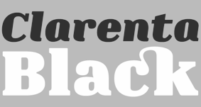
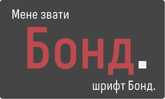 2013:
2013:  Indonesian creator in Jakarta (b. 1985). 7NTypes includes several designers, including Keithzo, but Situjuh Nazara is the founder and main contributor. Creator of
  Foundry, est. 2011, in Raleigh, NC, by
 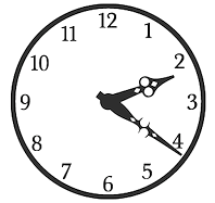 Southampton, UK-based foundry, est. 2006. Font families include Regalese (2008, 8 weights with stylish rounded serifs), Arrow Heaven (2007, 6 styles of fonts with 62 arrows in 40 orientations each), Lydiard (2007, sans cum comic book), Demigrunge (2007), Nidex (2007, caps-only grunge), Rocksolid (2007),
  Turkish type designer in Izmir (b. 1964) who sells through
  [
[ Adien Gunarta is an Indonesian type designer (b. 1995) who is based in Probolinggo, East Java, and who is studying at Airlangga University, Surabaya, class of 2014. His typefaces can be found under his name or under
  Valencia, Spain-based creator of the Bauhaus-inspired monoline geometric rounded sans typeface
  [
[
 Adult Human Male is the type foundry of Malaysian designer Alex Hy, who is located in Berlin or Ireland. His Twitter account says that he is New York, Paris and Coolock. His Dafont account calls him Irish. Whatever. Alex has two aspects, a commercial one, expressed in his commercial foundry Adult Human Male, and a free one via his Squack site on Dafont.
  This used to have alphadings and dingbats by Anastacia E. Zittel (b. 1976) from Douglas, Massachusetts, all made between 1990 and 2002: AEZ-American-Woman, AEZ-Americana, AEZ-April-Fool's-Day-dings, AEZ-I-saw-the-Sign, AEZ-Jon's-Handwriting, AEZ-Kate's-Handwriting, AEZ-Lacy-Hearts, AEZ-Native-American-Turtle,
 Aga Silva (aka Mme. Ping) is an ex-architect/urban designer, who now lives in Krakow, Poland. Creator of the
  Aggeliki Skandalelli is an Athens-born art director and graphic designer. After studying graphic design at AKTO Applied Arts School in Athens, she did an internship at Saatchi&Saatchi /Athens and went on to take a position as junior art director at Fortune Advertising. In 2000 she joined DDB /Athens and in 2003 was promoted to art director. During her time at DDB, Aggeliki collected a Grand Effie for the Tellas Telephone Network campaign, two Ermis Gold awards for an Alpha Bank print campaign and a Knorr TV spot, an Ermis Grand for the Thalassitis wine print campaign and an Ermis Silver for the hair salon Nicolas print ads. Since 2006, Aggeliki has been a senior art director at J. Walter Thompson /Athens, working for major accounts, such as Vodafone, Smirnoff, Amstel, Minoan Shipping Lines and Eurobank. She has also been in charge of various freelance assignments, creating logos, print ads and brochures.
 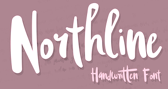 [
[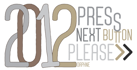 [
[ A.J. Palmer gives away his own TrueType font creations: Bookworm, Casual, Casual Tossed, Goofball, Pretzel,
  American lettering artist whose book Lettering: Brush&Pen in the Single Stroke inspired Nick Curtis in 2006 to design the connected script typeface
  [
[ Albertine Nerevan is a Quebec-based designer, b. 1973.
  [
[ [
[ Designer who lives in Buenos Aires and who teaches graphic design and typography at the Universidad de Buenos Aires. He has worked as an art director in prestigious Argentina-based studios, handling high-profile corporate brands such as Arcor, Marta Harff, Morph, SC Johnson, Danone, and Movicom. He runs
  Freelance Italian graphic designer, b. near Piacenza, 1976, who graduated with an M.S. in Industrial Design in 2004 from
 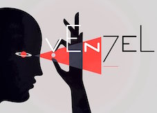 Moscow-based artist who created these typefaces in 2016: Buena Onda, Londa (a connected script), Foie Gras (signage script), Fuego, Cama (a thick connected script), Blackthorn,
  [
[ Talented Russian graphic and type designer who works for ParaType in Moscow. His typefaces:
 [
[ [
[ [
[ Alice Savoie is an independent typeface designer and researcher, b. 1984, based in Lyon. She studied graphic design and typography in Paris at Ecole Duperré and Ecole Estienne, and in 2006 graduated from the MA in typeface design from the University of Reading (UK). In 2014 she was awarded a PhD from the University of Reading for the research she carried out in collaboration with the Musée de l'imprimerie in Lyon (France). Her research focuses on the design of typeface in France, the UK and the USA in the postwar period, and for phototypesetting technologies in particular: International cross-currents in typeface design: France, Britain, and the US in the phototypesetting era, 1949-1975. She collaborates with international type foundries such as Monotype, Process Type Foundry, and Tiro Typeworks, and specializes in the design and development of typefaces for editorial and identity purposes. She also designs multi-script type families, including Latin, Greek, Cyrillic and Hebrew. She intends to sell her typefaces via
  Designer in Wonogiri, Indonesia, b. 1987. In 2018, he published the free script typefaces Hailuna and Anthemie. His commercial typefaces include the excellent retro signage script Bohemian Melody (2018), the signage script Avangarde (2018) and the handcrafted Mentawai (2018).
  Chinese studio that made the Latin script typefaces Agile Script (2015), Belle Script (2015), Lovepen (2015, connected), Smooth handwriting (2015), Caligraphy (2015), Golf (2015), Fancy Signature (2015), Vina (2015, fashion mag headline sans) and Candy Sticks (2014). In 2015, they made Sickle Blade, Bigoo, Bubble (display type), Pipe (art deco), Shuimu (hand-printed typeface), Begade (display type), Guilloches (a textured wavy op-art decorative typeface), Pio, Graffito (a painted graffiti font), Dome (a thin techno sans), and Hemiyong (a script typeface).
  Paolo Vannucci (Alphabet&Type, b. 1969, Punta Marina Terme) created the curly handwritten Halloween typefaces
  St. Louis lettering artist Robert Leuschke (who grew up and lives in St. Charles, MO) has made some 250 calligraphic fonts for greeting cards, including many for Hallmark Cards, of which about 80 are commercially available:
  [
[ Ipatinga, Minas Gerais-based (or Santa Barbara-based, or Belo Horizonte-based) designer of these typefaces in 2011:
  [
[ Free handwriting and some other fonts by Amanda Green Bottoms and hubbie Kevin Bottoms from Auburn, AL, all made in 2005: ALittlePot, Amanda'sCute, Amanda'sHand, Amanda'sScript, AmazingRuler, AnAccidentalKiss, AnnoyingKettle, Auburn, BOSSHOLE, BabyBoston, BabyBowser, BoringShowers, CafeRojo, Carrington, Charlie, ChewyStewy, Clingy, CourtneyDorkling, CrazyMilktopGirl, CryKitty, DigsMyHart, DoIlikeStripes?, DoodolonomyFred, DreamedAboutYou, EightFifteen, Elise,
  American designer, b. 1967, California. Married to Ken Russell, who runs
  [
[ Graphic designer in Colorado Springs, CO. Based on the diary of Seth Barlow (1808-181) kept in the New Bedford Whaling Museum Research Library, Amy Williams created the handwriting font and accompanying textured caps font Seth Barlow Script (2014). [
 Mexican designer who used iFontmaker in 2011 to create
  Using iFontMaker, Ana Leticia Amaral created
  Or Stasya Kolodii, b. 1993. Kiev, Ukraine-based designer who specializes in wild calligraphic scripts. Creator of the outlined handcrafted typefaces Pear Dragon (2017), My Little Scandinavia (2017), Rosemary (2017), Lavender (2017), Sailor Jack Script (2017), Gypsy Soul (2017: textured brush style), Rosemary & Lavender (2017), Drunk Panda (2016).
  Bogotá-based Colombian graphic design studio and type foundry Andinistas was founded in 1998 by
  [
[ Buenos Aires-based illustrator and designer, whose studio is called Bureau AMB. HeHe created the hand-printed typeface
  [
[ This German designer used iFontmaker in 2011 to create
  [
[ Born in Barcelona in 1962,
  Vic, Spain-based designer of the blackletter typeface Kalika (2018), the connected script typeface family Andarina (2018), the free black lapidary serif typeface Gilland (2018: an extension of Gary Elfring's free font Alonse (1993) from 100 to nearly 500 glyphs), the octagonal typeface family Gridger (2018) and the decorative inline typeface Linocut Deko Shade (2018).
  [
[ [
[ Andrew Hart is a Corona-based American digital photographer (b. 1988), who runs
  Canadian graphic and type designer who lives in Vancouver.
  [
[ [
[
 [
[ Argentinian lettering artist who worked for 35 years for McCann Erikson and has produced freelance works for other major agencies like Interbrand, Futurebrand, and others. Veer wrote: The talented Angel Koziupa has been lettering, creating type and designing logos for the past 40 years. His handiwork is behind nearly every important packaging logotype in Argentina. He worked 35 years for McCann Erikson and has produced freelance works for other major agencies like Interbrand, Futurebrand, and others.
  Mexican designer of the hand-printed Bolita, the kids typefaces Nino and Bíblica, the unicase Bauhaus, the round typeface Aqua, the grunge typefaces Gap and Heart, the handwriting typefaces
  Angie Baldelomar is a Lubbock, TX-based type designer at
  [
[ Cofounder, with Ralph du Carrois, of
  [
[ Wernau (was: Wendlingen), Germany-based Anke Arnold's free fonts: aa QWERTZ-Tasten (2012: German keyboard font),
  [
[ Julia Martínez Diana (b. 1990) is based in Buenos Aires, Argentina, where she studies graphic design at UBA. In 2004, she set up the type foundry Antipixel.
  [
[ Mexico City-based designer, b. Huauchinango. He studied graphic design at Universidad del Valle de Mexico in Queretaro City, and received a diploma in corporate identity from LISAVA in Barcelona in 2005. He opened his own graphic design studio in Mexico City in 2016.
  [
[ Designer at FontStruct in 2008 of Interest (dot matrix), Order (constructivist), Attica, Continuum (rounded bold), Fairway (+Slab, +Serif), Slant (techno), Cowboy (2008, Western-themed), Lights in the sky, Olymia Bold, Solida (psychedelic), Digi (pixel face), Villa (heavy slab serif) and Olympia Light. In 2009, he added Versional, Crown, Vend, Reed (Slab, Sans, both octagonal), Spaced Out (Bold, Italic, Regular), Jingle, ReMix (kitchen tile), Squire (3d face), Garage Sale (stencil), Signage, Futility (blackletter), Expearemint, Textual, Callout, tweedie, Embolden, Clipped, Economical, Emphasis, Vessel, Honest, Union (+Flat, +Sans, +
 One of the most dynamic foundries from 2000 until 2003. The "Lab" was run by Apostrophe (Fredrick Nader) and was based in Toronto. The name Apostrophe comes from a Frank Zappa song. It has produced well over 1000 original free fonts, in all formats (type 1, truetype, and opentype, PC and Mac), and nearly all fonts have full character sets. Many have character sets for extended European languages and Cyrillic as well. It was for a few years the only active producer of multiple master fonts.
  Brazilian or Indonesian designer, known as Dan Ghete, Dhan Ghete, Ambia Ambia and just Ambia. His/her foundry was first called
  [
[ Måns Grebäck (Aring Typeface, Örebro, Sweden) is a prolific Swedish designer (b. Lindesberg, Sweden, 1990), who lives in Borlänge, Sweden. Måns Grebäck has a bachelor's degree in graphic design from the University of Dalarna (2012). In 2010, he went commercial, and started selling fonts through
  Andrew Footit (b. 1984) runs his own type foundry in Johannesburg, South Africa. He is also known as Arkitype. Until 2014, his type studio was called Virtue Creative and before that, Virtue84. In 2017, he set up
  ARS Type is an Amsterdam-based foundry with some commercial fonts by Angus R. Shamal. Shamal had earlier published fonts with T-26 and Plazm. Fonts can be bought via
  Artcity is a digital type foundry and lettering studio based in Legionowa, Poland. Artcity specializes in designing fonts for comic books and books for children. The principal, Daniel Bak, is the Warsaw, Poland-based designer of the free monoline signage typeface Sweet Melody (2012). In 2014, Sweet Melody became a commercial typeface. He also designed the comic book typefaces
  Artery Design is located in Gothenburg, Sweden, and is run by Botond Bokor (b. 1978). In 2012, Botond published a few free fonts at Dafont:
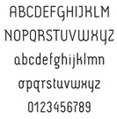

 Bekasi, Indonesia-based designer of the script typefaces
  Type designer from Dimitrovgrad, Bulgaria, b. 1974. Together with Ani Petrova, he designed the extensive handcrafted typeface family
  At the Universidade Federal do Ceará in Fortaleza,
 [
[ [
[ Solo, Jakarta, Indonesia-based designer of Centuries (2019), Belgian (2019: a
  Or Rebecca McCormick. Californian designer of some handcrafted typefaces.
  Designer of the nicy scratchy font
 George Triantafyllakos was born in Thessaloniki, Greece, in 1980. In 2004, he was a PhD student, Department of Informatics, Aristotle University of Thessaloniki. Founder, with Manolis Pratsinakis, of Backpacker, where one can find free Latin and Greek typefaces: BPLatinNumerals, BPbigHead, BPchildLefty, BPchildFatty, BPchubby, BPchubbyFat, BPdots, BPilialena, BPletterSquares, BPletterSquaresWide, BPmolecules, BPmouse, BPmyhand, BPneon [paperclip face], BPpong [light stencil face], BPsquareHand, BPtall, BP PhD Sans, BP PhD Italic, BP PhD Mono, BP Inktrap, BP Script. These include quite a few handwriting typefaces. Commercial handwriting fonts at
  Based in Perry, OK, Bannigan Artworks was founded in 1998 by
 [
[ Barcelona-based foundry involved in custom font work, est. 2005. Original fonts: Inclusive (2007), Urbanium (2005, a bold display face), Handwritten, Eixample (2008, octagonal and rounded), Screech (2008) and Begyptienne. Modified fonts (or re-fonts in their words) include Le Grand Palais (stencil, for La Force de l'Art, Paris, 2006), BeTV (for a Belgian TV channel), and VijfTV (a modification of Chalet for a Flemish TV station). Their custom types include
  Foundry in Wichita, KS, founded in 1999 by Nathan Williams (b. Concordia, KS, 1973), formerly from the University of Kansas Art Museum Library. Its motto: The goal of the foundry is to provide uninterpreted revivals of type samples generated through disappearing printing methods, and create new fonts for dissemination in the type community. Order through
  Belgrade-based creator of these typefaces in 2012:
 [
[ [
[ Creator of Messy Ben (2012, hand-printed) and
  Graphic designer in Paris-Plage, France. He made the hand-printed typeface Kitano (2011, after the handlettering of Takeshi Kitano), the semi-blackletter typeface
  French designer of these free typefaces that can be downloaded at
  French designer of
  Perm, Russia-based designer (b. 1986) of mainly script typefaces. Creator of the brush script typefaces Mushrooms (2017), Kangary (2017), Loveit (2017), Boronic (2017), Wildlife (2017), Fully Flared (2017), School of Rock (2017), Seek & Destroy (2017), Secret Service (2017: a


 Assistant Professor at Utah Valley University in Salt Lake City, who is based in Sandy, UT. His typographic work/
 [
[
 Graphic designer who was first in New York City and later in Venice, CA. Artist who sells via
  Blambot Comics Fonts was founded in 1999 by graphic designer and illustrator, Nate Piekos, and is located in East Providence, RI.
 Type design studio located in Norwood, MA, est. 2005. Fonts can be bought at
  Melbourne, Australia-based scrapbooking company of
  Ukrainian illustrator, photojournalist and web designer in Kiev who created a fun readable Cyrillic script face,
  Creators in 2008 of a series of detailed free fonts:
  Bomparte's Fonts is
  Fiona Clarke (aka
  The
The  [
[ Borutta (or Duce Type) is the creative studio of über-talented Warsaw-based designer Mateusz Machalski (b. 1989), a graduate of Wydziale Grafiki ASP in 2014, and of Warsaw Academy of Fine Arts. His oeuvre is simply irresistible, charming and a worthy representative of the Polish poster style---witness Alergia (2016), Magiel Pro (2017) and Madiso (2017).
  Art director in New York Mills, NY, and/or Rabat, Morocco, whose web site was called Hipster Font, and is now called Bowery Studio. Designer of Adasmine (2017), Denarrio Script (2017), Arminia Script (2017), Blanca Script (2016, brush script), Amazing (2016), Anatalia Brush (2016), Grace Elegant Script (2016), Daisy Script (2016), Miraluna (2016), Antype Script (2016), Antype Sans (2016), Saser Script (2016), Asmae (2015, brush script), Rinoshare (2014, a sketched font), the octagonal typeface Hipster Grunge One (2014), the poster font Ice Cube (2014), the spurred tattoo font Athena (2014), Bushcraft (2014,
 Mexican graphic designer, b. 1986, who lives in Hermosillo. He created a number of typefaces, some of which are free. Also known as Fractal Eye.
  Foundry created in 2006 by Virginia Beach, VA-based
  Designer (b. 1980) in Sonora, Mexico, who is involved in The Cowboy Fashion Journal. He created
  [
[ Belgian designer (b. 1978, Brussels, based in Brussels) of fonts at
  Type designer, aka
  During his studies in Barueri, Brazil, illustrator Bruno Lhaes designed the wonderful eerie
  Hungarian foundry with commercial and free fonts, est. 2005 by Attila Zigó. On Deviantart, they claim to be from Rwanda. They specialize in grunge type--some of the fonts are quite gorgeous indeed. Has a fontmaking service.
  Burghal Design (Tujunga, CA) offers commercial "fonts for the complacent middle class" by
  Dan Haag-based Dutch foundry, est. 2004 by
  Lviv, Ukraine-based designer of these typefaces in 2017: Buenos Dias (brush script), Gillian (brush script), Wisteria (irregular script),
  Foundry in Canada, est. 2004 by Rebecca Alaccari in Toronto, and run by her and Patrick Griffin.
  Carine de Wandeleer was born in Argentina to a French-Belgian immigrant family. She studied fine arts and graphic design at University of Buenos Aires, but lives and works in Spain.
  [
[ Carl Leisegang (b. 1984), aka
  Carla is a graphic designer originally from Costa Rica. She attended the Universidad Iberoamericana in Mexico City, and graduated from the Minneapolis College of Art + Design (2007). She lives in Minneapolis, MN. With Chank Diesel, she is working on a curly bilined script typeface called
  Padova-based graphic designer, teacher of advertising art at the Istituto Statale d'Arte Michele Fanoli in Cittadella Padova, Italy. Organiser of the international calligraphy award Belle Lettere (1997). The resulting publication Belle Lettere won the Fedrigoni Prize for graphic excellence. At ATypI in Rome in 2002, he
  [
[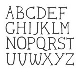 A graduate from Cambridge School of Art, carmen Lam lives in Bury Saint Edmunds, UK. She created a
  [
[ Carolina (or Caro) Marando is a graphic designer from Caballito / Buenos Aires, Argentina. She graduated from the Gutenberg Foundation in 2012. Together with Alejandro Paul of Sudtipos, she designed
  Medellin, Colombia-based designer (b. 1972) who graduated from UPB University in 1998. Creator of the free hand-printed typefaces Astrid (2012), Yelly (2006),
  Carolyn Porter is a St. Paul, Minnesota-based graphic designer, type designer, and author.
  Wolgast-based type designer Peter Wiegel (b. 1955) runs CAT Design Wolgast. Designer of these free fonts:
  [
[ Specializing in celebrity signature fonts, this Arcadia, CA-based foundry (est. 2008) is run by
  Foundry in Madrid. Their first commercial typefaces are
  Malaysian designer (b. 1984) based in Petaling Jaya.
  Born in Edmonton in 1969,
  Charis Tsevis was born in Athens in 1967. He studied Graphic Design and Advertising (Diploma) at the Deutsche Hohere Lehrastalt fur Graphic Design, Athens, Greece, and Visual Design (Master) at the Scuola Politecnica di Design, Milan, Italy. He is the Vice Head at the Graphic Design department of AKTO College of Art and Design / Middlesex University (in Athens), where he teaches editorial design and typography. He runs Tsevis Visual Design, his own studio in Athens, and collaborates with 'Parachute Type and Image Corporation' designing typefaces. He runs a type blog site. Charis is a regular columnist at RAM, the leading computer publication in Greece. He is also a regular columnist in +Design, an authority design Greek magazine covering aesthetics and design issues. Charis studied Graphic Design at the Deutsche Höhere Lehranstalt für Grafik und Werbung, Athens. He received his Master Degree in Visual Design from the Scuola Politecnica di Design, Milan, Italy. He worked for MBStudio in Milan and later for Apogevmatini, a national historic Greek newspaper. Since 1997 Charis runs his own design firm Tsevis Visual Design.
  [
[ Charles Percival (or just Percy) Bluemlein (b. 1891) served in the 346th Infantry in World War I. In 1920, he married Mildred Vanderbilt and settled in Brooklyn, NY. He died in 1944 and is buried in the Long Island National Cemetery in Farmingdale, NY. Famous for his scripts and penmanship, his best known book is
  Started in 2008, this web place by Norwegian entrepreneur Roger S. Nelsson (based in Honningsvåg, Norway) sells fonts by Ray Larabie, Brian Kent, Nick Curtis, Derek Vogelpohl and Kevin King that were originally freeware fonts. Nelsson reworked them (more glyphs, more multilingual) and asks about 10 dollars per font now. He says his fonts now cover these Latin languages: Afrikaans, Albanian, Basque, Belarusian (Lacinka), Bosnian, Breton, Catalan, Chamorro, Chichewa, Cornish, Croatian, Czech, Danish, Dutch, English, Esperanto, Estonian, Faroese, Filipino (Tagalog), Finnish, French, Frisian, Galican, German, Greenlandic, Guarani, Hungarian, Icelandic, Indonesian, Irish (Gaelic), Italian, Kashubian, Kurdish (Kurmanji), Latvian, Lithuanian, Luxembourgian, Malagasy, Maltese, Maori, Northern Sotho, Norwegian, Occitan, Polish, Portuguese, Rhaeto-Romance, Romanian, Saami (Inari), Saami (Lule), Saami (North), Saami (South), Scots (Gaelic), Serbian (latin), Slovak(ian), Slovene, Sorbian (Lower), Sorbian (Upper), Spanish, Swedish, Tswana, Turkish, Turkmen, Ulithian, Walloon, Welsh, Yapese.
  Creator of the iFontMaker font
  [
[ Christian Naths (Edmonton, Alberta) created the experimental typeface
  Creator of the
  Namibian-German designer of
  Born in 1982 in Karslruhe, he is one of the cofounders of
  [
[ [
[ British creator of The Dog Ate My Homework (2016), Social Circles (2016, web icons), Christopher's Scribble (2013) and
  [
[ Claire Agopian graduated in 2007 from
 [
[ Free fonts by Swedish designer
  Brazilian design company located in Recife, which lists type and design events in Brazil. Fatima Finizola is the Recife-based Brazilian designer (b. 1975, Recife) of the dingbat typefaces
  Manuel Eduardo Corradine Mora was born in Bogotá in 1973. He graduated from the School of Graphic Design of the National University of Colombia in 1996, and became a graphic designer. He started by custom-designing fonts and by making typefaces for his own company, Casa Papelera El Cedro (The Cedar Papermaking House), for printing invitation cards. With other designers like Carlos Fabián Camargo, John Vargas and César Puertas he formed Tipográfico in 2007 to strengthen the type discipline in Colombia.
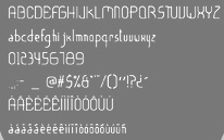
 Born in Firenze in 1969. Cofounder with Francesco Canovaro and Debora Manetti of the Italian design firm in Firenze called Studio Kmzero. He co-designed some typefaces there such as
  Established in 2013 by Hollywood, CA-based Jason Walcott (formerly operating as
  Mississippi-based designer (b. 1985) who created the serifed hand-printed font
  Type designer (b. 1951, New York) in New York City, who studied at Pratt. His type foundry, Cozy Fonts, is located in Bell Canyon, CA.
  UK-based designer in 2008-2009 of the free fonts ABC (using arcs of circles),
  Cakovec, Croatia and Washington Park, WA-based designer (b. 1995) of preponderantly grunge typefaces. In 2013, he created Funny Classic, Lion Pro, Lover, War is in the Air (military stencil), Aussen (squarish), Ensione (outlined), Rangle, Gaon, Momgers, Escapea (athletic lettering),
  [
[ [
[ Florent Courtaigne graduated in graphic design - ENSAD / Art Décoratifs de Paris. He founded created Cubo Fonts in 2008, and works as a graphic designer and drawing teacher in the LISAA Design School in Paris. Now a graphic designer, illustrator and art director based in Paris, Florent Courtaigne is the creator of the free circle arc and straight-line fonts Cyclo and Cyclo Bold (2006).
  Cuda Wianki graphic design studio in Warsaw, Poland, was founded by Aleksandra Dabniak (or: Ola Debniak) and Paulina Rek, two graduates from the Warsaw Academy of Fine Arts.
  Cindy Kinash is an apparel graphic designer from Canada. She started the Cultivated Mind foundry in 2012, and made a reputation as a script font designer. She published the hand-printed poster typefaces
  Game writer, game designer, graphic artist, and the creator and owner of Cumberland Games & Diversions, b. Cumberland, MD, 1971. He lived in Austin, TX, but is in Denver, CO, since 2014. Typefaces by S. John Ross include Sex Nerd (2021), Guacamole Quickstep (2019), Cynocel Poster (2019), Monesque (2019), Flagstones (2018), Kentucky Fireplace (2016), Bad Guy Black (2015, an engraved currency font), Silvery Tarjay (2015), Iron and Brine (2015), Afton James (2015), Fountain Avenue (2013),
  Petros Vasiadis is a graduate of Vakalo Art & Design College who works in Athens, Greece. Petros Vasiadis set up CYN Fonts in Athens, ca. 2013, and offers these free (mostly brush) fonts for Latin and Greek: CYN Kypselers (hexagonal), Logikfron (grunge), Me Rider (grunge), Banxed (hexagonal), CYN Ypsoma (hand-printed), CYN Unlimited (brush),
  Dame Hex is the designer of Gorey, a free font based on the distinctive hand lettering of Edward Gorey. [
 American designer of
  [
[ Squid (aka Dave Cohen) is a font designer, sculptor, illustrator and musician. He has executed hundreds of prototypes for the toy, ceramics and gift industries, such as tiki mugs. Squid's fonts are published exclusively by Sideshow Foundry. You can see his other musings at
  [
[ [
[ [
[ [
[ David Neustadt ("saberrider") is the designer who used FontStruct in 2008 to make the experimental fonts Eye Pain, Colorblind, Big Blue (like IBM's stripes), Cord, Fontsract (a nice stencil face, based on piano keys), Dice (great; based on an idea of Daniel Pelavin, 1996), Blux (liquid crystal), Blockiger (octagonal), athletica (athletic lettering), divided (two lines, octagonal), edgewalker (heavy slab serif), geomatrix (filled-in letters), olympica. Other creations include Picto People (2008, a great people figure dingbat font), Carmack (2008, octagonal), Pluto (2008, white on black), Pluto Lowercase, Arena Berlin (2008), Katja (2008), Average (2008), Unbalanced (2008), Solido (2008, based on Ata Syed's FS Minimal), Noise (2008, grungy school letters), and Diagonalis (2008, diagonally striped letters).
  David Pustansky (b. 1985) is a UK-based type designer who was active in 2005-2006, when he operated as David Martin and his web site was called
 Eagle Mountain, UT-based creator of free and commercial fonts and icons, ca. 2014---often poster fonts in the style of Pintassilgo or Hanoded---including Pleasantly Plump Icons (2013), Skewed Icons, Stacked (2013), Torple (2014), DubBub (2014), End To End Mini (2014), The Right Stuff Mini (2014), Gab Mini (2014), Two and Two Mini (2014), Peabo (2014, stars and stripes font), Forfty Mini (2014), Scribble (2014), Quick & Dirty Mini (2014), Cedar (2016), Aquabella (2016).
 Designer of the typefaces
  Delfina Duarte was Cristiane Delfinah. This Brazilian created the curly girlish script
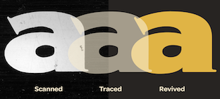
 Canadian designer of the (free) shadow circus fonts
 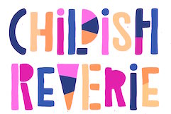 [
[ Digital artist from Quezon City, The Philippines, b. 1991. Aka Douxiegirl. Creator of the mostly handcrafted fonts Laser Metal (2015), Honeytone (2015), Aloha Sunshine (2015, curly script),
 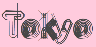 [
[ American creator of these free fonts: the sci-fi typefaces ISL Sickness (2012, dot matrix face), ISL Flak (2012), AlphaBot (2012, inspired by Bionic Systems), Fade to Blak, Jupiter (2012, inspired by Mass Effect) and Andvari (2012, an octagonal typeface inspired by Planetside), the pixel typefaces VsNano (2012), Xen (2012), and Onyx (2012), and the hand-drawn typeface Villain (1998, adapted for two-coloring).
  Located in Melbourne, Australia, d[esign] (Domenicos Design) was founded in 2007 and is headed by
 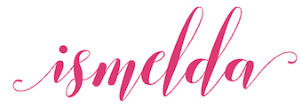 [
[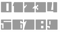 Aka Dhe Woman Nice, b. 1990, Jakarta City, Indonesia. Aka Dhe Bulet Tree, Dhezonk, Typogirl, and Fitri Apriliani. Designer of the black artsy typeface
  German cartoonist and animated gif artist (b. 1965) who lives in Lorraine. She designed
  Argentinian graphic designer and recent docent in graphic design at the University of Buenos Aires. He graduated in 1991 from the University of Buenos Aires with a degree in graphic design. He worked at Arcor, and after a brief sabbatical in London at Interbrand Newell and Sorrell during 1999, he returned to Argentina, where from 2000 on, he is the Director of Design at Interbrand Avalos&Bourse. His fonts:
 Famous Greek illustrator, who studied geology and paleontology and worked as a specialist designer for archeological findings. Among his influences are Edmund Guy and Philip Burke. His designs appear weekly in magazines and often in advertising campaigns. He has designed several typefaces
  Dismantle Destroy (and before that,
  Megan Tamaccio (District 62, Miami, FL) designed the Jack & Zoe Font Collection and the LilRebel and
  Yus Wardi (Diyos) is the Indonesian designer of these typefaces:
  Darcy Baldwin (DJBFontography) is the Texas-based designer of these handwriting typefaces in 2007: DJBABITOFFLAIRE, DJBADEE1, DJBAMANDAG, DJBANGELA, DJBANNALISE, DJBANNETTEscript, DJBCHERE, DJBCHRISTINEC, DJBCINDA, DJBCINDAs, DJBDAWN, DJBDOODLEDOO, DJBELIZABETHK, DJBELKE1, DJBEMILYS, DJBEuroscript, DJBGINAE, DJBGISELLA, DJBJANELLE, DJBJANINE, DJBJENB2, DJBJENNA, DJBJENNIFER, DJBJENNIFERscript1, DJBJOAN, DJBJOYscript, DJBKATHERINE, DJBKATRINE, DJBKEELYB, DJBKEELYBscript, DJBKELLEY, DJBKENNAscript, DJBKIRA, DJBLINDSE1, DJBLINDY, DJBLIZ, DJBLORRAINE1, DJBMANDY, DJBMEGAN, DJBMETA2, DJBMISH, DJBMichael, DJBPOOKIEDOO, DJBRITA2, DJBSOFEE1, DJBTABITHAscript, DJBWENDY, DJBWENDYPscript, DJBWRITESALOT. In 2008, she made DJB Treasure Hunt, DJB Curlie Wurlie, DJB 2Cute4U, DJB Heart of Dixi. Fonts made in 2009: DJB For Annie, DJB Sloppy Joe.
  Ukrainian type designer (b. 1977, Buryn) who graduated from Sumy State University in 1999. Since 2002, he creates digital fonts. He also works at Dancor advertising in Sumy, Ukraine, since 1997. Very prolific, his work includes a substantial number of commissioned typefaces for magazines and companies.
  Doghead Studio is the personal foundry of designer Jon Jennings. Jennings created the free handwriting font Lucidity (2008).
  Creator of the iFontMaker font Dimensional Hand (2010, hand-printed and 3d). [
 Ferndale, MI-based designer of the handcrafted typeface families Emily (2016), Hatross (2016, for metalheads), Secret Society (2016), Tzanah (206) and Pugzley (2016), the textured typeface Verboten (2016), the vintage typeface Hipster Dream (2016), and the grungy headline typeface Dark Matter (2016).
  [
[ Brazilian resident who specializes in original grunge designs. His typefaces are mostly free. Some commercial typefaces are available via
  Type foundry in München run by independent designer Antje Driemeyer, a graduate from the University of Applied Sciences Augsburg, Faculty of Design in 2004. Antje specializes in type design, corporate design and editorial design.
 Serbian graphic designer located in Gornji Milanovac, Serbia. Cofounder in 2009 with
 Designer of
  [
[ Magelang, Indonesia-based designer of the signage script typeface Justlyne (2017), the connected scripts Arthurdale (2018), Natalia Rosaline (2018, a font duo at Runsell Studio), Rusted Orlando (2018: monoline), Jaquilane (2018), Soulgates (2018) and Qatar Capital (2018), and the handwriting typeface Morristone (2018). He also designed the vintage typefaces Classic Arkansas (2018), Retro Chalet (2018) and Echomotors (2018).
  [
[ Eduscol is a web site of the Ministère d'Éducation Nationale for French educators. In June 2013, a package of school fonts became available for free download. These are serious writing fonts, with and without lines, that cover upright and italic scripts, and connected and unconnected handwriting. The type designers in charge of the development were Marion Andrews, Malou Verlomme and Laurence Bedoin. For samples of
  Creator of the scratchy hand-printed typefaces
  [
[ [
[ Elizabeth Waterhouse is co-designer of the
  German type foundry in Hamburg established in 1986 by Veronika Elsner and Günther Flake. They offer original fonts as well as improved versions of classical fonts. There are many non-Latin fonts as well. In-house designers include Jessica Hoppe (Carpediem), Verena Gerlach (
 [
[ [
[
 Plainville, Massachusetts-based Emily Spadoni (b. 1979), runs her own foundry, simply called Emily Spadoni. She specilaizes in scripts, and in partucular, curly, frilly, mischievous scripts and vavoom vampire handwriting. In 2014, she made these hand-printed typefaces: Drawing With Markers, Peanutbutter Smoothies (curly), What I Want For Christmas, Sweethearts Love Letters (curly script), Strawberry Whipped Cream, Silver Bellybutton Ring (cute curly script), Betty, Pink Ladies and Peanutbutter (a curly teatime script), Tall Tulips, Doodle Dings 1 Birds Cages.
  [
[ Creator of
  Located at the University of Paris, Emmanuel Beffara designed the
  Graphic designer in Barcelona, who made the text typeface Sonetto in 2014. This typeface was modeled after Gudrun Zapf-Von Hesse's semi-calligraphic typeface Hallmark Shakespeare (1968). [
 Andrew Leman is a prop designer in Hollywood, CA. The type foundry
  French designer (b. 1973) whose early fonts could be bought from 2Rebels in Montreal, and at La Fonderie. These are now available via
  [
[ Brazilian printmaker, graphic artist and illustrator, b. 1975. Her fonts are created together with Ricardo Marcin at
  Erik lives in Zwolle, The Netherlands, and was born in 1964. He designed the splendid free handcrafted typefaces Eryx Rennie Macintosh (2015, Scottish arts and crafts typeface),
  [
[ Lucaz Mathias (Estudio Cao, Jacarei, Brazil) designed the blackboard bold art deco typeface family
 Graphic designer and musician (b. 1982) at the New York studio AWP who grew up in Maine and is currently based in Ithaca, NY. In 2018, he founded Etcetera Type Company, which is based in Spencer, NY.
  Fontstructor who made
  Institute in Benalmadena, Spain (was: Santa Severa), where one can take 4-week courses at 1450 Euros a shot on the Etruscan alphabet, Trajan, Cuadrata and Rustic Roman Capital letters, and related subjects. They also organize lettering tours in Italy and guided tours in various musea. The teachers are Alberto Di Santo (Professor of the visual communication, Tor Vergata University, Rome; Professor of Graphic Design, Istituto Europeo di design, Rome; Professor of editorial design, La Sapienza University, Rome; Professor of Typography, C.F.P. Sinalunga, Siena) and
  [
[ Commercial foundry in London that specializes in hand-painted and brush styles. Their web site does not work on Firefox. F Is For Fonts made the free grunge slab serif font F. Vermont (2013). Commercial typefaces at 30 pounds a pop:
  Chilean designer of the great splashy scratchy paint-simulation typeface
  French designer (b. 1985) of the grunge typefaces
  Austrian foundry located in Vienna, est. in 2008 by
  Computer engineer in Riyadh, Saudi Arabia. Creator of the modern Kufi Arabic typeface
  French designer of
  Fat Cat Fonts (was: Mintcure) offers absolutely wonderful grunge fonts by CT-based Jennifer Dickert. These include Caterpillar, La Ment,
  Graphic designer from Brazil, b. 1989. Designer of FDHelwoodica (2008), a grungified Helvetica (2008), and similarly grungy FD Stenciluxe (2008), FDBateek (2009), FD Stripped for BUP (2009, arched Times New Roman face), FD J Borges (2009, extremely funny dingbats based on the work by Brazilian artist J. Borges), FDIlhoscript (2009, handwriting) and FD Carimboh (2009).
 [
[ Fernando Forero (b. 1978, Tunja) ran EisartGraphic.com together with Weronika Kwiatkowska, and moved from Bogota to Kalisz, Wielkopolska, Poland, where he
  [
[ Jens Ziehn (Filmhimmel, aka Jay R. Zay or JRZ) designed fonts on the theme of films. Filmhimmel closed its web doors ca. 2007. The list: 007-GoldenEye, 13th-Ghostwrite-JRZ, 28-Days-Later, a-bug's-life---debugged, a-bug's-life, AVP, AVPyramid, Alien-Resurrection, Anatomie-2, Apocalypse-Now, Blade-2, Chocolate-Factory, Elektra, Goonies, Highlander, Insomnia, Jurassic-Park, Koyaanisqatsi, Mars-Attacks, Men-In-Black-Credits, Monster-AG, Nightmare-Before-Christmas (a German expressionist typeface), One-Flew-Over-The-Cuckoo's-Nest, Planet-of-the-Apes, Road-to-Perdition, Shaun-of-the-Dead, Sin-City, Sleepy-Hollow-3.0, The-Sixth-Sense, The-Thirteenth-Floor, Van-Helsing, Signs---Zeichen-2.0 (old typewriter font, and grungy zodiac sign emulation capitals), The-Incredibles, The-Ring (handwriting), Daredevil, Durchgeknallt, Findet-Nemo, Lost-Highway, Phone-Booth.
 [
[ [
[ Creator of these free fonts in 1997-1998: Atchy, Etchy, FeelingDumped, FontosCrude, Gossip, SyntacticLower, UltraSonic (futuristic, horizontally striped),
  Japanese site with original fonts by Kato Masashi (b. 1973), who lives in Takasaki (Gunma prefecture, Japan): Parismatch (2004), SAKUalp (2000, handwriting), Steeltype, Broadband, Hivision, Cinematime, Ultracomic, Ice Cream, Be Happy, Summer Beauty, Flyermix, Cheerscript, Breakstyle, Breakfont, Round, H-Five, Natsucomi, Long Vacation, Lovers, Breakfont (2003, graffiti style), Pokkaman, BeHappy, Natsucomi, Momolcan, Seasons Dings, Electron, Round, Lovers, FlyerMix (fifties style), CheerScript (comic book style), Hi-Five (pixel font), Summer Beauty, SummerDrive, White Day, Long Vacation, Amayadori (high contrast kana font), Fuyucomi, Icecream, Pickett, 321, Pingpong, Frontline, Ginza, Yago (nice free dings), Polaris, 321eng, 321kana, APPLE, CLIQUE, Clover (kitchen tile font, 1998), DIGI, Eneneng, Enenhira, FDalp, FDwhie, Hnoodle,
  [
[ Samuel Marcius (b. 1970, from Boeblingen, Germany) has a web page for his own creations (fonts and dingbats). My own logo---the moose on all my web pages---is from Marcius' WinPets 1---I liked the sense of humour that shines through the drawing, and the spirit of Don't take life too seriously.
  Chris Vile (Fontmonger, Austin, TX) is a type and graphic designer and web developer, who was briefly located in Chicago. He specializes in horror, graffiti, grunge and brush fonts.
  Original fonts by Ben Balvanz from Cedar Rapids, Iowa (b. Cedar Rapids, 1975), who now lives in South California. His
  Russian designer (also spelled
  Launched at the end of August 2009 by Håkon Bertheussen, this was a truly free font generation service---the users own the generated fonts, and there are no commercial interests behind the scenes. Some minor improvements are being implemented. It looked and felt like the popular YourFonts, which is not free. Håkon Bertheussen is a design engineer at Atmel, Trondheim, Norway. He runs
  Fontforecast is a type foundry in the Netherlands that was set up by Hanneke Classen in 2013. Hanneke designed
 FontMeister is the commercial foundry of
 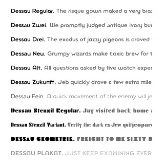 Gábor Kóthay (Fontmunkások) is a Hungarian type designer (b. 1962) who lives in Szeged.
  Italian creator of Broken Depth (2015, a shadow font), Fuzzy (2015), Dark Place (2015, scary font), Whispers Calligraphy (2015), Vintage College Dept Worn (2015), Peacock (2015), the free handcrafted typeface Old Sydney (2015) and the vintage typeface Old Bob Junior (2015).
 Ukrainian font foundry run by Genadij (also spelled Henadij) Zarechnjuk (b. 1961) who lives in Lviv. Nice historically accurate free fonts made by him in the period 2000-2003:
 [
[ Polish type designer who teaches graphic design at the Secondary Art School in Bydgoszcz. Second prize at the 3rd International Digital Type Design Contest by Linotype Library for the handwriting fonts
  [
[ Design consultancy in Lajeado, Rio do Sul, Brazil. In 2014, they published the
  Digital type studio in Santiago de Chile run by by Francisco Galvez Pizarro and Rodrigo Ramirez. Their typefaces:
  [
[ [
[ French creator of a large number of free typefaces, starting in 2012.
  Cartoonist from Recife, Brazil, b. 1966, whose sense of humor and artsistic prowess shine in his dingbat fonts.
  GalloFonts is part of Graphics by Gallo, founded in 1974 by
  Seattle-based type designer (b. 1951, Spokane, WA) who founded
  J.F.Y. Daniel Gauthier (GautFonts) was born in Montreal in 1964, and lives in Hamilton, Ontario. His fonts from 2005 and before include BarrelOfMonkeys, ChainFontOpen, ChangChang, ChangChangWoodcut, DirtyDarren, FireStarter, GriffinDucks, Jenna Myles, LollipopLettering, Lymphnodes, PooCorny, PooSmooth, Quake3ArenaBats (scanbats),
  Creator of the iFontMaker font
  Geen Bitter (Den Haag, The Netherlands) consists of Thom Janssen (b. 1984, Maastricht),
  [
[ Russian designer of the bouncy script
  Aka Bud White. Dundee, Scotland-based creator of
  Type designer based in Vienna, Austria. Codesigner with Marcus Sterz at FaceType of a Victorian type family called
  American designer, b. Rockville Centre, NY, 1950. George Ryan held senior positions at Linotype and Bitstream since 1979, where he has been involved in the production of over 2500 fonts. In 2004, Ryan joined Agfa Monotype, and is now a Monotype typeface designer.
  [
[ [
[ First called Geronimo Fonts, then Paradox Fontworks, and then Typewire Studios, this American studio created these free fonts in 2015: For Sara, Funkytown, Necktie (blackboard bold), Northpoint (strong octagonal varsity font), Kevin Eleven (handcrafted 3d font), Back to School (handcrafted), Musicnet (dot matrix font), Anxiety, Starship One, Astronaut City (comic book style), Internet Friends, Solitude (rounded sans), Kinetic Extreme (+Solid), Crank, Disco Flow, Psychedelic, Lemons, Bokai, Royalty Code, Operation (military octagonal stencil face), Northwest (squarish), Hijack, Establishment, Jamstone, Skinz, The Antenna, Distortion, Los Mesitos, Rock Salmon, Hand Stencil, Crossroads, Upton Funk, Zero Theory, The Million Mile Man (3d outline font), Blueberry Pie, Boraodway Musical, Block Cartoon, Cinematic Language, Kayak, Aerospace, Russian (constructivist), Lines (white on black), Ohio Collegiate, Alkaline.
  Austin, TX-based creator of several alphabets with sharpie pens. One of these, Sharp5, was turned into a
  Gerrit Noordzij (b. 1931, Rotterdam; d. 2022) was a Dutch graphic designer, typeface designer, author, teacher, calligrapher, and design artist who made drawings, wood and copper engravings, and postage stamps. From 1960 until 1990 he taught writing and type design at the Royal Academy of Art in The Hague. One of his many students there was Lucas de Groot. Noordzij has worked as graphic designer for various Dutch publishers. Since 1978 he has been the house designer for the publishing company Van Oorschot. His intellectual influence is matched by his physical heritage, in the form of two talented sons in the field of type design, Christoph and Peter Matthias. The Gerrit Noordzij Prize, a prize given to typographers and type designers for extraordinary contributions to the field, is named after him. He was also the first person to receive this prize in 1996. In 2013, Gerrit Noordzij reveived the TDC Medal at the ATypI in Amsterdam.
  [
[ Gia Tran is a self-taught calligrapher and type designer. He has worked for Dragon Rouge, 4uatre and A&Mcreative in Paris, as well as Saffron Brand Consultants in Madrid. Gia was the Type Director at the French foundry
  Gigofonts is a Ljubljana-based foundry run by
  Designer in Firenze, Italy, b. 1991, who works as Gud, and who studied industrial design at ISIA Firenze. She heads
  Giulio da Milano (1987-1990) was an Italian painter and type designer. He was the first director of Nebiolo in Turin (from 1930-1936), and was succeeded in 1936 by Alessandro Butti. All his fonts were published at Nebiolo:
  [
[ A type designer from Santa Cruz, CA (and now Oakland, CA), Matt Chisholm (Glyphobet; was: mattt's fonts) created mainly handwriting and display fonts. He obtained a BA in Mathematics from UC Santa Cruz. All his fonts were initially free---these included MRPHONE1, MRPHONE2, MRPHONE3, MRPHONE4, MRPHONEAlternates, CheckerHat, EverydayFont (Roland Berger, 1994),
  Japanese foundry, est. in Fukuoka in 2005 by Shintarou Nakayama (Goma Shin), b. 1982. It offers these free fonts, many of which are in the grunge or techno styles: Steel Boy (2005, techno), Manzyu (2005, liquid), The Past (2004),
  Designer from The Philippines. She created the handwriting fonts Vanamare (2009), Quest of Lies (2009), Lehova (2009, straight vertical hand-printed), Poisoned Tea (2009), Nuajas (2009), Nitalus (2008), Penspire (2008),
  [
[ Shawn Hooghkirk (Graticle, located in Longview, WA) created the handcrafted typefaces Quarterback Keeper (2015), Rough & Ready (2015), Gorilla Girl, Dog Faced Man and Alligator Man in 2015.
  Great Lakes Lettering in Eau Claire, WI, showcases the type designs of Dathan Boardman and (Detroit, Michigan-based) Molly Jacques (formerly Molly Jacques Erickson). They jointly designed the illustrative handwriting font
  A group of independent designers from Poland, heade by Bartek Nowak, and located in Staromiejska. Nowak has been designing typefaces since ca. 2000. Typefaces:
 Bordeaux, France-based designer of the rounded stencil typeface Libournavelo (2015, +icons). This font is used to promote bicycling in the city of Libourne. He also made a flowing hand-printed typeface for La Table de Josephine, a restaurant in the Hotel Kyriad in Bègles, France.
  Creator of
  Swedish type designer associated with
  Andreas Gustavsson is a Swedish designer, b. 1979, located in Nyköping. At MyFonts, starting in 2013, the name
  Brazilian designer (b. 1977, Rio de Janeiro) who worked in Amsterdam, The Netherlands, and is based in Cunha, Brazil. In 2009, he founded
  Tel Aviv-based Ben Nathan designs Hebrew typefaces.
  Commercial foundry, est. 2007 in Burlington, VT, by
  The Hallmark Cards company was founded by J.C. Hall. Fonts with the letters HMK in their names are produced by Hallmark, the well-known postcard company in Kansas City, MO. These include early fonts such as Hog-Bold---HMK, Hog-Book---HMK, Jot-Medium---HMK, Marita-Medium---HMK, Marita-Script---HMK, Trots-Light---HMK, Trots-Medium---HMK and later (1997-1999) fonts such as BaaBookHmk, BernhardFashionHmk, BethsCuteHmk, BixAntiqueScriptHmk, BoogieWoogieHmk, ChrisHmk, CluffHmk, DesertDogHmk, FrancineHmk, FultoonHmk (by Nancy Fulton), GeeohHmk, HavixHmk (by Doug Havach), JanieHmk, Jewels, LamboHmk, McBooHmk (by Megan Walsh), NotnorvalHmk, OkrienHmk,
  "The Men in Blue" show the handwriting of several type designers. My personal favorites are Erik Spiekermann and Dino dos Santos. [
 [
[ [
[ [
[ [
[ Hanoded is the
  German animation artist who lives in Southern California where he works for Disney Feature Animation. He is a member of the Academy of Motion Picture Arts and Sciences. His typefaces were mostly made at Agfa-Monotype:
  Niedersachsen, Germany-based creator of the iFontMaker fonts
  Elias Hanzer is the Berlin, Germany-based designer of the sans typefaces EH Eins A (2018?), EH Normal (2017) and Eh Gut (2015). He also created typefaces Phase
  German type designer, b. 1980, Frankfurt. He runs a design studio in Frankfurt.
  [
[ Harold Lohner was born in upstate New York in 1958. He received an MFA in printmaking from the University at Albany and is Professor of Visual Arts at Sage College of Albany. He began making fonts in 1997 and starting distributing them the next year through Harold's Fonts. He lives in Albany, NY, with his partner, Al Martino. Originally, most of his typefaces were freeware or shareware, but gradually, he started selling most on his site or via
  UK's Tom Oldfield (b. Yorkshire) designed some free fonts and a few commercial ones: Bokken, Creole, Dimbaza, Extrema, Gasoline, Quorn, Litany, Whiplash,
  Oregon-based creator of the freeware fonts
  Designer of these
  Tom Wallace's foundry, HiH (est. 2005), was first located in Woodbridge, CT. Subsequently, Tom Wallace (b. 1944) moved from Woodbridge to Naugatuck to Waterbury and finally in 2009 to New Britain, CT. His type designs are based on historical letterforms:
  "Homeless Fonts" is a Spanish project to turn hand-scrawled cardboard signs into charitable assistance. Homeless Fonts, a joint effort between the charitable Arrels Foundation and creative agency McCann Worldgroup, has paired designers with a small band of homeless people in Spain. The end goal is to sell these fonts to corporations that will use them to push their brands, with the financial proceeds going toward Arrels' homeless-outreach work in Barcelona.
  German printmaker, draftsman, and lithographer, whose prints are exaggerated, semi-surrealistic, and breathtakingly beautiful. He was born in Hamburg in 1929 and died in Oldenburg in 1995. His prints had a characteristic uneven hand-printed lettering that led Erica Jung and Ricardo Marcin to
  Foundry located in Yorkly, DE. House Industries is run by Rich Roat and Andy Cruz with designer Ken Barber as Typography Director. Originally founded in 1993 by principals Andy Cruz and Rich Roat, House Industries has grown into a studio which sells unique display typography, illustration and design services, and, most recently, clothing and accessories. Fonts sell for 50 USD per face, and about 175 USD for ten. Many of the typefaces are grungy or special effect fonts, and all font names have the word "house" in them, as in the graffiti font Phathouse. Custom font service available.
  Creator of the iFontMaker font
  UK-based creator (b. 1975) of the poster typeface
  Free fonts by Vietnamese cartoon artist Hung Lan Nguyen (b. 1956, HoChiMin City) include the brush and handwriting typefaces VNI-Comicbook, VNI-Matisse, VNI-BriquetNormal, VNI-Disney-Normal, VNI-Diudang, VNI-Nhatban, VNI-Baybuom-Normal, VNI-Truck, VNI-Yahoo, VNI-Thanhcao, VNI-Thufap2-Normal, VNI-Thufap3, VNI-Thufapfan-Normal, VNI-Viettay-Normal, VNI-Butlong, VNI-HLThuphap (Treefrog style face), VNI-Netbut, VNI-Thufap1, VNI-Whimsy, VNI-OngDoHL. These typefaces include some real beauties, such as
  Huy Fonts is a foundry in Madrid run by
 Type designer from Seoul, Korea. He started as a participant at the Koren typefoundry S-Core, and set up his own foundry, Cretype, in 2017. At S-Core, he published the Latin / Hangul typefaces
  Zachariah Nelson (I Can Be Your Type) studied graphic design at Philadelphia University. Clayton, NJ-based designer of the curly flared caps typeface
  Tokyo-based Hidekazu Sakakibara runs iAi-jp, and before that, Frontage and Kivart. He is the
  Samuel Park's freeware fonts at Ideal Fonts include Bauer, ChiquitaNormal, ChiquitaOutlined, CoverseAllstars, CoverseAllstars,
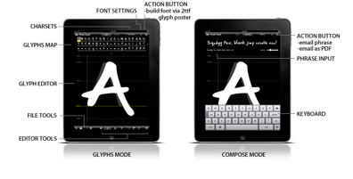
 Sao-Paulo-based illustrator (b. 1976) who designed Coverface SE (2014, a great rounded sans typeface family),
  Also written Igor Mustaev. Born in 1982 in Khabarovsk, Mustayev was first an architect. In 2009, he finished the Type and Typography course at the British Higher School of Art and Design, supervised by Ilya Ruderman.
  Lettering Delights (later renamed Illustration Ink) is a company founded by
  Aka Lupus Es. Russian designer of the thin calligraphic typeface Elegance (2016) and the beautiful handwriting font Departure (2017). [
 Frenchman (b. 1957) who started making fonts in 2010, after a career in illustration, comics, and video games. In 2010, he created the free fonts BabyJo (pixel face), Bayday, Chrom (beveled face), LaPresse (grunge),
  Banda Aceh, Indonesia-based designer, b. 1988. Creator of the handcrafted typefaces Archipelago (2015, a connected swashy script), Shintya (2015), Sambay (2015: a brush script), Silvia (2015), Matauro (2015, a watercolor brush), Almarhum (2015), Chocolava (2015, a fun creamy handcrafted typeface), Itaki (2015, a rough brush font), Egocentric (2014), and the curly connected script typeface Esmeralda (2015). He also designed the copperplate calligraphic script typeface Cimochi (2015).
  [
[ [
[ Ingofonts is a foundry in Augsburg started by Ingo Zimmermann (b. 1967) in 1994. It offers Fraktur fonts, handwriting fonts, sans serif fonts, Antiqua fonts and some pixel fonts. Full fonts go for 50 USD a piece and up. Some fonts are free. Many fonts are adaptations or revivals of historically important fonts. Ingo also practices
 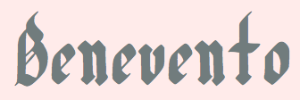 Brazilian illustrator residing in Joinville, SC. Creator (b. 1992) of the free blackletter typefaces Hairline Quadrata (2013) and
  Insigne Type Design Studio (est. 2006) is run by
 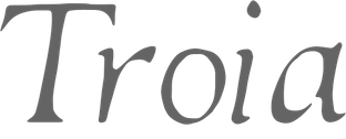 Visuals and a marketplace for graphic designs, located in Plymouth, UK. Includes
  Intellecta Design is a design company in Brazil run by
  [
[ [
[ [
[ Creator of the free hand-printed caps typeface
  [
[ [
[ [
[
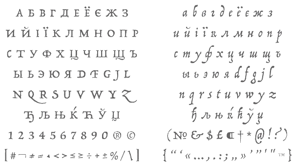 [
[ Graphic designer in Seattle, WA (was: San Jose, CA), who created the
  [
[ [
[ Buffalo, NY-based creator of the logotype typeface
 Using iFontMaker, JBF created
  [
[ [
[ Aka Loudifier. In 2013, Jeff Davis (Seattle, WA) published the
  Prolific type designer in Florida, b. New York, 1952. His fonts were originally free and consisted largely of dingbats. Around 2005 he went commercial, and now sells his work (over 350 fonts as of 2009) via
  [
[ Quebec-based creator (b. 1991) of the handwriting or script fonts Jellyks
  Jeni Pleskow's (free) creations: Abode, AlligatorPuree (like Zapata), Ironglass, BackcabExtraCrispy, BackcabOriginal, BleakFutureHand, BlueMutantDoubleSerif, CachexThin,
  [
[ Teacher at the Edmonton Digital Arts College in Edmonton, Alberta, who created the techno family Powers (2011), the squarish monoline family
  American type designer who co-designed (drew?) the great hand-printed memo-note typeface family
  [
[ [
[ American type designer at
  Young designer (b. 1995) who jumped on FontStruct in 2009, and burped up these fontstructions in just a few weeks: Defune, Echelon, Elfont, Embossed, Ghost, High-Noon, JINX, Needle (horizontal stripes), NightScape-Reverse, NightScape, Post-It-Notes, ShReD, The-Vine, Thorn, ZORRO, nikki-tikki-too-tom, squrible (cacography). Still in 2009, he created the bilined family Alkador (+Light, +Dark), the alphading Sound Waves, the artsy Jirix (!!!), Postage, and the scratchy Oops. Other typefaces there include Petal, Kryptonian and Error. He calls himself a grasshopper in the field of fontmaking. [
 Creator at Louisiana State University of the angst-inspiring sketchy typeface
  JLH Fonts (or: jhnri4) is the American creator of Making a list checking it twice (2012),
  Born in Barcelona in 1950, Joan Barjau is a graphic and type designer, cartoonist, illustrator, painter, and animator who taught at Eina in Barcelona from 1984-1993. Designer at type-o-tones in Barcelona who made Analfabeta Regular (1999, with Flavio Morais), Analfabeta Pics (1999, with Flavio Morais),
  [
[ [
[ [
[ [
[ iFontMaker who created the hand-printed typefaces
  [
[ Joanne Hewitt or Joanne Marie. Chester, UK-based designer of these commercial (mostly script) typefaces in 2015: Rebel, Hide Away, Strangelove, Artful Beauty, Alamanda (calligraphic script), Joella Brush, Springer,
  Aka Jos Joy, as Joanne Ford Taylor, and as
  [
[ Dutchman Jeroen van der Ham ("joebob"), who is based in s'Hertogenbosch, designed mostly handwriting fonts:
  Buenos Aires-based designer of a great hand-drawn typographic poster series in 2014, called Fama y Eucalipte. [
 [
[
 [
[ [
[ [
[ Victorian calligraphic artist, b. Newcastle-upon-Tyne, 1833, d. 1928.
  Mellieha, Malta-based designer (b. 1983) of
  Type and logotype company in Polanco (and now Mexico City), Mexico, run by
  [
[ [
[ Graphics editor for Science at the New York Times. Founder of
  Jonathan Paterson (d. 2024) was based in Montreal. His typefaces include
  [
[ [
[ [
[ Portuguese creator at FontStruct in 2008 of Goticula 1.3 (blackletter), Reposicao (octagonal), Frank Castle, Tomatix (rounded letters) and Tazaver (bold, rounded).
  [
[ Fairfax, VA-based creator (b. 1990) of the informally hand-printed font Rushil (2008).
  New York-based Garagedesigners who made
  Julius B. Thyssen (from Amsterdam) and Hens Zimmerman run this site (which used to be called Immortalware), where you can download 15 Truetype fonts, among which one handwriting font made by Julius. Now also a huge zip file with 16 new fonts: Corrodated-J,
 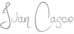 Designer from from Puyo, Ecuador, b. 1991, known as Darko Juan. He made numerous free fonts.
  [
[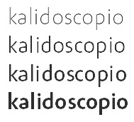 [
[ Juha Korhonen (b. 1966, aka Junkohanhero) is a Finnish artist and type designer, who created these
  Type designer from Hamburg, Germany, who is based in Goslar.
  [
[ Julia Sysmäläinen Carelian (Juliasys) is a Finnish type designer, who studied at Pekka Halosen Akatemia in Tuusula. She runs her own type foundry, Juliasys. Julia presently lives in Berlin, where she works for Edenspiekermann Berlin.
  [
[ Dutch Creative Alliance designer of Uncia (1999, uncial), Rudolph (Fraktur), Julius Primary (1999, a school font family), Amadeo (handwriting, 1999, with Fiel van der Veen) and Augusta (1999, +Cancellaresca, +Schnurkl). He published Xander (2001) at Agfa, a font based on the handwriting of the Dutch type designer Alexander Verberne. Finally, he published the calligraphic script family Gaius (2002), the calligraphic Bastarda typeface family Bernhardt Standard (2003), the Fraktur typeface family Frakto (2003), and the blackletter family Rockner (2005) at Linotype.
 Just My Type is a type foundry that was founded in 2012 by J. Randall (or Randy) Harris (b. 1947, Marion, IN) in Tucson, AZ. Harris is a graphic and type designer who has been making typefaces since 1997. He teaches at the Art Institute of Tucson. His typefaces from 2013:
  Polish graphic and type designer who started her own type foundry in 2014. Typefaces:
  German graphic designer (b. Aachen, 1960). His designs at FontFont include
  Teesside, UK-based graphic designer. Creator of
  Kak is a Russian type and design magazine run by Peter Bankov and Katerina Kozhukhova. Alexander Tarbeev designed the typefaces KakC and DenHaag for the mag.
  Juan Pablo del Peral (b. 1984), aka Cocosaurio, is an Argentinian graphic designer who lives in Mendoza. He graduated from the Universidad Nacional de Cuyo, and from
  [
[ Type designer from Batavia, IL. She designed
  [
[ [
[ Canadian creator (b. Regina, SK) of the free typefaces Subway Novella (2011, grunge), Death From Above (2011, grunge), My Girl is Retro (2011, grunge),
  [
[ [
[ Graphic artist who worked for Agfa Monotype and then Monotype from 1988 until 2008, mainly as a hinting expert. Currently, he is a freelance designer in North Andover, MA. He made the scary handwriting font GitschHand (2001).
 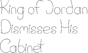 [
[ [
[ Born in Missouri in 1979, Kimberly moved first to Texas and later (in 2007) to China, and most recently, to Orlando, FL. She made some free fonts (often handwriting styles), and also ran a personal handwriting font service [those fonts have names that start with KGD].
  Kimmy Kirkwood (b. 1988, Seattle, WA) (Kimmy Design) studied at Chapman University, and lives in Santa Monica, Orange County. He graduated in 2018 from
 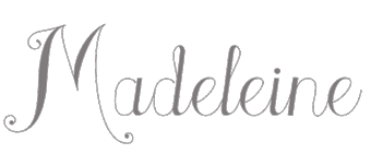 [
[
 Graphic artist and illustrator from Martinez, CA. Designer of
  Singapore (and before that, Jakarta, Indonesia)-based designer of Elena (2015, a connected rough brush script), Clark & Lou (2015, a scribbly handcrafted typeface), Tim (2015, a hand-printed typeface), August (2015), Lisa Marie (2015, a great calligraphic brush script), and Bartolomew (2015, a handcrafted poster font).
  [
[ Creator of the African-style hand-printed Kokekoko (2009).
 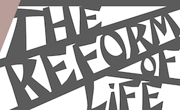 Koma Amok was founded in 1992 by Gerd Sebastian Jakob and Jörg Ewald Meißner, both located in Stuttgart, Germany. They are involved in art direction, book design, catalogue design, concept, consultation, custom lettering, drawing, editorial design, exhibition design, font design, icons, identity, illustration, infographics, logos, text, typography and web design. Their typefaces are published through
 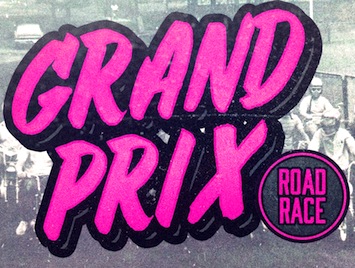 Commercial typeface foundry in Jakarta, Indonesia, run by "Ian" and "Abdilah". Its first typeface is Muffler (2014), which is inspired by retro brush signage for car races. Lacydes (2014) is a spurred advertizing typeface. Upjohn (2014) is a horror movie poster typeface. Curely (2014) is a
  [
[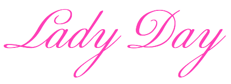 Swiss calligrapher in Basel who made and sells various medieval and historically important script fonts.
  Using iFontMaker, Kris Cohen created
  [
[ [
[
 American author, b. Indianapolis, 1922, d. New York City, 2007. Ardent supporter of the American Civil Liberties Union and a critical pacifist intellectual. He once wrote Write to please just one person. If you open a window and make love to the world, so to speak, your story will get pneumonia.
  Kustomtype is Coert De Decker's type foundry in Otegem, Belgium. Coert (b. 1966) created
  Graphic designer from Ankara, Turkey, who wotked in Istanbul and is now based in London. Creator of
  BFA Graphic Design student at Columbia College Chicago, class of 2011. She made the
 La Fonderie is a new French group of young typographers that may be consulted on all matters typographic. Based in Paris, and led by typographers Stéphane Gambini and Eric de Berranger. All fonts are by de Berranger.
  Design studio, est. 1999 in Riga, Latvia. They are doing some
 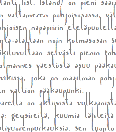 Johannes Lang (Langustefonts) is a graduate of the
  Canadian designer who lives in Grenville, Quebec, and works in Hawkesbury, Ontario. He is praised for some of the best grunge typefaces ever made. His work includes All Used Up (2006),
  Laudon Type Design is a one woman type studio dedicated to typography, type design and type education. Carolina Laudon is a Swedish typographer and type designer living in Gothenburg, Sweden. After art studies in Stockholm and London she finalized her MA in Graphic Design at the University of Goteborg in 2000. Since then she has worked in her own type studio, focusing on type design and typographic work. For seven years she was responsible for all typographic tutoring at the Konstfack University of Arts in Stockholm. She taught typography at the Forsberg School in Stockholm and Goteborg. She currently teaches at Berghs School of Communication in Stockholm. In 2012, Carolina Laudon received The Berling Prize, Sweden's most prestigious typographic design-prize.
 Graduate from
  [
[ Freelance graphic designer in San Diego, who created these typefaces in 2013:
  [
[
 Designer Eddy Biel (Stourbridge, UK and before that, Birmingham, UK) created the hand-drawn poster typeface Madeline, the hand-drawn Breezy and the display typeface Pointbreak Sans in 2014. In 2016, he designed the brush script typefaces Honey Bun, Coast 2 Coast, La Brava, Buffalo, Tamaluna (crayon style), Meet Manny and Mcallister Script, and the letterpress typeface Range Sans.
  [
[ Hanoi, Vietnam-based designer (b. 1990) of the clean connected handwriting font
  [
[ [
[ German creator of Pencilcase (2009, early handwriting),
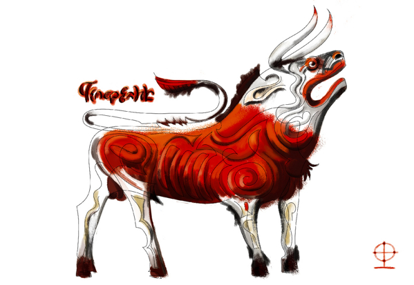
 Letterpunch, Kelvin Ma's web site, makes a strong and convincing case for font freedom and open source fonts. At Behance, Kelvin Ma is Kelvin Song from Riverhead, NY. American creator in Long Island of
  LettError is a foundry in Den Haag, founded by the interesting duo, Just Van Rossum (b. 1966) and Erik van Blokland (b. Gouda, 1967). Many of their fonts can be found in the FontFont library.
  Ursula Hitz (
 Cluj, Romania-based creator (b. 1973) of
  Lettering artist and author, 1845-1910. His books include
  German commercial foundry, est. 2009 by Ulrike Rausch (formerly
  Luis Jaramillo (LJ Design Studios, Monteria, Colombia; b. 1993) created these free typefaces in 2014: AGreaterFoundation-Bold, Capella-Century, CapellaRockIII-Bold, Decasmini, Dolgan, LJStudiosGF, LuisSmartTX-Bold, Melinett1, Parallels, ThePowerlessRise, WallIT-Bold. In 2015, he made the decorative connect-the-dots caps typeface Night of Music, the great slab serif titling typeface Inicio and the extremely tall x-height logotype Lidea National Fontype, the alchemic occult typeface Zilap Geometrik, the sans typeface Fina, and the headline / poster sans family Silver (Regular, Forte, Grunge). The current list of fonts: AoceanbetweenUS, AGreaterFoundation-Bold, AJourney, AnewHeardDecorative, AsILayDyingLogoFont, Beforeandafther-Bold, Blade, CapellaRockIII-Bold, Capella-Century, CapellaRock-LJDesignStudios-Bold, CapellaRockIII-Bold, Condemnedtoyourlove, DZTypography-Zilap-Bold, DZTypography-Zilap, Darkpast, Decas-Bold, DecasII, Decasmini, Dolgan, EarthDry (2014, glaz krak font), Fina (thin sans logotype), Forsaken, Lacalle6, IS-BoldItalic, IS-Bold, IS-Italic, IS-Thin, IS, Logo, LJPromiseDarck, LJStudiosMB, LJStudiosMFJH, LJStudiosMNS, LJStudiosMNS2, LJStudiosMonitorIS-MAYUS, LJStudiosMonitorIS-MAYUSMinus, Leven, Leven, LordZeDD-LJStudios, LordZeDD3-Bold, LorenaGalarcio, LorenaGalarcio, LorettoGrafic-Bold, LorettoGrafic-Italic, LuisSmartTX-Bold, LuisSmatTXNormal-Bold, MarlenThePonderosa, MeliVargas, Melinett1, Melinett2, Melinett3, MyBrush, NeoLR, NovedosaStick-Italic, Overcome, Parallels, ParalyzedSkyandMoon-LJ-designStudios-Grunge, PenetrationOut-Deformed, PenetrationOut-Grunge, Pequeita, Pizcas, PowerDark-Bold, ShadowsofSecurity, SilverDust, SilverForteGrunge-Grunge, SilverForte, Sincedust, TRG-Zilap, The Dark (spooky), TheSoundofTruth-Grunge, TheSoundofTruth-smooth, ThePowerlessRise, ThroughStruggle, WallIT, WritingMemories, ZILAPGEOMETRIK, ZulmCool, redout, thedark, withindestruction.
  Catalan free font outfit. At Dafont, they published these fonts in 2011:
  Creator at FontStruct in 2009 of Lobo, and
  London Stokes is a Utah-based designer who made mostly alpha dings. First her pages were called Kitten's Korner, and now they are just London's Letters. A partial font list: Birthday-Balloons, Conradasaur, Cat-Treats, Conrad's-Cows, Christmas-Cardinals, Cuddle-Cats, David's-Ducks, Hound-Dog, Jeremy's-Rigging, LondonBugs, Merry-Go-Round, PokeDex, Ringling-Brothers, Rykers-Pram, Stalking-Kitten, Tin-Soldiers, Toy-Soldier, Ty-Babies, Under-An-Acacia-Tree, Baby Egg, Helpful Hunnybee, Irish Beer, Pill Toad, Pokemon Master, SunshineMoonshine, Christmas Lights, LMS-HeroesAmongTheAshes, LMS-Beach-Wedding, LMS-Beautiful-Butterfly, LMS-Boyton-Alphabet, LMS-Calla-Lily, LMS-Darren's-Delight, LMS-Darren's-Diversion, LMS-Loves-Me, LMS-Tulips, Utah Welcomes The Olympics, LMS-Becca's-Wedding, LMS-Hogle-Zoo-Flutterbys, LMS-Inside-My-Claddah, LMS-Kat's-Cat, LMS-Lazy-Dayz, LMS-Oh-Canada, LMS-Rose, LMS-She-Shells, LMS-Summer-Camp-Love, LMS-Sunflowers-for-Jodie, LMS-Traci's-High-Flying-Hubby, LMS-A-Berry-Nice-Baby, LMS-Back-To-School, LMS-Bed-of-Ivy-and-Ribbons, LMS-Bloodsucker-Proxy, LMS-Comedy-of-Tragedies, LMS-Coral-Colt, LMS-Costume-Party, LMS-Friendly-Skys,
  Milan-based graphic designer. Creator of
  Ex-student at Scriptorium de Toulouse (2001) who published some of her fonts at
  Foundry in Chicago run by Robert Hunter Middleton. Myfonts.com writes that its type library was largely derivative, with some original scripts. After Middleton's death, and Ludlow's demise, most of the typefaces from the Ludlow library were licensed exclusively to International TypeFounders, Inc., (ITF) and are part of the Red Rooster collection. Fonts by Middleton at Ludlow include Bodoni Campanile, Bodoni (see
  Jake Luedecke (LDF Fonts, or Luedecke Design Font Co) (b. 1999) is the Dallas, TX-based creator of preponderantly hand-printed and pixel typefaces. These include:
  [
[ [
[ Creator of the clean hand-printed typeface
  [
[ Luzi Gantenbein (Luzi Type, Bern, Switzerland) is a type designer, b. 1988, Fläsch, Switzerland. He created the vernacular all caps wall paint typeface Valparíso (2010, Volcano). At the Hochschule der Künste Bern, he designed the angular family
  Dutch designer (b. 1975) who runs MvM Grafisch Ontwerp and is based in Leiden. Designer of the fun decorative caps typeface
  New York-based designer. Creator of the
  Designer at
  Maelle Keita is the second identity of
  Bálint Koczman (aka
  Mariel Gornati (Mago Fonts, Bernal and/or San Rafael, Argentina) is the creator (b. 1988) of the connected script typeface
  Type foundry in the United Staes, run by lettering artist Jessica McCarty, which specializes in hand-drawn, pen-drawn and hand-printed typefaces. In 2017, she co-founded
  [
[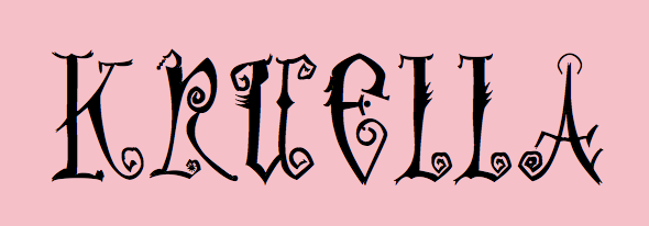
 In July 2017, Typoasis / Moorstation shut down. Run by Petra Heidorn out of Hamburg, Germany, it hosted her own fonts, as well as those of the popular and talented type designer and artist
  Frankfurt-based designer (b. 1932, d. 2018) whose creative output is so large that he deserves a
  About 150 free original fonts by Masayuki Sato (from Futaba and/or Takasaki, Japan), over half of them pixel fonts. Maniackers designers started in 1995. For most fonts, he has a Latin alphabet (denoted by AL) and a katakana alphabet (denoted by KT). Some also have a hiragana version (denoted by HR). All fonts were made between 1998 and 2009.
  Original creations by Camilla "
 [
[ Visual communications designer from San Juan, Puerto Rico, who operates as OlmoCs.
 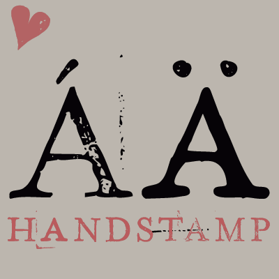 [
[ Köln, Germany-based creator of these typefaces:
  [
[ [
[ Canadian designer of the handcrafted typefaces Salmon Spirit (2017: indigenous North American style), Lime Time (2017), Cream of Oatmeal (2017), Blueberry Jam Script (2017) and Farm House (2017).
  [
[ Croatian calligrapher and type designer, based in Belgrade, Serbia. Graduate of the Faculty of Applied Arts in Belgrade. During
  Russian type designer who created the dynamic hand-printed typeface
  During her graphic design studies, Buenos Aires-based Marina Gonzalez Meyer created the didone typeface Baran (2014) and the hand-drawn typeface Beirut (2012, inspired by Alex Trochut's and Luke Lucas's work). [
 [
[ Barcelona-based graphic designer (b. 1963).
  [
[ Mark Simonson Studio is located in StPaul, MN. Mark founded Mark Simonson Studio around 2000, and describes himself as a freelance graphic designer and type designer. From
  [
[ [
[ Mark van Leeuwen (or Marco van Luijn), a designer and letterer in Berlin, Germany (and before that, in Milan, Italy), created these typefaces:
  Known as Marsnev, Marsneveneksk, Muhammad Ariq Syauqi and Ariq Sya. London-based Indonesian creator of the free grunge typefaces
  [
[ [
[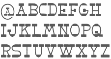 Polish graphic designer.
  Born in Gothenburg, Sweden, in 1970, Martin Lexelius (aka Core, aka
  Dutch freelance graphic, logo, type and web designer, b. 1989. He operated as MS Designs. In 2010, he made an extensive comic book / fat finger typeface called
  [
[ Independent Argentinian designer (b. 1982) who was an assistant in the graphic design program at the University of Buenos Aires from 2003 until 2009. Graduate of the Masters program in type design at
  MartinPlusFonts is the Berlin-based foundry of Martin Wenzel, a
  Indonesian type designer who operates under a variety of names. His fonts comprise mainly handcrafted and script typefaces, and dingbats, including many floral icon sets. As of June 2021, the typefaces included AmoceliaRegular, BalineseRegular, BlackAngelsFreeRegular, Heylie, FunnyRabbitRegular, HappySummerRegular, HelloUnicorn, NeutoSansDemoRegular, RasidayRegular, RhenataDemoRegular, Aladin, Aldebara, Alphabet-Wave, Amoxan, ANGELA, animasi-eyes, Annabelle, Azhitromicin, Baby-Cute, Baby-doll, BALOTAK, Beautiful-leaves, BELAROSA, Black-Forest, Blue-ocean, Booster, Botana, Botani, Bougenville-flowers, broken-Heart, Browie, BUBBLE-BOBA, Butterfly, cakiss, Cattrine, Ceftriaxon, CellineHeylie, Charles, Cheerful-Year, Chocolate, Christmas, Coffee-Break, Coffee-Robusta, Crunchy, CUTE-LOVE, Cutes, Delicious-Food, Devil-Beside-You, DIAMOND, Digital-Marketing, Dingbata-Regular, Donuts, DrawingRainbow, Emerald, Emot, Euis, everybody, explore, Floralipart2, FLORENA, flowers, Flowery, FRIENDLY, Funny-Kids, Funny-Rabbit, Gendis-Flower, GEORGIOS, Golden-Pumpkin, Gravera, Greentea-Milkshake, Gupis, Happy-Christmas, Happy-New-Year, Happy-Shopping, Happy-Summer, Happy-weekend, Hello-Christmas, HelloUnicorn, Hellow-January, Hidrocloroquin, Hollster, Honeymoon, Jelline, JONS, Just-Friend, Kidos, kindergarten, Krriiukk, Leaf, Lets-go-to-school, Lighting, Lisan, Love-Bubbles, Lovely, Mandala-Clip-Art-Regular, Mandara-Regular, Manopo, Memoriam, Mennuah, Methilprednisolon, Michy, Miracle-Of-Christmas, Mom-cooking, MONOLOG, Moo-Milky, MOUW, My-Princess, Naturally, North-Star, NOTHING, ONE-MORE, One-Stripe, Outline, Photography, Pillow, Playground, Poco-poco, Pompom, POW-KIDS, Princess, PURPLE, PUZZLE, QIWQIW, Rannel, Rebuilt, Remember, Richeese, Rolling-door, Sana-sini, Sand, sandra, Sansan, Sansullin, Santa-Claus, Saranghae, Sarapan, Sarwendah, Say-Hello, Scarlove, Serenada, SHIZUKA, Sky-face, Solaria, Solatip, Squaress, Srengngee, StarBold, START-UP, Stay-story, Stricker, Stripe-Calm, Sunshine, Taro-Flowers, Thai-tea, Travelling, Tremor, Unicorn-Beautifull, UPNORMAL, wedding-knick-knacks, Welcome-Santa, WILD, Willy, Winner, Winter-Soraya, Wisconsin, Zara.
  Match Fonts is the West Hollywood, CA-based foundry led by Michel Bujardet (b. Bordeaux, France, 1951), who is Mike Budge on alt.binaries.fonts. They make and sell interesting font paks. A particular favorite of mine is the
  [
[ [
[ Matias Romero was born Eduardo Alves da Silva in the city of Santos. He is a Brazilian nature photographer and multimedia artist, b. 1965. Currently, he is based in Sao Thomé das Letras, MG.
 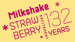 Graphic designer and illustrator (b. Southampton, UK, 1993) who studied graphic design at University College Falmouth.
 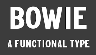 San Francisco, CA-based designer of the sans typeface Bowie (2015) and the hand-drawn typefaces Zafu (2015, in Zafu Fluffed and Zafu Firm versions; rounded and ideal for posters), Couch (2015), Lisa (2014) and Matta Sans Condensed (2014).
  Designer of several hand-printed typefaces at
  [
[
 [
[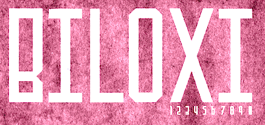 [
[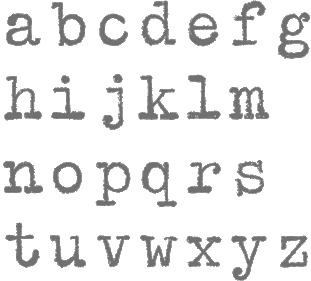 German designer
  [
[ P22, which sells Parrish Roman,
  Lille, France-based designer of the wonderful monokine connected cursive script typeface Rollercoaster (2014). [
 M-B Creative is a British type foundry in Presteigne, Pows, est. 2013 by Ben Mecke-Burford, or just Ben Berford, who has created many stunning art deco and other typeface families.
 [
[ Trujillo, Peru-based creator of the handwriting typeface Tehzeta (2008).
  Mellow Design Lab is Kelly Reed (USA). Her typefaces from 2015: the watercolor brush typefaces Ocean Adventure and Honey, the rough brush typeface Hurst (+dingbats), the handcrafted fonts Morrison (+Outline) and Hotel, and the connected script typeface La Tomarina.
  Graphic designer in Ankara, Turkey, who studied at Gazi University. She created the free hand-drawn typeface family Meryjane (2014), the free Little Pink Shit Font (2015), and the slightly irregular Korra (2014).
  Graphic designer, illustrator and childrens book author in Spain. She created the handcrafted typefaces Alondra, Bohemian Lady and Jungle Cat in 2015. In 2016, she designed Artisania.
  [
[ [
[ Duluth, MN-based designer (b. La Crosse, WI, 1977) of
  [
[ British type designer from Waltham Abbey who worked as a staff designer for P22 from 1994 until 1999. Morisawa Judge's Choice Award winner in 1996 for his typeface
  American designer of these handcrafted and calligraphic script typefaces in 2018: White Garden, Brooklyn Heights and Delicate. In 2017, she published Honey & Lavender, and East Village. She released the flowing calligraphic typefaces Stylish (a wild signature font), Gathering, Beyond Sweet, La Angelie, Milkshake, Lucille, Modern Summer, Haute Couture, Parisian and Besotted Love in 2021 and Adore Theory in 2020. [
 Graphic designer from Kragujevac, Serbia, b. 1988. She created the free fonts Mareke (2015, script), Wuggle (2015, handcrafted poster font), Omen (2011, a severe thunder-like face), and Miodrag (2011, a handwriting face).

 Architect and designer in Sao Paulo, who runs Minhocossauro Tipografia. He created Salyma (2015, part vampire script, part curly Victorian extravaganza), Essential Coffee (2015, stencil), Militante (2015, stencil font), Cogumelo (2014, a retro futuristic unicase typeface), Biotech (2014, techno), Action Flick (stencil font), Morango (2015, handcrafted Western font), and Cinema Novo (2015, handcrafted typeface).
 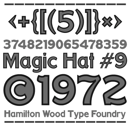 Miranda Roth graduated from Daemen College (Buffalo, NY) and joined P22 as an in-house type and graphic designer. Creator of these typefaces:
  Bremen, Germany-based illustrator, who was a manga artist in Japan. He used iFontMaker to create the hand-printed outline typeface
 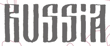 [
[ Misprinted Type (est. 1998) offers free and commercial old typewriter and grunge fonts designed by
 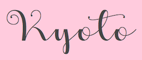 [
[ Texan creator (b. 1990) of many free mostly hand-printed typefaces. Starting in 2016, she is located in Dresden, Germany.
  Or just Mas Mujib, b. 1990. Ciamis or Jakarta, Indonesia-based designer of Andalusia (2018), Honey Flower (2018), Lovely Honey (2018), Noorlita (2018: script), Southeast (2018), Chives (2018), Alyshen (2018: a Peignotian all caps sans), Snowy Day (2018), Smile of Cinderella (2018: signature script), Definite Soul (2018), Luxurossa (2018), Avicenna (2018: a display sans), Javenese Neu (2018: squarish), Villanesia (2018), Moonlight (2018: a modular sans) and the handcrafted Ajieb (2018).
  [
[ Monokrom is a small independent type foundry based in Norway, founded by Frode Helland and Sindre Bremnes. Frode Bo Helland is a Norwegian graphic designer in Oslo who created the typefaces
  [
[ Athens-based designer of an
  M.R.I. Khokon (kdesignhous) is a digital artist in Dhaka, Bangladesh. Creator of the hand-printed Latin typeface Jakaro (2014), Holiday Cap (2014), Arguile (2014: cartoon font), Hellbent (2014), Shellshock (2014), Pickup Stix (2014), the brush typeface Palorensa (2014), Valentino (2014, Valentine's Day font), the sans typeface Akarius (2014), Digital End (2014, computer emulation font), Perimeter Sans (2014), and the display typefaces Flush (2014, brush face), Santa Maria (2014, Mexican party font), Ra One (2014, halftone textured typeface), Lemon Lane (2014, script face), Orenshaw (2014, sans), and Bold Towne (2014, blackletter).
  Born in Milan in 1965, Matteo Federico Bologna emigrated to the United States, where he founded Mucca Design in 1999, a company involved
  [
[ [
[ Gary Munch (born 1953) is the Stamford, CT-based principal of MunchFonts. He teaches at Norwalk Community College and at the University of Bridgeport Shintaro Akatsu School of Design.. His typefaces:
 Bandung, Indonesia-based hand-drawn type designer who created these brushy calligraphic typefaces in 2014: Dality, Ala Nice, Its Holiday, Calligrapheez, Chaotiq Modern Paint Brush, Dago (connected script).
  Myles Katherine (b. Lynchburg, VA, 1989) is a photographer and fine artist from Lynchburg, Virginia. She received her Bachelors degree in Studio Art with an emphasis in photography in May 2011.
  Aussie Nancy Lorenz (aka Lothlorien, and aka Queen of Spain Font Girl) created fonts in the theme of Lord of the Rings, all in a medieval handwriting or uncial style or Tolkien style: Party Business, Bilbo-hand-Bold-Bold (2002), Bilbo-hand-fine (2002), Bilbo-handRegular (2002),
  Creator of the collage typeface
  [
[ [
[ [
[ Born in Takamatsu, Kagawa-ken, Japan, in 1984, Natsuko is a Canadian-educated graphic designer who publishes most of her typefaces at
  [
[ Vernon Adams (born England, 1967) was a furniture restorer, woodcarver and typeface designer. On August 24, 2016 Vernon Adams passed away from injuries sustained in a scooter accident in May of 2014.
  [
[ [
[ [
[ This list contains information on Nick Curtis's free typefaces not discussed or mentioned under other themes. A visual summary of all his free typefaces:
 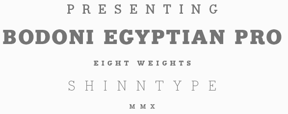 [
[ Successful designer in Cape Town, South Africa, who started making fonts in 2014, In 2016,
  A free handwritten kanji font, dated 2006:
  Bielefeld, Germany-based designer of Canted Comic (2016. comic book typeface), Canted FX (2016, cartoon typeface),
 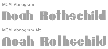 [
[ Graphic designer in Monterrey, Mexico, b. 1990, whose company is called Handcrafted Types.
  This is one of the main horror font sites on the planet. It has commercial and free original bloody fonts made in 1998-2003 by Thomas W. Otto, Norfok Inc: Hellbound, Friday 13, Hellraiser Blood, HellraiserSC, Hellraiser3-Shadow, Hellraiser3, IStillKnow, Massacre, Nugsoth, Scream Real, Texas Chain Massacre, Maniac, Stairs People, Wishmaster, Reanimator, Waxwork, Schlafwandler, Friday 13 Bloody, Bleeding Freaks, Bloodsucking Freaks, BleedingFreaks, BloodsuckingNFI, BloodyBirdNFI, BloodyValentineNFI, BoogeymansfxNFI, BruiserNFI, Bullskrit NFI (designed in 2002 by Tom Sullivan), Children Shouldnt Play With Dead Things, CSNPWDTNFI, CreepshowNFI, DaywalkerNFI, nKnightTaglineNFI, Dunwich NFI, ElvishRingNFI, EvilDead2NFI, EvilDead3, FrankenfleshNFI, Friday13BonusNFI, Friday13bloody, HalloweenReal, HannibalLecterNFI, Hellbound NFI, Hellraiser (family),
  Nor Eddine Bahha (jazz pianist, composer, copyist, researcher and teacher at "The Karawen Music School" in Morocco) designed the NorMusic fonts in 2005. This is a set of jazz music fonts with a handwritten look designed to work with Finale, Sibelius, Overture, Mozart, NoteWorthy Composer and Encore/MusicTime Deluxe. He coauthored
 Lauren Thompson (Nymfont, or Nymphont) is a designer from Las Vegas (b. 1982). She created the elegant sans typeface LT Oksana (2008), the grungy Frail 7 bedazzled (2008) and the classical ornament typeface Nymphette (2008). Her
  Octopi is UK-based foundry of
  [
[ [
[ [
[ Banda Aceh, Indonesia-based designer of Hellvina Hand Script (2015), Samitha Script (2015), Tynabella Script (2015), Silliza (2015), Aprillia (2015), Freenight (2015, watercolor brush), Samuella Script (2015), Seilla (2015, calligraphic), Ricca (2015, calligraphic), Love Sania (2015), Shizuka Brush Script (2015), Nella Script (2015), Beauty Atok Script (2015, connected and calligraphic in the style of a ronde), Allea Script (2015), the bubblegum typeface Monster Jelly (2015), the brush script typefaces Layla (2015, in Painted and Brush styles), Anggie (2015), Jailheart (2015), Sweet Delia Hand (2015), Stella Script (2015), Thunder Script (2015), Rachel (2015), Wendi (2015) and Rat Black Painted (2015). He also made the handcrafted typefaces Kingfont Script (2015), Asraf Kids (2015) and Obama Hand Lettering (2015).
  Krimean artist and illustrator based in Simferopol. Her work includes Narrow (2015, a hand-drawn Latin alphabet), Romantic Alphabet (2015), Ice Cream Alphabet (2015), Snacks and Drinks Doodles (2015), Floral Brushes (2015) and Hand-drawn Zen Letters (2015). [
 [
[ Freeware fonts by Eric VanDycke from Warnerville, NY, aka Dr. Nimbus. Original and very very enjoyable creations from 1997-1998. The site was closed in March 1999, unfortunately! Thanks to CybaPee, you can download the whole collection now.

 Motoki Higa (One Fonty Day) is the Sydney, Australia, and/or Saitama, Japan-based designer (b. Japan) of these commercial typefaces:
  Dondon Nillo (Quezon City, The Philippines, b. 1983), or just Don Nillo, created the ornamental typeface
  Dathan Boardman (
 Aha, what a wonderful chiseled angular semi-handwriting font,
  [
[ Tattoo artist and graphic designer from Dinslaken (Duisburg), Germany, b. 1968, Duisburg.
  Outside The Line Fonts was founded by
 Paco Torrecillas (Salamanca, Spain) is an illustrator. He created a condensed hand-drawn poster typeface in 2014. [
 [
[ [
[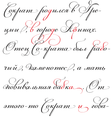 London, UK, and Athens and Kifissia, Greece-based type foundry started in 2001 by
  Designer and video maker based in London, Florence and Cagliari, Sardinia. Designer of the handcrafted typefaces Bambo (2016), Scrabionau (2016), Agattau (2016), the fantastic brush script typeface
  [
[
 About 100 free TrueType fonts by University of Western Australia lecturer Paul Lloyd (b. UK), many of them elaborate caps fonts: Larkin Capitals (2004), QuaNauticale Initials (2004, with
 Santiago de Chile-based creator of
 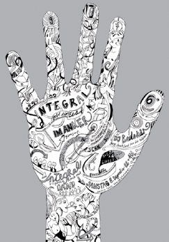 Zurich-based award winner at TDC55 for
 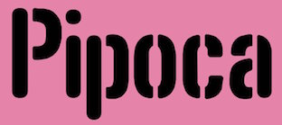 [
[ Aka Skomii. Austrian creator of the hand-printed typefaces
  [
[ [
[ Para, Brazil-based designer of the brush script typefaces Breakaway (2015) and Rebel Heart (2015, inspired by Madonna's album Rebel Heart), and the connected script typeface Confessions (2015; inspired by Madonna's album Confessions On A Dance Floor). In 2016, he made Awesome as Fuck, Noel Gallagher (based on the cover of Noel Gallagher's High Flying Birds album), and TrueBlue (connected script after Madonna's album by the same name).
  Type designer graphic designer, calligrapher and illustrator from Chile, who graduated in graphic design in 2005 from the Universidad del Bío-Bío., b. 1977, Santiago de Chile. Aka PeGGO, a
  Novi Sad, Serbia-based designer (b. 1985) of the fat hand-drawn typeface Oneer (2014). Typefaces made in 2016: School Stop (a wonderful variable width and interlocking poster typeface), the
  Born in Budapest in 1957, but Parisian since 1957. Designer and type artist who made many custom and magazine fonts.
  Type designer (b. Hong Kong, 1966) of the multiple stroke handwriting typeface
  [
[ Renowned German calligrapher who has a studio in Wiesbaden. At Elsner&Flake in Hamburg she published
  [
[ German type designer
 Type designer born in Boston in 1948 who created many exquisite designs such as
  Philip Isik used iFontmaker in 2011 to
  Successful British designer, b. Bolton, 1950, d. Manchester, 1998. He studied at Bolton College of Art.
  Austrian foundry (est. 2008) located in Vienna, and run by
  Illustrator in Marseille, France, who graduated in 2003 from ESA Institut St. Luc in Brussels with a Bachelors degree in plastic arts. In 2011, he created a
  At iFontMaker, Pietro Cesare Bologna designed these typefaces in 2016: Hand Din Engschrift, HandDin 2.0, HandDin 1.0, Pit 2016 Script, Pit 2016 Extrude, Manolibera, Walt Pit (Walt Disney script), Giovedi (a great poster script), Susanna, Hand Dillium, Bollicina. Earlier, he made HandtypeCondensed and Bollicina Type Hand (2010, hand-printed). Aka Pitbol.
  Brazilian printmaker, graphic artist and illustrator in Vitoria, b. 1973, Rio de Janeiro. His fonts are created together with Erica Jung at
  Cecilia Vizan (Buenos Aires, Argentina) set up her own type foundry, Pio Pio, in 2013. She created the curly script typeface family
  Originally, a free font foundry by
  Korydallos and Athens, Greece-based designer who ran Unicorg and later Pixelogical. He created the
 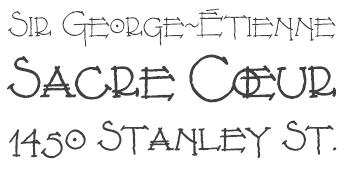 Download the following beautiful handwriting and handprinting fonts made by Mexican designer Kemie Guaida, who lives in Helsingborg, Sweden: Balderas (2002), BlackoutSans (2001), BlackoutSerif (2001),
  The Great Dane from Copenhagen,
 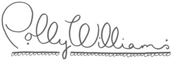 London-baased Polly Williams uses a lot of
  New foundry, est. 2005.
  Type foundry in Portland, OR, established in 2010 by Pete McCracken, who headed Plazm before that. McCracken acquired all of the Plazmfonts assets of the type design portion of the company in 2006. The (mostly custom) typefaces:
 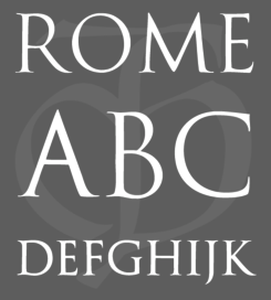 Lazar Dimitrijevic, who set up the foundry Posterizer KG, was born in 1981 in Bajina Basta, Serbia, and lives in Kragujevac, Serbia. He obtained a Master of Graphic Design from the Department of Graphic Design, FILUM Kragujevac, Serbia. Presently, he is art director at
  Postmark Type is the portfolio site of Kerry O'Connor, a graduate from Flagler College in Tallahassee, FL, who lives now in Saint Augustine, FL and/or Brooksville, FL. Designer of the free outline typeface
  Roy Preston was born in London, and worked most of his life as an art director and graphic designer. He is a prolific type designer, who created original families such as Paldus and Prentis (great-looking Old Style families), Preston-Roman, and Handroy (handwriting).
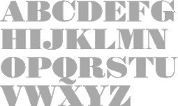
 Ben Jones (b. 1980, Buckinhamshire, UK) was a student of typography and graphic communication in Reading (2000-2004). He got his
  Type design studio, est. 2015. Creators of the watercolor brush typefaces Mellanie (2015), Angelia Script (2015), Greatpark (2015), Shaliqa Script (2015), Painting Script (2015), Jellysugar (2015), Allessa Script (2015), Hellena Script (2015) and Greatpark (2015). They also made the angular brush script Scriptease (2015) and the thin Manny Script (2015).
  French illustrator and cartoonist who, together with Gia Tran at FontYou, co-designed the hand-printed typeface
  Vladivostok, Russia-based designer of
  Designer of the hand-printed outline typeface
  Rachel Adams (R Lauren Designs, Pennsylvania) Savannah, GA) created the sketched typeface
  [
[ [
[ Raihan Nizar (b. 1977) is the Indonesian
  [
[ Celebrated British illustrator whose ink blot style of writing can be seen in all his drawings. Several typefaces are based on this style. These include
  [
[ Designer (b. 1991) of
  Type and graphic design student from Vilnius, Lithuania. Her Masters degree work at the Vilnius Academy of Arts produced the italic script family
  He states that his name is also Raslens Shaa Abedossen. Whatever. Creator (b. 1987) of Tribal Garamond (2010), Raslens Abedossen (2009: outlined, shaded hand-printed face), Raslani-Shaashimov (2009, splattered paint font), RaslaniKavaliarKaiser (2009, blood dripping paint font), Raslani und so weiter (2008, grunge), Raslani Ames Brisées (2008), RaslaniDestroyedSouls (2008), RaslaniMessenger (2008), Raslani American Letters (2008, hand-drawn athletic letters), Raslani Kaplash (2008), Raslani Tribal (2008), RaslaniAncientScript (2007), RaslaniUndaground-Bold (2007), RaslanihOoH (2007), Raslani the Pharaoh (2007, brush hand), Raslani-Hip-Hop (2007), Raslani-Horrorz (2007), Raslani-Melissa (2007).
  Creator of free fonts. These include
  [
[ Or Ira Trigubova. Kiev, Ukraine-based designer of these typefaces in 2017: the informal typeface School, Königreich (medieval blackletter calligraphic script), Sweetheart (a cutesy children's or Valentine's Day font), Coral Waves, Winter Story (handcrafted), Little Bee (+Sans: letters with bees buzzing around), Schönheit (connected script), Aisling (a monoline script), Rhapsody (connected script), Amanita, Star Dust (handcrafted), Urbano (dry brush), Tulip Garden, Meraki (a dotted ornamental sans).
  Vancouver, Canada-based designer of Kabella (2017), a
  Nick Polifroni (Remedy 667) is an American illustrator and designer, b. 1980, who lived in Belleville, MI, and Falmouth (Portland), ME. He specializes in horror fonts. Creator of the scratchy font Orange Book (2007), the sans typefaces Asymek (2011) and
  Staypretty is a type collection that is part of the Toronto-based commercial type collective called
 Giuseppe Salerno (aka
 Brazilian graphic and type designer in Sao Paulo, b. 1990. He made the hand-printed brushy typeface
  Brazilian illustrator and cartoonist in Belo Horizonte. With the help of Paulo W (Intellecta Design), his alphabets became funny digital cartoon-inspired and hand-printed digital fonts in 2007:
  [
[
 [
[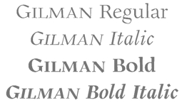 [
[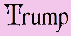 Designer from Elkader, IA (or is he from Garnavillo, IA?), b. 1956. No web page, but the fonts, mostly made in the early 1990s, were collected by CybaPee at TypOasis for your downloading pleasure. His typefaces:
  Ralph M. Unger (b. 1953, Thuringia, East Germany) says this about himself at
  [
[ [
[ [
[ [
[
 Original shareware fonts designed by Johnny Martz of Kitchener, Ontario. Font list:
  Creator of the hand-printed typeface
  [
[
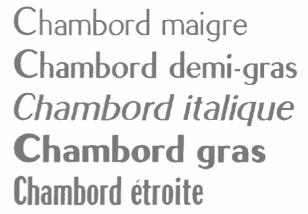 Born in Marseille in 1910, Roger Excoffon died in Paris in 1983. Co-founder of the Urbi et Orbi advertising agency in Paris, he was a graphic artist and type designer. He created the image of Air France, designed the symbols of the 1968 Winter Olympics in Grenoble, and designed many fonts.
  Geen Bitter (Den Haag, The Netherlands) consists of Thom Janssen, Jorn Henkes and Rogier van der Sluis. All three are graduates of the Graphic Design course at the Royal Academy of Art in The Hague, The Netherlands. At Geen Bitter, Rogier van der Sluis published two commercial typefaces:
  Mike Rohde (Roh Design, Milwaukee, WI) writes on sketching, drawing, technology, travel cycling and books. Author of
  Lithuanian from Vilnius, b. 1987. Creator of the connected monoline script typeface
  [
[ [
[ [
[ Wellington, New Zealand-based designer of Nosy Facetype (2014, a free typeface for ceeating human typefaces--it uses Opentype ligatures to achieve this remarkable feat), Kitsune Udon (2014, a free connected handwriting typeface) and Tryna No 5 (2014, a free hand-drawn poster typeface). Kitsune Udon provides very many glyphs per letter, and thus, text rendered in it simulates handwriting quite well. Similarly, Tryna No. 5 provides four variants per glyph.
  This page has a number of scans from a booklet by signpainter Roumond entitled 32 Alphabets Modernes, published in Paris by A. Charayron and Léon Duran, some time in the 1930s. There are lots of alphabets with art nouveau and art deco influences.
  Solo, Indonesia-based designer (b. 1985) of the hand-printed typeface Coloroyd Bastard (2011). In 2010, he designed the
  Kazincbarcika, Hungary-based type designer Roland Hüse (b. 1980) sells his fonts through My Handwritings (Kazincbarcika, Hungary), which was renamed Runes&Fonts. His first font is
  [
[ Misha Panfilov (Russian Fonts, St. Petersburg, Russia) created the
  During her studies at Ecole Estienne in Paris, Sabrina Ekecik created the experimental typeface
  This foundry started ca. 2015 as Siwox Smoke and Siwox Studios, and was rebranded Saffatin Co, Saffatin Sweettype, and Saffatin & Edy in 2018. Sarwo Edi (or Sarwo Edy) is the Banda Aceh, Indonesia-based designer (b. 1993 or 1996) of Oscar Script (2015), the calligraphic Dewi Script (2015), Zilvia (2015) and Salsabilla (2015), the brush script Kaizoku Brush (2015), Monica Script (2015), the connected script Holy Mountain (2015), the octagonal typeface family Nuevo (2015, a minimalist futuristic typeface), Space Galaxy (2015), the thin sans typeface Navira (2015), the connected Alberts Script Land (2015), the outlined typeface Devira Outland (2015), Albert's Handwriting Land (2015), the brush typeface Eco Brush (2015), and the watercolor brush typefaces Sarah & Claire Brush Land (2015) and Greenland Brush (2015).
  Creator of the
  [
[ Creator of a number of typefaces at FontStruct in 2009: Cyreall Dark, Cyreally, Classica, Dotie (dotted line font), Illegible (handwriting). [
 [
[ [
[ Chilean designer of the connected girlish and gestural calligraphic font
 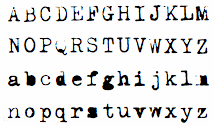 Some PostScript handwriting fonts developed by Luc Devroye and
  Wake Forest, NC-based designer. Creator of
  [
[

 Dave Nalle was born in Beirut in 1959, but lives and works in Texas. He is currently in Manor, TX. From his
 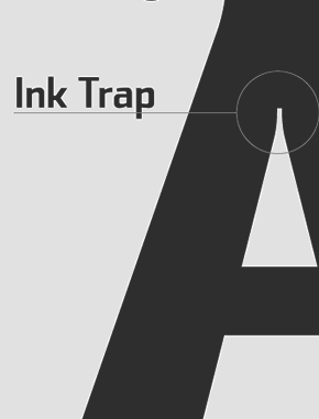 Sea Types is the partly free partly commercial type foundry of Jefferson Cortinove (artist, designer, teacher, sailor and wine maker) and publicist Márcio Duarte in Florianopolis and Marilia, Brazil, est. 2007. Their initial typefaces include
  [
[ [
[ [
[ Indonesian design studio located in Banda Aceh, run by Teuku Deky Firnanda, b. 1989. In 2013 it published the
  Bristol, UK-based creative design agency that consists of Sam Parrett, Steven Prebble, Warren Glass and Alex Bailey. Sam Parrett seems to be the main type designer in this team. In 2014, they published the brushy bold marker typeface Sickamore, Dope Script, and the Halloween font Deathgrin. In 2015, Set Sail created the typefaces Sweet Sucker Punch (comic book font in loud caps), Ghost Type (fat signage script),
  Dahlonega, GA-based designer of the connected script typefaces Caleigh (2015), Marahuyo (2015) and Ola Moon (2015).
  Lawrence, KS-based graphic design student. She shows a lot of promise in her display typeface
  Dennis Ludlow (Sharkshock Productions, Raleigh, NC) started making mostly free fonts in 1999. On August 28, 2001, Dennis announced that he would stop producing fonts, forever. To prove himself wrong, he became more prolific trhan ever, and ultimately started designing retail fonts as well.
  [
[ Nick Shinn (b. London, 1952) is an art director and type designer. He teaches at York University in Toronto, and is a founding member of the Type Club of Toronto. He writes regularly for Graphic Exchange magazine, and has contributed to Applied Arts, Marketing, Design, and Druk. He founded Shinn Type in 1999, and made fifteen type families.
  [
[ [
[
 SignDNA is run by Dave Simpson (Winters, CA). Commercial sign and display fonts, including many scripts, often by Dave Simpson himself. Other designers:
  [
[ Sidoarjo, Indonesia-based designer (b. 1990) of these typefaces in 2019: Rumble (a sharp-edged sans), The Atlantic (a serif), Bellarinde, Brigan (a signage script), Janetta Silloam (a signature script), Crushed Stone (a dry brush typeface), Saltacrus, Angler, Ballmont, Andrellina (a signature font), Bakojin, White Smith, Buffallo (a sharp-edged serif), Petricia, Kastangel, Montena, Blustori, Binetta (signature script), Sanctuary Script, Raydric, Rombus, Sambosa, Opera, Caroline Script, Squatter Collins (script), Hilmy Sahid Script (a signature script), Sonic Blow (spurred, dystopian), Zafir, Atena, Moscovia (a rounded all caps sans), Desta Sans, Slightly Sans.
  London-based creator of the
  Brno, Czechia-based designer of the basic sans typeface Uppest (2017), a wayfinding icon set for KOMA (2017), the handwriting font Karel Jaromir Erben Script (2017, based on the Czech poet's handwriting), and the icons and poster Enabled For Disabled (2017). [
 German designer of the artsy dingbats typeface
  [
[ Skyhaven (Alex, b. 1993) is located in New York City. He designed free typefaces between 2012 and 2015, and turned professional after that.
  [
[
 Their early fonts were renamed and had the attribute Serial in the name. Samples of some of these fonts/families:
  Additions in 2010:
  Purwakarta, Indonesia-based designer (b. 1996).
  Canadian designer from Kitchener (b. 1984) now located in Washington, DC, and before that, in Reston, VA. He created the irregular handwriting font
  [
[ Type designer in Sunrise, FL, who created a coop style foundry for a charity that pays for the medical bills of her siblings. Some typefaces are made by guest designers such as Jeff Levine, Ray Larabie, Matt Yow, and Brad O. Nelson. The list of typefaces:
  Nove Straseci, Czech Republic-based graphic designer, who runs
  Swiss graduate (b. 1965) of Luzern School of Art and Design, who settled in Berlin in 1997. Co-founder with Cornel Windlin in 1993 of Lineto, with Cornel Windlin and Andreas Eigendorf in 2014 of
 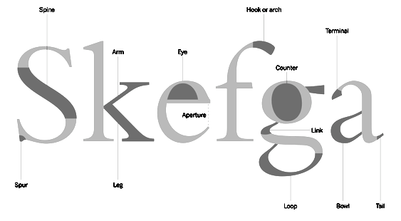 Aka
Aka  [
[ American calligrapher, letterer, and type designer (b. 1953, Indianapolis, IN) located in Lakewood, OH, and/or Kent, OH. As a lettering artist for American Greetings since 2000, he has designed and developed numerous proprietary fonts. He specializes in beautiful script typefaces. Stephen's commercial fonts can be found in both Veer and P22/IHOF collections. Creator of these fonts:
  Sterenn Bourgeois (Trait pour trait, France) studied graphic and type design at Ecole Estienne in Paris. She created several typefaces, including Nature (a great children's book typeface created for Mille Ans de Contes, ed. Milan), Québec (same purpose as Nature), Titi (hand-drawn), Super Héros, Ariol (comic book face), Gabri, PLR (license plate sans) and a set of initial caps done for Editions Ex Nihilo in 2011. [
 Quebec-based designer (b. 1971) in 2010 of the
  Rochester Institute of Technology's School of Printing graduate who lived in California and in Holland, MI, and now resides in Louisville, Colorado. He was a disciple of Chuck Bigelow and Kris Holmes.
  Aka Aponjohn and FLStudio and Fittingline Type Supply and Apon Bahrainy and Teuku Bahrainy, est. 2015. Aceh, Indonesia-based designer (b. 1994) of the fifties style connected calligraphic script typeface Guarddilla (2016), the calligraphic Ayunda (2016), Eye Catcher (2016) and Callpedia Script (2016), Callpedia Sans (2016), Elfa Brush (2016), and the handwriting fonts Malaga Diary (2016) and Feelter (2016).
  Type foundry in Warsaw, Poland, run by Krużyńska. It published the caps typeface
  Free handwriting fonts.

 Dhaka, Bangladesh-based designer, who created the cursive script typeface
 Type foundry in Prague, Czechia, est. 2014 by Vojtech Riha (b. 1989), who studied at the Technical School of Ceramics in Karlovy Vary, and at the Studio of Typography of the Academy of Arts, Architecture and Design in Prague.
  Brazilian graphic design student. Creator of the iFontMaker font
  New Westminster, BC-based foundry of
 Turkish art director and graphic designer in Istanbul. He was born in 1985 in Kircaali, Bulgaria. In 2009 Taner Ardali graduated from Anadolu University, Faculty of Fine Arts. Creator of the Embrio family of typefaces in 2009. In 2015, Taner designed the brush type
  Minneapolis, MN-based illustrator and lettering artist. Designer who sells her script fonts through
  Tattoo Woo (or: Smokewire) is American
  Grand Rapids, MI-based graphic designer trained in Chicago. Terrance worked as a graphic designer for the university book store while earning a bachelor of fine arts degree with an emphasis in graphic design from Grand Valley State University in 2008. After graduation, he joined Ascender Corporation where he worked closely with Steve Matteson. After Ascender folded, he became an in-house type designer at Monotype where most of his time is dedicated to custom fonts.
  Terrestrial Design is Carl Crossgrove's web site. Crossgrove graduated from Rochester Institute of Technology in Printing /Typography, and has shown a life-long interest in calligraphy and lettering. Now based in San Francisco, he has worked at Adobe, where he designed the Multiple Master hand-printed (semi-Celtic or stone-carved) families
  [
[ Alexander Tarbeev is Russian type designer, graphic artist and tutor. He graduated from Moscow Electrotechnical Institute of Communication in 1979 and Moscow Polygraphic Institute in 1988, and worke in the type department of NII Polygrafmash (Institute for Scientific Research of Printing Machinery, Moscow). Between 1989 and 1997, Tarbeev worked as type designer at ParaGraph. He set up the type studio TFaces in Moscow.
  [
[
 Type 3 fonts generated by a mini-language/syntax that requires knowledge of just a few points on the outlines of glyphs. This is illustrated on a connected handwriting font. All data were entered manually--no font editor was used. [
 James Kilfiger (The Difficult Type) designed the free calligraphic typeface
  Free fonts made by Brooklyn, NY-based (and before that, Huntington Beach, CA-based) Lauren Ashpole (b. 1982, Corpus Christi, TX):
  Amy Ellks (The Pen & Brush) creates commercial graphics items. Her fonts, mostly hand-drawn in a lively poster style, include Mia Bella (2014, an über-decorated Valentine's Day typeface; +Lighthearted), Love & Stuff (2014, a calligraphic font), Le Petit Parisien (2014, a gorgeous hand-drawn poster typeface), Le Petit Parisien Light (2014, outlined version), Sweet Wanderlust (2014), Brooklyn Girl (2014, a great connected curly script), and Made From Scratch (2014). [
 Born in Minneapolis, MN, in 1967,
 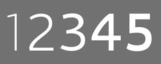 [
[ [
[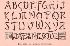 Scientific lettering expert, 1871-1944. His book
  German graphic designer. Creator of the gorgeous
  British graphic designer (b. 1989) who lives in Leisester. Designer of Tampy (2009, hand-printed), Sketchy (2009), Plasticine (2009, hand-printed),
  Aka
Aka 
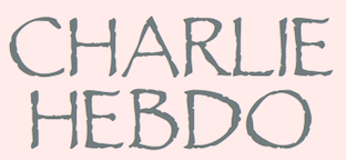 In 1999, a gang of people including Graham Meade, upset with the font policing efforts of Three Islands Press, made Bush Toad, which looks like (but is different from) their Treefrog. Bush Toad (1999) may be found on several archives. I am hosting the Three Mile Island font collection
  Andrew Martin (Thumbnail Designs) is a Manchester, UK-based type and graphic designer. He will do custom type design, including signatures. His fonts, dated ca. 2008:
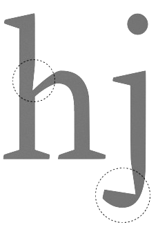
 Plymouth, UK-based designer of the two-dollar hand-printed typefaces
  Tournai, Belgium-based designer (b. 1990, Belgium) of the hand-printed typeface Trumna (2013) and the display typefaces Kemmot (2014) and Dirty Mot (2014).
  [
[ [
[ [
[ [
[
 Eric Scott Stevens has a BFA in graphic design from Winthrop University, Rock Hill, SC. Eric Scott specializes in display fonts that have a unique character. He is presently based in Tacoma, WA, where he set up the type foundry tower of Babel.
  Free fonts by Nathan Brown (Texas; was Philadelphia, PA), mostly handcrafted, grungy or sketched: WG-Analog, WG-Angeles, WG-Cascade, WG-Donovan-Title, WG-Dunste, WG-Fortune, Freestone, WG-Gilded-Hand, WG-Goodbye, WG-Grux-Regular, WG-Grux, WG-Halloh, WG-Handy-Icons, WG-Hudson-Slab, WG-Legacy-Edition, WG-Marshall, WG-Of-Concrete, WG-OffSet-Title, WG-Phased, WG-QuickHand, WG-Scriballistic, WG-Semplice-Regular, WG-Semplice, WG-Sequence, WG-Sideshow, WG-SilverLeaf-Regular, WG-SilverLeaf, WG-Skratched, WG-Statik, WG-Underneath, WG-Watchtower, WG-Whitley-Scribble, WG-Wild-Spaces. The
 Travis Stearns (was:
 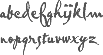 British designer of
  Laura Condouris is a calligrapher, illustrator, and occasional comedienne from Baltimore, Maryland. She offers commercial fonts via Trial By Cupcakes. The first font is the calligraphic
  Turtle Arts Fonts is the Seattle, WA-based foundry of Kerrie Carbary (b. 1970), est. 2000.
  Bandung, Indonesia-based designer of Smiths Script Font (2016). [
 [
[

 Tim Drabandt (Type Machine, located in Minneapolis, MN) is the designer of Eighthourday (2009, a commissioned sans face), Airborne (2009, octagonal typeface based on WWII airplane lettering),
  Type Sailor is David Espinosa (born in 1986) who lives in Bogotá. He graduated from the Universidad de Bogotá Jorge Tadeo Lozano as graphic designer and advertiser. He is a descendant of Antonio Espinosa de los Monteros, first royal printer of the viceroyalty of Nueva Granada.
  Graduate of the University of Applied Sciences, Hamburg, Germany, who was initially associated with
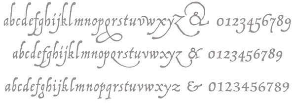
 Leon Hulst (TypeFaith) was born in 1966. Typographer at
  Indonesian designer of these connected brush script typefaces in 2017: Stephanie,
  Jakob Runge (M&uum;nchen, Germany) graduated from
  Joan Marti Mas' dingbats and fonts. Joan Mas is a Catalan type designer, illustrator and graphic designer in Palma, who offers free and commercial fonts. His free fonts include Cu-tbo-rough (2004, handwriting), Dalicanya (2004), Pero Jefe (2004), Corbatins (2004), Cartelia (2004), Carusses (heads), Ataques, Scroonge (grunge), Tooman (tribal dingbats), Kinky Boots (2004), Viatge Quimic (2004, psychedelic face), Kool Aid Acid Text (2004), CU-TBO (2004, comic book family), Psychopaths (2002), CapsBats (2002), Plantiya (1999), Illustries (2000),

 Hungarian designer of commercial fonts (from 2012 onwards, as Typesgal), located in Puspokhatvan, Hungary:
  Aka Fitriyawan Runsell, Arief Setyo Wahyudi founded Typia Nesia in 2016. Malang, Indonesia-based designer of the brush signage script typefaces Marjei Display (2016), Riverhack (2016), Bhatoshine (2016), Bellatiez (2016, dry brush), Sinisuka (2016), Hello Lary (sic) (2016), Hilary Room (2016, renamed later to Hello Lary?) and SokaQola (2016).
  Web page by Colombian designer
  Cesar Puertas is the Bogotá, Colombia-based
  Berlin-based
  Christophe Badani (b. 1969, Marseilles) is a French type designer. He resides in Boulogne-Billancourt, France. His typefaces:
 [
[ Wete, or
  Underware is a (typo)graphic design-studio which is specialized in designing and producing typefaces. These are published for retail sale or are specially tailor-made. The company was founded in 1999 by Akiem Helmling, Bas Jacobs and Sami Kortemäki. Since 2002 Hugo Cavalheiro d'Alte is also part of the studio. They are based in Den Haag, Helsinki and Amsterdam. In 2017, they joined
  Andreas Johansson is the Gothenburg, Sweden-based designer in 1999 of the medieval Cyrillic font Magna Veritas (based on a scan). He founded "unfontunately" in September 2001. Other fonts: Afterfonts,
  Designer of
  [
[ Experimental fonts developed by
  Uzim is a French type designer with a very nice output: 1920, 1920Bold, Acid2, AcidIII, AcidOne, Apocalypse, AtomicPasta, AtomicPastaItalic, Biolid, BlackRoses, BruisedFifty, BruisedFive, BruisedHundred, BruisedTen, BruisedTwentyFive, BruisedZero, BurningLight, BurningNormal (scratchy hand), ClearTypewriter, Distorted Faith (2001, a hacker font), Ephotical, FStein, FilthySunshine, Fishinthebathroom, Handmade, HerbeRouge, Index29, Jungle, Klassenarbeit, LiquidNewspaper, MoonyCat, November, OrganicDisease, Origin, Pantheon,
  Artistic director in Paris whose type designs are published through Fontyou. Her typefaces:
  Designer at
  Serbian designer who lives in Belgrade. He was born in 1980 in Split, Croatia. In 2009, he obtained a Masters in Applied Graphics from the University of Arts, Belgrade. He works as an Art editor in the Serbian daily newspaper Politika, and also collaborates with FontShop. In 2017, he set up
  [
[ [
[ Foundry st. 1998 by
 Belgrade, Serbia-based designer (b. 1981) of these typefaces:
  Type designer at Cannibal Fonts since 1999, where he made the hand-printed Latin / Greek fonts Semplice Pro CF,
  Scott Carsdale (Voice Design) is the Australian designer of Letraset Globale (2001, a sans in six styles). In 2006, he made the gorgeous hand-printed typefaces
  [
[ Aka Vuuuds. Denpasar, Indonesia-based designer of these typefaces in 2021: Alfine, Efton Serif (decorative), Emilea, Fistro (an avant garde fashion font with hipster traits), Fromy, Fugi, Hues Serif, Musky (decorative).
  An
An 
 Letterer from the art nouveau era. In some fonts named after him, the name William J. Pearce seems to have crept in. Author of the art nouvea style book
  Original fonts by Walter Velez made between 2000 and 2004 include Cemi-Taino, Erotokritos, FontasiaClash, Fontasia (oriental simulation), InAFlash-Expanded, InAFlash-Italic, InAFlash, InnerFlasherVersion2.0, InnerFlasher, Minotaur-Phatte, Mythical&HopliteNoodgies (dingbats), Phrixus, Proto-Alphabet, SnotmasterV-Italic, SnotmasterV (2002, extraordinary hand-printed face), SpiltInk, Talons, FontasiaV2.0:TheRevenge, TrueCrimes, Velezodiac, WVelezLogofont, Zeus.
  WC Fonts is run by Christophe Féray, and is located in Avignon, Lyon and Nantes. He is the designer of WC Pixhole Beta (2012), WC Pixhole Thin Beta (2012, dot matrix face),
  Tim Ko, or Timothy Ko,
  Japanese font site run by Oka (b. 1987). There are some free fonts here: eri's-font (handwritten Latin/kana/kanji font), MG8PX (pixel), h.dia, moyashimon (dingbats), daiji moyashimon, OKAO (kana), erizi_V (handwritten Latin and kana), Apika (artsy, Latin), Daiji Mojashimon (kana). [
 Designers in 2001 of DearestFriendlite, DearestFriend, DearestOpen, DearestOutline, Dearest (the
  Melanie J. Cook (
 Gert Wiescher was born in Braunsbach am Kocher, Germany, in 1944. Based in München,
  Serif:
  The Wilton Foundry, which started out in Wilton, CT, but is now in Chattanooga, TN), was founded in 2003 by
  WIP stands for Write It Personal. WIP is a commercial handwriting font outfit based in Vienna, and run by
  Prolific Barcelona-based type designer. He started out by creating the counterless hand-printed typefaces Woodcutter Dripping Nightmare (2012) and
  This graphic design firm in Westlake, Oregon makes original fonts. Through
  Max Infeld (b. 1981, aka Xerographer Fonts) from Chico, CA, makes free fonts and offers a free font-making service. He surged onto the font scene in 2012, and is currently located in Ojai, CA.
  A graduate of the University of Tennessee at Knoxville, Patric King began his career as a designer with Thirst in 1994, and helped to build Thirstype until 1999. All of Patric's typefaces moved with Thirstype to Village in 2001, then on to
  Graduate of Ecole Estienne in Paris, who lives in Paris, where is the lead designer at
 Michael Cina (Minneapolis) is the cofounder of WeWorkForThem and
  Strasbourg and now Metz, France-based creator of
  [
[ [
[ Zeptonn is the Dutch foundry of cartoonist
  Bryansk, Russia-based cofounder in 2011 with Valery Zaveryaev of the Russian type foundry
  Italian design firm in Firenze consisting of three graphic designers,
  Brooklyn, NY-based creator of the simple hand-printed font Cometbus (2010), which was based on Aaron Cometbus's handwriting in the Cometbus zine. Blokus (2011) is a gridded face. In 2019, she released the blocky white on black typeface Four Four.