TYPE DESIGN INFORMATION PAGE last updated on Tue May 14 18:05:17 EDT 2024
FONT RECOGNITION VIA FONT MOOSE

|
|
|
|
Jan LeWit
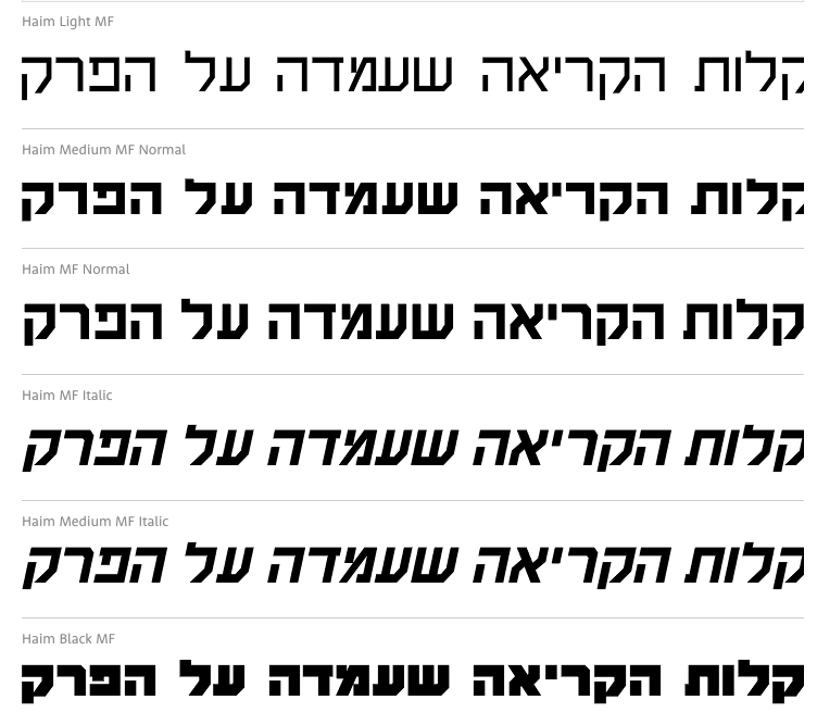
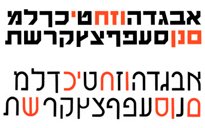
Polish designer of the Hebrew typeface Haim (1930s). Adi Stern writes about Haim and another Polish-designed Hebrew font, Sapir: Both typefaces are clearly influenced by the Bauhaus and early modernism and involve simplified, constructed and more geometrical forms. The Haim typeface holds seven symmetrical letterforms while the Sapir has eight of them. The Sapir brings on stage several additional important features. First, as a monolinear sans-serif, it is far more constructed than the Miryam. The Sapir is basically made of simple geometrical shapes, similarly to many Latin faces of the time (e.g. Futura). Second, it uses identical forms, rotated, to make different letters. Third, it introduces---probably for the first time---convex curves instead of flat x-height horizontal strokes. The design of those curves might have been inspired by Hebrew semi-cursive or cursive handwriting, but it is more likely an attempt to simulate the Latin script's x-height curved nature. Digital versions of Haim include Haim MF (1997-1998, Masterfont), which was designed by Eventov Elizov, Zvika Rosenberg and Pini Hemo. |
EXTERNAL LINKS |
| | |
file name: Eventov Elizov Zvika Rosenberg Pini Hemo Haim M F 1997
file name: Haim Sapir
| | |
|
Luc Devroye ⦿ School of Computer Science ⦿ McGill University Montreal, Canada H3A 2K6 ⦿ lucdevroye@gmail.com ⦿ http://luc.devroye.org ⦿ http://luc.devroye.org/fonts.html |