TYPE DESIGN INFORMATION PAGE last updated on Mon Apr 15 05:48:27 EDT 2024
FONT RECOGNITION VIA FONT MOOSE

|
|
|
|
Patrick Strietzel
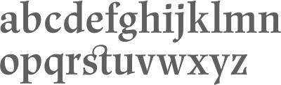
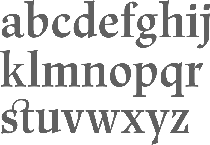
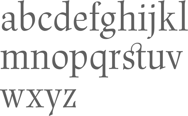
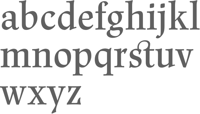
German designer of Renner Antiqua (2008, Linotype), a revival of a text typeface by Renner going back to 1937. Linotype writes: First published in 1939 by Stempel, Renner Antiqua is a classic serif text typeface. Designed by Paul Renner, the father of Futura, this design stands out as strikingly different from his other designs. The letterforms are relatively compact and space saving and the strokes have a strong contrast to look as if made by a pen. This design is extremely distinctive and individualized, but without being overly distracting. Notice many of the small details such as the serifs on the uppercase C, E, and L and the bar at the top of the uppercase A. Also observe the special curve in the bowl of the lowercase b, the dot of the i, and the tail of the y. This design is wonderful for extended amounts of text at 10pt, but the subtle details will be fully appreciated when used larger for titles and display settings. |
EXTERNAL LINKS |
| | |

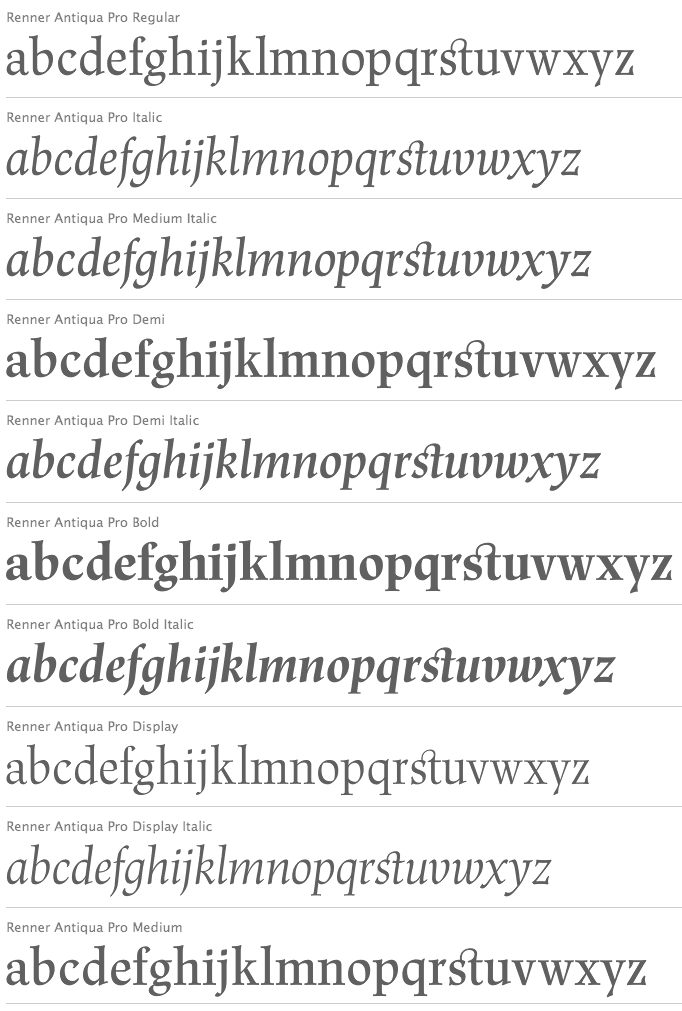
file name: Patrick Strietzel Renner Antiqua 2008
file name: Patrick Strietzel Renner Antiqua Pr Demi 2008

file name: Patrick Strietzel Renner Antiqua 2008d
file name: Patrick Strietzel Renner Antiqua Pro Display 2008
file name: Patrick Strietzel Renner Antiqua Pro Medium 2008
| | |
|
Luc Devroye ⦿ School of Computer Science ⦿ McGill University Montreal, Canada H3A 2K6 ⦿ lucdevroye@gmail.com ⦿ http://luc.devroye.org ⦿ http://luc.devroye.org/fonts.html |