|
Willard T. Sniffin

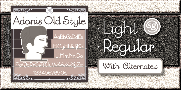
Designer at American Type Founders from 1927-1933. Catalog of some of his digitized typefaces. He made these fonts: - Adonis (1930, ATF). McGrew writes: Popular for stationery and announcements but with little use otherwise. Lines are monotone throughout, and lowercase letters are linked, although it is not really a script. There are alternate versions of several of the capitals. The 30-point size was cut, but seldom if ever shown. Revived by Jim Spiece as Adonis Old Style SG (1994).
- Hollwywood (1932, ATF). McGrew's comments: It was intended for smart, contemporary advertising, announcements, and stationery, but some of the characters have quaint shapes, suggestive of nineteenth-century styles. Compare Gothic Novelty. Revived by Jim Spiece in 1994 as Hollywood Deco SG and by Nick Curtis in 2009, with improvements, as Tinseltown NF.
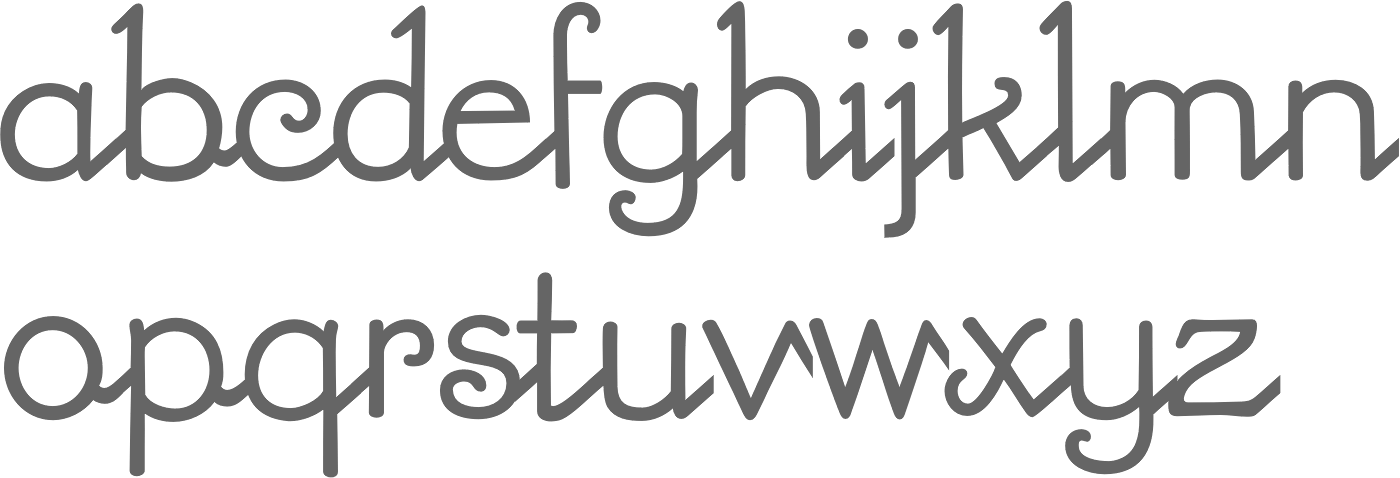
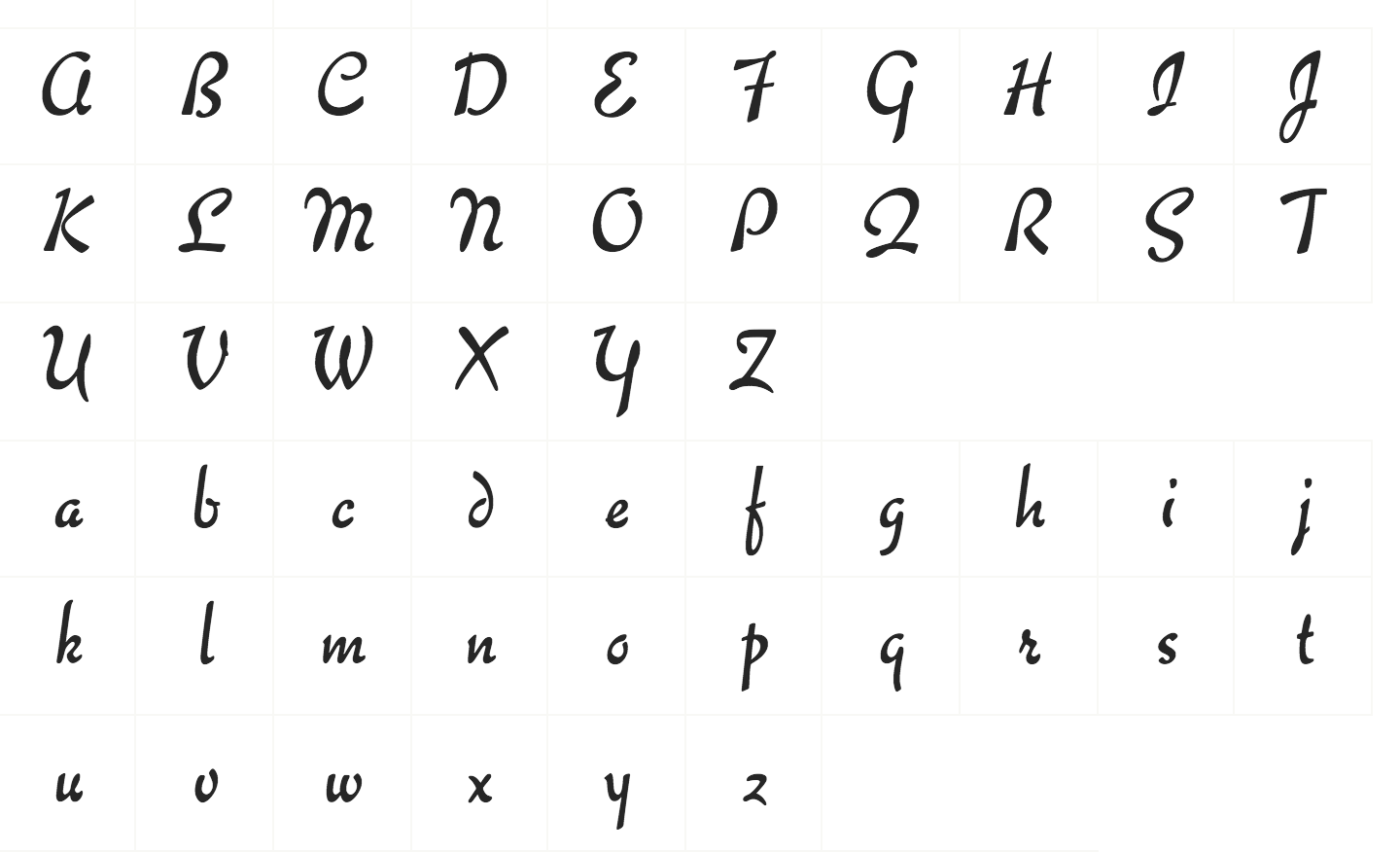
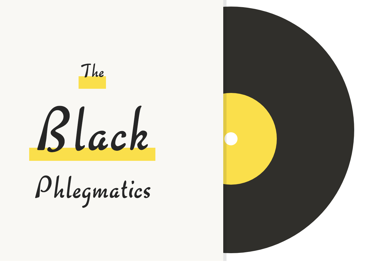
- Keynote (1933, ATF), an informal script face. McGrew writes: Its name was suggested by the political campaigns of the previous year. There is variation in weight of strokes, and letters are unconnected, but there are a number of logotypes of connecting pairs of letters. Inclination is slight, permitting it to be cast on straight bodies with little overhang. Compare Raleigh Cursive by the same designer. Digitally revived in 2005 by Steve Jackaman as Willard Sniffin Script, and by Monotype---without mentioning Sniffin...---as CgChaplin (2016).
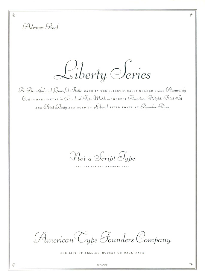
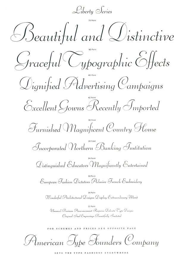
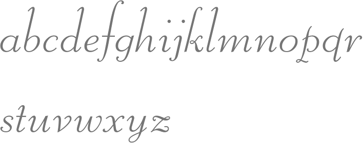
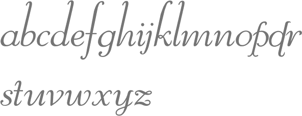
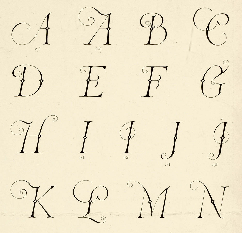
- Liberty (1927, ATF). McGrew: [ ...] was designed presumably to counter the importation of Bernhard Cursive (Bernhard Schoenschrift), which it greatly resembles. It differs in the crossbars of A and H, which have loops in them, the hooked ascenders of bdhl, and some lesser details, but it is a delicately handsome, unconnected script, with very small lowercase and very tall ascenders. On Intertype it is known as Lotus. Also compare Pompeian Cursive. Digital versions include Liberty (Bitstream) and Reliant (Intellecta Design).
- Newport (1932, ATF), an extra condensed novelty gothic / art deco face. McGrew: Caps occupy almost the entire body, and lowercase letters are tall, with short ascenders and very short descenders. In 48-, 60-, and 72-point sizes, descenders are cast on bodies 6 points larger. The round capitals CDGPR include arcs that are less than half a circle, joining stems at an acute angle. AEFH feature very low crossbars. The normal M is splayed, with the vertex ending short of the baseline, and is the W inverted. There are also an alternate M and W, consisting of three parallel lines with rounded top or bottom. In addition to characters shown in the specimen here, there are a cent mark and a small superior dollar mark, made only in 24-point and larger. Compare Jefferson Gothic, Phenix. Revived in 1994 by Jim Spiece as Newport Classic SG, by URW as URW Newportland, and by Nick Curtis in 2009 as Jazzfest NF.
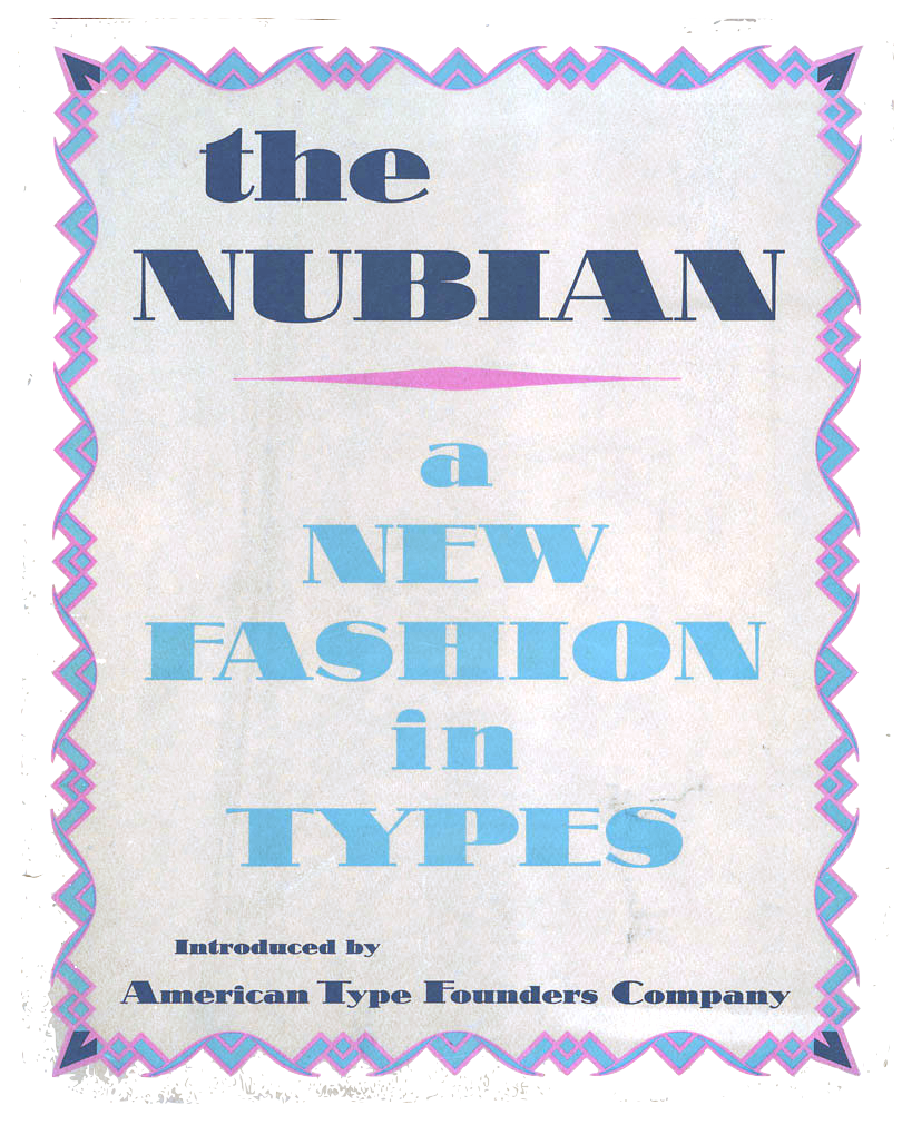
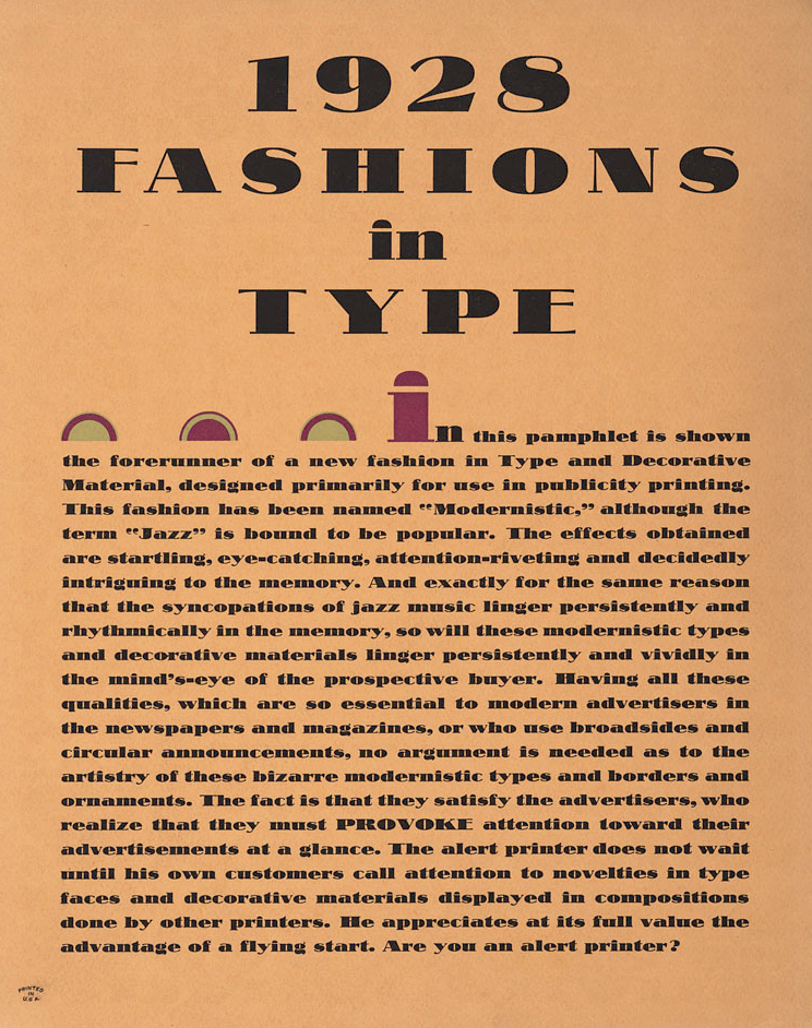
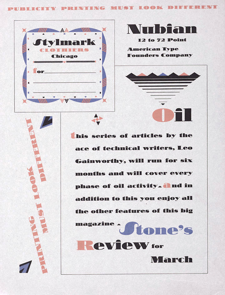
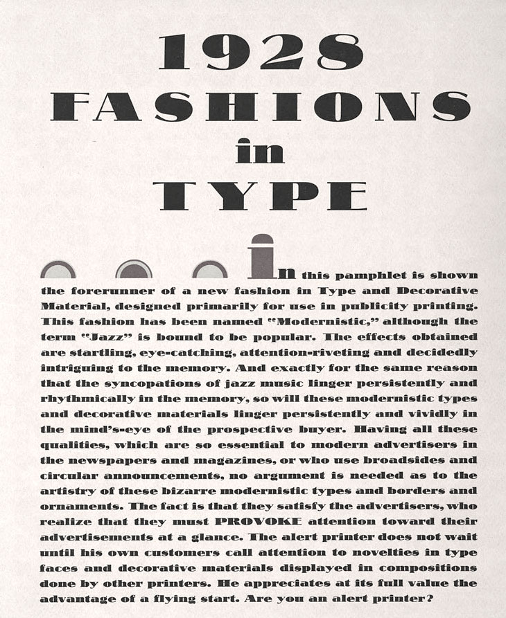
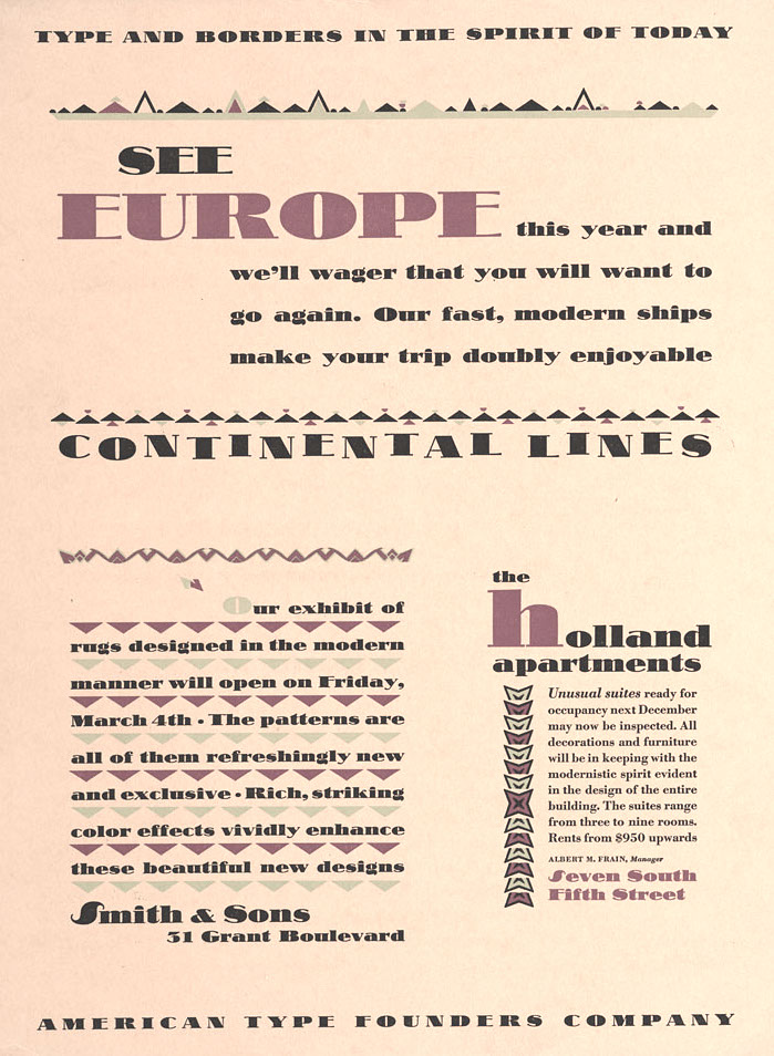
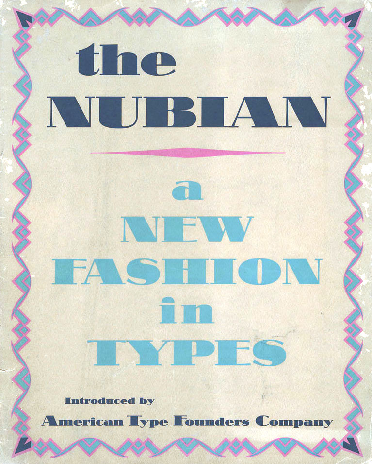
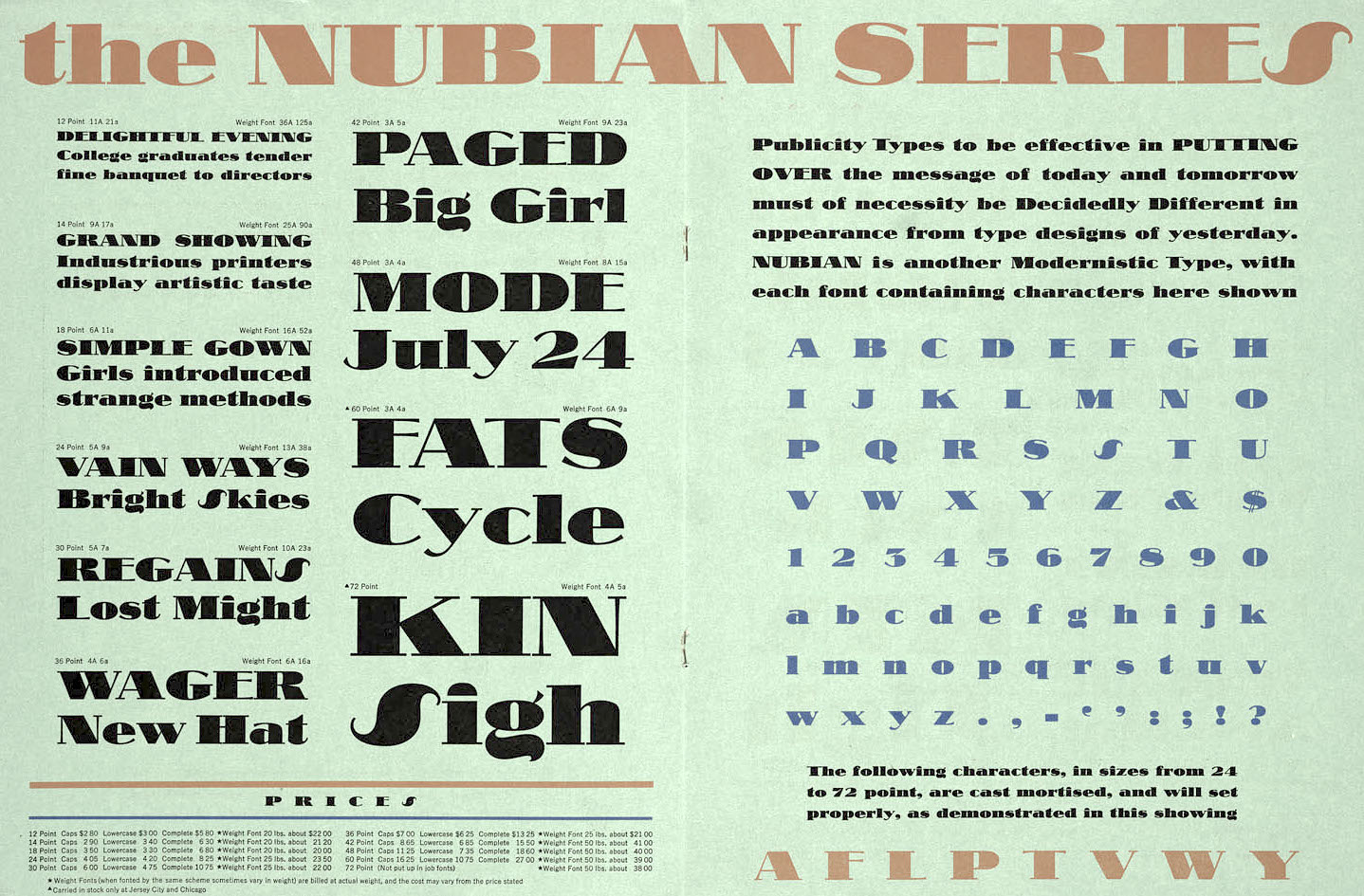
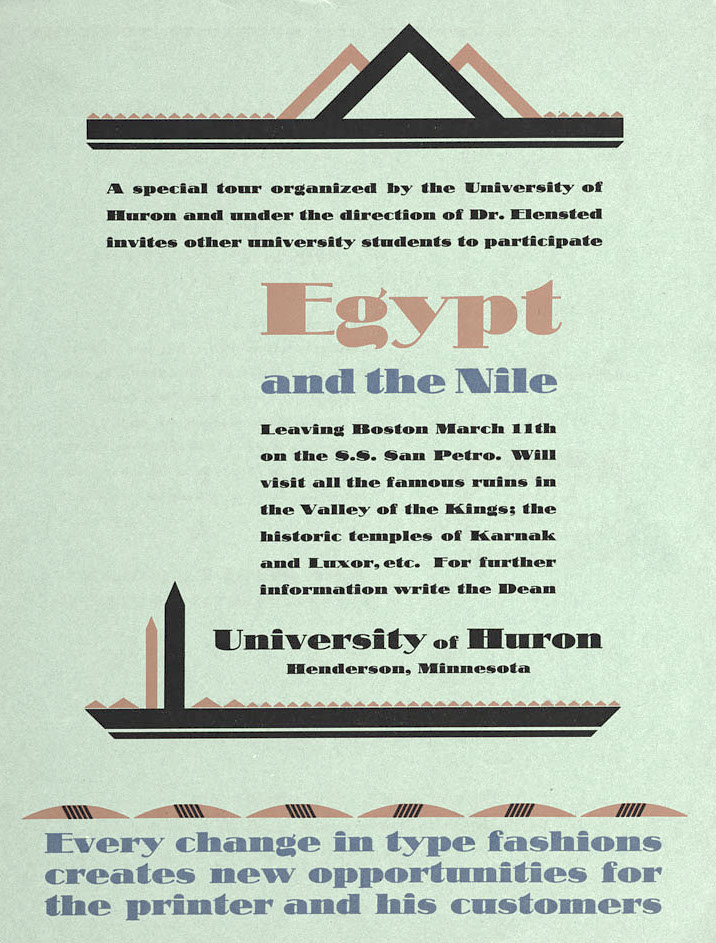
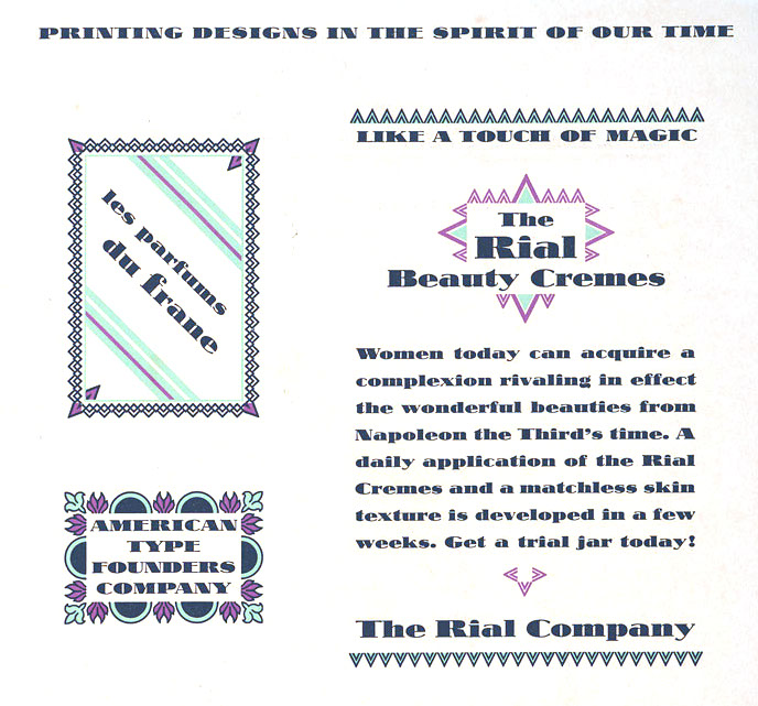
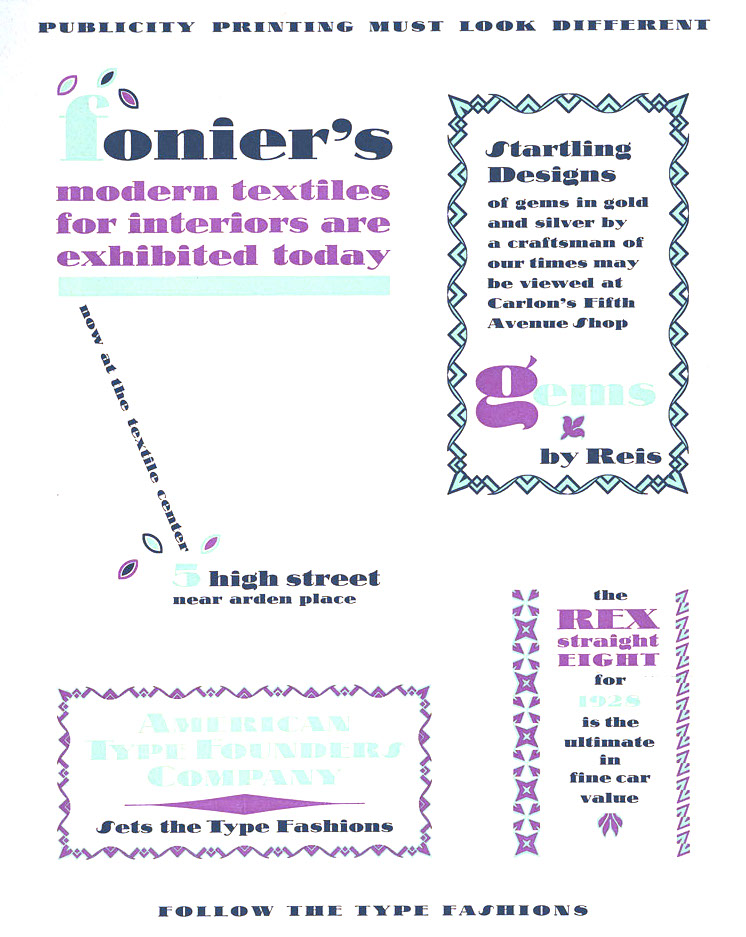
- Nubian (1928, ATF). McGrew: It is a wide, very heavy design with extreme contrast of thick and thin strokes, and has very short serifs. The lowercase g has an uncompleted tail, and the i and j have semicircular dots. Compare Ultra Bodoni, Cooper Modern. The Broadway style signage font Nubian Black was revived and interpreted by Nick Curtis in his Slam Bang Theater NF (2002). Also check The Nubian: a new fashion in types (ATF, 1928). Local download.
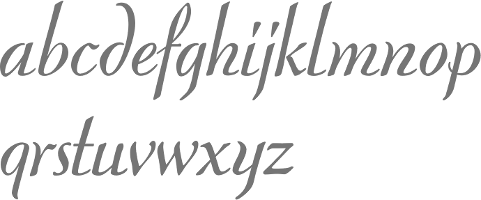
- Piranesi (1930, ATF), a light display typeface with tall ascenders, short descenders, and an almost script italic. Named after an eighteenth-century Italian engraver. McGrew explains: Piranesi was designed by Willard T. Sniffin for ATF in 1930. It is a very delicate roman, with long ascenders and rather short descenders, and is named for an eighteenth-century Italian engraver. Other versions were added by Morris Benton: PiranesiItalic, also in 1930; PiranesiBoldItalic in 1931; and Piranesi Bold roman in 1933. The italics are more characterful and have more of a calligraphic feeling, especially in the cursive capitals, but a separate set of Plain Capitals-essentially a slanted version of the roman was produced for each of the italics. Oldstyle figures were made for all versions, and lining figures were also available for the bold roman. Both romans and both sets of italic plain capitals were still shown by ATF in recent specimens. There seems to be no explanation for the high series number of Piranesi Italic Plain Caps, but that is how it appears in ATF literature. PiranesiItalic, with regular cursive capitals, was also made by Intertype under the name Minuet. Piranesi was remade by Bitstream.
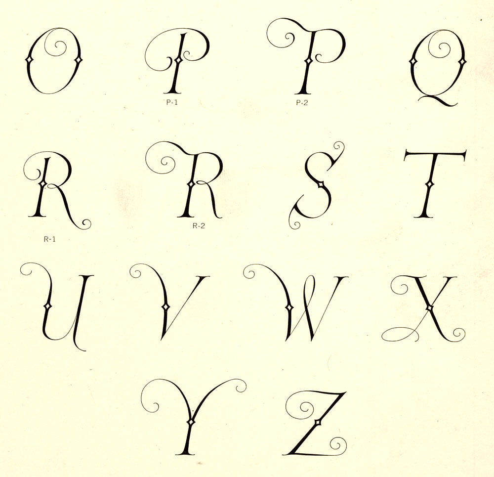
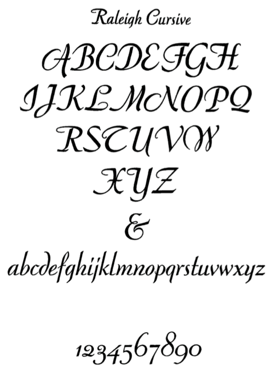
- Raleigh Cursive (1929, ATF). Mac McGrew: Raleigh Cursive is a spirited design by Willard T. Sniffin, drawn in 1929 for ATF but introduced in 1930. It has a pen-drawn quality, with precise lowercase letters which don't quite connect, and flourished capitals. There are two versions of cap Rand T, and several lowercase ligatures, as shown. Sizes over 36-point were discontinued in the late 1940s. Raleigh Initials were designed by the same artist at about the same time. They closely follow the style of Raleigh Cursive, but are more freely drawn. For each size, J and Q are cast on the next larger body size. Compare Park Avenue, Piranesi Bold Italic. For a digital version and extension, see the two-style Redwood (2007, Rebecca Alaccari, Canada Type).
- Rivoli and Rivoli Italic (1928, ATF). McGrew says: They are delicate typefaces with a nervous, pen-drawn quality, and are very similar to Eve and Eve Italic, designed by Rudolf Koch in Germany a few years earlier. However, Rivoli has the extra hairline on all sizes of caps in both roman and italic, whereas Eve has this line only on italic caps in sizes from 14-point up. Compare Paramount, which is essentially a bold version of Rivoli. A revival by Paul Hickson at Rooster Types is entitled Rivoli Initials [see also here].
- Rosetti (1931, ATF). McGrew: This is a thick-and-thin, serifless face. Many of the capitals are informal, and some have an extra swash version. In lowercase letters such as hand m, the ascending stroke leaves the stem at a low point. Compare Parisian, Optima, Radiant, Czarin, Lydian. Revived by Nick Curtis as Rassetta NF and Rassetta Swash Caps NF (2005).
FontShop link. Klingspor link. View Sniffin's typefaces.
|
EXTERNAL LINKS
Willard T. Sniffin
 [Designer info] [Designer info]
Monotype link
Klingspor Museum page
MyFonts search
Monotype search
Fontspring search
Google search
INTERNAL LINKS
Type designers ⦿
Type designers ⦿
Nick Curtis ⦿
Art deco typefaces ⦿
Signage typefaces ⦿
Modern style [Bodoni, Didot, Walbaum, Thorowgood, Computer Modern, etc.] ⦿
Morris Fuller Benton ⦿
|
