|
John Downer

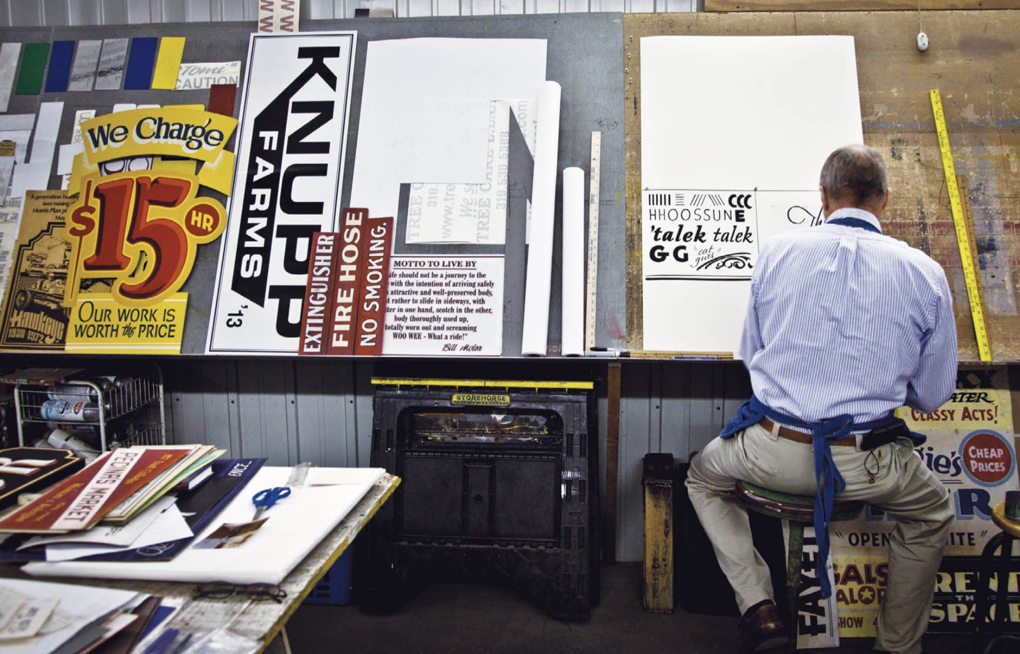
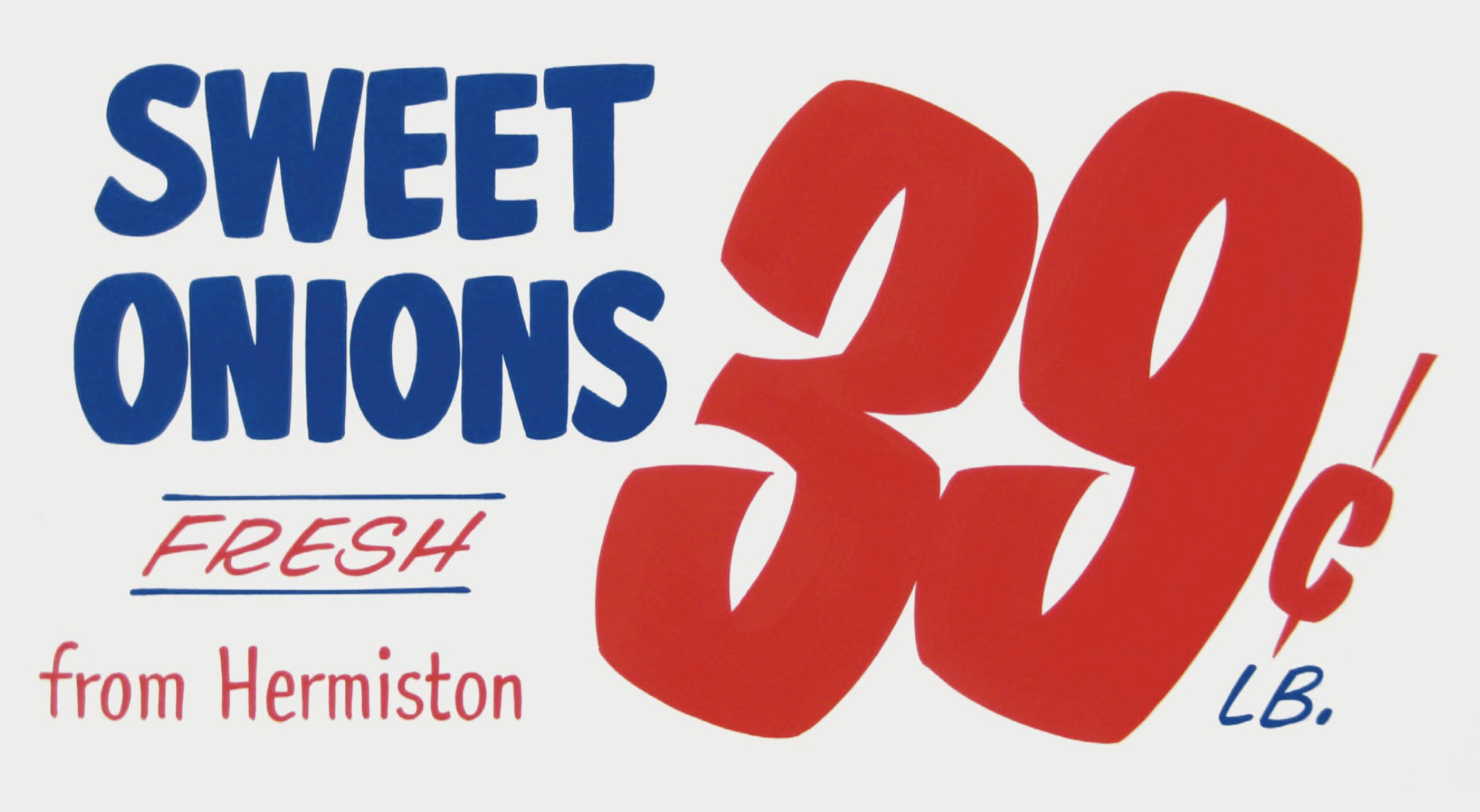
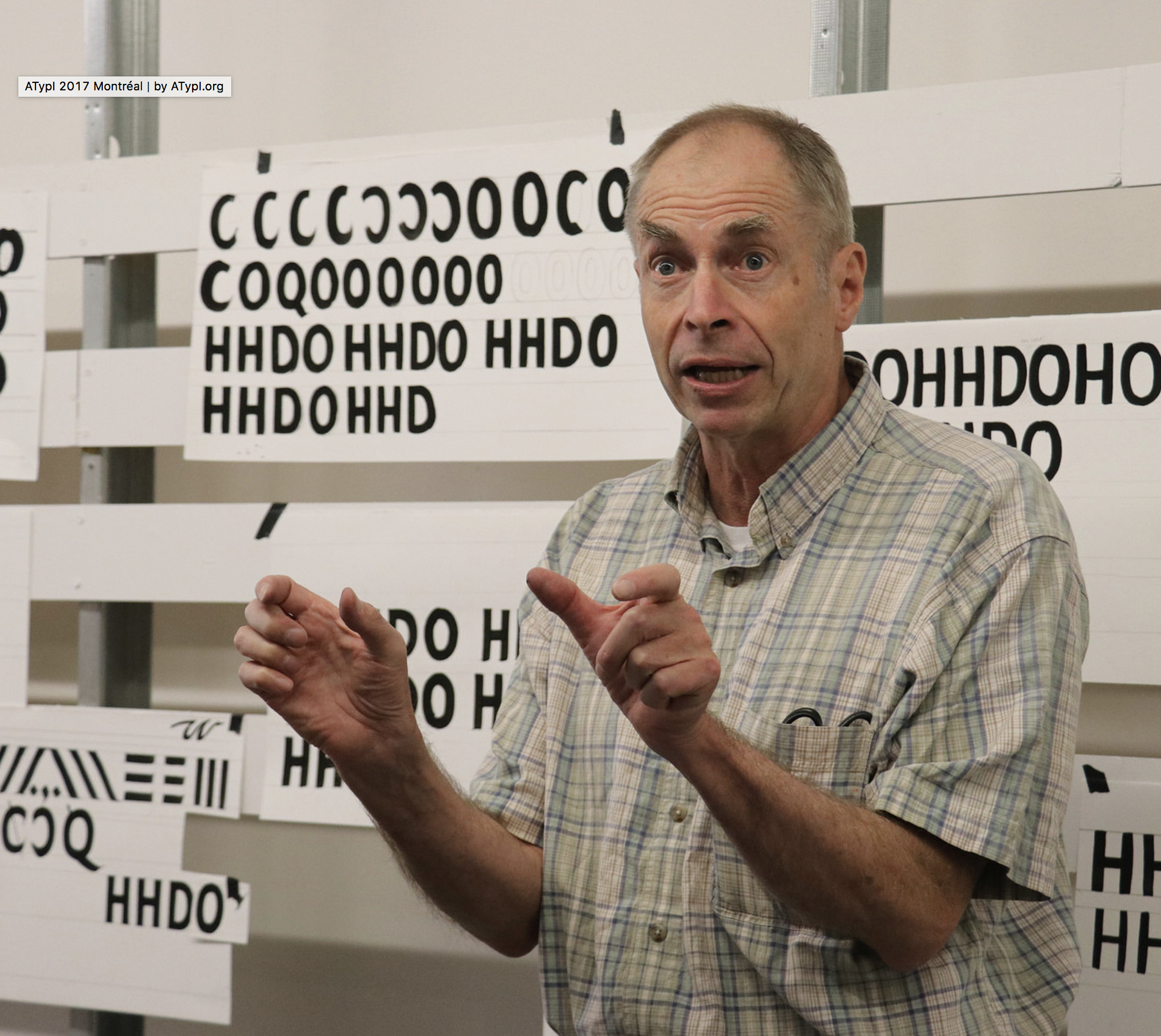
Celebrated American sign painter and type designer (b. Tacoma, WA, 1951), who lives in Iowa City, IA. Downer earned a BA degree in Fine Art from Washington State University, and both an MA degree and an MFA degree in painting from the University of Iowa. John Downer has been a journeyman sign painter since 1973, and a type designer since 1983. He is known as a type critic and type historian. He teaches hand lettering and lectures widely at educational institutions and professional conferences. Downer's professional activities include sign painting, lettering, glass gilding, type design, typography, and logo design. His typefaces: - Ironmonger (1991-1992: an angular all-caps display alphabet inspired by lettering on buildings), Roxy (1990: a stroke-modulated sans), SamSans (1993: a humanist sans) at FontBureau.
- Chicago Tribune Mag (1989, Roger Black).
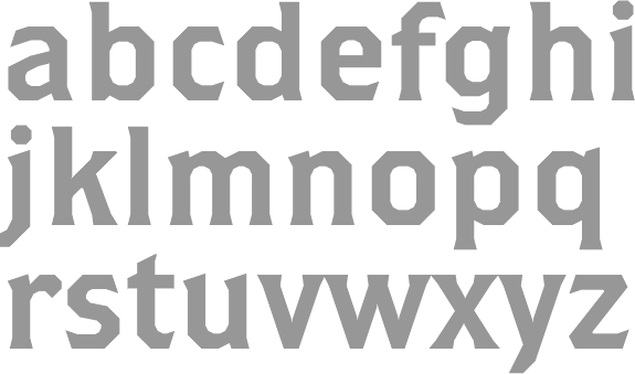
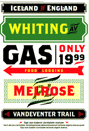
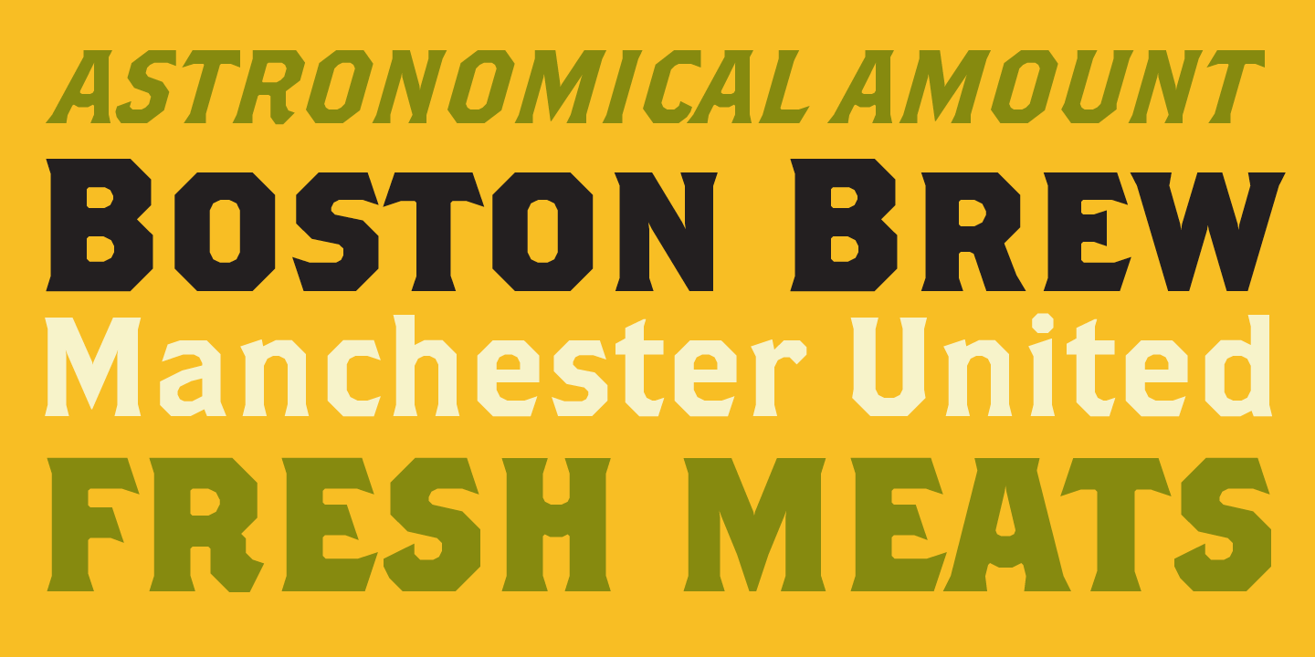
- At Emigre: Triplex Italic (1985; many weights were done by Zuzana Licko), Brothers (1999, a polygonal and almost octagonal family with wood type influences: Its inspiration came from a bright chromolithographed letterhead designed around the turn of the century for the Cole Brothers traveling shows, an extravaganza of acrobatic and circus acts that included trained horses with bareback riders.), Council (1999: an all caps condensed display wedge-serif) and Vendetta (1999: inspired by old-style Venetian serif fonts but with sharpened serifs). Council was based on lettering found on a candy tin box made in the early 1900s for John G. Woodward&Co. of Council Bluffs, Iowa. It has a wood type look.
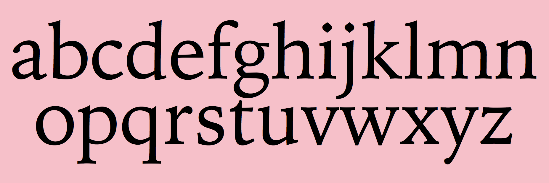
- Iowan Old Style (1990, Bitstream--his first font), Iowan Old Style Titling (2002, Bitstream). These are newspaper types. He writes about them: Iowan Old Style is classified as a Venetian old style type design. It is related to earlier, 20th-century American interpretations of Italian Renaissance types cut by Nicolas Jenson and Francesco Griffo, but it is modeled also on classical inscriptional lettering and sign painting seen in certain regions of eastern Iowa. See also Venetian 801 by Bitstream.
- Gonnick (1992, done for cartoonist Larry Gonnick).
- Simona (1994-1996, Design Lab, Milan, with Jane Patterson), Simona Swash Italic (1998, Design Lab). Example of its use.
- Airy (1998, Design Lab).
- Panatela (2001, compared by Downer with Jim Parkinson's Modesto).
- Paperback (2005), a family with 6, 9, 12, 24, 48 and 96 point optical sizes. Its polygonal sections of outlines are applauded by John Berry.
- Screenmax, a bitmap serif typefaces at 7 pixel x-height in Roman, Italic, Bold and Black.
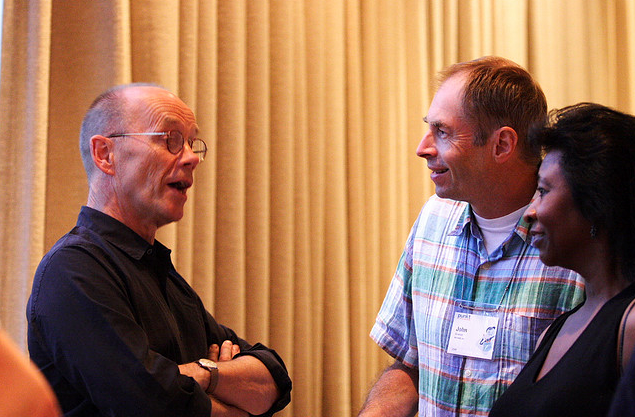
Russian piece by Ilya Ruderman on Downer's lettering. His present company is Voltage. At ATypI 2008 in St. Petersburg, he spoke about revivals, and ran a lettering workshop, something he is famous for at previous ATypI meetings as well. His abstract on font revival reads: To understand the intrinsic differences between plagiarism (normally regarded as a bad thing) and preservation (normally regarded as a good thing), we should look at various means by which newer typefaces are derived from older ones. There are indeed many approaches. Outlining them can be helpful in considering the practices surrounding revivalism in general: revivals, recuttings, reclamations - anthologies, surveys, remixes - knockoffs, clones, counterfeits - "me too", copycat - reconsiderations, reevaluations, reinterpretations - homages, tributes, paeans - encores, sequels, reprises - extensions, spinoffs, variations - caricatures, parodies, burlesques. Mug shot. Klingspor link. Brief bio. MyFonts page. FontShop link. John Downer, a master water polo player (2006). Bitstream bio. Showcase of John Downer's typefaces at MyFonts.
|
EXTERNAL LINKS
John Downer
 [Designer info] [Designer info]
Monotype link
Klingspor Museum page
MyFonts search
Monotype search
Fontspring search
Google search
INTERNAL LINKS
Type designers ⦿
Type designers ⦿
Wood Type ⦿
Type scene in Iowa ⦿
Type scene in Washington ⦿
Venetian or antiqua typefaces ⦿
Circus fonts ⦿
Polygonal typefaces ⦿
|
