TYPE DESIGN INFORMATION PAGE last updated on Tue May 14 17:08:21 EDT 2024
FONT RECOGNITION VIA FONT MOOSE

|
|
|
|
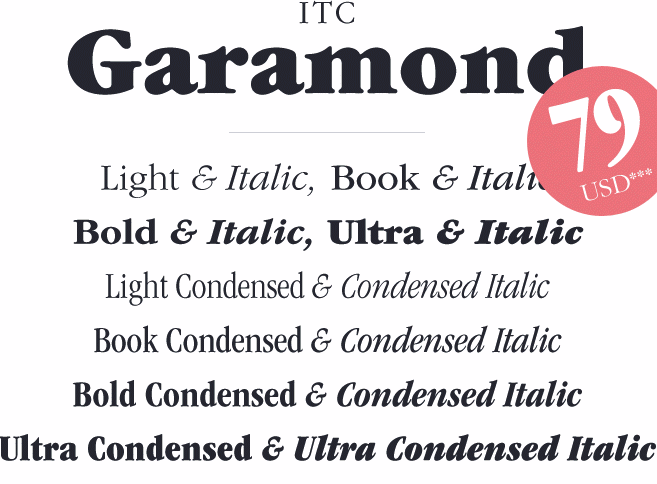
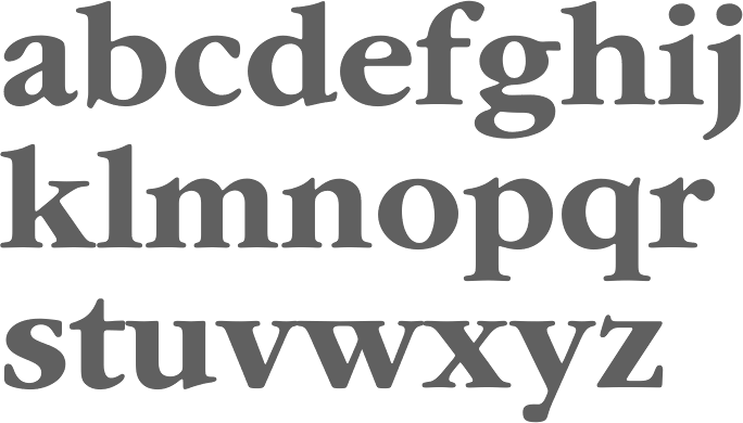
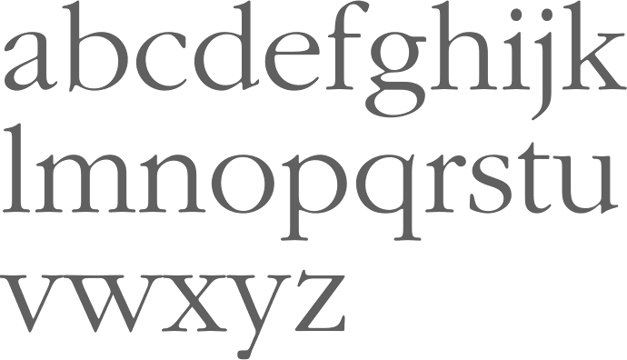
ITC Garamond opinion
[Tony Stan]
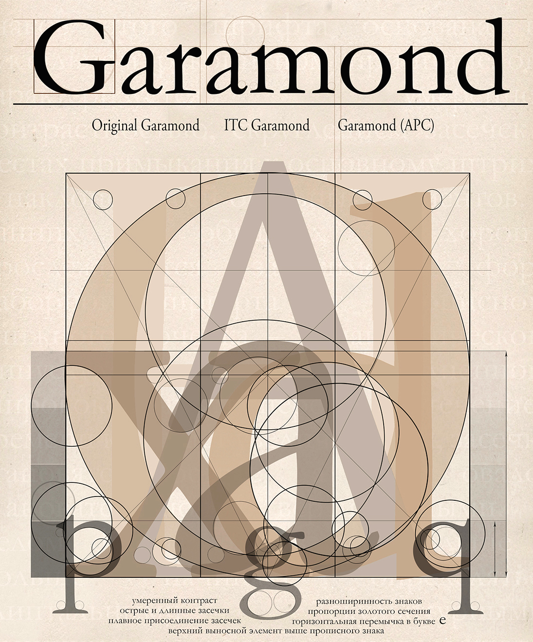
MyFonts recalls the history of ITC Garamond: Years ago Apple had used ITC Garamond (Tony Stan, 1977) and algorithmically condensed it 80% for their corporate typeface. (It is presumed that the existing ITC Garamond Condensed, at 64%, was too narrow.) Apple decided at some point to create a true outline to improve the appearance. A three-way agreement was made between Apple, ITC and Bitstream to develop this 80% width version. (Note that at this time ITC licensed only the outline artwork, no digital data, so each foundry effectively had their own cut of ITC fonts.) Bitstream used its cut of ITC Garamond, condensed it 80% and adjusted shapes, hairlines, weights, etc. Chuck Rowe then hinted the TrueTypes using RoyalT, incorporating diagonal hinting and deltas as well, all to Apple's satisfaction. The fonts delivered to Apple were known as Apple Garamond. Bitstream was allowed to sell the typefaces (six in all) by the name of ITC Garamond Narrow, which can be found in any of its older catalogues. As of January 2001, Bitstream is no longer licensed to sell ITC fonts including the ITC Garamond Narrow. According to Jim Lyles, these Narrow outlines were never given to ITC. For all intents and purposes, therefore, ITC Garamond Narrow no longer exists and the condensed styles provide the nearest alternative. Linotype offers ITC Garamond Book Condensed as part of its ITC Garamond family. Porchez stresses that ITC Garamond copies Jannon, and is not a Garamond. He claims that it seems to be modeled after Monotype Garamond (which is a Jannon, too). In the same article, Hrant Papazian calls ITC Garamond the "insidious town charlatan" and goes on: There are many depths to which one can disdain ITC Garamond. Some people only mind that it was called a Garamond, since its spirit is so distorted from the original. But that's too forgiving. You would want to go deeper and hate what it does to French culture: according to some people (like Mandel), a small x-height [note: ITC Garamond has a big x-height] is a requirement of being a French font, and Garamond is the Frenchest of them all. And you might go deeper, into functionality, and hate the fact that it combines such gaudy proportions with features only fitting in a serious text face. |
EXTERNAL LINKS |
| | |
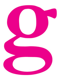
file name: Tony Stan I T C Garamond 1976
file name: I T C Garamond Poster by Evgenia Skalyha 2015

file name: Monotype Garamond Poster by Luciana Job 2015
file name: Monotype Garamond Italic

file name: Monotype Garamond Roman

file name: Monotype Garamond Std Italic

file name: Monotype Garamond
file name: Tony Stan I T C Garamond Book 1977
file name: Tony Stan I T C Garamond Light 1977

file name: Tony Stan I T C Garamond Narrow Ultra 1977
| | |
|
Luc Devroye ⦿ School of Computer Science ⦿ McGill University Montreal, Canada H3A 2K6 ⦿ lucdevroye@gmail.com ⦿ http://luc.devroye.org ⦿ http://luc.devroye.org/fonts.html |