TYPE DESIGN INFORMATION PAGE last updated on Mon Apr 15 06:54:49 EDT 2024
FONT RECOGNITION VIA FONT MOOSE

|
|
|
|
Gruppo Due
Gruppo Due (Berlin, London, Karlsruhe and Bern) is a type design platform and foundry offering retail typefaces, alongside bespoke designs resulting from a close collaboration with our commissioners. Gruppo Due was founded in 2019 by Moritz Appich, Massimiliano Audretsch, Jonas Grünwald and Bruno Jacoby. They designed bespoke typefaces for University of Arts and Design, Karlsruhe (Germany), Cafe Bar Mokka, Thun (Switzerland), Frankfurt University of Music and Performing Arts (Germany), and Mustafa Emin Büyükcoksun (Germany and Turkey). The details on the corporate fonts:
Retail typefaces:
|
EXTERNAL LINKS |
| | |
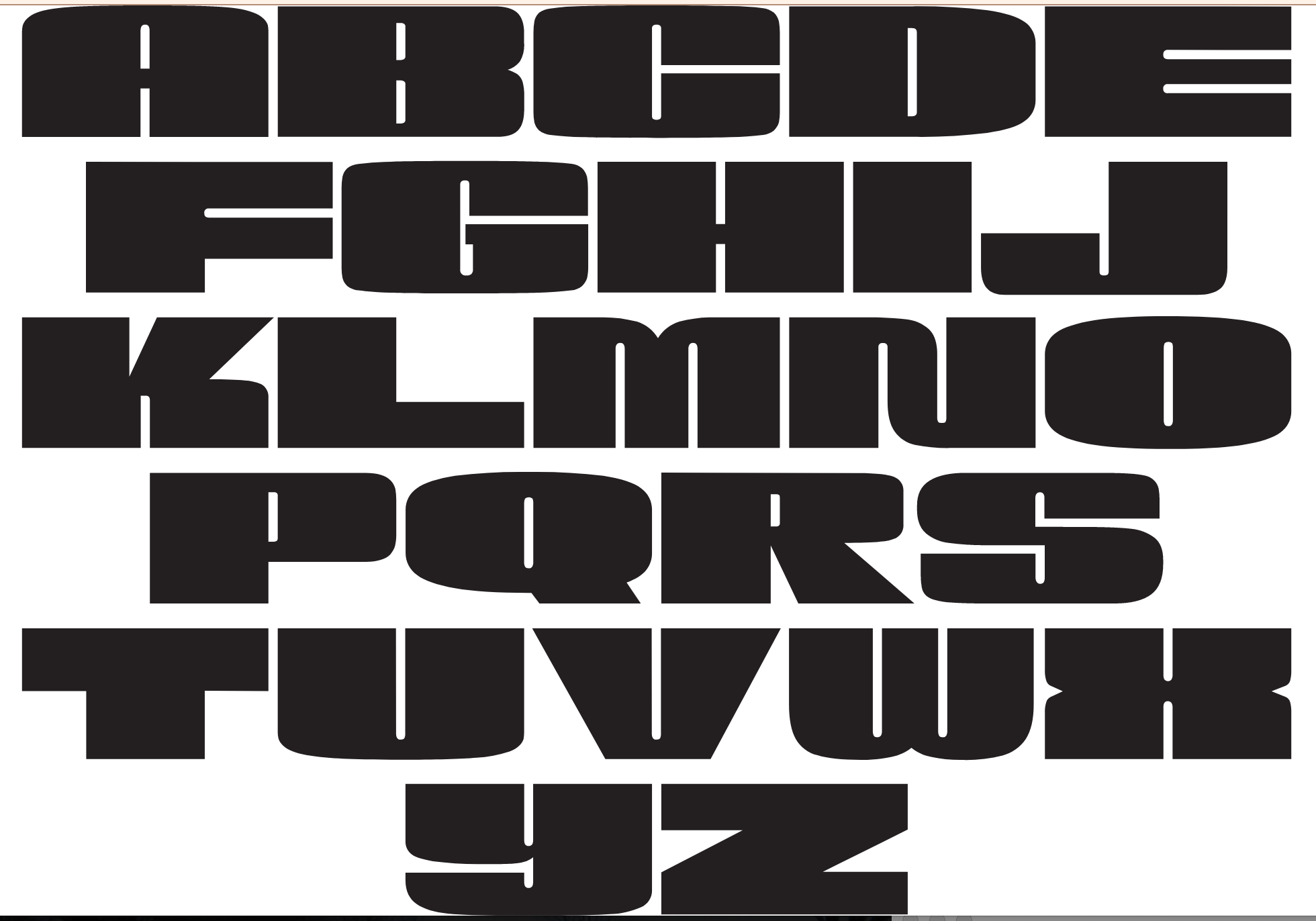
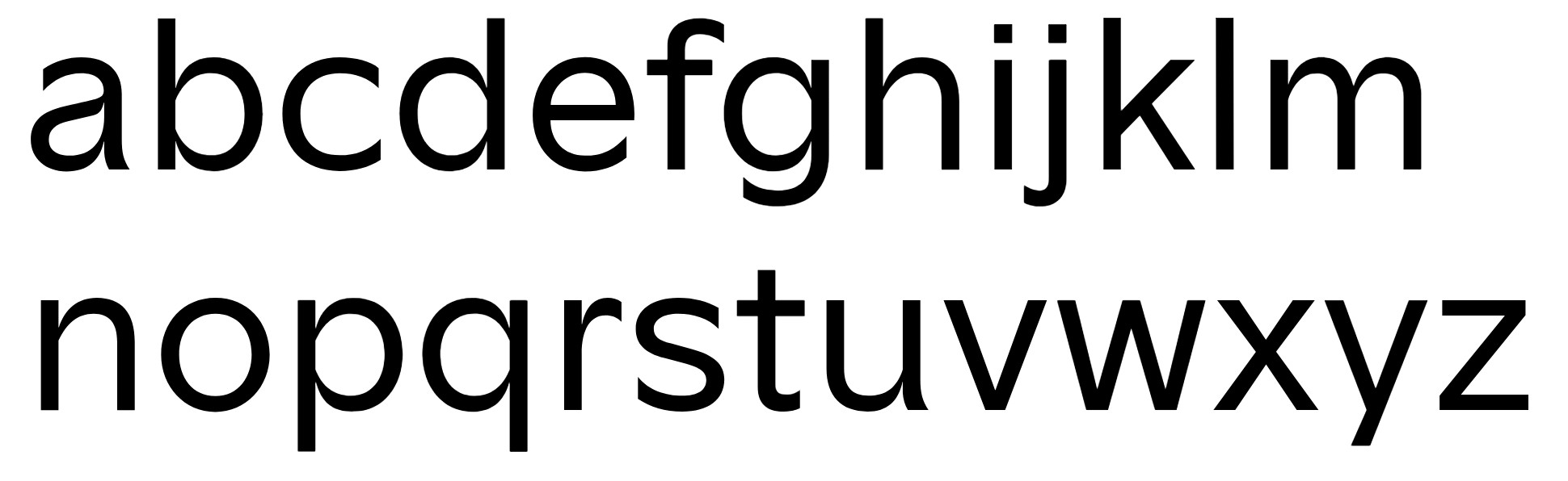
file name: G2 Airdancer
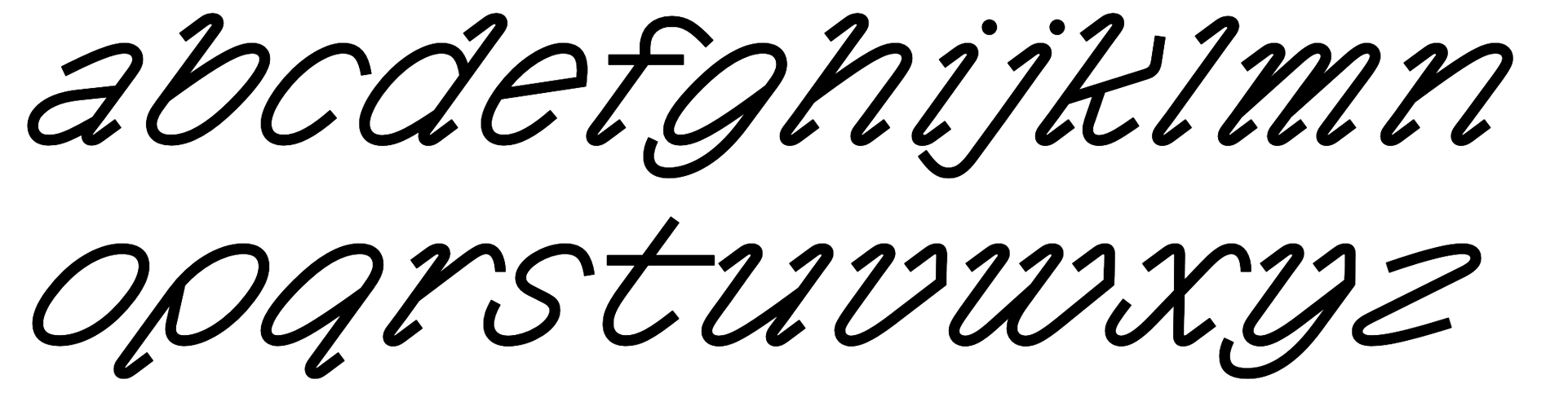
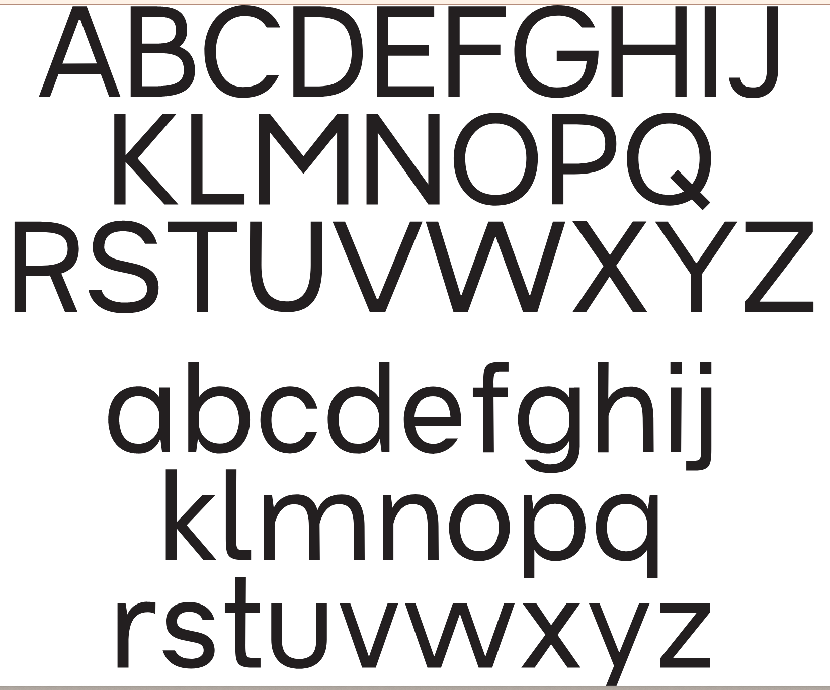
file name: Massimiliano Audretsch G2 Ciao
file name: Massimiliano Audretsch G2 Ciao
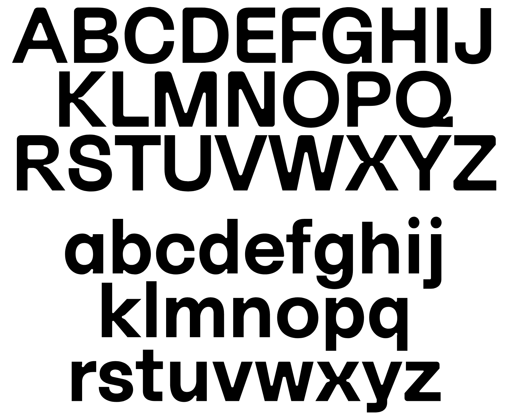
file name: Massimiliano Audretsch G2 T G R
file name: Massimiliano Audretsch G2 T G R
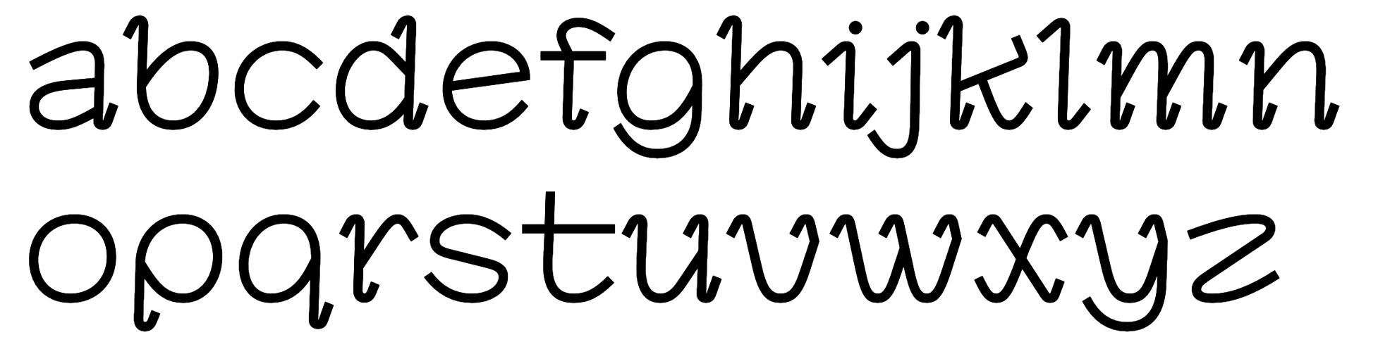
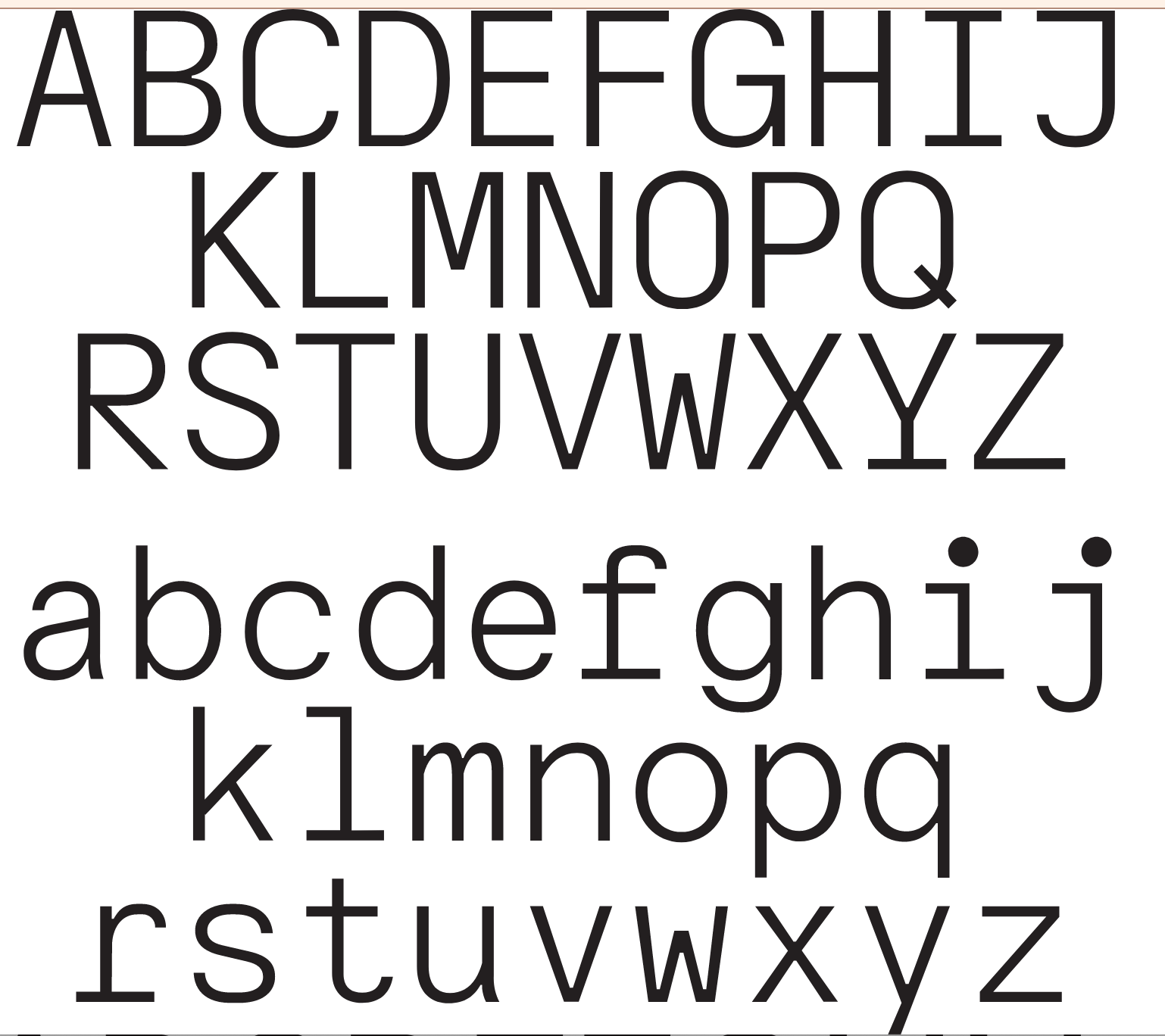
file name: G2 Gitmek
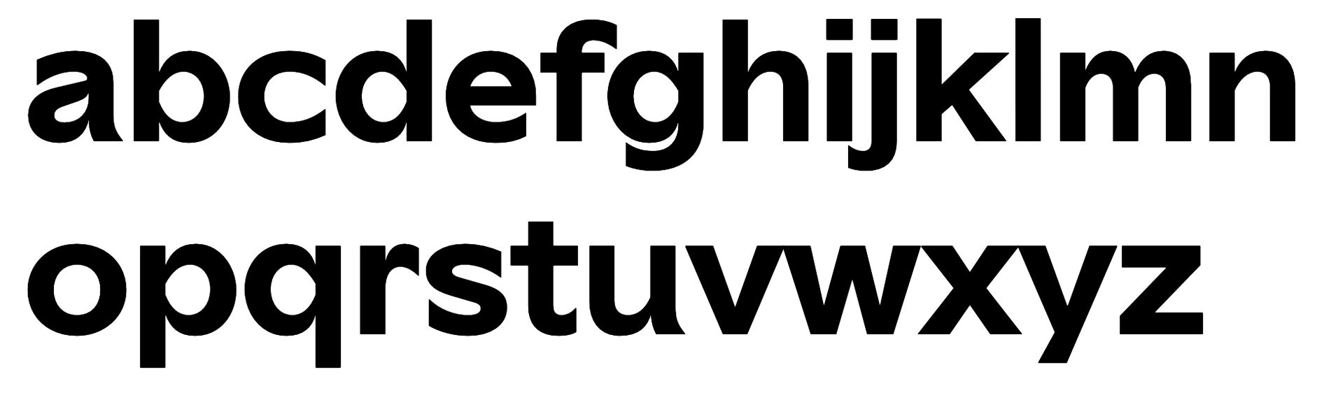
file name: G2 Hfmdk
file name: G2 Lohmann
file name: Moritz Appich Bruno Jacoby G2 Kosmos
file name: Moritz Appich Bruno Jacoby G2 Kosmos
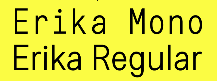
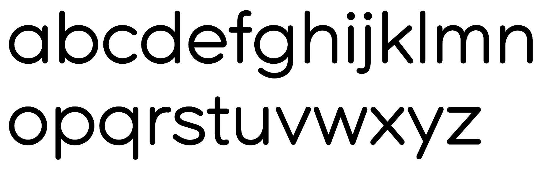
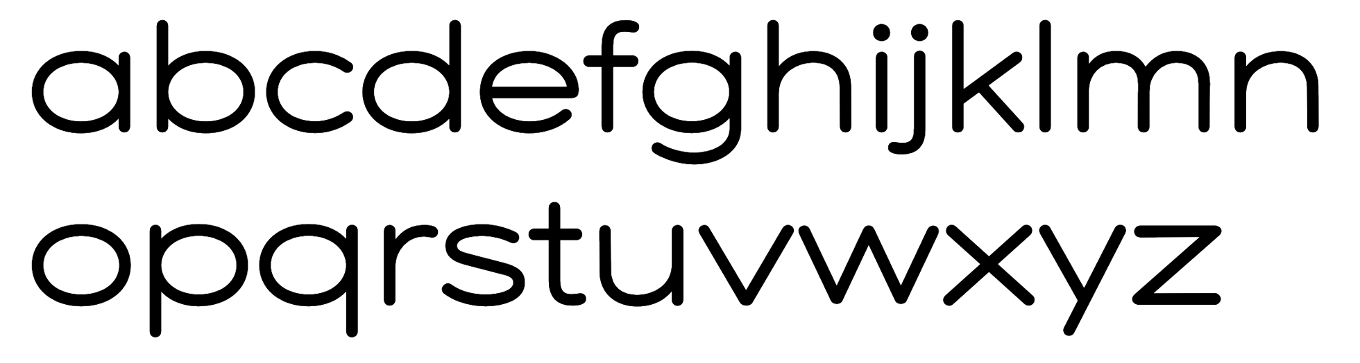
file name: Moritz Appich G2 Erika
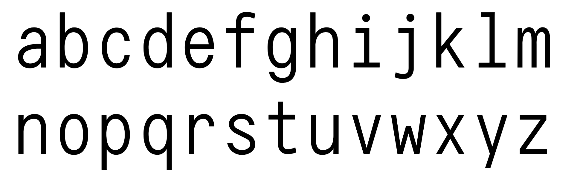
file name: Gruppo Due G2 Erika

file name: Gruppo Due G2 Erika
| | |
|
Luc Devroye ⦿ School of Computer Science ⦿ McGill University Montreal, Canada H3A 2K6 ⦿ lucdevroye@gmail.com ⦿ http://luc.devroye.org ⦿ http://luc.devroye.org/fonts.html |