TYPE DESIGN INFORMATION PAGE last updated on Mon May 6 09:04:18 EDT 2024
FONT RECOGNITION VIA FONT MOOSE

|
|
|
|
|
Eastern European fonts | ||
|
|
|
|
SWITCH TO INDEX FILE
Adam Twardoch (b. 1975) was raised in Tychy, Poland, and graduated from the University of Frankfurt/Oder, Germany. He worked at for Agentur GmbH, a Frankfurt/Oder-based design firm. Since 1991, Adam has advised numerous type designers on Central European extensions of their typefaces and has created localized versions of over fifty fonts. He frequently writes on type-related matters, and is the founder of Font.org, a (now defunct) website featuring articles about typography in English and Polish. Adam Twardoch is Director of Products of FontLab (since 2004), and is typographic consultant at Linotype (since 2002) and Tiro Typeworks (since 2001), and general font specialist at MyFonts (2000-2012). Since 2012 he is based in Berlin. Adam Twardoch is working in the field of font technology, multilingual typography, CSS webfonts, Unicode and OpenType. His typefaces:
Speaker at ATypI 2013 in Amsterdam. Speaker at ATypI 2016 in Warsaw and at ATypI 2018 in Antwerp. [Google] [MyFonts] [More] ⦿ | |
Alois Studnicka
| |
Alphabetum
| Juan-José Marcos García (b. Salamanca, Spain, 1963) is a professor of classics at the University of Plasencia in Spain. He has developed one of the most complete Unicode fonts named ALPHABETUM Unicode for linguistics and classical languages (classical&medieval Latin, ancient Greek, Etruscan, Oscan, Umbrian, Faliscan, Messapic, Picene, Iberic, Celtiberic, Gothic, Runic, Modern Greek, Cyrillic, Devanagari-based languages, Old&Middle English, Hebrew, Sanskrit, IPA, Ogham, Ugaritic, Old Persian, Old Church Slavonic, Brahmi, Glagolitic, Ogham, ancient Greek Avestan, Kharoshti, Old Norse, Old Icelandic, Old Danish and Old Nordic in general, Bengali, Hindi, Marathi, Phoenician, Cypriot, Linear B with plans for Glagolitic). This font has over 5000 glyphs, and contains most characters that concern classicists (rare symbols, signs for metrics, epigraphical symbols, "Saxon" typeface for Old English, etcetera). A demo font can be downloaded [see also Lucius Hartmann's place]. His Greek font Grammata (2002) is now called Ellenike. He also created a package of fonts for Latin paleography (medieval handwriting on parchments): Capitalis Elegans, Capitalis Rustica, Capitalis Monumentalis, Antiqua Cursiva Romana, Nova Cursiva Romana (2014), Uncialis, Semiuncialis, Beneventana Minuscula, Visigothica Minuscula, Luxoviensis Minuscula, Insularis Minuscula, Insularis Majuscula, Carolingia Minuscula, Gothica Textura Quadrata, Gothica Textura Prescissa, Gothica Rotunda, Gothica Bastarda, Gothica Cursiva, Bastarda Anglicana (2014) and Humanistica Antiqua. PDF entitled Fonts For Latin Palaeography (2008-2014), in which Marcos gives an enjoyable historic overview. Alphabetum is not Marcos's only excursion into type design. In 2011, he created two simulation fonts called Sefarad and Al Andalus which imitate Hebrew and Arabic calligraphy, respectively. Cyrillic OCS (2012) is a pair of Latin fonts that emulate Old Church Slavonic (old Cyrillic). In 2013, he created Cuneus, a cuneiform simulation typeface. Paleographic fonts for Greek (2014) has ten fonts designed by Marcos: Angular Uncial, Biblical Uncial, Coptic Uncial, Papyrus Uncial, Round Uncial, Slavonic Uncial, Sloping Uncial, Minuscule IX, Minuscule XI and Minuscule XV. These fonts are representative of the main styles of Greek handwriting used during the Classical World and Middle Ages on papyrus and parchments. There is also a short manual of Greek Paleography (71 pages) which explains the development of Greek handwriting from the fourth century B.C. to the invention of printing with movable type in the middle of the fifteenth A.D. He wrote a text book entitled History of Greek Typography: From the Invention of Printing to the Digital Age (in Spanish; second edition, 2018). See also here and here. [Google] [More] ⦿ |
Amadeus Information Systems
| Amadeus Information Systems Limited / Phil Chastney are the designers of SImPL (1999-2001) and Sixpack Medium (2009), great Courier-like monospace fonts with many diacritics and symbols, filling many of the Unicode pages. The designer is Phil Chastney, who writes One of the design aims of the font was to provide a complete set of all known APL symbols, plus sufficient characters to allow prompts, comments, etc., to be expressed in every European language known to be in current use. Basically, that means the Latin, Greek and Cyrillic alphabets, plus accented and variant letter forms as required for other European languages using these alphabets.. Incidentally, Armenian and Cyrillic are also covered, and the number of mathematical symbols is staggering. [Google] [More] ⦿ |
Czech Design and Typography (studio experimentalniho design). Vendor of Central European versions of Adobe fonts in Czechia. [Google] [More] ⦿ | |
He also helped with the finalization of some fonts at Primetype, e.g., the PTL Maurea family. He joined Carrois Type Design in Berlin, where he is involved in many type projects. One example is the angular grotesk typeface done by Carrois Type Design in 2008 for the Russian Railways. This work was carried out with Dmitri Lavrow, and invloved Andreas Eigendorf and Ralph du Carrois. In December 2014, Andreas Eigendorf and type designer Stephan Müller founded a font-production, type-technology, and knowledge hub based in Berlin, Alphabet Type. Its expertise and custom tools help type designers and foundries turn their typefaces into fully functional software. In 2016, a team of designers at Lettersoup that includes Ani Petrova, Botio Nikoltchev, Adam Twardoch and Andreas Eigendorf designed an 8-style Latin / Greek / Cyrillic stencil typeface, Milka, which is based on an original stencil alphabet from 1979 by Bulgarian artist Milka Peikova. Typedia link. FontShop link. [Google] [More] ⦿ | |
Andriy Konstantynov
| |
She designed Magnimo while at Reading. Aoife writes: from the Latin Magna, meaning great or large, and the Indic Anima, meaning spirit or soul. Magnimo is a big-hearted typeface with many moods and voices. I am quite impressed by this three-style typeface (Regular, Italic, Upright Italic), which, with its lively angular design, seems just right for green party and energy drink magazines. All the extra features expected of a 2010 typeface are there, including a matching and nicely balanced Greek, and coverage of most European diacritics. Additional scans: i, ii, iii. In 2016, she published the free Google Font family BioRhyme (+Expanded). See also Open Font Library. Speaker at ATypI 2016 in Warsaw on Synoptic Translations. Speaker at ATypI 2017 Montreal, where she entertained the crowd with socially relevant typography and type for dissenting voices. Speaker at ATypI 2018 in Antwerp. [Google] [More] ⦿ | |
Apostrophic Laboratory
|
|
Vendor of Mac and PC fonts for several languages and from a variety of companies, active ca. 1999. The fonts covered Japanese, Chinese, Russian, Arabic, Hebrew, Persian, Urdu, Tamazight, Turkish, Greek, Indic, Thai, Eastern European, and Korean. [Google] [More] ⦿ | |
Elk Grove Village, IL-based company established in 2004, which specializes in font development, licensing and IP protection. It rose from the ashes of a major fire at Agfa/Monotype at the end of 2003. Its founders are Steve Matteson (type designer, formerly with Agfa/Monotype), Thomas Rickner (of Microsoft fame, where he hinted many Microsoft families), Ira Mirochnick (founder and President of Monotype Typography Inc in 1989 (where he was until 2000) and a Senior Vice President and director of Agfa Monotype Corporation (2000-2003), a self-proclaimed expert in font licensing issues and IP protection), and Bill Davis (most recently the Vice President of Marketing for Agfa Monotype). Also included in this group are Josh Hadley, Brian Kraimer, Jim Ford (since 2005), and Jeff Finger (as Chief Research Scientist, since 2006). On December 8, 2010, Ascender was acquired by Monotype for 10.2 million dollars. Their typefaces include Endurance (2004, Steve Matteson, an "industrial strength" Grotesk designed to compete with Helvetica and Arial; it supports Greek, Cyrillic and East European languages). In April 2005, Ascender announced that it would start selling the Microsoft font collection, which is possibly their most popular collection to date. They also started selling and licensing IBM's Heisei family of Japanese fonts in April 2005: Heisei Kaku Gothic, Heisei Maru Gothic and Heisei Mincho. Ascender's version of the CJK font Heiti is called ASC Heiti. Also in 2005, they started distributing Y&Y's Lucida family. In October 2005, Ascender announced the development of Convection, a font used for Xbox 360 video games. Their South Asian fonts cover Bengali, Devanagari, Gujarati, Gurmukhi, Kannada, Malayalam, Tamil and Telugu, and include Ascender Uni, Ascender UniDuo and Arial Unicode for general use across all Indic languages, and, in particular, the Microsoft fonts Vrinda (Bengali), Mangal (Devanagari), Shruti (Gujarati), Raavi (Gurmukhi), Tunga (Kannada), Kartika (Malayalam), Latha (Tamil) and Gautami (Telugu). Khmer SBBIC (2011) is a Khmer font at Open Font Library. It does more type trading and licensing than type creation, although Steve Matteson has contributed fairly well to their new typefaces. Their brand value took a hit when they started selling scrapbook, handwriting and wedding fonts under the name FontMarketplace.com. Recent contributions: Crestwood (2006, a house face, possibly by Steve Matteson) is an updated version of an elegant semi-formal script typeface originally released by the Ludlow Type Foundry in 1937. In 2009, they started a subpage called GoudyFonts.Com to sell their Goudy revivals. In 2010, they announced a new collection of OpenType fonts created specifically for use in Microsoft Office 2010: Comic Sans 2010 (including new italic and bold italic fonts), Trebuchet 2010 (including new black&black italic fonts), Impact 2010, Pokerface 2010, Rebekah 2010 and Rebus Script 2010. Ligatures in Comic Sans? View Ascender's typefaces. [Google] [MyFonts] [More] ⦿ | |
The file fonty.zip on this web page contains the following AType collection from 1992, which looks very much like the Corel collection with East-European accents added on: ATAardvarkBoldBold, ATProseAntiqueBold, ATProseAntique, ATArabia, ATAvalonBold, ATAvalonItalic, ATAvalon, ATAvalonBoldItalic, ATBahamasHeavy, ATBahamasLight, ATBahamasBold, ATBahamas, ATBanff, ATBangkokBold, ATBangkok, ATBodnoff, ATBrooklynBold, ATBrooklynItalic, ATBrooklyn, ATBrooklynBoldItalic, ATNewBrunswickBold, ATNewBrunswickItalic, ATNewBrunswick, ATNewBrunswickBoldItalic, ATCasablancaBold, ATCasablancaItalic, ATCasablanca, ATCasablancaBoldItalic, ATCasperOpenFace, ATDawnCastleBold, ATDawnCastle, ATCenturionOldBold, ATCenturionOldItalic, ATCenturionOld, ATCottage, ATCupertinoItalic, ATCupertino, ATErieBold, ATErieBlackBold, ATErieBlack, ATErieLightBold, ATErieLight, ATErie, ATFranceBold, ATFrance, ATFrankfurtGothicHeavyItalic, ATFrankfurtGothicHeavy, ATFrankfurtGothicBold, ATFrankfurtGothicItalic, ATFrankfurtGothic, ATFrankfurtGothicBoldItalic, ATFreeport, ATFrankenstein, ATFujiyama2Italic, ATFujiyama2, ATFujiyamaBold, ATFujiyamaExtraBoldItalic, ATFujiyamaExtraBold, ATFujiyamaItalic, ATFujiyamaLightItalic, ATFujiyamaLight, ATFujiyama, ATFujiyamaBoldItalic, ATGatineauBold, ATGatineauItalic, ATGatineau, ATGatineauBoldItalic, ATHomewardBound, ATIreland, ATJupiter, ATKoalaBold, ATKoala, ATLincoln, ATLinus, ATMemorandumBold, ATMemorandum, ATMonospacedBold, ATMonospacedItalic, ATMonospaced, ATMonospacedBoldItalic, ATMotor, ATMystical, ATNebraskaBold, ATNebraskaItalic, ATNebraska, ATNebraskaBoldItalic, ATOttawaBold, ATOttawaItalic, ATOttawa, ATOttawaBoldItalic, ATPalmSpringsBold, ATPalmSpringsItalic, ATPalmSprings, ATPalmSpringsBoldItalic, ATParadise, ATParagon, ATPenguinLight, ATPenguinBold, ATPenguin, ATPosse, ATPresident, ATRenfrew, ATSouthernBold, ATSouthernItalic, ATSouthern, ATSouthernBoldItalic, ATStamp, ATSwitzerlandBold, ATSwitzerlandItalic, ATSwitzerland, ATSwitzerlandBoldItalic, ATSwitzerlandBlackItalic, ATSwitzerlandBlack, ATSwitzerlandCondBlackItalic, ATSwitzerlandCondBlack, ATSwitzerlandCondensedBold, ATSwitzerlandCondensedItalic, ATSwitzerlandCondensed, ATSwitzerlandCondensedBoldItalic, ATSwitzerlandCondLightItalic, ATSwitzerlandCondLight, ATSwitzerlandInserat, ATSwitzerlandLightItalic, ATSwitzerlandLight, ATSwitzerlandNarrowBold, ATSwitzerlandNarrowItalic, ATSwitzerlandNarrow, ATSwitzerlandNarrowBoldItalic, ATTechnicalItalic, ATTechnical, ATTimpaniBold, ATTimpaniItalic, ATTimpani, ATTimpaniBoldItalic, ATTimpaniHeavyItalic, ATTimpaniHeavy, ATTorontoBold, ATTorontoItalic, ATToronto, ATTorontoBoldItalic, ATUmbrella, ATUnicorn, ATUSABlackItalic, ATUSABlack, ATUSALightItalic, ATUSALight, ATVogueBold, ATVogue, ATZurichCalligraphicItalic. [Google] [More] ⦿ | |
Four truetype fonts of the R-Times-NewRomanPS family (for Romanian accents). [Google] [More] ⦿ | |
Six standard Microsoft TrueType fonts (Arial, etc.), and two free Baltic fonts, Serif and Sans, provided by Codefusion Communications Inc. [Google] [More] ⦿ | |
A collection of fonts from Bayer Corp (1995): AlbertusExtraBoldW1, AlbertusMediumW1, AntiqueOliveW1, AntiqueOliveW1Bold, AntiqueOliveW1Italic, AvantGardeBook, AvantGardeBookOblique, AvantGardeDemi, AvantGardeDemiOblique, Bookman, BookmanDemi, BookmanDemiItalic, BookmanItalic, CGOmegaW1, CGOmegaW1Bold, CGOmegaW1BoldItalic, CGOmegaW1Italic, CGTimesW1, CGTimesW1Bold, CGTimesW1BoldItalic, CGTimesW1Italic, CenturySchlbkBold, CenturySchlbkBoldItalic, CenturySchlbkItalic, CenturySchlbkRoman, ClarendonCondensedW1Bold, CoronetW1Italic, GaramondW1Antiqua, GaramondW1Halbfett, GaramondW1Kursiv, GaramondW1KursivHalbfett, Helvetica-Narrow, Helvetica-NarrowBold, Helvetica-NarrowBoldItalic, Helvetica-NarrowItalic, Helvetica, HelveticaBlack, HelveticaBlackOblique, HelveticaBold, HelveticaBoldItalic, HelveticaItalic, HelveticaLight, HelveticaLightOblique, LetterGothicW1, LetterGothicW1Bold, LetterGothicW1Italic, MarigoldW1, PalatinoBold, PalatinoBoldItalic, PalatinoItalic, PalatinoRoman, UniversCondensedW1Bold, UniversCondensedW1BoldItalic, UniversCondensedW1Medium, UniversCondensedW1MediumItalic, UniversW1Bold, UniversW1BoldItalic, UniversW1Medium, UniversW1MediumItalic, ZapfChanceryMediumItalic, ZapfDingbats. See also here. Further fonts are here. Bayer's Courier families for Greek, East-European, Cyrillic, Turkish and Latin. Type 1 collection. All these fonts are in fact part of an old Lexmark printer package. [Google] [More] ⦿ | |
Truetype download: CourierNewPSMT (East-European font by Monotype), HellasCour (Greek font by Pouliadis Associates, 1992), VPS-Courier-Hoa (VPS font: Vietnamese), VPS-Courier (VPS font: Vietnamese). [Google] [More] ⦿ | |
Charles J. Coker
| |
CheapProfonts
|
Designer at FontStruct in 2008 of cowboy_hippie and Syndrome X (DNA-look typeface inspired by Syndrome BRK by Brian Kent). Nelsson's fonts are Classic Trash BRK Pro, Dynamic BRK Pro, Galapogos BRK Pro, Genotype BRK Pro, King Cool KC Pro (kid's hand; done with Kimberly Geswein), Lamebrain BRK Pro, Matrise Pro and Matrise Text Pro (dot matrix), Phorfeit BRK Pro, Syndrome BRK Pro, Technique BRK Pro, Vigilance BRK Pro, Grapple BRK Pro. The "BRK" refers to Brian Kent, the original free font designer. In 2009, he added a number of fonts that were done by Nick Curtis some years before that (hence the "NF"): Boogie Nights NF Pro (art deco face), Copasetic NF Pro, Coventry Garden NF Pro, Pro, Fontleroy NF Pro, Hamburger Heaven NF Pro, Monterey Popsicle NF Pro, and Wooden Nickel NF Pro. Trypewriter Pro (2009) is based on Kevin King's Trypewriter. Helldorado Pro (2009) is a Tuscan wood type style typeface based on a font by Levente Halmos. Designer of Isbit Pro (2012, a magnificent melting ice cube-shaped superlliptical typeface family), Familiar Pro (2011, designed with the same metric as Helvetica but "better than Arial"), Bloco Pro (2010, fat counterless face), Trump Town Pro (2009, athletic lettering slab serif), Geometric Soft Pro (2009), Geometry Script Pro (2010, upright connected script), DIN Fun Pro (2011), Infantometric Pro (2012), Foobar Pro (2012) and Cheap Pro Fonts Serif (2009). Typefaces from 2013: Adultometric Pro (narrow monoline sans). Dafont. Fontspace link. Fontsquirrel link. Catalog of Nelsson's bestselling typefaces. [Google] [MyFonts] [More] ⦿ |
Christoph Singer
| |
Cyrillic, Latvian and English fonts: the Rim family (Times, Souvenir, etc.) by AG Fonts. The PragmaticaLatvian family by ParaGraph JV.&E. Gailis&Y. Ivanov. BaltHelvetica by AG Baltia. The Peterburg family by Atech Software. Dead link. [Google] [More] ⦿ | |
Cyrillic/Roman/Greek/East-European version of Courier. In truetype. [Google] [More] ⦿ | |
Arial, Courier New and Times New Roman East-European fonts. Truetype and type 1. [Google] [More] ⦿ | |
The East-European fonts NewsSerifEEBold, NewsSerifEERomanItalic, NewsSerifEERoman, NewsSerifEEBoldItalic, all by TypeScript Ltd (1992), and GreekMathSymbolsNormal. [Google] [More] ⦿ | |
Cyreal
| Cyreal is a type foundry with expertise in both Latin and Cyrillic scripts. Its founders are lecturers at the British Higher School of Art and Design in Moscow. They are
Fonts:
|
Czech Design and Typography (studio experimentalniho design)
| Filip Blazek writes about typography. His own fonts include Pozorius, Studnicka Antikva and Duboryt. Alois Studnicka (Prague) seems to have designed PozoriusCESample. [Google] [More] ⦿ |
Jiri T. Pelech's place with some Czech font downloads. [Google] [More] ⦿ | |
Site has X fonts for 8859-2 and Linux support for the Czech language. [Google] [More] ⦿ | |
Small Bulgarian archive: Bulgarian-Ariel, Bulgarian-Courier, Bulgarian-DutchRoman, Bulgarian-Garamond, Bulgarian-GaramondItalic, Bulgarian-Italic, Bulgarian-Kursiv, Bulgarian-Roman, Bulgarian-RomanItalic, Bulgarian-Times, Bulgarian-TimesItalic, ComicSansMS-Bold, ComicSansMS, Hebar, HebarBold, HebarBoldItalic, HebarItalic, HebarNormal, Palatia-Regular, TimokBold, TimokBoldItalic, TimokItalic, TimokPlain. All fonts have Latin and Cyrillic character sets. The fonts starting with "Bulgarian" were generated by Ilya Talev. [Google] [More] ⦿ | |
Arabic truetype fonts from SinaSoft: Titr-s-Bold Traffic-s-Bold, Persian-Font, Zar-s, Zar-Bold, Zar-Normal. Plus Zurich-Black-Extended-BT, and Zurich-Extended-BT. The fonts.zip file had Corel's Pepper Plain CE (1992) for Eastern European languages. Now it has American-Uncial-Normal, Articulate, BadAcid, Baxter, Beeswax-BO, Burton'sNightmare, CaslonAntique, Draconian, Groening-Plain, Isadora, Mephisto, Metal-Lord, Norumbega, QUAKE, Silicon, X-Files, Blades. [Google] [More] ⦿ | |
David Meadows adapted Arial (with macrons and breves on vowels, an inverted C, numerals with an overscore), called LatinArial. [Google] [More] ⦿ | |
DejaVu Fonts
| The DejaVu fonts form an open source font family based on the Bitstream Vera Fonts. Free download. Its purpose is to provide a wider range of characters (see Current status page for more information) while maintaining the original look and feel through the process of collaborative development. Included are DejaVuSans-Bold, DejaVuSans-BoldOblique, DejaVuSans-Oblique, DejaVuSans, DejaVuSansCondensed-Bold, DejaVuSansCondensed-BoldOblique, DejaVuSansCondensed-Oblique, DejaVuSansCondensed, DejaVuSansMono-Bold, DejaVuSansMono-BoldOb, DejaVuSansMono-Oblique, DejaVuSansMono-Roman, DejaVuSerif-Bold, DejaVuSerif-BoldOblique, DejaVuSerif-Oblique, DejaVuSerif-Roman, DejaVuSerifCondensed-Bold, DejaVuSerifCondensed-BoldOblique, DejaVuSerifCondensed-Oblique, DejaVuSerifCondensed. Authors and contributors comprise Adrian Schroeter, Ben Laenen, Dafydd Harries, Danilo Segan (Cyrillic), David Jez, David Lawrence Ramsey, Denis Jacquerye, Dwayne Bailey, James Cloos, James Crippen, Keenan Pepper, Mashrab Kuvatov, Misu Moldovan (Romanian), Ognyan Kulev, Ondrej Koala Vacha, Peter Cernák, Sander Vesik, Stepán Roh (project manager; Polish), Tavmjong Bah, Valentin Stoykov, and Vasek Stodulka. The idea is to eventually cover most of unicode. Currently, this is covered: Latin (+supplement, extended A and part of extended B), IPA, Greek, Coptic, Cyrillic, Georgian, Armenian, Hebrew, N'ko, Tifinagh, Lao, Canadian aboriginal syllabics, Ogham, Arabic, math symbols, arrows, Braille, chess, and many dingbats. Alternate download site. Wiki page with download information. |
The CG Times Semitica family, adapted in 1995 from CG Times by Dirk Schwiderski to put many accents on letters. [Google] [More] ⦿ | |
DTC (Digital Typeface Company, est. 1999, closed in 2004) was a Hungarian outfit founded and run by printer-typographer Attila Derecskei that developed and sold OpenType, truetype and Type 1 fonts on CDs or via downloads for just about every platform. It seems that they developed the East European and Cyrillic additions for the DTC font collection of Jon Stern's Minnesota-based Digital Typeface Corp. One of their products was called ProFonts Library. An earlier name of the Hungarian company was ScanDer Ltd, established by Derecskei in 1993. Other typographers at ScanDer included Leslie Egerer and Cathy Saufert. They said: 2500 TrueType&PostScript font for Windows 3.1x / 95 / 98 / Me / NT / 2000 / XP / OS2 / Linux / MacOs with Unicode. Some fonts with Cyrillic, Greek and Hebrew characters. Special pack is the PixelFonts Library for Flash. Developed by Digital Typeface Co. USA. Managed by Jon Stern. Old defunct MyFonts link. [Google] [MyFonts] [More] ⦿ | |
Phonetic font archive in Estonia with the RusEE family [RusEEBold, RusEEBoldItalic, RusEEItalic, RusEE, RusEERItalic, RusEER] (Monotype, 1992, a Microsoft core font), Venelane (Cyrillic), VenelaneTrans (Latin), Fone (Corel), and the Phonetic Times family (Monotype, 1992) [PhoneticTimesC, PhoneticTimesCBold, PhoneticTimesCBoldItalic, PhoneticTimesCItalic, PhoneticTimesEMS, PhoneticTimesEMSBold, PhoneticTimesEMSBoldItalic, PhoneticTimesEMSItalic, PhoneticTimesIMSK, PhoneticTimesIMSKBold, PhoneticTimesIMSKItalic, PhoneticTimesIMSKBoldItalic, PhoneticTimesISBoldItalic, PhoneticTimesS, PhoneticTimesSBold, PhoneticTimesSBoldItalic, PhoneticTimesSItalic, PhoneticTimesSL, PhoneticTimesSLBold, PhoneticTimesSLBoldItalic, PhoneticTimesSLItalic, PhoneticTimesV, PhoneticTimesVBold, PhoneticTimesVBoldItalic, PhoneticTimesVItalic]. Site maintained by Indrik Hein. Some of the weights of Phonetic Times are by Esko Oja (Türnpu 11-3, Tallinn EE0001, Estonia) for the Institute of Estonian Language (Roosikrantsi 6, Tallinn). [Google] [More] ⦿ | |
Eric Wannin
| |
In October 2003, he received the third Gerrit Noordzij Prize, which is given every other year to a designer who has played an important role in the field of type design and typography. It is an initiative of the postgraduate course in Type&Media at the Hague Royal Academy of Art with the Meermanno Museum (The Hague). His essay on information design. Biography. Bio at Linotype. Laudatio by John Walters of Eye Magazine. Blog. Presentation at ATypI 2006 in Lisbon. Presentation at ATypI 2008 in St. Petersburg. Interviewed in 2006 by Rob Forbes. Speaker at ATypI 2010 in Dublin. He made the following typefaces and type families:
Picture of Eric Spiekermann shot by Chris Lozos at Typo SF in 2012. View Erik Spiekermann's typefaces. [Google] [MyFonts] [More] ⦿ | |
Tallinn-based Estonian designer of some weights of the Phonetic Times family for the Institute of Estonian Language (Roosikrantsi 6, Tallinn) in 1994. [Google] [More] ⦿ | |
Monotype's EEArial family in truetype, for Estonian. [Google] [More] ⦿ | |
Designer in 2008 at FontStruct of Queen Mab CE, which was cloned from Ben Hamm's Queen Mab. [Google] [More] ⦿ | |
Eugenijus Paulauskas
| |
Polish foundry, located in Wroclaw. They sell barcode fonts (click on kody kreskowe), multi-language fonts, and many regular fonts, especially designed for East-European languages. The font "EFN PolskieStrony 2000 10pt" is a Polish bitmap truetype font that can be found here in the file pols2.zip. The free formal script font EFNDecoratorPS (type 1) can be found by clicking on Wypróbuj under eurofonty. EFN JuglansC (2000) is here. [Google] [More] ⦿ | |
Commercial truetype fonts for Western and Eastern European languages, Turkish, and Baltic. Based in Poland. [Google] [More] ⦿ | |
Free Mac fonts in the EversonMono series for CSX, Celtic, Croatian, Cyrillic, Esperanto, Gaelic, Georgian, Greek, Icelandic, Inuktitut, Ogham, Romanian, Sami, and Turkish. [Google] [More] ⦿ | |
Slovak IT company, est. 1990. It is a vendor for Monotype fonts, among other things. It also sells Central and Eastern European fonts developed under license from Bitstream. Some of their typefaces are sold on a CD called Fontotéka. [Google] [More] ⦿ | |
Filip Blazek
| |
Central European font links at Filip Blazek's Czech site. Great jump site for typography in general. Some links are taken from my own pages. Jump page for Polish typography. List of the special Polish characters: A, a, E and e ogonek; C, c, N, n, O, o, S, s, Z, and z acute; Lslash, lslash, Zdotaccent and zdotaccent. [Google] [More] ⦿ | |
A PO Box company company in Universal City, TX, involved in multilingual computing. It offers some Cyrillic fonts in a decorative pack (Artisan, Brush Stroke, Graceful Script, Kids Hand, Mechanical Pen, Mechanical Pen Wide, Old Cyrillic, Showtime). Other fonts can be found on various archives: for example, see Timesse CE (1999). [Google] [More] ⦿ | |
Fonts and software for multilingual computing. From Universal City, TX, a commercial site covering most major languages, especially Cyrillic, East-European and Slavic languages. [Google] [More] ⦿ | |
Fonts and utilities for Cyrillic, Central European, Latin, and Middle Eastern language support. [Google] [More] ⦿ | |
Michal Kvasnihka's Czech site with Czech versions of the Computer Modern fonts, CS Concrete, and a handwriting font called Slabikar. [Google] [More] ⦿ | |
Fontboard (was Nyelvészeti Fontok)
| Free truetype fonts for linguistics by Gyula Zsigri include Uralica, Saecula Hungarica, OctoCyrillic and ExtraLow. All are fonts with plenty of accents for Hungarian and Cyrillic. Linguistic fonts: direct link. Alternate URL. Check out Gyula Zsigri's cards font called "Cards" (1998). Hungarian mirror. Another Hungarian mirror. Uralica and OctoCyrillic are also here. [Google] [More] ⦿ |
Fontworld
| "Quality-crafted multiple language fonts." Based in New York and run by Mark Seldowitz, they sell Arabic, Russian, Greek, Vietnamese, Hebrew, Baltic and Central European typefaces. Mark sold the Hebrew fonts made by his brother Israel Seldowitz, who studied in Israel with Henry Friedlaender, the creator of the Hadassah typeface. [Google] [More] ⦿ |
Shareware Romanian fonts. Direct access. Huge selection of fonts. [Google] [More] ⦿ | |
Designers of the Latvian-Russian typefaces LR_Architect, LR_Baltica-Bold, LR_Baltica-BoldItalic, LR_Baltica-Italic, LR_Baltica, LR_Benguiat-Bold, LR_Compact-Italic, LR_Compact, LR_Helvetica-Bold, LR_Helvetica-BoldItalic, LR_Helvetica-RegularItalic, LR_Lazurski-Bold, LR_Lazurski-BoldItalic, LR_Lazurski-Italic, LR_Lazurski, LR_Optima-Bold, LR_Optima, LR_Souvenir, LR_Times-Bold, LR_Times-BoldItalic, LR_Times-Italic, LR_Times, LR_University-Roman. [Google] [More] ⦿ | |
Lithuanian foundry which markets the Aistika family for Latin, Lithuanian and Cyrillic. They used to (bit no longer) sell the Lithuanian fonts CourierLT, TimesLT, HelveticaLT, ArialLT. Older Fotonija fonts can still be found on archives such as this one: BrushScriptLT, CourierLT, CourierLTBold, CourierLTBoldItalic, CourierLTItalic, HelveticaLT, HelveticaLTBold, HelveticaLTBoldItalic, HelveticaLTItalic, HelveticaRS, MonospaceLT, TimesLT, TimesLTBold, TimesLTBoldItalic, TimesLTItalic, TimesRS. [Google] [More] ⦿ | |
Frantisek Storm
| |
In 2012, he created the grungy poster typeface Mezzanine, the condensed pixelish typeface Hauptbahnhof, the grungy In The Streets Of Europe, the techno typeface Platform Eight, Mastodont (in the obese category), the noisy Second-Hand Shop, the grungy Zagreb Underground, the striped game font Press Any Key To Continue, Dusty Matchbox (children's hand), Slaughterhouse (grungy), the pixel typeface Back Label Pixel, Please Hold The Line, Under The Bed (grunge), Refrigerator, I Fink U Freaky (a severe sans), Night Prowler (scary dusty caps face), Six Weeks Ago (texture face), Dimension (3d face), Ernestine, Frenchy (thin face). Typefaces from 2013: Hostile Headline (textured typeface), Emergency Exit (grunge), Lazy Sunday (shaded outlined face), Moon of Jupiter (octagonal sci-fi face), Birthmark (grungy and condensed), Ruxandra (scribbly face), Auricom, Arcade Nightmare, Volga (grunge caps), Urban Brigade, Evil Conspiracy (poster fonts, +Shadow), Container (grungy stencil), Peach Milk (paper cut face), Brouhaha (a 3d face). Typefaces from 2014: Lazing on a Sunny Afternoon, Old School United (athletic lettering family; +Stencil). Dafont link. Behance link. [Google] [More] ⦿ | |
Fredrick M. Nader
| |
Spanish language site for various non-Latin language fonts. A sampling: Afus Deg Wfus 2 (for Berber), AlKatib1 (2001, an Arabic typeface by Naseem Amjad), Albanian, Alice_0 (Lao typeface by by Ngakham Southichack), LAOMAY_5 CHAREUNSILP (Lao typeface by by Soupasith Bouahom), Arial AMU (1999, Armenian typeface by Ruben Tarumian), BaltFrutigerLight, BaltHelveticaMedium, BaltNewCenturySchoolbookMedium, BaltOptimaMedium, BaltTiffanyMedium, BaltUniversityMedium, CarloAtor (1997, Arabic family by Timm Erickson, Summer Institute of Linguistics), Caligraf-W, Ciula (1996, a Romanian typeface by Paul Hodor), Cursiv (Romanian), AnlongvillKhek, GabrialAtor (another Arab family by Timm Erickson), Gin, Greek (1993, by Peter J. Gentry&Andrew M. Fountain), HandSign (1993, Sam Wang), HFMassisShantNUnicode (1990-1994, an Armenian unicode typeface by BYTEC Computers and Massis Graphics), HONGKAD (1994, a family by Dr. Hongkad Souvannavong), IsmarBold, IsmarLight, Lakshmi, X000000A (1994, a lao typeface by Sith Bouahom), LAOMAY_2-CHAREUNSILP, Alice3Medium, Alice0Medium, Langagedessignes (1998, by Philippe and François Blondel), NorKirk (1997, a great Armenian typeface by Ruben Tarumian), NovaTempo (for Esperanto), Pazmaveb (for Armenian), ILPRumanianB100 (1996, by Charles J. Coker), Saysettha-Lao, Saysettha-LaoBold, SenzorgaAnhok, Timok, Tribuno, Turn-W, TimesUnicode, ArialAMU, PoliceTypeAPI (for Armenian), Cieszyn-Regular, PoojaNormal, Shibolet (1995, Hebrew), Shree-Ass-0552 (2000, by Modular InfoTech), Tudor-Semi-Lite, Webdunia, TimesNRCzech, TNRLiboriusVII (2001, a fully accented Times typeface by Libor Sztemon), GreatMoravia (2001 Libor Sztemon, Czechia), Johaansi-ye-Peyravi (2001, a full accent blackletter typeface by Libor Sztemon, Czechia), TimesNREuskaraEuransiEsperanto (2001, Libor Sztemon). [Google] [More] ⦿ | |
Free Russian and Slavonic TrueType fonts, including Vera Humana 95 (by BX fonts; contains codepages Cyrillic (1251), Central European (1250), and Baltic (1257)), Kirillica Wincyr (by Christopher Singer), Fixed system Kurier (by Steve Luckau), ER fonts (by Gavin Helf), and many other fonts. List and archive compiled by Glaude David. Nice links, great downloads. [Google] [More] ⦿ | |
Danube (accented font by Ralph Hancock, 1994), and the Cyrillic font Pravda (Translation Experts Ltd, 1994). [Google] [More] ⦿ | |
See here for a picture, which shows without a shadow of a doubt that she was Donald Rumsfeld's real mother. Alternate URL. [Google] [MyFonts] [More] ⦿ | |
Gavin Helf
| |
Gayaneh Bagdasaryan
| |
Designer of the formal script font Halifax (Mac only). [Google] [More] ⦿ | |
| |
The URW GhostScript font collection, version 1.41 (2005), truetype: A028-Ext, A028-Med [A028 is a free version of Albertus], A030-Bol, A030-BolIta, A030-Ita, A030-Reg, AntiqueOlive-Bol, AntiqueOlive-Ita, AntiqueOlive-Reg, ArtLinePrinter, CenturySchL-Bold, CenturySchL-BoldItal, CenturySchL-Ital, CenturySchL-Roma, ClarendonURW-BolCon, Coronet, Dingbats, GaramondNo8-Ita, GaramondNo8-Med (2000), GaramondNo8-MedIta, GaramondNo8-Reg, LetterGothic-Bol, LetterGothic-BolIta, LetterGothic-Ita, LetterGothic-Reg, Mauritius-Reg, NimbusMonL-Bold, NimbusMonL-BoldObli, NimbusMonL-Regu, NimbusMonL-ReguObli, NimbusMono-Bol, NimbusMono-BolIta, NimbusMono-Ita, NimbusMono-Reg, NimbusRomNo9L-Medi, NimbusRomNo9L-MediItal, NimbusRomNo9L-Regu, NimbusRomNo9L-ReguItal, NimbusRomanNo4-Bol, NimbusRomanNo4-BolIta, NimbusRomanNo4-Lig, NimbusRomanNo4-LigIta, NimbusRomanNo9-Ita, NimbusRomanNo9-Med, NimbusRomanNo9-MedIta, NimbusRomanNo9-Reg, NimbusSanL-Bold, NimbusSanL-BoldCond, NimbusSanL-BoldCondItal, NimbusSanL-BoldItal, NimbusSanL-Regu, NimbusSanL-ReguCond, NimbusSanL-ReguCondItal, NimbusSanL-ReguItal, StandardSymL, U001-Bol, U001-BolIta, U001-Ita, U001-Reg, U001Con-Bol, U001Con-BolIta, U001Con-Ita, U001Con-Reg, URWBookmanL-DemiBold, URWBookmanL-DemiBoldItal, URWBookmanL-Ligh, URWBookmanL-LighItal, URWChanceryL-MediItal, URWClassico-Bol, URWClassico-BolIta, URWClassico-Ita, URWClassico-Reg, URWGothicL-Book, URWGothicL-BookObli, URWGothicL-Demi, URWGothicL-DemiObli, URWPalladioL-Bold, URWPalladioL-BoldItal, URWPalladioL-Ital, URWPalladioL-Roma. All fonts were made in 1999-2000. Alternate URL. [Google] [More] ⦿ | |
Global Lithuanian Net
| About hundred Lithuanian truetype fonts from the following families: Antique Olive, Compacta, Algiers. Allegro, Arabia, Baltika, Brush Script, Impuls, Sans, ZypfHumanist (sic), Tekton, Trafalgar, Shelley Andante, AmericanText, Ariston, AvantGarde, Eras, Gothic825, Optima, GoudyOldstyle, Shotgun, Century Schoolbook, Letter Gothic, Garamond, Kastler, Memorandum, Mural Script, Palatino, Eurostile, Futura, Bremen, Stencil, Bookman, Blippo, Amazone, Amelia, Charter, Broadway, Brochure, Britannic, Impress, Mister Earl, Park Avenue. All fonts by Jonas Skendelis. JS_ShelleyAllegroScript and JS_Mariage are here. [Google] [More] ⦿ |
Gluk Fonts
|
Creator of the free artsy font Wanta (2008), of Resagnicto (2010), of Rawengulk (2010), of Rawengulk Sans (2011), of Reswysokr (2011), of the bold slab serif typeface Zantroke (2011), and of the free calligraphic typefaces Odstemplik (2009), promocyja (2008) and Konstytucyja (2008). He published the elegant serif family Foglihten (2010), which includes the inline typefaces Foglihten No. 1 (2011), Foglihten Fr02 (2011), Foglihten No. 3 (2011) and Foglihten No. 4 (2012). The latter is inspired by the Polish Constitution of May 3, 1791. Foglihten Petite Caps Black (2012) and Foglihten Black PCS (2012) are high-contrast fat didone typefaces, minus the ball terminals. The series continues with Foglihten No. 6 (2012) and Foglihten No. 7 (2013). Qumpellka No 12 (2011) is a flowing italic. Opattfram01 (2011) is a dingbat typeface with onamental patterns. The Okolaks family (2008) has a bit of an art deco feel. It covers East-European languages as well as Cyrillic. Sportrop (2008) is a neat multiline face. Gputeks (2008) is a delicate decorative face. Szlichta07 (2008) on the other hand is an experimental typeface based on tilting the horizontal edges about ten degrees up. Kawoszeh (2008) is a curly Victorian pre-art nouveau face. Spinwerad (2009) and Itsadzoke S01 (2010) and Itsadzoke S02 are display didones. Znikomit (2011) is an impressive lachrymal hairline slab face. See also Znikomit No. 25 (2012) and Znikomit No. 24 (2012; image by Benjamin Frazzetto). Creations from 2012: Charakterny, Garineldo, Mikodacs (an Impact-like black display sans), Yokawerad (a didone headline face), Resagokr, Nikodecs, Garineldo SC. Typefaces from 2013: Etharnig, Namskin, Namskout (a layered heavy display face), Prida 65 (spurred antique face), Ketosag, Prida 61, Gatometrix, Glametrix, Gallberik. Typefaces from 2014: VECfont FogV4, EtharnigV (a bi-colored font), Risaltyp, Wabroye, Kleymissky, Sortefax (an outline font with engraved versions as on dollar bills), Dragerotypos (blackboard bold), Resamitz. Typefaces from 2015: Prida 36, Sudegnak No. 3 (script), Vecfont Sudegnak (cartoonish), PridaEn (a vector font for color), Prida S4, Prida01, Prida02 Calt. Typefaces from 2016: BroshN, Tofimpelik (+Candy), Prosh3, Digitalt, Agreloy (a lovely curly Victorian typeface), Gluk Mixer (ransom note font), Fogtwo No 5. Typefaces from 2017: Prosh 4B (a variable color font), BroshK2 (an origami style color font, in OpenType SVG format), Fuetargio (a multiline bejeweled typeface). Typefaces from 2018: BroshK, Rostef (all caps titling typeface), Fogthree. Typefaces from 2019: ResotE, ResotE-Pastels (a color font), ResotYc (a decorative unicase font), Resot Yg, Liserif (a kinetic SVG font). Typefaces from 2020: Digico M (a color font), Resotho (a wide all caps geometric sans). Dafont link. Digart link. Fontspace link. Dafont link. Open Font Library link. Scribus Stuff link. Fontspace link. Kernest link. Abstract Fonts link. Behance link. Font Squirrel link. Klingspor link. Creative Market link. [Google] [MyFonts] [More] ⦿ |
Grzegorz Luksza
| |
FontShop link. Linotype link. Klingspor link. MyFonts collection. View Grinbergs's typefaces. [Google] [MyFonts] [More] ⦿ | |
Gyula Zsigri
| |
Commercial font vendor offering fonts such as Kyrillisch Romance, Polnisch Alpina, Lautschrift Metrik, Altgriechisch, Neugriechisch, Hebraisch, Turkisch Courier, Tschechisch/Slowakisch Romance, Kroatisch Romance, Mergensymbole. Between 90 and 390DM per font. [Google] [More] ⦿ | |
Born in Hagen, NRW, Germany, in 1949, Hans Reichel died in 2011 in his studio in Wuppertal. Musician and type designer. As explained by Ulrich Stiehl, Reichel made the sans serif Barmen for H. Berthold AG in München in 1983. The company renamed it Barmeno in 1990, but went bankrupt in 1993. Berthold Types Ltd snook in under the pretense of being the successor of H. Berthold AG, and trademarked the name Barmeno in the USA. It published Barmeno Pro in 2006. So, Reichel went to FSI and published FF New Barmen (1 and 2) there in 1999. Berthold Types Ltd objected to the name, and forced FSI to change it. Thus, FF New Barmen became FF Sari. Reichel also made the successful FF Dax sans serif family (1995-1997), which as byproducts included FF Daxline (2005) and FF Dax Compact (2004). Typefaces by Reichel that are less in the limelight include FF Routes (2001, dingbats) and FF Schmalhans. Old home page. Klingspor link. FontShop link. His typefaces showcased. [Google] [MyFonts] [More] ⦿ | |
Two East-European (Hungarian) fonts, Danube and Danube Italic, by Ralph Hancock, in truetype format. Free at Benyamin Pilant's page. The page name, Hebrew Fonts, is misleading! [Google] [More] ⦿ | |
Herman Miller made several typefaces for Kolagian languages (runes): Kisuna, MizarianUni, OlaeUni, ZireenUni, CispaNormal, OlaetyanNormal, Thryomanes, Zirinka (font used for Zireen languages including Zírí:nká and Zharranh), Lhoerr (font used for Jarrda and Jaghri), Pintek (Braille-type font), Velika, Minza, Lindiga, Teamouse VS, Tirelat (2001), Ludireo, Tilya, Czirehlat. TIPANormal, ThrIPANormal and ThrSAMPANormal are fonts designed for phonetics. Livagian (2003) has a reasonable character set. TeamouseLX, TeamouseVS, TeamouseVS (all 2001) are Miller's versions of Times Roman. He also made the unicode font Thryomanes (fully accented Times, with Greek, Latin, Celtic/uncial and Cyrillic). FTP source. Direct link. Older alternate URL. Fontspace link. Dafont link. [Google] [More] ⦿ | |
HiStroke is an East-European font maker that produced a number of East-European extensions of Western fonts in 1992. Many of these are in the 6MB font file at this site: AndromedaCE, ArchitectMediumCE, BlackKnightMediumCE, BlippoExtHeavyCE, BodoniUltraCE, BodoniUltraCondCE, BonnardMediumCE, BroadwayCE, CalligraphyMediumCE, ChicagoMediumCE, CoventryScriptMediumCE, CutOutsMediumCE, DorovarCE, DublinBoldCE, EpoqueMediumCE, FaktosMediumCE, FattiPattiBoldCE, FletcherGothicMediumCE, GiottoBoldCE, GoodCityModernMediumCE, GregorianMediumCE, HighlandGothicBoldCE, KasseBoldCE, KellsMediumCE, LaPerutaBoldCE, MeathMediumCE, MichelleBoldCE, MicroBoldCE, MoulinRougeMediumCE, NewsGothicWideItalicItalicCE, NouveauMediumCE, PaladinMediumCE, RevueItalicItalicCE, RightBankMediumCE, RscanaithCE, VertigoBoldCE, ZephyrScriptMediumCE. See also here. [Google] [More] ⦿ | |
Indrek Hein
| |
| |
Designer (b. 1972, East Frisia) of several CE versions of FontFont fonts. She designed the sans serif fonts FF Dax CE (2001) and FF Dax Turkish (2001), after initial designs of Hans Reichel. Second prize at the 3rd International Digital Type Design Contest by Linotype Library for Linotype Grassy (1999). Linotype link. She became Inka Strotmann. [Google] [MyFonts] [More] ⦿ | |
Irene Vlachou
| |
Irene Vlachou Type
|
Speaker at ATypI 2019 in Tokyo on the topic of Parametric Fallback Fonts for the Web. Klingspor link. Cannibal Fonts link. Github link. [Google] [More] ⦿ |
Monotype's TimesNewRoman ISO 8859-2 family for East-European languages. Also a Courier-New font. [Google] [More] ⦿ | |
Israel Seldowitz
| |
Archive with the Monotype families Courier New CE, Times New Roman CE, Arial CE. Also, Lucida Sans, and a Swiss family (type 1), adapted by Tefik Becirovic, Zagreb, for use in East-European languages. Link went dead. [Google] [More] ⦿ | |
Jakub Vrána
| |
Jakub Vrána - Grafika
| The Jakubovo_psac_ handwriting font created by Jakub Vrána has many East-European accents. Part of the letters only (up to M). [Google] [More] ⦿ |
Jan Tonellato
| |
Janusz Marian Nowacki
| |
JL-types Ky
| Juhani Lehtiranta holds a Ph.D. in linguistics, and lives and works in his place of birth, Nurmijärvi, near Helsinki. He has been busy with special fonts since 1985. In 1990 he established font design company, JL-types Ky. Lehtiranta's special interests are typefaces for European minority languages (e.g., Greek, Baltic, Sami, Cyrillic, Central European) and custom made fonts (e.g., barcode fonts (JLCode128, JLEAN, JLCode39, JLInterleaved2/5)). He created the first fonts for the Uralic Phonetic Alphabet in 1985 and published an OpenType phonetic font in 2005. He spoke at ATypI 2005 in Helsinki on A wild play with diacriticts, in which he discusses the Finnish language, Sami, and other special aerial languages. [Google] [More] ⦿ |
Berlin and Frankfurt-based company which published these fonts for ancient Middle Eastern scripts between 1990 and 2001: TitusAncientNeareastNormal, TitusArabic-Farsi, TitusArmenianNormal, TitusAsomtavruliMrglovani, TitusAsomtavruliMrglovani, TitusAsomtavruliNuskhuri, TitusBaltic, TitusBibleGothic, TitusBuzuku, TitusChristianEastNormal, TitusCyrillicNormal, TitusECLINGMxedruli-Normal, TitusECLINGTranscription-Bold, TitusECLINGTranscription-Italic, TitusECLINGTranscription, TitusEastEuropeanNormal, TitusGreekNormal, TitusGreekReverseNormal, TitusHebrew-Normal, TitusHebrewNormal, TitusIndoIranianNormal, TitusIndologyNormal, TitusKroatianGlagolicaNormal, TitusManichean, TitusMiddleIranian-Normal, TitusMxedruliNormal, TitusNearEastNormal, TitusNuskhaKhutsuri, TitusOghamNormal, TitusOldGeorgian, TitusOldPersianNormal, TitusOldPersianNormal, TitusOscanInscriptionsNormal, TitusRoundGlagolicaNormal, TitusRunicNormal, TitusSlavonicNormal, TitusSogdianIntNormal, TitusSyriacEstrangelo, TitusSyriacNestorian, TitusSyriacNestorianNormal, TitusSyriacSerto, TitusSyriacSertoNormal, TitusTaanaNormal, TitusUmbrianInscriptionsNormal, TitusWesternNormal. Downloadable here. [Google] [More] ⦿ | |
One truetype font here (bottom of page, click on Schriftart, the German word for font): Joe. This font has Latin, East-European, Cyrillic, Greek, Hebrew and Arabic characters, and sure looks like a renamed Monotype Times to me. [Google] [More] ⦿ | |
Jonas Skendelis
| |
Juan-José Marcos García
| |
Juhani Lehtiranta
| |
Czech design studio in Prague, and publisher of "Font" (in Czech): Od roku 1991 vydáváme odborný èasopis Font, toho èasu jediný specializovaný èasopis v ÈR zamìøený na grafiku, písmo, typografii, pre-press, reklamní praxi atd. Mezi odbìratele patøí vìtina tuzemských grafických studií, výtvarníkù a reklamních agentur. [Google] [More] ⦿ | |
kottattf contains the HTimes (Hungarian Times?) family by Kim-Soft, and MusicalSymbols by Corel. Truetype. [Google] [More] ⦿ | |
Monotype's TimesNewRoman family in truetype. Each font has all accents for all European languages, Cyrillic, Hebrew and Greek. [Google] [More] ⦿ | |
ChicagoVD, GenevaVD, VDTimes, GenevaKirillika, KirillikaVD, FGenEllinika, Timellinik, Latinus, Haykakan. For East-European languages, Cyrillic, Greek, Armenian. Free. Link down. [Google] [More] ⦿ | |
Lemkos
| Font page for people from the Carpathian mountains created by Walter Maksimovich. Several Ukrainian Cyrillic TrueType fonts (ER Kurier, ER Univers, ER Bukinist, ER Architect Proportional) designed by Gavin Helf. Also a Polish New Times font (free). Gavin Helf's ERUniversIF2 and ERUniversIV2 (1994; modified by Curt Ford for "Digital Russian" project, 1998; subsequently remodified for Internet use by Ken Petersen, 1998) are also here. [Google] [More] ⦿ |
Letter Database
| Indrek Hein's online character database, based in Estonia. Invaluable data base of all unicode letters, with pictures! (Only the Asian languages are missing, but it is complete for all East-European languages, for example.) [Google] [More] ⦿ |
Czech site with helpful tables of all Latin and Slavic alphabets. Downloadable fonts made by Libor Sztemon in 2001 for his software, Liborsoft, include CNR-Solca, Casy-EA-Bold (a didone), Casy-EA, Darseni-e-Afshenasi, Dee-Sathairn, Euransi-e-Nauromane, FZDHTJW--GB1-0, FZHLJW--GB1-0, GaramondWLHalbfett, Havirov, Johaansi-ye-Peyravi (blackletter), Khorshide_Iran, LiborsoftInternational, LinguaLatina, Masnavi-e-Nauromane, OldMoravianGlagolitic, Ostrava (a copy of Flyer), PrydEuro-Cymraeg, Shahanshah-e-Xatt, TNRLiboriusVII, TempsEuro-Catalan, Times-NR-Czech, Times-NR-Greenlandic, Times-of-EuransiLS, Times-of-SlaviskPSMT, Times-of-Slavs, Times-of-Tajiki, Times-of-the-West, TimesNREuskaraEuransiEsperanto, TimesNewRomanHungarian, Velehrad, VelehradBold, Zemanho-ye-Darseni, Ardashir-e-Urofarsi, Daftar-e-Urofarsi, Gam-e-Urofarsi, Jahan-e-Urofarsi, BohemiaLS, BohemiaPS-BoldLS, BohemiaPS-BoldItalicLS, BohemiaPS-ItalicLS, LiborsoftCzechia, MoraviaLS, Moravia-BoldLS, Moravia-BoldItalicLS, Moravia-ItalicLS, SilesiaLS, SilesiaPS-BoldLS, SilesiaPS-BoldItalicLS, LiborsoftSilesiaPS-ItalicLS, Miyane-ye-Urofarsi (Liborsoft), Name-ye-Urofarsi, Parvane-ye-Urofarsi, Peyk-e-Urofarsi, Sadsale-ye-Urofarsi, ahpur-e-Urofarsi, Setare-ye-Urofarsi, Siyah-e-Urofarsi, Times of Tajiki, Tarik-e-Urofarsi, Zeman-e-Darseni, Zaman-e-Urofarsi, TimesNREuskaraEuransiEsperanto, Friulan Nazzi-Faggin (2001, a didone). Another directory. [Google] [More] ⦿ | |
Yugoslav (Serb) TrueType fonts (free): TimesCiril, Miroslav, YU-Helvetica, YU-Helvetica-Bold, YU-Helvetica-Bold-Italic, YU-Helvetica-Italic, HelveticaCiril, HelveticaCirilBold, HelveticaCirilBoldItalic, HelveticaCirilItalic, TimesCirilBold, TimesCirilBoldItalic, TimesCirilItalic, YuTimes, YuTimesBold, YuTimesBoldItalic, YuTimesItalic. [Google] [More] ⦿ | |
MacCampus
| Europe's largest independent foreign language font developer for the Macintosh, which is directed by Sebastian Kempgen from Germany. Fonts include: Western Languages (CoreFont series), Eastern Europe (CE-Font series), Cyrillic (Professional series: RomanCyrillic Pro, Ladoga Pro etc. (text fonts); DEsign fonts: Faktor, Inessa Cyr etc. (headline, handwriting); Olliffe Fonts: Batumi, Schechtel, Russian Open (display type; example: Mashinka); Scientific Cyrillic (includes old orthography, accents, old characters); Old Church Slavonic (Cyrillic and Glagolitic, Square and Round); Non-Slavic Cyrillic: Roman CyrTurk, Ladoga CyrTurk), Greek (Modern Greek and Classical Greek (Agora and Parmenides)), Icelandic&Faeroese (PolarFont series), Irish&Welsh (Gaelic, Celtic in the CeltoFont series), Romanian (DacoFont series), Turkish (TurkoFont series), BalkanFont series (Hungarian, Romanian, Turkish, Azerbaijani, Maltese), Basque (BaskoFont series), Saami (SamoFont series), Georgian, Armenian, Coptic (such as the Pachomius font), Cuneiform, Sabean, SinoFont series for Vietnamese plus more or Chinese (Pinyin) transliteration, phonetic Fonts (Trubetzkoy&Phonetica), Transliteration Fonts. Some of its fonts (like Campus Ten/Twelve and Magister Book) are now sold through Agfa/Monotype. Names of some fonts: Breitkopf Fraktur, Campus Sans, CampusRoman Pro, CampusSans Block, Dareios, Faktor, Glagol Pro, Inessa, Konkret, Kronstadt, Marib, Method, Moskva Pro, Parmenides, Retrograd, Tafelkreide, Tatlin, Trubetzkoy. [Google] [More] ⦿ |
Sells Central European versions of Adobe fonts in Czechia. [Google] [More] ⦿ | |
Free Greek fonts in the Polytonistis software pack. Windows. Alternate URL for MgAntique, MgAvantG, MgBodoni, MgFuture, MgOldTimes. There are also sets of unicode fonts for Greek (single accent and multiaccent/polytonic), Latin, Turkish, and West and East European languages. This site carries these free Magenta Latin/Greek fonts, made in 2004: MgOpenCanonica-Bold, MgOpenCanonica-BoldItalic, MgOpenCanonica-Italic, MgOpenCanonica, MgOpenCosmetica-Bold, MgOpenCosmetica-BoldOblique, MgOpenCosmetica-Oblique, MgOpenCosmetica, MgOpenModata-Bold, MgOpenModata-BoldOblique, MgOpenModata-Oblique, MgOpenModata, MgOpenModerna-Bold, MgOpenModerna-BoldOblique, MgOpenModerna-Oblique, MgOpenModerna. The latter fonts were implemented/digitized by Alexias Zavras and Konstantinos Margarites. They can be modified and used for further development, in the style of the Bitstream Vera fonts. [Google] [More] ⦿ | |
East-European versions of the Monotype fonts Times New Roman, H-Times New Roman, HCourierNew, HArial, and CourierNew. Plus HTimes and HHelvetica by Kim-Soft (1992) and TitanSoft (1991), respectively, and ArialL2 by Peter Soos. [Google] [More] ⦿ | |
A Croatian company that sells East European fonts based on Bitstream originals. The 1600 TrueType font CD sells for 78 dollars. Bitstream fonts with East-European details. Check also here. [Google] [More] ⦿ | |
Yugoslav site with ArialNarrow-Bold, ArialNarrow-BoldItalic, ArialNarrow-Italic, ArialNarrow, Birch, HelveticaCyr, HelveticaCyrBold, HelveticaCyrBoldItalic, HelveticaCyrItalic, HelveticaLat, HelveticaLatBold, HelveticaLatBoldItalic, HelveticaLatItalic, TimesCyr, TimesCyrBold, TimesCyrBoldItalic, TimesCyrItalic, TimesLat, TimesLatBold, TimesLatBoldItalic, TimesLatItalic. [Google] [More] ⦿ | |
Match Fonts
|
Interesting typefaces: Boulon (letters with bolts), Bujardet Freres (French restaurant type), Calebasse (1997, semi-psychedelic), Chinoiseries (Chinese look-alike), Cristolikid (LCD), Diodes Light, Grecques, Halloween, Malabars, Metroplitain (art nouveau), Monogram, Octogone, Osselets (bones), Parador, Ruban Dis-Moi, SilBooettes, TSF et Compagnie, Venitienne, Yiddilatin, Zebrues, and the dingbats Dinosotype, Alphabetzier, Nahkt Hieroglyphics, Norman Prince (children's handwriting), Angelots, Sceaux, Seraphiques, Talismans, La Main Guided, La Main Solid (both children's tracing fonts), Bordini, Bordofixed, BoumBoum, ChapClerk, Dactylographe (nice!), Halotique (sans serif), Tortillon (2001, art deco), Normographe (great too!), Normafixed, Oloron, Parlante (serif family), Presse (typewriter), Technicien. Plus handwriting fonts Skrypta, Skryptaag (upright and connected), Willegha. a Morse Code font. The Halloween pack includes Coulures, Halloween, Osselets and SilBooettes. Fixed width fonts include Dactylographe, Oloron, Bordo, Norma. Direct access. Interview and photo. Alternate URL (in French), with many more fonts, such as the handwritten Pierre, Mariette. MICR E13 B font. Fontspace link. [Google] [MyFonts] [More] ⦿ |
Michel Bujardet
| |
Mint Type (was: PDesign 6.0)
|
His typefaces generally cover Latin and Cyrillic: Tecco (techno), Radix, Aera Sans, Aera Serif, Careless Hand Script (2005), Guarda Sans (2012), Vitra Sans (2005), Terra Sans (2005), Terra Semi Slab (2005), Terra Slab (2005), Radix (2004), Cyntho Pro (2012, a geometric sans), Cytia Pro (2012, a geometric sans with built-in contrast), Cytia Slab Pro (2013), Lytiga Pro (2012, a 48-font techy sans family, starting with hairline weights). Typefaces from 2013: Pancetta Pro (elliptical sans), Pancetta Serif Pro, Clinica Pro (a clean non-geometric sans), Cyntho Slab Pro, Cytia Slab Pro, Espuma Pro (a soft humanist sans family with lots of curviness), Ristretto Pro (a narrow display sans), Ristretto Slab Pro. During the riots and revolution in Ukraine in 2014, Andrey designed Anglecia Pro, a text typeface in Text, Display and Title subfamilies. Just before the 2014 elections in Ukraine, he designed the geometric partially humanist sans typeface Proba Pro, which has wide spacing and small x-height---the regular and italic styles are free. Synerga Pro (2014) is a humanist slab serif with rounded terminals. In 2015, he published the newspaper typeface Diaria Pro, which started out during a course at EINA in Barcelona. Diaria Sans Pro and Quiza Pro (a geometric display sans) were published in 2016. In 2016, Oleh Lishchuk and Andriy Konstantynov co-designed the rounded scientific or technical paper font Midpoint Pro. Typefaces from 2017: Skema Pro (a 84-style serif text family with Livro, Text, Omni, News, Title and Display subfamilies), Excentra Pro (a sans family with stroke variation and inclined axis), Opinion Pro (by Oleh Lishchuk), Orchidea Pro. Typefaces from 2019: Ponzu (a stencil-style display sans), Greenwich (a modern-looking humanized sans-serif typeface with open aperture inspired by Gill and Johnson; +Cyrillic), Closer Text (a sans with overclosed apertures), Cyntho Next Slab, Cyntho Next (advertized as Swiss and Dutch). Typefaces from 2020: Ki (a monospaced display typeface inspired by older VCR / camcorder OSD (on-screen display) fonts), Fiorina (a 72-style didone family in four optical sizes). Typefaces from 2021: Accia Forte (a 16-style serif with large x-height), Accia Variable, Accia Moderato (a 16-style serif with large x-height), Accia Piano (a 16-style serif with large x-height), Accia Sans (a 16-style humanist sans), Accia Flare (also in 16 styles), Extatica (a 16-style eclectic (or: hipster) sans), Inerta (an 18-style geometric/neo-grotesk hybrid for Latin and Cyrillic). View Mint Type's typefaces. Hellofont link. Behance link. Old URL. [Google] [MyFonts] [More] ⦿ |
Czech site with several free fonts developed in a mathematically precise manner:
| |
Mitiya Masuda
| |
Multilingual Unicode TrueType Fonts on the Internet
| Free Unicode fonts and font links compiled by Christoph Singer. Special attention is paid to East European and Cyrillic fonts. [Google] [More] ⦿ |
Naujas Vytis
| Developer of a free family of Lithuanian didone fonts called Vytis (2005). These fonts are quite complete and cover Latin, Cyrillic and Armenian as well. Copyright rests with AKL: Atviras kodas Lietuvai, a Lithuanian Free Software Foundation. Earlier, Paulauskas made the brush typeface ForteU (1998, Klaipeda). [Google] [More] ⦿ |
Navajo Fonts&Language
| Navajo language page kept by Chuck Coker. A Navajo font is for sale. Coker also designed the East-European typeface ILPRumanianB100 (1996). [Google] [More] ⦿ |
Designer of the East-European accent font Ciula (Mac only). See also here. [Google] [More] ⦿ | |
With Ivan Gladkikh, he designed the free font Prosto (2012), which covers Latin, Cyrillic and all East-European languages [see also Google Web Fonts]. In 2018, Ivan Gladkikh and Pavel Emelyanov, with the technical assistance of Marina Khodak, Vika Usmanova and Nadyr Rakhimov, designed TT Commons. TT Commons is a universal sans family originally created for the branding and in-house use of TypeType, but it was finally released due to many requests. Pavel also helped with the design of TT Norms in 2018. In 2019, Pavel Emelyanov and Ivan Gladkikh released the 20-style geometric sans typeface TT Hoves, which is intended for use in architecture, design, industry, science, astronomy, drawing, high tech, research, space and statistics. Co-designer of TT Norms Std Condensed (2020: an 18-font family by Pavel Emelyanov, Yulia Gonina and the TypeType Team). In 2020, he was part of the Type Type team that designed TT Ramillas, a 20-style high contrast transitional serif by Pavel Emelyanov, Marina Khodak, Yulia Gonina and Kseniya Karataeva. TT Ramillas also contains variable styles. In 2021, Antonina Zhulkova, Pavel Emelyanov and Yulia Gonina (aided by Radik Tukhvatullin and Marina Khodak) co-designed the 32-style geometric sans TT Fors which comes in standard, display and variable versions. Still in 2021, she co-designed TT Commons Classic (a 24-style geometric sans by Ivan Gladkikh, the TypeType Team, Pavel Emelyanov and Marina Khodak; it includes two variable fonts). [Google] [MyFonts] [More] ⦿ | |
Peter Bilak
| |
| |
Peter Soos
| |
Phil Chastney
| |
Designer of Informal Oblique and Phaedrus (Mac only). He also designed the Borzoi family in 1991 and Slant Informal in 1992. Phil Noguchi was at phi*JaMaCon associates, Bethesda, MD. [Google] [More] ⦿ | |
President of The Payne Loving Trust, which owns Linguist's Software (Edmonds, WA). A selection of the fonts of "Payne Loving Trust" that are floating around in cyberspace includes AradLevelVI, CityBlueprint, CountryBlueprint, EuroRoman, EuroRomanOblique, Graeca, PanRoman, Romantic, RomanticBold, RomanticItalic, SansSerif, SansSerifBold, SansSerifBoldOblique, SansSerifOblique, SuperFrench, Supergreek, TbilisiCaps, TbilisiText, TbilisiText13215, Technic, TechnicBold, TechnicLite. Apparently, Linguist's Software calls upon a battery of nameless typographers for font design. They also sell LaserIPA fonts (IPARoman, IPAKiel, IPAKielSeven and IPAExtras). [Google] [More] ⦿ | |
PL fonts
| The PL fonts are a set of Polish extensions of the Computer Modern fonts. The type 1 and metafont code is in the public domain. Created by Janusz M. Nowacki, the 77 fonts are PLCaps10-Regular, PLDunhill10-Regular, PLFibonacci8-Regular, PLFunny10-Italic, PLFunny10-Regular, PLInch-Regular, PLMathExtension10-Regular, PLMathExtension9-Regular, PLMathItalic10-BoldItalic, PLMathItalic10-Italic, PLMathItalic12-Italic, PLMathItalic5-Italic, PLMathItalic6-Italic, PLMathItalic7-Italic, PLMathItalic8-Italic, PLMathItalic9-Italic, PLMathSymbols10-BoldItalic, PLMathSymbols10-Italic, PLMathSymbols5-Italic, PLMathSymbols6-Italic, PLMathSymbols7-Italic, PLMathSymbols8-Italic, PLMathSymbols9-Italic, PLRoman10-Bold, PLRoman10-BoldItalic, PLRoman10-Italic, PLRoman10-Regular, PLRoman12-Bold, PLRoman12-Italic, PLRoman12-Regular, PLRoman17-Regular, PLRoman5-Bold, PLRoman5-Regular, PLRoman6-Bold, PLRoman6-Regular, PLRoman7-Bold, PLRoman7-Italic, PLRoman7-Regular, PLRoman8-Bold, PLRoman8-Italic, PLRoman8-Regular, PLRoman9-Bold, PLRoman9-Italic, PLRoman9-Regular, PLRomanDemi10-Regular, PLSans10-Bold, PLSans10-BoldItalic, PLSans10-Italic, PLSans10-Regular, PLSans12-Italic, PLSans12-Regular, PLSans17-Italic, PLSans17-Regular, PLSans8-Italic, PLSans8-Regular, PLSans9-Italic, PLSans9-Regular, PLSansDemiCond10-Regular, PLSansQuotation8-Italic, PLSansQuotation8-Regular, PLSlanted10-BoldItalic, PLSlanted10-Italic, PLSlanted12-Italic, PLSlanted8-Italic, PLSlanted9-Italic, PLTeXExtended10-Regular, PLTeXExtended8-Regular, PLTeXExtended9-Regular, PLTypewriter10-Italic, PLTypewriter10-Regular, PLTypewriter12-Regular, PLTypewriter8-Regular, PLTypewriter9-Regular, PLTypewriterCaps10-Regular, PLTypewriterSlanted10-Italic, PLTypewriterVarWd10-Regular, PLUnslanted10-Regular. The fonts were originally created by Janusz M. Nowacki in 1997 and released during the meeting of the Polish TeX Users Group (GUST) in Bachotek. Several minor bugs were removed during a few years of using the fonts. Total re-arrangement of the collection and adaptation to the Windows environment took place out in 2000 and was carried out by the JNS TEAM (Boguslaw Jackowski, Janusz M. Nowacki and Piotr Strzelczyk). [Google] [More] ⦿ |
The file fonty.zip contains mainly Eastern European fonts from URW, Microsoft, Corel and Agfa: AachenVerticalCE, ArtistikCE, AshleyInlineCE, BeeskneesItcPEE, BertramCE, Brisk, Cancun, Carino, Carmen-OutlineRegular, CasperOpenFace, CirkulusDEE, ComicSansMS, CooperBlackDEE-Bold, CorinthianTEE-Light, Cosmic-CE, Cosmic, CreepyCE, Crescent-CE, CroissantDEE, DanceStep, Dauphin-CE, DoggyPrintAOE, EclipseCE, Envision-CE, Envision, ErieContour-CE, Expo-CE, FrankHighlight-CE, GatsbyCEMedium, GlowwormCEMN, Handmedown, JapanetteCE, KidprintCE, Kids-CE, Kids, LuciferCE, Pipeline-CE, RoughedgeCE, Scribe-Bold, Scribe-CE-Bold, Scribe-CE, Scribe, SkidoosPEE, SnapITCCE, StencilSansCE, TeamSpirit, Technical-CE-Italic, Technical-CE, Technical-Italic, Technical, Tiffy, UnfinishedSympahthy, VanDijkDEE. [Google] [More] ⦿ | |
Six free truetype fonts at this Czech site: AvantCE, CallyCE, FriendCE, HistorCE, Pero_CE, StylCE. Dead link. [Google] [More] ⦿ | |
Quartet Systems
| Eric Wannin's French commercial foundry with PC and Mac fonts for all European languages, most Indic languages, Cyrillic, Vietnamese, Amharic, Inuit, Slavonic, Greek, Tibetan, Thai, Lao, Khmer, Burmese, Cri. Hieroglyphic fonts too. Free font family: EuroQuartet. These fonts have one glyph only, the Euro symbol. It has some bar code fonts too. Multilingual fonts. They cover Braille, East European languages, Turkish, Baltic, Cyrillic, Icelandic and Greek. According to the Google] [More] ⦿ |
Vendor of Central European versions of Adobe fonts in Czechia. [Google] [More] ⦿ | |
Revue-HU: Hungarian truetype version (accented) of Revue. [Google] [More] ⦿ | |
Rinchi Barno's site offers AmaroArialBold, AmaroArialBoldItalic, AmaroArialItalic, Arial, all versions of Arial with appropriate character sets for the Rroms (Rromanes, Hungarian, Romanian). [Google] [More] ⦿ | |
Roger S. Nelsson
| |
The Russian versions of the Arial, Kurier, Baltica, Architect and some KOI8 families. [Google] [More] ⦿ | |
Sebastian Kempgen
| |
Sergio Franzese
| Peter Soos's truetype versions of Arial, Courier and Times-Roman with Latin-2 (ISO 8859-2) layout. FTP source. See also here. Font list: ArialL2-Bold, ArialL2-BoldItalic, ArialL2-Italic, ArialL2, CourierNewL2-Bold, CourierNewL2-BoldItalic, CourierNewL2-Italic, CourierNewL2, TimesNewRomanL2-Bold, TimesNewRomanL2-BoldItalic, TimesNewRomanL2-Italic, TimesNewRomanL2. [Google] [More] ⦿ |
At this Lithuanian site, two Lithuanian fonts: BalticHelvet (1992, VNLabs) and CourierLT (1994, Fotonija). [Google] [More] ⦿ | |
Links to and help for Slavic and Cyrillic languages. In German. Slovo Russian page. [Google] [More] ⦿ | |
Web page with plenty of unicode compatible truetype fonts, collected by Christoph Singer. Included are Andale Mono, Arial, Athena Roman, Bitstream Cyberbit, Book Antiqua, Bookman Old Style, Century Gothic, Code 2000, Comic SansMS, Courier New, Garamond, Georgia, Haettenschweiler, Impact, Lucida Sans Unicode, Metropol 95, Monotype Corsiva, Tahoma, Times New Roman, Vera Humana 95, Verdana, XSerif Unicode. [Google] [More] ⦿ | |
Italian site which offers a free Courier face: CourNewIngeSoft. This has Greek, Arabic, Cyrillic and East-European blocks of glyphs. [Google] [More] ⦿ | |
About 60 Yugoslav/Serbian fonts, some Latin, and some Cyrillic. Direct access. Included: CSwiss, CirilicaBodoni, Cir_tms-Normal, CistanTimes, CirilicaTMBPN, CirilicaTimes, CTimes, CYBlippoR, CYDutchR, CYUniversityR, Mirosavljevo-Normal, Miroslav, CourierYU, HelvCiril, Miroslav, TimesYU, TimesCiril, YUArnoldBckln, YUBitsAmerigoR, YUBaskervilB, Helvetica, MiroslavljevaCirilica, MiroslavCirilica, MiroslavNewCirilica. Many of the fonts are copyright MiMac, Belgrade. [Google] [More] ⦿ | |
Stepan Roh
| |
Storm Type Foundry
|
Alternate URL. Myfonts write-up. At ATypI 2004 in Prague, he spoke about his own Czech typefaces, on his Czech Typeface Project, and on the life of Josef Týfa. Linotype link. FontShop link. Klingspor link. [Google] [MyFonts] [More] ⦿ |
SuSE CR s.r.o (Czech Republic) and URW++ Design and Development GmbH (Germany) have reached an agreement to ship URW equivalents of the 35 standard PostScript fonts using the ISO 8859-2 encoding with the Czech SuSE Linux 6.4 distribution. The fonts are distributed with the GNU General Public Licence. The type 1 fonts: URW Gothic L EE Book, URW Gothic L EE Demi, URW Gothic L EE Book Oblique, URW Gothic L EE Demi Oblique, URW Bookman L EE Light, URW Bookman L EE Demi Bold, URW Bookman L EE Light Italic, URW Bookman L EE Demi Bold Italic, Century Schoolbook L EE Roman, Century Schoolbook L EE Bold, Century Schoolbook L EE Italic, Century Schoolbook L EE Bold Italic, Nimbus Sans L EE Regular, Nimbus Sans L EE Bold, Nimbus Sans L EE Regular Italic, Nimbus Sans L EE Bold Italic, Nimbus Sans L EE Regular Condensed, Nimbus Sans L EE Bold Condensed, Nimbus Sans L EE Regular Condensed Italic, Nimbus Sans L EE Bold Condensed Italic, Nimbus Roman No9 L EE Regular, Nimbus Roman No9 L EE Medium, Nimbus Roman No9 L EE Regular Italic, Nimbus Roman No9 L EE Medium Italic, Nimbus Mono L EE Regular, Nimbus Mono L EE Bold, Nimbus Mono L EE Regular Oblique, Nimbus Mono L EE Bold Oblique, URW Palladio L EE Roman, URW Palladio L EE Bold, URW Palladio L EE Italic, URW Palladio L EE Bold Italic, URW Chancery L EE Medium Italic. [Google] [More] ⦿ | |
Synthview
|
He created Novecento (2011), a useful 32-style uppercase-only sans family that covers every European language, and is loaded with plenty of opentype features. Six weights of it were free. It became a hugely successful commercial typeface in the two years after its publication. In 2013, Novecento Slab was published. In 2016, he added the layered typeface Novecento Carved and in 2020 Novecento Slab Rough. In 2019, he published the high-contrast 5-optical-size didone typeface family Operetta (Fontspring link). In 2021, he released Contralto (a fashionable high contrast sans in 40 styles). Fontsquirrel link. MyFonts link for Synthview. Klingspor link. Behance link. Fontspring link. Home page. Adobe Fonts. [Google] [MyFonts] [More] ⦿ |
Systema 81
| Systema 21 is a free Unicode sans font for European languages, Japanese, Armenian and Cyrillic, made on the basis of Konatu by Mitiya Musuda for the M+ Project. [Google] [More] ⦿ |
British font service house: can sell you most of the commercial fonts. Sells also fonts for Albanian, Arabic, Bengali, Bulgarian, Croatian, Czech, Estonian, Farsi, Greek, Gujurati, Hindi, Hungarian, Japanese (Katakana, Hiragana, Kanji), Latvian, Lithuanian, Polish, Punjabi, Russian, Serbian, Slovak, Slovene, Thai, Turkish, Ukrainian, Vietnamese, Welsh. Has barcode fonts, and is a special distributor of the Royal Mail Barcode font. [Google] [More] ⦿ | |
The TeX Gyre Project was started in 2006 as the brainchild of Hans Hagen (NTG). It is described in The New Font Project (Hans Hagen (NTG), Jerzy Ludwichowski (GUST) and Volker RW Schaa (DANTE e.V.), presented at BachoTeX2, 2006). From the project, which is being implemented by GUST's e-foundry guys, Boguslaw Jacko Jackowski and Janusz M. Nowacki aka Ulan: All of the Ghostscript font families will eventually become gyrefied as the result of the project. Gyrefication, also called LM-ization, was first applied to the Computer Modern Fonts and their various generalizations with the result known as the Latin Modern (LM) Fonts. The Gyre fonts each have 1200 glyphs that cover basically all European scripts (including Latin, Cyrillic and Greek), and have Vietnamese characters added by Han The Thanh, and Cyrillic glyphs by Valek Filippov. Available in Type 1 and OpenType, they come under a very liberal license (free, modifiable, unlimited use, and a request to rename altered fonts). The TeX Gyre fonts are
Fontspace link. [Google] [More] ⦿ | |
The Tilde/AG Fonts collection published between 1991-1995 also includes these families designed by Andrejs Grinbergs: AGAalenBold, AGBengaly, AGCenturion, AGCrown, AGFriQUer, AGGalleon, AGGloria, AGLetterica, AGMelanie, AGNewHandbook, AGOpus, AGOpusHR, AGPalatial, AGPresquire, AGReverence, AGZeppelin. The Bitstream-based collection comprised these typefaces in 2015: Aachen, Aldine 401, Aldine 721, Allegro, Alternate Gothic, Am Beauty, Amazone, Amelia, Americana, Amerigo, Aurora, Baker Signet, Balloon, Baltic Ornaments, Bank Gothic, Baskerville, Bell Centennial, Belwe, Bernhard Fashion, Bernhard Modern, Bernhard Tango, Blippo, Bodoni, Bremen, Broadway, Brunch Pro, Brush 445, Brush 738, Brush Script, Calligraph 421, Candida, Carmina, Cataneo, Caxton, Century Old Style, Cheltenham, Clarendon, Classical Garamond, Cloister Black, Cloister, Commercial Script, Constellation Pro, Cooper, Copperplate Gothic, Davida, Della Robbia, Dom, Egyptian 505, Elegant Garamond, Empire, English 111, English 157, Engravers Gothic, Engravers Old English, Exquisite Pro, Flareserif 821, Flemish Script, Folio, Formal 436, Fraktur, Franklin Gothic, Freehand 471, Freehand 521, Freehand 575, Freehand 591, Futura, Futura Black, Geometric 231, Geometric 415, Geometric 706, Geometric 885, Geometric Slabserif 703, Gothic 720, Gothic 725, Gothic 821 Condensed, Goudy Handtooled, Goudy Heavyface, Goudy Old Style, Handel Gothic, Hobo, Humanist 521, Humanist 531, Humanist 777, Huxley Vertical, Impress, Impuls, Incised 901, Informal 011, Kaufmann, Kette Pro, Kuenstler 480, Lapidary 333, Letter Gothic 12, Liberty, Libra, Lucian, Lydian, Lydian Cursive, Matt Antique, Mirarae, Mister Earl, Monterey, Murray Hill, News 702, News 705, News 706, News Gothic, Nuptial, OCR-B-10, Onyx, Oranda, Orator 10, Original Garamond, Parisian, Park Avenue, Piranesi, Poster Bodoni, Prestige 12, Raleigh, Revue, Ribbon 131, Rigaer Tango Pro, Robusta, Romana, Roundhand, Schadow, Scintilla Pro, Seagull, Serifa, Shotgun, Snow Cap, Snowbird, Square 721, Staccato 222, Staccato 555, Starfighter, Stencil, Swiss 721, Tango, Tourandot Pro, Transitional 521, Transitional 551, Umbra, University Roman, VAG Rounded, Waldorf Pro, Wedding Text, Windsor, Zapf Calligraphic 801, Zapf Elliptical 711, Zapf Humanist 601, Zurich. MyFonts link where one finds Starfighter TL (2012, a font family for gamers), Snowbird (2011, informally hand-printed family), Constellation Pro (geometric sans family), Kette Pro and Rigaer Tango Pro (calligraphic script). View Tilde's typefaces. [Google] [MyFonts] [More] ⦿ | |
Timo Hamalainen's page with a few free TrueType fonts: the Times New Roman ISO 8859_2 family (from Monotype), and the TimesE family (code 1250), both for Baltic languages. Fonts have disappeared. [Google] [More] ⦿ | |
Free TrueType fonts of old Christian times, Greek, Cyrillic, Hebrew, Christian Oriental, East European, and ancient languages. The TITUS project is run by Jost Gippert in Frankfurt. They intend to develop a special unicode font. TITUS Ogham is an Ogham font. [Google] [More] ⦿ | |
| |
pjfonts: 224K Japanese font (self-extracting file). TLAsian, TLCentralEurope, and TLCyrillic2 are made by URW in 1994. [Google] [More] ⦿ | |
Free truetype fonts for Cyrillic: TLAsian, TLCentralEurope, TLCyrillic2. All made in 1998 by Transparent Language based on earlier fonts from URW. [Google] [More] ⦿ | |
This Hungarian site has about 250 Bitstream and Corel fonts in both truetype and type 1 formats. The names start with "H" as in HFijuyama or HDauphin, so these appear to be fonts set up for use with Hungarian (which has many accents). Many fonts are joint copyright of Corel and Kim-Soft. [Google] [More] ⦿ | |
Hungarian versions of all major Latin fonts in the Bitstream collections. Free downloads. About 800 fonts in all. The fonts are copyright Corel Corporation and KIM-SOFT Ltd, 1992. A great starter collection, especially for people who need all Hungarian accents. [Google] [More] ⦿ | |
Article about the renaissance of type design in Eastern Europe. Written in 2000 by Adam Twardoch. [Google] [More] ⦿ | |
Typotheque
|
Typotheque also offers its own type utilities: AccentKernMaker and FontAgent. In 2000, with Stuart Bailey, Peter Bilak co-founded art and design journal Dot Dot Dot. Along with Andrej Kratky he co-founded Fontstand.com, a font rental platform. Peter is teaching at the Type & Media postgraduate course at the Royal Academy of Arts, The Hague. Free fonts: Remix Typotheque and RaumSüd. Commercial fonts: Fedra Sans (2001, 30 weights), Holy Cow (2000), Champollion (2000), Eureka (2000), Eureka Phonetik (2000), Eureka Arrows (2000), Eureka Glyphs (2000), Jigsaw (Light and Stencil, 2000, by Johanna Balusikova), Fedra Mono (2002), Fedra Bitmaps (2002), Fedra Serif (2003, 48 weights, with a characteristic shy female A, toes pointing inwards), Fedra Serif Display (2006) and Fedra Arabic (2006) . Greta (2006-2007, Greta Text and Greta Display) is a newspaper type family designed initially for the main Slovak newspaper, SME. Greta Text won an award at TDC2 2007. It is also being used by the Sunday Times (along with Sunday Times Modern by Emtype and Flama by M. Feliciano). Greta Symbol (2012) is a 10-style 1200-glyphs-per-style superfamily of symbols commonly used in newspapers, magazines and online publications. Finally, Greta Mono (by Peter Bilak and Nikola Djurek) saw the light in 2015. Codesigner with Daniel Berkovitz of Greta Sans Hebrew (2015), which won an award at TDC 2016 and was released in 2017. Greta Sans supports Latin, Greek, Cyrillic, Armenian, Arabic, Hebrew, Devanagari, Thai and Hangul. Greta Sans was designed by Peter Bilak, produced together with Nikola Djurek. Irina Smirnova designed the Cyrillic version. The Latin part has been published in 2012, the Cyrillic and Greek in 2015. In 2015, Greta Sans was recognised by the Tokyo TDC. The Arabic version was designed by Kristyan Sarkis and published in 2015. Greta Sans Devanagari was published in 2017, designed by Hitesh Malaviya at ITF under the supervision of Satya Rajpurohit. The Thai version was designed by Smich Smanloh from Cadson Demak, and published in 2019. This Hangul version was designed by Sandoll designers Yejin We and Jinhee Kim, and directed by Chorong Kim. In 2005, Collins Fedra Sans and Serif were published for use in the Collins dictionaries. A slightly modified version of Fedra Sans is used by the Czech Railways. In 2008, Peter Bilak, Eike Dingler, Ondrej Jób, and Ashfaq Niazi created the 21-style family History at Typotheque: Based on a skeleton of Roman inscriptional capitals, History includes 21 layers inspired by the evolution of typography. These 21 independent typefaces share widths and other metric information so that they can be recombined. Thus History has the potential to generate thousands of different unique styles. History 1, e.g., is a hairline sans; History 2 is Peignotian; History 14 is a multiline face; History 15 is a stapler face, and so forth. In 2009, Bilak published the extensive Irma (Sans, Slab) family, which includes a hairline. Typotheque's other designer is Johanna Balusikova. Collection of over 90 articles on type design by by Stuart Bailey, Michael Bierut, Peter Bilak, Andrew Blauvelt, Erik van Blokland, Max Bruinsma, David Casacuberta, Andy Crewdson, Paul Elliman, Peter Hall, Jessica Helfand, Steven Heller, Roxane Jubert, Emily King, Robin Kinross, Rosa Llop, Ellen Lupton, Martin Majoor, Rick Poynor, Michael Rock, Stefan Sagmeister, and Dmitri Siegel. In 2011, he created Julien, a playful geometric display typeface loosely inspired by the early 20th century avant-garde. It is based on elementary shapes and includes multiple variants of each letter. It feels like a mix of Futura, Bauhaus, and geometric modular design. Julien (2012) is a playful geometric display typeface loosely inspired by the early 20th century avant-garde. Karloff (2012, Typotheque: Positive, Negative, Neutral) is a didone family explained this way: Karloff explores the idea how two extremes could be combined into a coherent whole. Karloff connects the high contrast Modern type of Bodoni and Didot with the monstrous Italians. The difference between the attractive and repulsive forms lies in a single design parameter, the contrast between the thick and the thin. Neutral, the offspring, looks like a slab face. They were made by Peter Bilak, Nikola Djurek and Peter van Rosmalen. Lumin (2013) is a family that includes slab-serif, sans serif, condensed and display typefaces, and no attept is made to make them uniform in style. Lava (2013) is a magazine typeface originally designed for Works That Work magazine. It was extended to a multilingual workhose typeface family. It as extended in 2021 to Lava 2.0, at which time they added a variable version of Lava that does this size-specific tracking optimization automatically---Typotheque calls it optical spacing. By 2021, Lava covered Latin, Greek, Cyrillic, Devanagari, Telugu and Kannada. Typotheque collaborated with type designers Parimal Parmar, who drew the Devanagari; and Ramakrishna Saiteja, who drew Kannada and Telugu companions for Lava Latin, designed by Peter Bilak. For Musée des Confluences in Lyon, France, Typotheuqe designed the custom sans typeface Confluence (2014). For Buccellati Jewellery and Watches in Milan, Typotheque made the classy sans typeface Buccellati in 2013. In 2016, Peter Bilak, Nikola Djurek and Hrvoje Zivcic published the Uni Grotesk typeface family at Typotheque. It is based on Grafotechna's 1951 typeface Universal Grotesk, which in turn is based on 1934 design by Vladimir Balthasar. Noteworthy also is the prismatic style Uni Grotesk Display. In 2016, Peter Bilak designed the wayfinding sans typeface family November for Latin, Greek, Cyrillic and Hebrew. Its rounded version is October. November, co-designed by Peter Bilak, Irina Smirnova and Kristyan Sarkis, won two awards at Granshan 2017. November Stencil was published in 2018. The Q Project was conceived in 2016 by Peter Bilak, and published in June 2020. Nikola Djurek produced the Q Shape 01, loosely based on the Edward Catich's basic brush strokes from his book The Origin of the Serif: Brush Writing and Roman Letters. Bilak explains: The Q Project is a game-like [modular] type system that enables users to create a nearly infinite number of variations. Inspired by toys like Lego or Meccano, Q invites you to explore its vast creative space and discover not only new solutions, but also new problems. Q consists of ix uppercase Base fonts and 35 attachments that can be added as individual layers (Q Base and Serifs). It also comes with a variable font with a motion axis (Q Mechanic), as well as three levels of basic shapes that can be combined into new forms (Q Shapes). In 2021-2022, Typotheque custom-designed the humanist sans typeface NRK Sans for the Norwegian broadcaster, NRK. History won an award at ProtoType in 2016. Behance link. Typedia link. [Google] [MyFonts] [More] ⦿ |
Typo.z (was: Designiq)
| Filip Blazek (alias Filip de Sign, b. 1974) writes about typography and ran Filip de Sign--Czech Graphic&Design Studio, founded in 1997 in Prague [in 2003, its name was changed to Designiq]. In 2000, he graduated from the Faculty of Arts at the Charles University in Prague. He regularly contributes to professional periodicals in the field of graphic design. His typefaces include Pozorius, Studnicka Antikva and Duboryt. In 2013, he designed Smalt, a typeface for the street signs in Prague. He explains: Until very recently, the typefaces used on enamel street signs were drawn by hand. Unfortunately the producers introduced computers to the process which resulted in brutal degradation of the typographic quality of street signs. Two years ago, I was invited to organize a typographic workshop at the Academy of Art, Architecture and Design, Prague, and I asked a group of students to create a typeface for Prague street signs based on the letterforms used between 1890s and 1990s. The result was very impressive, so I decided to undrego the process of countless negotiations with Prague municipality. The project has a happyend: Last year, Prague mayor accepted the proposal and all street signs in the capital of the Czech Republic are required to use the students' typeface system and follow certain guidelines. No more Helvetica Condensed Bold extended to 130 percent but a beautiful typeface Smalt (Czech for enamel). Alternate URL. Very useful pages for Central European typography, with plenty of links and practical information. Interview. Blazek's old site, still jam-packed with font information. Coauthor of Typography in practice (Praktická typografie), published by ComputerPress, 2000, 2004. Founder of Typo Magazine, which focuses on typography, graphic design and visual communication. Speaker at ATypI 2006 on diacritics (PDF of Filip's presentation). At ATypI 2009 in Mexico City, he spoke on posters from the 1989 Velvet Revolution. Speaker at ATypI 2011 in Reykjavik. Speaker at ATypI 2013 in Amsterdam: Typeface for Prague enamel street signs. [Google] [More] ⦿ |
Description of character sets.
| |
Selected releases: URW Egyptienne, URW Grotesk (1985, Hermann Zapf), Anzeigen Grotesk (2009), Clarendon No 1 URW, Saa Series (an industrial sans: the official typeface for Australian road signage), Nimbus Sans (1987, a Helvetica clone), Nimbus Sans Novus, Nimbus Sans Europa (covering Latin, Greek, Baltic, Cyrillic, Central European, Turkish, Romanian, and so forth), Nimbus Roman No 9 (2001), Nimbus Sans Global and Nimbus Roman Global, each at about 2000 Euros, and each containing 35,000 glyphs, from kanji/Chinese/Korean to all European languages. House typefaces done for corporations: DaimlerChrysler Corporate ASE (after the Corporate ASE series for Daimler-Benz by Kurt Weidemann), Gardena Sans (2015, for Gardena), Siemens Schriftfamilie, Deutsche Telekom Schriftfamilie, ZF Friedrichshafen, Körber Argo, URW++ SelecType Raldo (2001, for Igepa). MyFonts lists their bestsellers. Catalog of their typefaces [large web page warning]. Another catalog of URW's typefaces. Eight-minute corporate movie produced in the summer of 2014. Adobe link. [Google] [MyFonts] [More] ⦿ | |
The 1.5MB rar file has the Arial and TimesRoman families (truetype) with full coverage of all European languages, Turkish, Cyrillic, Hebrew and Arabic. [Google] [More] ⦿ | |
Five Lithuanian fonts, extending for example Times and Courier. Site of Jonas Skendelis. [Google] [More] ⦿ | |
Archive of free foreign language fonts covering Arabic, Armenian, Bengali, Bulgarian, Burmese, Cambodian, Celtic, Chinese, Croatian, Czech, Estonian, Old English, Farsi, Georgian, German, Greek, Hawaiian, Hebrew, Hindi, Hmong, Hungarian, Icelandic, Japanese, Khmer, Korean, Latvian, Myanmar, Nepali, Persian, Polish, Punjabi, Romanian, Russian, Serbian, Slovenian, Tagalog, Tamil, Thai, Turkish, Ukranian, Urdu, Vietnamese and Welsh. [Google] [More] ⦿ | |
Four truetype fonts with Hungarian accents, made by WoodStone in 1997: HuniExob, HuniGerne, HuniHobow, Huni_Bohembia. [Google] [More] ⦿ | |
Links to, and descriptions of, East-European and Cyrillic fonts. [Google] [More] ⦿ | |
East-European versions of ArialNarrow-Bold, ArialNarrow-BoldItalic, ArialNarrow-Italic, ArialNarrow, BookmanOldStyle. [Google] [More] ⦿ | |

 Berlin, Germany-based font engineer. Designer of several CE versions of FontFont fonts, such as the CE versions of Ole Schaefer's Fago: FF Fago Office Sans CE, Fago Office Serif CE (2000).
 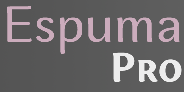 [
[ Aoife is an Irish typeface designer and teacher. She has a BA degree in Visual Communications from Dublin Institute of Technology (2005) and an MA in Typeface Design from the
  One of the most dynamic foundries from 2000 until 2003. The "Lab" was run by Apostrophe (Fredrick Nader) and was based in Toronto. The name Apostrophe comes from a Frank Zappa song. It has produced well over 1000 original free fonts, in all formats (type 1, truetype, and opentype, PC and Mac), and nearly all fonts have full character sets. Many have character sets for extended European languages and Cyrillic as well. It was for a few years the only active producer of multiple master fonts.
  Started in 2008, this web place by Norwegian entrepreneur Roger S. Nelsson (based in Honningsvåg, Norway) sells fonts by Ray Larabie, Brian Kent, Nick Curtis, Derek Vogelpohl and Kevin King that were originally freeware fonts. Nelsson reworked them (more glyphs, more multilingual) and asks about 10 dollars per font now. He says his fonts now cover these Latin languages: Afrikaans, Albanian, Basque, Belarusian (Lacinka), Bosnian, Breton, Catalan, Chamorro, Chichewa, Cornish, Croatian, Czech, Danish, Dutch, English, Esperanto, Estonian, Faroese, Filipino (Tagalog), Finnish, French, Frisian, Galican, German, Greenlandic, Guarani, Hungarian, Icelandic, Indonesian, Irish (Gaelic), Italian, Kashubian, Kurdish (Kurmanji), Latvian, Lithuanian, Luxembourgian, Malagasy, Maltese, Maori, Northern Sotho, Norwegian, Occitan, Polish, Portuguese, Rhaeto-Romance, Romanian, Saami (Inari), Saami (Lule), Saami (North), Saami (South), Scots (Gaelic), Serbian (latin), Slovak(ian), Slovene, Sorbian (Lower), Sorbian (Upper), Spanish, Swedish, Tswana, Turkish, Turkmen, Ulithian, Walloon, Welsh, Yapese.
  German type designer and graphic designer par excellence, born in 1947 in Stadthagen. He set up MetaDesign in Berlin in 1979. In 1988 he set up FontShop, home of the FontFont collection. He holds an honorary professorship at the Academy of Arts in Bremen, is board member of ATypI and the German Design Council, and president of the ISTD (International Society of Typographic Designers). In July 2000, Erik left MetaDesign Berlin. He now lives and works in Berlin, London and San Francisco, designing publications, complex design systems and more typefaces. He collaborated on the publication of the comprehensive
  [
[ French designer (b. 1984) who s based in Montelimar. He created the poster typeface
  Russian type designer, 1901-1972 (d. Moscow). Her typefaces include Bannikovskaya (1946-1951, at Polygrafmash, which was inspired by the Russian Grazhdansky early and mid 18th century typefaces: the digital version is
  Yet another ghostscript font archive, with the following URW++ truetype fonts made in 2000:
  Aka Grzegorz Luk and just Gluk, Grzegorz Luksza is a Polish type designer (b. 1973) who specializes in ultra-decorative and experimental typefaces.
  [
[ Born in Riga, Latvia, in 1943, he has mainly cooperated (since 1990) with
  German company that sells 9999 fonts on a CD for 229 USD. In 2017, Infinitype 4 has 7444 fonts for 299 USD. One can download 20 fonts for free, as a teaser. The company is run by Martin Kotulla, owner of Softmaker, who also made the MegaFont CD. Many (most?) fonts are licensed from URW and come with a performance guarantee.
  [
[ Match Fonts is the West Hollywood, CA-based foundry led by Michel Bujardet (b. Bordeaux, France, 1951), who is Mike Budge on alt.binaries.fonts. They make and sell interesting font paks. A particular favorite of mine is the
  Ukrainian Andrey Konstantinov (b. 1981, Moscow, lives in Kiev) graduated from the National Technical University of Ukraine in 2002. He lived for some time in Tallinn, Estonia. He ran
  Pavel Emelyanov (b. 1982, Kandalaksha, Russia) is a graphic designer, art director and web designer based in Murmansk. He is part of Ivan Gladkikh's typeType team.
  [
[ Slovakian type designer (b. 1973), who lives in The Netherlands.

 Reinis Ludvik's Riga-based Latvian font design and software development company sells high quality fonts (adapted from Bitstream fonts) for Baltic, Cyrillic, Turkish and Eastern European languages. Includes the
  Aka Rursus, this Swedish viking calls himself a nerd and a cyber vagabond---exactly my kind of guy! Designer of the slab typewriter font for Latin and Cyrillic called Rursus Compact Mono (2007-2010), an
  Typotheque is an initiative of Peter Bilak and ui42 out of Bratislava (Slovakia), and later, The Netherlands: Typotheque is an Internet-based independent type foundry. It offers quality fonts for PC and Macintosh platforms in standard European character set and in CE (central european) character set. All fonts have full (european) character sets, are thoroughly tested and manually kerned.
  URW++ Design&Development GmbH is a Hamburg-based foundry established in 1995 by Svend Bang, Hans-Jochen Lau, Peter Rosenfeld, and Jürgen Willrodt. URW stands for Unternehmensberatung Rubow Weber, named after Gerhard Rubow and Rudolf Weber, cofounders of the original URW company from which urw++ evolved. It offers a whole range of font services and has an extensive (7000+) font library. At the basis of the early development of many classy PostScript fonts. For example, in 1999, URW++ donated the 35 core PostScript fonts (renamed) under the GNU GPL license to the Ghostscript project. The great 3000-font CD costs about 2000DM. Other CDs are more expensive: on the ITF CD, each font is about 100DM! URW sells fonts and font families with complete rights (you can change, resell, embed, anything, except use the original name), with examples ranging from 2k for a complete family of 12 to 5k for a collection of 250 fonts. This practice continues until today: URW++ thus provides a great service to software developers who want to include high-quality typefaces in their software applications. URW has offices in many countries. In the first decade of the 21st century, freelance type designer Ralph M. Unger contributed most frequently to the URW library.
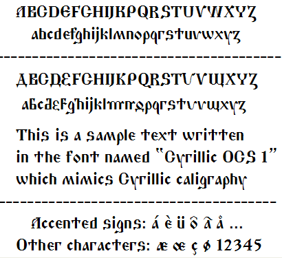
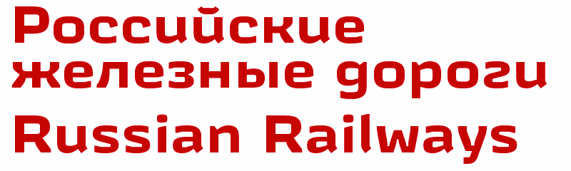
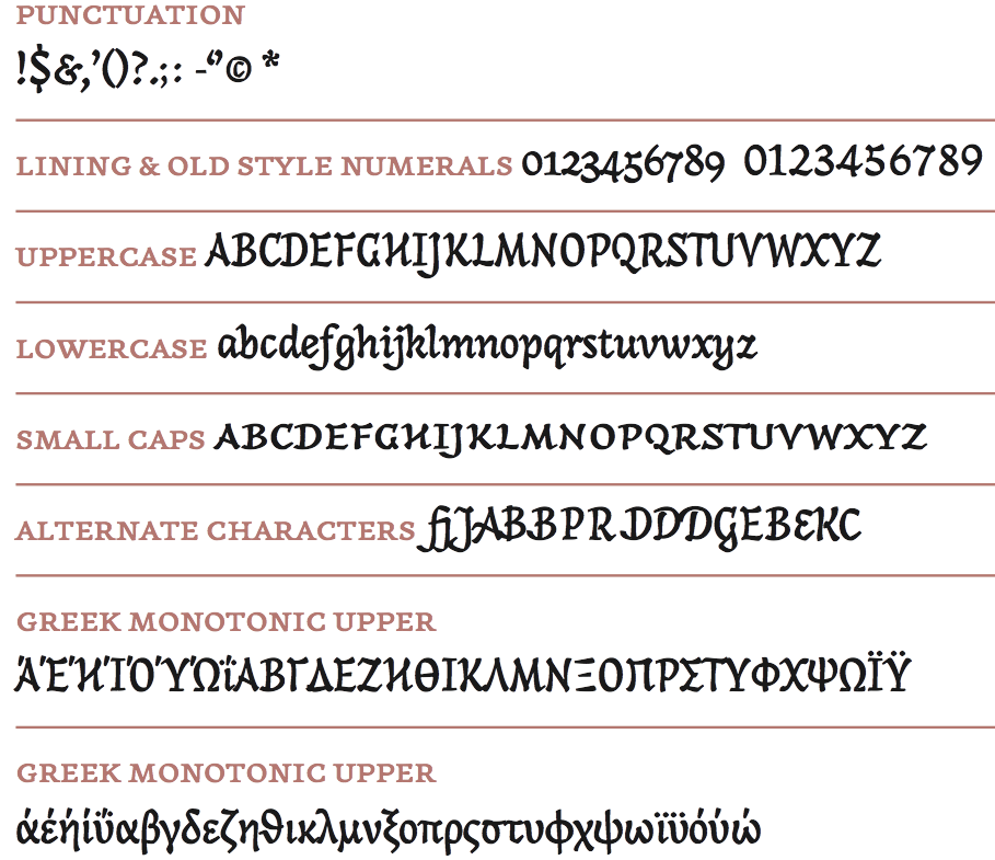
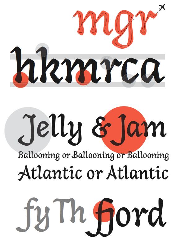
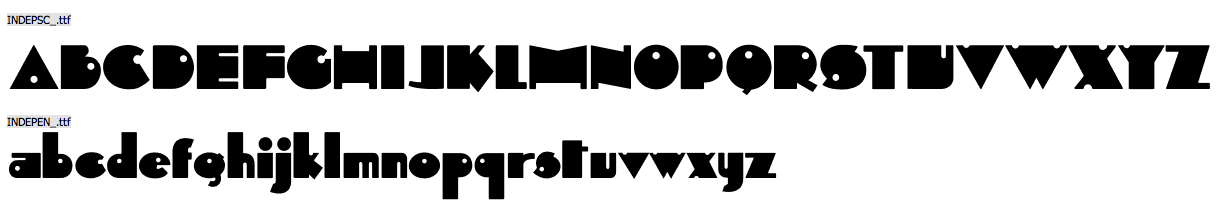
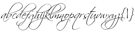
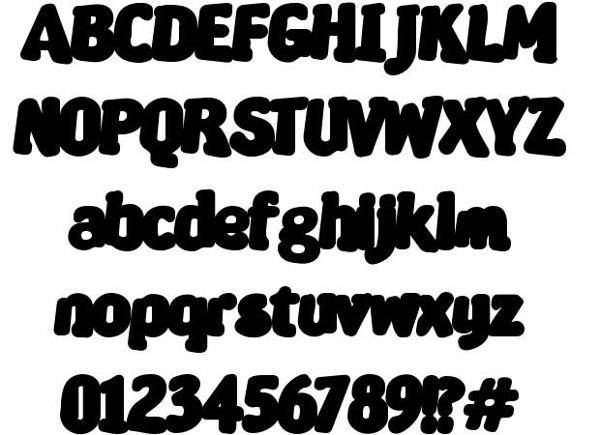
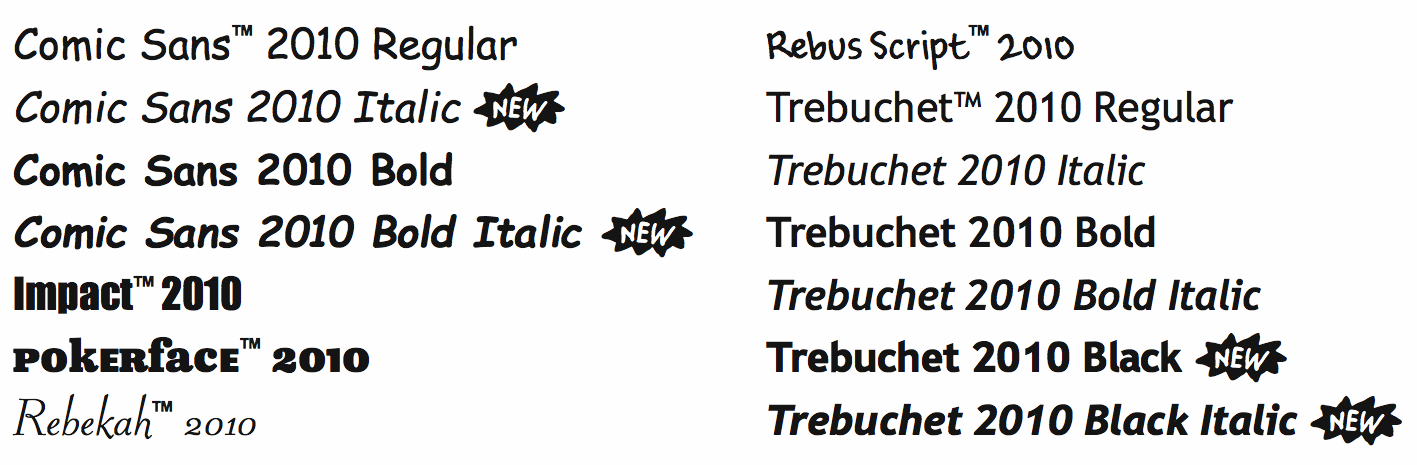
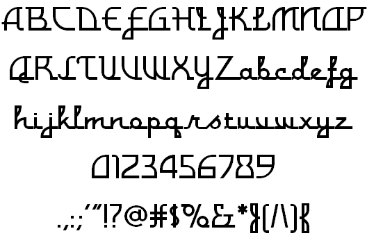
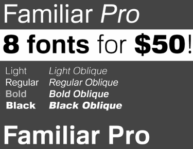
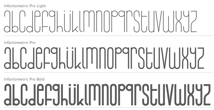
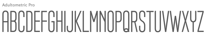
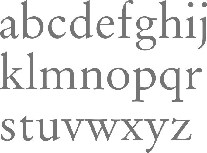
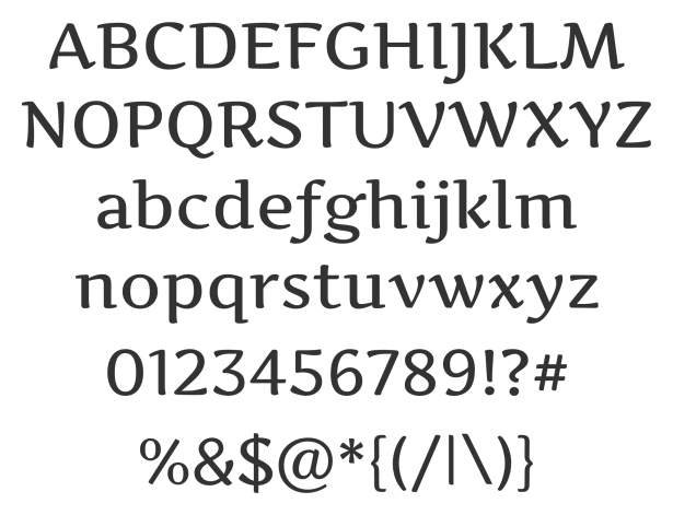
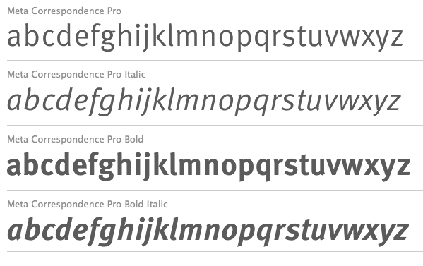
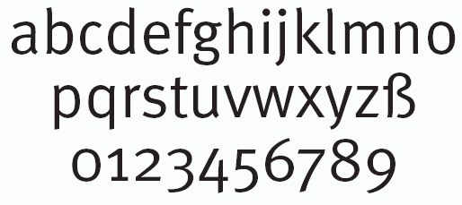
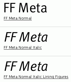
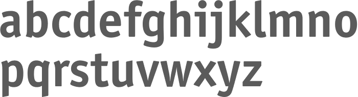
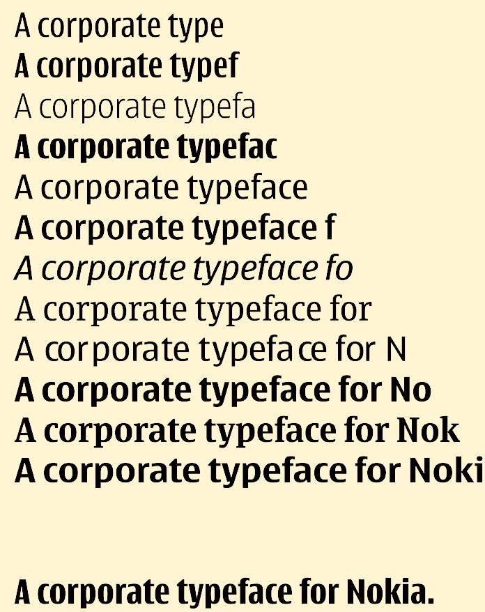
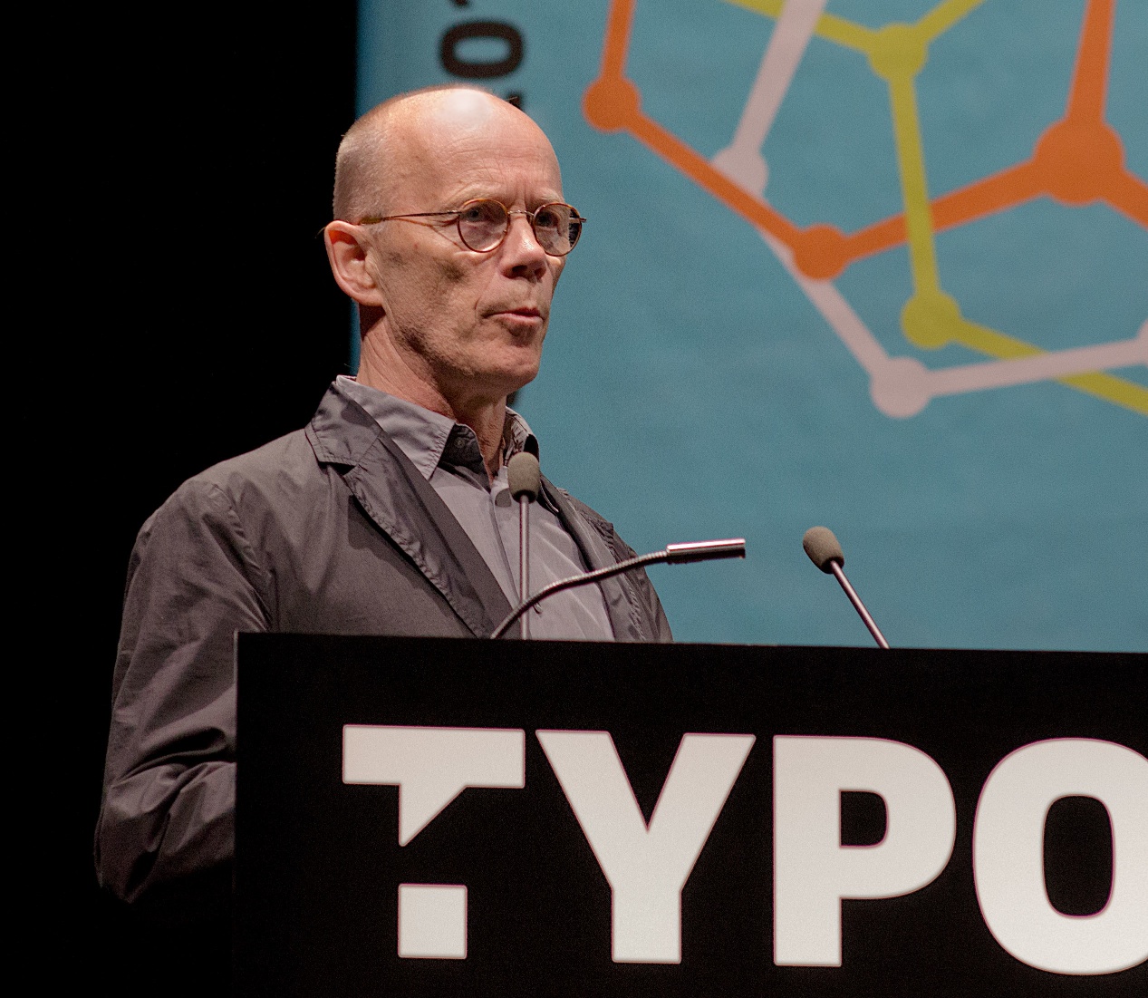
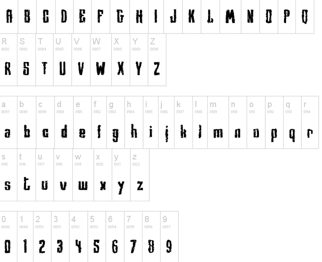
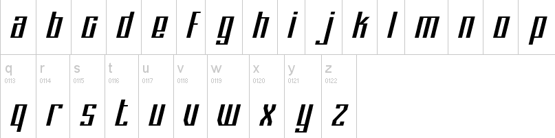
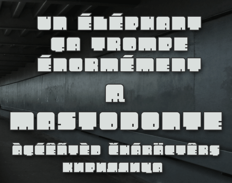
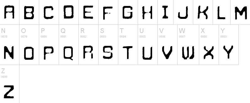
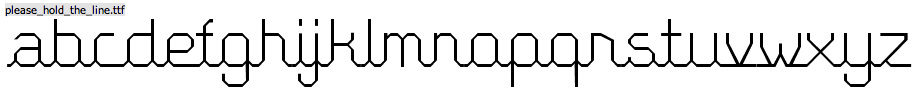
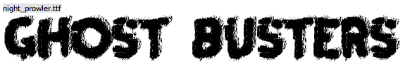
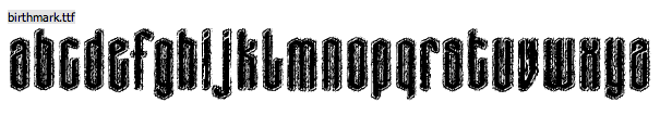
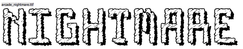
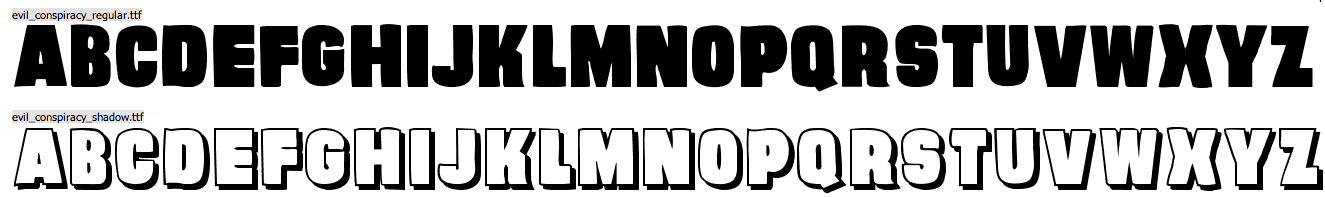
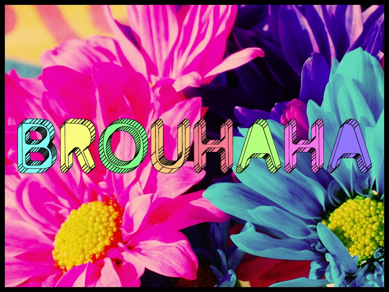
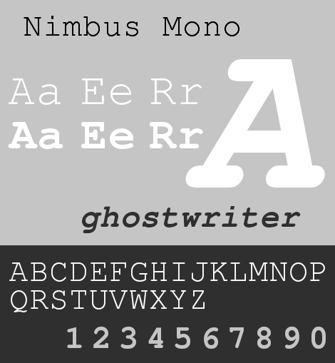
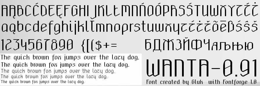
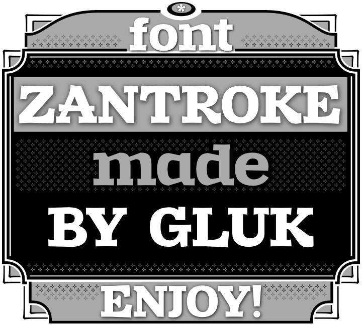
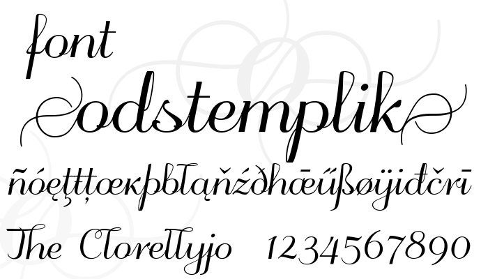
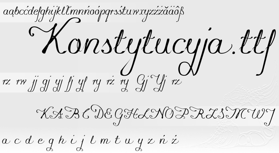
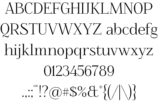
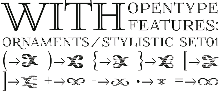
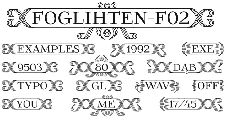
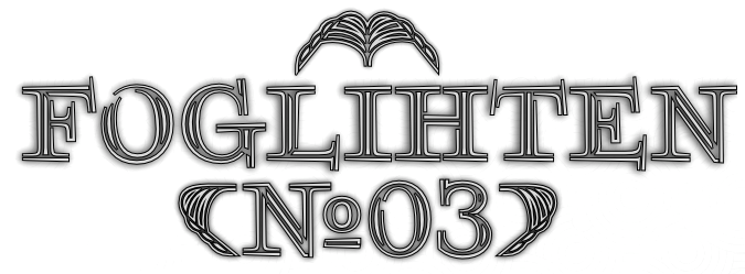
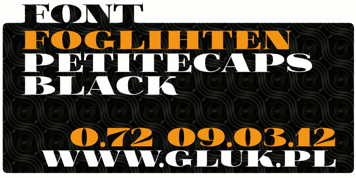
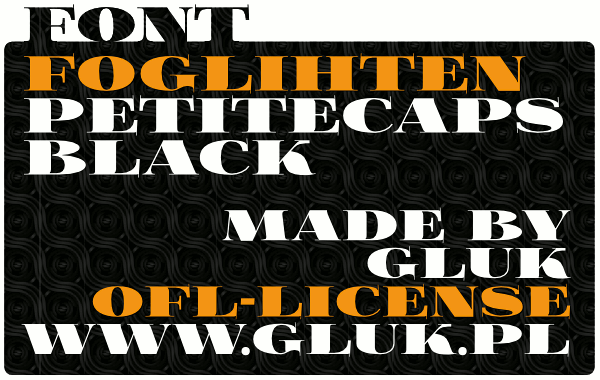
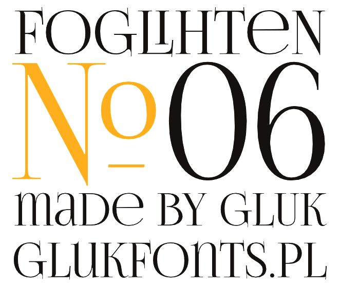
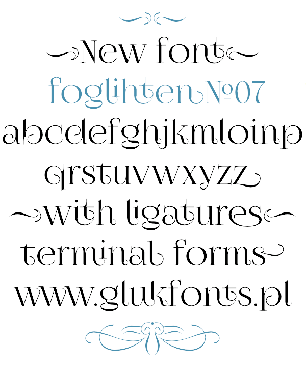
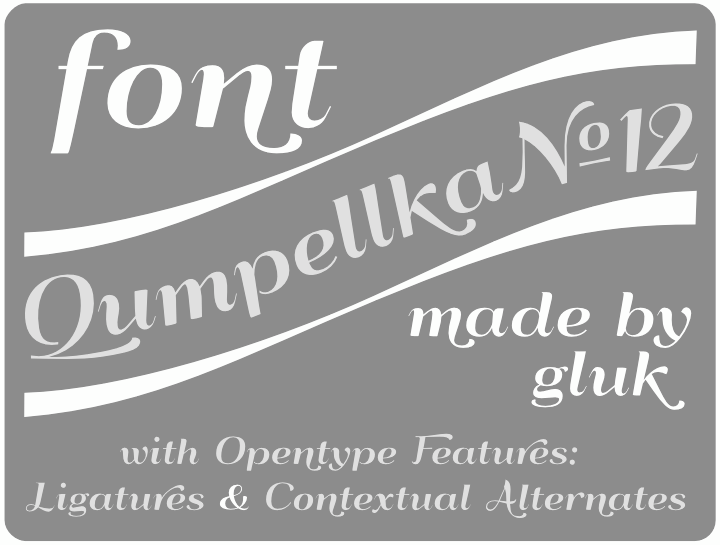
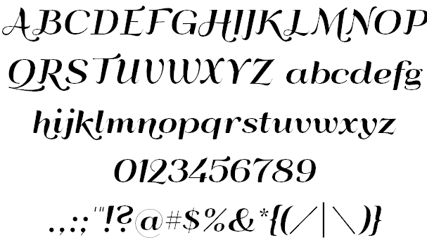
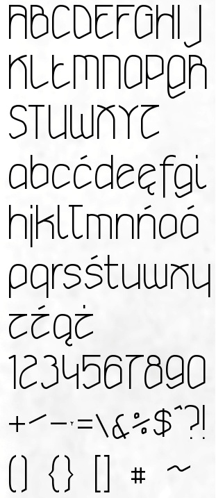
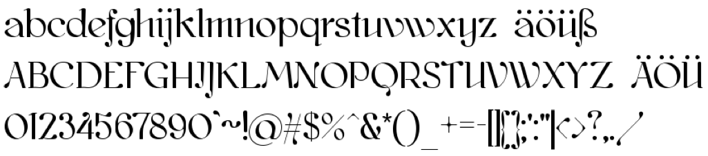
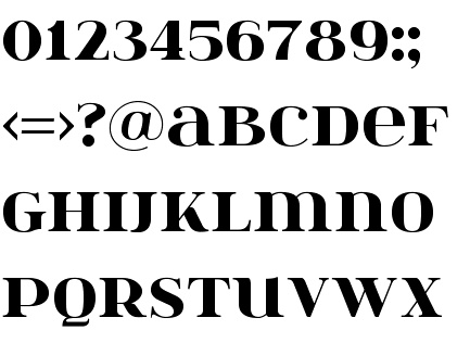
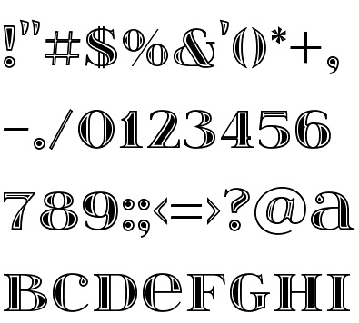
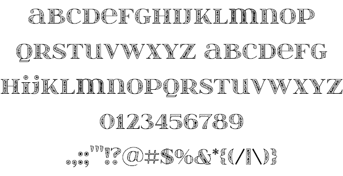
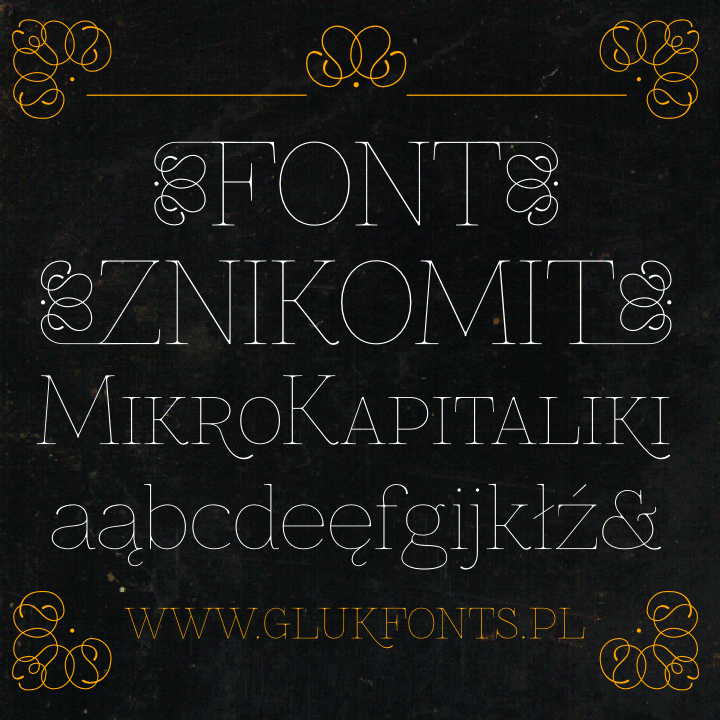
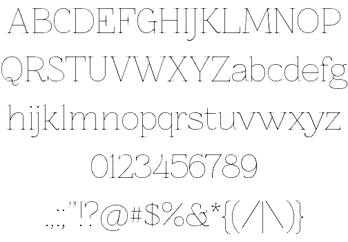
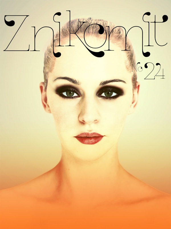
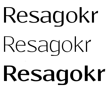
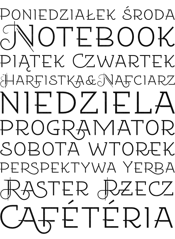
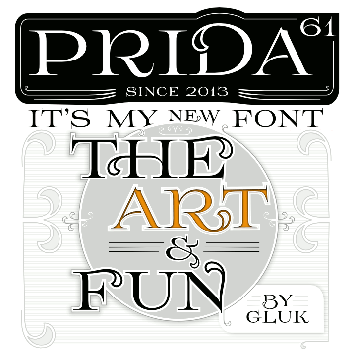
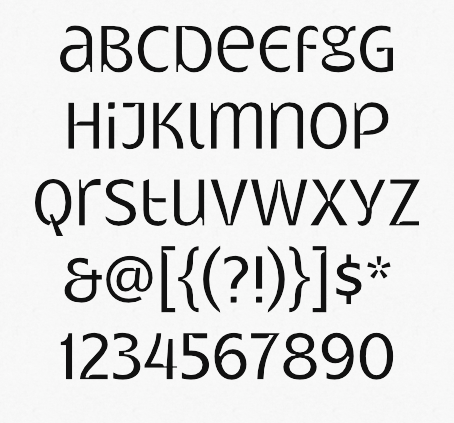
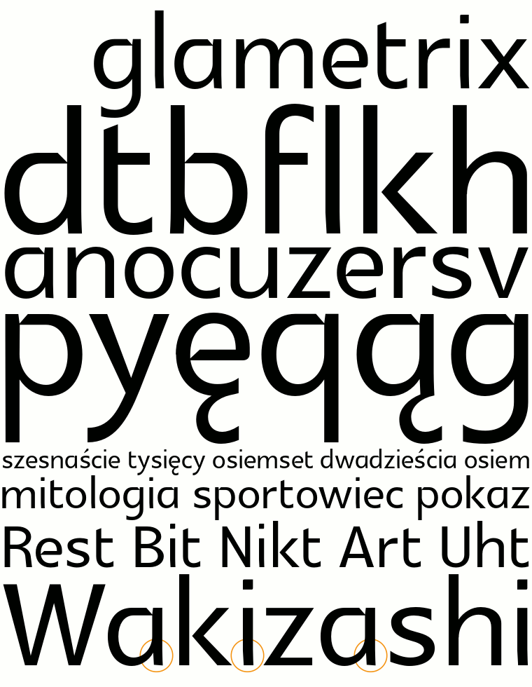
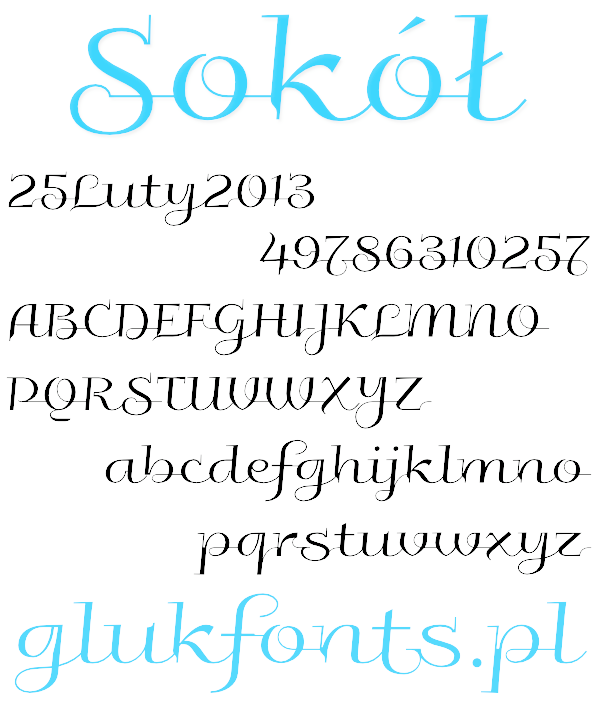
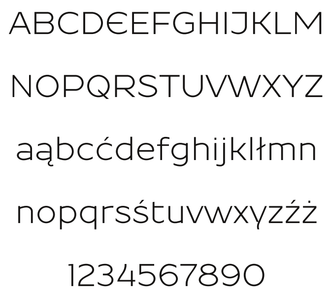
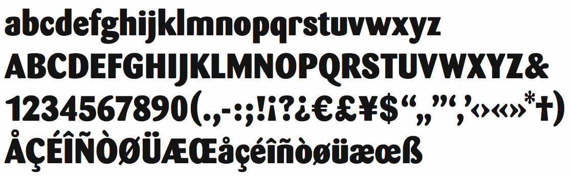
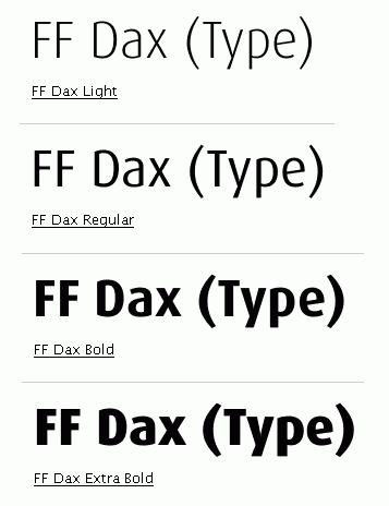
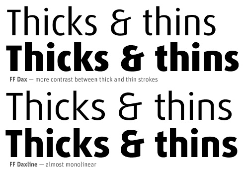
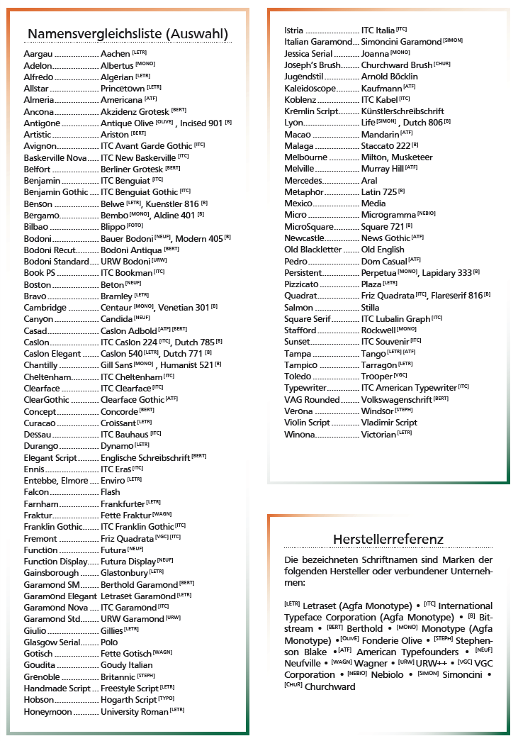
![German Garamond"> [based on TypoArt Garamond], Giulio,](Infinitype--GermanGaramond--basedonTypoartGaramond.png)
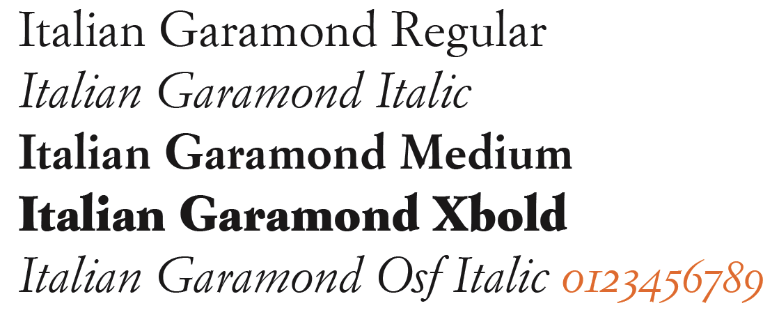
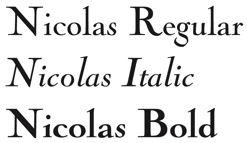
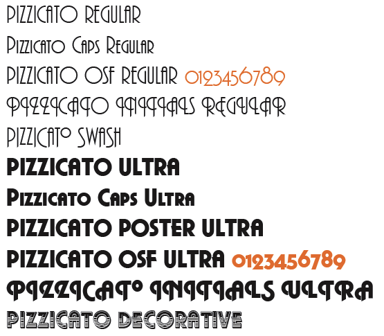
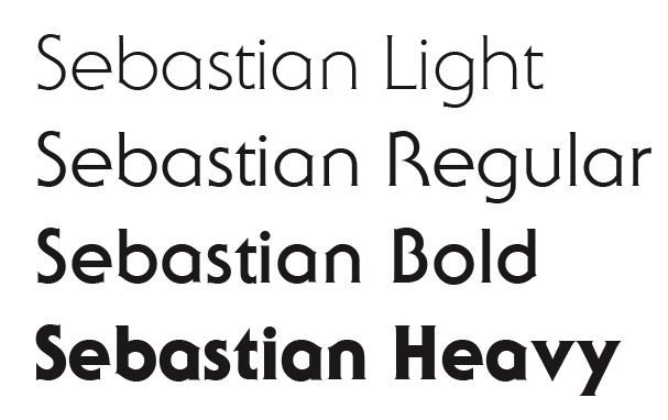
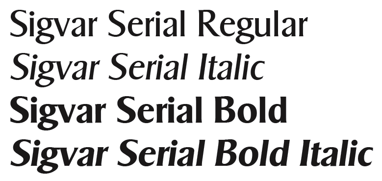
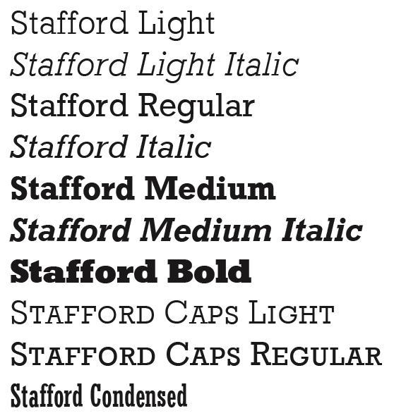
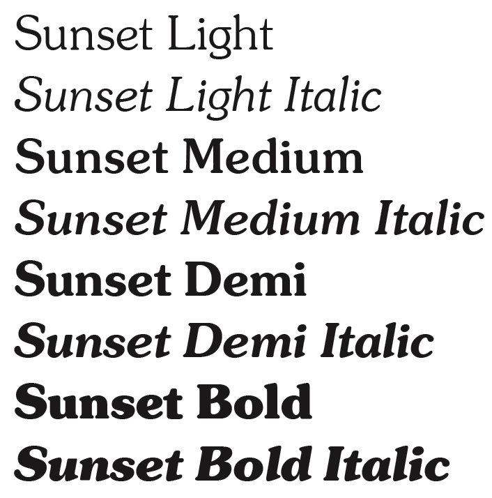
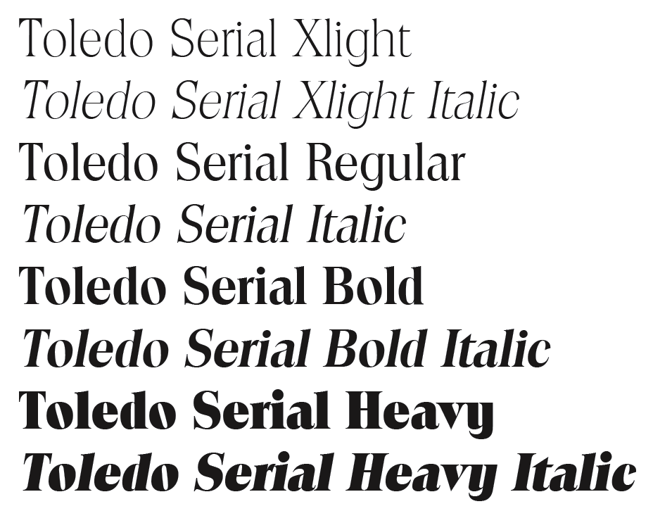
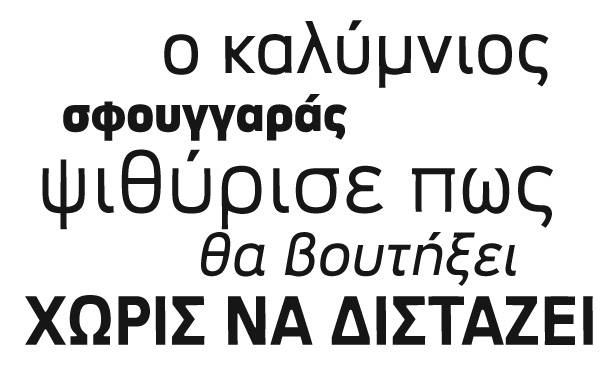
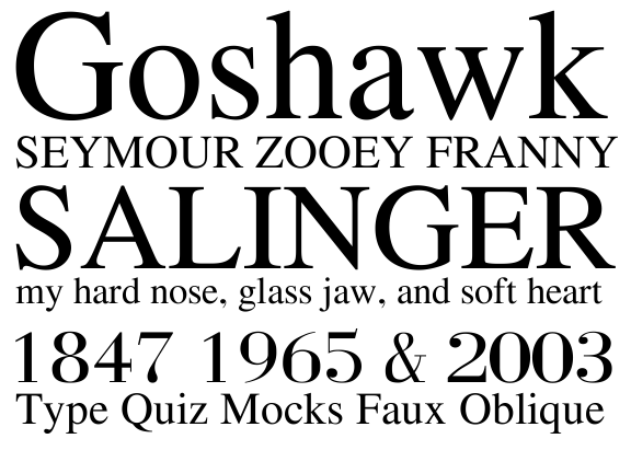
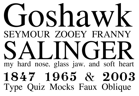
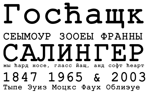
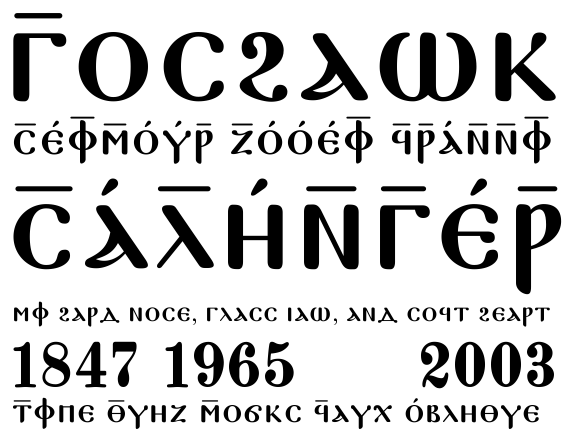
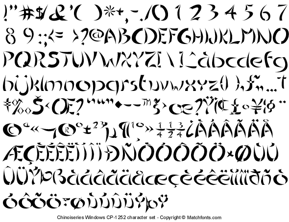
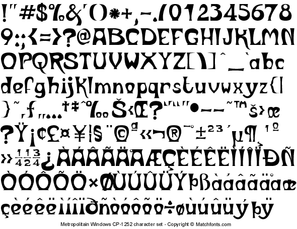
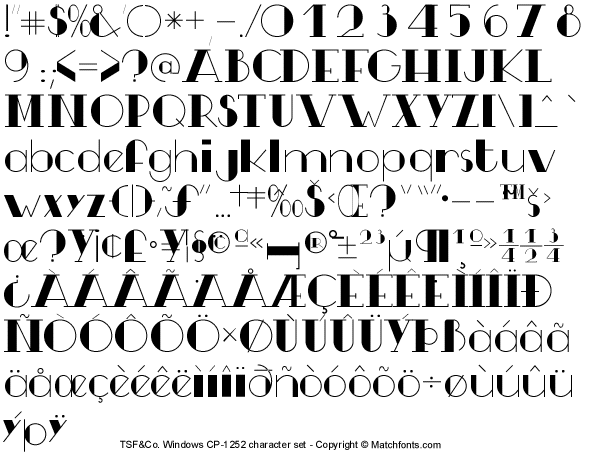
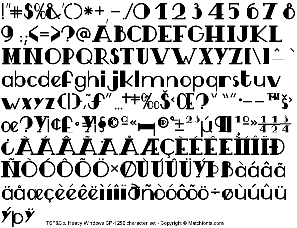
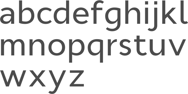
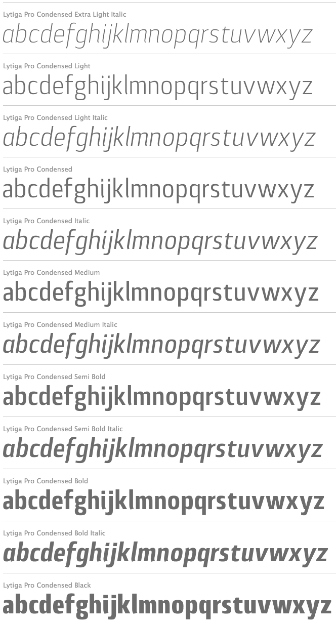
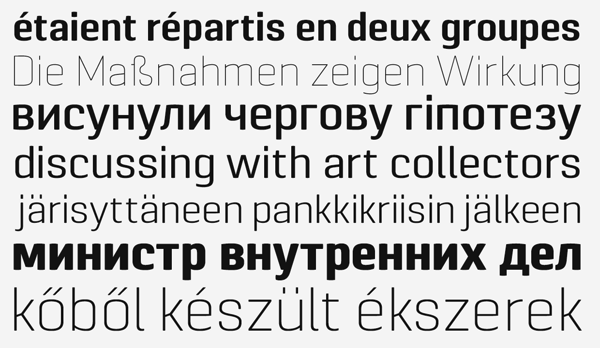
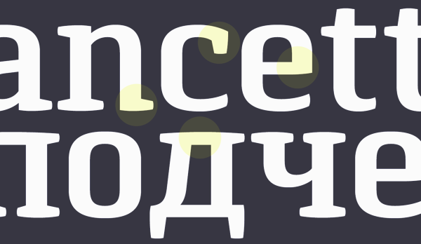
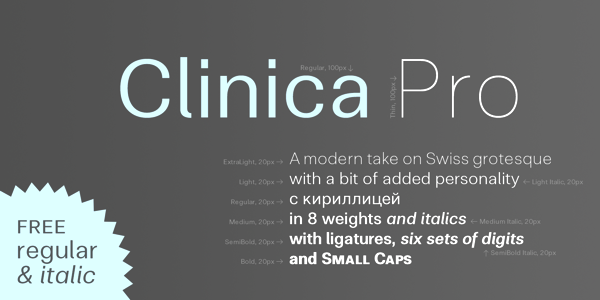
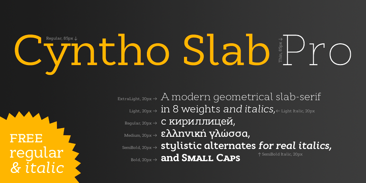
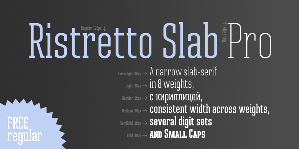
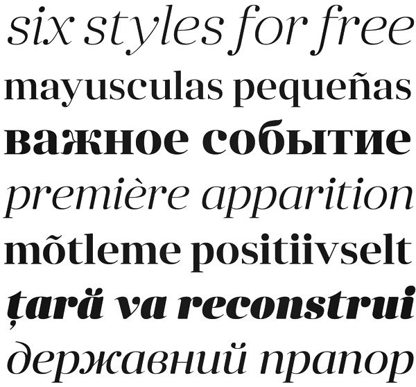
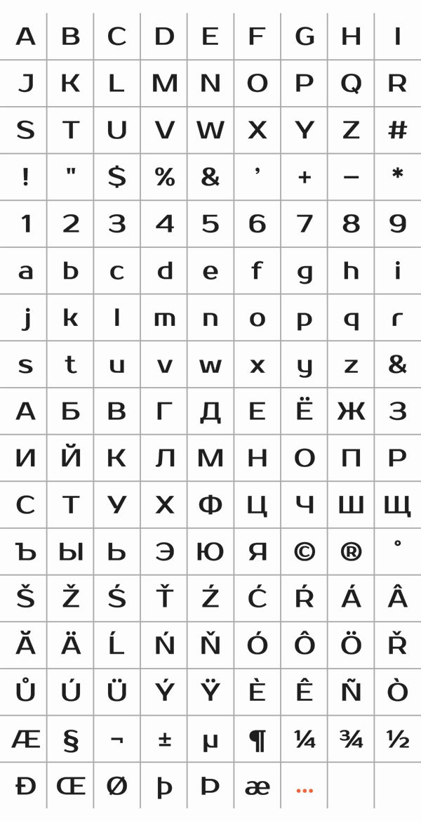
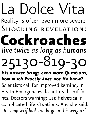
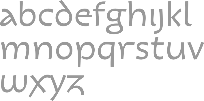
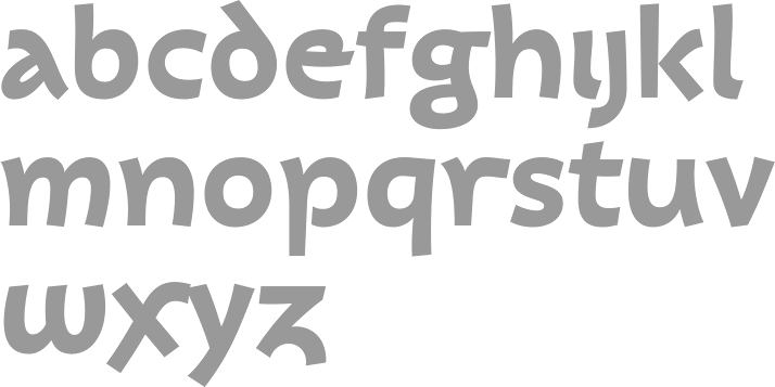
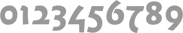
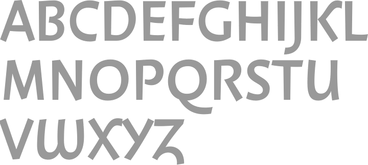
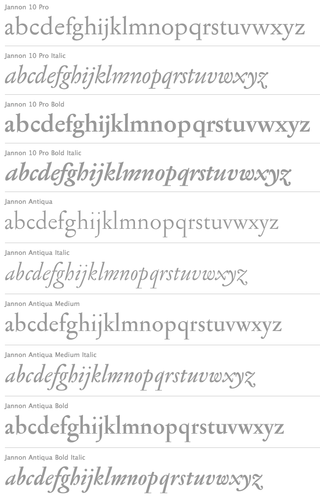
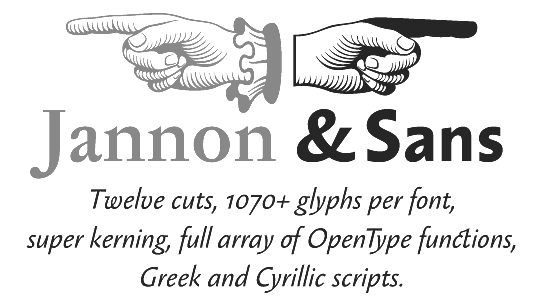
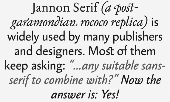
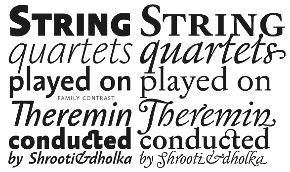
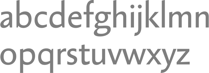
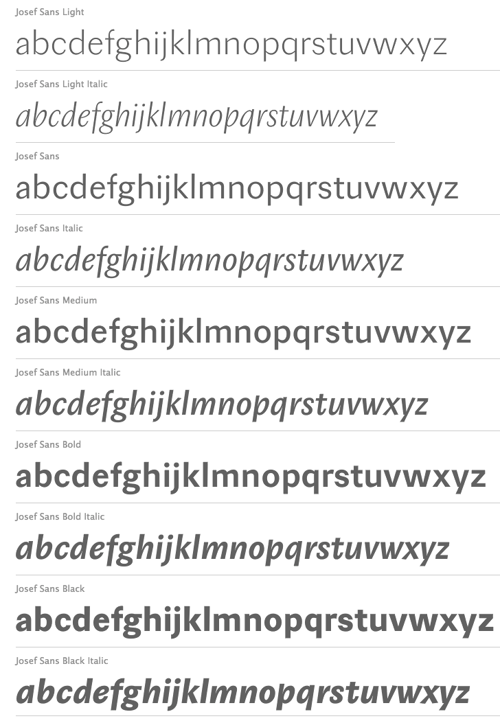
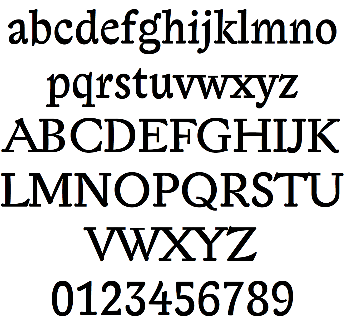
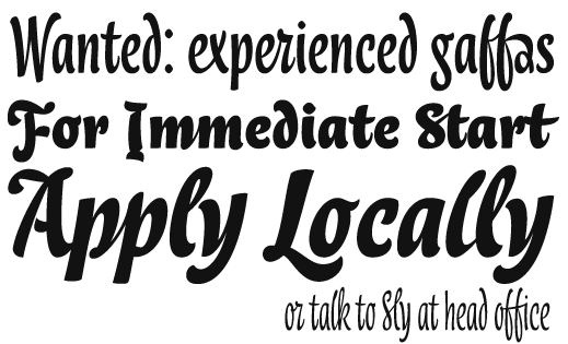
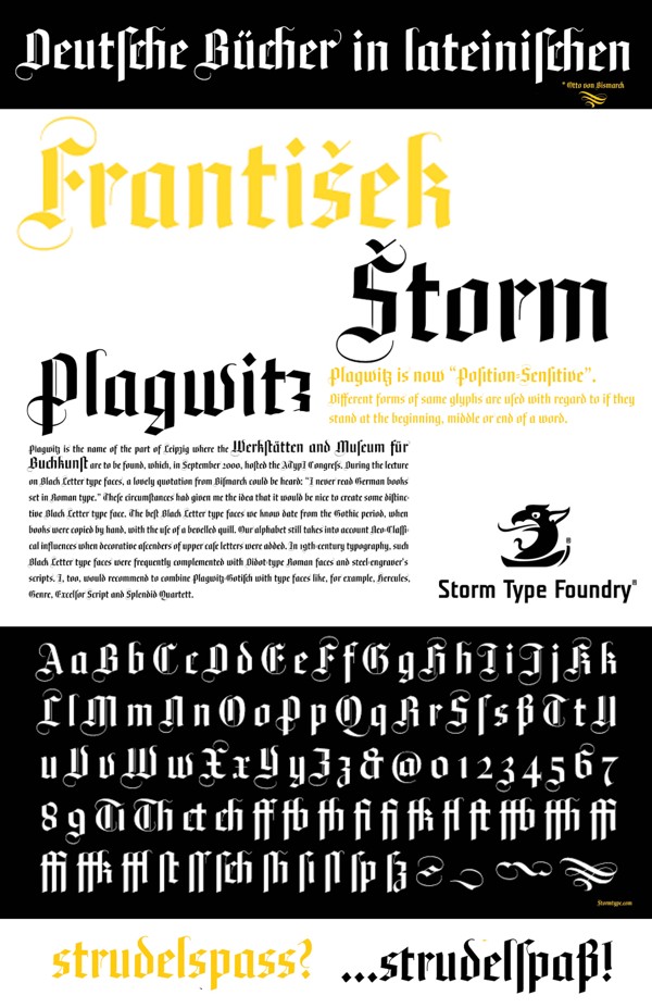
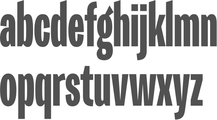
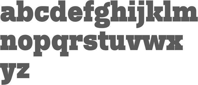
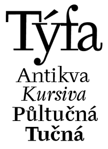
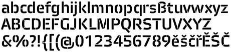
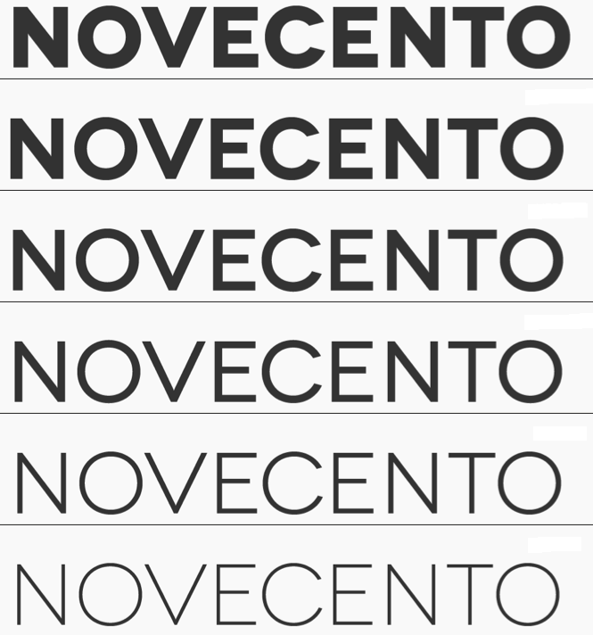
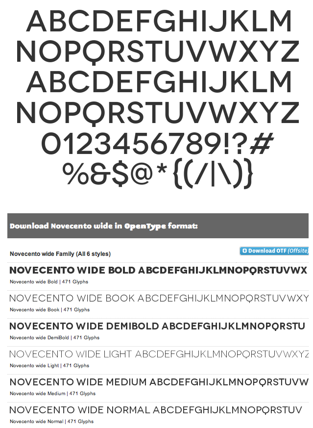
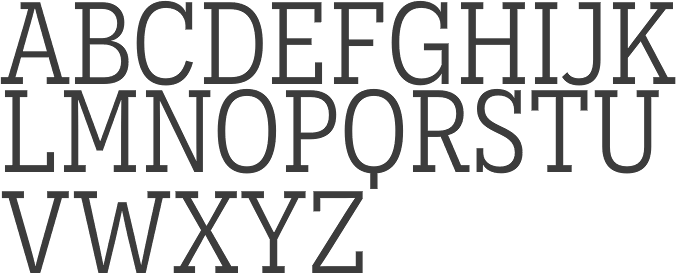
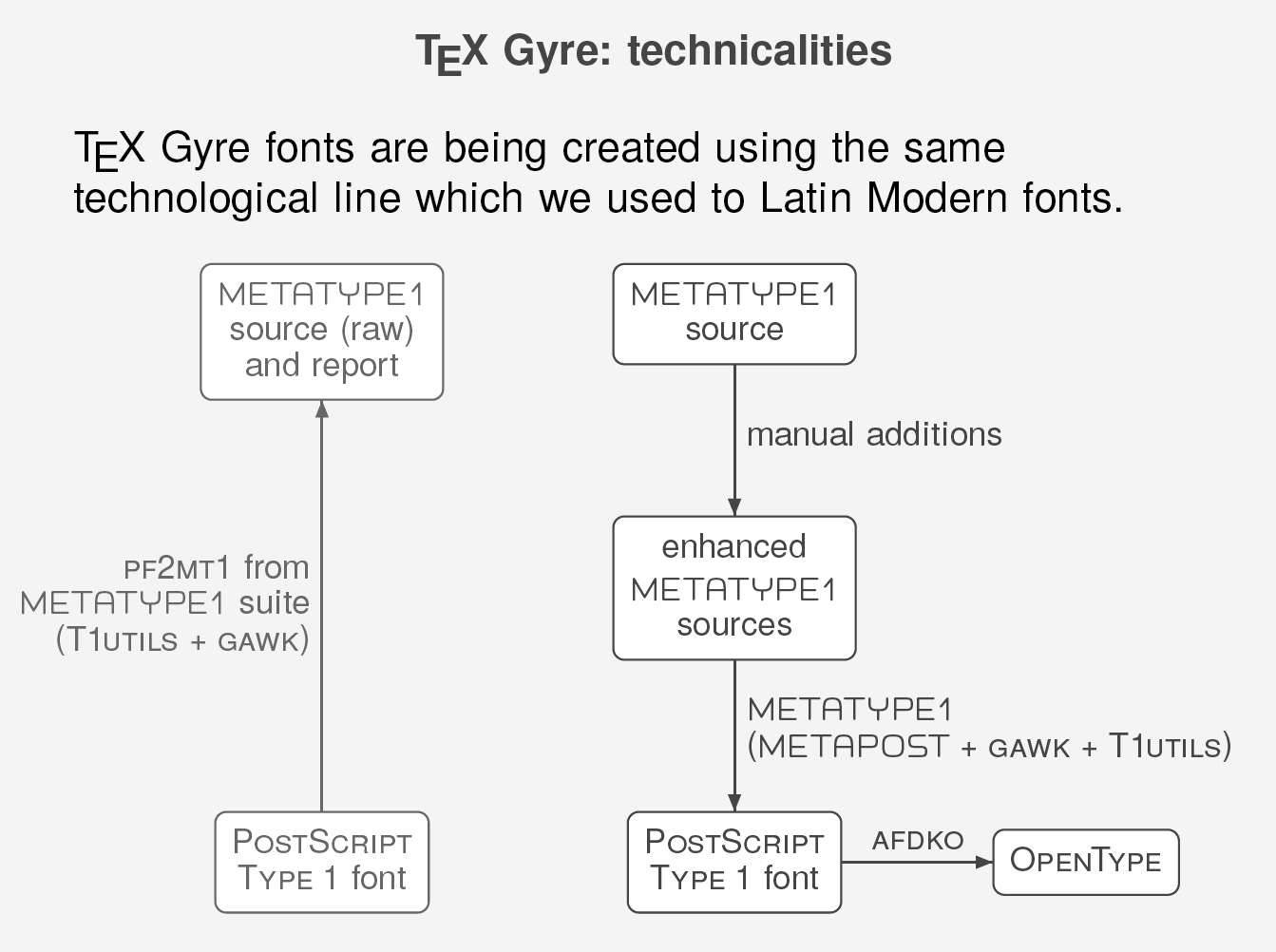
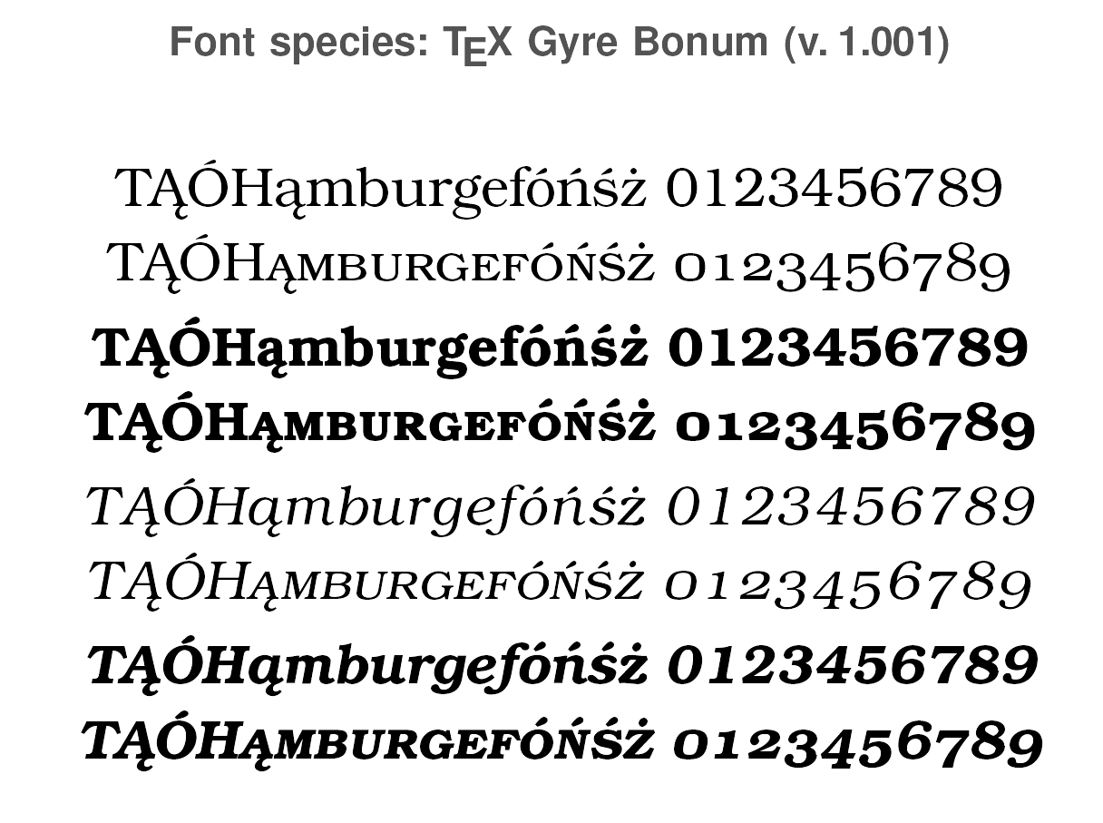
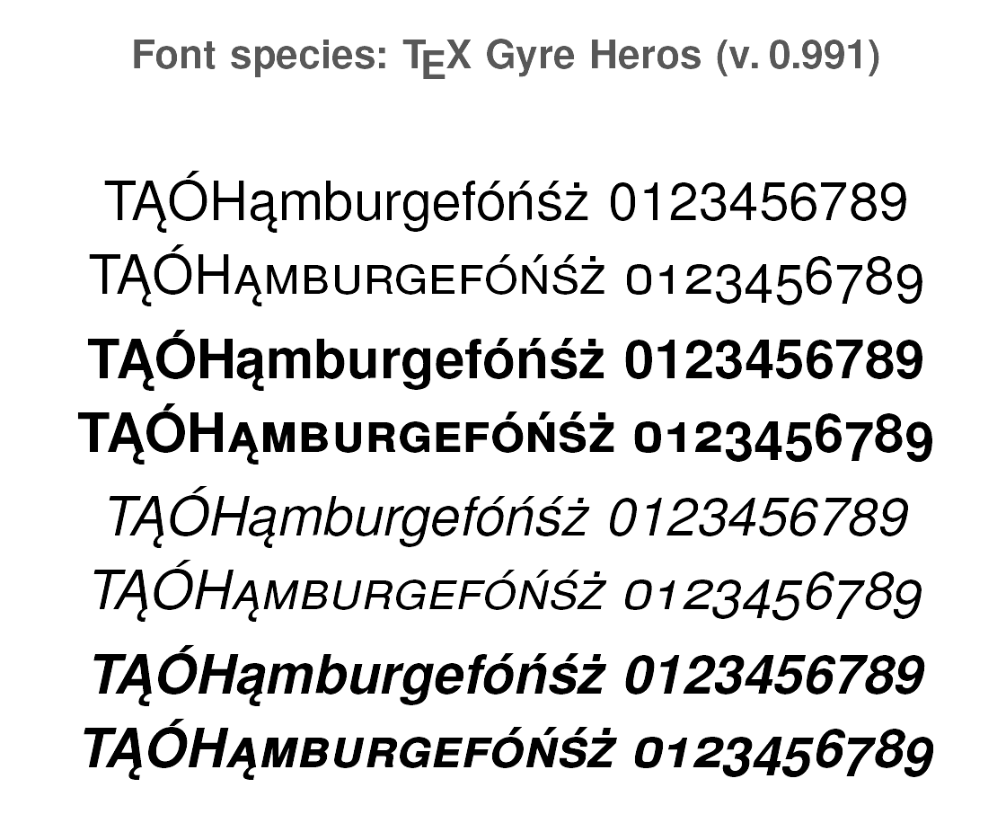
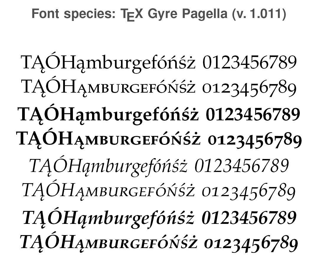
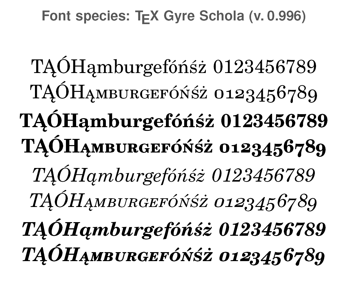
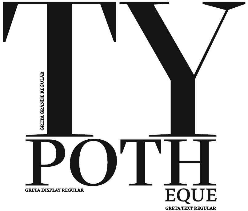
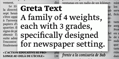
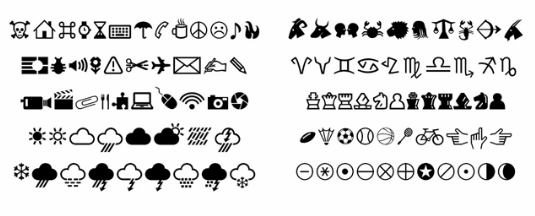
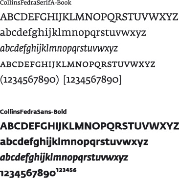
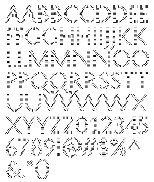
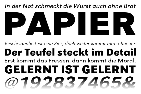
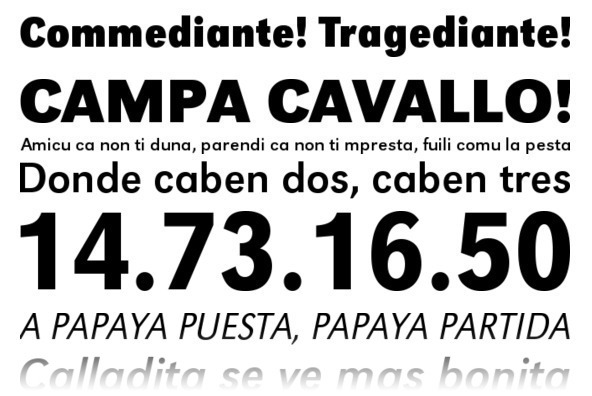
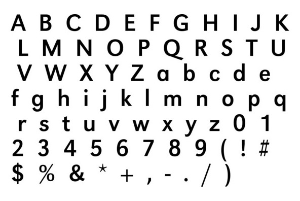
|
|
|
|