| | |
2D Typo
[Lukyan Turetskyy]

|
 Lviv-based Ukrainian designer (b. 1979) of the octagonal stencil typeface Depot Trapharet (2006, brutalist), and of the free car rallye dingbat typeface Rallye Symbols (2008). Dafont link.
 In 2010, he went commercial as 2D Typo. The first typeface at 2D typo was the modular pixelish Pressure Drop 2D (2010). This was followed by Ornamental Deco 2D (2010, art deco ornaments), Rally Symbols 2D (2010), Mascaron2D (2010, by Iryna Korchuk), Depot Trapharet 2d (2010, a stencil based on the tram lettering in Lviv), Ascetic 2D (2005-2010), Hutsulyandiya (2010, extraordinary ornaments by Iryna Korchuk), Simeon (2010, calligraphic), Cranked Pipe 2D (2011), Tripyllia 2D (2011, ornaments of the neolithic Trypillya culture), and Ukrainian Barokko (2010, a calligraphic typeface by Genadij Zarechnjuk), Historism Border (2011, border ornaments), Moreske 2D (2012, ornaments), Geomanticus (2012, modular squarish sans). Typefaces from 2013: Bandelwerk (borders), Digital Stitch, Modern Wave (ornaments based on Alphonse Mucha), Hopferian (Roman caps after engravings by Daniel Hopfer (1470-1536)---typeface completed with help of Mariya Sokil), Simple Ribbon (art nouveau dingbats). In 2014, he created Angusto (an elegant narrow shaded display typeface family), Vindemiam (ornamental borders), Squamish (ornamental borders), UA Map (maps of Ukraine dingbats) and Bohemian Border. In 2014, Dmitry Rastvortsev, Lukyan Turetsky, and Henadij Zarechnjuk cooperated on the design of the free Latin / Cyrillic handwriting typeface Kobzar KS, which is based on the handwriting of Taras Shnvchenko, a famous Ukrainian poet, artist and philosopher. Typefaces from 2015: Finetitle (ornaments for headers), Gothic Herbarium (a floriated ornamental font based on the Gothic Revival ornaments developed by Augustus Pugin (1812-1852)), Old Depot (rough stencil), Francesca (decorative caps). Typefaces from 2016: Geometric Harmony (geometric ornaments), Dubster (which he describes as a technocratic modular font). Typefaces from 2017: Military Symbols. Typefaces from 2018: Strapwork (four ornamental typefaces with friezes, borders and motifs modeled after Balthasar Bos (1554) and 16th century mannerism). Typefaces from 2020: Lo Fi Copy (grungy and pixelish). Typefaces from 2021: Kolm Keltek (classical ornaments), Microdot (a dot matrix font). [Google]
[MyFonts]
[More] ⦿
|
A collective
|
A group of designers at Velvetyne who published some free fonts. These include: - Resistance (2015). A brutalist sans typeface by these students at ENSAD Paris: Pauline Cormault, Esther Michaud, Claire Mucchieli, Merlin Andreae, Raphaël Maman, Pedro Gomes-Cardoso, Juliette Nier, Gabrielle Meistretty, Damien Bauza.
- Saintjean (2017). A font created from ampersands received during a workshop from about one hundred participants.
[Google]
[More] ⦿
|
ABC ETC INC
[Nazareno Crea]
|
 ABC ETC INC. is a font and logo design service (est. 2018) based in New York City, run by Nazareno Crea. Nazareno Crea (b. Cinquefrondi near Reggio Calabria, 1983) is a Brooklyn, NY-based book and type designer, who studied at ECAL/University of Art and Design Lausanne (class of 2006) and the Royal College of Art in London (class of 2010). His typefaces:
 - At Lineto, he released LL Gulliver (2008-2018), which was renamed LL Catalogue in 2019. A new serif family with 3 weights/6 styles based on Miller & Richard's Antique Old Style (1858), LL Gulliver was first used in print in an early version in 2008, and was to be published by Lineto in early 2019.
- The custom sans typeface Gabellini Sheppard.
- Zug (Regular and Light). A custom typeface done for the Ski Brand Matek (matek.clothing). Inspired by Walter Haettenschweiler's lettering work for Lettera 2, published by Niggli in 1961.
- Waldorf Astoria. Waldorf Astoria is a custom display typeface inspired by the façade engravings of the homonymous hotel building in New York City. Expanded into a full set of upper and lower cases. Designed for the relaunch of the residential project of the Waldorf Astoria in New York City. Inspired by the work of the architects Weaver & Schultze who designed the building and the original lettering in 1931.
- Pan Display and Pan Text. Corporate typefaces designed for the jewellery brand Pandora A/S. Developed in collaboration with Chi-Long Trieu and engineered by Alphabet Type, Pan is loosely inspired by the work of Percy Smith.
- BBB Neu. Created for the identity of French artist Stephane barbier Bouvet. A brutalist adaptation of Helvetica.
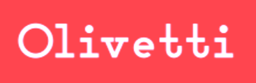
- Olivetti (2020). Based on a 1934 logo design by Bauhaus artist Xani Schawinsky for the Italian typewriter company Olivetti.
- Plantin Rounded (2020).
[Google]
[More] ⦿
|
Adrien Midzic
|
 Fatnobrain was Adrien Midzic's design studio in Paris. Born in 1982, he co-founded Pizza Typefaces with Luc Borho in 2018. Midzic designed these typefaces or type families: Fine (lineal), Blokus (free pixel font, 2009), Cimen (strong sans, designed for Smacl Entraide), Mesquine (lineal), Blitz, Cucha, Stencil Reverse, Huit (2009, a gorgeous didone headline face), Stenha (stencil).
 Fonts made in 2010: The ETH family (art deco sans). Custom typefaces by Midzic: Aquitaine (2013, for Région Aquitaine), Nilka (2013, for his personal identity), No End (2013, a fat didone), Ethon Serif (2013, a perked up serif typeface for Penguin Books), Kasai Est (2011, for the Congo-based Kasai Est Magazine), Festival De Film Documentaire (2011), Nevenka (2011, condensed sans). In 2014, Adrien Midzic, Jason Vandenberg, Jérémie Hornus, Julien Priez and Alisa Nowak co-designed the creamy script Vanilla FY. It was renamed Vanille FY after a few days. Still in 2014, Adrien Midzic, Jérémie Hornus and Alisa Nowak co-designed the very humanist sans family Saya FY and Saya Semisans FY. Adrien Midzic and Joana Correia co-designed Saya Serif FY (2015). At the free font cooperative Velvetyne, he published the sans typeface Lack (2014). In 2015, he made the 3-style sans typeface Suber for an art fair in Paris. The roman transitional typeface Bota Serif (2015), which was inspired by Cochin (designed by Charles Peignot in 1912) is a custom font designed for Hotel des ventes de Poitiers. In 2017, it was finally released for retail. In 2016, Adrien designed the bold titling typeface Debeo and the modern condensed Latin/Arabic typeface 29LT Adir (with Naji El Mir; at 29 Letters). In 2017, he published the piano key typeface Mixal, which became a large experiment on variable fonts and is free for everyone. Typefaces from 2018: Kern, Kern Office (a sans with some Futura features), Forno (sans), VTF Lack (a free single weight monoline geometric sans for Latin, Greek and Cyrillic, published by Velvetyne), Metal (an all caps multi-width variable font originally designed for marché Dauphine), Orelo (a 120-style high-contrast fashion mag font family; +Orelo Hangul, 2020). Typefaces from 2019: Ultra Solar (experimental), 1871 Mane (a custom sans typeface), Wasa (a tense sans in seven styles), Shrill, Gangster Grotesk (free), Stupid (a hacker / hipster font), Kern (geometric sans). Typefaces from 2020: Shreck Issue (very tall and ultra-condensed), Metal (brutalist), Version ACT (a two-axis variable font), Debeo (a heavy sans), Dozza (a hybrid family named after ITC Mendoza by Jose Mendoza Almeida), XMX (experimental). Typefaces from 2021: Campingo (a roundish informal typeface inspired by camping and outdoor life), Bota (with Ines Davodeau: first designed for Boissnot&Tailliez, Bota is a modern interpretation of Georges Peignot's Cochin (2012)), Pleasure (hipsterism pushed to the fringe of addiction), Model Standard (ModelStandard Mono, ModelStandard SemiMono, ModelStandard Sans). Dafont link. Klingspor link. Behance link. Another Behance link. Hellofont link. Velvetyne link. [Google]
[MyFonts]
[More] ⦿
|
Akbar Rohmanto
[Harmnessless]
|
[MyFonts]
[More] ⦿
|
Alexander Alexandrowitsch Roth
[Neue (or: Neue Foundry)]
|
[MyFonts]
[More] ⦿
|
André Nunes
|
Graphic designer in Entroncamento, Portugal. In 2019, he published the monoline display typeface Hermo. [Google]
[More] ⦿
|
Andrey Belogonov
|
 Russian type designer. His typefaces:
 - Nerpa (2014, with Yana Kutyina).
- Kalimantan (2012-2013: an award-winning calligraphic typeface designed together with Yana Kutyina)> It is unclear if this was a joint project or if Yana did this by herself.
- Powerview (2010, with Yana Kutyina), a scanbat font with portraits of Bush, Castro, Gorbachev, Osama Bin-Laden, Reagan, Martin Luther King and other leaders.
- Brusque (2008, Paratype: a brutalist face). Brusque was originally named Rouble and under this name it was awarded a first degree diploma of the Typefaces nomination at the Graphite Graphic Design Festival, 1999, and a diploma at the ATypI International Type Design Contest Bukva:raz!, 2001.
- Astera,
- Cliche,
- FastFingers,
- Vataga (2008, Paratype, with Yana Kutyina). A really funny dingbat face.
- In 2016, Yana Kutyina and Andrey Belogonov cooperated with Valery Golyzhenkov on the great vintage typeface system Triplet in Erste, Zweite and Dritte styles. Triplet won an award at Granshan 2017.
Behance link. [Google]
[MyFonts]
[More] ⦿
|
Andrey Karter
|
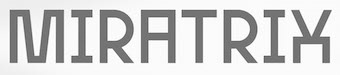 Moscow-based designer of the free free Latin/Cyrillic typeface Concrete (2019) and the free brutalist sans typeface Miratrix (2019). [Google]
[More] ⦿
Moscow-based designer of the free free Latin/Cyrillic typeface Concrete (2019) and the free brutalist sans typeface Miratrix (2019). [Google]
[More] ⦿
|
Anna Tsuranova
[Letter Muzara]
|
[MyFonts]
[More] ⦿
|
Arthur Coppens
|
During his studies, Hasselt, Belgium-based Arthur Coppens designed the free modular outline typeface BRTX (2018), an experimental font inspired by brutalist architecture and Duplo playing blocks. [Google]
[More] ⦿
|
Audry Kitoko Makelele
[Aukim Visuel]
|
[MyFonts]
[More] ⦿
|
Aukim Visuel
[Audry Kitoko Makelele]
|
 Graduate of the Academy of Fine Arts in Kinshasa, b. 1986. Kinshasa, Congo-based designer of the modular typeface Kitoko (2017) and Matondo Pro (a 32-style organic monolinear sans) (2018). In 2020, he published the organic sans family Kumba (Claw, Sketch, Scrawl, Sans, Expanded), the monolinear mechanical typeface families Ekela (216 styles), Ekela Circle and Ekela Round, the inline typeface Lakisa Stencil and the 62-style condensed techno / elliptical typeface Bokeseni.
 Typefaces from 2021: Aukim (a 54-style sans), Nsai (a 36-style partly geometric sans), Kenga Kaya, Bilokos (a 72-style chamfered family), Bilokos Pro (72 styles; octagonal), FT Beton (octagonal, brutalist), Yemeyi (a 60-style quirky sans), Kumba (now a 36-style techno sans). Fontsquirrel link. [Google]
[MyFonts]
[More] ⦿
|
Bagerich Type Foundry (was: Zealab Fonts Division, Zea Fonts, Zea Lab, Zeaspace)
[Reza Rasenda]
|
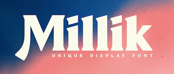 Founded in Bandung, Indonesia in the middle of 2019 by graphic designers Reza Rasenda (b. 1993) and Riska Chandra Dewi, Zealab Fonts Division specializes in and is inspired by urban culture, luxurious brands and street posters. Reza Rasenda designed these typefaces in 2020: Crenzo (a free sci-fi typeface), Pherome (a fashion-conscious display serif), Arguman (an aerodynamic or speed font), Oldblue (an interlocking retro font), Digitany (pixelized), Ethique, Brightfate (with Riska Candra Dewi; a sharp-edged typeface that conjures up images of a guillotine), Bagerich (an art nouveau genre display typeface by Reza Rasenda and Riska Candra Dewi), Digitany (pixelish), Rigeko (a refreshing display typeface), Chillion (in the heavy rounded serif genre), Anglestein (a sans inspired by retro car and amplifier lettering), Millik (a sturdy angular poster typeface), Bellinzo, Shirens, Roundlane, Oldblend (a 4-style circle-based sans family, possibly renamed Oldblue), Richson (a sans inspired by pop punk, rock, hardcore music and skateboarding), Airbolt (a futuristic racing font), Roseford (a display typeface), Qultiva (a display typeface), Ethique, Hochland (tall, condensed, urban), Rodenberg (a beer bottle font), Aveline (a display serif), Quilla, Monschone (a fashion mag sans in one style).
 Typefaces from 2021: Neima (a decorative serif), Nagoda, Chuten (a display typeface), Ephidona (a decorative serif), Claycozoa (an intestinal typeface), Elgista (incised and hipsterish, with mostly trapezoidal stems), Amovand (a decorative serif), Willton, Olieva, Waffold, Bogam (a great free black display font), Voca (brutalist, in their view), Gover (a gaspipe sans, +stencil), Agne (a decorative serif). Typefaces from 2022: Vifellia (an experimental condensed display serif, in which the left side serif is curved and the right side serif is straight). Type Department link for Zealab. Type Department link for Bagerich Type Foundry. Typefaces from 2022: Guffonia (a hyper-decorative hipster typeface), Baunk (futuristic). [Google]
[MyFonts]
[More] ⦿
|
Bastarda Type (was: No Name Type Foundry)
[Sebastian Castellanos De La Hoz]
|
 Bogota, Colombia-based outfit, est. 2017 by Jason Guzman, Sebastian Castellanos and Federico Parra. Type designers associated with Bastardatype in 2022 included Oscar Guerrero, Julian Moncada and Fer Cozzi. Sebastian Castellanos graduated from the MATD program at the University of Reading in 2015. His graduation project was Orca (2015). It covers Latin, Greek and Thai: Orca was inspired by alcoholic beverage labels. It is constructed of a blend of sharp serifs and brush out-strokes which create a dynamic combination of angular lines and curves.
 The list of type designs: - Orca and Orca Display (by Sebastian Castellanos and Jason Guzman). The semi-stencil Orca Display won an award at Tipos Latinos 2018. Orca was inspired by alcoholic beverage labels. It is characterized by sharp serifs, a large x-height, moderate ascenders and descenders, and wide proportions. It covers Latin, Greek and Thai.
- Magma (Federico Parra). A psychedelic all caps typeface.
- Central. A handcrafted American gothic custom-designed for Central Cevicheria in Bogota.
- BT Barbara (2018). A flared typeface done with Fernanda Cozzi.
- BT Brutman (2020). An angular text typeface inspired by brutalist architecture.
- BT Orca and BT Orca Display.
- BT Lamina (2019).
- BT Salsa (2019).
- Kiffo Sans (2019), later called BT Kiffo.
- Stewar Variable (2022). Unknown designer.
- Gregor (2021, Oscar Guerrero). A hybrid sans serif typeface family with two variants, Upright and Slanted. The design is inspired by some advertising graphic designs used in the United States during the 60's and 70's.
- Super BT (2022). Unknown designer.
Old URL. [Google]
[More] ⦿
|
Brumale
[Stefano Giliberti]
|
 Salerno, Italy-based designer of these typefaces in 2018: Sonica (a rounded techno sans), Giordano (a geometric sans), Sauro (techno family), Deciso (octagonal / mechanical / brutalist: free), Adita (sans), Partita (a free outlined pixel font family), Marmo (slab serif), Denso (sans), Apice (a free sans), Altero (titling sans), Parco (a rounded octagonal multilined typeface family), Mani (a free set of hand icons), Sagoma (bilined), Serico (a free semi-calligraphic display typeface), (Altero (caps only sans), Animosa (free), Voluta (rounded sans, with a handicapped lower case e), Stoica (a fine monolinear sans), Anodina (free), Mandorlato (a free display typeface with almond-shaped glyphs).
 Typefaces from 2019: Osmica. Typefaces from 2021: Desta (a squarish family in 18 styles, with some styles branded neon), Agosto (a dry brush script with calligraphic roots). Blog. Typefaces from 2022: Valerio (a high contrast boutique serif). [Google]
[More] ⦿
|
Bruno Duarte
|
 Lisbon, Portugal-based graphic designer who created the Greek mythology-inspired Greek emulation or brutalist typeface Arka (2016). Behance link. Creative Market link. [Google]
[More] ⦿
Lisbon, Portugal-based graphic designer who created the Greek mythology-inspired Greek emulation or brutalist typeface Arka (2016). Behance link. Creative Market link. [Google]
[More] ⦿
|
Brutalism
|
Brutalism or Outsider Art. Art critic Rogger Cardinal invented the term outsider art in 1972 as an English synonym for art brut, which was a label created by French artist Jean Dubuffet to describe art created outside the boundaries of official culture. Dubuffet focused particularly on art by insane-asylum inmates. There are typefaces one could label as "brutalist", such as several of Ray Larabie's creations---Ugocranis, Laserjeks and Vigo, for example---and the wonderful Kompressor by Frantisek Storm. Rough unfinished stencils are also sometimes labeled brutalist. Take for example, Depot Trapharet 2D or Dripps (Gert Wiescher). The architectural process Béton brut involves concrete left unfinished or roughly-finished after pouring and then exposed to dry. The use of béton brut was pioneered by Auguste Perret and Le Corbusier and flourished as a part of the brutalist architecture of the 1960s and 70s. [Google]
[More] ⦿
|
Charles Pons
|
Charles Pons has a Master's in Graphic Design from Elisava in Barcelona. Barcelona, Spain-based designer of the brutalist typeface Brute (2018). [Google]
[More] ⦿
|
Chester Jenkins
[Constellation]
|
 [More] ⦿
|
Chris Seaborn
|
Cheltenham, UK-based designer of the brutalist typeface Monolith (2015). [Google]
[More] ⦿
|
Comicraft (was: Active Images)
[Richard Starkings]
|
 Comicraft was founded by Richard Starkings and John Roshell in 1992. Located in Santa Monica and Los Angeles, they do lettering and design for the comic book industry and make comic book fonts. At one point they were also called Comic Book Fonts. The current presidents are Rita Simpson and Richard Starkings. Alternate URL. T-26 link. Creative Market link. Some fonts: Sanctum Sanctorum (2003), Grandguignol (2003), MagicalMysticalFour (2003), Smash (2003), Aztech, Joe Kubert, Gobbledygook, Meanwhile, Matinee Idol [Nick Curtis has a much nicer script font by the same name, sold by MyFonts], Manganese (Asian-lookalike by Richard Starkings), Altogether OOky (by John Roshell), AbsolutelyFabulous, Achtung Baby (1997, Richard Starkings: a brutalist typeface), Adamantium, Alchemite, AstroCity, AstroCity International, Bithead, BrontoBurger, CarryOnScreaming, Chills, ClobberinTime, Comicrazy, Destroyer, DivineRight, DoubleBack, DutchCourage (1995, an art deco family), Elsewhere (art nouveau), Flameon, Framistat (2000, JG), Frostbite, GrimlyFiendish, Hooky, Hellshock, IncyWincySpider, JimLee, JoeMad, KissAndTell, KissAndTell International (2000, JG), Meltdown, MonsterMash, PhasesOnStun, PulpFiction, ResistanceIs..., RunningWithScissors, SchoolsOut (1999, John Roshell), SezWho/SezYou, SpookyTooth, Spills, Splashdown, StandBy4Action, Stormtrooper, TheStorySoFar, ToBeContinued, Thrills, WildWords, WildWords International, YuleTideLog, Zoinks, ZAP Pack, Digital Delivery, Jeff Campbell (2000, by JG), Los Vampiros, DeadMansChest, Cutthroat International (2000), Rigor Mortis (2000, John Roshell), DangerGirl, Thingamajig, Red Star, Red Square, Drop Case, Too Much Coffee Man, NearMyth, Stonehenge, Golem and SwordsAndSorcerers (medieval or runes fonts). Their monster fonts collection includes MonsterMash, CarryOnScreaming, Chills, GooseBumps, CreepyCrawly, Grimly Fiendish, IncyWincySpider, SpookyTooth, Meltdown and TrickorTreat dingbats. In 2005, MyFonts started selling their collection. Fonts by Starkings include Achtung Baby, Carry On Screaming, Clobberin Time, Flame On, Goosebumps, Grimly Fiendish, Sez, Splashdown. The full font list: Absolutely Fabulous (1999), Achtung Baby (1997), Adam Kubert (2005), Adamantium (1999), Alchemite (1997), Altogether Ooky (1999, vampire script), Area51 (2005, an octagonal typeface with a military stencil)), Astro City (2005), Astronauts In Trouble (2005), Atomic Wedgie (2005), Aztech (2005), Battle Cry (2005), Battle Scarred (2005), Belly Laugh (2005), Biff Bam Boom (2005), Bithead (1997), Blah Blah Blah (2005), Bronto Burger (1996), Carry On Screaming (1996), Chatterbox (2005), Cheeky Monkey (2005), Cheese And Crackers (2005), Chills (1997), Clobberin Time (1995), Comicrazy (1995), Creepy Crawly (2005), Cutthroat (2005), Danger Girl (2005), Dave Gibbons (2005), Dead Mans (2005), Dear Diary (2005), Designer Genes (2005), Destroyer (1999), Digital Delivery (2005), Divine Right (1998), Doohickey (2005), Double Back (1998), Dreamland (2005), Drop Case (2005), Dutch Courage (1995), Elsewhere (1998), Euphoria (2005), Exterminate (1999), Face Front (2005), Flame On (1997), Forked Tongue (2005), Framistat (2005), Frostbite (1997), Girls Girls Girls (2005), Gobbledygook (2005), Golem (2005), Goosebumps (2005), Grande Guignol (2003), Grimly Fiendish (1998), Hedge Backwards (2005), Hellshock (1997), Hooky (1999), Hush Hush (2005), Hyperdrive (2005), Incy Wincy Spider (1996), Jeff Campbell (2005), Jeff Campbell Sketchbook (2005), Jim Lee (1998), Joe Kubert (2005), Joe Mad (1999), Kiss And Tell (1999), Ladronn (2005), Los Vampiros (1999), Manganese (1999), Matinee Idol (2005), Meanwhile (2005), Meltdown (1997), Mike Wieringo (2005), Monster Mash (1997), Near Myth (2005, a grunge face, since 2007 also at T26), Nuff Said (2005), Overbyte (2005), Paranoid Android (2005), Pascual Ferry (2005), Pass The Port (2005), Phases On Stun (1995), Primal Scream (2005), Pulp Fiction (1996), Red Square (2005), Red Star (2005), Resistance Is (1997), Rigor Mortis (2005), Rumble (1994), Running With Scissors (1997), Sanctum Sanctorum (1998), Santas Little Helpers (2005), Schools Out (1999), Sean Phillips (2005), Sentinel (2005), Sez (1998), Shannon Wheeler (2005), Shannon Wheeler (2005), Smash (2005), Snowmany Snowmen (2005), Soothsayer (2005), Spellcaster (2005), Spills (1997), Splashdown (1997), Spookytooth (2005), Stand By4 Action (1997), Stonehenge (2005), Stormtrooper (1997), Thats All Folks (2005), The Story So Far (1998), Thingamajig (2005), Thrills (1997), Tim Sale (1999), Tim Sale Brush (2005), Tim Sale Lower (2005), Timelord (2005), To Be Continued (2005), Too Much (2005), Tough Talk (2005), Treacherous (2005), Trick Or Treat (2005), Wall Scrawler (2005), Wiccan Sans (1999), Wiccan Serif (1999), Wiccan Special (1999, see also T-26), Wild And Crazy (1997), Wild Words (1995), Yada Yada Yada (2005), Yeah Baby (2005), Yuletide Log (1996), Zoinks (2005), Phil Yeh (2006), Zzzap (2006), Battle Damaged (2007), Speeding Bullet (2006), Foom (2007), Letterbot (2007), Timsale (2007), Cutthroat (2007), Framistat (2007), Area 51 (2007, techno, octagonal), CC Comicraft (2007), Ratatat (2008), Mad Scientist (2008), Monologous (2008, T-26), HolierThanThou (2008, T26), Elephantmen (2008, grunge typeface at T26), Storyline (2008, T-26), Primal Scream (2009, T-26), Spillproof (2009, T-26), Sign Language (2008), Moritat (2009, T-26, by John Roshell), Pass The Port (2009, T-26), Credit Crunch (2009), Elsewhere (2009, art nouveau), Code Monkey (2011, monospaced yet informal), Glitter Girl (2011, hand-printed), Rassum Frassum (2011, comic book face), Rocket Man (2011, a retro futuristic family), Spaghetti Western (2011, signage face), Sunrise Till Sunset (2012), Samaritan and Samaritan Tall (2013, with John Roshell).
 In 2014, John Roshell published the school font Dash To School. Typefaces from 2015: Samaritan Lower (by Richard Starkings and John Roshell), Dusk Till Dawn Buried (expressionist). Typefaces from 2016: Questionable Things (with John Roshell: a question mark font). Typefaces from 2017: Evil Schemes (by Richard Starkings and John Roshell), Regeneration, Obey Obey Obey (by Starkings and Roshell). Typefaces from 2018: Samaritan Tall Lower (by Starkings and Roshell), Blah Blah Upper (by John Roshell and Richard Starkings), Evil Doings (by Richard Starkings and John Roshell). Typefaces from 2020: Elektrakution (a Greek simulation font family by Richard Starkings and John Roshell), This Man This Monster (by John Roshell and Richard Starkings). Typefaces from 2021: Richard Starkings Brush (2021; a comic book typeface by Richard Starkings and John Roshell), Scoundrel (a comic book face by Richard Starkings and John Roshell). Creative Market link. View Comicraft's typefaces. Fontsquirrel link. [Google]
[MyFonts]
[More] ⦿
|
Connary Fagen
|
 Art director, designer and consultant who grew up in Colorado and is now based in Heber City (was: Park City and before that Salt Lake City), UT. He created the commercial Latin / Cyrillic geometric sans font family Venti CF in 2014---Venti can be purchased here. His second typeface is the geometric / techno typeface Filter CF (2014).
 In 2015, he created Waverly (avant garde caps), Articulat CF (an 18-style Swiss sans typeface), Argent CF (a 13-style display serif family), Ironfield (bold husky brutalist display font), Visby CF (geometric sans), Visby Round CF, Quincy CF (a warm serif text face), and Manifold CF (a squarish cold utilitarian sans with 16 styles; extended to the corporate typeface Manifold DSA in 2017). See also Manifold Extended CF (2022; 16 styles). Typefaces from 2016: Vanguard CF (a strong ultra-compressed sans in 16 styles), Addington CF (a 14-style text typeface family), Cartograph CF (monospaced sans), Greycliff CF (sans), Turismo CF (a wide rounfded open sans inspired by midcentury motorsports, technology, and business). Typefaces from 2017: Gryffith (angular), Visby Slab CF, Filter v2 CF (hipster style), Couplet CF (humanist sans), Integral CF (an all caps titling font). Typefaces from 2018: Argent Pixel (free), Artifex CF (a 9-weight serif family), Artifex Hand CF (a flared version of Artifex), Criteria CF (a geometric sans with horizontal and vertical terminal endings), Roxborough CF (a sharp-edged roman typeface). Typefaces from 2019: Wayfinder CF (a sharp-edged display typeface). Gumroad site, where one can download free trial versions of many of his fonts, and purchase licenses for the other ones. Typefaces from 2020: Hexaframe CF, Olivette CF (a sharp-edged angular and contrast-rich typeface family), Ellograph CF (a rounded monoline sans in 16 styles). Typefaces from 2021: Mielle CF (a monolinear script), Greycliff Thai CF, Greycliff Arabic CF, Greycliff Hebrew CF, Quiverleaf CF (ten flared / lapidary styles). Typefaces from 2022: Quiverleaf Arabic CF. Interview by MyFonts in 2021. [Google]
[MyFonts]
[More] ⦿
|
Constellation
[Chester Jenkins]
|
 Constellation is a creator and publisher of contemporary typefaces and is run by its two partners, Chester Jenkins (based in New York, born in Montreal) and Tracy Jenkins. They also feature typefaces by Magnus Rakeng, Patrick Giasson, Kris Sowersby, Rick Valicenti, and Jeremy Mickel. Constellation contains the main elements of the previous Village and Thirstype foundries. Typefaces including bespoke typefaces by Chester Jenkins:
 - Aero (2011, Chester Jenkins and Jeremy Mickel). Based on Roger Excoffon's Antique Olive.
- Apex Sans (2003), Apex Serif (2003), Apex New (2005) and Apex Rounded (2010). All by Chester Jenkins. Apex Serif and Apex Sans were co-designed with Rick Valicenti.
- Apollo. A bespoke multiline typeface for the Apollo Theater.
- Arbor (2010). Arbor was originally commissioned by the New York Times magazine for use in their 2008 Hollywood special issue. The source was Rob Roy Kelly's book of woodtype samples, and the D and H from Caslon's Italian of the 1820s. An original representative of this Western genre.
- Barclays Center (2012). A bespoke athletic lettering and stencil family.
- Brooklyn (2013, a brutalist typeface) and Brooklyn Stencil (2013, an octagonal stencil). The original was commissioned in 2007 by Michael Bierut for a sports complex.
- The Cooper Hewitt Smithsonian Design Museum in New York City is giving away for free its bespoke house typeface, a sans designed in 2014 by Chester Jenkins. Even the original UFO files are made available.
- Cosmica (2018).
- Endzone Slab (+Condensed) and Endzone Sans (2017) are bespoke typeface done for the NFL.
- Galaxie Cassiopeia (2006). A round connected upright script. By Chester Jenkins.
- Galaxie Copernicus (2009). An interpretation of Christophe Plantin's Plantin (cut by Robert Granjon) and Frank Hinman Pierpont's Monotype revival of Plantin. By Chester Jenkins and Kris Sowersby.
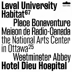
- Indestructible Language (2006, with Mary Ellen Carroll): The Precipice Alliance, a non-profit corporation collaborating with artists to direct public attention to global warming, launched with this inaugural artwork by the contemporary artist Mary Ellen Carroll. This lettering was a collaboration with Ms. Carroll to design letterforms that could be rendered 8-feet tall in neon tubing. Each neon letter was to be placed, in a 900-foot-long installation, in the window bays of all five former American Can factory buildings in Jersey City, New Jersey to be exhibited from November 2006 to April 2007. The 8-foot high, carbon neutral neon letters were clearly visible (and legible) to drivers on both the Pulaski Skyway and the New Jersey Turnpike, and by planes heading to and from Newark International Airport.
- Maharam (ca. 2017). A bespoke Futura revival typeface for Maharam.
- A bespoke sans titling typeface for the NYC Opera.
- Galaxie Polaris, Galaxie Polaris Condensed (2004-2013). Two sans families by Chester Jenkins.
- Oz (1999). A round typeface family by Patrick Giasson. Designed as an homage to Oswald Cooper (whose nickname was Oz), whose Oswald Cooper inspired the fat shapes.
- Pink Sans, Pink Slab and Pink Outline are bespoke typefaces for Victoria's Secret Pink campaign.
- Radio (1998). A retro script family by Magnus Rakeng.
- Robledo Stencil. For Slanted Magazine.
- Sharpie Script. a bespoke script typeface for the identiy of Michael Kors.
- A revival of Frederic Goudy's lost Sherman type for Syracuse University with Michael Bierut and his team at Pentagram.
- For Snickers, Chester designer Chiat Day.
[Google]
[More] ⦿
|
David Ottley
[Graphic Workman]
|
[MyFonts]
[More] ⦿
|
Davide Natalucci
|
Student in Rome who designed the free brutalist sans poster typeface Fondamenta (2019). [Google]
[More] ⦿
|
Device Fonts
[Rian Hughes]
|
 Rian Hughes studied at the LCP in London before working for an advertising agency, i-D magazine, and a series of record sleeve design companies. Under the name Device he now provides design and illustration for the advertising, entertainment, publishing, and media industries. He works from Richmond, UK, as a comic book artist, letterer and typefounder---his foundry is called Device. He creates mostly display type. List of fonts. Interview. Review by Yves Peters. Monotype Imaging page. Interview by Die Gestalten. Various (overlapping) font listings, still unorganized.
 - Dingbats: Pic_Format, Mastertext Symbols, MacDings, RiansDingbats, Autofont.
- FontFont fonts: Identification (1993), Revolver, Rian's Dingbats, LustaOneSixtySans, Knobcheese, CrashBangWallop, and Outlander.
- [T-26] fonts: English Grotesque (1998), Data90 (2003; a free FontStruct typeface that is virtually identical to Data90 is Bitrate by Kummaeno (2010)), Flak Heavy (2003, stencil), Flak (2003, stencil), Freeman (2003), Klaxon (2003, kitchen tile font), Cordite, Substation (2003), September (2003), West Way (2003), Egret (2003), Paralucent Complete (2003), Paralucent Condensed, Paralucent Stencil (2003), Mercano Empire (2003), Iconics (2003), Cantaloupe (2003), Gravel (2003), Acton (blocky screen font, 2002), Ainsdale, Amorpheus, Anytime Now (alarm dingbats), Bingo, Blackcurrant (Blackcurrant Cameo (1997) is free), Bordello, Elektron, Haulage (U-Haul lettering, 2002), WexfordOakley, Telecast, Terrazzo, Transit, Untitled, Scrotnig, Skylab (2002), Silesia (1993), SlackCasual, Ritafurey, Reasonist-Medium, Regulator, GameOver, Novak, Quagmire, PicFormat, Jakita Wide (2000, techno font), Metropol-Noir, Motorcity, Mastertext, Mystique (2002), MacDings, Lusta, Laydeez, Sinclair, Paralucent (sans serif), Judgement, Bullroller, Zinger (a fifties font), Citrus (2002), Popgod (2003), Range (2000, a futuristic font), Hounslow, Jemima, Griffin, GranTurismo, Gargoyle, Foonky, DoomPlatoon, Darkside ("remixed" by FontStructor Kummaeno in his Ubangi (2011)), Kallisto (2010), Kallisto Lined (2010), Cyberdelic, Contour, and the very original Stadia Outline family (Stadia is a kitchen tile font).
- List of all fonts by Rian Hughes, as of 2004: Acton, Ainsdale, Amorpheus, Anytime Now, Bingo, Blackcurrant, Bordello, Bull Roller, Chascarillo, Contour, Cottingley (1992), FF CrashBangWallop, Cyberdelic, Darkside, Data90, Doom Platoon (1996), Elektron, English Grotesque, Flak, Foonky, Freeman, Game Over, Gargoyle, Gran Turismo, Griffin, Haulage, Hounslow, Iconics, FF Identification, Jakita, Jemima, Judgement, FF Knobcheese, Laydeez Nite, Lusta (big family), Mac Dings, Mastertext, Men Swear, Metropol Noir, Motorcity, Mystique, Novak, FF Outlander, Paralucent, Pic Format, Platinum, Quagmire, Range, Reasonist, Register (A and B), Regulator, FF Revolver, FF Rian's Dingbats, Ritafurey, Scrotnig, September, Silesia, Sinclair, Skylab, Slack Casual, Space Cadet, Stadia, Substation, Telecast, Terrazzo, Transmat, Untitled One, Vertex, Westway, Wexford Oakley, Why Two Kay, Zinger.
- At Veer, in 2005, these Device fonts were published: Gentry, Gridlocker, Valise Montreal, Custard, Box Office (moviemaking letters), Sparrowhawk, Monitor, Moonstone, Miserichordia, Yolanda (a great playful medieval text typeface in three styles: Duchess, Princess, Countess), Gusto, Dauphine, Rogue, Ritafurey, Dynasty, Radiogram, Xenotype, Roadkill (grunge), Payload (stencil family comprising Regular, Outline, Spraycan, Narrow, Narrow Outline, Wide, Wide Outline), Catseye, Electrasonic, Absinthe (psychedelic style), Straker, and Chantal (brush).
- In 2006, Veer added these: Profumo, Ironbridge, Cheapside, Battery Park (grunge), Forge, Shenzhen Industrial, Hawksmoor (grunge), Coldharbour Gothic, Wormwood Gothic (grunge), Chase (grunge), Diecast, Roadkill Heavy, Tinderbox (fuzzy blackletter), Dazzle (multiline face), Nightclubber (art deco), Klickclack (2005, comic book or cartoon caper typeface), Vanilla (art deco), Wear it's at (grunge), Diecast, Drexler, Box Office (movie icon font).
- Fonts from 2007: DF Conselheiro (2007, grunge), DF Glitterati (2007), Indy Italic (script), DF Apocrypha (2006, rough outline), DF Quartertone (2007), DF Lagos (2007, rough stencil), DF Pulp Action, DF Reliquary #17 (2006, grunge didone), DF Dukane (2007, octagonal grunge), DF Strand (2007, striped stencil), DF Rocketship from Infinity (2006, futuristic), DF Appointment with Danger (2006), DF Las Perdidas (2006, grunge stencil), DF Kelly Twenty (2007, grunge stencil), DF Heretic, DF Roadkill, DF Ironbridge, DF Forge, DF Shenzhen Industrial, DF Hawksmoor, DF Cheapside, DF Battery Park, DF Saintbride, DF Profumo, DF Coldharbour Gothic, DF Wormwood Gothic, DF Tinderbox, DF Flickclack, DF Vanilla (multiline art deco face), DF Chase, DF Nighclubber (art deco jazz club face), DF Diecast, DF Dazzla, DF Zond Diktat (grunge), DF Yellow Perforated, DF Mulgrave (grunge), DF Ministry B, DF Ministry A (with a hairline weight), DF Gridlocker, DF Gentry, DF Valise Montréal (grunge), DF Custard, DF Box Office, DF Roadkill, DF Payload Wide, DF Payload Narrow, DF Catseye Narrow, DF Catseye, DF Yolanda, DF Xenotype, DF Telstar, DF Straker, DF Sparrowhawk, DF Rogue Serif, DF Rogue Sans Extended, DF Rogue Sans Condensed, DF Rogue Sans, DF Ritafurey B, DF Ritafurey A, DF Radiogram, DF Pitshanger, DF Payload (stencil), DF Outlander Nova, DF Moonstone, DF Monitor, DF Miserichordia, DF Interceptor, DF Gusto, DF Glitterati, DF Galicia (2004), DF Galaxie, DF Electrasonic, DF Dynasty B, DF Dynasty A, DF Drexler, DF Dauphine, DF Chantal, DF Absinthe, DF Register Wide B, DF Register Wide A, DF Register B, DF Register A, DF Quagmire B, DF Cordoba (2007, grunge), Mellotron (2004, stencil), Seabright Monument (2007), Charger (2007, grunge).
- T-26 releases in 2007: Klickclack, Hawksmoor (grunge), Heretic, Ironbridge (old letter simulation), Battery Park (grunge), Chase (grunge), Cheapside (grunge), Dazzle (multiline art deco), Diecast (grunge), and Forge (grunge).
- T-26 releases in 2008: Automoto (fat multiline deco face), Straker (organic). Also from 2008: Mission Sinister (grunge), Gonzalez (grunge).
- FontBros release in 2009: Filmotype Modern. Other Filmotype series fonts include Filmotype Miner (2012), Filmotype Manchester (2012), Filmotype Meredith (2012), Filmotype Marlette (2012), Filmotype Mansfield (2012), Filmotype Power (2012) and Filmotype Major (2012: this is based on a typeface used as the titling font for the popular children's book by Dr. Seuss entitled One Fish Two Fish Red Fish Blue Fish, 1960). Other 2009 fonts: Degradation (grunge).
- Creations in 2010: Pod (2010, fat round stencil), Korolev (2010, a 20-style monoline sans family based on communist propaganda from 1937), DF Agent of the Uncanny (2010, brush face), DF Destination Unknown (2010, Kafkaesque brush), DF Maraschino Black (a sleek, sophisticated high-contrast swash capital font).
- Creations in 2011: DF Capitol Skyline, DF Capitol Skyline Underline and DF Capitol Skyline Capitals (a multi-weight all-caps pair that epitomizes Streamline Moderne), DF Korolev (a 20-weight sans serif family based on lettering by an anonymous Soviet graphic designer who did the propaganda displays at the Communist Red Square parade in 1937. Named in honor of Sergey Pavlovich Korolyov, or Korolev, considered to be the father of practical astronomics). In 2018, Korolev was expanded to Korolev Rounded and Korolev Rough.
- Typefaces from 2012: Ember (informal script), Kane (based on the Batman logo), Glimmer Glossy, Glimmer Mate, Galleria (avant-garde caps), Clique (flared sans).
- Typefaces from 2013: Wulf Utility (grungy), Charterhouse (an aggressive black sans), Filmotype Melon (after a 1959 original, this is an offbeat Googie era doo-wop typeface), Filmotype Melody (similar to Melon), Filmotype Mellow (also similar to Melon), Raw (worn wood type), Cadogan (a rhythmic connected script), Whiphand (brush face), Steed (heavy codensed masculine sans inspired by the titles of the Avengers TV show), State Stencil (Clean and Rough: in the style of Futura Black), Korolev Military Stencil (named after Sergei Korolev, father of Soviet astronautics, and based on signs from the Red Army parade of 1932), Armstrong (a 1950s automobile font).
- Typefaces from 2015: 112 Hours (numerals font).
- Typefaces from 2016: Typex (an angular yet rounded monospaced typewriter or OCR-style typeface based on the lettering used on Alan Turing's and Tutte's famous code-breaking machine at Bletchley Park, the Bombe, and the subsequent British answer to the German Enigma machine, the Typex), Serenity (a legible sans family).
- Typefaces from 2017: Pitch (a heavy block sans in chrome and solid variants), Shard (originally commissioned for Nickelodeon's 3D reboot of the Teenage Mutant Ninja Turtles franchise), Championship Inline, Mood (a great liquid deco font), Grange, Grange Rough, Dazzle Unicase, Urbane (sans), Urbane Rounded, Albiona (a modern take on Clarendon; includes Albiona Heavy Stencil), Albiona Soft (a rounded version of Albiona), Pact (a modular geometric font).
- Typefaces from 2018: Rutherford, Salvation (a potato cut font), Kano (inspired by the work of Dutch furniture designer and architect Gerrit Rietveld, one of the principal members of the Dutch artistic movement De Stijl), Rogue Sans Nova, Fairtrade (rough-edged font), Goddess (Victoriana), Neuropa (a five-weight semi-extended sans that projects a muscular corporate authority), Worthington Arcade (a caps-only lapidary typeface), Zeno (a piano key stencil typeface), Vektra (an experimental crosshatch-textured typeface), Recon (a quartz display font), Kinesis (Kinesis is inspired by the work of Dutch furniture designer and architect Gerrit Rietveld, one of the principal members of the Dutch artistic movement De Stijl. It is a modular headline font, constructed from white, black and grey overlapping rectangles), Freehouse (Freehouse is a reinterpretation of the well-remembered Watney's logo, a brewery and pub chain infamous for its poor quality beer and brutalist decor.), Zipline (a great multiline typeface), Argent Sans, Craska (a multiline font), Panther Black, Carilliantine (art nouveau with many interlocking letter pairs), Regulator Nova, Broadside, Bubblegum Pop, Heft (a heavy slab serif), Faction (stencil style), Metaluna (techno, engineering), Magnetron (futuristic), Urbane Rough, Urbane Adscript (a monoline semi-linking sans), Revolver (original from 1992), Albiona Inked (a Clarendon).
- Typefaces from 2019: Gerson Rand, Gravesend Sans (an all caps sans family based on the unique typeface used for the iconic grass-green signage for the now-defunct Southern Railway in England).
- Other: Customised Foonky Starred, Altoona, DfAncestorITC, DfAttitudesPlain, HotRod (2002).
- Typefaces from 2020: Breach (a display typeface with partitioned capital letters), Epiphany (stencil), Aurore Grotesque (an elegant geometric art deco sans family with small x-height), Faculty (a geometric sans with large x-height), Fathom (a flared serif typeface), Atomette (a stylized comic book typeface family), Conquera (a stylish extended caps-only font in five weights plus an inline), Dare (a tape font, that borrows a pinch of the hand-drawn swagger of Bauer's Cartoon (designed in 1936 by H. A. Trafton), used as Dan Dare's signature logo in the British boy's comic Eagle, and also the upward-pointing serifs of machine-moderne typefaces such as Dynamo (designed by K. Sommer for Ludwig & Mayer in 1930), Urbane Condensed.
- Typefaces from 2021: Maximum (a blocky techno or sports font), Paralucent Slab (a monolinear slab serif), Guildhall (a 10-style strong-willed mechanical font family), Broadside Text (14 styles), Cynosure (a 14-style elliptical sans), Valvolina (a geometric display typeface inspired by Italian Futurismo), Chassis (a sci-fi or computer game font), Fomalhaut (a space exploration font), Disclosure (a grungy font), Sheffield Fiesta (a squarish font based on the brutalist concrete landmark nightclub in Sheffield, now the Odeon Cinema), Grange Text (a 14-style sans), Wilko (a fat rounded poster typeface), Farthing (a 5-style wedge serif).
- Typefaces from 2022: Bradbury Five (a vernacular / bubblegum / supermarket / cartoon typeface in 18 styles), Tracker (an inline space-age disco font from the 1960s or 1970s, reminiscent of the Mexico City olympics font), Salient (a 12-style didone).
FontShop link. Klingspor link. [Google]
[MyFonts]
[More] ⦿
|
Embe Studio
[Malgorzata Bartosik]
|
 Graphic designer in Warsaw, Poland, who created the cosmic family Solanum (2019) and deco typeface Bohemaz in 2019.
 Typefaces from 2020: Aligant (Peignotian), Kidcut (paper-cut glyphs), Prymityv (a blocky Latin / Cyrillic typeface inspired by East European brutalist architecture), Milky Bar. Typefaces from 2021: Kwadrat (a 5-style squarish display family). [Google]
[MyFonts]
[More] ⦿
|
Emma Rostaing
|
Art director in Lyon, France. FontStructor who made the brutalist typeface Hexafiles Bold (2015). FontStruct link. [Google]
[More] ⦿
|
Escaphandro (or: Rafael Cervi Barrozo)
[Rafael Nascimento]
|
 Rafael Nascimento (b. 1977) is a Sao Paulo, Brazil-based graphic designer whose fonts are mostly free. FontStructor who made these modular display typefaces in 2014: Wim Gestreept (an octagonal typeface inspired by Wim Crouwel's work), Sao Paulo (pixacao emulation), Pixel Spaceships, Chippanze (+LoRes, +DotMatrix), Kamada, Illusion (op-art based on the work of visual artist Martijn Sandberg), De Lorean, Pulse (pixel face), De Stijl, Soundwave (experimental), Ninja Gaiden, Pony PX, Act1, Platypus, Geo Geo, Expressionista, Soundwave Round, Video, Geo Libre (a tangram font).
 Typefaces from 2019: the dot matrix typeface Ghouls (attributed to Rafael Cervi Barrozo). Typefaces from 2020: - Geo (a free kitchen tile or stencil font based on retro record covers).
- Choripan. A revival typeface based on the classic round font Frankfurter (1970, Bob Newman at Letraset).
- The free brutalist typeface Blknd (made with FontStruct).
- The free sports lettering font Wim Pro.
- The graffiti font SP011.
- Refuse. A revolutionary or military stencil font. Free download.
- Sumano. Squarish, tribal, and experimental. Free download.
- Volume Dealers. A free bold art deco font This typeface that references the photo typeface Black Body (Peter Steiner, 1973) and the classic lettering of the album Vol 4 by Black Sabbath.
- Swiss Grit. A free grungy typeface in the destructionist style of Brody and Carson.
Typefaces from 2021: Volume Round (Volume Round takes its cousin Volume Dealer structure to a retro-weird leve; it too is inspired by late 1960s photo typesetting designs, and in particular the works of Peter Steiner, adding a little sci-fi flair to the details). Typefaces from 2022: Ghosts (a 4-style experimental geometric display font), CMYK (an experimental textured typeface). You Work For Them link. [Google]
[More] ⦿
|
Evan Lelliott
[Increments]
|
 [MyFonts]
[More] ⦿
[MyFonts]
[More] ⦿
|
Ewa Kucharska
|
 Polish designer of the sans typeface Brootal (2014), a typeface created for small print applications. At Typeclinic 2015, she continued the development of Brootal. [Google]
[More] ⦿
Polish designer of the sans typeface Brootal (2014), a typeface created for small print applications. At Typeclinic 2015, she continued the development of Brootal. [Google]
[More] ⦿
|
Foxtail Collectif
|
Design studio in Istanbul. Creators of the Peignotian sans typeface Reserved (2018) and Brutalist (2018). [Google]
[More] ⦿
|
Frantisek Storm
[Storm Type Foundry]
|
 [MyFonts]
[More] ⦿
[MyFonts]
[More] ⦿
|
Gaetan Baehr
|
 French type designer. In 2016, Gaetan Baehr and Jeremie Hornus co-designed Hate at Indian Type Foundry. This is the best Halloween and horror movie font ever made, period. The font has 510 glyphs, and each letter has three variants. Letters have spooky-looking hairs or roots sprouting from their zombie outlines. In 2016-2017, Baehr designed the octagonal mechanical varsity typeface family Hoover (Fontstore / Fontshare).
 In 2017, the blackletter typeface Aktura was published by Fontstore. At Black Foundry, he designed the emoji font Bluumoji as part of Jean-Baptiste Morizot's brutalist Bluusuuperstar (2017). In 2018, he published Neptune (a 12-style geometric sans family with a dwarf "t") and the organic sans typeface Hongkong at Indian Type Foundry. Finder is a multiscript typeface developed in 2020 at Black Foundry by Jérémie Hornus, Gaëtan Baehr, Changchun Ye and Zhang Miao. This neutral sans is intended for interface design, and covers Arabic, Cyrillic, Greek, Hangul, Hebrew, Japanese, Latin, Simplified Chinese, Thai and Traditional Chinese. Zodiak (2021, Jérémie Hornus, Gaetan Baehr, Jean-Baptiste Morizot, Alisa Nowak, and Théo Guillard at Fontshare) is a free 24-style text family with Century-like newspaper roots and sturdy bracketed slab serifs. It was originally named Claire (2020). [Google]
[MyFonts]
[More] ⦿
|
Gert Wiescher
[Wiescher Design]
|
 [MyFonts]
[More] ⦿
[MyFonts]
[More] ⦿
|
Graphic Workman
[David Ottley]
|
 David Ottley (the Graphic Workman) is a typographer and graphic designer in the UK. His typefaces:
 - Erno (2011), introduced as follows: Erno is a humanist sans serif typeface inspired by the brutalist manifestos and architectural practice of the 1960's. Informed by a study of traditional English typefaces by designers such as William Caslon, Eric Gill and John Baskerville. The name for the typeface is taken from the Hungarian born brutalist architect, and inspiration for Bond villian, Erno Goldfinger.
- Luminare (2016, The Northern Block).
- Stencil Book (2010).
[Google]
[MyFonts]
[More] ⦿
|
Guillermo Lizarzuay
[Nois (was: Makenois)]
|
[MyFonts]
[More] ⦿
|
Harmnessless
[Akbar Rohmanto]
|
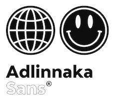 Aka Akbar Ar-rohamn. Bandung, Indonesia-based designer of the hipster font family Minnerva (2019), the display sans typeface Dreadnoughtus (2019), the 54-style geometric sans typeface family Adlinnaka (2019), the monoline script typeface Your Deep Rest (2019), the wide sci-fi font family Gemini Cluster (2019), and the vintage poster typefaces Sunblast and Sunblast 02 (2019).
 Typefaces from 2020: Diagramm (an ink-trapped hipsterish neo-grotesk), Eingrantch Mono (based on an old Continental typewriter type). The Kiwari Kolektiv Studio consists of Bandung, Indonesia-based designers Akbar Ar-rohman, Izhar Fathurrohim and Irfan Nur Fadhilah. Together they published Kiwari Grotesk and Kiwari Mono in 2020. Typefaces from 2021: Neue Augenblick (Neue Augenblick is a 20-style modern contemporary grotesk spiced up with deep ink traps; featuring a mechanical and industrial look, it is inspired by the Panzerkampfwagen and post-war brutalist architecture). [Google]
[MyFonts]
[More] ⦿
|
Ilya Bazhanov
|
 Artist and type and graphic designer. His fascination with street art has led him to typography and visual arts. Ilya received a diploma in graphic design from the Russian-British Institute of Management (Chelyabinsk, Russia). He graduated from the Faculty of Arts and Design at UJEP (Usti nad Labem, Czechia). He also studied at the HSD University of Applied Sciences in Düsseldorf, Germany, and at the Graduate School of Applied Arts in Prague, UMPRUM. His typefaces cover Latin and Cyrillic:
 - Thaw. Awarded by Modern Cyrillic 2019.
- At Type Tomorrow, he published the variable dot matrix typeface Dusseldot (2020) together with Maks Barbulovic.
- FUD Grotesk (2020, Type Tomorrow). Described as Closed (sometimes completely closed) narrow brutalist sans serif with wild ligatures.
[Google]
[More] ⦿
|
Increments
[Evan Lelliott]
|
 UK-based designer of II Vorkurs (2020: a 6-style geometric sans inspired by Bauhaus and Futura), II Balfron (2020), an all caps typeface about which he writes: Inspired by the Ernö Goldfinger's east London tower block of the same name, II Balfron is an imposing, all caps, one-weight typeface. Brutalist in form, the characters embody the principles of the distinctive 27-storey concrete profile with unexpected angles set within a rigid, structural grid. Much like Goldfinger's humanist, utopian housing ideals, the font is best viewed at large scale. [Google]
[MyFonts]
[More] ⦿
UK-based designer of II Vorkurs (2020: a 6-style geometric sans inspired by Bauhaus and Futura), II Balfron (2020), an all caps typeface about which he writes: Inspired by the Ernö Goldfinger's east London tower block of the same name, II Balfron is an imposing, all caps, one-weight typeface. Brutalist in form, the characters embody the principles of the distinctive 27-storey concrete profile with unexpected angles set within a rigid, structural grid. Much like Goldfinger's humanist, utopian housing ideals, the font is best viewed at large scale. [Google]
[MyFonts]
[More] ⦿
|
Innit Design
|
Innit Design (Amsterdam) created the typefaces BMBKLT05 (2012, influenced by brutalist architecture) and MSSV11 (2012, a dripping paint graffiti font). Behance link. [Google]
[More] ⦿
|
Ion Neto
|
In 2018, Ion Neto, Lara Benedet and Nicholas Auler, all students at Universidade Federal de Santa Catarina in Florianopolis, Brazil, co-designed the free brutalist typeface BoBardi. [Google]
[More] ⦿
|
Janik Sandbothe
|
During his studies at the University of Muenster, Germany, Janik Sandbothe designed Brutalist Grotesque (2016). In 2019, he published Euphoria. In 2020, Christian Altmann and Janik Sandbothe co-designed Altmann Grotesk, a 5-style almost monolinear sans that was initially planned as an internal studio typeface for Ateljé Altmann. [Google]
[MyFonts]
[More] ⦿
|
Jean-Baptiste Morizot
[Phantom Foundry]
|
 [MyFonts]
[More] ⦿
[MyFonts]
[More] ⦿
|
Joan Ramon Pastor Rovira
[Ultra Types]
|
 [MyFonts]
[More] ⦿
[MyFonts]
[More] ⦿
|
John Misael Villanueva
|
Trece Martires, Philippines-based lettering artist and type designer, known for the official typeface of the American industrial tools maker Stanley Black & Decker. In 2019, he designed these typefaces: the colorful decorative caps typefaces Pinas, Habi and Habi Pinas, Florida, Military Industrial, the free vernacular typeface BBT Martires, the script typeface Cute Bouncy, the modular typeface Arturo, the corporate font Stanley Black&Decker and the variable sans typeface Dinamika. Typefaces from 2020: Nilad Pro (a display serif inspired by the flourishing bud of the yamstick mangrove or nilad), Leandro (inspired by the brutalist architecture of Filipino architect Leandro Locsin). [Google]
[MyFonts]
[More] ⦿
|
Jonathan Gibson
[Studio Buchanan]
|
 [MyFonts]
[More] ⦿
[MyFonts]
[More] ⦿
|
Jorge Cisterna Avendaño
|
 Chilean type designer in Santiago who created the heavy slab serif / signage typeface Bock (2008; images: i, ii, iii), the fat Muralista (2008, Latinotype), the signage font Quinchao Script (2008), and the fat slab serif typeface Bock (2011). Behance link.
 In 2011, he cofounded Los Andes Type, and published the mural and/or poster font Muralista there. In 2012, he published the beautiful bold round typeface Altiplanica. In 2015, Jorge Cisterna published the humanist sans typeface Brocha (32 styles, Latinotype), the low contrast slab serif typeface Decour, Decour Soft, and the humanist sans typeface Blanc at Latinotype. Typefaces from 2016: Taberna (a vintage copperplate style family based on design trends in bar signage, liquor packaging and street wear; with Rodrigo Fuenzalida), Queulat (Latinotype: a slab serif), Queulat Condensed, Cover Sans (Latinotype), Queulat Soft. A humanist geometric typeface family in which every stroke ending is horizontal or vertical. Typefaces from 2017: Fibra (Los Andes: a beautiful geometric sans designed for display; advertized as avant-garde, although in my view there are slightly too many curves for that label to apply), Weekly (a semi slab serif), Atlan (at Latinotype; with Daniel Hernandez). A geometric sans typeface family. In 2018, inspired by Herb Lubalin's serif Gothic, Jorge Cisterna and Bruno Jara co-designed the layerable font family Lumiere at Latinotype. Other typefaces from 2018: Cagliari (Latinotype; a display didone with high contrast, based on his earlier typeface Queulat), Recoleta (Latinotype), Fibra One (Los Andes: a display sans). In 2019, Jorge Cisterna and Bruno Jara developed the vintage layerable typeface Blackberry (Los Andes). Blackberry is inspired by vintage packaging and old fashion ads. It has woodtype characteristics such as angular serifs, and light and diagonal curves. Typefaces from 2020: Kenac (a serifed text typeface with a negative optical axis). Typefaces from 2021: Brutalista (a 14-style sans inspired by the architectural brutalist style). Behance link. Link to his studio, Edwards Asociados. [Google]
[MyFonts]
[More] ⦿
|
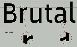
Josh James Jackson
|
Josh James Jackson (JJJ Design, Manchester, UK) created the brutalist fat octagonal typeface Brutal in 2015. [Google]
[More] ⦿
|
Joshua Ogden
|
Graphic designer in London, who created the brutalist typeface Bruton (2013). Behance link. [Google]
[More] ⦿
|
Kamil Kurzajewski
|
Polish graphic and type designer. His typefaces include Coctail (2010: a display serif), Carbon (2010: a brutalist typeface for the Katowicka Shopping Center), Struqtura (2009: a corporate monospaced typeface), Razor (2011), and Kolo (2010: a 12-style corporate typeface for Kolo Sanitec) [Google]
[More] ⦿
|
Keith Bates
[K-Type]
|
 [MyFonts]
[More] ⦿
[MyFonts]
[More] ⦿
|
Keith Tricker
[Studio K]
|
 [MyFonts]
[More] ⦿
[MyFonts]
[More] ⦿
|
Kelsey Kub
|
Charlotte, NC-based designer of the brutalist semi-blackletter typeface Gurl Code (2017). Behance link. [Google]
[More] ⦿
|
K-Type
[Keith Bates]
|
 K-Type is Keith Bates' (b. 1951, Liverpool) foundry in Manchester, UK, est. 2003. Keith works as an Art&Design teacher at a Salford High School. They custom design type, and sell some of their own creations.
 Commercial typefaces: - Adequate (2012). A basic geometric monoline sans family.
- Adventuring (2010, comic book style)
- Alan Hand (2005, based on some blobby lettering, handwritten by printer and mail artist, Alan Brignall)
- Alex (2002-2004)
- Alright (2004, cursive script)
- Anna (2002-2007).
- Argot (2019). Characterized by square counters, this typeface family exhales brutalism and industrialism. See also Argot Machine (2019).
- Artist Hand (2019).
- Axis
- Bank of England (2012, blackletter): Bank of England is loosely based on blackletter lettering from the Series F English twenty pound banknote introduced in 2007. The font also takes inspiration from German Kanzlei (Chancery) typefaces and the 17th century London calligrapher, John Ayres.
- Banks & Miles (2018). Inspired by the geometric monoline lettering created for the British Post Office in 1970 by London design company Banks & Miles, a project initiated and supervised by partner John Miles, which included Double Line and Single Line alphabets. The new digital typeface is a reworking and extension of both alphabets.
- Barbica (2015). A glyphic typeface.
- Bricola (2020).
- Brush Hand New (2013): Brush Hand New is a full font based on a copy of Flash Bold called Brush Hand marketed by WSI in the 1990s and more recently distributed through free font sites. Brush Hand was an anonymous redrawing of Flash which simplified, slightly lightened, smoothed out ragged edges, and improved the legibility of the original classic created by Edwin W. Shaar in 1939.
- Building&Loan (2007, engaved face)
- Bigfoot (2005, a Western font based on the slab capitals used by Victor Moscoso in his 1960s psychedelic rock posters)
- Bolshy (2009)
- Bolton750 (2003, a mechanical typeface done with John Washington).
- Chancery Lane (2021). An italic text typeface that is based on chancery scripts.
- Charles Wright (2016). A set of fonts based on the UK license plate fonts.
- Chock (2009)
- Circa (geometric sans)
- Cloudbuster (2019). Inspired by Imre Reiner's Corvinus Skyline of 1934.
- Club.
- Coinage Caps (2017). Coinage Caps is a trilogy of small caps fonts based on the roman lettering used for the designs of British coinage. Coinage Caps Eric Gill is a regular weight, spur serif style drawn by Eric Gill for silver coin designs in the 1920s which were rejected by the Royal Mint. Coinage Caps Humphrey Paget is a medium weight serif based on the lettering of Thomas Humphrey Paget, designer of the Golden Hind Halfpenny first struck in 1937. This font simulates the soft, slightly rounded corners of the minted letterforms. Coinage Caps Kruger Gray is a glyphic, flare serif font typical of the bold style engraved by George Kruger Gray for numerous British and Commonwealth coins during the 1920s and 30s. This font also simulates the slightly rounded corners of the minted letterforms.
- Collegiate (2009)
- Component (2012). A font for lost civilizations and dungeon rituals.
- Context (experimental)
- Credit Card (2010, font for simulating bank cards)
- Curwen Sans (2018). A monoline sans from the early 1900s originally created for in-house use at the Curwen Press in London.
- Cyberscript (2006, connected squarish face)
- Deansgate (2015). Deansgate and Deansgate Condensed are based on the clearest and most distinctive of the sans-serif letterforms used on Manchester street nameplates, and easily identified by a pointy Z and pointed middle vertices on M and W.
- Designer
- Digitalis
- English
- Enamela (2013). Keith writes: Enamela (rhymes with Pamela) is based on condensed sans serif lettering found on vitreous enamel signage dating from the Victorian era and widely used in Britain for road signs, Post Office signs, the plates on James Ludlow wall postboxes, railway signs, direction signs and circular Automobile Association wayfinding plaques throughout the first half of the twentieth century. The original model goes back to Victorian times, ca. 1880.
- Engravia (2018). Engravia is a didone display typeface supplied in three varieties of engraving---Inline, Shaded and Sawtooth---plus a plain basic font.
- Example (2017). A workhorse neo-grtesque typeface family.
- Excite
- Flip (2011), a western grotesk billboard face.
- Flyer (2009, techno)
- Frank Bellamy (2009, an all-capitals family based on the hand lettering of English artist Frank Bellamy, who is most famous for his comic art for Eagle and TV21, and his Dr Who illustrations for Radio Times)
- Future Imperfect
- Gill New Antique (2003)
- Greetings
- Helvetiquette
- Hapshash (2010): an all capitals font inspired by the 1960s psychedelic posters of British designers Hapshash and the Coloured Coat (Michael English and Nigel Waymouth), in particular their 1968 poster for the First International Pop Festival in Rome. A dripping paint font.
- Irish Penny (2016). An uncial typeface based on the lettering from Percy Metcalfe's influential pre-decimal coinage of Ireland, the Barnyard Collection.
- Ivan Zemtsov (2009)
- Kato (2007, oriental simulation face)
- Keep Calm (2015). A geometric sans inspired by a British war poster from 1939.
- Keith's Hand
- Klee Print (2010, Klee Print is based on the handwriting of American artist Emma Klee)
- Latinate (2013). A vintage wedge serif wood style typeface, and a rough version.
- Lexie (an improved or "adult" version of Comic Sans) and Lexie Readable (2006, modified in 2015). Keith writes: Lexie Readable (formerly Lexia Readable) was designed with accessibility and legibility in mind, an attempt to capture the strength and clarity of Comic Sans without the comic book associations. Features like the non-symmetrical b and d, and the handwritten forms of a and g may help dyslexic readers.
- Licencia (2016). A blocky typeface inspired by the tall, soft-cornered lettering on vehicle licence and registration plates world-wide.
- Londinia (2016).
- Matchbox
- Max
- Ming
- Modernist Stencil (2009).
- Monterey Pop (2020). A psychedelic / popart typeface based on Tom Wilkes's poster lettering for the Monterey International Pop Festival in June 1967.
- Mythica (2012). A slightly condensed lapidary roman with copperplate serifs.
- Modulario (2010): a contemporary sans.
- New Old English (2010, blackletter)
- Norton (2006)
- Nowa (2004, a play on Futura)
- NYC (octagonal)
- Openline (2008, an art deco pair)
- Oriel Chambers Liverpool: A Lombardic small caps font based on the masonry lettering on Peter Ellis's 1864 building, Oriel Chambers, on Water Street in Liverpool.
- Pentangle (2008, based on album lettering from 1967)
- Pixel
- PixL (2002-2004)
- Plasterboard (2004-2005)
- Pop Cubism (2010) is a set of four texture fonts, combining elements of cubism and pop art.
- Poster Sans (2006). A wood type family based on Ludlow 6 EC. See also Poster Sans Outline.
- Rick Griffin (2006, more psychedelic fonts inspired by a 1960s Californian artist)
- Rima (2020). A stencil typeface with heavy slabs.
- Roundel (2009, white on black)
- Runestone (2010, runic).
- Sans Culottes (2008, grunge)
- Serifina
- Solid State (2008, art deco blocks)
- Solus (2004, a revival of Eric Gill's 1929 typeface Solus which has never been digitized; read about it here)
- Stockscript (2008, down-to-earth script based on the pen lettering of the writer, Christopher Stocks)
- Susanna (2004)
- Ticketing (2011): pixelish.
- Total and Total Eclipse (2004, squarish display typefaces based on the four characters of Jaroslav Supek's title lettering for his 1980s mailart magazine, Total)
- Transport New (2009: a redrawing of the typeface designed for British road signs. In addition to the familiar Heavy and Medium weights, Transport New extrapolates and adds a previously unreleased Light weight font originally planned for back-lit signage but never actually applied. Originally designed by Jock Kinneir and Margaret Calvert beginning in 1957, the original Transport font has subtle eccentricities which add to its distinctiveness, and drawing the New version has involved walking a tightrope between impertinently eliminating awkwardness and maintaining idiosyncrasy.)
- Union Jack (octagonal)
- Victor Moscoso (2008, psychedelic)
- Wanda (2007, art nouveau)
- Waverly
- Wes Wilson (2007, psychedelic, inspired by 1960s psychedelic poster artist Wes Wilson).
- 3x5
- Zabars (2001): a Western face.
His free fonts: - Blue Plaque (2006: a distressed font based on English heritage plaques)
- Blundell Sans (2009)
- Celtica (2007) has Celtic influences
- Dalek (2005, stone/chisel face: Dalek is a full font based on the lettering used in the Dalek Book of 1964 and in the Dalek's strip in the TV21 comic, spin-offs from the UK science fiction TV show, Doctor Who. The font has overtones of Phoenician, Greek and Runic alphabets). See also Dalek Pinpoint (2018).
- Designer Block (2006)
- Flat Pack (2006)
- Future Imperfect (2006, grunge)
- Gommogravure (2005)
- Greetings (2006), Greetings Bold (2006)
- Insecurity (2005, experimental) won an award at the 2005 FUSE type competition.
- International Times (2006, inspired by the masthead of the International Times underground newspaper of the 1960s and 1970s)
- Keep Calm (2011). Related to London Underground.
- Kindersley Sans (2017). A modernized version of David Kindersley's 1950s type used for many street name plates in Britain, about which Bates writes: Kindersley Sans is a humanist sans-serif that conserves the Gill-inspired character and some of the calligraphic qualities of Kindersley's lettering, it retains the Roman proportions and its Britishness, but traditional prettiness and intricacy are discarded in favour of a clean modernity.
- Klee Capscript (2005: based on the handwriting and capitals drawn by artist Emma Klee (USA) for her Color Museum Mail Art invitation. The upper case is based on Emma's capitals and the lower case is freely adapted from her script)
- Lexia and Lexia Bold (2004)
- MAGraphics (2004)
- Magical Mystery Tour (2005, outlined shadow face), Magical Mystery Tour Outline Shadow (2005), Magica (2015, a serifed titling typeface family).
- Mailart (2004), Mailart Rubberstamp (2004), Mailart Rubberstamp Sans (2018).
- Mandatory (2004, a UK number plate font based on the Charles Wright typeface used in UK vehicle registration plates).
- McKnight Kauffer (2021). A retro poster font in the style of poster artist Edward McKnight Kauffer.
- Motorway (2015), a companion typeface to Transport, the British road sign lettering. This is an extension of an original design by Jock Kinneir and Margaret Calvert: The Motorway alphabet was created for the route numbers on motorway signage, and is taller and narrower than the accompanying place names and distances which are printed in Transport. However, for Motorway Jock Kinneir and Margaret Calvert created only the numbers 0 to 9, the capitals A, B, E, M, N, S and W, ampersand, slash, parentheses and a comma. So, although the lettering made its first appearance on the Preston bypass in 1958, K-Type Motorway is the first complete typeface and contains all upper and lower case letters, plus a full complement of punctuation, symbols and Latin Extended-A accented characters. As with the Transport alphabet the starting point was Akzidenz Grotesk, Motorway taking inspiration from condensed versions. Changes were mainly driven by a quest for legibility, resulting in some reduced contrast between horizontal and vertical strokes, and Gill-esque straight diagonal limbs on the 6 and 9, and high vertex for the M.
- Penny Lane (2014). A a sans serif derived from twentieth-century cast-iron signs displaying Liverpool street names.
- Possible (2020). A 10-style mini-serif typeface.
- Provincial (2014). A Victorian set of outline fonts.
- Ray Johnson (2006-2008)
- Roadway (2005, based on New York roadside lettering).
- Romanica (2017). A humanist sans.
- Sam Suliman (2020). A condensed squarish typeface which was inspired by lowercase lettering on a Sarah Vaughan album cover designed by Sam Suliman in 1962. Suliman was born in Manchester, England in 1927. After working for McCann Erikson in London, he moved to New York where he took on freelance work designing album covers, particularly celebrated are his striking minimalist designs for jazz records. He moved back to England in the early 1960s, designing many book jackets, film titles and fabrics, also working in Spain and India before settling in Oxford in the 1980s.
- Savor (2011). An art nouveau family.
- Sgt Peppers Lonely Hearts Club (2014).
- Sinkin Sans (2014, free) and Sinkin Sans Narrow (2015, commercial). Open Font Library link.
- Soft Sans (2010)
- Subway Ticker (2005)
- Taxicab (2016). A squarish style.
- This Corrosion (2005).
- Toppler (2018). A modern and full range top-heavy cartoon font family that includes a Popdots style. Bates was striving to improe on 1990s clasics such as Baby Kruffy (Ben Balvanz), Comix Heavy (WSI) and Startling (Dave Bastian).
- Wildcat (2016). An athletics typeface family.
- Zinc (2018). A monoline sans with diagonal nubs.
- Colnage Caps Kruger Gray (2018). Coinage Caps is a trilogy of lapidary small caps fonts based on the Roman lettering used for the designs of British coinage.
- Dalek Pinpoint (2018). Based on Dalek comic book lettering from the 1960s.
- Icky Ticket Mono (2018). IckyTicket Mono is a monospaced font based on the coarsely printed numbering from 1960s bus tickets.
- Sexbomb (2018). A psychedelic typeface family.
- Mancunium (2019). A monoline sans family.
- Straight Line (2020). An outlined font with chamfered corners and straight edges, possibly useful as a blackboard bold type.
- We The People (a blackletter font based on the peamble of the American constitution).
- Bowdon (2021). A six-style warm, Bodoni-inspired English Modern, influenced by the 1930s lettering of designer Barnett Freedman.
- Oxford Street (2021). A condensed grotesque with horizontal and vertical stem terminals; it is a street a signage font that began as a redrawing of the capital letters used for street nameplates in the borough of Westminster, which in turn were designed in 1967 by the Design Research Unit using custom lettering based on Adrian Frutiger's Univers 69 Bold Ultra Condensed.
Custom / corporate typefaces: With Liverpool-based art director Liz Harry, Bates created a personalized font, loosely based on Coco Sumner's handwritten capitals, for the band I Blame Coco. Medium and Semibold weights of Gill New Antique were commissioned by LPK Design Agency. Stepping Hill Hospital and Bates created Dials, a pictorial font to help hospital managers input data about improvements. A custom font was designed for Bolton Strategic Economic Partnership. Abstract Fonts link. View Keith Bates's typefaces. Dafont link. Yet another URL. Fontspace link. Fontsy link. Behance link. [Google]
[MyFonts]
[More] ⦿
|
Kulturë Type (or: Kulture Type)
[Leonit Gashi]
|
 Graphic designer in Pristina, Kosovo. Creator of these typefaces:
 - In 2022: Apostrof Grotesk (with exaggerated ink traps), Gin & Jüs (a display sans), Perandory (a free vintage wedge serif).
- In 2021: Gogoli Grotesk, Trileqe (a fat typeface in Fatt and Hybrid styles), Gin Grotesk (a free inktrapped typeface), Bllok (a typeface inspired by cement blocks), Rentgen (a typeface inspired by x-ray machines and radiation), Trafika Monospace, Retrika, Lugati Sans (a post-modernist sans based on vintage prototypes found in Kosovo's print shops), Projekt Blackbird (a free grotesque), KT Cement (a blackletter font for black metal, gangs, or tattoos), Kaotizm (a dystopian font), Ignotus (a heavy display typeface), KT Striktus (a very narrow sans inspired by dadaism), Digitopia (octagonal, dystopian), Kaotik Grotesk.
- In 2020: KT Servis (an industrial sans), Tsipuna Grotesk, Haire (an experimental mixture of grotesque and humanist sans), Metalurgjia 1932 (a metallic industrial type), Haperisa (an experimental cyberpunk typeface), Kool (techno, sci-fi), Armatura (a hipster condensed sans that Gashi considers as brutalist), Kyltyre (a great free blocky display typeface).
[Google]
[More] ⦿
|
Lara Benedet
|
In 2018, Ion Neto, Lara Benedet and Nicholas Auler, all students at Universidade Federal de Santa Catarina in Florianopolis, Brazil, co-designed the free brutalist typeface BoBardi. [Google]
[More] ⦿
|
Leonit Gashi
[Kulturë Type (or: Kulture Type)]
|
 [More] ⦿
|
Letter Muzara
[Anna Tsuranova]
|
Russian designer of Qisharon (2019: a stylish sans for Latin, Greek, Cyrillic, Hebrew and Arabic), Omorphia (2019: influenced by the squarish Hebrew Sephardic style; covering Latin, Greek and Curillic) and Cursivica (2019) for Latin and Cyrillic. Typefaces from 2020: Ribuah Sans (a sans serif font with high contrast, inspired by Bodoni and brutalism). [Google]
[MyFonts]
[More] ⦿
|
Luise Thoma
|
During her studies at FHWS in Würzburg, Germany, Luise Thoma designed the circle-based modular typeface Neonorm (2017) and the industrial sans Laundry Mono (2018). In 2019, from her home in Ravensburg, Germany, she designed 20 typeface as aprt of a project called Archetypes, in which she explores the connection between architecture, and in particular brutalism, and type design. The names of these typefaces: Ad Atlantic, Alagar, Alt Parallax, Arson, Baari, Big Bear Mono, Blanco Tolcka, Compound, Diatribe, Digitalize, Halcyon, Meteor, Odin Modi, Qobalt, Rambutan, Ravage Mono, Shrike, Unakit Mono, Unblock, Xerxes. [Google]
[More] ⦿
|
Lukyan Turetskyy
[2D Typo]
|
[MyFonts]
[More] ⦿
|
Malgorzata Bartosik
[Embe Studio]
|
[MyFonts]
[More] ⦿
|
Marco Rollo
|
Graphic designer in Milan, Italy, who published Brutaype in 2019, where the name refers to brutalism. [Google]
[More] ⦿
|
Maurizio Carpani
|
 Bologna, Italy-based designer of Logo Plastika (2009), an example of how letters can be made to look shiny, rounded and 3d. [Google]
[More] ⦿
Bologna, Italy-based designer of Logo Plastika (2009), an example of how letters can be made to look shiny, rounded and 3d. [Google]
[More] ⦿
|
Metis Digital Type Foundry (or: Studio Io, or: Metis Foundry; was: Volume2a)
[Simon Bent]
|
 Simon Bent from Melbourne (Metis Foundry, or: Studio Io; was: Volume2a) designed these typefaces in 2007-2008: Epsilon, Annual (modular, architectural), Tangerine, Deccade (experimental), Hoax [more scans: i, ii, iii, iv], Babylon (another modular experiment).
 In 2012, he created the geometric sans typeface Acumen, and the sans family Silence. He is working on Fragile, Terminal, Link, Recurrence (very experimental), Autonomy, Motor, Velcro, and Elevator. In 2013, he designed the sans typeface Figure. In 2016, he published the ultra-condensed blackletter typeface Optimum Compress in Textura style. In 2018, he published the great condensed brutalist octagonal typeface Texel, the experimental geometric typeface Pyxis (published by The Designers Foundry), and the geometric solid typeface Geometer. In 2019, he added the ultra-fat Dot19, the monoline experiment LXII, the modular Alexandro, the geometric sans typefaces Software and Gertrudes, and the sans font Mizzen. Typefaces from 2020: Geometer. Typefaces from 2021: LXII Display (a prismatic typeface). [Google]
[More] ⦿
|
Mickaël Emile
|
Paris, France-based designer of Fleuron (2021: a floriated sans; includes a fleuron dingbat font) and Clinker (2021: brutalist). [Google]
[More] ⦿
|
Mitul Grover
|
New Delhi, India-based student-designer of a few typefaces in 2017 that are inspired by brutalist architecture. [Google]
[More] ⦿
|
MyFonts: Brutalist typefaces
|
MyFonts selection of brutalist typefaces. [Google]
[More] ⦿
|
Nazareno Crea
[ABC ETC INC]
|
[More] ⦿
|
Neue (or: Neue Foundry)
[Alexander Alexandrowitsch Roth]
|
 Alexander Alexandrowitsch Roth, or just Alexander Roth, was born in the Tajik Soviet Socialist Republic and immigrated from Dushanbe to Germany in 1993. He is a Berlin-based graphic designer who holds a bachelor degree in Media Production from the Hochschule Ostwestfalen-Lippe University of Applied Sciences. Alexander is one of the founders of Ghostarmy---a conglomerate of several designers who are working among others for Erik Spiekermann, FSI FontShop International, FontShop Germany and the city of Wardenburg. In 2012, he graduated from TypeMedia at KABK in Den Haag. His graduation project was the high-contrast Uoma typeface which comes to life in large display sizes.
 He held positions as a graphic designer for FontFont, as a lead graphic designer for FontShop and as a marketing manager for Monotype's digital commerce businesses, before joining Monotype's type team. Roth set up Neue. Alexandra Schwarzwald is a type designer & typographer and joined Neue as business partner in October 2020. In 2020, he designed the 72-style typeface family Neue Radial, which is a compendium of sans genres: Neue Radial A follows the model of the original London underground typeface; Neue Radial B exemplifies the roots of a rational grotesque of the late twentieth century; Neue Radial C is a contemporary representative of the geometric sans, mechanically constructed to optically appeal to the appearance of a true compass and ruler typeface; avant-garde-esque elements ensure a smooth transition into Neue Radial D that reflects the tradition of neo-grotesques. The Soft versions (done with Alexandra Schwarzwald) were added in 2021: Neue Radial Soft A, Neue Radial Soft B (18 styles), Neue Radial Soft C, Neue Radial Soft D. Late in 2020, Neue released Neue Vektor (by Alexander Roth; 27 styles, describable as cold-hearted, utilitarian, DIN-like, and for engineers only), Neue Vektor CNC (a monolinear rounded sans in 14 styles), Neue OS Icons (by Alexandra Schwarzwald) and Neue UXUI Icons (by Alexandra Schwarzwald). Typefaces from 2021: Neue Rasant (a cold 15-style brutalist sans), Neue Singular (60 styles: a contemporary neo-grotesque sans-serif designed in three variants, H, D, and V according to stroke endings---H for horizontal, D for diagonal, and V for vertical). [Google]
[MyFonts]
[More] ⦿
|
Nicholas Auler
|
In 2018, Ion Neto, Lara Benedet and Nicholas Auler, all students at Universidade Federal de Santa Catarina in Florianopolis, Brazil, co-designed the free brutalist typeface BoBardi. In 2019, he designed the free informal typeface family Spurce Sans. In 2021, Auler released Esquinera (a variable font for wayfinding applications). [Google]
[More] ⦿
|
Nick Shea
|
 Nick Shea is a designer based in East London. Creator of Ombra Brutal, which began as a brutalist interpretation of the typeface Motter Ombra designed by Othmar Motter.
 Nick experiments widely with type. Noteworthy is his Albers Moiré, which is part of a project for creating complex type designs with a limited and easily interchangeable set of parts. The structure of Albers Moiré is based on the Bauhaus stencil type designs by Joseph Albers, and uses radiating lines to achieve the moiré effect when layered. [Google]
[More] ⦿
|
Nickel Beryllium
|
Hamburg, Germany-based designer of the blocky font Brutalism (2020). [Google]
[More] ⦿
|
Nois (was: Makenois)
[Guillermo Lizarzuay]
|
Barcolona-based designer who set up Makenois and then Nois, a studio engaged in branding, web design and digital campaigns. Creator of Mirtha Display (2020), Britti Sans (2020: a 14-style brutalist sans), Lalo Grotesk (2020) and Beni (2020: a condensed headline sans). Typefaces from 2021: Krooner (a tall sophisticated display serif), Jessi Neue (a soft serif in four styles, and a variable font). [Google]
[MyFonts]
[More] ⦿
|
Paul Henry Robb
[S6 Foundry]
|
[MyFonts]
[More] ⦿
|
Phantom Foundry
[Jean-Baptiste Morizot]
|
 Type designer at the open source type foundry Velvetyne in Paris. His creations there include Trickster (2017: blackletter), Bluu Next (2014, a free wedge serif typeface) and Steps Mono (with Raphael Bastide).
 In 2015, he switched to the commmercial camp, and cooperated with the Fontyou team in the production of the didone typeface family Télémaque FY, which brings Didot in its most rigid and tuxedoed manner, for the black-and-white fashion mags showing James Bond with a black bowtie and spotless high-contrast shirt. In 2016, Alisa Nowak, Julie Soudanne and Jean-Baptiste Morizot co-designed Graphico (Indian Type Foundry): Its letterforms are industrial and square-sided. The typeface looks like the product of precision mechanics: it should be featured together with tech---either old tech like appliances or watches, or new tech like apps and laptop stands. Still for Indian Type Foundry in 2016, he designed the hipster sans typeface family Bobo---perhaps one of the greatest hipster typefaces of all times. Bobo stands for bourgeois Bohemian---I am not sure it is identical to gauche caviar, but that is the societal class the author of this typographic encyclopedia belongs to. In 2016, Morizot designed the high contrast wedge serif newspaper typeface families Editor and Editor Condensed, the 6-style techno font Technor (free at Fontshare; squarish with inflated horizontal strokes), and the car license plate font License at Indian Type Foundry. In 2017, as part of the new Black Foundry, he extended his free font Bluu and even added a variable font to the set, as well as a collection of emojis. The new name is Bluusuuperstar: Bluu Suuperstar is a brutalist serif typeface featuring very prominent triangular-wedges for serifs and terminals. Bluu Suuperstar's letters have a tall x-height, and the diamond dots are a chief characteristic of the design. Notches like these [diamonds] are found in several blackletter designs; but most-famously in the romain du roi created for Louis XIV. Nothing in Bluu Suuperstar is soft or cuddly; this is a sharp typeface, and you could cut yourself on its letters. The separate emoji font, designed by Gaëtan Baehr, is wittily named Bluumoji, and it includes 73 glyphs. In 2018, Morizot set up Phantom Foundry, where he published Super Fat Bob (2018) and Phantom Sans (2018: trying to bring some warmth to the geometric sans genre, and now also a variable typeface). Typefaces from 2019: Cosmetic (Indian Type Foundry: a high-contrast fashion mag sans family), TXT25 (an unconventional extreme-axis (variable) text typeface). Typefaces from 2020: Karrik (a free britalist font designed with Lucas Le Bihan), Token (at Future Fonts---on purpose, Morizot mixes discordant styles to create a Frankenstein monster of a typeface; he added Token Bebop in 2021), Kola (a molecular rounded stencil typeface published at Indian Type Foundry; free at Fontshare) Typefaces from 2021: Pally (at Fontshare; a 3-style asymmetric rounded sans with a playful children's book or comic strip rhythm), Zodiak (2021, Jérémie Hornus, Gaetan Baehr, Jean-Baptiste Morizot, Alisa Nowak, and Théo Guillard at Fontshare; a free 24-style text family with Century-like newspaper roots and sturdy bracketed slab serifs that was originally named Claire (2020)), NaN Tragedy (an 8-style serif with display and Text subfamilies, and a variable font option; Tragedy is classical and sturdy, yet mischievous and unconventional). Fontshop link. Future Fonts link. Home page. Fontsquirrel link. Jean-Baptiste Morizot at Velvetyne. [Google]
[MyFonts]
[More] ⦿
|
Philip Kelly
|
Graphic designer in Auckland, New Zealand. In 2013, he summarizes his career: Early career working in New Zealand for not for profit clients in theatre, music and fine arts. Two years at Saatchi & Saatchi NZ followed by ten years in New York City as a type director, design director and photographer. Recently returned to New Zealand after two years in Shanghai. Typefaces designed by him include Basalt (2011, bilined), Brutalism (2008), Cement (2009, octagonal), Hellvettika (1998, gothic, tattoo font), Esosquare (1998, squarish), Phrank (1997, experimental), and Hanson Unicase (2006). In 2015, the custom octagonal typeface Pure Pakati was developed at Whybin TBWA Auckland for Tourism New Zealand. Its design team comprised Philip Kelly (design director), Karl Wixon (Maori design consultant), Kris Sowersby (type designer) and Rangi Kipa (Maori carver). Pure Pakati blends the traditions of wood type with the traditional indigenous carving style of Aotearoa (New Zealand) in a hand-carved and digital fonts. Behance link. Another Behance link. Old URL. [Google]
[More] ⦿
|
Rafael Nascimento
[Escaphandro (or: Rafael Cervi Barrozo)]
|
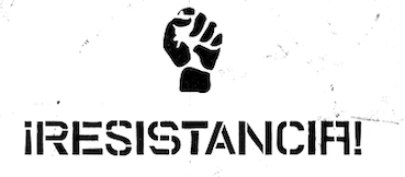 [More] ⦿
|
Ray Larabie
[Typodermic]
|
 [MyFonts]
[More] ⦿
[MyFonts]
[More] ⦿
|
Reza Rasenda
[Bagerich Type Foundry (was: Zealab Fonts Division, Zea Fonts, Zea Lab, Zeaspace)]
|
 [MyFonts]
[More] ⦿
[MyFonts]
[More] ⦿
|
Rian Hughes
[Device Fonts]
|
 [MyFonts]
[More] ⦿
[MyFonts]
[More] ⦿
|
Richard Starkings
[Comicraft (was: Active Images)]
|
[MyFonts]
[More] ⦿
|
Roberto Sanchez
|
Guadalajara, Mexico-based illustrator and designer who created the free vector format brutalist typeface Bruto (2015). Behance link. [Google]
[More] ⦿
|
S6 Foundry
[Paul Henry Robb]
|
Italian designer of these typefaces: - Lunema (2020). A five-style neo-grotesque with exaggerated ink traps.
- S6 Sans (2021). A neo-grotesque that comes in ten styles.
- Arto Condensed (2021). A tall, bold and macho sans family.
- Agger Serif (2021). A decorative serif.
- Ariom Sans (2021). A high contrast display sans. Aupress (2021). Exaggerated opulence.
- Monk SPF (2021). A ten-style sans in search of an identity.
- Pulchra SPF (2021). A 4-style condensed ink-trapped and frivolous sans.
- Plasma SPF (2021). A stylistic modular typeface.
- Somtam (2021). A decorative modular monolinear typeface.
- Sf Mora Sans (2021). A 12-style Swiss sans.
- Suss Sans (2021). A condensed sans in ten styles.
- Alskar Extended (2022). A very wide sans.
- Sf Lang (2022). A 4-style branding sans.
- Hex Metric (despite the name, an octagonal typeface family in six styles), Orka Condensed (2022). A 6-style condensed sans.
- Sf Supernova (2022). A reverse stress font.
- Bix Metric (2022). Squarish and octagonal.
- Olap Metric (2022). A 9-style display family inspired by pixel fonts.
- Magnesia SF (2022). A brutalist semi-serif.
- Neues Grotesque (2022). In 16 styles.
[Google]
[MyFonts]
[More] ⦿
|
Sam Hall
|
At Nottingham Trent University in Nottingham, UK, Sam Hall designed the brutalist typeface Brutal (2016). Behance link. [Google]
[More] ⦿
|
Sardiez
[Sergio Ramírez Llamas]
|
 Sardiez is a foundry located in Medellín, Colombia, and is run by Sergio Ramírez (b. 1988). He created the ornamental stencil typeface Sra stencil (2008), which was inspired by Colombian colonial times. His typeface Sister won an award at Tipos Latinos 2008 in the non-text typeface category. Trochera (2009) is a Tuscan face. Systopie (2010) is a techno family.
 Codesigner with Manuel Ernesto Corradine of Canciller (2012), an italic roman script. At Tipos Latinos 2012, Sergio Ramírez won awards for the following typefaces: Papermov (in the text category) and Panclasta (in the display category: co-designed with Carlos Fabian Guerrero). Neuron (2012) is a fantastic 16-style rounded elliptical sans family created together with Manuel Eduardo Corradine over at Corradine Fonts. Tecna (2012) is an 8-style techno sans family also done with Manuel Eduardo Corradine over at Corradine Fonts. Quarzo (2012, with Corradine as well) is a formal copperplate script. In 2013, together with Manuel Eduardo Corradine at Corradine Fonts, he created Neuron Angled, Alianza Script (a packaging script), Alianza Italic and Alianza Slab (a good-looking slab family). Mayonez (2013, Sergio Ramirez) is a friendly elliptical text typeface for Latin and Cyrillic. Whisky (2015) is a large blackletter family with inlines and fills for layering co-designed with Manuel Corradine. Related to German expressionism, it won an award at Tipos Latinos 2016. Typefaces from 2019: Brutman (inspired by brutalist architecture, he explains that he wanted to create a typeface that reimagined the incise style for the 21st century). Overview of his work and interview. Behance link. Klingspor link. Fontspring link. Creative Market link. [Google]
[MyFonts]
[More] ⦿
|
Sebastian Castellanos De La Hoz
[Bastarda Type (was: No Name Type Foundry)]
|
 [More] ⦿
|
Sergio Ramírez Llamas
[Sardiez]
|
 [MyFonts]
[More] ⦿
[MyFonts]
[More] ⦿
|
Shawn Wee
|
During his studies in Singapore, Shawn Wee designed Basel (2017). He refers to the work of Helmut Schmid and the Basel School of Design by the motto Basel is brutalist. [Google]
[More] ⦿
|
Simon Bent
[Metis Digital Type Foundry (or: Studio Io, or: Metis Foundry; was: Volume2a)]
|
[More] ⦿
|
Srecko Radivojcevic
|
Serb designer of the handwriting typeface Basquiat (2019), which is inspired by Jean-Michel Basquiat's handwritten letters from his paintings an drawings. His Brutalism typeface (2019) refers to the brutalist movement. [Google]
[More] ⦿
|
Stefano Giliberti
[Brumale]
|
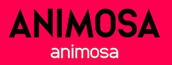 [More] ⦿
|
Storm Type Foundry
[Frantisek Storm]
|
 Storm Type is a major Czech foundry that offers the inspiring work of Frantisek Storm (b. 1966, Prague). Most typefaces are made by Storm himself. The typefaces:
 - Aaahoj: a ransom note font.
- Abald (2005): Abald adds to the number of "bad-taste" alphabets as seen on faded commercial inscriptions painted on neglected old houses.
- Academica: Josef Týfa first published Academia in 1967-68. It was the winning design in a competition for scientific typefaces, announced by Grafotechna. It was cut and cast in metal in 1968 in 8 and 10 point sizes in plain, italic and semi-bold designs. In 2003 Josef Týfa and Frantisek Storm began to work on its digital version. The new name Academica distinguishes the digital execution (and modifications) from the original Academia. In 2021, Frantisek Storm added Academica Sans.
- Aichel: originally designed for use in architecture (in this particular case for a UNESCO memorial plaque for a church built by Jan Santini-Aichel on Zelenà Hora). It has a stone-chiseled look.
- Alcoholica
- Alebrije (2015). A 42-cut exaggerated cocaine-driven typeface family with instantly recognizable v and w that have slabs on their baselines.
- Amor Sans and Amor Serif (2005).
- Amphibia (2016). A lapidary typeface family.
- Andulka (2004): 24 weights for use in books, mags and newspapers. Extended in 2011 to Andulka Sans.
- Antique Ancienne, Moderne&Regent (2000): Baroque typefaces.
- Anselm Sans and Serif (2007): 20 styles about which Storm writes The ancestry of Anselm goes back to Jannon, a slightly modified Old Style Roman. I drew Serapion back in 1997, so its spirit is youthful, a bit frisky, and it is charmed by romantic, playful details. Anselm succeeds it after ten years of evolution, it is a sober, reliable laborer, immune to all eccentricities. It won an award for superfamily at TDC2 2008. It covers Greek as well.
- Areplos (2005): Based on Jan Solpera's 1982 typeface with serifs on top and serifless at the bottom.
- Bahnhof: poster typeface from the 1930s.
- Baskerville Original Pro (2010) comprising Baskerville 10 Pro, Baskerville 10 Cyr, JBaskerville, and JBaskerville Text. This is an important and thoroughly studied execution starting from photographs of prints from Baskerville's printing office, ca. 1760.
- Beletrio and Beletria (2018). Beletria (26 styles) is intended as a modern book type. Beletrio is a peaceful accompanying sans.
- Bhang (2011) is a flat brush signage family of exceptional balance.
- Biblon (2000; note: ITC Biblon is a watered down version of Biblon, so please go for the original, not the ITC version). Biblon Pro (2006) is even better; 6 weights.
- Briefmarken (2008): letters that look dented like postage stamps.
- The 64-style Carot type system (2020), which consists of Carot Sans, Carot Display, Carot Slab and Carot Text.
- Clara Sans and Clara Serif (2014). Based on sketches by Rotislav Vanek, and published at Signature Type Foundry.
- Clichee
- Cobra (2001)
- Comenia Script (Radana Lencov&acaute;), an upright script with a handwritten look for teaching writing.
- Comenia Text (2006): a serif family for school books. Also called Comenia Pro Serif.
- Compur (2000).
- Coroner (2018). A blackletter first sketched in 1988.
- Defender (2008): a heavy slab family.
- Digita (2004)
- Dracula (2017). A great blackletter family.
- Dynamo Grotesk (1995): Storm's 60-weight sans family going back to the early sans traditions. In 2009, this was updated to Dyna Grotesk Pro.
- Enamelplate (2011).
- Etelka (2005, 42 styles): a corporate identity sans family, which became commercial in 2006. Four Etelka Monospace styles were added in 2008. Etelka Sans and Etelka Slab were released in 2019.
- Evil
- Excelsior Script (1995-1996), perhaps renamed Excelsor Script around 2000.
- Farao (a great Egyptienne font in 3 weights)
- Friedhof (2011). A family based on tombstone lettering from ca. 1900. It contains handtooled and shaded (Geist + Deko) variations.
- Gallus Konzept (2007, in many weights):
- Carolingian-Roman-Gaelic-Uncial script, or an exploration into how the Latin alphabet could look were the evolution of the Carolingian Minuscule to stop in the 8th century AD in Sankt Gallen.
- Genre: a modern face.
- Fenix 21 through 23 (2010): An elliptical sans family that includes a hairline (21).
- Header (2009): a magazine headline family.
- Hercules (2001). A didone family originally influenced by Monotype's fat face Falstaff (1935).
- Hexenrunen (2006, + Reverb): a runic simulation face.
- Ideal Gothic
- Inicia (2018). A sans originally drawn in the 1980s.
- Jannon (this is a formidable Garalde family). Jannon Pro appeared on MyFonts in 2010.
- Jannon Sans (2011).
- Jannon Text Moderne (2001): thicker hairlines and smaller x-height than Jannon Text, thus more generally useful
- Jasan (2017). A 36-strong sans family with lots of wide styles.
- JohnBaskerville (2000)
- JohnSans (2001, a 72-weight sans version of Baskerville)
- Josef Sans (2013, with Jan Solpera). A humanist sans family related to Josef Tyfa's Tyfa Roman (Tyfa Antikva).
- Juvenis (2003)
- Kompressor: techno typeface
- Lexicon Gothic: newspaper and magazine type family, created in 2000. Renamed Lexon Gothic.
- Libcziowes: based on the oldest lettering found in Bohemia, on a gravestone in Libceves dating from 1591
- LidoSTF (2001, free): a redrawn Times with lots of individuality, yet still a newspaper typeface
- Lokal Script (2009): a large hand-printed letter family.
- ITC Malstock (1996-1997), a condensed film poster face.
- Mediaeval
- Metron (2004, a digital version by F. Storm and Marek Pistora after a huge sans design from 1973 by Jiri Rathousky, which was commissioned by the Transport Company of the Capital City of Prague in 1970 to be used in the information system of the Prague Metro. In 1986, the metro started using Helvetica): this typeface is eminently readable!
- Modell: techno
- Monarchia [The Monarchia family, consisting of three designs, is a transcription of "Frühling" of the German type designer Rudolf Koch, enriched by a bold and text design]
- Moyenage (2008): a 25-style blackletter family for Latin and Cyrillic, almost an experiment in blackletter design and flexibility. Winning entry at Paratype K2009.
- Mramor (1988-2013). A roman caps typeface with lower case added. Storm: The text designs are discontinued since they were replaced by the related Amor Serif family (along with its -sans version). Even so, ten display styles are left.
- Negro
- Ohrada: condensed upper case
- Ornaments 1+2
- Ozdoby 1+2 (great dingbats): The set includes heraldic figures, leaves, decorative endings, various skull forms, weather signs, borders and many more.
- Patzcuaro
- Pentagramme
- Pentagraf: a slab serif
- Pepone and Pepone Stencil. Designed for setting belles-lettres, this serifed family defies classification.
- Pivo (2006), a connected diner script inspired by Bohemian beer labels.
- Plagwitz (2000, blackletter). Plagwitz poster by Lissa Simon (2012).
- Politic (2004): a clunky fat octagonal family made for billboards, flyers, posters, teabags, and matches for the green Party in the 2004 Czech elections. Caps only.
- Preissig Antikva + Ornaments: a 1998 digitization and interpretation of Preisig's polygonal type from 1925. The Pro version is from 2012.
- Preissig 1918: a typeface by Vojtech Preissig cut in linoleum
- Preissig Ozdoby
- Regent Pro (2015): a rustic Baroque typeface that oozes energy out of its semi-transitional semi-didone orifices.
- Quercus Whiteline, Quercus 10, Quercus Serif, and Quercus Sans (2015). Four large families, created for informational and magazine design, corporate identity and branding. The sans has a Gill flavor.
- Regula Text and Regula Old Face. Regula is named after the secular monastic order Regula Pragensis. Initially, the digitized font (regular old Face, which is now free) had jagged edges and a rather narrow range of applications until the summer of 2009, when Storm added text cuts. Regula was a baroque alphabet faithfully taken over from a historical model including its inaccuracies and uneven letter edges.
- Rondka (2001)
- Sebastian (2003, a sans with a funky italic), about which he writes: Sans-serif typefaces compensate for their basic handicap---an absence of serifs---with a softening modulation typical of roman typefaces. Grotesques often inherit a hypertrophy of the x-height, which is very efficient, but not very beautiful. They are like dogs with fat bodies and short legs. More# Why do we love old Garamonds? Beside beautifully modeled details, they possess aspect-ratios of parts within characters that timelessly and beauteously parallel the anatomy of the human body. Proportions of thighs, arms or legs have their universal rules, but cannot be measured by pixels and millimeters. These sometimes produce almost unnoticeable inner tensions, perceptible only very slowly, after a period of living with the type. Serifed typefaces are open to many possibilities in this regard; when a character is mounted on its edges with serifs, what is happening in between is more freely up to the designer. In the case of grotesques, everything is visible; the shape of the letter must exist in absolute nakedness and total simplicity, and must somehow also be spirited and original.
- Serapion (a Renaissance-Baroque Roman typeface with more contrast than Jannon)
- SerapionII (2002-2003): early Baroque
- Solpera (digitization of a type of Jan Solpera, 2000)
- SplendidOrnamenty (1998, a formal script font)
- Splendid Quartett: an Antiqua, a sans, a bold and a script. Stor writes: The script was freely transcribed from the pattern-book of the New York Type Foundry from 1882, paying regard to numerous other sources of that period.
- St Croce (2014). Based on worn-out lettering on tombstones in the St. Croce Basilica in Florence, this is a flared lightly stenciled typeface family.
- Technomat (2006): this typeface takes inspiration from matrix or thermal dot printers.
- Tenebra: a combination of the Baroque inscriptional majuscule with decorative calligraphic elements and alchemistic symbols
- Teuton (2001): a severe sans family inspired by an inscription on one German tomb in the Sudetenland
- Traktoretka
- Trivia Sans (2012), Trivia Serif (2012, a didone), Trivia Serif 10 (2012), Trivia Grotesk (2012, 48 cuts), Trivia Gothic (2013), Trivia Slab (2012), and Trivia Humanist (2013, a strong wedge serif family: I wanted a clear and majestic typeface for book jackets, LP cover designs, posters, exhibition catalogues and shorter texts).
- Tusar (2004): a digitization of a type family by Slavoboj Tusar from 1926
- Tyfa ITC + Tyfa Text: Designed by Josef Týfa in 1959, digitized by F. Storm in 1996.
- Vida Pro (2005), a big sans family designed for TV screens. Vida Stencil Demo is free.
- Walbaum Text (2002). Walbaum 10 Pro (2010) and Walbaum 120 Pro (2010) are extensive (and gorgeous!) didone families, the latter obtained from the former by optical thinning. Storm quips: I only hope that mister Justus Erich won't pull me by the ear when we'll meet on the other side. Advertised as a poster sans family, he offers Walbaum Grotesk Pro (2011).
- Wittingau (2016). A wonderful decorative blackletter typeface family, with a great set of Wittingau Symbols.
- Zeppelin (2000): a display grotesk
This foundry cooperates in its revivals with experienced Czech designers Ottokar Karlas, Jan Solpera and Josef Týfa. Alternate URL. Myfonts write-up. At ATypI 2004 in Prague, he spoke about his own Czech typefaces, on his Czech Typeface Project, and on the life of Josef Týfa. Linotype link. FontShop link. Klingspor link. [Google]
[MyFonts]
[More] ⦿
|
Studio Buchanan
[Jonathan Gibson]
|
 This London-based foundry evolved from Gibson Type Foundry in 2016. It is run by Jonathan Gibson, a digital designer in the UK, who worked at Design London. His typefaces include Swahbuckle (2014, quixotic and piratey; sold by YWFT), and Roehampton (2014, condensed sans, +Avenue, +Boulevard; sold by YWFT).
 In 2016, he designed Beaumont (a tuxedoed art deco sans called postdeco by Gibson), Clutch Sans (for Latin and Cyrillic: rounded and condensed) and Brand Neue (a condensed rounded sans). Typefaces from 2017: Halcyon, Monolisk (a rigid gothic almost brutalist typeface). Typefaces from 2019: Kamber. Typefaces from 2020: Compita (an 8-style slightly condensed workhorse sans), Bloxic (chunky and counterless), Thorben (named after the old Norse legend of Thorben Odinson), Acklebury (a chunky reverse contrast Western slab serif typeface, with a Tuscan sub-style). You Work For Them link. [Google]
[MyFonts]
[More] ⦿
|
Studio K
[Keith Tricker]
|
 Keith Tricker (b. 1949) is the Creative Director of a UK advertising agency, and during his career has worked as both a copywriter and art director. MyFonts lists him as Keith Gordon. Klingspor link.
 His foundry is Studio K: The foundry specialises in display fonts designed primarily for advertising, publishing, product packaging and signage. He created the wavy typeface Calypso (2011), the techno typeface Charta (2011), the sturdy black typeface Anvil (2011), Jazz Age (2011, art deco), and the brush typeface Pagoda (2011). In 2012, he published Hollywood Hills, Pier Arcade, Graffix, Skeleton Slab, the art deco typeface Tea Dance, the art nouveau typeface Paris Metro, Oscar Bravo (a heavy octagonal typeface), Café de Paris (a stylish retro--futuristic fifties style typeface), Barrowboy, and the stylish Contessa family. Typefaces from 2013: Communiqué (rugged stencil face), Regency (influenced by Americana and Optima, it is a flared very humanist sans), Alma Mater (athletic lettering), Showbiz (inline typeface), Dynatron (retro sci-fi font), Mechanoid (elliptical techno sans), Canterbury (inspired by the shapes of the cathedral), Export Drive (a bold condensed cargo stencil), Soft Rock (bold condensed sans), Red Top, Colossus (an elliptical typeface that is a bit squarer than Microgramma), 4Square (elliptical), Aspidistra (art nouveau), Home Grown. Typefaces from 2014: Belvedere, Joe Cool (a bold masculine headline typeface in the genre of Impact), Gravitas (a Bauhaus / futurismo typeface), Rock Face (sticky tape typeface). Typefaces from 2015: Chenko (2015, a constructivist / brutalist typeface named after Rodchenko), Marazion (a rounded display sans), Castaway, Variety (ransom note font), Nightlife (an amoebic rounded stencil typeface that conjures up neon signs, DNA molecules and jelly beans), Rough Stuff (textured faded stencil typeface), Signpost (a drop shadow version of Red Top). Typefaces from 2016: Cambourne (a luxury goods font advertized as cutting edge retro), Capstan (slab serif), Alonquin (art deco: a typographical tribute to Dorothy Parker and the New Yorker crowd who haunted the Alonquin hotel in its 1920s heyday), Cadenza, Exotica (described by Keith as Old World elegance meets Levantine luxury), Oxbridge (vintage compact titling typeface). Typefaces from 2017: Vagabond (a weathered vintage railroad font), Brando (slab serif). Typefaces from 2018: Stamina (a sports font), Cybernaut. [Google]
[MyFonts]
[More] ⦿
|
Szymon Sznajder
|
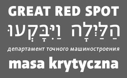 Szymon Sznajder (b. 1977) graduated from the Poznan University of Arts. He currently works as a typographer and font and book designer in Poznan, Poland and occasionally teaches at the Poznan University of Arts. He runs or ran Typolis.
 His typefaces include - Shelf (a 27-style humanistic wayfinding sans for Latin, Cyrillic and Hebrew; released as a retail typeface in 2021).
- Grind (angular expressionist style).
- Oneweek.
- Simonella (2009).
- Zaklad (2016: a free brutalist typeface done as part of the Warsaw Types project).
[Google]
[MyFonts]
[More] ⦿
|
Tunahan Pehlivan
|
Istanbul, Turkey-based designer of the geometric art deco typeface Bad (2016) and the brutalist display typeface Daved (2016). [Google]
[More] ⦿
|
Typodermic
[Ray Larabie]
|
 Ray Larabie (b. 1970, Ottawa, Canada) ran Typodermic in Mississauga, ON, which opened in the Fall of 2001. In 2006, it moved to Vancouver, BC, and in 2009 it moved on to Nagoya, Japan. Dafont page. Ray Larabie has been making fonts since 1996, but those early fonts were freeware. His pre 2001 fonts are grouped under the label Larabie Fonts. In 2001, he set up Typodermic. Latest additions.
 The Typodermic fonts: - 2022: Biphoton (a monospaced sans with the same proporions as Letter Gothic 12), Valve (an industrial muffler shop font), Deception (a sub-pixel typeface with ten captivating effects---Deception Array (wide blocks), Deception Bars (text viewed through lenticular glass), Deception Blocks (as in heavy JPEG degradation), Deception Diamonds, Deception Lines (for a grayscale effect), Deception Particles, Deception Plusses, Deception Process (simulates grayscale LCD text or a thermal printer on the fritz), Deception Scanline (television picture tube text rendering), Deception System (1-bit dithering gone haywire)), Monofonto (a monospaced sans), Encercle Draft (permitting users to create numbers in borders), Encercle Sans, Heavy Heap (a groovy psychedelic typeface with a scorching look, reminiscent of 1960s hot-rod culture and die-cast toy vehicles), Ggx89 (a 48-style tightly spaced Swiss style sans family).
- 2021: Quadrillion (a 12-style rounded monoline sci-fi family), Mochon (a wall writing or chalk font based on the lettering of Donald Mochon, dean of the RPI School of Architecture until 1966; the Mochon samples were provided by an ex-student of Mochon, Karl A. Petersen), Steelfish Hammer (a subtly rustic version of Larabie's most popular typeface, Steelfish), Wavetable (sci-fi), Xyzai (an LED emulation font, described by Ray Larabie as a hardcore, Y2K-style techno typeface), Geoparody (a 12-style squarish typeface inspired by a late 1960s font called Anonymous), Typewriter Spool (122 fonts, modeled after the Underwood No. 5 typewriter font).
- 2020: Gravtrac (a 56-style condensed to crushed slab serif family inspired by mid-twentieth century classics like Univers 59 Ultra-Condensed, Helvetica Inserat and Compacta; +Greek, +Cyrillic), Vinque Antique (a rustic handcrafted blackletter in eight styles).
- 2019: Dealerplate (17 license plate styles for various states and provinces in the USA and Canada, current as of 2019; included are California, New York, New Jersey, Ohio, Illinois, Pennsylvania, Florida, Maryland, Michigan, Wisconsin, Massachusetts, Missouri, Washington, North Carolina, Virginia, Quebec, and Ontario), Kenyan Coffee Stencil, Good Timing, Steelfish Rounded, Bitcrusher (a consumer electronics / techno font), Galderglynn 1884 (a nineteenth-century style sans-serif typeface that exp[ands his Galderglynn Esquire).
- 2018: Cybermontage, Crack Man (a pac man font), Propaniac (a 1980s-style postmodern typeface inspired by a Pointer Sisters record sleeve which was designed by Shoot That Tiger Creative Services), Zelega Zenega, Spectrashell.
- 2017: Minicomputer (MICR style), Squirty, PCTL9600, PCTL4800 (retro techno), Ultraproxi (semi-monospaced and influenced by the high speed computer printers from the 1950s to 1970s), Toxigenesis (techno sans), Venus Rising, Vanchrome (a compact sans-serif headliner with chromatic layers), Krait (a layered geometric typeface designed for architectural display), Xylito (a layered font for chromatic or 3d effects).
- 2016: Refuel (octagonal, based on military aircraft markings), Expressway Soft (a sans-serif font family inspired by the U.S. Department of Transportation's FHWA Series of Standard Alphabets, also known as Highway Gothic), Conthrax (squarish, techno), Cornpile (cartoonish), Electric, Evensong (art deco), Fledgling (a very tall typeface), Gymkhana (sans), Remissis (sans), Sunday Evening (a reverse contrast typeface), Meloche (Meloche is a unique grotesque sans-serif typeface influenced by hand-painted French signs of the late nineteenth century. It's available in 7 weights and obliques).
- 2015: Canada 150 (a custom font for the Canadian government; see here, here, this coverage regarding the Inuktitut part of the font, and this reaction by the curmudgeons in Toronto who complain that Ray did this work for free), Autoradiographic (sans family), Built Titling (for compact headlines), Chickweed Titling (cartoon titling font), Cardigan Titling (flared headline face), Bench Grinder Titling, Kleptocracy Titling, Palamecia Titling (rounded black comic book typeface), Quasix Titling, Galderglynn Titling (all caps sans family from hairline to black), Mixolydian Titling, Stormfaze (a sci-fi font started in 1996 and finished in 2015), NK57 Monospace (a 60-style programmer typeface), Gargle, Athabasca (a sans family designed for the rugged Canadian oil patch).
- 2014: Mesmerize (a large free sans family), Kingsbridge (a large slab serif family with sharp points on the A, M, N, V and W), Manbow (a layered geometric art deco display font which includes solid, clear, stripe, polka-dot and screen patterns), Breamcatcher (an all caps art deco font inspired by the piano sheet music for With Every Breath I Take which was featured in the Bing Crosby/Kitty Carlisle musical comedy film, Here is my Heart), Kilsonburg (Dutch deco based on an old Vogue magazine cover), Uchiyama (poster typeface), Goldsaber (art deco design), Vexler Slip (unicase), Rakesly, Dacquoise, Pretender, Rimouski (a rounded geometric font family), Nulshock (techno), Recharge (techno/industrial font), Interrogator Stencil, Strange Alphabets (arts and cratfs font), Angerpoise Lampshade (free).
- 2013: Numbers With Rings, Shookup (funky cartoon font), Pastrami on Rye (cutout comic book style), Chickweed, Built (a condensed headline sans), Fluctuation (a softly rounded elliptical sans family), Astrochemistry (sci-fi, techno with rounded edges), Snasm (sci-fi).
- 2012: Engebrechtre (2000-2012), Die Nasty (1999-2012: free), Strasua (1999-2012), Planet Benson (1997-2012), Husky Stash (1998-2012), Barbatrick (1999-2012: a speed emulation font), Zero Hour (1997-2012), Urkelian (1998-2012: very condensed), Zolasixx (inspired by the video game Zaxxon), Ampacity (neon font), Chromakey (a space deco headline font inspired by box art classic video games including Matrix Marauders and Magical Chase), Disassembler (1980s style bitmap font), Zerbydoo (a dot matrix family), Superego (a geometric-techno font inspired by the cabinet graphics for the 1981 Stargate arcade game), Rukyltronic (a set of dot matrix typefaces), Nerdropol (pixel family), Gulkave (rounded pixel font), Cyclopentane, Palamecia (a fat finger poster face), Gameness (a 1990 retro industrial deco font), Camulogen (headline face), Color Basic (a pixel typeface inspired the by TRS-80 Color Computer), Triac Seventy One (a funky face), Acroyear (retro all-caps headline font), Troll Bait, Strenuous (unicase), Permanence (a retro=futuristic font based on Alvin Toffler's cover of Future Shok, 1970), Clockpunk (octagonal and quaint), Battlemaze (trekkie face), Mixolydian (industrial sans).
- 2011: Ugocranis (a brutalist typeface), Clipwave, Wheaton (MICR-inspired), Mango Scribble, TRS Million (dot matrix face), Ugogranis (constructivist), Gomoku (paper cut face), From The Internet.
- 2010: Cranberry Gin (2010, octagonal), Restore (all caps, geometric sans), From The Stars (an elliptical techno family done with Chikako Larabie), Thrusters (space age face), Dream Orphanage, Dream Orphans (2000-2012), Kengwin (rounded slab serif), Gleaming The Cube (Greek simulation face), Vectipede (a slab serif family), Great Escape (an elliptical sans family), Subrocs (connected script), Hackensack (with Chikako Larabie), Polarband (bilined stackable headline face), Naked Power, Special Forces (a great macho slab serif headline face---watch for awards to roll in), Warugaki (handpainted), Warmer, Honfleur (art deco; with Chikako Larabi), Voivode (a headline typeface done with Chikako Larabie), Hachimitsu (Asian look face, done with Chikako Larabie), Kadeworth (rounded retro look sans, done with Chikako Larabie), Gnuolane Jump (2010, with Chikako Larabie), Markerfield (brush), Board of Directors (Bank Gothic style family, done with Chikako Larabie), GGX88 (a Swiss sans family), Body Goat, Reversal, Gord (techno), Computechnodigitronic (LED, LCD geek-look font), Bench Grinder, Inklea (a bubbly face), Skygirls (retro brush script), Gloss (a paint brush typeface based on Champion, 1957, G.G. Lange), Galderglynn Esquire.
- 2009: Maqui (an industrial headline sans family), Zingende (art deco family: caps only), Misadventures, Gaz (large retro sans family), Acrylic Brush, Enamel Brush (a digitization of Catalina, 1955, Emil J. Klumpp), DDT (neutral sans), Thump (fat, casual), Desperate Glamour, Pricedown (an update of his free 1990s font, patterned after the lettering on The Price Is Right show), Mitigate (monoline and slabbed; has some typewriter styles), Catwing, Walken (slab serif stencil), Silicone (soft rounded sans family), Movatif (sans), Gunplay (a stencil family inspired by the poster for the 1972 Steve McQueen/Ali MacGraw film The Getaway), Fragile Bombers (octagonal), Forgotten Futurist (techno sans, 19 styles), Bullpen (slab serif), Coolvetica (35 styles), Duality, Good Times, Strenuous, Shlop (paint-drip style), Dirty Baker's Dozen (stencil), Junequil (VAG Rounded style), Owned (graffiti), Domyouji, Threefourtysixbvarrel (stencil), Enacti, Uniwars (futuristic, 16 styles).
- 2008: Madawaska (a rugged slab serif), Ebenezer (grunge), Gnuolane Stencil, Raincoat, Report School (avant garde sans), Jesaya, Carouselambra (art nouveau), Debusen (rounded), Barge (military font), Renju (2008, potato or rubber stamp print face), Otoboke (handlettered), Hit (informal hand), R6 D8 (futuristic sans family), Rexlia (an octagonal machinistic family), Hybrea (a display sans with TV screen rounding), Sweater School, Tussilago (2008, a neutral sans family), Presicav (extended sans), Hover Unit, Addlethorpe (grunge), Scheme (rounded sans), Usurp (bouncy poster lettering), Negotiate (technical sans family), Divulge, Sewn, Gnoulane (condensed sans), Moja, Teeshirt (old typewriter face), Pound (art deco marries grunge), Graveblade (heavy metal font), Synthemesc (psychedelic anti-Starbucks font), Chysotile (white on black grunge), Cardigan (sans), Gurkner (balloon style), Reagan (grunge).
- 2007: Tight (a copy of Dean Morris's 1976 Letraset chrome font Quicksilver), Headlight, Meloche (a 3-style grotesk), Octin Spraypaint (grunge stencil), Octin Vintage (grunge), Bouffant (script), Octin Prison (stencil), Octin Sports (octagonal), Octin College (octagonal, for sports jerseys), Octin Stencil (free octagonal font family), Burnaby Stencil (stencil), Superclarendon, Conceal, Ohitashi, Stud (grunge), Bristles (grunge), Skirt, Cotton (grunge), Kelvingrove (a bit of copperplate gothic, rounded and shaved), Augustine, Containment, Snowa, Veriox, Scrubby, Transmute, Sheaff, Injekuta (techno), Rinse (grunge), Polyflec, Domyouji (square sans), Winthorpe (old style), Cutiful (script), Flyswim (grunge), Dirtstorm (spray-painted stencil), Shnixgun (grunge), Neuzon (grunge), Oxeran (old typewriter), PRINTF (grunge all caps monospaced), Akazan (sans), Nyxali (a metal tag face), Nesobrite (25 styles of Bank Gothic lookalikes), Meloriac (a heavy headline sans inspired by Futura), Walnut (graffiti face), Gnuolane (a narrow superelliptical sans), Edifact (a damaged computer font), Darkheart, Stampoo (squarish), Raymond (rough script), Hayate (oriental look), Telephoto. The entire Octin series is free at DaFont.
- 2006: Octynaz (grunge), Paltime (ornamented), Jolie Ecriture Desard (children's hand), Mango (comic book face), Desard (child's hand), Bulltoad, Lerku (eroded serif), Charbroiled (also eroded), Ceroxa (eroded stencil), Nagomi (a chiseled-look Asian font based on calligraphy of Chikako Suzuki from Nagoya), Whiterock, Yellande, Chilopod (a futuristic typeface inspired by the logo from the 1980s videogame, Atari Centipede), Order, Goldburg (based on a typeface by George Bowditch, 1957), Laserjerks (2006, brutalist), Milibus (futuristic), Bonobo (serifed), Ohitashi, Sarasori (TV-tube shaped typeface in the style of Oban), Structia (an octagonal family), Betaphid (octagonal), Gendouki (futuristic stencil), Slugger (athletic lettering), Marianas (a gorgeous art deco face), Lineavec (octagonal), Corzinair (serif family), Buxotic (a great caps face), Cinecav X (for closed caption TV and DVD), Salsbury (comic book face), Lonsdale (loosely based on a font called Parkway Script, which was designed by Emil Hirt in 1964), Alepholon (futuristic), Kwokwi, Mikadan (a tribute to Stephenson Blake's Verona from 1948, which was in turn based on William Dana Orcutt's Humanistic from 1904), Marion (2012: a beautiful transitional family adopted as a standard Mac OS X font), Quasix (hookish), Skraype (grunge stencil), Bleeker (casual lettering), Linefeed (monospaced line printer font), Draculon (a casual typeface inspired by the letterforms of William Orcutt's humanist font from 1904 which was in turn based on an Italian manuscript from 1485), Mahavishnu (a mix between 1970s psychedelics and art nouveau), Doradani (a corporate identity sans family), Korotaki (futuristic).
- 2005: Beat My Guest, Kadonk (a Halloween face), Report (a VAG-Rounded style face), Croteau (a poster face), Heroid (ook face), Barrista (informal script), Wyvern (sans serif), Wubble (like puddles of water), Caryn (casual script), Folder (a rigid sans family), Venacti (a futuristic family), Xenara (a keyboard lettering family), Emory (a destructionist sans family), Ligurino (neat sans&serif family), Biondi (update of Copperplate Gothic; followed in 2010 by Biondi Sans; these copperplate style typefaces are in the style of AT Sackers), Byington (Trajan column lettering), Sayso Chic, Expressway (28 weights, a highway signage family), Algol (pixel type), Meposa (fat display face), Tandelle (condensed), Vigo, Maychurch, Mecheria, Vactic (dot matrix), Zosma, Topstitch, Windpower, Llandru, Soap (a creative extension of Cooper Black, with dingbats), Kleptocracy (1999-2005), Owned, Rimouski (sans), Burnstown Dam (2005, a wooden plank font), Sinzano (sans with opentype ligatures galore; compare, e.g., House Ed Interlock), Zamora.
- 2004: Affluent, Threefortysixbarrel (stencil face), Tank, Telidon (dot matrix face), Funboy, Neuropol X, Neuropol Nova, Mufferaw (comic book face), Larabiefont, Zekton (techno), Strenuous 3D, Silentina (advertised as "a silent movie font"), Amienne (brush script), Fenwick Outline (free), Betsy Flanagan (1998, a keyboard face), Boopee (children's handwriting), Pirulen (in the general Bank Gothic style), Zalderdash.
- 2003: Zupiter, Blue Highway.
- Before 2002: the dot matrix family Telidon, Telidon Ink, Butter Belly, Almonte (1999), the architectural font Jillican (octagonal), Snowgoose, Bomr, Pakenham, Neuropol, Nasalization, Fenwick, Kleptocracy DLX, Sui Generis, Dirty Bakers Dozen (faded stencil), Minya Nouvelle, Asterisp, Chinese Rocks, Jillsville (great artsy Courier), Ulian, Wevli (including Wevli Dingbats), Sappy Mugs (funny mugshots), Sofachrome (1999, inspired by Pontiac car emblems), Eden Mills (1999).
MyFonts interview. Fontspace link. Fontspring link. Catalog of the typefaces in the Larabie Fonts collection. Klingspor link. Catalog of the Typodermic library in decreasing order of popularity. Extensive (large page warning) Typodermic catalog. Font Squirrel link. Creative Fabrica link. Fontsquirrel link. Fontdaily link. [Google]
[MyFonts]
[More] ⦿
|
Ultra Types
[Joan Ramon Pastor Rovira]
|
 Wete, or Wete Cacahuete, or Joan Ramon Pastor Rovira, or Juanra Pastor, or Juanra Wete Pastor, is a Barcelona-based graphic and type designer, b. 1984. He set up Ultra Types in 2012.
 Typefaces created by him include the useless monstrosity called Combo (2009), the hand-printed Deibi (2009, free), the text typeface Alba Serif (2010), and the fantastic geometric/mathematical caps face Roke 1984 (2010). TP Duro (2011) is a blackletter typeface inspired by an Albrecht Dürer design from 1525. It was published in 2019 at Vette Letters in cooperation with Martin Lorenz: VLNL TpDuro. Favela (2011) is a free tattoo face. In 2012, he designed an experimental / futuristic set of numbers for a Yorokobu magazine section called Numerografia. Still in 2012, he created the Alexander Grotesk typeface family (which can be bought at Ten Dollar Fonts), and Ut One (modular, arc-based). In 2013, he designed the sans typeface Reefont Condensed on commission for Reebok [under the creative direction of Manuel Lemus]. 4YFN (4 Years Fro Now, 2013) is a minimilaist custom typeface created for an event organized by Mobile World Congress. He also designed Stela UT (a layered stencil font) in 2013. Cairo Slab UT (2013) is based on an alphabet found in 100 alphabets publicitaires (1946). In 2014, he made an experimental connect-the-dots typeface with Drawbot. Intangibles is a custom-designed didone titling face. UT Rounded is free. In 2015, Wete made the angular brutalist display typeface UT Nickel. In 2018, Oscar Cobo and Wete co-designed the piano key variable font UT Morph, which was inspired by Wim Crouwel's Nagasaki poster. In 2019, Wete designed the logotype for TCM (Turner Classic Movies) and the identity and wayfinding symbols for Hotel El Call. Typefaces from 2021: UT Barrel (a fat face with serious ink traps). Behance link. Dafont link. Abstract Fonts link. Personal home page. Klingspor link. [Google]
[MyFonts]
[More] ⦿
|
Wiescher Design
[Gert Wiescher]
|
 Gert Wiescher was born in Braunsbach am Kocher, Germany, in 1944. Based in München, Gerd Wiescher designed many classy and classic Bodoni families, as well as New Yorker Type (1985). All of his typefaces are carefully fine-tuned and balanced. Wiescher founded first Munich Type and then Wiescher Design and Autographis. He is known as a hard, fast and prolific worker. His exquisite typefaces can be bought at MyFonts. Catalog of his bestselling typefaces. Interview in 2008. Wikipedia page. Creative Market link. List of typefaces:
 - Scripts: Prima Script (2017: for menus and cookbooks), Marmelade (2015, +Fruits, a set of dingbats), Triana (2014, a thin monoline penmanship script named after a Spanish sailor on the Pinta who in 1492 was the first to see America---in this case the Bahamas), Floral Script (2014, copperplate style script), Sherlock Script (2014: this comes with Sherlock Stuff (fingerprints) and Sherlock Stuff Dots (ink stains)), Felicita (2013, a swashy copperplate script), Vividangelo (2013, after the handwriting of a real person), Dreamline (2013, connected monoline cursive wedding scripts in A, B and C styles), Fiorentina (2012, a renaissance style script with 650 characters), Excelsia Pro (2012), Delicia Pro (2012, a fat brushy signage script), Nono (2011, formal swashy calligraphic family), Dyane (2011), Penn (2011), Lettera (2011, hand-drawn formal face), Tosca (2010, a high-contrast calligraphic typeface with 730 glyphs), Grandcafe (2010), Loulou (2010, curly and of extreme contrast), Schoolblock (2010, hand-printed school font), Grandezza (2010, calligraphic family; +Xtra), Sixtra (2010, a curly didone script), English Script (2010, classic Spencerian calligraphic script), Savage Initials (2009), Morning News (2009), Revolte (2009, a brush script for demonstration signs), Estelle (2009), Scriptofino (2008, 4 calligraphic styles to give Zapfino a run for its money), Exprima (2008), Daiquiri (2008), Lisa Bella, Lisa Fiore and Lisa Piu (2008, connected and calligraphic), Tati (2008), Movie Script (2007), Cake Script (2007), Eddy (2007, grungy calligraphy), Pointino (2007), Bohemio (2007, a great oriental-brush script), Artegio (2007, two calligraphic scripts), Xylo (2006, in the tradition of the 18th-century English calligrapher George Bickham and the 19th-century American calligrapher Platt Rogers Spencer), Tamara (2005, art-deco script based on some initials for Semplicita made in the 1930s by the Nebiolo foundry), Tecon, Ellida (2005, inspired by the elaborate scripts of 18th-century English calligrapher George Bickham, with additional influences from 19th-century American calligrapher Platt Rogers Spencer), Eloise (2009, a high-contrast version of Ellida), Nadine Script (2005, an elegant script inspired by a set of initials the French designer and artist Bernard Naudin drew for Deberny&Peignot in the 1920s), Royal Classic (2005, unbelievable script based on a design that has initially been comissioned by King Ludwig I of Bavaria for in-house-use), DesignerScript, Filzer Script (1995, handwriting), Futuramano-Condensed-Bold, Futuramano-Condensed, Futuramano-Plain, Futuramano-Thin, Giambattista, Scriptissimo-Plain, Scriptissimo-Forte, Scriptissimo-Swirls, Squickt (1989), Konstantin A, B and C (2005), Konstantin Forte (2005), MyScript, GrocersScript, Swanson (2006). Scriptissimo (2004) has versions named Start, Middle and End, tweaked for their position in the word, and there are plenty of ligatures. Check also Bodoni Classic Chancery (2007) and Bodonian Script (2012).
- Sans: Brute Sans (2018), Xpress (2018), Xpress Rounded (2019), Classic Sans (2017, a revival of Theinhardt Grotesk), Classic Sans Rounded (2017), Maxi (2017), Nic (2017), Azur (a large almost geometric sans famly with 1950s Roger Excoffon-style French flavours, called a Medterranean grotesk by Wiescher himself), Royal Sans (2017, after Theinhardt's Royal Grotesk---the forerunner of Akzidenz Grotesk--- from 1880), Docu (2016, a workhorse elliptical sans family), Viata (inspired by Bauhaus), Noticia (2016, in the Bauhaus tradition, with very pointy v and w, and a bipartite k; not to be confused with the 2011 Google Web Font Noticia Text by José Solé; followed in 2019 by Noticia Rounded), Avea (2015), Aramis, Nota Bene (2015: squarish, narrow, technical), Nota (2015, technical and cold: the rounded version, Nota Rounded, followed in 2019), Dylan Condensed (2014), Dylan Copperplate (2014), Supra (2013, grotesk: Supra Thin is free. See also Supra Condensed (2013), Supra Mezzo (2013, between regular and condensed), Supra Extended (2013), Supra Rounded (2015), Supra Classic (2014), and Supra Demiserif (2013, slab serif derived from Supra)), Dylan (geometric sans), Franklin Gothic Raw (2013, like Franklin Gothic but with raw, not rough, outlines, only visible at very large sizes), Blitz (2012, a flared family), Blitz Condensed (2012), Contra Sans (2011, which led to Contra Slab, Contra Condensed and Contra Flare), Vedo (2011, a Bauhaus style family that include a hairline weight), Germania (2011, a useful and beautiful monoline sans family), Geometa (2011, +Rounded, +Rounded Deco, +Deco: all based initially on Renner's Futura), Geometra Rounded (2011, a rounded family based on Futura and "much less boring than DIN"), Bombelli (2010, ultra-wide architect's hand), Bluenote Demi (2010, a grungy Franklin Gothic Condensed), Perfect Sketch (2010, sketched grotesque), Unita (2009), Antea (2009), Eterna (2009, sans with a swing), Pura (2008, an uncomplicated grotesk family), Purissima (2010, a decorated extension of Pura; +Bold), Copperplate Gothic Hand (2009, after a 1901 design by Goudy), Copperplate Alt (2011), Copperplate Wide (2011), FranklinGothicHandDemi (+Shadow), Franklin GothicHandCond (2009), Franklin Gothic Condensed Shadow Hand (2010), and Franklin Gothic Hand Light (2009, a hand-drawn version of Franklin Gothic), Papas (2005, sturdy, slightly curly), Julienne (2005, a condensed sans family; see the new versions Moanin and Julienne Piu, 2017), Cassandra (1996, an art deco style after Adolphe Mouron Cassandre), Futura Classic (2006), Cassandra Plus (2012), Ela Sans (2005, a large family), Mondial-Bold (2004), Mondial-Demi, Mondial-Light, Mondial-Medium, Mondial-Normal, Mondial-XBold, Monem-Bold, Monem-Medium, Monem-Normal, Monem-Roman.
 Serif: Imperia (2011, a Trajan column caps face), Monogramma (2012, a Trajan family for monograms), Imperium (2005, a precursor of Imperia with a Relief shadow style included), Hard Times (2011), Fat Times (2011, retraced Times), Elegia (2011, slightly Victorian family), Breathless (2010, a spiky family, inspired by nouvelle vague movie posters), Bodoni Classic 1, Bodoni Classic 2, Bodoni Classic 3, BodoniClassic-Condensed, BodoniClassic-Handdrawn, BodoniClassic-Swashes, BodoniClassic-Text, Bodoni Classic Deco, Bodoni Classic Swirls (2009), Bodoni Classic Pro (2011), Bodoni Classic Inline (2012), Bodoni Classic Fleurs (2014, ornamental caps), Bodoni Comedia (2010, one of my favorites: a funny "live one day at a time" curly Bodoni cocktail), Bodoni Classic Swing (2010), Bodoni Classic Free Style (2010, curly), Bodoni Classic Ultra (2010), La Bodoni Plain (+Italic, 2008), Take Five (2005, a jazzy take on Bodoni Classic), DonnaBodoniAa, DonnaBodoniBe, and DonnaBodoniCe (three scripts named after Bodoni's wife, Margharita dell'Aglio, who published his complete works, the Manuale Tipografico, in 1818, five years after his death), Edito, Robusta. A great series, some of which were originally published at Fontshop, see, e.g., FFBodoniClassic (1994). MyFonts: When the first of Wiescher’s Bodoni Classic fonts came out in the 1993, there was nothing like it. Up to then, virtually all Bodoni revivals had been given clear-cut forms and square serifs. But Bodoni’s originals from the late 1800s were never as straight and simplistic as is often assumed: they had rounded serifs and slightly concave feet. Wiescher digitized a wide range of Bodoni letterforms, including a wonderful script-like family called Chancery and a nice series of Initials. Having accomplished his mission twelve years later, he began making personal additions to the family, such as the more decorative Bodoni Classic Swashes. Recently a useful little family was added to the clan: LaBodoni is sturdier and less optically delicate than most Bodonis, and therefore more usable as a text face. Wiescher made Metra Serif (2009), Principe (2008) and Paillas (2009). Prince (2009) is a curlified didone. Serif: Imperia (2011, a Trajan column caps face), Monogramma (2012, a Trajan family for monograms), Imperium (2005, a precursor of Imperia with a Relief shadow style included), Hard Times (2011), Fat Times (2011, retraced Times), Elegia (2011, slightly Victorian family), Breathless (2010, a spiky family, inspired by nouvelle vague movie posters), Bodoni Classic 1, Bodoni Classic 2, Bodoni Classic 3, BodoniClassic-Condensed, BodoniClassic-Handdrawn, BodoniClassic-Swashes, BodoniClassic-Text, Bodoni Classic Deco, Bodoni Classic Swirls (2009), Bodoni Classic Pro (2011), Bodoni Classic Inline (2012), Bodoni Classic Fleurs (2014, ornamental caps), Bodoni Comedia (2010, one of my favorites: a funny "live one day at a time" curly Bodoni cocktail), Bodoni Classic Swing (2010), Bodoni Classic Free Style (2010, curly), Bodoni Classic Ultra (2010), La Bodoni Plain (+Italic, 2008), Take Five (2005, a jazzy take on Bodoni Classic), DonnaBodoniAa, DonnaBodoniBe, and DonnaBodoniCe (three scripts named after Bodoni's wife, Margharita dell'Aglio, who published his complete works, the Manuale Tipografico, in 1818, five years after his death), Edito, Robusta. A great series, some of which were originally published at Fontshop, see, e.g., FFBodoniClassic (1994). MyFonts: When the first of Wiescher’s Bodoni Classic fonts came out in the 1993, there was nothing like it. Up to then, virtually all Bodoni revivals had been given clear-cut forms and square serifs. But Bodoni’s originals from the late 1800s were never as straight and simplistic as is often assumed: they had rounded serifs and slightly concave feet. Wiescher digitized a wide range of Bodoni letterforms, including a wonderful script-like family called Chancery and a nice series of Initials. Having accomplished his mission twelve years later, he began making personal additions to the family, such as the more decorative Bodoni Classic Swashes. Recently a useful little family was added to the clan: LaBodoni is sturdier and less optically delicate than most Bodonis, and therefore more usable as a text face. Wiescher made Metra Serif (2009), Principe (2008) and Paillas (2009). Prince (2009) is a curlified didone. - Romain du roi: In 2008, Wiescher designed the two-style Royal Romain, which is based on the Romain du Roi of Philippe Grandjean, which was completed in 1745 after Grandjean's death by Grandjean's successor Jean Alexandre and Louis Luce. Wiescher: The Romain du Roi was for the exclusive use of the Louis XIV. It was never sold or given to any other king or government. The king of Sweden tried to scrounge a set, but the king refused. This font is the basic design for such famous fonts as the Fournier and Bodoni. Just so the Romain du Roi doesn't get lost in the digital turmoil I set out to redesign it in 2004 and finished now in early 2008. I did a lot of research in France's National Library. A good excuse to visit Paris is always welcome!!!
- Engravers: Dylan Copperplate (2014), Cavaliere (2010), Guilloche A (2009), Guilloche B (2013, op-art borders), CopperplateClassic-Plain, CopperplateClassic-Round, CopperplateClassic-Sans, Copperplate Classic Light Floral (2009), Cimiez-Bold, Cimiez-Roman (2004), Ela-Demiserif, Ela-Sans (2004), Eleganza (2008).
- Blackletter/Fraktur: Renais (2011, renaissance initials), Flipflop (2011), Fraktura and Fraktura Plus (2008), Royal Bavarian (2004, based on a typeface commissioned by King Ludwig 1st of Bavaria about 1834), Royal Blossom (2009), Royal Bavarian Fancy (2004), Bold Bavarian (2010, a heavy version of Royal Bavarian), Monkeytails (2008), Fat Fritz (2006, rounded endings), Ayres Royal (2005, blackletter typeface based on drawings of London's calligrapher John Ayres, ca. 1700; to be used with RoyalBavarian; followed in 2010 by BoldAyres).
- Slab serif: Slam Normal (2017), Slam Rounded (2017), Suez (2017: with extra tall ascenders and descenders), Egyptia (2010), Egyptia Rounded (2010).
- Typewriter: Lettera (2014), Lectra (2011), QuickType-Bold, QuickType-Plain, QuickType-Sans.
- Decorative: Tric (2017, art deco), Franklin Gothic Raw Semi Serif (2015), Frank Woods (2013, letterpress simulation based on Franklin Gothic Heavy), Ohio Bold (2012, a rough headline type in the tradition of Louis Oppenheim's Lo-Type from 1913), Viking Initials (2012), Cannonball (2012, a psychedelic typeface derived from a jazz record-sleeve for Cannonball Adderley), Byblos (2011, derived from the logo of St. Tropez's famous Hotel Byblos), Blockprint (2013, early 1900 German expressionist grunge face, renamed Bannertype after 24 hours), Ferrus (2010, inspired by Cassandre's Acier Noir, 1936), Petite Fleur (2009, flowery embellishments and the capitals of his redesigned Royal Romain, which in turn is based on the famous romain du roi), Glass Light (2012, a decoirative art nouveau type family based on Glass Light by Franz Paul Glass, 1912), Penstroxx (2009, 5 fonts that are based on the powerful, expressive Traits de plume (penstrokes) designed in Paris around 1930 by Alfred Latour), Liquoia A, B and C (2008, decorative scripts), Modernista (2008, an art nouveau headline face, based on an 1898 sample by Peter Schnorr), Ornata A, B, C, D, E, F and G (2008-2009: ornaments), Fleuraloha (2008), Floralissimo (2008: flowery ornaments), Frank Flowers (2011), Scrolls A (2010, penman's dingbats), Bacterio (2007), Alpha Bravo, Alpha Charlie, Alpha Echo (2006), Barracuda, Cacao (2005, fifties style), Cassandre Initials (2004, Elsner&Flake, after the 1927 original by Adolphe Mouron Cassandre), Contype, Fleurie (2005), Fleurons Two (2006), Fleurons Three (2006), Fleurons Four (2006), Fleurons Initials (2007), Fleurons Six (2008), Fleuron Labels (2008), HebrewLatino, Julius, Lunix (2006), MyHands, NewYorkerType (1985; extended in 2011 to NewYorker Plus, and in 2020 to New Yorker Type Classic and New Yorker Type Pro; after Rea Irvin's well-known typeface for The NewYorker), Venice Initials (2006, after a 15th century find, but Wiescher added about half of the caps), Ventoux, Vivian (2005), Woody.
- Pixel and/or futuristic: Nexstar (2013: this octagonal typeface is also useful or athletic lettering), Alpha Fox (2007), Alpha Juliet (2010), Alpha Papa (2010), Alpha Square (2010), Alpha Jazz (2010), Alpha Papa (2010, LED meets stencil).
- Stencil typefaces: Dripps (2010, handpainted, perhaps brutalist), Red Tape Plus (2014).
- Comic book fonts or brush fonts: Breezy (2015), Caboom (2014).
- Dingbats: Wayside Ornaments (2012), XX Century Ornaments (2012), Thistle Borders (2012), Greenaway Mignonettes (2012, after Kate Greenaway (1846-1901), author and illustrator of childrens books), Collins Florets (2012), Flourishes A (2010), Jingle Doodles (2010).
- Art deco: Trix (2017), Zelda (2017, named after F. Scott Fitzgerald's wife).
- Commissioned and special typefaces include a version of the logotype for the Munich's newspaper Abendzeitung, Maxi (variable width sans), NIC Grotesk, Tric (art deco), a Cyrillic version of Bodoni Classic for Vogue Moscow, a special Bodoni Classic for Ringier Publishers in Zurich, and Red Tape, a typeface that is on permanent exhibition at the German National Library in Leipzig.
- Typefaces from 2019: Elita (a condensed sqaurish typeface), Artis Sans, Sigma Condensed and Sigma (simplified readable sans families), Cosma (an elegant high-contrast text family with tapered upstrokes and crossbars, but otherwise didone roots), Quincy (a bebop typeface that started from some letterutouts), Phoebe (an elliptical techno family), Phoebe Rounded, Polygon A, Polygon I, Polygon X.
- Typefaces from 2020: Bullets Bannertype, Alpha One (a counterless experiment), Exec (a 14-style sans family), Exec Corners, Exec Demiserif, Penta (a grotesque family with large counters that make the ExtraLight style quite striking), Penta Rounded.
Author of many books, including Zeitschriften & Broschüren (Systhema-Verlag, München, 1990), Schriftdesign (Systhema-Verlag, München, 1991), and Blitzkurs Typografie (Systhema-Verlag, München, 1992). The following text was excerpted from his wikipedia page: At 14 years of age, Wiescher went to Paris to study fine art. He financed his stay by doing portraits on the Place du Tertre on Montmartre. In the sixties Wiescher studied graphic design at the Berlin Academy of Fine Arts. (Since November 2001, Berlin University of the Arts.) He financed his studies by sidewalk painting and drawing portraits. While doing sidewalk paintings, he met the typeface designer Erik Spiekermann, who inspired his love of this branch of design. After two years he quit his studies, and went to Barcelona where he worked at the offices of Harnden & Bombelli, for whom he designed the OECD-Pavilion of the 1970 Osaka World Expo. In 1972 he moved on to Johannesburg working as an art director at Grey and Young advertising . In 1975, he returned to Germany, working first for DFS+R-Dorland, and then for the "Herrwerth & Partner" ad agency. At Herrworth, he was involved in introducing IKEA into the German market. In 1977 he became a creative partner in the Lauenstein & Partner ad agency, creating mainly campaigns for large German retail chains. In 1982 he started his own design office, creating work for editors (Markt & Technik, Systhema and Langen-Müller-Herbig), computer companies (House of Computers, FileNet) and he worked for Apple Computers designing their publications (Apple-Age and Apple-LIVE). View Gert Wiescher's typefaces. Wikipedia link. [Google]
[MyFonts]
[More] ⦿
|
Yulia Gonina
|
 Graphic and type designer (b. Moscow) in Saint Petersburg, Russia, who started studying at UNIC in Moscow in 2015. In 2018, she published a book, Jacques-François Rosart Revival that documents not only Rosart's life but also some of her revivals of Rosart's typefaces. Hers are called Rosart Text and Display and include italics. After graduation, she joined the TypeType team.
 In 2020, Antonina Zhulkova, Yulia Gonina and Kseniya Karataeva co-designed the octagonal typeface family TT Octosquares at TypeType. TT Octosquares comes with a 3-axis variable type option. Co-designer of TT Norms Std Condensed (2020: an 18-font family by Pavel Emelyanov, Yulia Gonina and the TypeType Team). In 2020, she was part of the Type Type team that designed TT Ramillas, a 20-style high contrast transitional serif by Pavel Emelyanov, Marina Khodak, Yulia Gonina and Kseniya Karataeva. TT Ramillas also contains variable styles. In 2021, Antonina Zhulkova and Yulia Gonina designed TT Autonomous, a 25-style wide brutalist technological sans family that includes a monospaced subfamily and a trio of variable fonts. In 2021, she designed the thin roman capital lettering typeface TT Ricordi Todi which was inspired by plaques with engraved street names from the small Italian town of Todi. Later in 2021, Antonina Zhulkova, Pavel Emelyanov and Yulia Gonina (aided by Radik Tukhvatullin and Marina Khodak) co-designed the 32-style geometric sans TT Fors which comes in standard, display and variable versions. Typefaces from 2022: TT Arlen (six fonts and a variable typeface; TT Arlen is an expressive bold haedline grot by Yulia Gonina, Eugene Tantsurin and the TypeType team), TT Fellows (a monolinear sans with 18 static fonts and one variable font; by Antonina Zhulkova, Yulia Gonina and the TypeType team). [Google]
[MyFonts]
[More] ⦿
|

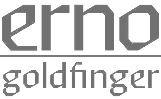
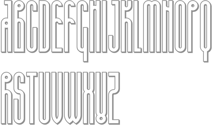
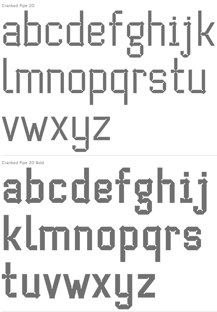
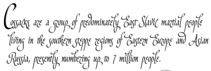
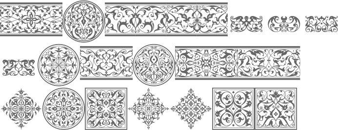
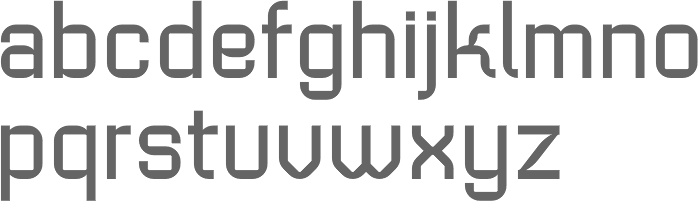
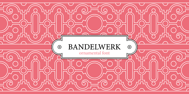
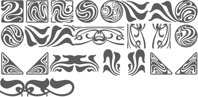
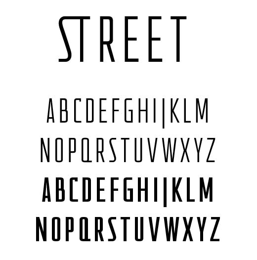
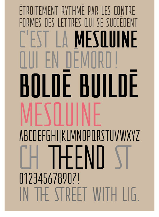
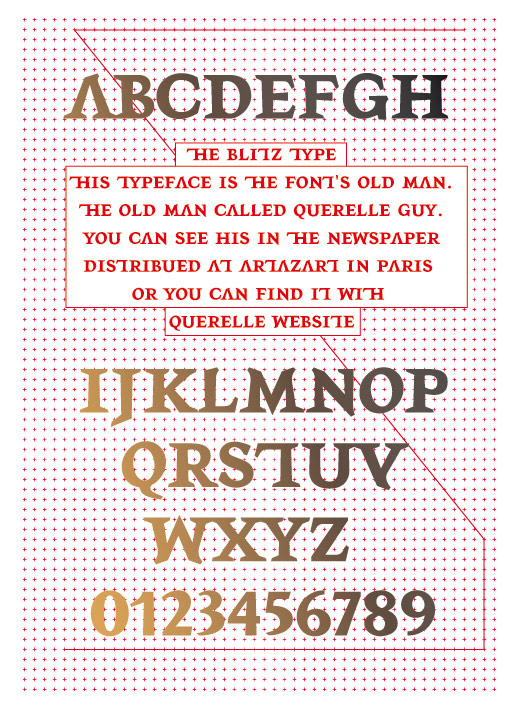
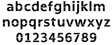
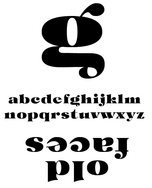
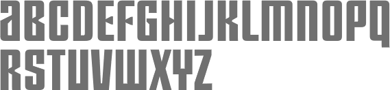
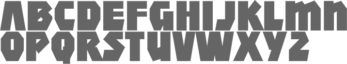
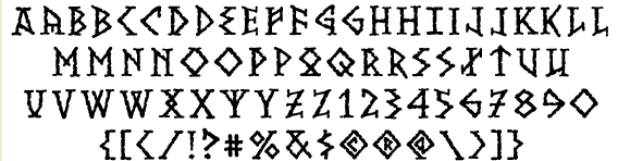
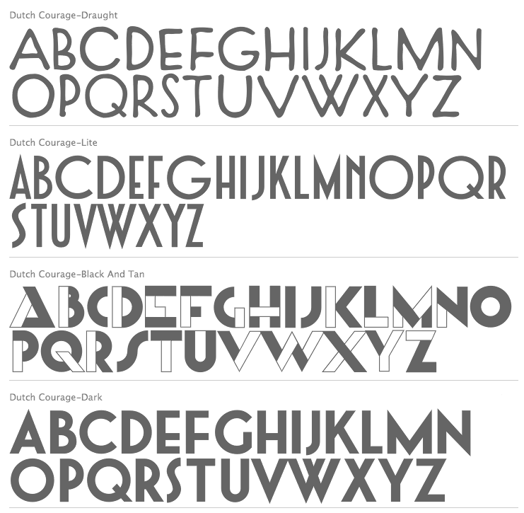
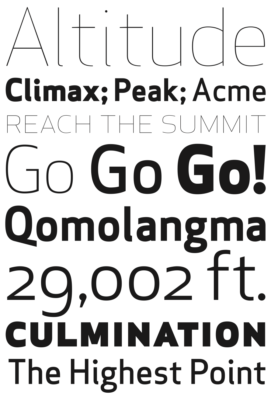
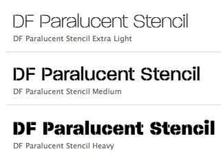
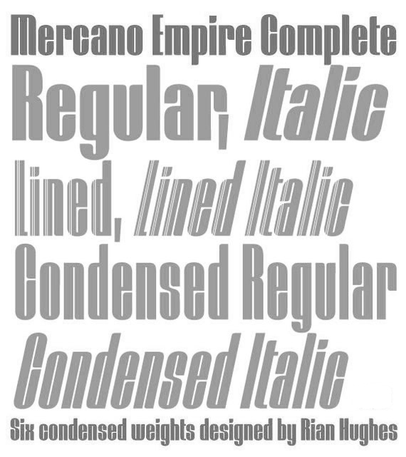
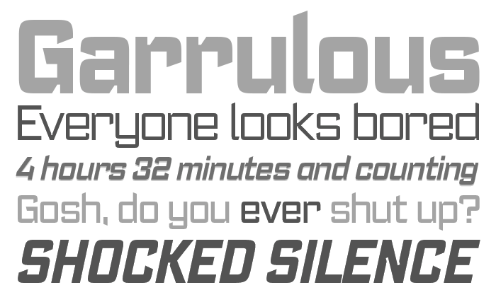
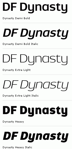
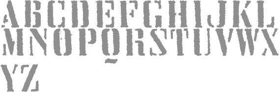
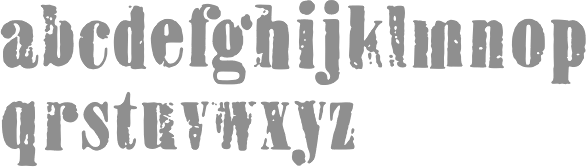
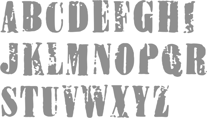
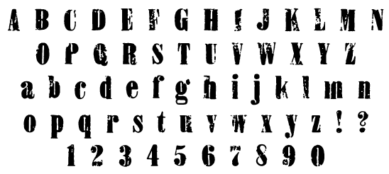
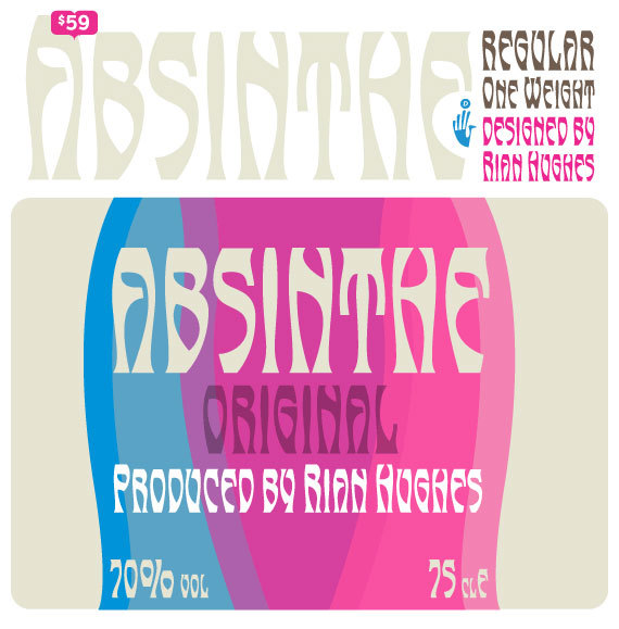
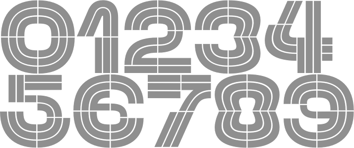
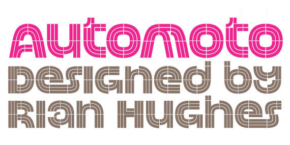
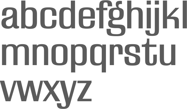
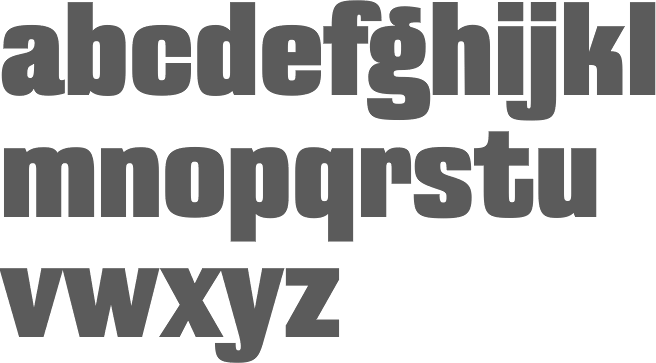
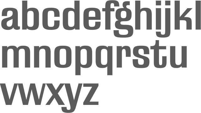
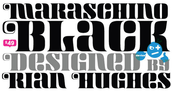
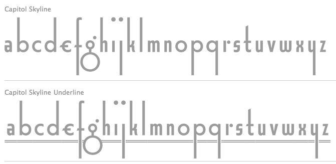
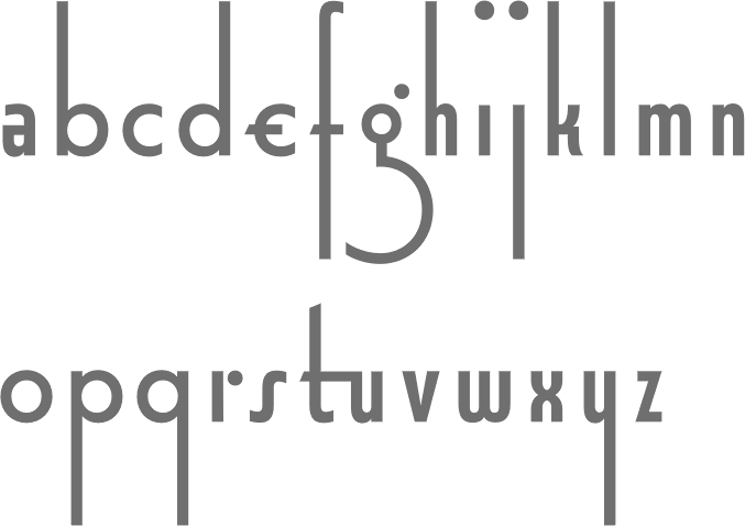
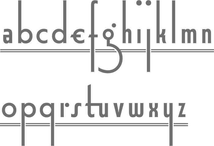
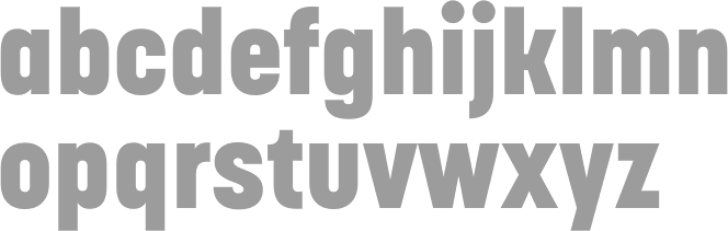
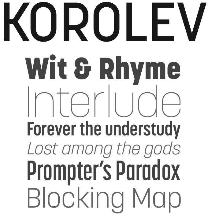
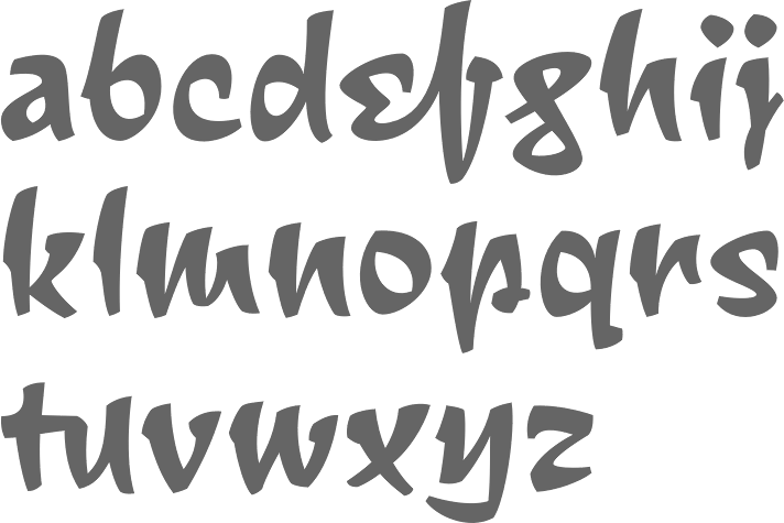
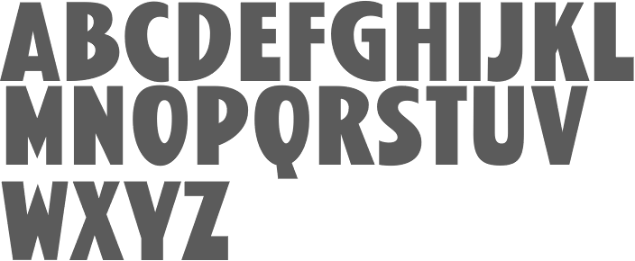
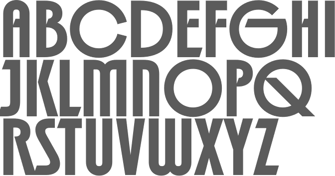
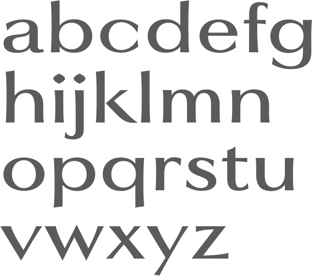
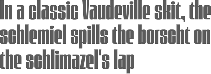
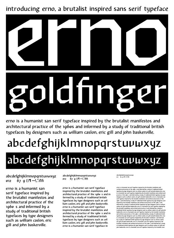
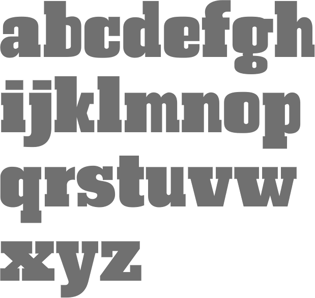
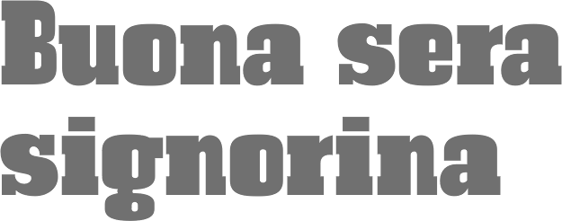
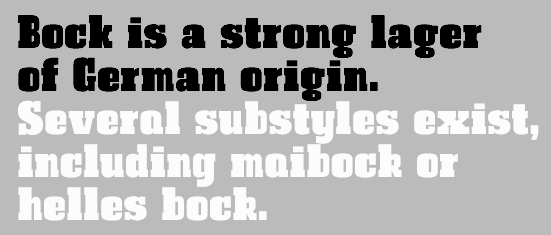
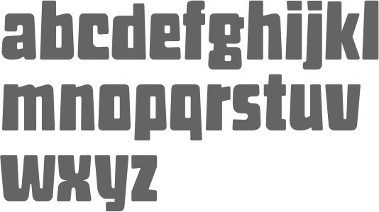
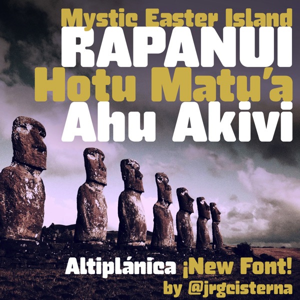
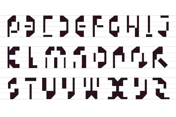
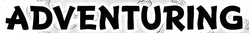
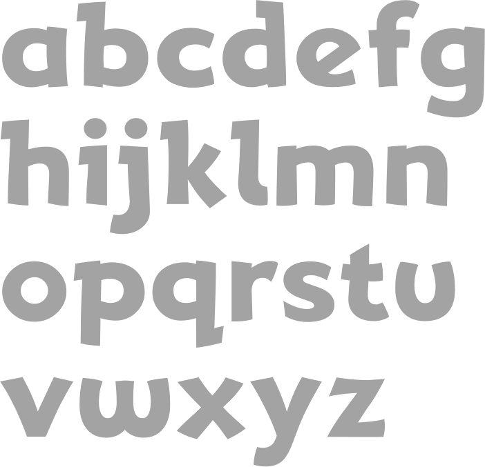
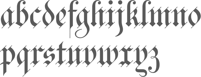
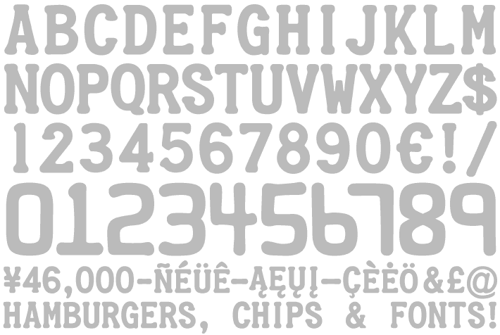
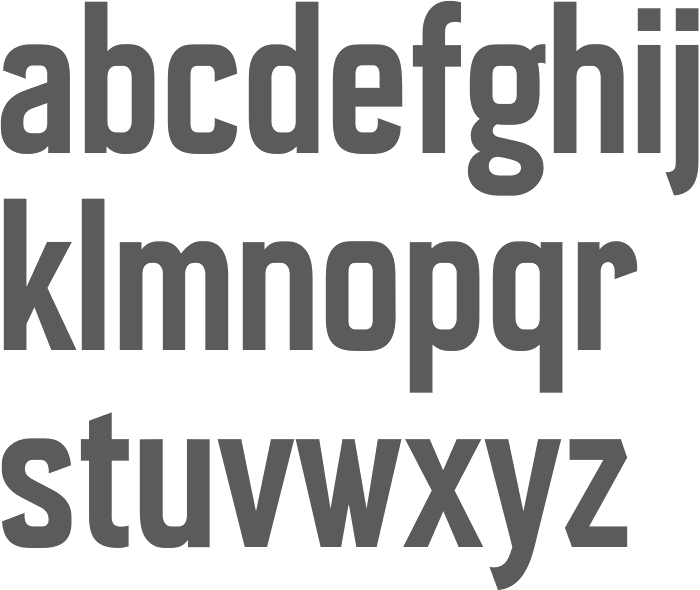
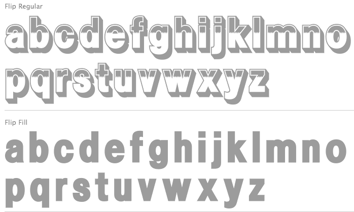
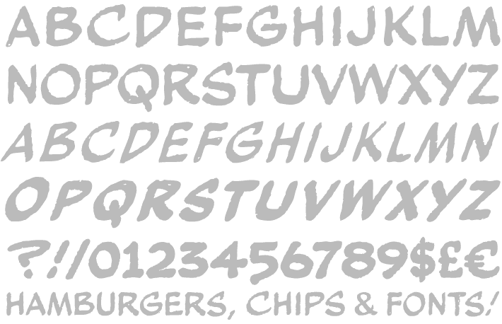
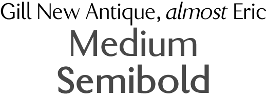
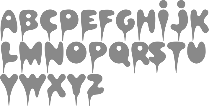
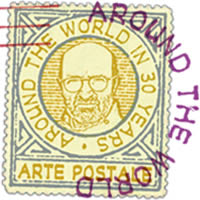
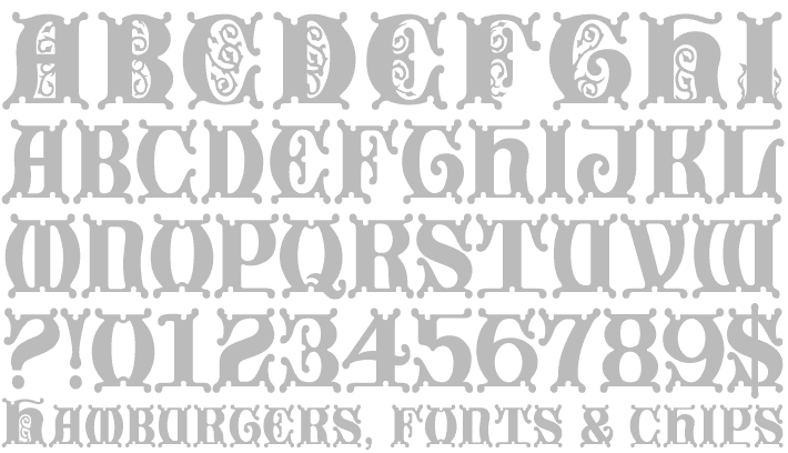
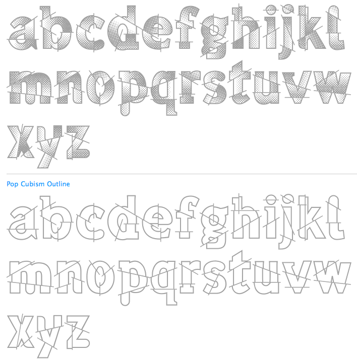
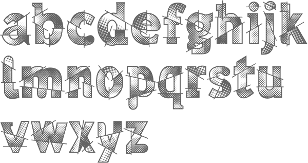
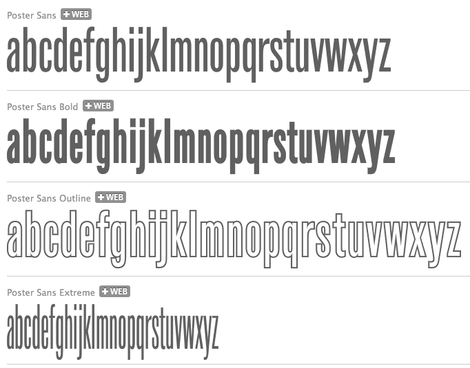
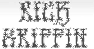
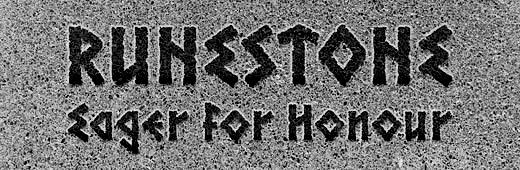
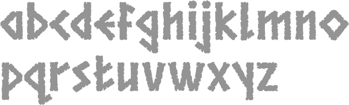
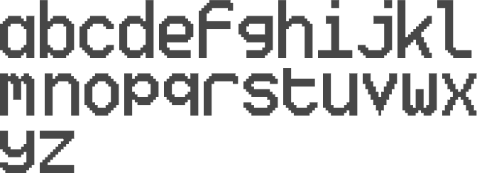
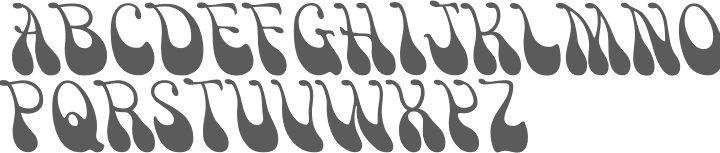
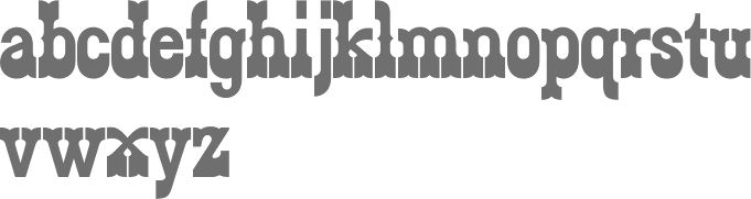
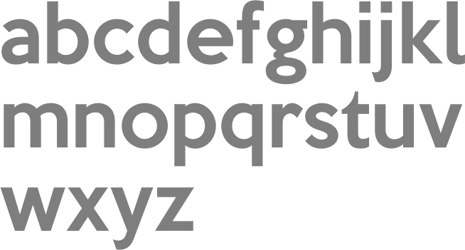
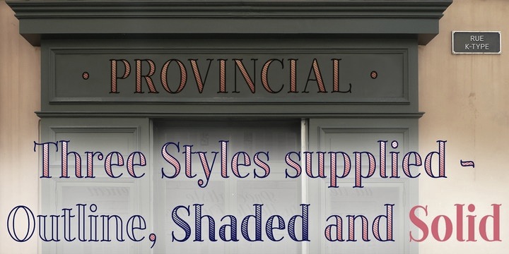
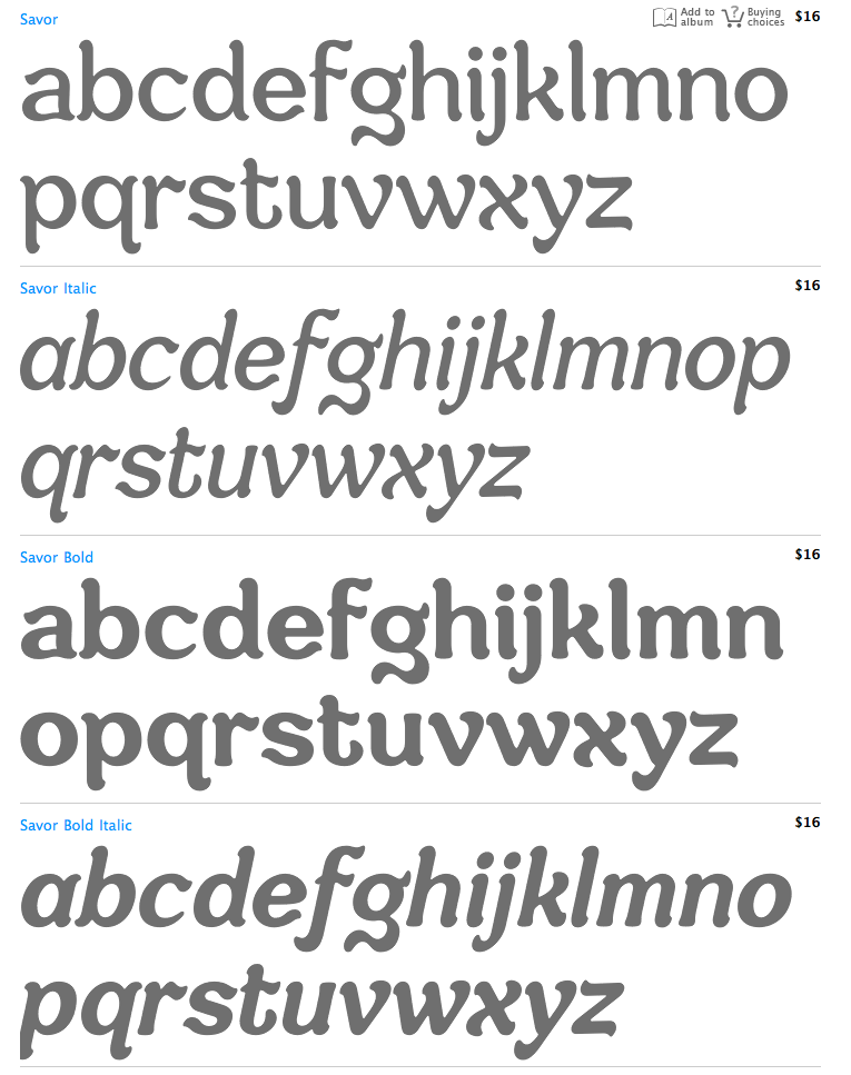
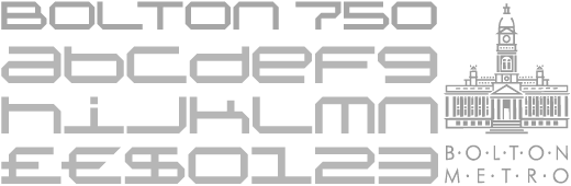
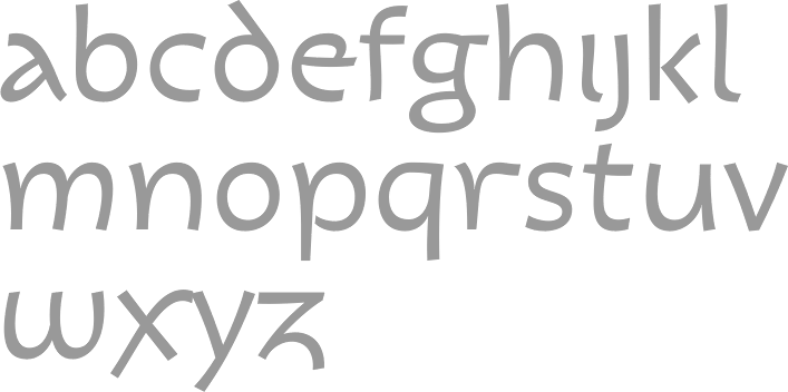
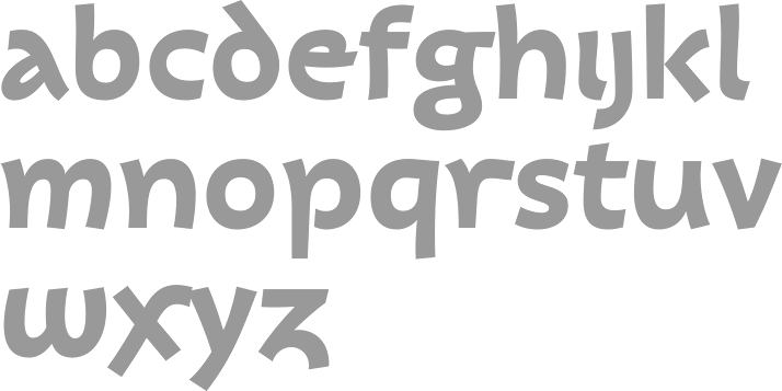
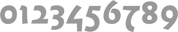
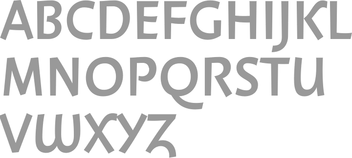
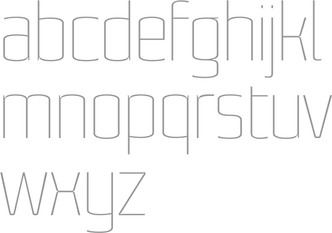
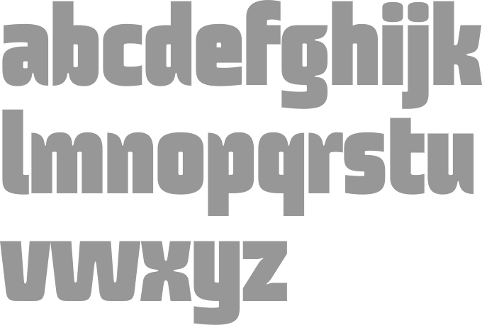
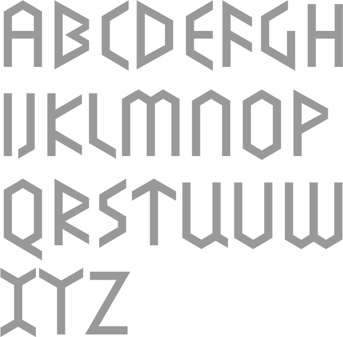
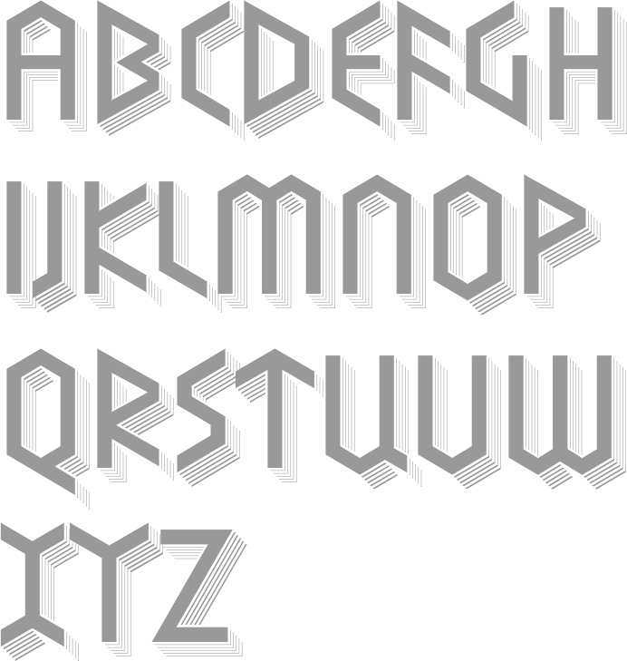
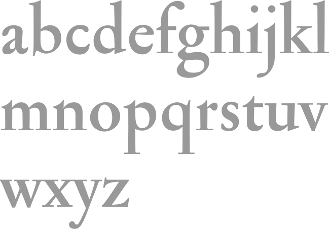
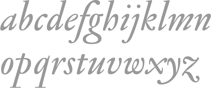
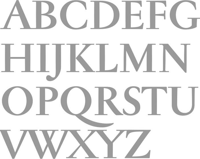
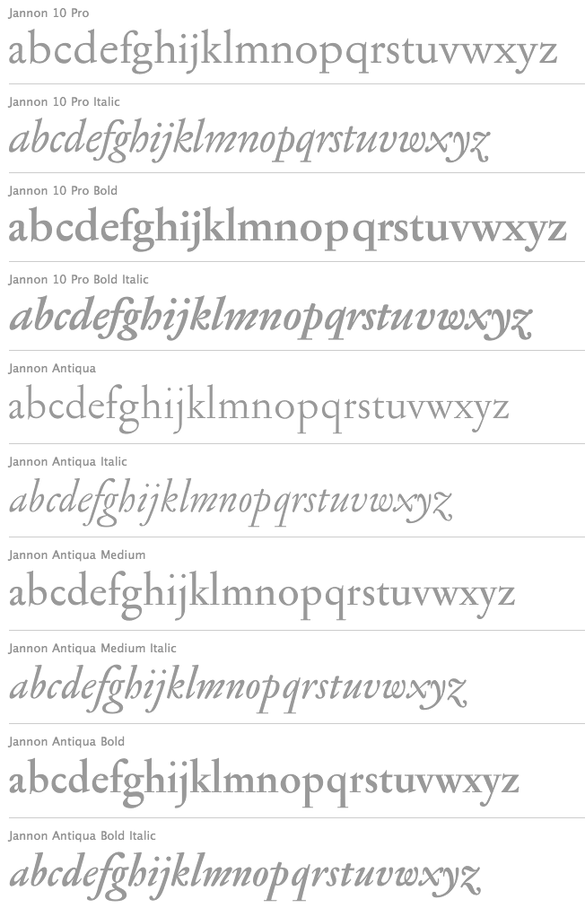
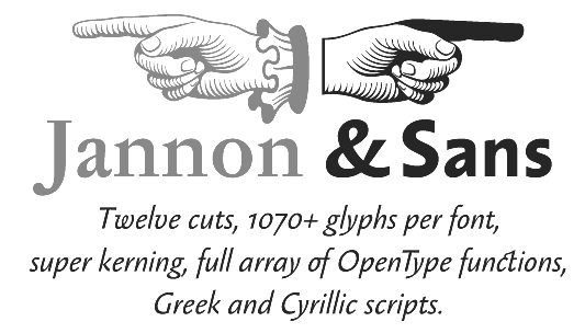
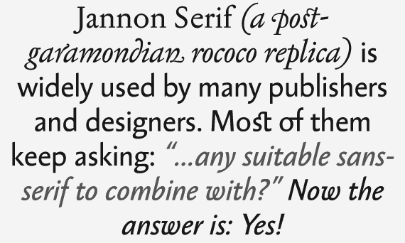
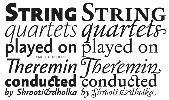
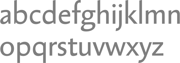
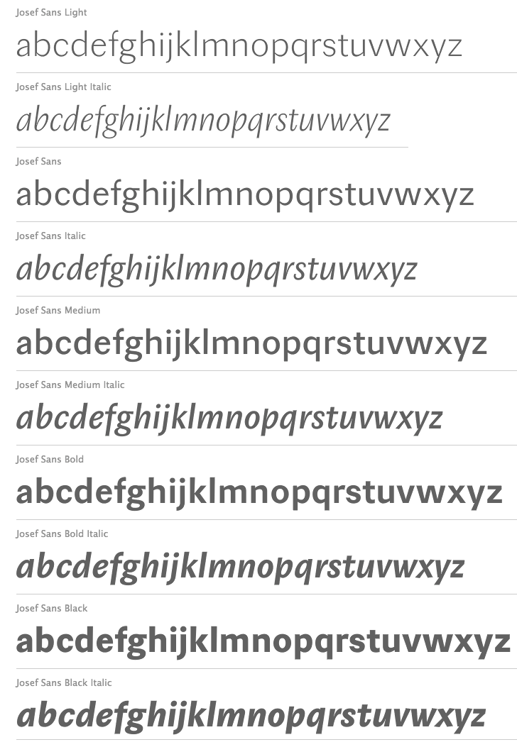
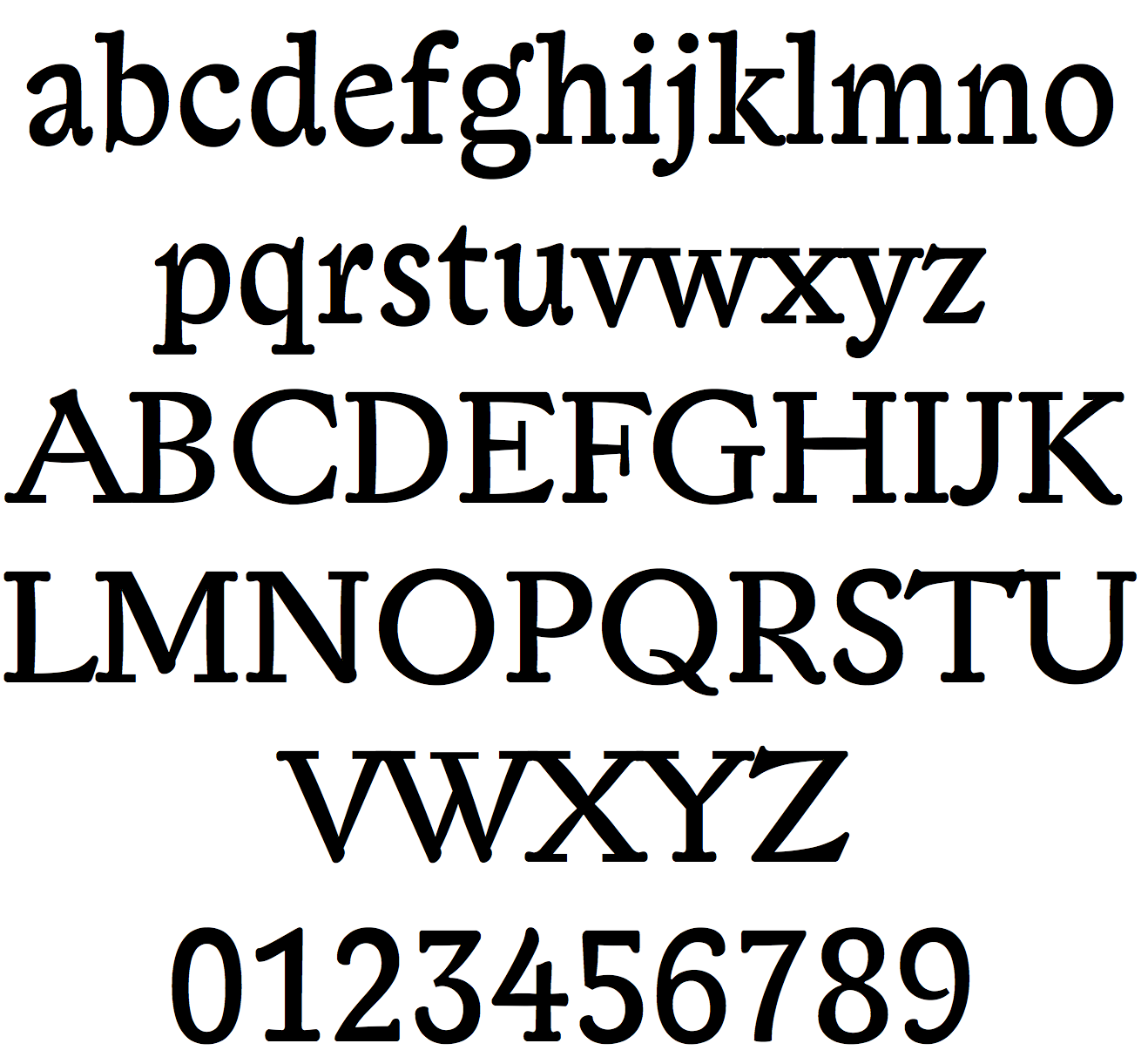
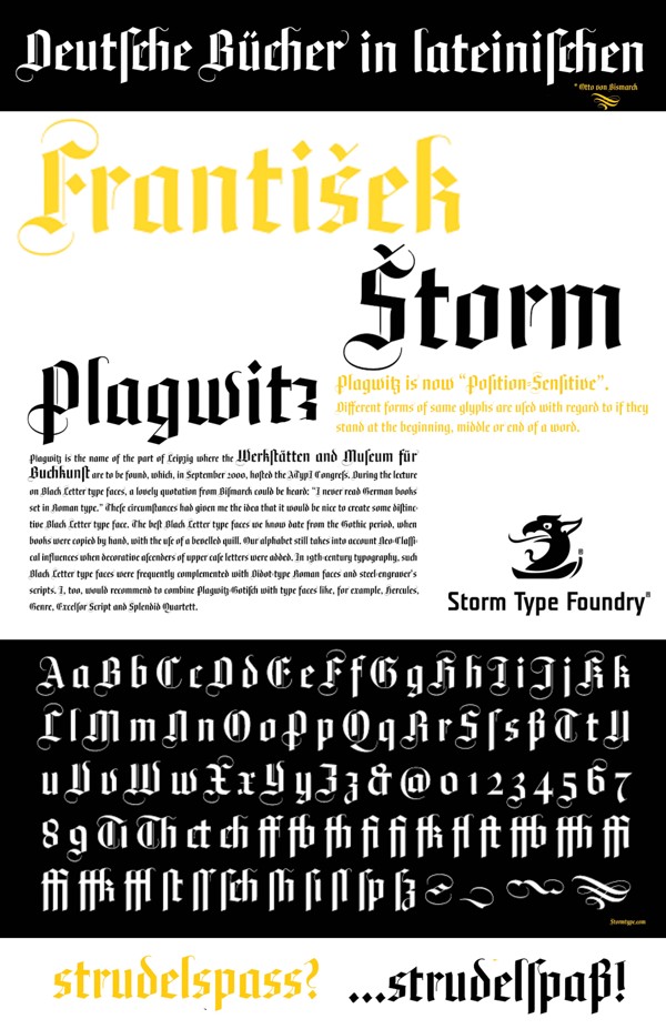
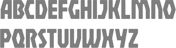
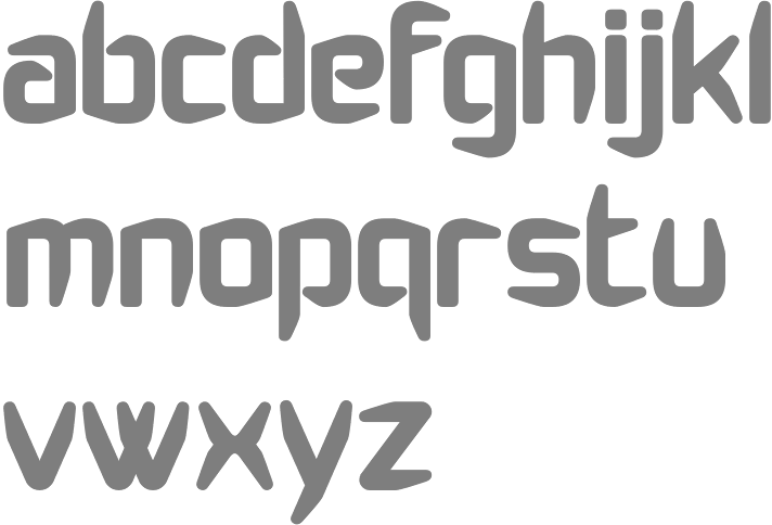
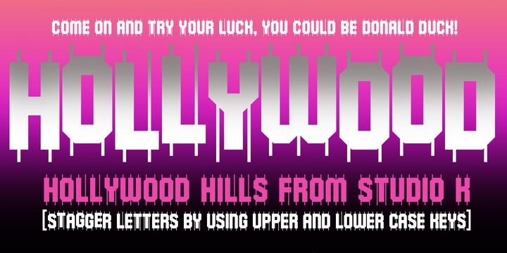
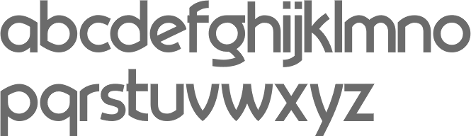
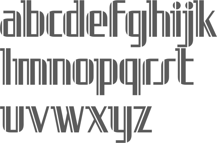
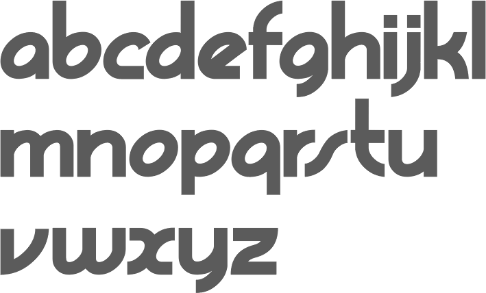
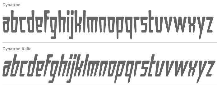
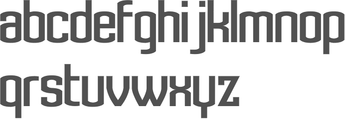
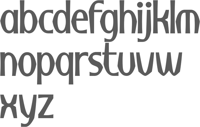
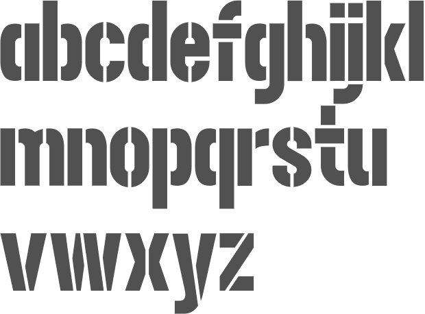
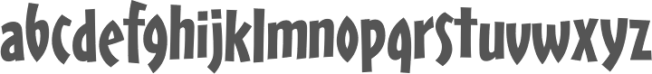
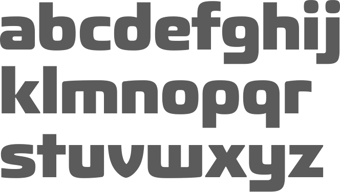
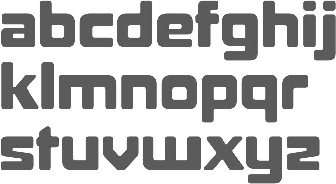
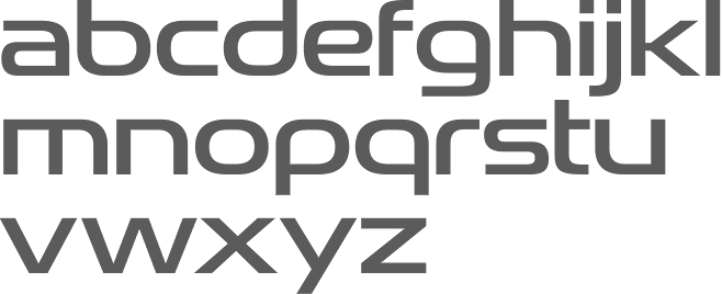
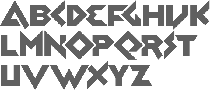
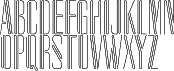
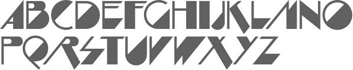
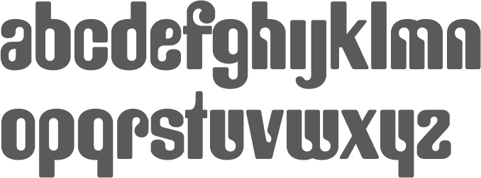
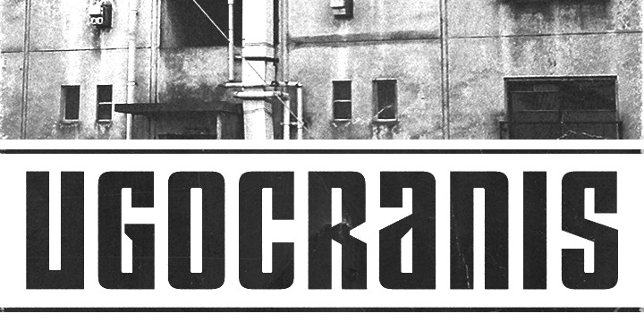
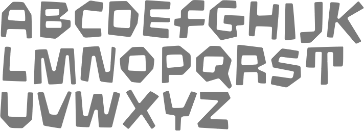
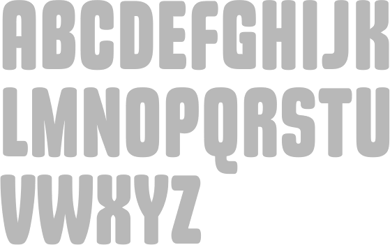
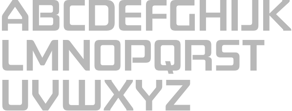
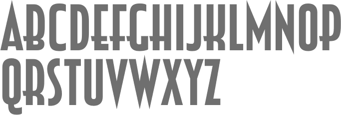
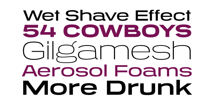
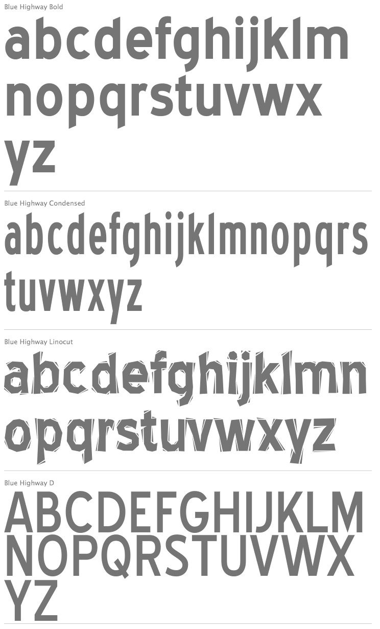
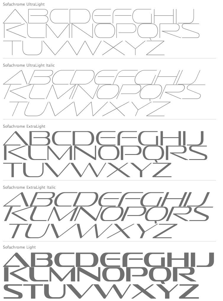
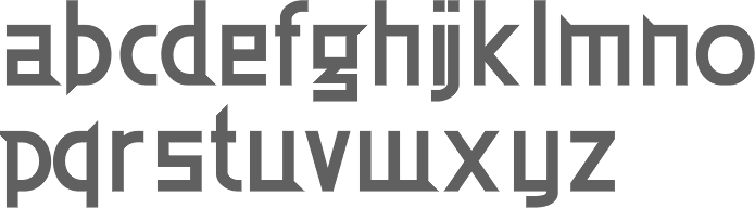
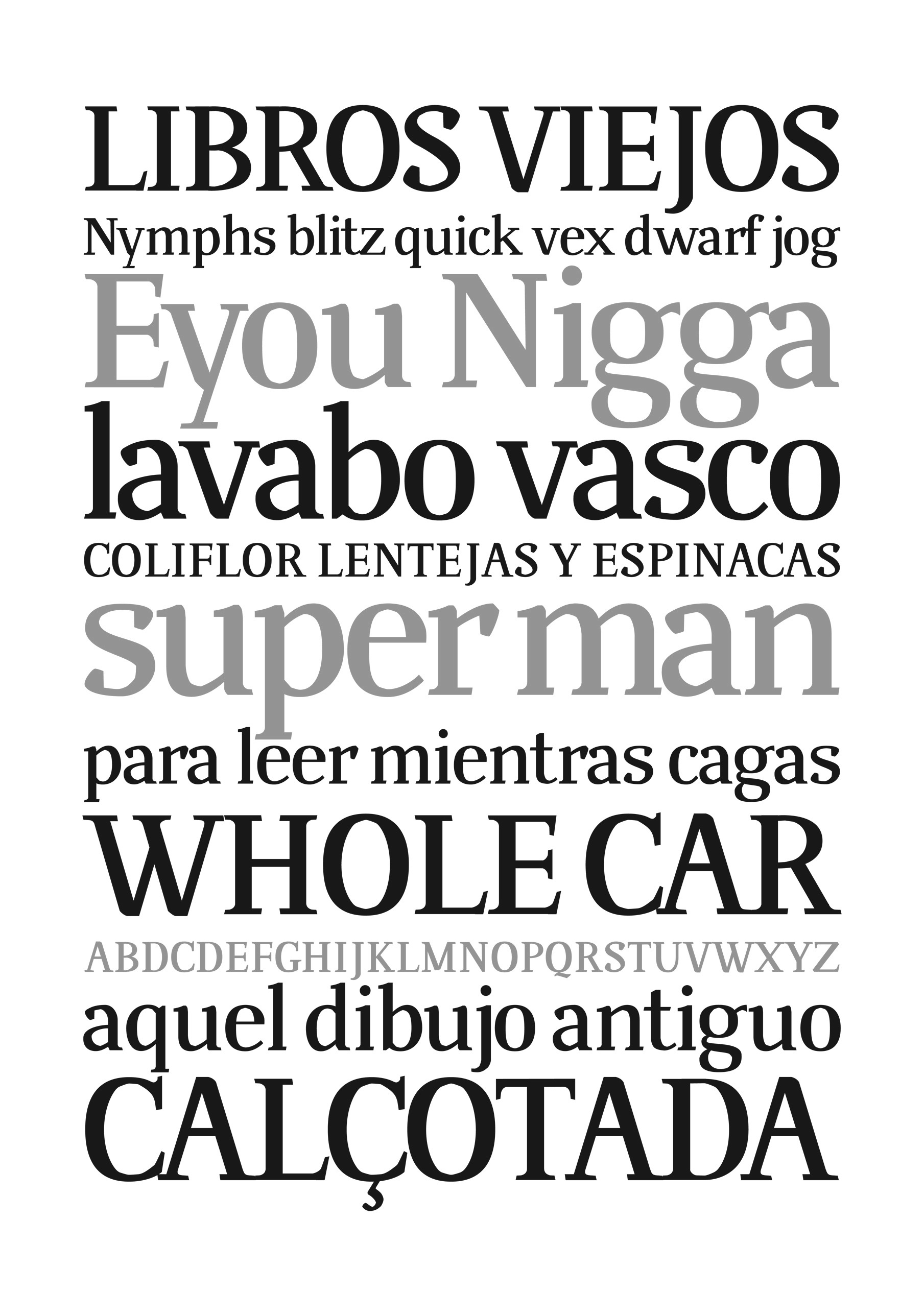
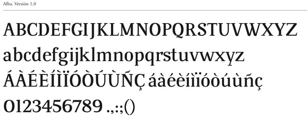
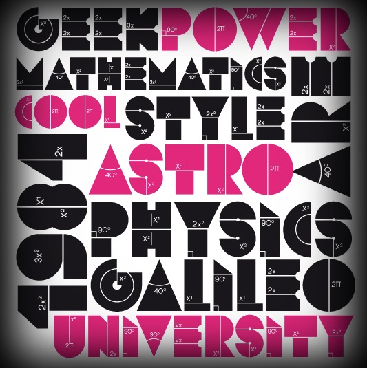
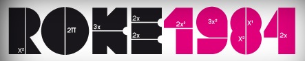
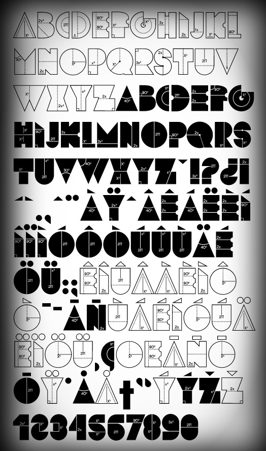
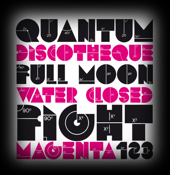
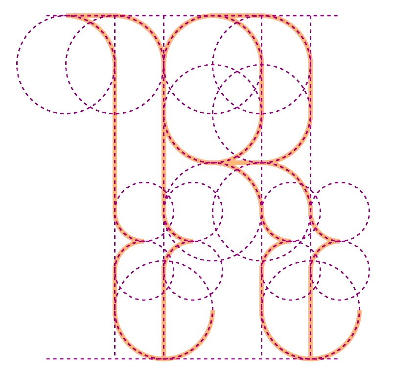
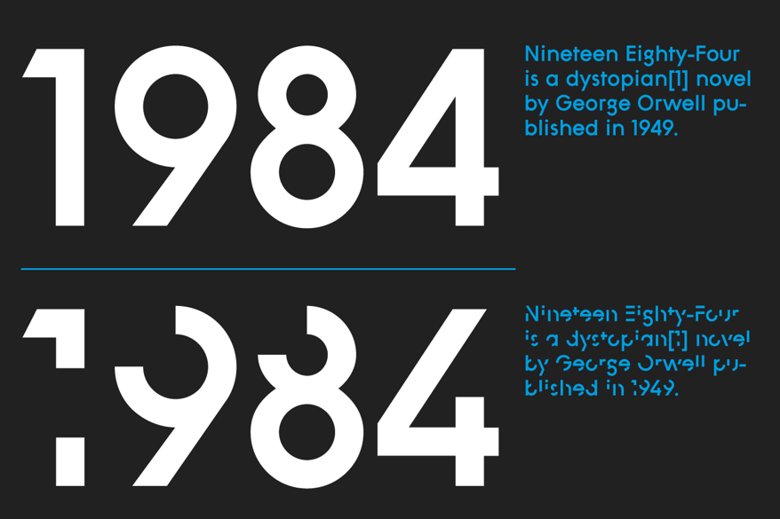
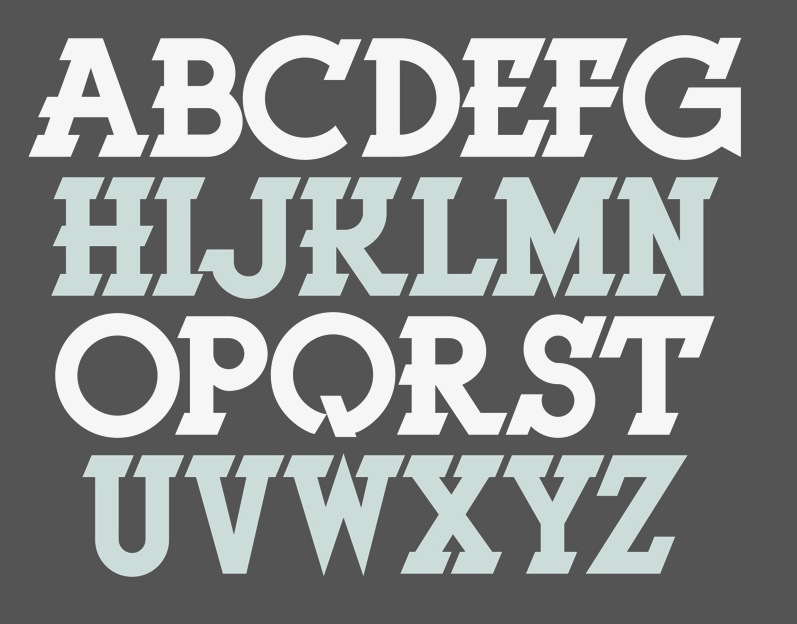
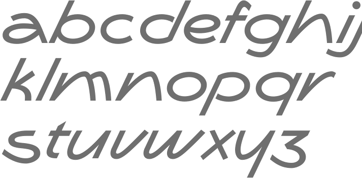
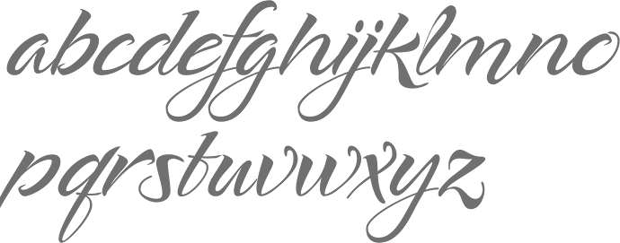
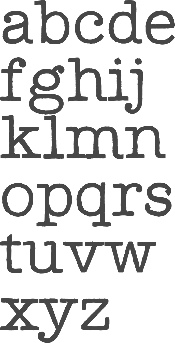
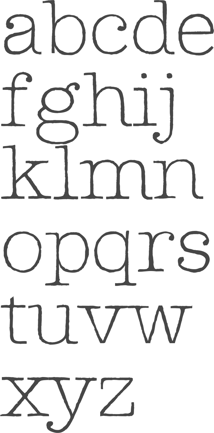
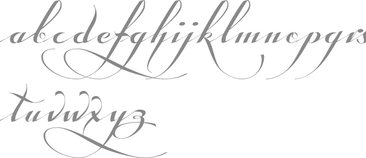
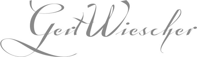
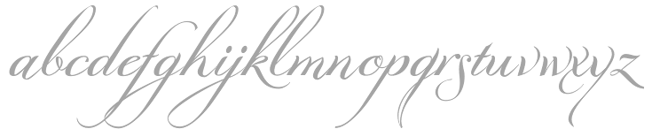
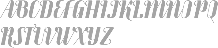
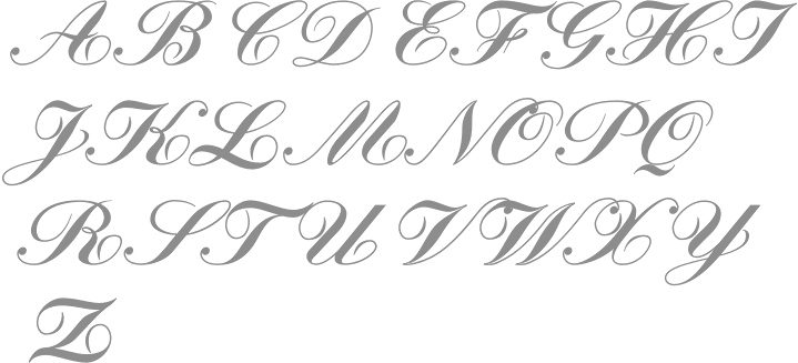
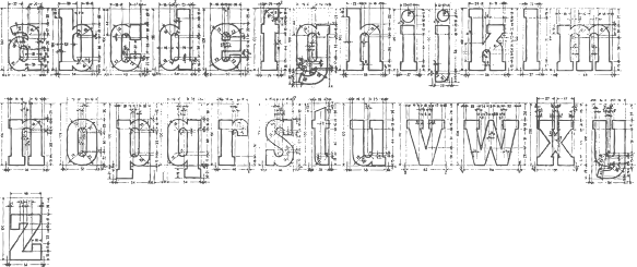
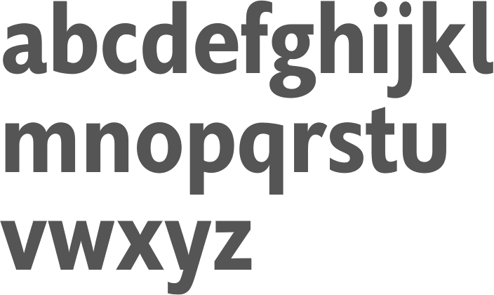
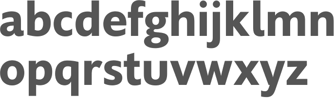
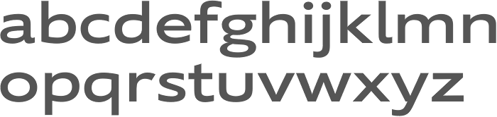
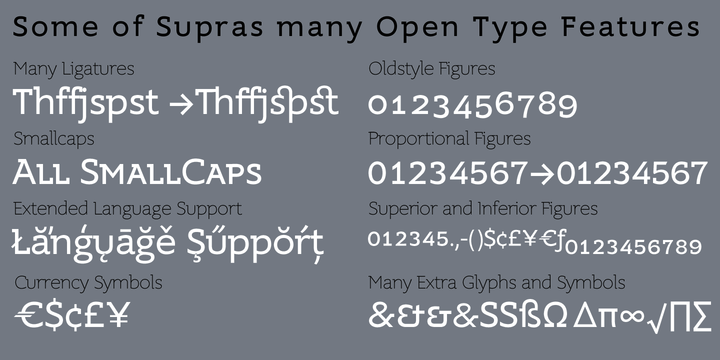
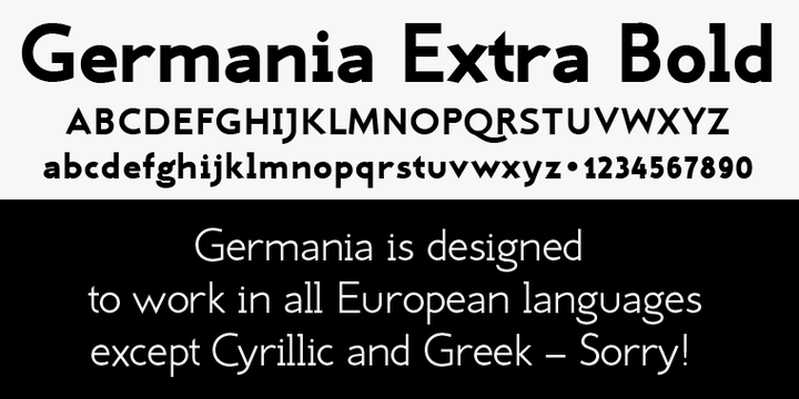
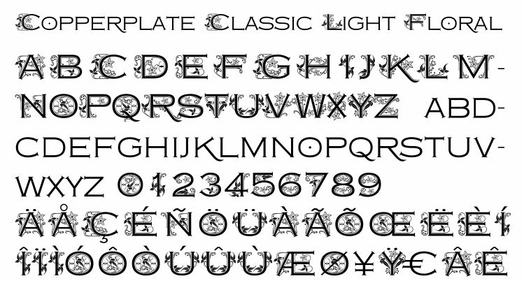
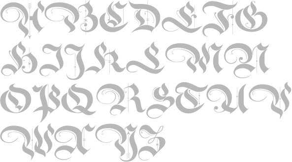
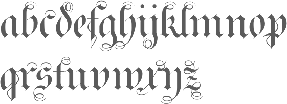
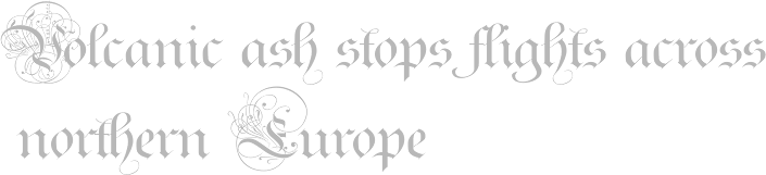
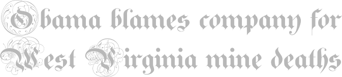
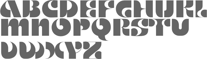
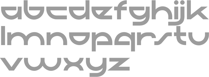
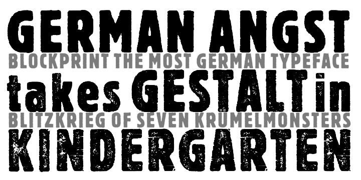
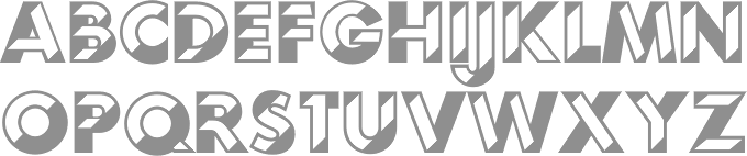