The best typefaces of 2014: Luc's selection
|
 This is my own selection of the best commercial and non-commercial typefaces published in 2014, grouped by category.
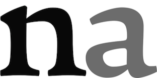
 Text typefaces:  Amster Pro (Francisco Galvez Pizarro, Pampa type). The original is from 2008. Amster Pro (Francisco Galvez Pizarro, Pampa type). The original is from 2008.  Berenjena (Javier Quintana Godoy). This charming antiqua text typeface from 2007 won a Tipos Latinos award in 2012 but was only published in 2014 by Pampa Type. Berenjena (Javier Quintana Godoy). This charming antiqua text typeface from 2007 won a Tipos Latinos award in 2012 but was only published in 2014 by Pampa Type.  Kaius (Lisa Fischbach). A University of Reading typeface family created for very small text. See also Kaius Pro (2020). Kaius (Lisa Fischbach). A University of Reading typeface family created for very small text. See also Kaius Pro (2020).  Pratt Nova (Nick Shinn). Shinn's 17-style large x-height typeface family strives for visual and semantic opulence, equipping the typographer with a comprehensive array of harmonized fonts, all rigorously drawn, superbly fitted iterations of a single, profoundly original design. Pratt Nova (Nick Shinn). Shinn's 17-style large x-height typeface family strives for visual and semantic opulence, equipping the typographer with a comprehensive array of harmonized fonts, all rigorously drawn, superbly fitted iterations of a single, profoundly original design.  GT Sectra (Dominic Huber, Marc Kappeler and Noel Leu at Grilli Type). Broad coverage, angular design, readable yet elegant, the works. GT Sectra (Dominic Huber, Marc Kappeler and Noel Leu at Grilli Type). Broad coverage, angular design, readable yet elegant, the works.  Milio (Josep Patau Bellart). A ten-style transitional family. Milio (Josep Patau Bellart). A ten-style transitional family.  FF Franziska (Jakob Runge). A multidimensional typeface family based on Runge's 2012 Masters project. FF Franziska (Jakob Runge). A multidimensional typeface family based on Runge's 2012 Masters project.  Big Moore (Matthew Carter, Font Bureau). Based on a 1766 specimen by Isaac Moore. Big Moore (Matthew Carter, Font Bureau). Based on a 1766 specimen by Isaac Moore. - Mengelt Basel Antiqua (Christian Mengelt, Linotype). Based on the Basel types from the 16th century, this typeface family for Latin, Cyrillic and Greek brings classical and relaxing Venetian charm.
 Garibaldi (Henrique Beier, Harbor Type). Angular and based on calligraphic strokes, this is quite powerful and legible. Garibaldi (Henrique Beier, Harbor Type). Angular and based on calligraphic strokes, this is quite powerful and legible. 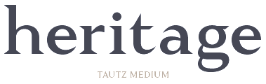 Tautz (Mariya V. Pigoulevskaya, The Northern Block). Tautz (Mariya V. Pigoulevskaya, The Northern Block).  Essay Text (Stefan Ellmer, TypeTogether). A warm slightly angular and extremely legible book text typeface. Essay Text (Stefan Ellmer, TypeTogether). A warm slightly angular and extremely legible book text typeface. 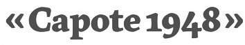 Epica (Oscar Guerrero, Sumotype). Epica (Oscar Guerrero, Sumotype). - Leidener (Jesus Barrientos). Based on letters used by the Elzevir family in their workshop in Leiden.
 Pesaro (Dieter Hofrichter). Pesaro (Dieter Hofrichter).
| Sans typefaces: 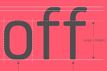 London Luton Airport (Atipo). A wayfinding sans typeface commissioned for London Luton Airport. London Luton Airport (Atipo). A wayfinding sans typeface commissioned for London Luton Airport.  FF Bauer Grotesk (Thomas Ackermann and Felix Bonge). A revival of the Trennert & Sohn metal art deco era sans Friedrich Bauer Grotesk (1933-1934). FF Bauer Grotesk (Thomas Ackermann and Felix Bonge). A revival of the Trennert & Sohn metal art deco era sans Friedrich Bauer Grotesk (1933-1934). - Pembroke (Jeremy Tankard).
 Galano Grotesque Alt (René Bieder) and Galano Classic. An important geometric sans family. Free demos of some styles. Galano Grotesque Alt (René Bieder) and Galano Classic. An important geometric sans family. Free demos of some styles.  Karlsen (Type Union). Minimalist in conception. Karlsen (Type Union). Minimalist in conception.  Naste (Josep Patau). Sixteen styles in a strong-willed purely geometric exercise. Naste (Josep Patau). Sixteen styles in a strong-willed purely geometric exercise. - Dic Sans (Luciano Perondi, CAST). Eurostile-inspired, the Extra Bold and Ultra Black Dic weights are yummy (and expensive).
 Balto (Tal Leming, 2007-2014). An American Gothic family. Balto (Tal Leming, 2007-2014). An American Gothic family. 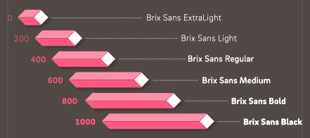 Brix Sans (Hannes von Döhren and Livius Dietzel). A typeface family, wichich together wioth Brix Slab (2011) has carefully engineered glyphs for use in information design and corporate applications. This could possibly become a blockbuster package. Brix Sans (Hannes von Döhren and Livius Dietzel). A typeface family, wichich together wioth Brix Slab (2011) has carefully engineered glyphs for use in information design and corporate applications. This could possibly become a blockbuster package. 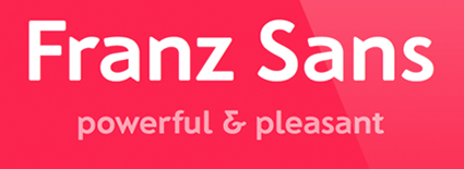 Franz Sans (Mona Franz). Franz Sans (Mona Franz).  Certa Sans (Elena Kowalski). Certa Sans (Elena Kowalski). - Klef (Adrian Talbot). A geometric sans family influenced by Avant Garde.
 Orgon (Dieter Hofrichter). Orgon as in organic, and in Argon, the inert gas---uncomplicated, unpretentious, neutral, but still distinctive. Orgon (Dieter Hofrichter). Orgon as in organic, and in Argon, the inert gas---uncomplicated, unpretentious, neutral, but still distinctive.  Lipa Agate (Ermin Mededovic, Type Together). A sans workhorse family for very small print. Lipa Agate (Ermin Mededovic, Type Together). A sans workhorse family for very small print.  Founders Grotesk Mono (Kris Sowersby, KLIM). Founders Grotesk Mono (Kris Sowersby, KLIM).  Glober (Ivan Petrov, Fontfabric). Glober (Ivan Petrov, Fontfabric). - Nokio (Type Union). A geometric rounded minimalist family for mobile devices.
- Como (Ryoichi Tsunekawa). A rounded sans family with large x-height.
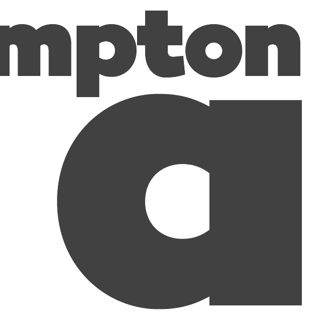
- Campton (René Bieder).
 Arquitecta (Miguel Hernandez and Daniel Hernandez, Latinotype). Arquitecta (Miguel Hernandez and Daniel Hernandez, Latinotype). - Museo Sans Display (Jos Buivenga). Great new Hairline and Extra Black weights.
 Bague Sans (Panos Vassiliou). A geometric grotesk. Also take a look at PF Bague Inline Pro and PF Bague Round Pro to get a fuller picture. Bague Sans (Panos Vassiliou). A geometric grotesk. Also take a look at PF Bague Inline Pro and PF Bague Round Pro to get a fuller picture.
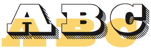
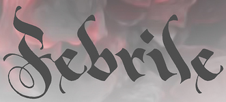
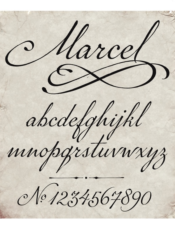
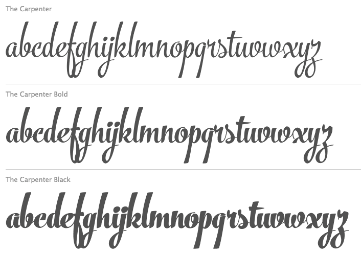
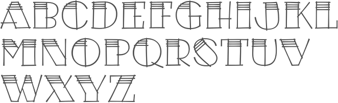
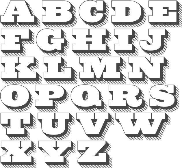
| | Type systems: | | Art deco typefaces: | | Hipster typefaces: | | Script typefaces: | | Sketched, Layered or Poster typefaces: | | Blackletter typefaces: | Dingbats and ornaments:  Tepu (Sergio Ramirez Flores, Latinotype). A large set of infographics icons with rounded shapes. Tepu (Sergio Ramirez Flores, Latinotype). A large set of infographics icons with rounded shapes.
| | Garalde typefaces: | Display typefaces:  Orwellian (Shiva Nallaperumal, Lost Type). The Italian genre refitted for 2015. Orwellian (Shiva Nallaperumal, Lost Type). The Italian genre refitted for 2015. 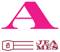 Jeames (Kyle Benson). Jeames (Kyle Benson). - Spot Mono (Lauri Toikka and Florian Schick). Attractively rounded monotype typeface.
- Vezus Serif Texture (Slobodan Jelesijevic).
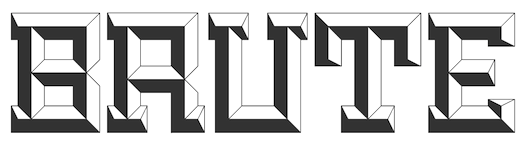 Brute (Kirby Matherne, Ten Dollar Fonts). A layered beveled type system with oomph. Brute (Kirby Matherne, Ten Dollar Fonts). A layered beveled type system with oomph.  Manola (Ira Lensberr). An expressive lapidary typeface family with applications in stonecutting. Manola (Ira Lensberr). An expressive lapidary typeface family with applications in stonecutting. - Getter (Camilo Zamora). A large family influenced by Japanese robots and advertized as Bogotá cyberpunk.
 Attica RSZ (Giuseppe Salerno). A Western typeface inspired by Caslon's Italian and Aldo Novarese's Estro. Attica RSZ (Giuseppe Salerno). A Western typeface inspired by Caslon's Italian and Aldo Novarese's Estro.  Rubik One (Elvire Volk Leonovitch, under art direction of Philipp Hubert and Sebastian Fischer at Hubert and Fischer). A rounded heavyweight sans of attractive proportions. It is a free Google Web Font. Rubik One (Elvire Volk Leonovitch, under art direction of Philipp Hubert and Sebastian Fischer at Hubert and Fischer). A rounded heavyweight sans of attractive proportions. It is a free Google Web Font. - Hedon Display (Dusan Jelesijevic).
- Valter (Nikola Djurek, Typotheque). A variable contrast sans inspired by pointed-pen writing.
 Helsinki XXL (Ludwig Übele). Helsinki XXL Black and Helxinki XXL Thin are free additions to Übele's successful Helsinki typeface family. Helsinki XXL (Ludwig Übele). Helsinki XXL Black and Helxinki XXL Thin are free additions to Übele's successful Helsinki typeface family. - TDL Ruha Hairline and Latin (Tipos das Letras). A didone foundation morphed into a slab serif and wedge serif pair of typefaces.
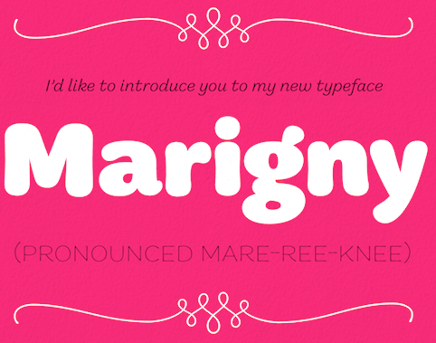 Marigny (Tal Leming). This warm roundish display typeface might just as well fit into the text typeface category. Marigny (Tal Leming). This warm roundish display typeface might just as well fit into the text typeface category.  Briller (Nikola Kostic). A striking ultra-wide sans typeface family. Briller (Nikola Kostic). A striking ultra-wide sans typeface family. - UT Amen (Marco Virgillito). In search of the fattest and artsiest poster typeface.
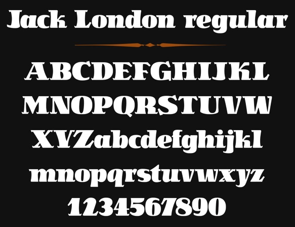
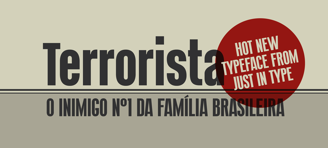
 Jack London (Terezija Donlic). A fat and lively poster typeface family based on a revival. Jack London (Terezija Donlic). A fat and lively poster typeface family based on a revival.  Terrorista (Tony de Marco and Bernardo Faria, Just in Type). A masculine sans headline typeface created to honor all those who fought against Brazil's military regime from 1964 until 1985. Terrorista (Tony de Marco and Bernardo Faria, Just in Type). A masculine sans headline typeface created to honor all those who fought against Brazil's military regime from 1964 until 1985.  Lichtspiele (Stefan Huebsch). Retro cinema marquee and lettering typeface family. Lichtspiele (Stefan Huebsch). Retro cinema marquee and lettering typeface family.
| | Slab serif typefaces: | | Copperplate: | Wood type revivals:  HWT Artz (Erik Spiekermann, P22). A true wood type with a digital version added to support the Hamilton Wood Type Museum. HWT Artz (Erik Spiekermann, P22). A true wood type with a digital version added to support the Hamilton Wood Type Museum. - Dobro (Mariana Alen).
| | Letterpress emulation: | Didone typefaces: - Jeles (Slobodan Jelesijevic, Tour de Force). A soft-edged didne typeface family with large x-height.
 Surveyor (Hoefler). A mapmaker and newsprint font family. Surveyor (Hoefler). A mapmaker and newsprint font family.  Lewis (Alexandre Saumier Demers). A graduation typeface family at KABK in Den Haag, this didone family was specially designed for typesetting mathematics and for use with TeX. Lewis (Alexandre Saumier Demers). A graduation typeface family at KABK in Den Haag, this didone family was specially designed for typesetting mathematics and for use with TeX. - Yo Italic series by James Montalbano. One hundred didone italics were added in 2014 to the 100 regular didones from 2010.
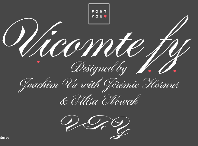
 Parmigiano Typographic System (Riccardo Olocco and Jonathan Pierini). Parmigiano Typographic System (Riccardo Olocco and Jonathan Pierini).  Encorpada Essential (Eduilson Wessler Coan). A fat didone that completes the Encorpada font series started in 2011. Encorpada Essential (Eduilson Wessler Coan). A fat didone that completes the Encorpada font series started in 2011.  Barkley (Poster and Block) by Björn Gogalla, Letter Edit. Barkley (Poster and Block) by Björn Gogalla, Letter Edit. - Normandie Modern FY (Julien Priez, Fontyou). A wide fat typeface didone.
- Caponi (Christian Schwartz, Paul Barnes, Miguel Reyes). A sturdy didone family in Text, Display and Slab versions that can survive the flagellations of print.
| | Fashion mag typefaces: | | Stencil typefaces: | Multilingual typefaces:  Raylaw (Ryota Doi). A Latin / Greek / Cyrillic Latin typeface family for use in travel magazines. Raylaw (Ryota Doi). A Latin / Greek / Cyrillic Latin typeface family for use in travel magazines.  Makar (Leo Phelp). This graduation project at the University of Reading covers Cyrillic, Greek, Latin and Gurmukhi. Makar (Leo Phelp). This graduation project at the University of Reading covers Cyrillic, Greek, Latin and Gurmukhi. -
 Mirna (Teja Smrekar). Her graduation project at the University of Reading covers Latin, Cyrillic, Greek and Khmer. Mirna (Teja Smrekar). Her graduation project at the University of Reading covers Latin, Cyrillic, Greek and Khmer. - Source Han Sans, a new open source Pan-CJK typeface family brought by Adobe and Google for Japanese, Korean, Traditional Chinese, and Simplified Chinese, all in one font. It also includes Latin, Greek, and Cyrillic glyphs from Adobe's Source Sans Pro. Each of the 42 fonts has 65,535 glyphs. This monolinear sans design is not beautiful or artsy---it is a basic and useful workhorse. The Google version is called Noto.
 Journal Sans New (Alexandra Korolkova and Maria Selezeneva, Paratype). A typeface family for Latin and Cyrillic that updates and extends the old Journal Sans (1990s) with charming new Erbar Grotesk-based styles such as an Inline and tall-legged Display. Journal Sans New (Alexandra Korolkova and Maria Selezeneva, Paratype). A typeface family for Latin and Cyrillic that updates and extends the old Journal Sans (1990s) with charming new Erbar Grotesk-based styles such as an Inline and tall-legged Display.  Gion (Mariko Takagi). A modern serif typeface for multi-lingual typesetting in Latin, Japanese and Chinese. Gion (Mariko Takagi). A modern serif typeface for multi-lingual typesetting in Latin, Japanese and Chinese.  Bustan (Jamal Bustan and Mamoun Sakkal). An Arabic jewel with tens of stylistic sets and opentype features, based on calligraphic originals. Bustan (Jamal Bustan and Mamoun Sakkal). An Arabic jewel with tens of stylistic sets and opentype features, based on calligraphic originals.
| | Wonderful, adorable, refreshing typefaces: | [Google]
[More] ⦿
|


 Haltrix (
 Meritage (


 Core Magic (
 Ciao Bella (
 Krullcoplate Script (


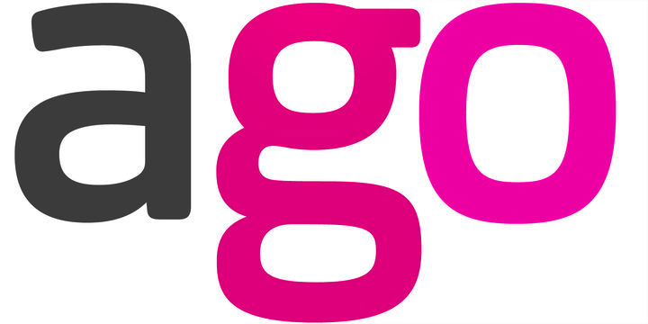
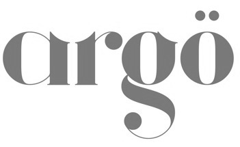 Argö (