TYPE DESIGN INFORMATION PAGE last updated on Mon May 6 08:17:19 EDT 2024
FONT RECOGNITION VIA FONT MOOSE

|
|
|
|
|
Anthroposophy and type design | ||
|
|
|
|
SWITCH TO INDEX FILE
Acces Design
|
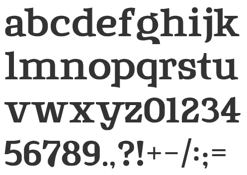
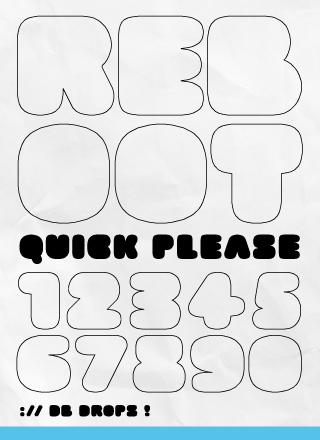
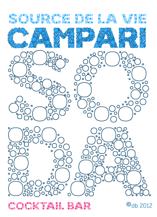
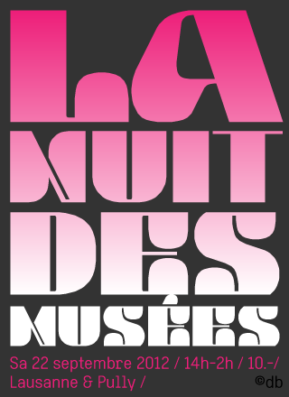
Typefaces made in 2009: DB72, DBColon, DBPoints Sans, DBCube, and DB13, mostly dot matrix or octagonal fonts. In 2010, these were followed by db Outline, db Stickers, db Stick, DB Cube New, db MOKI (stencil), db Ciao, db Ticket Light, db 72, DBpoints (dot matrix), DBPoin2, and db Kopix (blackletter), db New Points Italic (dot matrix face). In 2011, we find dB Stick, dB Sticker, dB Sticker Mono (a monospaced typewriter face), db Prague (fat sans), db Backjumps (an extraordinary fat poster stencil), db Perl, db Perl 1.2 (texture face), db Quarz (2011, +Mix), and db Nox and db Nox II. Fonts made in 2012: db Como (a simple monospace sans), db Sticker (hairline sans), db Rocko v2 (stencil face), db Today v1 (a beautiful black slab face), db Today v2, db Etroite (2012, in several weights: constructivist), db N3, db Drops (fat counterless face), db Quarz Mix, db Soda, db Klacks, db NQ, db Boxer, db Como (monospaced), db Smoothie (fat stencil face), db Quick Cut (stencil), db Karton (stencil), db Frieda. Typefaces from 2013: db Etroite, db Concierge (hairline serif), db Lineo, db Lucky, db Boxer III, db SIL. Typefaces from 2014: db Darling. db Oh Darling, db Melitta (a fantastic brush emulation typeface), db Sticker T, db Points Sans Oblique (dot matrix font), db Como Splitt, db Quirlo (fat rounded poster typeface), db Quirlo Mix, db Limo (angular angry anthroposophic sans), db Limo N, db Slow (a German expressionist typeface), db Bargo Condensed, db TwoLines (an inline font). Typefaces from 2015: DB Caryptis, DB Oleumi, DB Caroli Plain, DB Caroli, DB Seimeins Serif, DB Seimains, DB Sago, DB Sago II, DB Sthlm (+Light), DB Gertrude, DB Track, DB Track Too. Typefaces from 2016: DB Maquette, DB Largo, DB For You (winner in the 2016 Fontstruct Love competition), DB Bargo Slanted. Typefaces from 2017: DB Jojo, DB Scrape, DB Tape Noir, DB Tape Slab, DB Tape, DB Pins, DB Monoto Sans, DB Mrs Back n Black, DB Dr. Bob, DB Tilda, DB Rondo Mix, DB Rondo, DB Shop. Beate set up Acces Design ca. 2017. The typefaces available there are ad Backjumps (stencil), ad Bargo, ad Como, ad Concierge, ad Darling, ad Oh Darling, ad Frieda, ad Klacks, ad Limo, ad Lucky, ad Magritte, ad Melitta, ad Mill, ad Points, ad Quirlo, ad Slow, ad Soda and ad Soda Plex. Typefaces from 2018: ad Falter (blackletter). Typefaces from 2019: ad Dorma (sans), ad Flieger, ad Louise, ad Hobby, ad Journal, ad Juli (sans), ad Tape, ad Violetts (handcrafted), ad Tape (sans). Typefaces from 2020: ad Ander, ad Sticker Mono, ad Juli (sans), ad Magritte (sans and serif; for posters). Behance link. FontStruct link. [Google] [More] ⦿ |
Afronsu Afronsu
| |
Aidfonts (was: Antropos)
|
Baar published these typefaces with Linotype: Atlantis, Linotype Kaliber, Linotype Balder (1994), Linotype Ordinar (2000), Linotype Pisa (1997), Feltpen, Nordica (chiseled typeface). Nice fonts at old Antropos site included: Aristoteles, Platonia, Andromeda, Zeitgeist, Artemis, Andromeda Engschrift, BaarAntropos, BaarAntroposAidfont, BaarAntroposBold, BaarAntroposBoldItalic, BaarAntroposCaps, BaarAntroposDisplay, BaarAntroposEngschrift, BaarAntroposItalic, BaarGoetheanis (2002), BaarLemuria (2002), BaarMetanoia (2002), BaarMetanoiaBold, BaarMetanoiaBoldItalic, BaarMetanoiaItalic, BaarPhilos, BaarPhilosBold, BaarPhilosBoldItalic, BaarPhilosItalic, BaarSophia (2002), BaarSophiaBold, BaarSophiaBoldItalic, BaarSophiaItalic, BaarZeitgeist. He founded Menschengeist and Aidfonts (2005), where one can download his Sophia, Metanoia and Philos families. Dafont link. Linotype link. FontShop link/ Klingspor link. Fontspace link. Catalog of Lutz Baar's commercial typefaces. See also here. [Google] [MyFonts] [More] ⦿ |
Baptiste Gios (Yerres, France) created the school project typeface Mango (2014), which has the curvature of anthroposophic typefaces. [Google] [More] ⦿ | |
Beate Limbach
| |
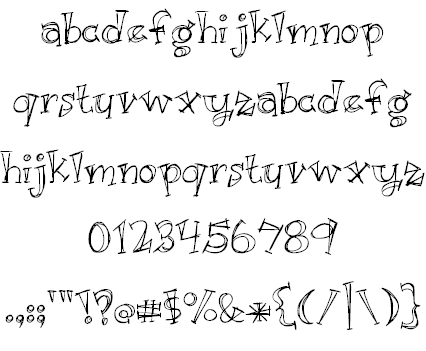
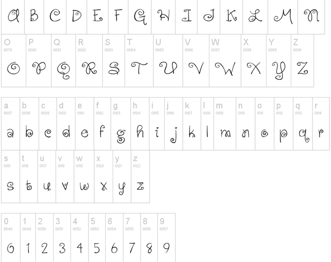
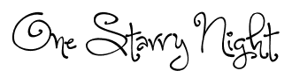
Her typefaces: Ambition + Ink (a hand-printed font), Aerwyna (2021: a fairytale font), Shirebourn (2021), Crickhollow (2021), Farmhouse Rooster (2020), Airbender (2020), The Old Forest (sketched, eerie) (2020), Lingonberry Marmalade (2020), Little Miracles (2020), Brandybuck (2020), Poundcake (2020), Haunted Woods (2019: +Corroded, +Inline), Moonbright (2019, +Inline), Wildemount (2019), Farm to Market (2019, +Fancy), Hodgepodgery 3D (2019), Love Monster ketched (2019), Love Monster Skinny (2019), Heartwrecked (2019: brush font), Bang Whack Pow Outline (2019: cartoon font), Fishfingers Outline, Cuddlebugs Outline (2019), Hodgepodgery Outline (2019), Aberforth Outline (2019), Melisande Sharp (2019), Wildemount Rough (2019), Perfectly Scrathy (sic) (2019: a sketched font), Dusty Velvet (2019), Aberforth (2019: unicase), Aberforth Tiles (2019: white on black), Aberforth Rough (2019), Sugar + Spice (2018, +HandSans), Beautiful Things (2018), Christmas Sprouts (2018), Hodgepodgery (2018), The Road Ahead (2018), Submarine Beach (2018), The Brooklyn Smooth (2018), Skydancer (2018), Wildemount (2018), Just Alice (2018), Uptown Market (2018), Raspberry Moonshine (2018), Avacado & Lime (2018), Ambition & Ink (2017), The Brooklyn (2017, sans), Shorthalt (2017), Alphabetized Cassette Tapes (2017), Geektastic (2017), Letters for Learners (2017), Asparagus Sprouts (2017), Lovegood (2017), Georgina (2017, script), Meatloaf (2017, 3d), Honeyquick (2017), Market Fresh (2016), Beautiful Mess (2016), Another Birdhouse (2016), Velvet Heart (2016), Unrulyness (2016), Meadowbrook (2016), Simple Joys (2016), Yellow Umbrella (2016, beatnik style), Charbroil (2016), Perfectly Amicable (2016: a sans), Hickory Jack (2016: a connected script), Small Town Skyline (2016), Brilliant (2015), Morningtype (2015, sans), September Mornings (2015), Sassy Molassy (2015), Peas & Carrots (2015), Notepaper Airplanes (2015), Gingersnaps (2015: a curly font), Retrofitted (2015), When It Rains (2015), Love Monster (2015), Cashew Apple Ale (2015, +Bold), Tinue Road (2015), Generally Speaking (2015, hand-printed), Wedding Chardonnay (2015, a ronde), Huffleclaw (2015), Sandbox Melodrama (2015, children's hand), Faerytale Woods (2015), Dandelion (2015), Hazelnut Water (anthroposophic), McKenna (2015), Whatever It Takes (2015), Something Blue (2015), Blueberry Oatmeal (2015), Always Forever (2014), Where Stars Shine the Brightest (2014), A Song For Jennifer (2014, sketched typeface), Cuddlebugs (2014), Sweetly Broken (2014), Hazel Grace (2014, a wonderful curly script), Hazelnut Water (2014, +Lite), Jasmine Reminiscentse (sic) (2014: a connected script), Virginia Sky (2014), Something Blue (2014), Cheddar Jack (2014), Sandbox Melodrama (2014), Ingrained (2013, textured typeface), Garden Fresh Tomatoes (2013), Something In Your Eyes (2013), Faerytale Woods (2013), Dark Roast (2013, a connected script), Jennifer Lynne (2013), Retrofitted (2013), Whiz Bang (2013), Fish Fingers (2013), Something in your eyes (2013), Enough For Me (2013), Organic Fridays (2013, funky; +Lined, +Italic), Orange Juice (2013, hand-printed shadow face), Apple Cider Daydreams (2012), McKenna (2012, hand-printed), Just Kidding (2012, outlined and hand-printed), My Grandpa's Farm (2012), Café And Brewery (2012, thin sans), Whatever It takes (2012, hand-printed), Albatross (2012, grungy), Deus Etched Machina (2012: a sketched typeface), Gingersnaps (2012, curlified text), Kyne Morgan (2012), A song for Jennifer (2011), Night of the fireflies (2011), Cinnamon Cake (2011), One Starry Night (2011, curly letters), Dandelion in the Spring (2011), Simply Glamorous (2011, script), Second Breakfast (2011, hand-printed), Skinny Jeans (2011), Sweet Home Oklahoma (2011), Sweetly Broken (2011), Light Up The World (2011), Of Wildflowers and Wings (2011), Joy Like Sunshine Through My Windowpane (2011), When It Rains (2011, grunge), Peyton Jennifer (2011, an informal hand-printed sans), Appleberry (2011, sketch font), Irish Spaghetti (2011, hand-printed), Alphabetized Cassette Tapes (2011), The Beautiful Ones (2011, grungy), Contempo Jungle Minuet (2011), The Unseen (2011), Sophomore Yearbook (2011, hand-printed), Jelly Bean Sandwich (2010), English Essay (2010), Jazz Essay (2010, connected hand), A Sensible Armadillo (2010), Double Scratch (2009, Fontcapture), Writing Stuff (2009, Fontcapture) and Just Act Casual (2009, Fontcapture), Yesterday Again (2011), Illuminate (2011, a sketch font), Vanilla Twilight (2011), Where Stars Shine The Brightest (2011), Attack of the Cucumbers (2010), Awakening (2010). Fontspace link. Dafont link. Creative Market link. Abstract Fonts link. [Google] [MyFonts] [More] ⦿ | |
Caleb East
| |
American designer (b. 1986) of the anthroposophic hand-drawn typeface Rotund (2013). [Google] [More] ⦿ | |
Cocijotype
|
Their typefaces:
Klingspor link. [Google] [MyFonts] [More] ⦿ |
Cuttlefish Fonts
| Cuttlefish Fonts offers free original fonts by Cupertino, CA-based graphic designer Jason Pagura, such as Rutaban (2001), Bernur (1996, sans), Gemelli (handwriting), Gohan (fat finger comic book lettering, updated into ShinGohanSix in 2007), Bolonewt (2003), Antherton Cloister (2003, based on insect antennae. Discussed here) and Rutager (2001). He was working on Palormak (2006, futuristic). Between 2006 and 2010, he published Agamemnon, a large and warm transitional slab serif typeface with wood type influences that covers Latin, Cherokee, Cyrillic and Greek. Later typefaces include Cartmeign and Posterony (2007, anthroposophic). Dafont link. 1001fonts link. [Google] [More] ⦿ |
Brazilian designer (b. 1990) of the hairline informal typeface Antropofagia (2011). [Google] [More] ⦿ | |
Elí Castellanos Chávez
| |
Erica Sirotich (San Francisco) iwsmages inspired by children, animals and anthropomorphic critters. She designed Creature Alphabet (2012) for a children's print for Cuddlefish Press. These letterforms are based on the Adelle Basic font from Type Together. [Google] [More] ⦿ | |
Fatih Günes
| |
Mutiloa, Spain-based designer of Breaking Van Font (2016). This anthroposophic typeface is influenced by the van in Breaking Bad. Behance link. [Google] [More] ⦿ | |
During his studies in Curitiba, Brazil, Frederico Westphalen designed the anthroposophic display typeface Oca (2017), which is inspired by the Guarani Indian culture. Behance link. [Google] [More] ⦿ | |
Type designer, b. 1915, who created the decorative anthroposophic typeface Michellina (or Michelina) and the bilined display typeface Akhenaton, both published by Mecanorma. Klingspor link. [Google] [MyFonts] [More] ⦿ | |
London, UK-based designer of Punk Font (2017, dada style) and Berlin Font (2017, anthropomorphic style). [Google] [More] ⦿ | |
Designer in Anderson, SC, who made Anthro (2012), a slab serif typeface based on Gotham. [Google] [More] ⦿ | |
| |
| |
Insigne Type Design Studio (was: Dooley Type)
|
Catalog of their typefaces. View Jeremy Dooley's font library. View Jeremy Dooley's typefaces. Adobe link. [Google] [MyFonts] [More] ⦿ |
+ism
| The gorgeous fonts by London-based Matius Gerardo Grieck at this commercial foundry include: Dysthymia, Typographiction, Idiosynoptium (very very original), Arsmagna, Transhuman, Xyperformulaic, Requiem (phenomenal face!), Karoshi, Nanoscopics, Kunstware (techno font), Circumcision (1999, simulating Hebrew), CQN-Molecular, Anthropolymorphics (2000), Arsmagna, Dysthymia, Hypertexturion, Karoshi, Metastases, Netopath, Transhuman (has a katakana component), Transkryption (one of the latter fonts in the family was done by Tsuyoshi Nakazako). Great web page (but a bit slow). Some of the fonts are also available at T-26. Another MyFonts link. Klingspor link. [Google] [MyFonts] [More] ⦿ |
Jack Yan
| |
Jack Yan and Associates (or: JY&A Fonts)
| Jack Yan (b. 1972, Hong-Kong) now lives in Wellington, New Zealand, where he founded Jack Yan and Associates (JY&A) in 1987, the first kiwi digital type foundry. He designed over 100 typefaces, which mostly share calligraphic roots---his lower case f is like a signature Yan glyph. In 2013, he turned to politics and is running to become mayor of wellington. He designed the extensive family Aetna, digitized based upon 16th century work by Francesco Griffo and Giovanni Antonio Tagliente. It is Yan's version of Bembo. His other font families include Decennie Express Pro (2011, a sans companion for JY Décennie), Decennie JY Titling, Integrity JY (2002), Pinnacle JY (1995-1996, +Bold), Ray JY, Rebeca JY (1993), Tranquility (1994-1995), Artemis JY, and Yan Series 333 (1987-1993). JY Koliba (by Jure Stojan, 2001) is a sans serif typeface family based on Slovenian architects' lettering of the 1940s. Other typefaces include Circles JY, Dandy JY (2012: Originally created for a theatre project at Massey University, Dandy is reminiscent of Pablo Ferro's hand-lettering; created by Danielle Smith), Comic Pro JY (1999, by Antonio Gonzalez de Santiago for Jack Yan), Novalis JY (2008, an anthroposophic family), Boomerang JY (by Greg Bastin), Boum-Boum (2002) and Alia JY (2008-2009, an aldine serif family). JY Pressly (2012, a serif family) was originally designed for Lucire, and destined for web and print use. Arts and Crafts alphabet by JY&A. Personal and political web site. Interview. Klingspor link. [Google] [MyFonts] [More] ⦿ |
Jason Pagura
| |
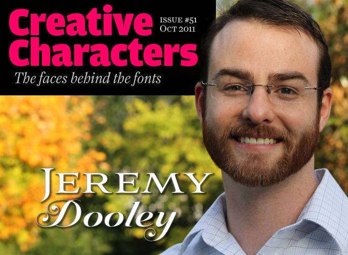
Jeremy Dooley
| |
Joachim Frank
| |
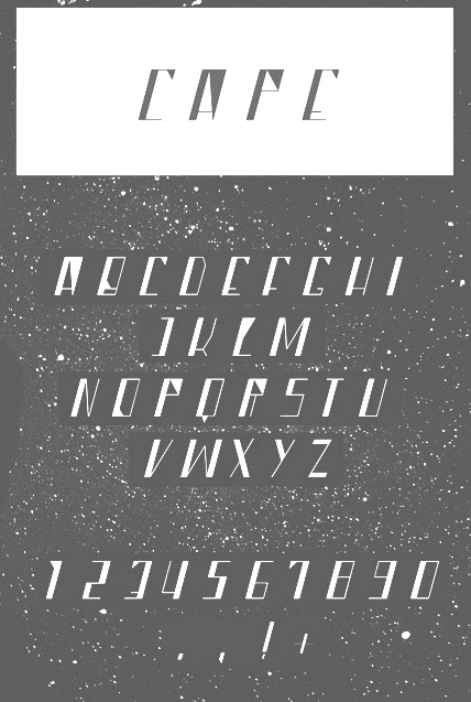
During his studies at the University of Kansas in Lawrence, KS, John Reynolds created the sci-fi typeface Cape (2012) and the anthroposophic typeface Hijack (2013). [Google] [More] ⦿ | |
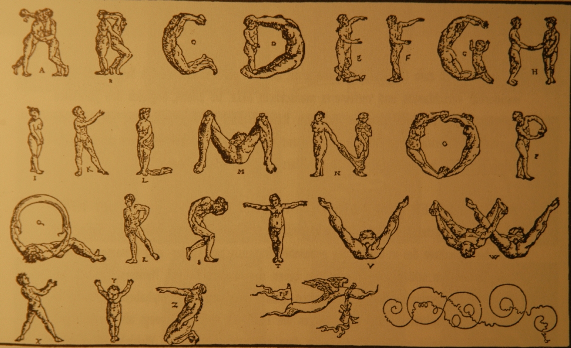
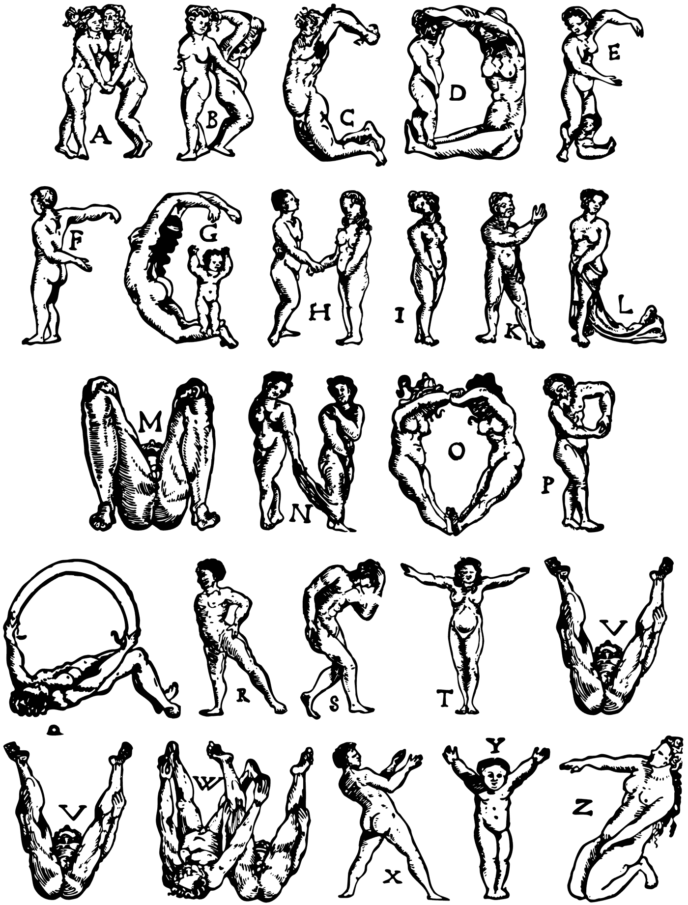
Nürnberg-based painter and illustrator (b. 1539, Zürich, d. 1591, Nürnberg) who created some ornamental alphabets, including an anthropomorph alphabet (1567) that shows some influences of Peter Flötner. [Google] [More] ⦿ | |
During her studies at University of Applied Sciences Potsdam, Germany, Julia Oberndörfer created the anthroposophic typeface Holleri (2014). [Google] [More] ⦿ | |
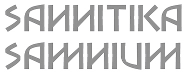
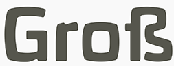
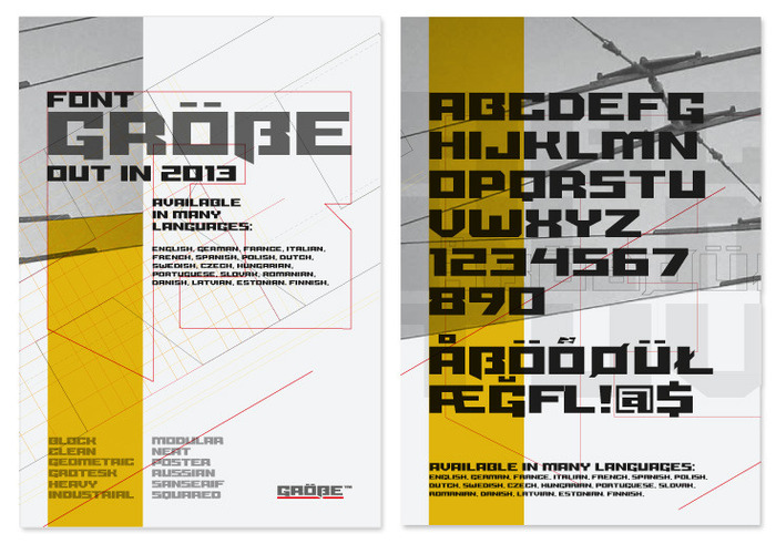
His early typefaces include the hand-printed Peake, Grill Trump (2012: a typeface derived from Gill Sans together with Valentina Aufiero, Francesca Sperti, Natale Ventre and Alejandra Sepulveda at Politecnico di Milano), BetaQin, and the heavy angular display typeface Grosser (2013), which was earlier called Größe (2012). This octagonal typeface covers Greek and is loaded with opentype features. In 2018, he designed the ultra-condensed blackletter typeface Guglia. In 2020, he released the all caps anthroposophic / lapidary typeface Caudine. It was inspired by the Oscan alphabet used by the Samnites, an pre-roman Italic culture from south-central Italy. Home page. [Google] [MyFonts] [More] ⦿ | |
Luciano Vergara
| |
Lutz Baar
| |
Designer in Krakow, Poland, who made the anthroposophic typeface Gardela (2013). [Google] [More] ⦿ | |
Malwin Béla Hürkey
| |
Manfred Klein
| |
Manfred Klein
| |
Ann Arbor, MI-based designer of the custom anthroposophic typefaces Alpha (2014) and Omega (2014), and the custom typefaces Morf (2014) and Meza Luna (2014). Behance link. [Google] [More] ⦿ | |
Matius Gerardo Grieck
| |
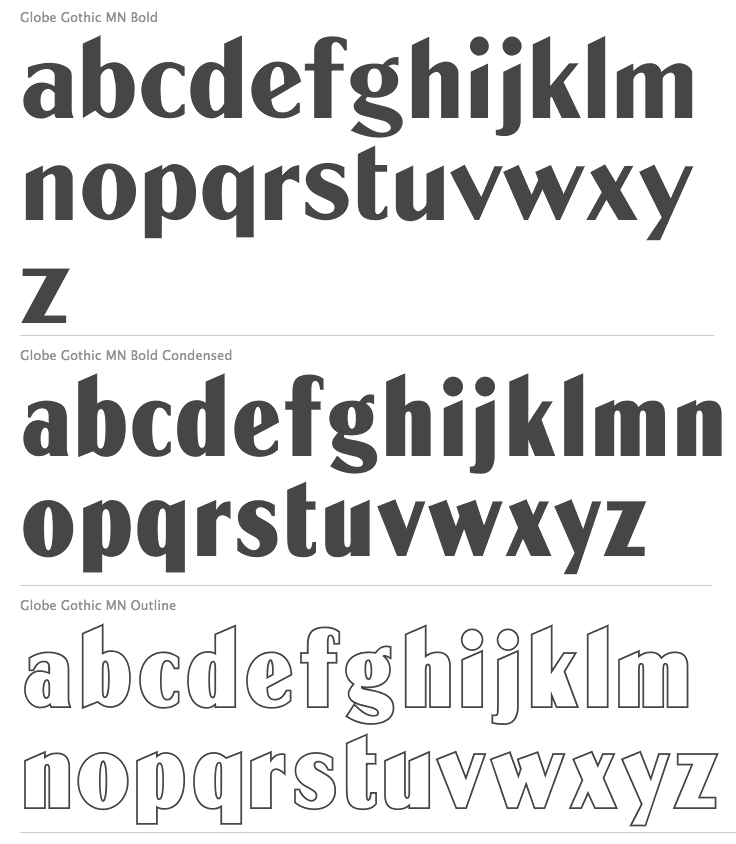
Their collection includes some great fonts: Access, Artdeco, Artworld, BalloonMN, Brio, BusoramaMN, Campus, CardCamio, Carplate, CaslonAntiqueVL, ChocMN, CircusMN, ComicStripMN, DynamoMN, Galba, Globe-Gothic-Outline, Glowworm, Jackson, LibraMN, MtPlacard, Ortem, Renault, RoslynMN, Sayer, SayerScriptMN, SquashMN, Sully-Jonquieres, Watch-Outline. You can also buy through Atomic Type. Projected new URL, which I am afraid will never be activated because in 1999, the company was bough by the Dutch company Trip Productions. MyFonts sells these typefaces: Access, American Uncial, Anatol, Arnold Bocklin (art nouveau), Artdeco, Artworld (an embossed font), Aster, Balloon (brush font), Blippo Black, Brio, British Inserat, Brush, Bulletin Typewriter, Caligra (blackletter), Campus (athletic lettering), Cardcamio, Carplate, Caslon Antique, Celtic (in the style of University Roman), Chicago (dot matrix / marquee typeface), Chinon, Choc (brush script), Circus (Western font), Classic Script (a copperplate calligraphic script), Comic Strip, Commercial Script, Contest, Cooper Black, Dubbeldik, Dynamo, Egyptienne, Estro (Western font), Eurostile, Forelle, Fumo Dropshadow MN, Galba (Trajan typeface), Globe Gothic, Glowworm (a bubblegum font), Gothique (blackletter), Hansson Stencil, Hillman, Hotel (multilined art deco), Isonorm, Jackson, Jubilee Lines (an engraved money font), Latina, Leopard, Libra (uncial), Michelina (anthroposophic), Milton, Mistral, Normalise Din, Old Style, Olive, Orator, Organda, Ortem, Polka (a brush typeface), Renault, Rondo (retro script), Roslyn, Sayer Interview (old typewriter font), Sayer Script, Sayer Spiritual, Squash, Stencil, Stop (stencil typeface), Studio, Swaak Centennial (pure art nouveau), Tzigane, Viant, Vivaldi, Voel Beat (beveled), Watch Outline (LED font), Windsor, Zambesi (African look font). Designers include Albert Boton, J.H. Crook, Jan van Dijk, J. Dresscher, Roger Excoffon, U. Fenocchio, L. Fumarolo, William Gillies, N. Glason, Lennart Hansson, B. Jaquet, K. Kochnowicz, J. Larcher, C. Mediavilla, José Mendoza y Almeida, L. Meuffels, Aldo Novarese, Georges Renevey, F. Robert, Manfred Sayer, M. Schmidt, J.P. Thaulez, J. Werner and Bogdan Zochowski. The Western slabby font Figaro MT (2004) is ascribed to Mecanorma. A list culled from the web: AccessMN-Bold, AccessMN-Medium, AmericanUncialMN, AnatolMN, ArnoldBocklinMN, ArtdecoMN, ArtworldMN, AsterMN-Demi, AsterMN-Roman, BalloonMN-Bold, BalloonMN-ExtraBold, BlippoBlackMN, BrioMN, BritishInseratMN, BritishInseratMNCondensed, BrushMN, Bulletin-Typewriter, BusoramaMN-Bold, CaligraMN, CampusMN, CardcamioMN, CarplateMN, CaslonAntiqueVL, CelticMN-Bold, CelticMN-Italic, CelticMN, CenturyMNCondensed-BoldItalic, CenturyMNCondensed-Bold, CheltenhamMN-Book, CheltenhamMN-BookItalic, CheltenhamMN-Ultra, ChicagoMN, ChinonMN, ChocMN, CircusMN, ClassicScriptMN, ComicStripMN-Italic, ComicStripMN, CommercialScriptMN, ContestMN, Cooper-Black-Italic, Cooper-Black-Outline, CooperBlackMN, CushingMN-Book, CushingMN-Heavy, CushingMN-HeavyItalic, CushingMN-Medium, DubbeldikMN, DynamoMN-Bold, DynamoMN-Medium, DynamoMN-Shadow, EgyptienneMNCondensed-Bold, ElanMN-Extended, ElanMN-Light, ElanMN-Medium, EnrouteVL, ErasMN-Book, ErasMN-Demibold, ErasMN-Ultra, ErasMN, EstroMN, EurostileMN-Extended, EurostileMN-ExtendedBold, EurostileMN-Medium, FidelioMN, FolioMN-Bold, FolioMN-Extrabold, ForelleMN, FranklinGothicMN-Book, FranklinGothicMN-BookItalic, FranklinGothicMN-Heavy, FrizQuadrataMN-Bold, FrizQuadrataMN, Fumo-DropshadowMN, FuturaBlackMN, GalbaMN, Gillies-Gothic-Bold, Gillies-Gothic-Light, Gillies-Gothic-Ultra-Shadow, Gillies-Gothic-Ultra, GlobeGothicMN-Bold, GlobeGothicMNCondensed-Bold, GlobeGothicMNOutline, GlowwormMN, GlowwormMNCompressed, GorillaVL-Bold, GothiqueMN, HanssonStencilMN-Bold, HanssonStencilMN, HillmanMN, HillmanMNCondensed, HotelMN, IrishUncialVL, IsonormMN, Italia-Bold, Italia-Book, Italia-Medium, JacksonMN, JubileeLinesMN, LatinaMN, LeopardMN, LibraMN, MRunic-Condensed, MSwingBold, MachineMN-Bold, MachineMN, MichelinaMN, MiltonMN-Demibold, MistralVL, MtPlacard-Condensed, NormaliseDinMN, OklahomaState, OliveCompactMN, OliveMNBold, OliveNordMN, OratorMN, OrgandaMN-Bold, OrgandaMN, OrtemMN, PascalMN, PolkaMN-Bold, PolkaMN, PopplExquisitMN, PopplExquisitMN-Alternative, RenaultMN, RenaultMNBold, RondoMN, RoslynMN-Bold, RoslynMN-Bold, RoslynMN-Outline, RoslynMNMedium, SaphireMN, SayerMN-Interview, SayerScriptMN-Black, SayerScriptMN-Bold, SayerScriptMN-Light, SayerSpiritualMN-Italic, SayerSpiritualMN, SloganMN, SquashMN-Outline, SquashMN, StencilAntiqueMN, StencilAntiqueVL, StencilMN, StencilMNOutline, StopMN, StudioMN, SullyJonquieresMN-Bold, SullyJonquieresMN, SwaakCentennialMN, Syntax-Bold, Syntax-Roman, ToucheVL, TziganeMN, ViantMN-Bold, VivaldiMN, VoelBeatMN, WashSymbolVL-Light, WatchMN-Outline, WindsorMN, WindsorMNElongated, ZambesiMN. View Mecanorma's typefaces. [Google] [MyFonts] [More] ⦿ | |
Mendoza&Vergara
|
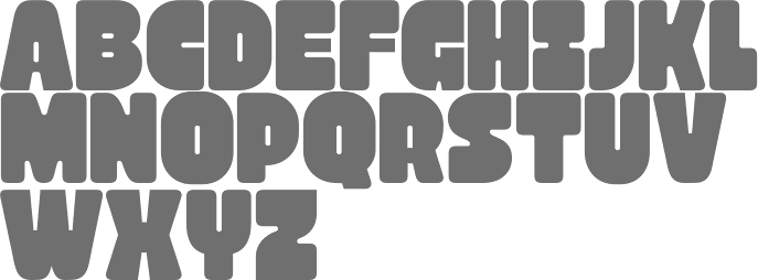
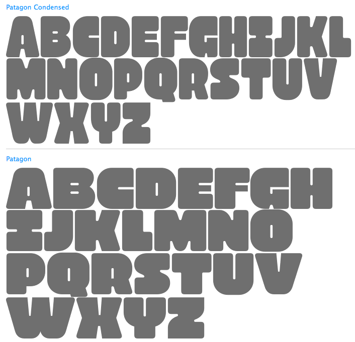
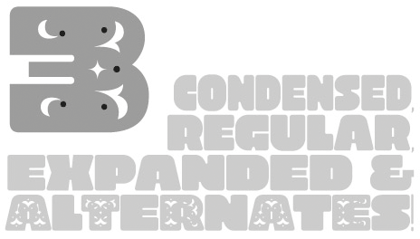
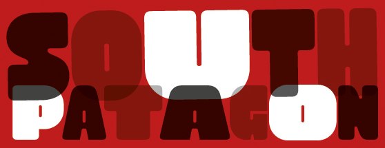
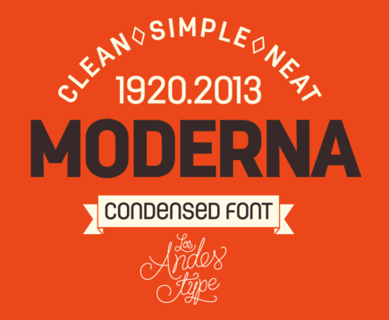
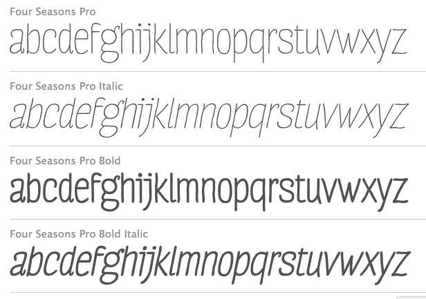
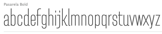
Vergara created these typefaces between 2004 and 2010: the sans typeface Conce (2004), Pepona (2006, T-26, a pixel face), Sketch (2008, T-26), Trauco (2006, T-26, a wonderful display face), Otto (2006, T-26, another pixel face), Roket U (2007, T-26, rounded anthroposophic unicase typeface) and Hisla Negra (2004), the serif typeface Patua (2003; Patua One is free at Google Web Fonts), the pixel typeface Xerif (2004), the pixel typeface Sinaptix (2004), the pixel typeface UNXERIF (2004), the pixel typeface Don Paul (2004, named after Paul Renner), the liquid display typeface Revolución (2006), the pixel family Renex (2004) and the pixel typeface O'Higgins (2003). At Latinotype (which Vergara co-founded with Daniel Hernandez in 2007), he created the dingbat typeface Chilean Bugs (2006) (free at Dafont), as well as Patua (serif), Regia (2008, hairline condensed sans). At FontStruct, he experimented with Flaca (2008). At his Flickr site, check out more commercial typefaces: Fidel (strong sans), Regia and Trasans (two light, even hairline, sans typefaces), Biotech, Working on a short-ascendered sans typeface called Midas (2010). Typefaces from 2011: Biotech, Cachiyuyo (a pixel family), Machi (titling sans), Los Lana Pro (an angular poster face; a stone age font), Fidel Black (a strong rounded sans, +Stencil Black), Patagon (Latinotype: a rounded wood-inspired poster typeface done with Miguel and Daniel Hernandez), Suisside (a humanist sans). Typefaces from 2012: Julius Sans One (Google Web Fonts), Pantano Pro (Pantano is a handmade grunge typeface inspired by the rustic style of Amazonia), Antartida (an 8-style family at Latinotype), Antartida Rounded (a rounded sans family), Kahlo (2012, Latinotype, designed for magazine headlines), Frida (Latinotype: a Latin style hipster sans typeface), Schwager (a steampunk slab serif, followed by Schwager Sans in 2014). Typefaces from 2013: Estandar (a wayfinding sans published by Latinotype; the Regular is free), Estandar Rounded, Moderna Condensed (+Unicase: an organic sans family), Four Seasons (handwritten, with Guisela Mendoza), Pasarela, Kahlo Rounded (Latinotype). Moderna (a monoline organic sans, with unicase styles thrown in). Antartida Rounded Essential (2013) is a rounded sans by Luciano Vergara, done for Los Andes Type. Typefaces from 2014: Estandar Rounded (by Vergara, a rounded sans in 13 styles named after Standard Oil Company), Garden (a playful decorative set of typefaces), Darwin (2014, a 20-font sans family with multiple fathers; see also Darwin Office, 2014, Darwin Pro, 2017, and Darwin Rounded, 2018), DIY Time (hand-printed, with Coto Mendoza at Latinotype). Typefaces from 2015: Nordikka (a headline sans with large x-height and a Scandinavian feel; Latinotype), Styling (a simple almost techno sans family inspired by the aerodynamic curves and elliptical shapes of old cars and airplanes). Corporative Sans, Corporative Sans Rounded and Corportaive are large typeface familes created by the Latinotype Team in 2015. In particular, they were developed by Javier Quintana and Cesar Araya, under the supervision of Luciano Vergara, and Daniel Hernandez. With Bruno Jara, Luciano Vergara designed the angular Jurassic park style typeface Los Lana Niu (2016). In 2016, Mendoza Vergara (Cecilia Mendoza, Coto Mendoza and Luciano Vergara) published the script family Bach and the script/slab pair Matcha at Los Andes. In 2016, Bruno Jara Ahumada, Alfonso Garcia, Luciano Vergara, Daniel Hernandez and the Latinotype Team designed the roman square capital headline typeface family Assemblage. In 2017, Luciano Vergara published Niemeyer as a tribute to Brazilian architect Oscar Niemeyer, and the modular---almost sci-fi---sans typeface family Nizzoli as a tribute to Marcello Nizzoli. He also designed the 28-style Internacional in 2017-2018, following the Swiss grotesque examples. Typefaces from 2018: Alvar (a humanist sans family at Los Andes; italics designed with the help of Alfonso Garcia), Resort (Sans, Script, Ornaments). In 2019, Luciano Vergara and Alfonso Garcia co-designed Moderna Sans at Latinotype. It is an interpretation of American gothics like Alternate Gothic. Typefaces from 2020: Abstract (an eclectic serif family with post-pandemic tensions and existential angst; by Luciano Vergara at Los Andes), Aestetico (Luciano Vergara, Daniel Hernandez and Alfonso Garcia: a 54-style sans family having Formal and Informal subsets of fonts so that the family covers several sans genres), Spock (2020: a 48-style demi-sans demi-slab family by Luciano Vergara, Cesar Araya and Rodrigo Fuenzalida), Neogrotesk. P>Typefaces from 2021: Grotesco (advertized as a South American grotesk; in 20 styles). Klingspor link. Dafont link. Behance link. View Lucian Vergara's typefaces. Fontspring link. [Google] [MyFonts] [More] ⦿ |
Mysterian
| Texas-based designer of Interzone (2021: an eerie stencil font), Ezekiel (an angular script with broken outlines) (2021), the polygonal typeface Soutumi (2021) and the anthroposophic typeface Multipolar (2021). [Google] [MyFonts] [More] ⦿ |
New Parameter
| Yangon, Myanmar-based designer of the free blobby font Bob (2013), the free severe typeface Zerb (2013), the free font Zebrazil (2013), the free anthroposophic Latin typeface family Rozo (2018) and the free typeface Zviro (2016). [Google] [More] ⦿ |
Nicolas Schreyer (Schreyer Design) created the square anthropogenic (rounded octagonal) font Quadrat NX (2011, FontStruct). Aka geuzle. [Google] [More] ⦿ | |
During his multimedia design studies at the University of Johannesburg, South Africa, Nikki Hellmann created the anthroposophic typeface Urban (2013). [Google] [More] ⦿ | |
Oldschool Designer Co (or: Design Dukkan, or: Font Art)
|
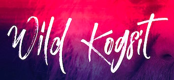
In 2016, Fatih designed Magnificent, Yellow Shoes, Tweety Sweety Script and Brother, the calligraphic scripts Sunshine Rose and Japille Script, the brushy Las Vegas, the scribbly Habgost Script, William Kidmon (signature script), Sunshine Rose, Ravishing (brush script), Stemle, Specific (a techno sans), Harley Quinzel, Lemonade Script, Xandek (signage script), Antony Bradshaw Script, Roseline Script (brushy), Yusuf Kral Artistica Font, Lustinmal Script, Twister Script and Amsterdam Script. Typefaces from 2017: Garrett Russol (signature script), Rarrettant, Kind Smithen, Midnight Blue Brush, Ramsterink Script, Bob Husk Brush, Justinot Infinity (marker script), Wild Kogsit (dry artistic brush), Waterlife, Harmony Script, Bluejeans (dry brush), Alice Blue (brush lettering), Sparkling, Hellocity (dry brush), Livingstone, Zombies (free dry brush font), Northshine (dry brush font), Jack's Adventure Book (curly vampire script that could also work as a children's book font), Jasmine (brush script), Specific (squarish), Saturday (brush script), Majestic (brush script), Relative Script, Kensington, Sandy Brown (script). Aka Design Dukkan and as FontArt. The free Hand-Crafted Font Collection of 2017 includes Angela's Hopes, April, Belongsto (dry brush), Black, BobRaeal, December (dry brush), Fevhil, Hemlok, Jaguar, Jungle (very dry brush font), Kitchen, La Alorta, La Rose, Permanent, Ramses, Relax (textured), San Francisco, Saturday, Snake, Tools, Witness (textured). Typefaces from 2018: Avelia, Abelia, Waton Kattuk, Gatasuunk (a lovely dry brush script), Kasterl Rom Script, Gold Mastey, Famous Bristol (watercolor brush), Christmas Icons. Behance link. Another Behance link. Creative Market link. Old URL. Behance link for FontArt. Creative Market link for Design Dukkan. Creative Market link for Oldschool Designer. Fontart link. See also Fontart, Font Art, or Son of Art. [Google] [MyFonts] [More] ⦿ |
One of his alphabets was scanned and fonted by "Character" and posted on abf on November 25, 2002. It is called Flotner. For other free fonts, see Flotner Anthropomorphic (2010, Dick Pape) and Menschenalphabet (1997, Ingo Zimmermann). [Google] [More] ⦿ | |
Rabisco (was: AfroBreak)
| Aka afronsu Afronsu. Crazy Sao Paulo-based Brazilian designer (b. 1986) of the grunge typeface Antropofagia (2010). Born in 1986. He also made Urbana (2020), Futurista (2019: an experimental font), Afronsu (2011), Estaktu (2012, influenced by Sao Paulo's graffiti or pixacao), and Abstract Rua (2012). [Google] [More] ⦿ |
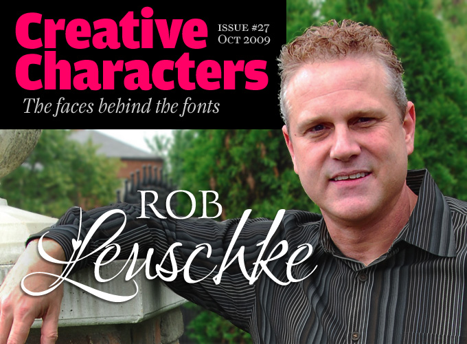
Robert E. Leuschke
| |
Rúben Dias
| |
Ruben R Dias (was: Item Zero)
|
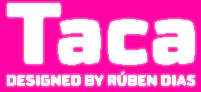
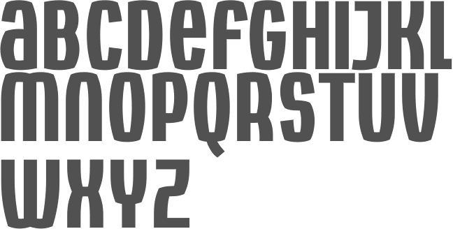
Designer of the promising font Oban (2002), which resulted in the production of a formidable sans family, Oban (2006), in which all straight lines have been replaced by curvatures one could find on TV screens from the 1960s. An elegant display family! It got raving reviews and was compared in style with Mayo (Peter Bruhn), Gregarious (Mike Kohnke), Crank8 Plus/Minus (Henk Elenga), Ectoplasm (T-26) and Armchair Modern (PsyOps). Type designs include Medro (2008), Quarto (2006), Arco (2009), Euro 2012 (2010, a rounded sans). In 2012, he published the elliptical sans family Taca at Fountain Type and republished it in 2015 at his own type foundry. He calls it a squircle---neither square nor circle, and explains: We usually associate the rounded, convex box with the television screens of the 1960s and Aldo Novarese's classic typeface, Eurostile. But whereas Eurostile is cold and machined, Taca is warm and rugged, as if it was molded from clay or carved from stone. It adds a bit of anthroposophic warmth and mystery. |
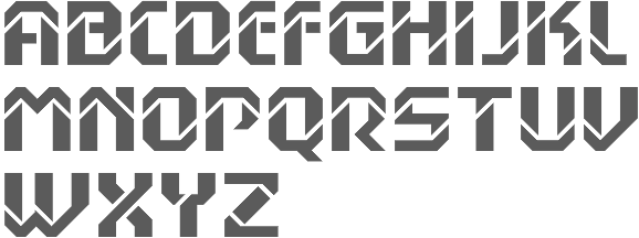
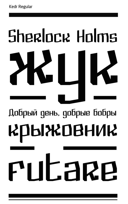
Designer in Kiev, Ukraine. Creator of the fat poster typeface Noko (2013), the experimental typeface Fract (2012), and the anthroposophic Latin/Cyrillic typeface Cedar or Kedr (2013). In 2014, he designed the free art deco typeface Sideboard, the free vector format font Moriarty. Typefaces from 2015 include Flomic. Behance link. Another Behance link. [Google] [MyFonts] [More] ⦿ | |
Design student at Universidade do Estado de Santa Catarina in Florianopolis, Brazil, who created the hand-drawn anthroposophic and alien language typeface Hylian (2014). [Google] [More] ⦿ | |
Santiago, Chile-based designer of the anthroposophic typeface Malva Vali (2017). [Google] [More] ⦿ | |
Australian designer of Princess (curly script), RV Park, Sunset (anthropomorphic face), all made in 2003-2004 at StockBucket, a company she founded in 2004 with David Phillips. [Google] [MyFonts] [More] ⦿ | |
TypeSETit
|
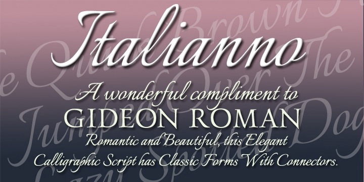
Ambiance BT (Bitstream) was Rob's first typeface. Also, early on, he created the free emoticon font AairChat (1995). An incomplete list of his creations: AlexBrush, Cherish, Ephesis, Inspiration, Jackie-O, Licorice, Kolker Brush (2004, Western version of Japanese calligraphy), Love, Neanderthaw, Ruge Boogie (2004), Saliere, Updock, Whisper, TheNautiGal (2006, connected script), Water Brush, Love Light, Passions Conflict (2004), Mea Culpa, Beau Rivage (2004: calligraphic; Github link), Good Vibrations (the commercial version of his free font Great Vibes), Lovers Quarrel, Grechen Fuemen (2003-2021), Moon Dance (2004), MsMadi (a monolinear script), Bonheur Royale (2005), Fuzzy Bubbles, LA Heat (2005), Qwigley ROB (2005), Vujah Day, he added Kings Honor (2006), Kings Quest (2006), Kings Dominion (2006), RUSerius (2007, curly handwriting), QwitcherBychen (2007, calligraphic), Arizonia (2007, calligraphic, based on lettering seen on a truck), Road Rage ROB (2008, grunge), Grey Qo (2008, calligraphic), FleurDeLeah (2008, flowery calligraphic), My Soul (2008), MooLahLah (2008, cow-spotted letters). MyFonts sells Alex Brush, Allison (an inky script that is free at Google Fonts), Ambiance BT, ITC Arid (1997), Arizonia, Babylonica (2008, a great connected brushy script), Bilbo, Bilbo Swash Caps (2011, Google Web Fonts), Bonheur Royale, Caramel (Crunch, Candy, Nuggets), Carattere, Cherish, ITC Chivalry, Corinthia (calligraphic but with slope errors on some connections such as between "o" and "r"), Ephesis, FleurDeLeah, Fuzzy Bubbles (free at Google Fonts), Good Vibrations (2003), Grapenuts, Great Vibes (2012, Google Web Fonts), Gwendolyn (free at Google Fonts), Holiday Font, Hurricane (brush script), Imperial Script (2008), (2018-2022, Google Fonts), Inspiration (2004), Jackie O, Kings (script), Kolker Brush (2004), LA Heat, (2018-2022, Google Fonts), Licorice (2004), Love Light (2003), Lovers Quarrel (since 2012 at Google Web Fonts), Mea Culpa (2003-2021), MooLahLah (2003-2021), Moon Dance (2004), Ms Madi, MySoulOne, Neonderthaw, Oh Ley, Ole (2008), Oooh Baby (2004-2021), Passions Conflict, Petemoss, Puppies Play (2009-2021: a curly script), Qwigley, QwitcherBychen, Qwitcher Grypen (2007-2021), RoadRage, Roelandt BT (2002), RUSerius, Ruthie (2003), Saliere, SassyFrass ROB (2008-2021: calligraphic), (2018, Google Fonts), Shalimar (a great calligraphic script, 2004-2021), Square Peg, Tapestry, TheNautiGal (2013-2021), Twinkle Star (2003), Updock (classical calligraphy), VujahDay (2003), Water Brush, Waterfall (2011) and Whisper. Fonts released in 2009 at P22: Babylonica, RobsPickles, RoadRage, QwitcherBychen, the Caramel family (including Crunch, Candy, Nuggets). In 2009, he also published Italianno ROB. Typefaces made in 2010: Allura (see Google Web Fonts), Estonia Nouveau (based on calligraphy by Villu Toots), Estonia Regular, Estonia Swash, Island Moments, Neon Derthaw (neon light face). Typefaces from 2011: Robs Pickles, Waterfall, Monte Carlo (a free formal calligraphic script at Google Fonts), Genos (anthroposophic; includes Cherokee; in 2021, a variable font pair was added), Bilbo (free at Google Web Fonts), Playball (free connected signage or baseball script face at Google Web Fonts). Designs from 2012: Fuggles, Explora (a delicate calligraphic script face). Typefaces from 2013: Style Script (an upright retro script; free at Google Fonts). Typefaces from 2014: Praise Pro (signage script), Ise Sport (flared font). Typefaces from 2015: Festive, Luxurious (free at Google Fonts), Luxury script, Comforter, Comforter Brush, WindSong (a connected script, not to be confused with the famous calligraphic script Windsong (1998, Bright Ideas); also at Google Fonts), Alumni Sans (an organic sans family with large x-height; +Collegiate, +Inline; free at Google Fonts). Typefaces from 2016: Glory (an organic sans family, free at Google Fonts, and a pay font at MyFonts), Hurricane (connected script family). Typefaces from 2017: Splash (ink splatter script), American Calligraphic, Smooch (a brush scriptthat is free at Google Fonts), Smooch Sans. Typefaces from 2018: Angeletta (at Monotype), Meow Script. In August 2018, he published his Smorgasbord series: Grape Nuts, (Google Fonts), (2022, Google Fonts), Kings Honor, Kings Quest, Kings Dominion, Moon Dance One, Moon Dance Two, Ms Madi, My Soul, Pickles, RUSerius, (2018, Google Fonts), Vujahday Plain, Vujahday Script, Vujahday Flourish. Typefaces from 2019: Birthstone. Typefaces from 2021 (including updates of earlier fonts), all published by Google Fonts: Are You Serious, Birthstone, Birthstone Bounce, Bonheur Royale, Caramel, Carattere, Cherish, Ephesis, Explora, Fleur De Leah, Gideon Roman, Fuggles (script), Festive (a free curly script). [Google] [MyFonts] [More] ⦿ |
TypOasis, 2002
|
|
TypOasis 2005
|
|
Waldorf Fonts
|
Mike Diaz pointed out that Waldorfschrift is really really close to Ingrid Liche's FF Liant (1995) about which FontFont writes: In 1976 Ingrid Liche began designing Liant Medium for the packaging of the natural cosmetic company Weleda AG in Germany. Since then this typeface has defined the corporate identity of Weleda worldwide and because of this company's prestige, the look to the entire natural cosmetic and biologically oriented industry. Because of a split of opinions in the international company in 1994, the mother company in Switzerland decided to introduce a new house face; thereby giving up the brand name recognition that had been established over twenty years... Because of the turn in events and since Liche still owned the rights to Liant, she decided to distribute the typeface exclusively over FontShop International. She re-digitized the font, adding several ligatures and expanding the typeface to a three weight family. The most noticable characteristic of the font is its lively lines, the forms for which are taken from nature. Within the individual characters there is an exchange of sinking and rising points, which are connected by taut curves. Typefaces from 2021: Wouldkat (a woodcut font inspired by an old house font of an anthroposophical hospital in Germany; soon after its release removed and renamed to Filirator). Typefaces from 2022: Skinni (high-waisted and hand-crafted, appropriate for Giacometti statues), Lui (a wide anthroposophic font), Zumbo (hand-crafted letters with an African theme), Lakrits (a primitive hand-printed font influenced by the LogosNazhdag font), Suki (emulating a children's hand). [Google] [MyFonts] [More] ⦿ |
Weltfremd
|
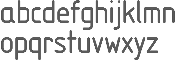
Malwin created Mars (2011, an ultra-fat octagonal face) and Merkur (2011, a triangulated face). Initially, the fonts were free, but in 2011, they became commercial. In 2014, while studying at HfG Offenbach, Malwin designed the Japanese Inkan seal-themed typeface Nihon. This vertical order typeface has over 30,000 ligatures to make the characters fully interlocking. Inspired by the pioneering prefab architecture of Ernst May in Siedlung Römerstadt, Germany, Malwin created the anthroposophic typeface Bautype in 2015. Bautype is a geometric sans-serife with a humanist touch, suitable headlines and simple text. Dafont link. MyFonts link. Behance link. Home page. Fontspace link. Klingspor link. [Google] [MyFonts] [More] ⦿ |
Zar Ni
|
 Gifted designer from Epalinges, Lausanne, Switzerland. One of the most talented creators of typefaces with FontStruct.
 Lutz Baar (b. Berlin, 1946) ran Antropos. He is a calligrapher/type designer who runs a design studio called
  [
[ Type designer, aka
  A 2004 graduate of Universidad Autonoma de San Luis Potosi. As a student at CEAD in Mexico,
  [
[ [
[ Skopje, Macedonia-based designer of the Latin / Cyrillic anthroposophic typeface
  German freelancer who made
  Insigne Type Design Studio (est. 2006) is run by
  [
[ Milan, Italy-based type designer who graduated from IED in 2007 and attended the Master of Type Design program at Politecnico di Milano. He has been working in the world of visual communication since then for clients such as Chianti Classico, Moretti, Amnesty International and UAAR. In 2019, he started teaching at IED (Istituto Europeo di Design) in Rome.
  [
[ [
[ [
[ French graphics lettering company initially involved in instant lettering (made by Trip Productions), and some original typeface designs. From 1989 until 1994, Mecanorma worked with another Dutch company
  MendozaVergara is
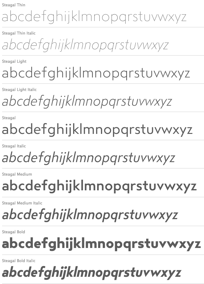
  Fatih Günes, an art director in Milan and/or Bursa, Turkey, extended Lukasz Dziedzic's free Lato font (2010) for Turkish, in his Lato TR (2013). In 2015, he made the rounded slightly elliptical sans typeface family
  Artist who probably comes from Thurgau, and who lived roughly from 1485-1546. From 1512 until 1528, he worked in Adold Dauer's shop in Augsburg. He settled later in Nürnberg. Creator of an alphabet (now known as
  [
[ [
[ Portuguese designer Rúben Dias graduated in design from IADE. He ran Item Zero and built his own letterpress studio, where he prints and experiments with both metal and wood type. Since 2012 he has been working on a doctoral degree on Portuguese Royal Printing Office typefaces at the Technical University of Lisbon's School of Architecture (FA-UTL). He teaches typography at ESAD.CR (Escola Superior de Arte e Design) and ESTAL and holds workshops on type and typography all across Portugal. In 2013, Aprígio Morgado, Ricardo Santos and Rúben Dias cofounded the type foundry
 The fonts produced in 2002 by
  Fonts published in 2005:
|
|
|
|